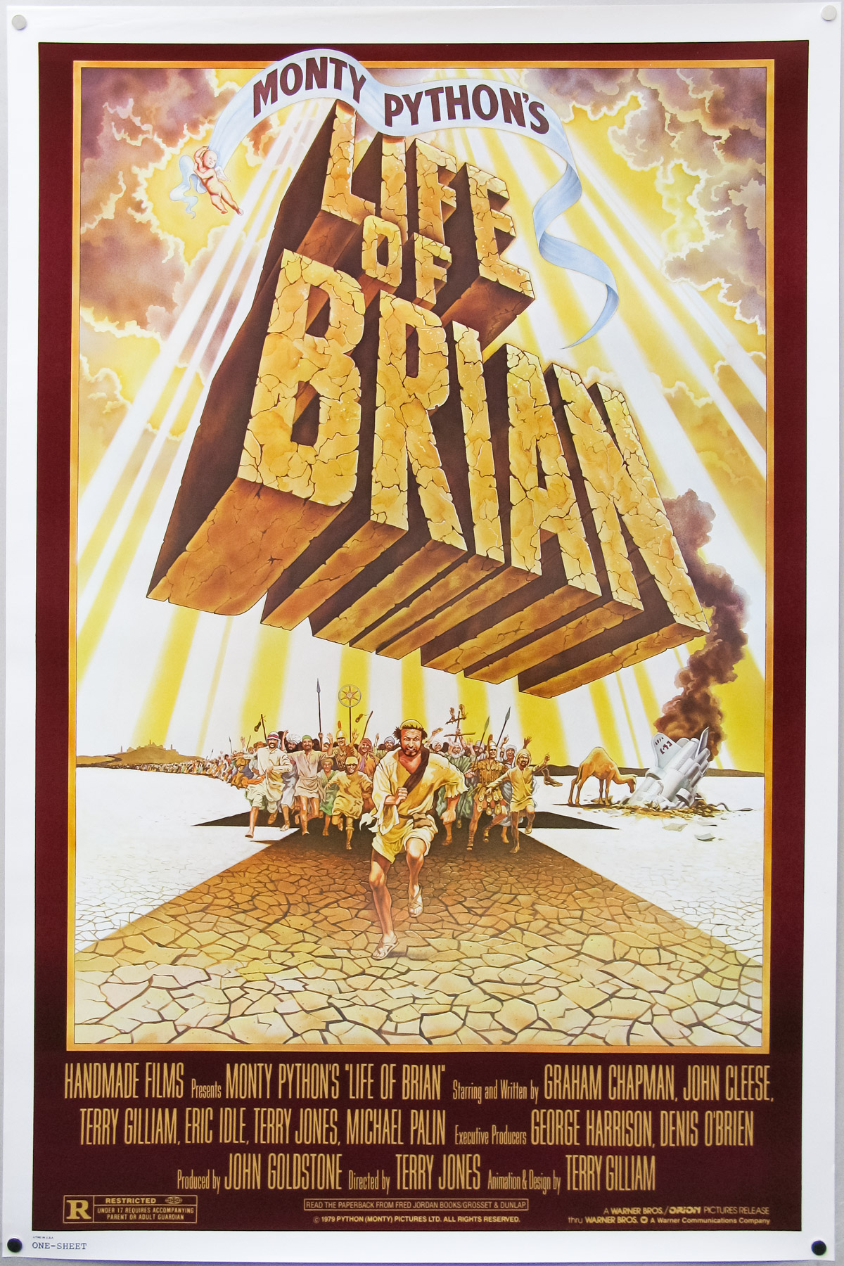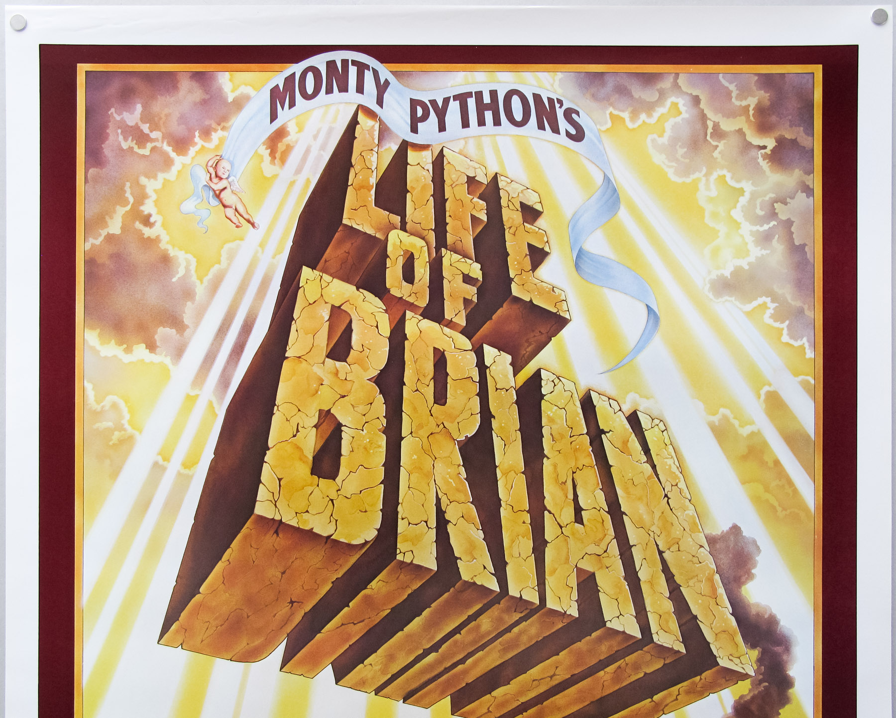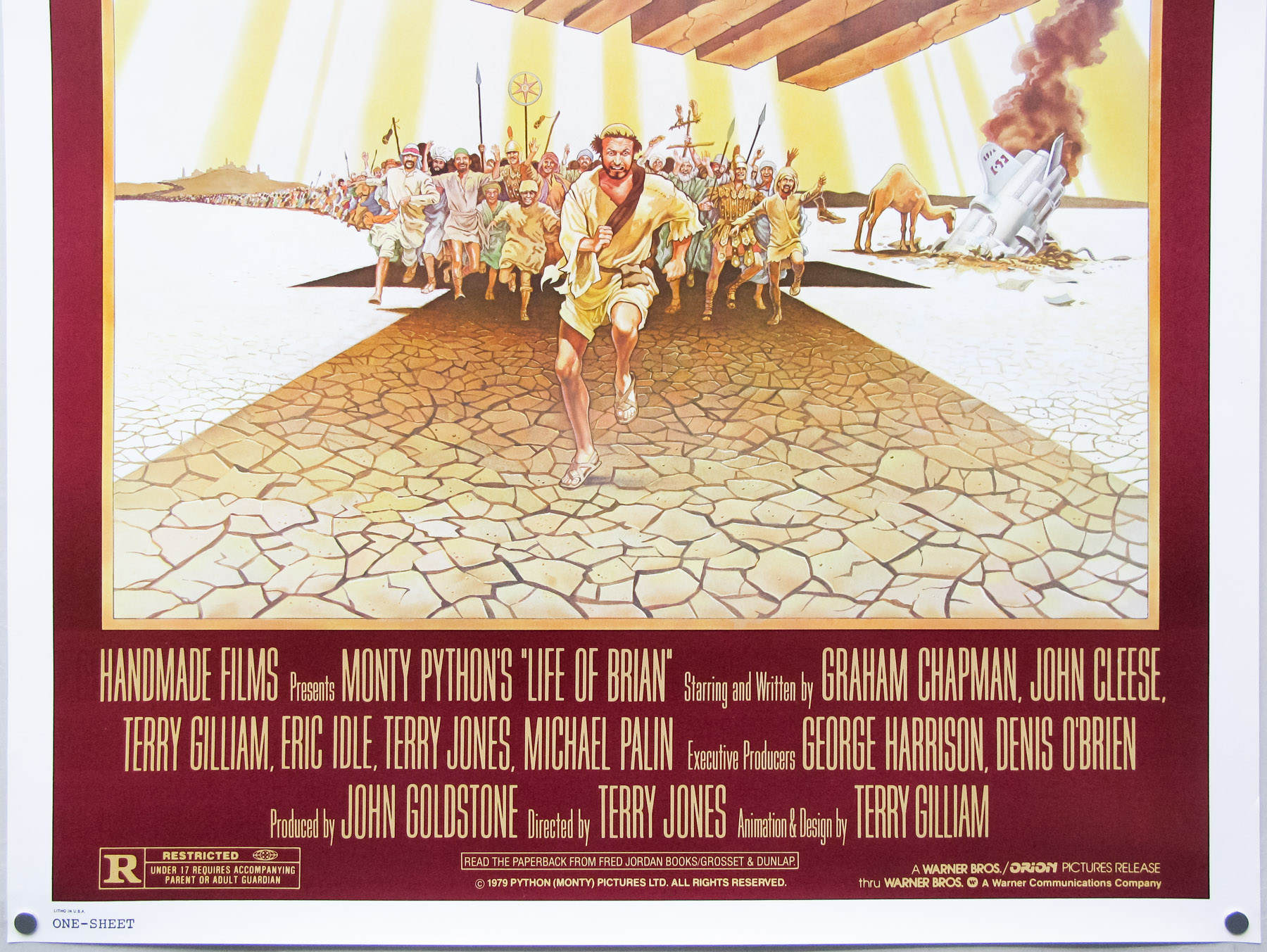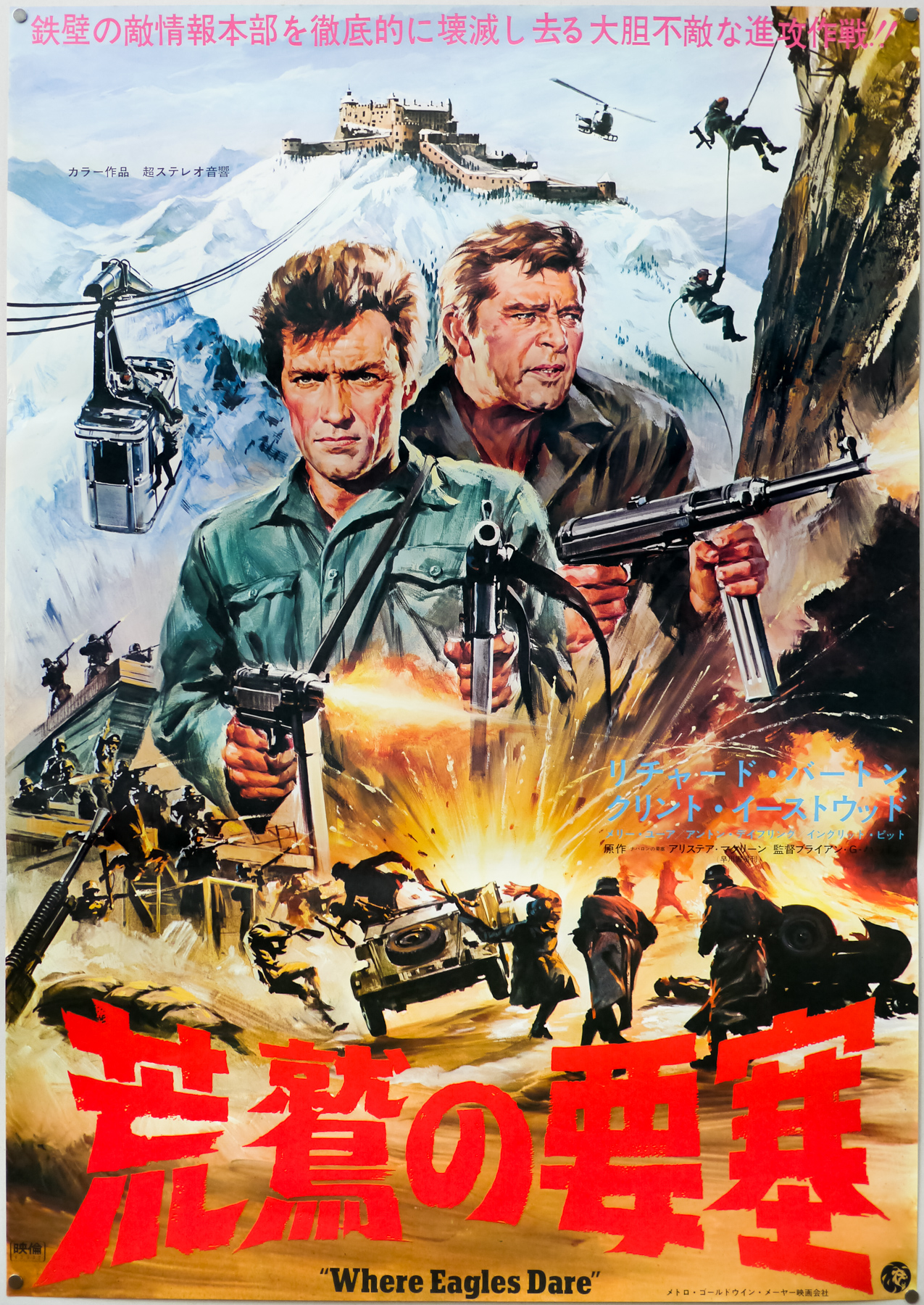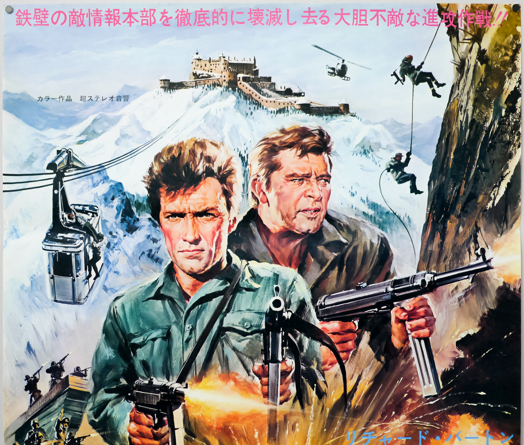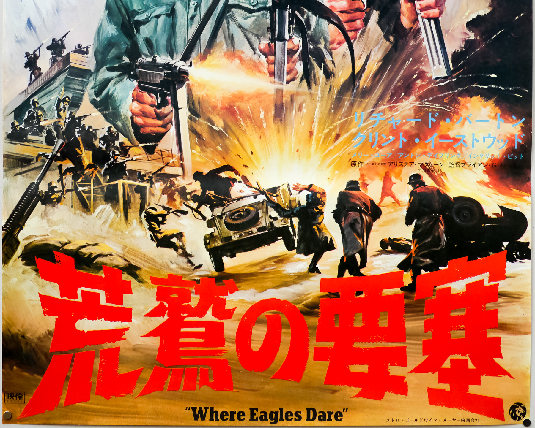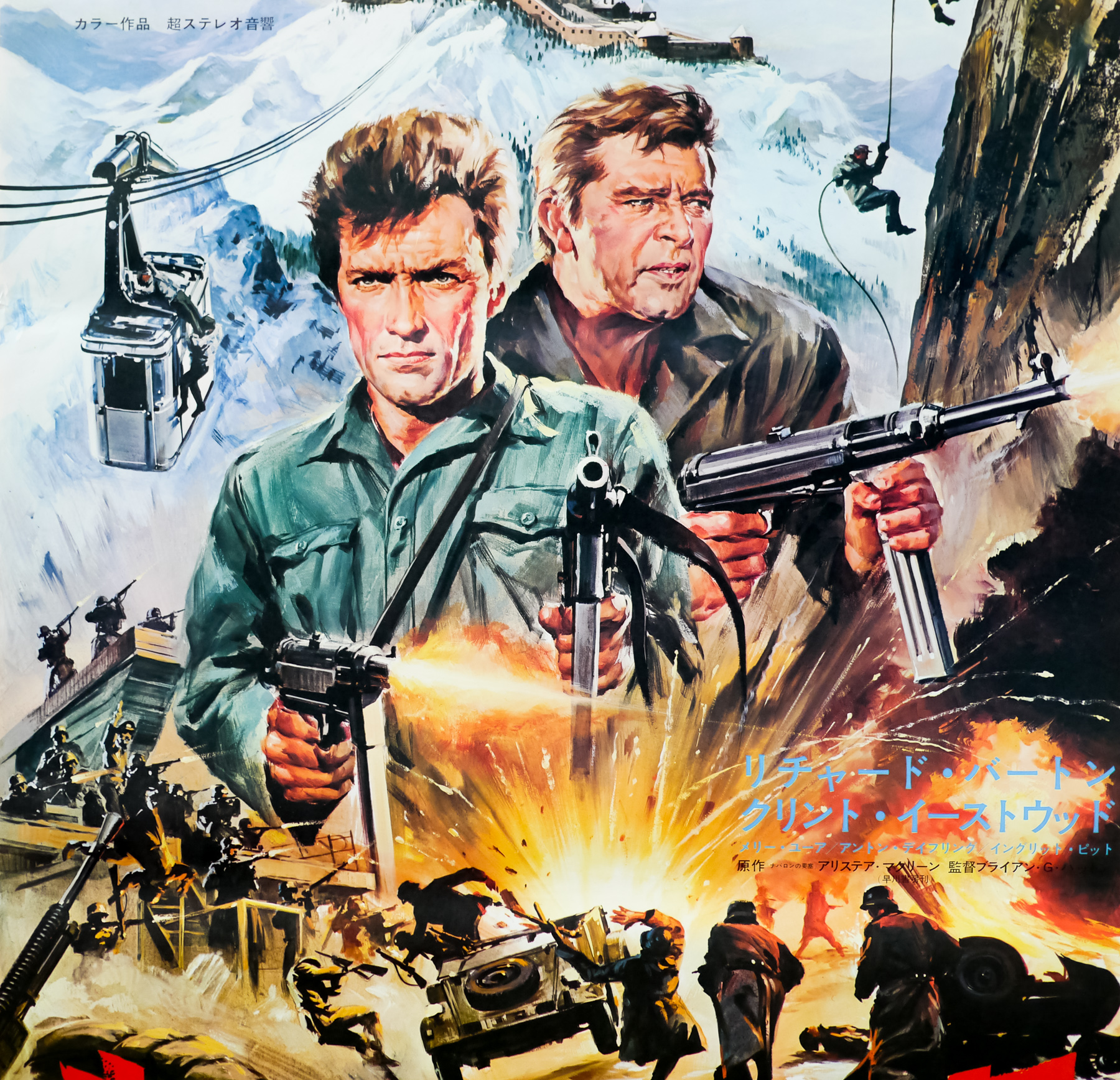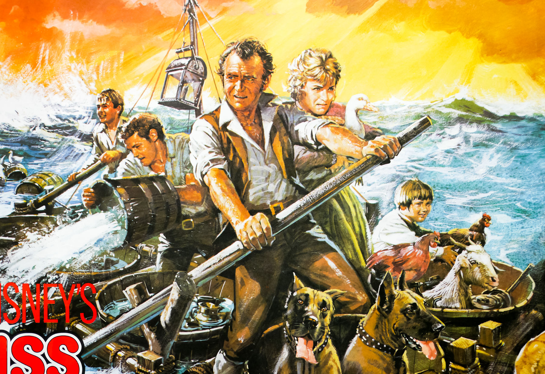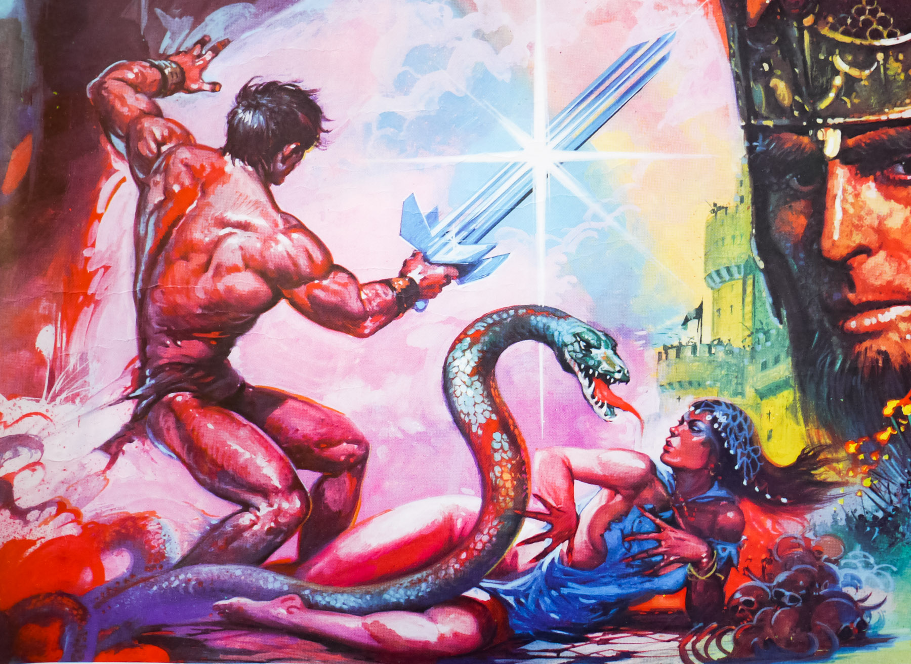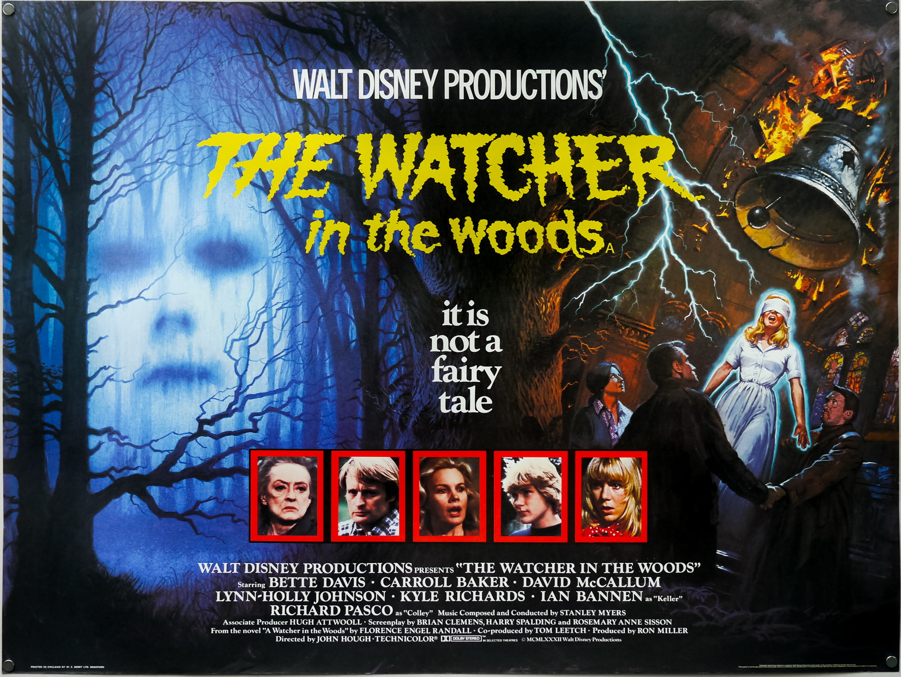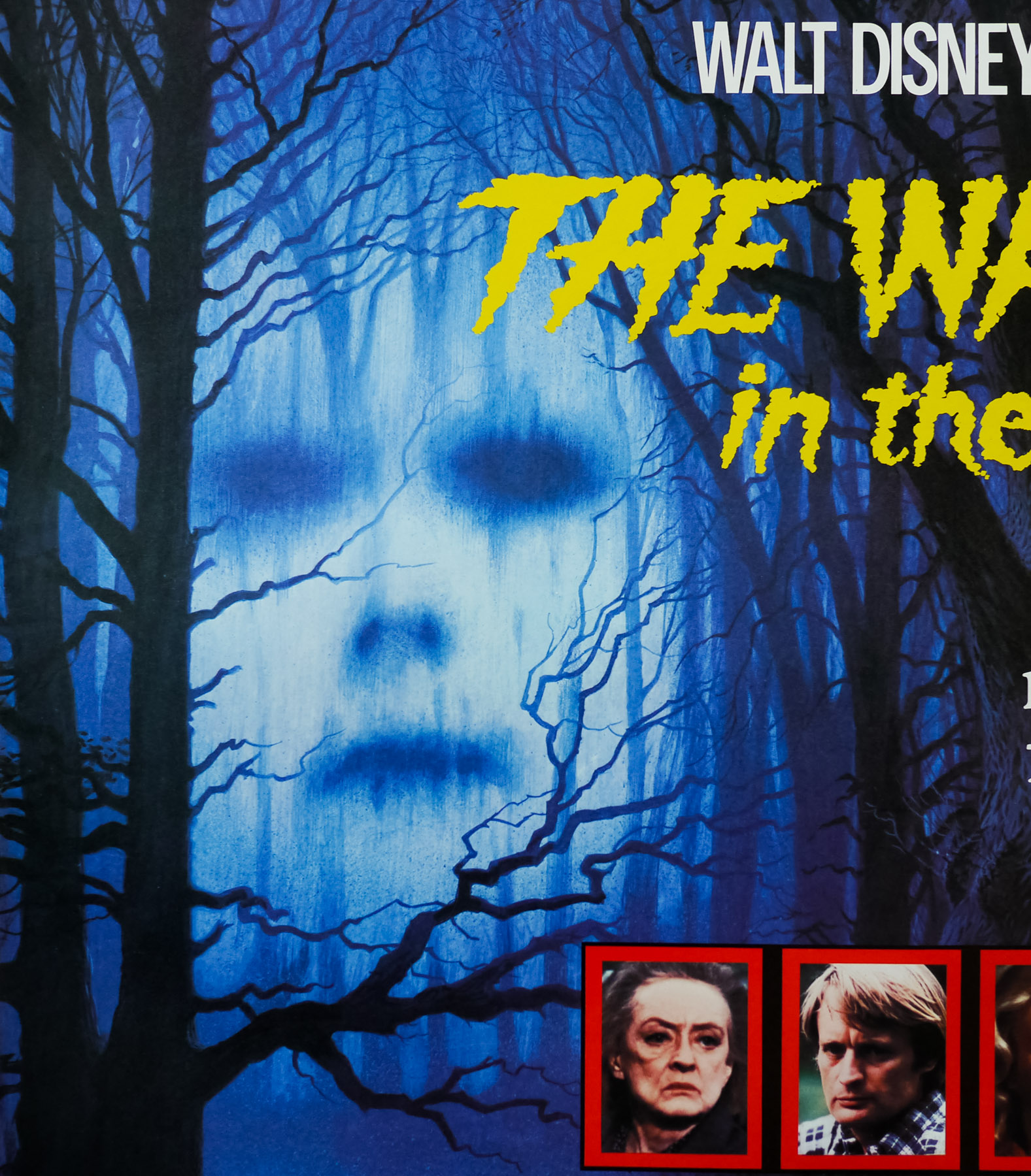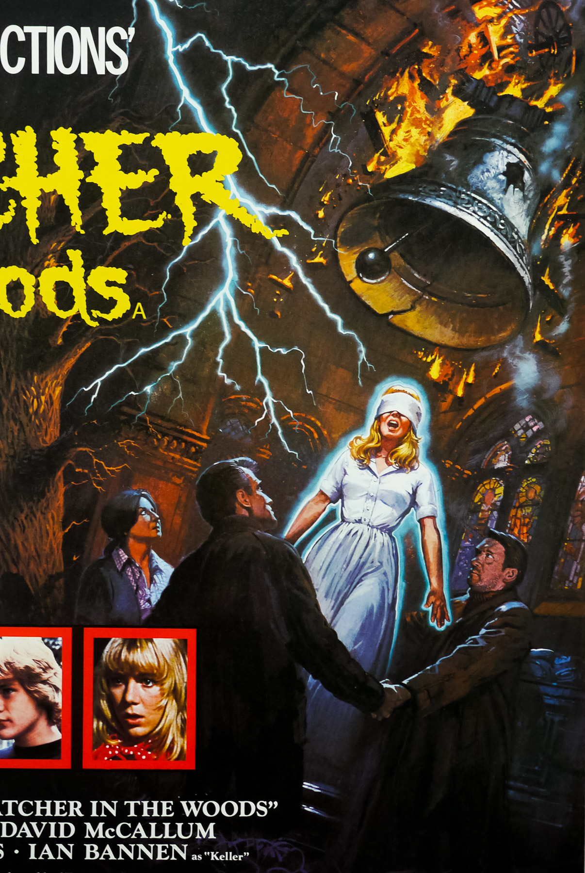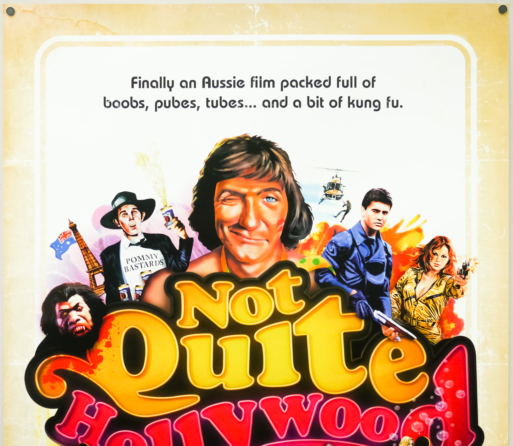
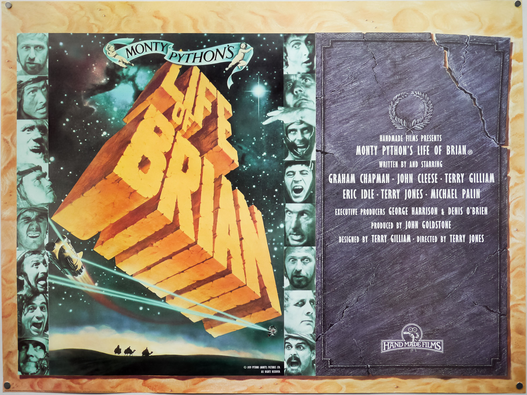
Poster detail
1-5
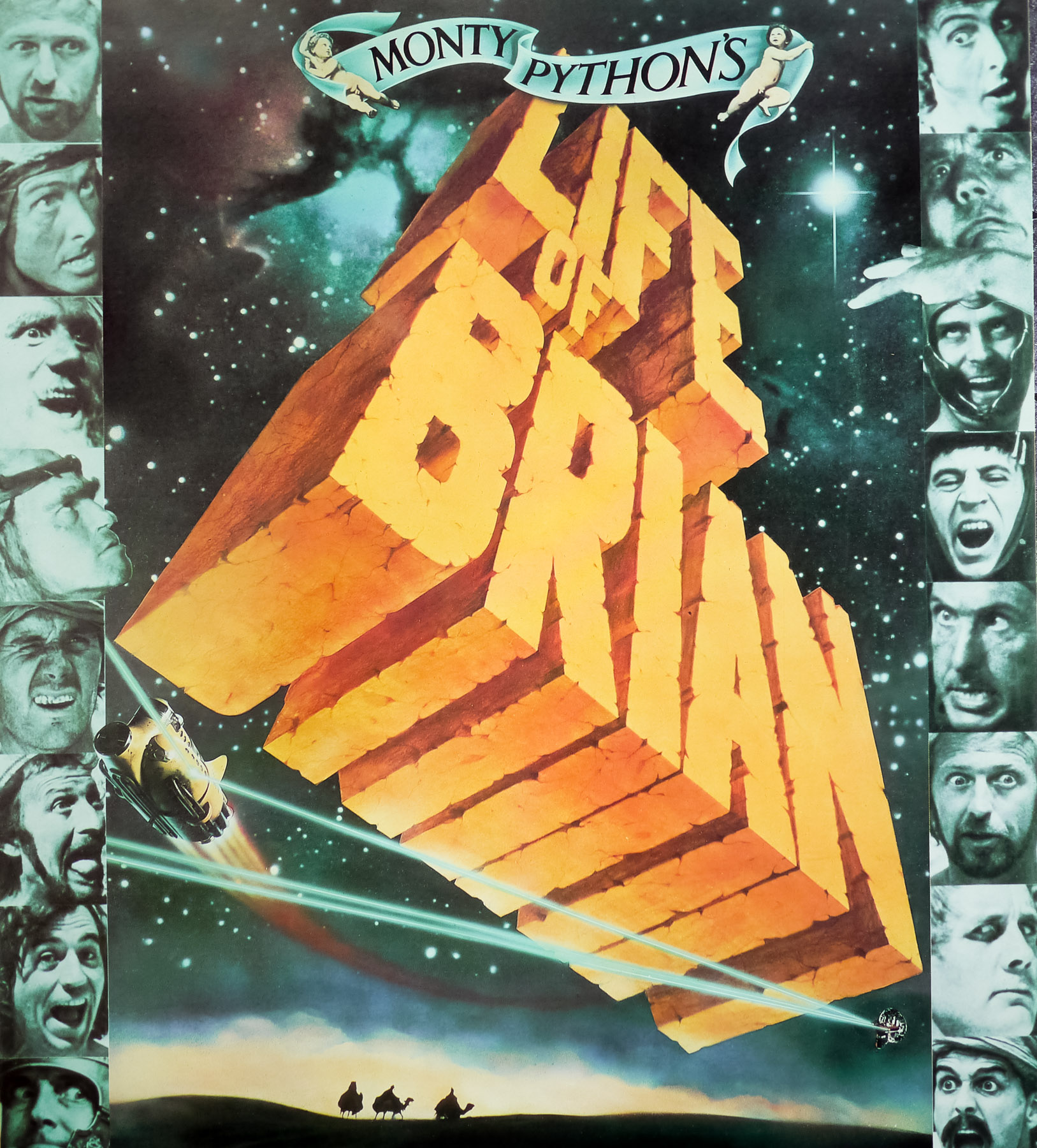


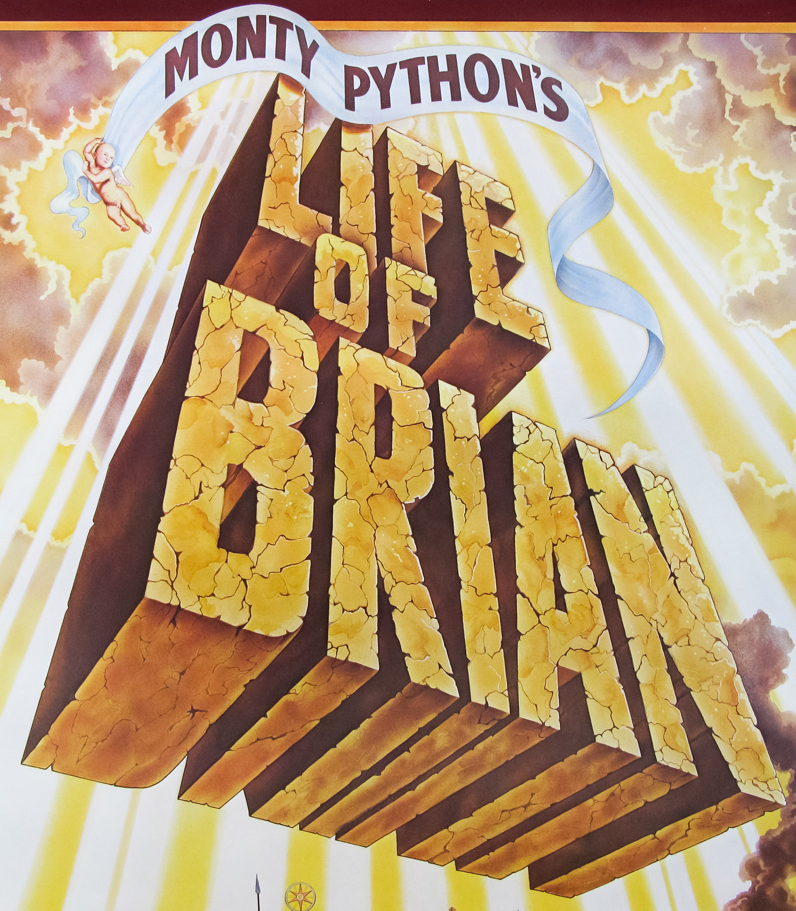
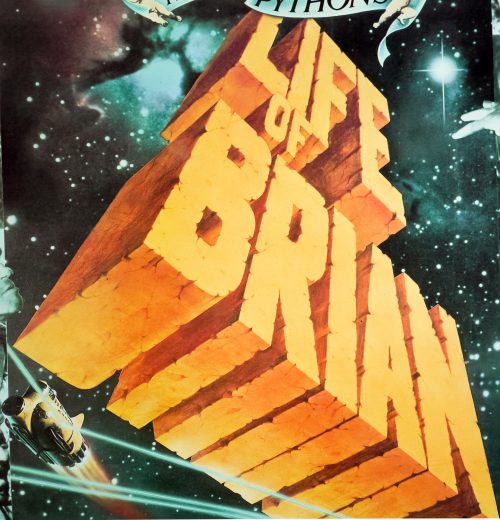
- Title
- Life of Brian
- AKA
- Brian di Nazareth [Brian of Nazareth] (Italy)
- Year of Film
- 1979
- Director
- Terry Jones
- Starring
- Graham Chapman, John Cleese, Terry Gilliam, Eric Idle, Terry Jones, Michael Palin, Terence Bayler, Carol Cleveland, Kenneth Colley, Neil Innes, Charles McKeown, John Young, Gwen Taylor, Sue Jones-Davies
- Origin of Film
- UK
- Genre(s) of Film
- Graham Chapman, John Cleese, Terry Gilliam, Eric Idle, Terry Jones, Michael Palin, Terence Bayler, Carol Cleveland, Kenneth Colley, Neil Innes, Charles McKeown, John Young, Gwen Taylor, Sue Jones-Davies,
- Type of Poster
- Quad
- Style of Poster
- Re-release
- Origin of Poster
- UK
- Year of Poster
- 1988
- Designer
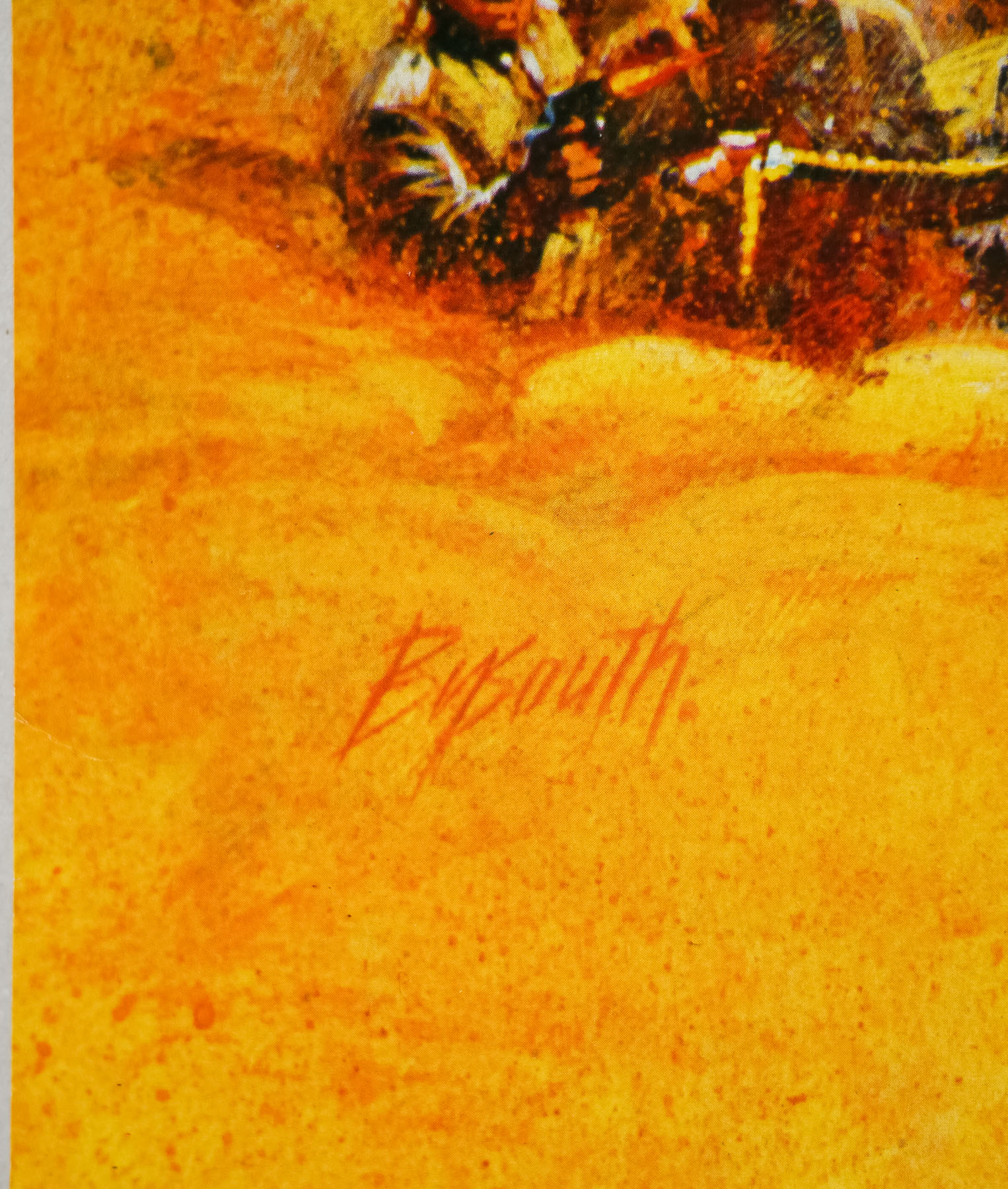
- George Rowbottom
- Artist
- George Rowbottom
- Size (inches)
- 30 2/16" x 40"
- SS or DS
- SS
- Tagline
- --
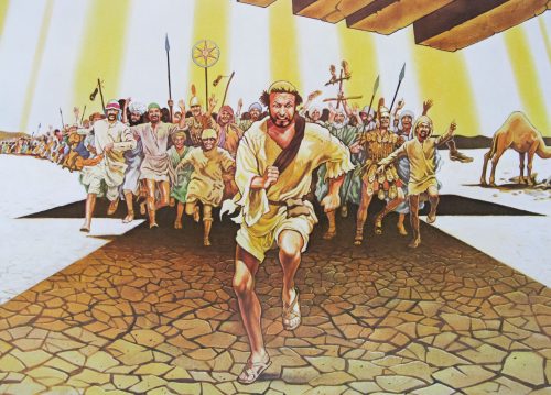
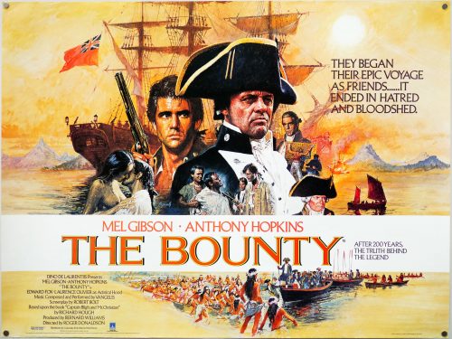
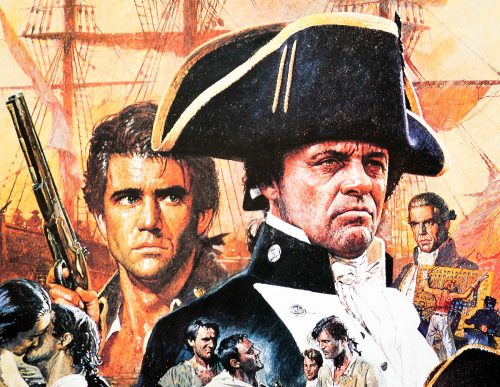
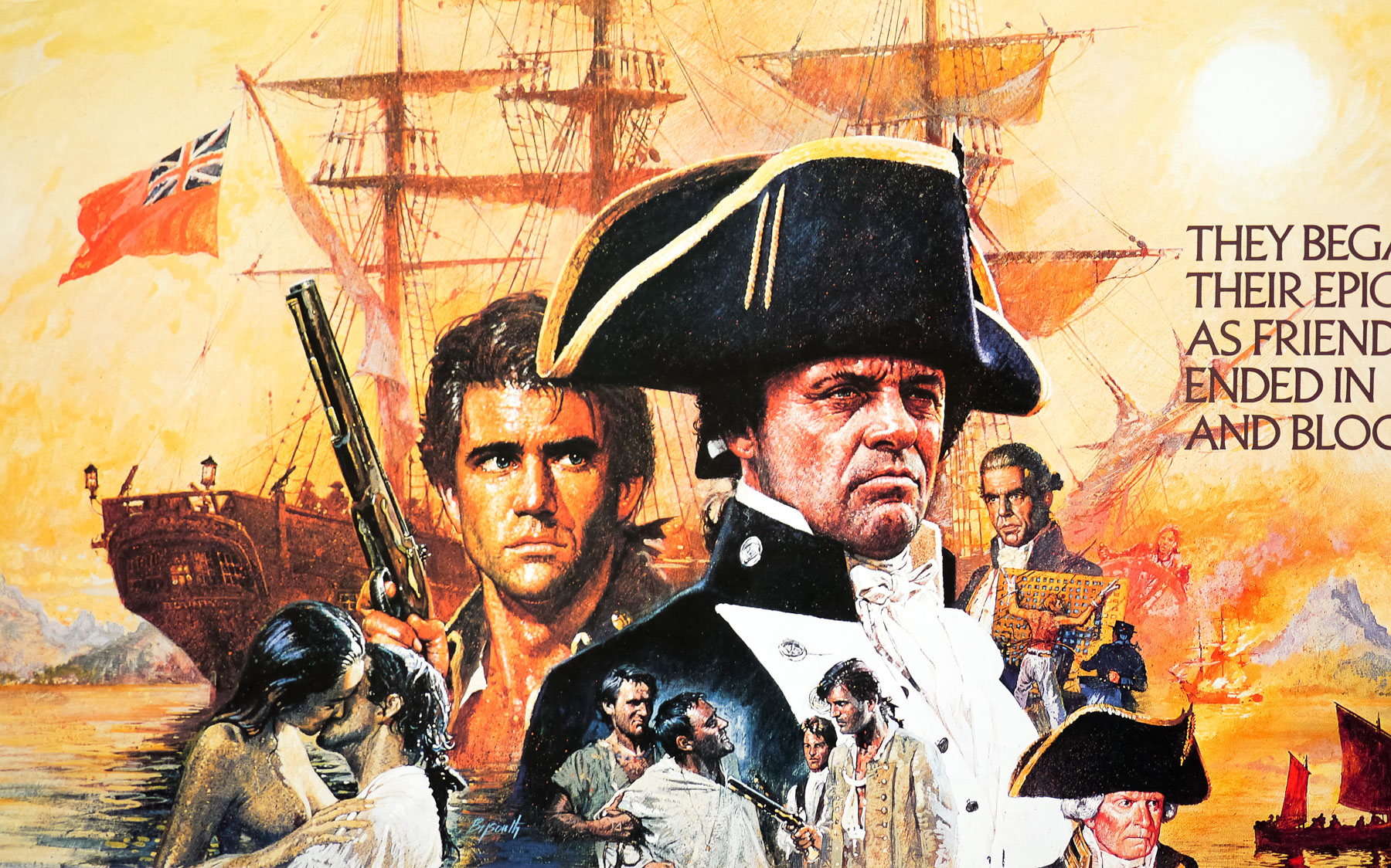
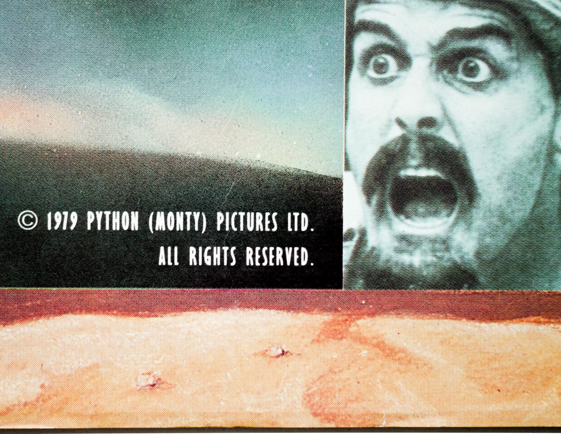
Probably my favourite of the five cinematic outings by the Monty Python crew, Life of Brian is one of the funniest films ever made and the brilliant satirical humour hasn’t diminished at all in the thirty plus years since its release. Infamously causing an uproar with various religious groups, it also saw EMI, the original financial backers, pulling out during production claiming the script was blasphemous. Luckily, George Harrison stepped in with the finance, apparently after realising it may have been the last chance to see another Python film in cinemas. His company HandMade Films was formed as a result of this deal.
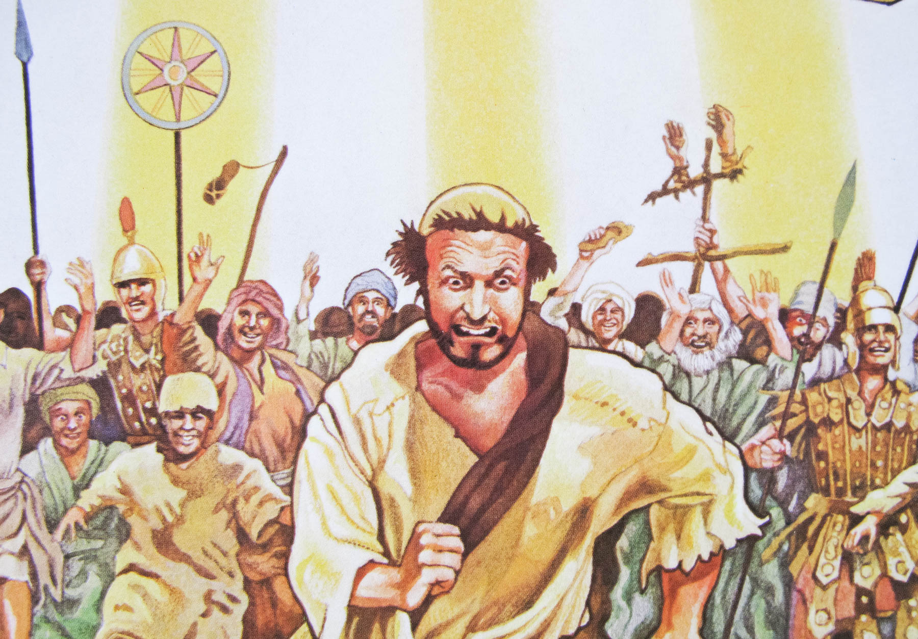
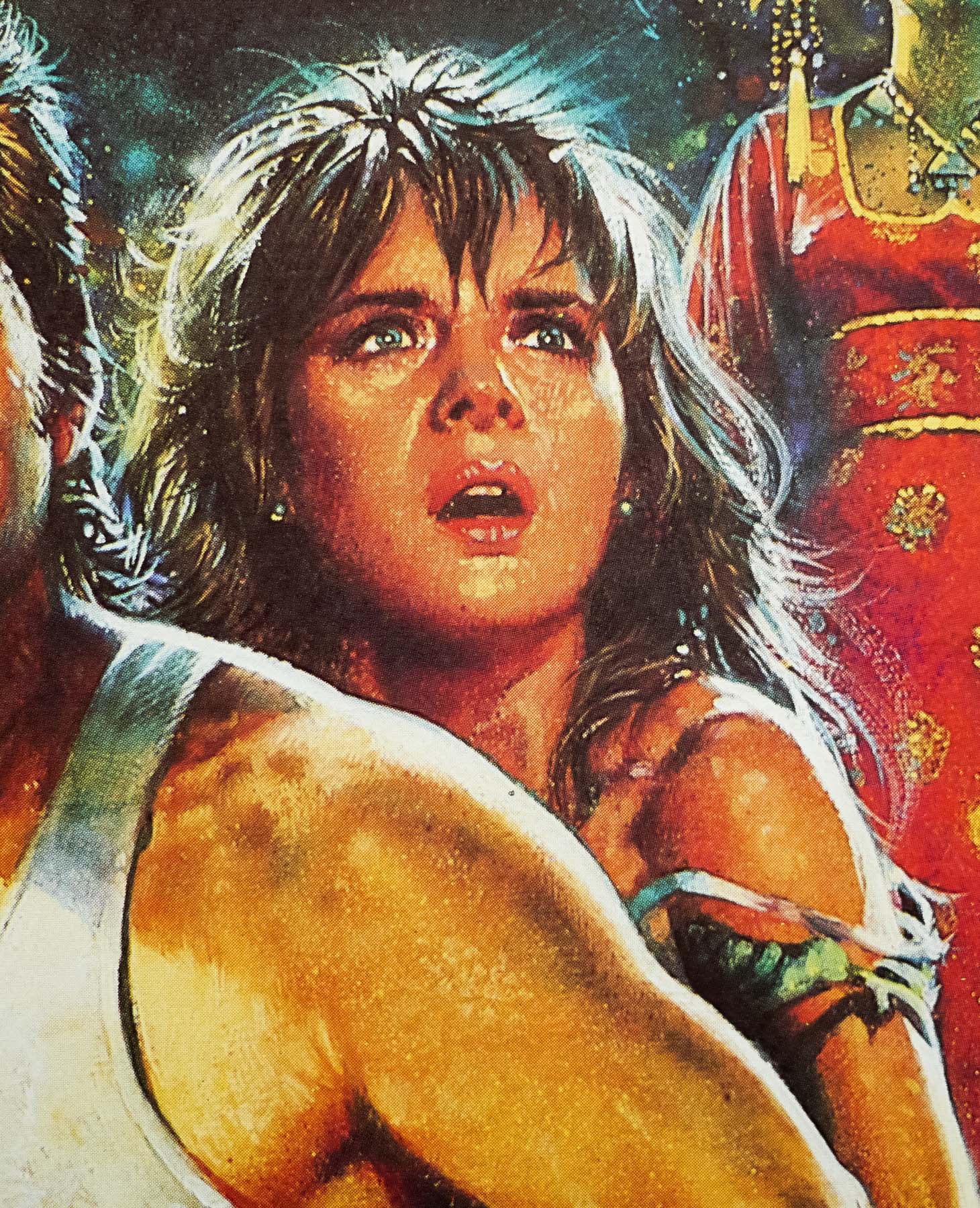
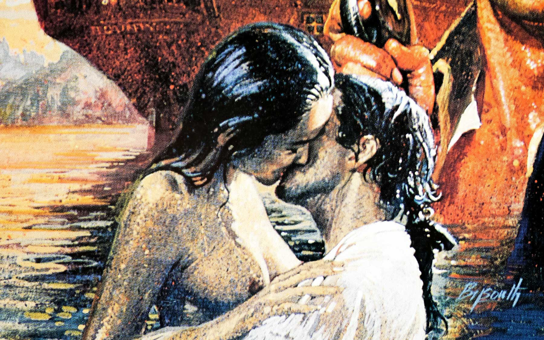
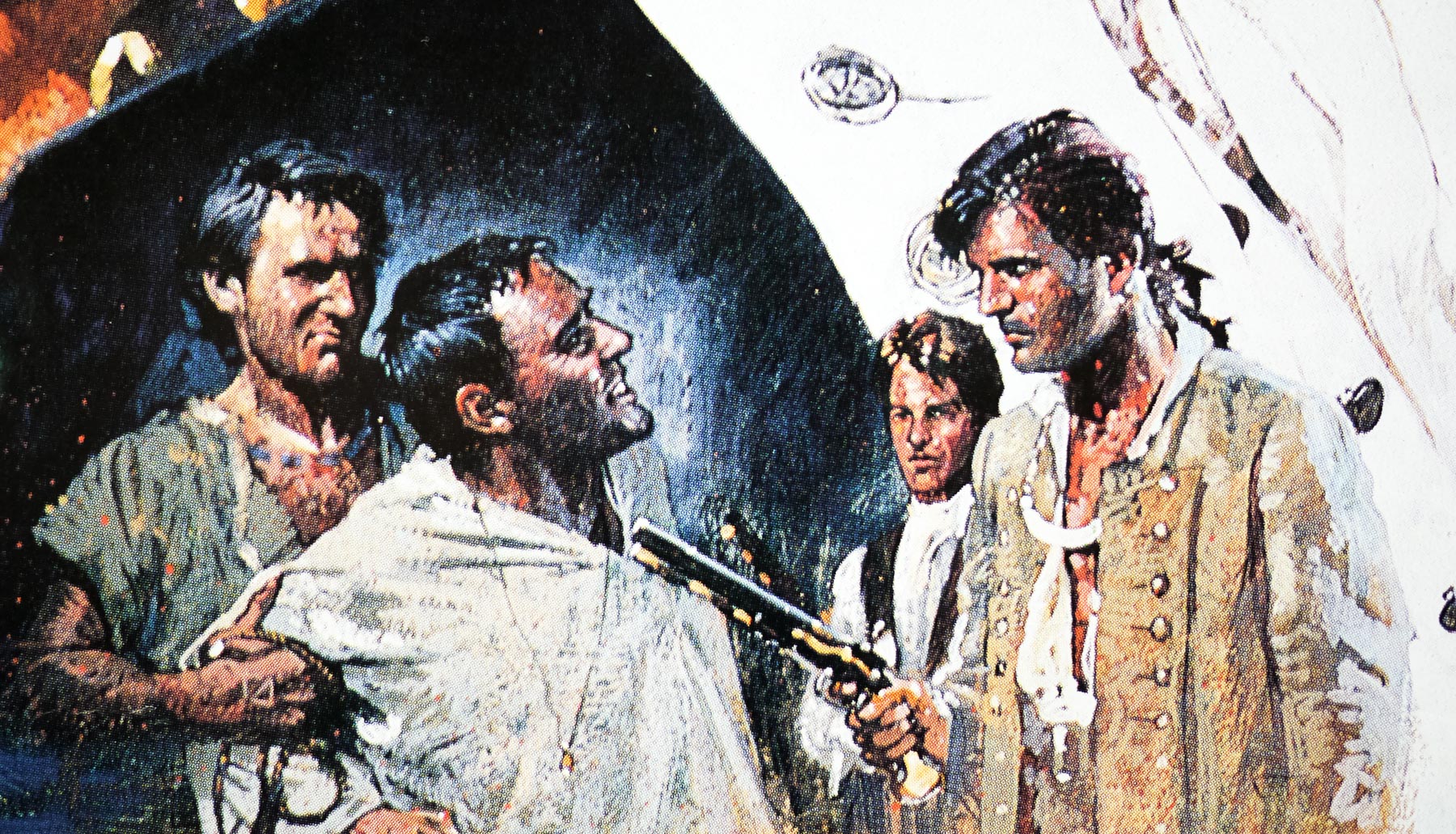
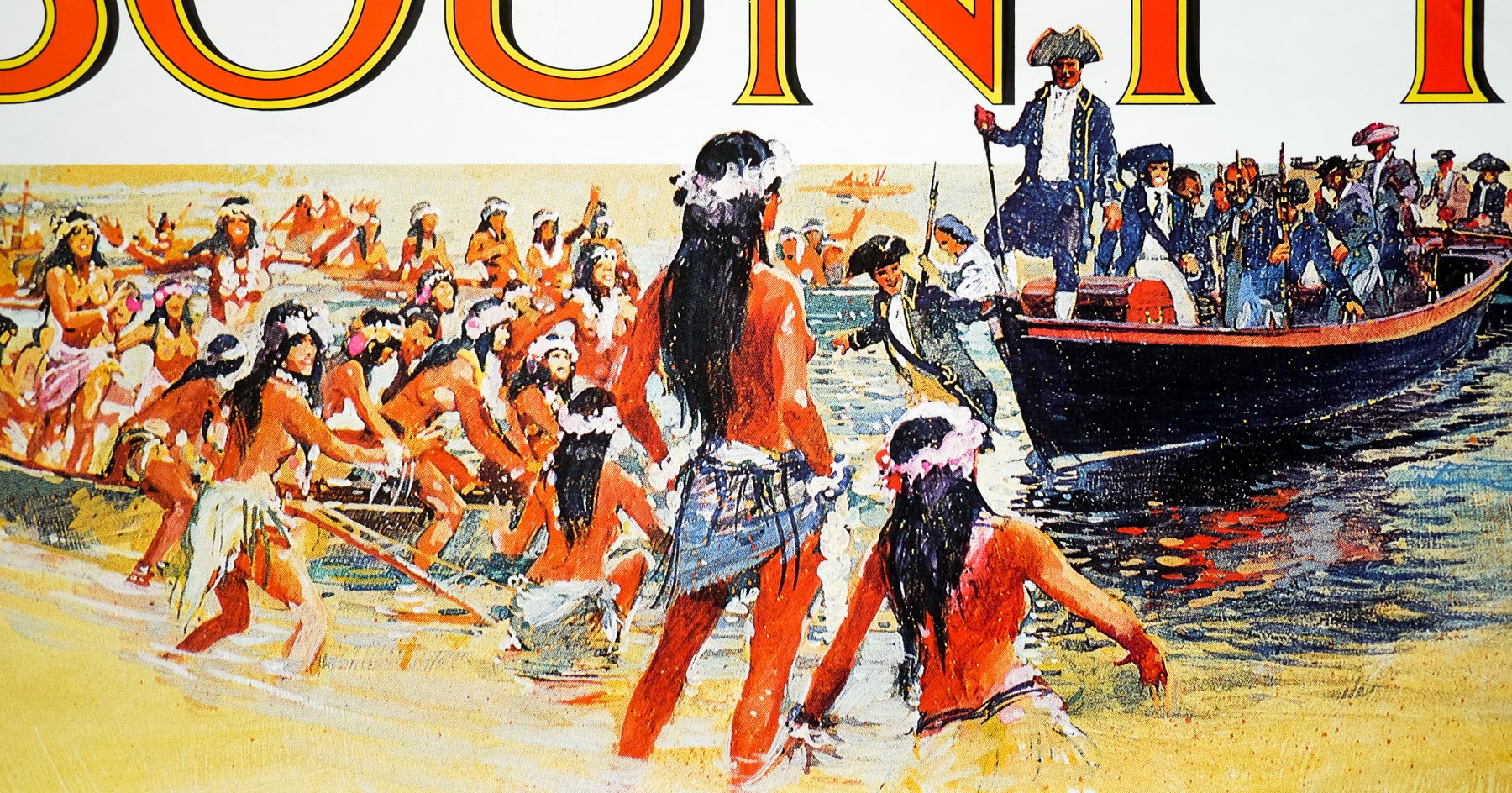
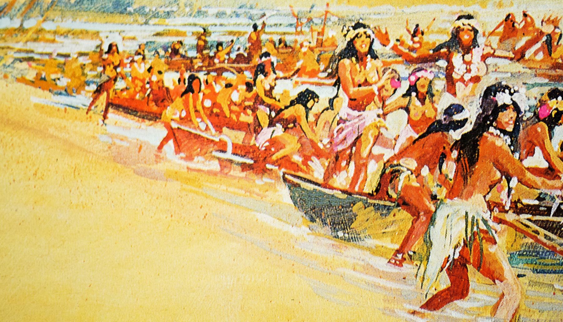
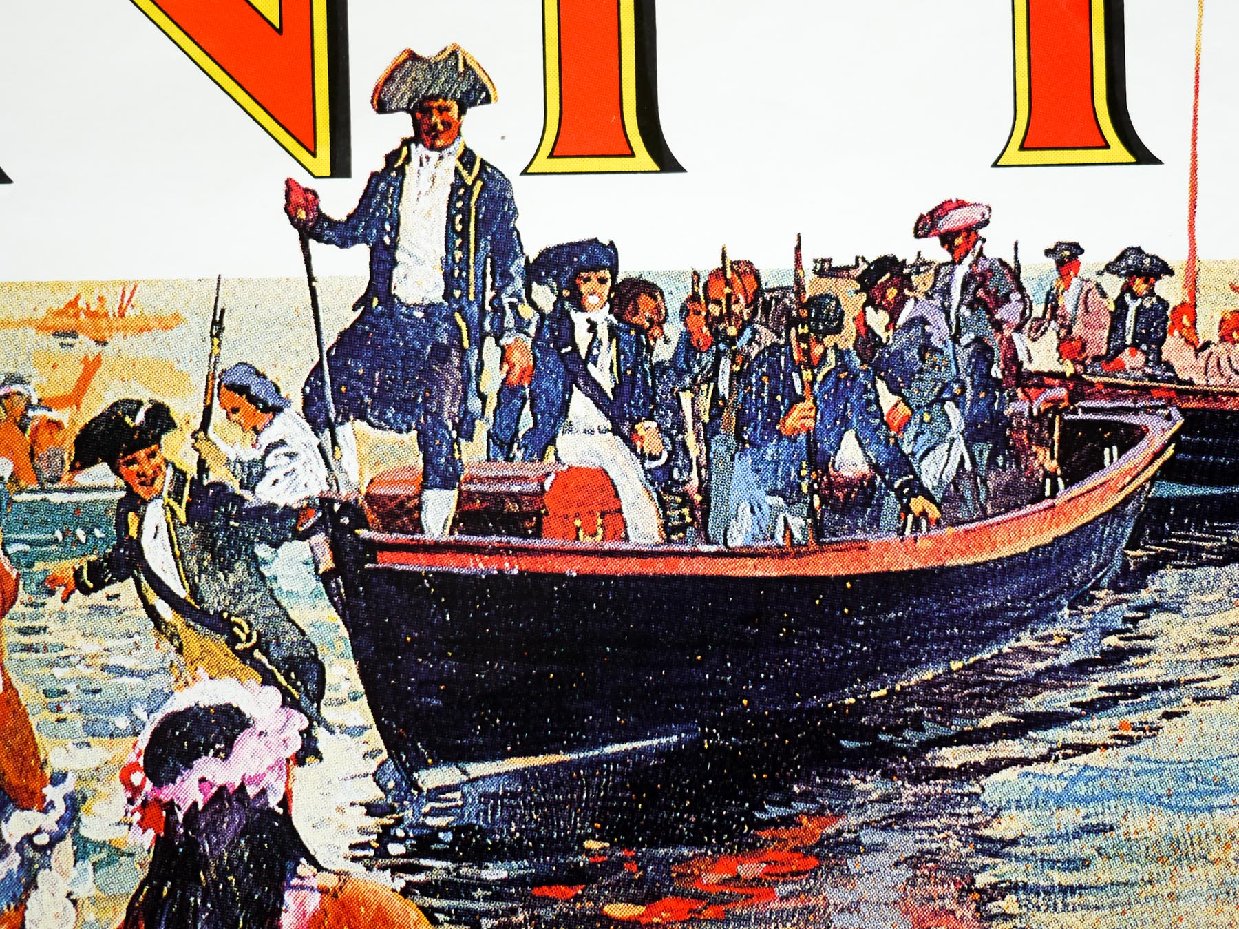
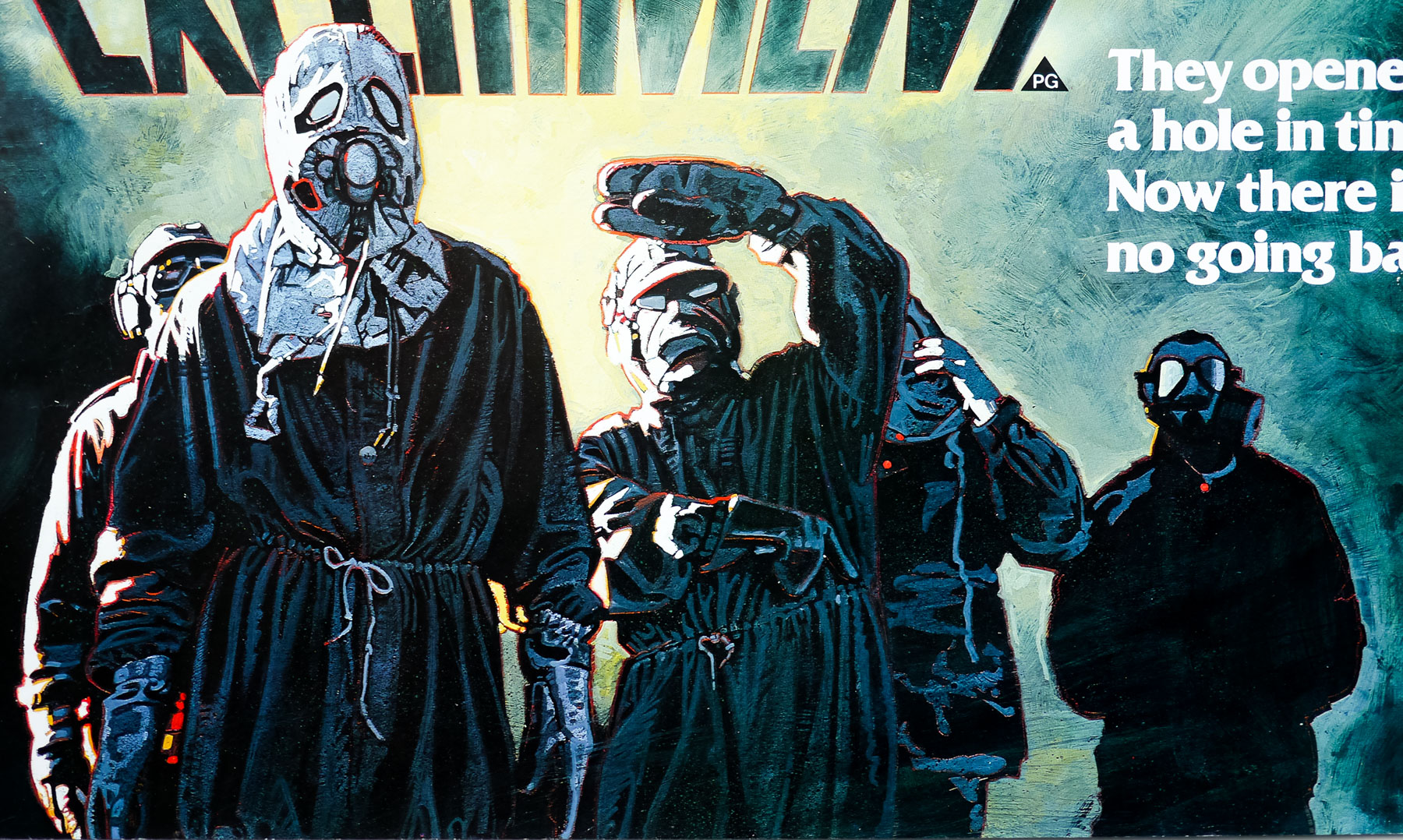
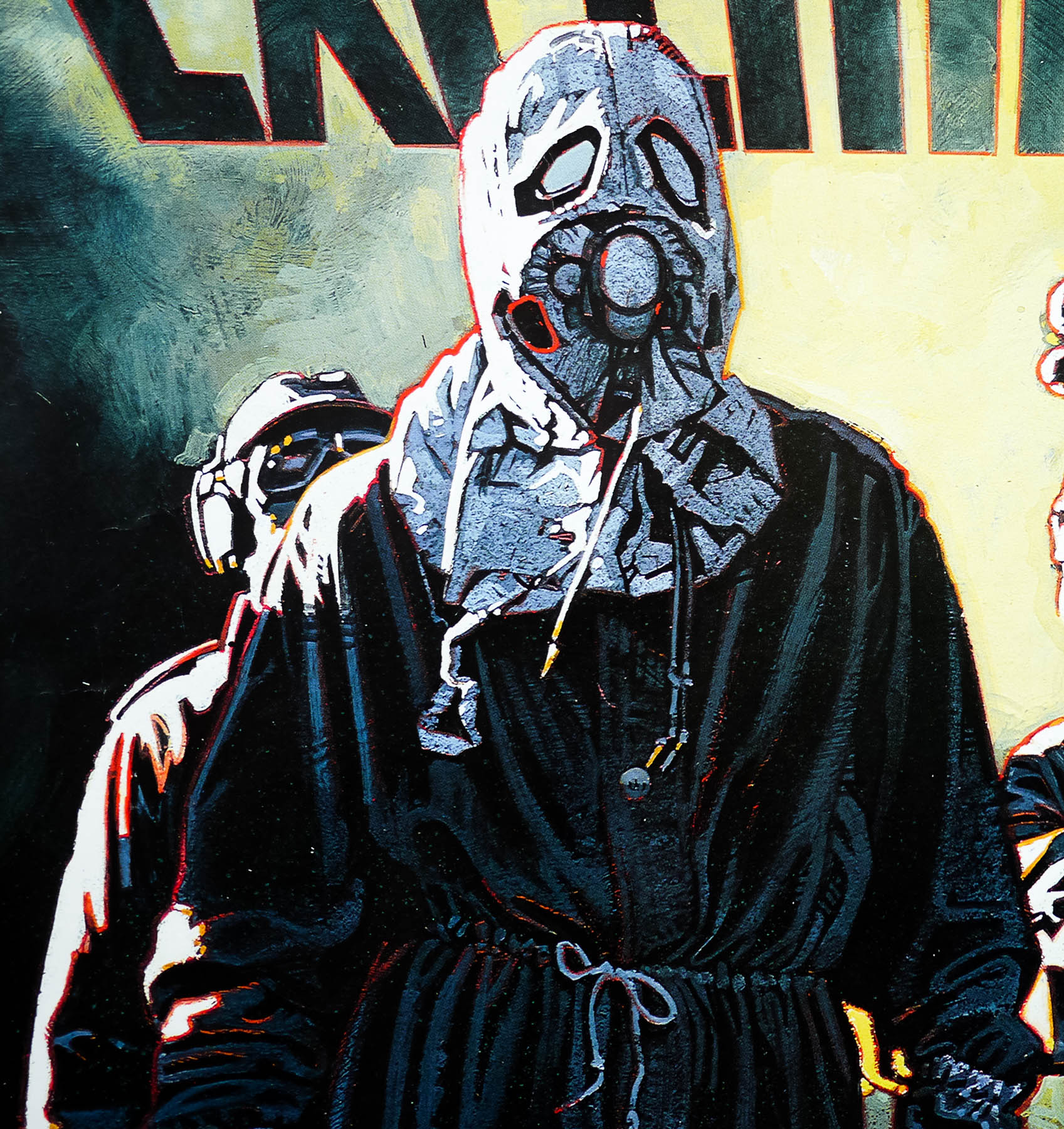
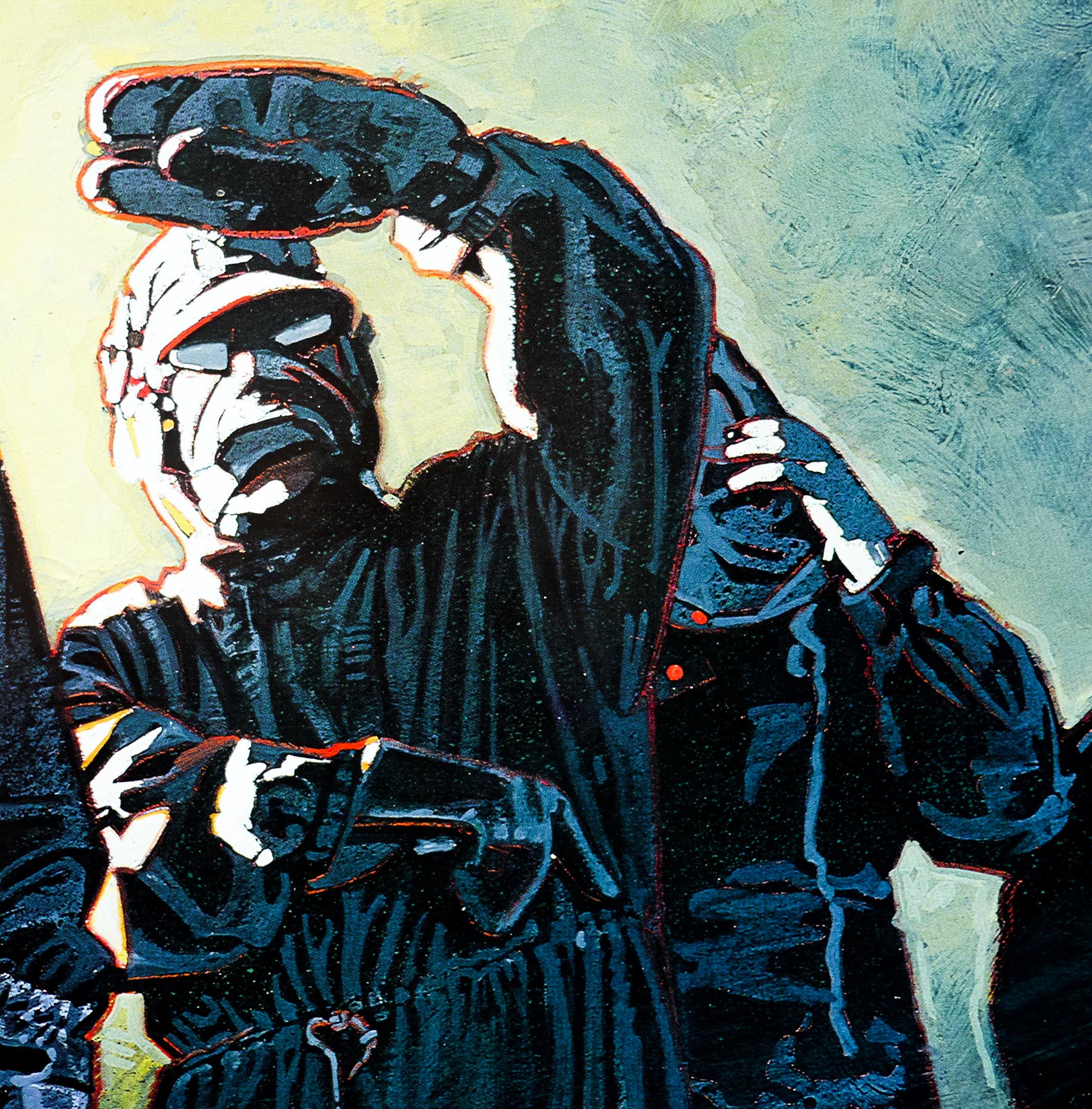
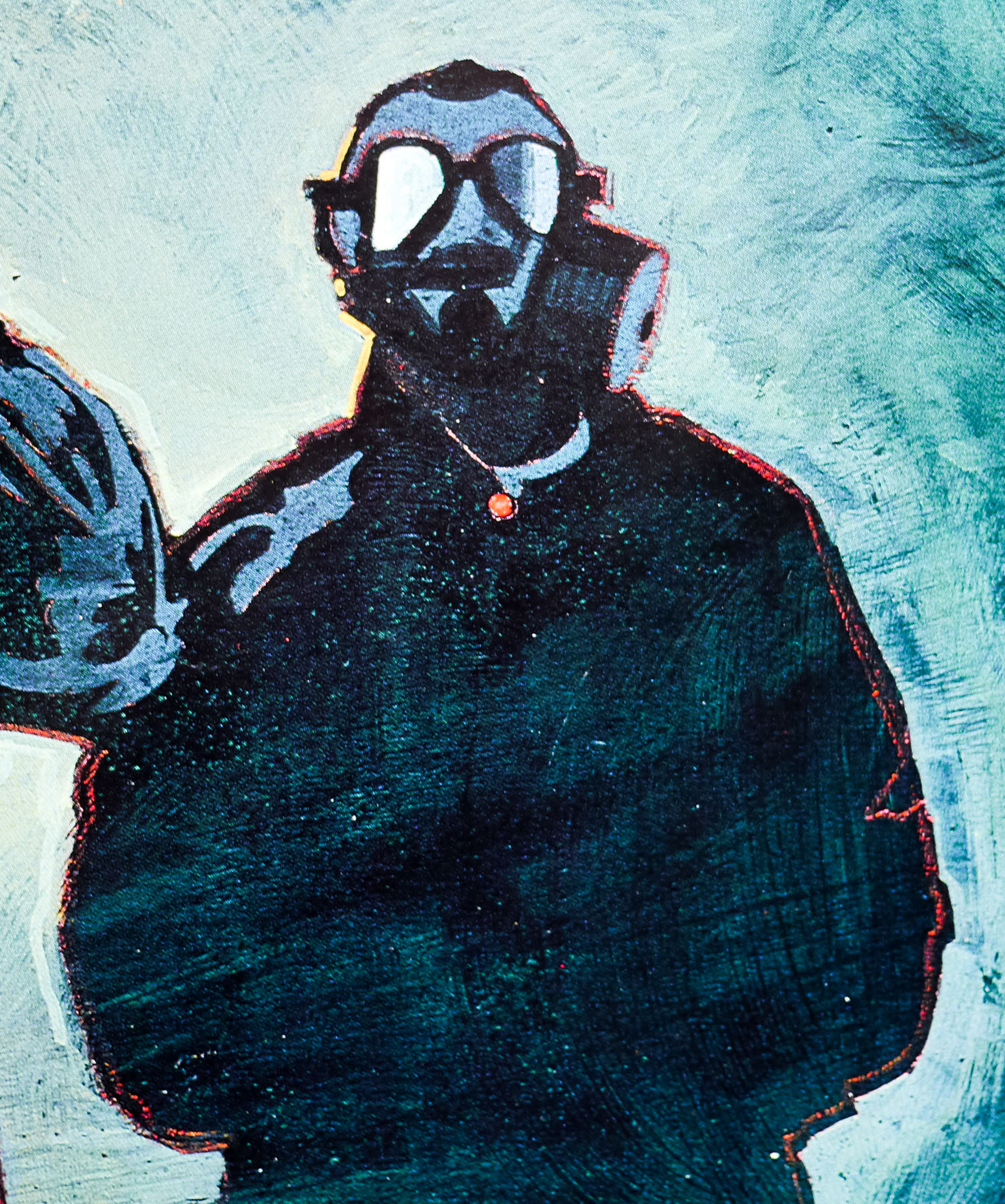
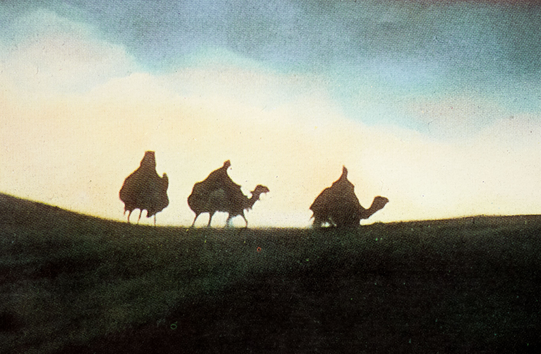
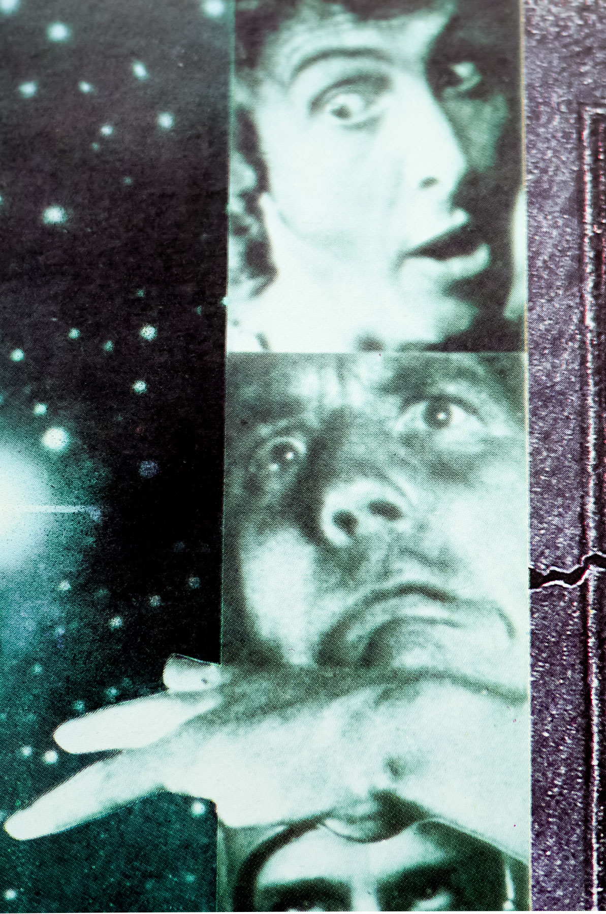
The film’s religion-baiting story sees a man called Brian (Graham Chapman) born at the same time as Jesus Christ and initially mistaken for the Messiah, who ends up living an unremarkable life under the Roman occupation of Judea. Things take a fateful turn when his infatuation with a young rebel called Judith (Sue Jones-Davies) leads him to join the People’s Front of Judea, a bickering group who have decided to take a stand against the emperor.
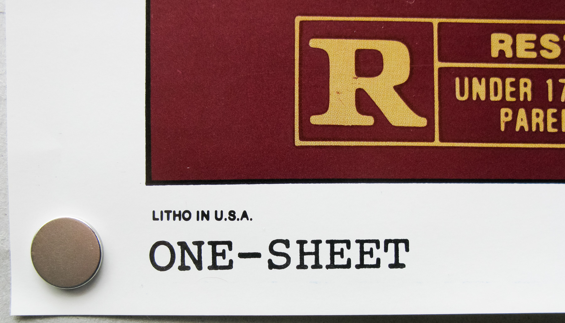
The film raised the ire of several religious groups who were outraged at the concept, despite most of them having never even seen the film, and it was only given a general release once several cuts had been made. Despite the edits, several local UK councils banned the film from being shown at cinemas within their boroughs. Apparently some of these bans lasted until very recently, with the Welsh town of Aberystwyth finally lifting its one in 2009, which then saw a screening of the film attended by Jones, Michael Palin and Sue Jones-Davies, who was the then mayor of the town.
One of the more infamous bans was carried out by the Norwegians who refused to allow the film to be screened at all, which lead some of the international marketing material for the film to be emblazoned with the proclamation ‘So funny it was banned in Norway!’
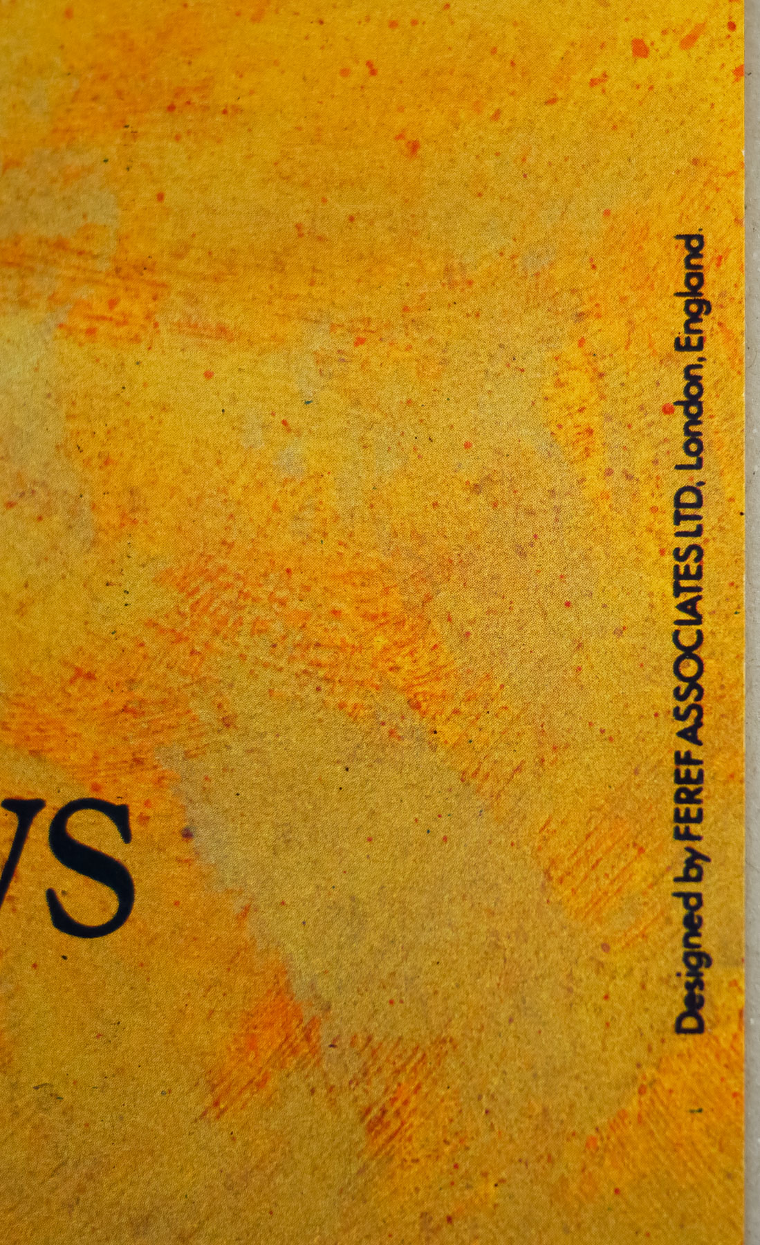
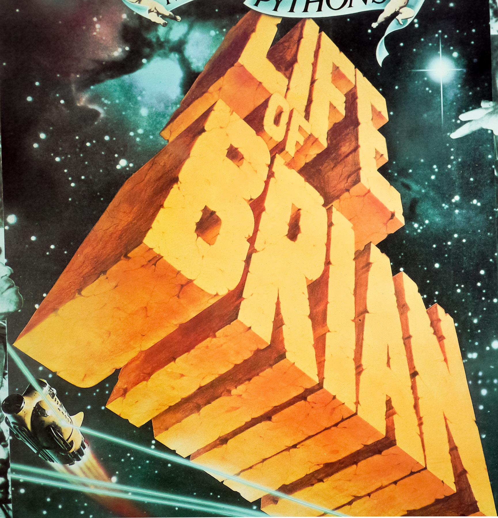
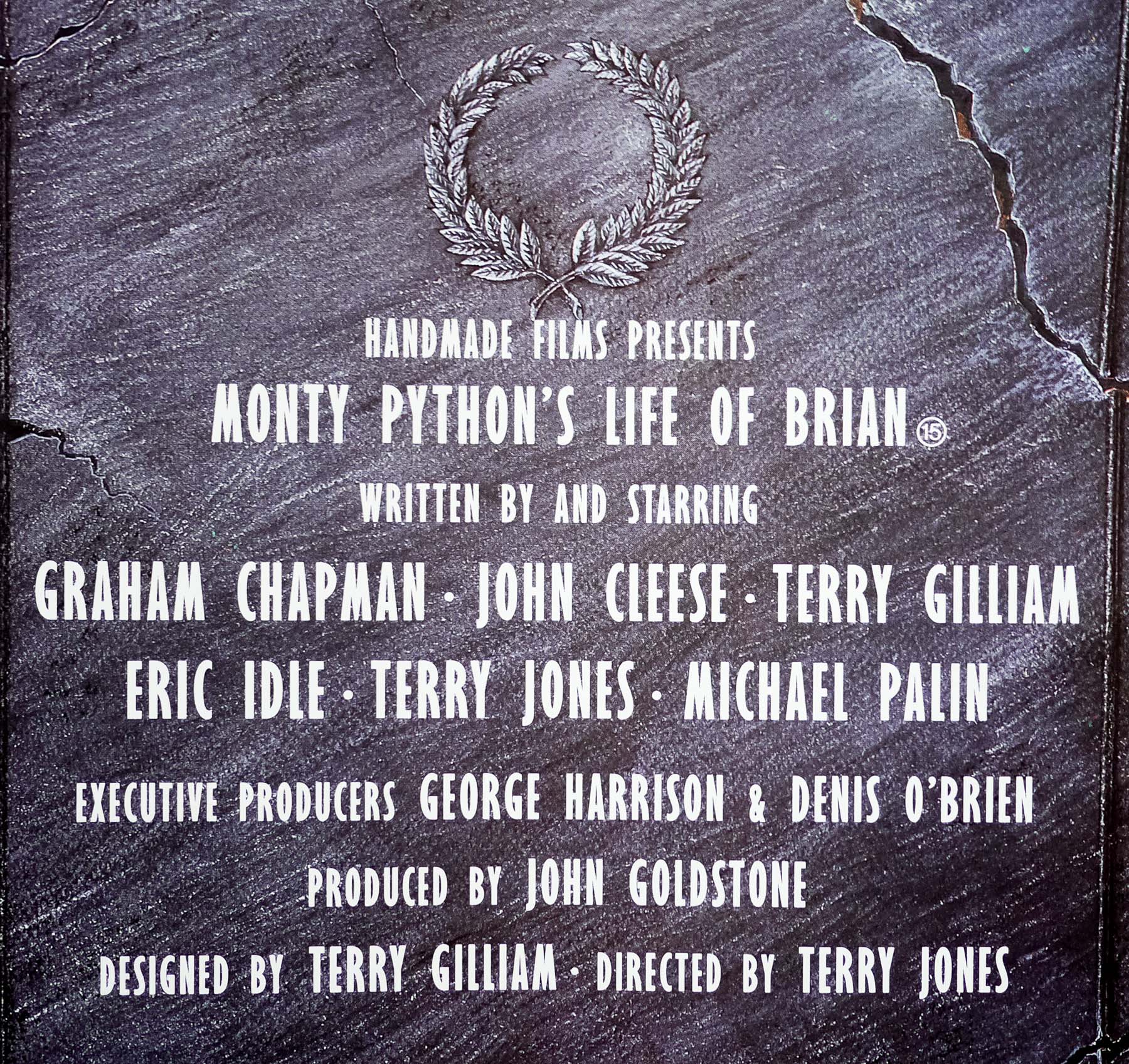
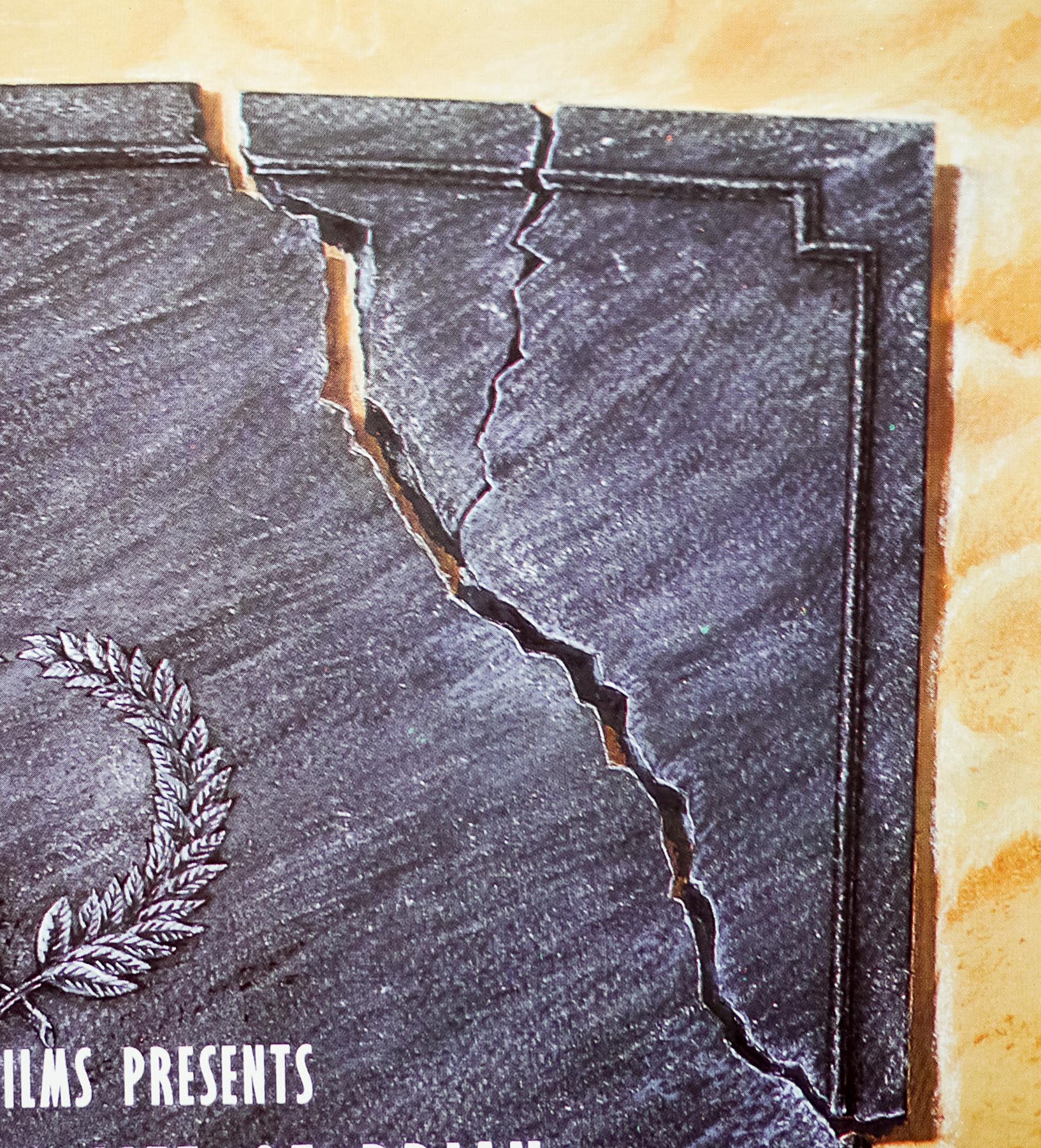
This is a scarce, alternate style UK quad which differs from the other somewhat confusing design, which is simply the logo doubled up. A reader of the site got in touch to confirm that this quad was designed in house at HandMade films. To quote their informative email:
HandMade and the Pythons decided to re-submit the film to Irish Film Board to have the original ban overturned. The submission was successful and with the censor certification under our belt plans to release the film moved ahead and the Life of Brian was finally released in Ireland I recall in the summer of 1988 as I recall eight years after original release. One of the unsung heroes of HandMade was freelance artist/designer George Rowbottom.
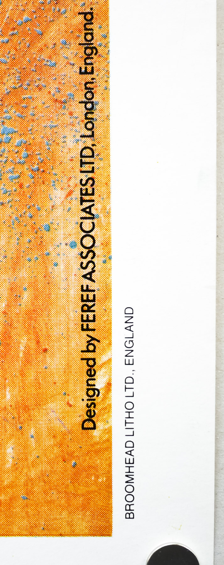
George was closely involved in many HMF posters over the years along with Ray Cooper and it was George who re-worked Life of Brian poster and came up with the “tablet” design for the quad used for the Irish release and also the superior amended 1-sheet. In both cases these were printed by National Screen who printed all our posters for domestic and international.
The original American trailer can be seen on YouTube.