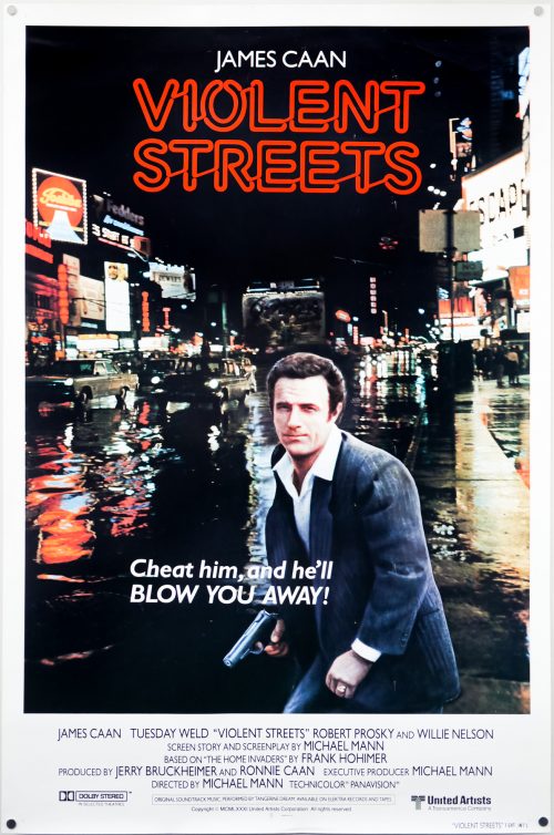
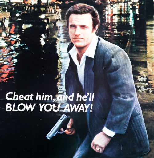
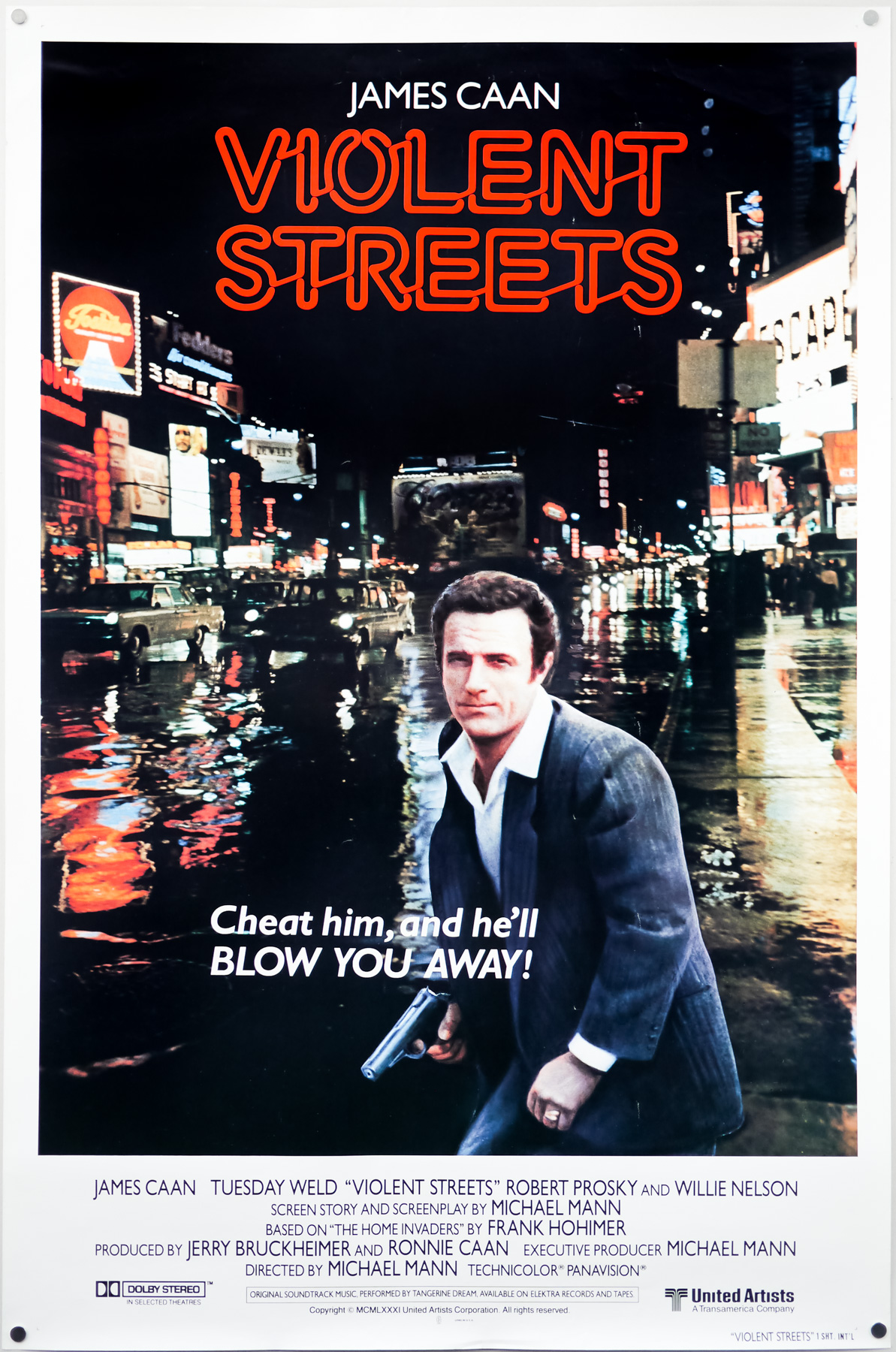
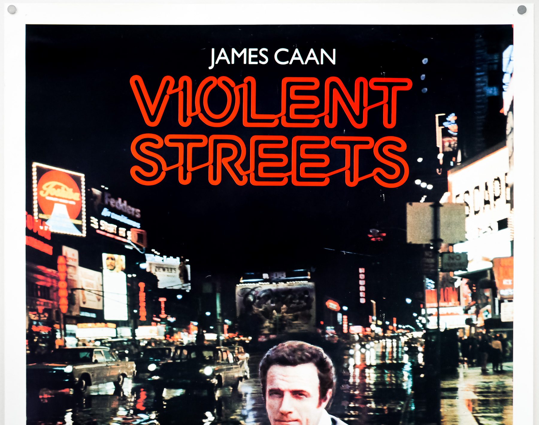
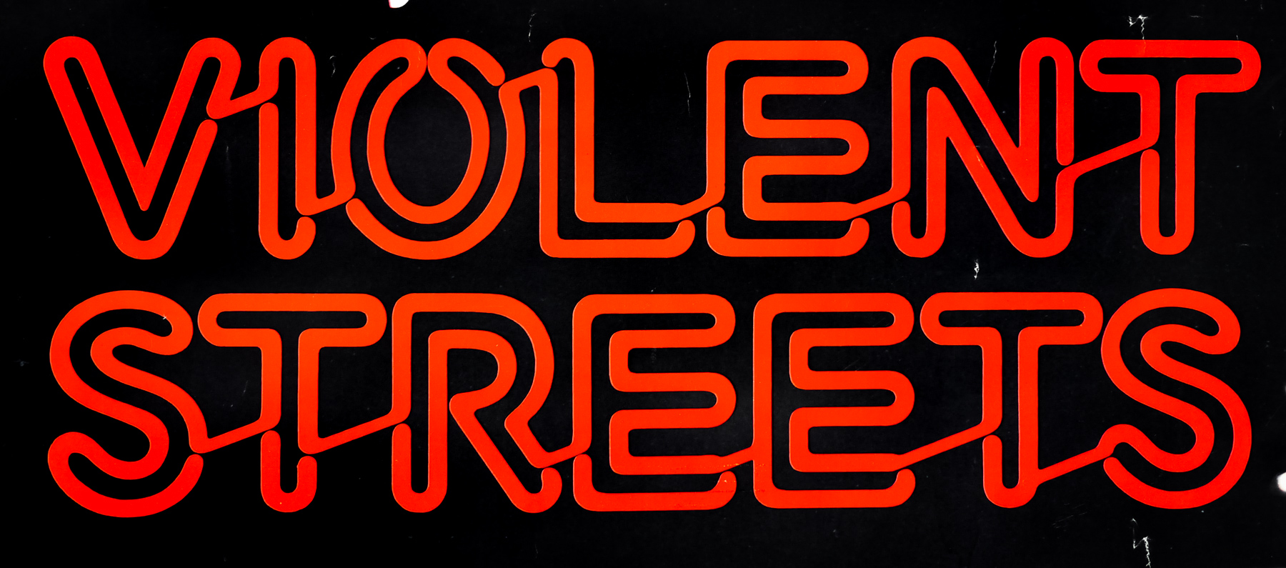
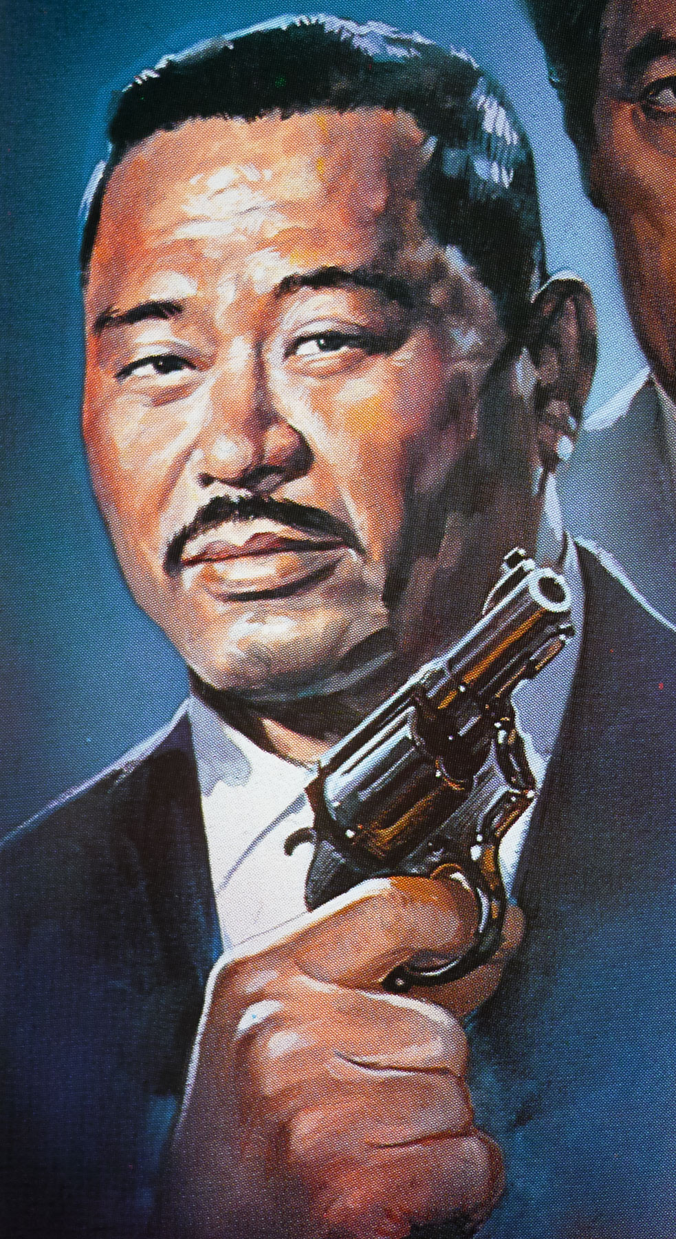
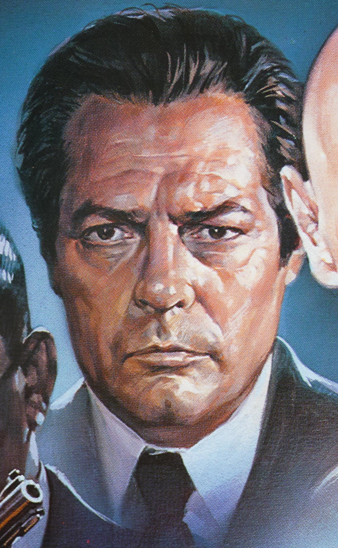
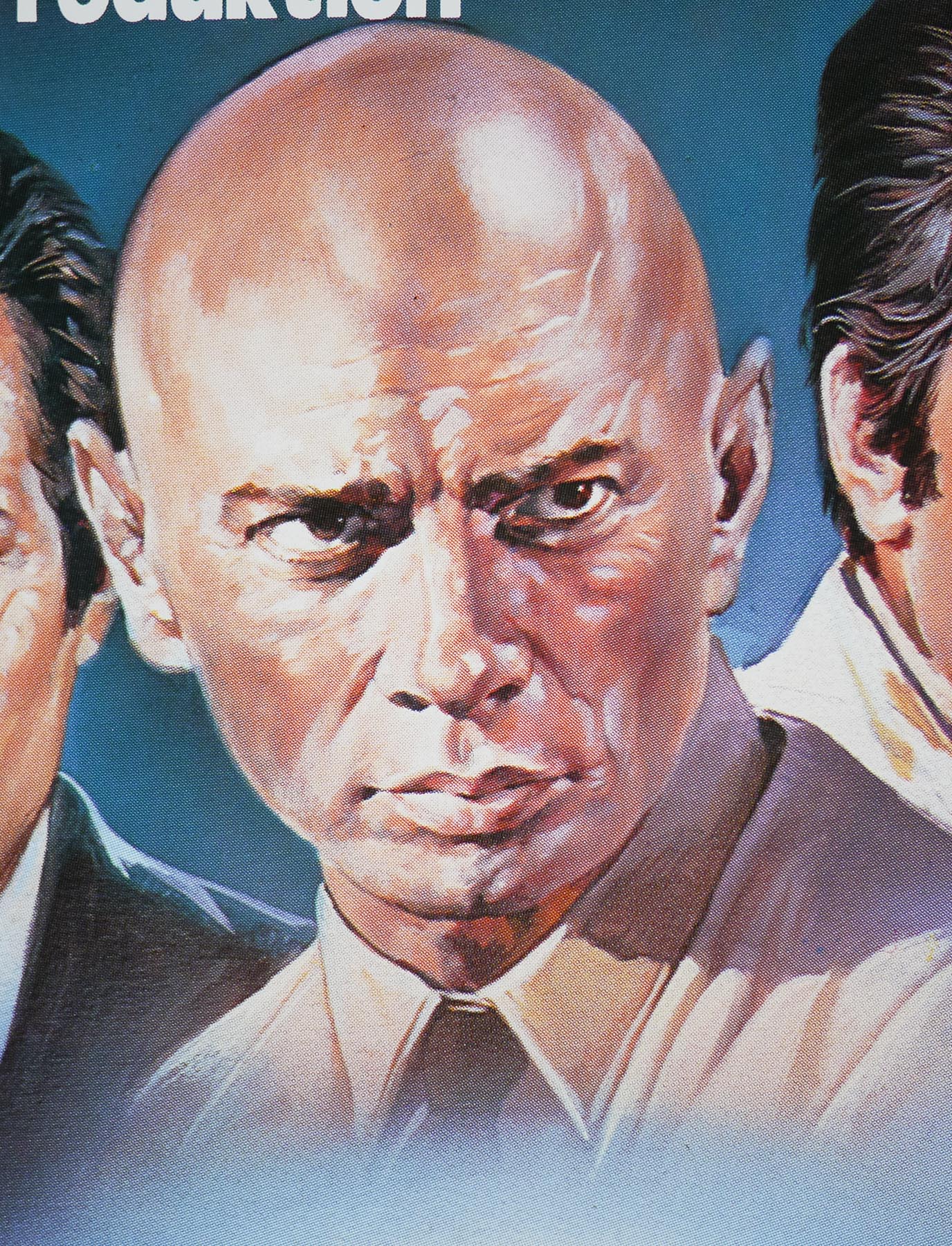
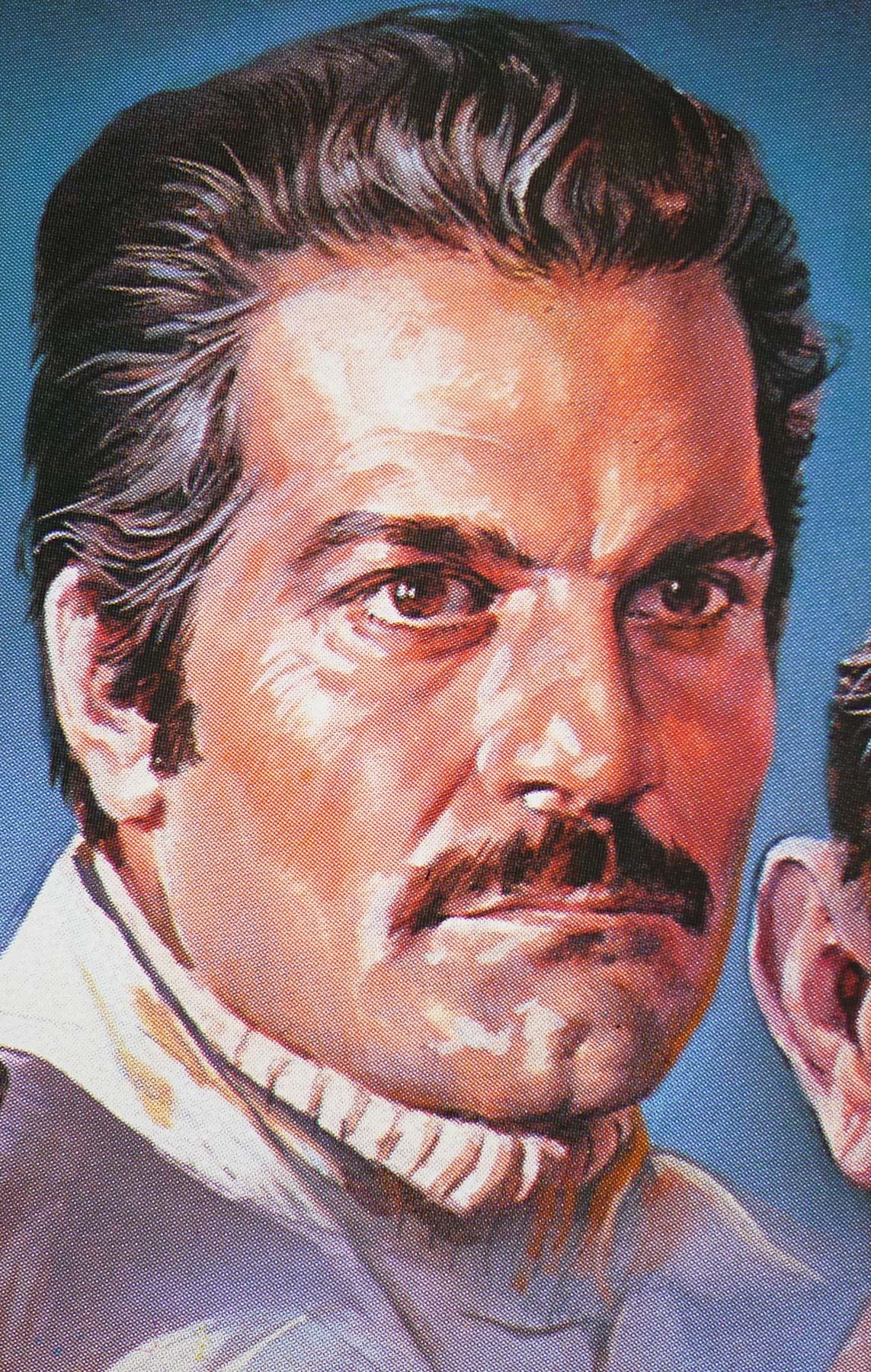
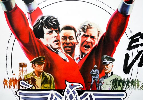
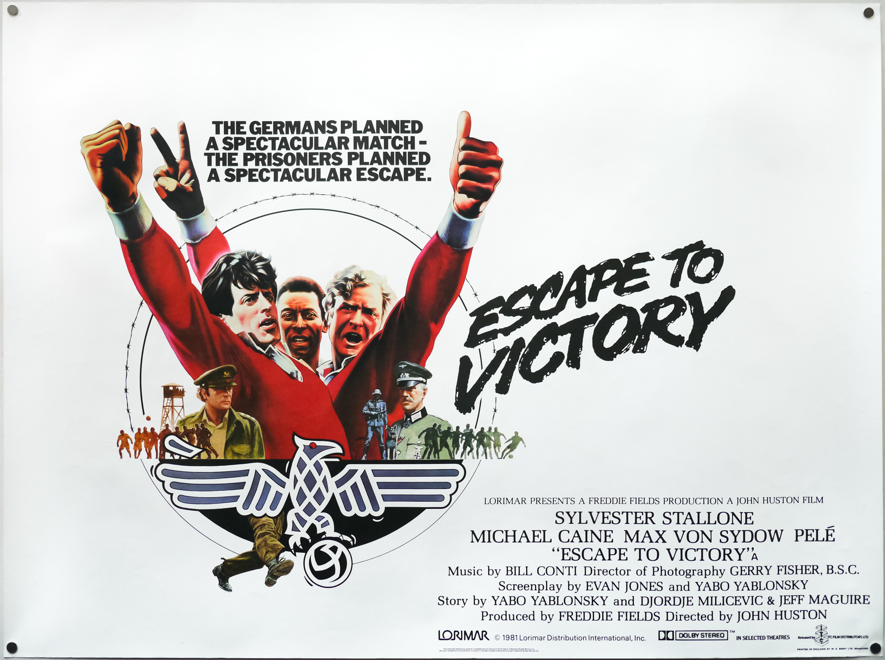
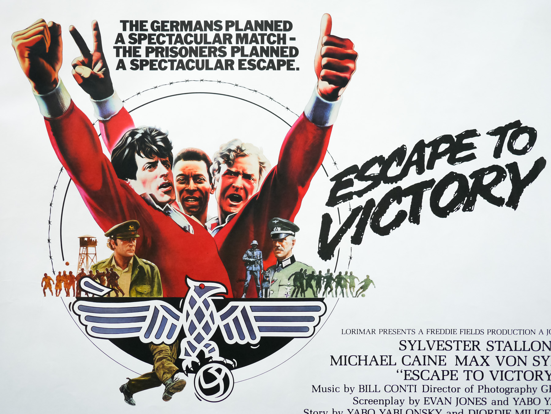
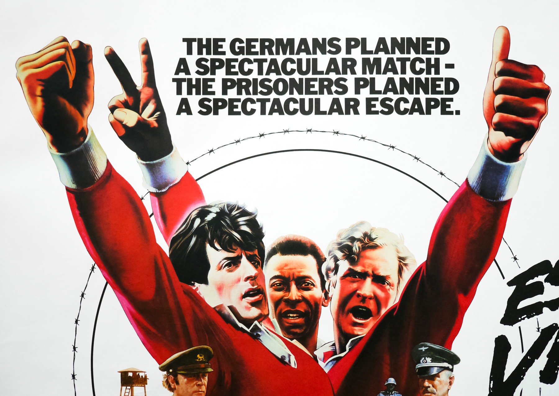
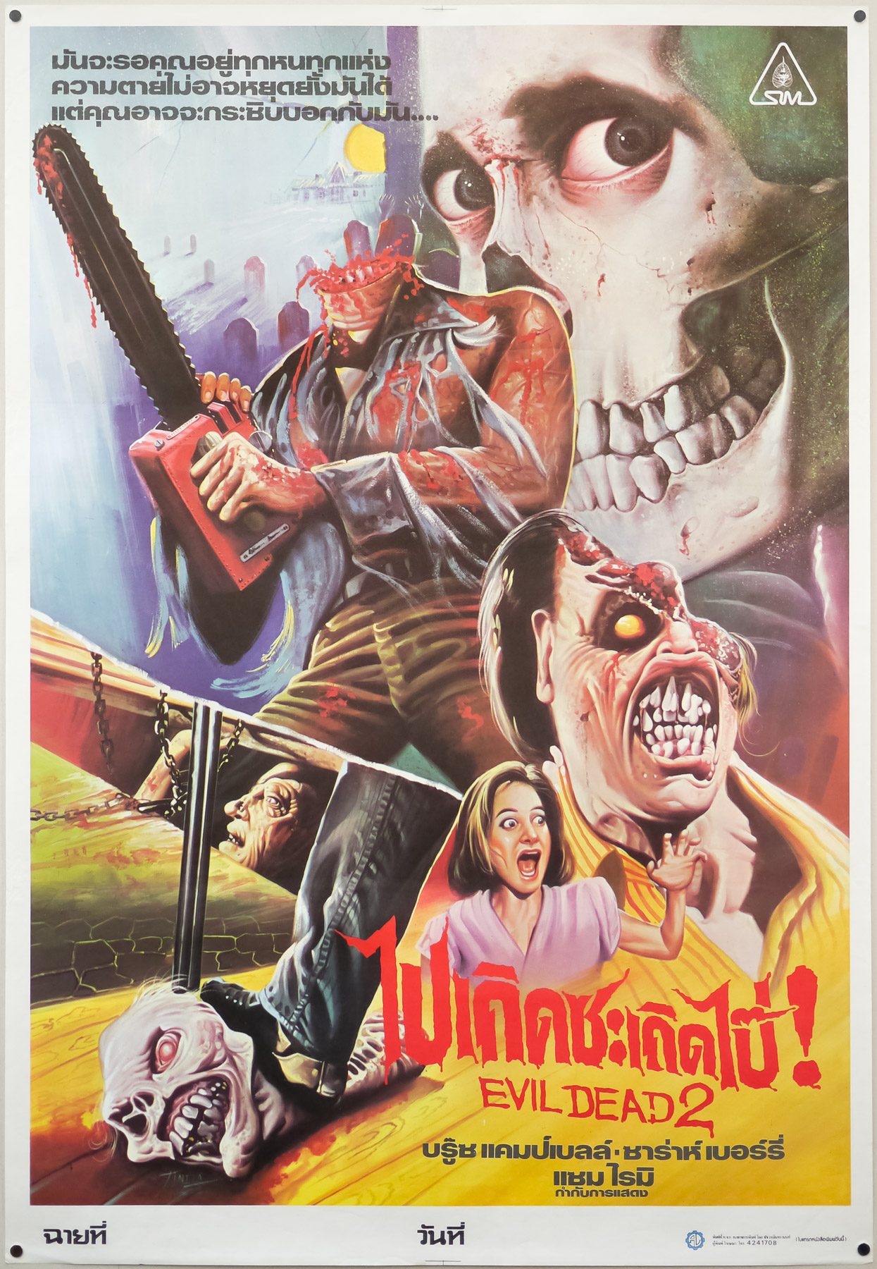
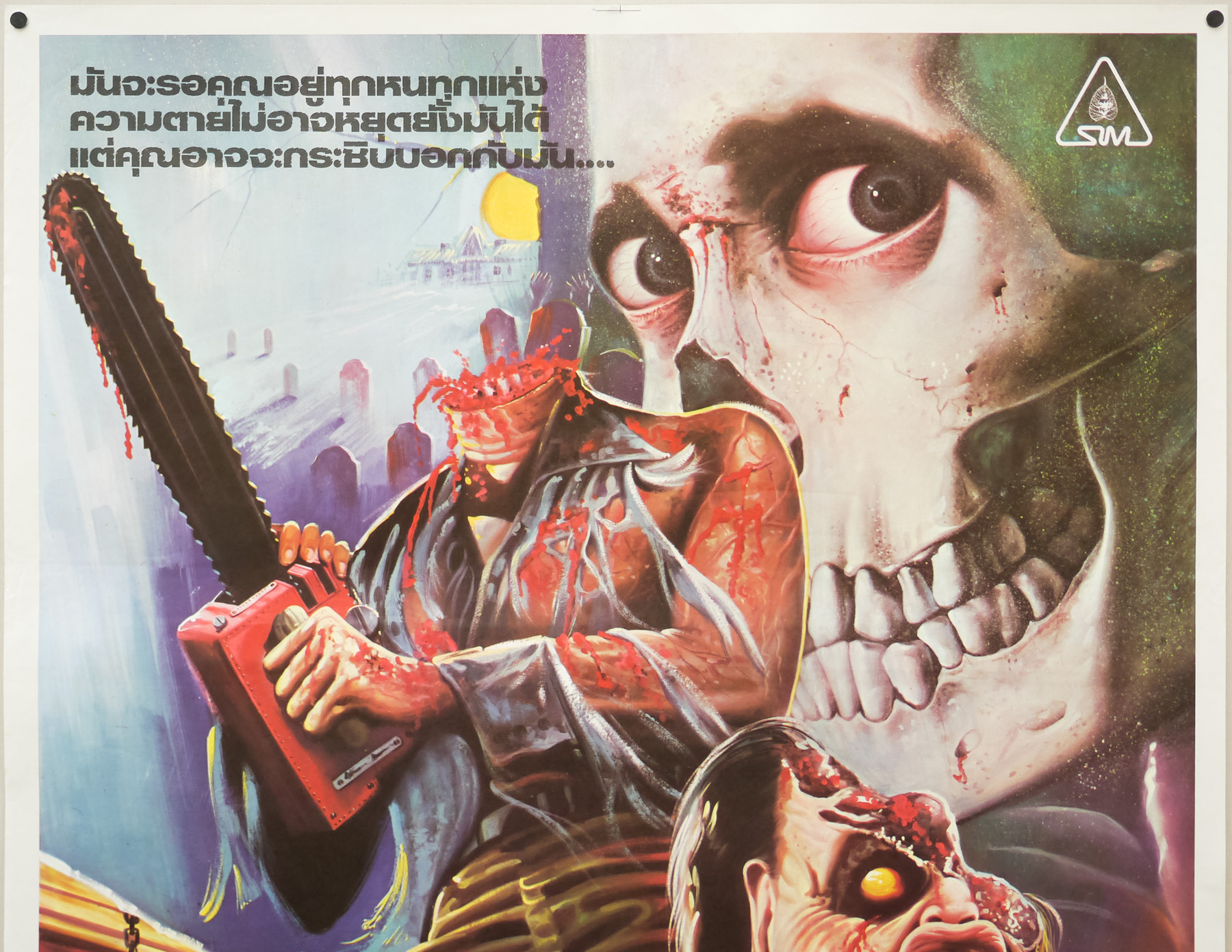
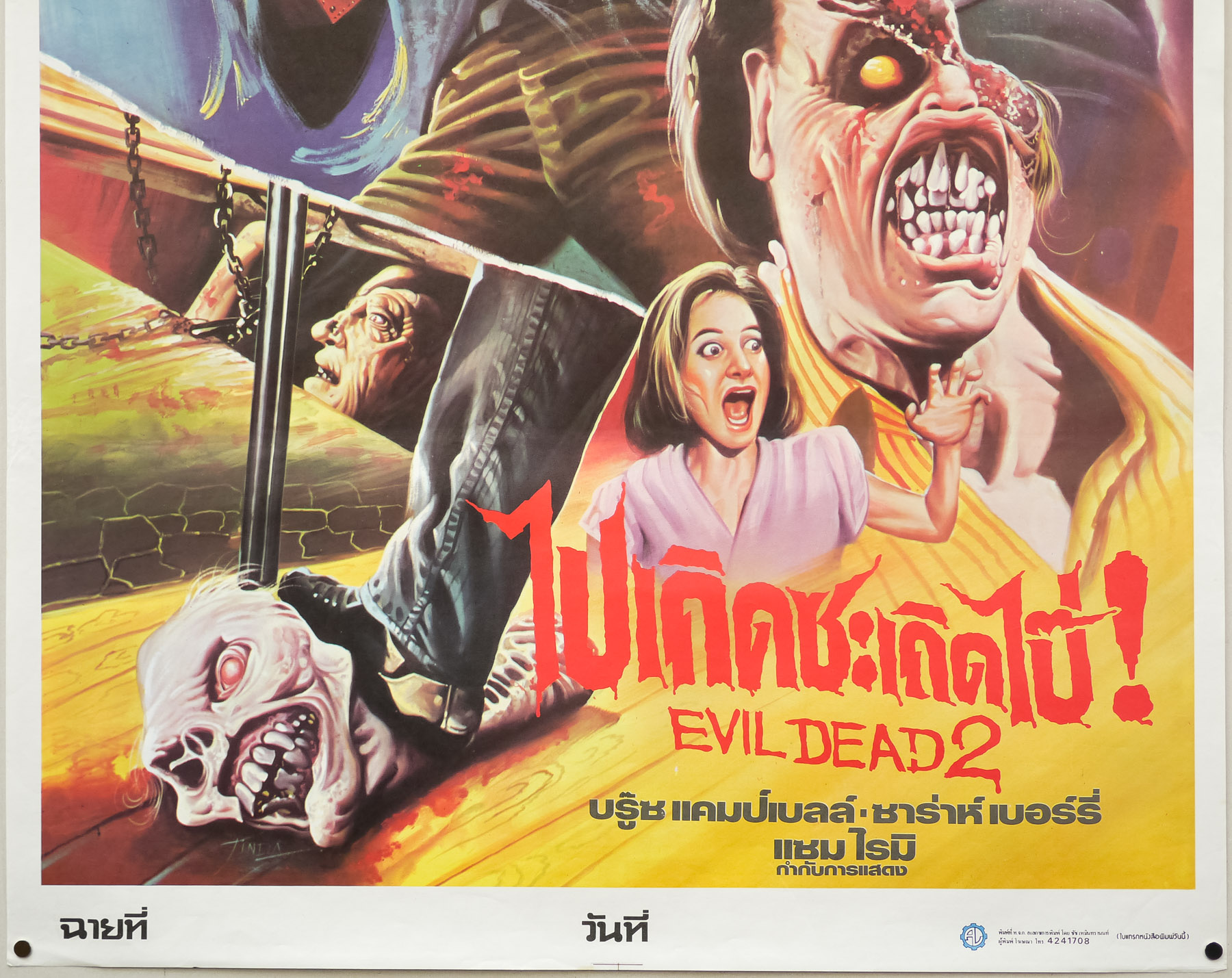
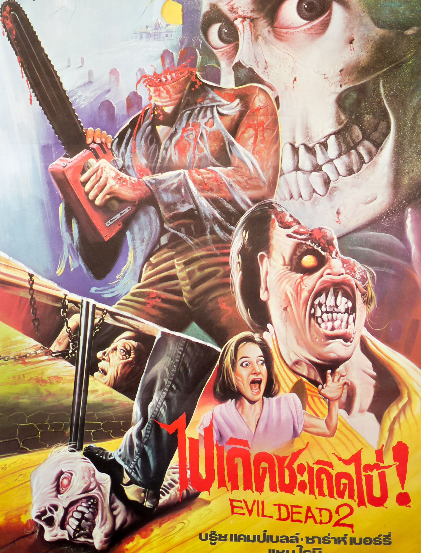
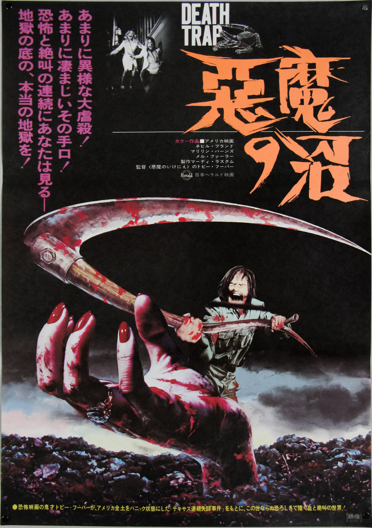
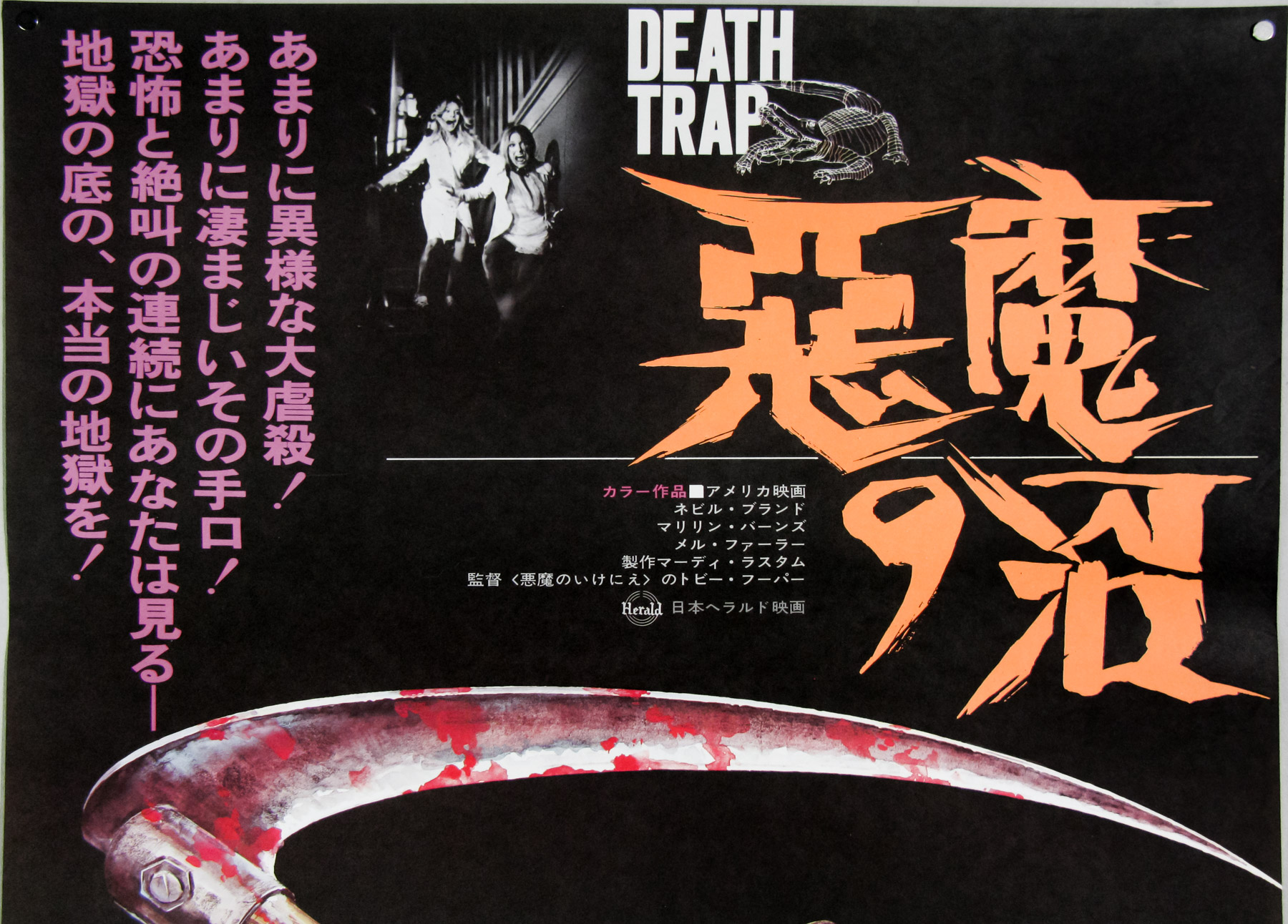
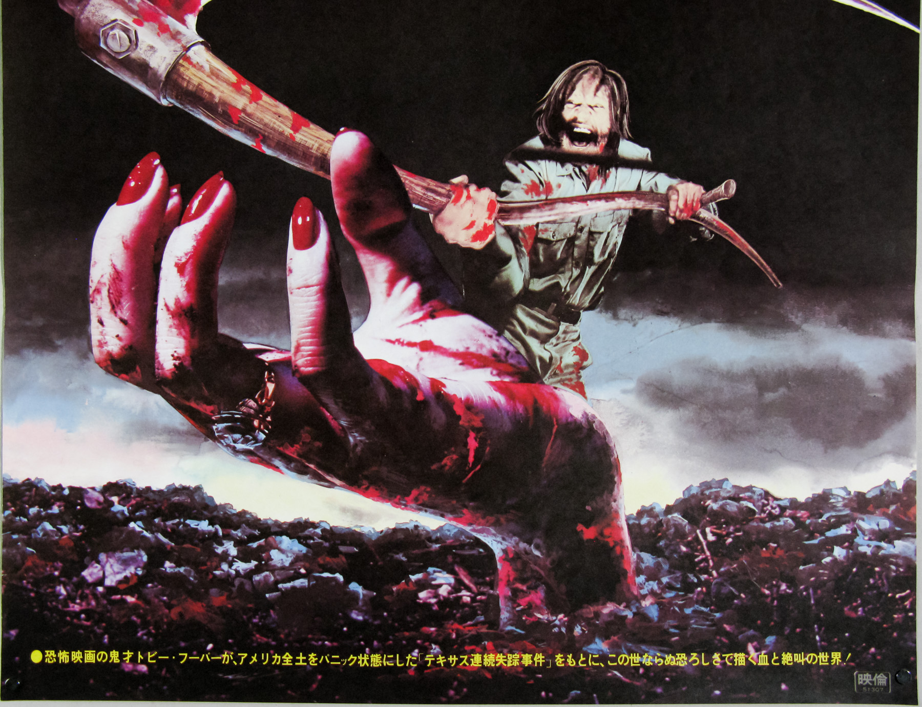
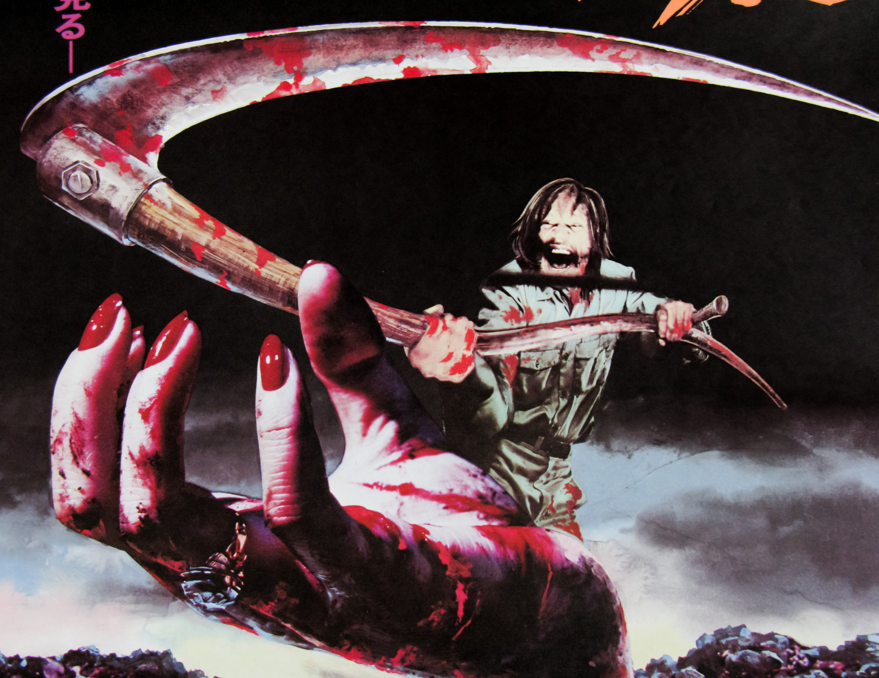
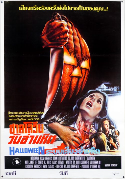
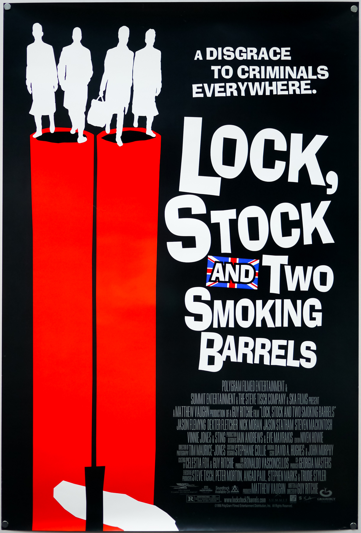
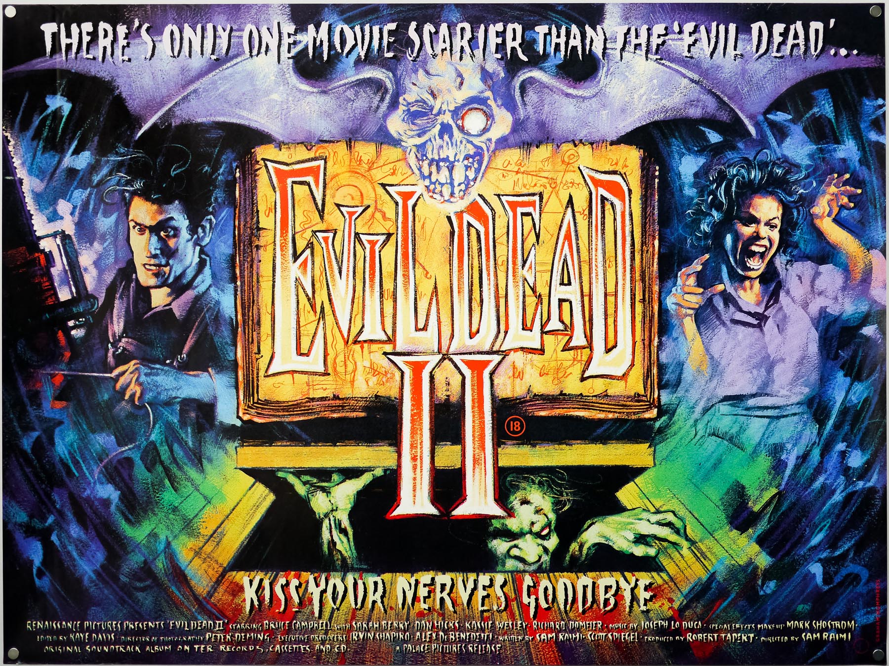
You searched for: USA%2520

Weekend / 1967 / one sheet / 2011 re-release / USA

21.08.17

Poster Poster
Title
Weekend
AKA
Week End (France - alt. original title)
Year of Film
1967
Director
Jean-Luc Godard
Starring
Mireille Darc, Jean Yanne, Jean-Pierre Kalfon
Origin of Film
France | Italy
Genre(s) of Film
Mireille Darc, Jean Yanne, Jean-Pierre Kalfon,
Type of Poster
One sheet
Style of Poster
Re-release
Origin of Poster
USA
Year of Poster
2011
Designer
Steve Chow
Artist
--
Size (inches)
27 2/16" x 40"
SS or DS
SS
Tagline
--

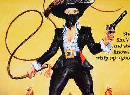
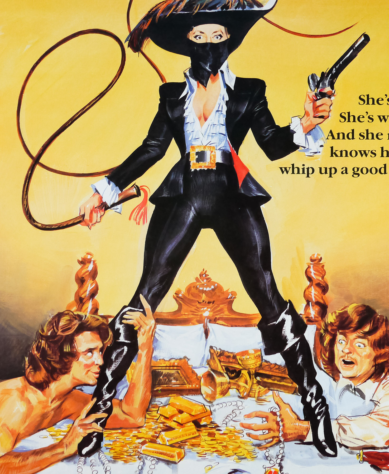
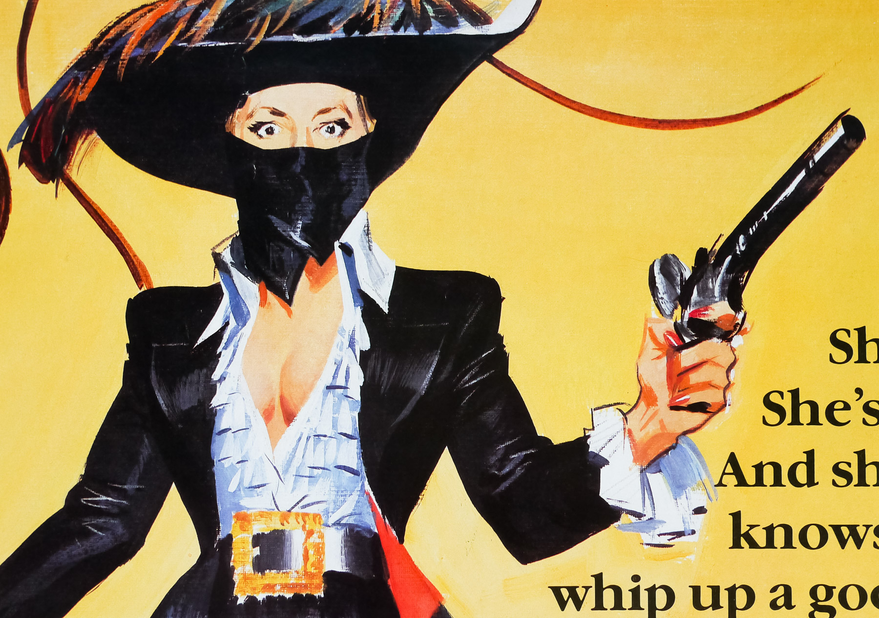
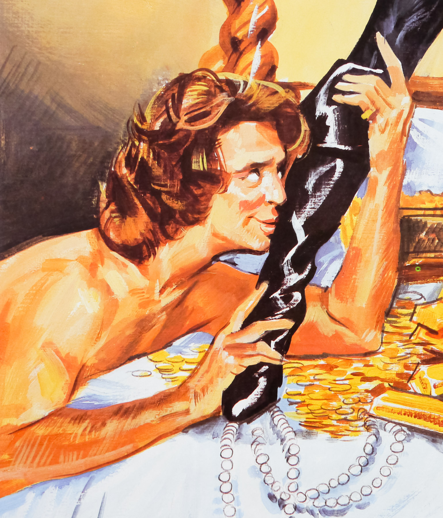
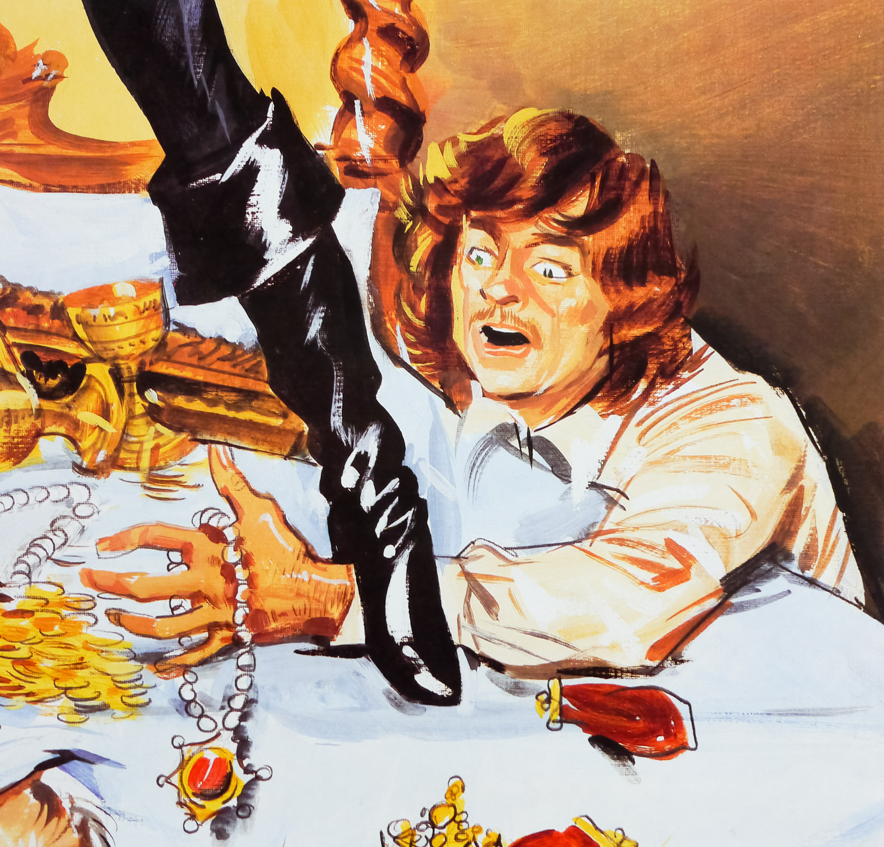
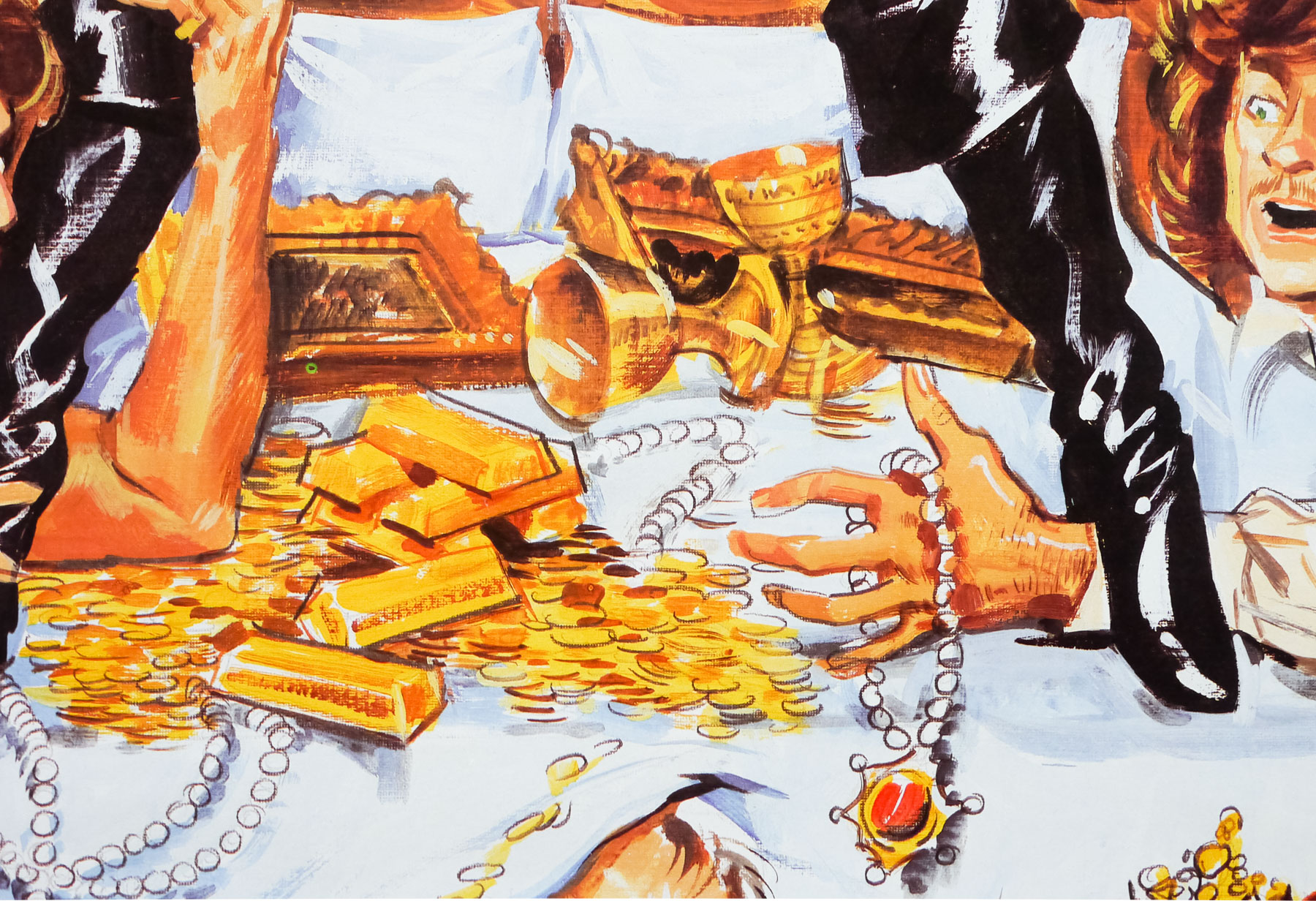
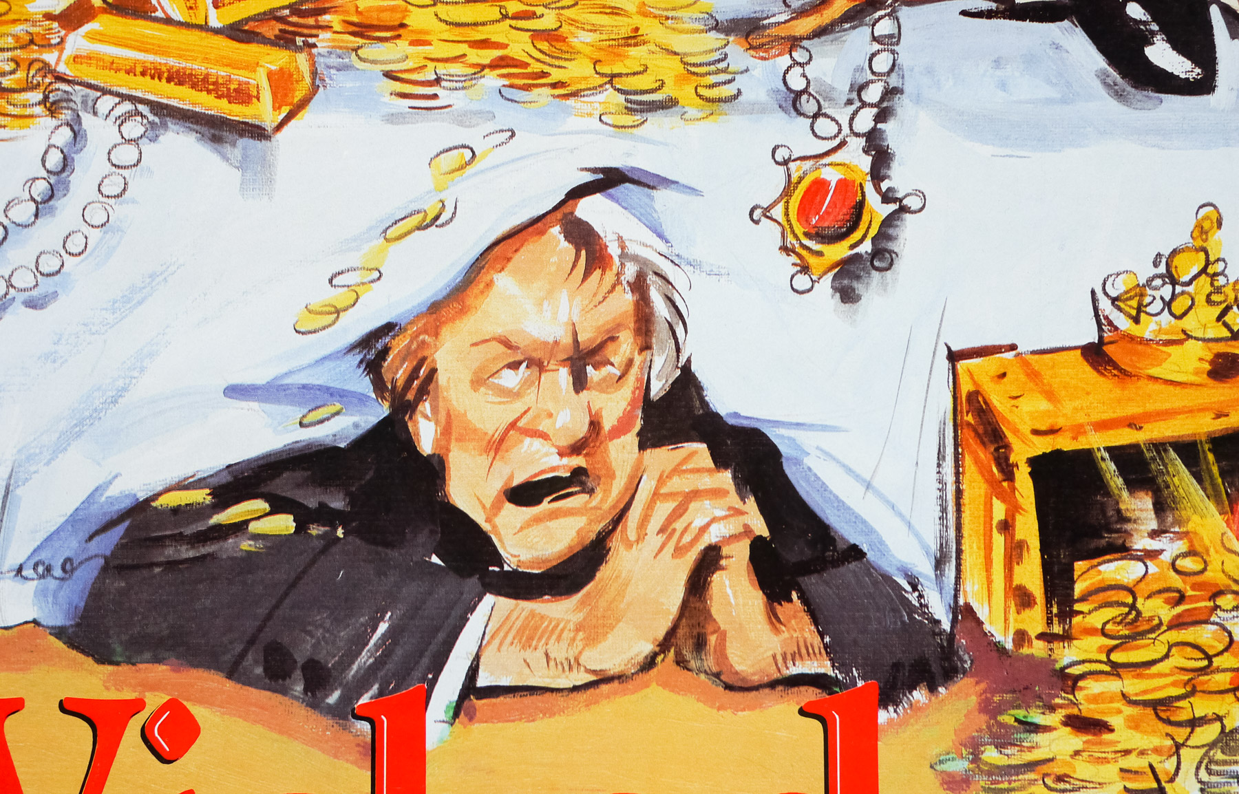
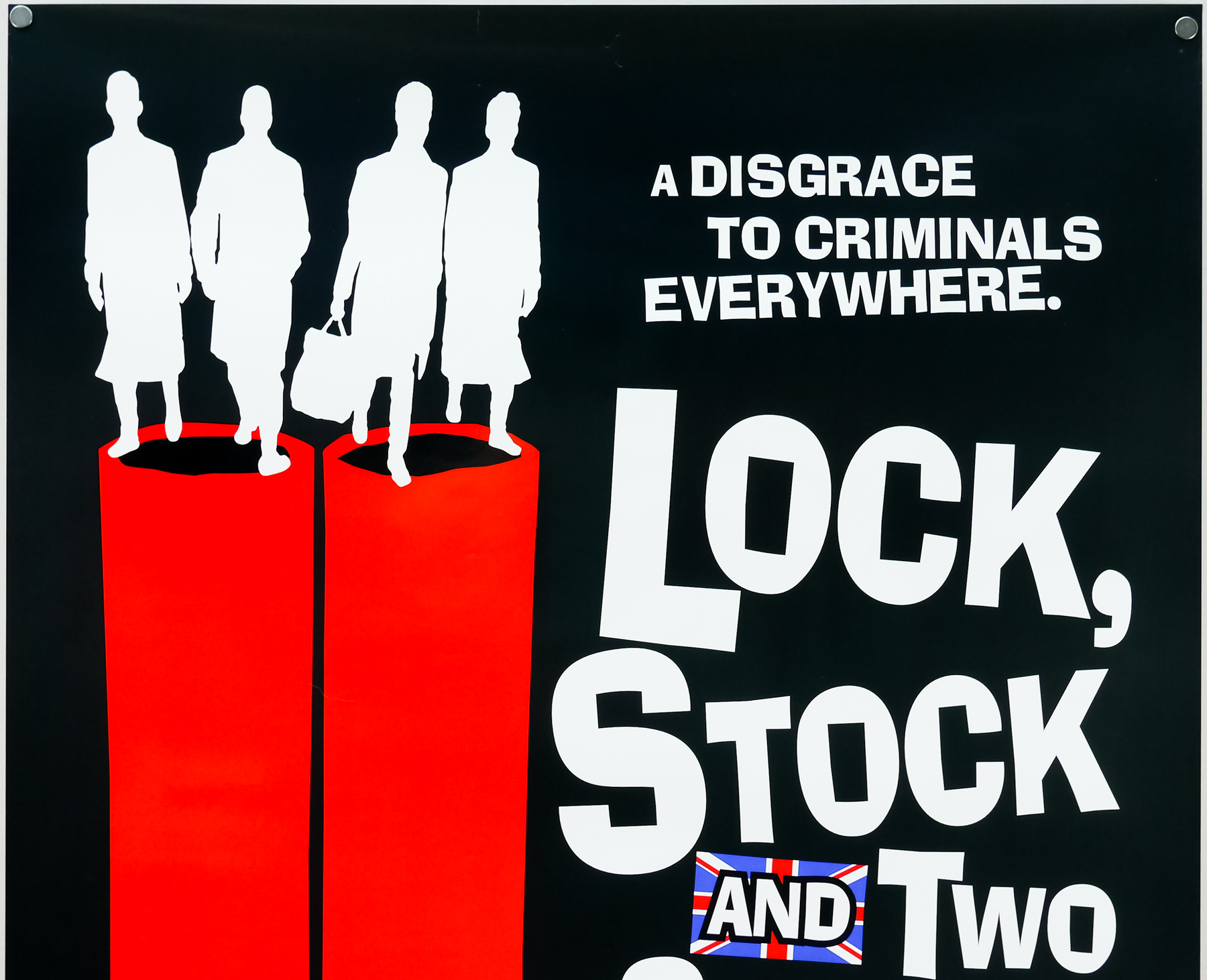
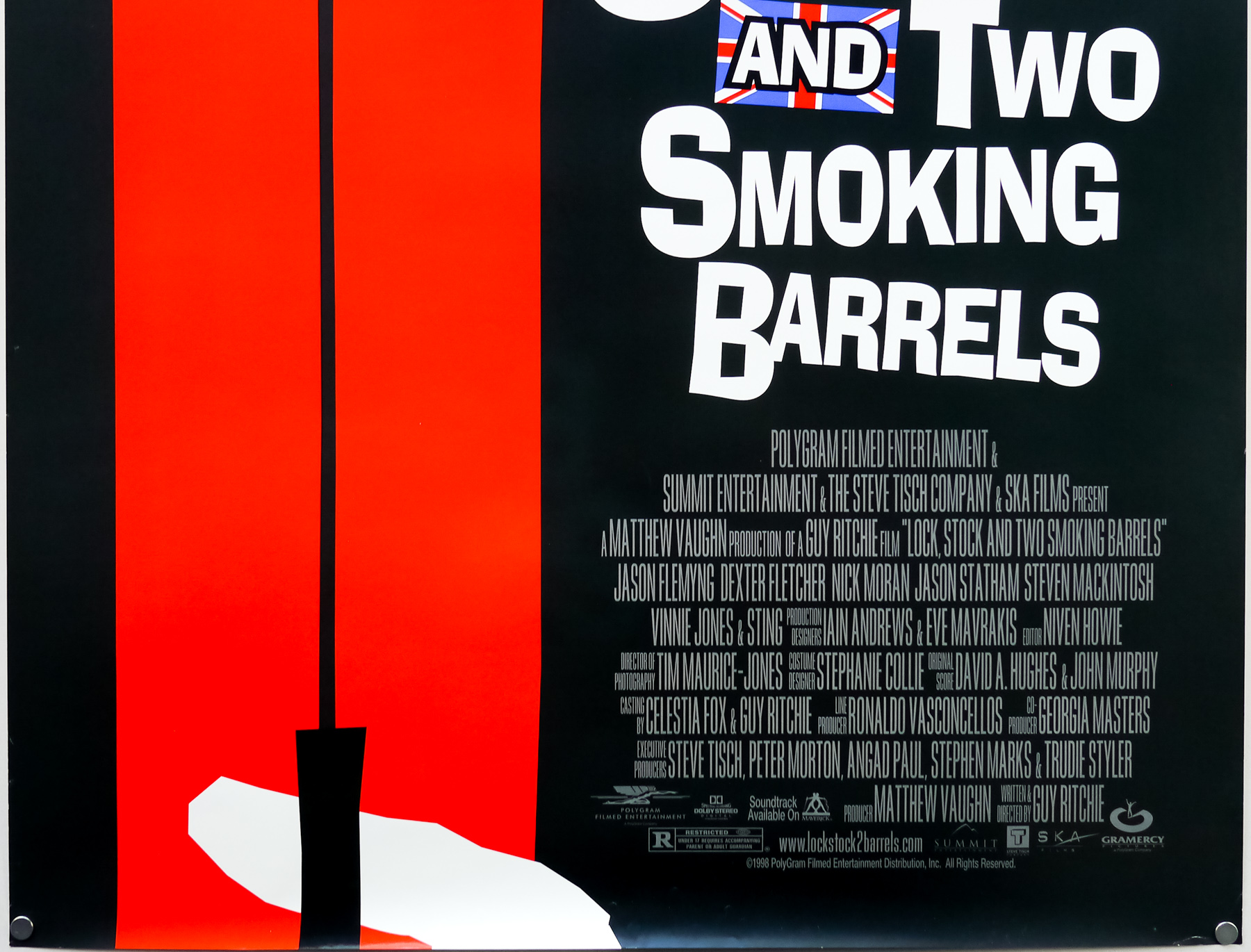
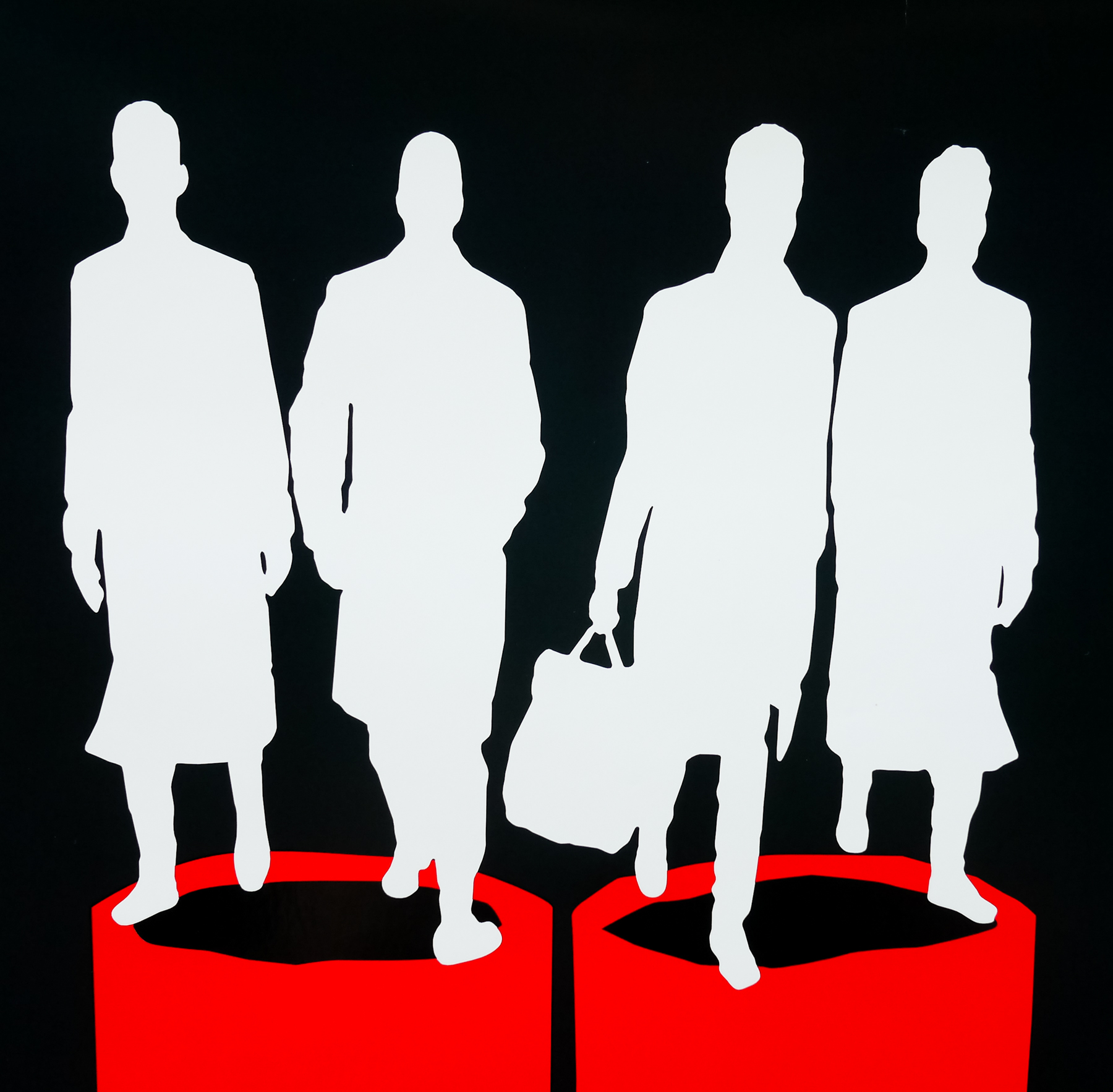
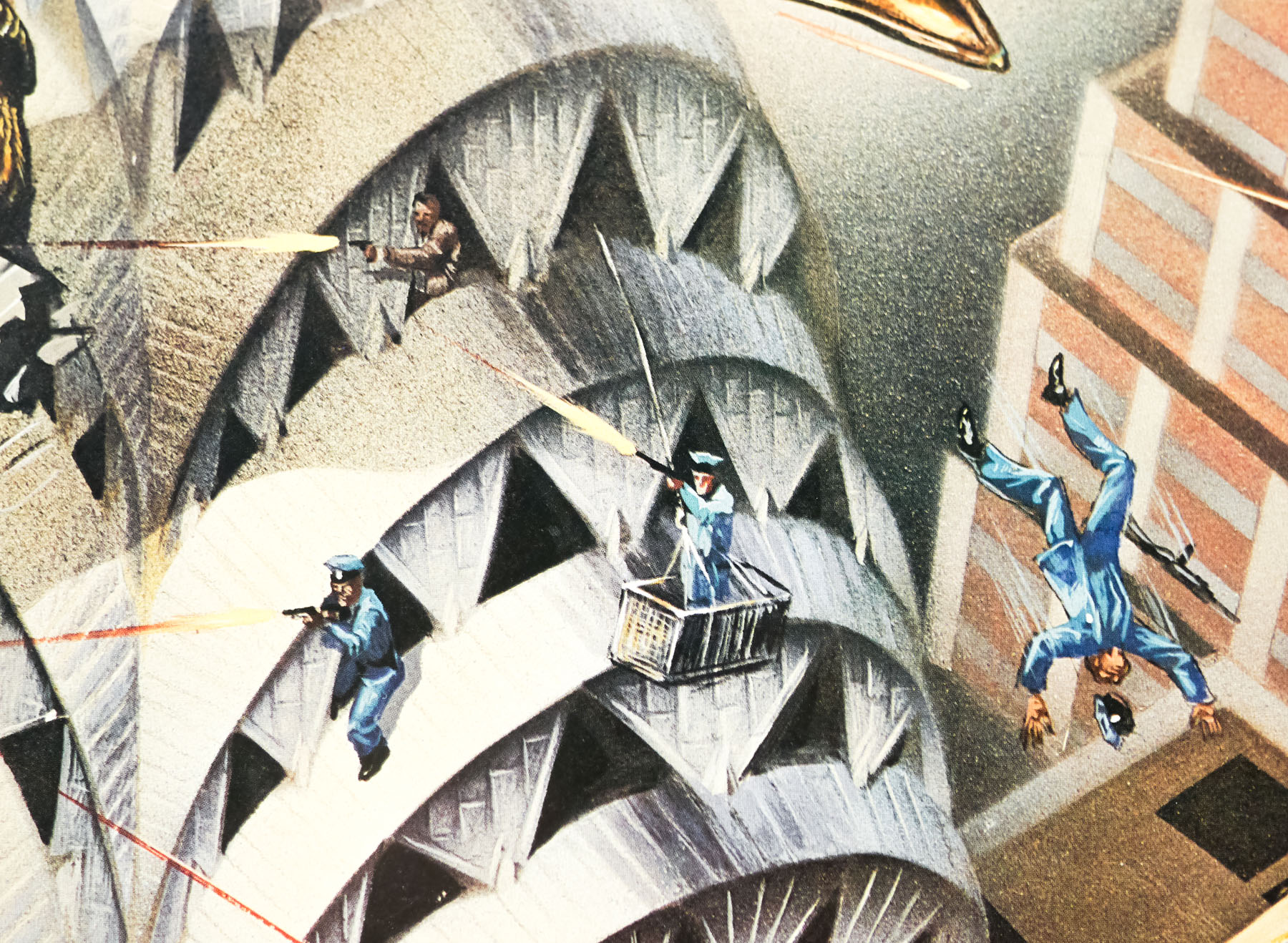
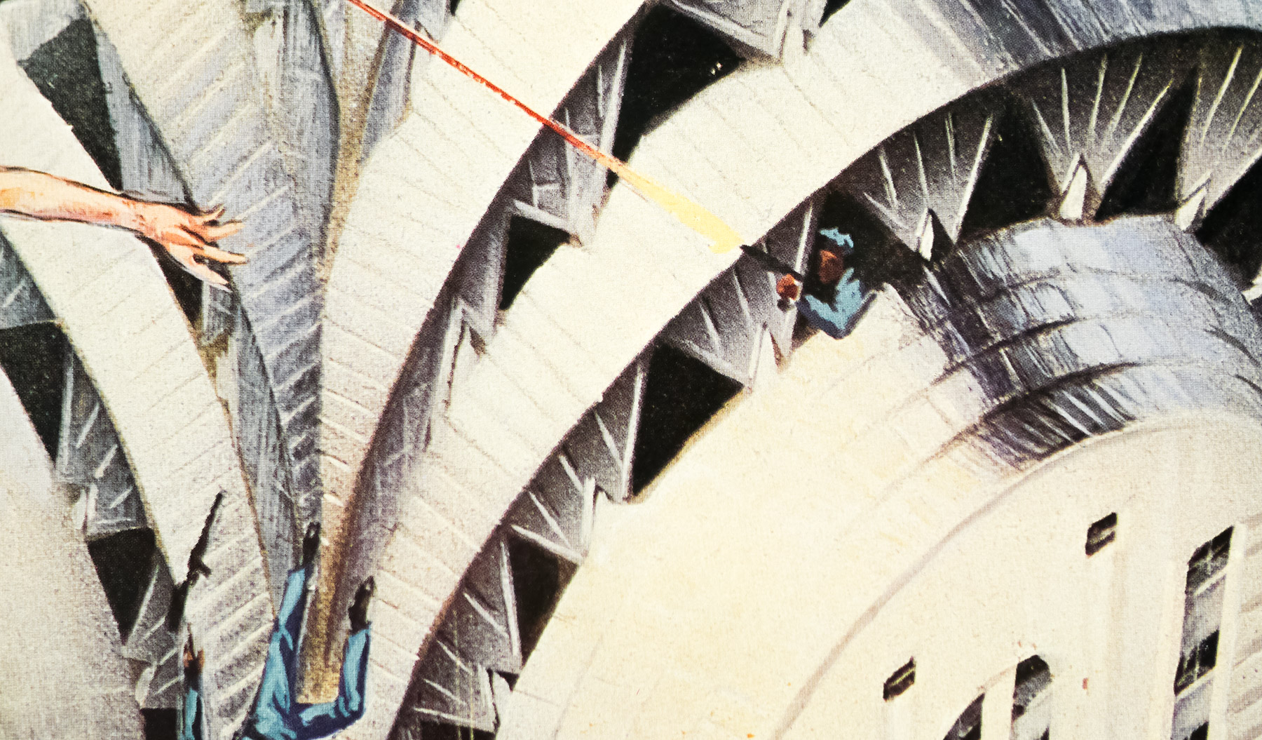
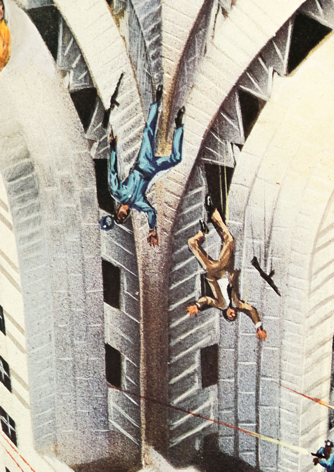
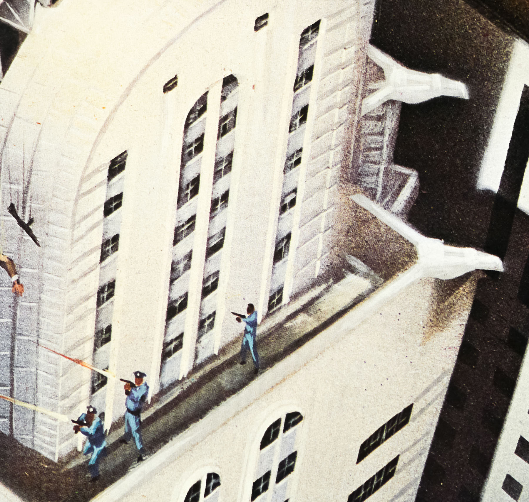
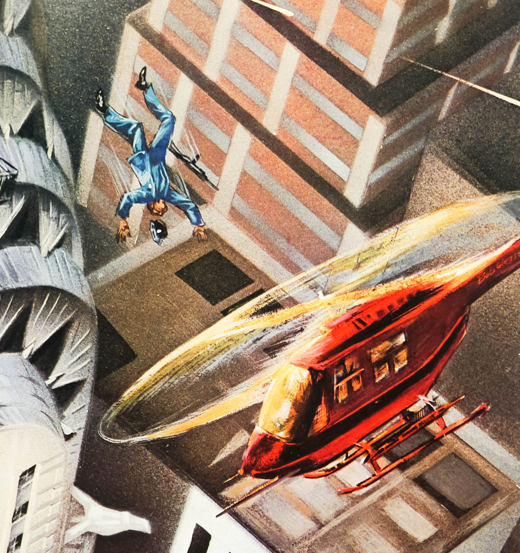
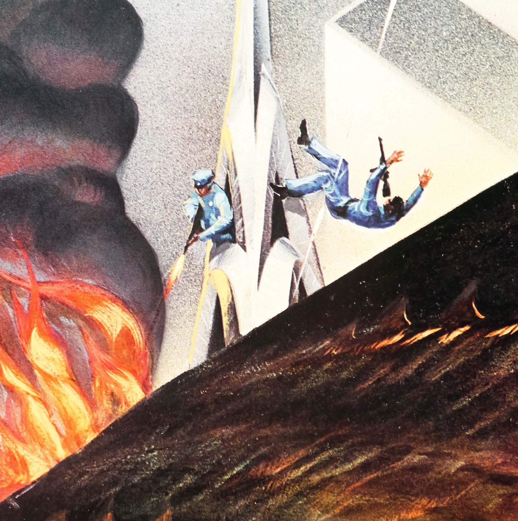
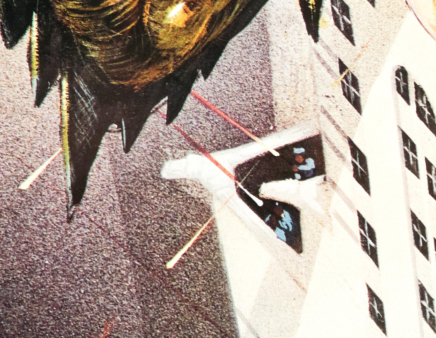
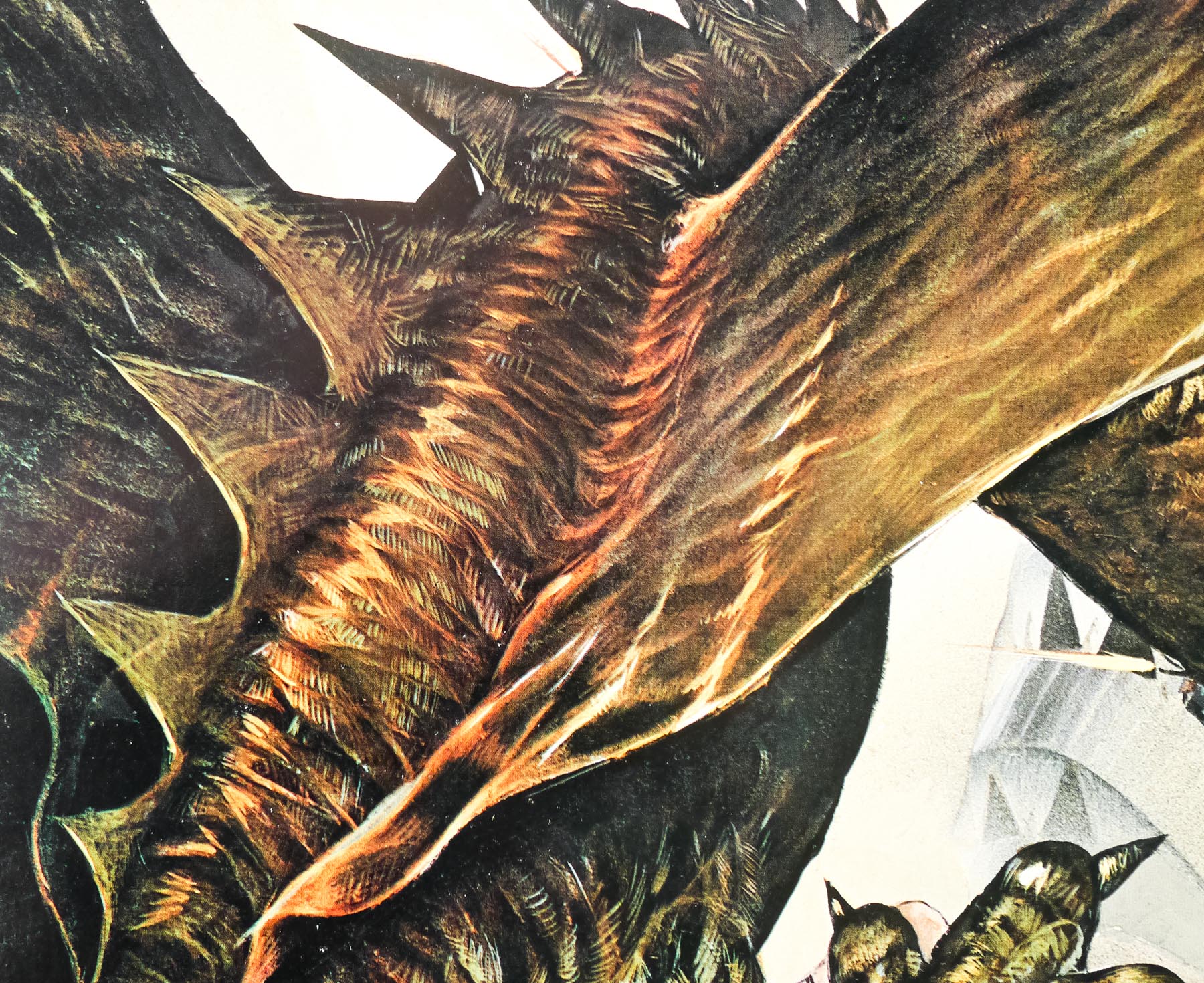
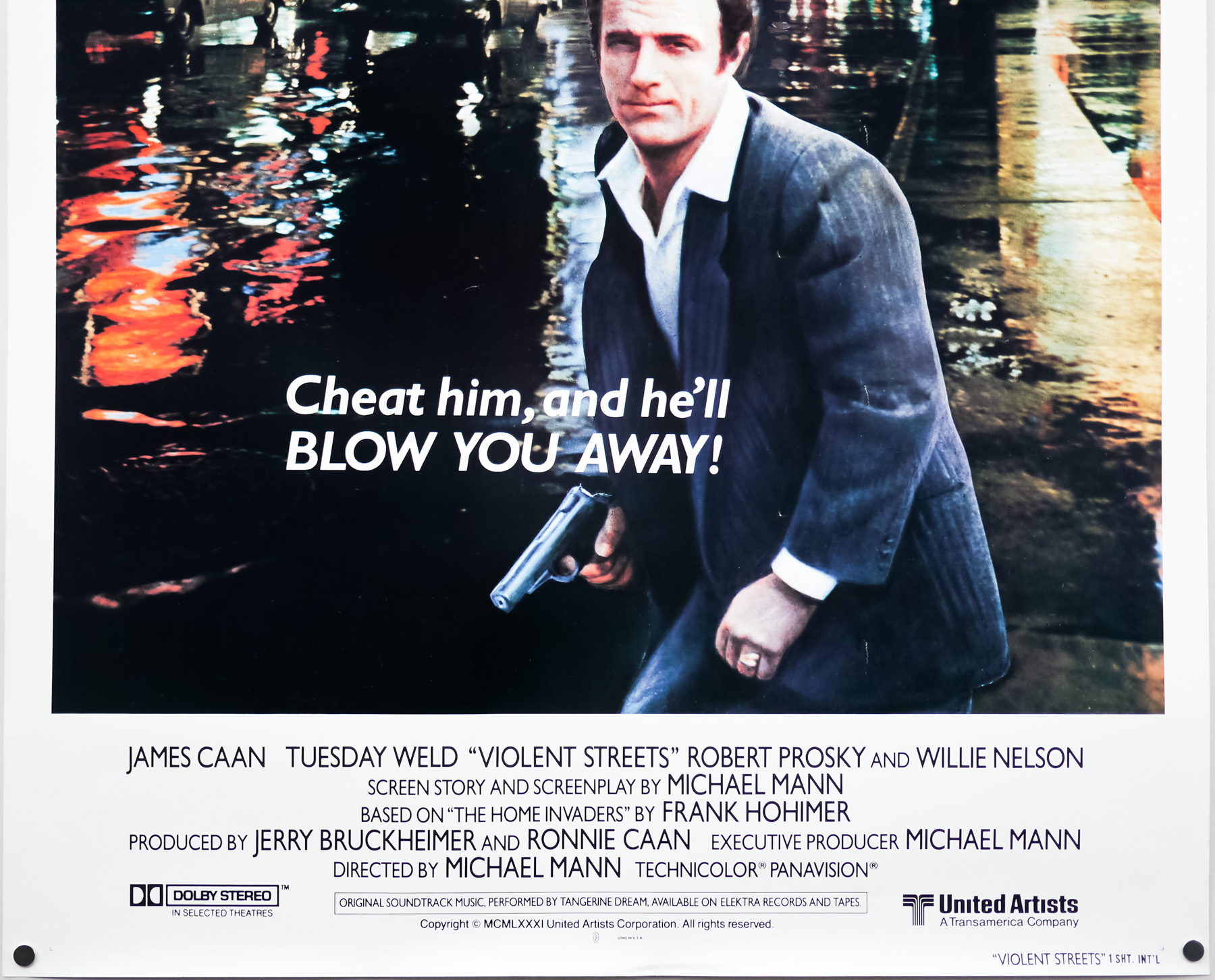
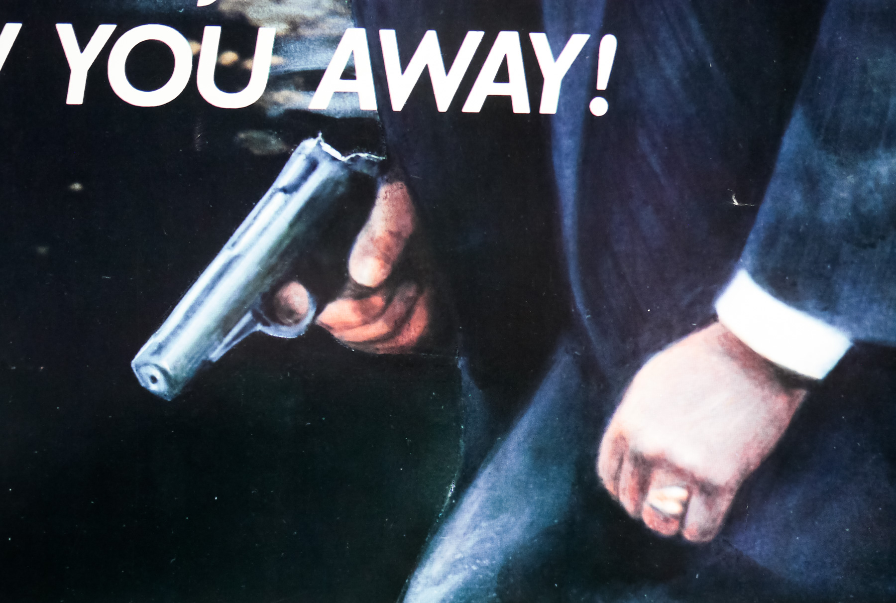
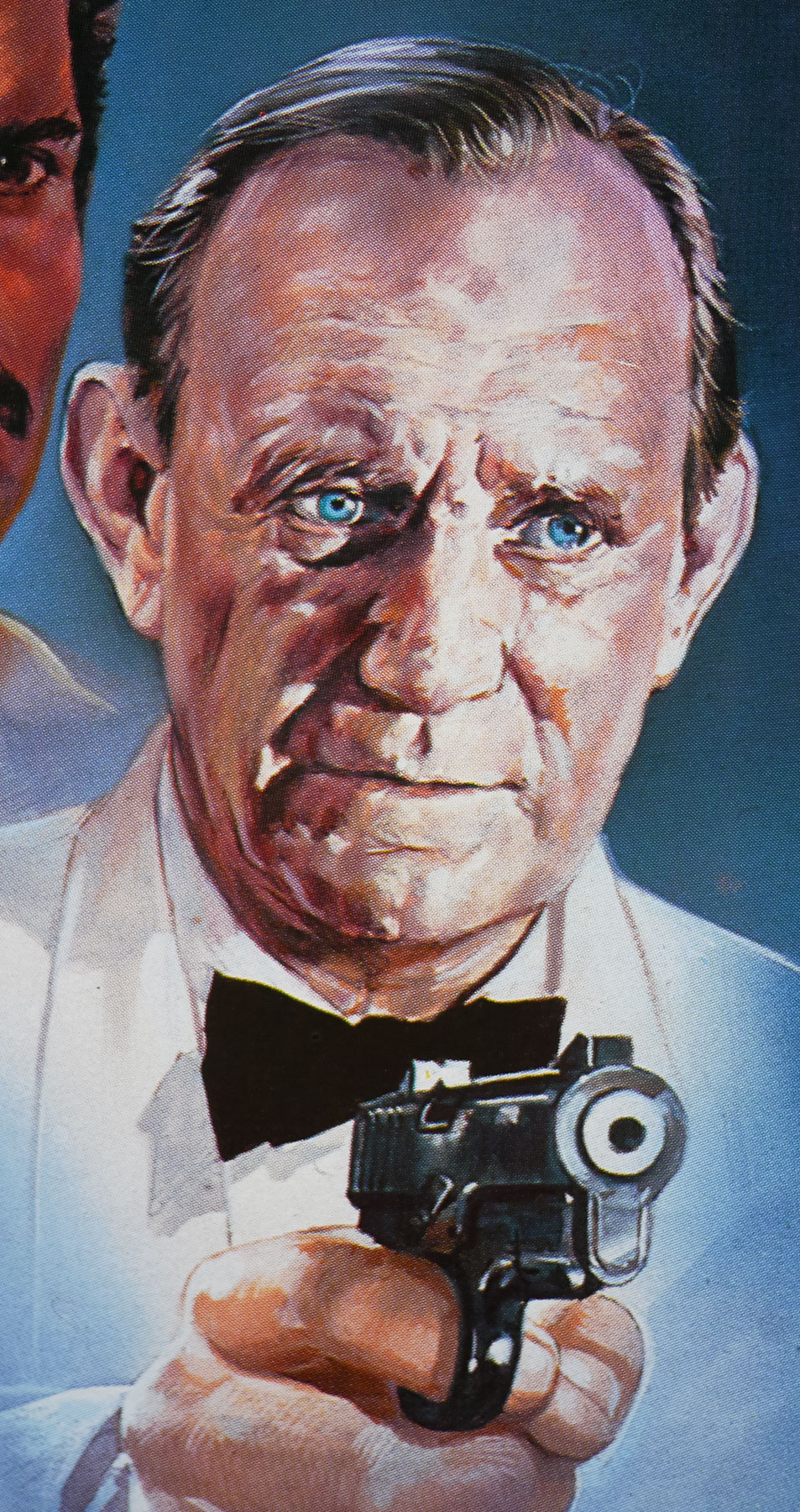
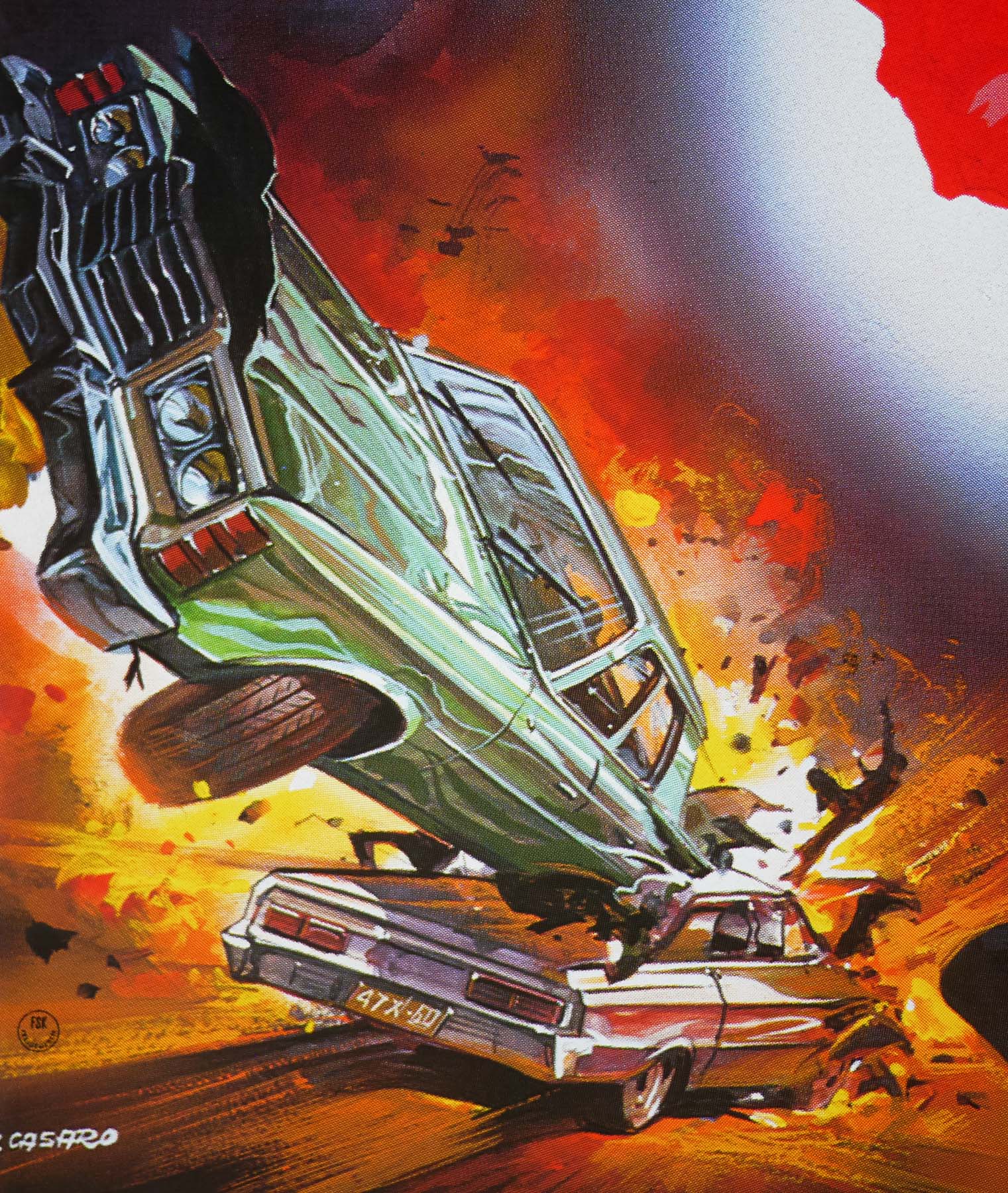
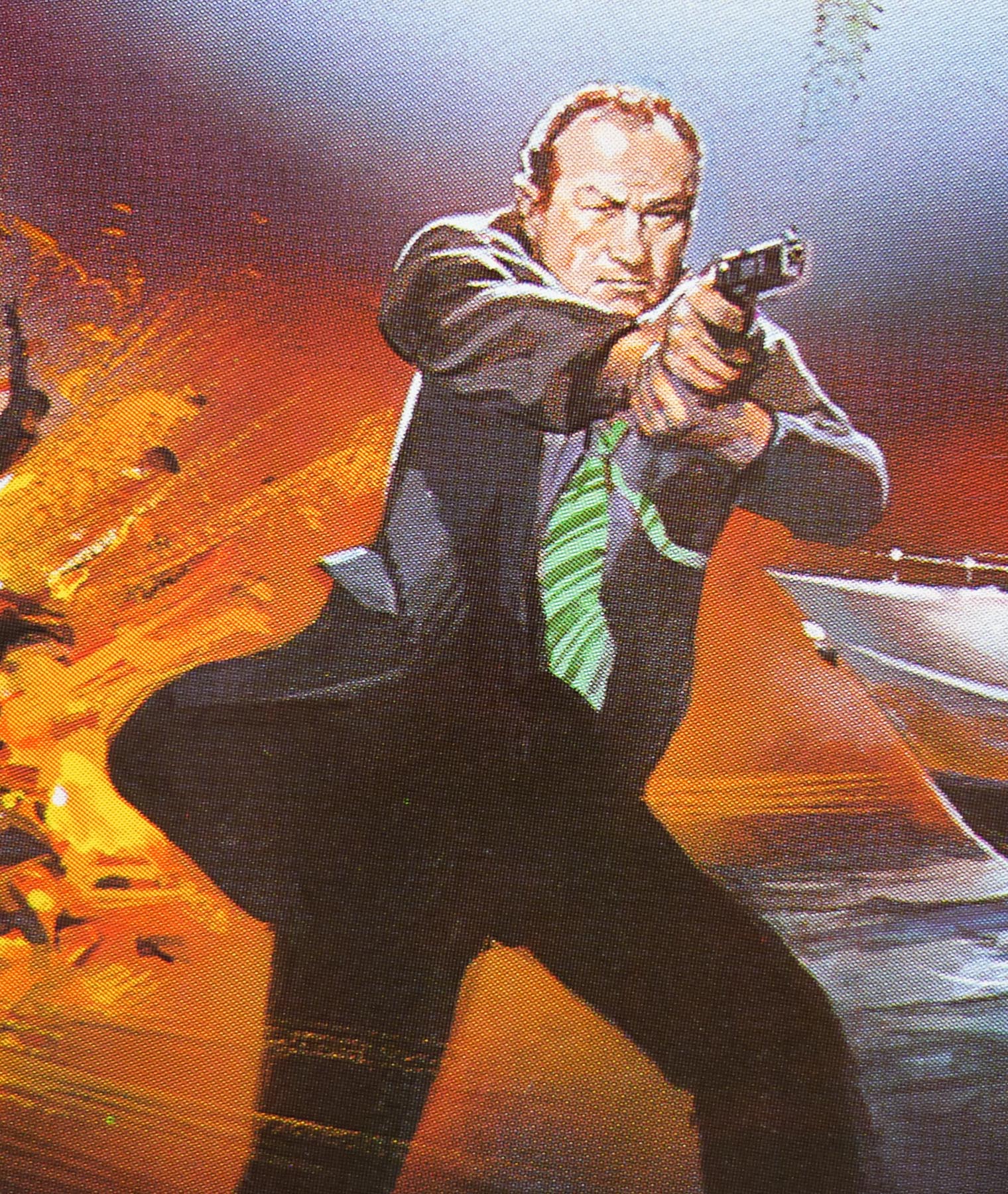
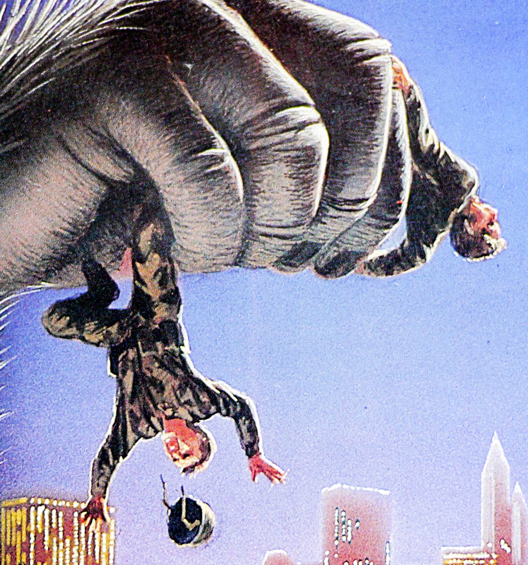
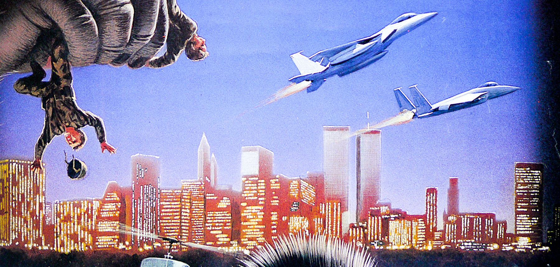
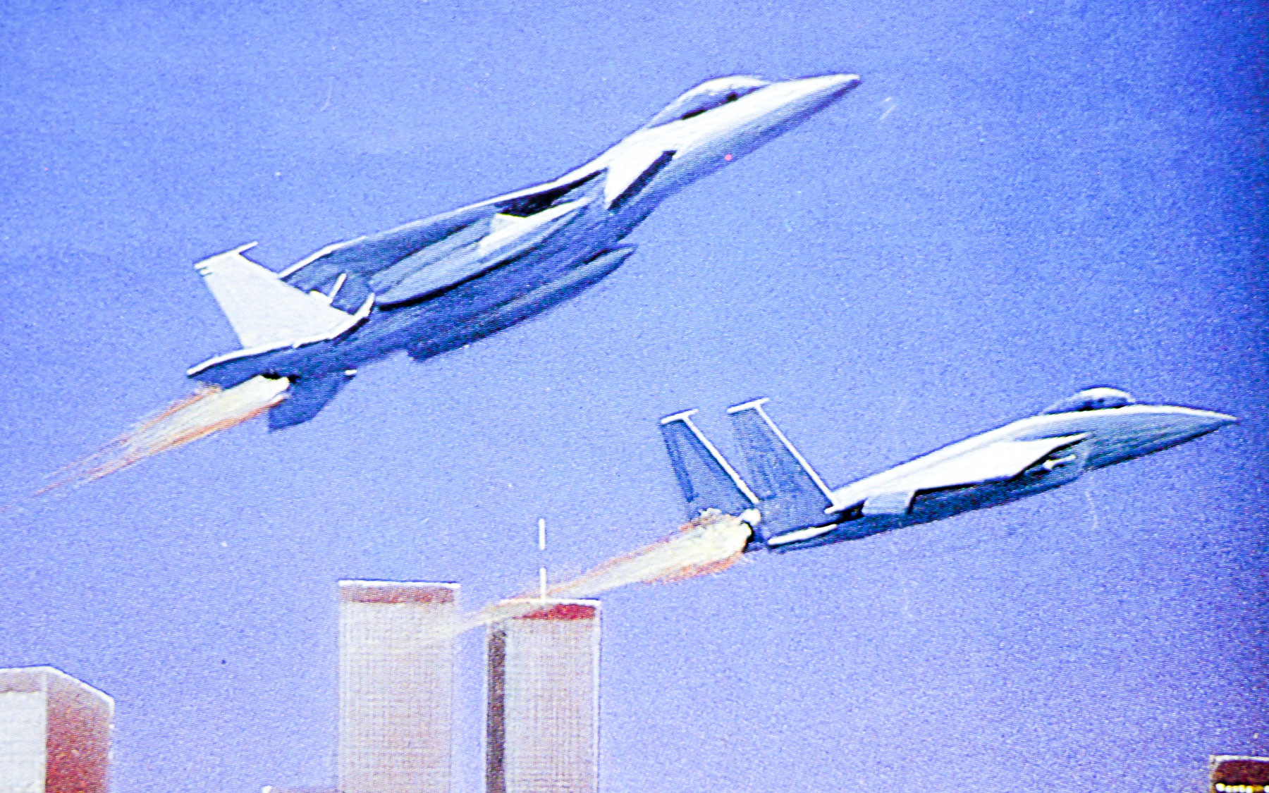
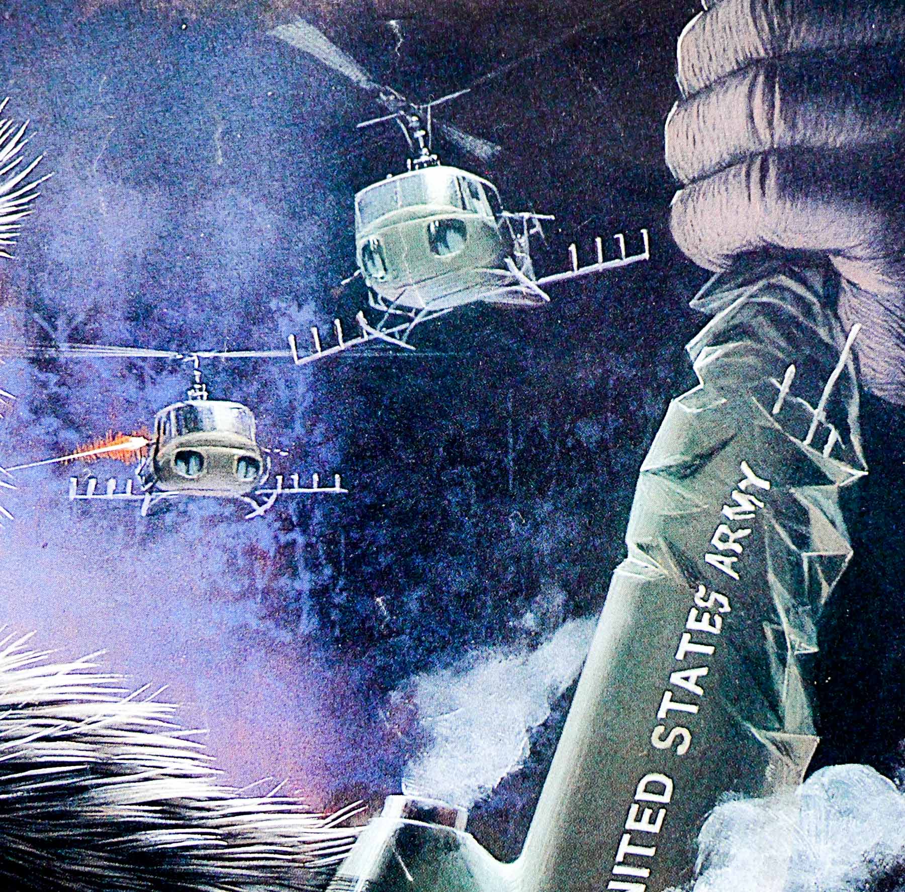
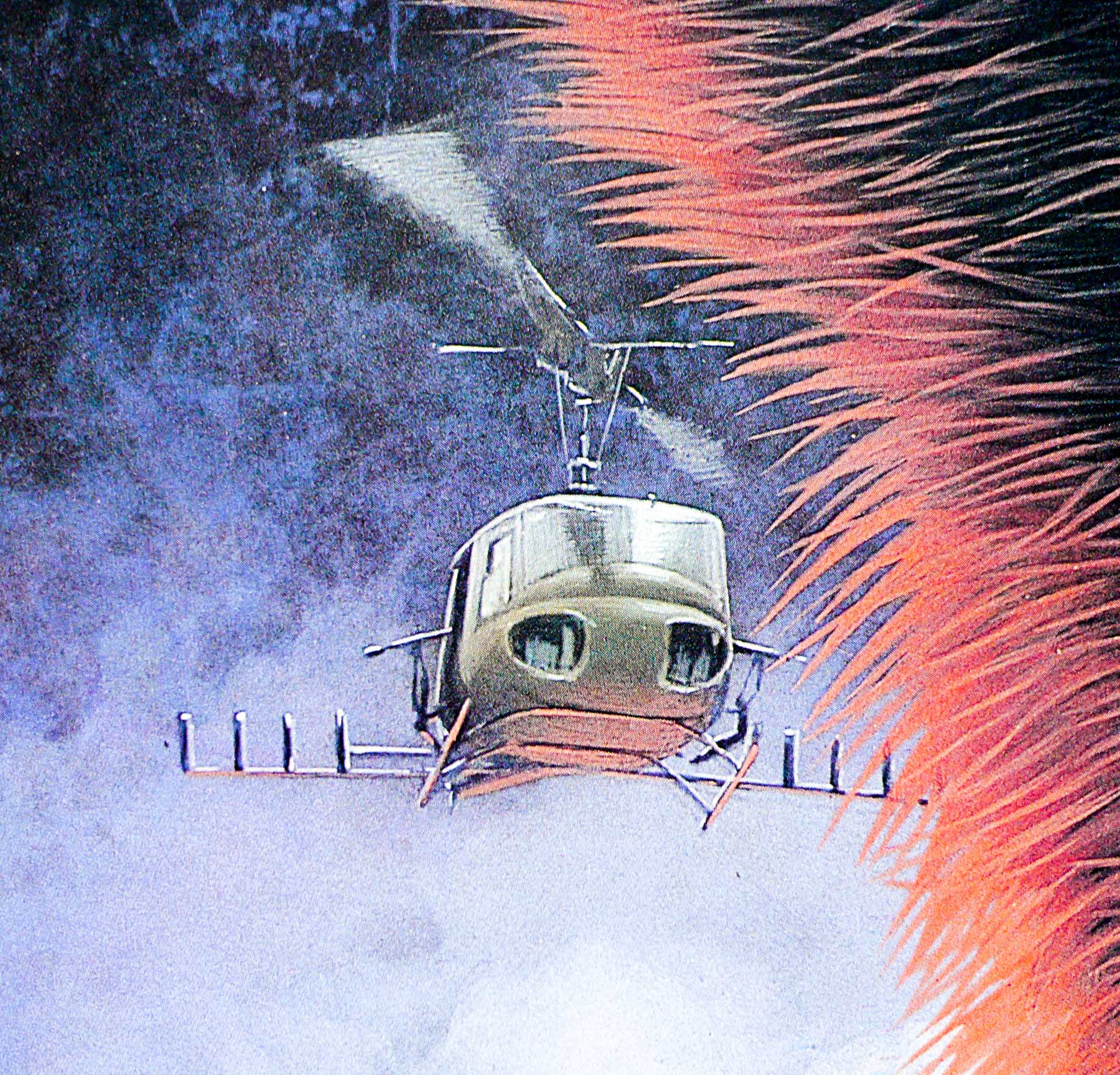
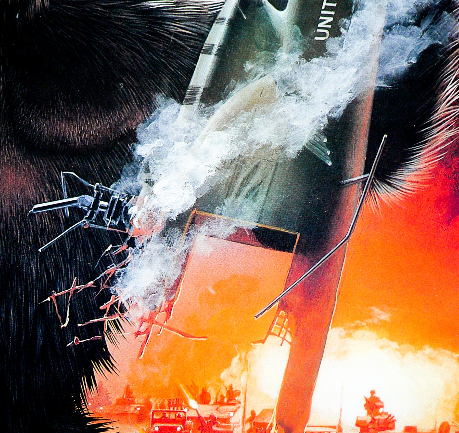
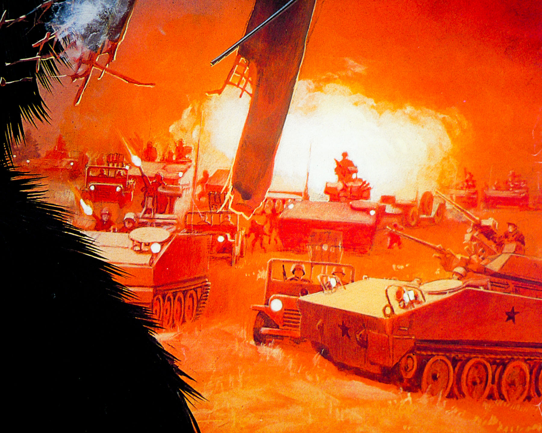
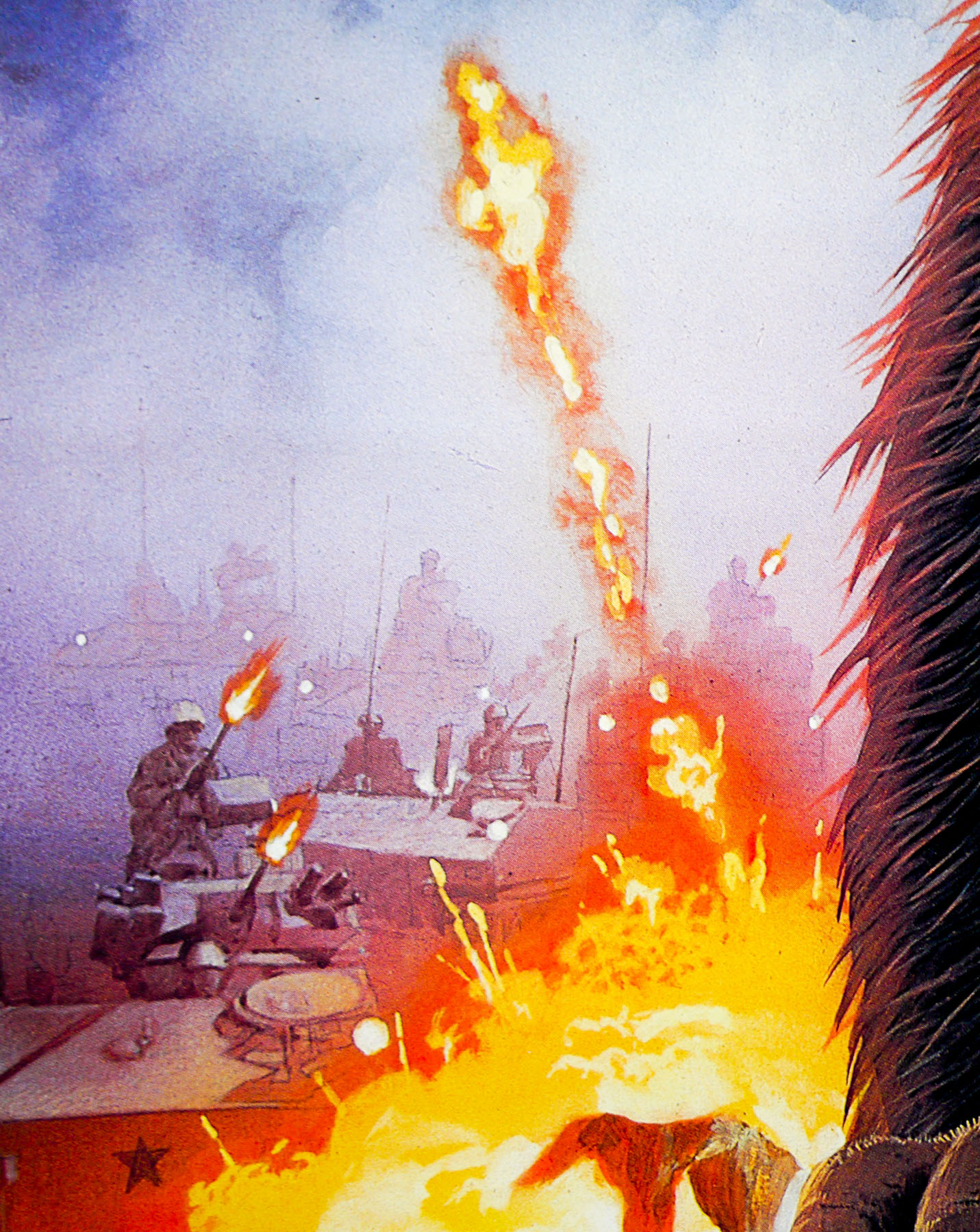
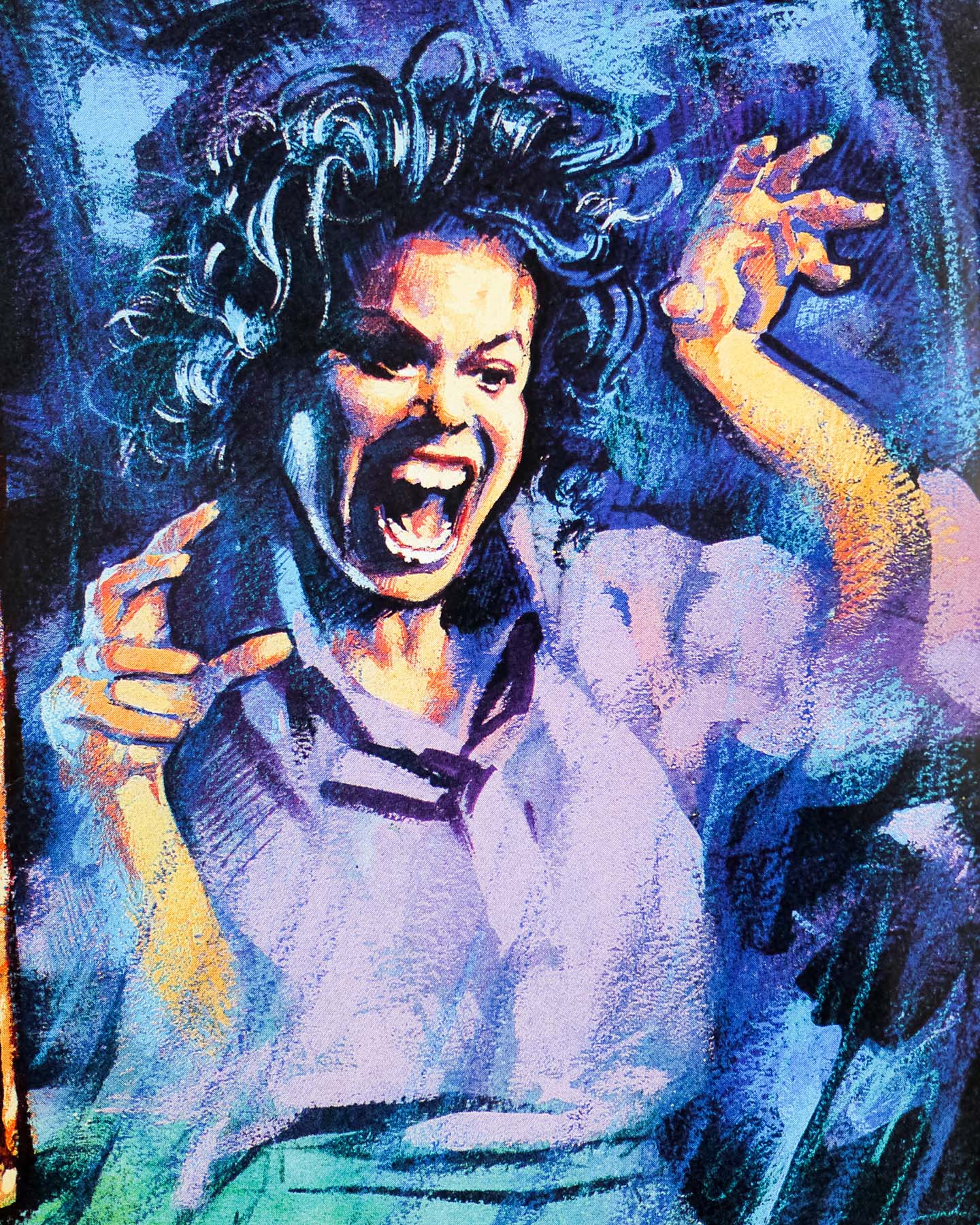
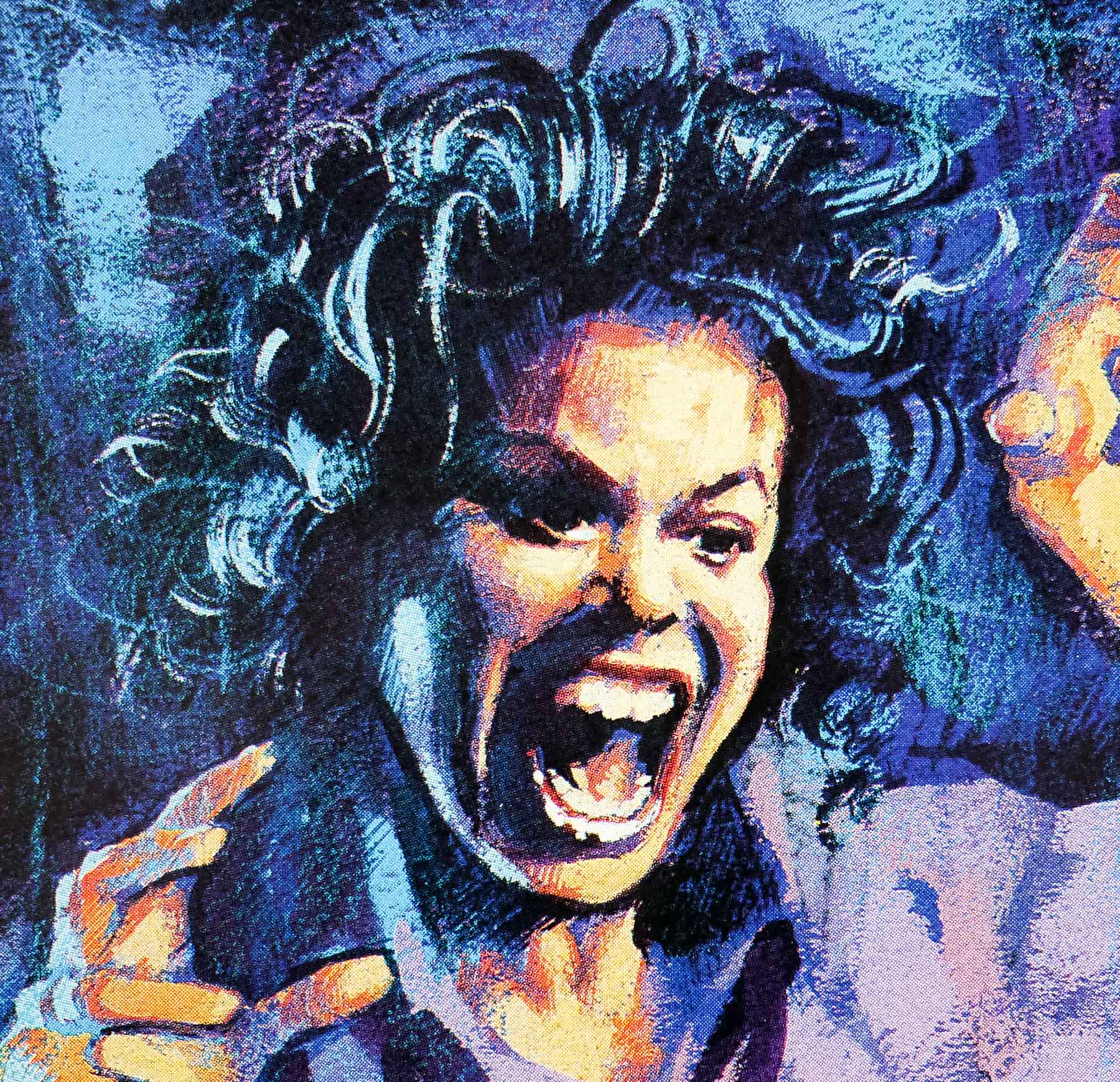
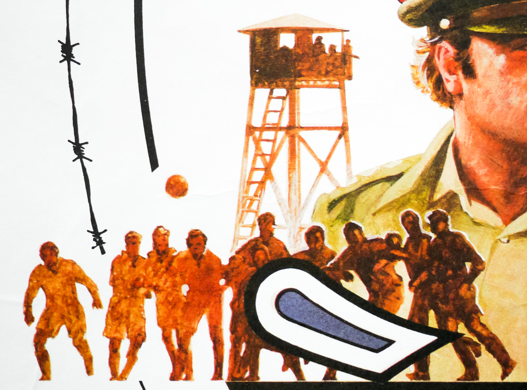
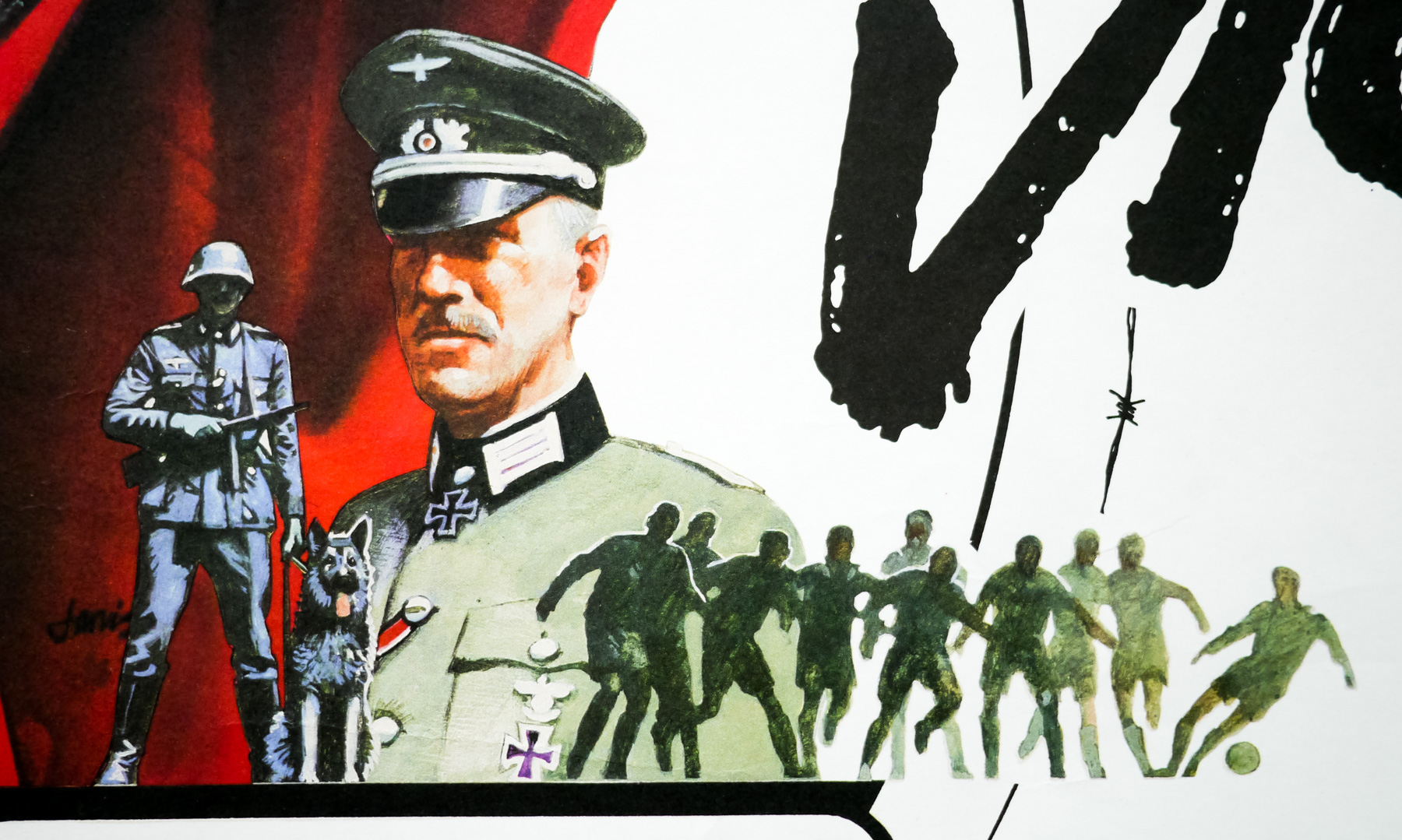
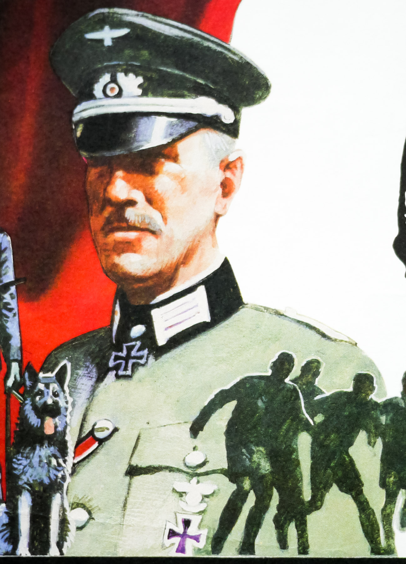
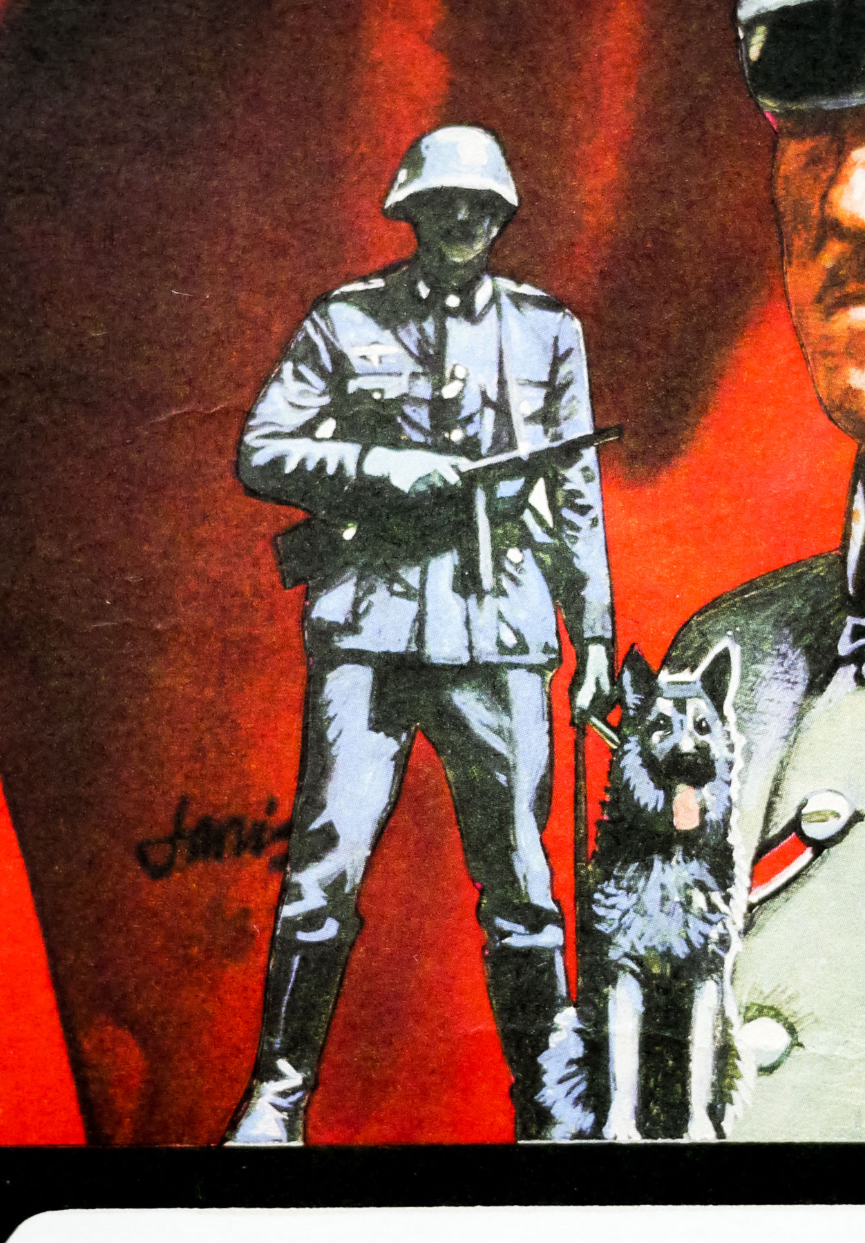
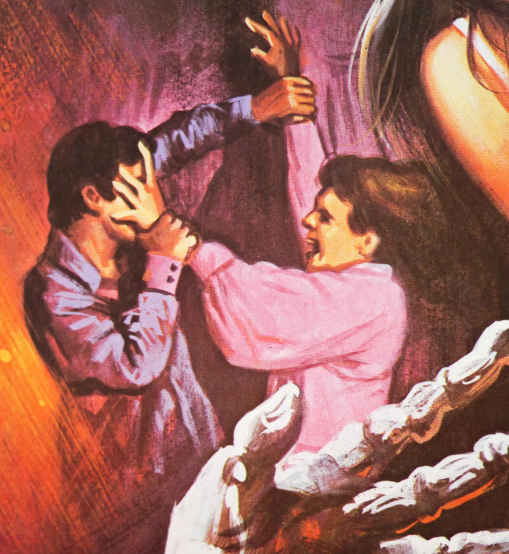
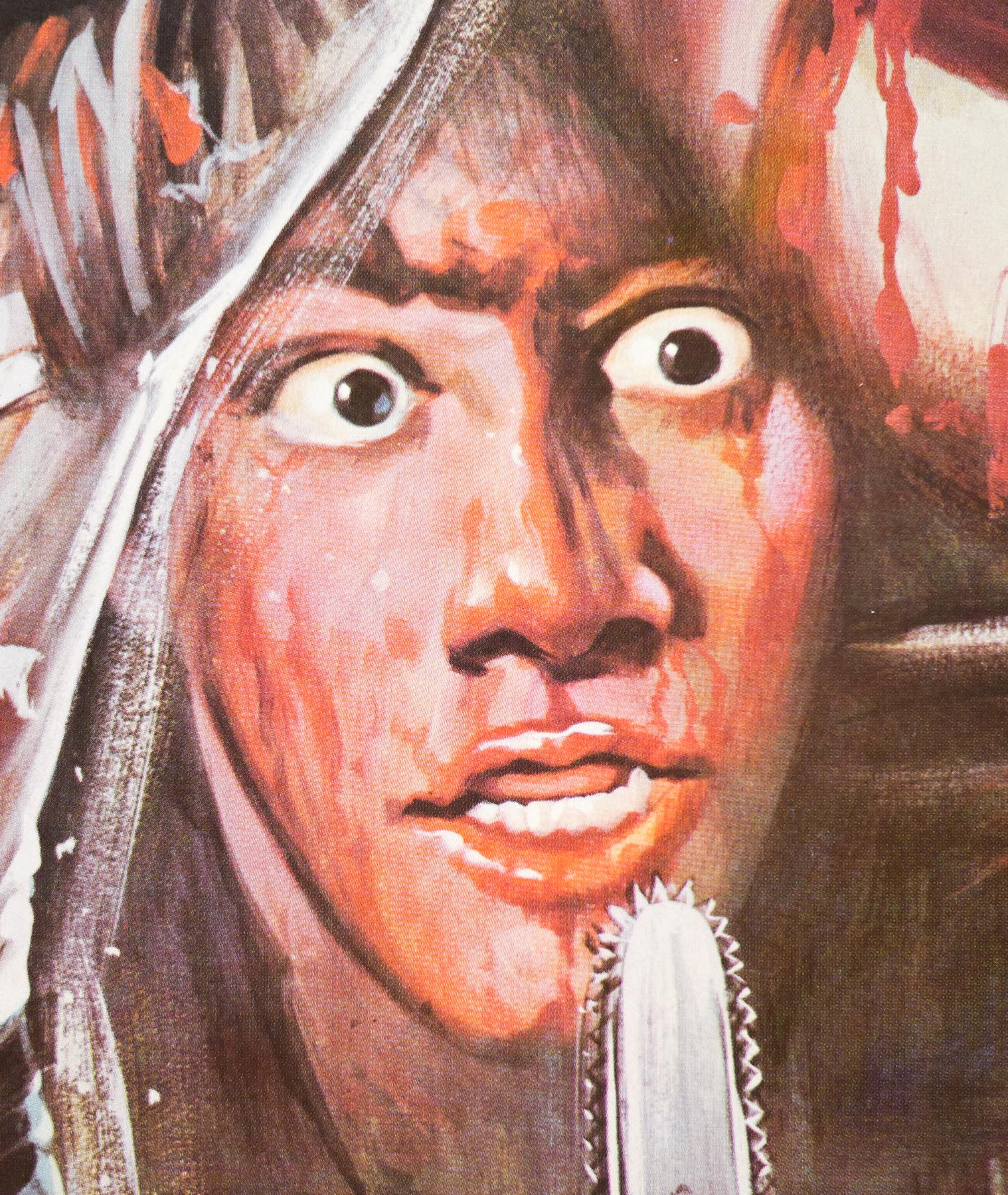
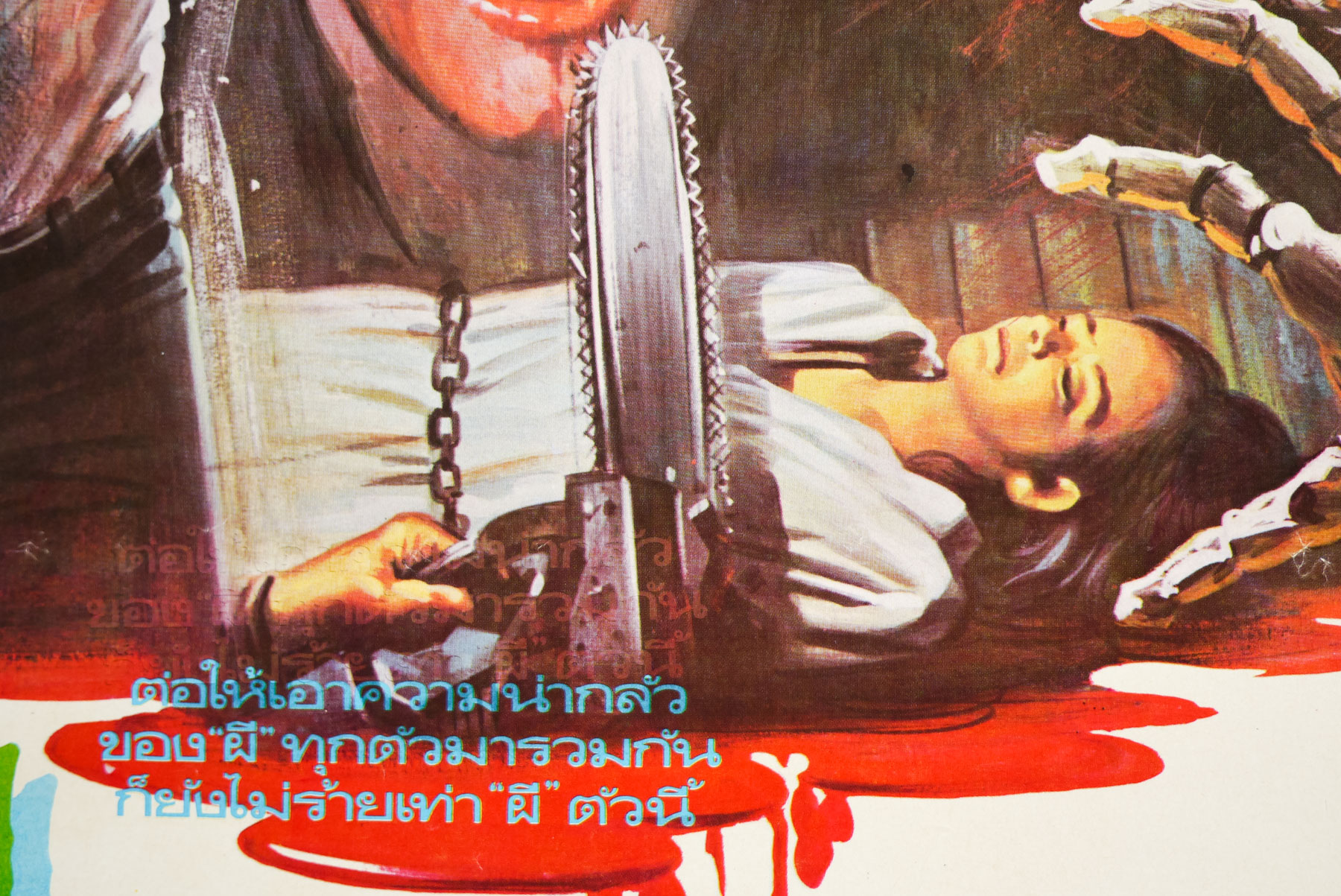
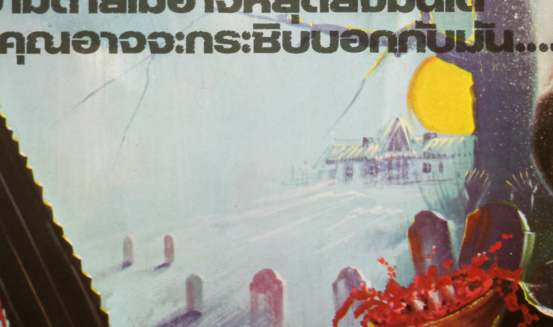
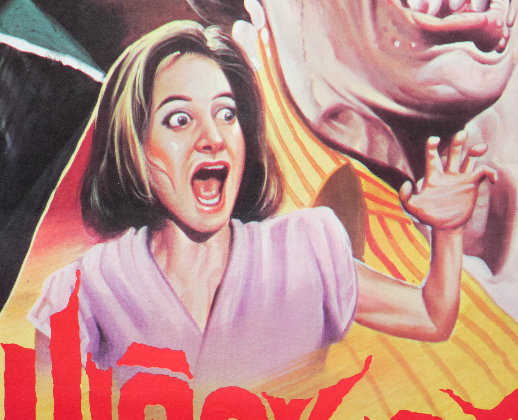
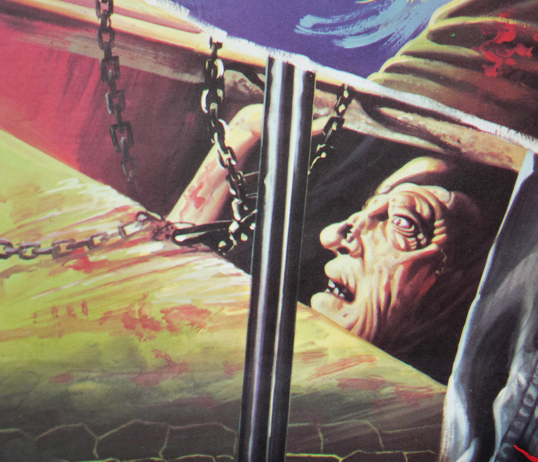
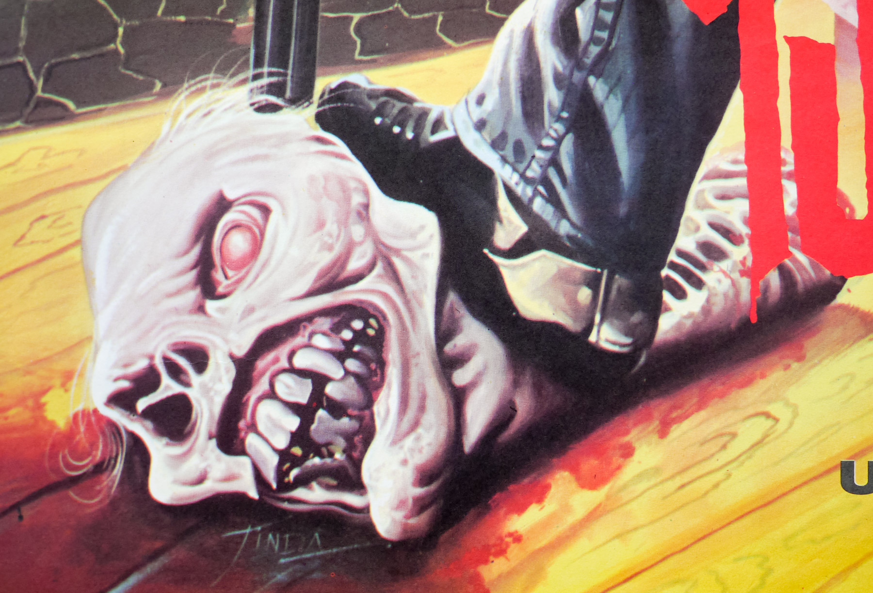
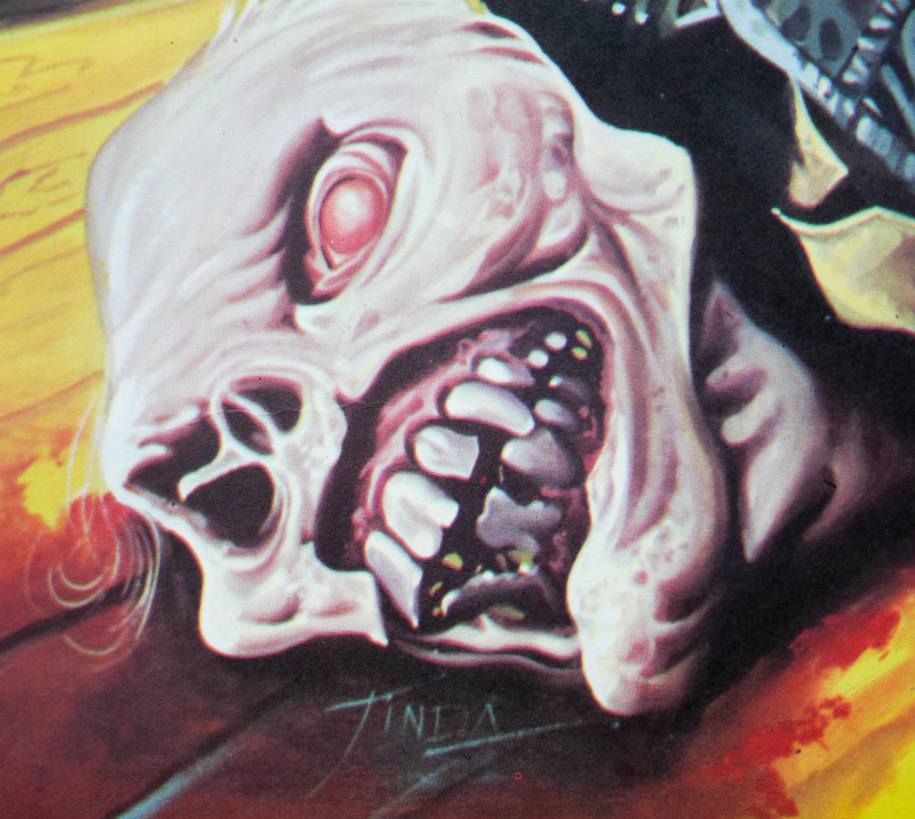
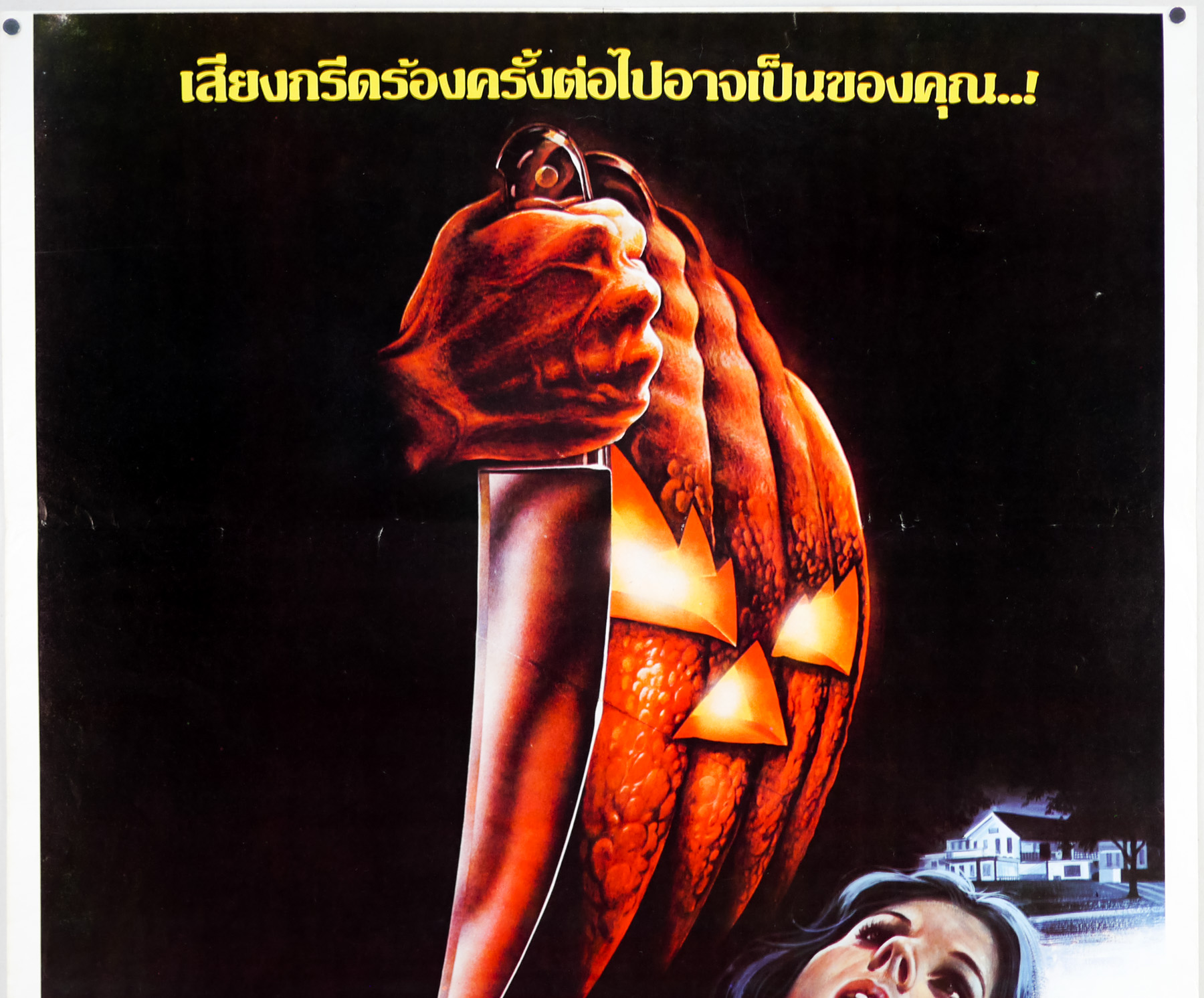
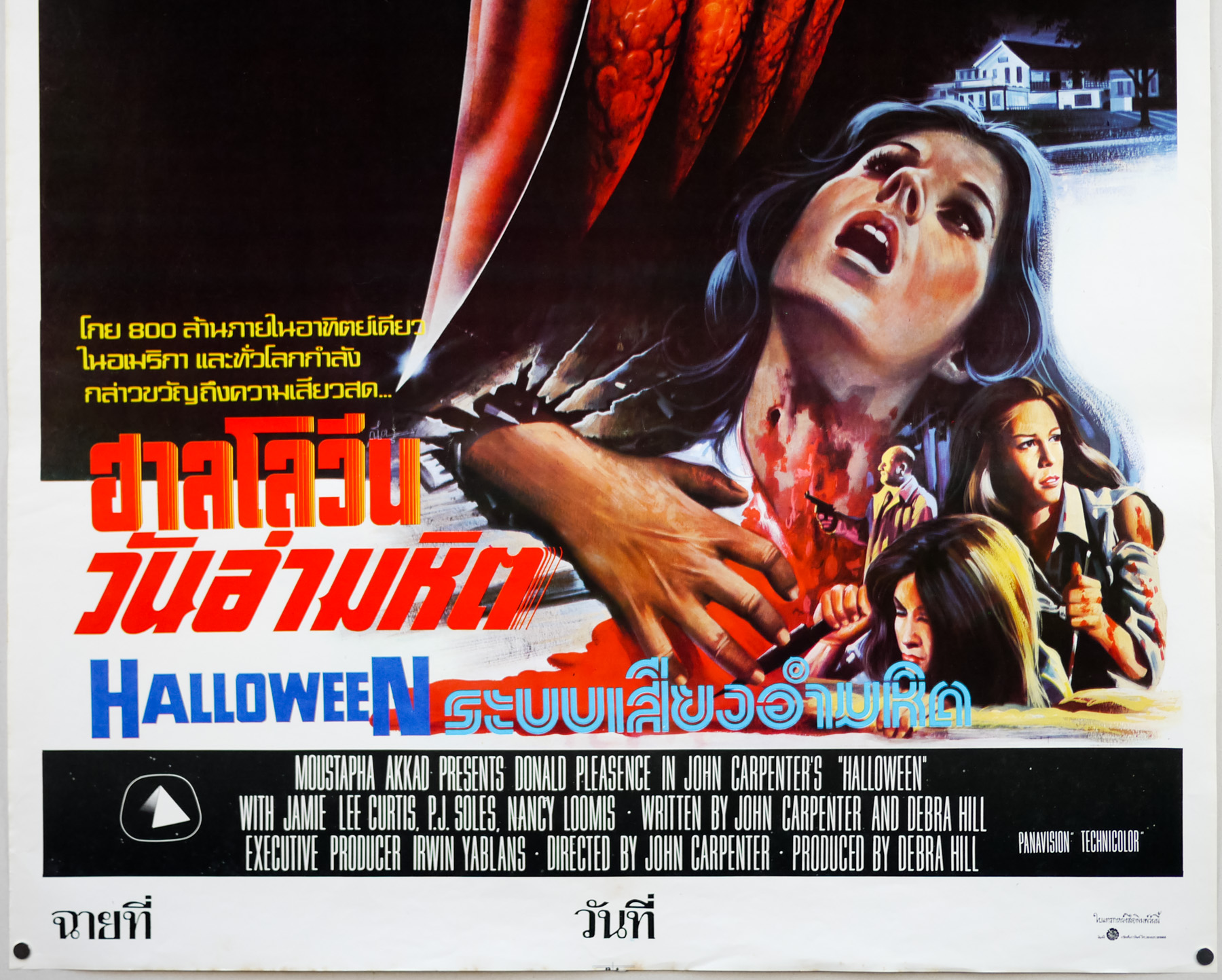
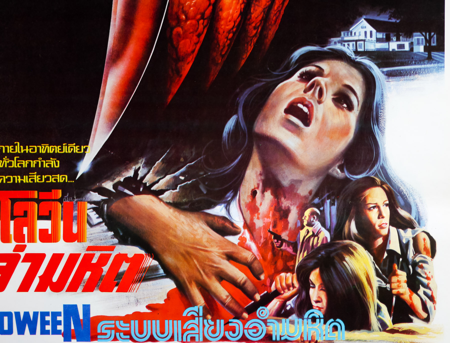
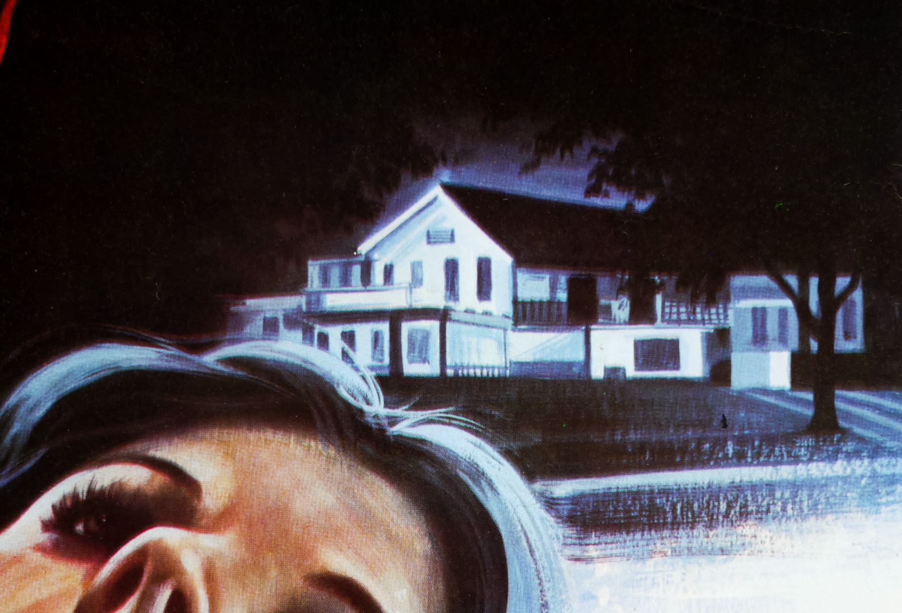
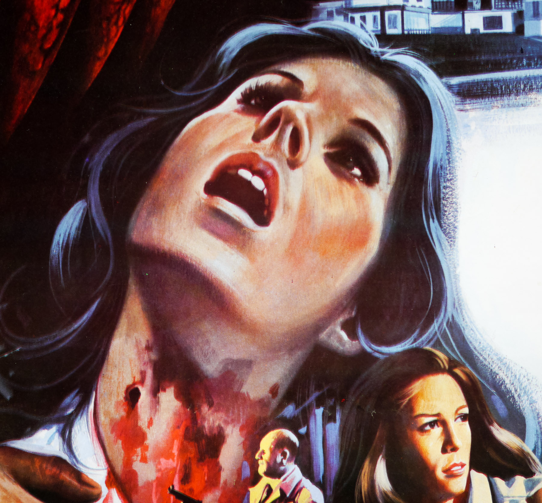
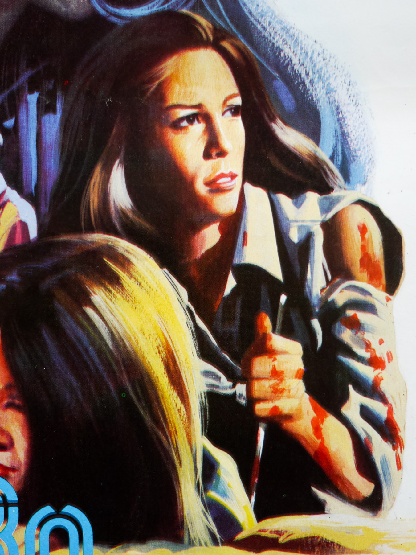
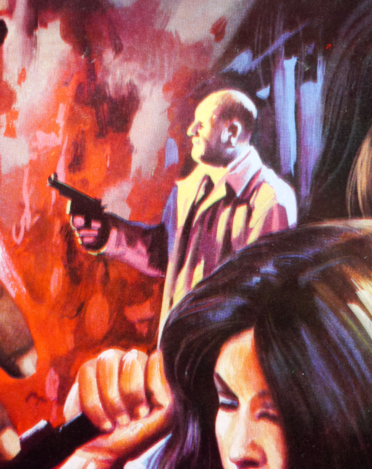
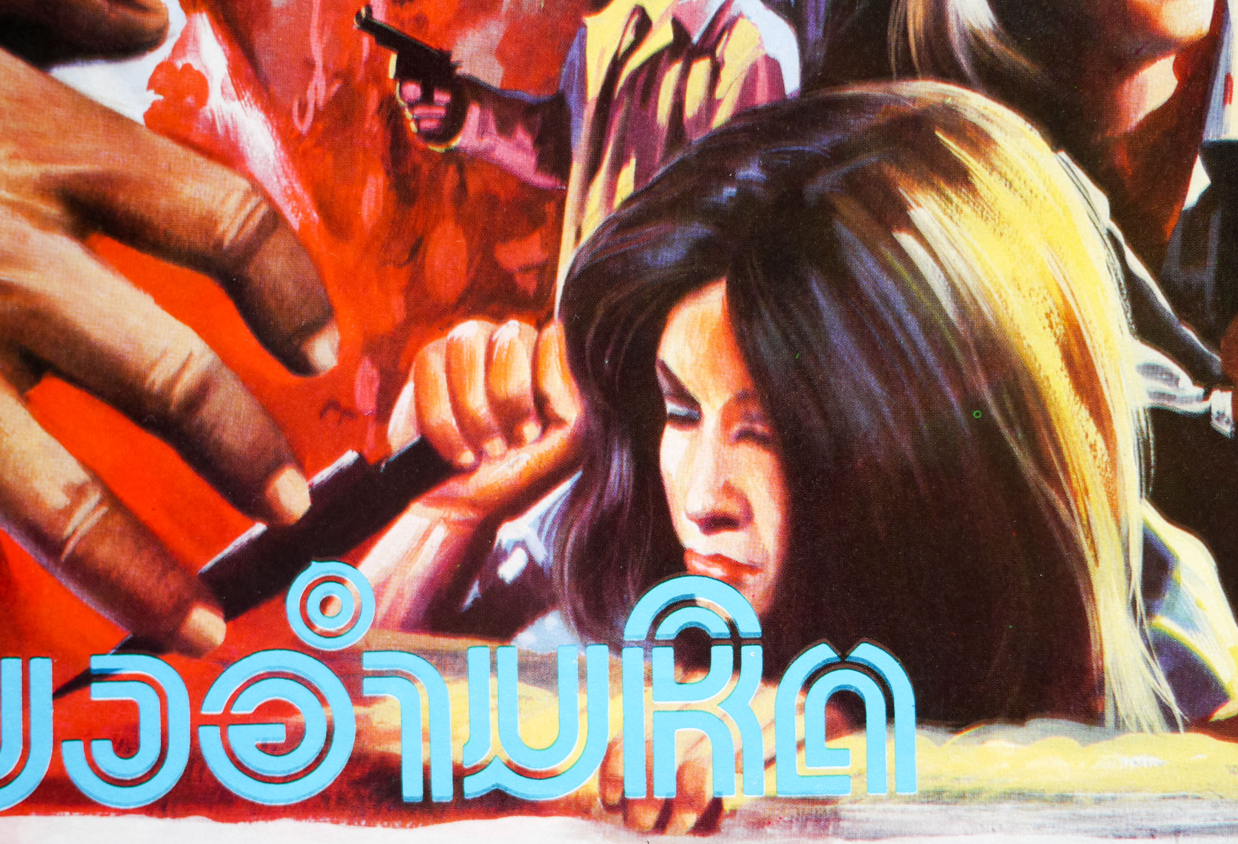
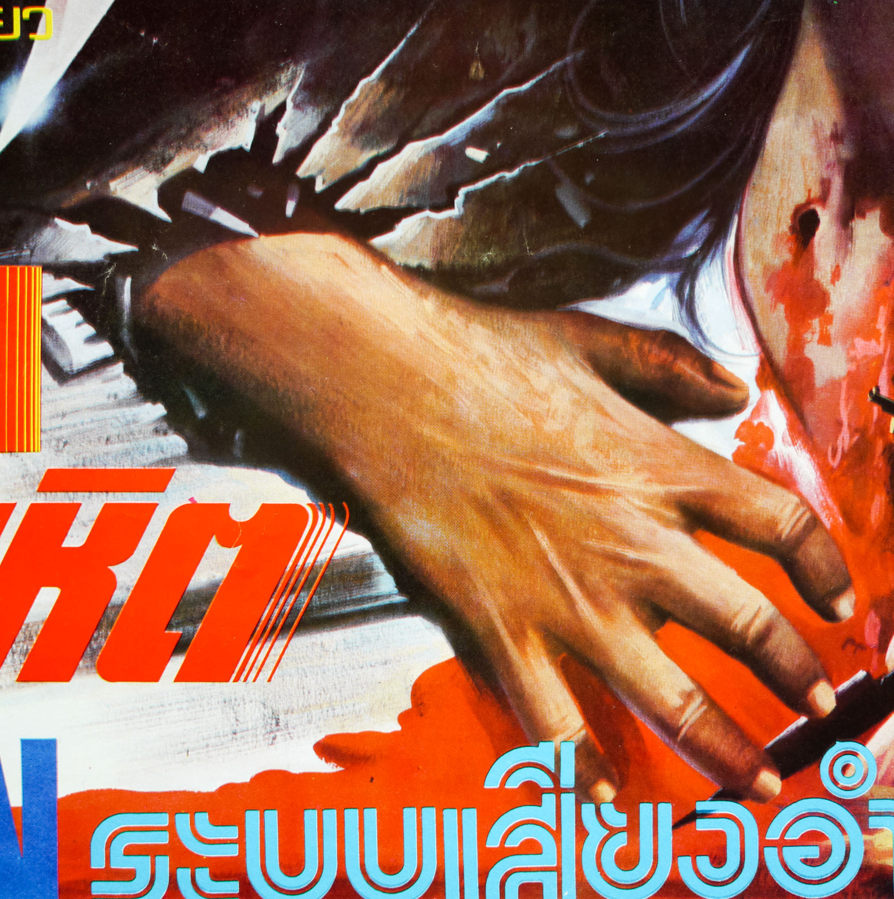
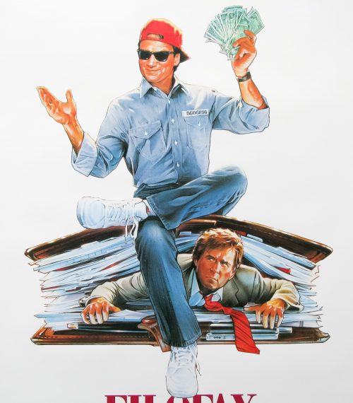
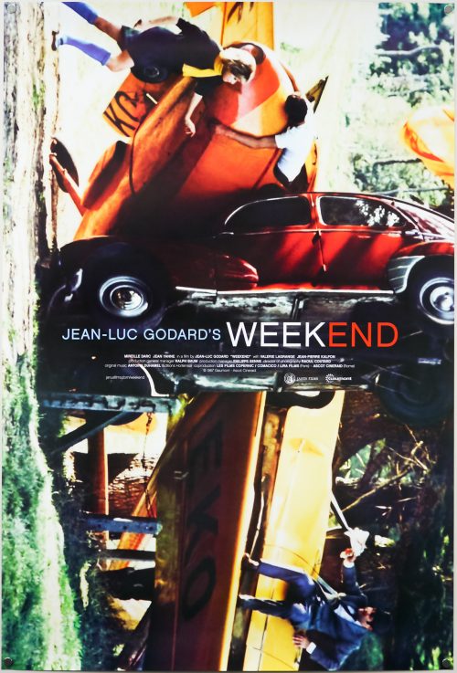
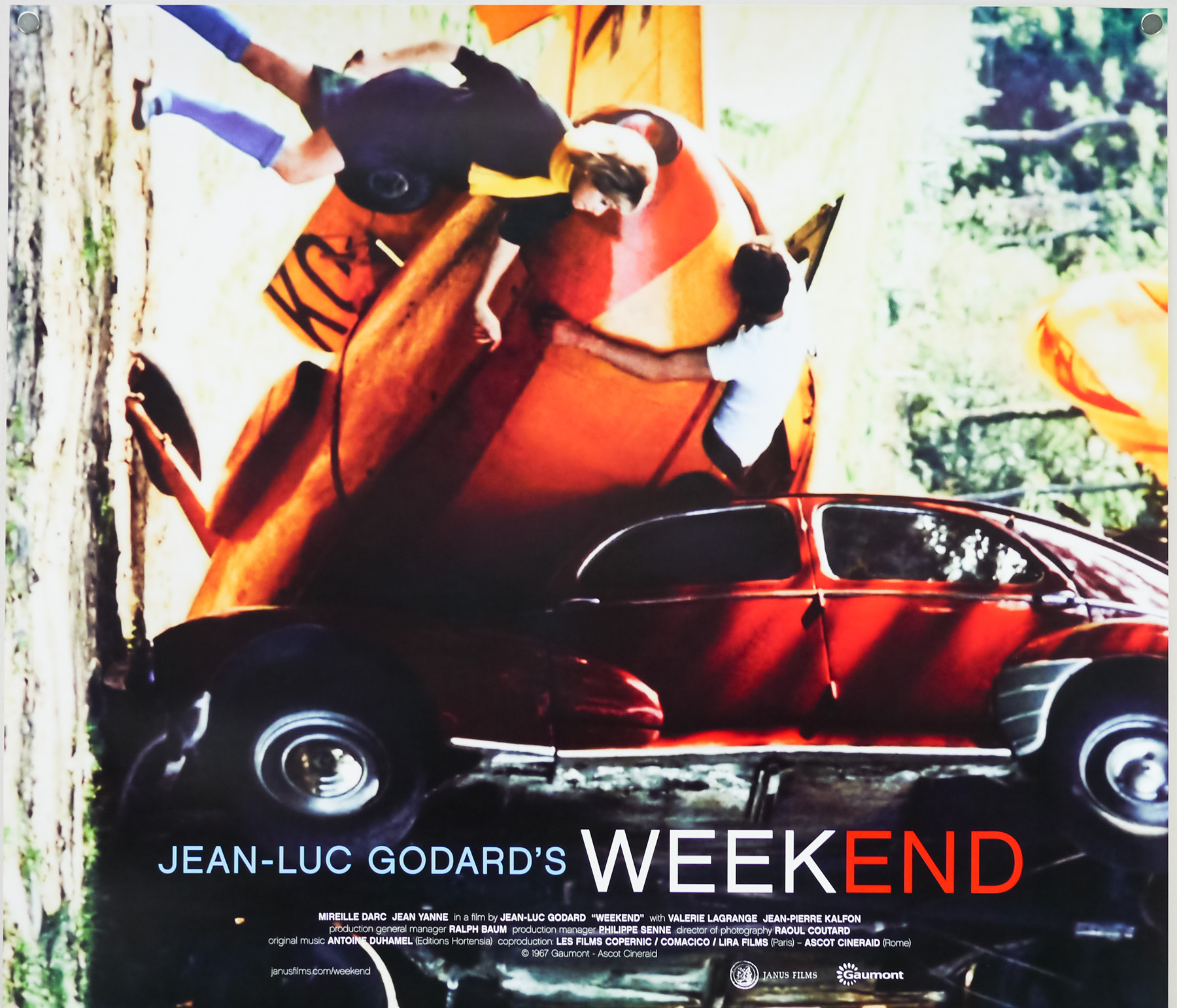
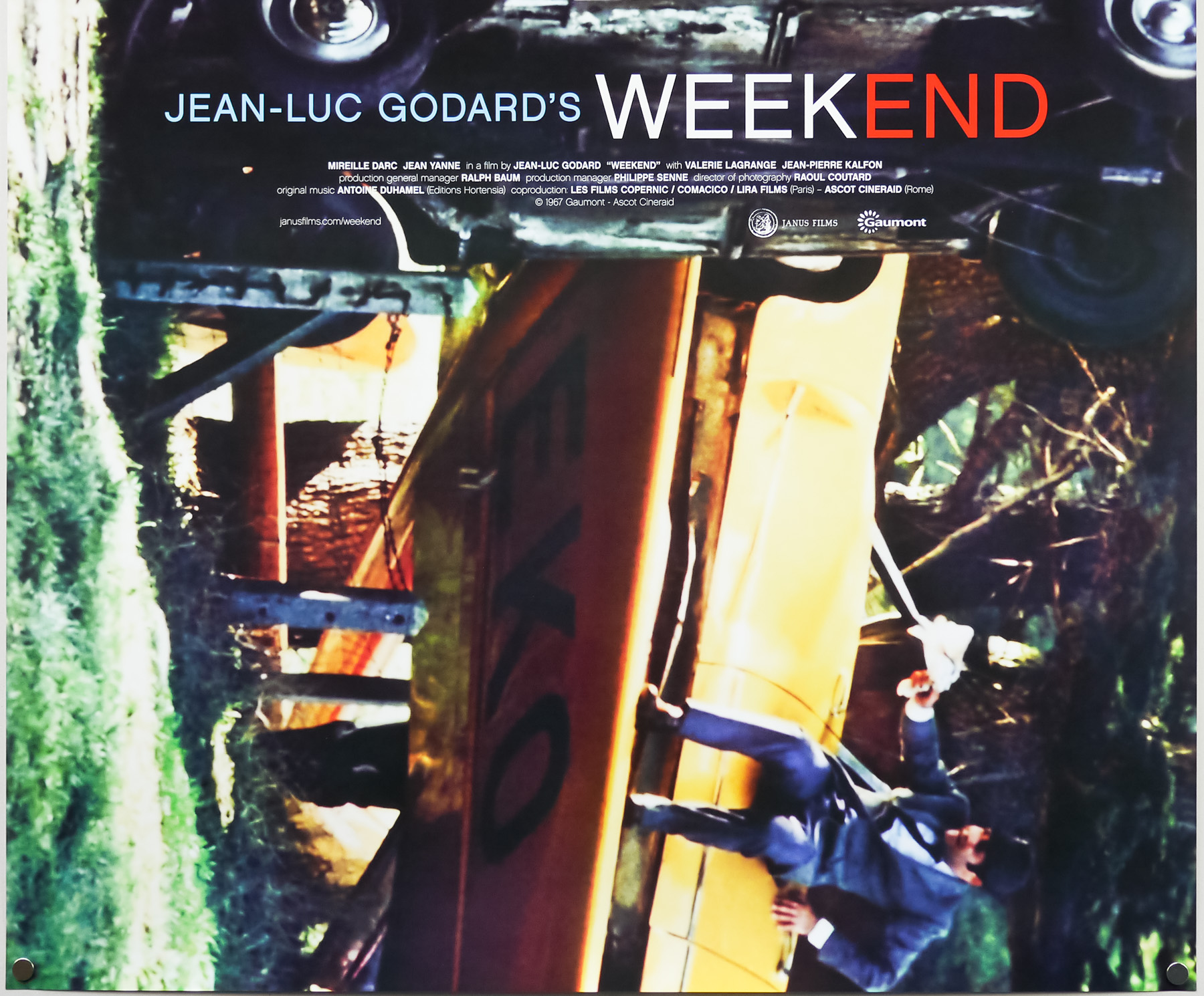
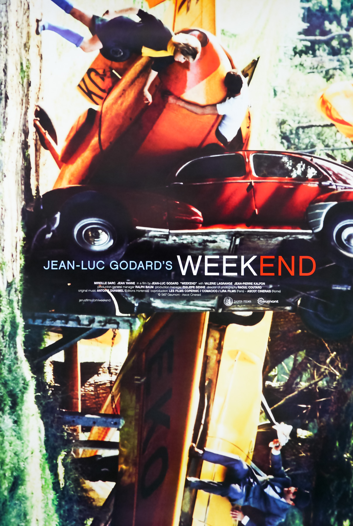
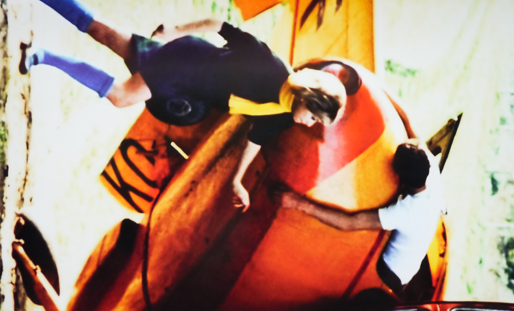
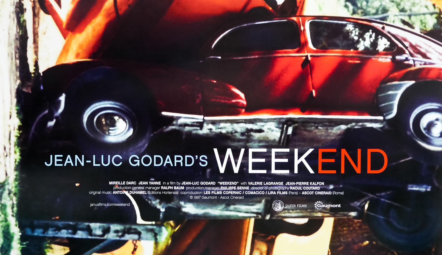
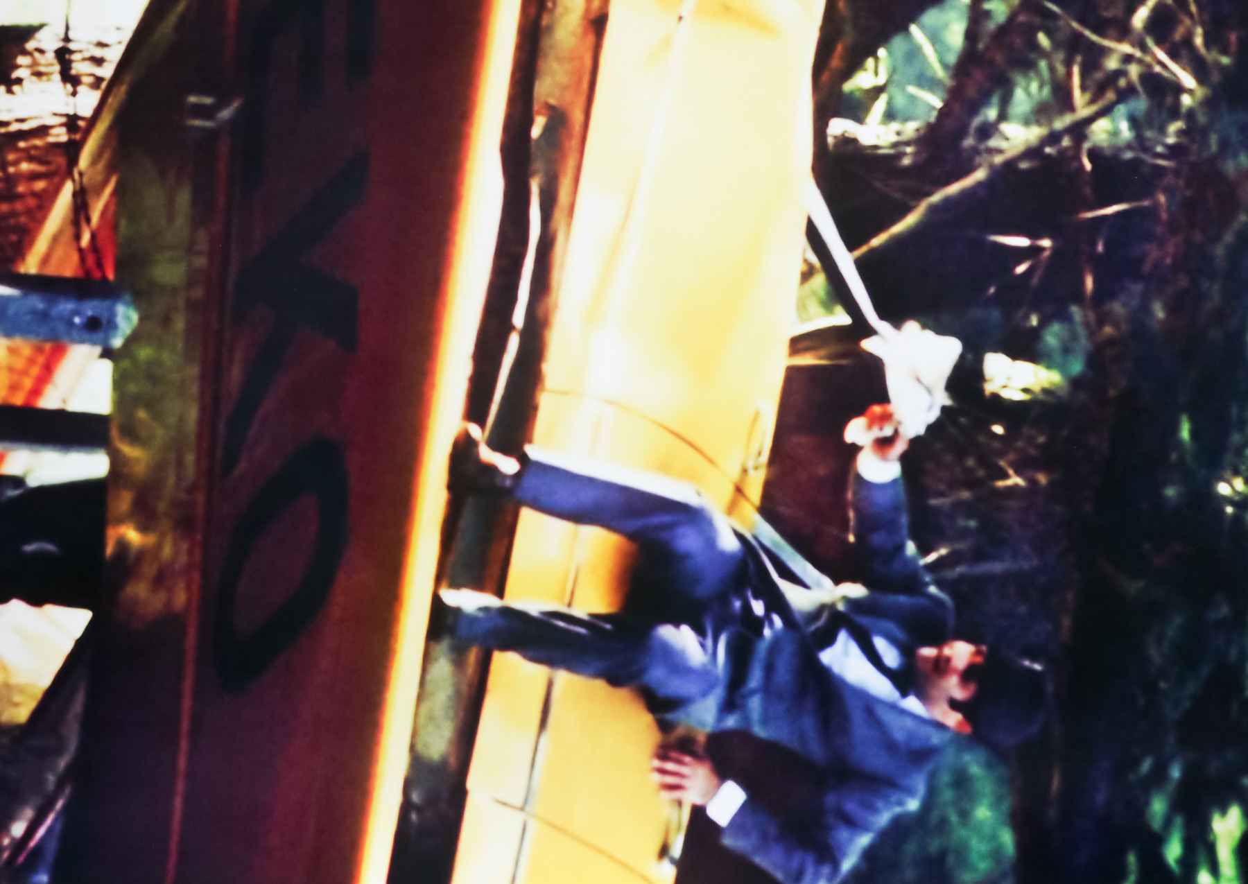
This one sheet was printed by Janus films for their 2011 re-release of Jean-Luc Godard‘s celebrated 1967 film Weekend (or Le Week End). One of the most anarchic and surreal films ever committed to celluloid, Weekend is a satire which takes aim at, amongst other things, the bourgeois status and money-obsessed French middle-class. The story, such as there is one, focuses on a self-obsessed couple played by Mireille Darc and Jean Yanne who have plotted to murder her parents and collect their inheritance. They set off from their home in the city and travel into the French countryside where they come across all manner of scenes, including fatal car crashes and a (justifiably famous) sequence of a traffic jam which the audience watches them traverse with horns blaring the entire time. Society appears to be crumbling around them as they make their way to the small village where her parents live. Eventually, things take a turn for the deadly when they end up in the clutches of a band of hippie, cannibalistic revolutionaries.

This one sheet was created by the Vancouver-based designer Steve Chow who is a regular collaborator with Janus and its sister company The Criterion Collection (the film was released on disc soon after its cinema outing in 2011). Chow has worked on hundreds of posters, magazines, advertising elements and covers for home video releases of various films. Check out his official website to see a gallery of his work and a short biography about his career so far.

In 2011, the Criterion website featured a short interview with Chow on the creation of this poster and I’ve copied the detail here (in case that page disappears one day):

What was your inspiration for the new poster for Weekend?
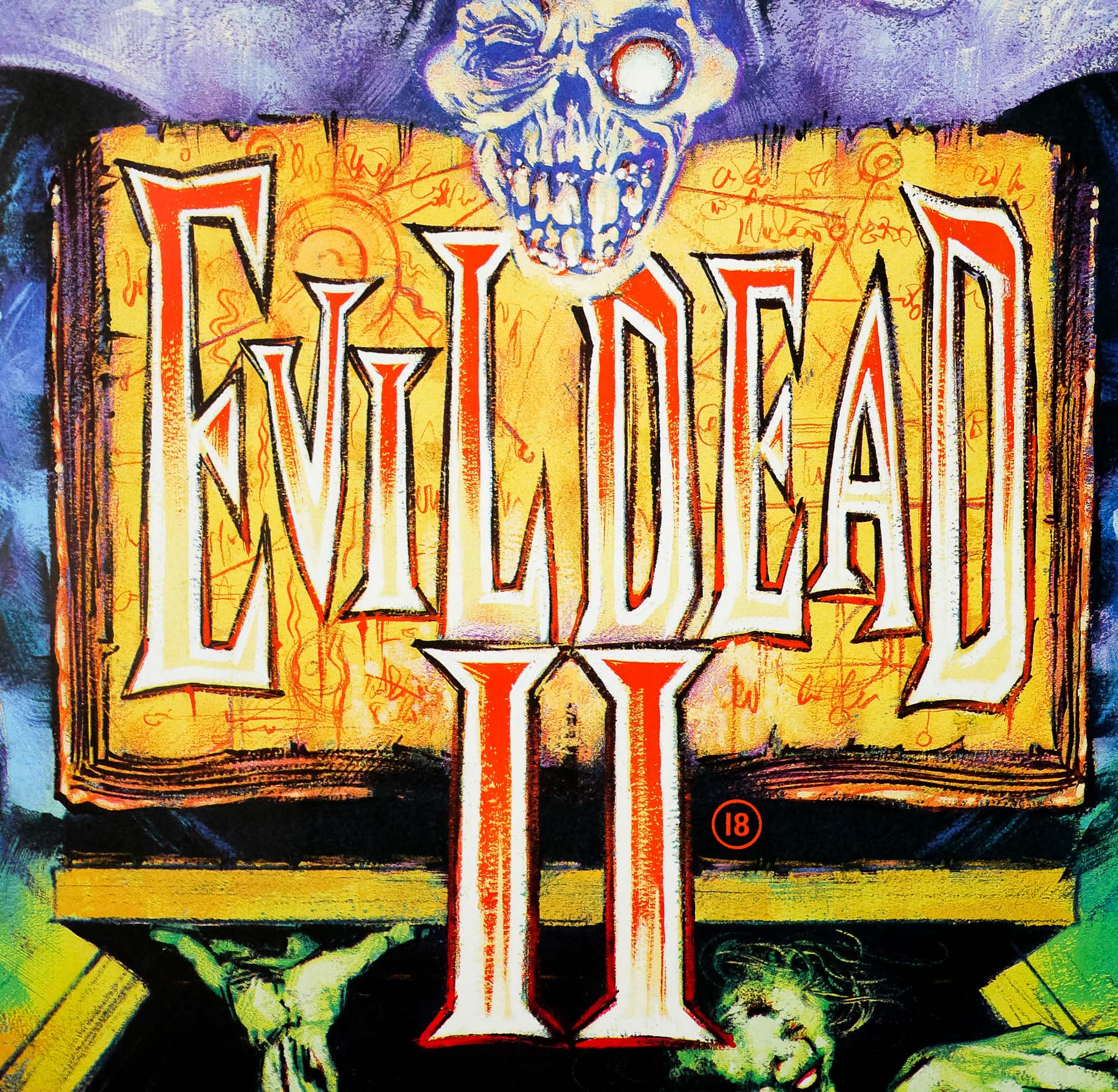
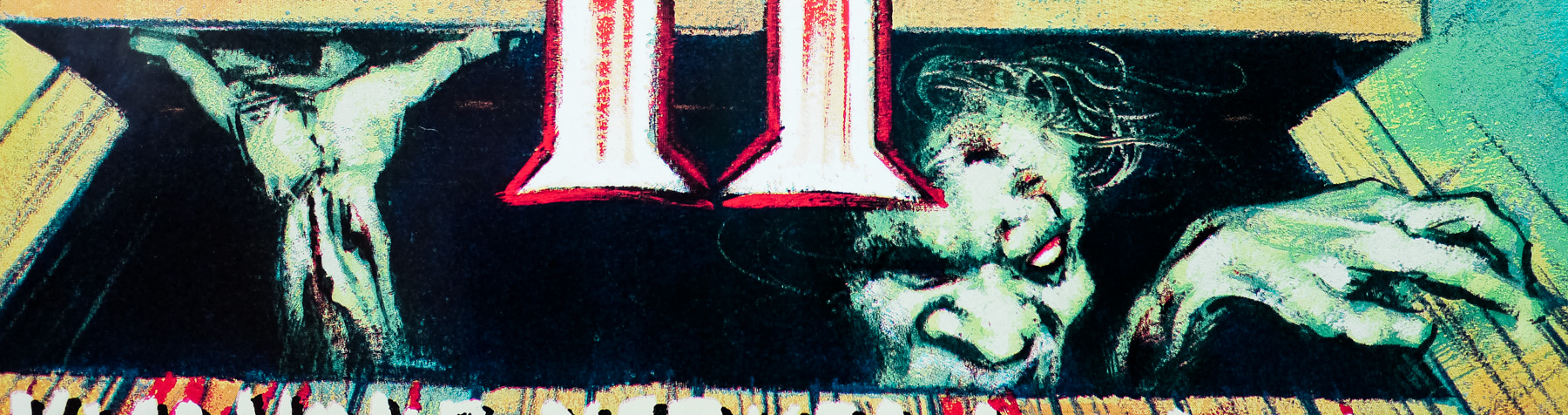
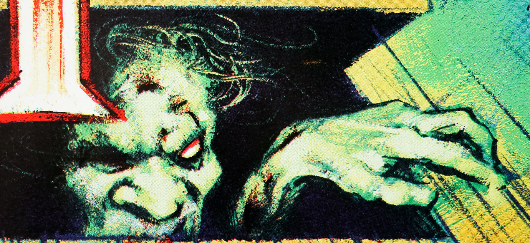
That particular image really only works with all the elements intact—cropping was not doing us any favors—so we figured, Why not use it whole? It’s just that in order to do that, we had to turn it sideways. It was a natural choice—and it seemed to fit the film’s unpredictable, violent, and humorous tenor. It’s like, “WTF just happened? Is that a plane? A body? How did that car end up like that?” It’s kind of like the visual punch line to a joke that starts with “two materialistic bourgeois jerks go on a road trip . . .”

Where does your interest in Godard films come from?
Godard’s influence is everywhere—in contemporary advertising, commercials, music videos. You could be watching something that is “Godard” and not even realize it. (Just the other night, I saw a new Mexican film that riffed on Anna Karina’s back-of-the-head introduction in Vivre sa vie.) His 1960s works, in particular, still resonate with so much life and excitement. So daring, and so very, very cool, even decades later.

Do you have a particular approach to designing for them?
With all of these Godard posters, I pretty much tried to just get out of the way and let the image speak for itself, and in the end, the most intuitive options were successful. With Pierrot le fou and Vivre sa vie, the resonance of those particular images is strong; title treatments that are too heavy or that get too much attention wouldn’t help tell their stories. Similarly, for Weekend, we’d have a hard time creating an image or a collage that captured the crazy, chaotic energy and direction of the film as well as the one we ended up using. So, with regards to these three posters, if I never hear “Wow, that’s a killer title treatment!” I’ll consider that a success.

Chow also designed the Janus re-release one sheets for Godard’s Pierrot Le Fou and Vivre Sa Vie and both can be seen in this Mubi.com ‘Movie Poster of the Week’ article.

The Wicked Lady / one sheet / USA

29.08.17

Poster Poster
Title
The Wicked Lady
AKA
--
Year of Film
1983
Director
Michael Winner
Starring
Faye Dunaway, Alan Bates, John Gielgud, Denholm Elliott, Prunella Scales, Oliver Tobias, Glynis Barber, Joan Hickson, Helena McCarthy
Origin of Film
UK
Genre(s) of Film
Faye Dunaway, Alan Bates, John Gielgud, Denholm Elliott, Prunella Scales, Oliver Tobias, Glynis Barber, Joan Hickson, Helena McCarthy,
Type of Poster
One sheet
Style of Poster
--
Origin of Poster
USA
Year of Poster
1983
Designer
Unknown
Artist
Unknown
Size (inches)
27 2/16" x 41"
SS or DS
SS
NSS #
830033
Tagline
She's wild. She's wicked. And she really knows how to whip up a good time.

The Wicked Lady is a period drama that was directed by the late Michael Winner and was based on the 1945 film of the same name. Faye Dunaway stars as Barbara whose sister Caroline (Glynis Barber) is due to marry wealthy landowner, Sir Ralph Skelton (Denholm Elliott). Seemingly devoid of any scruples, Barbara seduces Ralph and takes her sister’s place at the wedding. She soon grows bored of just being the wife of a wealthy man and decides to take up highway robbery, depriving wealthy coach travelers of their jewels and other trinkets. Eventually she meets and falls in with a real highway robber, Jerry Jackson (the late Alan Bates), and the pair step up their game by robbing gold bullion-filled stage coaches. Eventually their sloppiness catches up with them and people around Barbara begin to suspect she has some involvement in the robberies. 

The film was a critical and commercial failure and was compared unfavourably with the original film. Dunaway’s character is totally unlikeable and her performance is nothing short of bizarre. Perhaps the worst aspect of the film is the pointless nudity, including one really cringeworthy sex scene by a fire, with a stockings removal setup that’s tortuously long. You can practically hear the sleazy Winner rubbing his knees at the back of the set. Despite a strong cast on paper this is a squandered opportunity.

I’m unsure who is responsible for the art on this American one sheet so if you have an idea please get in touch. It’s not to be confused with the artwork that was used elsewhere around the globe, including the British quad, that was painted by Brian Bysouth.

Lock, Stock And Two Smoking Barrels / one sheet / USA

22.09.17

Poster Poster
Title
Lock, Stock And Two Smoking Barrels
AKA
Lock & Stock (Spain)
Year of Film
1998
Director
Guy Ritchie
Starring
Jason Flemyng, Dexter Fletcher, Nick Moran, Jason Statham, Steven Mackintosh, Vinnie Jones, Sting
Origin of Film
UK
Genre(s) of Film
Jason Flemyng, Dexter Fletcher, Nick Moran, Jason Statham, Steven Mackintosh, Vinnie Jones, Sting,
Type of Poster
One sheet
Style of Poster
--
Origin of Poster
USA
Year of Poster
1999
Designer
New Wave Creative
Artist
--
Size (inches)
27 1/16" x 40"
SS or DS
SS
Tagline
A disgrace to criminals everywhere

This is the US one sheet for the release of the feature debut of British director Guy Ritchie, 1998’s crime comedy Lock, Stock and Two Smoking Barrels. In addition to it being Ritchie’s first, it also introduced audiences to Jason Statham, best known for the Transporter films and recently the Fast and Furious franchise. It also marked the first appearance of British ex-footballer Vinnie Jones. Ritchie had come to attention with his short film The Hard Case which was seen by Trudie Styler and her husband Sting, leading to Styler executive producing Lock, Stock and Sting appearing in the film. Matthew Vaughan, a friend of Ritchie and now a successful director in his own right produced the film.

The film focuses on four lifelong friends who are small-time criminals, Eddy (Nick Moran), Tom (Jason Flemyng), Soap (Dexter Fletcher) and Bacon (Statham). At the start of the film Eddy has entered a high-stakes underground card game after the four put together the £100,000 entry fee. The game has been organised by local gangster Hatchet Harry (P.H. Moriarty) and the quartet soon discover that the odds are rigged in Harry’s favour. Before they know it they are half a million pounds in debt and under pressure from one of Harry’s enforcers, Big Chris (Jones).

A desperate Eddy overhears his next door neighbours, a gang of robbers, discussing plans to hold-up a local cannabis farm which also has cash and valuables. Eddy relays the information to his friends and they decide to rob the gang once the heist has taken place. So begins a madcap caper that continues to spiral into violence and an increasing body count. The two barrels in the title refers to a pair of antique shotguns that also feature in the story.

The film was given only a limited release in the US in March of 1999 and this one sheet was designed by the Hollywood marketing agency New Wave Creative. The company has been working on campaigns for major studios for over 25 years and, as well as posters, they also work on trailers and other aspects of film and TV campaigns. Their page on IMPAwards indicates how prolific they were at creating posters and it appears their first one was for a 1998 re-release of Gone with the Wind. It also looks like they stopped working on posters around a decade later and presumably now only focus on other aspects of marketing campaigns. The other posters I have collected by New Wave can be seen here.

Moon / screen print / All City / regular / USA

17.05.11

Poster Poster

Moon / screen print / All City / variant / USA

17.05.11

Poster Poster

The Winged Serpent / one sheet / international

16.07.13

Poster Poster
Title
The Winged Serpent
AKA
Q (USA) | Q: The Winged Serpent (UK) | American Monster (West Germany)
Year of Film
1982
Director
Larry Cohen
Starring
Michael Moriarty, Candy Clark, David Carradine, Richard Roundtree, James Dixon, Ron Cey
Origin of Film
USA
Genre(s) of Film
Michael Moriarty, Candy Clark, David Carradine, Richard Roundtree, James Dixon, Ron Cey,
Type of Poster
One sheet
Style of Poster
--
Origin of Poster
USA
Year of Poster
1982
Designer
Unknown
Artist
Bob Gleason
Size (inches)
27 2/16" x 41"
SS or DS
SS
NSS #
--
Tagline
Today in New York City the winged serpent rules. | A true legend comes alive.

Writer/director and B-movie legend Larry Cohen is responsible for this 1982 horror film that harks back to the popular ‘giant beast’ monster movies of the 1950s. Commonly known as ‘Q: The Winged Serpent’, or simply ‘Q’, the story is set in New York City and follows two police detectives (played by David Carradine and Richard Roundtree) investigating a series of brutal sacrificial slayings in which victims’ hearts and skins have been removed. They are also struggling to explain the mysterious deaths of people snatched from high up on rooftops by what is reported to be a flying lizard.

At the same time, a luckless hoodlum called Jimmy Quinn (played with gusto by Michael Moriarty) is on the run from murderous mobsters and discovers a giant egg hidden in the crown of the famous Chrysler Building, which apparently belongs to the deadly creature. It becomes apparent that the cult behind the sacrificial murders has managed to resurrect an Aztec god known as Quetzalcoatl, a flying lizard with huge talons and a taste for human flesh, and the detectives must battle to stop both the cult members and defeat the beast before New York City is lost.

This is the scarce international one sheet, printed in the USA for use in other English-speaking territories, and it differs greatly from the American one sheet that features artwork by Boris Vallejo. The detailed artwork on this poster is by the American artist Bob Gleason who is probably most famous for his work on the one sheet for John Carpenter’s Halloween. The artist, who lives in Portland, Oregon, has an official website that features galleries of the fine art paintings he currently works on, but makes no mention of his time painting film posters.

Death Proof / one sheet / international

11.11.13

Poster Poster
Title
Death Proof
AKA
Grindhouse (USA - two movies together) | Boulevard de la mort (France)
Year of Film
2007
Director
Quentin Tarantino
Starring
Kurt Russell, Zoe Bell, Rosario Dawson, Vanessa Ferlito, Tamiia Poitier, Tracie Thoms, Rose McGowan, Jordan Ladd, Mary Elizabeth Winstead, Quentin Tarantino, Marcy Harriell, Eli Roth
Origin of Film
USA
Genre(s) of Film
Kurt Russell, Zoe Bell, Rosario Dawson, Vanessa Ferlito, Tamiia Poitier, Tracie Thoms, Rose McGowan, Jordan Ladd, Mary Elizabeth Winstead, Quentin Tarantino, Marcy Harriell, Eli Roth,
Type of Poster
One sheet
Style of Poster
International
Origin of Poster
USA
Year of Poster
2007
Designer
BLT Communications, LLC
Artist
Unknown
Size (inches)
27" x 40"
SS or DS
SS
NSS #
--
Tagline
These 8 women are about to meet 1 diabolical man!

This is the scarce international one sheet for the release of Quentin Tarantino’s half of the ill-fated Grindhouse project, Death Proof. featuring Kurt Russell as the sadistic Stuntman Mike, a former Hollywood stuntman who has rigged his 1970s muscle car with a special cage that protects him in the event of a crash making it ‘death proof’. We see what happens when Mike invites Pam (Rose McGowan), a drunken reveller for a ride and kills her with his reckless driving before smashing into a car full of her friends who he’d met earlier that evening killing them all instantly, whilst he survives with only a few minor injuries. Mike evades prosecution because all the witnesses are dead and the girls were intoxicated. Fourteen months later he tries the same trick with another bunch of girls, but he doesn’t reckon on them having a stuntwoman (Zoe Bell) in their midst and before long the tables have turned.

The project was conceived by Tarantino and fellow director (and frequent collaborator) Robert Rodriguez as a homage to the 1970s grindhouse cinemas that would show horror, sci-fi and cult b-movies, often in double or even triple bills. Grindhouse features Death Proof paired with Rodriguez’s zombie action feature Planet Terror whilst a series of fake trailers were filmed and shown before each feature began. The trailers were created especially for Grindhouse by directors including Rob Zombie, Eli Roth and Edgar Wright. One of the trailers for a film called Machete starring Danny Trejo was directed by Rodriguez and was later made into a full length feature, the sequel to which is just about to be released into cinemas in the UK.

The Grindhouse project was shepherded by Tarantino’s regular producing partner Harvey Weinstein and when the film had a near disastrous North American box-office debut, despite positive reviews, the decision was then made to split the two films apart and release them separately in cinemas in the rest of the world. Blame was placed both on the overall length of Grindhouse (three hours plus) and reports that many cinema-goers were confused by the structure and left during the credits of Planet Terror. Both films had multiple minutes added back to their length in order to justify the ticket price of a standalone feature. Two films meant that many more posters were created to market the films and there were two one sheets that were printed in the USA for use internationally – typically that means in English-speaking territories outside of North America like Singapore and Hong Kong. These are pretty scarce posters and I’ll be posting the Planet Terror version in the coming weeks.

Return Of The Jedi / B2 / Sano artwork style / Japan

11.08.14

Poster Poster
Title
Return Of The Jedi
AKA
Star Wars Episode VI: Return of the Jedi (full title) | Blue Harvest (USA - fake working title) | Revenge of the Jedi (USA - working title)
Year of Film
1983
Director
Richard Marquand
Starring
Mark Hamill, Harrison Ford, Carrie Fisher, Billy Dee Williams, Anthony Daniels, Kenny Baker, Peter Mayhew, David Prowse, Ian McDiarmid
Origin of Film
USA
Genre(s) of Film
Mark Hamill, Harrison Ford, Carrie Fisher, Billy Dee Williams, Anthony Daniels, Kenny Baker, Peter Mayhew, David Prowse, Ian McDiarmid,
Type of Poster
B2
Style of Poster
Sano artwork style
Origin of Poster
Japan
Year of Poster
1983
Designer
Unknown
Artist
Kazuhiko Sano
Size (inches)
20 6/16" x 28 13/16"
SS or DS
SS
NSS #
--
Tagline
--

This is one of four B2 posters printed for the original Japanese release of Return of the Jedi in 1983. Although ROTJ, the third in the original trilogy of Star Wars films, was often maligned by fans who complained it was a weak end to the series and derided for featuring the child-friendly Ewoks, all was forgiven with the release of the 1999′s The Phantom Menace and its ‘galactic trade disputes’ and the risible Jar-Jar Binks. Now, although certainly not as highly acclaimed as the original 1977 film or the classic The Empire Strikes Back, ROTJ is still beloved by fans of the series. In 2015, director JJ Abrams will release Episode VII into cinemas, mooted as a direct sequel to this film and much anticipated by fans worldwide. JJ is seen as a much safer pair of hands than George Lucas after his shepherding of a well-received reboot of the Star Trek franchise.

Even if the Ewoks are loved and hated in equal measure, ROTJ still features many memorable, fan favourite characters, locations and scenes, including the attempted rescue of Han Solo from Jabba the Hut’s palace leading to a memorable showdown above a Sarlacc pit monster (which features the ignominious exit of fan favourite Boba Fett). Later the film sees the passing of Yoda along with more revelations about the Skywalker family, and an excellent scene that sees Luke Skywalker confront the evil Emperor Palpatine with Vader standing by. Meanwhile, the Ewoks (essentially child-sized teddy bears) join forces to defeat the ground forces of the Empire on the surface of the planet Endor.

The artwork on this poster was painted by the late Japanese-American artist Kazuhiko Sano and also appeared on a US one sheet and multiple other posters around the world. As detailed in the notes for the one sheet, I discovered the following information about the artwork from an ebay auction description:

‘The art is by Kazuhiko (Kazo) Sano. The art direction and design were by Christopher Werner. There was some resizing of Lando’s head on this poster, which needed to match the general size of the other actors. Because Sano was in Japan when this decision was made, they had another artist come in to do it. This retouch artist may have been Vincent Malizia, an airbrush artist in Los Angeles. I have an old newspaper clipping with him standing in front of the Jedi B poster and a caption that reads he was an airbrush artist for this poster.’

Kazuhiko Sano was born in Toyko in 1952 and studied oil painting before moving to Los Angeles in 1975 and majoring in illustration at the Academy of Art College. He graduated in 1980 with a Master in Fine Art qualification and soon began working in commercial illustration, working on book covers, editorial illustrations and film posters for a whole range of internationally famous clients. He also returned to the Academy of Art College in 1986 to teach and worked there until his death in 2011. Unquestionably his most famous film poster work was this one for Return of the Jedi but there are a handful of others too.

Survival Run / B1 / Japan

11.07.11

Poster Poster

Released as Damnation Alley in the USA, this dystopian sci-fi adventure (set after the nuclear destruction of World War 3) pretty much disappeared at the box office, but later gained something of a cult status. It’s interesting to note that the studio, 20th Century Fox, were making two sci-fi films in 1977 and saw this as their big hope for a box-office blockbuster. The studio suits didn’t have much faith in the other project, a little film called Star Wars…

The film features a couple of infamous scenes with mutated creatures, including ‘giant’ scorpions (terribly composited using the blue screen process) and killer cockroaches. It also featured an interesting vehicle known as The Landmaster.

In some cinemas the film was shown with something called Sound 360. From IMDb:

20th Century-Fox developed a rival to Universal’s gimmicky ‘Sensurround’ sound process (popularized in the theatrical release of Earthquake (1974)) that was only used for the theatrical release of “Damnation Alley” called Sound 360. This process was basically a variation of Magnetic-Optical Stereo sound. This technical advancement/gimmick in sound did not last past “Damnation Alley” although it was planned for Walter Hill‘s The Driver (1978) and Damien: Omen II (1978). If you look at the one sheet of “Damnation Alley” the “Sound 360” declaration and logo are prominent at the bottom.

This one sheet by one of my favourite Japanese artists, Seito, is practically identical to one of the American one sheets that can be seen on IMPAwards (credited to artist Paul Lehr).

The film was recently released on blu-ray (in the correct aspect ratio) and a trailer for that can be watched here.


Violent Streets / one sheet / international

06.10.14

Poster Poster
Title
Violent Streets
AKA
Thief (USA)
Year of Film
1981
Director
Michael Mann
Starring
James Caan, Tuesday Weld, Willie Nelson, James Belushi, Robert Prosky, Tom Signorelli, Dennis Farina, Nick Nickeas
Origin of Film
USA
Genre(s) of Film
James Caan, Tuesday Weld, Willie Nelson, James Belushi, Robert Prosky, Tom Signorelli, Dennis Farina, Nick Nickeas,
Type of Poster
One sheet
Style of Poster
--
Origin of Poster
International
Year of Poster
1981
Designer
Unknown
Artist
--
Size (inches)
27 1/16" x 41"
SS or DS
SS
NSS #
--
Tagline
Cheat him, and he'll BLOW YOU AWAY!

Ace director Michael Mann‘s debut film was released as Violent Streets in the UK and in several other countries (it was originally filmed with that title) but is now better known as Thief. Starring James Caan, in arguably his best role outside of The Godfather, it’s a neo-noir crime caper featuring the ‘one last job’ plot device. Frank (Caan) is an expert safecracker, jewel thief and hardened ex-con who works with a small, close-knit team of thieves on high-end robberies that are planned to an exacting degree.

After a run in with the Chicago mob Frank agrees to do one last big heist that will allow him to follow his dream of getting out of the game to spend time with his new wife Jessie (Tuesday Weld). It quickly becomes clear that getting out isn’t as easy as Frank hoped and, as the caper escalates, his usual wariness and mistrust is set aside, which puts his very life at risk.

This one sheet was printed in the USA for use in international English-speaking countries and features a unique design not seen on any other poster for the film. The rain-soaked street scene is very evocative of the film itself and I believe the figure of James Caan is actually a photograph that has been touched-up with paint (check out the close-ups). The American one sheet is markedly different and features stylised artwork of Caan and the UK quad can be seen here.

The original trailer is on YouTube.

Poppies Are Also Flowers / A1 / Germany

21.09.15

Poster Poster

Five great portraits painted by Renato Casaro feature on this German re-release poster for Poppies Are Also Flowers (AKA Danger Grows Wild and several other titles). Made as an anti-drug trafficking film with the help of the United Nations, it was sponsored by corporate entities, including Xerox.  As this poster attests, it was based on a screenplay by James Bond creator Ian Fleming, was directed by Bond director Terence Young and had a seriously star-studded cast. The likes of Yul BrynnerAngie DickinsonTrevor Howard and Marcello Mastroianni all signed up and, so the story goes, worked for $1 each. Some serious favours must have been called in as I find it hard to believe they were all passionately anti-narcotics!

The story is described thusly on the film’s Wikipedia page:

In an attempt to stem the heroin trade at the Afghanistan–Iran border, a group of narcotics agents working for the United Nations inject a radioactive compound into a seized shipment of opium, in the hopes that it will lead them to the main heroin distributor in Europe.

Now largely forgotten, the film is apparently in the public domain and is available to watch on YouTube and elsewhere (although the quality of all copies out there is atrocious). Although originally intended for TV, the film was given a cinema release in several countries, including Japan, UK (as Danger Grows Wild) and Germany. This poster is apparently for a 1973 re-release (for what reason I’m not certain) and the original German release poster can be seen here. Casaro was clearly tasked with making the film appear as exciting as possible and added the action scenes in the bottom half of the poster. It’s safe to say that for all the effort that went it to making the film it wasn’t exactly successful in curtailing the activities of the international drug trade!

One of my favourite artists, Renato Casaro is an Italian with a prolific movie poster output that lasted over 35 years. He began his career in 1953, aged 19, at the famous Studio Favalli in Rome and would go on to design and paint posters for many of the biggest directors in the world. His skill at accurately portraying actors and his brilliant use of colour and composition saw him much in demand from studios and actors alike. His artwork has featured on posters used in multiple countries, including Japan, Germany, USA as well as in his native Italy.

Check out the incredible amount of work on his official website here, which also features a biography of the artist. In March 2014 I published an exclusive interview with Renato and it can be read by clicking here. The other posters I’ve collected by Renato Casaro are here.

King Kong Lives / B2 / style A / Japan

20.11.13

Poster Poster
Title
King Kong 2
AKA
King Kong Lives (USA / UK)
Year of Film
1986
Director
John Guillermin
Starring
Peter Elliott, George Yiasoumi, Brian Kerwin, Linda Hamilton, John Ashton, Peter Michael Goetz, Frank Maraden
Origin of Film
USA
Genre(s) of Film
Peter Elliott, George Yiasoumi, Brian Kerwin, Linda Hamilton, John Ashton, Peter Michael Goetz, Frank Maraden,
Type of Poster
B2
Style of Poster
Style A
Origin of Poster
Japan
Year of Poster
1986
Designer
Unknown
Artist
Unknown
Size (inches)
20 6/16" x 28 13/16"
SS or DS
SS
Tagline
--

King Kong Lives is the critically-mauled and commercially disastrous sequel to the ill-advised 1976 remake of the classic big ape monster movie, which was shepherded into life by the legendary Italian producer Dino De Laurentiis. I’m not entirely sure why a decade passed before this sequel was put into production, but both De Laurentiis (or at least his company DEG) and director John Guillermin returned and definitely shouldn’t have bothered. The gap is explained in the film by having Kong in a 10 year coma following his fall from the World Trade Center at the end of the previous film.

Linda Hamilton (who should have known better) stars as Dr. Amy Franklin who is attempting to perform a heart transplant with an electronic replacement but Kong has lost too much blood for the operation to proceed. Luckily the adventurer Hank Mitchell (Brian Kerwin) finds and captures another giant ape in the jungles of Borneo and brings it to the US so that the operation can go ahead. It turns out that the new ape is a female and once Kong’s heart is replaced it’s not long before he escapes with ‘Lady Kong’ and chaos ensues. Unfortunately, despite the premise, the entire cast looks as if they’d rather be somewhere else and the shoddy effects can’t paper over the cracks.

This artwork is exclusive to the style A Japanese poster but has some elements that are similar to the American one sheet. I’ve struggled to find out who the artist is for this poster so please get in touch if you have an idea. There is also a style B Japanese poster that was illustrated by the great Noriyoshi Ohrai that I also have in the collection and can be viewed here.

The Streetfighter / B2 / Japan

04.10.12

Poster Poster
Title
The Streetfighter
AKA
Hard Times (USA) | L'eroe della strada [The hero of the street] (Italy)
Year of Film
1975
Director
Walter Hill
Starring
Charles Bronson, James Coburn, Jill Ireland, Strother Martin, Margaret Blye, Michael McGuire, Felice Orlandi, Edward Walsh, Bruce Glover, Robert Tessier, Nick Dimitri
Origin of Film
USA
Genre(s) of Film
Charles Bronson, James Coburn, Jill Ireland, Strother Martin, Margaret Blye, Michael McGuire, Felice Orlandi, Edward Walsh, Bruce Glover, Robert Tessier, Nick Dimitri,
Type of Poster
B2
Style of Poster
--
Origin of Poster
Japan
Year of Poster
1975
Designer
Unknown
Artist
--
Size (inches)
20 6/16" x 28 12/16"
SS or DS
SS
Tagline
--

This was cult director Walter Hill’s debut feature film and starred action legend Charles Bronson in one of his more memorable roles. A mysterious drifter named Chaney (Bronson) arrives in New Orleans and has a chance meeting with Speed (James Coburn) an organiser of illegal bare-knuckled boxing matches. Chaney asks Speed to set him up with a fight and he quickly proves himself as a fearsome boxer. He also meets and begins a relationship with Lucy Simpson (Jill Ireland – Bronson’s wife at the time) but it’s not long before Speed’s chaotic nature and addiction to gambling begins to threaten more than just their partnership.

This was to be the only time Hill and Bronson would team up together with the director later recalling “We had kind of a falling out over the film. He thought I’d been a little too… how do I put this? Too draconian in my editing of his wife’s scenes.”

The film was originally released as Hard Times in the US.

The trailer can be watched on YouTube. Writer Josh Olson adds a commentary on the great Trailers From Hell site.

The Terminator / quad / UK

29.08.12

Poster Poster
Title
The Terminator
AKA
O Exterminador do Futuro (Brazil)
Year of Film
1984
Director
James Cameron
Starring
Arnold Schwarzenegger, Michael Biehn, Linda Hamilton, Paul Winfield, Lance Henriksen, Bess Motta, Earl Boen, Rick Rossovich, Dick Miller, Shawn Schepps, Bruce M. Kerner, Franco Columbu,, Bill Paxton, Brad Rearden, Brian Thompson
Origin of Film
UK | USA
Genre(s) of Film
Arnold Schwarzenegger, Michael Biehn, Linda Hamilton, Paul Winfield, Lance Henriksen, Bess Motta, Earl Boen, Rick Rossovich, Dick Miller, Shawn Schepps, Bruce M. Kerner, Franco Columbu,, Bill Paxton, Brad Rearden, Brian Thompson,
Type of Poster
Quad
Style of Poster
--
Origin of Poster
USA
Year of Poster
1985
Designer
Unknown
Artist
Mike Francis
Size (inches)
30 2/16 x 40"
SS or DS
SS
NSS #
--
Tagline
In the Year of Darkness, 2029, the rulers of this planet devised the ultimate plan. They would reshape the Future by changing the Past. The plan required something that felt no pity. No pain. No fear. Something unstoppable. They created 'THE TERMINATOR'

James Cameron’s seminal sci-fi classic The Terminator was given a unique poster design when it was released on these shores in January 1985. The US poster had featured the iconic photograph of Arnold Schwarzenegger alongside the lengthy tagline (that also appears on this quad), but the decision was taken to go with a painted portrait of the actor, which also features a depiction of the robotic endoskeleton underneath the Arnie exterior.

The person responsible for the image on this quad was the British artist Mike Francis. Whilst putting together the must-own book British Film Posters, Sim Branaghan met and spoke to Francis about his life and career and, as always, I heartily recommend picking up the book to read the section in full. Born in Surrey in 1938, Francis got his first job in commerical art in the early 1950s at the Rome Studios in Soho, London. Starting out as a messenger boy he began to be given illustration jobs and after a stint as a National Serviceman he returned to the studio in 1958 to a welcome pay raise and an increase in illustration work.

Mike stayed with Rome Studios until 1970 when he left to join Illustrators of London on Great Marlborough Street and this is where he was given his first film posters to work on. His first quad was for the 1971 version of Black Beauty and he also worked on posters for Hammer and other independent companies. In 1974 Francis won the National Gallery’s 150th Anniversary Award, and with the prize money he took the decision to go freelance. Although film posters were only a small part of his overall output (he estimates he was doing a couple per year) he continued to paint for film-related studios such as Downtons and some of his other quads include The Karate Kid (1984), Not Quite Jerusalem (1985) and The Holocroft Covenant (1985).

By about 1990 the illustration work had dried up completely but Francis had been painting highly finished photorealist work for many years and this side of his career had taken off significantly with high-profile exhibitions and celebrity clients. However, in terms of film work there’s no question that this painting for The Terminator is the artist’s most iconic work.

Evil Dead II / quad / UK

21.09.12

Poster Poster
Title
Evil Dead II
AKA
Evil Dead 2: Dead by Dawn (USA title)
Year of Film
1987
Director
Sam Raimi
Starring
Bruce Campbell, Sarah Berry, Danny Hicks, Kassie Wesley, Ted Raimi, Denise Bixler, Richard Domeier, John Peaks, Lou Hancock
Origin of Film
USA
Genre(s) of Film
Bruce Campbell, Sarah Berry, Danny Hicks, Kassie Wesley, Ted Raimi, Denise Bixler, Richard Domeier, John Peaks, Lou Hancock,
Type of Poster
Quad
Style of Poster
--
Origin of Poster
UK
Year of Poster
1987
Designer
Graham Humphreys
Artist
Graham Humphreys
Size (inches)
30" x 40"
SS or DS
SS
NSS #
--
Tagline
There's only one movie scarier than 'The Evil Dead'... | Kiss your nerves goodbye

Brilliant artwork by UK artist Graham Humphreys on this quad for the (superior IMO) sequel to Sam Raimi’s brilliant low-budget horror The Evil Dead. The films were a great success in the UK after the first was bought at the Cannes Film Festival by the legendary British distribution (and later production) company Palace Pictures. Released in cinemas and on VHS almost simultaneously the modest outlay for the rights to distribute the film proved to be an excellent deal as it went on to see great box-office takings and thousands of tapes sold. The first film was eventually caught up in the infamous video nasties debacle of the 1980s and was banned for a number of years under the Video Recordings Act.

The sequel, made six years later and technically a retcon sequel, was allotted a significantly larger budget than the first and is more of a black comedy than the original. Lead actor Bruce Campbell is put through a continually escalating series of horrific encounters that allow him to show the full extent of his talent for slapstick comedy.

Palace pictures bought the rights to distribute the second film and asked Graham Humphreys to design the quad and video artwork for it after his iconic design for the first film had proved so successful. When I interviewed the artist about his career in 2011 I asked him about the design for the poster and the excerpt from the interview is below:

What happened with the quad for Evil Dead II?
It was the same situation at Palace but I think Steve and Nik Powell were at the helm with this one, since the first film had been so succesful. They figured why change the formula. I guess the point was that the film was almost a remake of the first one, plus a bit extra and so that’s what going on here. A re-imagining of the first one.

In that documentary you talk about how you’d had another idea involving a clock.
Yeah, that was the whole thing about ‘dead by dawn’ and I had this pendulum and a blood-covered clock that looked fantstic. I was particularly influenced by Werner Herzog’s Nosferatu film because there’s a great clock in that, which is beautifully designed with a little skull. That’s really what I wanted to do. The idea was actually to build a physical clock, but I never got to make it. The guys thought it was a bit obscure. There was also going to be a ‘Pit and the Pendulum’-style swishing blade covered in blood and the title was going to be on that.

The feedback was to keep things simple and use the characters?
Yeah, we had the reel to reels on the first one and for this we had the book of the dead as the key element. There was some contention over whether we do the Roman numerals or the big number 2. To me it felt it should be classic looking with the numerals. I used a colour slide-set for the characters with only a few adjustments. I think I took a Polaroid of my hand to get the position right and a girl I was working with did the pose for me onto which I added the actresses head.

Do you prefer this one or the first film’s quad better?
I like the first one because it’s so raw and it captures the mood and music of the time for me. They’re two different animals really.
The full interview can be read here.

Check out these TV clips that were specially filmed in the UK to promote the film featuring Sam Raimi and English TV and radio (and film critic) Jonathan Ross


E.T. the Extra-Terrestrial / quad / UK

13.05.13

Poster Poster
Title
E.T. the Extra-Terrestrial
AKA
Night Skies (USA working title)
Year of Film
1982
Director
Steven Spielberg
Starring
Henry Thomas, Dee Wallace, Robert MacNaughton, Drew Barrymore, Peter Coyote
Origin of Film
USA
Genre(s) of Film
Henry Thomas, Dee Wallace, Robert MacNaughton, Drew Barrymore, Peter Coyote,
Type of Poster
Quad
Style of Poster
--
Origin of Poster
UK
Year of Poster
1982
Designer
Unknown
Artist
John Alvin
Size (inches)
30" x 39 15/16"
SS or DS
SS
Tagline
He is afraid. He is alone. He is three million light years from home.

Easily one of the most iconic pieces of film poster artwork ever printed, John Alvin’s superb image was used around the globe to advertise Steven Spielberg’s sci-fi masterpiece, E.T. the Extra-Terrestrial. The story of a small alien who gets stranded on earth and meets a young boy called Elliot (Henry Thomas) touched the hearts of millions of movie-goers around the world. Within a year of its release it was crowned the highest-grossing film of all time, overtaking the previous leader, George Lucas’ Star Wars (this record has since been bested by over forty films in the intervening years). Last year saw E.T. celebrate its 30th anniversary and having watched the 2012 blu-ray release recently there’s no question that it has stood the test of time well.

The image of the two fingers touching is an obvious homage to the most famous section of the fresco on the ceiling of the Sistine Chapel in Rome that was painted by the Italian artist Michelangelo in the 16th century. Known as The Creation of Adam, the painting is thought to depict God breathing life into Adam, which is the Biblical creation narrative from the book of Genesis. The painting is arguably as famous as Leonardo da Vinci’s legendary Mona Lisa. In Alvin’s version it is E.T.’s gnarled hand that reaches out towards what is clearly the hand of Elliot. The alien’s finger is shown to have particular powers during the film.

The poster artwork on this British quad is by the late American designer and artist John Alvin, who was responsible for over 135 film poster designs over a thirty year period. Alvin painted many unforgettable pieces of artwork, including for Blade Runner and Gremlins, both of which were used around the world to promote their respective films. Alvin sadly passed away too early, just shy of his 6oth birthday (in 2008), but his fantastic designs will live on for generations to come.

The Nightmare Before Christmas / quad / photo style / UK

13.12.13

Poster Poster
Title
The Nightmare Before Christmas
AKA
Tim Burton's The Nightmare Before Christmas (USA - complete title)
Year of Film
1993
Director
Henry Selick
Starring
Danny Elfman, Chris Sarandon, Catherine O'Hara, William Hickey, Glenn Shadix, Ken Page
Origin of Film
USA
Genre(s) of Film
Danny Elfman, Chris Sarandon, Catherine O'Hara, William Hickey, Glenn Shadix, Ken Page,
Type of Poster
Quad
Style of Poster
Photo
Origin of Poster
UK
Year of Poster
1993
Designer
Unknown
Artist
--
Size (inches)
30 1/16" x 40"
SS or DS
SS
NSS #
--
Tagline
--

It’s hard to believe that it’s celebrating its 20th anniversary this year but The Nightmare Before Christmas has lost none of its magic and is a film that I could happily re-watch year after year. The combination of Tim Burton‘s storytelling and character design, with Henry Selick‘s direction and Danny Elfman‘s brilliant songs (and voice) make for one of the best animated films ever made. The story has its origins from the time when Tim Burton was working at Disney as an animator and had just completed the short film Vincent in 1982. After writing a short poem with the same title, Burton played around the idea of adapting it as a television special and a book, but eventually Disney agreed to help him produce it as a short film. 

After meeting Selick, a fellow animator at the same studio, he came close to realising his original vision before development stalled, apparently after Disney felt the project was ‘too weird’. Several years passed which saw Burton strike box-office gold with Beetlejuice and Batman, before he discovered that Disney still owned the rights to the film. He and Selick committed to the idea of developing the project into a feature length animation and because of commitments to directing Batman Returns (1992) it was agreed that the latter would direct.

Utilising 20 sound stages and 120 animators, Selick set about bringing to life the story of Jack Skellington, the Pumpkin King, and organiser of Halloweentown’s annual party. Fed up of the same routine year after year, Jack is walking in the forest and discovers a series of doors leading to other holiday-based worlds. Upon entering the Christmas door Jack is enchanted by everything he sees and vows to take on the role of Santa for the next Christmas day. Each member of Halloweentown is given a task to prepare for the big event, but their penchant for all things ghoulish isn’t compatible with the jollity of Christmas and Jack’s dream is in danger of unravelling completely.

The quality of the stop-motion animation and character design is first-rate and Elfman’s songs are unforgettably great. The Nightmare Before Christmas has a legion of fans and a 3D re-release occurred in 2006 which further increased its popularity, and a seemingly endless stream of merchandise has been released over the past two decades.

This is the photo style (photo in the sense that it’s a posed still from the film) British quad that was printed for the original release of the film and there is also another quad which features an illustration and that can be seen here. This design is effectively the landscape format version of the US one sheet.

Clockwork Orange / quad / 2000 re-release / UK

21.05.14

Poster Poster
Title
Clockwork Orange
AKA
Stanley Kubrick's A Clockwork Orange (USA - poster title) | Arancia meccanica (Italy)
Year of Film
1971
Director
Stanley Kubrick
Starring
Malcolm McDowell, Warren Clarke, Michael Bates, James Marcus, Michael Tarn, Patrick Magee
Origin of Film
USA | UK
Genre(s) of Film
Malcolm McDowell, Warren Clarke, Michael Bates, James Marcus, Michael Tarn, Patrick Magee,
Type of Poster
Quad
Style of Poster
Re-release | advance
Origin of Poster
UK
Year of Poster
2000
Designer
Unknown
Artist
Philip Castle
Size (inches)
30 1/16" x 39 15/16"
SS or DS
SS
Tagline
Being the adventures of a young man whose principal interests are rape, ultra-violence and Beethoven.

Stanley Kubrick’s classic 1971 dystopian sci-fi, A Clockwork Orange, was met with controversy as soon as it was released in 1971, despite being a hit with UK and US audiences and earning box-office profits several times its original production budget. Unfortunately for UK audiences, the film was withdrawn from distribution in 1973 at the insistence of Kubrick himself following a number of death threats that were apparently received by the director and his family. These threats had been the result of the film being implicated, or at least referenced, in several high-profile criminal cases, including one in which an elderly vagrant had been kicked to death, mirroring an infamous scene in Kubrick’s film.

Despite being freely available across the rest of Europe and in the US, the film remained out of UK cinemas and, during the 1980s, off British video rental shop shelves. When the legendary London cinema the Scala Film Club decided to show the film in 1993 they were sued by Warner Bros at Kubrick’s insistence. The studio won the court case and the cinema club was effectively bankrupt, with plans for expansion quickly shelved. The club produced its last ‘what’s on’ calendar in May 1993 and the Scala converted to a music venue towards the end of the 1990s.

When Kubrick died in 1999 the ban was relaxed and the film was finally made available on VHS and DVD. A limited cinema run also took place and this quad was produced at the time. It uses part of the original artwork that featured on posters for the film around the world, which was painted by the renowned British artist Philip Castle. The final one sheet for the film is one of the most iconic posters of all time, with the same painting being used to promote the film all over the world, and it continues to be used to promote the film to this day. The original UK quad features more of Castle’s artwork and a more muted colour scheme, but features the same tag-line.

Born in London in 1943, Philip Castle’s design career has seen him working on album covers for some of the biggest names in British music, including Wings, Mott the Hoople and Pulp. His skills were utilised for the famous cover for David Bowie’s Aladdin Sane, which saw him airbrushing over a photograph by Celia Philo. He also worked on the cover for the legendary computer game Elite. In 1987 Kubrick and Castle would collaborate once more on the poster for Full Metal Jacket, which again proved to be a seminal piece of work. There’s an interesting interview with Castle available to watch on YouTube in which he discusses his work with Kubrick.

This page features several examples of his brilliant work and there are multiple images tagged on Tumblr. The posters I’ve collected by him can be seen here.

Escape to Victory / quad / UK

13.06.14

Poster Poster

Something of a cult classic, Escape to Victory is arguably the most famous film to revolve around The Beautiful Game. Based on 1962 Hungarian film called Két félidő a pokolban by director Zoltán Fábri the film, which is set during WWII, tells the story of a football match played in Paris by a team of Prisoners of War against a German side, seen as a propaganda event. The team is led by John Colby (Michael Caine) who is determined to win the game despite the distraction of other POWs who want to use the cover of the game to escape. Sylvester Stallone plays Hatch, an American POW who is at the vanguard of the escape attempt and actually manages to get out of the camp prior to the game to meet up with resistance leaders in Paris. After planning the big breakout, Hatch must get recaptured and returned to the POW camp in order to communicate the plans to the others. When the big day arrives, Hatch is put into goal and Colby persuades the team to see the match through to the final whistle before they make their escape.

The film notoriously features a host of real life professional footballers who were involved in the game and doubled for the actors or played on the German team, including the Brazilian superstar PeléBobby MooreOsvaldo Ardiles and a whole host of players from the English team Ipswich Town, who were one of the most successful British sides at the time of the film’s release. English goalkeeping legend Gordon Banks, who played during the 1966 world cup that England won, worked behind the scenes and coached Stallone to ensure his scenes in goal were realistic enough for the film’s audience.

This UK quad takes the central figures from the US one sheet (where the film was titled simply Victory) that were painted by the artist David Jarvis and adds a montage that was illustrated by the British designer Vic Fair, who also designed the poster. Jarvis is perhaps best known for his illustration on the US one sheet for Walter Hill’s The Warriors. Having completed a degree in illustration at the Los Angeles Art Center College of Design, Jarvis went on to work as a freelance illustrator producing over thirty designs for film posters, as well as record sleeves, magazine covers and more. He also worked as an artist for Disney studios on the films Mulan and Tarzan. The other posters I’ve collected by him can be seen here.

One of the most important designer/artists ever to work on British film marketing, Vic Fair is responsible for several iconic posters, including The Man Who Fell To Earth, posters for Hammer horrors like Vampire Circus, and the withdrawn advance one sheet for A View to a Kill. I interviewed the artist for this site and that article can be viewed by clicking here.

Evil Dead / Thailand

09.03.15

Poster Poster
Title
Evil Dead
AKA
La casa [The house] (Italy) | Into the Woods (USA working title)
Year of Film
1981
Director
Sam Raimi
Starring
Bruce Campbell, Ellen Sandweiss, Betsy Baker, Hal Delrich, Theresa Tilly
Origin of Film
USA
Genre(s) of Film
Bruce Campbell, Ellen Sandweiss, Betsy Baker, Hal Delrich, Theresa Tilly,
Type of Poster
Thai
Style of Poster
--
Origin of Poster
Thailand
Year of Poster
1982
Designer
Unknown
Artist
Noppadol
Size (inches)
21 1/16" x 29 5/16"
SS or DS
SS
Tagline
--

This is the Thai poster for the release of Sam Raimi’s brilliant low-budget horror The Evil Dead, which made an instant cult icon of lead actor (and friend of Raimi) Bruce Campbell who plays Ash, one of five friends who travel to a small cabin in the woods on vacation. The group discover a gnarled old book in the basement that turns out to be a Sumerian version of the Book of the Dead. Along with it are tapes containing translation of the text and when these are played demons are summoned in the woods. The house is subjected to a sustained attack and one by one the friends are possessed, turning into ‘deadites’ and leaving just Ash to survive the night and the forces of the evil dead.

Both this film and its 1987 sequel were big hits in the UK after the first was bought at the Cannes Film Festival by the legendary British distribution (and later production) company Palace Pictures. Released in cinemas and on VHS almost simultaneously the modest outlay for the rights to distribute the film proved to be an excellent deal as it went on to see great box-office takings and thousands of tapes sold. The Evil Dead was eventually caught up in the infamous video nasties debacle of the 1980s and was banned for a number of years under the Video Recordings Act.

The sequel, made six years later and technically a retcon sequel, was allotted a significantly larger budget than the first and is more of a black comedy than the original. Ash is put through a continually escalating series of horrific encounters that allow him to show the full extent of his talent for slapstick comedy.

This Thai poster featuring a montage of scenes from the film was painted by a Thai artist called Noppadol about whom I’ve been unable to discover very little, other than a few of the other film poster titles he worked on (including Saturn 3 and The Beyond). If anyone knows any more details please get in touch.

Evil Dead II / Thailand

29.05.15

Poster Poster
Title
Evil Dead II
AKA
Evil Dead 2: Dead by Dawn (USA title)
Year of Film
1987
Director
Sam Raimi
Starring
Bruce Campbell, Sarah Berry, Danny Hicks, Kassie Wesley, Ted Raimi, Denise Bixler, Richard Domeier, John Peaks, Lou Hancock
Origin of Film
USA
Genre(s) of Film
Bruce Campbell, Sarah Berry, Danny Hicks, Kassie Wesley, Ted Raimi, Denise Bixler, Richard Domeier, John Peaks, Lou Hancock,
Type of Poster
Thai
Style of Poster
--
Origin of Poster
Thailand
Year of Poster
1987
Designer
Unknown
Artist
Jinda
Size (inches)
21 4/16" x 30 12/16"
SS or DS
SS
Tagline
--

Unique and wild artwork by Jinda features on this original Thai poster for the (superior IMO) sequel to Sam Raimi’s brilliant low-budget horror The Evil Dead. The films were a great success in the UK after the first was bought at the Cannes Film Festival by the legendary British distribution (and later production) company Palace Pictures. Released in cinemas and on VHS almost simultaneously the modest outlay for the rights to distribute the film proved to be an excellent deal as it went on to see great box-office takings and thousands of tapes sold. The first film was eventually caught up in the infamous video nasties debacle of the 1980s and was banned for a number of years under the Video Recordings Act.

Evil Dead II, made six years later and technically a retcon sequel, was allotted a significantly larger budget than the first and is more of a black comedy than the original. Lead actor Bruce Campbell is put through a continually escalating series of horrific encounters that allow him to show the full extent of his talent for slapstick comedy.

I’ve been unable to find out much about Jinda other than the titles of several of the Thai film posters he painted the artwork for. If anyone has anymore information on him please get in touch.


Halloween / Thailand

03.05.16

Poster Poster
Title
Halloween
AKA
The Babysitter Murders (USA - working title) | Halloween: la notte delle streghe [The night of the witches] (Italy)
Year of Film
1978
Director
John Carpenter
Starring
Donald Pleasence, Jamie Lee Curtis, Nancy Kyes, P.J. Soles, Charles Cyphers, Kyle Richards, Brian Andrews, John Michael Graham, Nancy Stephens
Origin of Film
USA
Genre(s) of Film
Donald Pleasence, Jamie Lee Curtis, Nancy Kyes, P.J. Soles, Charles Cyphers, Kyle Richards, Brian Andrews, John Michael Graham, Nancy Stephens,
Type of Poster
Thai
Style of Poster
--
Origin of Poster
Thailand
Year of Poster
1978
Designer
Unknown
Artist
Neet | Bob Gleason (central image based on art from US one sheet)
Size (inches)
21.5" x 30 13/16"
SS or DS
SS
Tagline
--

This is the Thai poster for the release of John Carpenter‘s seminal horror film Halloween. An independent release, financed by one man (Moustapha Akkad), the film was produced on a low budget of $300k and would go on to gross over $70m worldwide. Halloween kickstarted a franchise that would run for seven sequels (and a recent remake) and the masked character of Michael Myers would enter the horror pantheon as one of its most memorable monsters.

Carpenter wrote the screenplay with his then girlfriend, producer Debra Hill and is often credited as being the the first in a long line of slasher films, although films like Alfred Hitchock’s Psycho were obvious inspirations. The film has little in the way of gore or violence and instead uses clever camera work and sound design to brilliant effect, keeping the audience on the edge of their seats throughout. There have been countless imitations over the years but few that match up to the taught, perfectly-paced original Halloween.

This Thai poster features the classic illustration of a knife blade morphing into a carved pumpkin that was created by the American artist Bob Gleason and used on the US one sheet and several other posters around the globe. The lurid montage at the bottom of the poster was created by a local Thai artist known as Neet. If anyone has any more details about the artist please get in touch.

In March 2016 Gleason’s original artwork was put up for auction (selling for just under $84k) and was accompanied by a letter from the artist talking about its creation, which is well worth a read.

Excalibur / A0 / Germany

19.04.17

Poster Poster
Title
Excalibur
AKA
The Knights (USA - working title)
Year of Film
1981
Director
John Boorman
Starring
Nigel Terry, Helen Mirren, Nicol Williamson, Nicholas Clay, Cherie Lunghi, Liam Neeson, Patrick Stewart, Clive Swift, Gabriel Byrne
Origin of Film
USA | UK
Genre(s) of Film
Nigel Terry, Helen Mirren, Nicol Williamson, Nicholas Clay, Cherie Lunghi, Liam Neeson, Patrick Stewart, Clive Swift, Gabriel Byrne,
Type of Poster
A0
Style of Poster
--
Origin of Poster
Germany
Year of Poster
1981
Designer
Unknown
Artist
Based on Bob Beak artwork
Size (inches)
33" x 46 10/16"
SS or DS
SS
Tagline
--

At first glance, the artwork on this large-format (A0) German poster for the 1981 fantasy film Excalibur seems to be the same Bob Peak artwork that appears on posters from around the world, including the US one sheet, but it is not. When viewed up close, and compared to the Peak art, it’s clear that the (German) artist was asked to replicate the original as closely as possible, but the quality is definitely lacking in comparison to Peak. The likely reason the distributor decided to have the art repainted, as opposed to cutting and recomposing Peak’s, is that the one sheet art’s composition is completely unsuited to the landscape format of this A0. I suspect a similar thing happened with the British quad, which features an image of the sword being held aloft that is not the same artwork as on the Peak one sheet. The sword appears alongside an image of Merlin that is the artist’s work.

Excalibur was a passion project for the director John Boorman (Deliverance, Point Blank) who had been trying to kickstart a project based on the legend of King Arthur and the Knights of the Round Table since 1969. After almost a decade he was able to pull together the financial backing to commence filming, with a script based on the 15th century tales of Le Morte d’Arthur by Thomas Malory. The film is notable for being entirely shot on location in Ireland and for featuring breakout performances from a number of notable actors, including Helen MirrenGabriel Byrne, and Liam Neeson. Set over several decades, the story follows the machinations of multiple characters, with the wizard Merlin (Nicol Williamson) acting as something of a constant (if deeply eccentric) figure who floats around the rulers of Britain. In one of the first scenes we see him retrieving the titular sword from the Lady of the Lake.

Beginning with a king called Uther Pendragon (Byrne), Merlin first assists him in first reaching a truce with Gorlois, the Duke of Cornwall, before Uther sets his sights on the Duke’s wife Igrayne and war breaks out once more. Merlin reluctantly offers to help him defeat Gorlois and capture Igrayne on the condition that he can have ‘whatever results from this lust’. Without fully understanding the ramifications of the deal, Uther agrees, slays the Duke and has his way with Igrayne (albeit under a Merlin spell that makes him look like the Duke). Nine months later Merlin arrives to claim his agreed prize, a boy born of that night’s passion. The wizard leaves the castle with him, much to Igrayne’s horror, and eventually Uther decides to pursue and attempt to rescue his son. Unfortunately he is attacked in a forest by a group of Gorlois’ men and dies, but not before he thrusts Excalibur into a stone and proclaims, “He who draws the sword from the stone, he shall be king.”

The story then jumps forward several years and sees the boy, now grown into a teenager named Arthur, completely unaware of his origins (Merlin had given him to another couple to raise as their own). Whilst attending a jousting contest with his father and brother, a mixup with a stolen sword sees Arthur easily pulling Excalibur from the stone after hundreds of men have failed to do so in the past. Unaware of the significance of the event, it takes Arthur a while to understand that he is now the rightful king and only a visit from Merlin eventually convinces him. The rest of the film follows Arthur as he rallies knights around him, takes the throne and establishes the famous court and castle of Camelot. He also meets and falls in love with Guinevere (Cherie Lunghi) but eventually tensions rise when Lancelot, one of his trusted knights, becomes infatuated with her. Morgana, a budding sorceress and Arthur’s half-sister, also tricks Merlin into teaching her the Charm of Making, allowing her to take the form of others. When she tricks Arthur into sleeping with her (him believing it to be Guinevere) the resultant child threatens an end to the whole kingdom.

Apparently the film was originally completed to a length of around three hours before having 40 minutes trimmed and I can’t help but feel that allowing the film to breathe might have helped. There’s a lot of story to fit in and it’s fair to say that the cuts do show; I found some of the time jumps and scene to scene transitions pretty jarring, whilst the script doesn’t exactly help matters. Critics at the time also found the film’s story and exposition wanting but most agreed that Boorman had definitely succeeded in making the film visually stunning. The use of real locations along with some incredible costumes such as the shiny chrome armour worn by most of the male cast (Merlin even has a shiny cap) are accentuated by the use of coloured lighting. The film has developed something of a cult reputation over the years, largely thanks to the arresting visuals on display.

If anyone knows who the artist was that repainted the original Bob Peak art, please get in touch.

Death Trap / B2 / Japan

17.05.11

Poster Poster

Filofax / one sheet / international

17.05.11

Poster Poster