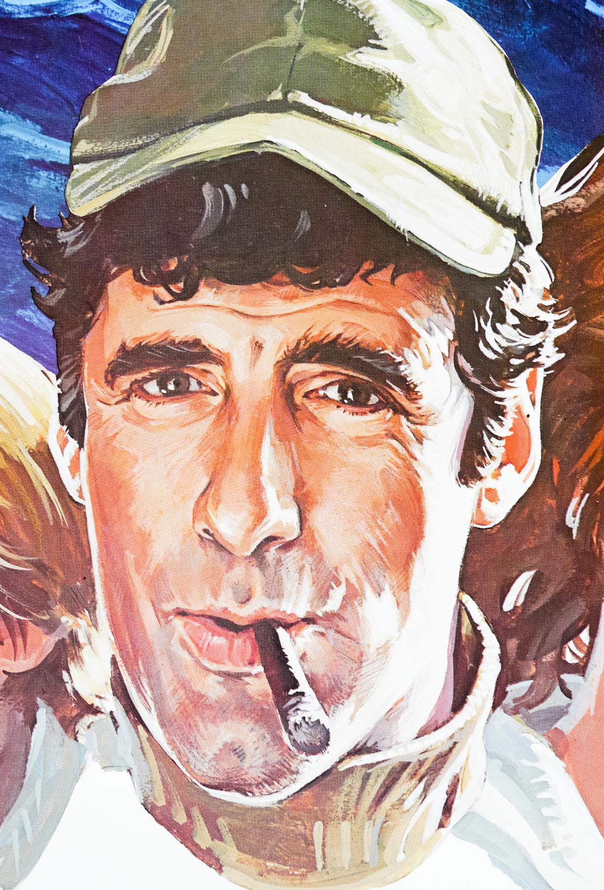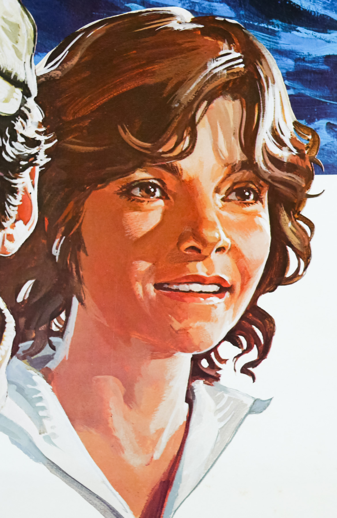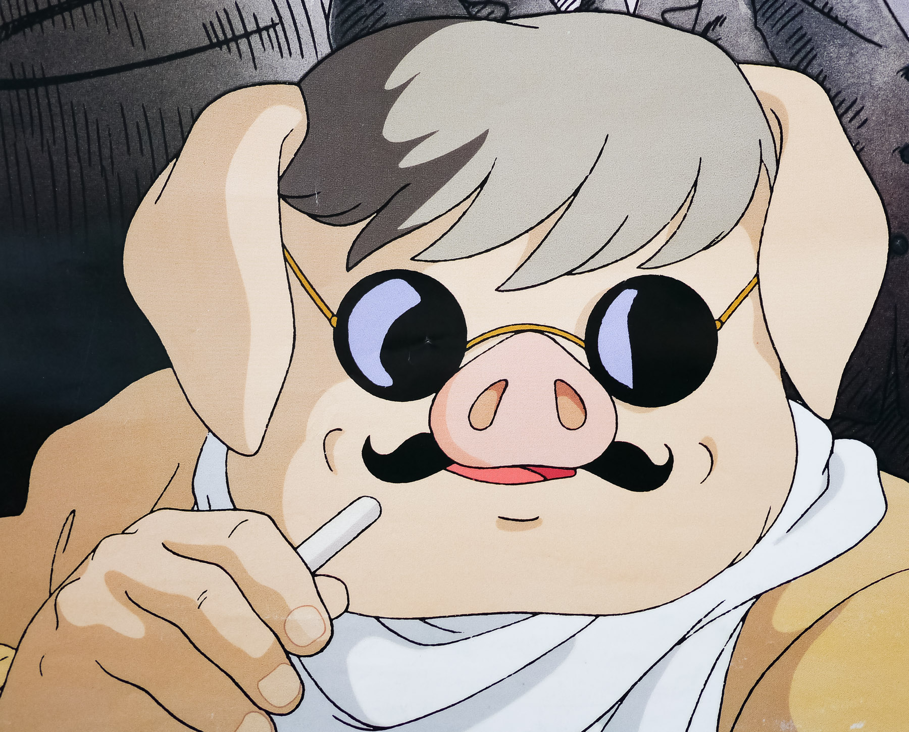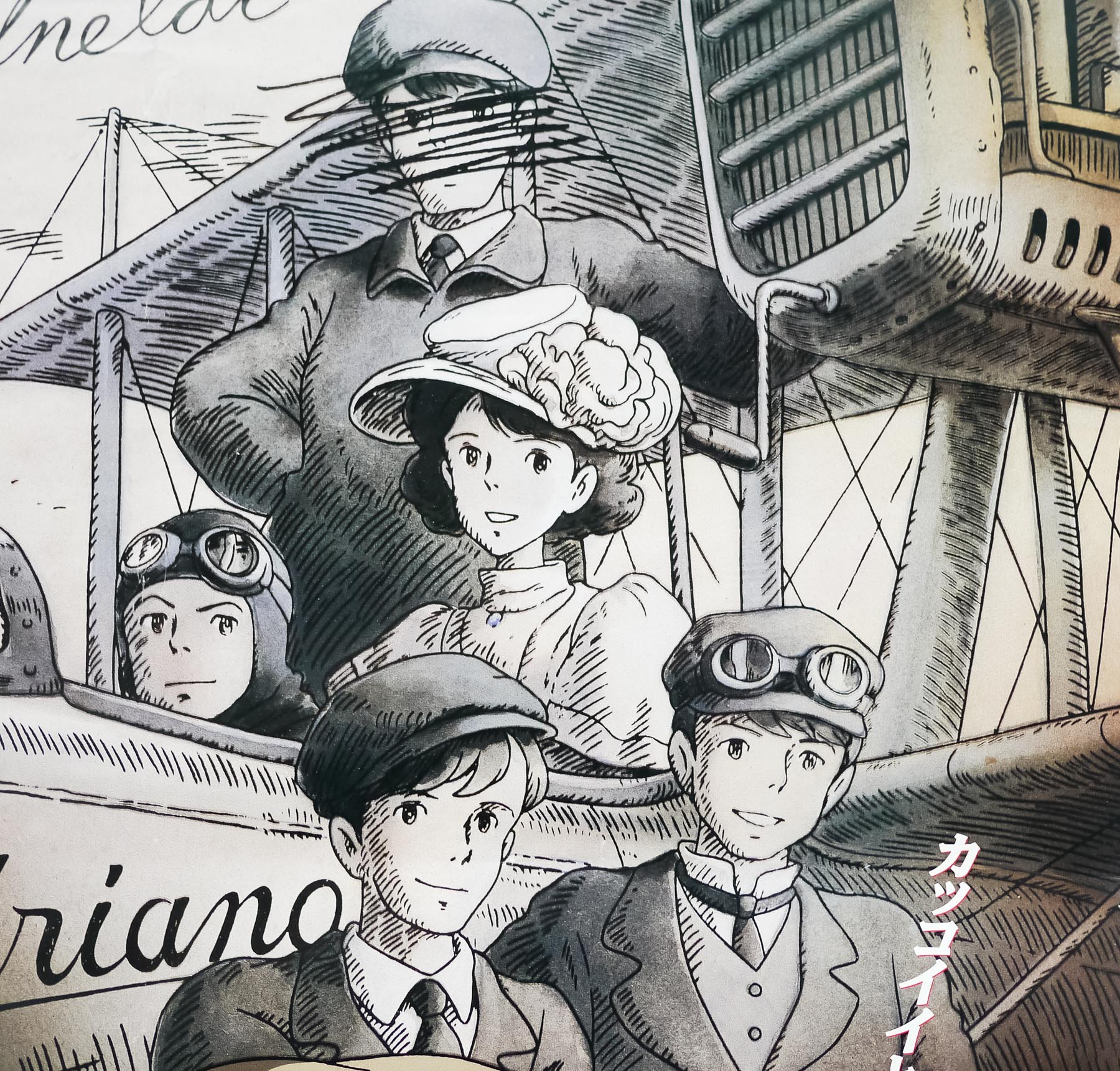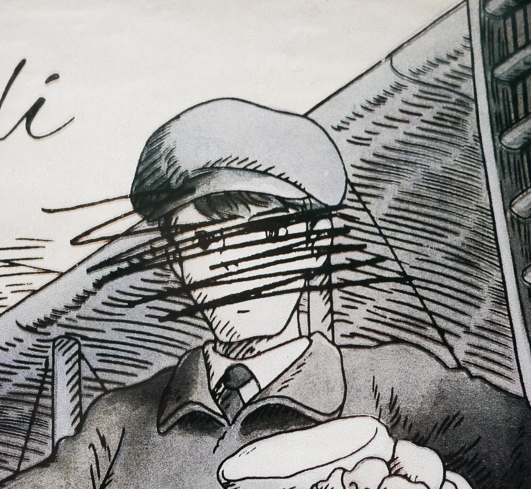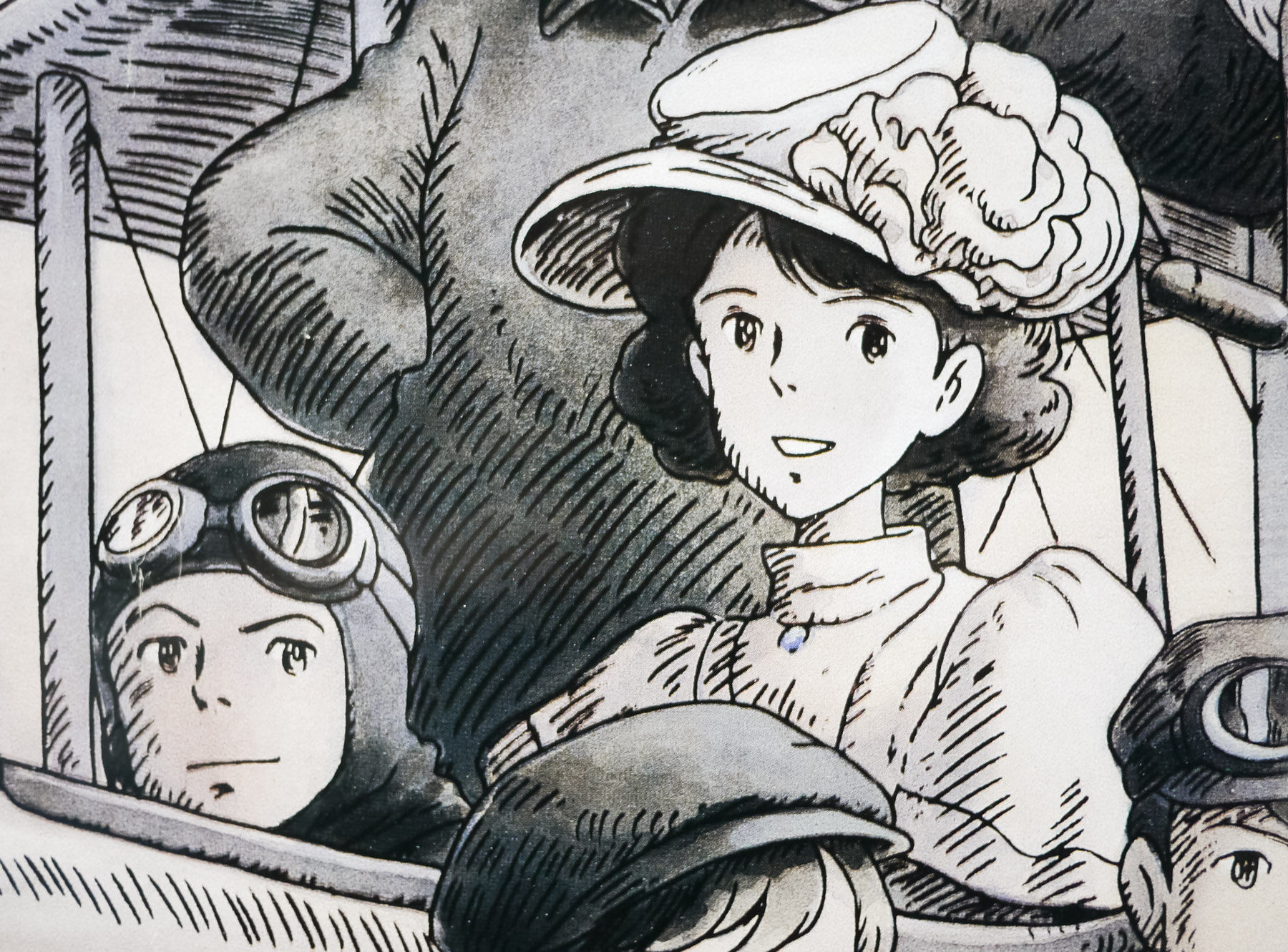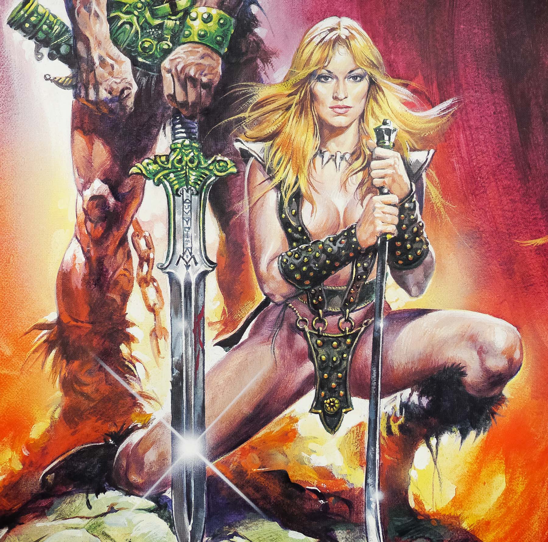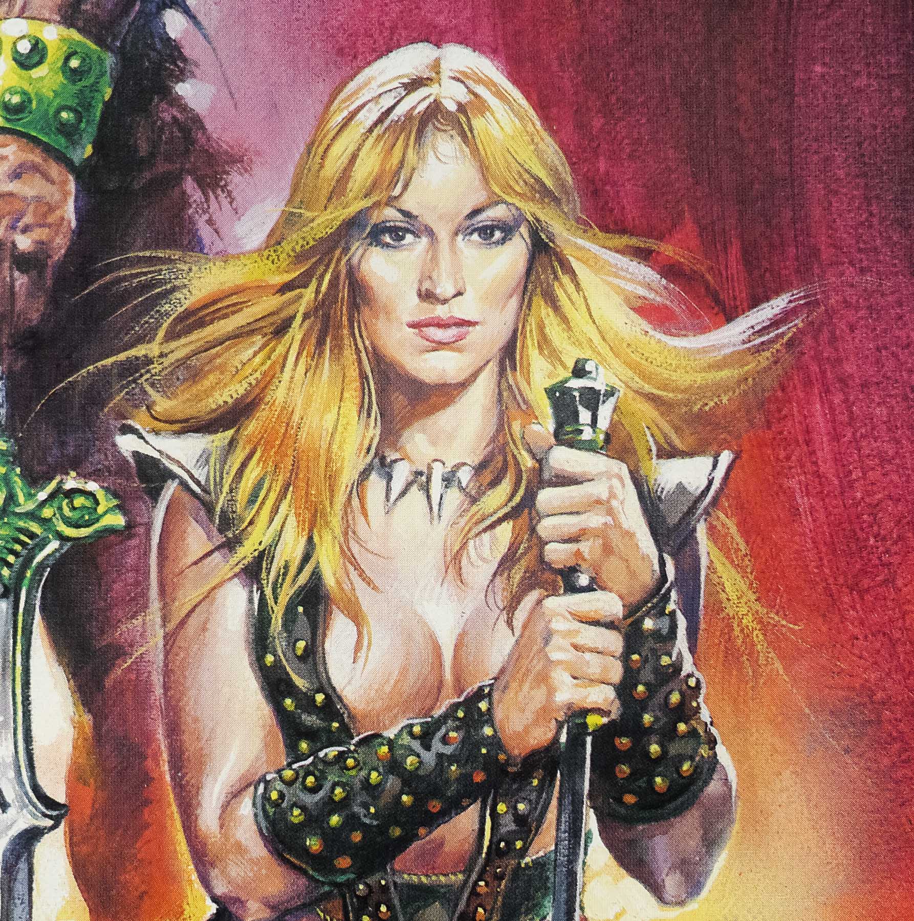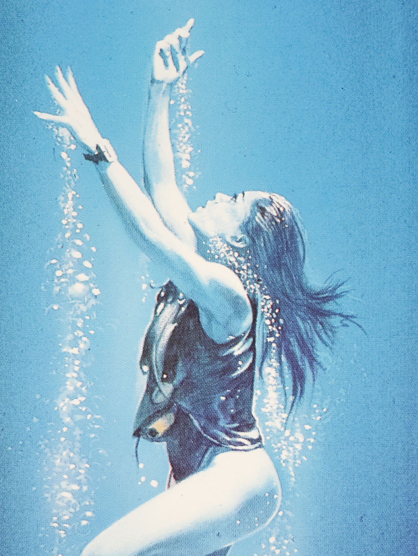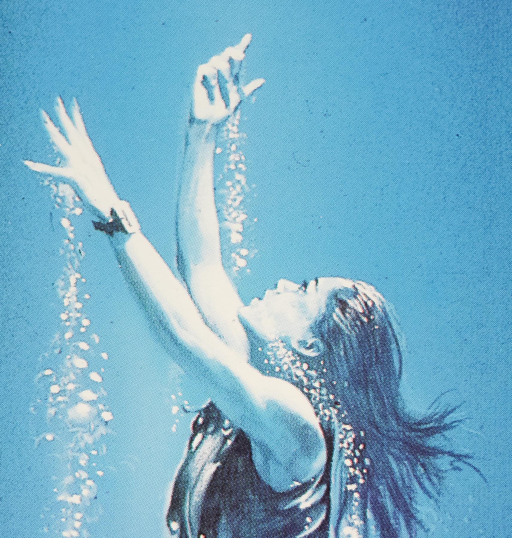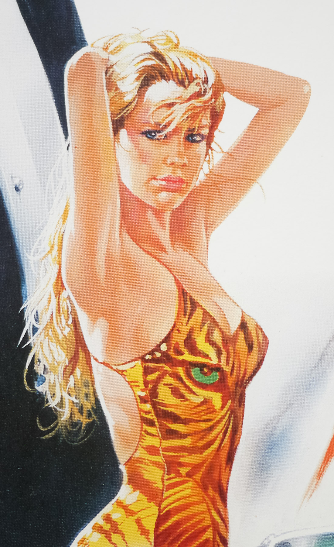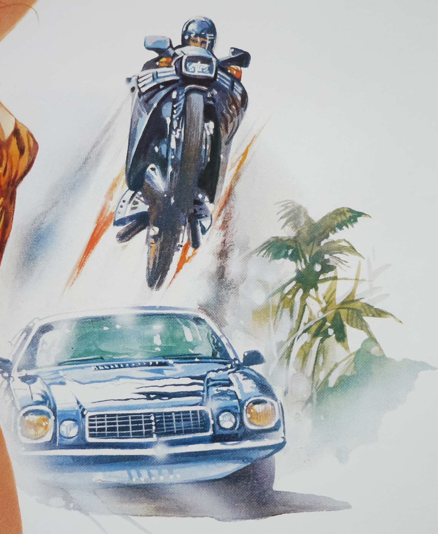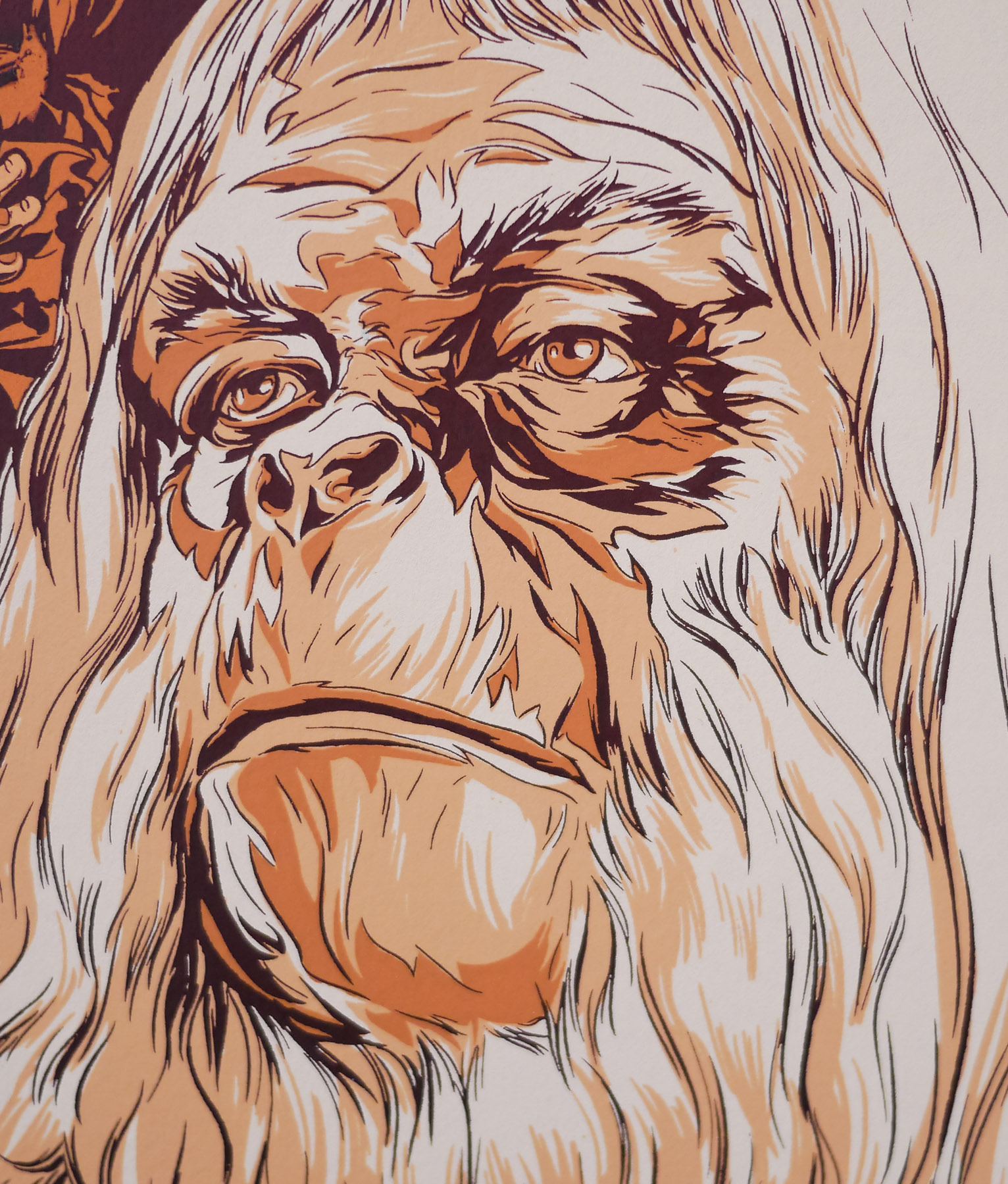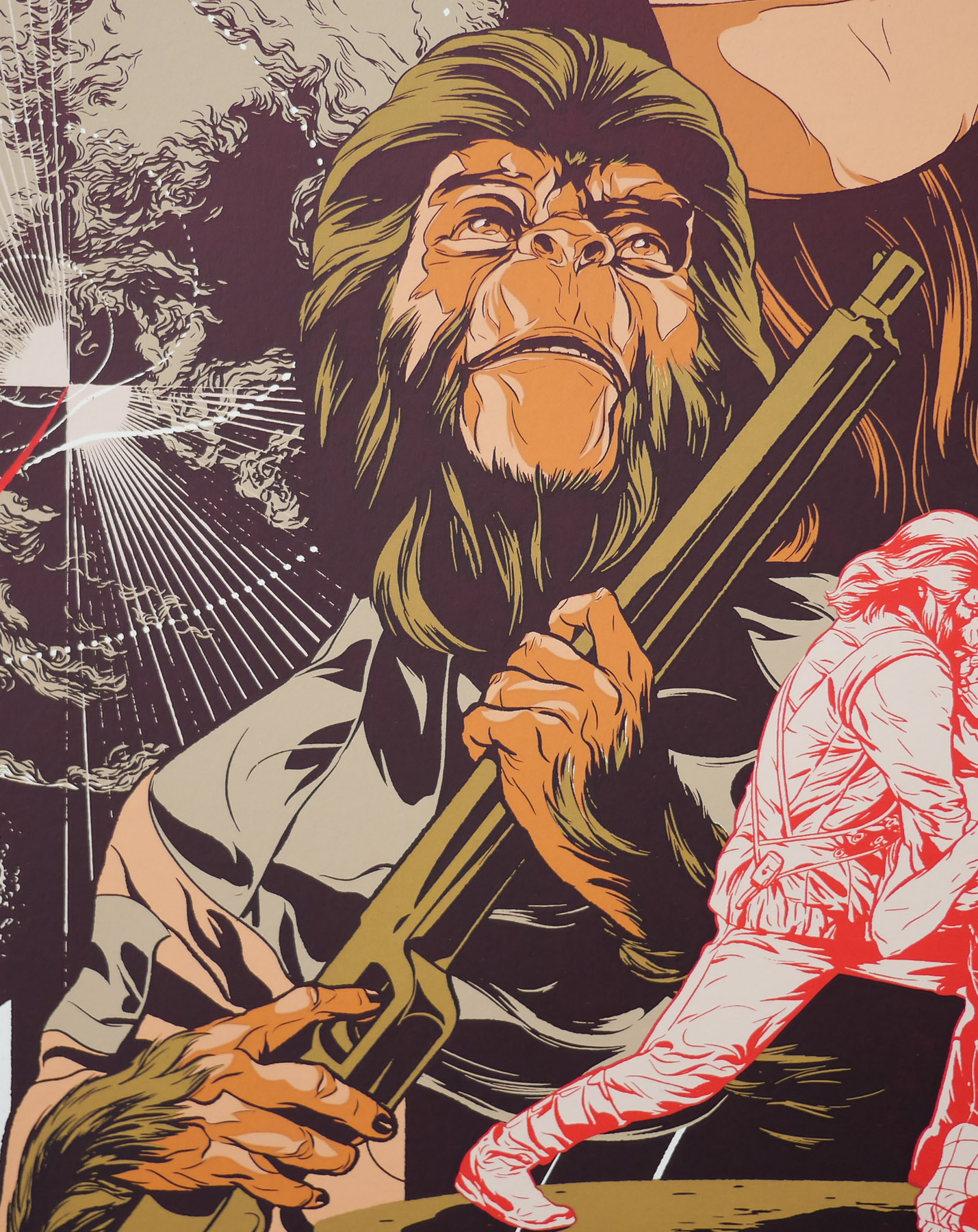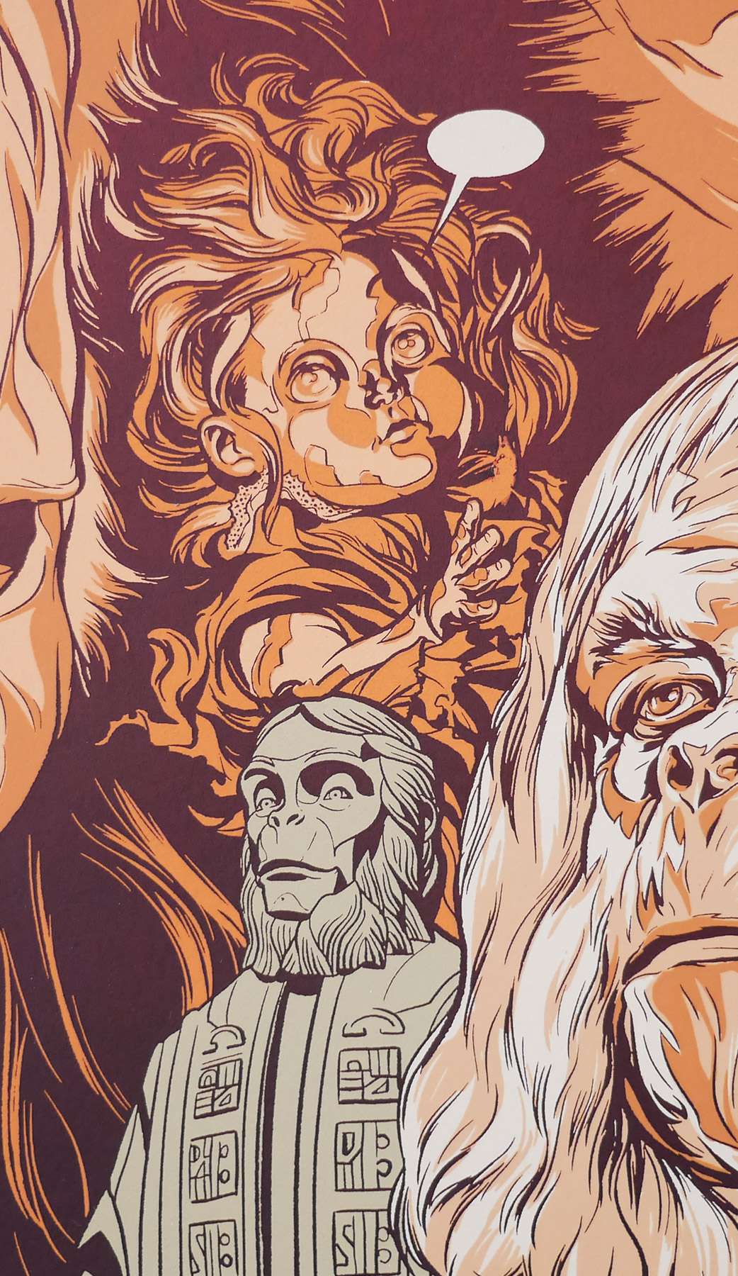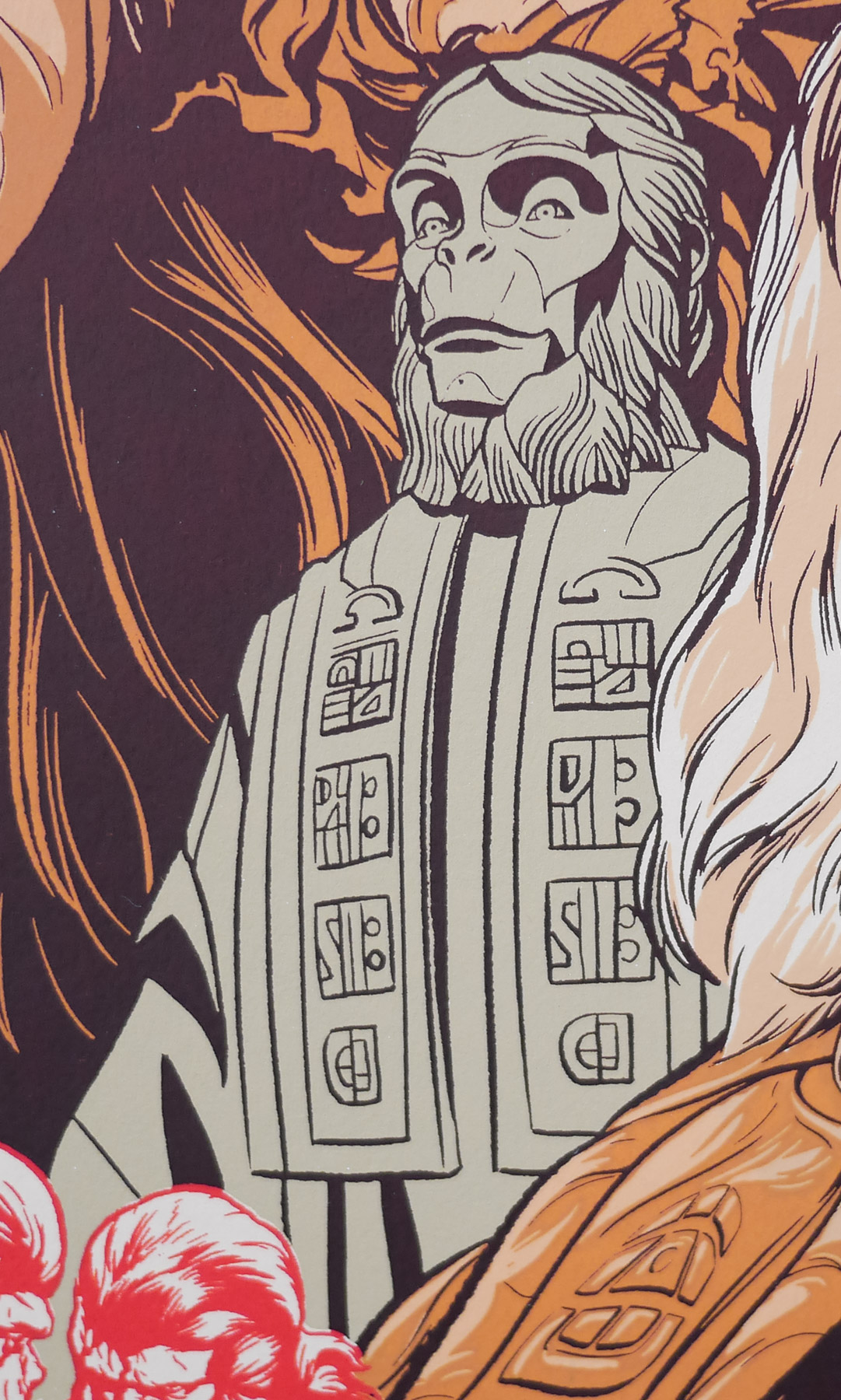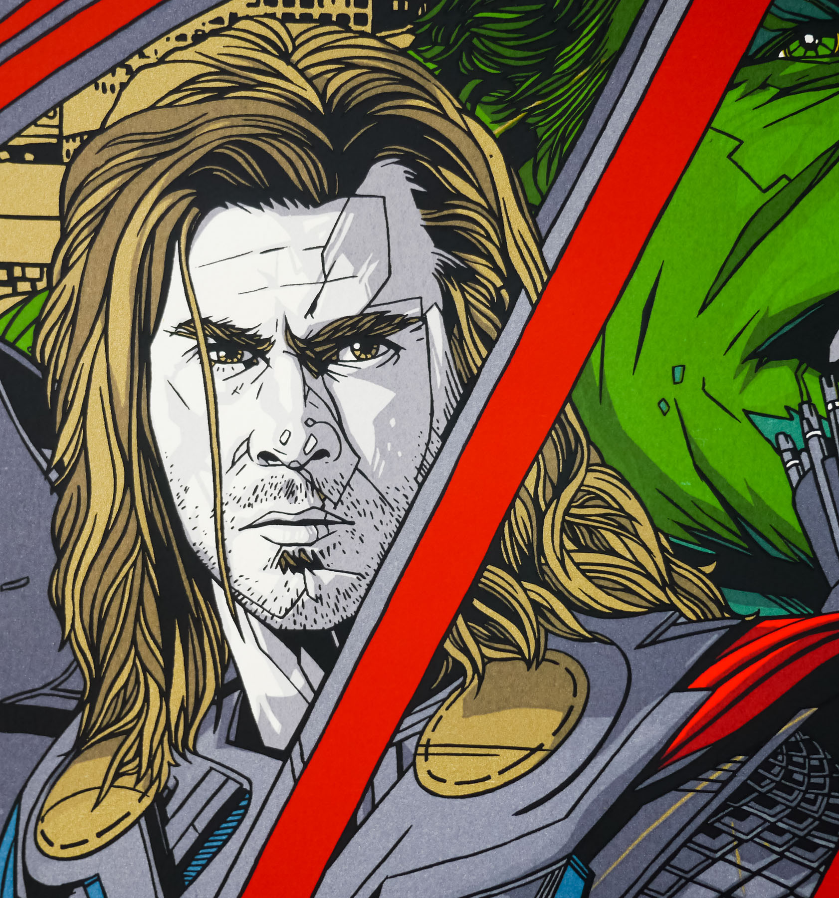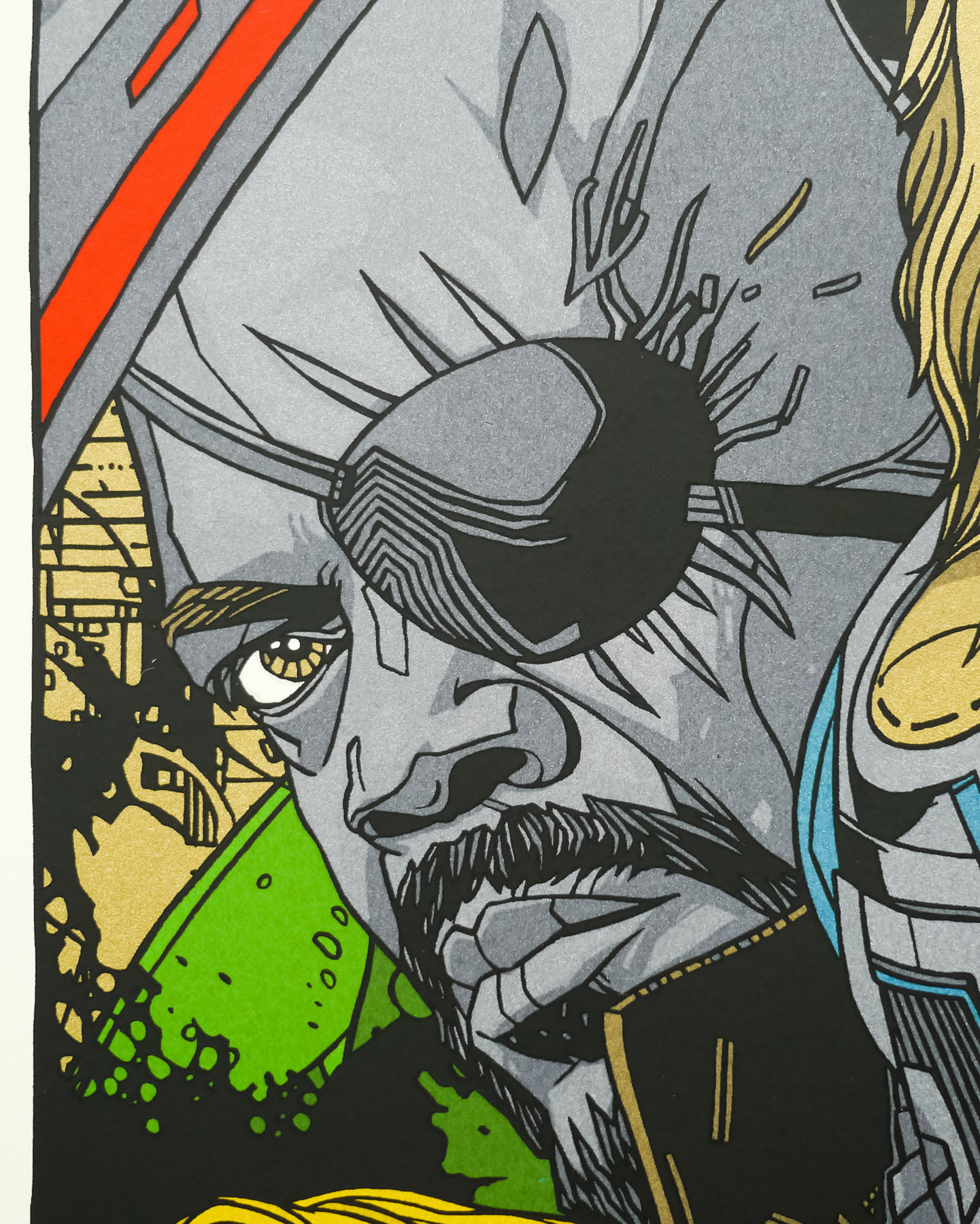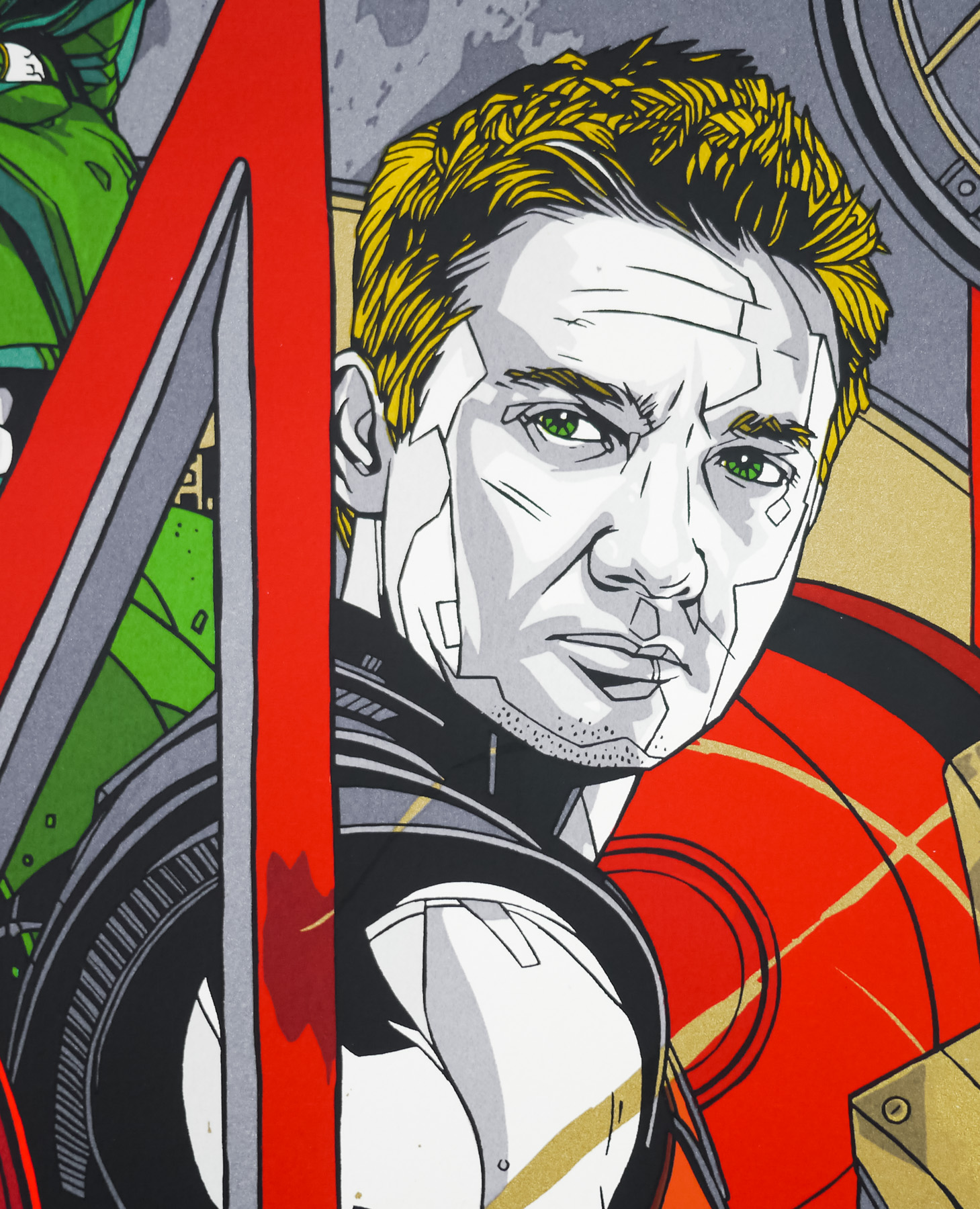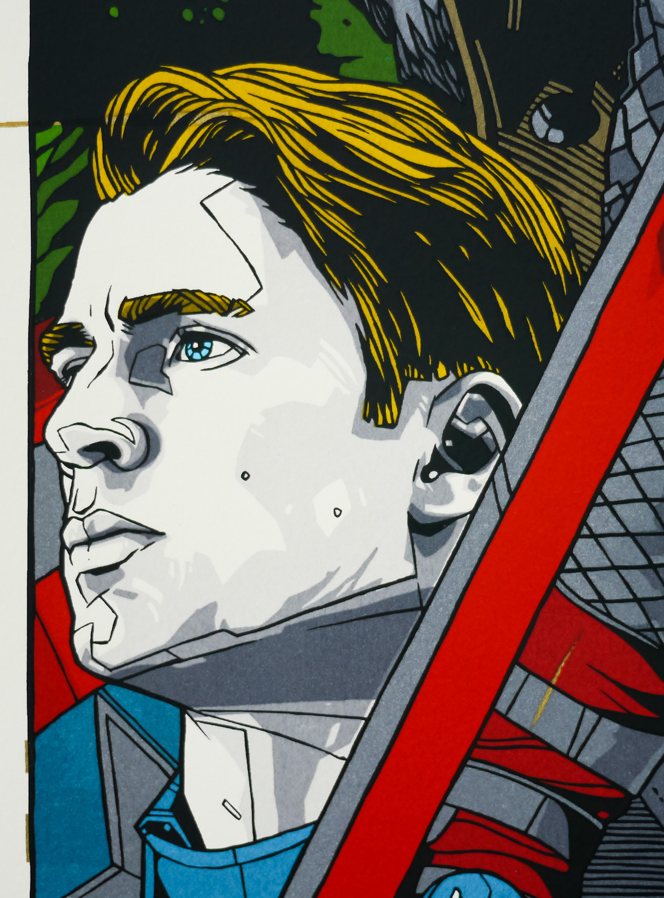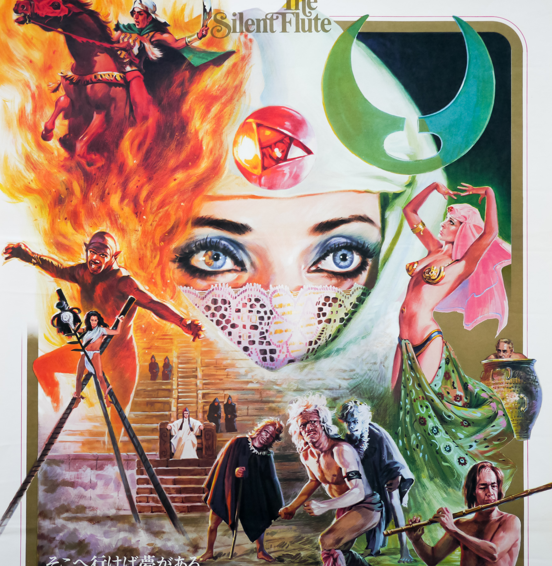
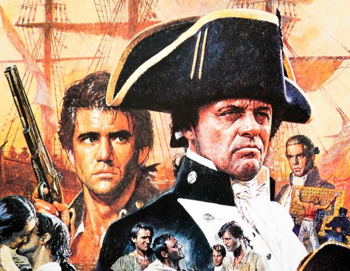
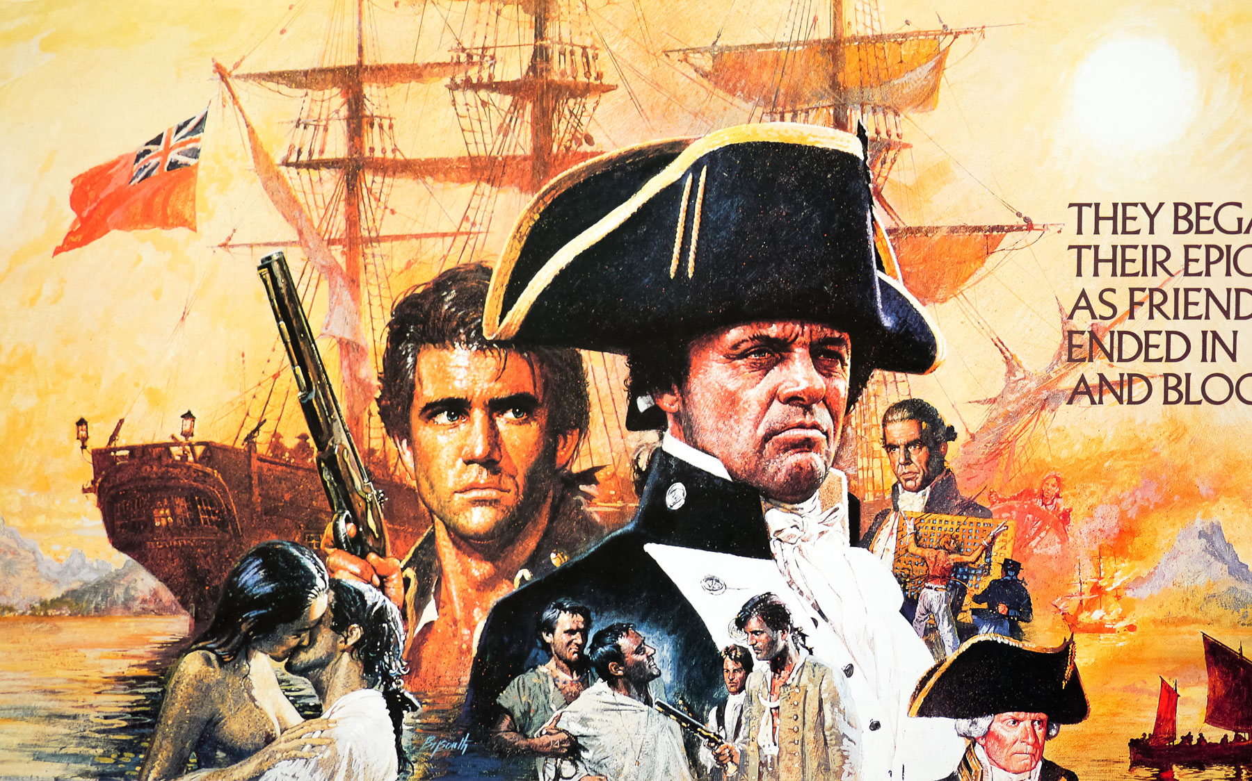
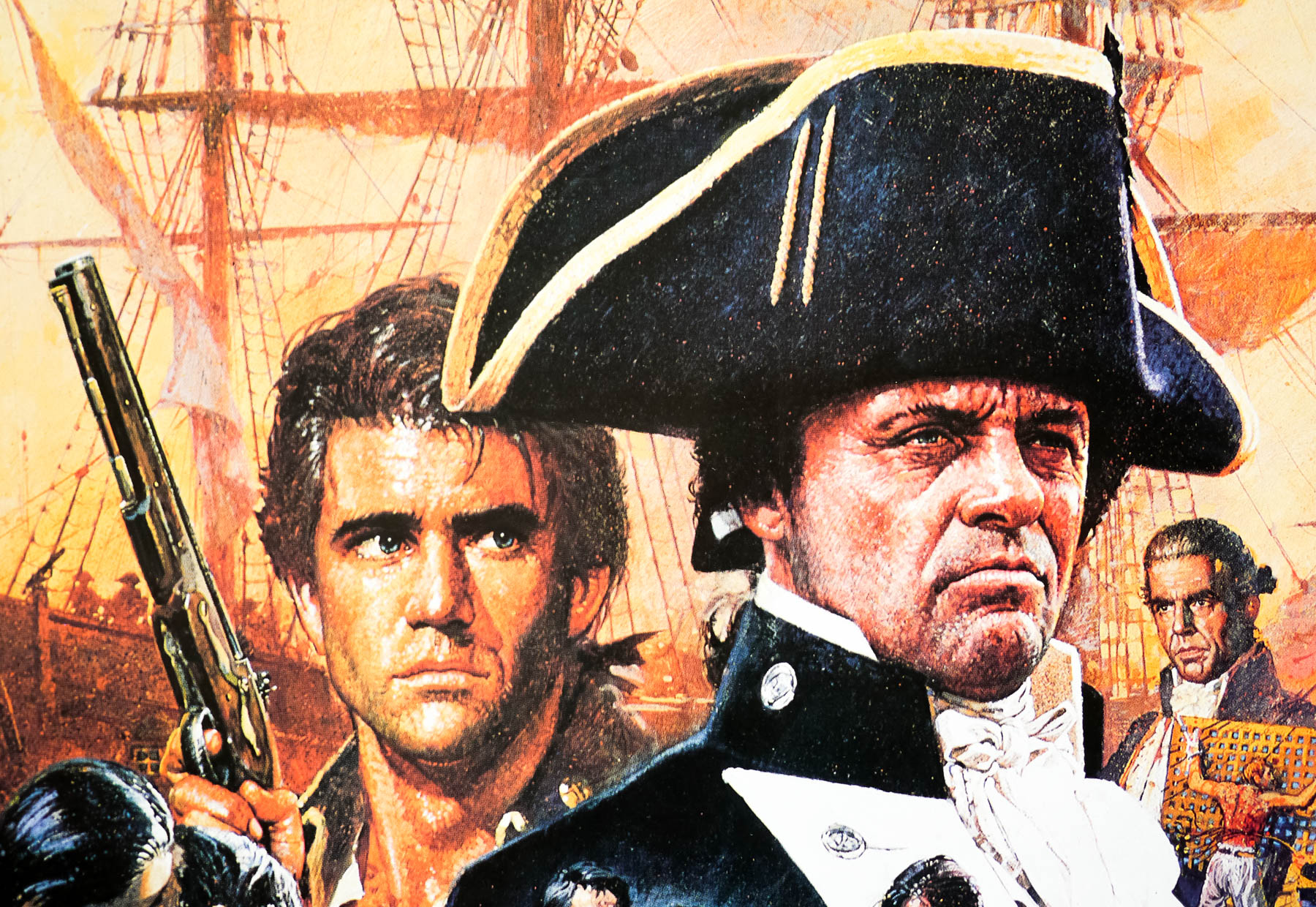
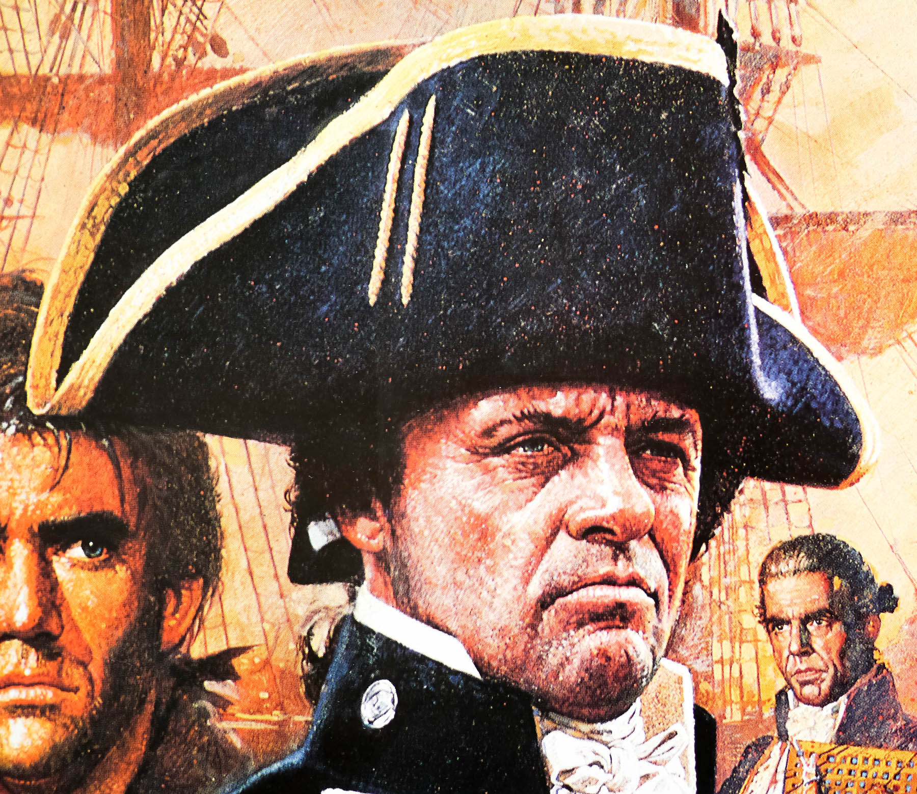
Poster detail
1-5


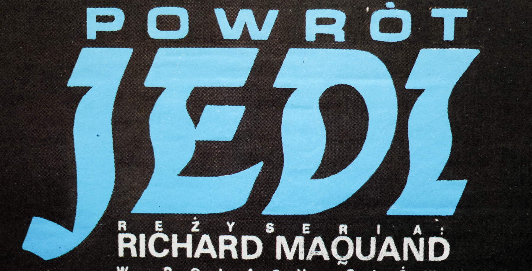
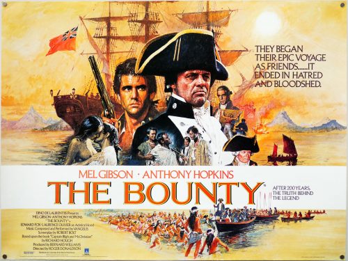
- Title
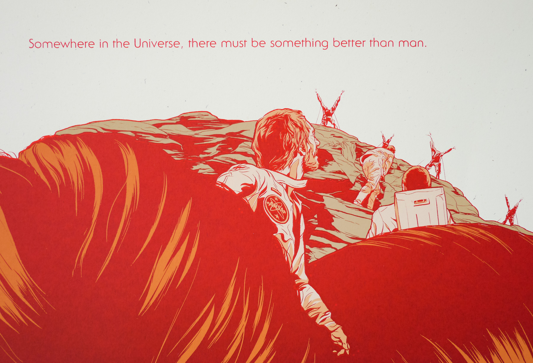
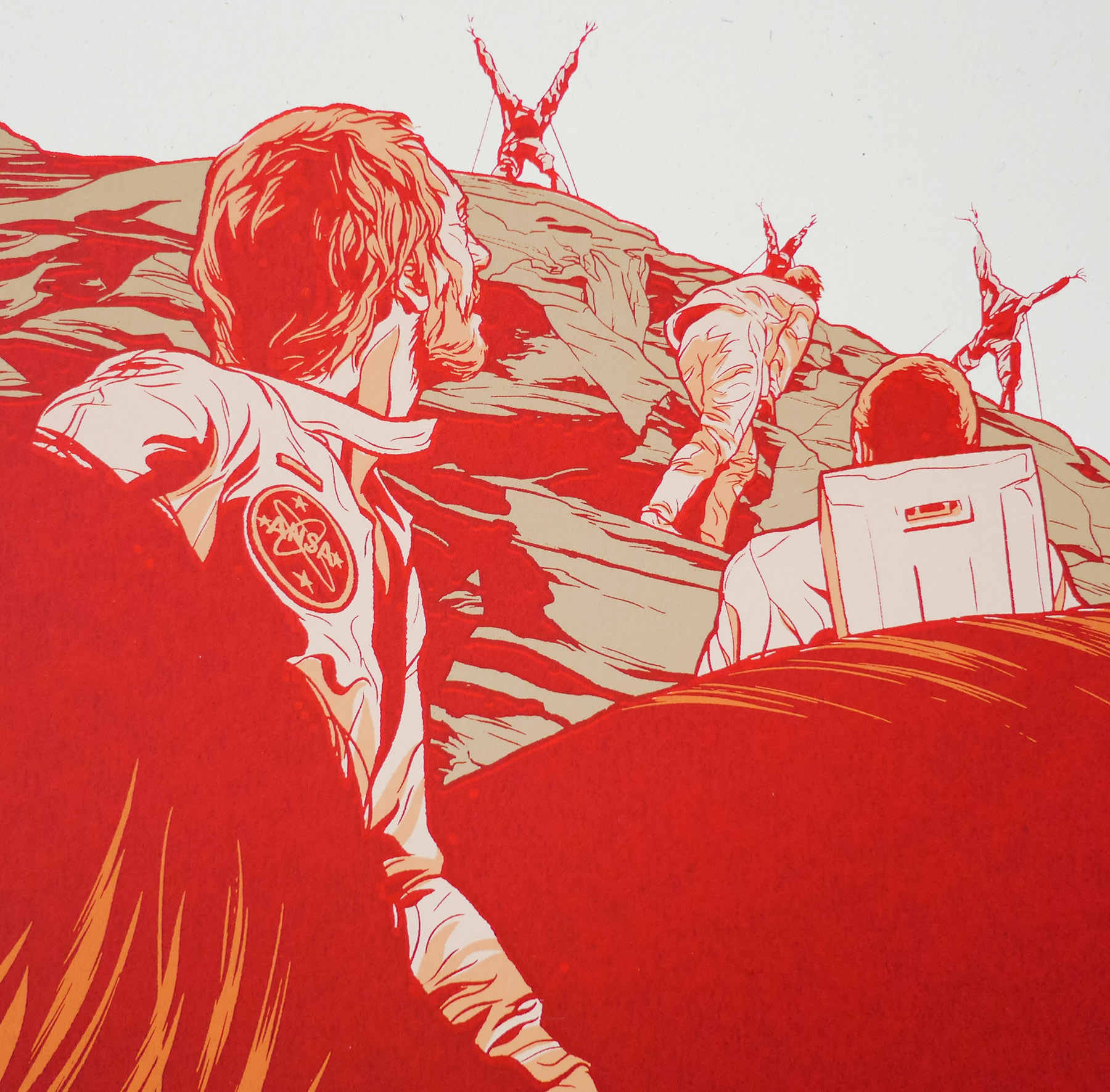
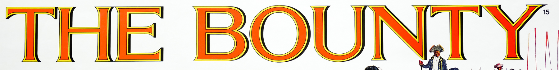
- The Bounty
- AKA
- --
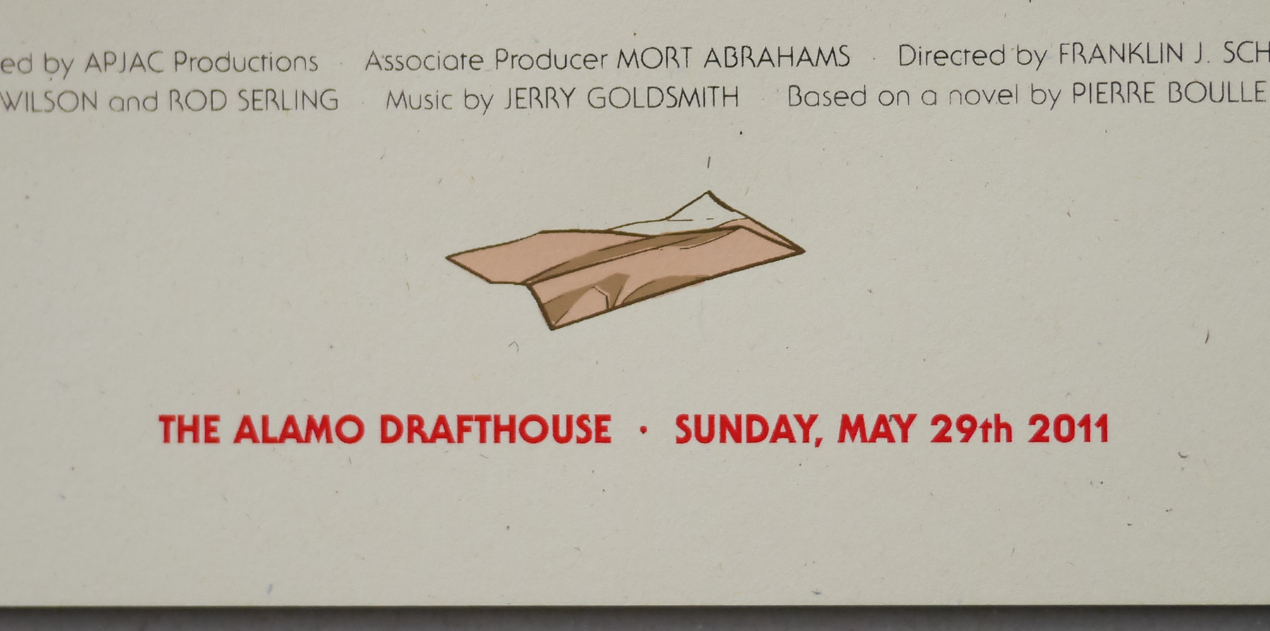
- Year of Film
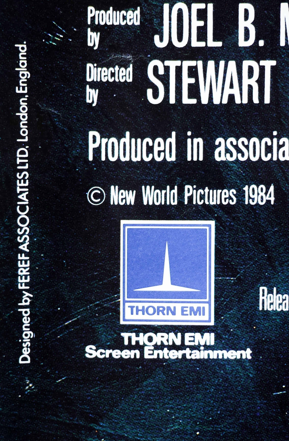
- 1984
- Director
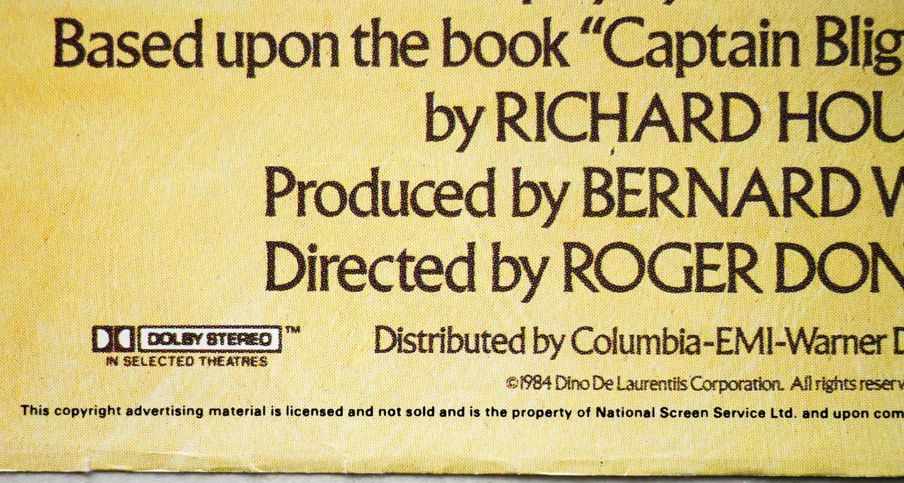
- Roger Donaldson
- Starring
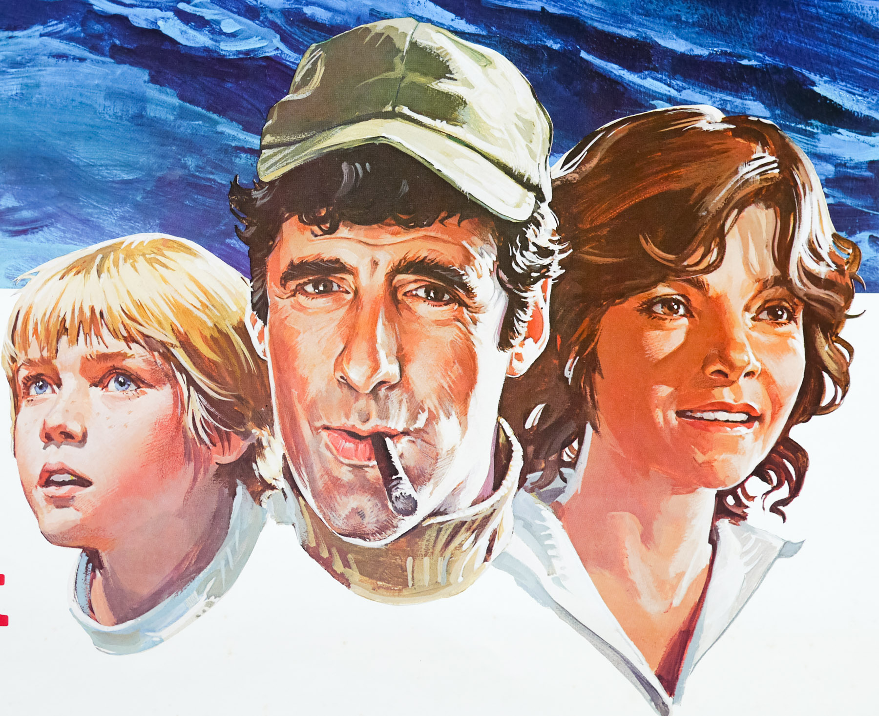
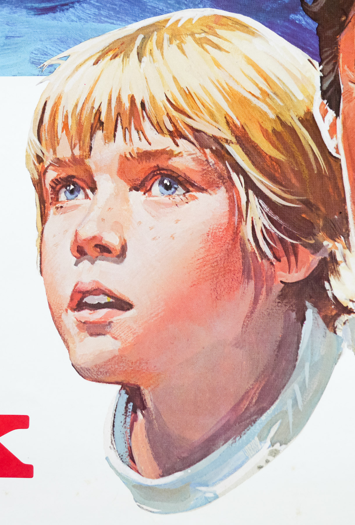
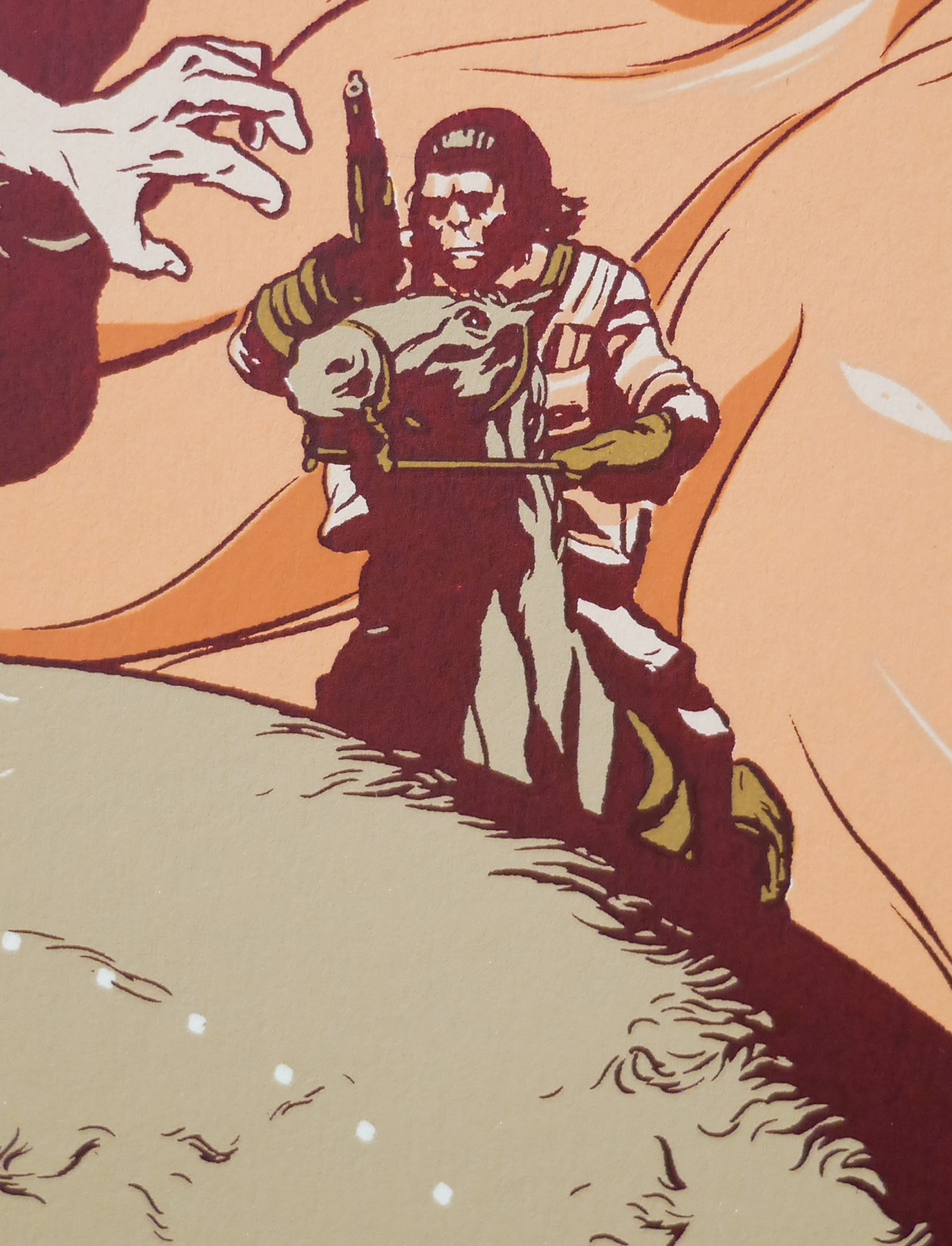
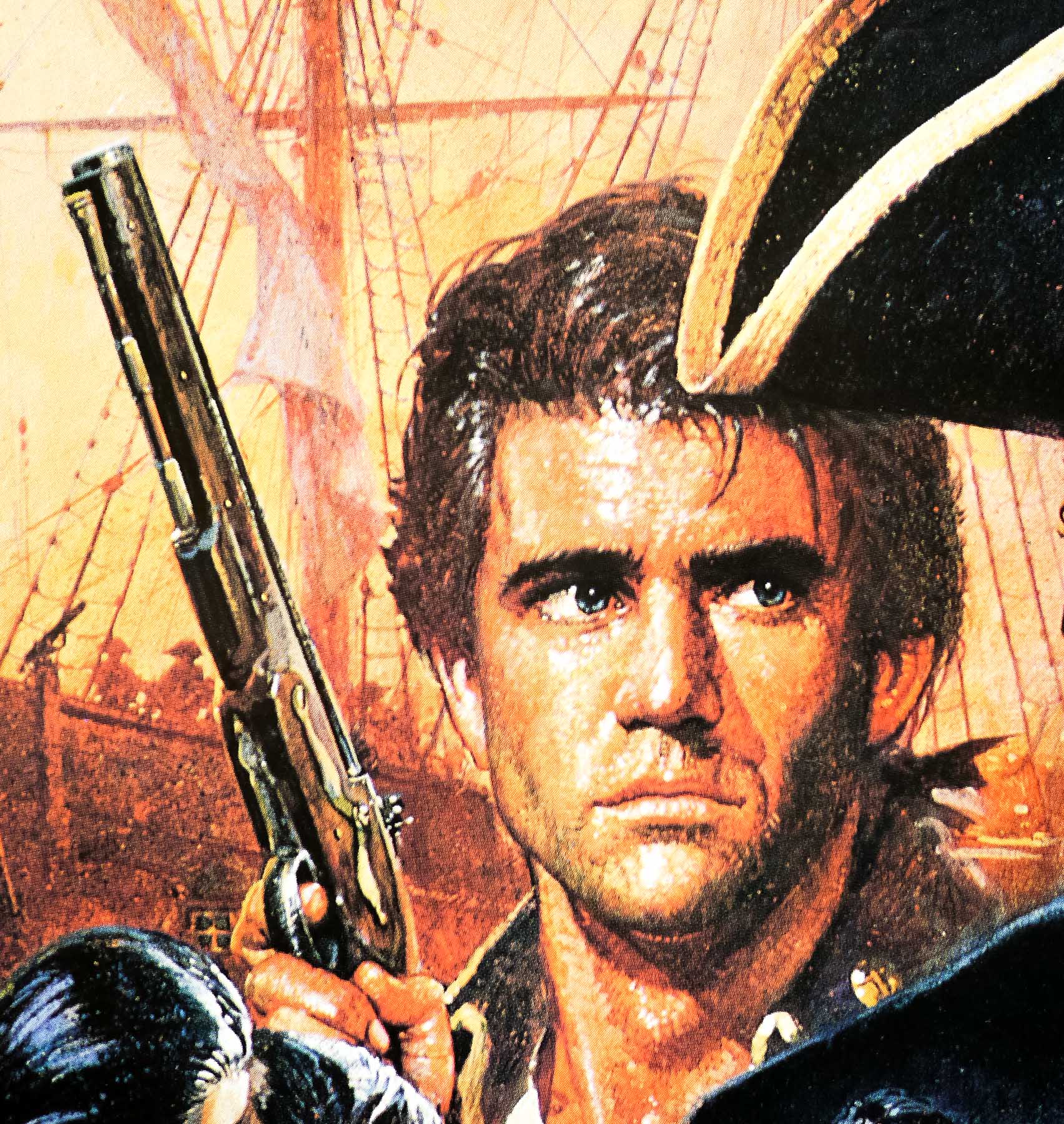
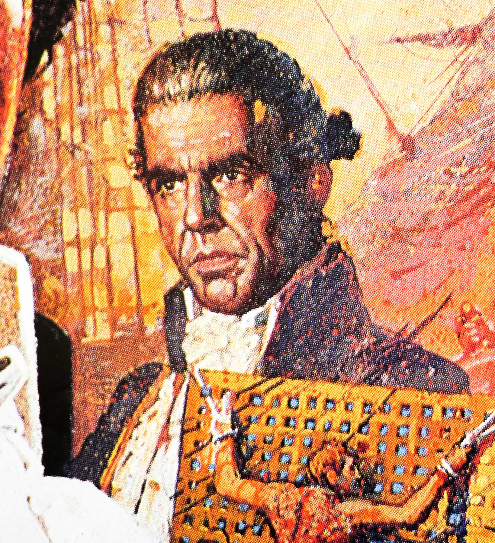
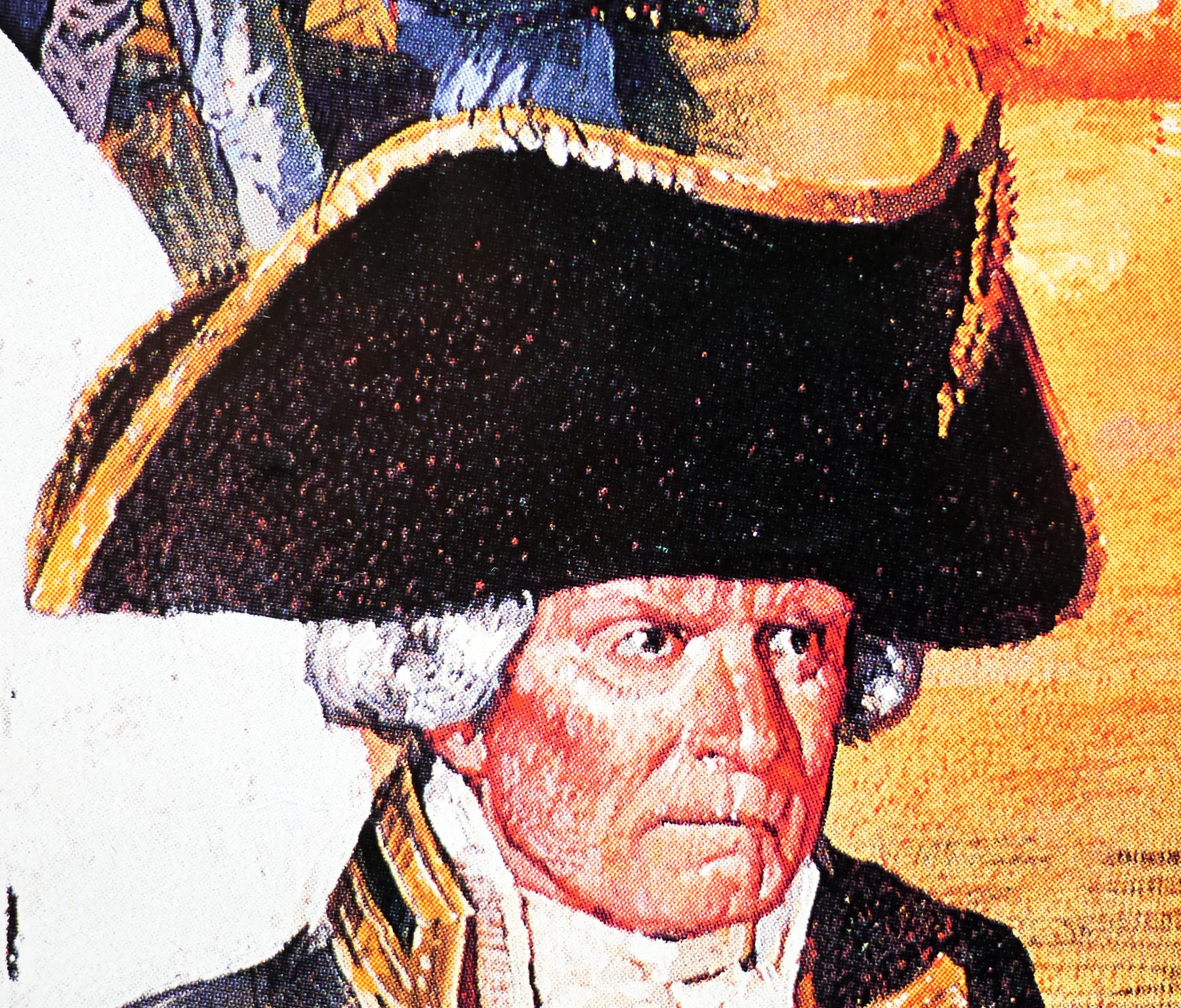
- Mel Gibson, Anthony Hopkins, Laurence Olivier, Edward Fox, Daniel Day-Lewis, Bernard Hill, Philip Davis, Liam Neeson. Wi Kuki Kaa, Tevaite Vernette, Philip Martin Brown, Simon Chandler
- Origin of Film
- UK | USA
- Genre(s) of Film
- Mel Gibson, Anthony Hopkins, Laurence Olivier, Edward Fox, Daniel Day-Lewis, Bernard Hill, Philip Davis, Liam Neeson. Wi Kuki Kaa, Tevaite Vernette, Philip Martin Brown, Simon Chandler,
- Type of Poster
- Quad
- Style of Poster
- --
- Origin of Poster
- UK
- Year of Poster
- 1984
- Designer
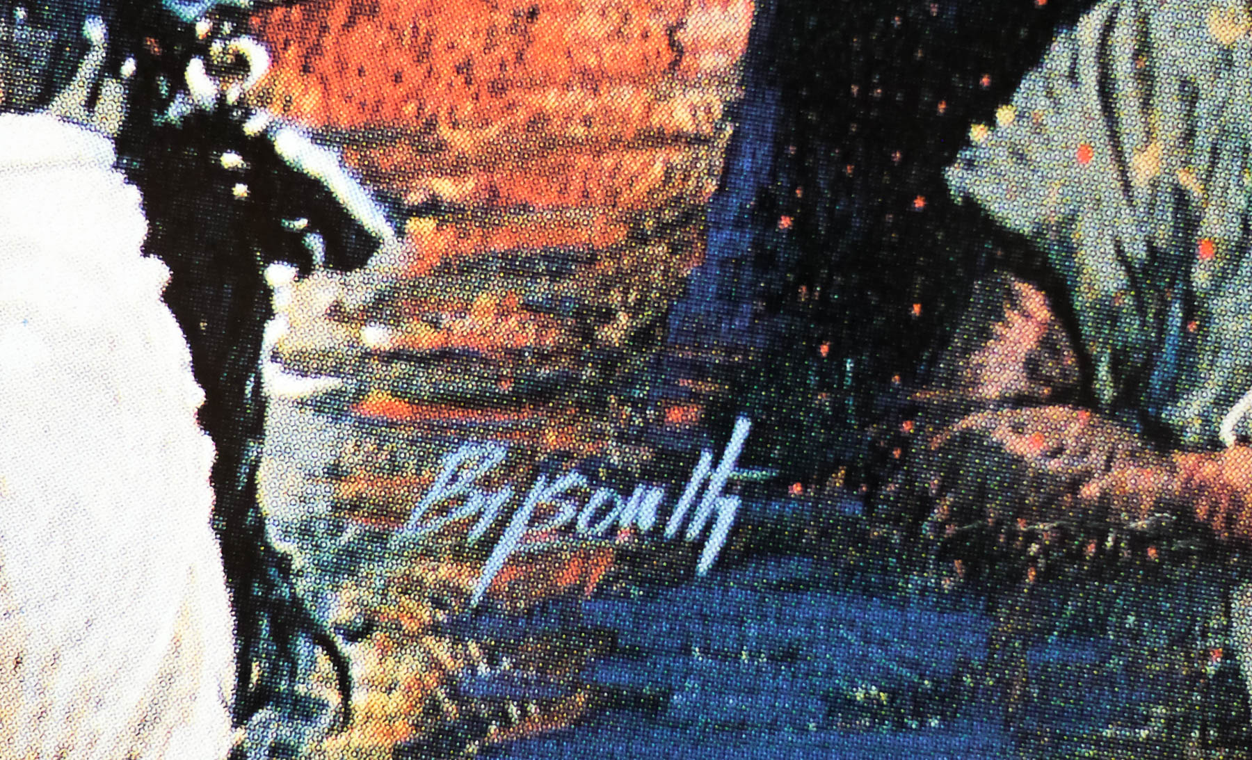
- Eric Pulford | Brian Bysouth
- Artist
- Brian Bysouth
- Size (inches)
- 30 1/16" x 39 14/16"
- SS or DS
- SS
- Tagline
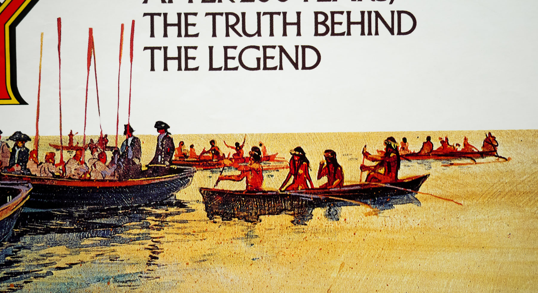
- They began their epic voyage as friends... it ended in hatred and bloodshed. | After 200 years, the truth behind the legend.
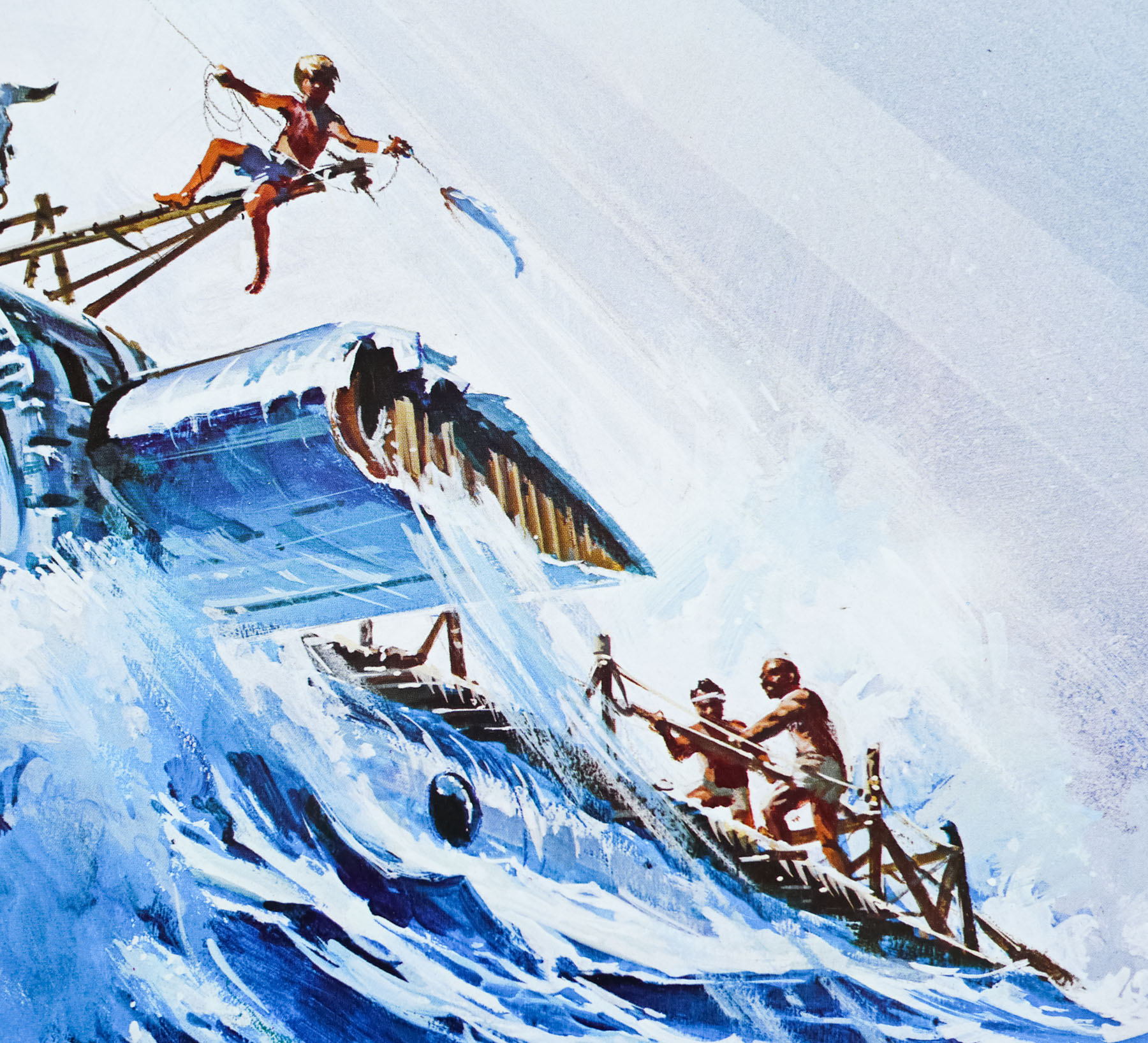
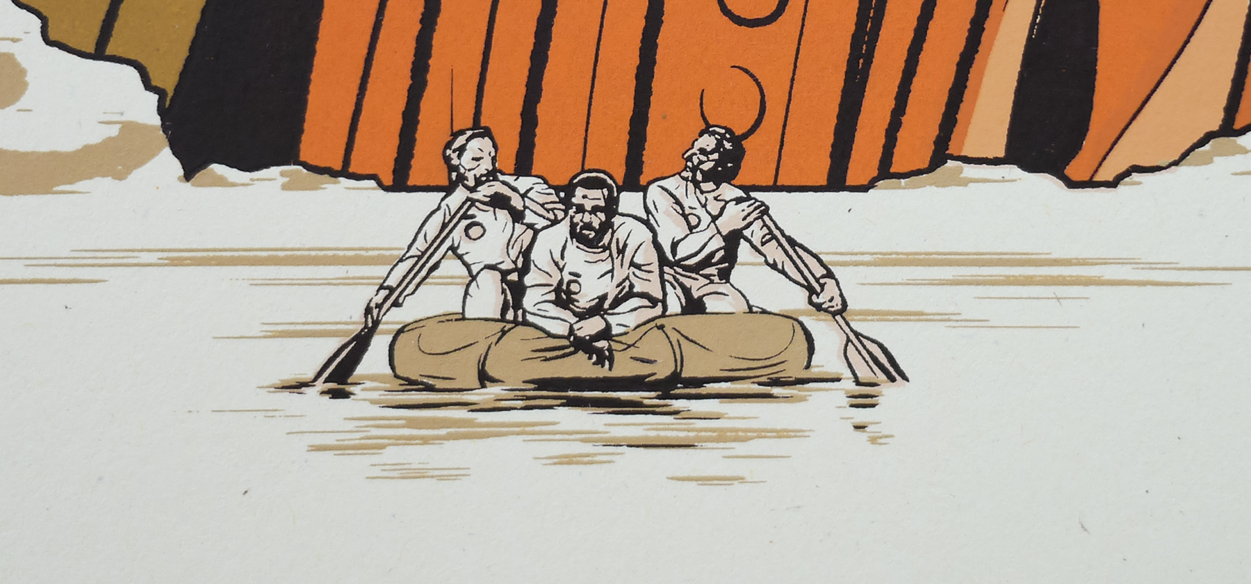
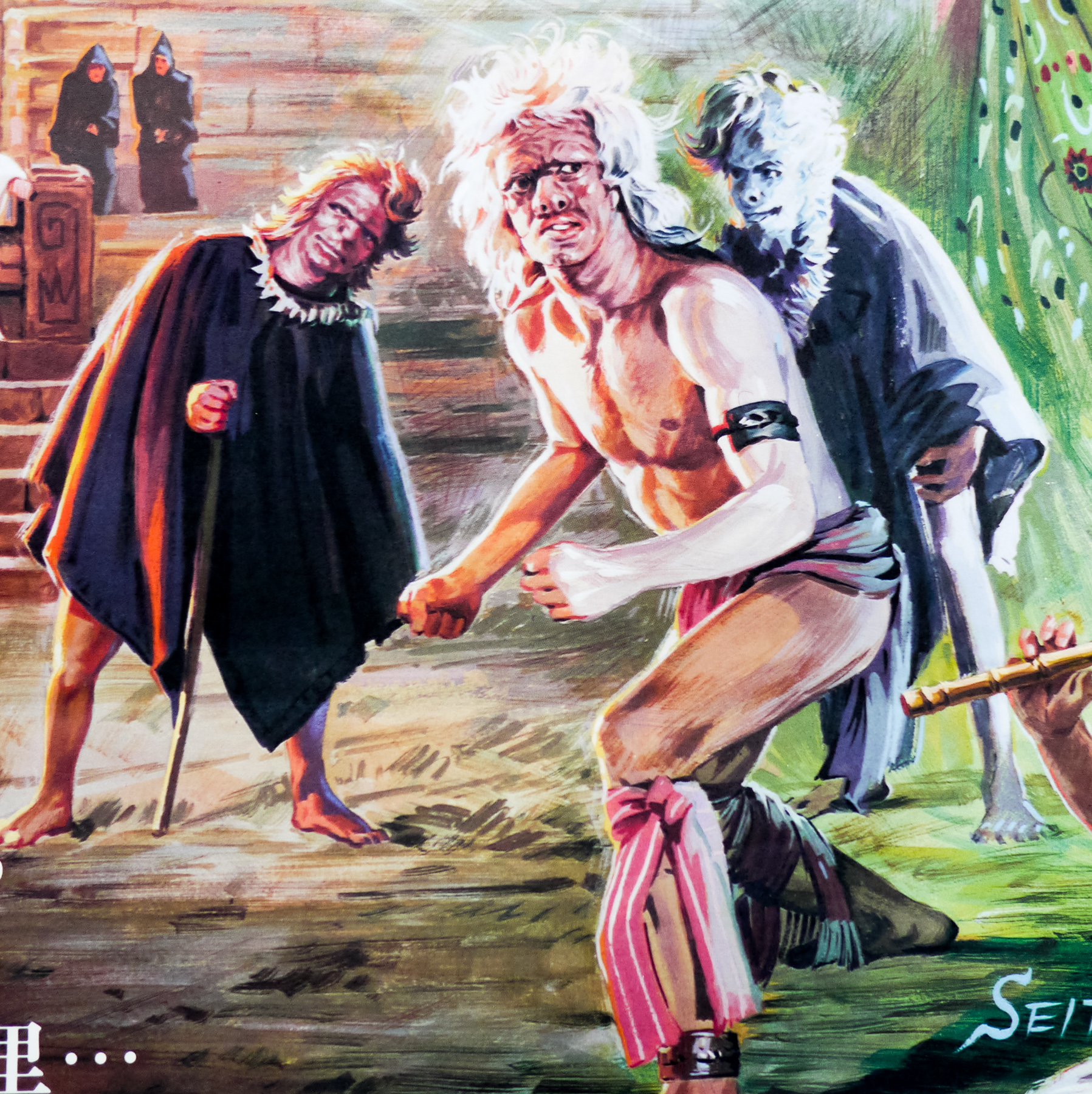
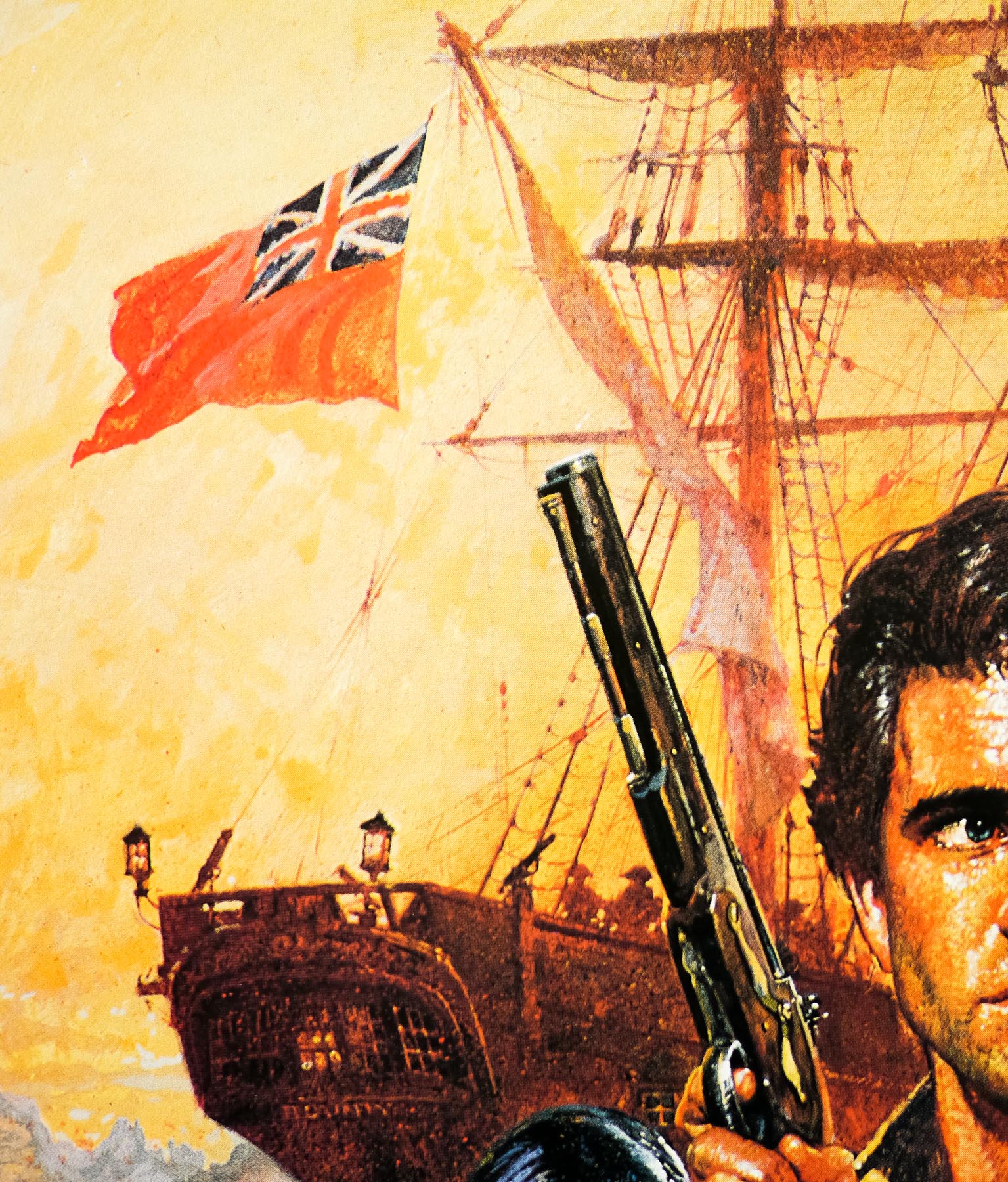
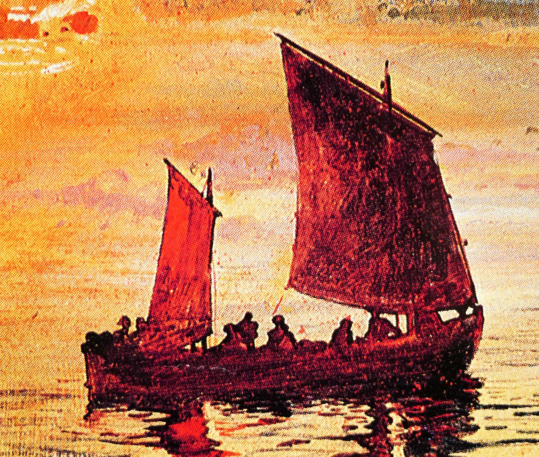
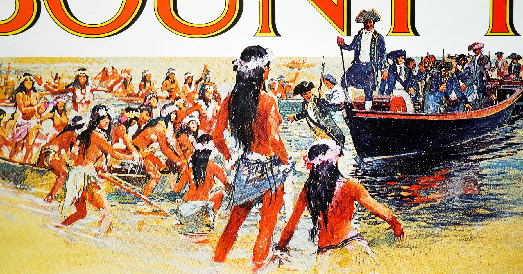
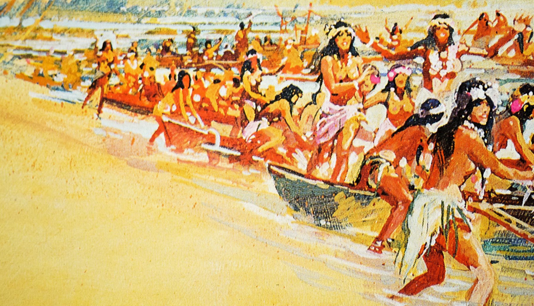
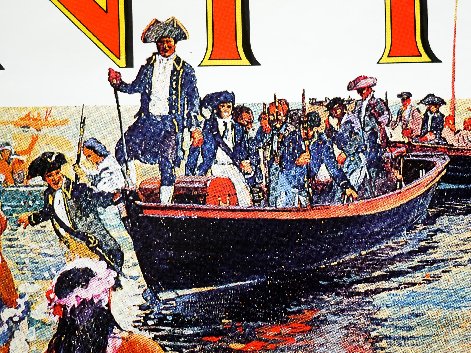
The Bounty was the fifth film based on the true life story of the Mutiny on the Bounty, which took place at sea onboard the British Royal Navy ship of the same name in 1789. The event saw a mutinous group of sailors led by Fletcher Christian place Captain William Bligh, and a group of sailors loyal to him, onboard a small launch (boat) before sailing back to the island of Tahiti where they wished to settle. Incredibly, Captain Bligh was able to navigate the tiny boat over 3600 nautical miles to Timor in the East Indies from where he was able to travel back to London and report the mutiny.
A Royal Navy ship (HMS Pandora) was dispatched with the task of rounding up the mutineers and the crew were successful in capturing fourteen of them, but were unable to locate Fletcher Christian or The Bounty itself. After setting sail back to England, the ship ran aground on part of the Great Barrier Reef and sank shortly thereafter, killing a number of the crew and four of the prisoners. Eventually the remaining mutineers were returned to face court martial in Britain, whilst those who escaped continued to try to evade justice aboard the Bounty before settling one of the tiny Pitcairn Islands in the Pacific Ocean to the east of Australia.
This version was originally being prepared for the screen by the legendary British director David Lean, but problems were encountered with getting the requisite financial backing for his vision of two films, later reconfigured to a TV series. Italian producer Dino De Laurentiis stepped in with the financial support and the film was reconfigured as a single feature. When Lean’s screenwriter partner Robert Bolt suffered a massive stroke, Lean decided to leave the project but had already overseen the construction of a replica Bounty and had successfully cast most of the roles.
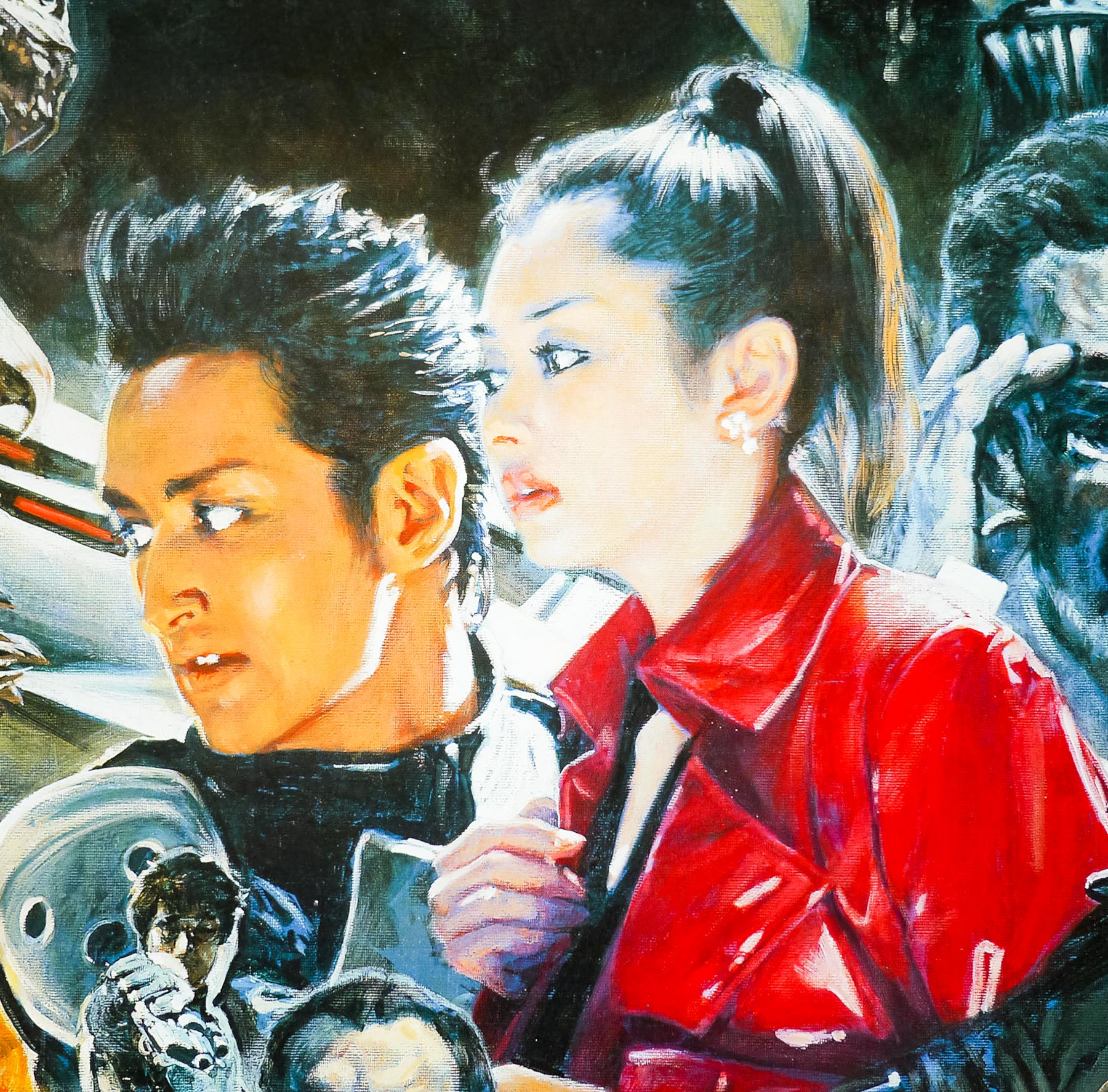
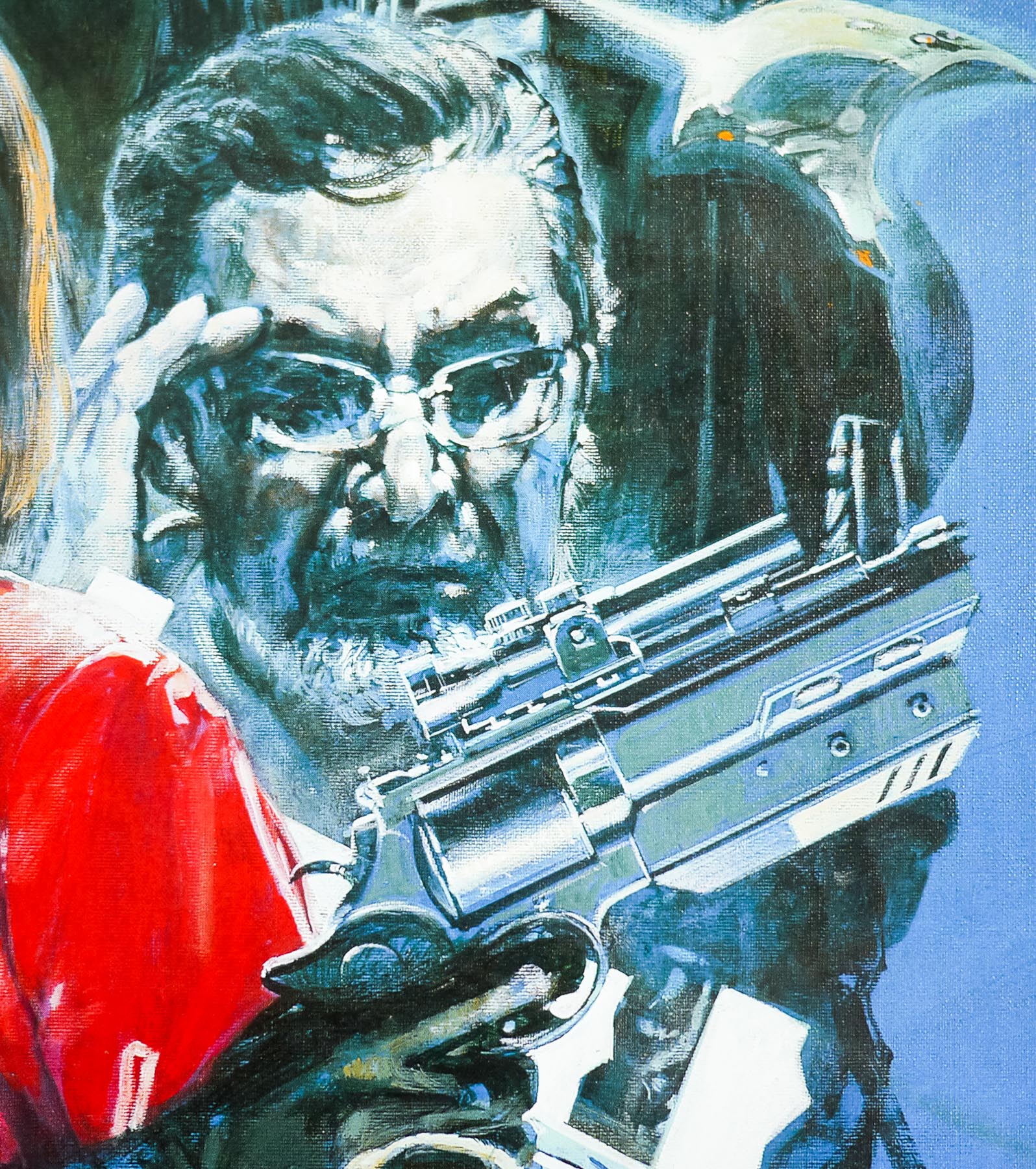
Mel Gibson, who was to play Fletcher Christian, brought in a fellow Aussie Roger Donaldson to helm the film and production got underway. Featuring an extremely impressive cast, including Anthony Hopkins (as Captain Bligh), Laurence Olivier, Daniel Day-Lewis and Liam Neeson, the film was considered to be something of a revisionist take on the event and was certainly more accurate than the two previous Hollywood versions. The Bounty was warmly critically received but was sadly something of a flop at the box office, failing to recoup even half of its budget in the US.
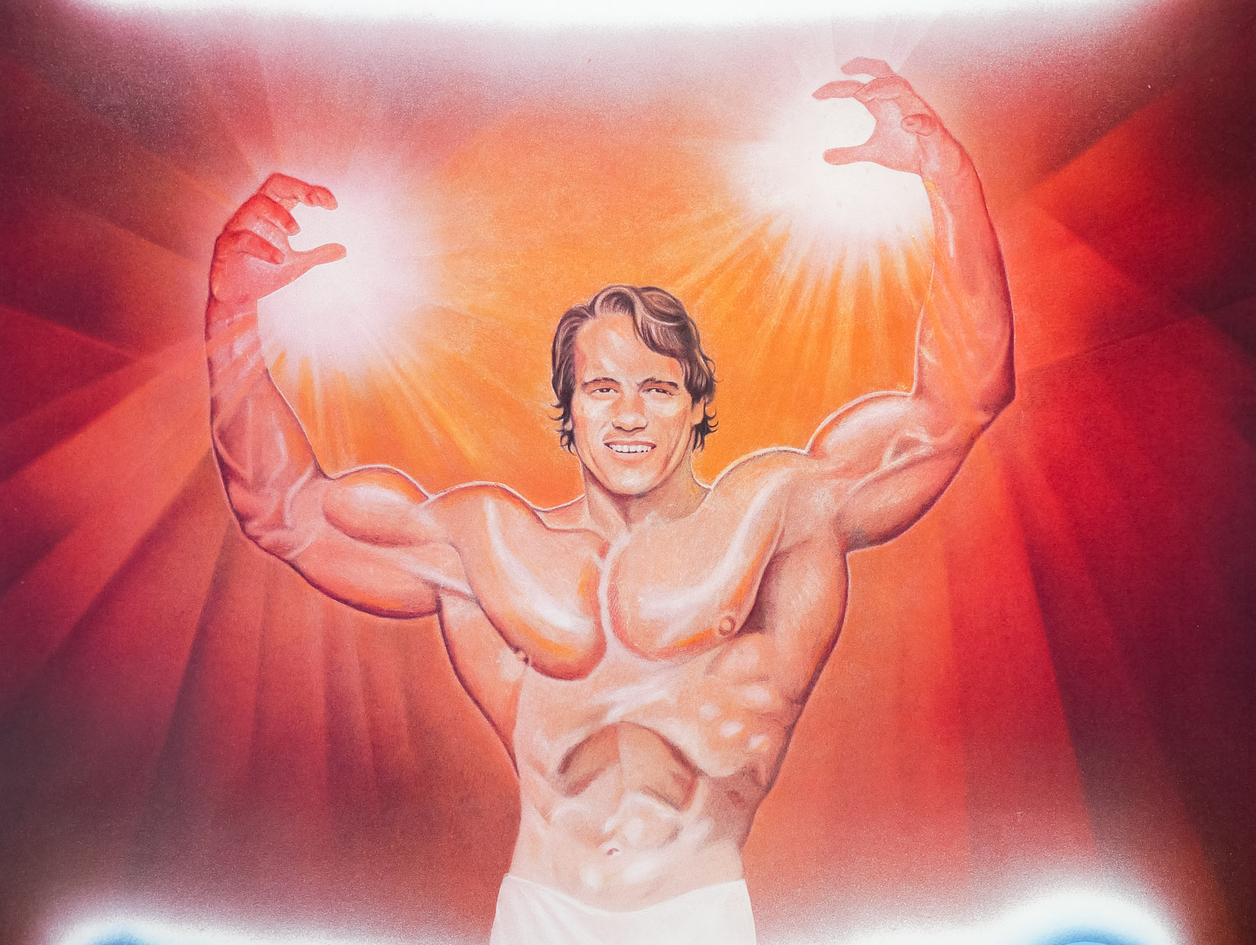
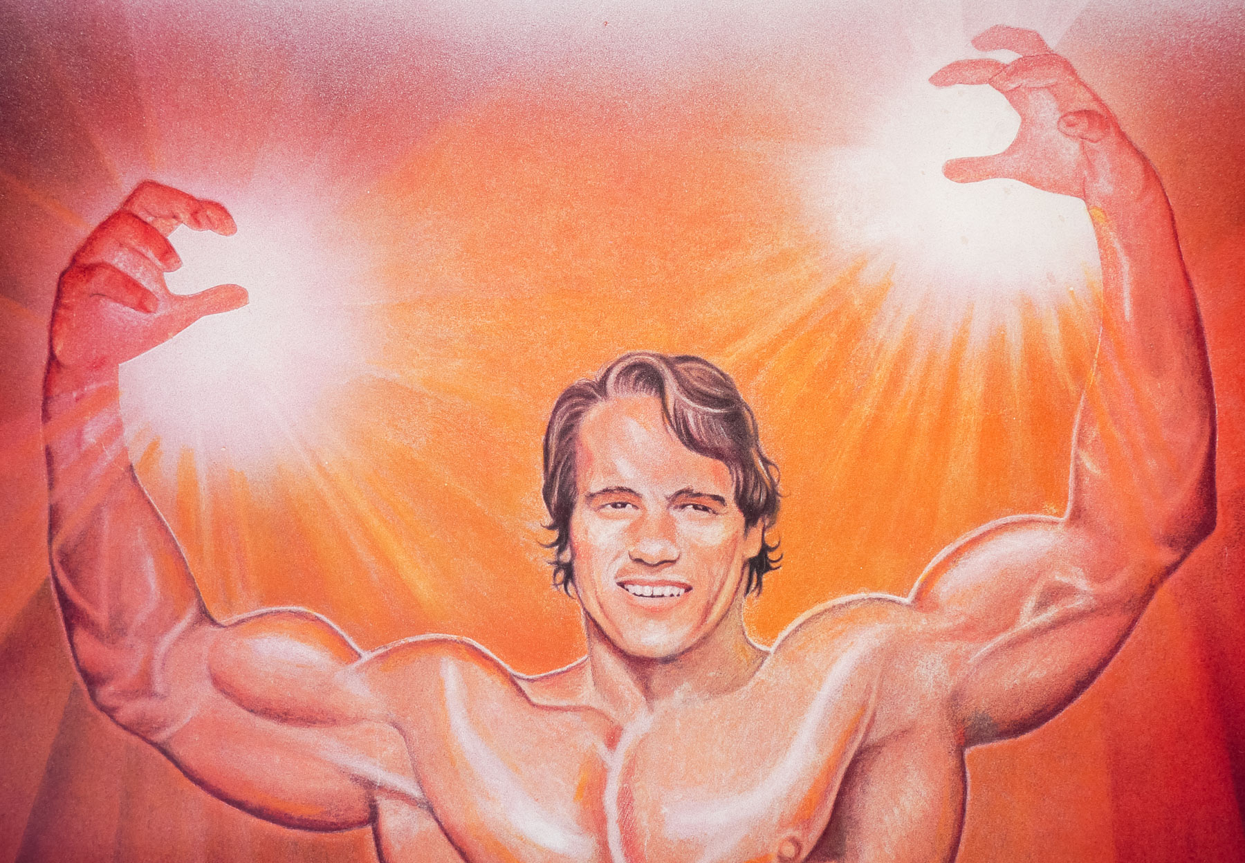
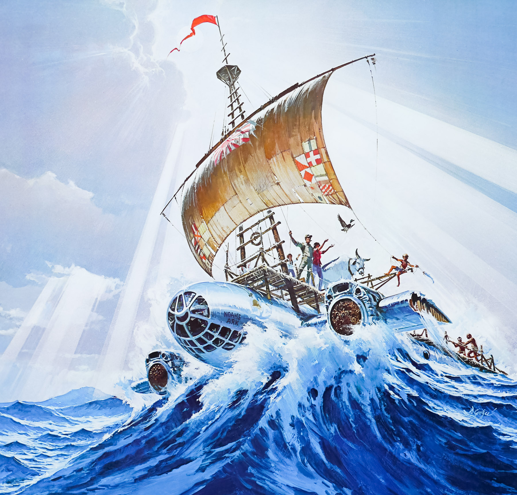
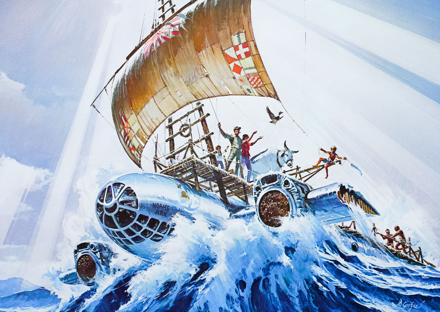
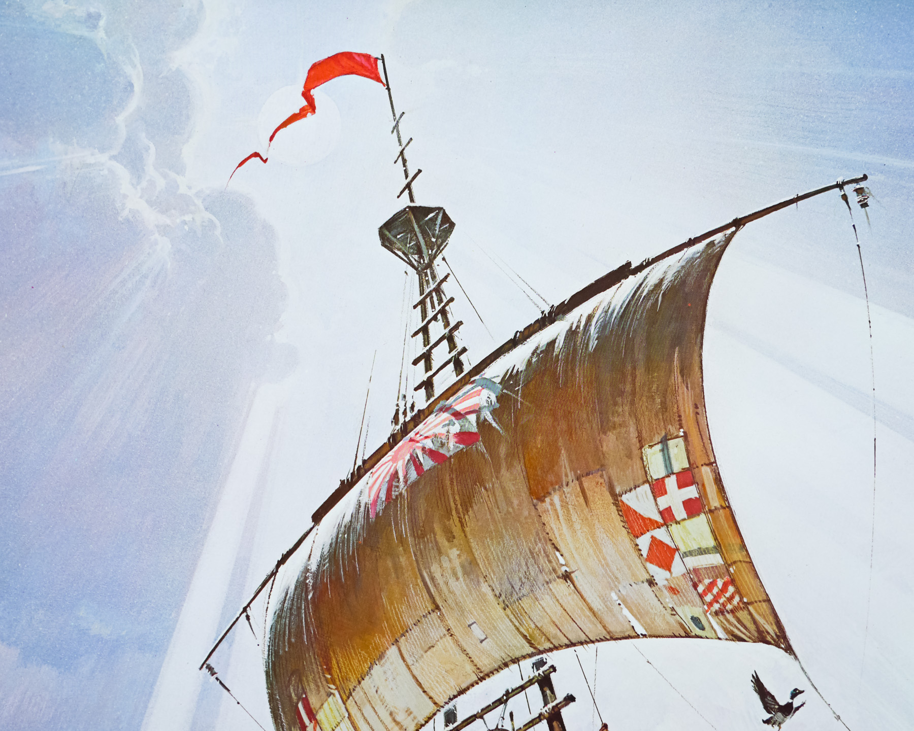
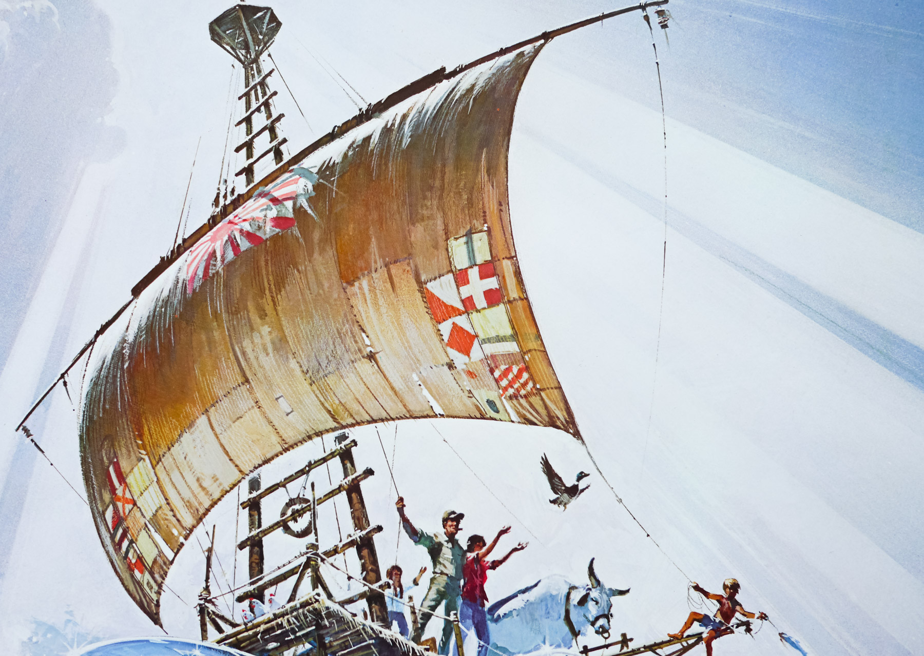
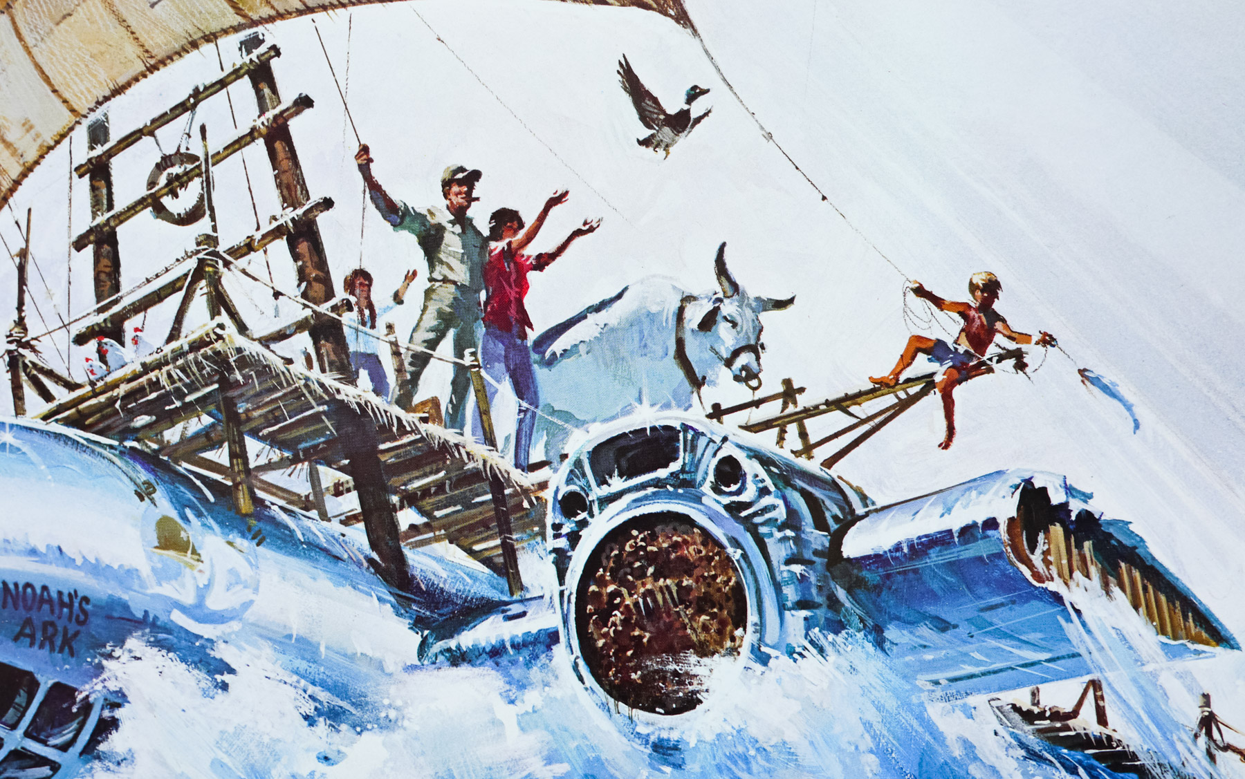
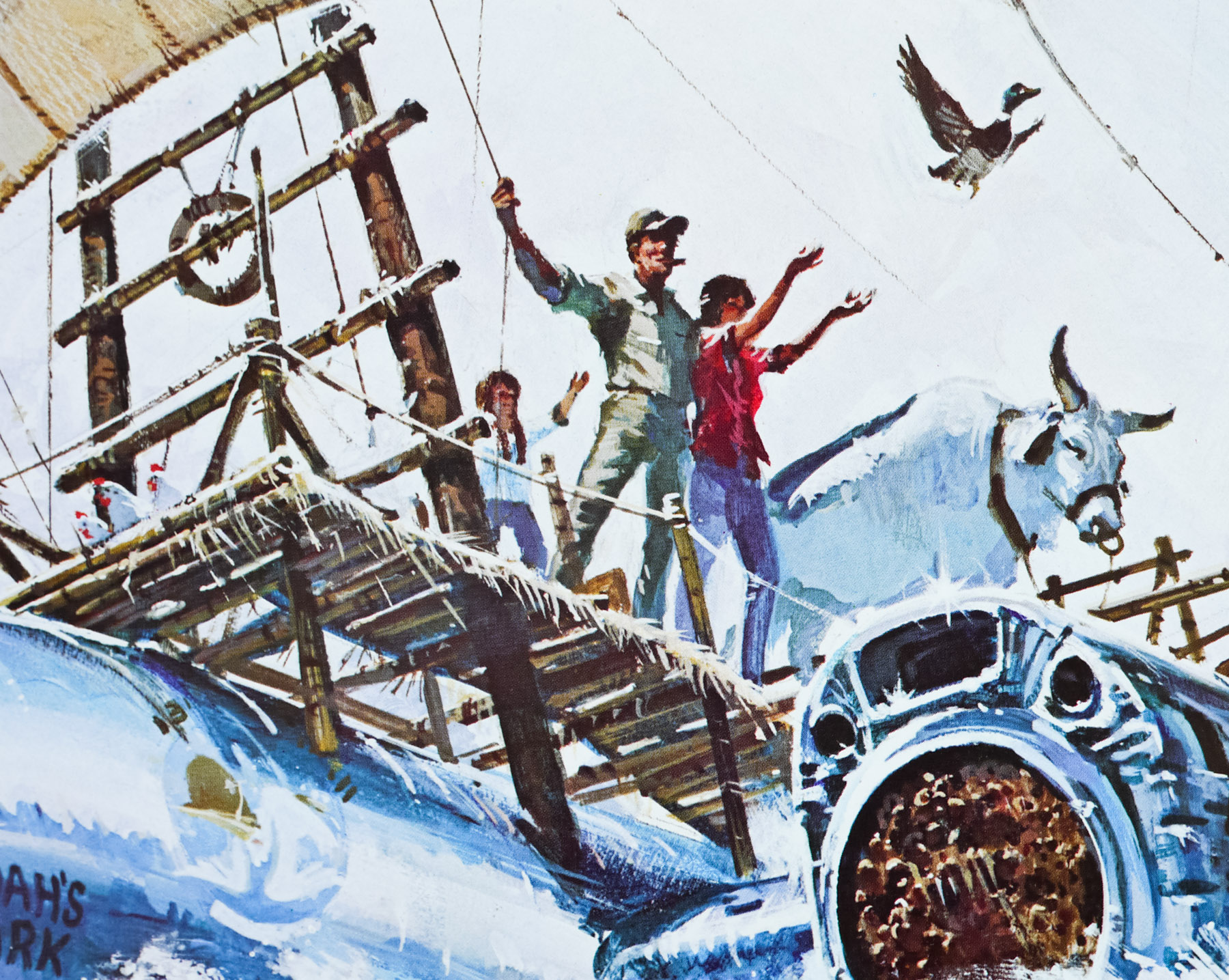
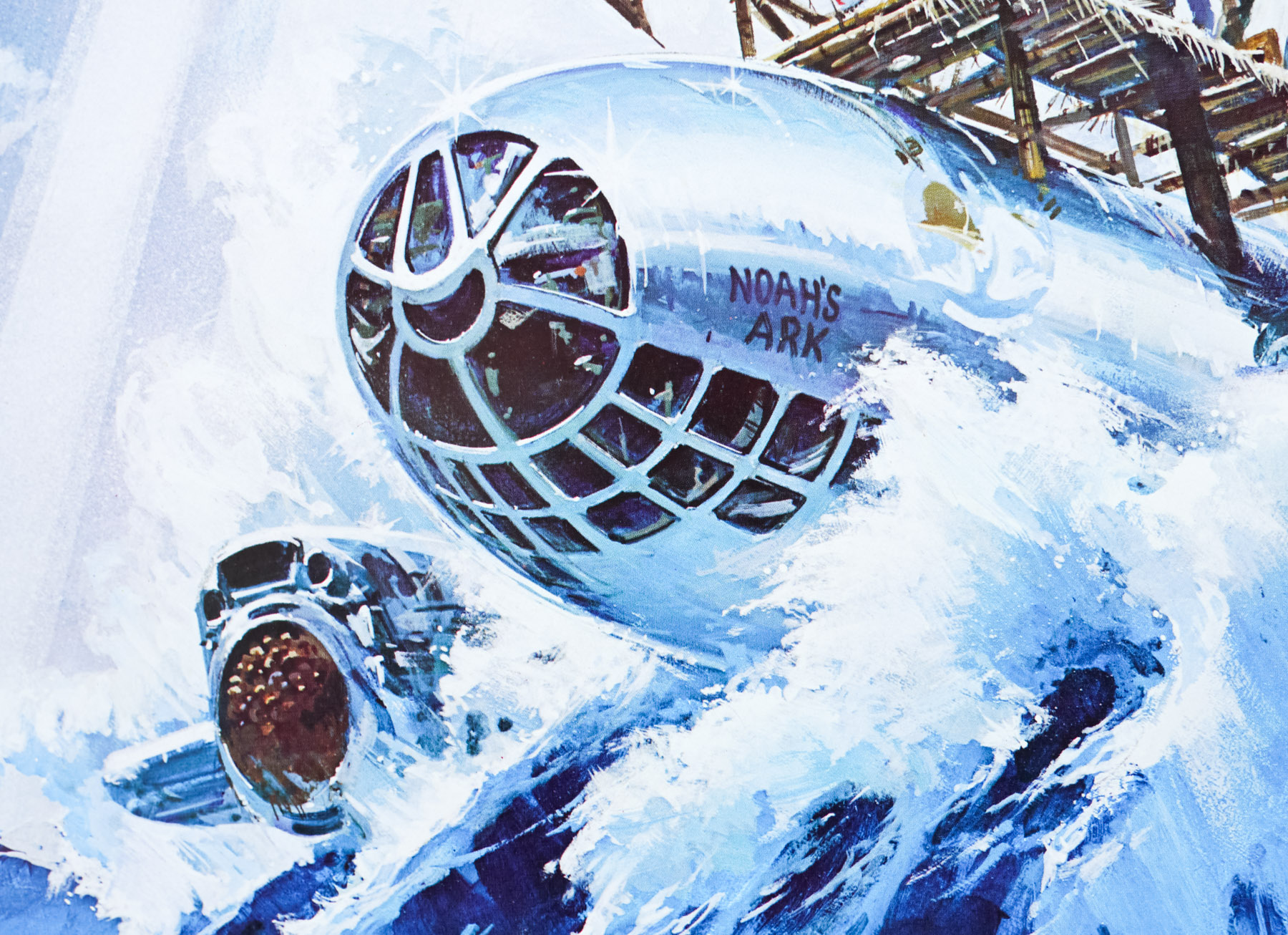
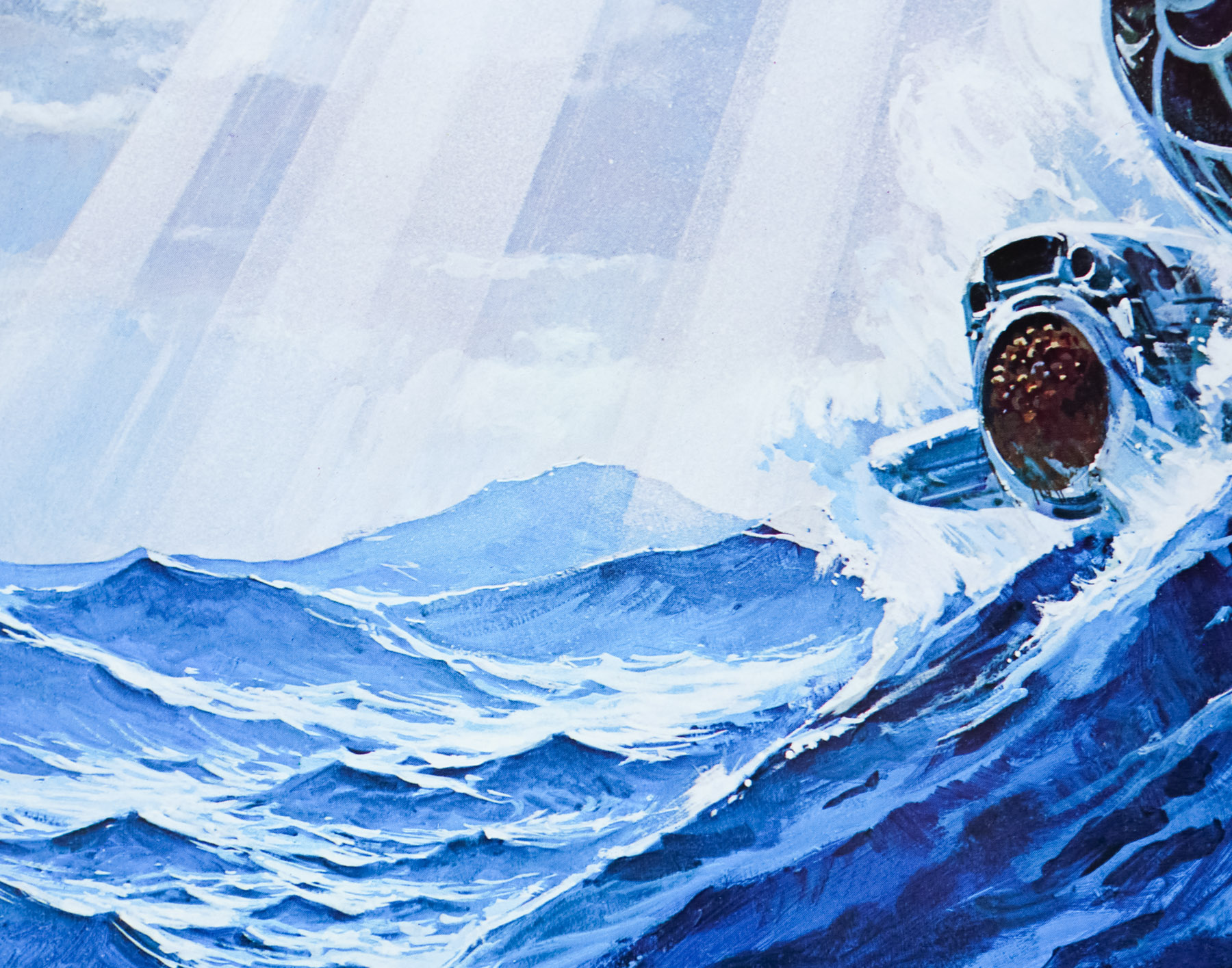
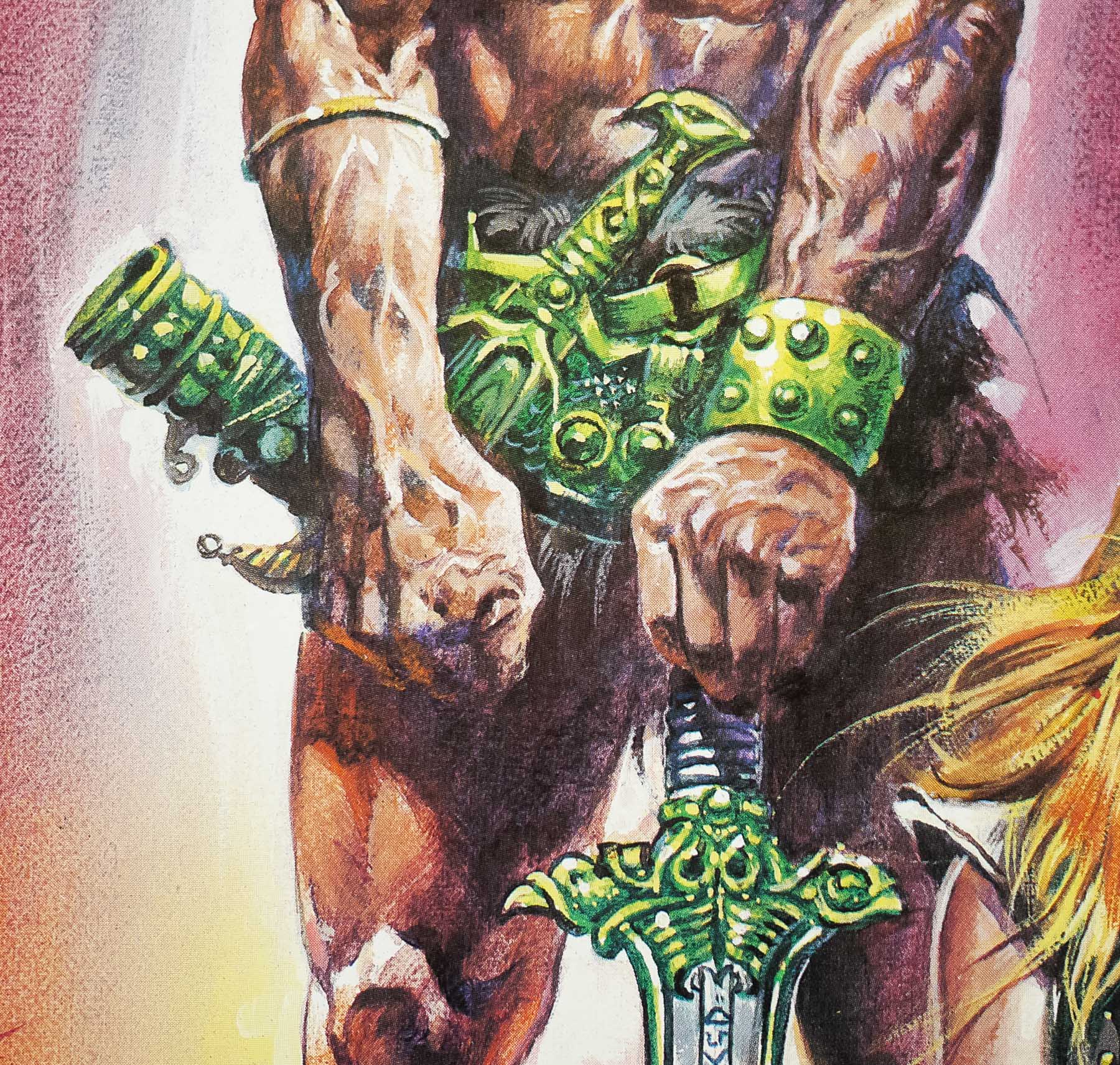
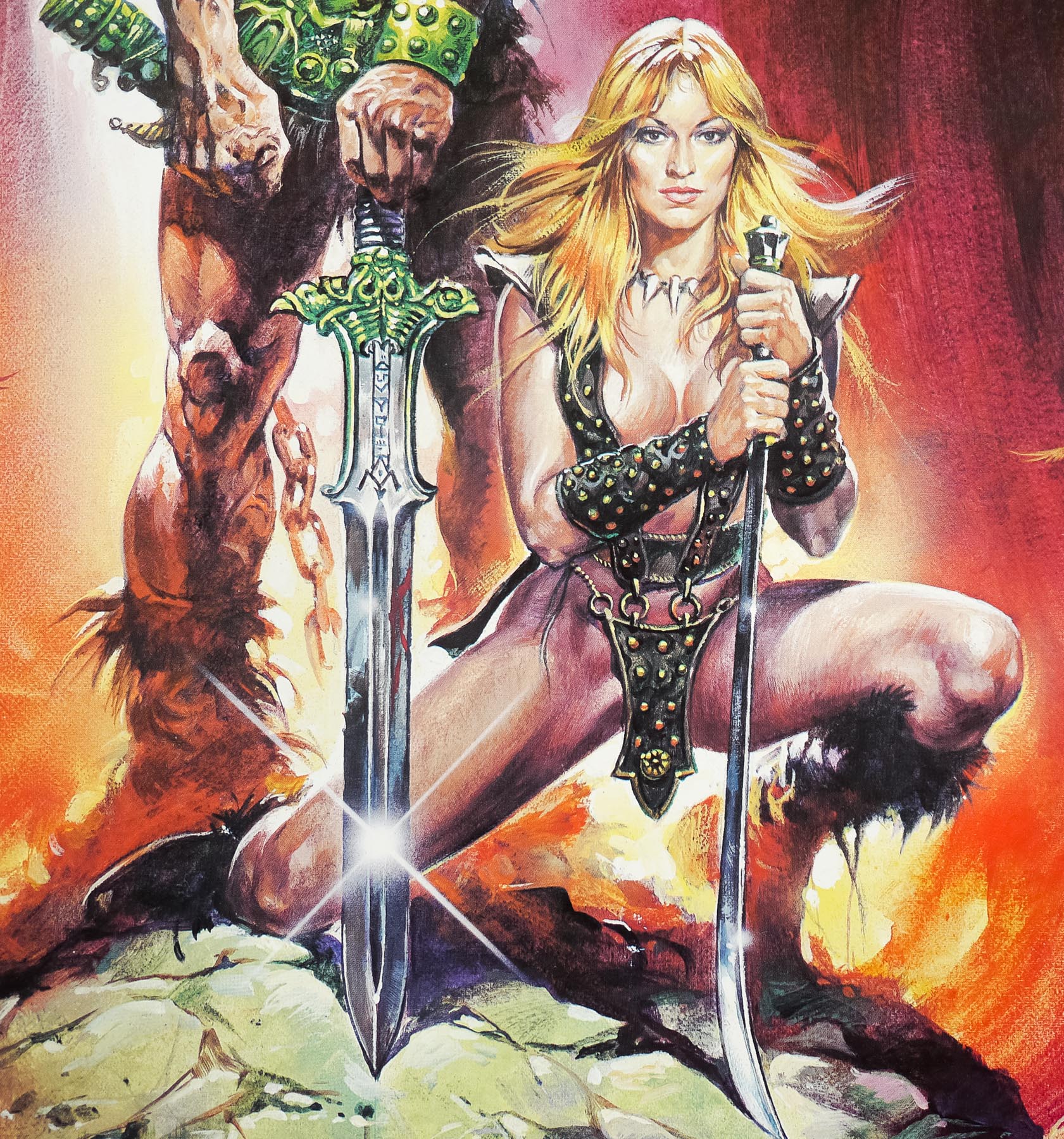
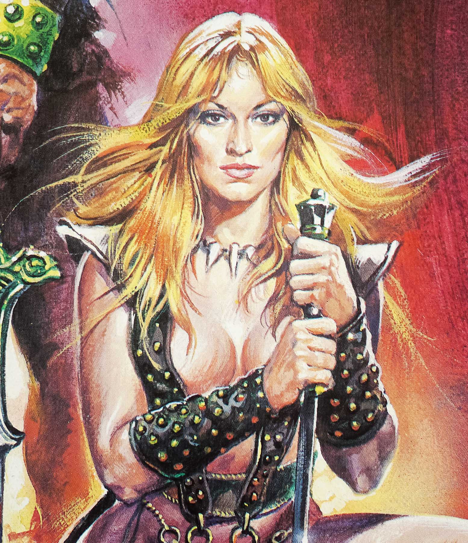
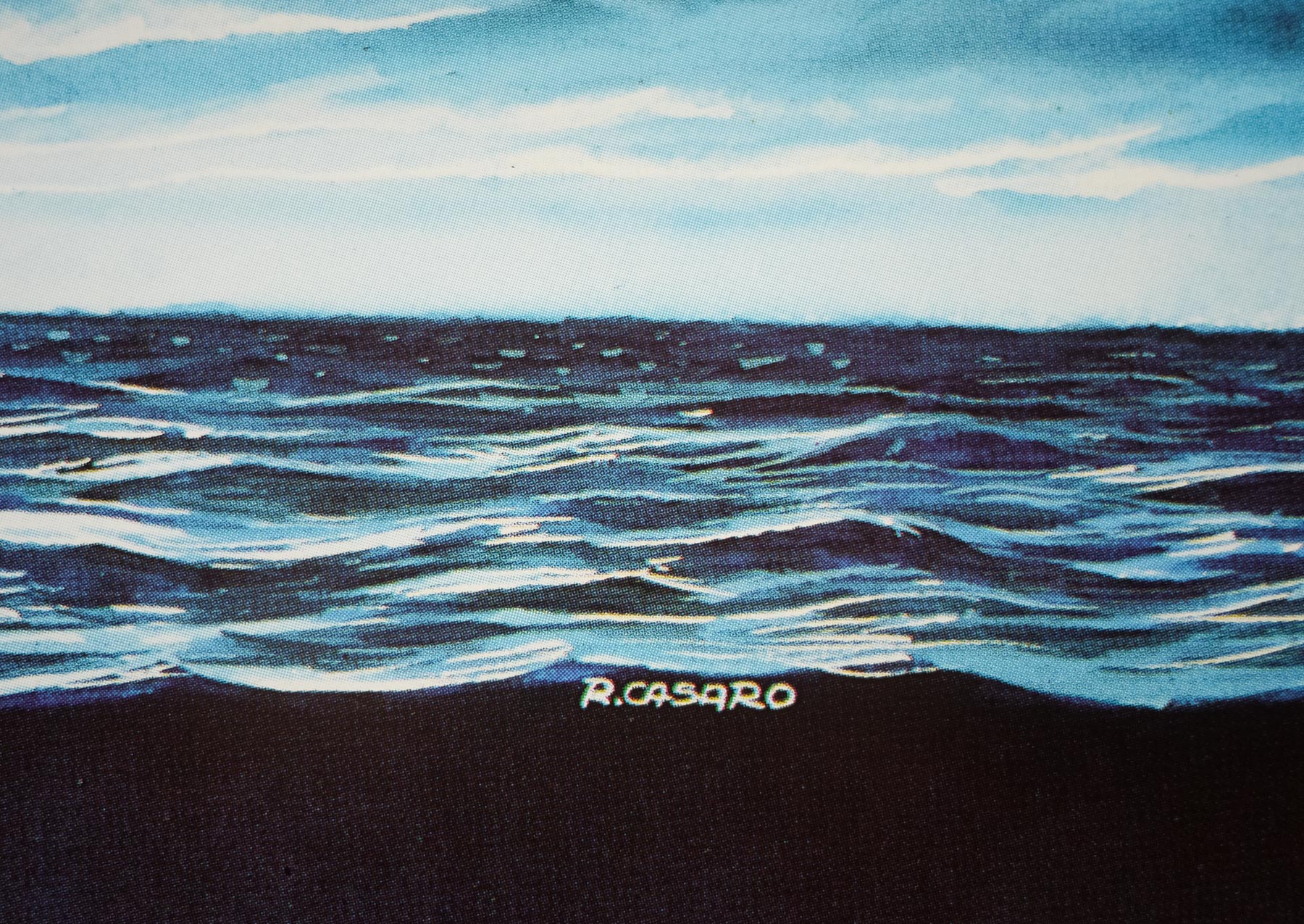
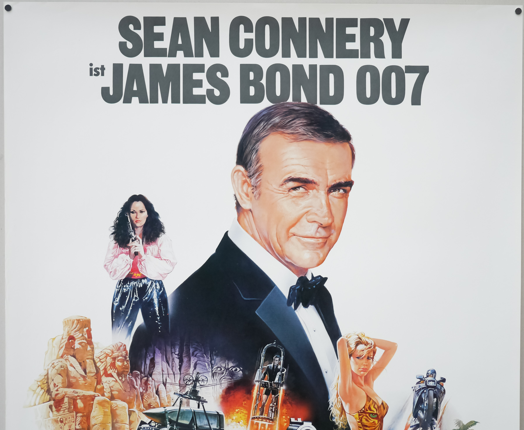
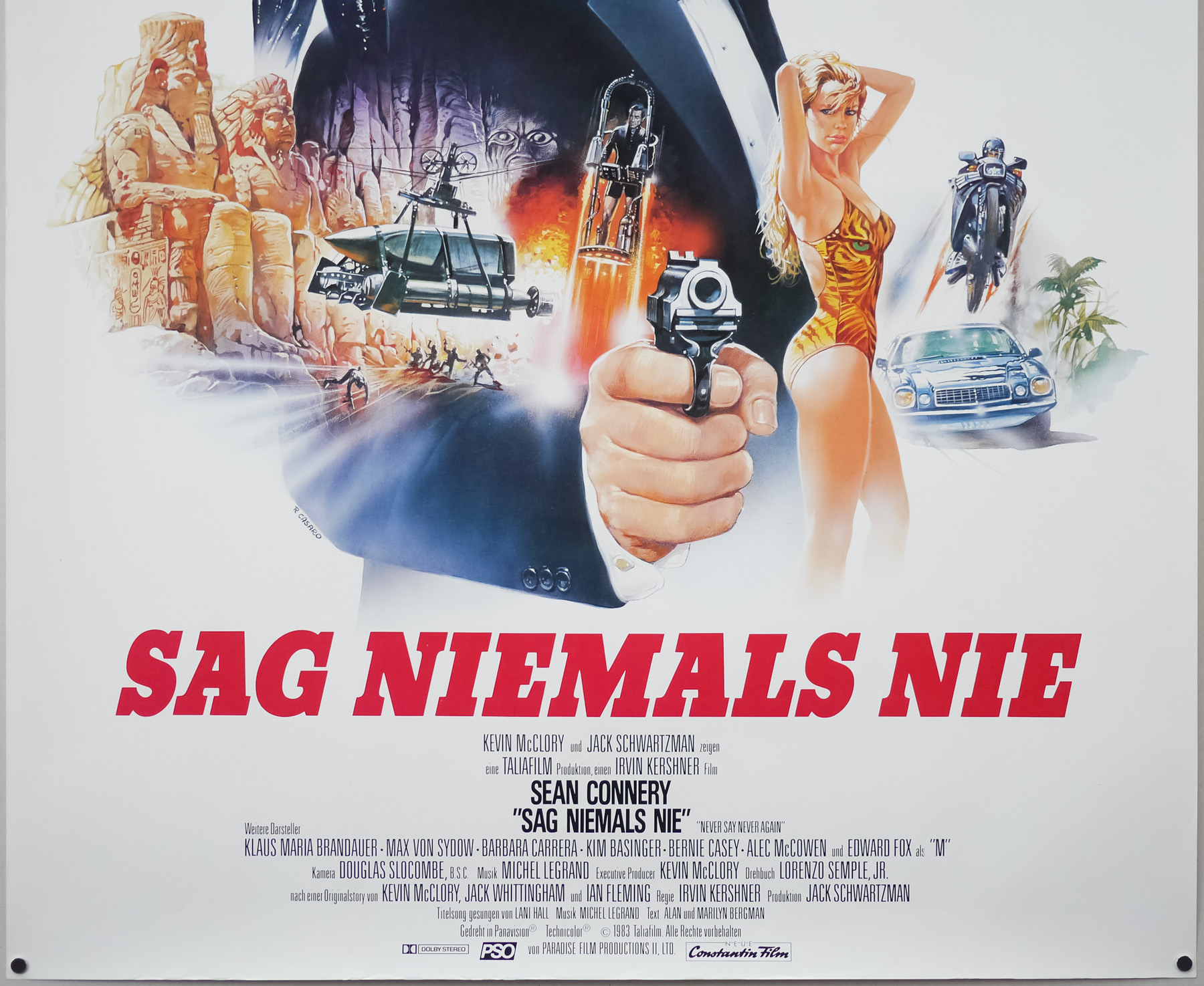
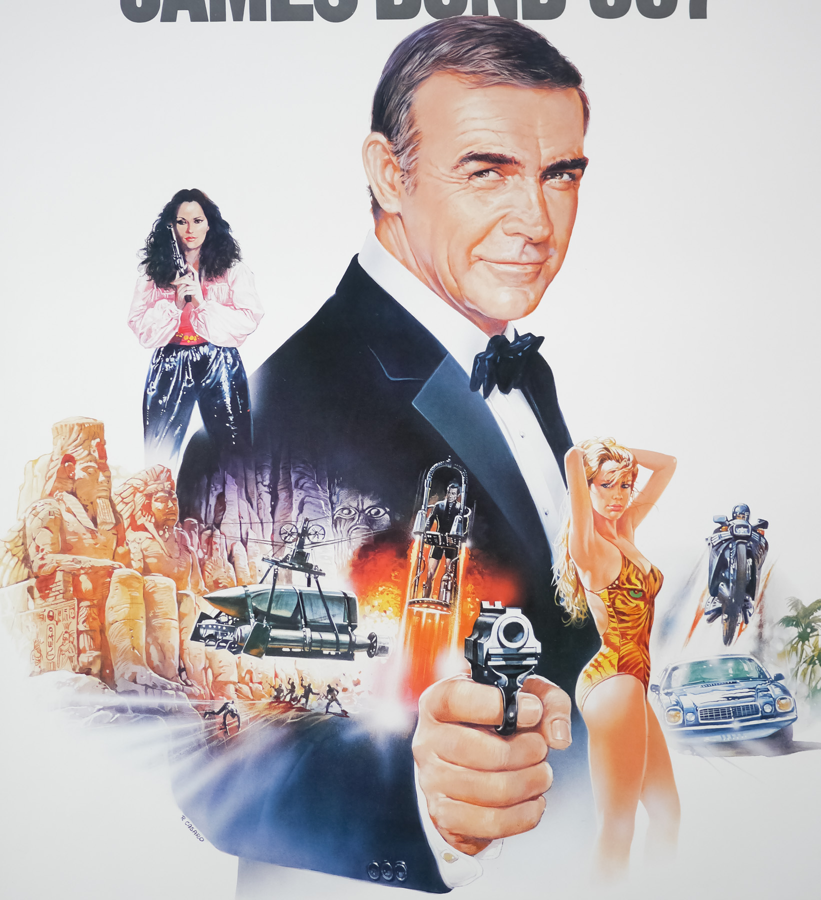
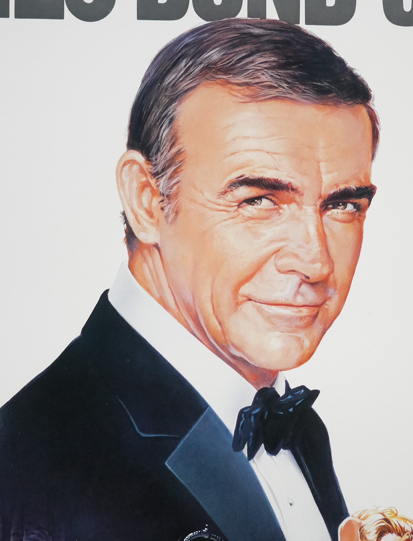
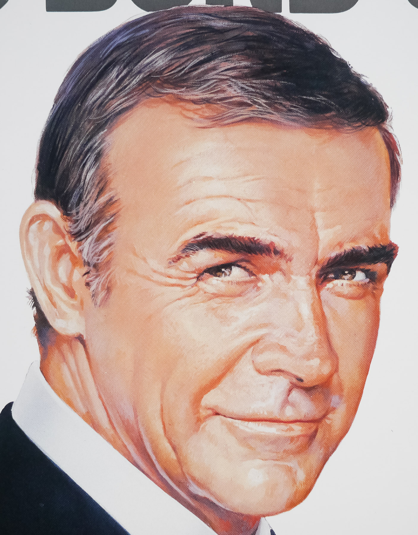
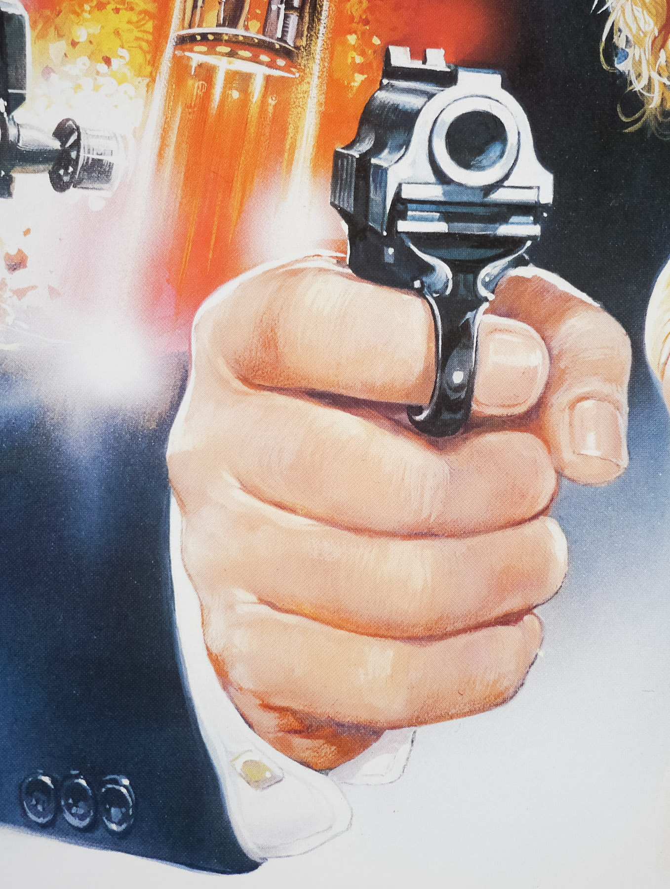
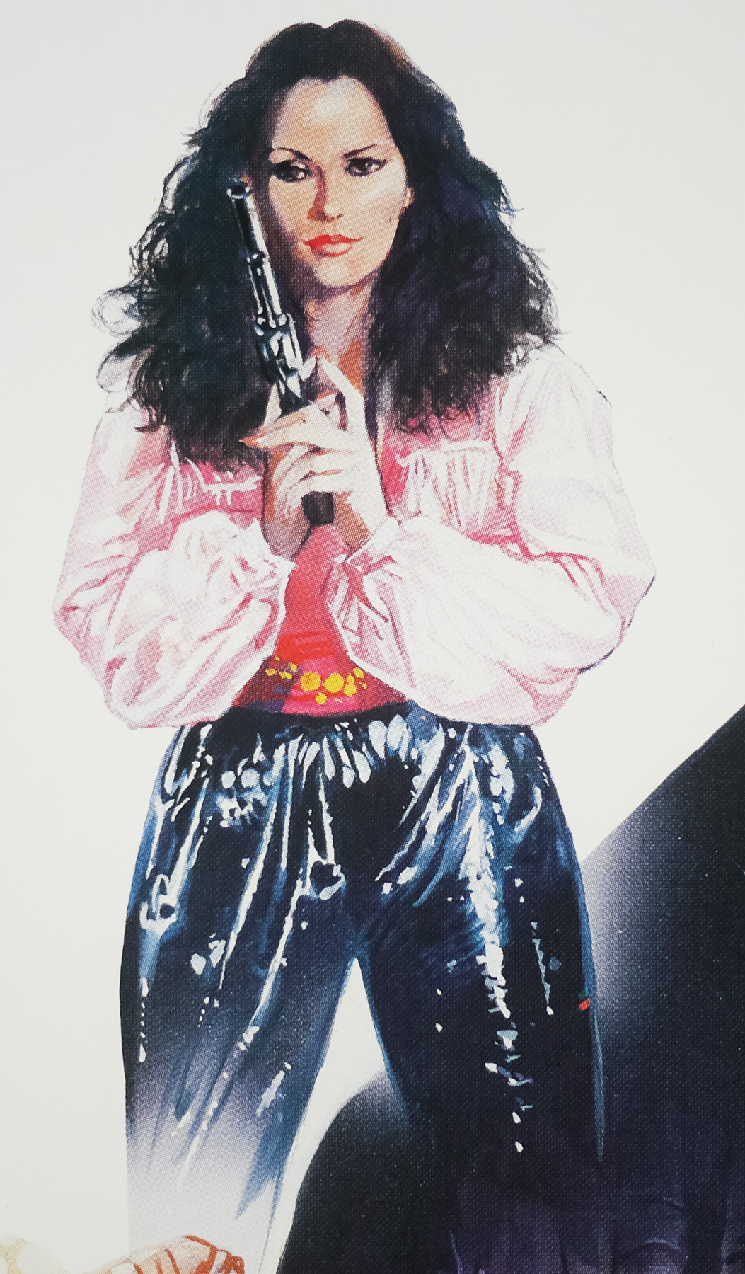
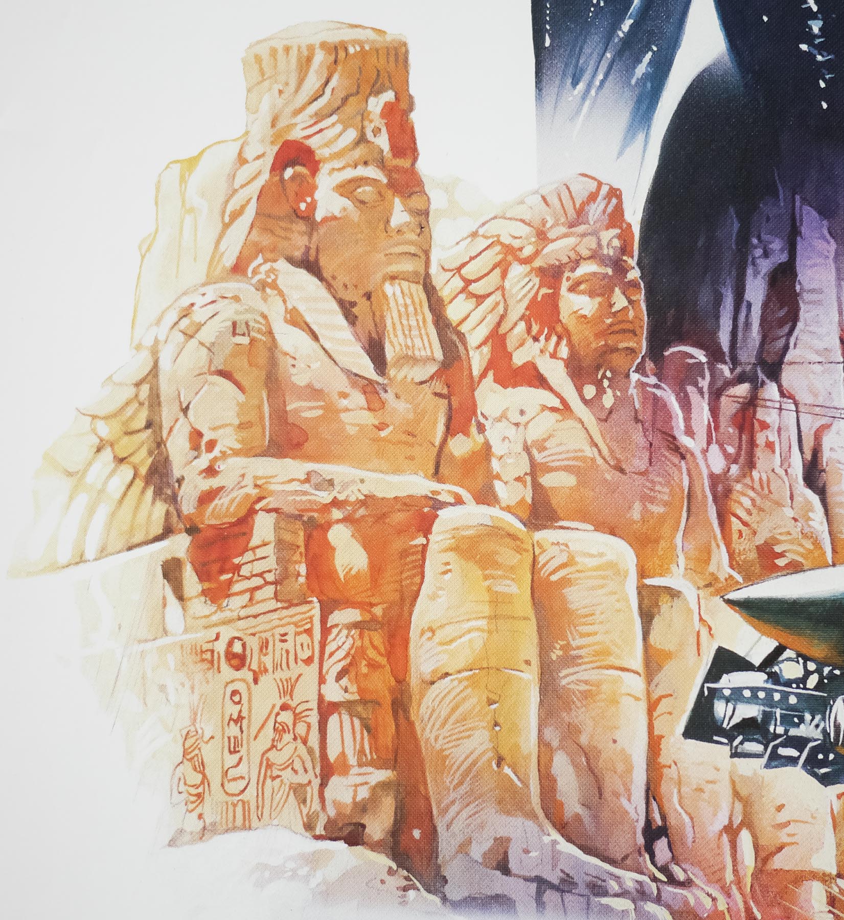
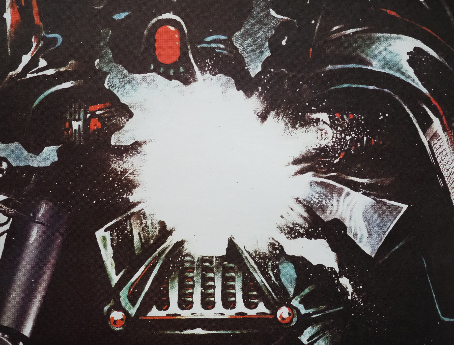
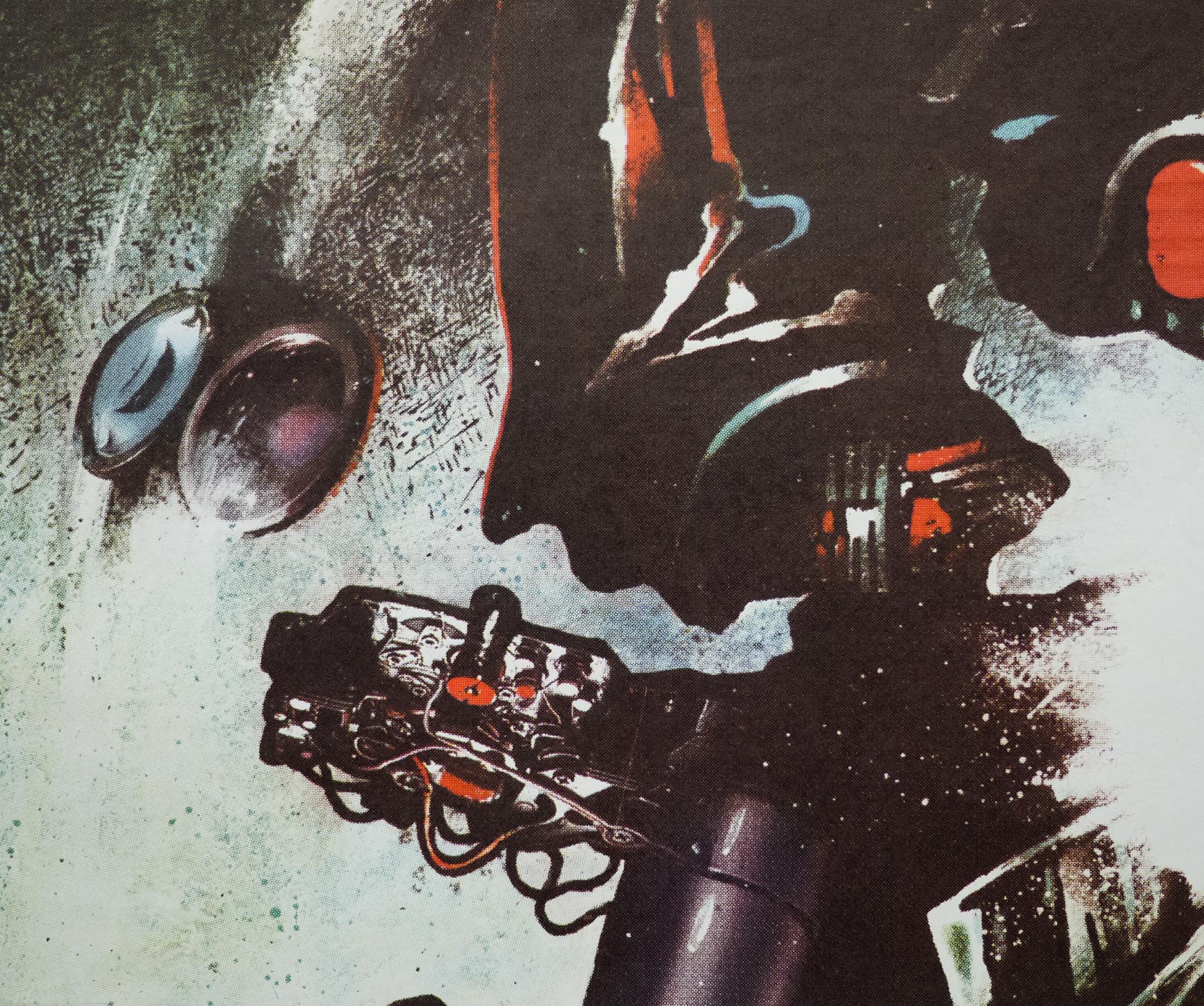
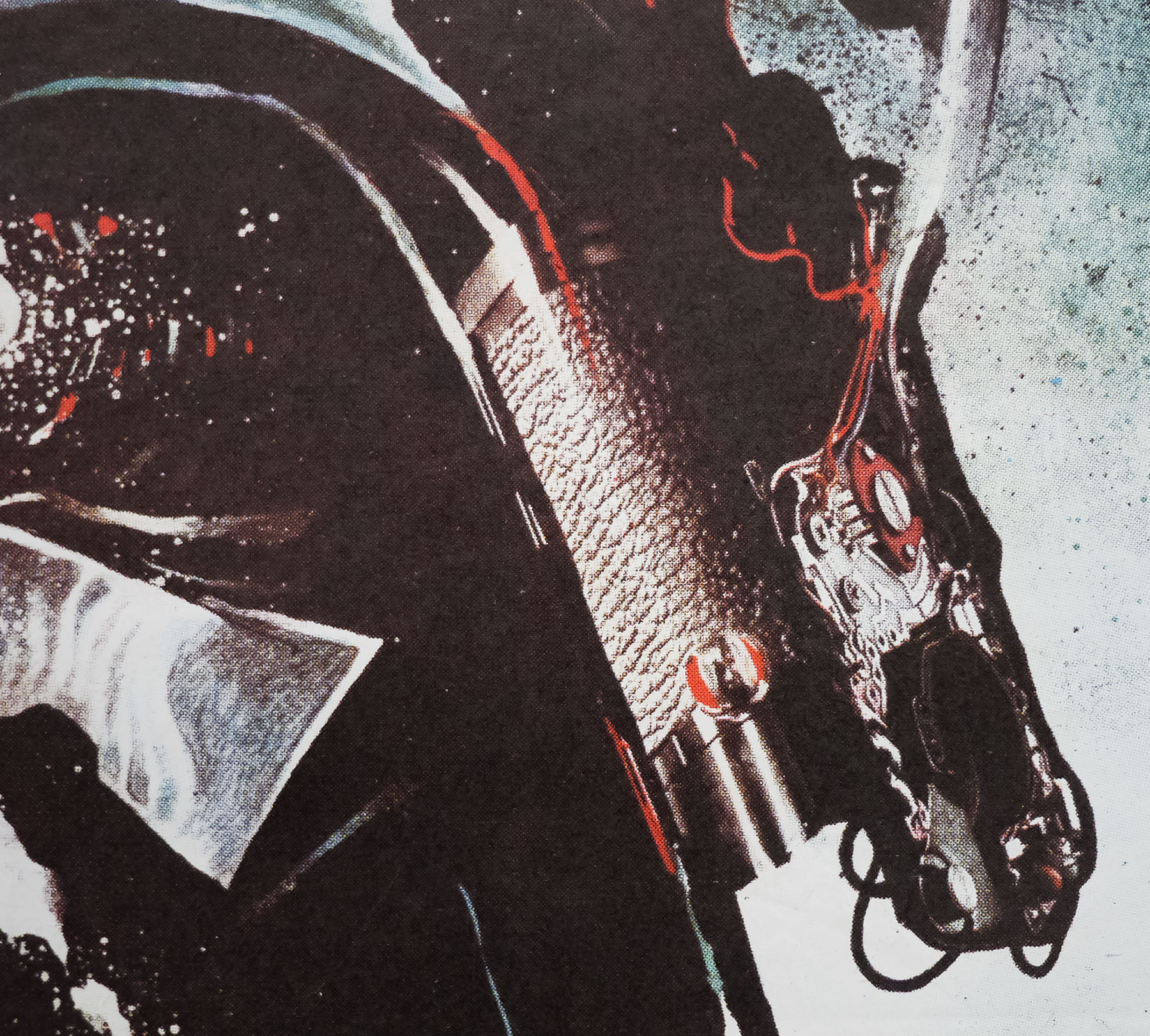
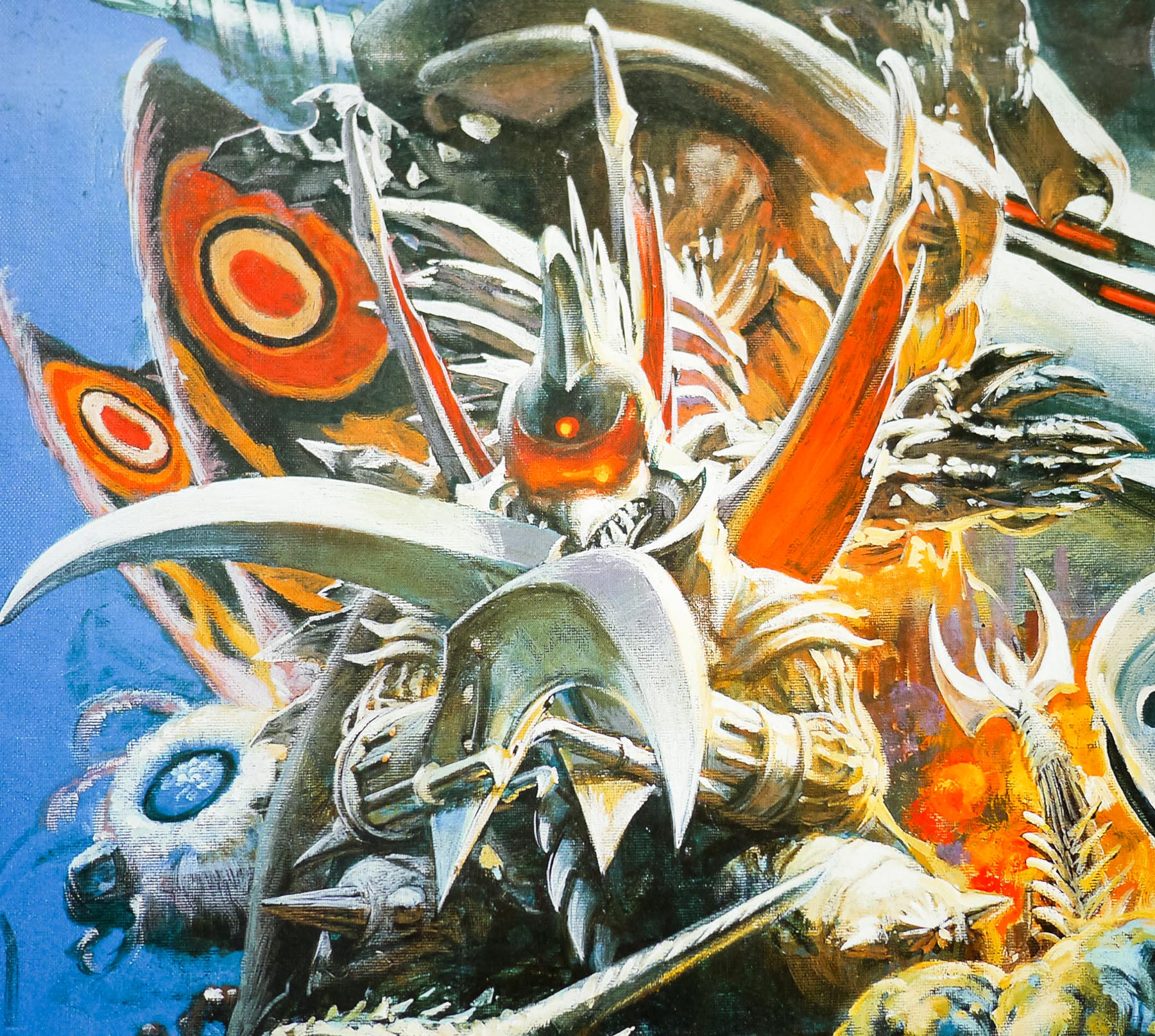
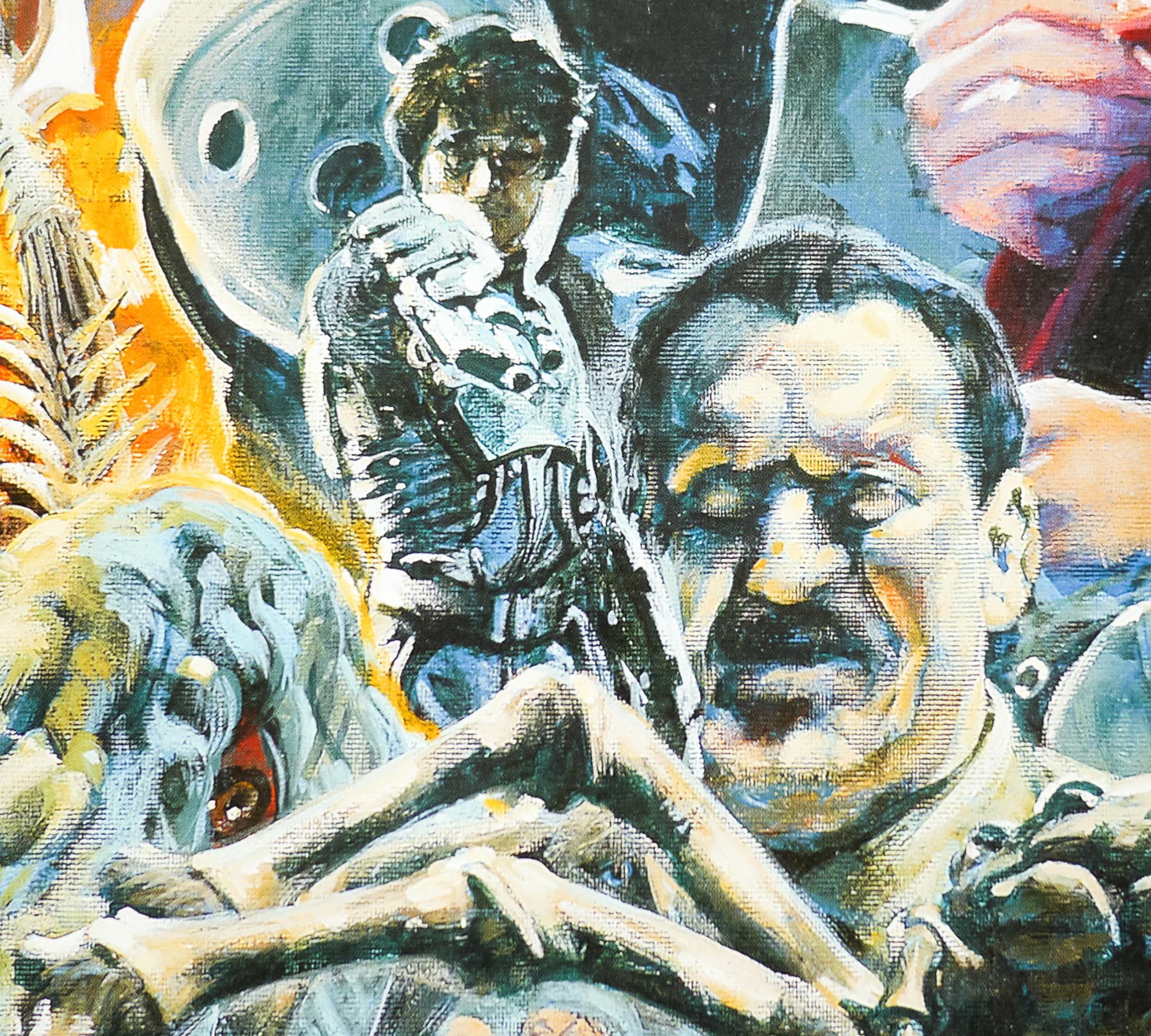
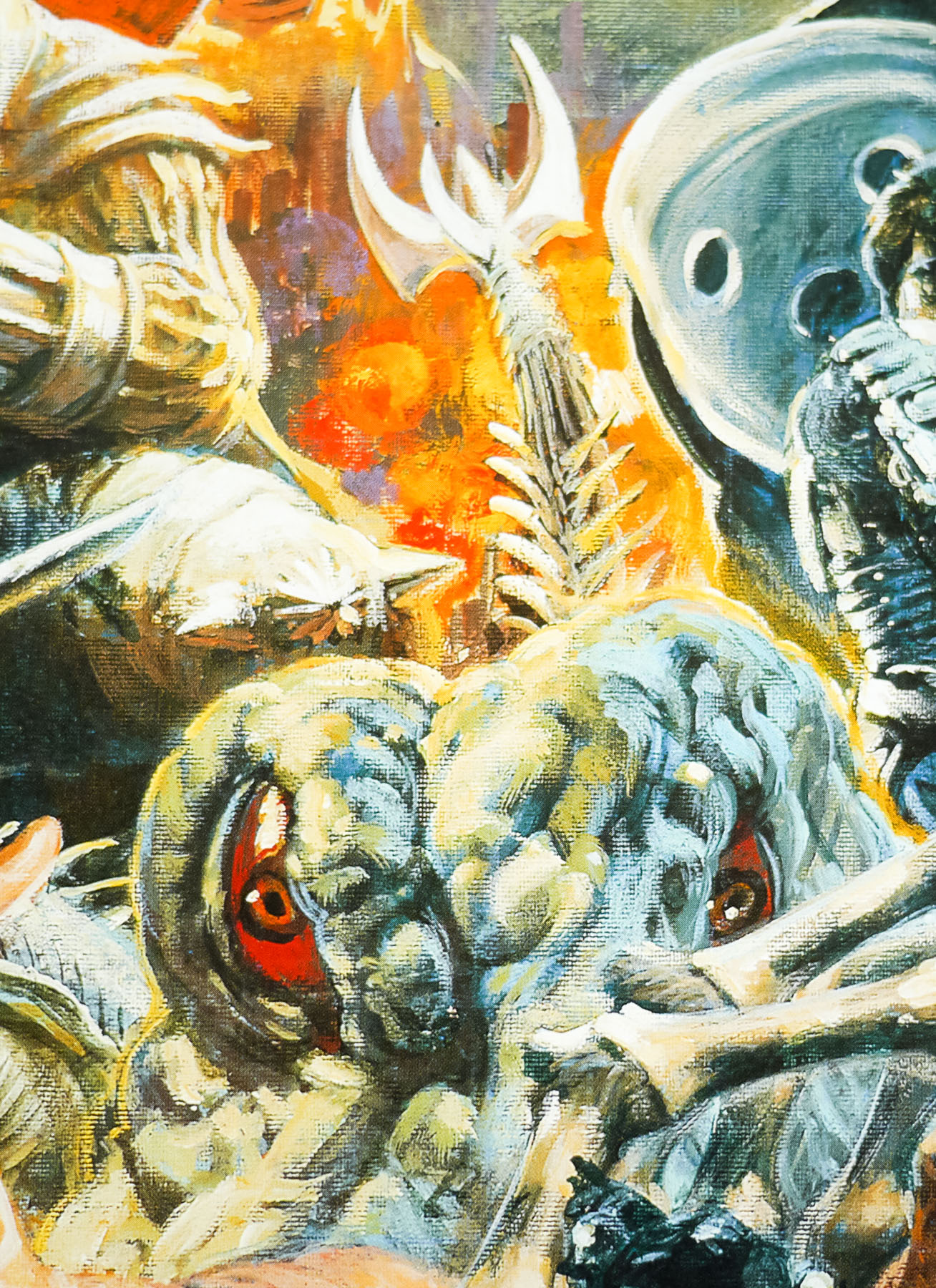
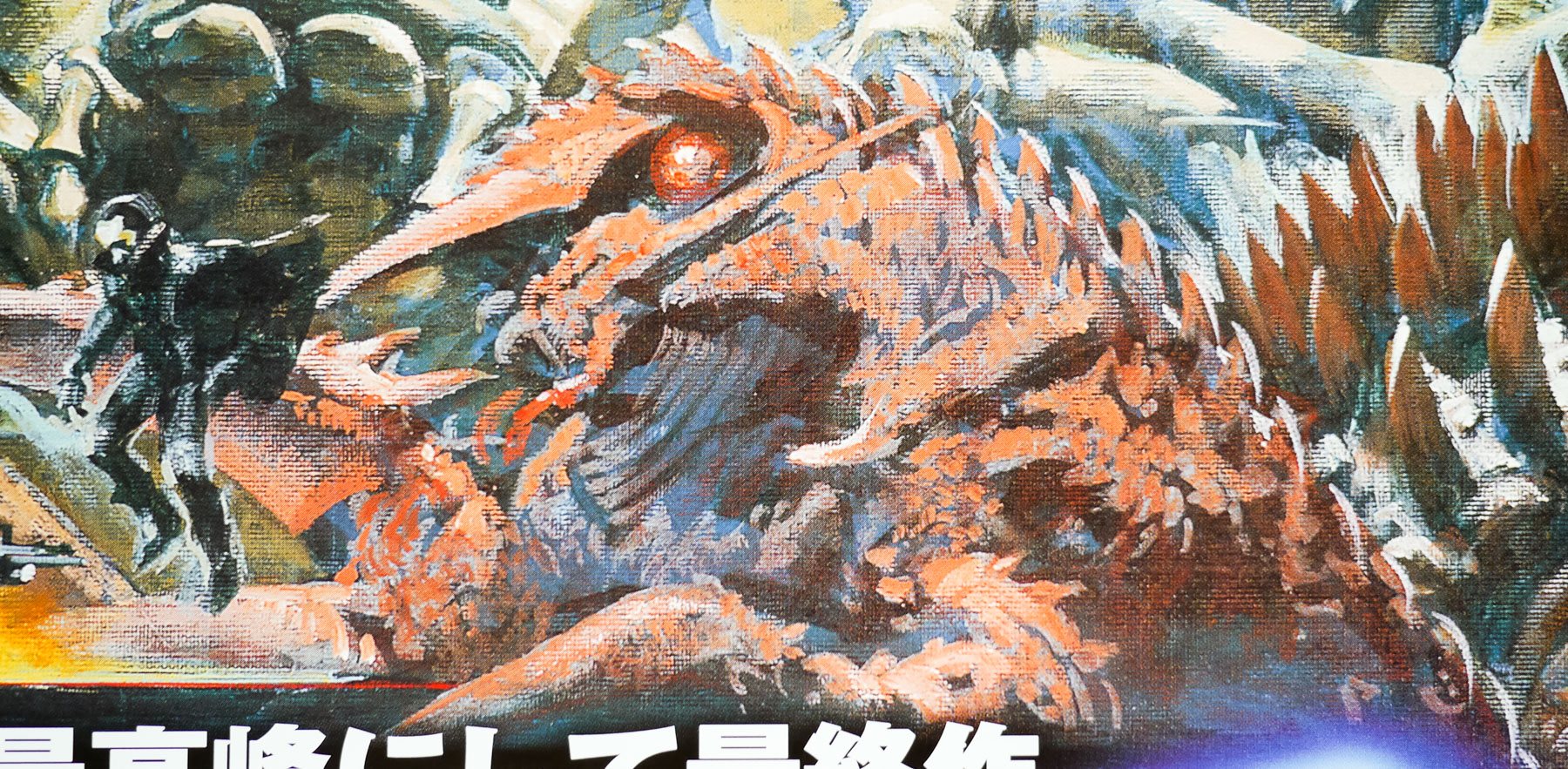
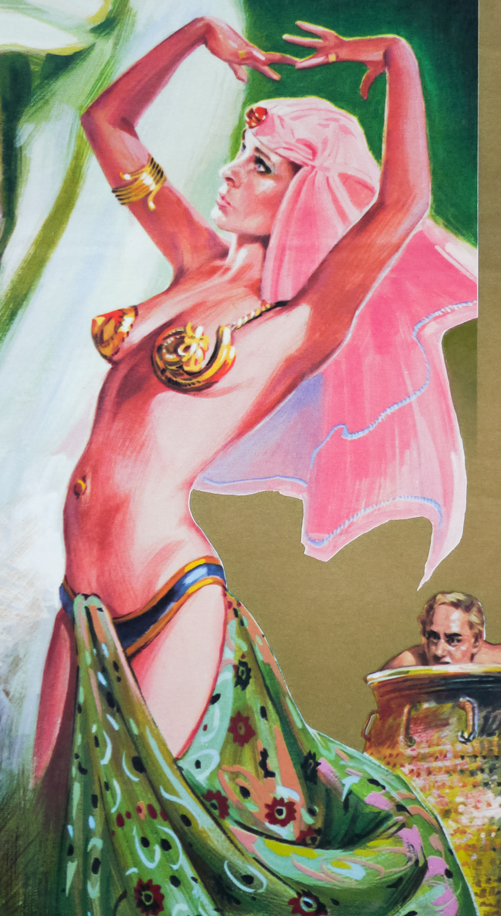
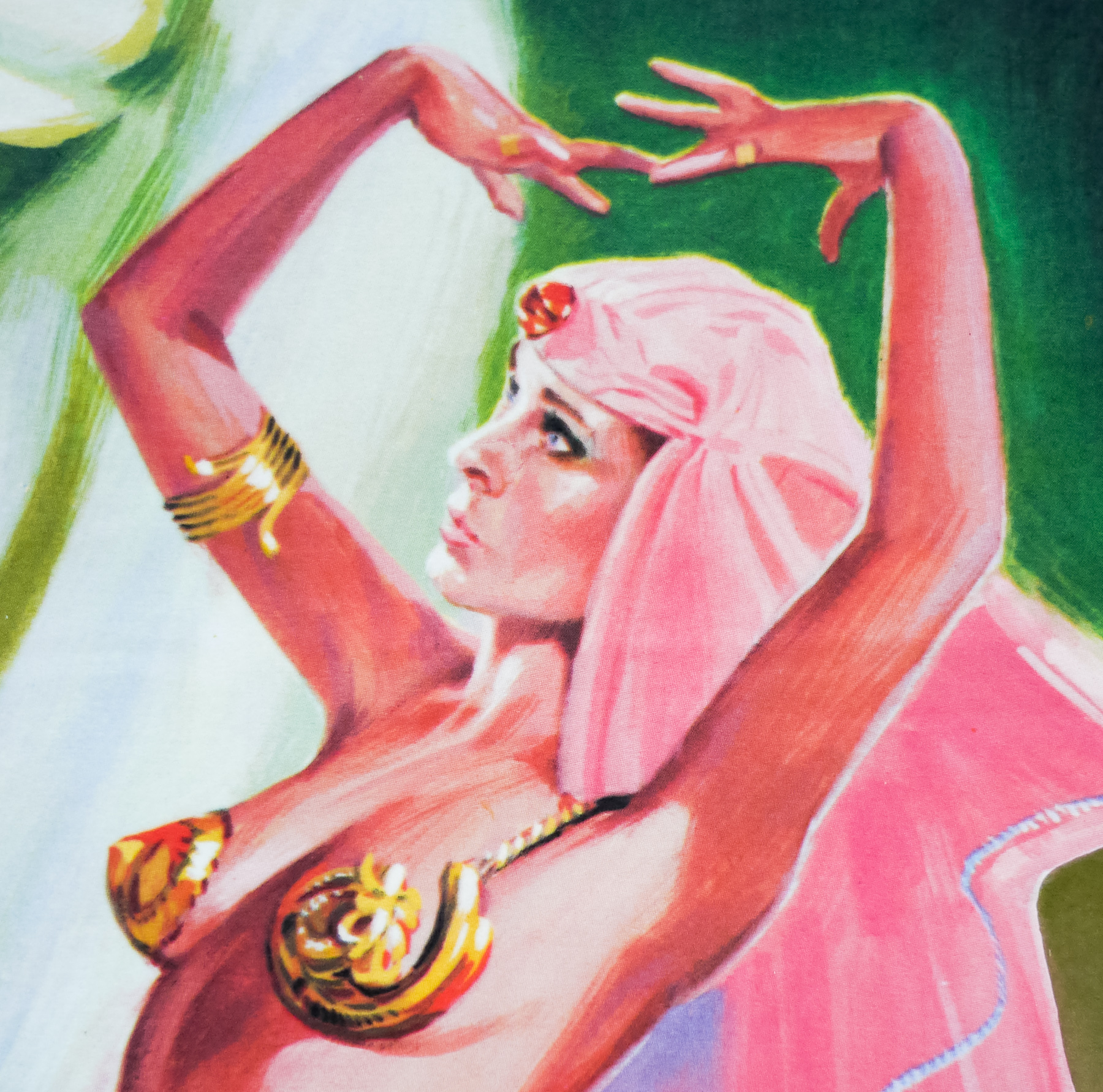
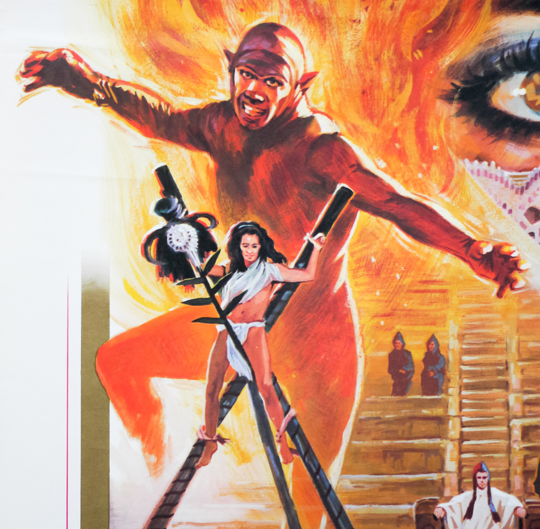
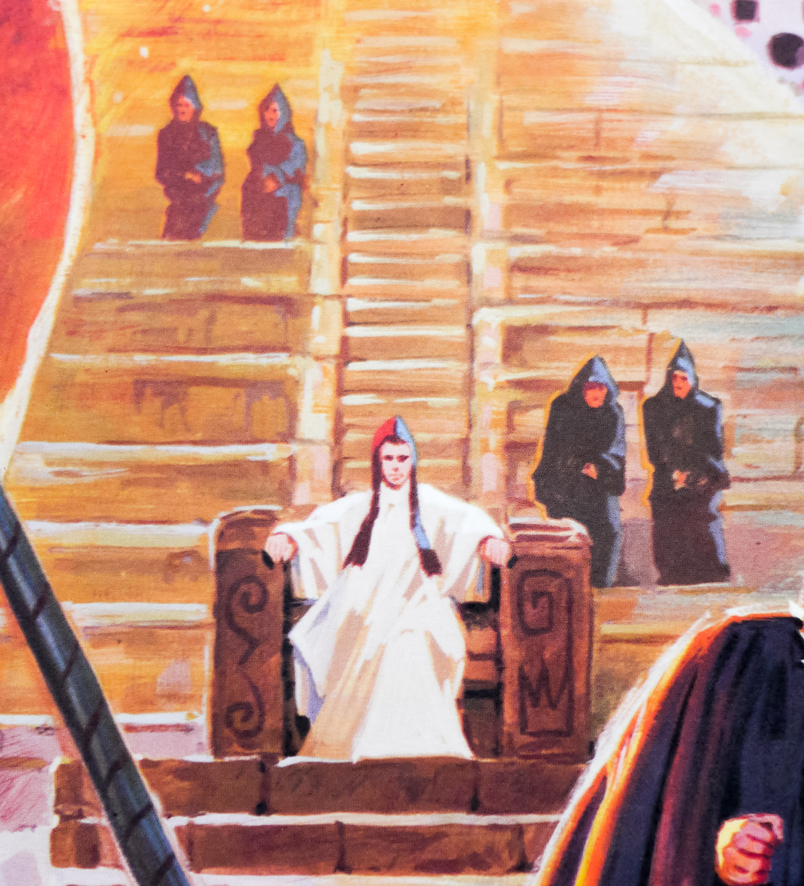
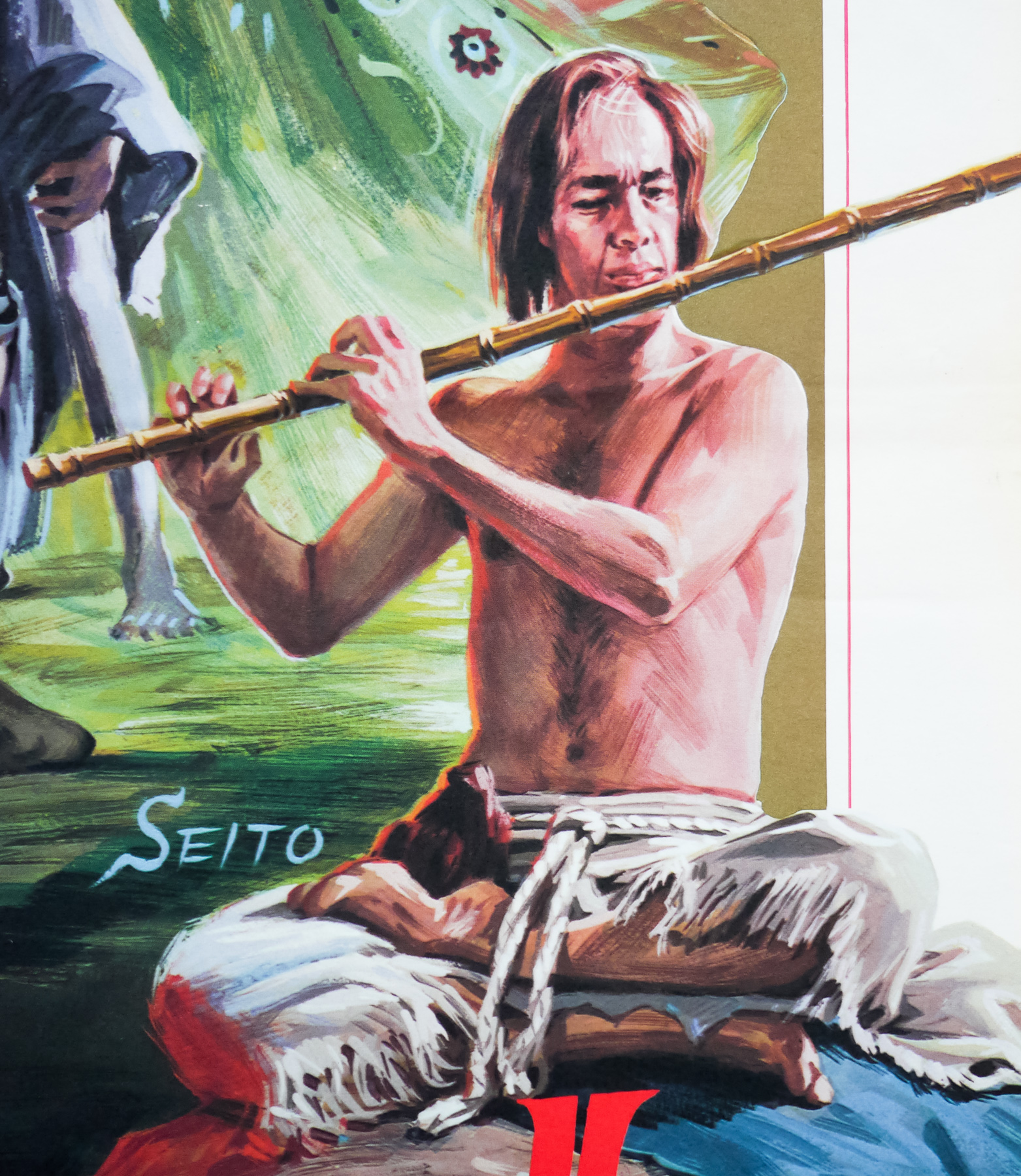
The artwork on this British quad was painted by the British artist Brian Bysouth, from an original design by Eric Pulford. When I interviewed the artist in 2012 this poster was discussed and the following is an excerpt from the article:
—————-
One Bond poster you worked on is the quad for For Your Eyes Only. It had the Bill Gold designed element of the long legs, but you modified the montage when doing the finished illustration?
Eric Pulford created the U.K. poster design that was approved. The inclusion of the very iconic Bill Gold legs concept was a must in any design that was submitted, so I suppose the scope for fresh designs was limited. In my opinion Eric’s original montage was not his best work and, although I tried to re-arrange some of the elements, the reference material supplied was not very exciting and I think the surrounding montage looks rather ordinary.
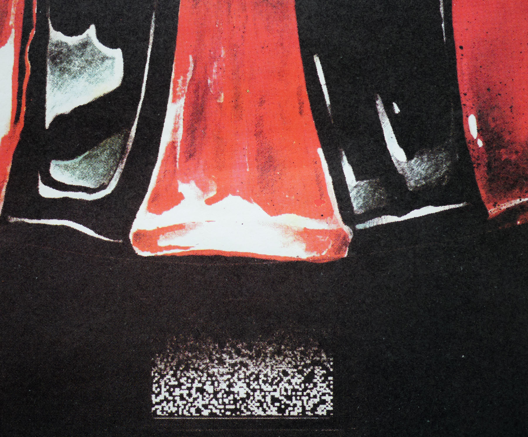
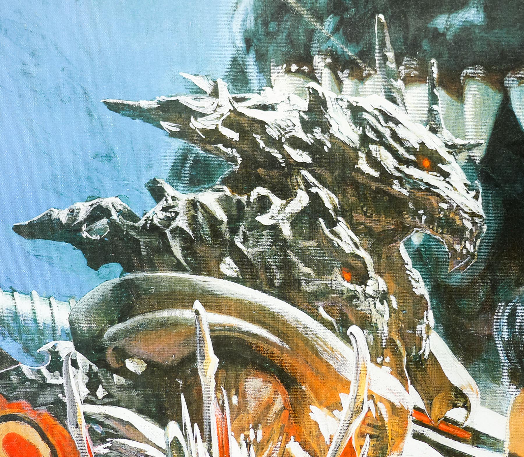
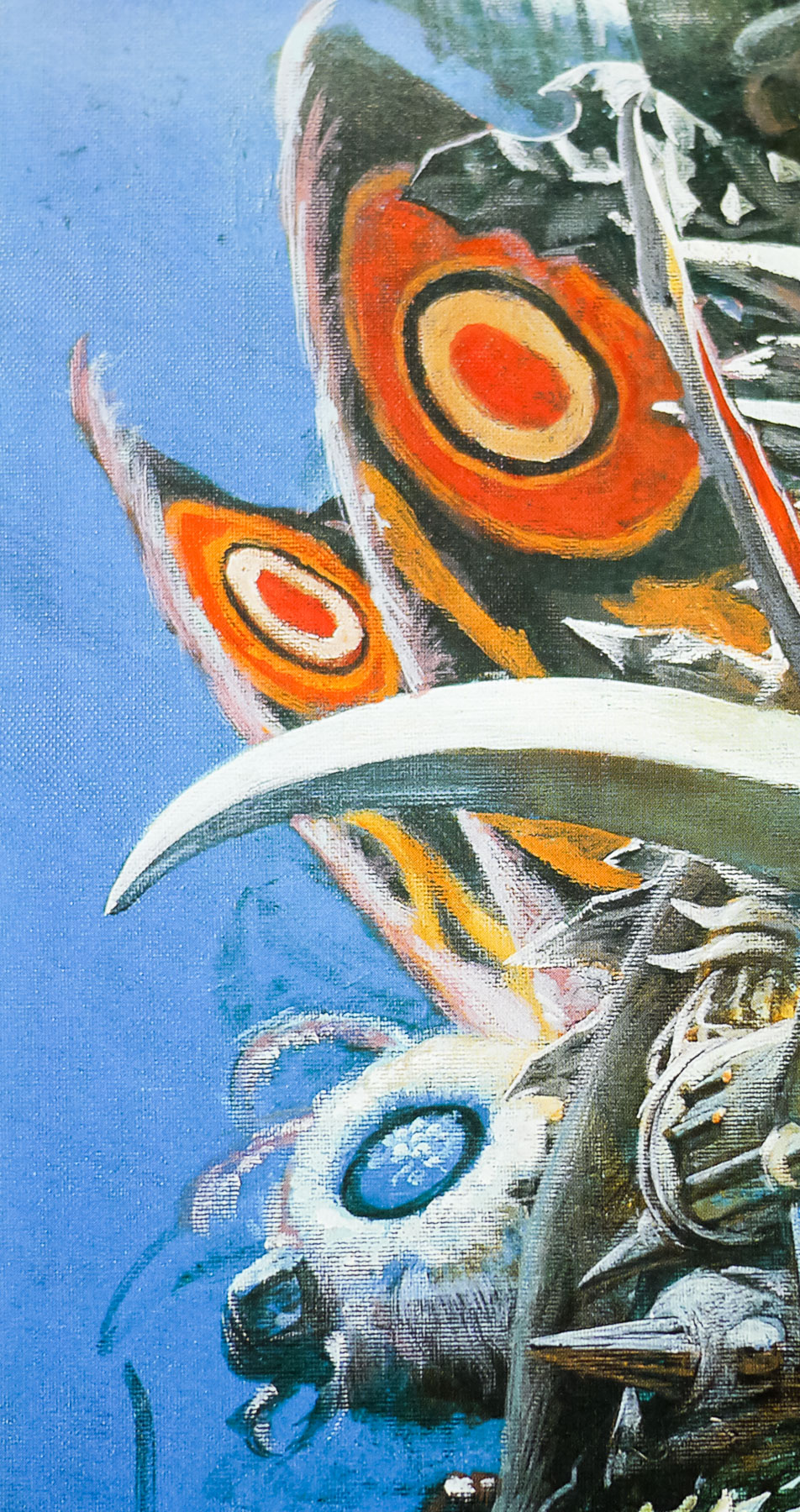
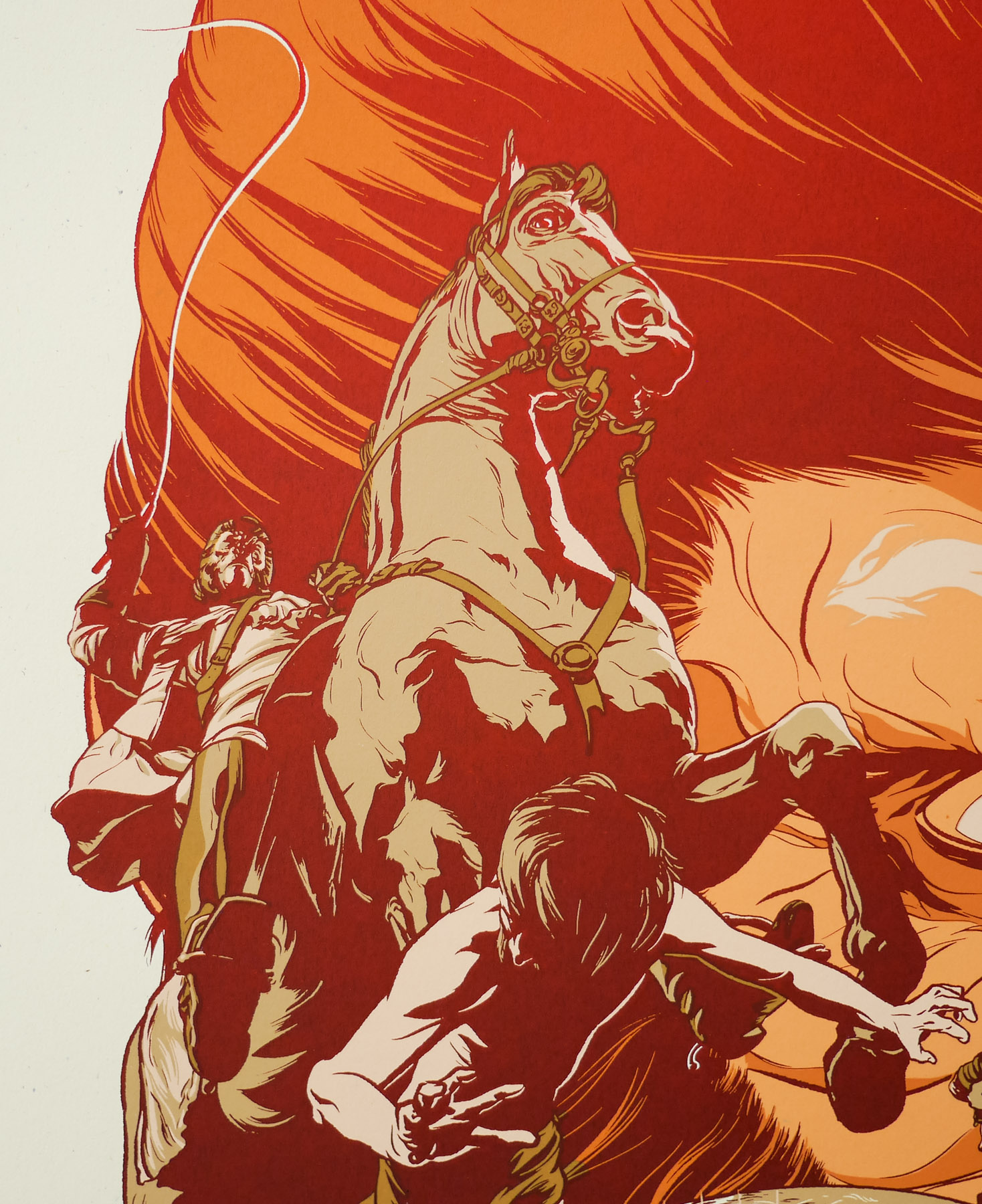
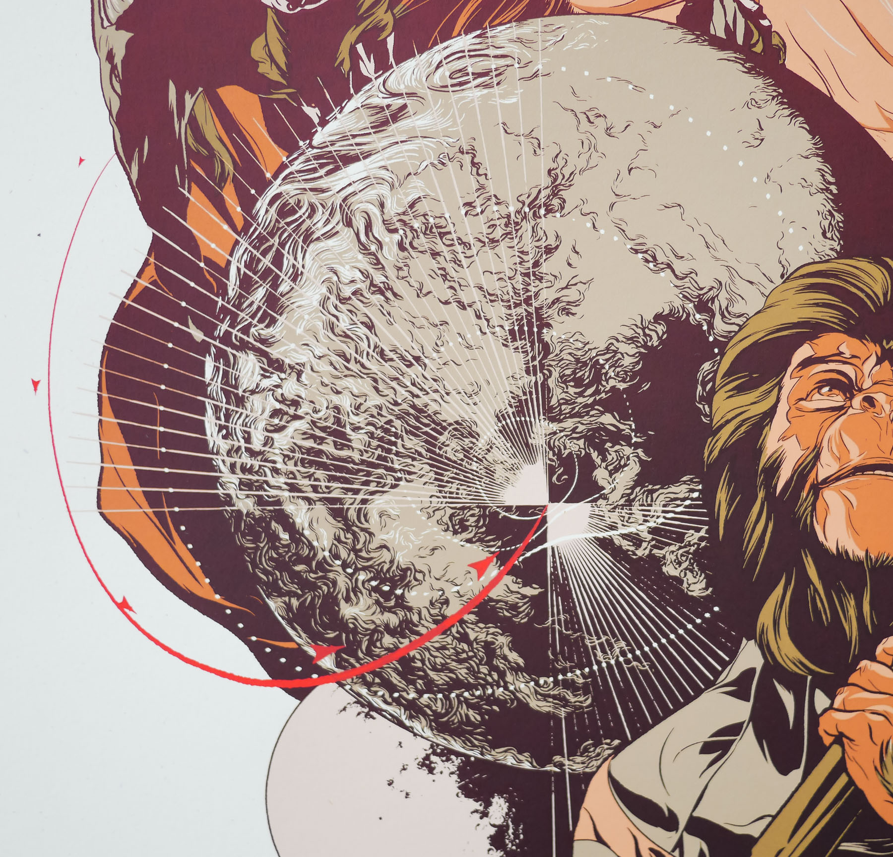
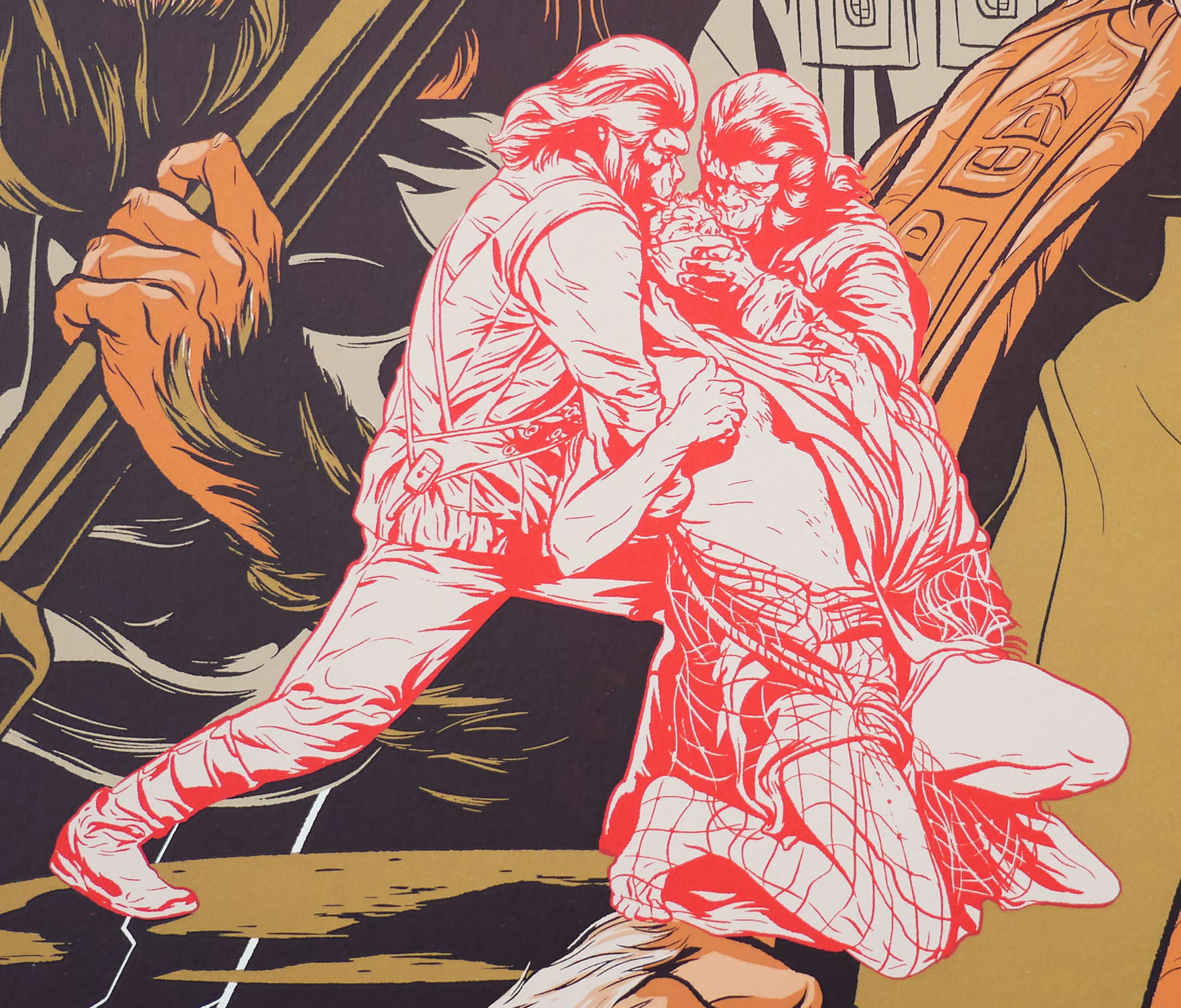
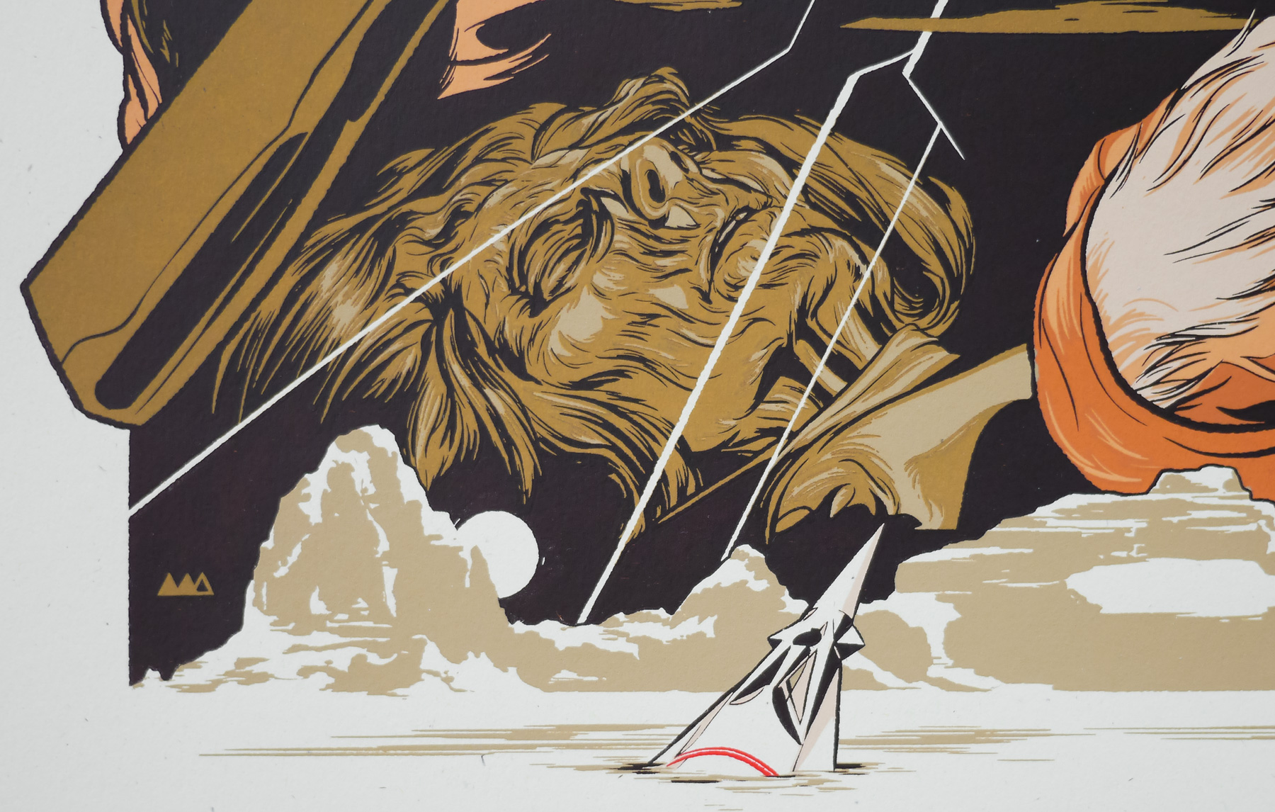
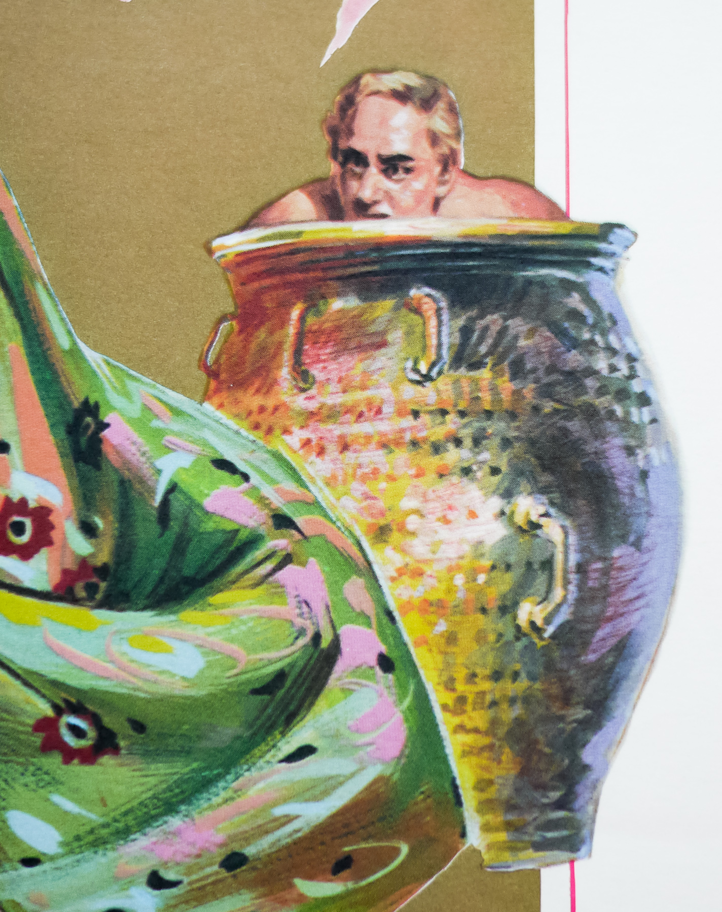
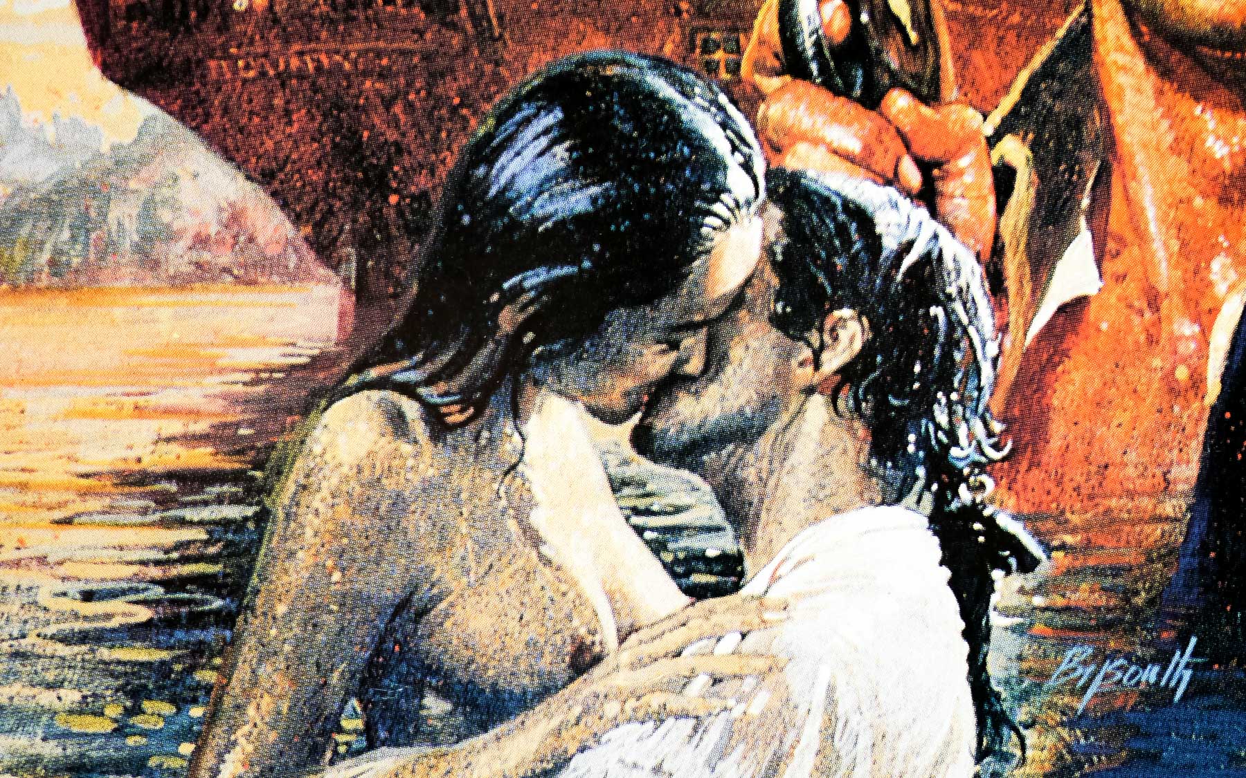
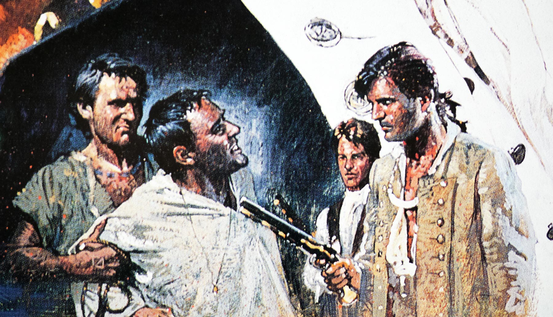
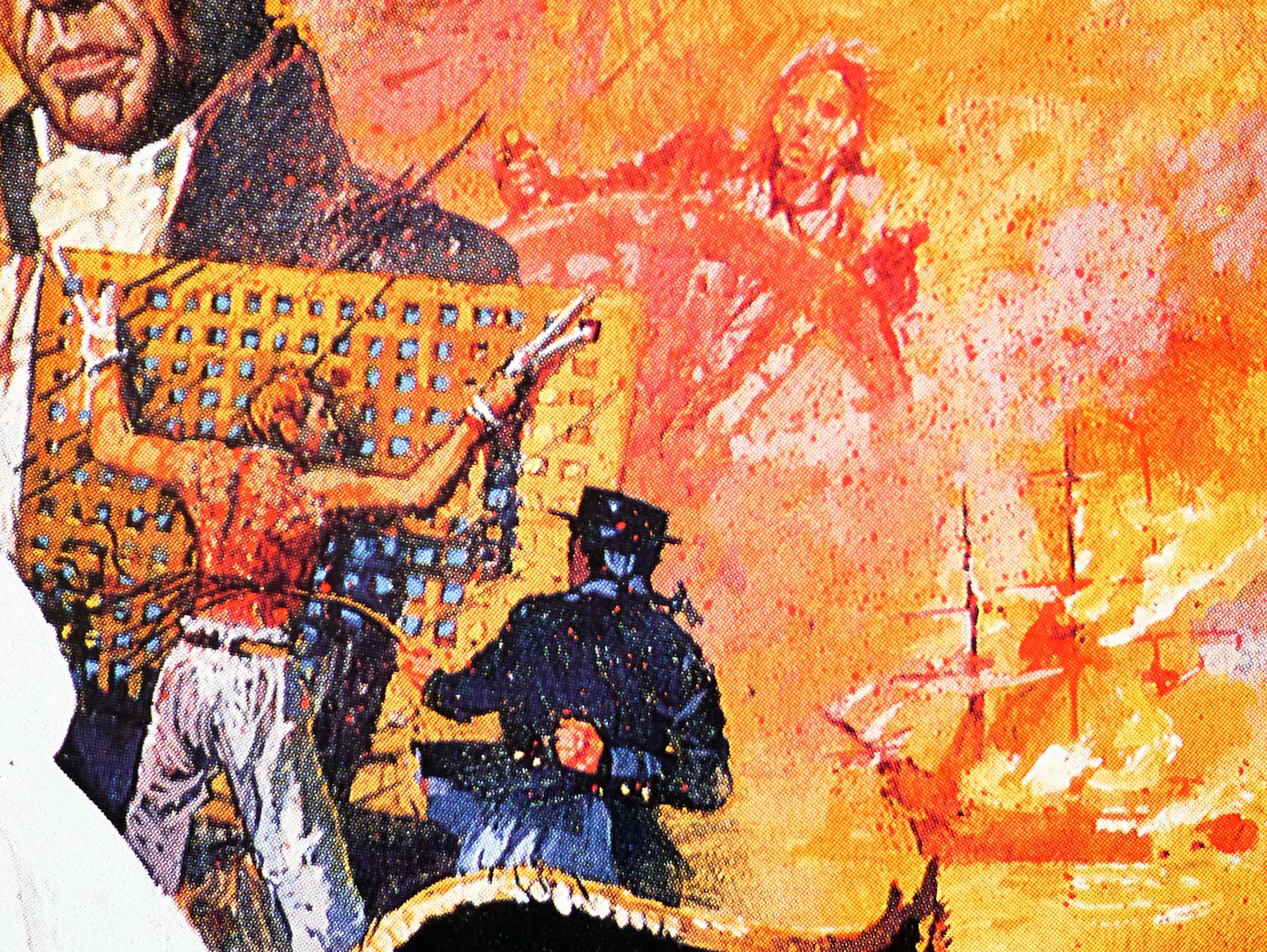
A similar difficulty arose with the design Eric had done for The Bounty (1984). His atmospheric colour rough was exciting, but when I began to sketch out the finished painting I realised the perspective of the ship was flawed. Eric’s exciting random montage of characters had initially disguised the shortcoming. I spent a day redrawing the ship and rigging to ensure it was reasonably correct, and then moved the characters to try to improve the composition. I was pleased with the final painting but was never happy with the montage, which I really thought needed recomposing. I didn’t think a confrontation with Eric was in my best interest.
Some weeks later I asked for the return of my painting only to be told, ‘it could not be found’. Obviously, a light-fingered person took a fancy to it. Much of my work has been lost to me in that way, including my teaser art for A View to a Kill.
—————-
The other posters I have that were designed and/or painted by Brian Bysouth can be viewed here.