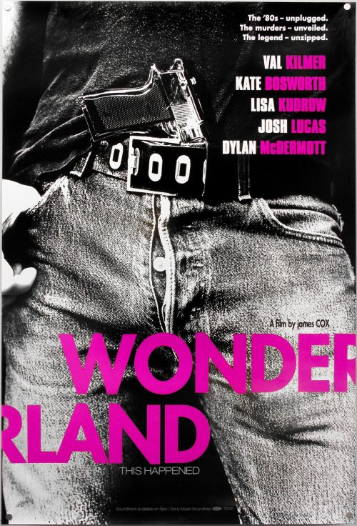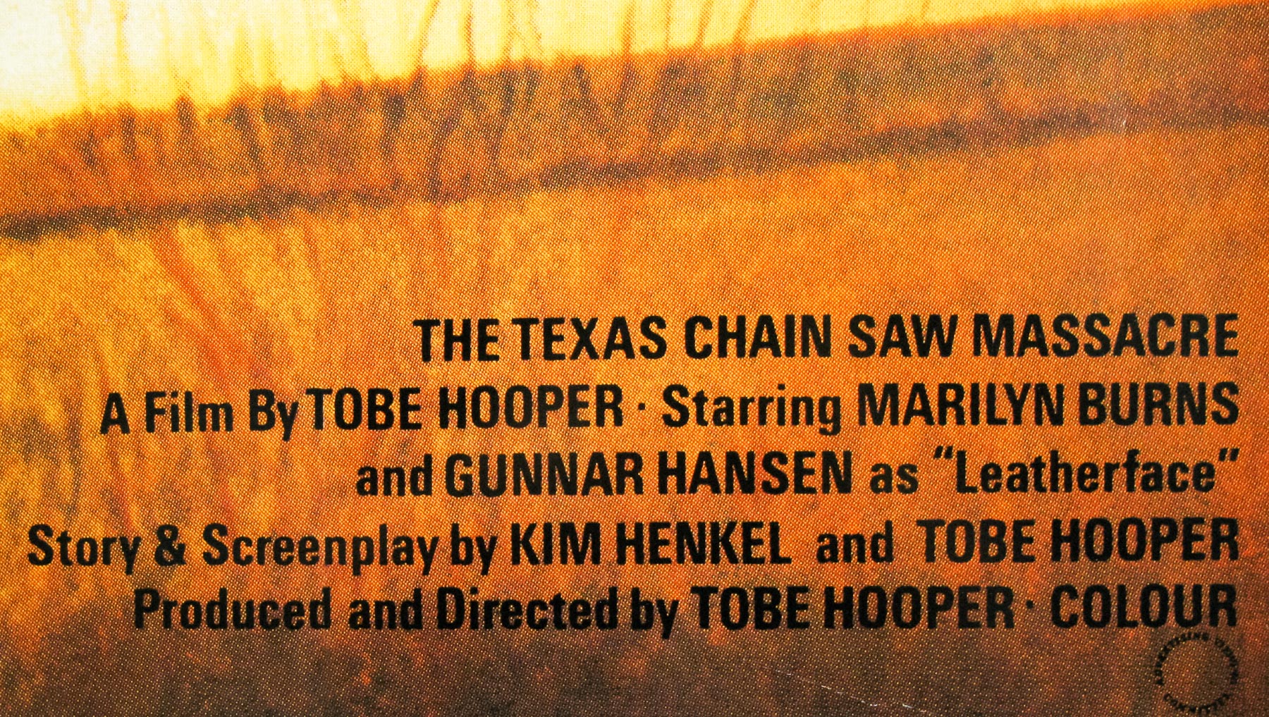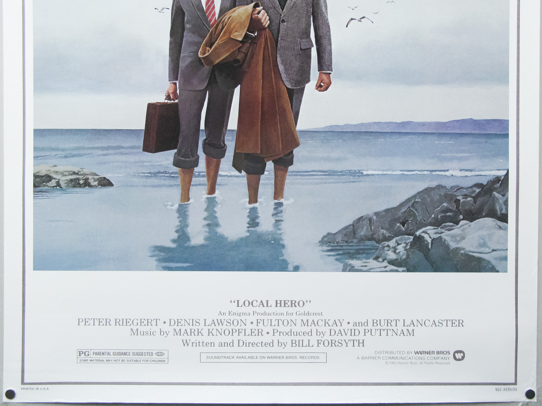
- Title
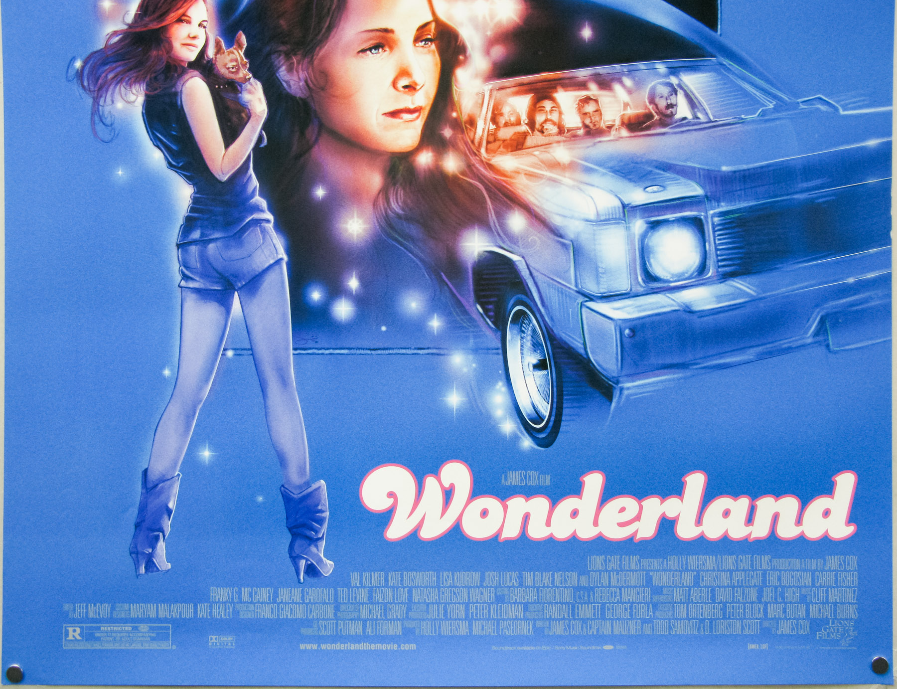
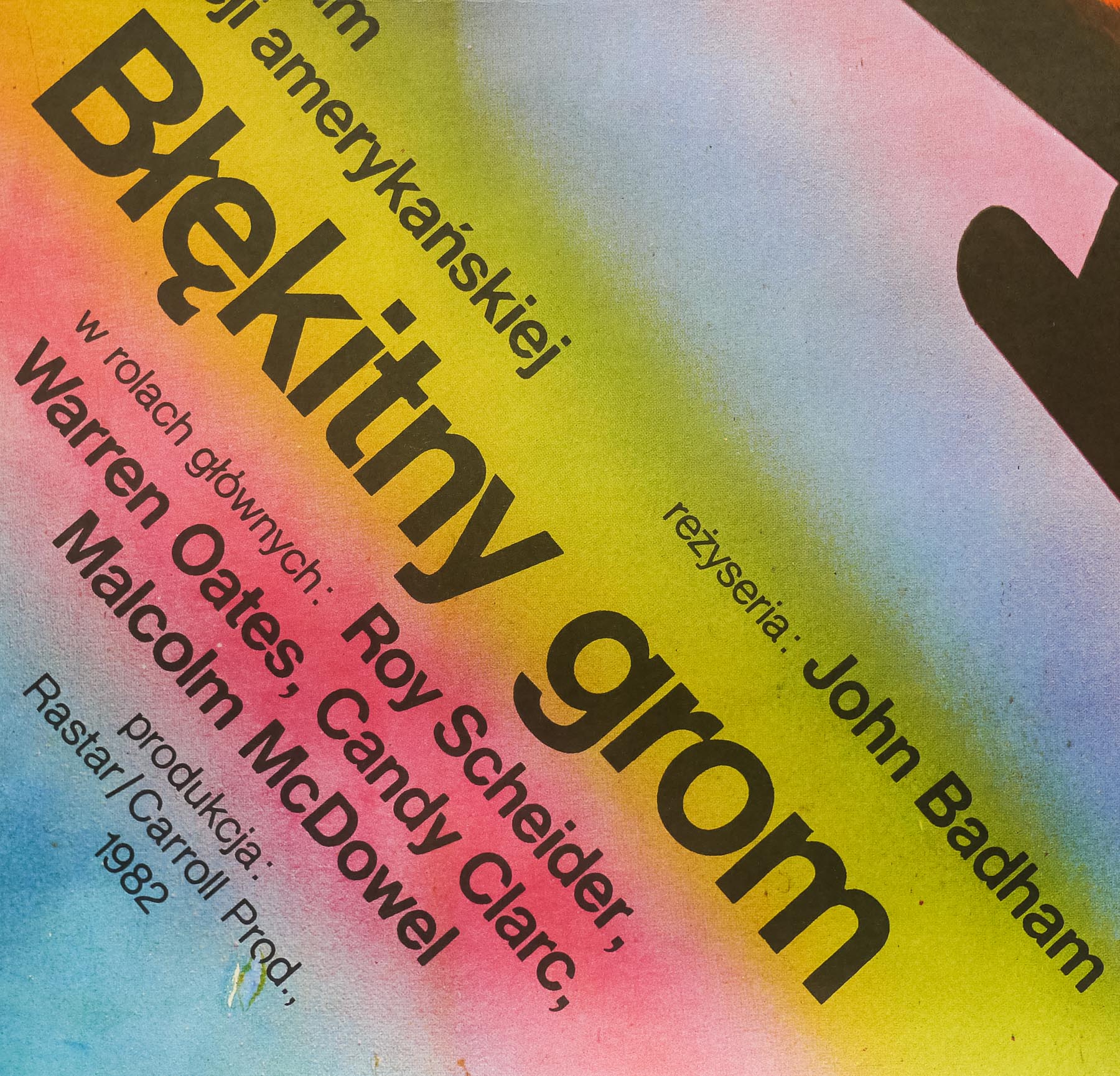
- Evil Dead II
- AKA
- Evil Dead 2: Dead by Dawn (USA title)
- Year of Film
- 1987
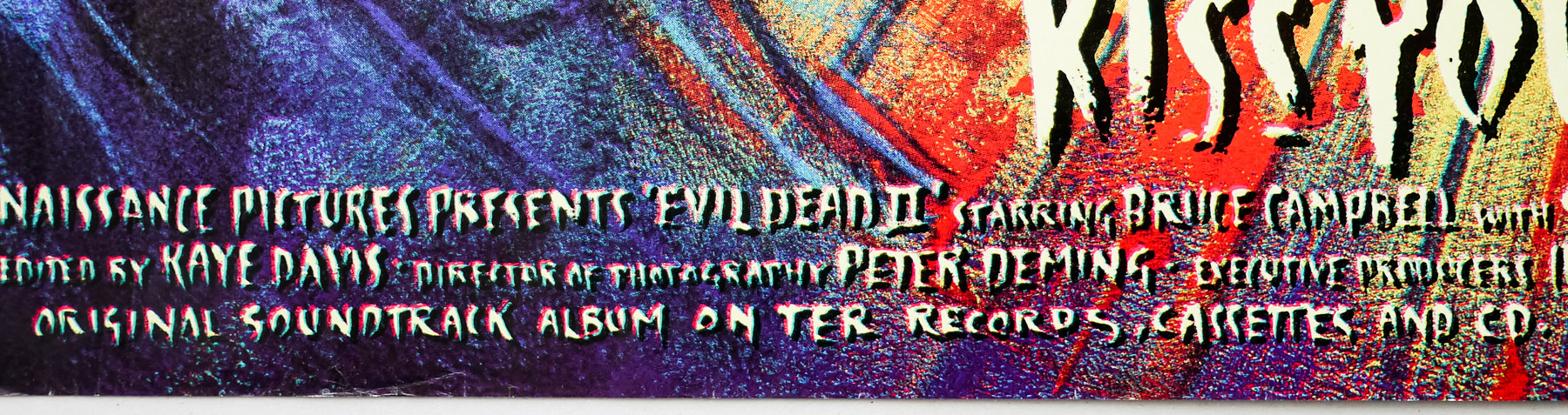
- Director
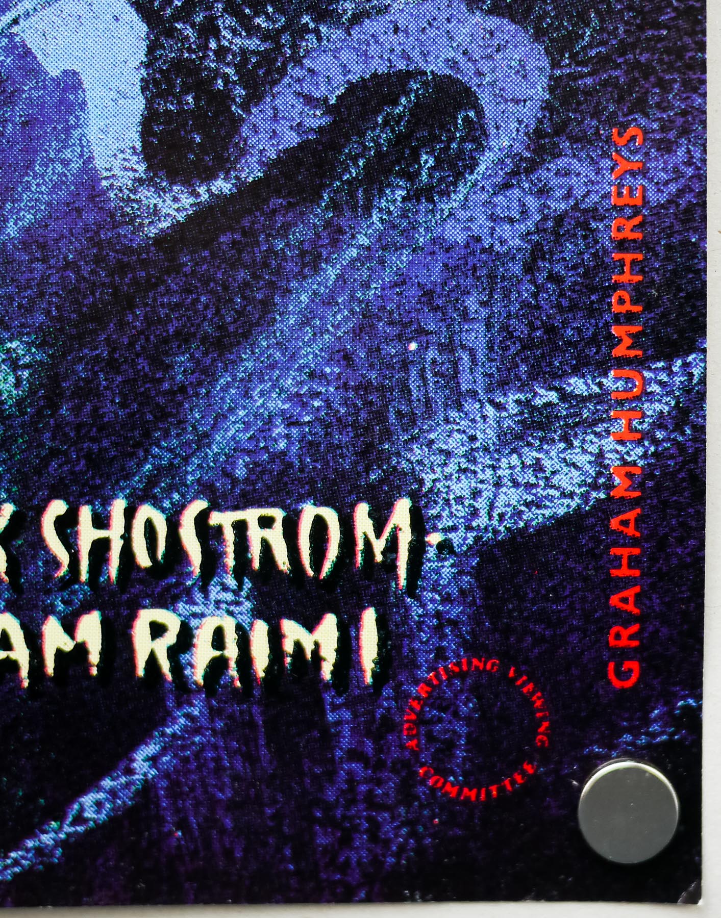
- Sam Raimi
- Starring
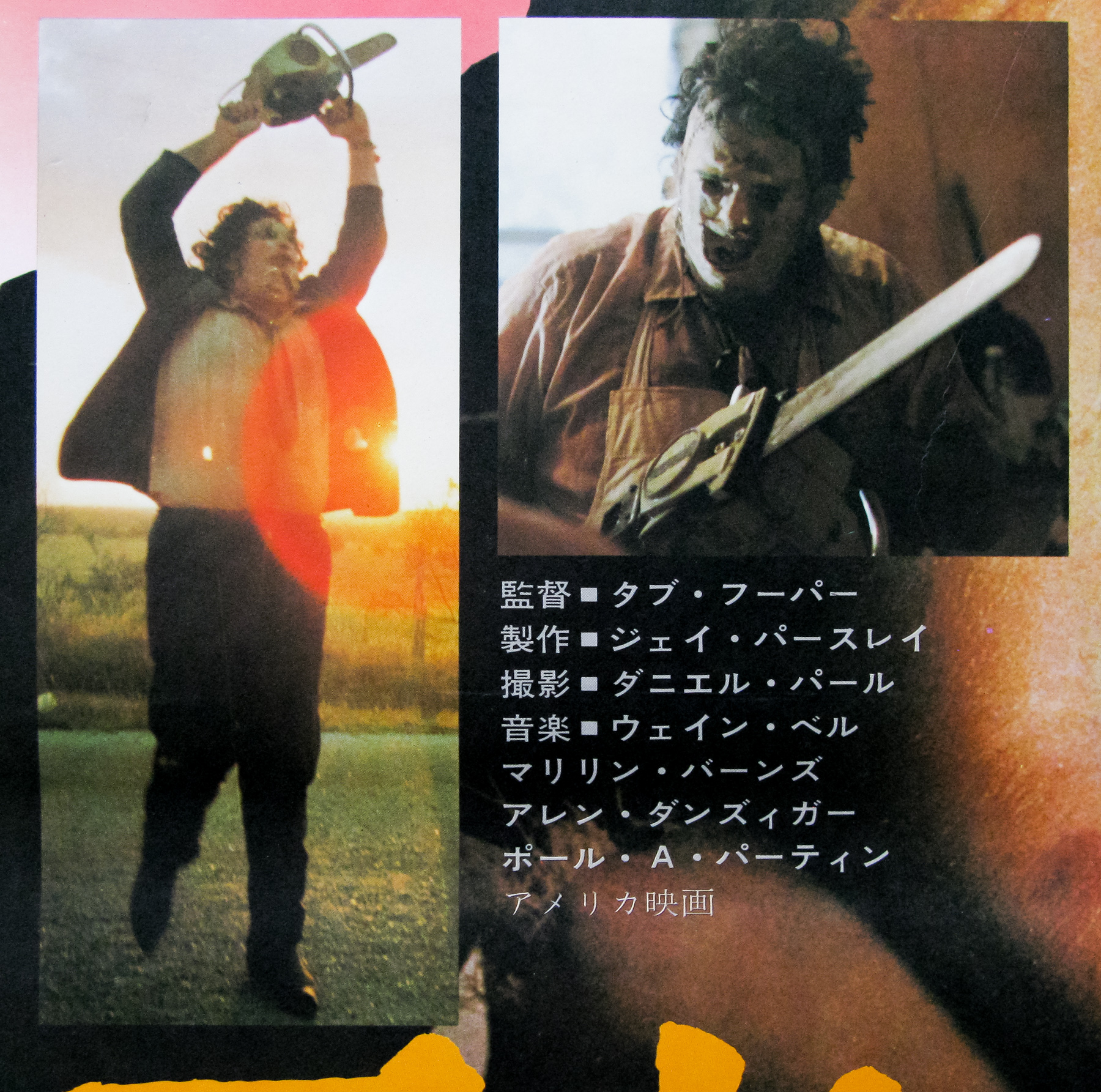
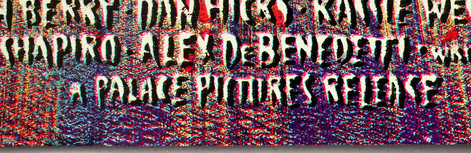
- Bruce Campbell, Sarah Berry, Danny Hicks, Kassie Wesley, Ted Raimi, Denise Bixler, Richard Domeier, John Peaks, Lou Hancock
- Origin of Film
- USA
- Genre(s) of Film
- Bruce Campbell, Sarah Berry, Danny Hicks, Kassie Wesley, Ted Raimi, Denise Bixler, Richard Domeier, John Peaks, Lou Hancock,
- Type of Poster
- Quad
- Style of Poster
- --
- Origin of Poster
- UK
- Year of Poster
- 1987
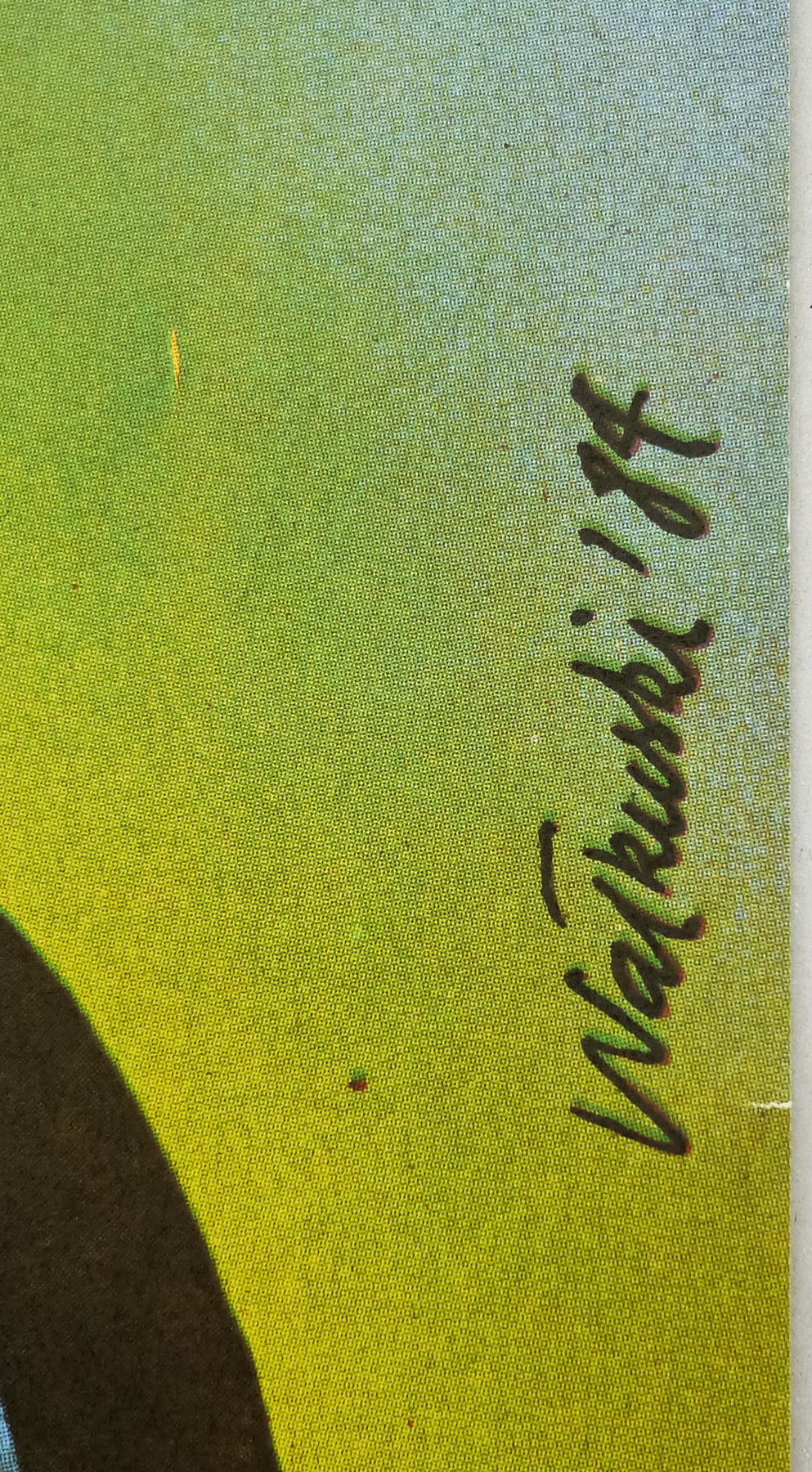
- Designer
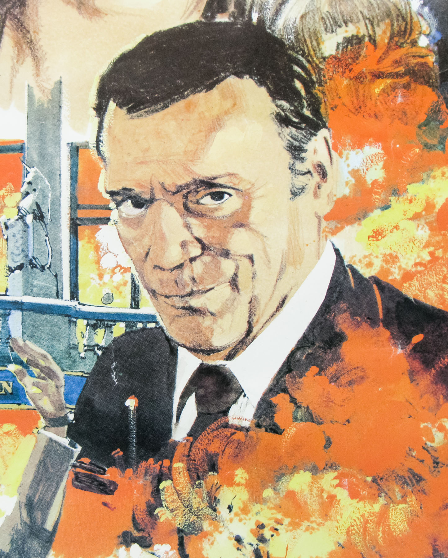
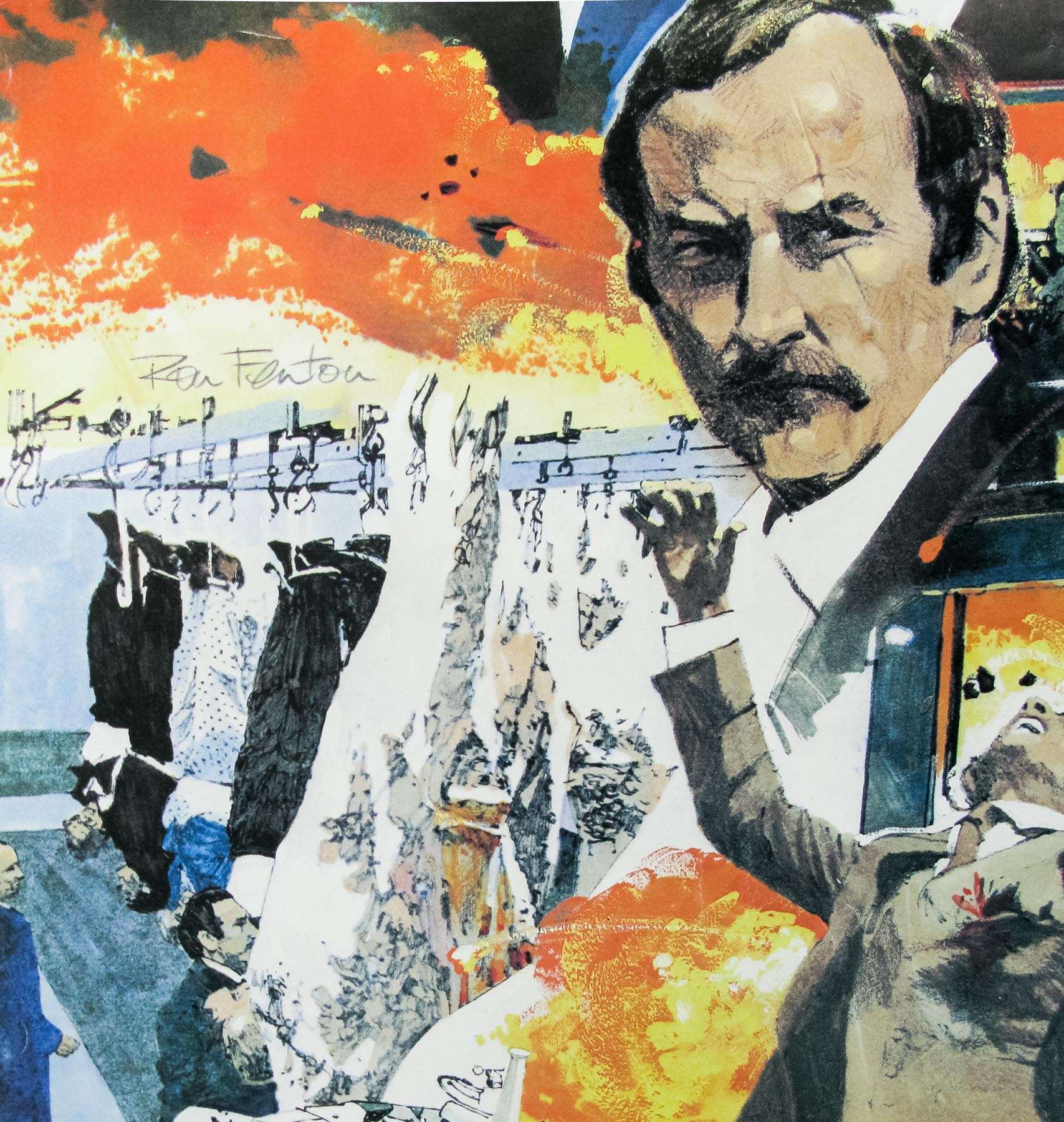
- Graham Humphreys
- Artist
- Graham Humphreys
- Size (inches)
- 30" x 40"
- SS or DS
- SS
- NSS #
- --
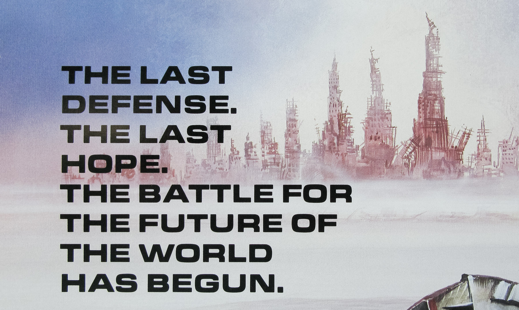
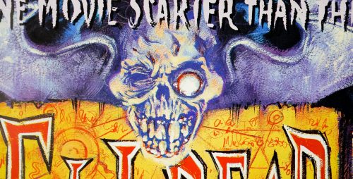
- Tagline
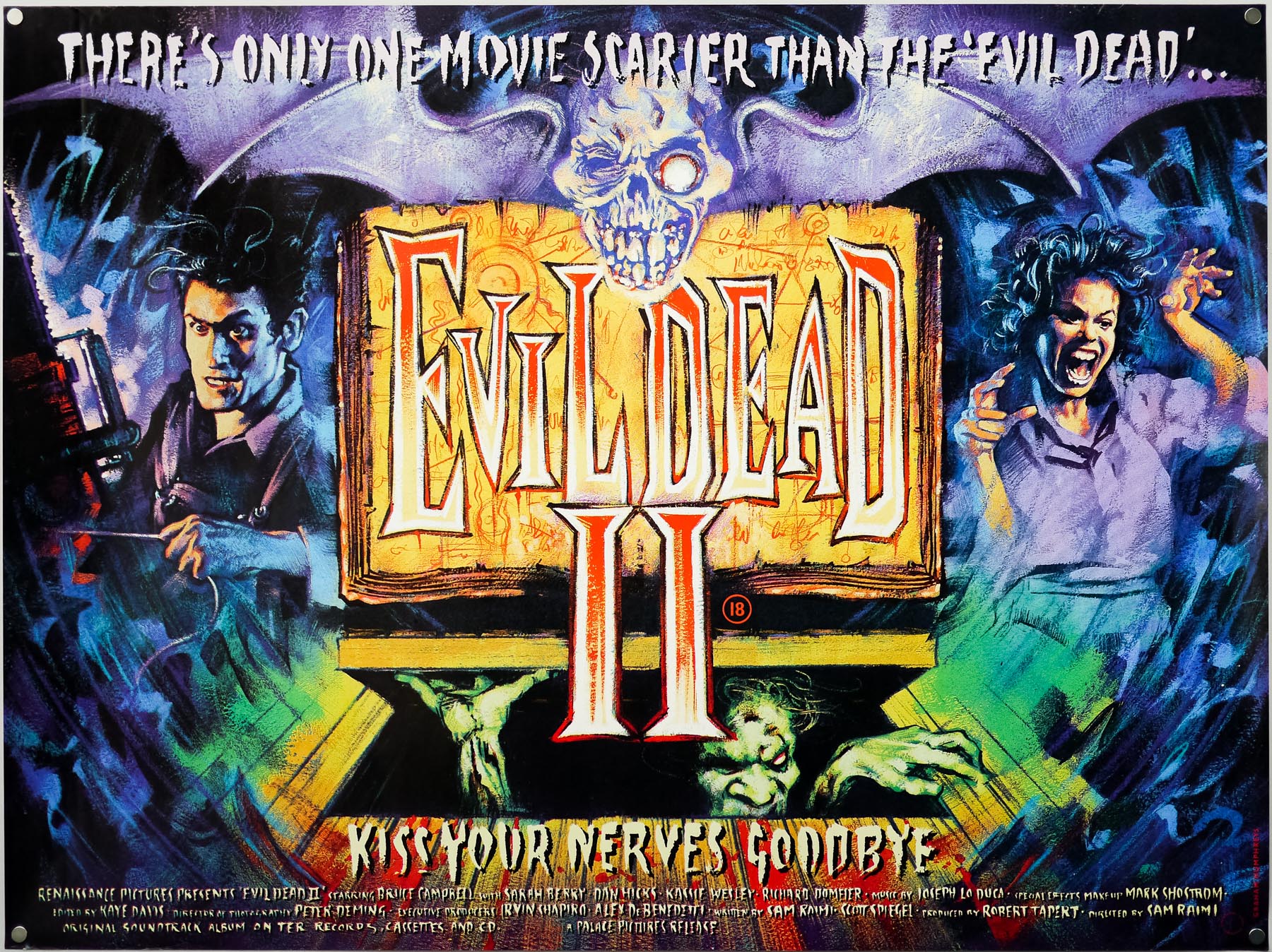
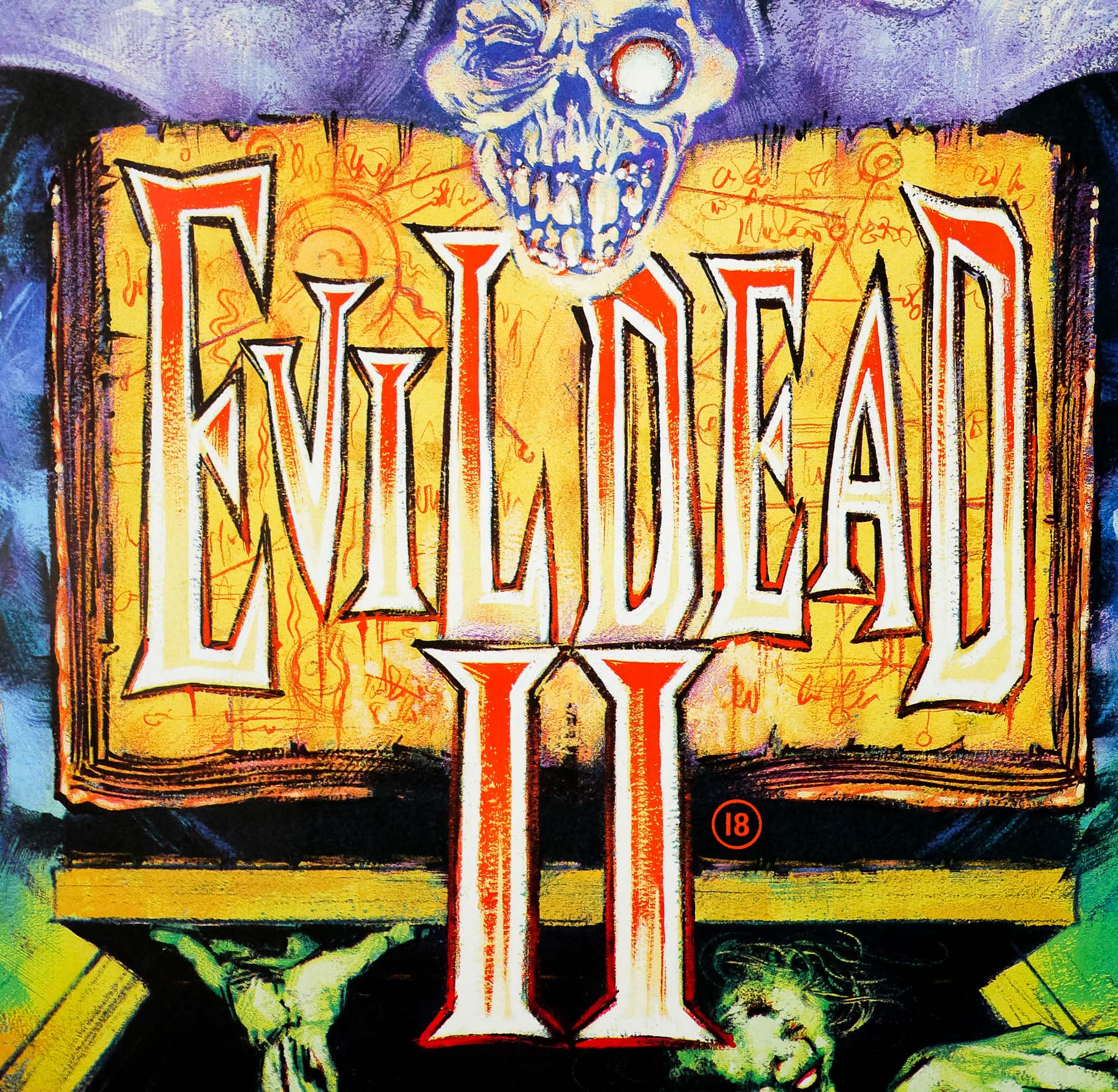
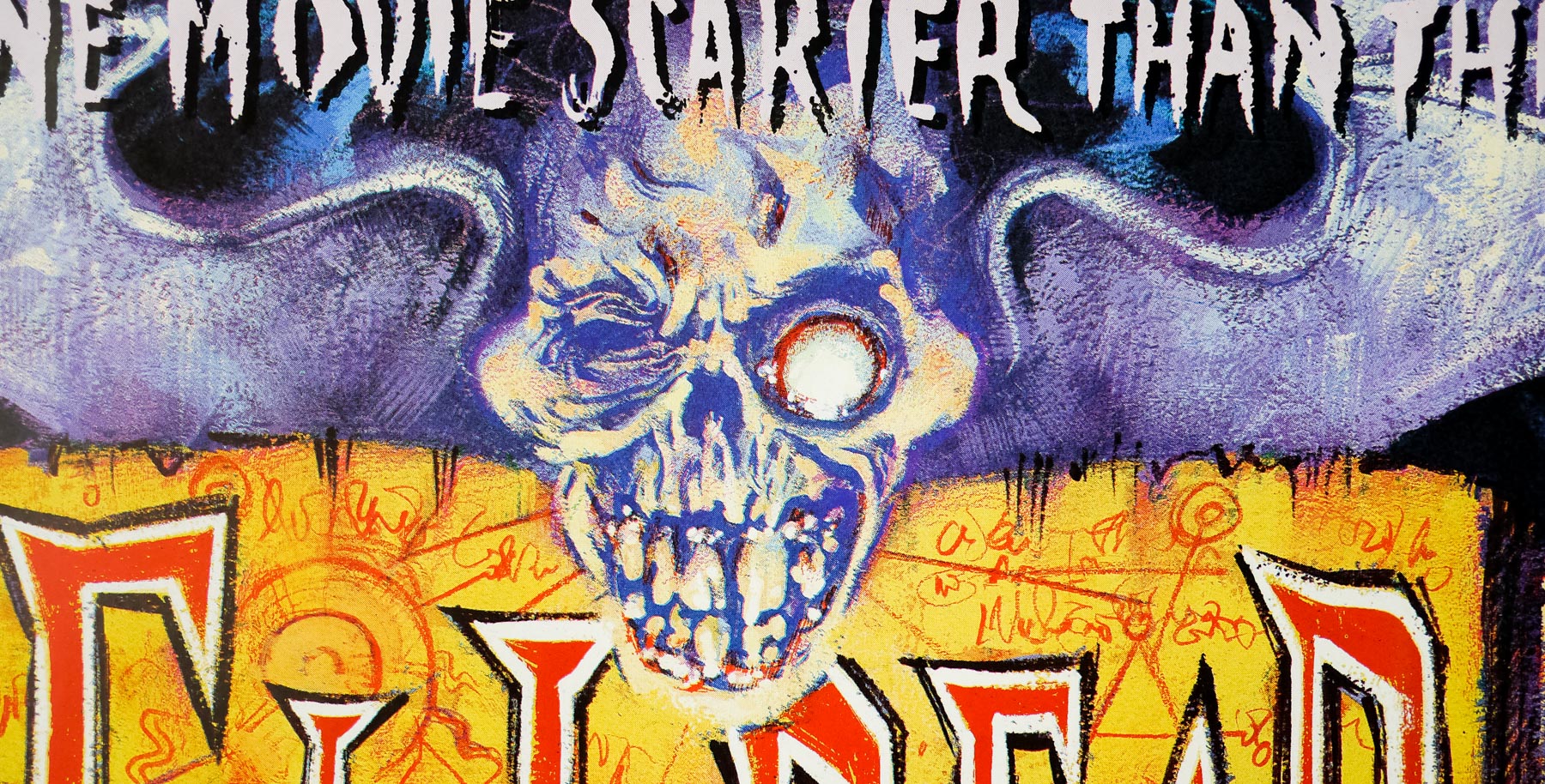
- There's only one movie scarier than 'The Evil Dead'... | Kiss your nerves goodbye
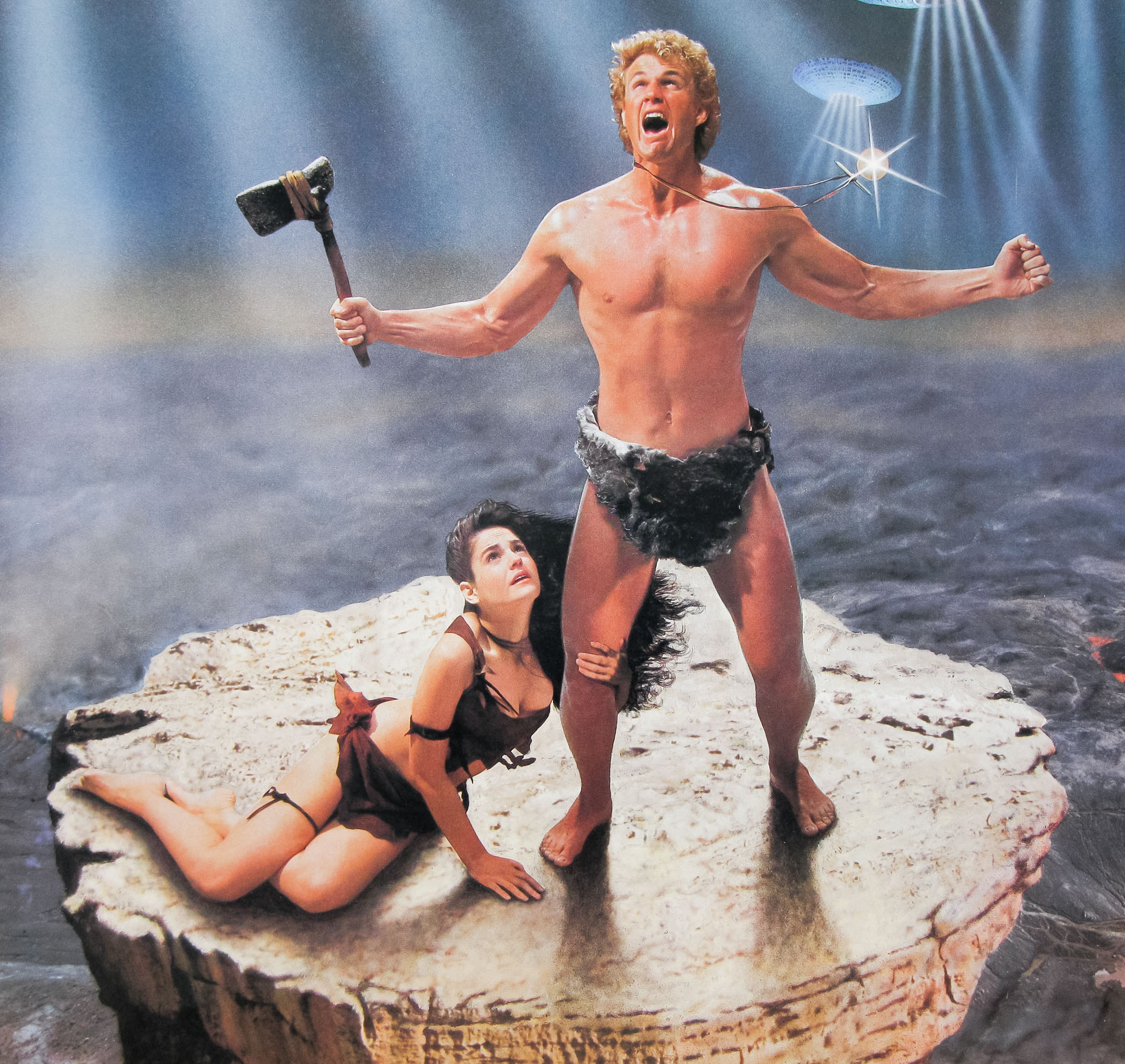
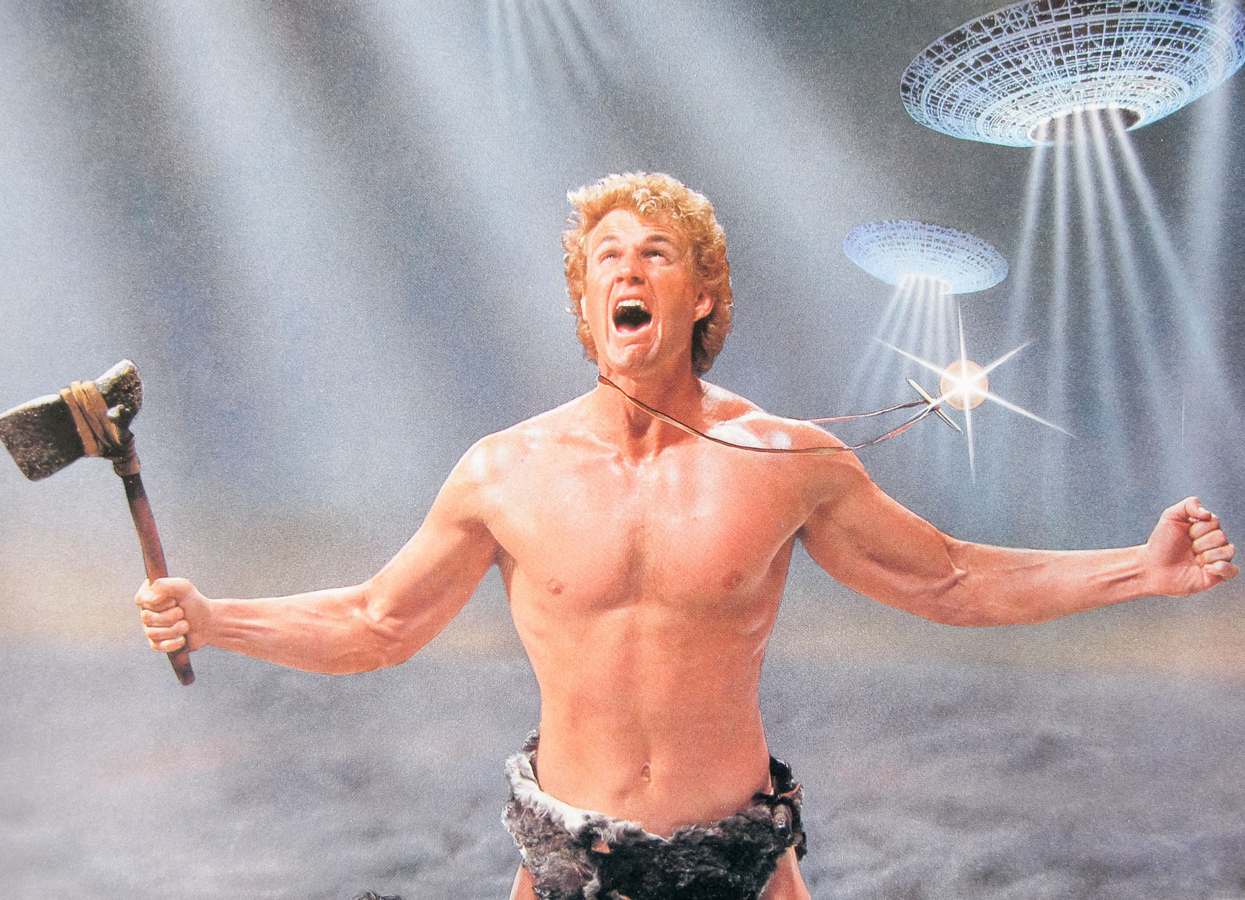
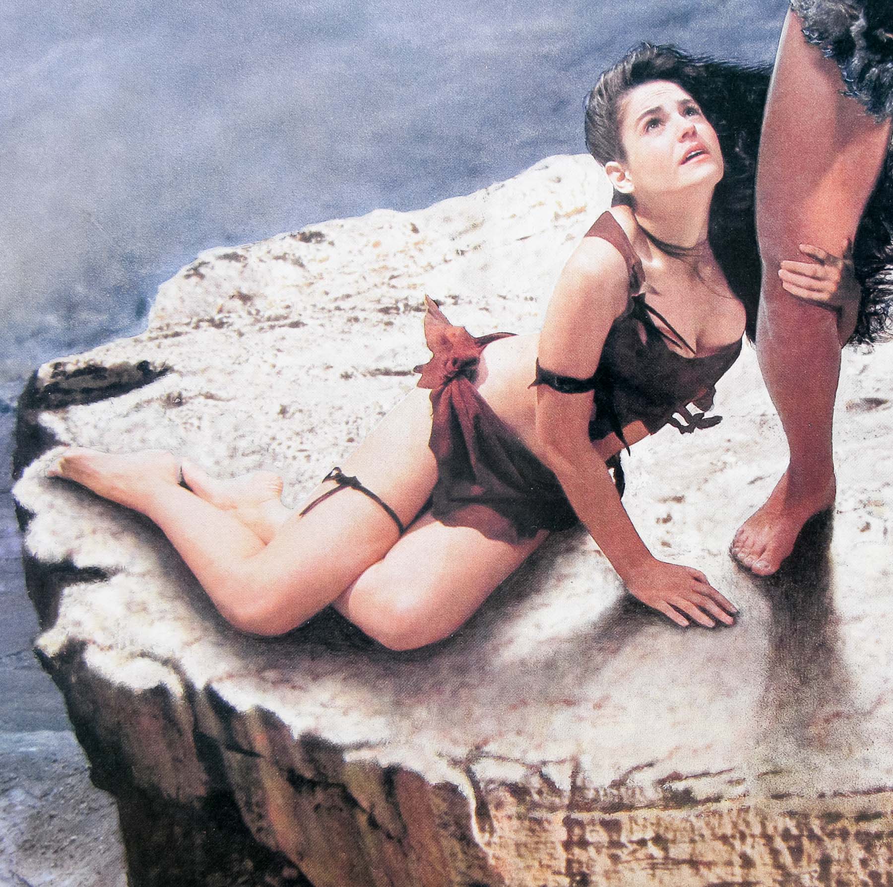
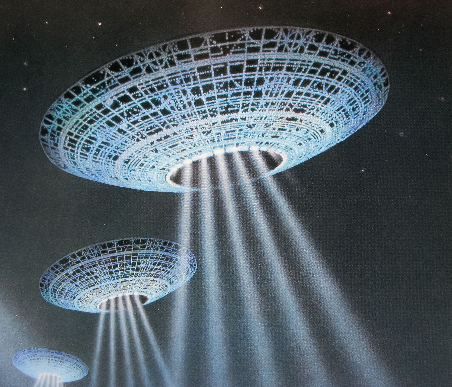
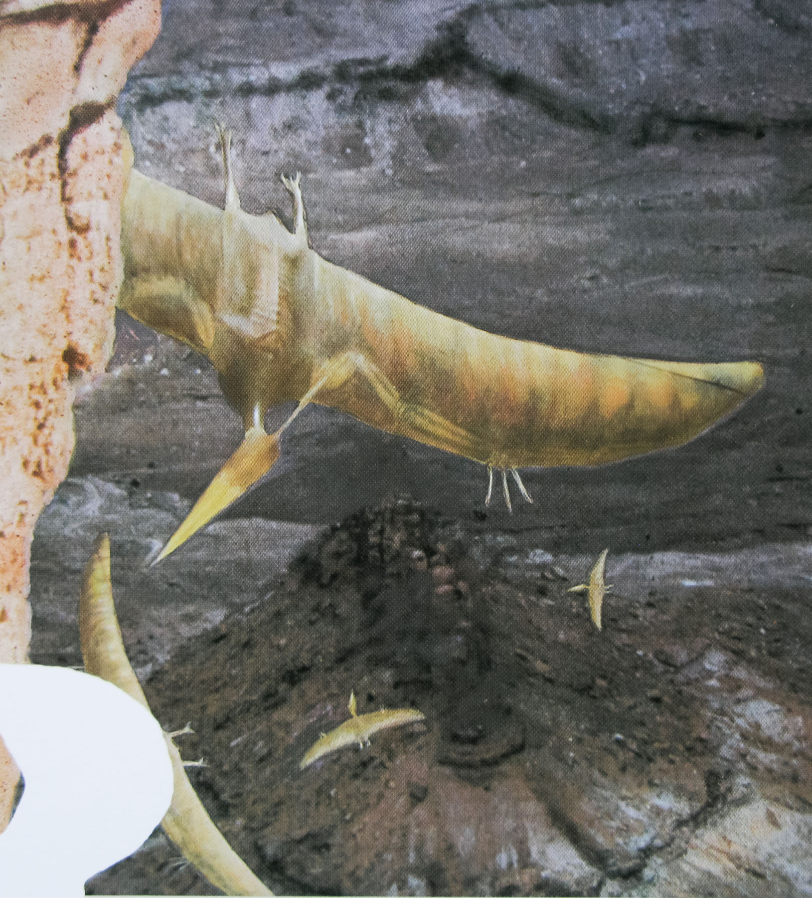
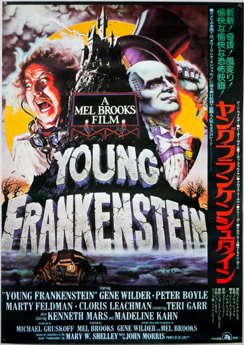
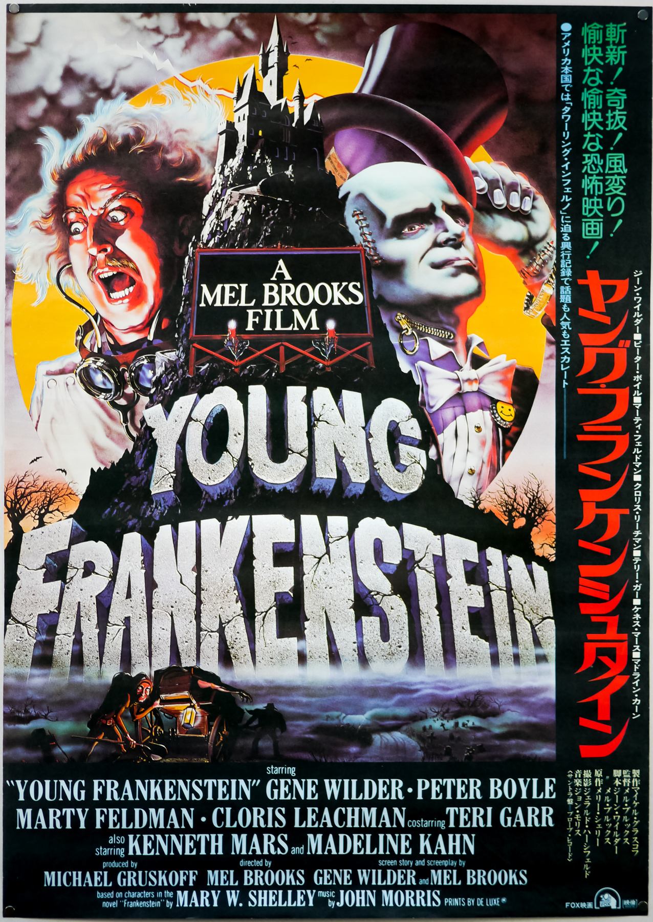
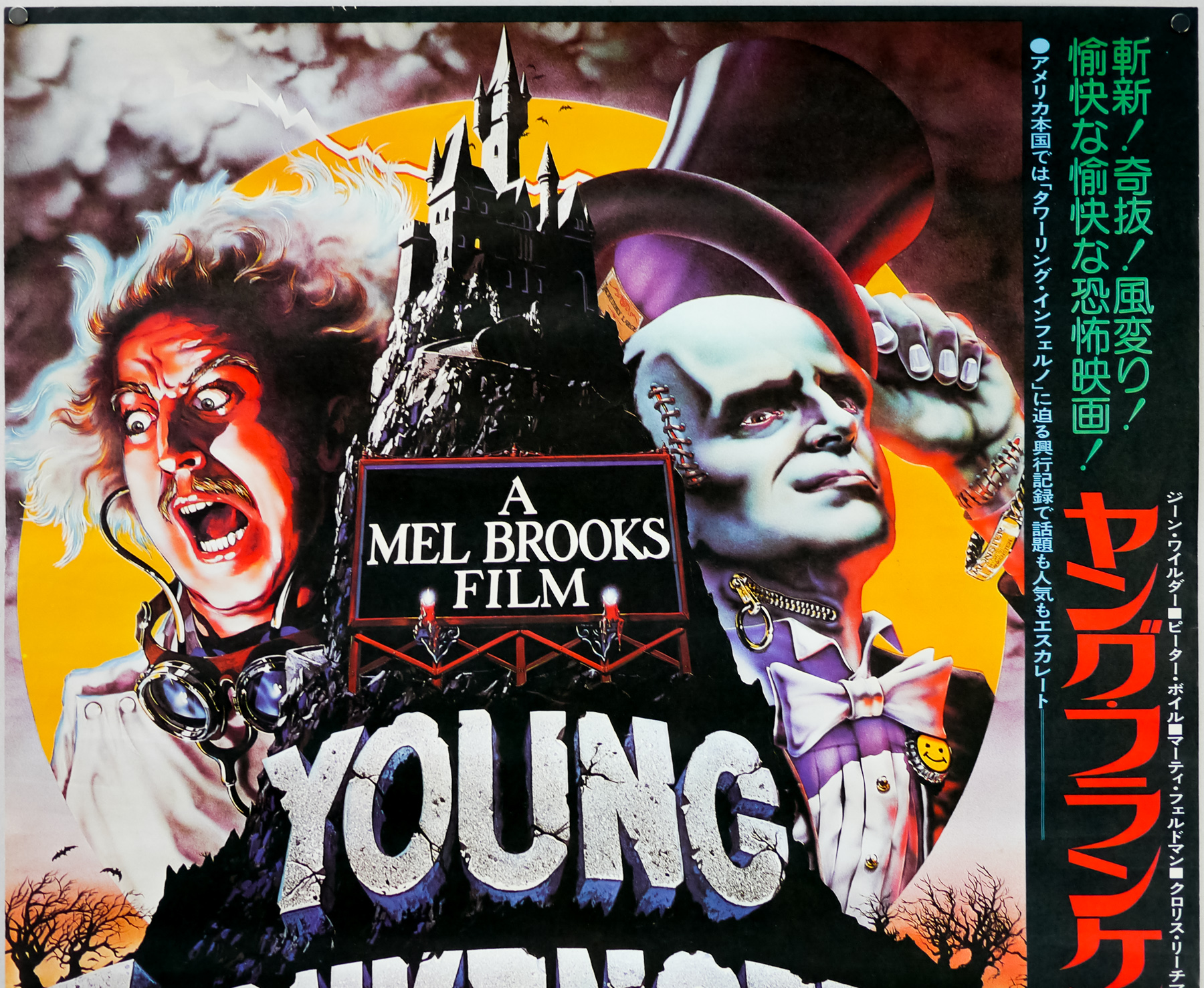
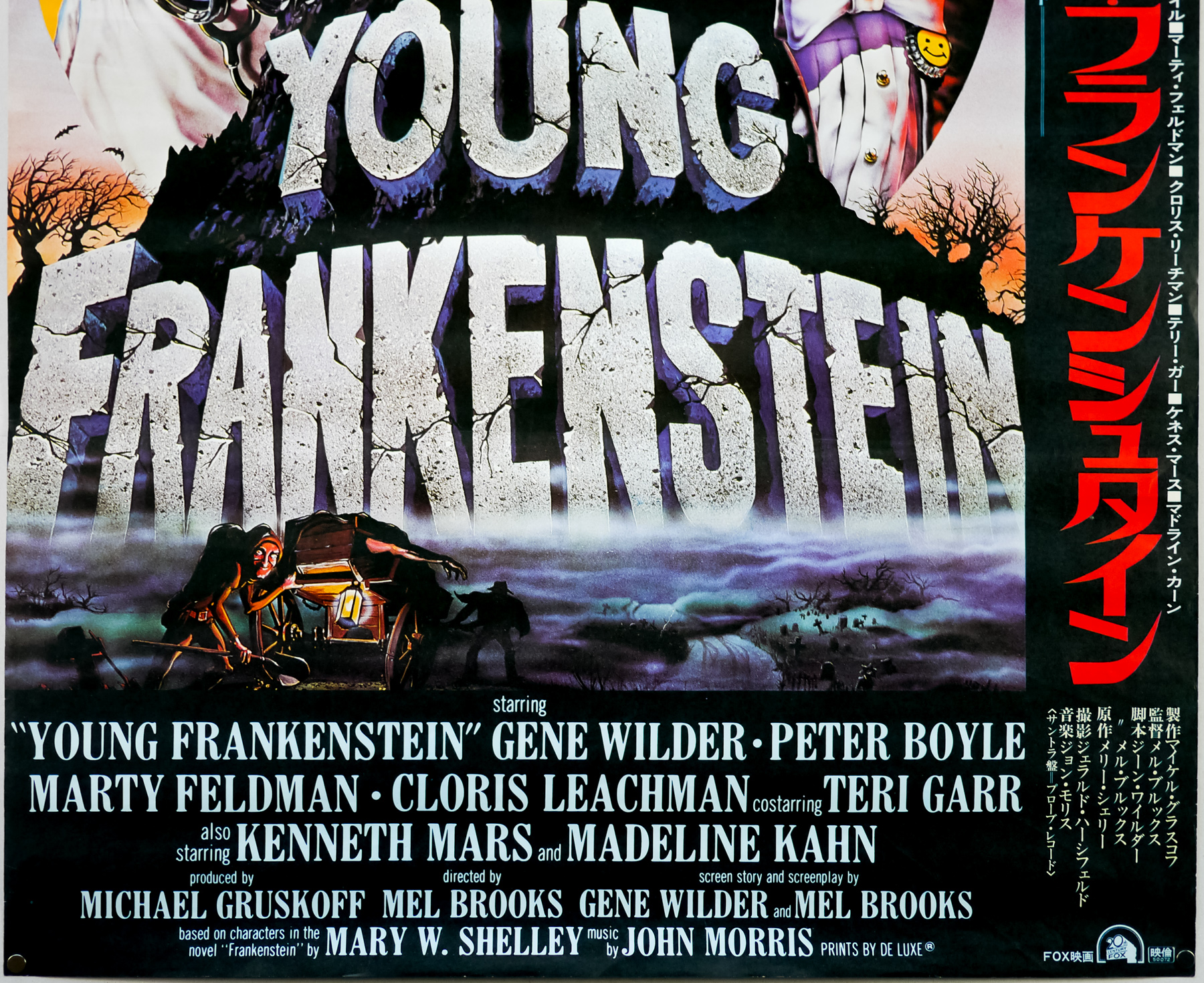
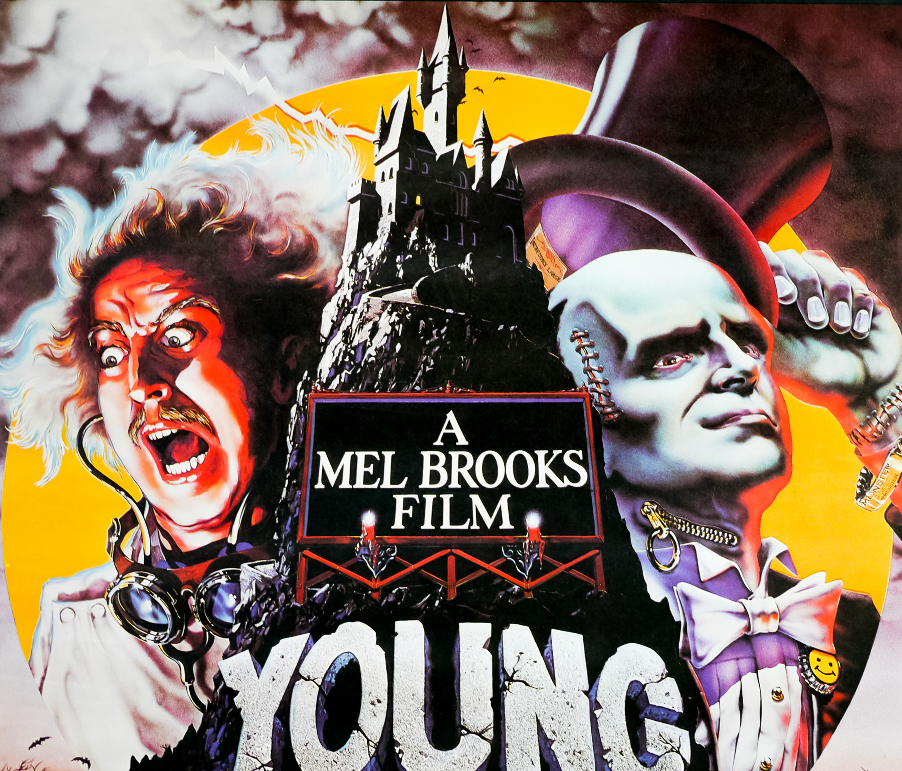
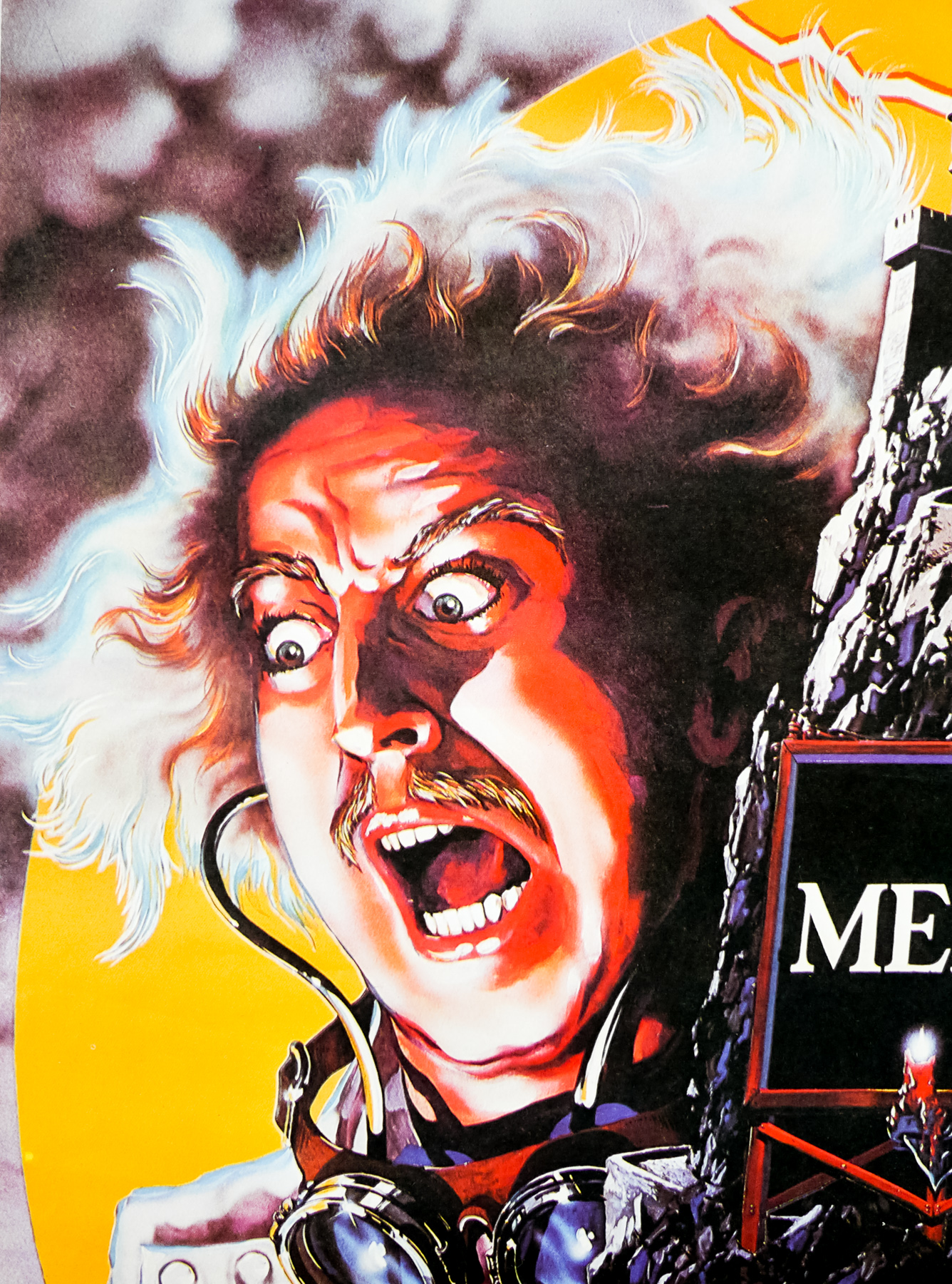
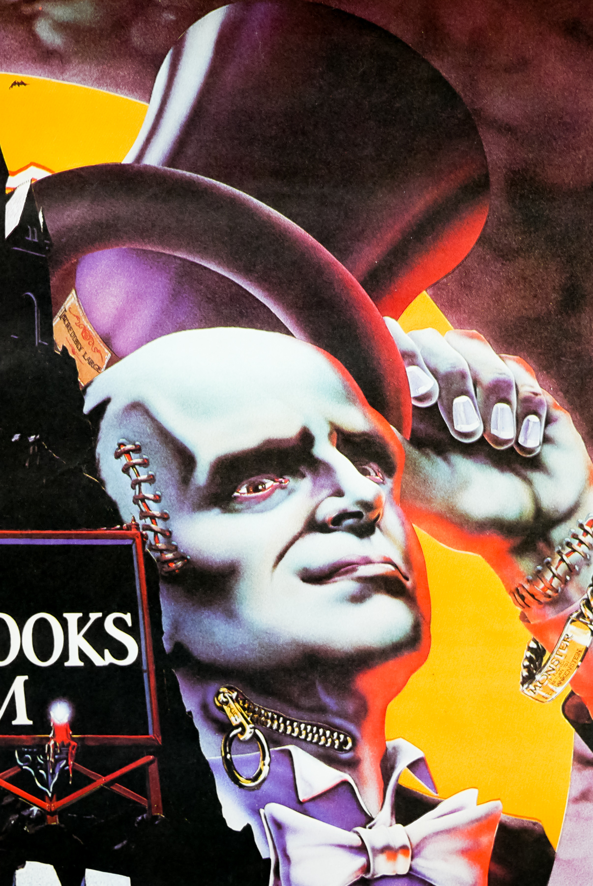
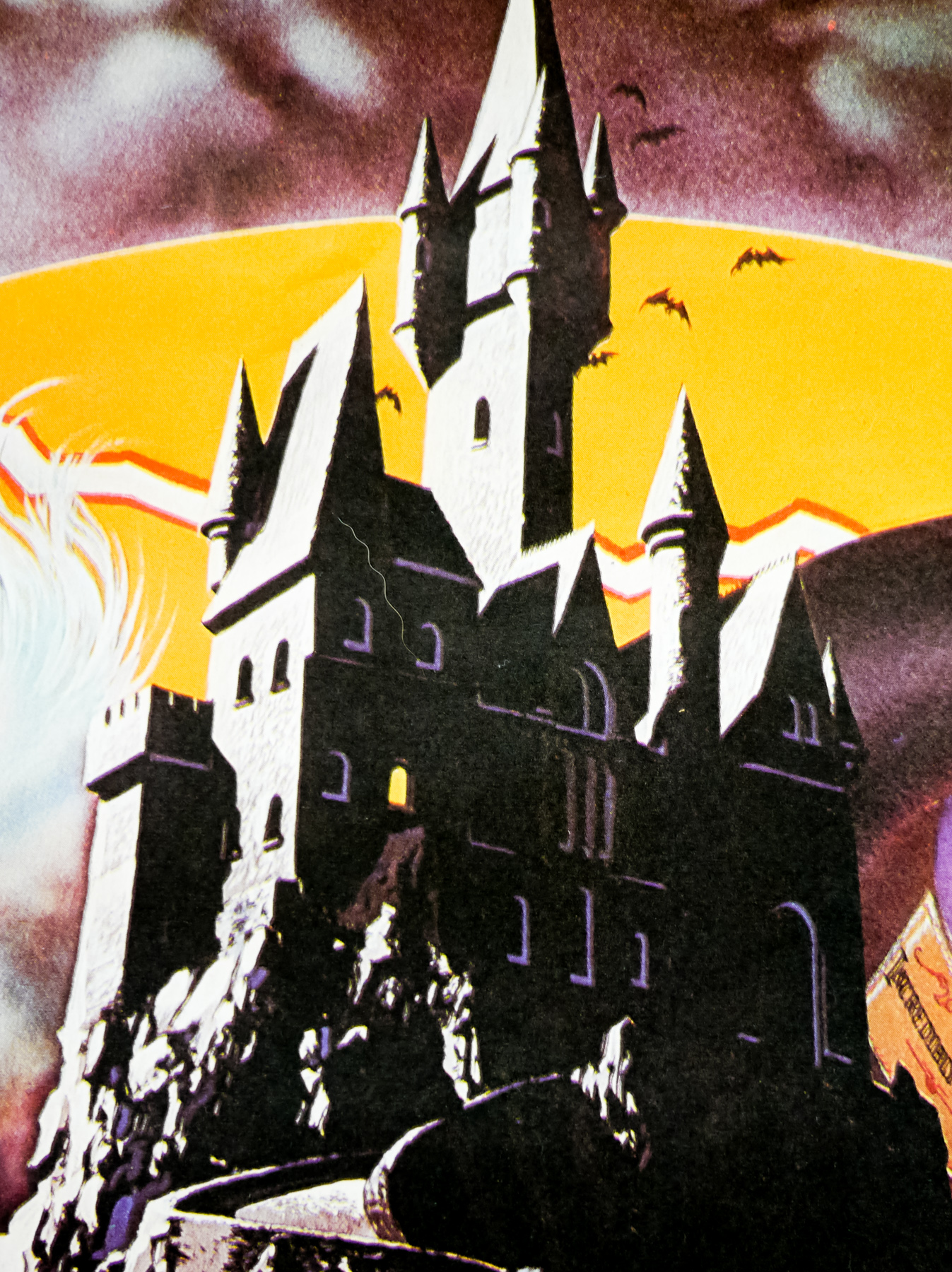
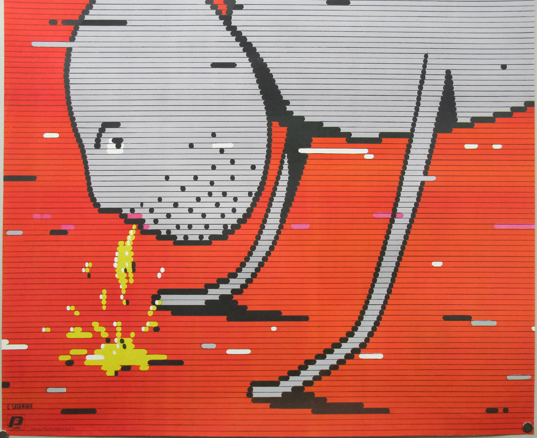
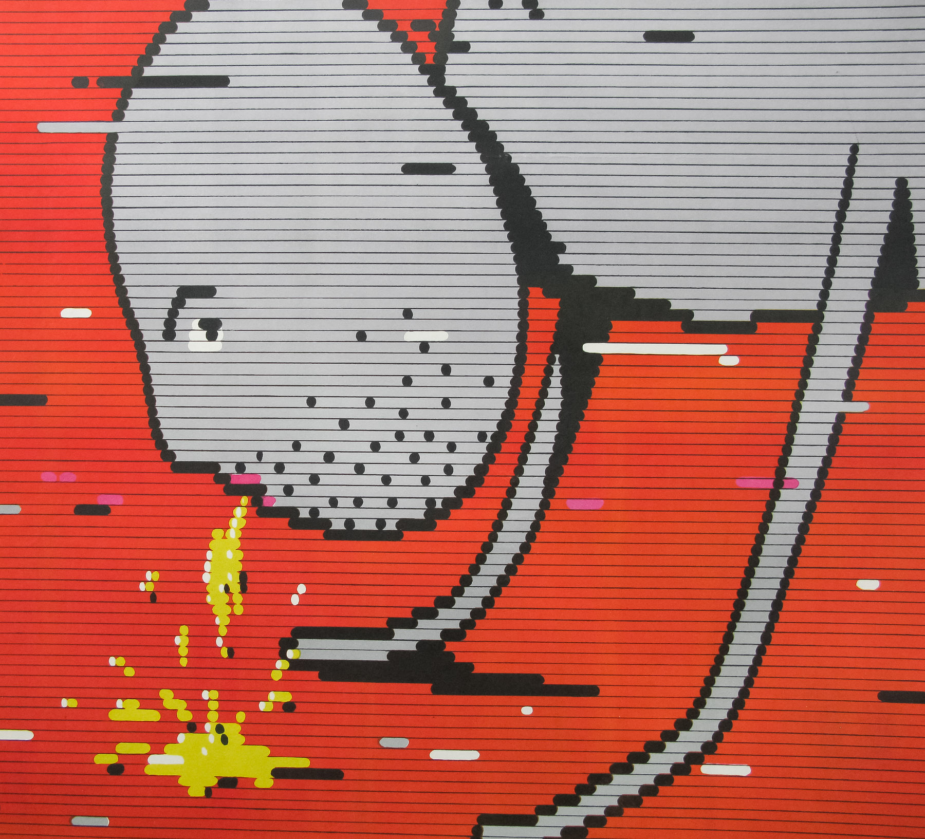
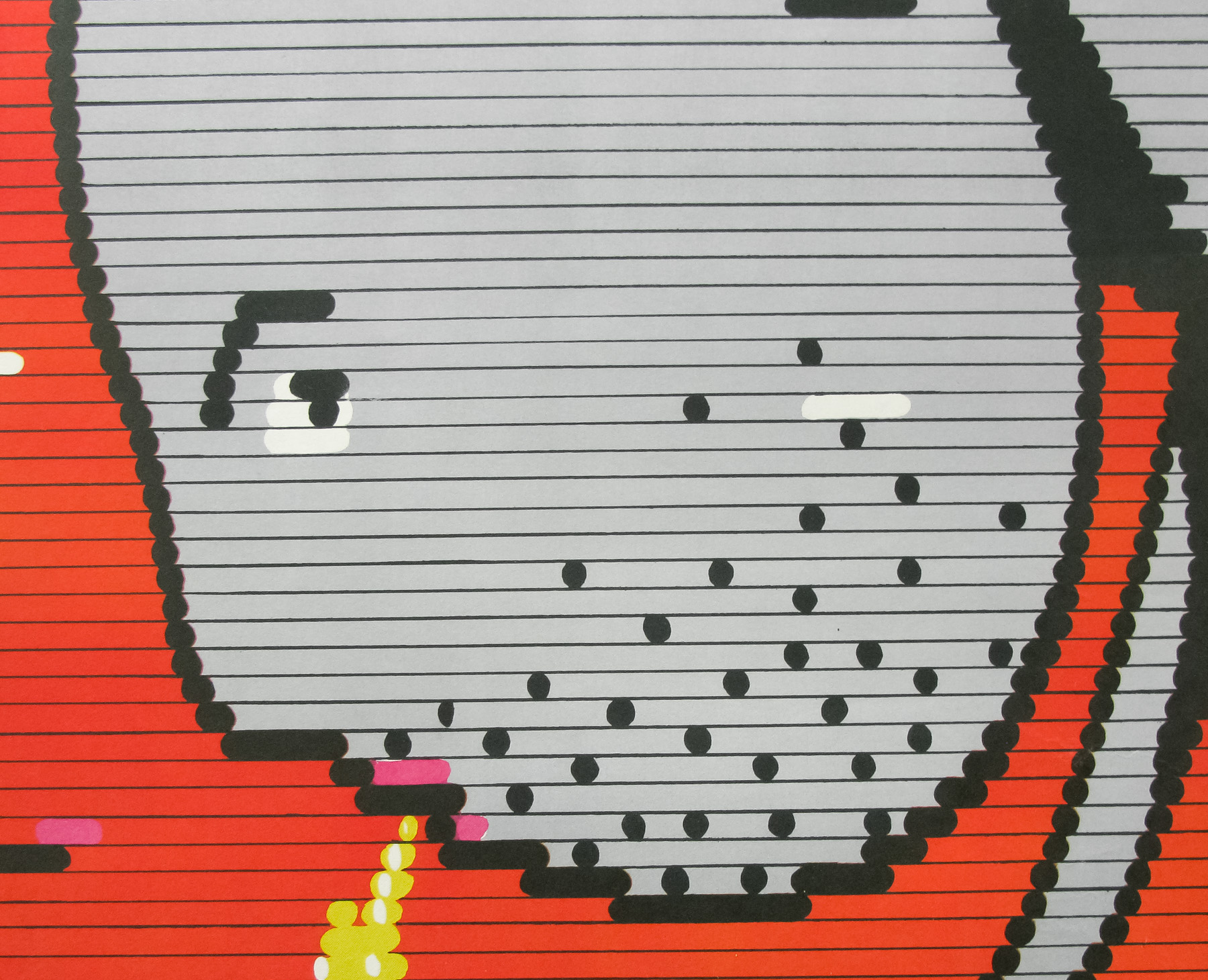
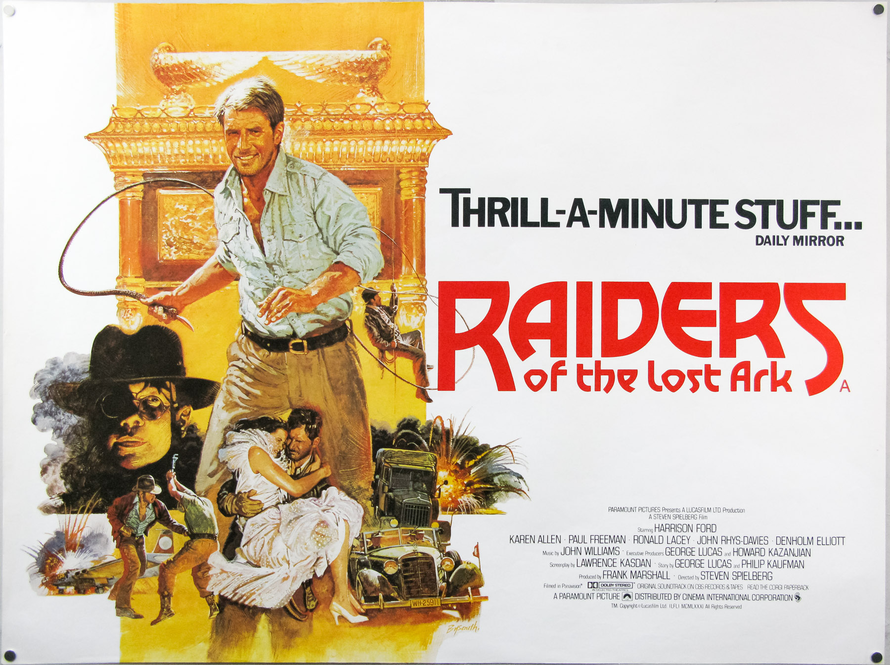
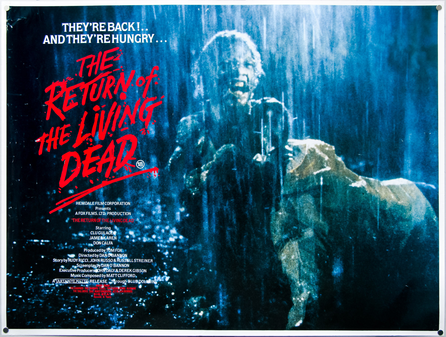
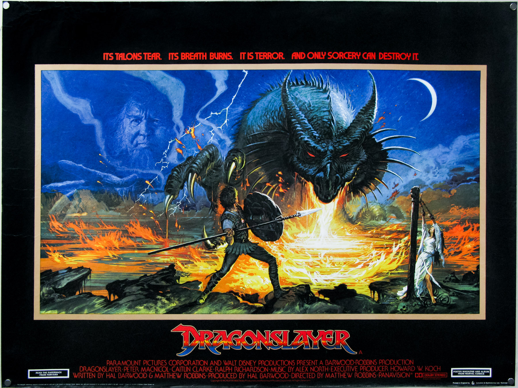
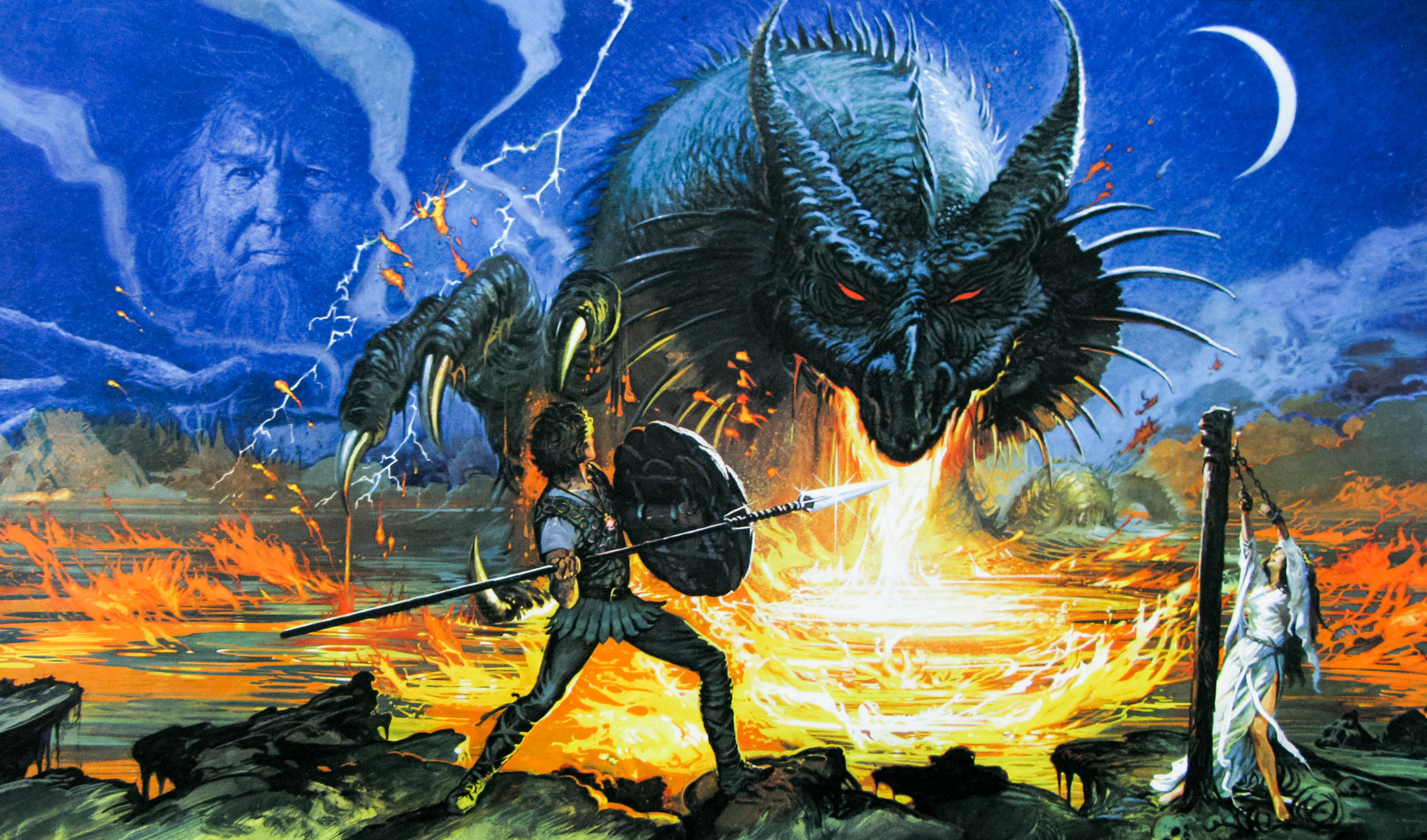
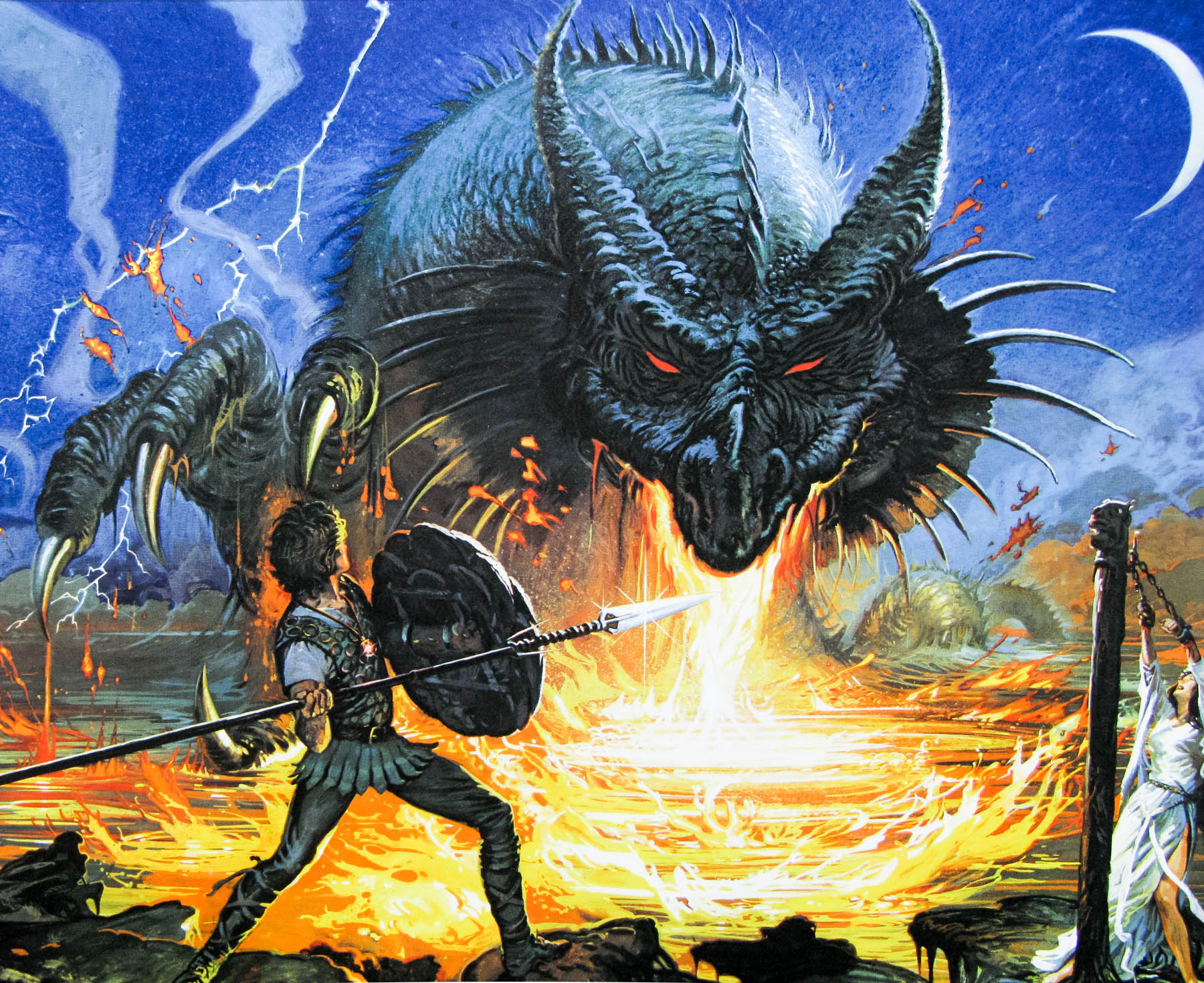
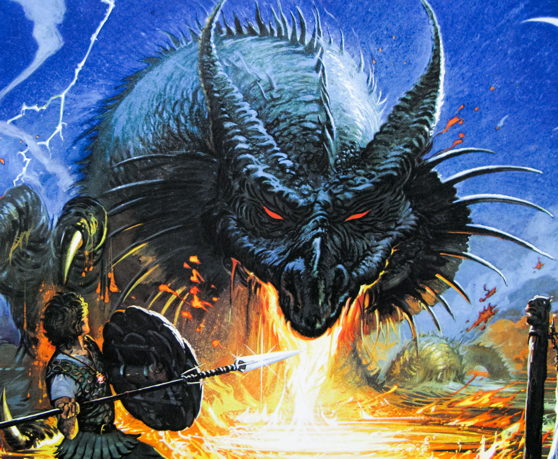
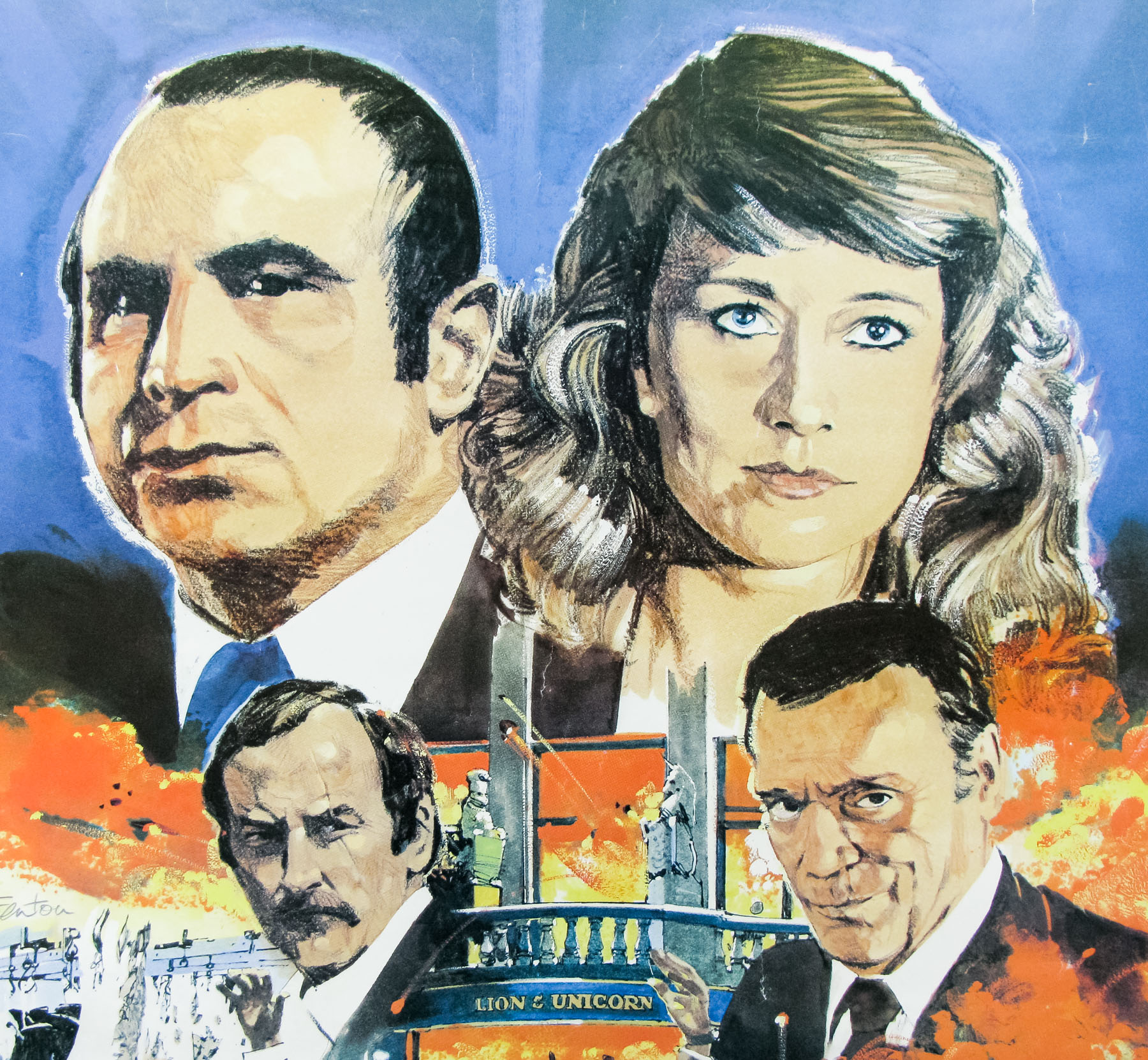
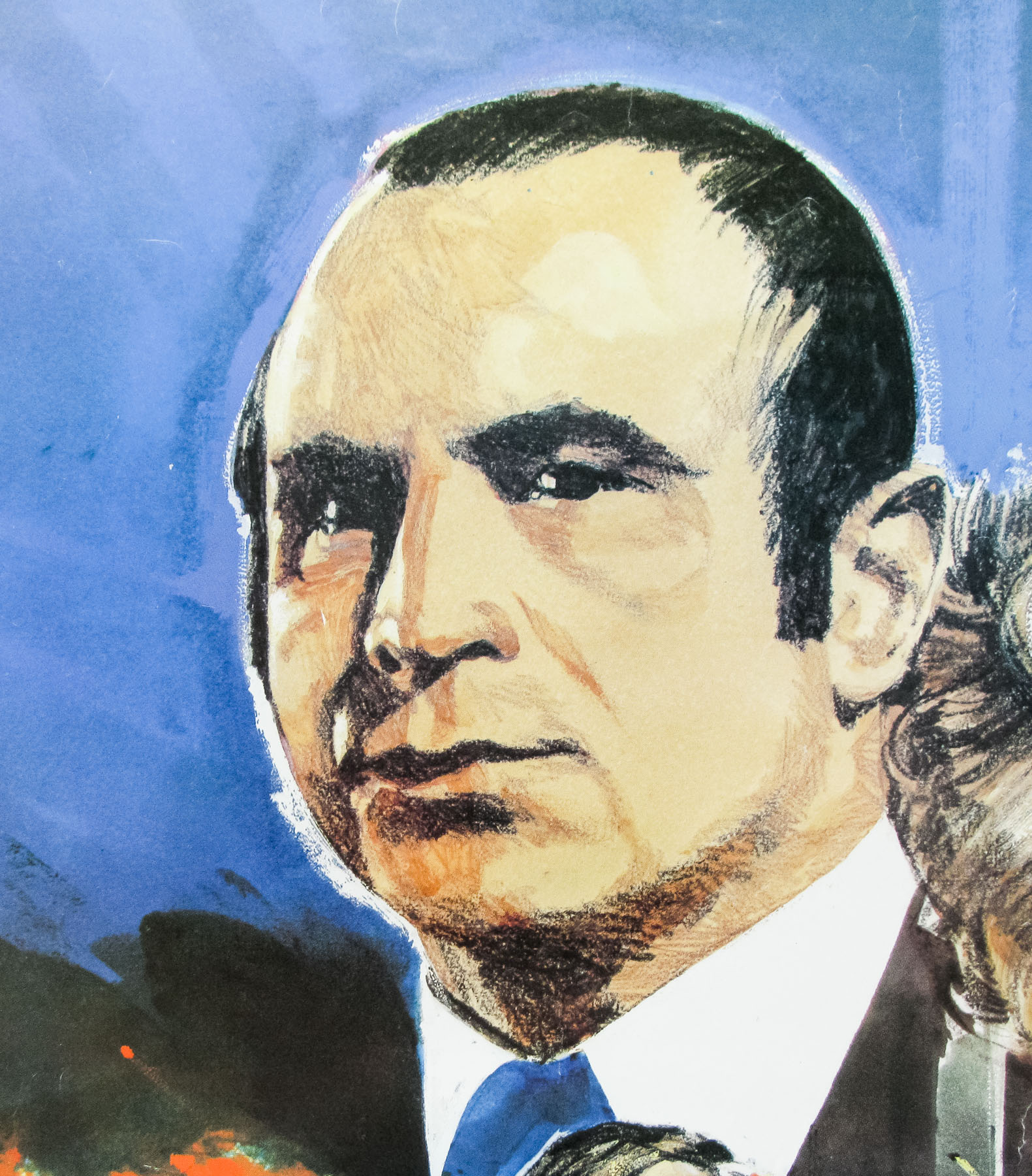
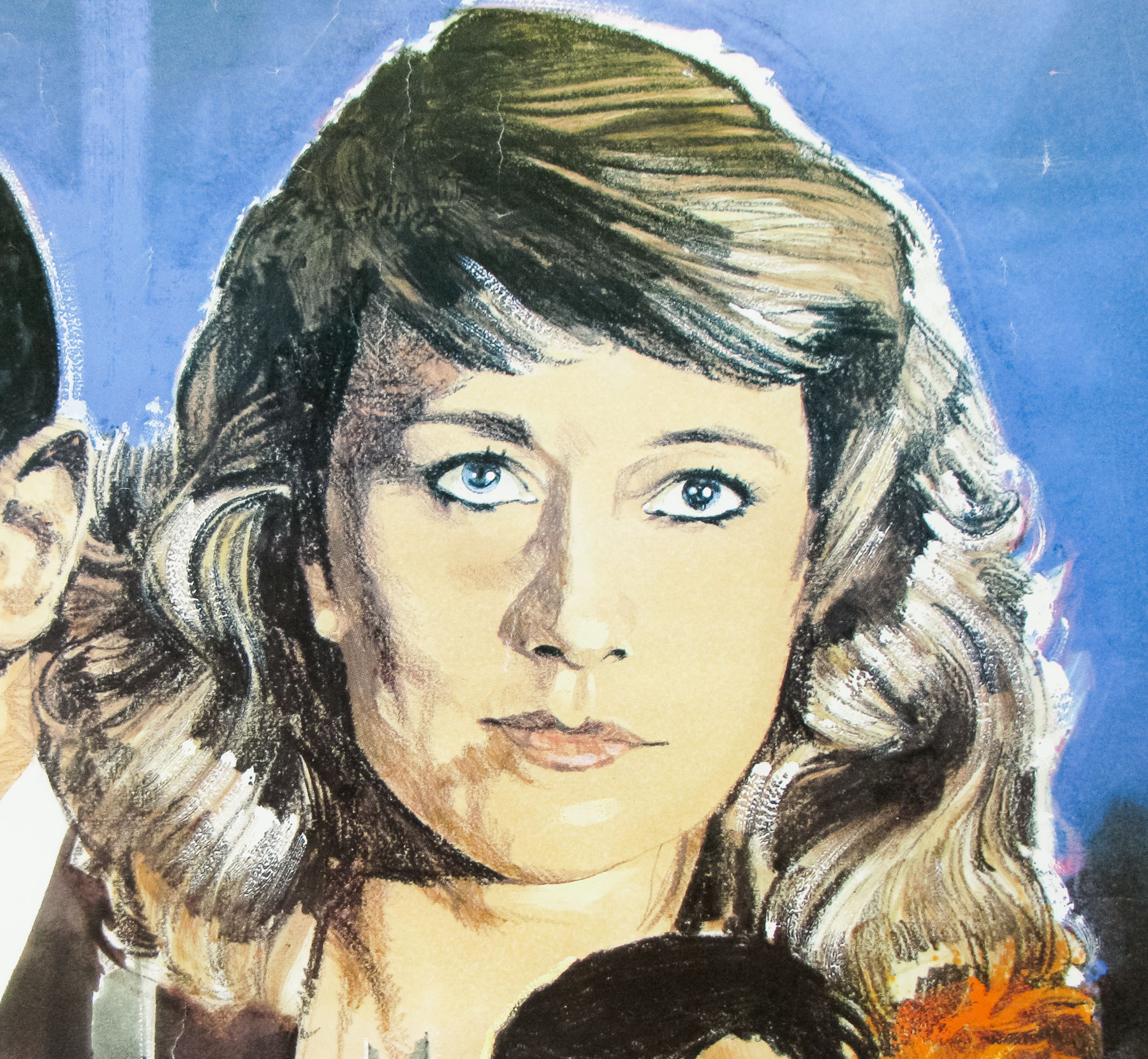
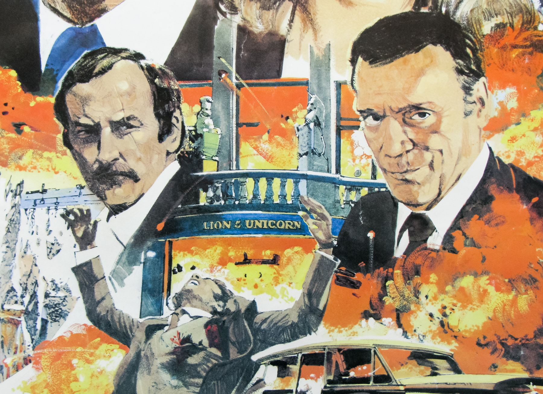
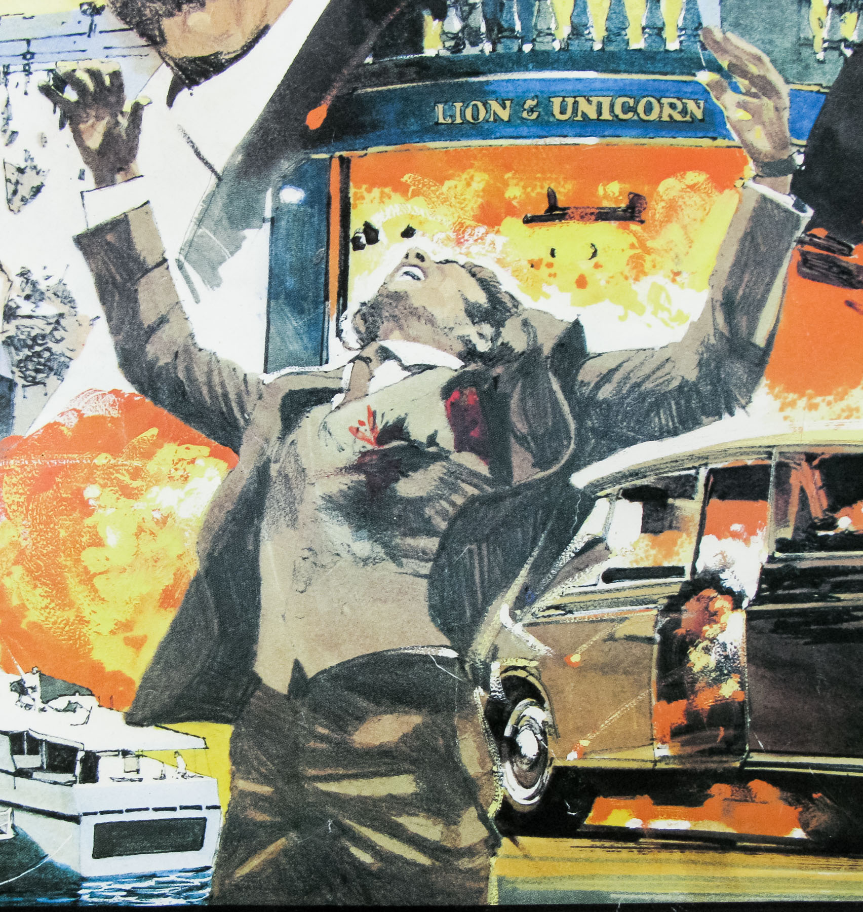
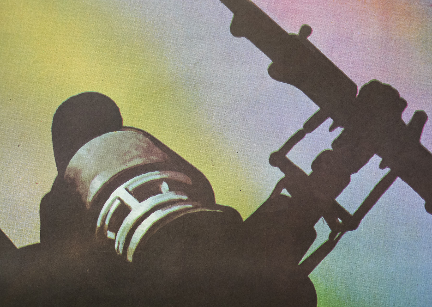
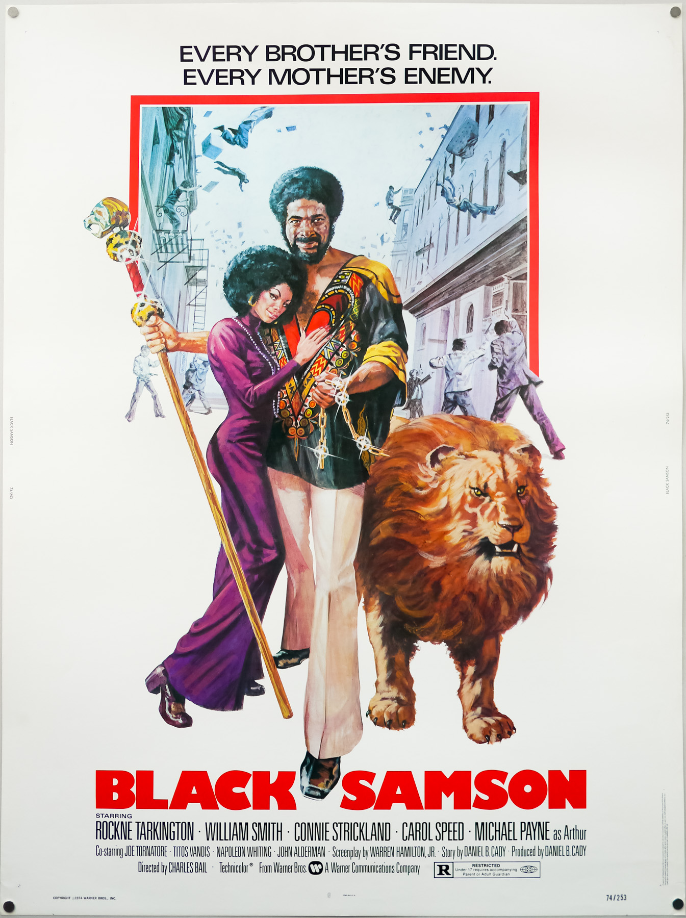
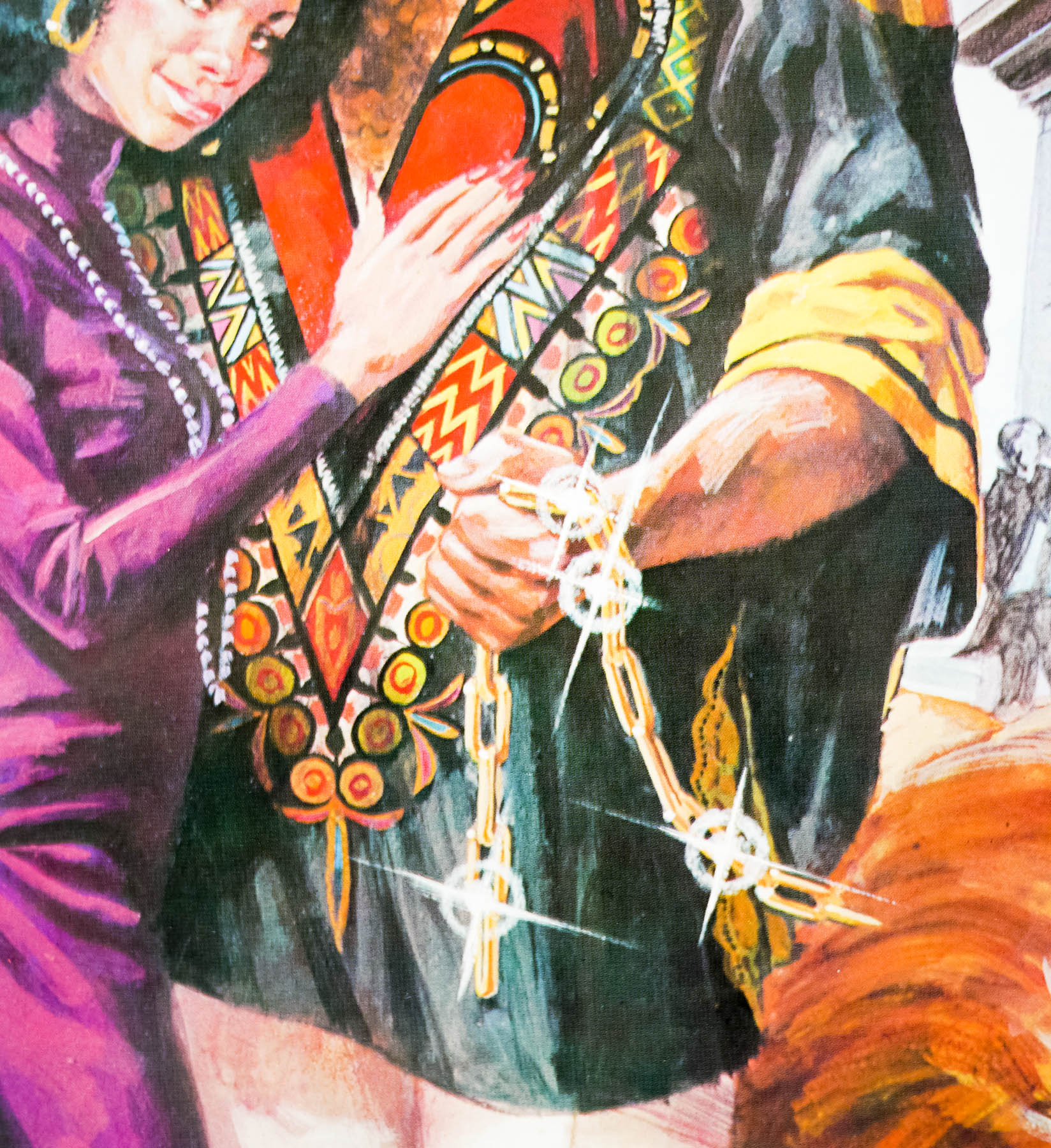
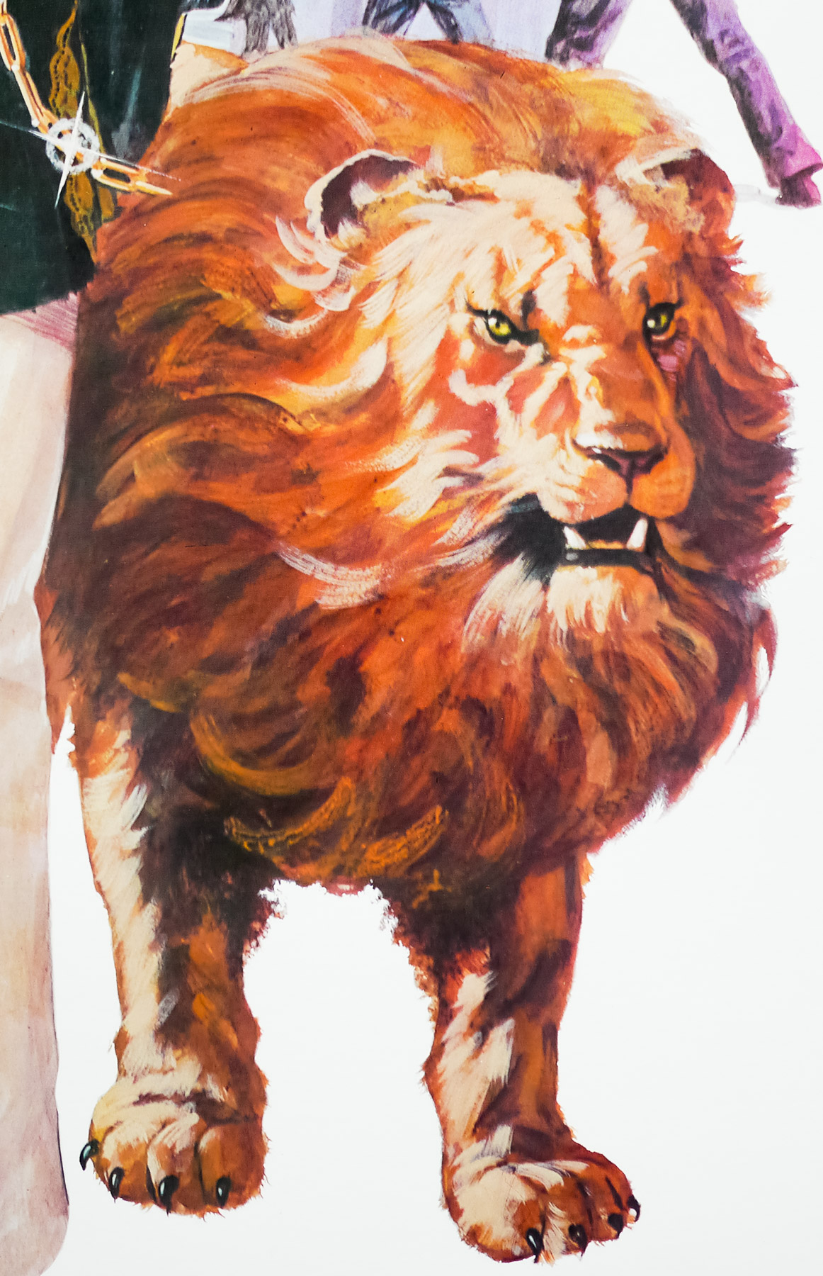
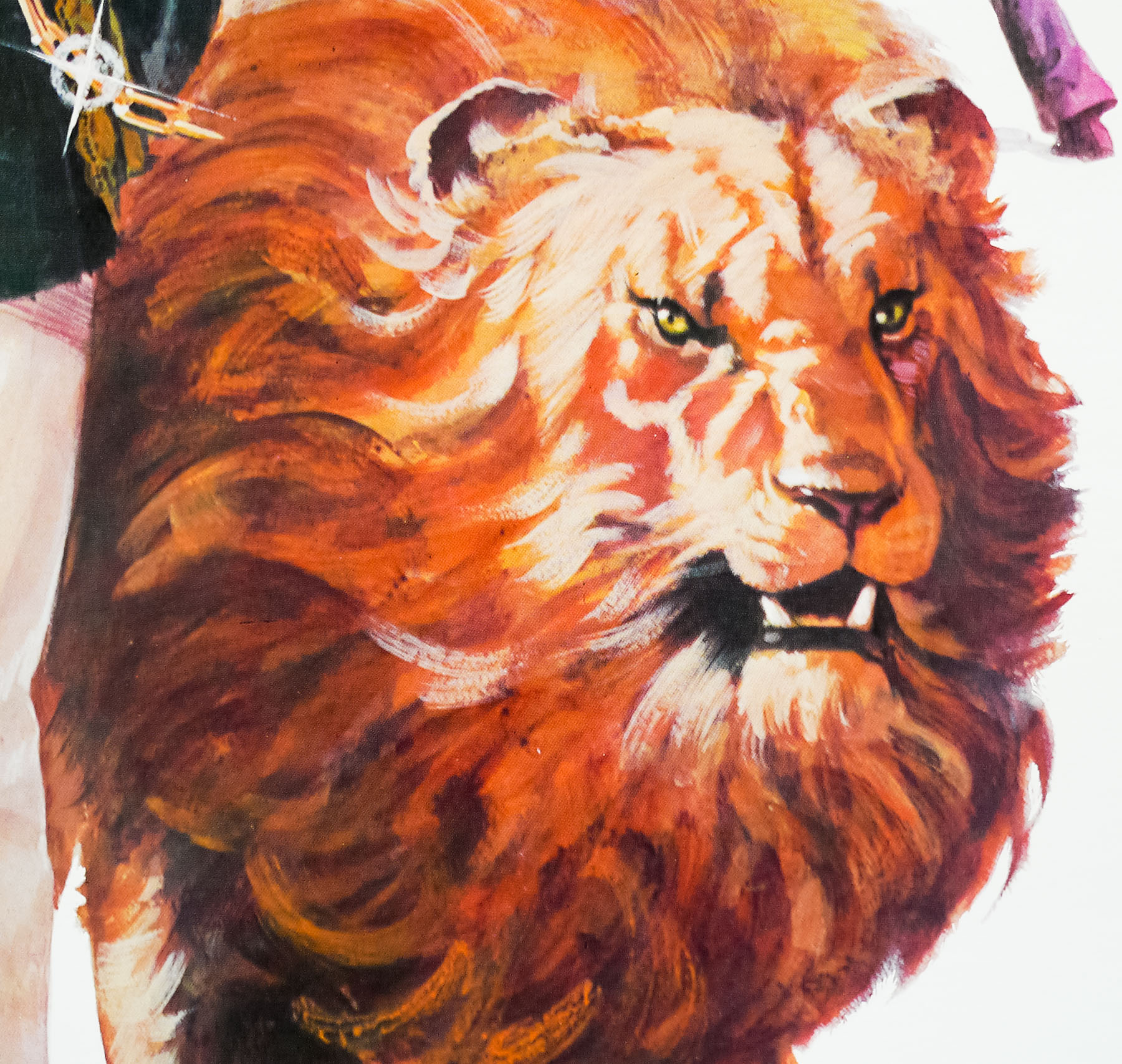
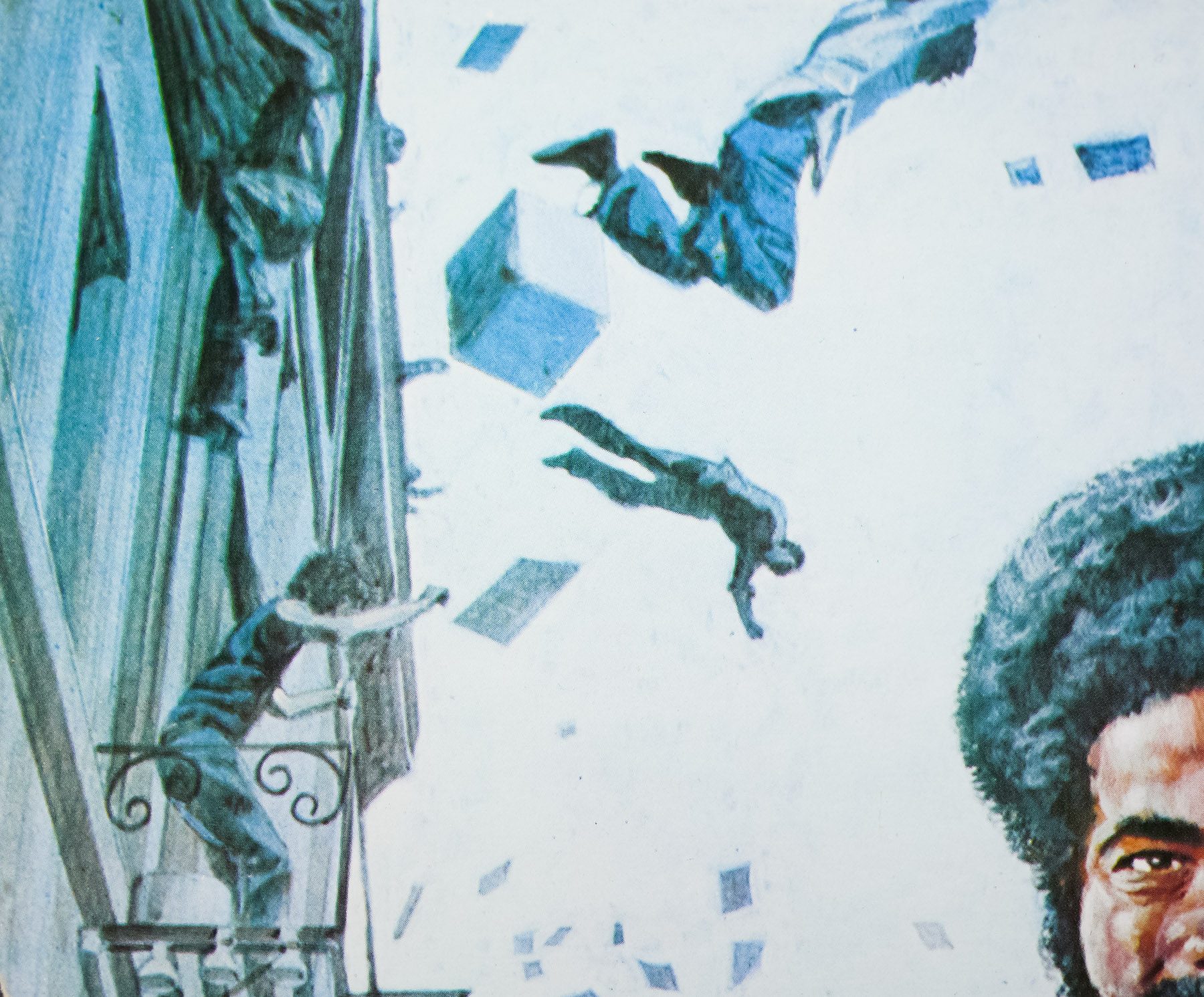
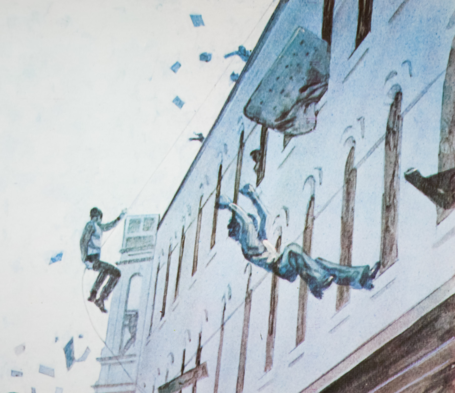
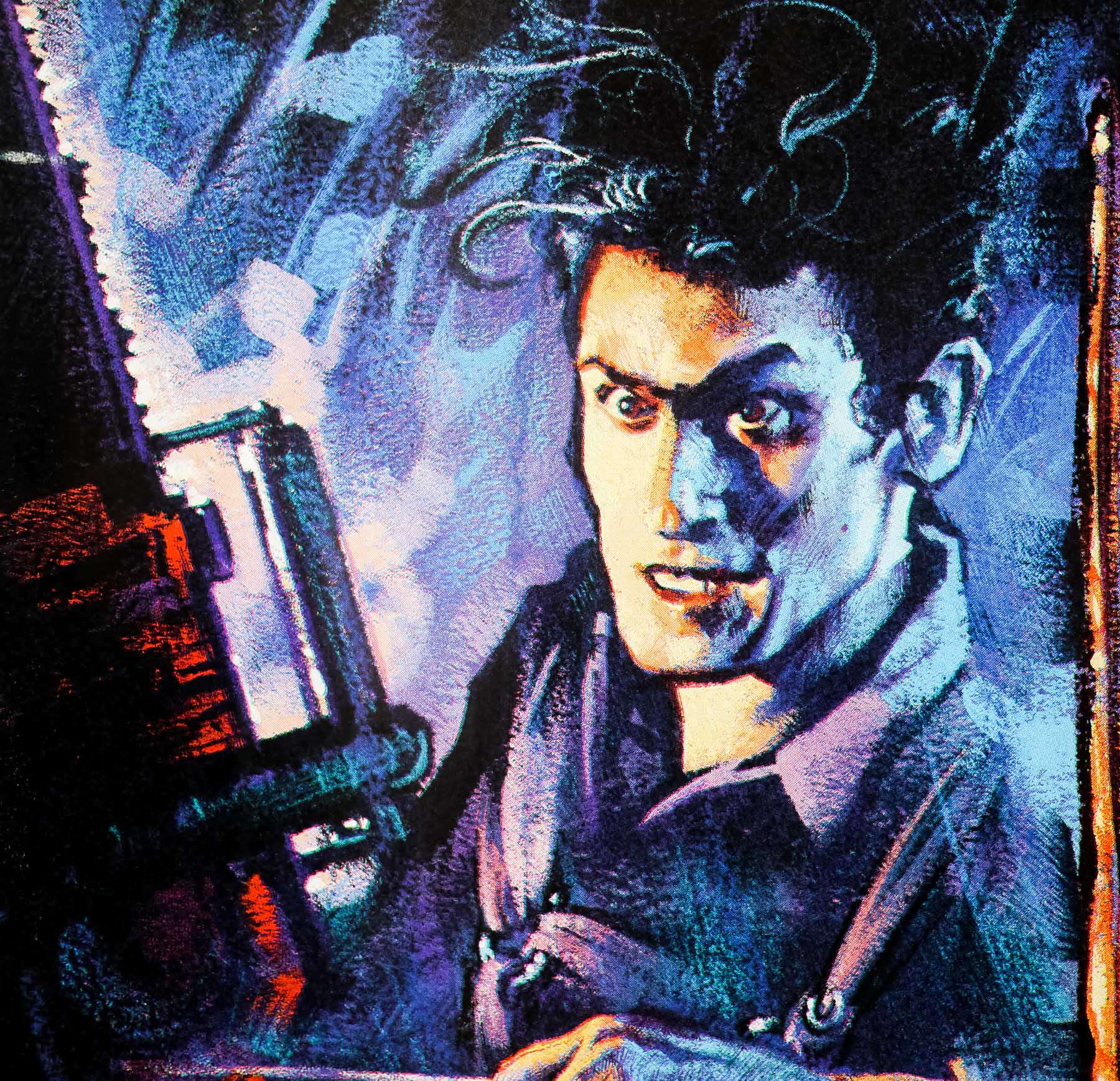
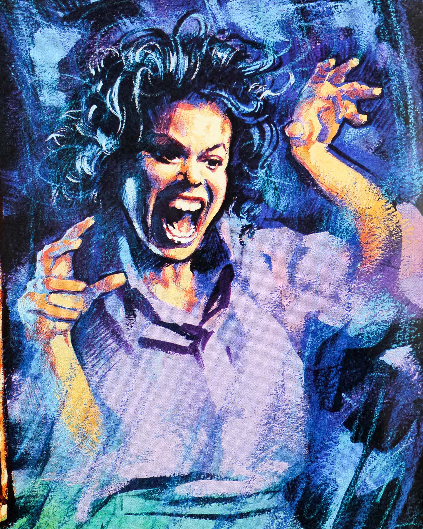
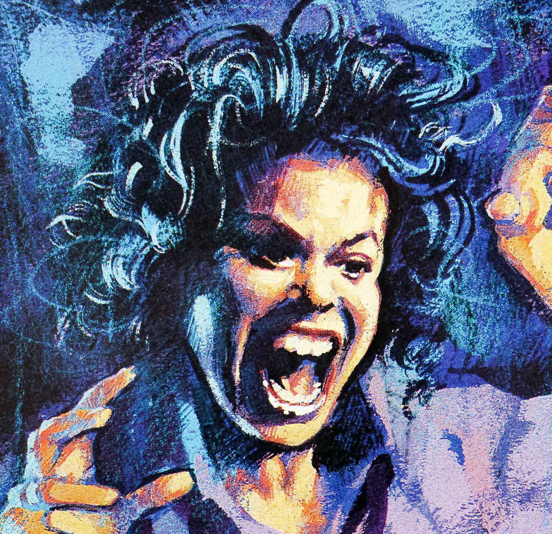
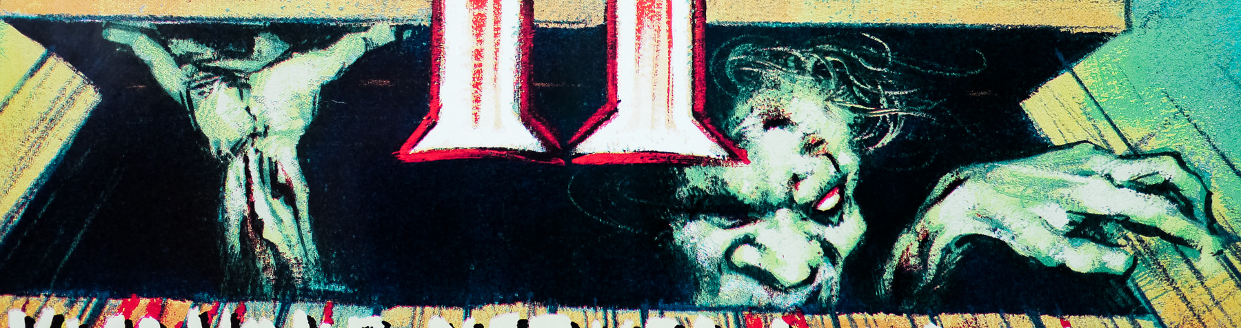
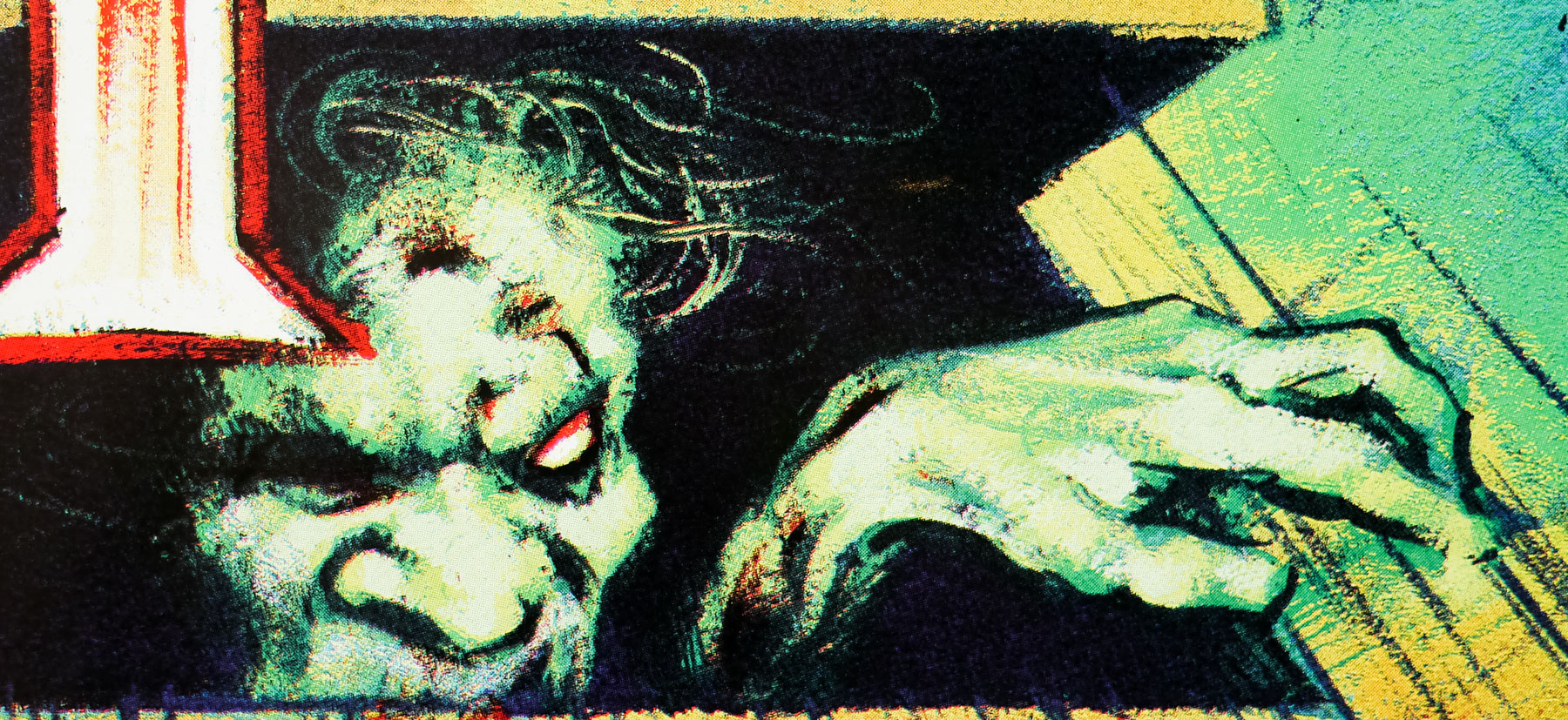
Brilliant artwork by UK artist Graham Humphreys on this quad for the (superior IMO) sequel to Sam Raimi’s brilliant low-budget horror The Evil Dead. The films were a great success in the UK after the first was bought at the Cannes Film Festival by the legendary British distribution (and later production) company Palace Pictures. Released in cinemas and on VHS almost simultaneously the modest outlay for the rights to distribute the film proved to be an excellent deal as it went on to see great box-office takings and thousands of tapes sold. The first film was eventually caught up in the infamous video nasties debacle of the 1980s and was banned for a number of years under the Video Recordings Act.
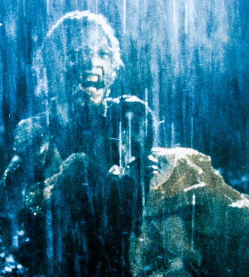
The sequel, made six years later and technically a retcon sequel, was allotted a significantly larger budget than the first and is more of a black comedy than the original. Lead actor Bruce Campbell is put through a continually escalating series of horrific encounters that allow him to show the full extent of his talent for slapstick comedy.
Palace pictures bought the rights to distribute the second film and asked Graham Humphreys to design the quad and video artwork for it after his iconic design for the first film had proved so successful. When I interviewed the artist about his career in 2011 I asked him about the design for the poster and the excerpt from the interview is below:
What happened with the quad for Evil Dead II?
It was the same situation at Palace but I think Steve and Nik Powell were at the helm with this one, since the first film had been so succesful. They figured why change the formula. I guess the point was that the film was almost a remake of the first one, plus a bit extra and so that’s what going on here. A re-imagining of the first one.
In that documentary you talk about how you’d had another idea involving a clock.
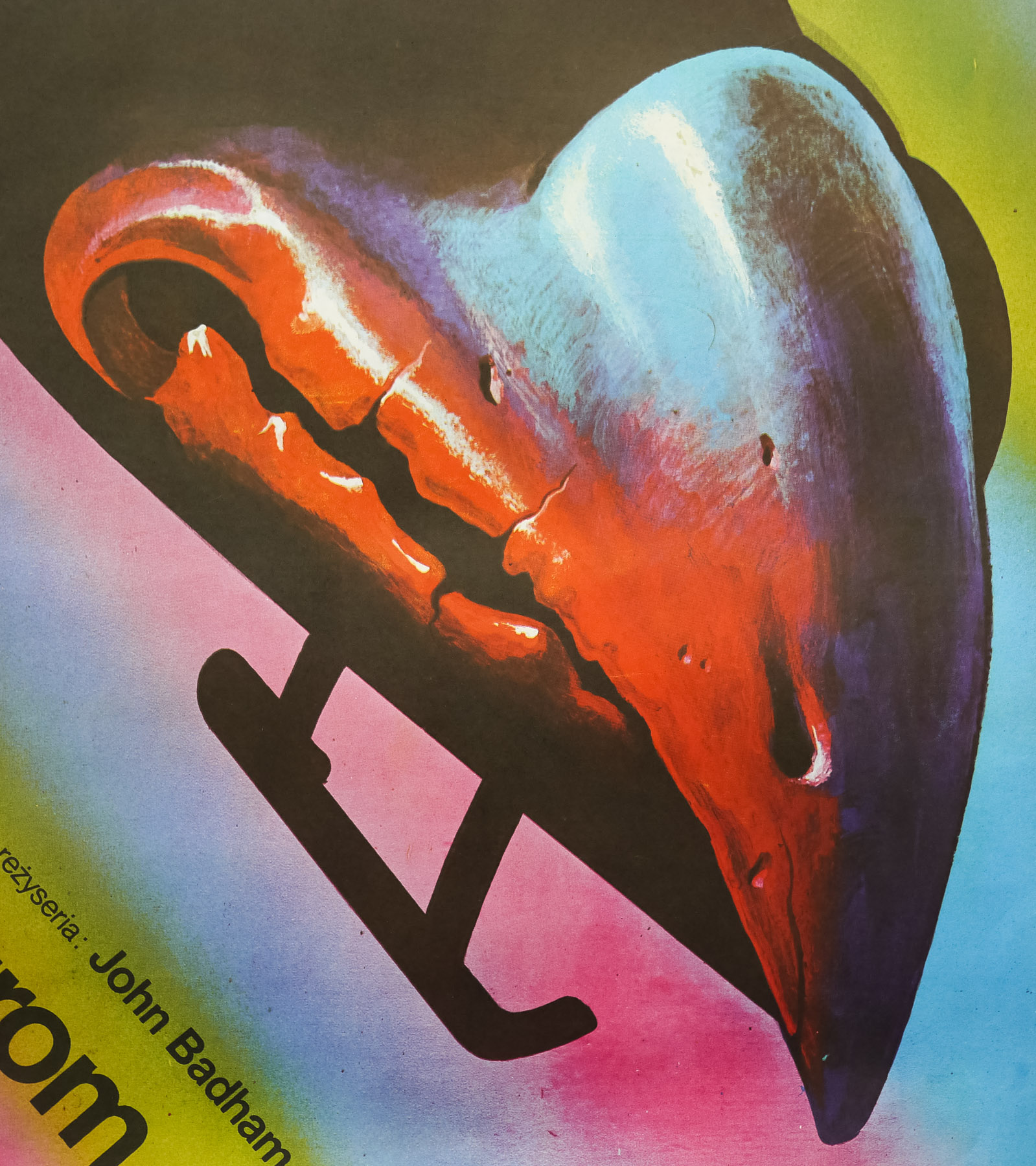
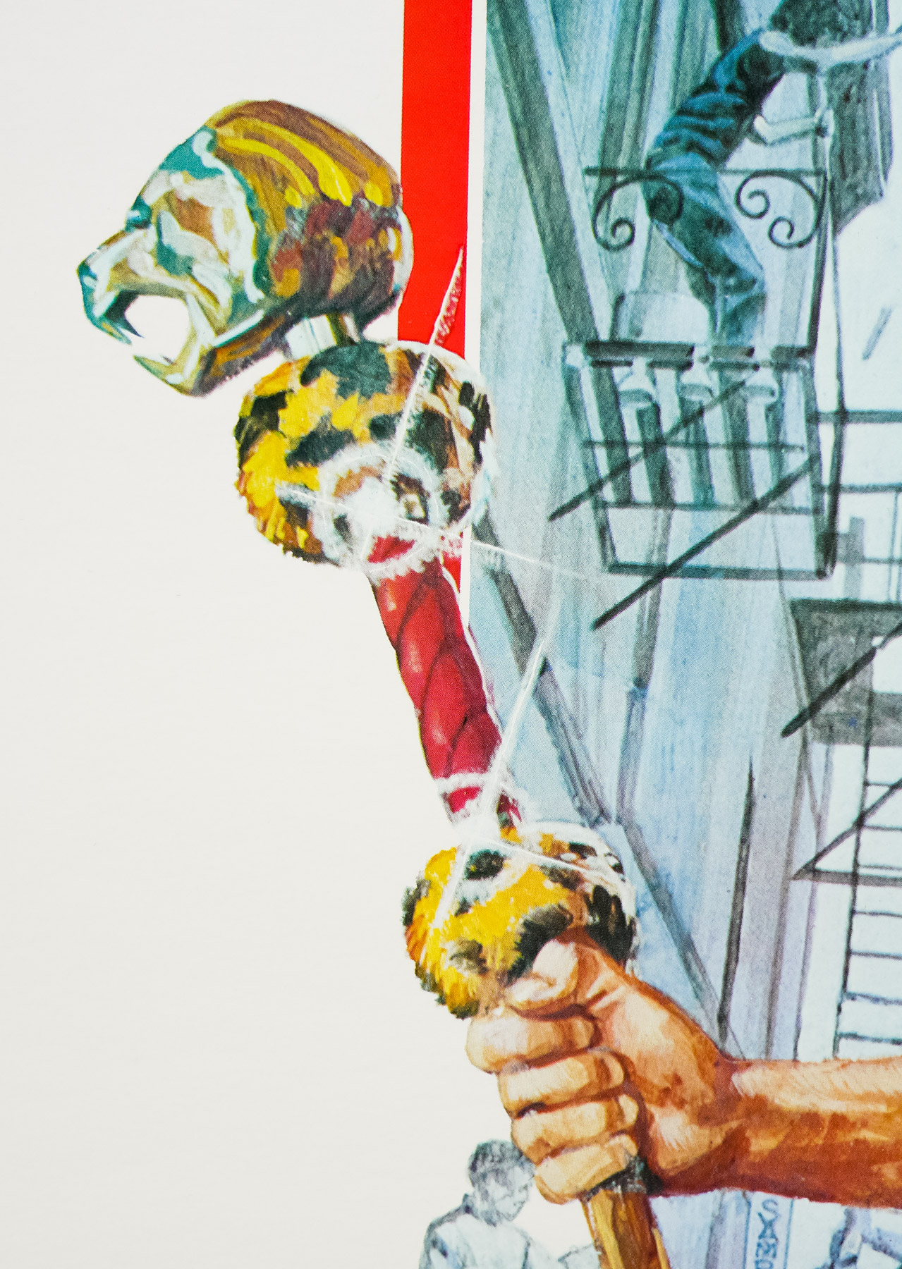
Yeah, that was the whole thing about ‘dead by dawn’ and I had this pendulum and a blood-covered clock that looked fantstic. I was particularly influenced by Werner Herzog’s Nosferatu film because there’s a great clock in that, which is beautifully designed with a little skull. That’s really what I wanted to do. The idea was actually to build a physical clock, but I never got to make it. The guys thought it was a bit obscure. There was also going to be a ‘Pit and the Pendulum’-style swishing blade covered in blood and the title was going to be on that.
The feedback was to keep things simple and use the characters?
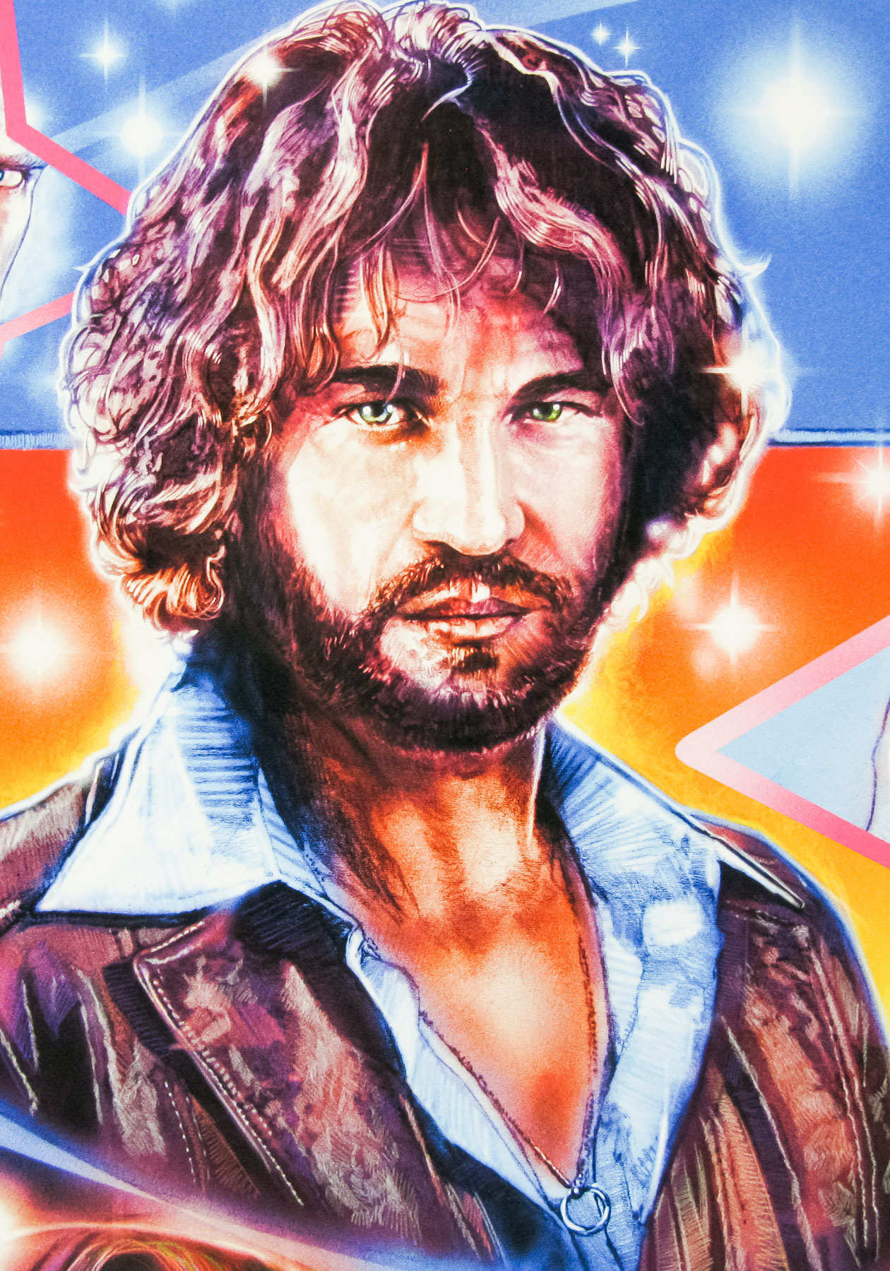
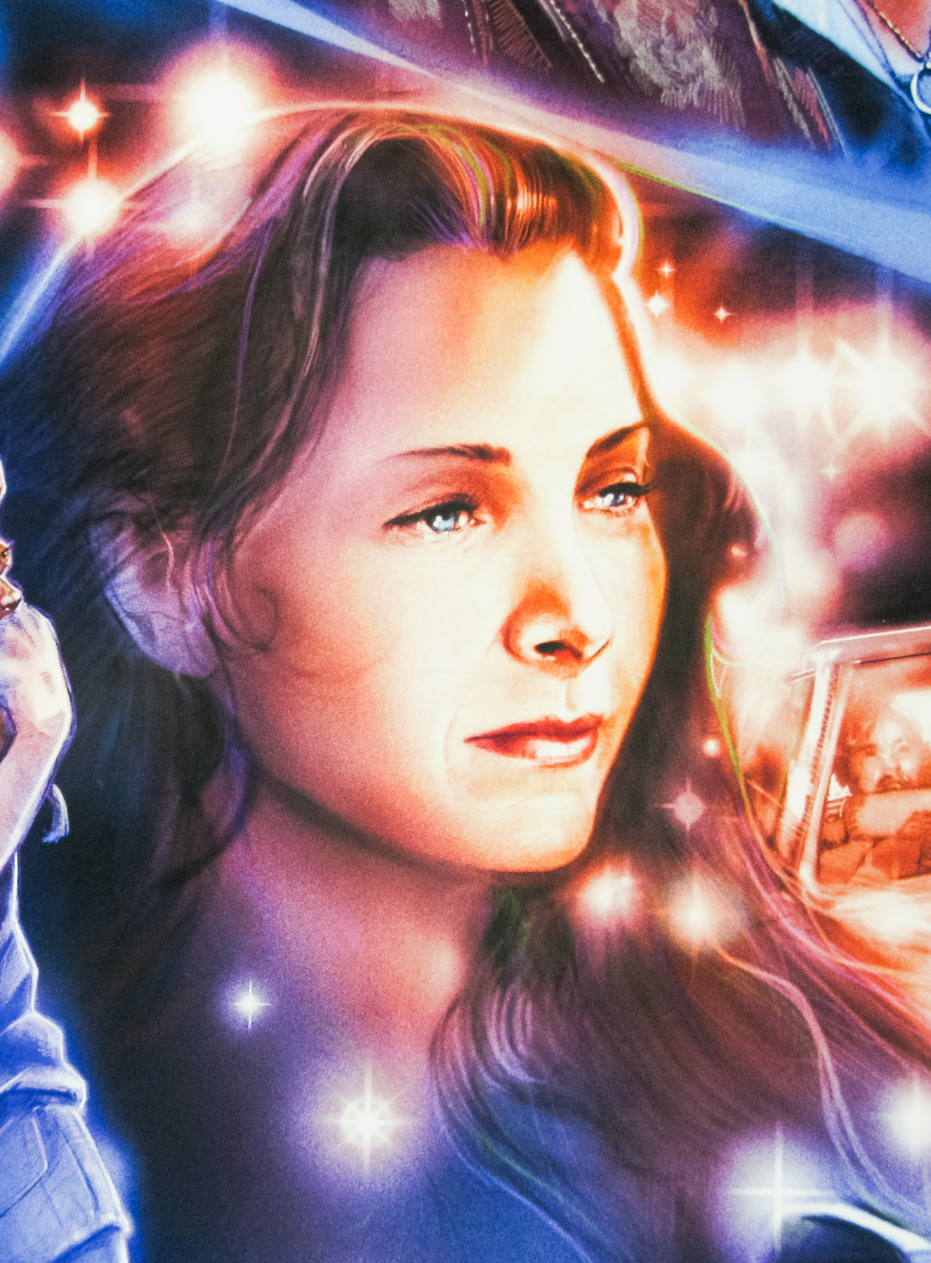
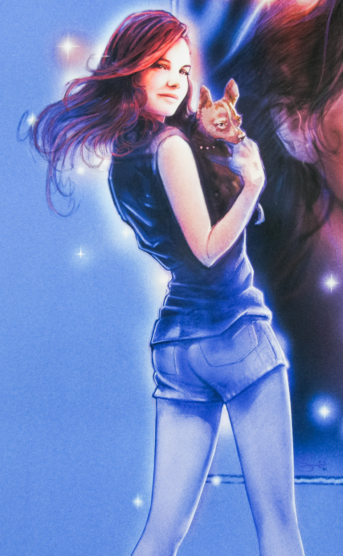
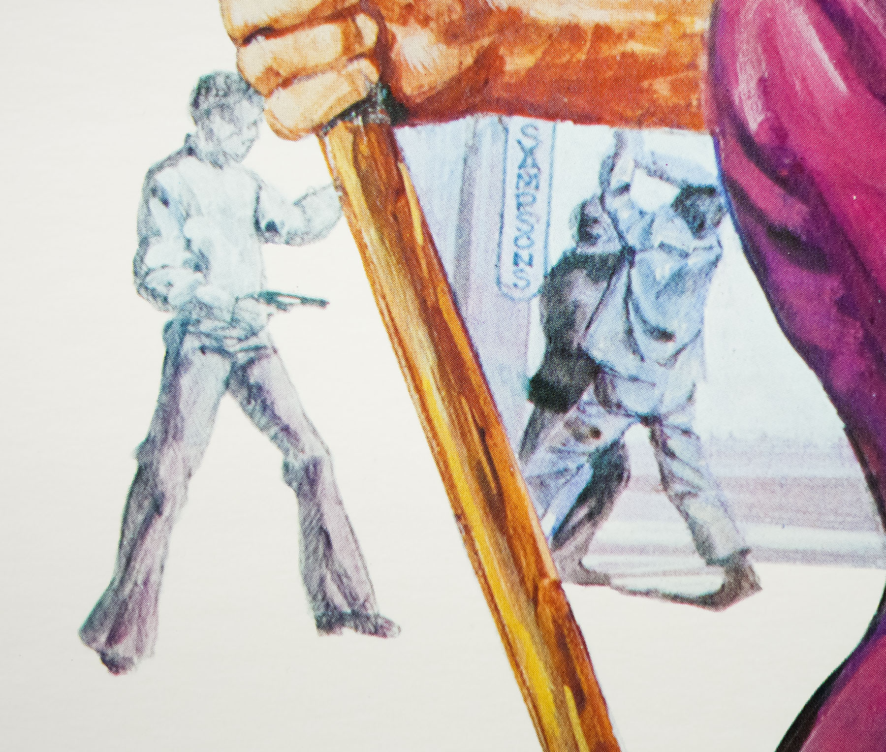
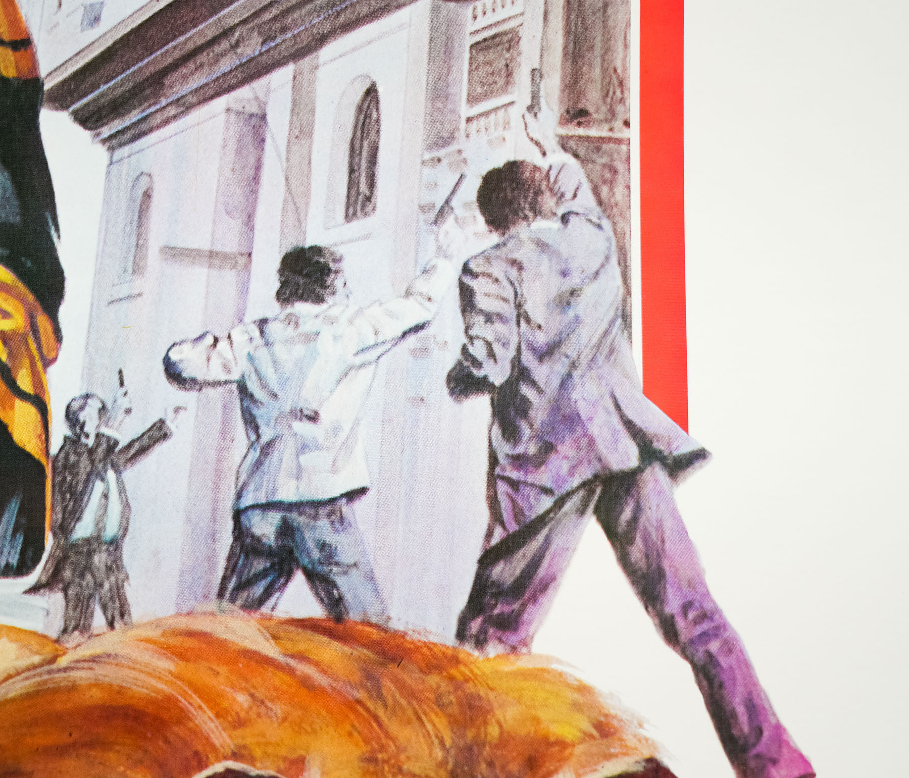
Yeah, we had the reel to reels on the first one and for this we had the book of the dead as the key element. There was some contention over whether we do the Roman numerals or the big number 2. To me it felt it should be classic looking with the numerals. I used a colour slide-set for the characters with only a few adjustments. I think I took a Polaroid of my hand to get the position right and a girl I was working with did the pose for me onto which I added the actresses head.
Do you prefer this one or the first film’s quad better?
I like the first one because it’s so raw and it captures the mood and music of the time for me. They’re two different animals really.
The full interview can be read here.
Check out these TV clips that were specially filmed in the UK to promote the film featuring Sam Raimi and English TV and radio (and film critic) Jonathan Ross