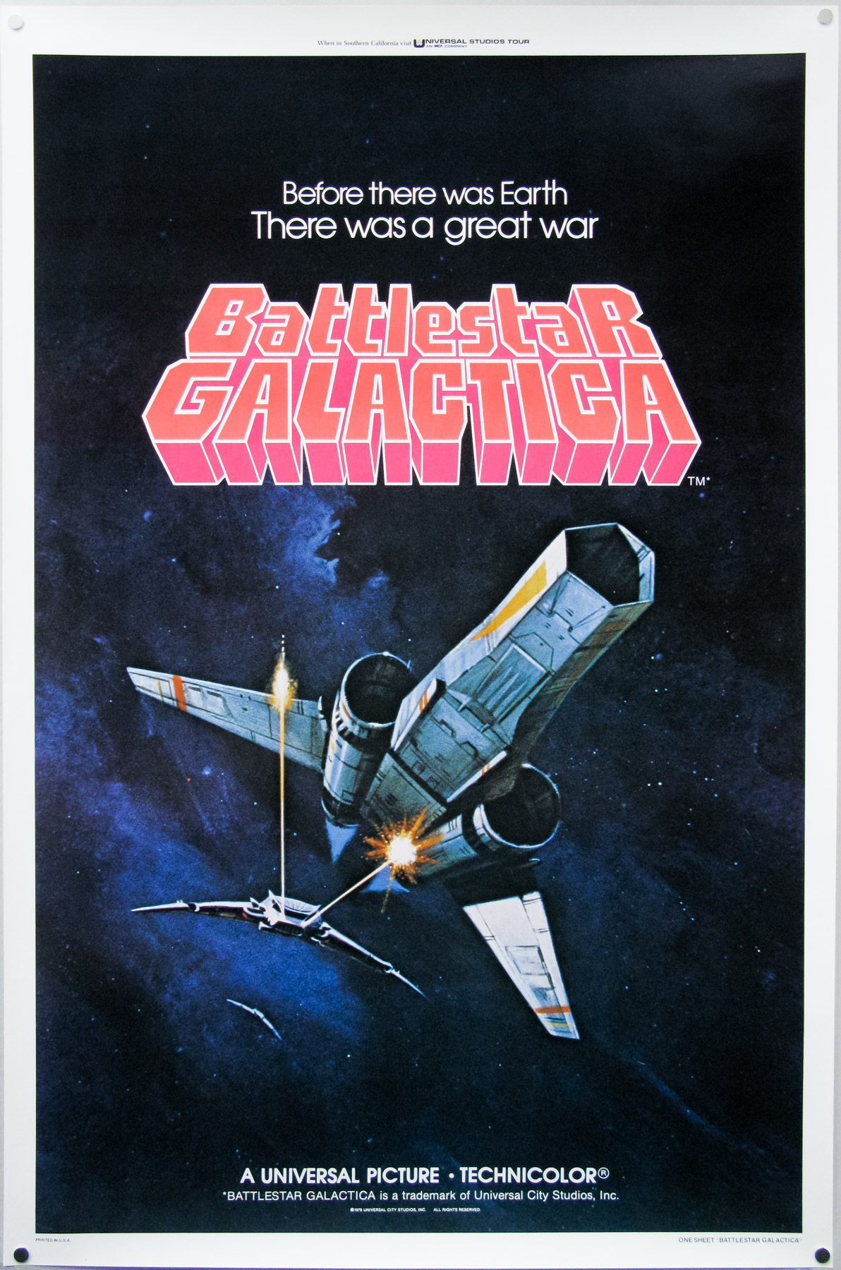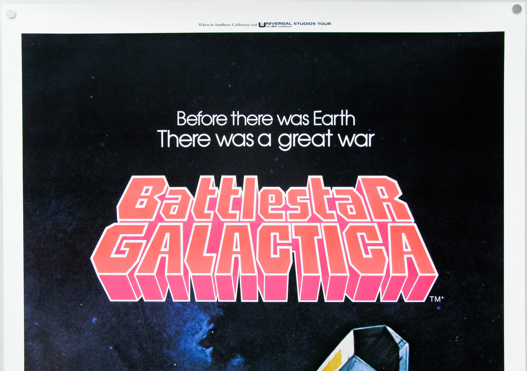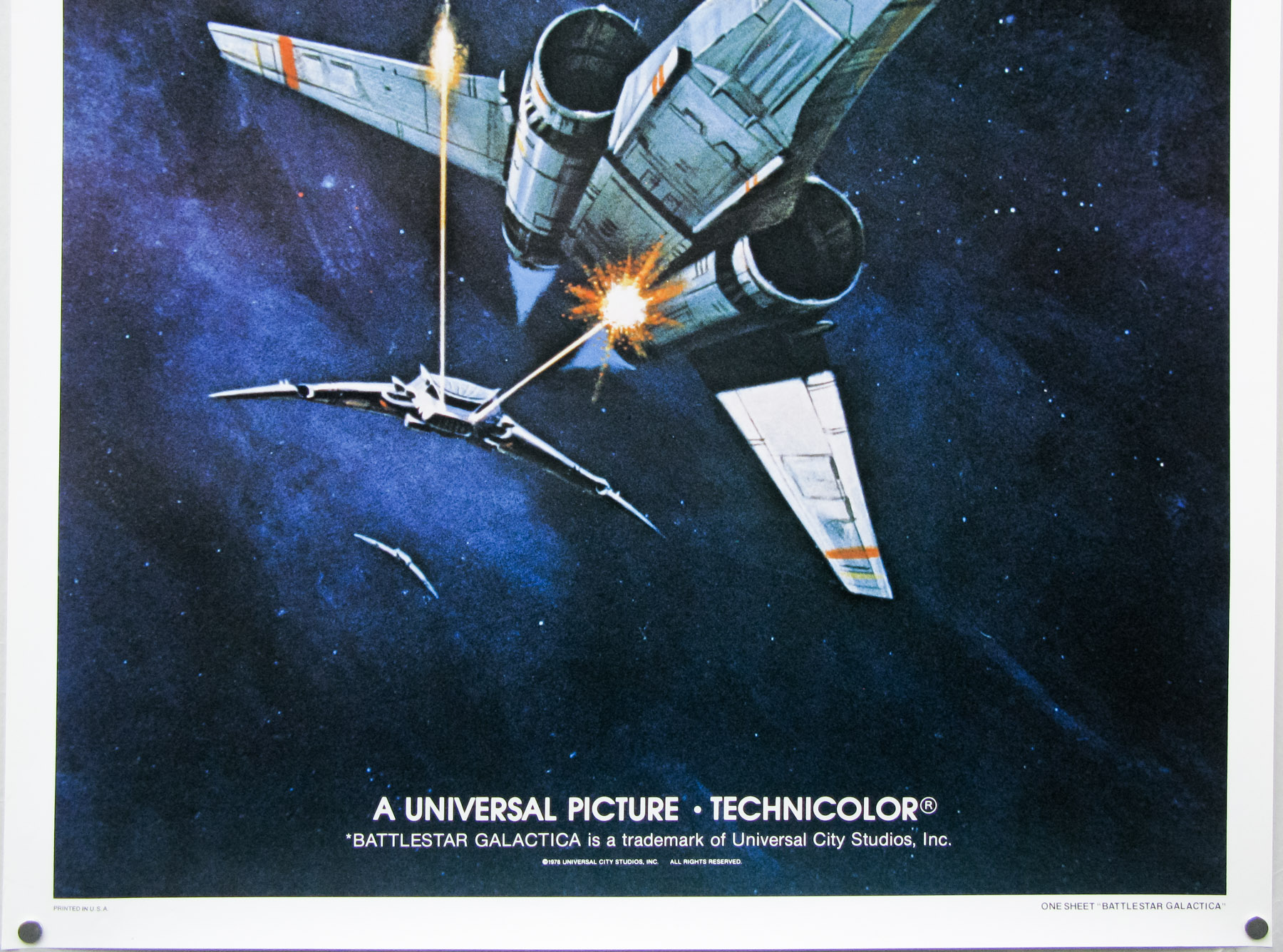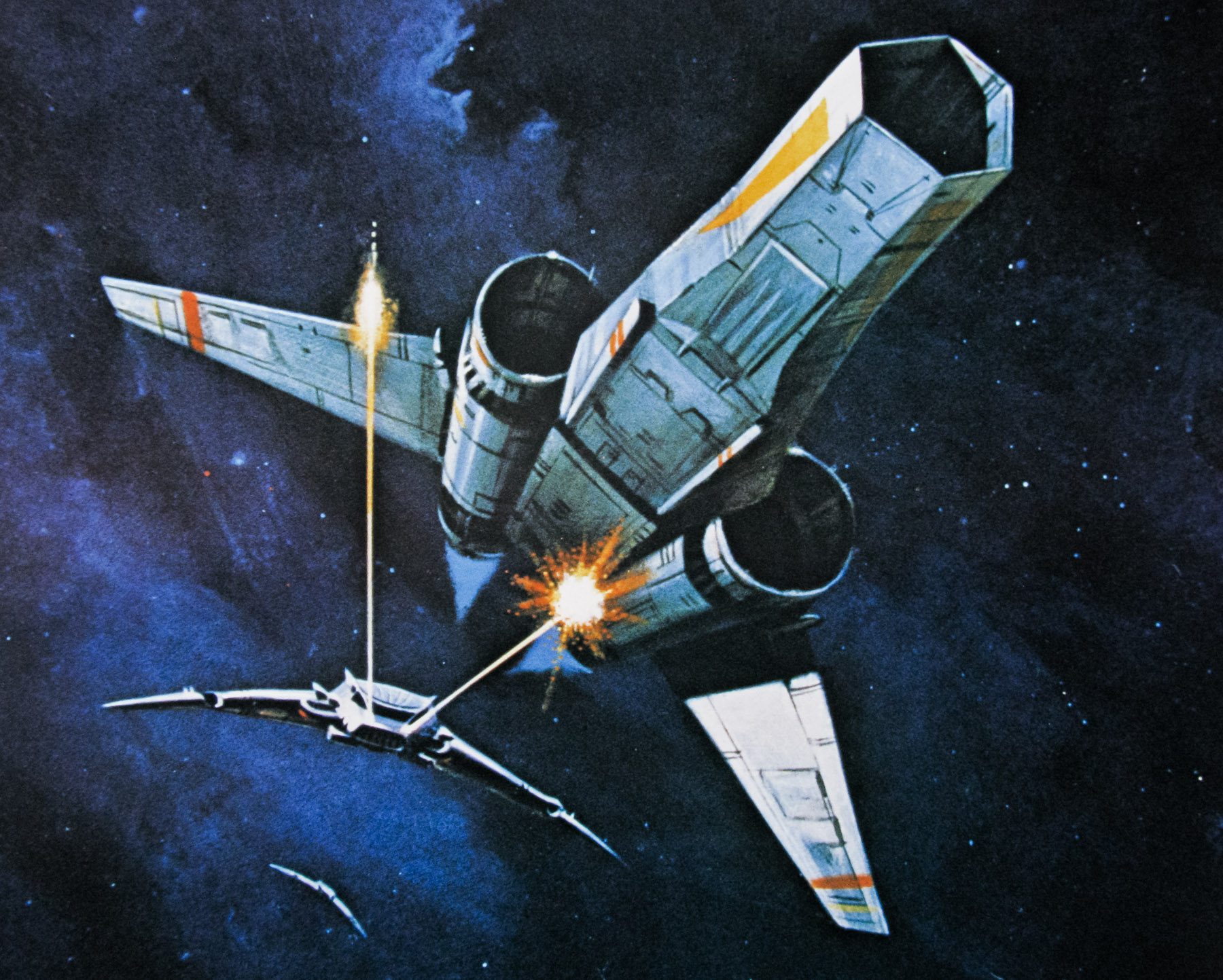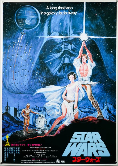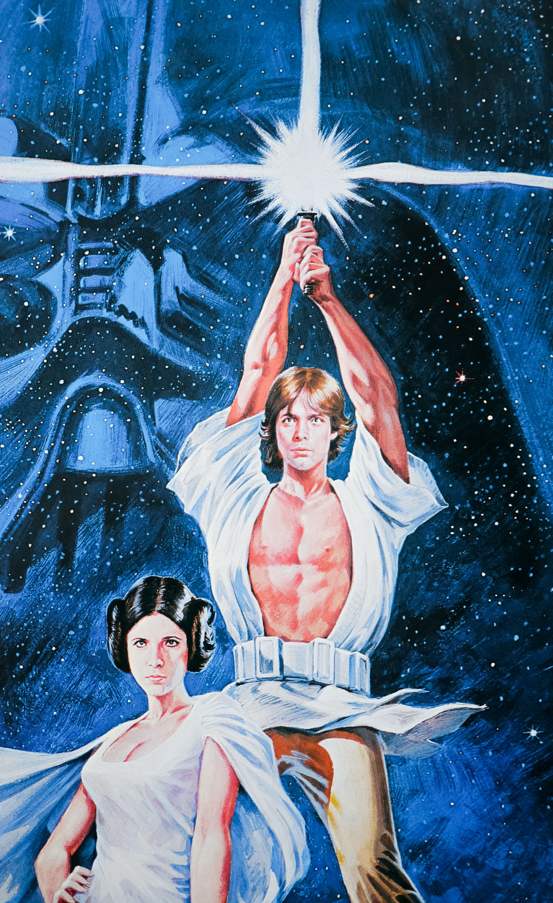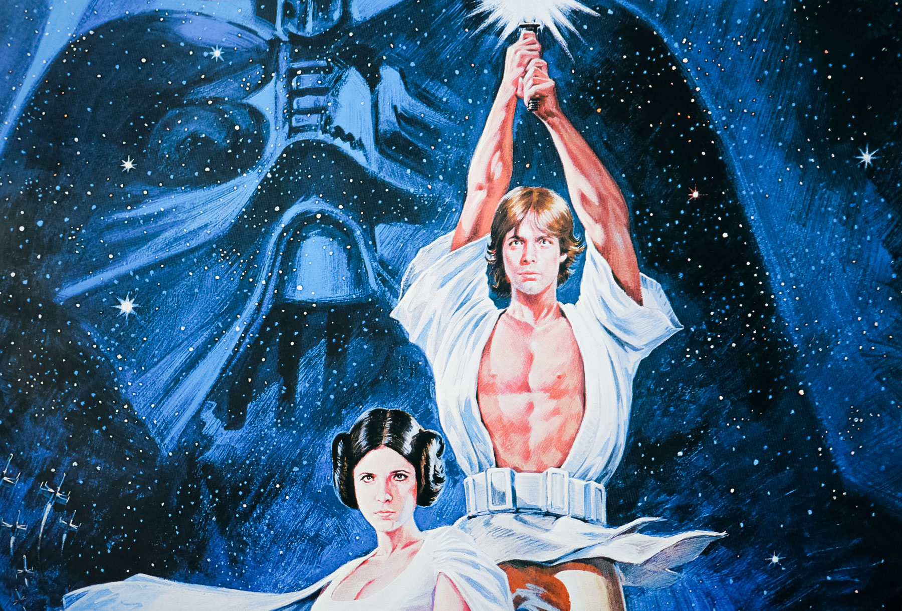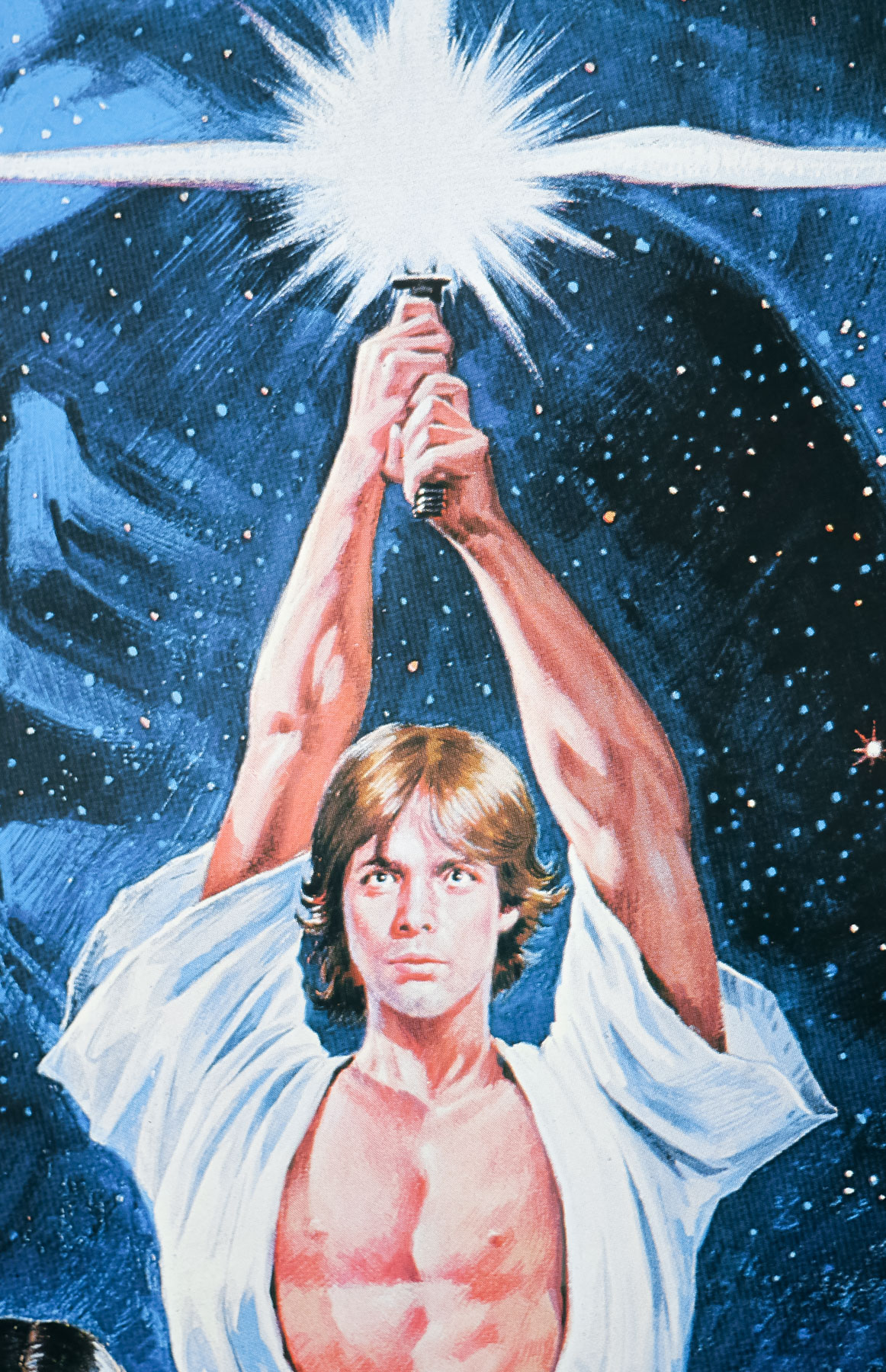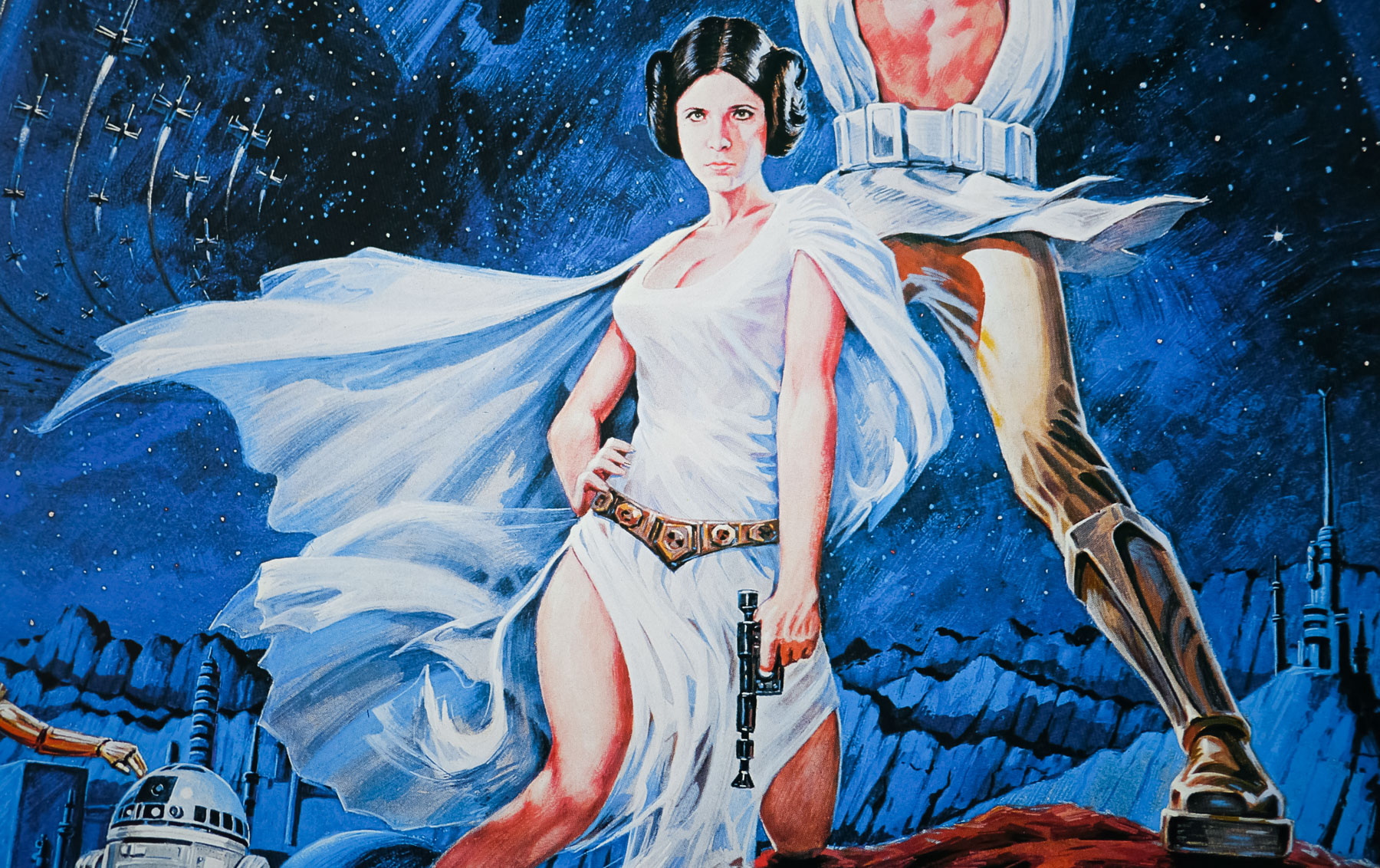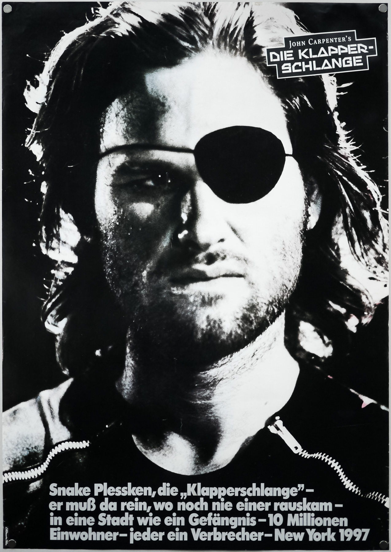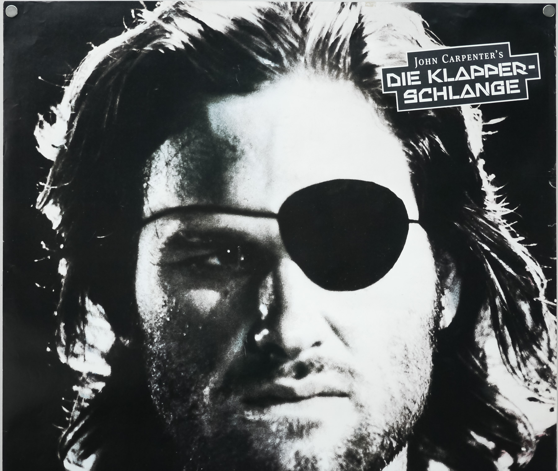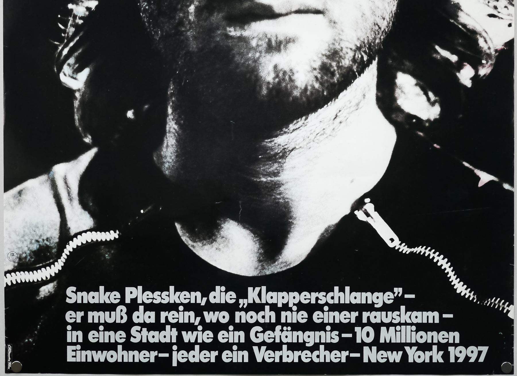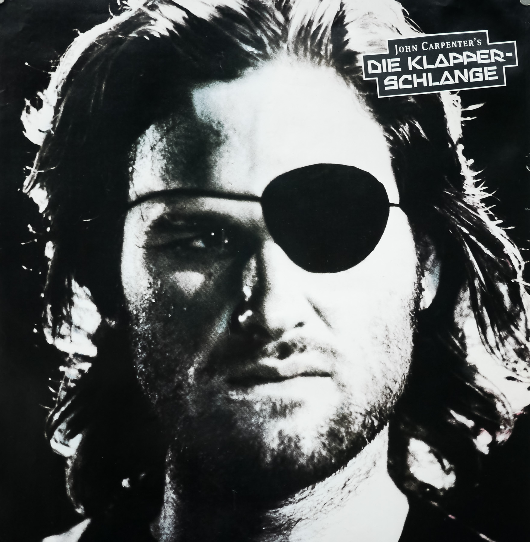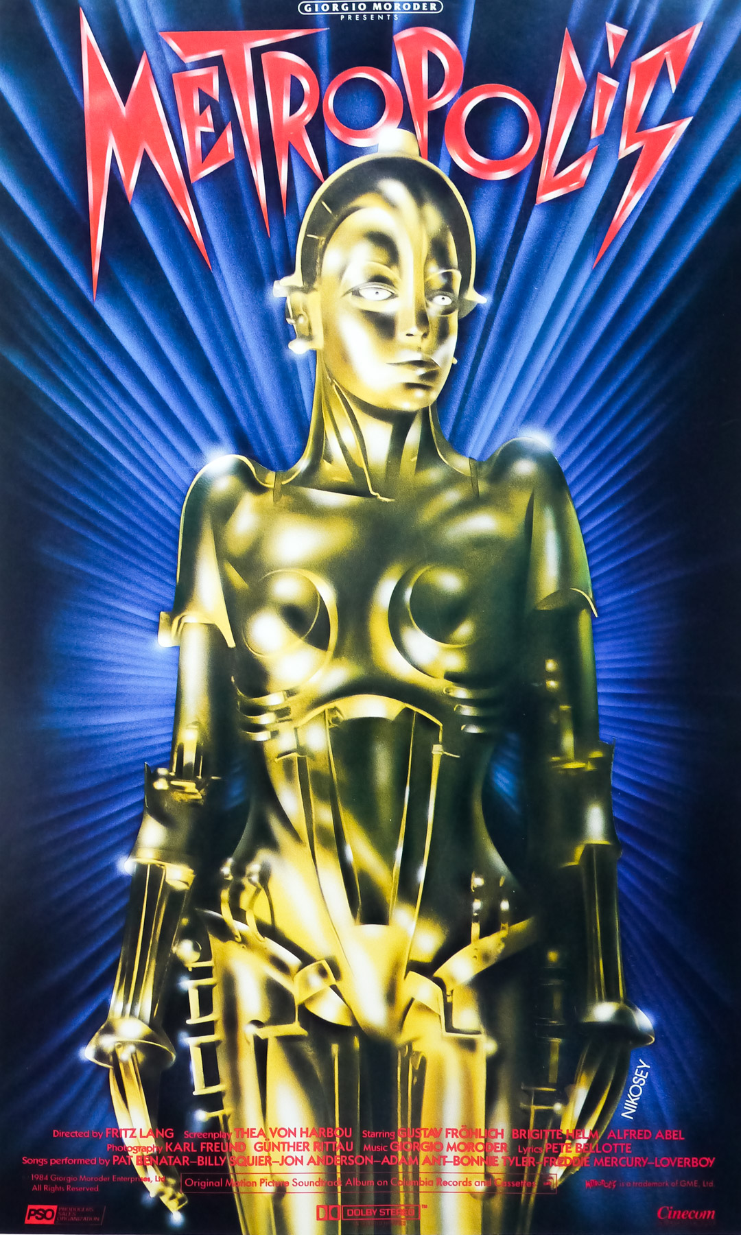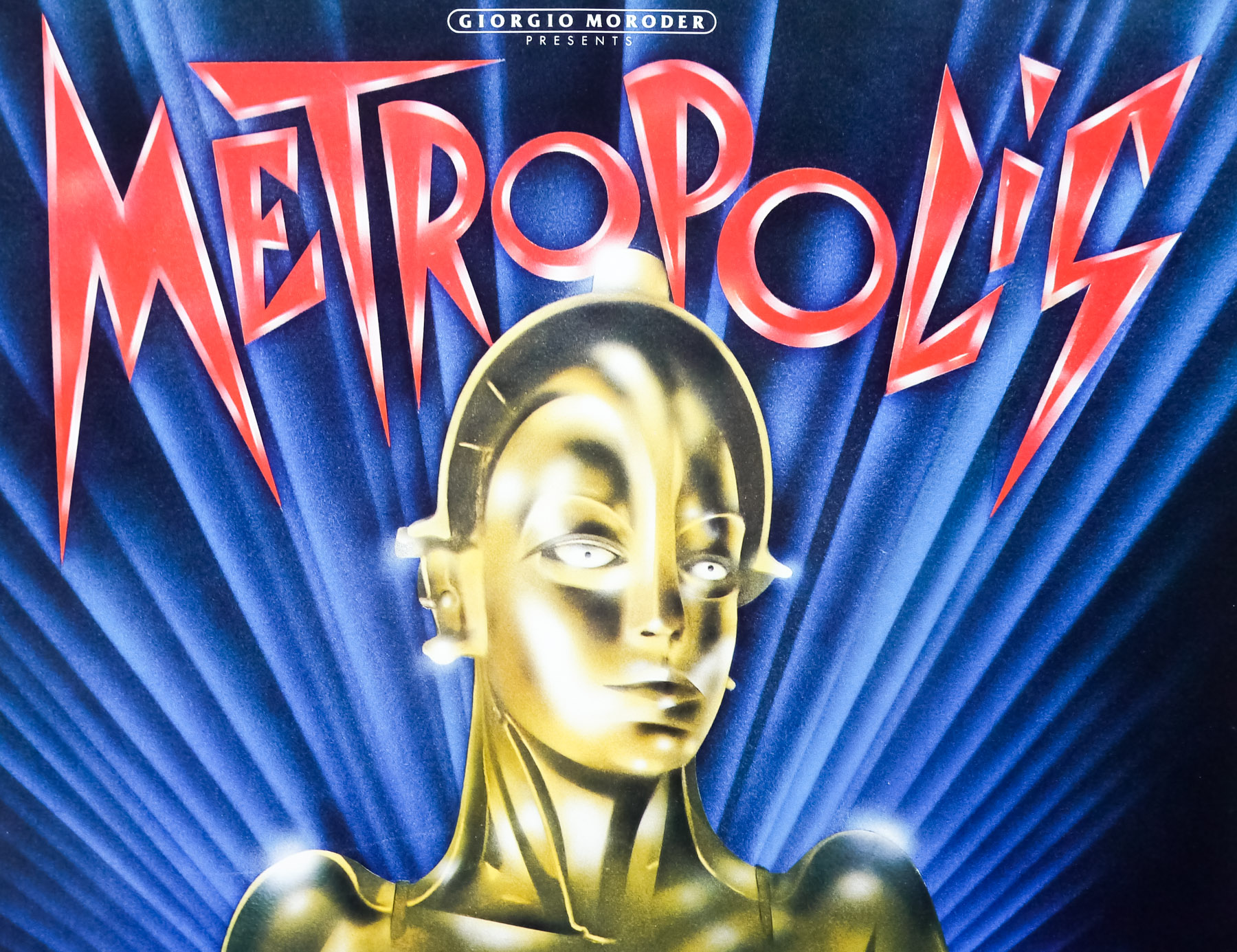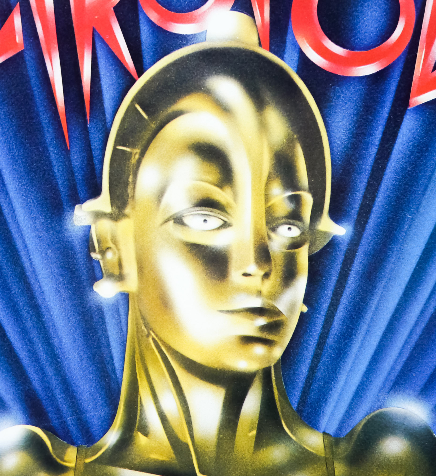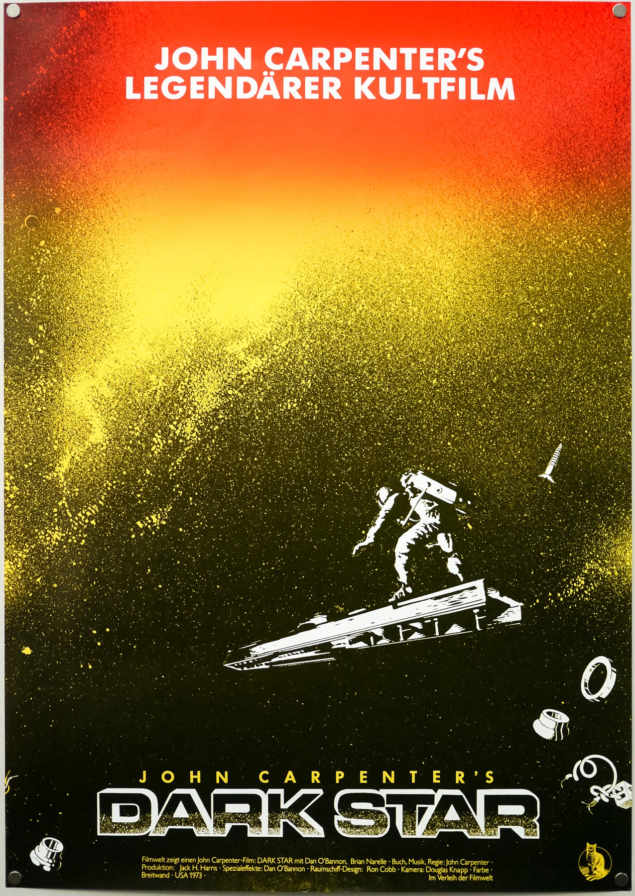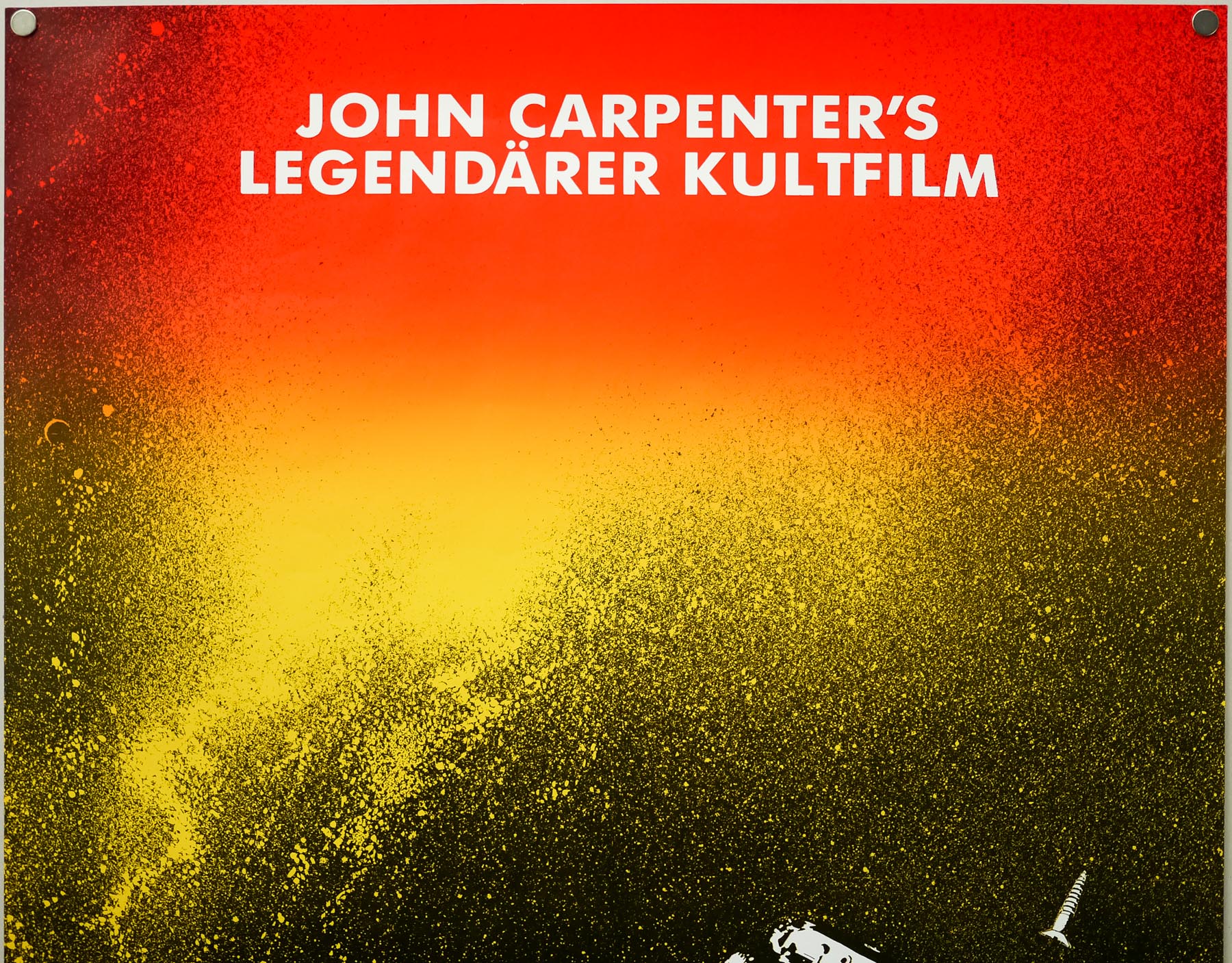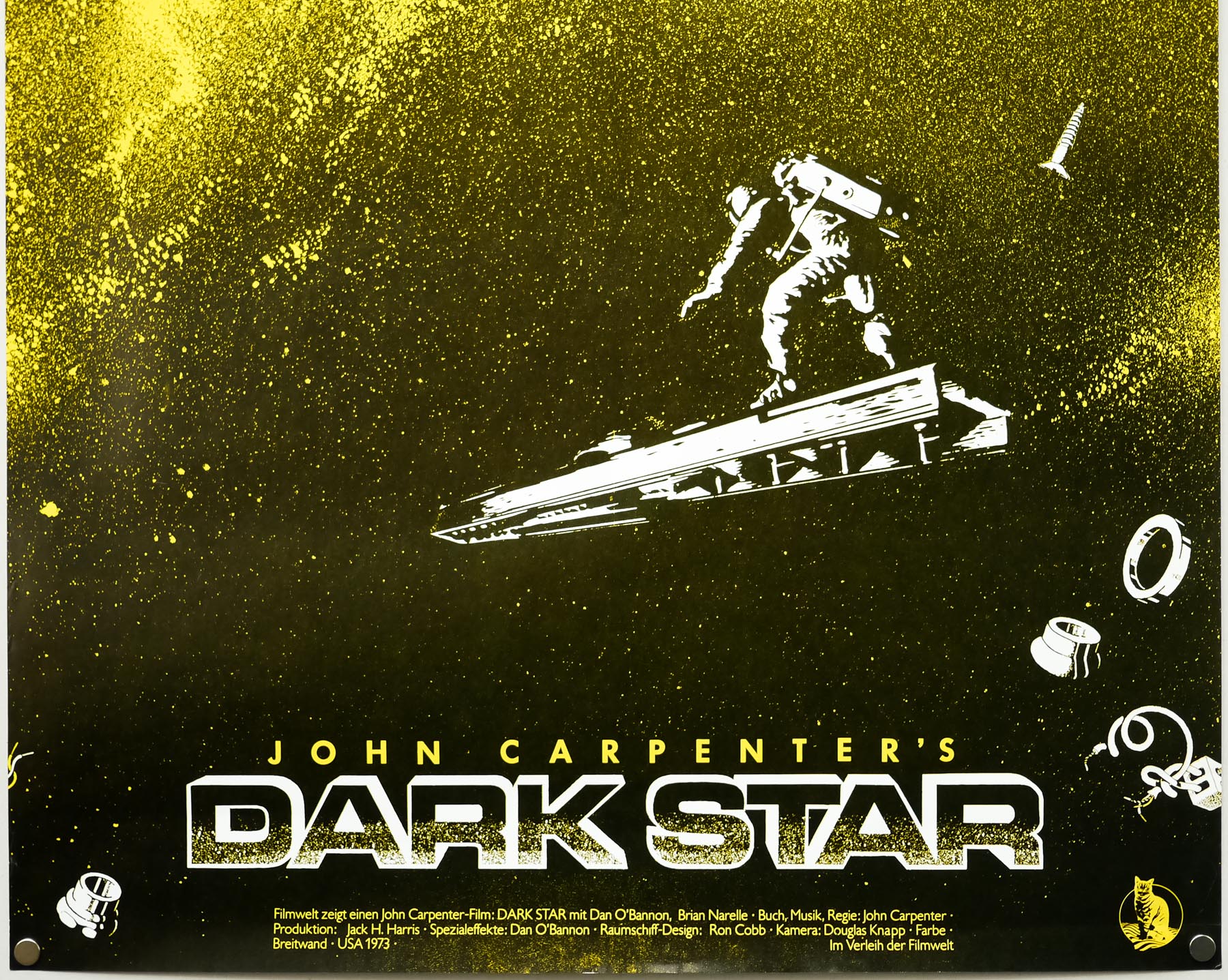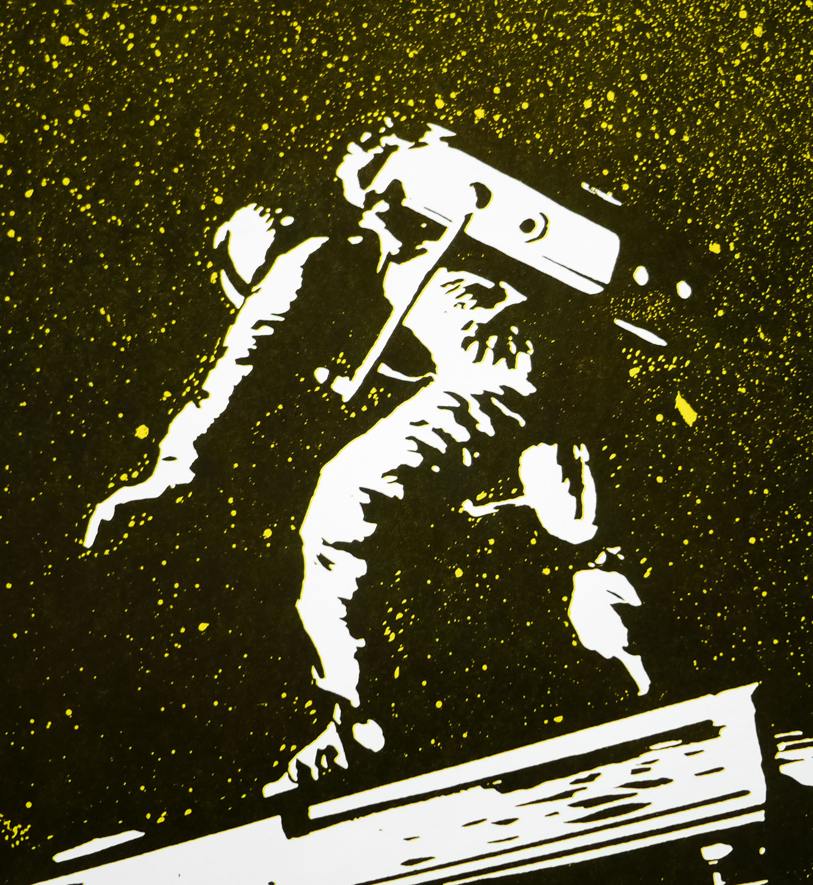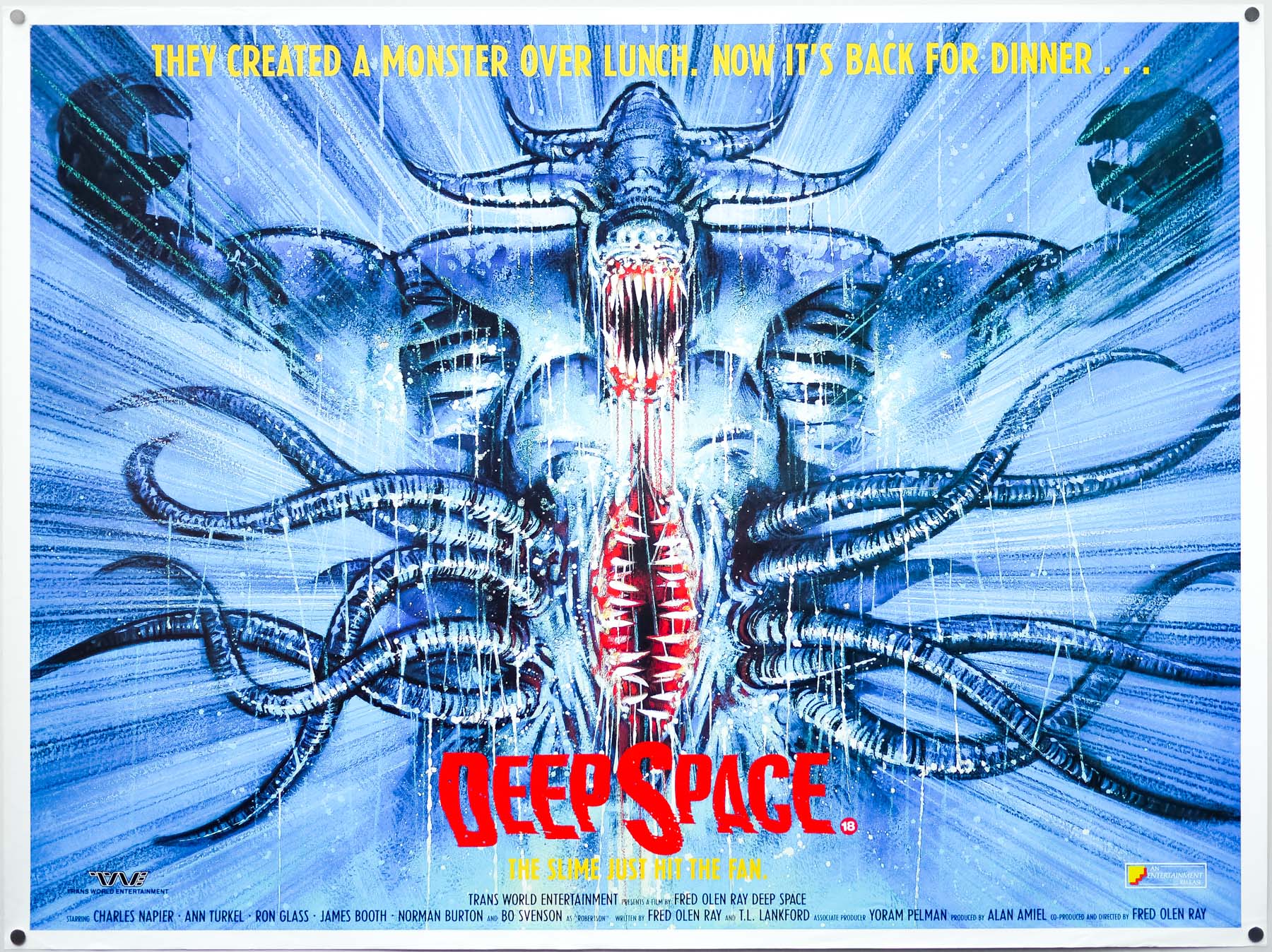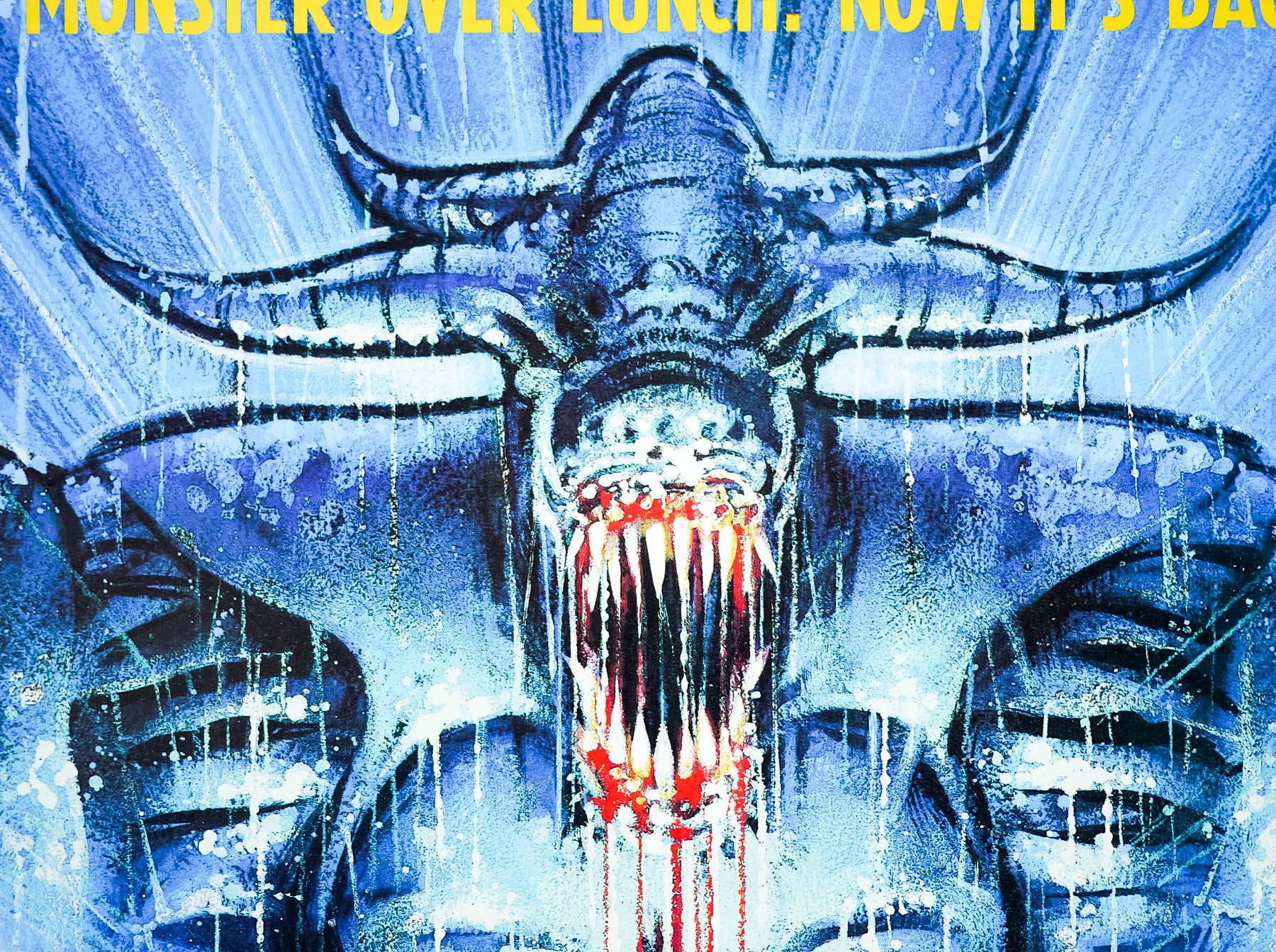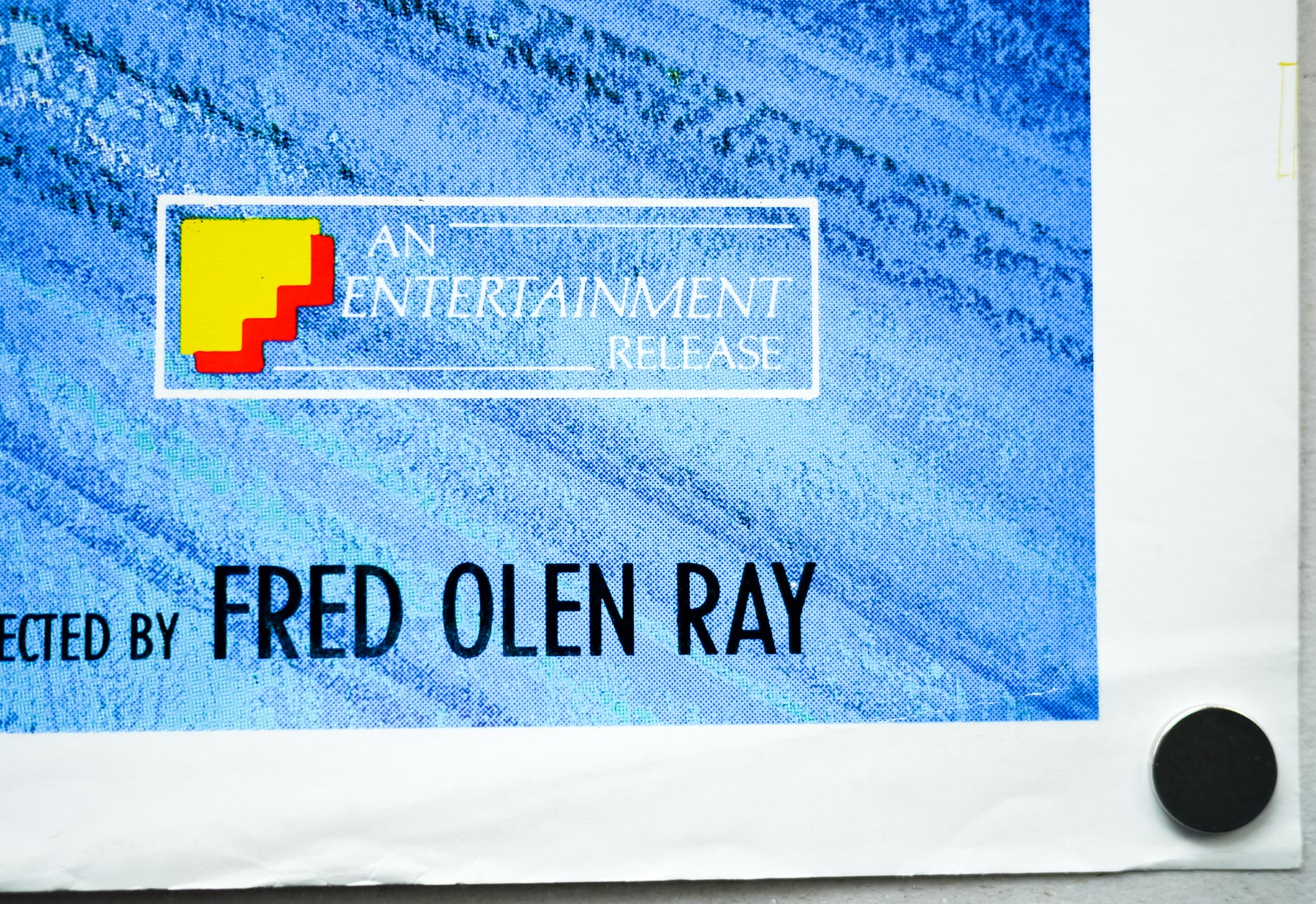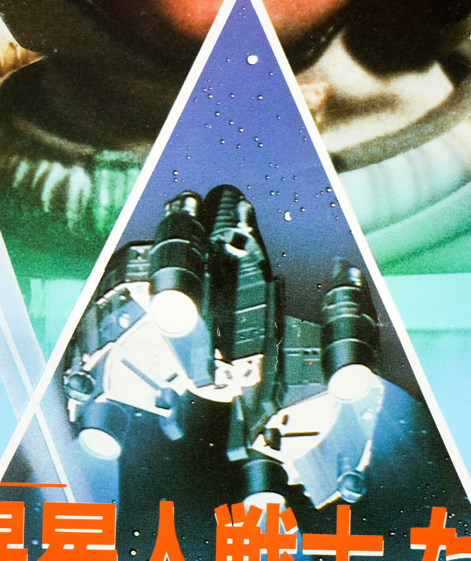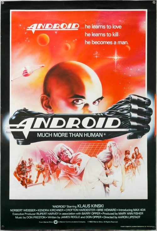
Poster detail
1-5
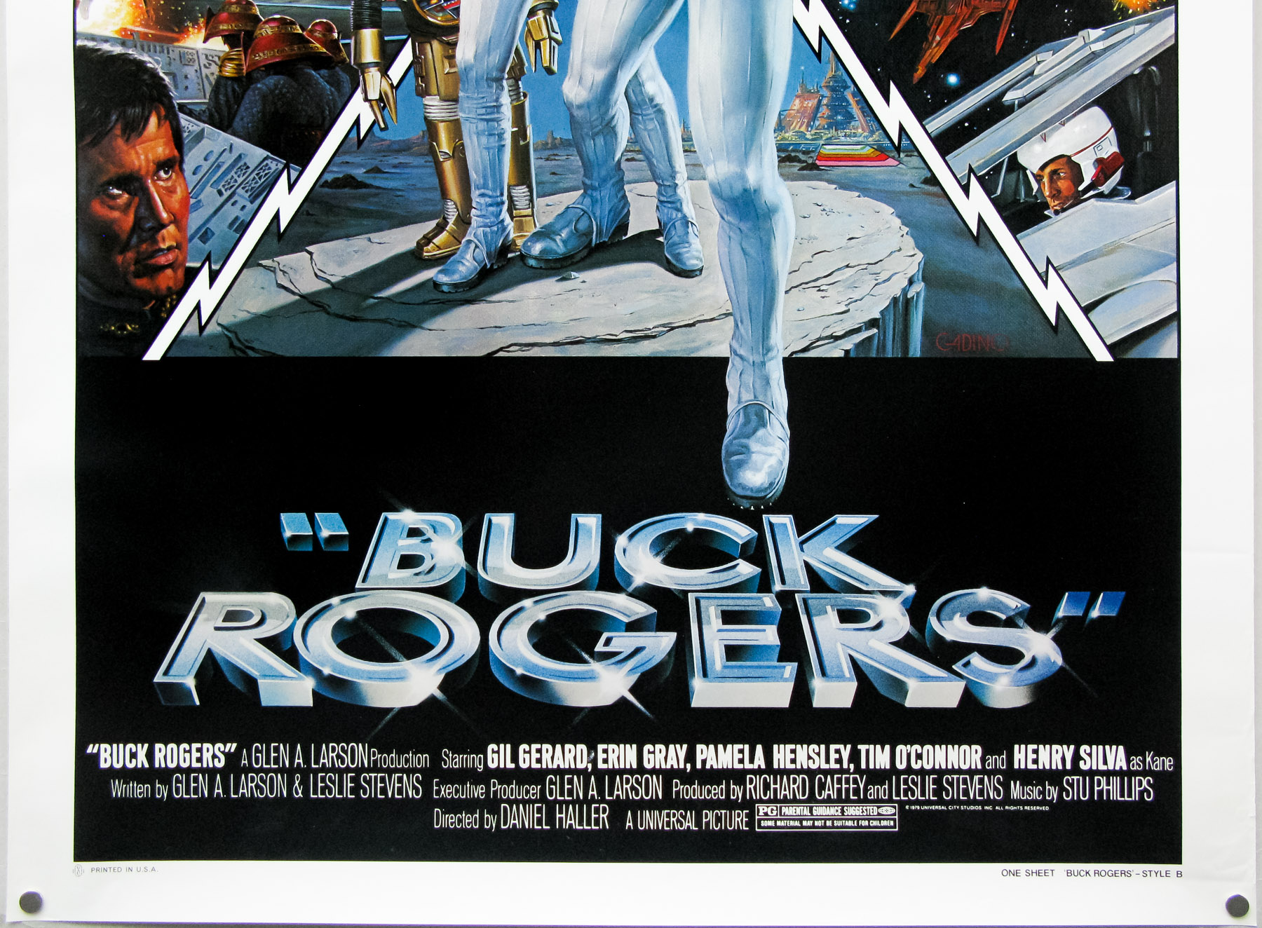

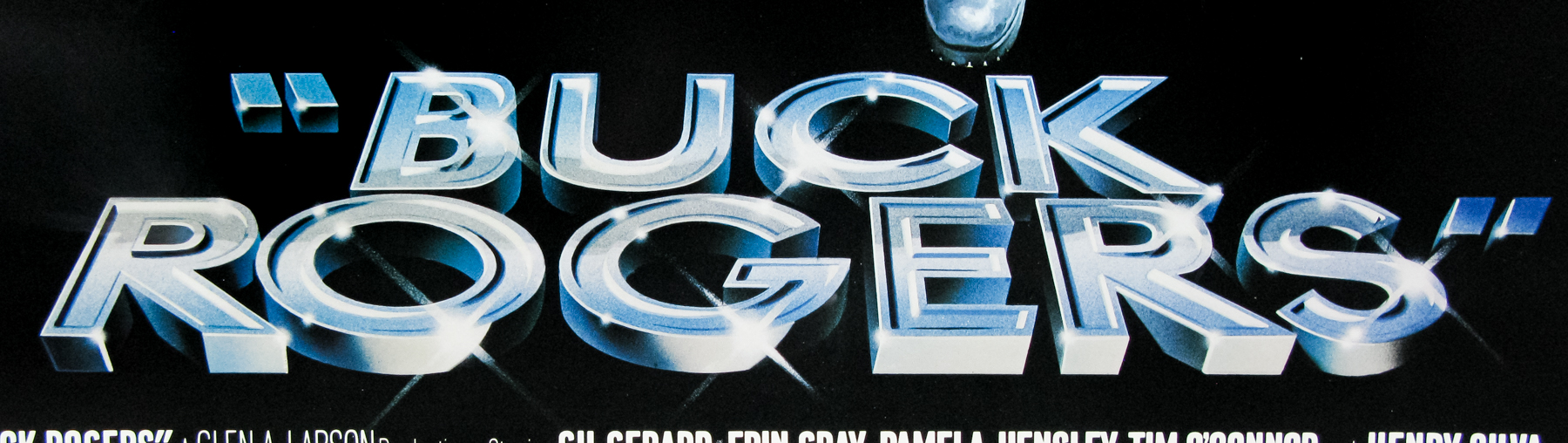
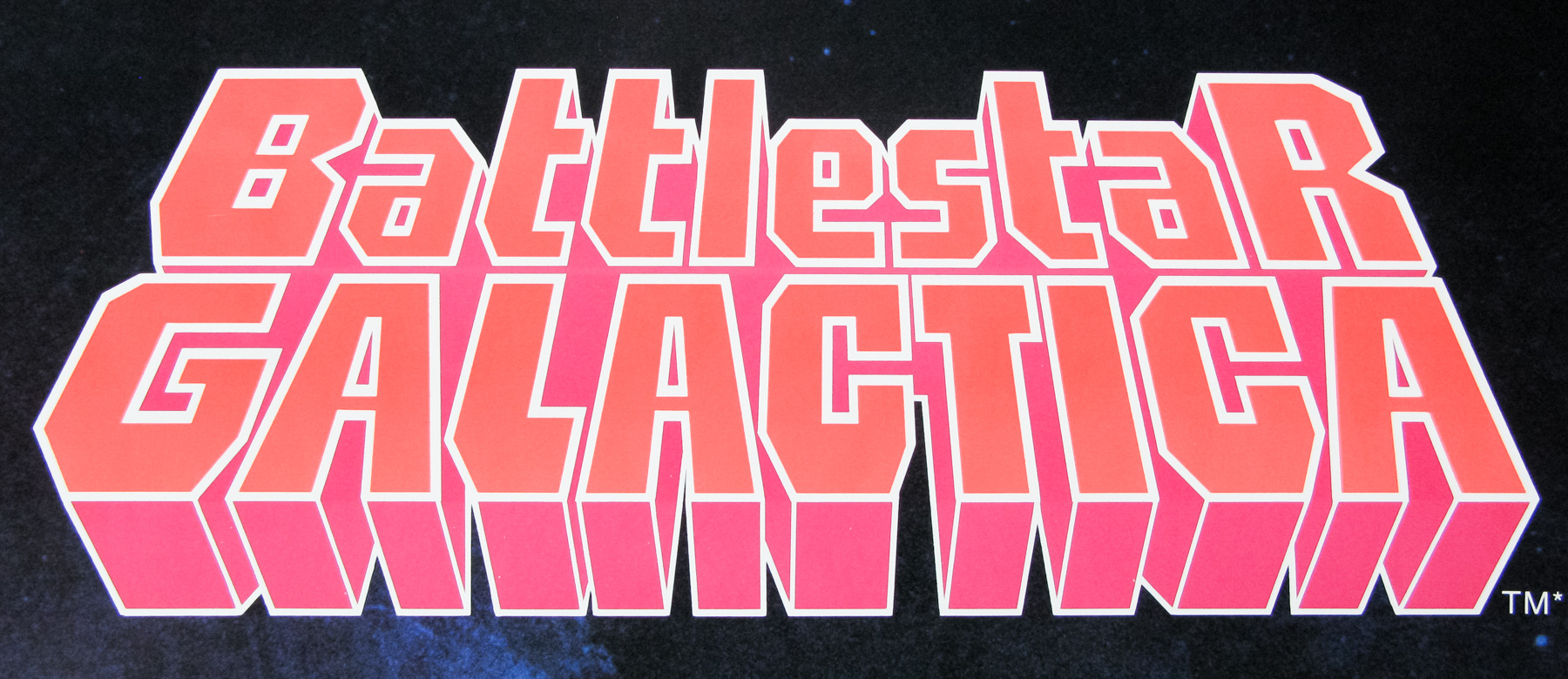
- Title
- Buck Rogers
- AKA
- Buck Rogers in the 25th Century (alt. title)
- Year of Film
- 1979
- Director
- Daniel Haller
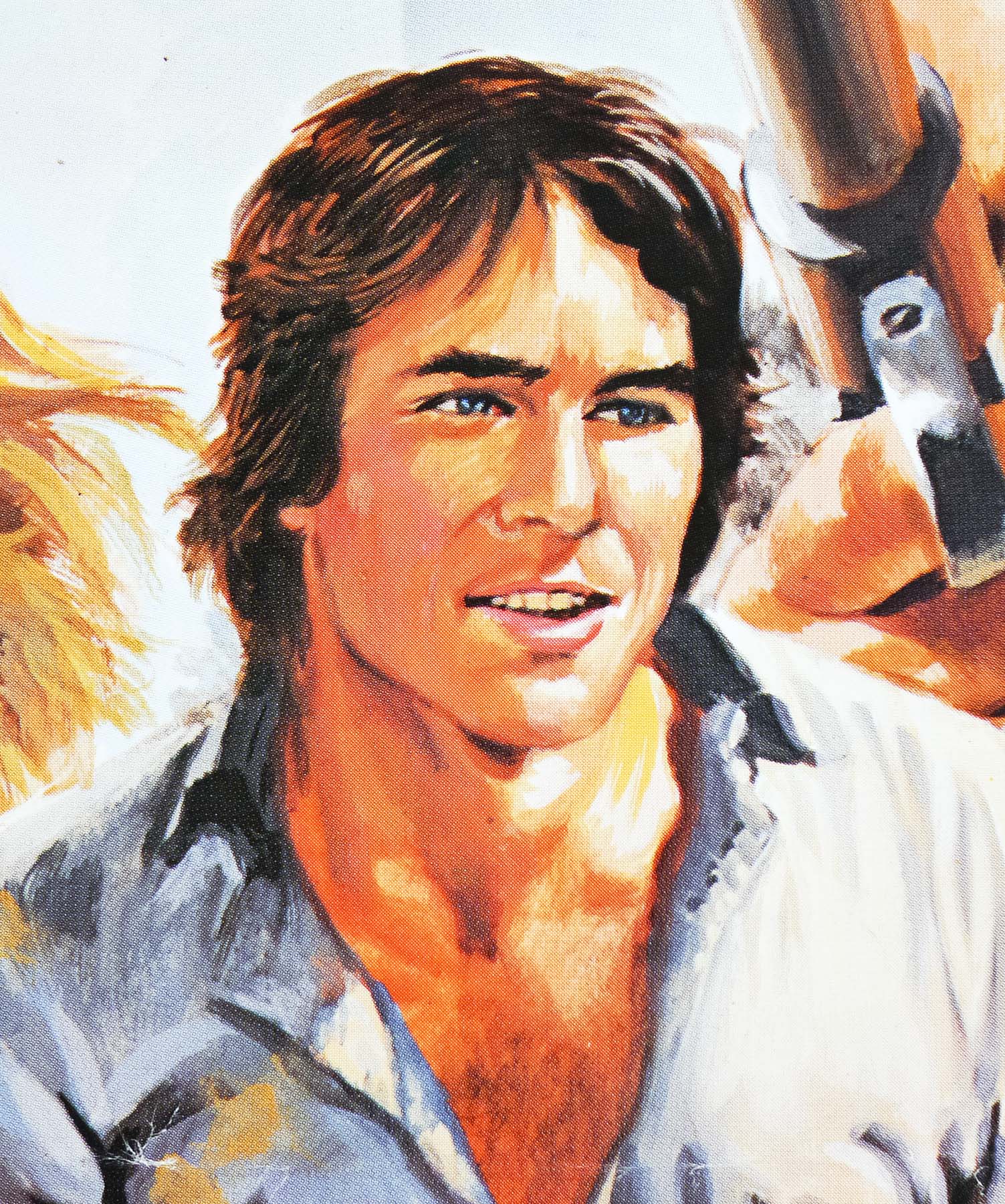
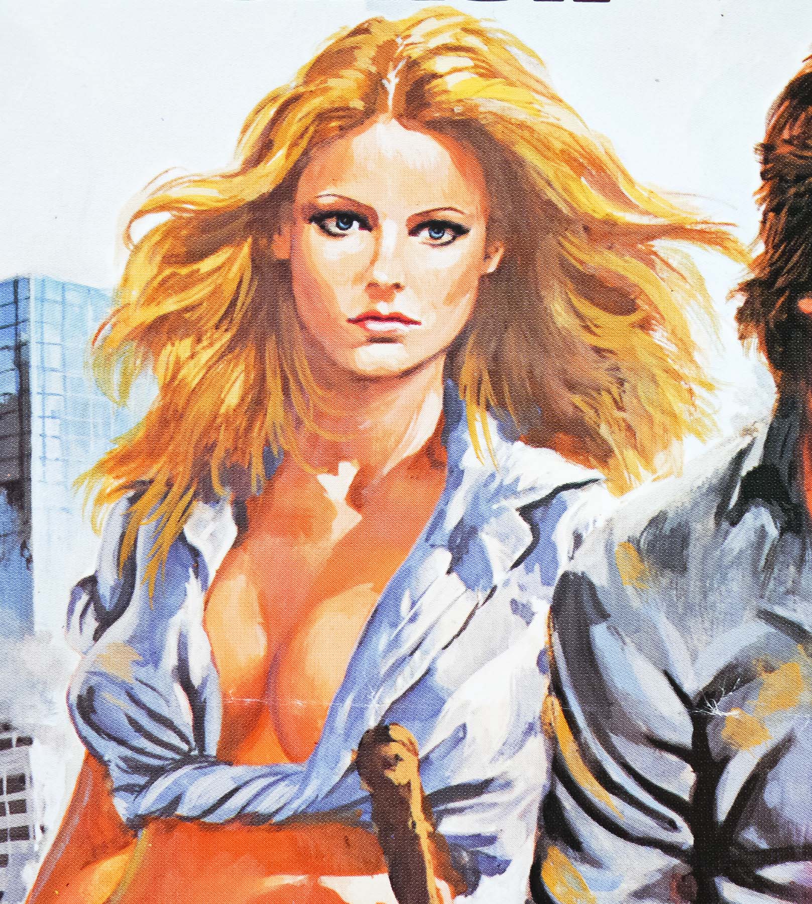
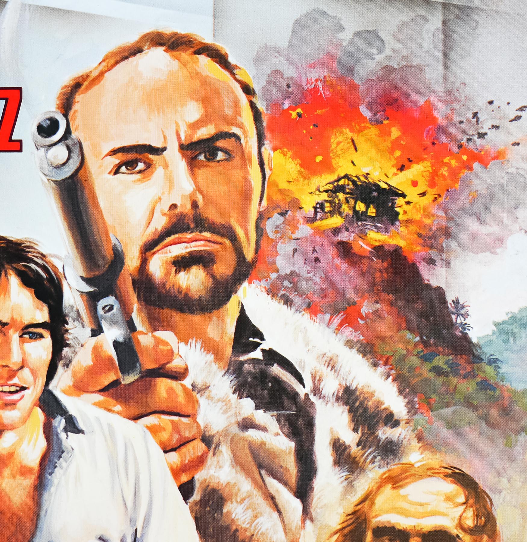
- Starring
- Gil Gerard, Mel Blanc (voice), Duke Butler, Howard F. Flynn (voice), Erin Gray, Pamela Hensley, Tim O'Connor, Felix Silla, Henry Silva
- Origin of Film
- USA
- Genre(s) of Film
- Gil Gerard, Mel Blanc (voice), Duke Butler, Howard F. Flynn (voice), Erin Gray, Pamela Hensley, Tim O'Connor, Felix Silla, Henry Silva,
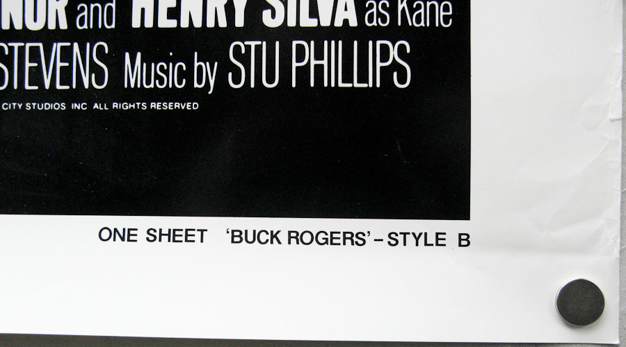
- Type of Poster
- One sheet
- Style of Poster
- Style B
- Origin of Poster
- USA
- Year of Poster
- 1979
- Designer
- Unknown
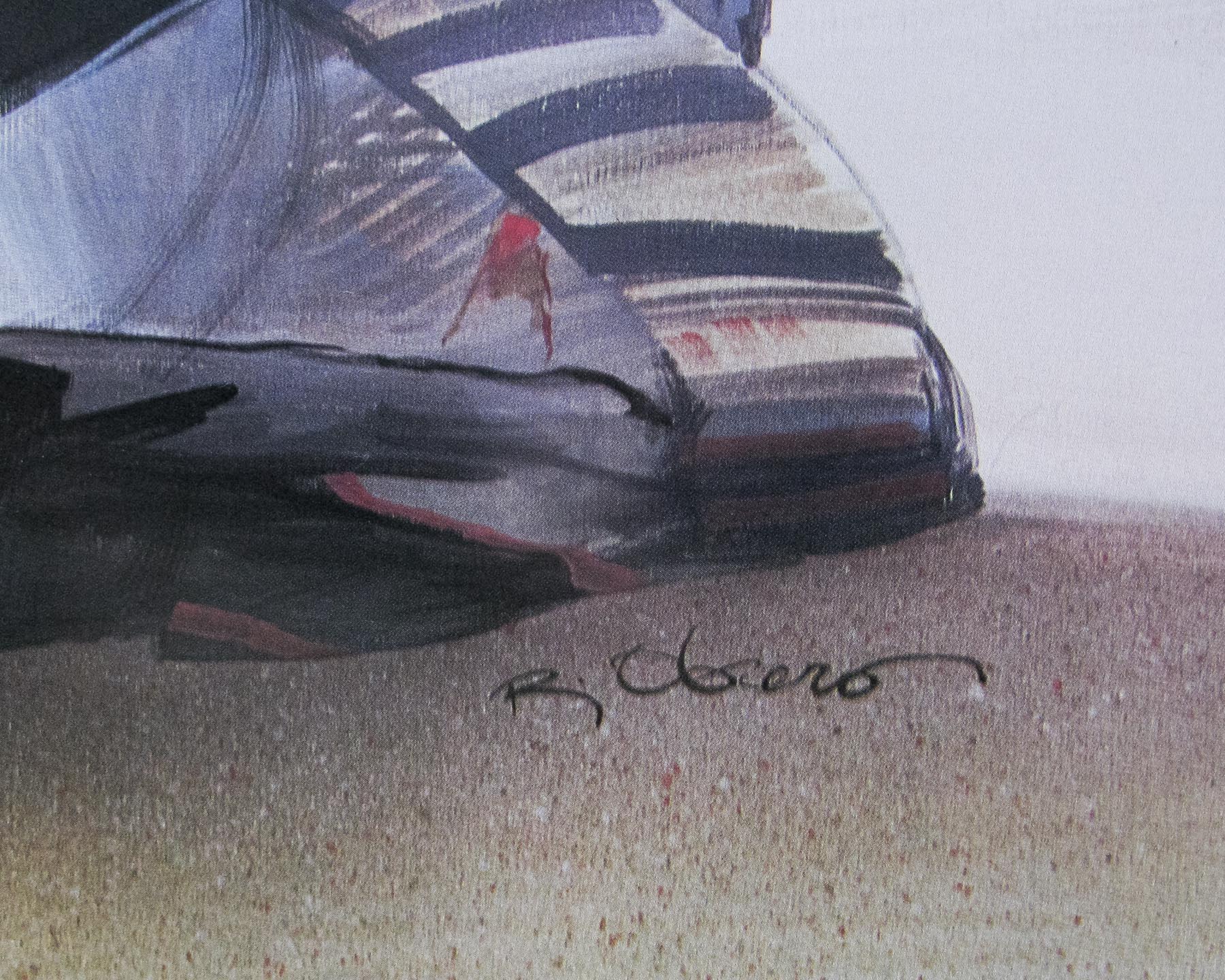
- Artist
- Victor Gadino
- Size (inches)
- 27" x 41"
- SS or DS
- SS
- NSS #
- --
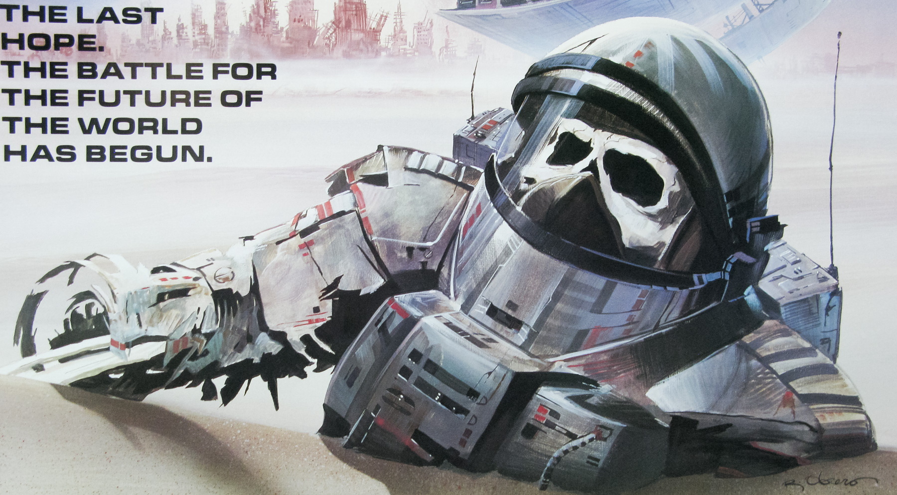
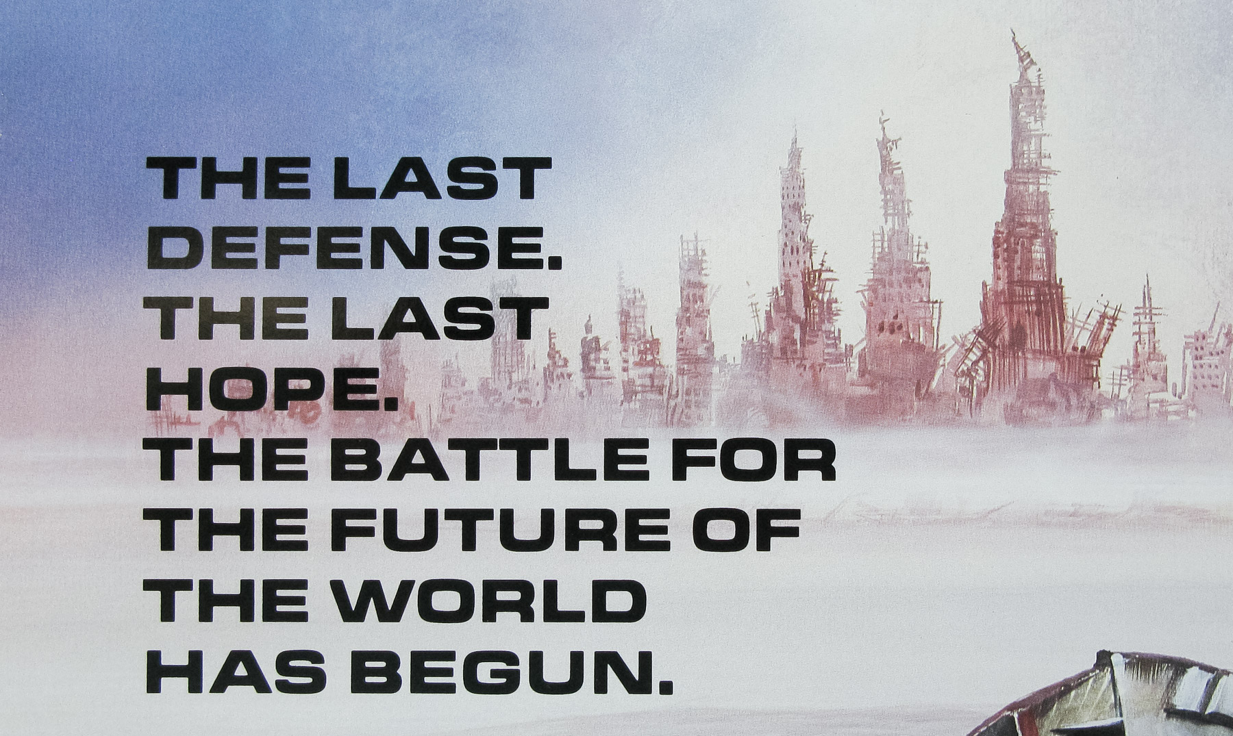
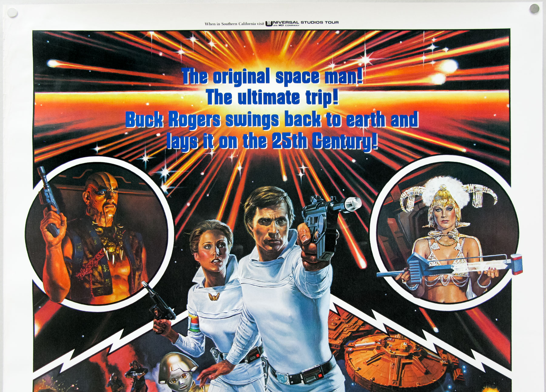
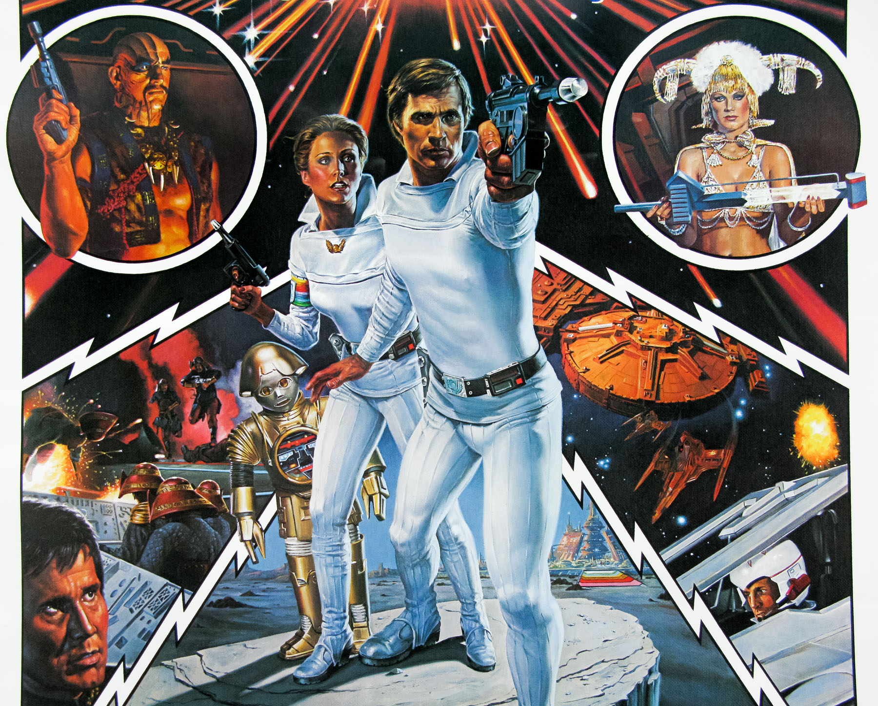
- Tagline
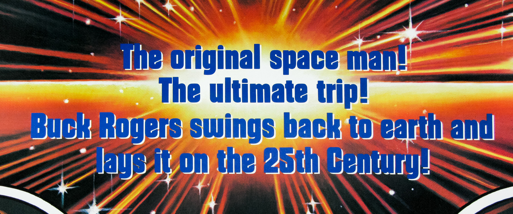
- The original space man! The ultimate trip! Buck Rogers swings back to earth and lays it on the 25th Century!
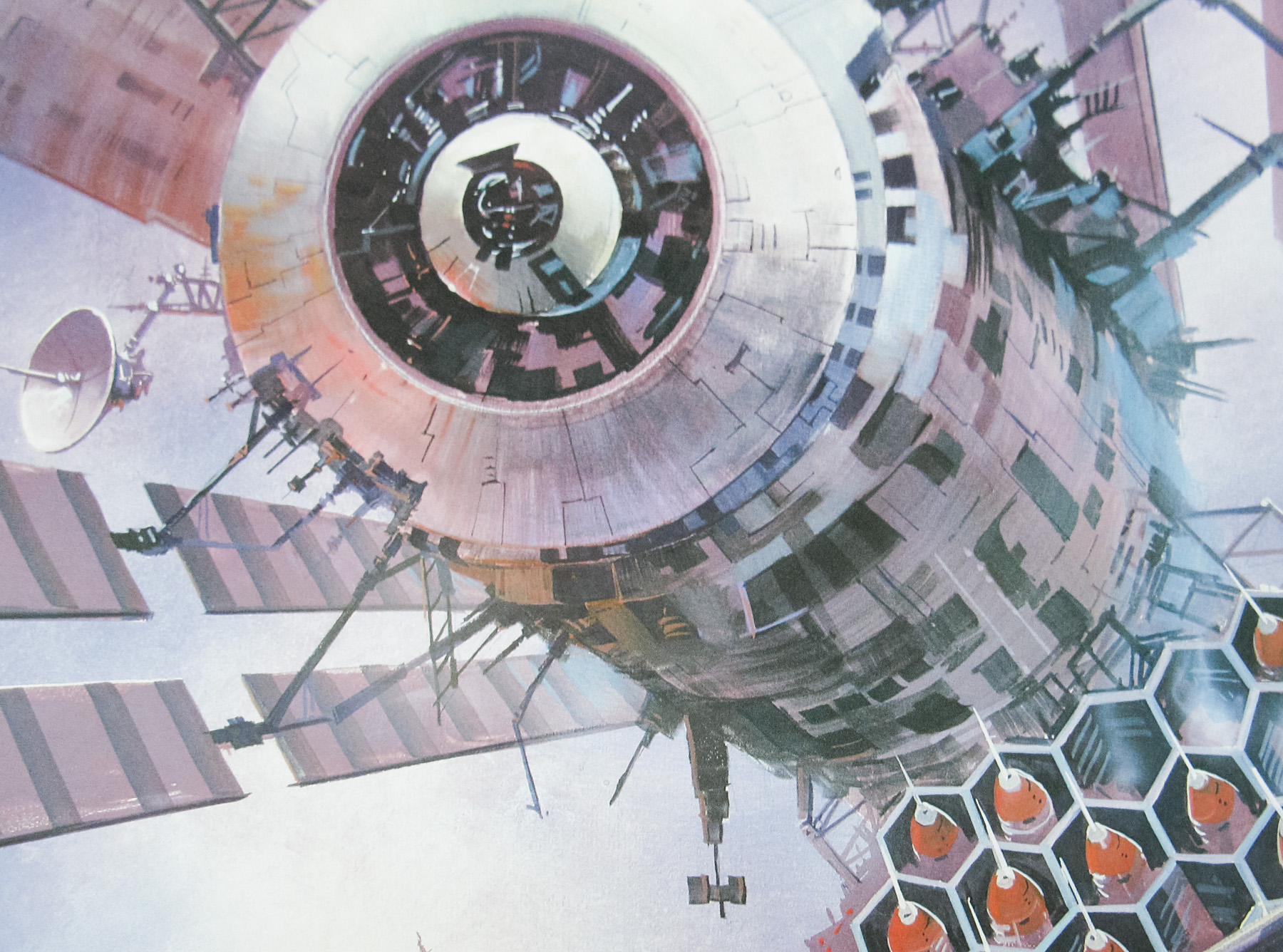
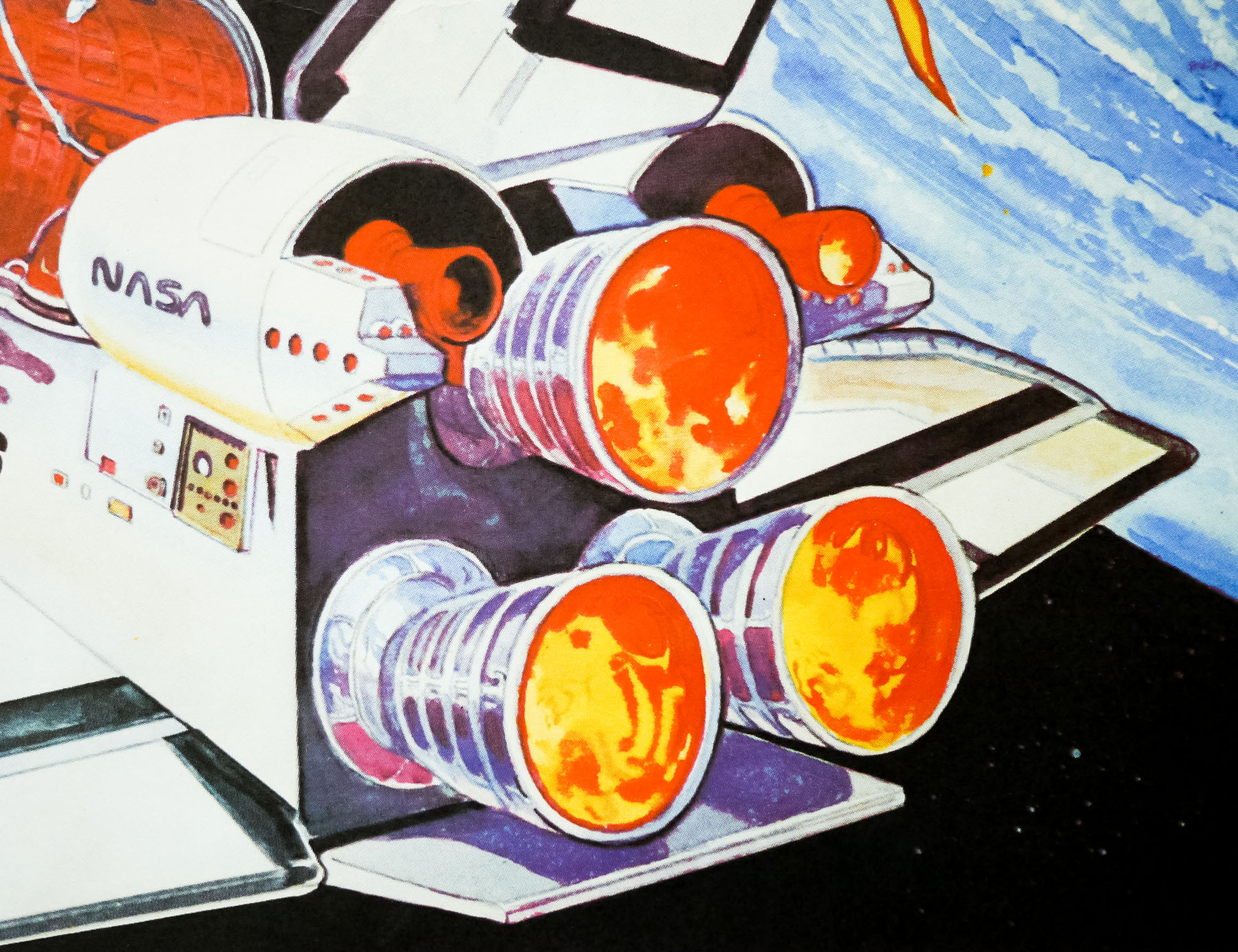
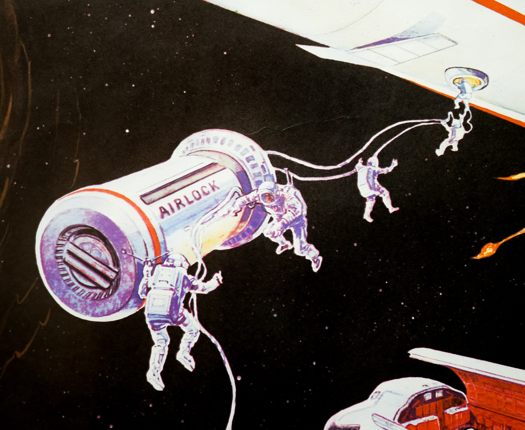
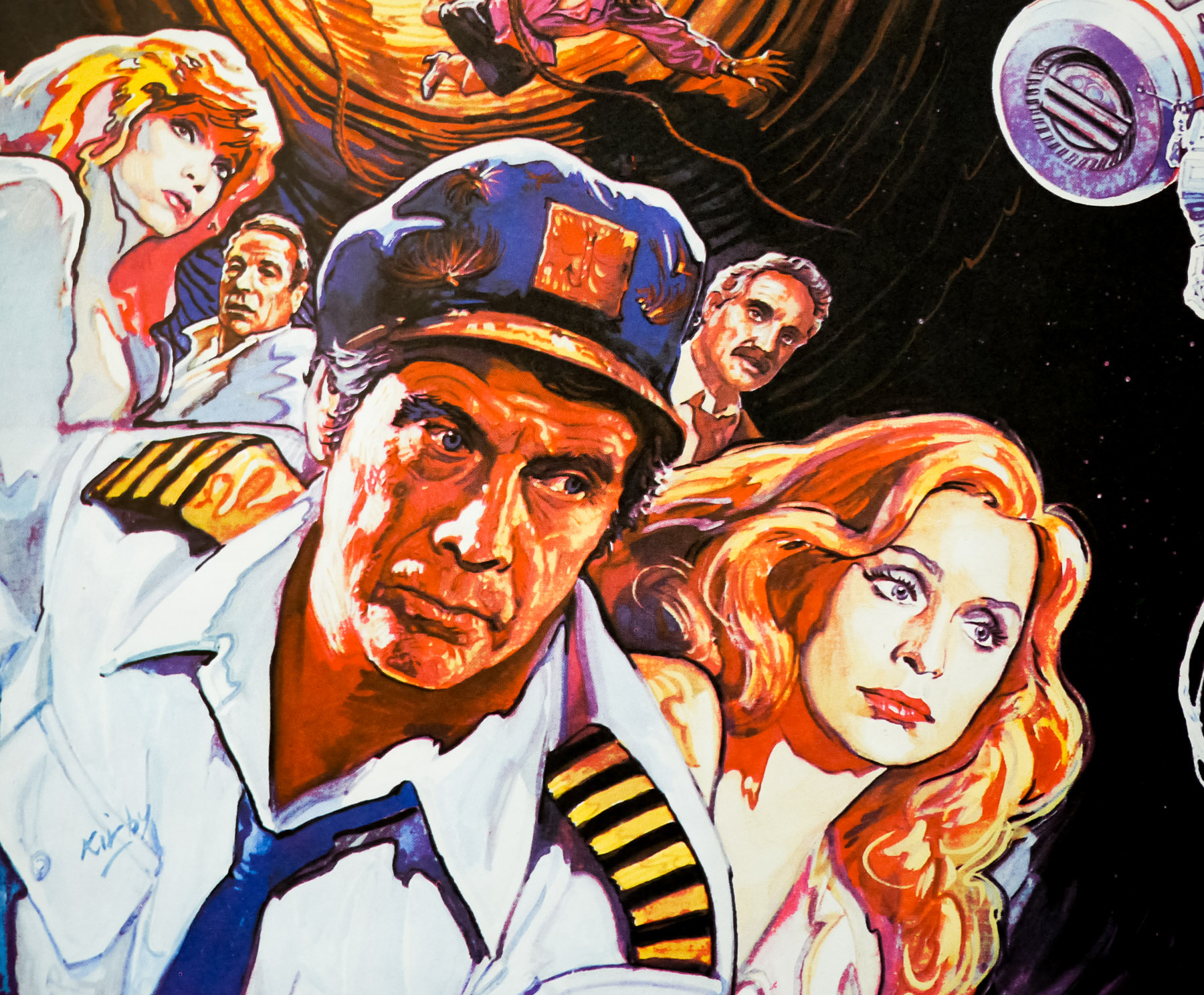
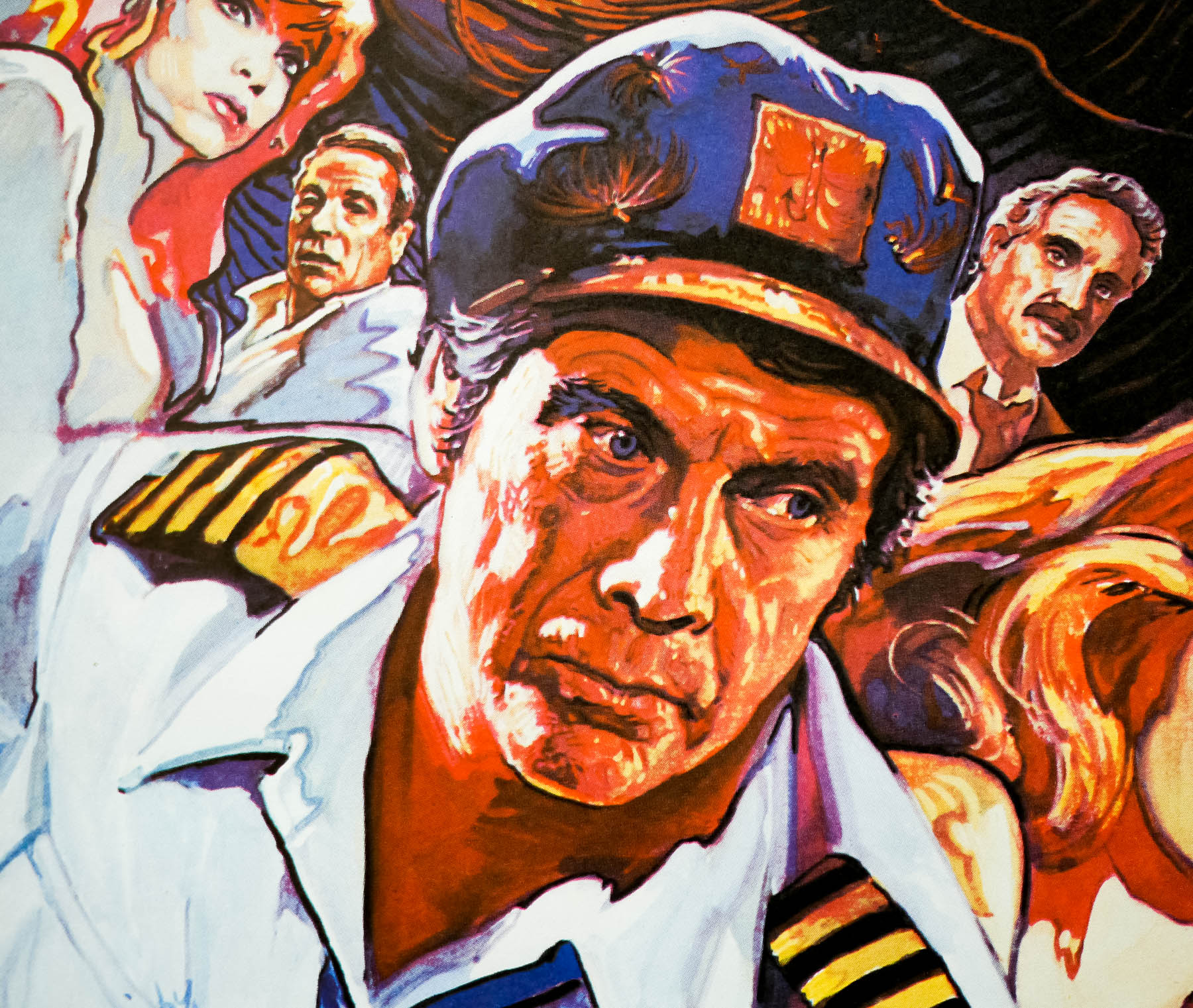
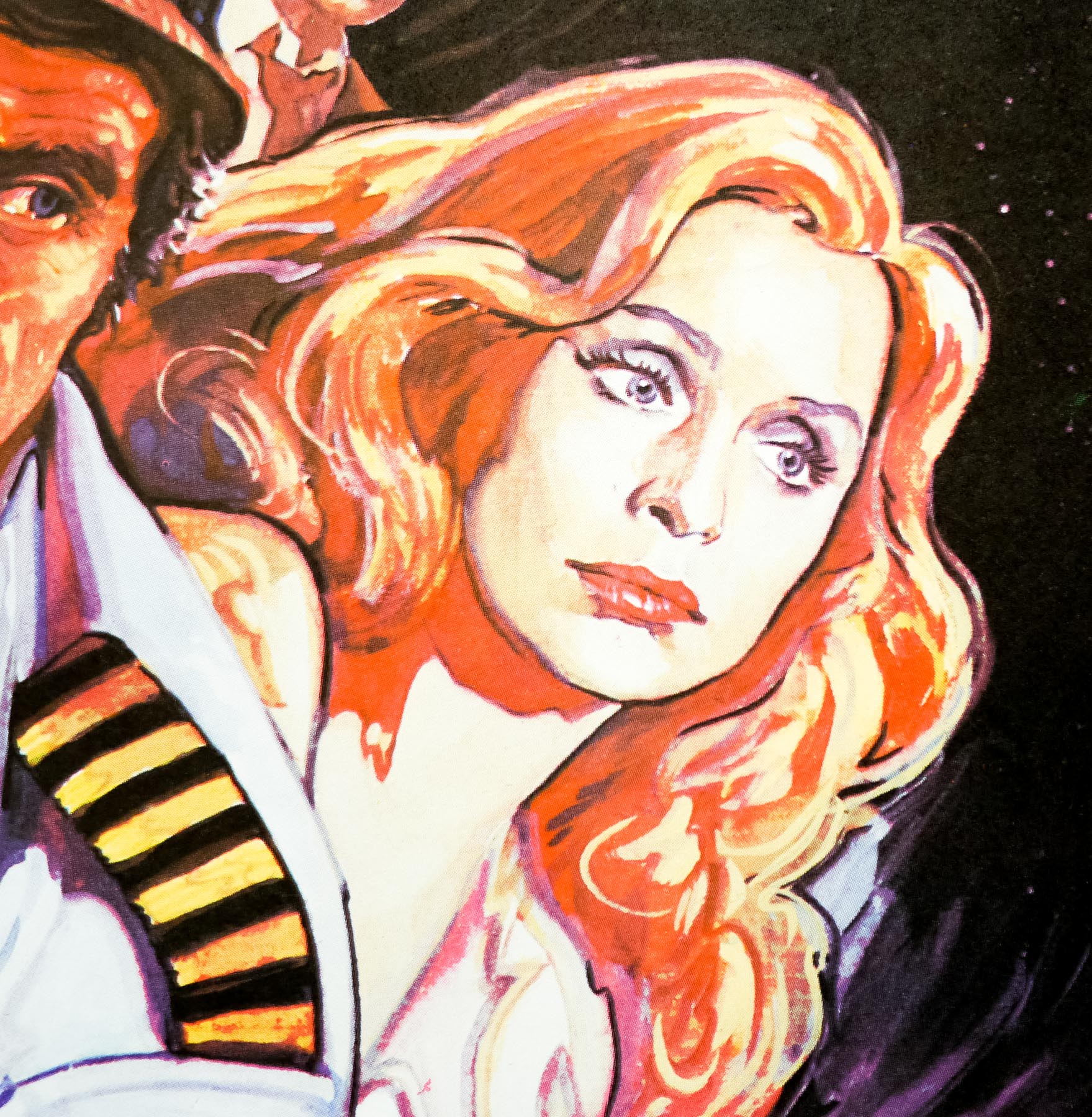
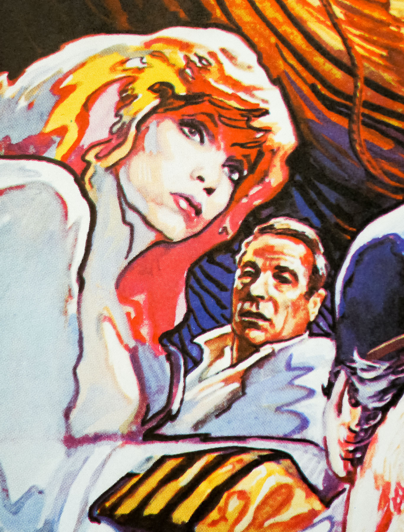
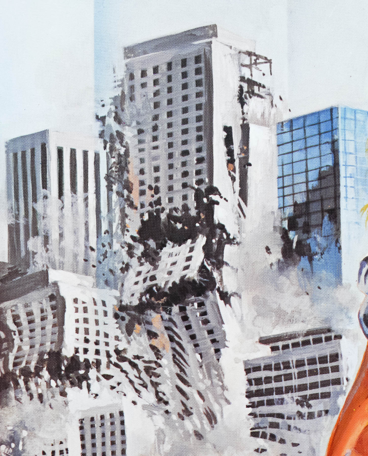
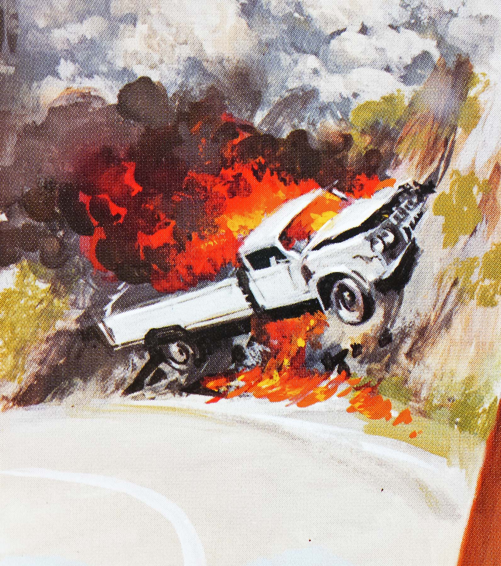
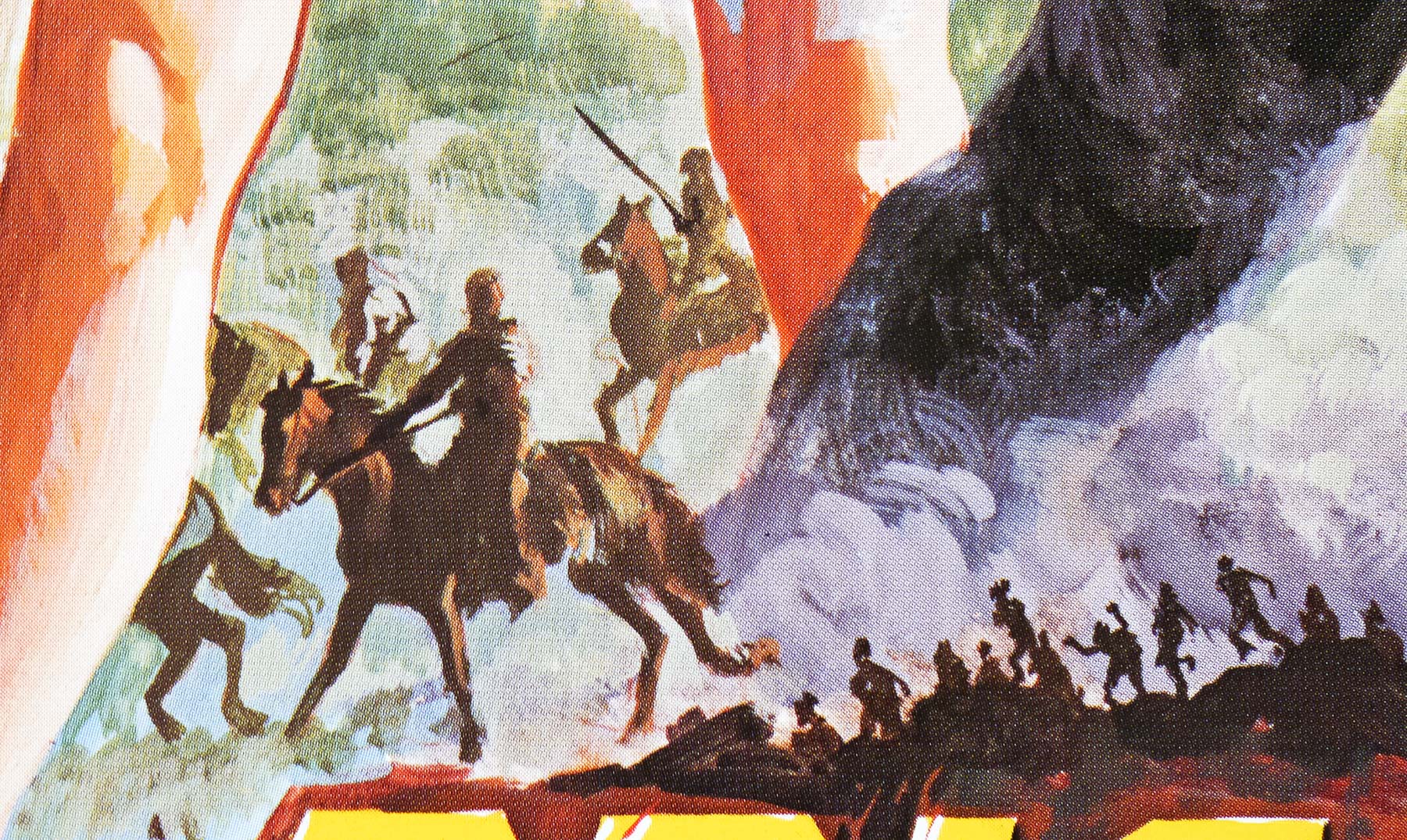
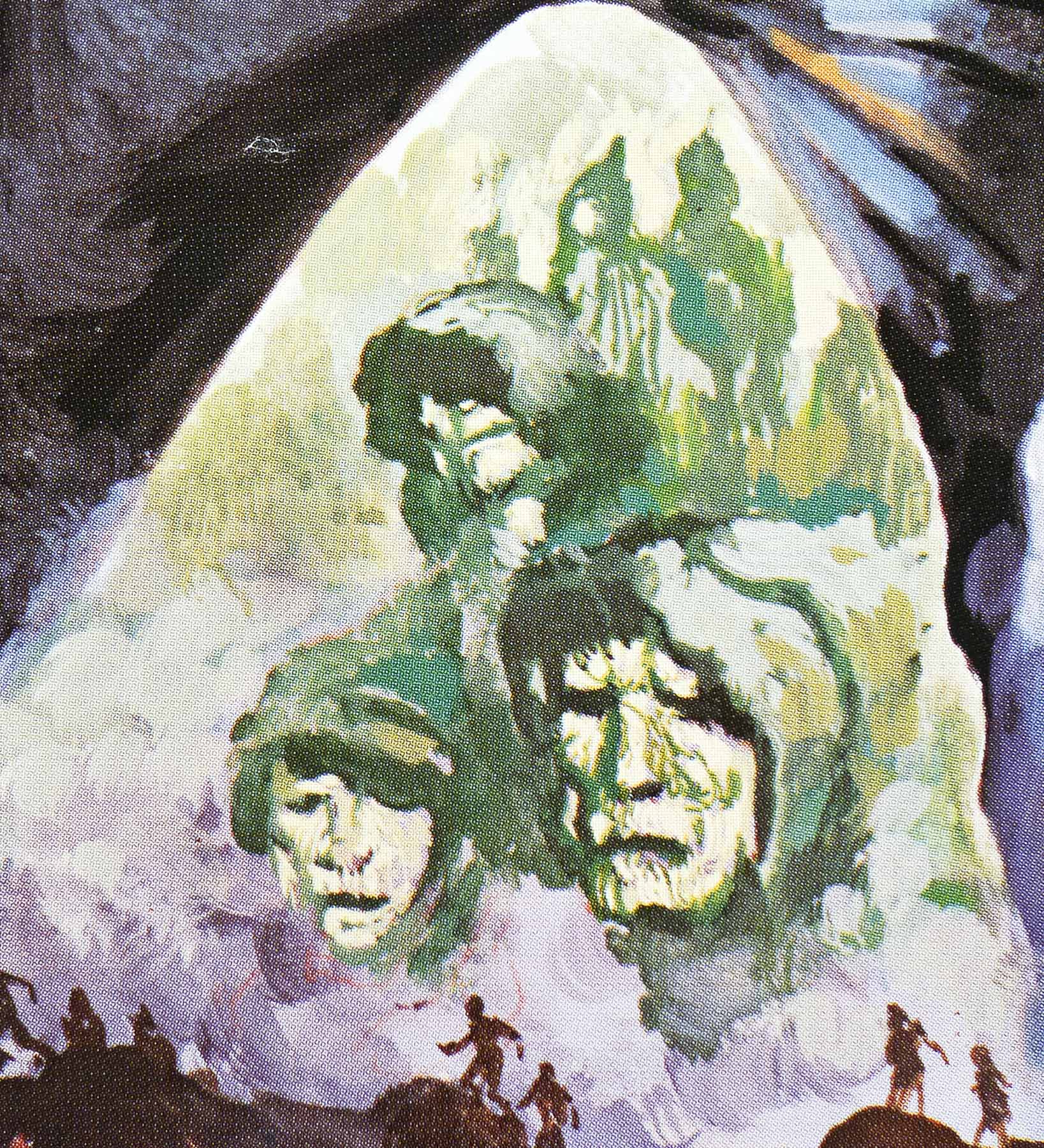
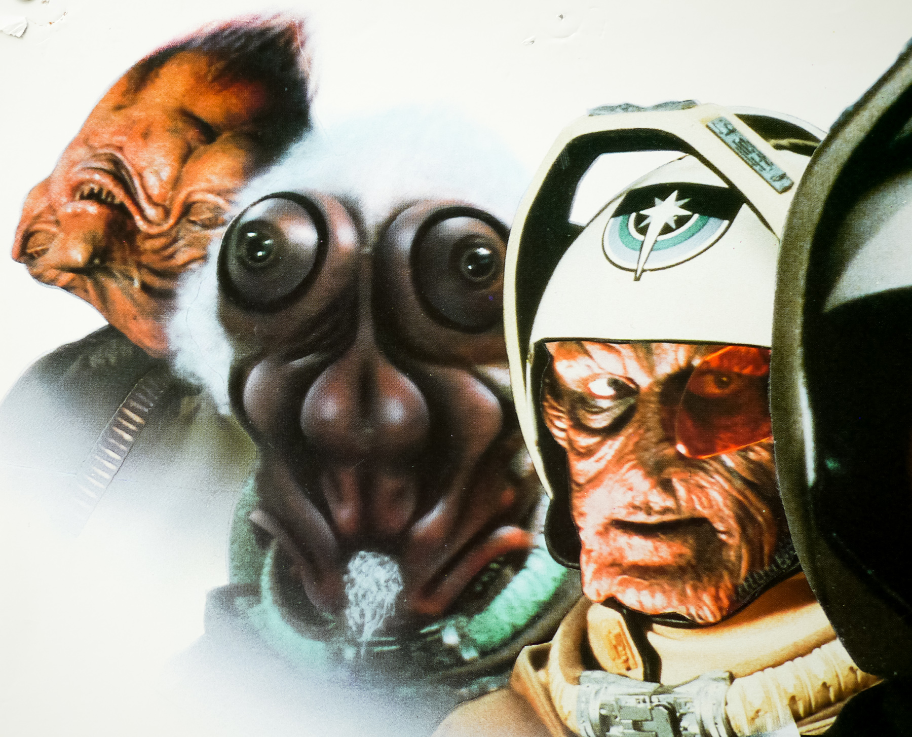
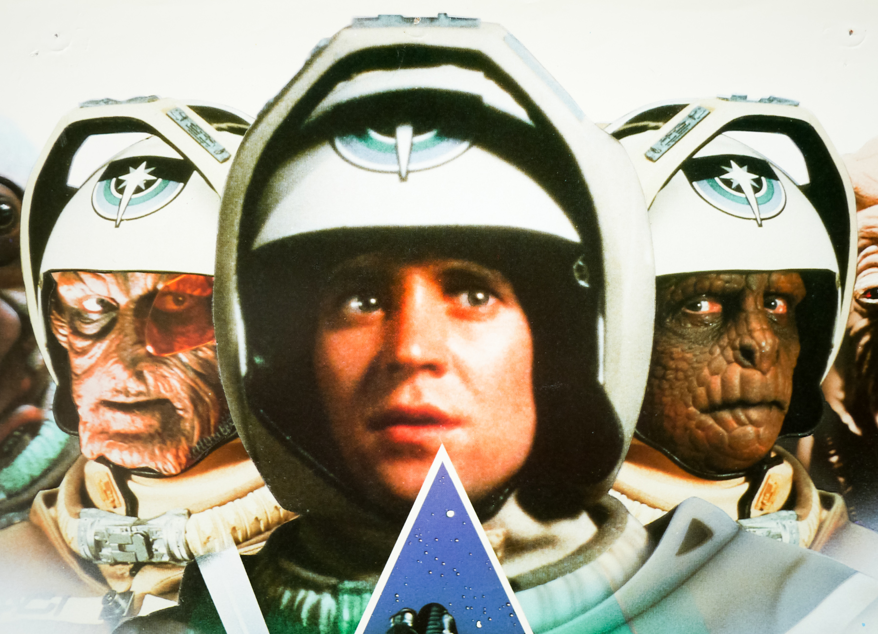
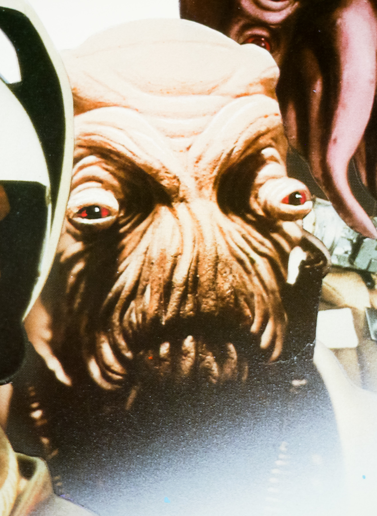
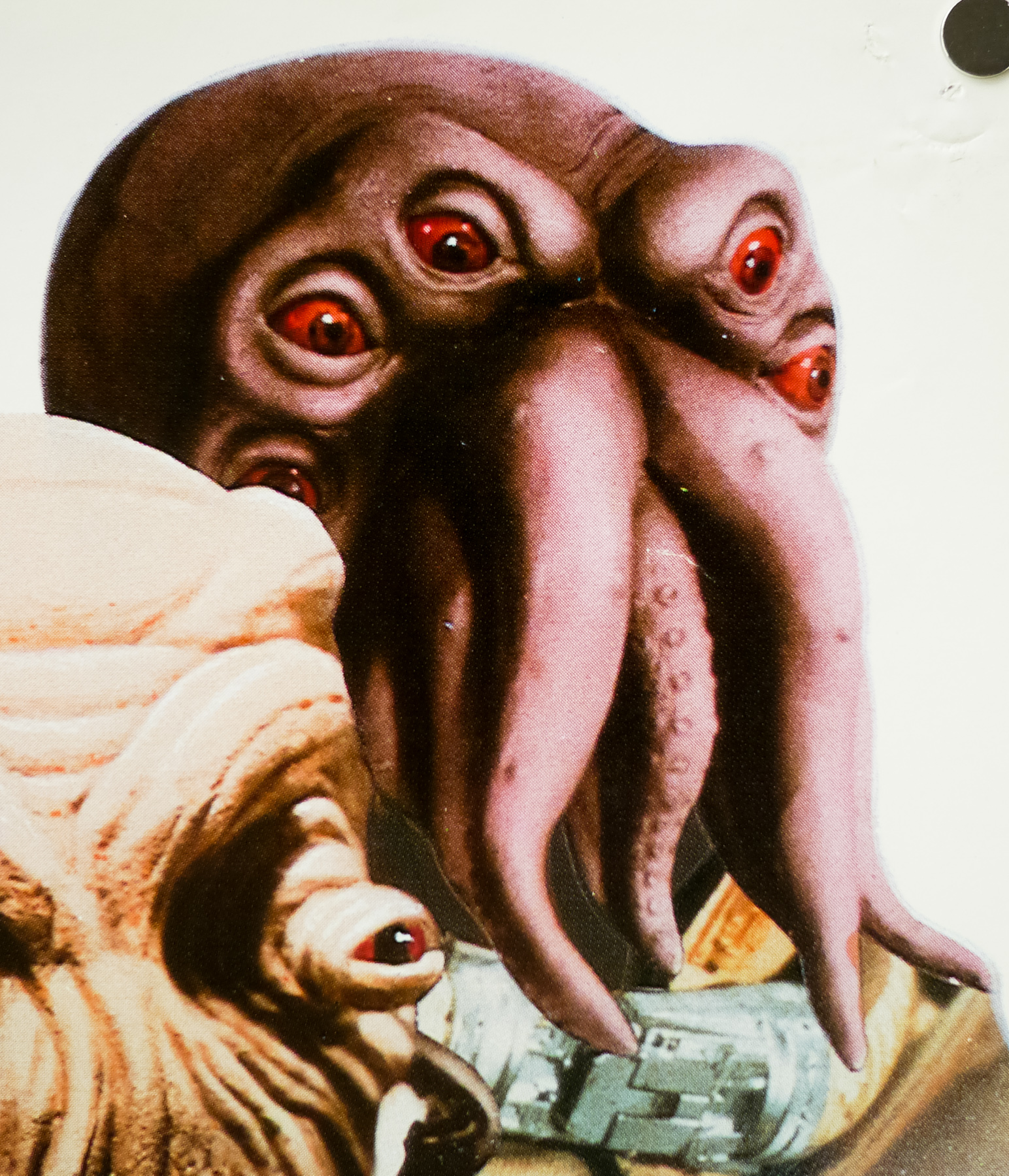
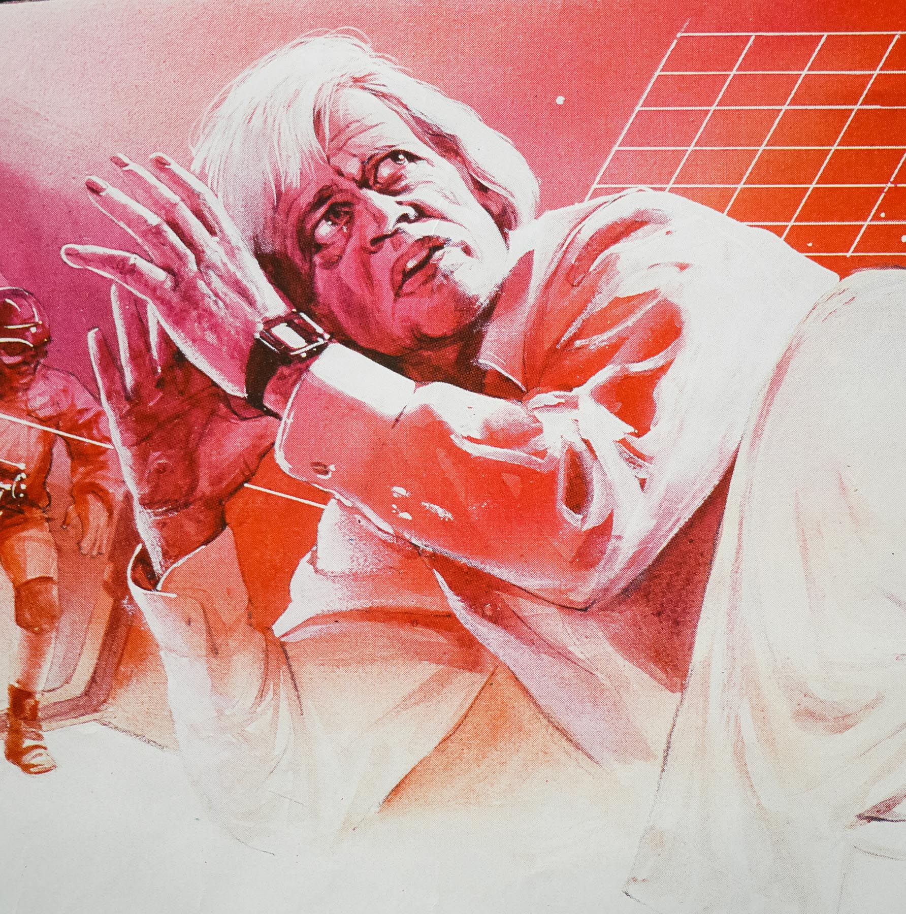
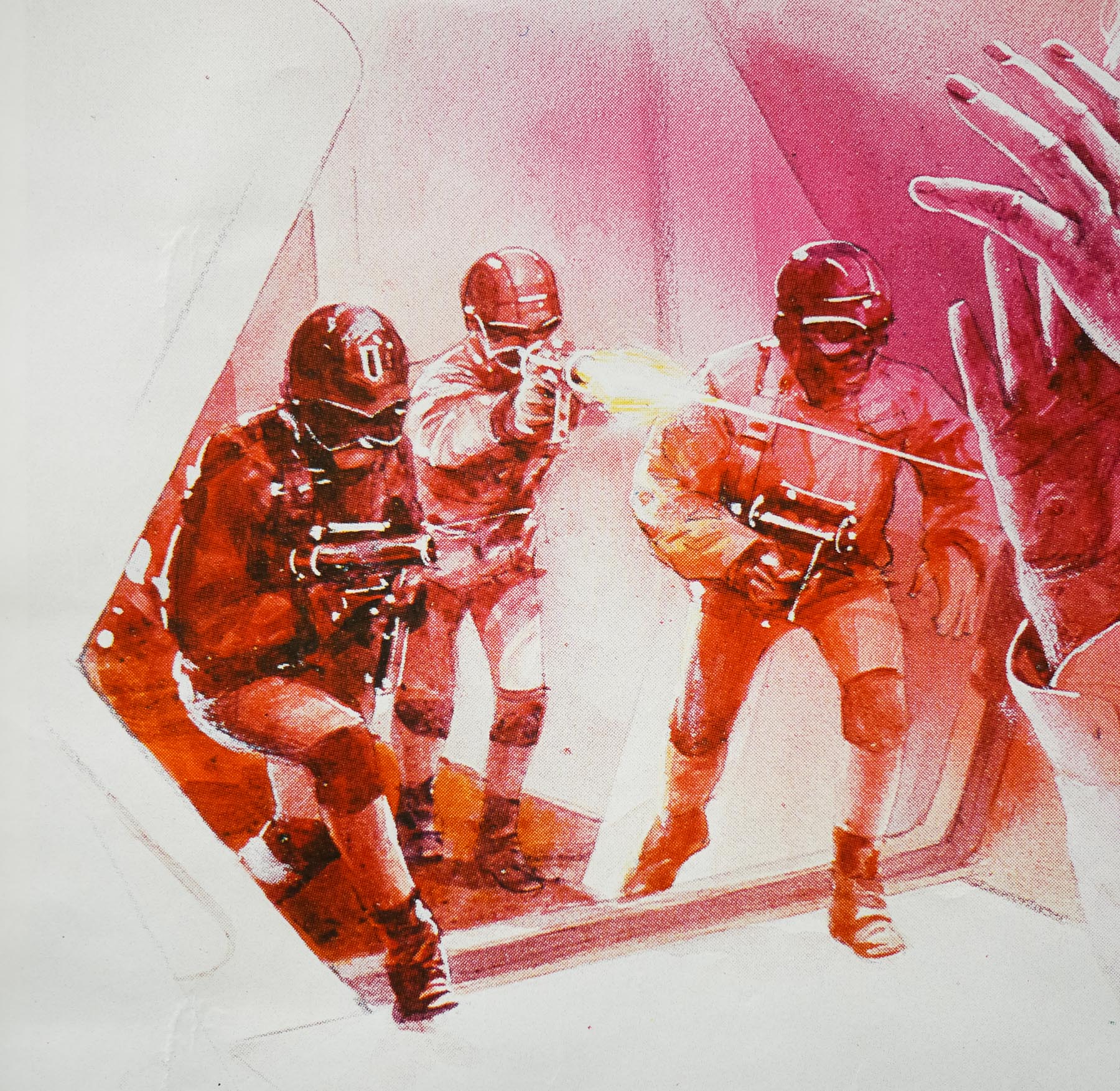
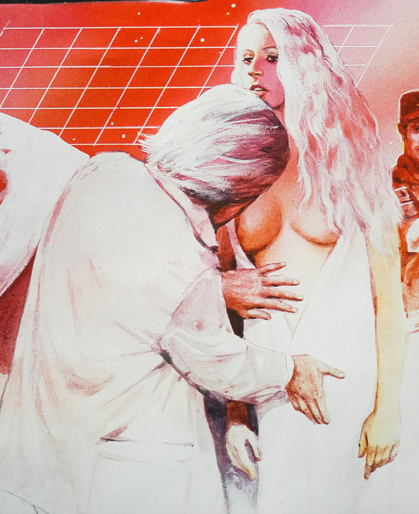
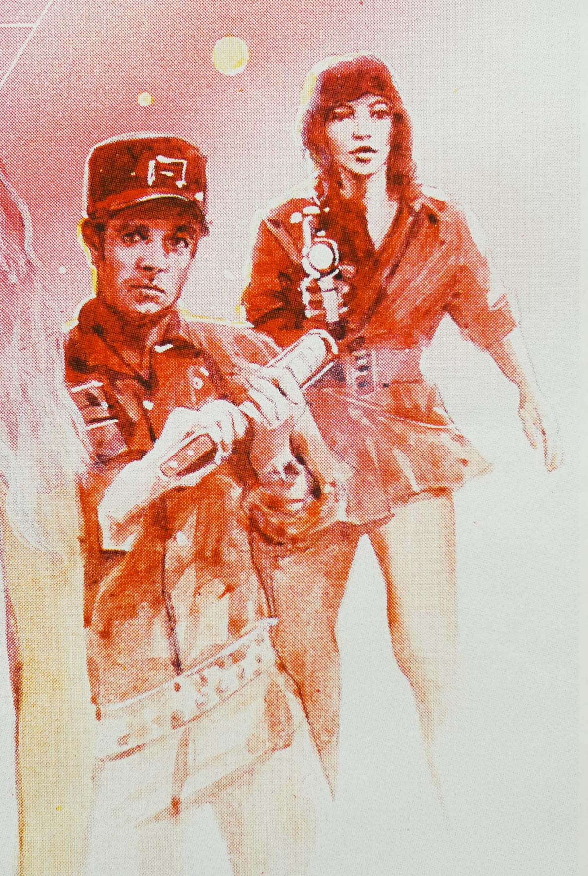
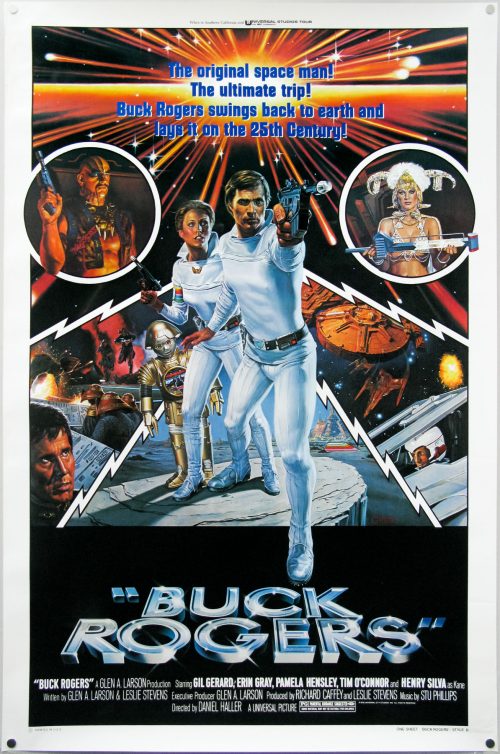
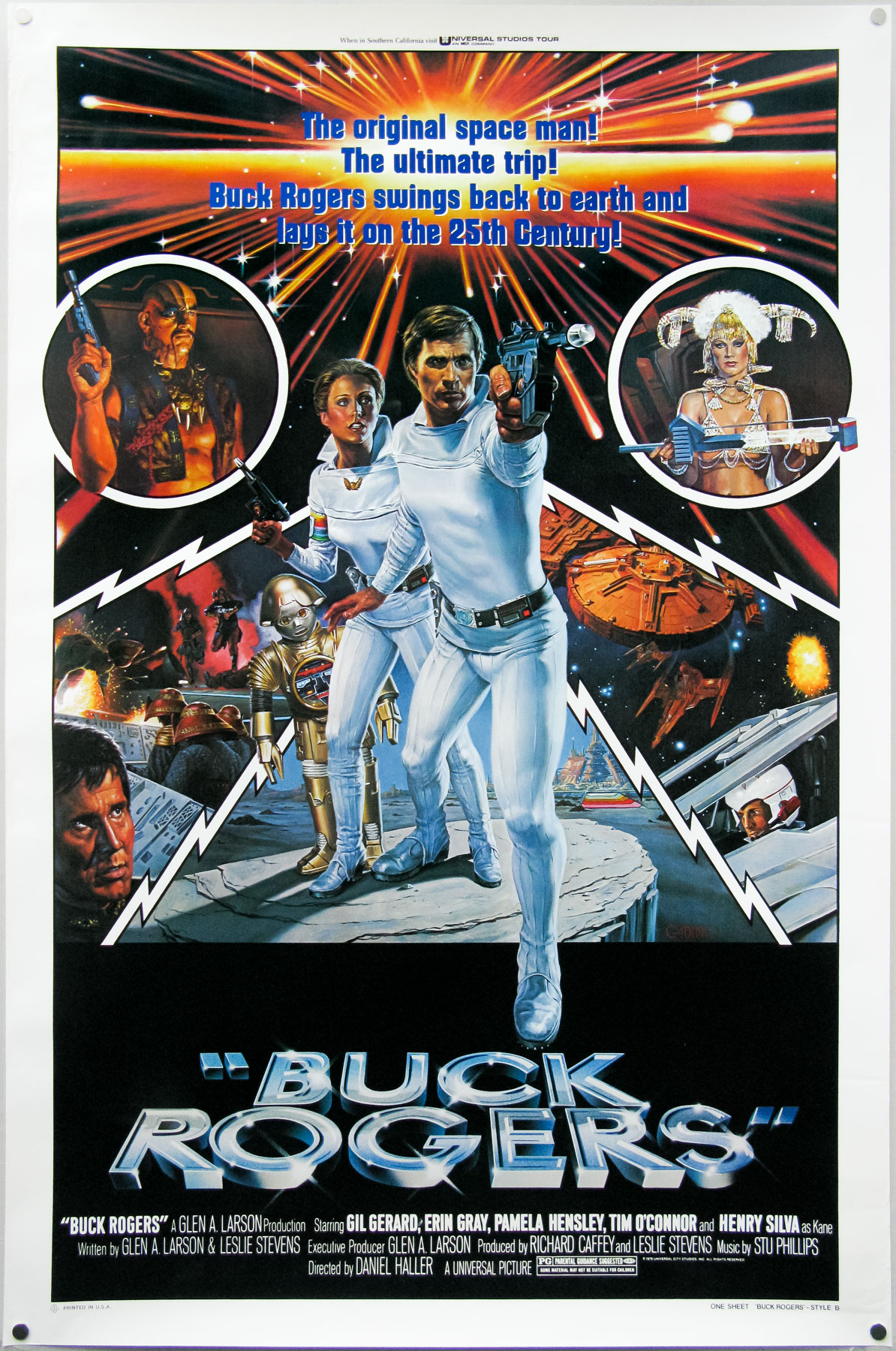
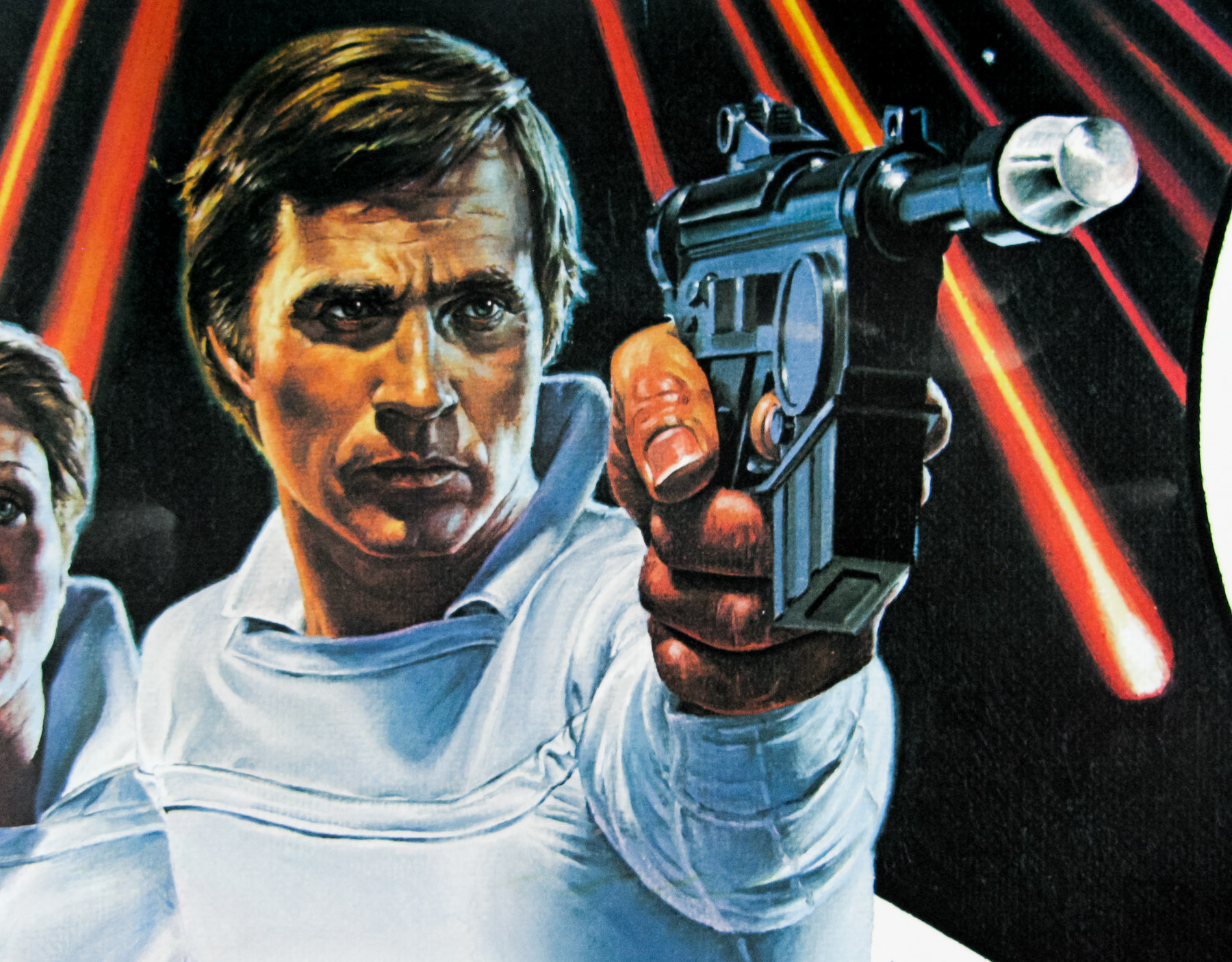
Excellent artwork by Victor Gadino on this style B one sheet for the cinema release of the feature-length pilot for Buck Rogers in the 25th century, a sci-fi TV series that ran for two seasons on the US channel NBC between 1979 and 1981. The series was developed by legendary TV producer Glen A. Larson who had earlier worked on the first Battlestar Galactica TV series and later went on to produce the likes of The Fall Guy, Magnum, P.I. and Knight Rider. Based on the character created by Philip Francis Nowlan, Buck Rogers first made an appearance in 1928 in the pulp magazine Amazing Stories and he would later go on to be adapted into a successful comic strip, a radio show, a 1930s 12-part film serial and a 1950s TV show.
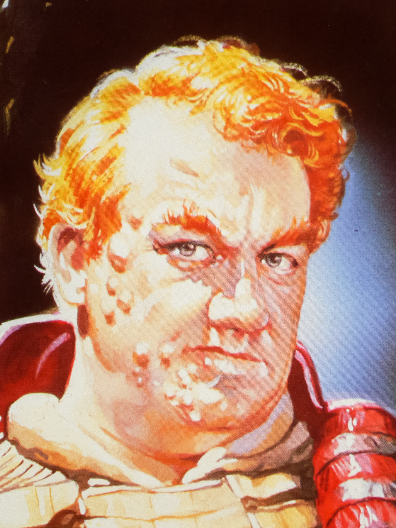
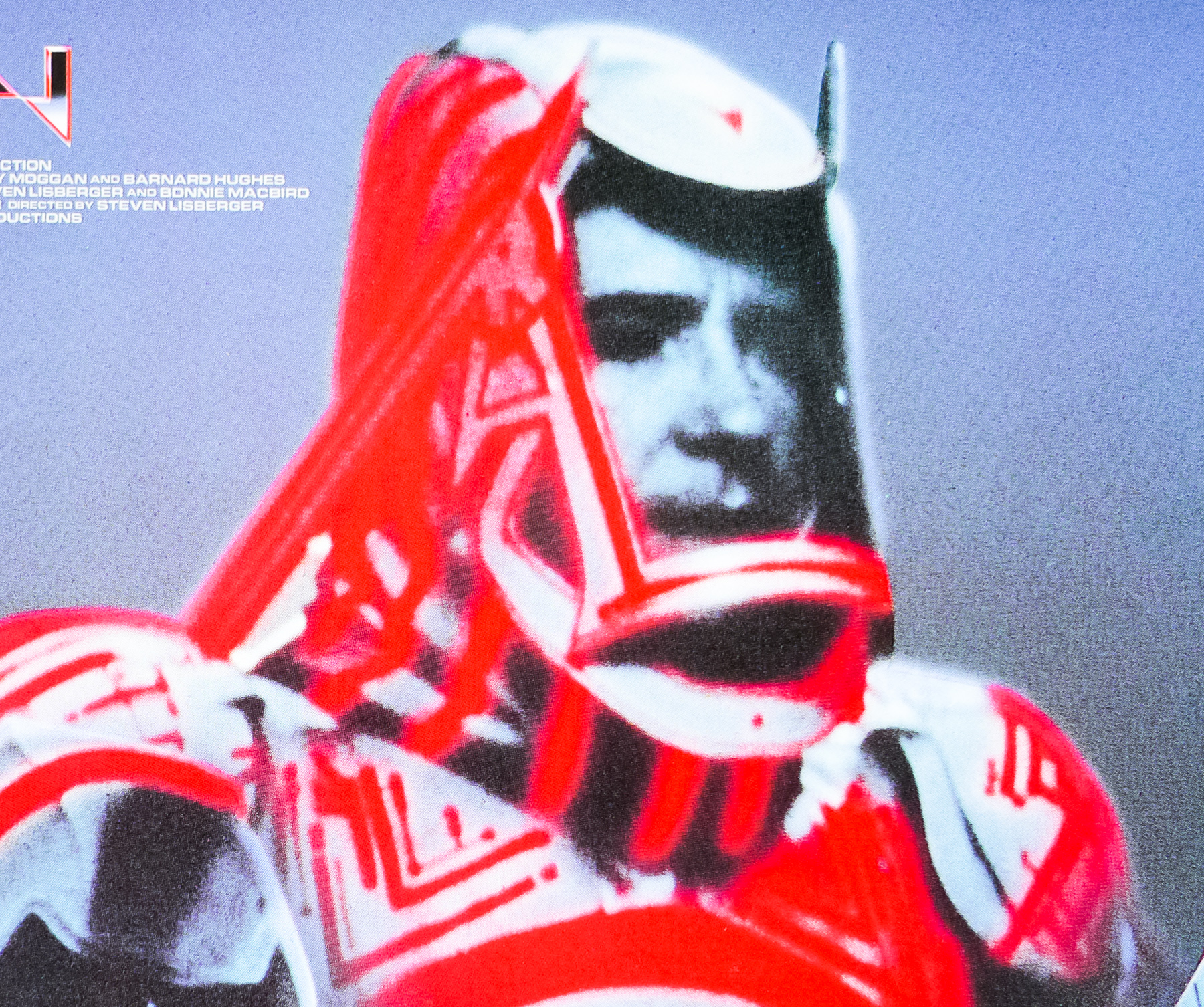
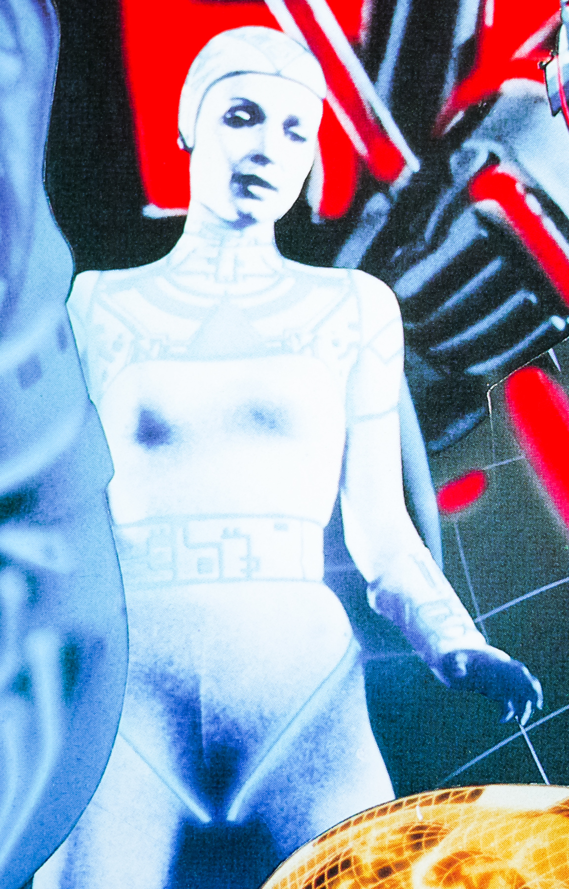
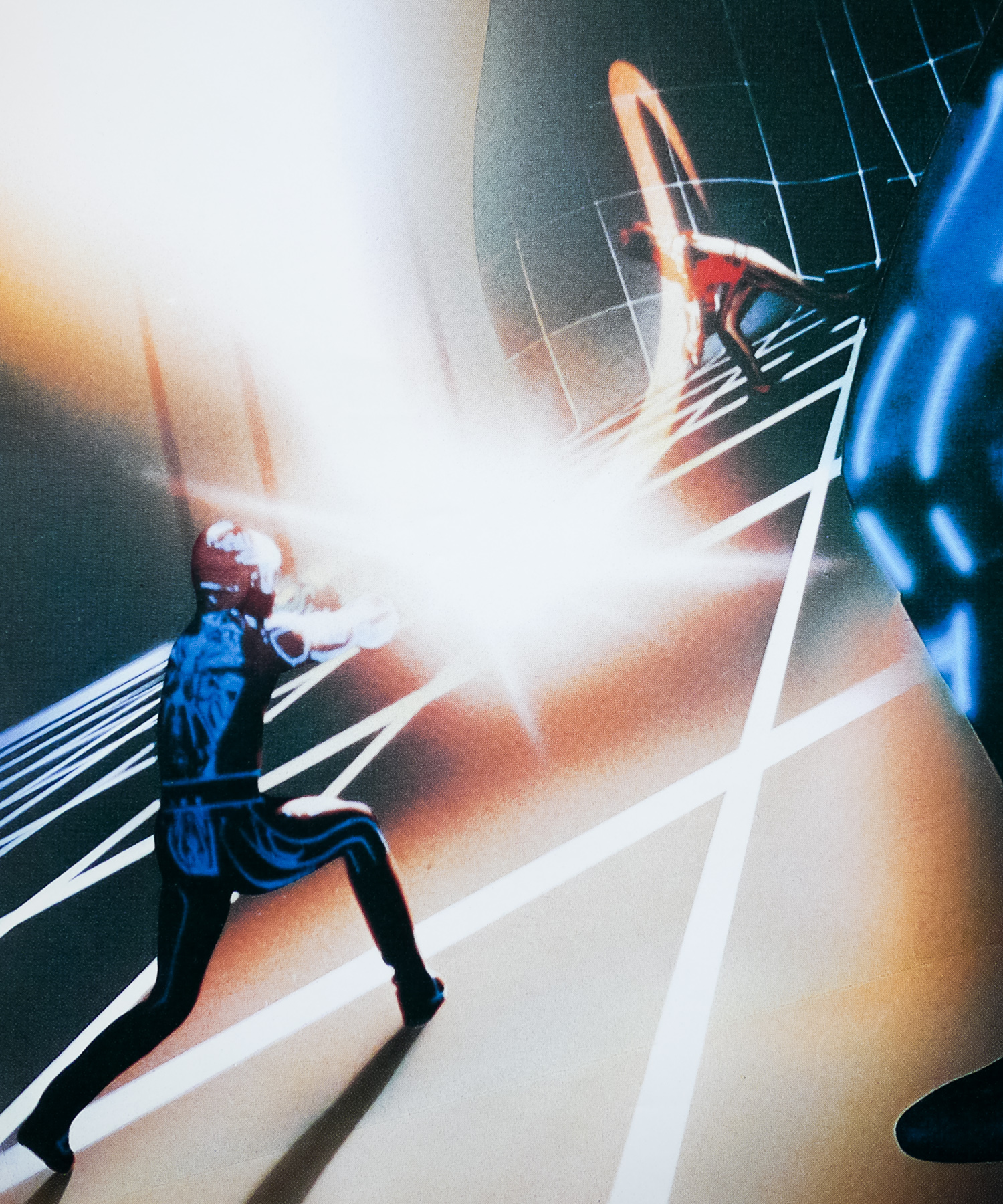
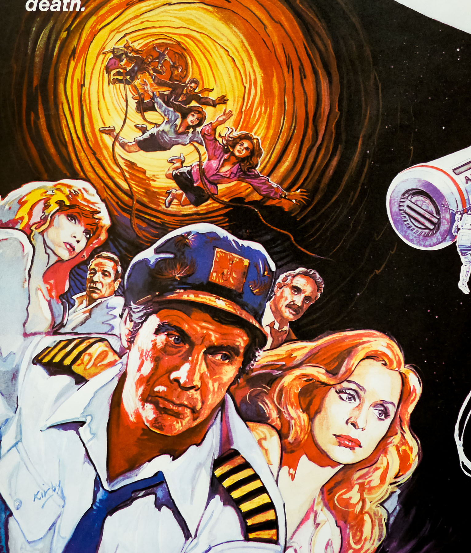
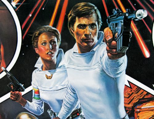
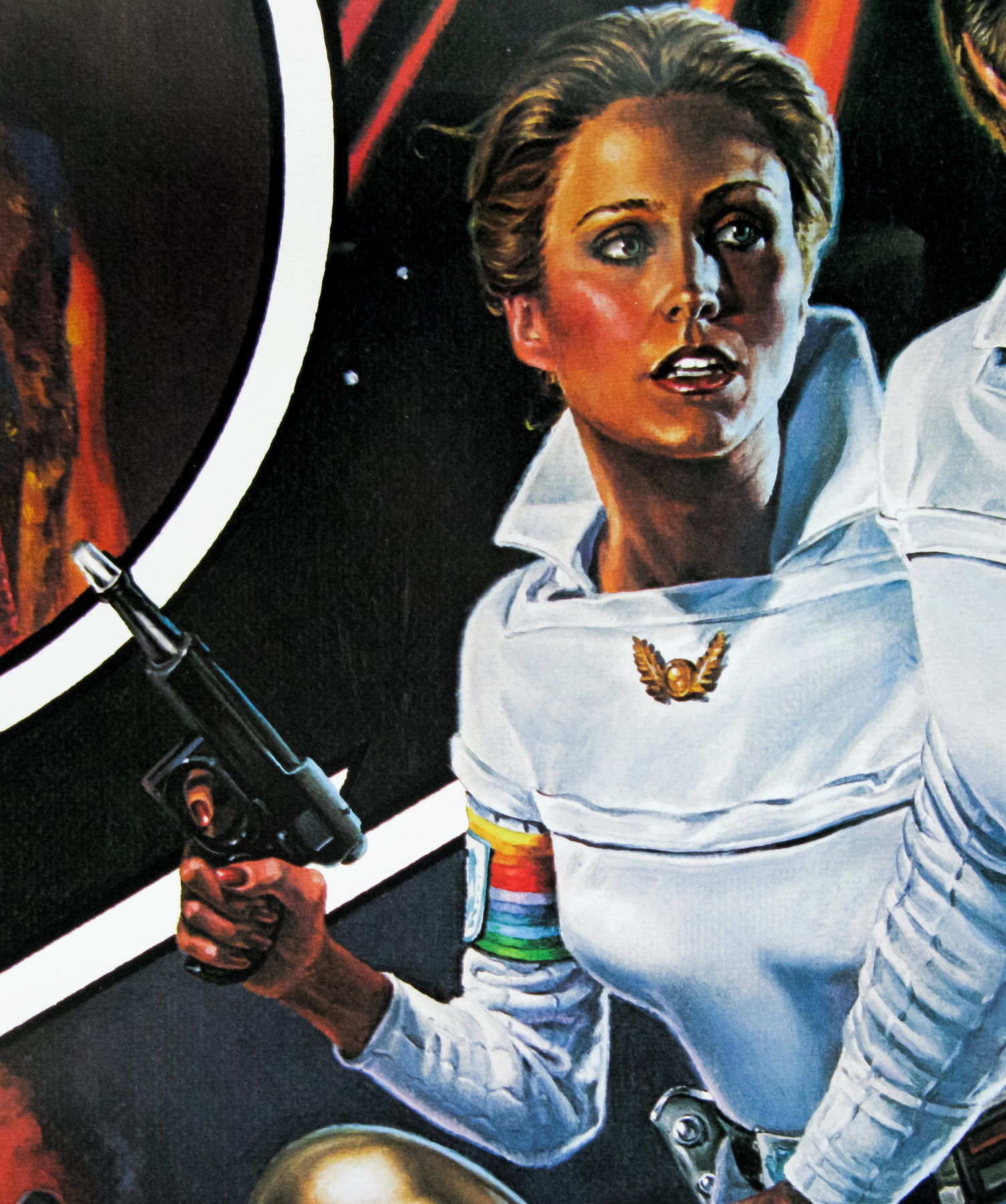
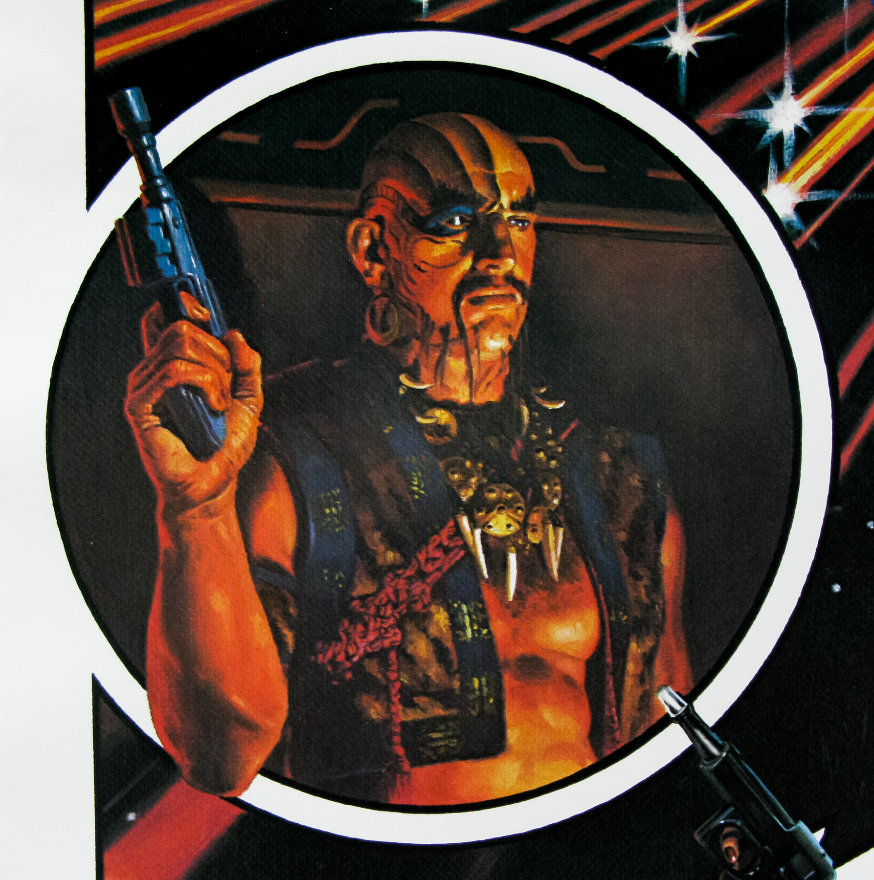
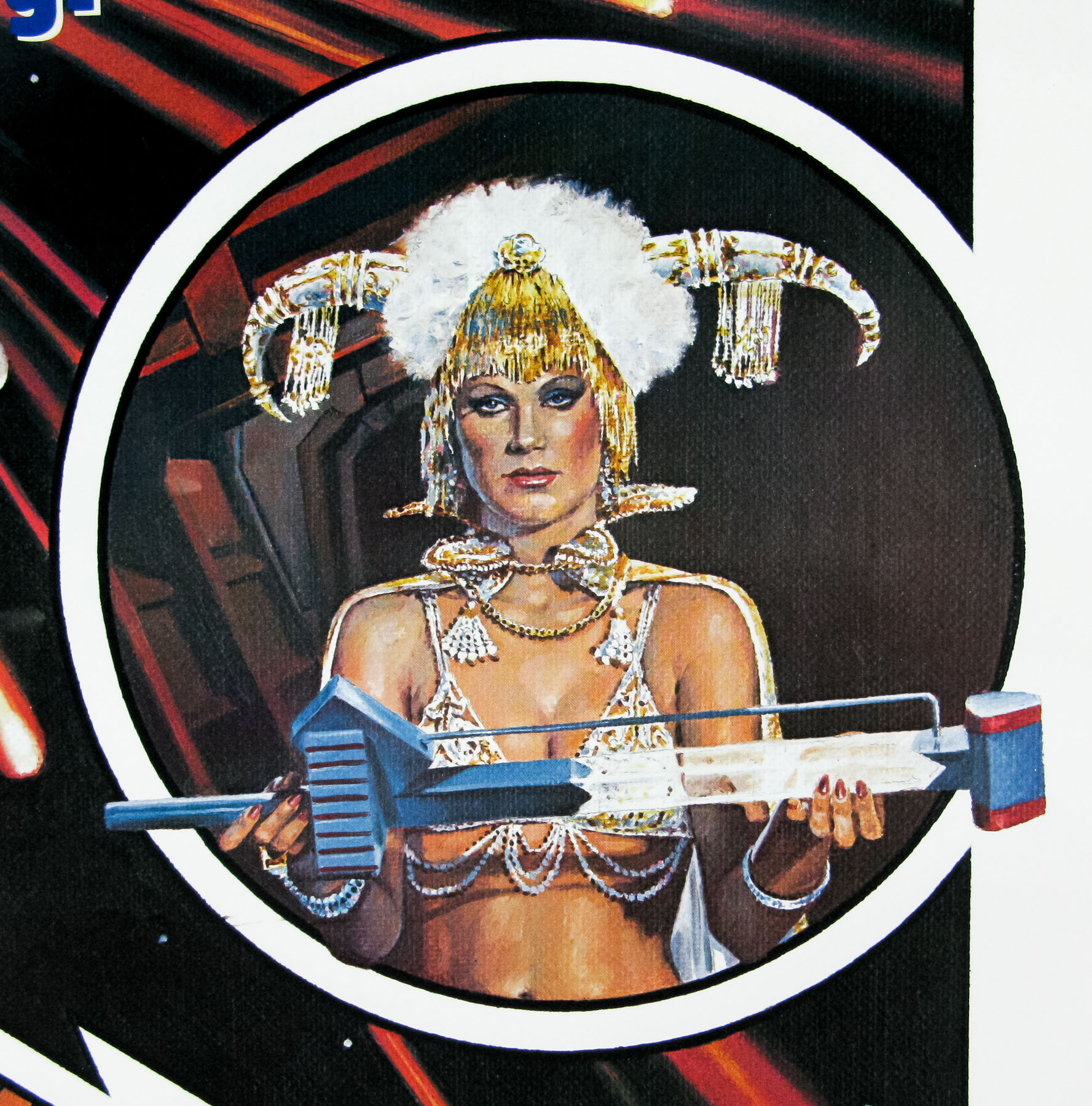
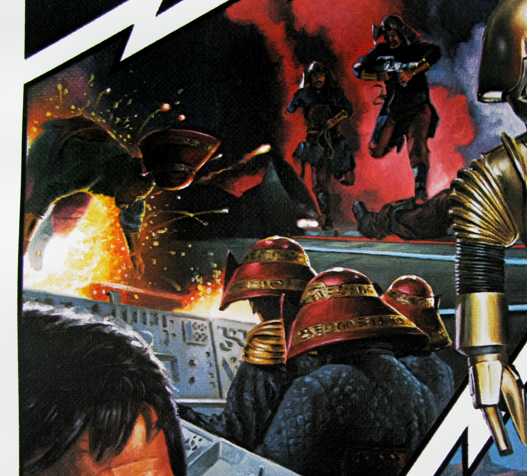
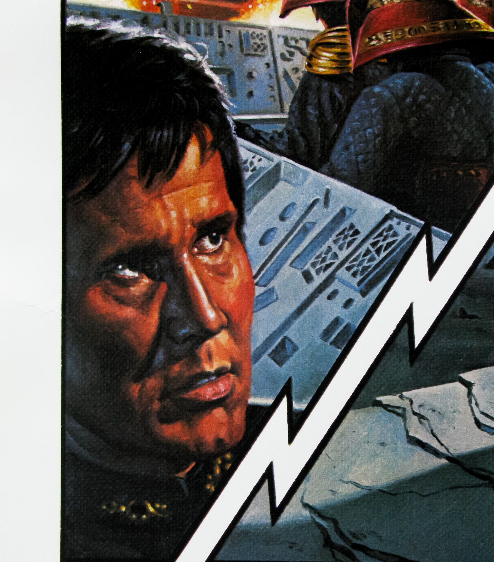
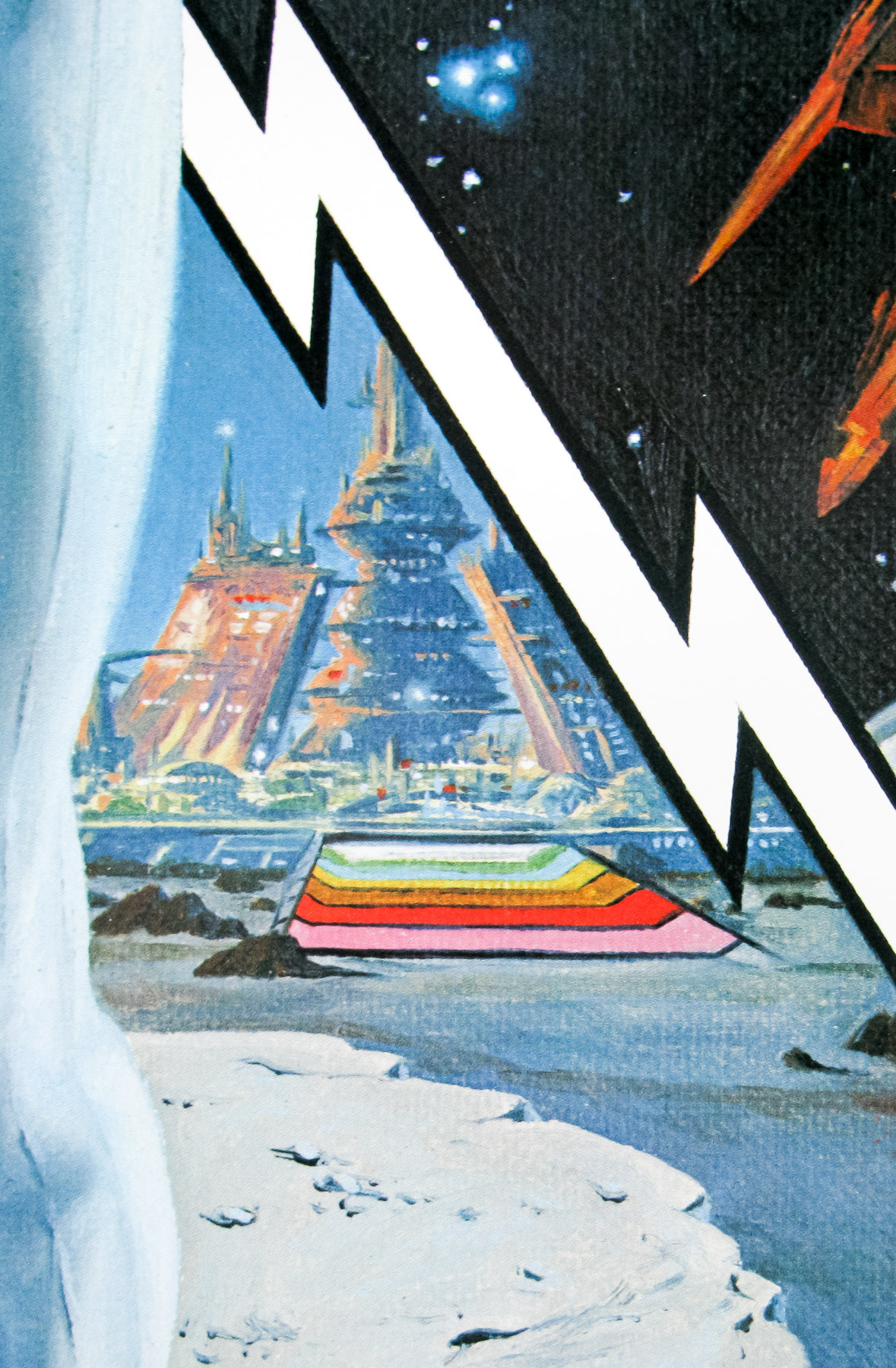
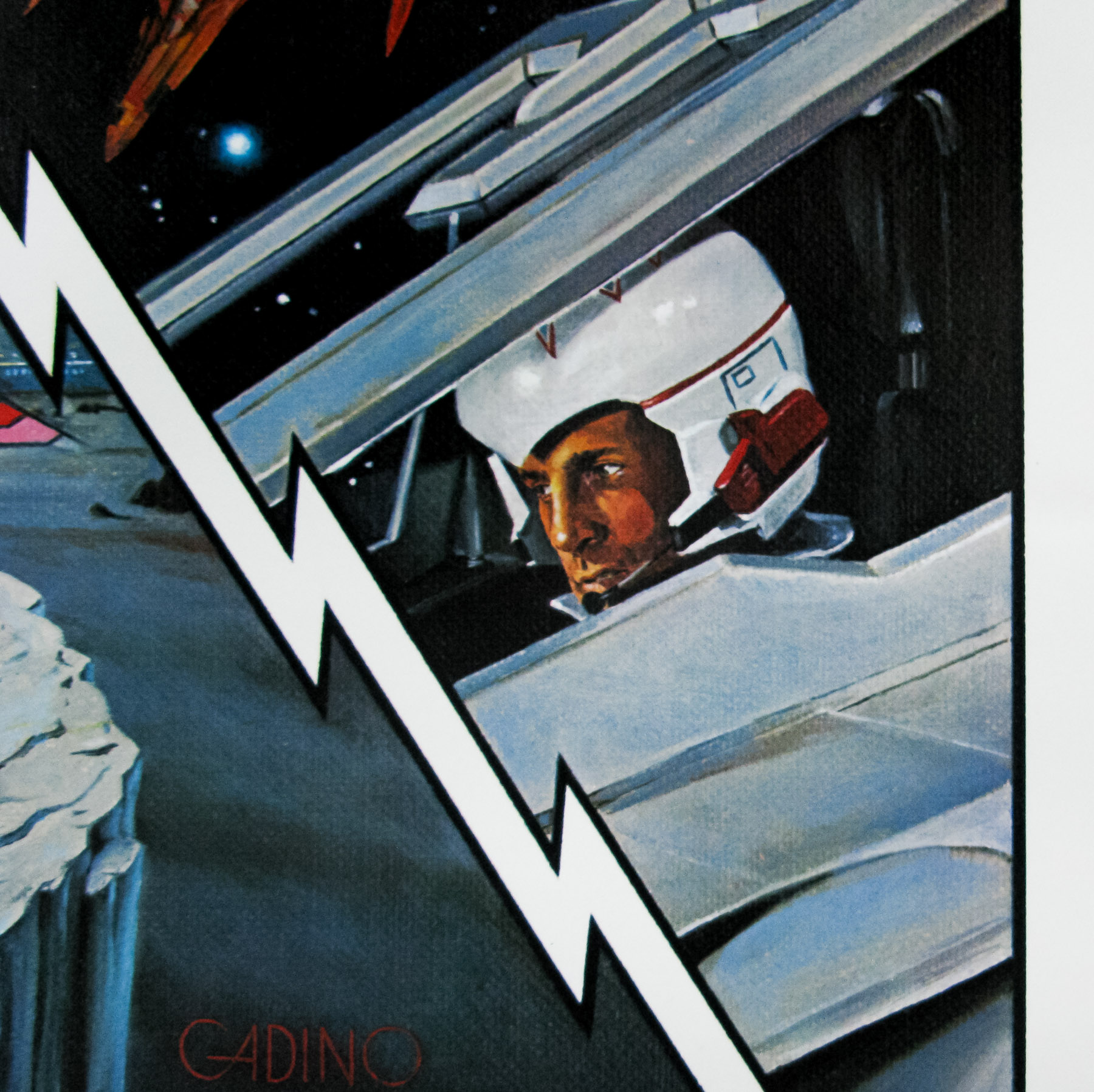
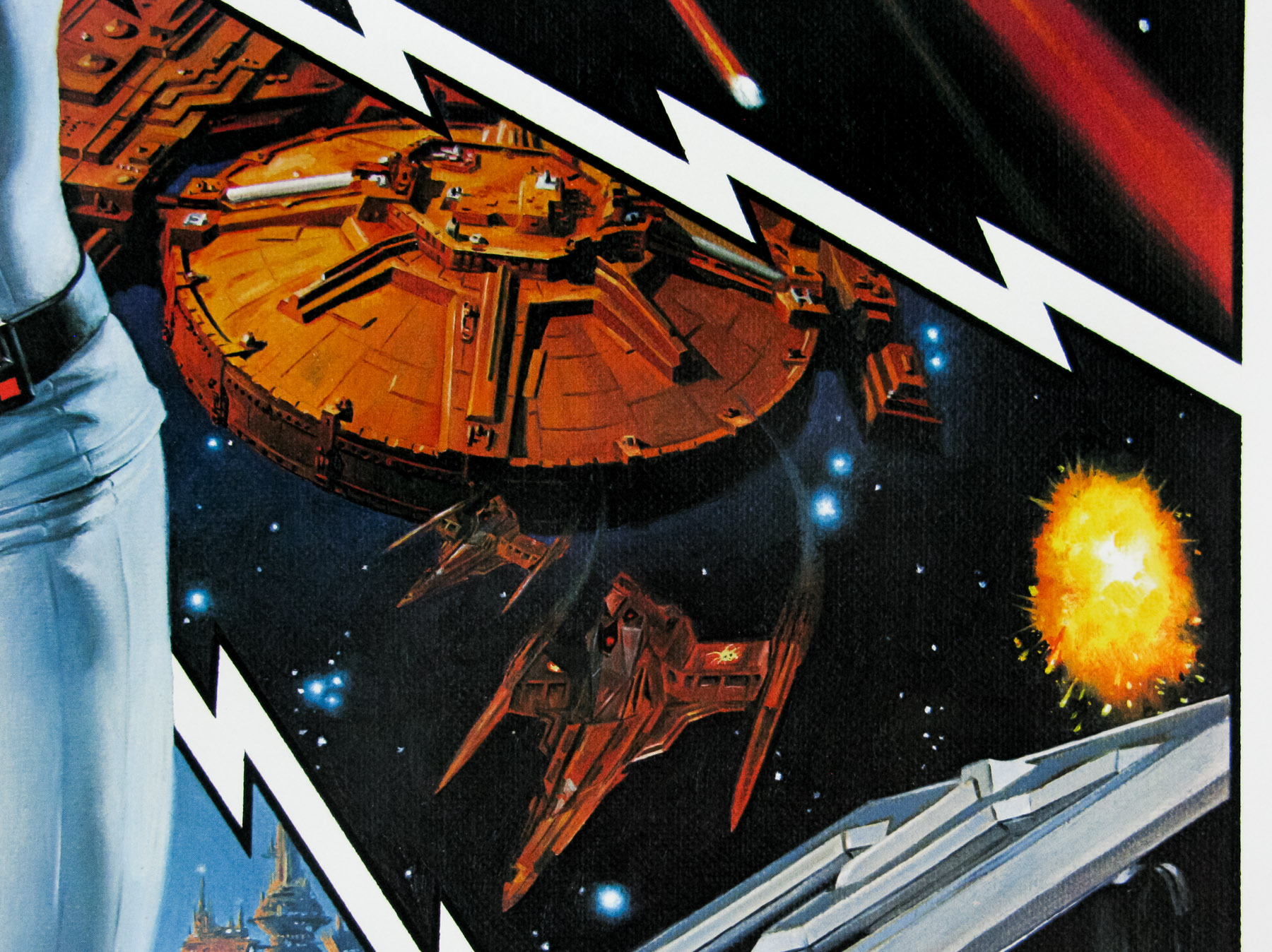
The 1979 revival starred Gil Gerard as Captain William “Buck” Rogers, a US Air Force pilot who is in charge of a space shuttle called the Ranger III that is launched in 1987 and, following a freak accident, winds up frozen and floating through space. Buck is eventually revived 504 years later in the 25th century to discover that the forces of Earth were united as the Earth Defence Directorate following a devastating nuclear war soon after he left the planet. A new threat to earth looms as the armies of the planet Draconia plan to invade and Buck must work with the E.D.D. and starfighter Colonel Wilma Deering (Erin Gray) to put a stop to their plans.
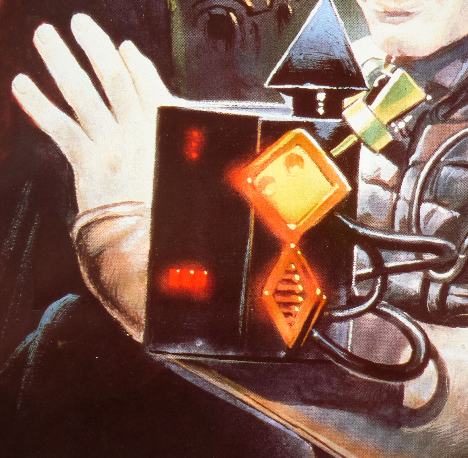
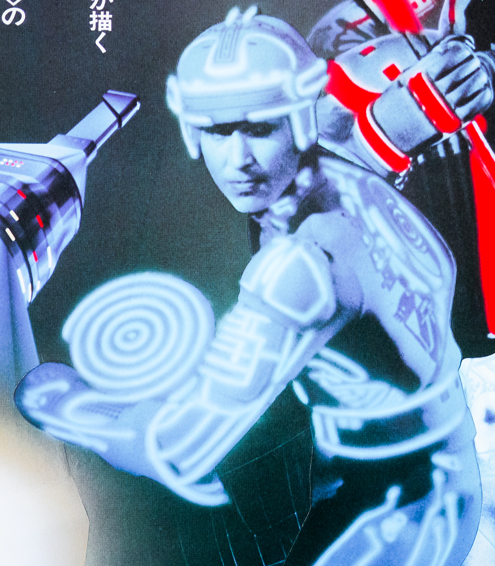
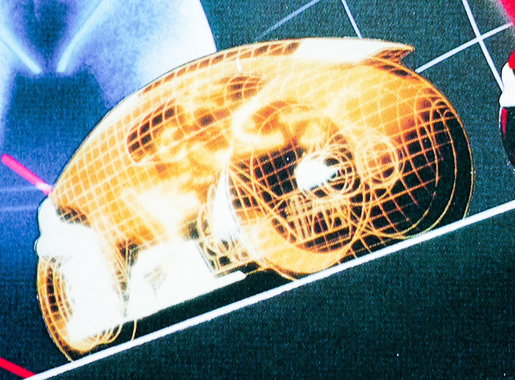
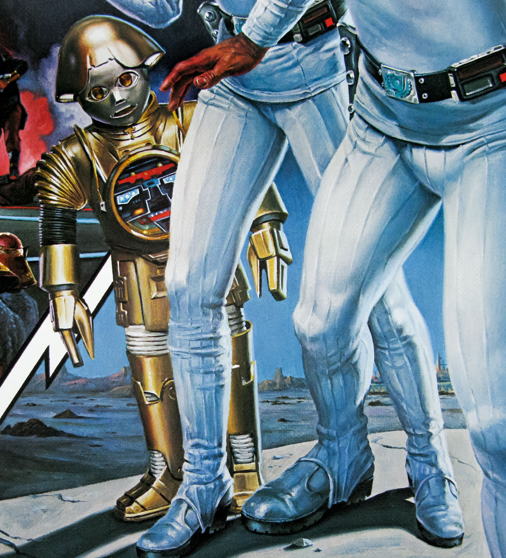
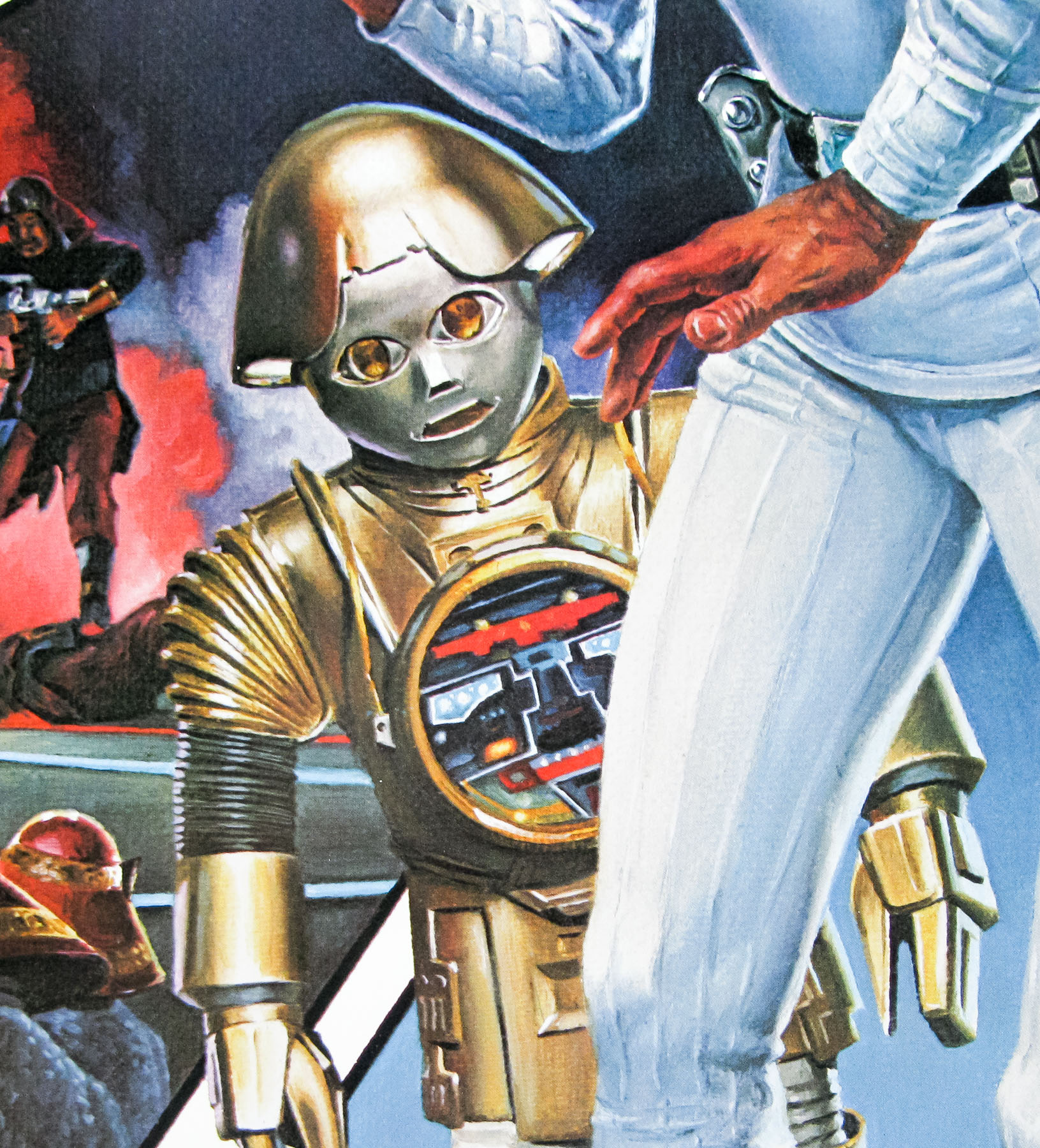
As featured on this poster he is aided by a comic sidekick robot called Twiki (voiced by Mel Blanc) who carries around a disc-shaped sentient computer called Dr. Theopolis (voiced by Eric Server). Twiki’s infamous excalamation of ‘biddi biddi biddi’ would often precede a 20th Century catchphrase or piece of slang that had been taught to him by Buck.
Victor Gadino is a prolific and award-winning artist who has an incredible roster of commercial clients as well as an impressive amount of portrait work to his name, including ones for the likes of George Lucas and Clint Eastwood. He painted several music album covers as well as a handful of movie posters. Another one that is clearly signed by him is the artwork that appears on the UK quad for Sinbad and the Eye of the Tiger (1977). If you know of any other film posters that Gadino worked on please get in touch. His personal website features a biography and several galleries of his art.