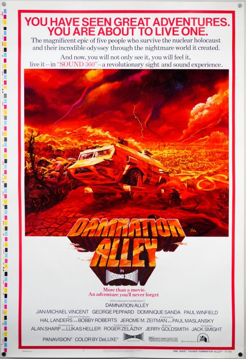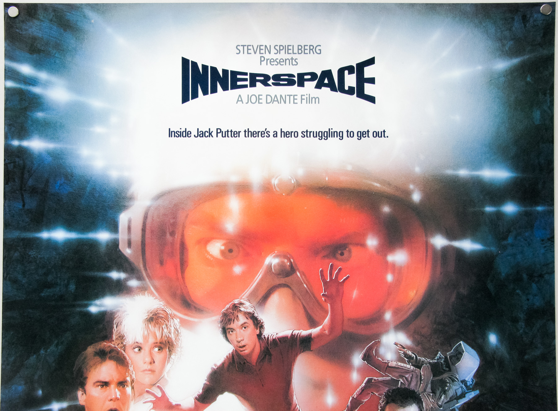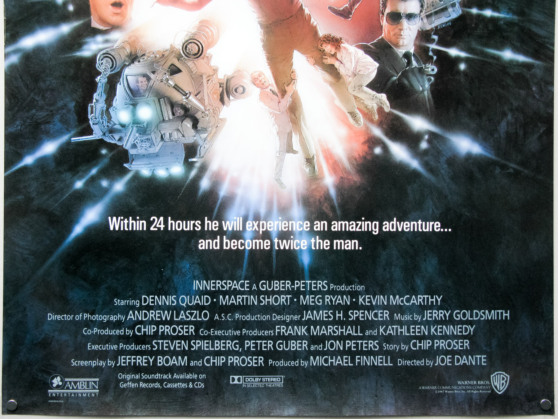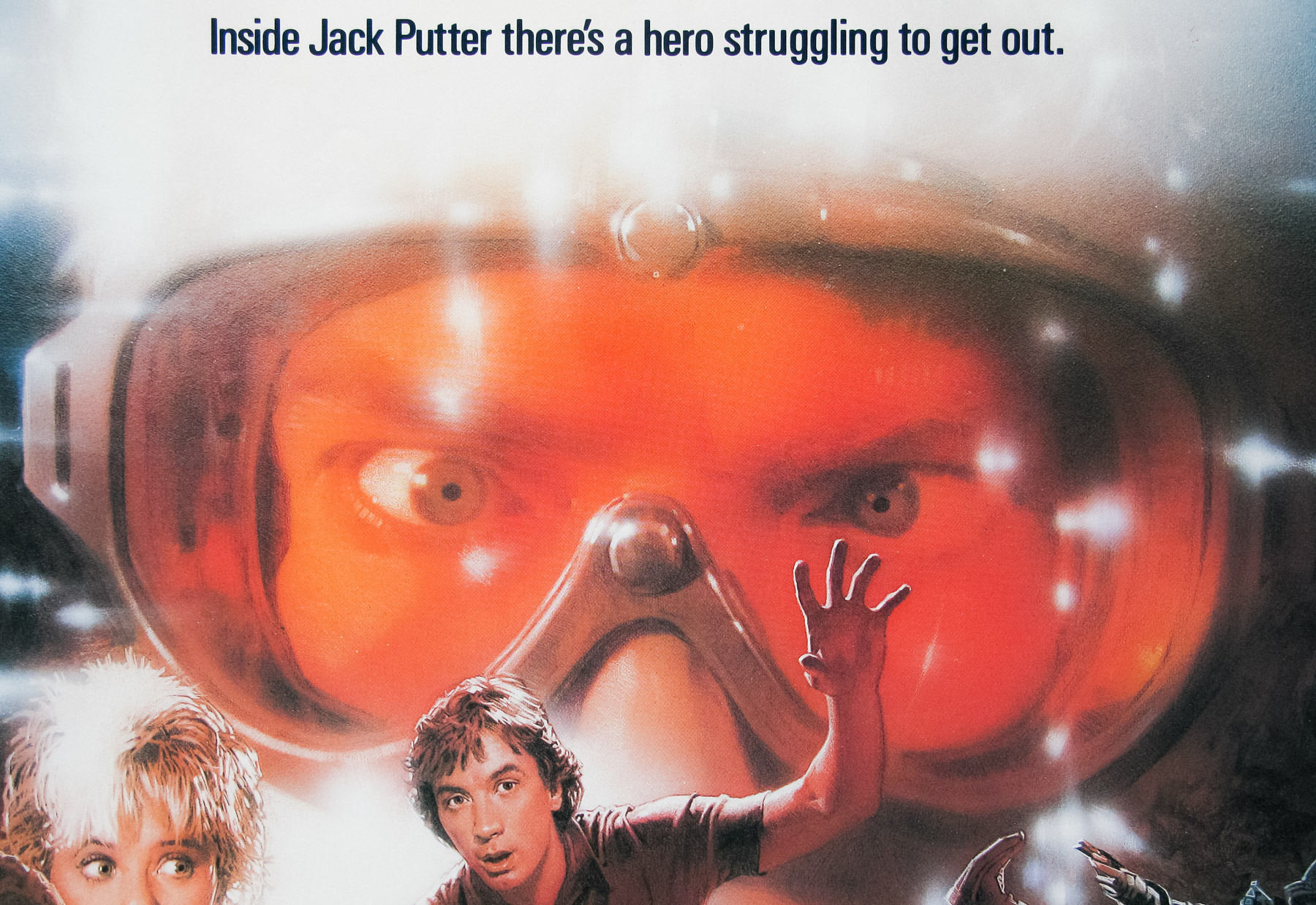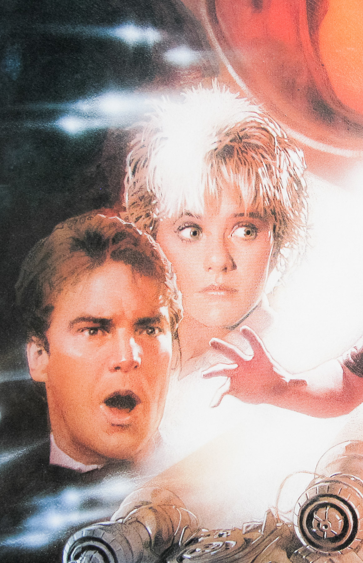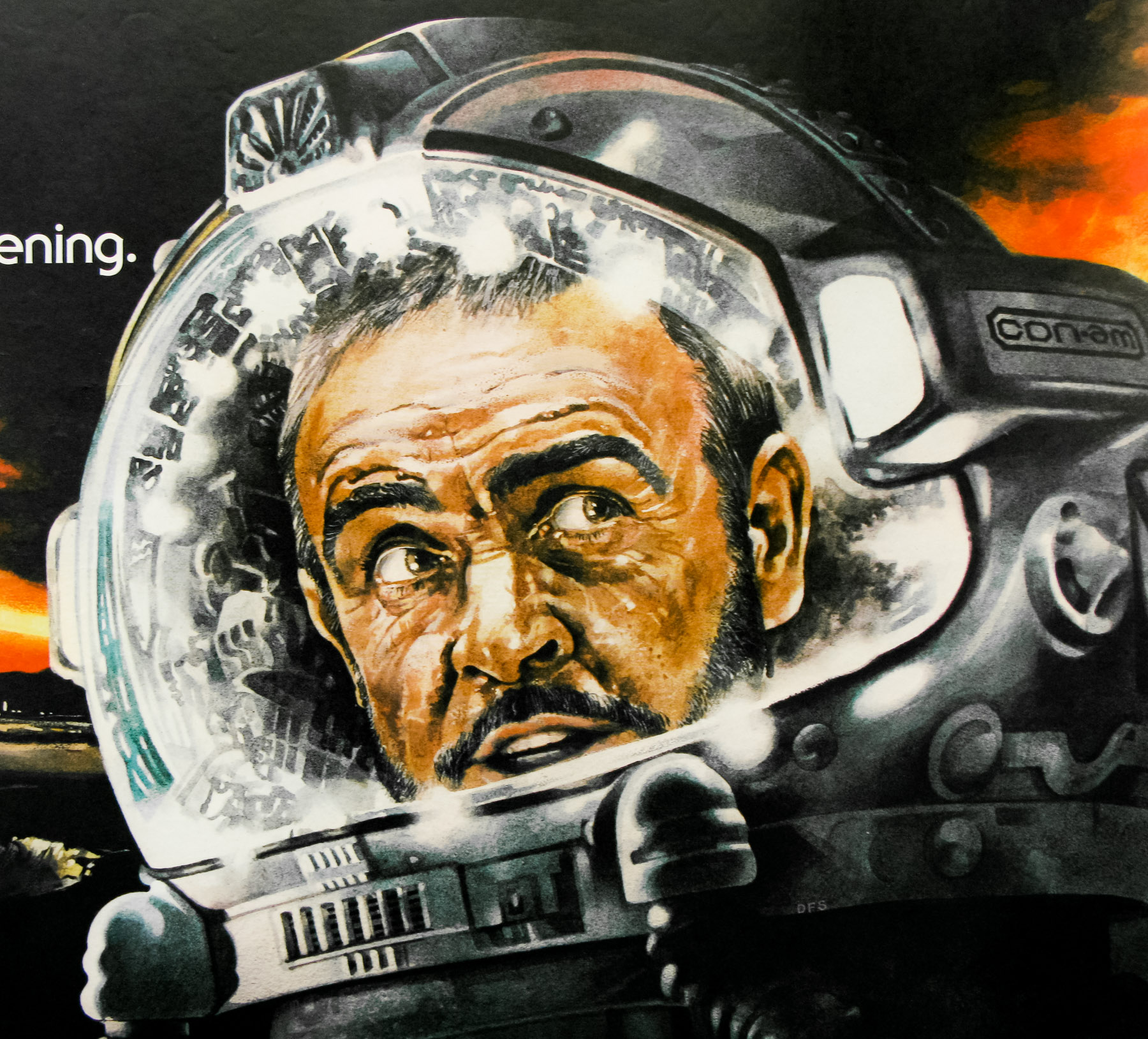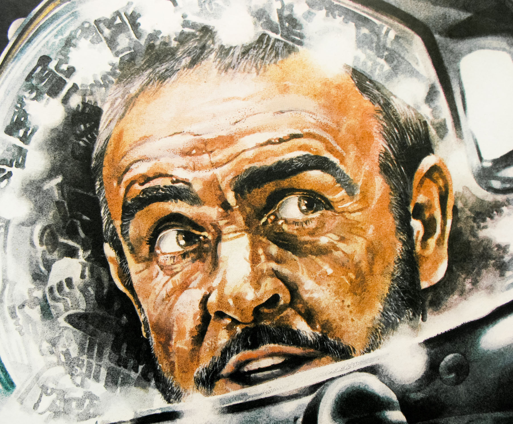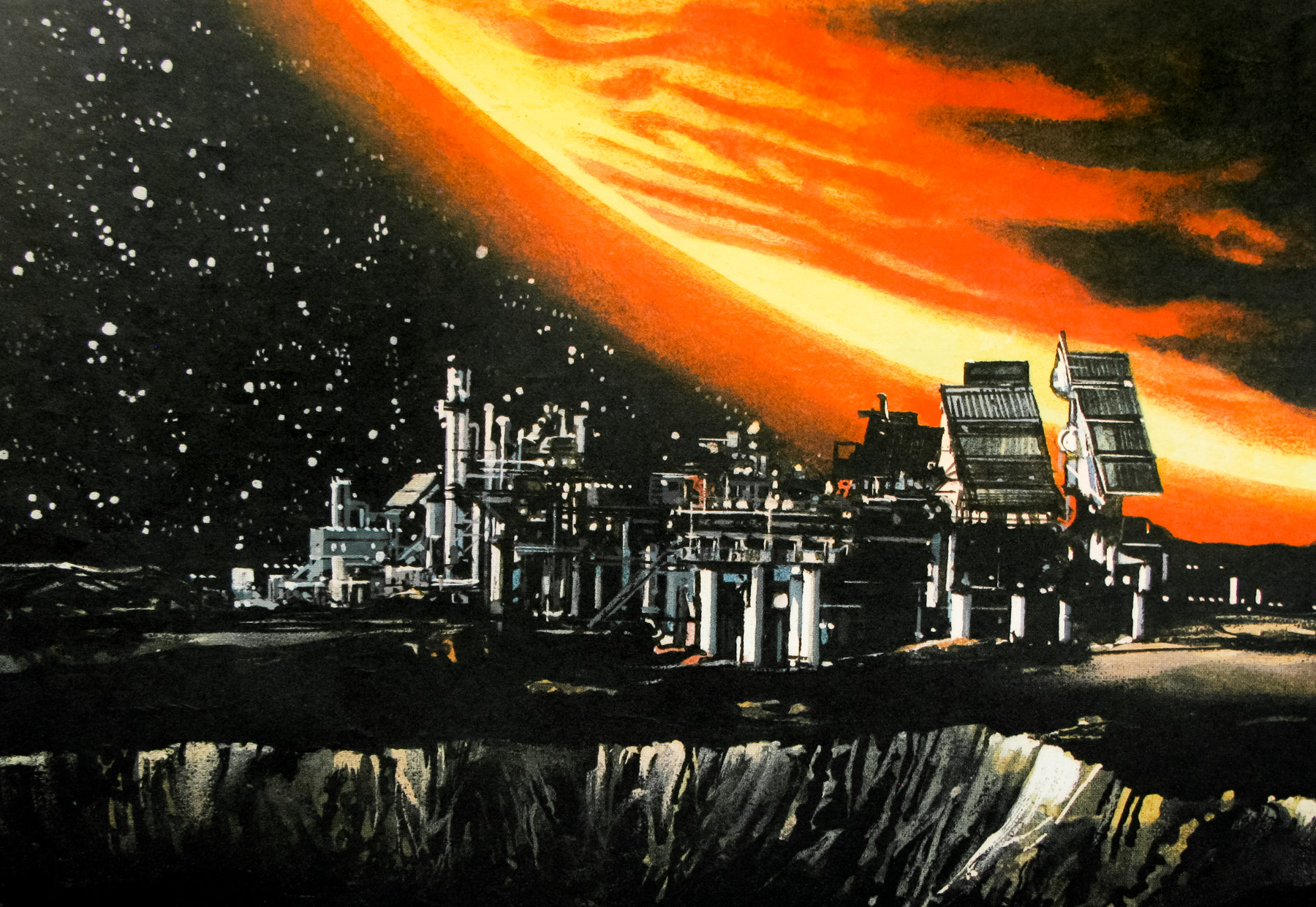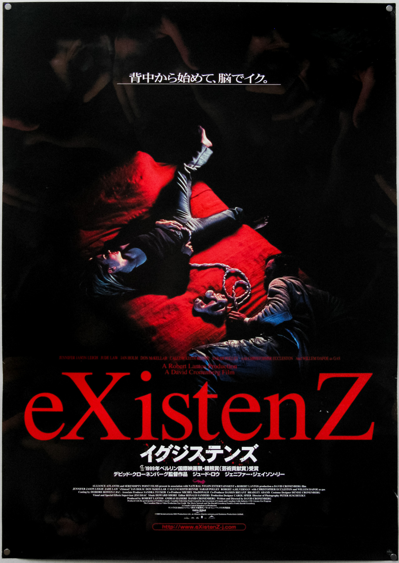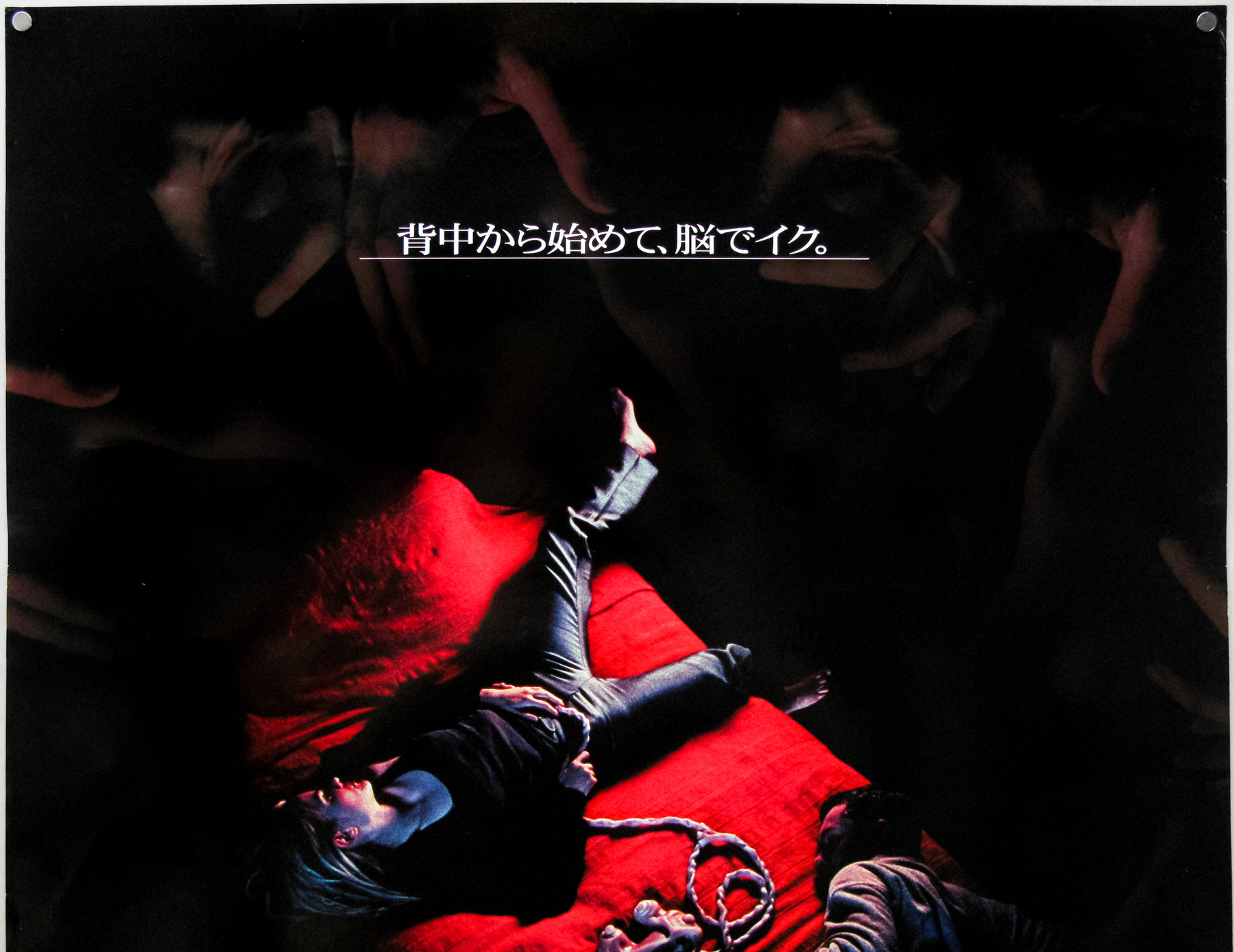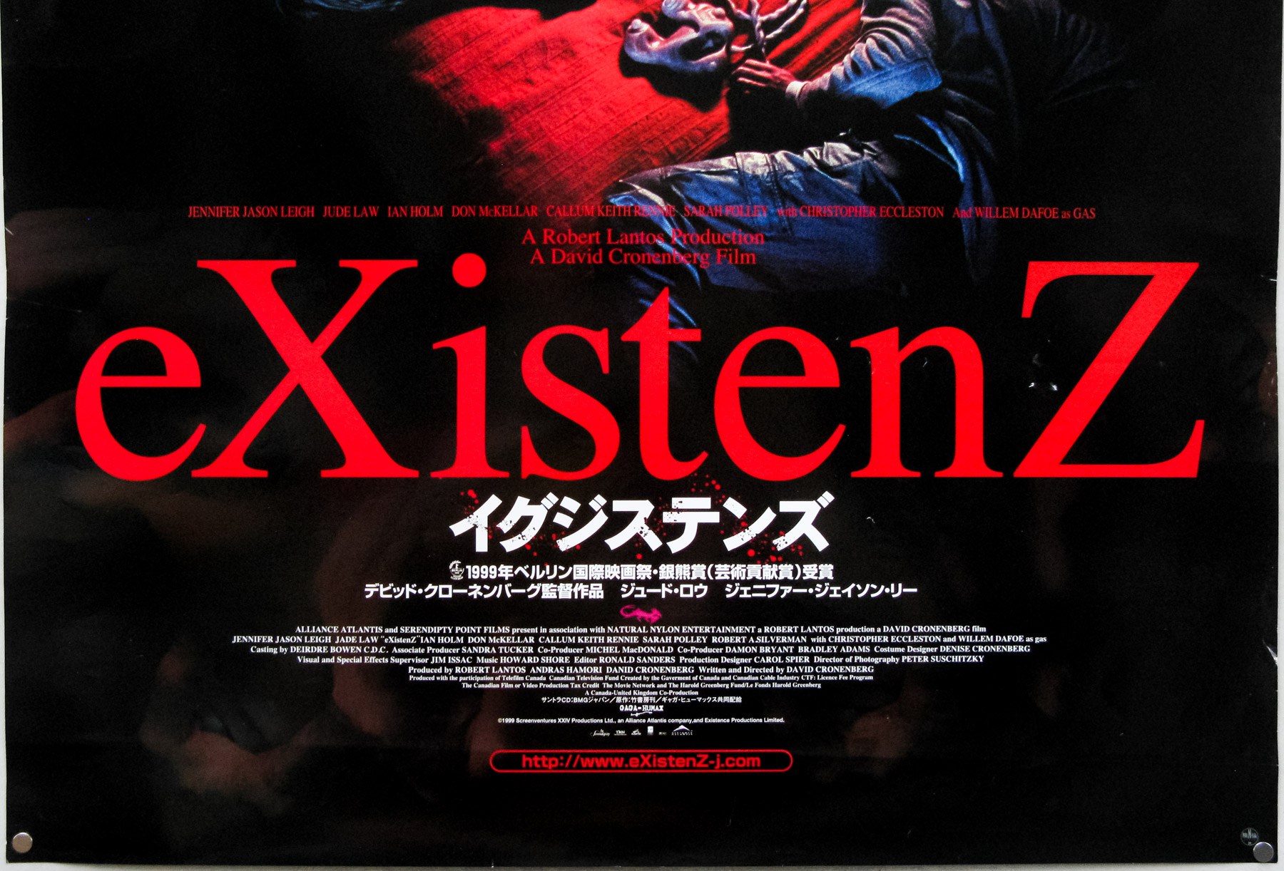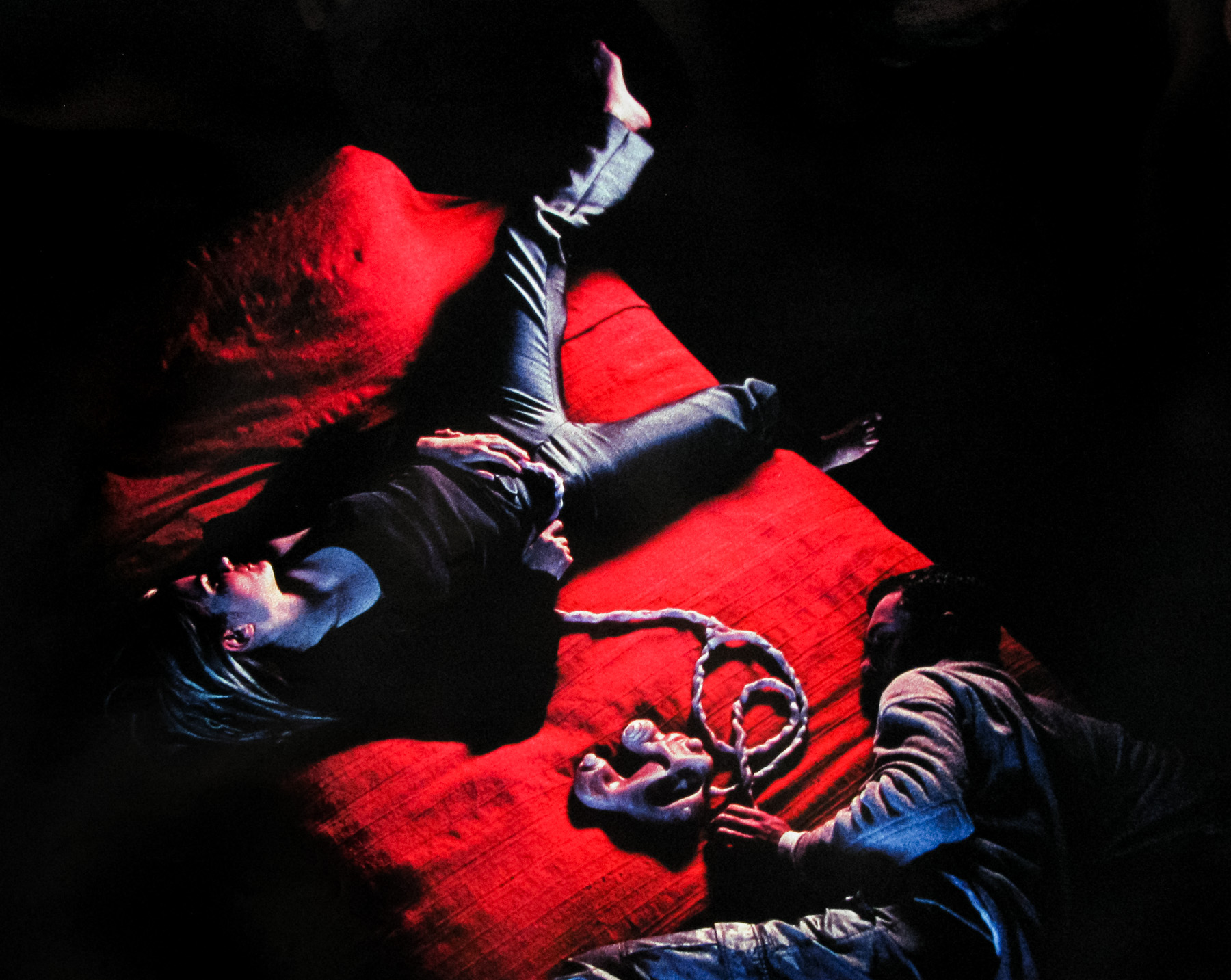

Poster detail
1-5

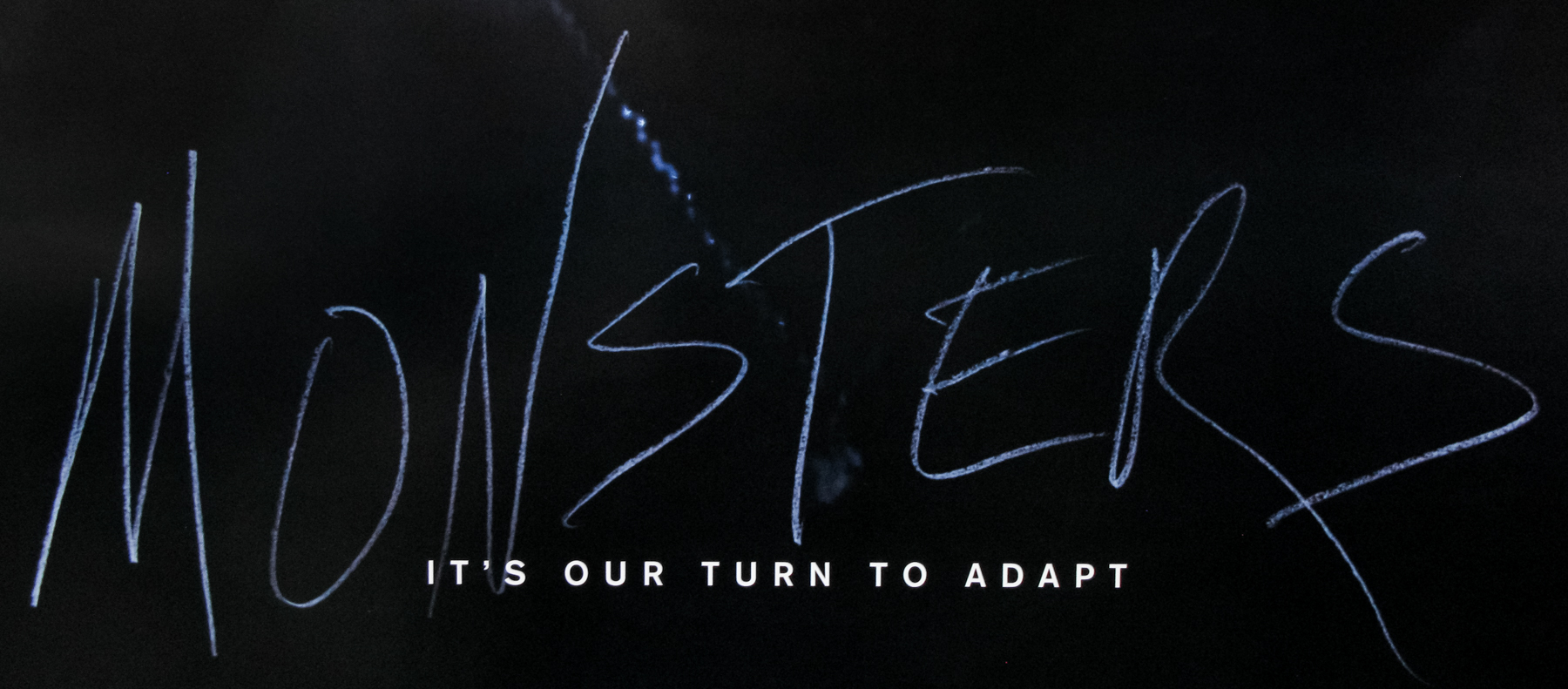
- Title
- Monsters
- AKA
- --
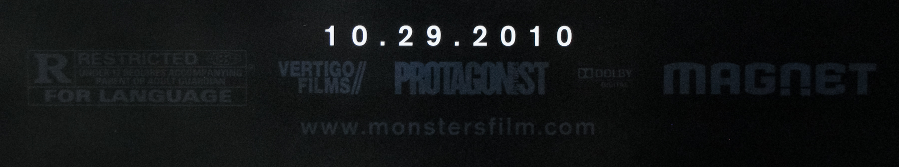
- Year of Film
- 2010
- Director
- Gareth Edwards
- Origin of Film
- UK
- Genre(s) of Film
- Scoot McNairy, Whitney Able, Mario Zuniga Benavides, Annalee Jefferies,
- Type of Poster
- One sheet
- Style of Poster
- Teaser
- Origin of Poster
- USA
- Year of Poster
- 2010
- Designer
- Gravillis Inc.
- Artist
- --
- Size (inches)
- 27" x 39 13/16"
- SS or DS
- DS
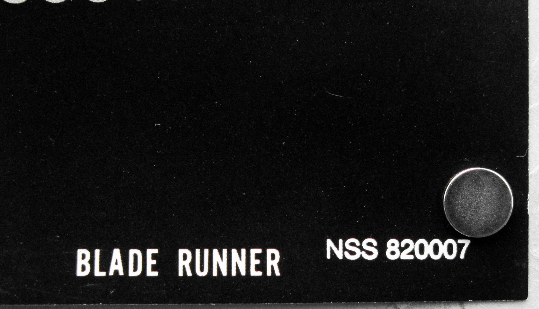
- NSS #
- --
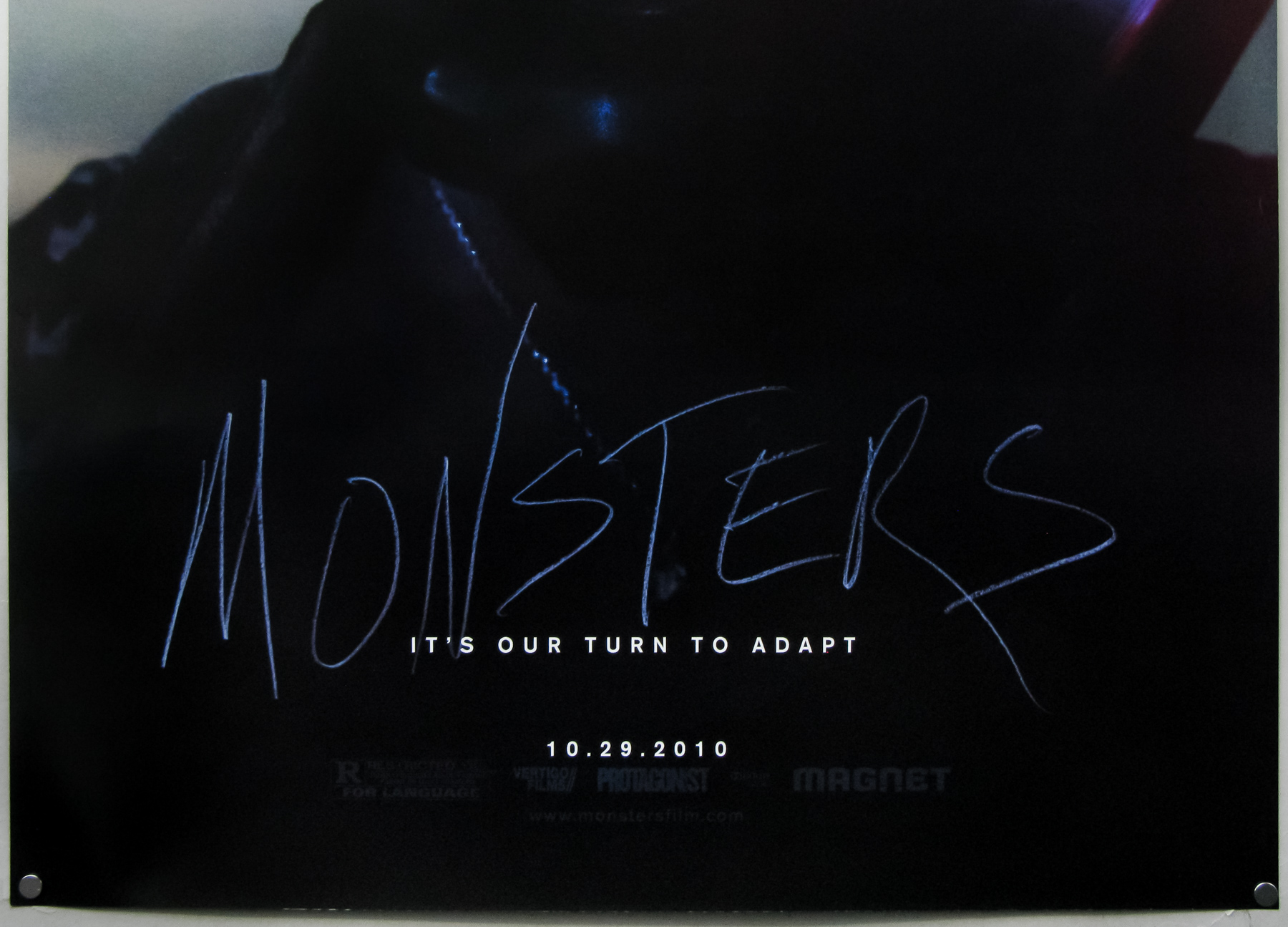
- Tagline
- It's our turn to adapt
British director Gareth Edwards’ excellent Monsters was one of the best films released in 2010 and transcended a micro-budget to become one of the freshest entries in the sci-fi genre for several years. The film is set slightly in the future and several years after a NASA probe crashed back to earth infected with alien life. Half of Mexico had to be quarantined off as the creatures grew and took over the area, and the US military patrols the borders. Andrew Kaulder (Scoot McNairy) is a US photojournalist who is hired by his boss to escort his daughter Samantha Wynden (Whitney Able) from the safe part of Mexico back to the States. The pair are forced to head through the quarantined zone despite the threat of the creatures who are moving across the country on their yearly ‘migration’.
The film was shot entirely on location by a tiny crew, using prosumer cameras and, aside from the two leads, the majority of the characters were played by non-actors. The dialogue was improvised around a loose scene outline and the results were edited whilst the crew was on the road. Gareth Edwards had previously worked as a special effects editor and spent four months designing and creating all of the effects himself, once again using off the shelf equipment and software. It’s a superb achievement and well worth a watch, but don’t go in expecting some kind of fast-paced, gory creature-feature as some cinema-goers were, back in 2010.
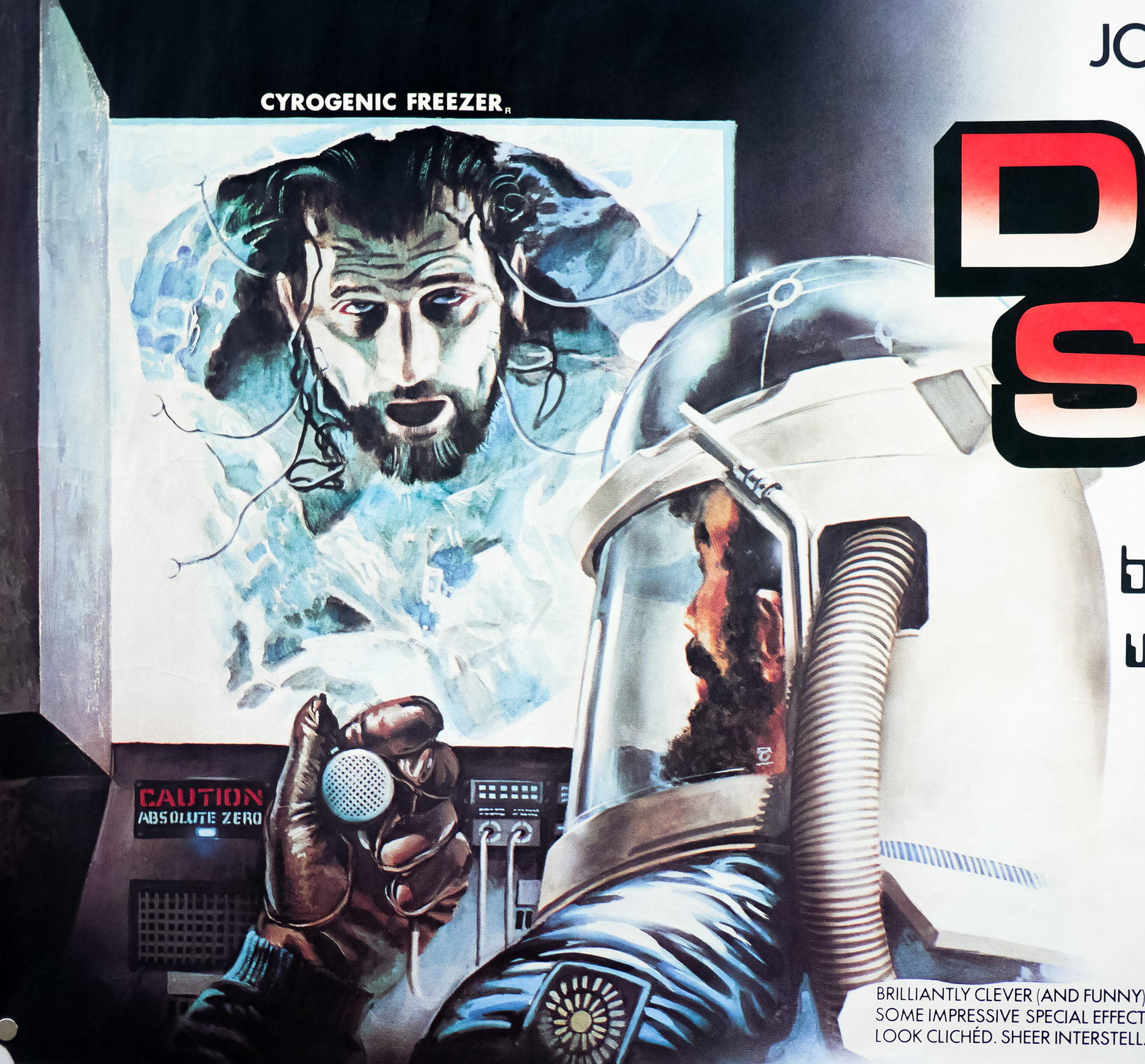
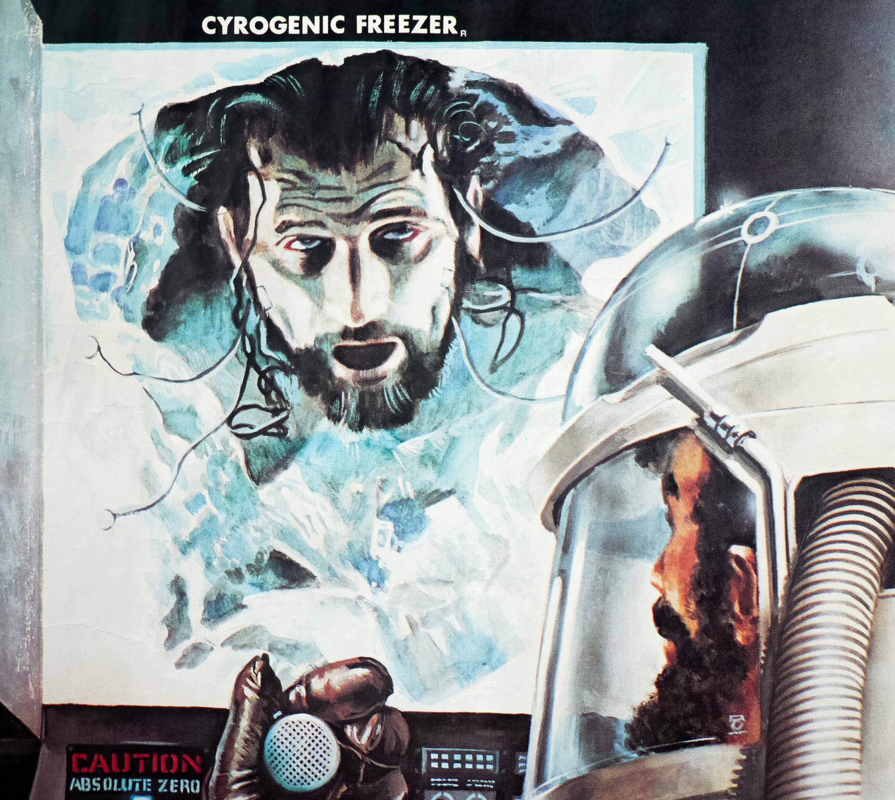
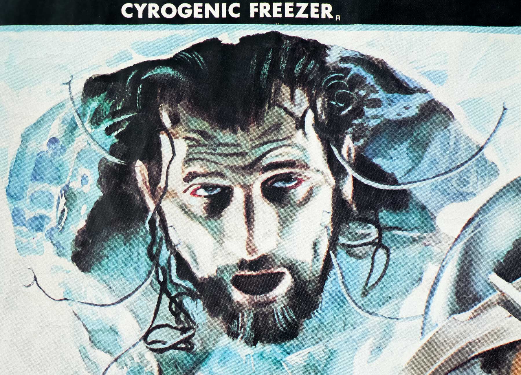
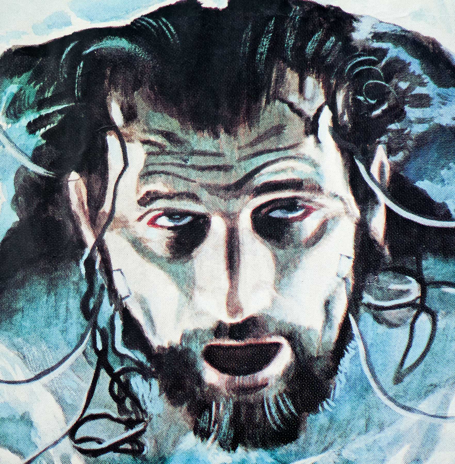
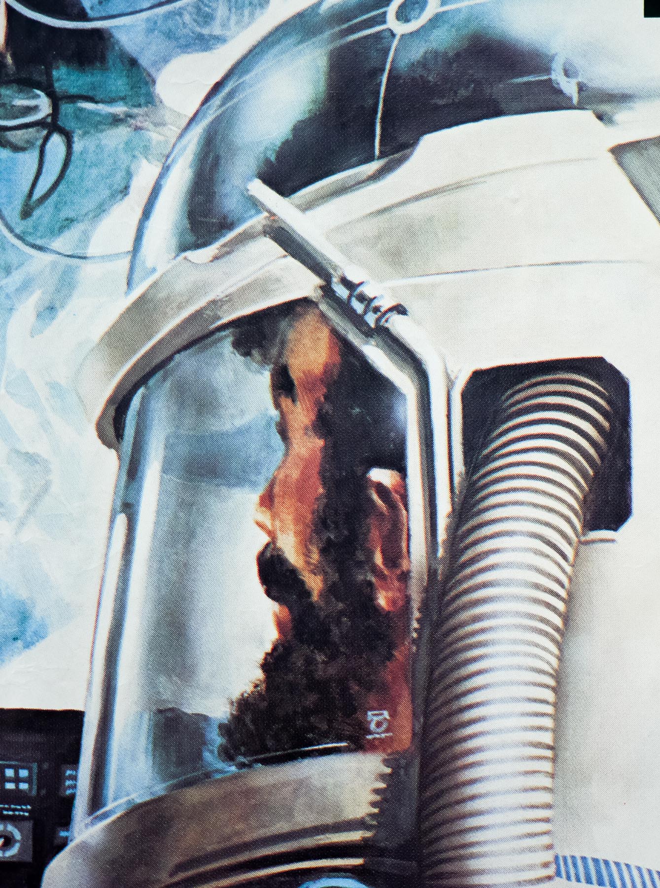
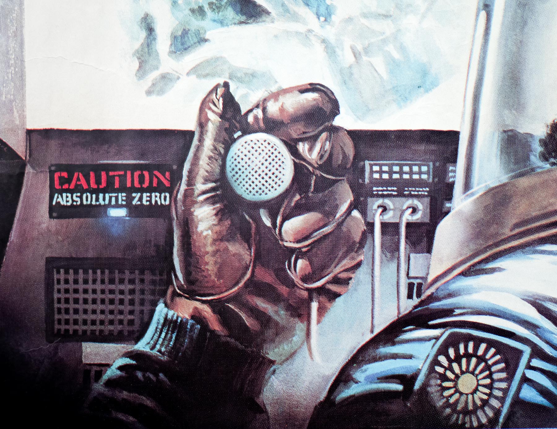
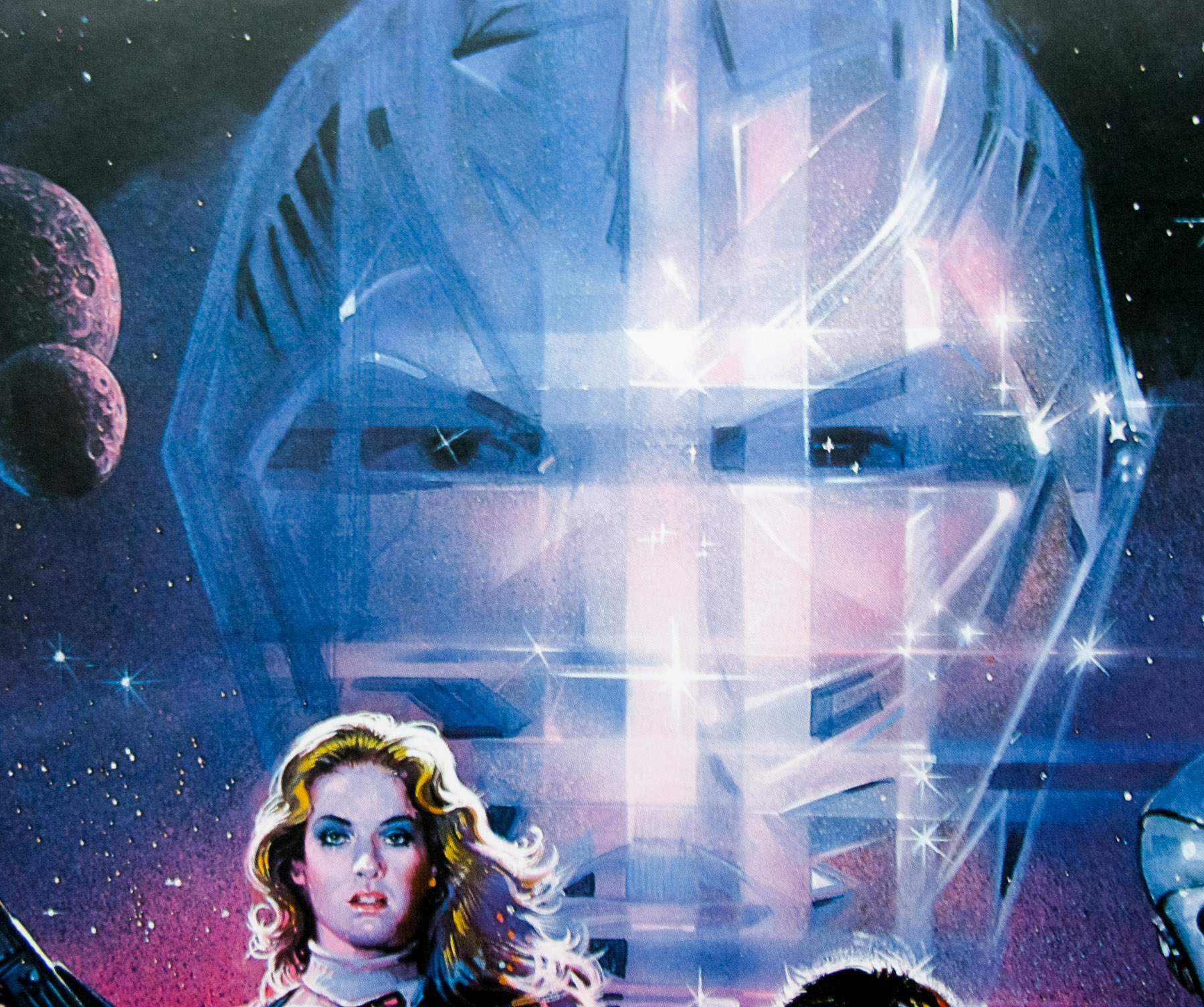
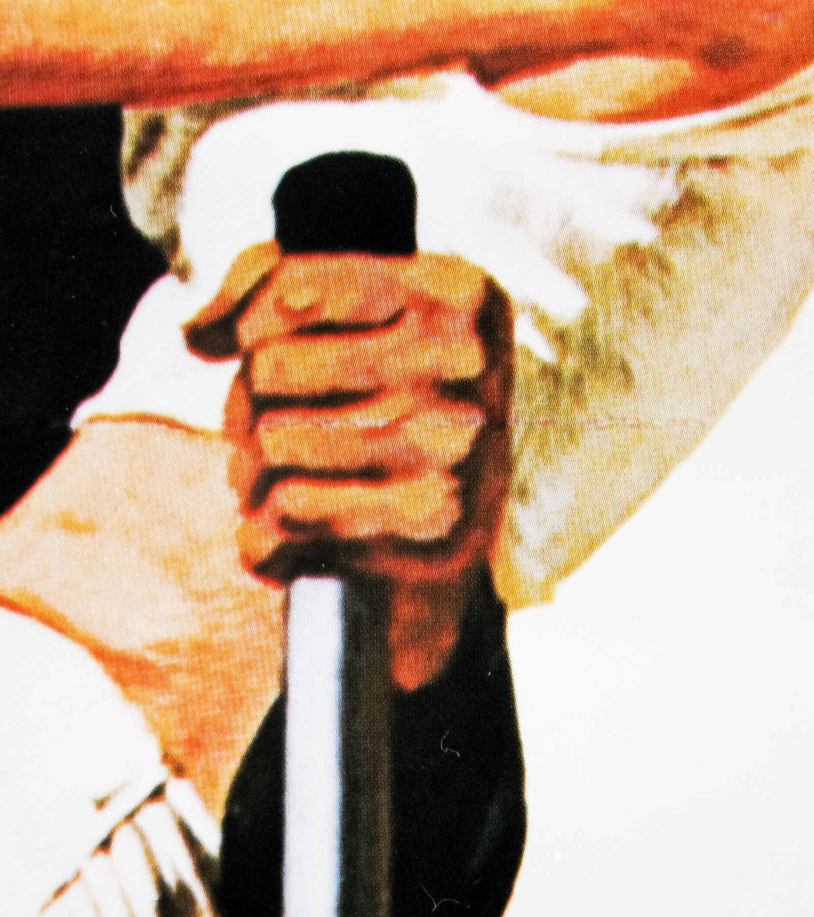
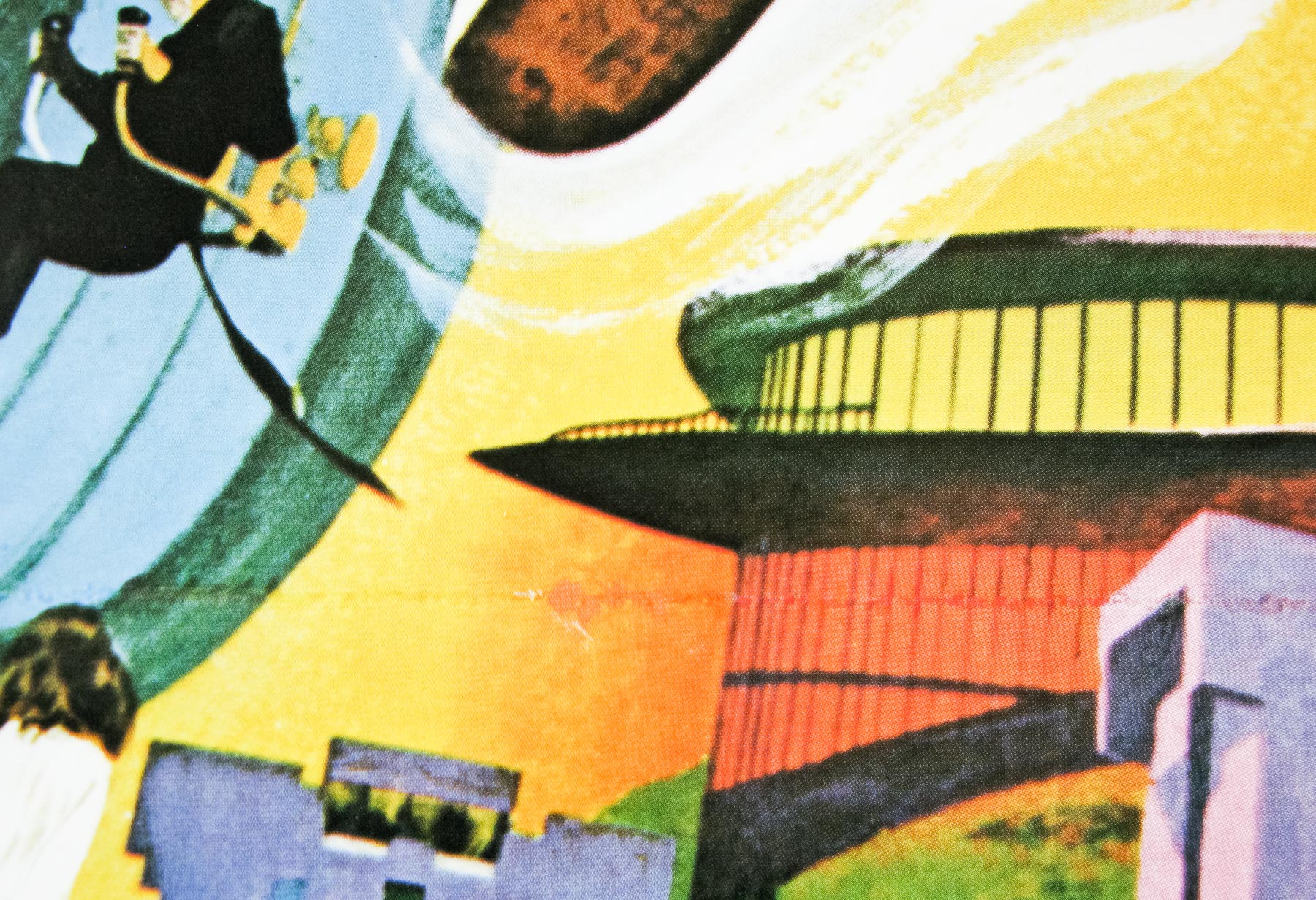
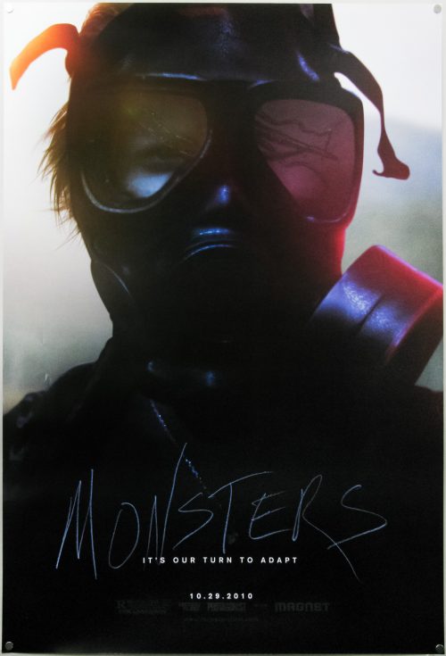
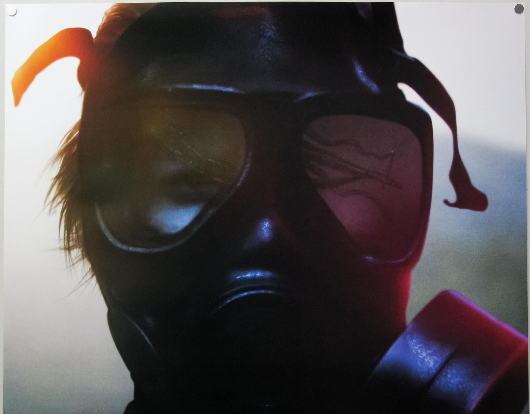
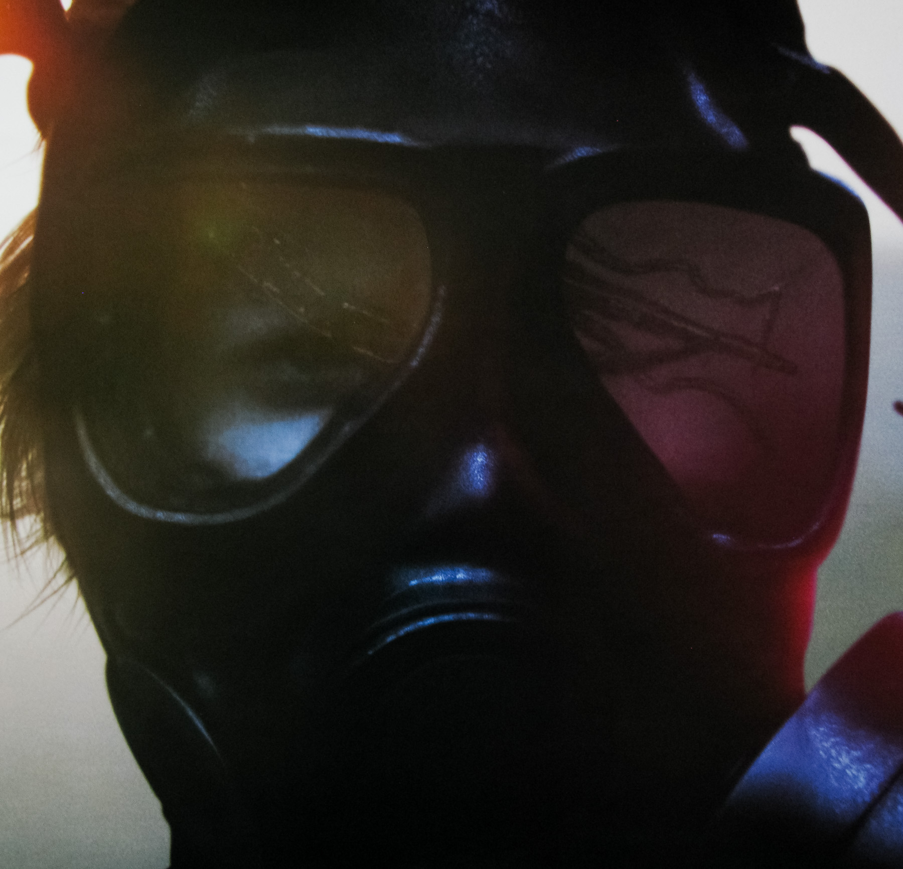
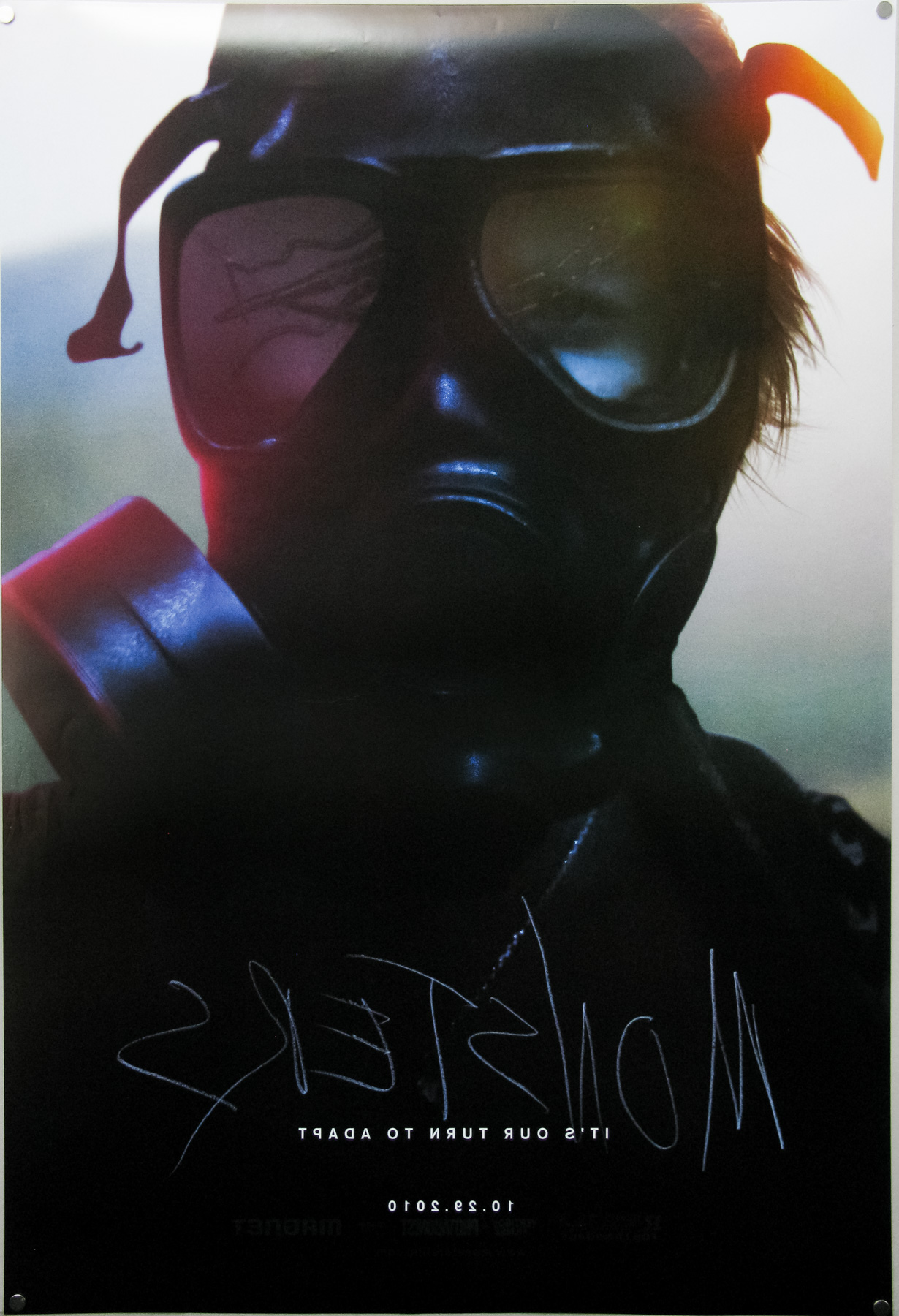
This striking US one sheet teaser was designed by Gravillis Inc. and features Whitney Able in a gas mask with a reflection of one of the creatures in the visor. Because the poster is so dark it’s hard to photograph without losing some of the details so check out the original digital file here.
The original trailer is on YouTube.