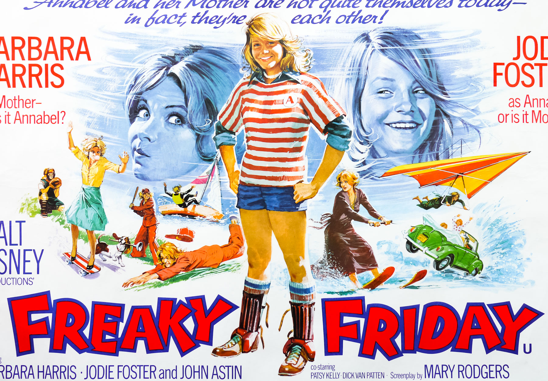
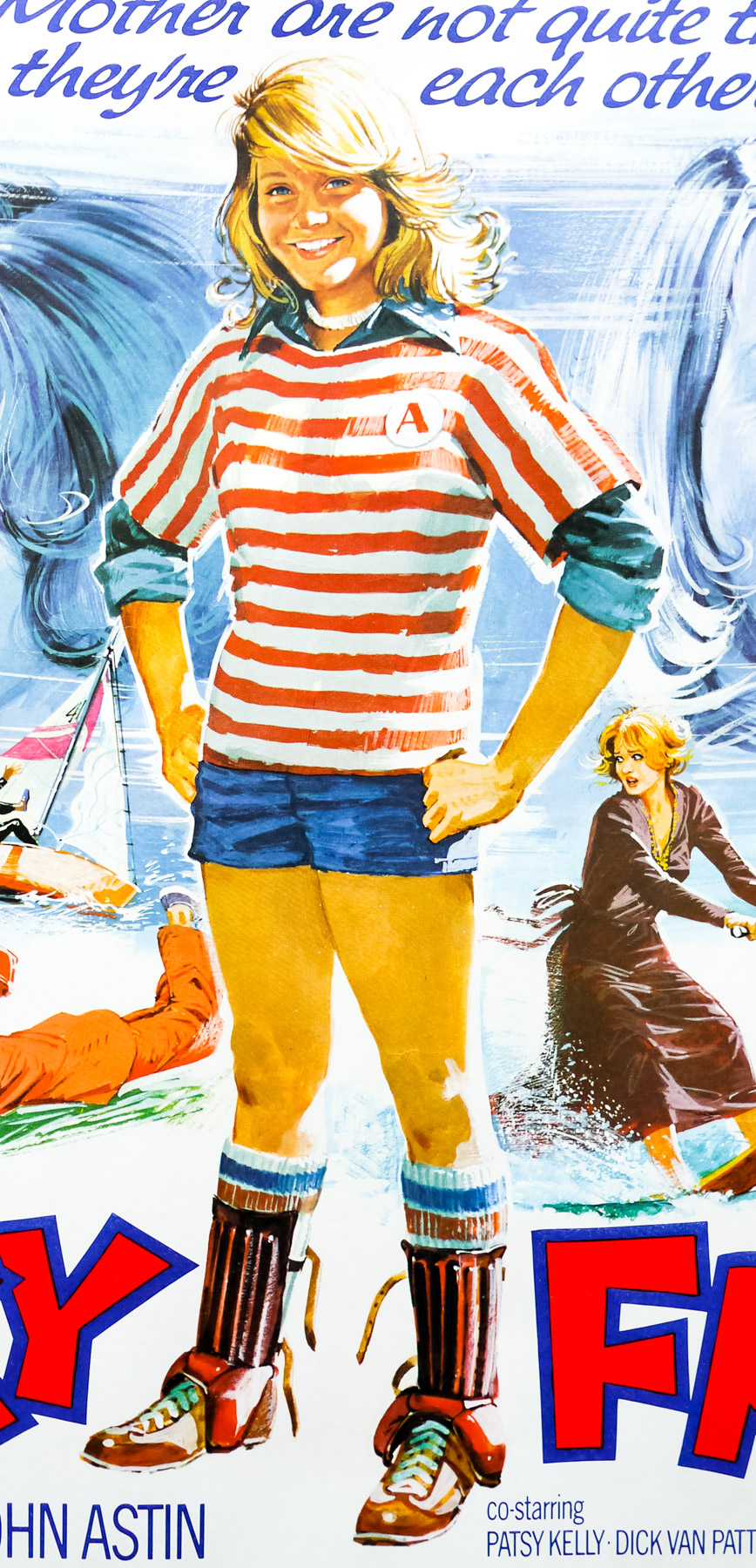
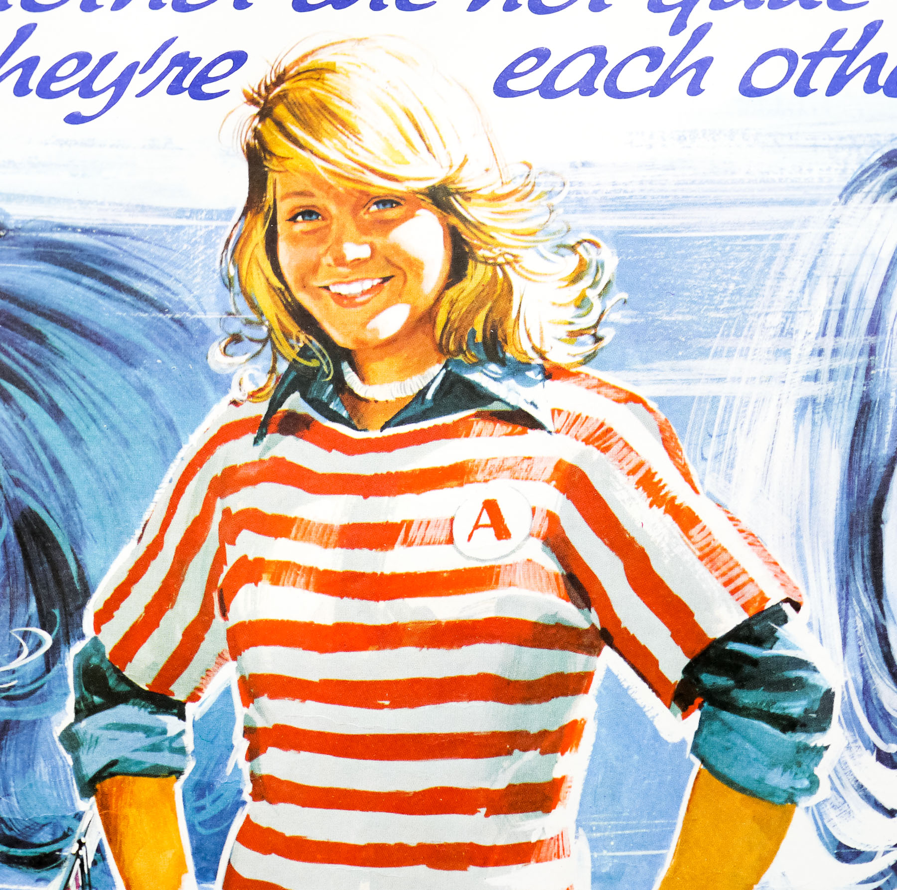
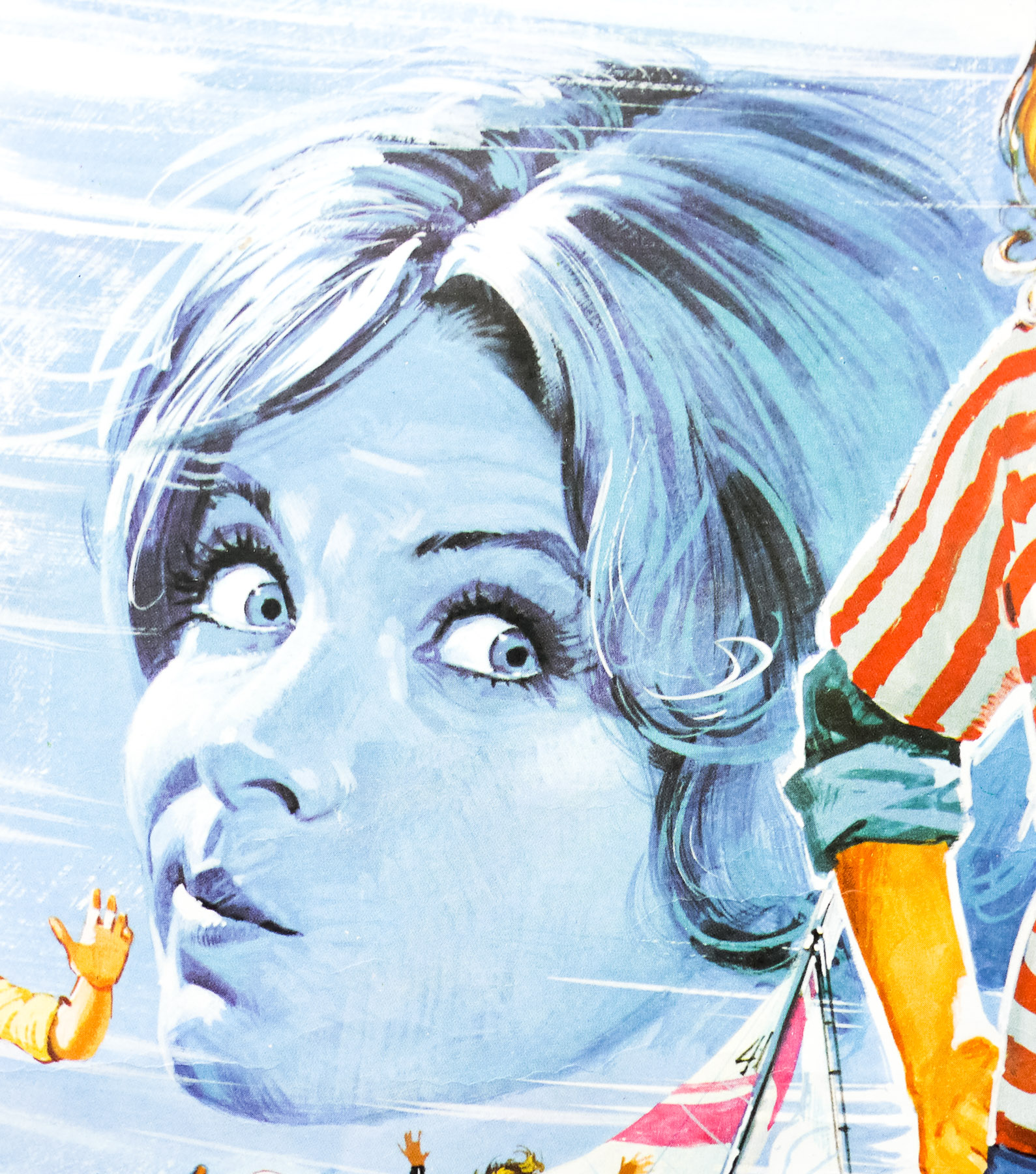
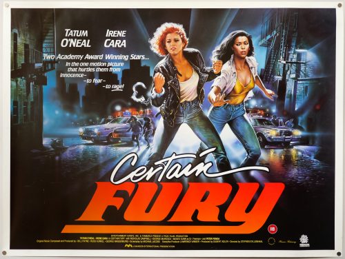
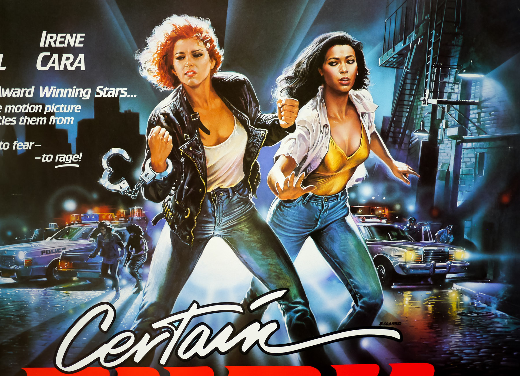
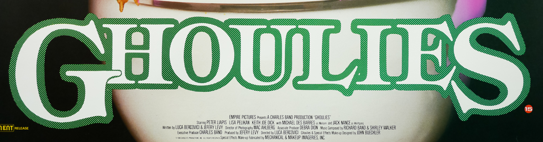
- Title
- Rosemary's Baby
- AKA
- --
- Year of Film
- 1968
- Director
- Roman Polanski
- Starring
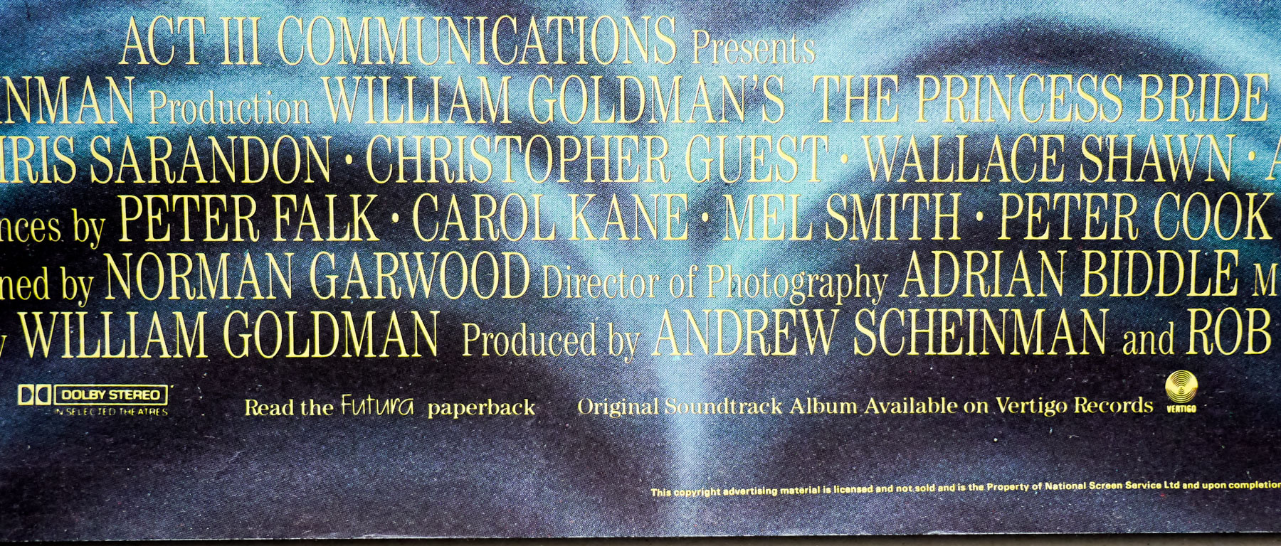
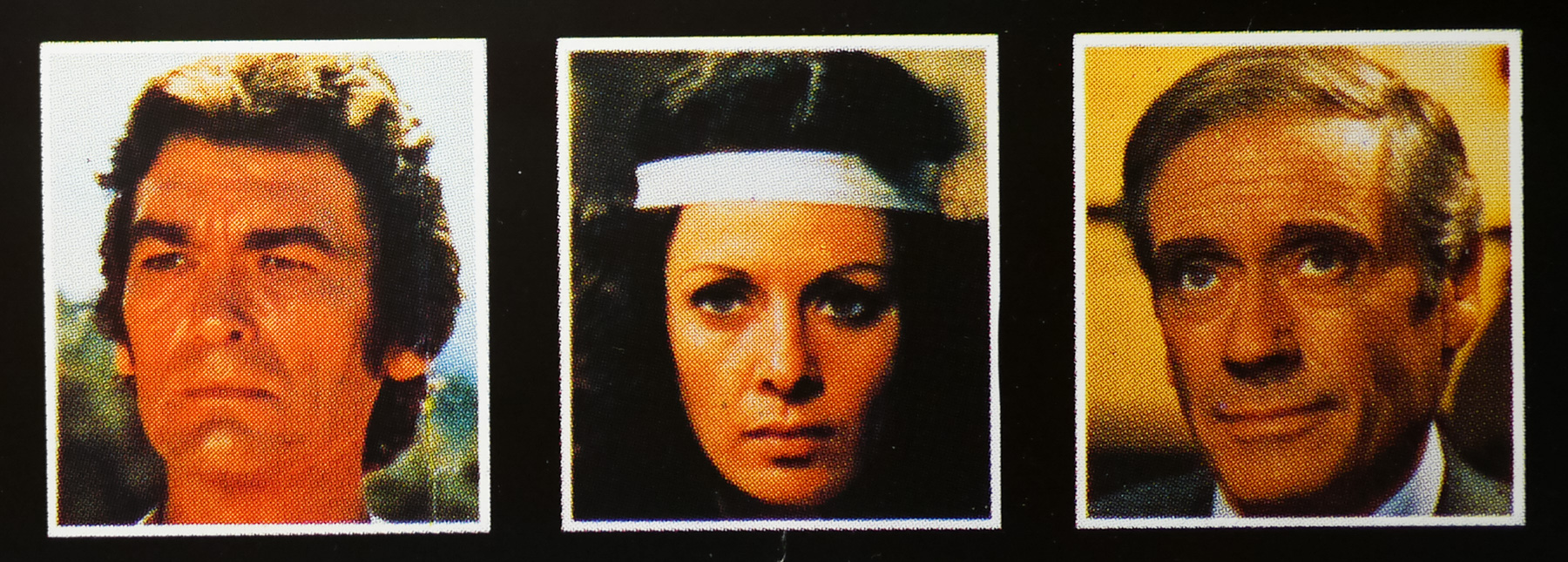
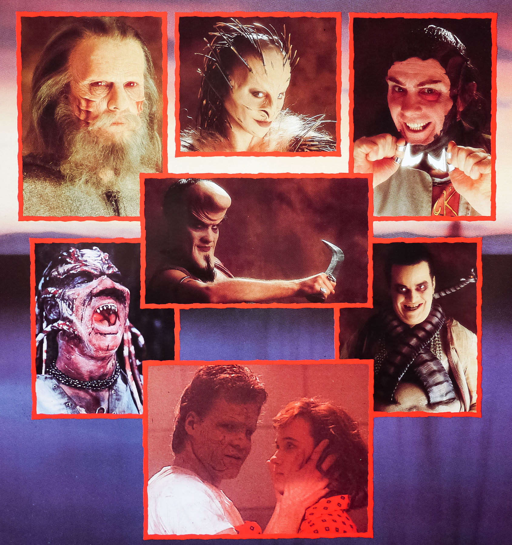
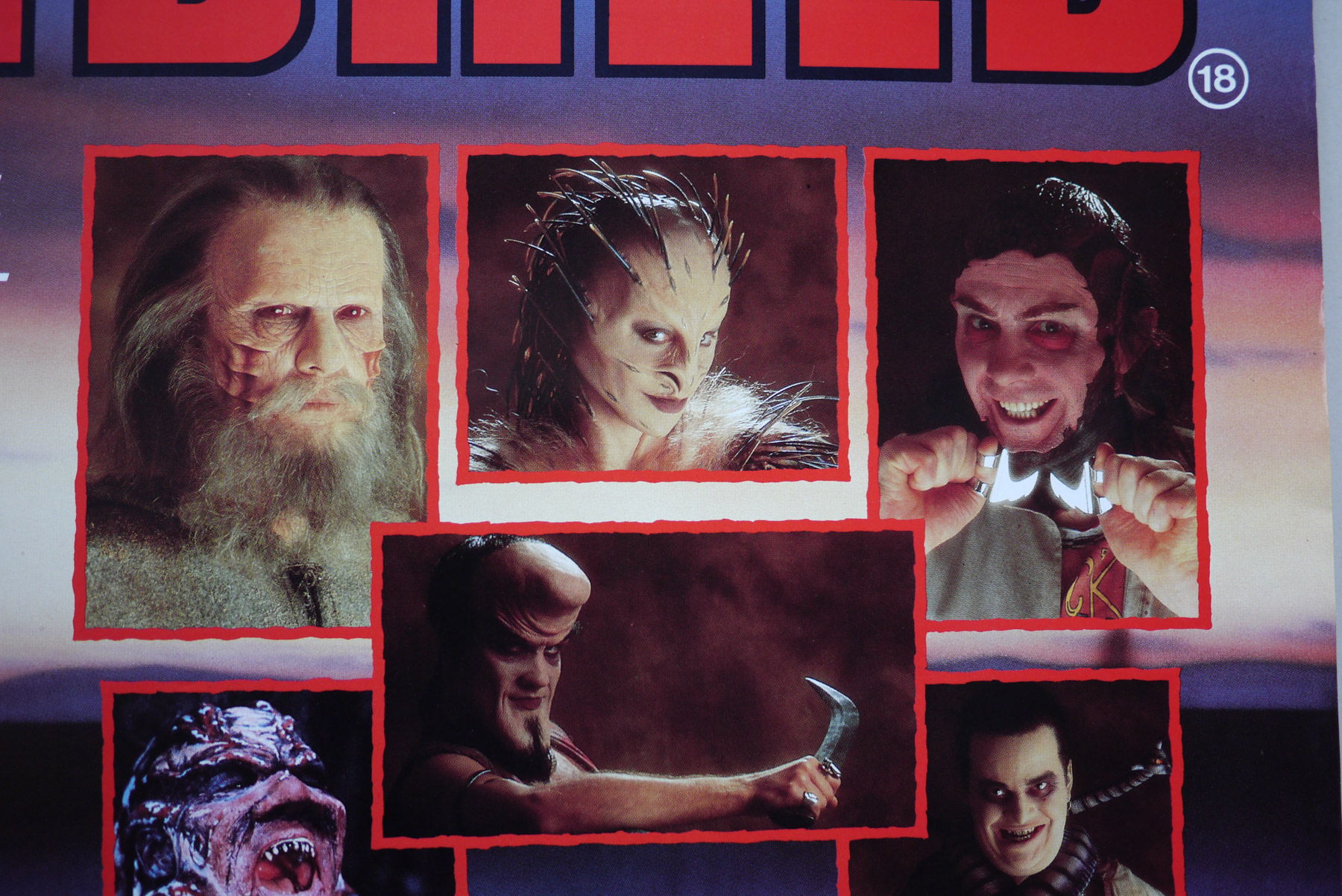
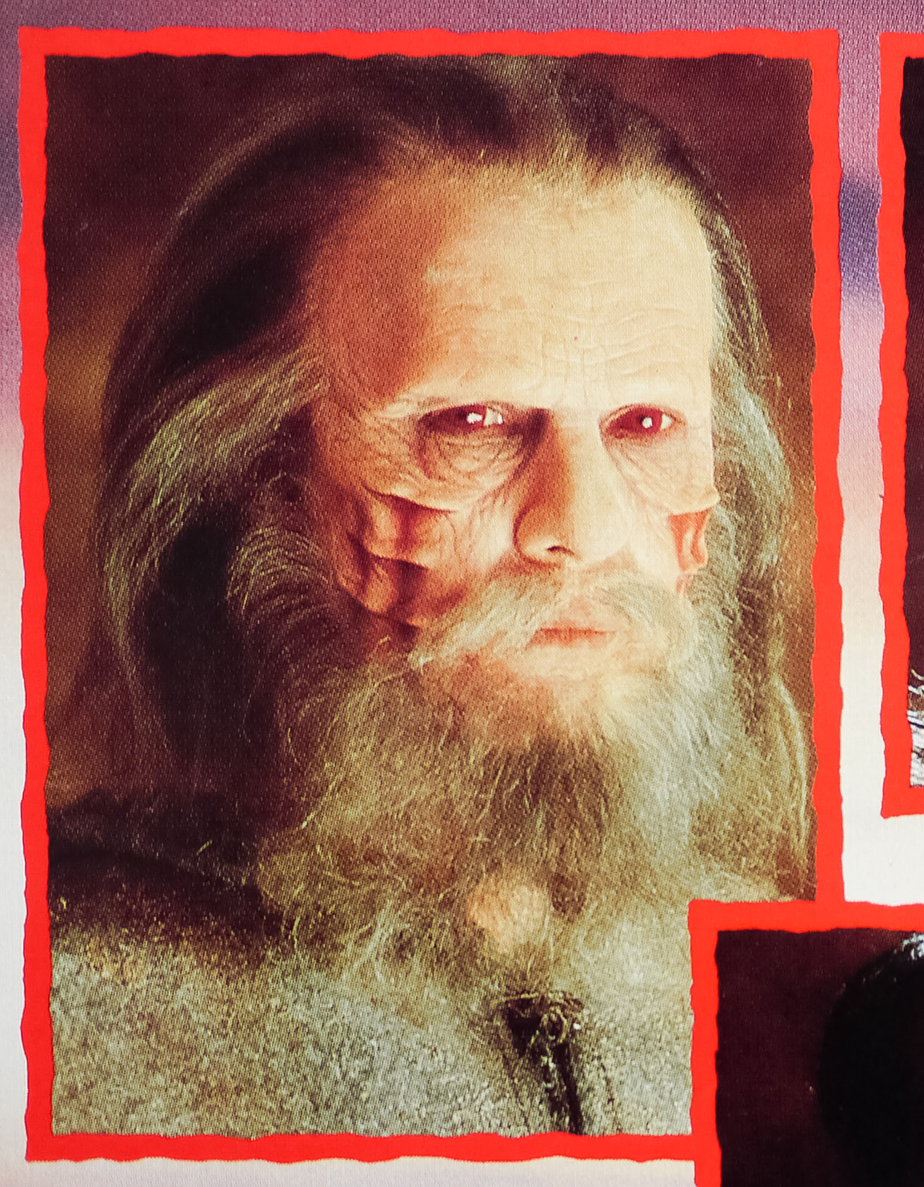
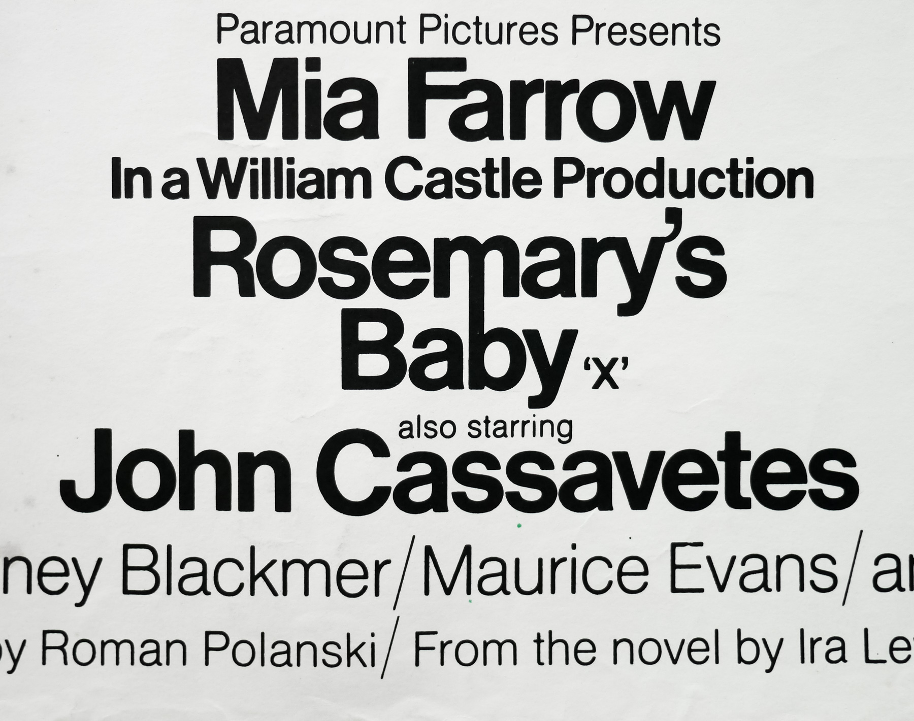
- Mia Farrow, John Cassavetes, Ruth Gordon, Sidney Blackmer, Maurice Evans, Ralph Bellamy, Victoria Vetri, Patsy Kelly, Elisha Cook Jr., Emmaline Henry, Charles Grodin
- Origin of Film
- USA
- Genre(s) of Film
- Mia Farrow, John Cassavetes, Ruth Gordon, Sidney Blackmer, Maurice Evans, Ralph Bellamy, Victoria Vetri, Patsy Kelly, Elisha Cook Jr., Emmaline Henry, Charles Grodin,
- Type of Poster
- Quad
- Style of Poster
- --
- Origin of Poster
- UK
- Year of Poster
- 1968
- Designer
- Philip Gips | Richard Danne | Stephen Frankfurt (creative director)
- Artist
- --
- Size (inches)
- 30 1/16" x 40"
- SS or DS
- SS
- Tagline
- Pray for Rosemary's Baby
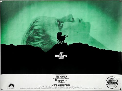
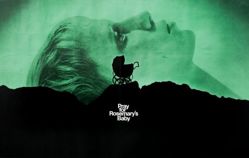
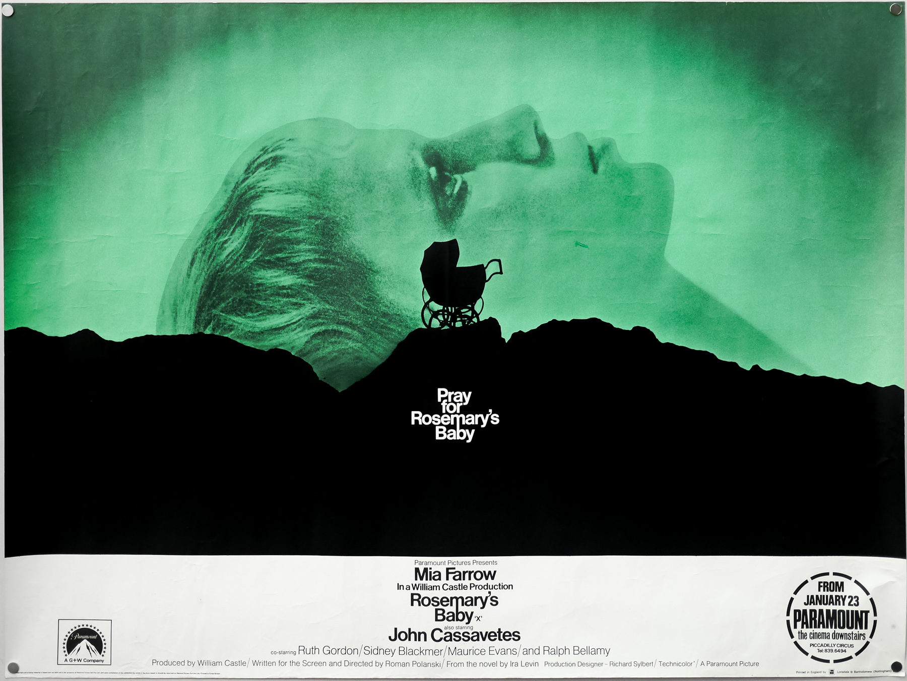
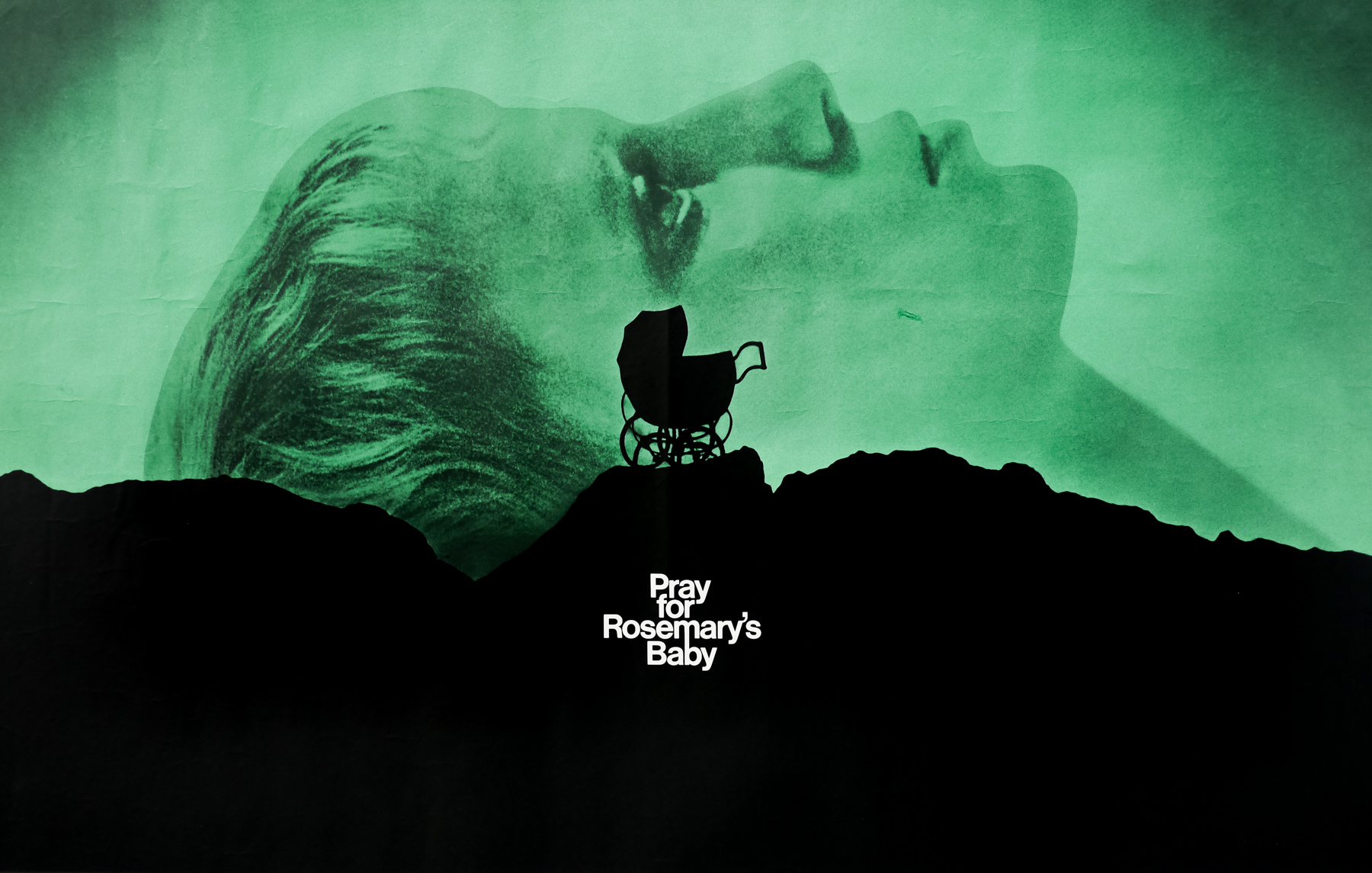
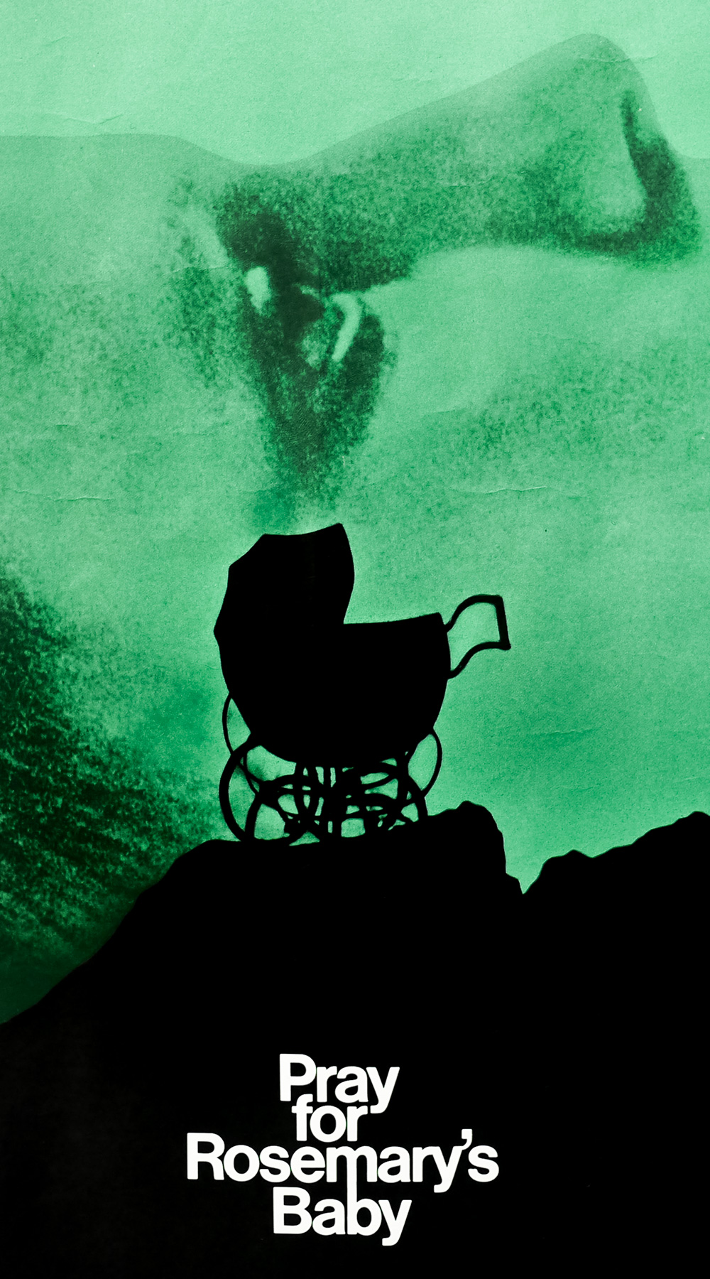
Roman Polanski’s 1968 horror masterpiece Rosemary’s Baby was released with one of the most iconic posters of all time that, like many of the most memorable designs, features a striking image in conjunction with an intriguing tagline. There is a fascinating, newly-filmed documentary on the recently released Criterion blu-ray of the film, which features many of the people involved in its making, including the legendary producer Robert Evans who recounts the story of how this poster came to be:
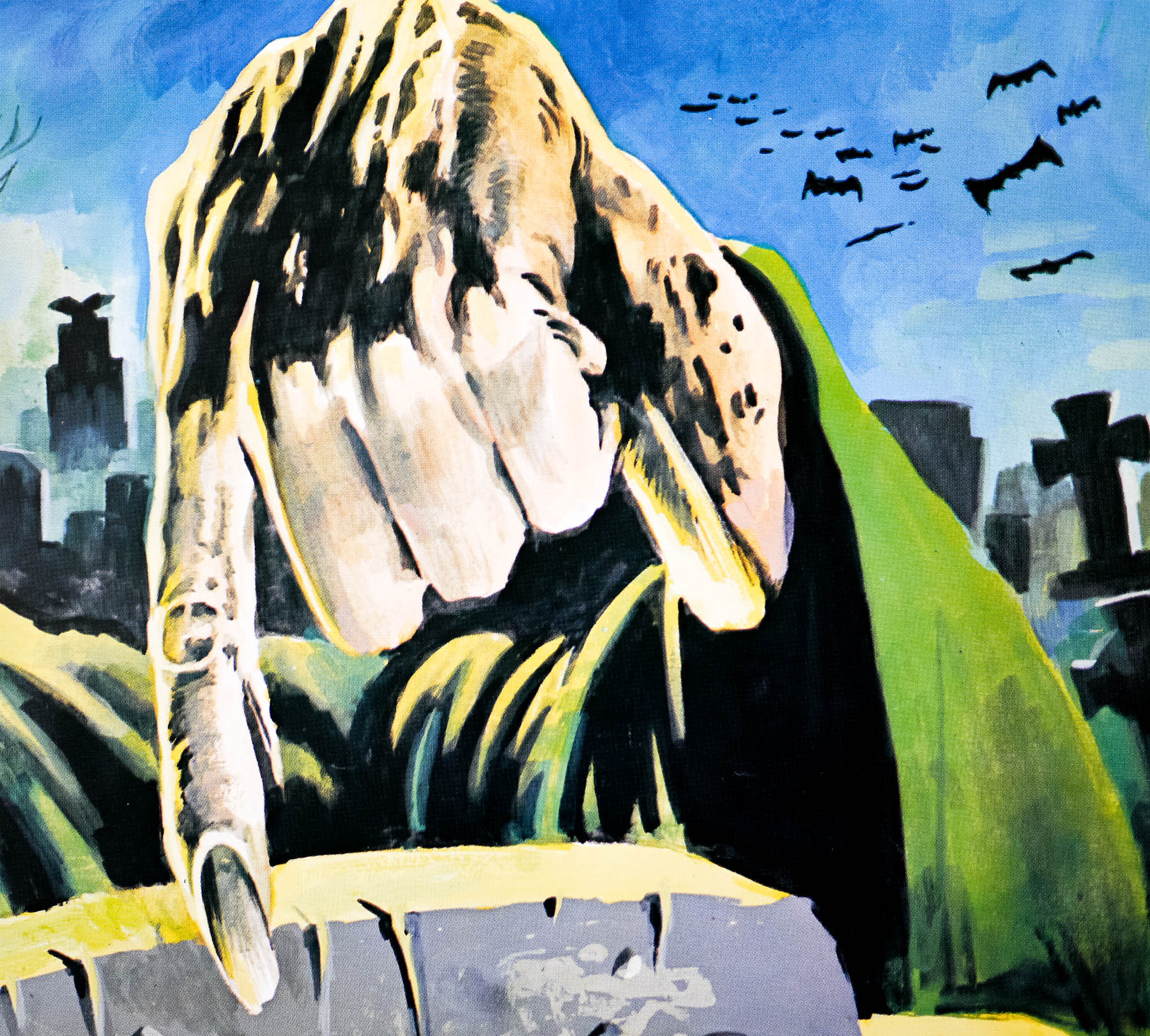
“When we finished the film the front office [of Paramount], which was in New York at the time, didn’t want to release it. They didn’t know how to sell it. I went to a friend of mine [Stephen Frankfurt] who was president at Young & Rubicam, a very large advertising agency, and I told him my problem; I can’t release the movie because the whole of our advertising team doesn’t know how to sell it, and the picture’s brilliant! He goes to see it and then he said to be ‘Bob, I’m going to tell it you straight; it’s not an easy picture to sell and I’m not going to take one dime from you to give you a whole campaign for it.’ He then said ‘But if you buy what I give you I want one hundred thousand dollars’.
I walked in to the chairman of the board Charles Bluhdorn‘s office and said ‘take a look at this and you tell me if you want to write a cheque for one hundred thousand dollars’ and I turned the artboard around and there it is; there’s a mountain and a carriage and it says ‘Pray for Rosemary’s Baby’, that’s all. And he looks at it and he becomes so pale that he’s as white as these shoes that I’m wearing and he said ‘I have to pay him one hundred thousand dollars for three [four] words?!’ and I said that’s right, and he did! Pray for Rosemary’s Baby became the ad of the year. It made the picture and without that image people wouldn’t know what it is and they still didn’t know but they were intrigued. It opened to the biggest business Paramount had done in years.”
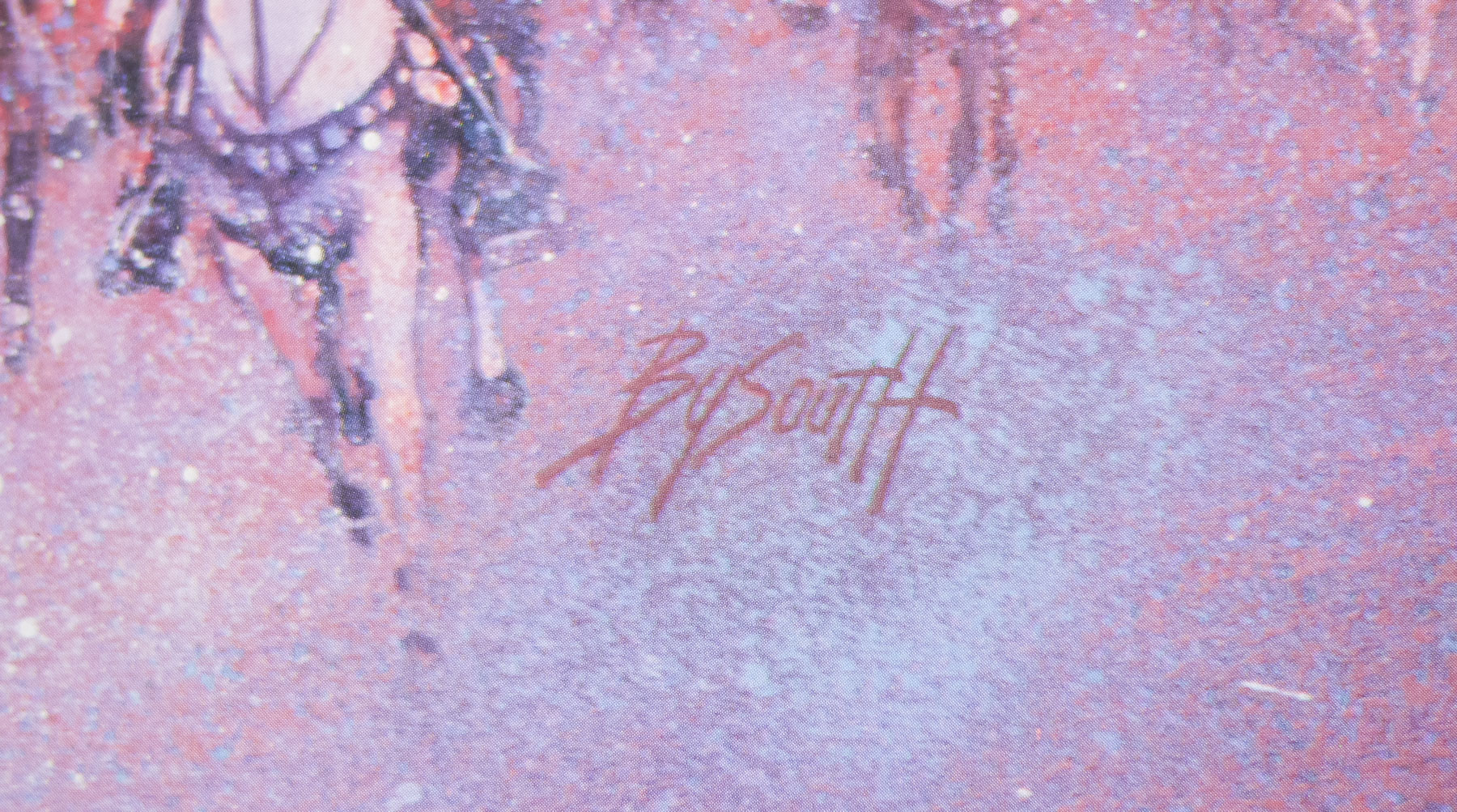
After a bit of research it seems that although Stephen Frankfurt should be credited as the creative director for the poster, it was actually designed by Philip Gips in conjunction with Richard Danne. I’ve been attempting to figure out exactly where each of these designers worked and I have to confess it has left me slightly confused. Stephen Frankfurt is profiled in this excellent piece by Adrian Curry on Mubi.com that details his involvement in several seminal film posters of the 1960s and 70s, including Downhill Racer and the first Emmanuelle movie. He also worked on opening titles (To Kill a Mockingbird) and trailers for several films, including the one for Rosemary’s Baby. According to the article Frankfurt’s thing ‘was to see the packaging of movies as a totality—designing the titles, posters, trailers and ads with one common look and theme.’ The article also notes that the baby carriage on the crag was shot on the outcrops of rocks in Manhattan’s Central Park.
Frankfurt died earlier this year and in this article in Adweek it mentions that he was also a partner in an agency he set up with Philip Gips and Aubrey Balkind (named simply Frankfurt Gips Balkind), where he worked on over 55 film marketing campaigns. It’s not totally clear but I believe that he must have worked on this poster whilst also serving as president at Young and Rubicam, hence the fact that Robert Evans mentions the larger agency in the interview above.
Note that in the comments of that article someone with the username ‘Villafranca’ writes the following:
“In the mid-90’s, I worked for Philip Gips’s the small agency that he started after he left Frankfurt, Gips Balkind. In his office, he had framed prints of both the “Rosemary’s Baby” and “Alien” posters hanging in his office because, well, he designed them. And one other small tidbit: his wife, Barbara, wrote the line “In space no one can hear you scream” (not Stephen Frankfurt). Phil told me this personally.”
Further on in the comments another poster called ‘danagips’ writes:
“This should absolutely be retitled the movie posters of Phil Gips. And my mother did indeed write, ‘In Space No One Can Hear You Scream’ for Alien.”
In addition to this, the website of AIGA (American Institute of Graphic Arts) features a page on the poster that also credits Richard Danne as a co-designer of the poster. Danne appears to have had a lengthy and lauded career in the New York advertising industry and his official website features a biography that indicates he served as president of AIGA as well as a several other organisations. The Rosemary’s Baby poster features on his website where another agency ‘Gips and Danne’ is mentioned (the AIGA website has examples of that agency’s work).
The agency for the poster is credited as Gips and Danne so does that mean that Philip Gips was also working as a partner in a second design firm in addition to the one he founded with Frankurt and Balkind? Was this job given to Gips and Richard Danne’s firm by Frankfurt who was working for Paramount? I intend to contact Richard Danne to try and clarify but I’d appreciate any other information that people may have so I can accurately credit the poster.
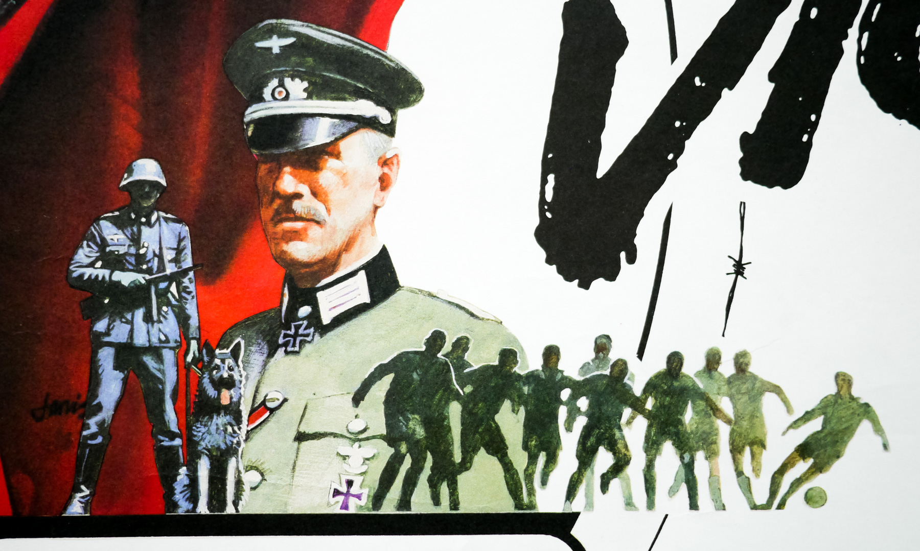
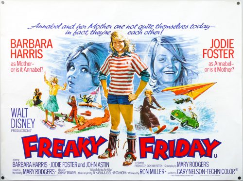
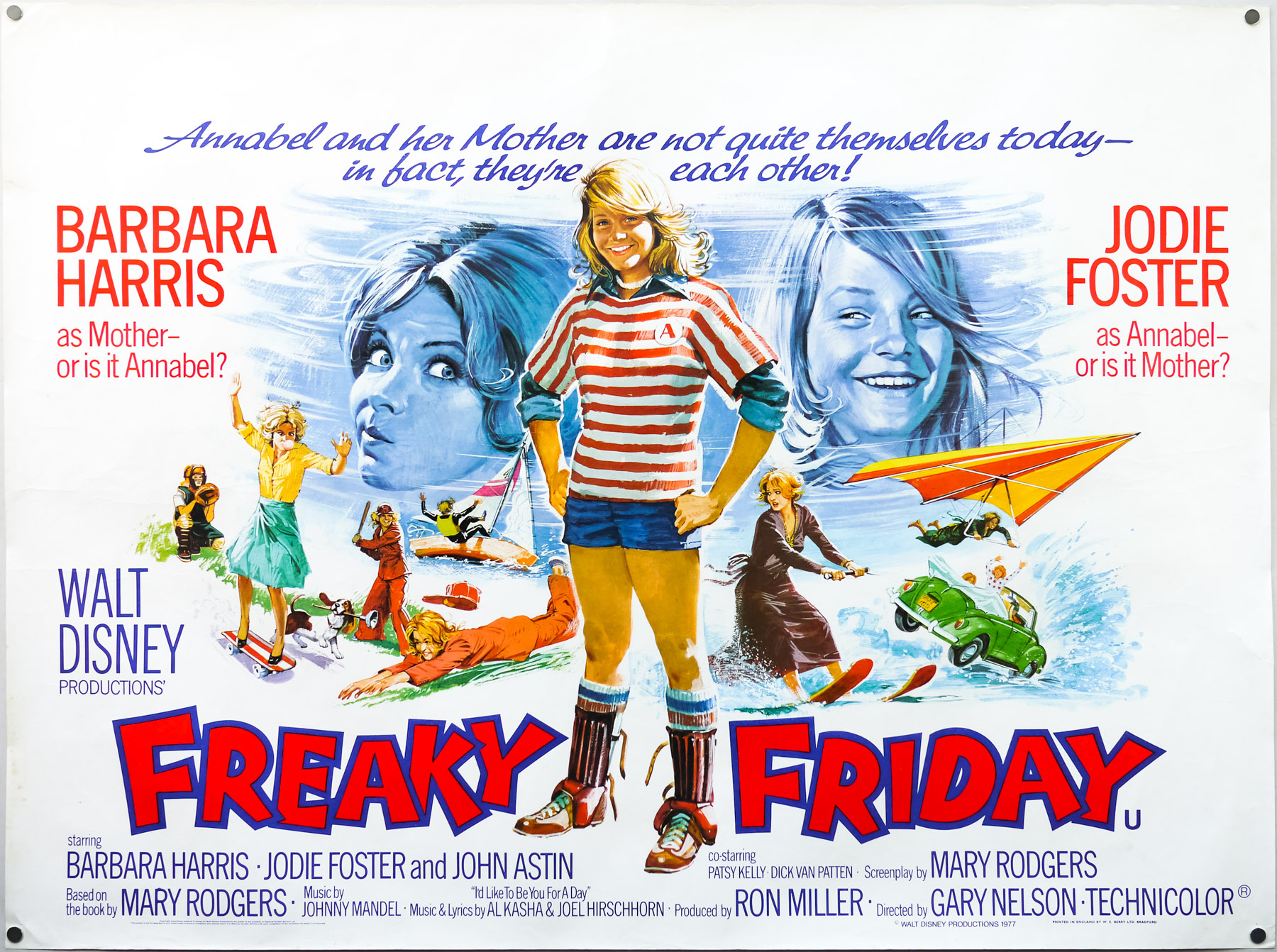
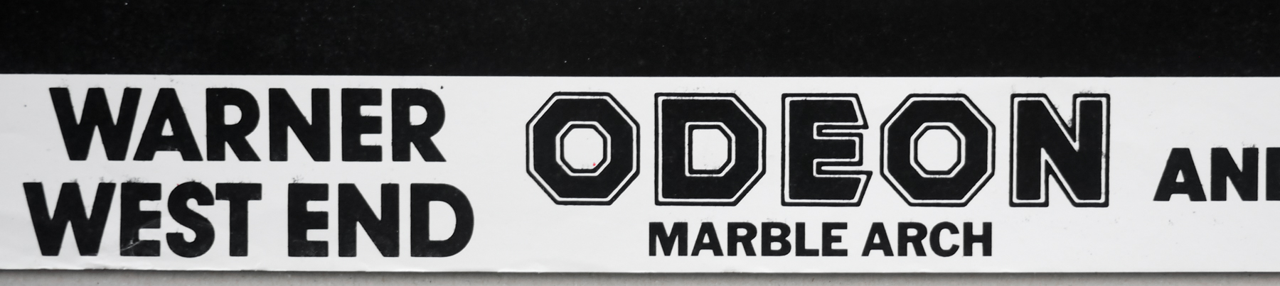
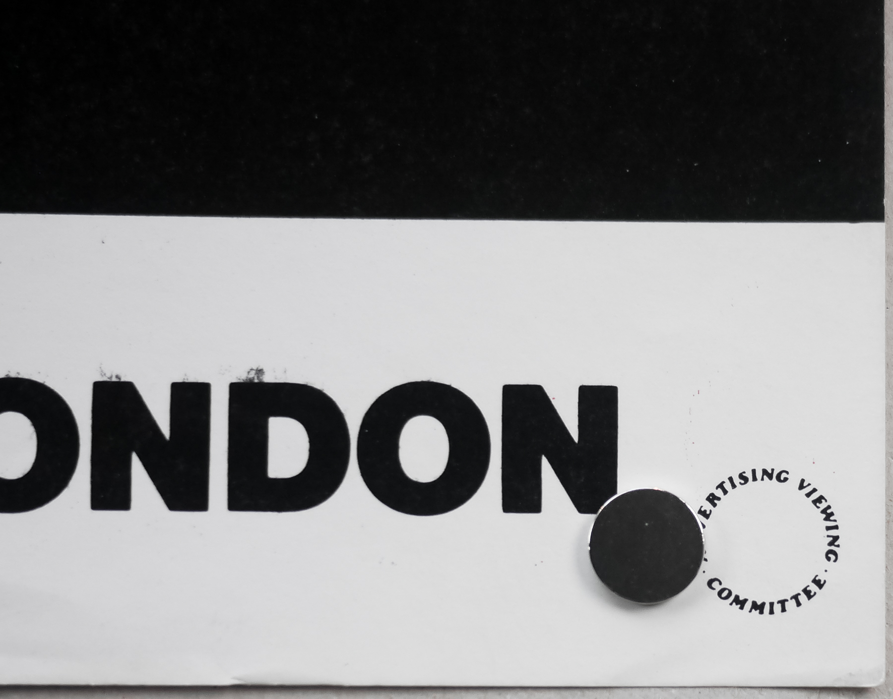
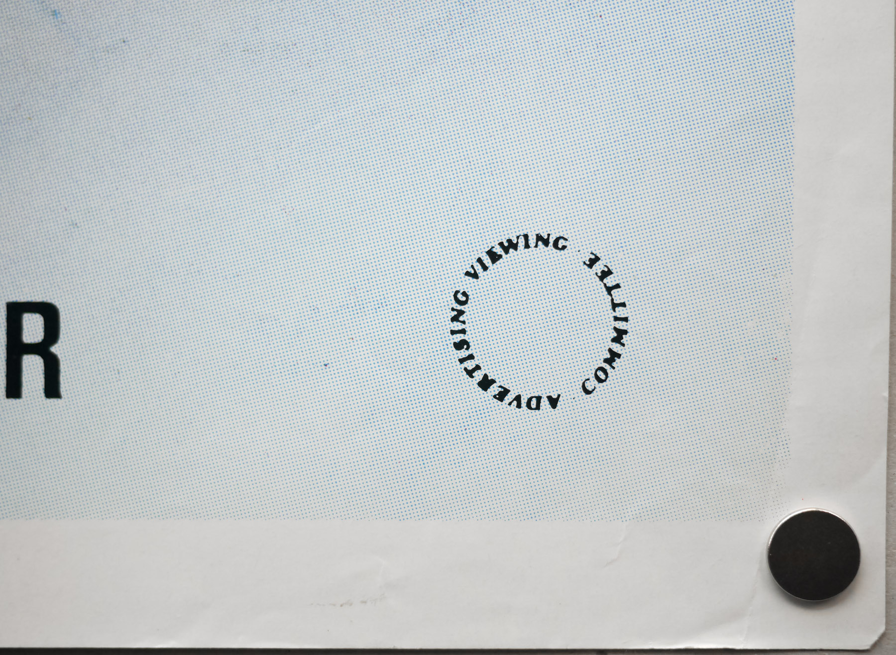
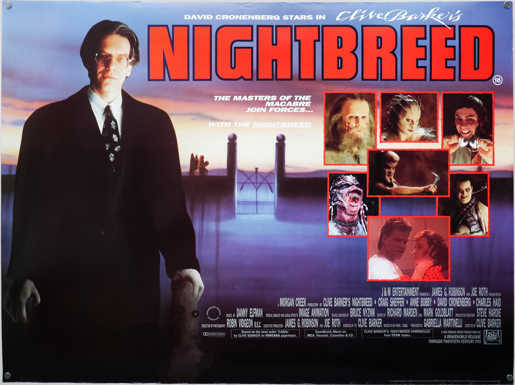
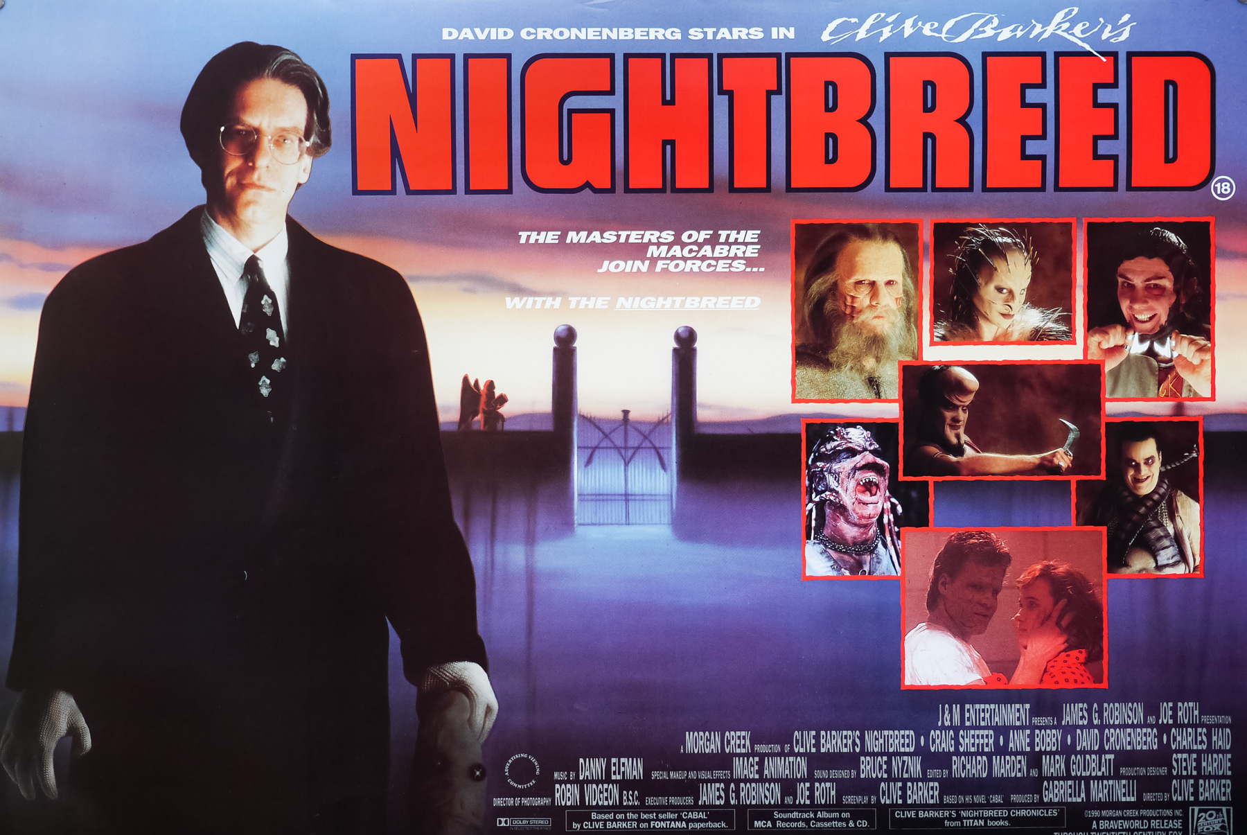
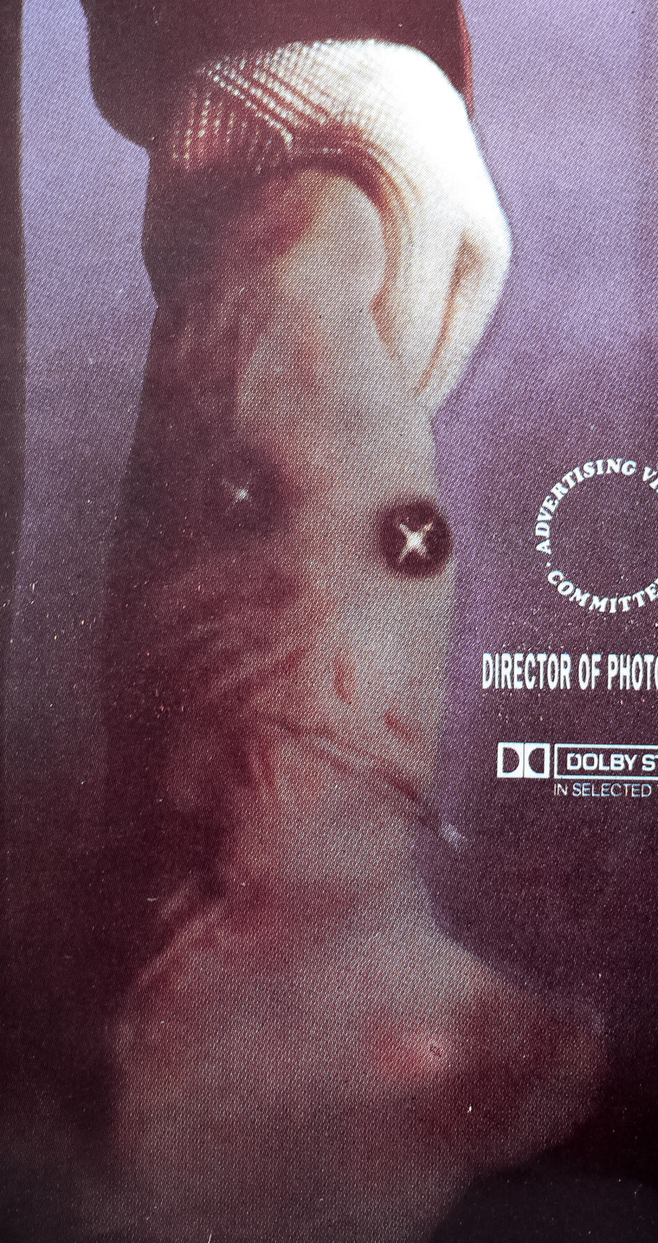
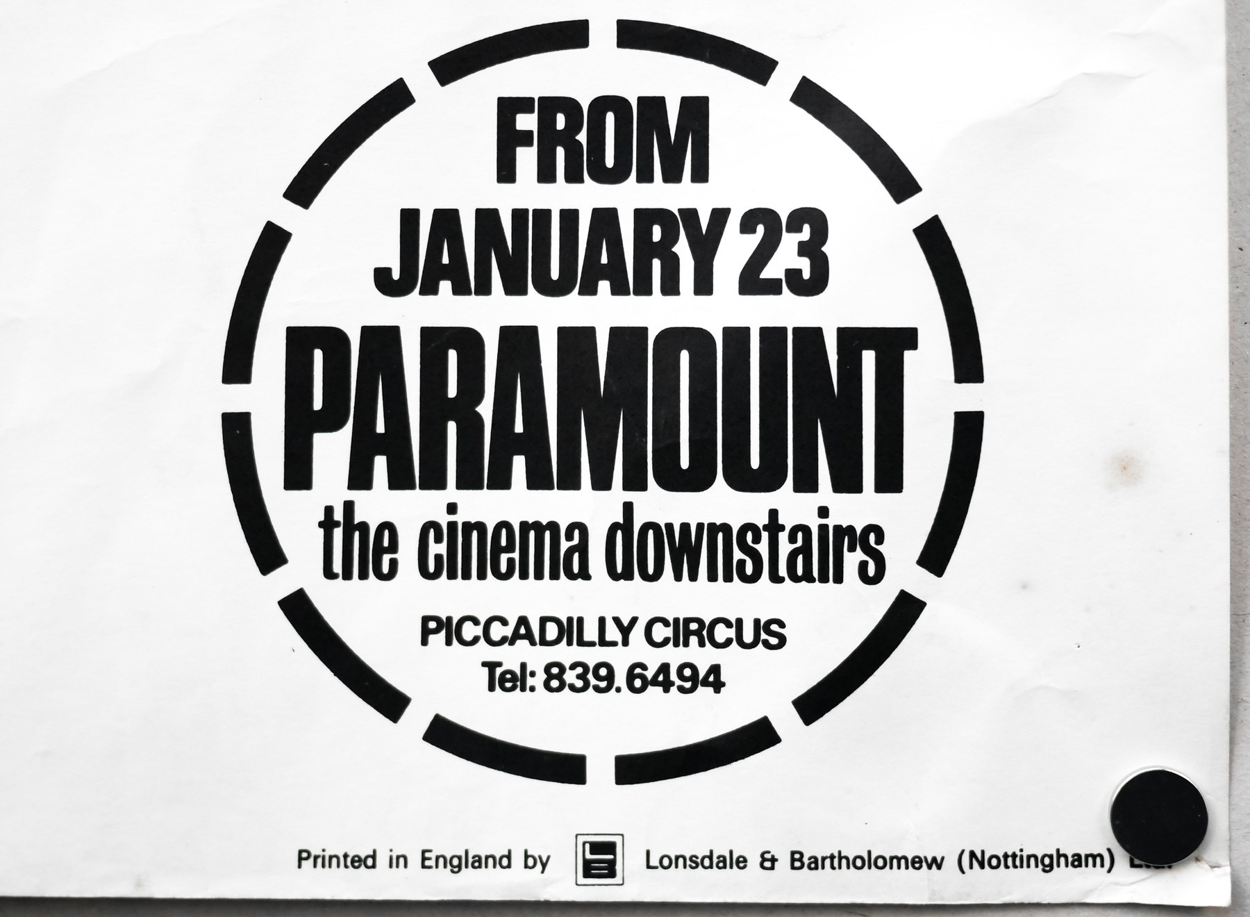
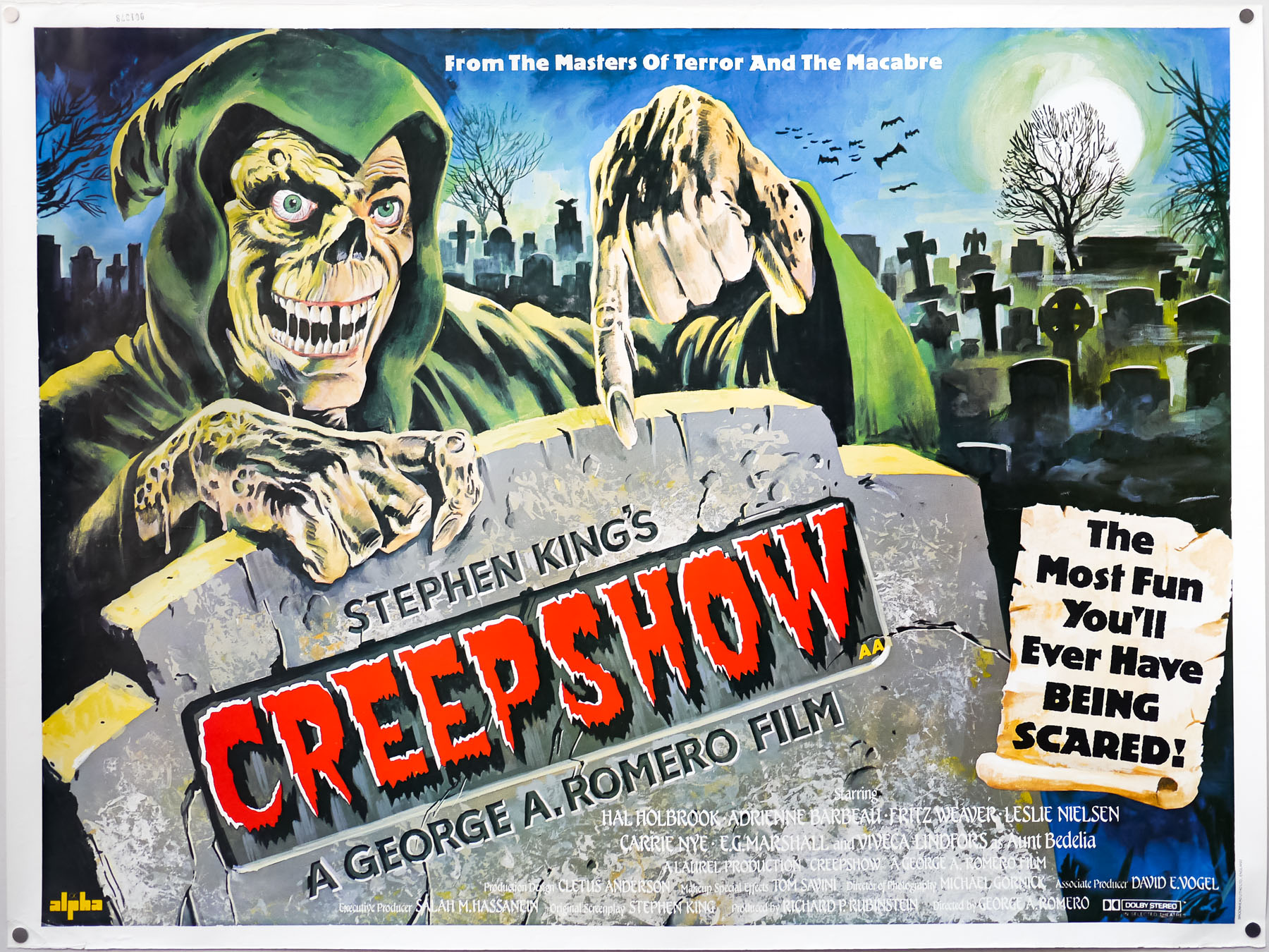
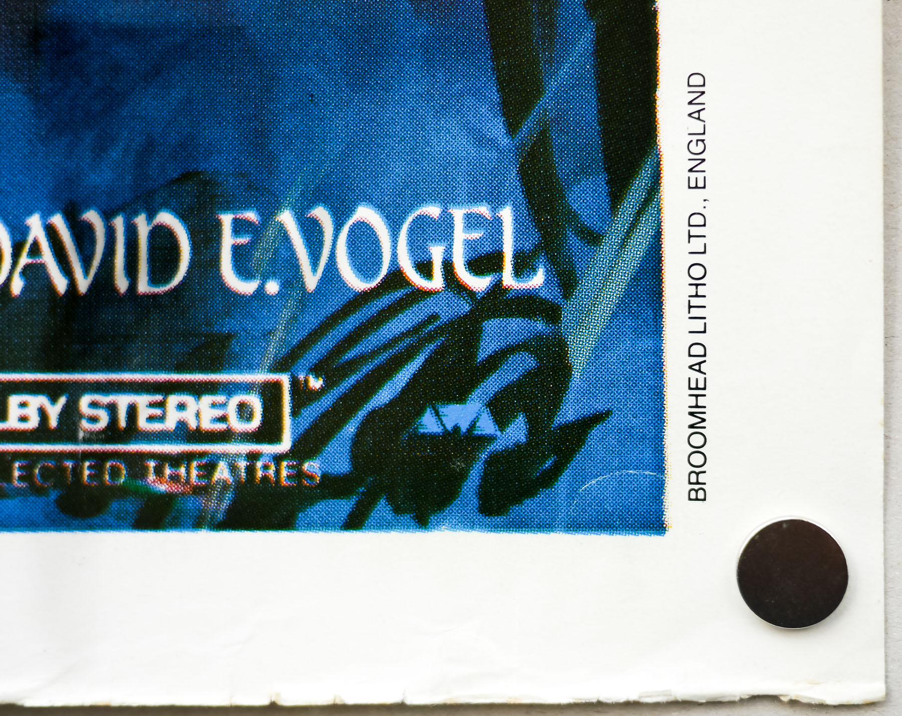
This is the original British quad for the release of the film over here and I was utterly thrilled to find it in excellent, rolled condition. Note the circular snipe in the bottom corner which ties it to the Paramount cinema in London’s Piccadilly Circus. The building was opened in 1921 as the large and luxurious cinema known as the Plaza Theatre that was designed and built for Paramount Pictures to be their showcase venue in London. The Arthur Lloyd ‘music hall and theatre history’ website features a page on the cinema that details its history and has several excellent pictures included. Finally, I’m unsure who will have done the design work to adapt the original portrait one sheet design to the landscape quad format.