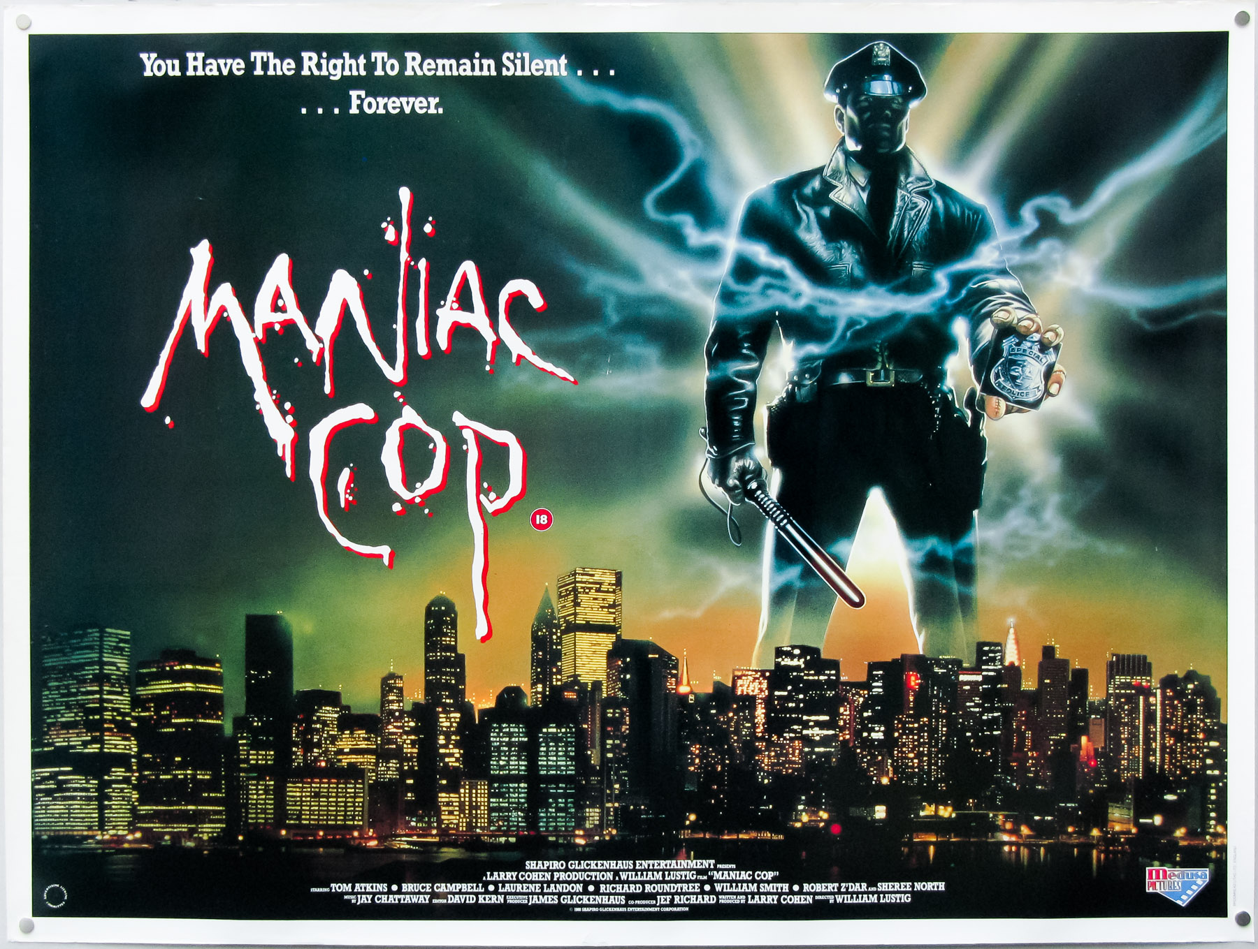
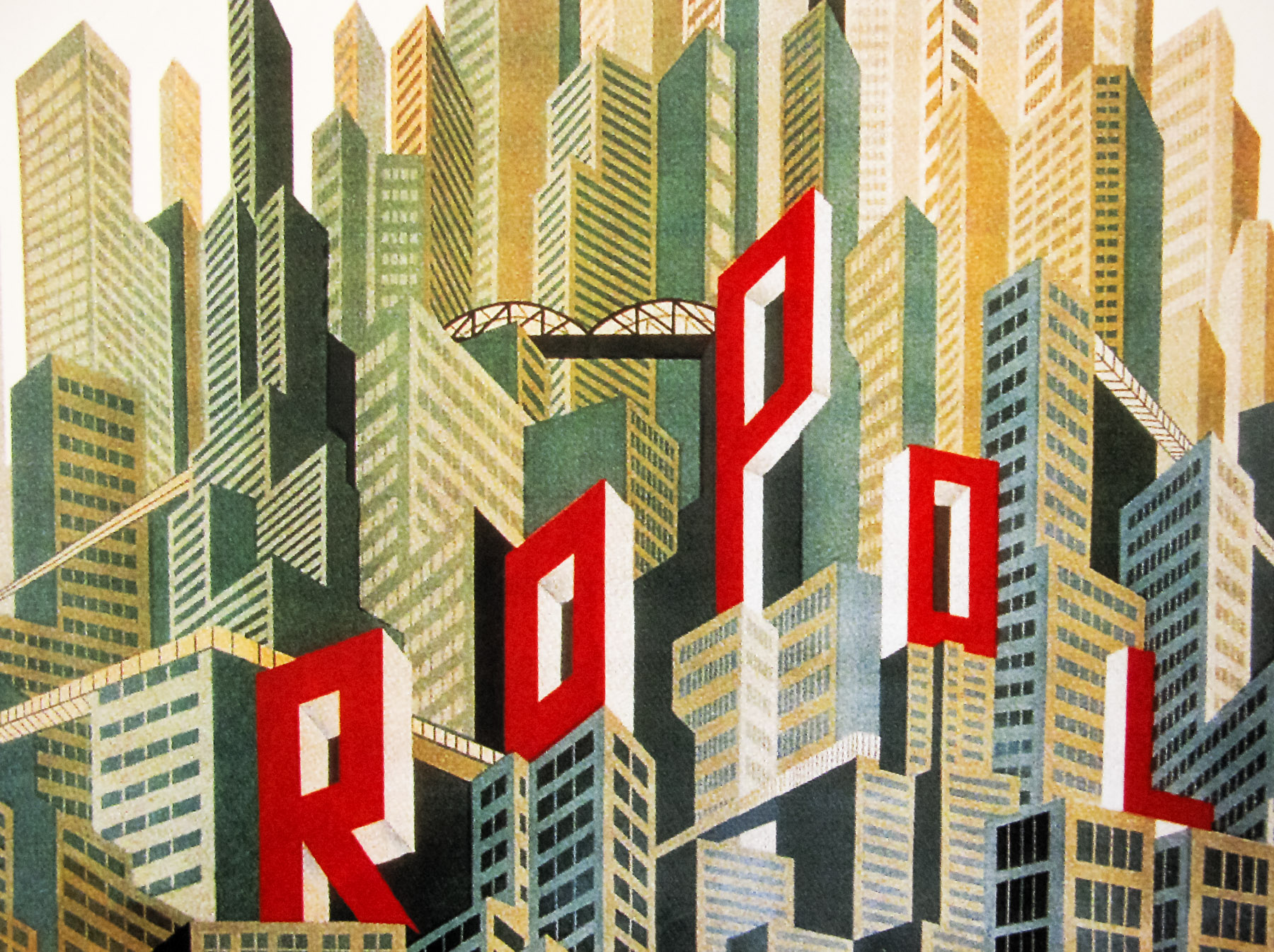
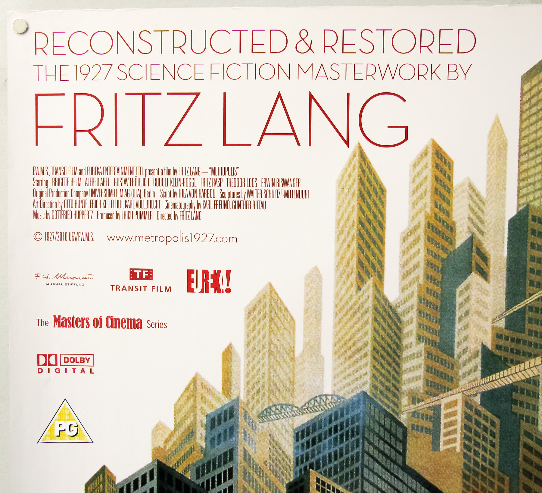
You searched for: Quad%2520
18.05.11
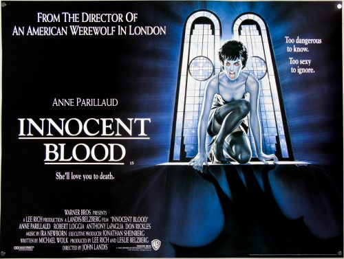
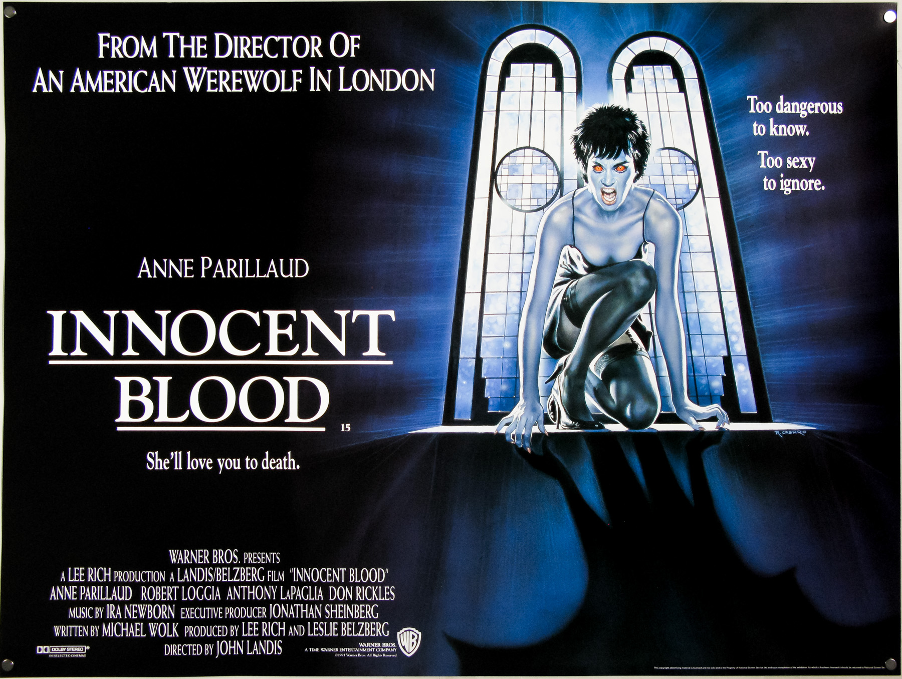
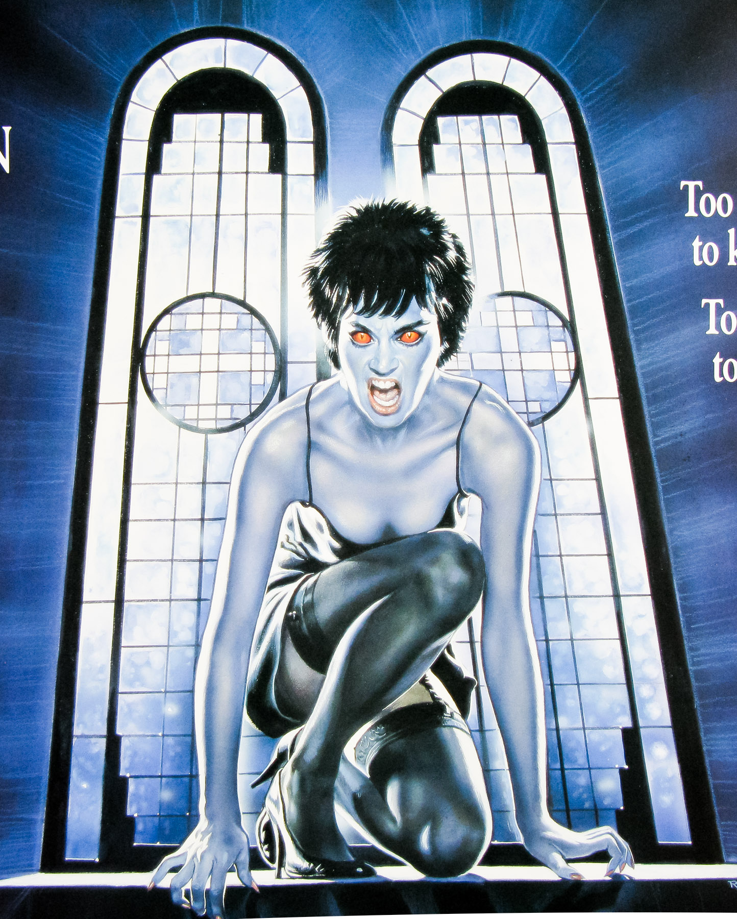
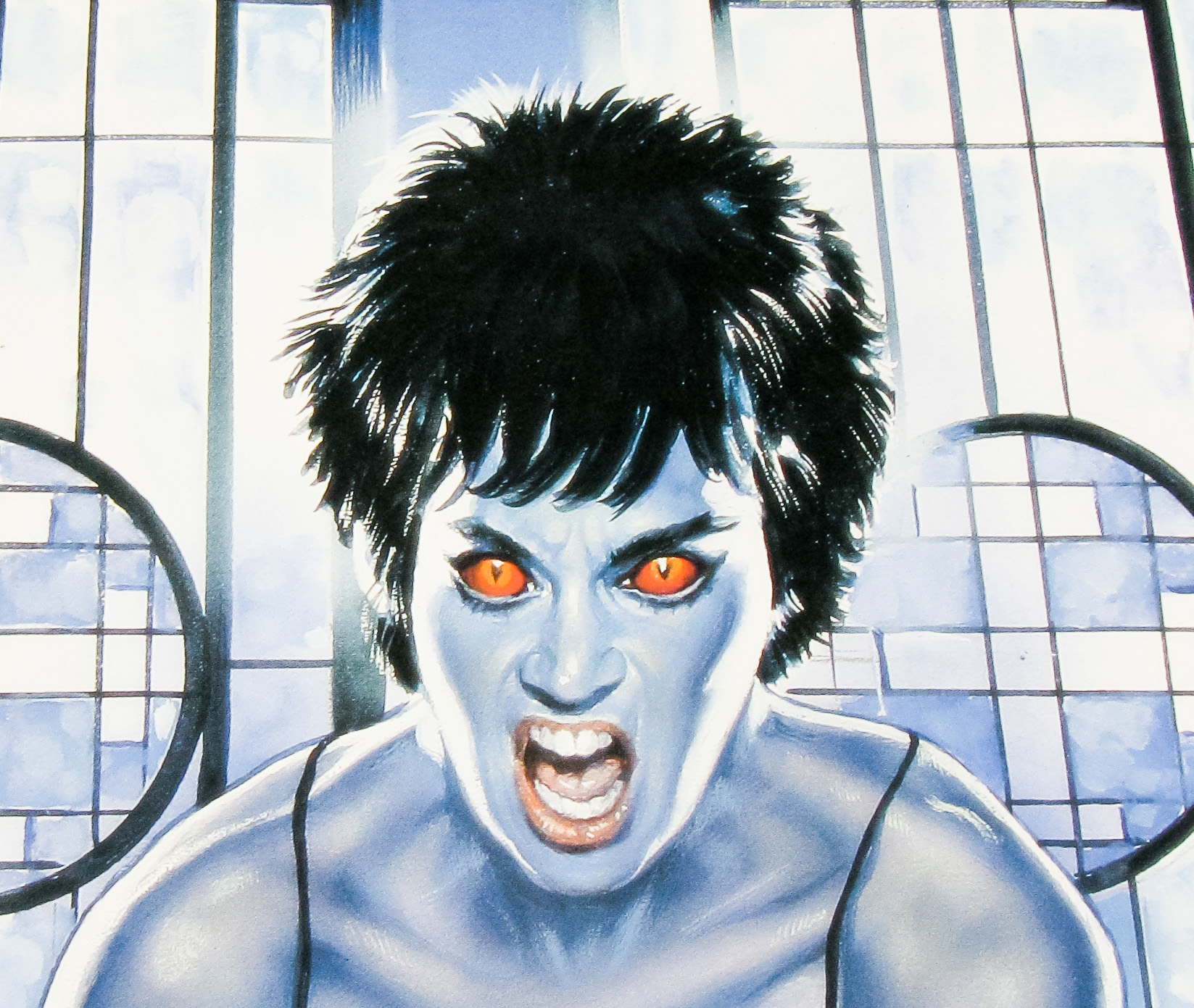
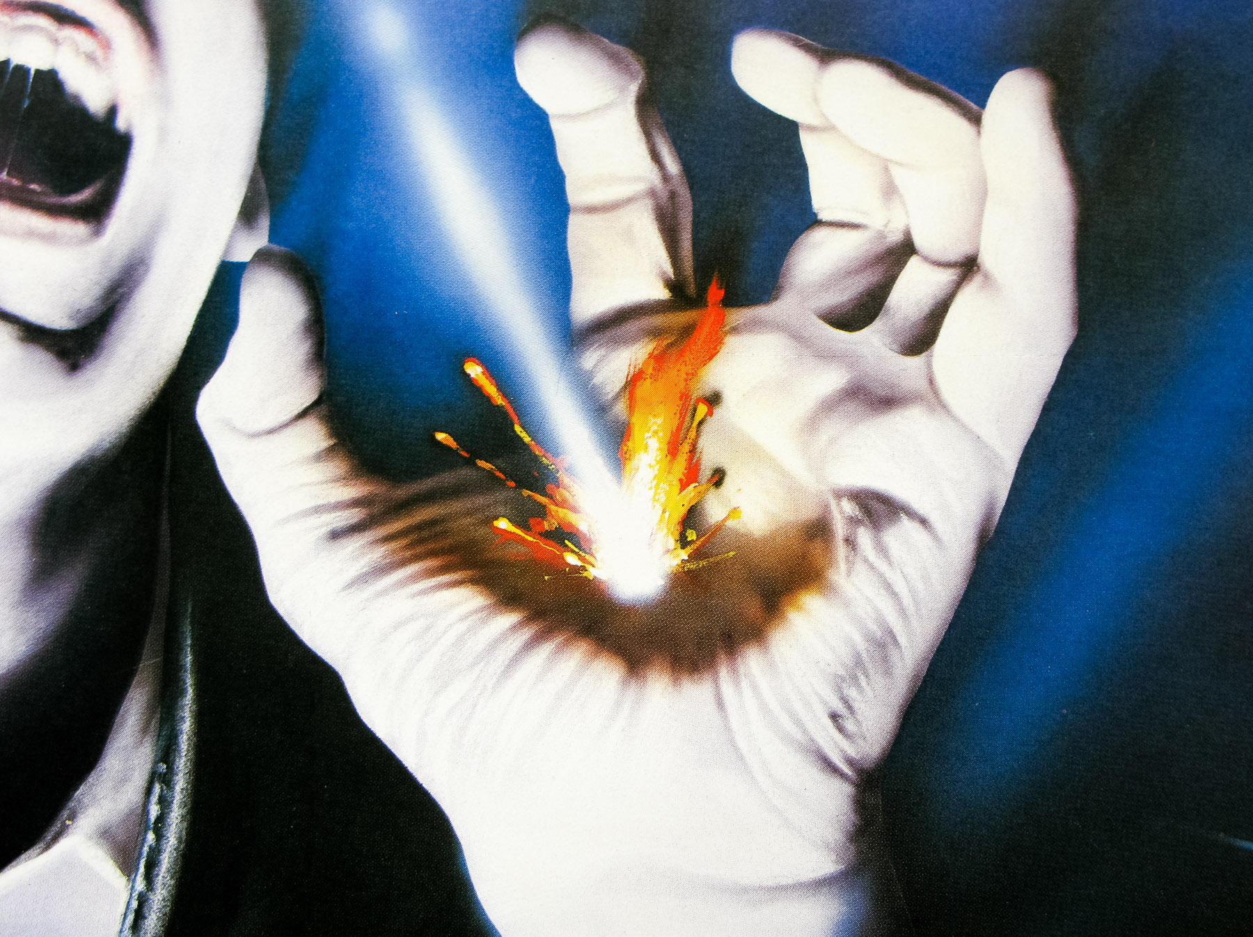
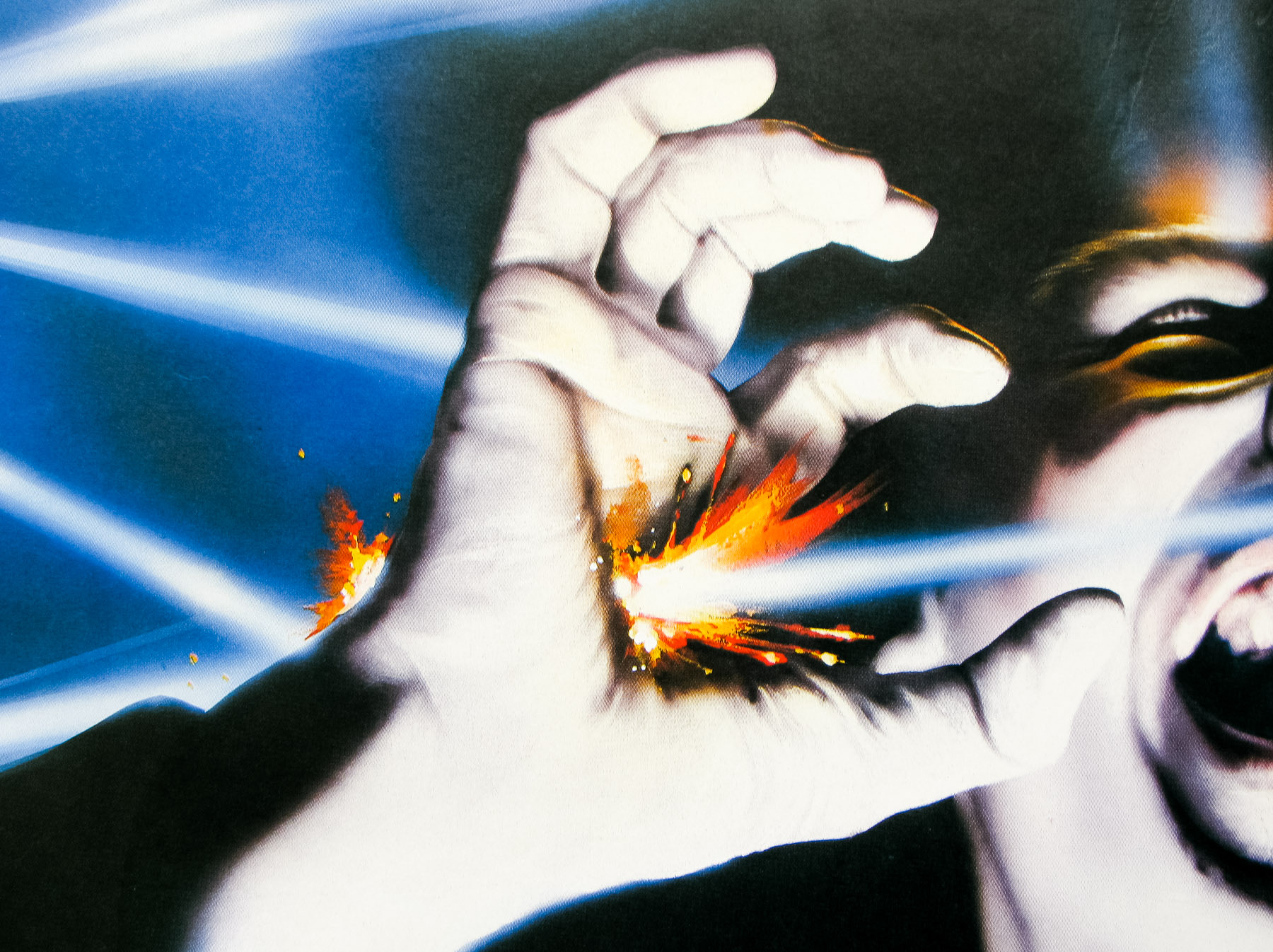
- Title
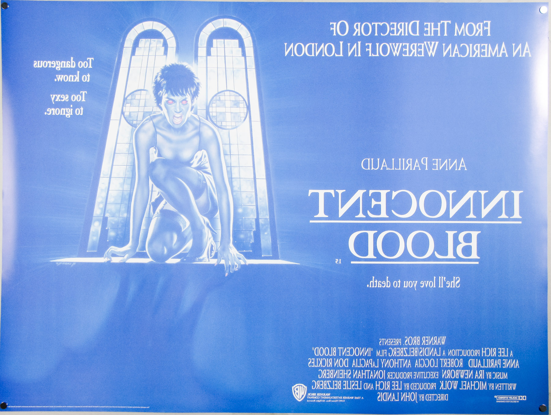
- Innocent Blood
- AKA
- Bloody Marie (Germany, video) | Transilvania, mi amor (Mexico, Argentina) | Amore all'ultimo morso [Love at last bite] (Italy)
- Year of Film
- 1992
- Director
- John Landis
- Starring
- Anne Parillaud, David Proval, Rocco Sisto, Chazz Palminteri, Anthony LaPaglia, Robert Loggia, Tony Sirico, Tony Lip, Kim Coates, Marshall Bell, Leo Burmester, Rohn Thomas, Angela Bassett, Luis Guzmán, Don Rickles, Tom Savini, Sam Raimi, Dario Argento, Frank Oz
- Origin of Film
- USA
- Genre(s) of Film
- Anne Parillaud, David Proval, Rocco Sisto, Chazz Palminteri, Anthony LaPaglia, Robert Loggia, Tony Sirico, Tony Lip, Kim Coates, Marshall Bell, Leo Burmester, Rohn Thomas, Angela Bassett, Luis Guzmán, Don Rickles, Tom Savini, Sam Raimi, Dario Argento, Frank Oz,
- Type of Poster
- Quad
- Style of Poster
- --
- Origin of Poster
- UK
- Year of Poster
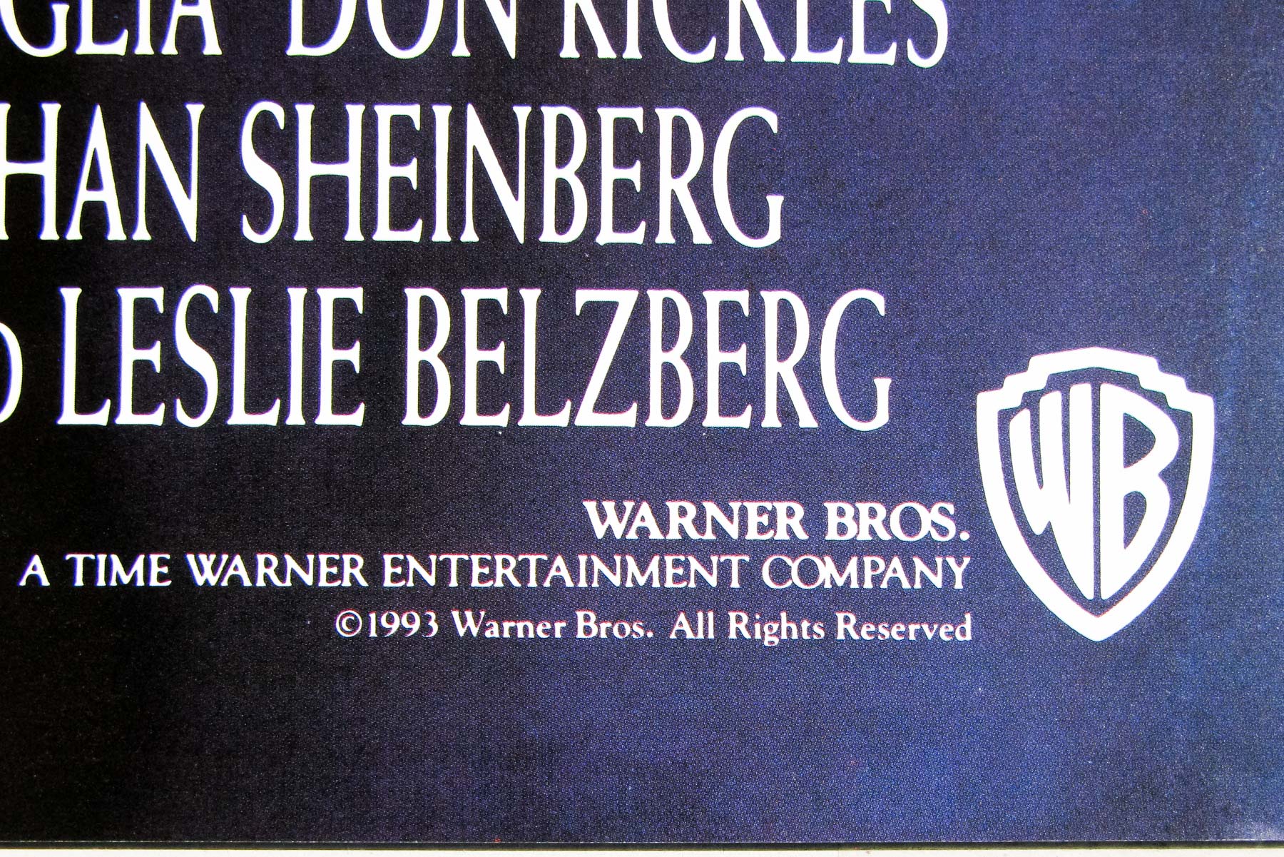
- 1993
- Designer
- Unknown
- Artist
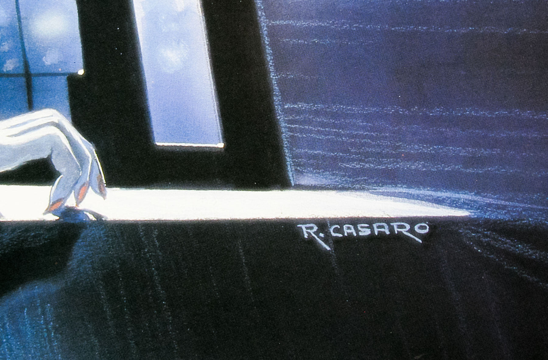
- Renato Casaro
- Size (inches)
- 30 1/16" x 40"
- SS or DS
- DS
- Tagline
- Too dangerous to know. Too sexy to ignore.
18.05.11
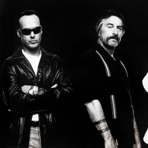
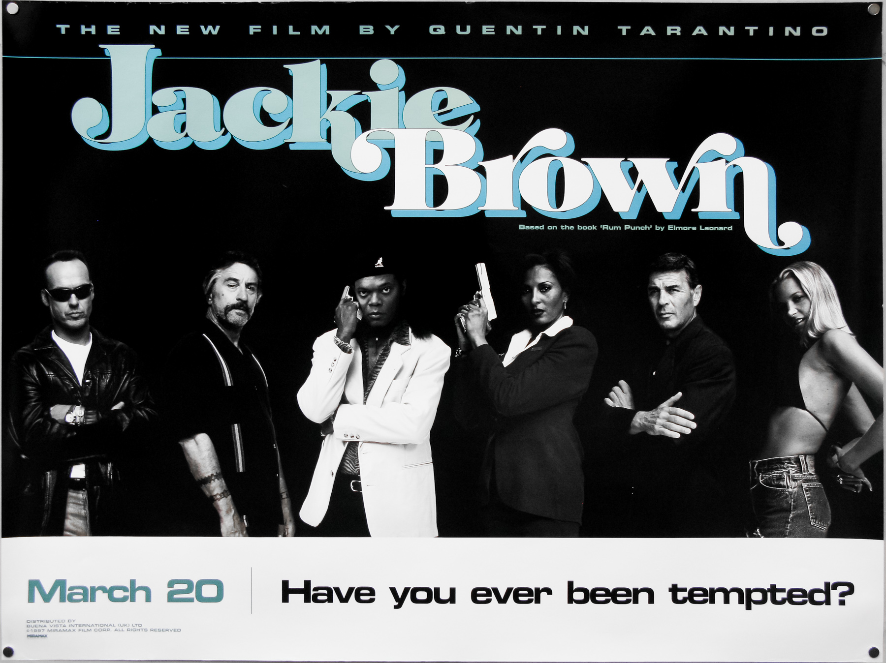
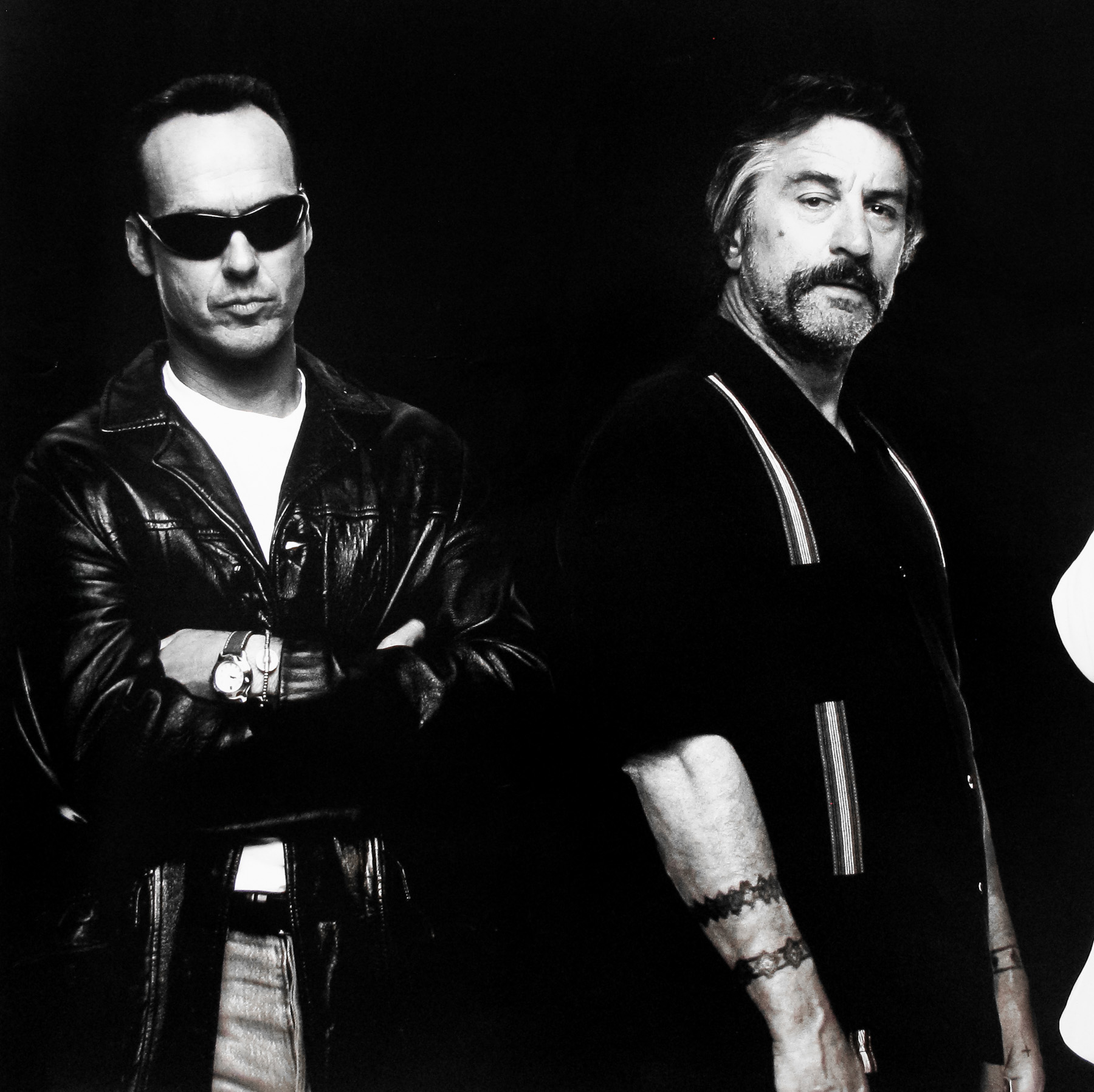
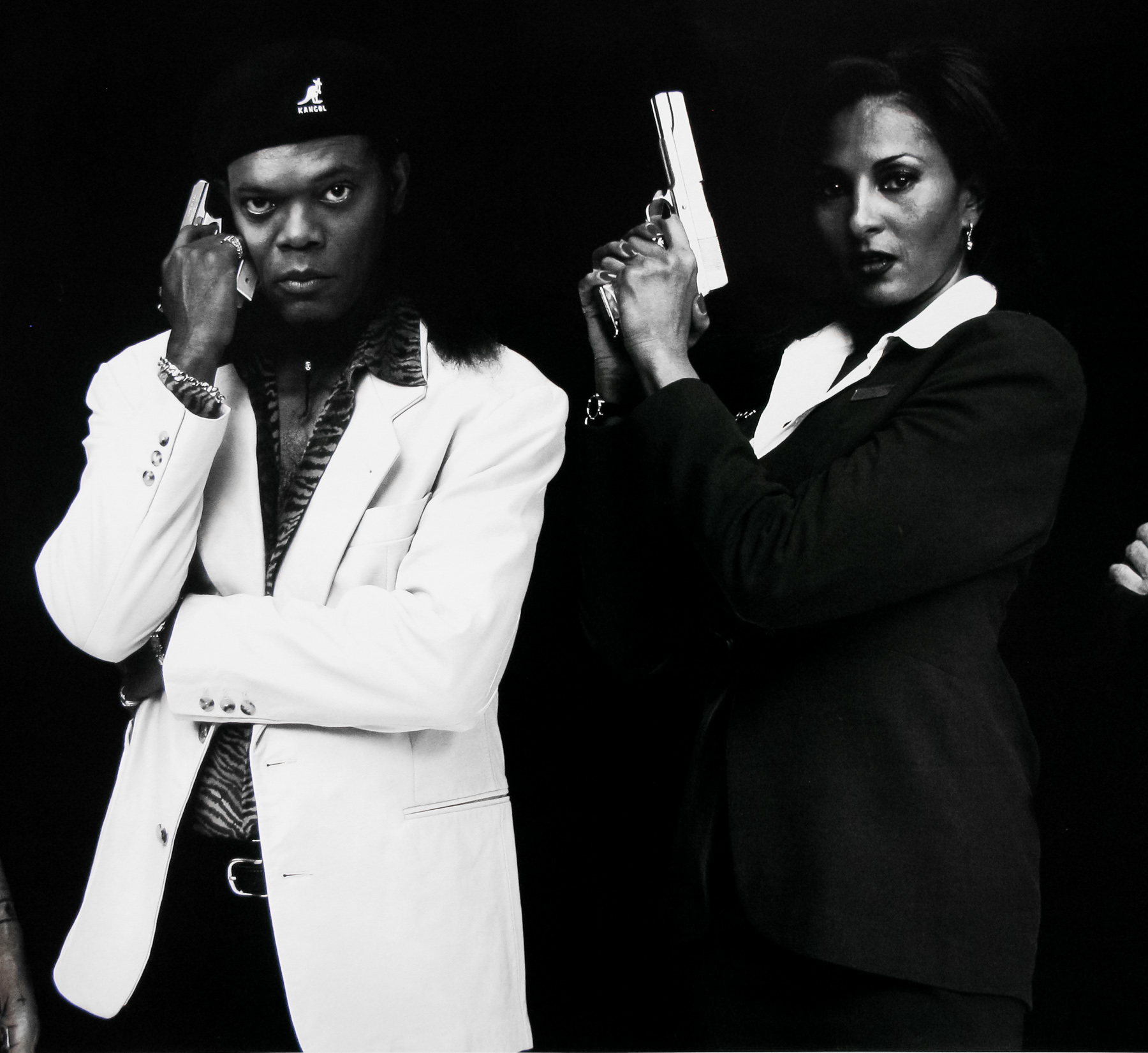
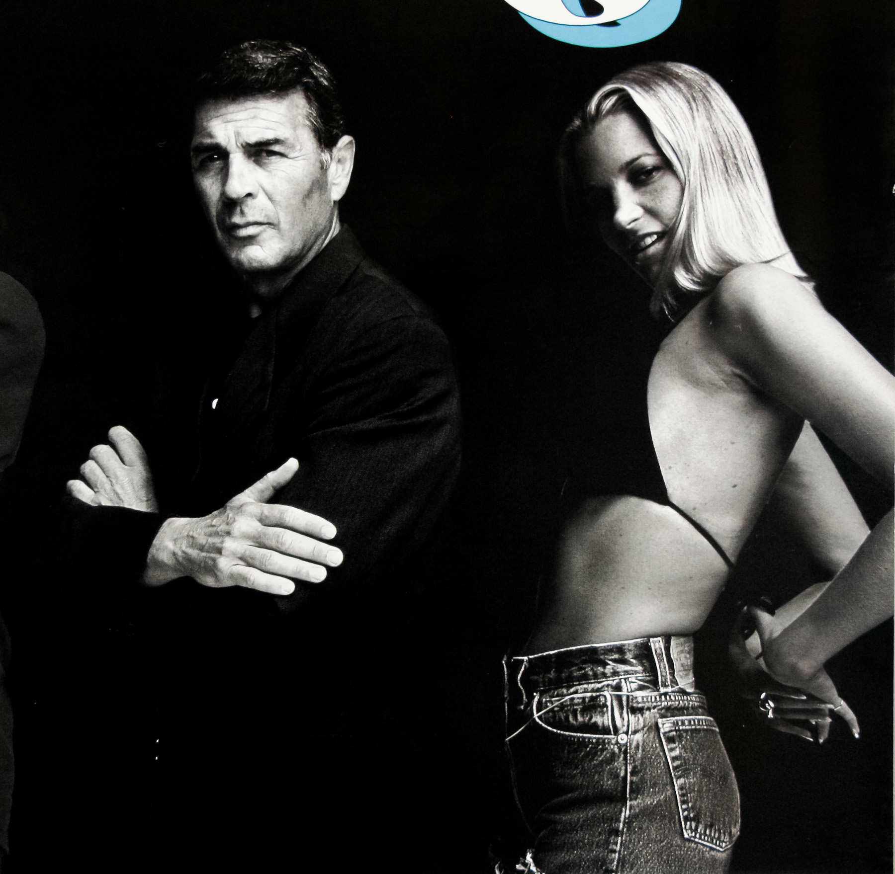
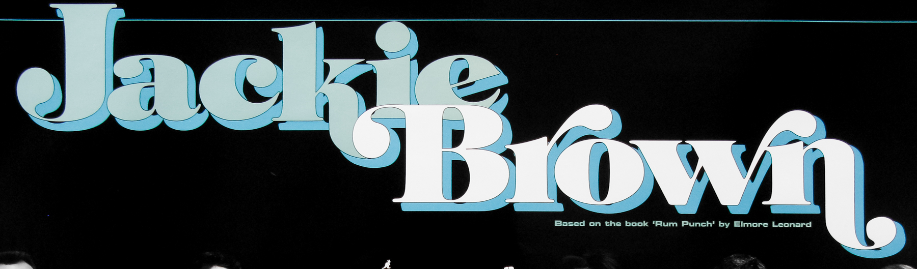
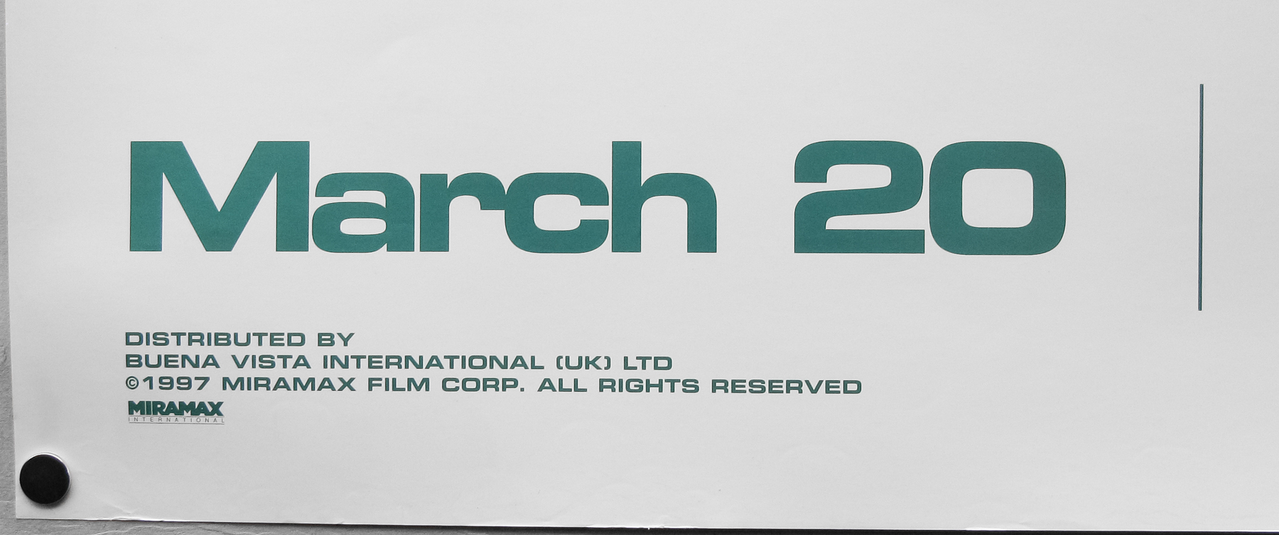
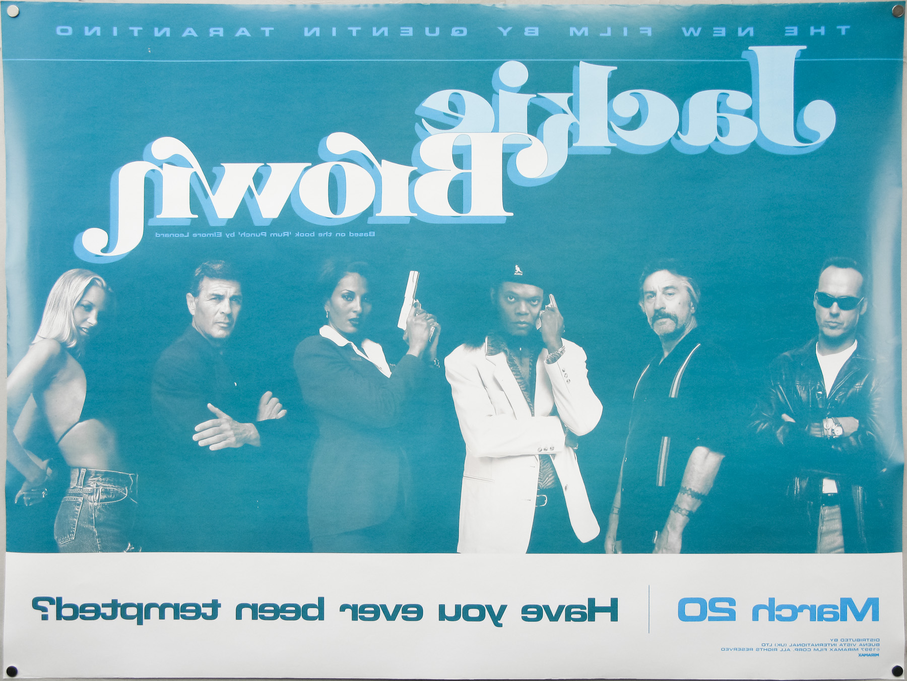
- Title
- Jackie Brown
- AKA
- Triple traición (Argentina)
- Year of Film
- 1997
- Director
- Quentin Tarantino
- Starring
- Pam Grier, Samuel L. Jackson, Robert Forster, Robert De Niro, Michael Keaton, Bridget Fonda, Michael Bowen
- Origin of Film
- USA
- Genre(s) of Film
- Pam Grier, Samuel L. Jackson, Robert Forster, Robert De Niro, Michael Keaton, Bridget Fonda, Michael Bowen,
- Type of Poster
- Quad
- Style of Poster
- Teaser
- Origin of Poster
- UK
- Year of Poster
- 1997
- Designer
- Unknown
- Artist
- --
- Size (inches)
- 30 1/16" x 40"
- SS or DS
- DS
- Tagline
- Have you ever been tempted?
18.05.11
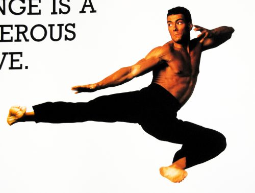
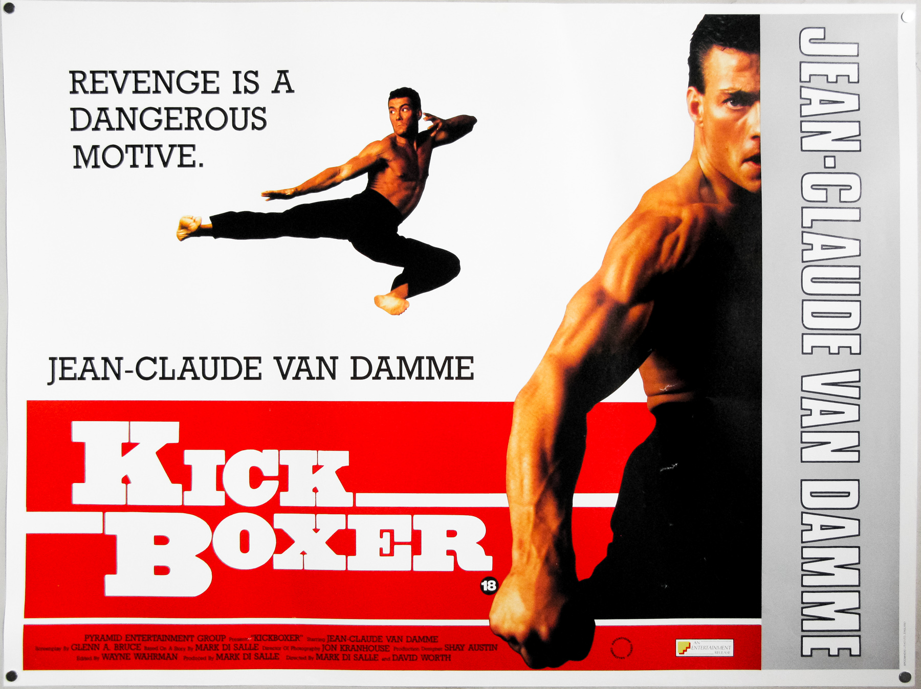
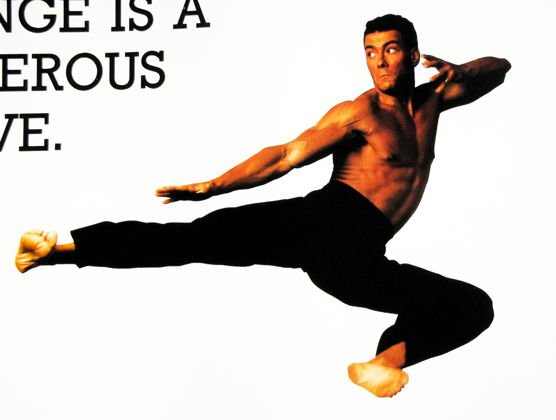
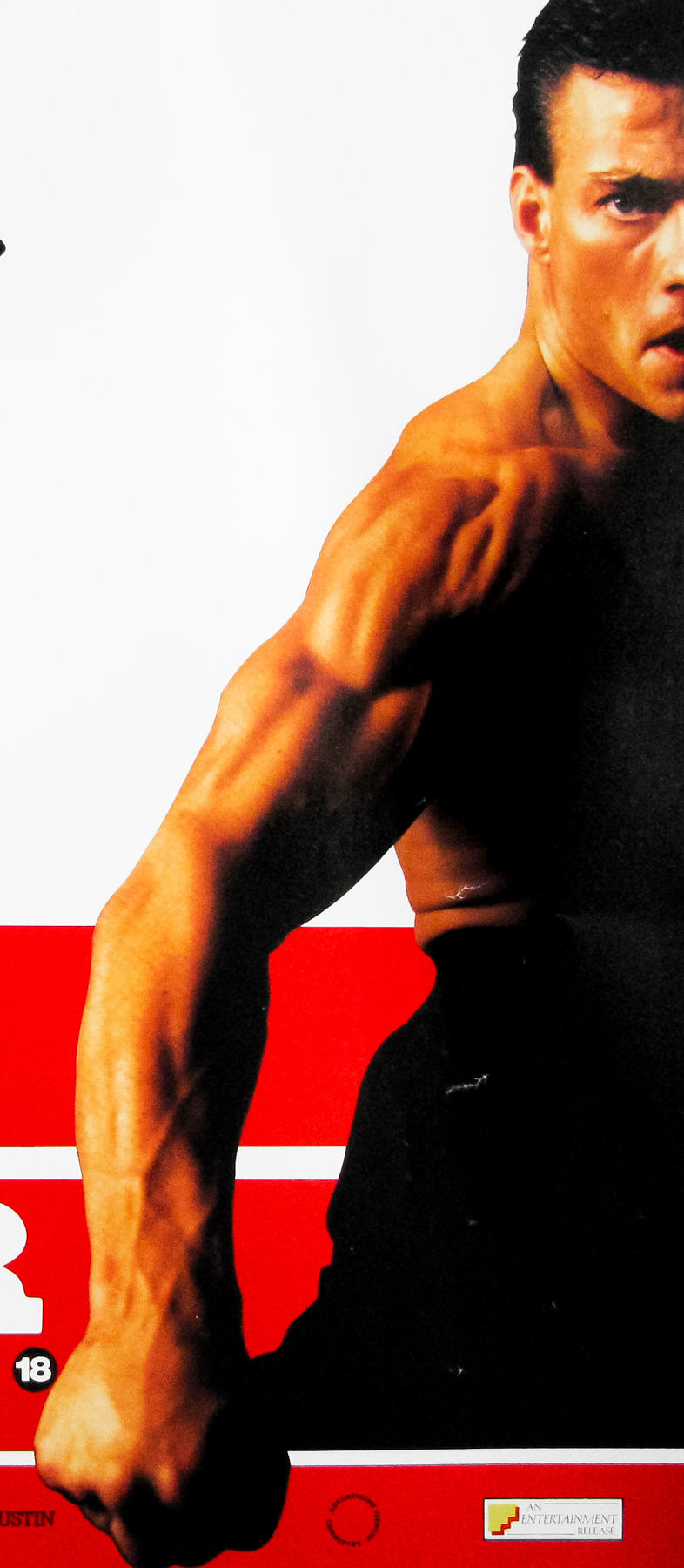
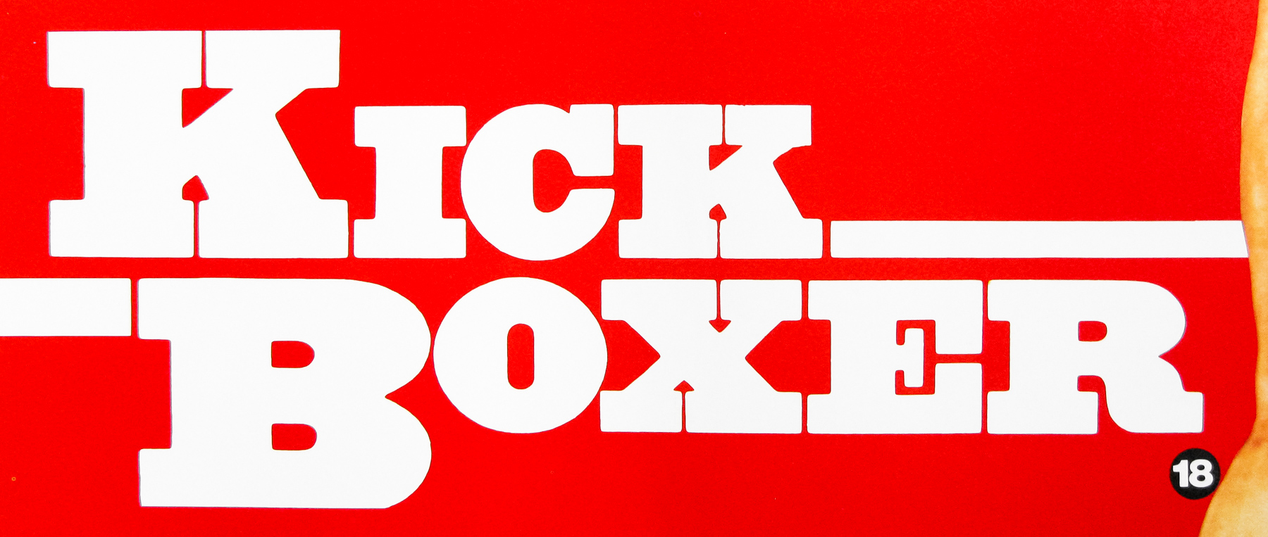
- Title
- Kick Boxer
- AKA
- Kickboxer (Alt. spelling) | Karate Tiger 3 (Germany)
- Year of Film
- 1989
- Director
- Mark DiSalle, David Worth
- Starring
- Jean-Claude Van Damme, Dennis Alexio, Dennis Chan, Michel Qissi, Haskell V. Anderson III, Rochelle Ashana, Ka Ting Lee, Richard Foo
- Origin of Film
- USA
- Genre(s) of Film
- Jean-Claude Van Damme, Dennis Alexio, Dennis Chan, Michel Qissi, Haskell V. Anderson III, Rochelle Ashana, Ka Ting Lee, Richard Foo,
- Type of Poster
- Quad
- Style of Poster
- --
- Origin of Poster
- UK
- Year of Poster
- 1989
- Designer
- Unknown
- Artist
- --
- Size (inches)
- 30" x 39 15/16"
- SS or DS
- SS
- Tagline
- Revenge is a dangerous motive.
18.05.11
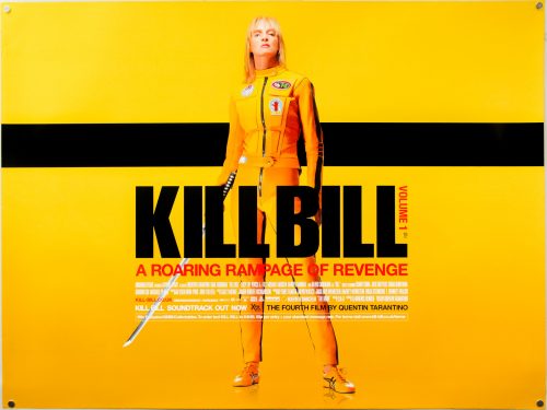
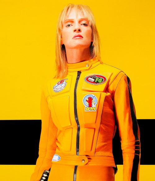
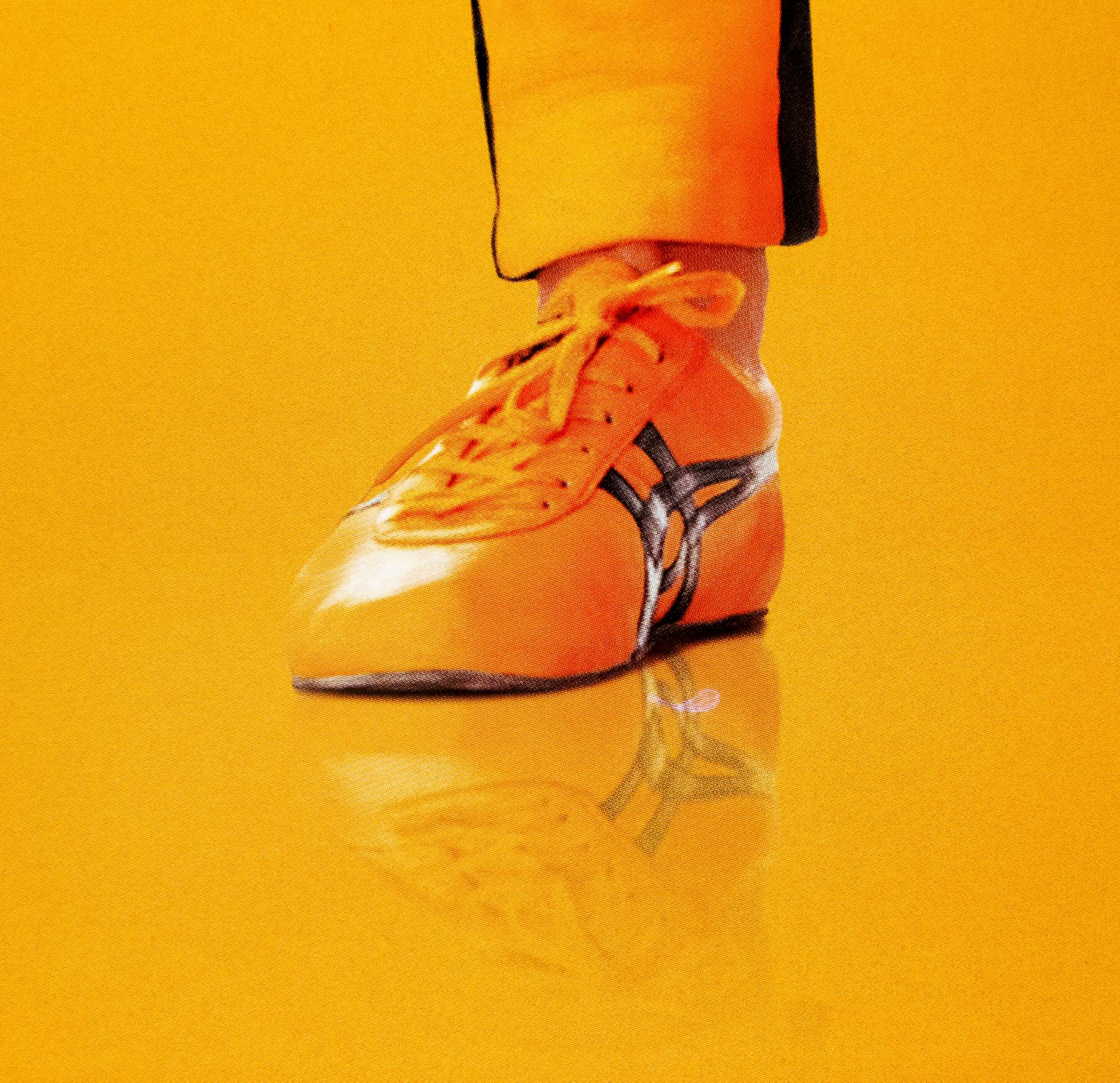
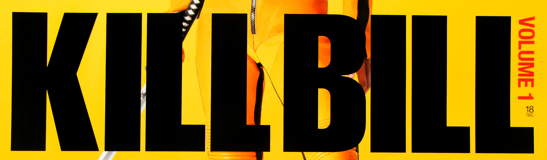
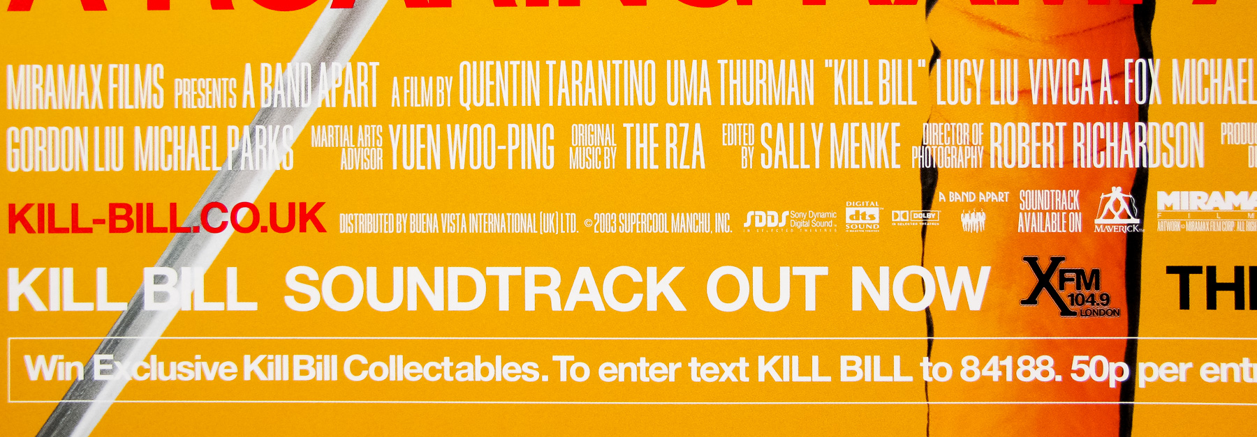
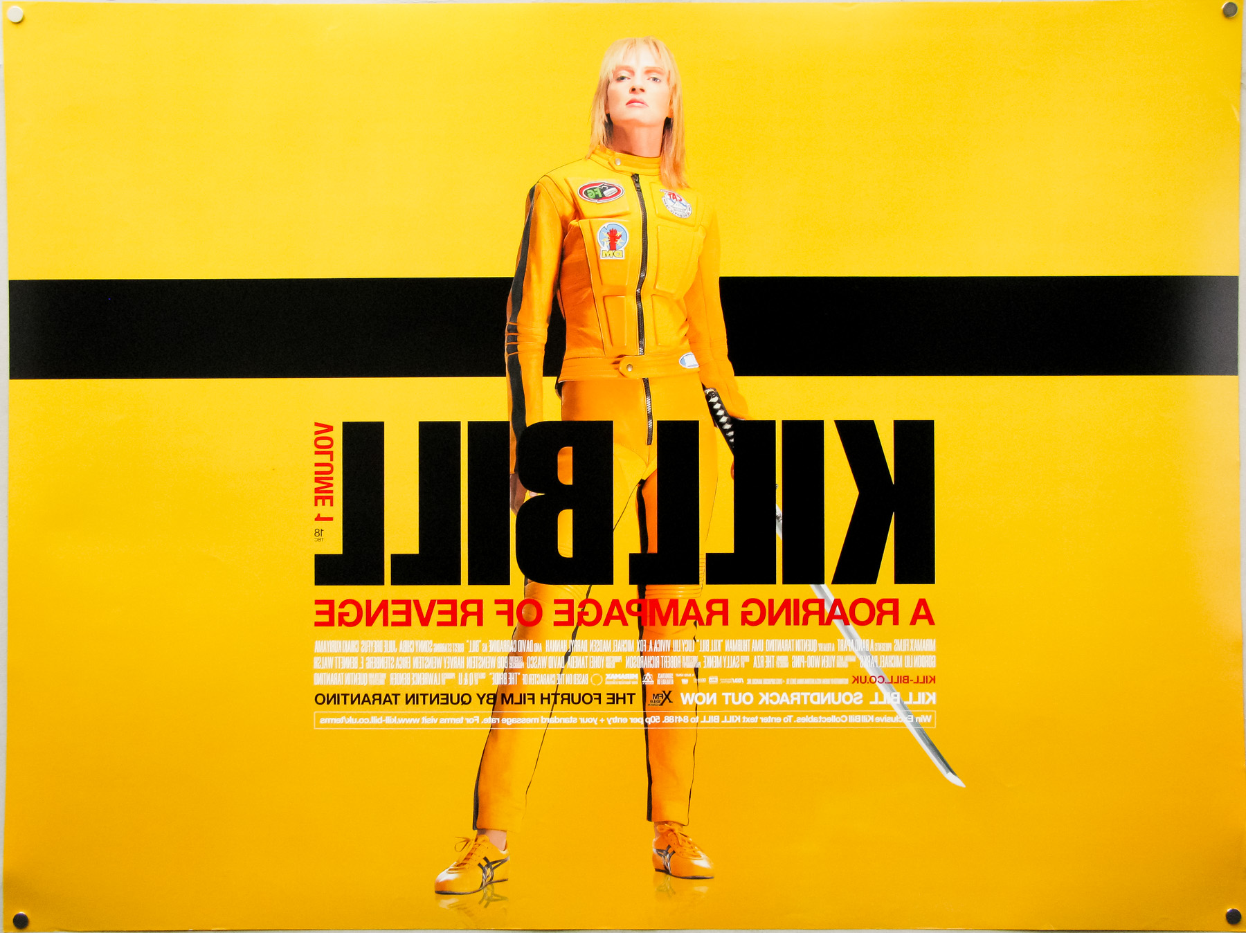
- Title
- Kill Bill: Volume 1
- AKA
- Kiru Biru (Japan - poster title - English title)
- Year of Film
- 2003
- Director
- Quentin Tarantino
- Starring
- Uma Thurman, Lucy Liu, Vivica A. Fox, Daryl Hannah, David Carradine, Michael Madsen, Julie Dreyfus
- Origin of Film
- USA
- Genre(s) of Film
- Uma Thurman, Lucy Liu, Vivica A. Fox, Daryl Hannah, David Carradine, Michael Madsen, Julie Dreyfus,
- Type of Poster
- Quad
- Style of Poster
- Final
- Origin of Poster
- UK
- Year of Poster
- 2003
- Designer
- Empire Design
- Artist
- --
- Size (inches)
- 30" x 40"
- SS or DS
- DS
- Tagline
- A roaring rampage of revenge
18.05.11
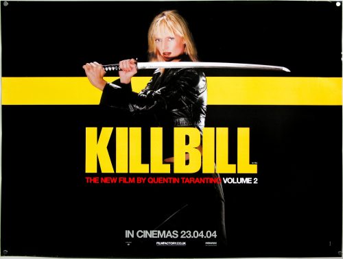
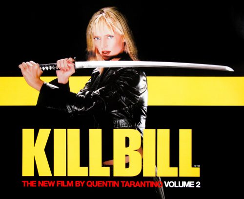
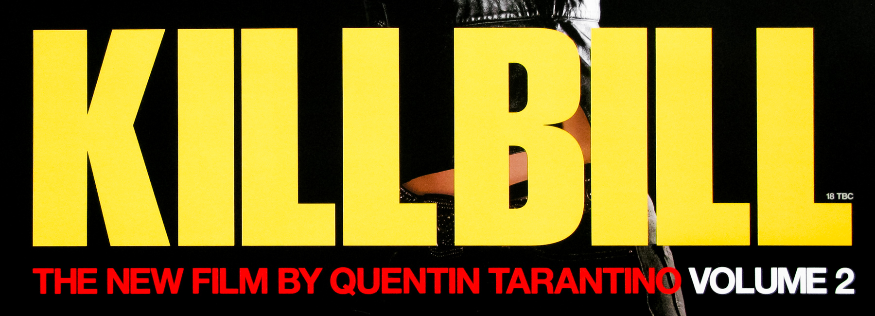
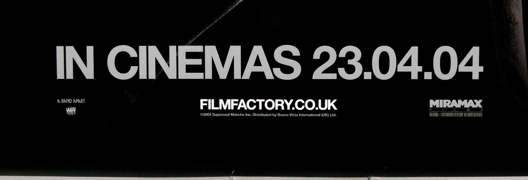
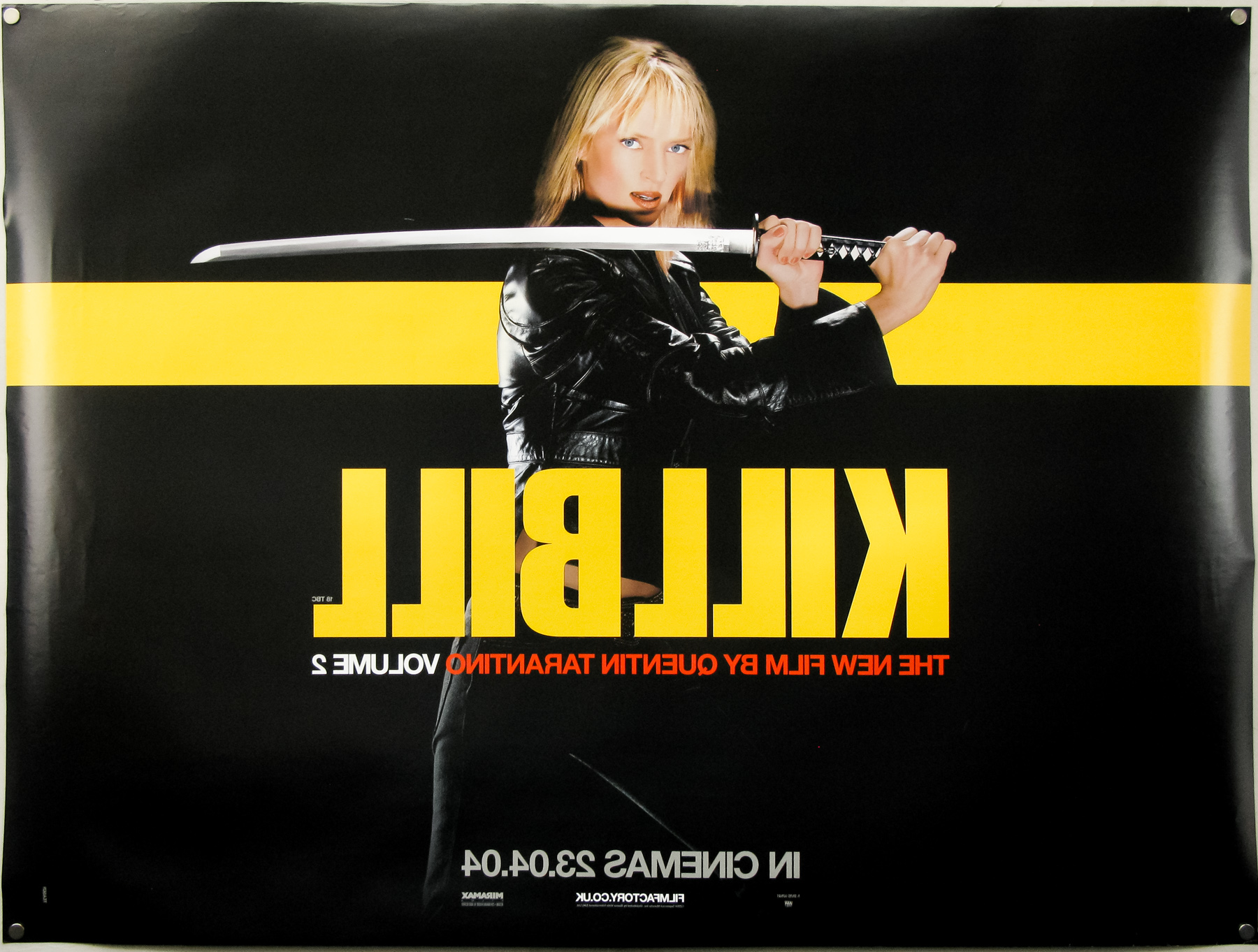
- Title
- Kill Bill: Vol. 2
- AKA
- --
- Year of Film
- 2004
- Director
- Quentin Tarantino
- Starring
- Uma Thurman, David Carradine, Lucy Liu, Vivica A. Fox, Michael Madsen, Daryl Hannah, Gordon Liu
- Origin of Film
- USA
- Genre(s) of Film
- Uma Thurman, David Carradine, Lucy Liu, Vivica A. Fox, Michael Madsen, Daryl Hannah, Gordon Liu,
- Type of Poster
- Quad
- Style of Poster
- Teaser
- Origin of Poster
- UK
- Year of Poster
- 2004
- Designer
- Empire Design
- Artist
- --
- Size (inches)
- 30" x 40"
- SS or DS
- DS
- Tagline
- --
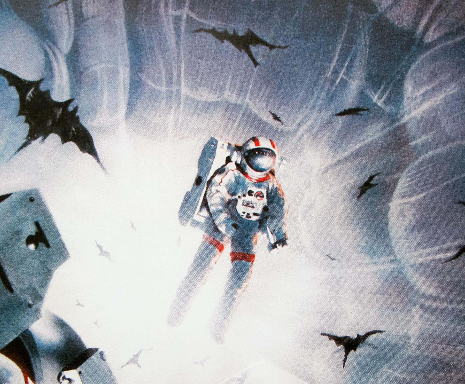
18.05.11
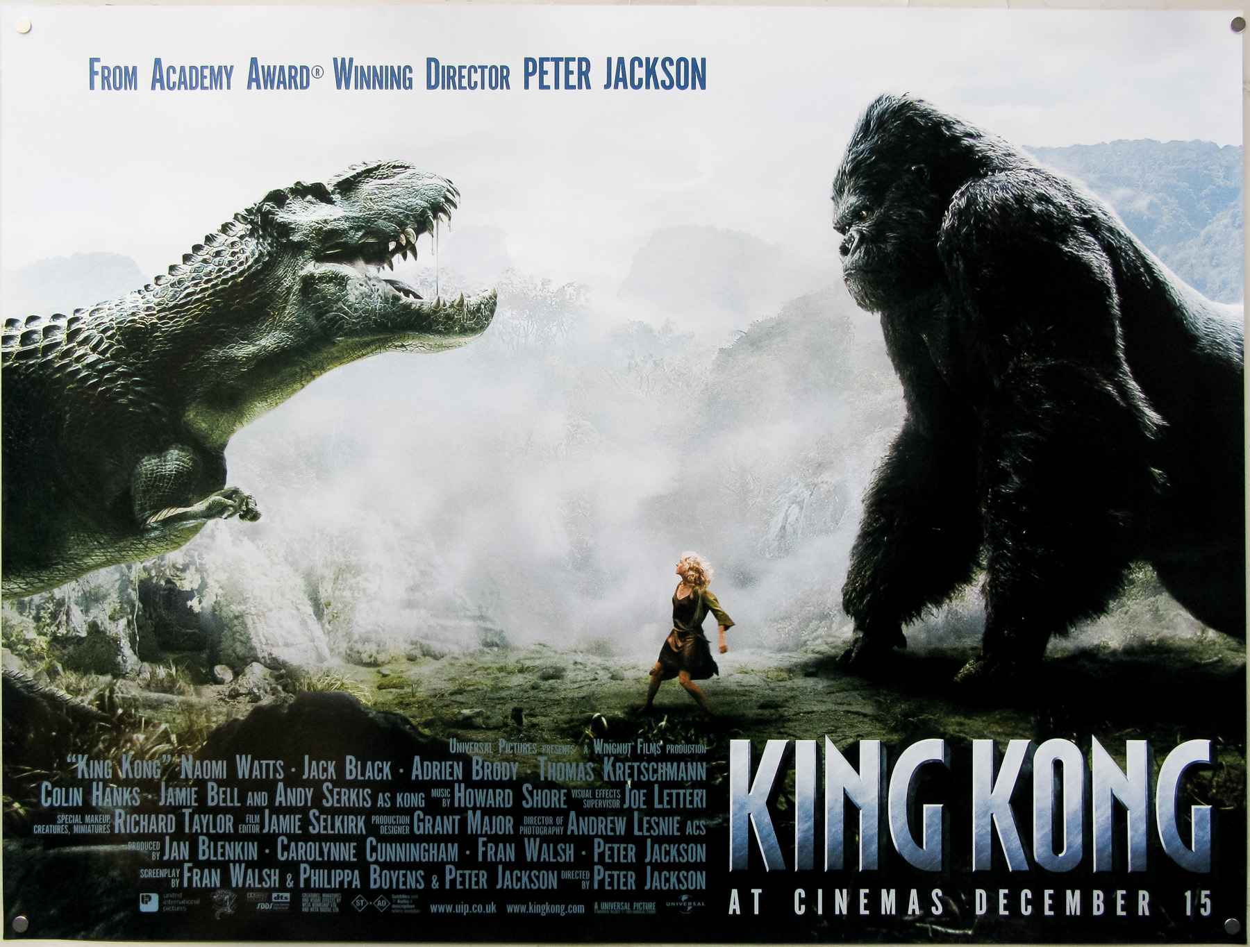
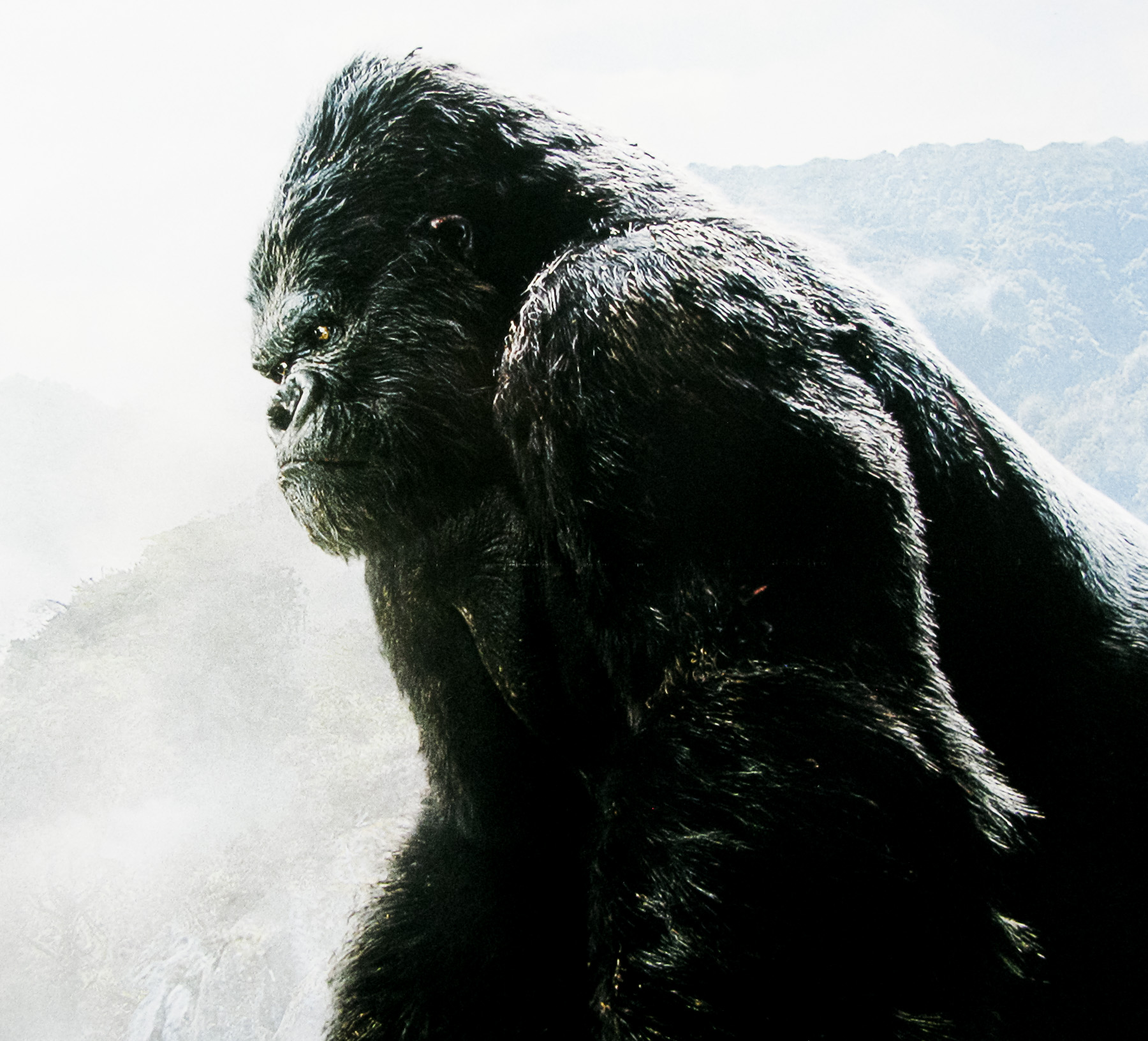
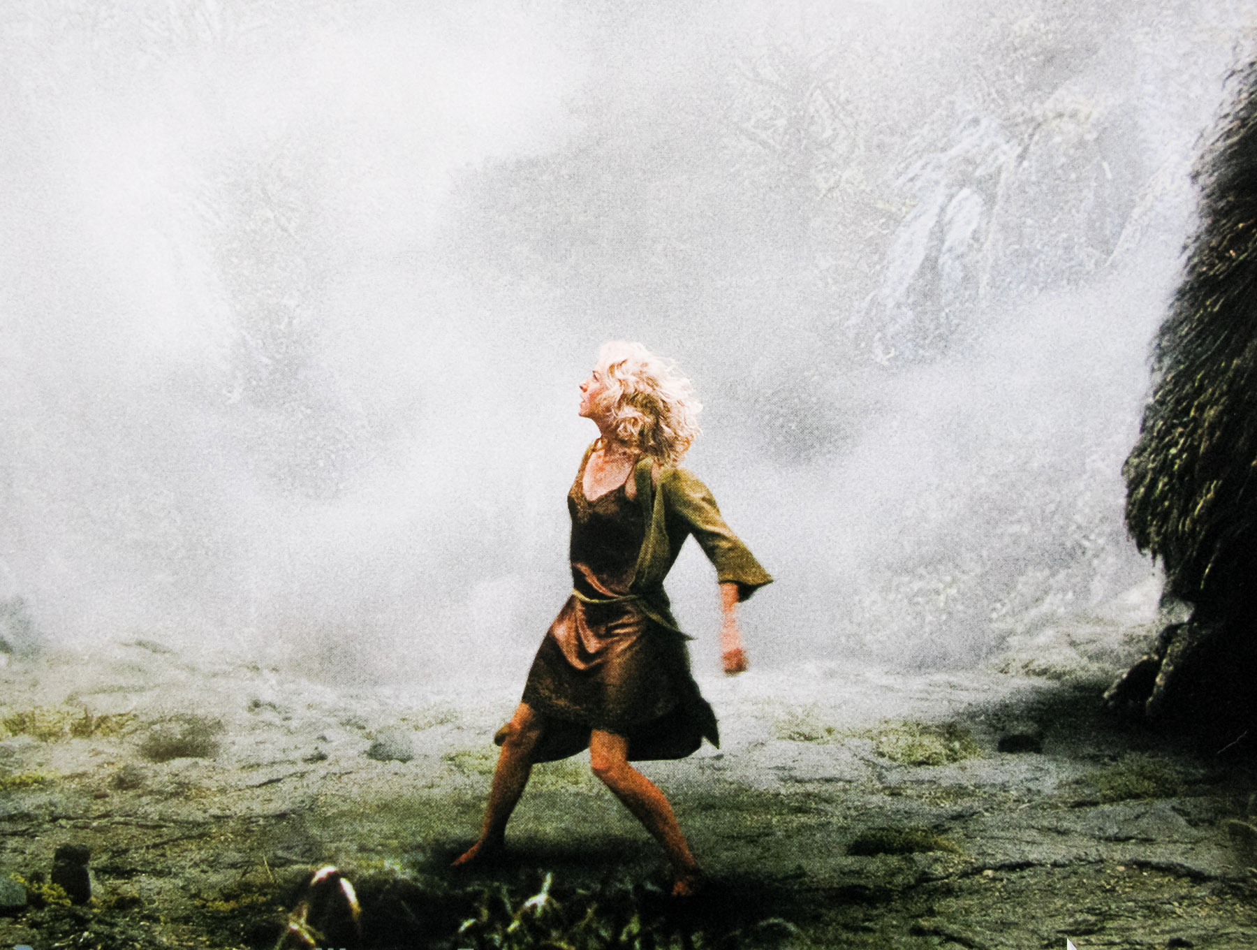
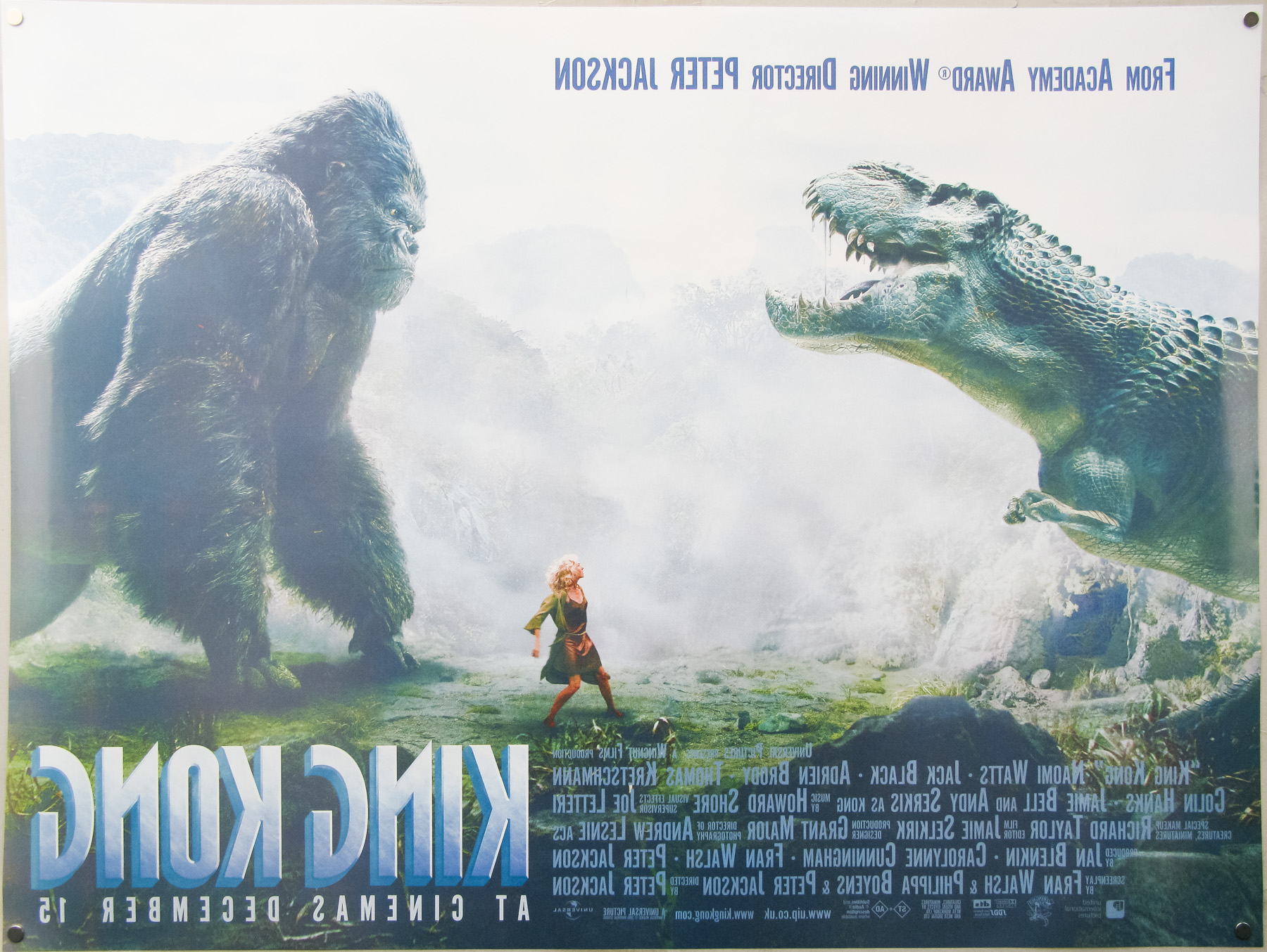
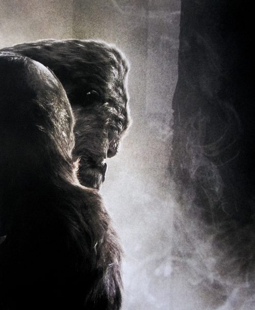
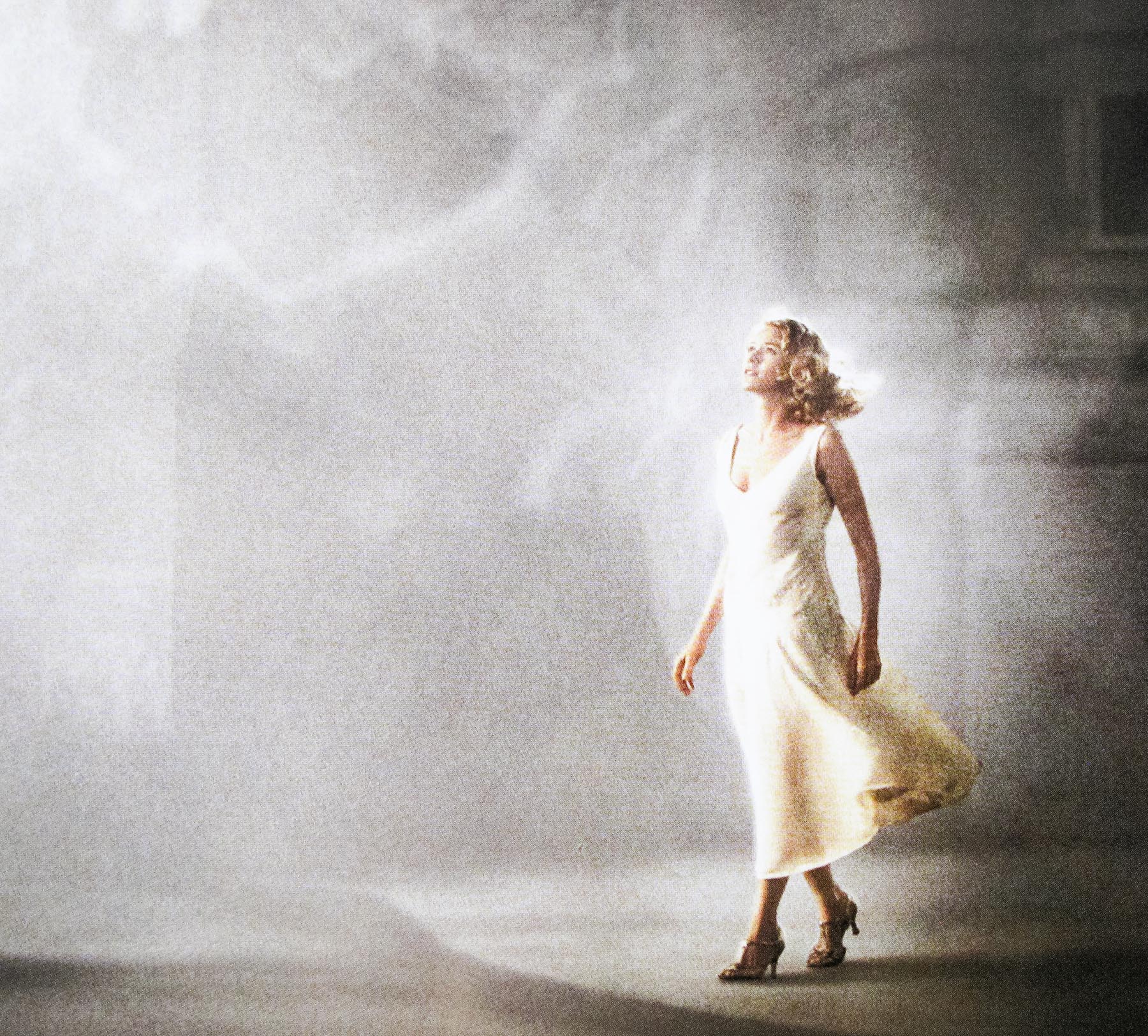
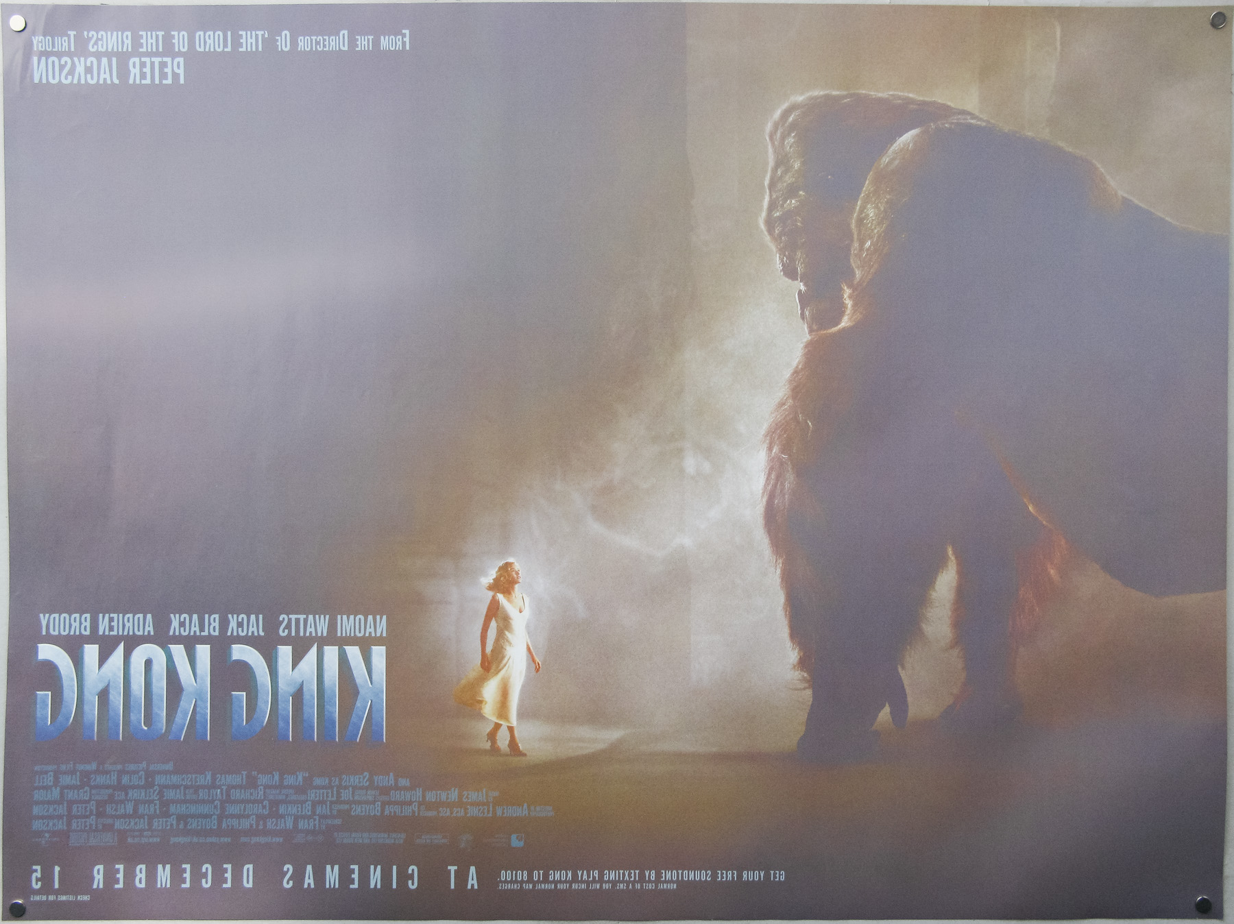
- Title
- King Kong
- AKA
- --
- Year of Film
- 2005
- Director
- Peter Jackson
- Starring
- Naomi Watts, Jack Black, Adrien Brody, Thomas Kretschmann, Kyle Chandler, Jamie Bell, Andy Serkis
- Origin of Film
- New Zealand | USA | Germany
- Genre(s) of Film
- Naomi Watts, Jack Black, Adrien Brody, Thomas Kretschmann, Kyle Chandler, Jamie Bell, Andy Serkis,
- Type of Poster
- Quad
- Style of Poster
- Advance - T-Rex style
- Origin of Poster
- UK
- Year of Poster
- 2005
- Designer
- Unknown
- Artist
- --
- Size (inches)
- 30" x 40"
- SS or DS
- DS
- Tagline
- --
18.05.11
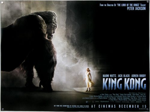
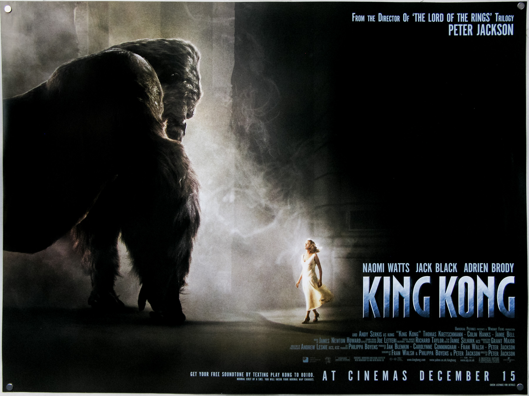
- Title
- King Kong
- AKA
- --
- Year of Film
- 2005
- Director
- Peter Jackson
- Starring
- Naomi Watts, Jack Black, Adrien Brody, Thomas Kretschmann, Kyle Chandler, Jamie Bell, Andy Serkis
- Origin of Film
- New Zealand | USA | Germany
- Genre(s) of Film
- Naomi Watts, Jack Black, Adrien Brody, Thomas Kretschmann, Kyle Chandler, Jamie Bell, Andy Serkis,
- Type of Poster
- Quad
- Style of Poster
- Advance - street style
- Origin of Poster
- UK
- Year of Poster
- 2005
- Designer
- Unknown
- Artist
- --
- Size (inches)
- 30" x 40"
- SS or DS
- DS
- Tagline
- --
18.05.11
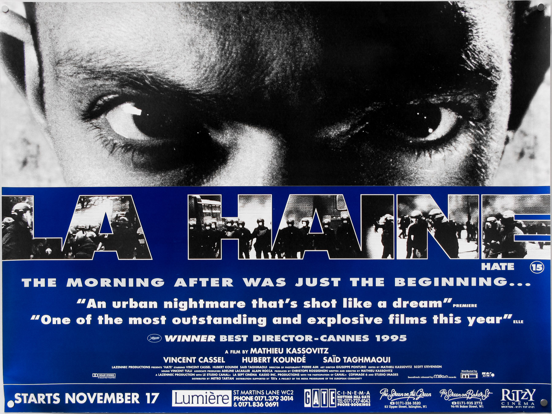
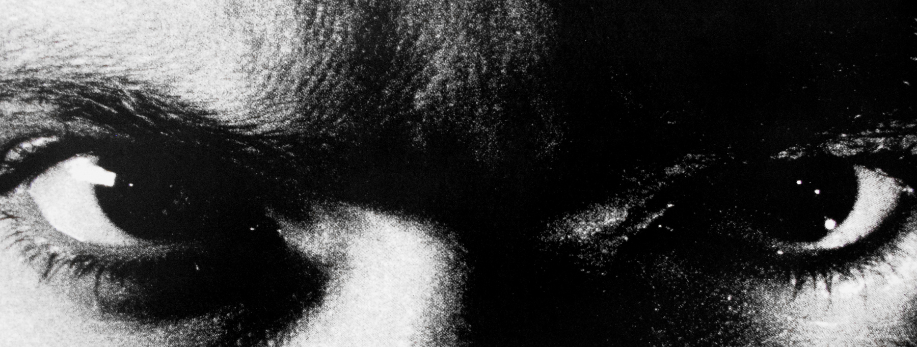
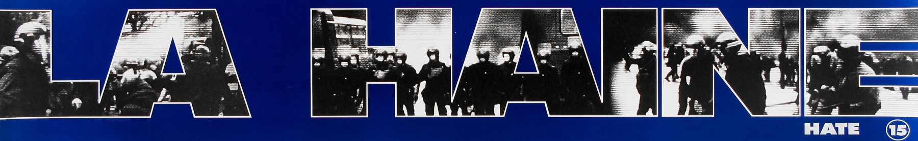
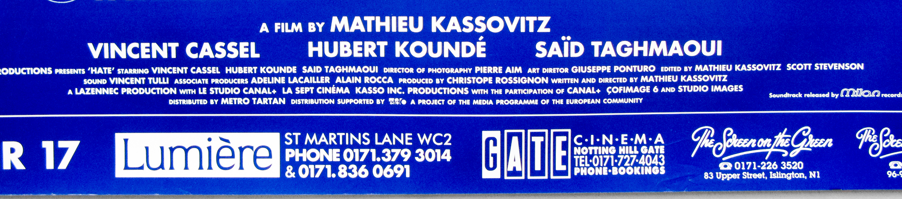
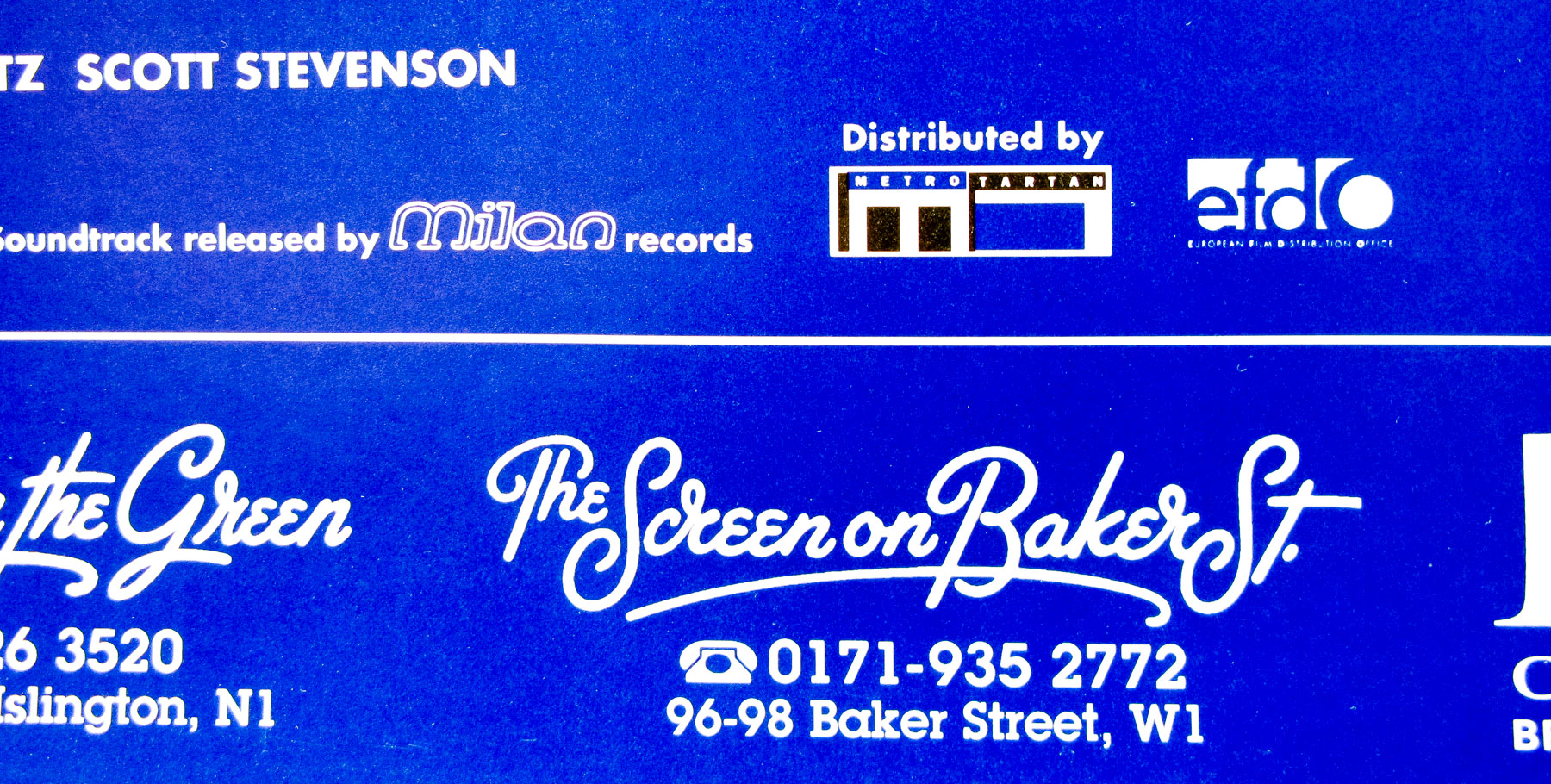
- Title
- La Haine
- AKA
- The Hate (International - English title)
- Year of Film
- 1995
- Director
- Mathieu Kassovitz
- Starring
- Vincent Cassel, Hubert Koundé, Saïd Taghmaoui, Abdel Ahmed Ghili, Solo, Joseph Momo, Héloïse Rauth
- Origin of Film
- France
- Genre(s) of Film
- Vincent Cassel, Hubert Koundé, Saïd Taghmaoui, Abdel Ahmed Ghili, Solo, Joseph Momo, Héloïse Rauth,
- Type of Poster
- Quad
- Style of Poster
- --
- Origin of Poster
- UK
- Year of Poster
- 1995
- Designer
- Unknown
- Artist
- --
- Size (inches)
- 30" x 39 15/16"
- SS or DS
- SS
- Tagline
- The morning after was just the beginning...
18.05.11
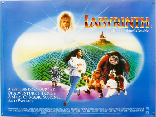
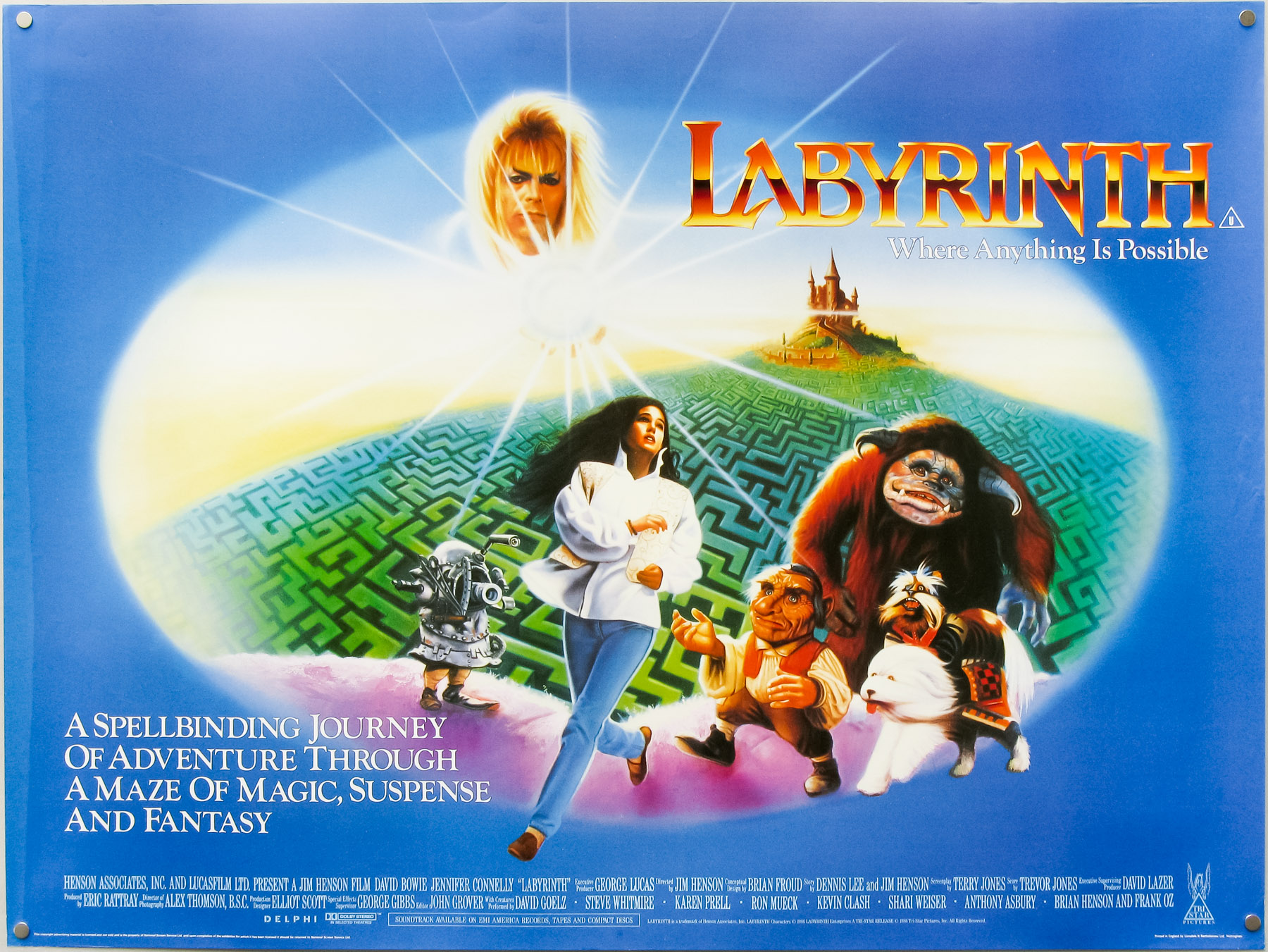
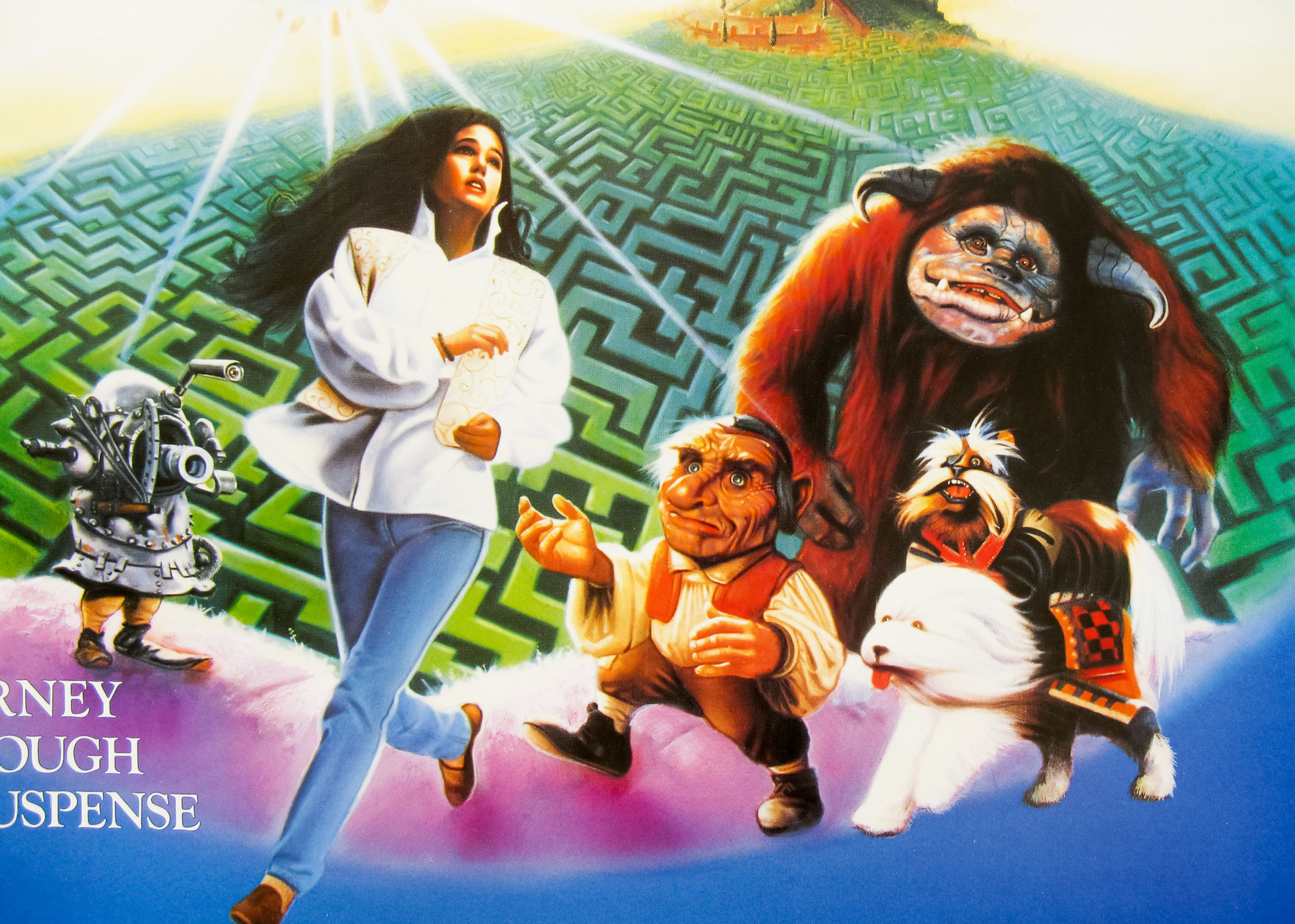
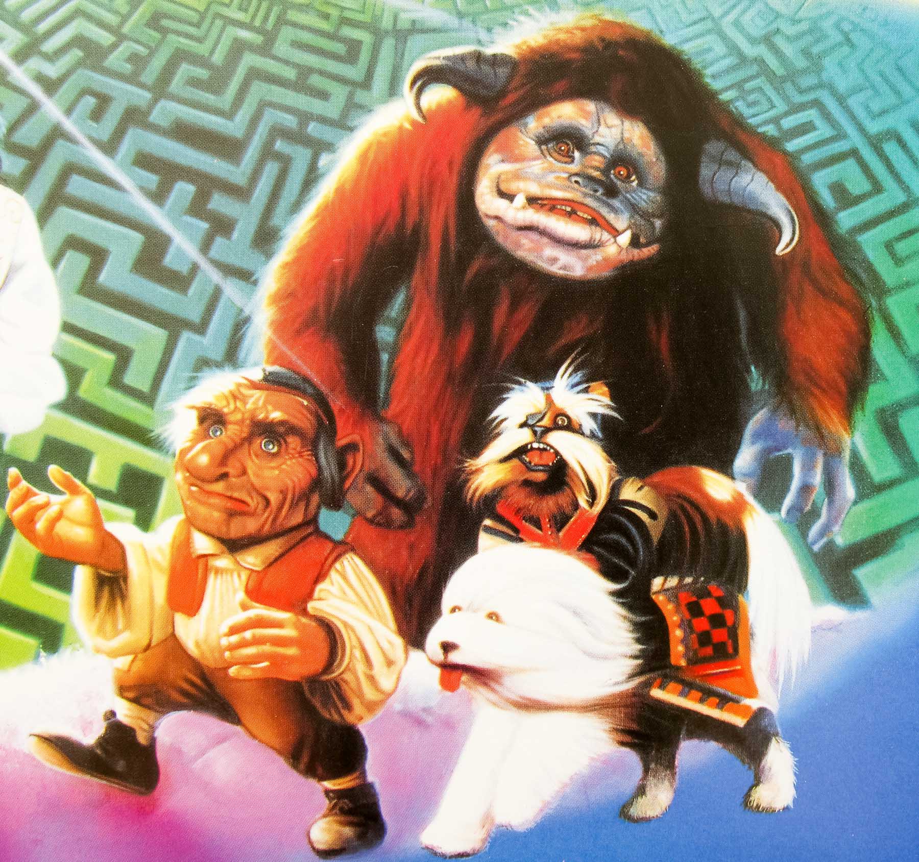
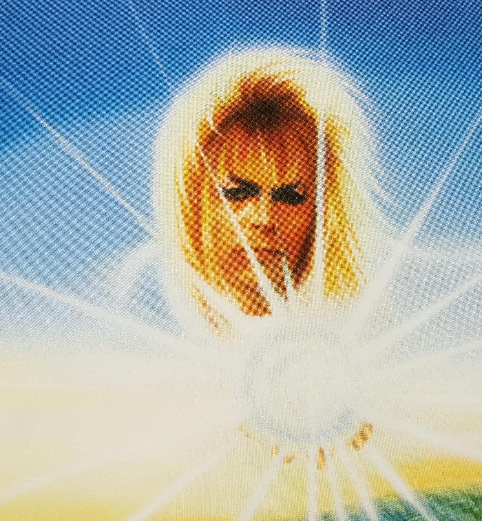
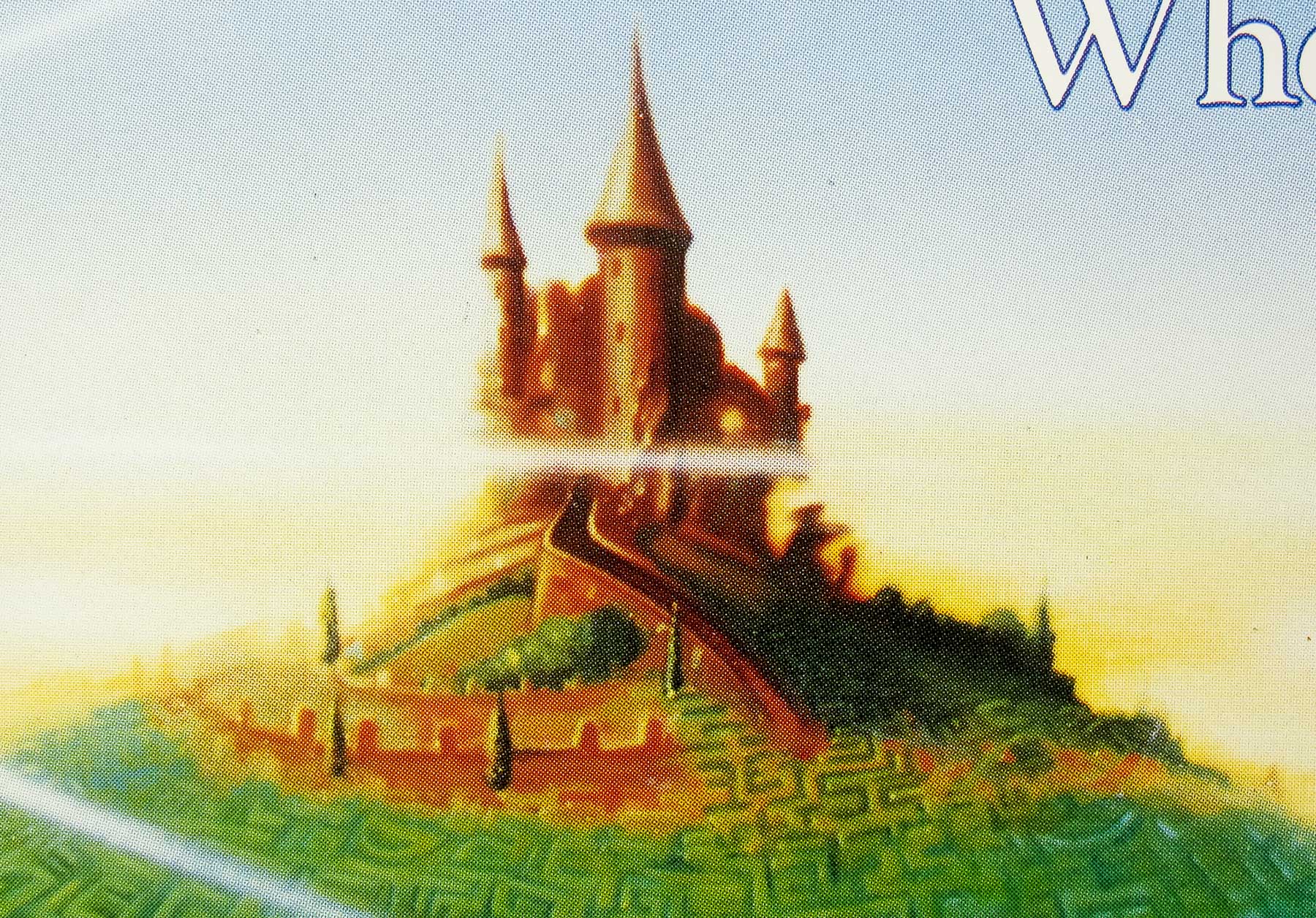
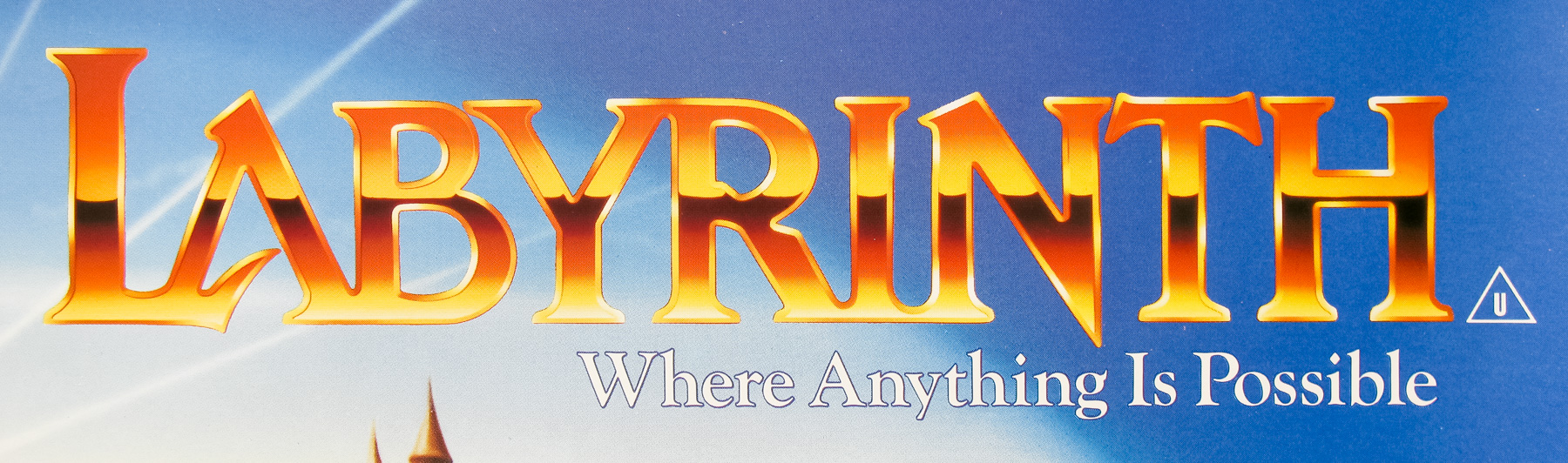
- Title
- Labyrinth
- AKA
- --
- Year of Film
- 1986
- Director
- Jim Henson
- Starring
- David Bowie, Jennifer Connelly, Toby Froud, Shelley Thompson, Christopher Malcolm, Natalie Finland, Shari Weiser, Brian Henson, Ron Mueck, Rob Mills
- Origin of Film
- UK | USA
- Genre(s) of Film
- David Bowie, Jennifer Connelly, Toby Froud, Shelley Thompson, Christopher Malcolm, Natalie Finland, Shari Weiser, Brian Henson, Ron Mueck, Rob Mills,
- Type of Poster
- Quad
- Style of Poster
- --
- Origin of Poster
- UK
- Year of Poster
- 1986
- Designer
- Unknown
- Artist
- Unknown
- Size (inches)
- 30" x 40"
- SS or DS
- SS
- Tagline
- Where anything is possible. | A spellbinding journey of adventure through a maze of magic, suspense and fantasy.
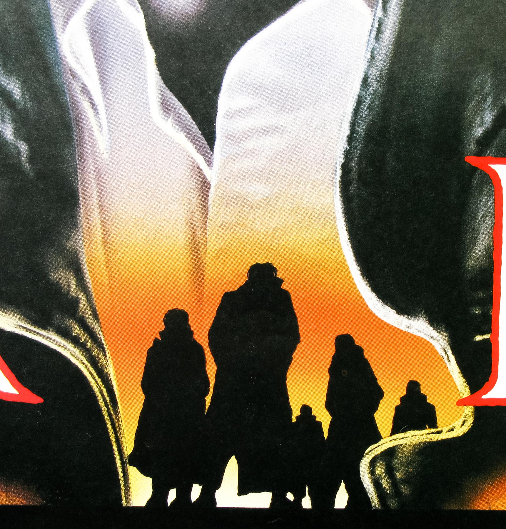
18.05.11
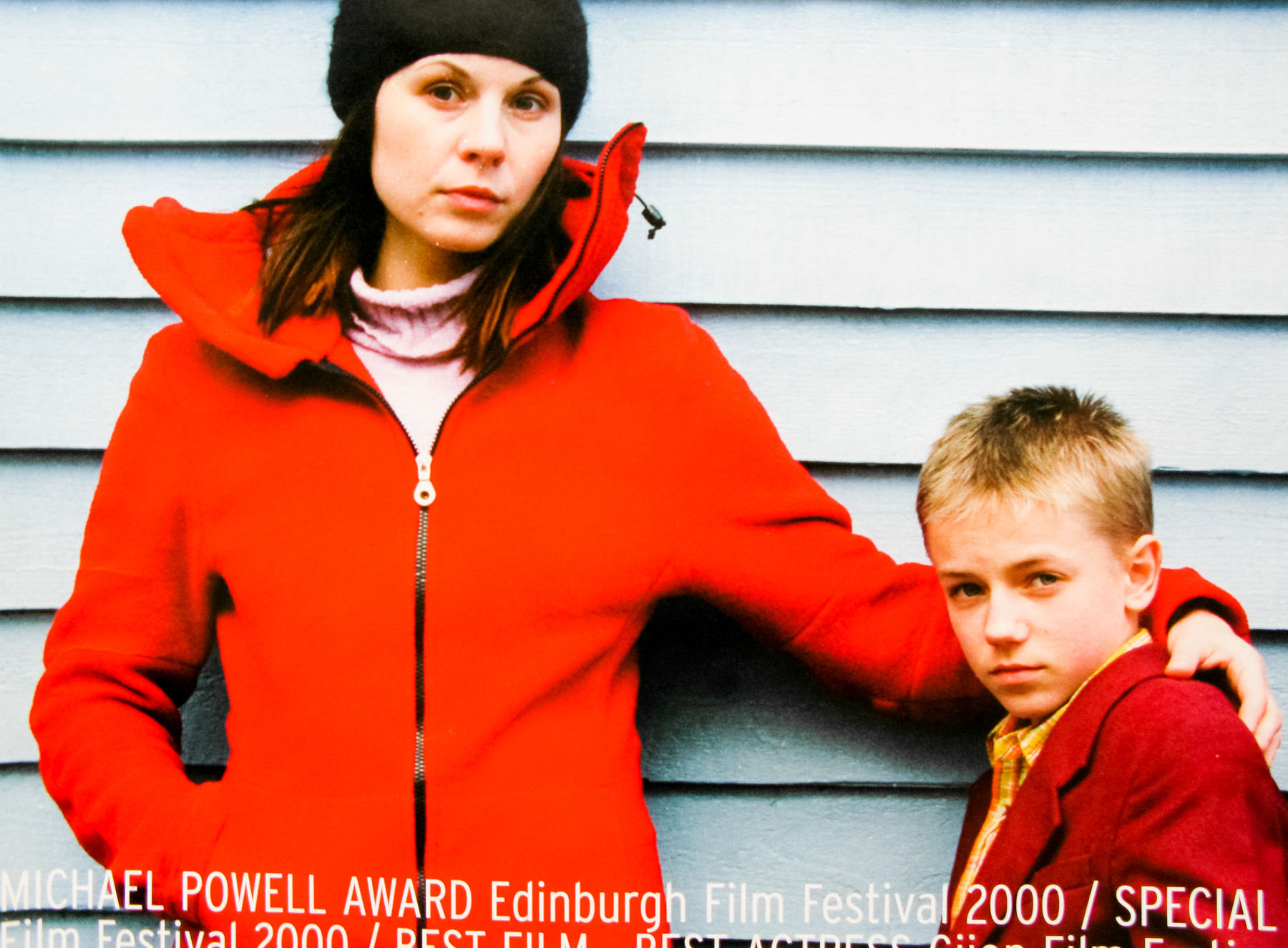
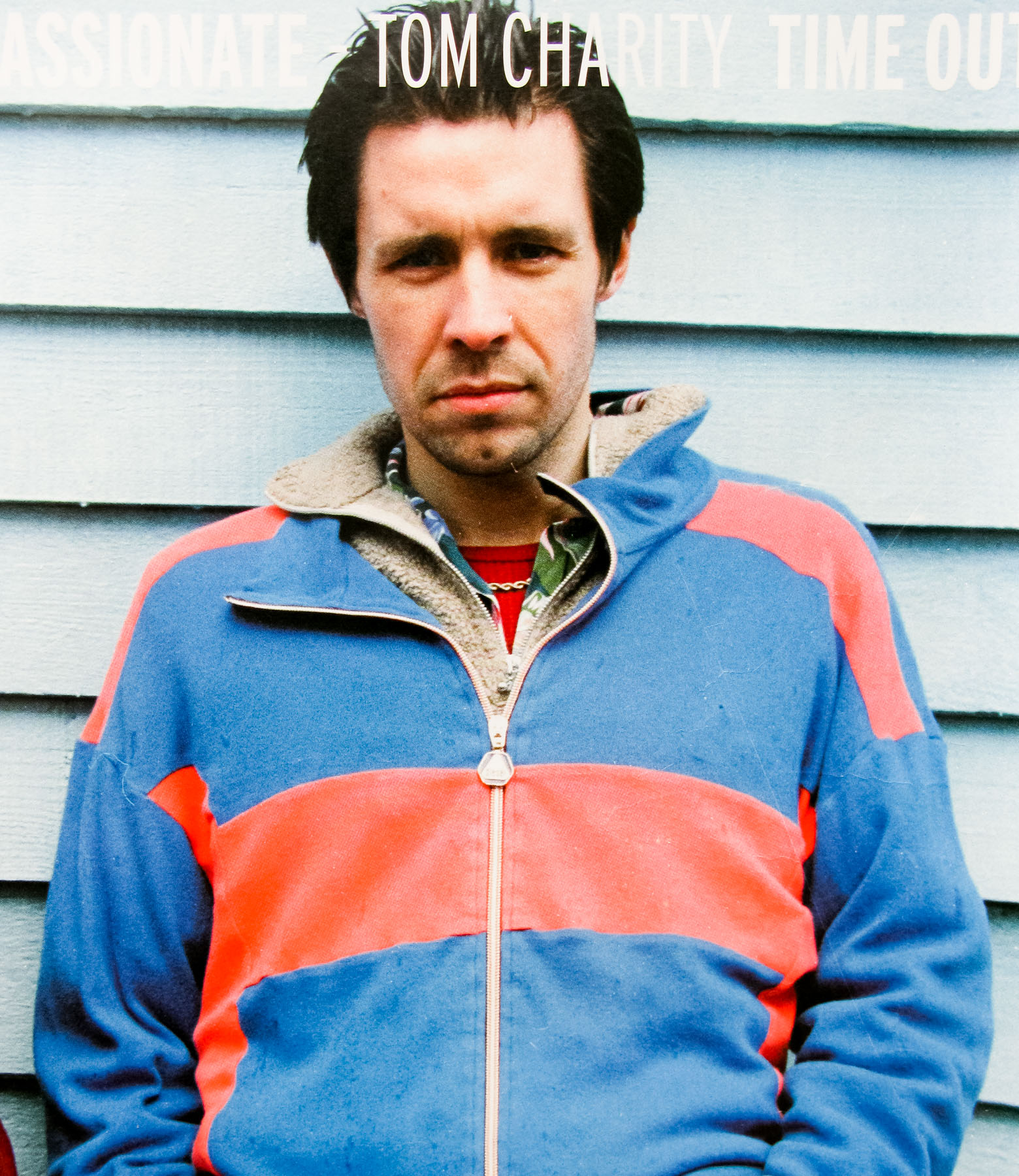
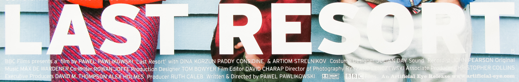
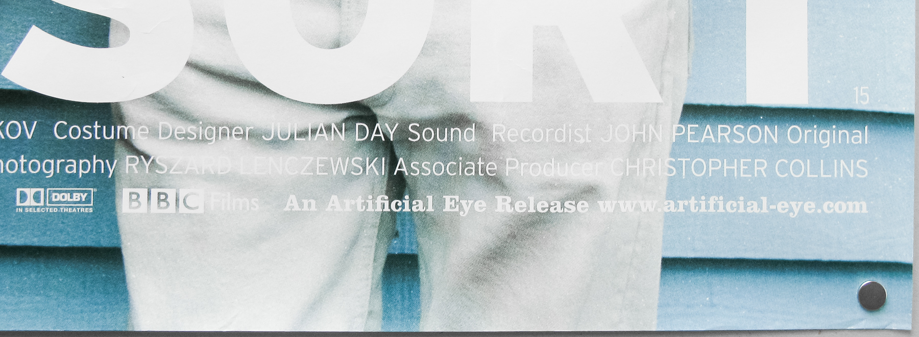
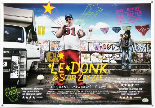
- Title
- Last Resort
- AKA
- Transit Palace (France)
- Year of Film
- 2000
- Director
- Pawel Pawlikowski
- Starring
- Dina Korzun, Artyom Strelnikov, Paddy Considine, Steve Perry, Perry Benson, Katie Drinkwater, Dave Bean
- Origin of Film
- UK
- Genre(s) of Film
- Dina Korzun, Artyom Strelnikov, Paddy Considine, Steve Perry, Perry Benson, Katie Drinkwater, Dave Bean,
- Type of Poster
- Quad
- Style of Poster
- --
- Origin of Poster
- UK
- Year of Poster
- 2001
- Designer
- Unknown
- Artist
- --
- Size (inches)
- 29 7/8" x 39 7/8"
- SS or DS
- SS
- Tagline
- --
18.05.11
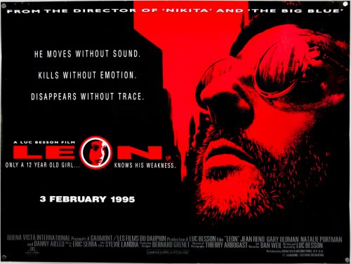
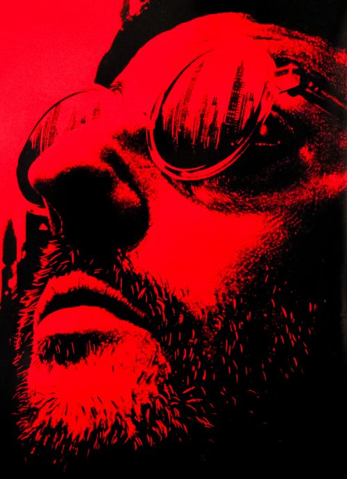
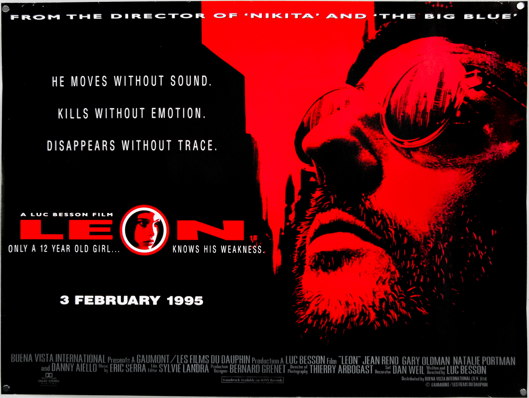
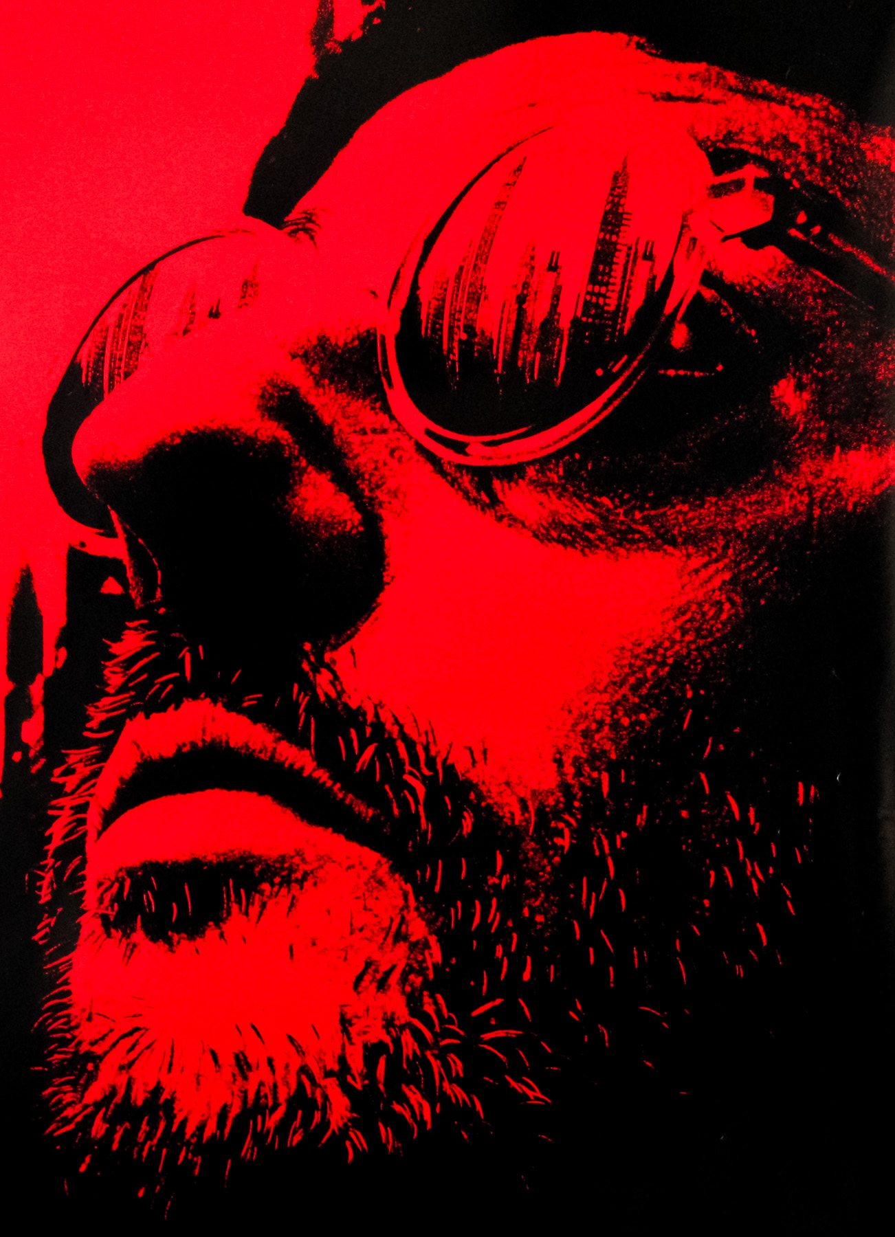
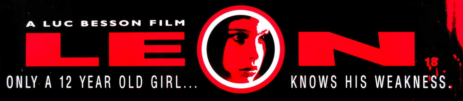
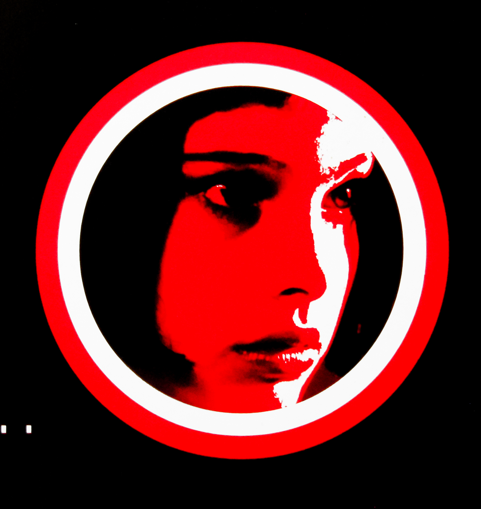
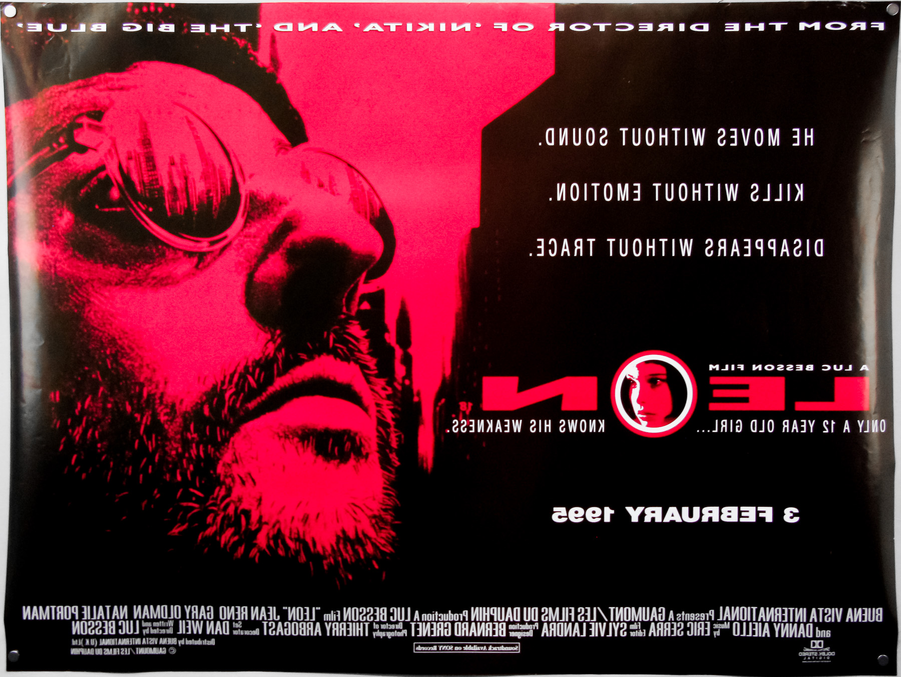
- Title
- Leon
- AKA
- Léon (France - original title) | The Professional (USA)
- Year of Film
- 1994
- Director
- Luc Besson
- Starring
- Jean Reno, Gary Oldman, Natalie Portman, Danny Aiello, Michael Badalucco, Ellen Greene, Willi One Blood, Don Creech
- Origin of Film
- France
- Genre(s) of Film
- Jean Reno, Gary Oldman, Natalie Portman, Danny Aiello, Michael Badalucco, Ellen Greene, Willi One Blood, Don Creech,
- Type of Poster
- Quad
- Style of Poster
- --
- Origin of Poster
- UK
- Year of Poster
- 1995
- Designer
- Unknown
- Artist
- --
- Size (inches)
- 30" x 39 7/8"
- SS or DS
- DS
- Tagline
- He moves without sound. Kills without emotion. Disappears without trace.
18.05.11
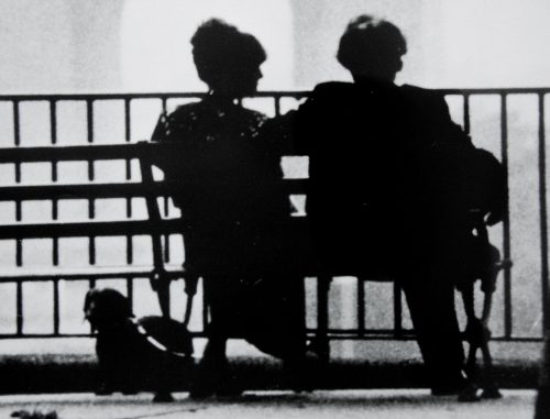
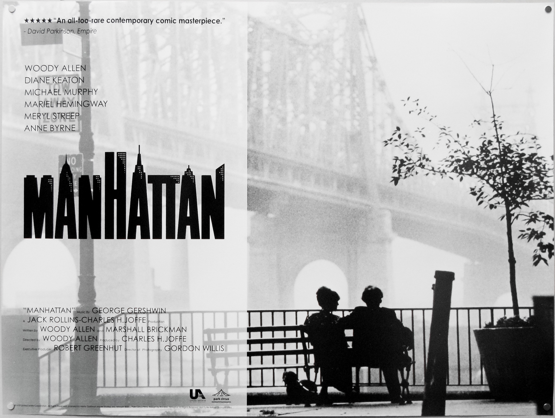
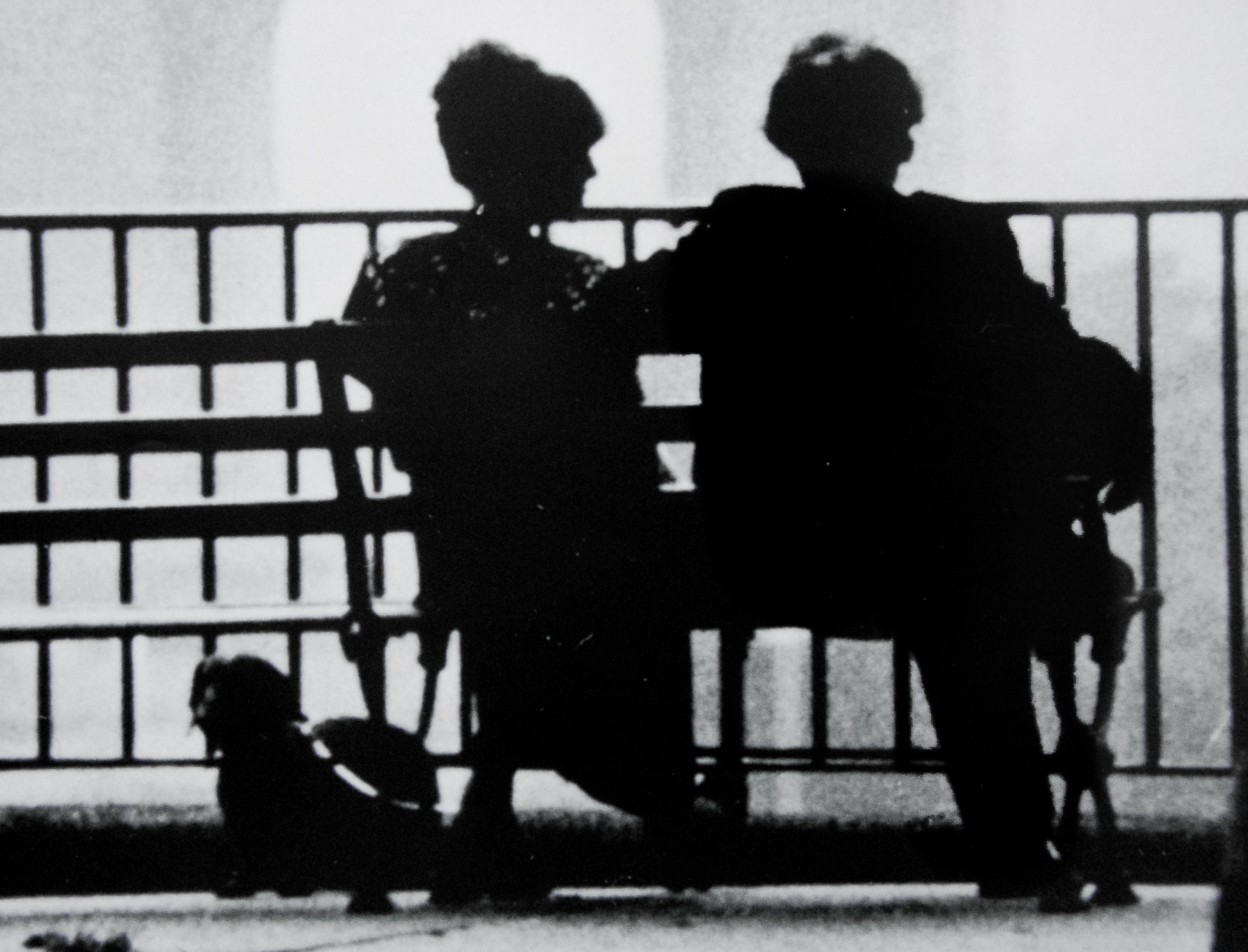
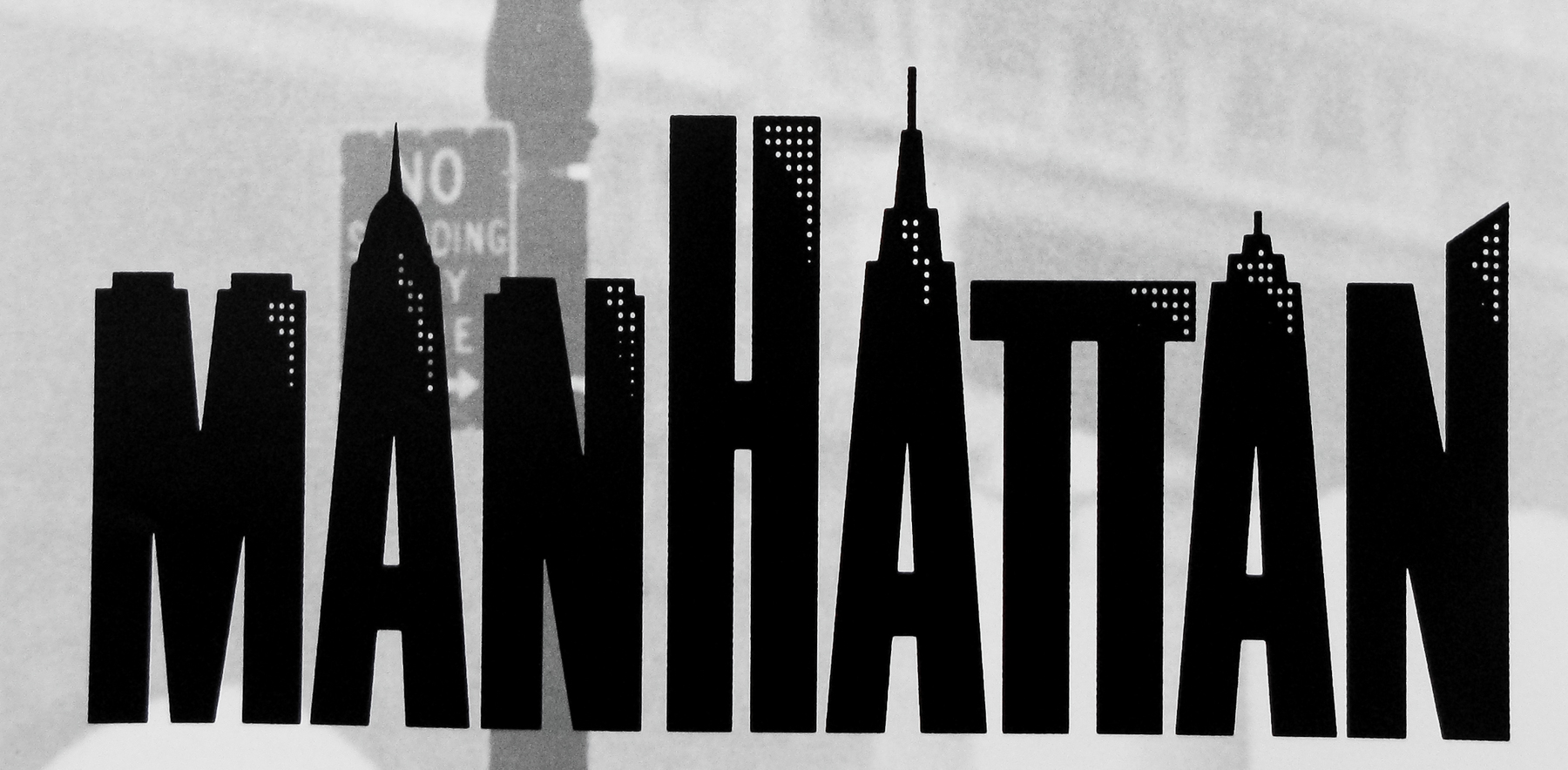
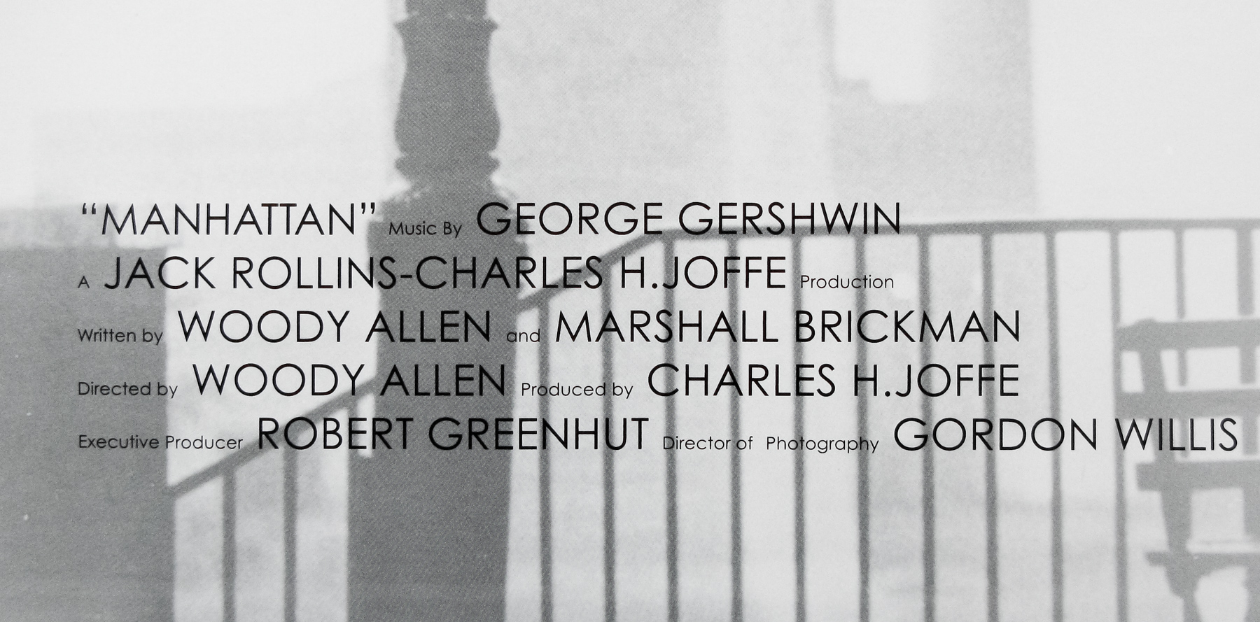
- Title
- Manhattan
- AKA
- --
- Year of Film
- 1979
- Director
- Woody Allen
- Starring
- Woody Allen, Diane Keaton, Michael Murphy, Mariel Hemingway, Meryl Streep, Anne Byrne
- Origin of Film
- USA
- Genre(s) of Film
- Woody Allen, Diane Keaton, Michael Murphy, Mariel Hemingway, Meryl Streep, Anne Byrne,
- Type of Poster
- Quad
- Style of Poster
- Re-release
- Origin of Poster
- UK
- Year of Poster
- 2006
- Designer
- Randak
- Artist
- Burt Kleager (original title treatment)
- Size (inches)
- 30" x 40"
- SS or DS
- SS
- Tagline
- --
18.05.11
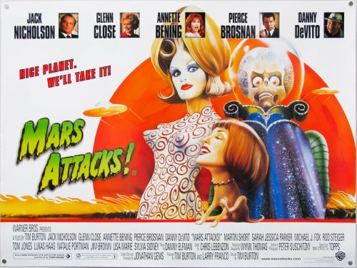
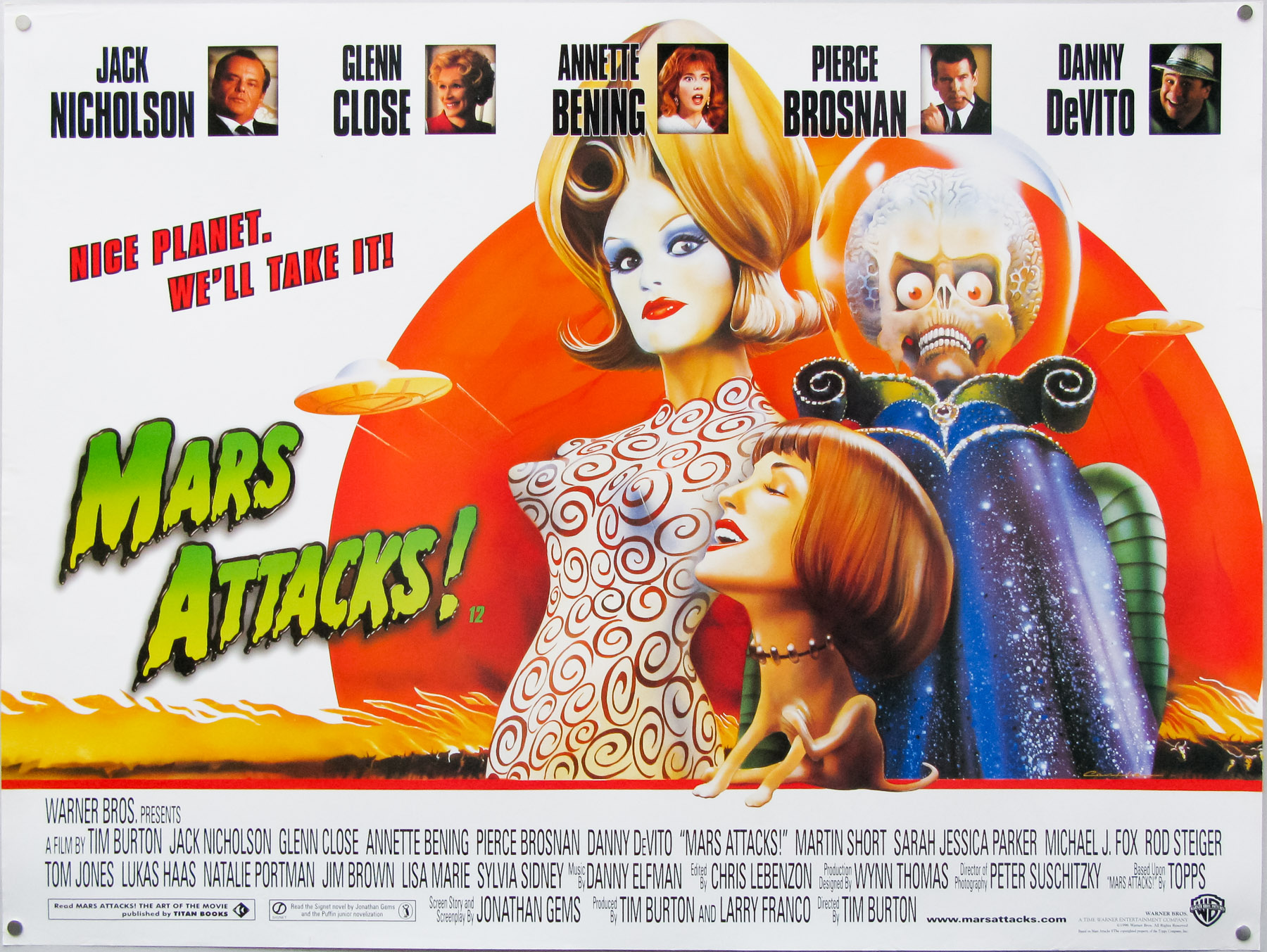
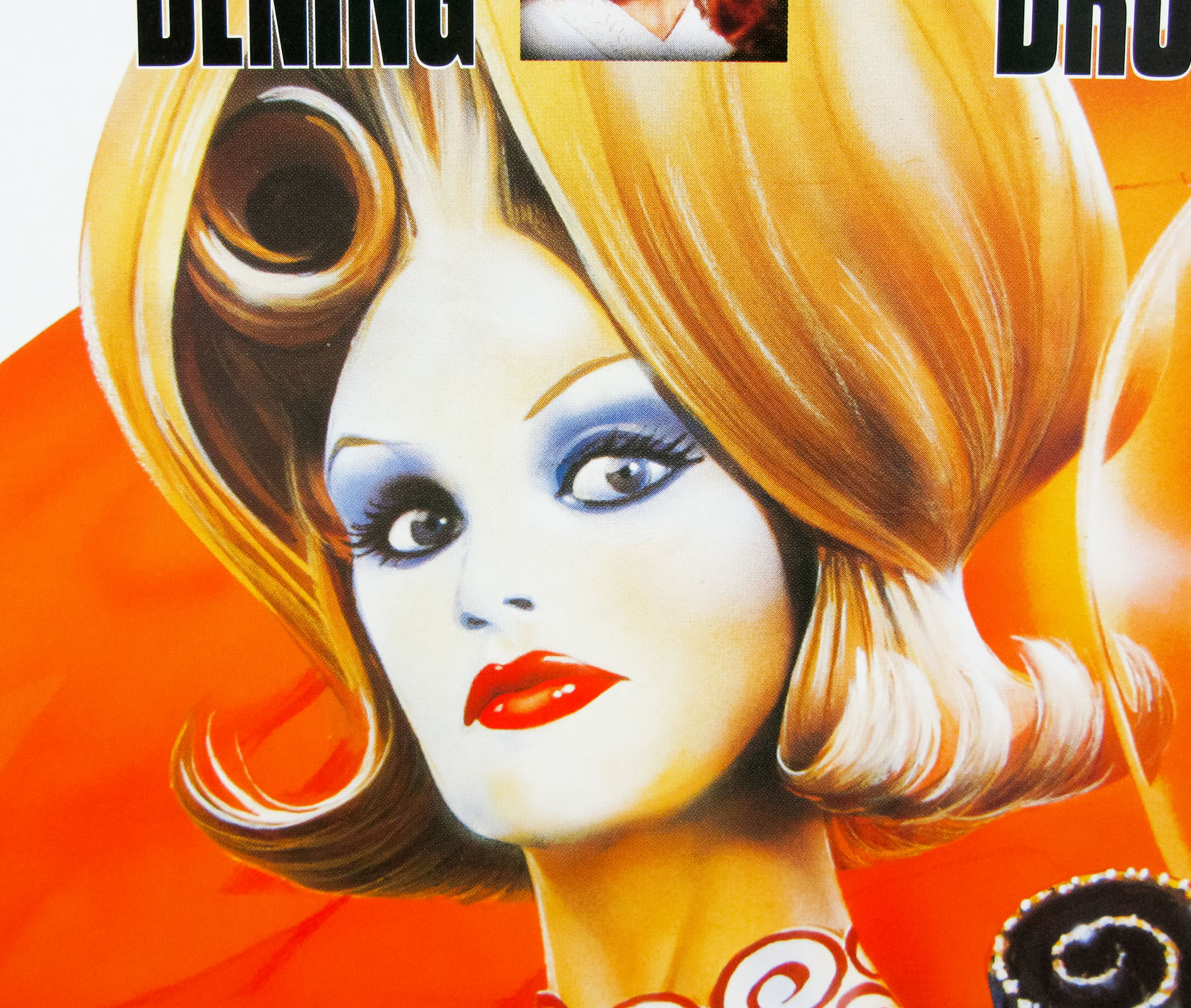
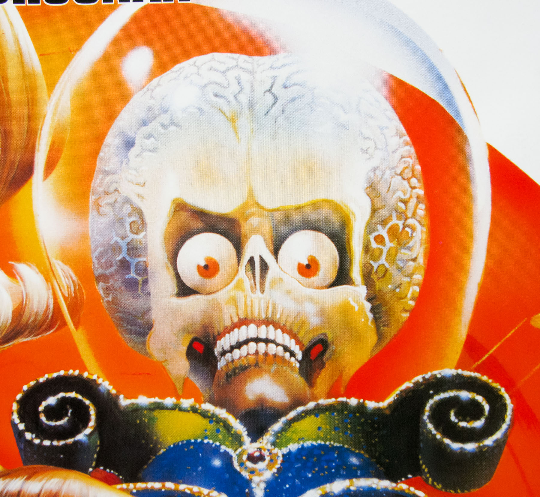
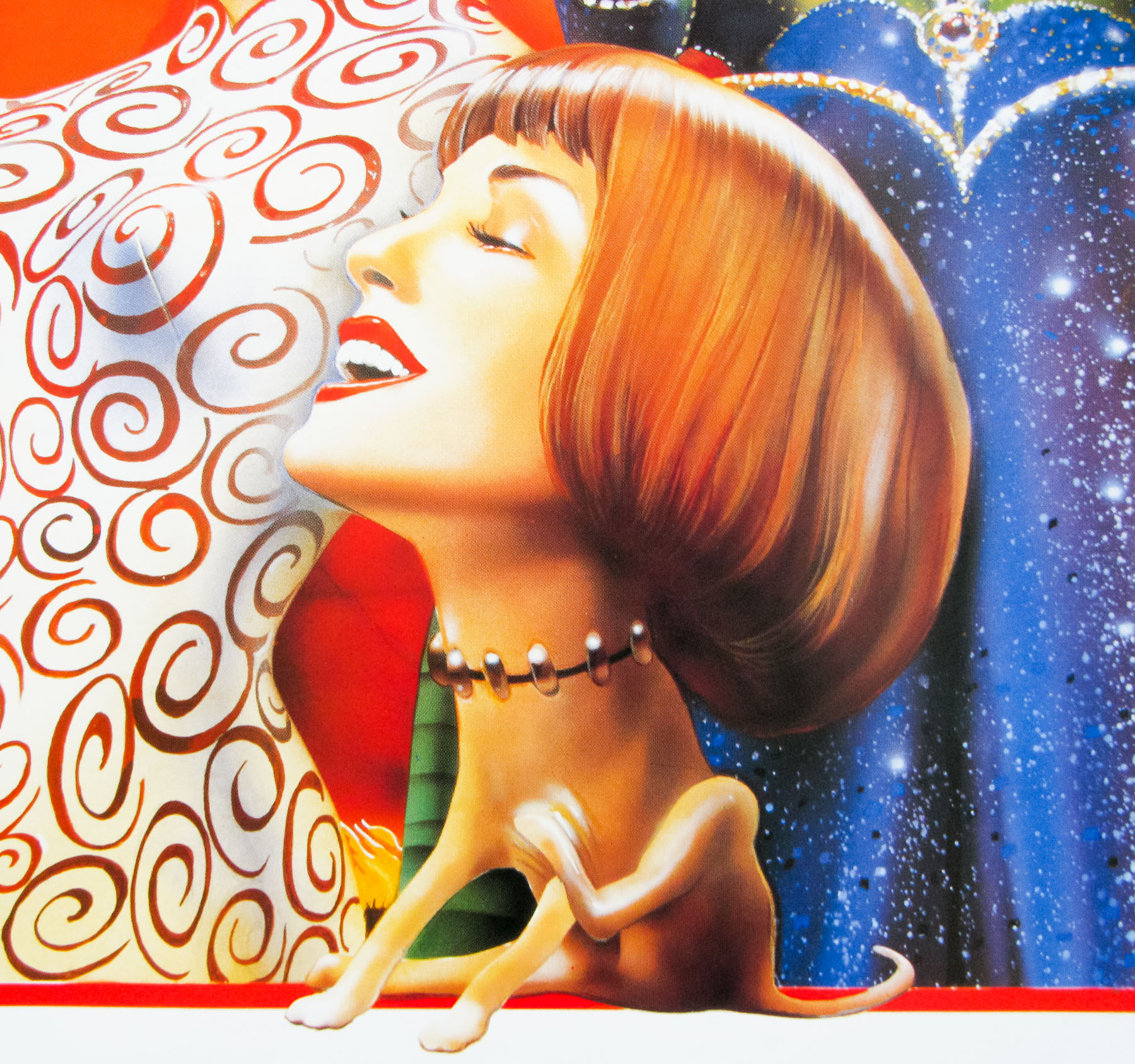
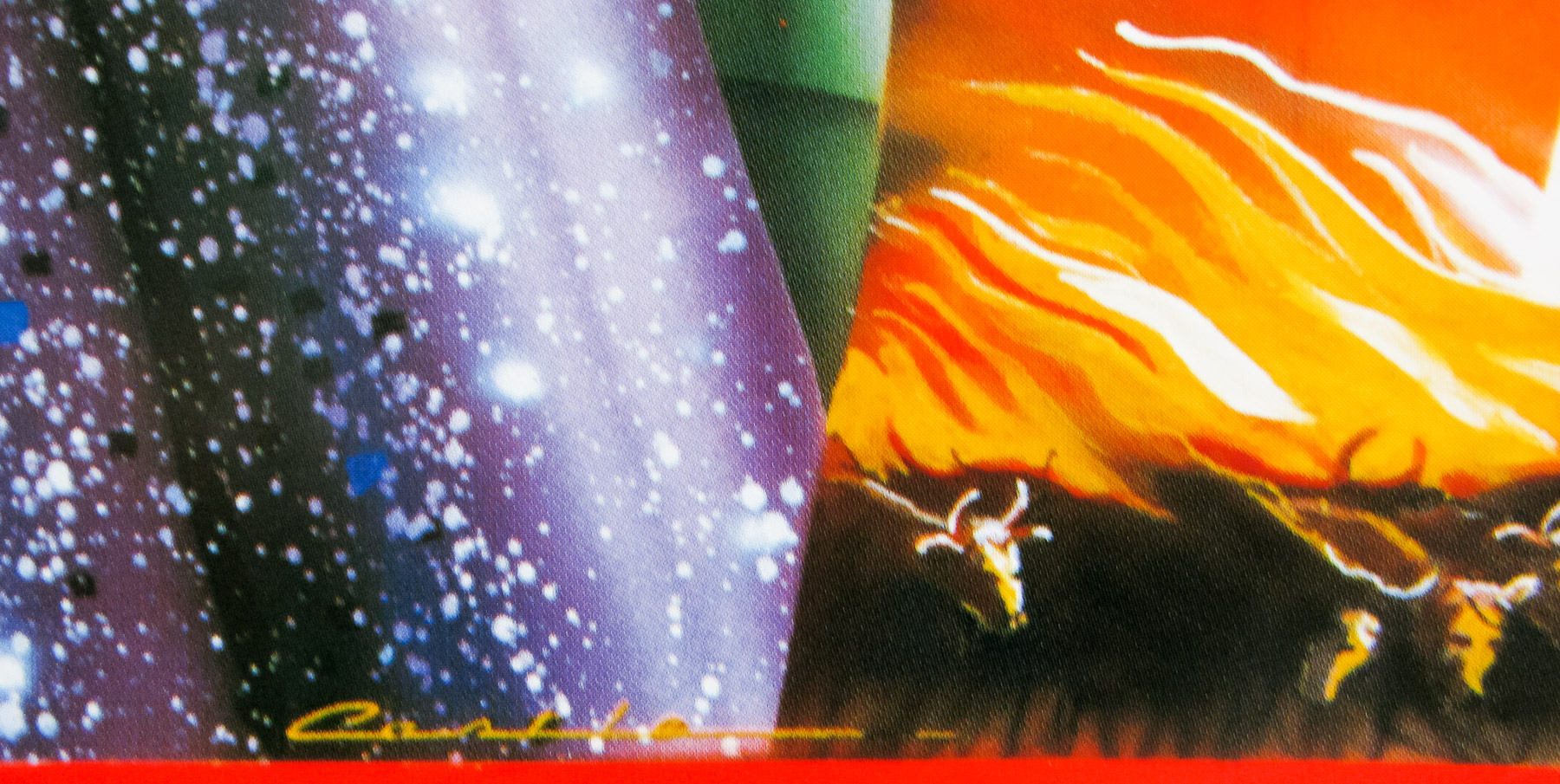
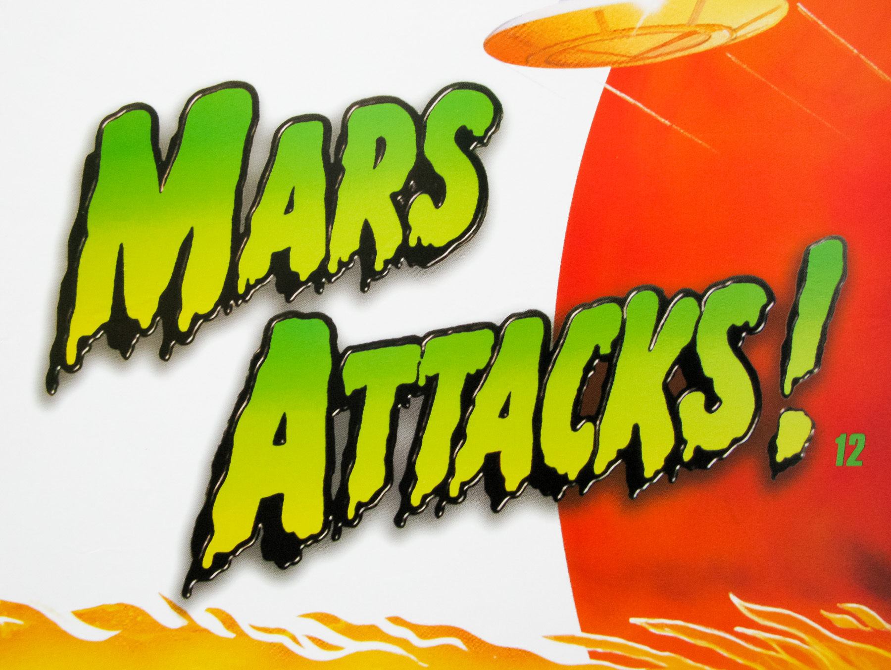
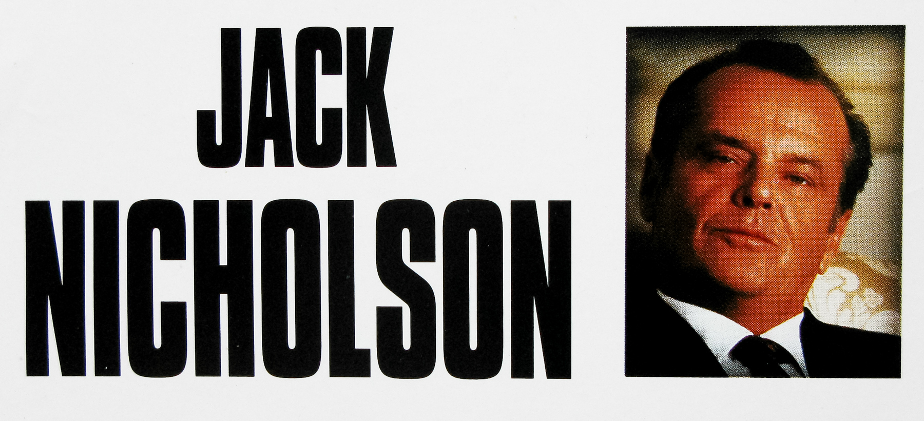
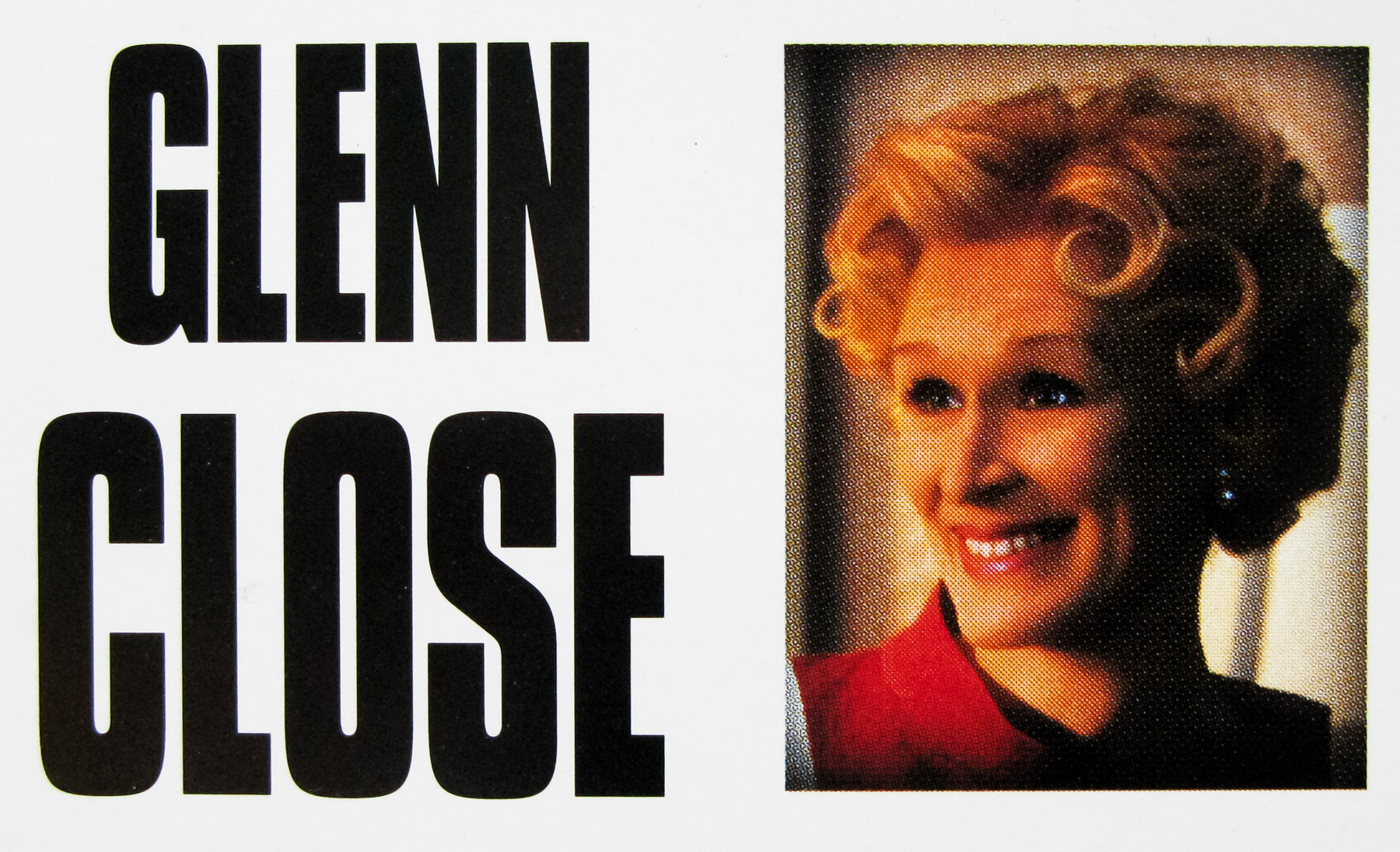
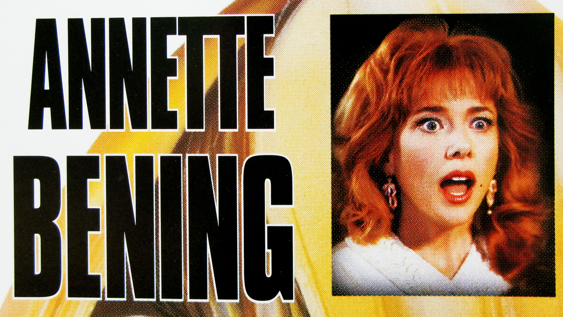
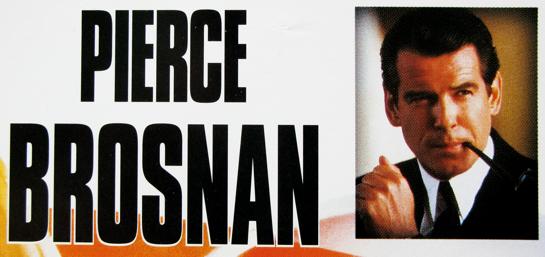
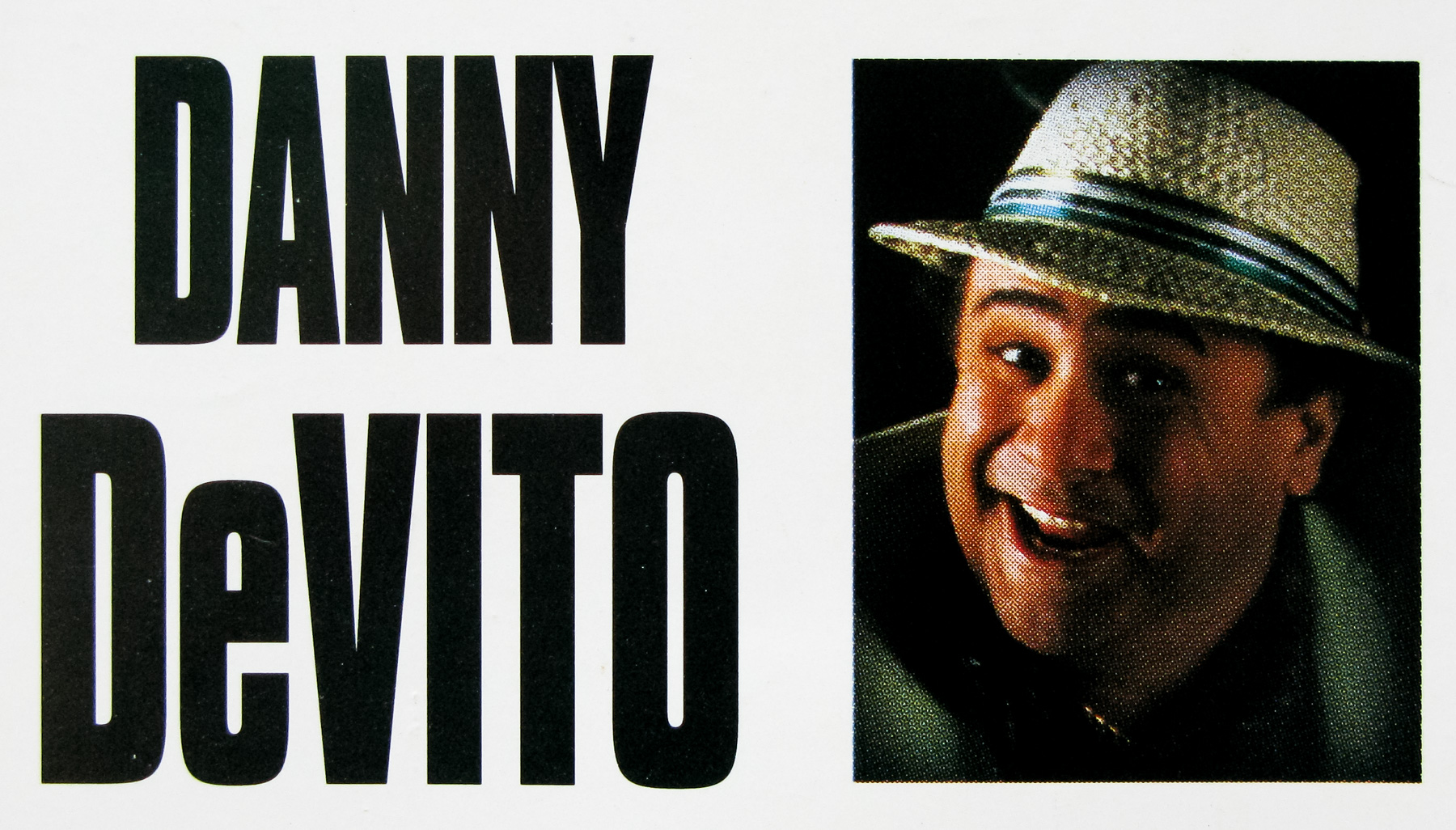
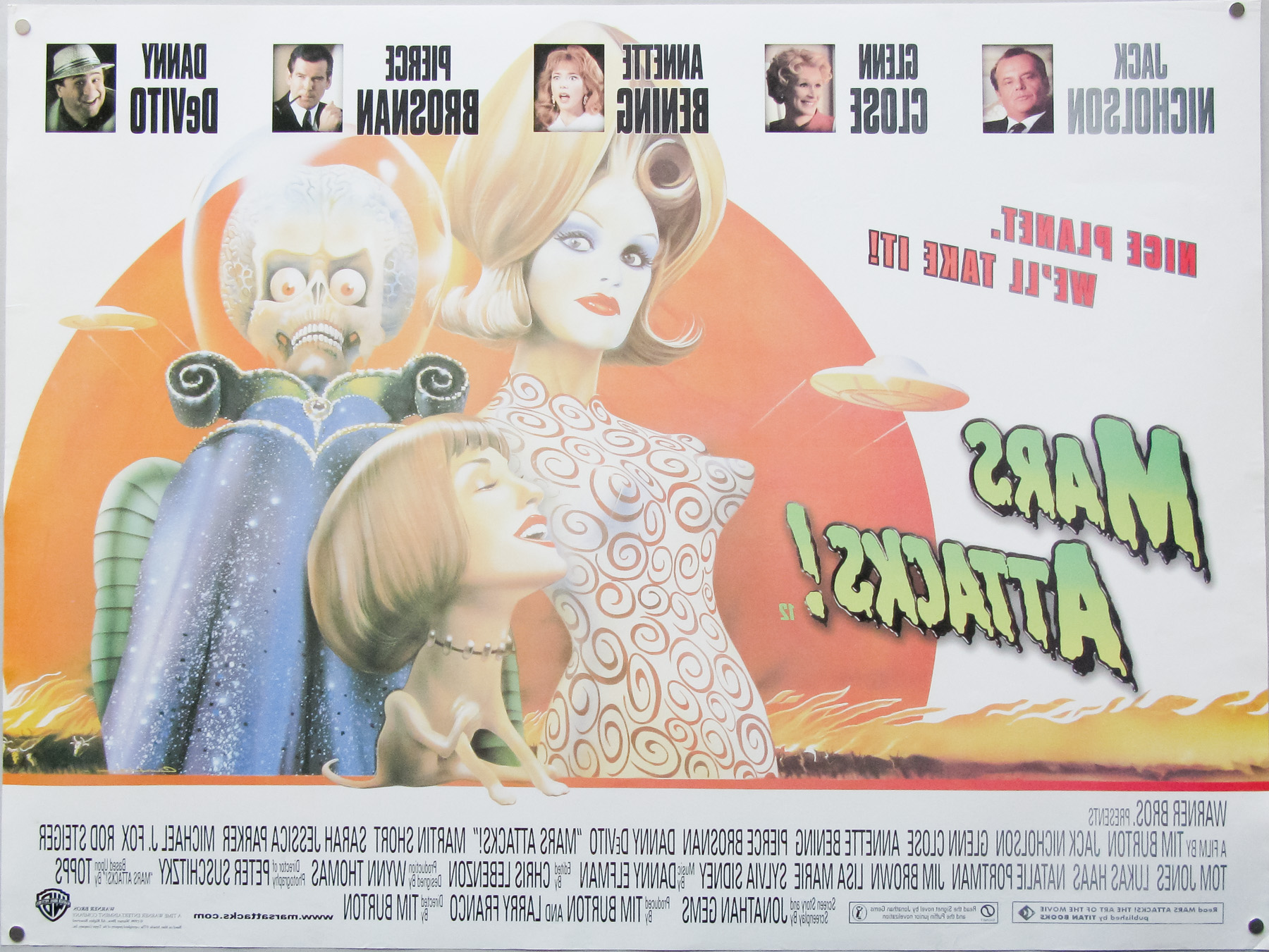
- Title
- Mars Attacks!
- AKA
- --
- Year of Film
- 1996
- Director
- Tim Burton
- Starring
- Jack Nicholson, Glenn Close, Annette Bening, Pierce Brosnan, Danny DeVito, Martin Short, Sarah Jessica Parker, Rod Steiger, Tom Jones, Lukas Haas, Natalie Portman, Jim Brown, Lisa Marie, Sylvia Sidney
- Origin of Film
- USA
- Genre(s) of Film
- Jack Nicholson, Glenn Close, Annette Bening, Pierce Brosnan, Danny DeVito, Martin Short, Sarah Jessica Parker, Rod Steiger, Tom Jones, Lukas Haas, Natalie Portman, Jim Brown, Lisa Marie, Sylvia Sidney,
- Type of Poster
- Quad
- Style of Poster
- --
- Origin of Poster
- UK
- Year of Poster
- 1996
- Designer
- Unknown
- Artist
- Philip Castle
- Size (inches)
- 30 1/16" x 39 7/8"
- SS or DS
- DS
- Tagline
- Nice planet. We'll take it!
18.05.11
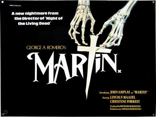
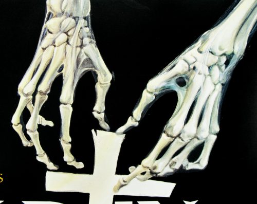
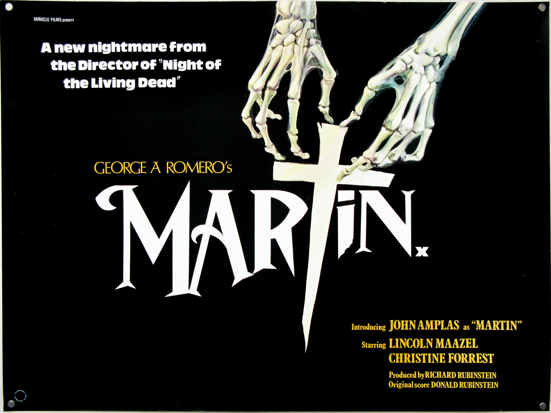
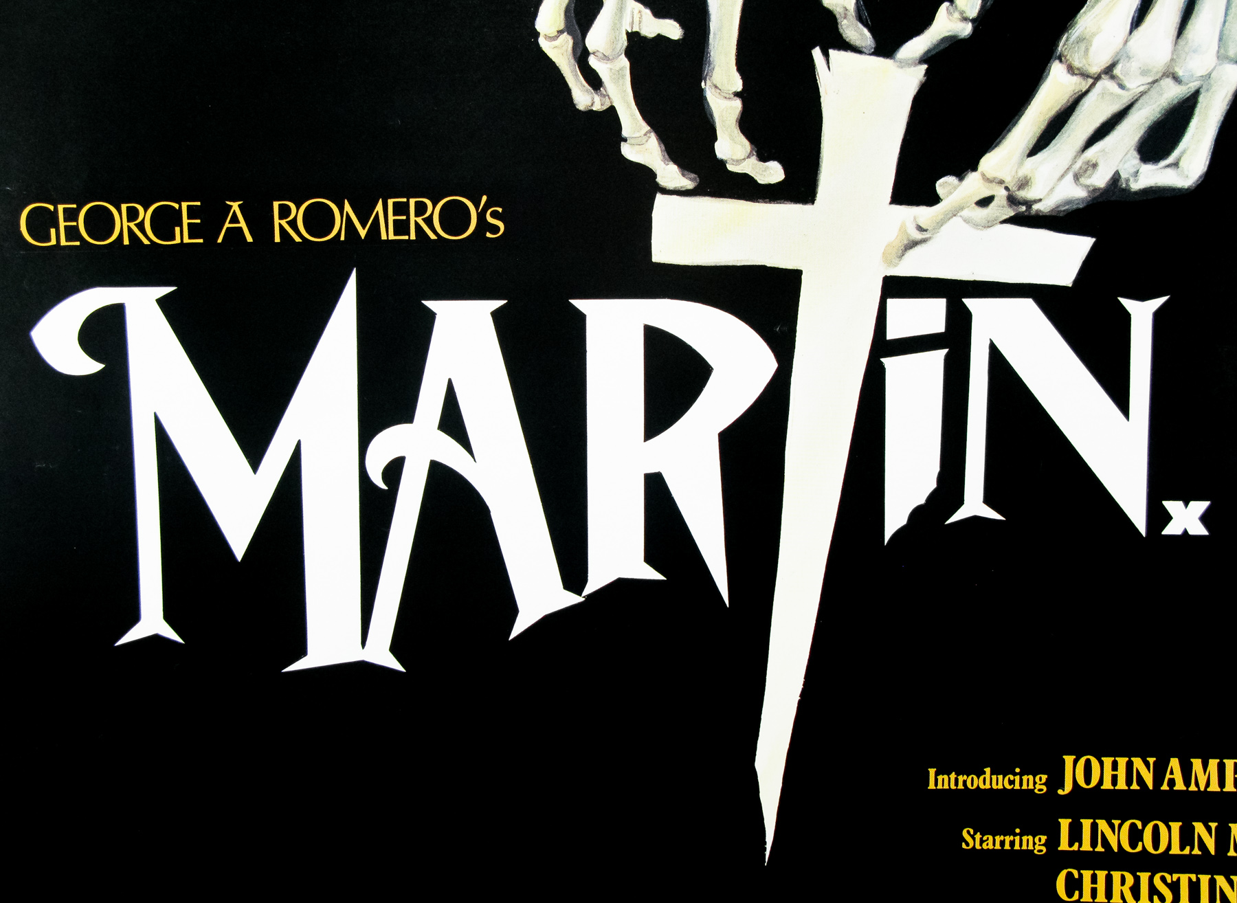
- Title
- Martin
- AKA
- Wampyr (Italy / West Germany)
- Year of Film
- 1977
- Director
- George A. Romero
- Starring
- John Amplas, Lincoln Maazel, Christine Forrest, Elyane Nadeau, Tom Savini, Sara Venable, Fran Middleton, Roger Caine
- Origin of Film
- USA
- Genre(s) of Film
- John Amplas, Lincoln Maazel, Christine Forrest, Elyane Nadeau, Tom Savini, Sara Venable, Fran Middleton, Roger Caine,
- Type of Poster
- Quad
- Style of Poster
- --
- Origin of Poster
- UK
- Year of Poster
- 1977
- Designer
- Unknown
- Artist
- Unknown
- Size (inches)
- 30" x 40 1/8"
- SS or DS
- SS
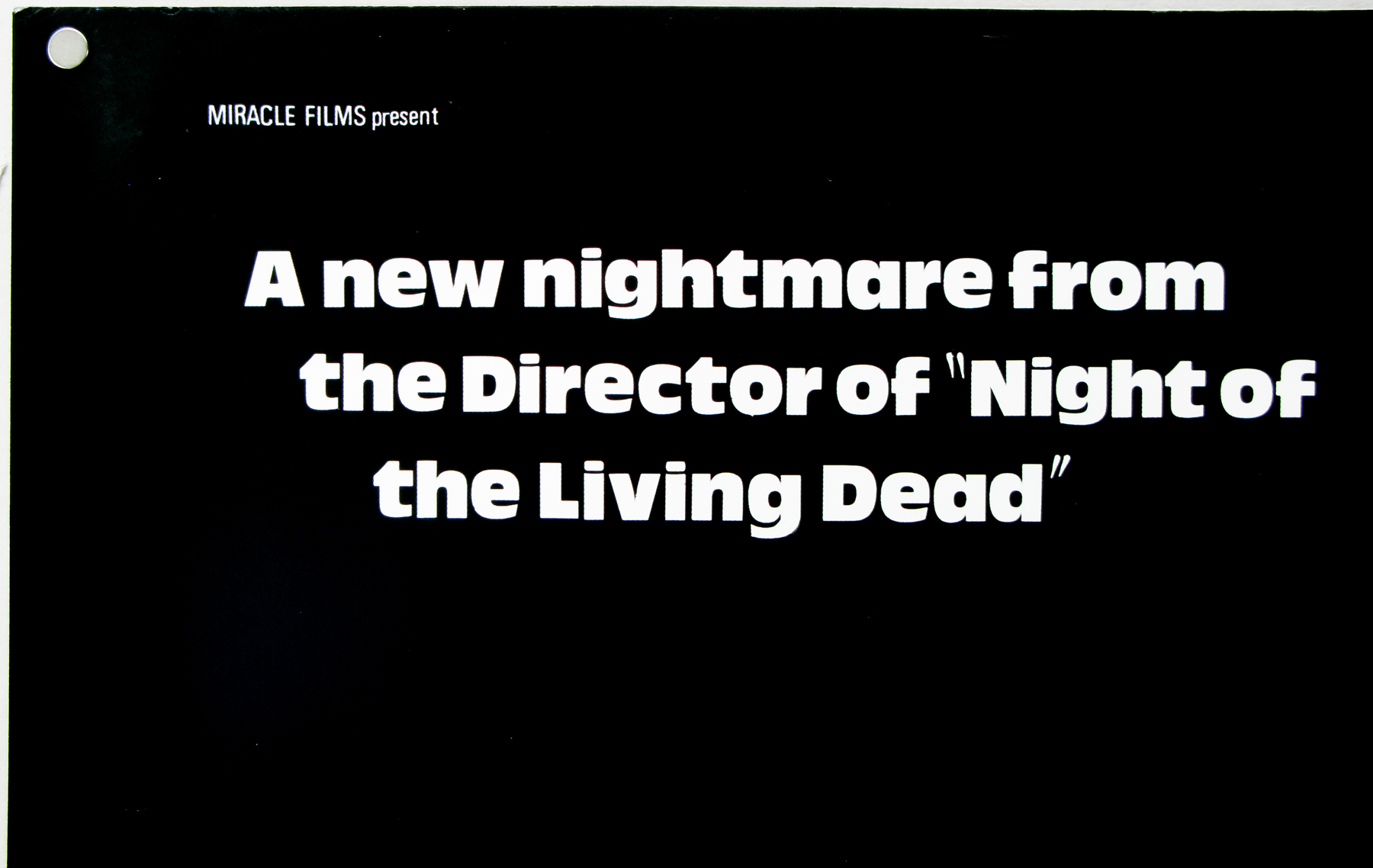
- Tagline
- A new nightmare from the Director of "Night of the Living Dead"
18.05.11
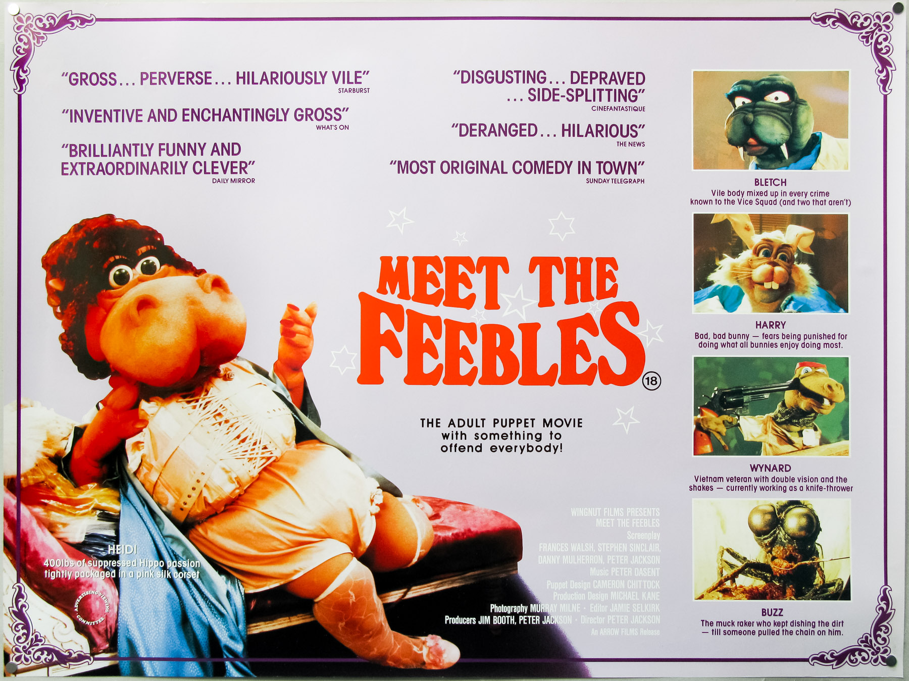
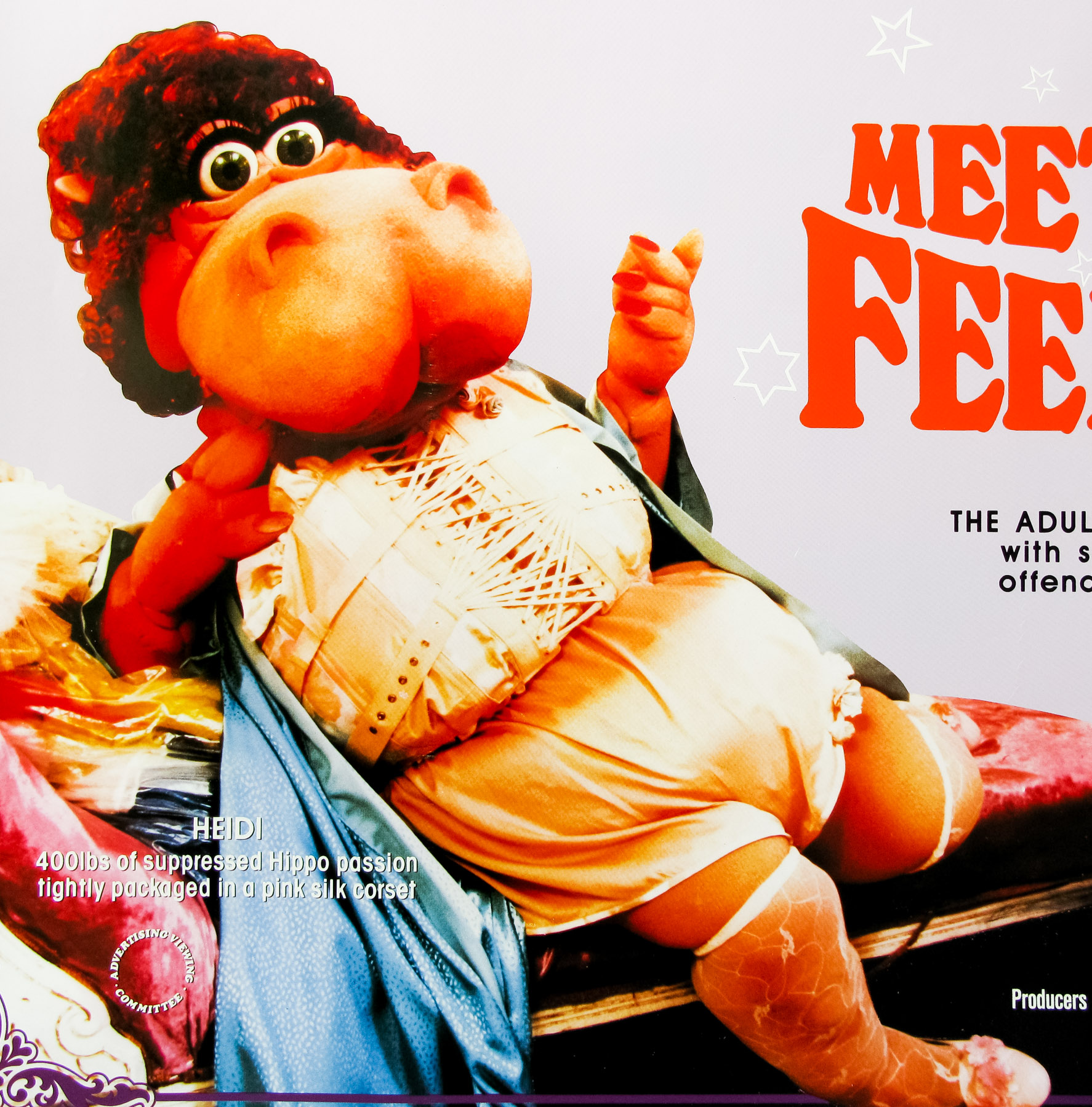
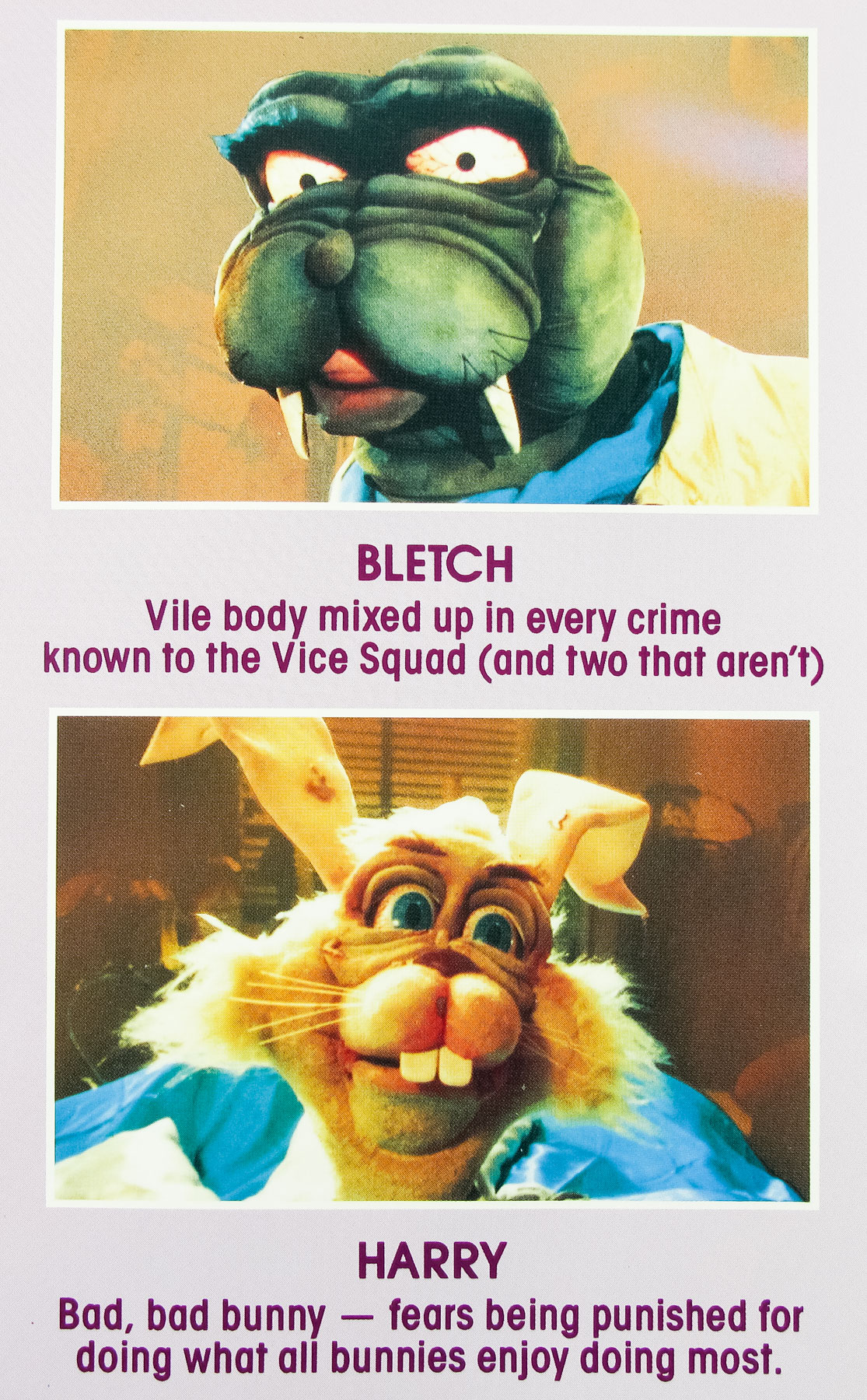
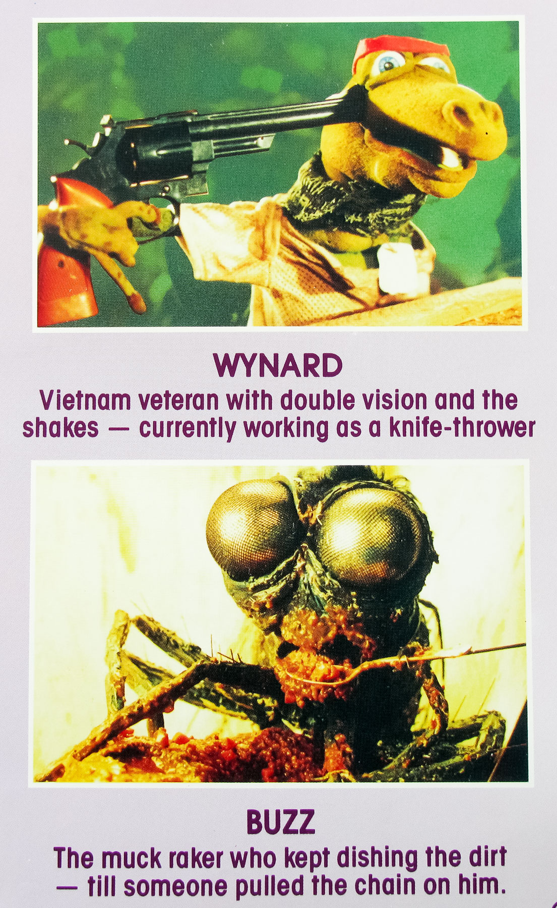
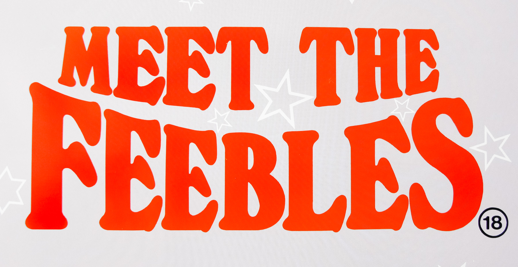
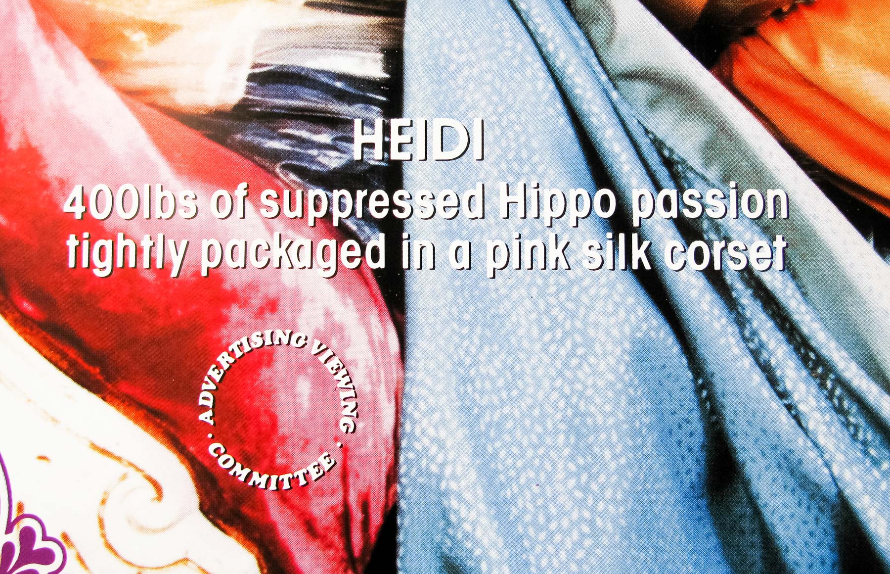
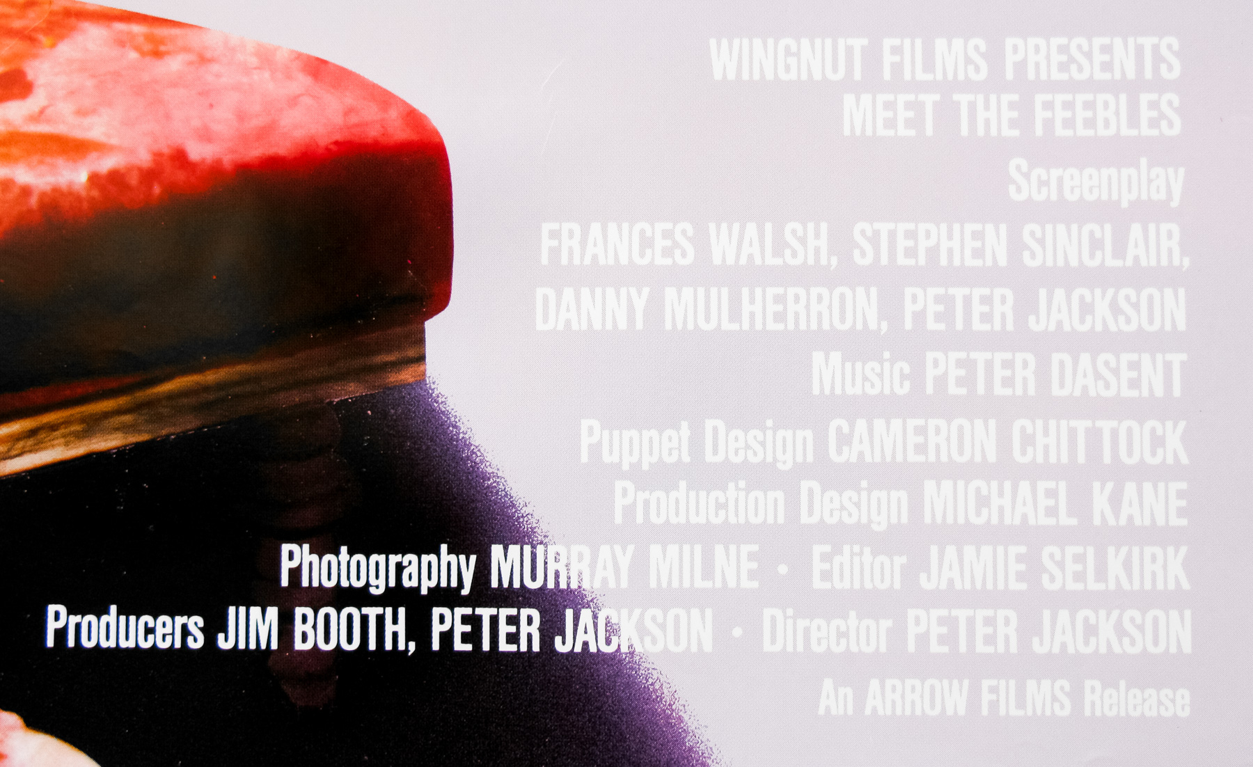
- Title
- Meet the Feebles
- AKA
- --
- Year of Film
- 1990
- Director
- Peter Jackson
- Starring
- Donna Akersten, Stuart Devenie, Mark Hadlow, Ross Jolly, Brian Sergent, Peter Vere-Jones, Mark Wright
- Origin of Film
- New Zealand
- Genre(s) of Film
- Donna Akersten, Stuart Devenie, Mark Hadlow, Ross Jolly, Brian Sergent, Peter Vere-Jones, Mark Wright,
- Type of Poster
- Quad
- Style of Poster
- --
- Origin of Poster
- UK
- Year of Poster
- 1992
- Designer
- Unknown
- Artist
- --
- Size (inches)
- 30" x 40"
- SS or DS
- SS
- Tagline
- --
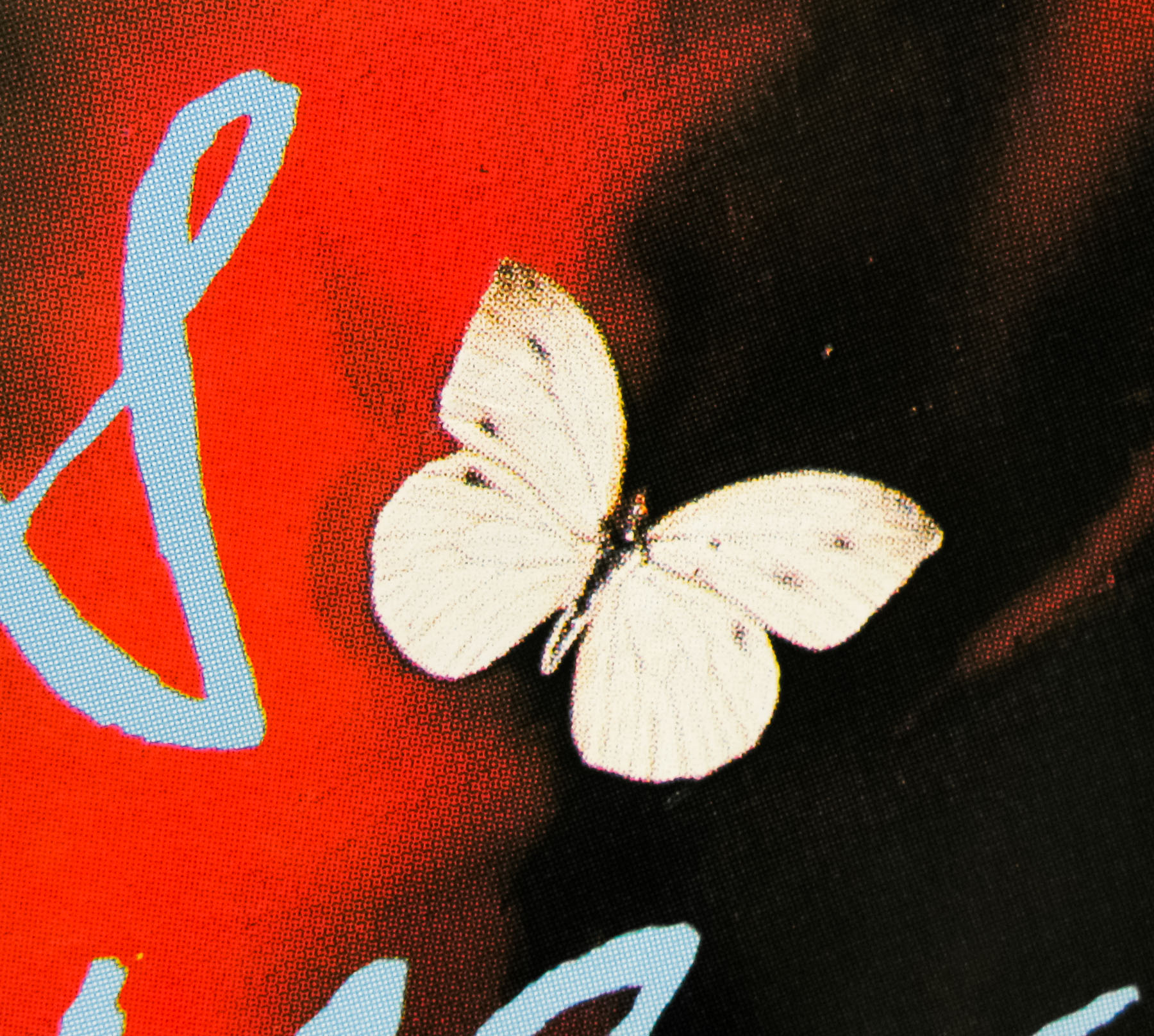
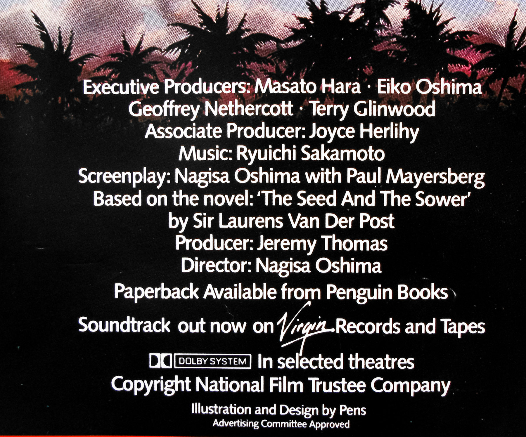
18.05.11
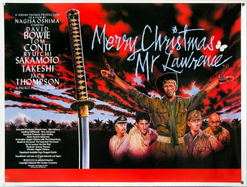
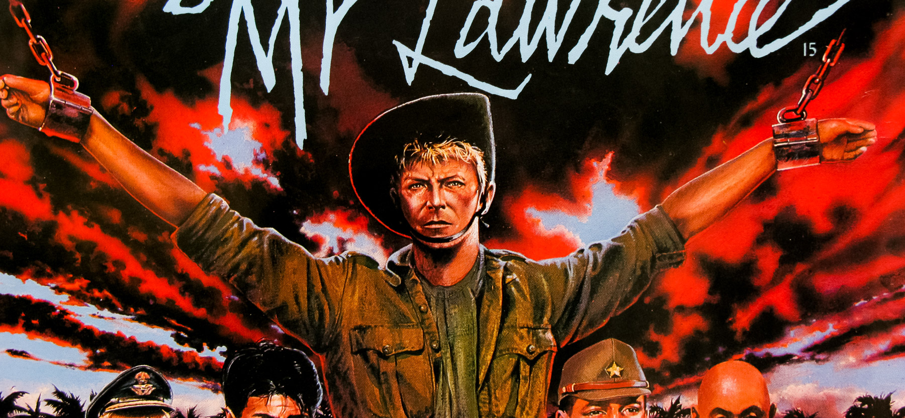
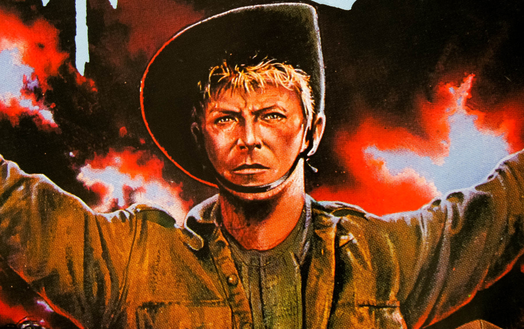
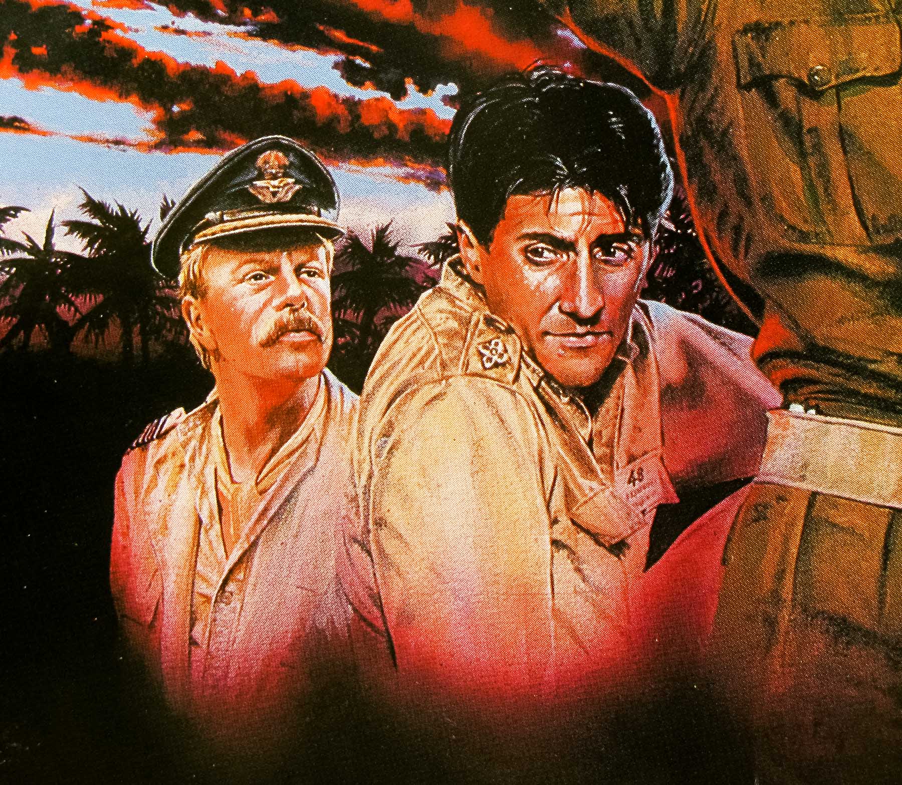
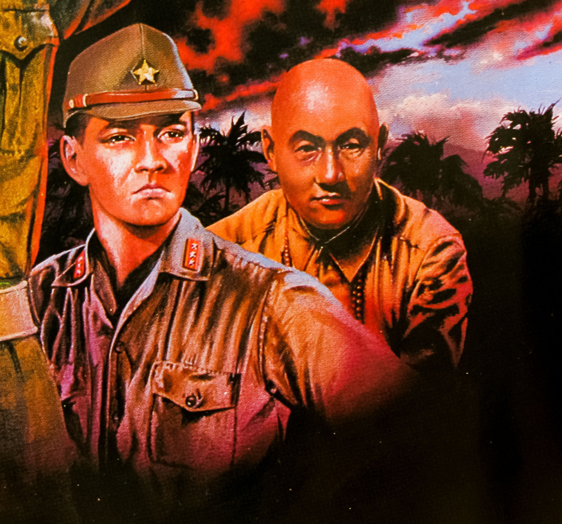
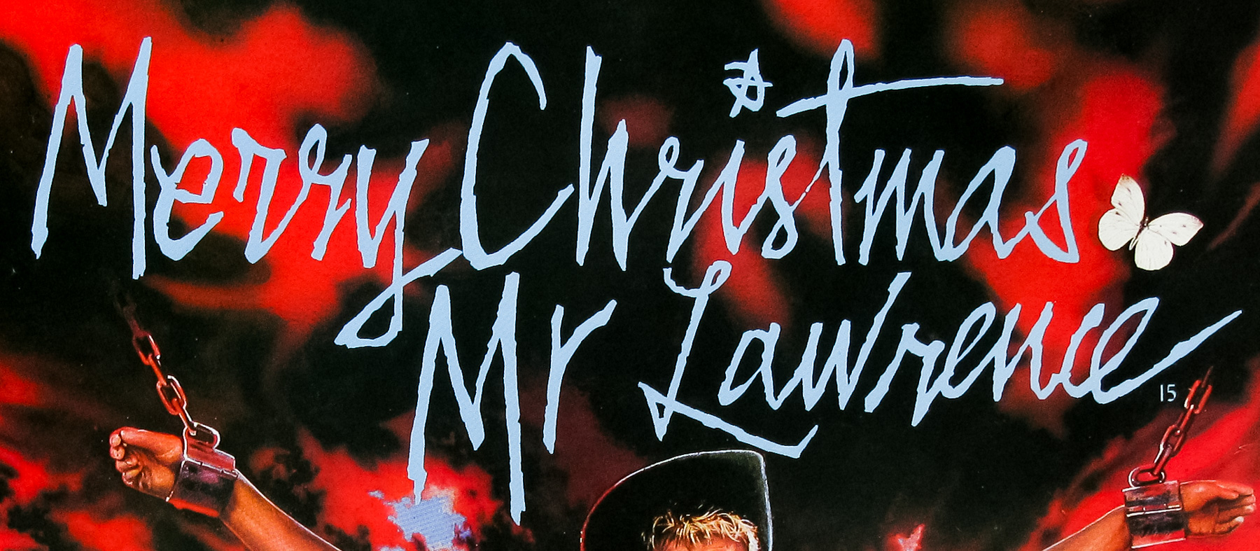
- Title
- Merry Christmas Mr Lawrence
- AKA
- Furyo (Canada / France / Italy / Turkey) | Senjô no merî Kurisumasu (Japan)
- Year of Film
- 1983
- Director
- Nagisa Oshima
- Starring
- David Bowie, Tom Conti, Ryuichi Sakamoto, Takeshi Kitano, Jack Thompson, Johnny Okura, Alistair Browning
- Origin of Film
- UK | Japan
- Genre(s) of Film
- David Bowie, Tom Conti, Ryuichi Sakamoto, Takeshi Kitano, Jack Thompson, Johnny Okura, Alistair Browning,
- Type of Poster
- Quad
- Style of Poster
- --
- Origin of Poster
- UK
- Year of Poster
- 1983
- Designer
- Pens
- Artist
- Pens
- Size (inches)
- 30" x 39 15/16"
- SS or DS
- SS
- Tagline
- --
18.05.11
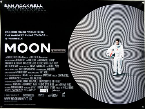
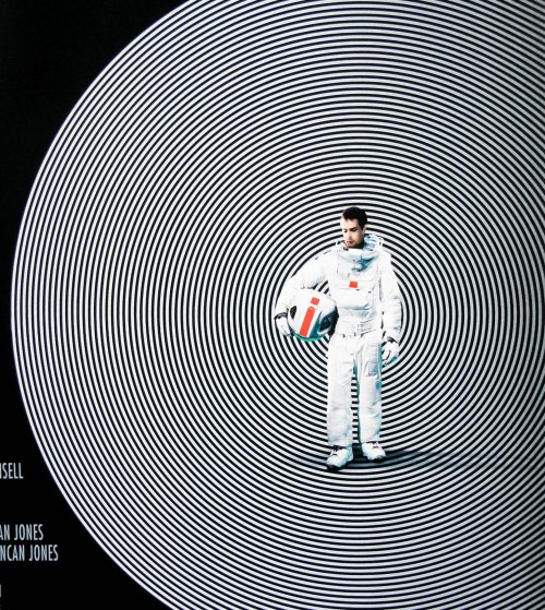
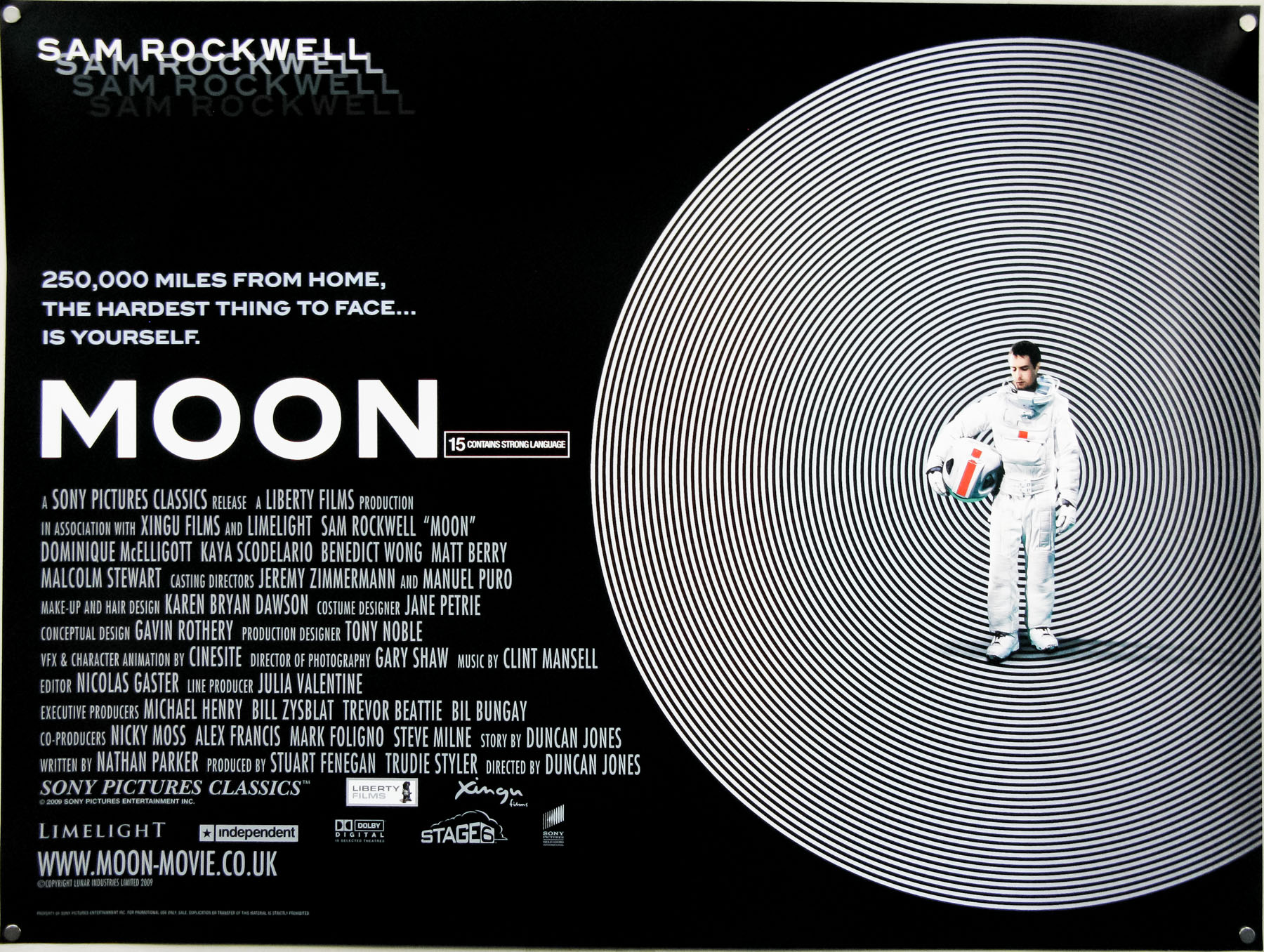
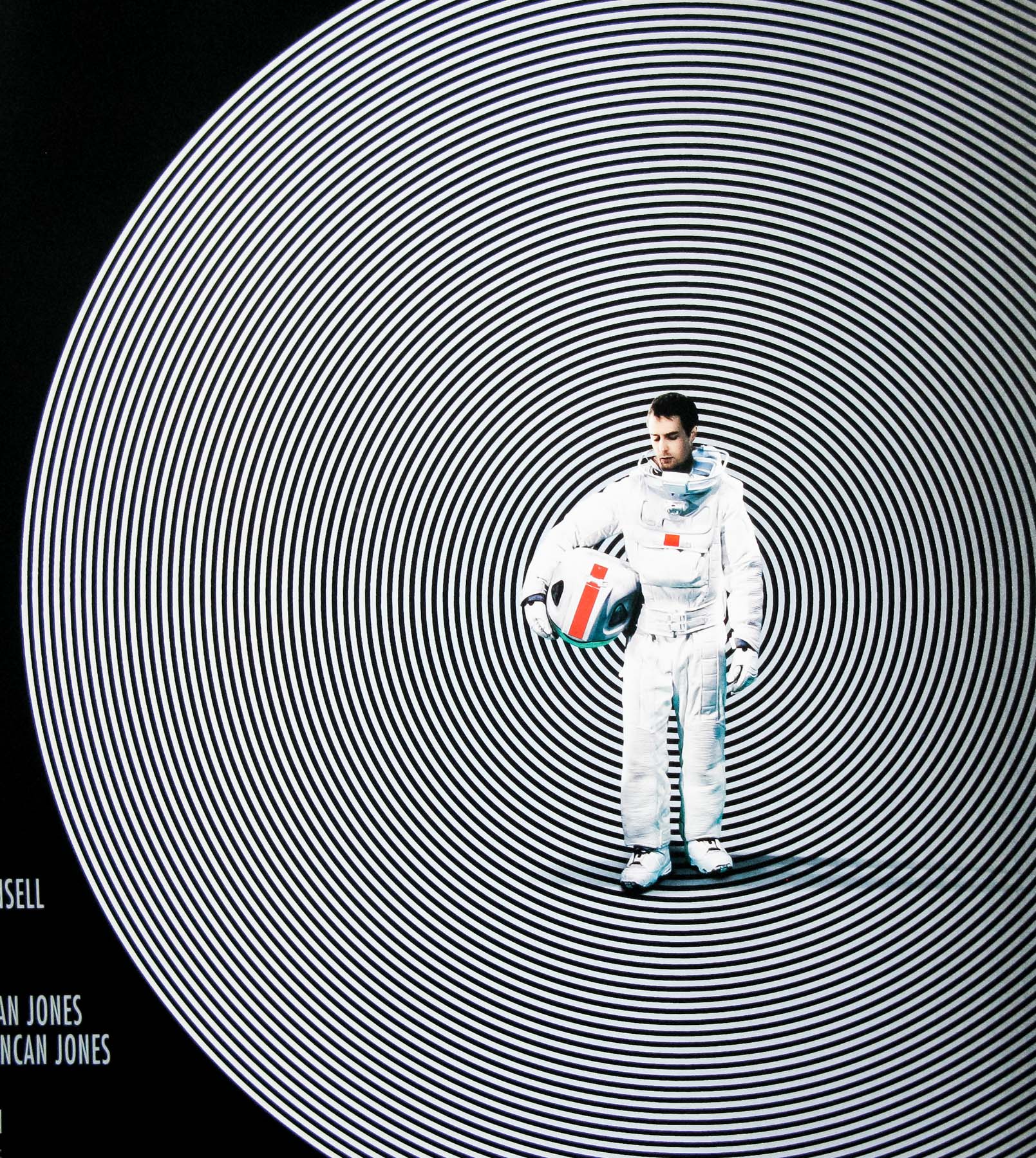
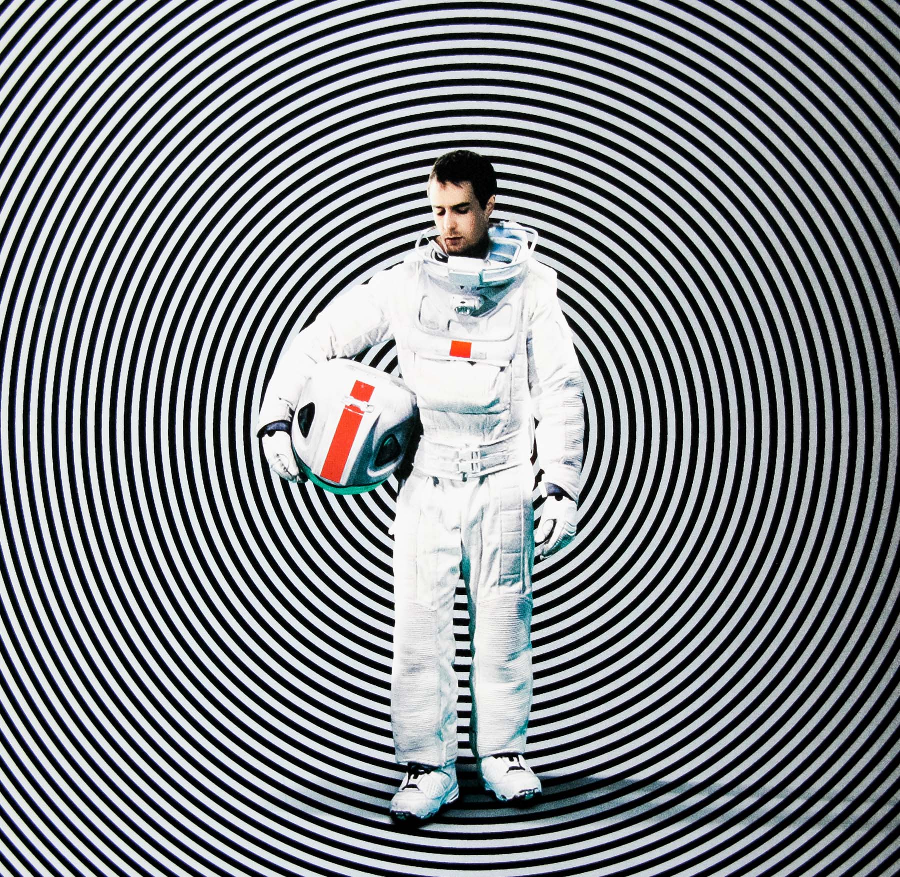
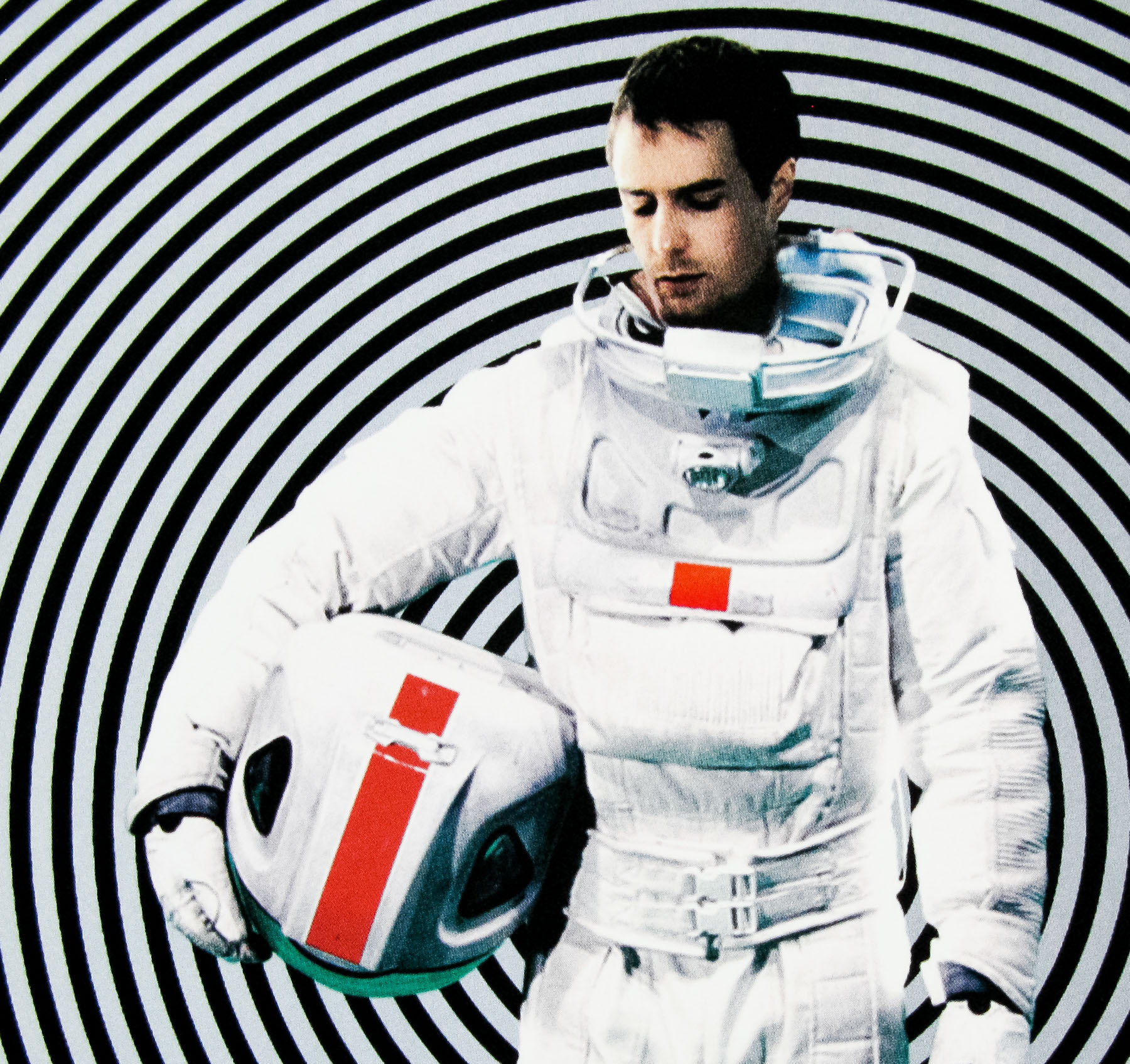
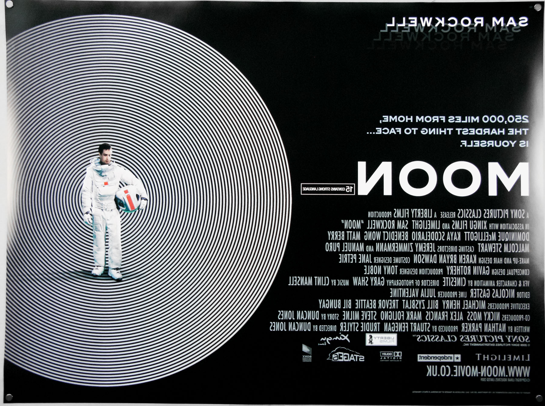
- Title
- Moon
- AKA
- --
- Year of Film
- 2009
- Director
- Duncan Jones
- Starring
- Sam Rockwell, Kevin Spacey, Robin Chalk, Dominique McElligott, Kaya Scodelario, Benedict Wong, Matt Berry, Malcolm Stewart
- Origin of Film
- UK
- Genre(s) of Film
- Sam Rockwell, Kevin Spacey, Robin Chalk, Dominique McElligott, Kaya Scodelario, Benedict Wong, Matt Berry, Malcolm Stewart,
- Type of Poster
- Quad
- Style of Poster
- --
- Origin of Poster
- UK
- Year of Poster
- 2009
- Designer
- Cardinal Communications USA
- Artist
- --
- Size (inches)
- 30" x 40"
- SS or DS
- DS
- Tagline
- 250,000 miles from home, the hardest thing to face...is yourself
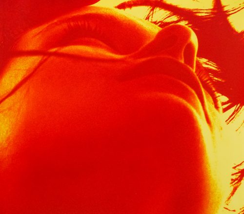
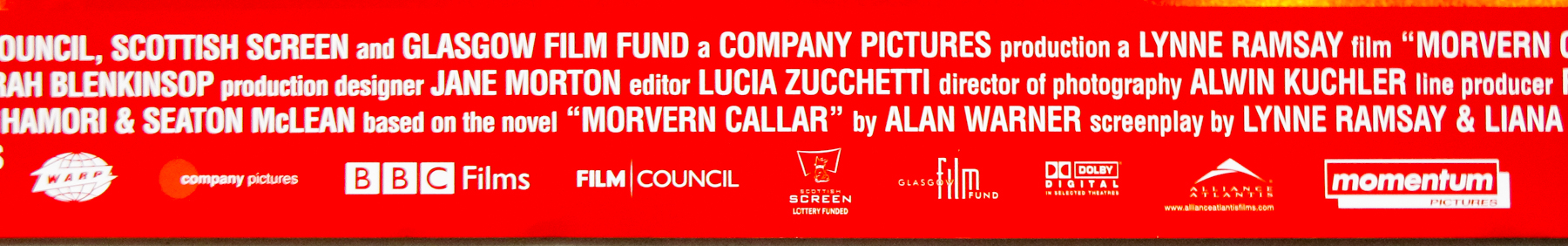
18.05.11
- Title
- Morvern Callar
- AKA
- --
- Year of Film
- 2002
- Director
- Lynne Ramsay
- Starring
- Samantha Morton, Kathleen McDermott, Linda McGuire, Ruby Milton, Dolly Wells, Dan Cadan, Carolyn Calder
- Origin of Film
- UK | Canada
- Genre(s) of Film
- Samantha Morton, Kathleen McDermott, Linda McGuire, Ruby Milton, Dolly Wells, Dan Cadan, Carolyn Calder,
- Type of Poster
- Quad
- Style of Poster
- Advance
- Origin of Poster
- UK
- Year of Poster
- 2002
- Designer
- TEA - The Entertainment Agency
- Artist
- --
- Size (inches)
- 29 15/16" x 40"
- SS or DS
- SS
- Tagline
- --
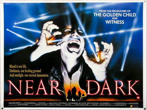
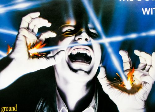
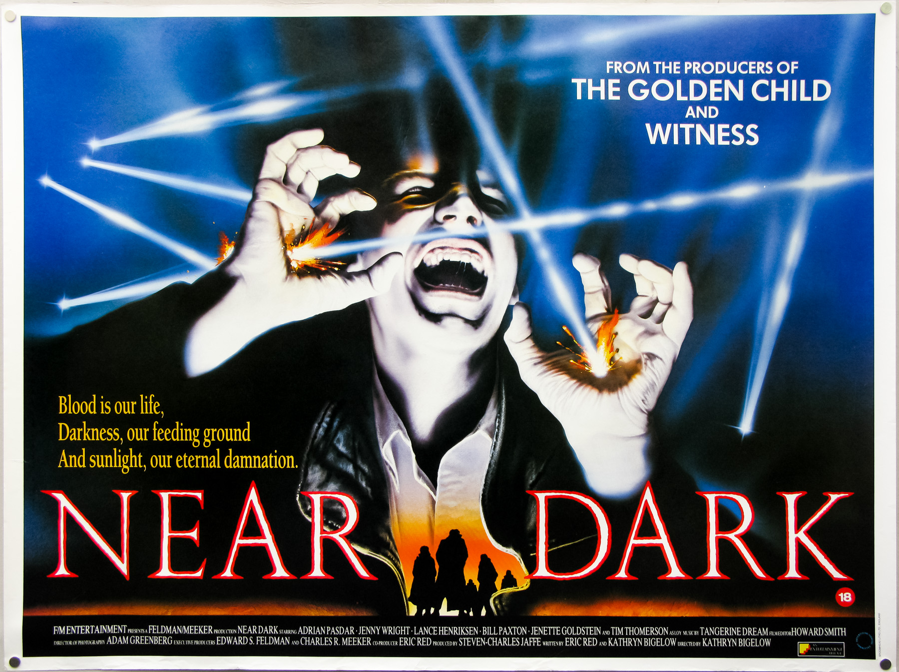
18.05.11
- Title
- Near Dark
- AKA
- --
- Year of Film
- 1987
- Director
- Kathryn Bigelow
- Starring
- Adrian Pasdar, Jenny Wright, Lance Henriksen, Bill Paxton, Jenette Goldstein, Tim Thomerson, Joshua John Miller, Marcie Leeds
- Origin of Film
- USA
- Genre(s) of Film
- Adrian Pasdar, Jenny Wright, Lance Henriksen, Bill Paxton, Jenette Goldstein, Tim Thomerson, Joshua John Miller, Marcie Leeds,
- Type of Poster
- Quad
- Style of Poster
- --
- Origin of Poster
- UK
- Year of Poster
- 1988
- Designer
- Marcus Silversides | Mike Harris
- Artist
- Unknown
- Size (inches)
- 29 15/16" x 40"
- SS or DS
- SS
- Tagline
- Blood is our life, Darkness, our feeding ground and sunlight, our eternal damnation.