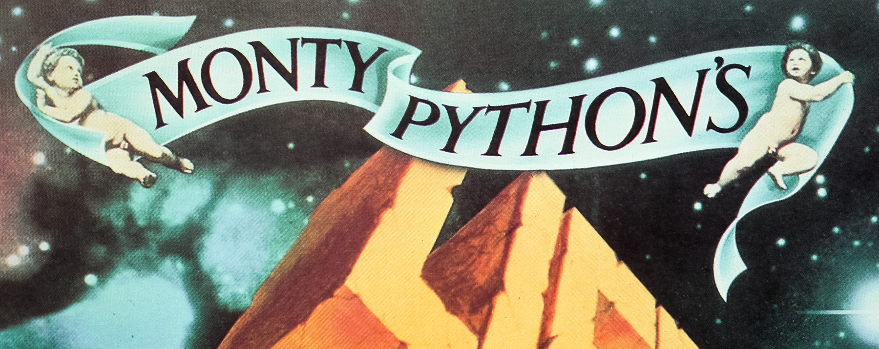
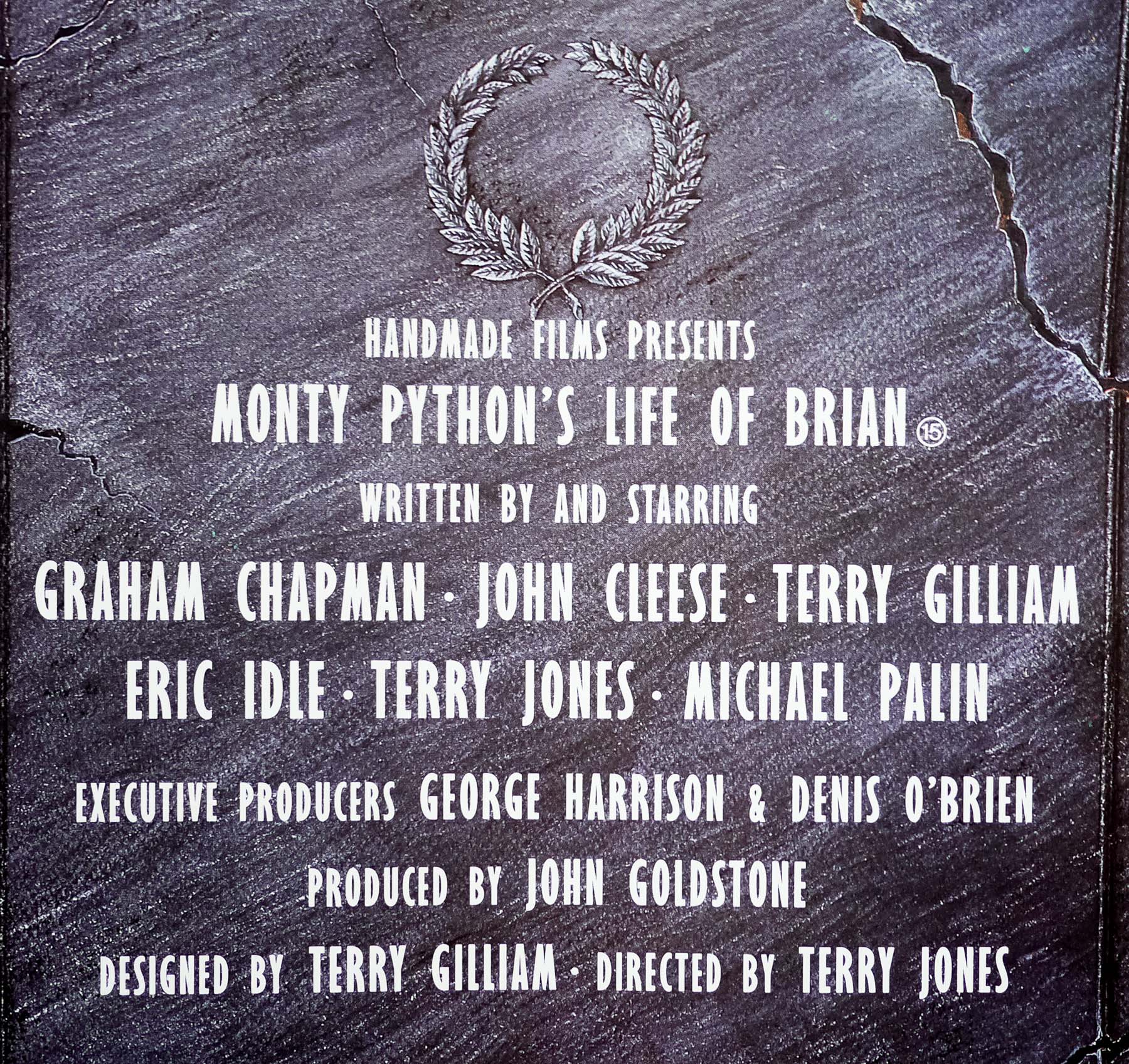
- Title
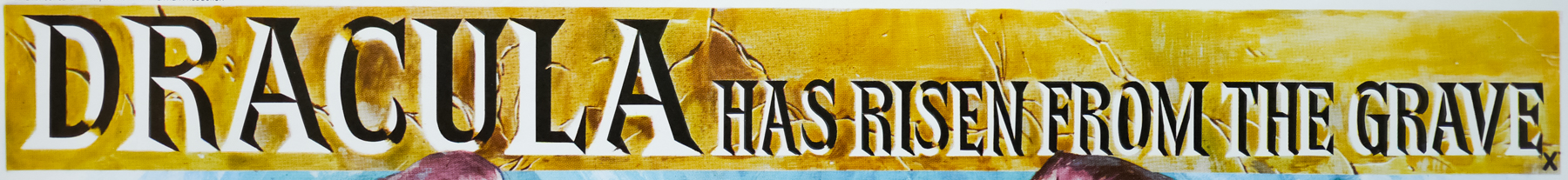
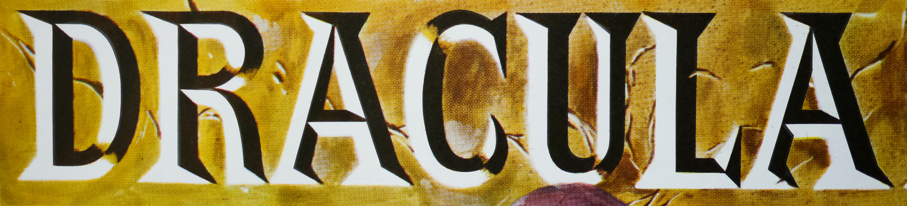
- Dracula Has Risen From the Grave
- AKA
- --
- Year of Film
- 1968
- Director
- Freddie Francis
- Starring
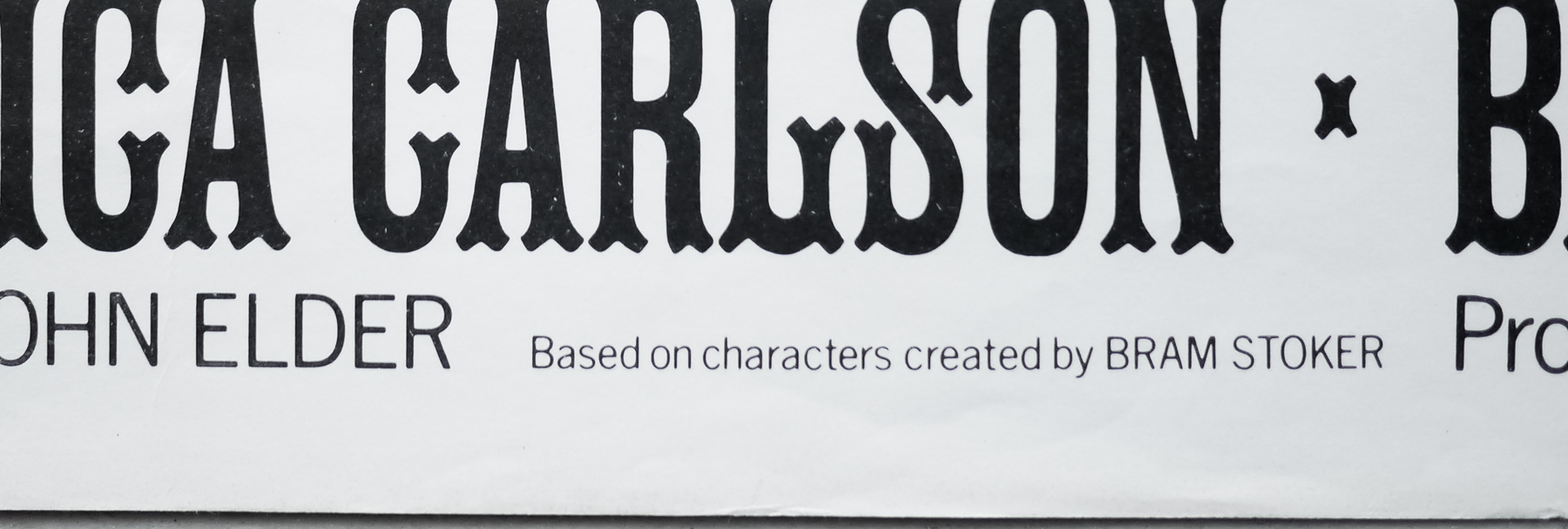
- Christopher Lee, Rupert Davies, Veronica Carlson, Barbara Ewing, Barry Andrews, Ewan Hooper, Marion Mathie, Michael Ripper, John D. Collins, George A. Cooper
- Origin of Film
- UK
- Genre(s) of Film
- Christopher Lee, Rupert Davies, Veronica Carlson, Barbara Ewing, Barry Andrews, Ewan Hooper, Marion Mathie, Michael Ripper, John D. Collins, George A. Cooper,
- Type of Poster
- Quad
- Style of Poster
- --
- Origin of Poster
- UK
- Year of Poster
- 1968
- Designer
- Tom Chantrell
- Artist
- Tom Chantrell
- Size (inches)
- 30" x 39 15/16"
- SS or DS
- SS
- Tagline
- --
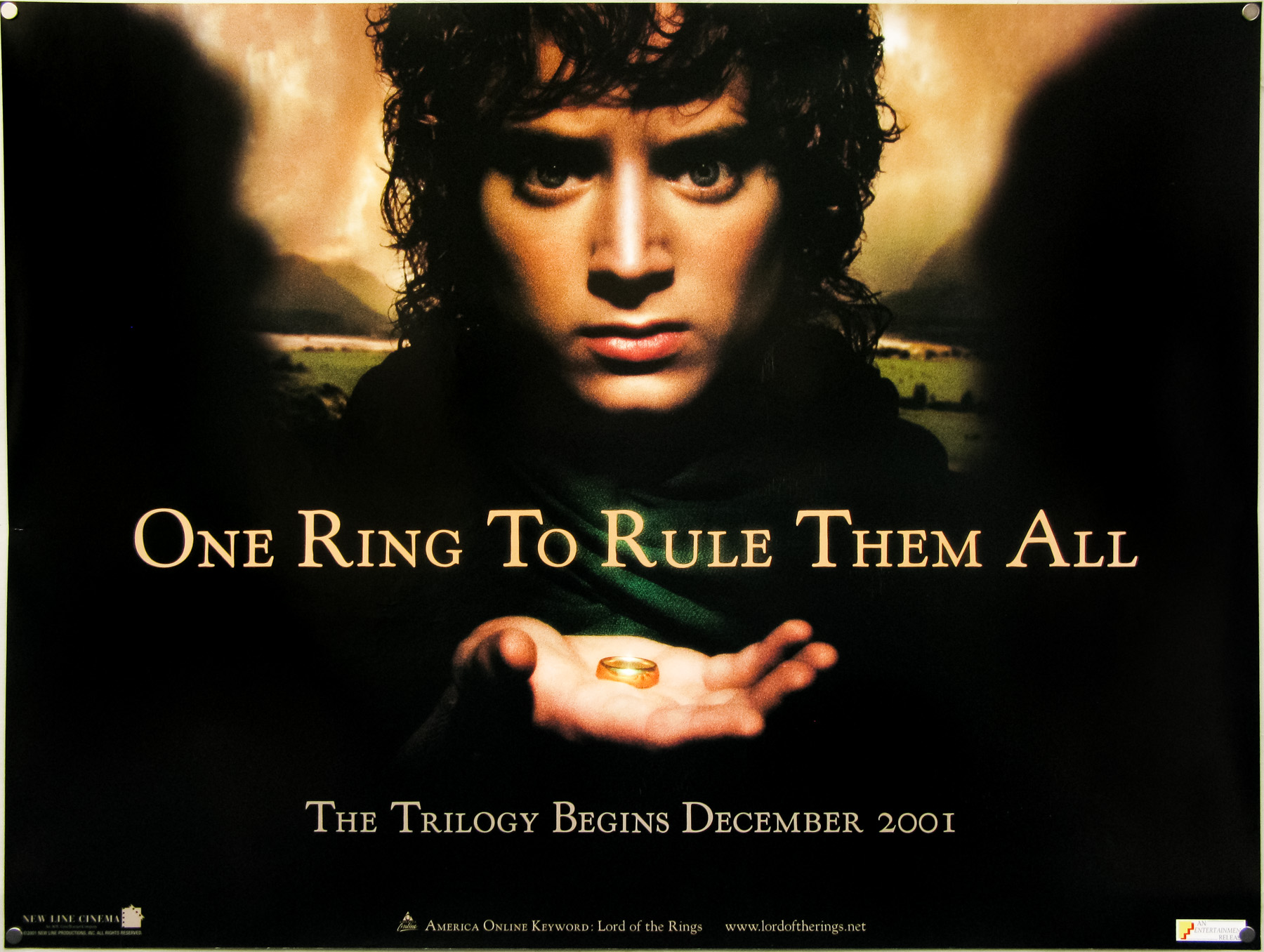
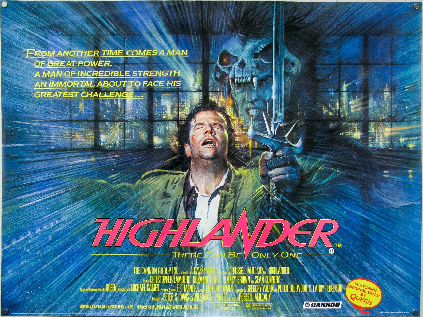
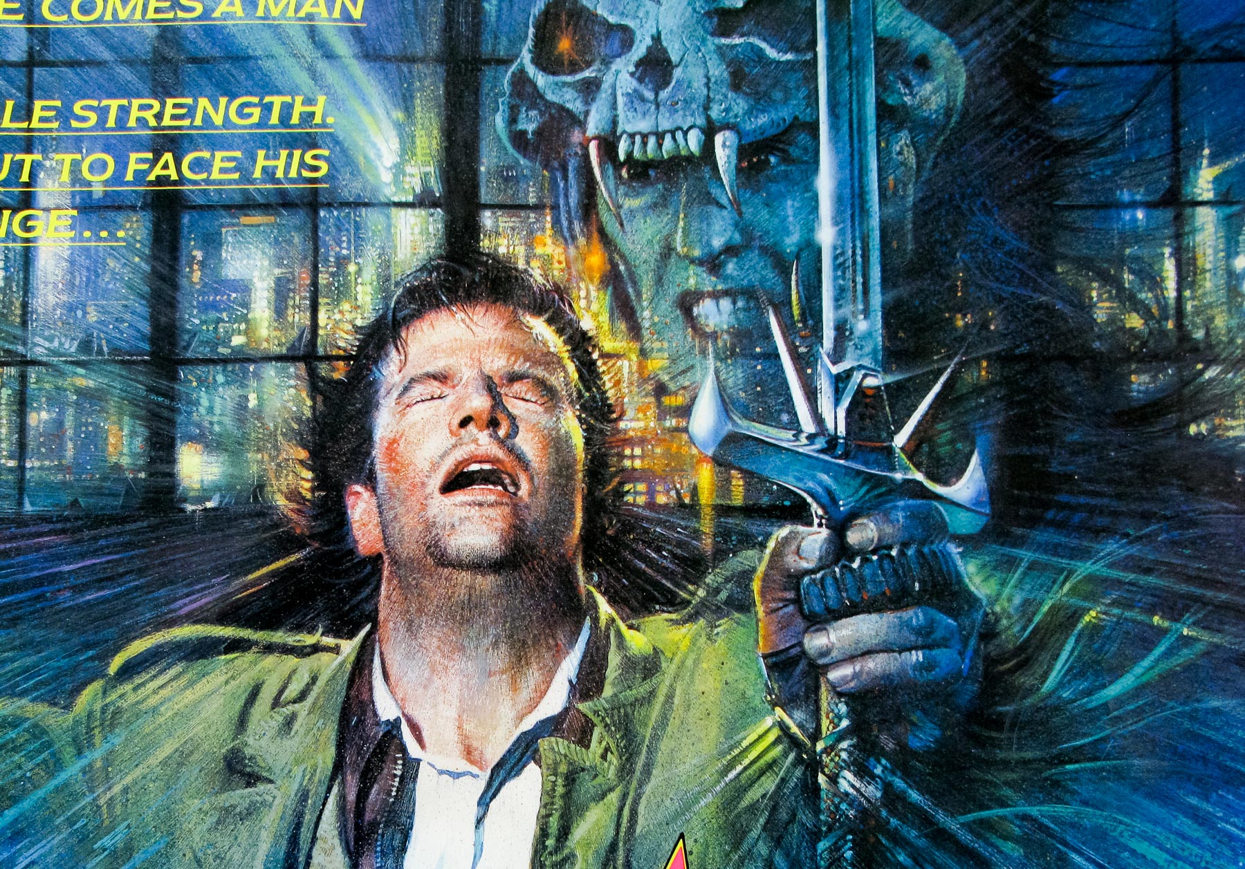
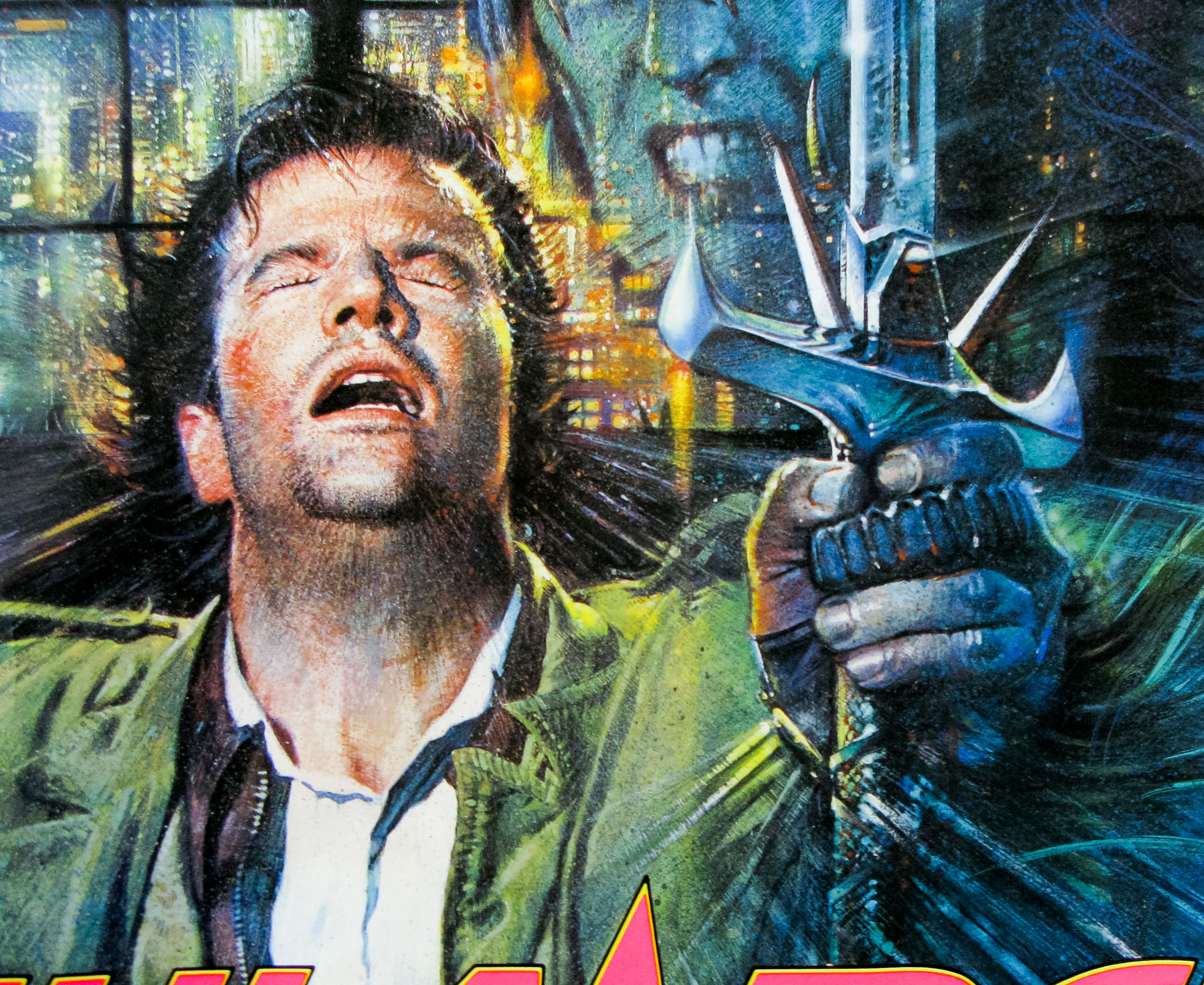
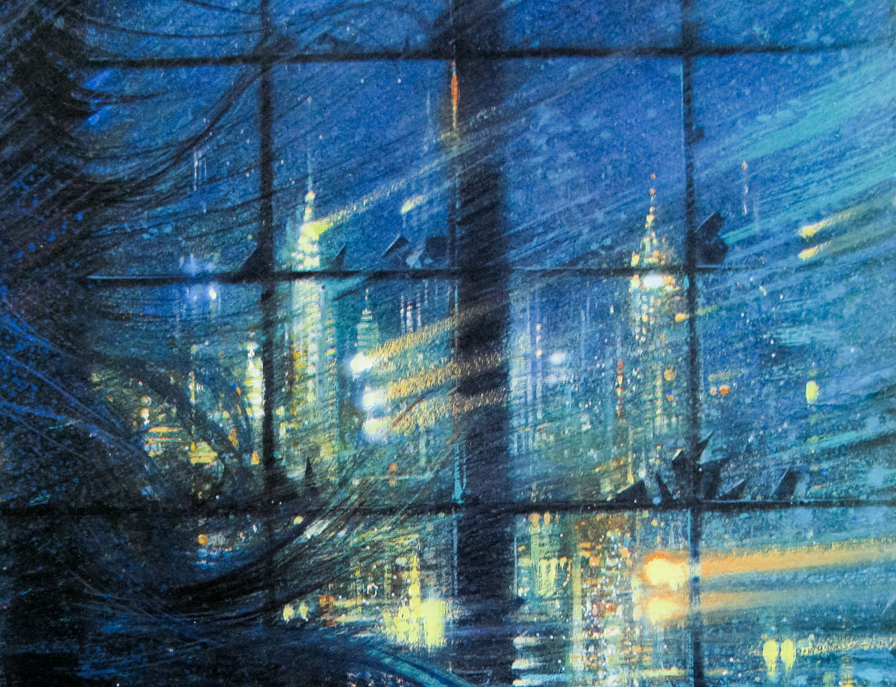
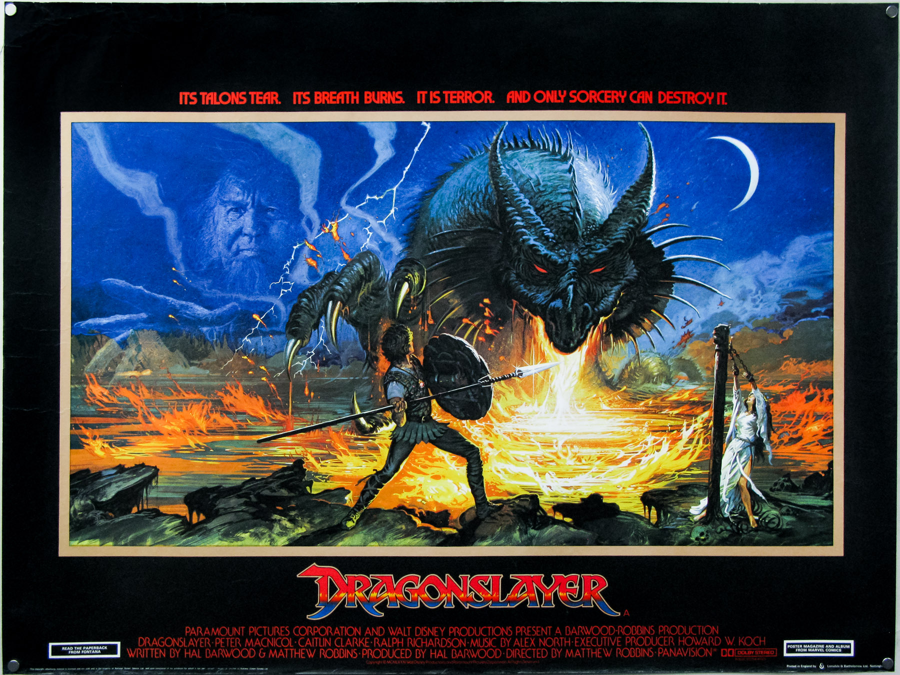
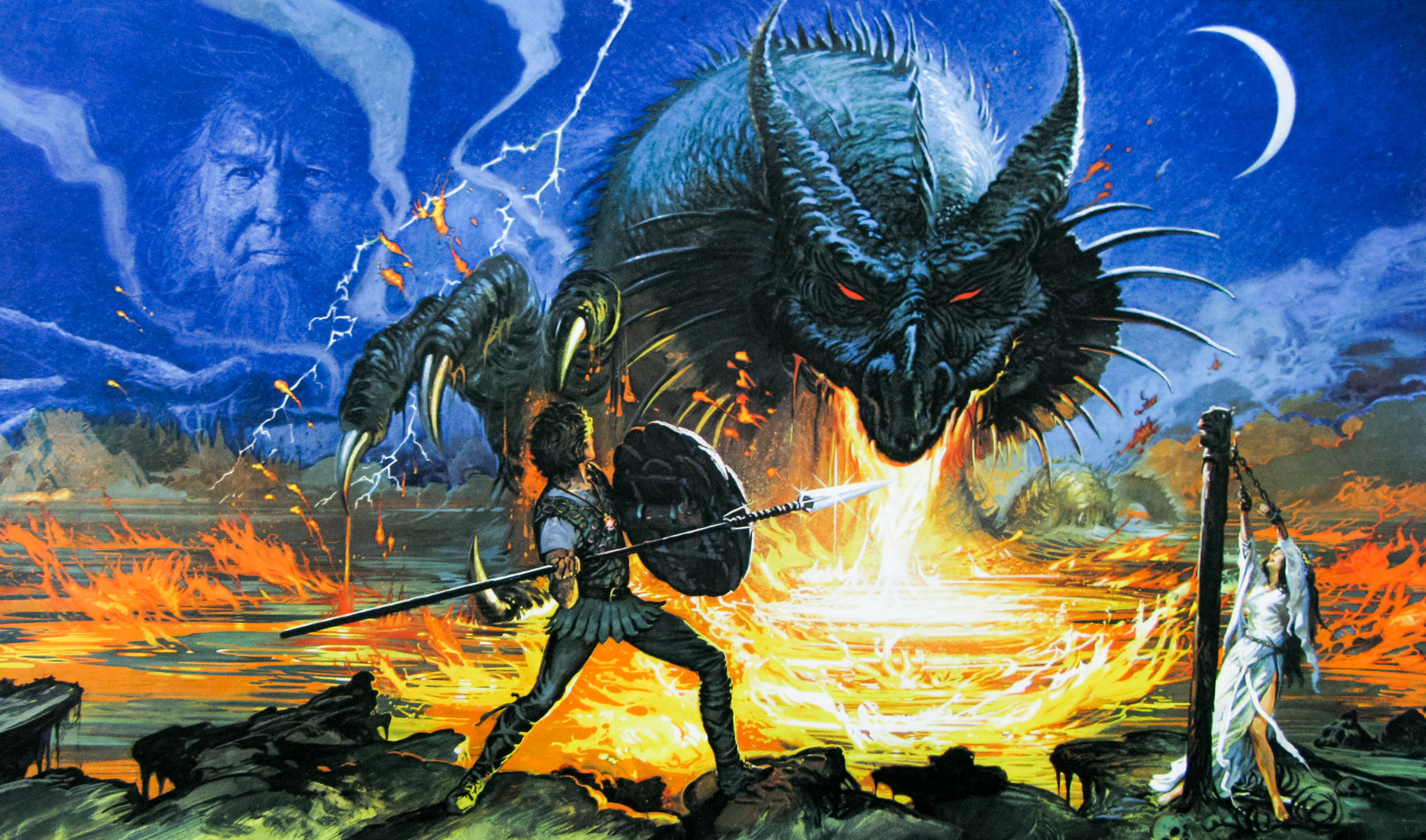
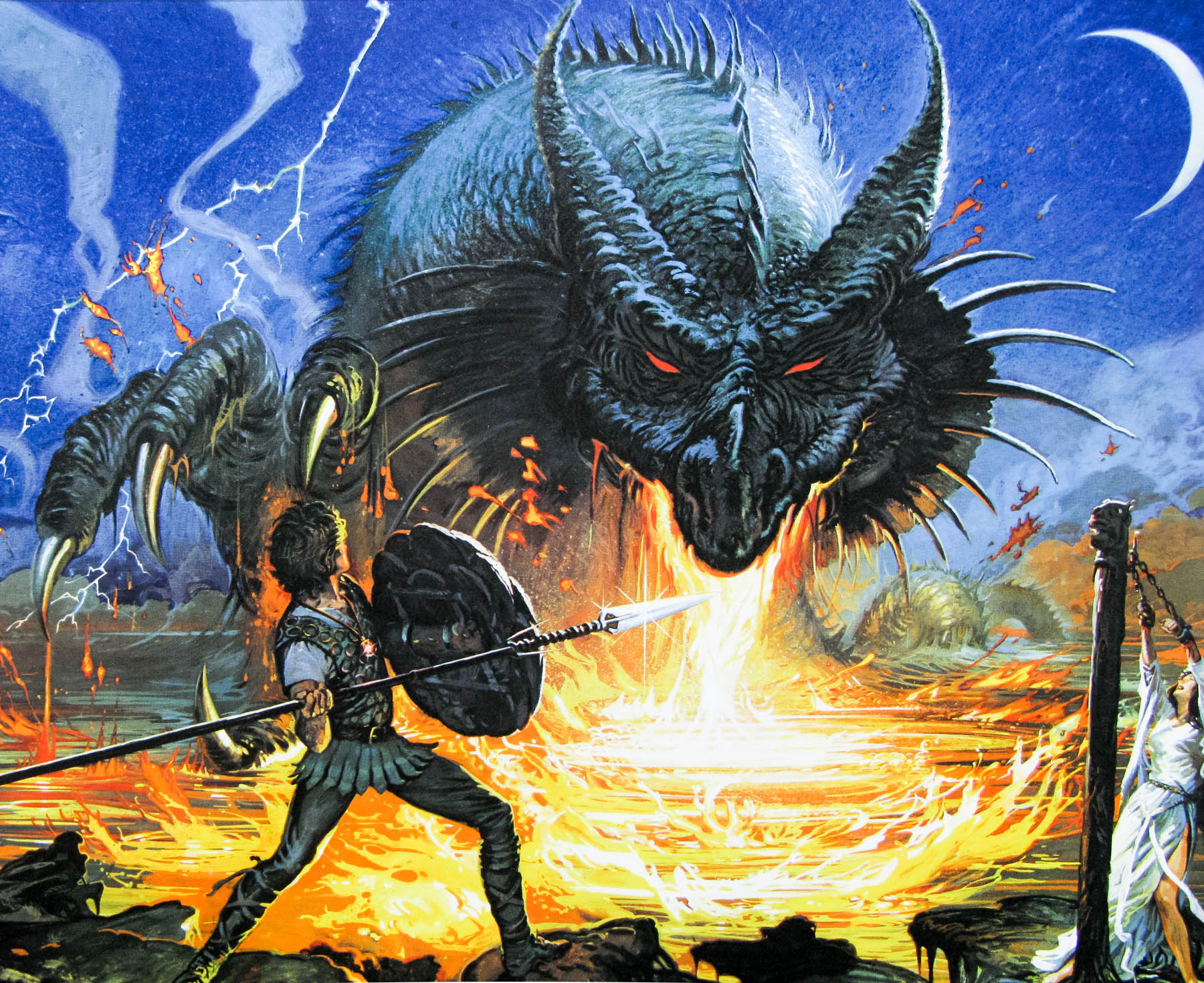
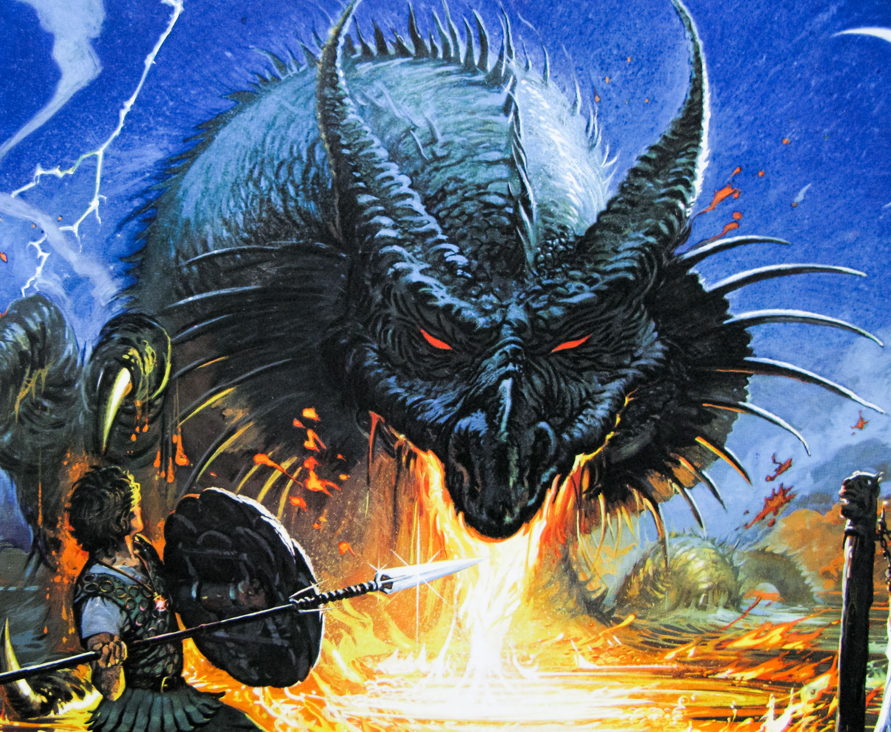
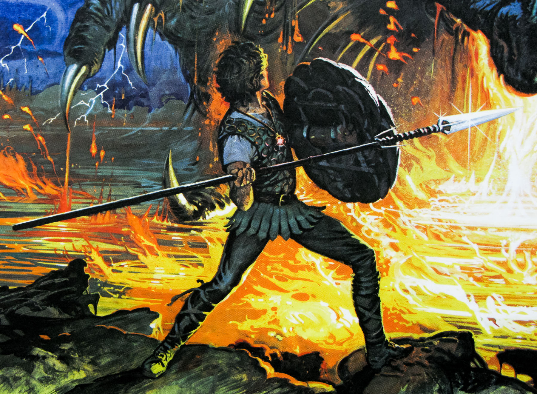
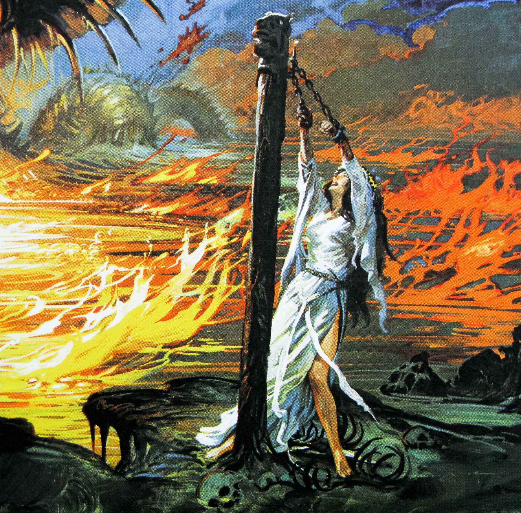
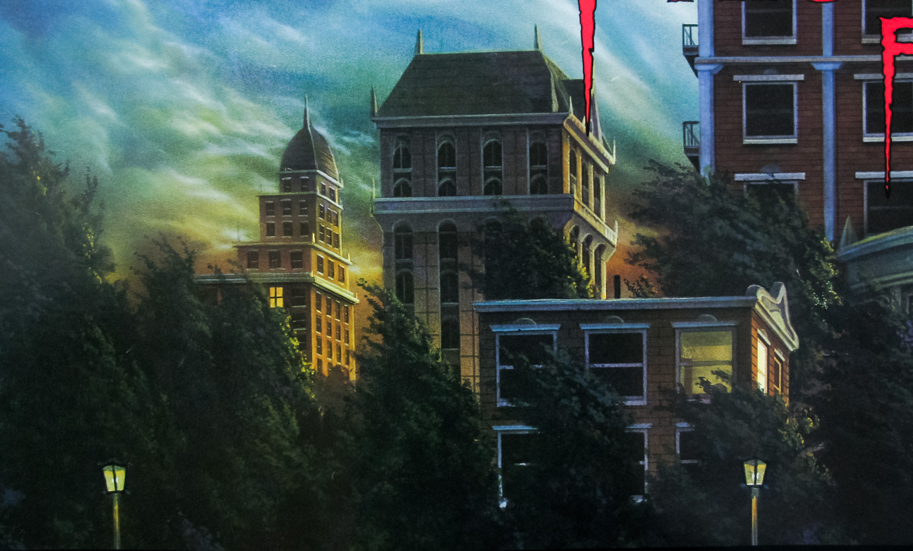
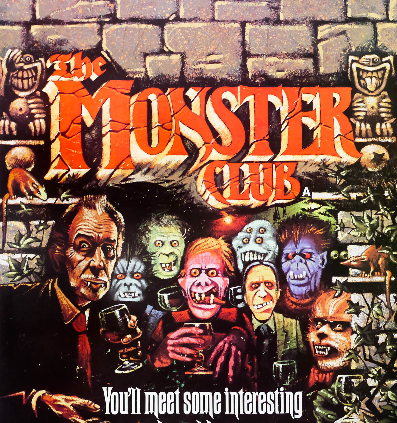
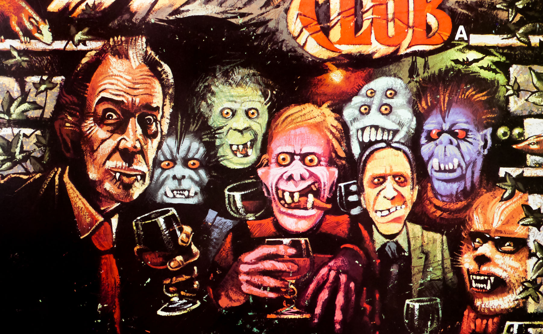
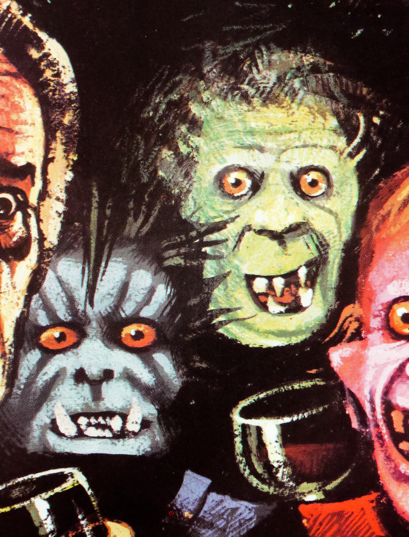
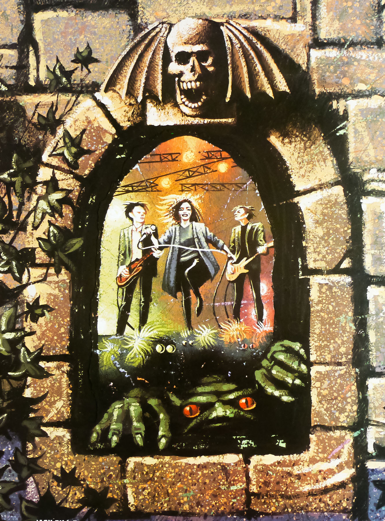
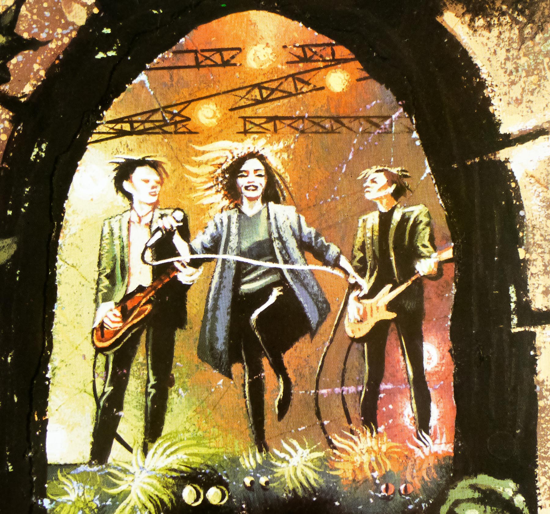
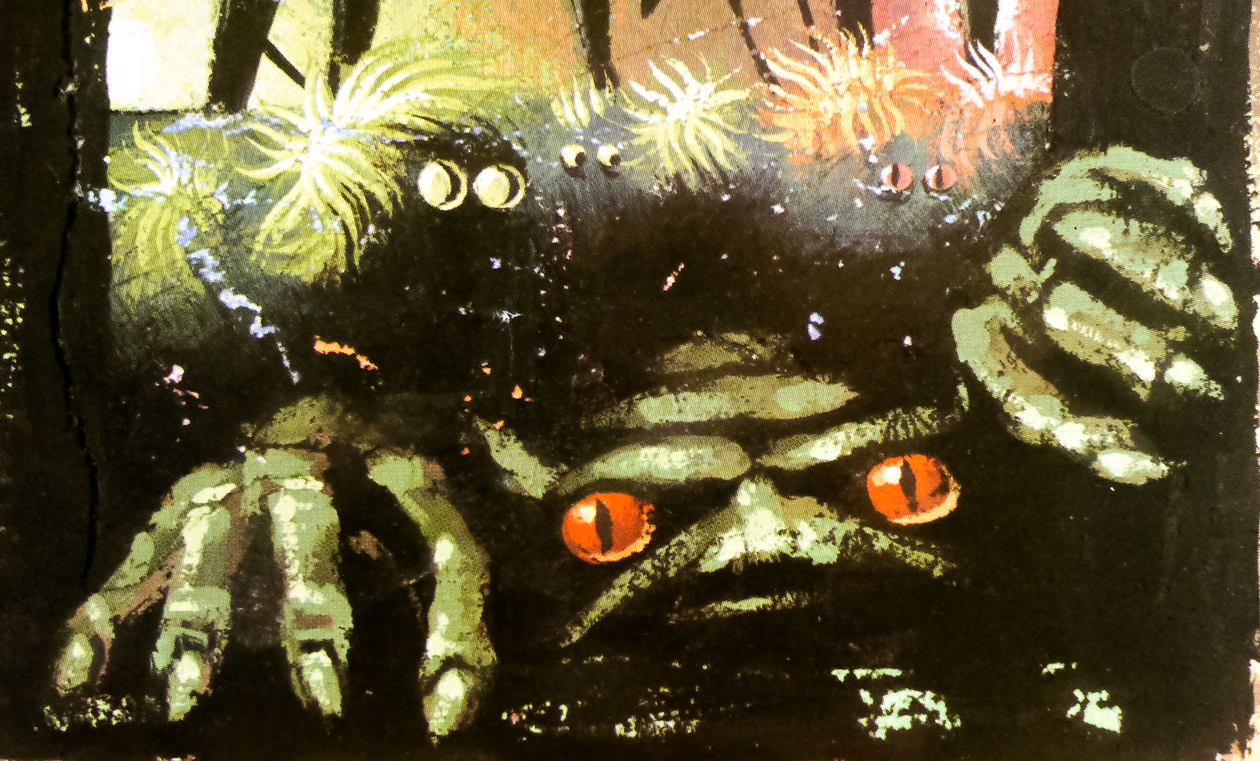
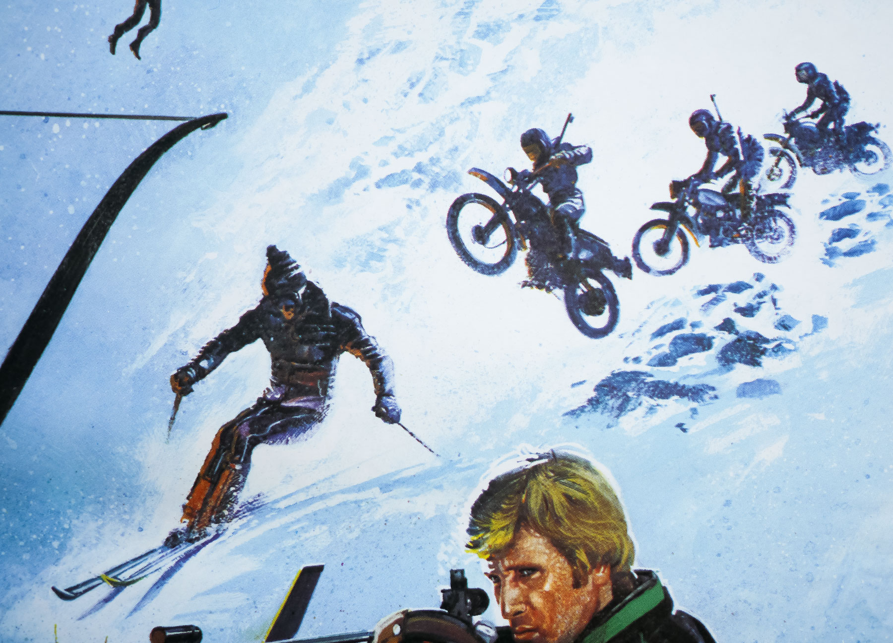
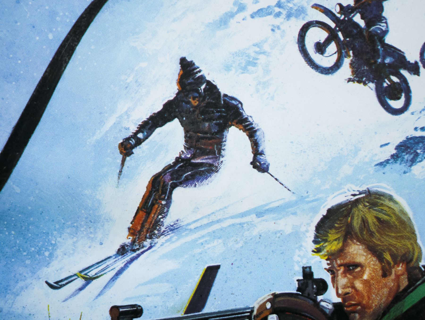
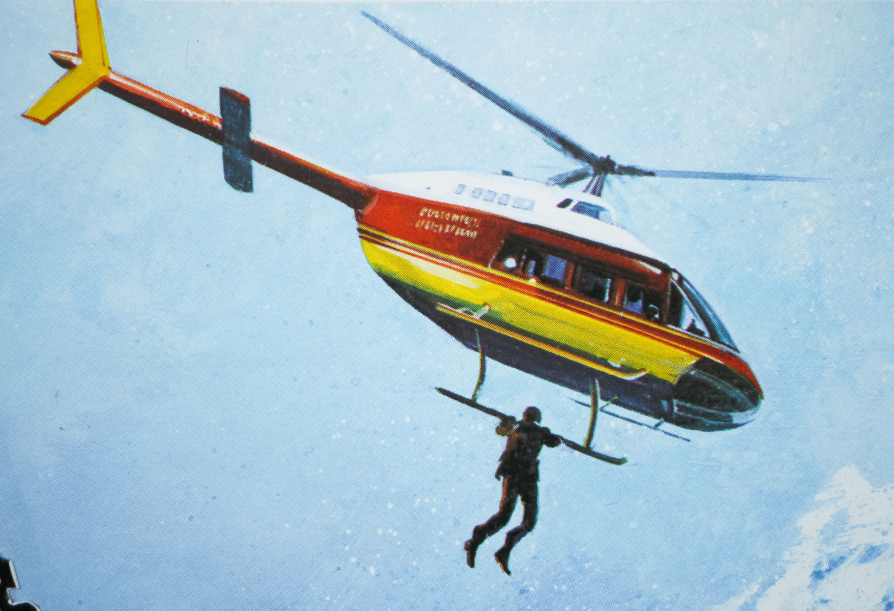
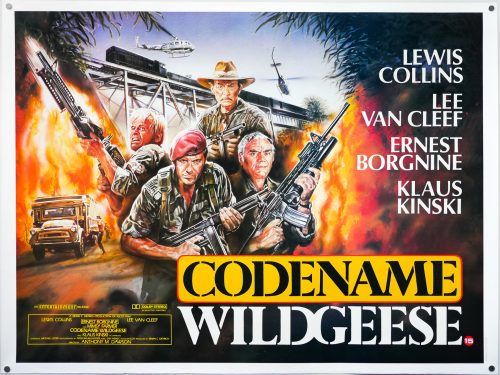
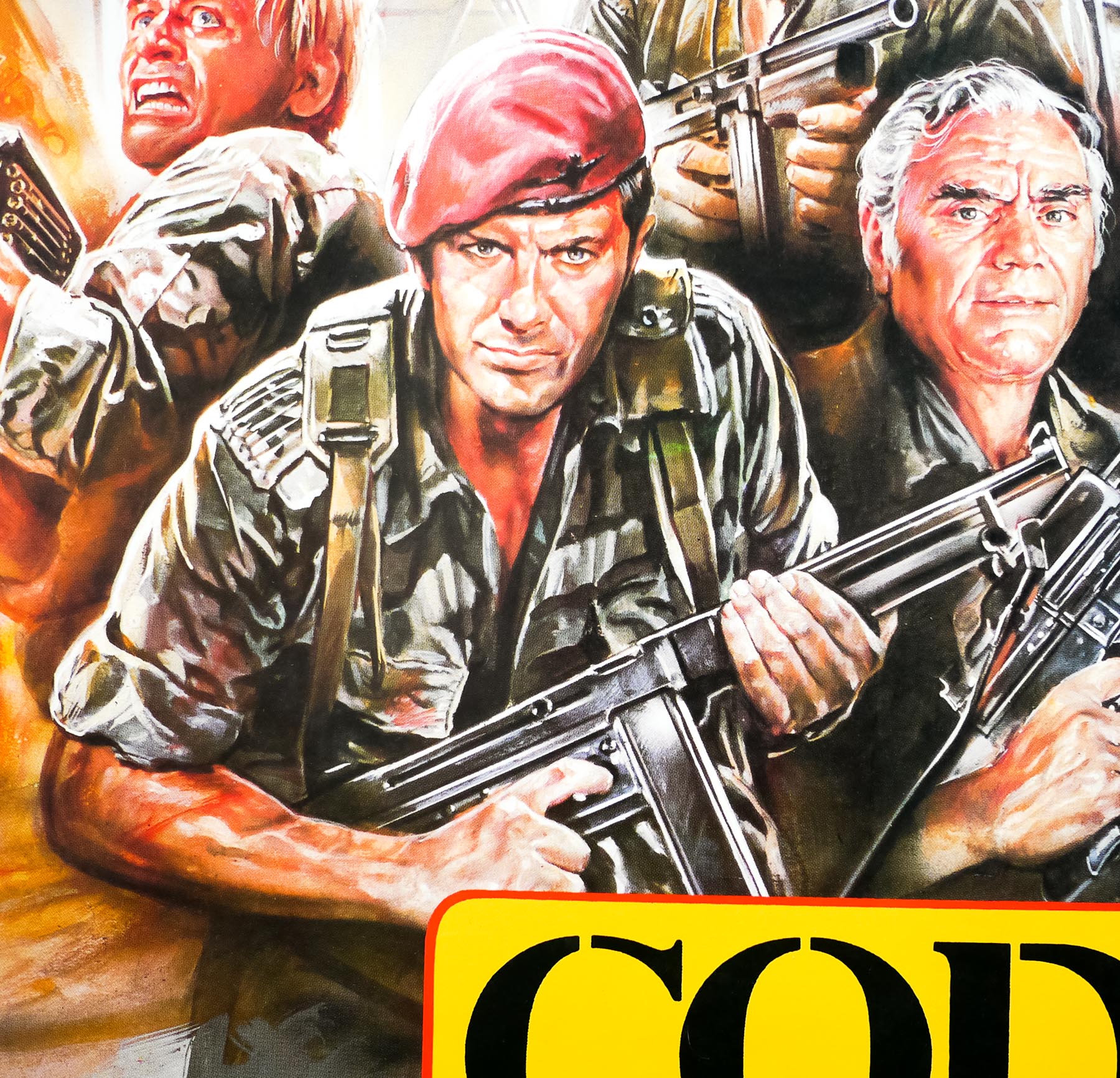
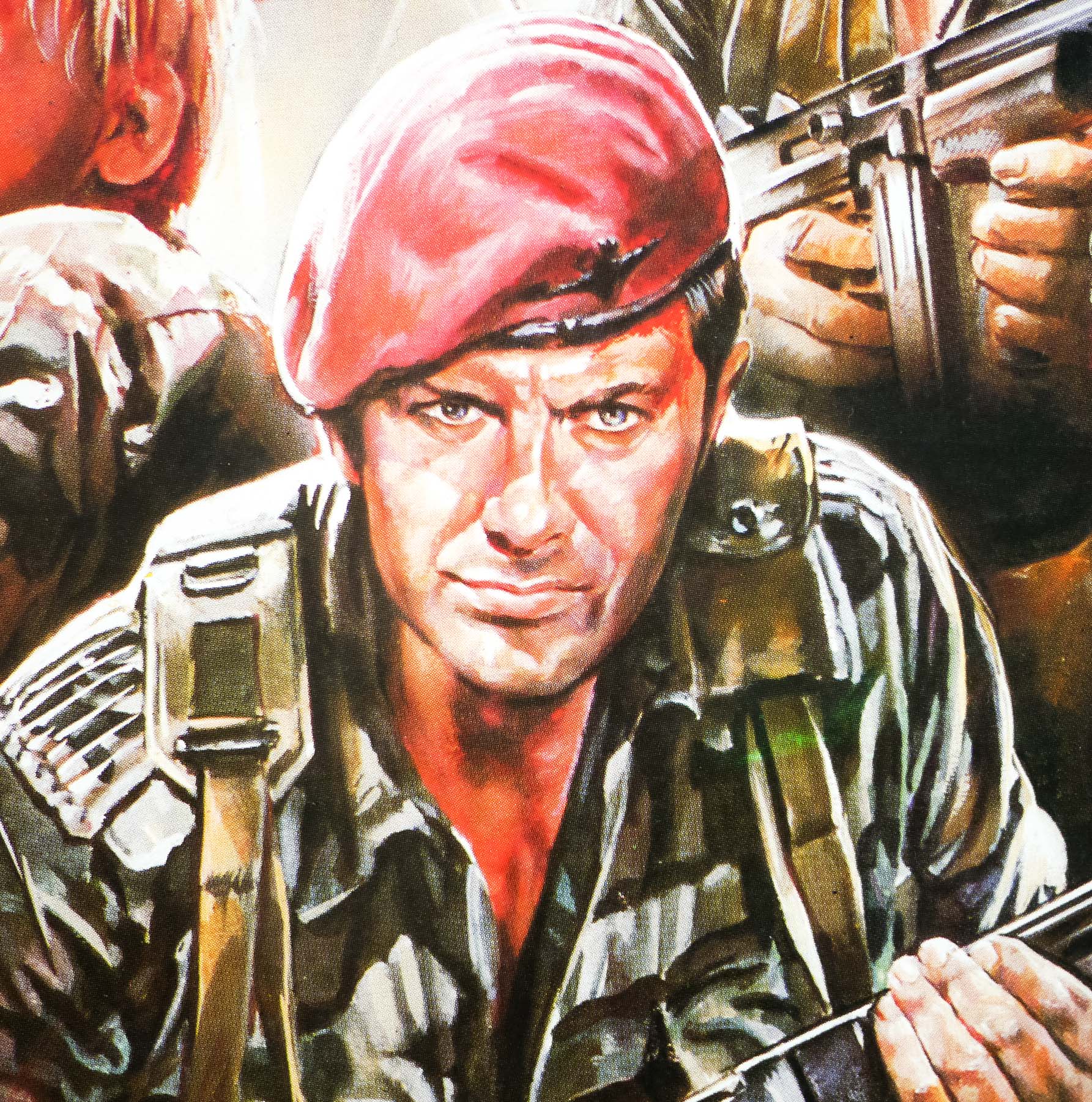
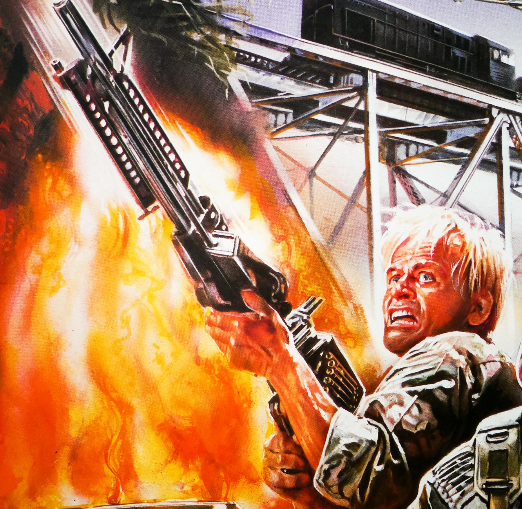
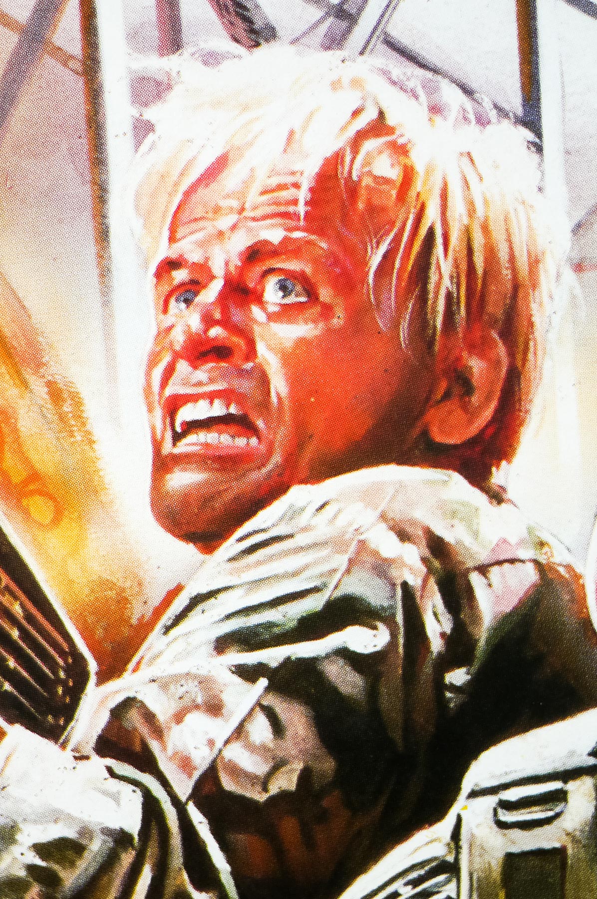
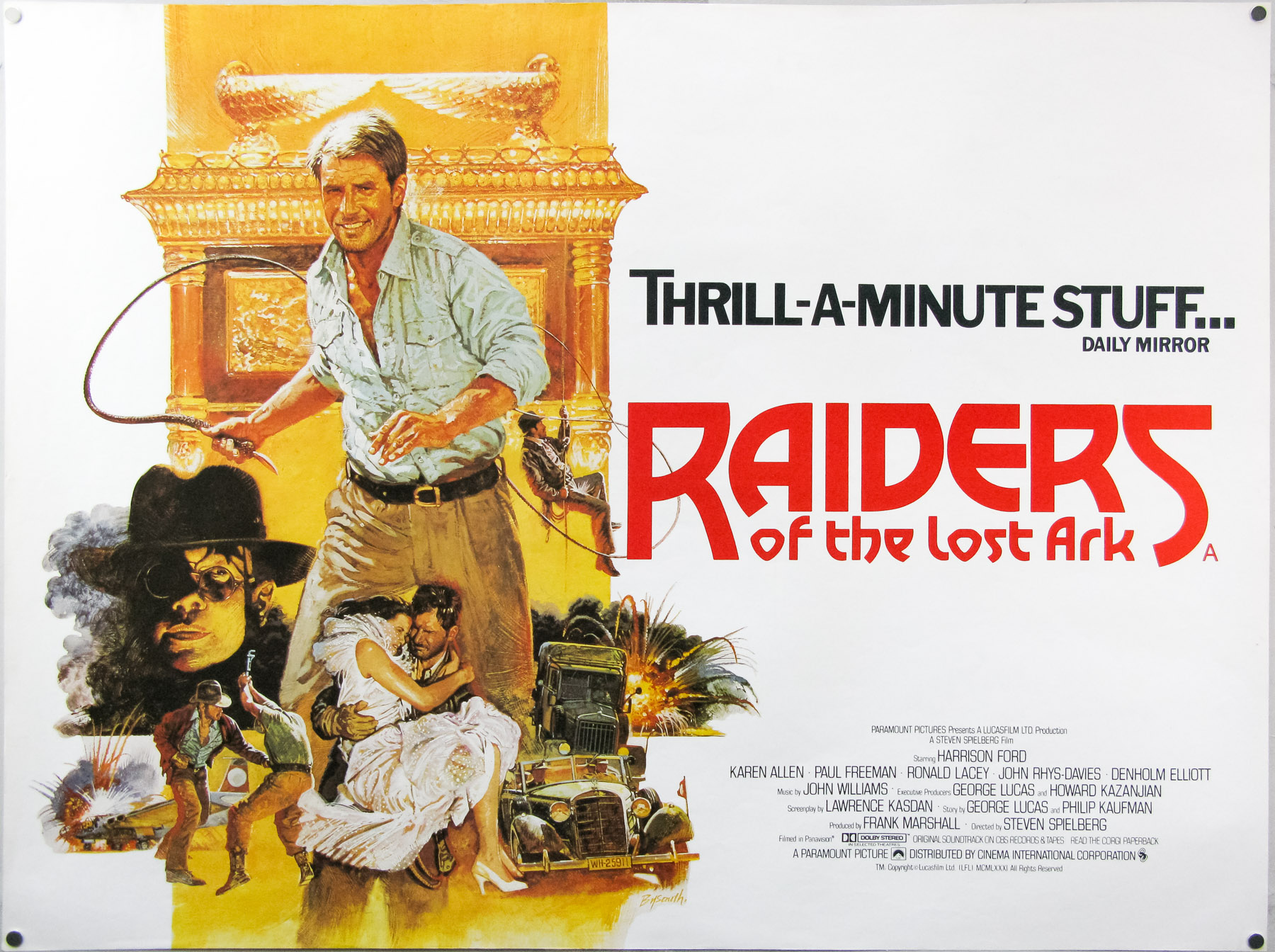
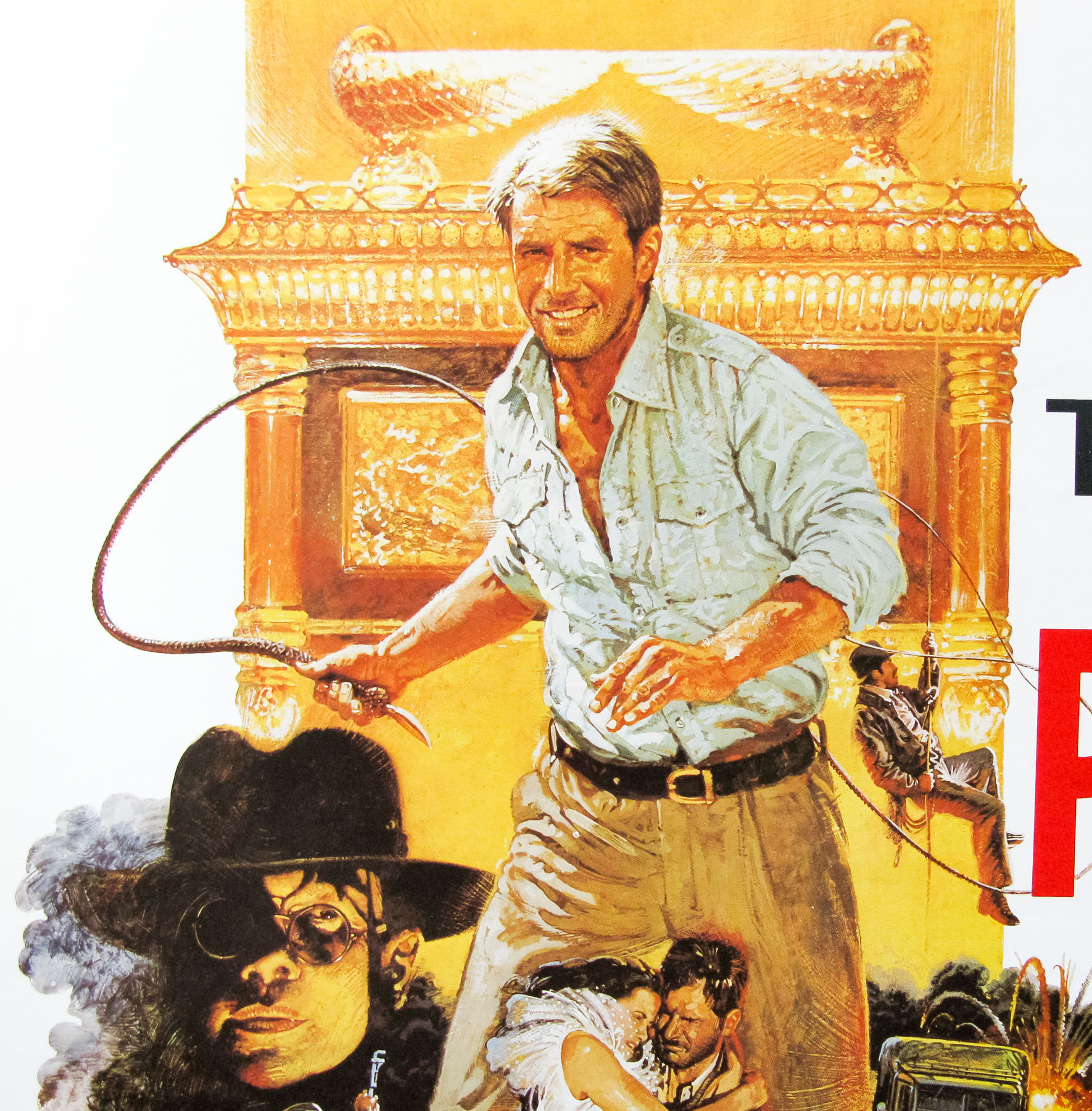
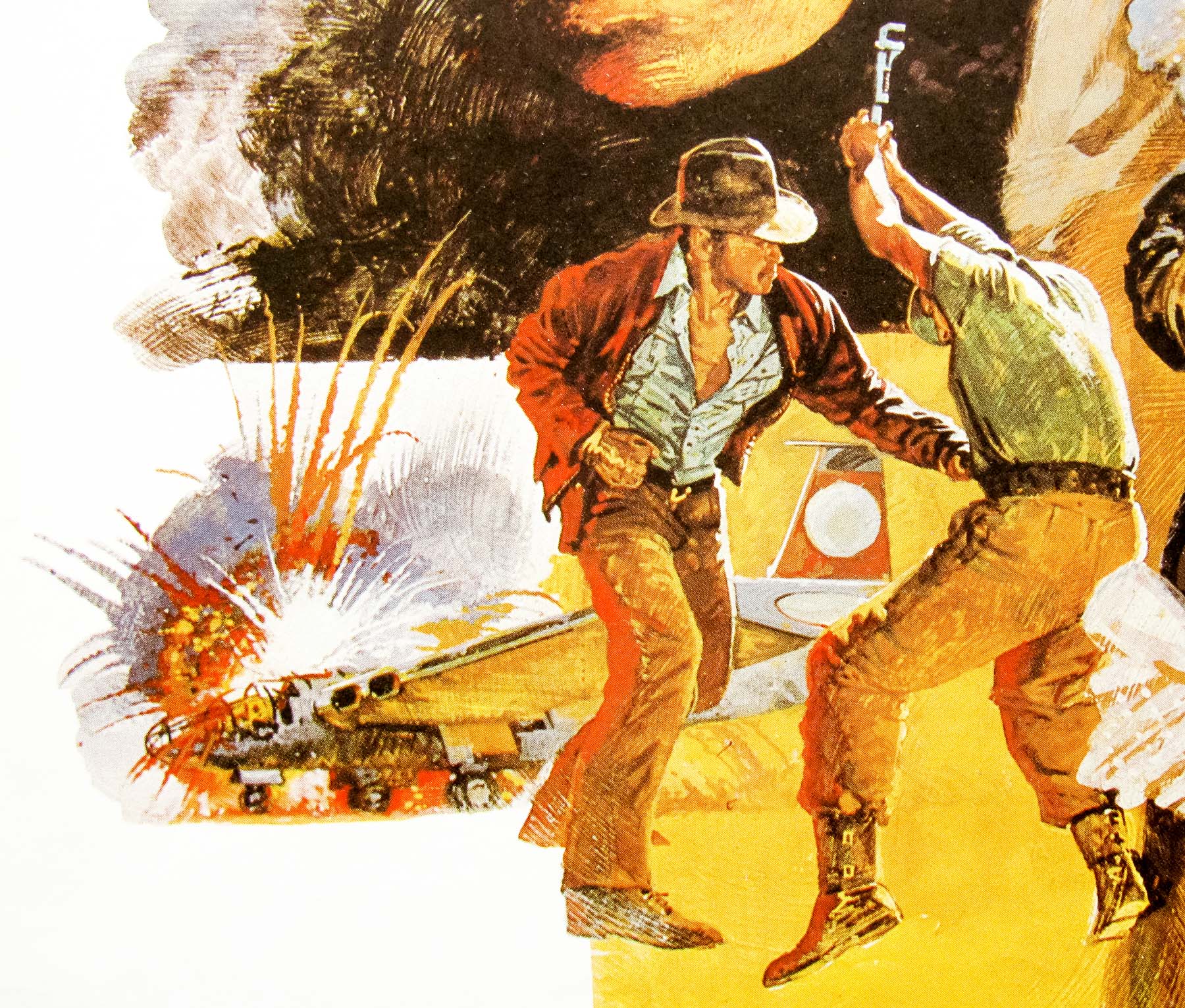
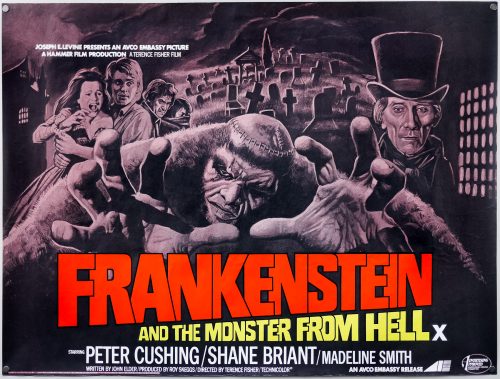
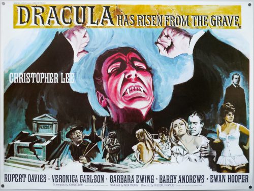
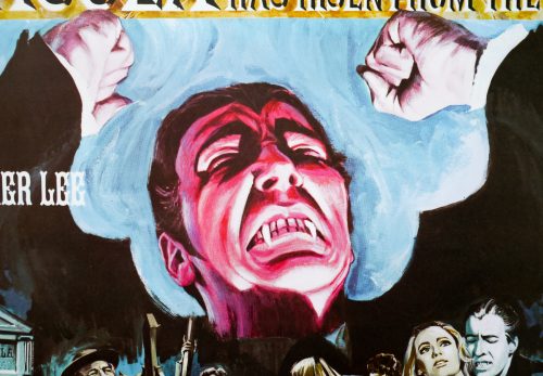
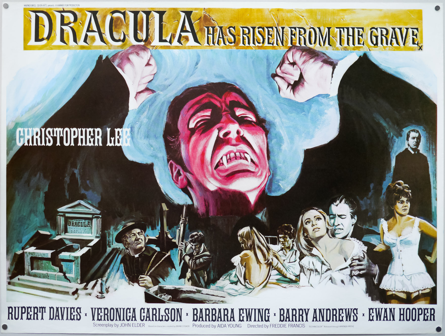
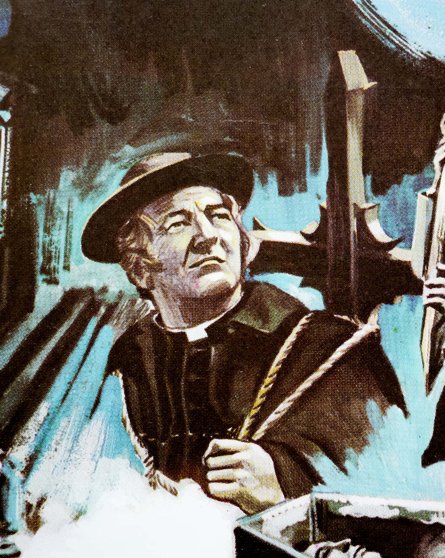
A classic painting of an enraged Count Dracula dominates this quad for Hammer studios’ Dracula Has Risen From the Grave, the third film featuring the legendary British actor Christopher Lee as the titular bloodsucker. The story, which follows on from Dracula: Prince of Darkness (1966), sees a Catholic Monsignor (played by Rupert Davies) travel to the Eastern European village of Keinenburg where he discovers a populace too afraid to attend church mass because they live in the shadow of Count Dracula’s castle.
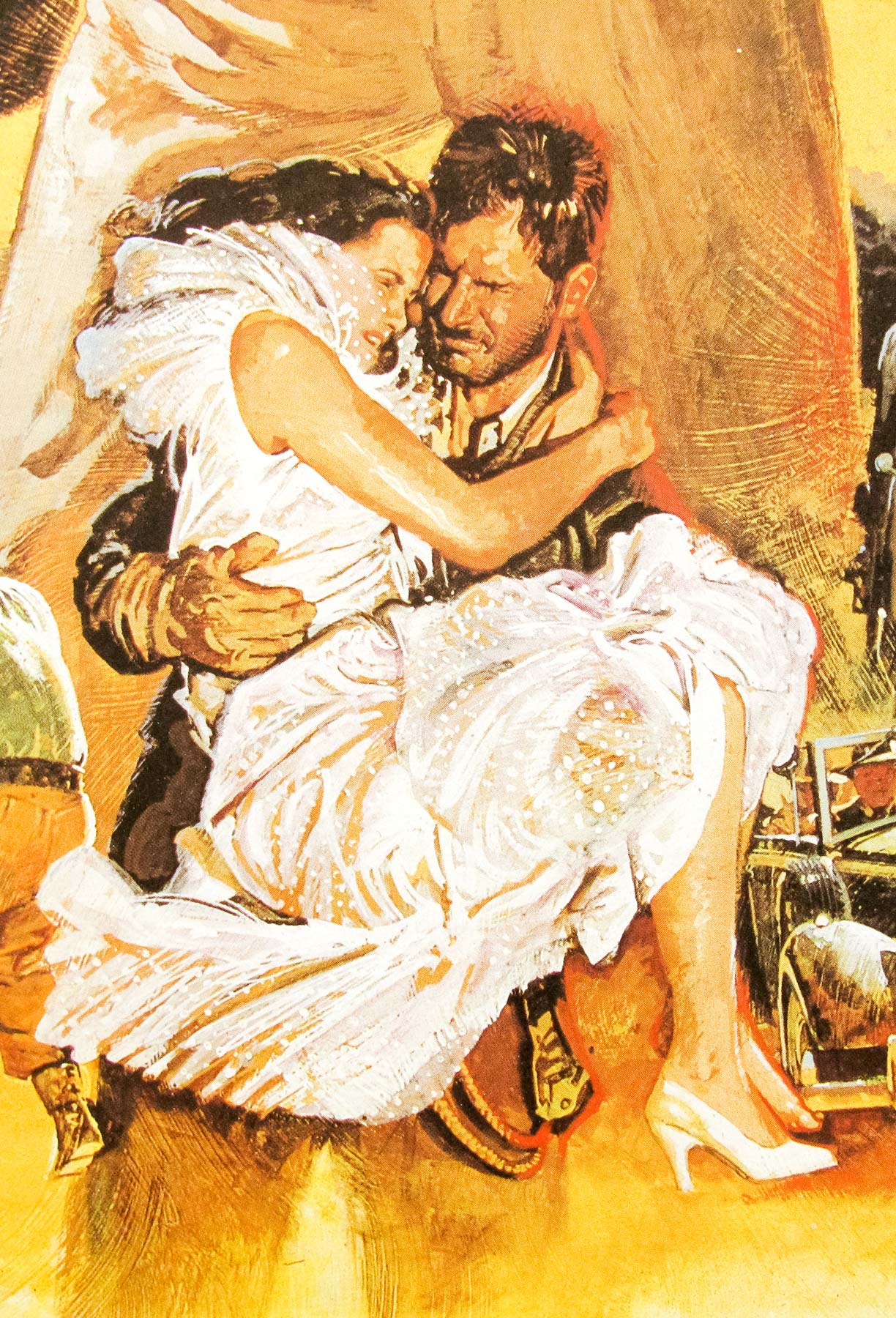
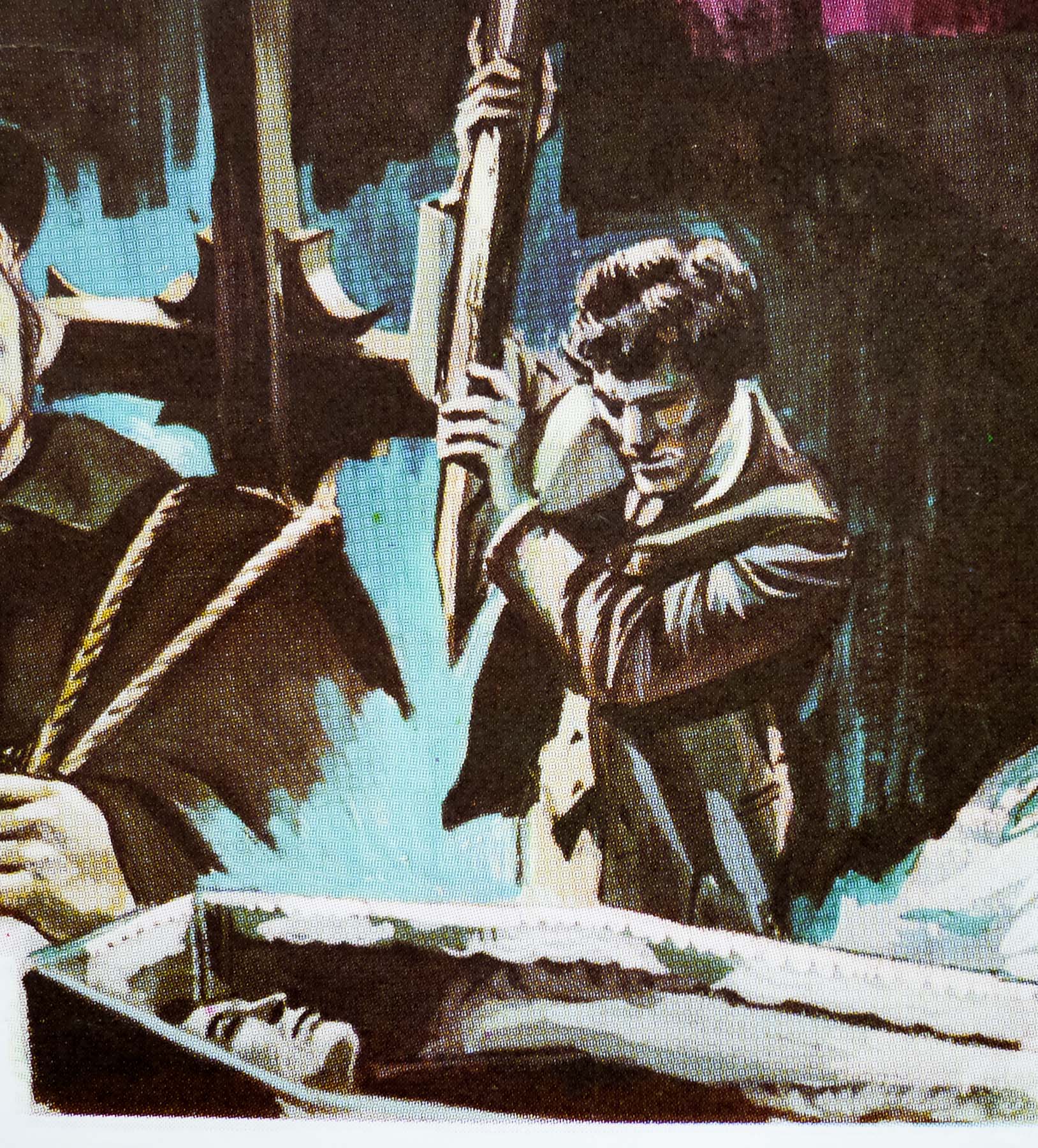
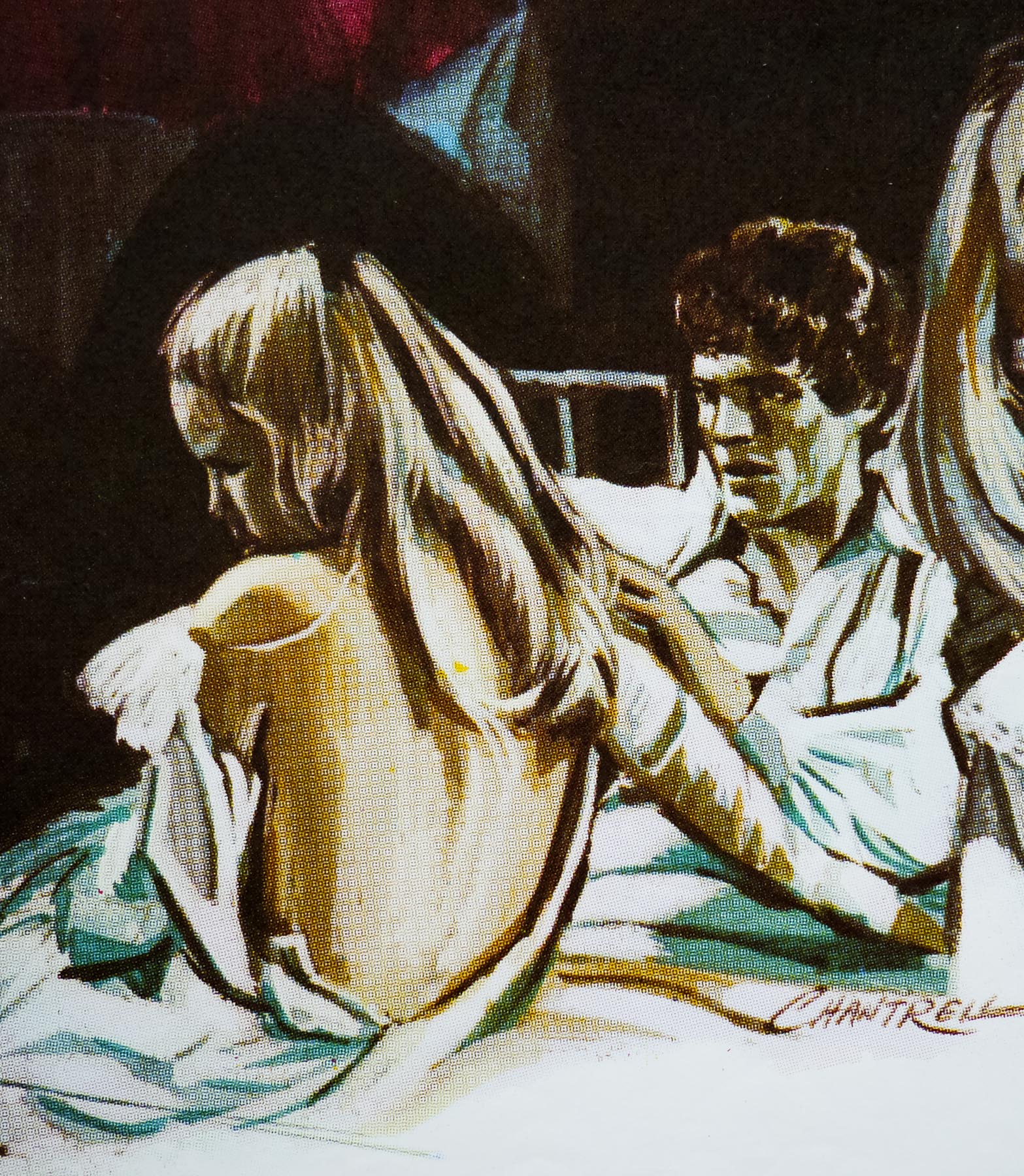
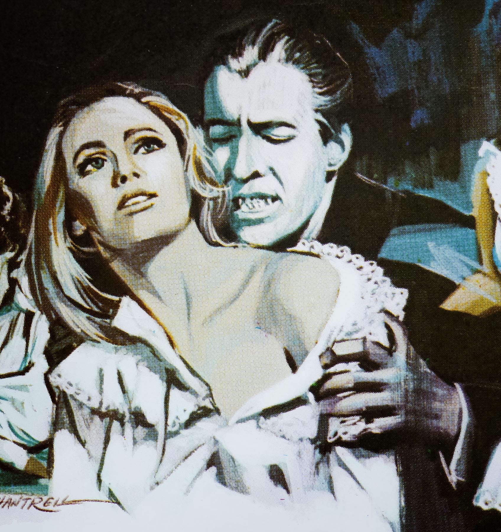
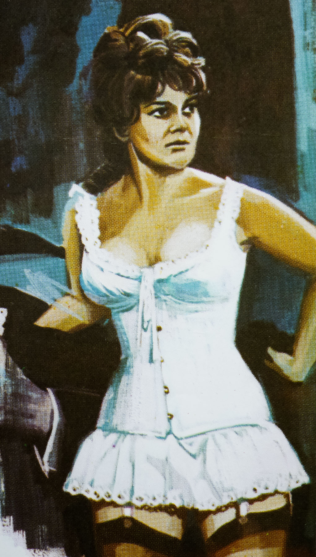
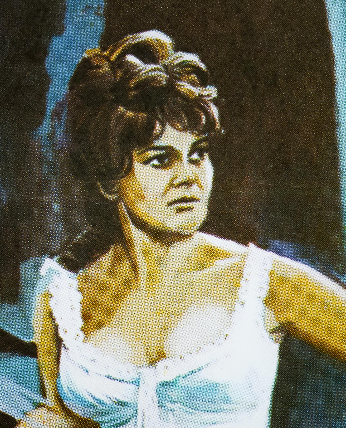
Despite the fact that the vampire was seemingly destroyed a year earlier, the Monsignor decides to hike up to the castle with a local priest to perform an exorcism and then seals the front door with a giant holy cross. An accident sees the priest falling onto a frozen river and the blood from his head wound seeps through the ice, resurrecting the Count who is trapped below. Dracula then follows the Monsignor’s trail back to the town and sets his sights on the holy man’s daughter-in-law Maria, played by the gorgeous Veronica Carlson.
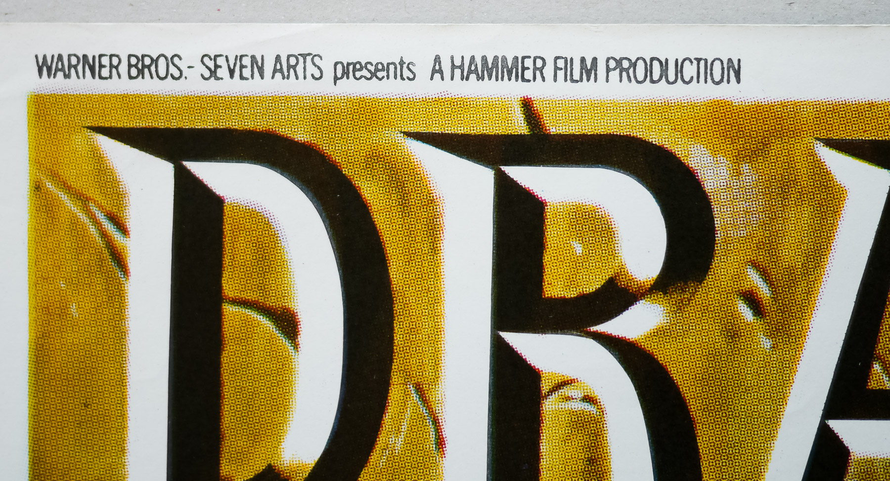
Originally intended to be directed by Hammer stalwart Terence Fisher, the man at the helm of the original Dracula (1958), a freak road accident saw Fisher temporarily out of action and regular Hammer cinematographer (and director) Freddie Francis stepped in shortly before production began. This was the first of the studio’s pictures under their newly arranged co-production deal with Warner Bros-Seven Arts, following a split with previous partners Twentieth Century Fox.
As was typical at the time, a pre-sales marketing brochure had been prepared before the screenwriter Anthony Hinds had even finished the script and this was used to secure the required financing from the American partners. Unfortunately, no one had yet informed Christopher Lee that the deal was entirely dependent on him reprising his role as the Count, something the actor was more than a little reluctant to do at the time. There thus followed a sustained campaign of persuasion from Francis and studio boss James Carreras to entice the actor back into the cape. Lee eventually capitulated and the production was on, but it was not to be the last time that Lee would need to be harangued into stepping back onto a Hammer soundstage.
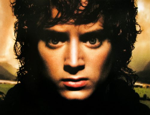
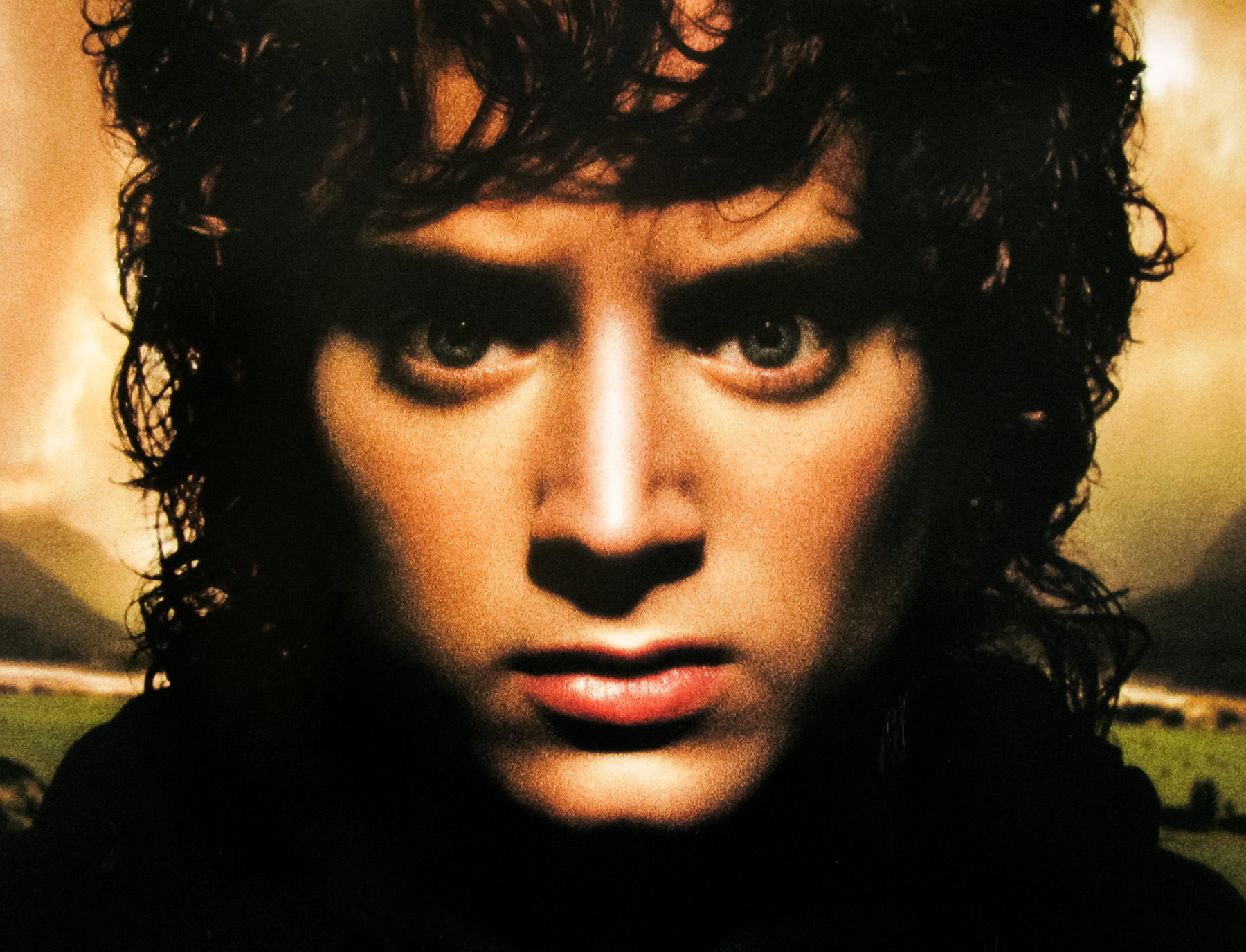
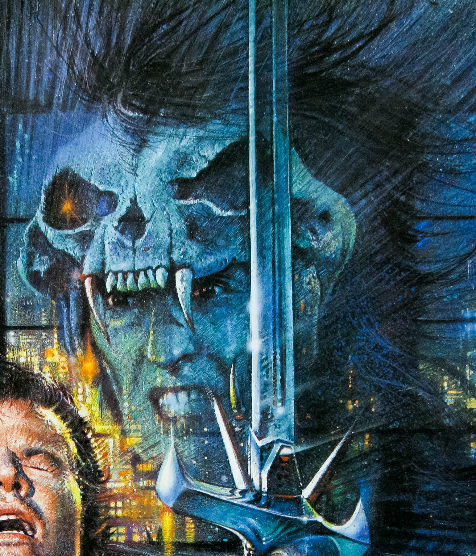
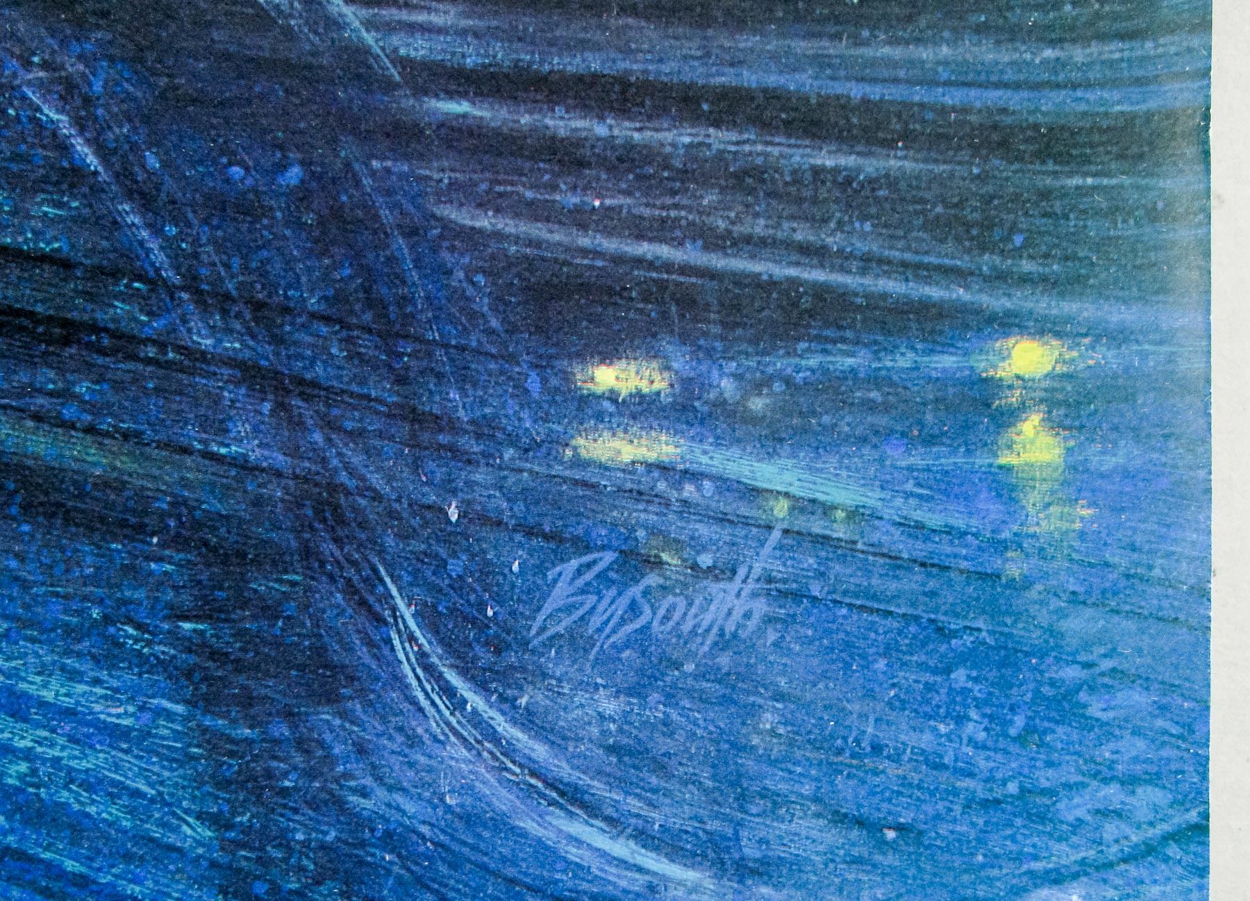
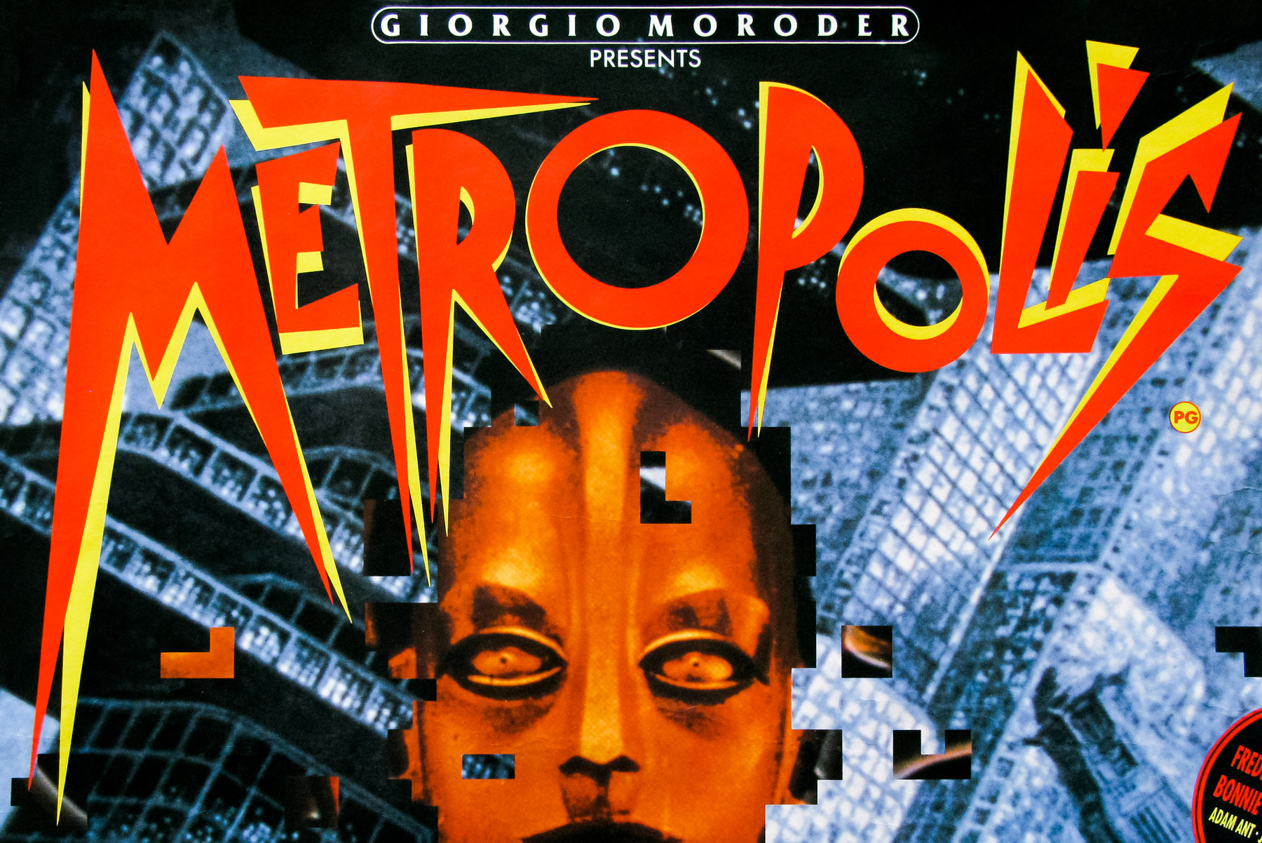
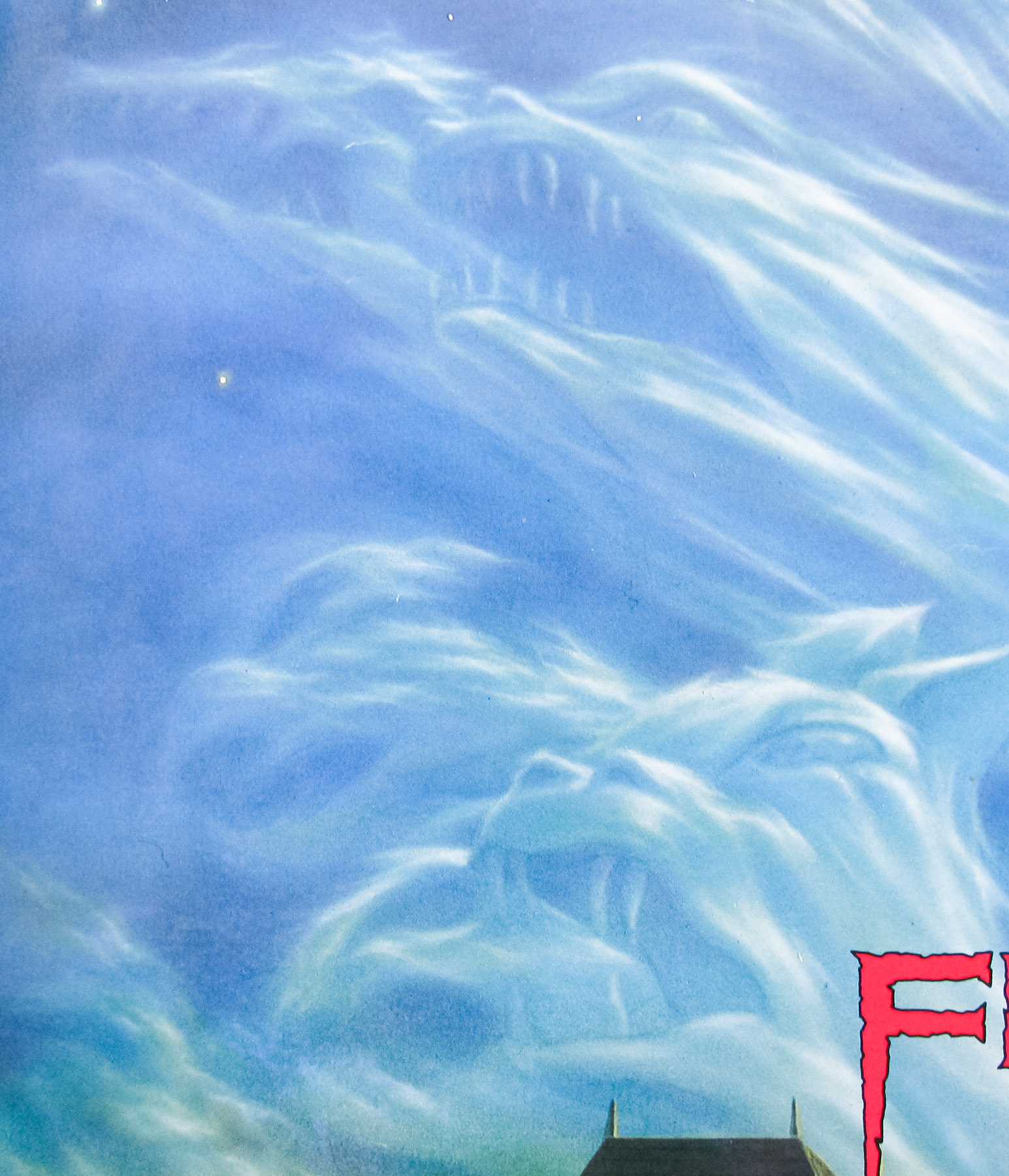
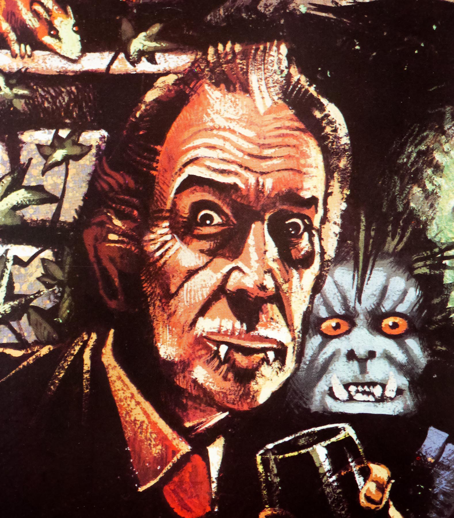
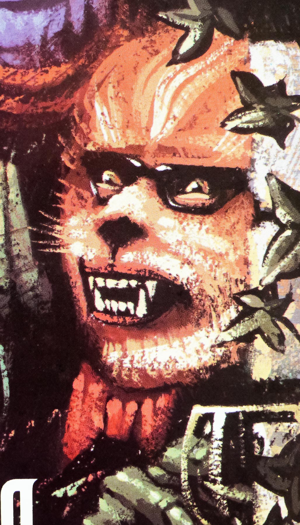
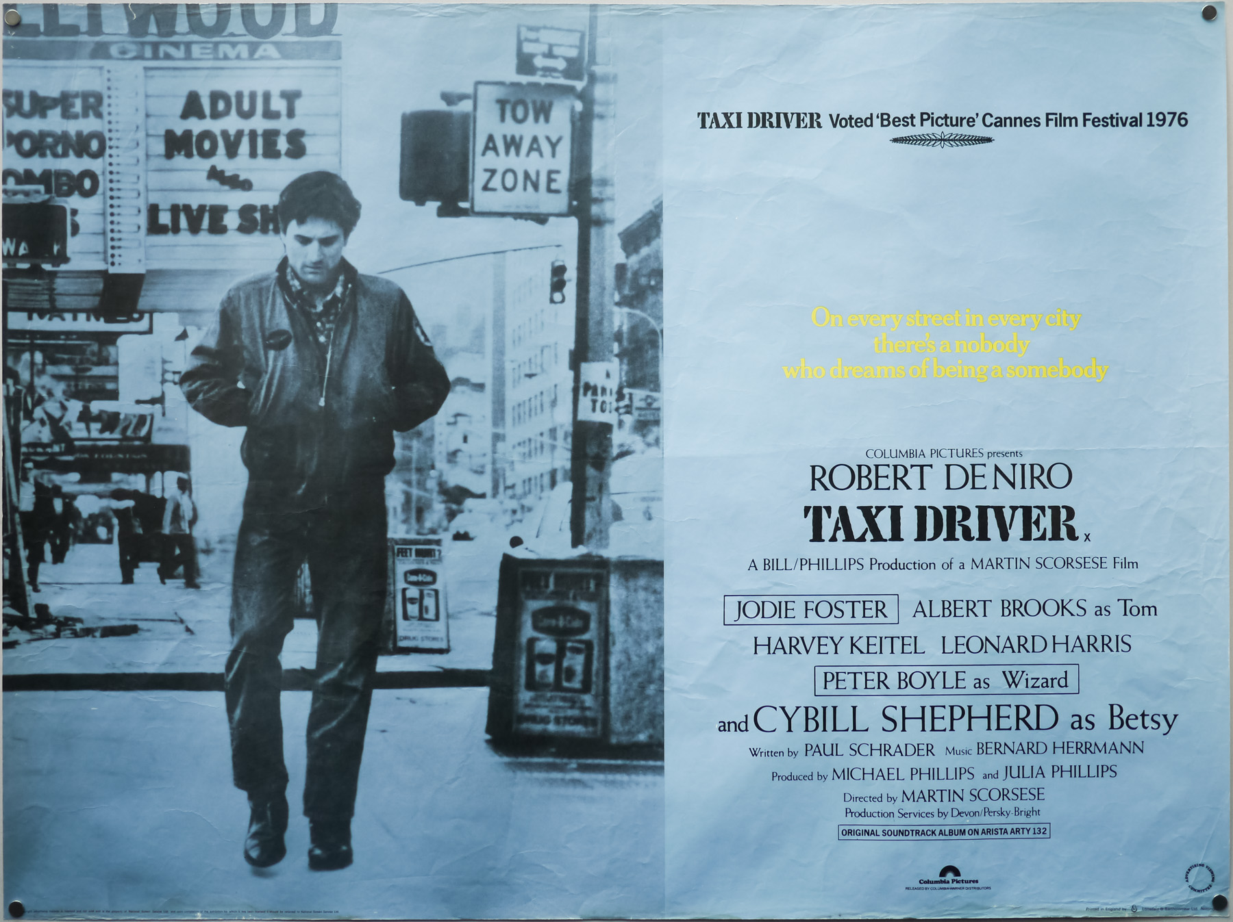
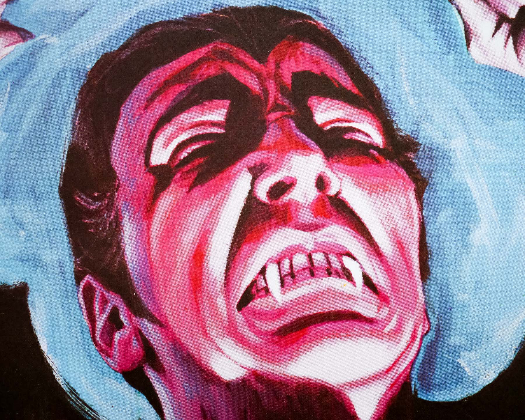
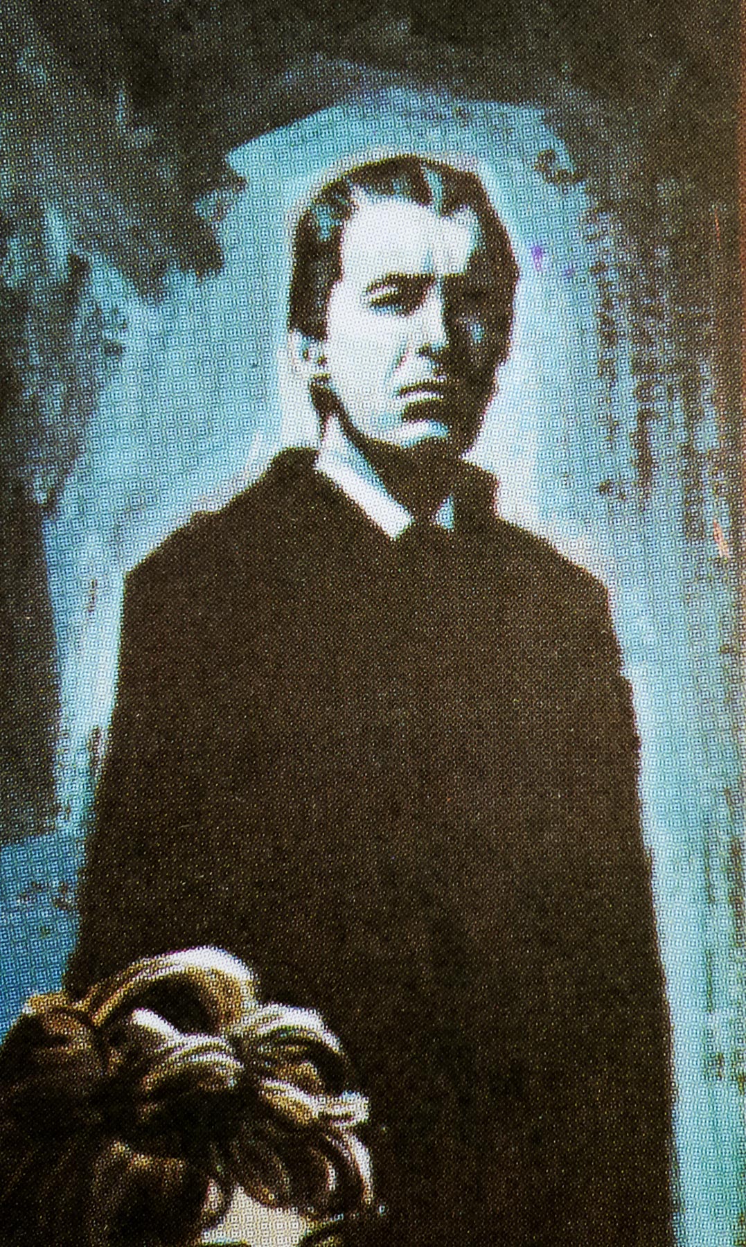
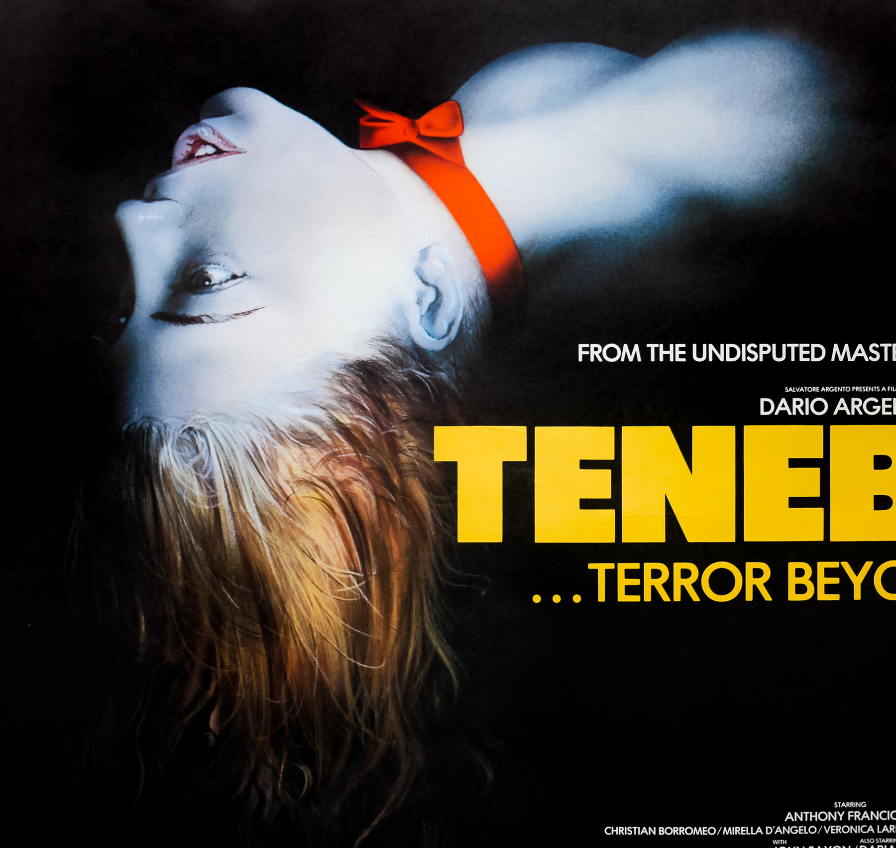
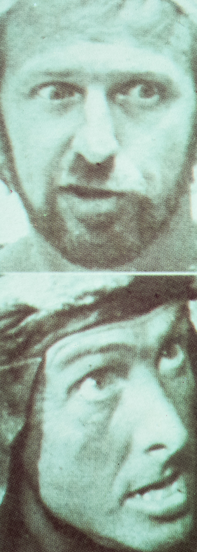
This British poster was designed and painted by arguably the UK’s most famous poster artist, the late, great Tom Chantrell. From 1965 to 1969 Chantrell effectively worked as Hammer’s ‘House Artist’ and produced artwork for the studio’s film posters as well as all of the aforementioned marketing material used to sell the film to potential investors and distribution partners. This particular poster holds particular significance in terms of the Chantrell/Hammer partnership since the depiction of Dracula is actually taken from a slightly modified portrait of the artist himself.
The official Chantrell website, launched last year by Tom’s widow Shirley and memorabilia dealer Michael Bloomfield, features a superb biography of the artist written by his friend and British poster expert Sim Branaghan (who I interviewed here). At the end of the must-read article there is Tom’s own account of the creation of this poster, which is as follows:
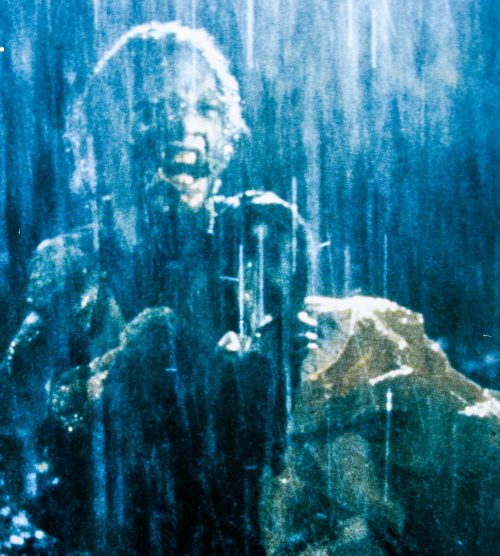
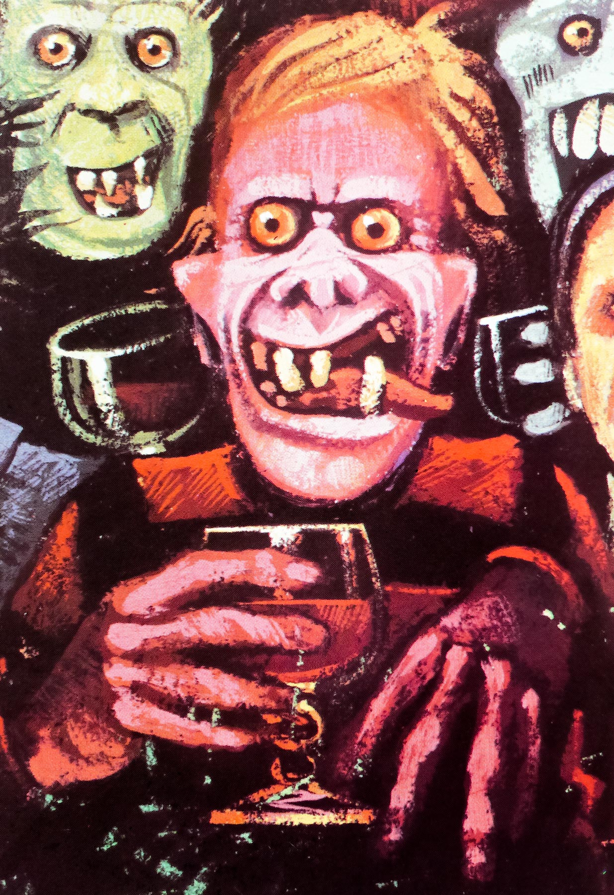
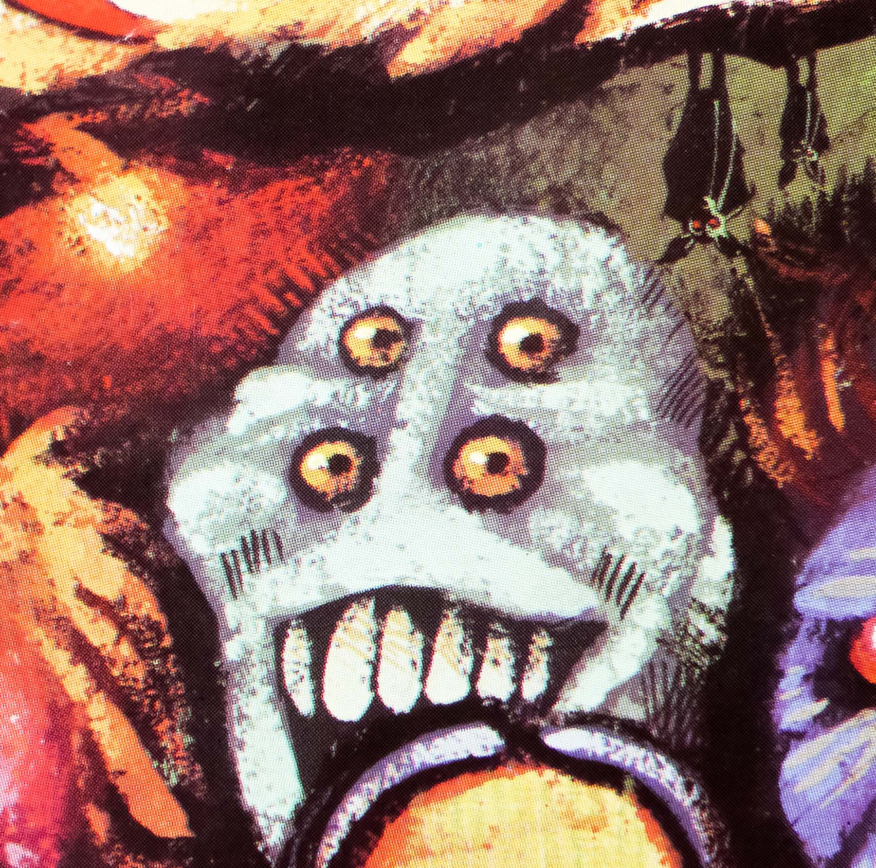
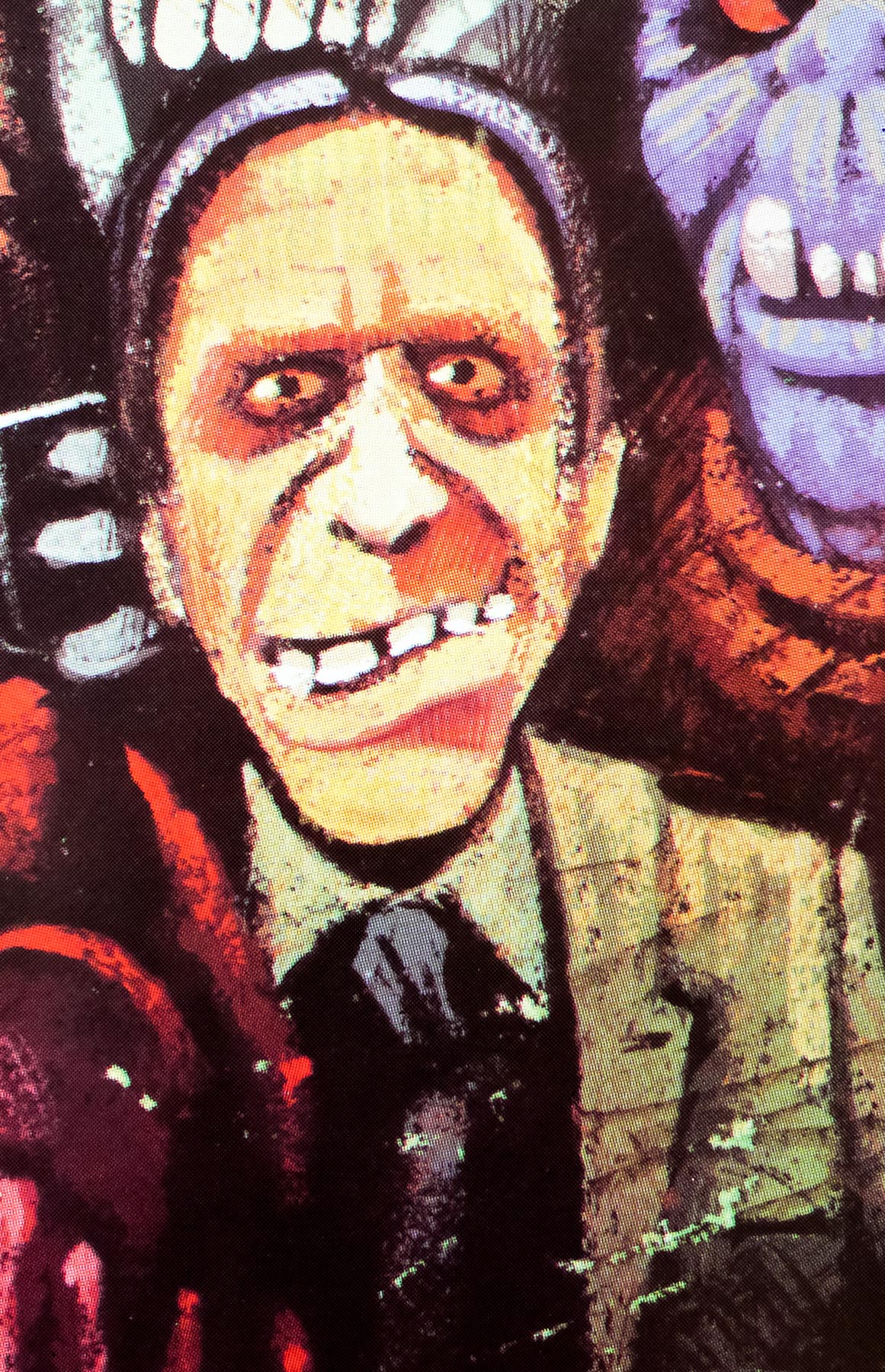
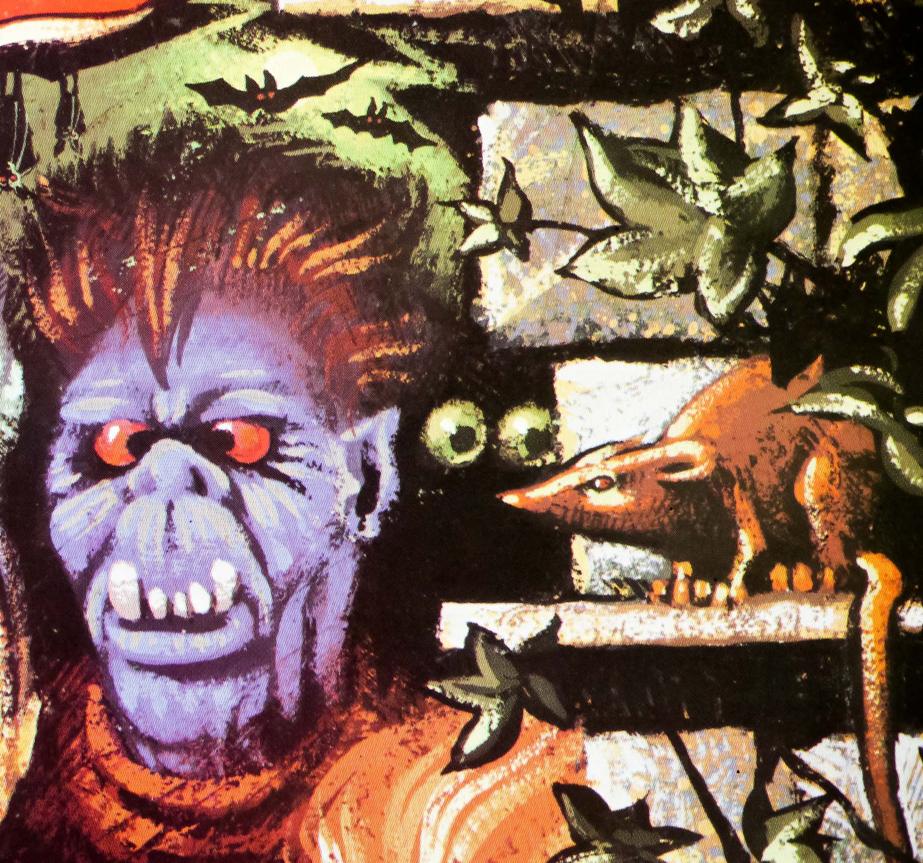
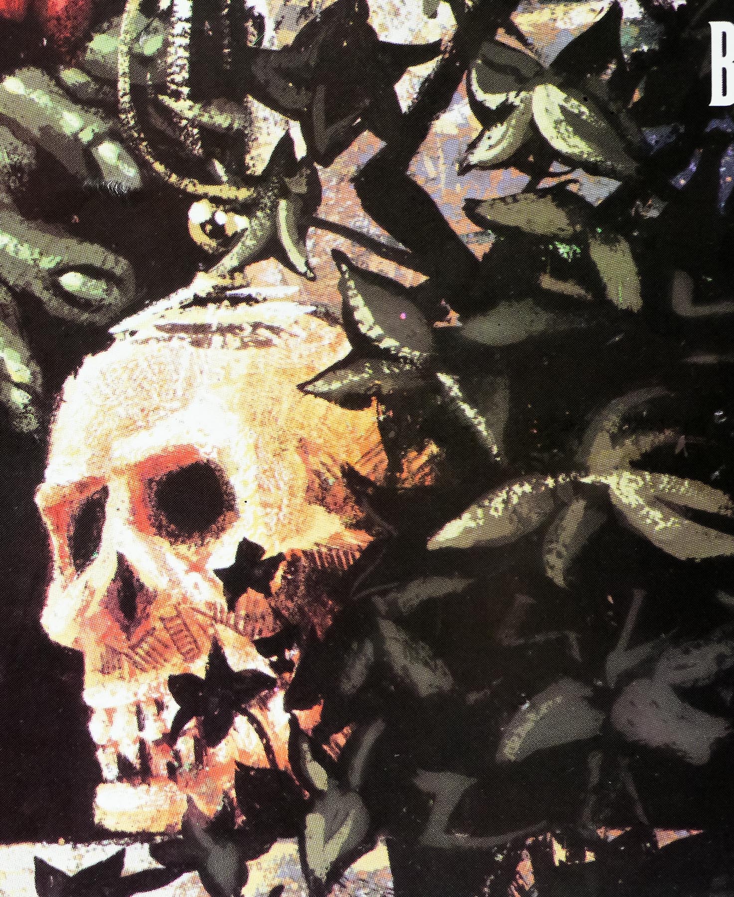
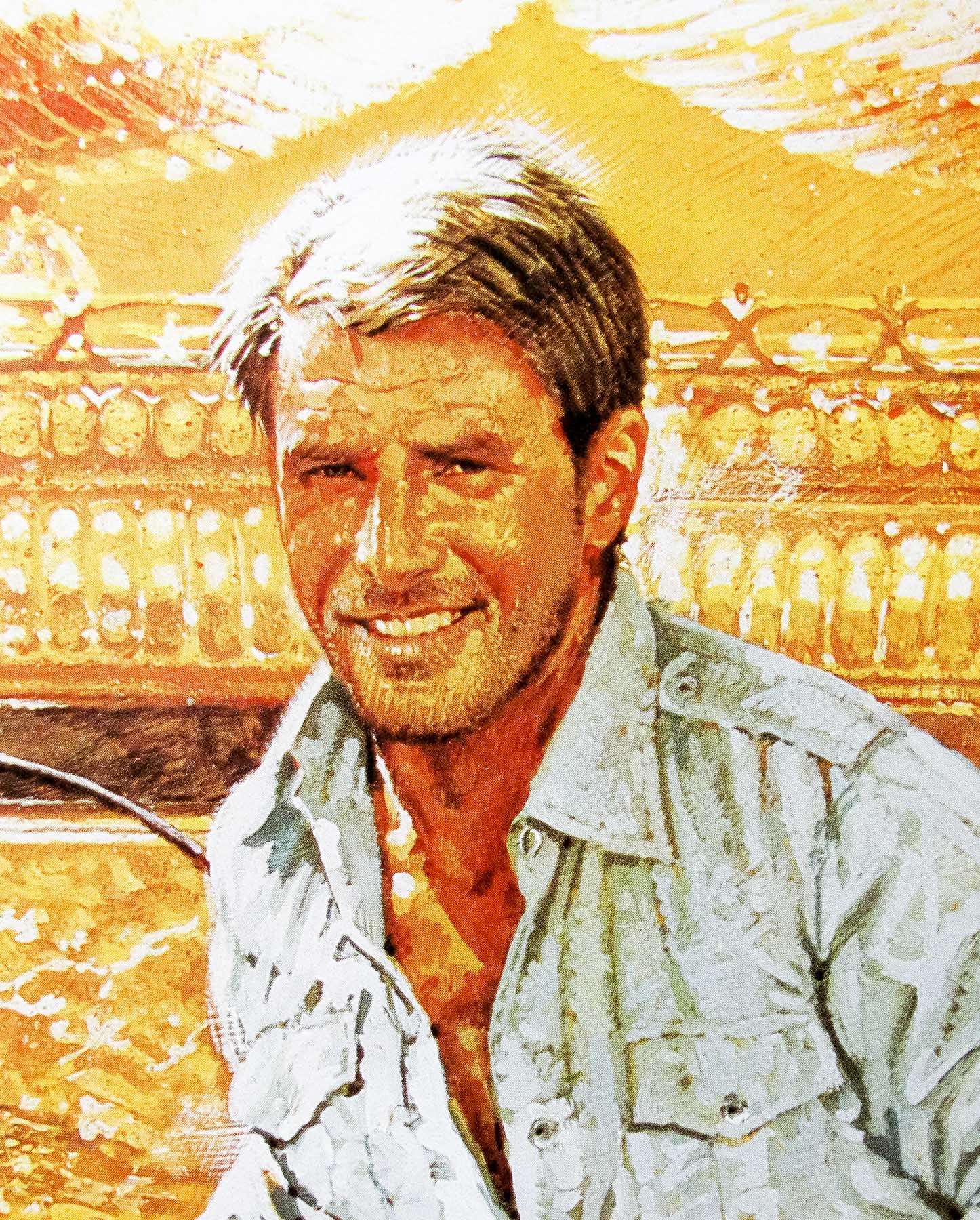
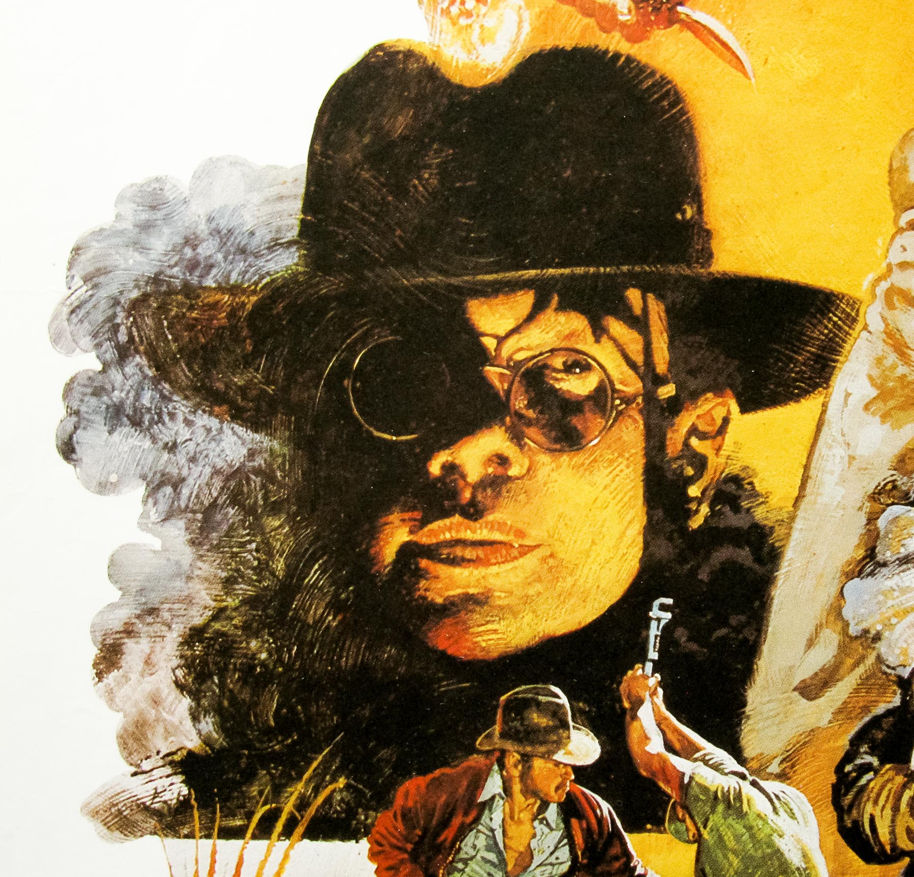
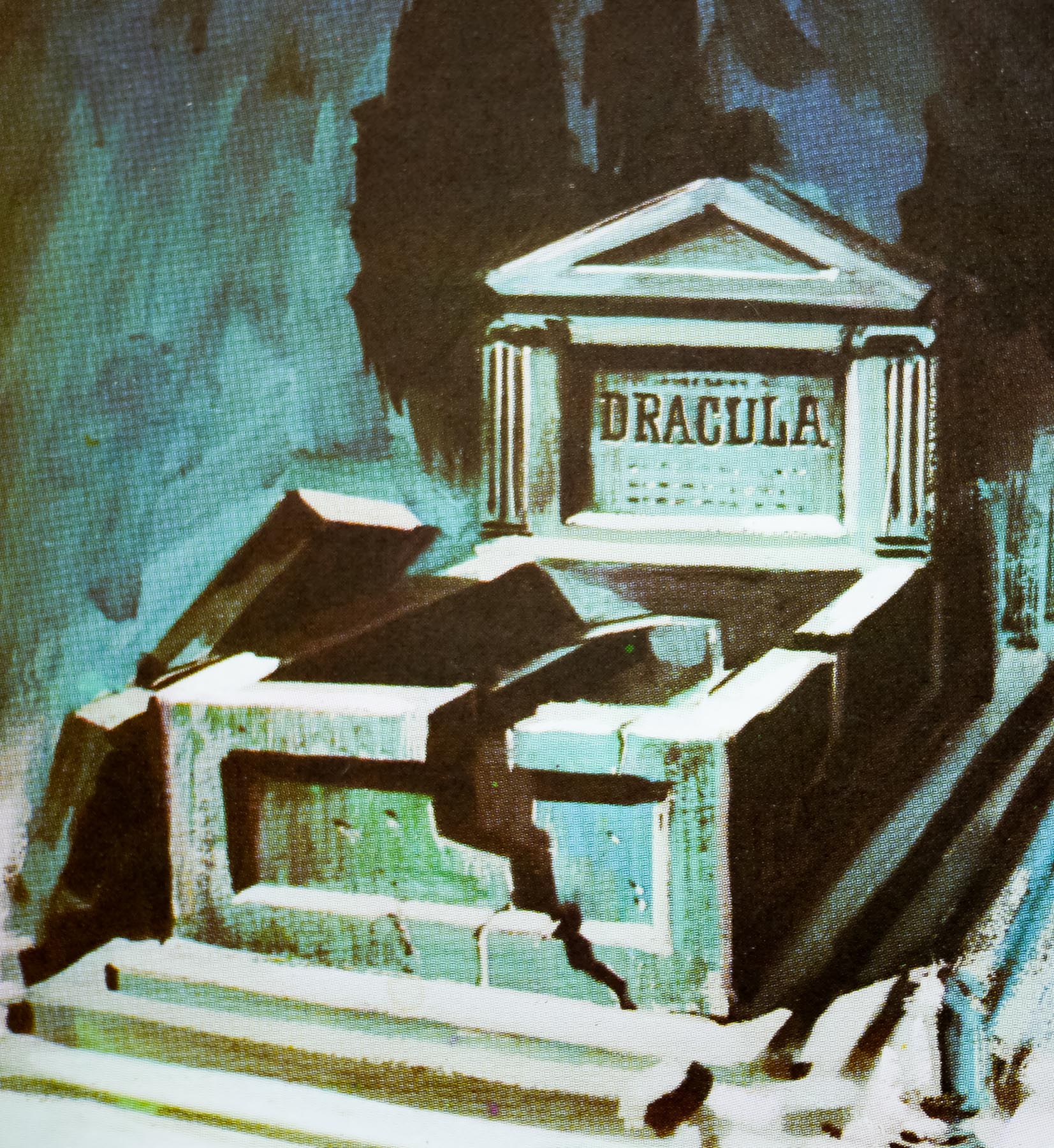
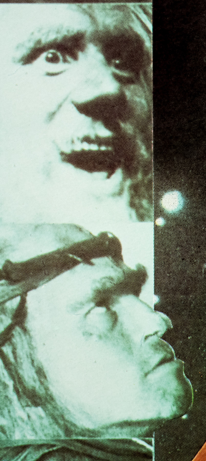
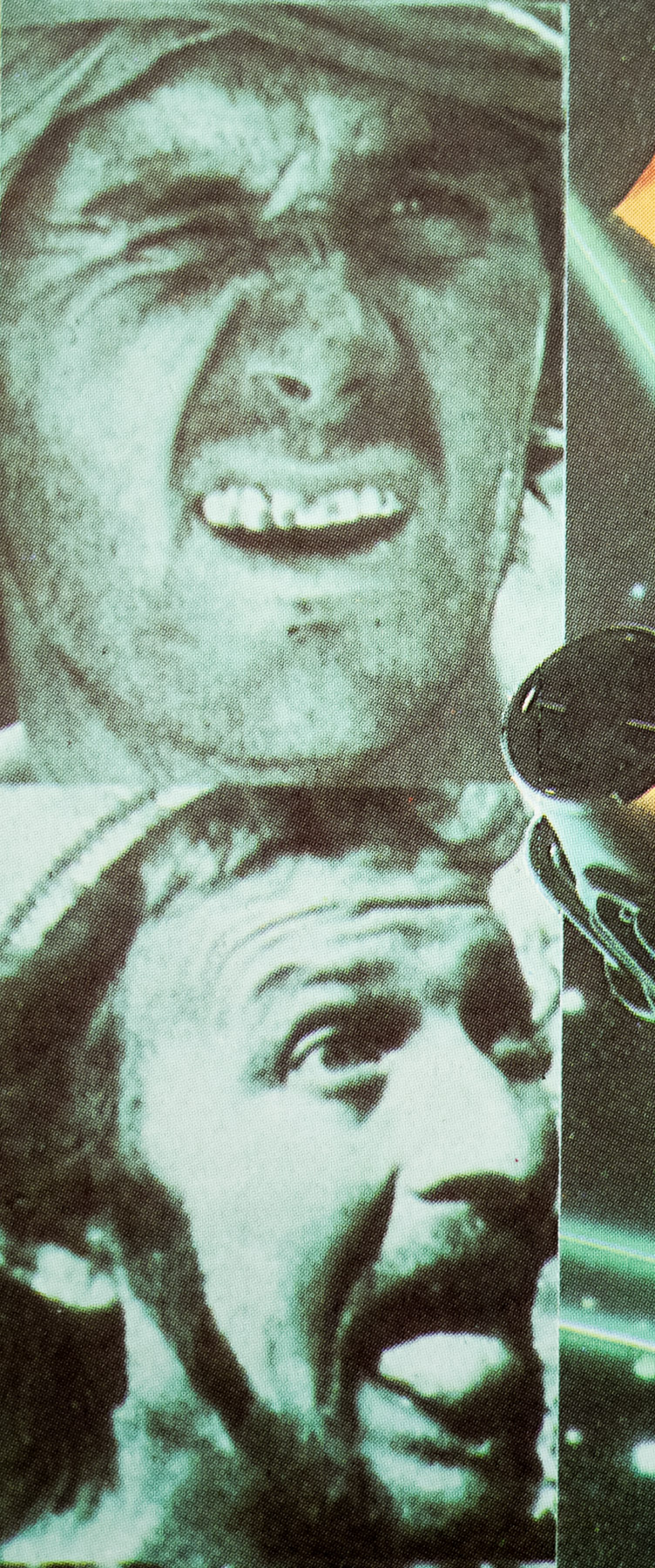
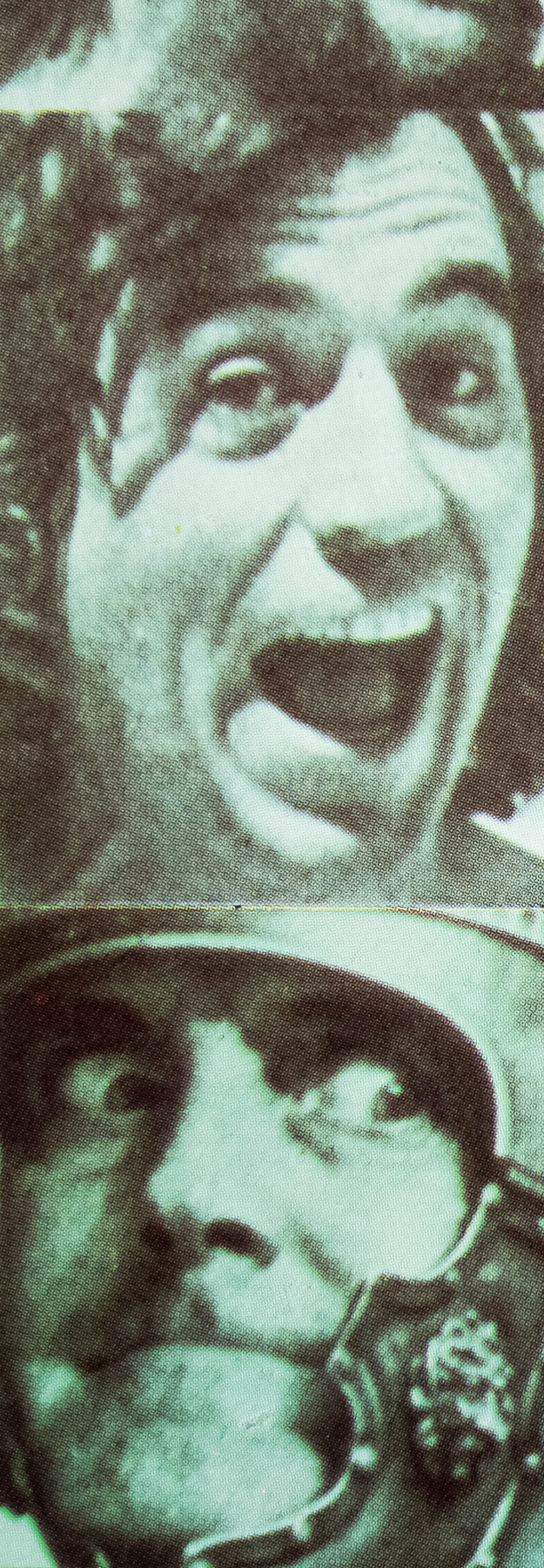
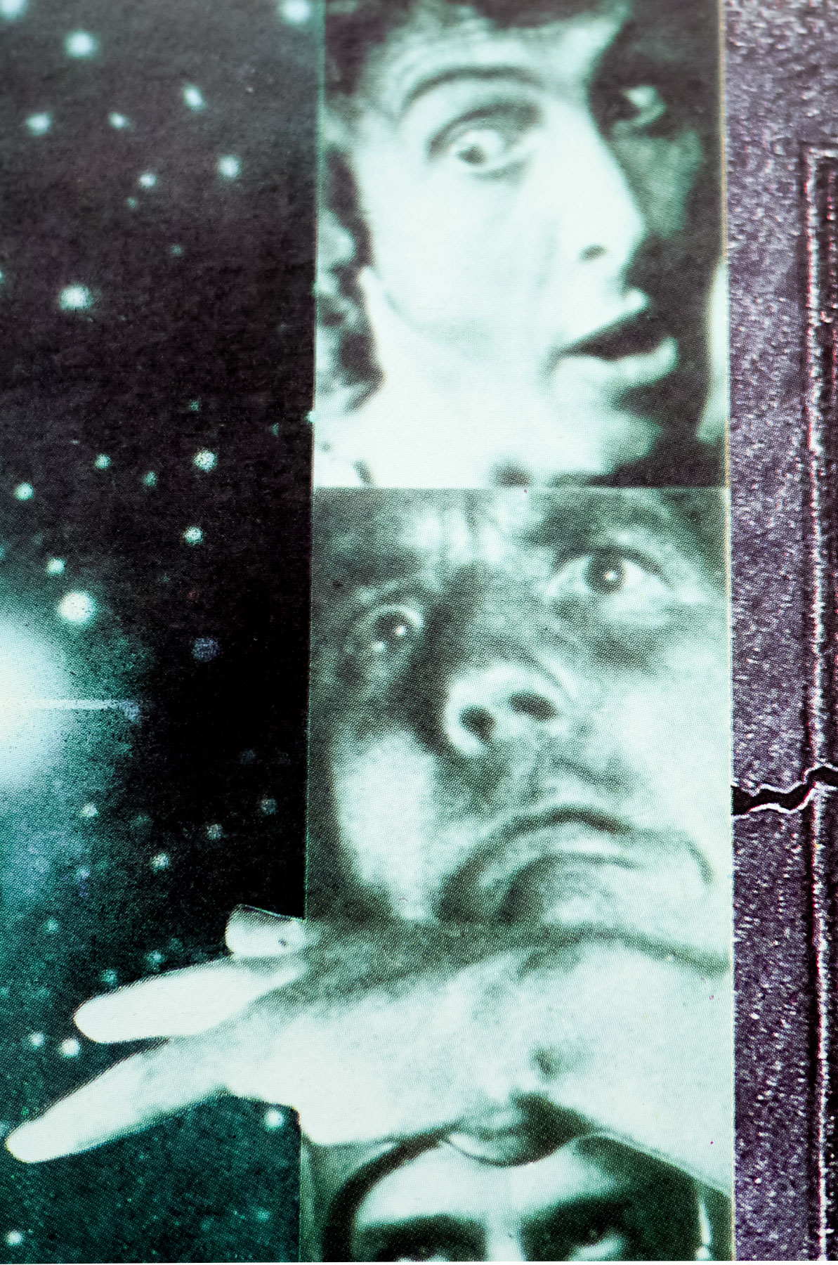
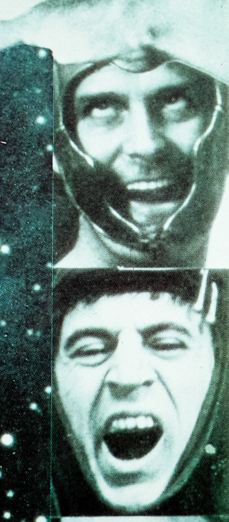
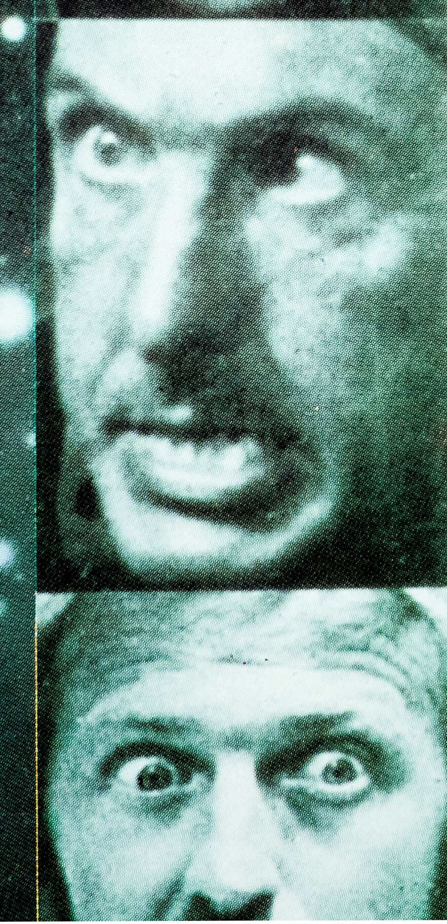
“With only a title to go on, I painted a poster with a head of Count Dracula, snarling away with extended teeth, surmounting a montage of characters warding off vampires with a cross, a lady vampire drooling over another, and a female victim with a decolletage having her neck bitten. I used models as there were no stills provided, and later photographed a colleague with suitable under-chin lighting, then similarly posed while he took photographs of me. Denis was too benevolent-looking, so I used one of the photographs of myself to paint from, and added a busted grave to the montage.
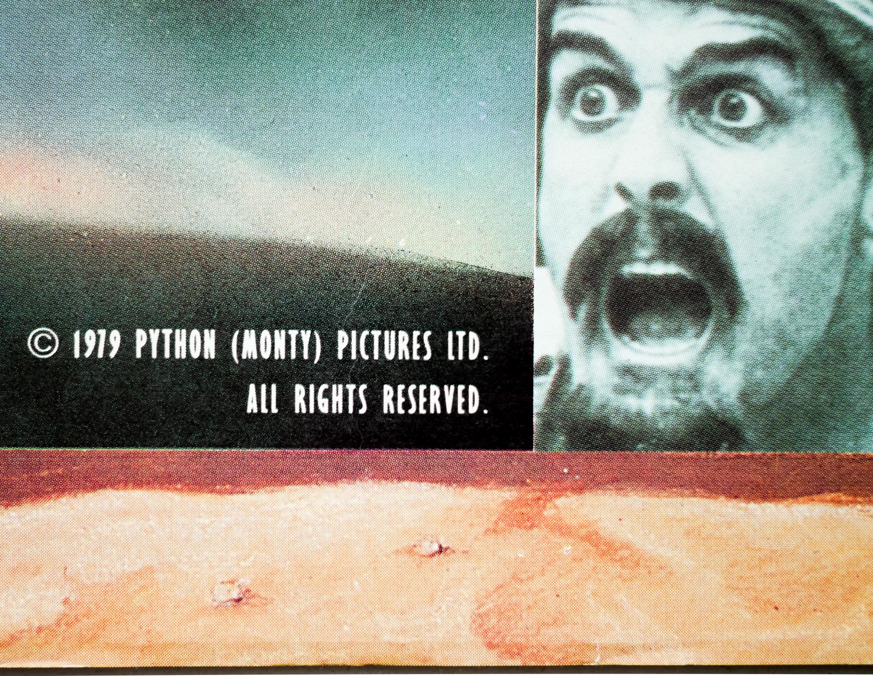
Later some stills arrived, and it was possible to start on a third version. This poster had the neck-biting scene with Christopher Lee, and retained the open grave and malevolent self-portrait of Tom Chantrell. Then the distributor Warner Pathe said the film was going on in two weeks, and they wanted a poster right away. No still of Christopher Lee was available, so (what the heck!) the design was printed as it was. Nobody ever questioned the poster. They all think it’s Christopher Lee, but it isn’t, it’s nasty ole’ Count Chantrell!”
The reference photograph of Chantrell as Dracula can be seen here and the two earlier versions can be seen here (both images courtesy of chantrellposter.com). It’s worth noting that this is a Hammer quad that was printed in greater numbers than others because it was used to give away to fans who wrote in to the studio, along with the ‘She/One Million Years BC’ quad (see the bottom of this page for more detail).