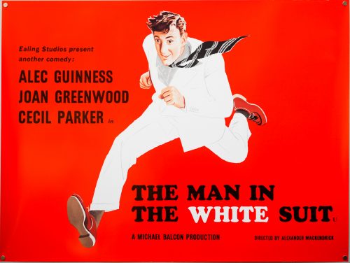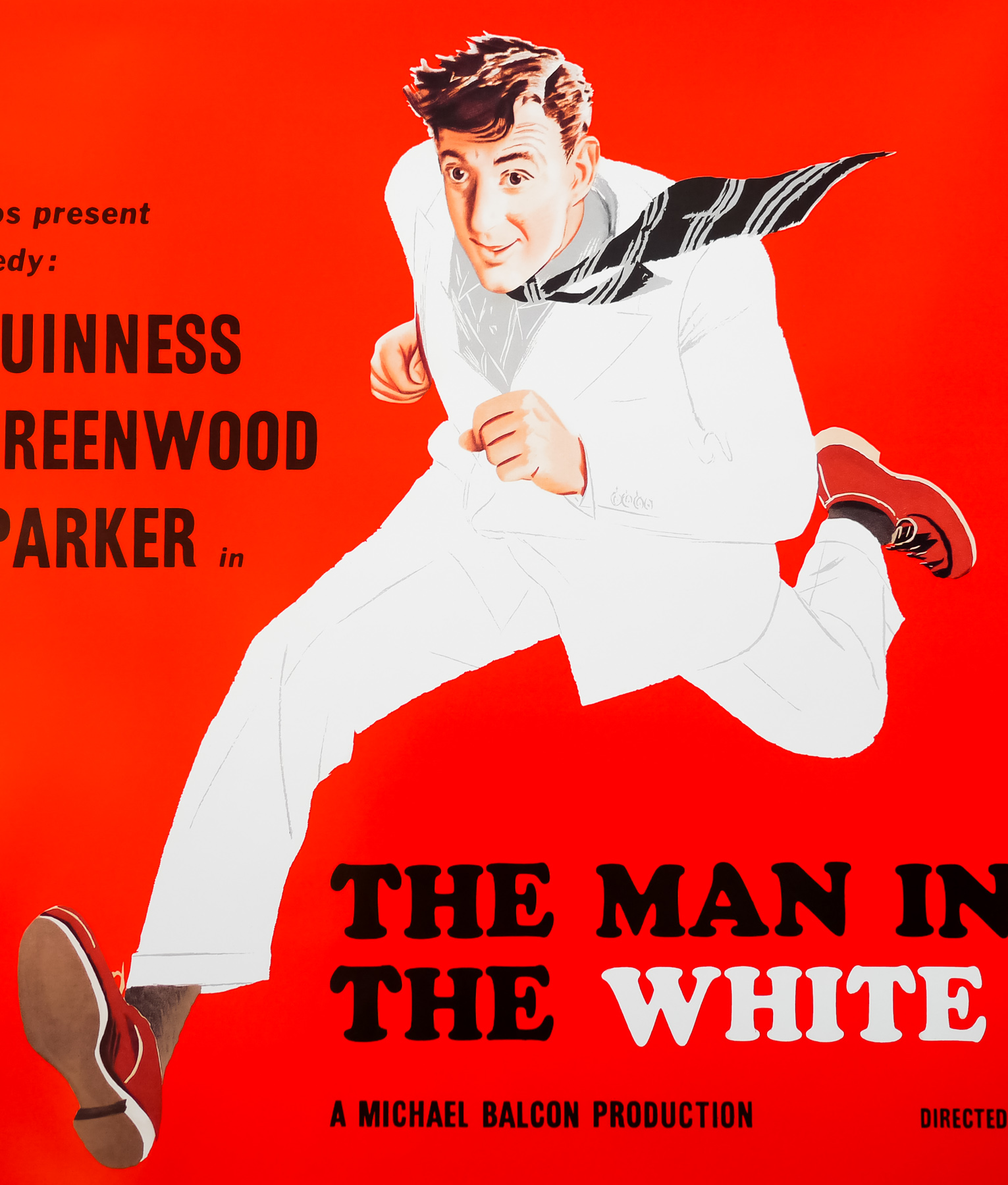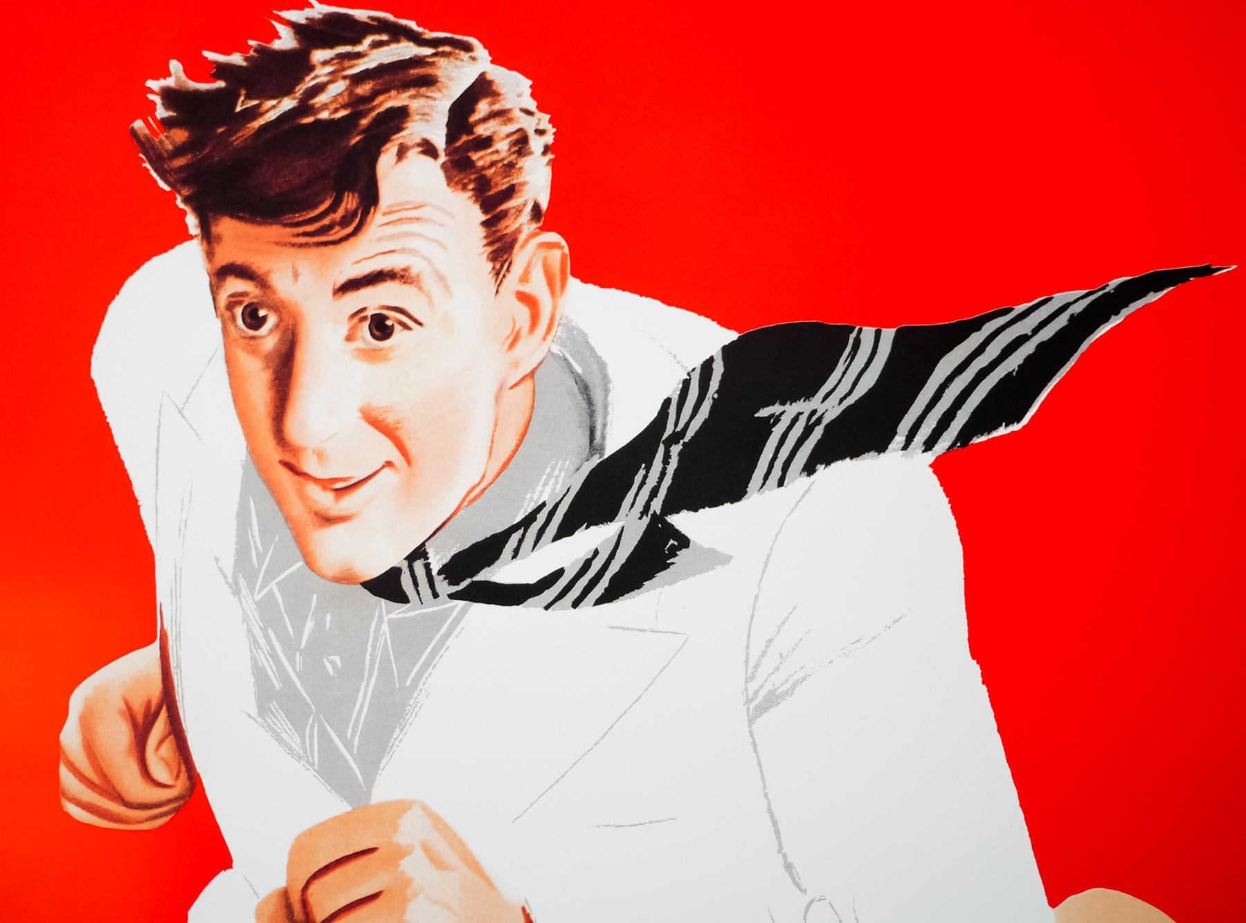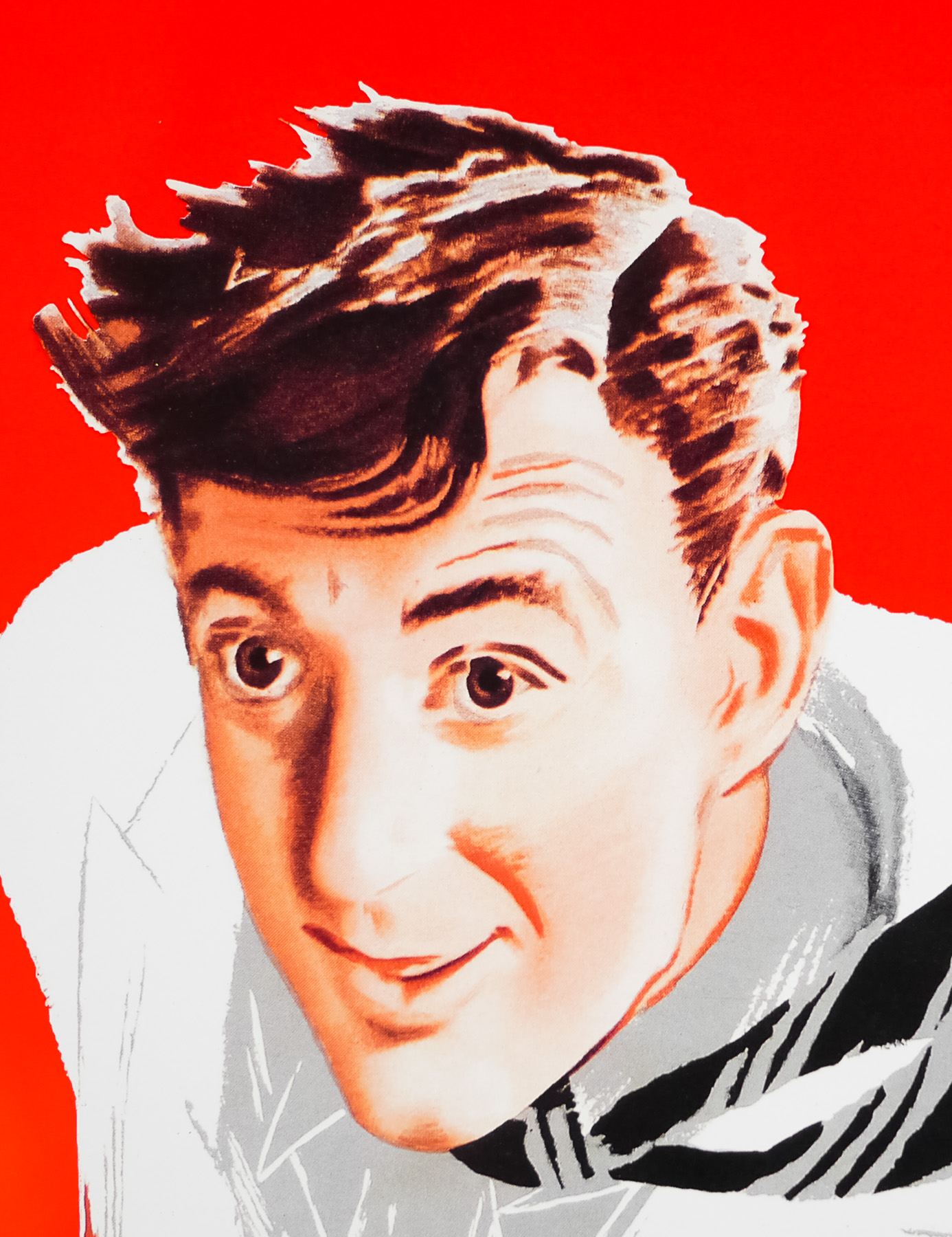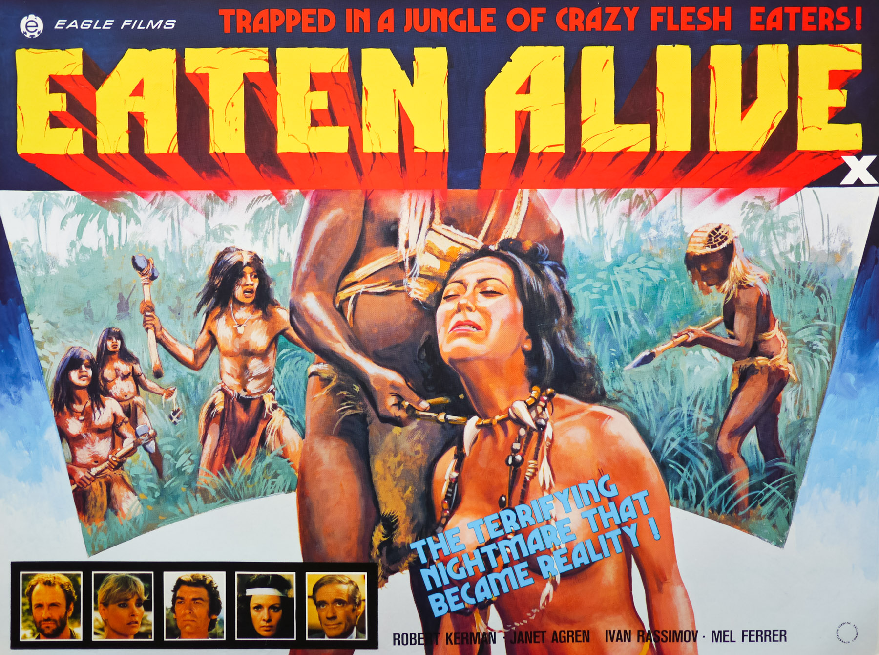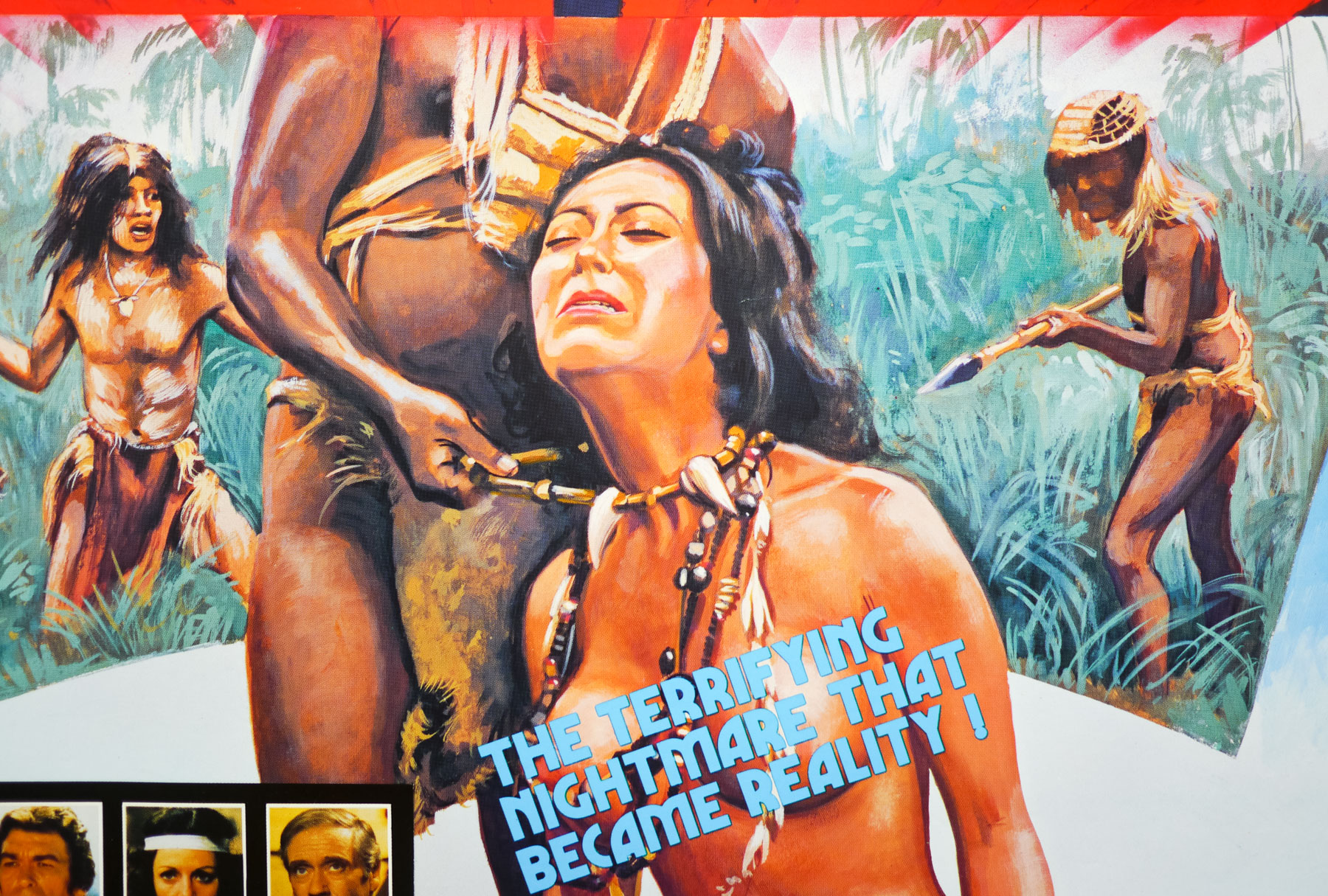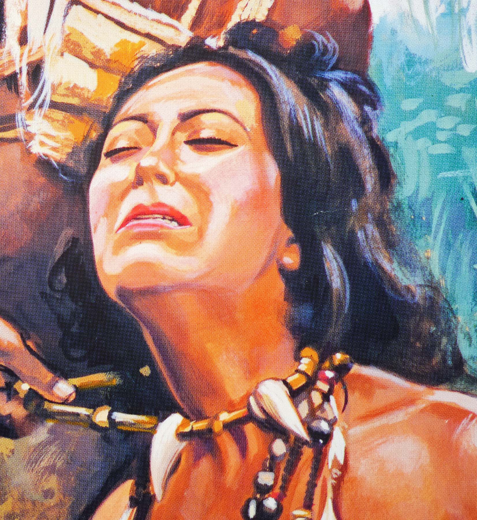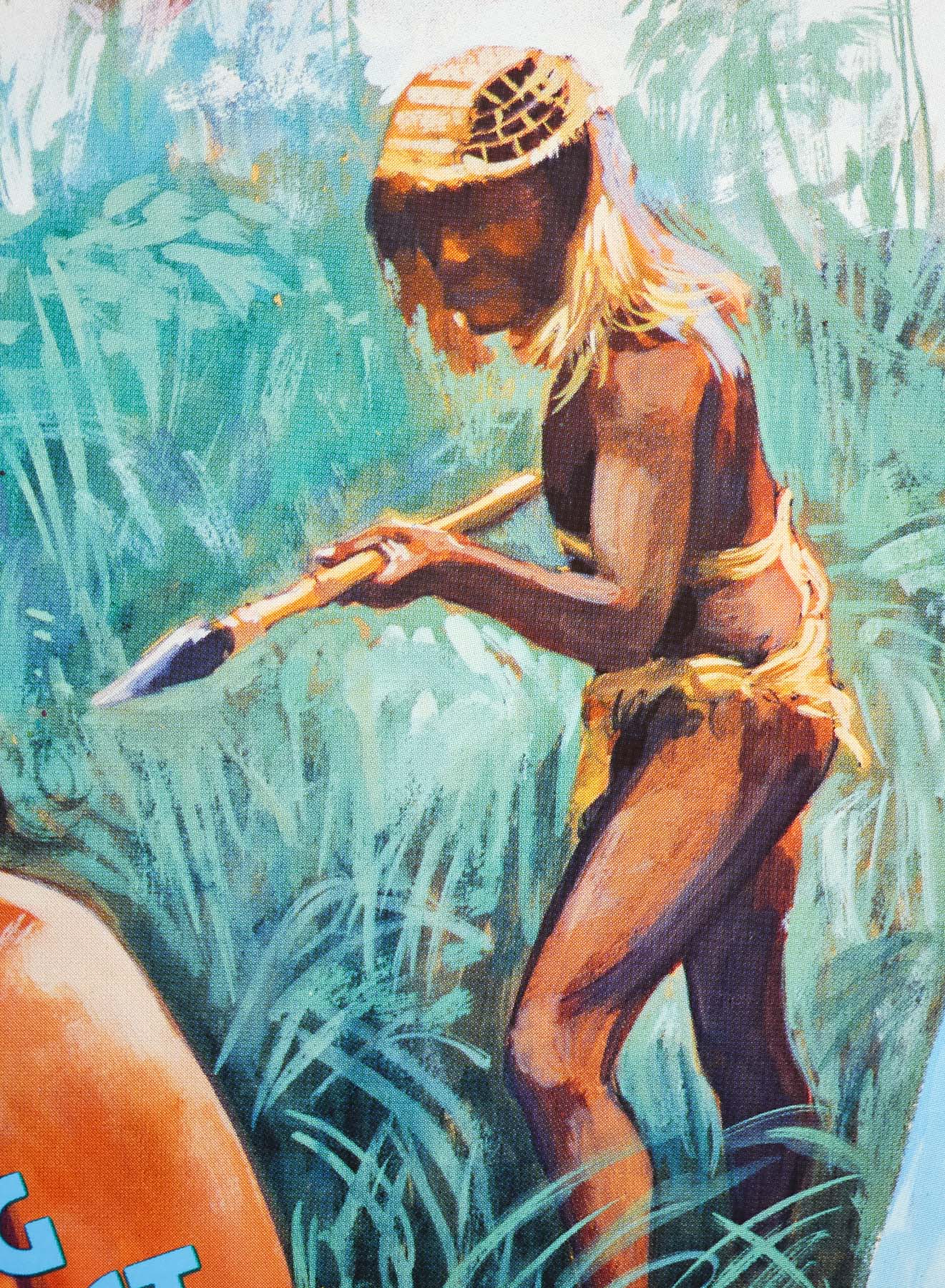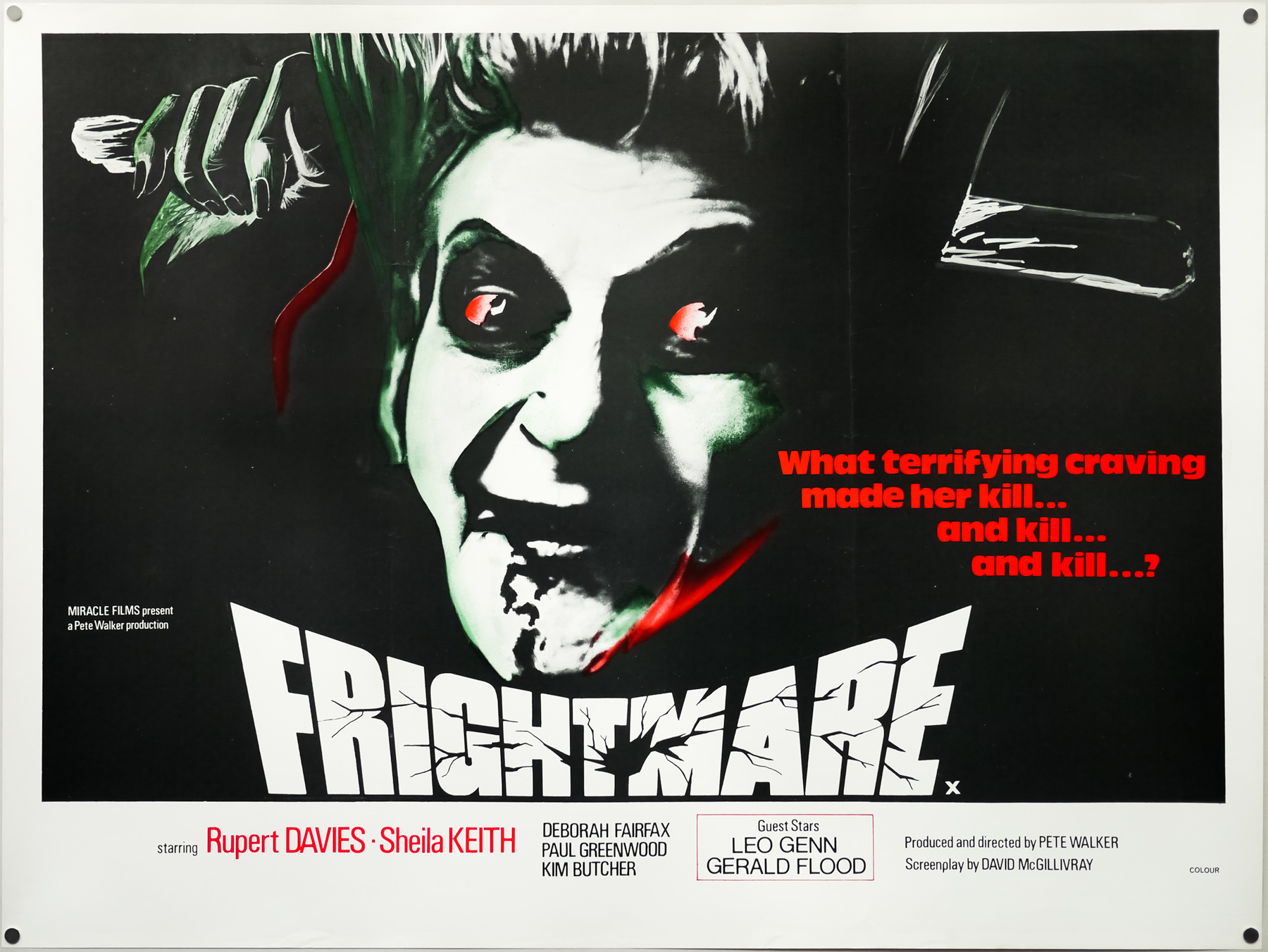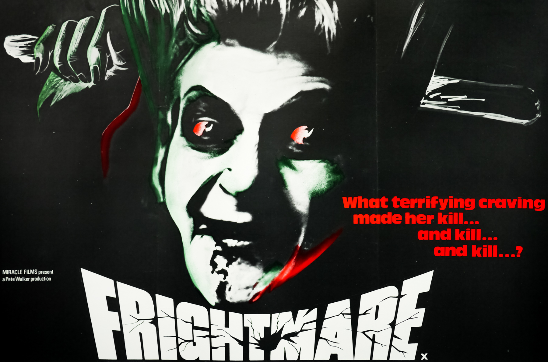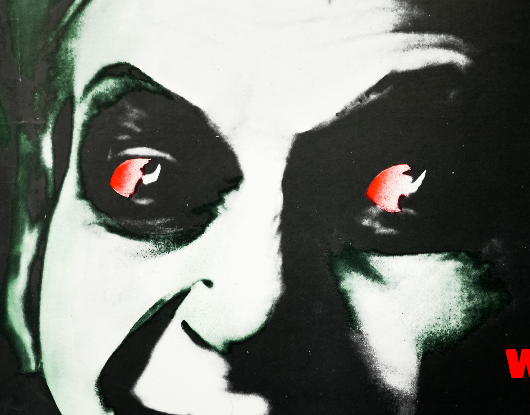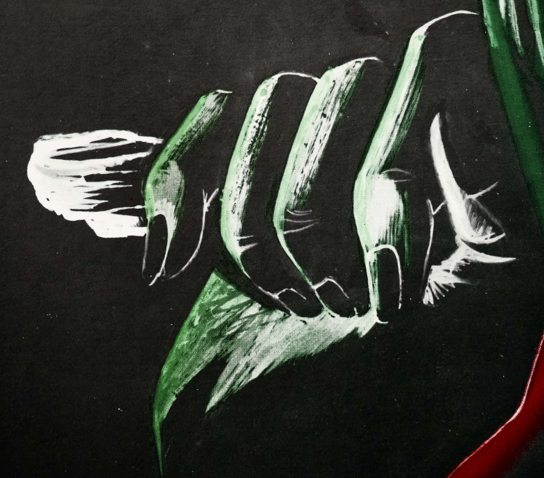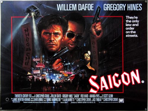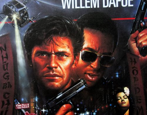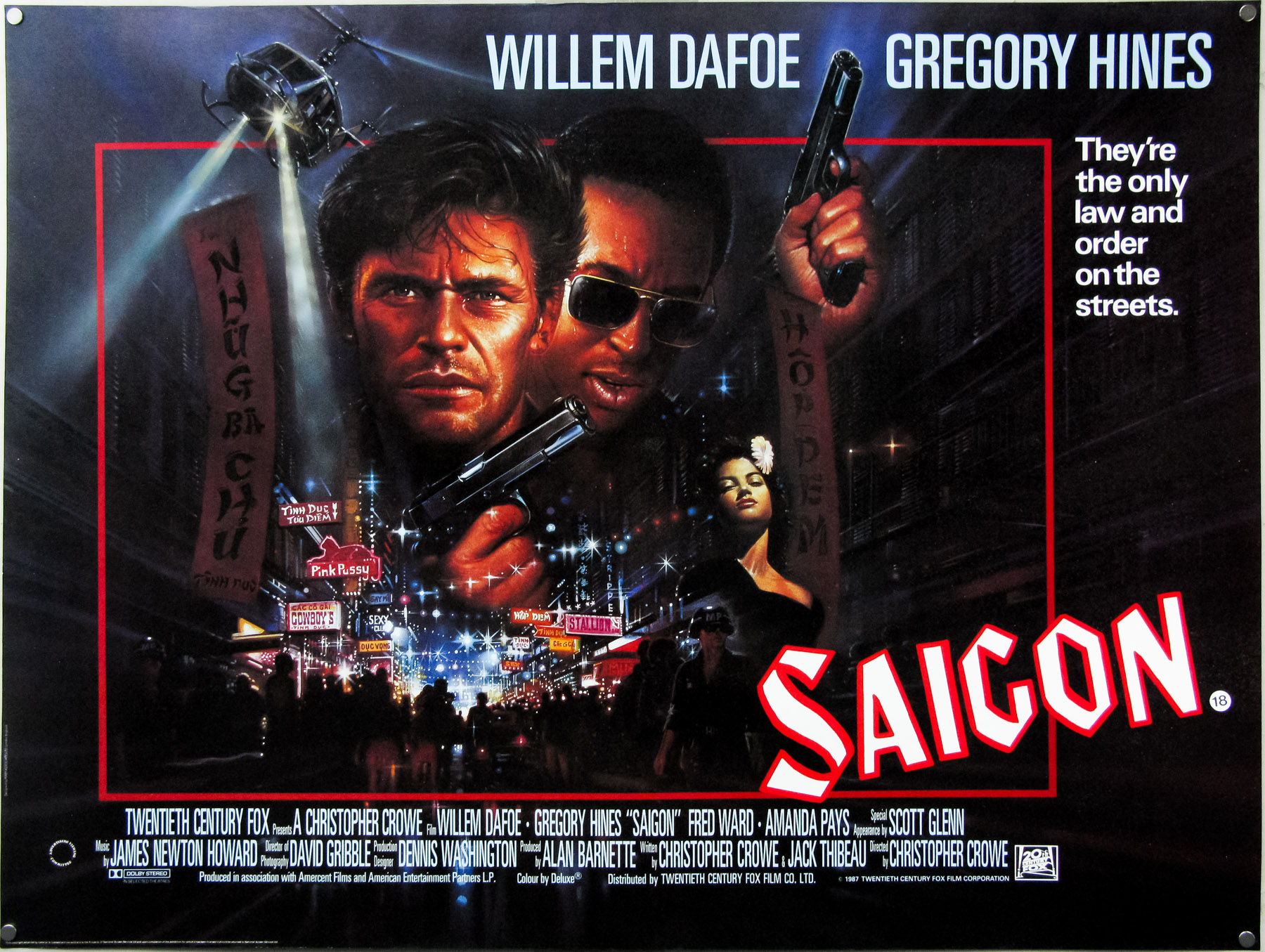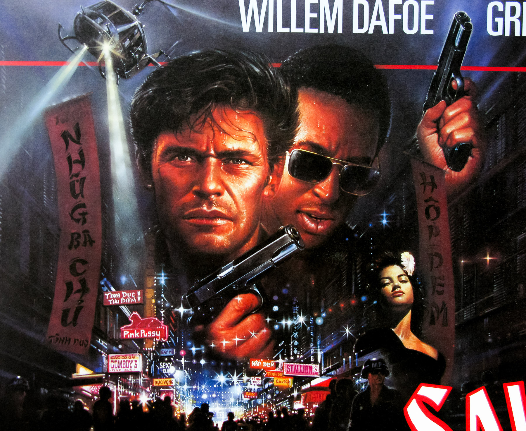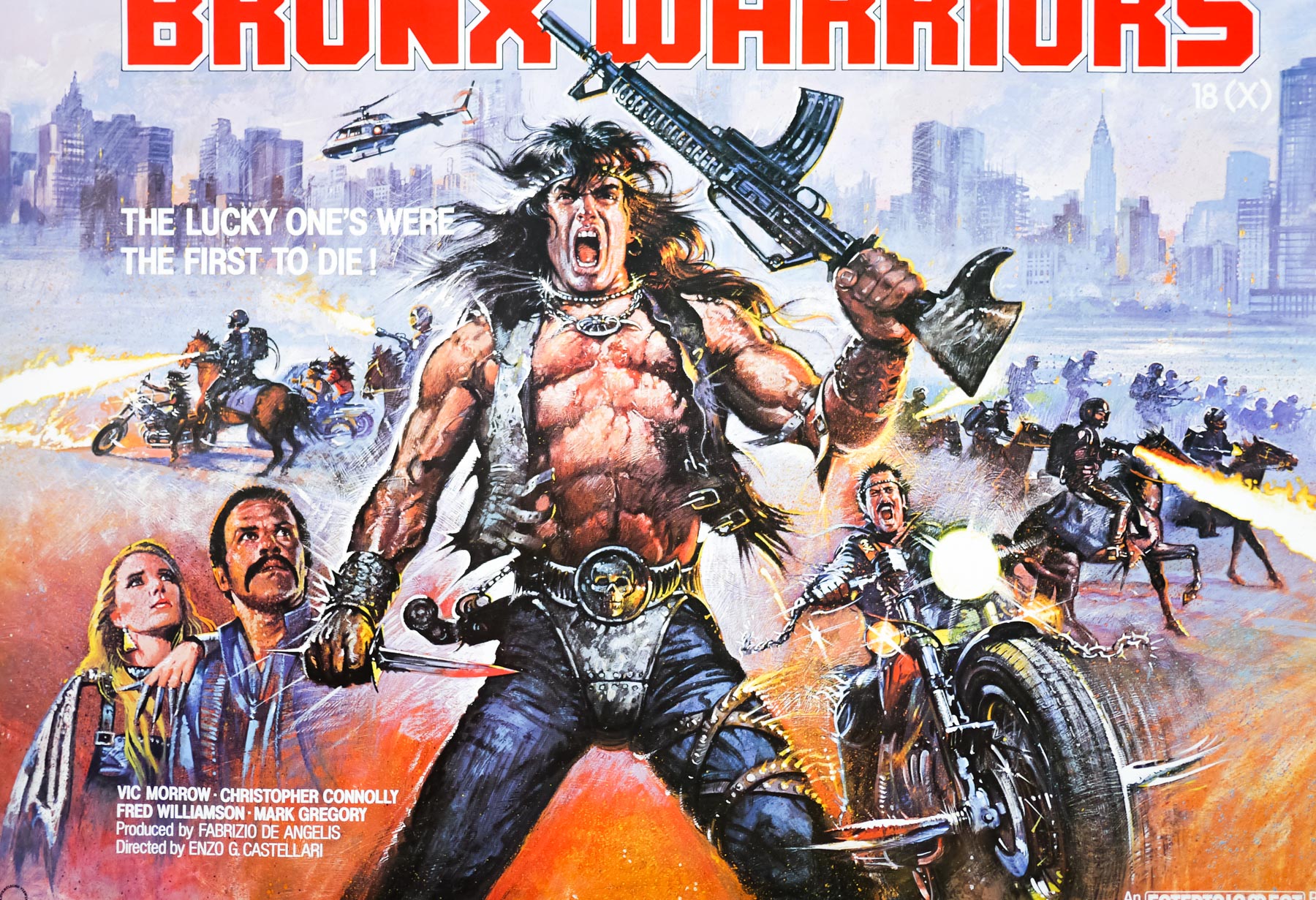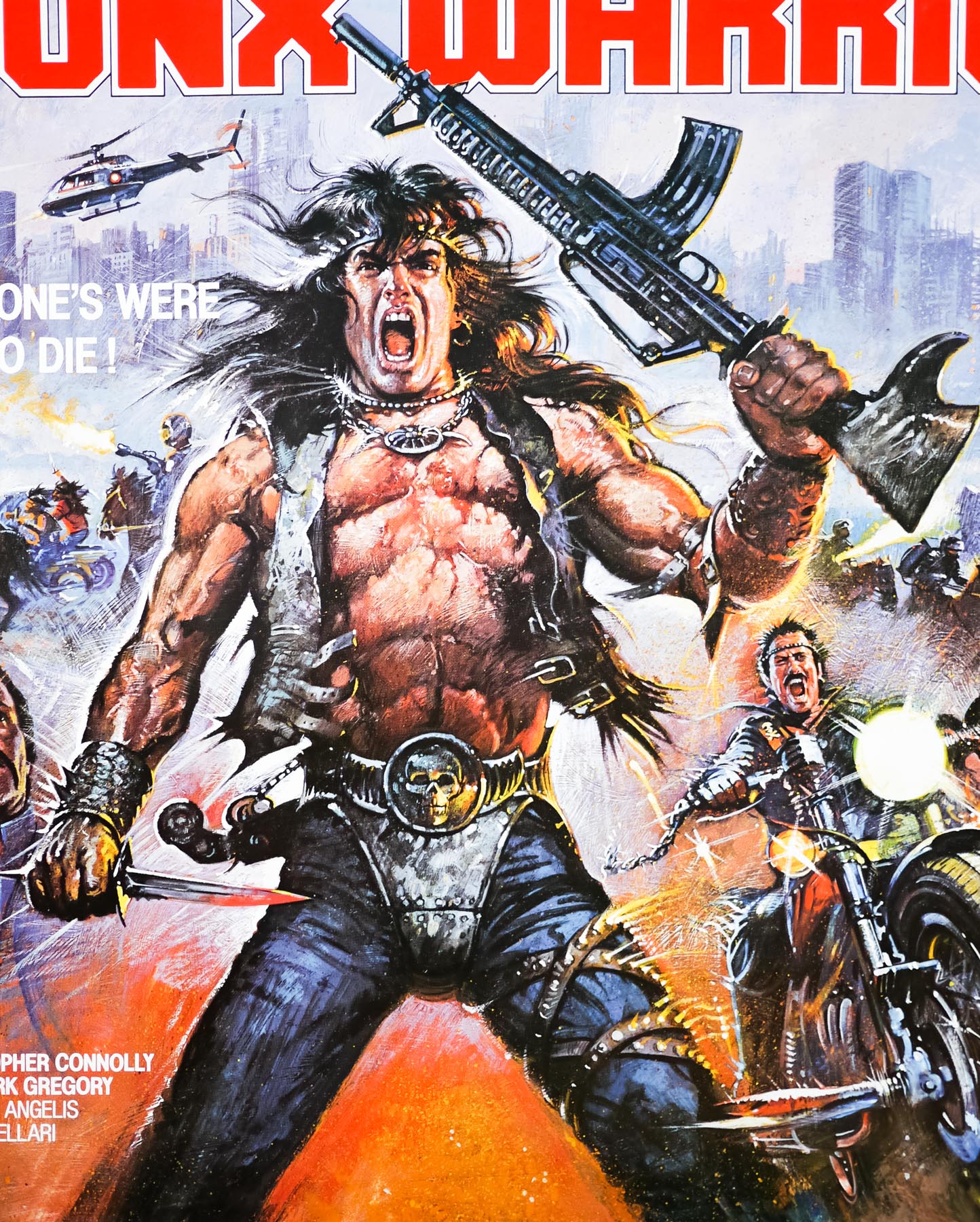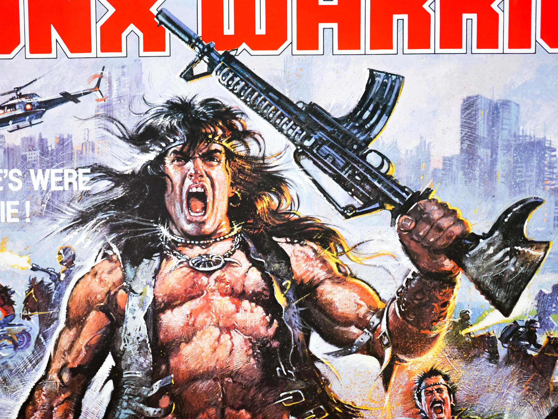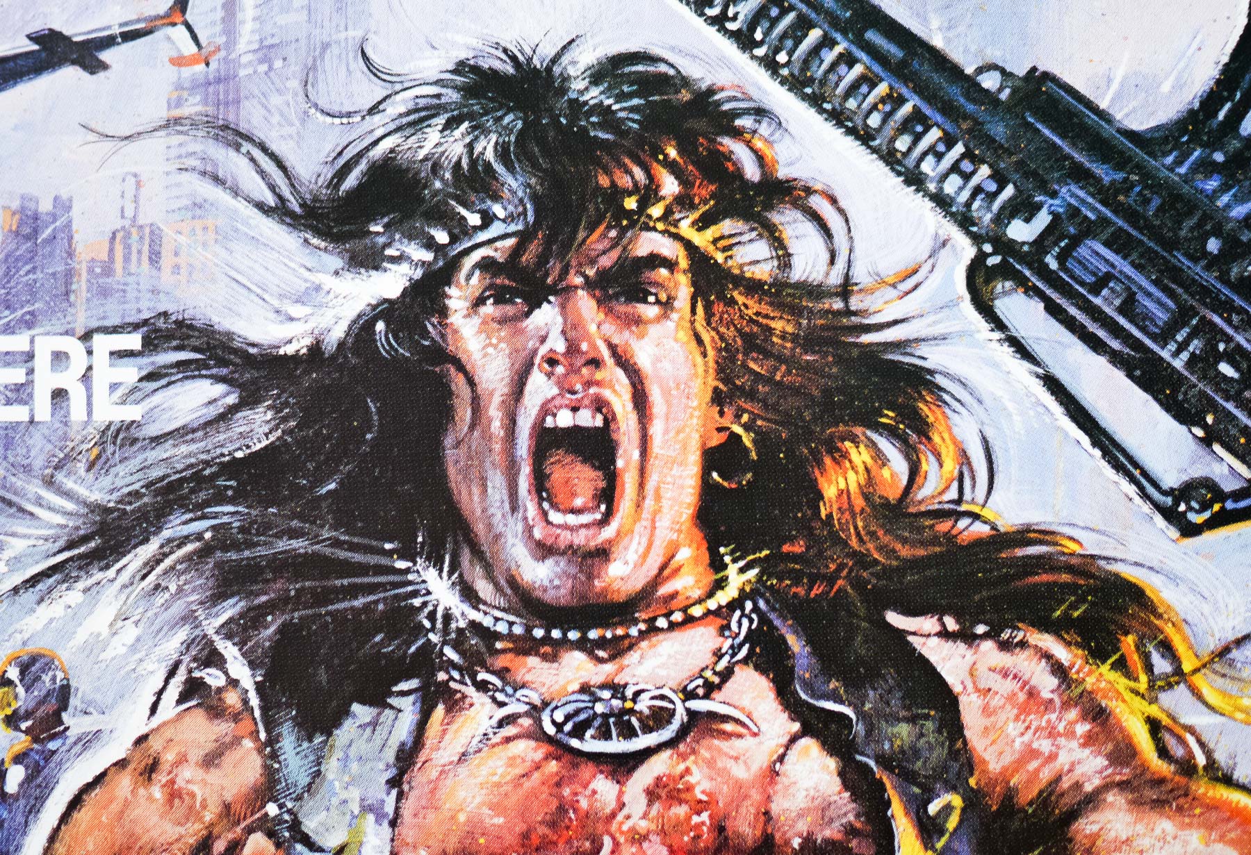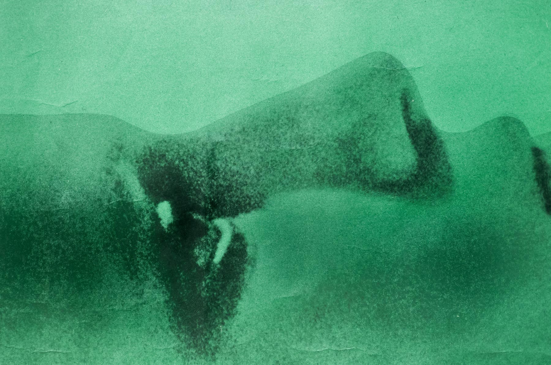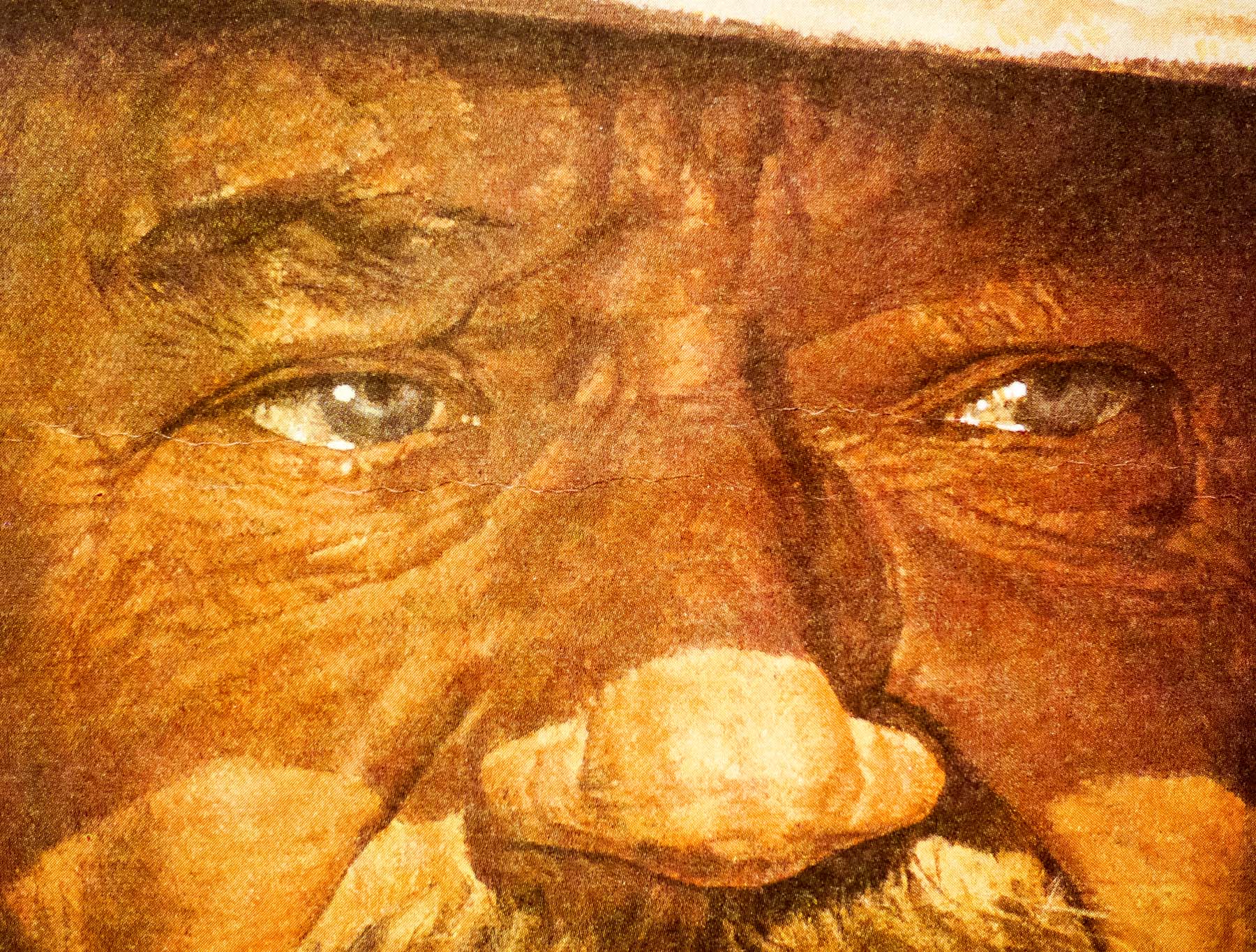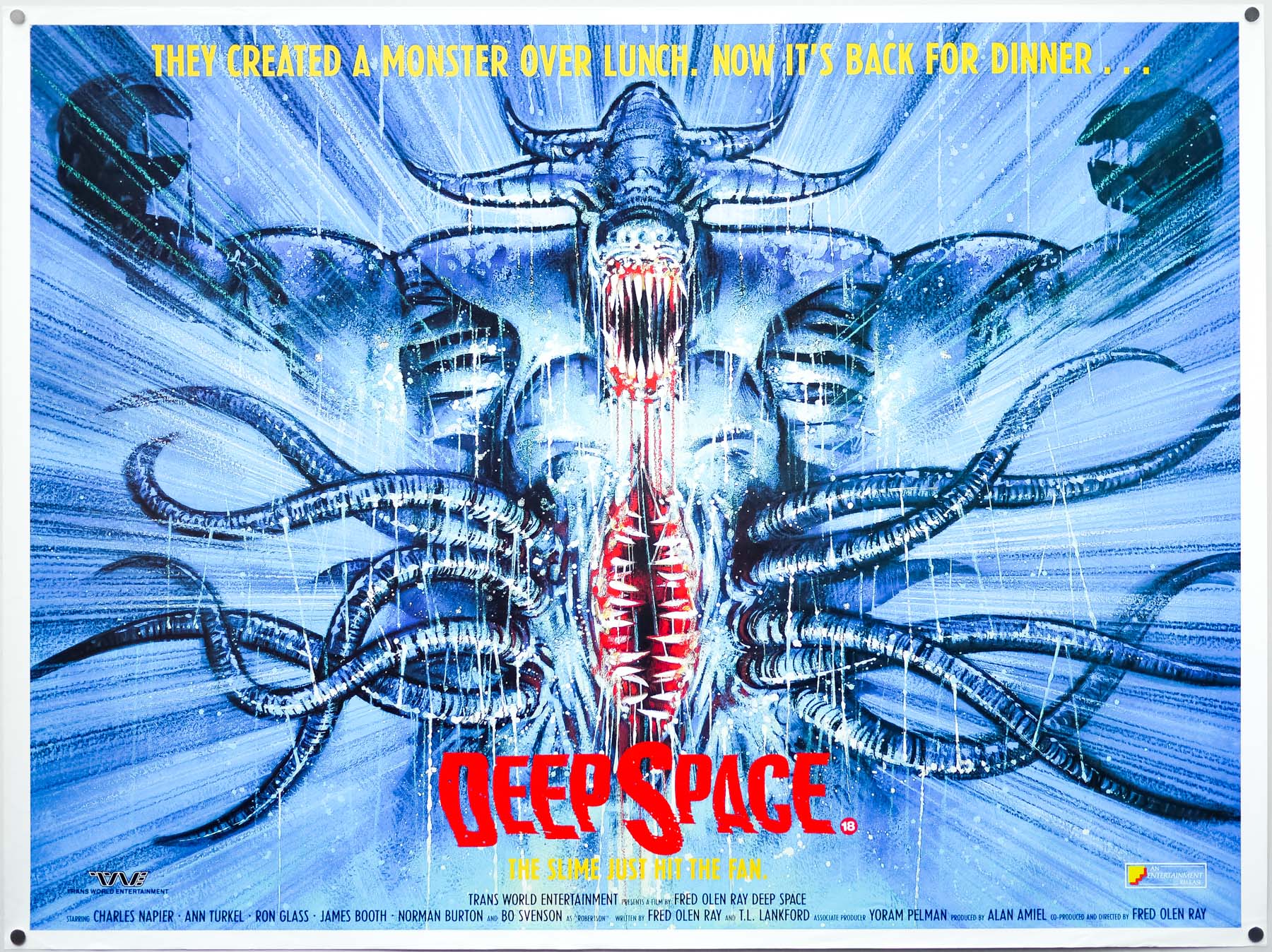
Poster detail
1-5


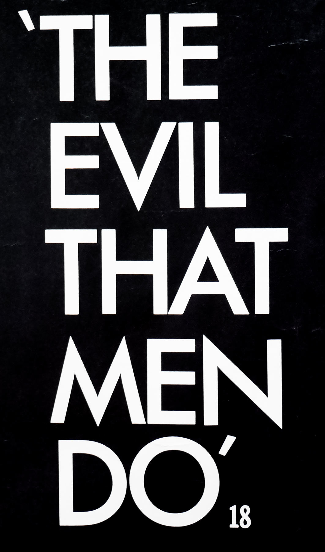

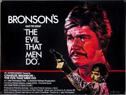
- Title
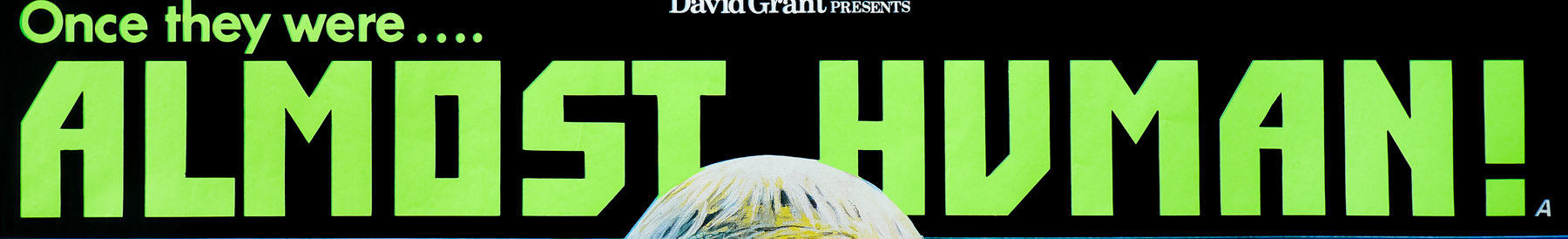
- The Evil That Men Do
- AKA
- Liquidator (West Germany) | L'enfer de la violence [The Hell of violence] (France)
- Year of Film
- 1984
- Director
- J. Lee Thompson
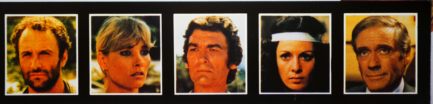
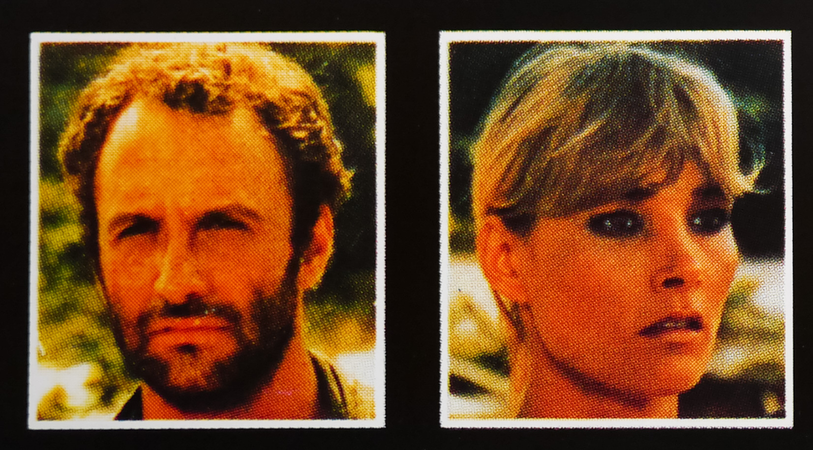
- Starring
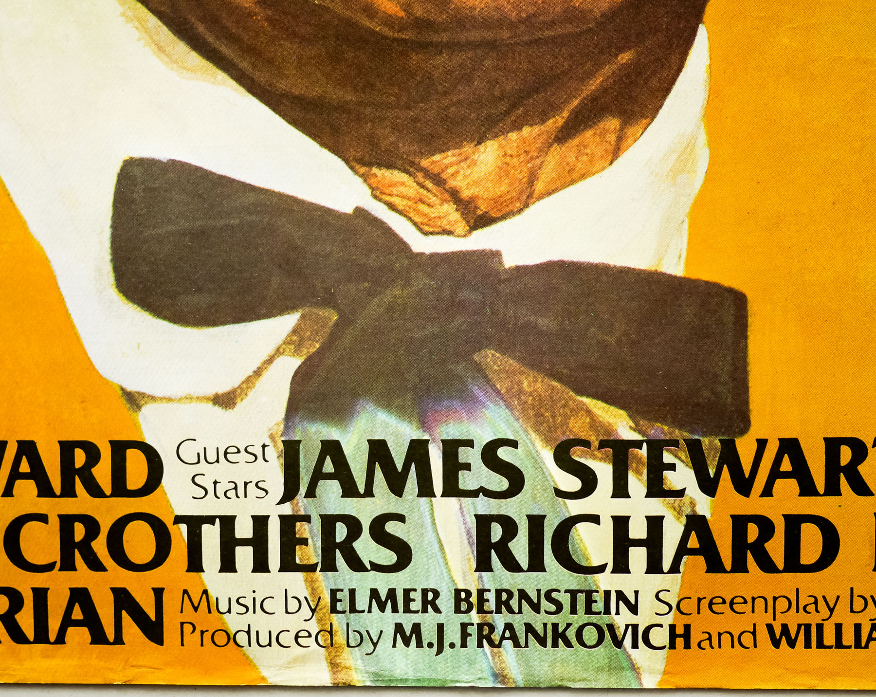
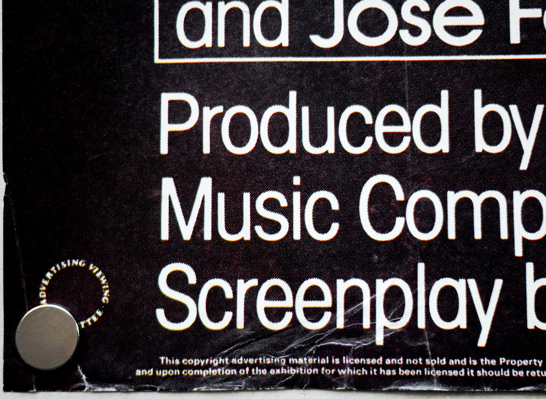
- Charles Bronson, Theresa Saldana, Joseph Maher, José Ferrer, René Enríquez, John Glover, Raymond St. Jacques, Antoinette Bower, Enrique Lucero
- Origin of Film
- Mexico | USA | UK
- Genre(s) of Film
- Charles Bronson, Theresa Saldana, Joseph Maher, José Ferrer, René Enríquez, John Glover, Raymond St. Jacques, Antoinette Bower, Enrique Lucero,
- Type of Poster
- Quad
- Style of Poster
- --
- Origin of Poster
- UK
- Year of Poster
- 1984
- Designer
- Eric Pulford
- Artist
- Eric Pulford
- Size (inches)
- 29 15/16" x 39 11/16"
- SS or DS
- SS
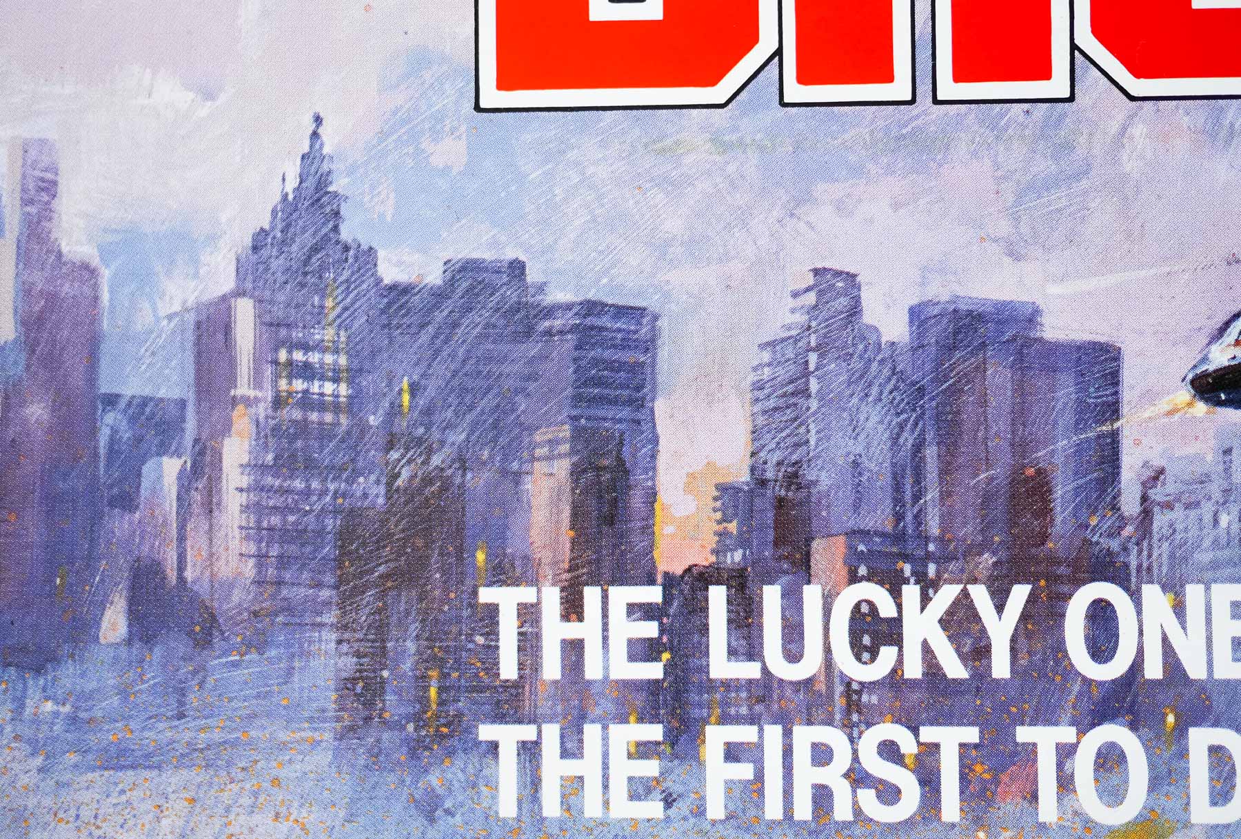
- Tagline
- Bronson's out to stop...
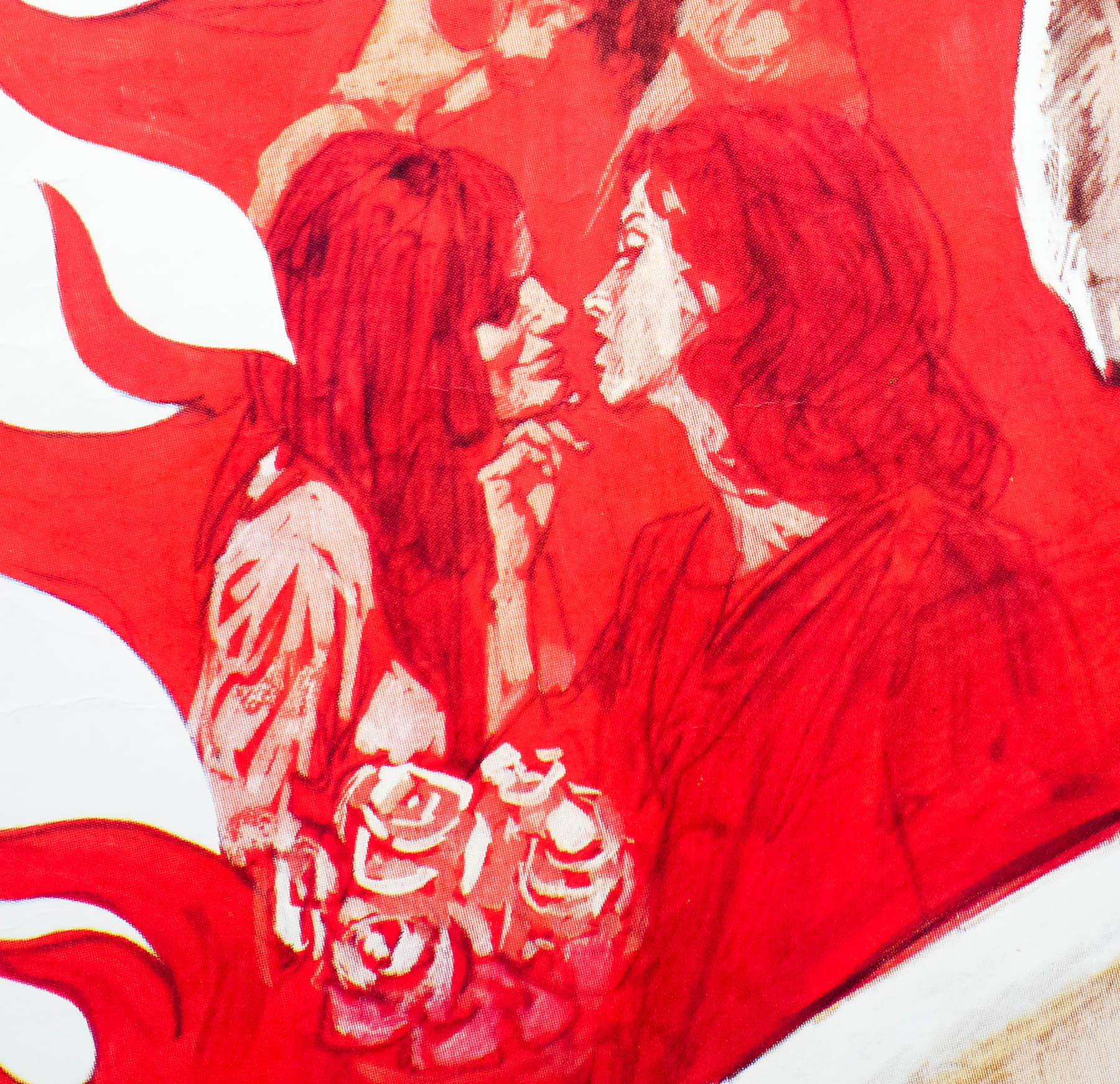
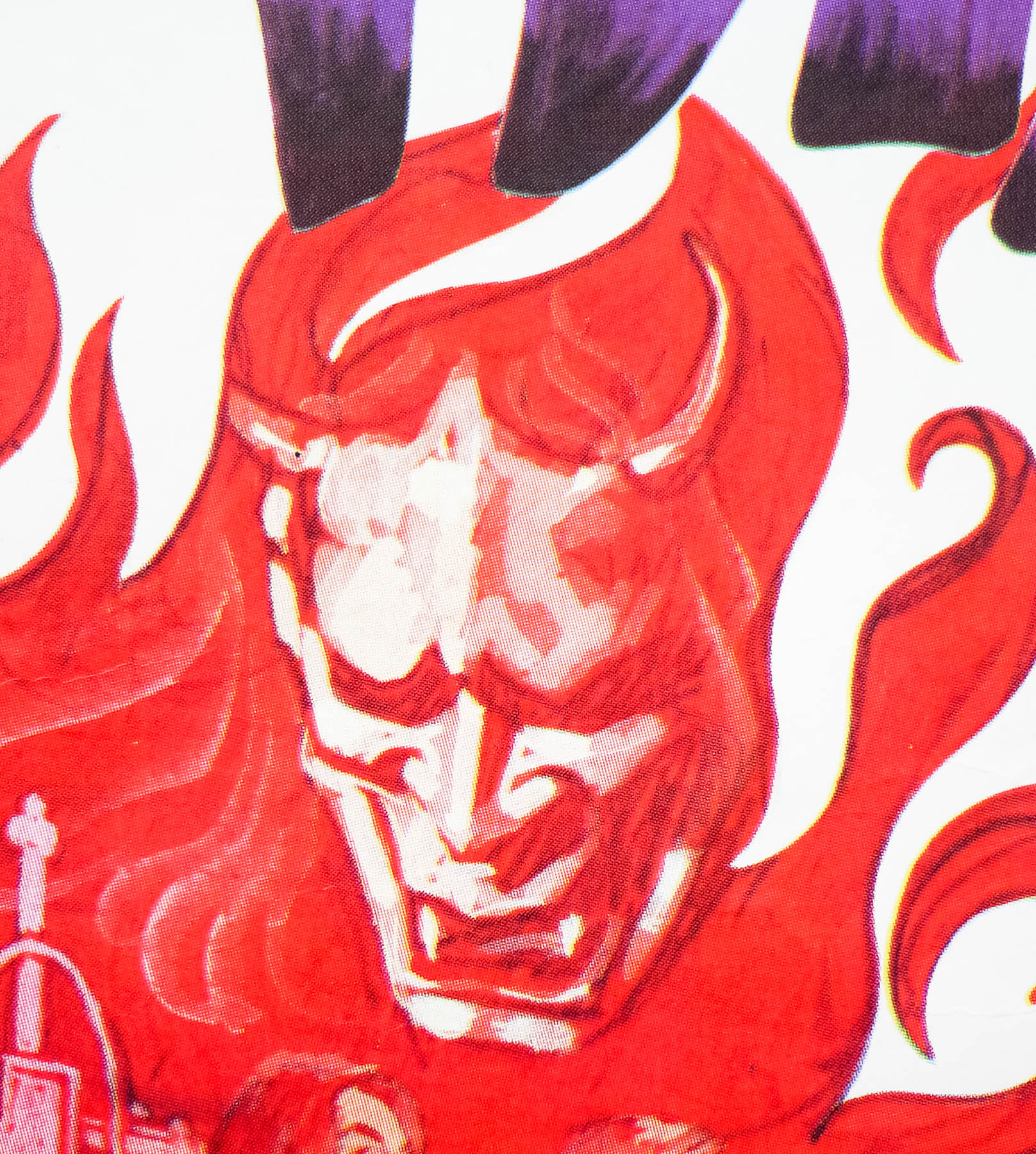
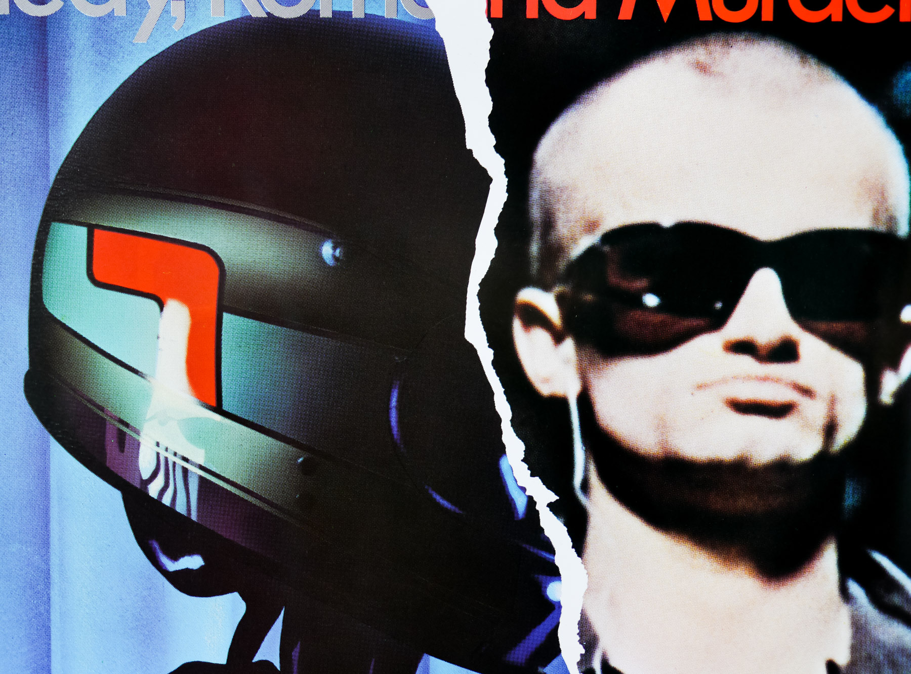
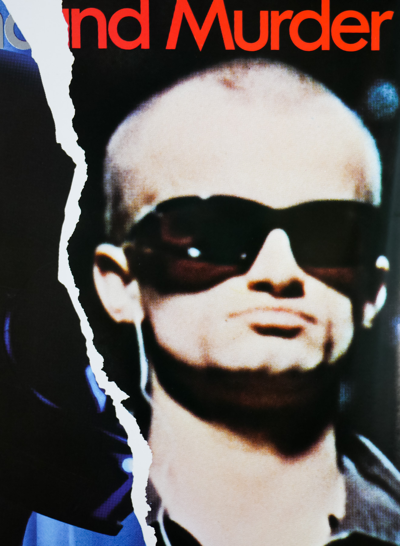
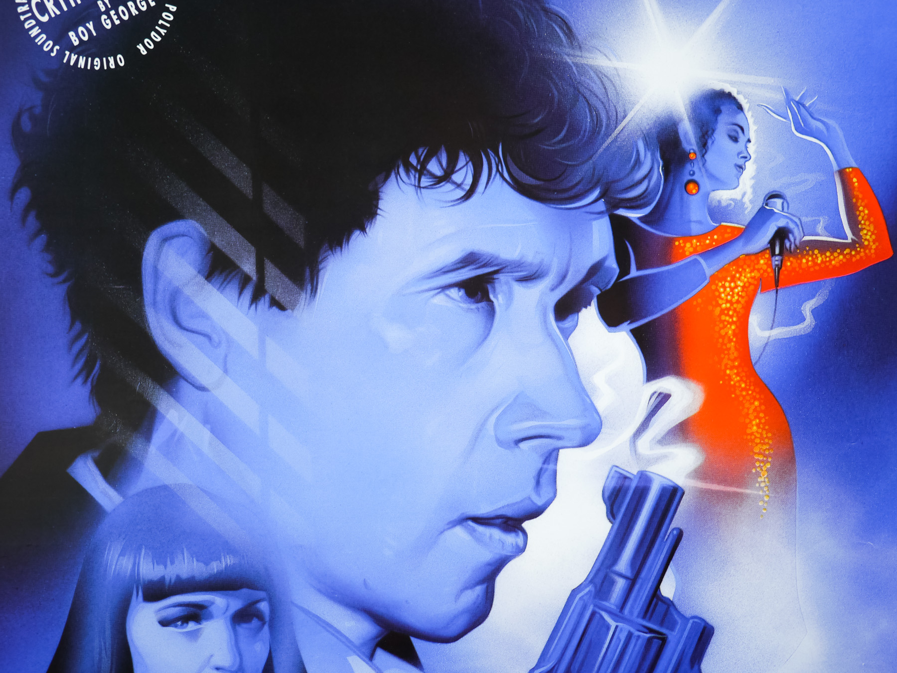
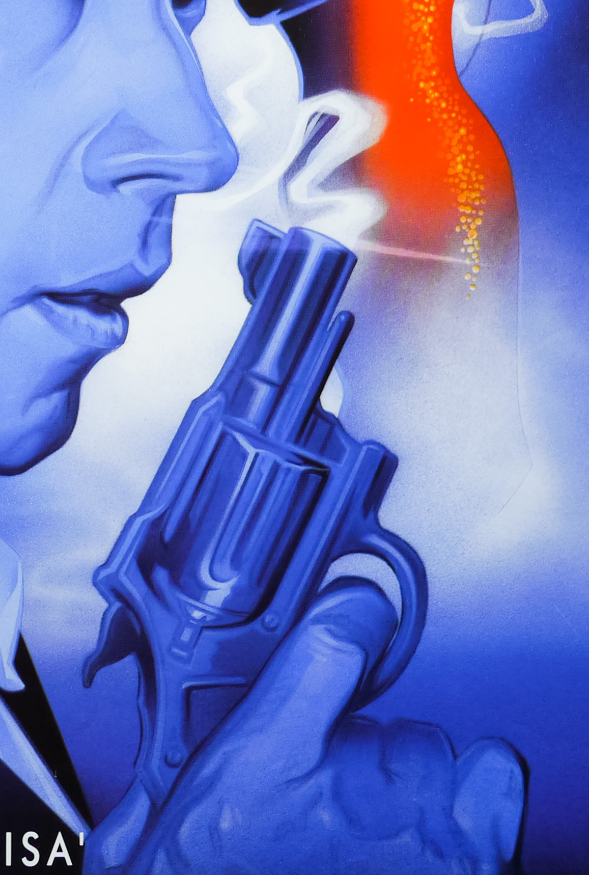
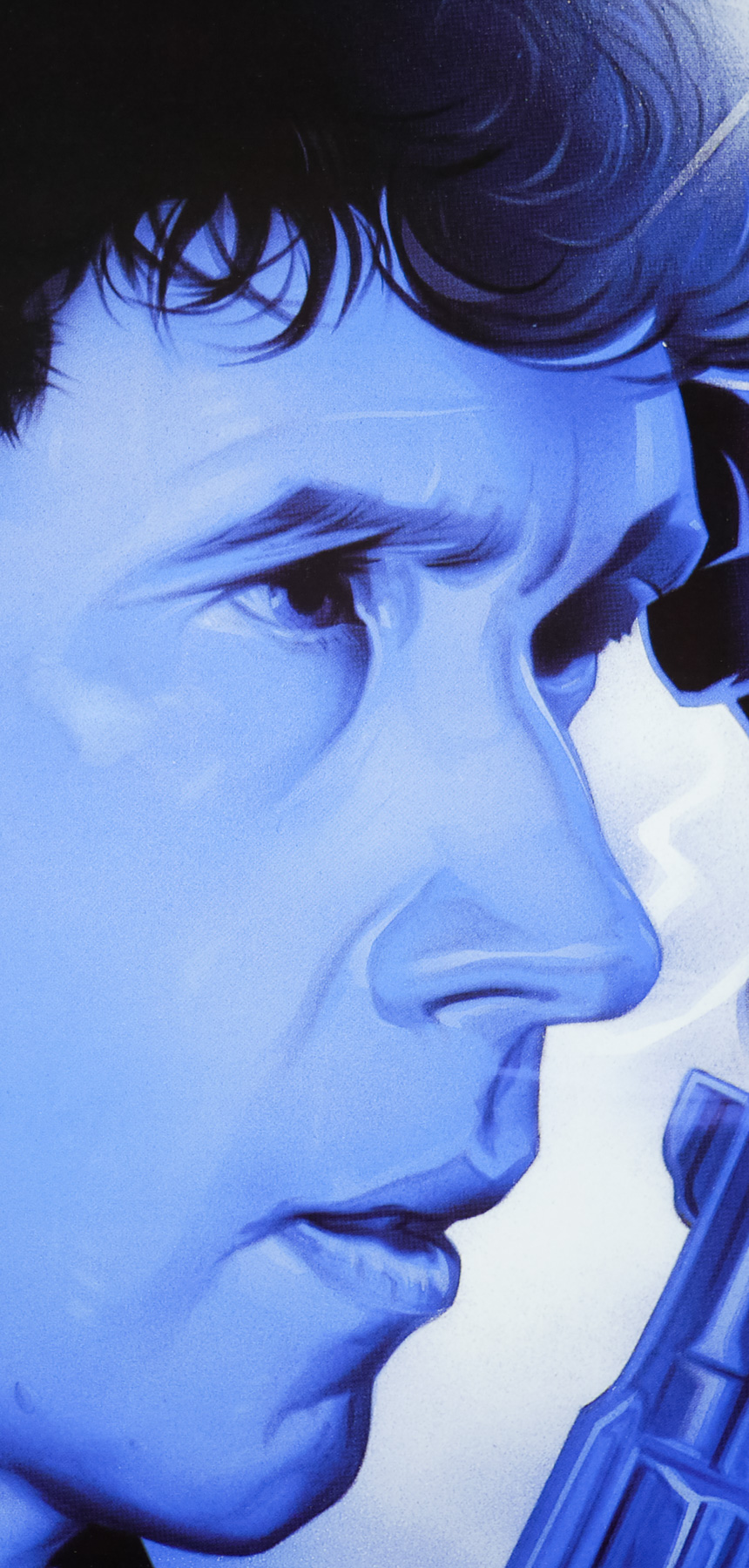
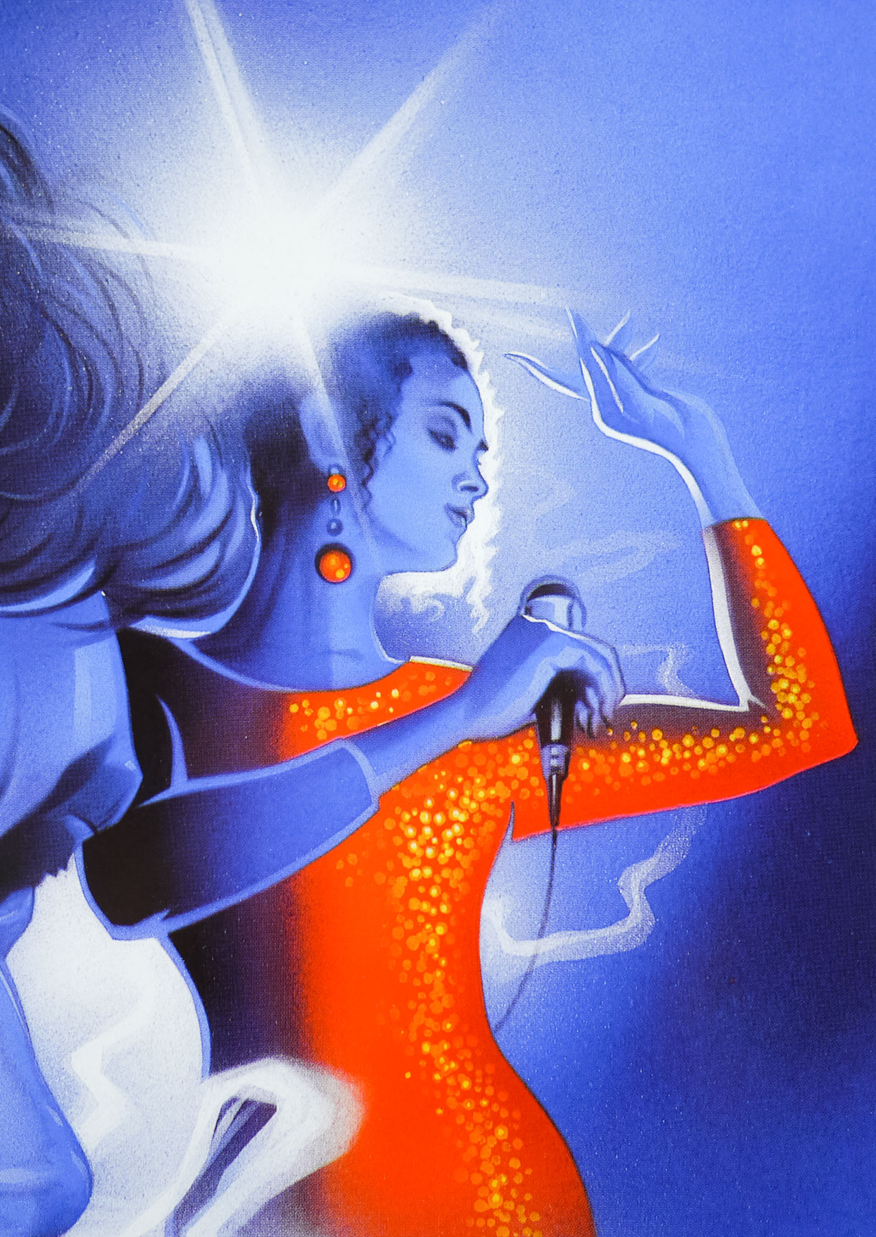
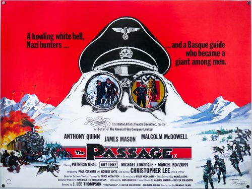
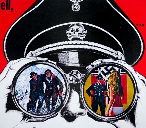
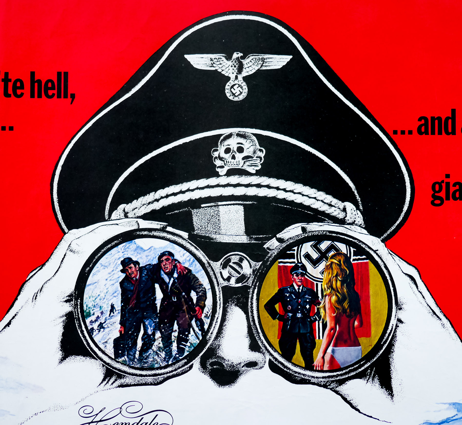
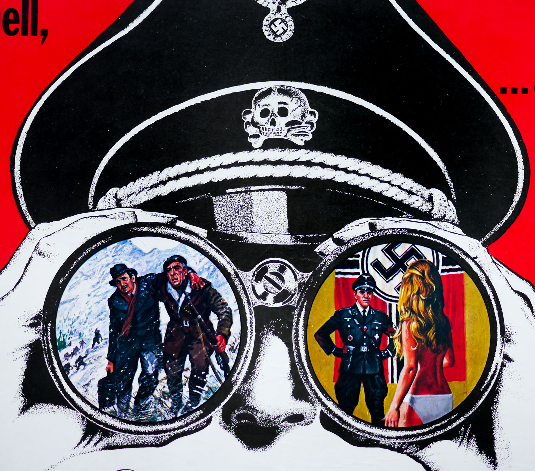
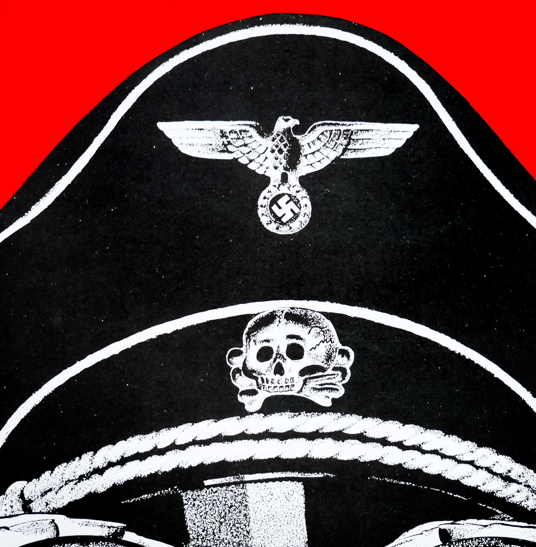
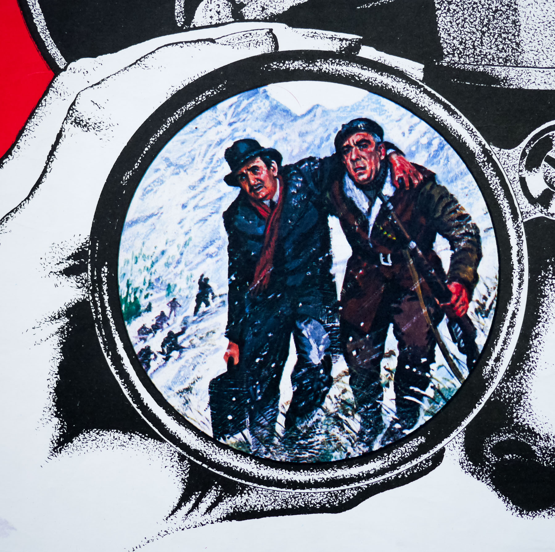
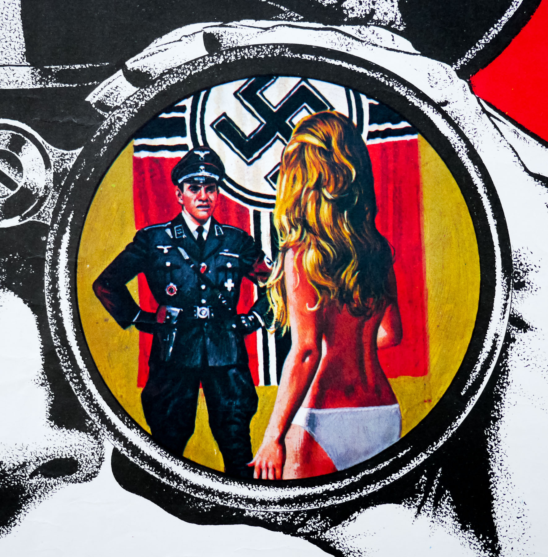
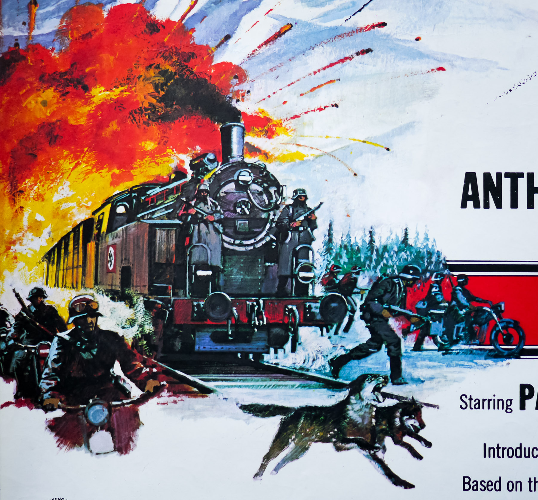
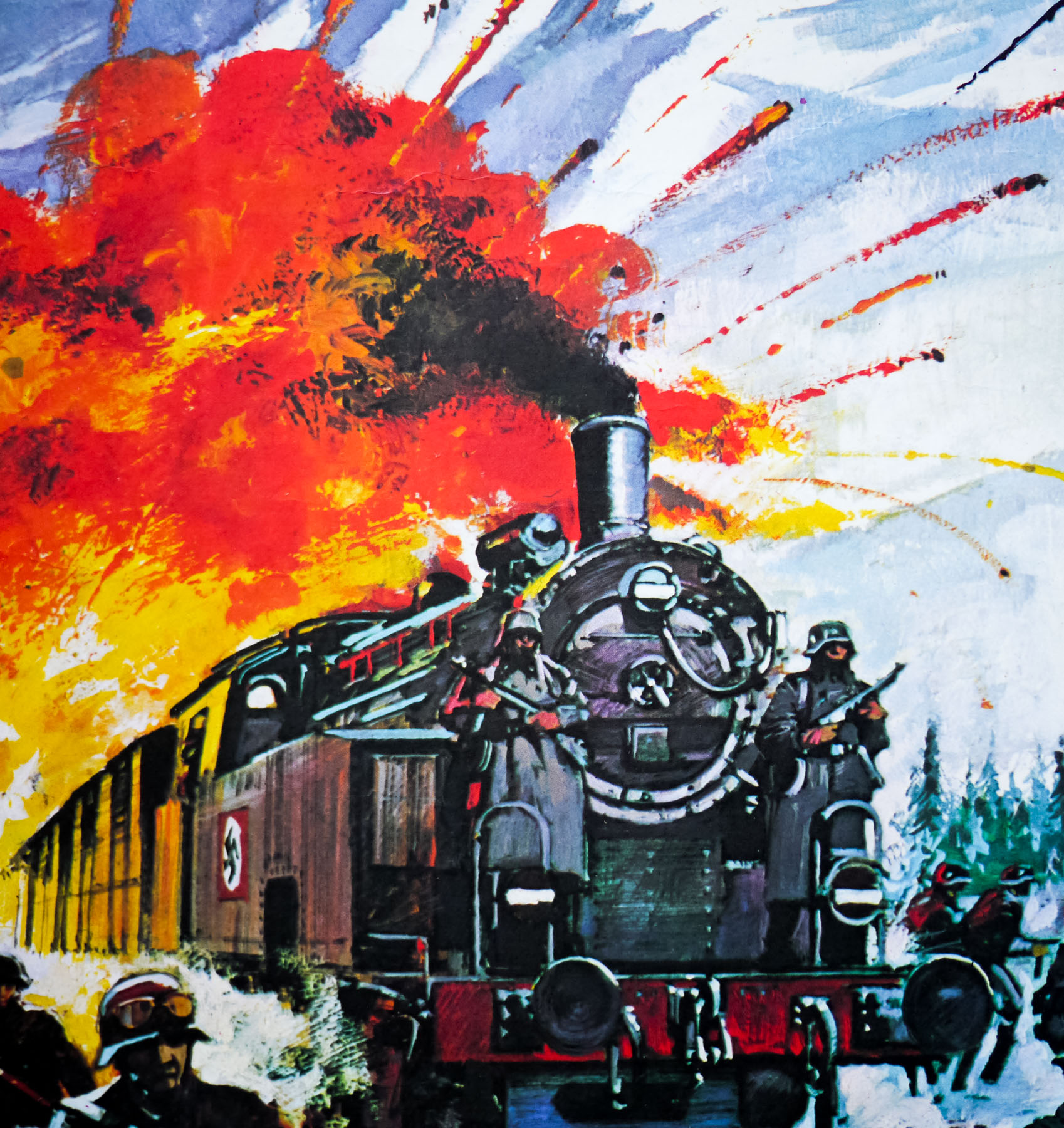
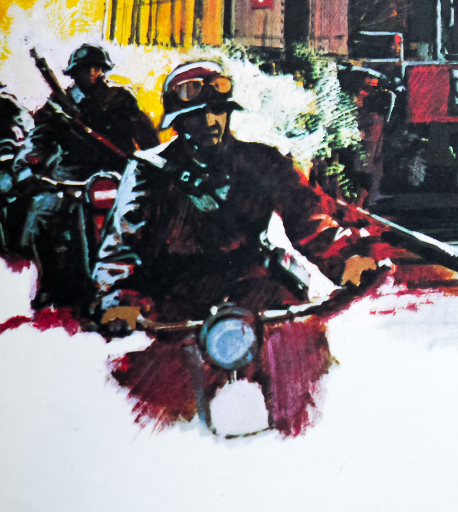
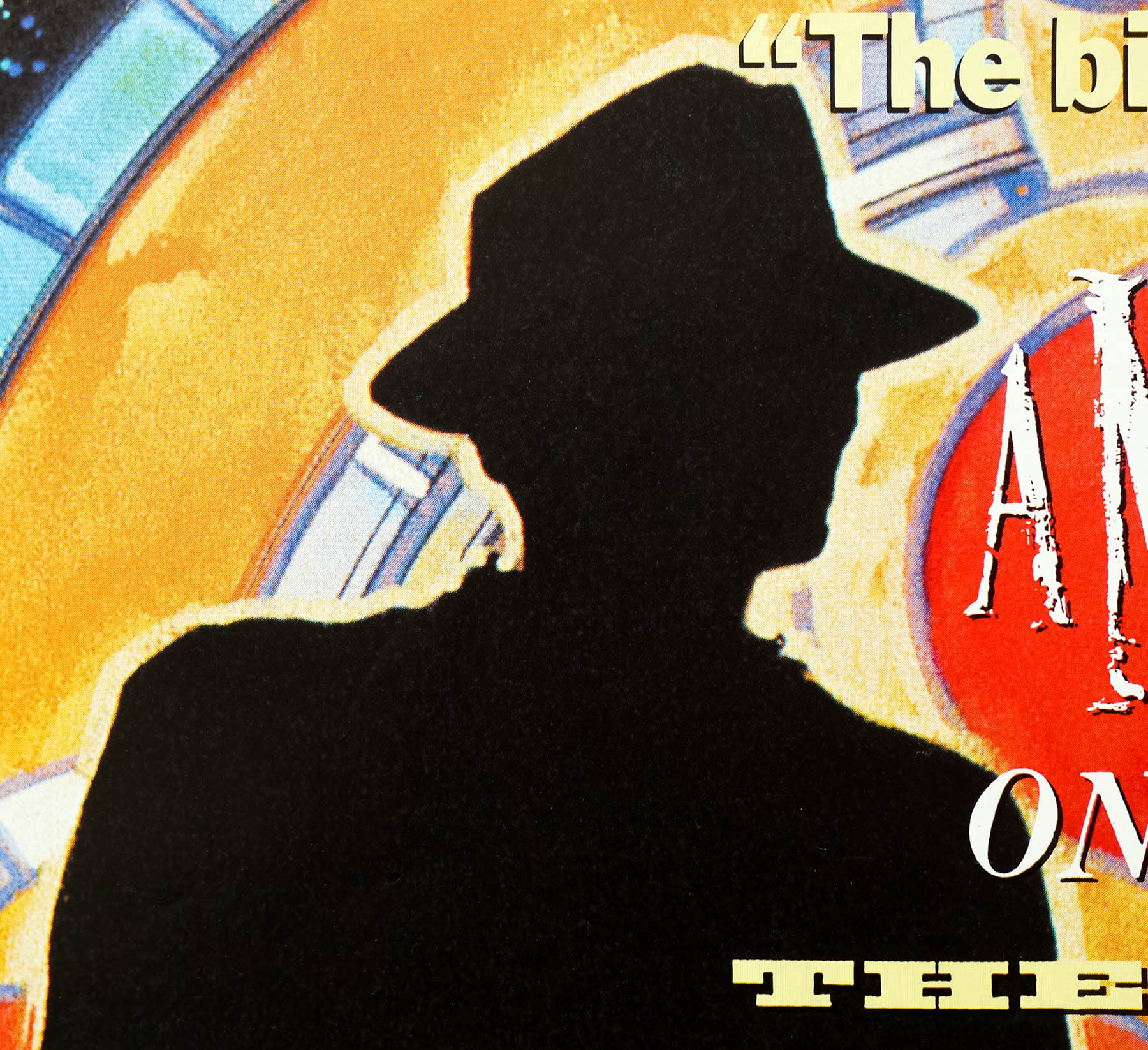
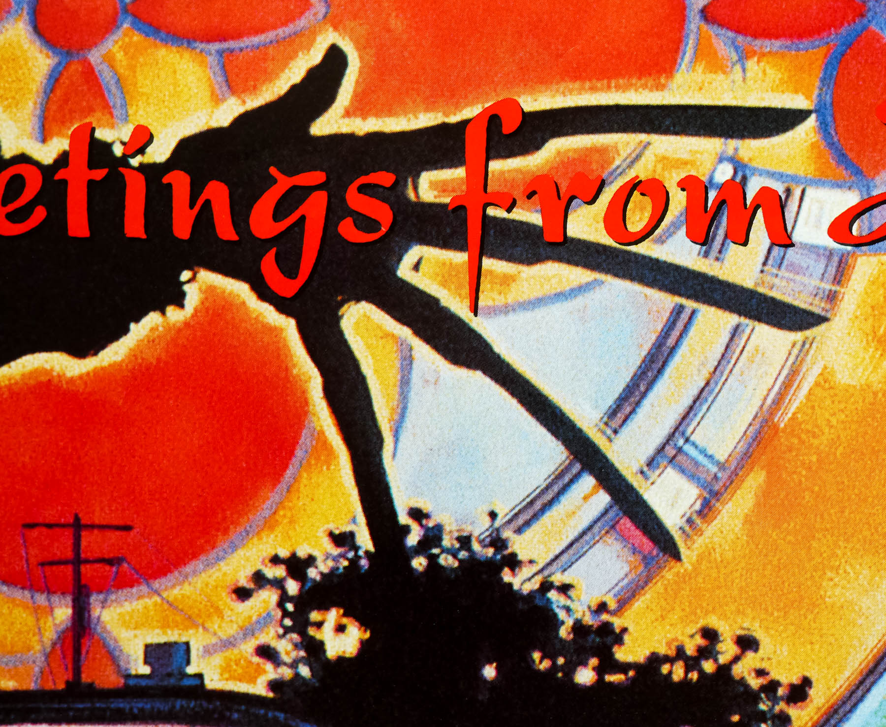
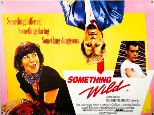
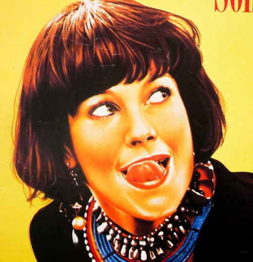
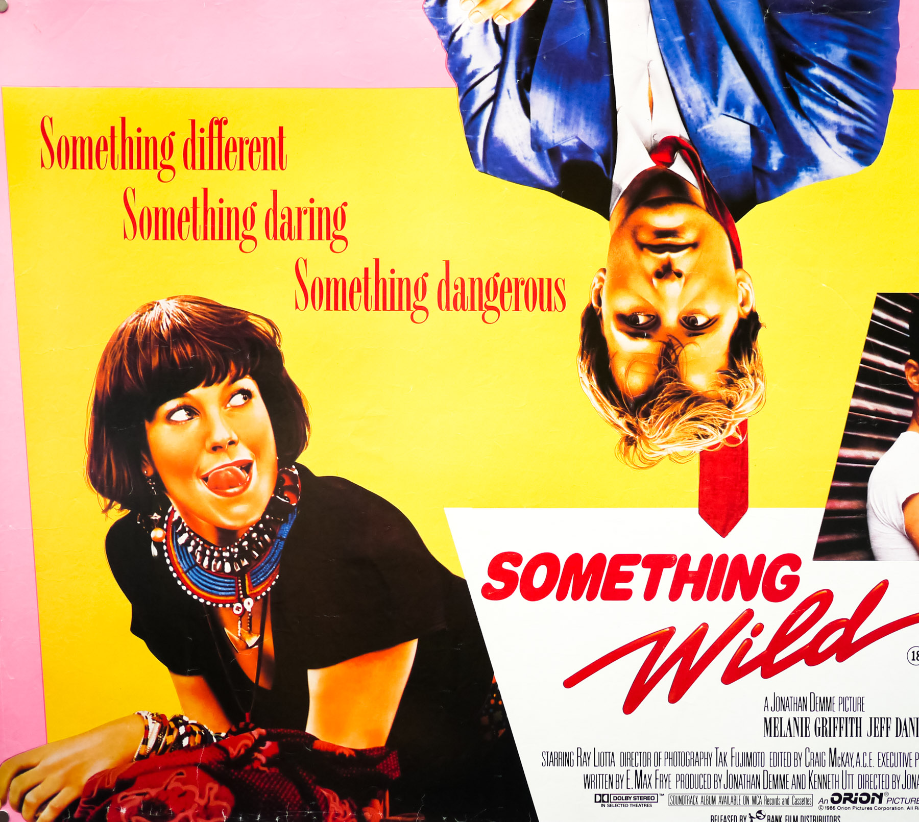
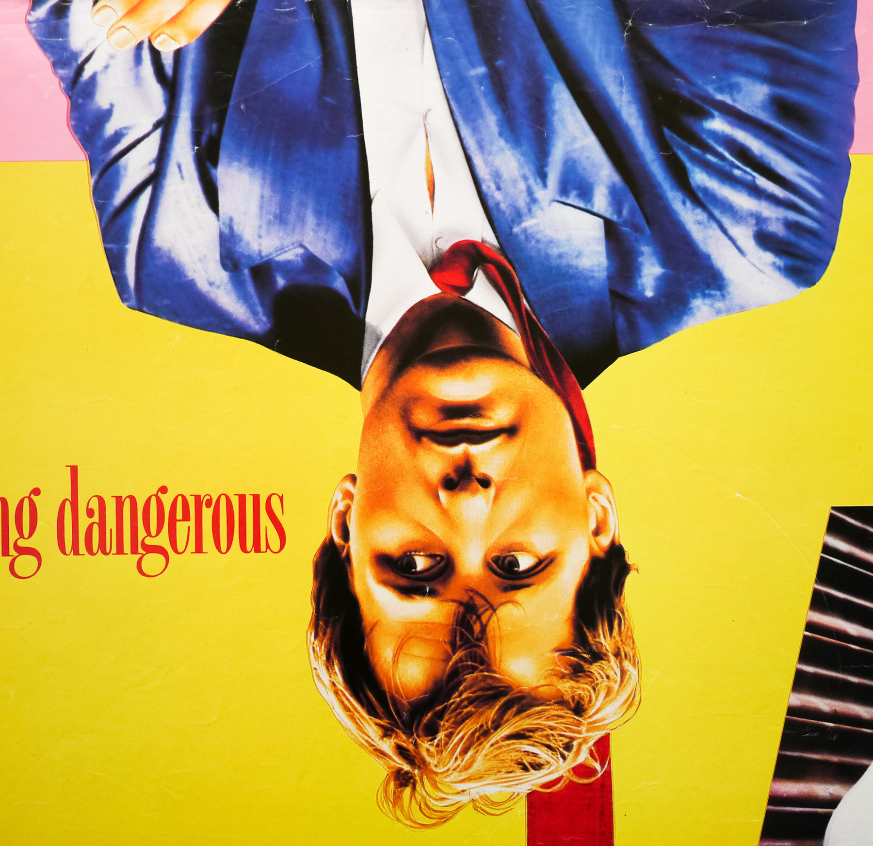
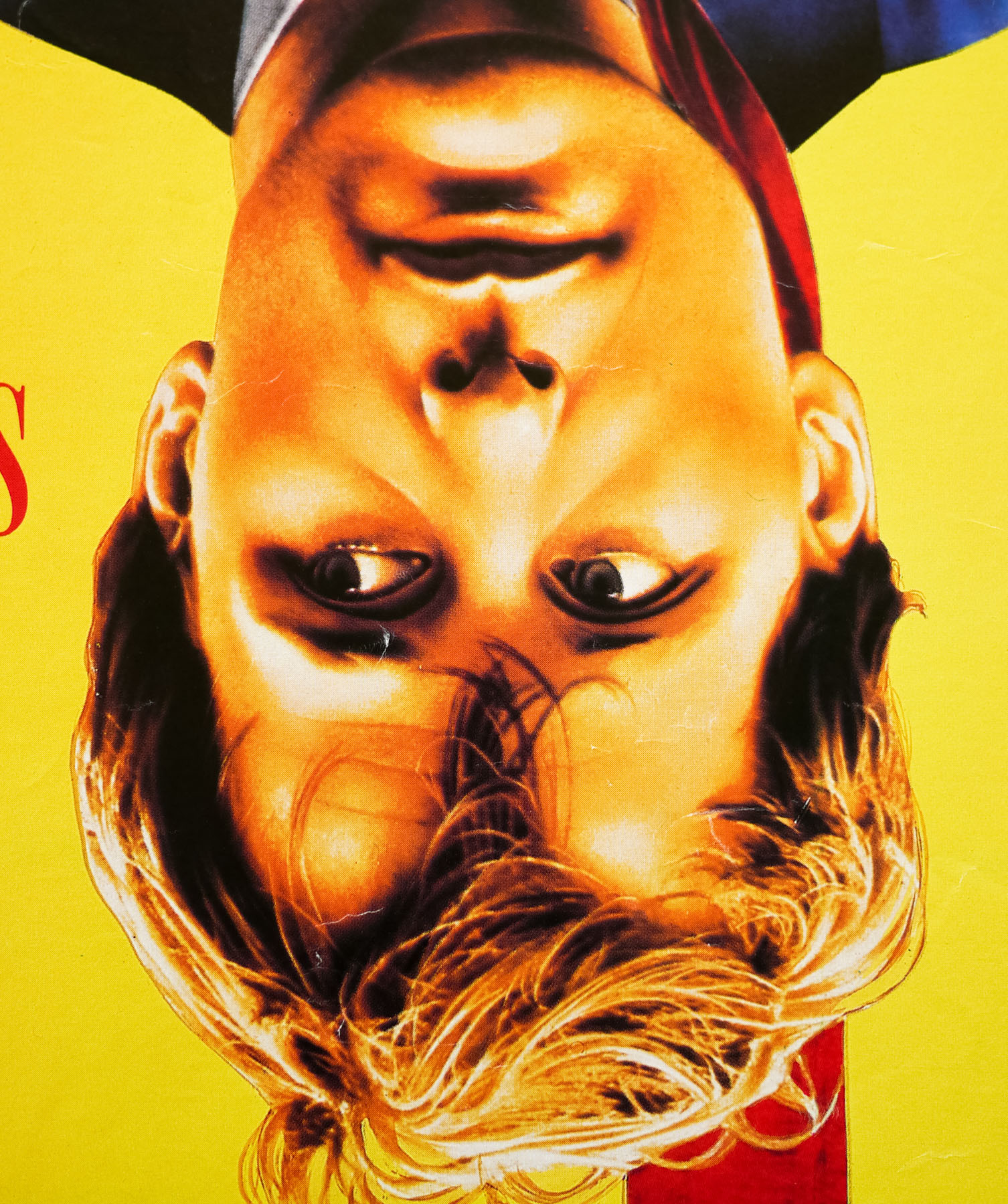
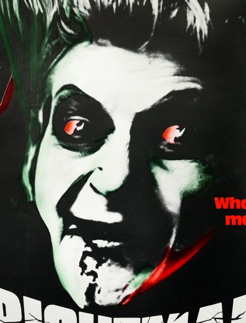
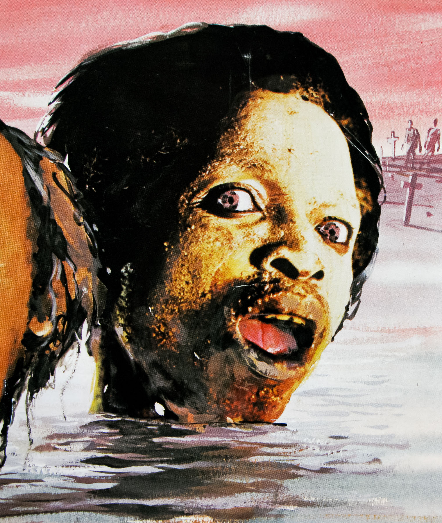
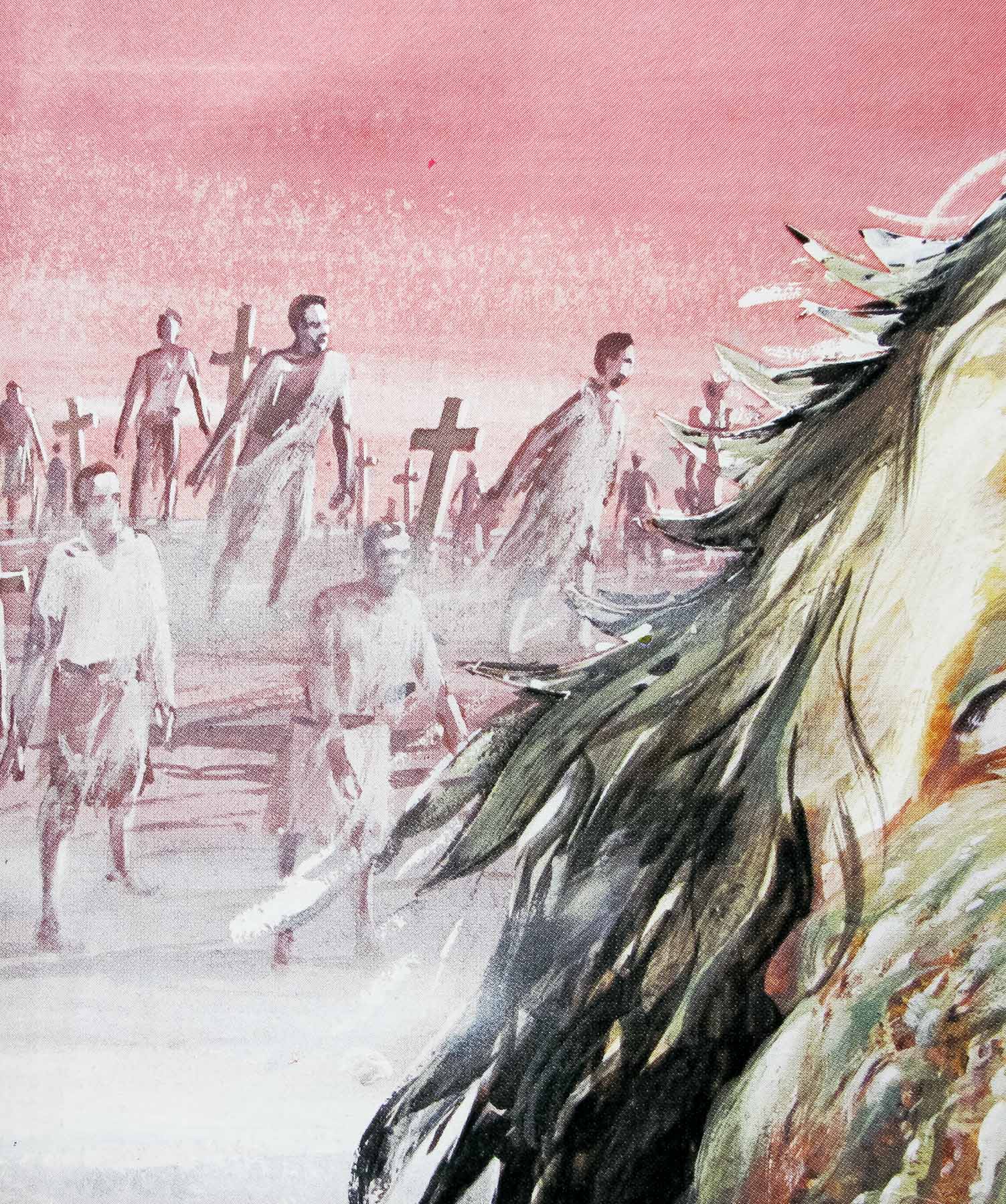
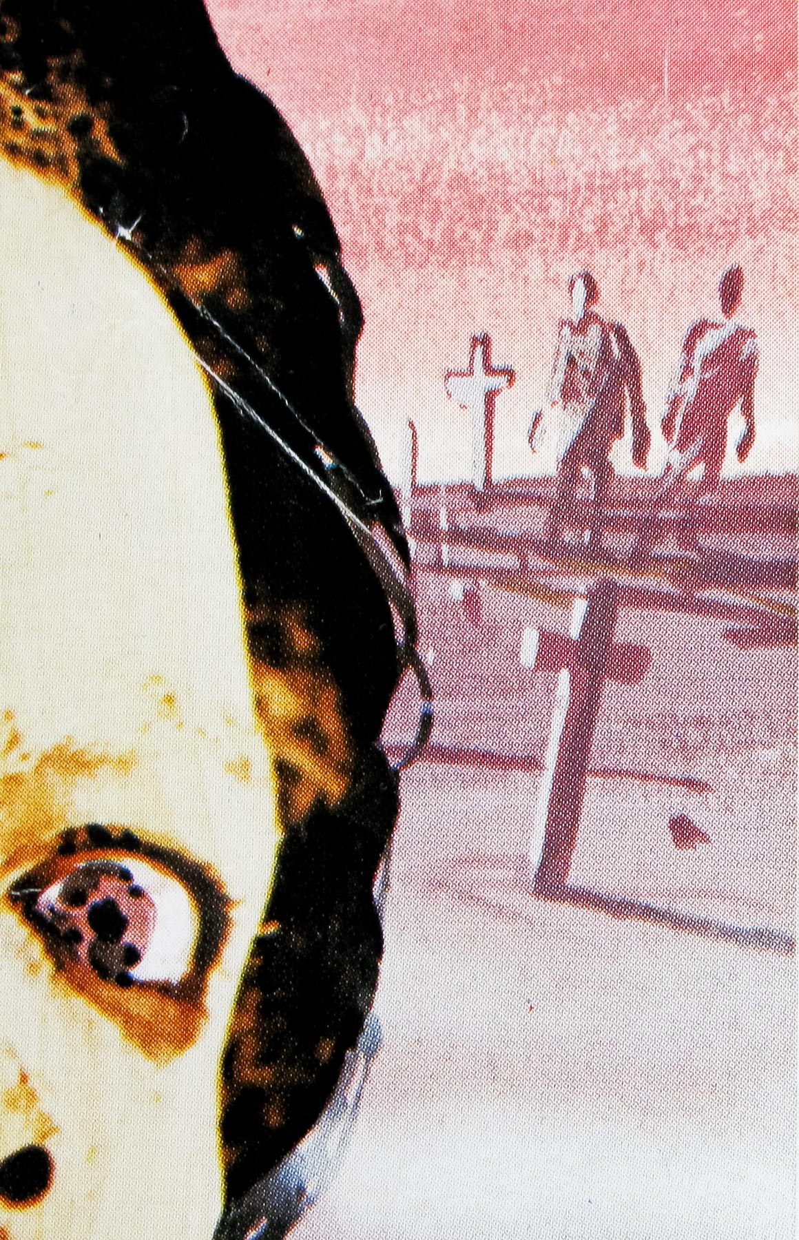
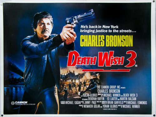
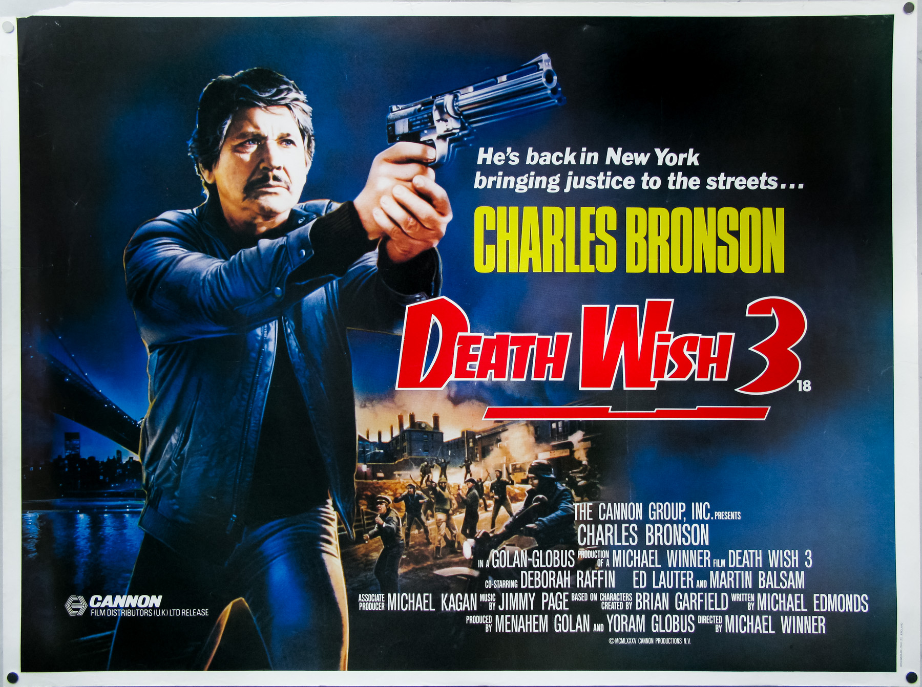
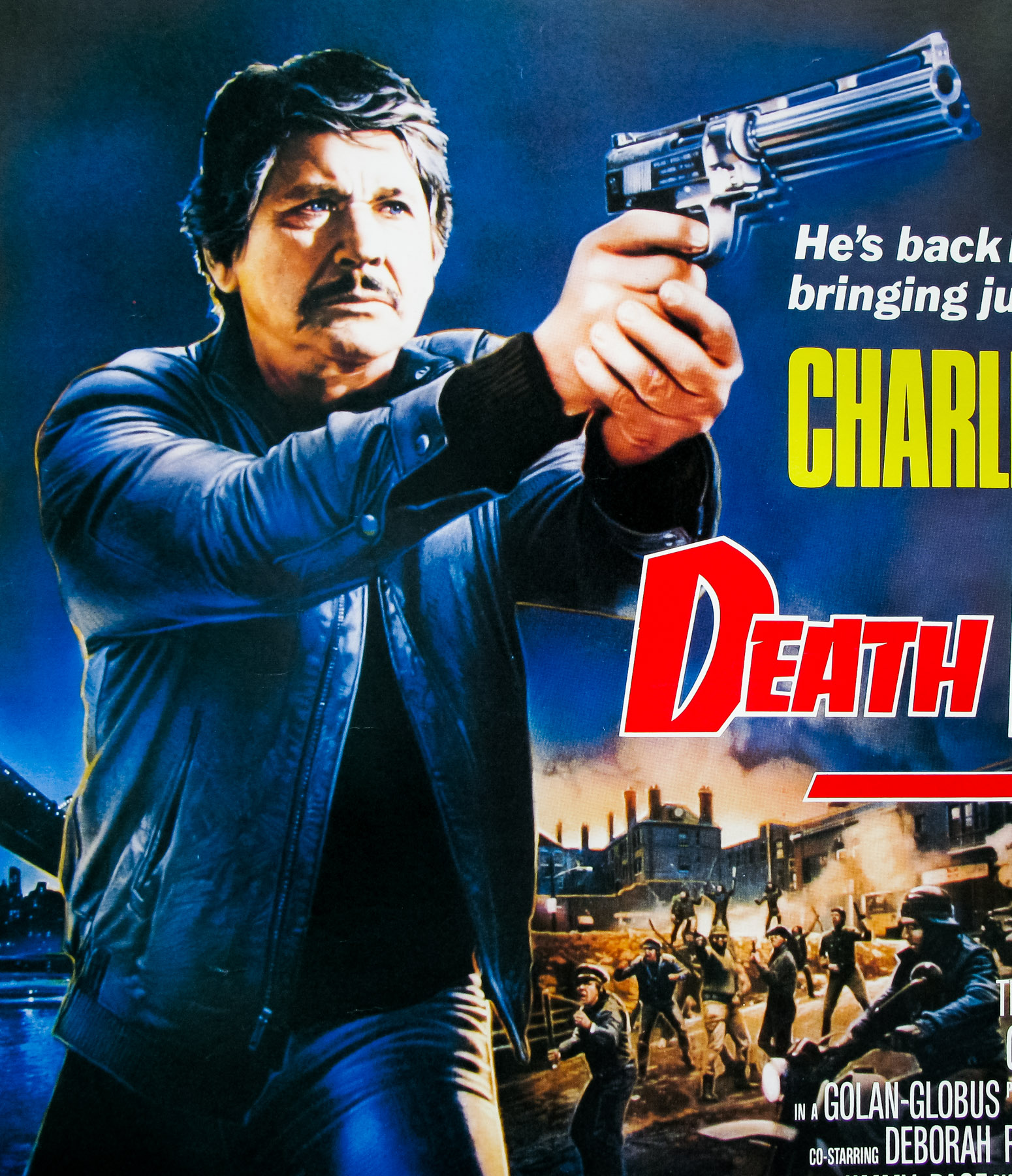
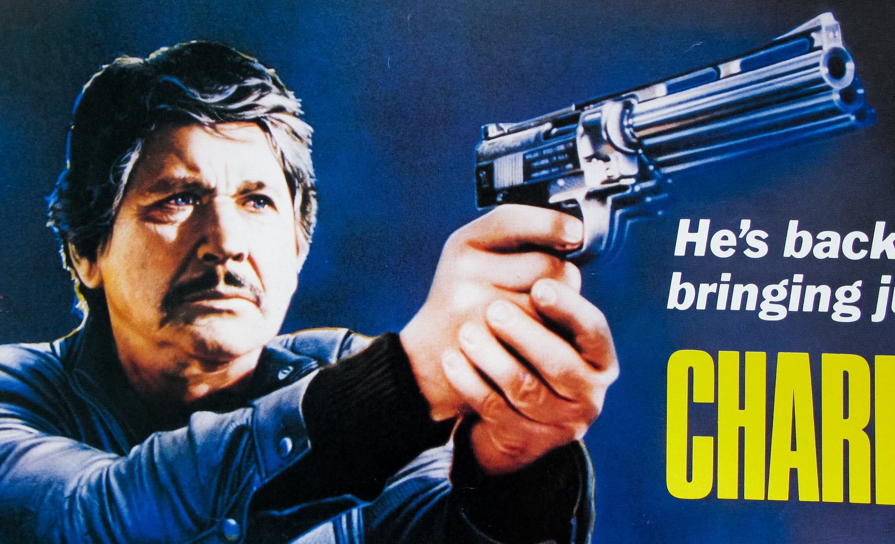
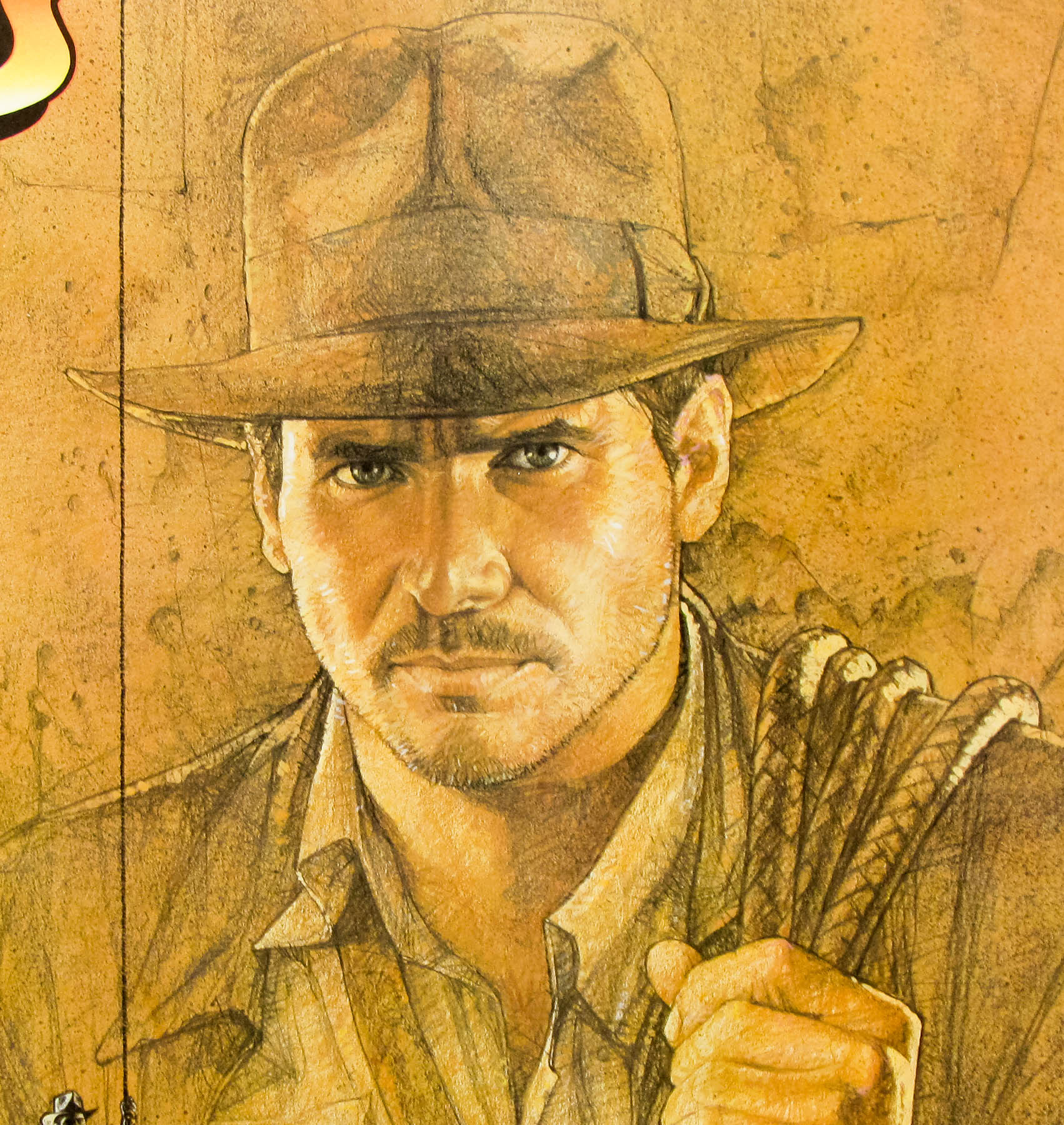
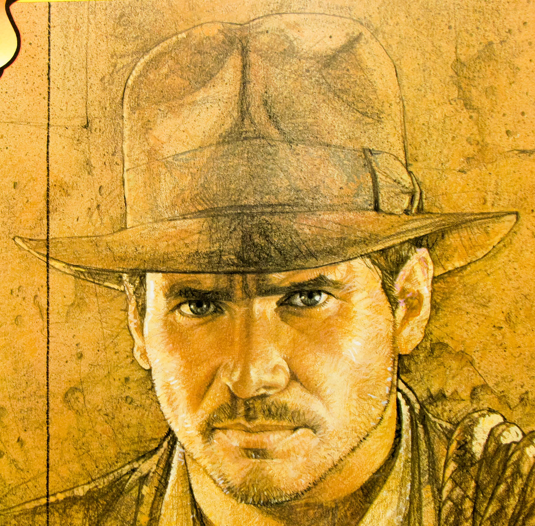
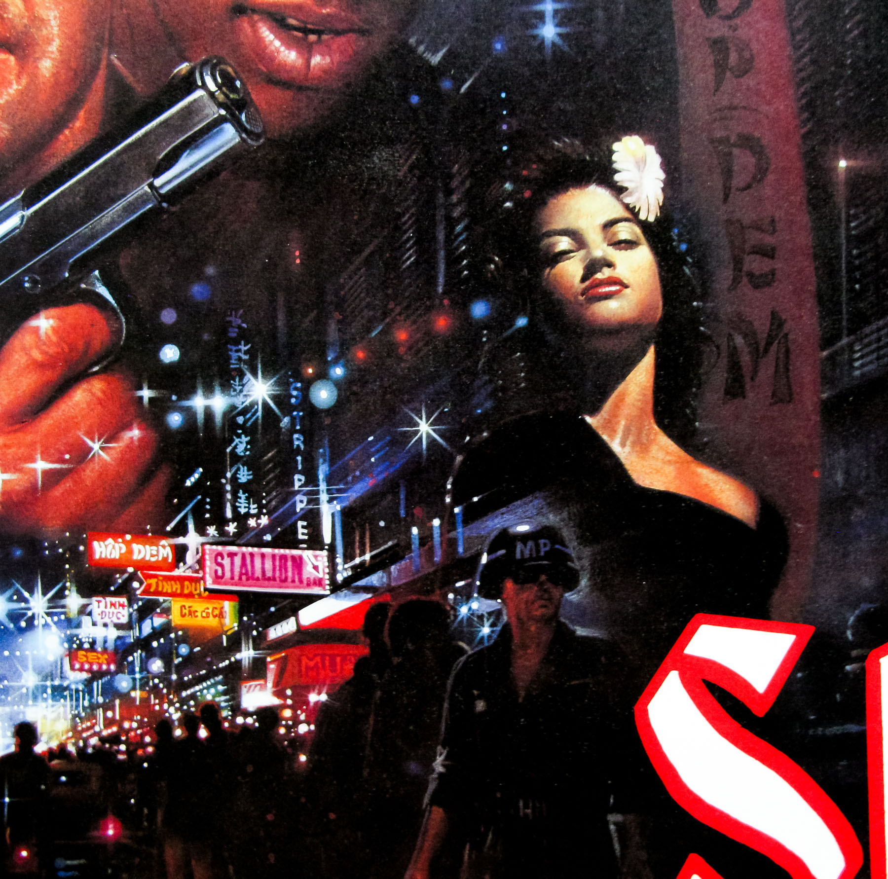
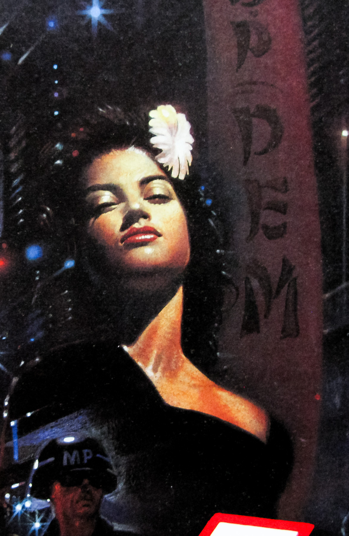
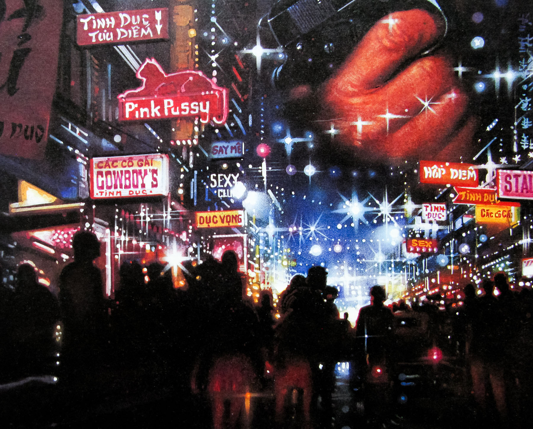
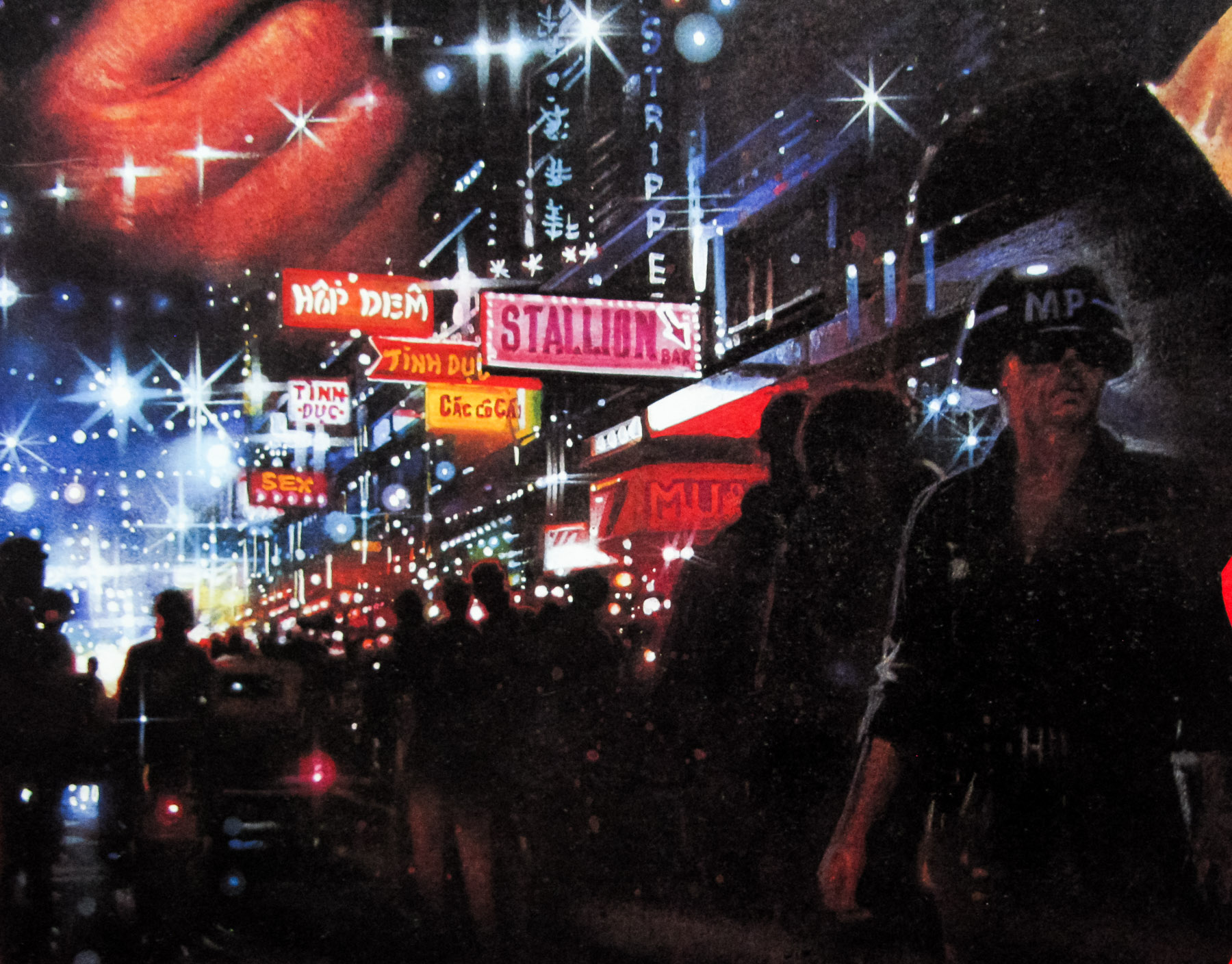
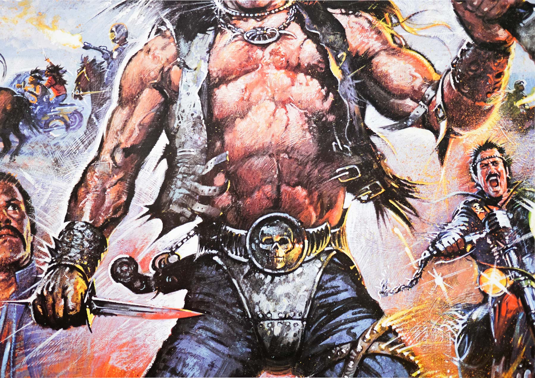
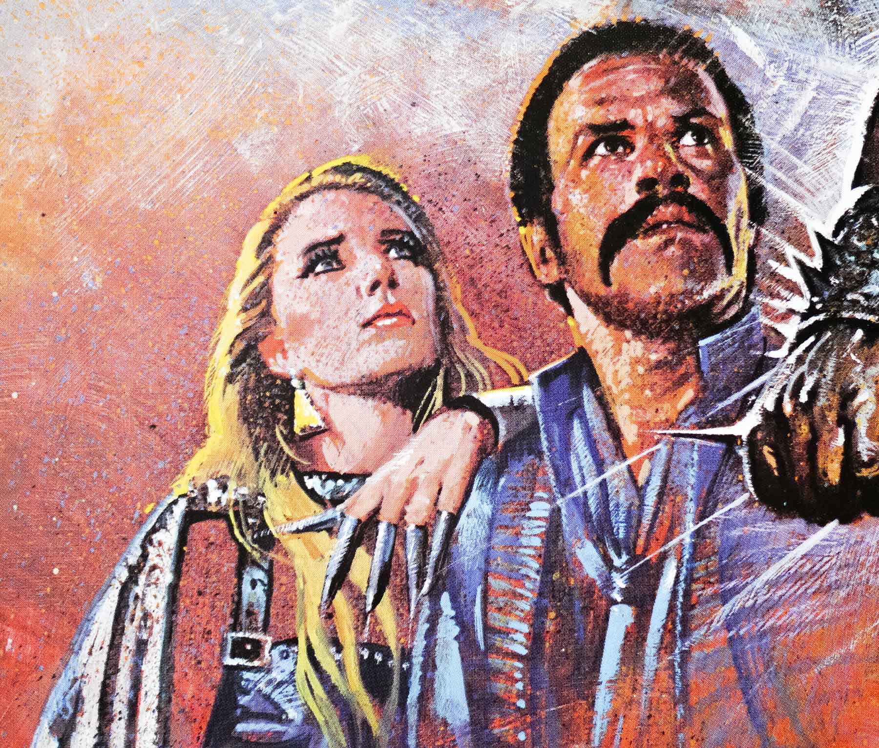
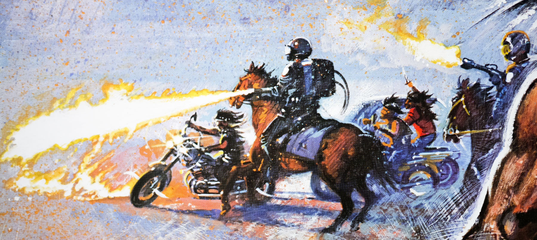
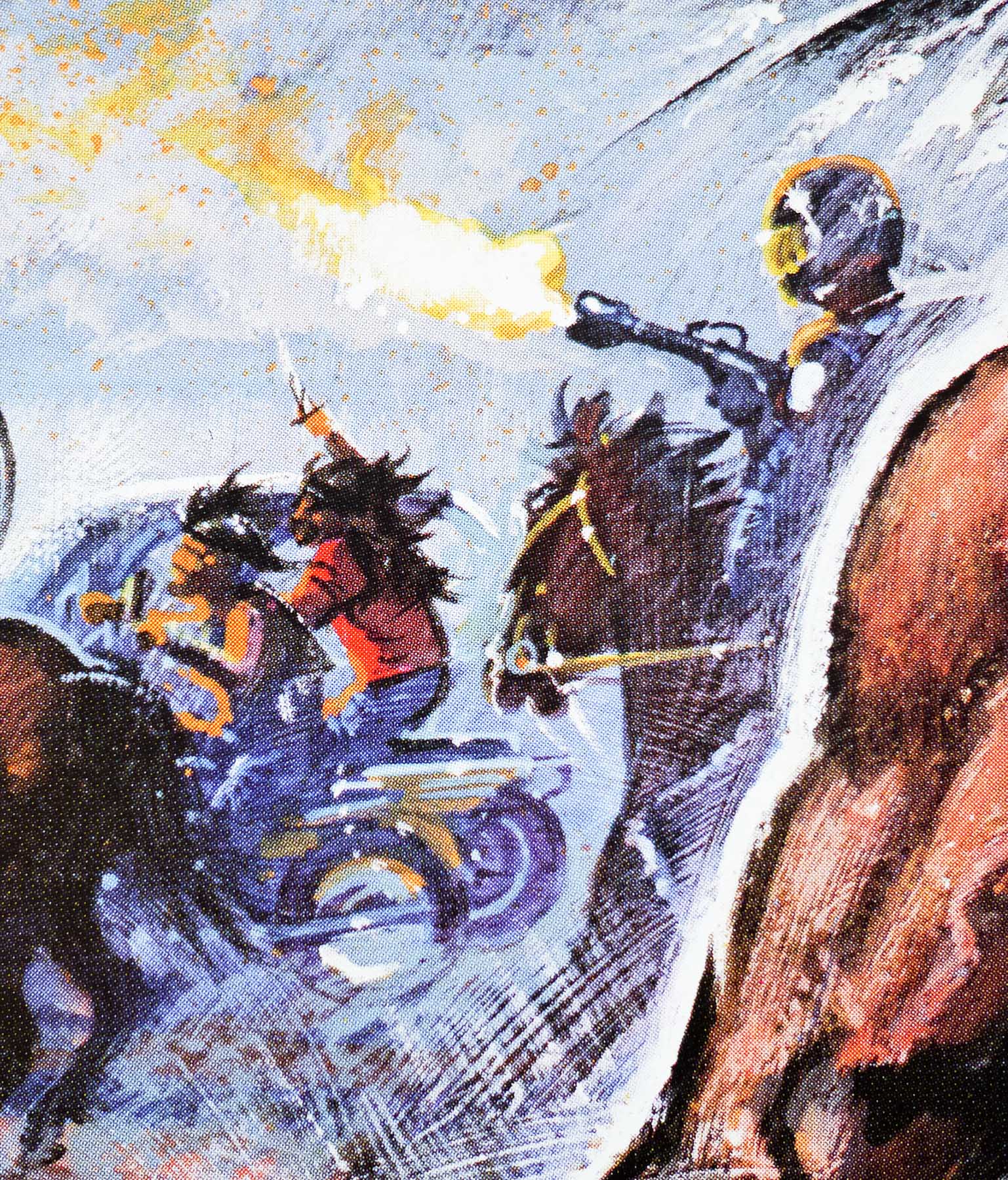
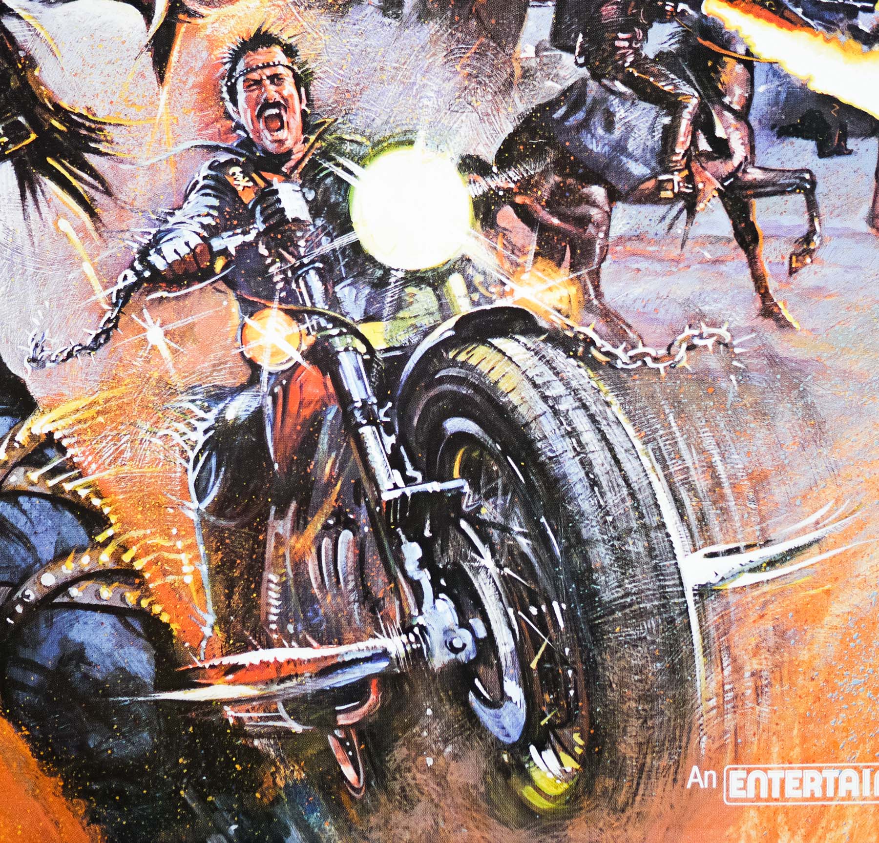
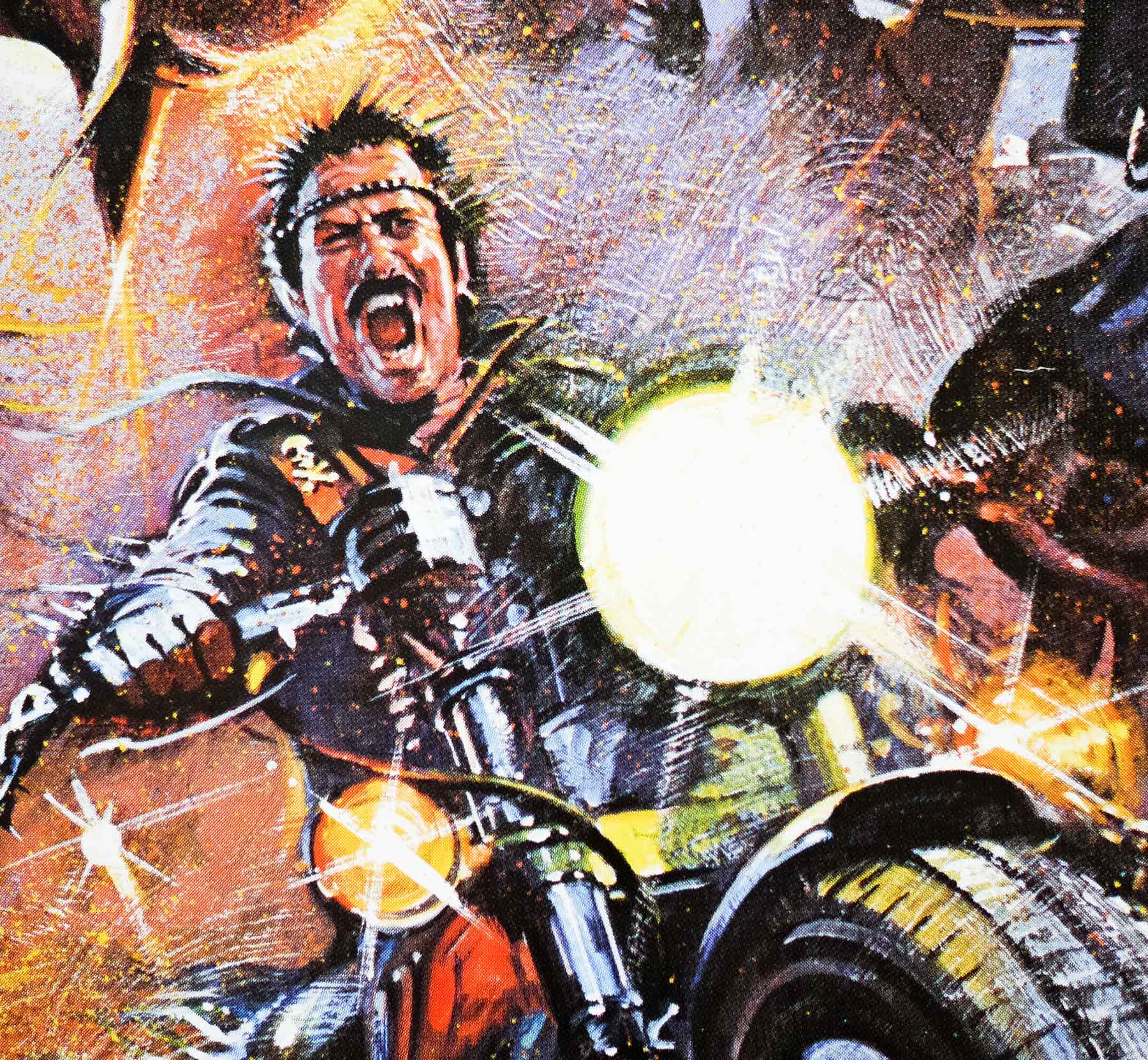
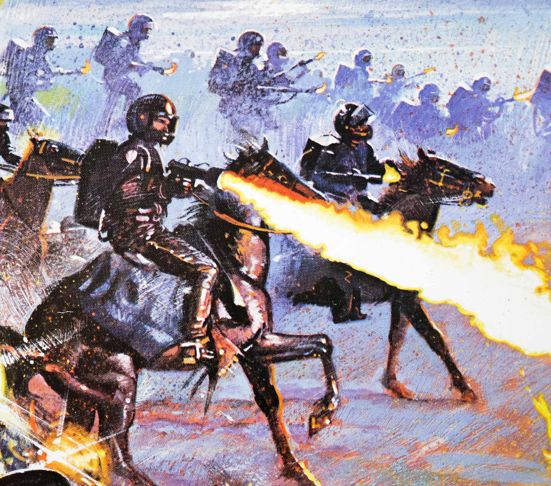
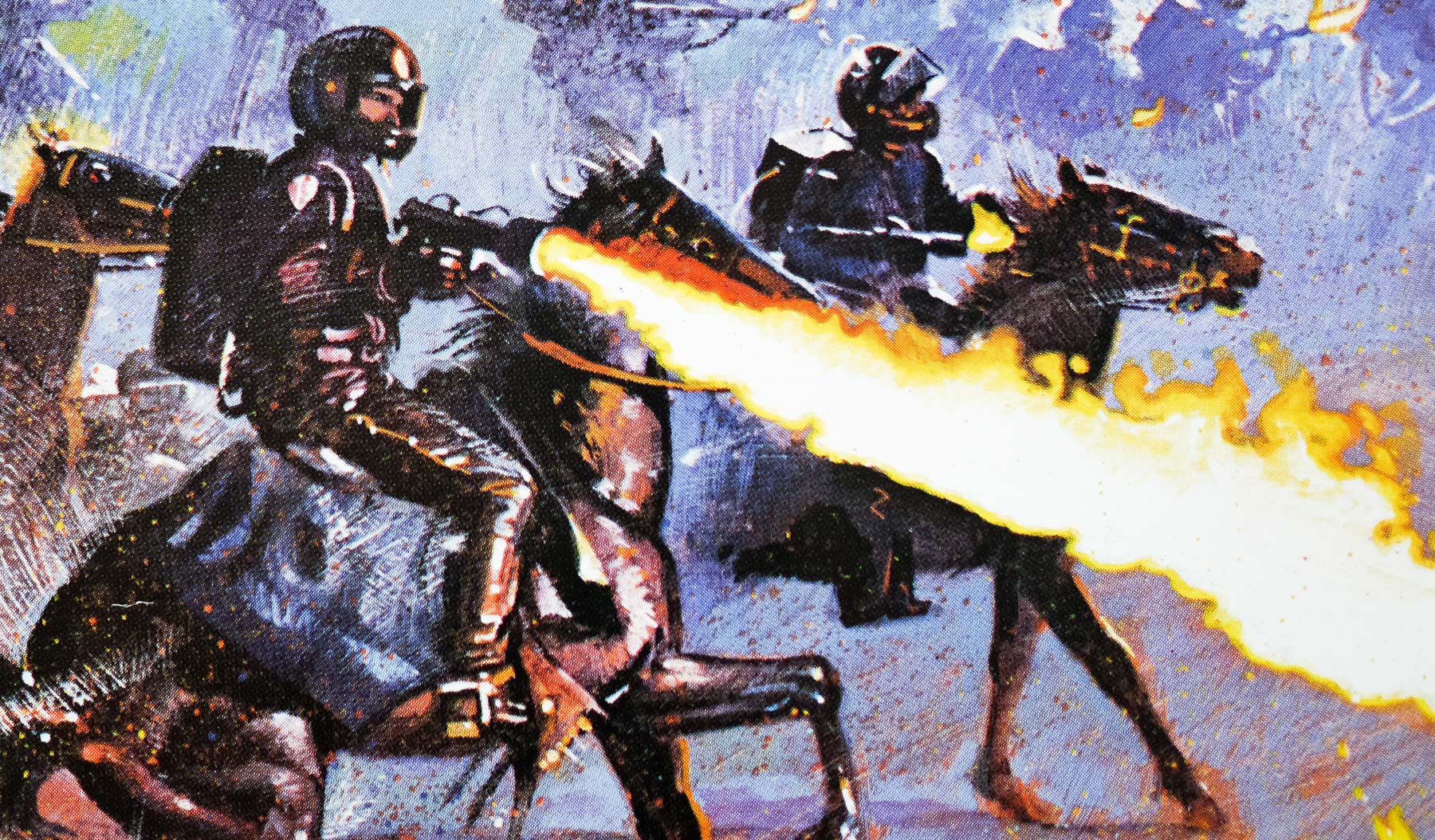
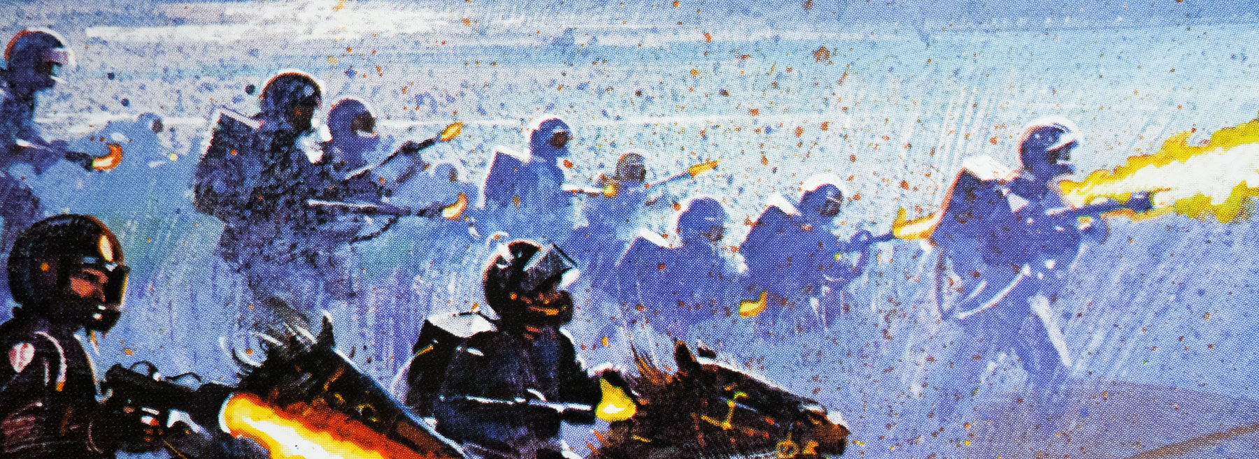
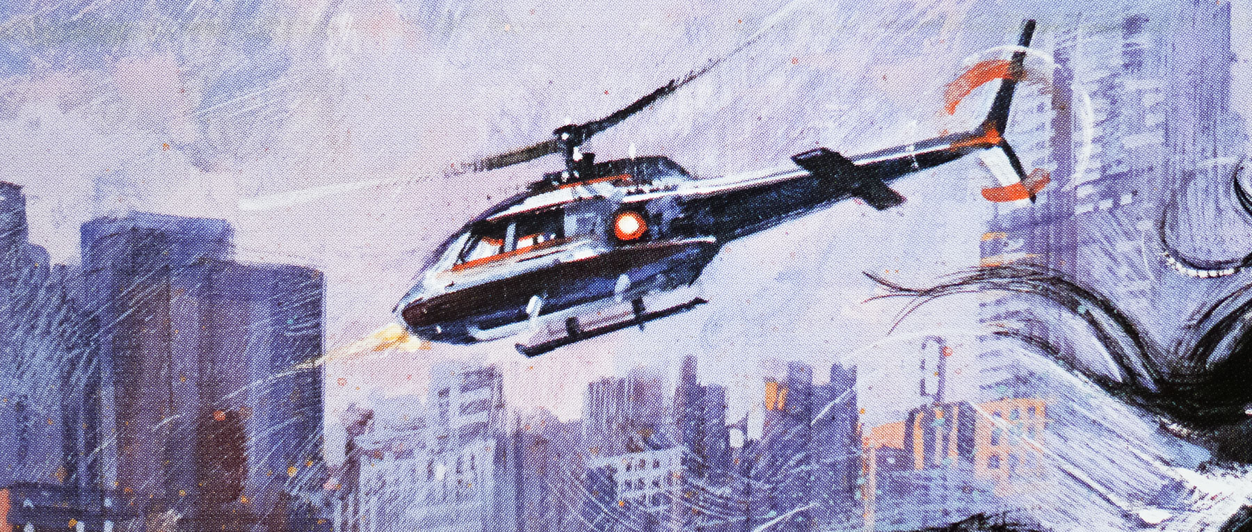
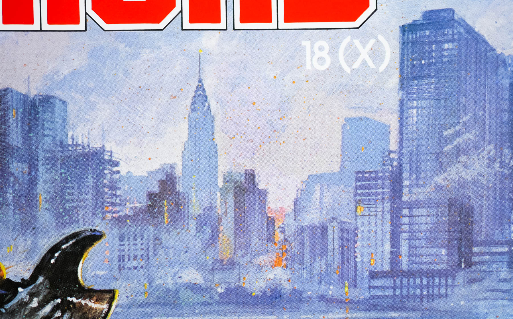
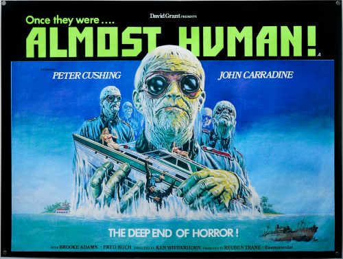
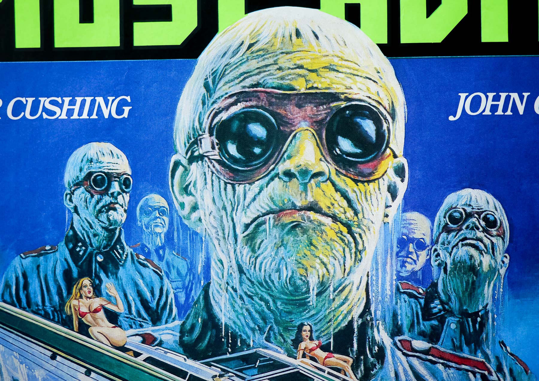
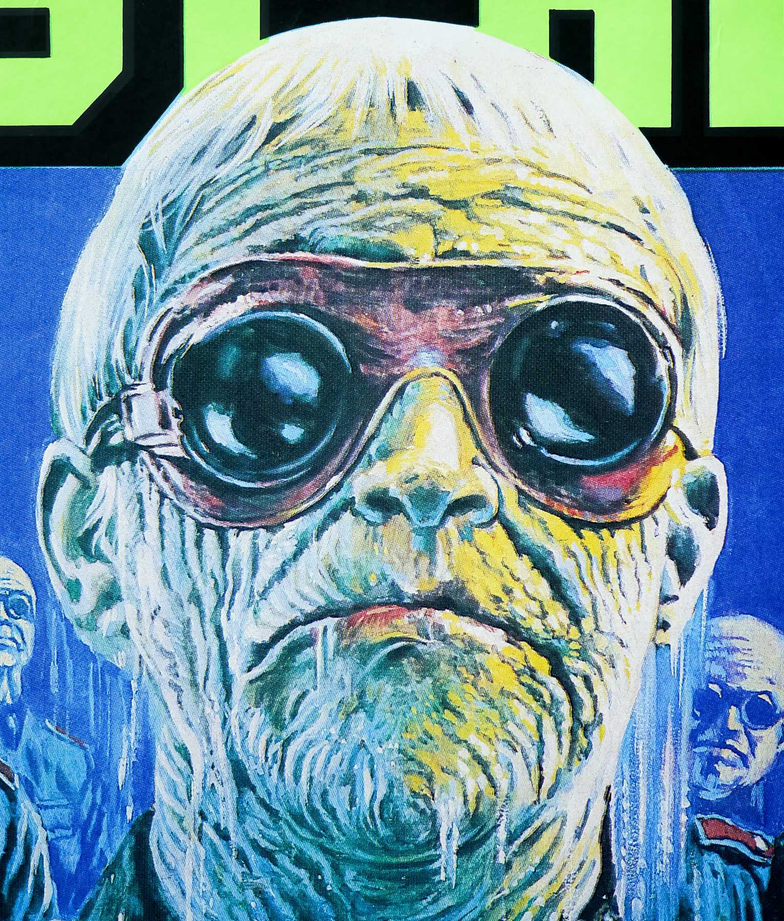
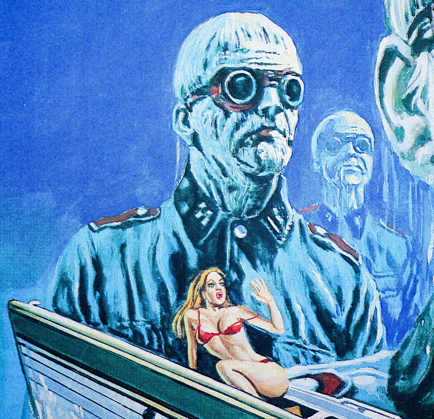
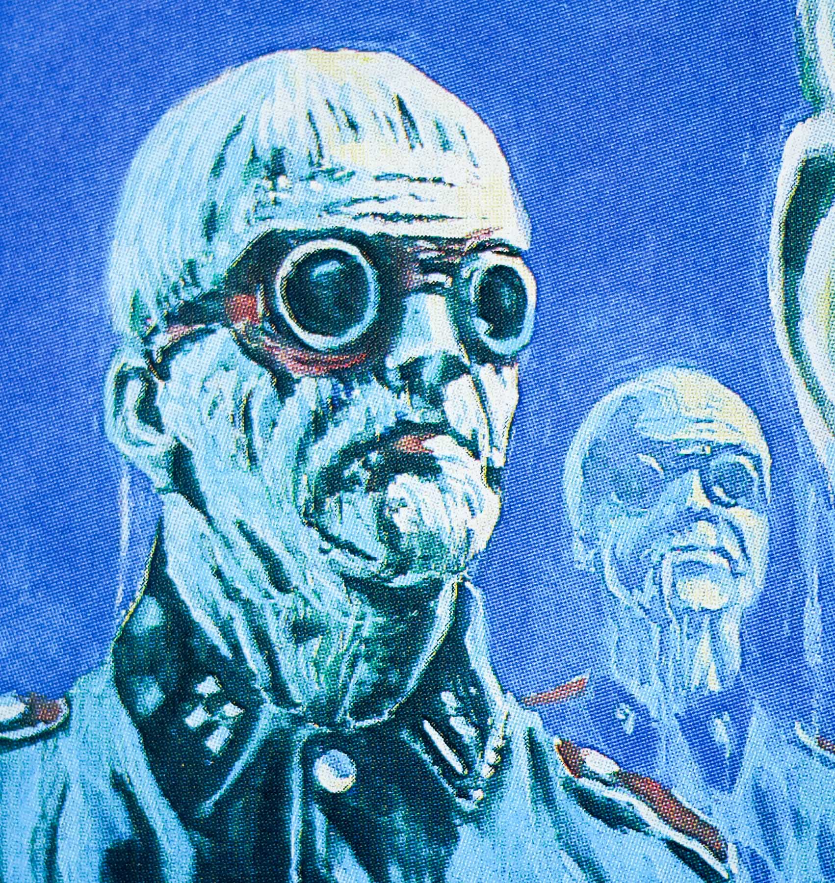
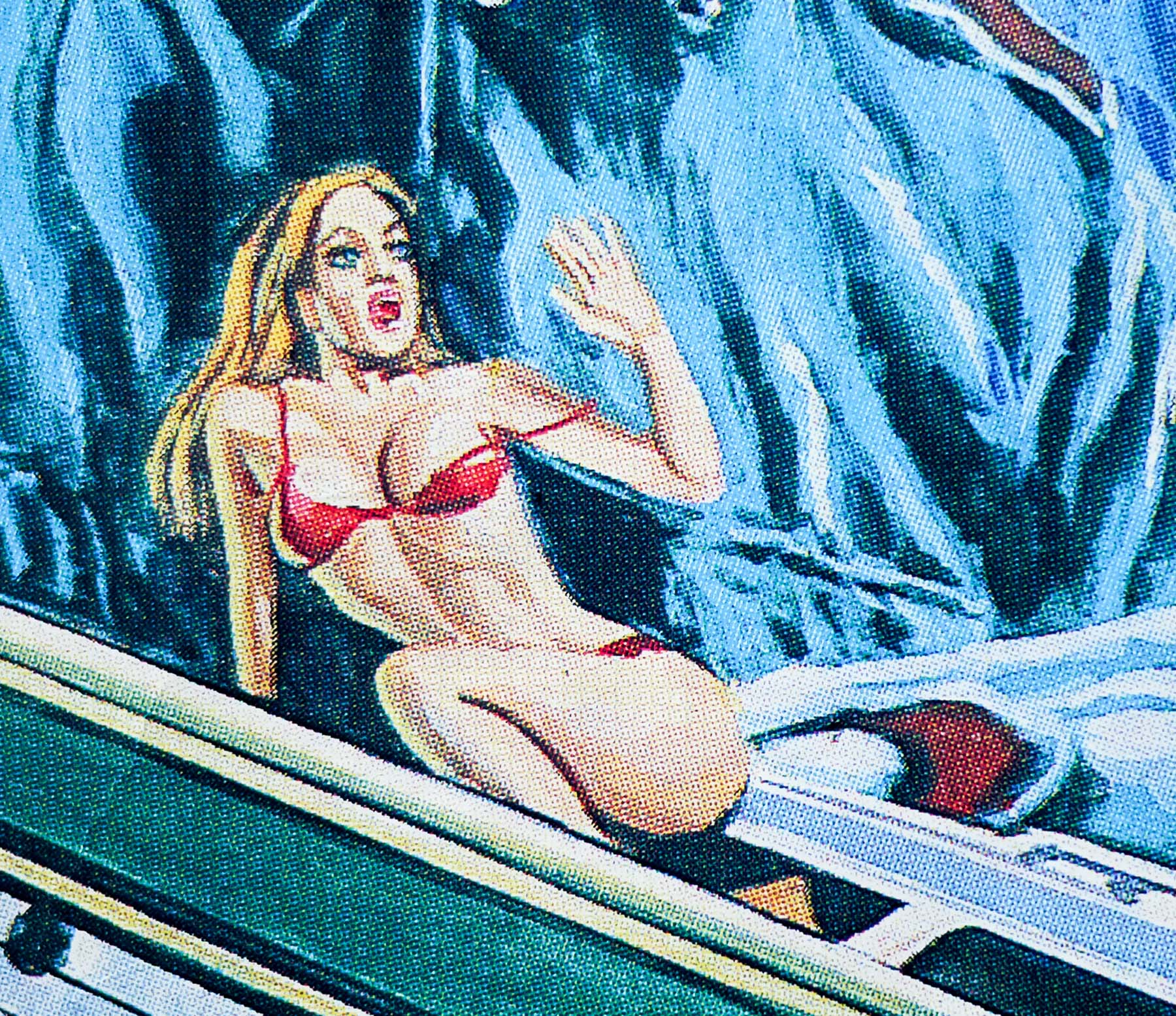
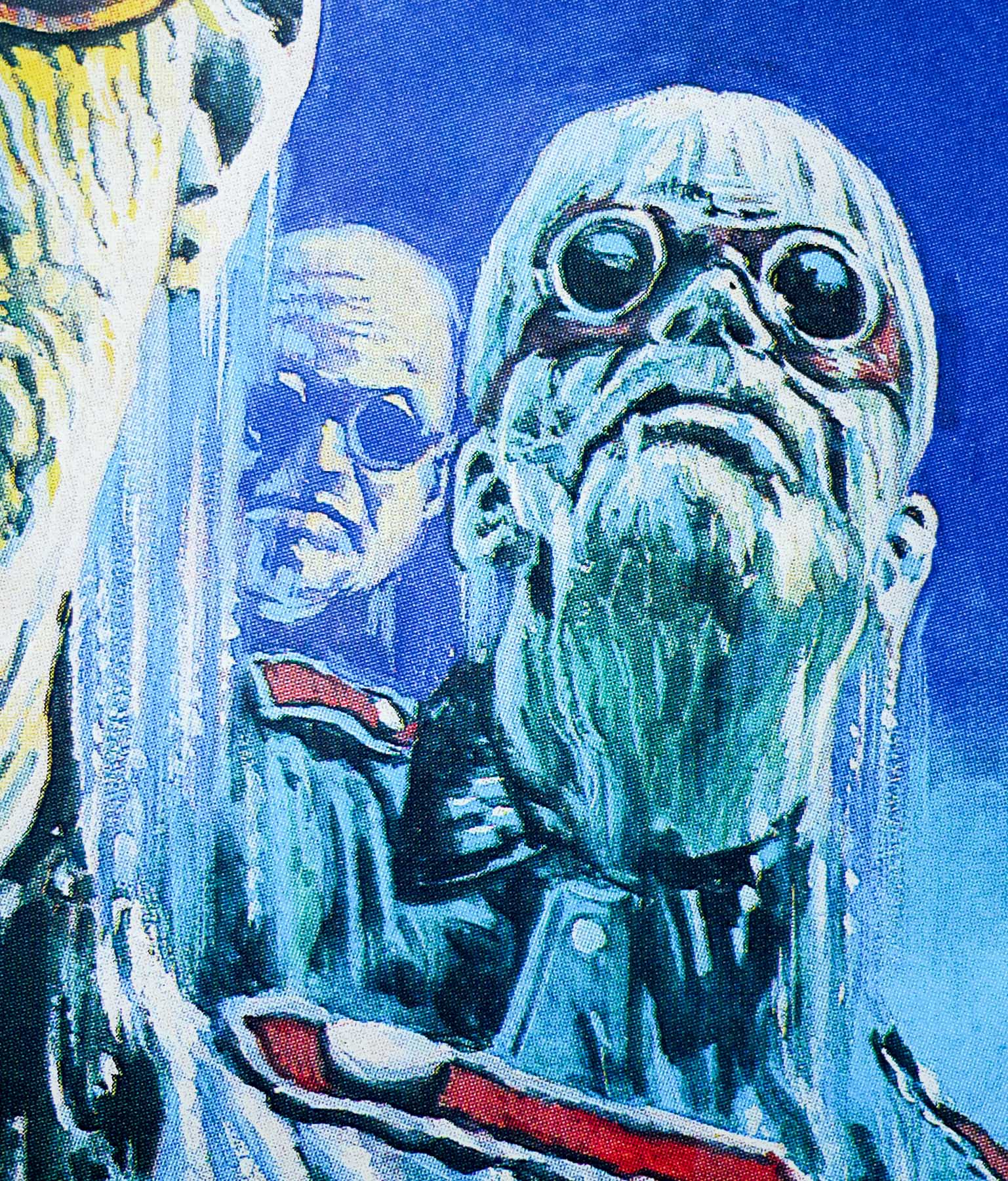
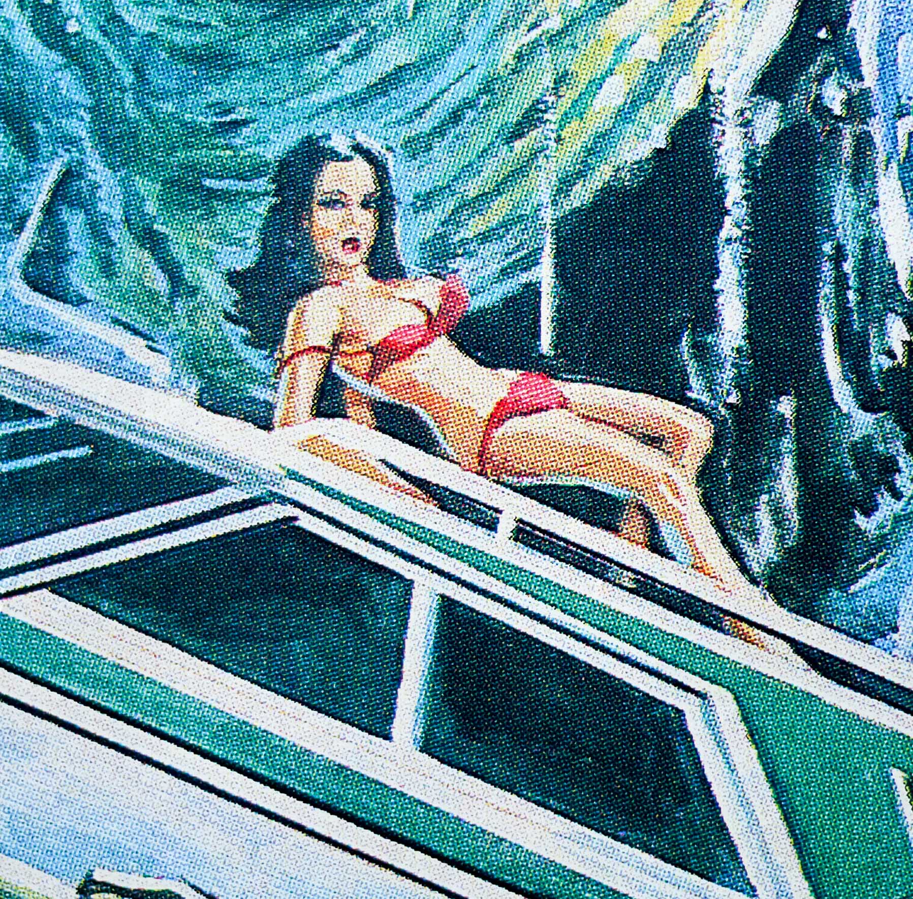
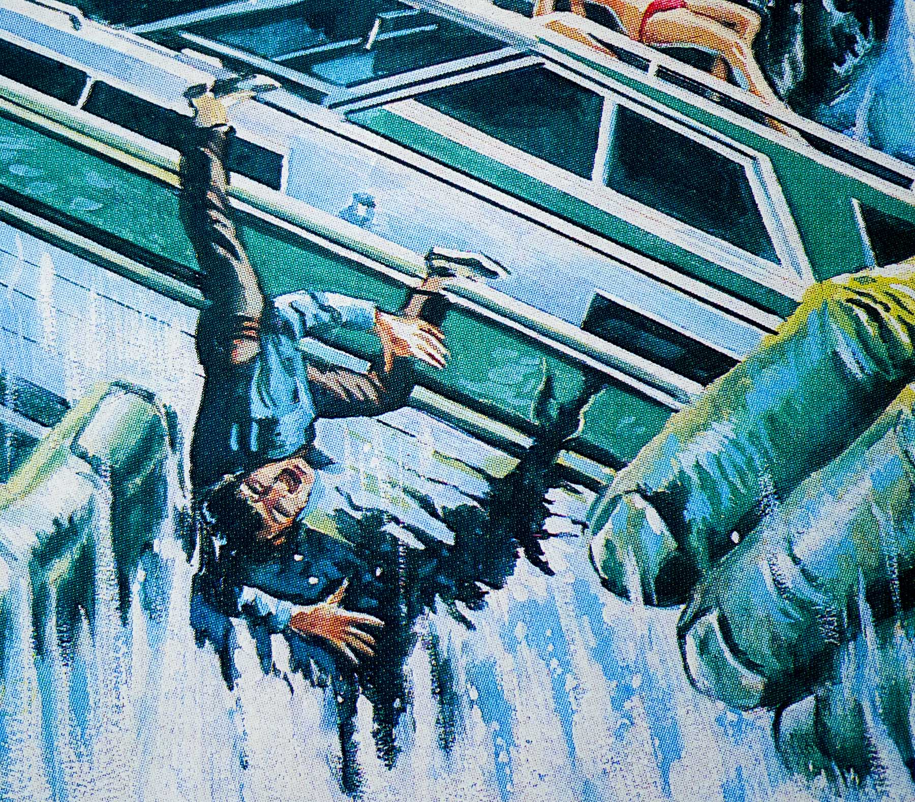
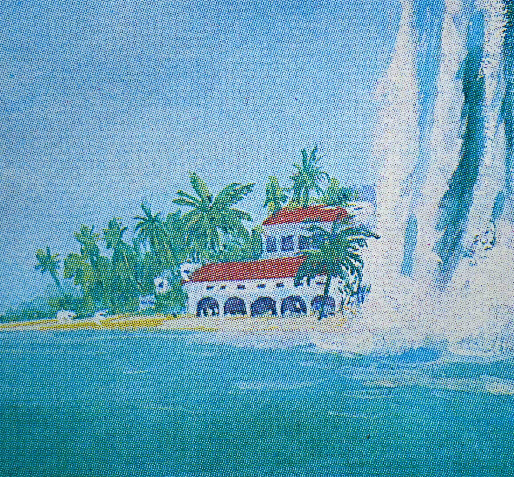
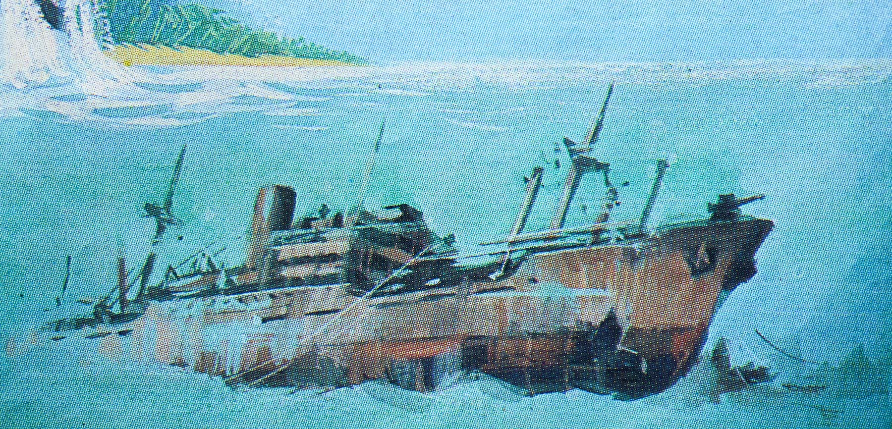
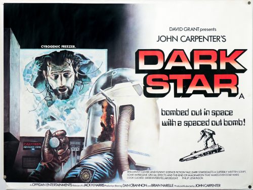
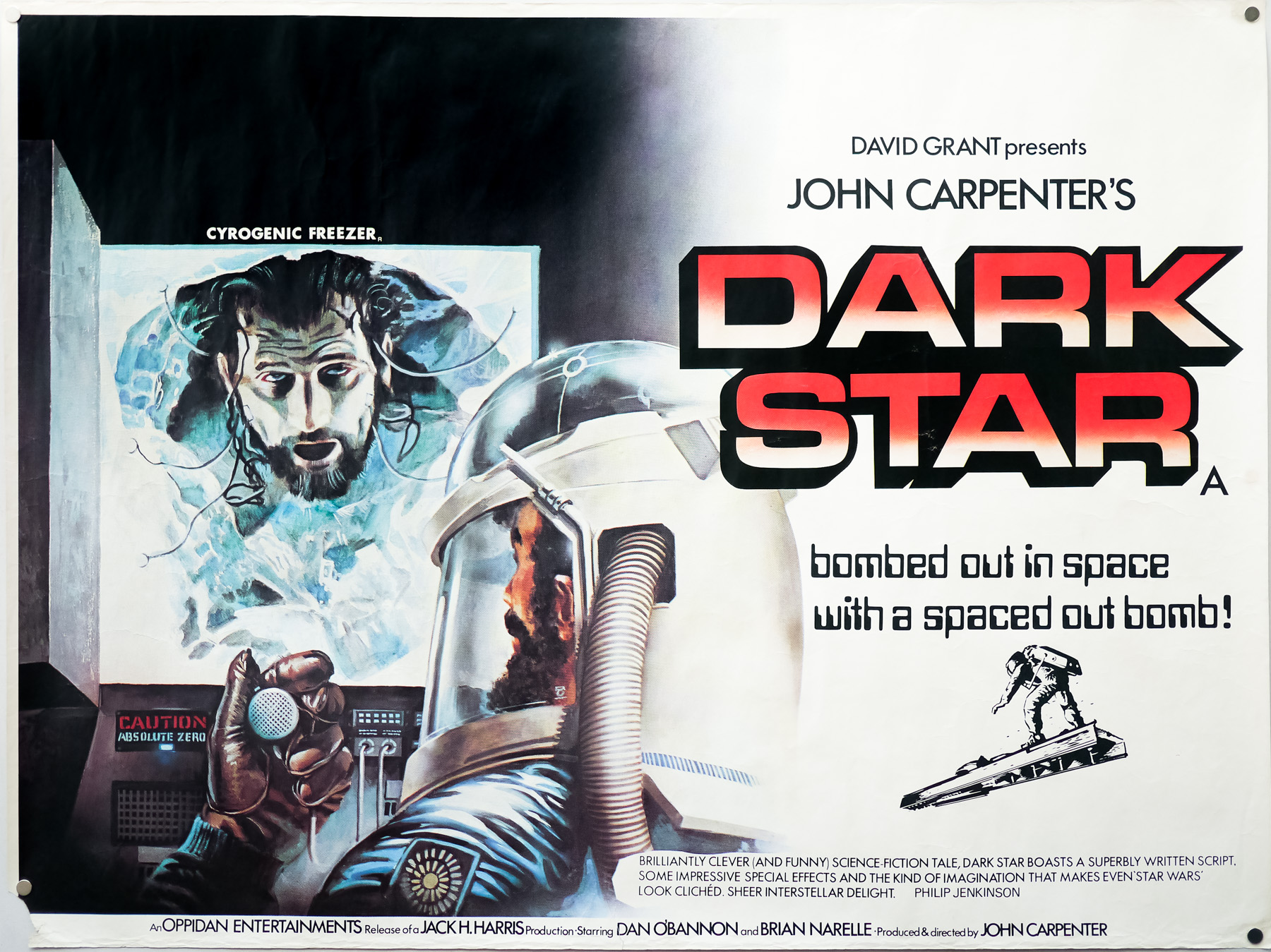
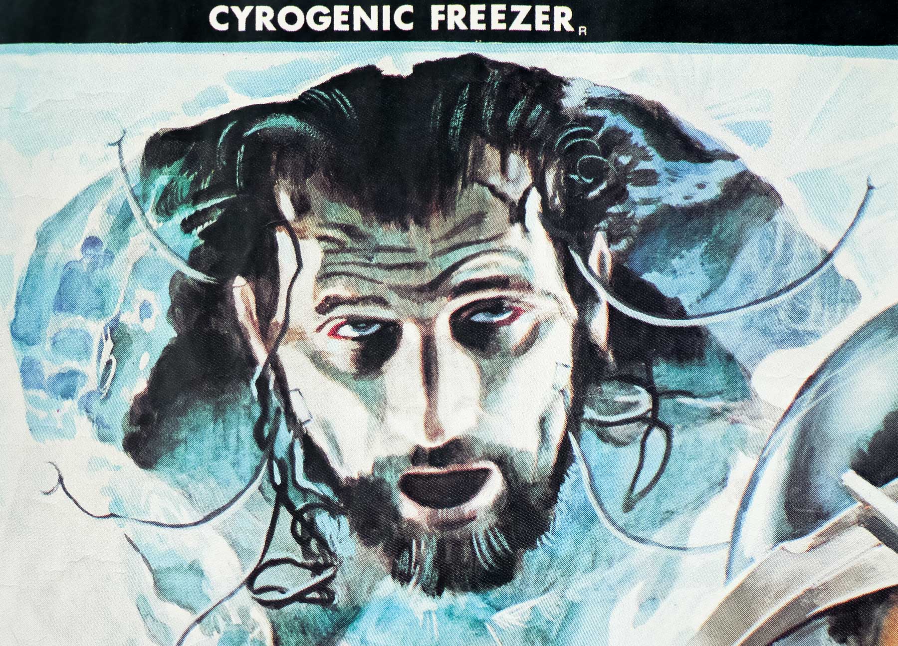
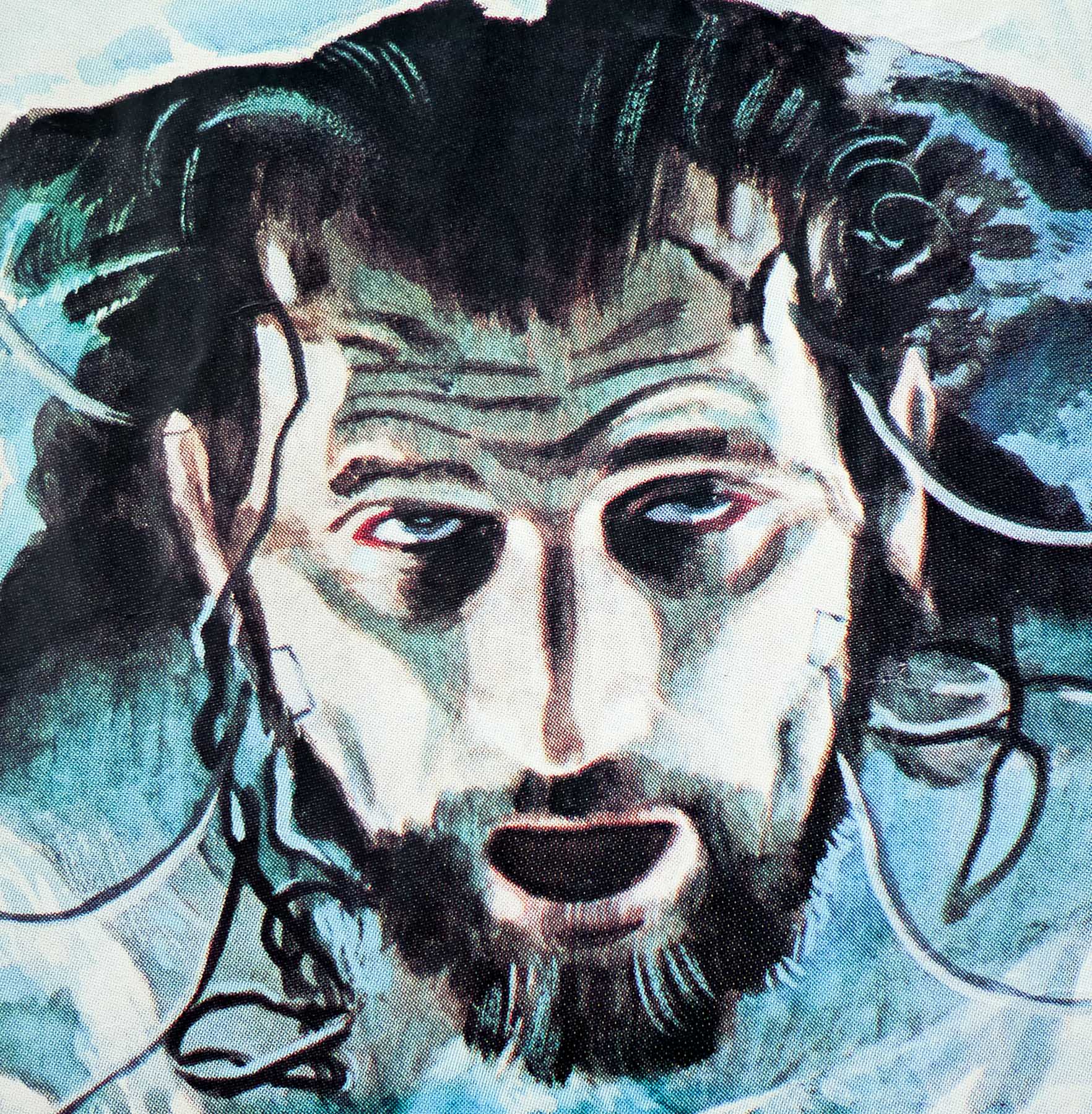
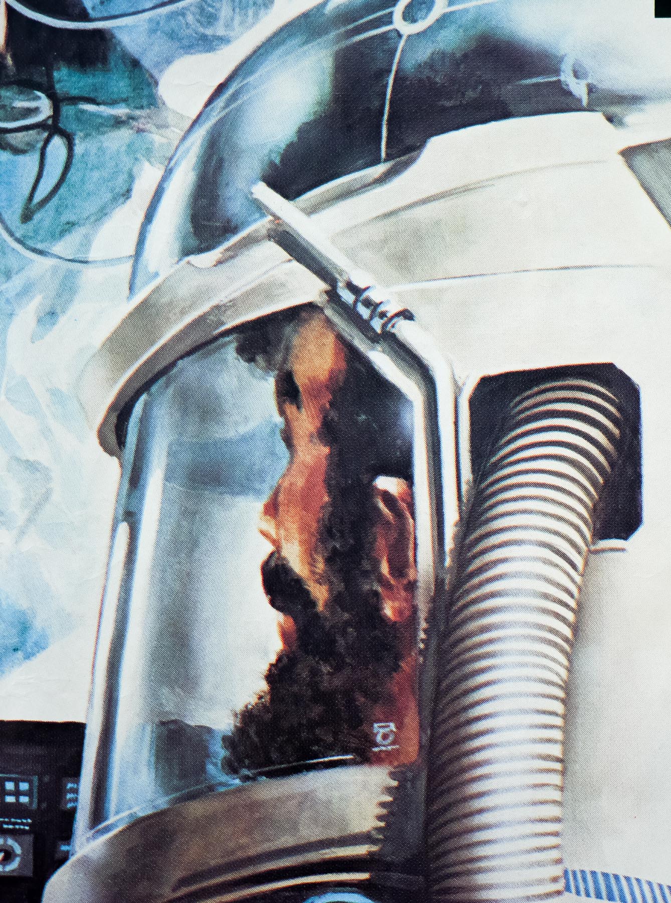
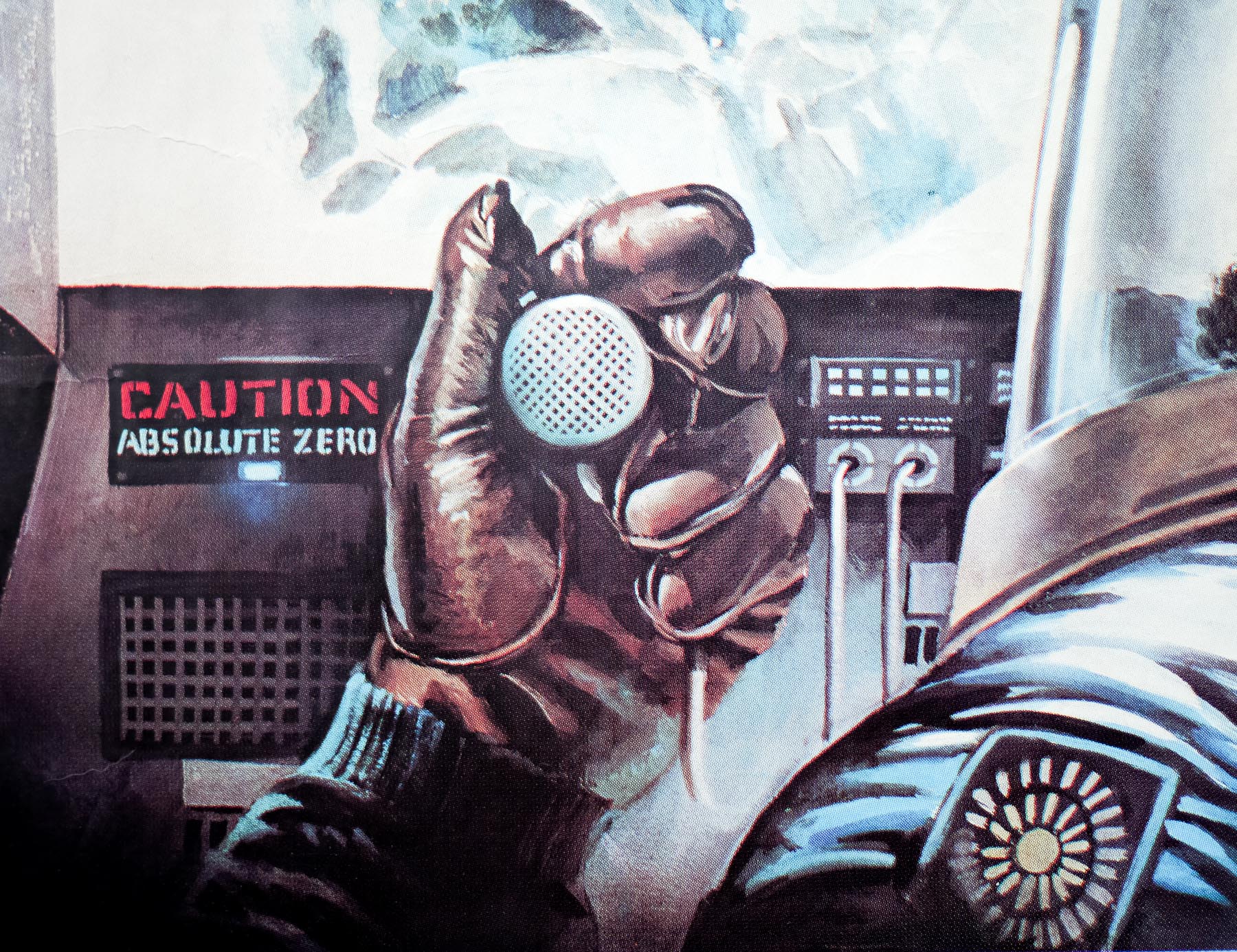
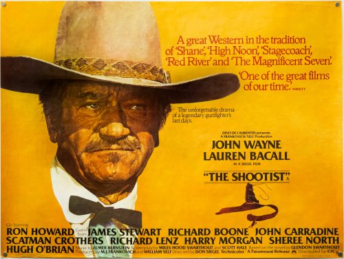
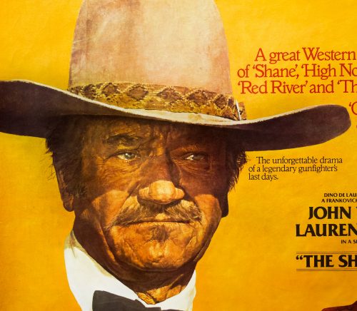
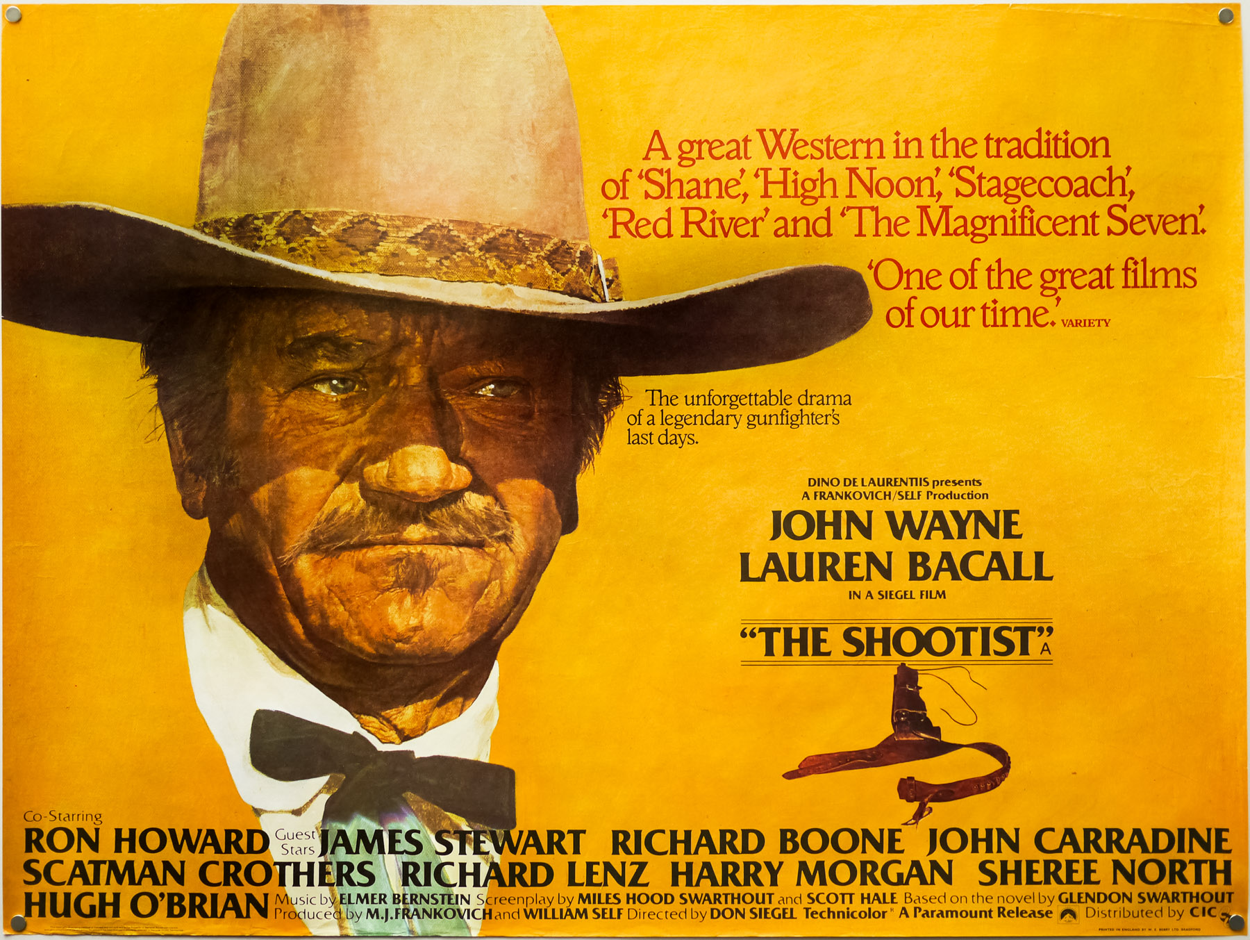
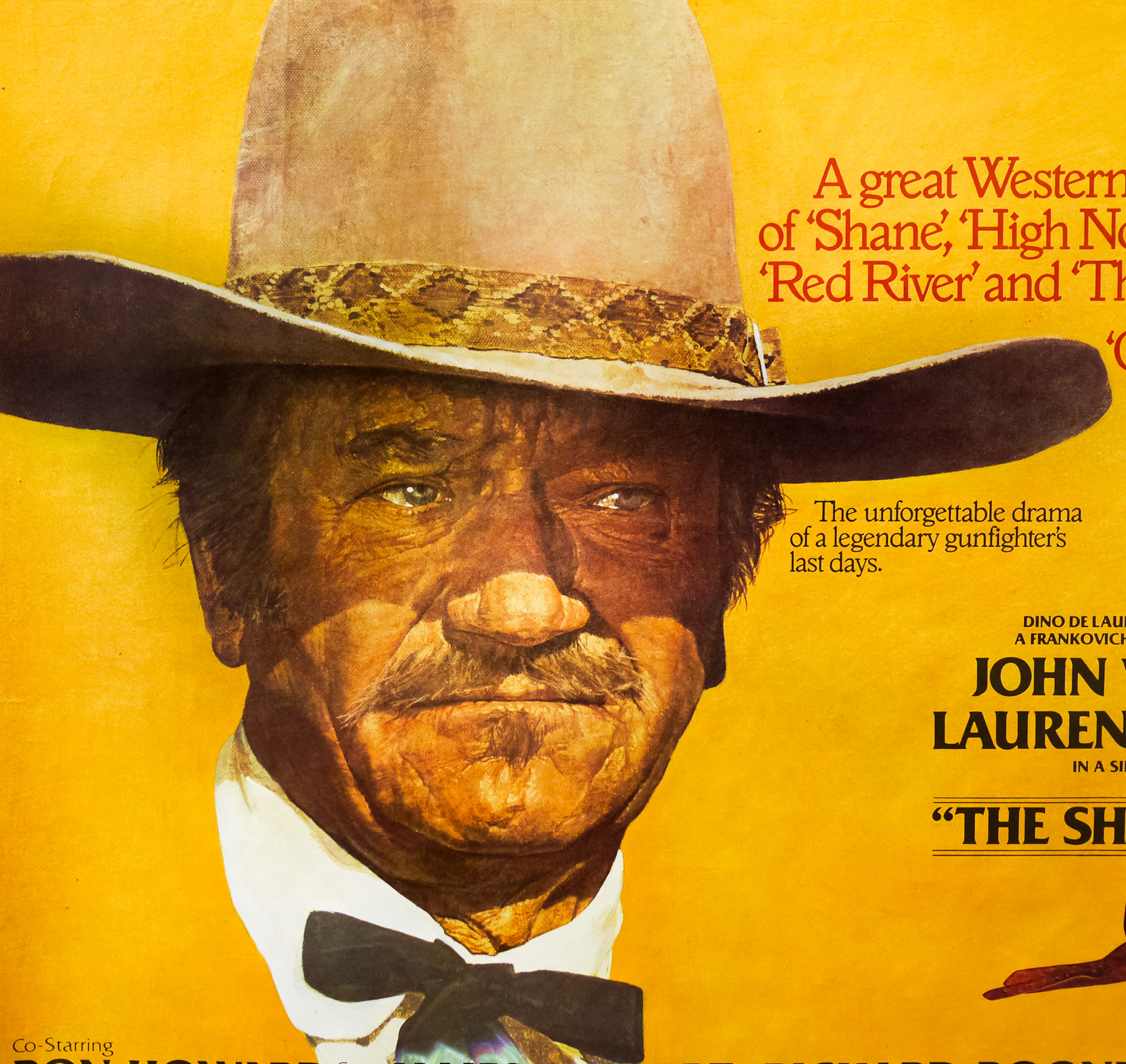
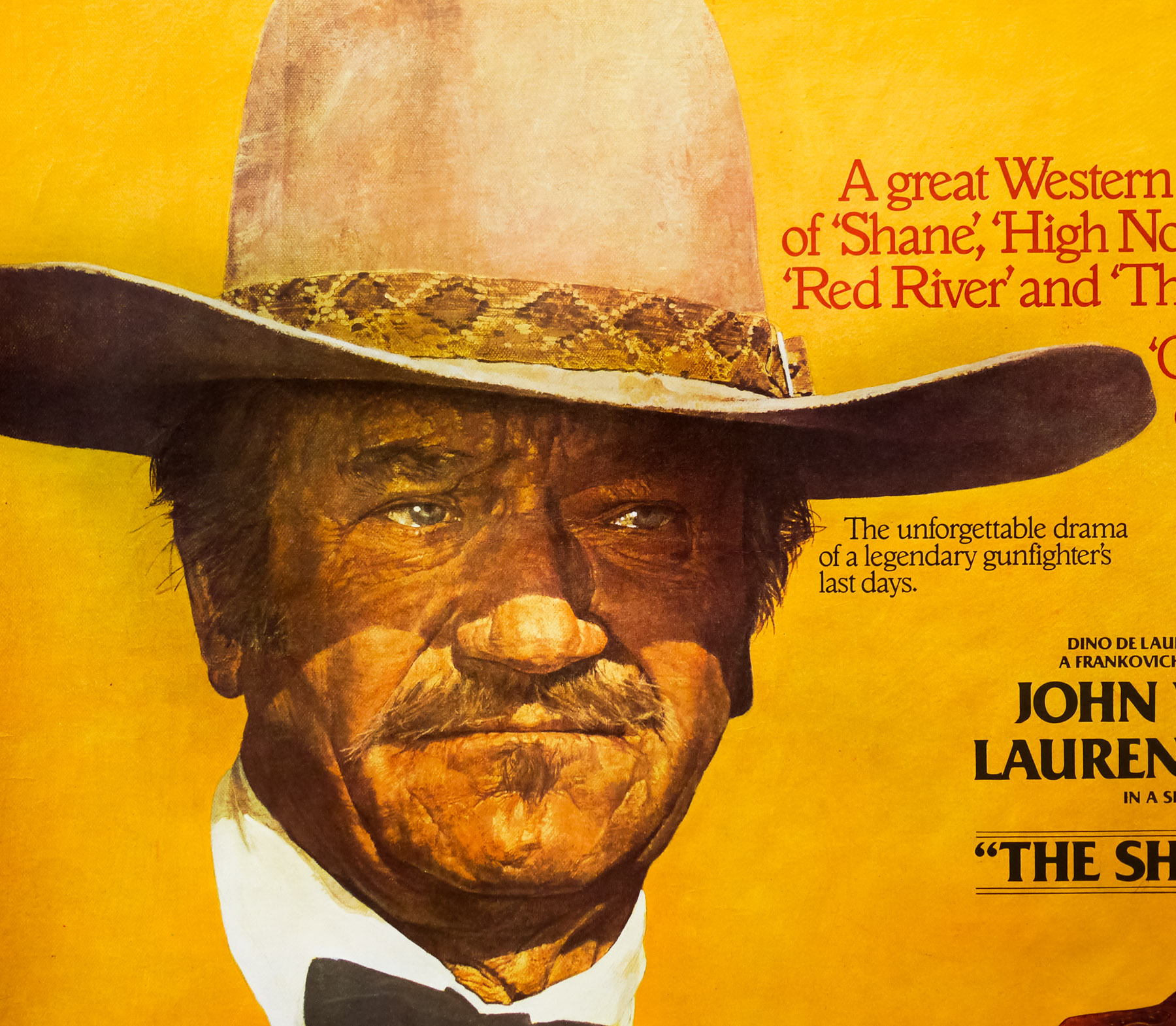
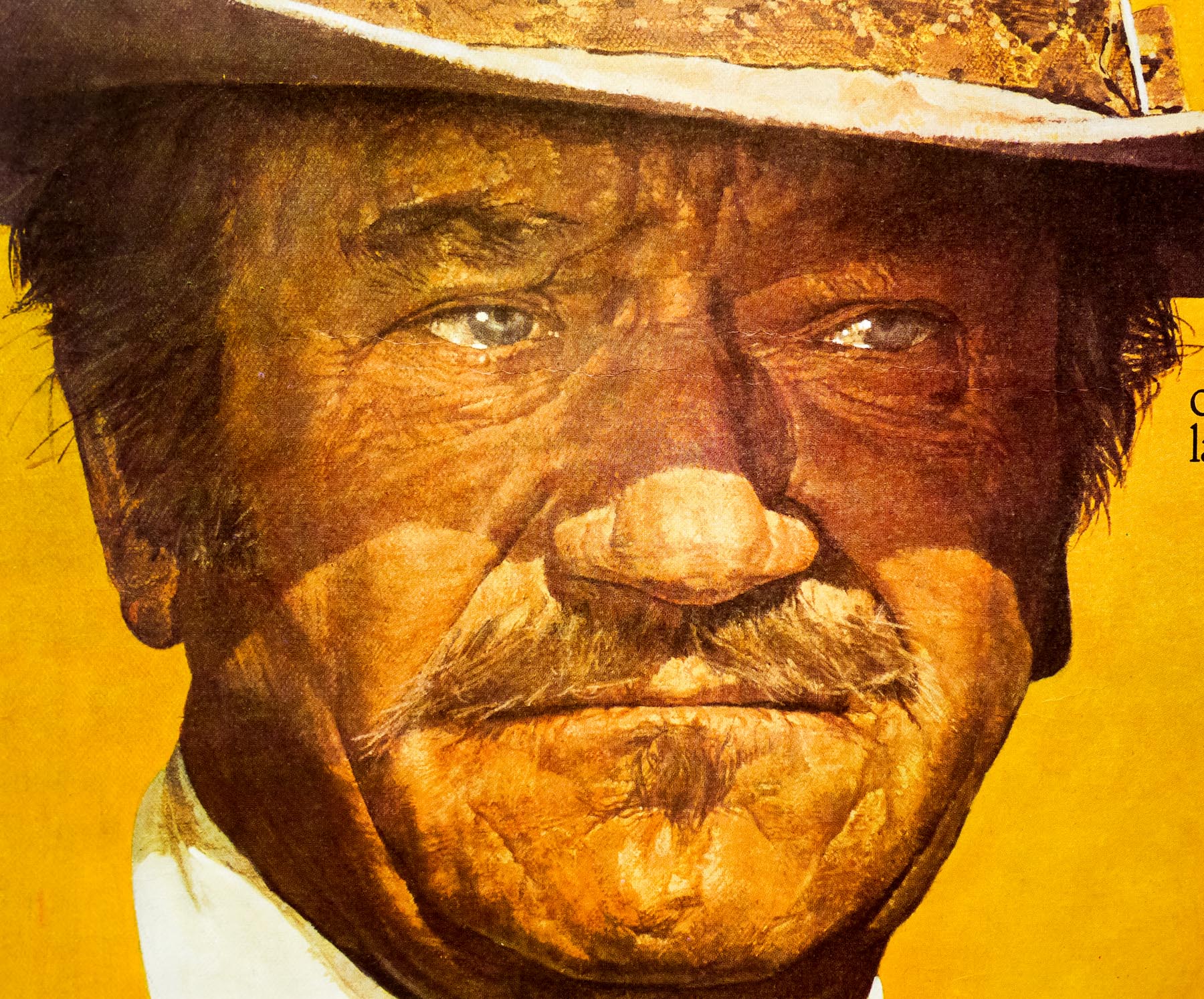
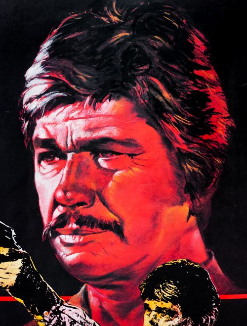
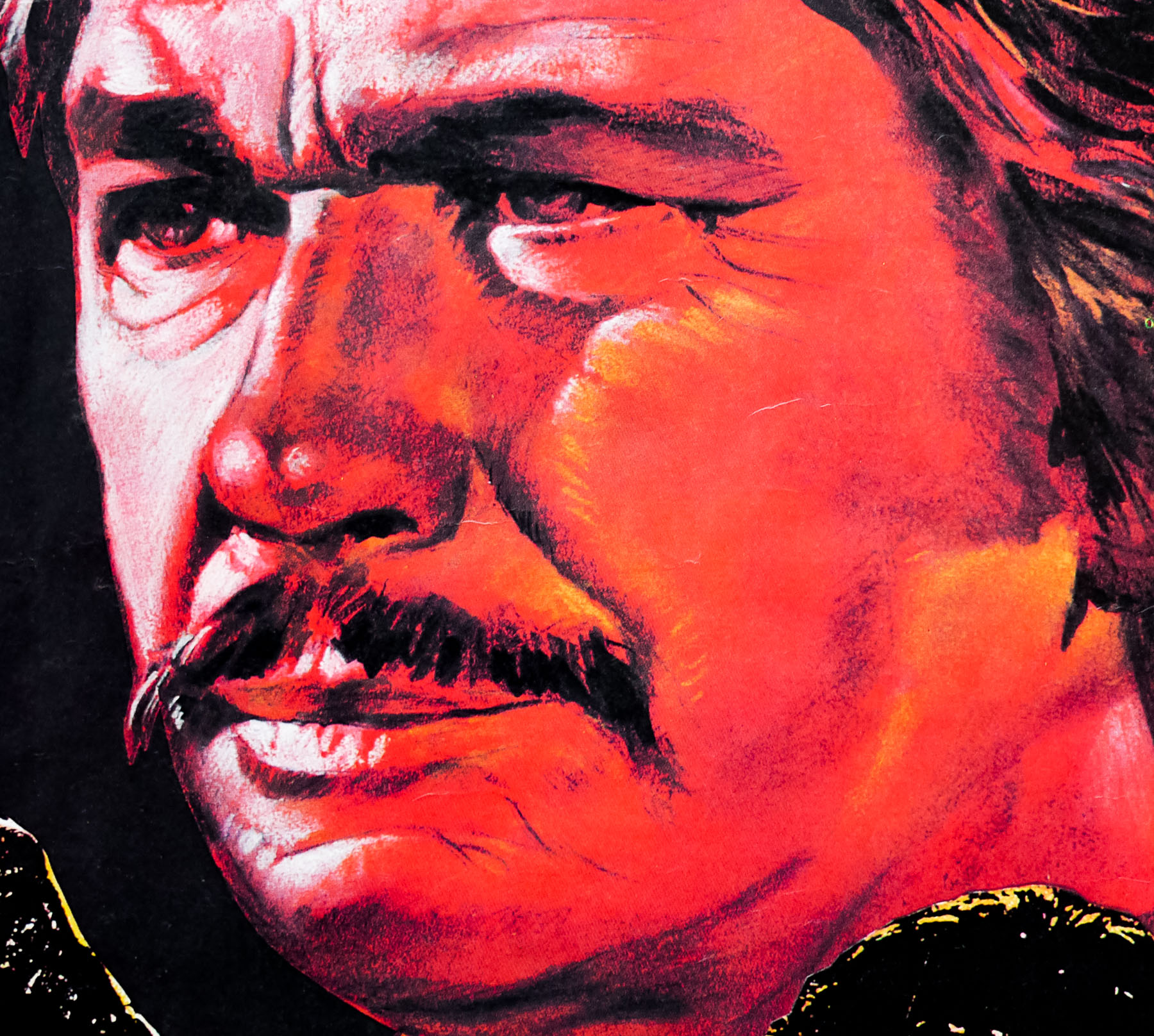
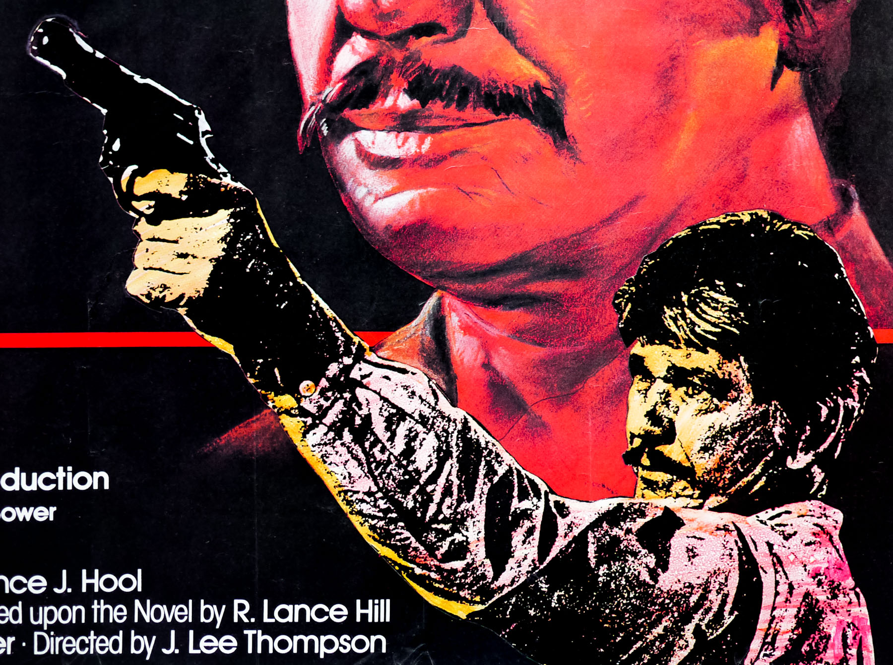
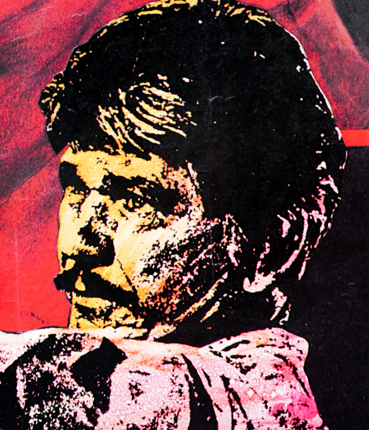
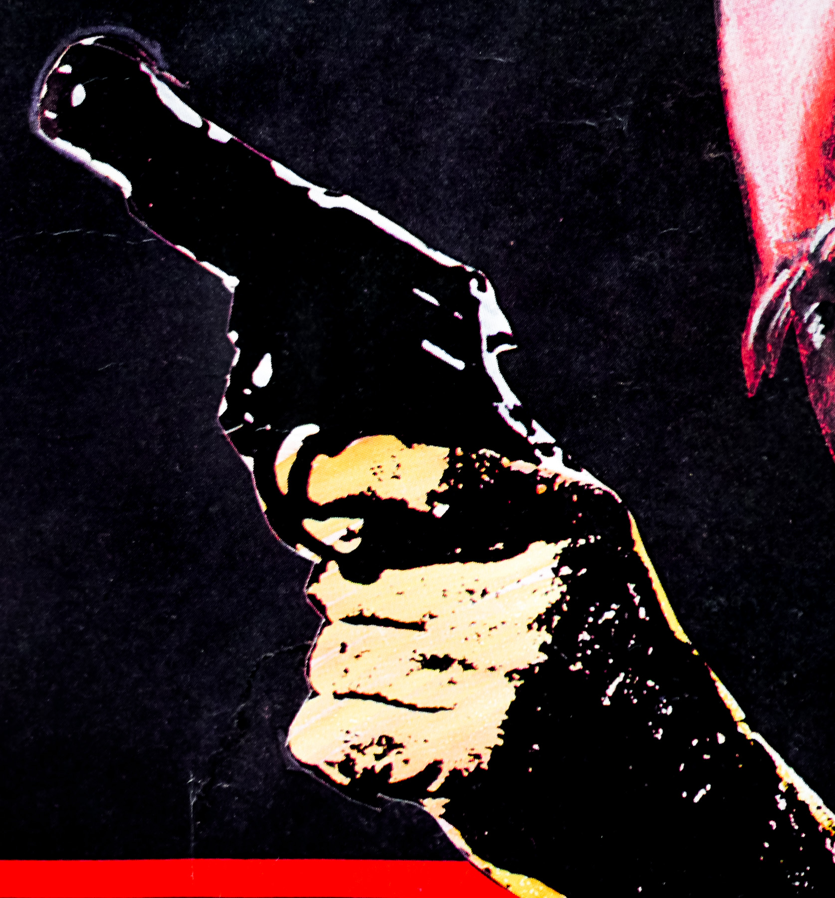
An excellent portrait of action legend Charles Bronson by Eric Pulford features on this British quad for the 1984 thriller The Evil That Men Do. One of several collaborations between the star and director J. Lee Thompson, the film sees Bronson star as a retired hitman known as Holland who is living a relaxed life on a West Indies Island when he is approached by former associates who persuade him to take on one last job. The target is the sadistic torturer, Dr. Clement Molloch, a Welshman who is often hired by political regimes to help them keep dissidents in check and has consequently left a trail of enemies in his wake.
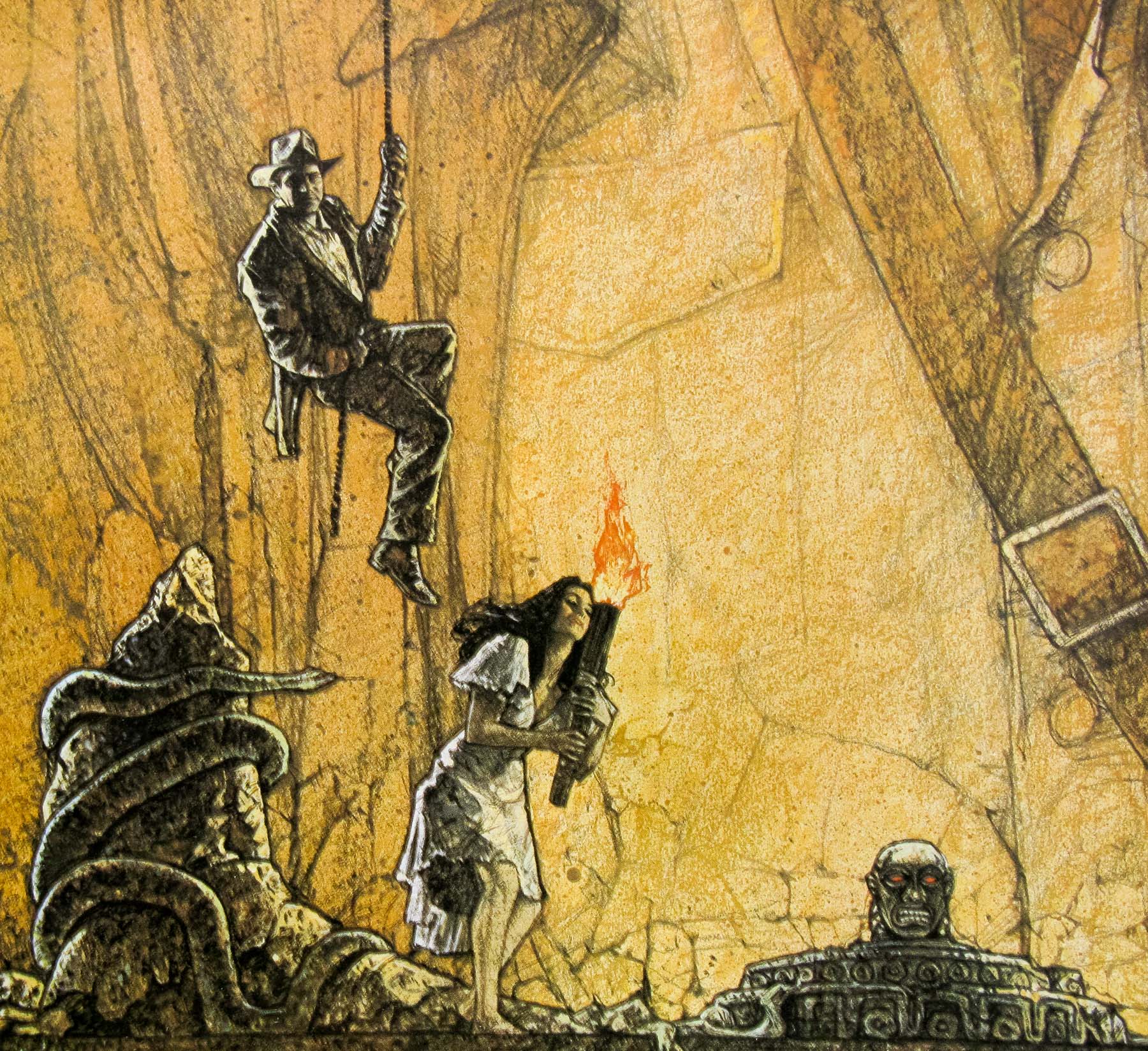
Holland discovers that Molloch has killed his old friend Jorge Hidalgo at the behest of the Surinamese regime and he agrees to set off to Guatemala, the last known location of his target, with Hidalgo’s wife and daughter agreeing to pose as his family to protect his cover. Holland uses his old skills to take out various criminal associates as he works his way up the chain to exact revenge against Molloch. The film was released to weak reviews and it’s definitely not Bronson’s finest hour, or the best collaboration with J Lee Thompson.
As Sim Branaghan notes in his must-own book British Film Posters: An Illustrated History, Eric Pulford was one of the most important figures in the history of UK film marketing. Born in Leeds in 1915, Pulford was encouraged to develop his drawing abilities at school before he left, aged 14, to join a firm that manufactured electrical goods where he designed light fittings. After a year he left there to take up an apprenticeship at Gilchrists, a blockmakers in Leeds city centre, whilst also attending evening classes at Leeds Art College and painting in his spare time.
It was during his time at Gilchrists that Eric’s skills were spotted by Leslie Whitchurch, a partner in design firm who had an arrangement with the British film company Rank to produce film posters for Leeds cinemas. Pulford began working on illustrations for the posters around 1940 and eventually left Gilchrists to join Format (Whitchurch’s agency) in 1943. The most important move happened in 1943 when Pulford was invited by Rank to relocate to London and set up a design agency to specifically handle their marketing, which saw the birth of Pulford Publicity.
Over the next decade Eric designed and illustrated hundreds of posters for British and Hollywood films, and this meant him working with many of the most important producers and directors in the industry. As Downtons, the parent company to Pulford Publicity, grew Eric started to illustrate less and take on more of an executive role, dealing with clients and liaising with distributors but he still managed to keep his hand in designing posters, including for some of Rank’s most important film properties like the Carry On series.
Eventually he took over Downtons completely in 1965 and this is when he hired designers like Vic Fair and John Stockle who would often submit competing concepts for film campaigns that were then sifted and selected by the client. Pulford also hired a number of young artists that included Brian Bysouth and would often give them his own take on how to achieve the best illustration results. Eventually, at the start of the 1980s, Eric began to plan for his retirement and began handing over the reins of Downtons to a new management team before eventually moving to the south coast in 1984.
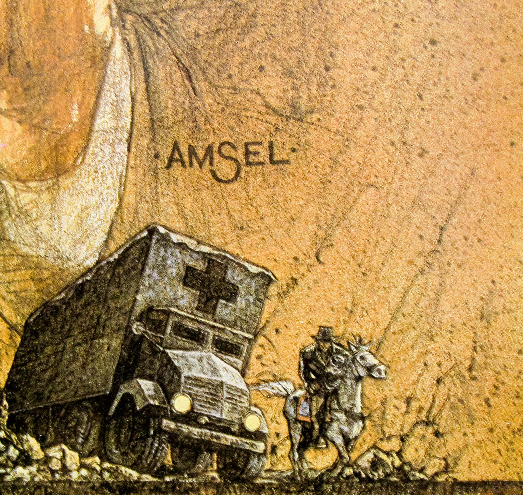
This quad for The Evil That Men Do marks a milestone as it’s the last printed quad that was both designed and illustrated by Pulford, but other design and layout jobs followed over the next few years. His last assignment was, rather aptly, The Last Emperor in 1987 after which he started to enjoy his retirement fully. In 2005 Pulford passed away shortly after suffering a fall at his home, just shy of his ninetieth birthday. Sim notes that Pulford is believed to have designed at least 500 posters over a 50 year period for some of the best British films and his contribution to the field cannot be underestimated.