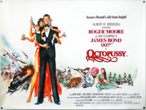
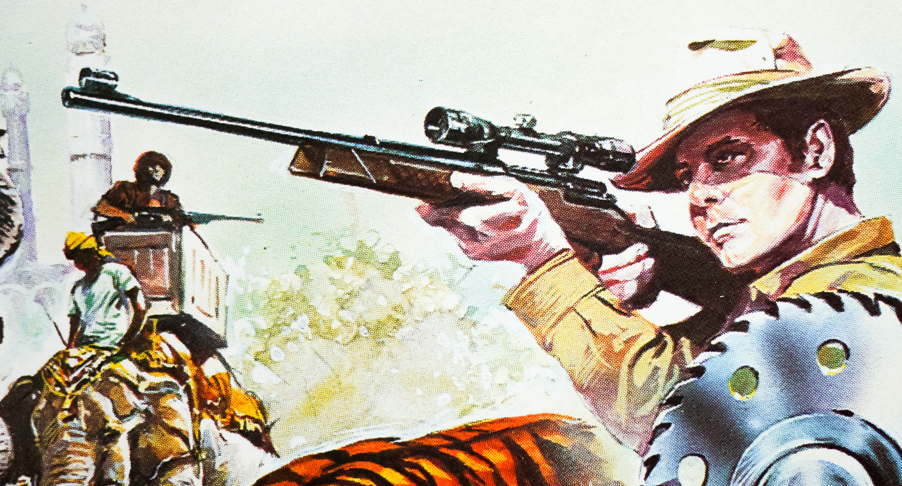
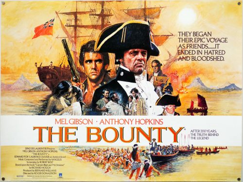
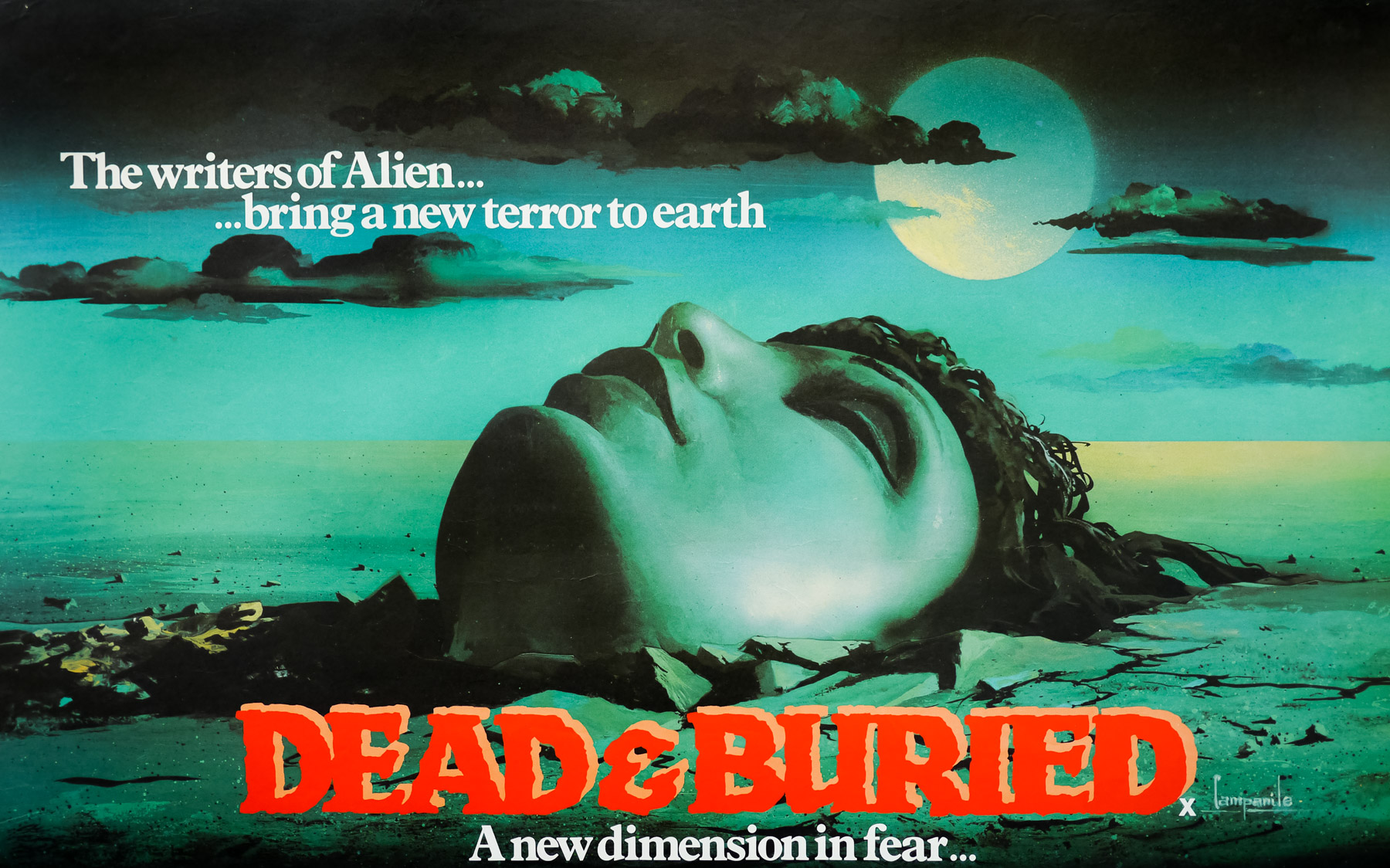
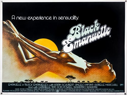
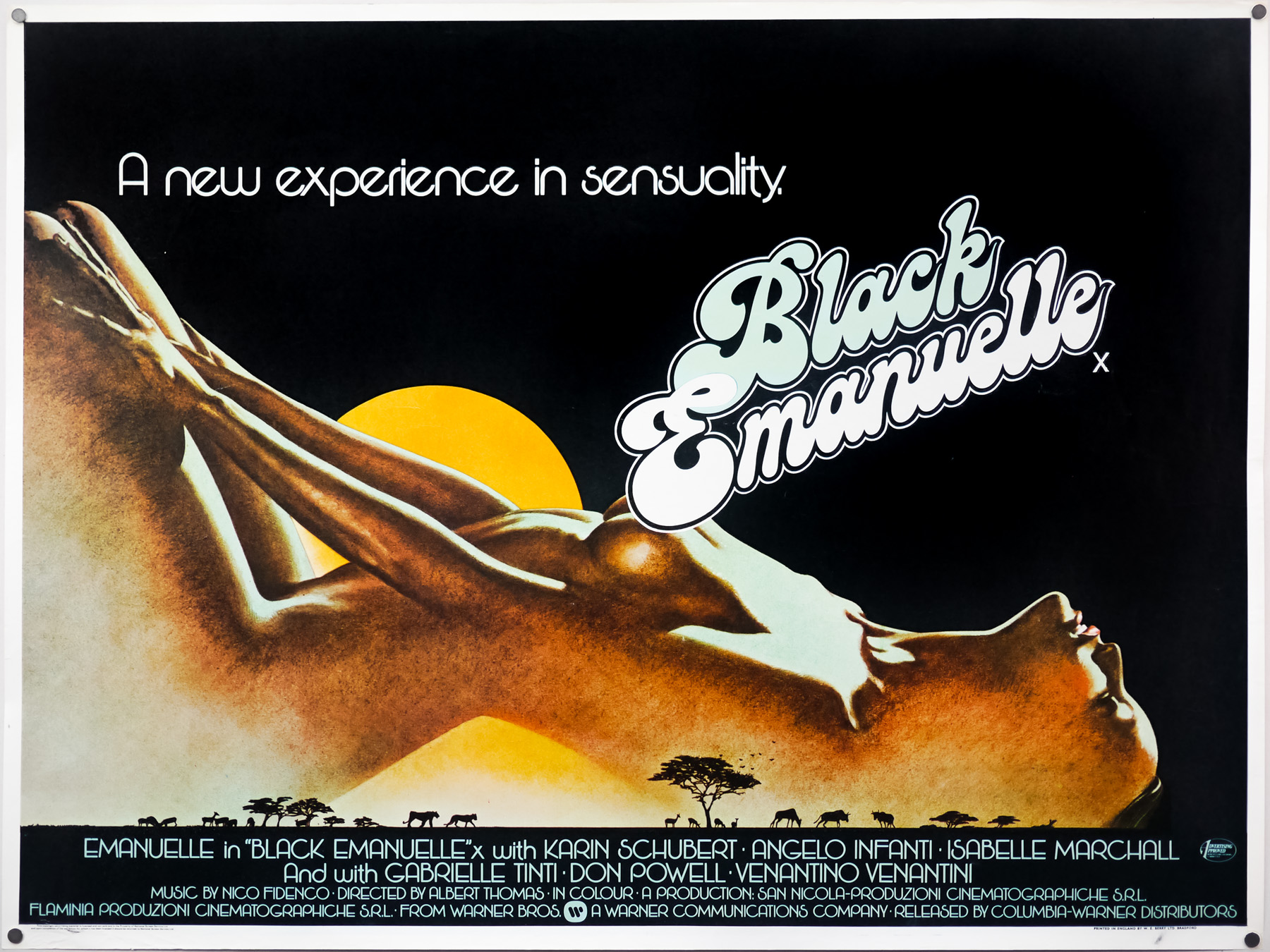
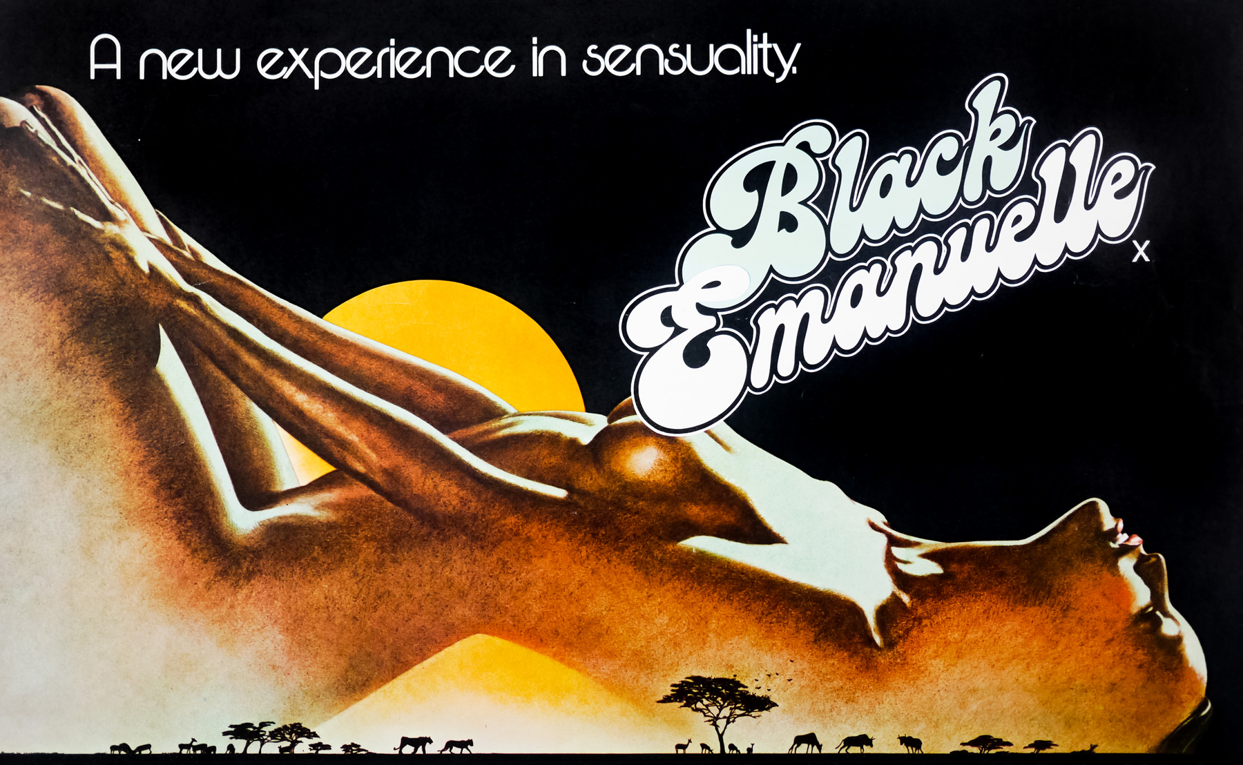
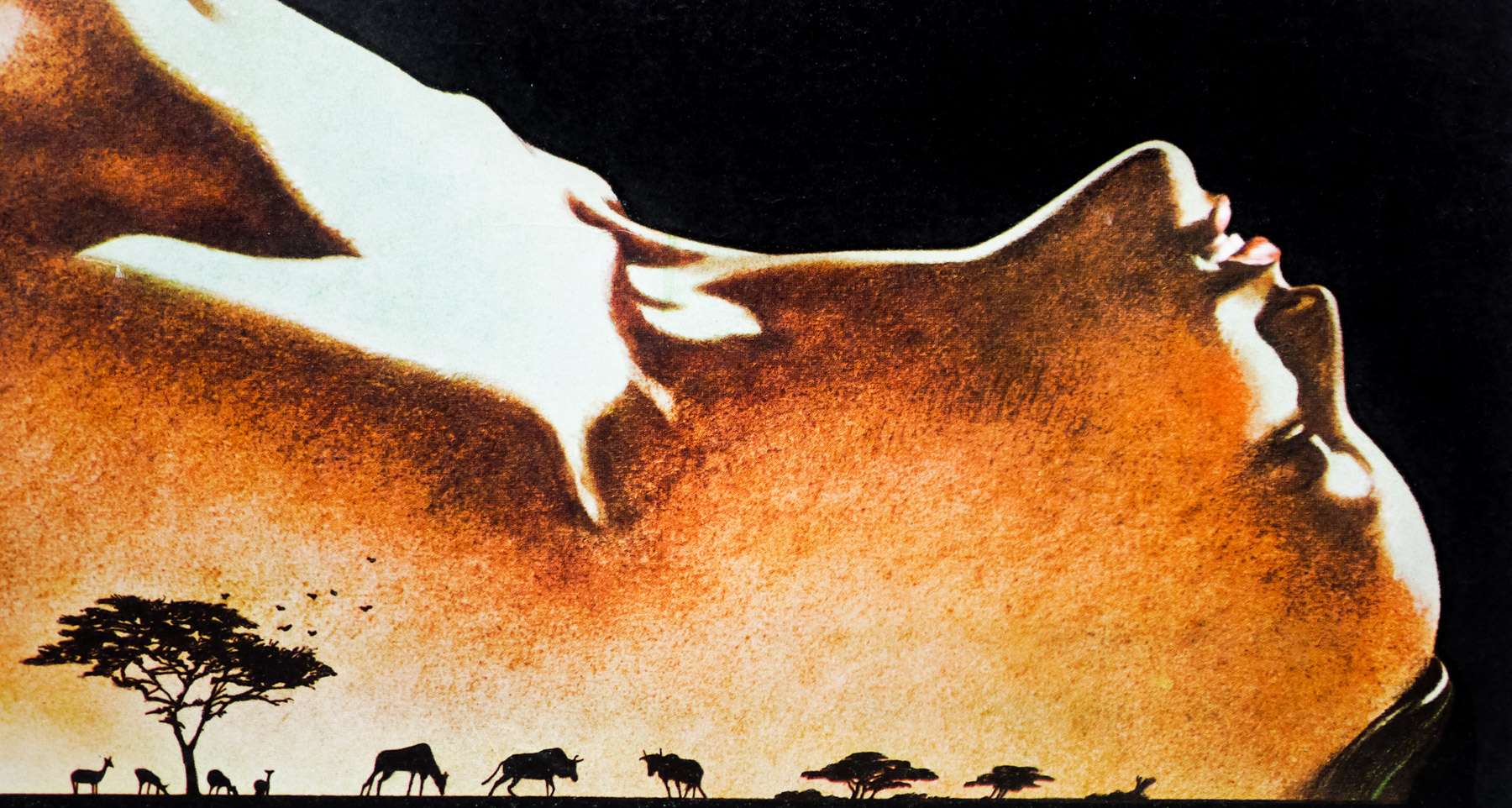
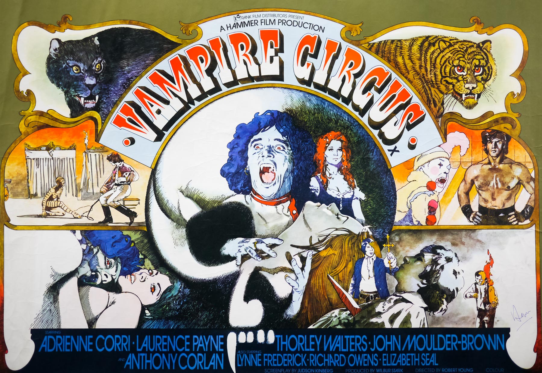
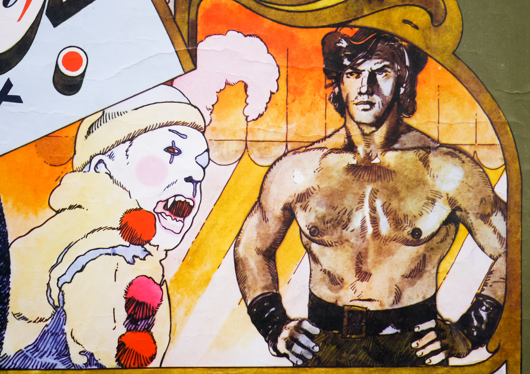
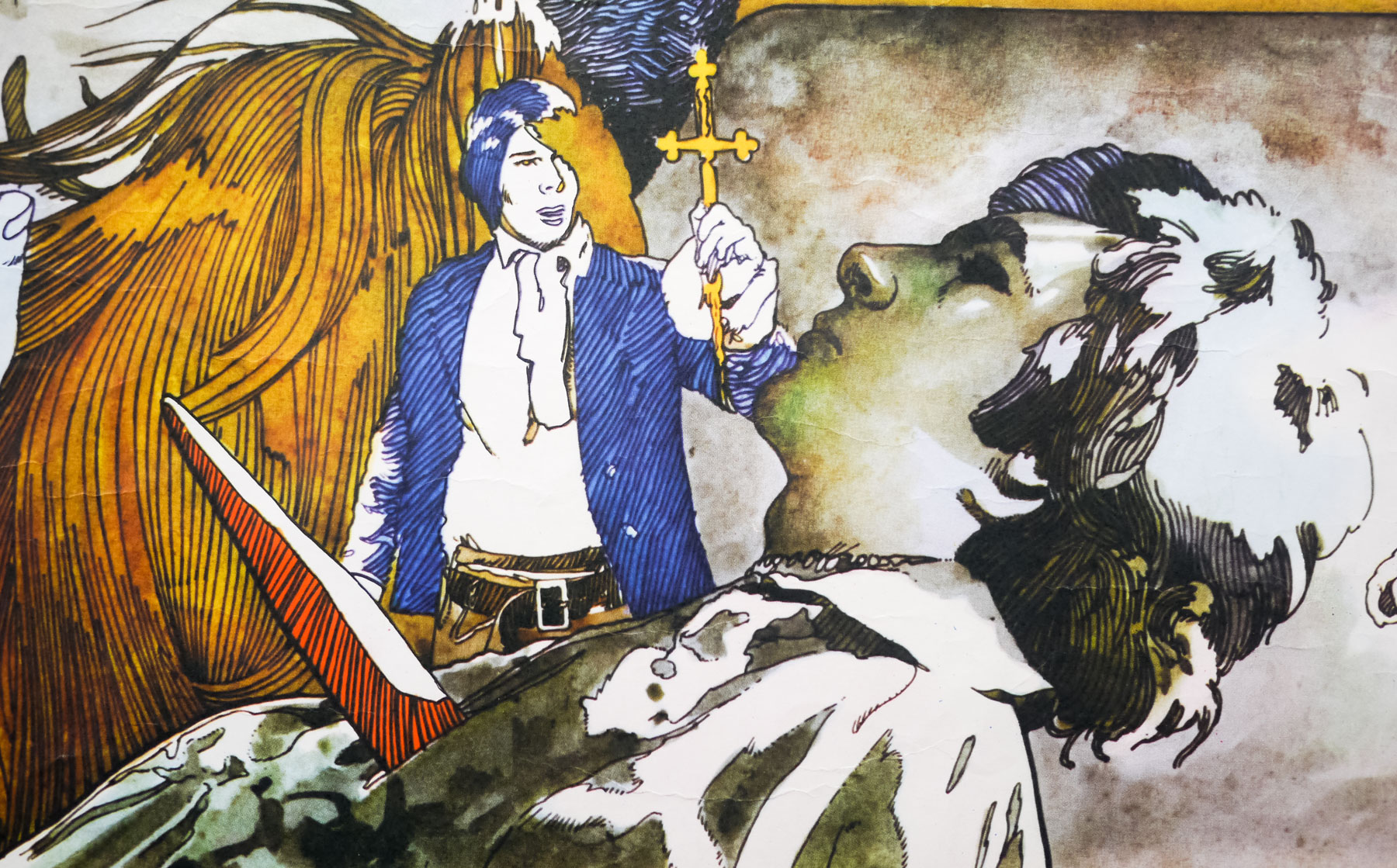
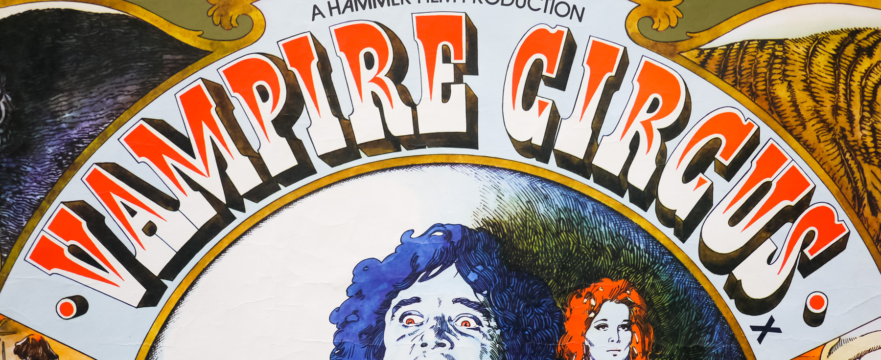
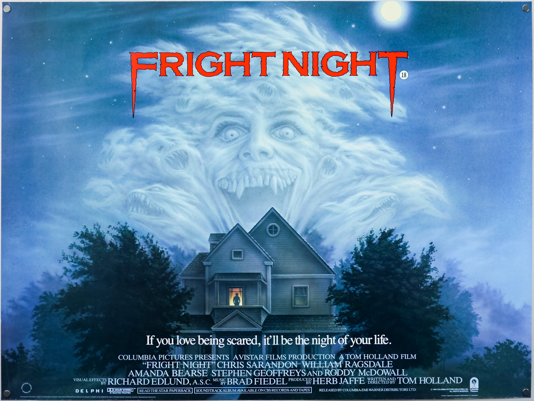
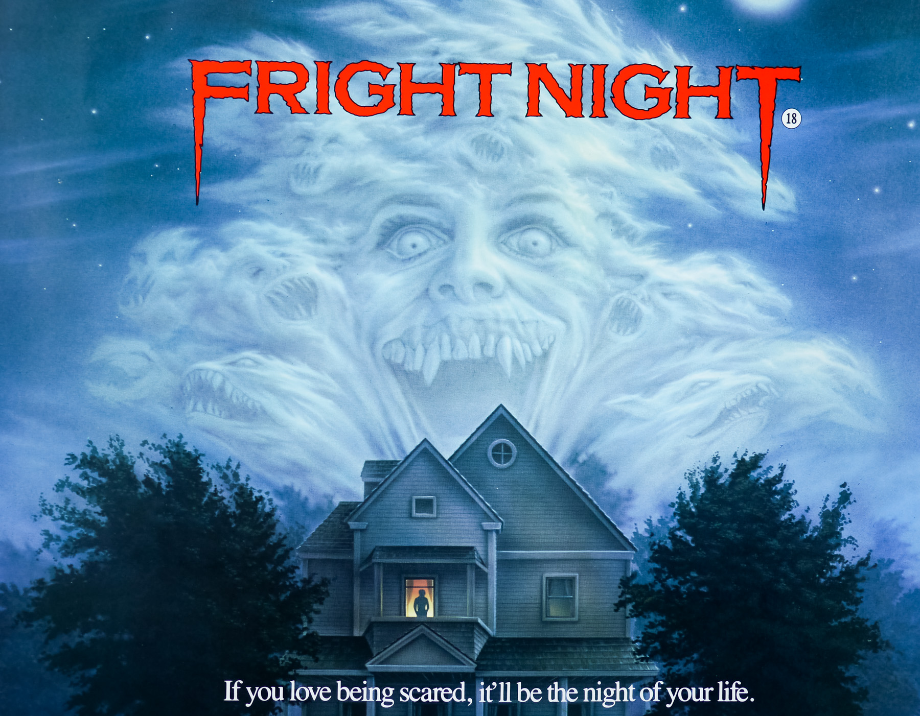
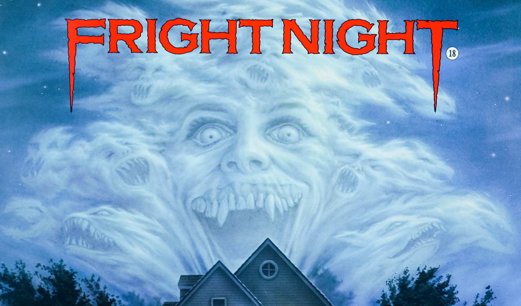
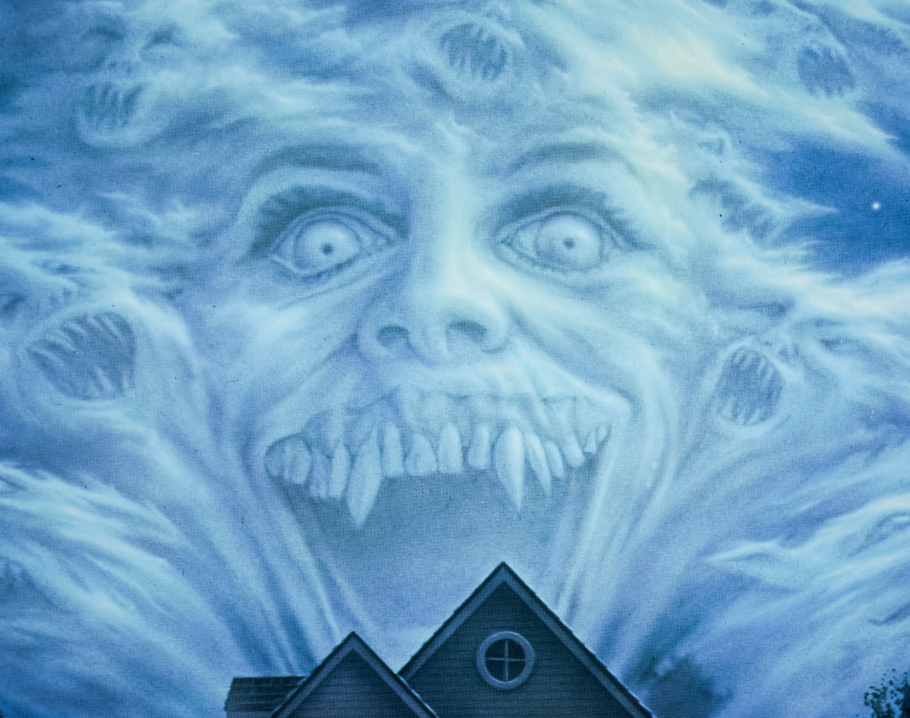
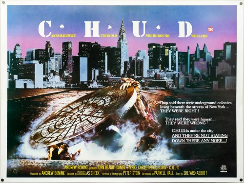
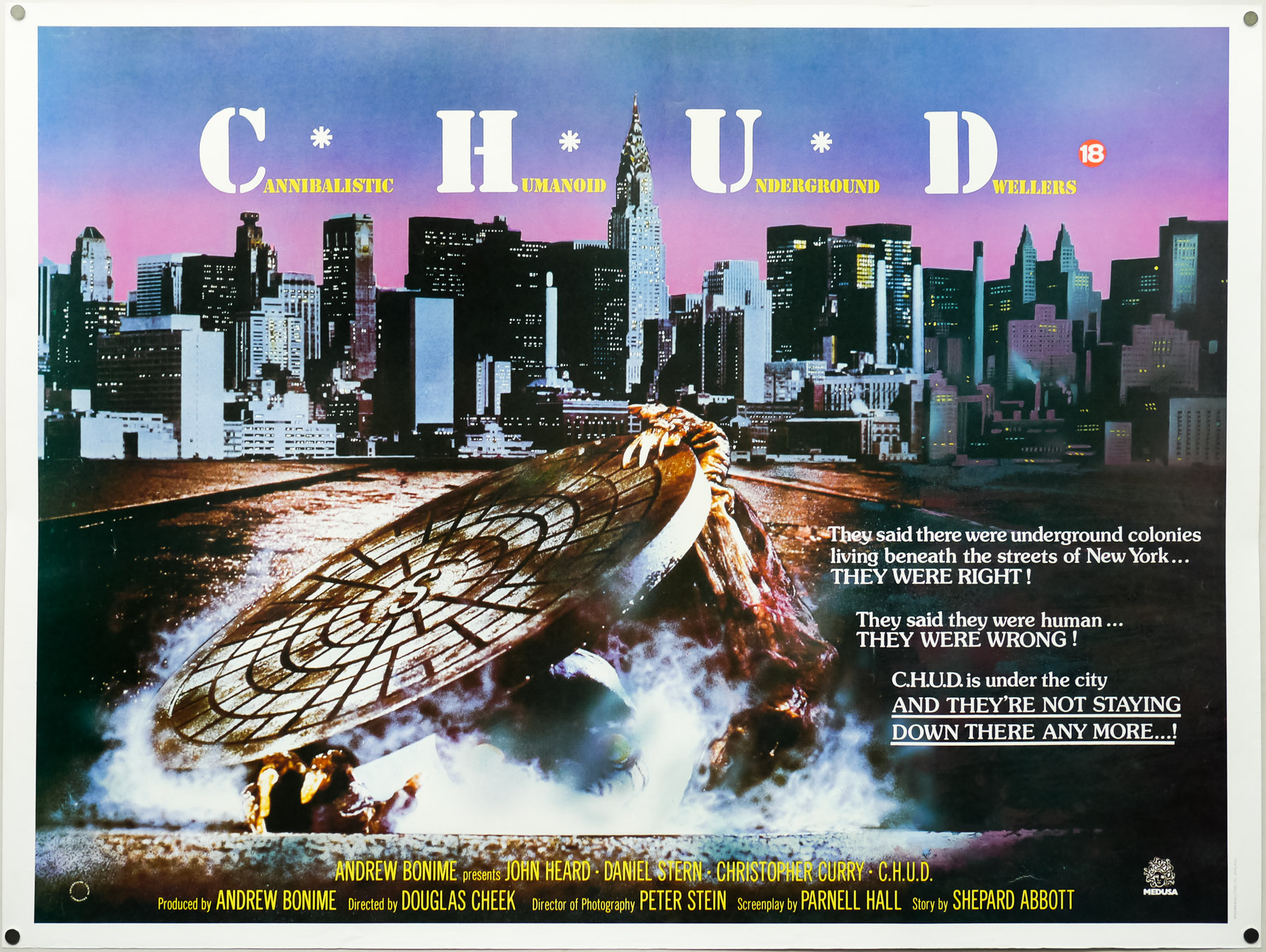
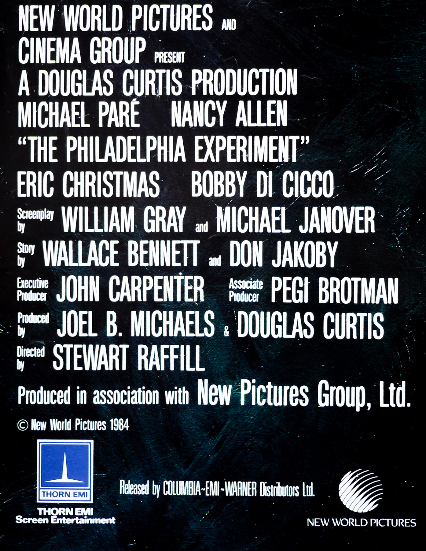
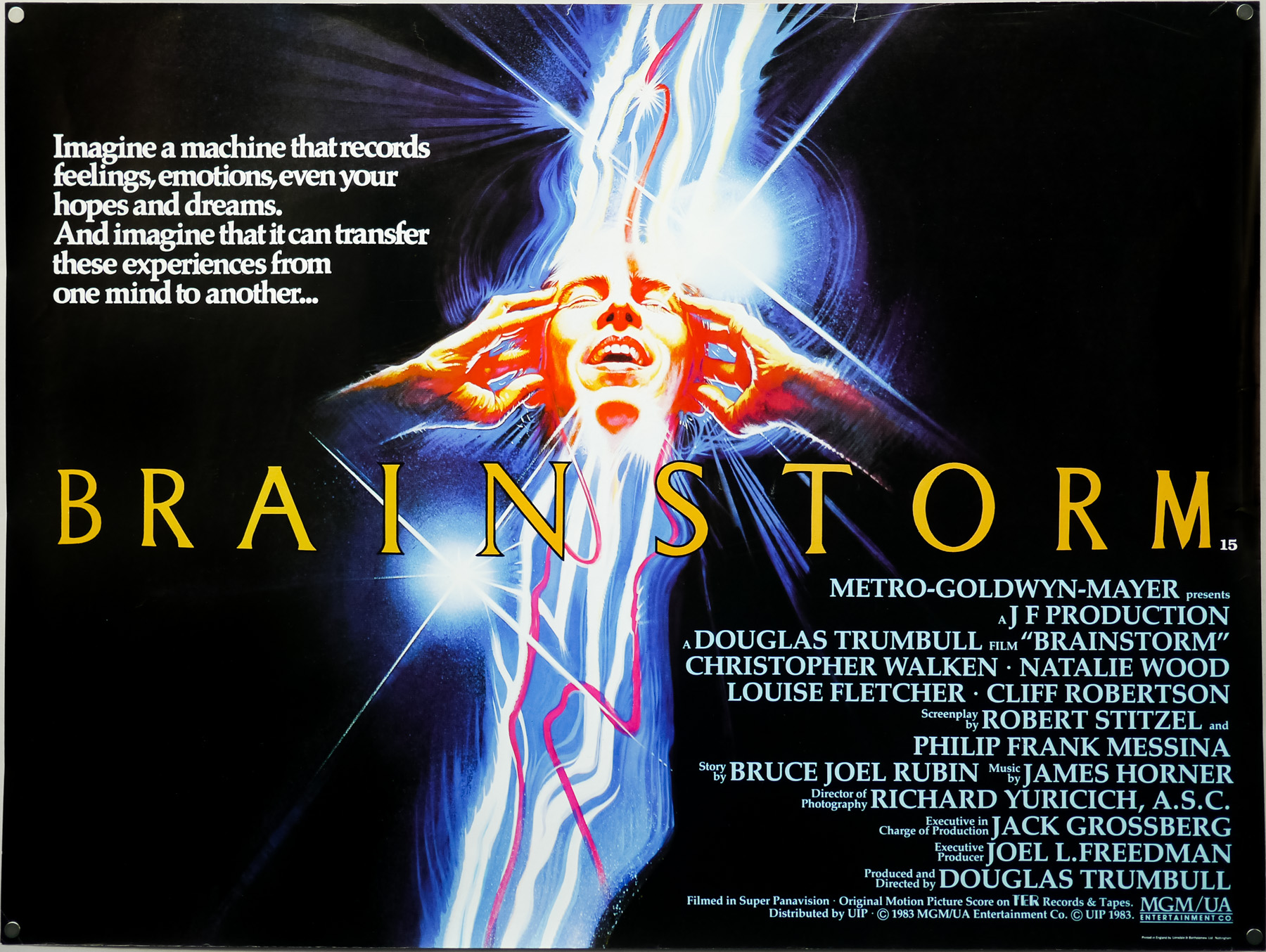
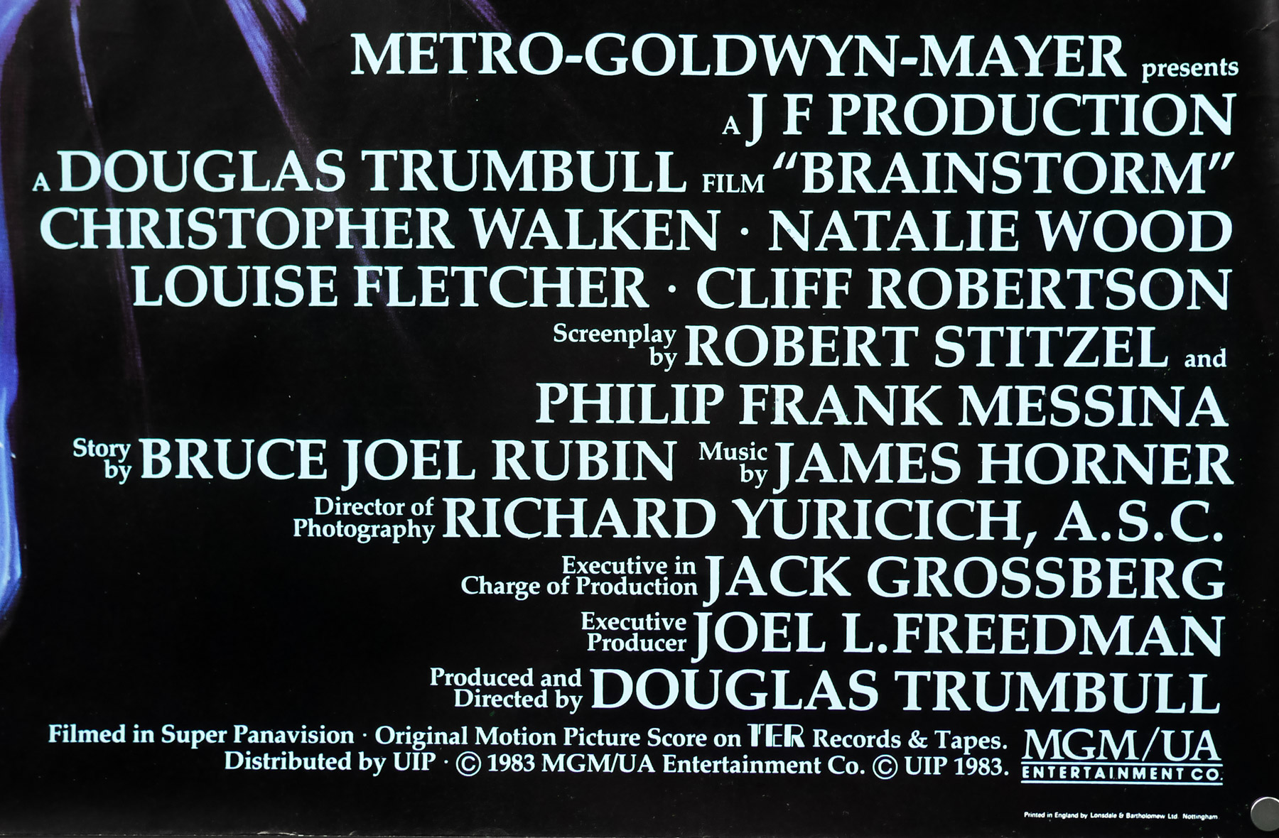
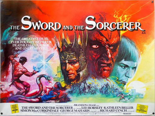
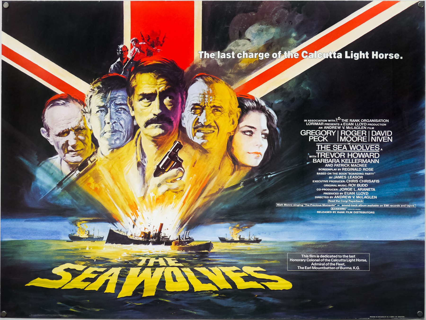
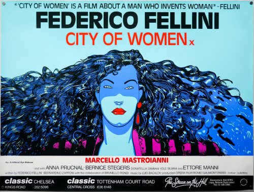
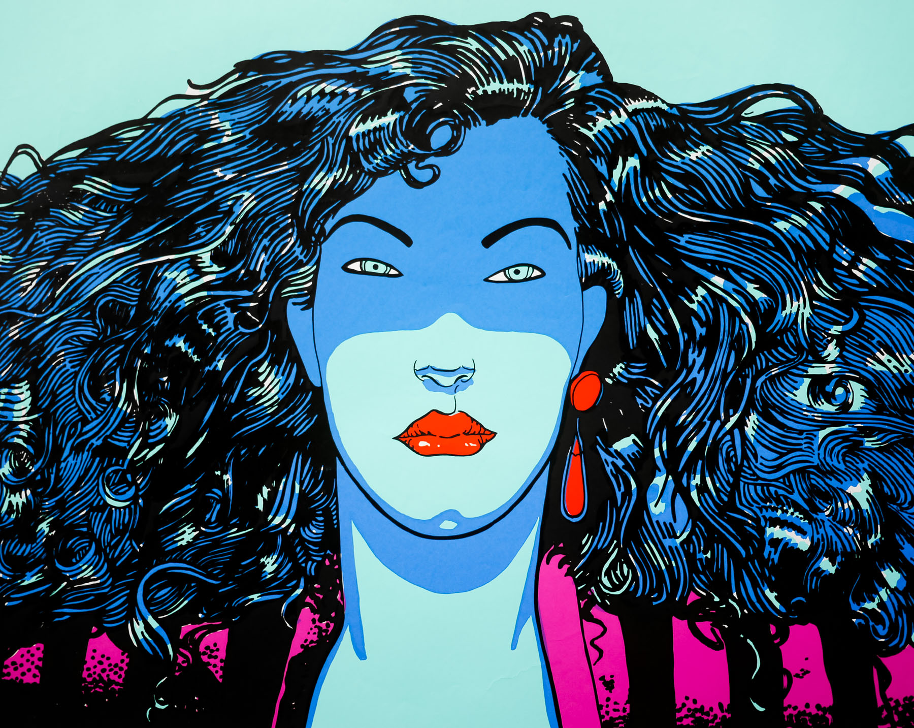
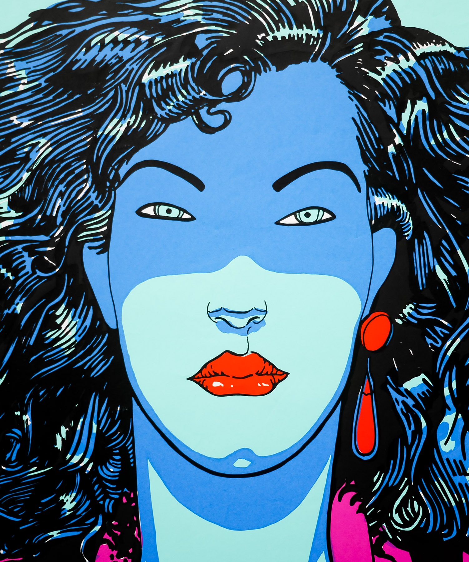
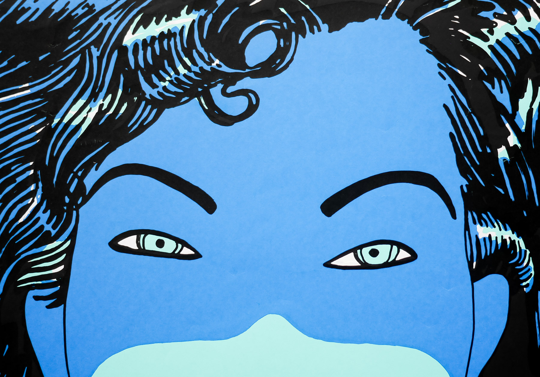
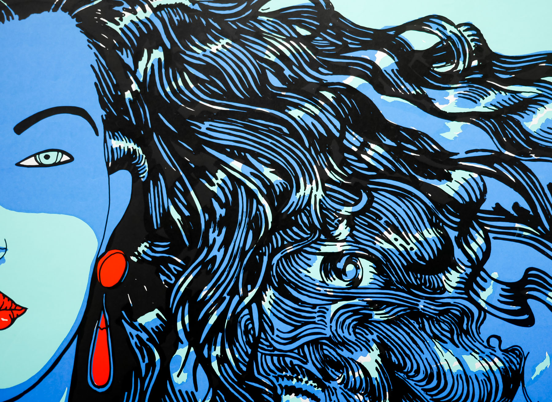
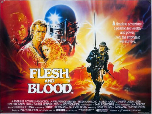
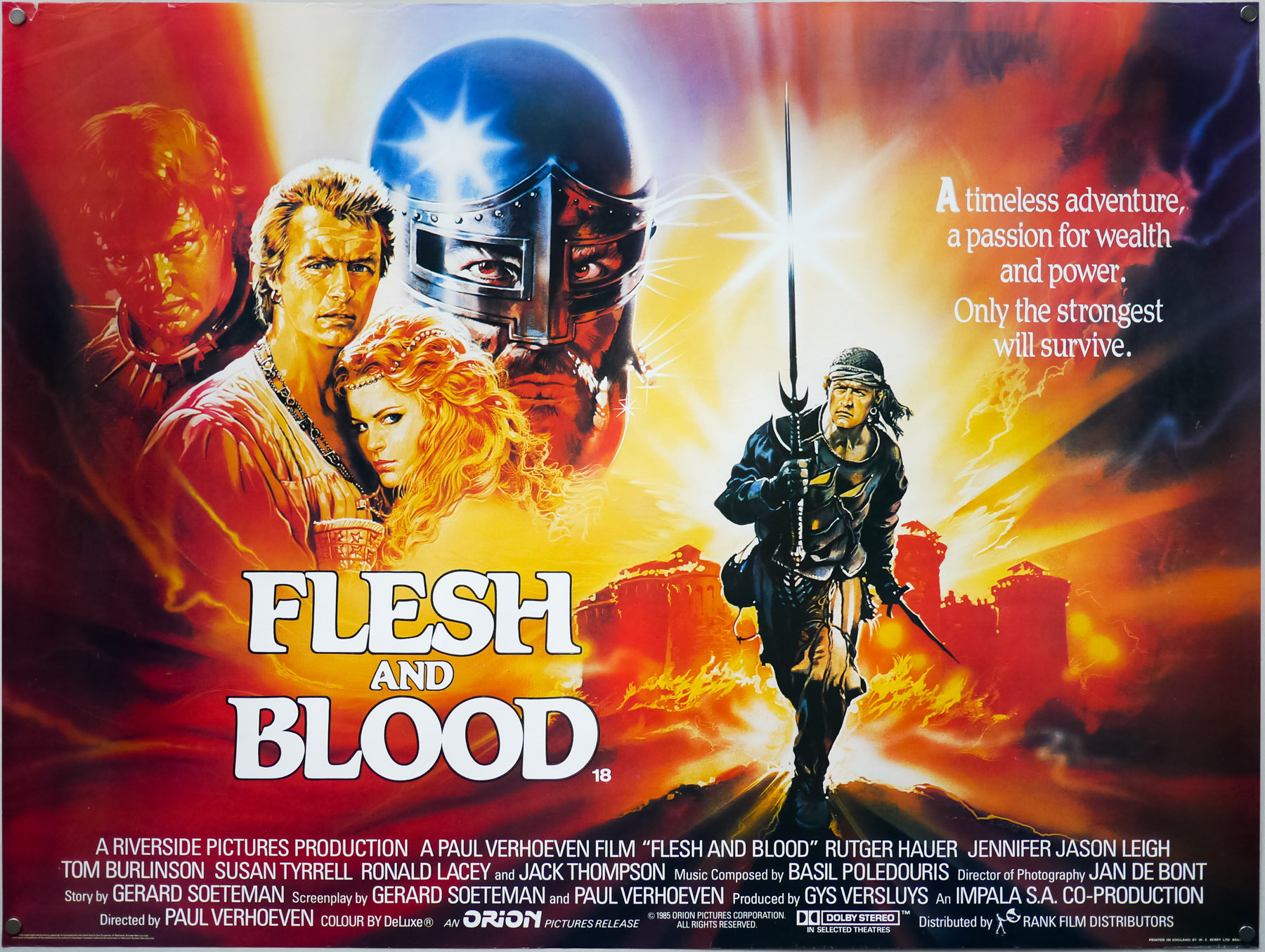
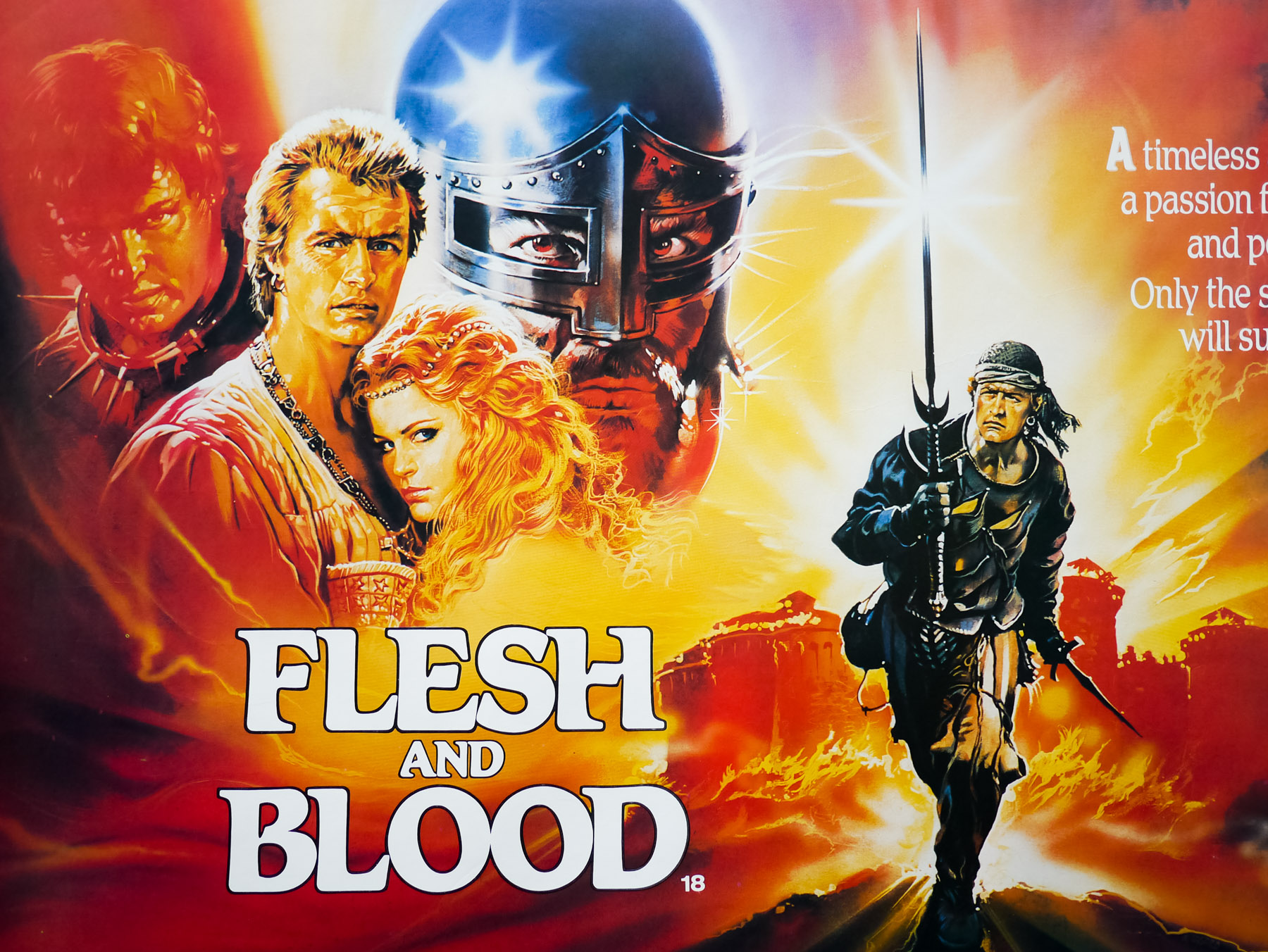
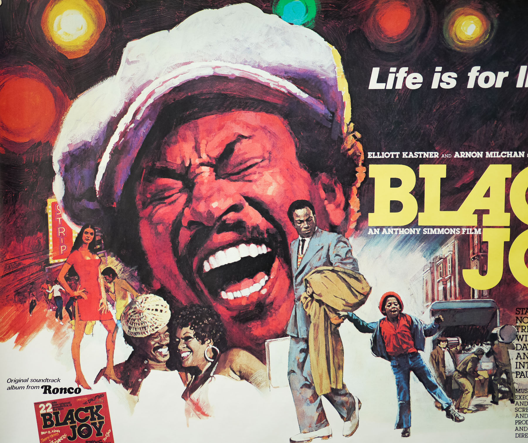
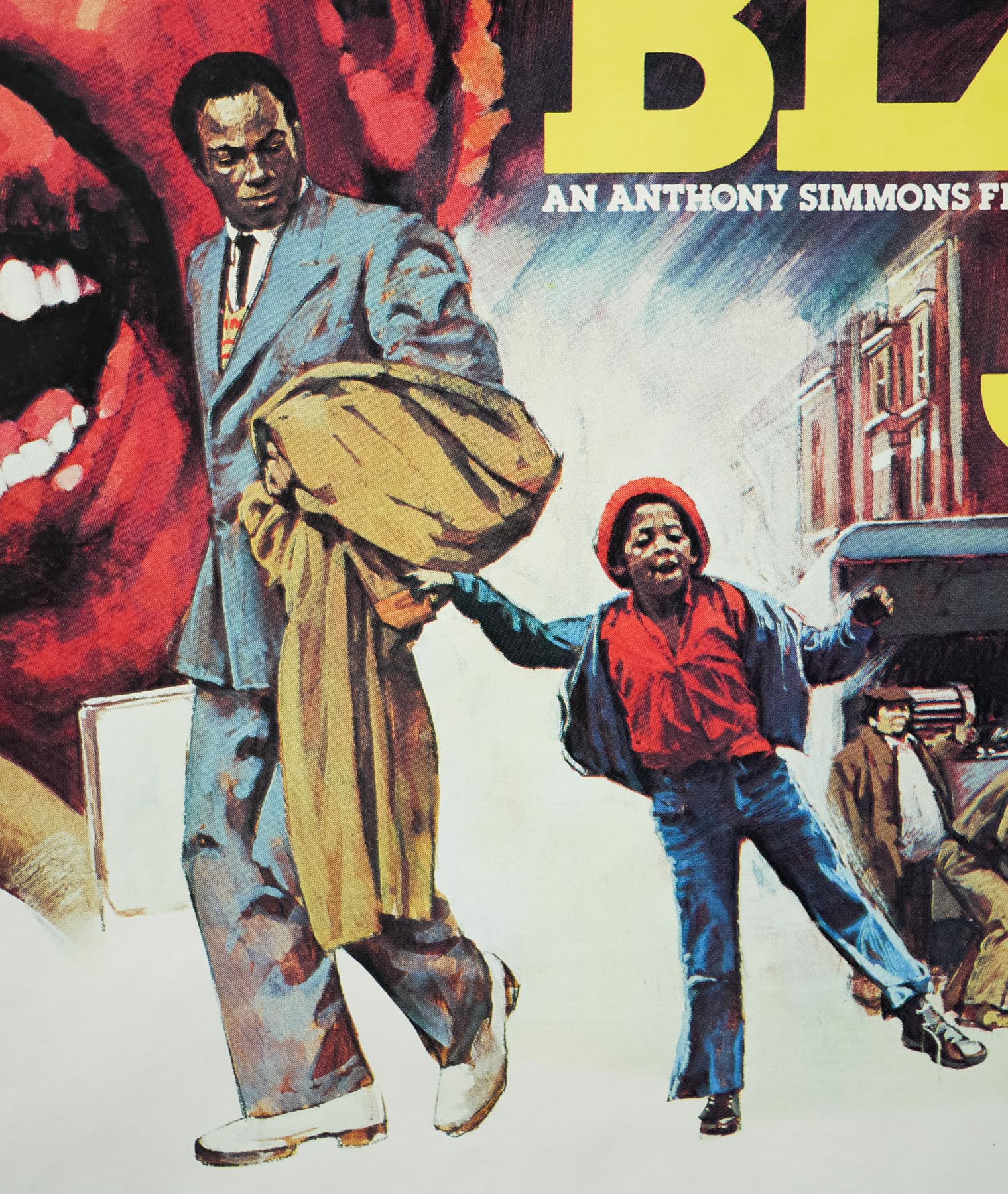
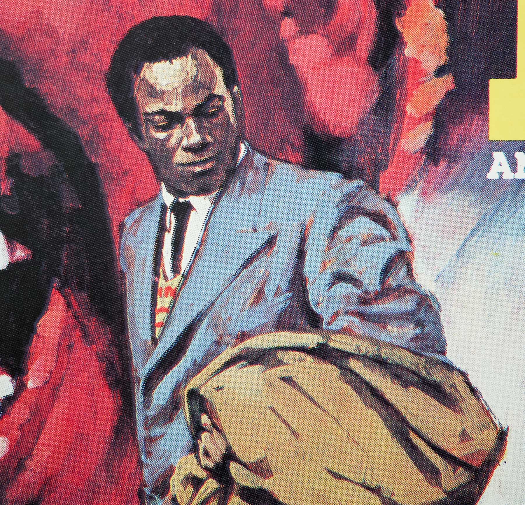
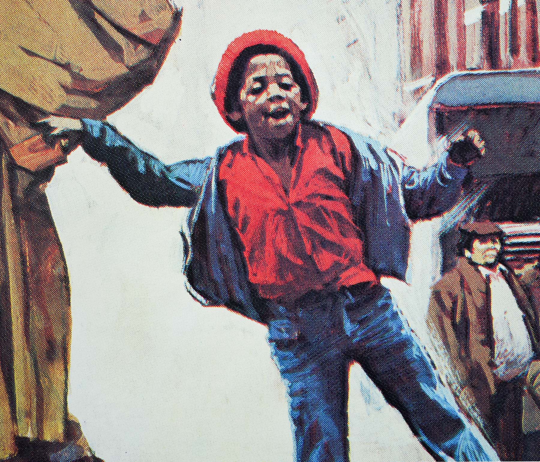
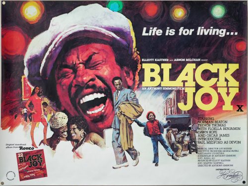
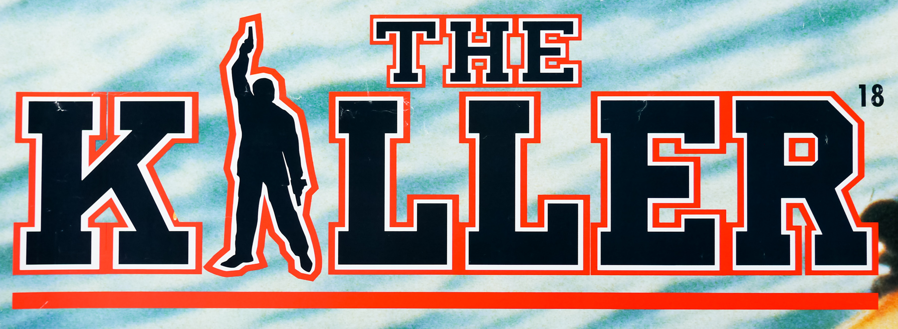
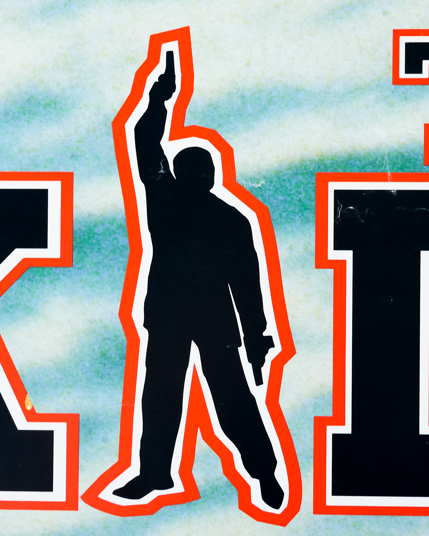
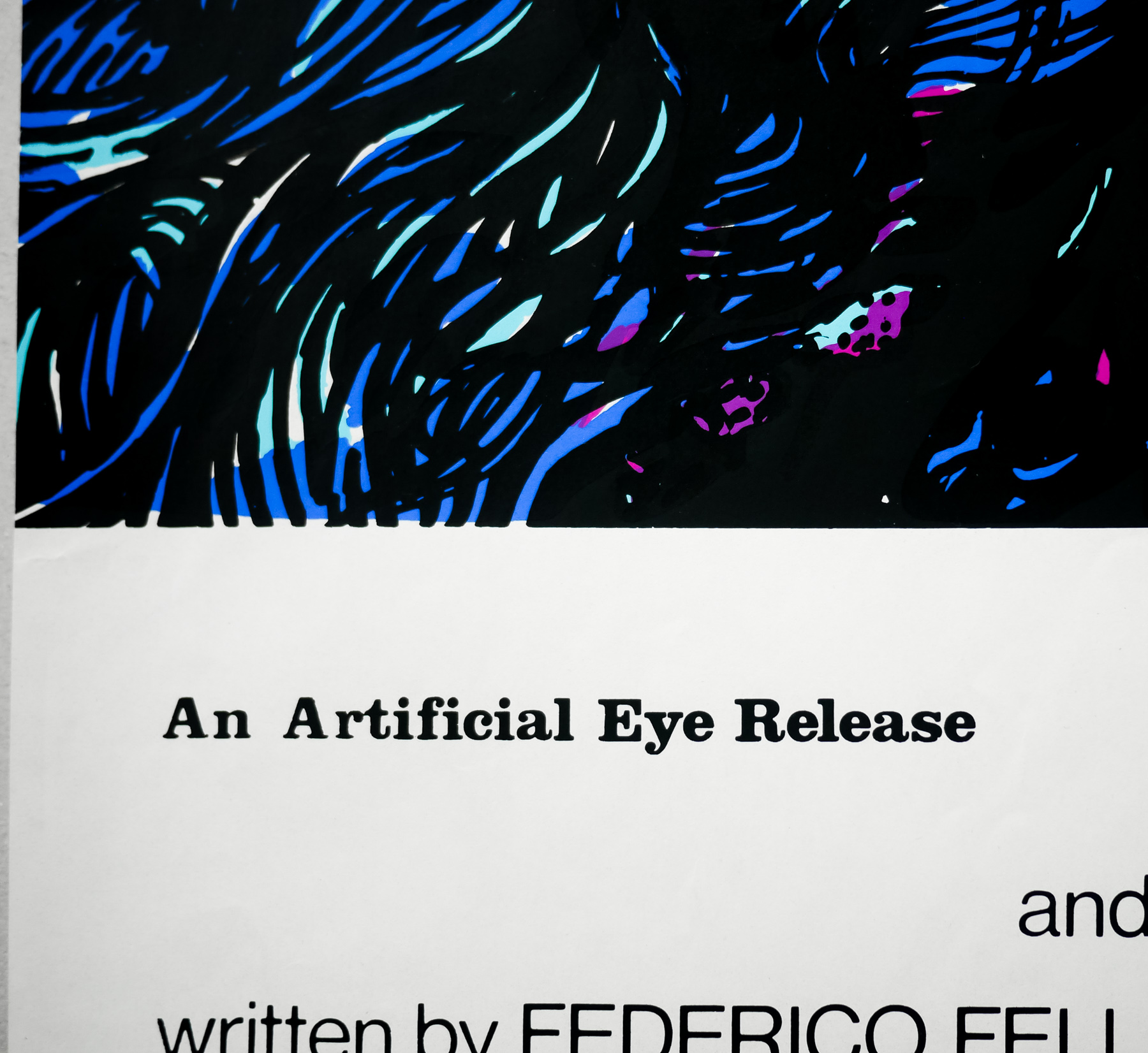
You searched for: Quad%2520

The Killer / quad / UK

02.08.13

Poster Poster
Title
The Killer
AKA
Dip huet seung hung (Hong Kong - original title) | Bloodshed of Two Heroes (International - literal title) | Blast Killer (West Germany)
Year of Film
1989
Director
John Woo
Starring
Chow Yun-Fat, Danny Lee, Sally Yeh, Kenneth Tsang, Paul Chu Kong
Origin of Film
Hong Kong
Genre(s) of Film
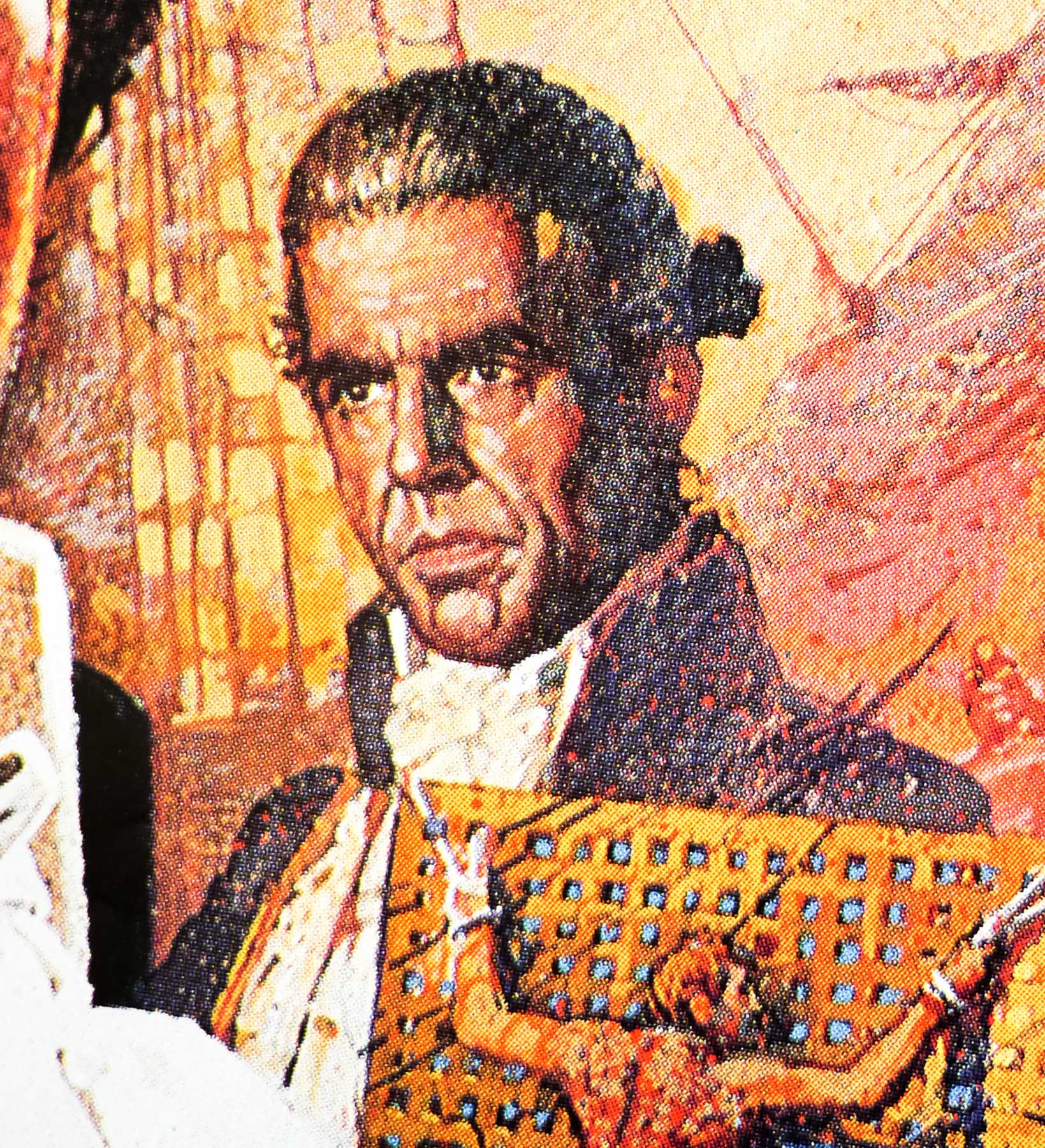
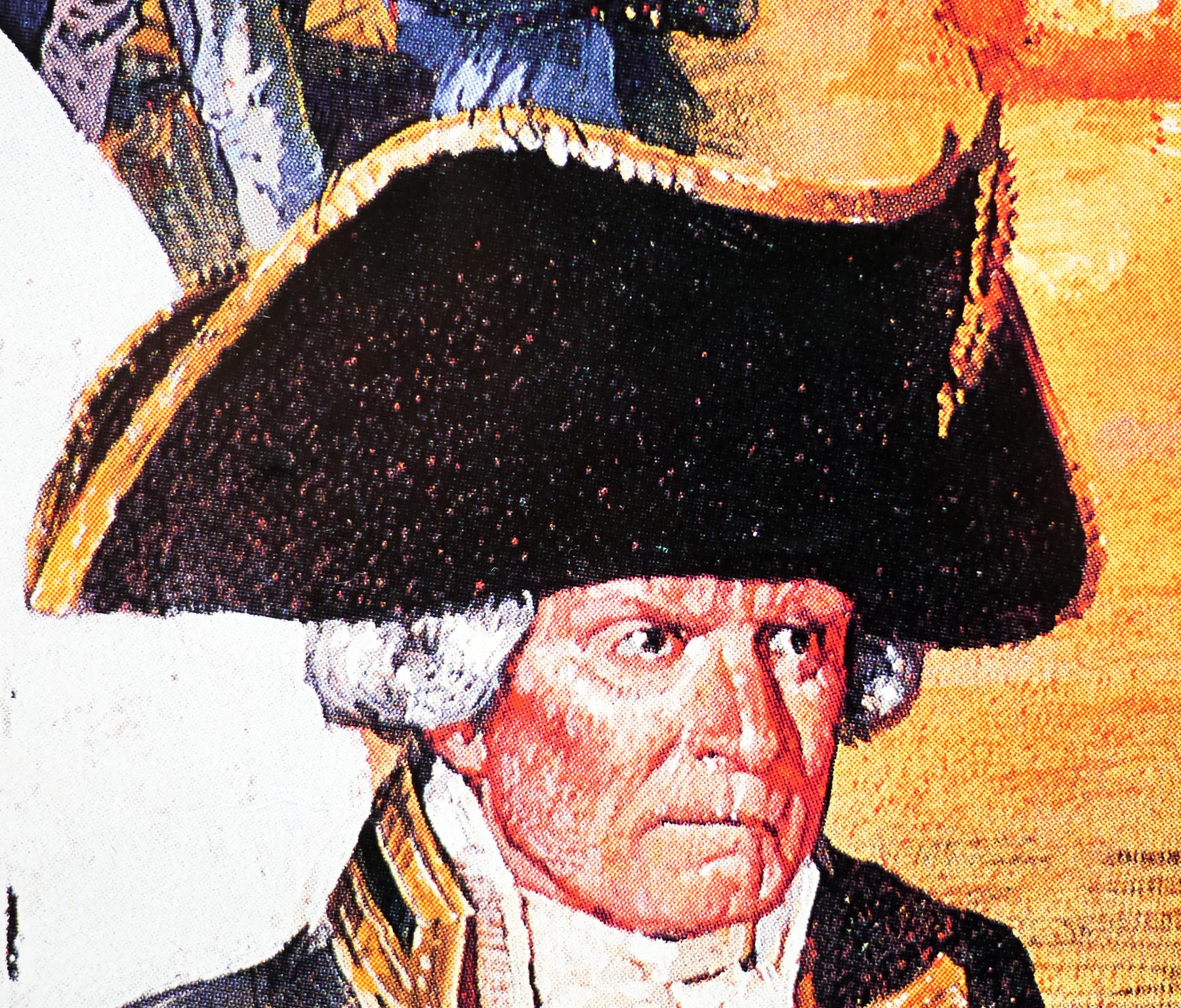
Chow Yun-Fat, Danny Lee, Sally Yeh, Kenneth Tsang, Paul Chu Kong,
Type of Poster
Quad
Style of Poster
--
Origin of Poster
UK
Year of Poster
1990
Designer
Unknown
Artist
--
Size (inches)
30 2/16" x 40"
SS or DS
SS
Tagline
--

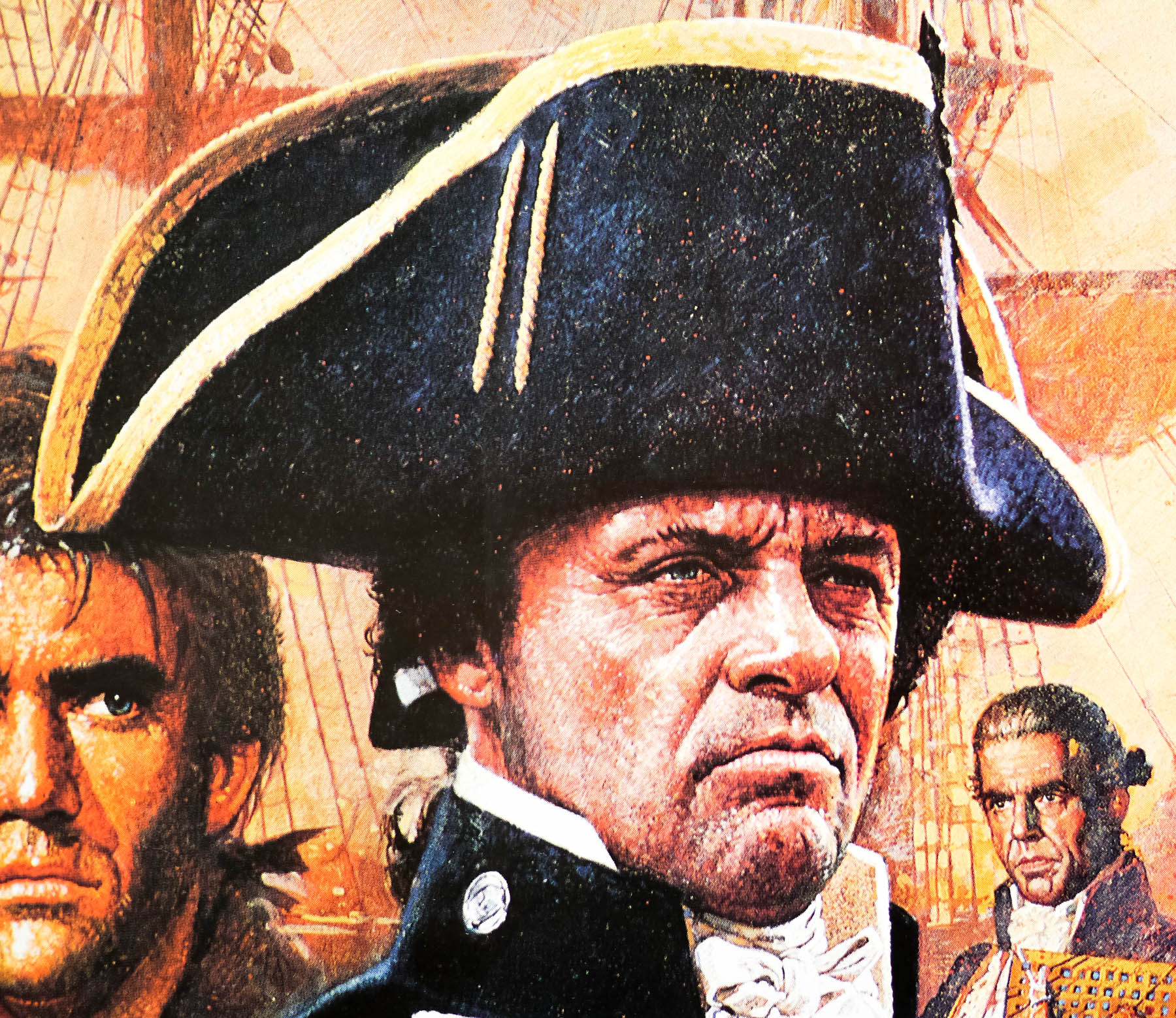
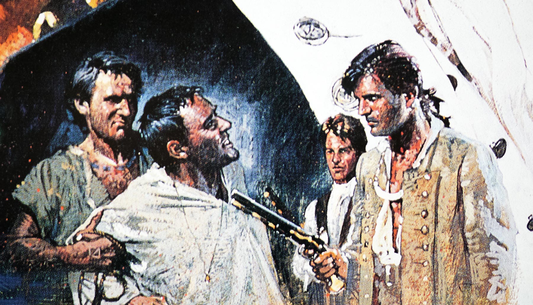
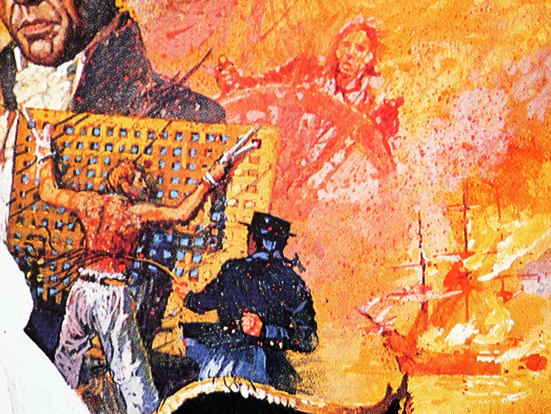
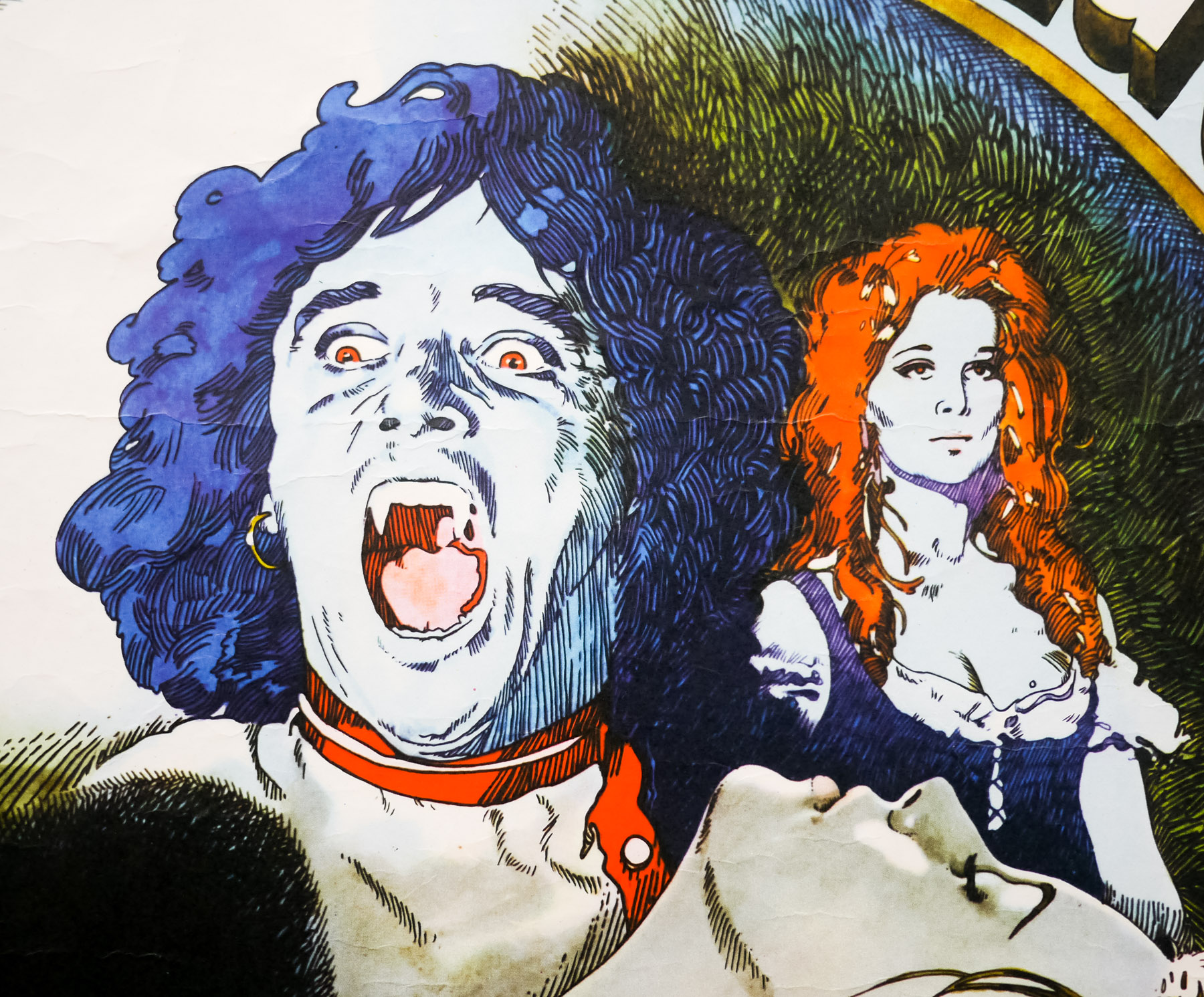
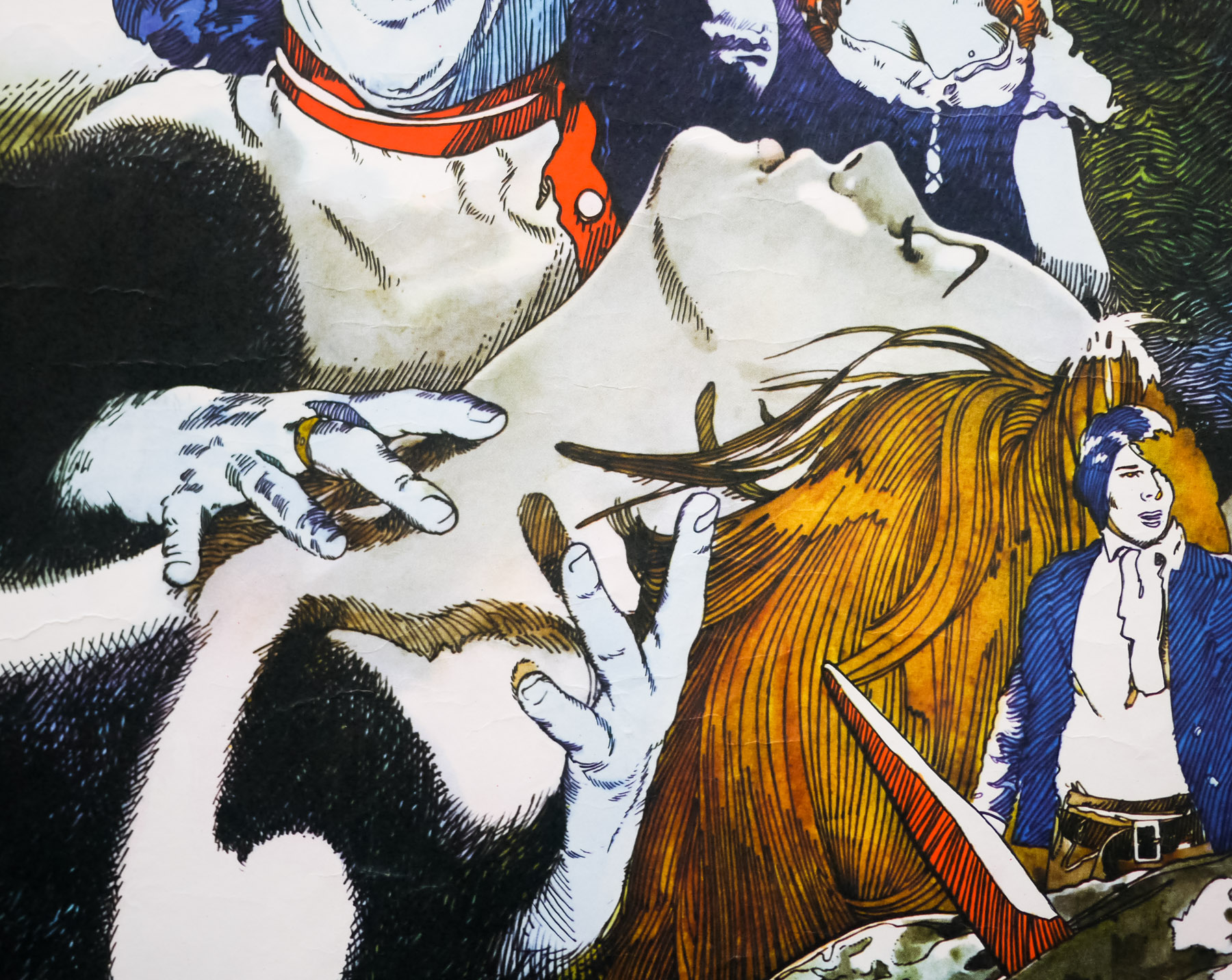
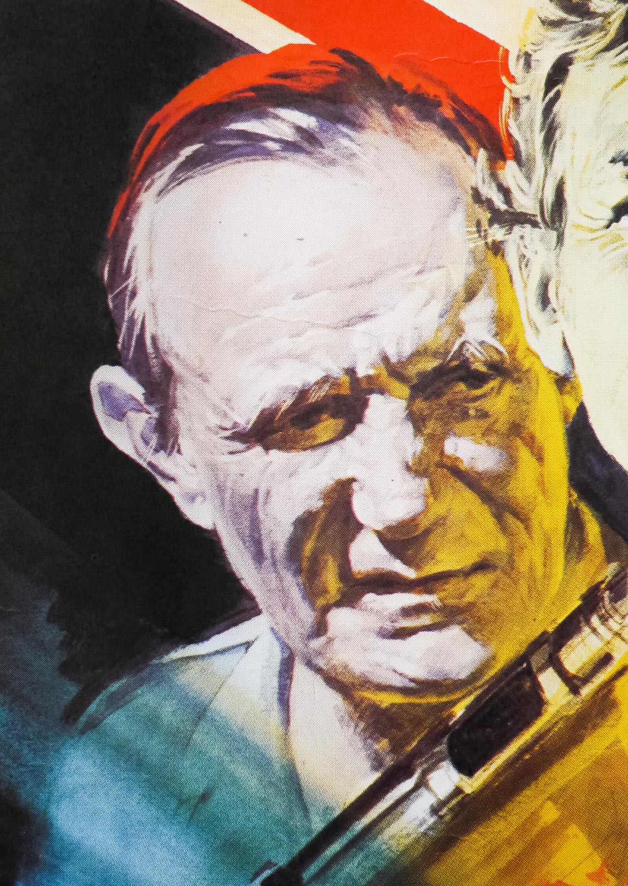
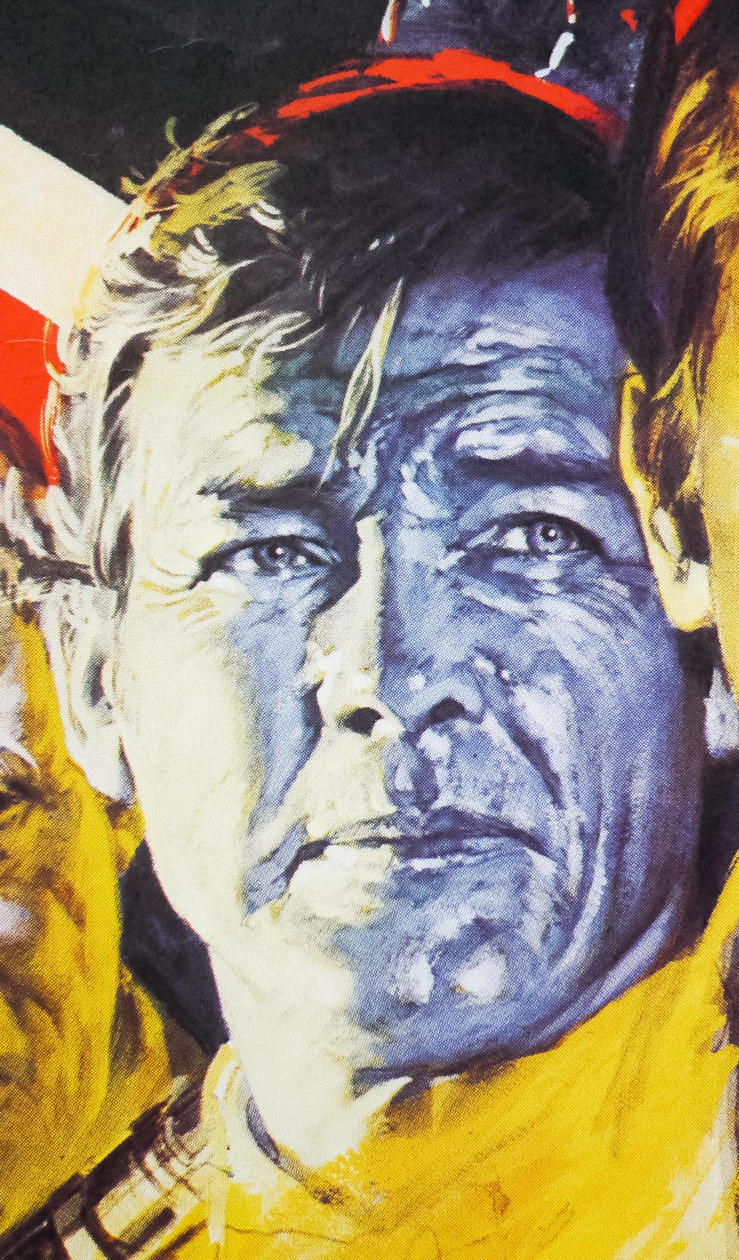
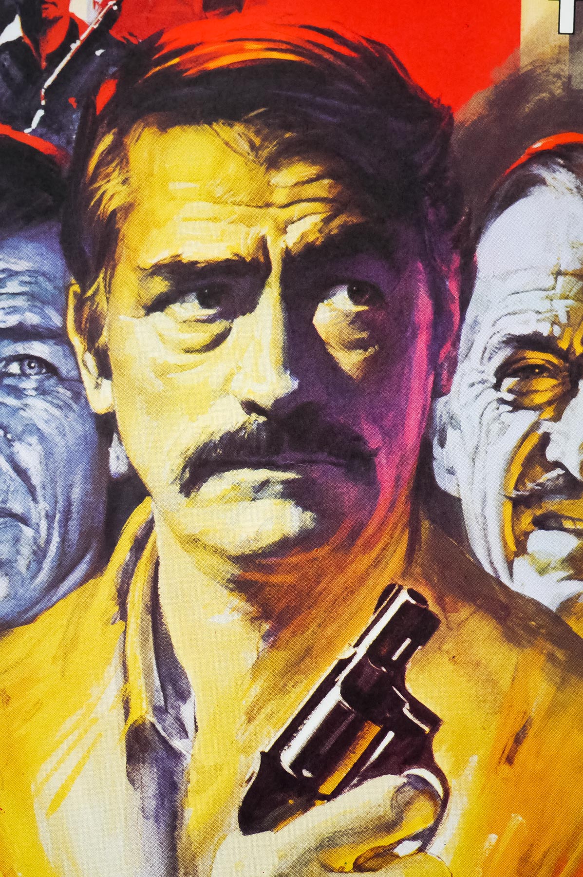
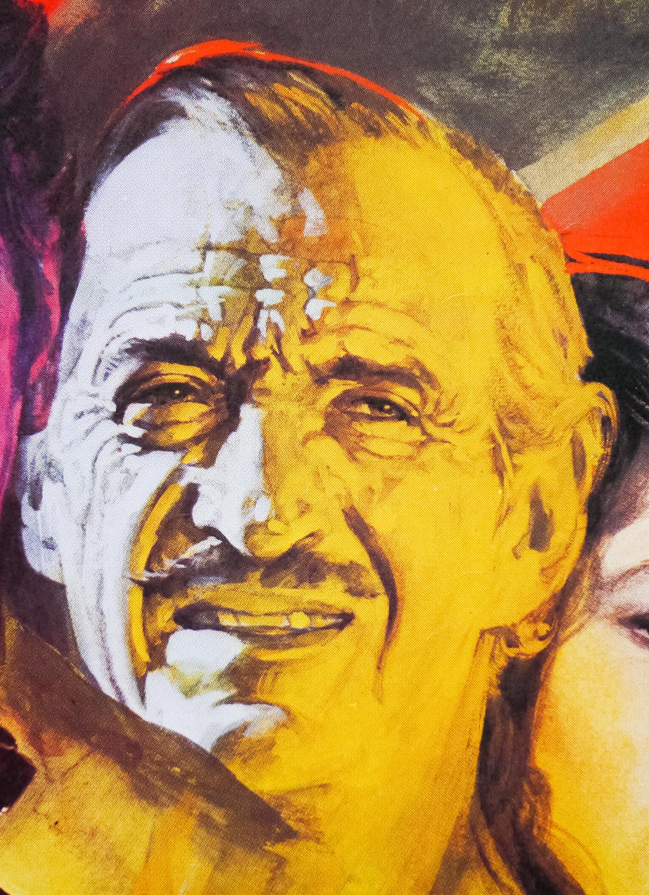
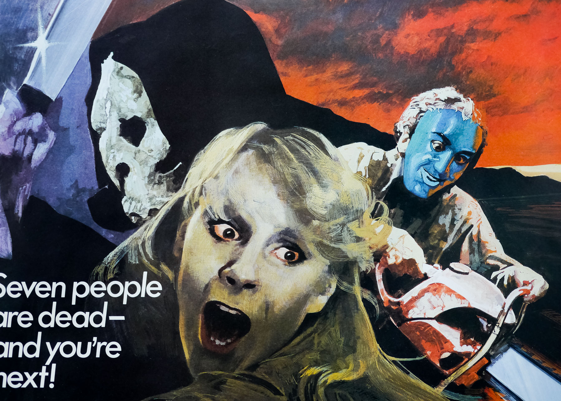
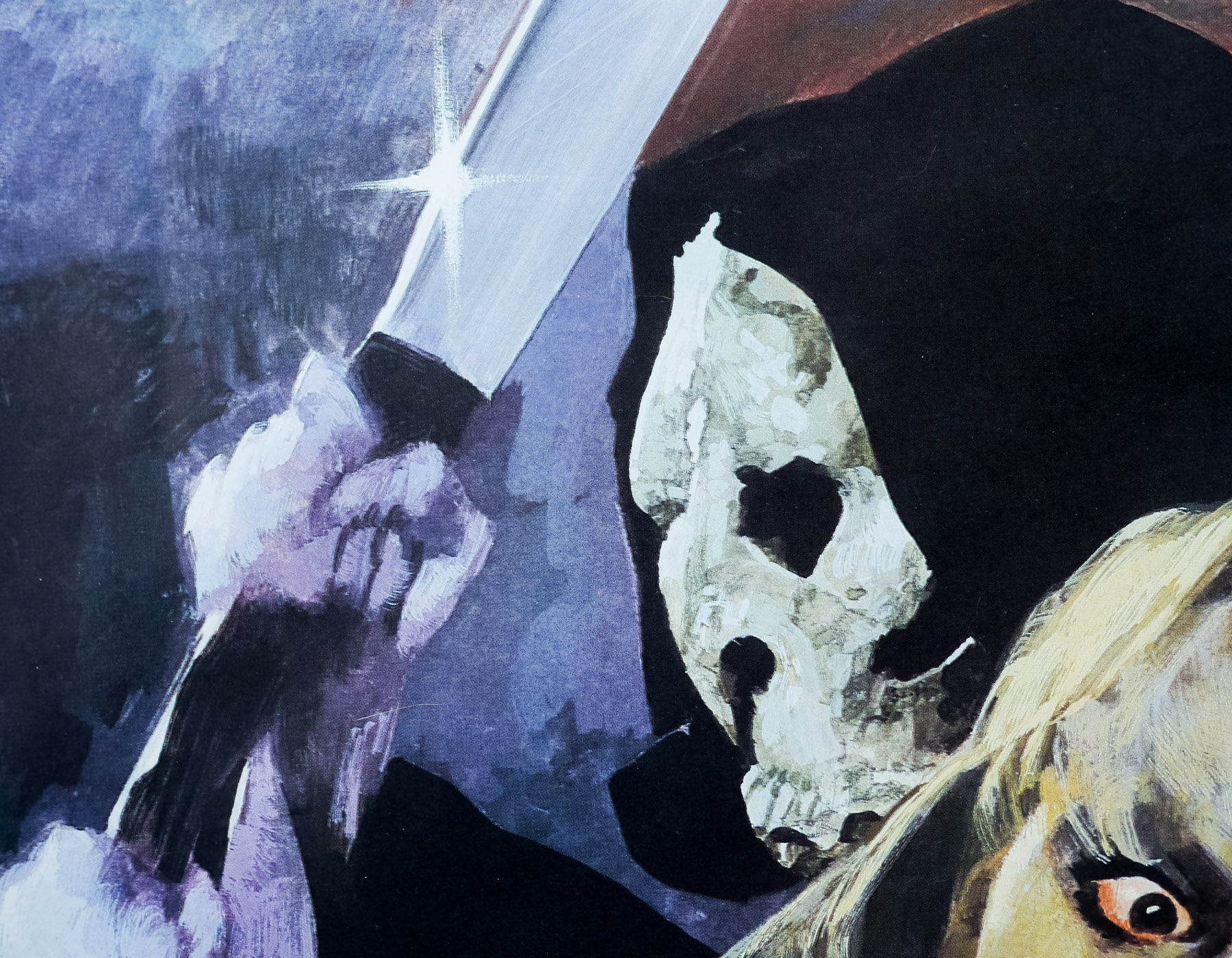
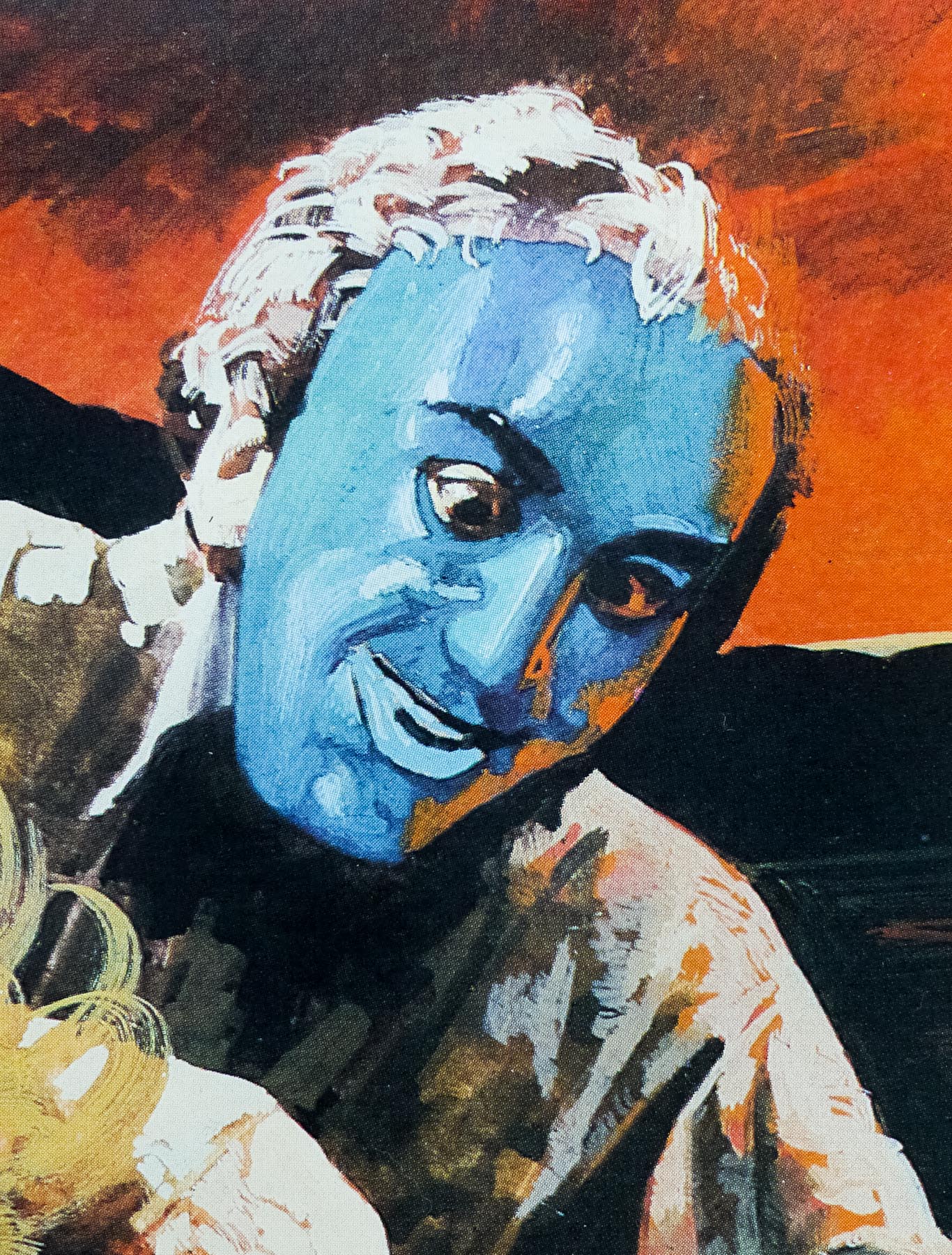
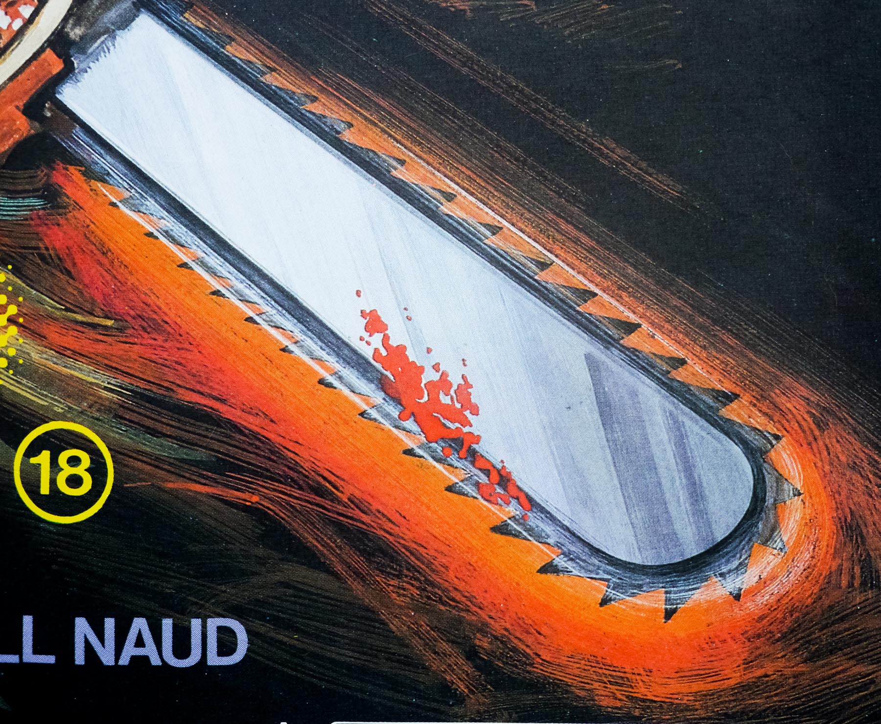
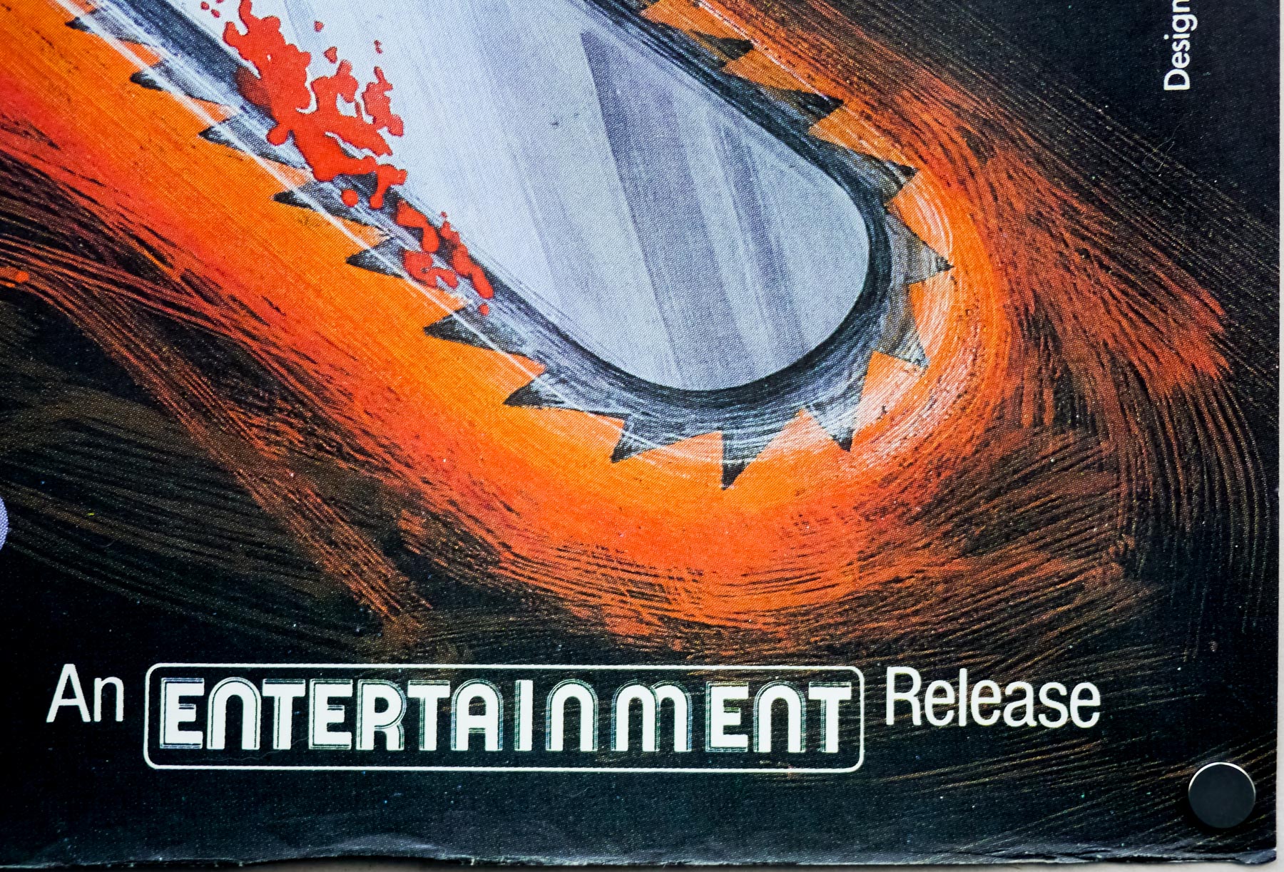
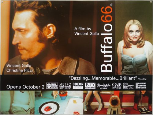
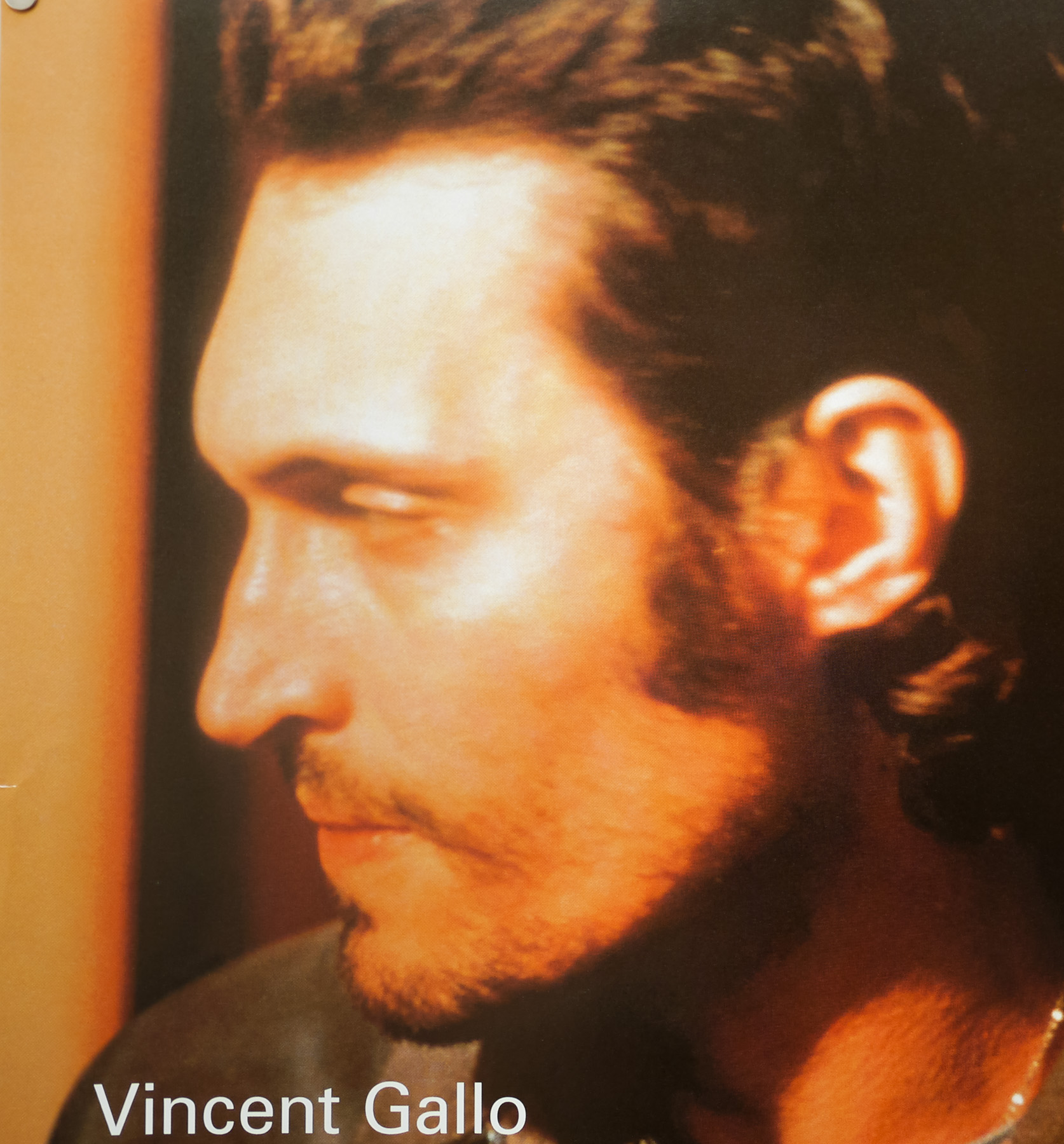
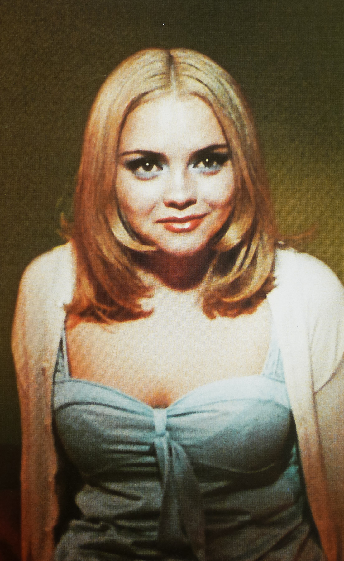
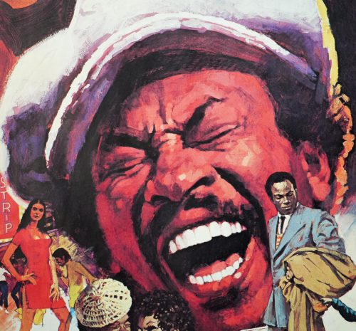
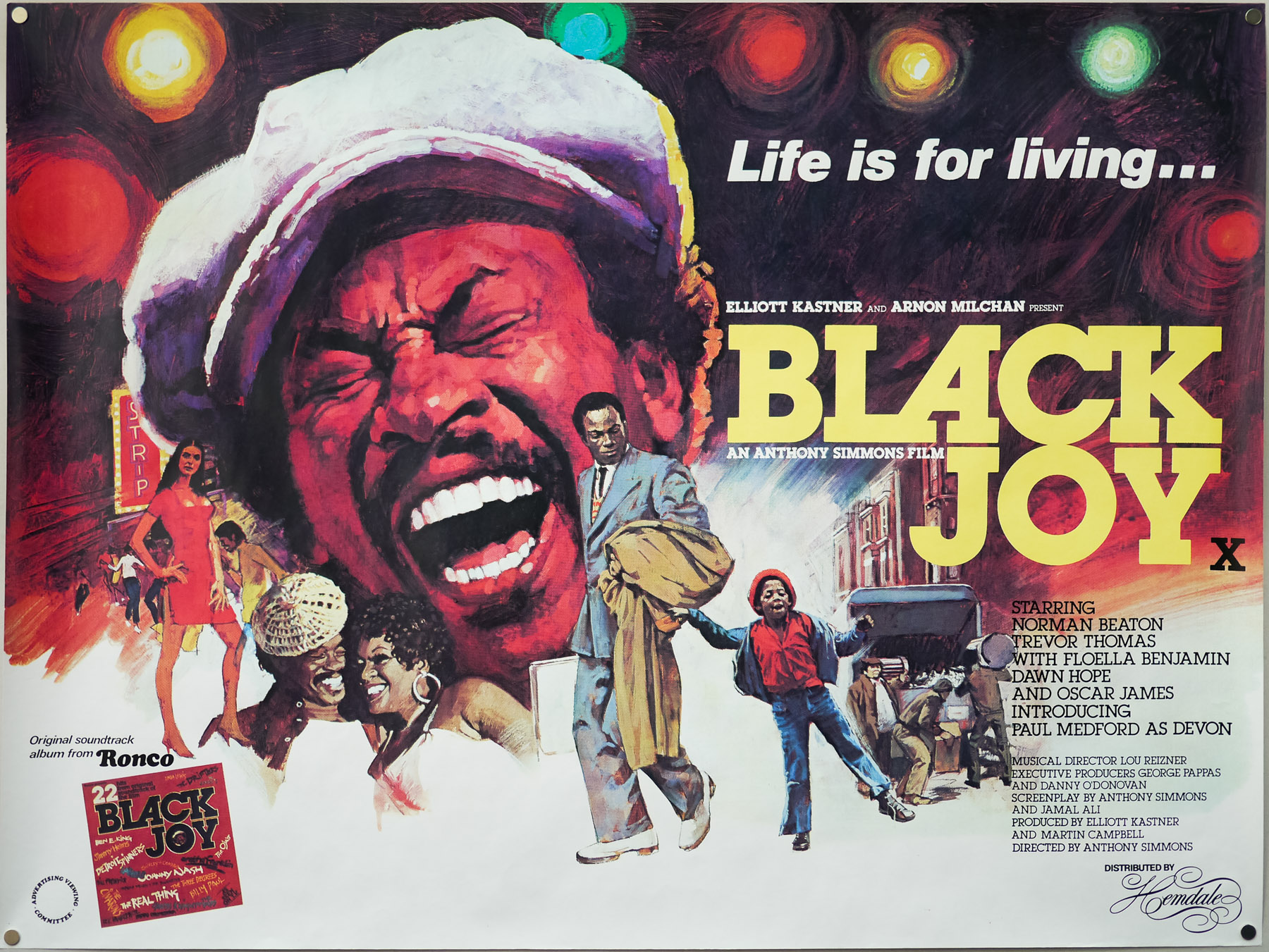
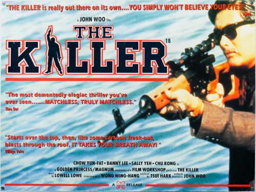
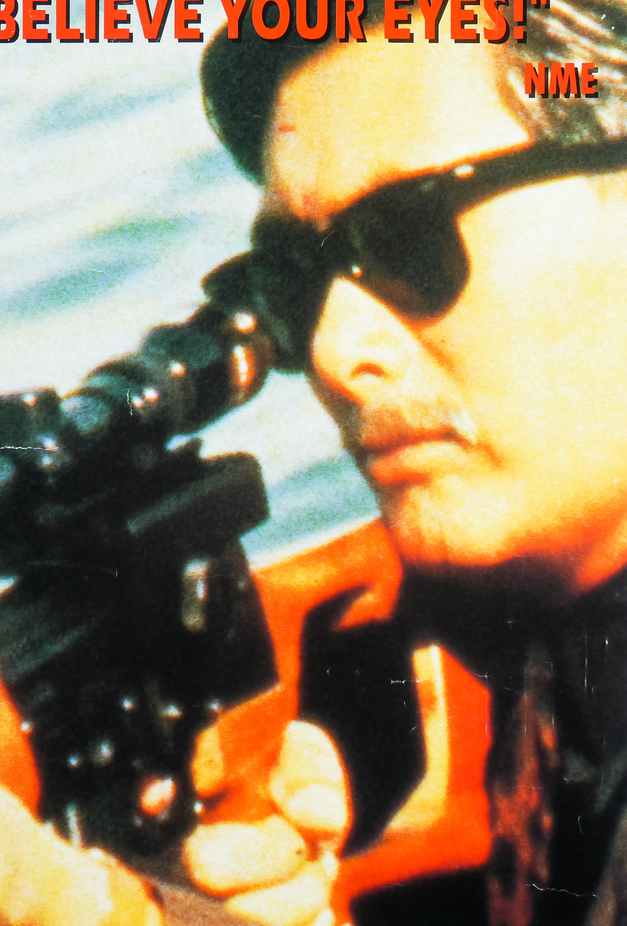
This is the scarce UK quad for the release of legendary Hong Kong director John Woo‘s landmark action-fest The Killer, which was the film that launched both him and lead actor Chow Yun-Fat onto the international stage. Although Woo had garnered acclaim for A Better Tomorrow (1986) and its sequel, both featuring Yun-Fat, it was The Killer’s perfect blend of hyper-kinetic violence, well-written characters and action spectacle that set it apart from Woo’s earlier films. The film would be followed by the spectacular Hard Boiled (1992), after which Woo’s career in Hollywood was launched, to somewhat mixed success. The Killer’s impact on other Western filmmakers cannot be denied, with the likes of Luc Besson clearly borrowing plot points and action beats for both Nikita and Léon: The Professional (1994), whilst both Robert Rodriguez (El Mariachi, Desperado) and Quentin Tarantino were clearly huge fans.

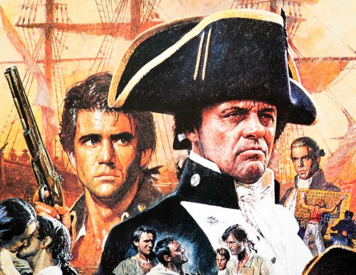
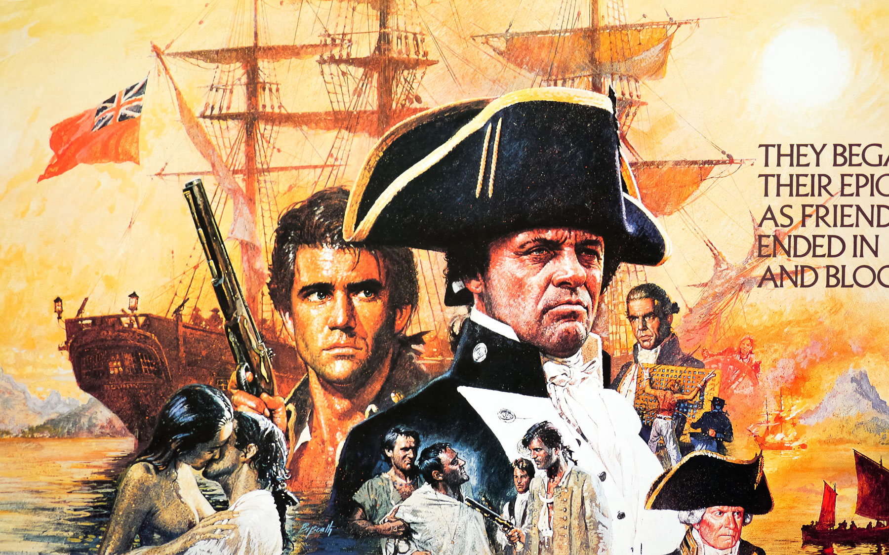
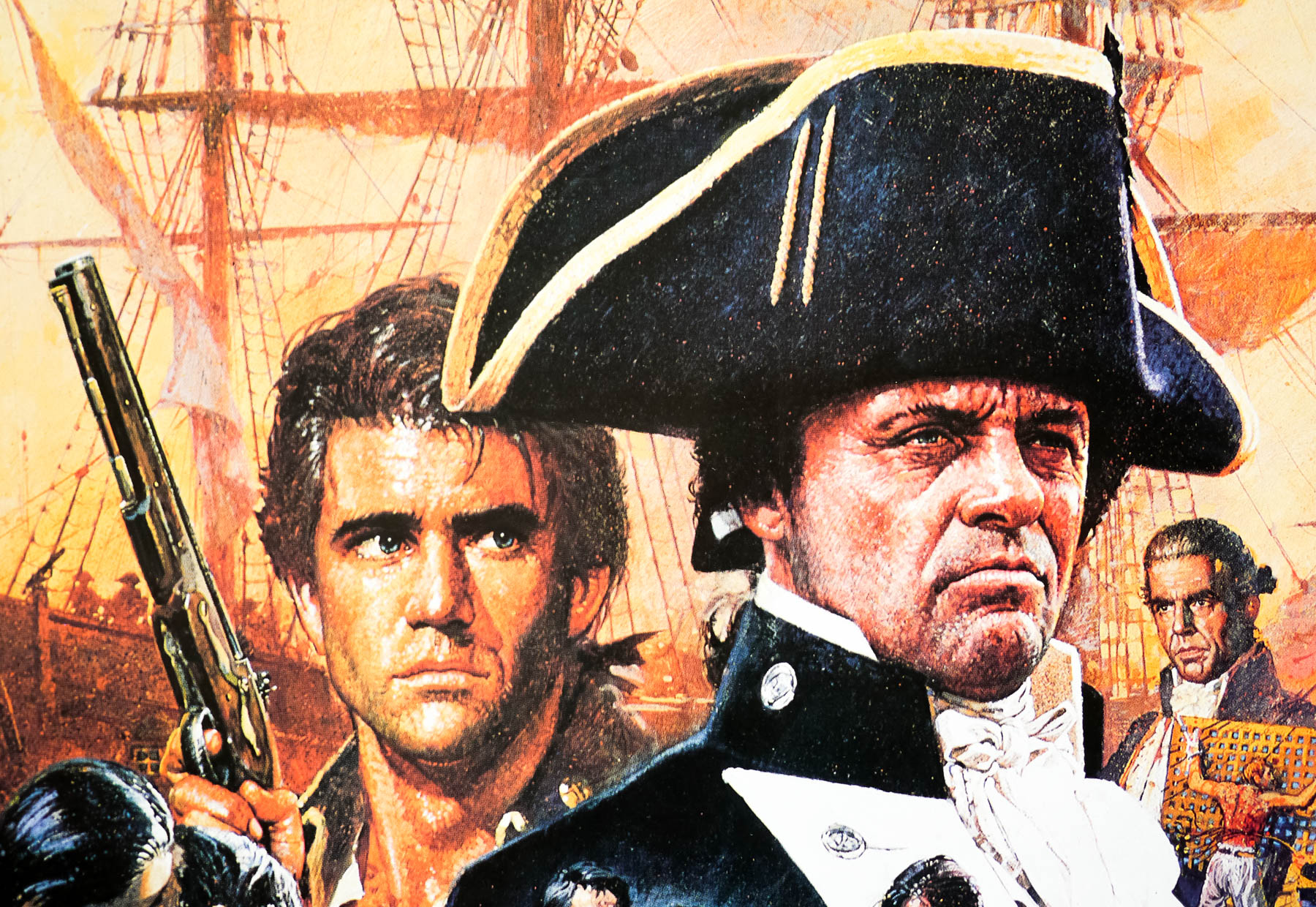
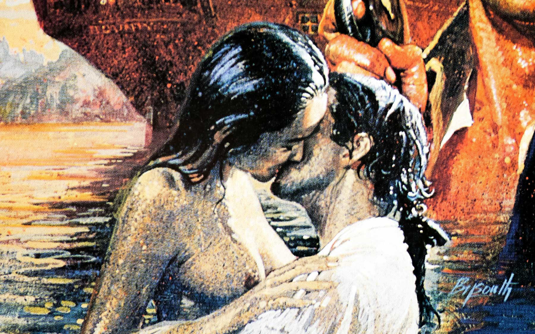
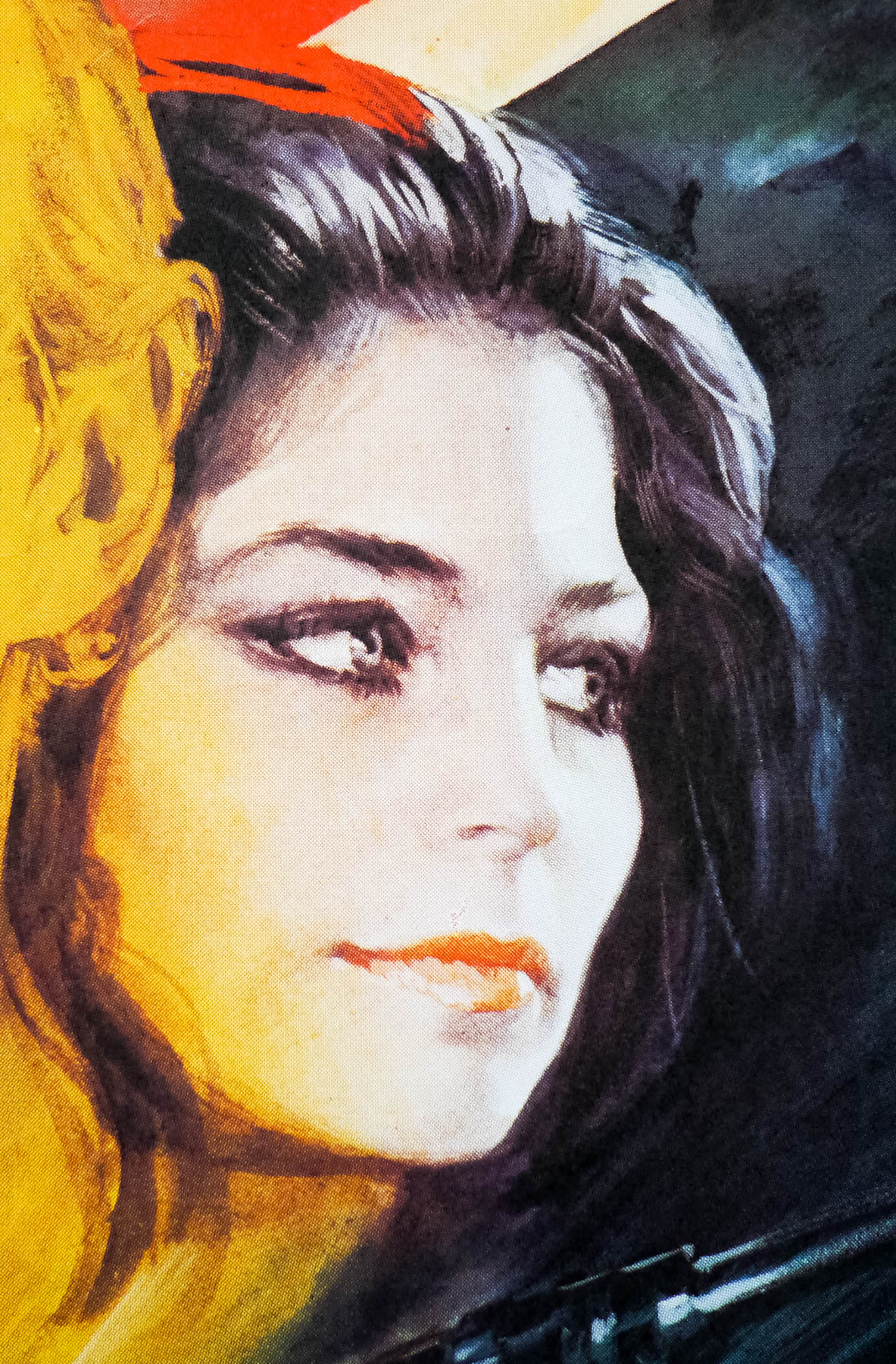
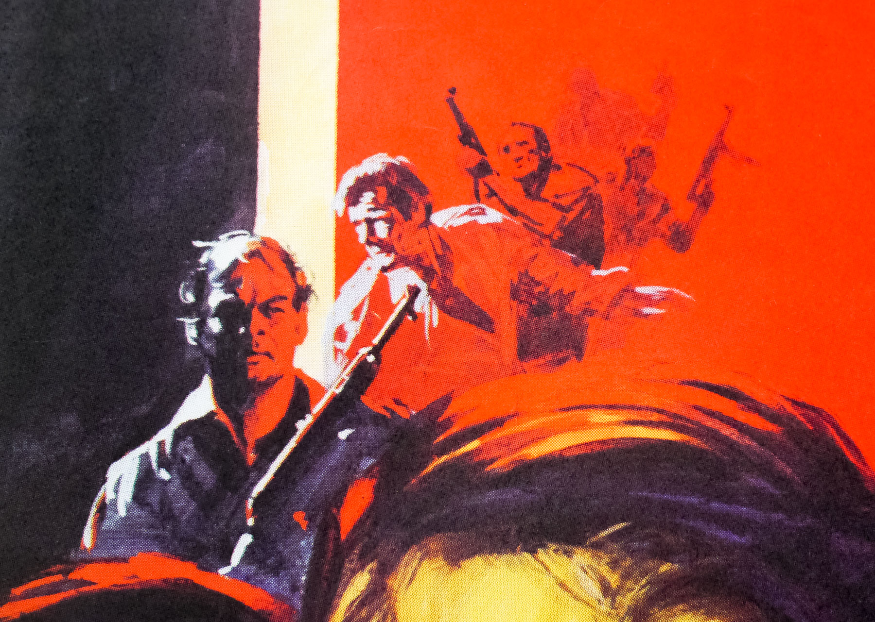
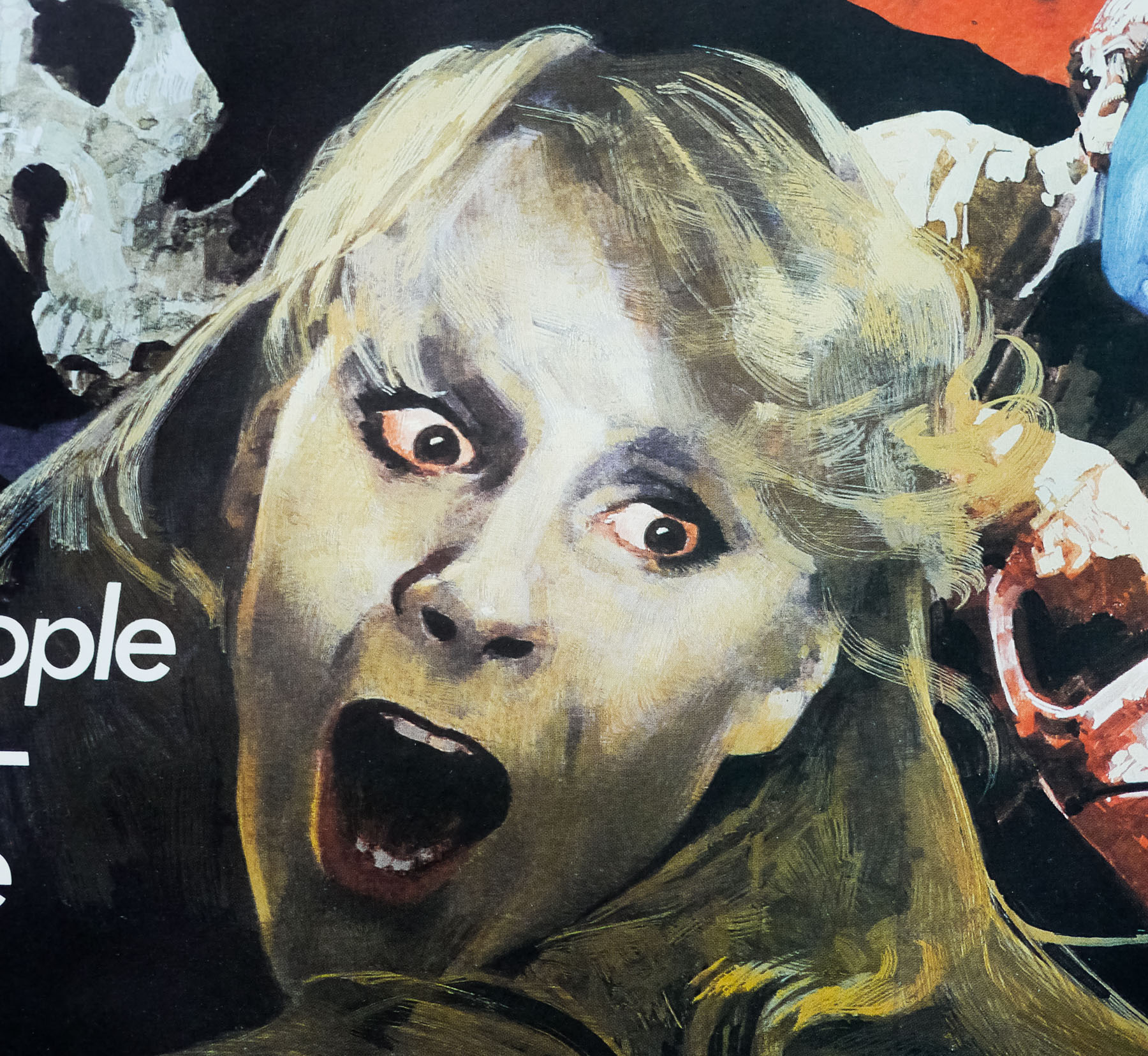
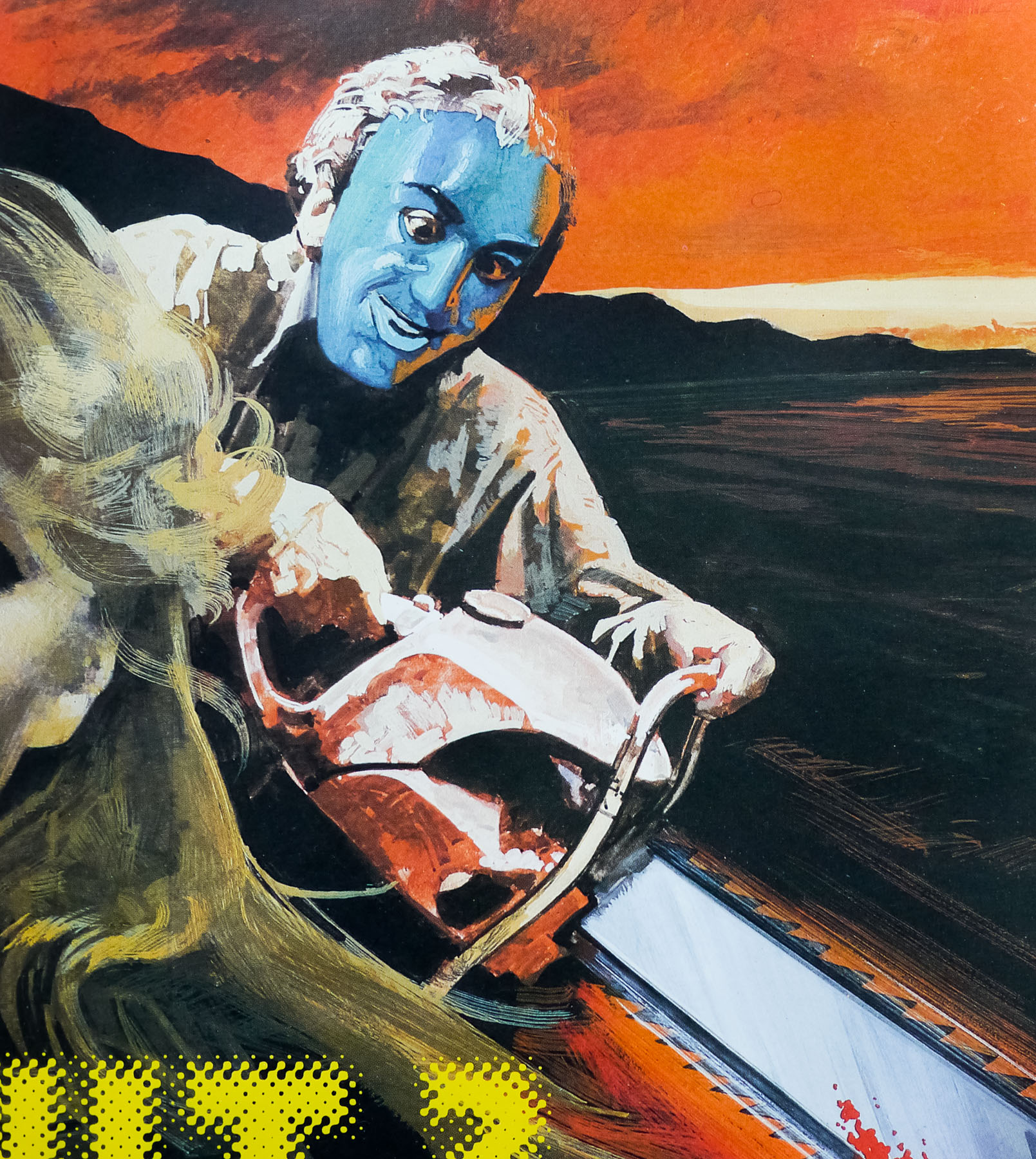
Chow Yun-Fat stars as a hired assassin who accidentally blinds a nightclub singer called Jennie (Sally Yeh) during the course of a hit, and after the pair strike up a relationship he decides to take one last job to pay for an operation to restore her sight. After being double-crossed by his Triad clients Ah Jong manages to escape from a group of hired guns, but not before coming to the attention of police detective Li Ying (Danny Lee). At first the hot-shot cop aims to take Ah Jong into custody but when he realises that he’s no ordinary hitman and sees the predicament he’s in, Detective Li decides to team up with the killer to take down the mobsters. This was the first film in which Woo used his trademark white doves taking flight in the middle of action scenes.

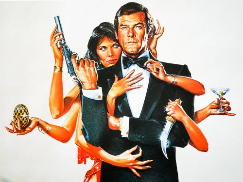
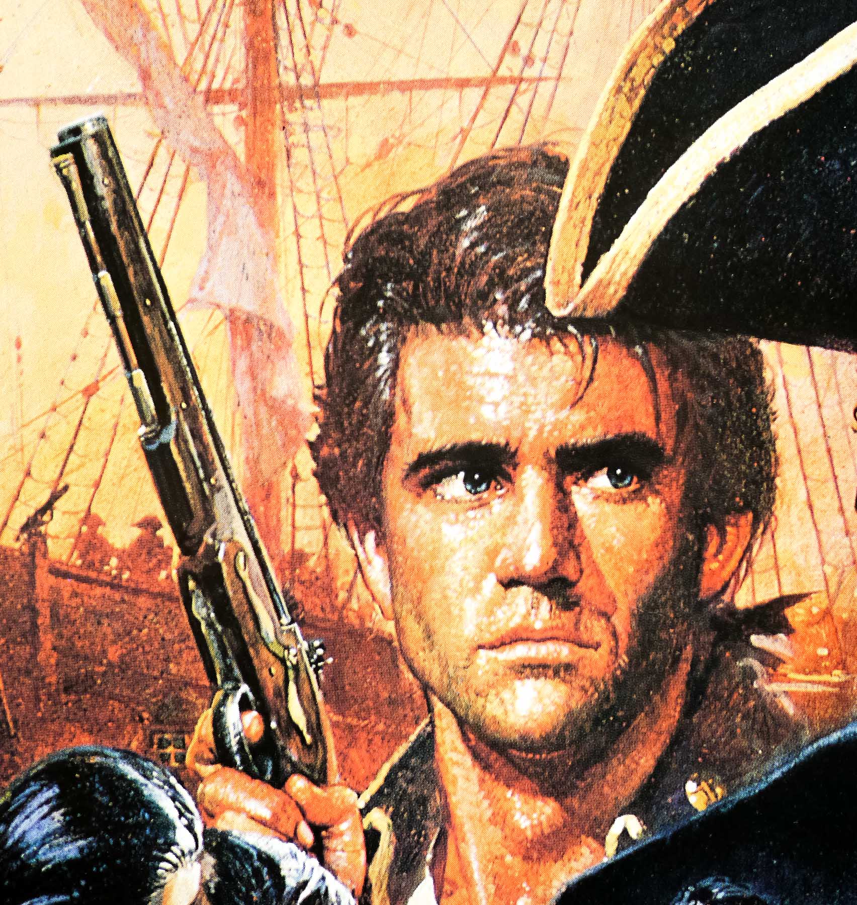
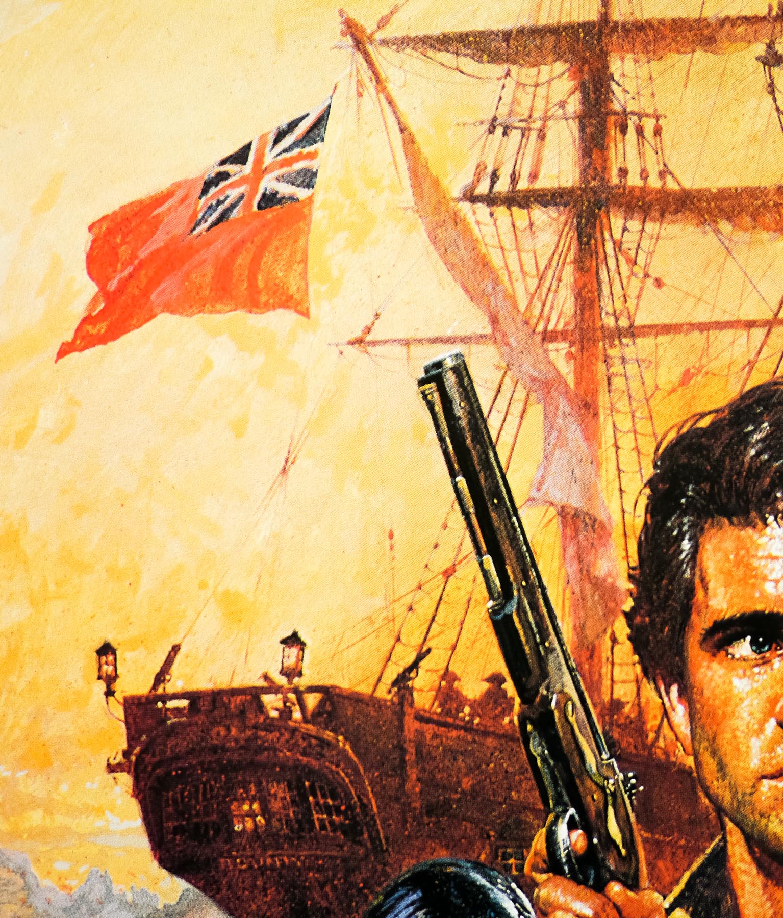
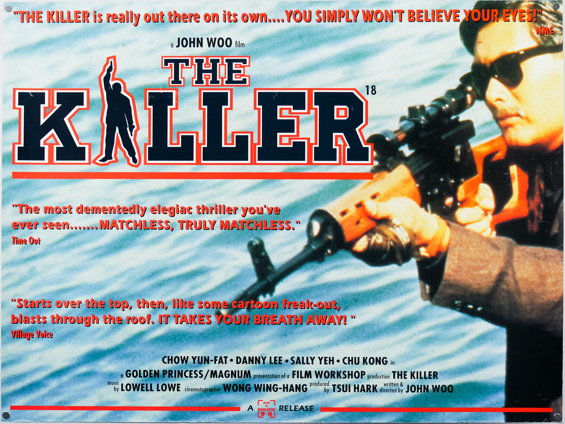
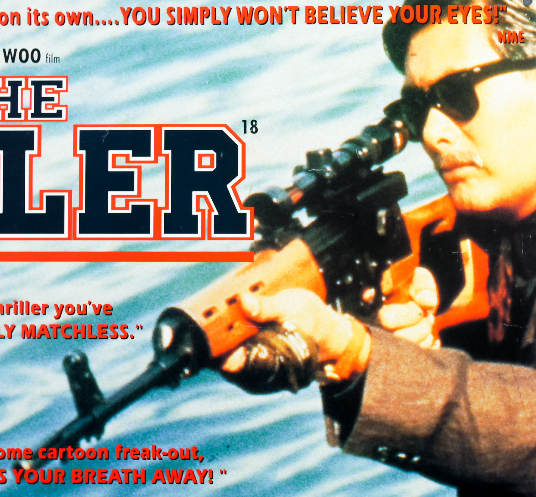
This quad features the same image of Yun-Fat holding the Dragunov sniper-rifle as seen on the American one sheet (although that image is illustrated) and this page on the Internet Firearms Database features gives a lengthy run-down of all the guns featured in the film (hint: a lot). The quote from the Time Out reviewer deserves special mention as you have to applaud anyone who uses the phrase ‘dementedly elegiac thriller’ and gets away with it.

Octopussy / quad / UK

09.08.13

Poster Poster

This is the UK quad for Roger Moore‘s sixth outing as the legendary spy, 1983’s Octopussy. Considered by many to be one of the weaker entries in the long-running series, the film nevertheless continued the more ‘realistic’ and down to earth approach that was taken for the previous entry, For Your Eyes Only (1981), following the over-the-top lunacy of Moonraker (1979). The story sees Bond sent to investigate the death of his fellow agent ‘009’ who perishes in front of the British embassy in East Berlin clutching a copy of a priceless Fabergé egg. When the trail leads to an auction house in London where the real egg is to be sold, Bond enters a bidding war with the mysterious Afghan prince Kamal Khan (Louis Jourdan), forcing him to spend several times its listing price.

After following Khan back to his palace in Rajasthan, India, the spy eventually ends up in the clutches of Khan’s bodyguard Gobinda (an imposing Kabir Bedi) and, after escaping, discovers that the prince is working with a power-hungry Soviet general named Orlov (Steven Berkoff) who plans to detonate a nuclear bomb in a US Air Force base in Germany in order to destabilise Europe and expand Soviet borders. Bond heads to a palace on an Indian lake on the trail of Octopussy (Maud Adams), the enigmatic leader of an all-female cult and head of a travelling circus troupe that Khan and Orlov plan to use to smuggle the weapon into the base. Bond must convince Octopussy that Khan is only using her for his nefarious plot and sets out to prevent the bomb from detonating before Europe is plunged into chaos.

This quad was jointly illustrated by both Renato Casaro, an Italian artist with a prolific output, and the American artist Dan Goozee who painted the central two figures for the US one sheet. They were reused here and then surrounded by the montage of action scenes painted by Casaro. On the Japanese B2, Casaro actually repainted the figures, which then sat alongside a slightly modified montage.

Renato Casaro began his career in 1953, aged 19, at the famous Studio Favalli in Rome, which was part of the legendary Cinecittà studios and handled film publicity for many Italian productions. Casaro soon decided to become a freelance artist and went on to design and paint posters for many of the biggest directors in the world. His skill at accurately portraying actors and his brilliant use of colour and composition saw him much in demand from studios and actors alike. His artwork has featured on many German posters as well as others from countries including Japan, UK, North America as well as in his native Italy.

Check out the incredible amount of work on his official website here, which also features a biography of the artist. The other posters I’ve collected by Casaro can be seen by clicking here.

The Bounty / quad / UK

09.09.13

Poster Poster
Title
The Bounty
AKA
--
Year of Film
1984
Director
Roger Donaldson
Starring
Mel Gibson, Anthony Hopkins, Laurence Olivier, Edward Fox, Daniel Day-Lewis, Bernard Hill, Philip Davis, Liam Neeson. Wi Kuki Kaa, Tevaite Vernette, Philip Martin Brown, Simon Chandler
Origin of Film
UK | USA
Genre(s) of Film
Mel Gibson, Anthony Hopkins, Laurence Olivier, Edward Fox, Daniel Day-Lewis, Bernard Hill, Philip Davis, Liam Neeson. Wi Kuki Kaa, Tevaite Vernette, Philip Martin Brown, Simon Chandler,
Type of Poster
Quad
Style of Poster
--
Origin of Poster
UK
Year of Poster
1984
Designer
Eric Pulford | Brian Bysouth
Artist
Brian Bysouth
Size (inches)
30 1/16" x 39 14/16"
SS or DS
SS
Tagline
They began their epic voyage as friends... it ended in hatred and bloodshed. | After 200 years, the truth behind the legend.

The Bounty was the fifth film based on the true life story of the Mutiny on the Bounty, which took place at sea onboard the British Royal Navy ship of the same name in 1789. The event saw a mutinous group of sailors led by Fletcher Christian place Captain William Bligh, and a group of sailors loyal to him, onboard a small launch (boat) before sailing back to the island of Tahiti where they wished to settle. Incredibly, Captain Bligh was able to navigate the tiny boat over 3600 nautical miles to Timor in the East Indies from where he was able to travel back to London and report the mutiny.

A Royal Navy ship (HMS Pandora) was dispatched with the task of rounding up the mutineers and the crew were successful in capturing fourteen of them, but were unable to locate Fletcher Christian or The Bounty itself. After setting sail back to England, the ship ran aground on part of the Great Barrier Reef and sank shortly thereafter, killing a number of the crew and four of the prisoners. Eventually the remaining mutineers were returned to face court martial in Britain, whilst those who escaped continued to try to evade justice aboard the Bounty before settling one of the tiny Pitcairn Islands in the Pacific Ocean to the east of Australia.

This version was originally being prepared for the screen by the legendary British director David Lean, but problems were encountered with getting the requisite financial backing for his vision of two films, later reconfigured to a TV series. Italian producer Dino De Laurentiis stepped in with the financial support and the film was reconfigured as a single feature. When Lean’s screenwriter partner Robert Bolt suffered a massive stroke, Lean decided to leave the project but had already overseen the construction of a replica Bounty and had successfully cast most of the roles.

Mel Gibson, who was to play Fletcher Christian, brought in a fellow Aussie Roger Donaldson to helm the film and production got underway. Featuring an extremely impressive cast, including Anthony Hopkins (as Captain Bligh), Laurence OlivierDaniel Day-Lewis and Liam Neeson, the film was considered to be something of a revisionist take on the event and was certainly more accurate than the two previous Hollywood versions. The Bounty was warmly critically received but was sadly something of a flop at the box office, failing to recoup even half of its budget in the US.

The artwork on this British quad was painted by the British artist Brian Bysouth, from an original design by Eric Pulford. When I interviewed the artist in 2012 this poster was discussed and the following is an excerpt from the article:

—————-

One Bond poster you worked on is the quad for For Your Eyes Only. It had the Bill Gold designed element of the long legs, but you modified the montage when doing the finished illustration?
Eric Pulford created the U.K. poster design that was approved. The inclusion of the very iconic Bill Gold legs concept was a must in any design that was submitted, so I suppose the scope for fresh designs was limited. In my opinion Eric’s original montage was not his best work and, although I tried to re-arrange some of the elements, the reference material supplied was not very exciting and I think the surrounding montage looks rather ordinary.

A similar difficulty arose with the design Eric had done for The Bounty (1984). His atmospheric colour rough was exciting, but when I began to sketch out the finished painting I realised the perspective of the ship was flawed. Eric’s exciting random montage of characters had initially disguised the shortcoming. I spent a day redrawing the ship and rigging to ensure it was reasonably correct, and then moved the characters to try to improve the composition. I was pleased with the final painting but was never happy with the montage, which I really thought needed recomposing. I didn’t think a confrontation with Eric was in my best interest.

Some weeks later I asked for the return of my painting only to be told, ‘it could not be found’.  Obviously, a light-fingered person took a fancy to it. Much of my work has been lost to me in that way, including my teaser art for A View to a Kill.

—————-

The other posters I have that were designed and/or painted by Brian Bysouth can be viewed here.

Moonraker / quad / UK

30.09.13

Poster Poster
Title
Moonraker
AKA
Agente 007, Moonraker: Operazione Spazio [Operation Space] (Italy)
Year of Film
1979
Director
Lewis Gilbert
Starring
Roger Moore, Lois Chiles, Michael Lonsdale, Richard Kiel, Corinne Clery, Bernard Lee, Geoffrey Keen, Desmond Llewelyn, Lois Maxwell, Toshirô Suga, Blanche Ravalec
Origin of Film
UK | France
Genre(s) of Film
Roger Moore, Lois Chiles, Michael Lonsdale, Richard Kiel, Corinne Clery, Bernard Lee, Geoffrey Keen, Desmond Llewelyn, Lois Maxwell, Toshirô Suga, Blanche Ravalec,
Type of Poster
Quad
Style of Poster
--
Origin of Poster
UK
Year of Poster
1979
Designer
Unknown
Artist
Dan Goozee
Size (inches)
30 1/16" x 39 15/16"
SS or DS
SS
NSS #
--
Tagline
Where all the other Bonds end... this one begins!

Although considered by most Bond fans to be one of the weakest of the series, I know I’m not the only one to have a soft spot for Moonraker, Roger Moore‘s fifth outing as James Bond. Thanks to endless TV showings during the 1980s and early 1990s I’ve probably seen this more than any other in the series and, like Live and Let Die, it had a huge impression on my young mind.

Looking at it through the cynical fog of adulthood it’s easy to sneer at the camp script, supremely daft action sequences (motorised Gondola anyone?) and painfully obvious attempt to cash in on the success of Star Wars (a very common theme amongst films released in its wake). The film is probably the quintessential outing for Moore as Bond and only he could have pulled it off as well as he did, particularly when it comes to the hokey script and madcap action.

The film features several memorable sequences, including a stunning cable car fight over Rio de Janeiro, and a decent bad guy in Richard Kiel‘s inimitable ‘Jaws’ who used to scare me senseless as a kid. Also notable is John Barry‘s soundtrack, which marked a departure from his previous Bond work by mainly using strings instead of the typical brass. The film also features one of the most (literally) eyebrow-raising character names in the form of Dr Holly Goodhead (Lois Chiles) and one of the best/worst sign-offs of the entire series:

Sir Frederick Gray, Minister of Defence:  My God, what’s Bond doing?
Q: I think he’s attempting re-entry, sir.

This is the British quad featuring artwork by the American artist Dan Goozee that was also used on the final Moonraker US one sheet and on the film’s posters in several other countries. Because the original artwork was copied to create this quad before computer technology meant easy recycling of images, the artwork is slightly ‘softer’ than on the one sheet, with some parts of the image not as sharp as they could be. This is the case on every copy of the poster I’ve ever handled. Dan Goozee also worked on several other James Bond posters including the international advance one sheet for Moonraker, the artwork for Octopussy and two one sheets for A View to a Kill.

Other posters I’ve collected by Goozee can be seen here.

Dead and Buried / quad / UK

14.10.13

Poster Poster
Title
Dead and Buried
AKA
Zongeria (Japan)
Year of Film
1981
Director
Gary Sherman
Starring
James Farentino, Melody Anderson, Jack Albertson, Dennis Redfield, Nancy Locke, Robert Englund
Origin of Film
USA
Genre(s) of Film
James Farentino, Melody Anderson, Jack Albertson, Dennis Redfield, Nancy Locke, Robert Englund,
Type of Poster
Quad
Style of Poster
--
Origin of Poster
UK
Year of Poster
1981
Designer
Unknown
Artist
Dario Campanile
Size (inches)
30" x 39 15/16"
SS or DS
SS
Tagline
The writers of Alien... bring a new terror to earth | A new dimension in fear...

An iconic piece of horror artwork adorns this UK quad for the release of the American horror film Dead and Buried. As the poster’s top tagline highlights, the film was written by Ronald Shusett and Dan O’Bannon, the two screenwriters responsible for the 1979 sci-fi masterpiece Alien and it was directed by Gary Sherman whose previous film had been the creepy ‘cannibals on the London Underground’ horror Raw Meat (AKA Deathline) almost a decade earlier. The story is set in the seemingly normal New England seaside town of Potter’s Bluff and sees the local Sheriff Dan Gillis (James Farentino) investigating a series of mysterious disappearances of strangers visiting the area. The baffling thing for the sheriff is that the strangers are then reappearing some days later now seemingly a member of the community.

The viewer bears witness to a series of gruesome murders beginning with that of a photographer (Christopher Allport) who is seduced on the town beach before being attacked by several people from the town who beat him and burn him alive whilst taking photographs. It soon becomes clear that Potters Bluff’s eccentric mortician William G. Dobbs (Jack Albertson AKA Grandpa Joe from Willy Wonka and the Chocolate Factory) has been practicing some fairly unorthodox patient handling in his morgue and the sheriff sets out to put a stop to his plans.

Apparently, the film went through a number of edits at the request of one of the financiers and was moulded into more of a dark horror film than Gary Sherman had originally intended, with two additional killings inserted and filmed without the assistance of effects maestro Stan Winston (these are noticeably different in tone and quality of execution than the rest of the film). Despite this, Dead and Buried is a solid horror film with a creepy atmosphere, excellent production design and some memorable turns, particularly from Albertson and Melody Anderson as Dan Gillis’ wife who harbours a dark secret.

The artwork was painted by the Italian artist Dario Campanile who was born in Rome in 1948 and nurtured a talent for painting still life that would see him exhibiting and selling his artwork by the time he was 18. After spending time in London to learn English whilst also selling his art at a pop-up stall in Hyde Park and later in Kings Road galleries, Dario returned to Rome where he further evolved his style with the aid of a French art consultant. His next move took him to California where he would receive a break when the owner of a Beverly Hills gallery liked his portfolio so much he was offered a one-man show, and this in turn led to him meeting a number of high-profile collectors, several from the music and film industries. Before long he was taking commissions for album and book covers and this poster is clearly the result of one of those meetings.

His official website features galleries of his work as well as an extensive biography that details his life up to now, including the fact that he painted the 75th anniversary logo for Paramount. The artist currently resides in Maui, Hawaii and continues to paint to this day.

This artwork was used on this UK quad as well as the American one sheet. I’ve been unable to discover any other films that Campanile painted a poster for so please get in touch if you are aware of any others.

Castaway / 1986 / quad / UK

18.11.13

Poster Poster

An excellent use of a classic optical illusion graces this British quad for the release of Castaway, a film based on the true story of a British man called Gerald Kingsland who decided to try living as a modern day Robinson Crusoe on a remote island near Australia in 1980. Kinglsand put an advertisement in London’s Timeout magazine looking for a woman to share a year with him on the island and, surprisingly, a woman named Lucy Irvine, who was less than half his age, agreed to join him. The pair lived on Tuin Island for close to a year and almost perished from malnutrition before being rescued by natives from another island. The pair returned to the UK and both wrote a book about their experiences. Lucy Irvine’s Castaway was published in 1983 and was the basis for this film.

British director Nic Roeg (Don’t Look Now, The Man Who Fell to Earth) took on the project and a hirsute, portly Oliver Reed was cast as Kingsland, whilst a then relatively unknown Amanda Donohoe was hired to play Irvine. Filming took place in the Seychelles and Roeg changed several elements of the original book but most of the major events were kept in place. Donohoe certainly puts in a brave performance (read: she’s naked for a vast majority of the running time) and Reed was arguably perfect casting as Kingsland.

This quad was created by the British designer and artist Vic Fair who had worked with Roeg on a number of his posters, including the iconic one he designed and illustrated for The Man Who Fell to Earth. Originally the artist Brian Bysouth, a frequent collaborator with Vic, was asked to paint a ‘final’ version of the artwork based on Fair’s rough, but Roeg apparently liked the original version so much that they decided to print it instead. The use of optical illusions and juxtaposition of elements was a common theme with Vic Fair’s work.

Black Emanuelle / quad / UK

26.03.14

Poster Poster
Title
Black Emanuelle
AKA
Emanuelle nera (original title)
Year of Film
1975
Director
Bitto Albertini
Starring
Laura Gemser, Karin Schubert, Angelo Infanti, Isabelle Marchall, Gabriele Tinti, Don Powell, Venantino Venantini
Origin of Film
Spain | Italy
Genre(s) of Film
Laura Gemser, Karin Schubert, Angelo Infanti, Isabelle Marchall, Gabriele Tinti, Don Powell, Venantino Venantini,
Type of Poster
Quad
Style of Poster
--
Origin of Poster
UK
Year of Poster
1976
Designer
Vic Fair
Artist
Vic Fair
Size (inches)
30" x 39 15/16"
SS or DS
SS
Tagline
A new experience in sensuality.

A striking design by British artist Vic Fair features on this UK quad for the release of Black Emanuelle, an Italian-Spanish softcore sexploitation by cinematographer turned director Bitto Albertini. One of the first films to cash in on the success of the internationally successful French softcore film Emmanuelle (note the dropped ‘m’), which had been released a year earlier.

Indonesian-born actress Laura Gemser stars as the journalist Mae Jordan, known to her readers as Emanuelle, who travels to Africa on an assignment. Whilst staying at the house of a married couple Emanuelle begins an affair with both of them leading her to question both her sexuality and racial identity. The film was successful enough to spawn several sequels and quasi-sequels, several of which were directed by prolific Italian schlockmeister Joe D’Amato and featured Gemser.

One of the most important designer/artists ever to work on British film marketing, Vic Fair is responsible for several iconic posters, including The Man Who Fell To Earth, posters for Hammer horrors like Vampire Circus, and the withdrawn advance one sheet for A View to a Kill. Despite working on all of the posters for the British ‘Confessions…’ series of comedy softcore films, this quad for Black Emanuelle was one of a tiny handful of sexploitation posters that Fair worked on during his career. In 2013 I published an interview with Vic Fair and this poster was mentioned:

————————-

The poster you designed for Black Emanuelle is really striking.
Thanks, I came up with the idea of using the arch of her back as the mountain and the final touch was using the title treatment to cover her modesty. The softcore porn posters were always served quite well by working with pastels.

————————–

The interview also features an image of an early sketch painting for the poster that can be viewed here.

Vampire Circus / quad / UK

06.02.14

Poster Poster

Iconic Vic Fair artwork graces this UK quad for the release of Hammer Films‘ 1972 horror Vampire Circus. Released at a time when the popularity of British gothic horror tales was on the wane, particularly when compared against the more explicit, contemporary horrors coming out of Hollywood (Rosemary’s Baby and later The Exorcist), the film nevertheless managed to stand out from a glut of other films produced by the studio around the same time. A decent script, typically excellent production design and a raft of quality British thespians all help to make Vampire Circus one of the more memorable films to be produced by the House of Horror before its first demise picked up pace a couple of years later

Set in a small village in the studio’s customary ‘mittel-Europe’ sometime in the 19th century, a lengthy pre-credits sequence shows a young girl being led into the castle of vampire Count Mitterhaus by Anna (Domini Blythe), the wife of local schoolmaster Albert Müller (Laurence Payne). Soon after the girl is murdered by the vampire, a group of villagers led by Müller storm the castle, stake the Count and burn the castle to the ground. Anna manages to drag the dying vampire to the crypt beneath the castle and before he perishes he curses the villagers and promises that their children will die to give him back his life. Fast-forward fifteen years, the village is beset by a plague and blockaded by the authorities with the miserable villagers fearing that this is the Count’s doing.

One day the eponymous travelling troupe arrives, having apparently snuck past the blockades, led by a mysterious gypsy woman (Adrienne Corri) and containing a ragtag bunch of performers, including a mischievous clown dwarf, a set of flying twins, an erotic tiger dancer (as depicted on this poster) and Emil, a shape-shifting artiste. At first the villagers are happy to be entertained by the circus as it gives them a reprieve from their misery, but it soon becomes clear that the gang have an ulterior motive for being there. Before long the Count’s dying promise is being kept by Emil, who it turns out is a ‘kinsman’ of Mitterhaus, and the leaders of the village must battle to try to stop the murder of their children and the resurrection of the cursed Count. It’s a well-paced film and certainly a stand-out feature in Hammer’s output of the early 1970s, only let down by some dodgy special effects, which can be explained by a curtailed production period and the dwindling budgets of the time.

During my interview with Vic Fair that was published at the end of 2013 I asked the artist about his work on the poster and this is an excerpt from that article (which also features an image of the original sketch created for the poster):

‘I enjoyed working on the quad I designed for Vampire Circus. I’d wanted to design something that might have been used to advertise an actual circus. The animals on there were pretty much copied directly from a children’s book, as I really didn’t have that much time to work on it. I thought they looked quite amusing, since they’re not exactly anatomically correct portraits of tigers and lions! I also had fun sneaking in the hidden male members, which was really just meant as a bit of a tease towards certain people behind the scenes. I can’t believe I got away with it really.’

To see the other posters I’ve collected that were designed by Vic click here.

Note that this copy came from Vic’s personal archive and it is signed in the bottom right-hand corner.

The Nightmare Before Christmas / quad / illustration style / UK

13.12.13

Poster Poster
Title
The Nightmare Before Christmas
AKA
Tim Burton's The Nightmare Before Christmas (USA - complete title)
Year of Film
1993
Director
Henry Selick
Starring
Danny Elfman, Chris Sarandon, Catherine O'Hara, William Hickey, Glenn Shadix, Ken Page
Origin of Film
USA
Genre(s) of Film
Danny Elfman, Chris Sarandon, Catherine O'Hara, William Hickey, Glenn Shadix, Ken Page,
Type of Poster
Quad
Style of Poster
Illustration
Origin of Poster
UK
Year of Poster
1993
Designer
Unknown
Artist
Unknown
Size (inches)
30 1/16" x 40"
SS or DS
SS
NSS #
--
Tagline
--

It’s hard to believe that it’s celebrating its 20th anniversary this year but The Nightmare Before Christmas has lost none of its magic and is a film that I could happily re-watch year after year. The combination of Tim Burton‘s storytelling and character design, with Henry Selick‘s direction and Danny Elfman‘s brilliant songs (and voice) make for one of the best animated films ever made. The story has its origins from the time when Tim Burton was working at Disney as an animator and had just completed the short film Vincent in 1982. After writing a short poem with the same title, Burton played around the idea of adapting it as a television special and a book, but eventually Disney agreed to help him produce it as a short film. 

After meeting Selick, a fellow animator at the same studio, he came close to realising his original vision before development stalled, apparently after Disney felt the project was ‘too weird’. Several years passed which saw Burton strike box-office gold with Beetlejuice and Batman, before he discovered that Disney still owned the rights to the film. He and Selick committed to the idea of developing the project into a feature length animation and because of commitments to directing Batman Returns (1992) it was agreed that the latter would direct.

Utilising 20 sound stages and 120 animators, Selick set about bringing to life the story of Jack Skellington, the Pumpkin King, and organiser of Halloweentown’s annual party. Fed up of the same routine year after year, Jack is walking in the forest and discovers a series of doors leading to other holiday-based worlds. Upon entering the Christmas door Jack is enchanted by everything he sees and vows to take on the role of Santa for the next Christmas day. Each member of Halloweentown is given a task to prepare for the big event, but their penchant for all things ghoulish isn’t compatible with the jollity of Christmas and Jack’s dream is in danger of unravelling completely.

The quality of the stop-motion animation and character design is first-rate and Elfman’s songs are unforgettably great. The Nightmare Before Christmas has a legion of fans and a 3D re-release occurred in 2006 which further increased its popularity, and a seemingly endless stream of merchandise has been released over the past two decades.

This is the illustration style British quad that was printed for the original release of the film and there is also another quad which I’ve dubbed the photo style (photo in the sense that it’s a posed still from the film) and that can be seen here. I’m unsure who’s responsible for this artwork so please get in touch if you have an idea.

The Nightmare Before Christmas / quad / photo style / UK

13.12.13

Poster Poster
Title
The Nightmare Before Christmas
AKA
Tim Burton's The Nightmare Before Christmas (USA - complete title)
Year of Film
1993
Director
Henry Selick
Starring
Danny Elfman, Chris Sarandon, Catherine O'Hara, William Hickey, Glenn Shadix, Ken Page
Origin of Film
USA
Genre(s) of Film
Danny Elfman, Chris Sarandon, Catherine O'Hara, William Hickey, Glenn Shadix, Ken Page,
Type of Poster
Quad
Style of Poster
Photo
Origin of Poster
UK
Year of Poster
1993
Designer
Unknown
Artist
--
Size (inches)
30 1/16" x 40"
SS or DS
SS
NSS #
--
Tagline
--

It’s hard to believe that it’s celebrating its 20th anniversary this year but The Nightmare Before Christmas has lost none of its magic and is a film that I could happily re-watch year after year. The combination of Tim Burton‘s storytelling and character design, with Henry Selick‘s direction and Danny Elfman‘s brilliant songs (and voice) make for one of the best animated films ever made. The story has its origins from the time when Tim Burton was working at Disney as an animator and had just completed the short film Vincent in 1982. After writing a short poem with the same title, Burton played around the idea of adapting it as a television special and a book, but eventually Disney agreed to help him produce it as a short film. 

After meeting Selick, a fellow animator at the same studio, he came close to realising his original vision before development stalled, apparently after Disney felt the project was ‘too weird’. Several years passed which saw Burton strike box-office gold with Beetlejuice and Batman, before he discovered that Disney still owned the rights to the film. He and Selick committed to the idea of developing the project into a feature length animation and because of commitments to directing Batman Returns (1992) it was agreed that the latter would direct.

Utilising 20 sound stages and 120 animators, Selick set about bringing to life the story of Jack Skellington, the Pumpkin King, and organiser of Halloweentown’s annual party. Fed up of the same routine year after year, Jack is walking in the forest and discovers a series of doors leading to other holiday-based worlds. Upon entering the Christmas door Jack is enchanted by everything he sees and vows to take on the role of Santa for the next Christmas day. Each member of Halloweentown is given a task to prepare for the big event, but their penchant for all things ghoulish isn’t compatible with the jollity of Christmas and Jack’s dream is in danger of unravelling completely.

The quality of the stop-motion animation and character design is first-rate and Elfman’s songs are unforgettably great. The Nightmare Before Christmas has a legion of fans and a 3D re-release occurred in 2006 which further increased its popularity, and a seemingly endless stream of merchandise has been released over the past two decades.

This is the photo style (photo in the sense that it’s a posed still from the film) British quad that was printed for the original release of the film and there is also another quad which features an illustration and that can be seen here. This design is effectively the landscape format version of the US one sheet.

Fright Night / quad / UK

04.04.14

Poster Poster
Title
Fright Night
AKA
Ammazzavampiri (Italy)
Year of Film
1985
Director
Tom Holland
Starring
Chris Sarandon, William Ragsdale, Roddy McDowall, Amanda Bearse, Stephen Geoffreys, Jonathan Stark
Origin of Film
USA
Genre(s) of Film
Chris Sarandon, William Ragsdale, Roddy McDowall, Amanda Bearse, Stephen Geoffreys, Jonathan Stark,
Type of Poster
Quad
Style of Poster
--
Origin of Poster
UK
Year of Poster
1985
Designer
Unknown
Artist
Peter Mueller
Size (inches)
30 1/16" x 39 15/16"
SS or DS
SS
Tagline
If you love being scared, it'll be the night of your life.

Iconic horror artwork on this British quad for the release of the superior original Fright Night, an excellent vampire flick directed by Tom Holland. Charlie Brewster (William Ragsdale) is an average high school kid who’s a fan of gothic horrors and often stays up late to watch Fright Night, a horror film TV series hosted by ageing actor Peter Vincent (Roddy McDowall), known for playing vampire hunters in the past. One day the mysterious, suave Jerry Dandrige (Chris Sarandon) moves in next door and before long Charlie sees him attacking and biting the neck of a woman leading him to suspect that Jerry is a creature of the night.

After everyone, including the local police, his girlfriend Amy and his best friend ‘Evil’ Ed doubt Charlie’s claims, he visits the TV studio and tries to convince Peter Vincent to help him uncover the truth about Jerry. Although initially dismissing Charlie as a deluded fan, the financially struggling Vincent eventually agrees to help once Amy, worrying about her boyfriend’s sanity, hires him to look into his claims. Soon the pair are engaged in a game of cat and mouse with Jerry who first goes after Ed, biting and converting him into a vampire. When Jerry turns his attentions to Amy, Charlie and Vincent must try to outwit him before it’s too late.

An effective, fun horror film with solid special effects, a creepy atmosphere and memorable characters, Fright Night was a box office and critical hit at the time of release, despite its modest production budget. A middling sequel followed three years later which saw Charlie and Peter Vincent facing off against Jerry’s sister and friends. The poster for the sequel used a very similar design to this one. After wondering for years who was responsible for the artwork on the original poster I was contacted by a fellow poster fan in relation to the Japanese poster (which uses the same art) and was given the name of Peter Mueller as the artist behind the one sheet, done for the design firm B.D. Fox Independent. The quad is a slightly zoomed in reproduction of the same art. I’ve credited it to Mueller but if anyone knows anything different please get in touch.

Clockwork Orange / quad / 2000 re-release / UK

21.05.14

Poster Poster
Title
Clockwork Orange
AKA
Stanley Kubrick's A Clockwork Orange (USA - poster title) | Arancia meccanica (Italy)
Year of Film
1971
Director
Stanley Kubrick
Starring
Malcolm McDowell, Warren Clarke, Michael Bates, James Marcus, Michael Tarn, Patrick Magee
Origin of Film
USA | UK
Genre(s) of Film
Malcolm McDowell, Warren Clarke, Michael Bates, James Marcus, Michael Tarn, Patrick Magee,
Type of Poster
Quad
Style of Poster
Re-release | advance
Origin of Poster
UK
Year of Poster
2000
Designer
Unknown
Artist
Philip Castle
Size (inches)
30 1/16" x 39 15/16"
SS or DS
SS
Tagline
Being the adventures of a young man whose principal interests are rape, ultra-violence and Beethoven.

Stanley Kubrick’s classic 1971 dystopian sci-fi, A Clockwork Orange, was met with controversy as soon as it was released in 1971, despite being a hit with UK and US audiences and earning box-office profits several times its original production budget. Unfortunately for UK audiences, the film was withdrawn from distribution in 1973 at the insistence of Kubrick himself following a number of death threats that were apparently received by the director and his family. These threats had been the result of the film being implicated, or at least referenced, in several high-profile criminal cases, including one in which an elderly vagrant had been kicked to death, mirroring an infamous scene in Kubrick’s film.

Despite being freely available across the rest of Europe and in the US, the film remained out of UK cinemas and, during the 1980s, off British video rental shop shelves. When the legendary London cinema the Scala Film Club decided to show the film in 1993 they were sued by Warner Bros at Kubrick’s insistence. The studio won the court case and the cinema club was effectively bankrupt, with plans for expansion quickly shelved. The club produced its last ‘what’s on’ calendar in May 1993 and the Scala converted to a music venue towards the end of the 1990s.

When Kubrick died in 1999 the ban was relaxed and the film was finally made available on VHS and DVD. A limited cinema run also took place and this quad was produced at the time. It uses part of the original artwork that featured on posters for the film around the world, which was painted by the renowned British artist Philip Castle. The final one sheet for the film is one of the most iconic posters of all time, with the same painting being used to promote the film all over the world, and it continues to be used to promote the film to this day. The original UK quad features more of Castle’s artwork and a more muted colour scheme, but features the same tag-line.

Born in London in 1943, Philip Castle’s design career has seen him working on album covers for some of the biggest names in British music, including Wings, Mott the Hoople and Pulp. His skills were utilised for the famous cover for David Bowie’s Aladdin Sane, which saw him airbrushing over a photograph by Celia Philo. He also worked on the cover for the legendary computer game Elite. In 1987 Kubrick and Castle would collaborate once more on the poster for Full Metal Jacket, which again proved to be a seminal piece of work. There’s an interesting interview with Castle available to watch on YouTube in which he discusses his work with Kubrick.

This page features several examples of his brilliant work and there are multiple images tagged on Tumblr. The posters I’ve collected by him can be seen here.

C.H.U.D. / quad / UK

25.06.14

Poster Poster
Title
C.H.U.D.
AKA
C.H.U.D. (Cannibalistic. Humanoid. Underground. Dwellers.) - full title | CHUD (alt. spelling)
Year of Film
1984
Director
Douglas Cheek
Starring
John Heard, Daniel Stern, Christopher Curry, Kim Greist, Laure Mattos, Brenda Currin, Justin Hall, Michael O'Hare, Cordis Heard, Vic Polizos, Eddie Jones, Sam McMurray, John Goodman, Jay Thomas, Hallie Foot, Jon Polito
Origin of Film
USA
Genre(s) of Film
John Heard, Daniel Stern, Christopher Curry, Kim Greist, Laure Mattos, Brenda Currin, Justin Hall, Michael O'Hare, Cordis Heard, Vic Polizos, Eddie Jones, Sam McMurray, John Goodman, Jay Thomas, Hallie Foot, Jon Polito,
Type of Poster
Quad
Style of Poster
--
Origin of Poster
UK
Year of Poster
1984
Designer
Unknown
Artist
--
Size (inches)
30" x 39 15/16"
SS or DS
SS
NSS #
--
Tagline
They said there were underground colonies living under the streets of New York... THEY WERE RIGHT! They said they were human... THEY WERE WRONG! C.H.U.D. is under the city AND THEY'RE NOT STAYING DOWN THERE ANY MORE...!

A true cult horror – you only have to look at the list of references in pop culture on its Wikipedia page to get an idea of how much impact the film has had – this UK quad poster for C.H.U.D. features a memorable, lengthy tagline and a teaser of the creatures of the title. The story is nicely schlocky; toxic mutants living in the sewers of New York City are attacking its inhabitants and it’s up to ragtag group of people (cop, fashion reporter, soup-kitchen owner!) to save the day, but the film works with its low budget to create some memorable gore-filled scenes and features fun acting from the likes of John Heard and Daniel Stern. It also has an excellent none-more-80s synth soundtrack.

Chud has since been appropriated to describe ugly, stupid people thanks mainly to its use in Kevin Smith’s Clerks II. It’s also used as the domain name of an excellent cult film website (Cinematic Happenings Under Development).

This UK quad is very similar to the US one sheet but features a different tagline and more muted colours around the creature (his eyes glow more on the one sheet, for example). Here’s the original trailer.

The Philadelphia Experiment / quad / UK

08.08.14

Poster Poster
Title
The Philadelphia Experiment
AKA
--
Year of Film
1984
Director
Stewart Raffill
Starring
Michael Paré, Nancy Allen, Eric Christmas, Bobby Di Cicco, Louise Latham, Kene Holliday, Joe Dorsey, Michael Currie, Stephen Tobolowsky
Origin of Film
USA
Genre(s) of Film
Michael Paré, Nancy Allen, Eric Christmas, Bobby Di Cicco, Louise Latham, Kene Holliday, Joe Dorsey, Michael Currie, Stephen Tobolowsky,
Type of Poster
Quad
Style of Poster
--
Origin of Poster
UK
Year of Poster
1984
Designer
Brian Bysouth
Artist
Brian Bysouth
Size (inches)
30" x 39 15/16"
SS or DS
SS
Tagline
The terrifying story of an experiment that went wrong. | They opened a whole in time. Now there is no going back.

Unique artwork features on this British quad for the release of the science-fiction film The Philadelphia Experiment. Based on the urban legend of the same name in which the US Navy was said to have temporarily rendered one of its destroyer escorts, the USS Eldridge, invisible (or rather cloaked) to the naked eye in October 1943. The experiment has never been validated, despite investigations (most famously by an astronomer and researcher called Morris Jessup) and several unverified accounts of the events.

The film takes the experiment as the basis for a story in which two sailors aboard the ship, David Herdeg (Michael Paré) and Jim Parker (Bobby Di Cicco), are transported through time during the 1943 experiment and end up in 1984. A scientist called Dr Longstreet (Eric Christmas) tried to use the same experiment in 1984 to protect a town in Nevada from a missile attack. The plan backfired, causing the town to disappear, David and Jim to be sucked through time and a black hole opens up at the site of the town. David agrees to help the scientist close the vortex before it destroys the planet.

This quad was created by the British designer and artist Brian Bysouth who I interviewed for this site in 2012. He is one of my favourite artists and worked on multiple classic posters from the 1960s to the 1980s, including the final painted poster for a James Bond film, The Living Daylights. The other posters I’ve collected by Brian can be seen by clicking here.

Brainstorm / quad / UK

22.09.14

Poster Poster
Title
Brainstorm
AKA
--
Year of Film
1983
Director
Douglas Trumbull
Starring
Christopher Walken, Natalie Wood, Louise Fletcher, Cliff Robertson, Jordan Christopher, Donald Hotton, Alan Fudge, Joe Dorsey, Bill Morey, Jason Lively
Origin of Film
USA
Genre(s) of Film
Christopher Walken, Natalie Wood, Louise Fletcher, Cliff Robertson, Jordan Christopher, Donald Hotton, Alan Fudge, Joe Dorsey, Bill Morey, Jason Lively,
Type of Poster
Quad
Style of Poster
--
Origin of Poster
UK
Year of Poster
1983
Designer
Marcus Silversides
Artist
Brian Bysouth
Size (inches)
30" x 40"
SS or DS
SS
Tagline
Imagine a machine that records feelings, emotions, even your dreams. And imagine that it can transfer these experiences from one mind to another...

This is the UK quad for the release of the science-fiction film Brainstorm, which was the second and final directorial effort from Douglas Trumbull who is best known for his pioneering work in the field of special effects. Trumbull had worked with Stanley Kubrick on 2001: A Space Odyssey and created the iconic ‘Star Gate’ sequence at the end of the film. He would go on to create special effects sequences for films including Close Encounters of the Third Kind, Star Trek: The Motion Picture and Blade Runner. The first film he directed was the cult classic Silent Running (1974) which was a critical success but a box-office failure and it would be eight years before Trumbull would once again sit in the director’s chair.

The film stars Christopher Walken as Michael Brace, a scientist working as part of a pioneering research team that has discovered a method of recording the sensory and emotional feelings of a person onto tape, allowing them to be viewed by others. His estranged wife Karen (Natalie Wood) also works with him and Michael realises he can use the system to reconcile their feelings for each other and show her his true emotions. Unfortunately not all of the scientists use it for good with one recording a sexual encounter which he then shares with several of his colleagues, leading to his eventual dismissal. 

Lillian Reynolds (Louise Fletcher) one of the lead scientists is fiercely protective of the team’s work and is angry when the company forces the team to involve military advisors in their plans. When she suffers a heart attack in the lab and is unable to call for help, she records the experience of death into the system. The tape is viewed by another scientist and the sensory experience causes him to also have a heart attack so the company locks the tape away. Lillian’s fears about the nefarious plans of the military are borne out when Michael discovers they plan to use the system for torture and brainwashing but his protestations see him get fired from the program. He and Karen decide to shut down the system to prevent it being used for negative means but Michael is also determined to view Lillian’s ‘death’ tape, despite Karen’s protestations.

Trumbull used the production to work on a new effects process which he called Showscan that allowed for 70mm film to be projected at 60fps (standard film is 24fps) and create a hyperreal feeling to the footage. MGM backed out of plans to create prints in the new format but Trumbull did film the virtual reality sequences in the larger Super Panavision 70 format and the ‘normal’ sequences in the conventional 35mm format so that it changes throughout the film whenever the scientists use their machines. The film was shown at special 70mm cinemas during its initial run.

The film’s production was unfortunately overshadowed by the mysterious death of Natalie Wood who drowned whilst on a boat trip with Walken and her husband Robert Wagner. MGM shut down the production and were planning to write it off and claim insurance on the money already spent. Trumbull and others argued with the studio that Wood had already completed most of her key scenes and the insurers realised that the film was salvageable. They agreed to finance the completion of production for a cut of any profits but by then things were getting very acrimonious between the director and MGM.

Trumbull was allowed to finish the film by rewriting several scenes and using a body double for Wood in some scenes but the experience critically damaged his desire to work inside the Hollywood system again. In 1983 he stated, “I have no interest…in doing another Hollywood feature film…Absolutely none. The movie business is so totally screwed-up that I just don’t have the energy to invest three or four years in a feature film. Moviemaking is like waging war. It destroys your personal life, too.” Sadly Brainstorm under-performed in cinemas despite strong critical notices and failed to recoup most of its final budget.

This quad features unique artwork that was painted by the British artist Brian Bysouth, based on a design by fellow designer and artist Marcus Silversides. The figure is actually based on Silversides himself whose reference shot was provided to Bysouth as he painted the artwork. You can read my extensive interview with the artist by clicking here. The other posters I’ve collected by him can be seen by clicking here.

Freaky Friday / quad / UK

15.10.14

Poster Poster
Title
Freaky Friday
AKA
--
Year of Film
1976
Director
Gary Nelson
Starring
Barbara Harris, Jodie Foster, John Astin, Patsy Kelly, Dick Van Patten, Vicki Schreck, Sorrell Booke, Alan Oppenheimer, Ruth Buzzi, Kaye Ballard, Marc McClure, Marie Windsor
Origin of Film
USA
Genre(s) of Film
Barbara Harris, Jodie Foster, John Astin, Patsy Kelly, Dick Van Patten, Vicki Schreck, Sorrell Booke, Alan Oppenheimer, Ruth Buzzi, Kaye Ballard, Marc McClure, Marie Windsor,
Type of Poster
Quad
Style of Poster
--
Origin of Poster
UK
Year of Poster
1976
Designer
Brian Bysouth
Artist
Brian Bysouth
Size (inches)
30" x 40 2/16"
SS or DS
SS
Tagline
Annabel and her mother are not quite themselves today - in fact, they're each other!

Unique artwork features on this UK quad for the release of the 1976 version of the Disney comedy Freaky Friday. Based on the novel of the same name by Mary Rodgers (who also wrote the screenplay), the film focuses on the Andrews family in which the mother and daughter (played memorably by Barbara Harris and Jodie Foster) are constantly at odds with each other and struggle to understand why they behave the way they do to each other. On Friday the 13th they both happen to say “I wish I could switch places with her for just one day” at the same time and their wishes come true as their minds swap places. The pair then must cope with being in each other’s bodies as they realise the pressures and expectations they both have on them.

Mr Andrews (John Astin) is a real-estate developer preparing for an important launch in which mother and daughter are meant to be playing their different parts and hilarity ensues as the pair attempt to cope with the situation. The film is classic Disney family entertainment and definitely harkens back to a more innocent time. Both Harris and Foster bring a great energy to their parts and it’s easy to see why the latter would go on to catch the eye of many a Hollywood casting director.

This quad was created by the British designer and artist Brian Bysouth who I interviewed for this site in 2012. He is one of my favourite artists and worked on multiple classic posters from the 1960s to the 1980s, including the final painted poster for a James Bond film, The Living Daylights. The other posters I’ve collected by Brian can be seen by clicking here.

The Sword and the Sorcerer / quad / UK

30.01.15

Poster Poster

The Sword and the Sorcerer is a 1982 fantasy film directed by Albert Pyun (in his debut) and was one of several entries in the genre that were released the same year, including Conan the Barbarian and The Beastmaster. Lee Horsley appears in his first film role as Prince Talon the song of a King and Queen who are slain by the evil King Cromwell (Richard Lynch) after he uses the black magic of a sorcerer named Xusia (Richard Moll) to overthrow their kingdom.

Over a decade later, Talon returns to the kingdom as a mercenary leading a band of men on a mission to help rebels overthrow Cromwell. Talon is asked to help free Mikah (Simon MacCorkindale), Cromwell’s war chancellor, who is secretly a double agent and is captured and imprisoned. His sister Alana (Kathleen Beller) begs for help from Talon and the mercenary sets out to Cromwell’s castle where the final showdown with his parents’ murderer takes place.

The film was critically derided at the time but still proved a popular box-office draw, easily recouping its relatively low budget and ending up as the most profitable independent film of 1982.

This quad was painted by the British designer and artist Brian Bysouth who I interviewed for this site in 2012, There is also a quad for Willow featuring the same artwork. Brian is one of my favourite artists and worked on multiple classic posters from the 1960s to the 1980s, including the final painted poster for a James Bond film, The Living Daylights. The other posters I’ve collected by Brian can be seen by clicking here.

This poster takes elements from both the Style A US one sheet as well as the Style B one sheet, both credited to the artist Peter Andrew Jones.

The Sea Wolves / quad / UK

17.04.15

Poster Poster
Title
The Sea Wolves
AKA
--
Year of Film
1980
Director
Andrew V. McLaglen
Starring
Gregory Peck, Roger Moore, David Niven, Trevor Howard, Barbara Kellerman, Patrick Macnee, Kenneth Griffith, Patrick Allen
Origin of Film
Switzerland | UK | USA
Genre(s) of Film
Gregory Peck, Roger Moore, David Niven, Trevor Howard, Barbara Kellerman, Patrick Macnee, Kenneth Griffith, Patrick Allen,
Type of Poster
Quad
Style of Poster
--
Origin of Poster
UK
Year of Poster
1980
Designer
Vic Fair
Artist
Arnaldo Putzu
Size (inches)
30 1/16" x 39 15/16"
SS or DS
SS
Tagline
The last charge of the Calcutta Light Horse.

Featuring great art by Arnaldo Putzu, this is the UK quad for the 1980 action film The Sea Wolves, which is based on real events that occurred during the Second World War. As mentioned on the poster, the story is based on the exploits of ex-members of the Calcutta Light Horse, a cavalry regiment of the British Indian Army that was formed in 1872 and was disbanded a couple of years after the end of WWII. The plot sees British intelligence discovering that a Nazi radio ship is broadcasting the coordinates of allied ships from a harbour in Portuguese Goa, which was neutral during the war, so an all out assault cannot be launched by the Navy because of this.

British Intelligence officers Col. Lewis Pugh (Gregory Peck) and Capt. Gavin Stewart (Roger Moore) lead the operation and covertly enlist retired officer Col. Bill Grice (David Niven) of the Calcutta Light Horse & some of his former soldiers. The gang sneak into Goa and arrange a diversion on the evening of a planned raid, before making their way to the radio ship carrying enough explosives to sink it and put a stop any more transmissions. The film reunited much of the creative team behind an earlier OAPs on a mission film, 1978’s The Wild Geese, including director Andrew V. McLaglen, screenwriter Reginald Rose, producer Euan Lloyd and several of the stars.

Arnaldo Putzu was born in Rome in 1927 and began painting from a very early age and in 1948 he got involved with the world of film publicity under the guidance of the famous artist Enrico De Seta. Eventually Putzu would gain enough confidence in his abilities to set up his own agency and it was this move that saw him getting involved in work for the British studio Rank. Eric Pulford was so impressed with his work that he brought him over to London to work at Downtons in 1967.

The artist worked on many quads whilst over here and also gained notoriety for lending his talents to the popular children’s magazine Look-in, for which he painted almost every cover during its publication lifetime. His best-known quad is undoubtedly the one he painted for the Michael Caine gangster classic Get Carter in 1971. My friend, and author of the must-own British Film Posters, Sim Branaghan met Putzu during the making of his book and describes it as a very memorable experience in the interview I published in 2012. Putzu sadly passed away the same year, aged 85, and Sim wrote an excellent obituary for The Guardian newspaper, which can be read here.

The poster was designed by the British designer and artist Vic Fair who is one the most important people ever to work on British film marketing. He is responsible for several iconic posters, including The Man Who Fell To Earth, posters for Hammer horrors like Vampire Circus, and the withdrawn advance one sheet for A View to a Kill. I interviewed Vic for this site and that article can be viewed by clicking here.

Whodunit? / quad / UK

06.05.15

Poster Poster
Title
Whodunit?
AKA
Island of Blood (USA) | Scared Alive (USA - alt. title) | El asesino de los bloopers (Argentina)
Year of Film
1982
Director
William T. Naud (as Bill Naud)
Starring
Marie-Alise Recasner, Rick Dean, Ron Gardner, Terence Goodman, Richard Helm, Jeanine Marie, Jared McVay, G. Rockett Phillips, Jim Piper
Origin of Film
USA
Genre(s) of Film
Marie-Alise Recasner, Rick Dean, Ron Gardner, Terence Goodman, Richard Helm, Jeanine Marie, Jared McVay, G. Rockett Phillips, Jim Piper,
Type of Poster
Quad
Style of Poster
--
Origin of Poster
UK
Year of Poster
1982
Designer
FEREF-James The Partnership
Artist
Mike Vaughan
Size (inches)
30 1/16" x 39 15/16"
SS or DS
SS
Tagline
Seven people are dead - and you're next!

This is the UK quad for a rather obscure 1980s slasher flick that is known by various names around the globe, including Island of Blood and Scared Alive, but was released in the UK as Whodunit? Directed by William T. Naud (here credited as Bill Naud), whose IMDb profile shows him as not being very prolific, the film is apparently based unofficially on Agatha Christie’s mystery novel And Then There Were None. The Wikipedia page for the film describes the plot thusly:

A film crew and a motley collection of thespians set out for an island that will be the perfect location for their next feel good, light hearted, comedy picture. But unfortunately someone has other ideas and destroys their mode of transport before finishing off the surviving cast and crew (wearing a skull-like mask) with the aid of a chainsaw, machete, and nail gun, all to a sick sado-masochistic type song (that this homicidal psycho has a fetish for). This psychotic murderer also has an accomplice, a fellow crewman who is skilled in the art of booby traps, rigging a shower to rain battery acid and scalding swimming pool that boils alive anyone who falls in.

It appears only to have been released on VHS here and in the US and no DVD is forthcoming. Judging by the handful of reviews on IMDb it might be a while before we see this one appear on blu-ray.

This quad bears a line crediting the design to the British design agency FEREF-James The Partnership, who were (and still are) a London-based agency creating advertising for the film industry. The original line up featured five designers and artists who had worked together at other agencies and decided to form their own and the name FEREF derives from each co-founder’s first initial. They worked on hundreds of posters during the 1970s and 1980s and employed many of the most talented artists to work on the posters, including Brian Bysouth (who eventually joined the company full time). It is believed this artwork was by the FEREF regular Mike Vaughan, who painted plenty of posters during the 1970s and 1980s.

City of Women / quad / UK

29.06.15

Poster Poster
Title
City of Women
AKA
La città delle donne (Italy - original title)
Year of Film
1980
Director
Federico Fellini
Starring
Marcello Mastroianni, Anna Prucnal, Bernice Stegers, Jole Silvani, Donatella Damiani, Ettore Manni, Fiammetta Baralla
Origin of Film
Italy | France
Genre(s) of Film
Marcello Mastroianni, Anna Prucnal, Bernice Stegers, Jole Silvani, Donatella Damiani, Ettore Manni, Fiammetta Baralla,
Type of Poster
Quad
Style of Poster
--
Origin of Poster
UK
Year of Poster
1981
Designer
Unknown
Artist
Andrea Pazienza
Size (inches)
30 3/16" x 40"
SS or DS
SS
Tagline
'City of Women' is a film about a man who invents woman' - Fellini

A striking piece of art by the late Italian comic artist Andrea Pazienza on this UK quad poster for the release of the late Italian director Federico Fellini‘s City of Women. Often cited as being semi-autobiographical, the dream-like film sees Fellini’s frequent collaborator (and arguably alter-ego) Marcello Mastroianni (La Dolce Vita, 8 and a half) playing Snàporaz a businessman traveling on a train who becomes infatuated by a woman (Bernice Stegers) in the same carriage. When the train stops at a remote station he lets his lust get the better of him and follows her into a forrest. Eventually she leads him to a hotel in which a raucous feminist conference is taking place and Snàporaz moves from room to room in search of the woman. Each room contains a different event or discussion dealing with the different ways that women and men interact, with satirical displays of machismo and passionate arguments taking place. 

Eventually, growing impatient, Snàporaz manages to persuade an older woman to take him to the train station but she stops on the way and forces herself on him in a greenhouse. After escaping from her clutches he ends up getting a lift from a group of women in convertibles who drive him around all night until he runs away and ends up at the house of the pompous Dr. Xavier Katzone (a play on the Italian word for ‘big dick’) who is hosting a lavish party to celebrate his 10,000th conquest. A number of events occur and Snàporaz ends up sliding down a tunnel under a bed into an even more surreal world where he is forced to recall his previous sexual encounters and eventually ends up being judged by a kind of court for his masculinity. Although he is freed for his crimes, he ends up confronting the punishment and ends up in a boxing ring above a huge crowd of women.

During a making-of documentary on the recent blu-ray release Fellini collaborators explain that the film was definitely written by Fellini as a way of working out his own feelings around his infidelity and the relationship between the two sexes. Filled with typically Felliniesque surrealist sequences, the film is visually interesting throughout and is frequently funny. Mastroianni is clearly enjoying himself and despite some sluggish moments the film mostly works. Rather bizarrely, Ettore Manni, the actor playing Katzone, died during filming by shooting himself in the genitals and dying from blood loss. A large section of the end of the film had to be altered by Fellini because of the accident.

Sadly, Andrea Pazienza also died prematurely at the age of 32 from a heroin overdose. Born in 1956, he studied Art at the University of Bologna and went on to create comic strips for Italian magazines, with often surreal, satirical stories featuring several characters of his own creation. Arguably his most famous creation was Zanardi, a high-school student from Bologna, who appeared in several comic strips during the 1980s and was very popular with Italian comic fans. During this period he also worked on illustrations for advertising and editorial content, as well as a designs for theatrical productions and a handful of movie posters. This illustration also appeared on the Italian teaser poster but the UK quad is, I believe, the only other international poster to feature it.

Beauty / quad / advance / UK

20.07.15

Poster Poster
Title
Beauty
AKA
Skoonheid (South Africa)
Year of Film
2011
Director
Oliver Hermanus
Starring
Deon Lotz, Charlie Keegan, Michelle Scott, Albert Maritz, Sue Diepeveen, Roeline Daneel, Drikus Volschenk
Origin of Film
South Africa | France | Germany
Genre(s) of Film
Deon Lotz, Charlie Keegan, Michelle Scott, Albert Maritz, Sue Diepeveen, Roeline Daneel, Drikus Volschenk,
Type of Poster
Quad
Style of Poster
Advance
Origin of Poster
UK
Year of Poster
2012
Designer
Sam Ashby
Artist
Sam Ashby
Size (inches)
30" x 39 14/16"
SS or DS
SS
Tagline
Love - Envy - Obsession

This is the advance quad poster for the UK release of the first Afrikaans-language film to be shown at the Cannes Film Festival, 2011’s Beauty, which was directed by Oliver Hermanus. Set in Bloemfontein and Cape Town, the film is a drama that is intended to highlight the bigoted attitudes towards homosexuality in South Africa, which forces men like François van Heerden (Deon Lotz) to lead a closeted life. François has become bored with his marriage to wife Elena Michelle Scott, is frustrated with his daughter’s behaviour, and is bored of his job at a local sawmill. He is shown to be regularly meeting a group of gay men at a remote farm where they engage in sexual activities and then return to their families.

After meeting Christian Roodt (Charlie Keegan), the handsome son of an old friend, at a wedding he becomes obsessed with him and begins to fake reasons to travel to Cape Town where Christian lives with his family. When he sees his daughter relaxing on the beach with Christian, François starts to descend even deeper into his dangerous obsession. After spending a drunken evening out in Cape Town, he calls Christian asking him to pick him up and when the pair drive back to François’ hotel an incident occurs that neither are prepared for. The ending is fairly ambiguous but we’re led to believe that life will be no happier for the married man.

This fantastic UK quad was created by Sam Ashby, a London-based graphic designer who has worked on a number of film posters, including quads for films like Weekend (2011). According to this interview, Sam used to work at the poster design firm AllCity as Head of Design before leaving to set up his own studio in 2010. His website hasn’t been updated in a number of months so I’m not sure if he’s still active as a film poster designer.

It’s worth noting that I bought this poster directly from the UK distributor Pecadillo Pictures and it’s printed on thicker paper than standard quads. The printing quality is not as high as would usually be expected.

Flesh and Blood / quad / UK

29.07.15

Poster Poster
Title
Flesh and Blood
AKA
Flesh+Blood (alt. spelling)
Year of Film
1985
Director
Paul Verhoeven
Starring
Rutger Hauer, Jennifer Jason Leigh, Tom Burlinson, Jack Thompson, Fernando Hilbeck, Susan Tyrrell, Ronald Lacey, Brion James
Origin of Film
Spain | USA | Netherlands
Genre(s) of Film
Rutger Hauer, Jennifer Jason Leigh, Tom Burlinson, Jack Thompson, Fernando Hilbeck, Susan Tyrrell, Ronald Lacey, Brion James,
Type of Poster
Quad
Style of Poster
--
Origin of Poster
UK
Year of Poster
1985
Designer
Unknown
Artist
Unknown artist - based on artwork by Renato Casaro
Size (inches)
30 3/16" x 39 15/16"
SS or DS
SS
Tagline
A timeless adventure, a passion for wealth and power. Only the strongest will survive.

This is the British quad for the release of Dutch director Paul Verhoeven‘s first English language film, Flesh and Blood (sometimes referred to as Flesh+Blood). Verhoeven had been making films with subsidies from the Dutch government but things had been proving difficult due to the controversial subject matter of his stories so he decided to seek financial backing from a Hollywood studio. The now defunct Orion Pictures stumped up most of the budget for Flesh and Blood and had asked the director for a war film after seeing the celebrated Soldier of Orange. Verhoeven had nothing prepared in that genre so he worked hastily with a regular collaborator, the screenwriter Gerard Soeteman, to adapt some unused material from their TV series Floris, which was set during the Middle-Ages. Verhoeven would later rue the decision to allow Orion to insist on script changes that added a romantic interest to the story.

Set in Italy in 1501, the film features the Dutch actor Rutger Hauer, who had worked with Verhoeven several times before (including on Floris), as Martin, the leader of a band of mercenaries who are asked to help Lord Arnolfini (Fernando Hilbeck) retake his city that was captured whilst he was away. After successfully storming and recapturing it the mercenaries are initially told they can ransack the houses of the richest inhabitants of the city, but Arnolfini then changes his mind and orders his army to march the mercenaries from the city without the bounty that was agreed. The group vow to take their revenge and when Arnolfini’s son Steven (Tom Burlinson) leaves the castle to meet Agnes (Jennifer Jason Leigh), a noblewoman who has been betrothed to him, the mercenaries strike. After attacking the caravan and badly wounding Arnolfini, they kidnap Agnes and ride away with her. Eventually they end up at a castle where they hole-up and attempt to see off any attempts to rescue Agnes, who is seemingly falling in love with Martin.

Although it features moments of humour, Verhoeven’s intention was to show that the Middle-Ages weren’t as glamorous and pleasant as had been depicted in previous films, so he doesn’t shy away from casual violence, filth and degradation. Agnes in particular is subjected to a humiliating ordeal at the hands of the mercenaries, effectively ending up as their plaything later in the film. There’s plenty of blood-letting too with some battle scenes that are not for the faint hearted. Apparently the production was beset with problems, including an uncooperative international crew who were often drunk or under the influence of drugs, as well as a giant rift that opened up between Verhoeven and Hauer because the actor wanted to build a career as a heroic leading man, but the director wanted his character to be more ambiguous and at times unpleasant. The resulting film is definitely uneven and at times confusing, but is nevertheless engaging. Hauer in particular injects his scenes with plenty of wild energy and Jennifer Jason Leigh is memorable as the sensuous Agnes. Unfortunately Orion botched the American release and the film apparently flopped quickly. Verhoeven would later say he felt that he’d probably made the film too cynical and downbeat for audiences to take.

This artwork was adapted by an unknown British artist from an original piece of art by the Italian artist Renato Casaro, which was originally painted for the German poster. Notable changes include the position of the characters, which widened for this quad, plus the smaller figure of Hauer is also markedly different. One of my favourite artists, Renato Casaro had a prolific movie poster output that lasted over 35 years. He began his career in 1953, aged 19, at the famous Studio Favalli in Rome and would go on to design and paint posters for many of the biggest directors in the world. His skill at accurately portraying actors and his brilliant use of colour and composition saw him much in demand from studios and actors alike. His artwork has featured on posters used in multiple countries, including Japan, Germany, USA as well as in his native Italy.

Check out the incredible amount of work on his official website here, which also features a biography of the artist. In March 2014 I published an exclusive interview with Renato and it can be read by clicking here. The other posters I’ve collected by Renato Casaro are here.

Buffalo 66 / quad / UK

01.10.15

Poster Poster
Title
Buffalo 66
AKA
--
Year of Film
1998
Director
Vincent Gallo
Starring
Vincent Gallo, Christina Ricci, Anjelica Huston, Ben Gazzara, Kevin Corrigan, Mickey Rourke, Rosanna Arquette, Jan-Michael Vincent
Origin of Film
USA
Genre(s) of Film
Vincent Gallo, Christina Ricci, Anjelica Huston, Ben Gazzara, Kevin Corrigan, Mickey Rourke, Rosanna Arquette, Jan-Michael Vincent,
Type of Poster
Quad
Style of Poster
--
Origin of Poster
UK
Year of Poster
1998
Designer
Empire Design
Artist
--
Size (inches)
30 1/16" x 39 15/16"
SS or DS
SS
NSS #
--
Tagline
--

This is the UK quad for the release of actor/director/model/musician Vincent Gallo and was the first full-length feature film he directed. The film has an impressive cast with Gallo starring alongside Christina Ricci and supporting turns from the likes of Ben GazzaraMickey Rourke and Anjelica Huston. Gallo plays Billy Brown who has just been released from prison after serving a five year sentence for a crime he didn’t commit. On the way to visit his parents, who actually think he’s a successful (and married) businessman after he wrote them fictional letters from jail, he comes across a young tap-dancer called Layla (Ricci) and decides to kidnap her and force her to pretend to be his wife. Layla is clearly attracted to Billy and goes along with his plans but his own inner demons wrestle for his attention.

The film was well-reviewed on release and was a reasonable box-office success. It has since turned into a true cult film with many fans across the globe who are attracted to the offbeat romance between Billy and Layla, as well as the interesting way the film was shot by cinematographer Lance Acord. A gentle reminder that for a cool $1,000,000 you can actually purchase the main man’s little swimmers, should you want to birth the next generation Gallo, whilst $50,000 will net you a night with him (ladies only).

This quad, featuring a unique design, was put together by the British firm Empire Design who have been working on posters and other film marketing material for 18 years, including for the James Bond films since Casino Royale (2006). To see the other posters that were designed by Empire in the Film on Paper collection click here.

Black Joy / quad / UK

28.04.16

Poster Poster
Title
Black Joy
AKA
--
Year of Film
1977
Director
Anthony Simmons
Starring
Norman Beaton, Trevor Thomas, Floella Benjamin, Dawn Hope, Oscar James, Paul J. Medford, Shango Baku
Origin of Film
UK
Genre(s) of Film
Norman Beaton, Trevor Thomas, Floella Benjamin, Dawn Hope, Oscar James, Paul J. Medford, Shango Baku,
Type of Poster
Quad
Style of Poster
--
Origin of Poster
UK
Year of Poster
1977
Designer
FEREF
Artist
Arnaldo Putzu
Size (inches)
30" x 39 15/16"
SS or DS
SS
Tagline
Life is for living...

Excellent artwork by the Italian artist Arnaldo Putzu features on this quad poster for the release of the 1977 British film Black Joy. Based on a stage play called ‘Dark Days and Light Nights’ by Jamal Ali (who also wrote the screenplay) it was directed by the late Anthony Simmons. The film, something of a time capsule of a period in London’s history, is a culture-clash comedy about a Guyanese country boy called Ben Jones (Trevor Thomaswho arrives in the borough of Brixton. Ben had assumed life will be easier in the UK but after meeting several streetwise characters, including a wannabe hustler called Dave King (Norman Beaton), he soon learns that not everyone is out for his best interests.

The film notably stars Floella Benjamin a Trinidadian actress who is famous for her work as a presenter on children’s TV programmes in the 1970s and 80s, including Play School, and more recently for her extensive charity work and as the chancellor of the University of Exeter. In 2010 she was made a Baroness as a Liberal Democrat Life Peer and is a member of the House of Lords.


Arnaldo Putzu was born in Rome in 1927 and began painting from a very early age. In 1948 he began his relationship with the world of film publicity under the guidance of the famous artist Enrico De Seta. Eventually Putzu would gain enough confidence in his abilities to set up his own agency and it was this move that saw him getting involved in work for the British studio Rank. Eric Pulford was so impressed with his work that he brought him over to London to work at Downtons in 1967.

The artist worked on many quads whilst over here and also gained notoriety for lending his talents to the popular children’s magazine Look-in, for which he painted almost every cover during its publication lifetime. His best-known quad is undoubtedly the one he painted for the Michael Caine gangster classic Get Carter in 1971. My friend, and author of the must-own British Film Posters, Sim Branaghan met Putzu during the making of his book and describes it as a very memorable experience in the interview I published in 2012. Putzu sadly passed away the same year, aged 85, and Sim wrote an excellent obituary for The Guardian newspaper, which can be read here.

A Nightmare on Elm Street 3: Dream Warriors / quad / video / UK

16.05.16

Poster Poster
Title
A Nightmare on Elm Street 3: Dream Warriors
AKA
--
Year of Film
1987
Director
Chuck Russell
Starring
Heather Langenkamp, Patricia Arquette, Craig, Wasson, Robert Englund
Origin of Film
USA
Genre(s) of Film
Heather Langenkamp, Patricia Arquette, Craig, Wasson, Robert Englund,
Type of Poster
Quad
Style of Poster
Video
Origin of Poster
UK
Year of Poster
1987
Designer
Graham Humphreys
Artist
--
Size (inches)
30" x 40"
SS or DS
SS
Tagline
--

This is the UK video poster for the third entry in one of the most beloved horror franchises, A Nightmare on Elm Street 3 (subtitled Dream Warriors). It’s a full-size quad (30″ x 40″) and the only way to tell that it’s a video poster is the ‘Warner Home Video’ logo (they handled the home video release) in the bottom right corner. As you can see on this image from emovieposter.com it’s otherwise identical to the Palace Pictures cinema release quad which has their logo in the bottom right.

The third film, whilst not as great as the original, was nevertheless a significant return to form following the very lacklustre part 2 that had been released a year earlier to reasonable box-office returns but poor critical reception. Both Wes Craven and Heather Langenkamp (Nancy) had been absent from the first sequel but were persuaded to return for Part 3, with Wes providing drafts of the screenplay and being instrumental in getting Langenkamp onboard. The story went through several iterations with Wes and Bruce Wagner both writing a series of initial drafts and then Frank Darabont (of Shawshank Redemption fame) and the film’s director Chuck Russell completing the screenplay.

Part of the film’s success is that they return to what made the original much scarier than part 2, which is the concept of the evil Freddy Krueger only having his power in the dreams of the kids he’s attacking. This is what made the first film so effective and allowed Freddy to be much more inventive with the way he attacks his victims. In part 2 there are several sequences where Freddy is in the ‘real world’ and he simply becomes a standard slasher antagonist, losing his uniqueness as a villain in the process. Aside from one sequence involving a Ray Harryhausen-esque skeleton, all of the Freddy scenes take place in the dream world of his teenage victims.

The concept for the third one, hinted at with the film’s subtitle, is that the characters are able to enter each other’s dreams in order to try and defeat Freddy. Patricia Arquette (in her film debut) plays Kirsten Walker, a teenager who has been suffering terrible nightmares at the hands of Freddy. After an attack that leaves her wrist slashed, her mother has Kirsten taken to a secure psychiatric hospital and there she meets a number of other teens all suffering from the same nightmares, with the adult carers at a loss to explain it. Dr Neil Gordon (Craig Wasson) is the only one who begins to believe the group and he’s helped when Nancy begins working at the hospital as an intern.

After two of the gang die following a Krueger attack, ruled as suicides by the hospital bosses, Gordon and Nancy realise the key to defeating him is using Kirsten’s gift of being able to bring other people into her own dreams. They also discover that each of the remaining kids has a particular gift when they’re in their dreams. Having multiple characters in one dream allows Chuck Russell and the special effects crew to stage a number of memorable sequences, filled with inventive gore coupled with a much more interesting script for Robert Englund (Freddy) to have fun with. There are a number of moments in the film that are ingrained in my memory from the first time I saw it almost 20 years ago and it’s definitely a fan favourite sequel. The film was a hit at the box-office and ensured Freddy’s return in part 4 only a year later.

The celebrated British designer and artist Graham Humphreys was chosen by Palace to work on the posters for the first five A Nightmare on Elm Street films. This poster for part 3 is notable for being the only one of the five that’s photographic, rather than illustrated, and when I interviewed Graham in 2011 for this site he explained how that came about:

——————

For A Nightmare on Elm Street 3 they went with a photographic image and you designed the poster. Was there a reason they didn’t have an illustration?
No idea at all. They might have been cheap-skating. I think they thought the photographs were quite good from the session they’d had so why not use one of them. I redid the logo and drew the number 3, which took ages!

How easy was it working with photographs at this time, before computers?
Well given a computer this poster would have been so different. I mean I would have used the same photograph but so much more could have been done to make it more sinister and far more exciting. In those days all I could do was play around with the lettering.

Did you actually ask if you could do an illustration or suggest an idea for one?
No, the decision was made that it would be a photo and that was that.

———–——

To see the other posters I’ve collected by Graham click here and read the exclusive interview with the artist here.