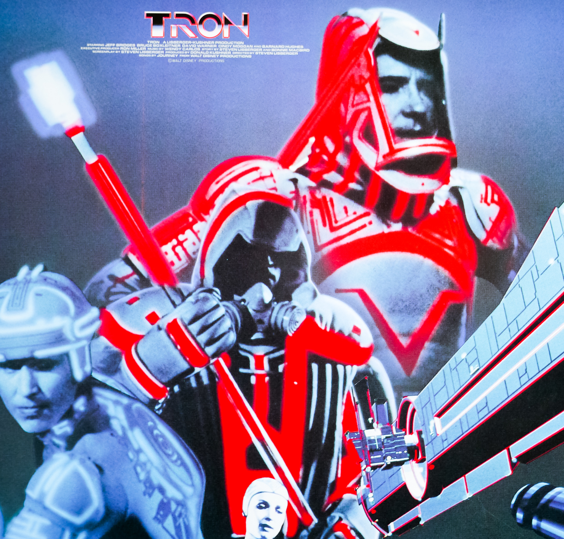
- Title
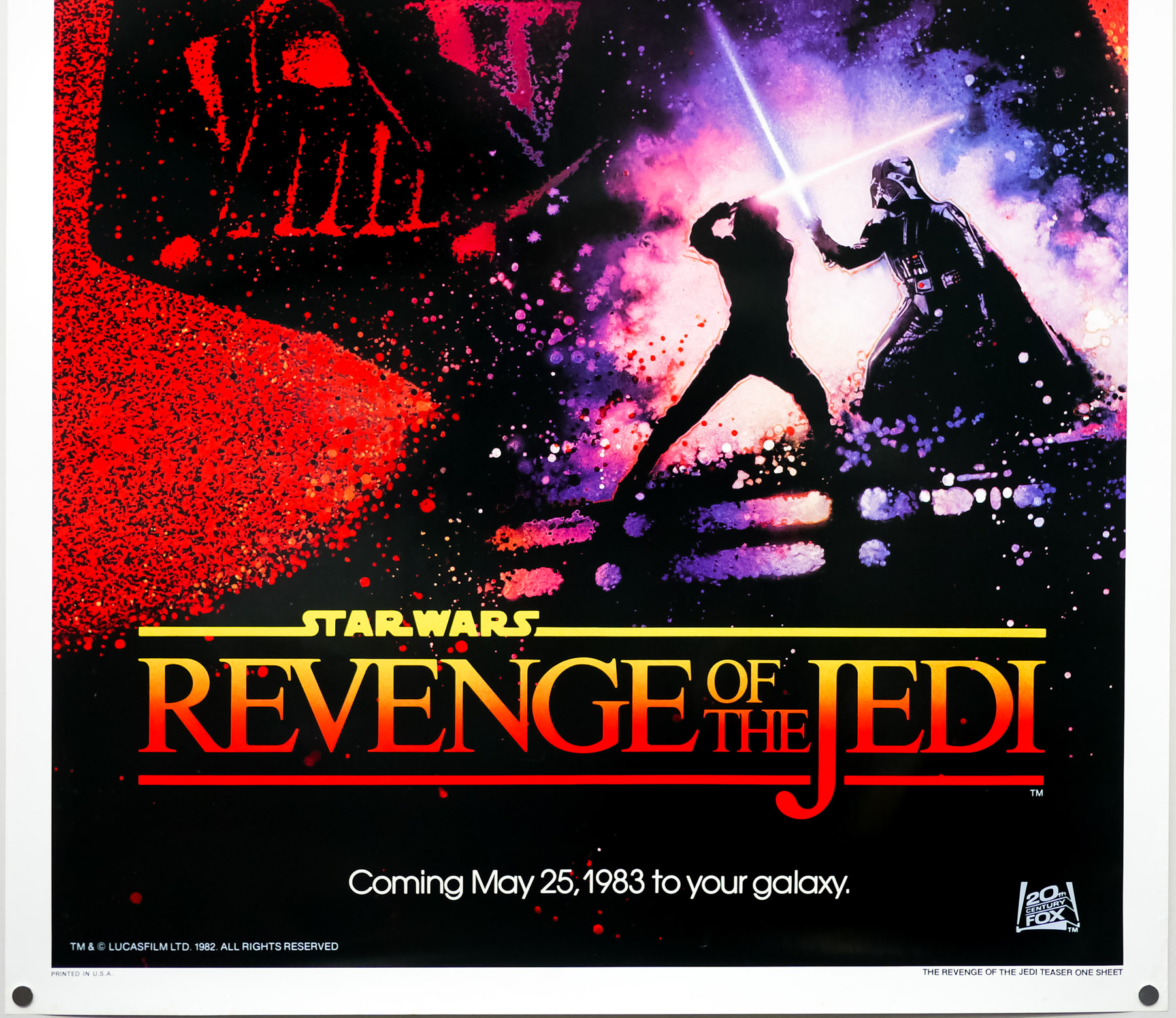
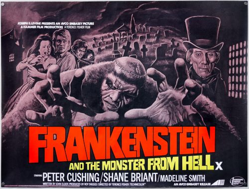
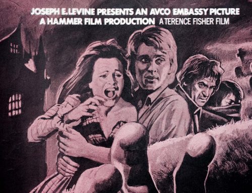
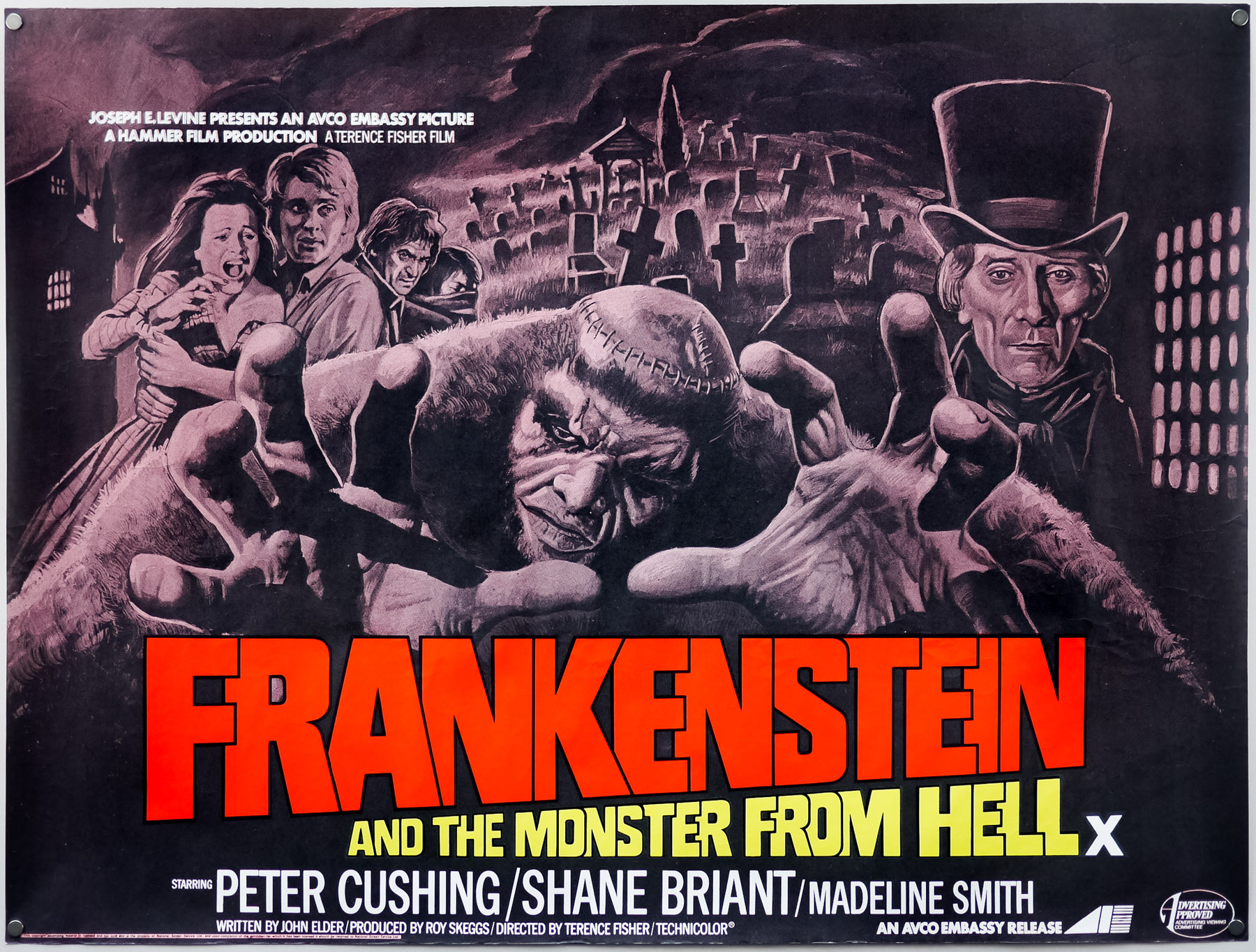
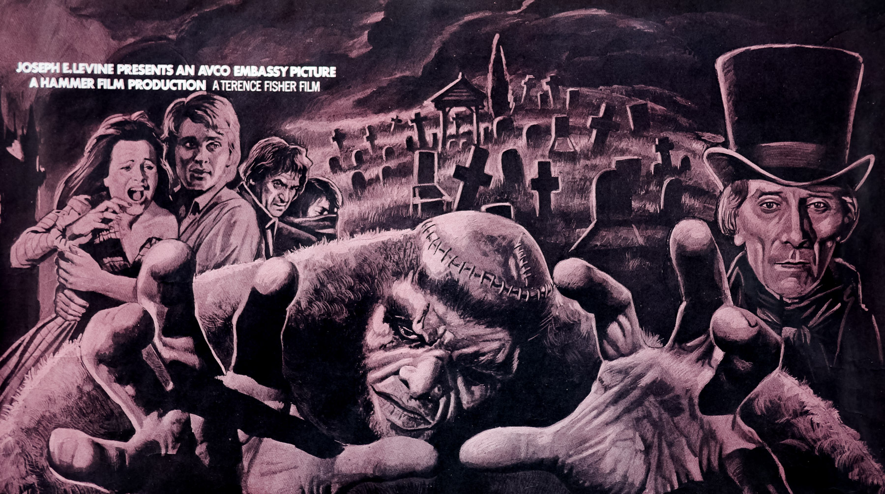
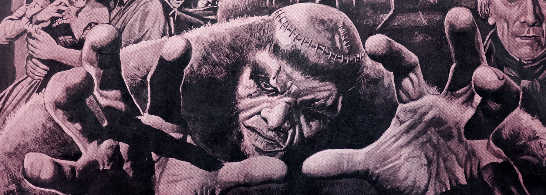
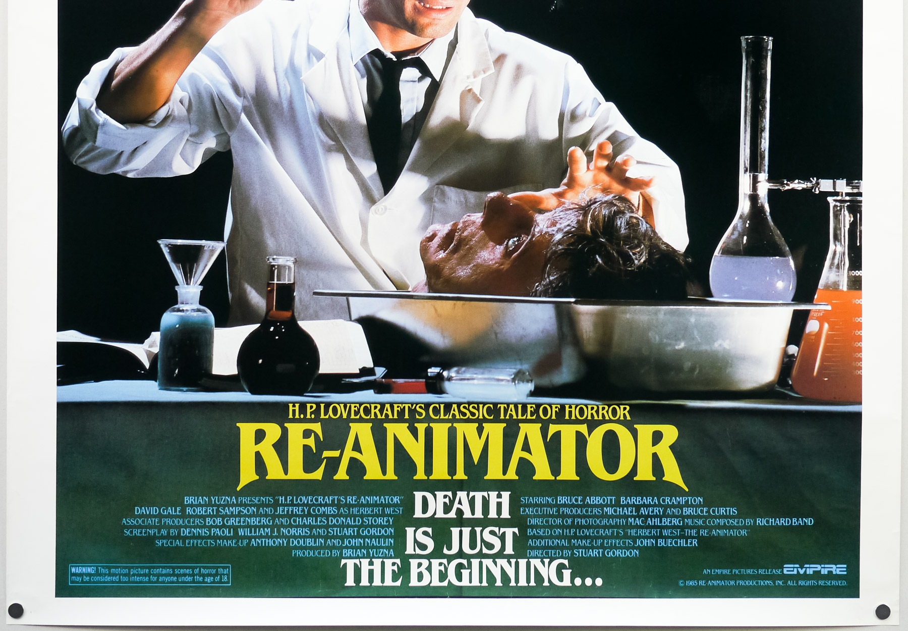
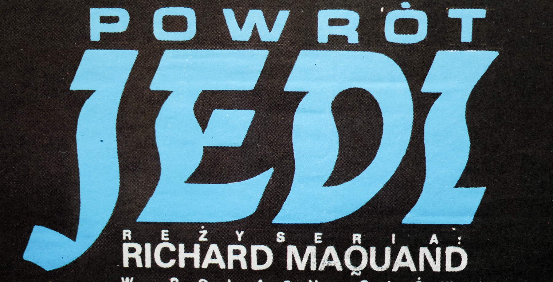
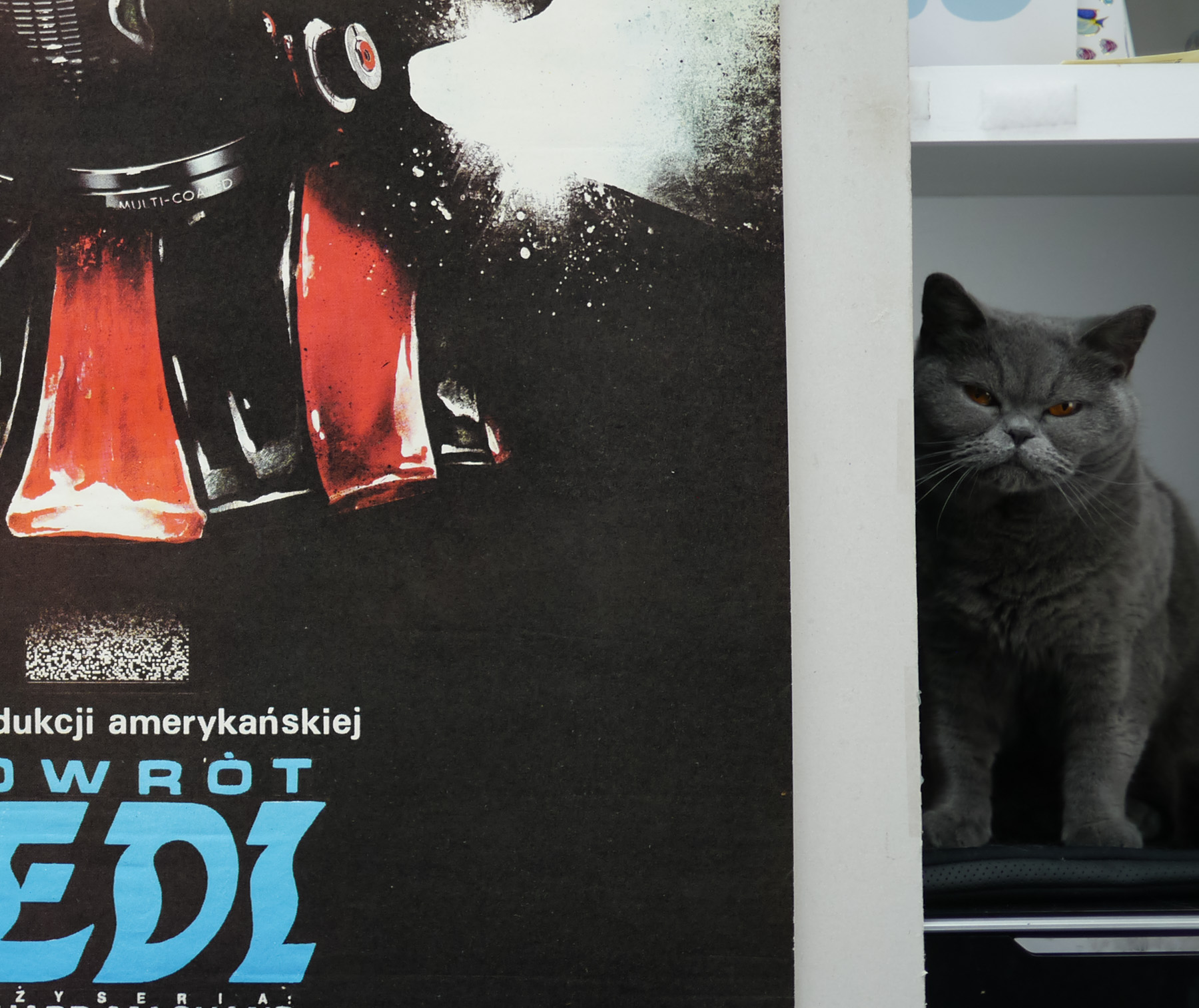
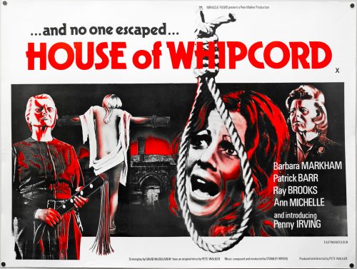
- Frankenstein and the Monster From Hell
- AKA
- --
- Year of Film
- 1973
- Director
- Terence Fisher
- Starring
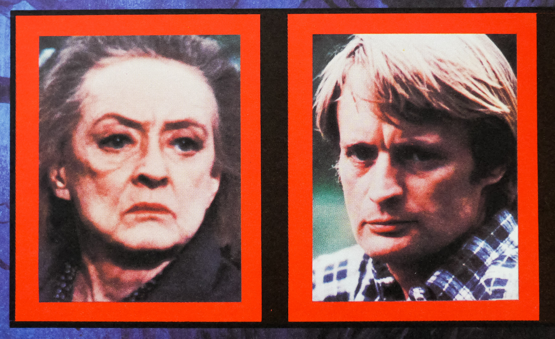
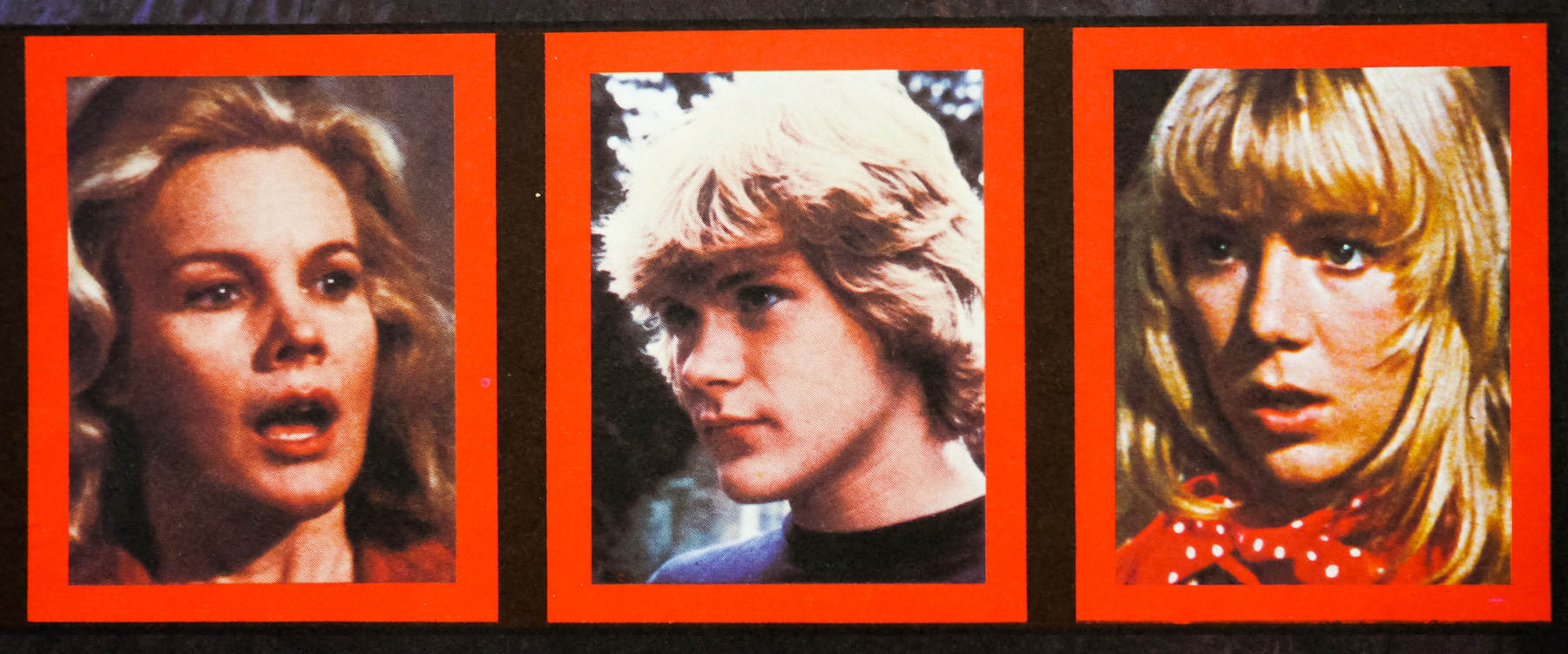
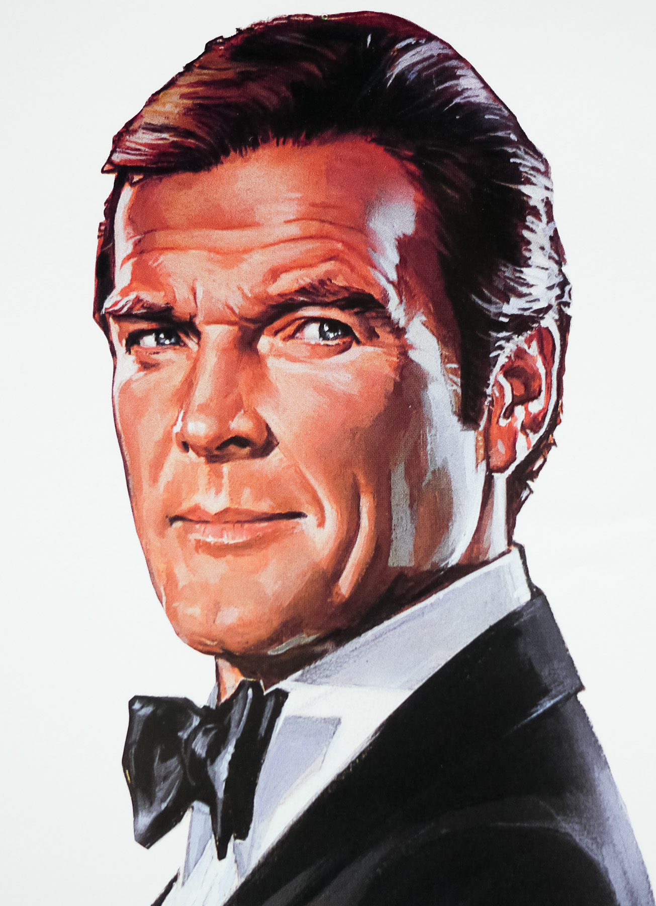
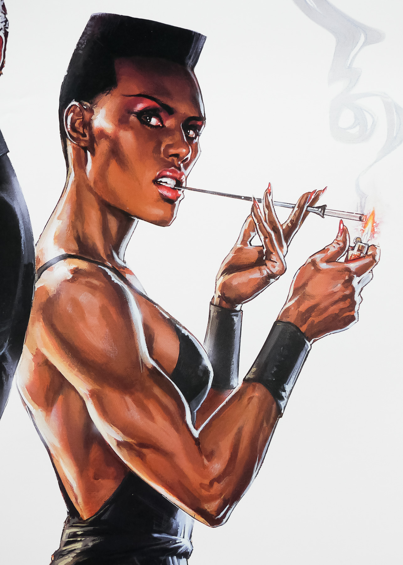
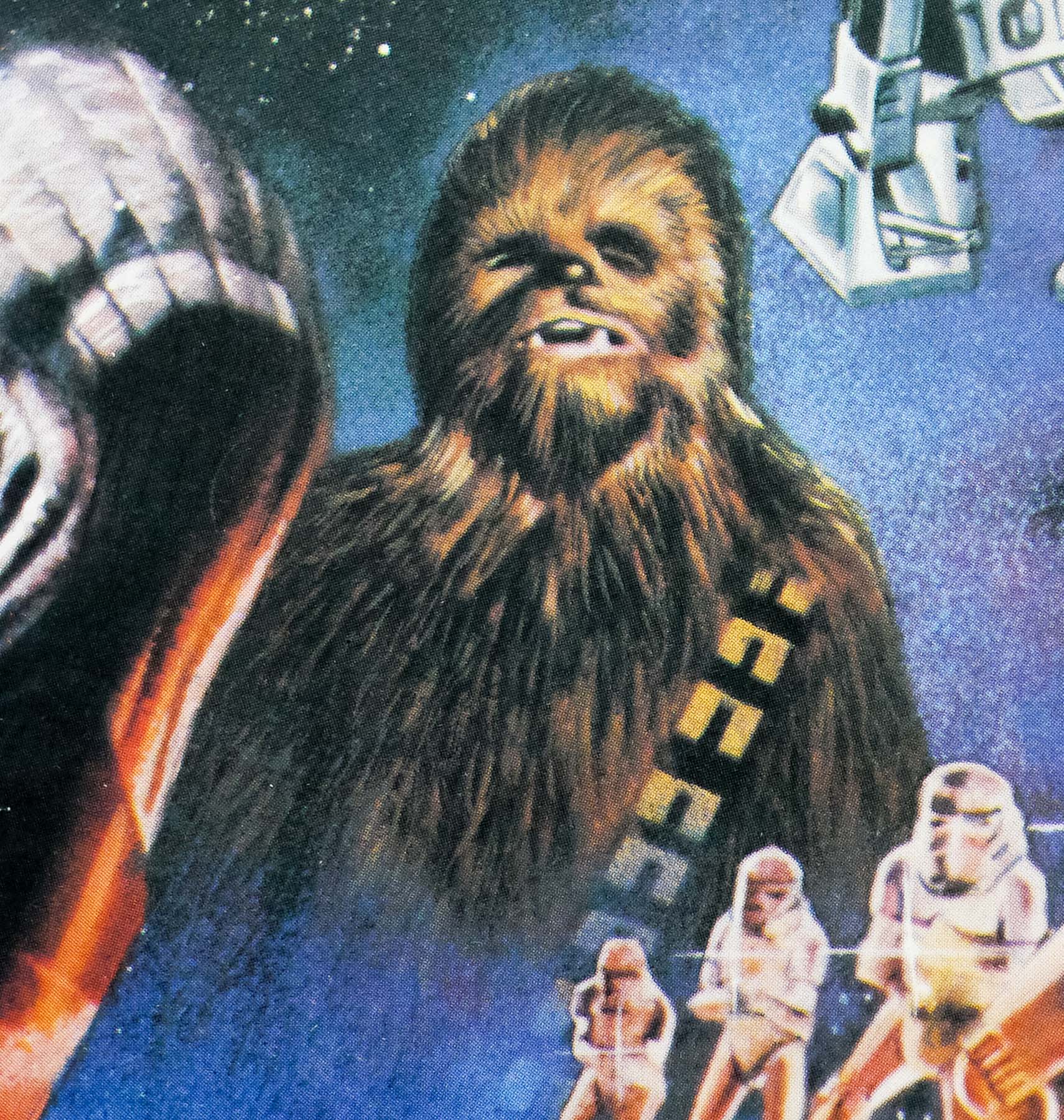
- Peter Cushing, Shane Briant, Madeline Smith, David Prowse, John Stratton, Michael Ward, Elsie Wagstaff, Norman Mitchell, Clifford Mollison, Patrick Troughton, Philip Voss, Christopher Cunningham, Bernard Lee
- Origin of Film
- UK
- Genre(s) of Film
- Peter Cushing, Shane Briant, Madeline Smith, David Prowse, John Stratton, Michael Ward, Elsie Wagstaff, Norman Mitchell, Clifford Mollison, Patrick Troughton, Philip Voss, Christopher Cunningham, Bernard Lee,
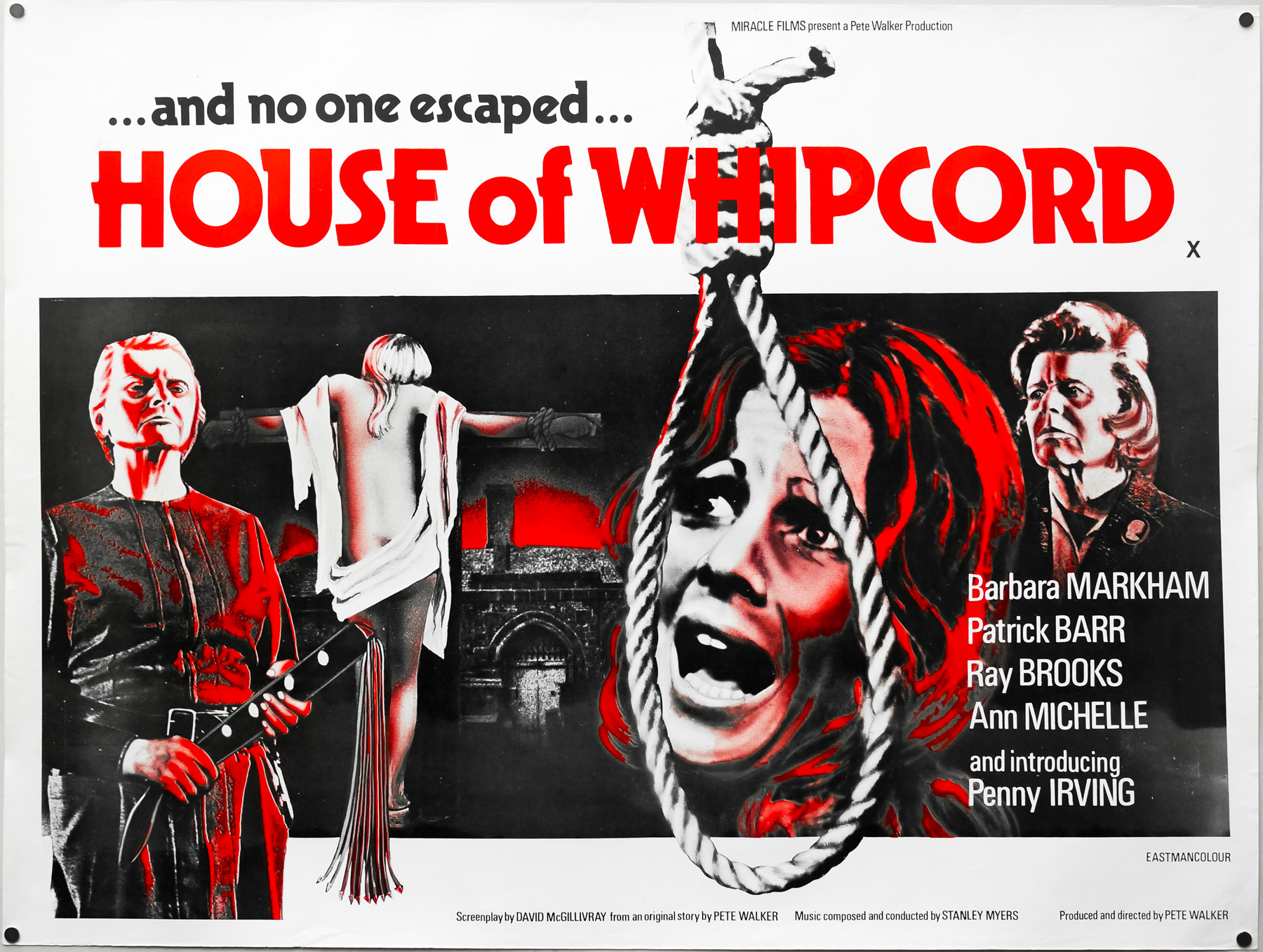
- Type of Poster
- Quad
- Style of Poster
- --
- Origin of Poster
- UK
- Year of Poster
- 1974
- Designer
- Eddie Paul
- Artist
- Bill Wiggins
- Size (inches)
- 30 1/16" x 39 15/16"
- SS or DS
- SS
- NSS #
- --
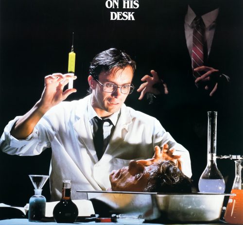
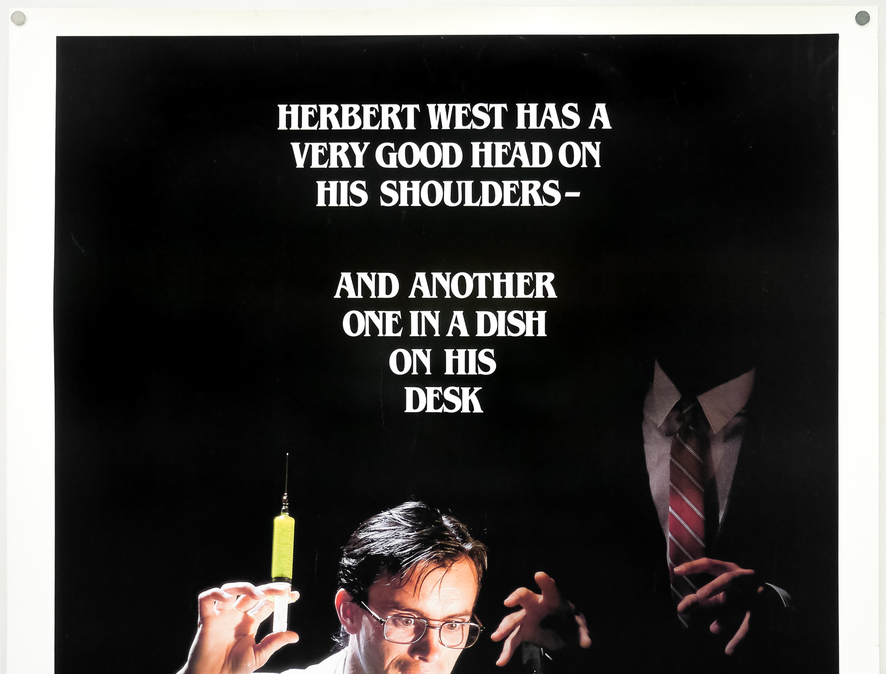
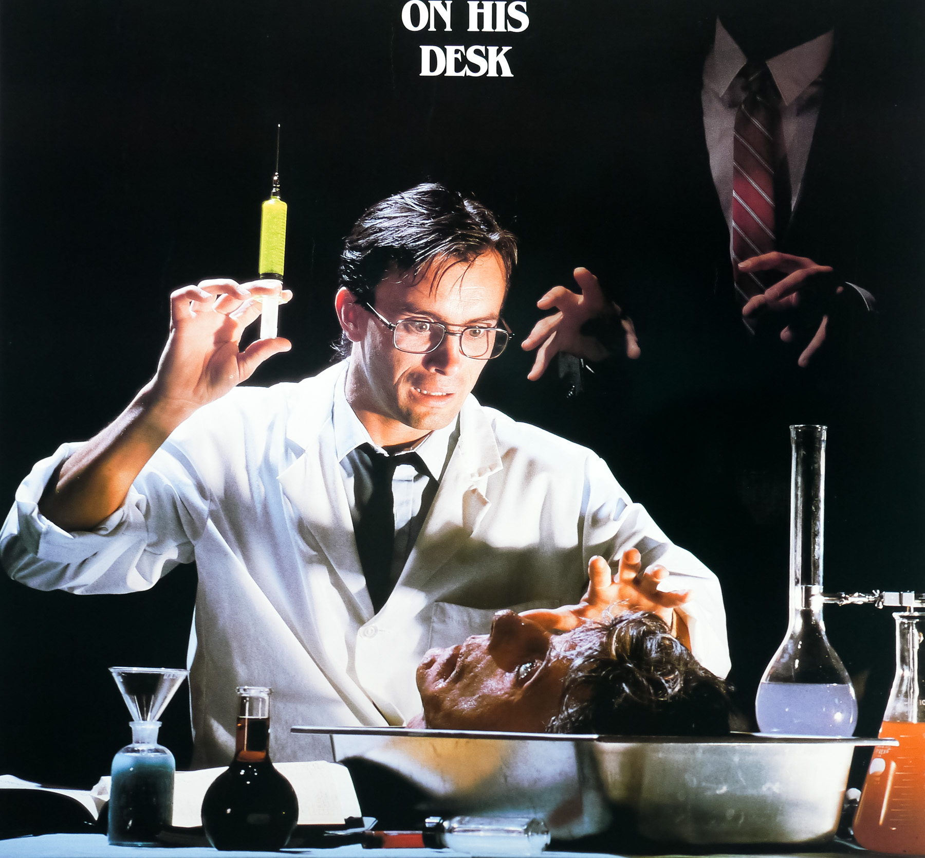
- Tagline
- --
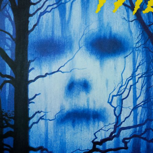
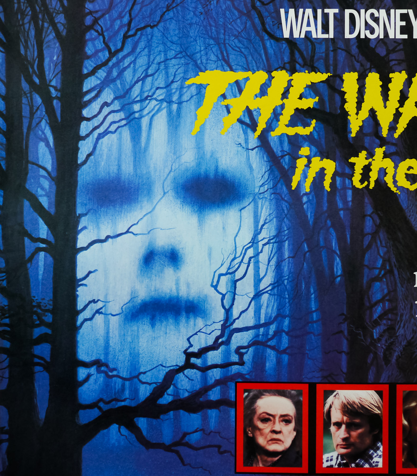
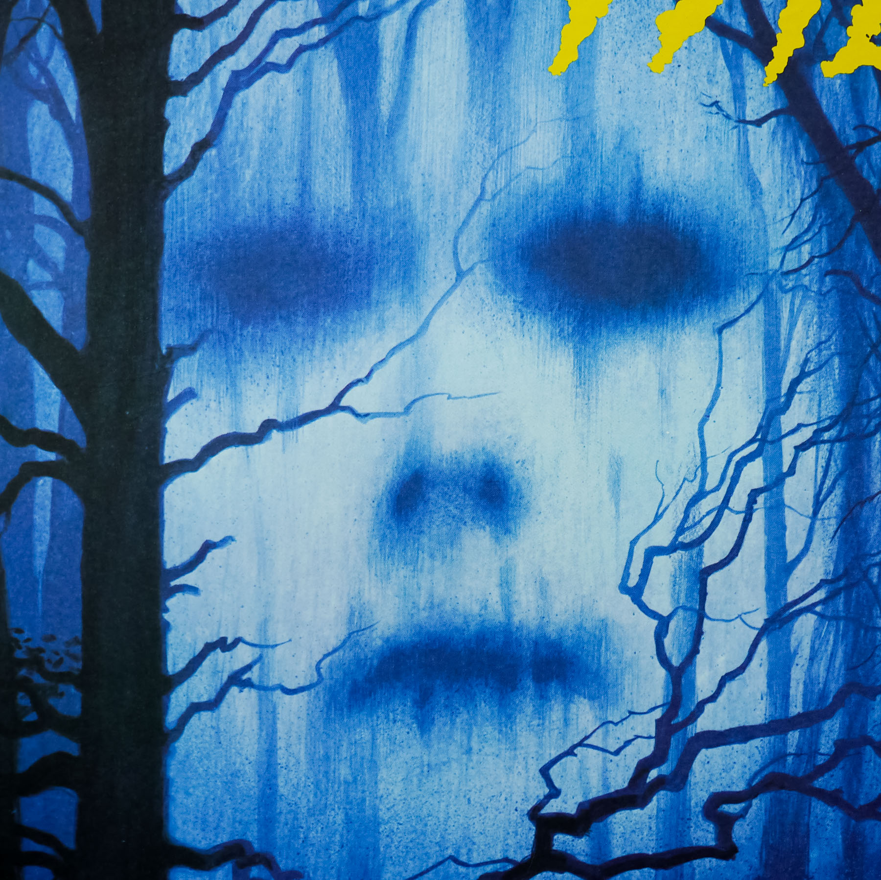
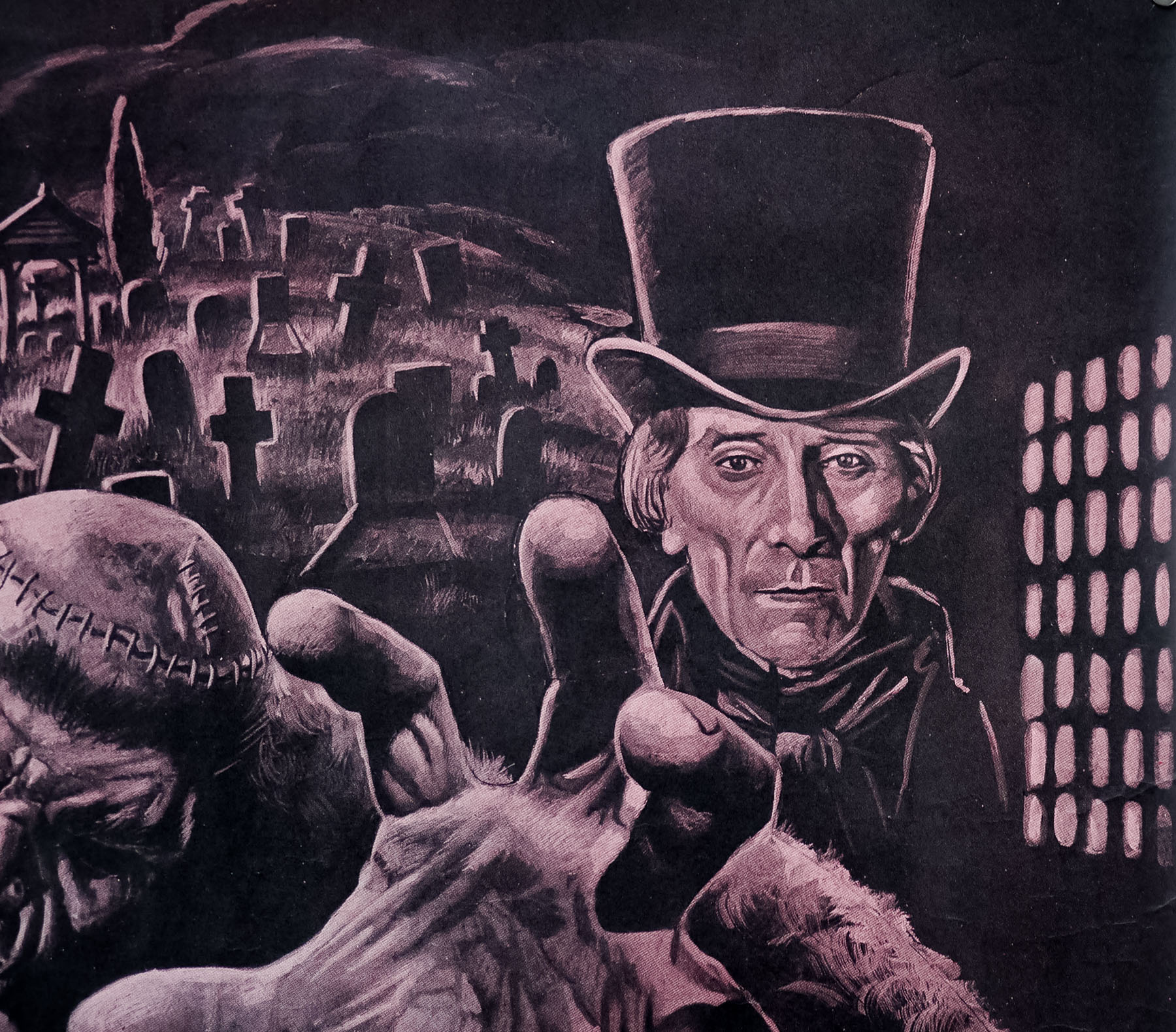
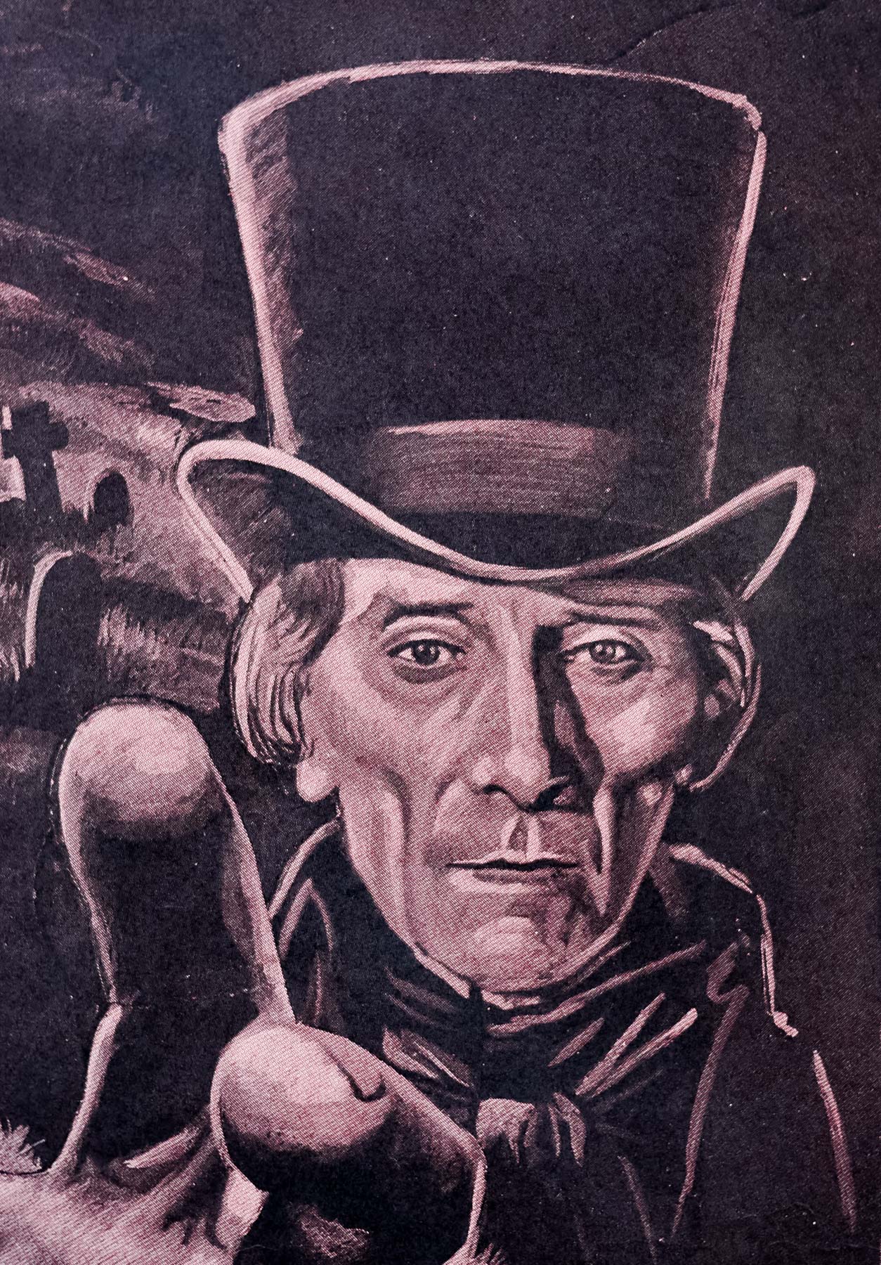
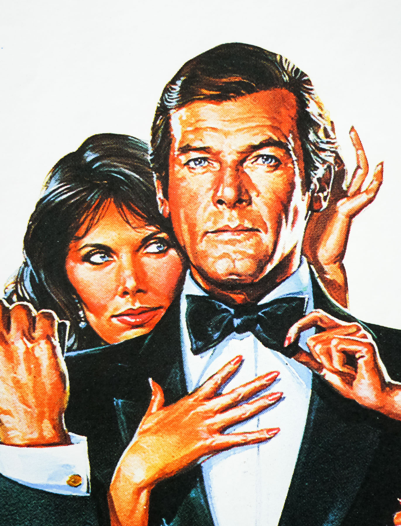
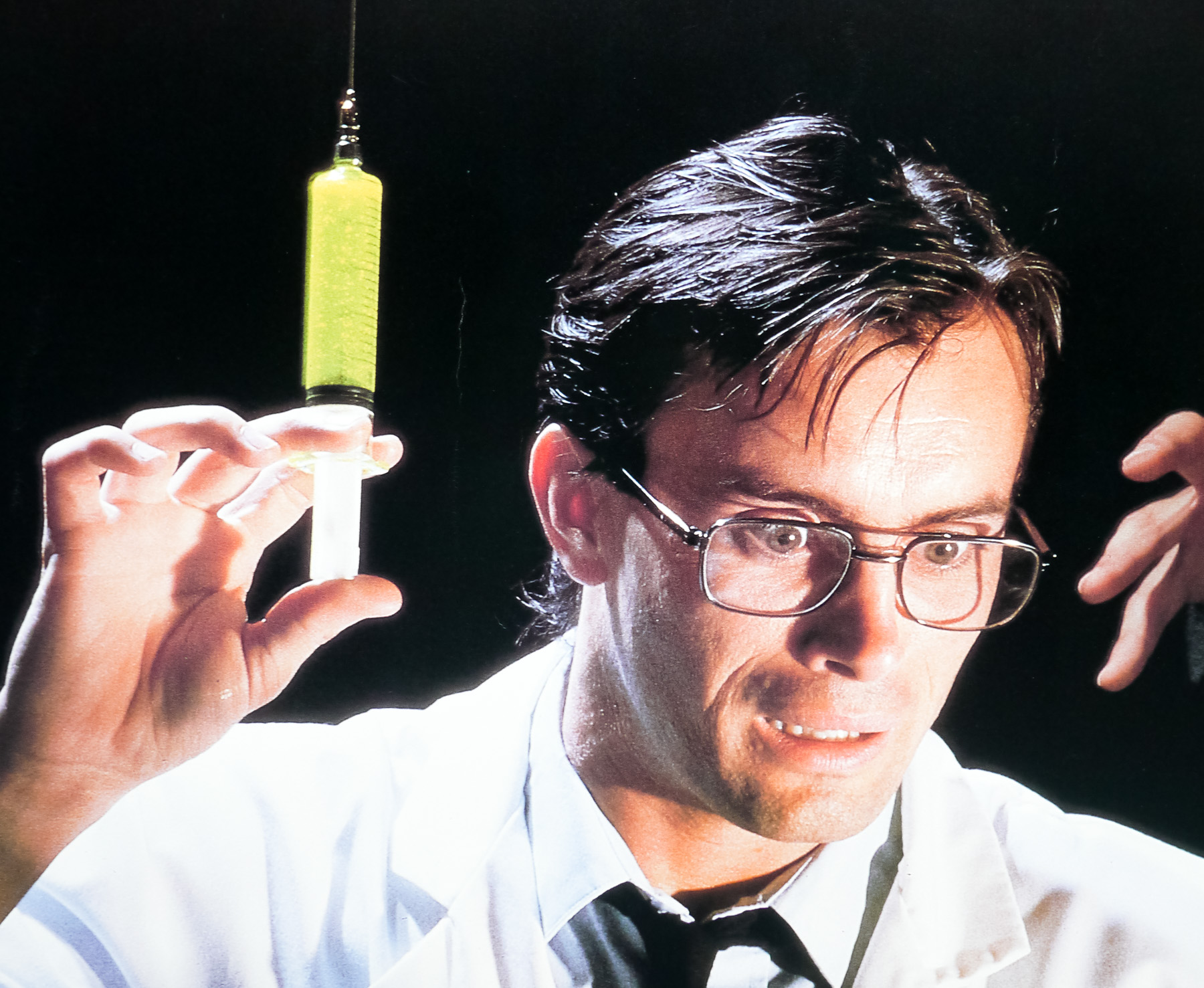
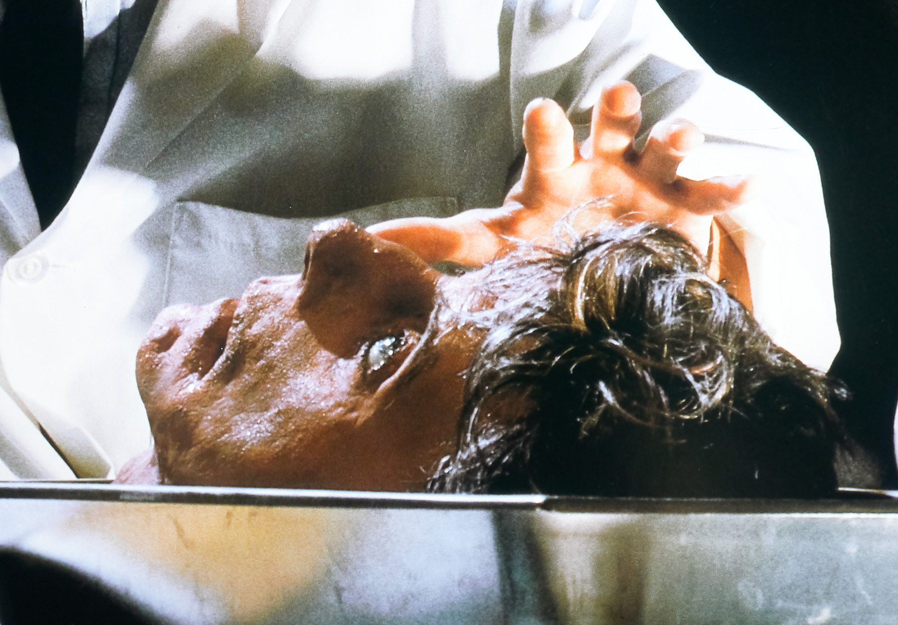
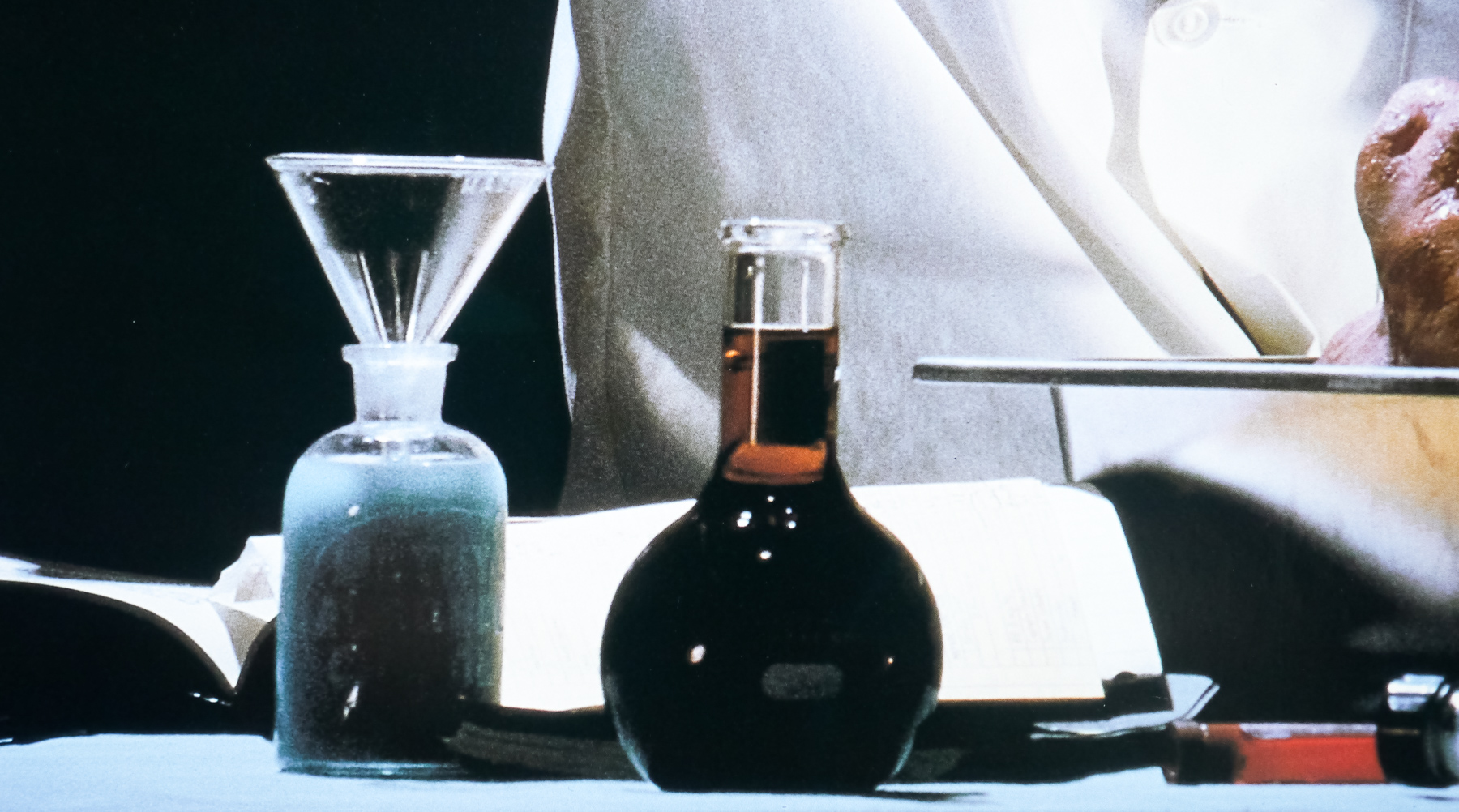
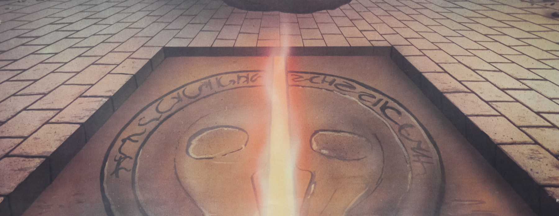
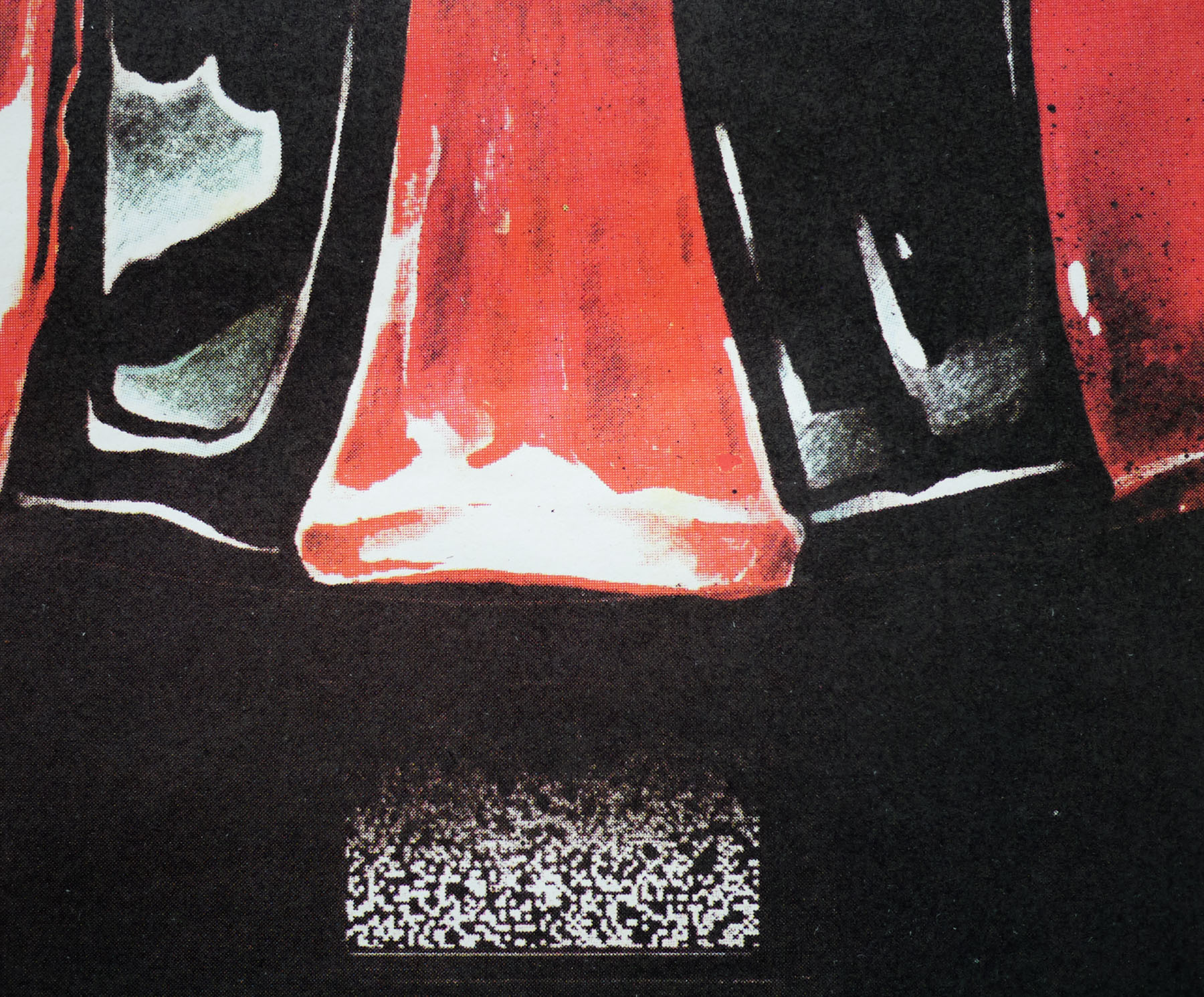
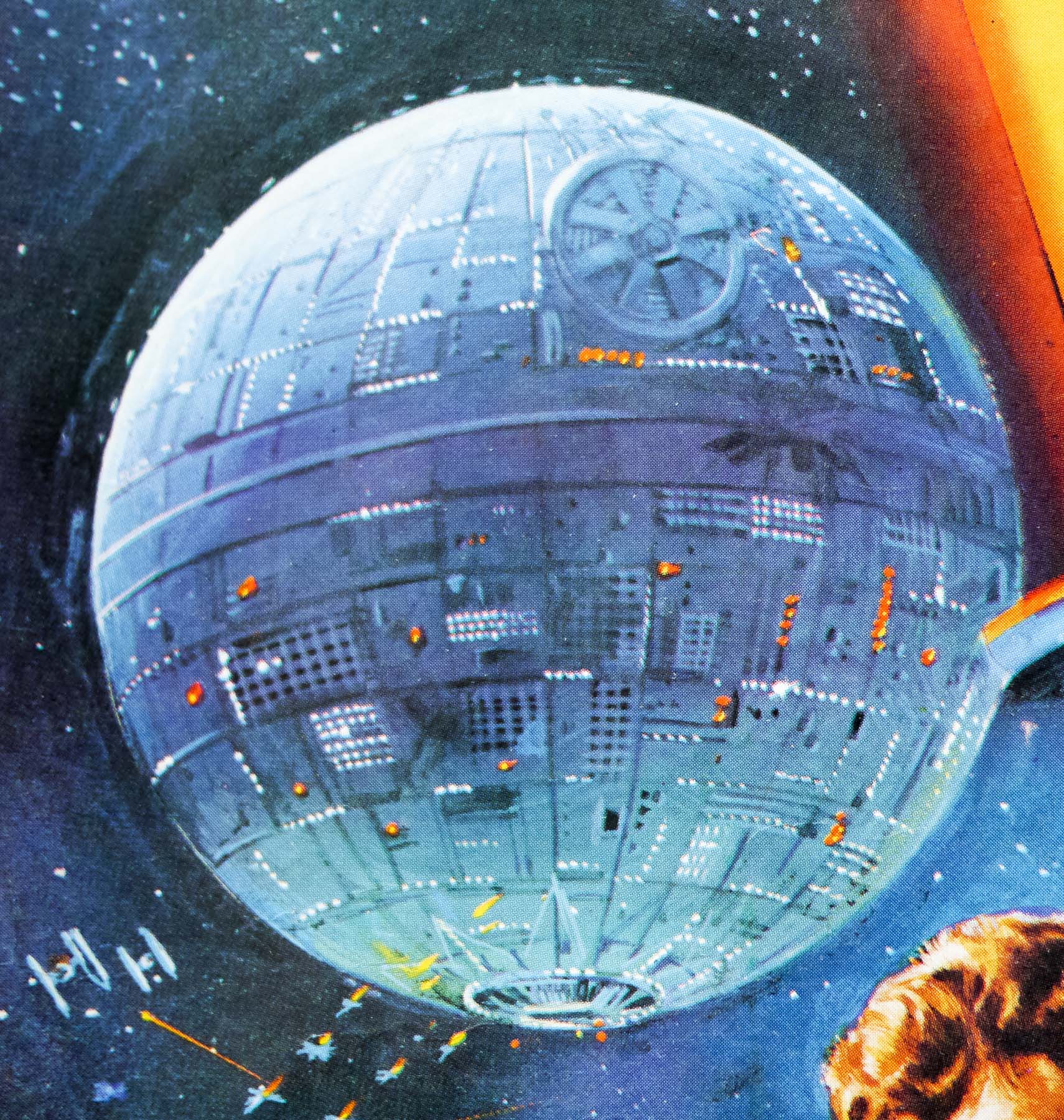
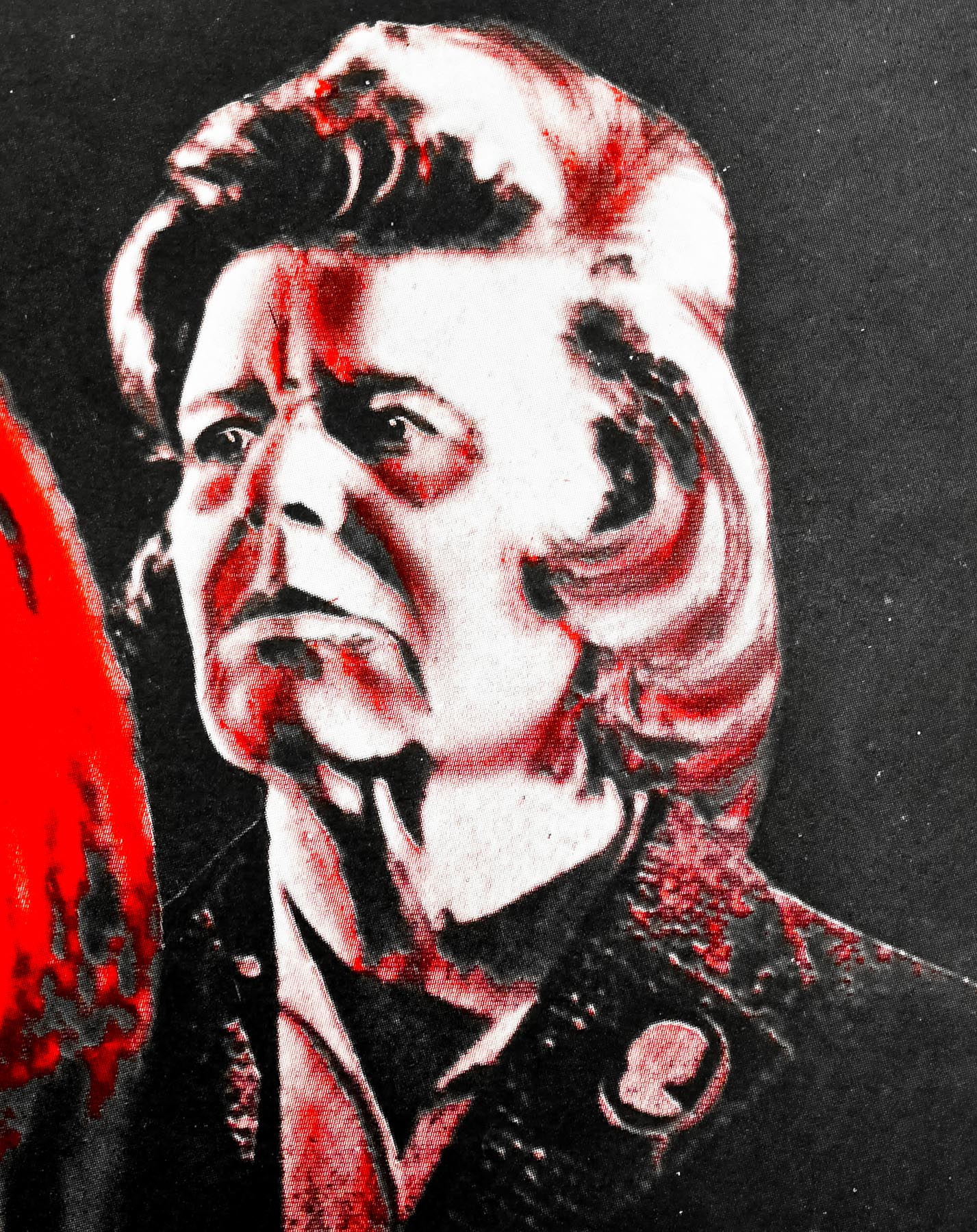
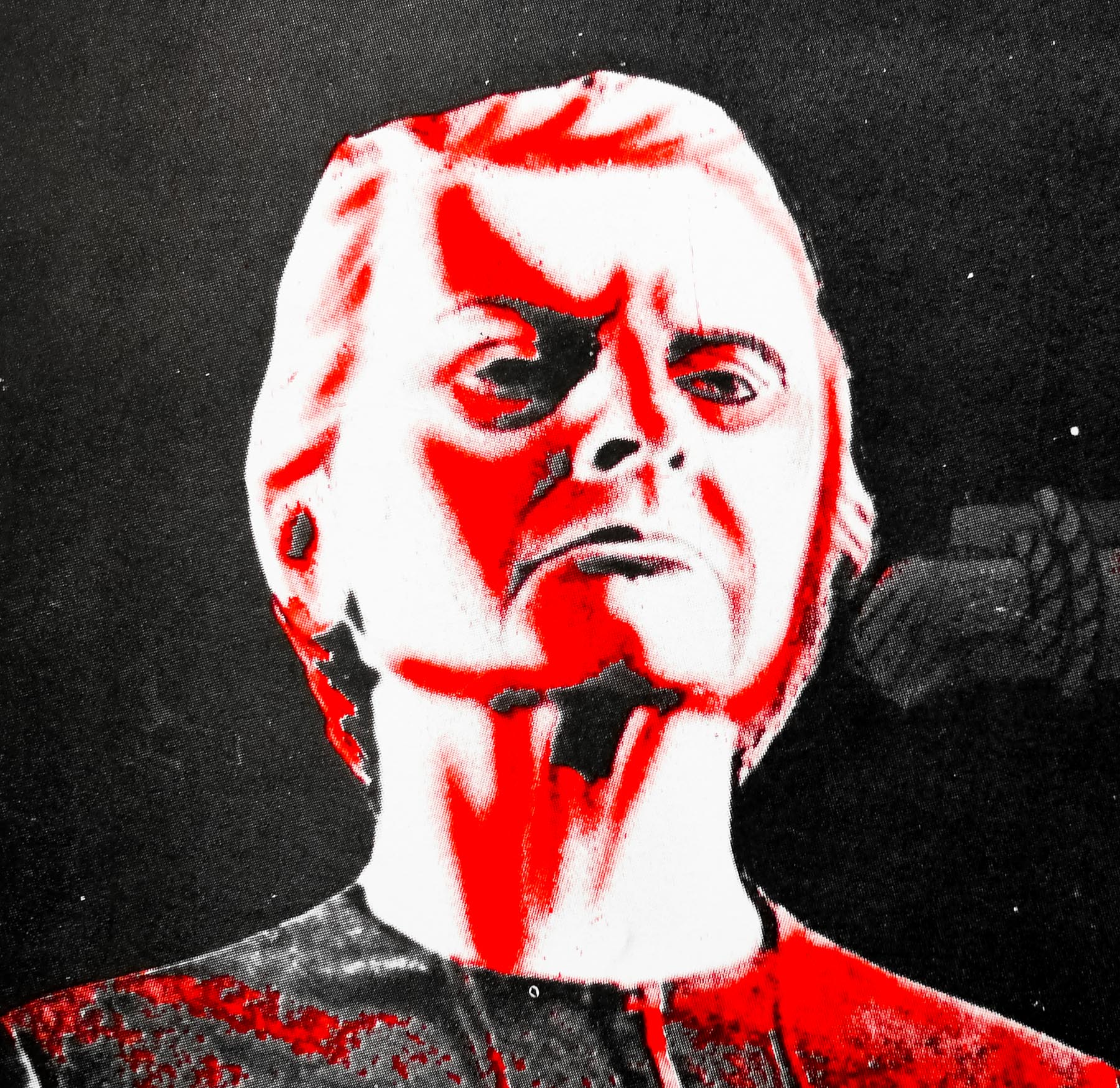
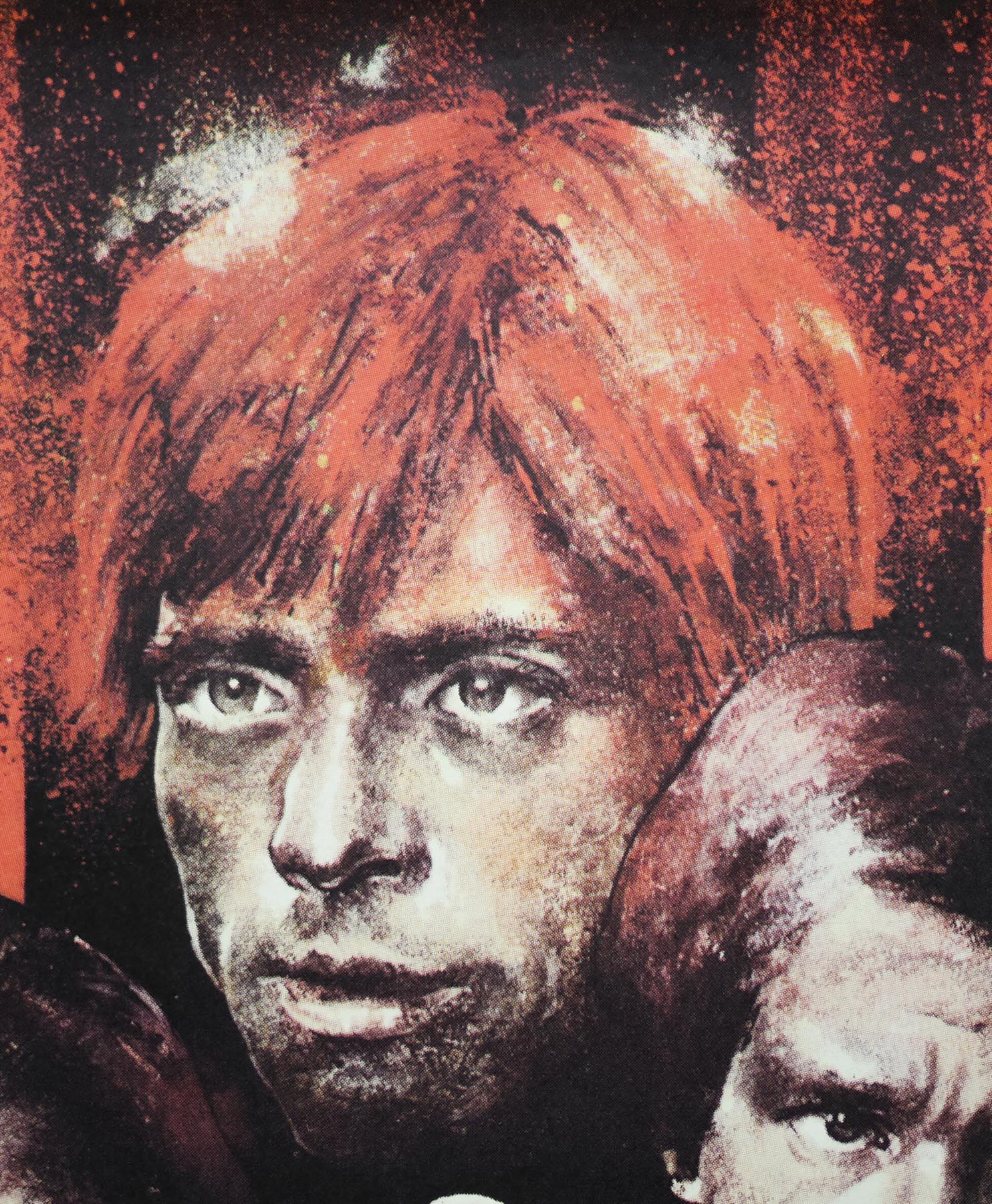
Frankenstein and the Monster From Hell (1973) marked the end of an era for British film in more ways than one. It was the last gothic horror to be produced by the original incarnation of the British Hammer Films studio and followed on from a series of six feature films based around the character of Baron Frankenstein portrayed by the late, great British actor Peter Cushing (the less said about 1970s Horror of Frankenstein, with Ralph Bates in the lead role, the better). Director Terence Fisher had worked on many of Hammer’s best-loved horrors, including their first gothic feature, 1957s The Curse of Frankenstein (starring Cushing and Christopher Lee as the monster) as well as the original Dracula (1958), The Mummy (1959) and two other Frankenstein features for the studio. He was to effectively retire from film-making at the end of production on FATMFH, and he wasn’t the only one of the Hammer alumni to do so. This was also the last Hammer feature film that screenwriter Tony Hinds, who had worked on many of the studio’s most successful horrors, would supply a script for. Other crew members who had been instrumental in the production of dozens of Hammer horrors also called it a day once this film was released.
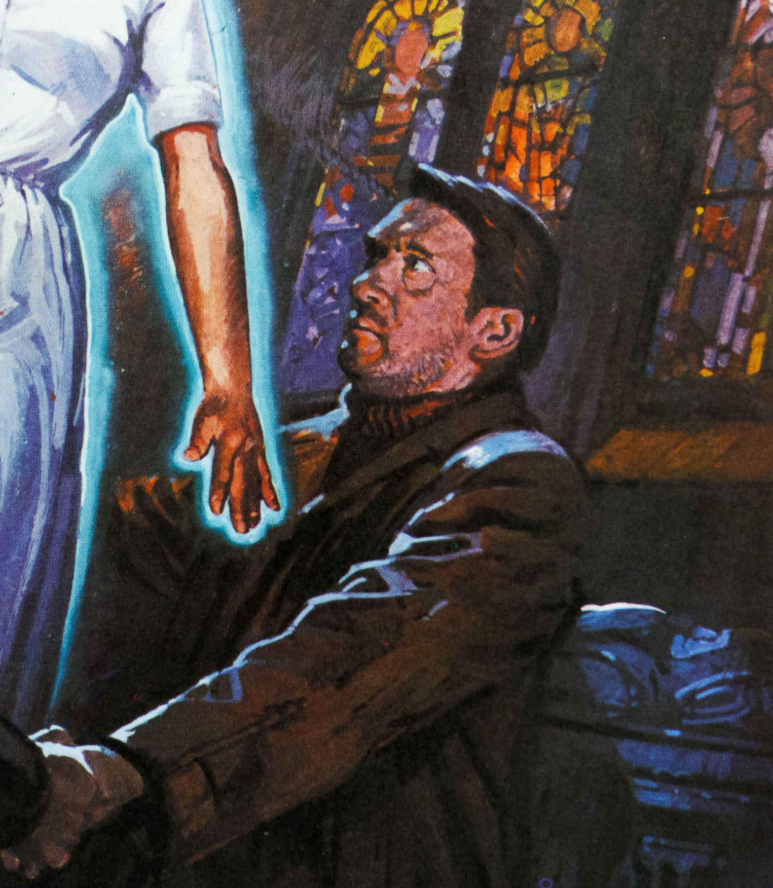
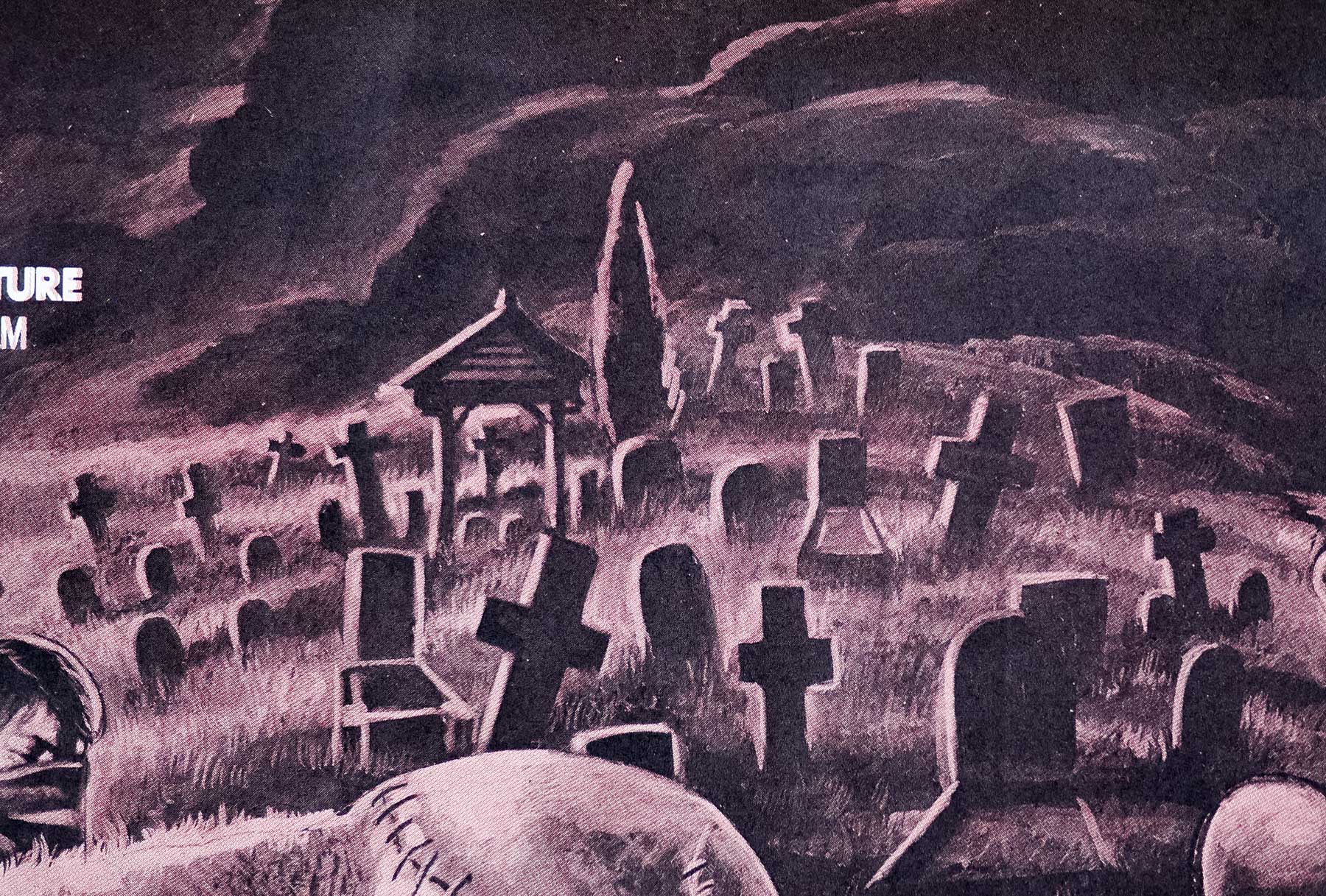
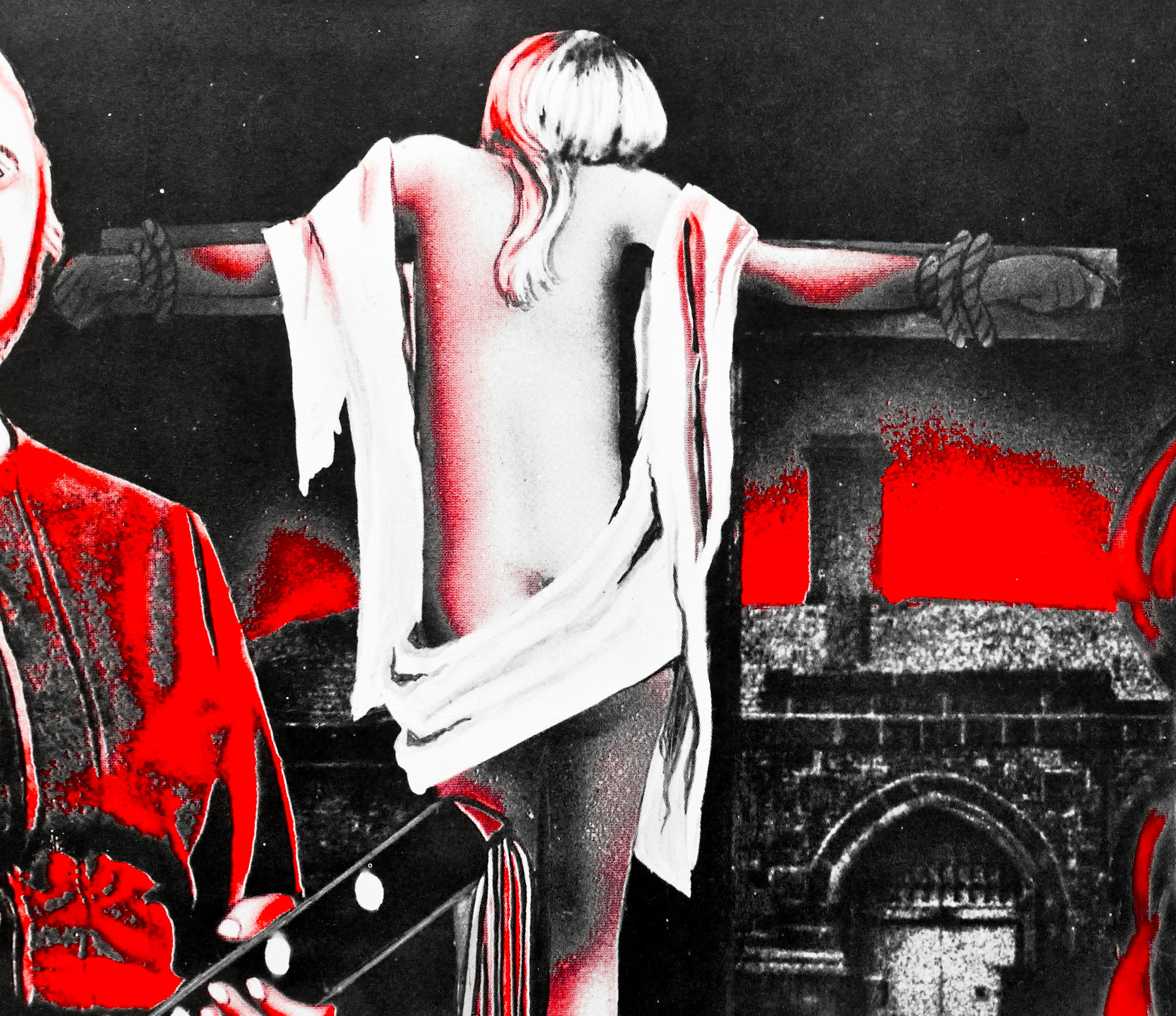
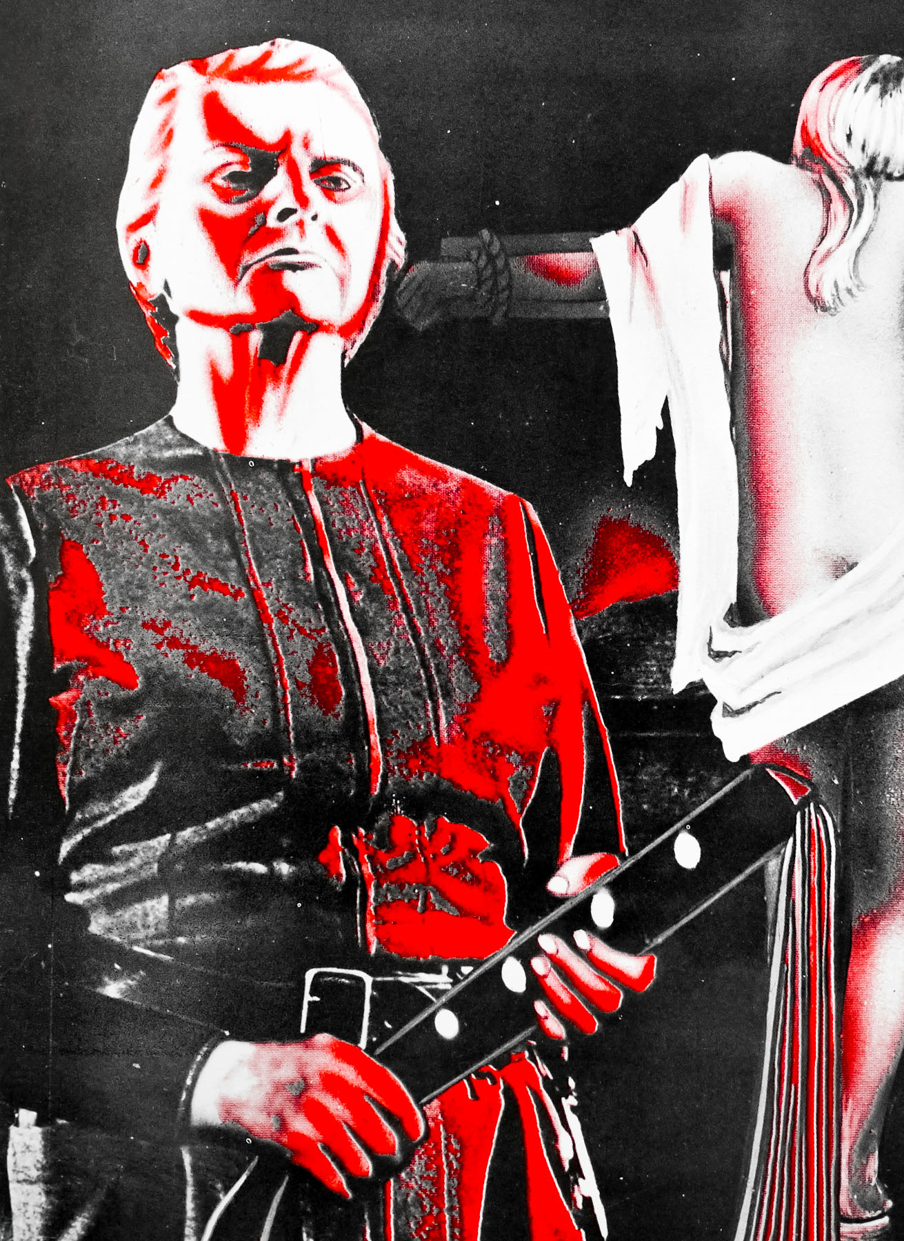
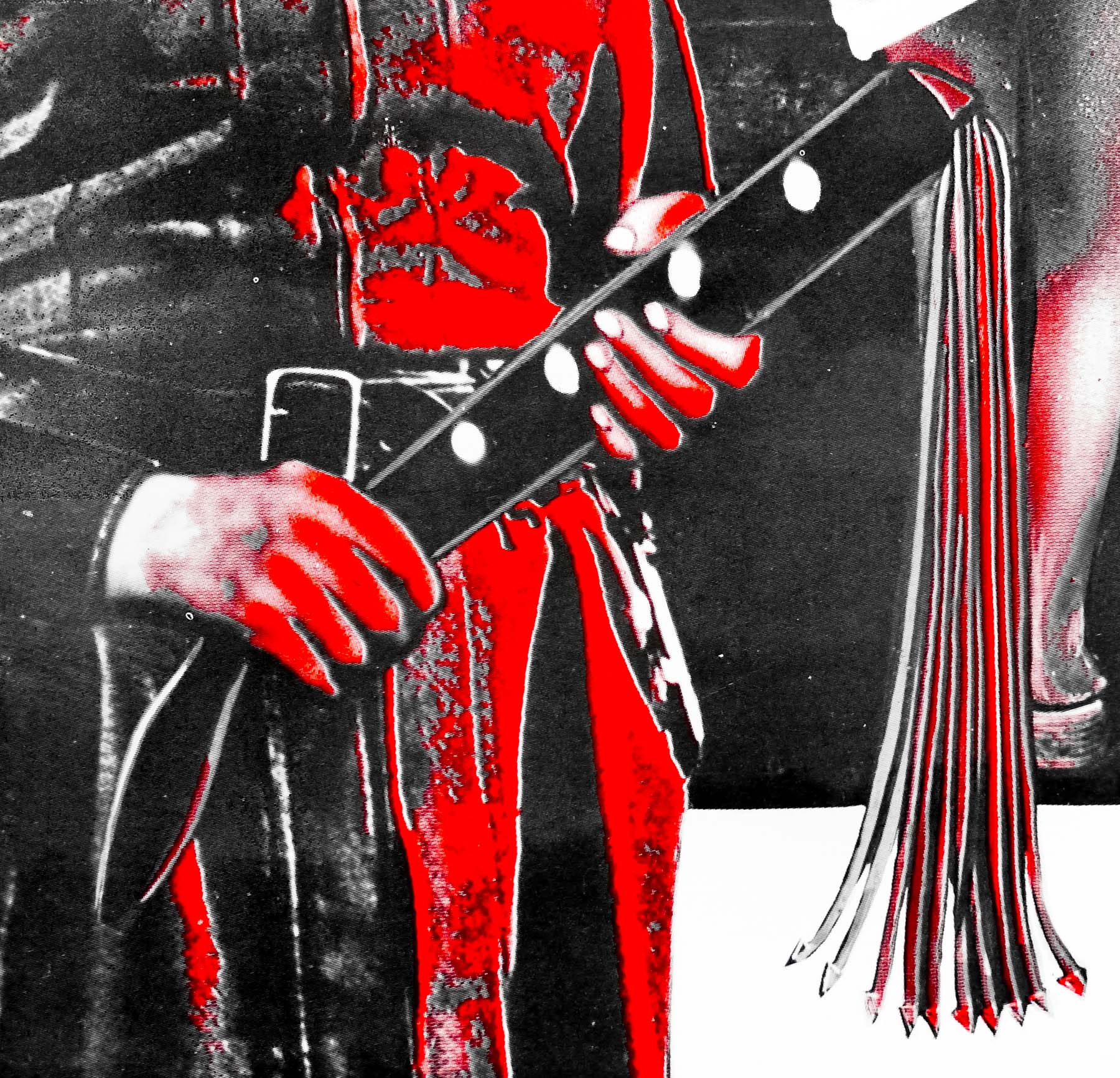
Originally produced and shot in 1972, it eventually limped into cinemas in 1974 well after the appeal of British gothic horror films had dissipated. Cinema-goers were keen to experience the visceral thrills of the new wave of films coming out of Hollywood, including William Friedkin’s 1973 masterpiece The Exorcist, which made British efforts like FATMFH seem positively antiquated. Because of the fall in demand from distribution companies who were previously happy to bankroll Hammer’s productions, the budget for this film was a tiny fraction of many of their previous horrors. It would be a lie to say that the lack of money doesn’t show on screen – most of the film takes place on what is clearly a single soundstage – but the skilled craftsmen at Hammer were still able to create a wonderful sense of atmosphere with the modest amount of funds at their disposal. The film is in many ways the perfect swan-song for Cushing’s Baron Frankenstein and his performance absolutely steals the show, from his brilliant crash-zoom entrance to the quiet madness of the denouement.
On the 29th of May, 2013 I was lucky enough to see the film at London’s British Film Institute in a special showing to both celebrate the centenary of Cushing’s birth and also preview a newly restored print of FATMFH. The reformed version of Hammer films have undertaken a series of restoration projects on many of the studio’s classic films, including the original Dracula and the original Curse of Frankenstein. I believe that the new print of FATMFH will see release on blu-ray at some point this year, as well as a new restoration of The Mummy. It was a real treat to see the film on the big screen and be able to revel in a classic Peter Cushing performance.
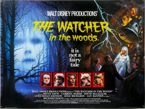
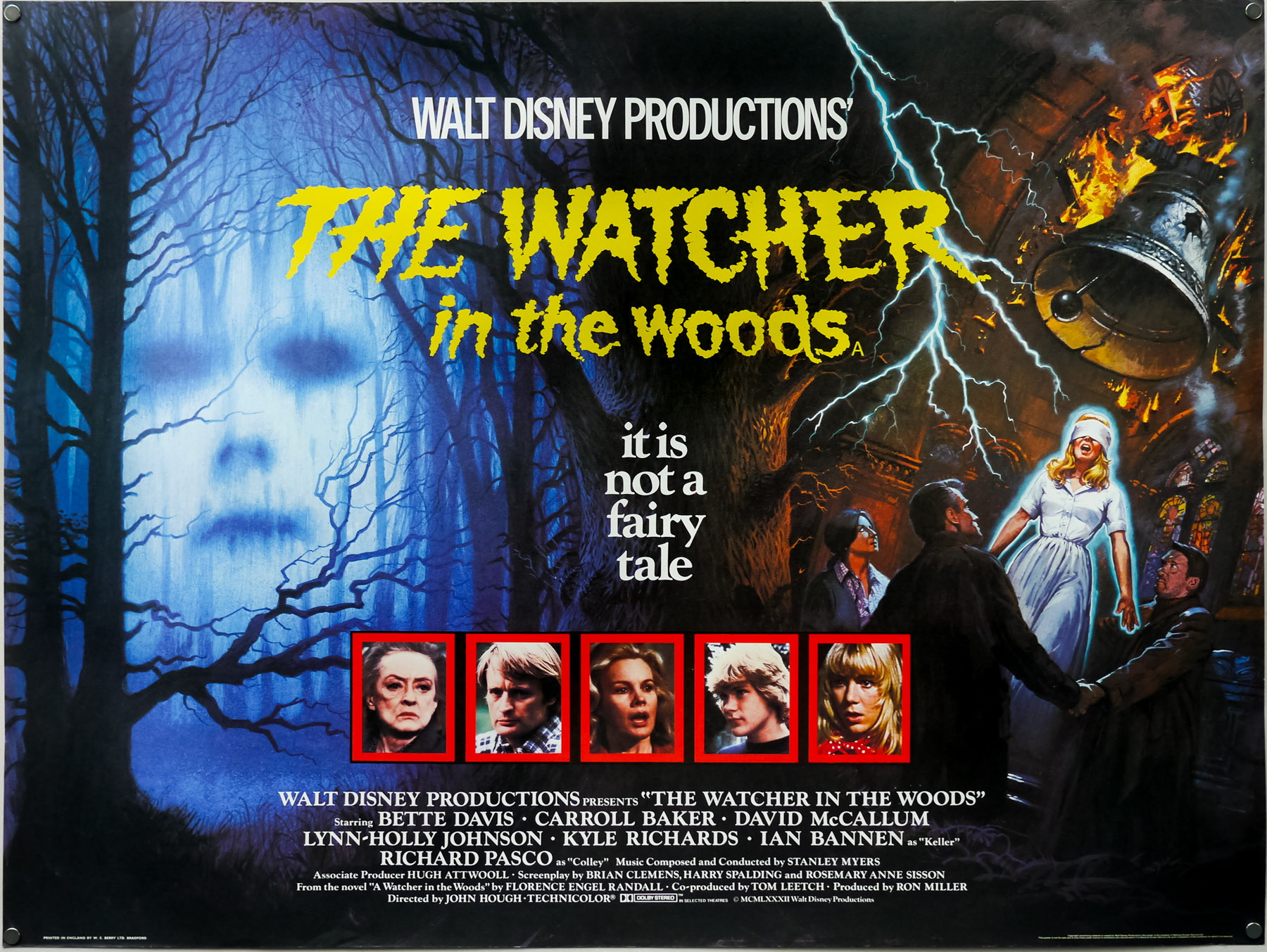
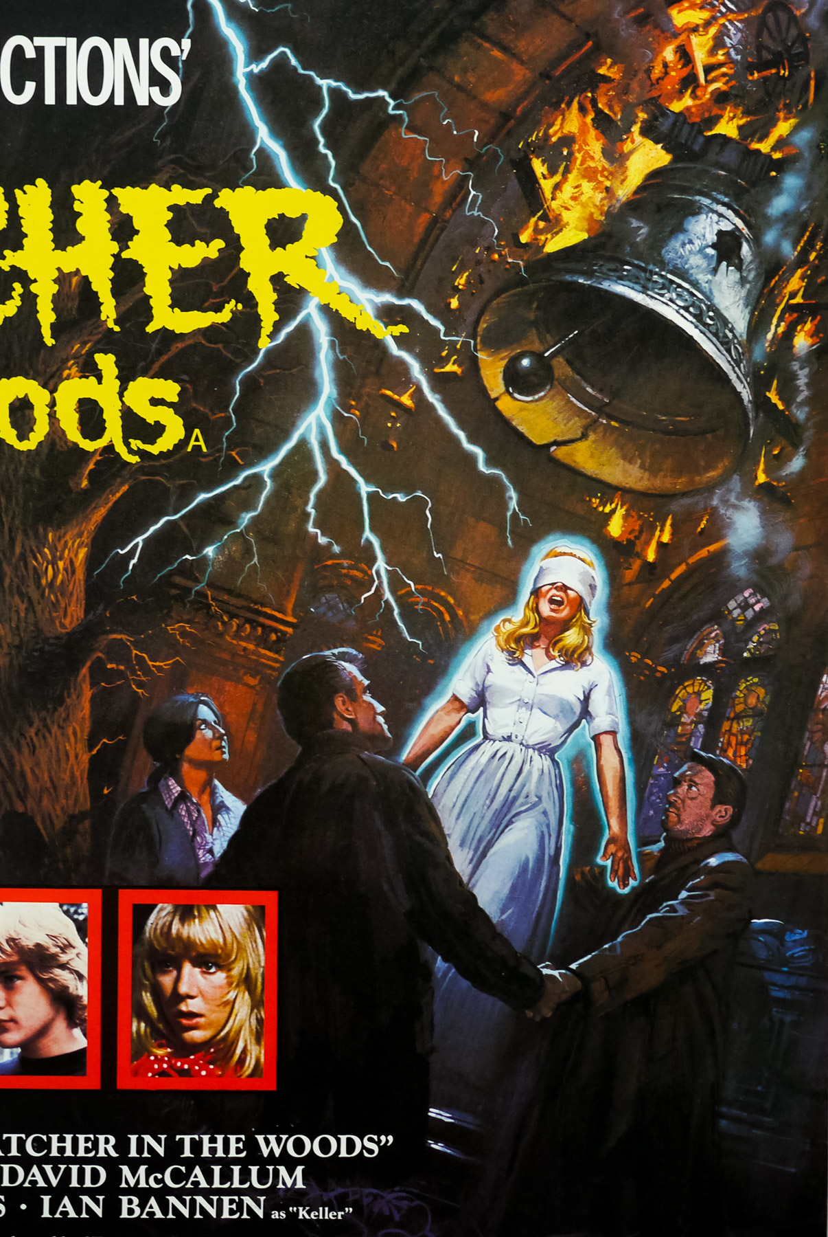
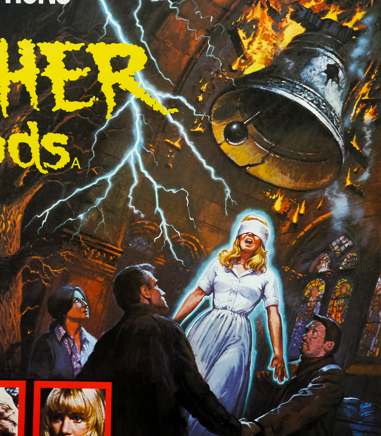
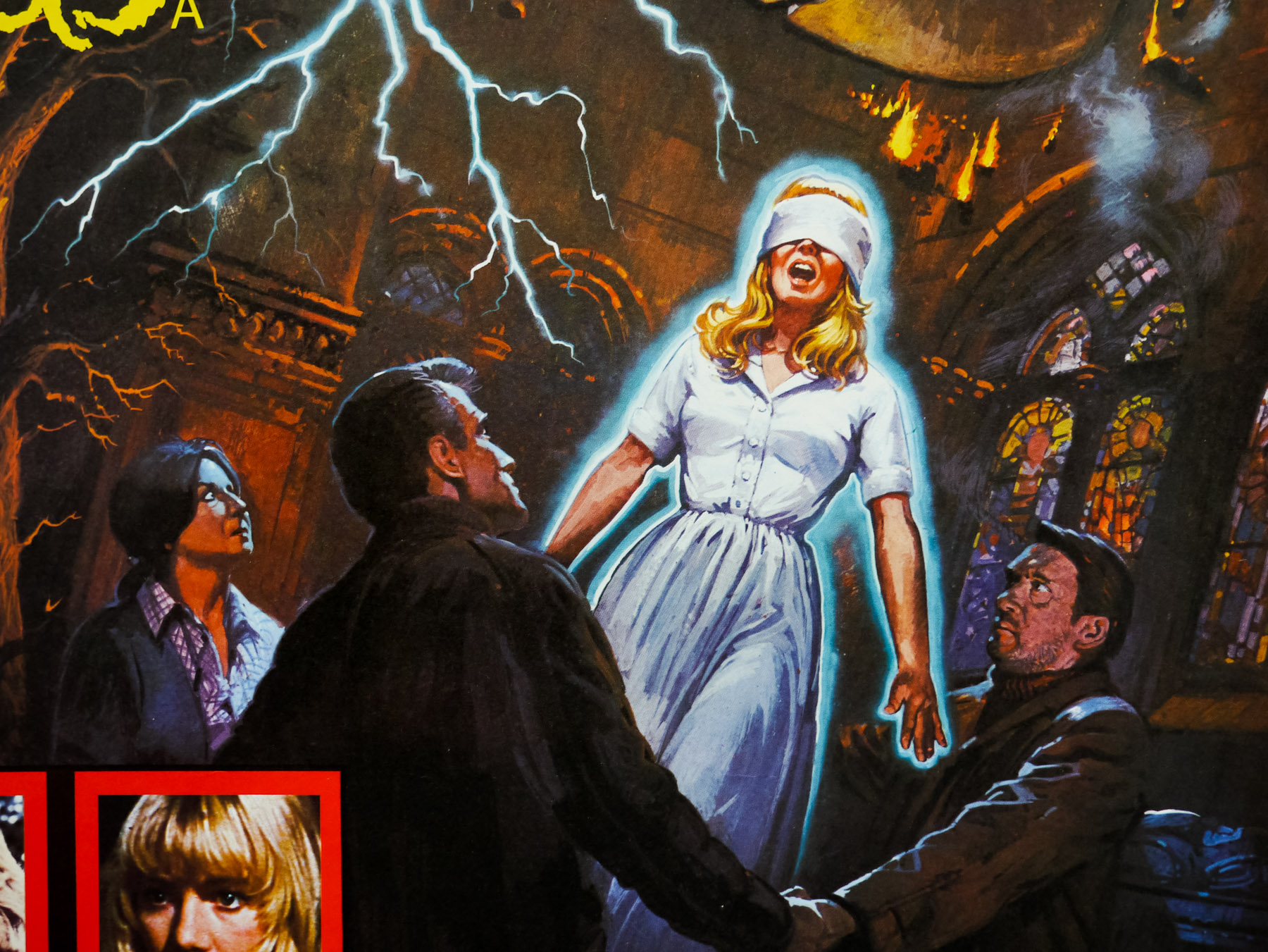
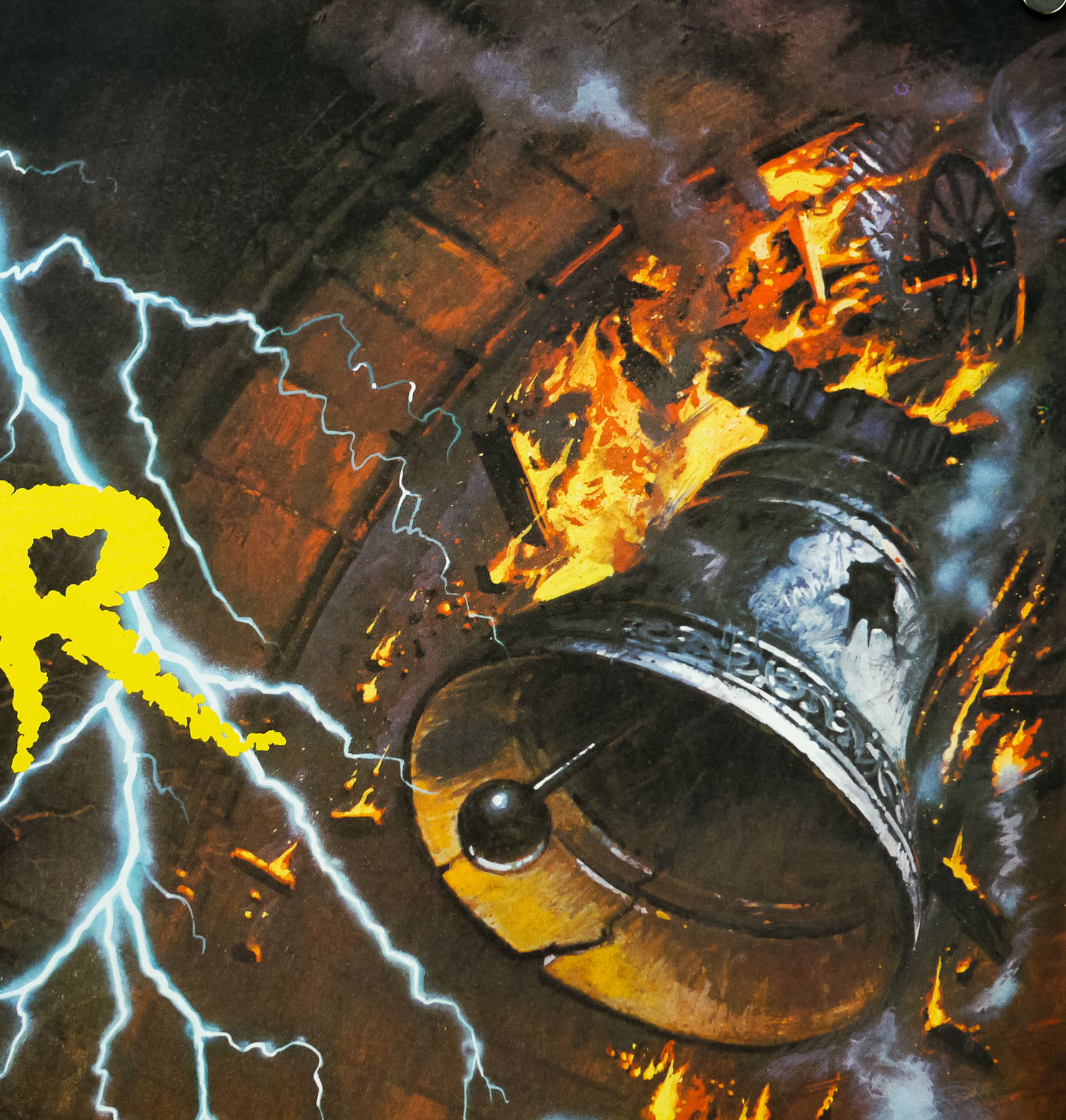
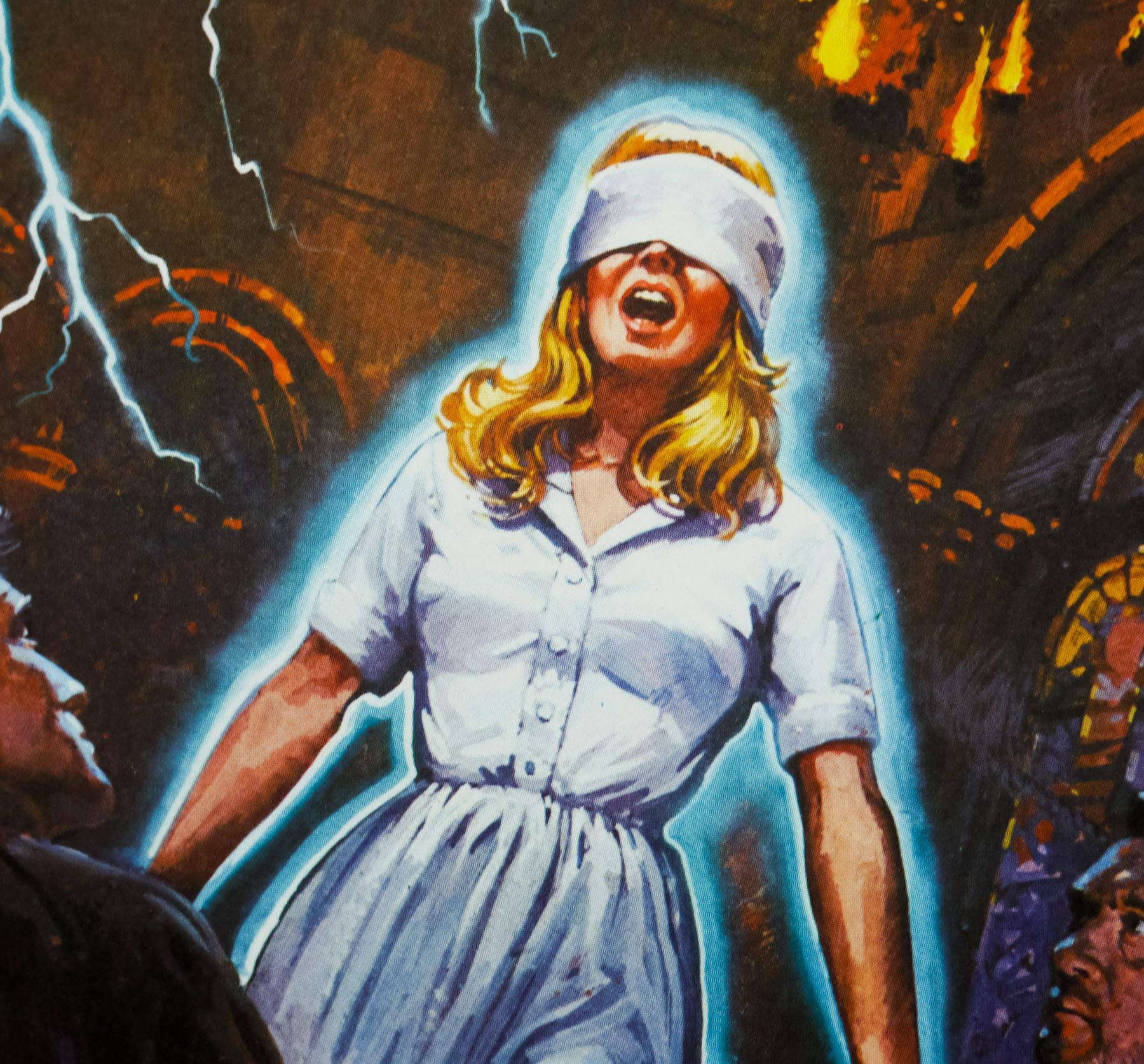
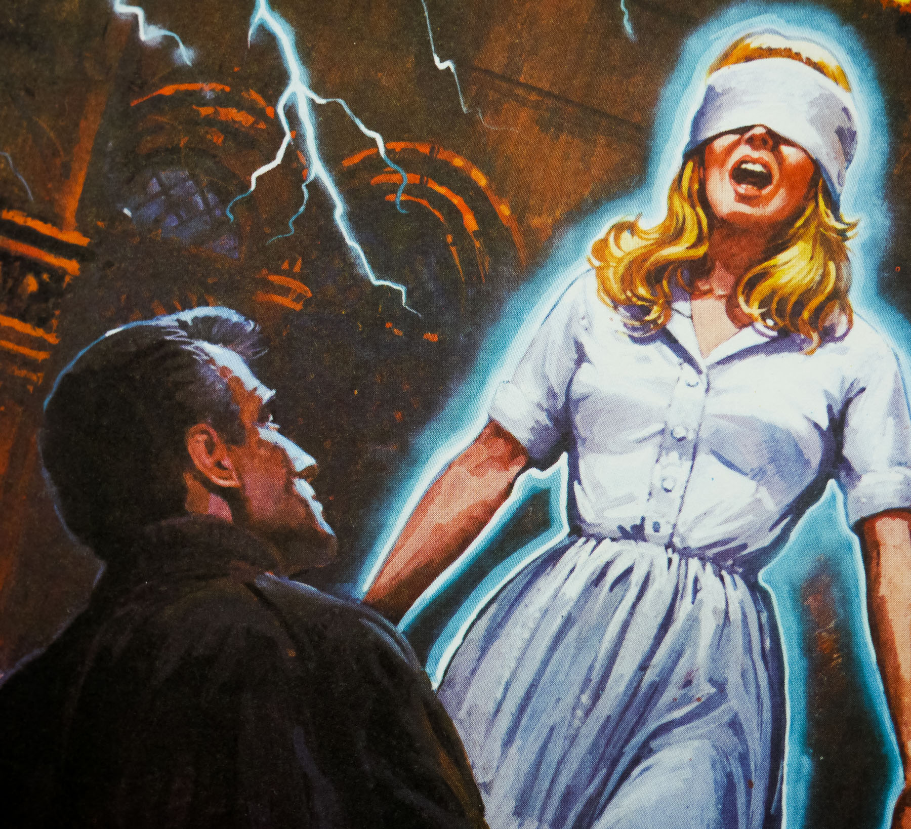
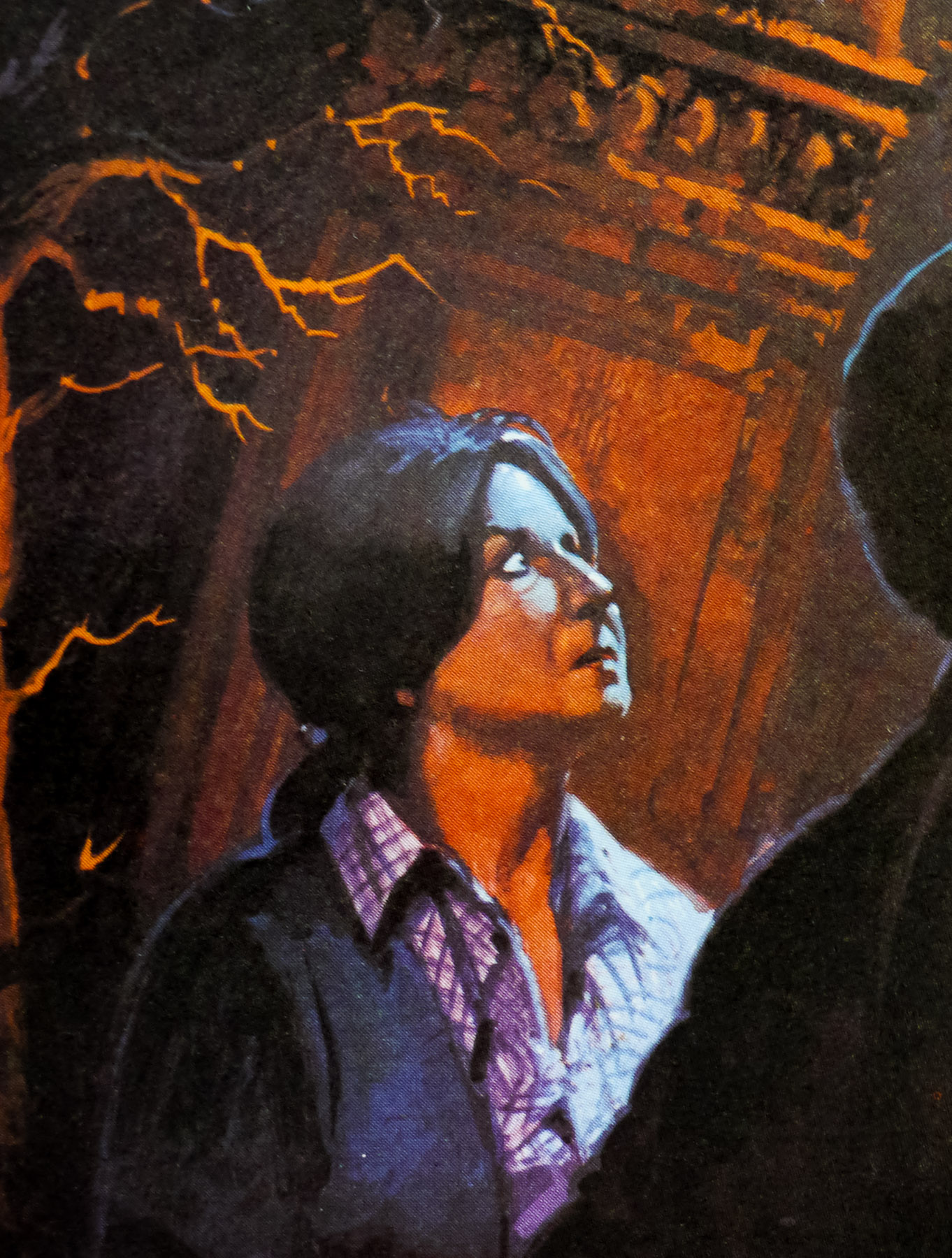
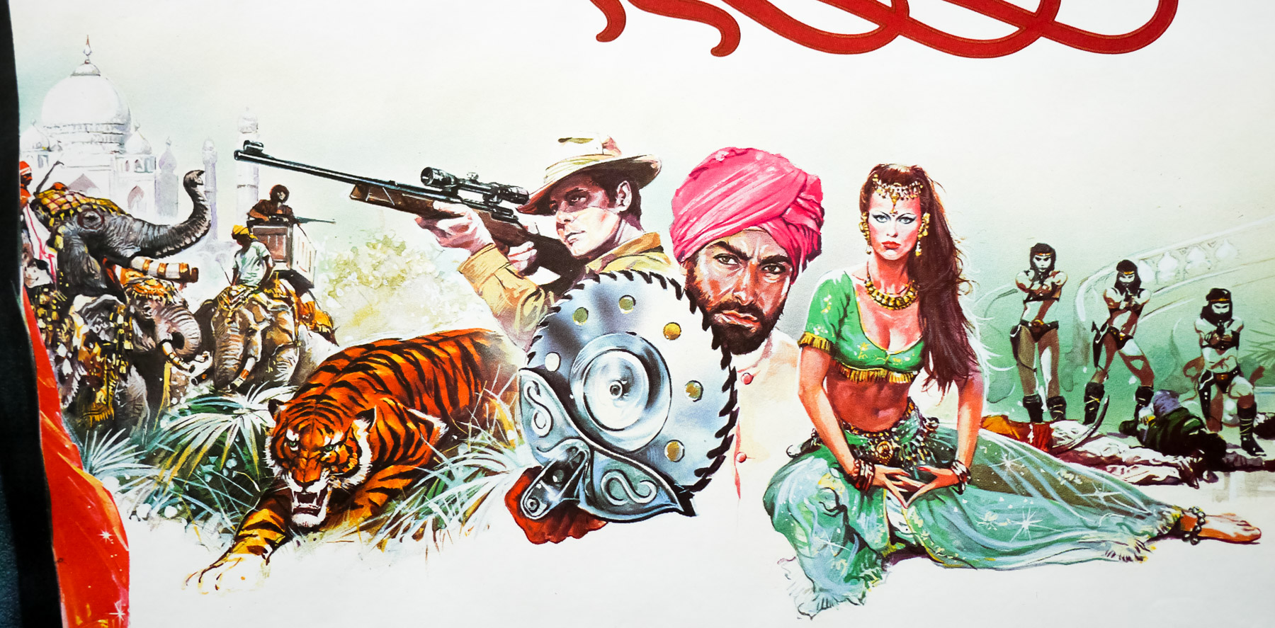
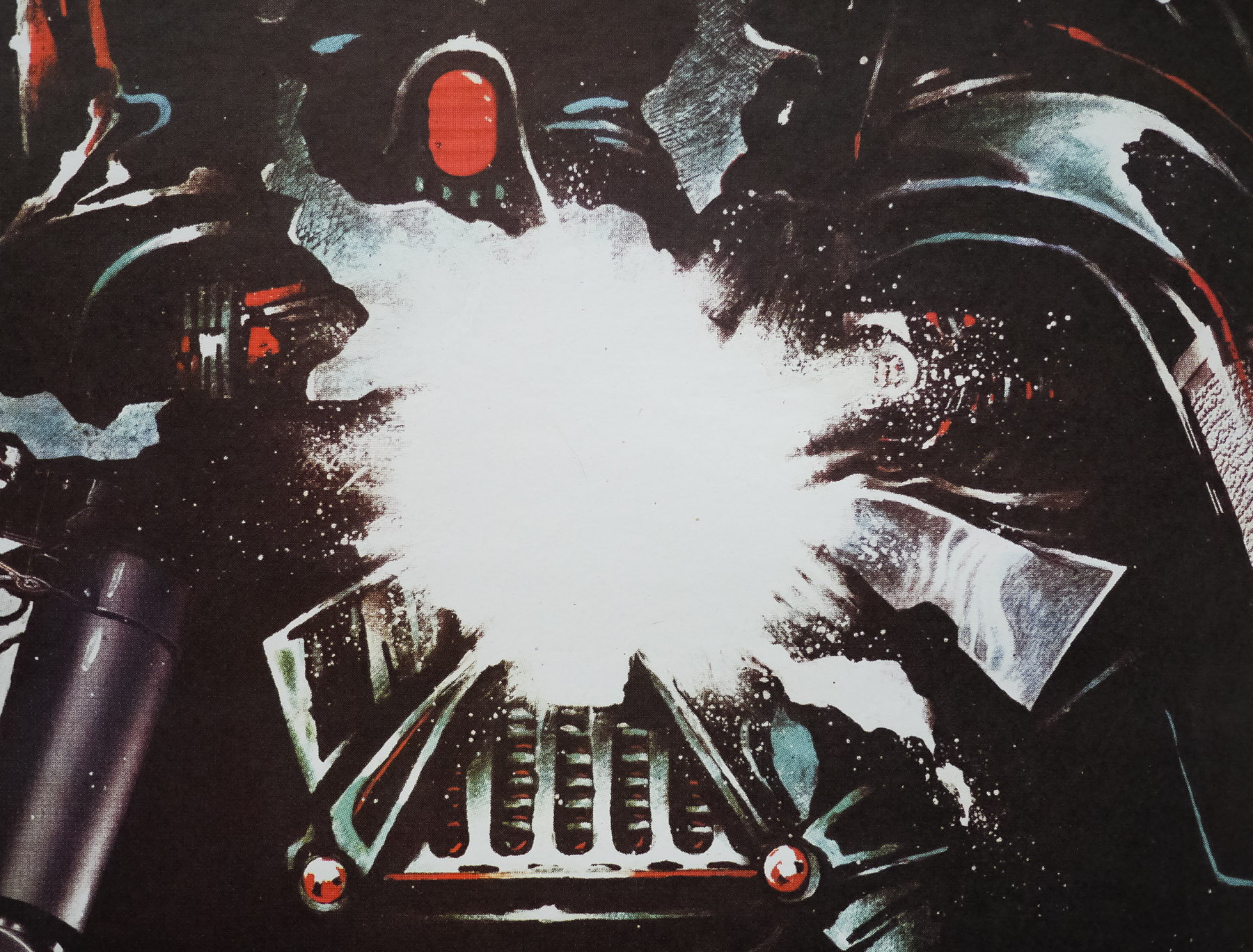
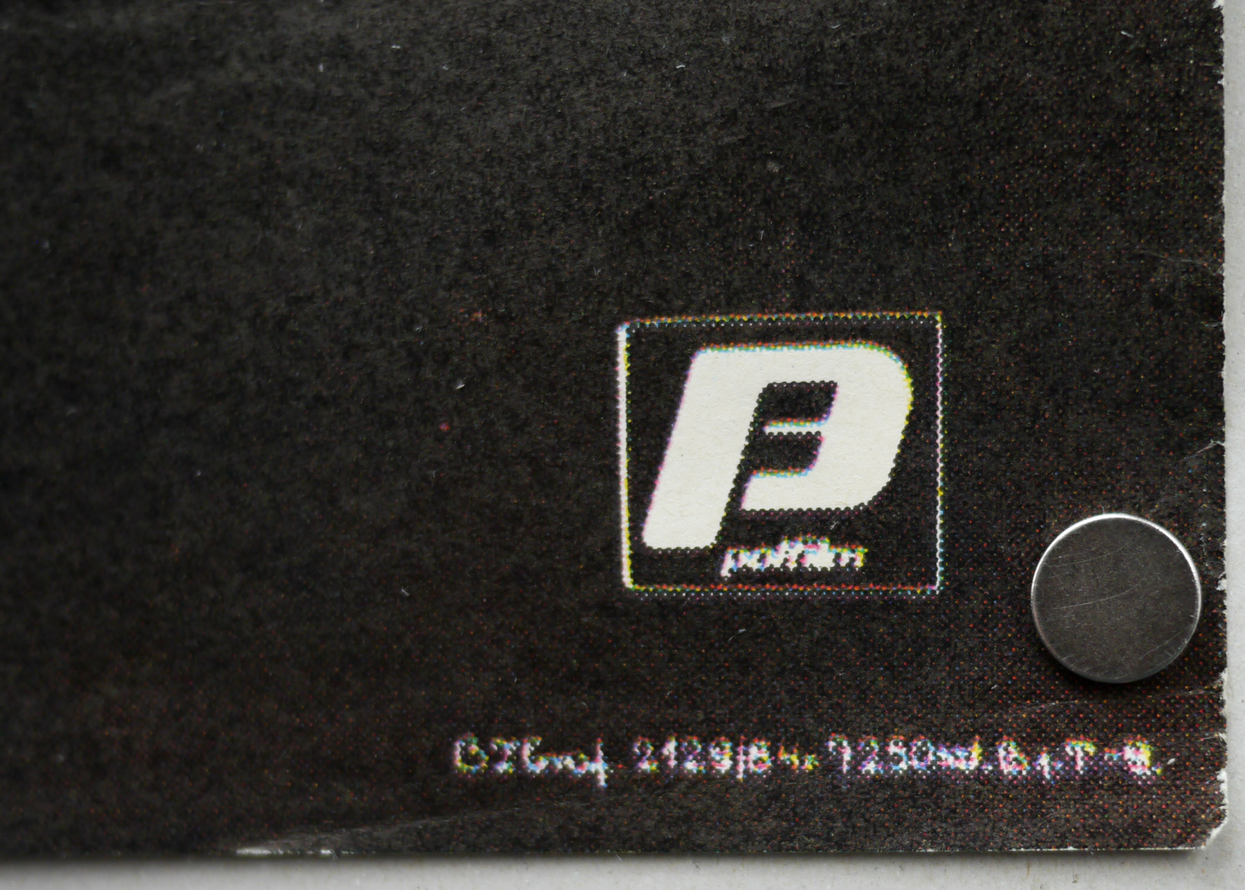
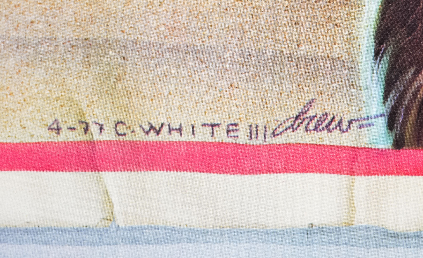
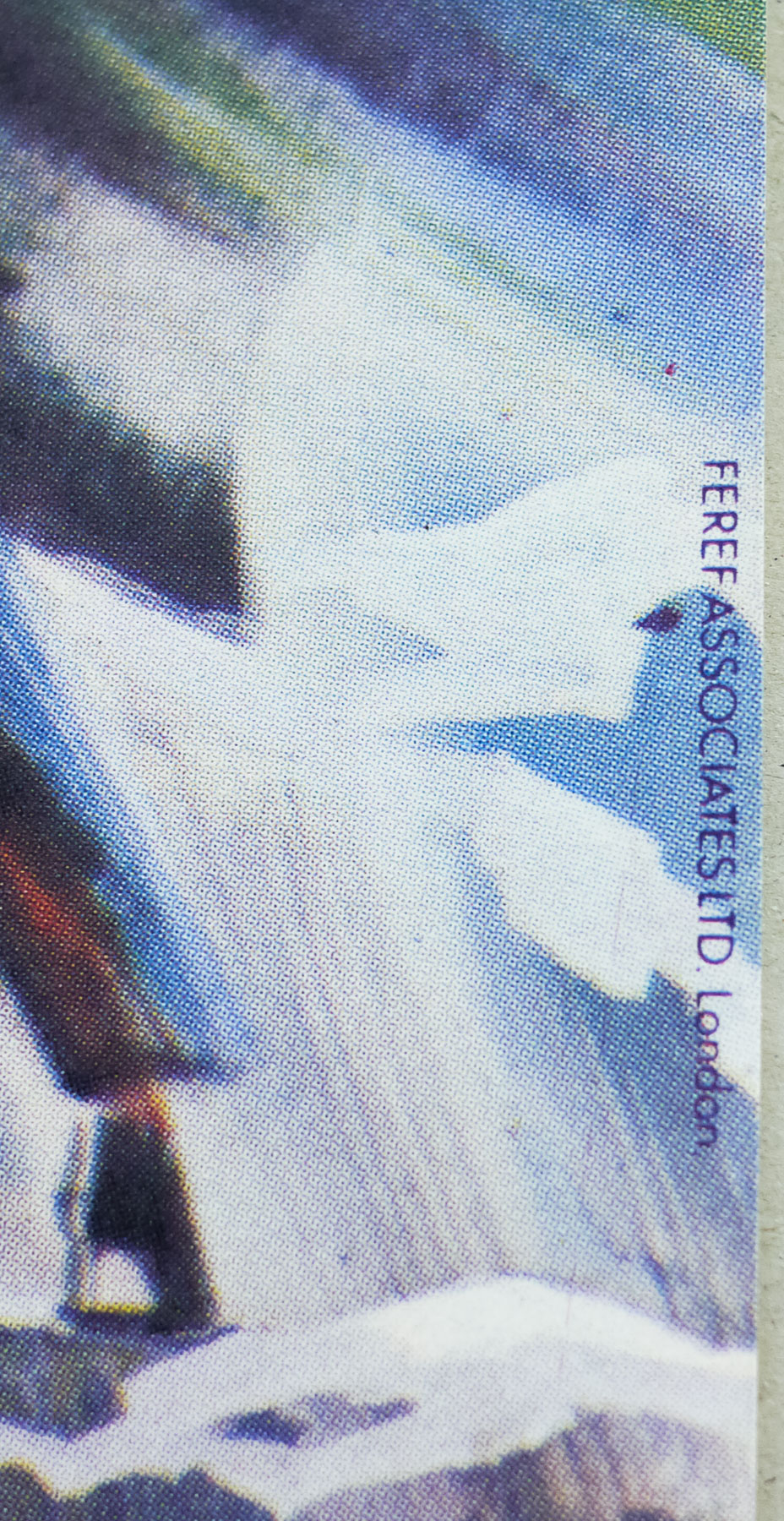
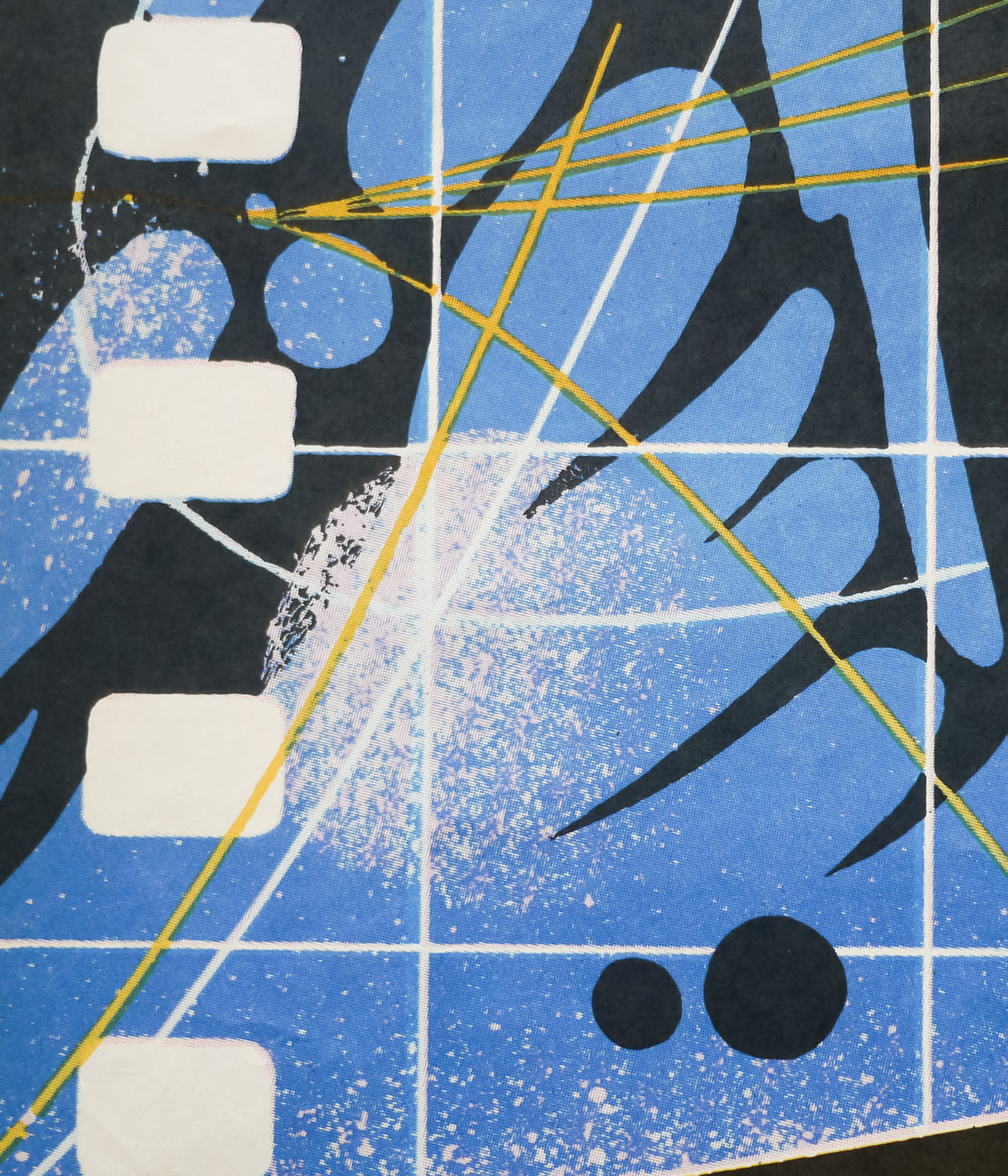
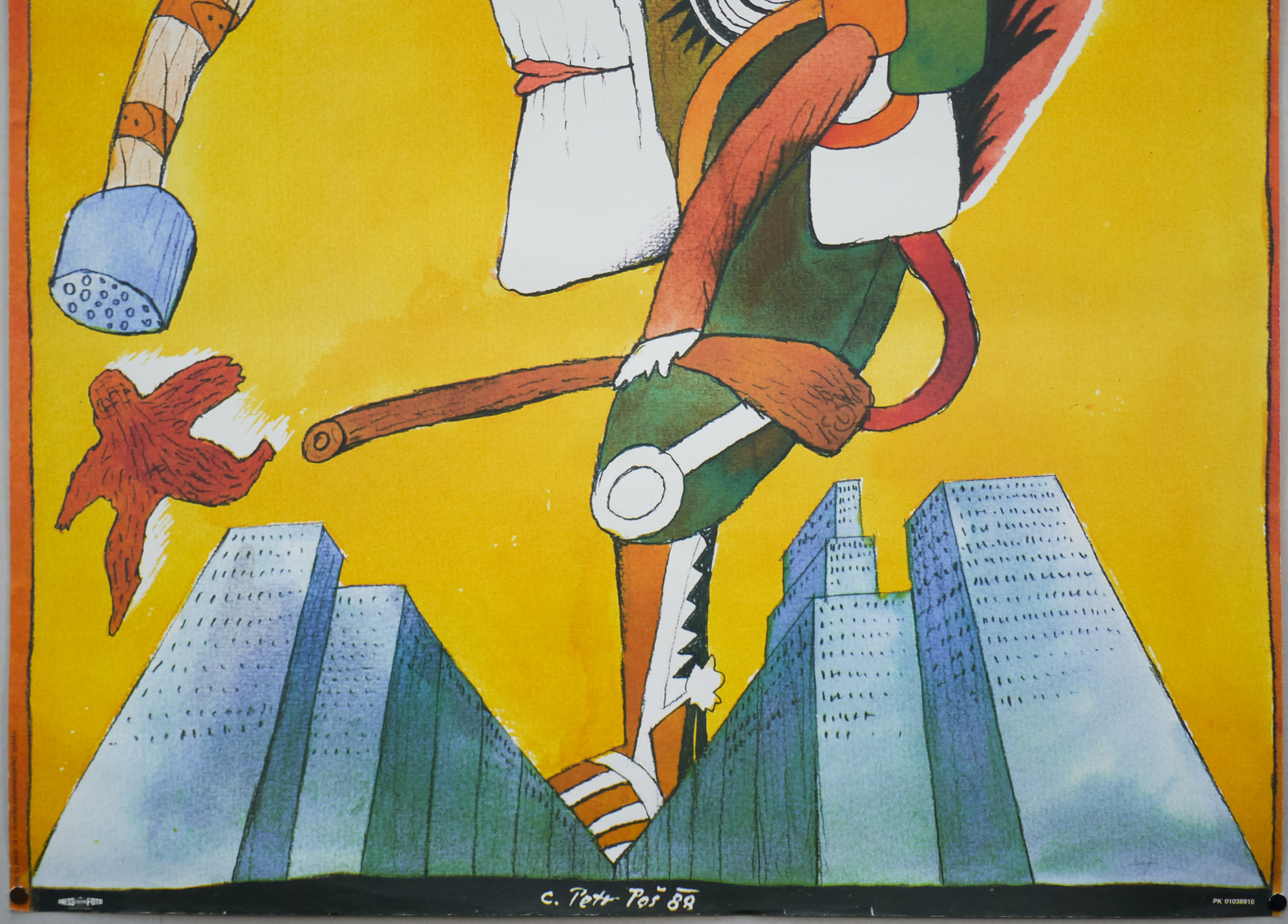
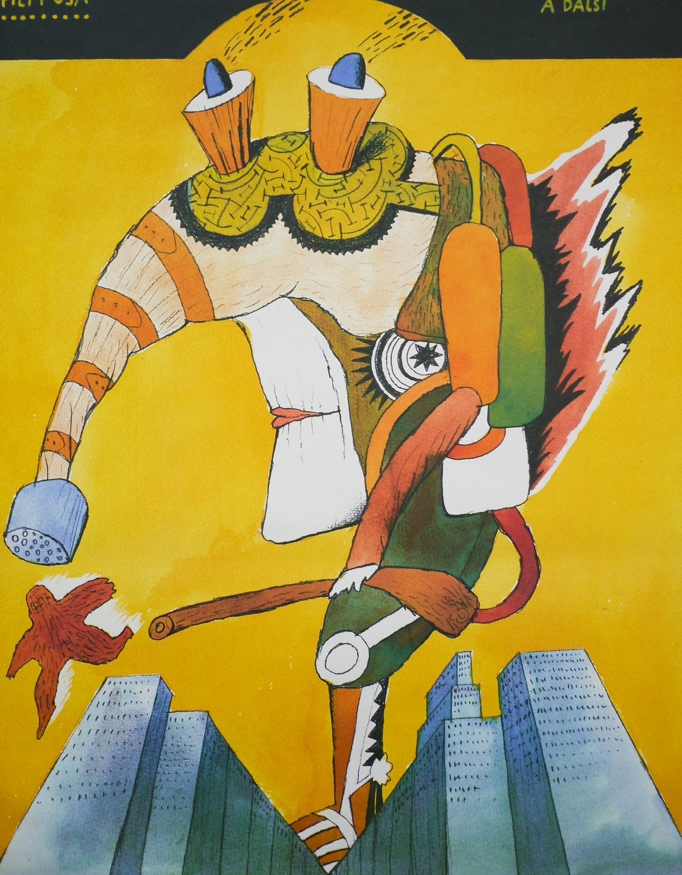
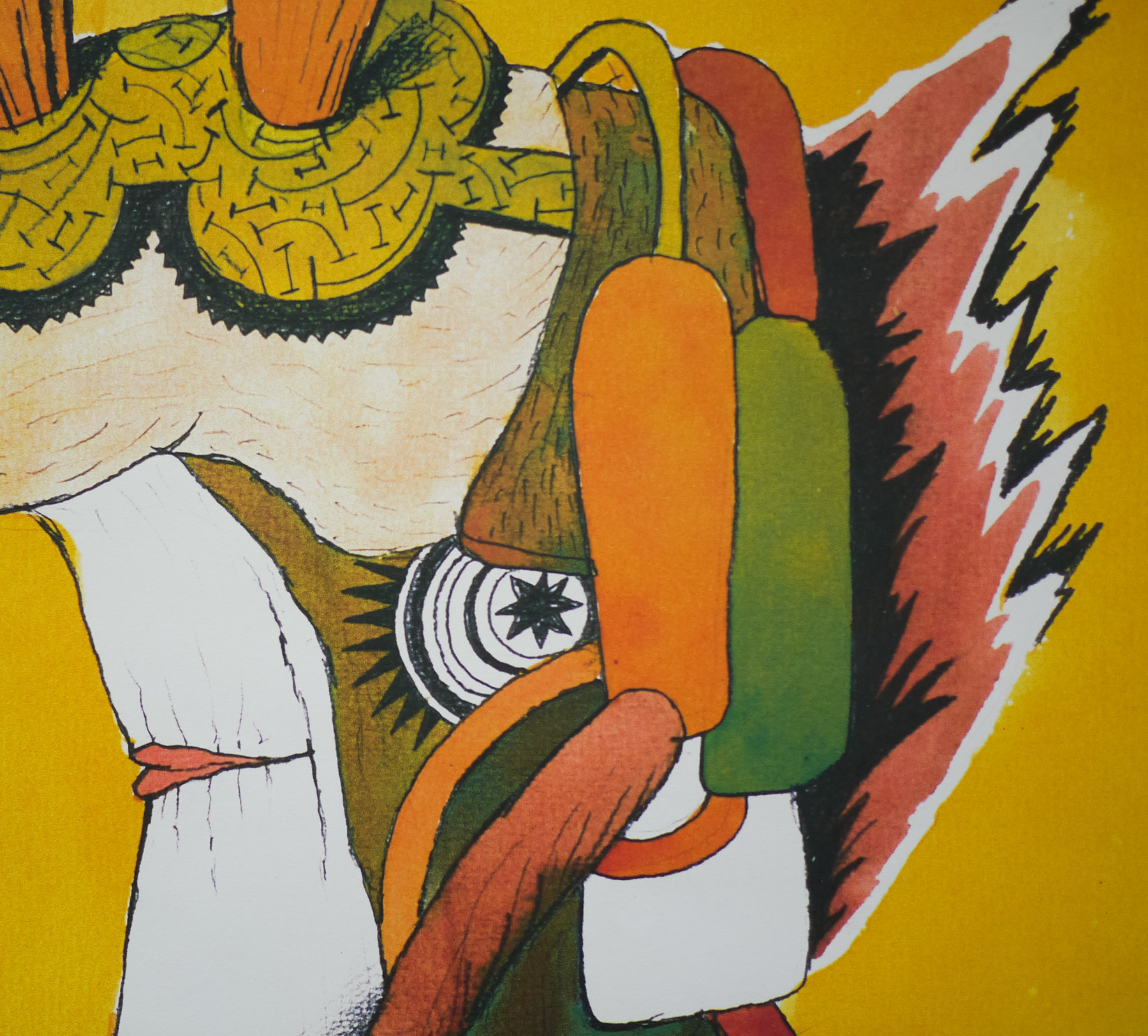
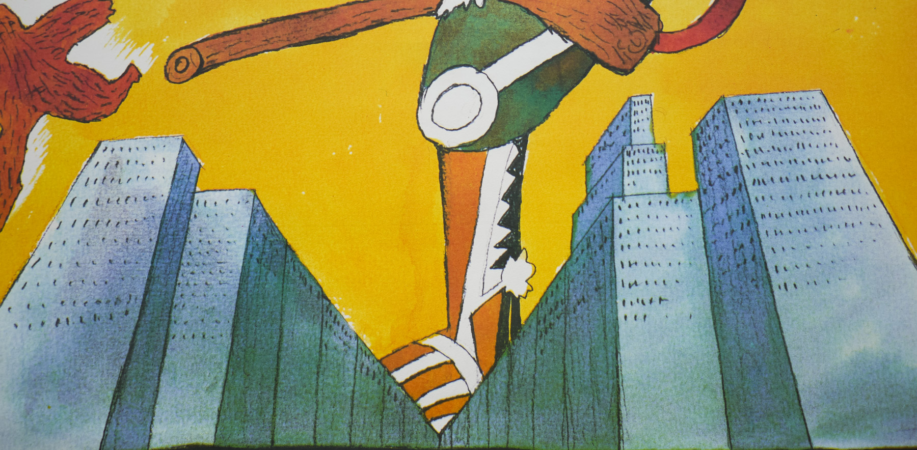
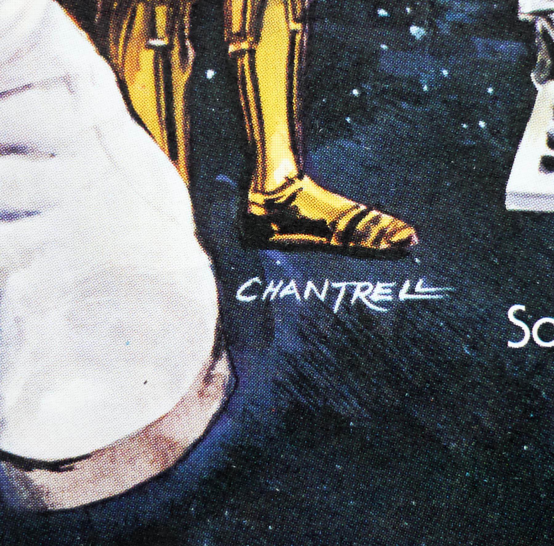
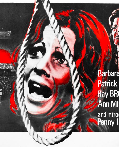
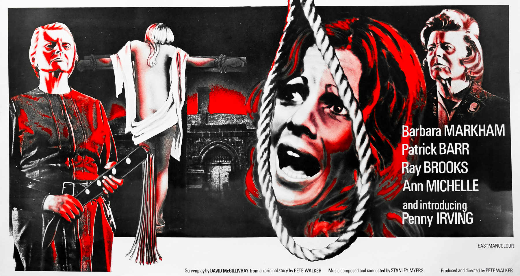
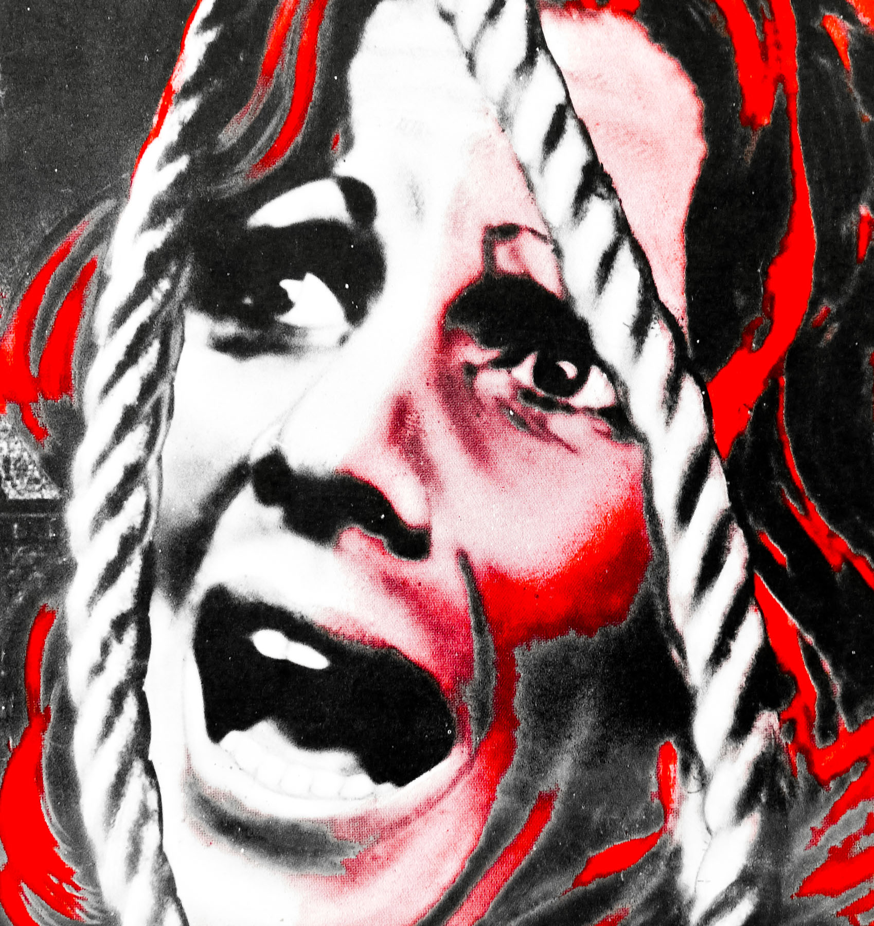
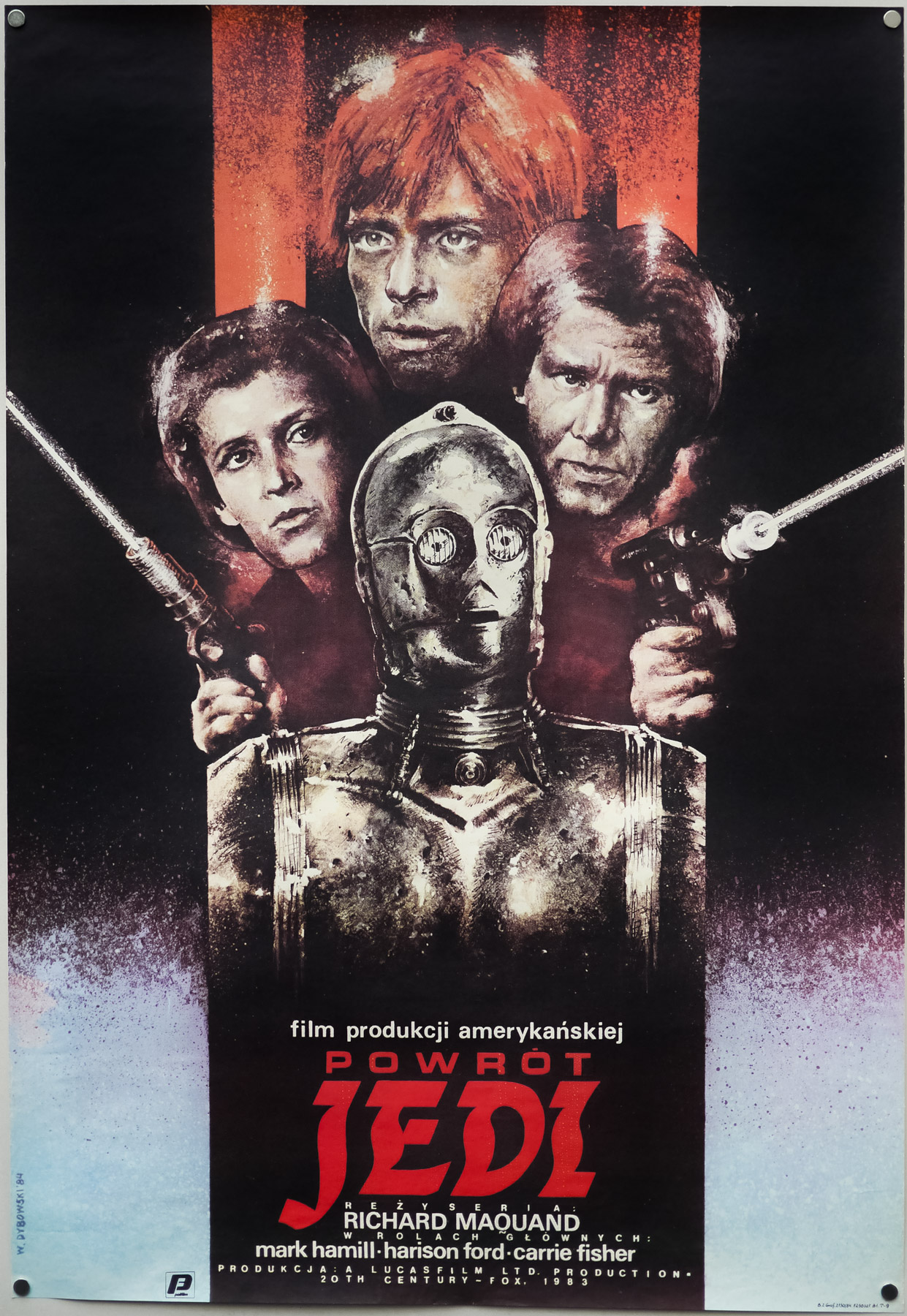
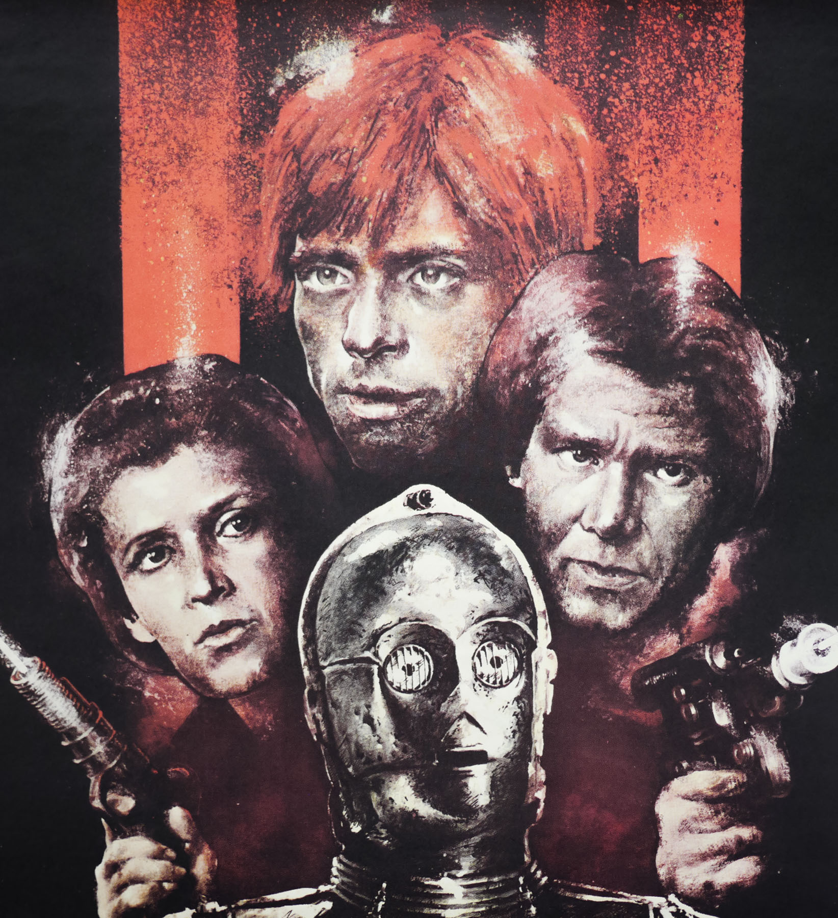
This British quad was created at the London-based Downtons Advertising agency by one of the principal designers, Eddie Paul, and painted by an artist named Bill Wiggins. Both men are featured in Sim Branaghan’s must-own book British Film Posters: An Illustrated History and are each responsible for several iconic British posters. The designer Eddie Paul was born in Hackney in 1920 and attended Southend School of Art, later beginning his career at Temple Art Studios before moving on to Star Illustrations on Shoe Lane, where he gained a good reputation as a scrapboard artist. After serving in the RAF during the war, Paul joined Pulford Publicity in 1946 and started designing film posters using crayons and coloured pencils. He worked on several successful poster campaigns during the 1960s, including El Cid (1961), The Fall of the Roman Empire (1964) and the famous quad for From Russia with Love (painted by Renato Fratini). He later joined four ex-Downton colleagues and formed the successful agency FEREF in 1968. As Sim notes in his book, ‘He was well liked and respected within the business as a gentleman’. Eddie Paul passed away from a heart attack whilst on his way to work in 1984, just shy of his retirement from FEREF.
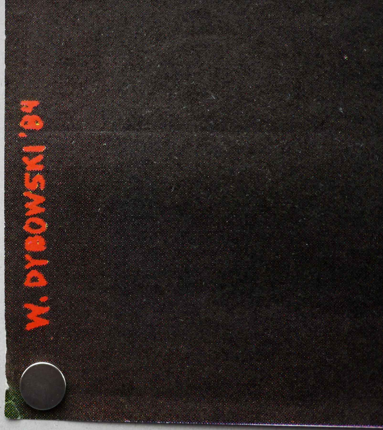
Bill Wiggins was born in 1915 and worked installing large cinema displays (on the front of the buildings) during the 1930s and was a special constable during the second world war. He arrived at Downton’s Advertising agency at the same time as another principal designer, Fred Atkins (later a partner in FEREF), in 1951. Wiggins worked in the film department of the studio for 25 years, painting dozens of posters alongside the likes of Vic Fair and Brian Bysouth. Wiggins is mentioned several times during my interview with the latter. He worked on several of the early Hammer films, including Dracula (1958), The Mummy (1959), Curse of the Werewolf, as well as the sci-fi films The Lost World (1960) and Day of the Triffids (1962). He initially retired in 1975 ‘but rapidly found himself so bored that he returned within a couple of months and continued full time for another three years, eventually leaving to paint commissioned oil portraits for an art/photographic business in Bromley’. He passed away, aged 73, in 1988. Sim believes that this poster for FATMFH is likely to be one of, if not the, final cinema poster that Wiggins worked on.
In addition to this single feature quad, there is also a double-bill quad for when the film was released in a pairing with the long-forgotten kung-fu film The Fists of Vengeance. The artwork for FATMFH is actually coloured on the double-bill poster and is therefore arguably superior to this quad. Sim confirmed to me that there was a policy around this time that the single feature quad would usually be monochrome whilst the double-bill was typically printed in full colour.
Finally, this particular copy is rolled and in great condition, which is somewhat unusual for a poster from this era. I recall reading that it may have been one poster that Hammer printed in greater numbers to give away to fans who wrote in to the studio, as was the case with the quads for ‘Dracula Has Risen from the Grave’ and the ‘She/One Million Years BC’ quads (see the bottom of this page for more detail). I’m not certain that this is case though and I’d appreciate more details about it if anyone has them.