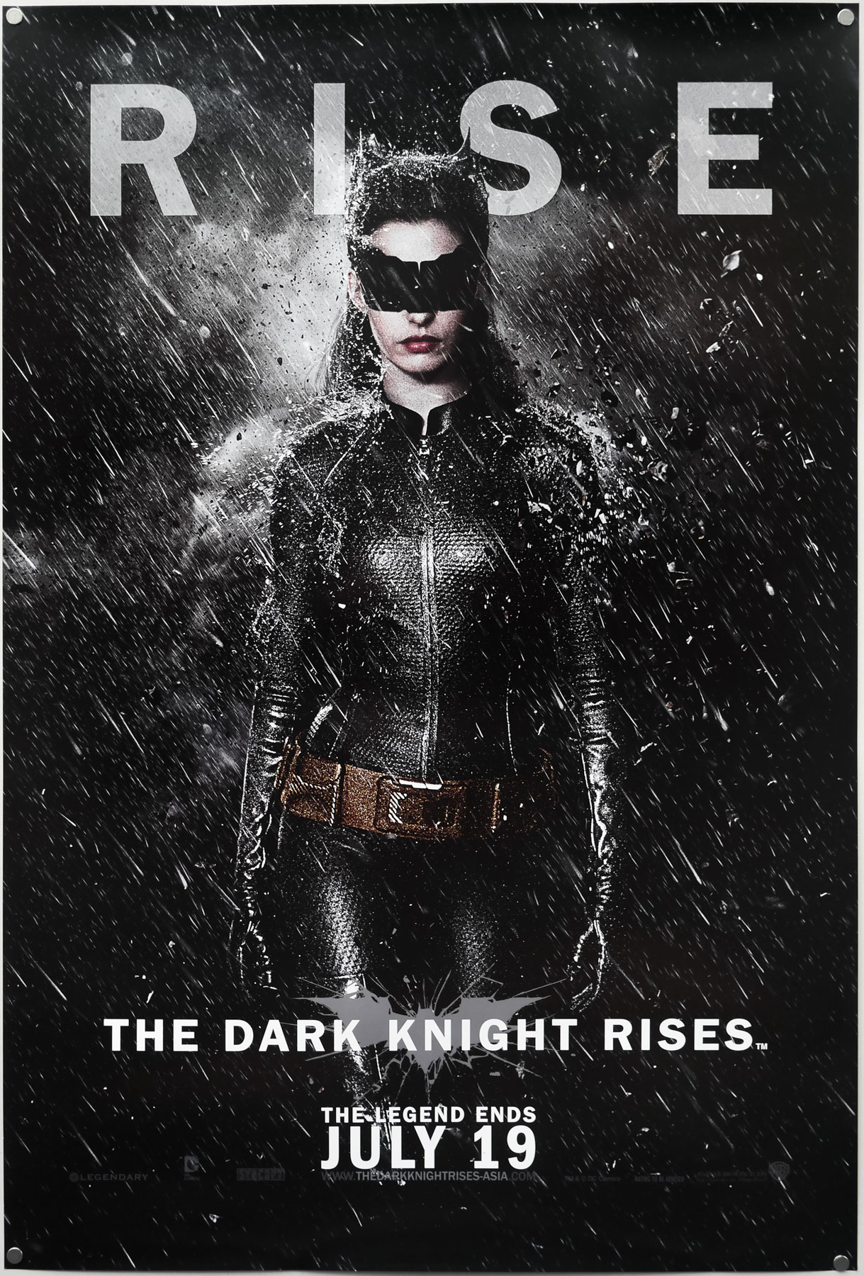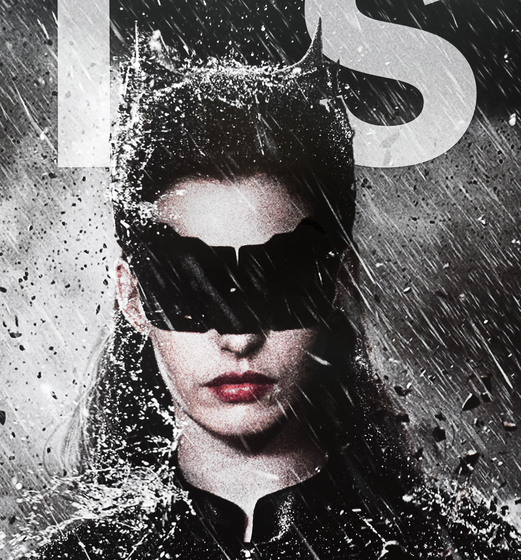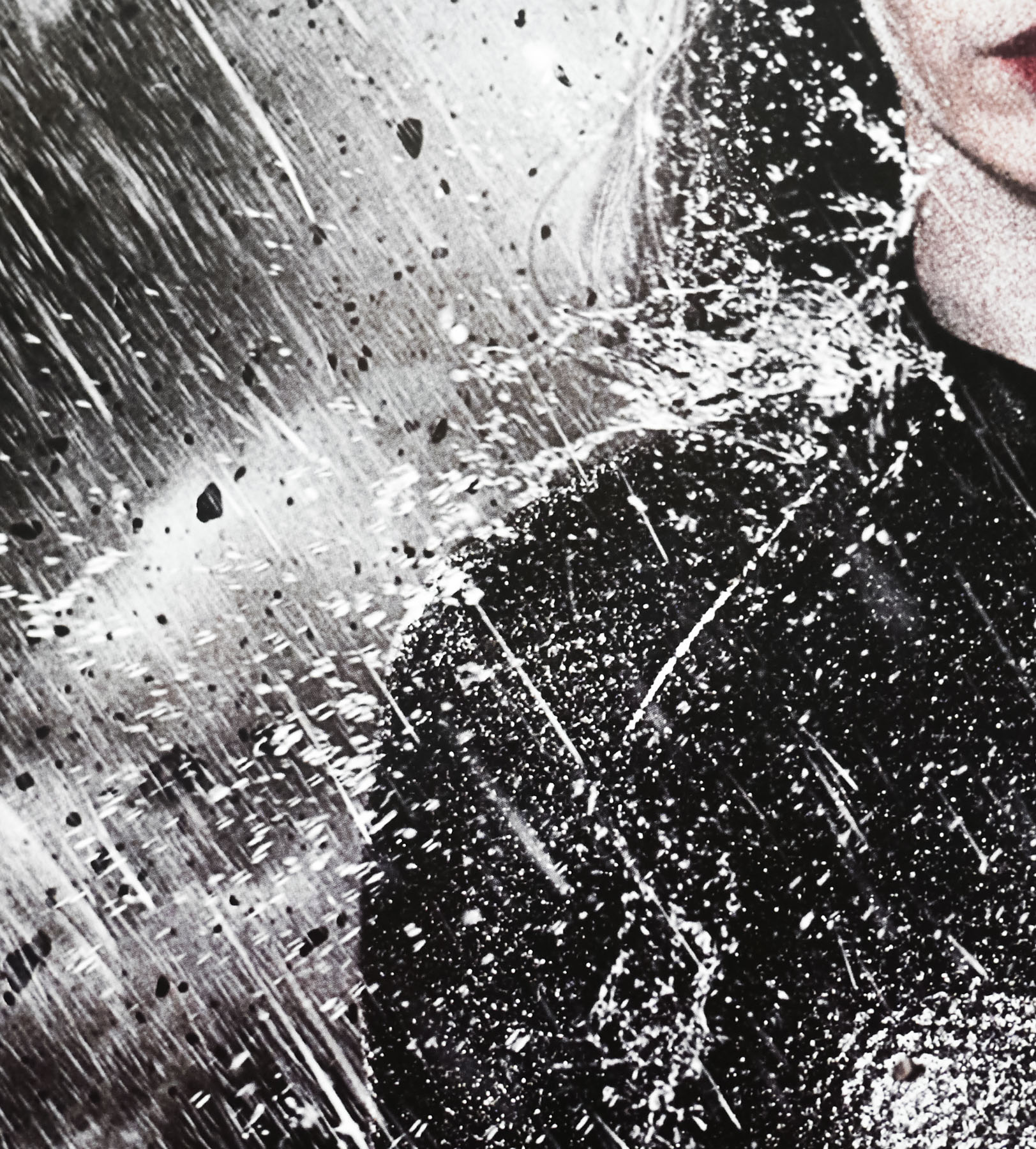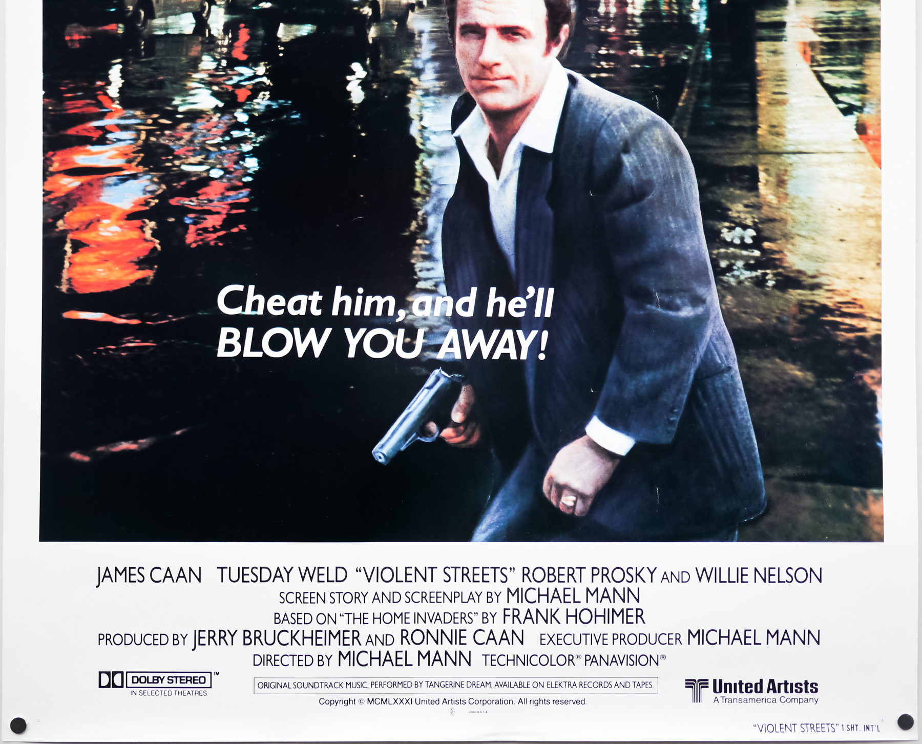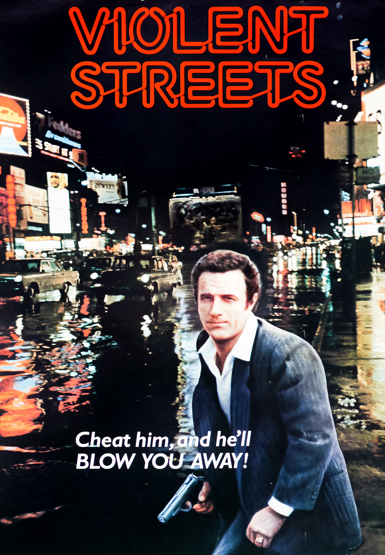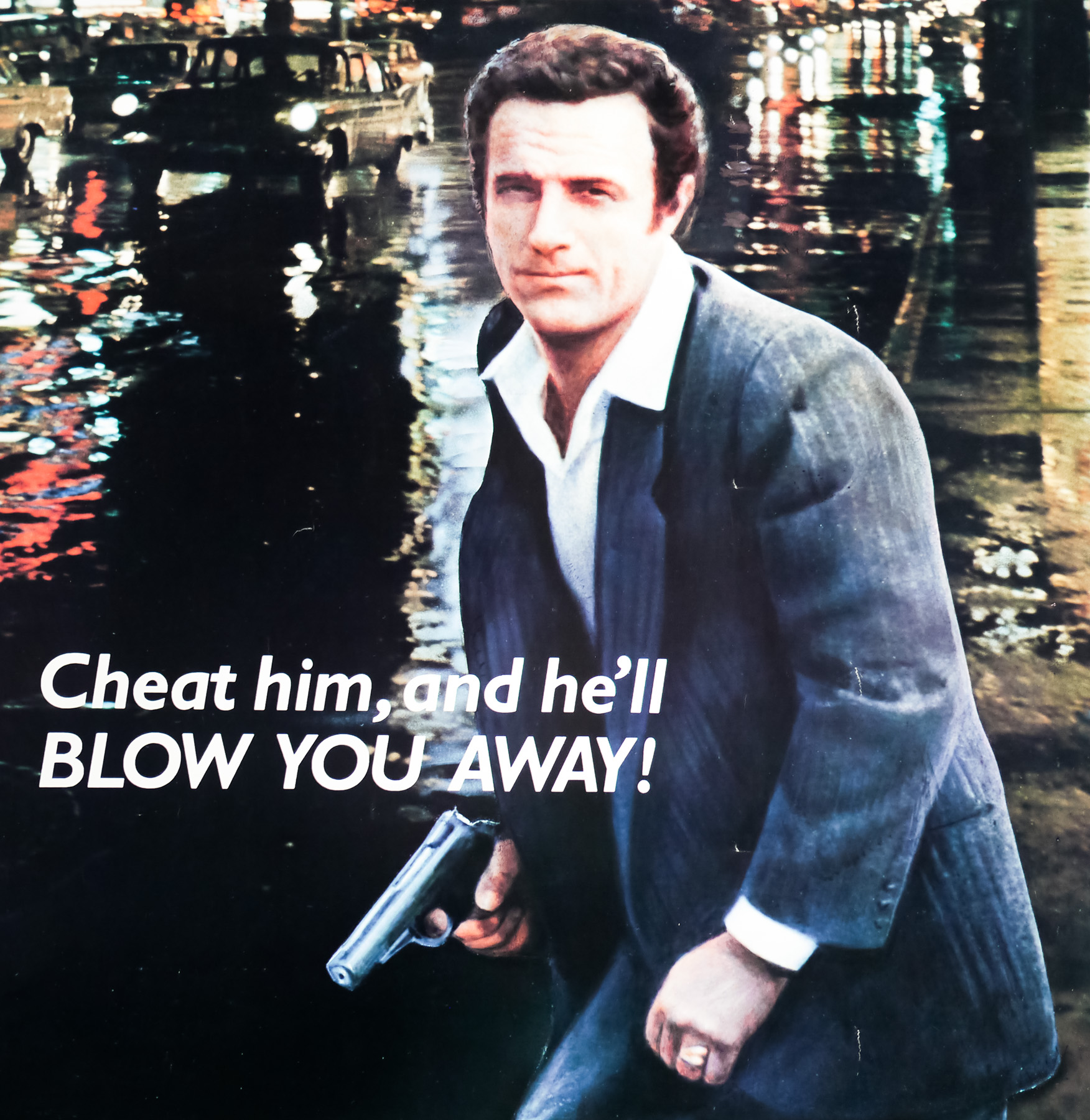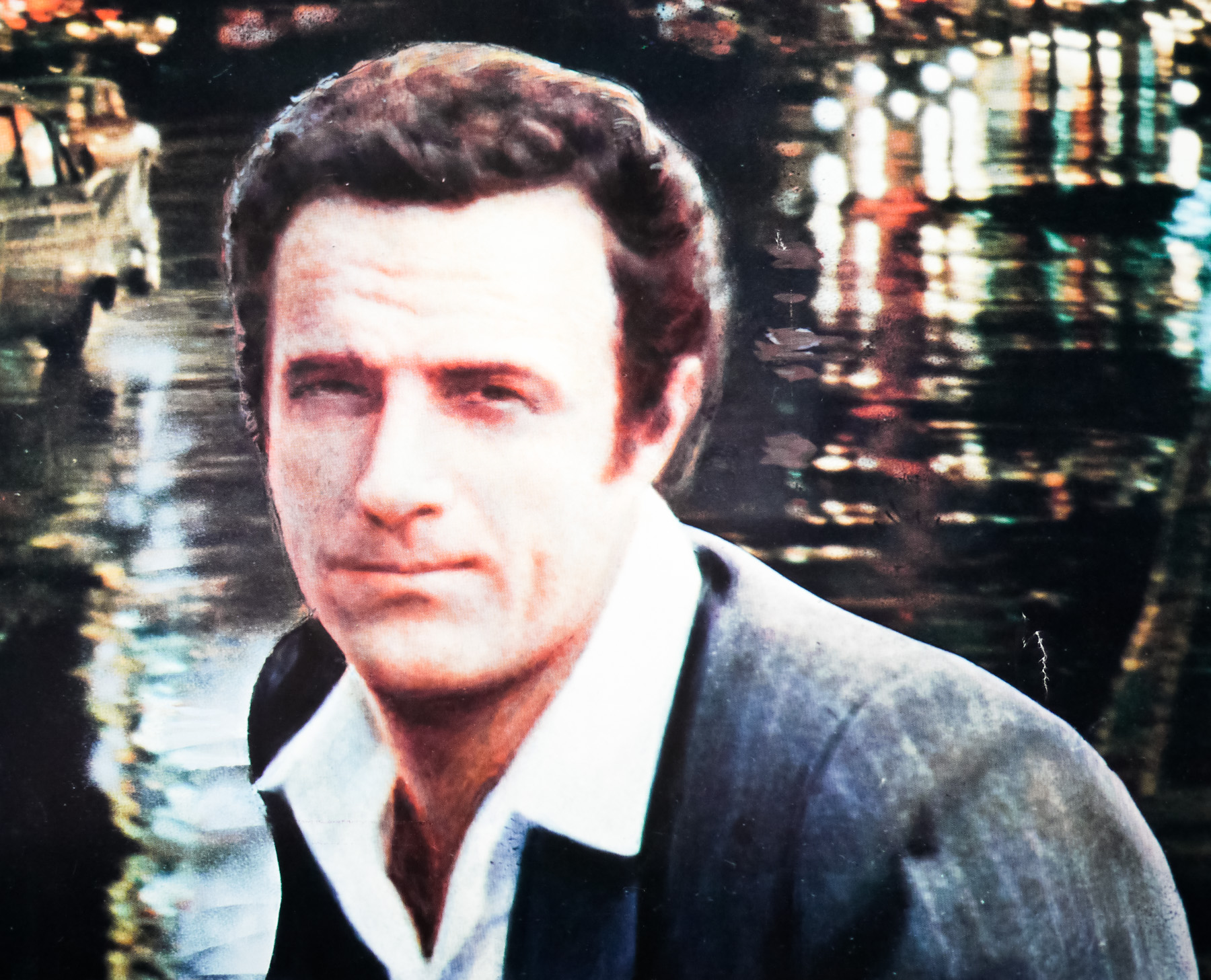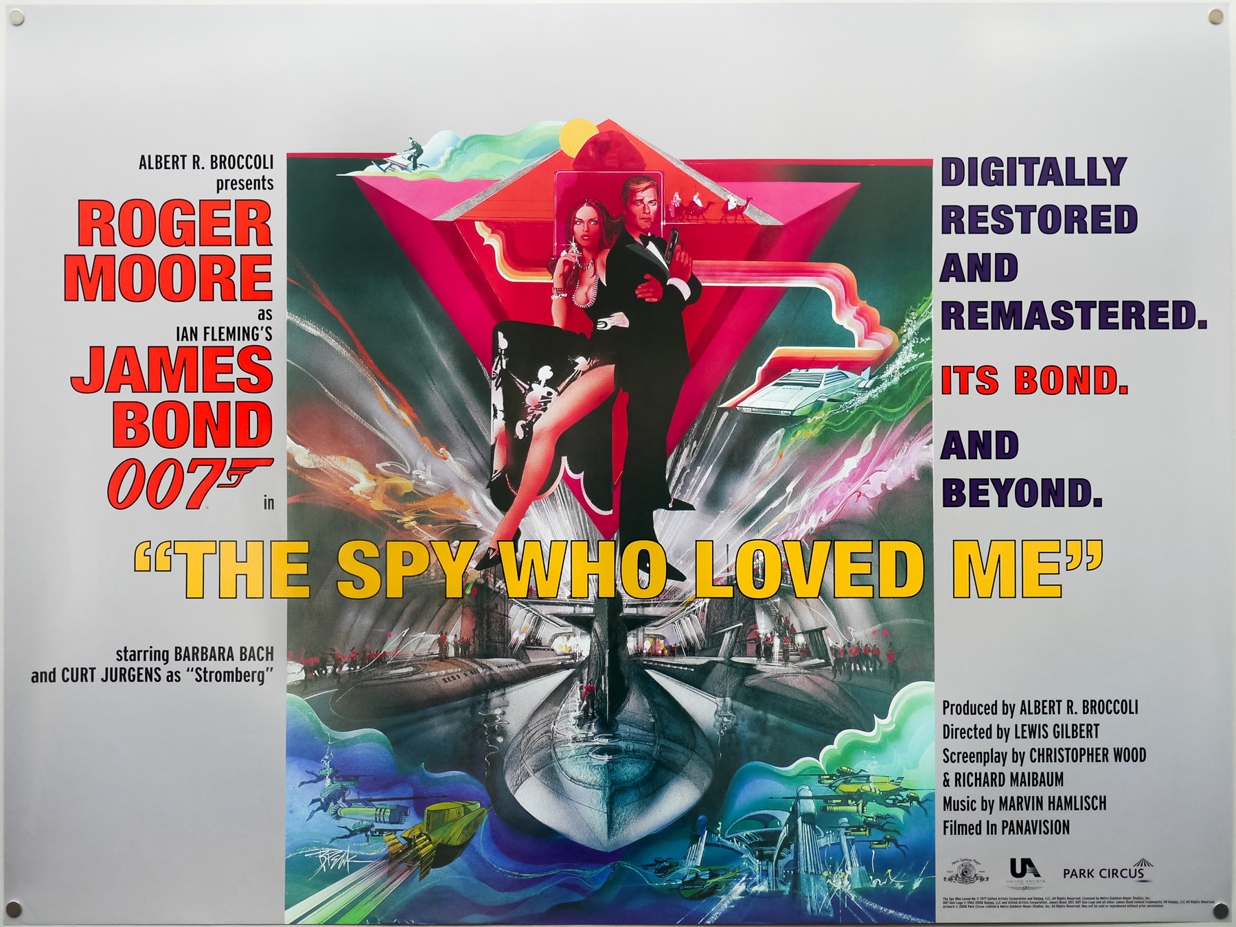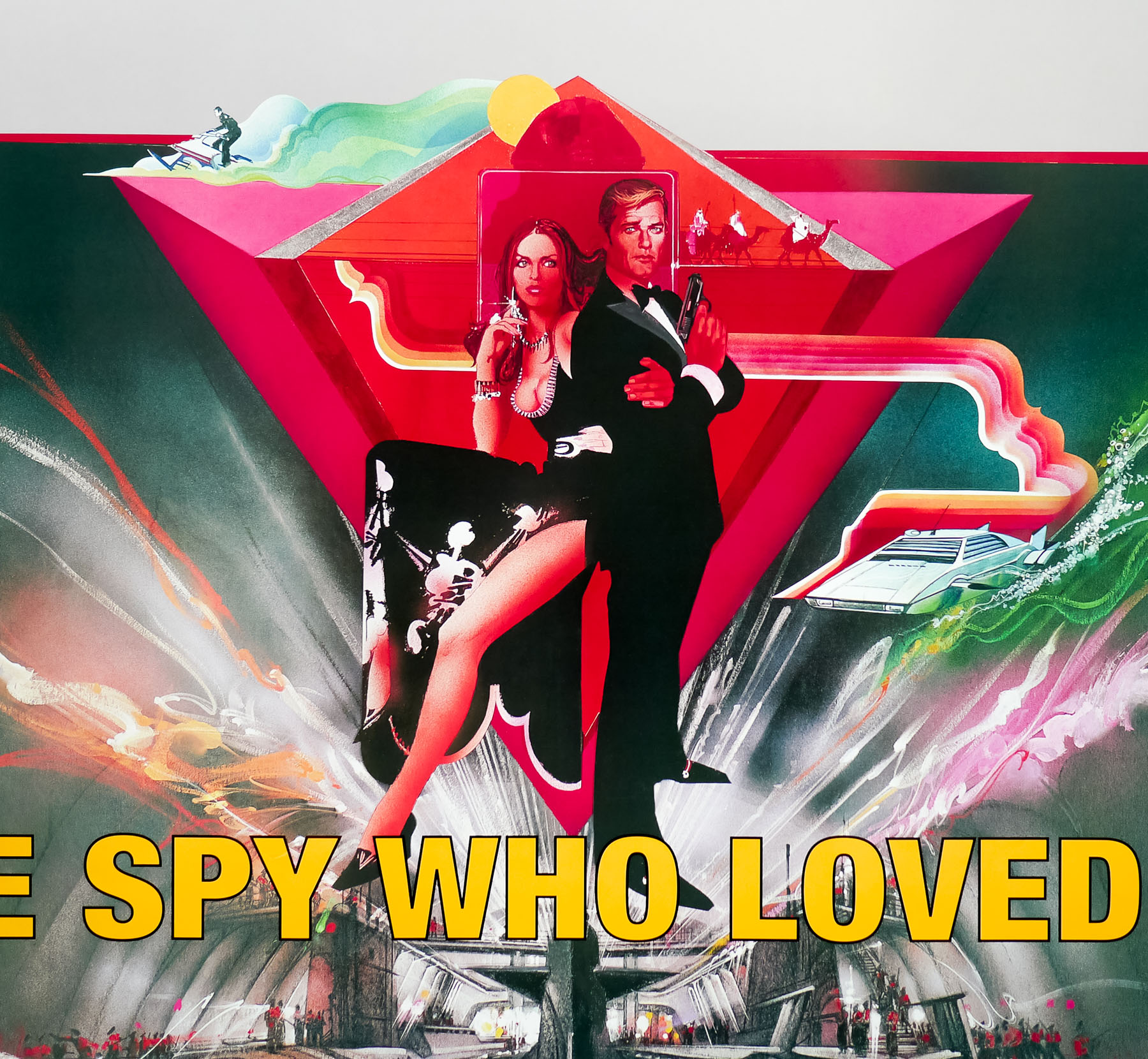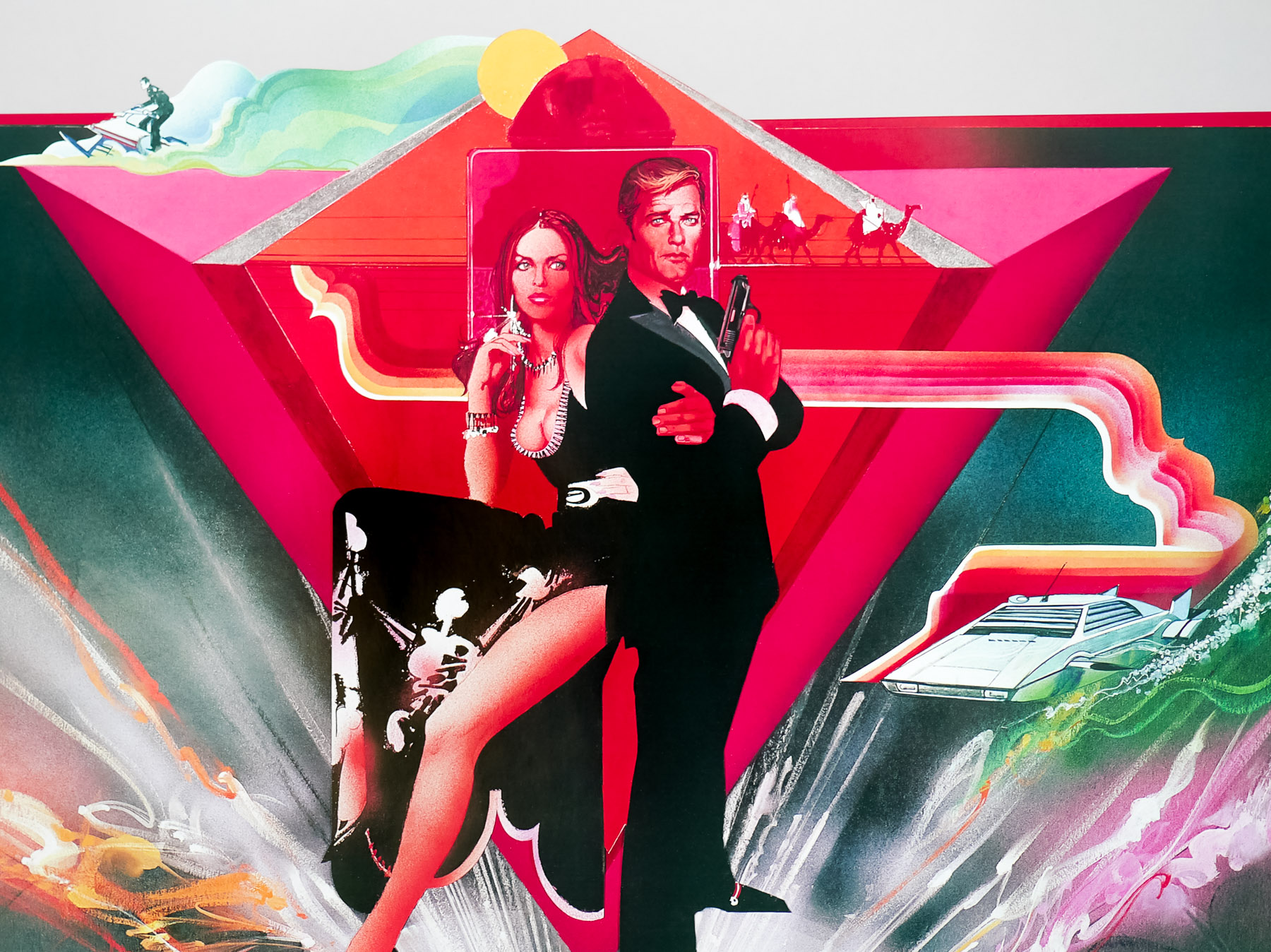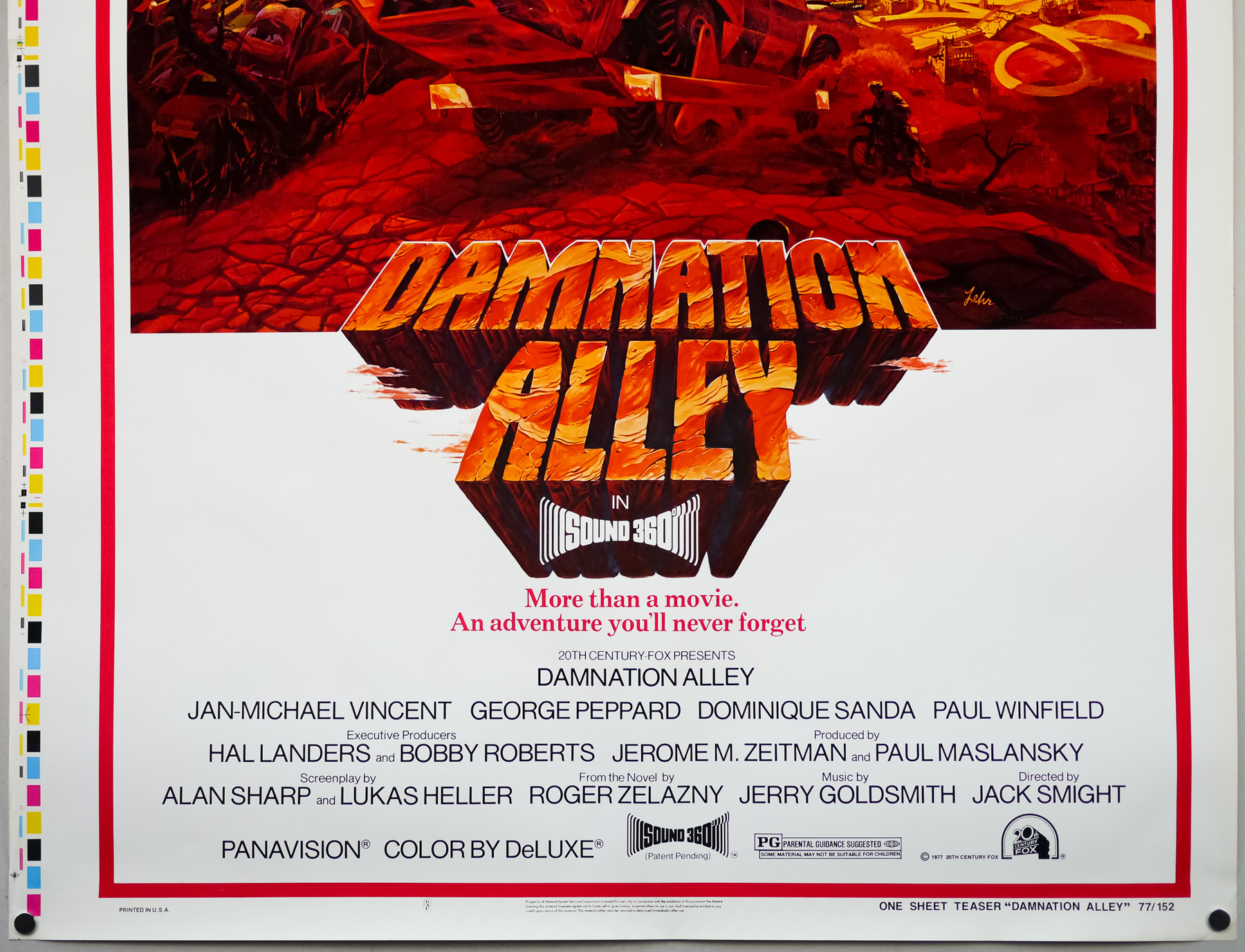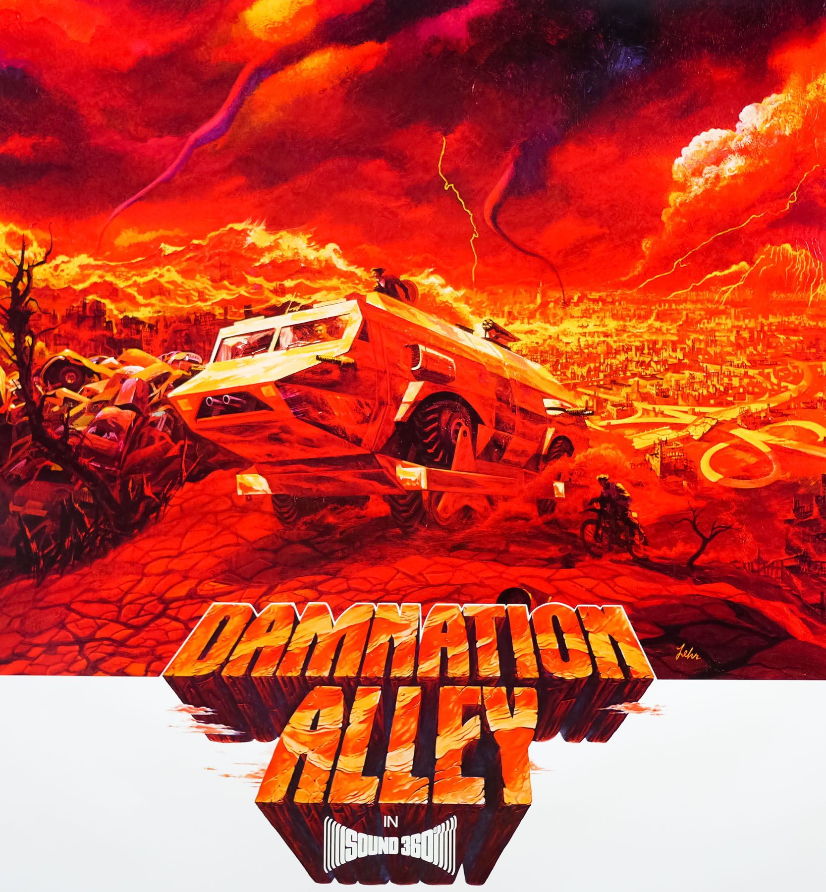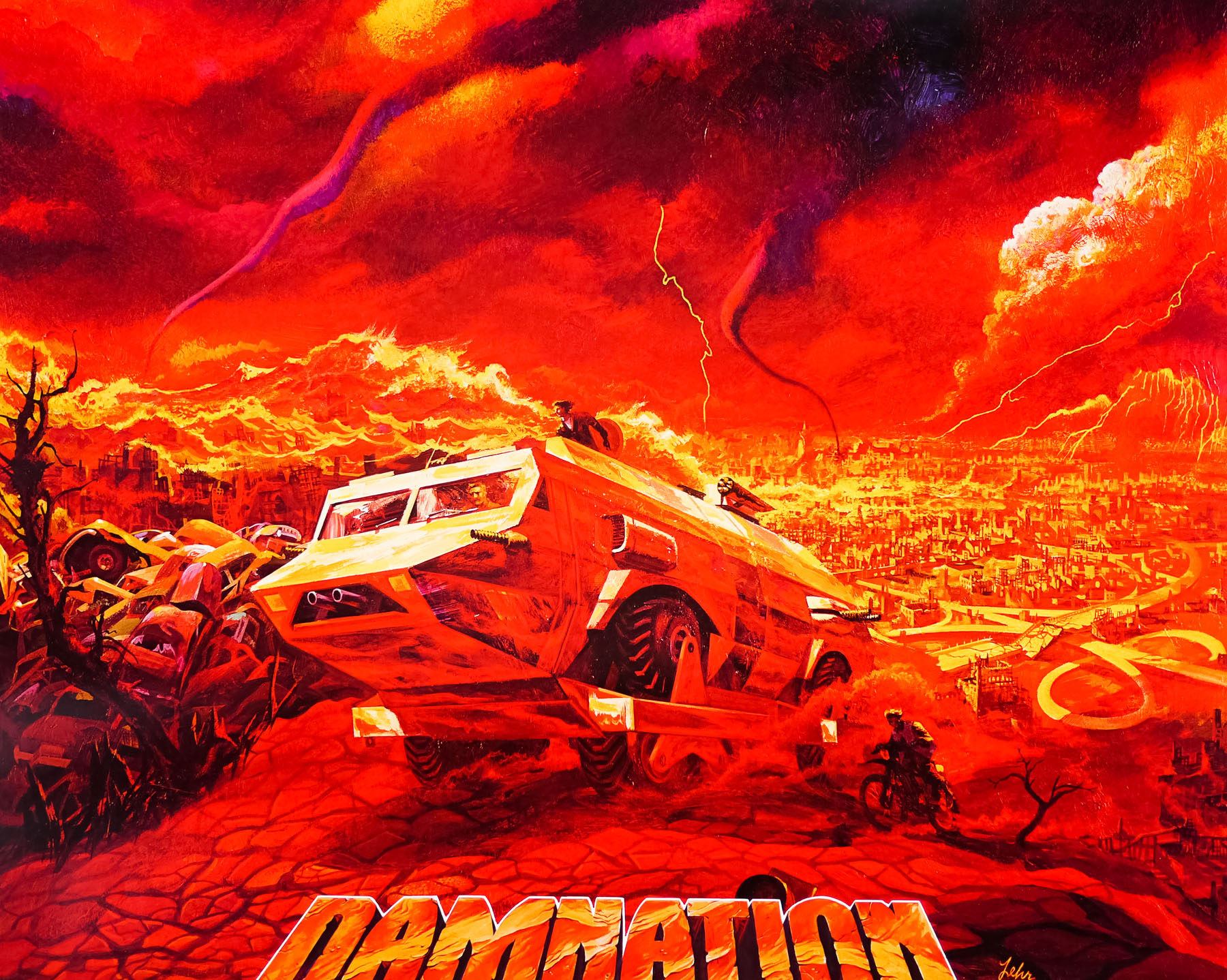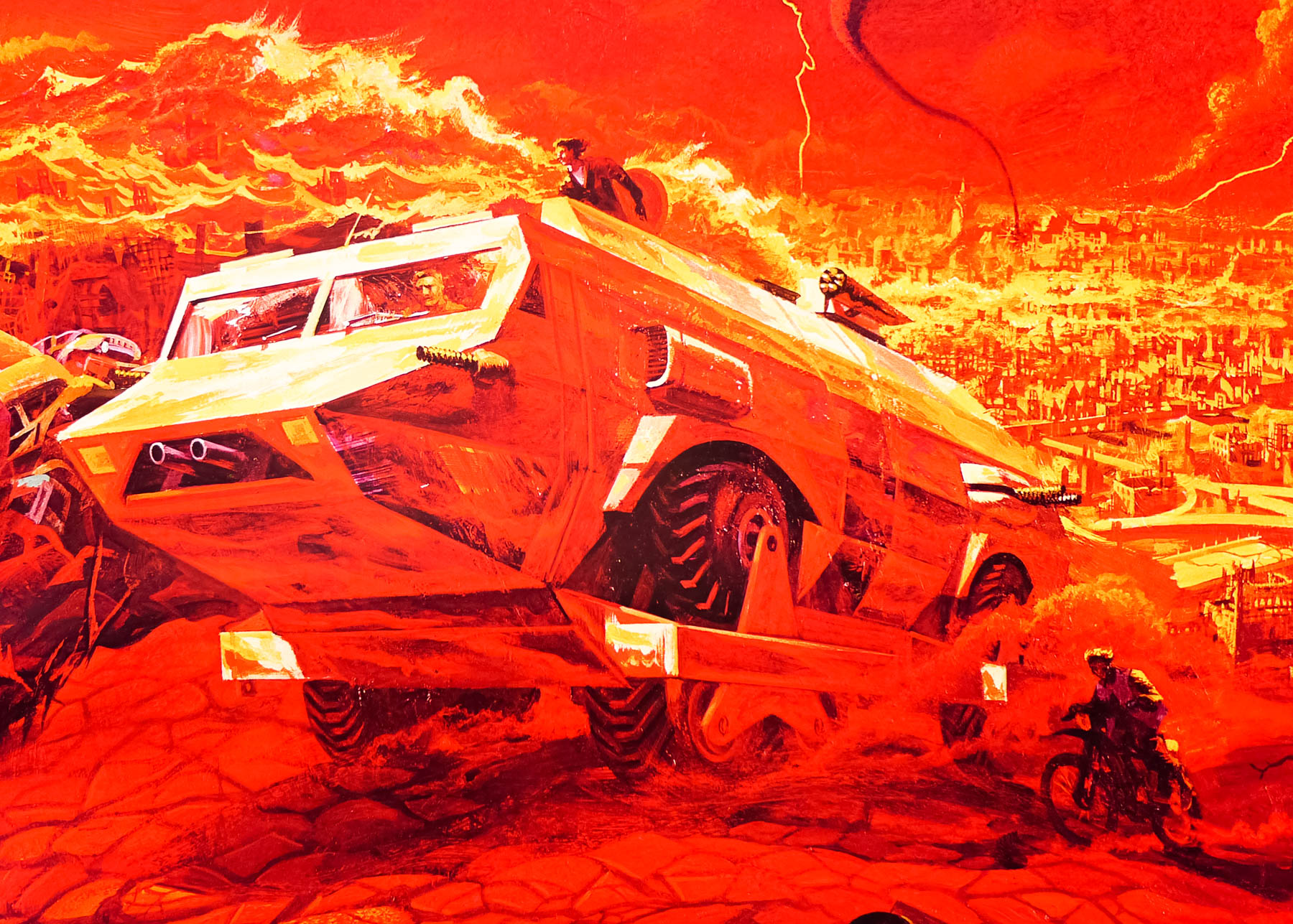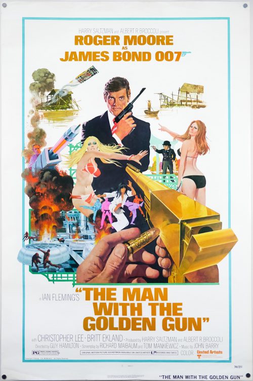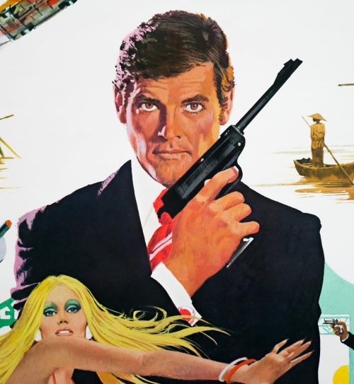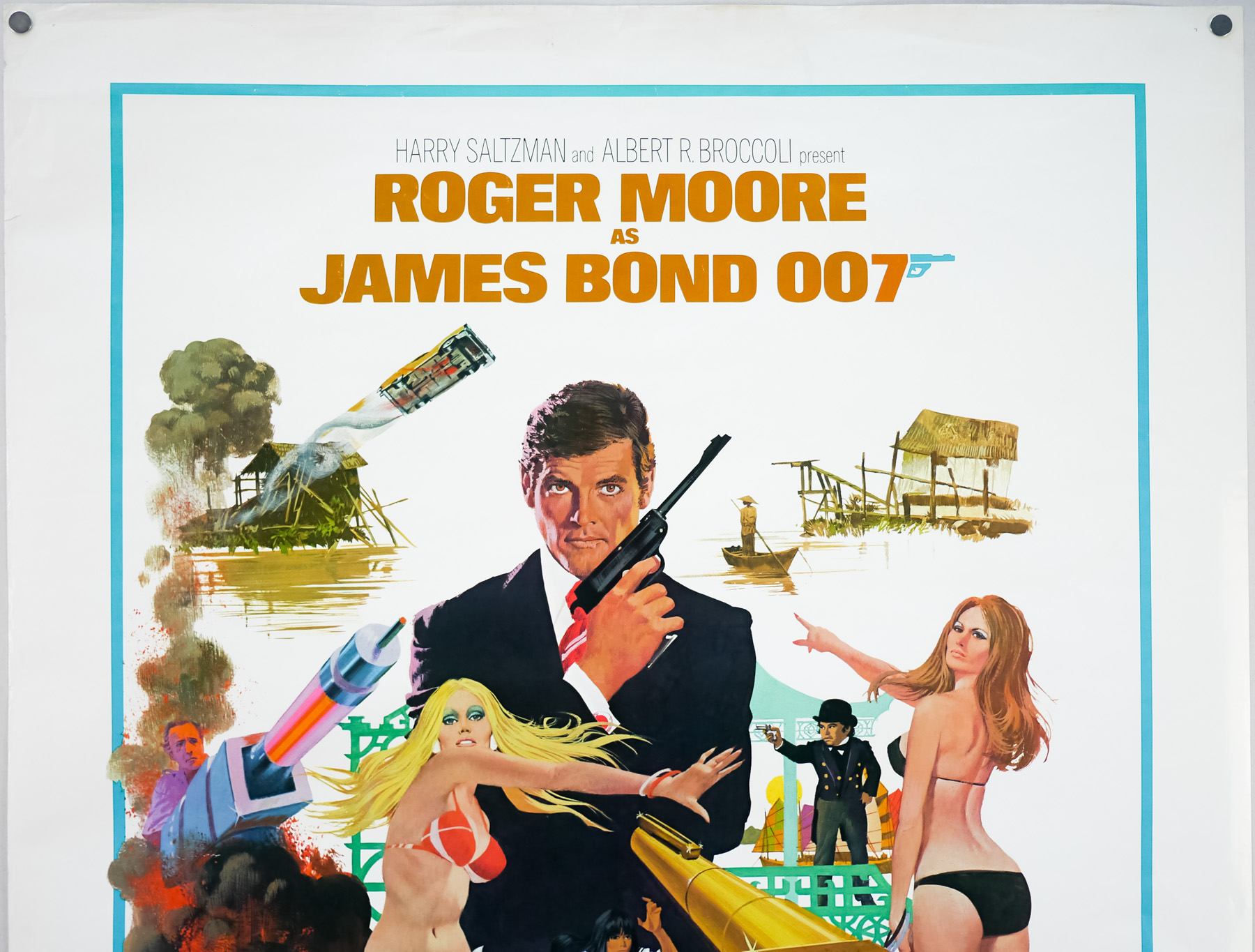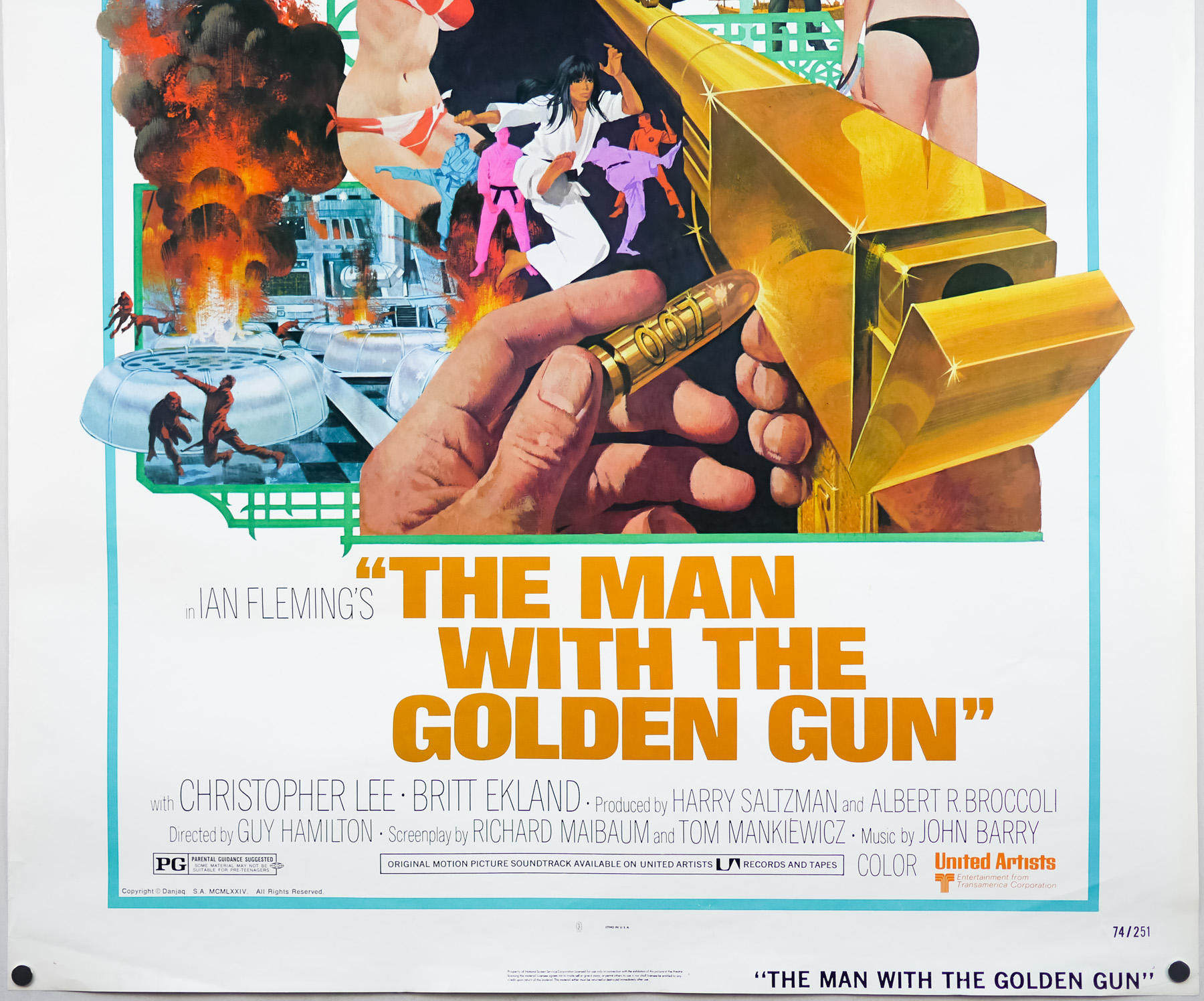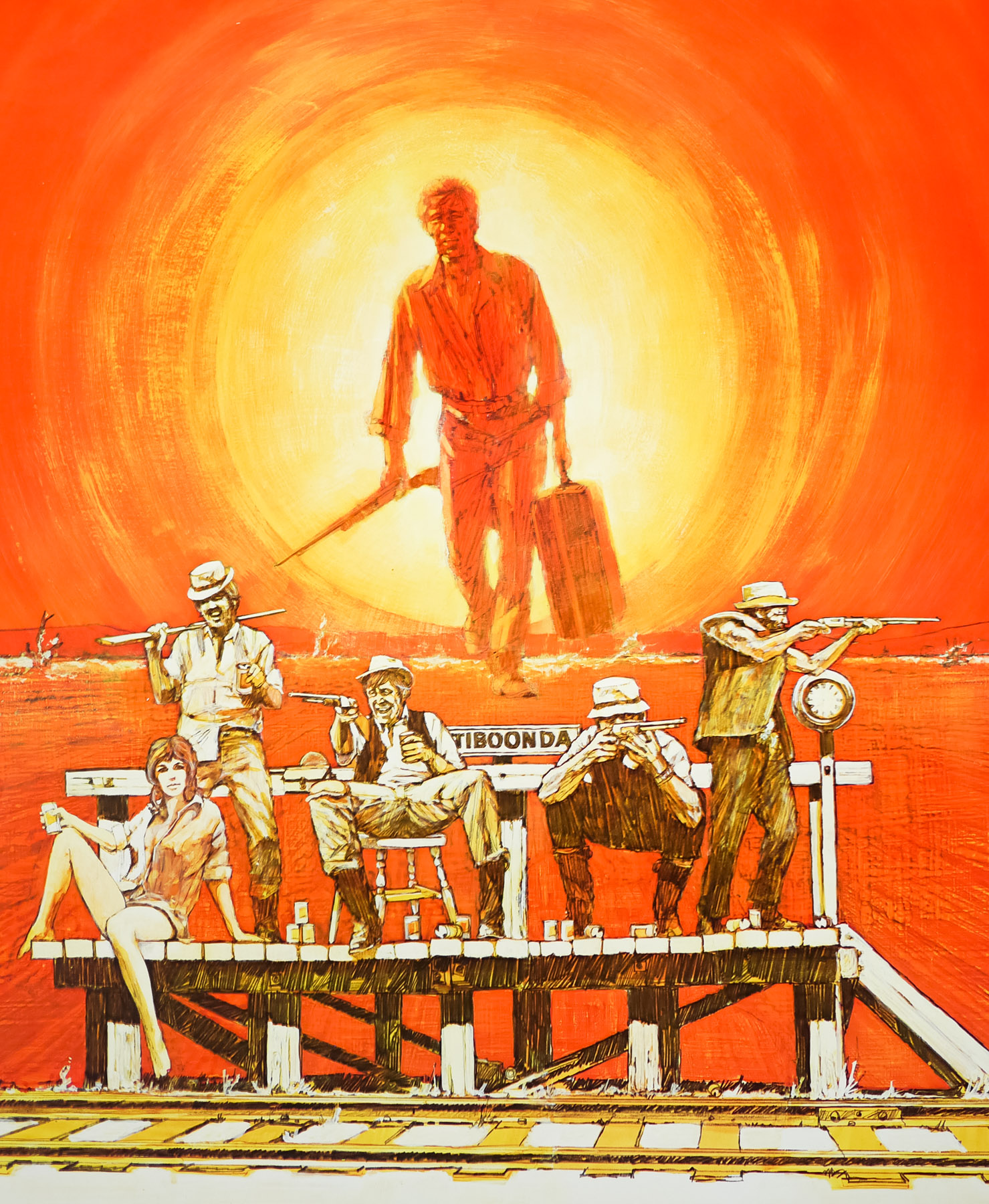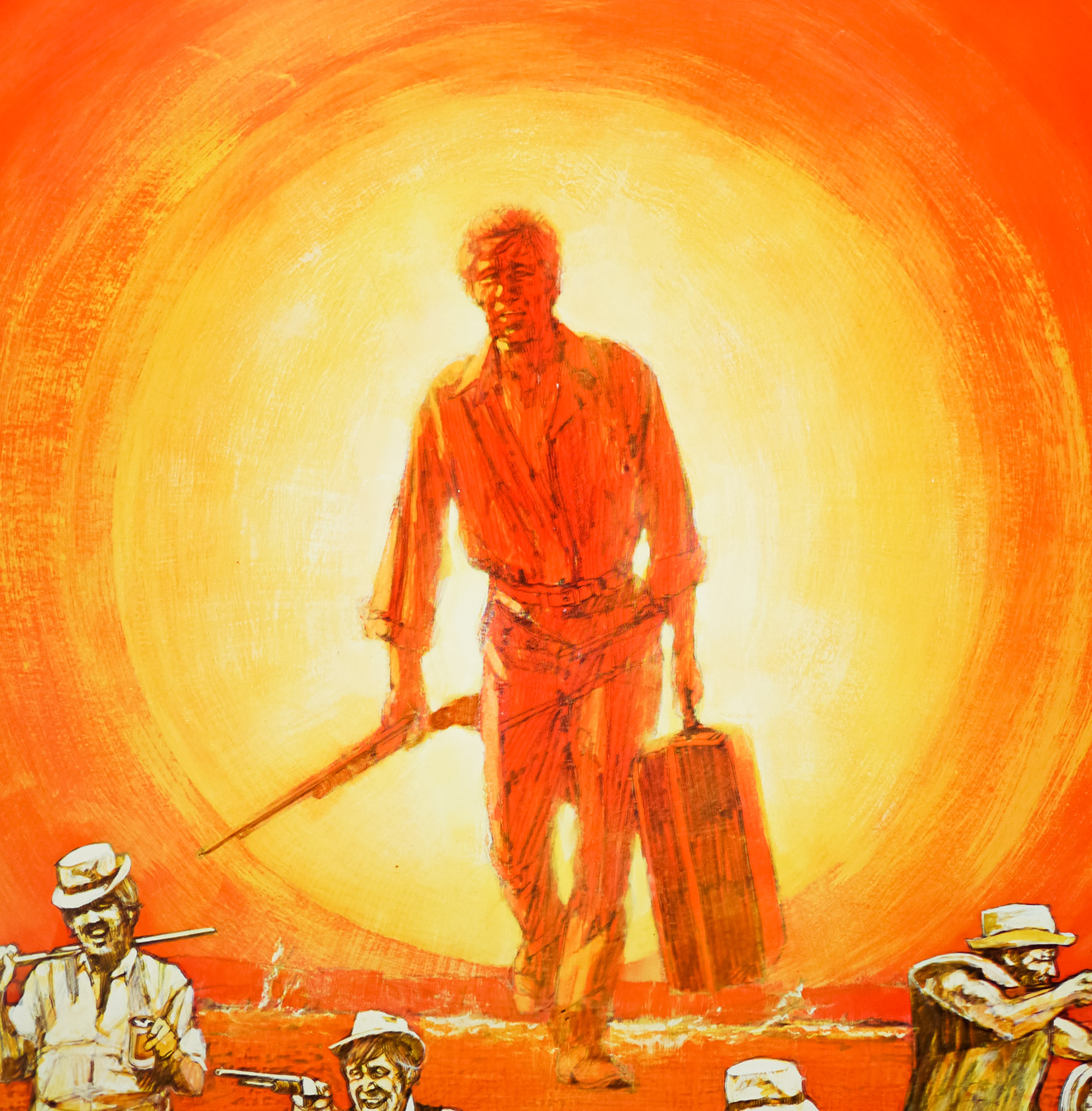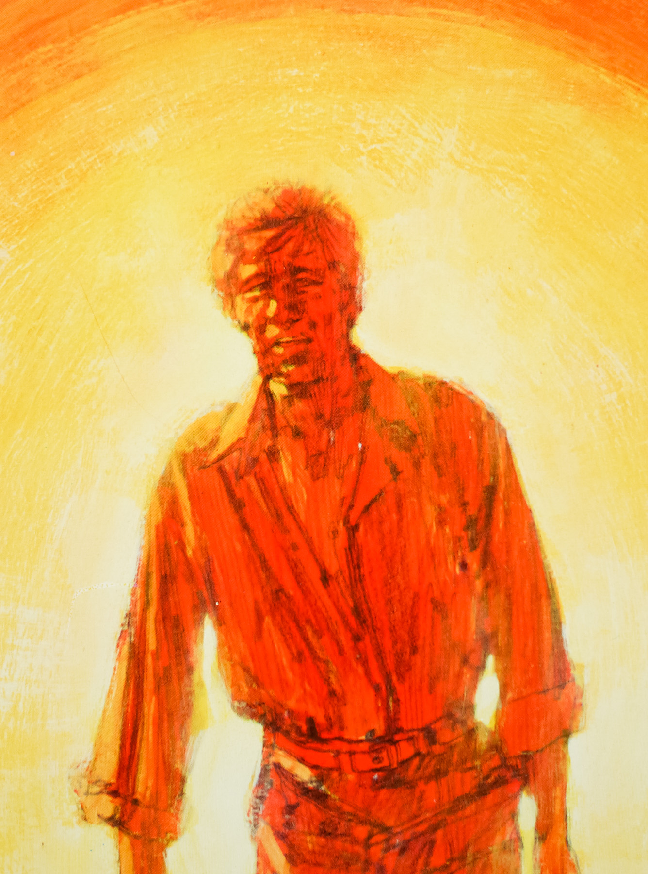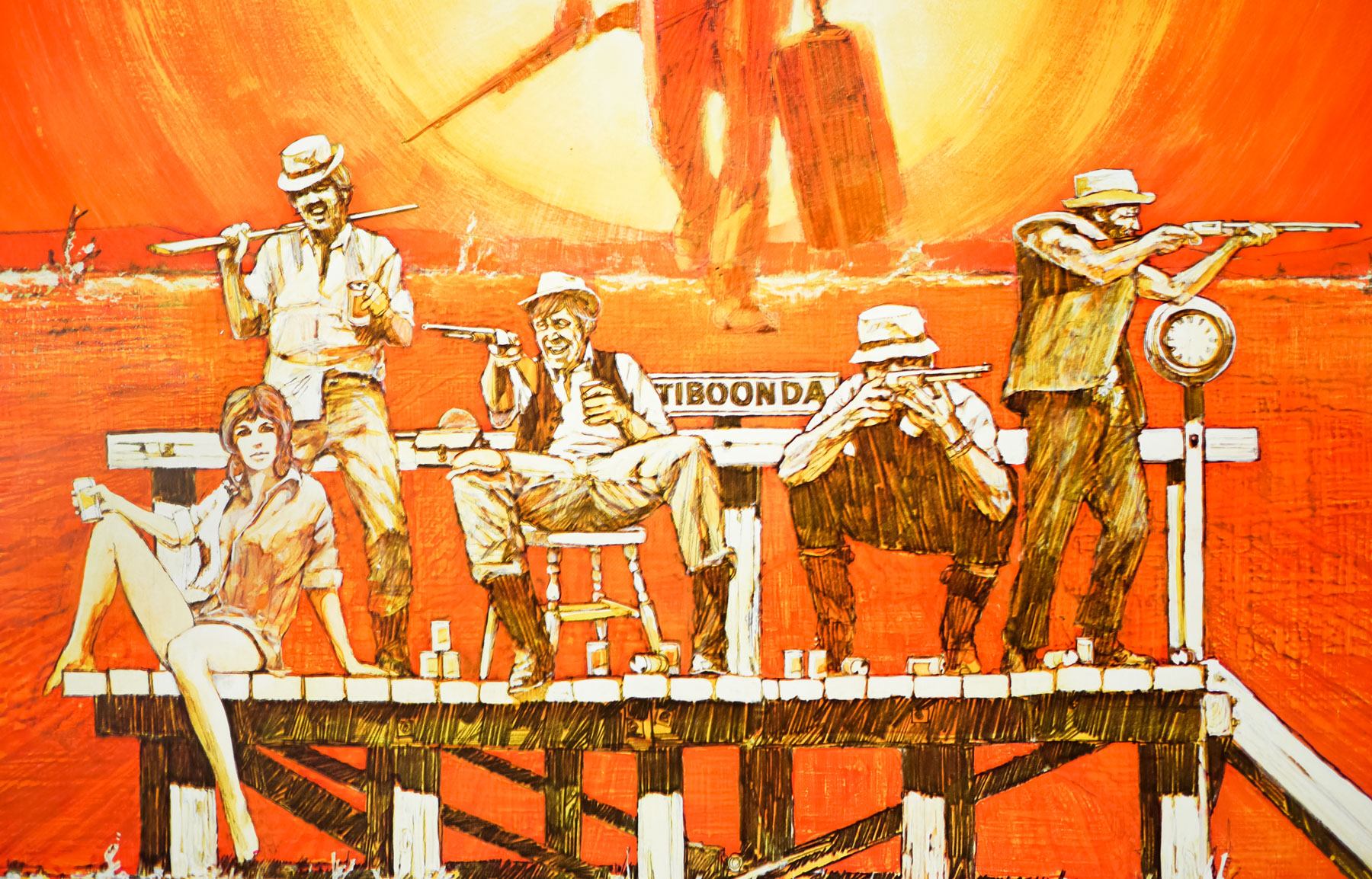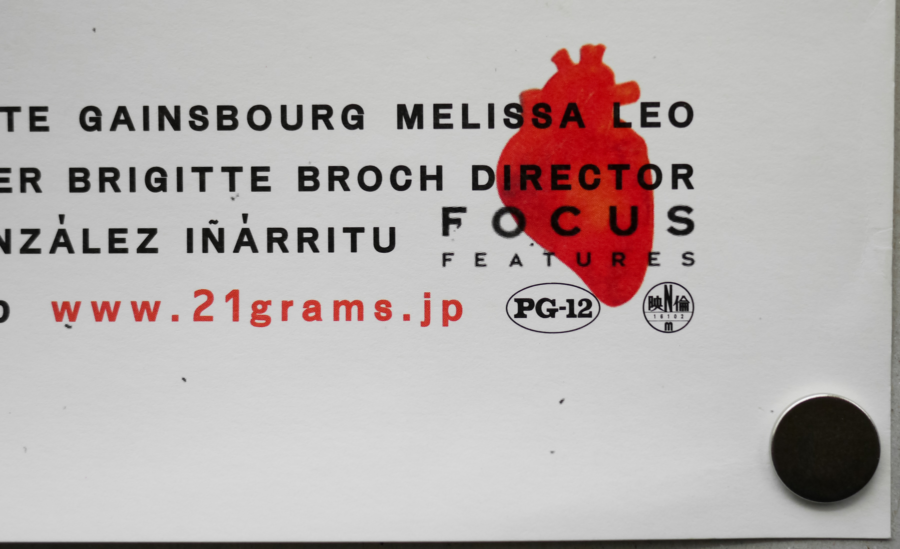
Poster detail
1-5

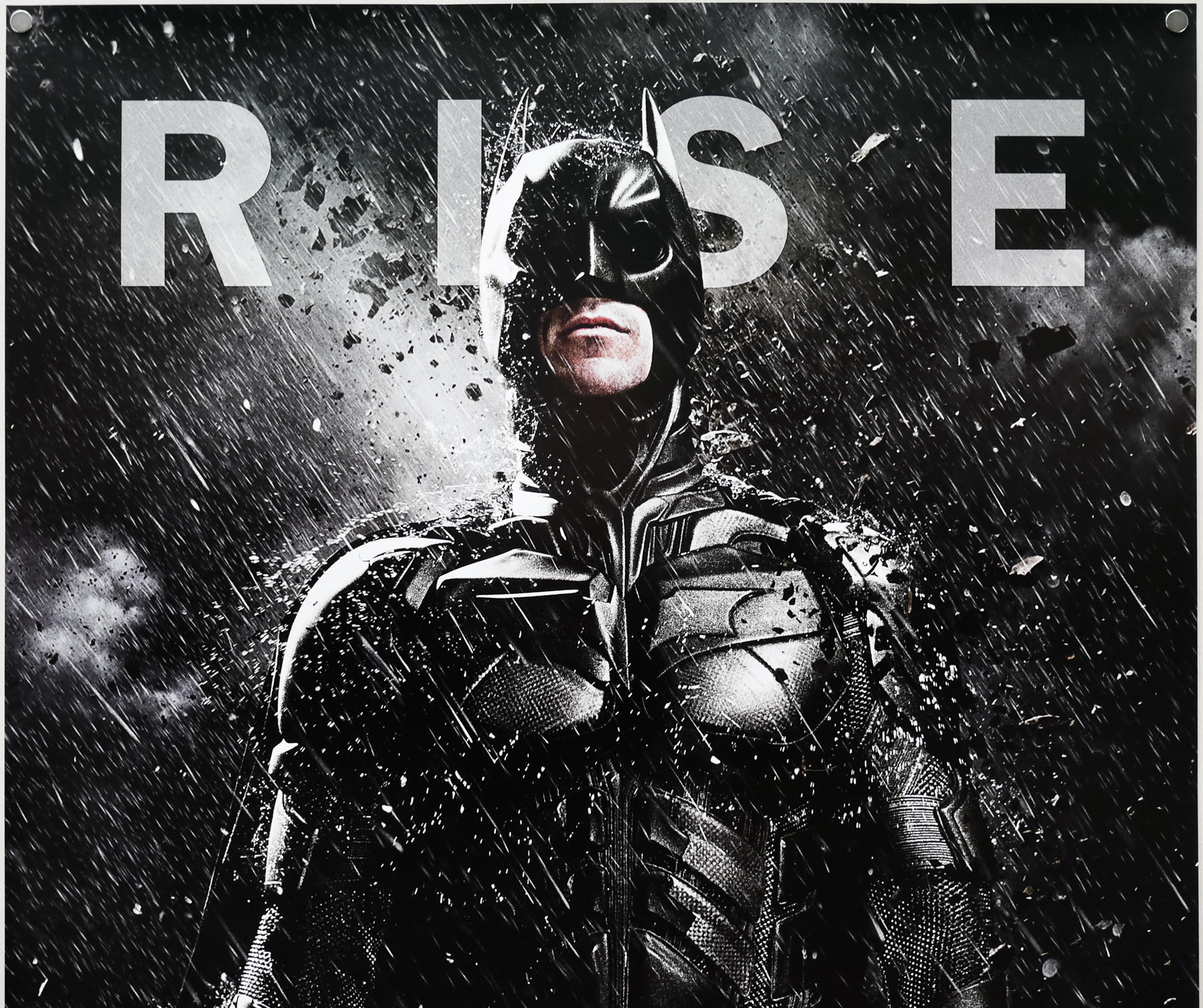
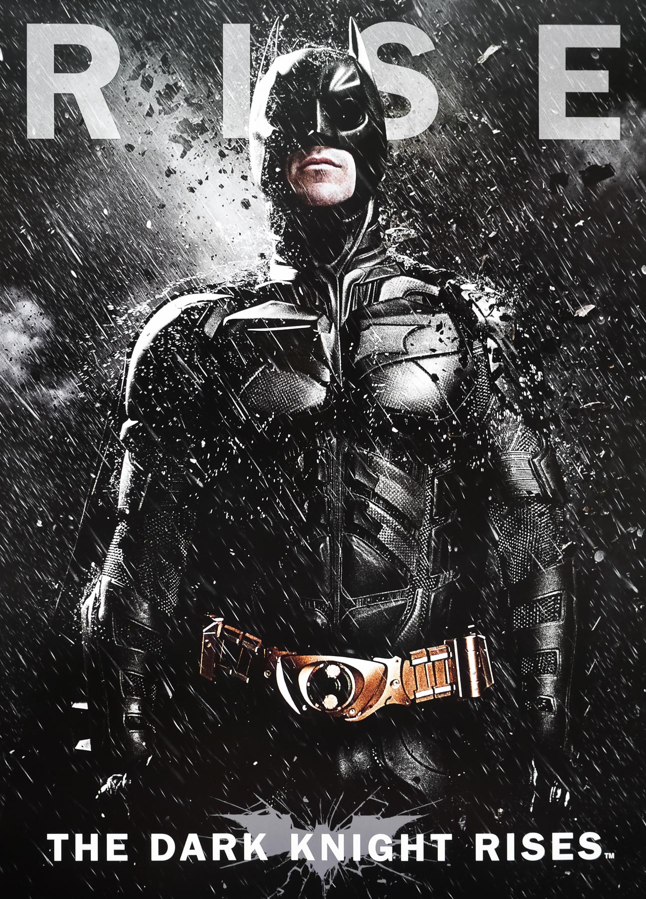

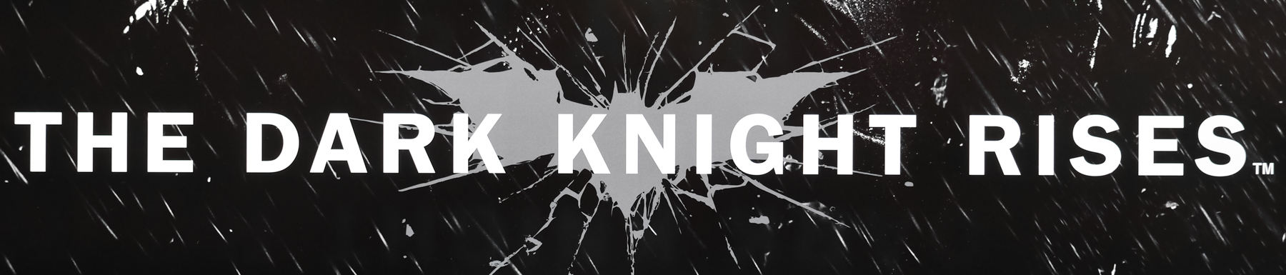
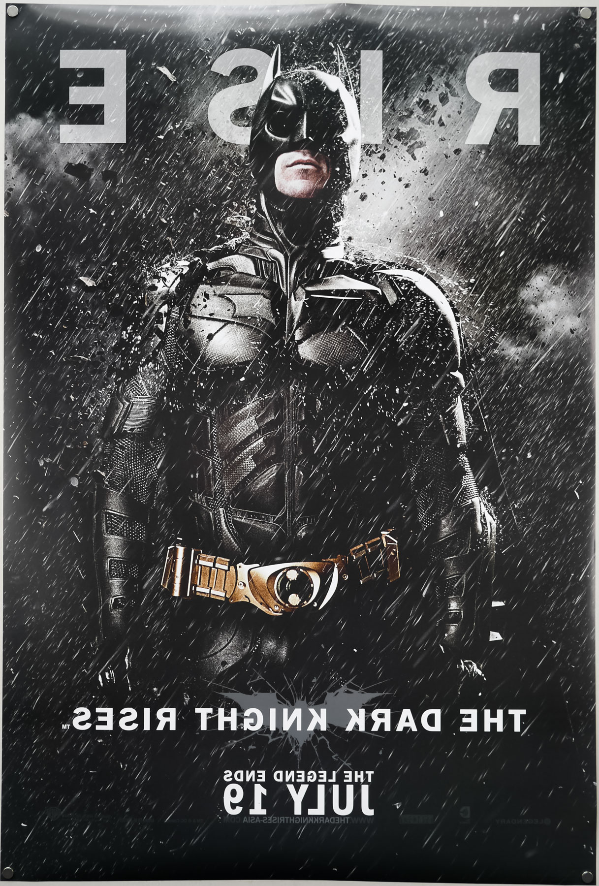
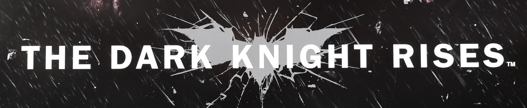
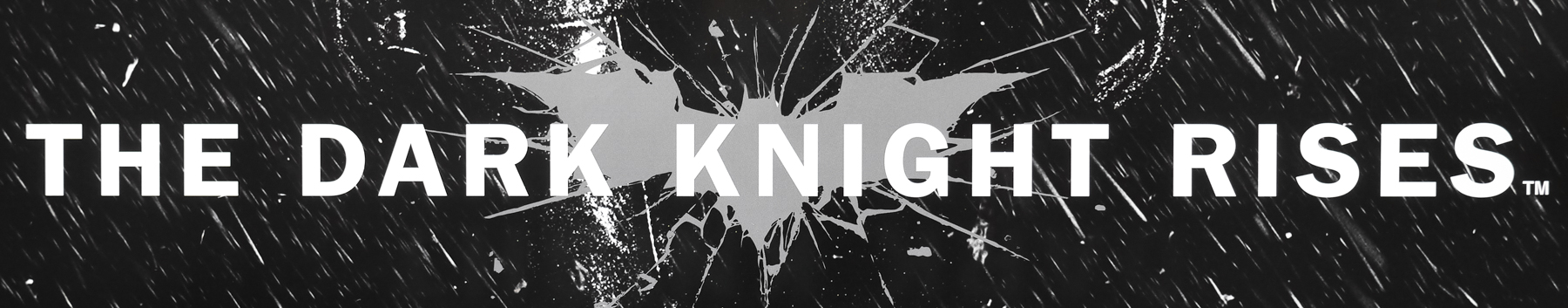
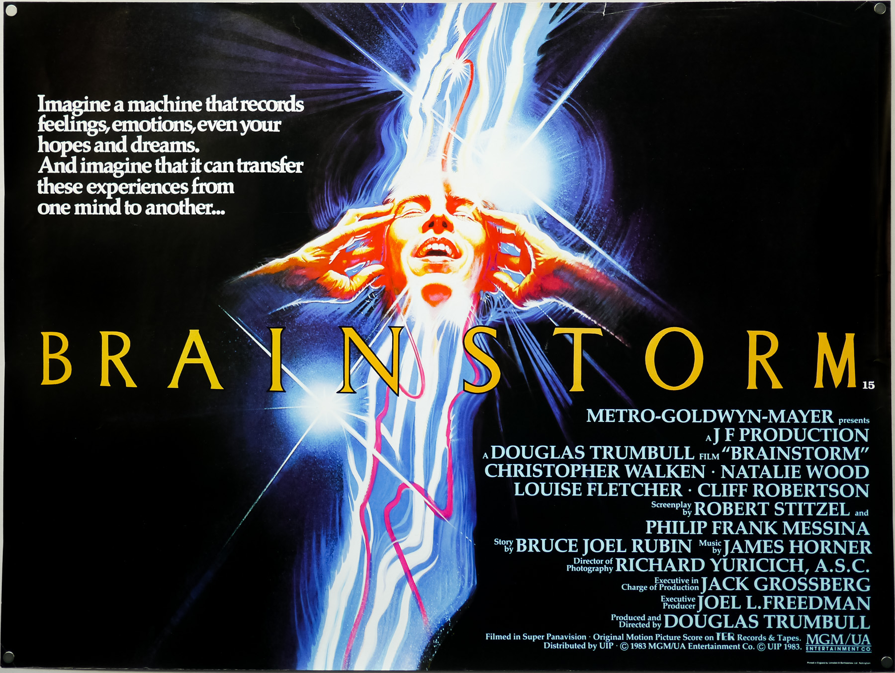
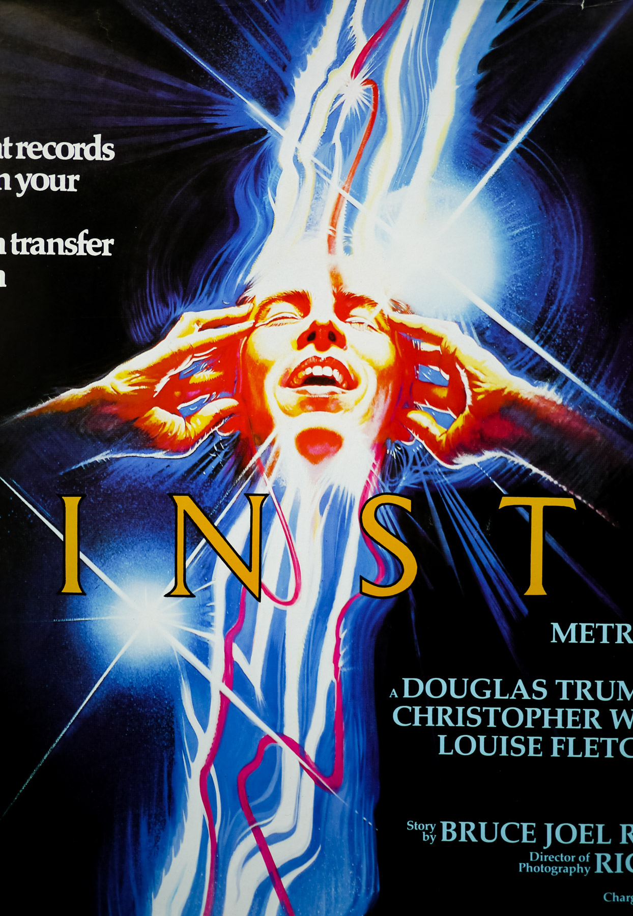
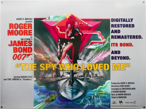
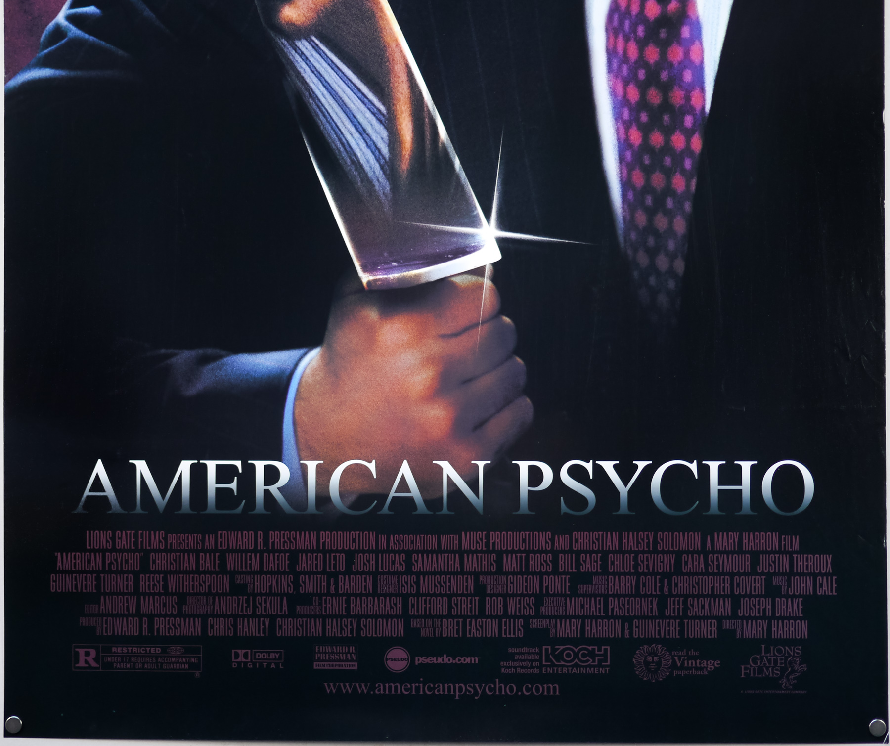
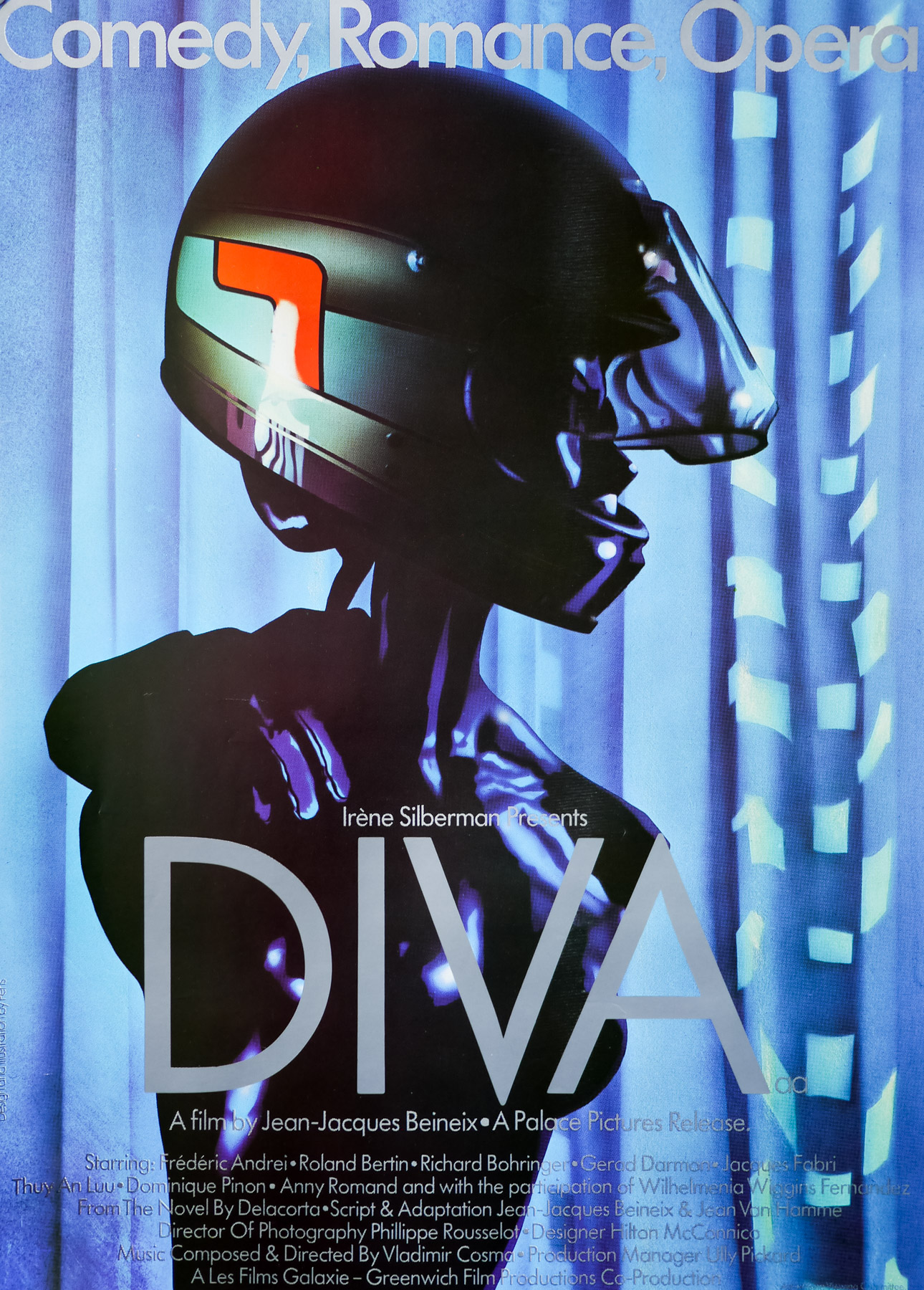
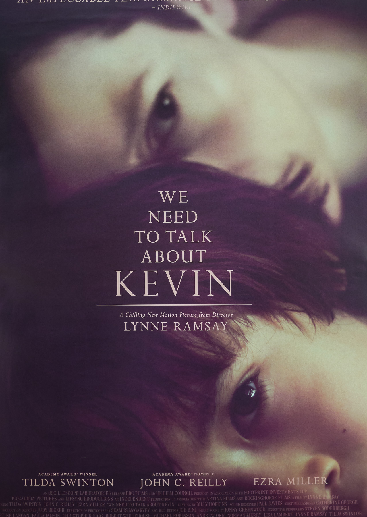
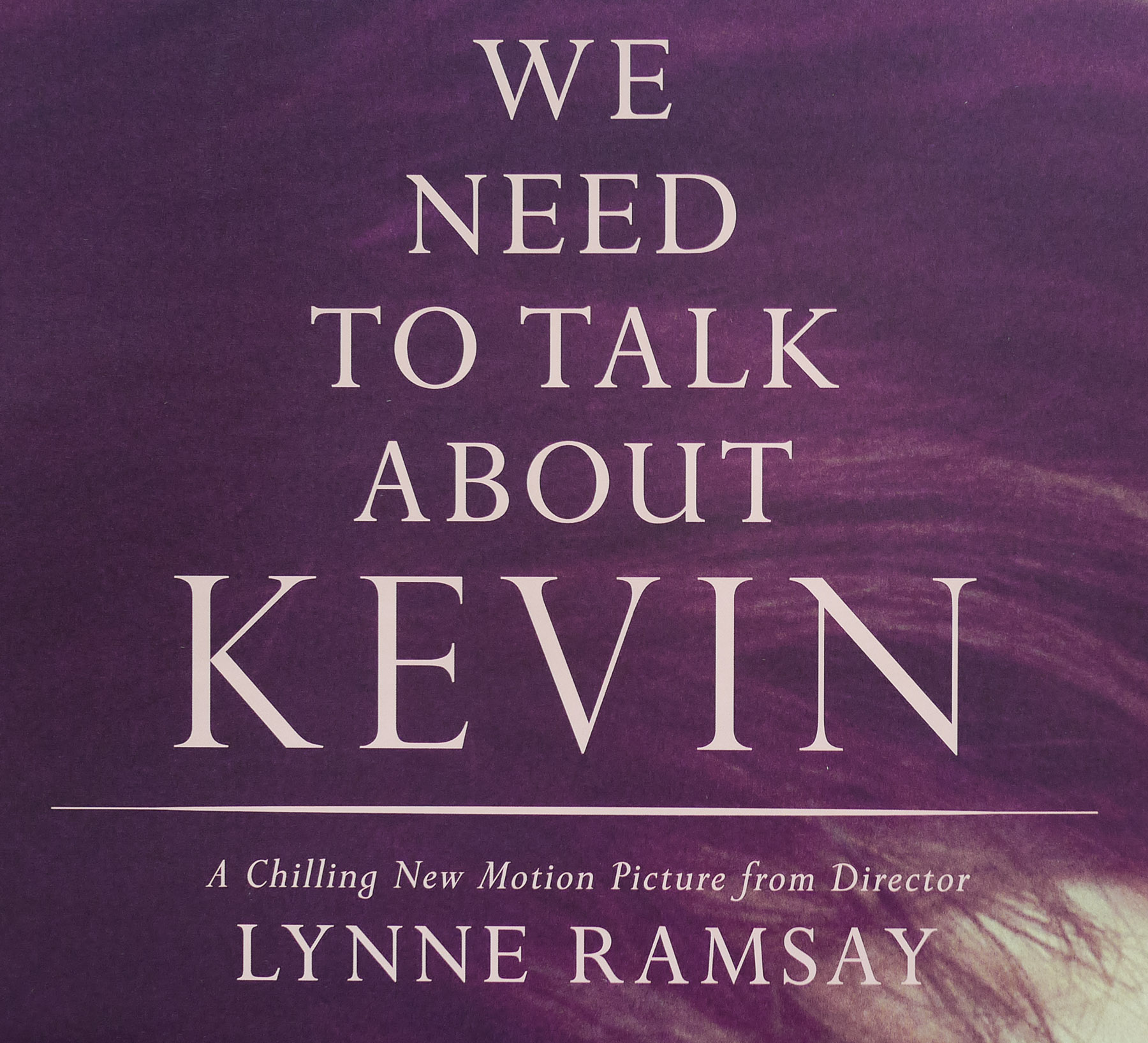
- Title
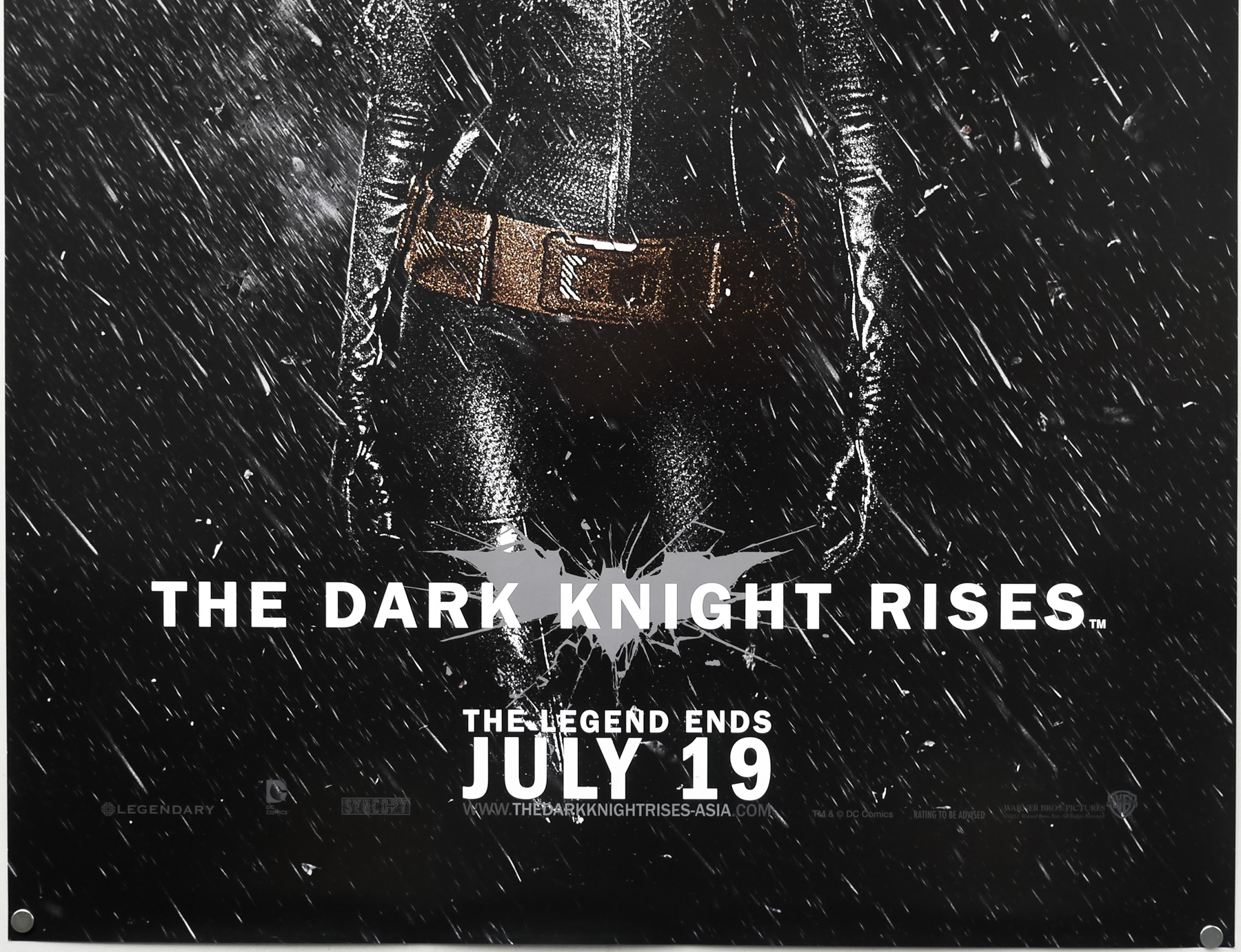
- The Dark Knight Rises
- AKA
- --
- Year of Film
- 2012
- Director
- Christopher Nolan
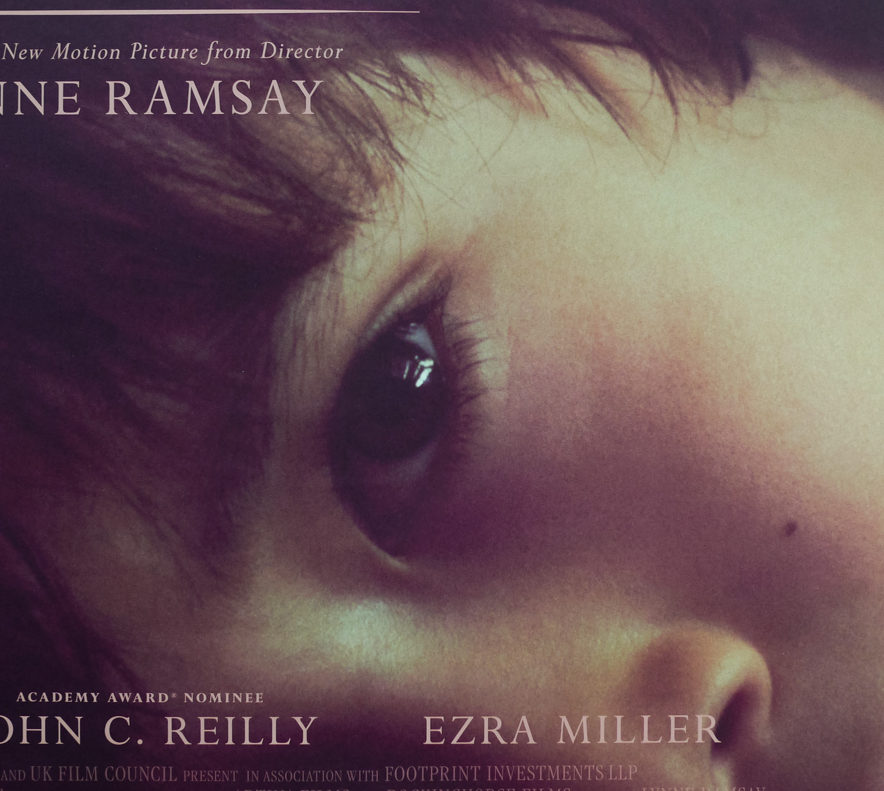
- Starring
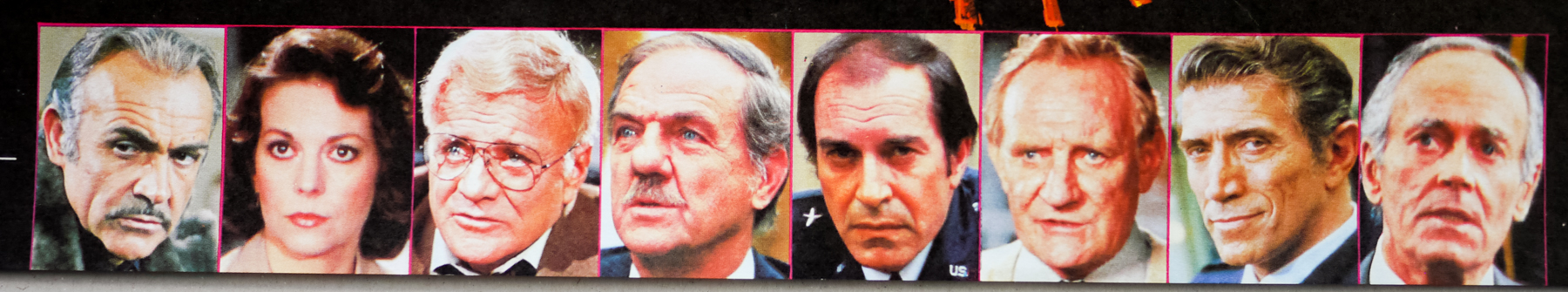
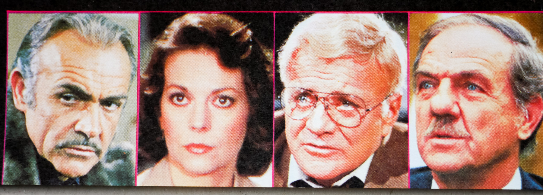
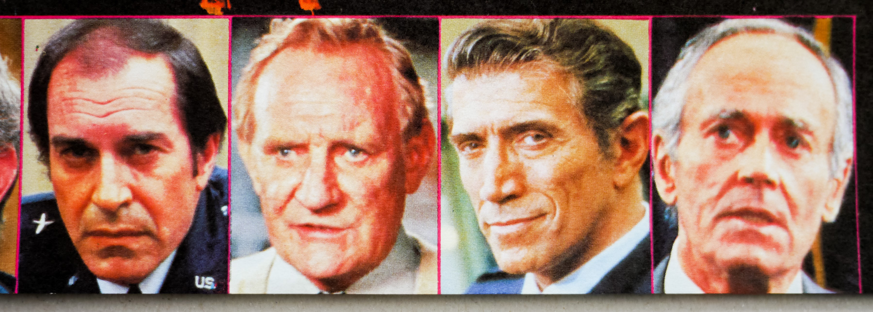
- Christian Bale, Gary Oldman, Tom Hardy, Joseph Gordon-Levitt, Anne Hathaway, Marion Cotillard, Morgan Freeman, Michael Caine, Matthew Modine, Alon Aboutboul, Ben Mendelsohn
- Origin of Film
- USA | UK
- Genre(s) of Film
- Christian Bale, Gary Oldman, Tom Hardy, Joseph Gordon-Levitt, Anne Hathaway, Marion Cotillard, Morgan Freeman, Michael Caine, Matthew Modine, Alon Aboutboul, Ben Mendelsohn,
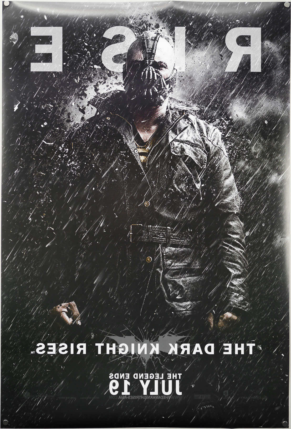
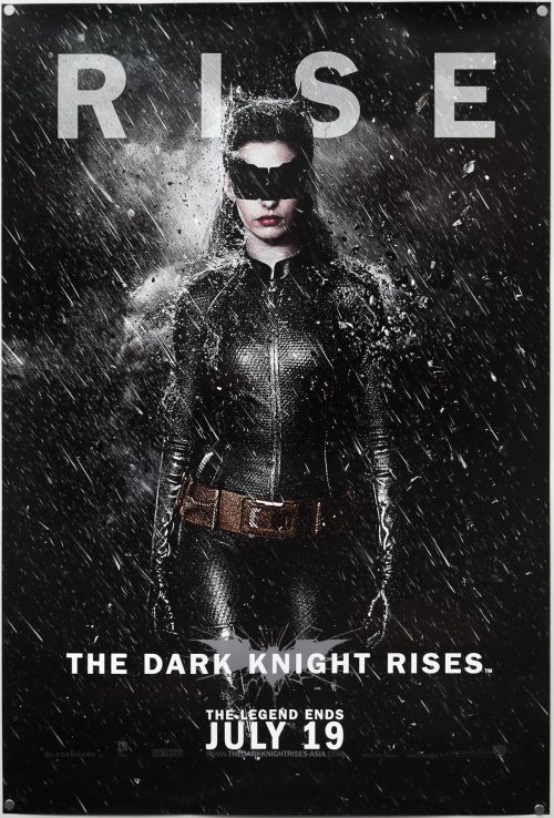
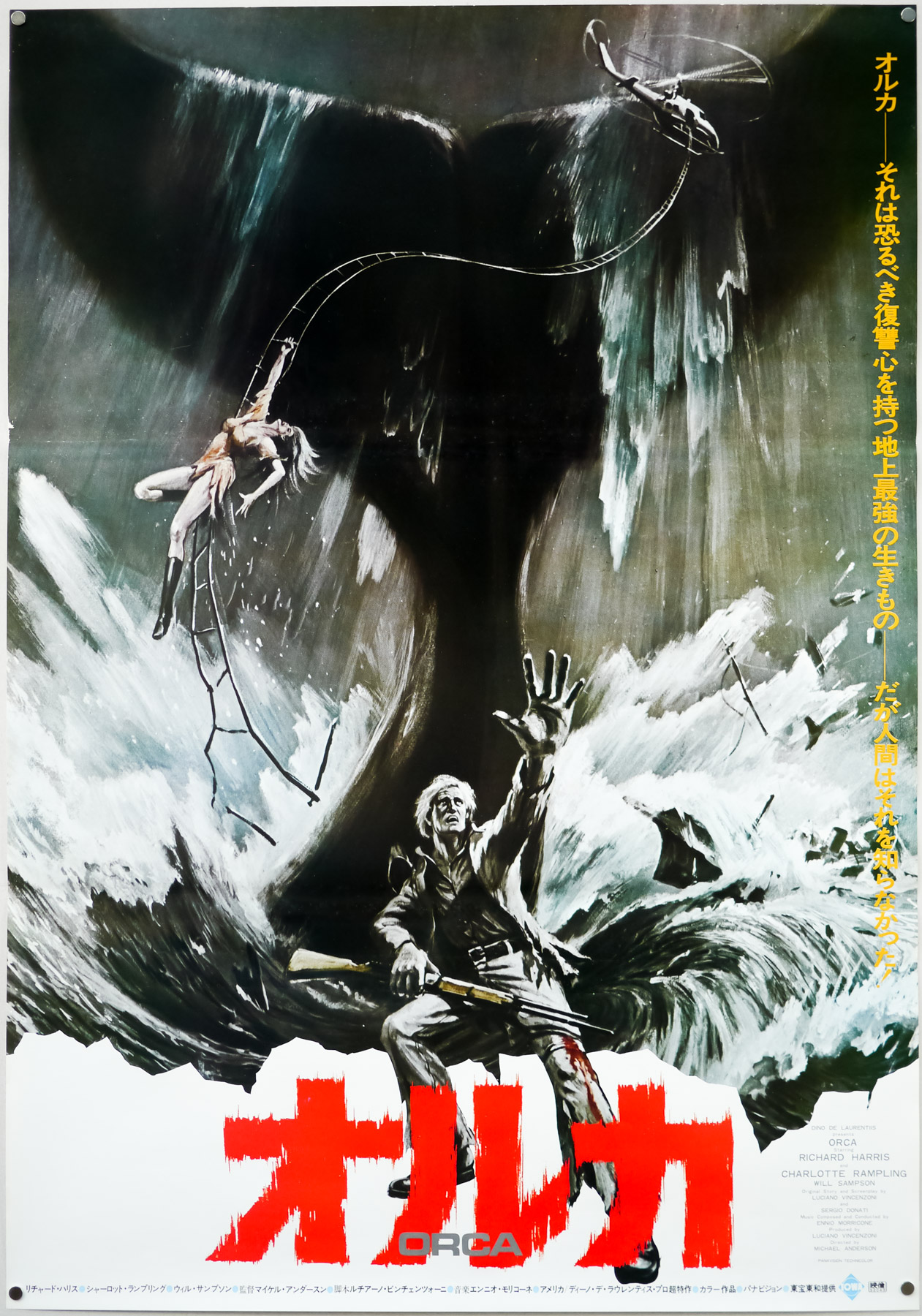
- Type of Poster
- One sheet
- Style of Poster
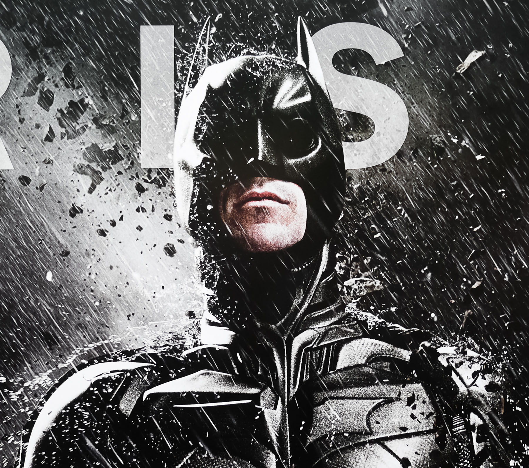
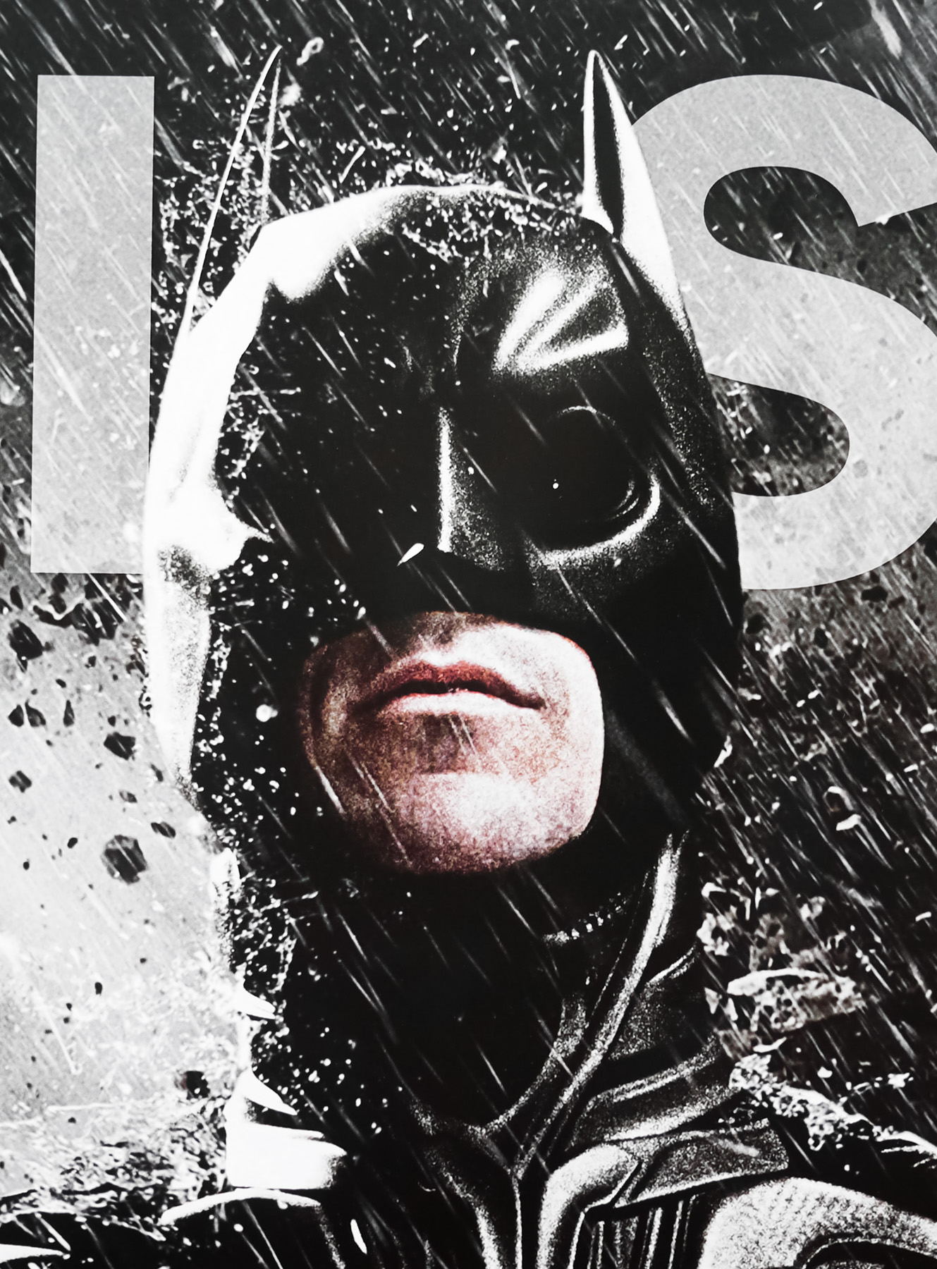
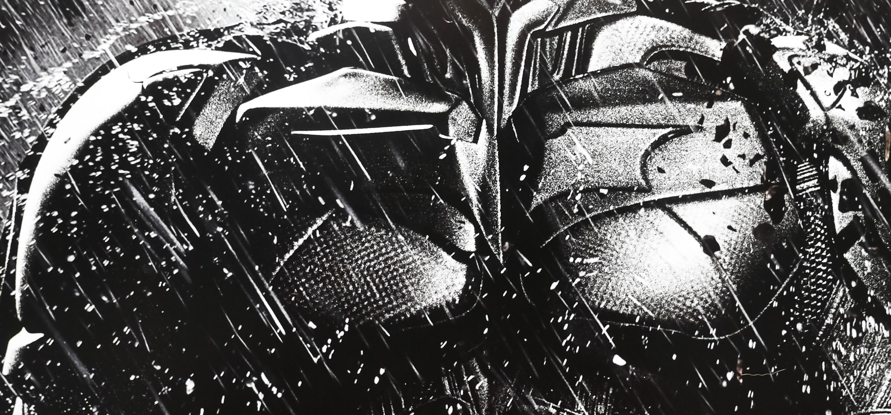
- Batman
- Origin of Poster
- International (Asia)
- Year of Poster
- 2012
- Designer
- Ignition
- Artist
- --
- SS or DS
- DS
- NSS #
- --
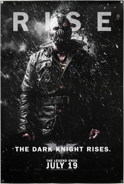
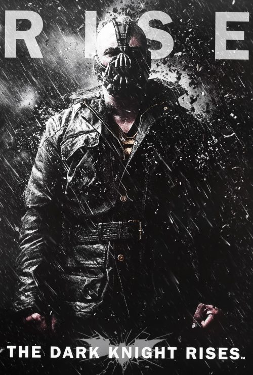
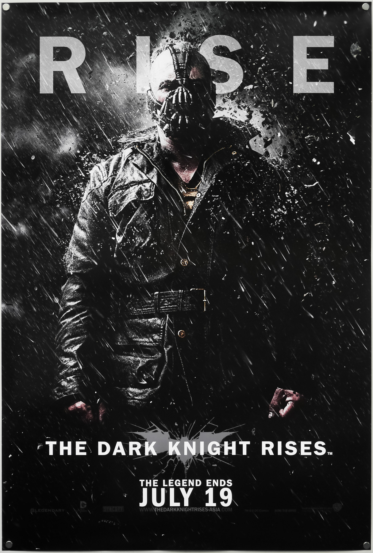
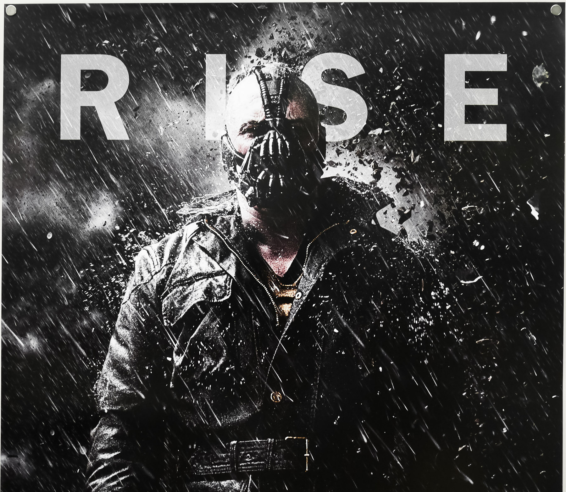
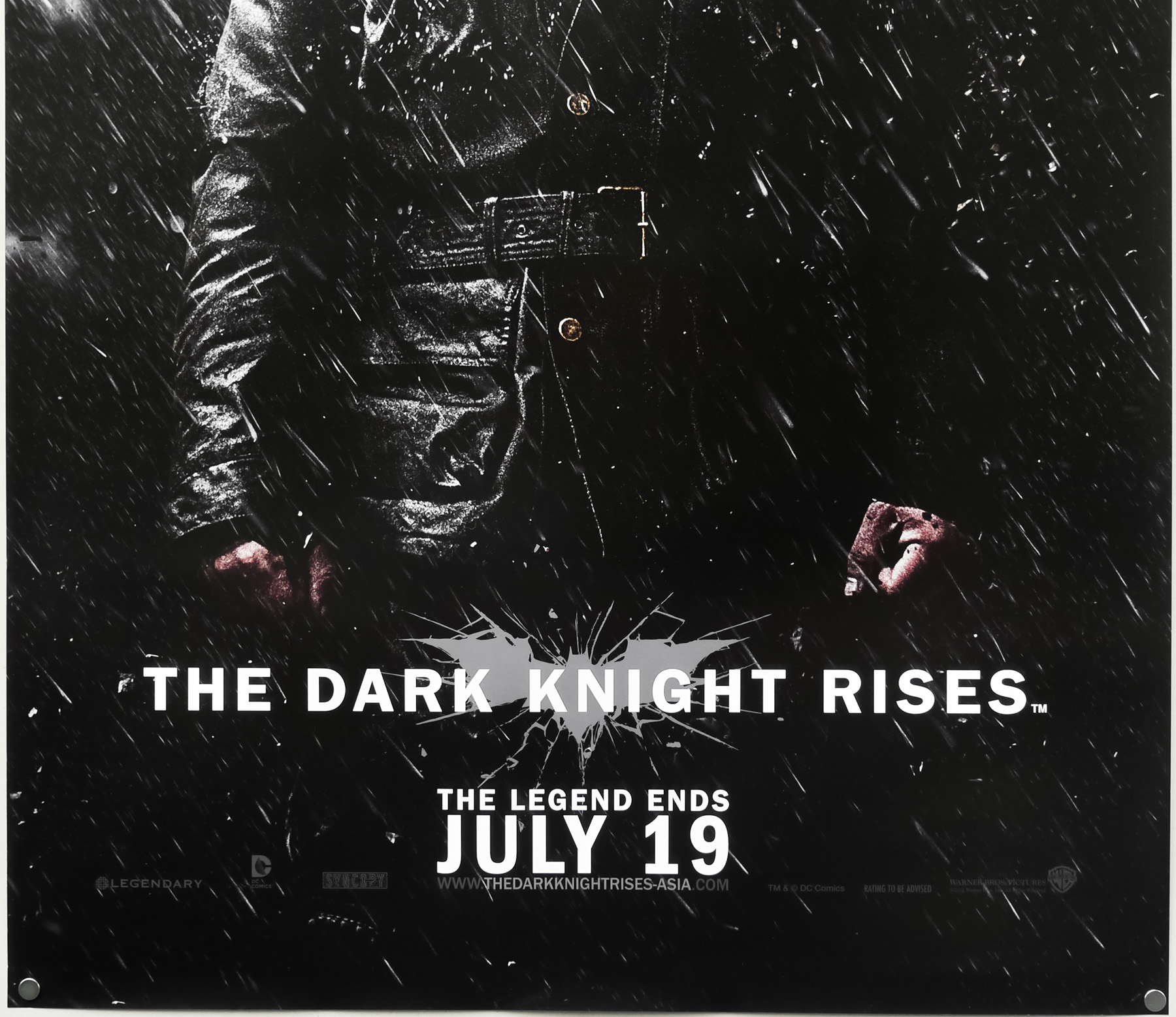
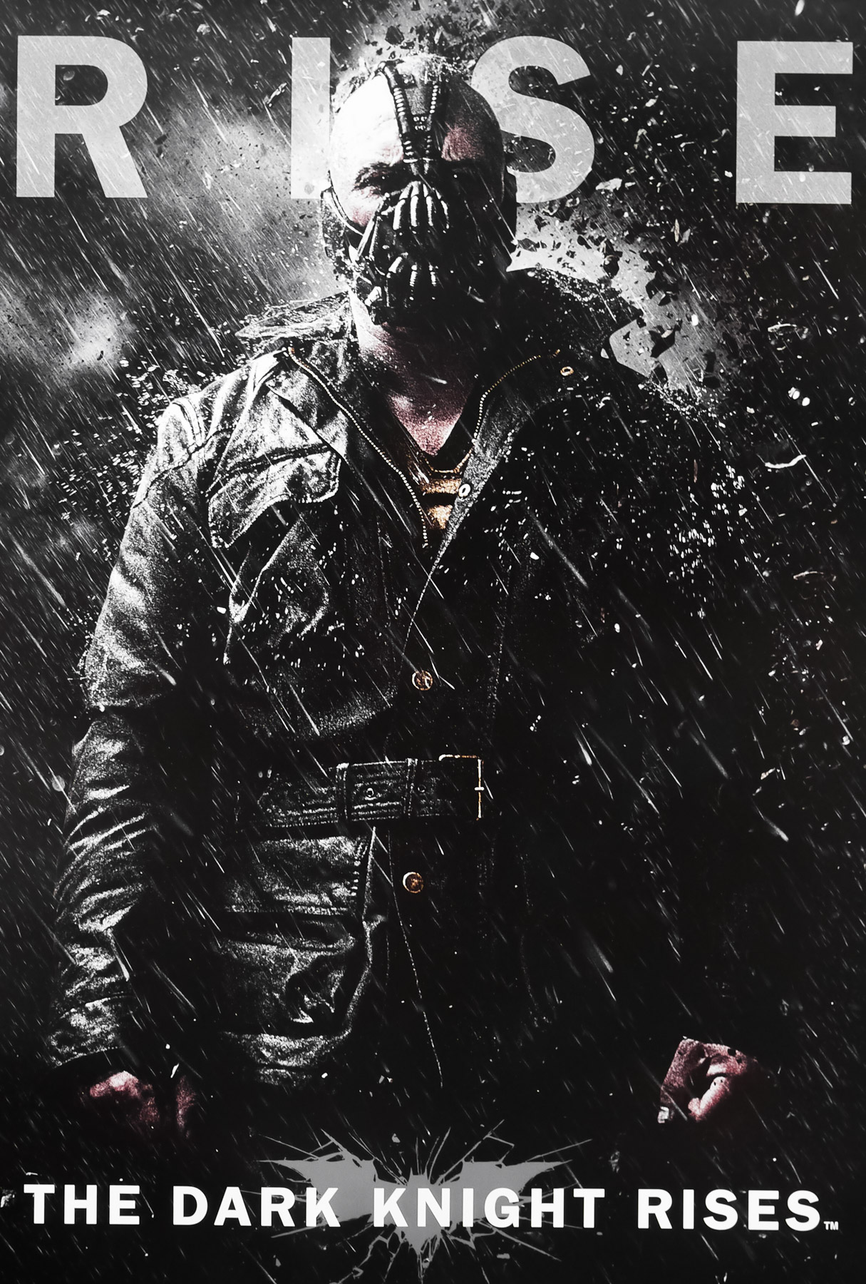
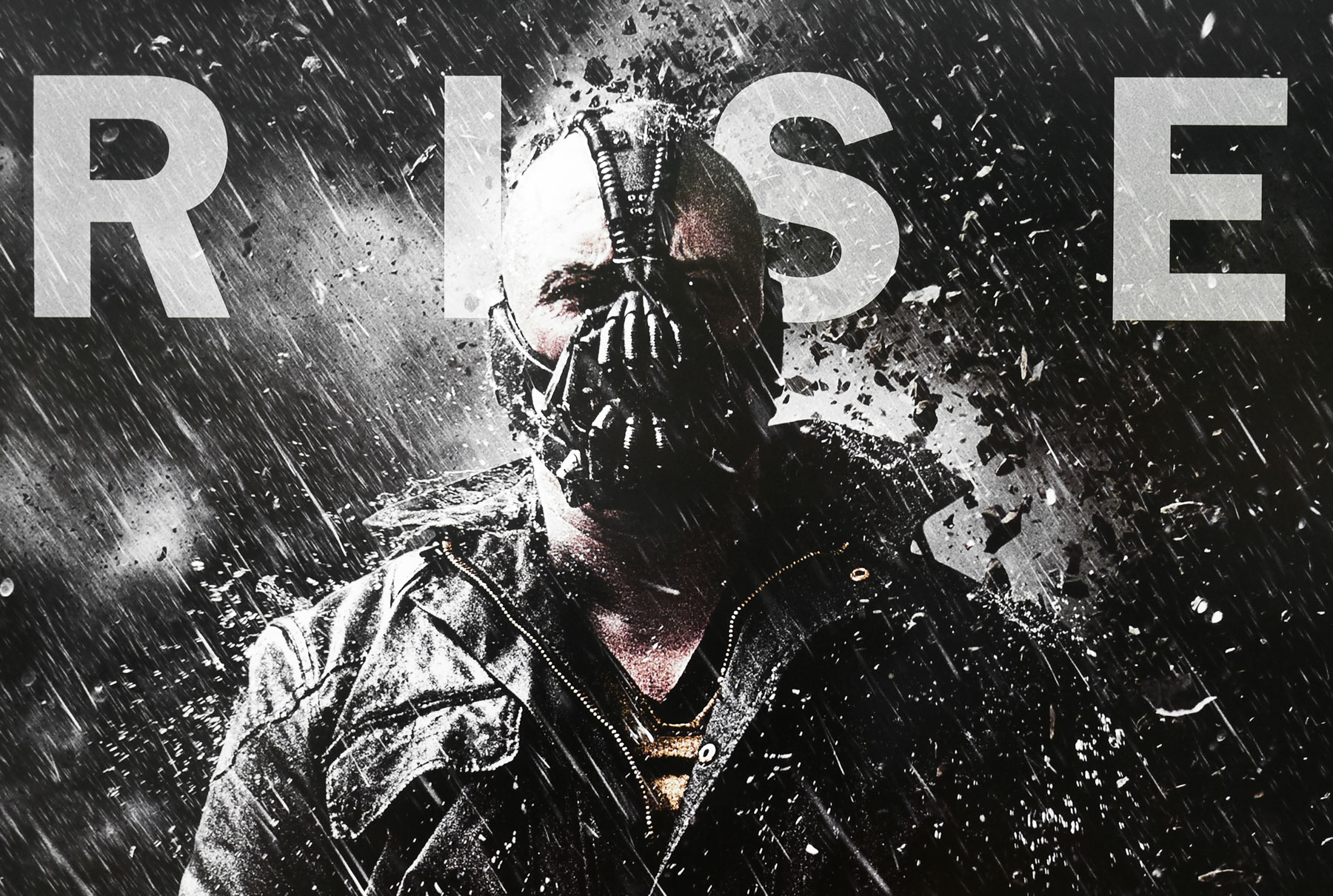
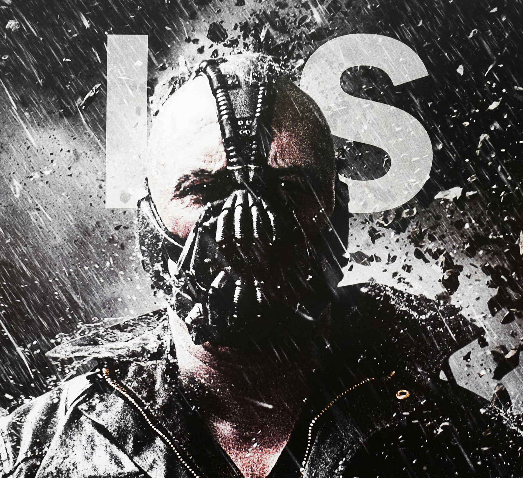
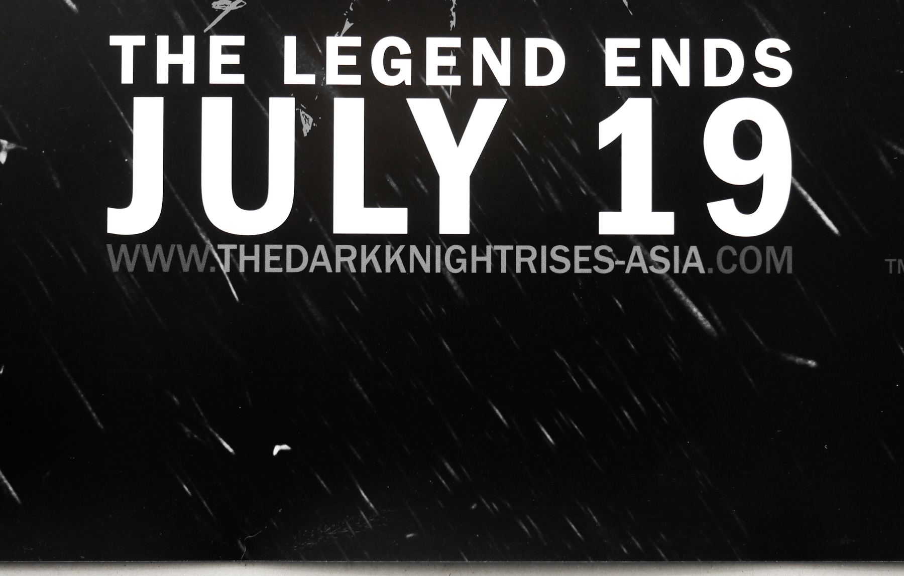
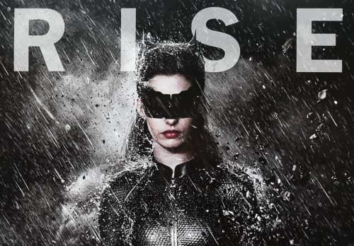
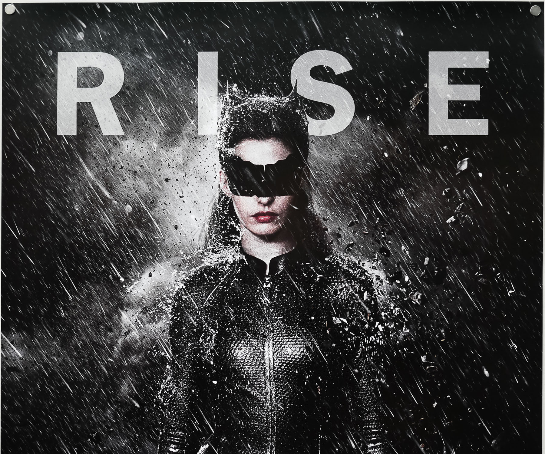
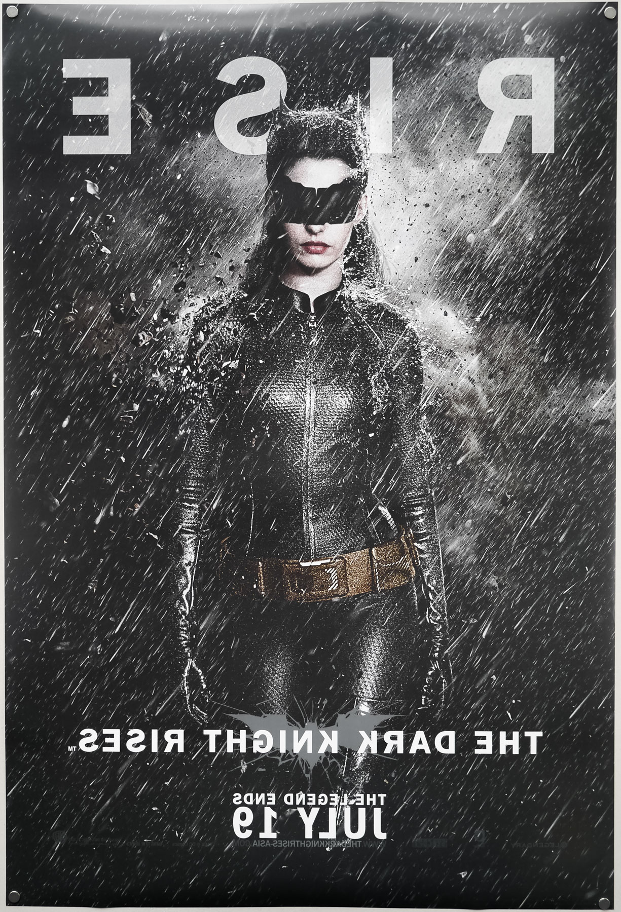
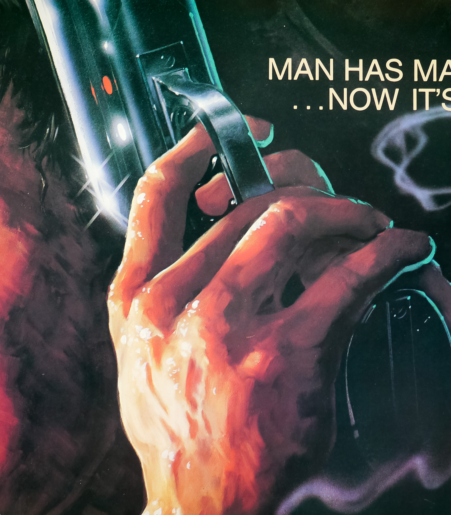
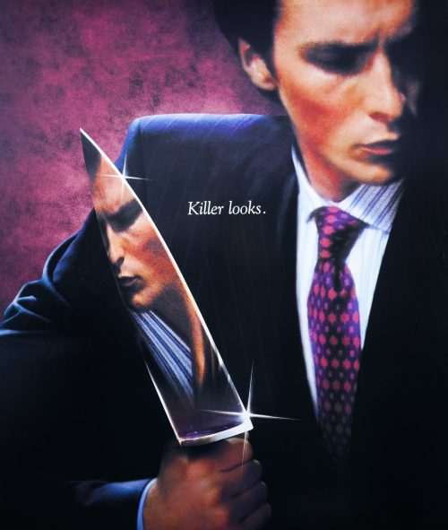
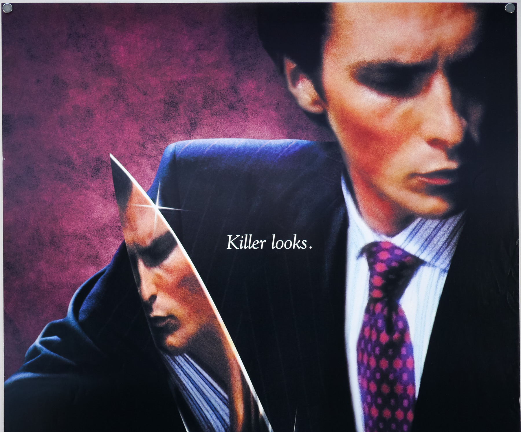
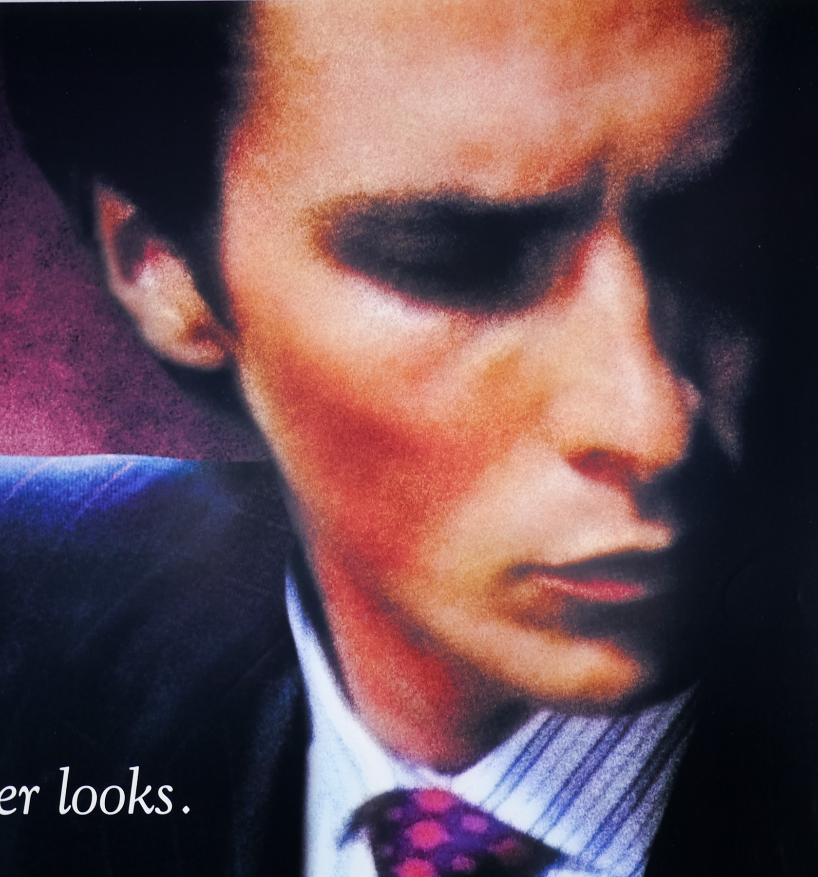
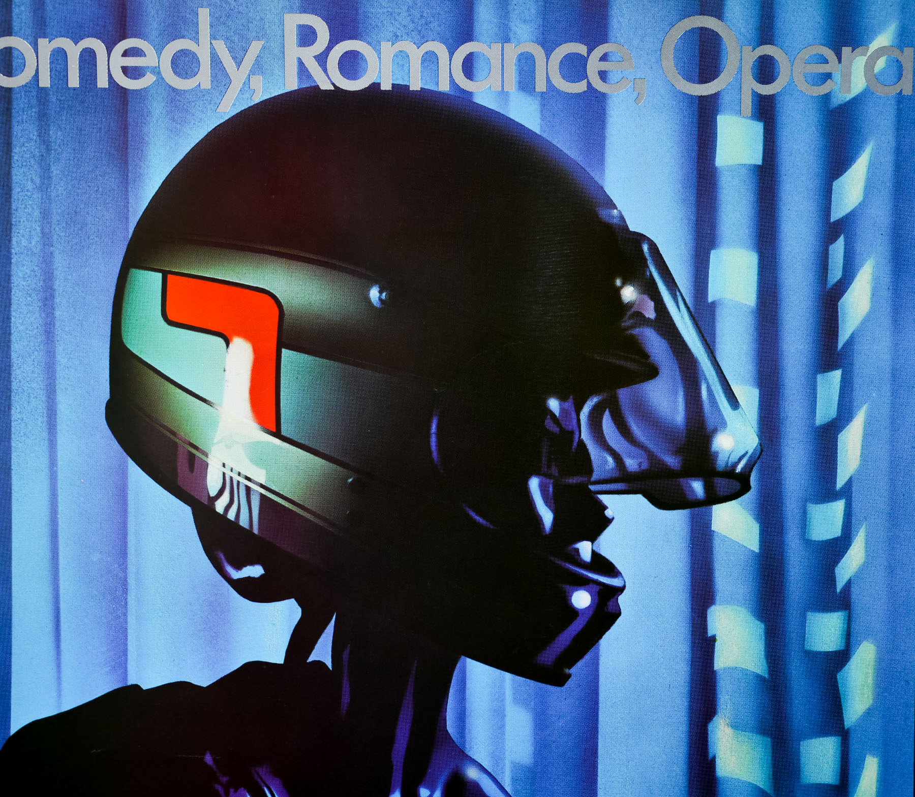
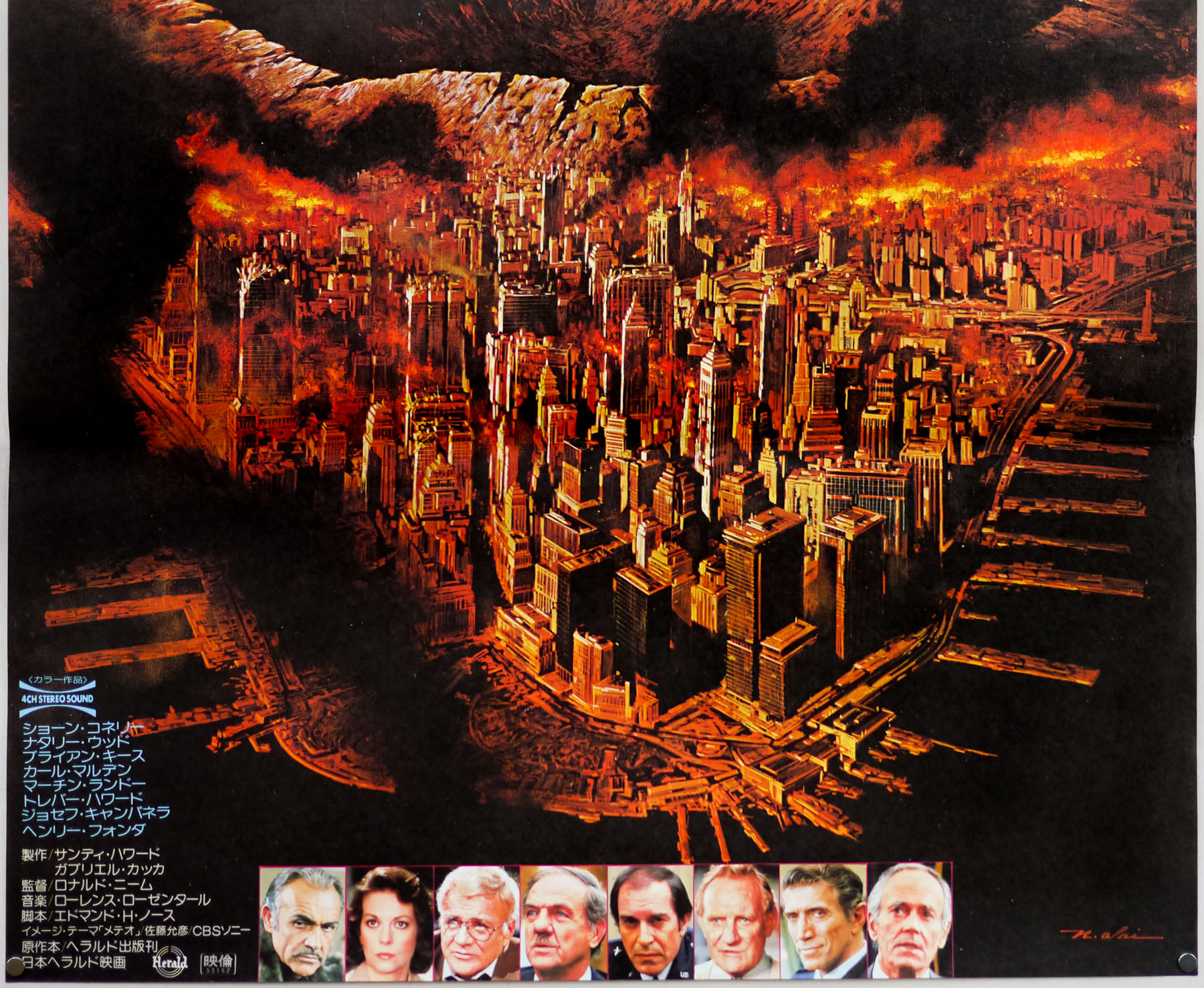
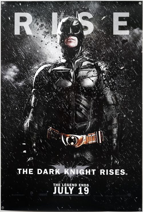
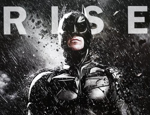
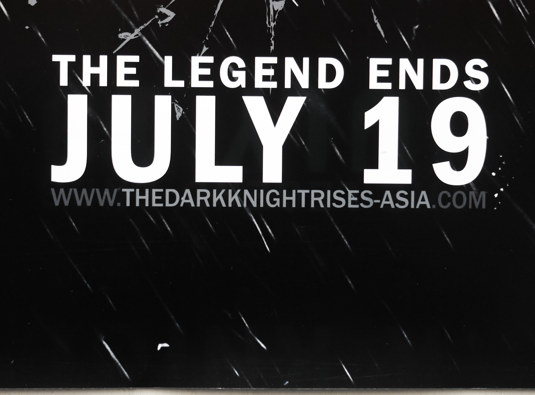
- Tagline
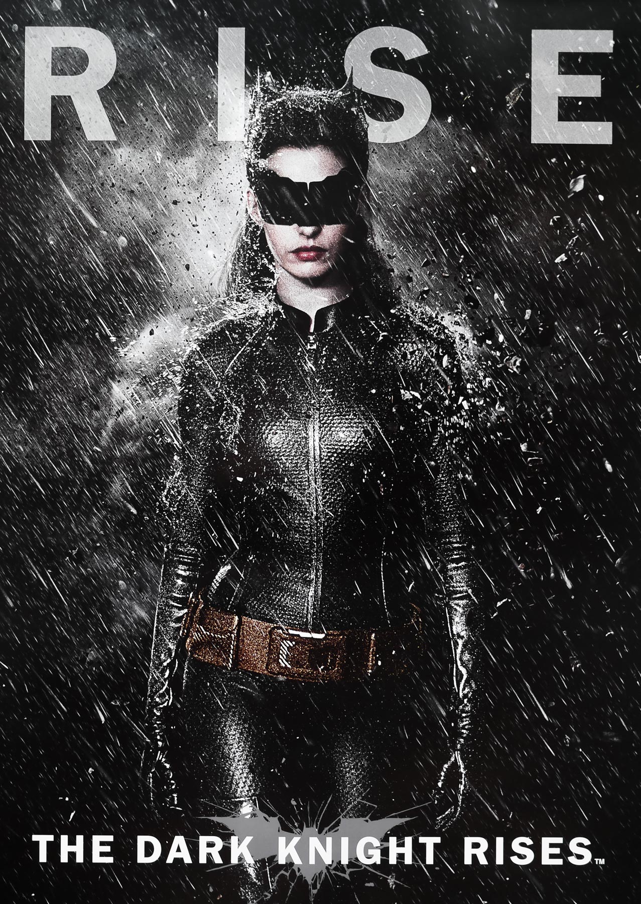
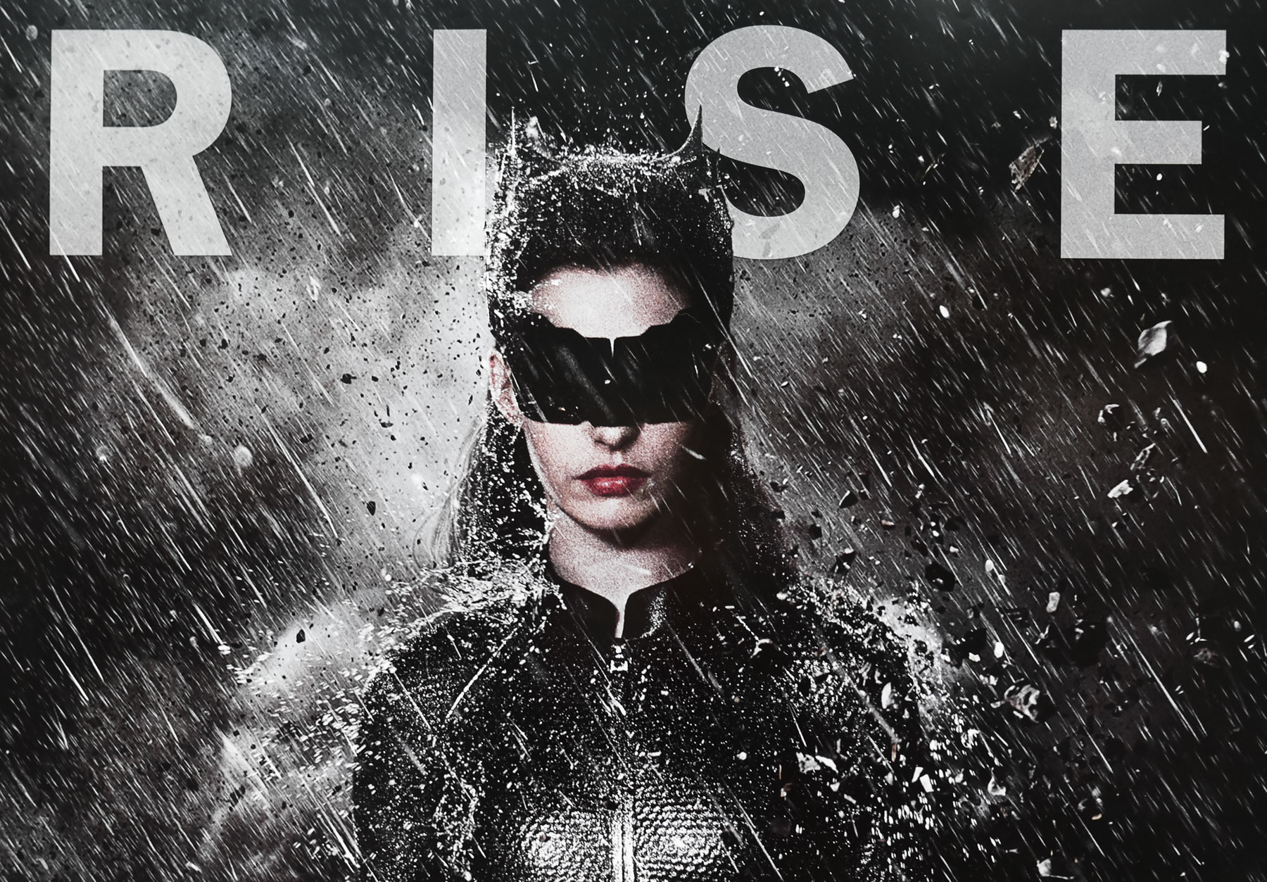
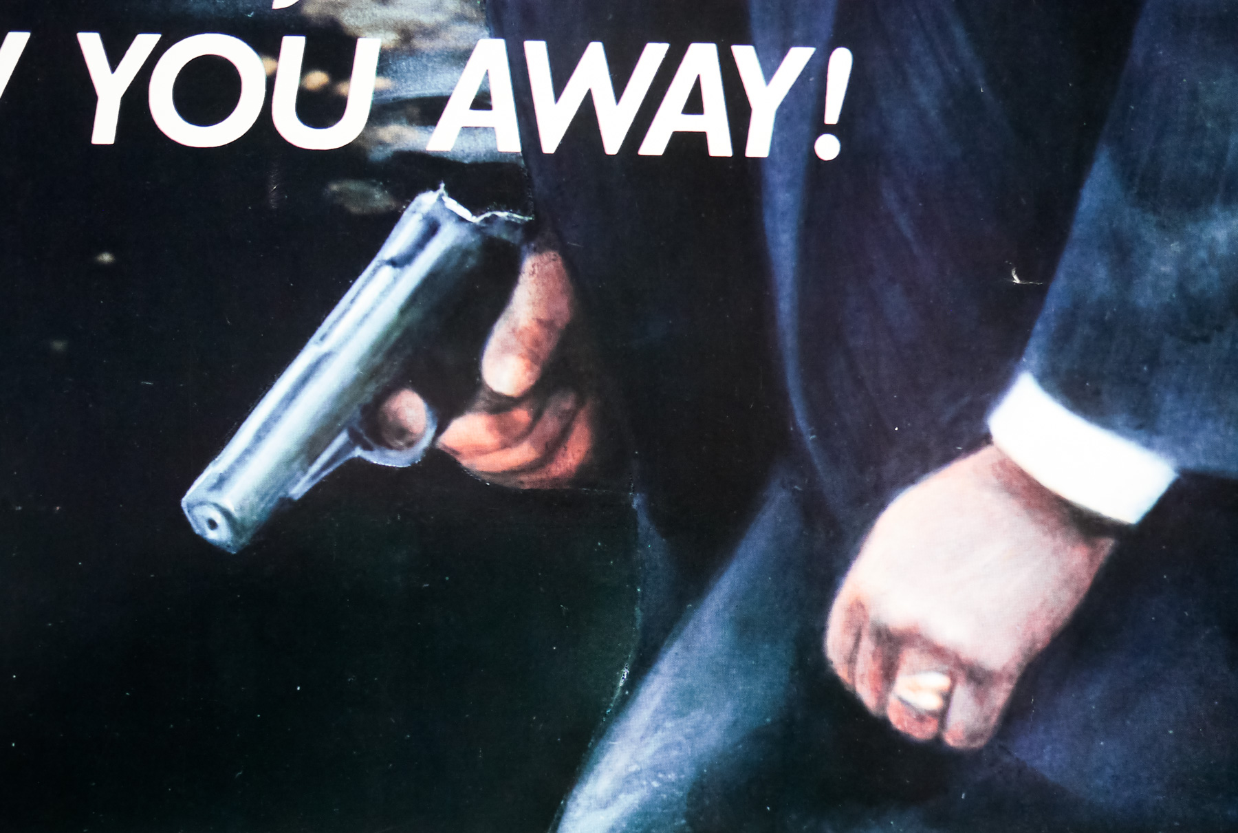
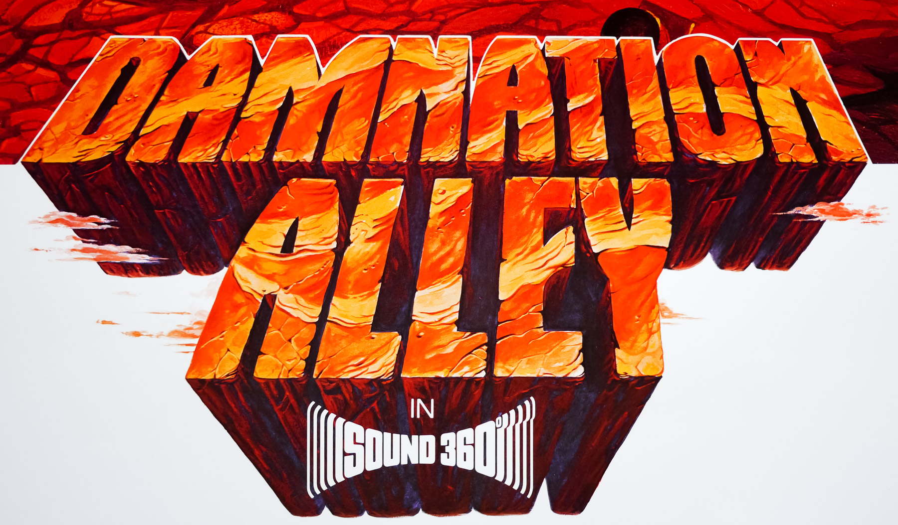
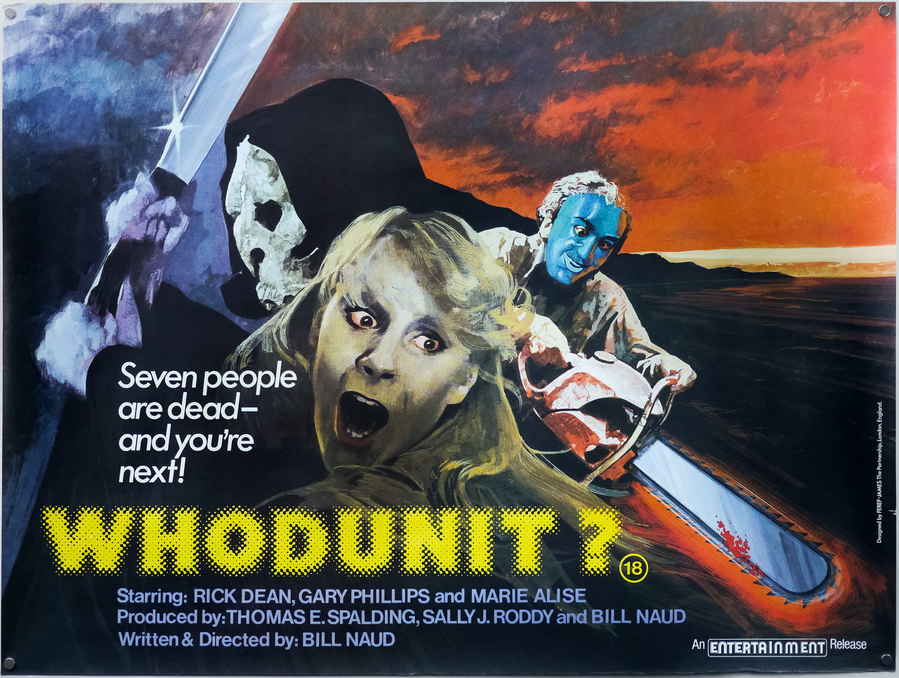
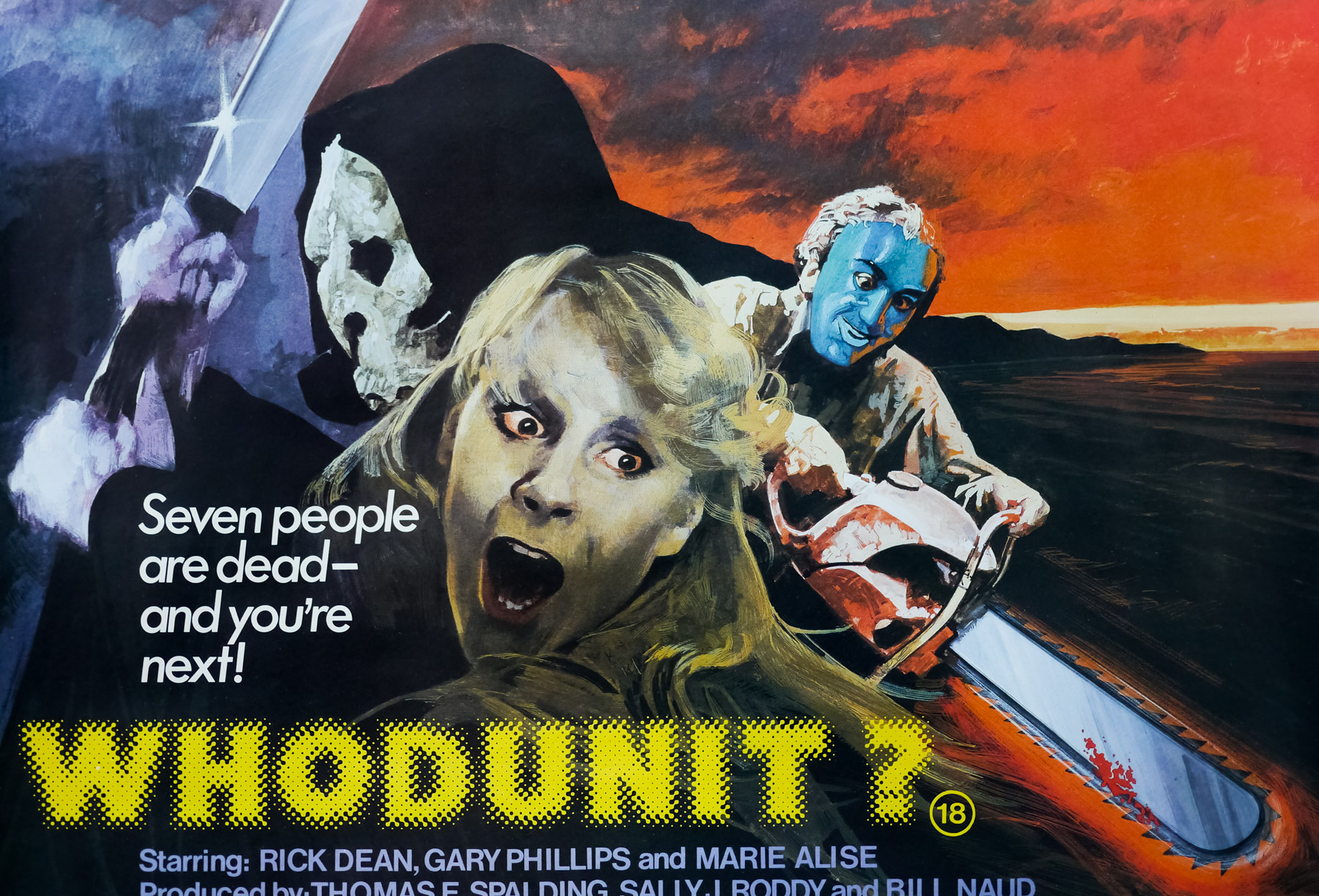
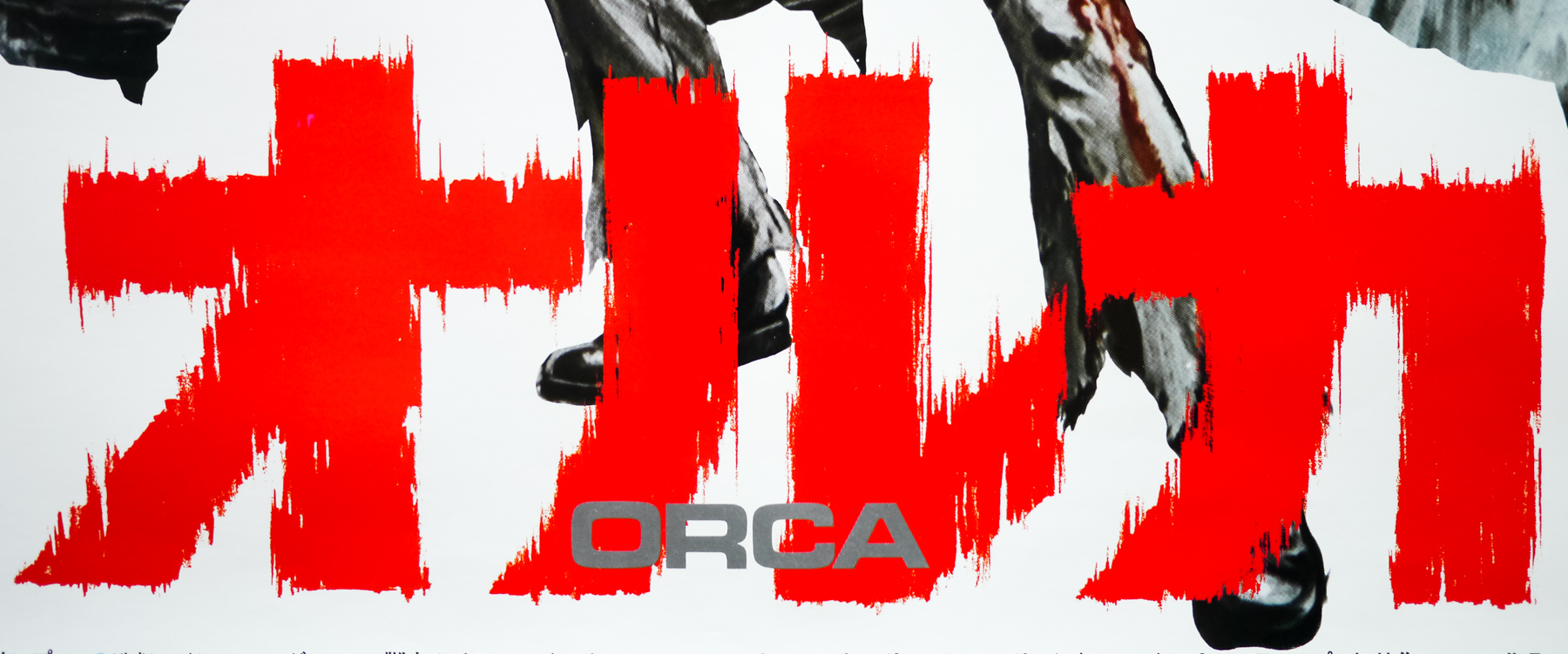
- RISE
Christopher Nolan’s incredible Batman trilogy launched in 2005 with Batman Begins and ended with The Dark Knight Rises in 2012. The final installment was following on from arguably the greatest film based on a comic book character yet to be released, The Dark Knight, which featured Heath Ledger’s unforgettable performance as the villainous Joker. The actor’s tragic demise meant the character would not be returning for what Nolan decided, after a deliberation of a few months following the second film’s release, would be the final entry in his series of films.
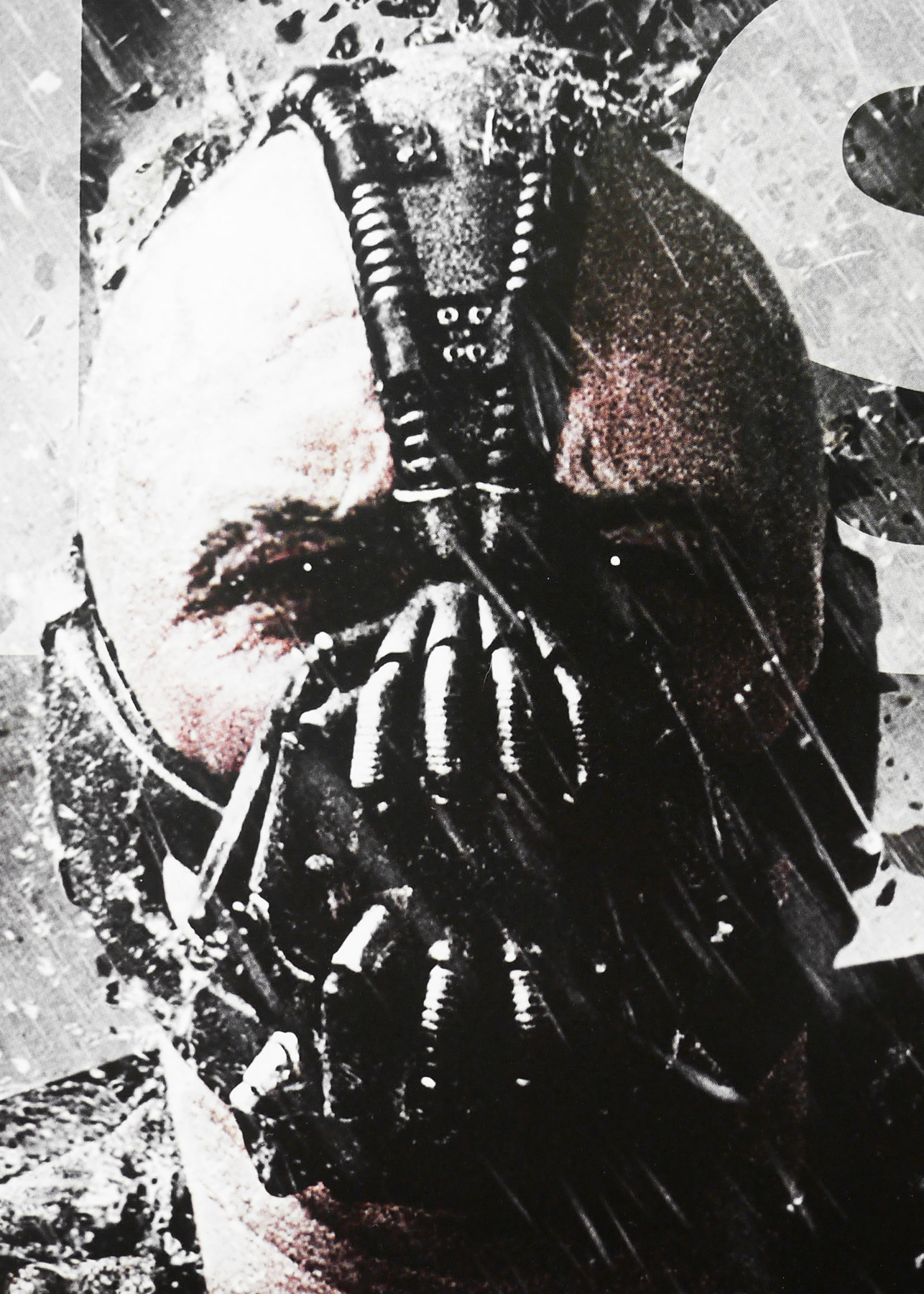
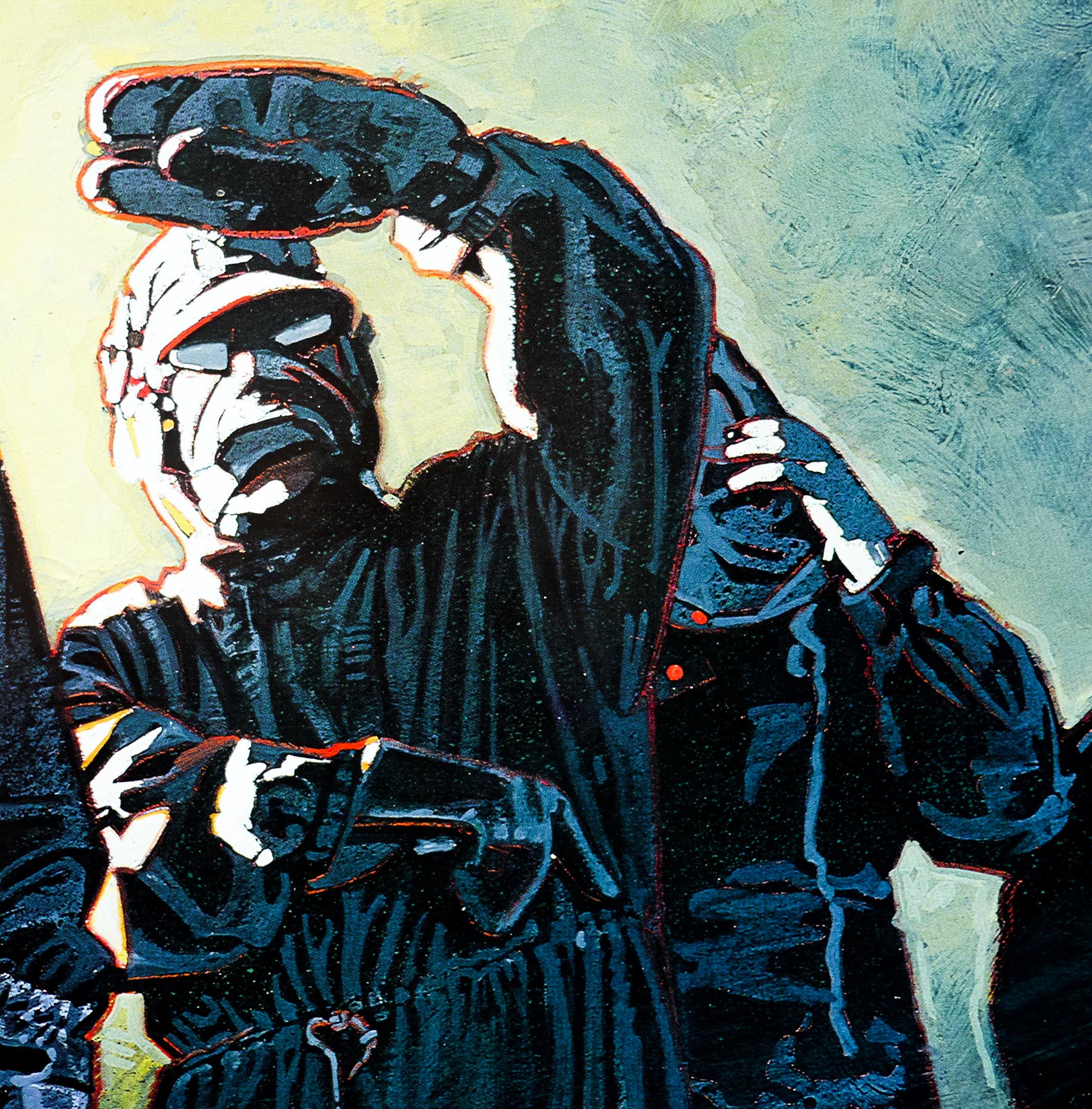
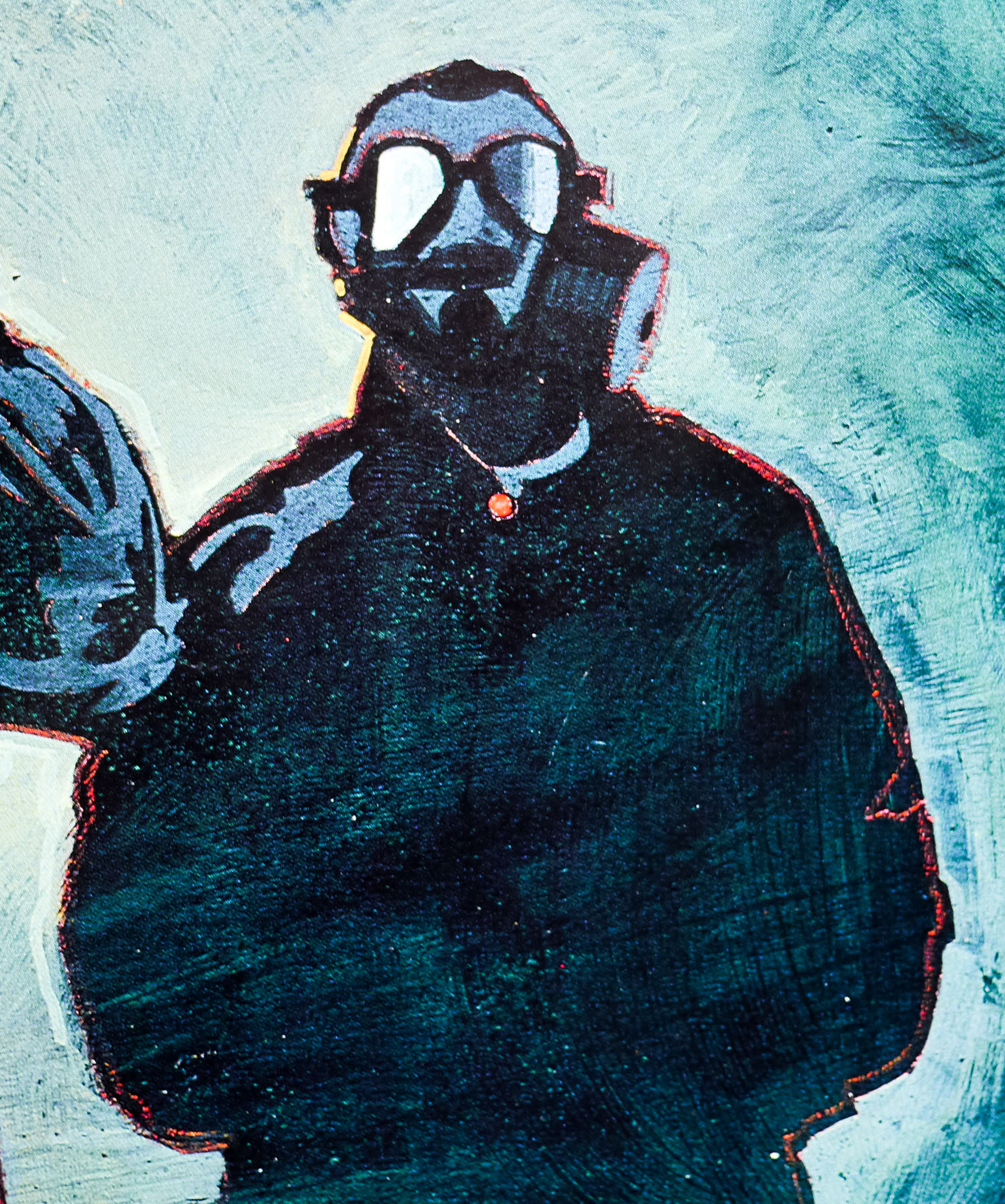
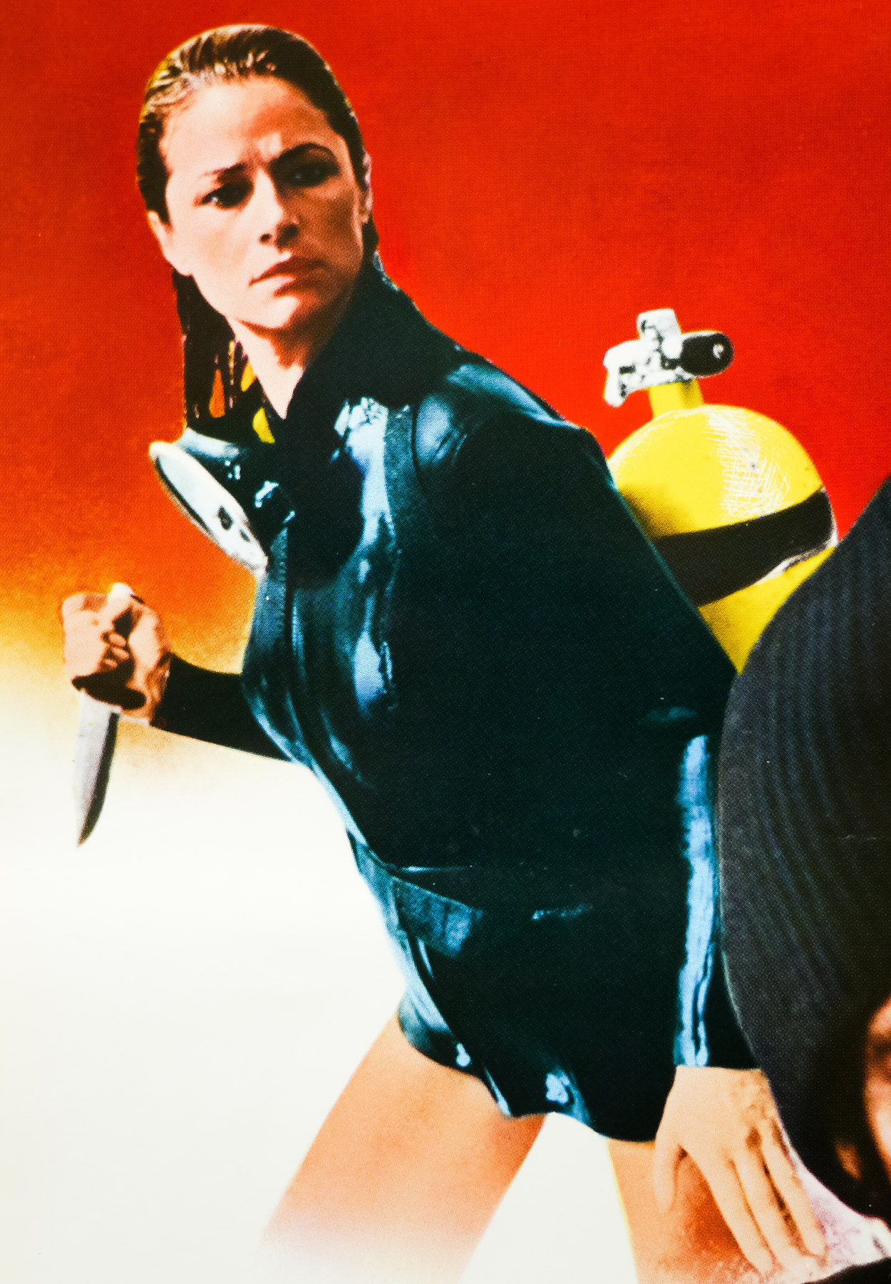
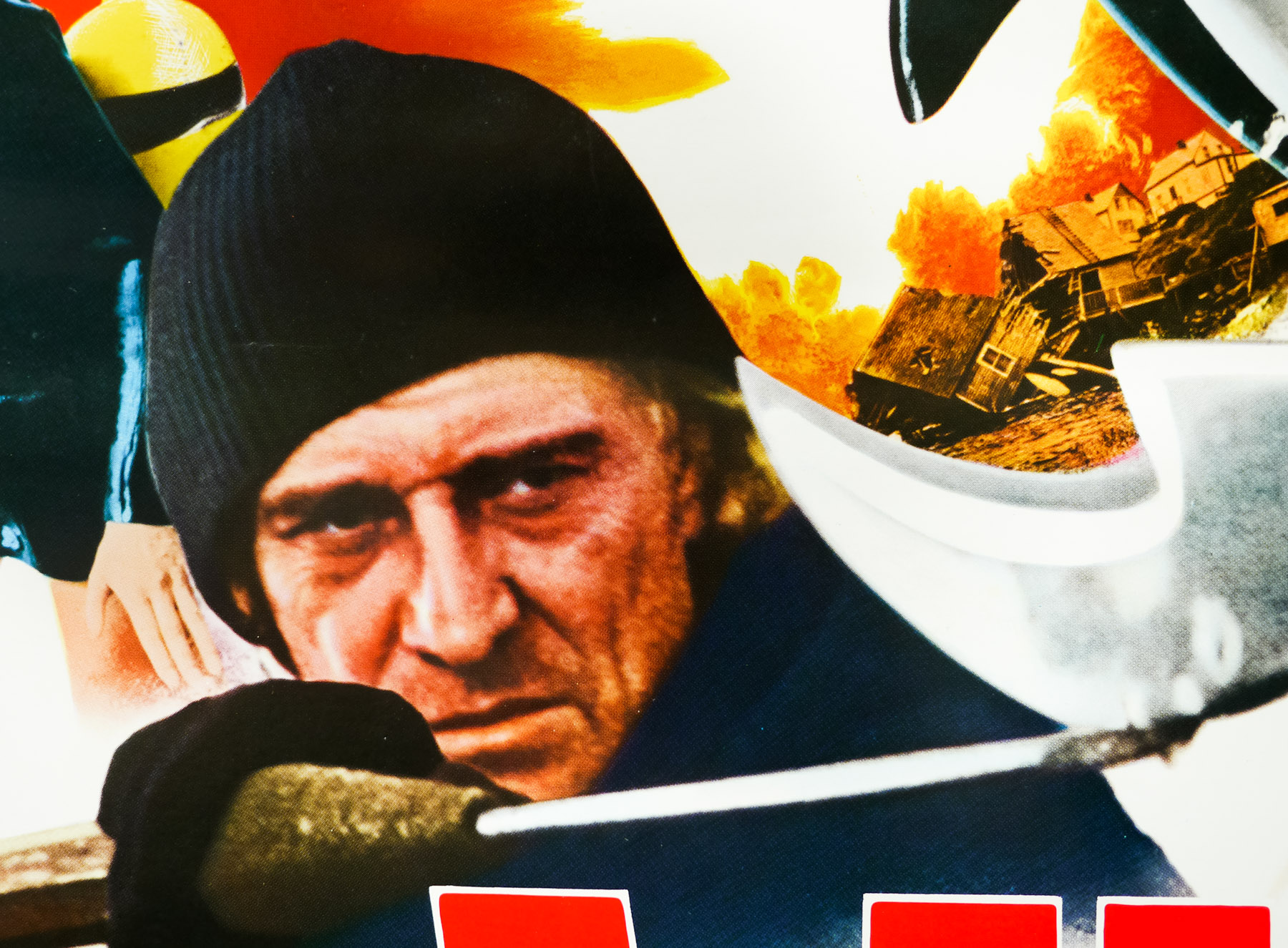
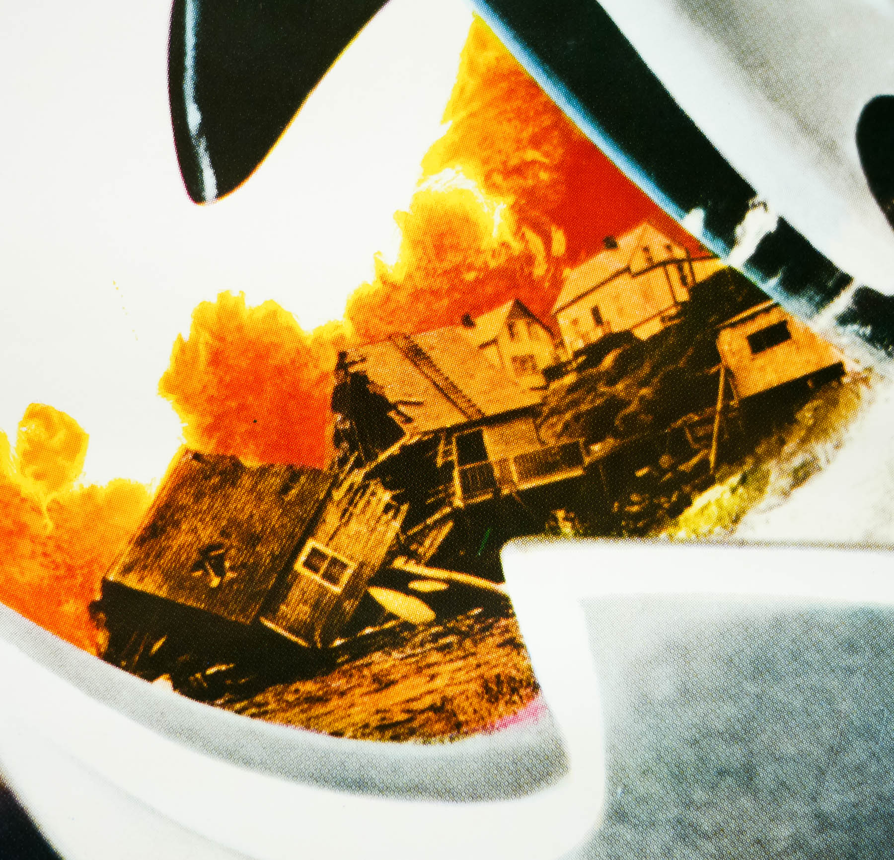
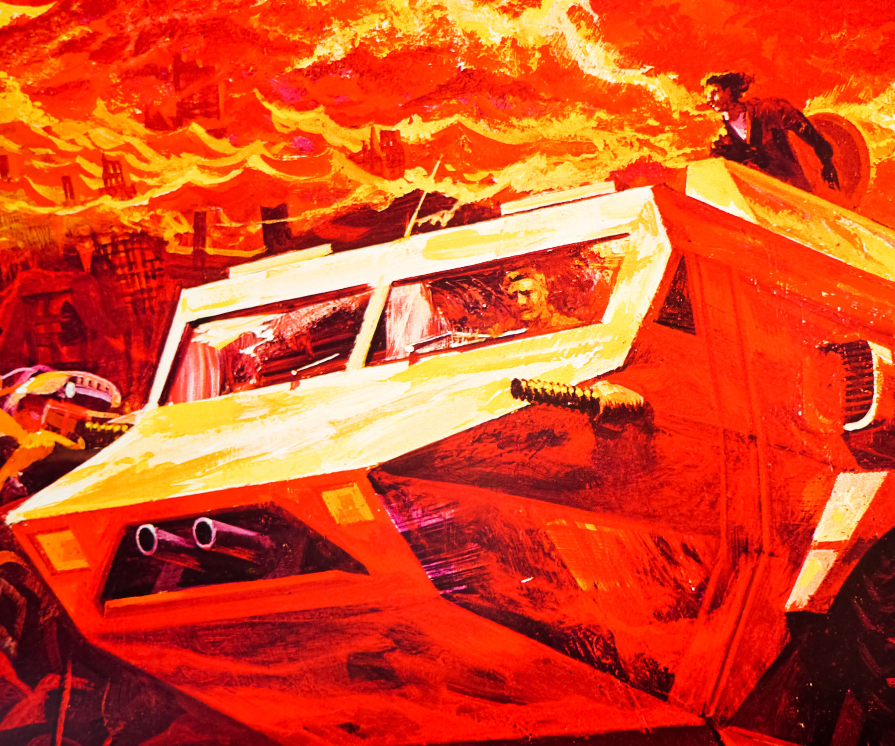
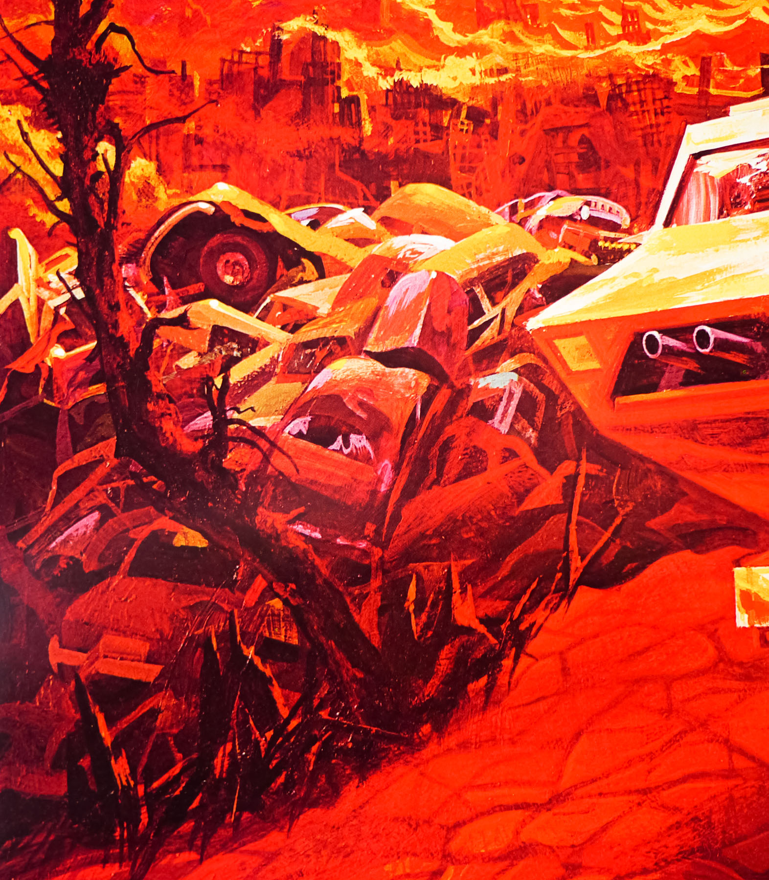
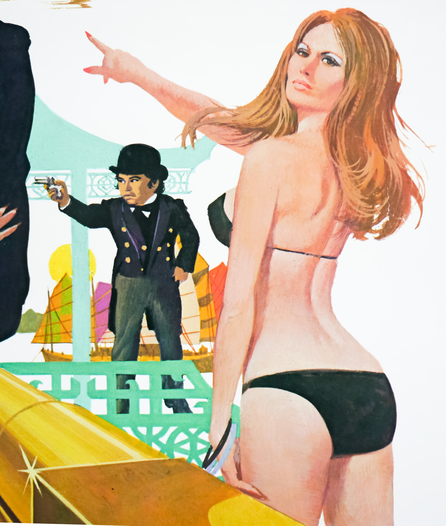
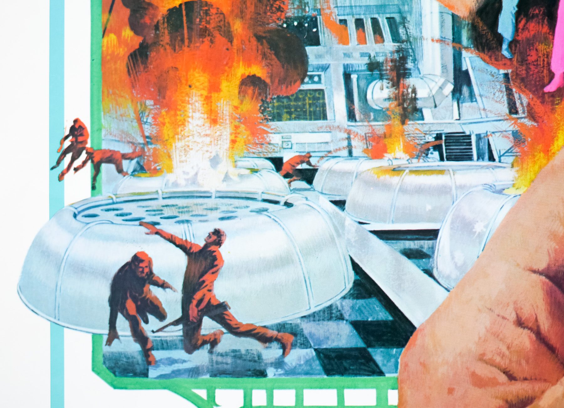
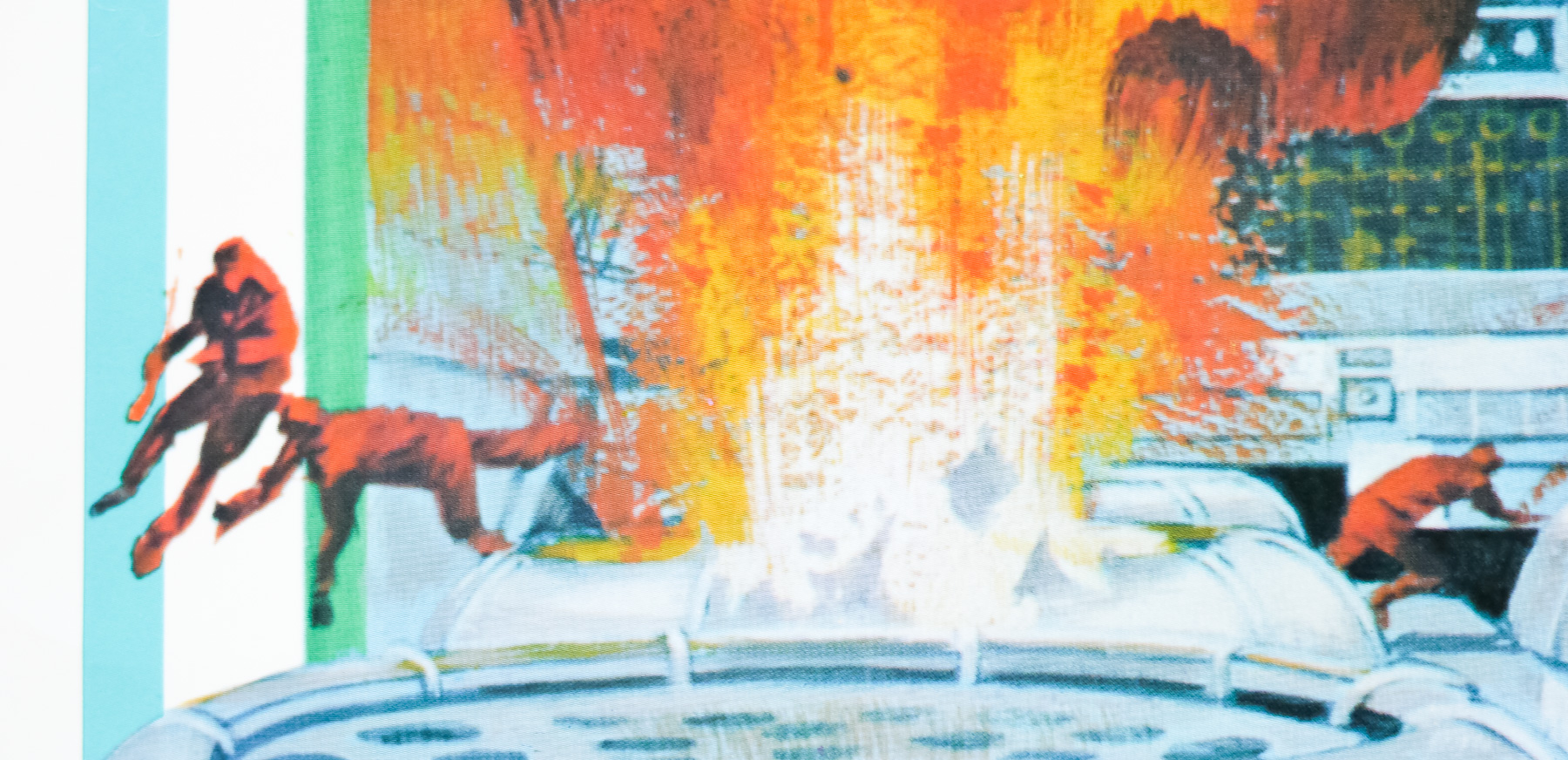
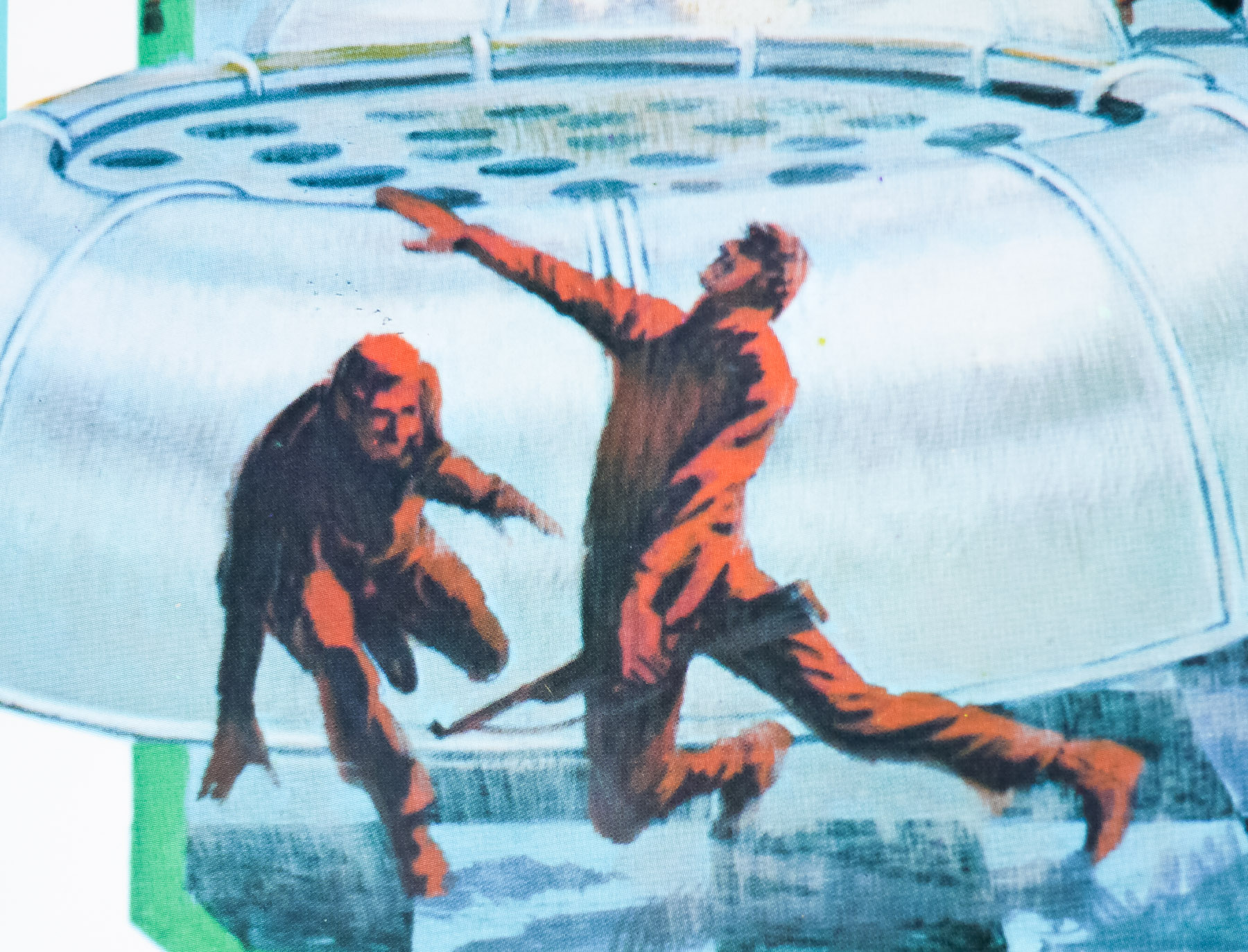
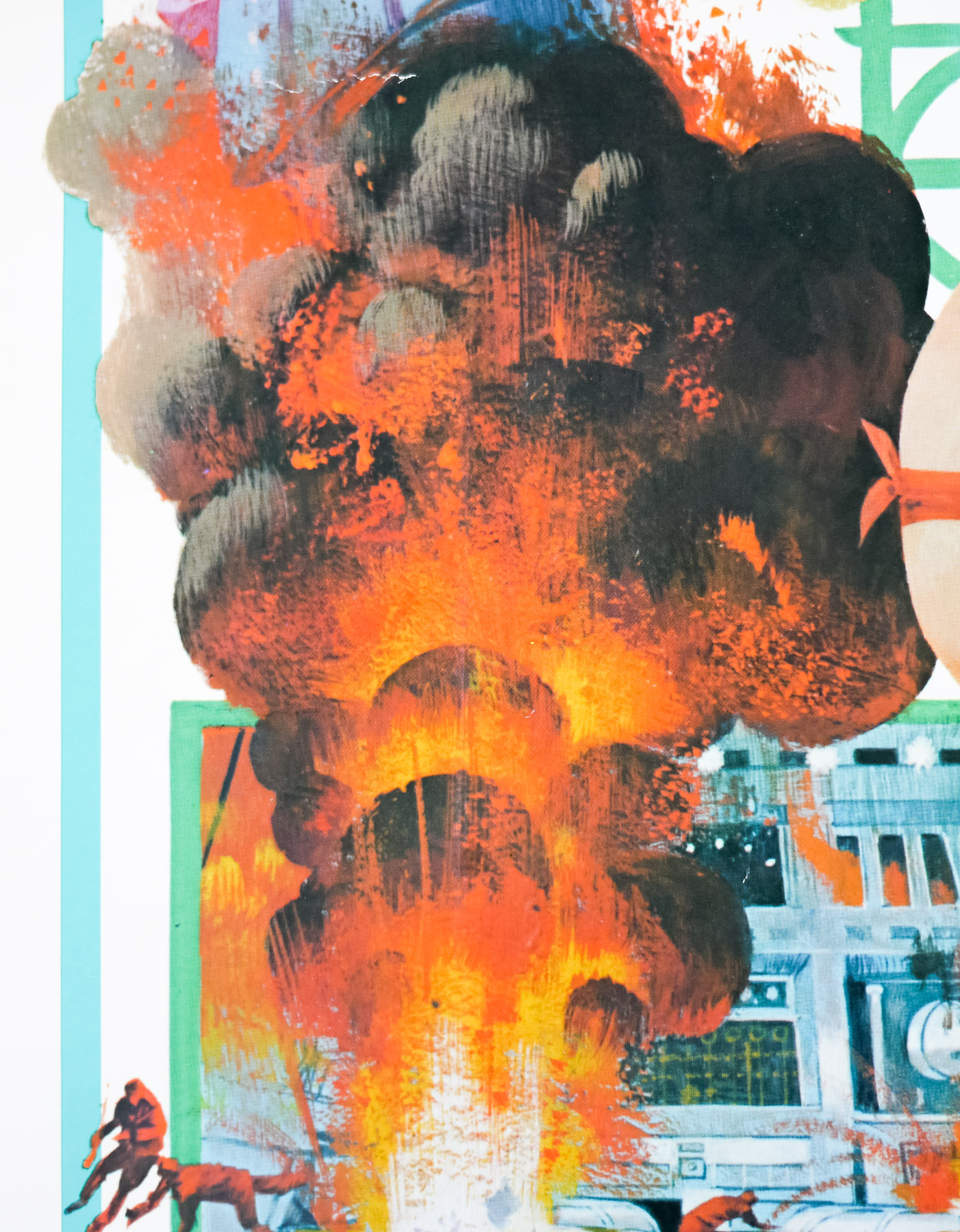
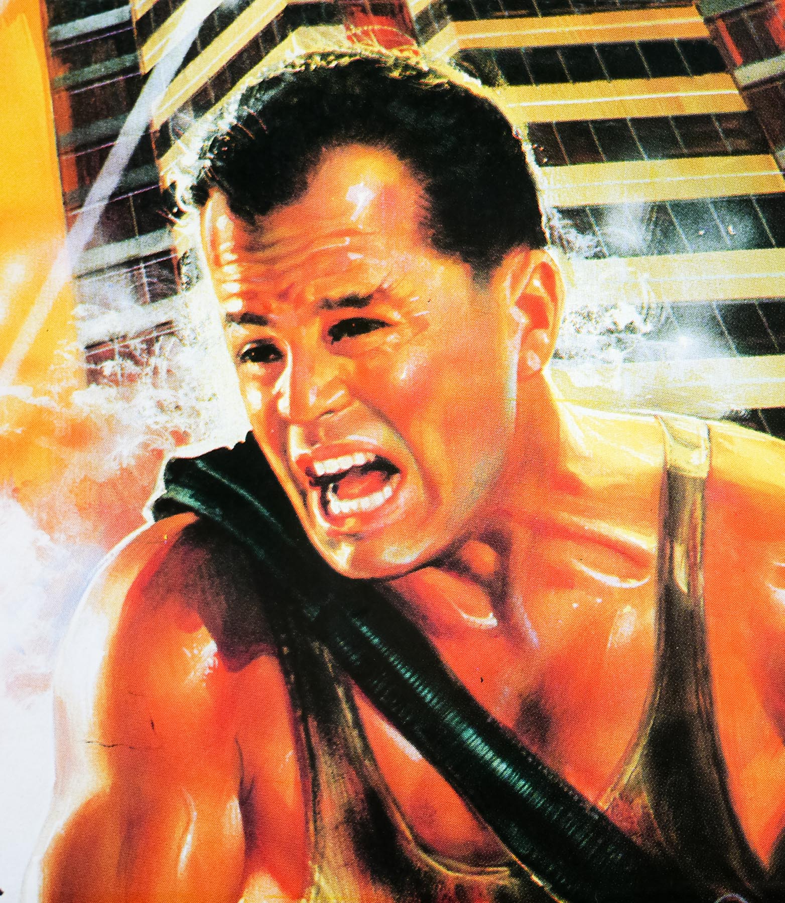
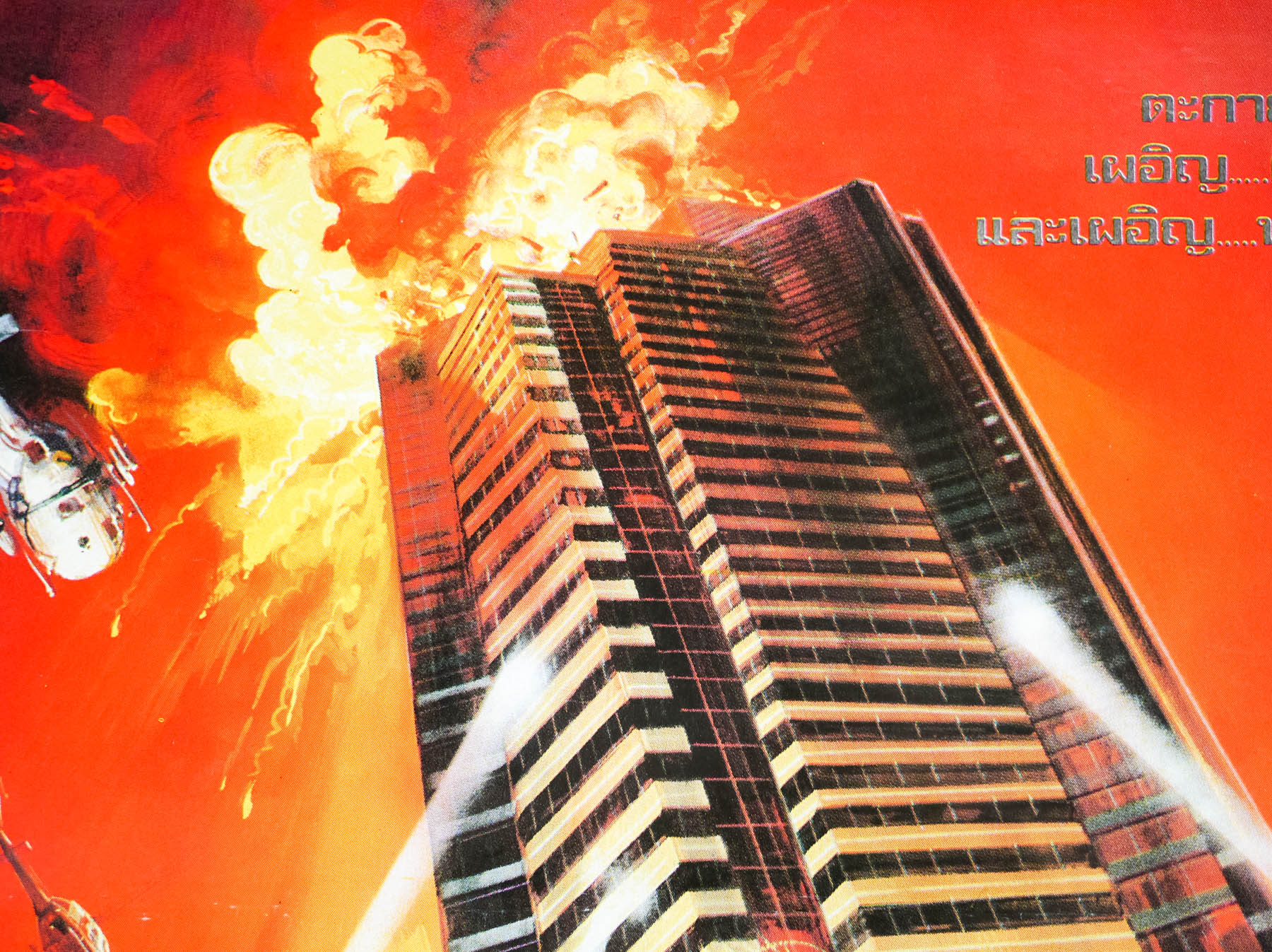
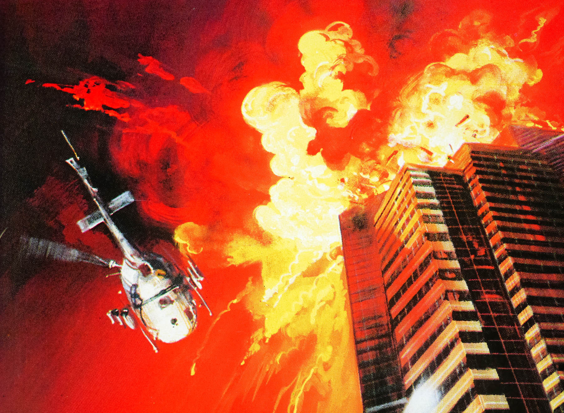
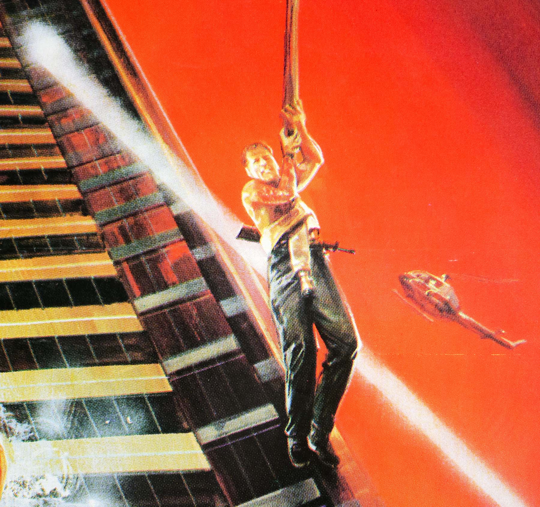
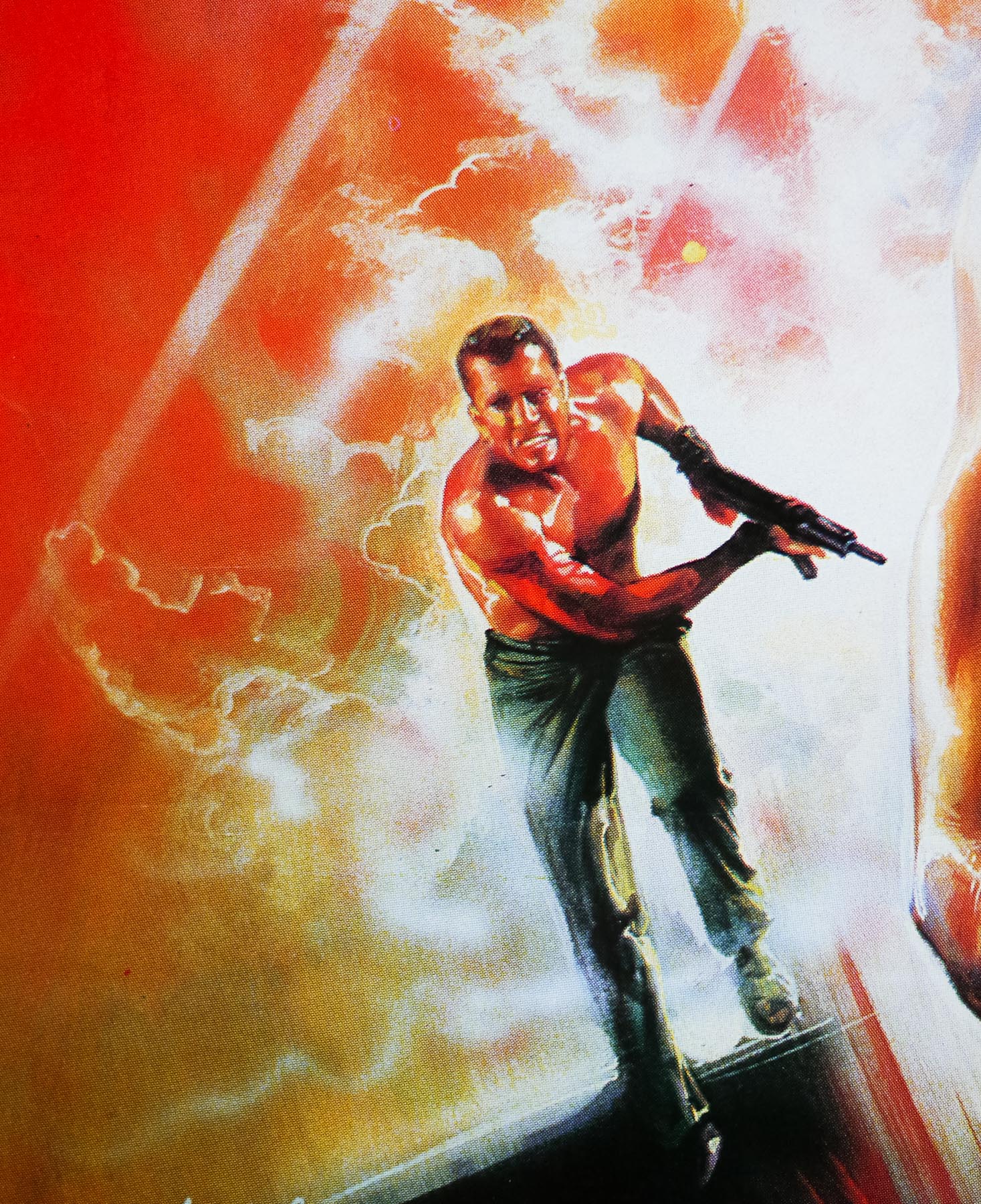
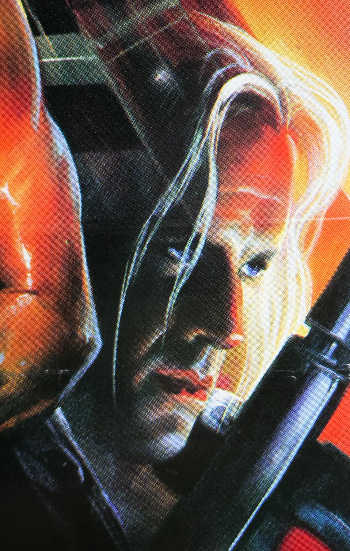
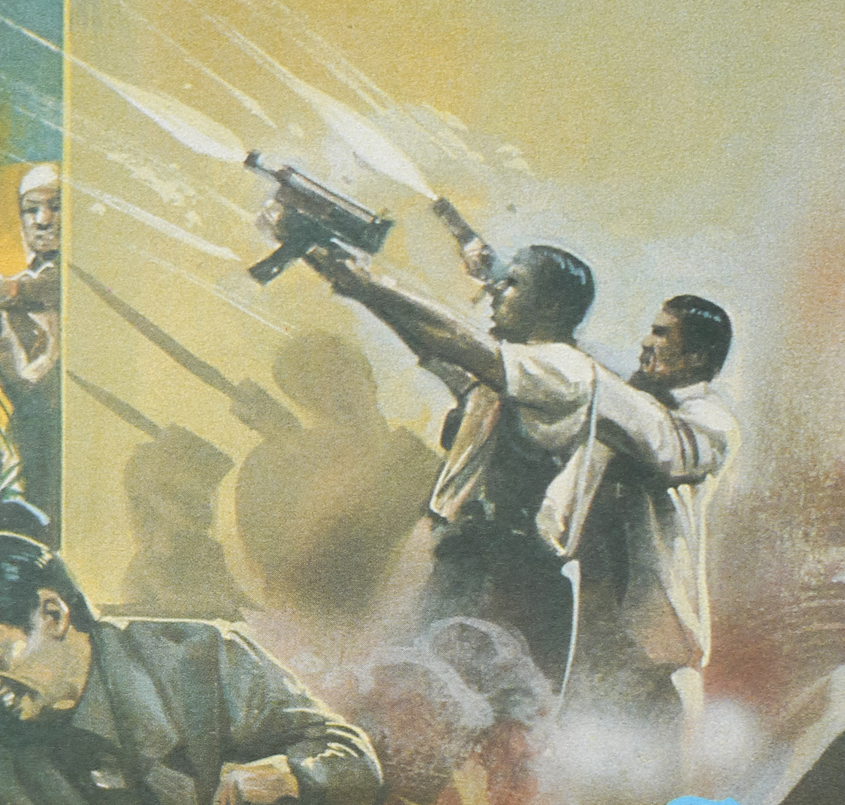
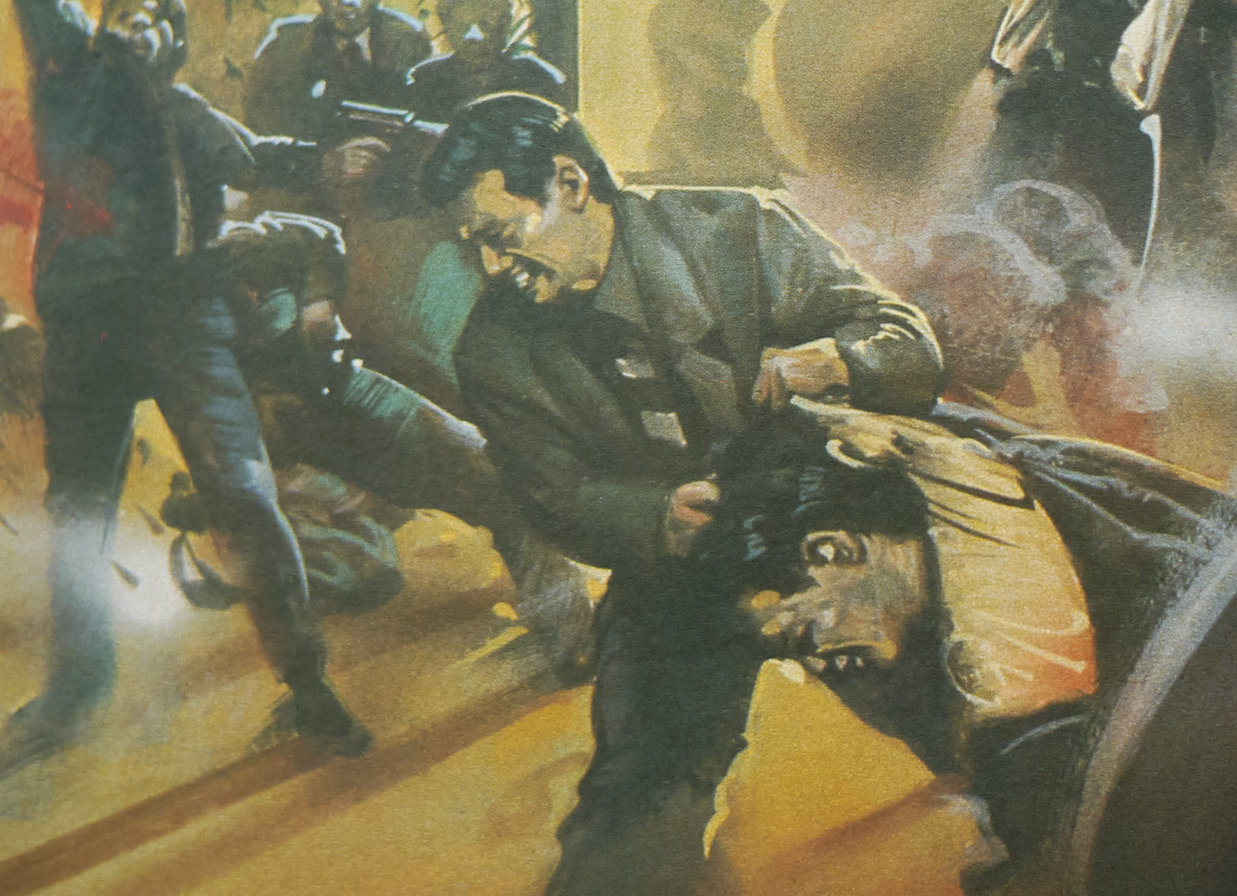
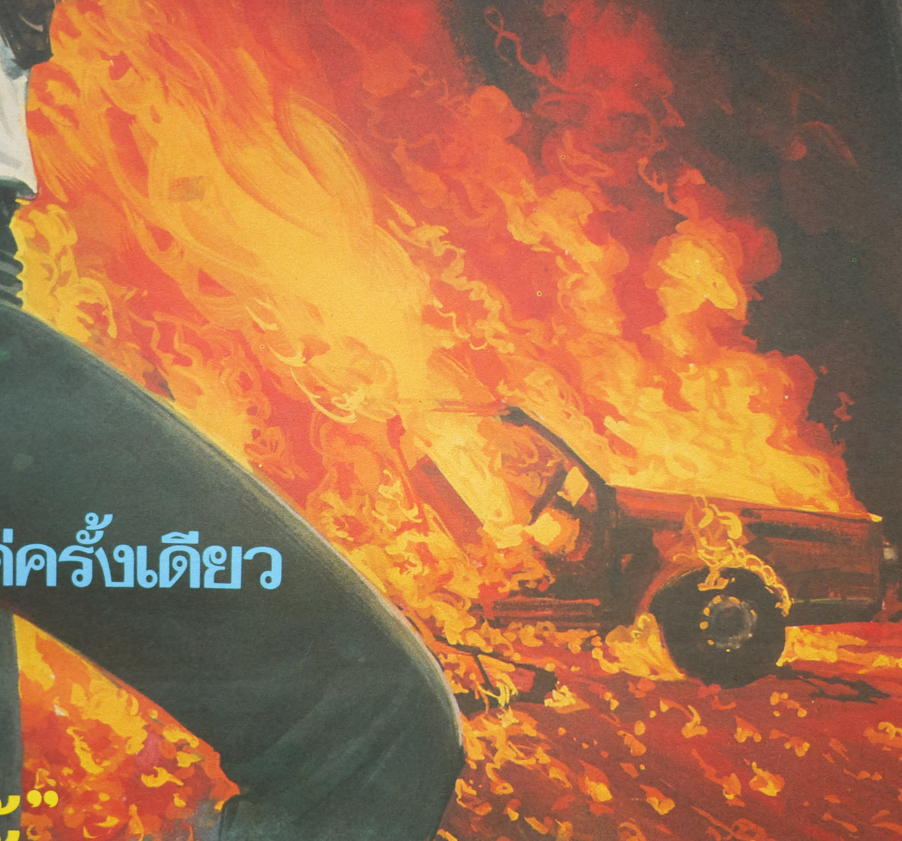
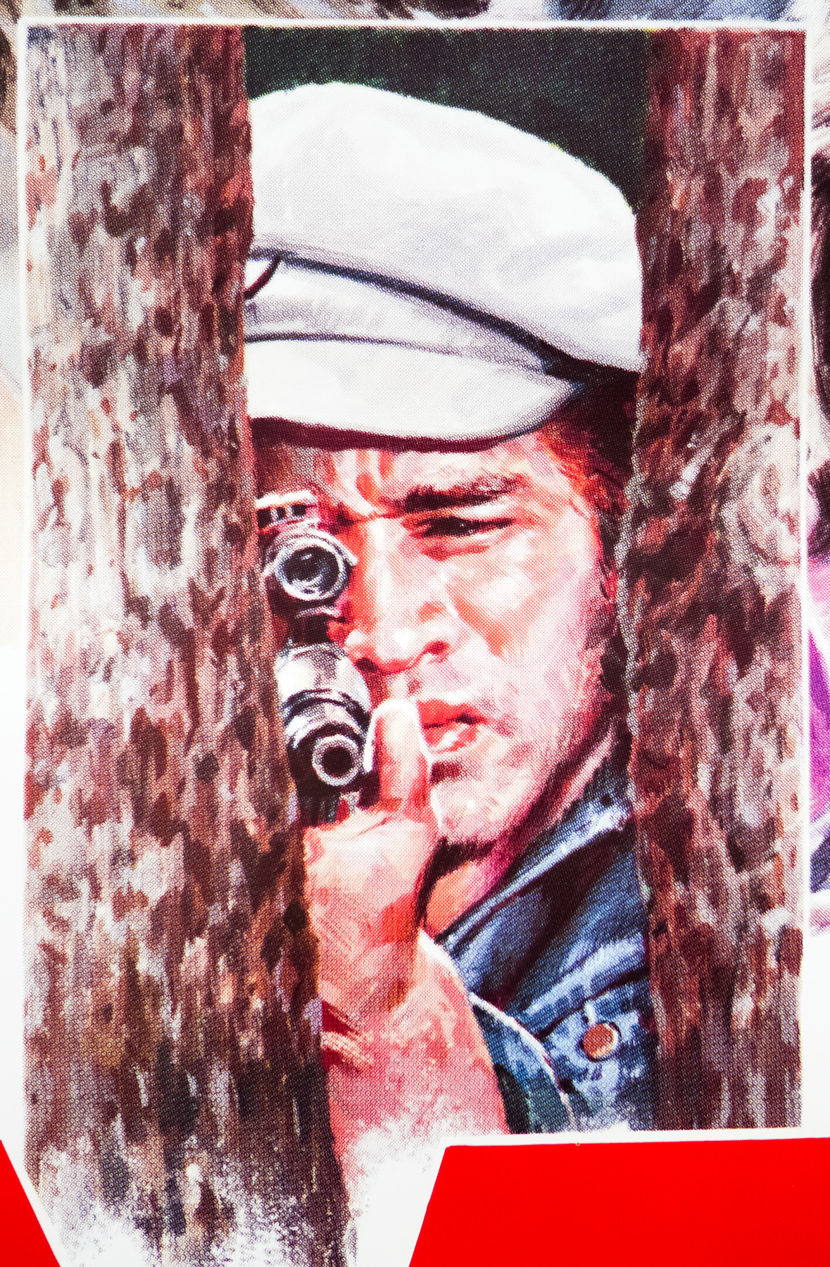
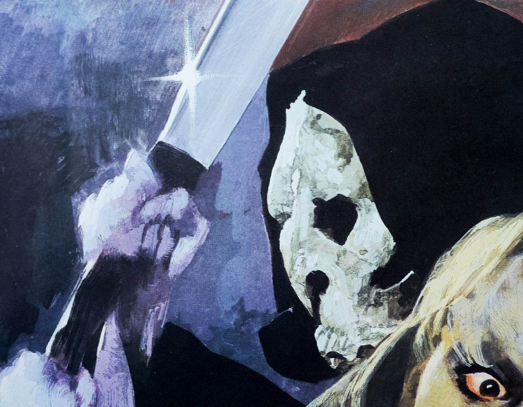
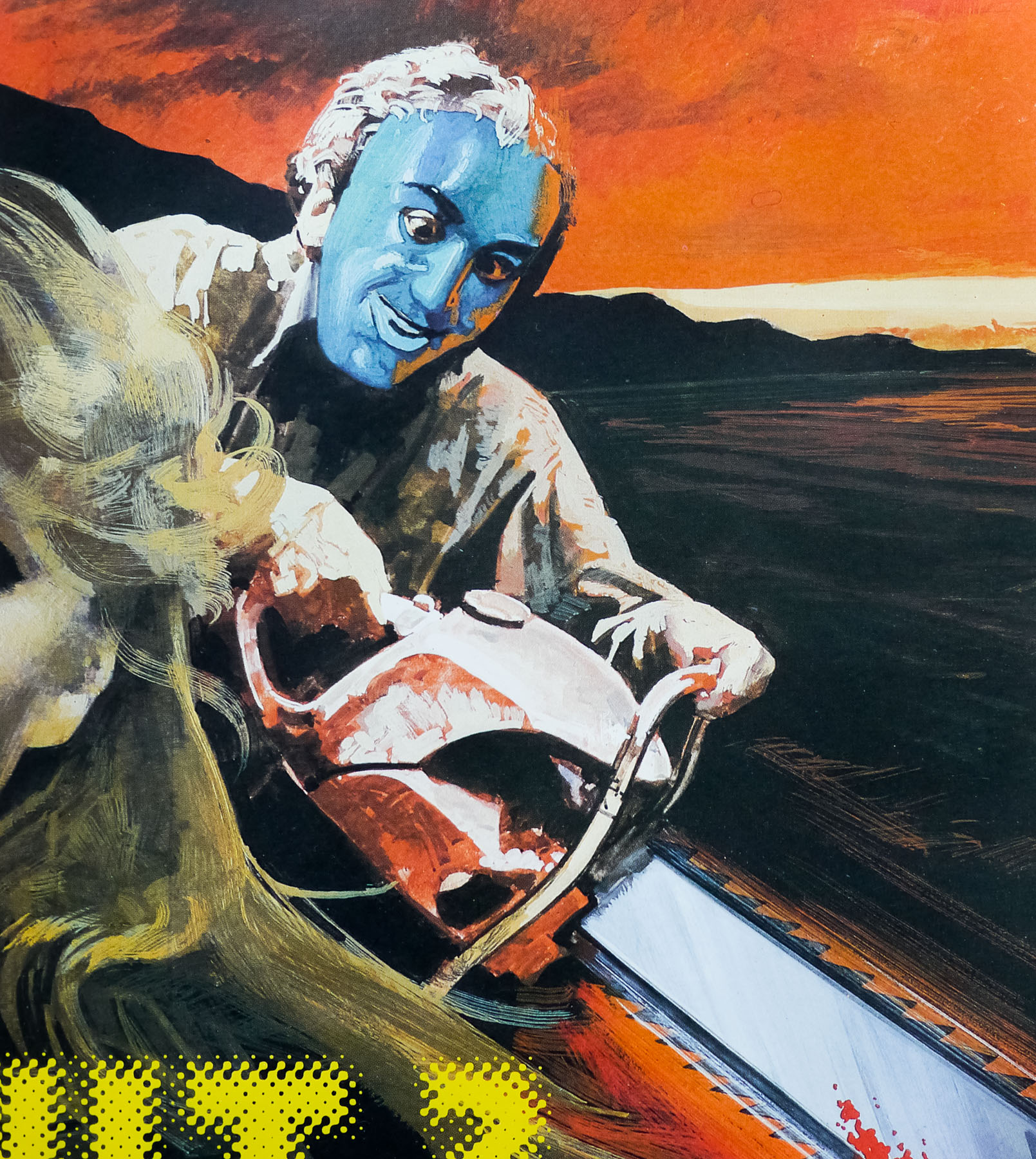
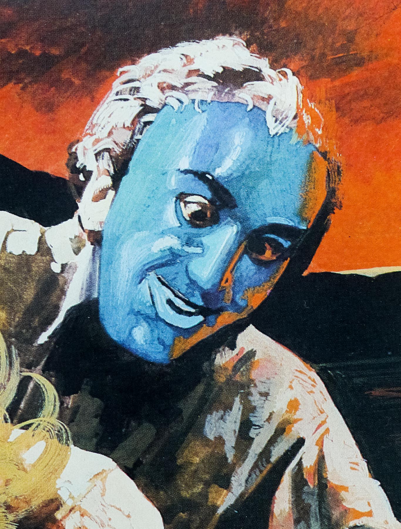
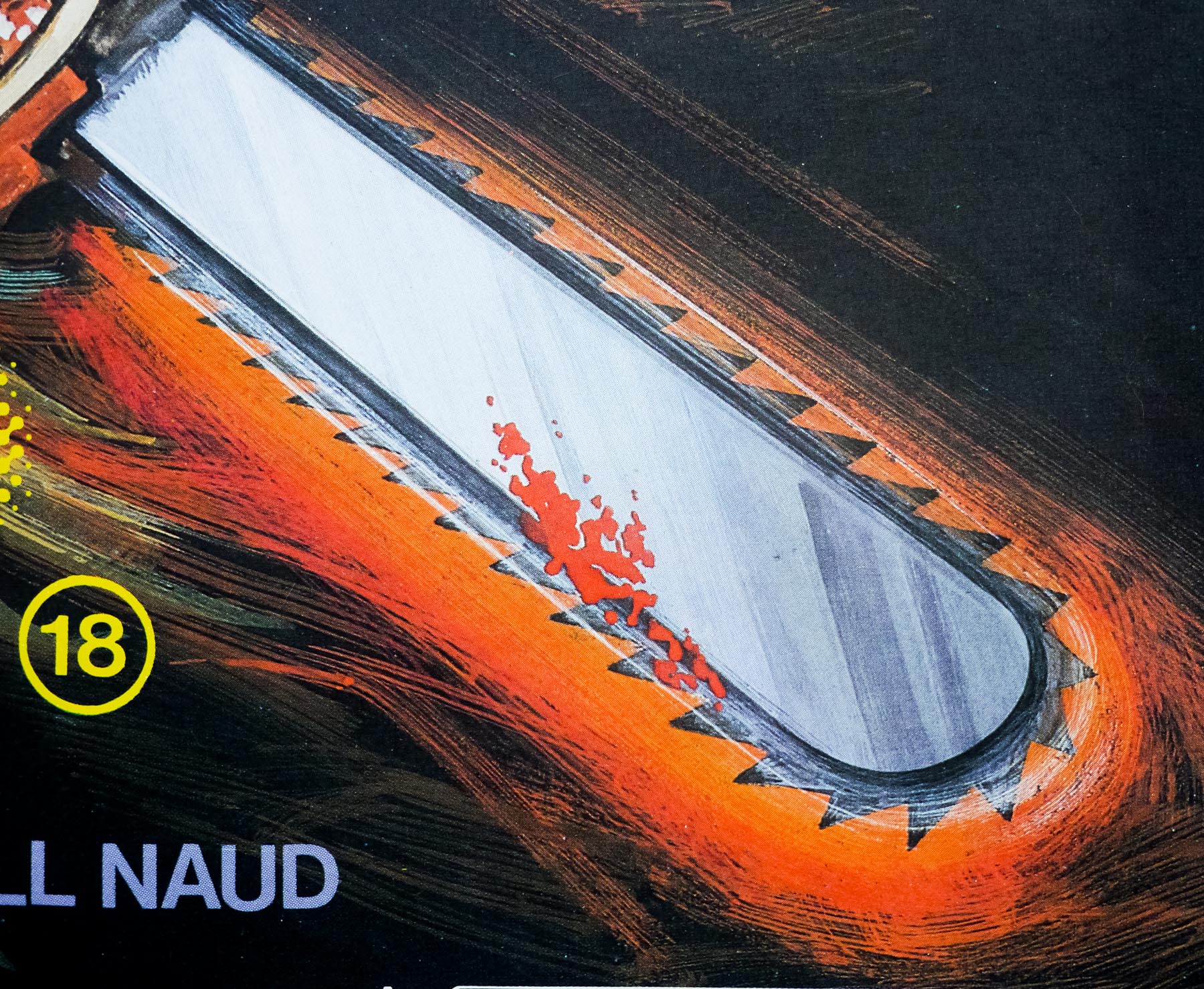
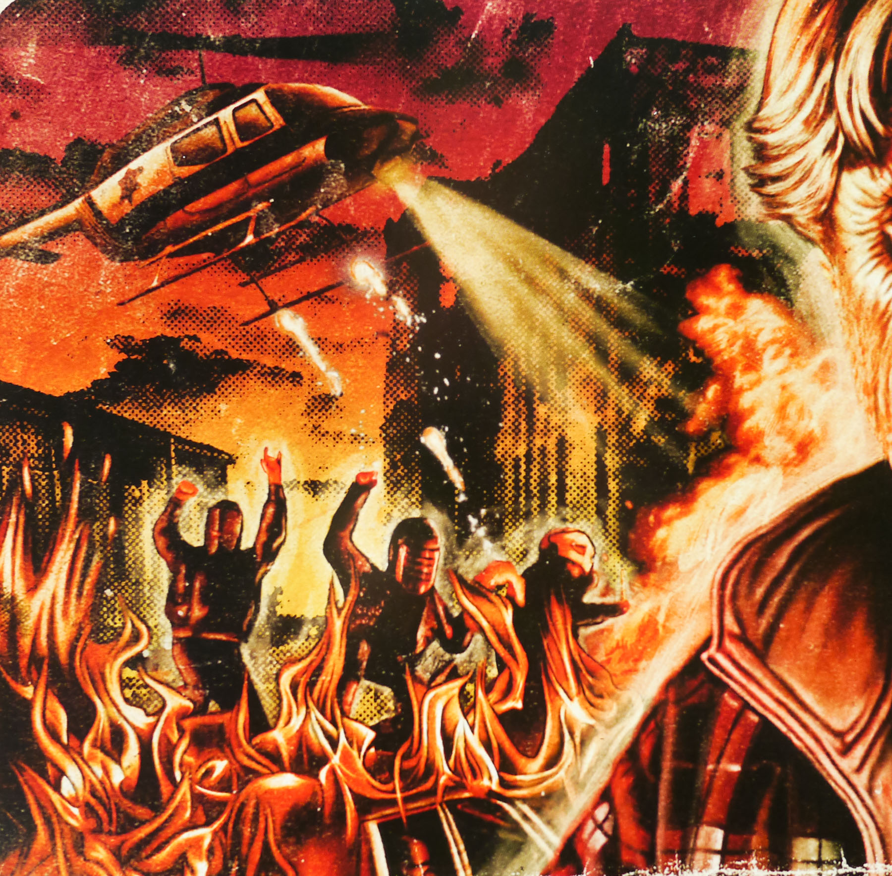
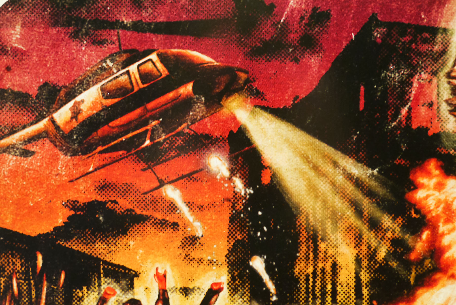
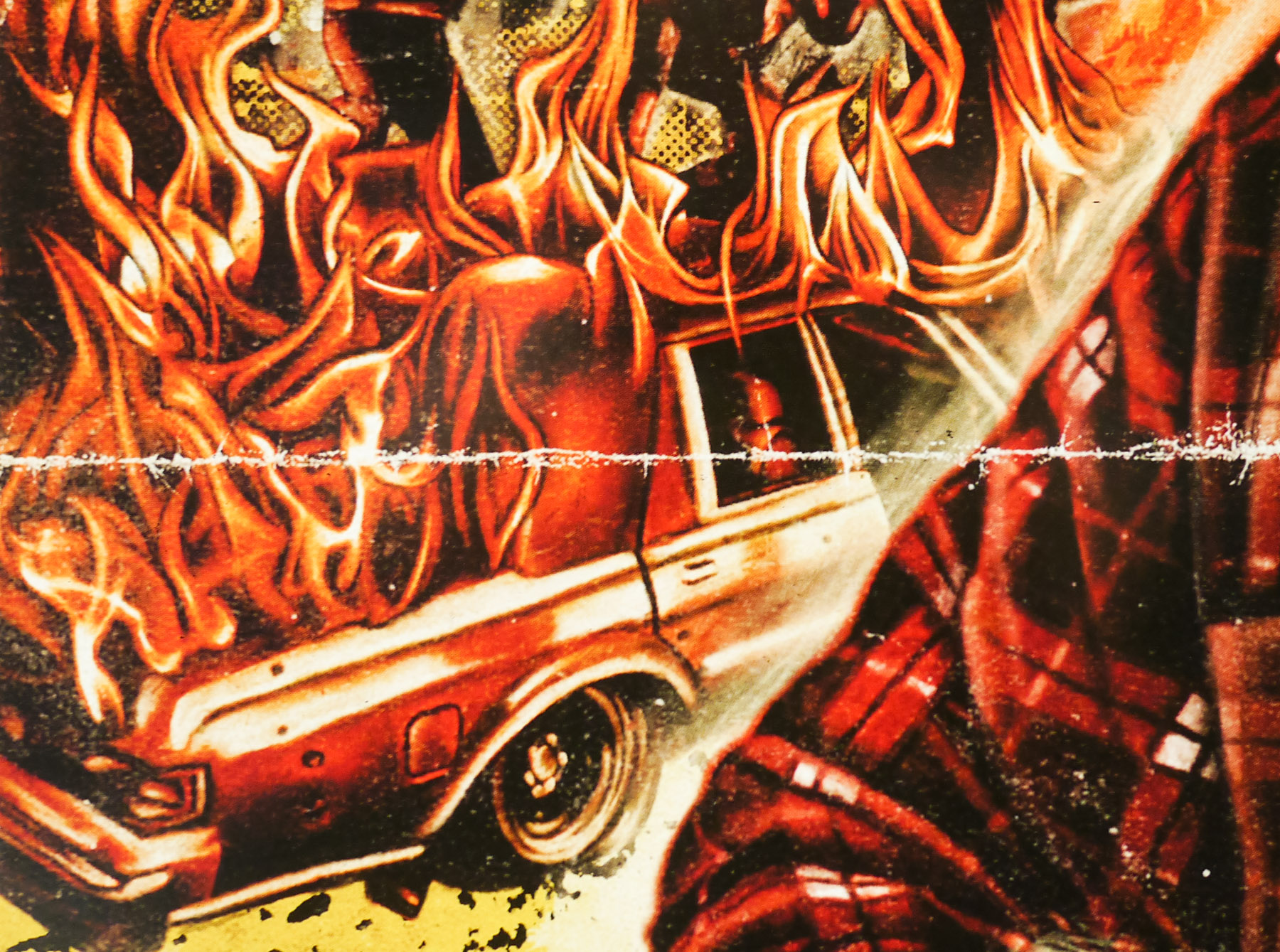
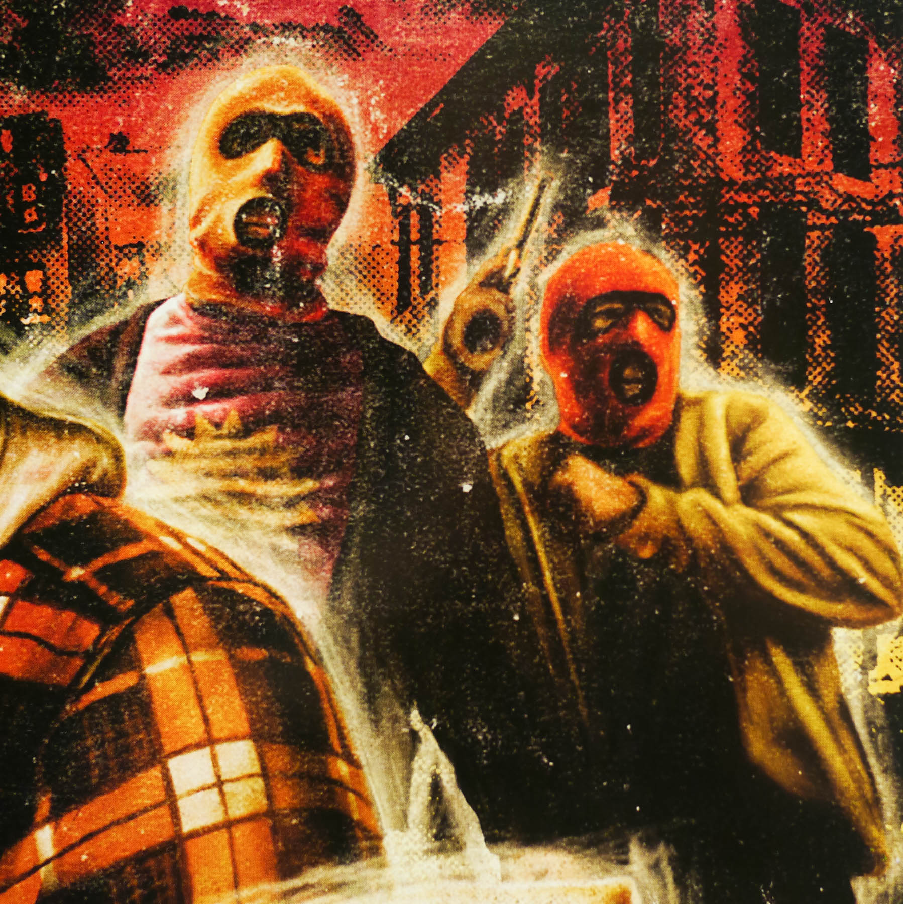
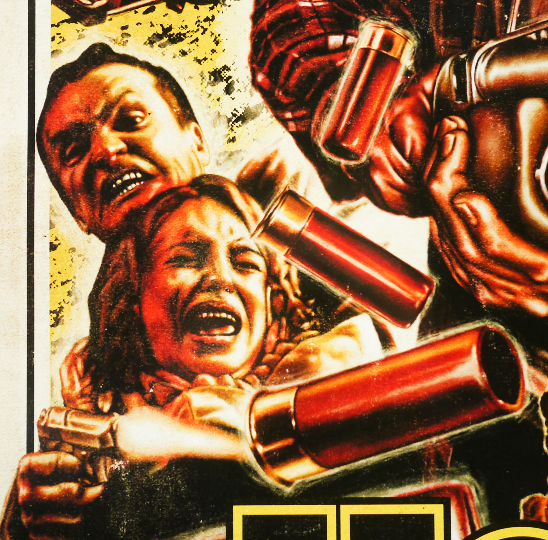
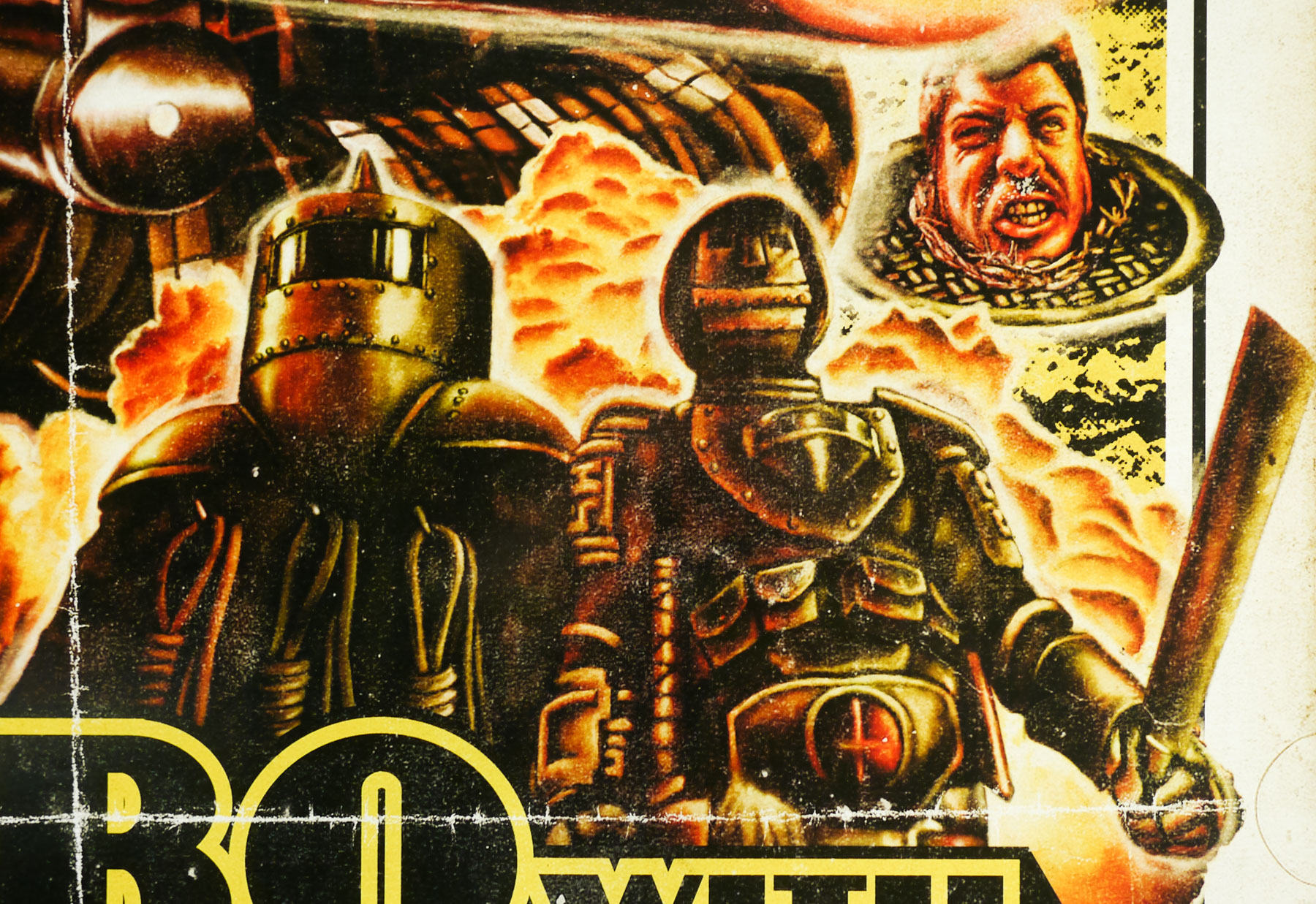
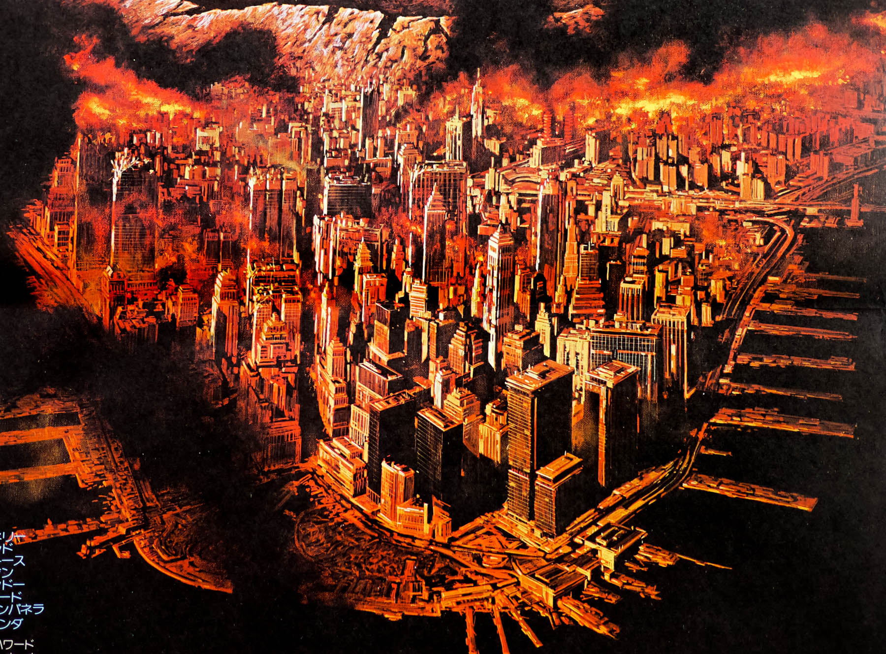
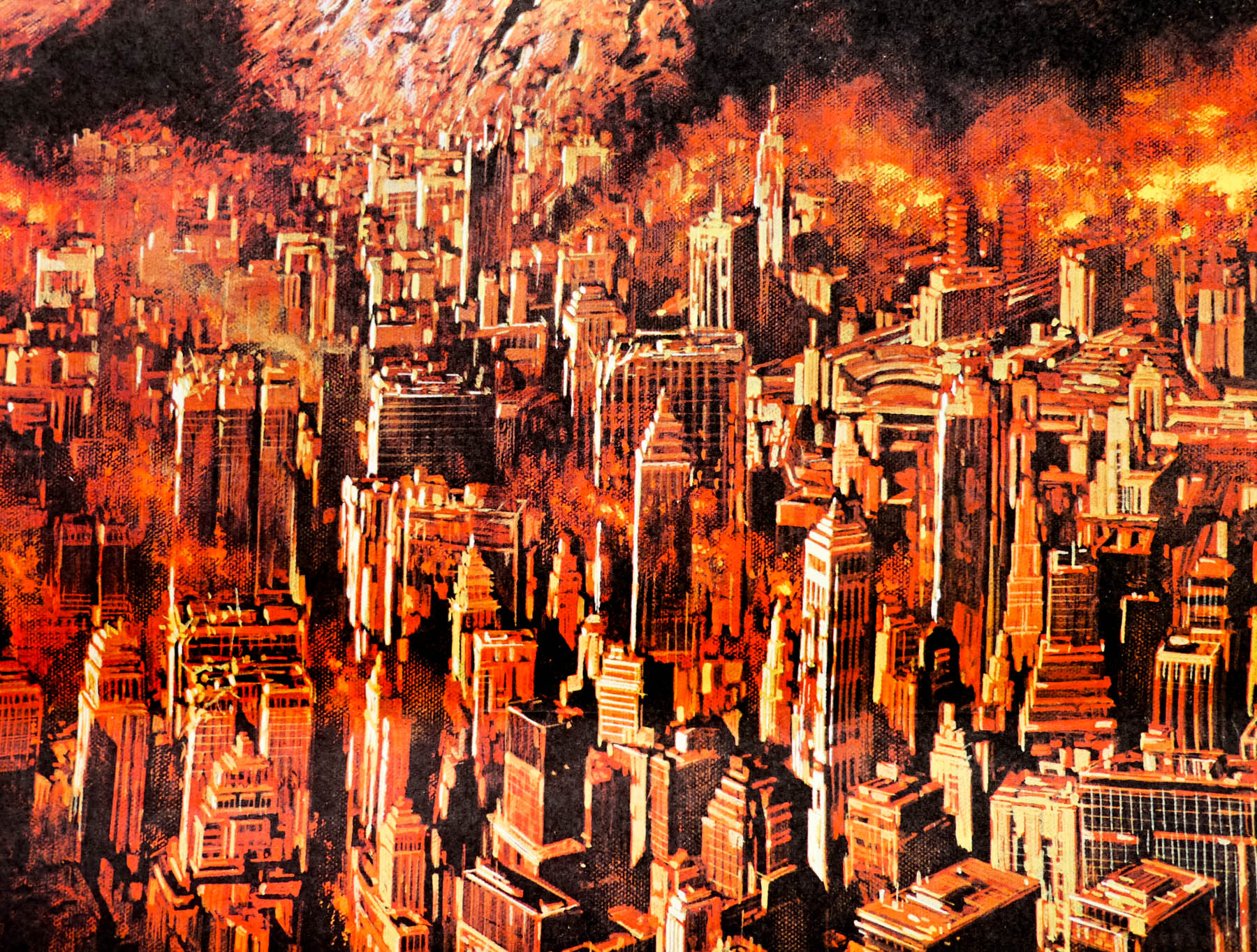
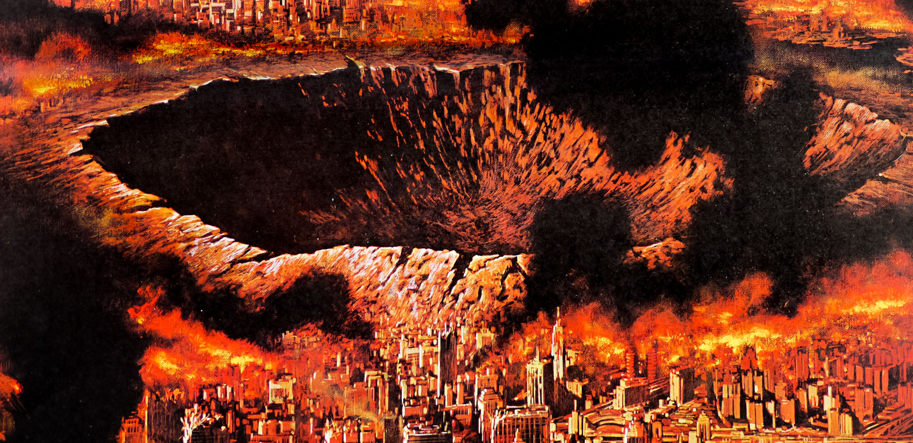
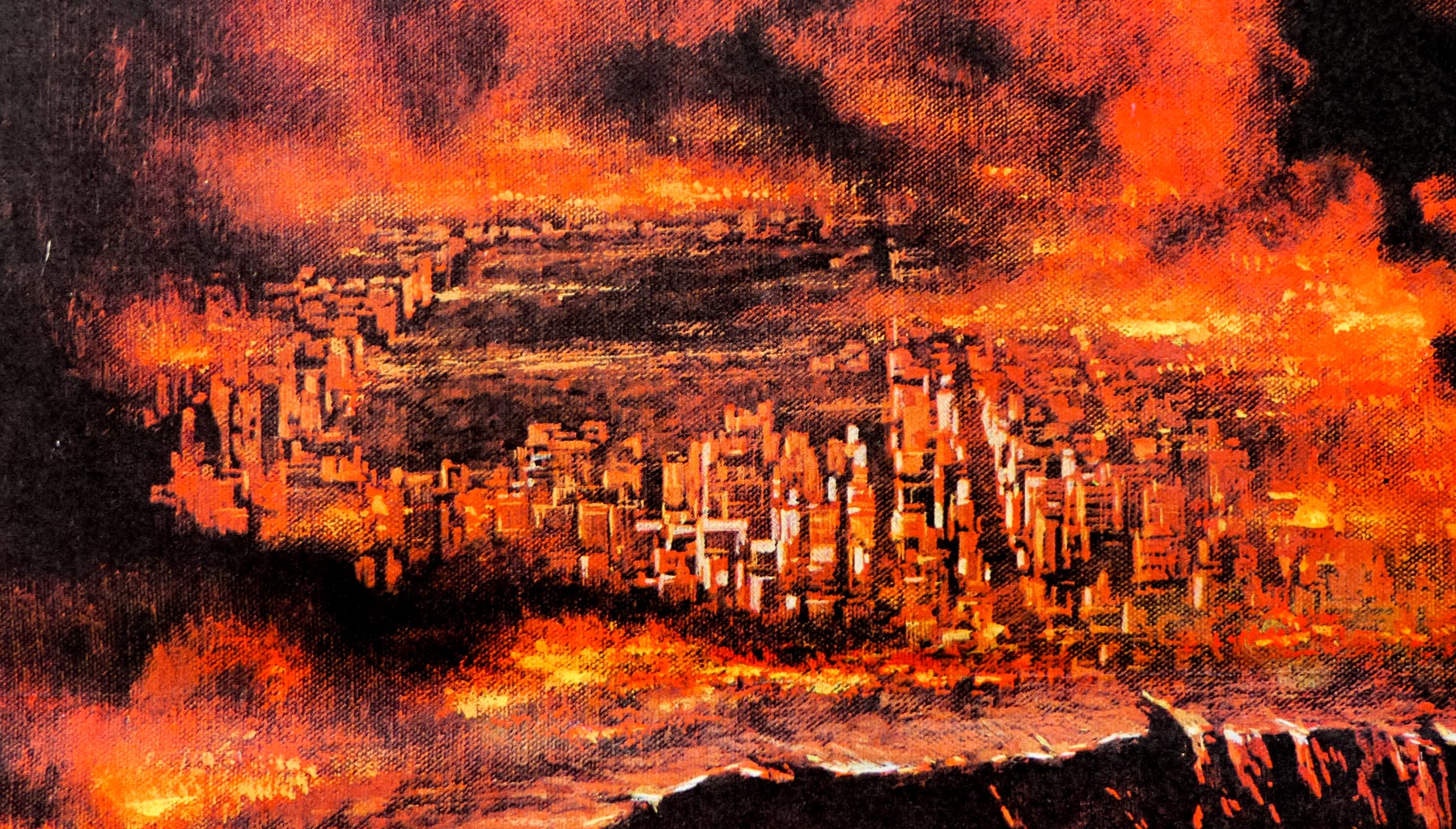
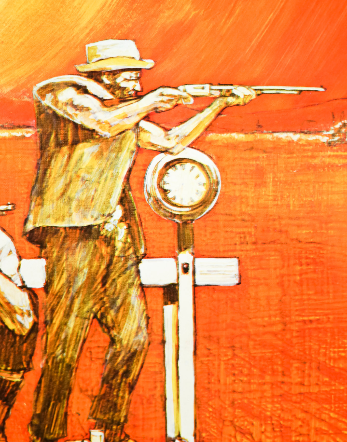
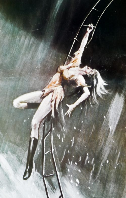
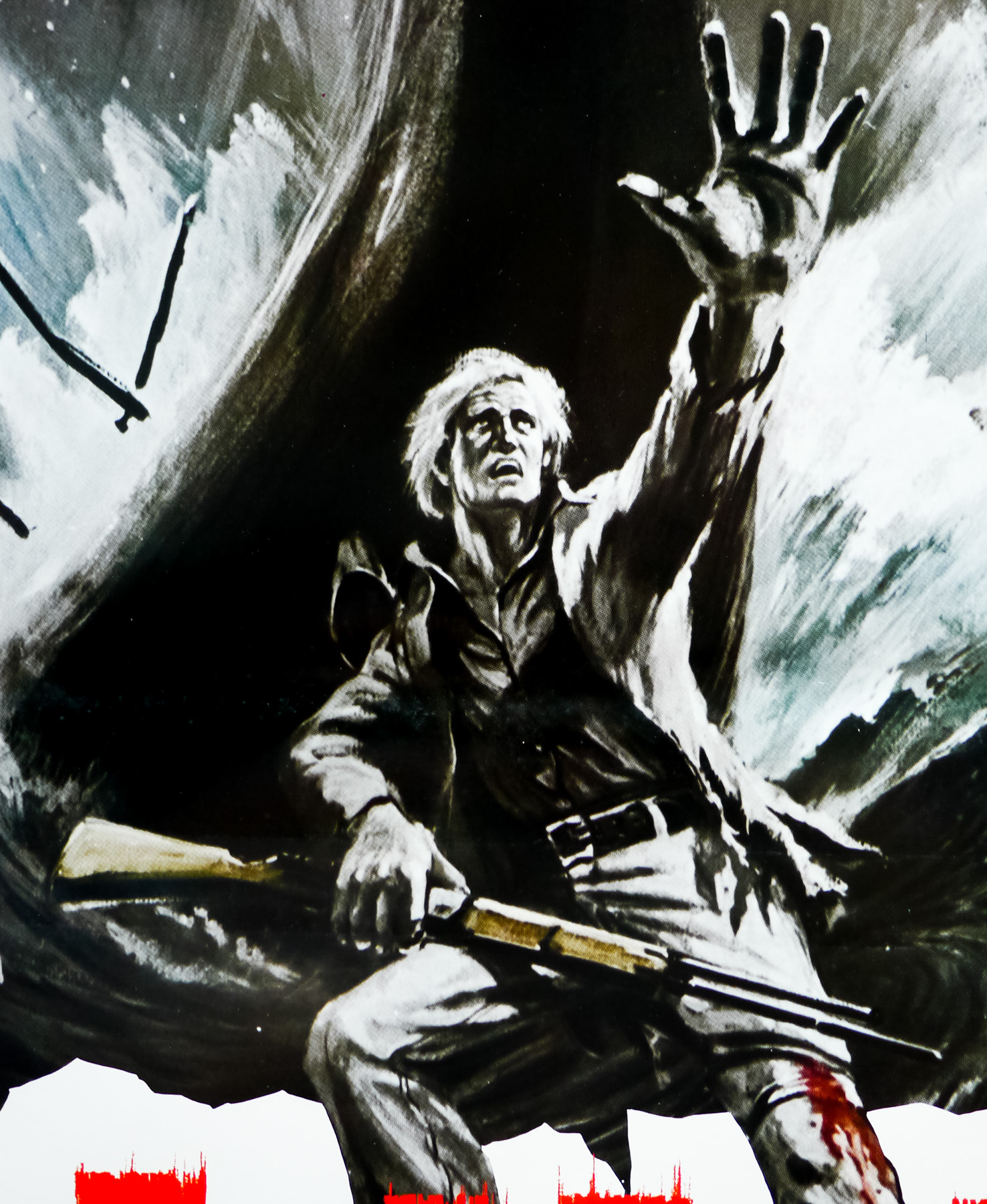
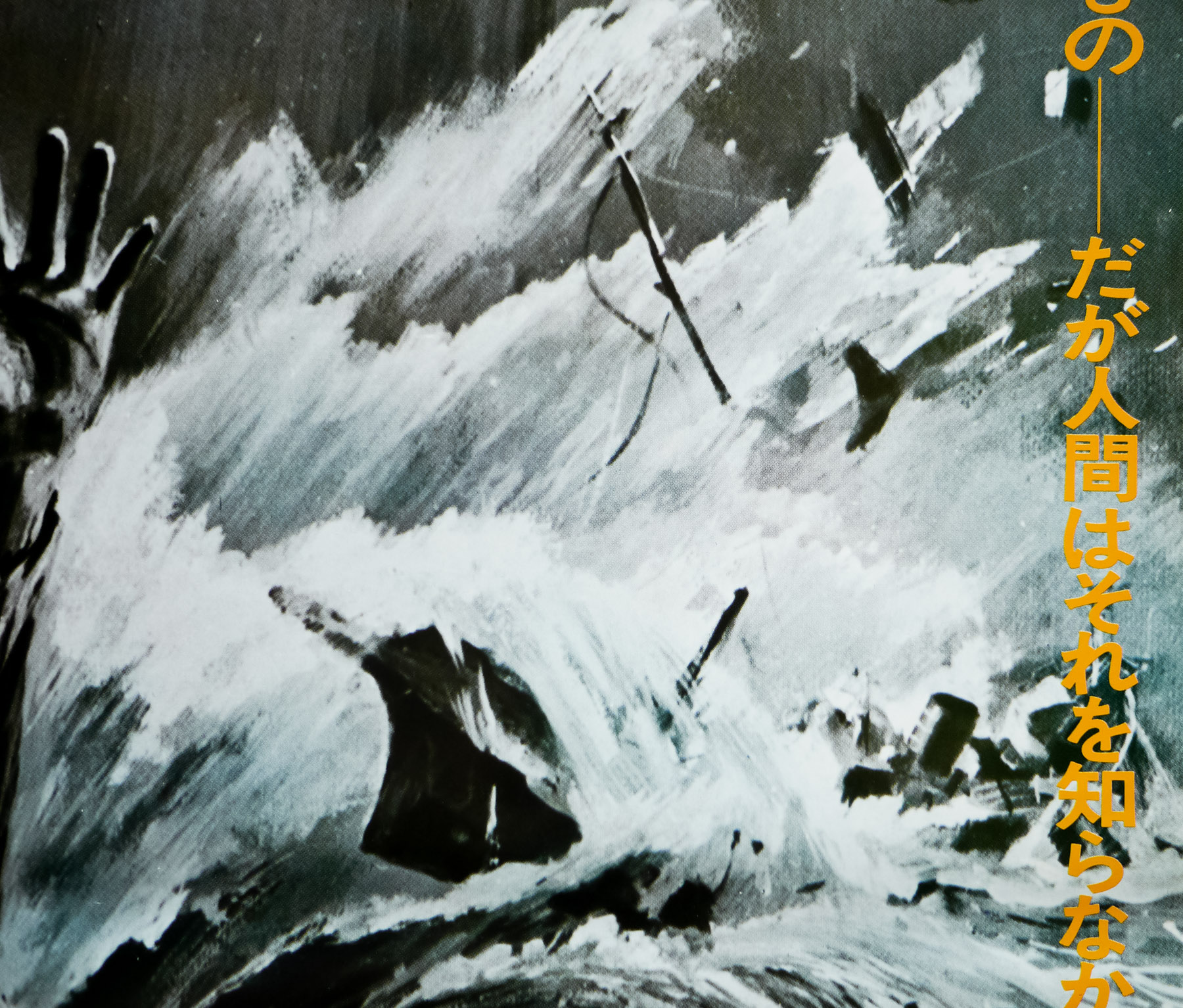
Set a few years after the events in The Dark Knight, the film opens with a jaw-dropping mid-air sequence onboard a plane during which we’re introduced to the film’s big bad, comic book favourite character Bane (played by Tom Hardy), who sets in motion a plan that will threaten Gotham and the reclusive, physically ailing Batman. At first it seems as though Bane is acting alone but soon a sinister plot is revealed that sees Gotham literally isolated from the rest of the world with Batman unable to help. The film also features Anne Hathaway’s Catwoman, initially a selfish thief but later an ally of the Dark Knight, keen to help prevent a terrible explosive disaster.
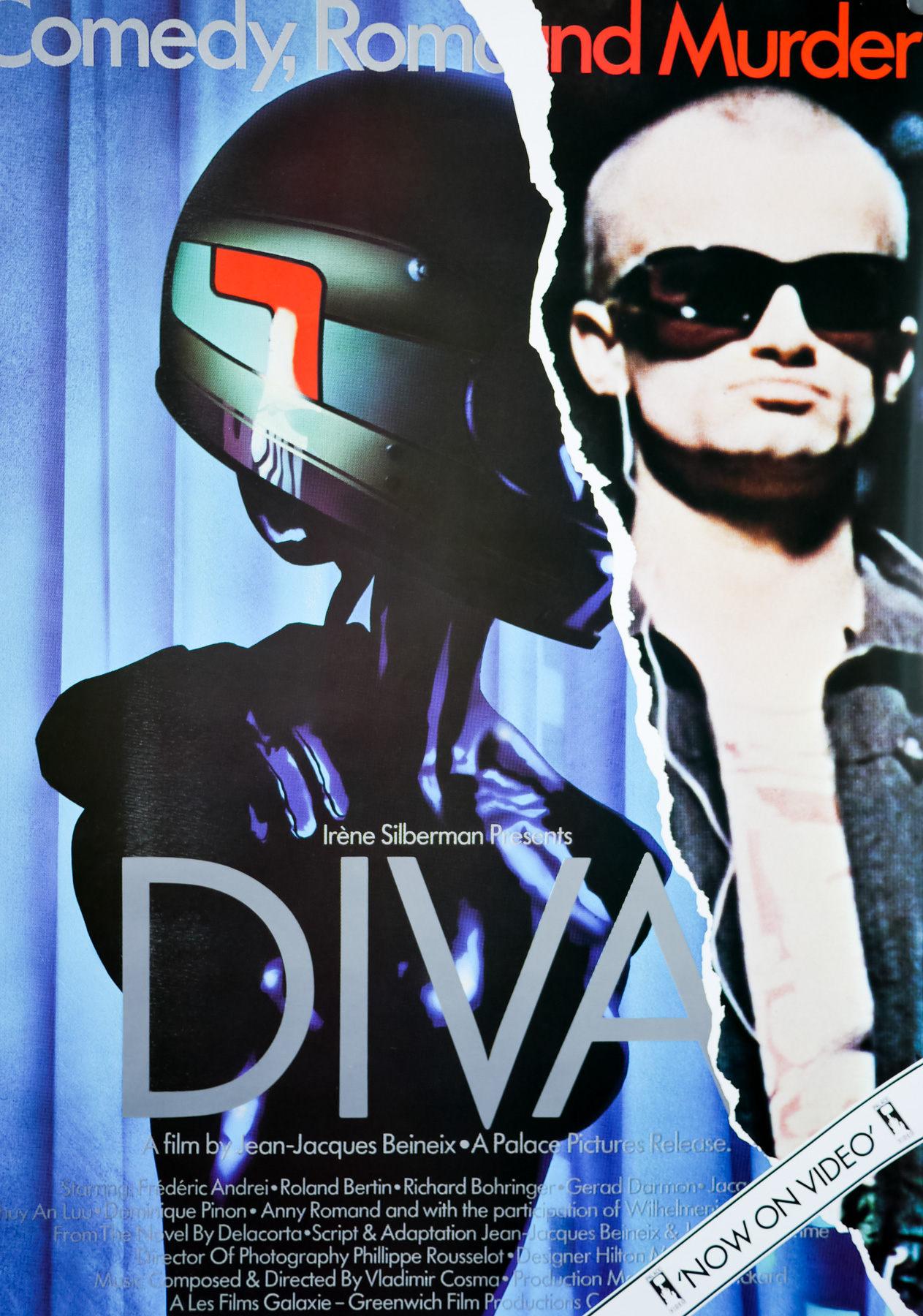
Following on from the second film was always going to be a tricky prospect and some filmgoers were not as impressed with the final film in the trilogy. But many, including me, felt it was pretty much the perfect end to Nolan’s take on DC Comics’ most beloved character. The only thing which I did find somewhat lacklustre was the marketing campaign, especially in comparison to the host of posters printed for The Dark Knight. A fairly intriguing teaser gave way to a number of rather less interesting one sheets and the British quads weren’t great.
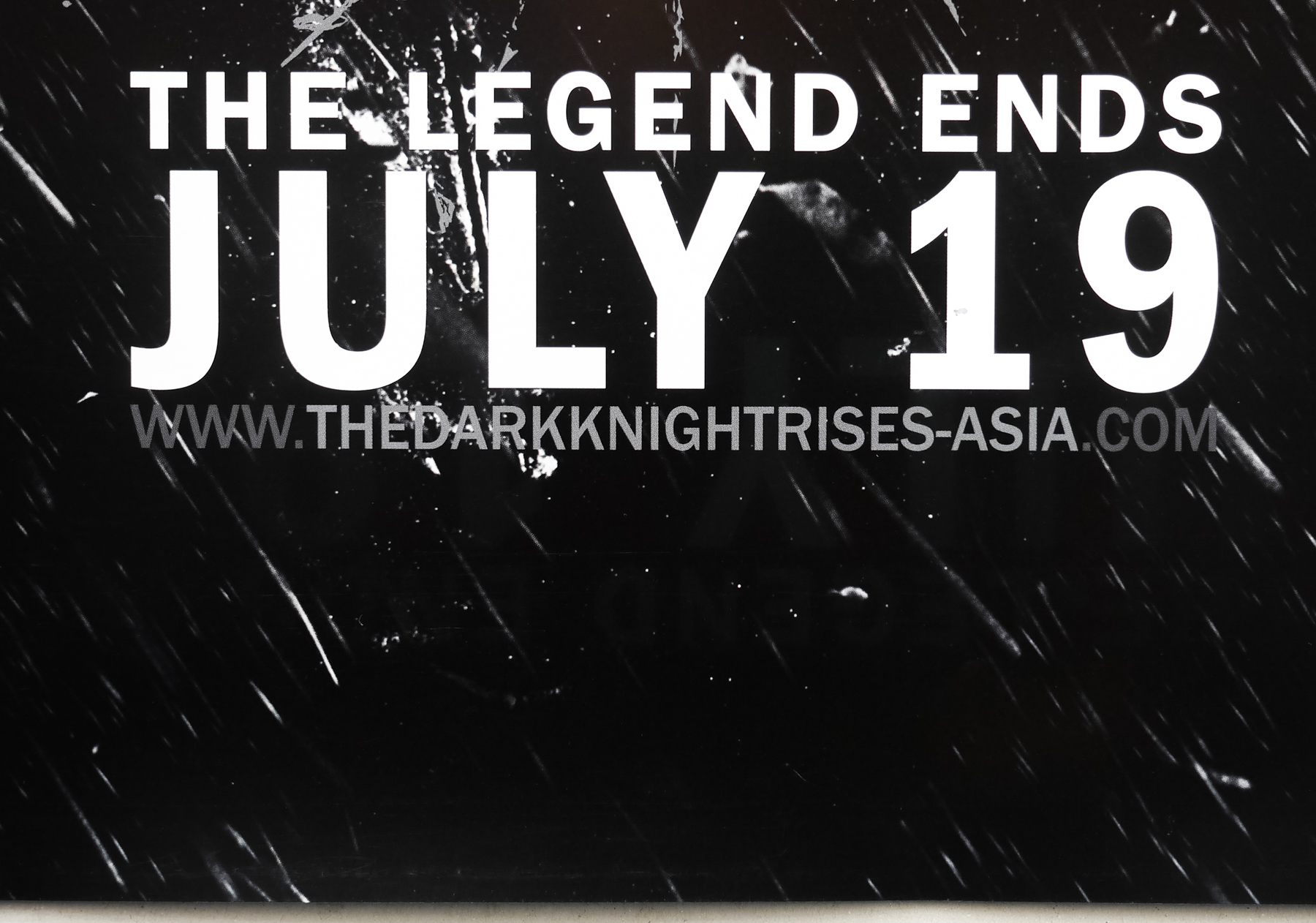
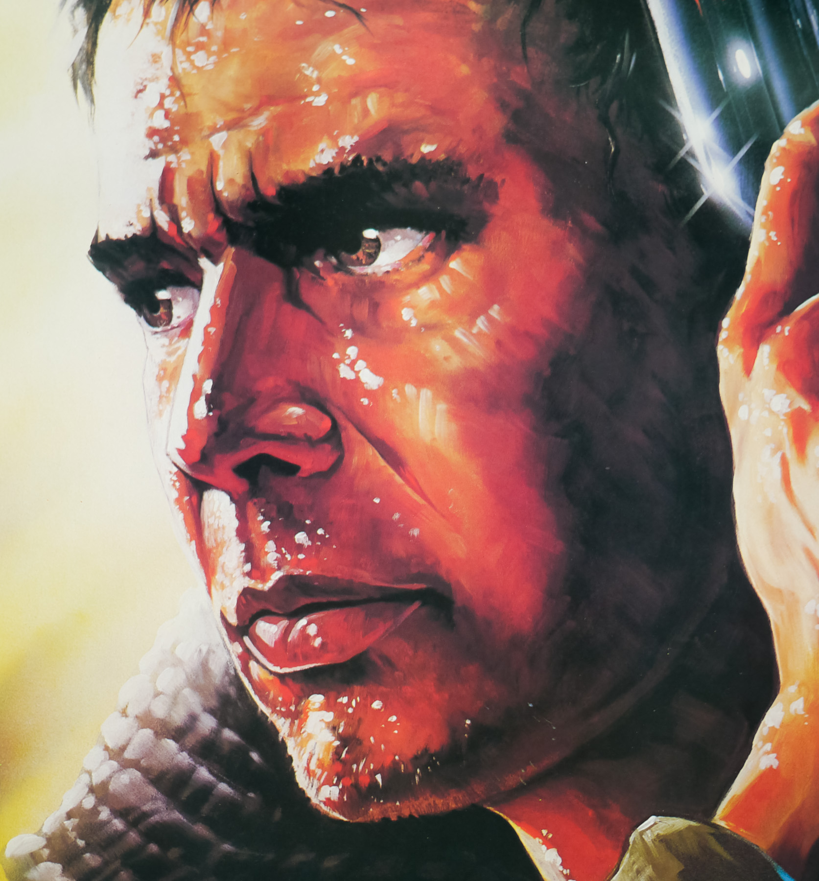
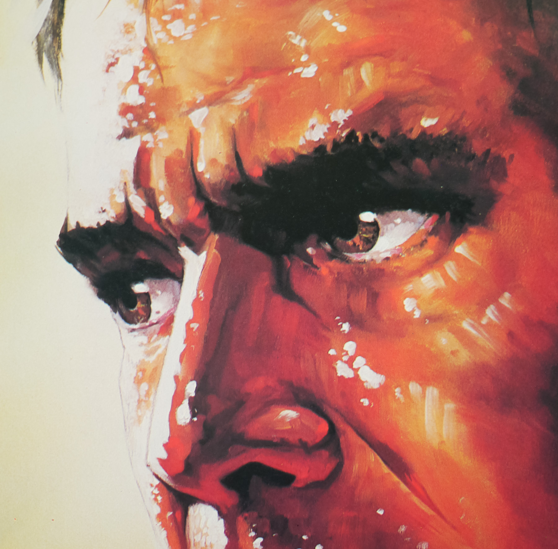
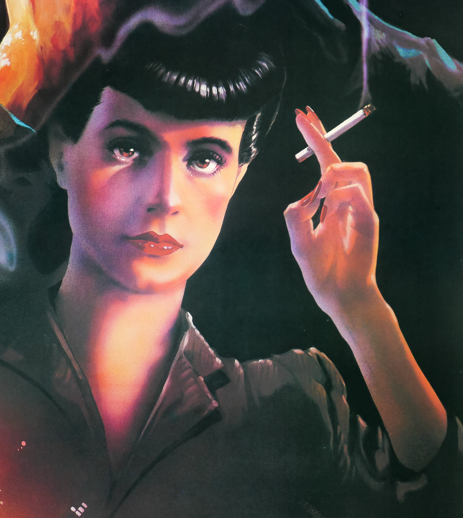
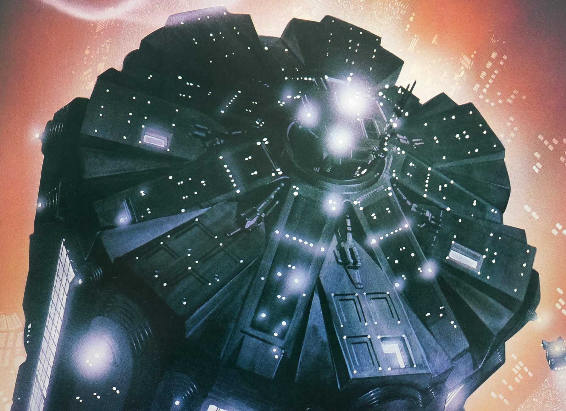
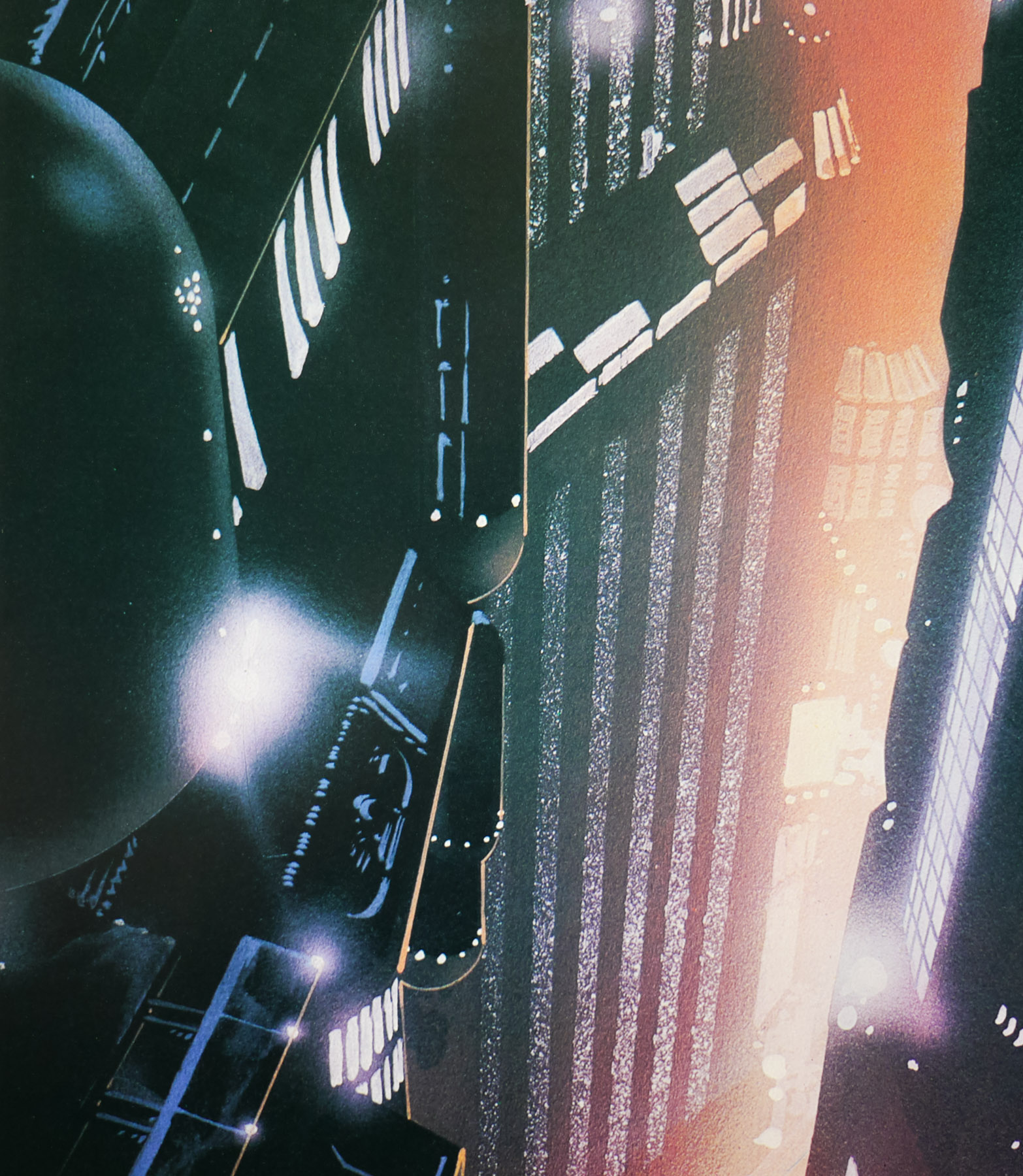
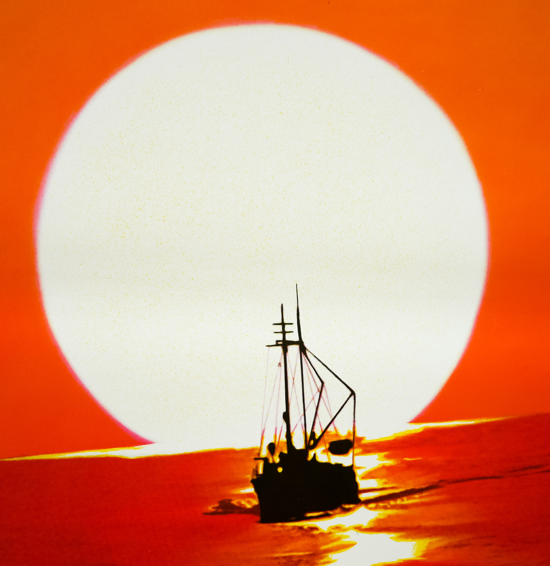
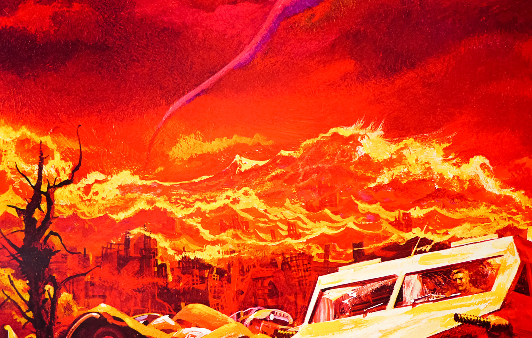
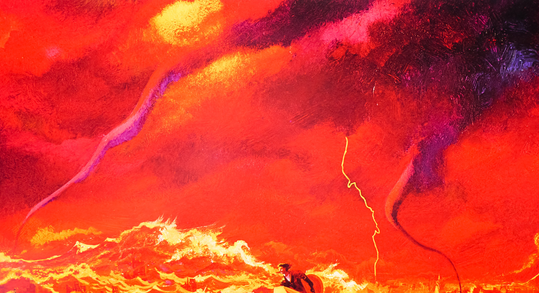
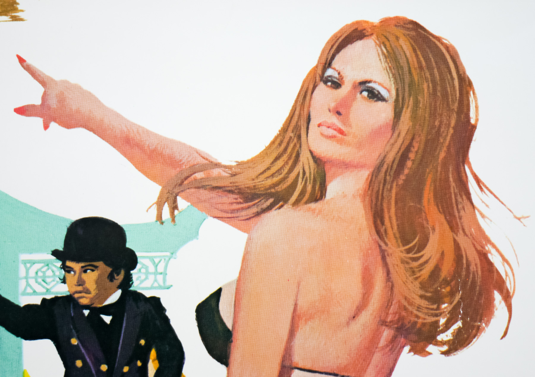
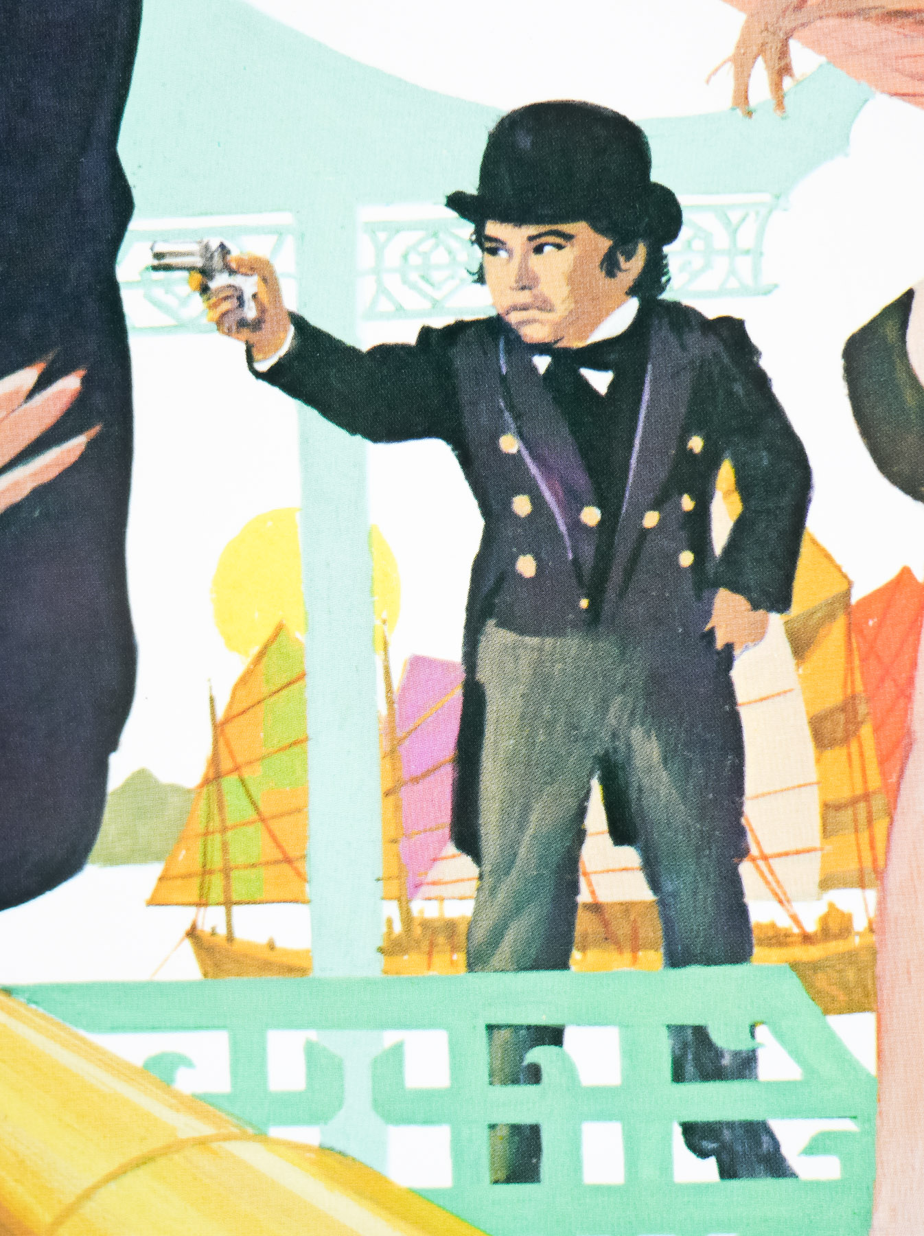
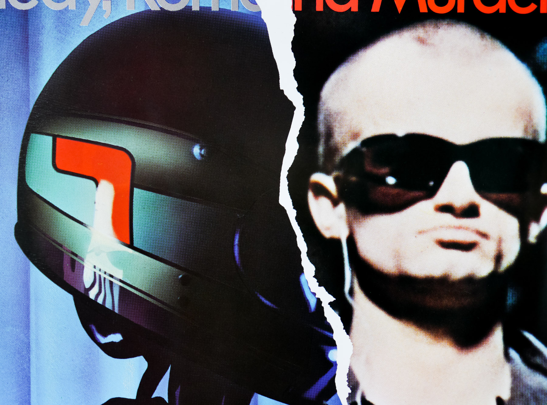
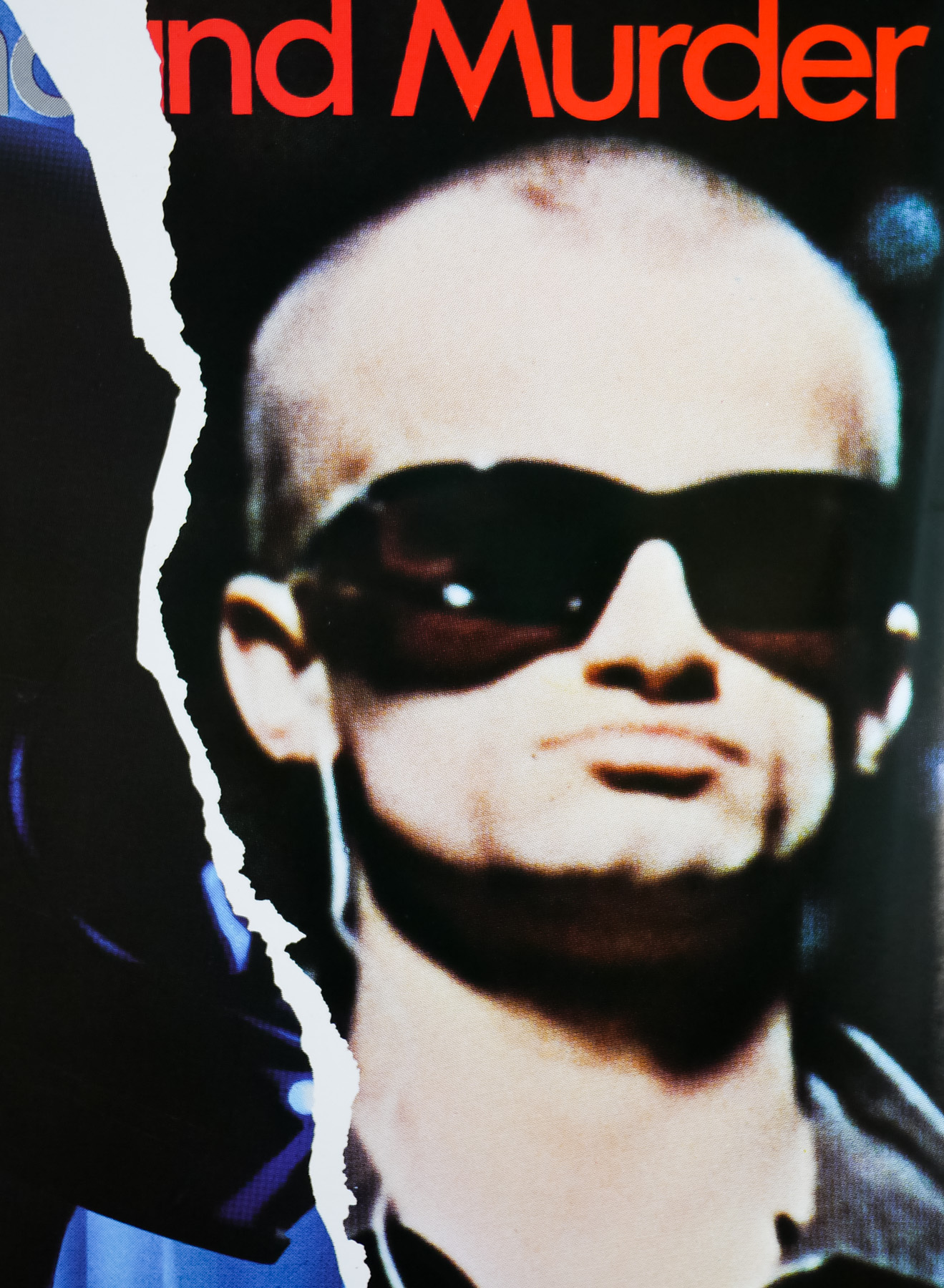
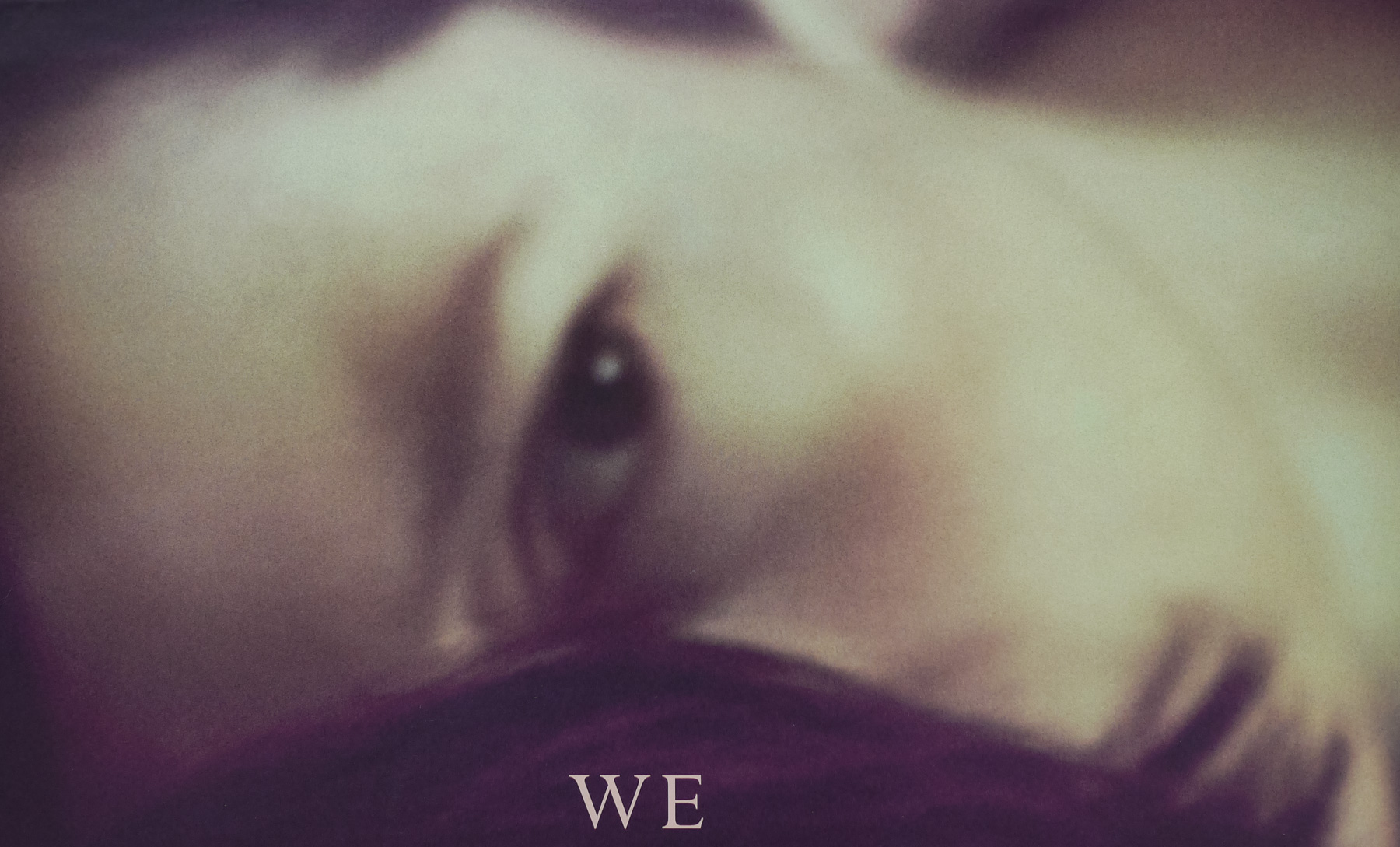
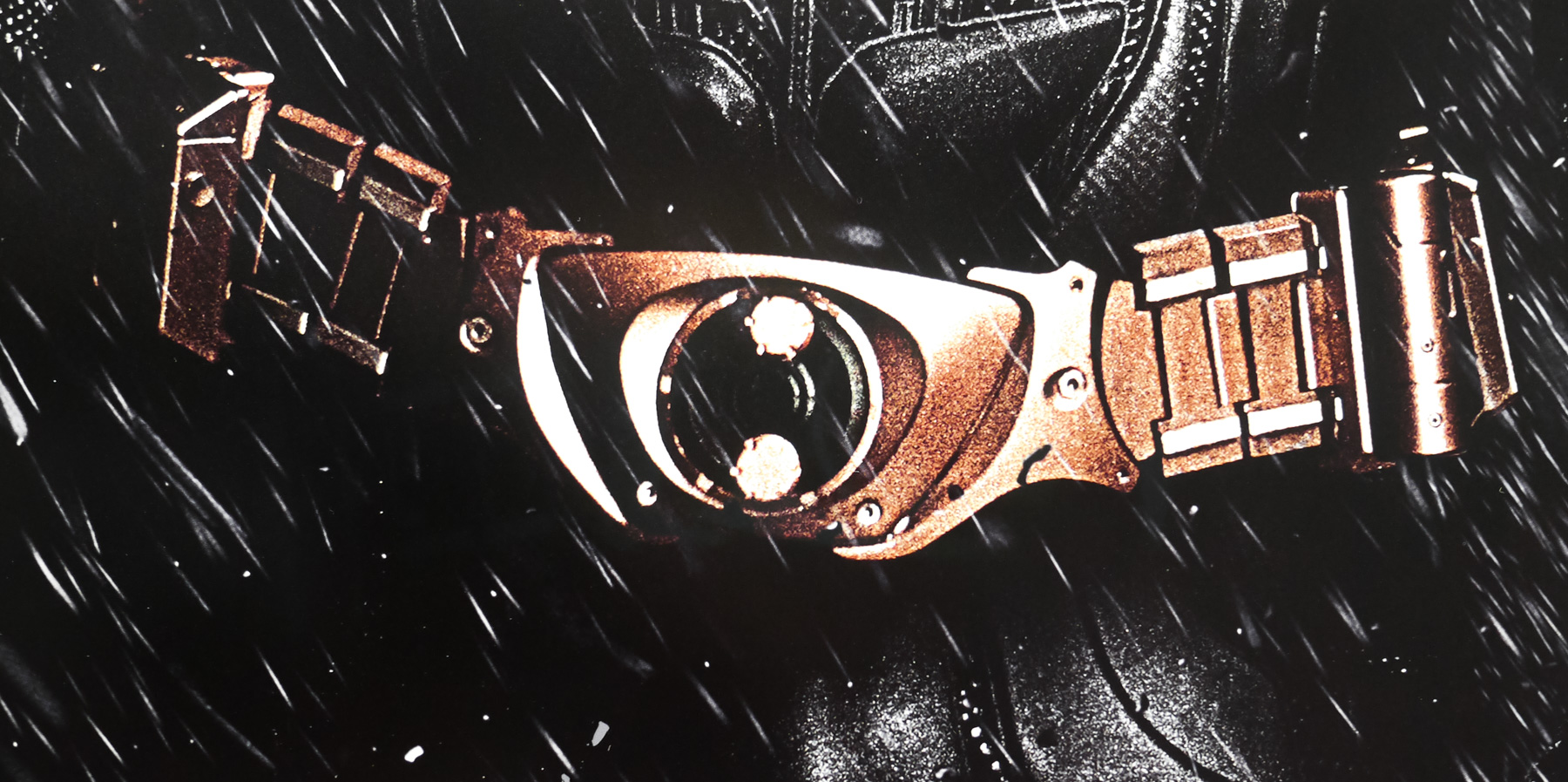
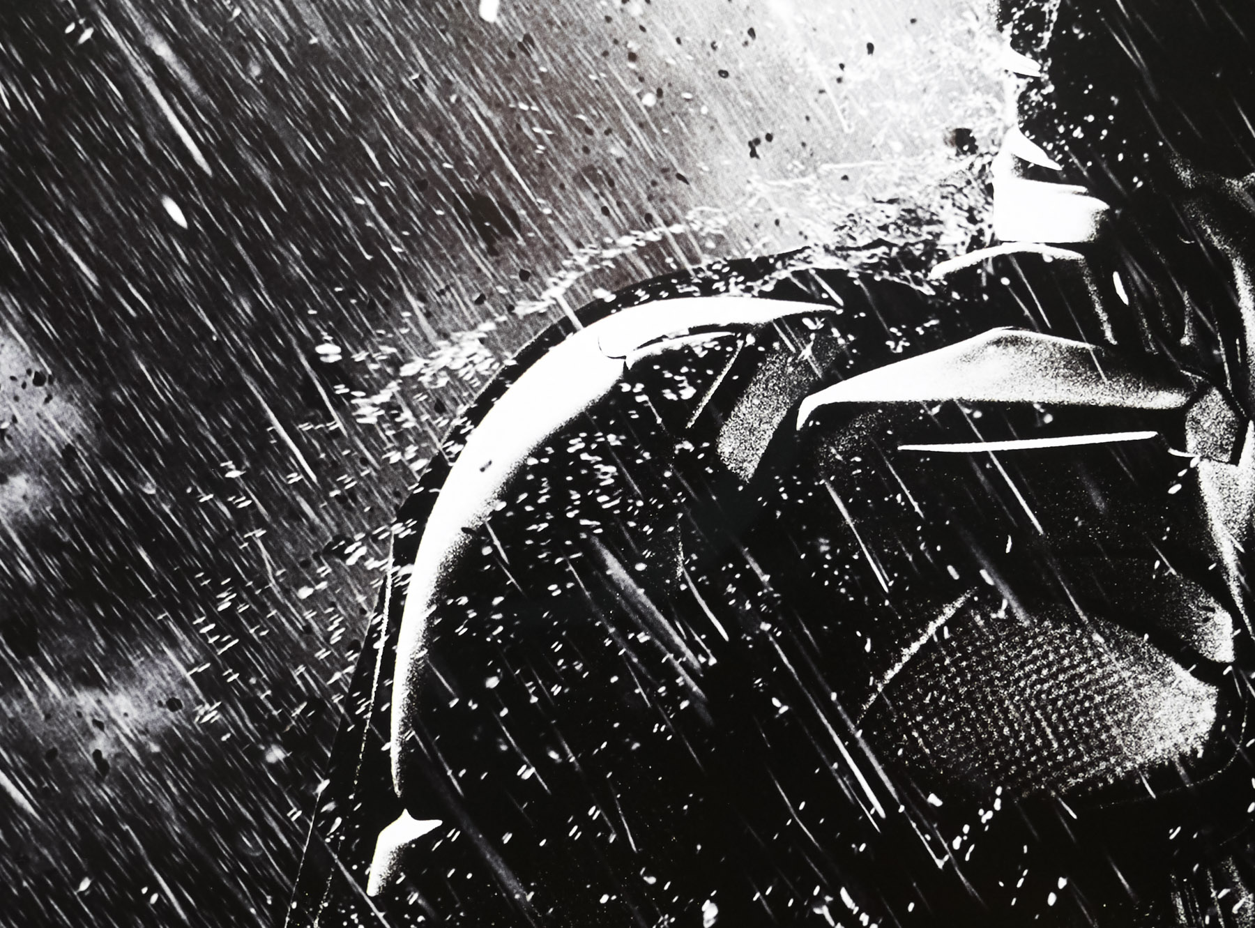
Not all of the posters were disappointing, however, and this was one of three international advance character one sheets that were designed by Ignition Creative and printed for use in international English-speaking territories. This particular set came to me from Singapore and features a URL with ‘Asia’ in it but I have also seen UK versions of the same posters.
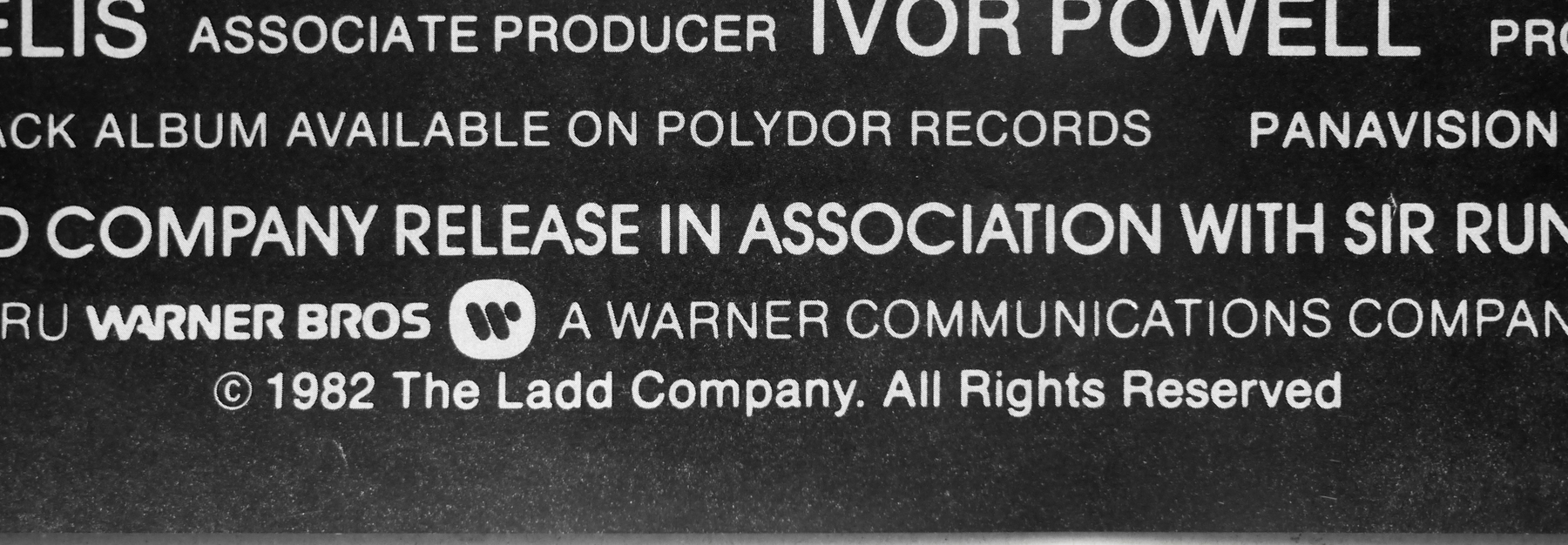
Ignition are a creative agency based in Los Angeles and London and they offer print, audio/visual (including trailers) and interactive (websites) for film, TV and games. Their official site features hundreds of examples of their work and you only have to look at the gallery of their work on IMPAwards to see how prolific they are. The firm worked on the majority of the posters for The Dark Knight Rises and often generates lots of posters for each campaign it works on.
To see the other posters I’ve collected that were designed by Ignition click here.