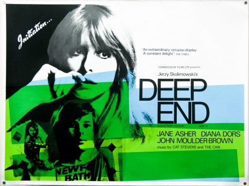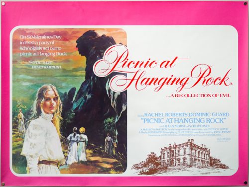
Poster detail
1-5
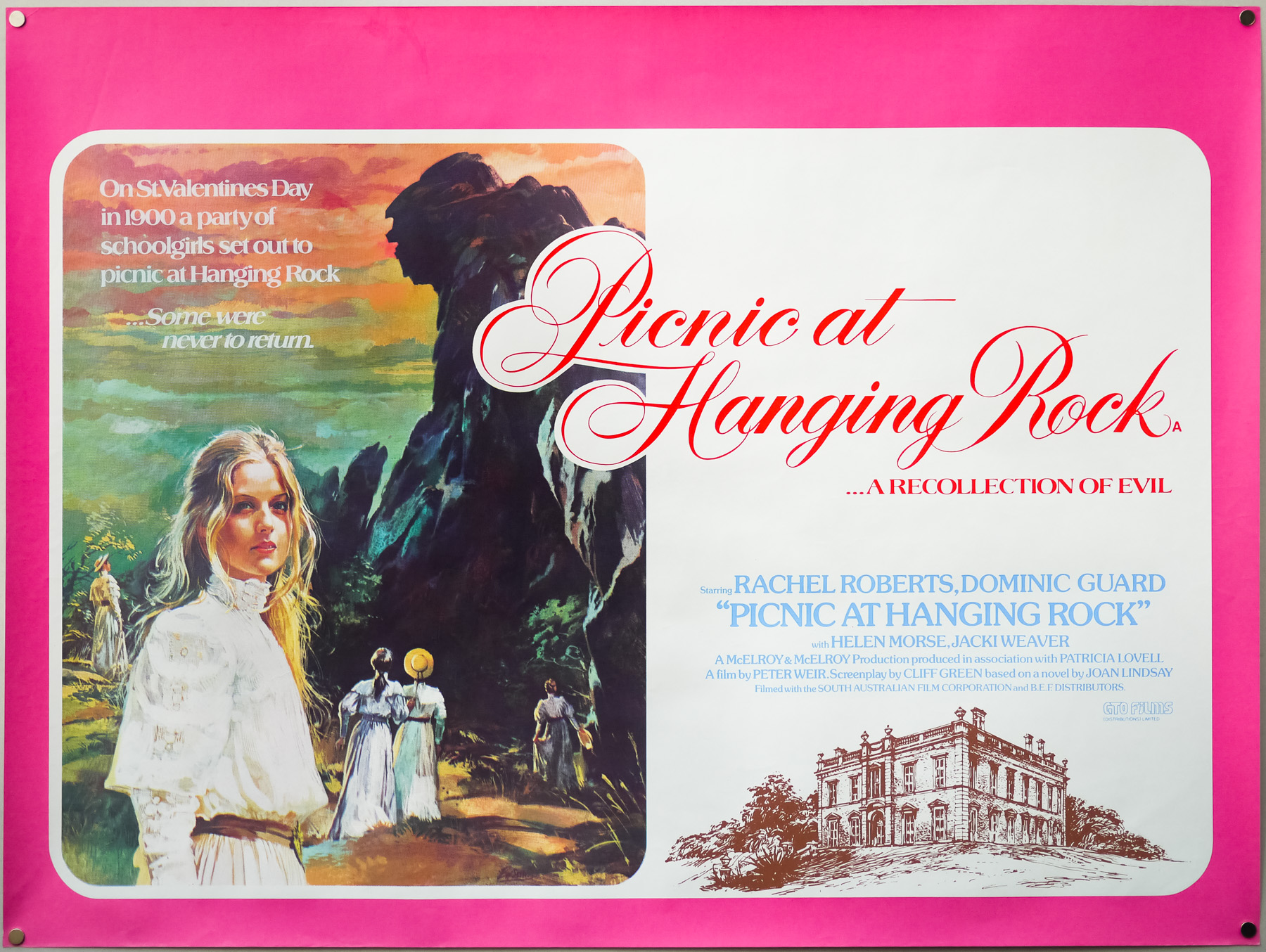

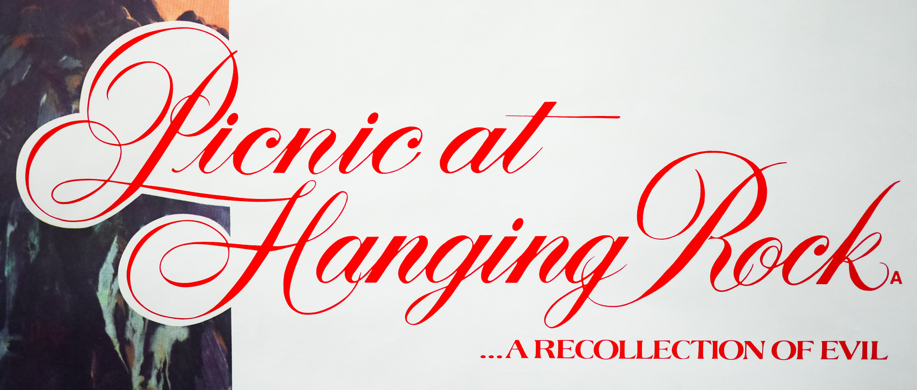
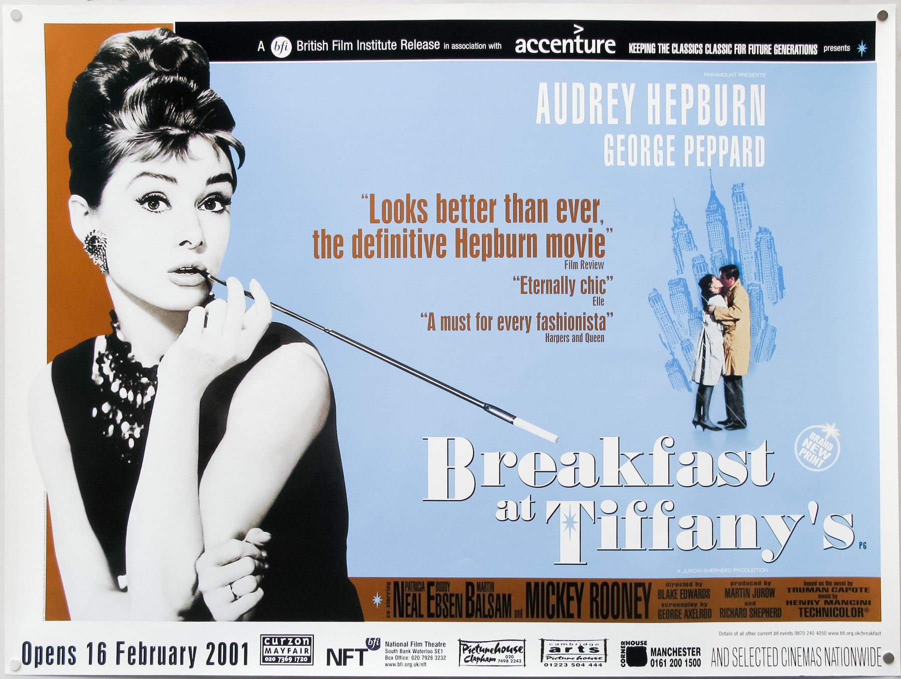
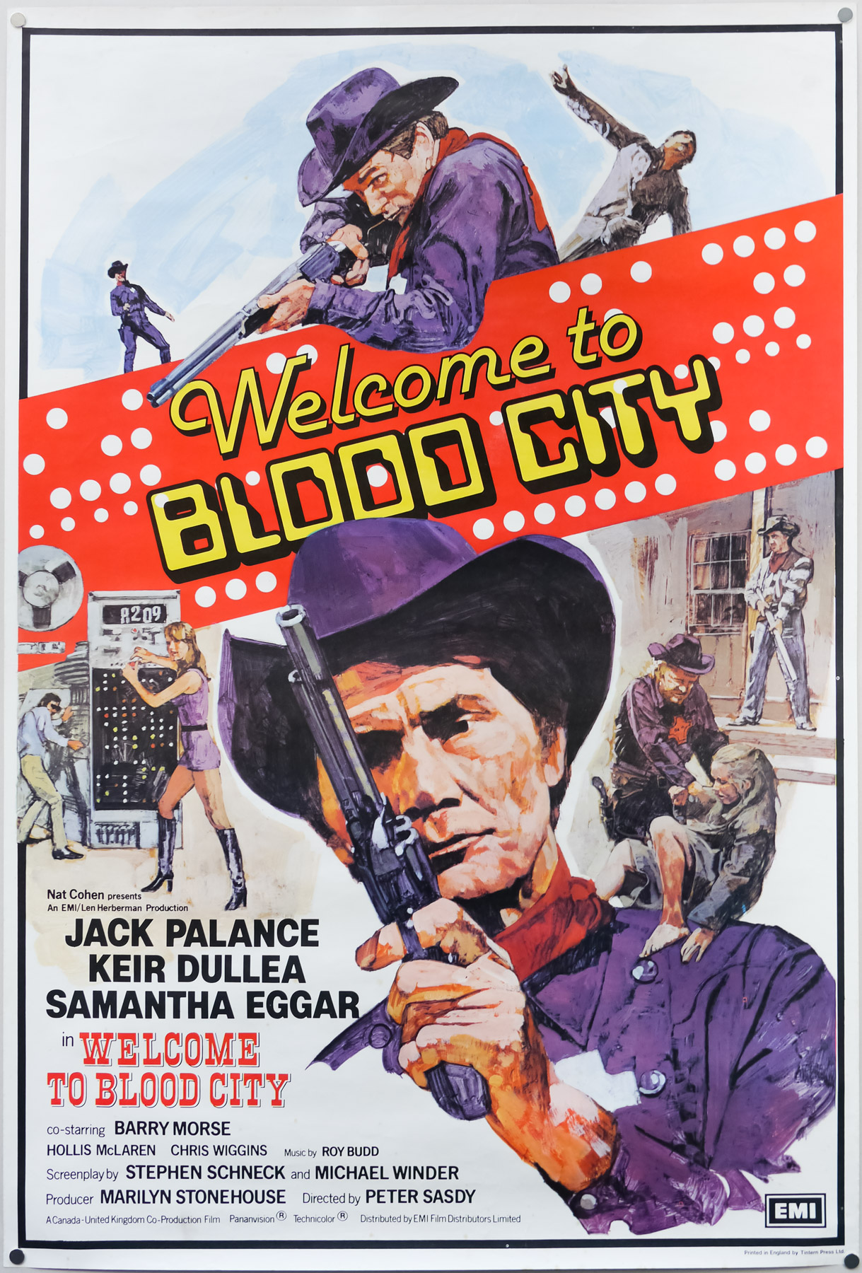
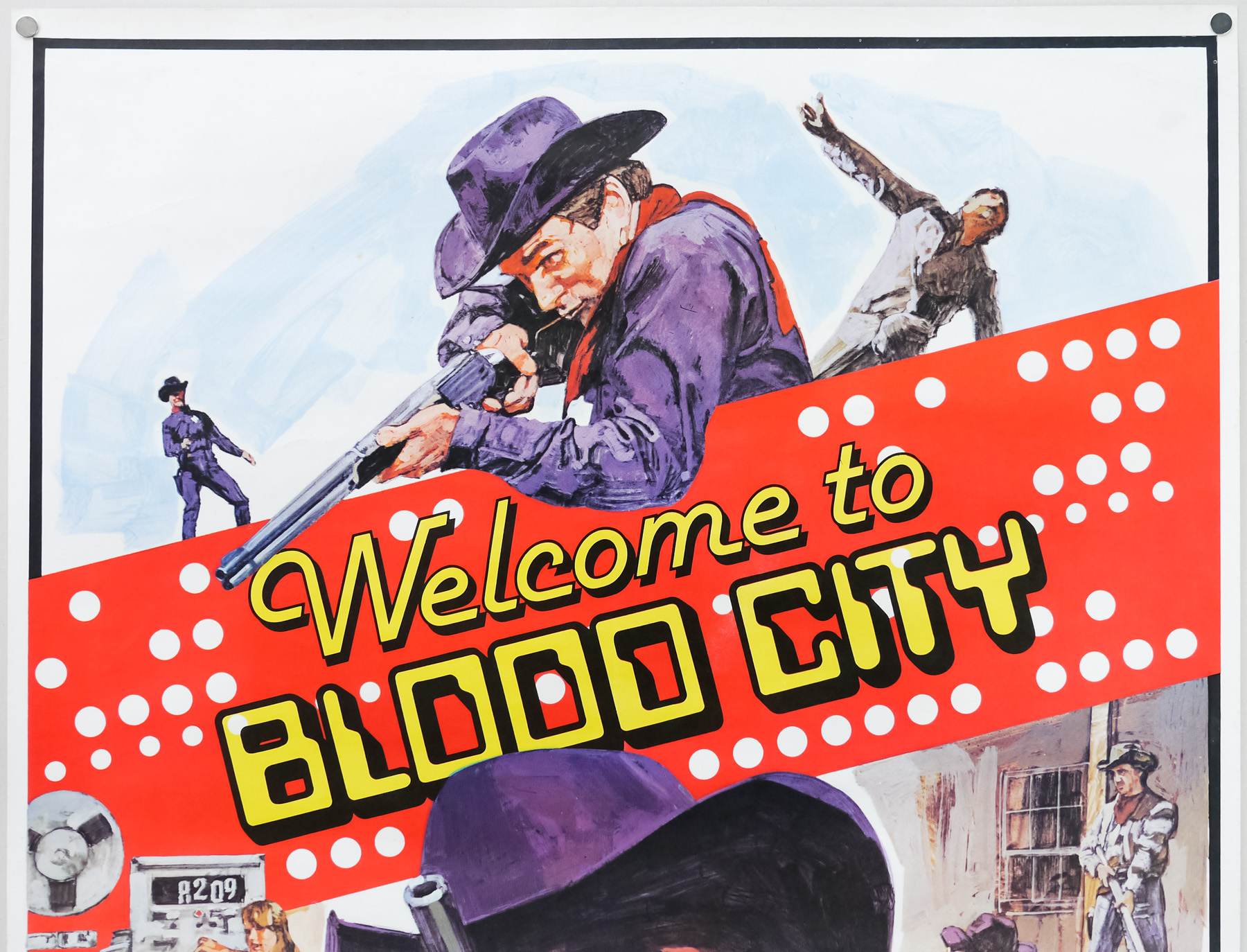
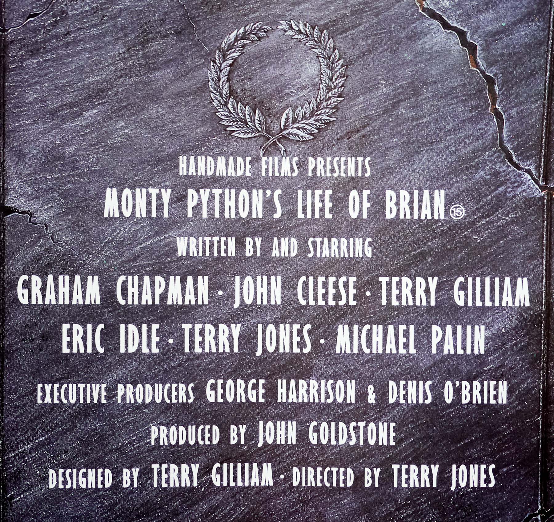
- Title
- Picnic at Hanging Rock
- Year of Film
- 1975
- Director
- Peter Weir
- Starring
- Rachel Roberts, Vivean Gray, Helen Morse, Kirsty Child, Tony Llewellyn-Jones, Jacki Weaver, Frank Gunnell, Anne-Louise Lambert, Karen Robson, Jane Vallis, Christine Schuler
- Origin of Film
- Australia
- Genre(s) of Film
- Rachel Roberts, Vivean Gray, Helen Morse, Kirsty Child, Tony Llewellyn-Jones, Jacki Weaver, Frank Gunnell, Anne-Louise Lambert, Karen Robson, Jane Vallis, Christine Schuler,
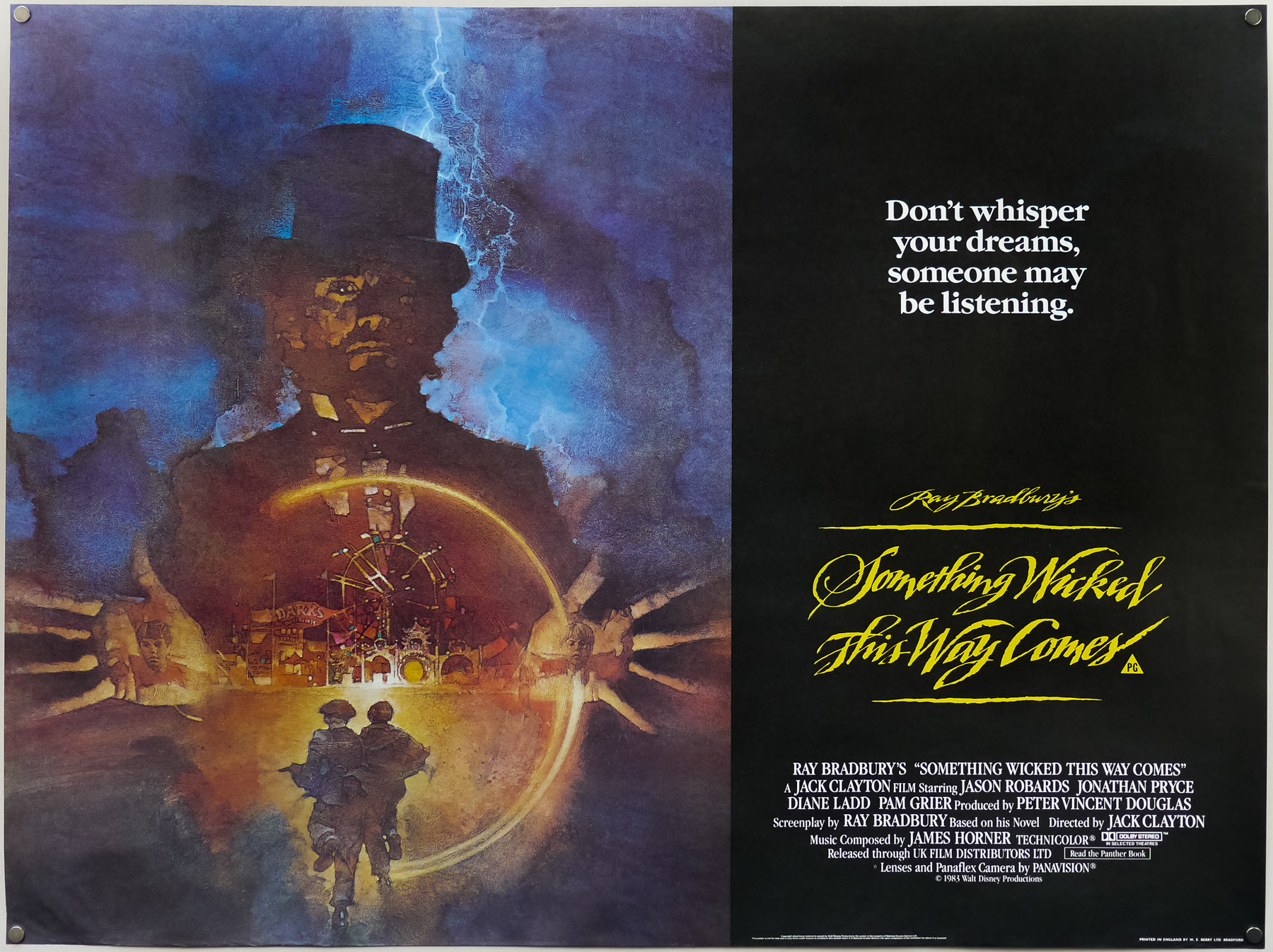
- Type of Poster
- Quad
- Style of Poster
- --
- Origin of Poster
- UK
- Year of Poster
- 1976
- Designer
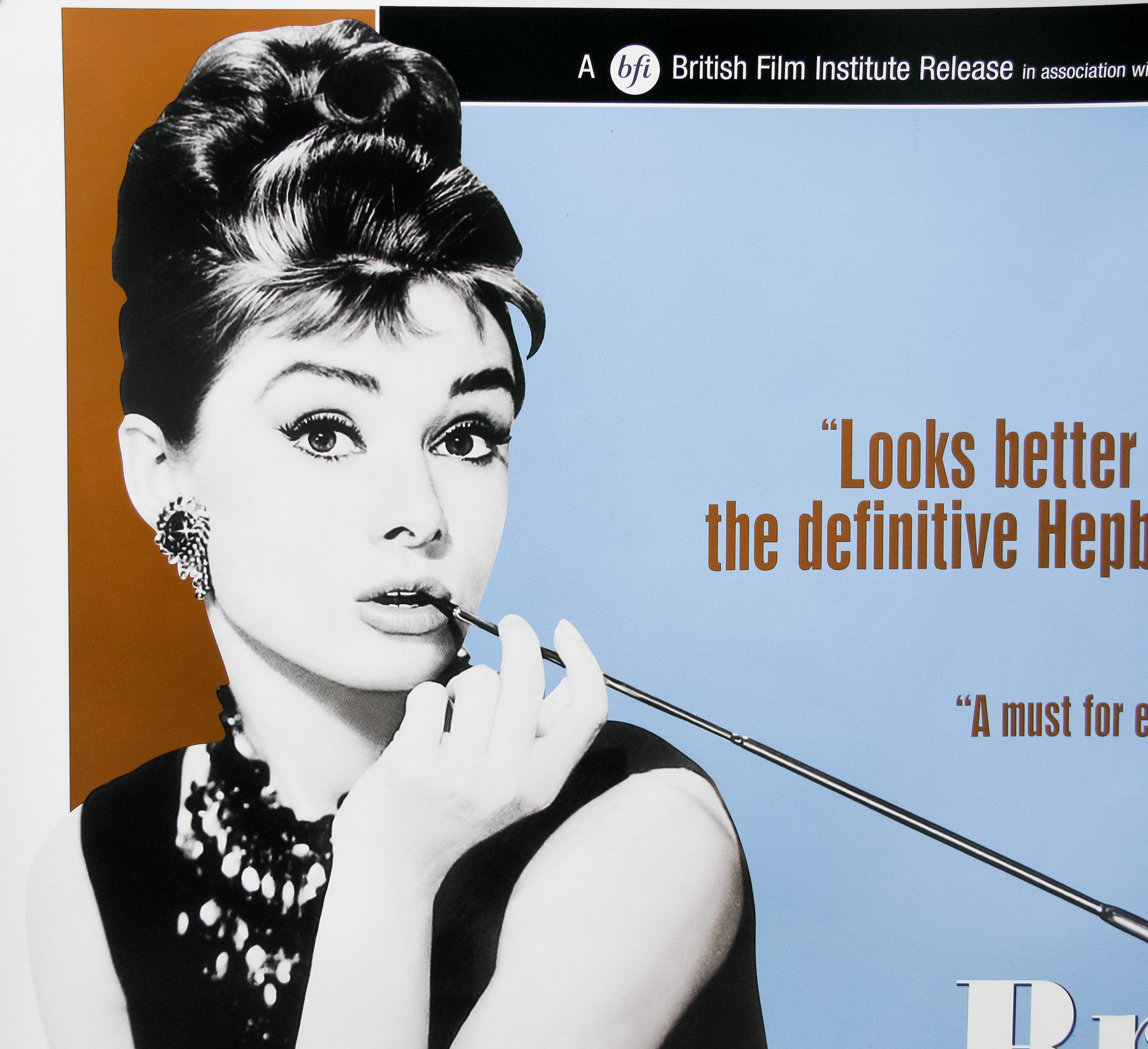
- Brian Bysouth
- Artist
- Brian Bysouth
- Size (inches)
- 30" x 39 15/16"
- SS or DS
- SS
- NSS #
- --
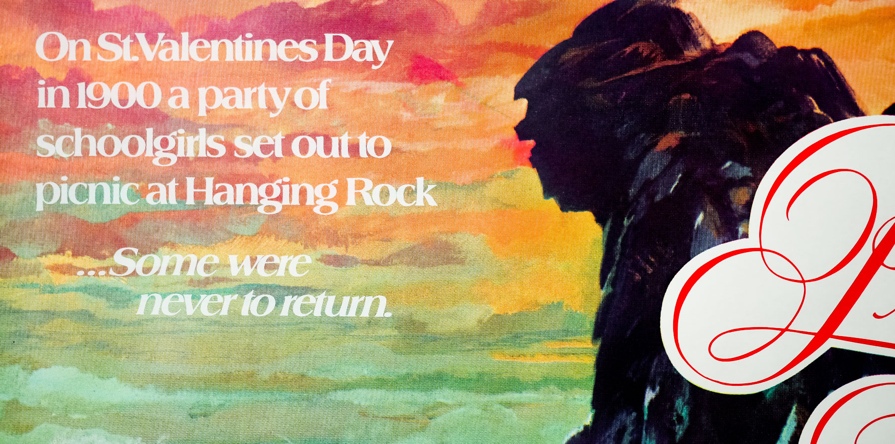
- Tagline
- On St. Valentine's day in 1900 a party of schoolgirls set out to picnic at Hanging Rock ... Some were never to return. | ... A recollection of evil.
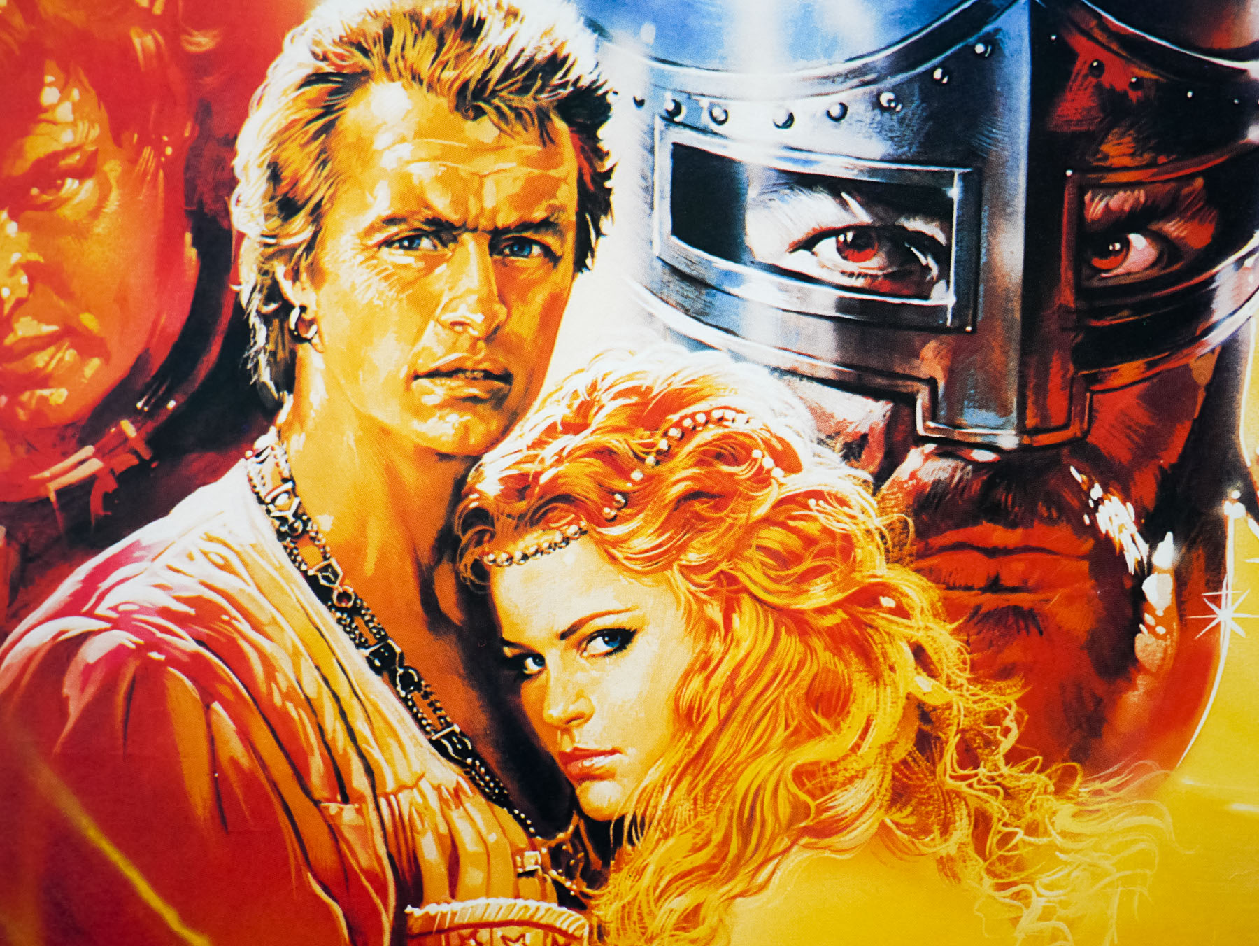
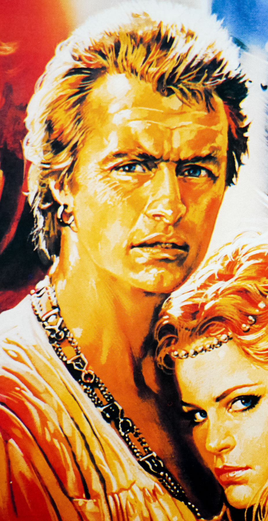
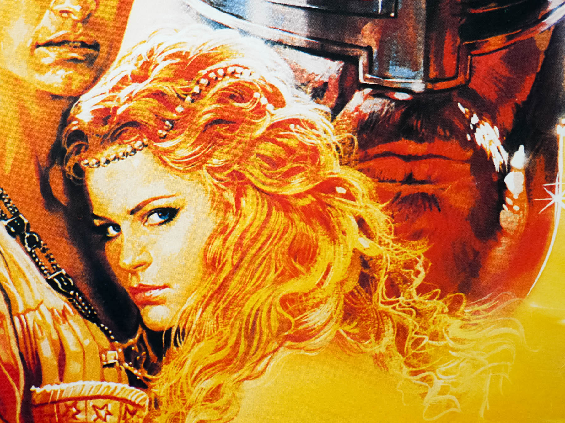
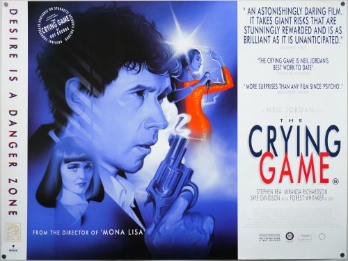
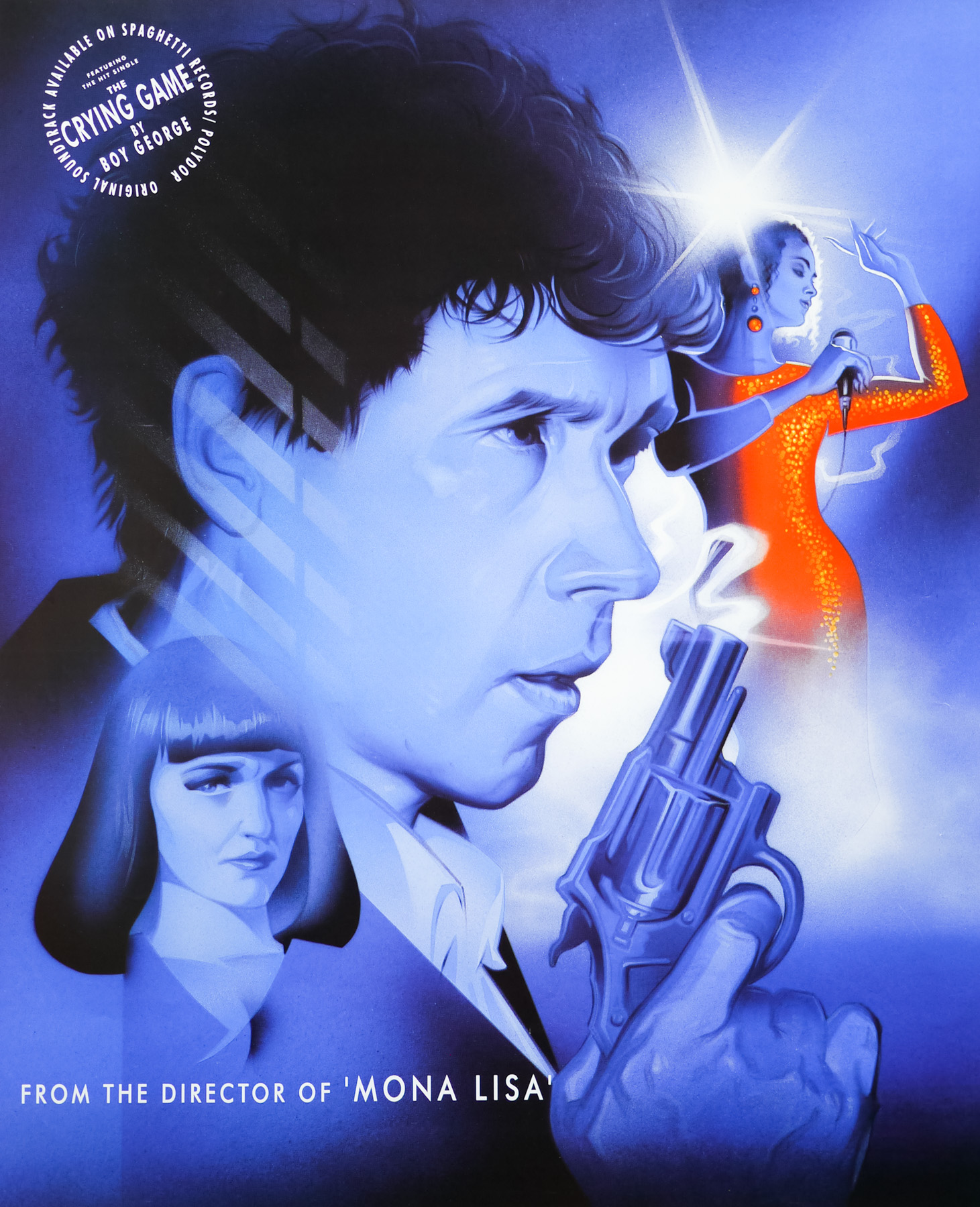
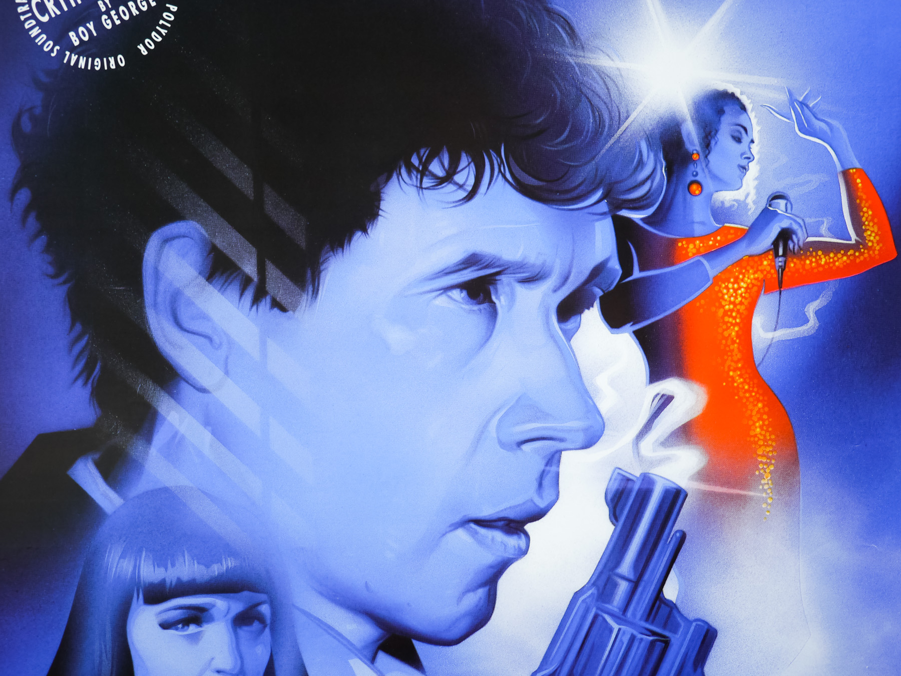
One of the best Australian films ever made, Peter Weir‘s enigmatic mystery Picnic at Hanging Rock was released in 1975 and is based on the novel of the same name by the Australian author Joan Lindsay. The story focuses on the mysterious disappearance of a group of girls who travel to the titular rock with a school party and vanish without trace, much to the horror of their fellow pupils and the head teacher of the school. Infamously Lindsay elected to remove the ‘final’ chapter that fully explained their disappearance from the novel and it was not published until after her death in 1987 as ‘The Secret of Hanging Rock’. Weir and screenwriter Cliff Green thus filmed the story without the standard Hollywood explanation, which apparently frustrated American distributors looking to buy the rights and who were unused to ambiguous endings.
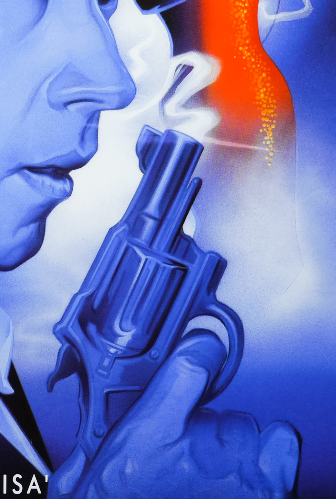
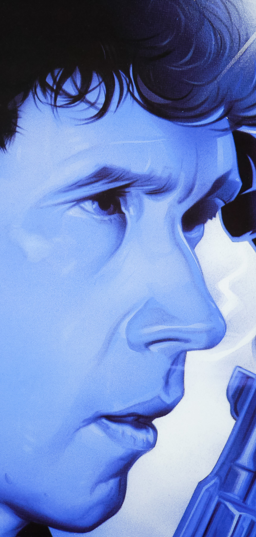
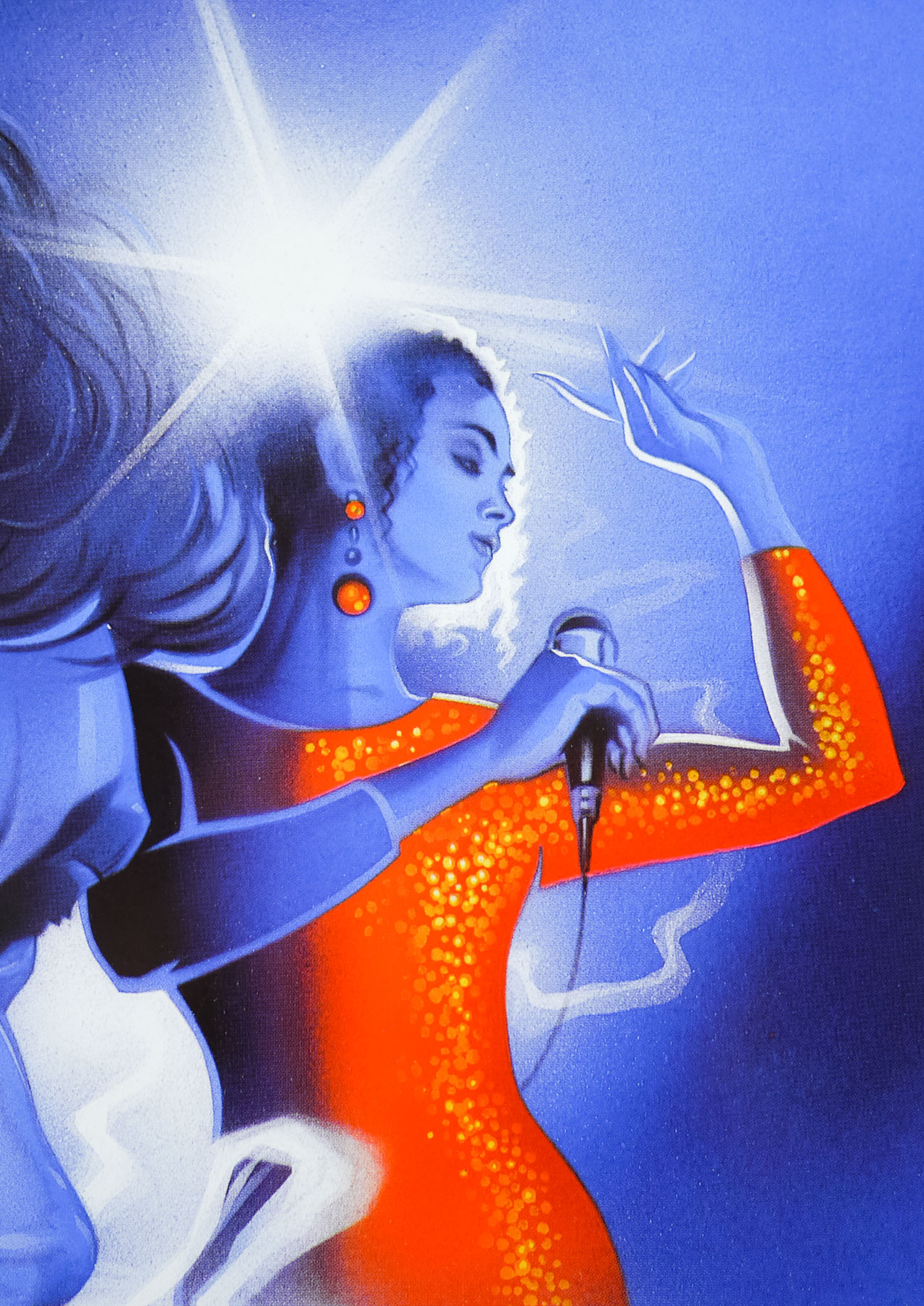
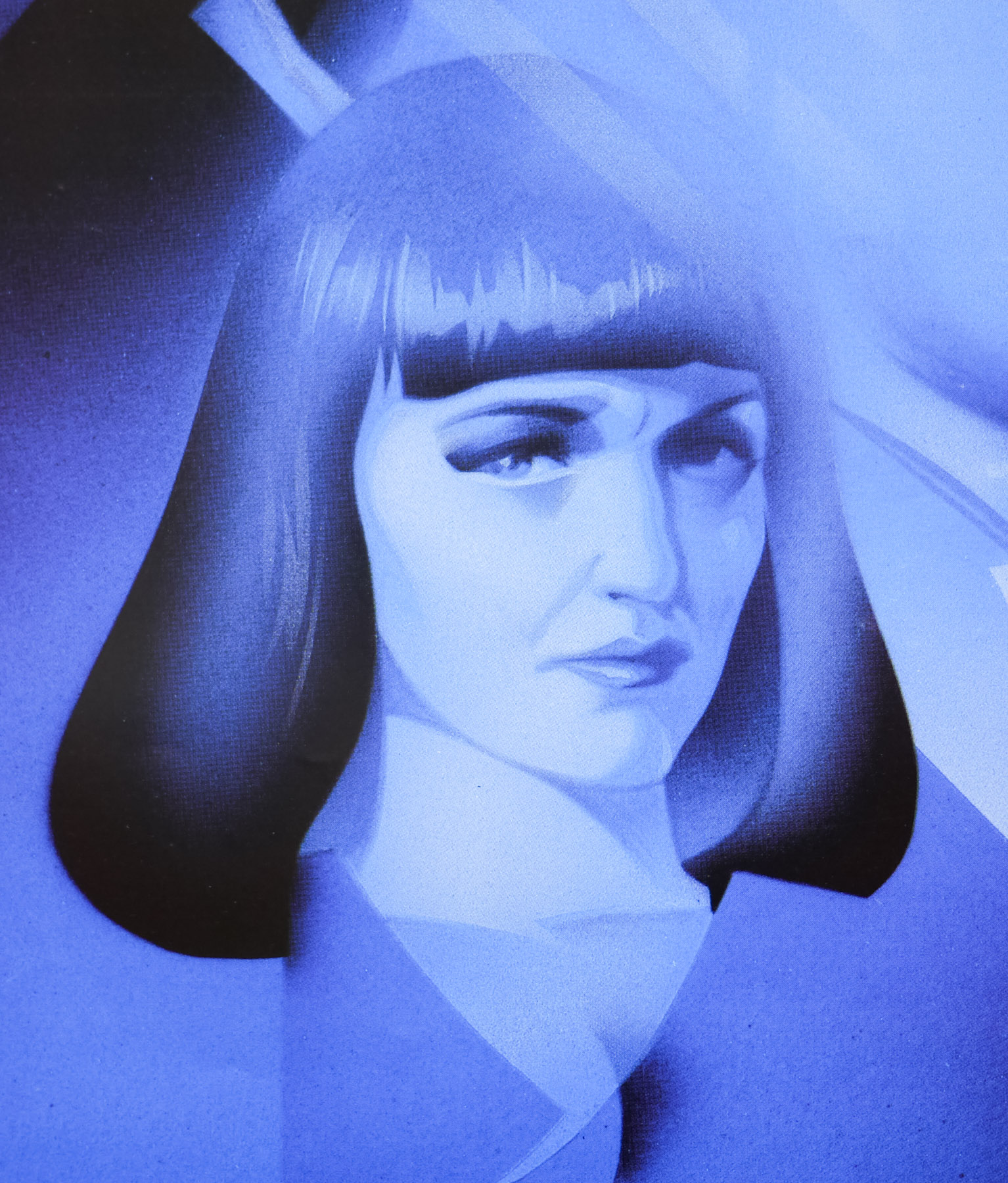
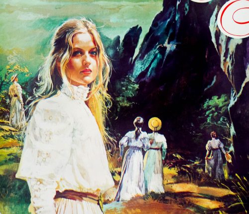
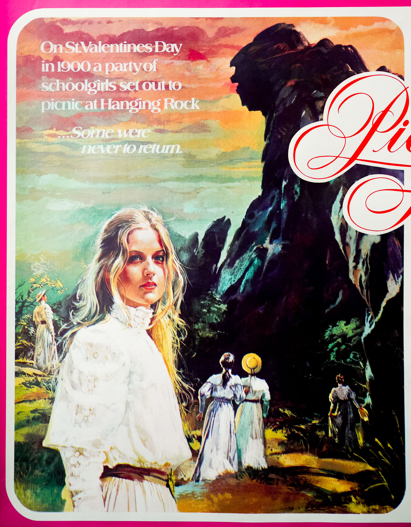
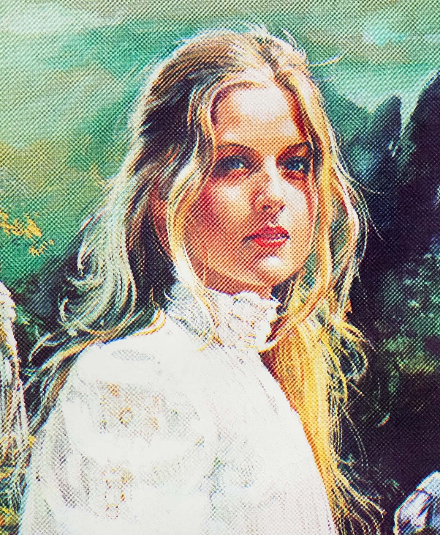
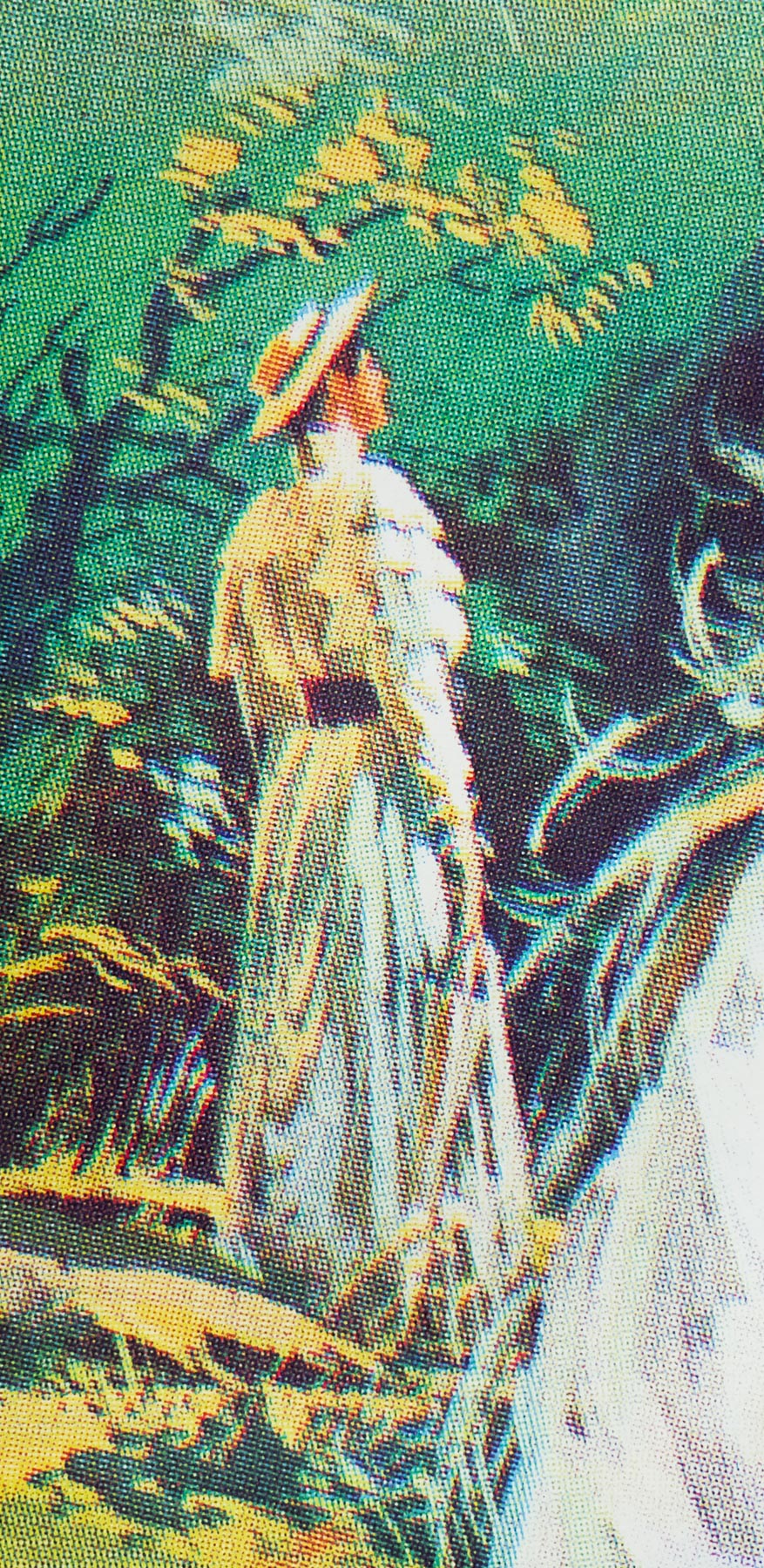
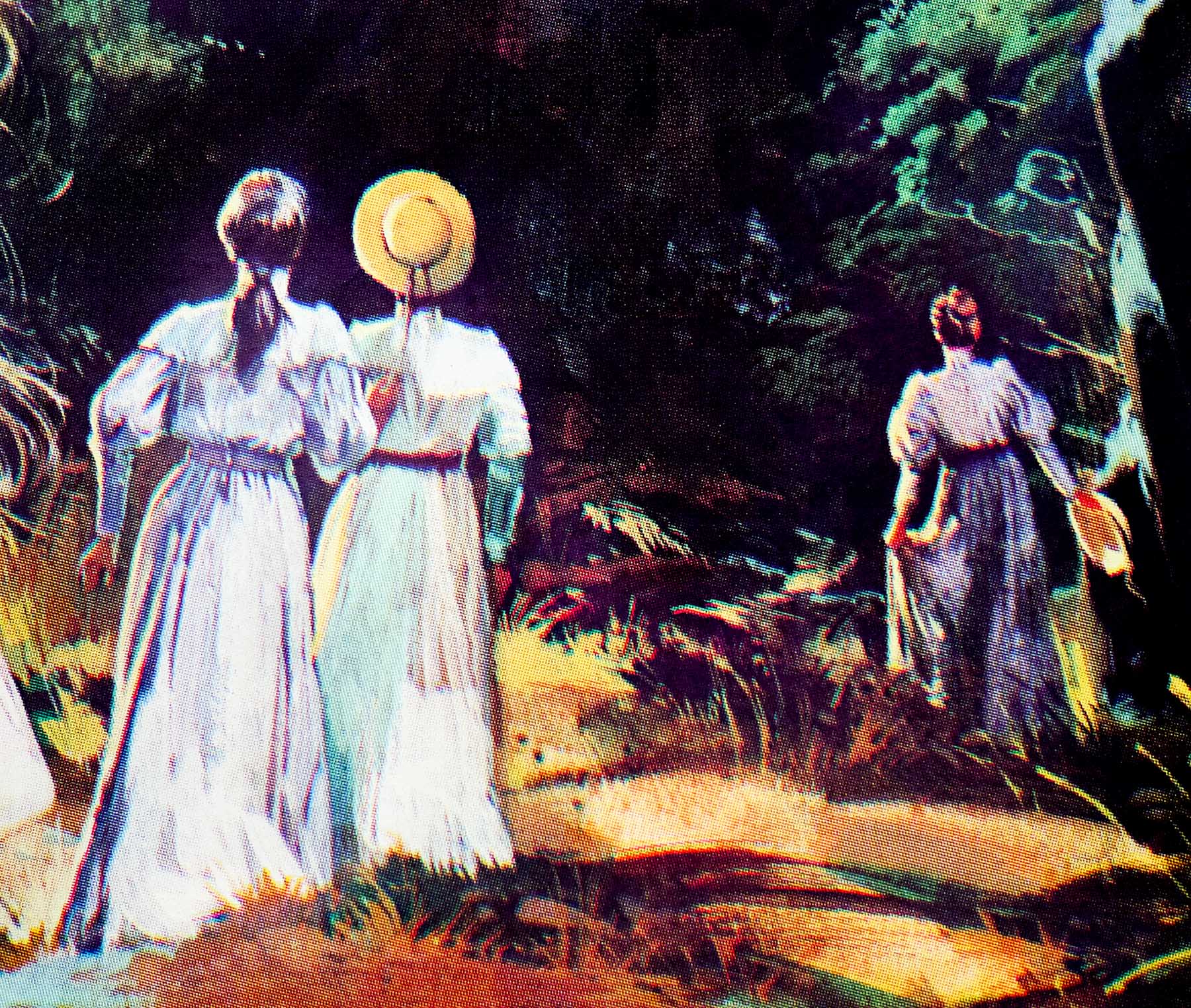
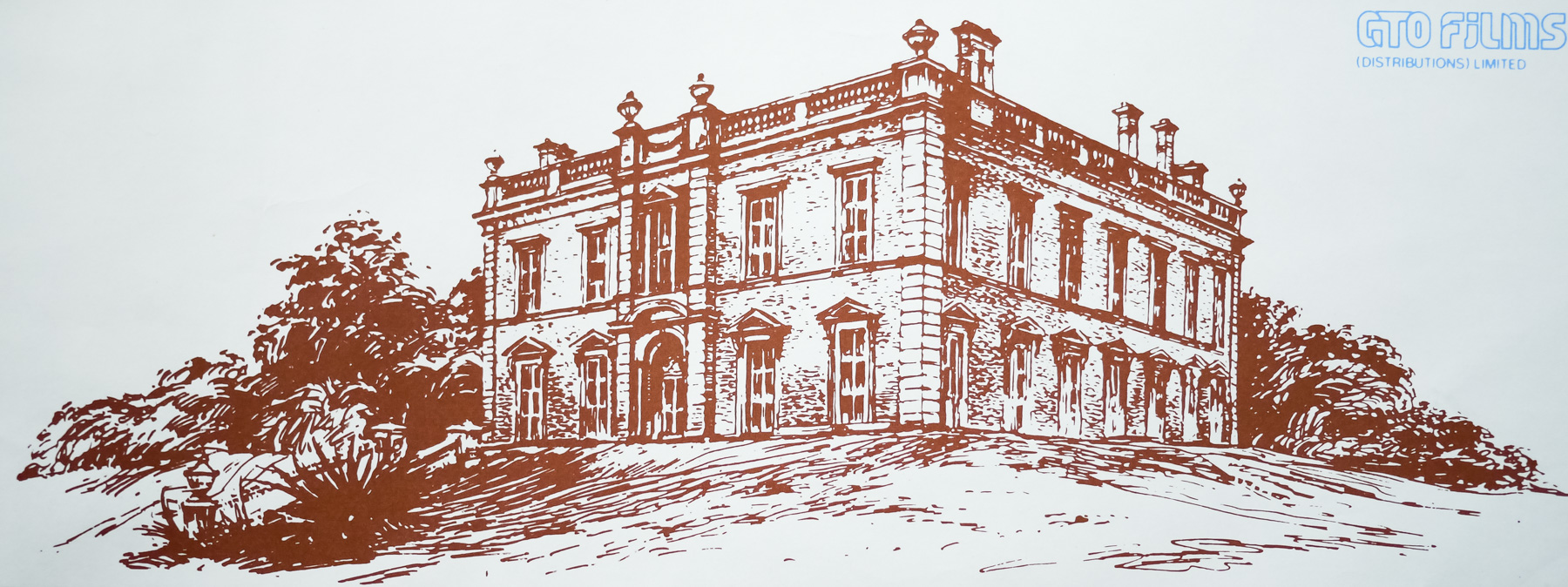
The film has an unforgettable atmosphere, helped by the ethereal cinematography of Russell Boyd who utilised the same material used for bridal veils to cover the lens and give many of the outdoor scenes a soft glow – this look was much imitated in the years following. The cast is uniformly excellent, particularly the key group of school girls that includes the beautiful Anne-Louise Lambert as Miranda (as featured on this poster) who is the focus of more than one characters’ infatuation. Filming took place at the real Hanging Rock in Victoria as well as a mansion called Martindale Hall that doubled as Appleyard College. The film was a global critical and box office success, despite some audience frustration at the ending, and it retains its legacy as one of Australia’s most beloved films.
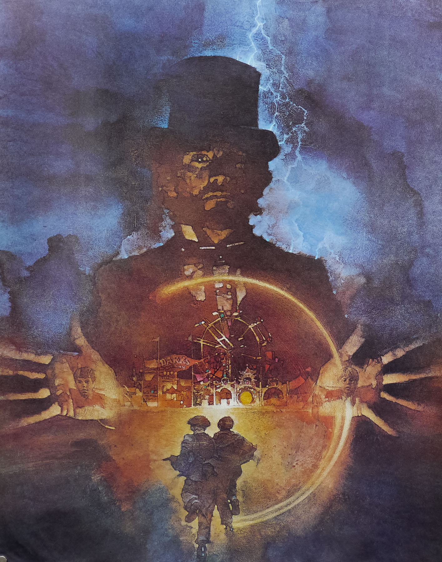
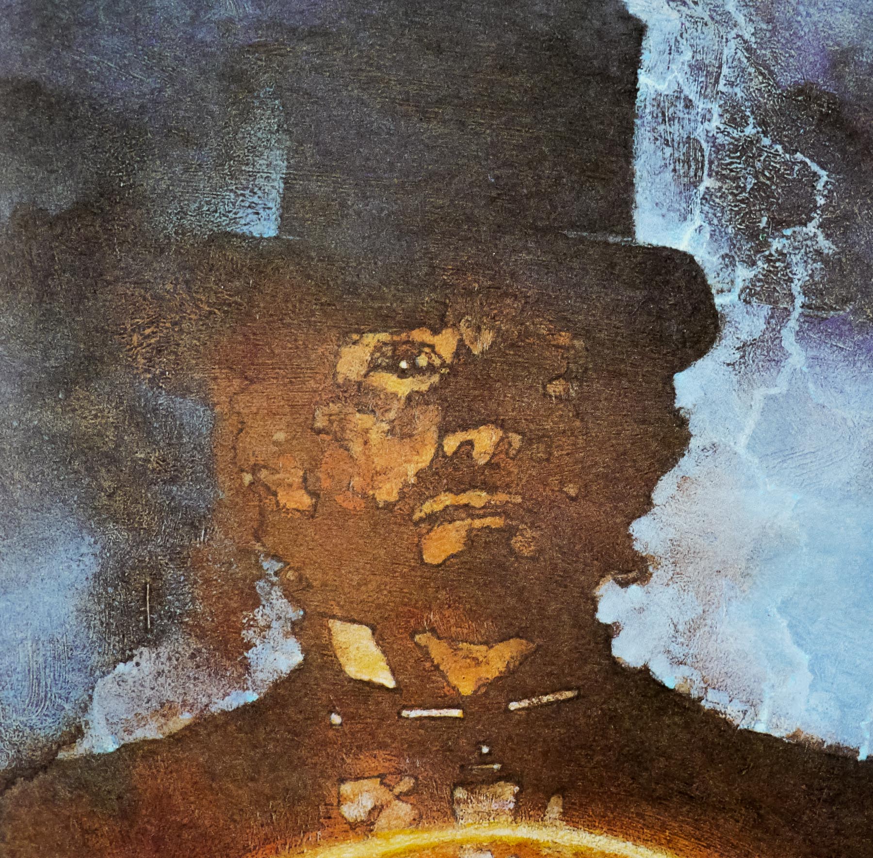
This British quad was illustrated by one of my favourite British artists, Brian Bysouth, who worked on a number of classic British posters during the 1970s and 1980s. It is unique to this particular poster but has some elements that also appeared on the original Australian poster that can be seen here (image taken from emovieposter.com).
You can read my extensive interview with Brian by clicking here. The other posters I’ve collected by him can be seen by clicking here.