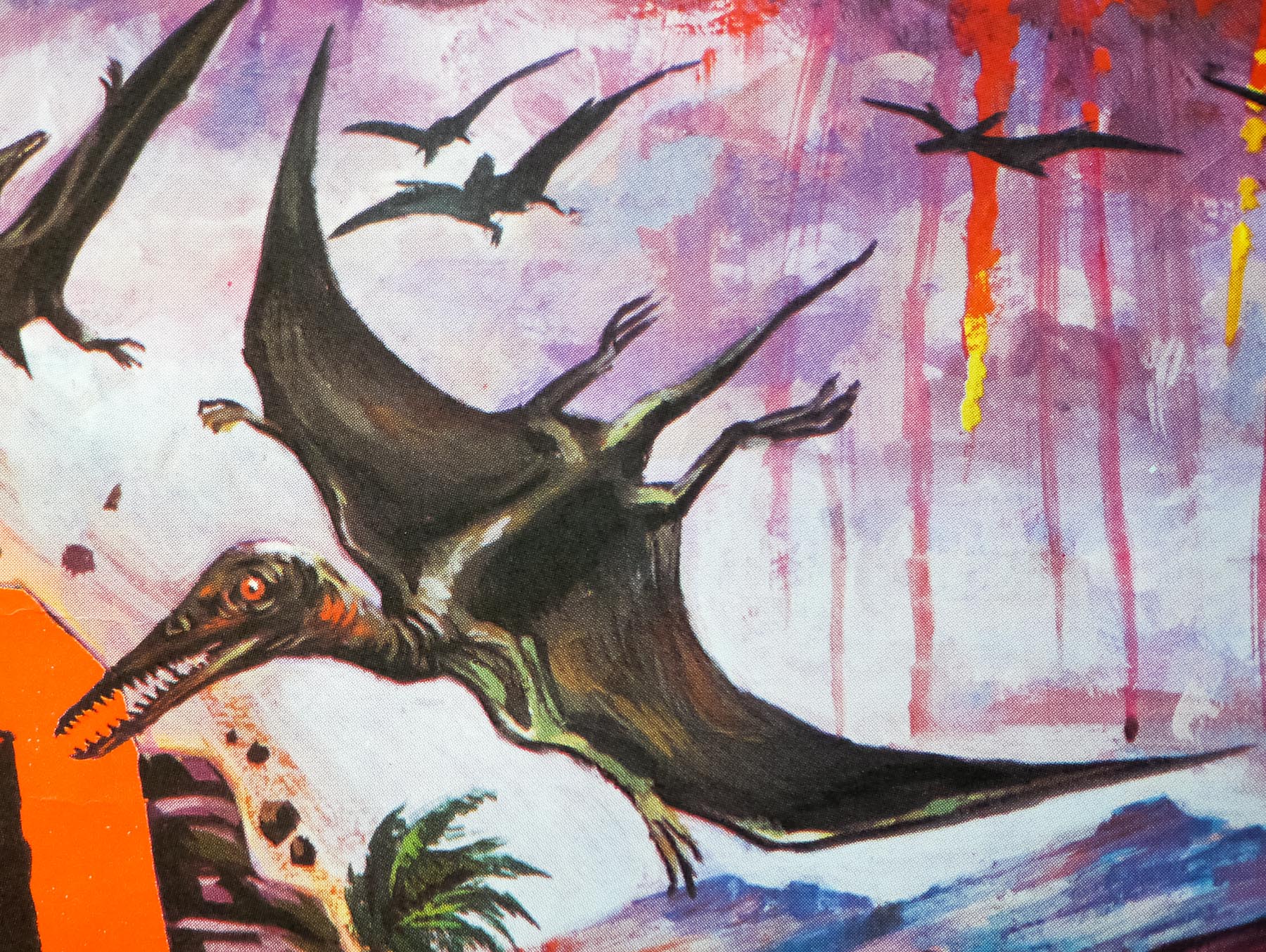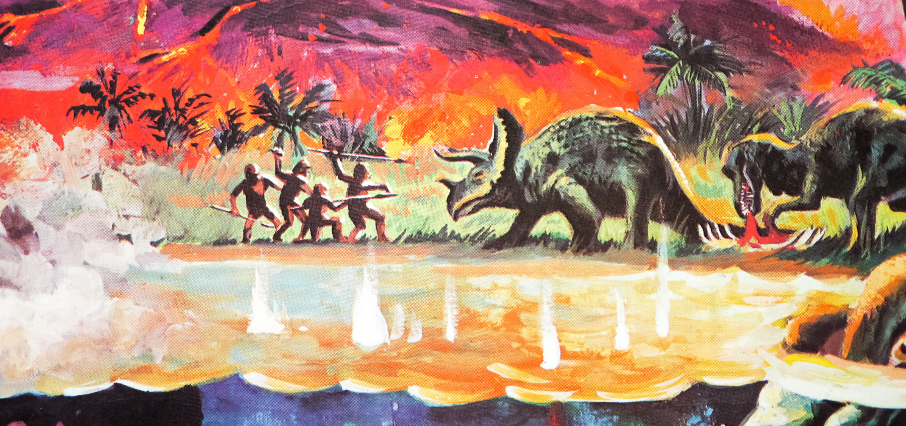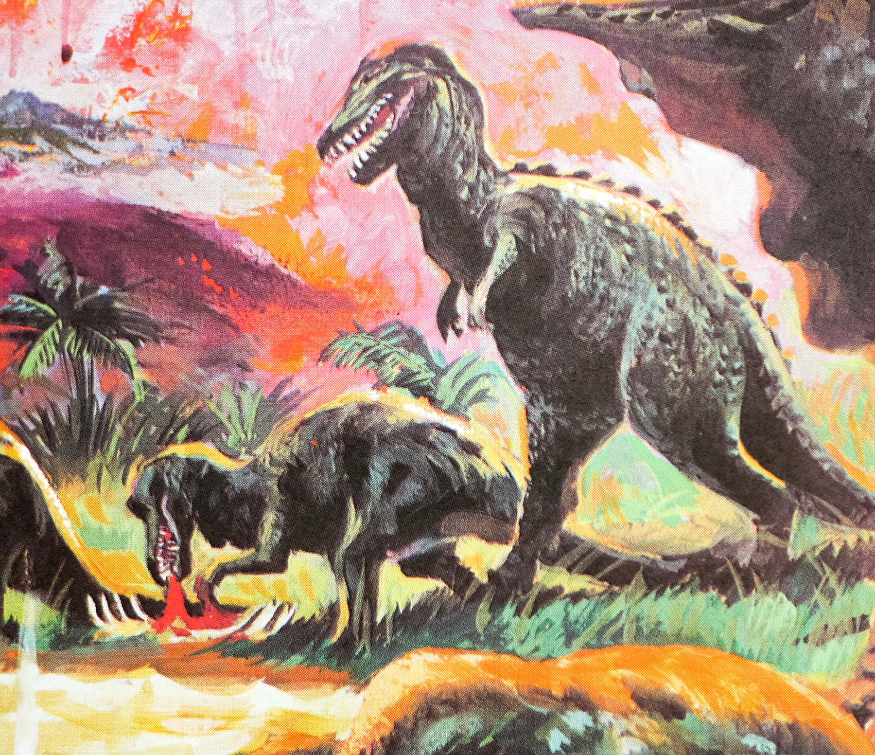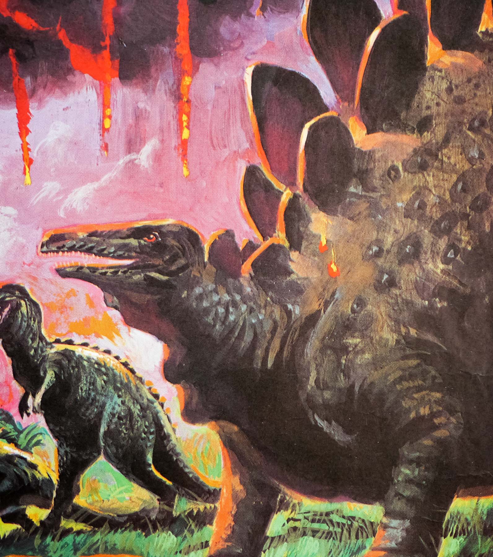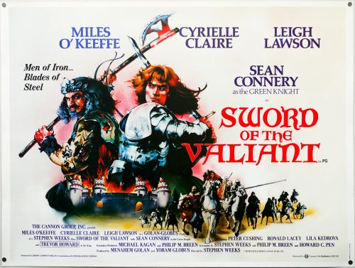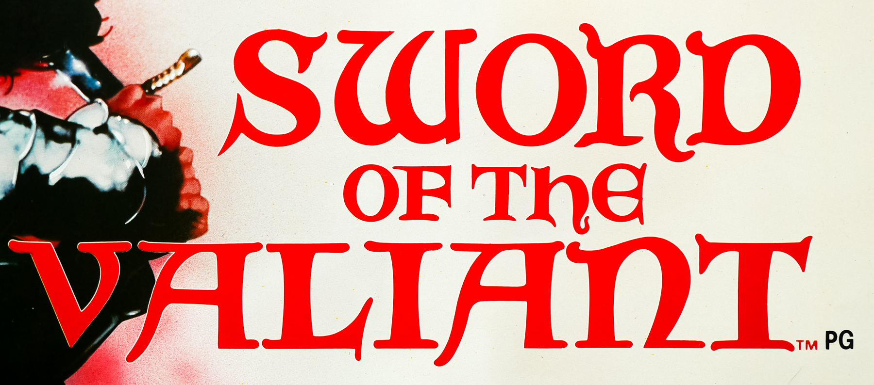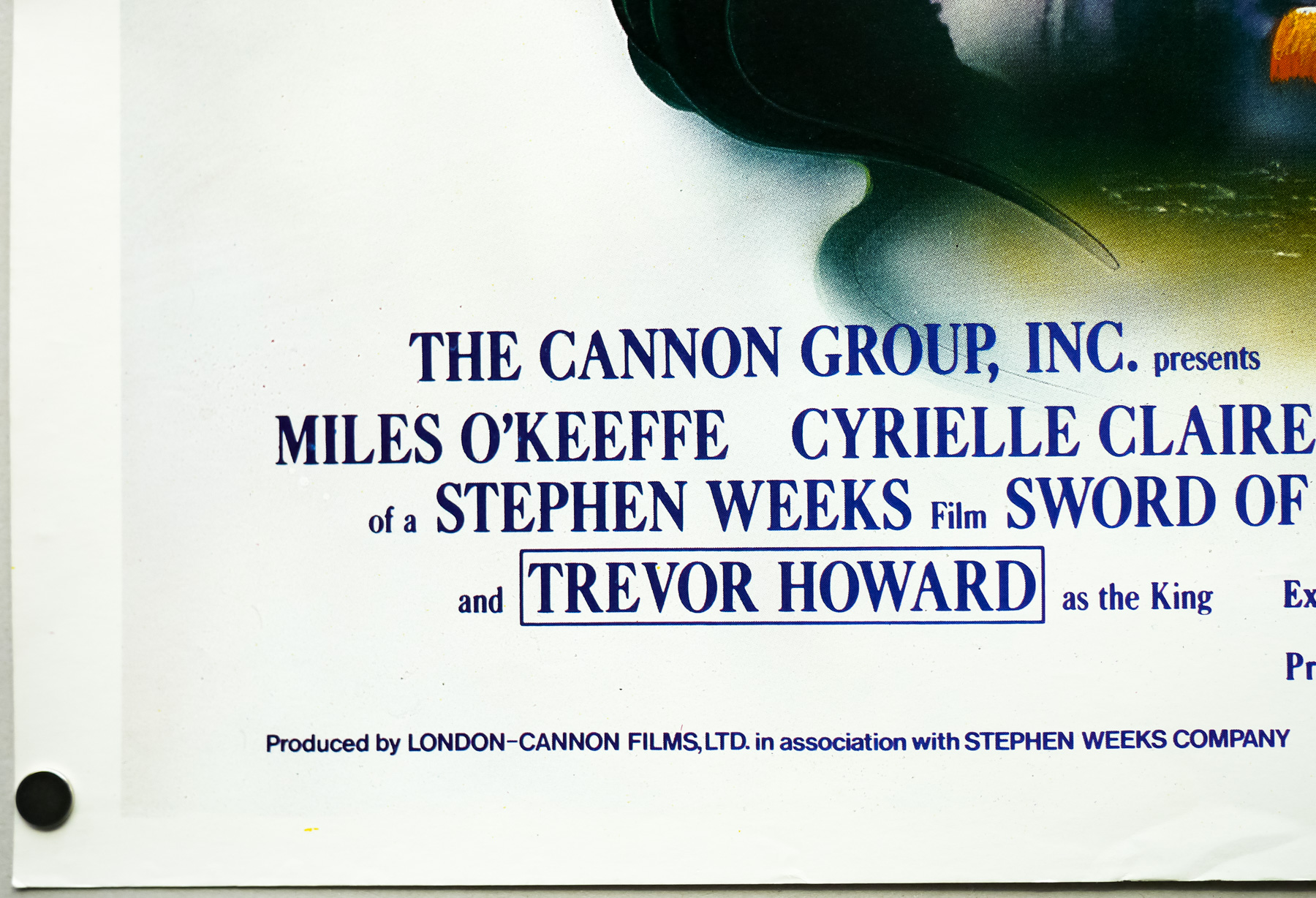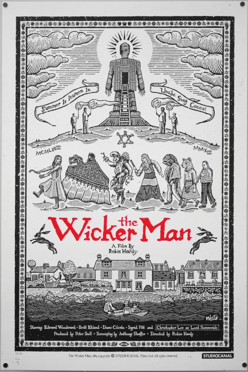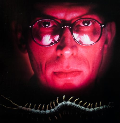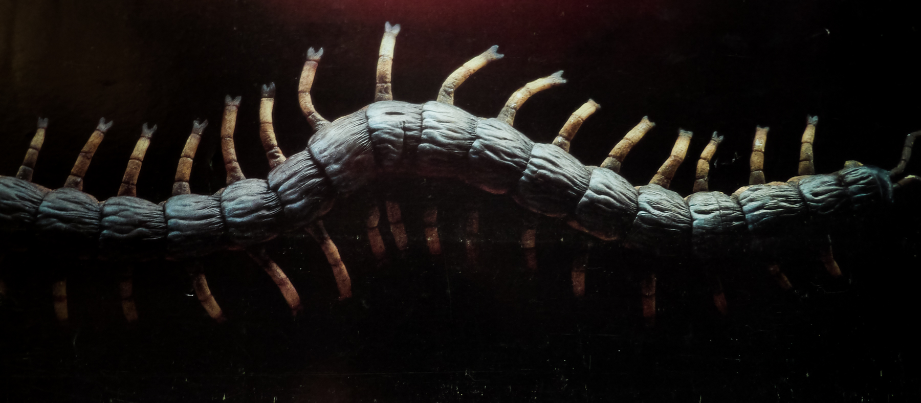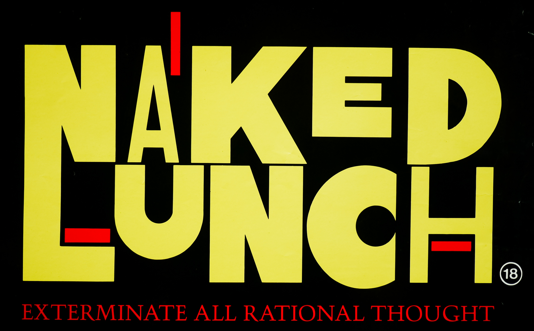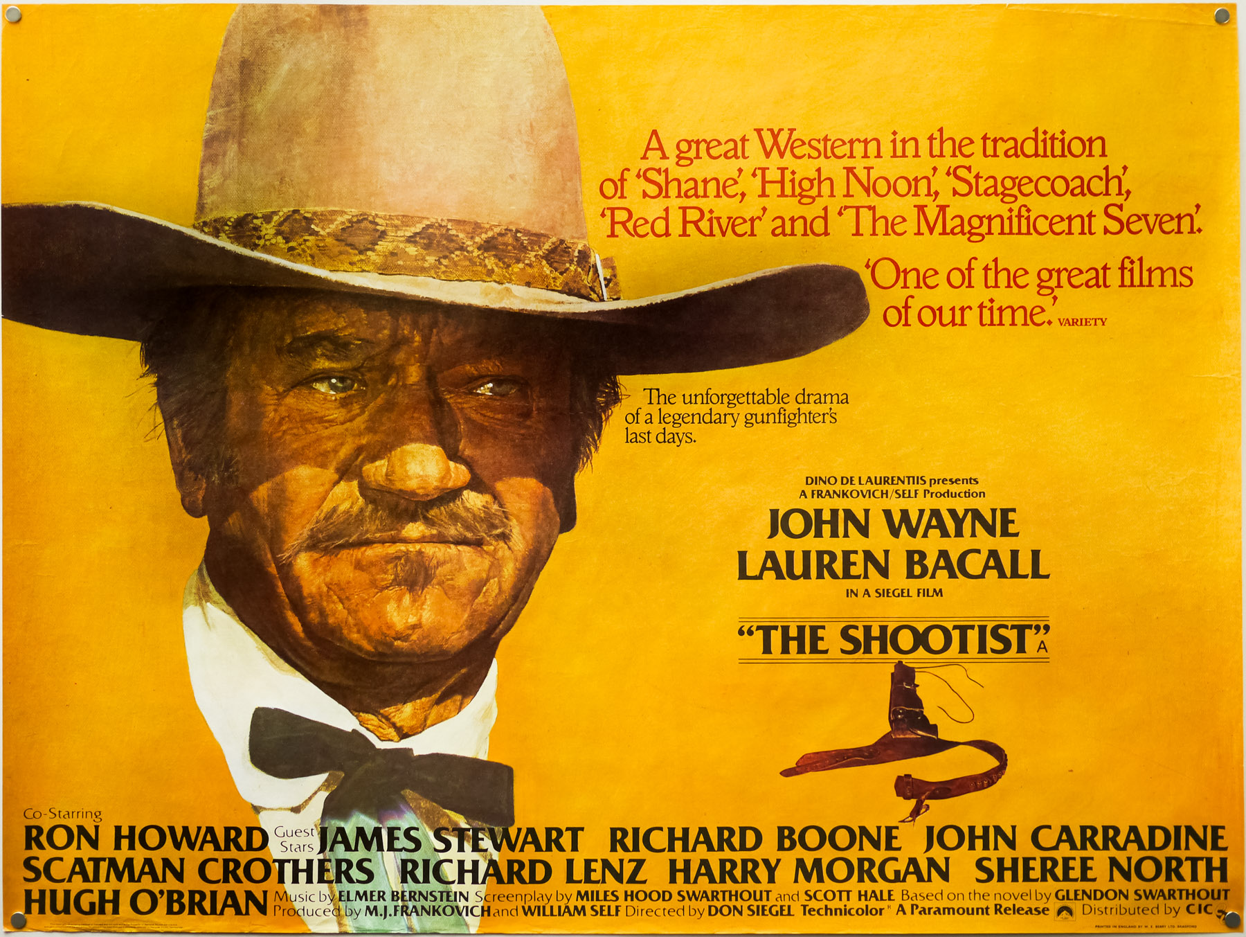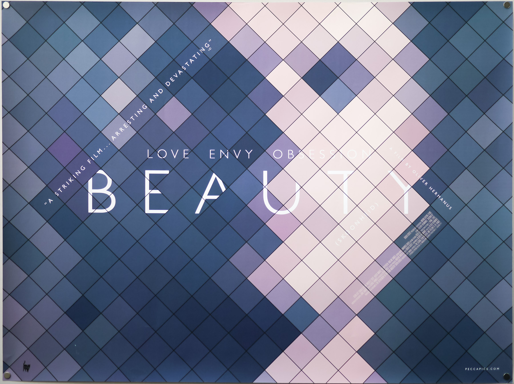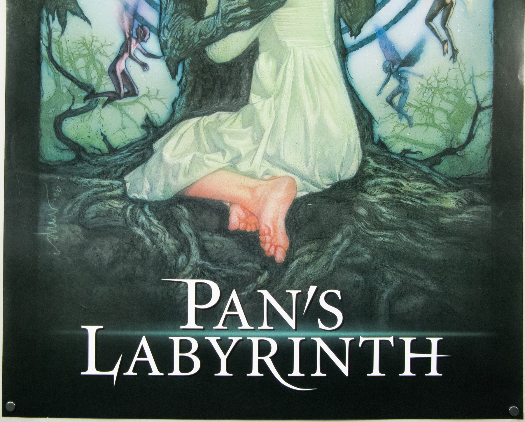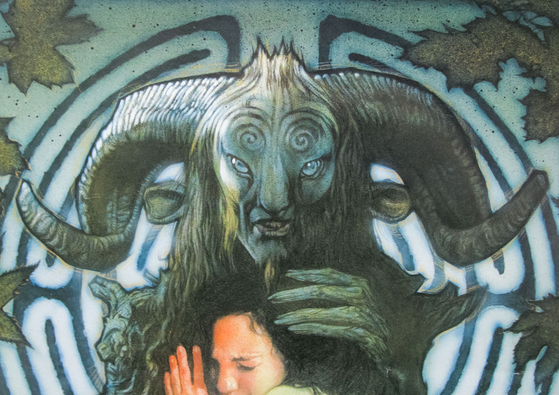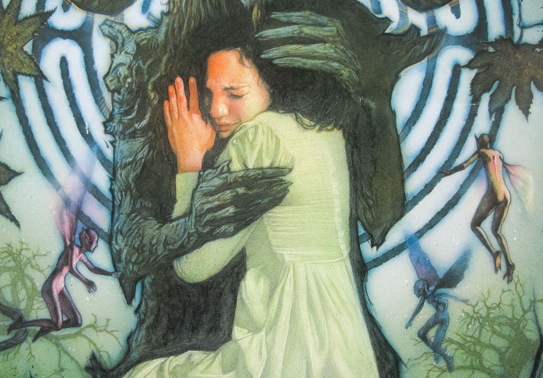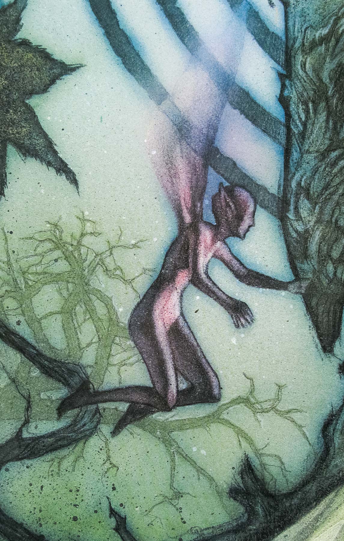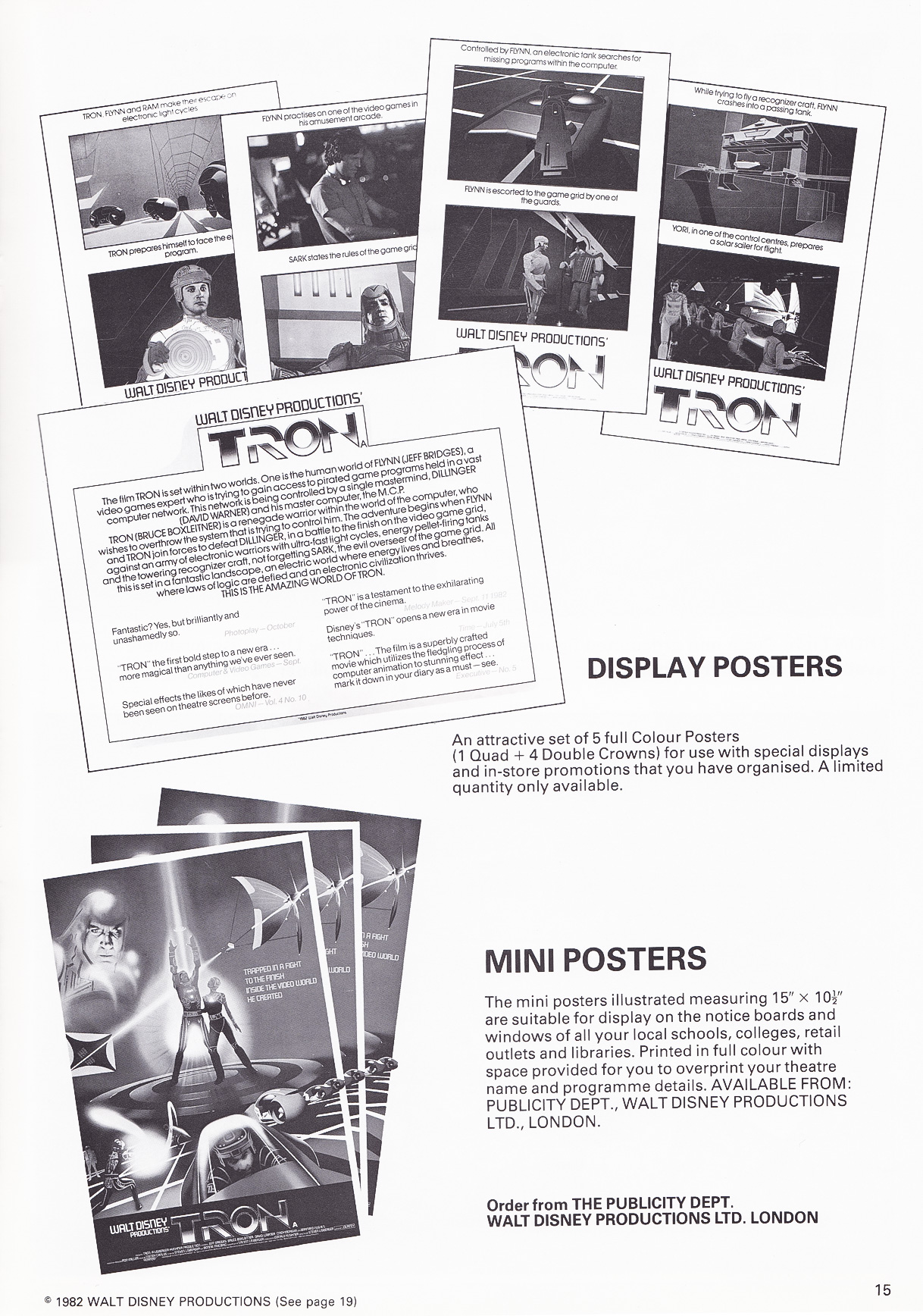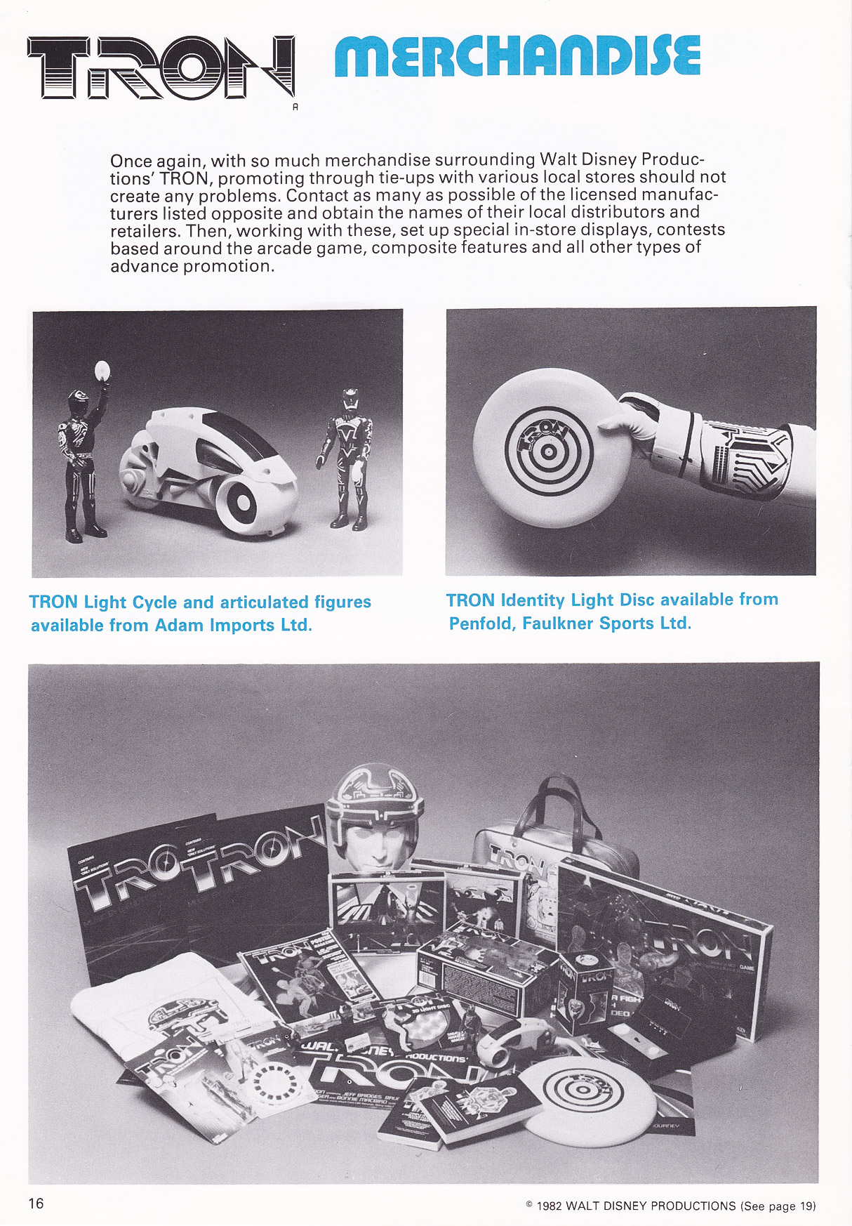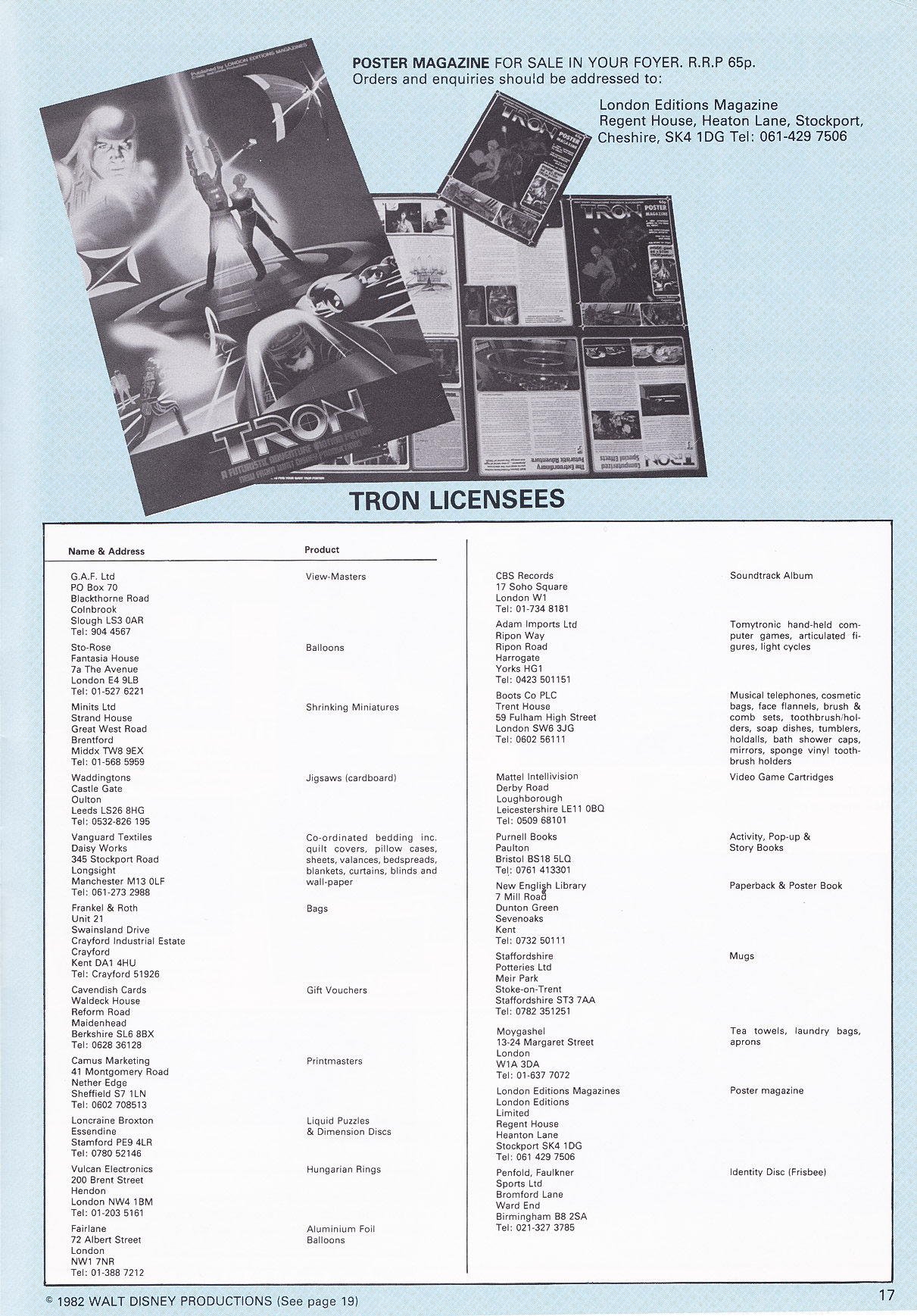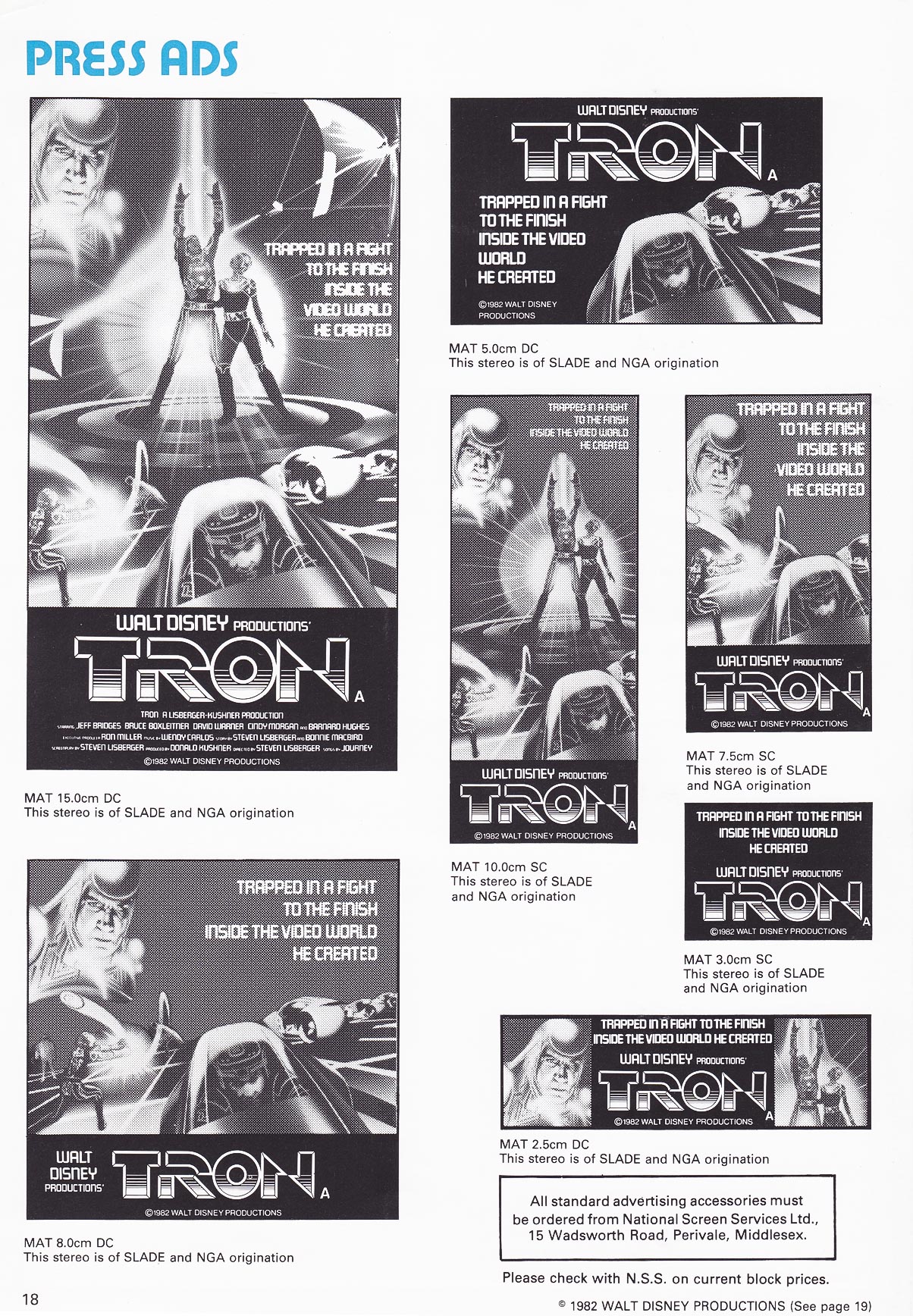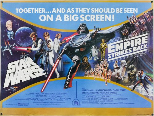

Poster detail
1-5

- AKA
- --
- Year of Film
- 1977 | 1980
- Director
- George Lucas | Irvin Kershner
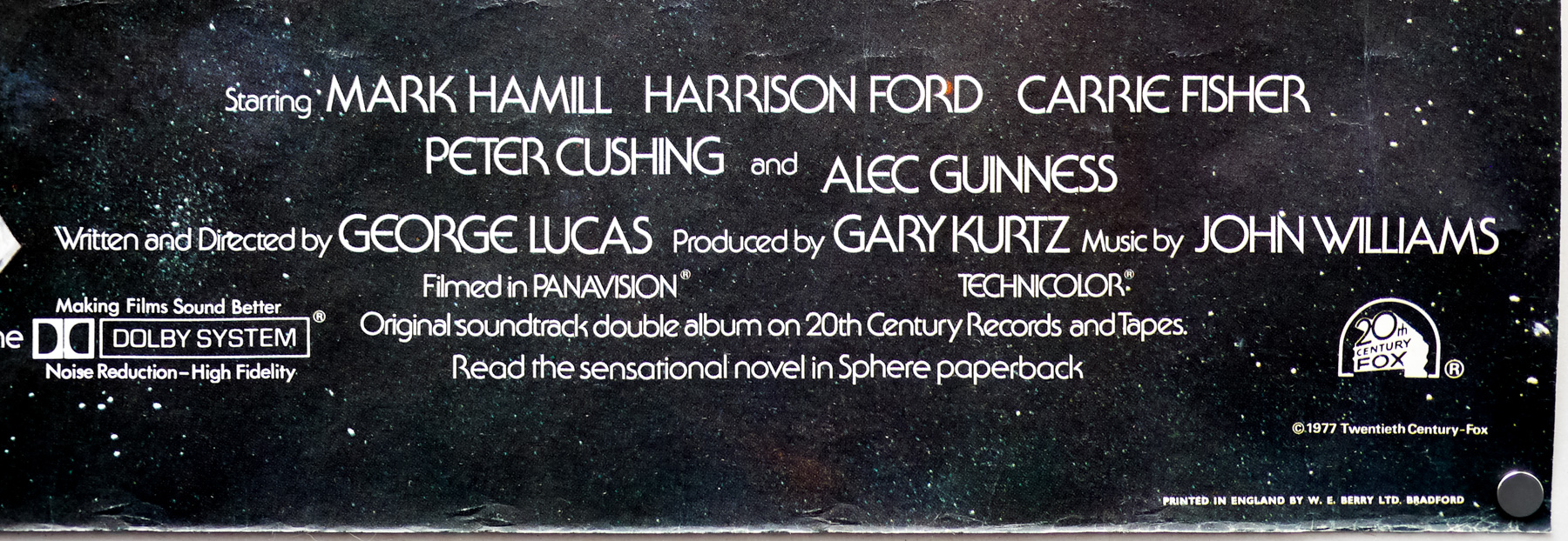
- Starring
- Mark Hamill, Harrison Ford, Carrie Fisher, David Prowse, Peter Cushing, Alec Guinness, Anthony Daniels, Kenny Baker, Peter Mayhew, Billy Dee Williams
- Origin of Film
- UK | USA
- Genre(s) of Film
- Mark Hamill, Harrison Ford, Carrie Fisher, David Prowse, Peter Cushing, Alec Guinness, Anthony Daniels, Kenny Baker, Peter Mayhew, Billy Dee Williams,
- Type of Poster
- Quad
- Style of Poster
- --
- Origin of Poster
- UK
- Year of Poster
- 1980
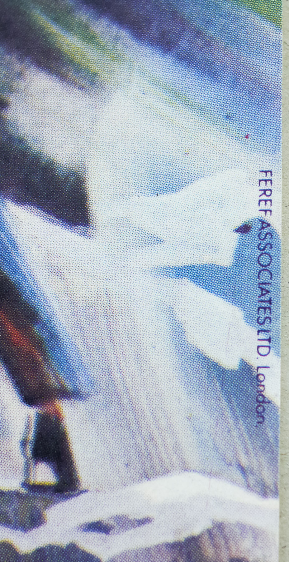
- Designer
- FEREF Associates
- Artist
- Tom Chantrell | Tom Jung
- Size (inches)
- 30" x 39 14/16"
- SS or DS
- SS
- NSS #
- --
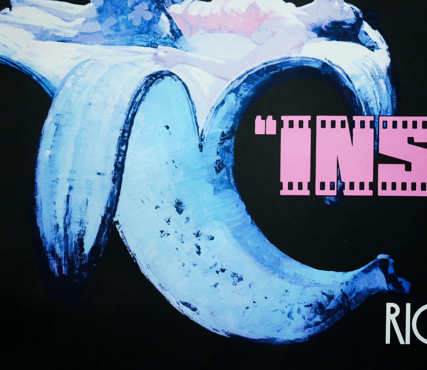
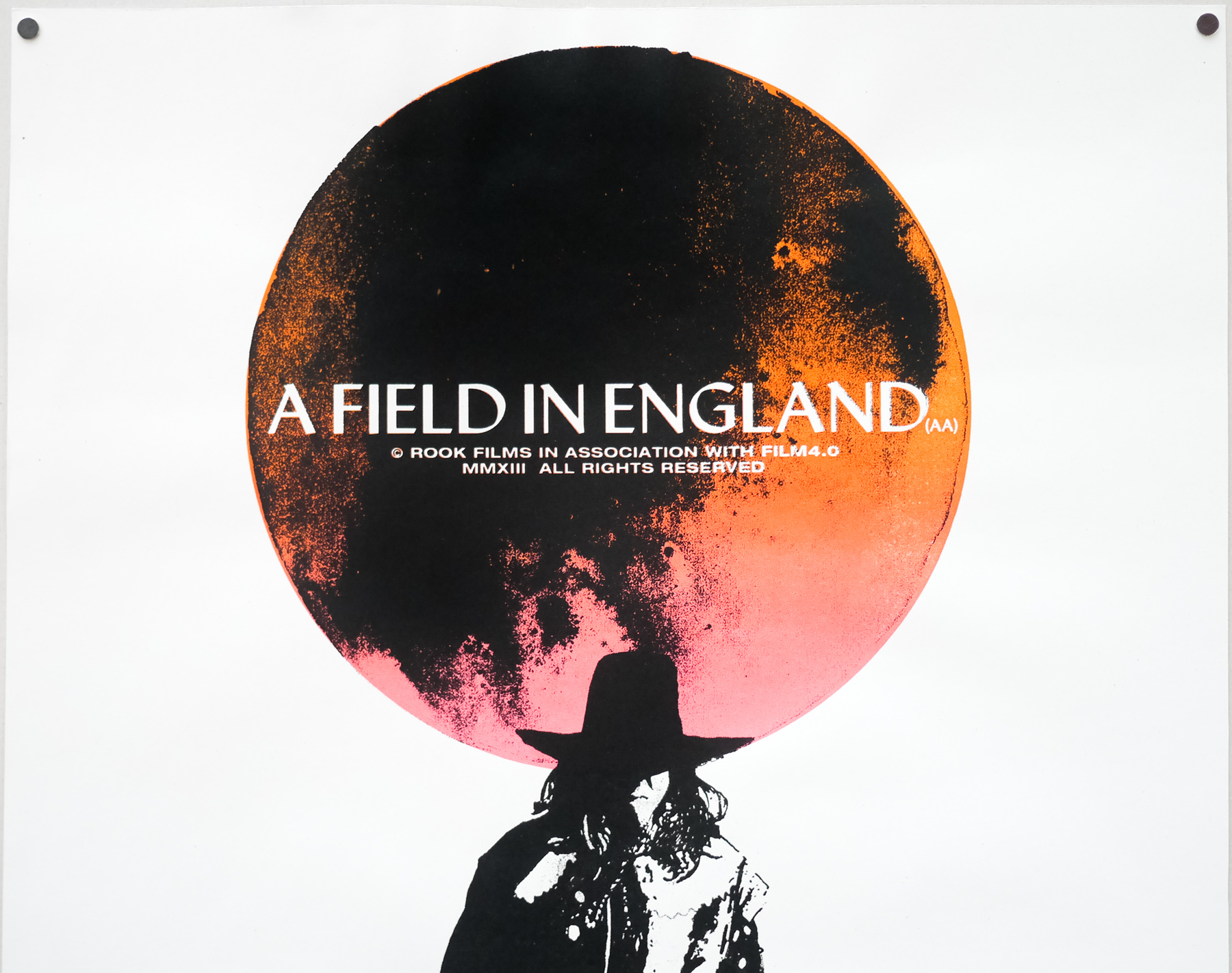
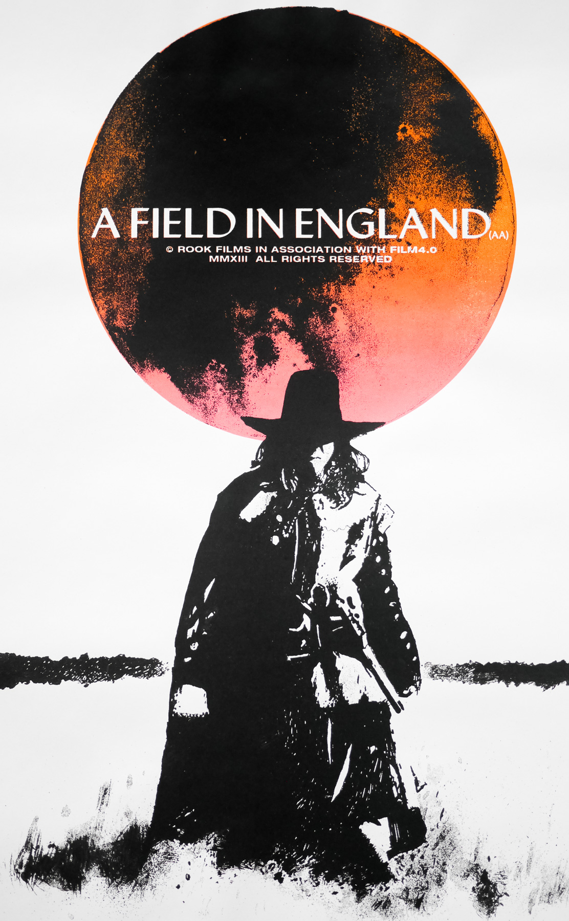
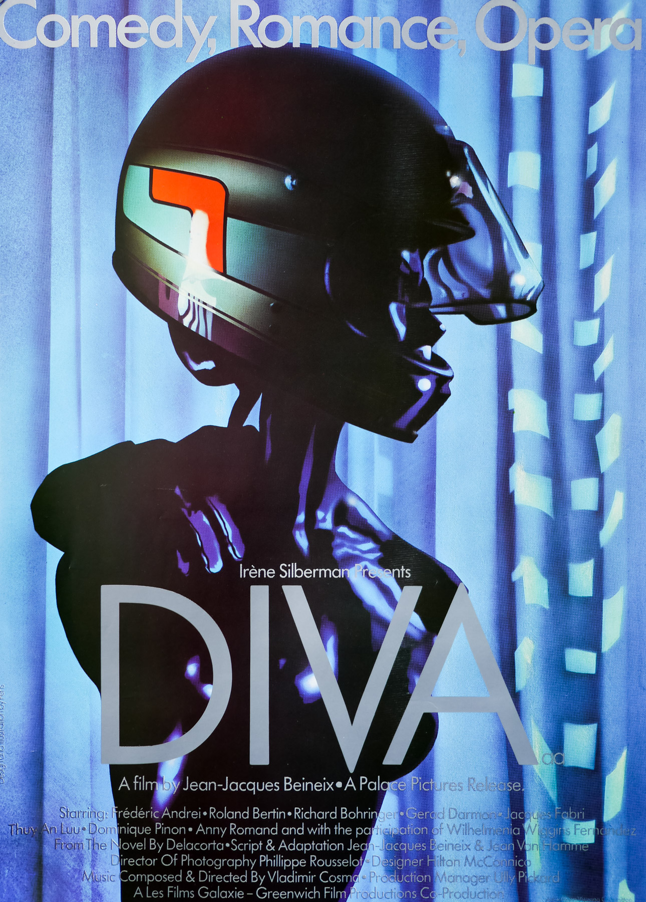
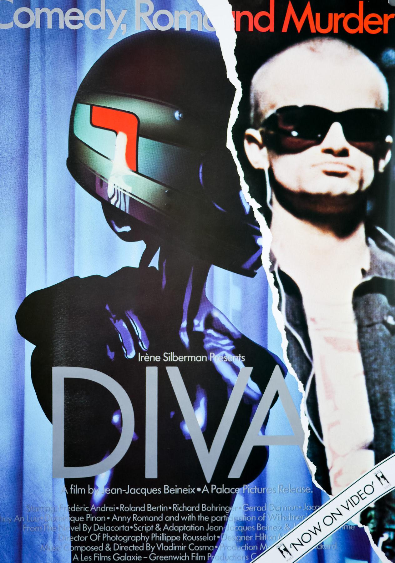
- Tagline
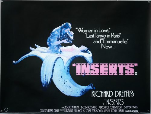
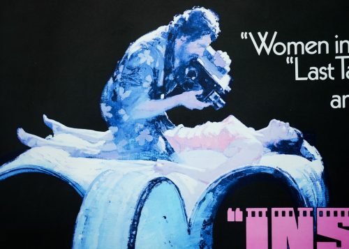
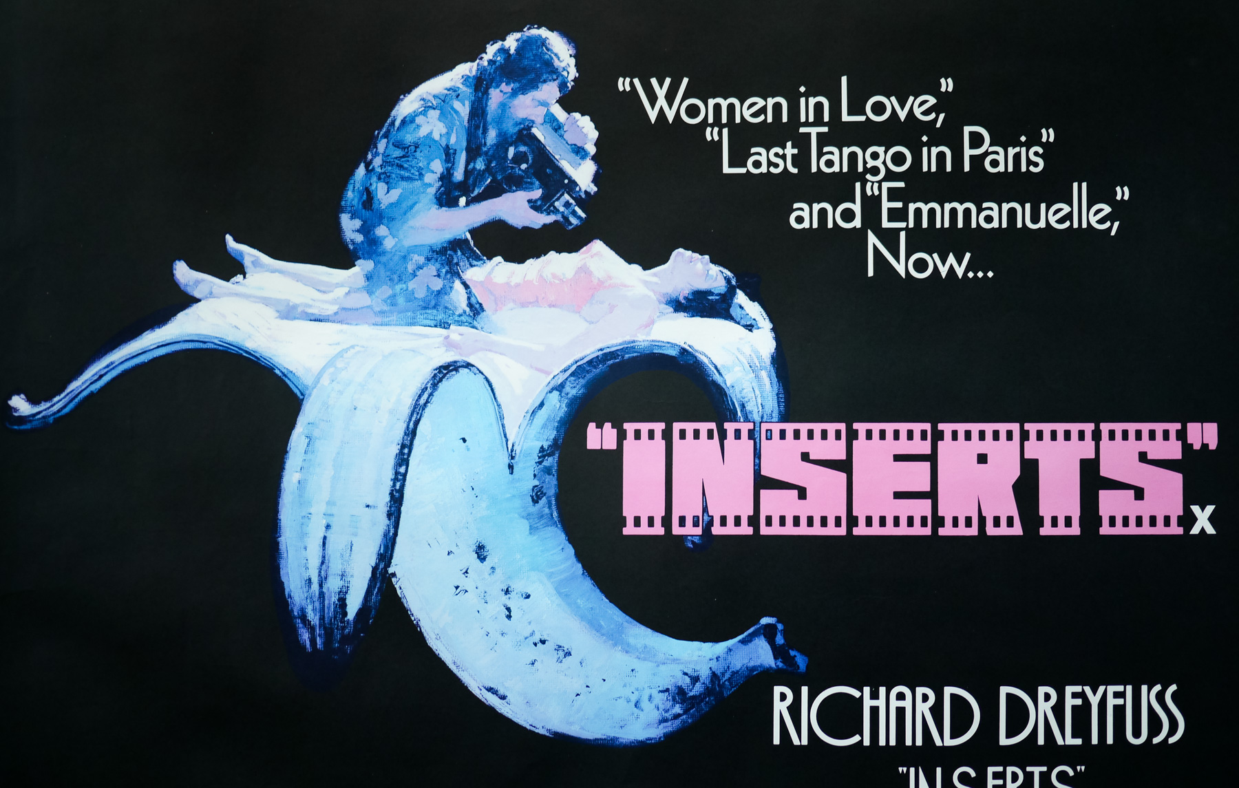
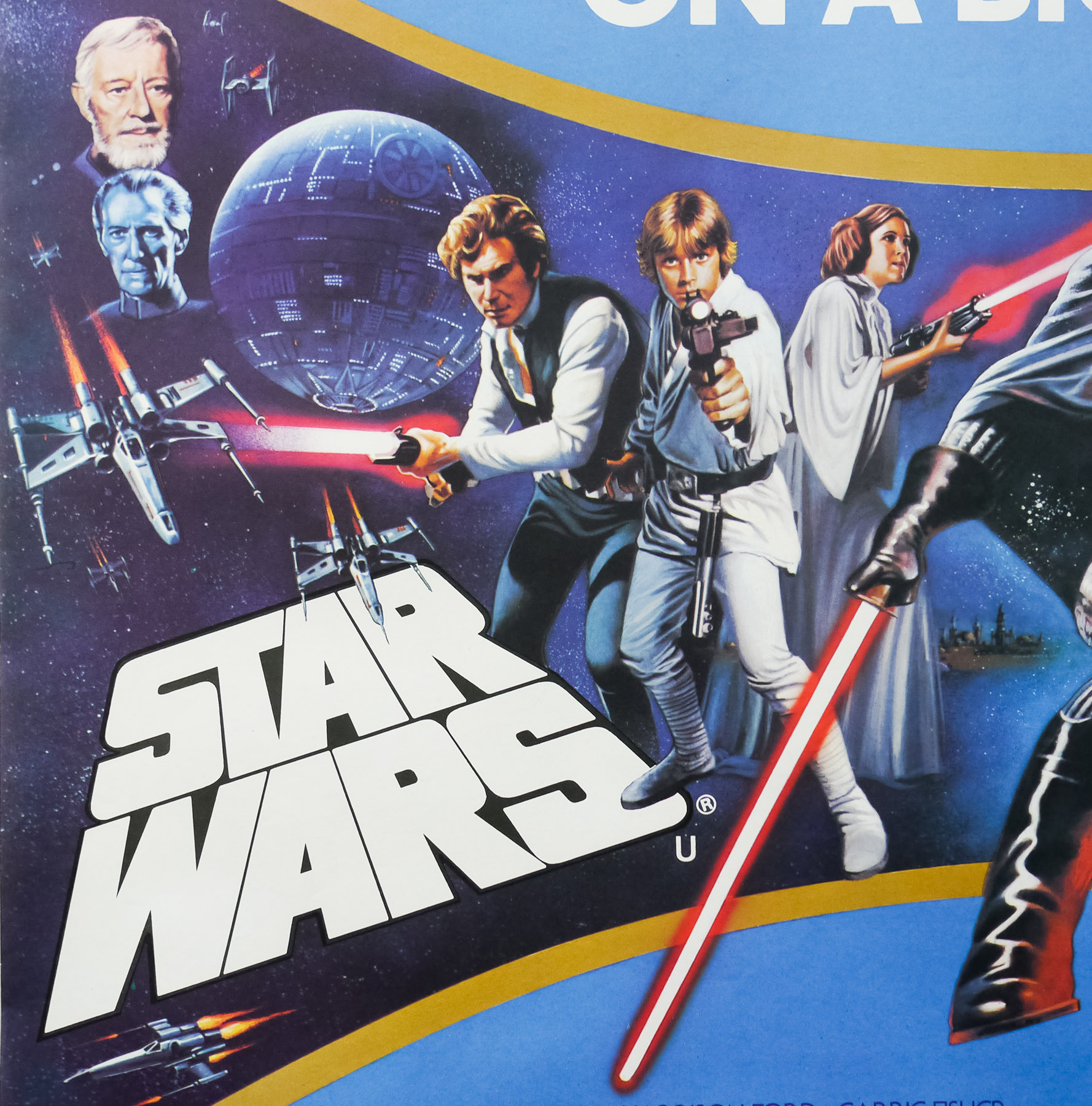
- Together... and as they should be seen ON A BIG SCREEN!
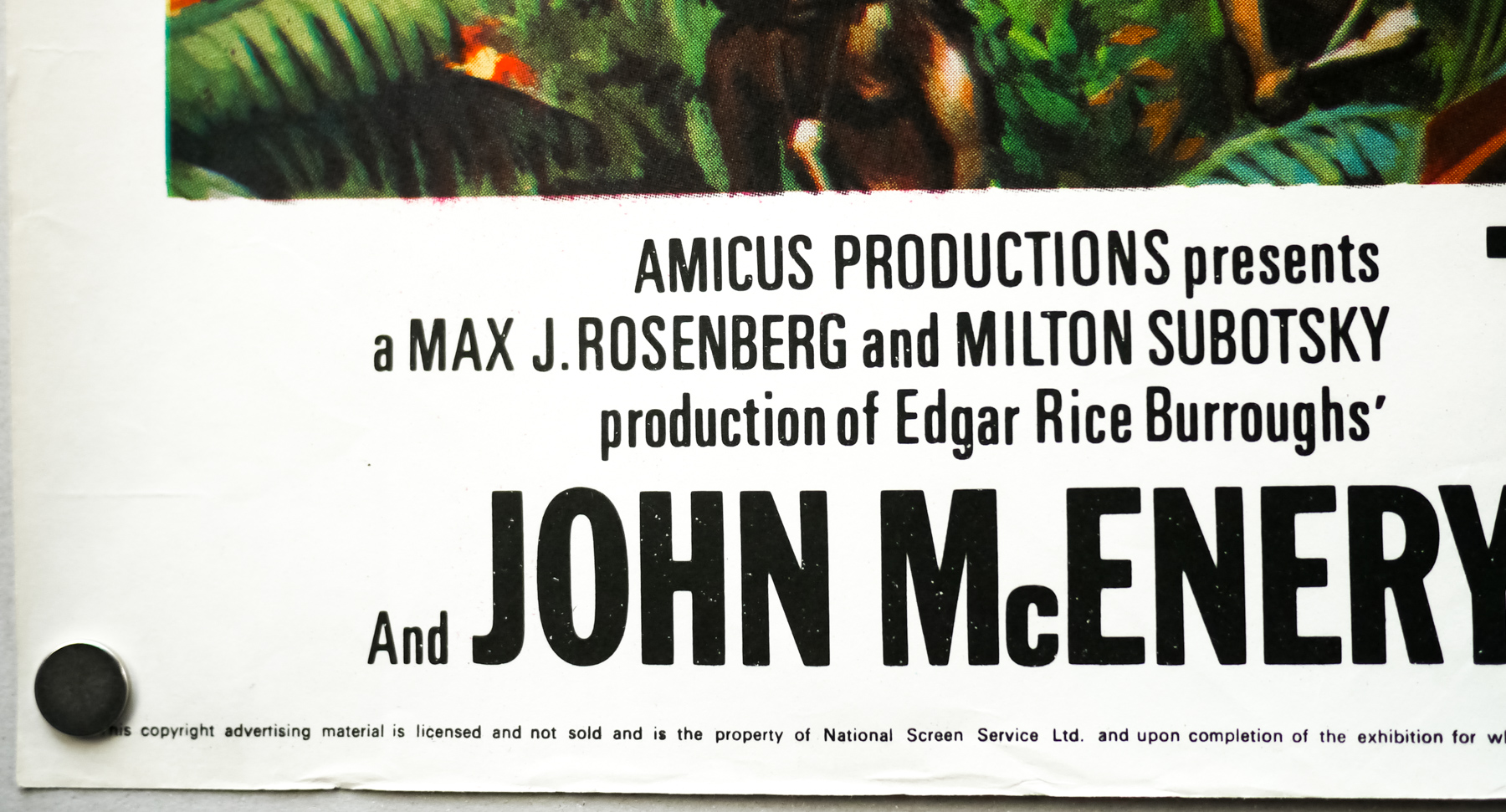
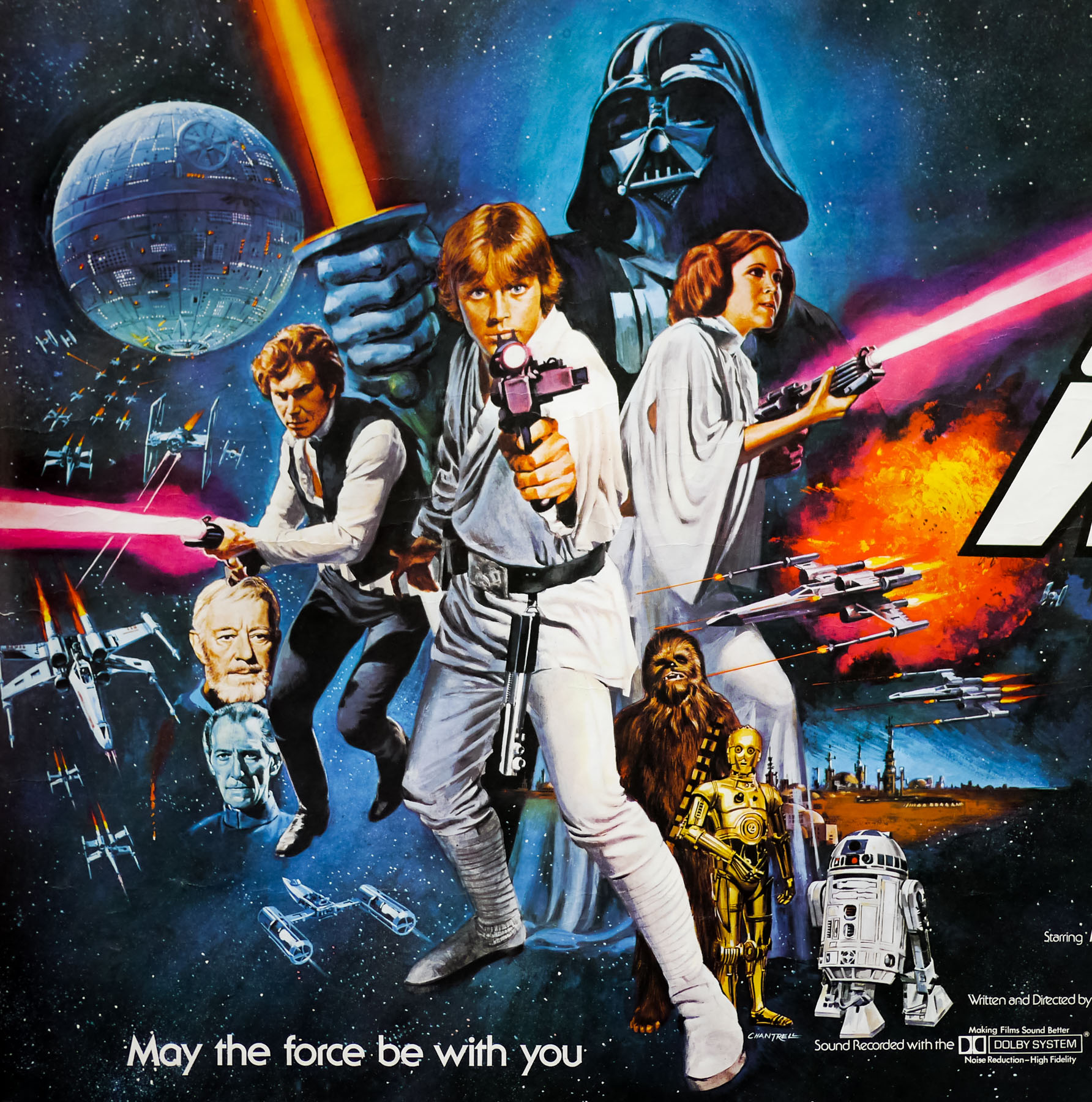
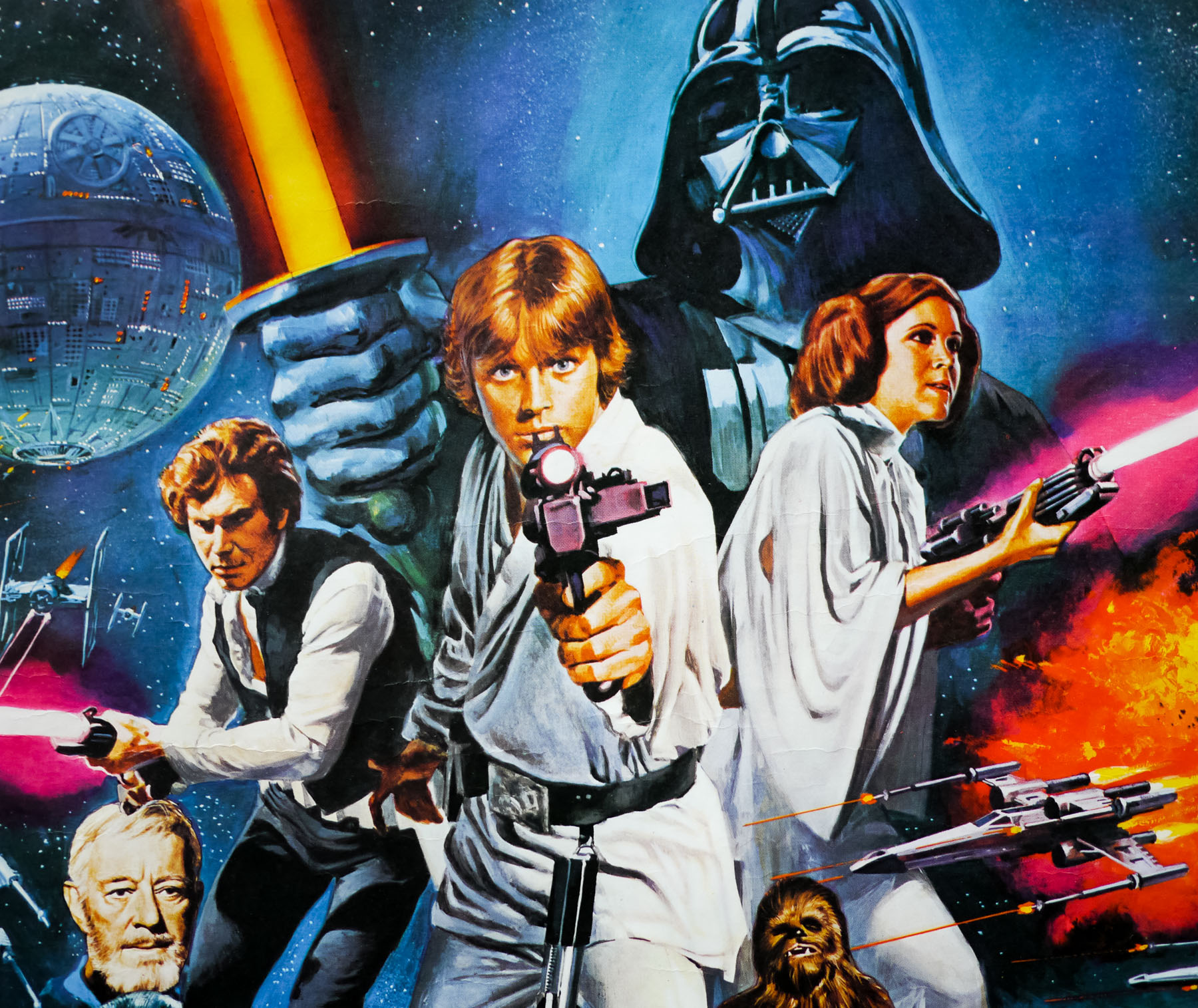
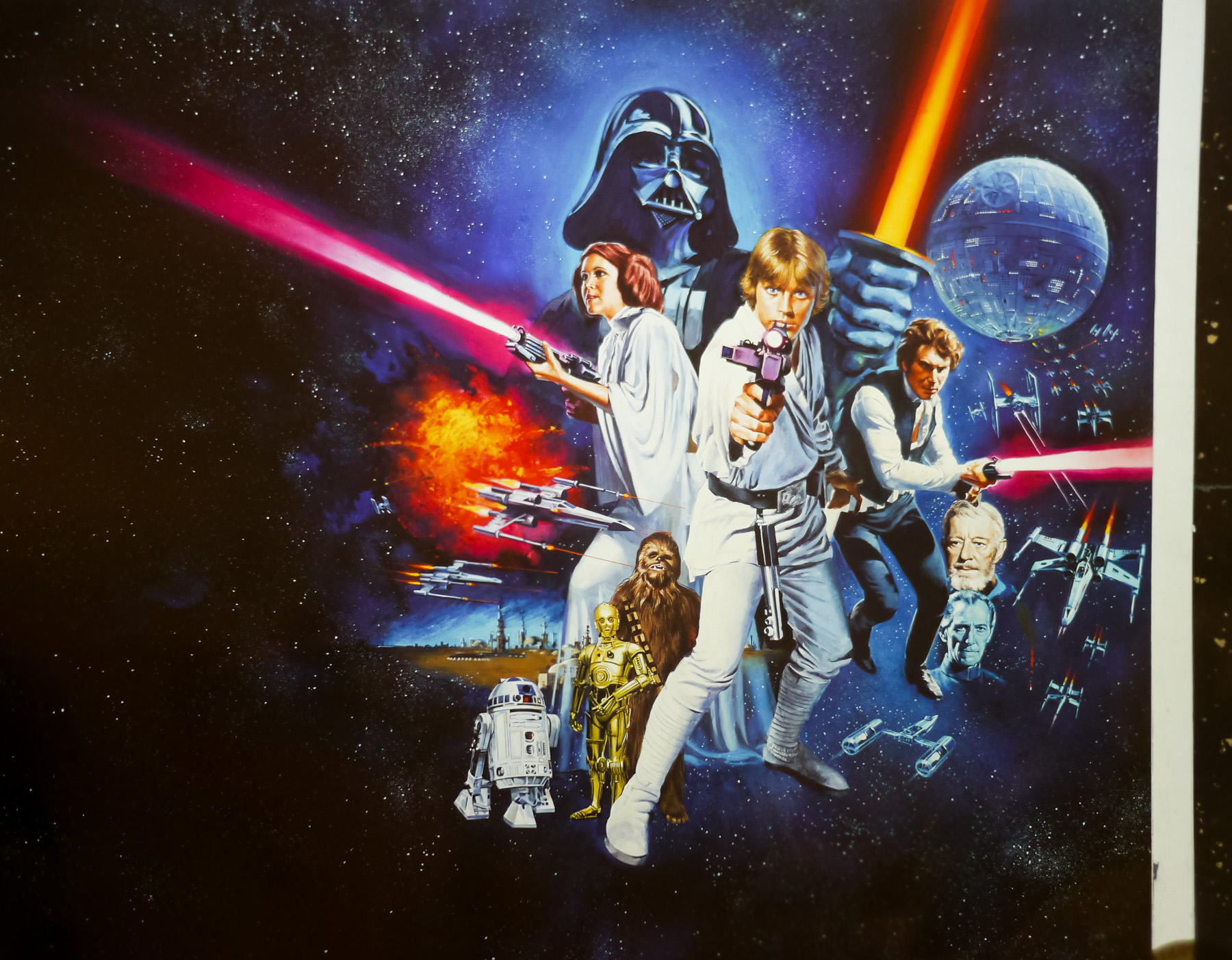
Following the unprecedented success of the original Star Wars, released in 1977 to worldwide audience acclaim, expectations were high for the sequel which was put into production a few months after its release. Three years later, The Empire Strikes Back arrived in cinemas and was met with huge audience and critical acclaim, firmly cementing the series’ place in the hearts of millions of fans across the globe. A less well-received third part of the original trilogy, Return of the Jedi, and a lacklustre set of prequel films failed to dampen audience enthusiasm for the franchise and a new film adventure is set to be released at the end of 2015.
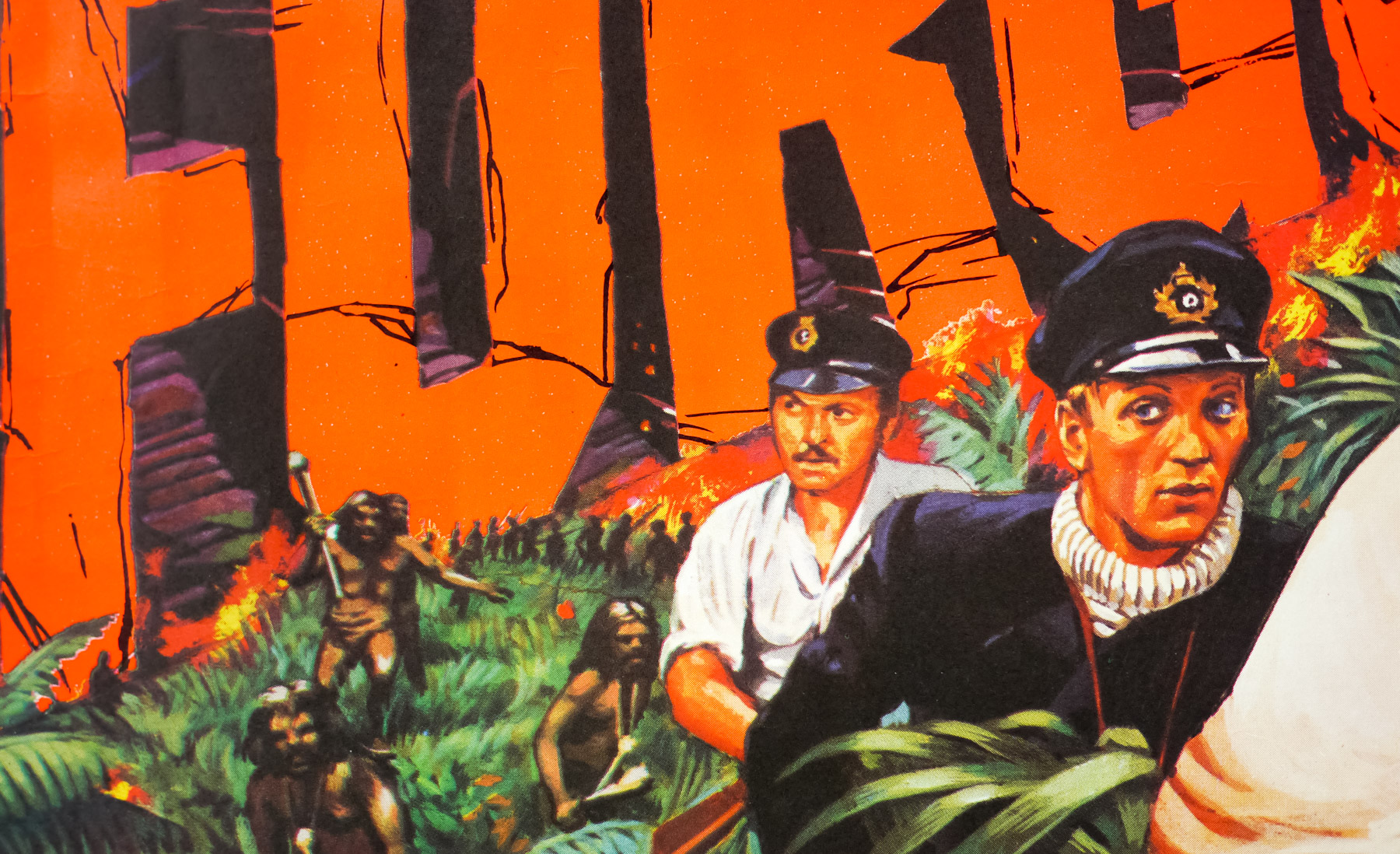
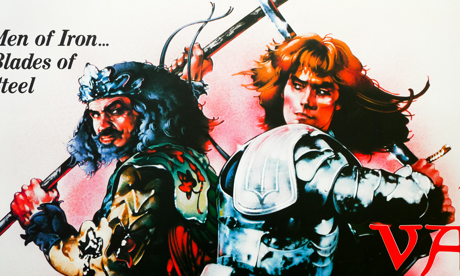
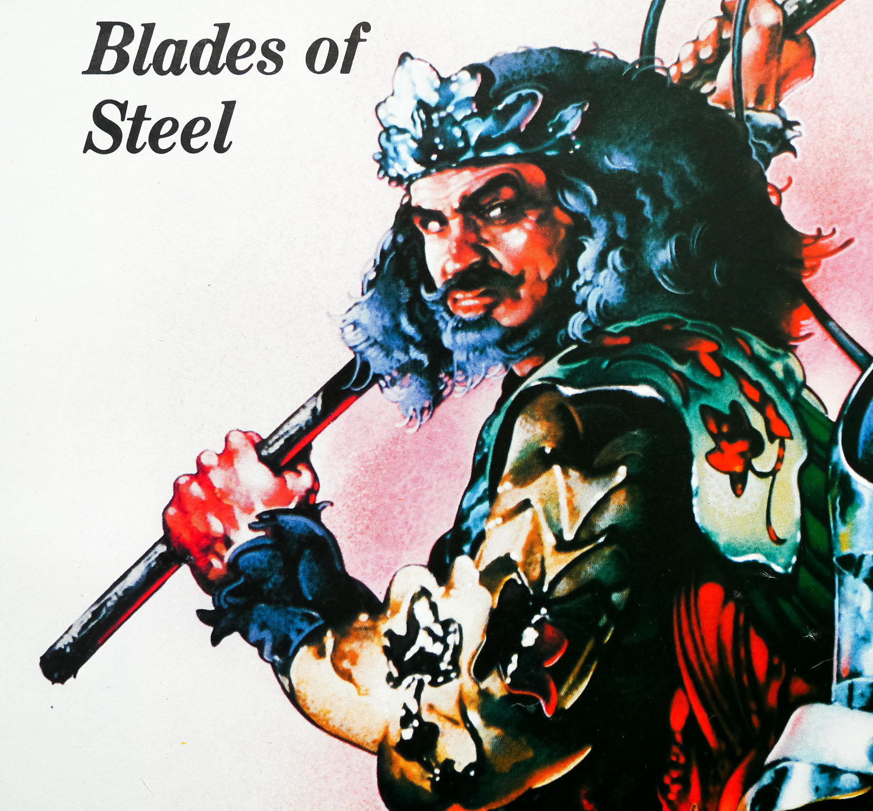
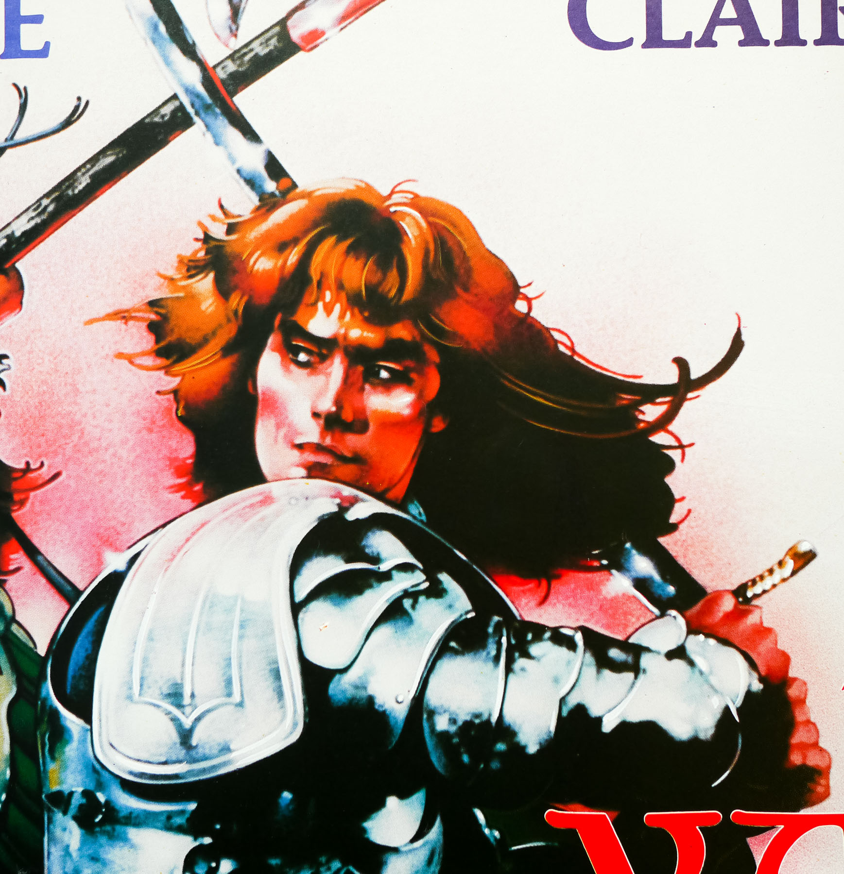
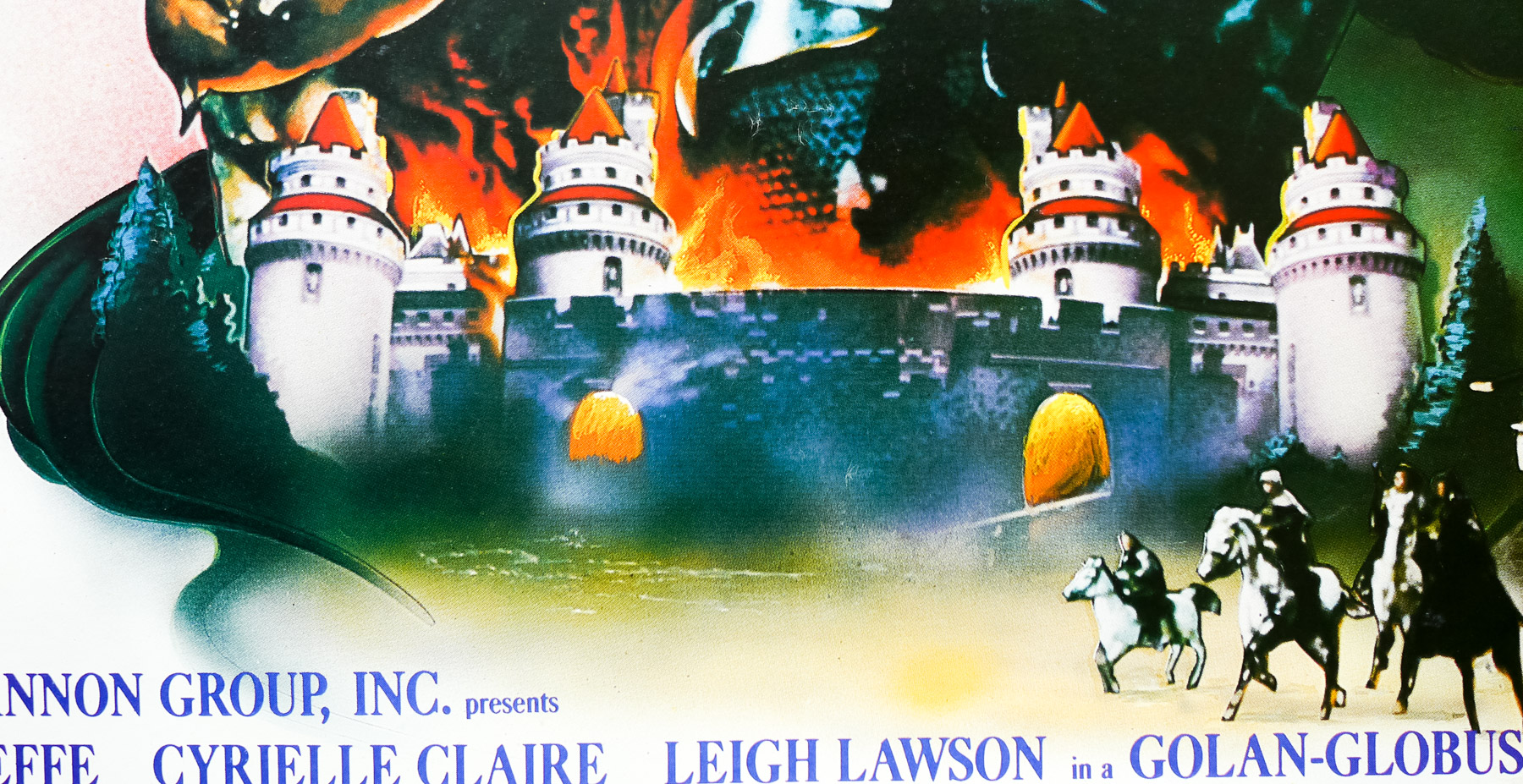
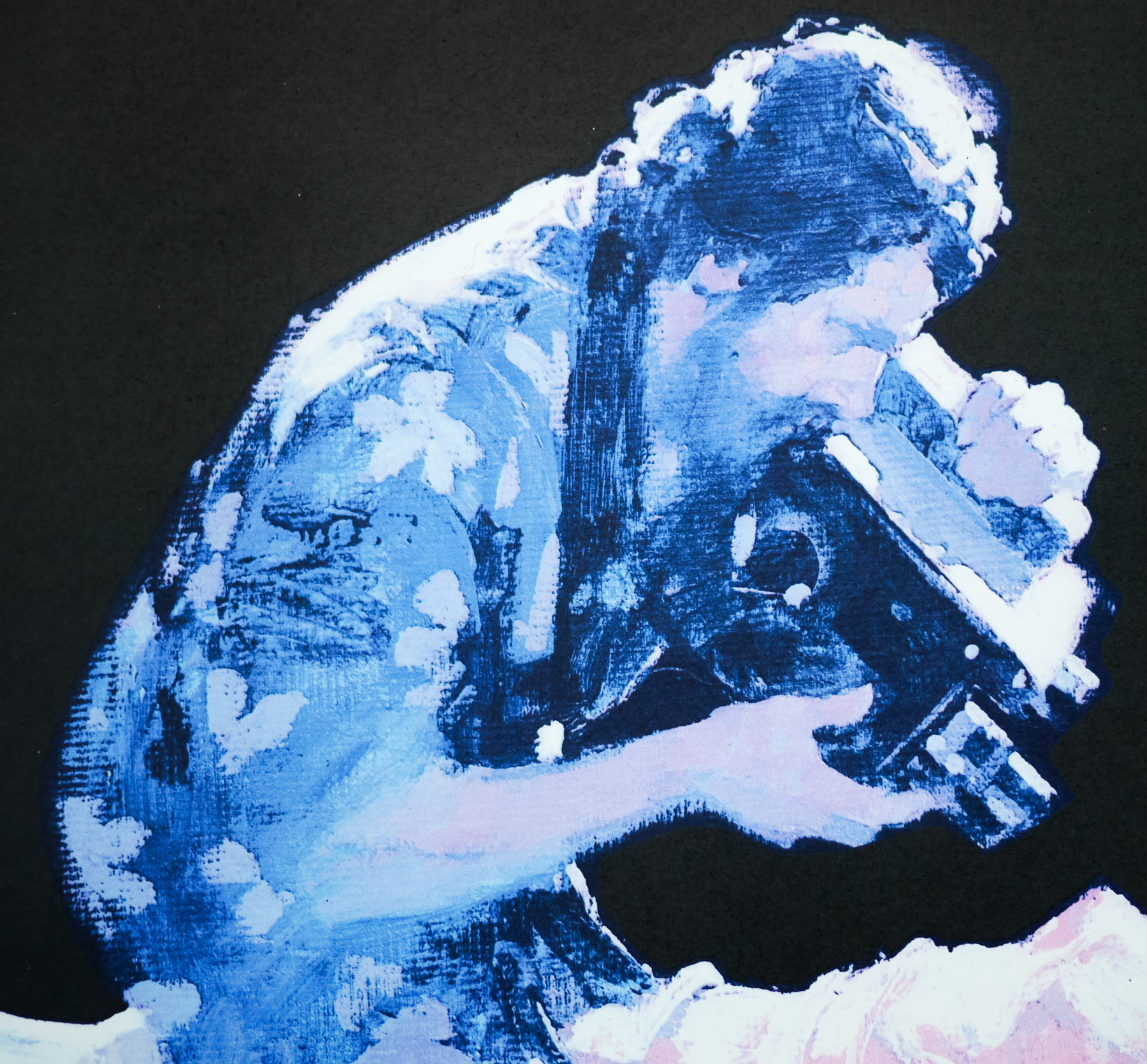
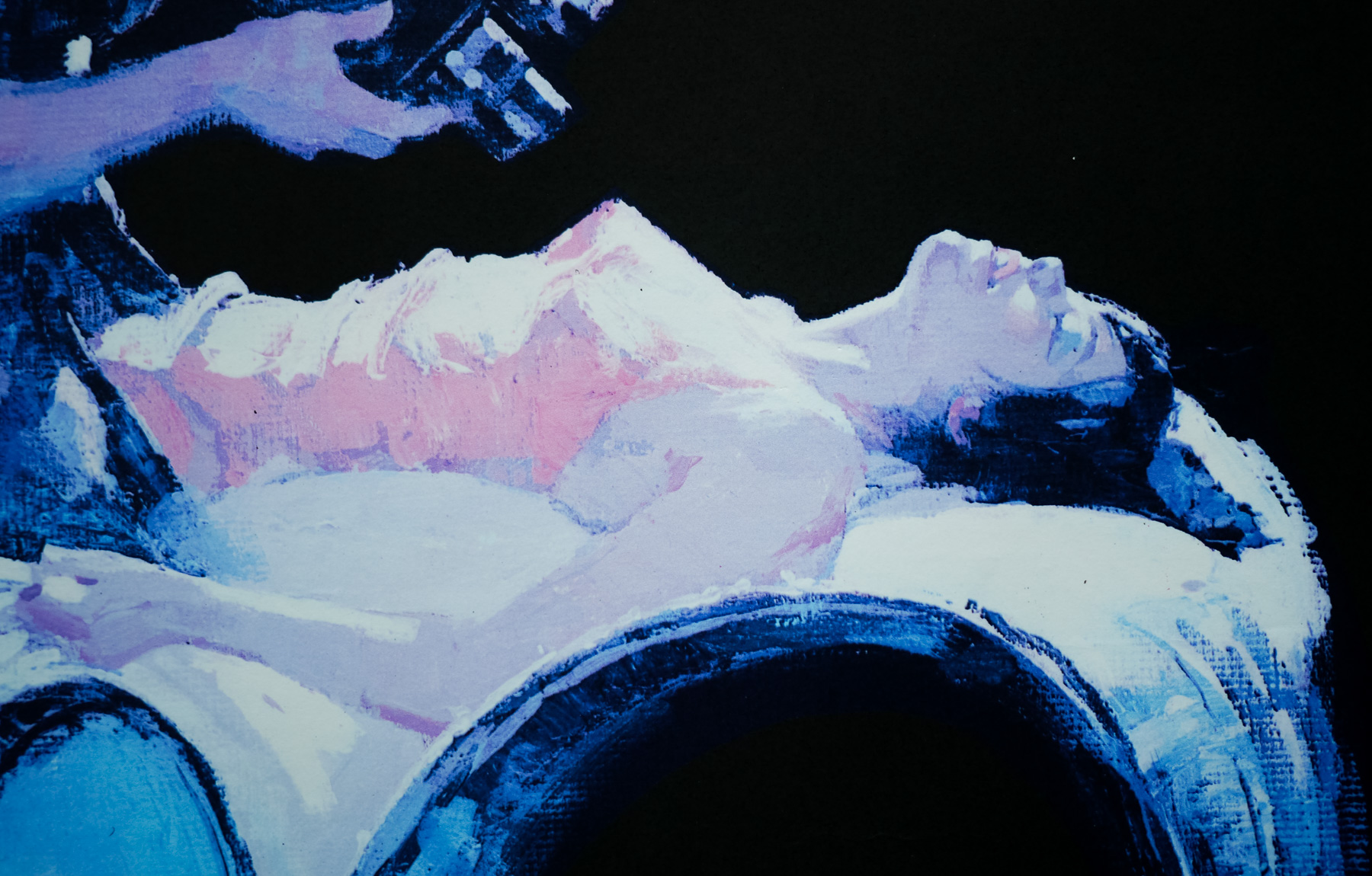
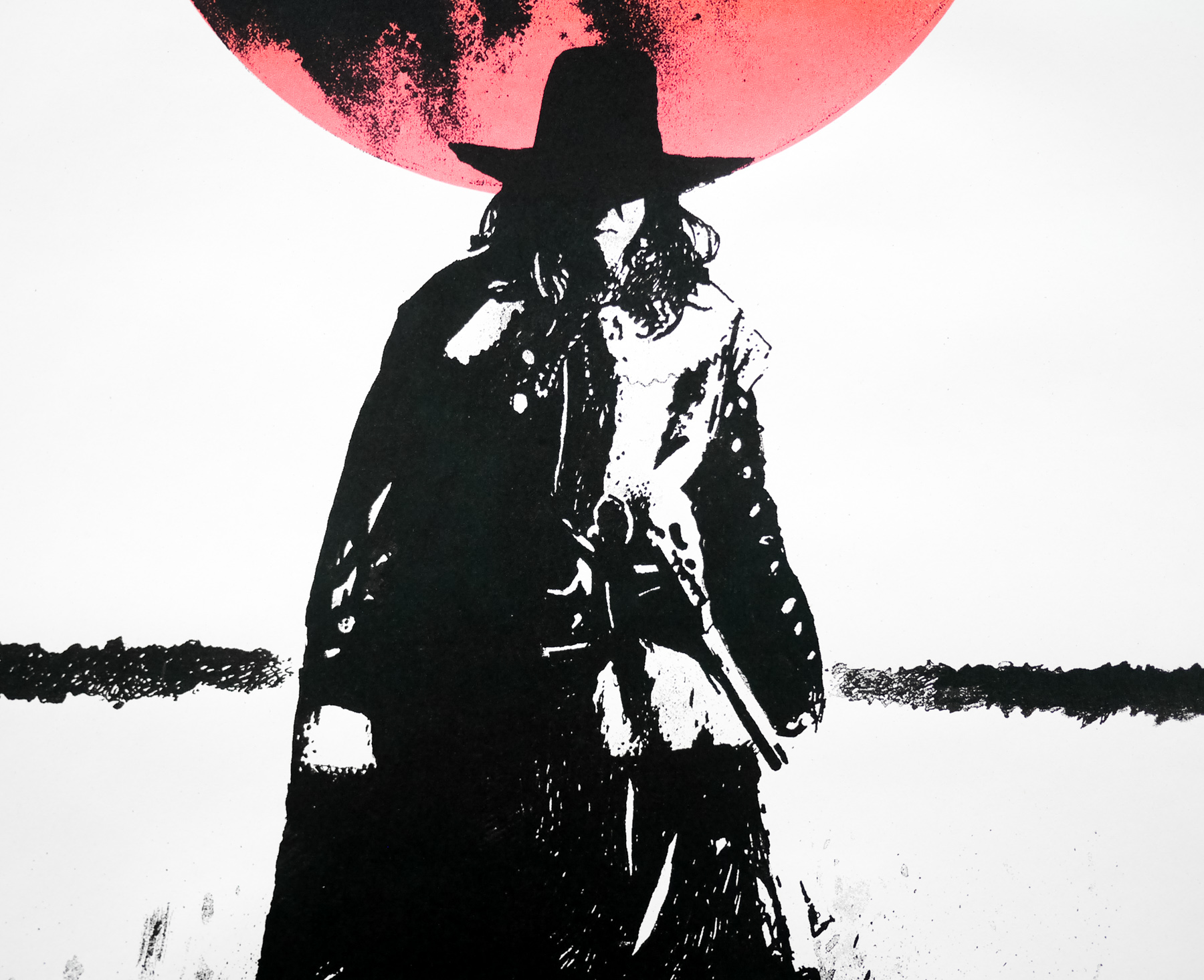
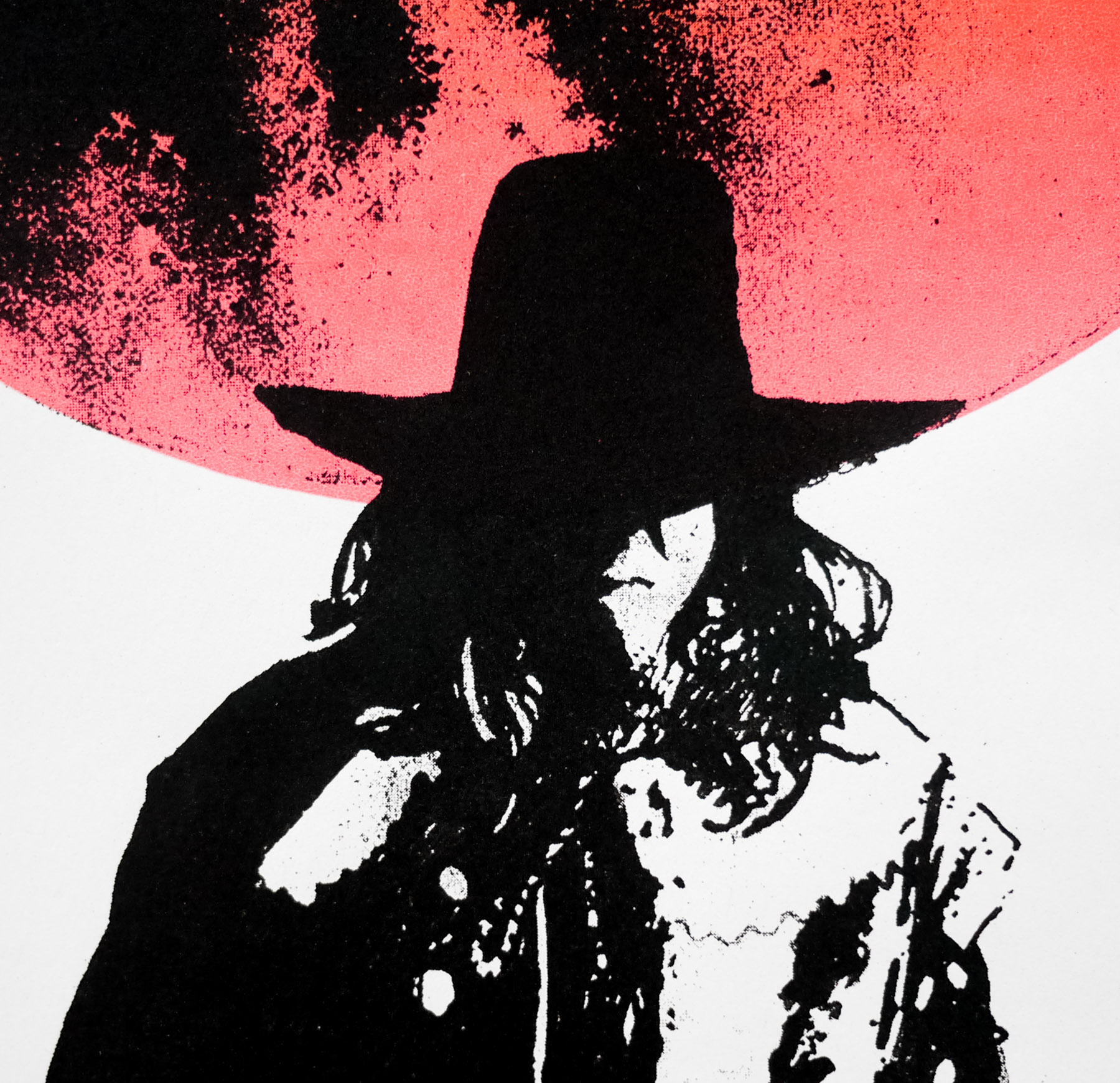
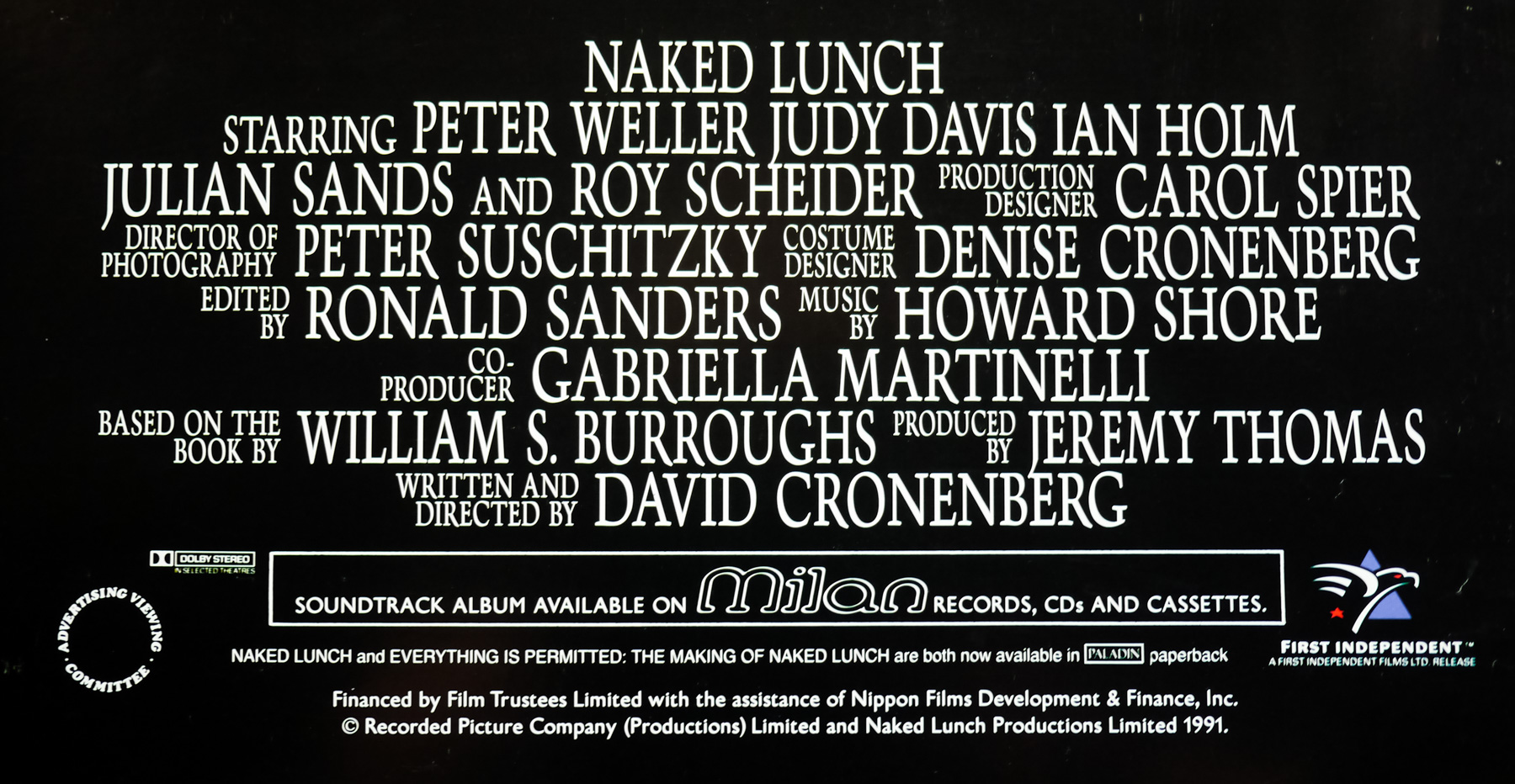
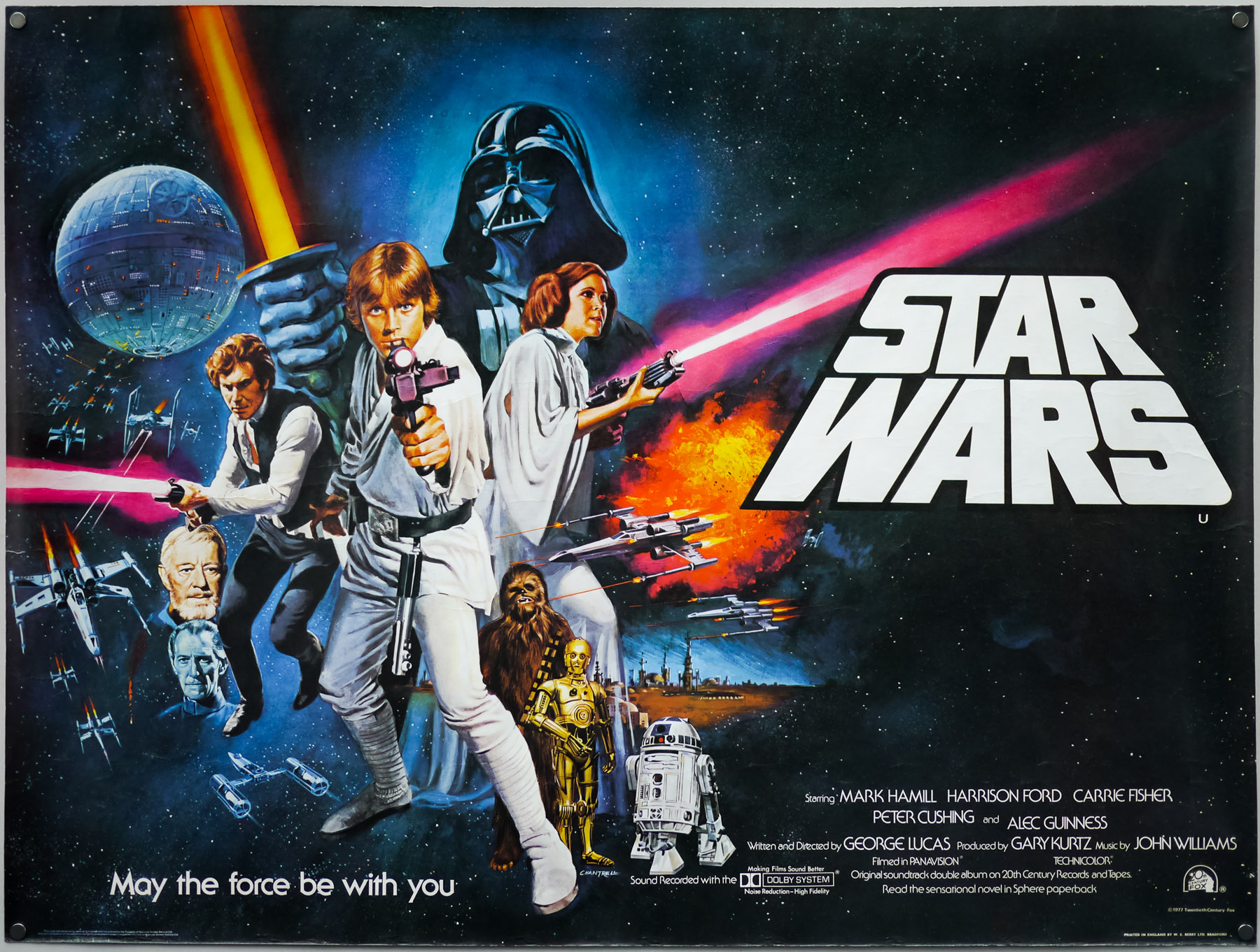
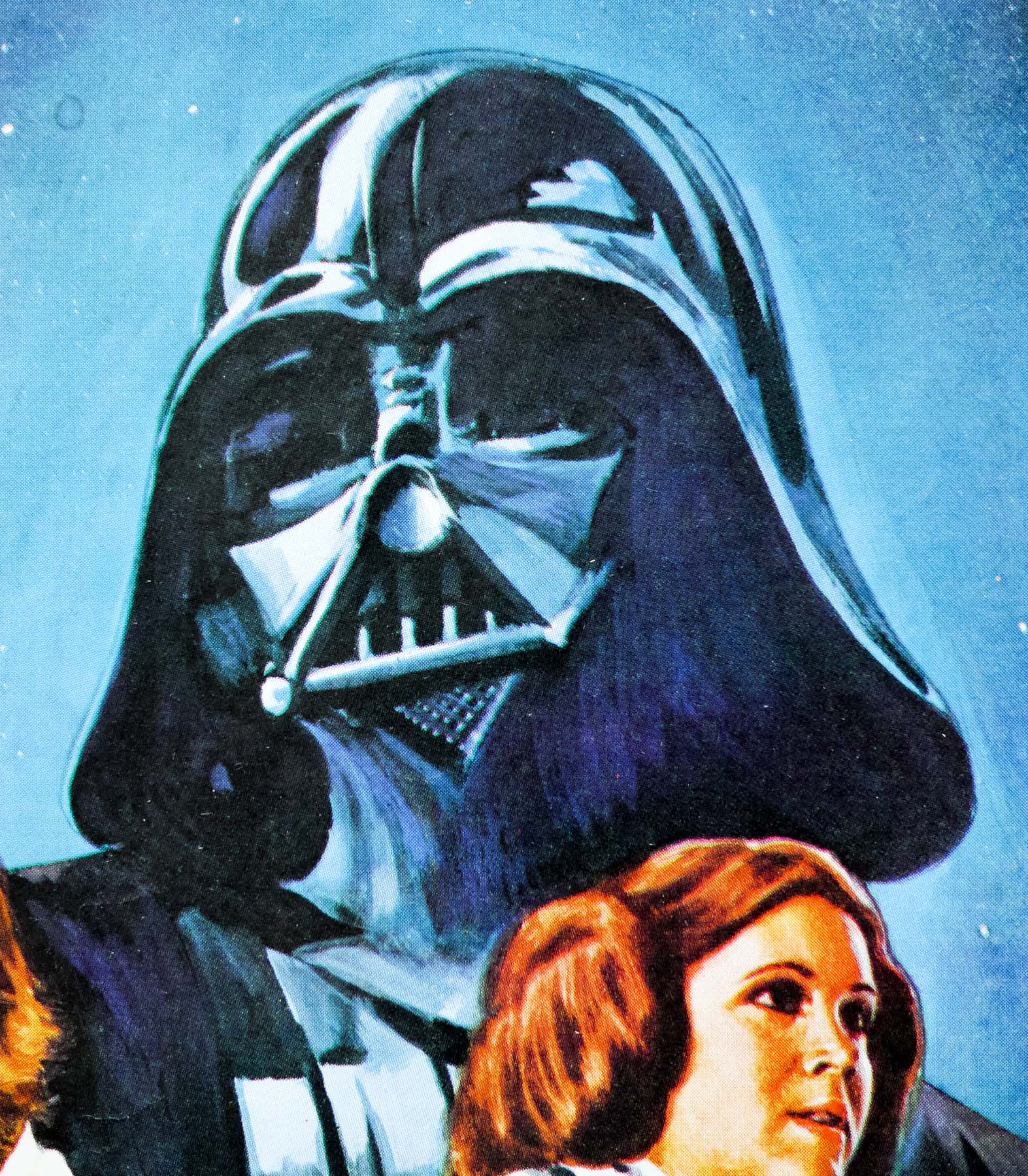
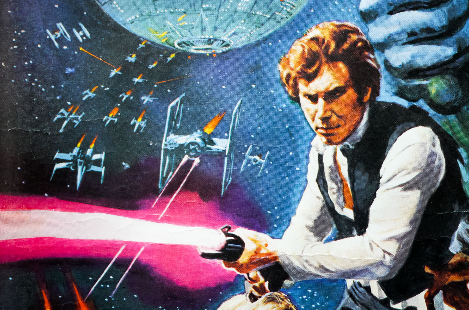
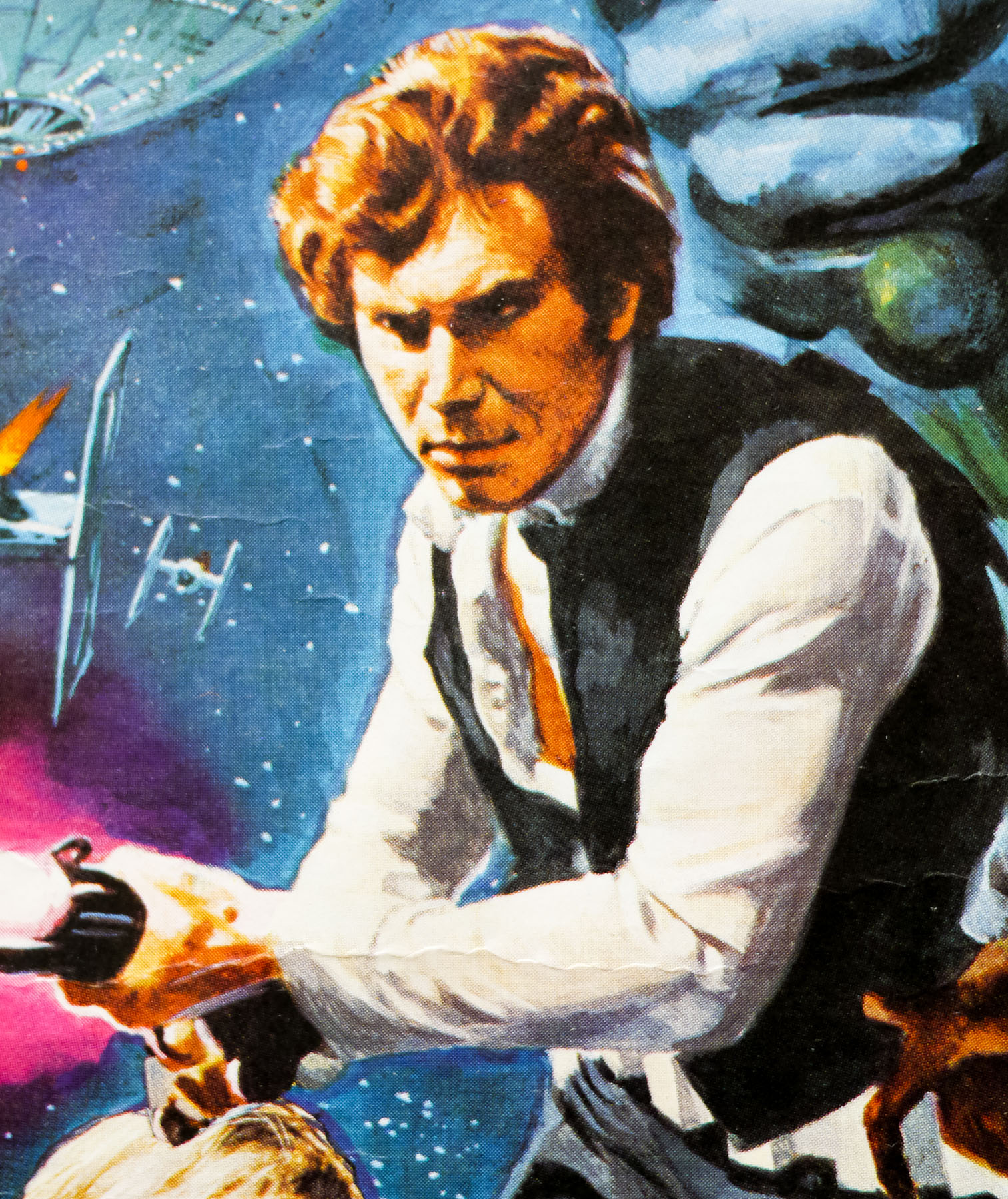
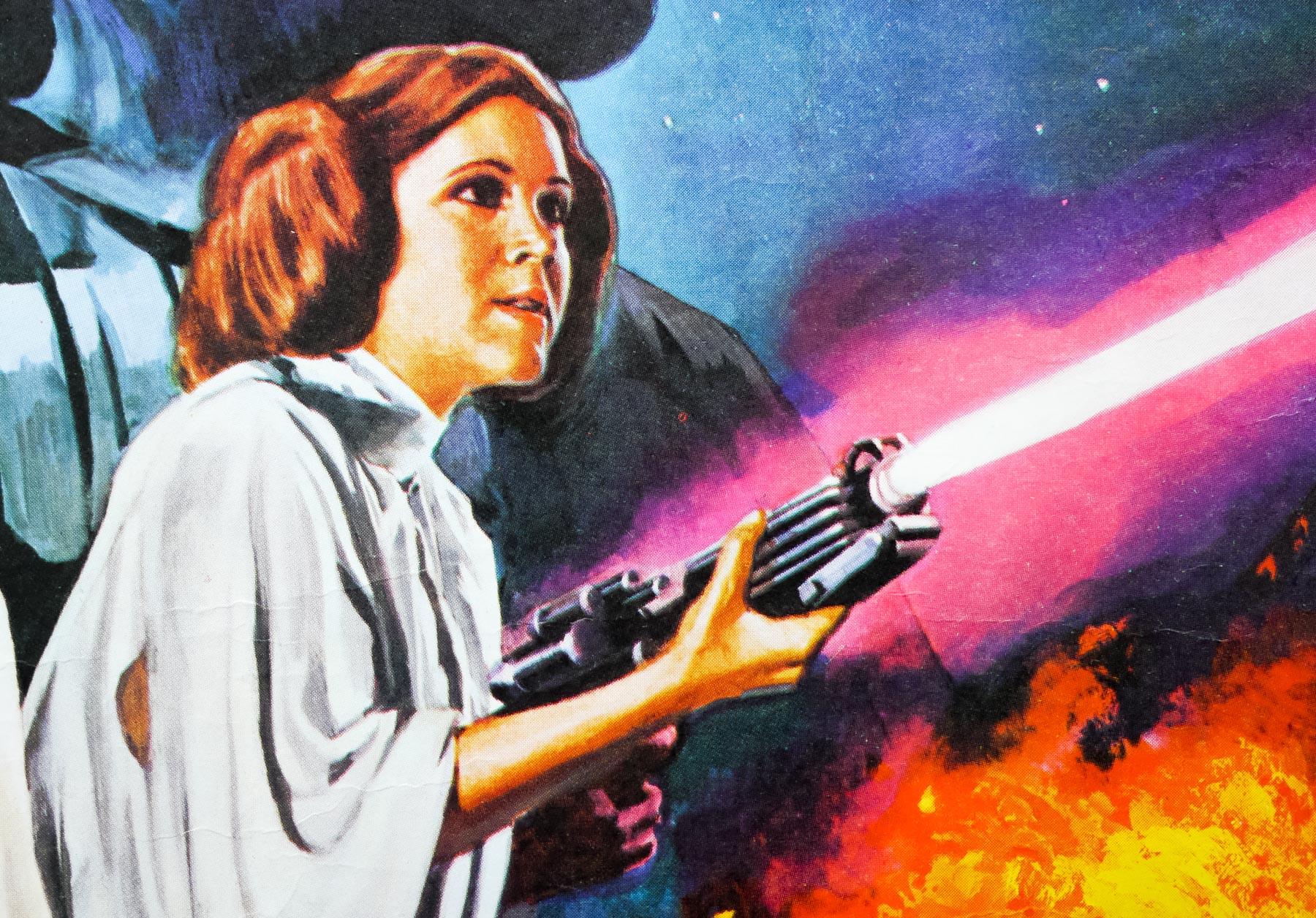
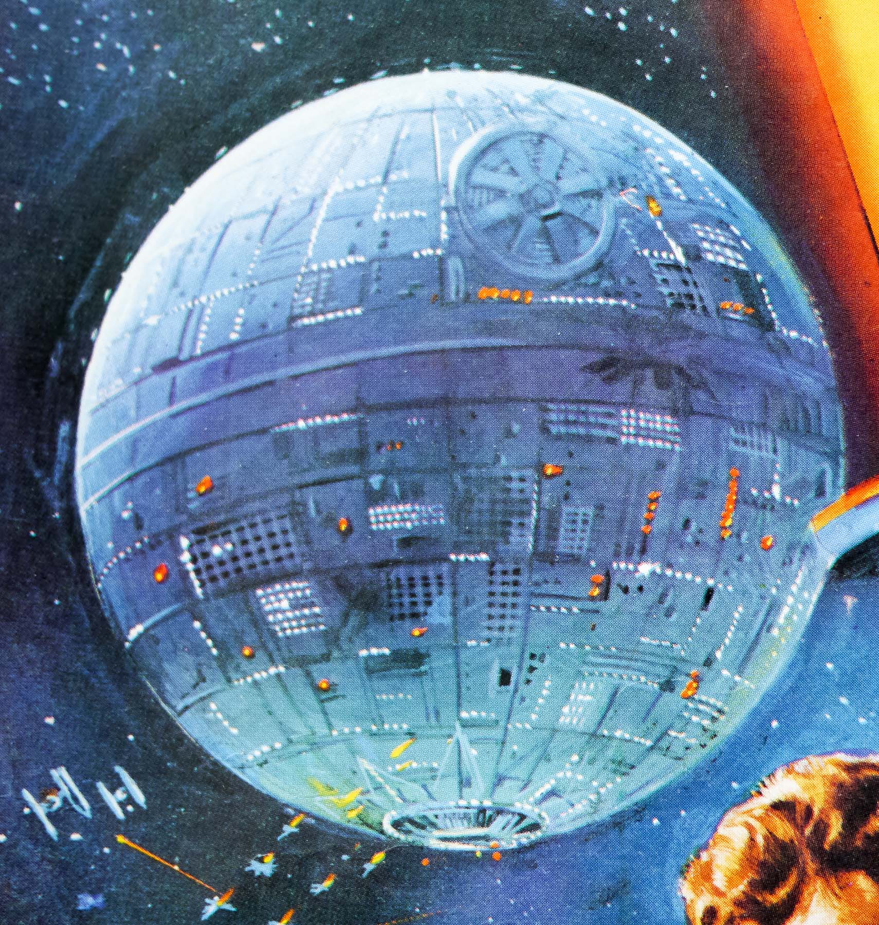
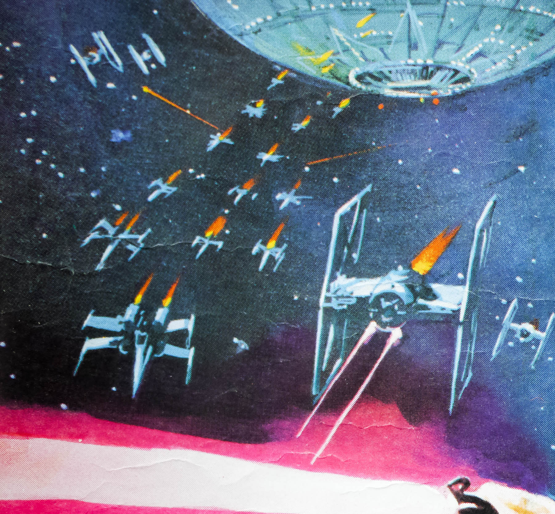
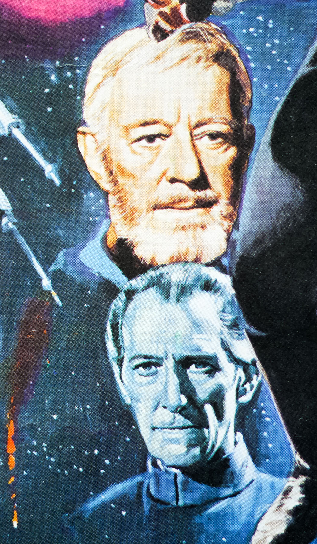
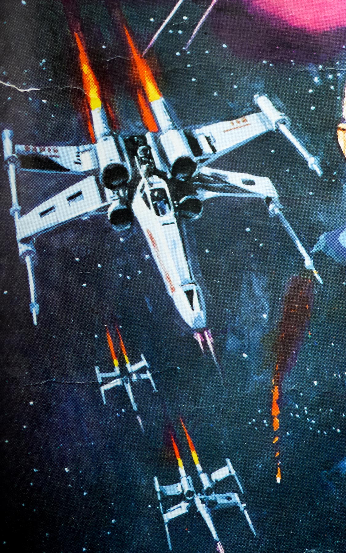
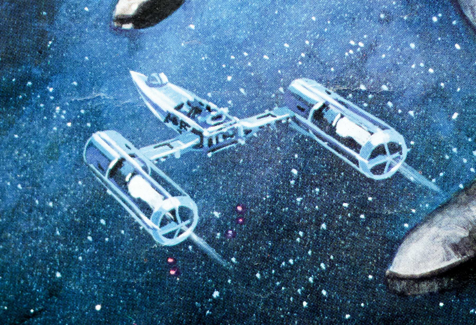
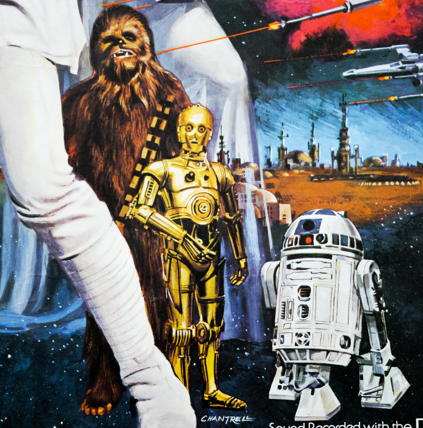
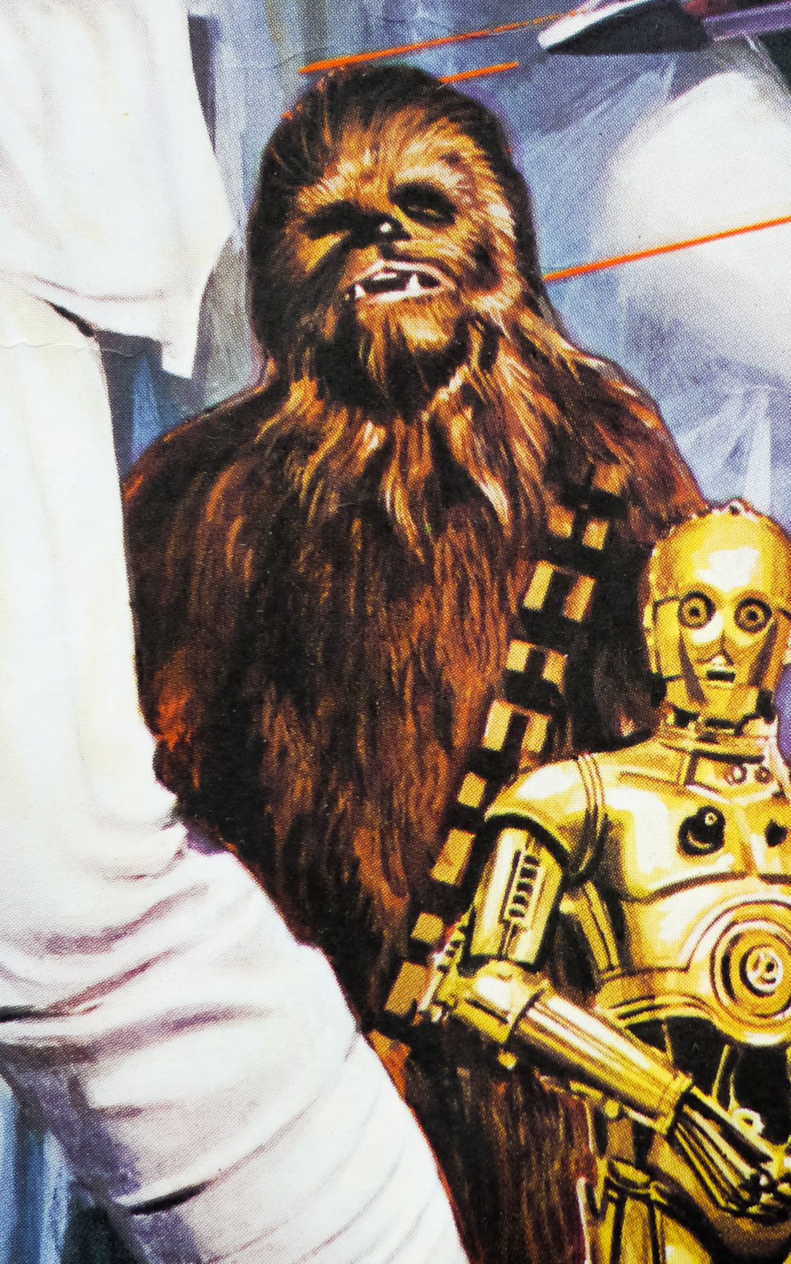
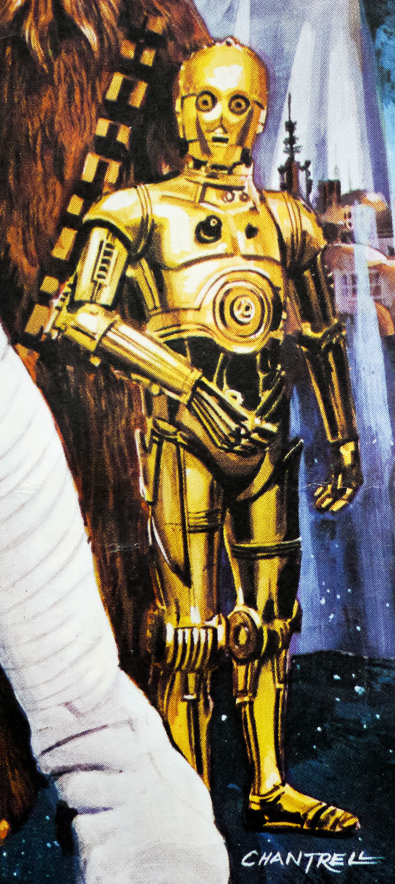
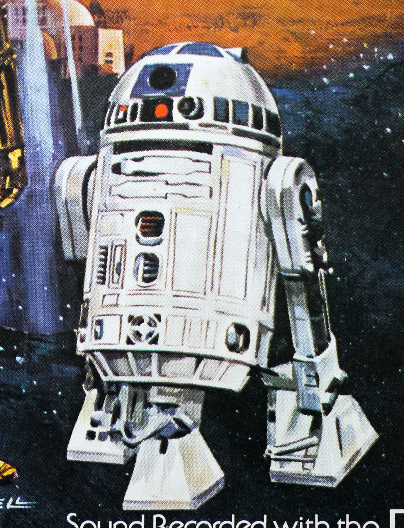
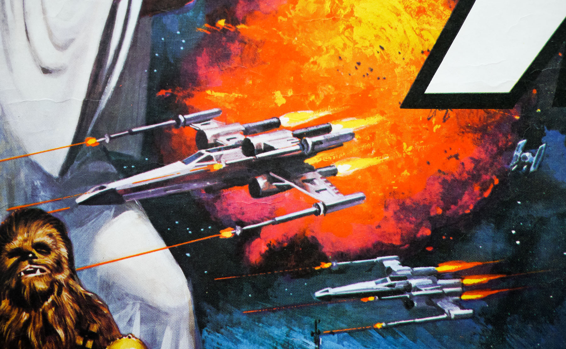
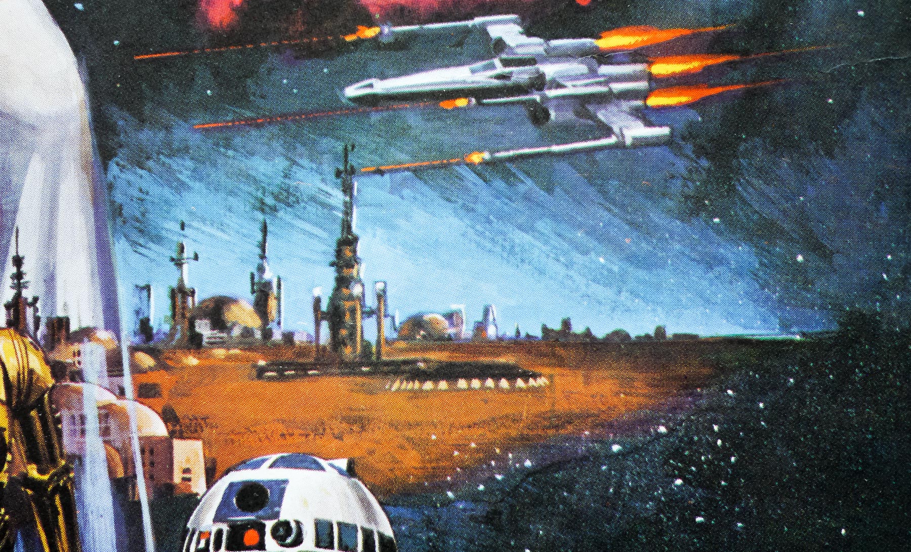
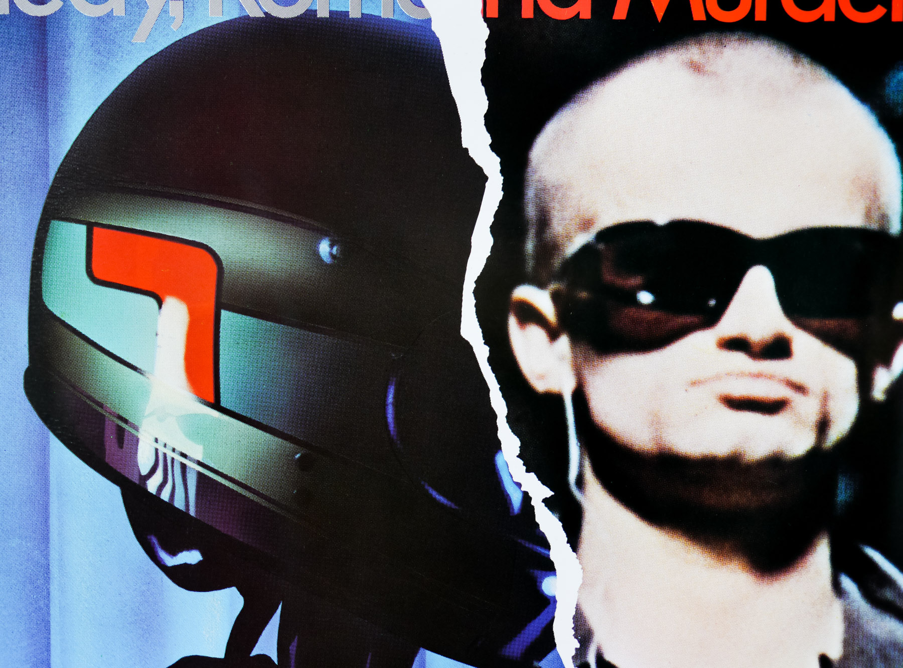
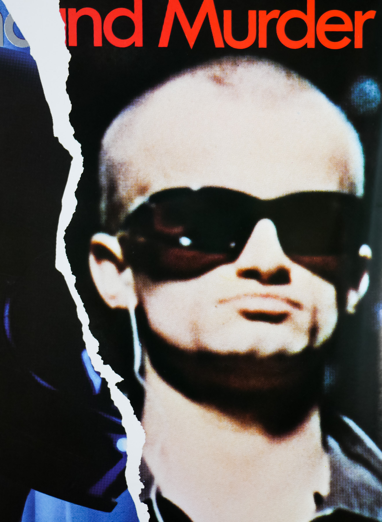
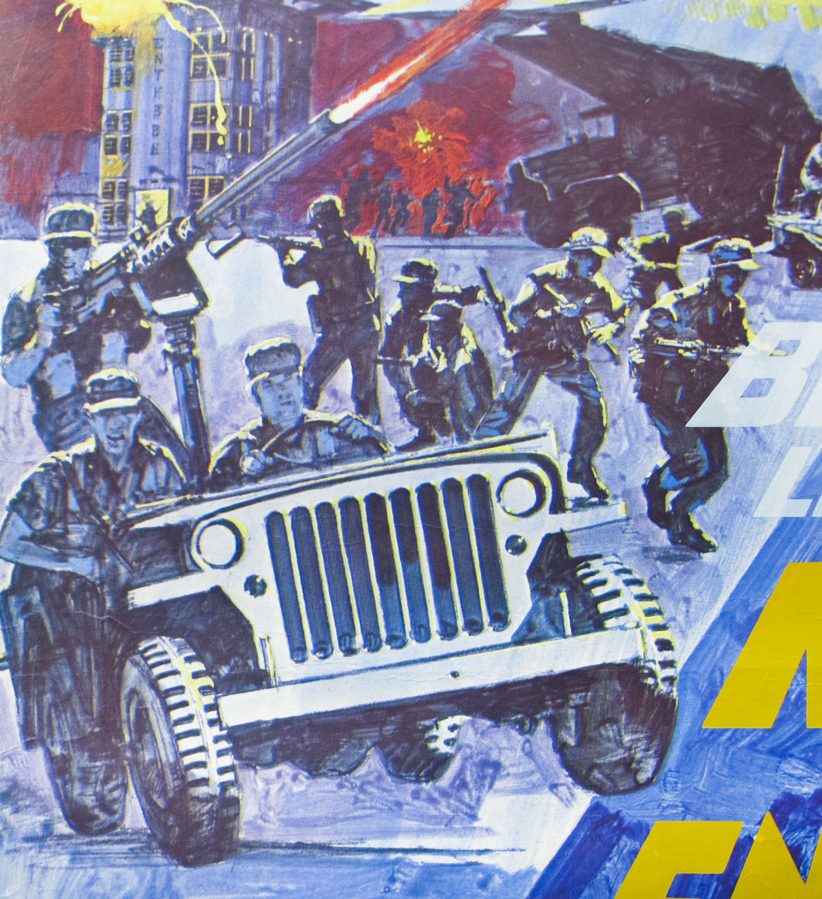
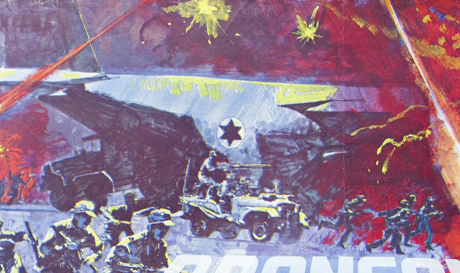
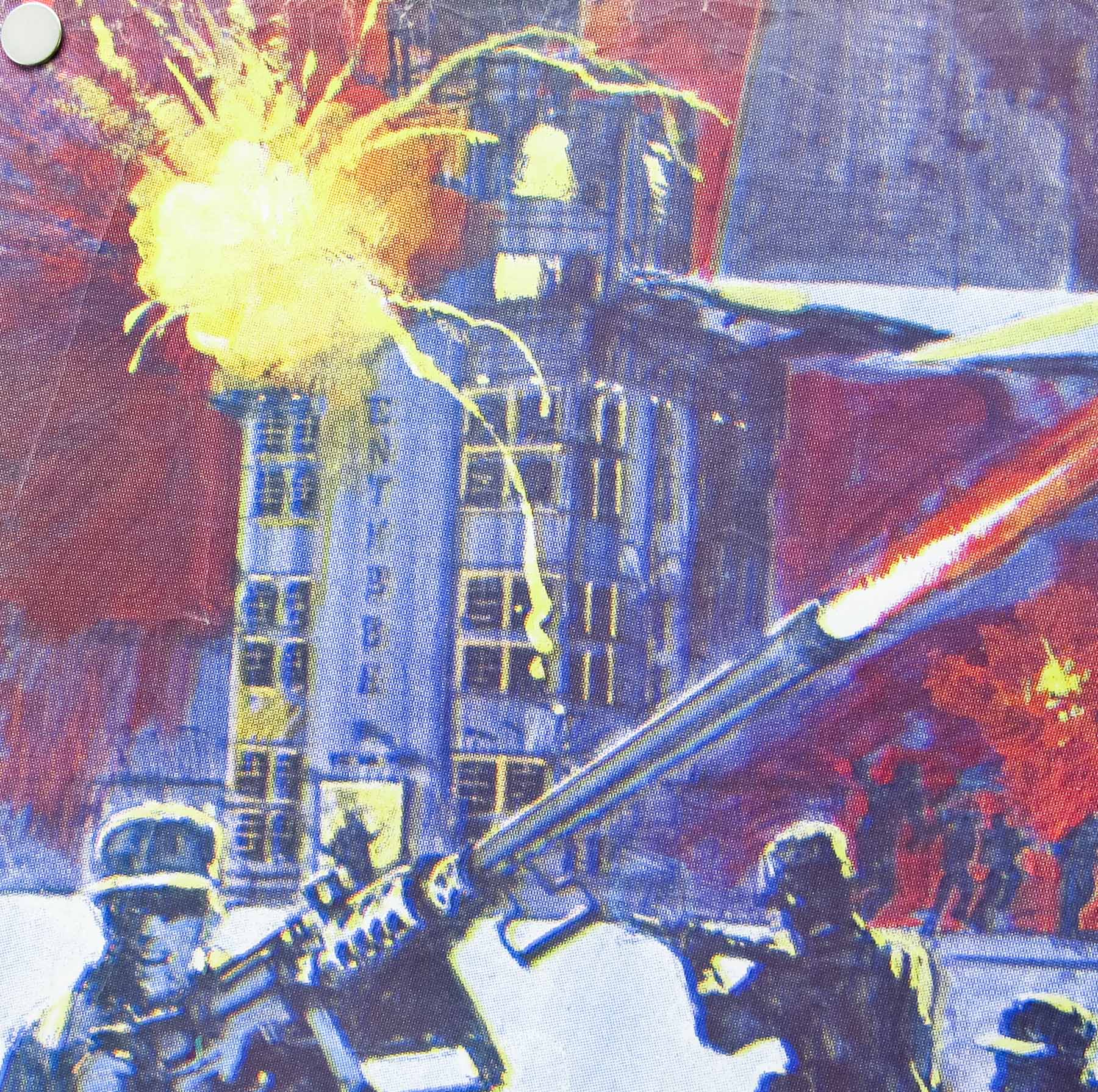
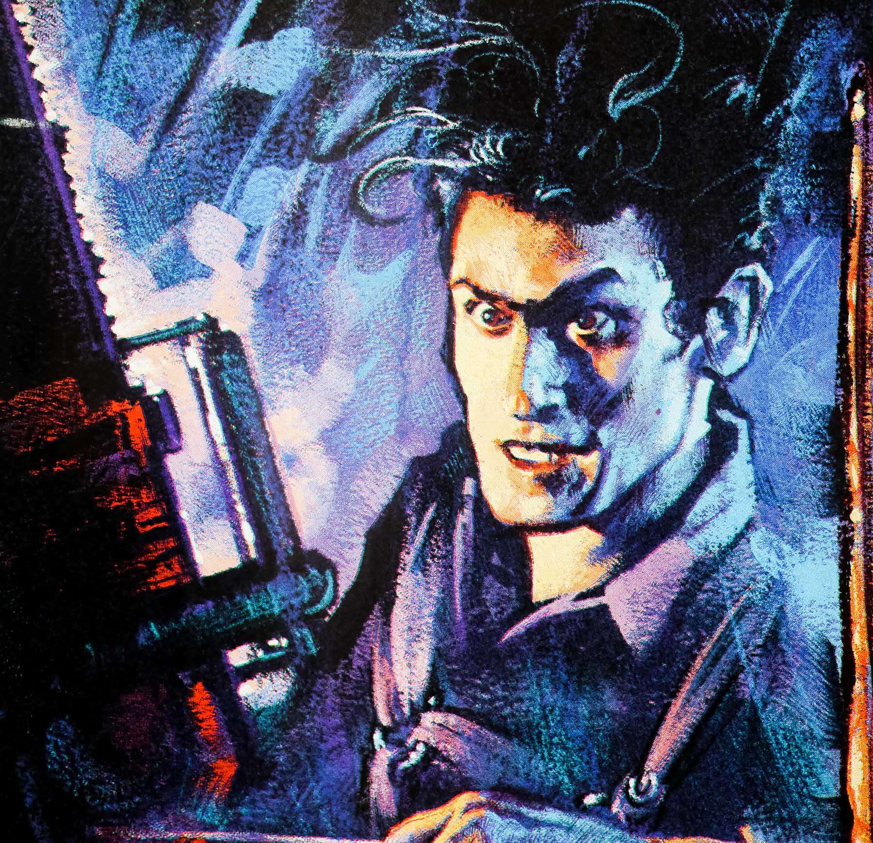
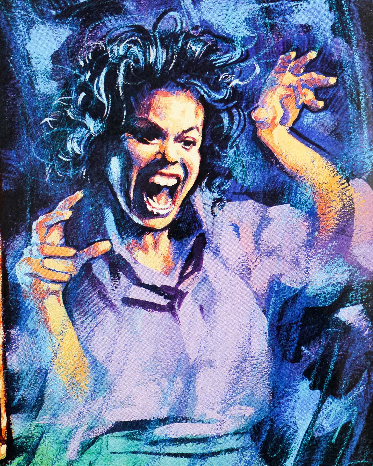
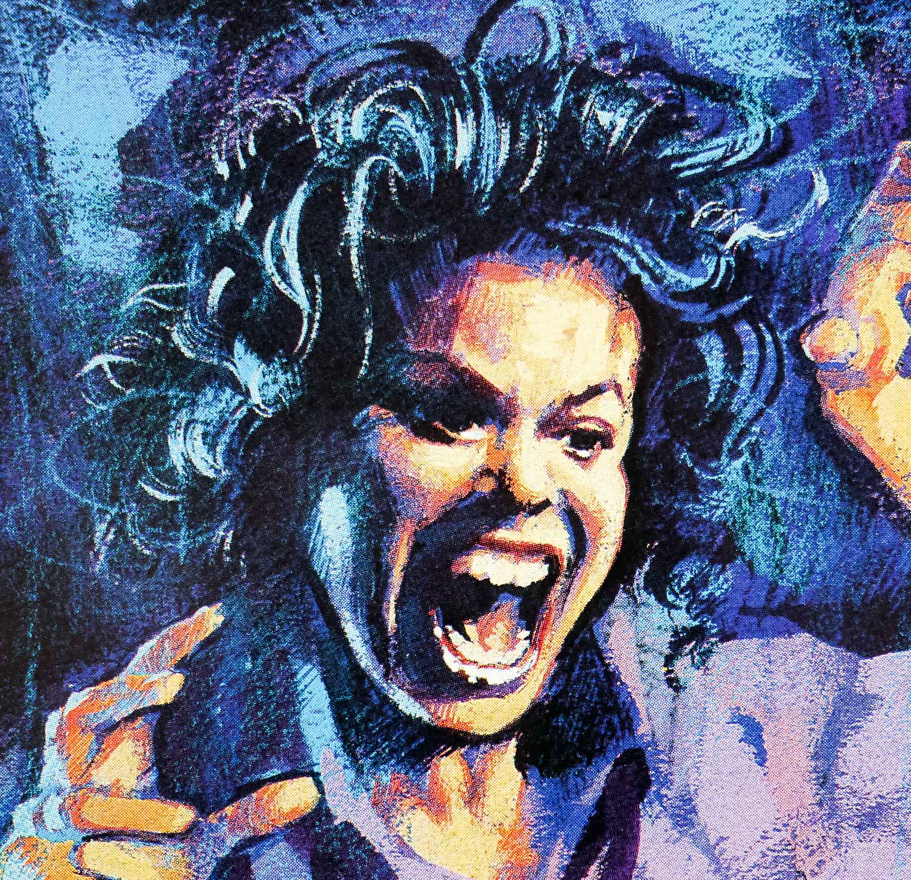
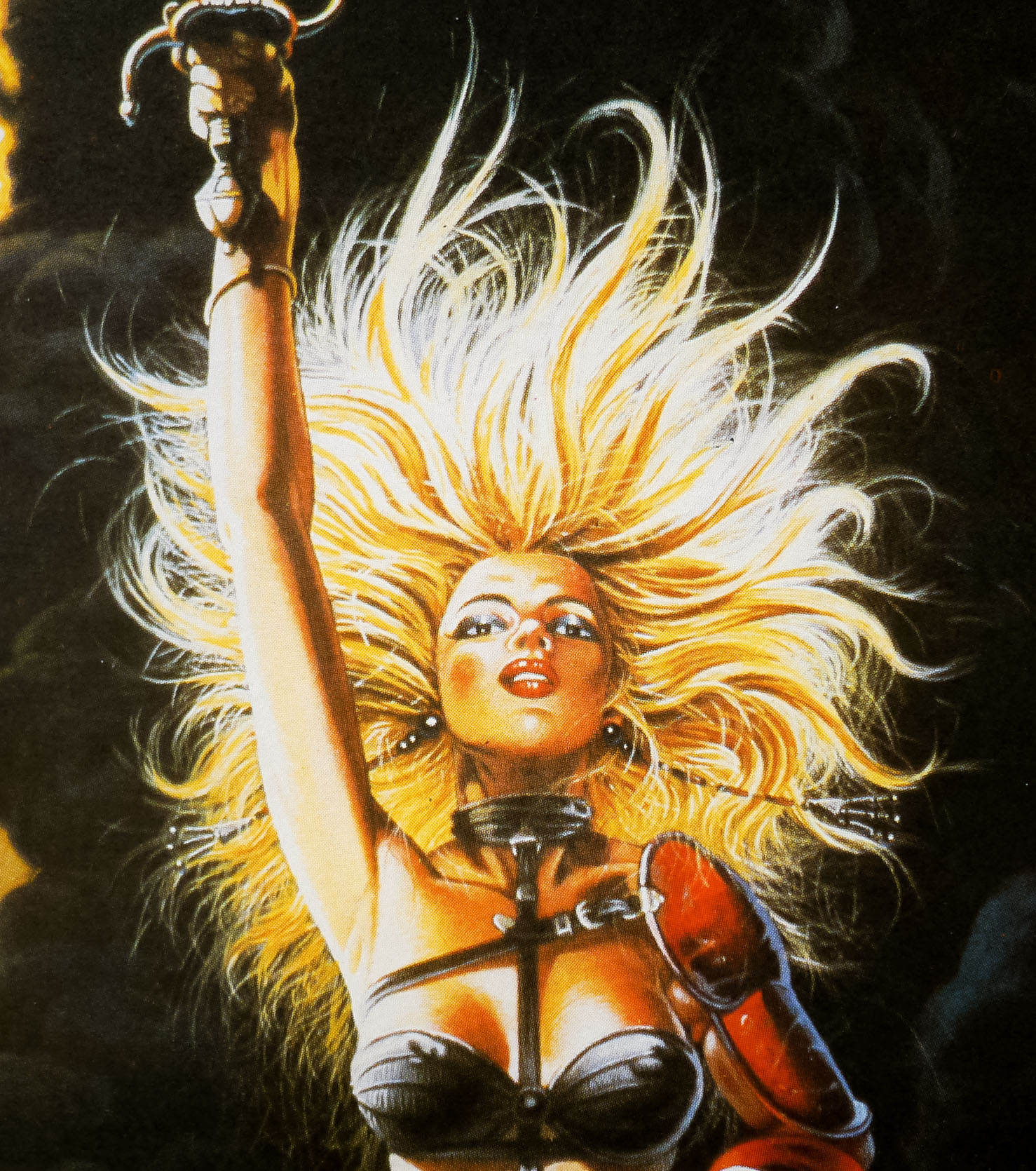
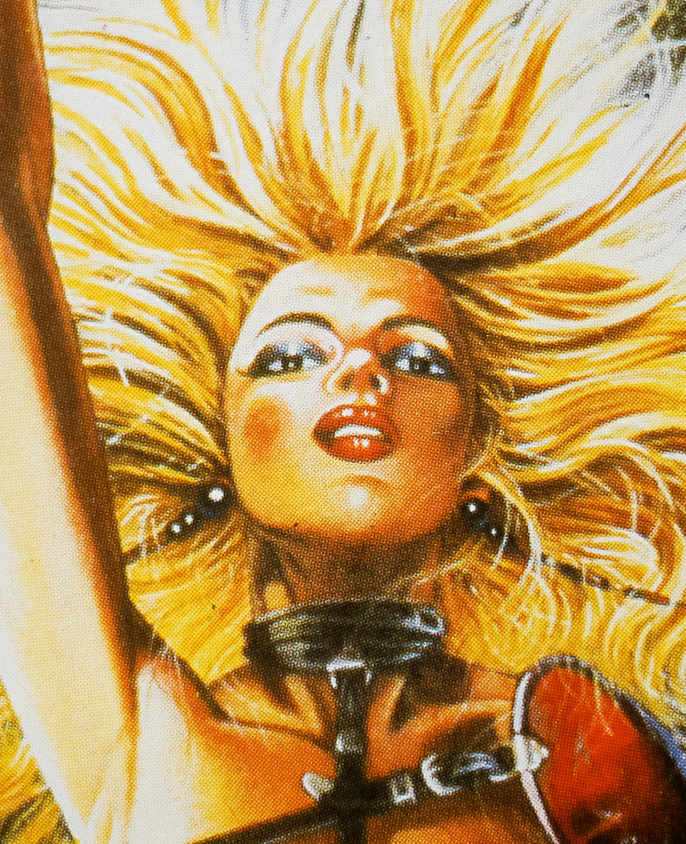
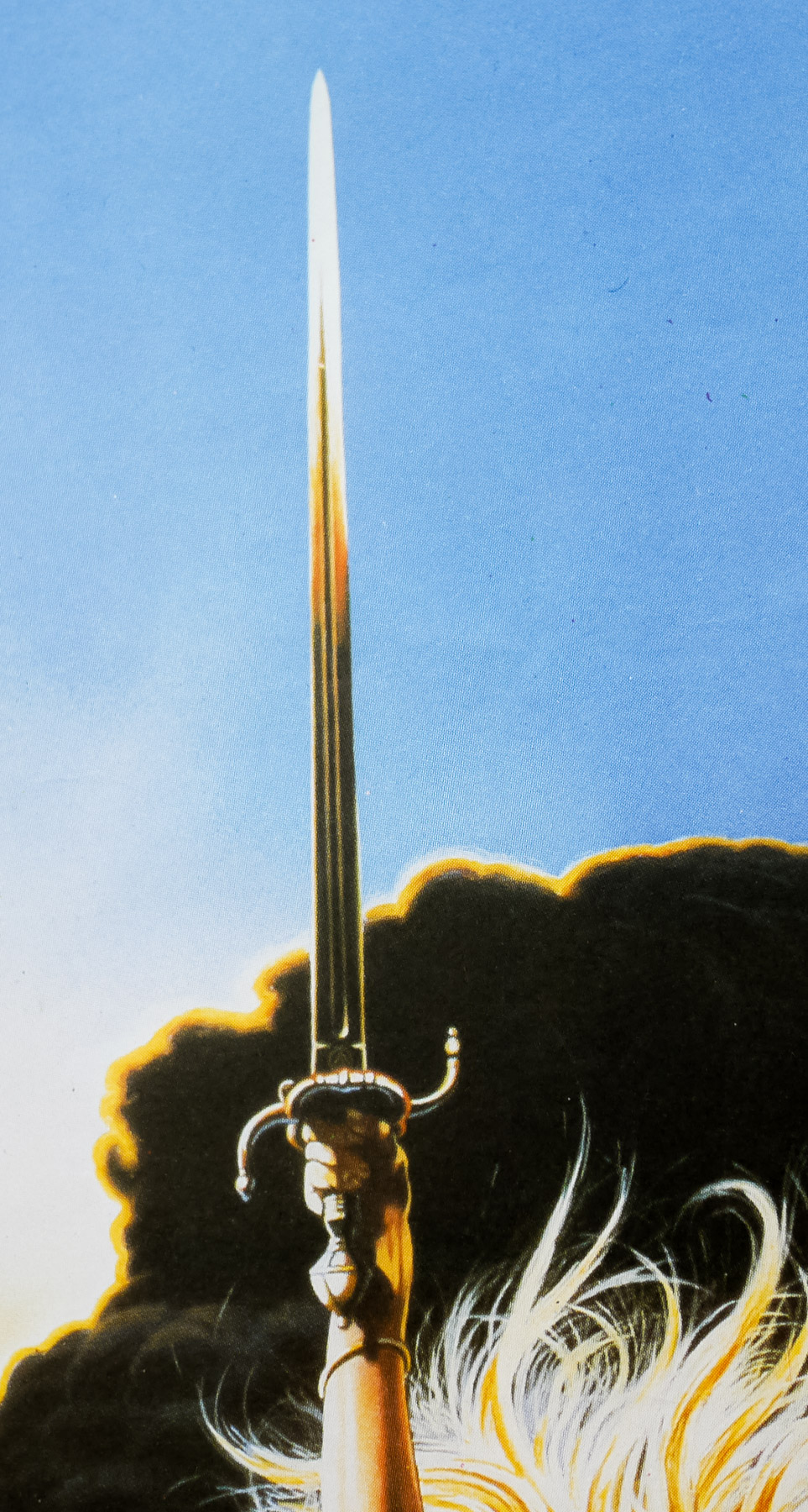
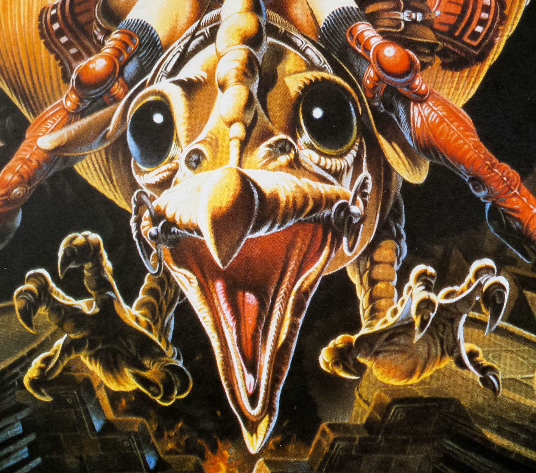
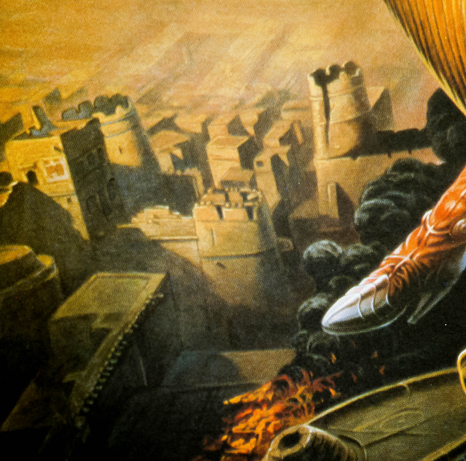
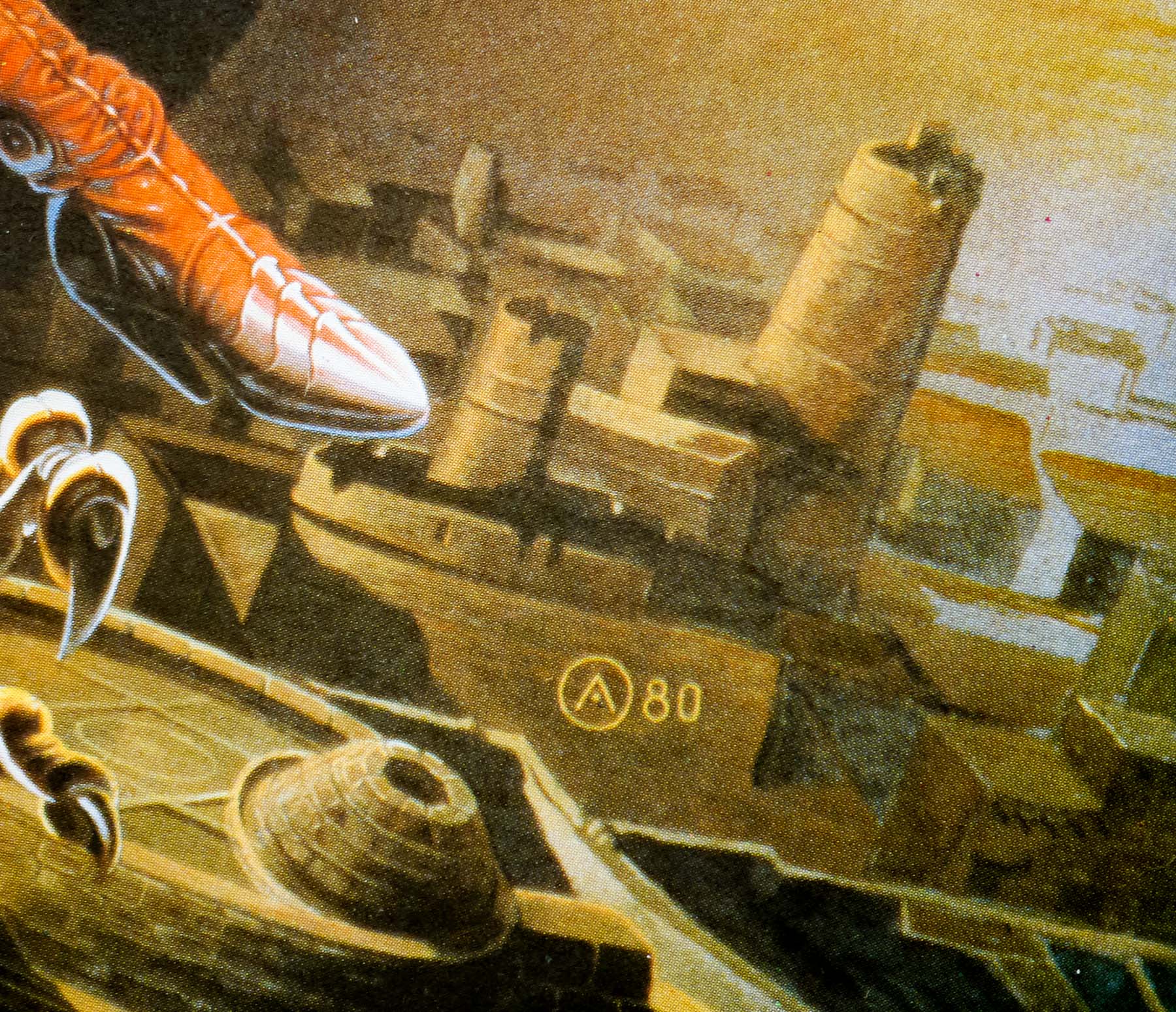
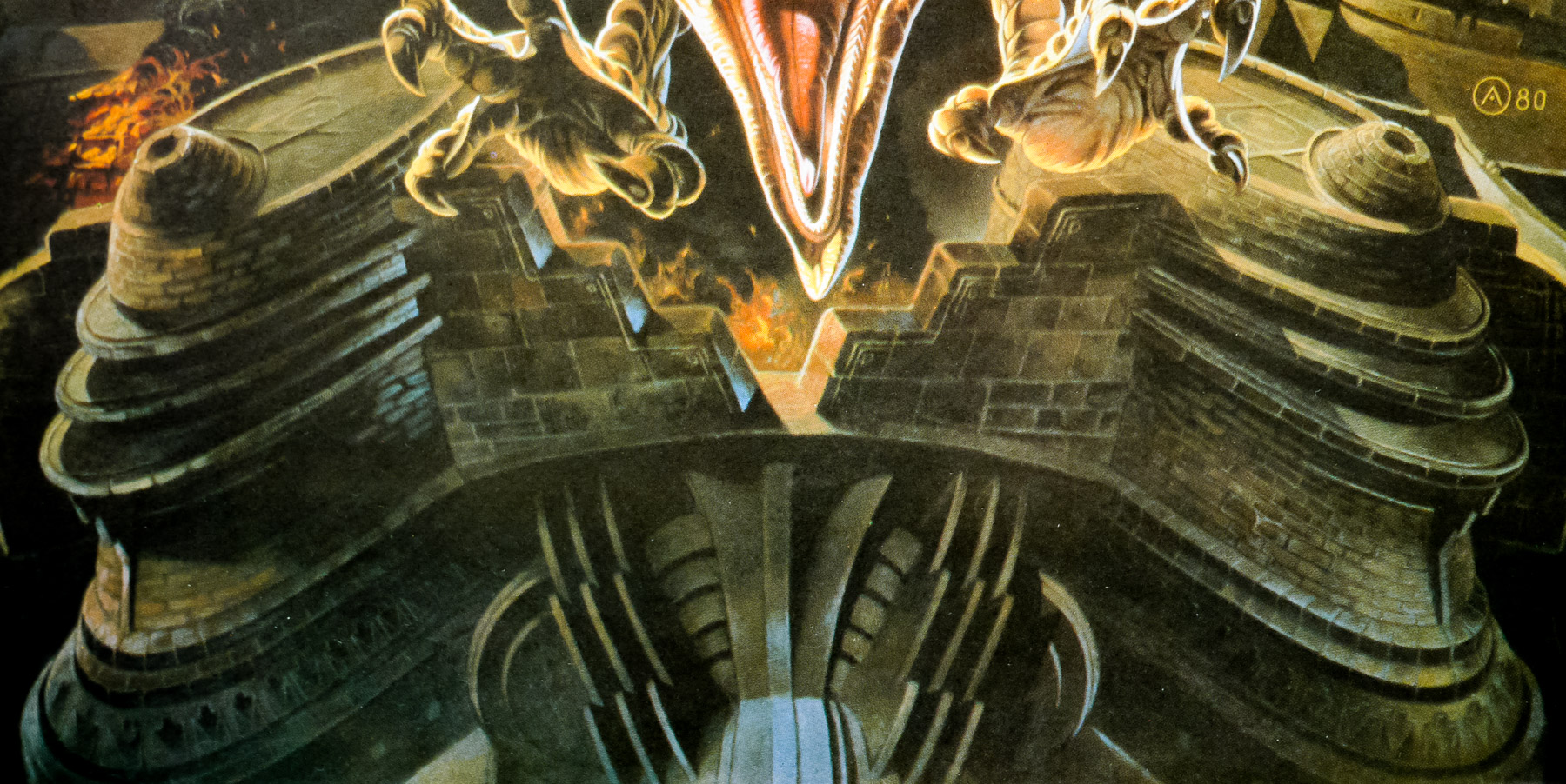
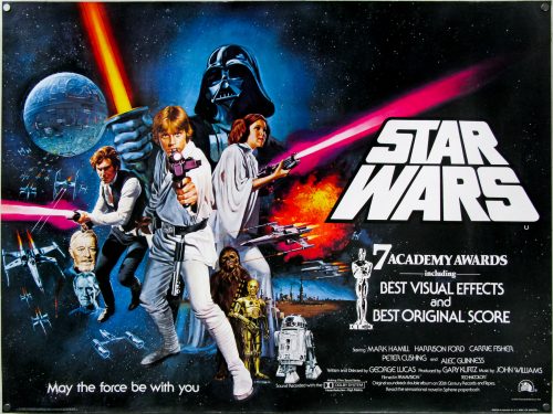
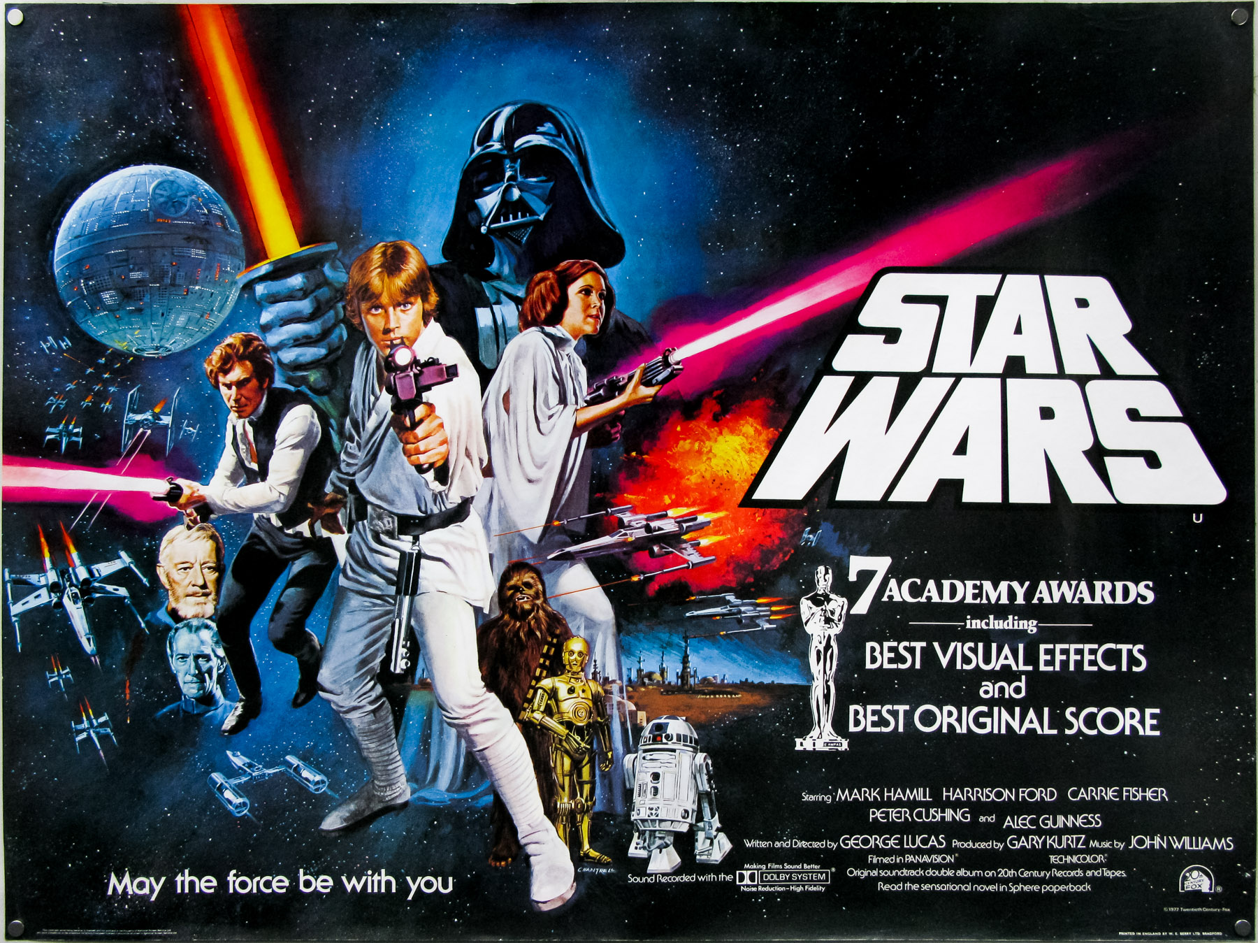
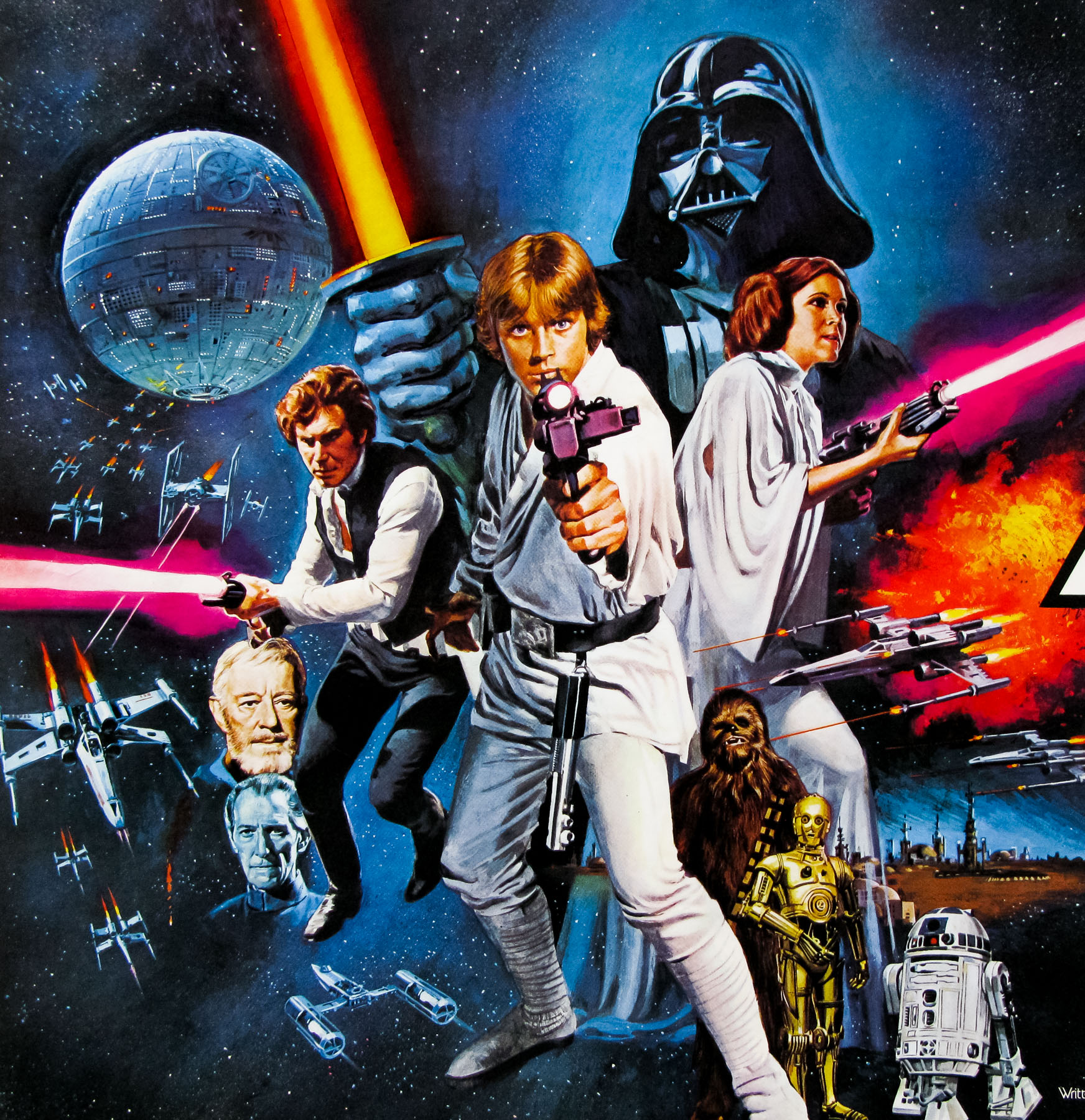
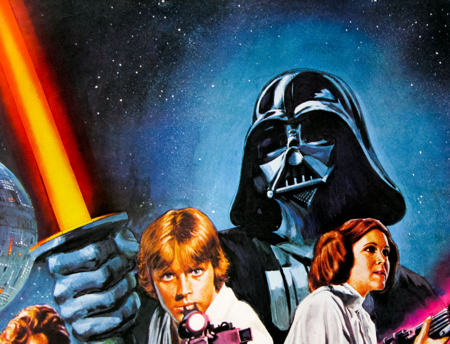
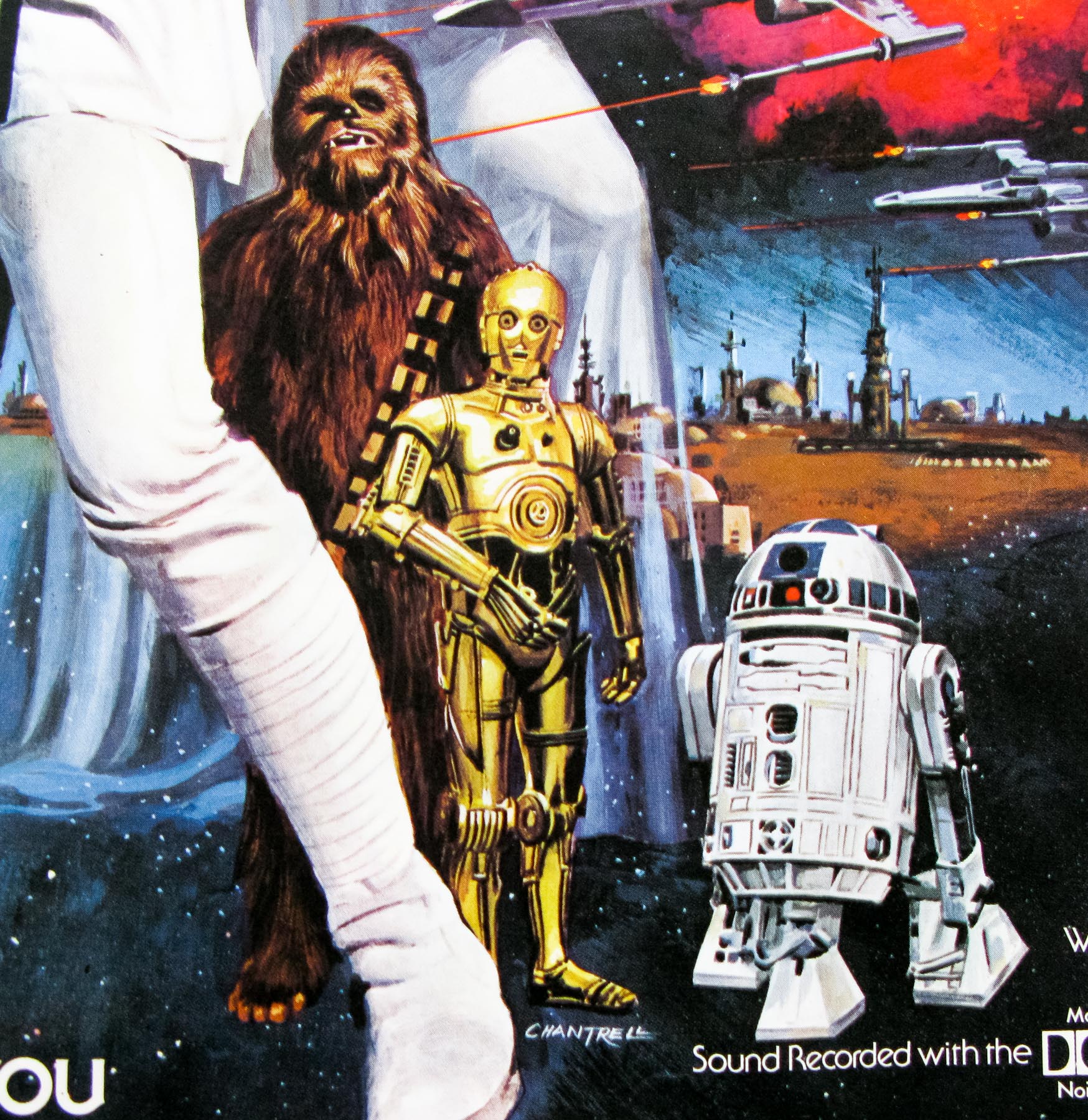
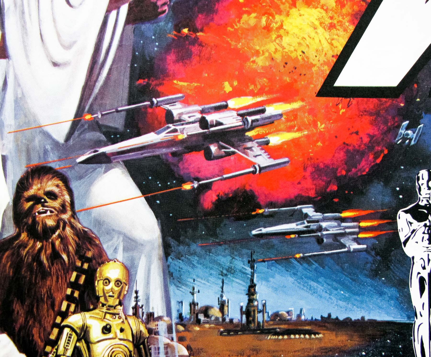
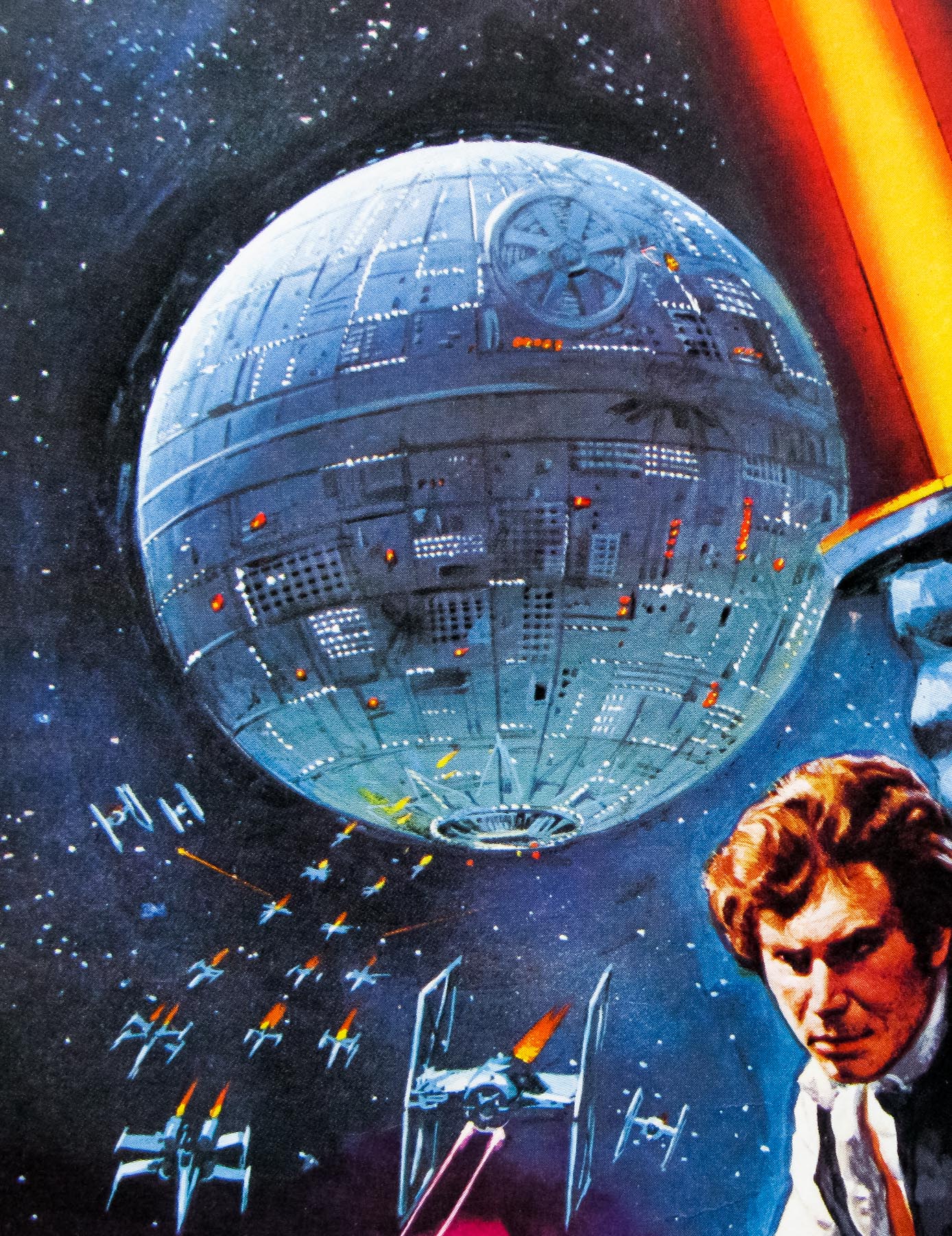
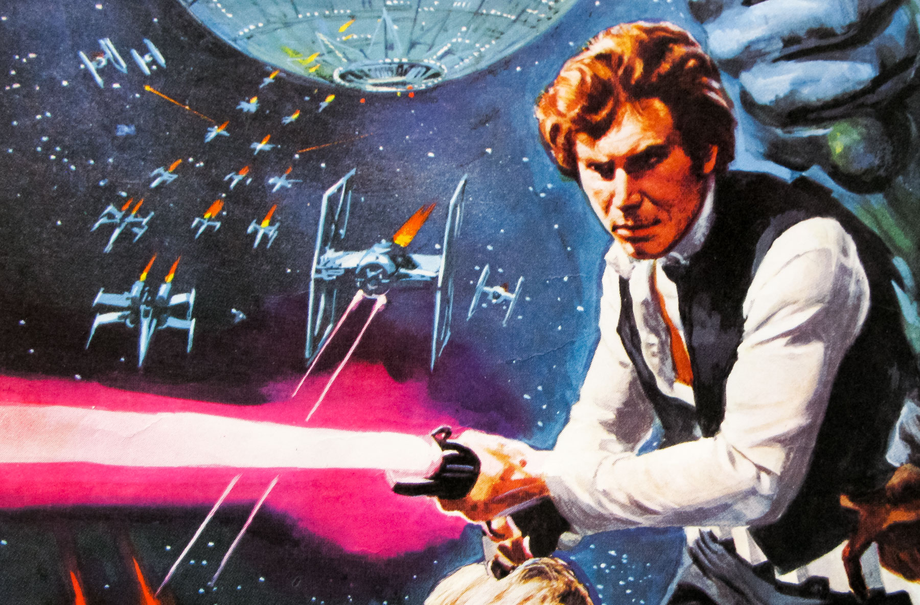
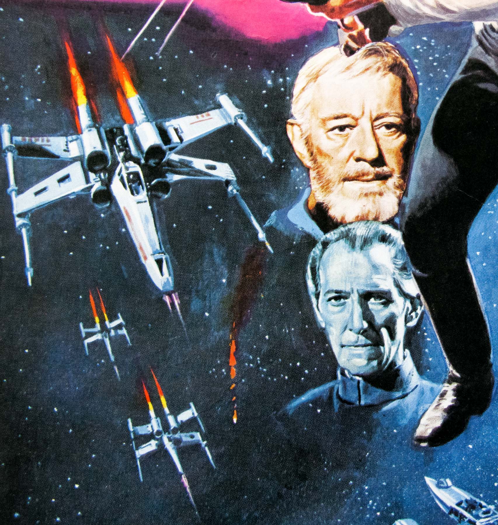
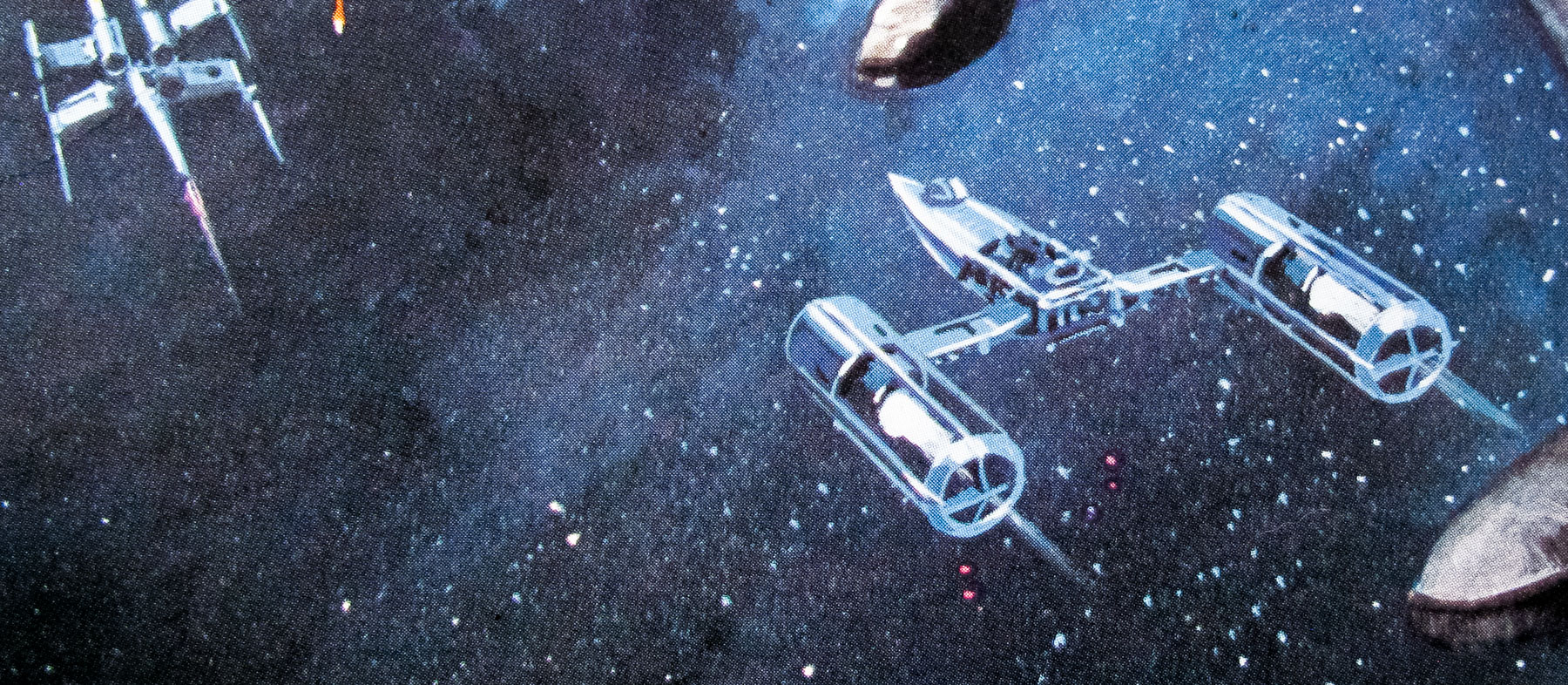
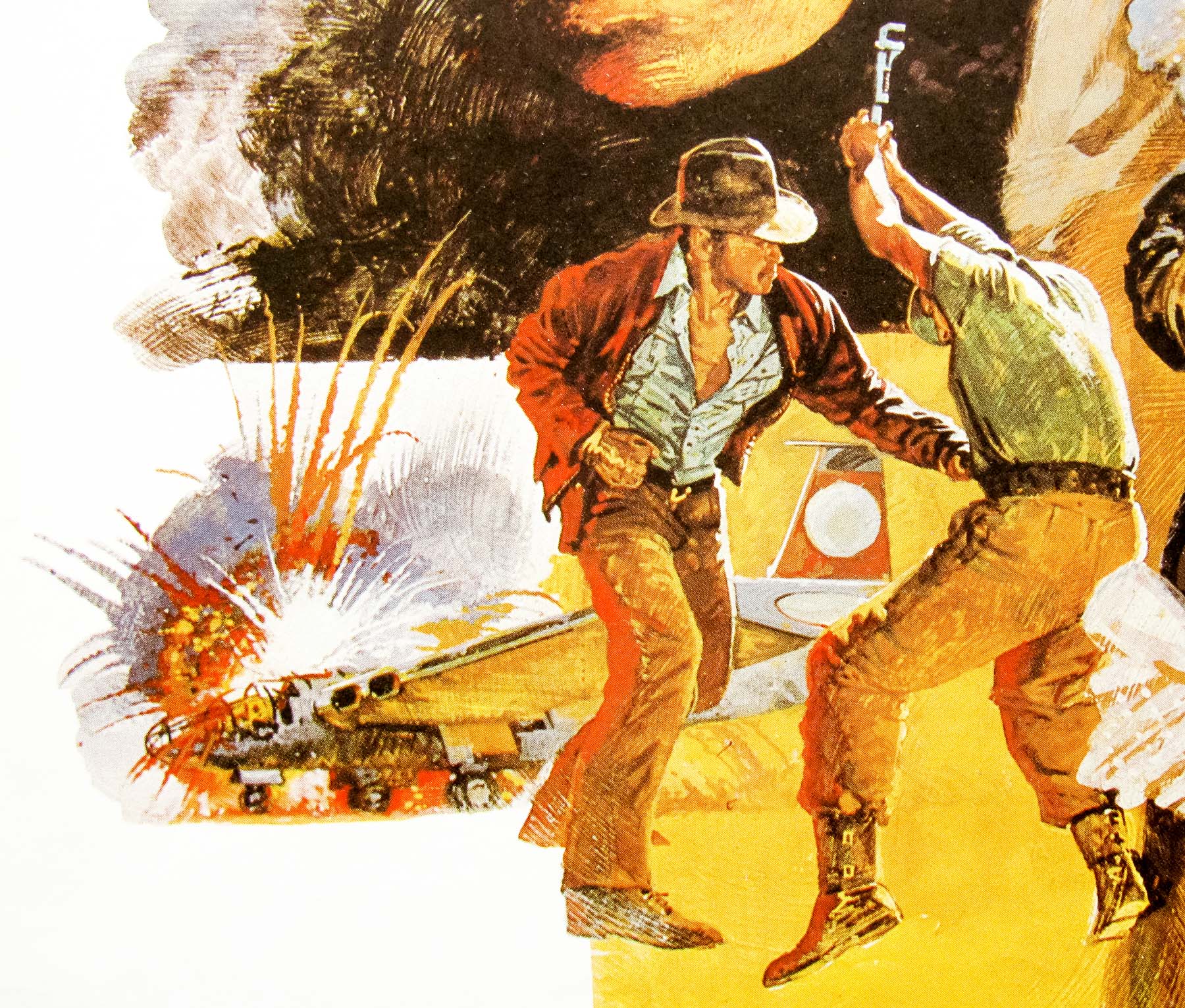
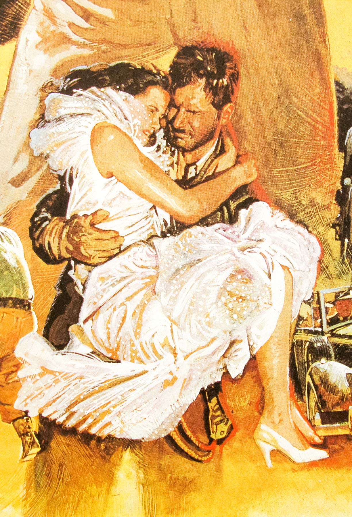
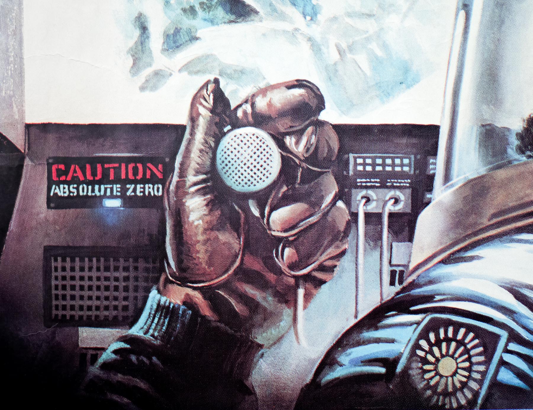
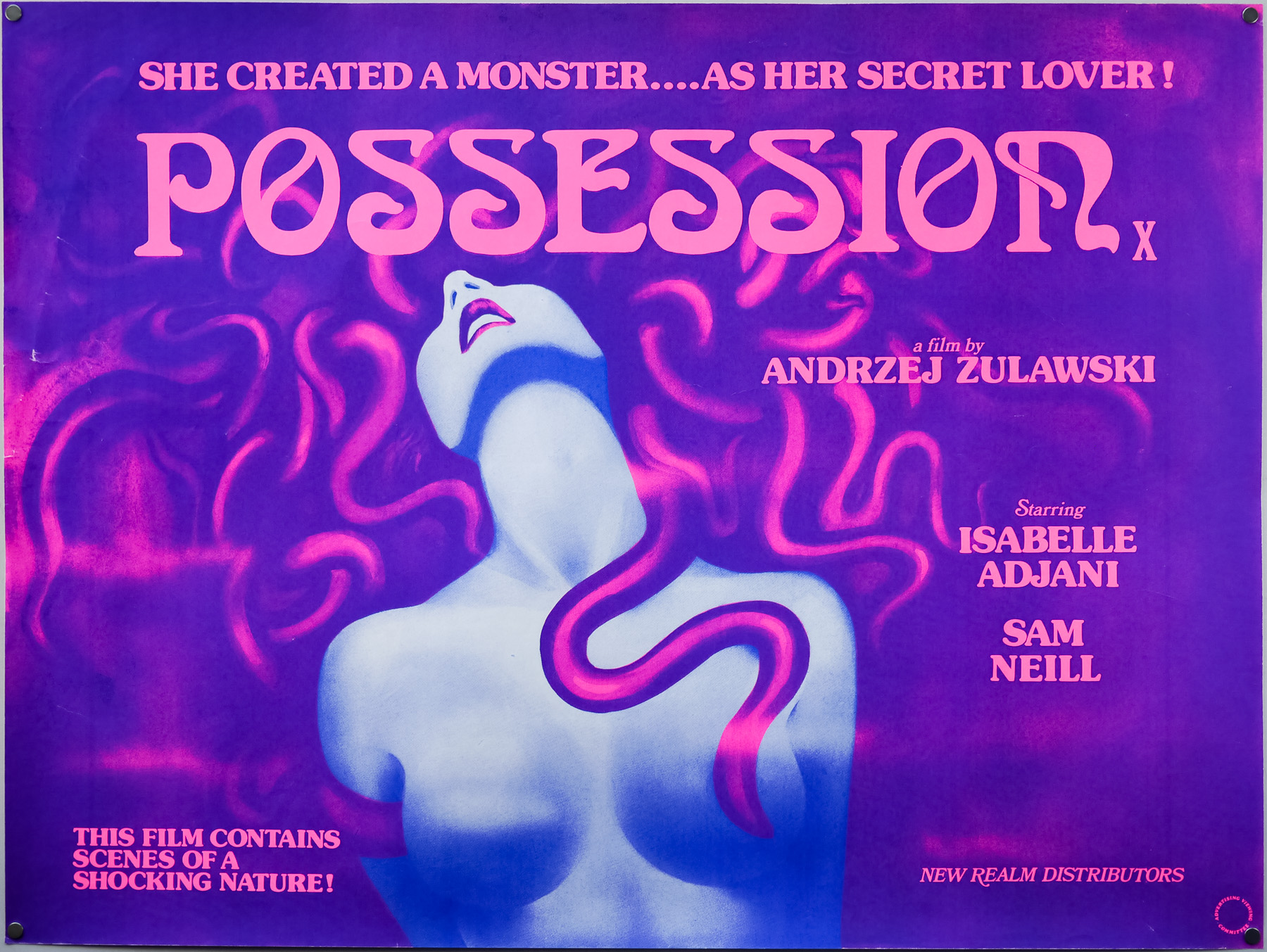
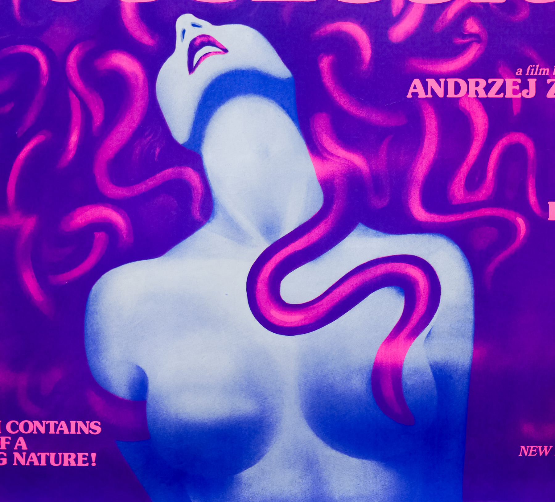
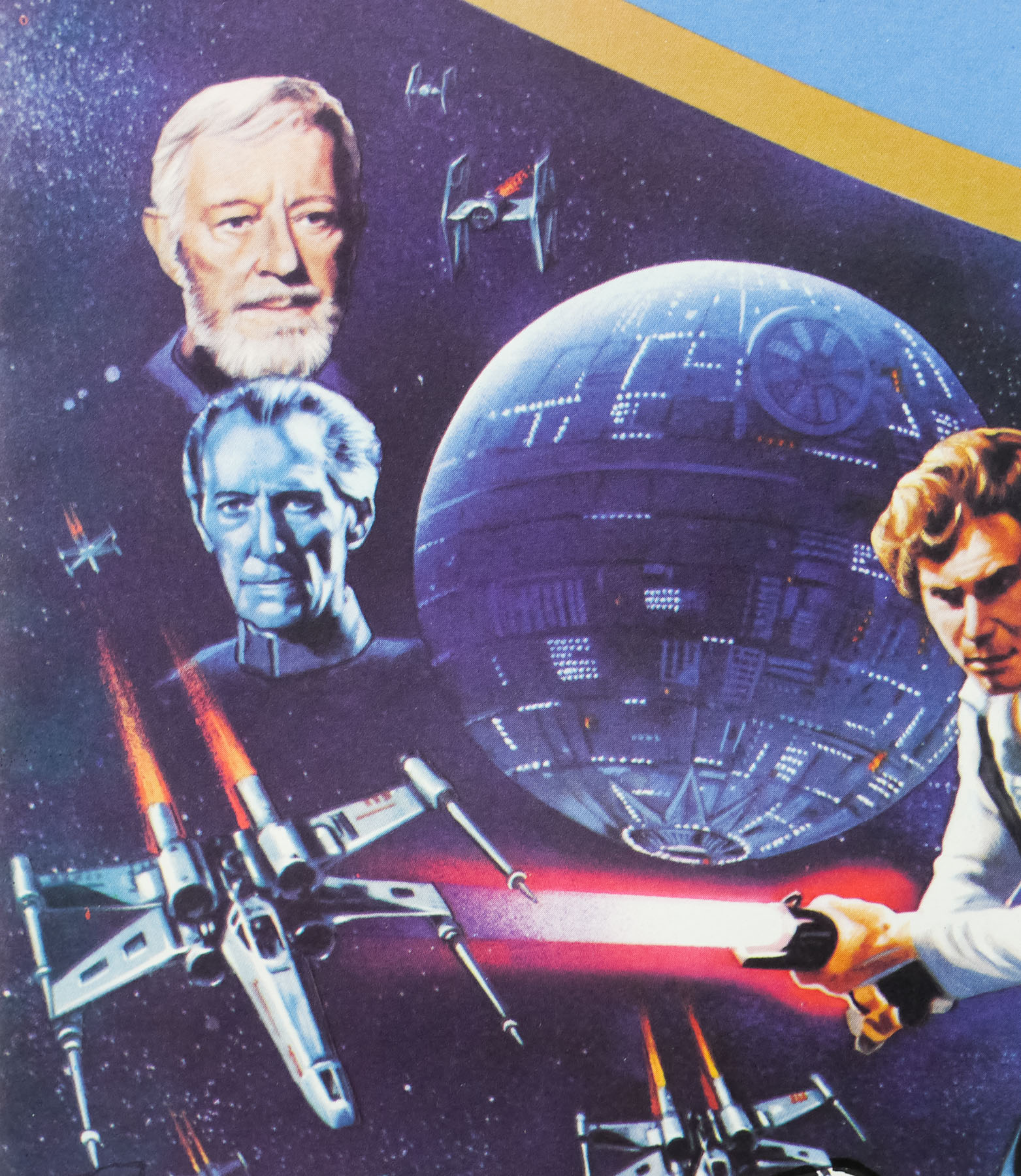
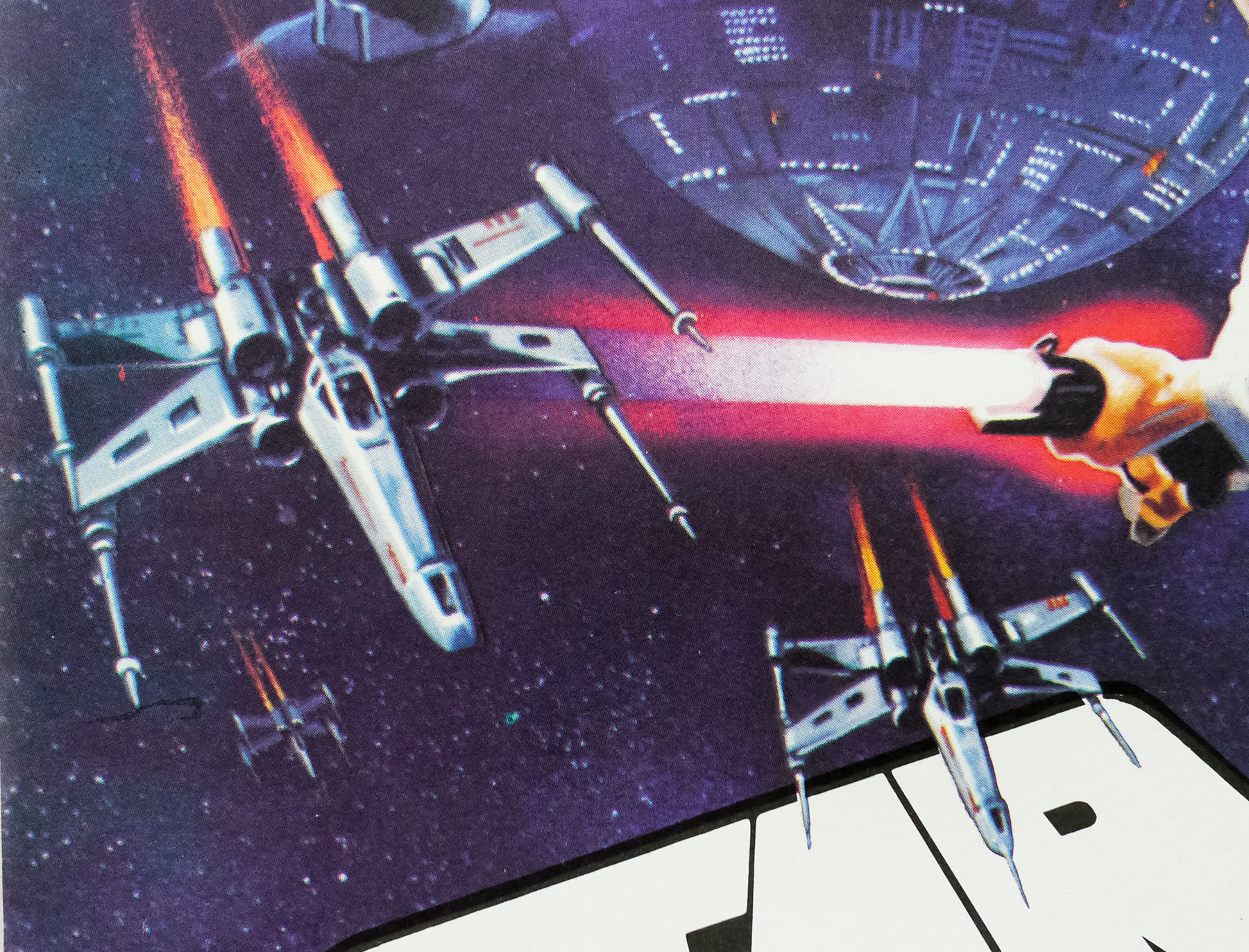
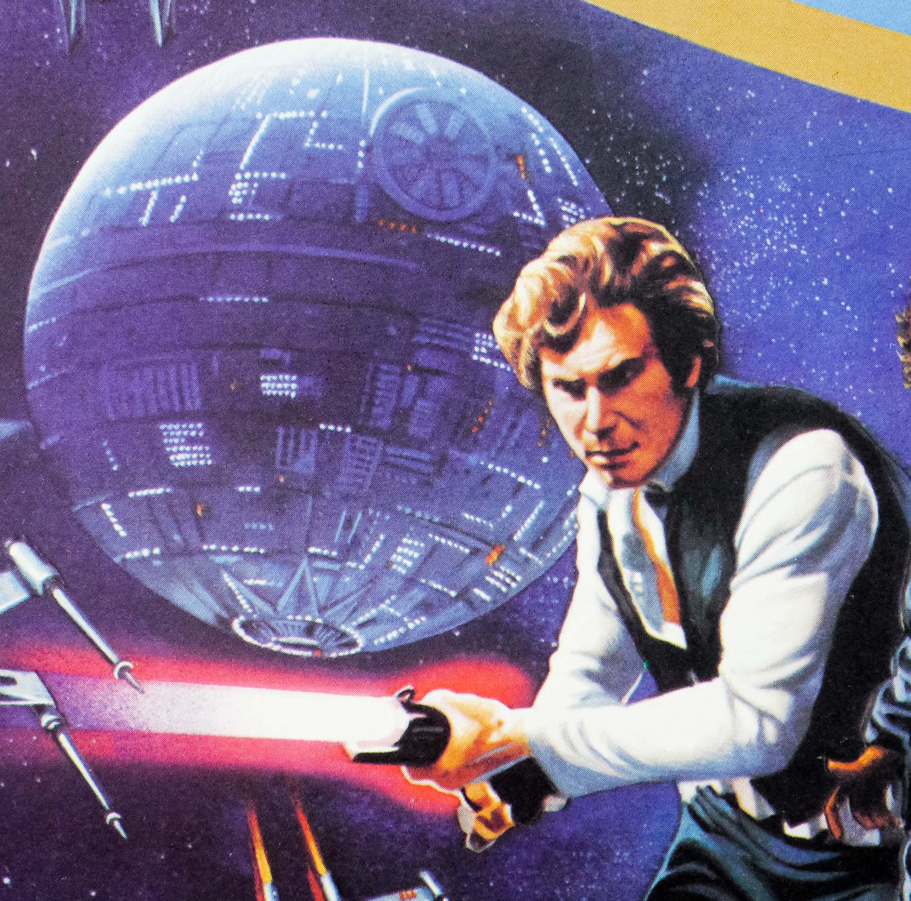
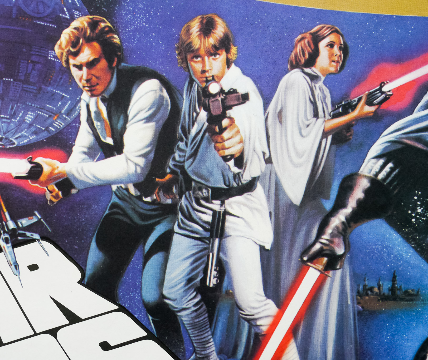
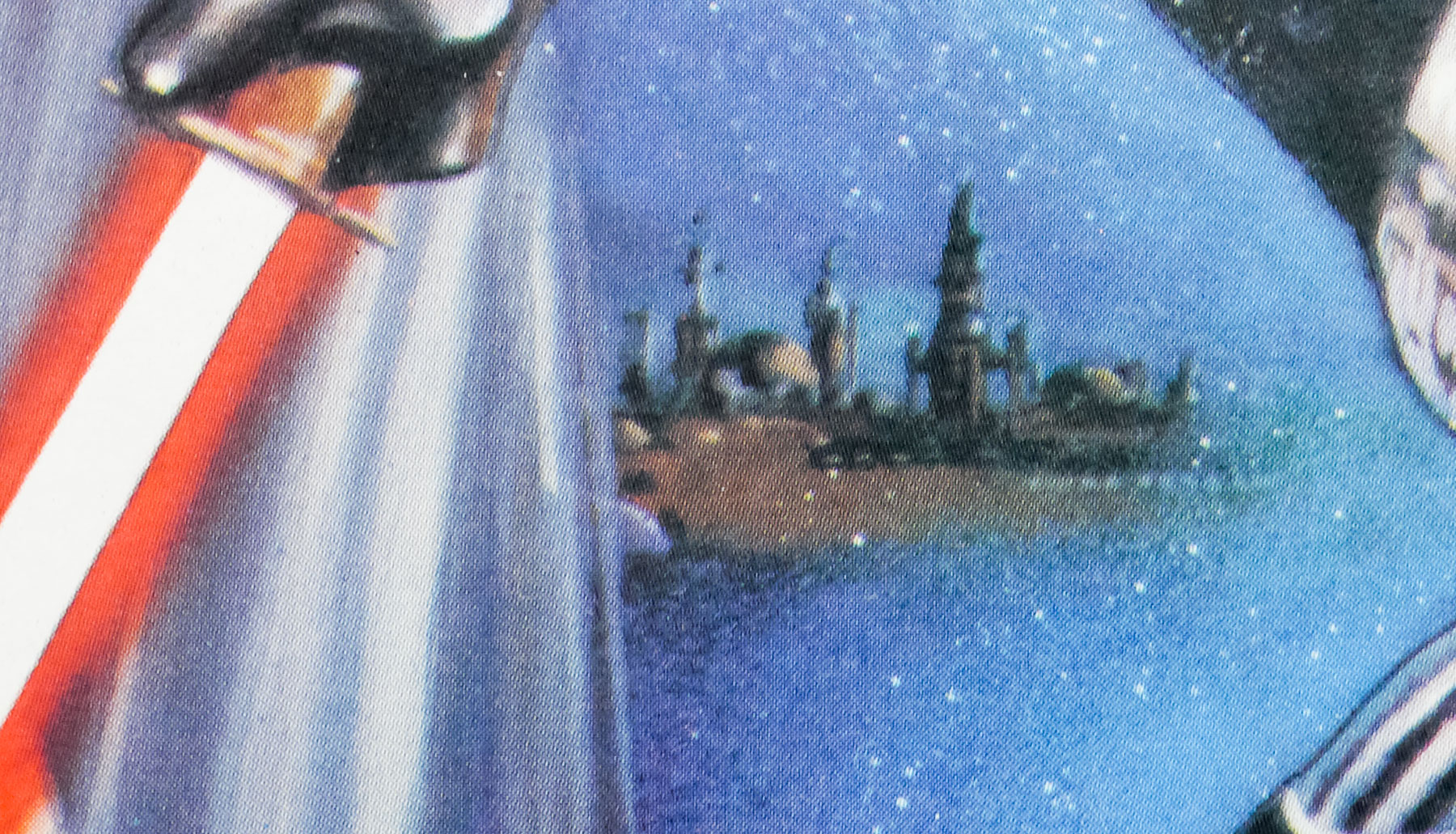
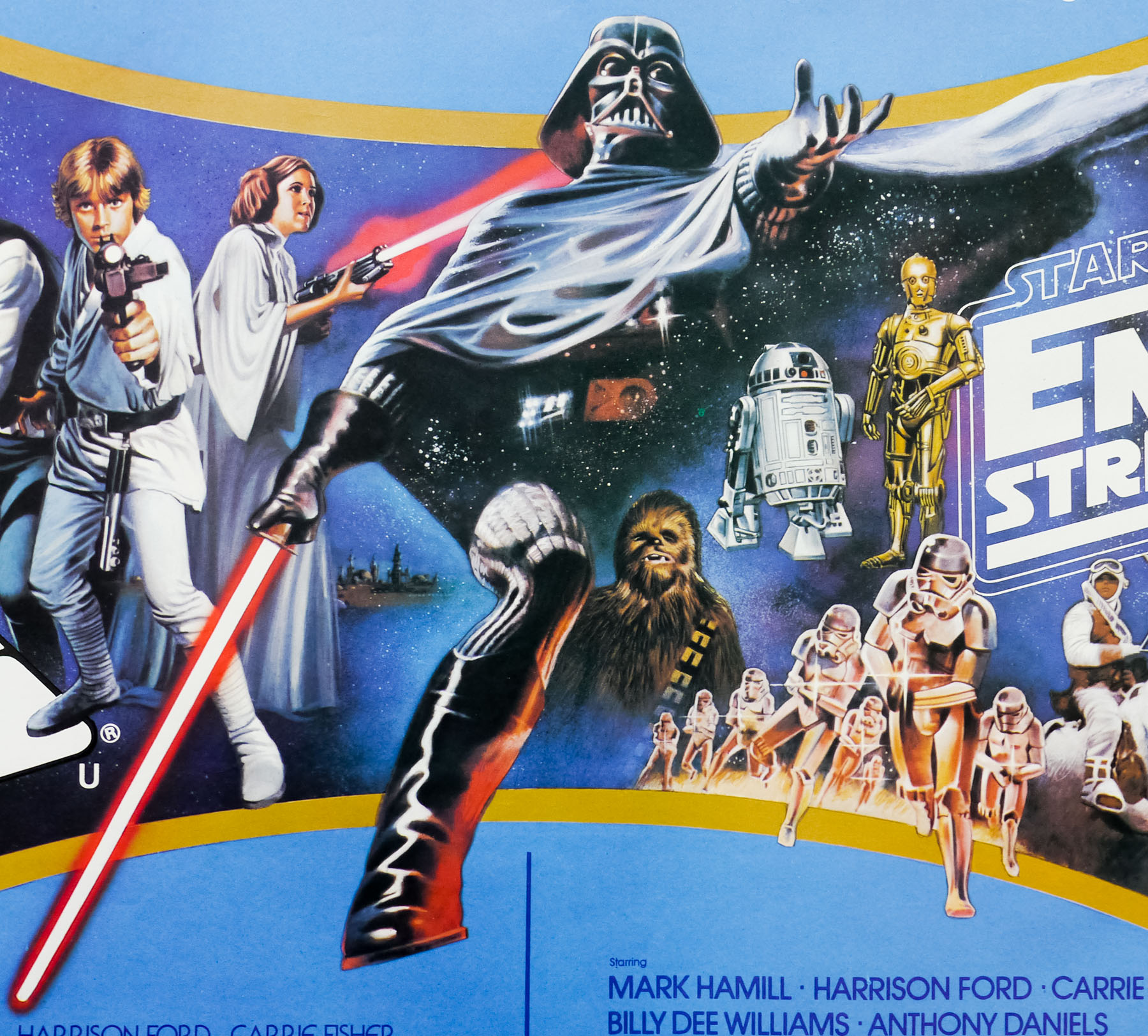
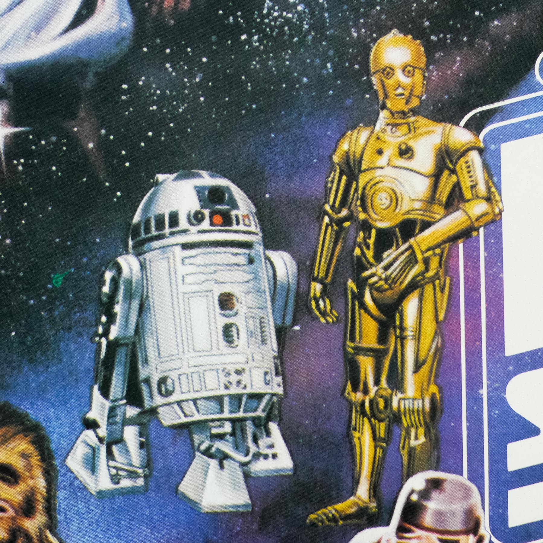
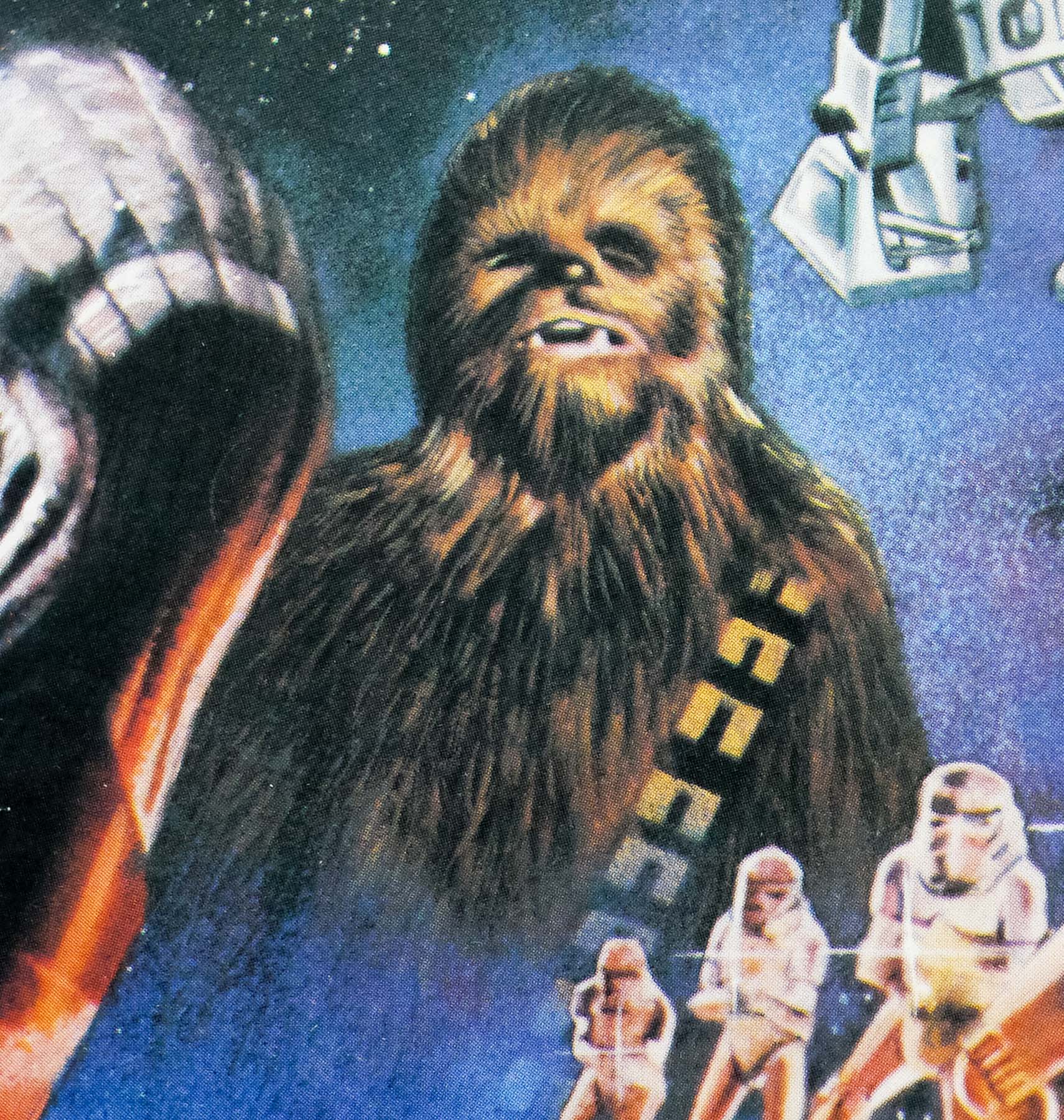
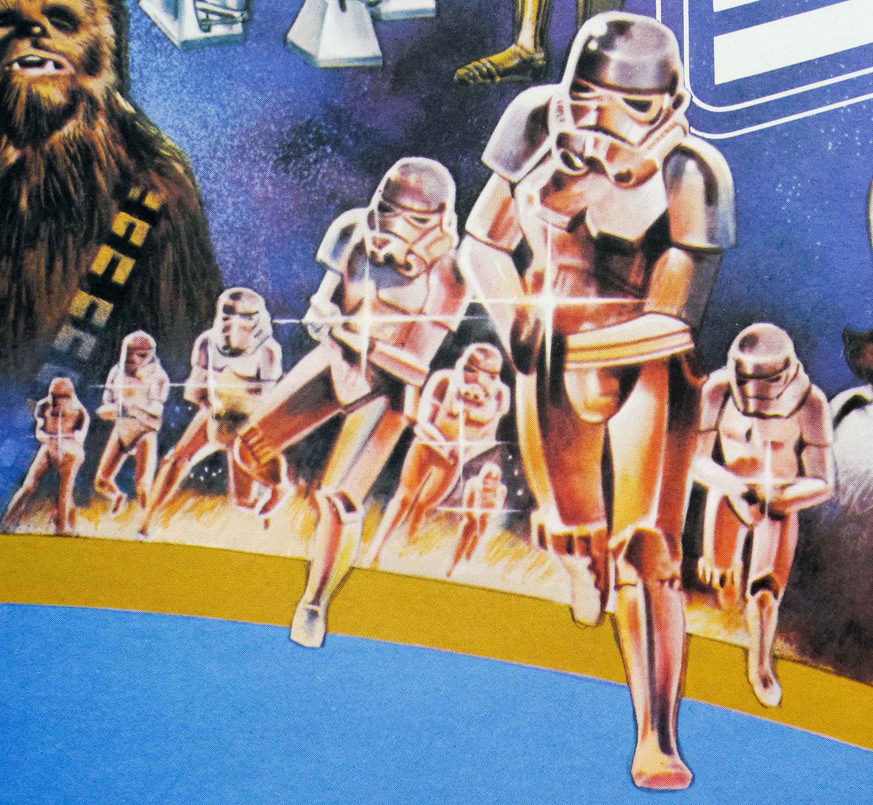
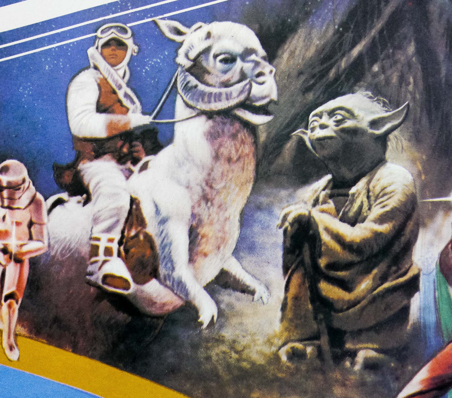
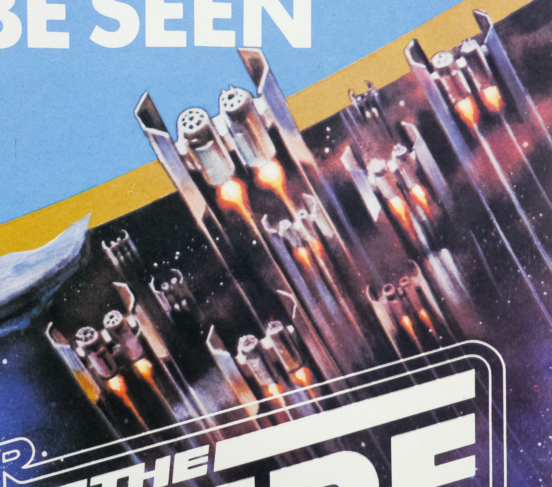
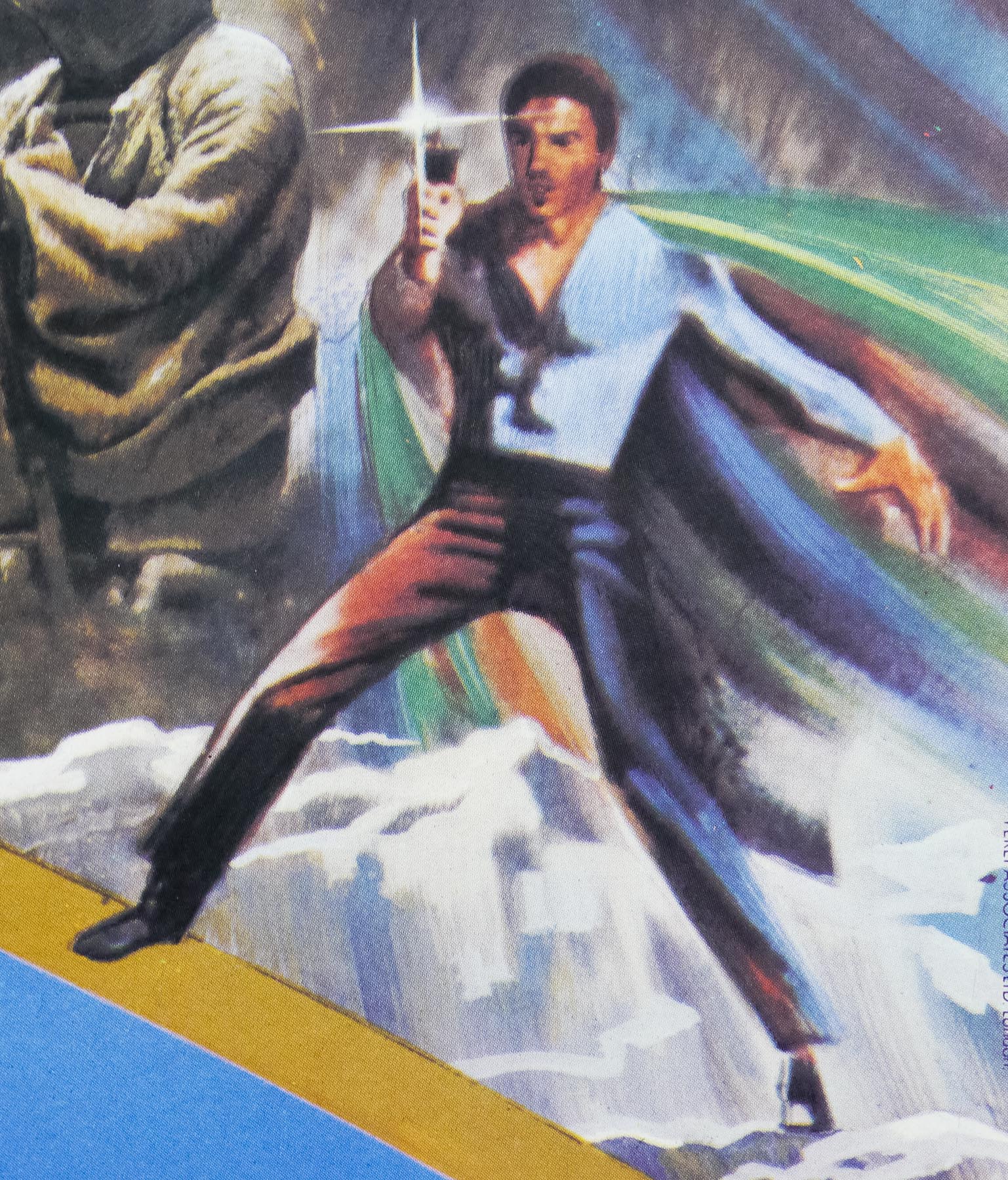
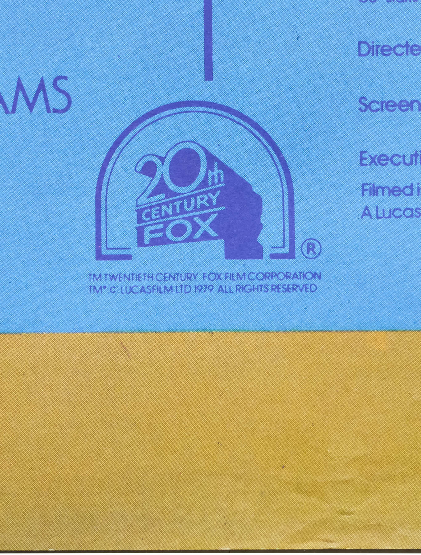
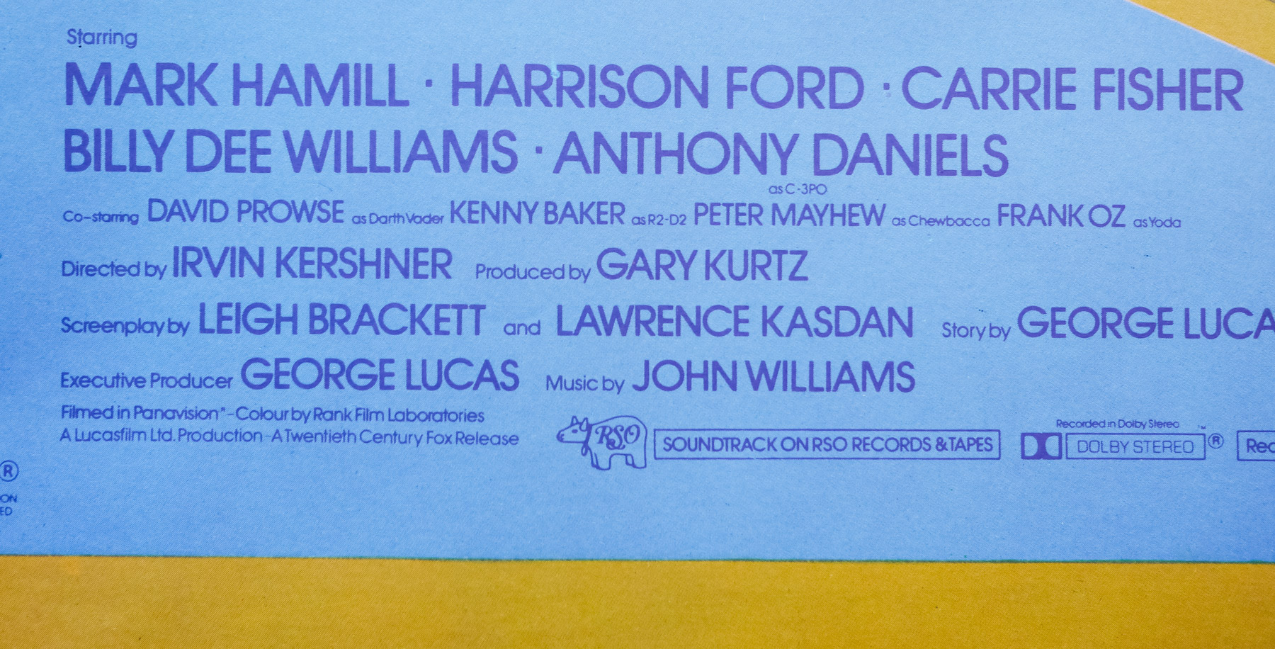
To capitalise on the successful release of the films, particularly before home video was a reality, distributor 20th Century Fox decided to release a double-bill of both Star Wars and Empire Strikes Back in to cinemas towards the end of 1980. This event was repeated across the world but this British quad is unique to this country and is the result of the amalgamation of the original quads for both films, plus an extra photographic element not included on either in the figure of Jedi master Yoda, which was probably added due to the characters’ popularity.
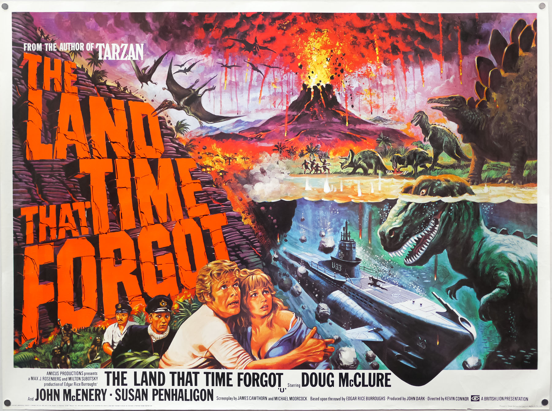
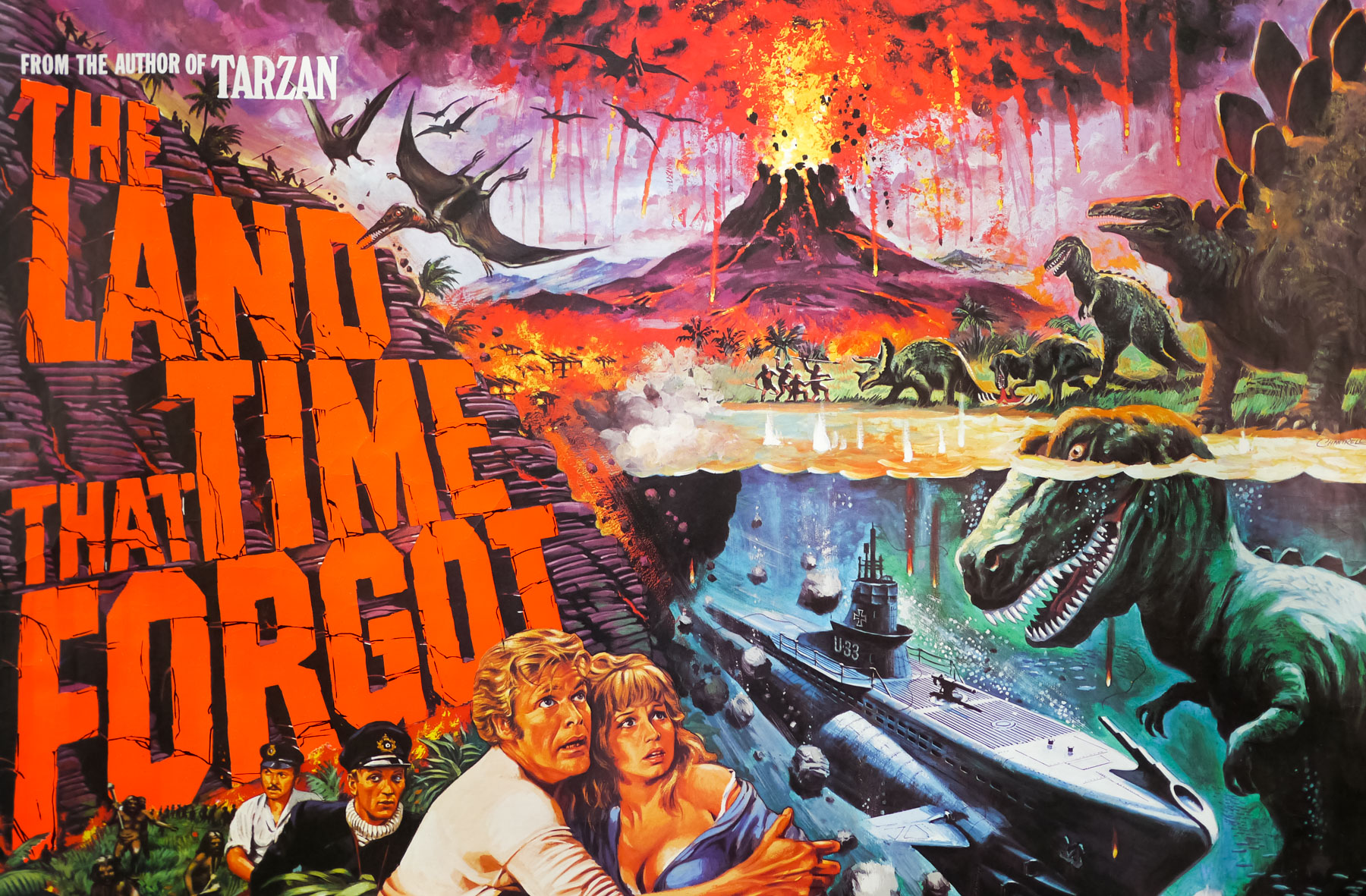
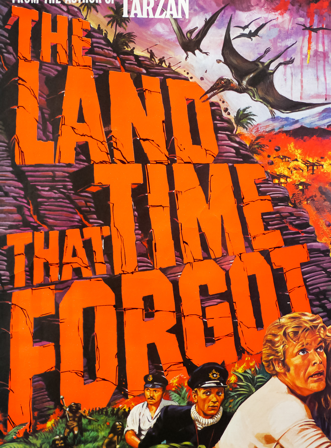
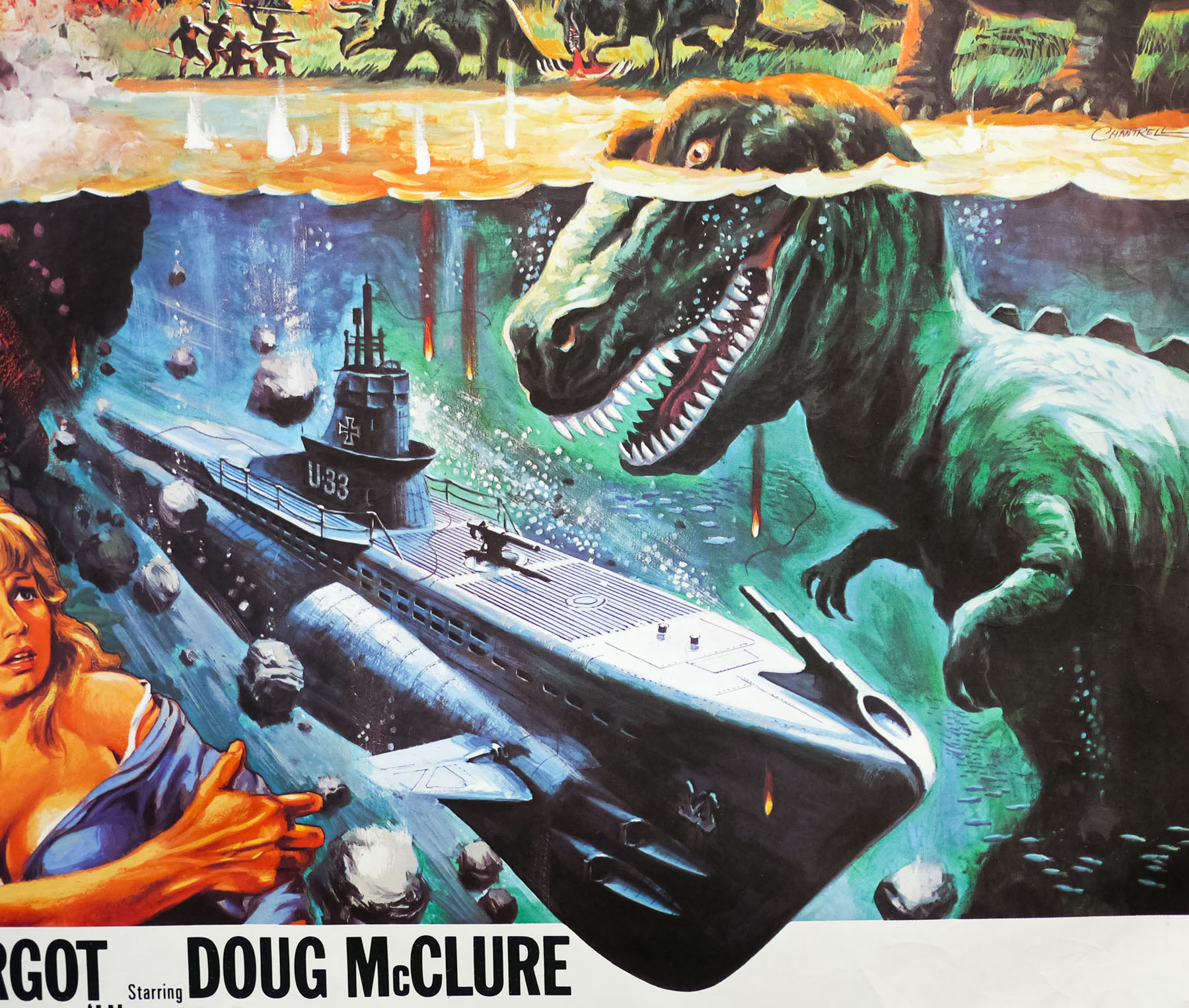
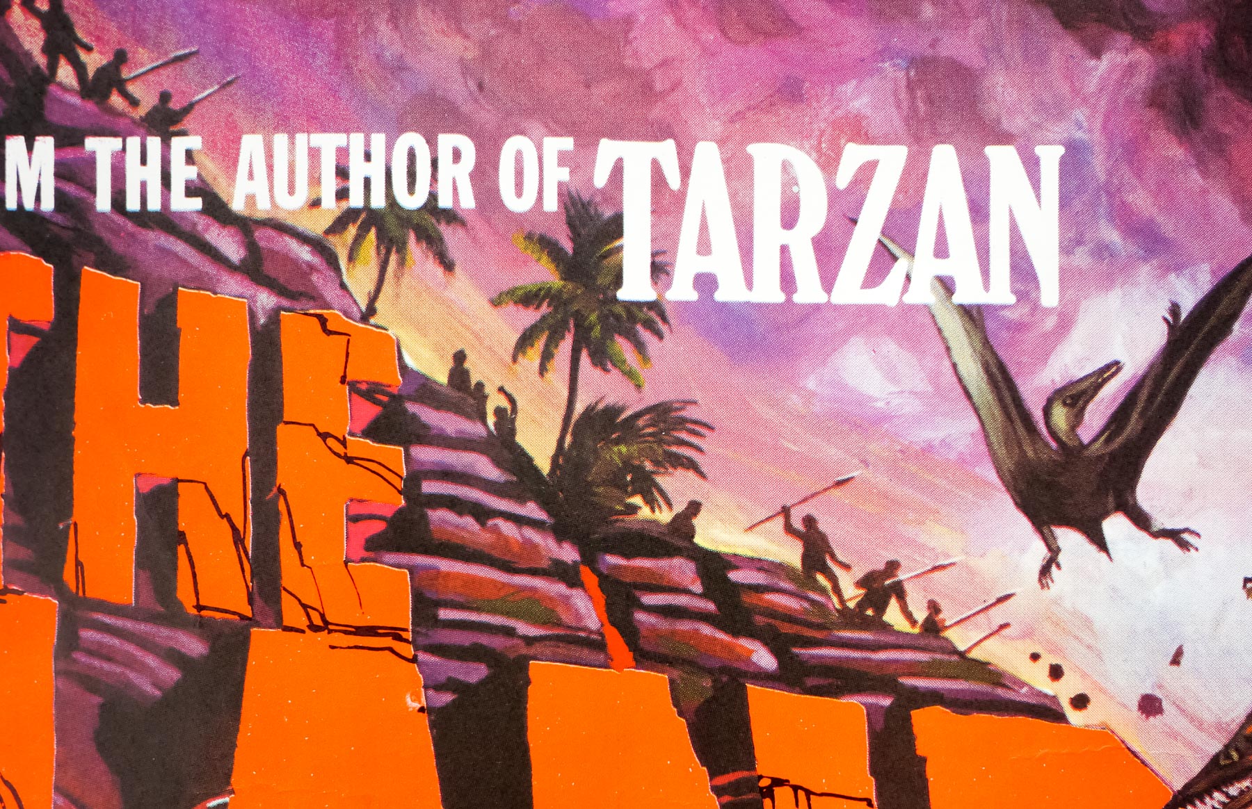
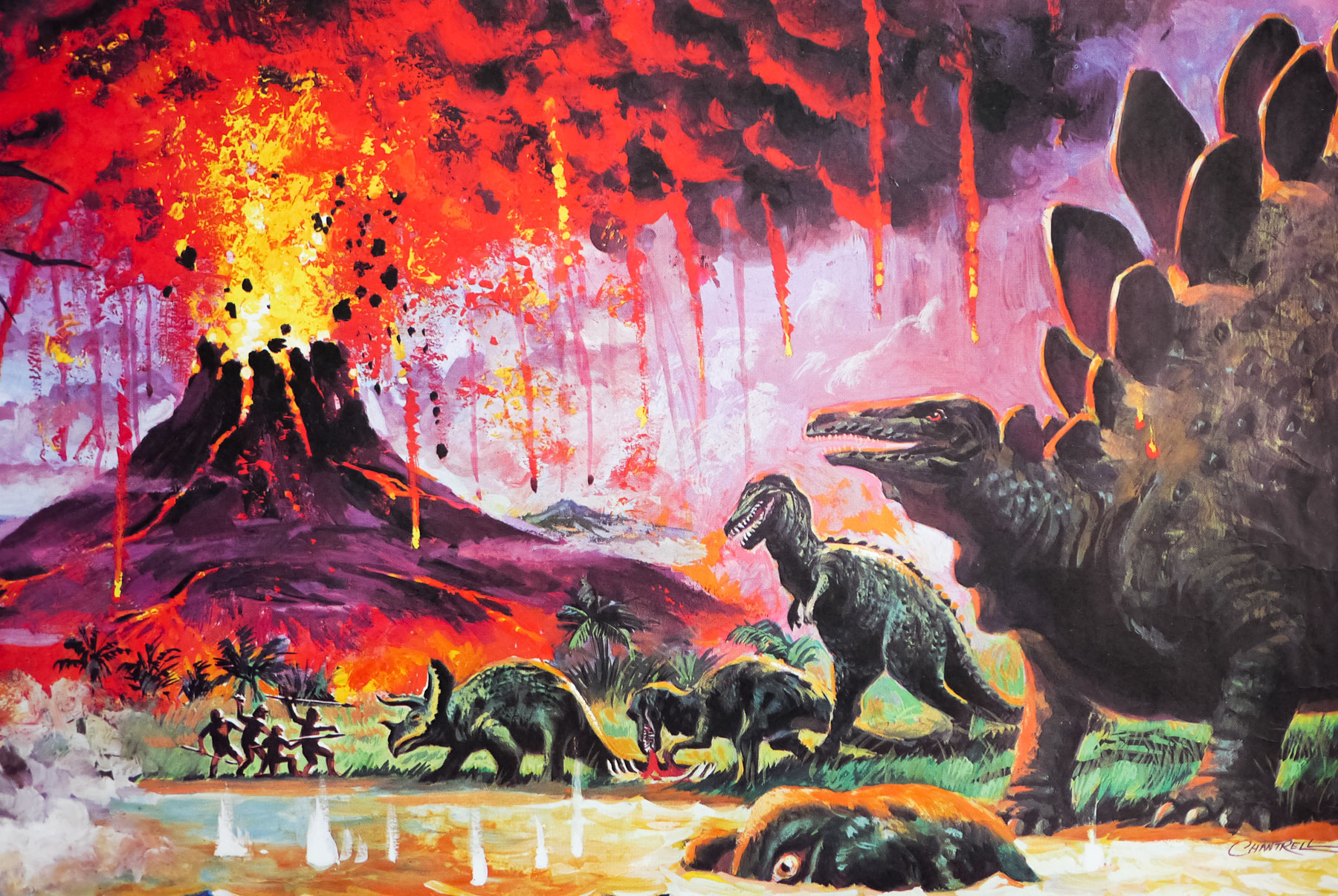
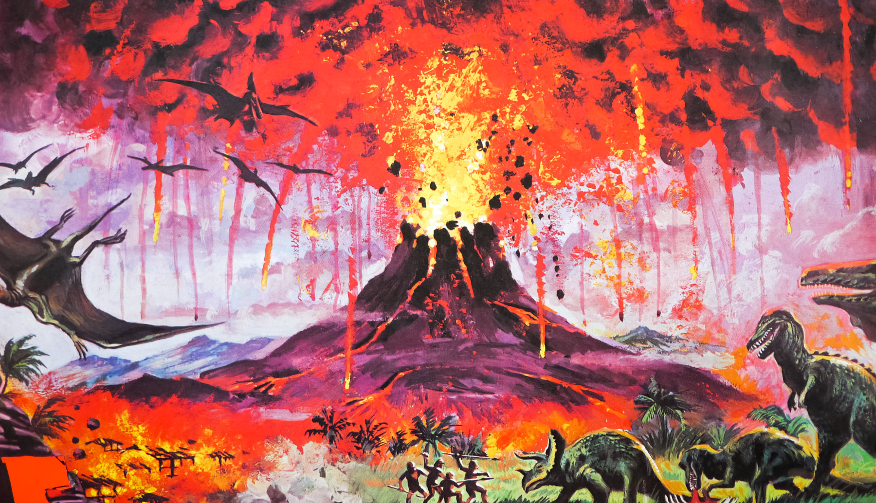
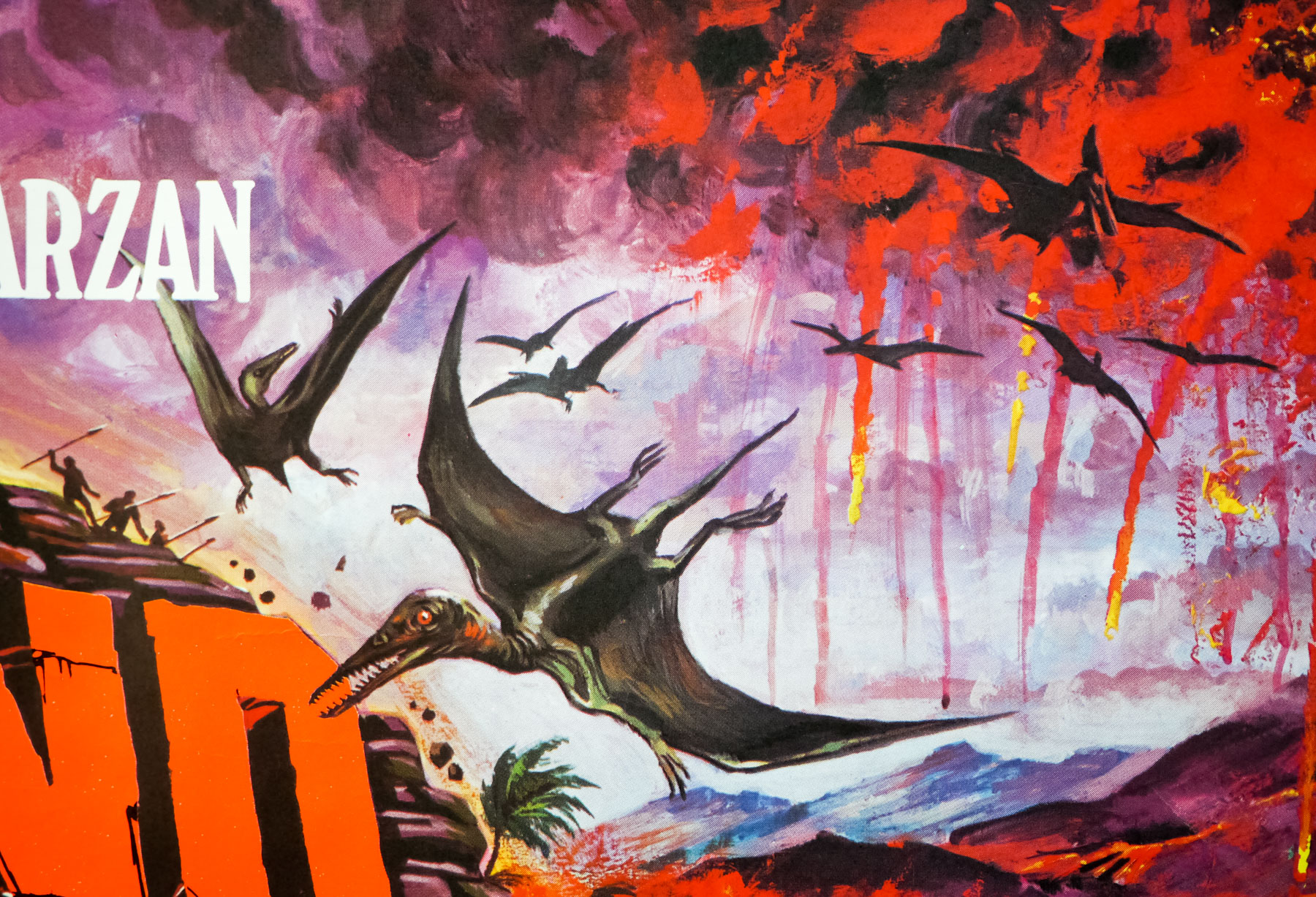
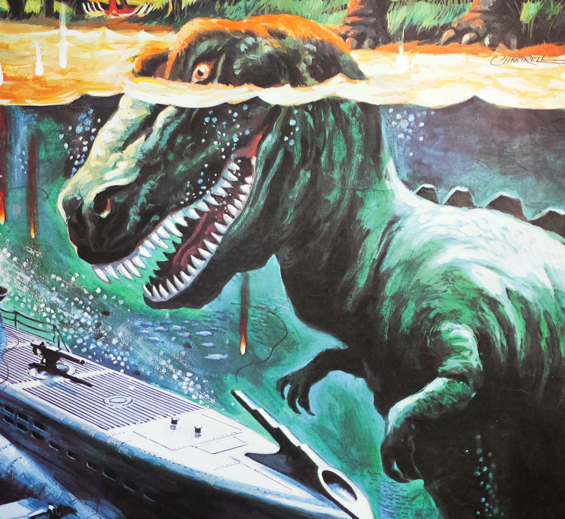
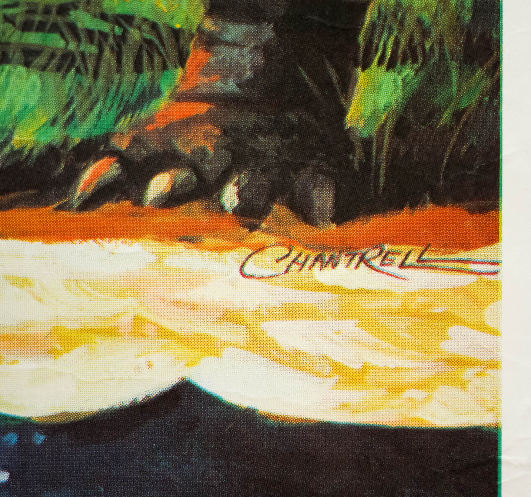
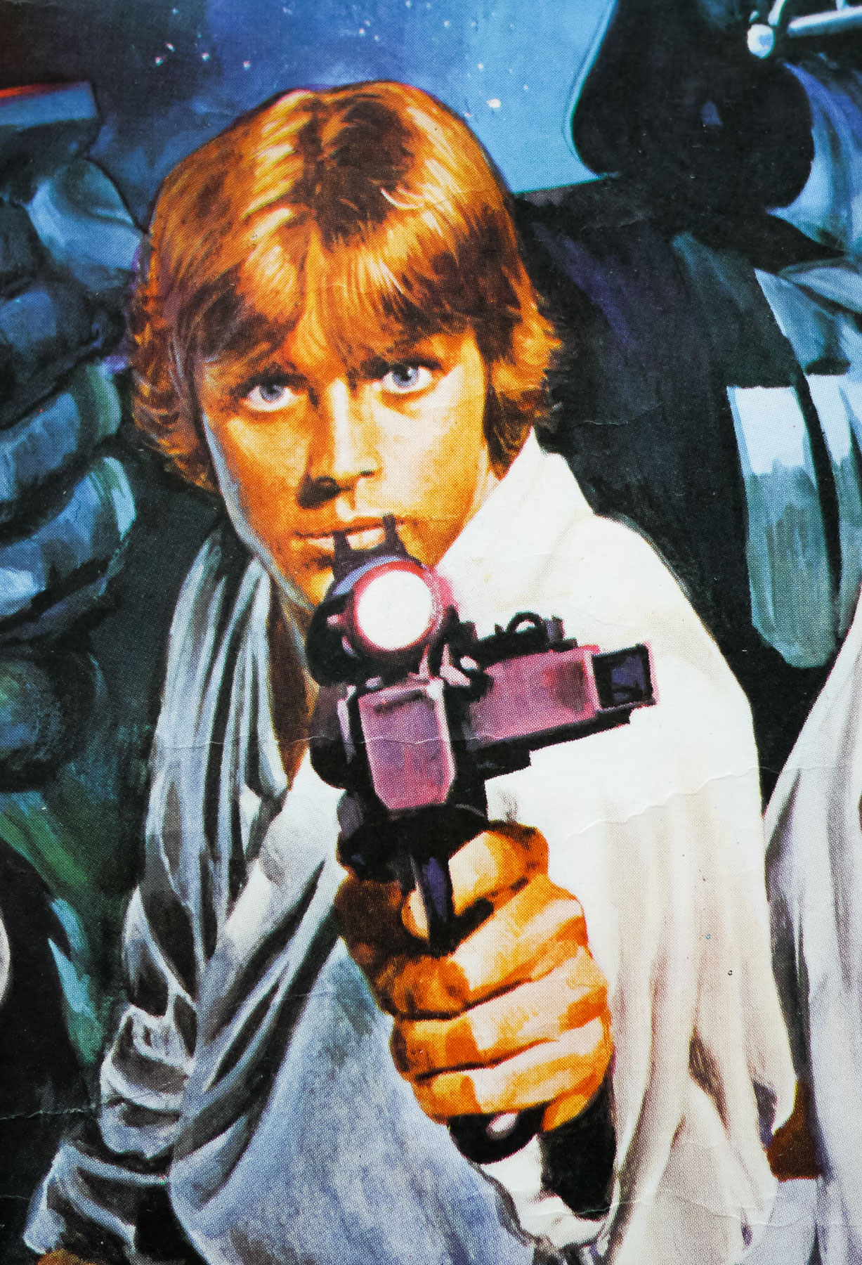
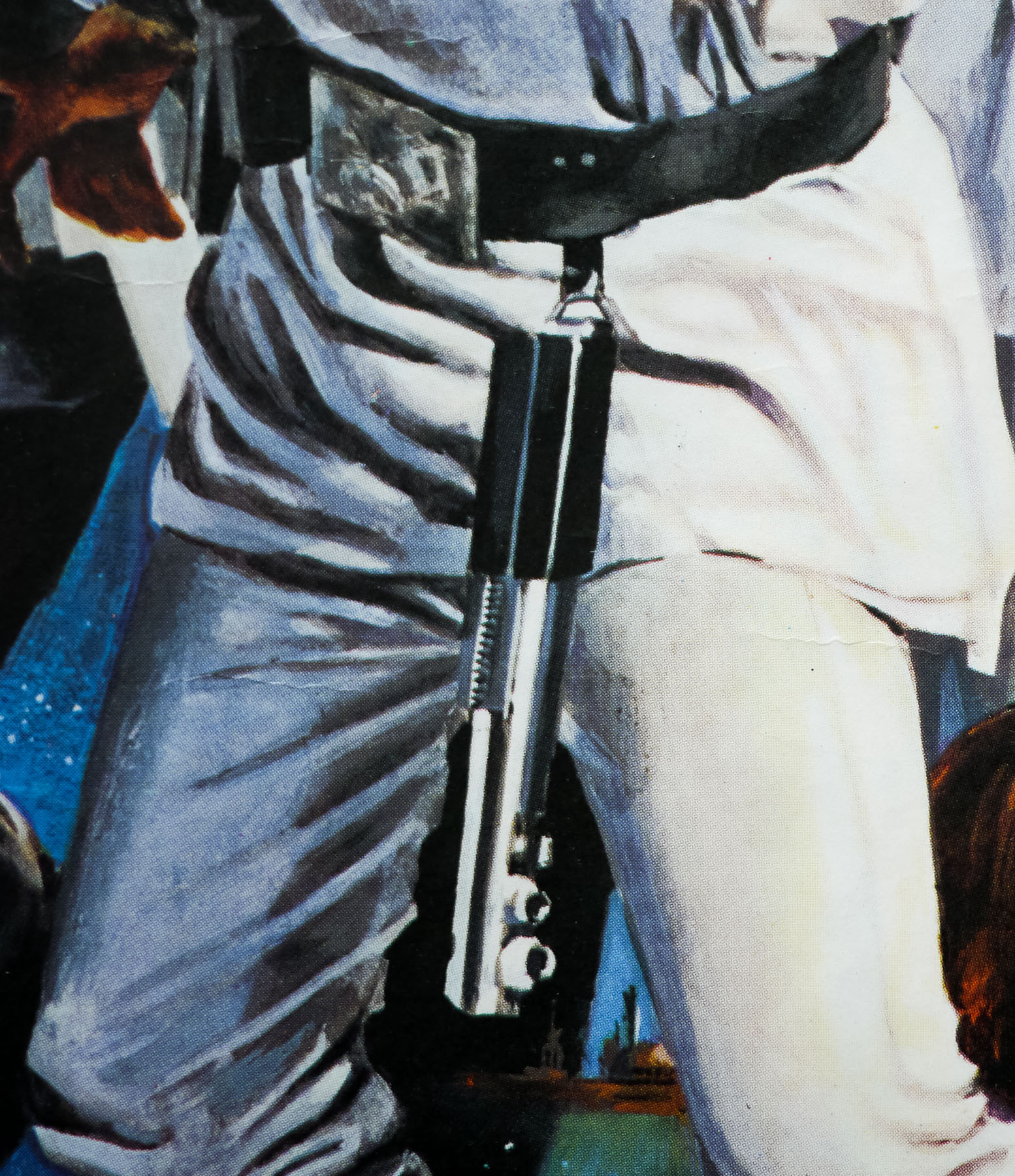
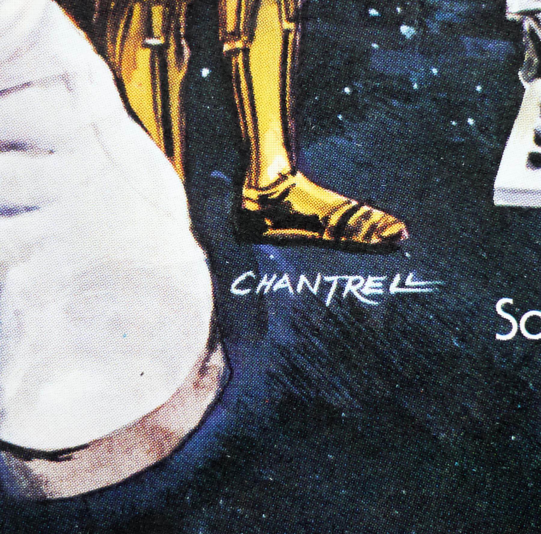
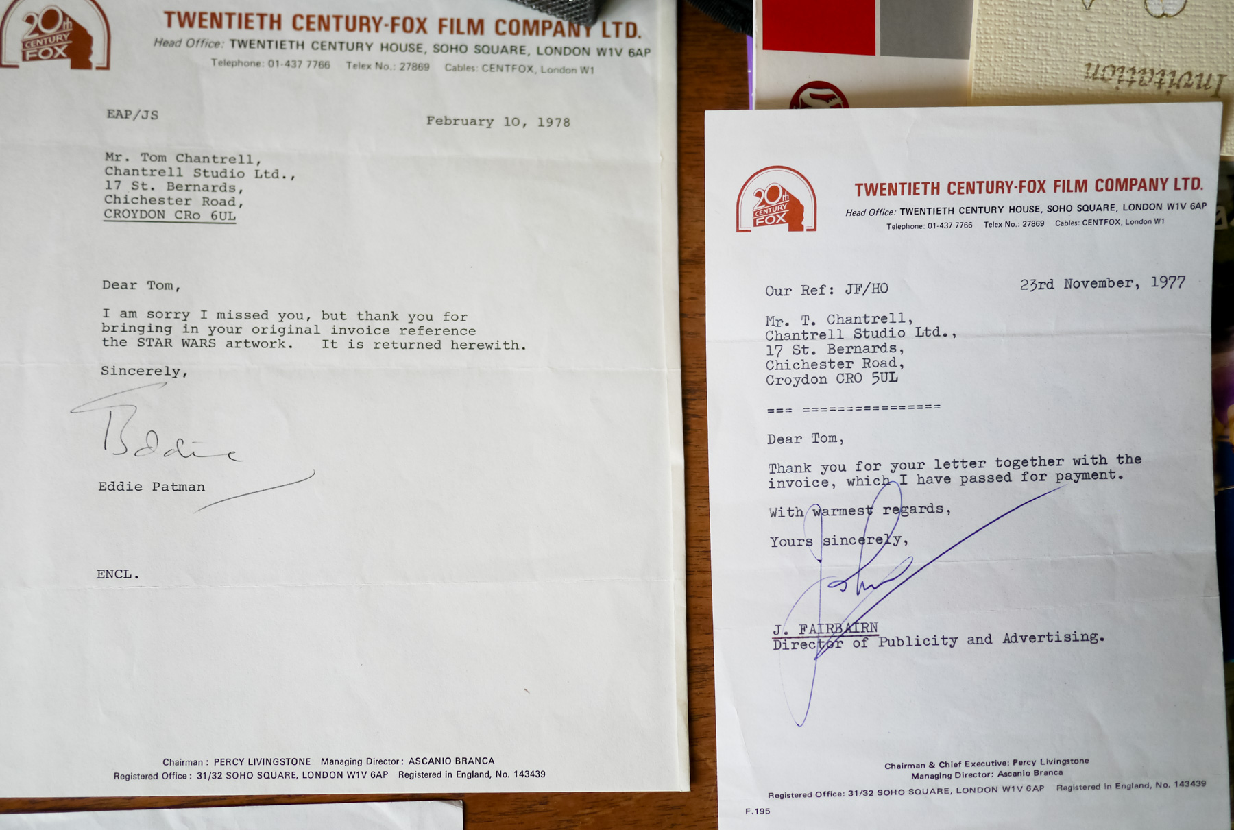
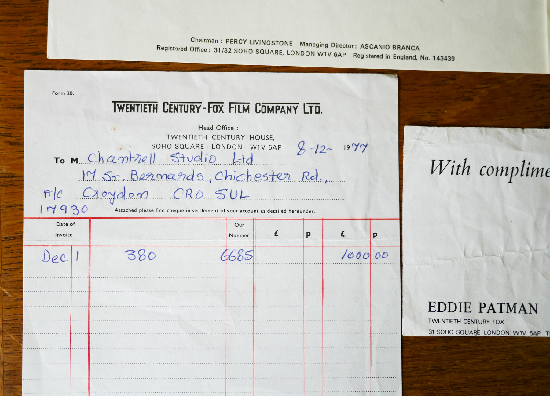
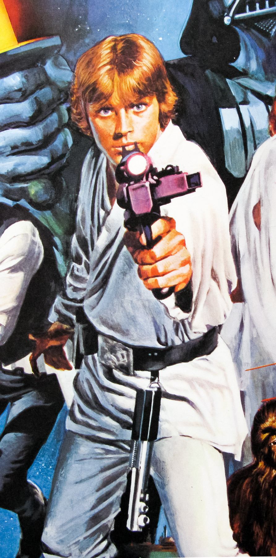
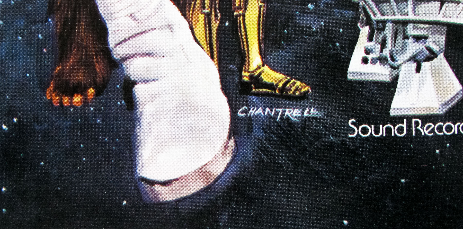
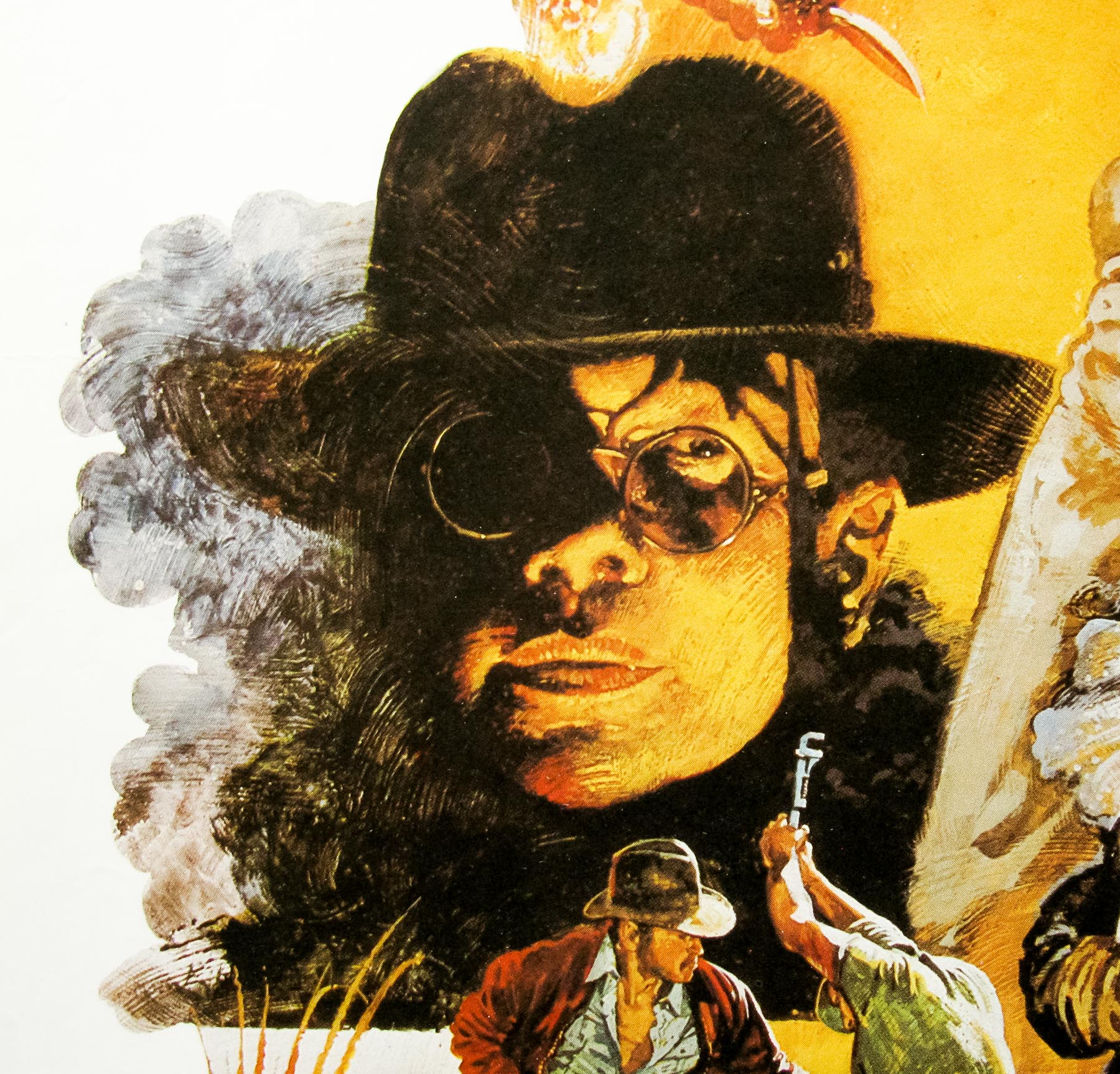
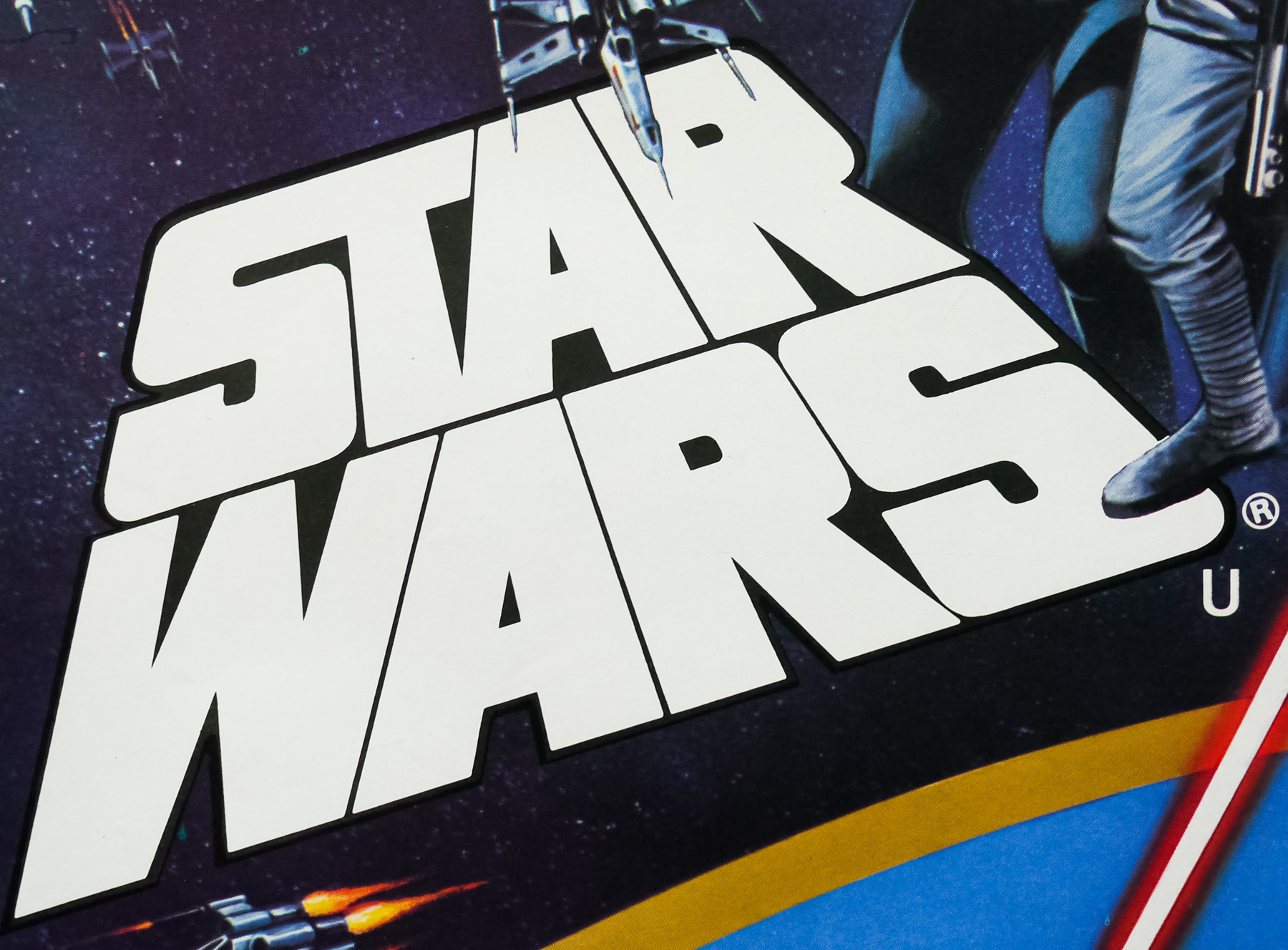
The original Star Wars quad was designed and illustrated by the late, great British artist Tom Chantrell whose dynamic and colourful work featured on hundreds of posters over a forty year period. The artist sadly passed away in 2001 but last year his widow Shirley launched his official website, which showcases his work and features a great biography written by Sim Branaghan, author of the must-own book British Film Posters. Chantrell illustrated many classic poster designs, including several Hammer posters such as the brilliant quad for ‘One Million Years B.C.’, and he was also responsible for many other pieces of iconic poster artwork. I have a number of other designs by Chantrell on this site and you can read an exclusive interview with Shirley by clicking here.
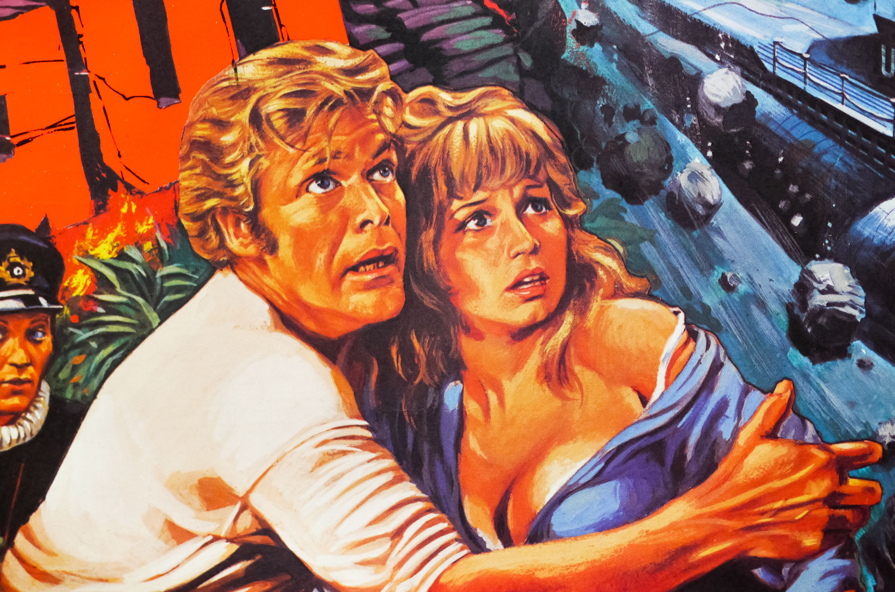
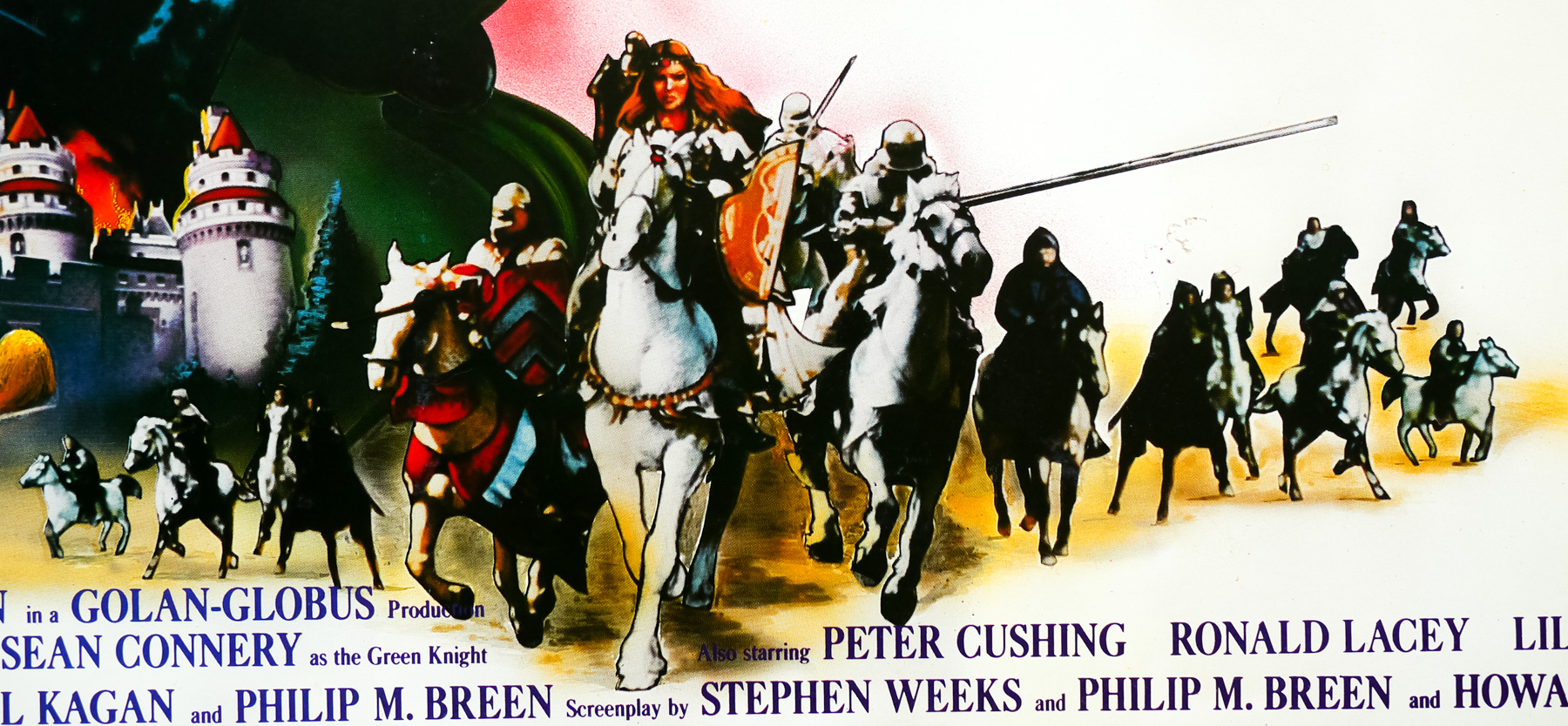
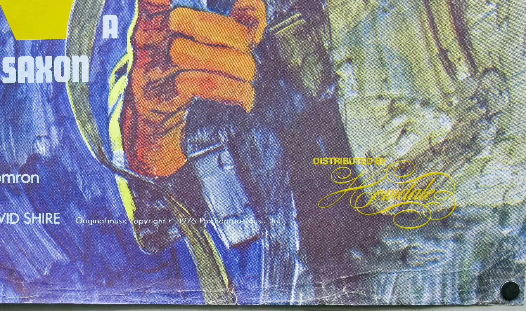
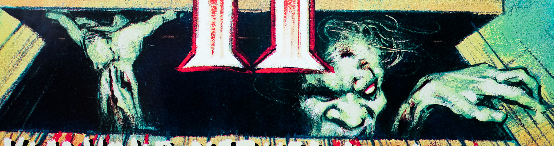
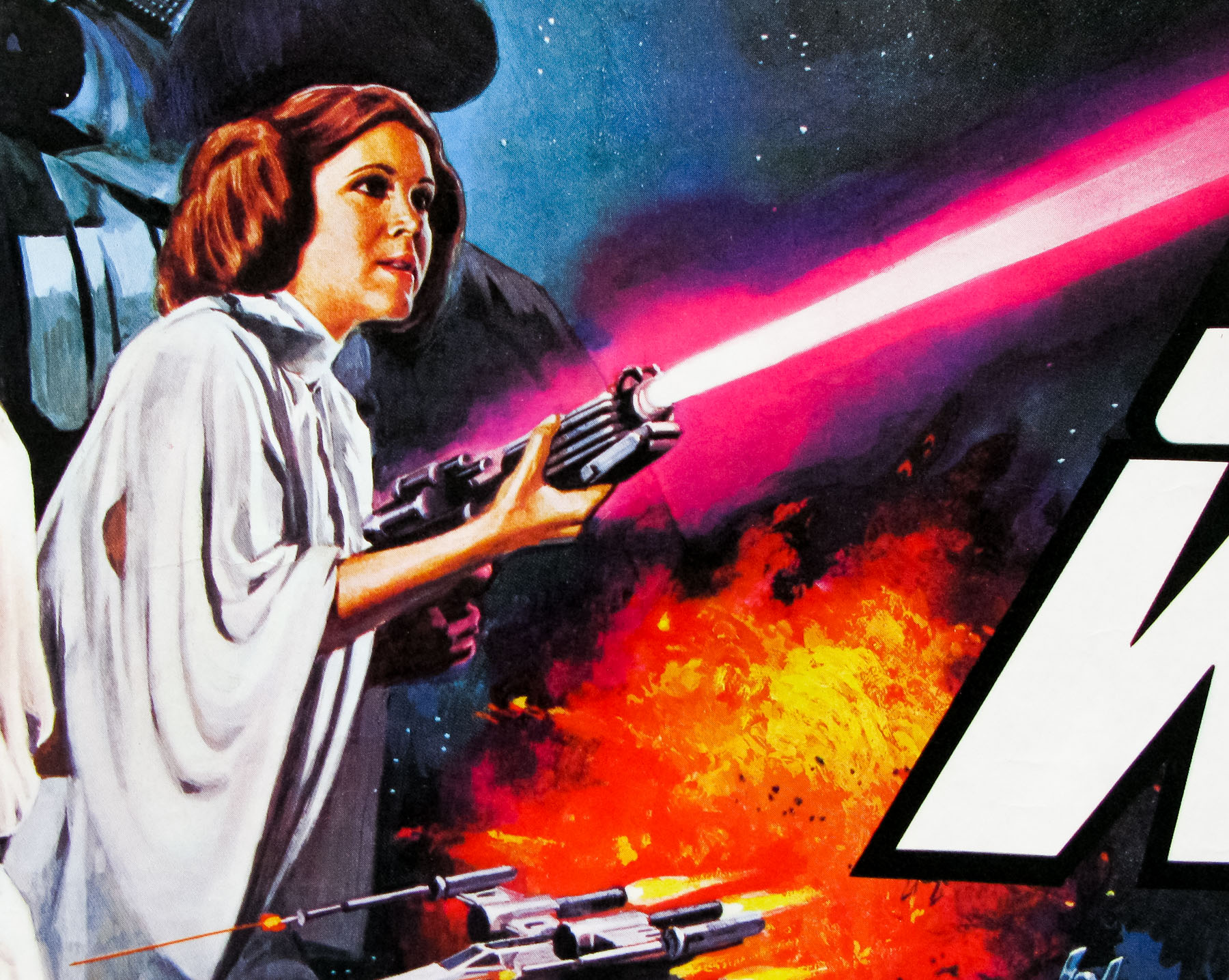
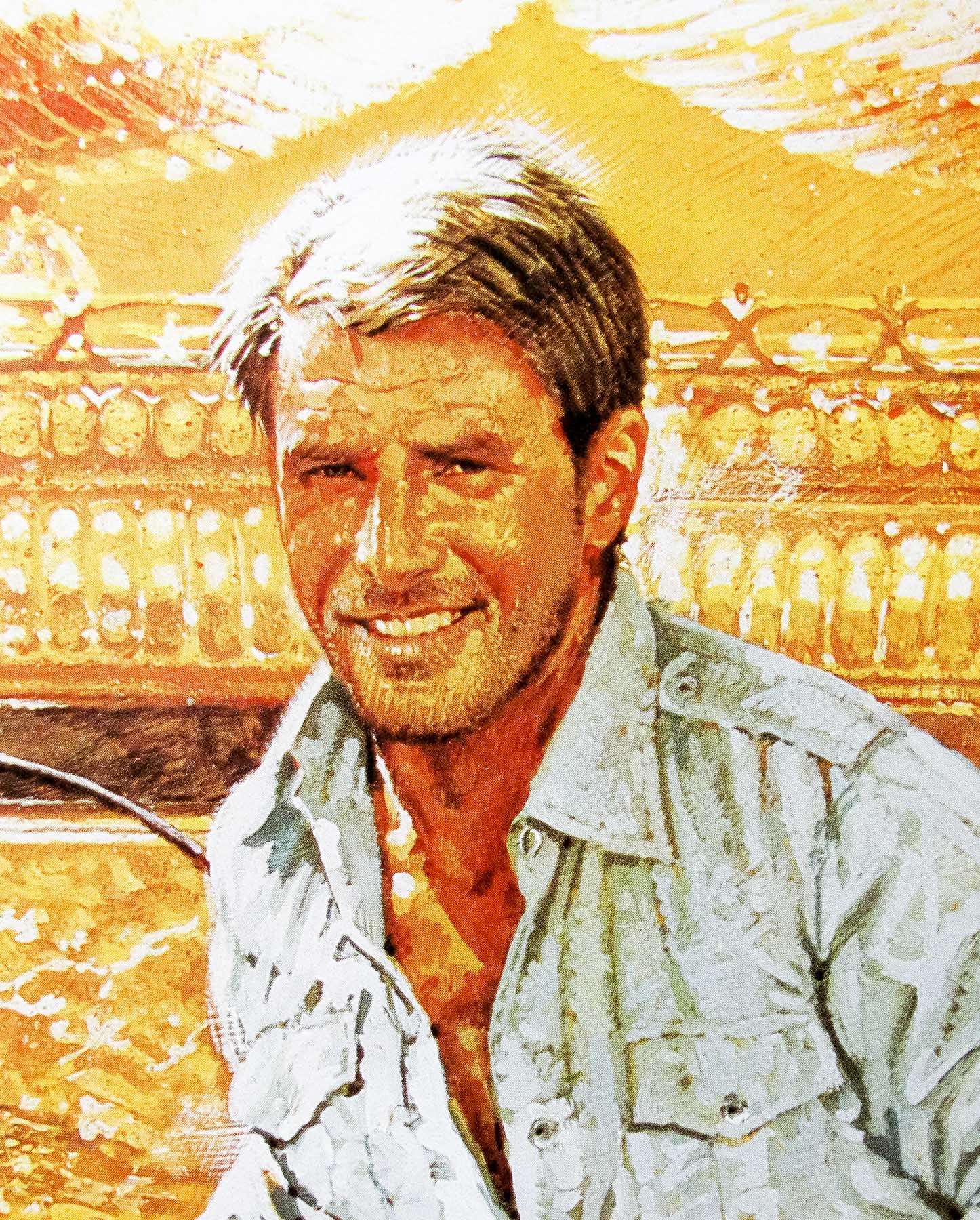
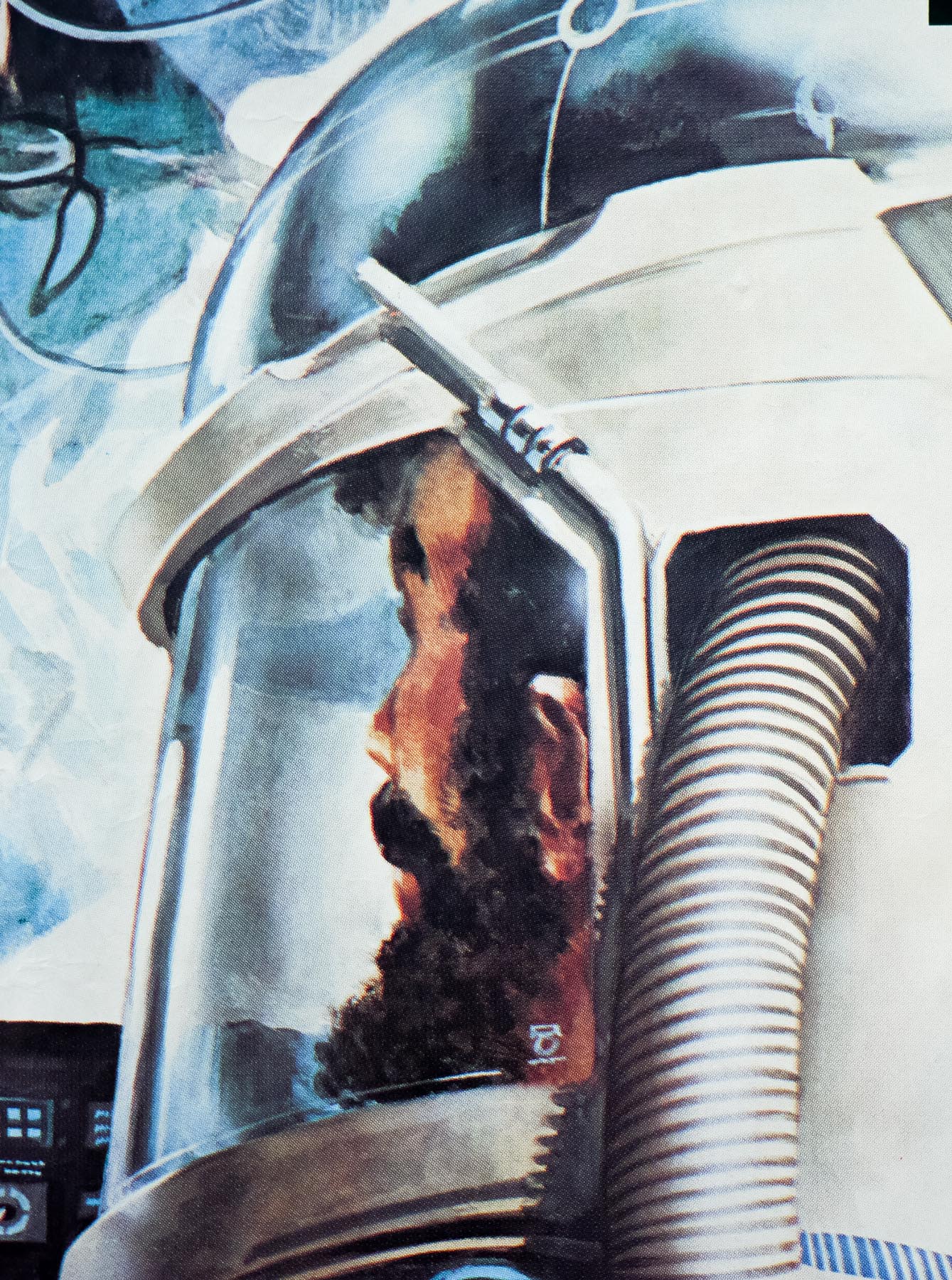
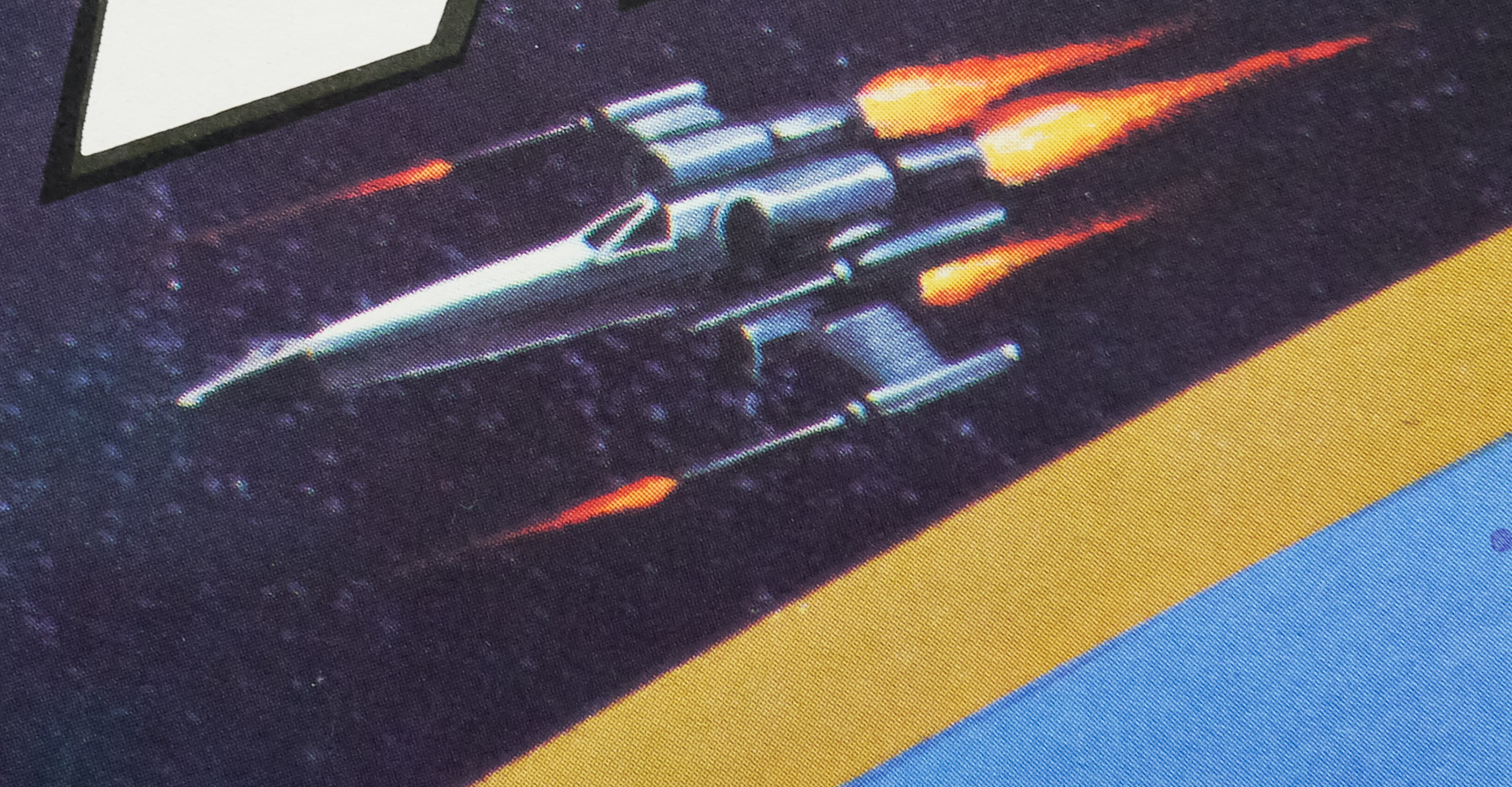
The Empire Strikes Back quad features the artwork painted for the US style B one sheet, which was by the American artist Tom Jung, perhaps best known for his iconic ‘style A’ one sheet that he painted for the release of the original Star Wars. Jung was a prolific designer and illustrator for film campaigns from the 1950s through to the 1980s. IMPAwards features a gallery of his work and his Wikipedia article has a selected list of the posters he worked on. The other posters I’ve collected by him can be seen here.
Another special quad was put together for a triple-bill event after the release of Return of the Jedi, which again featured elements of the artwork from all three separate release quads. Note that this poster can be found undersized at around 28″ x 40″ and this was because several hundred copies were machine trimmed to be used in special frames on the London Underground, a fate which befell a number of posters around the end of the 1970s and early 1980s.