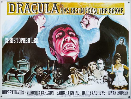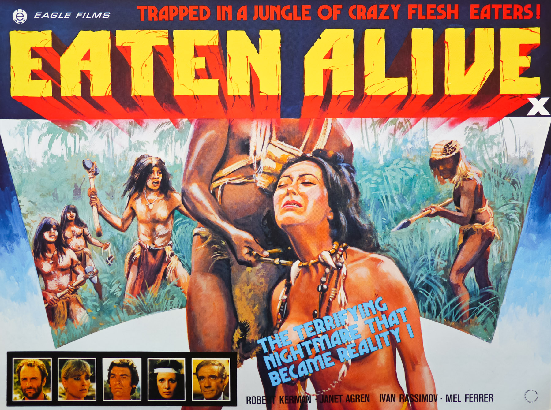
Poster detail
1-5
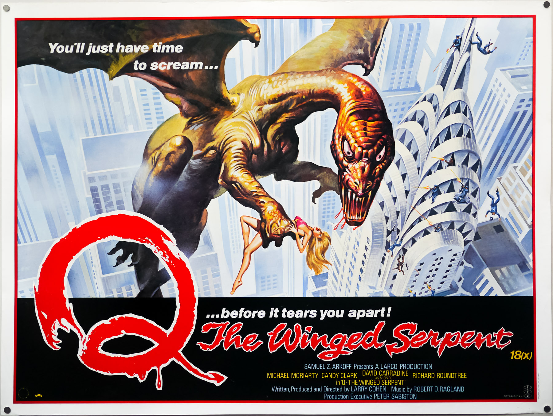

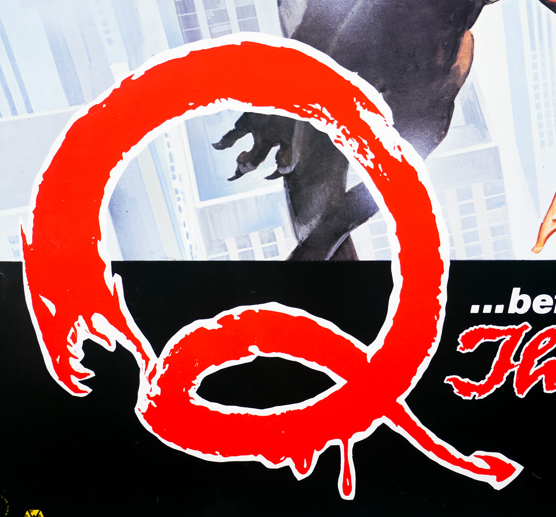
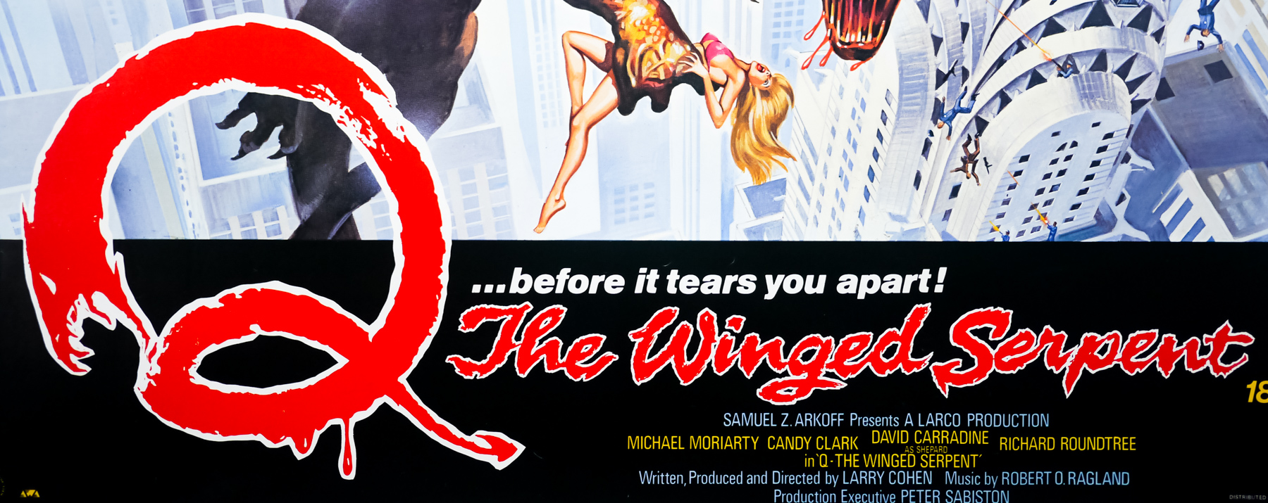
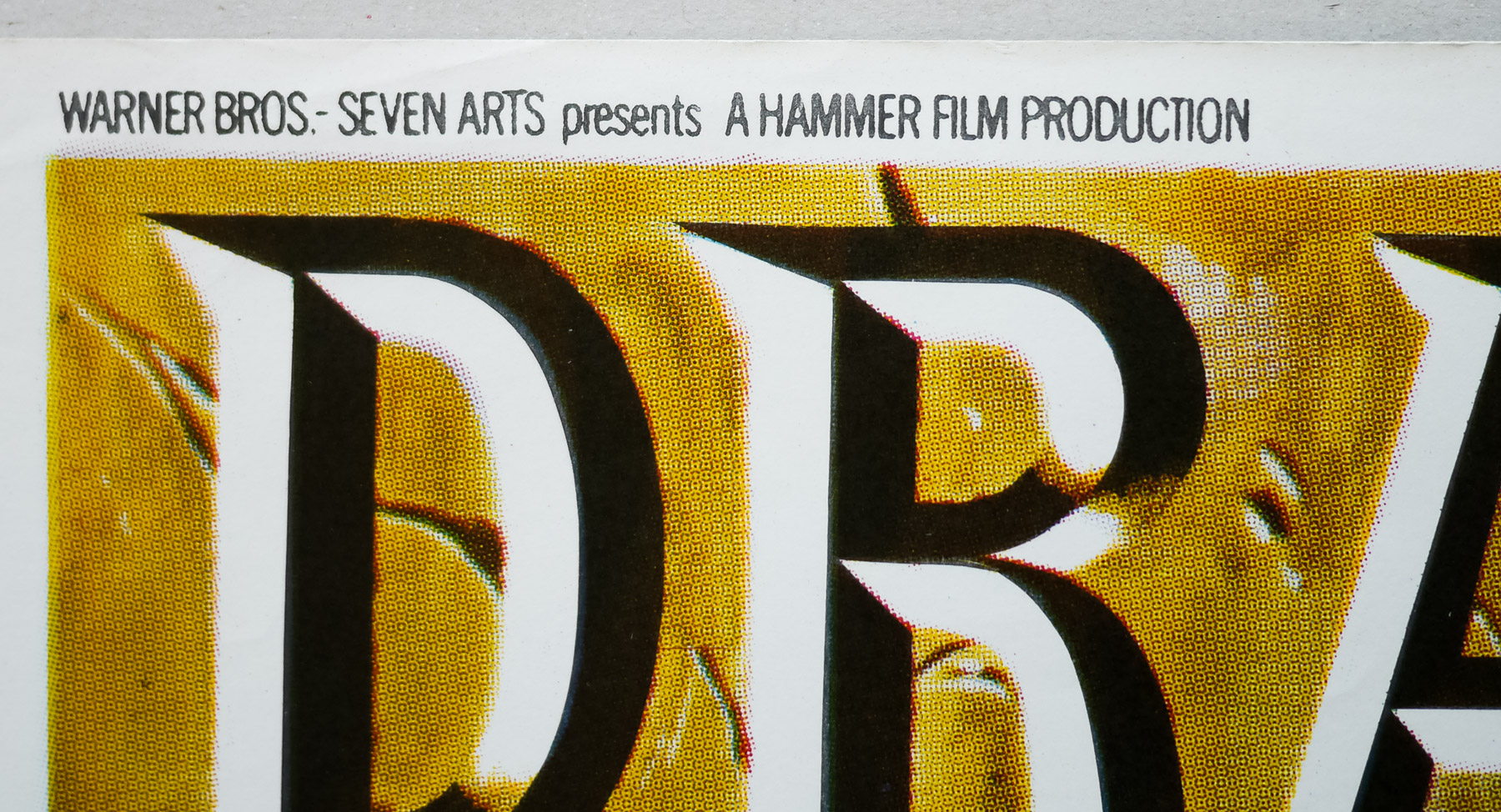
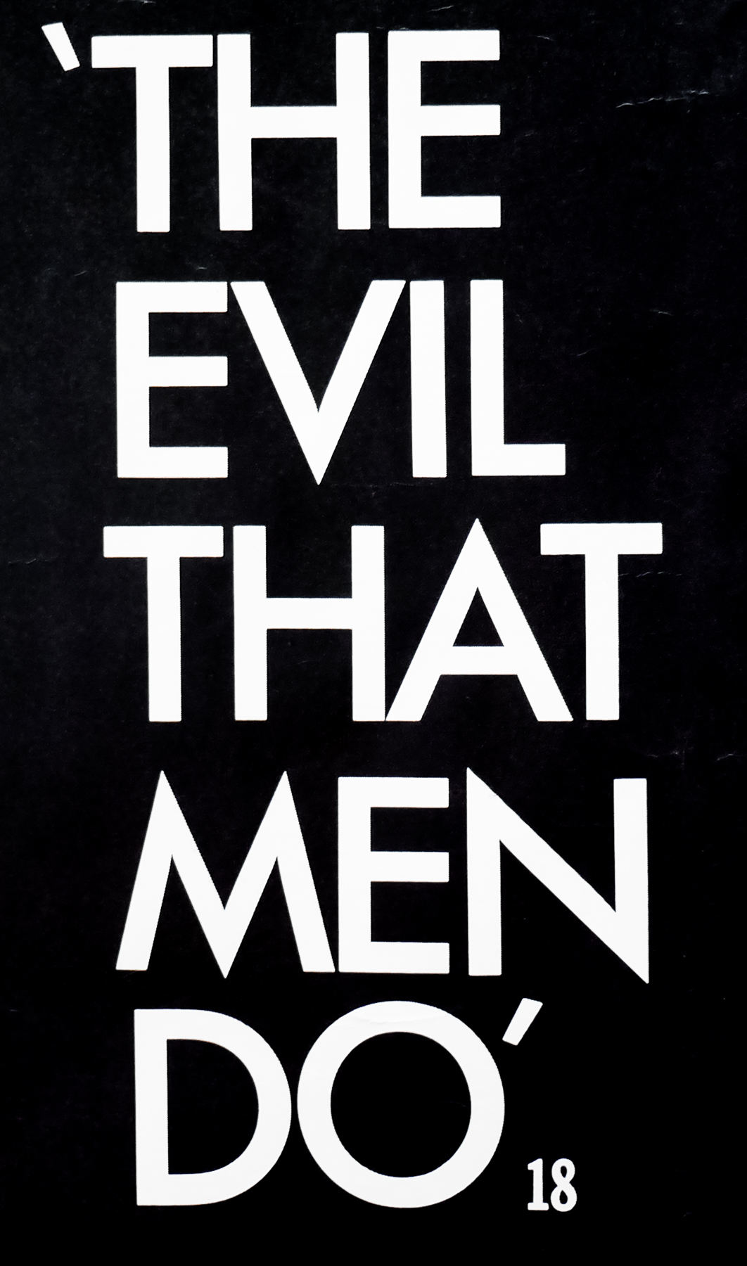
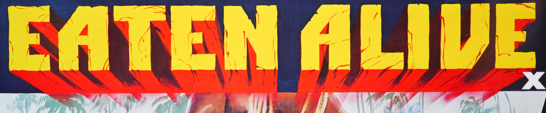
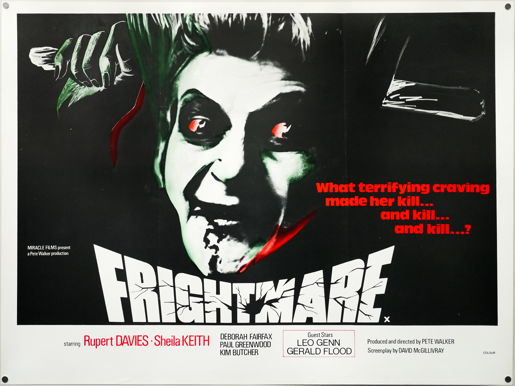
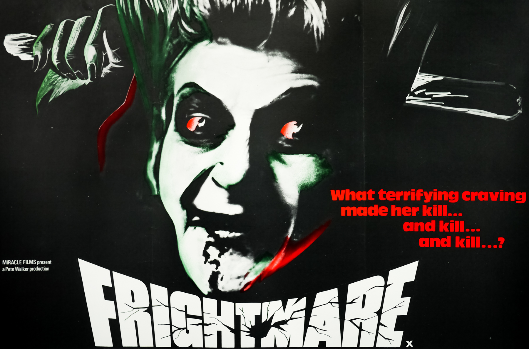
- Title
- The Winged Serpent
- AKA
- Q (USA) | Q: The Winged Serpent (UK) | American Monster (West Germany)
- Year of Film
- 1982
- Director
- Larry Cohen
- Origin of Film
- USA
- Genre(s) of Film
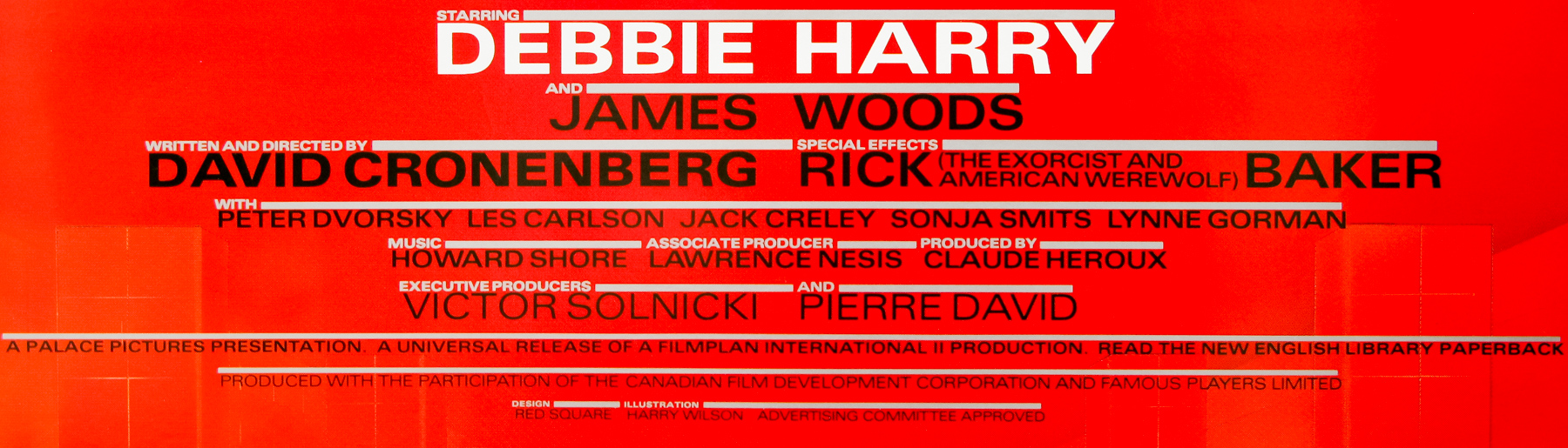
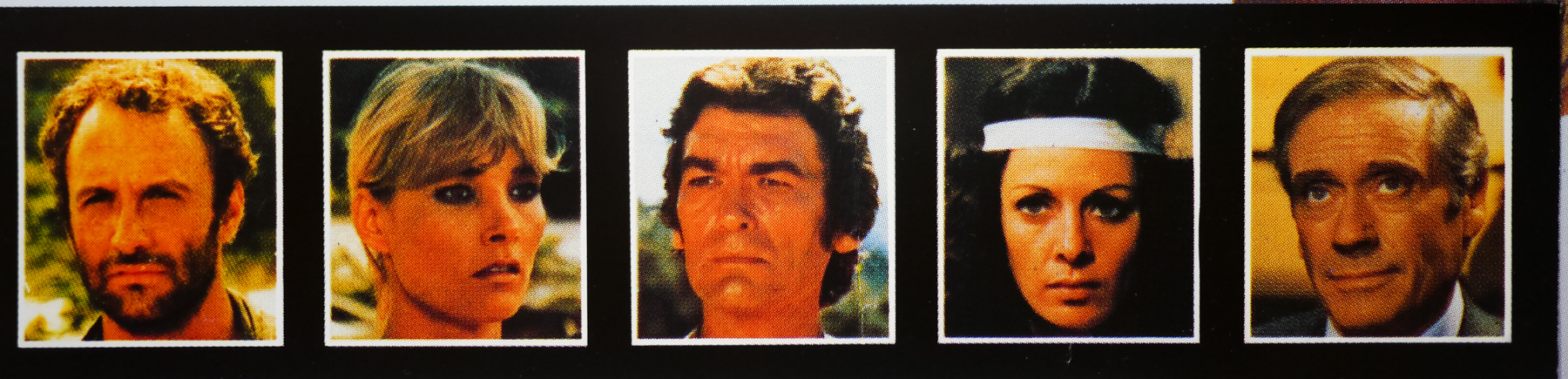
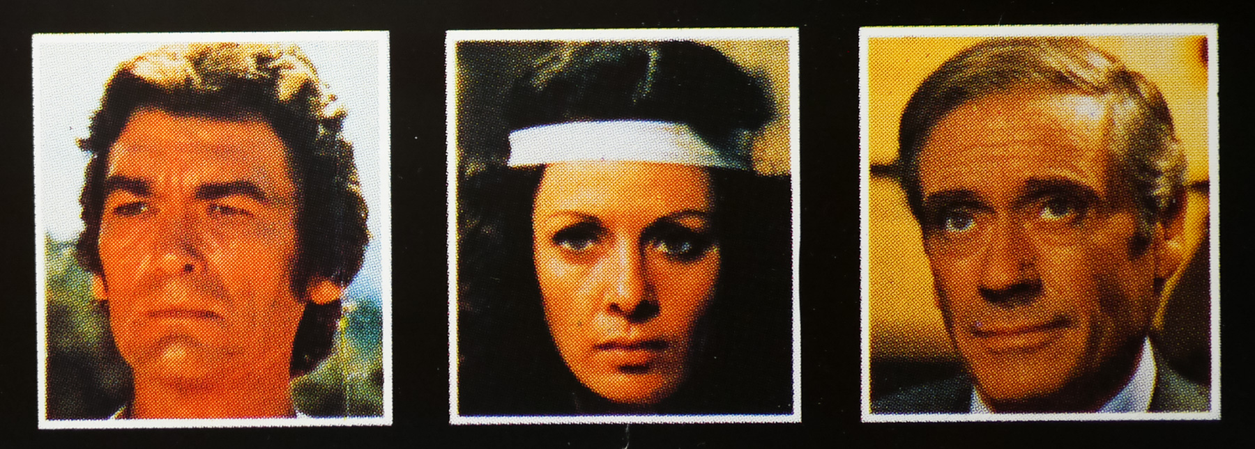
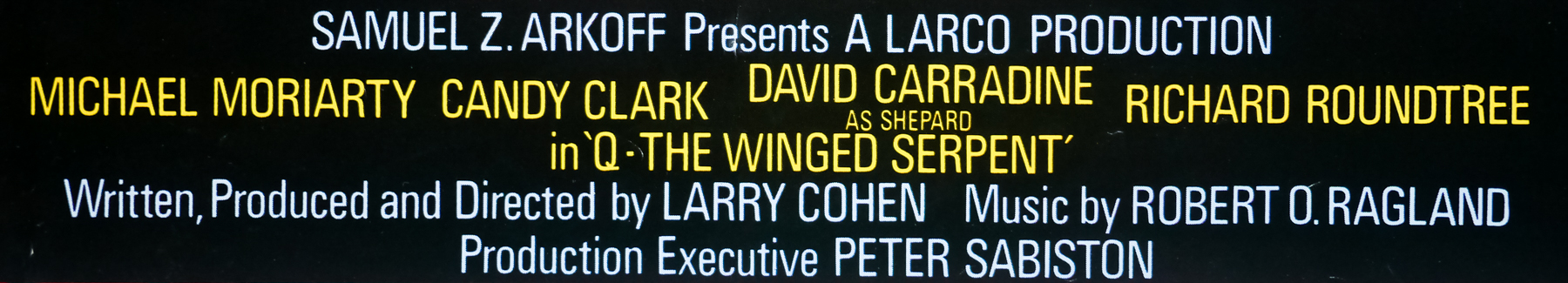
- Michael Moriarty, Candy Clark, David Carradine, Richard Roundtree, James Dixon, Ron Cey,
- Type of Poster
- Quad
- Style of Poster
- --
- Origin of Poster
- UK
- Year of Poster
- 1982
- Designer
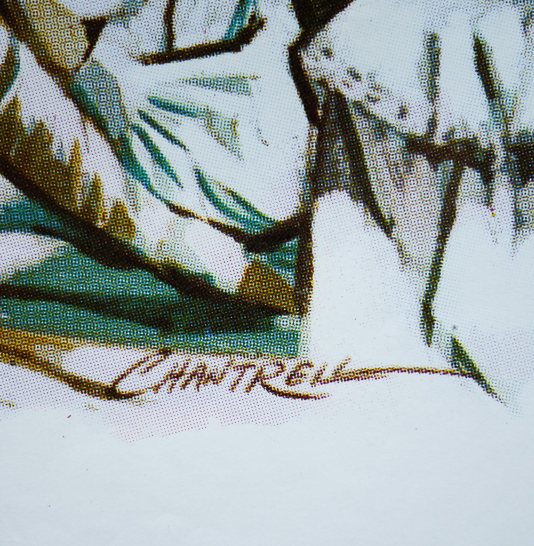
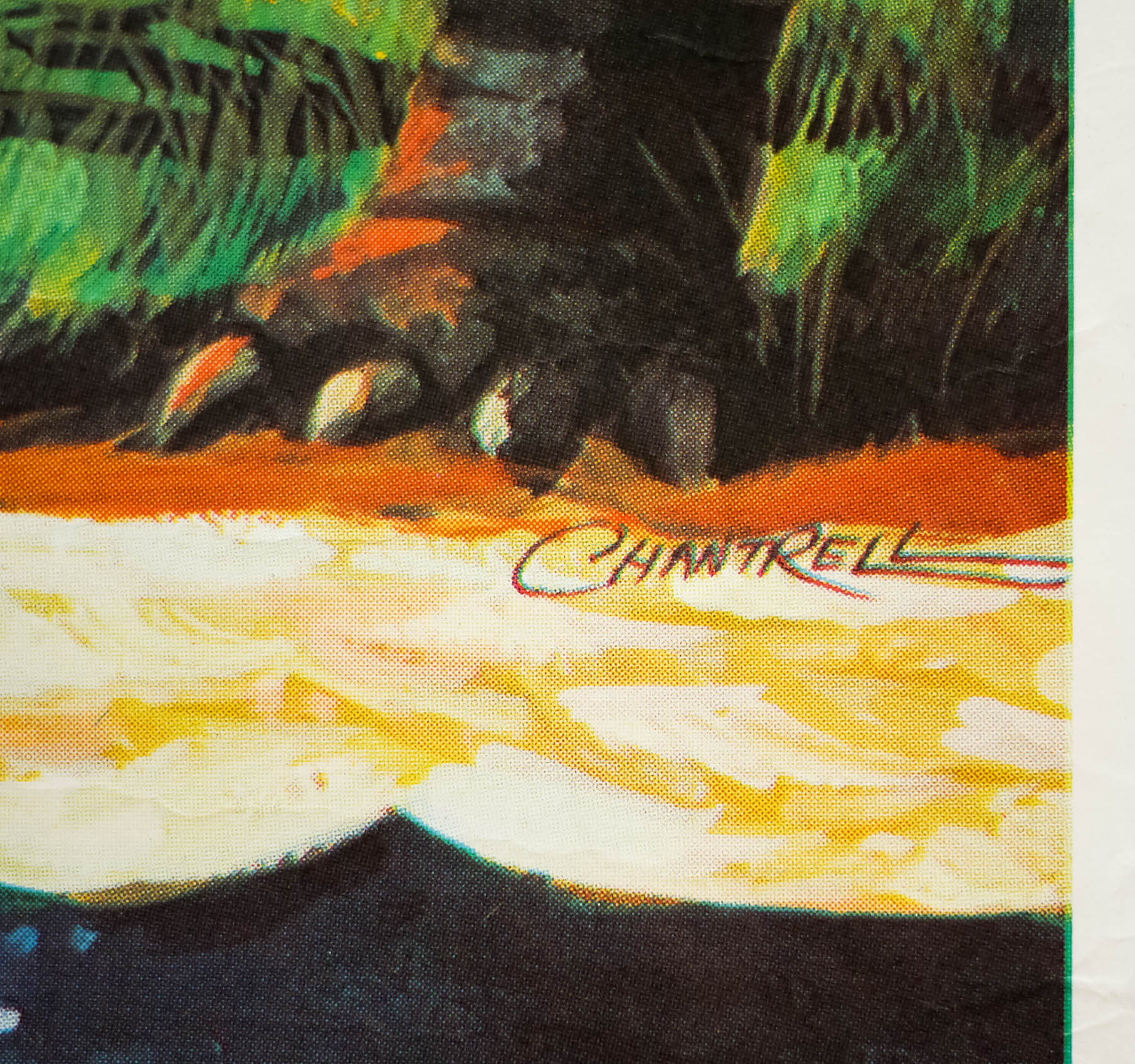
- Tom Chantrell
- Artist
- Tom Chantrell
- Size (inches)
- 30" x 40"
- SS or DS
- SS
- NSS #
- --
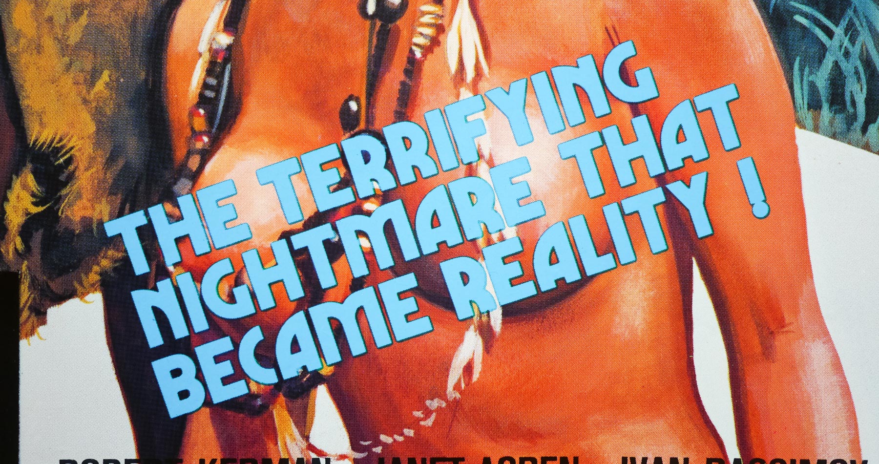
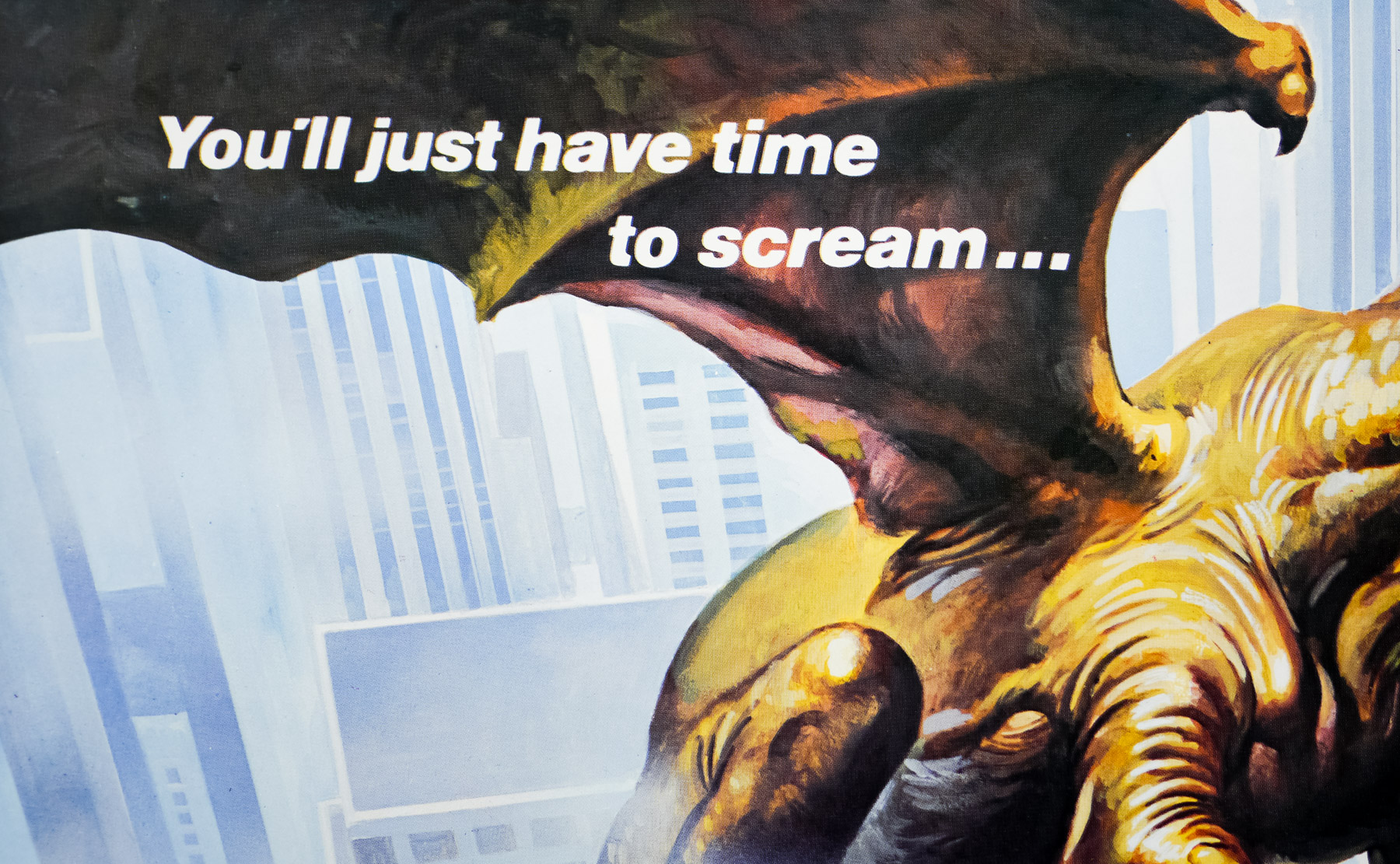
- Tagline
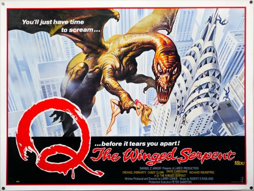
- You'll just have time to scream... before it tears you apart!
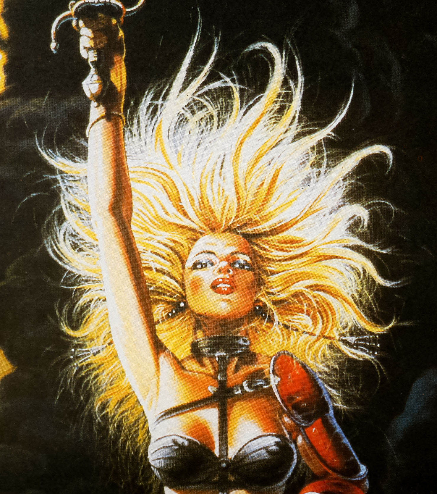
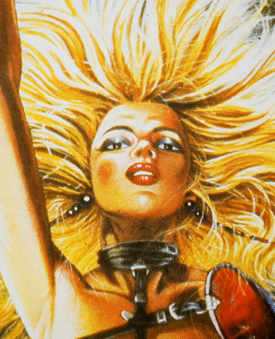
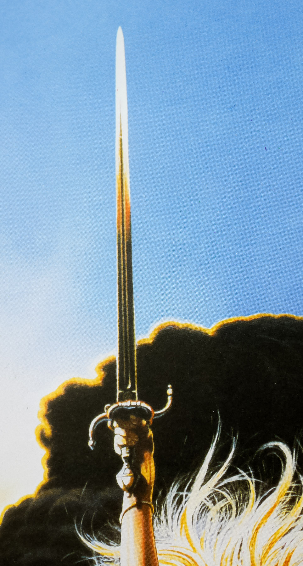
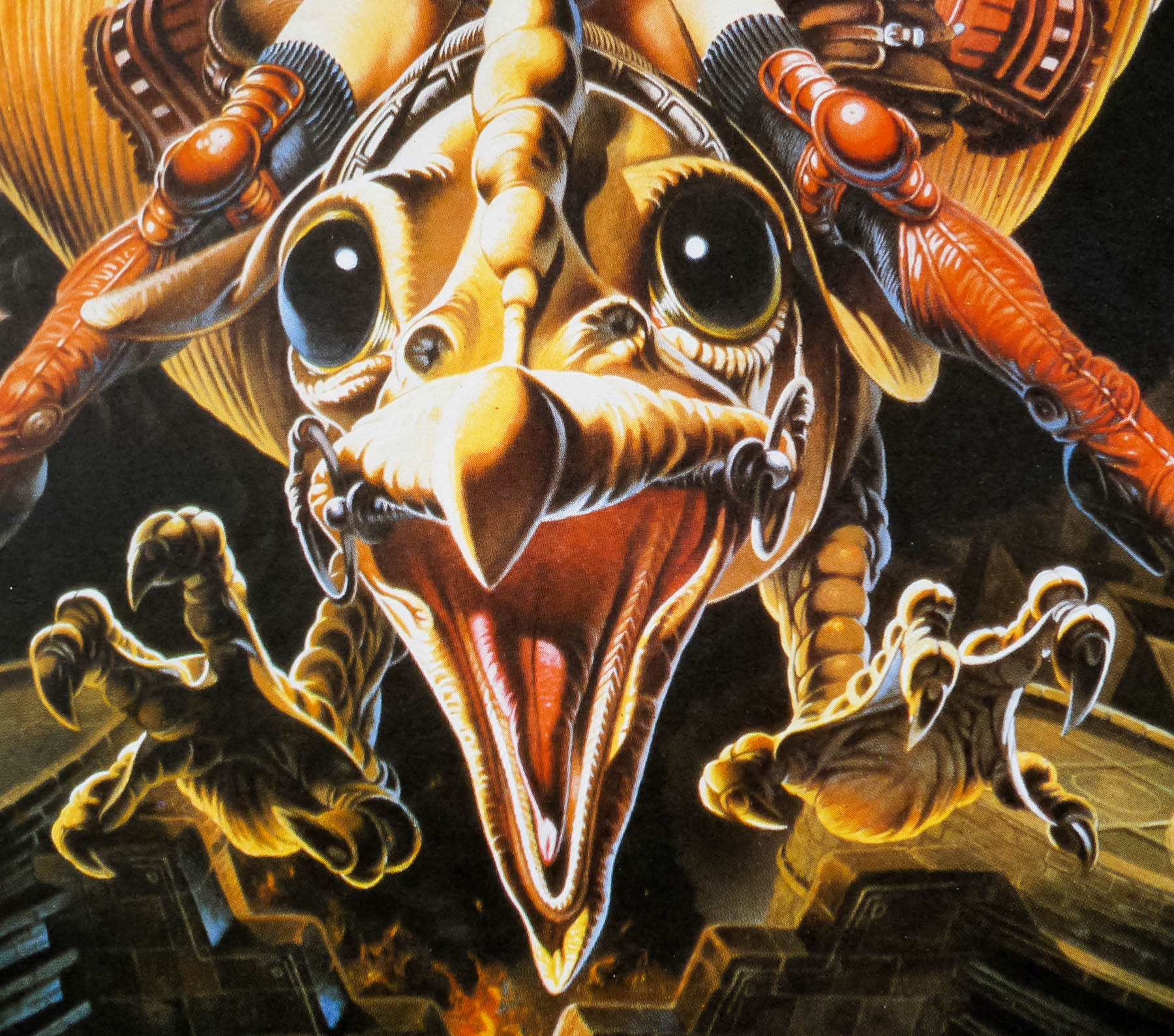
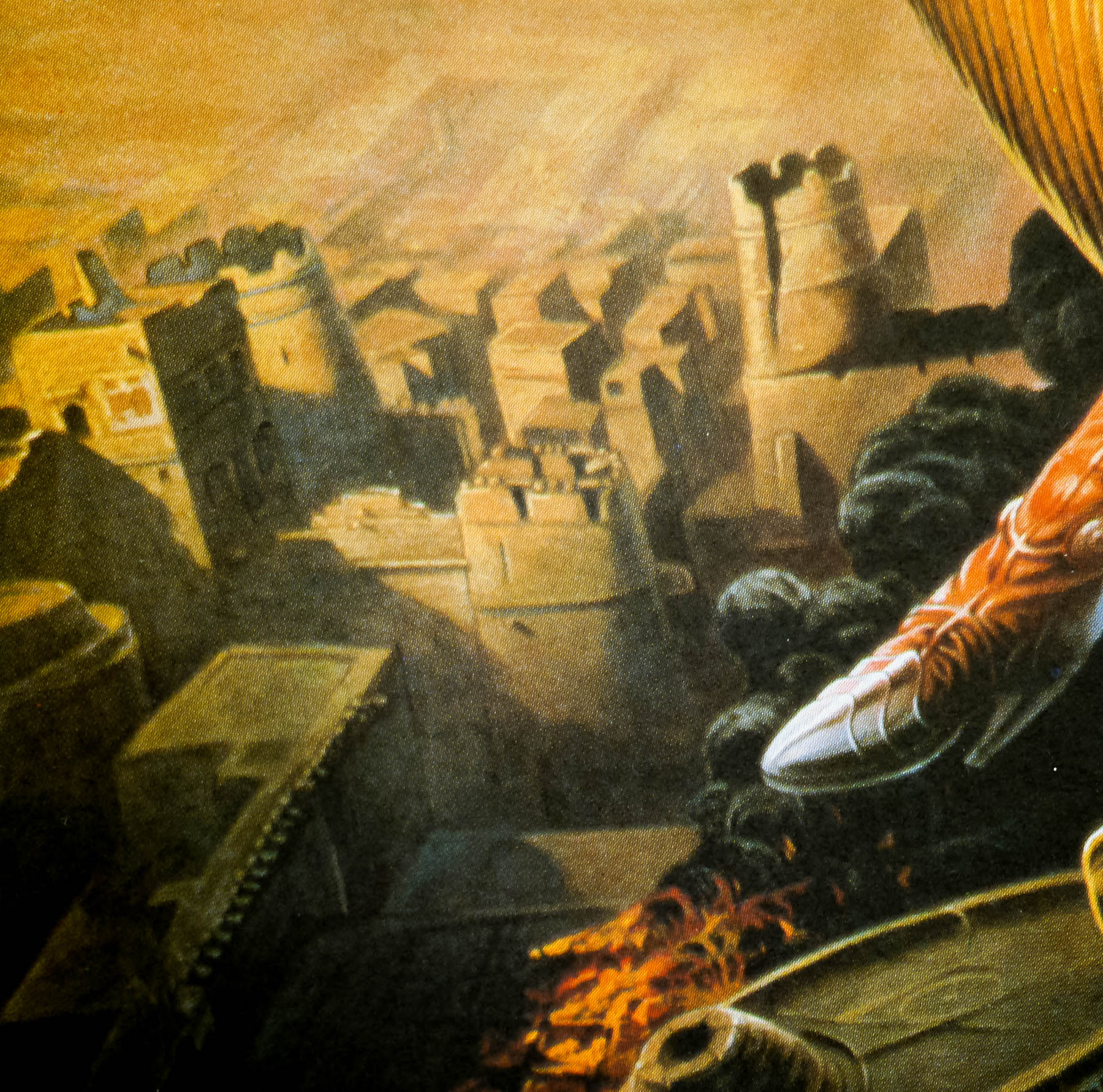
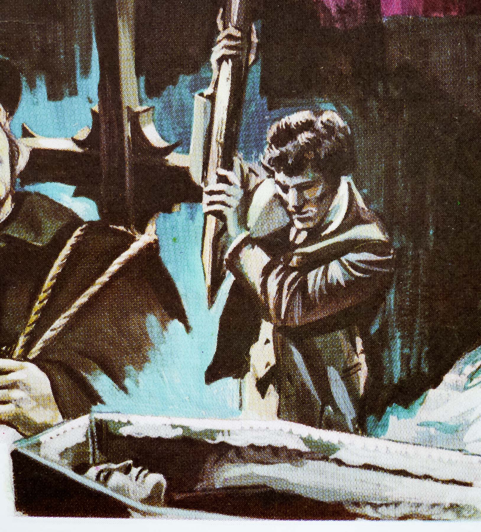
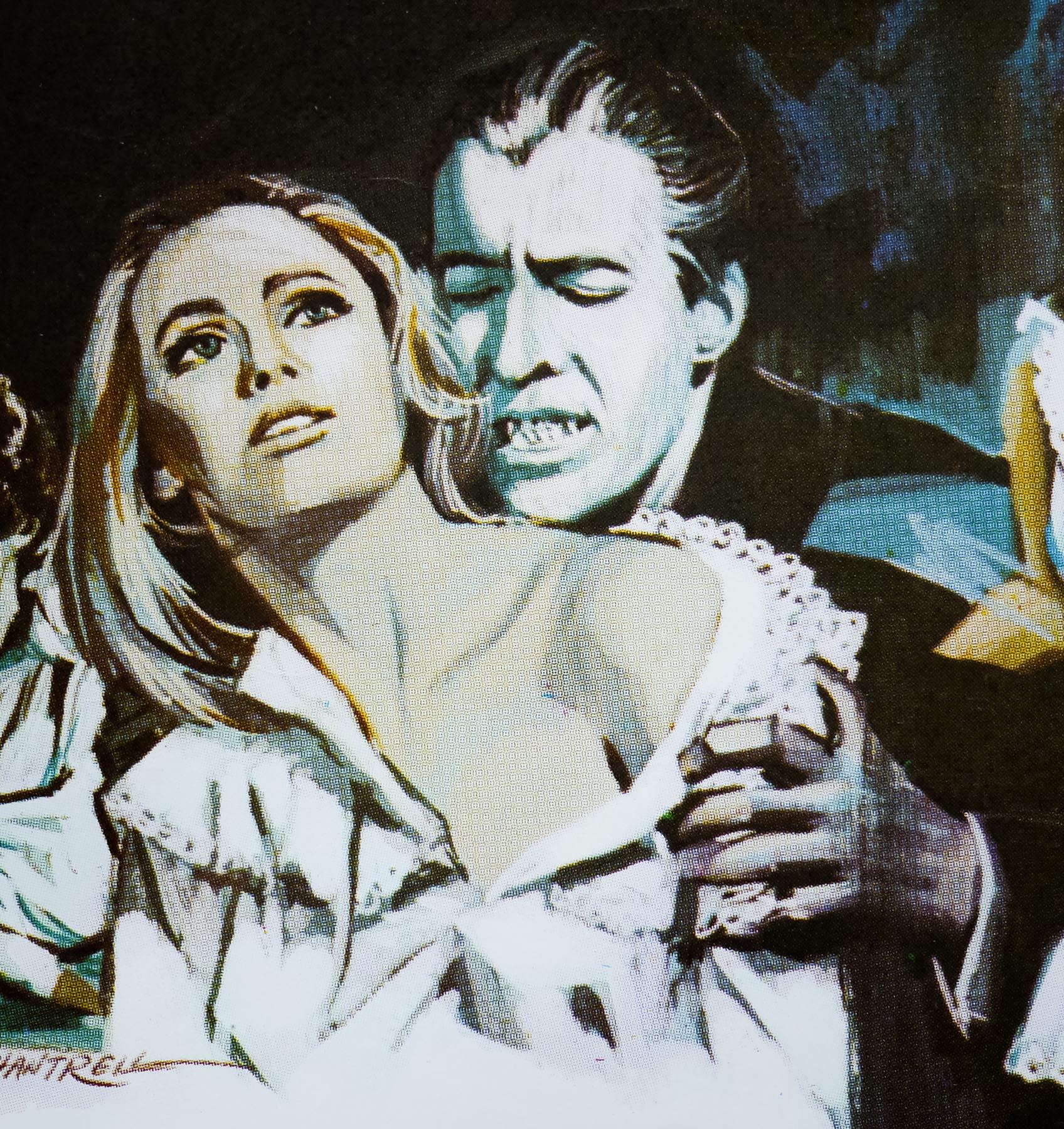
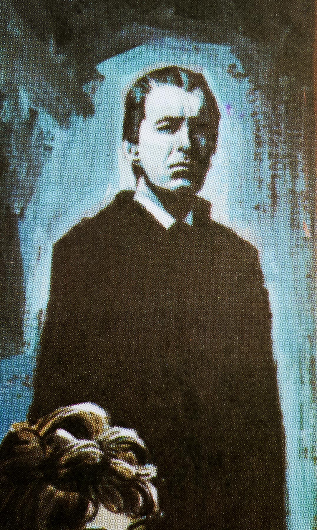
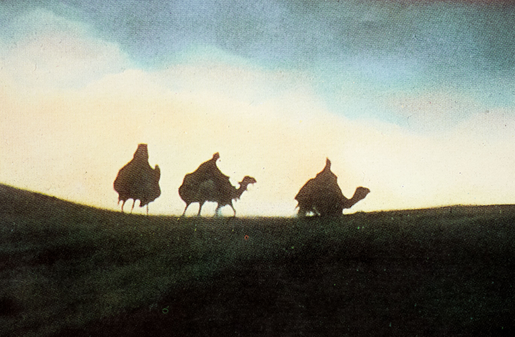
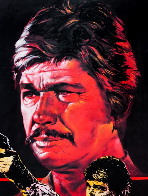
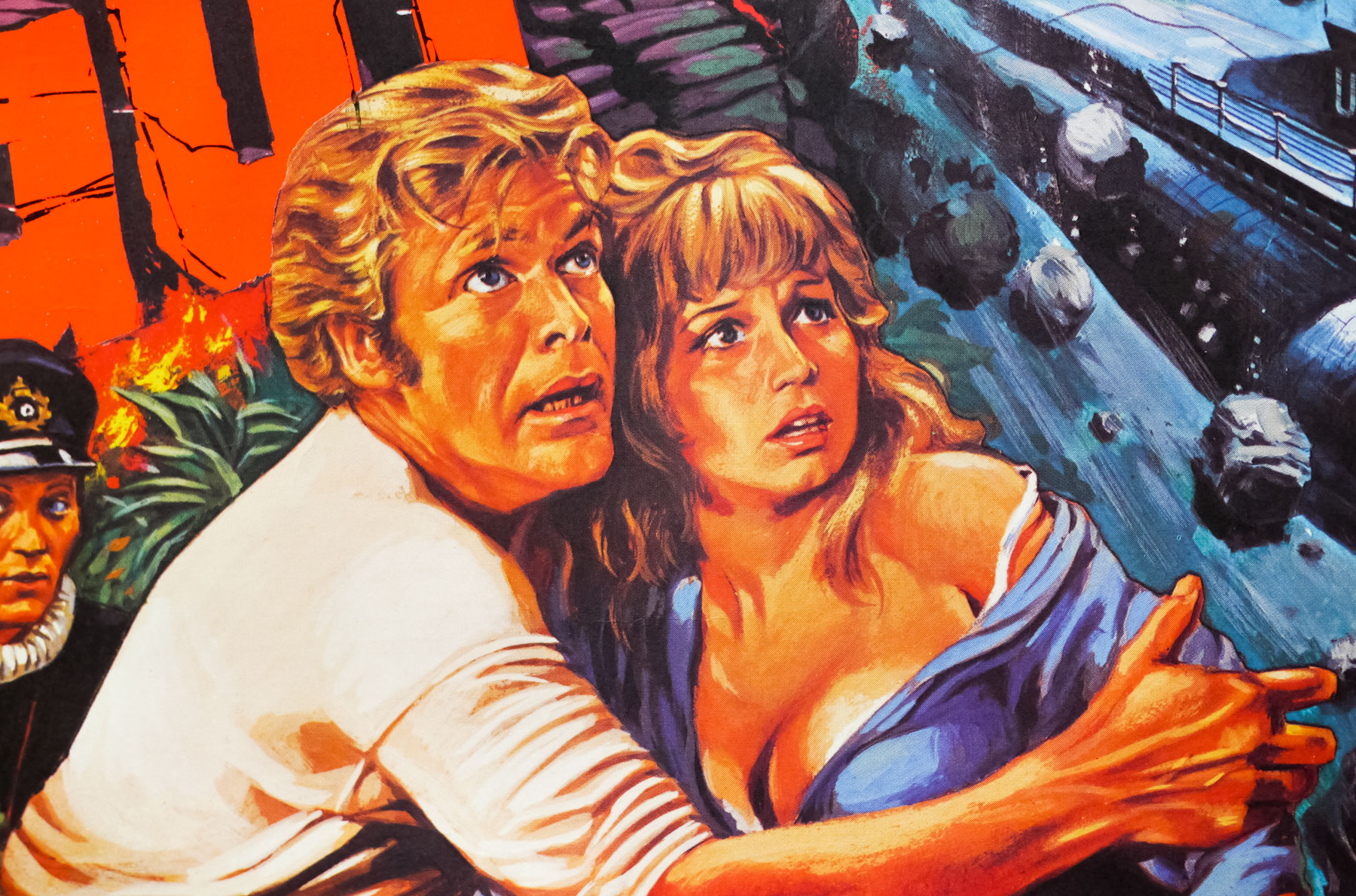
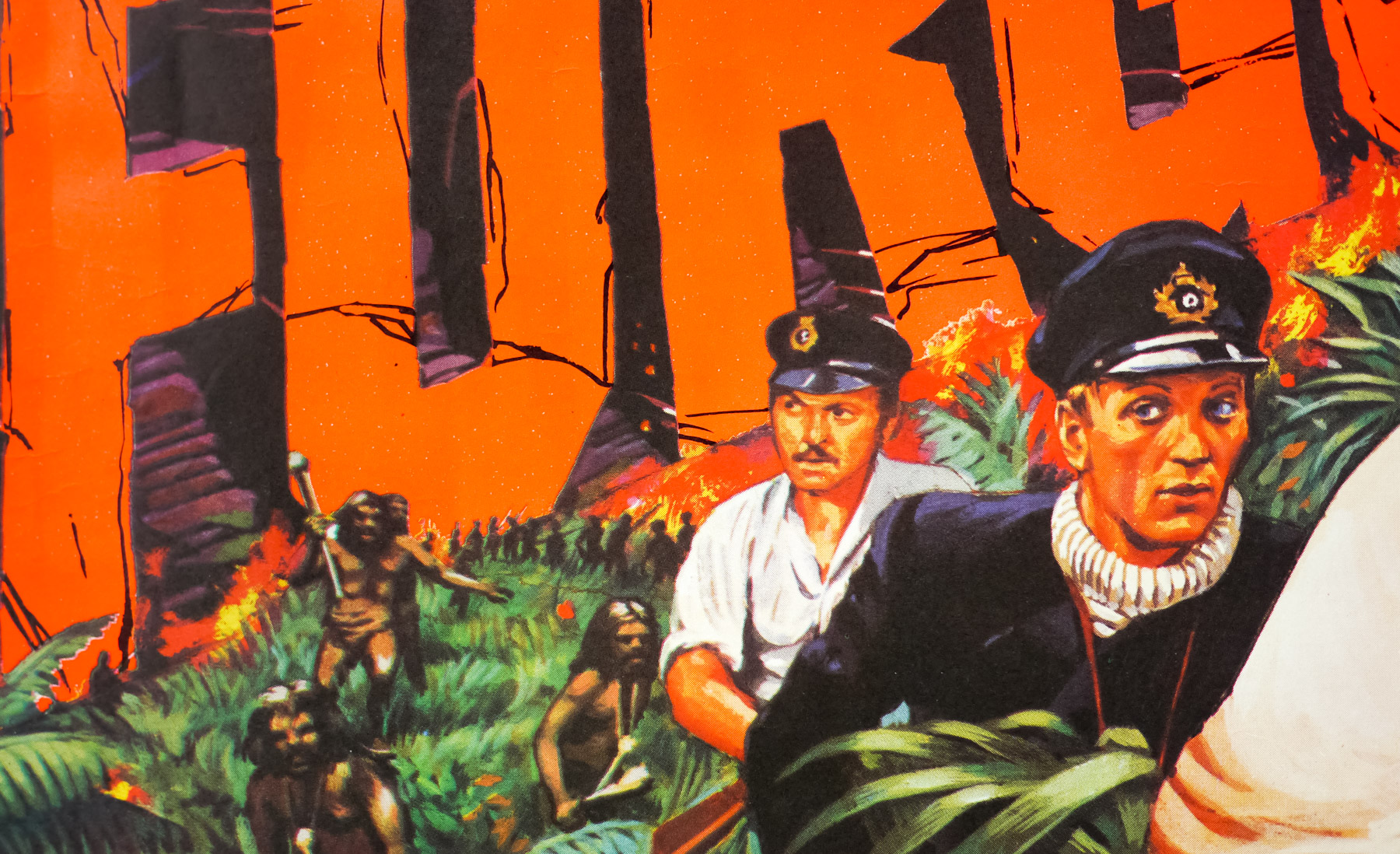
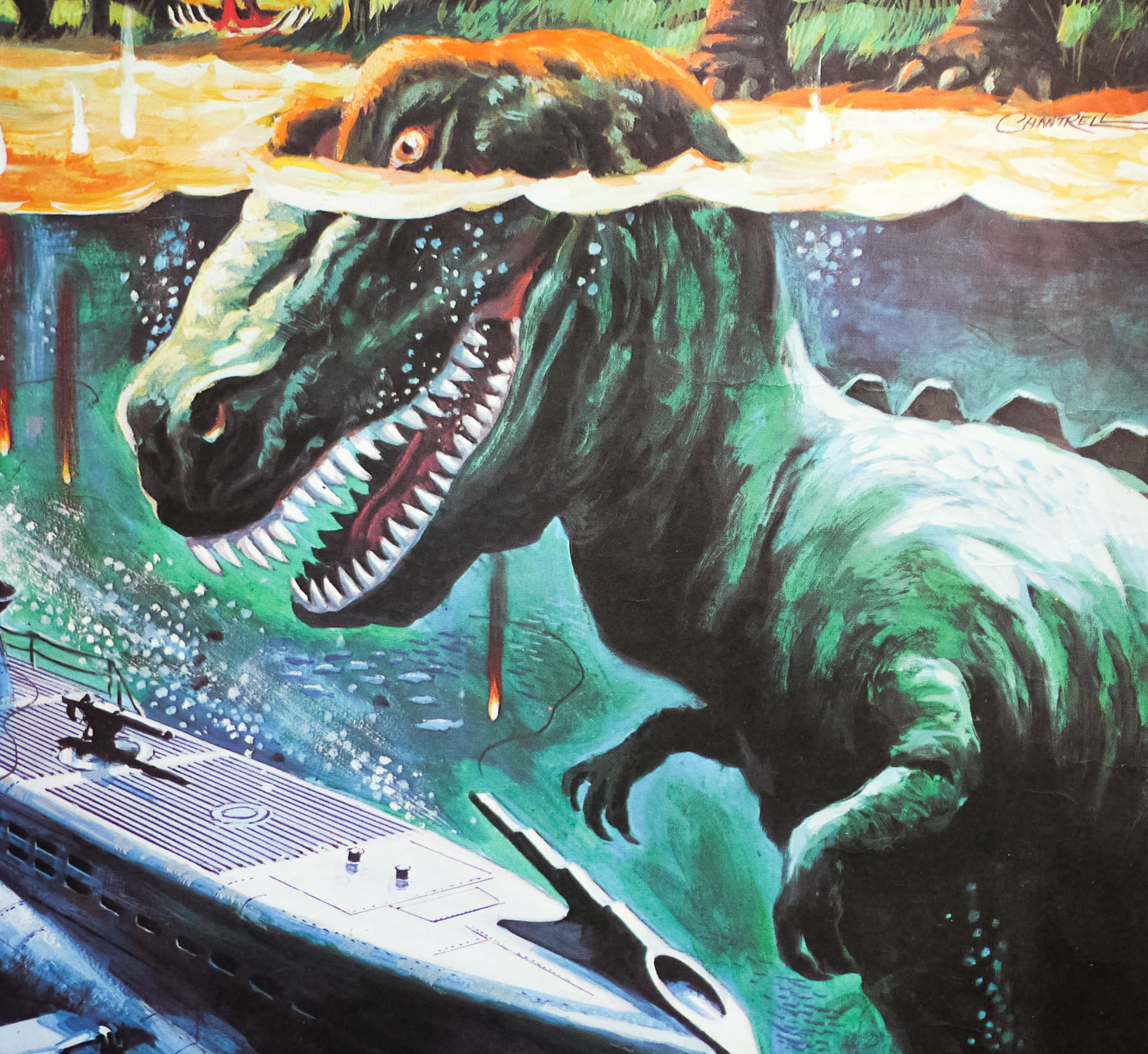
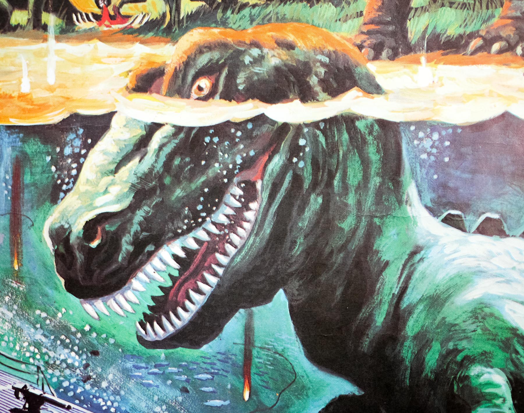
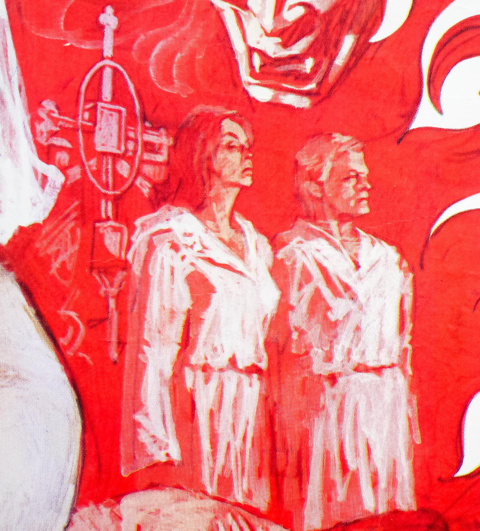
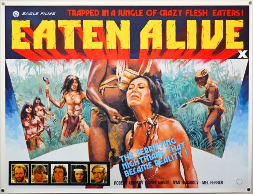
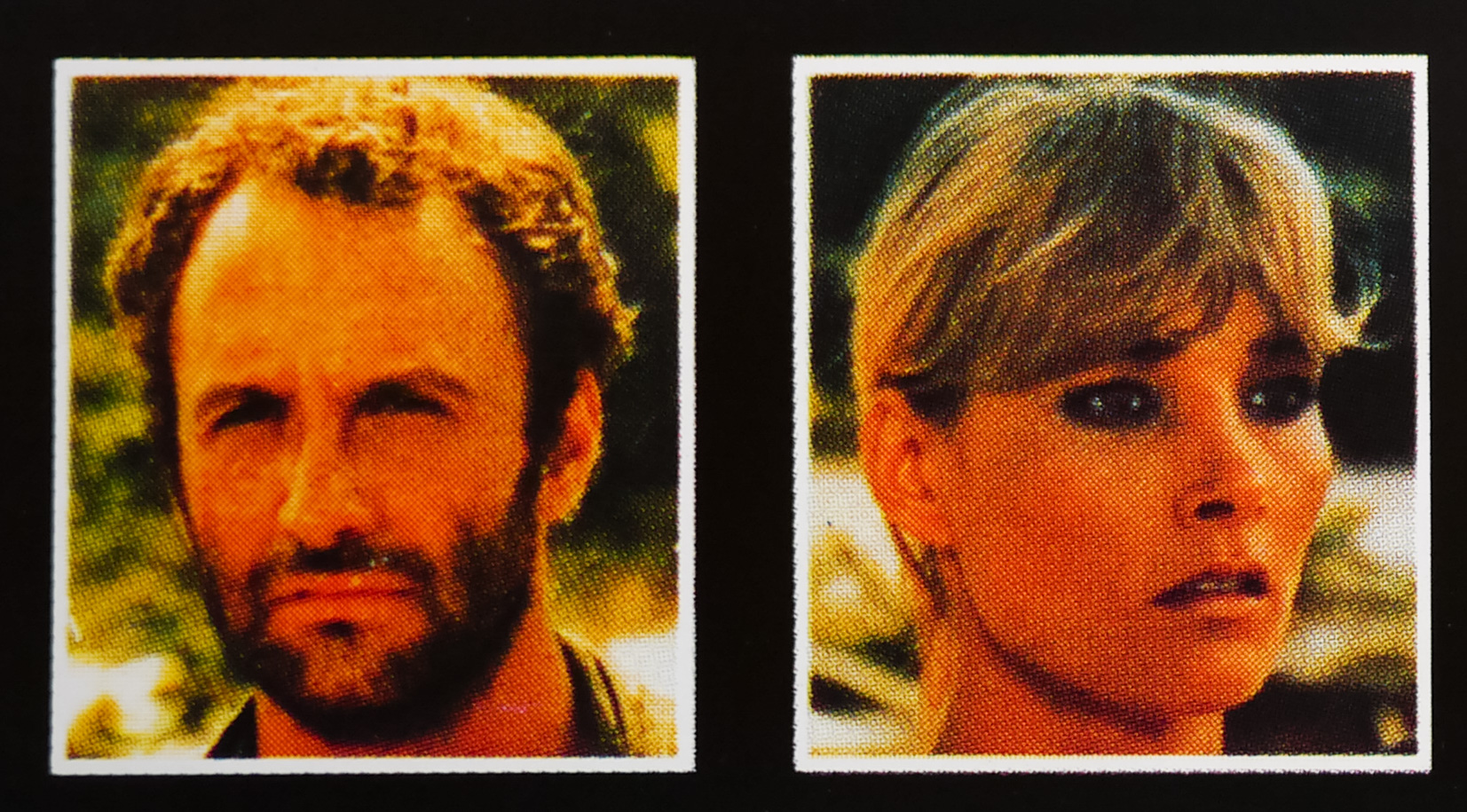
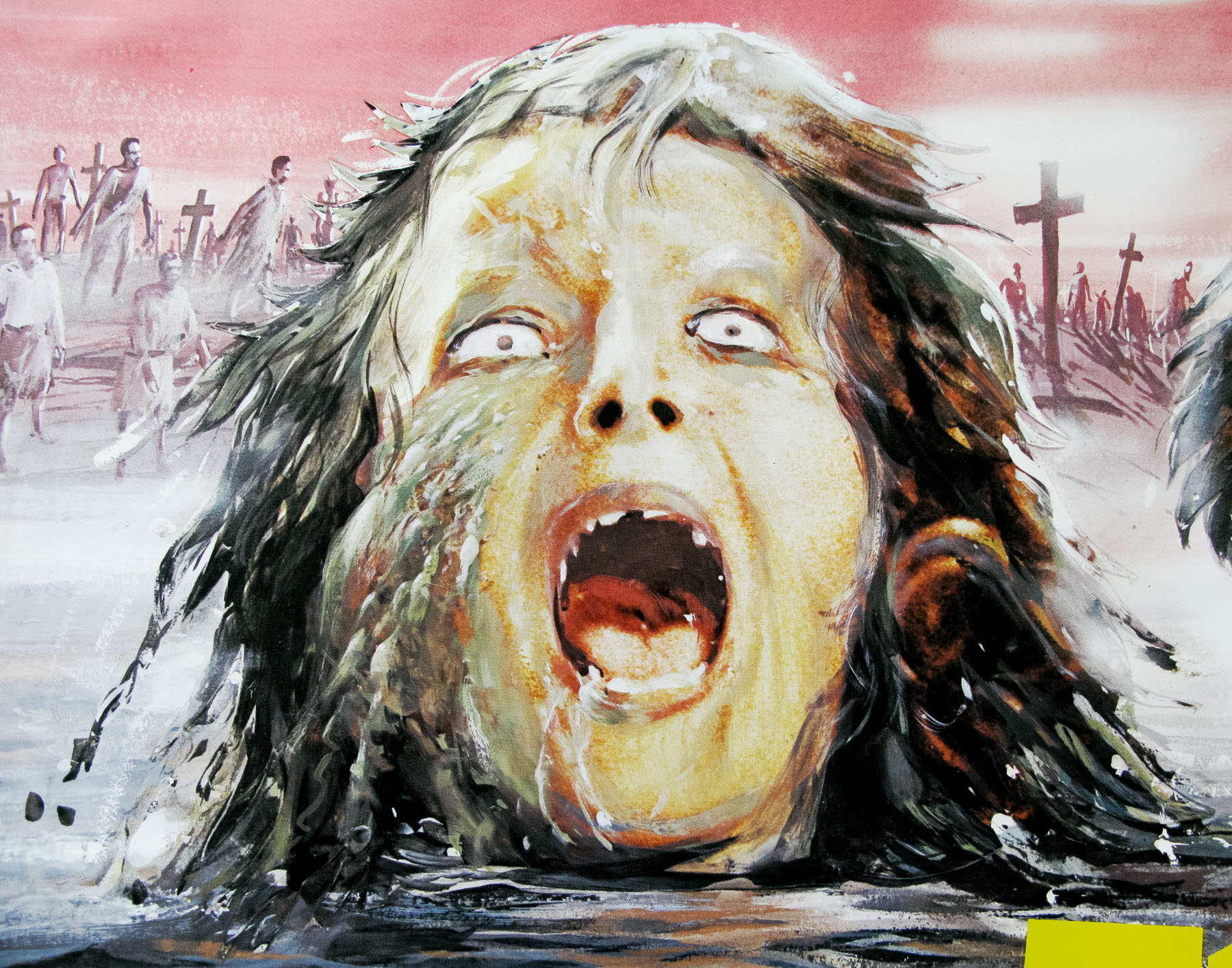
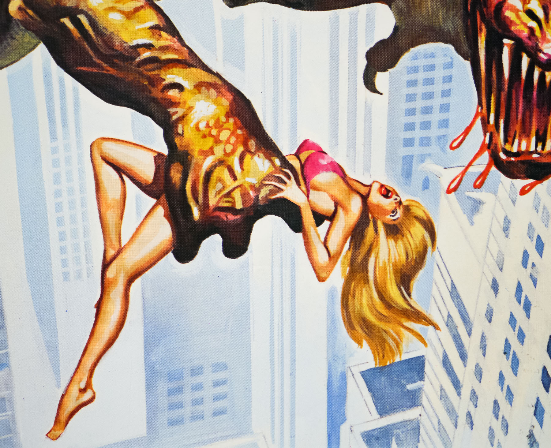
Writer/director and B-movie legend Larry Cohen is responsible for this 1982 horror film that harks back to the popular ‘giant beast’ monster movies of the 1950s. Commonly known as ‘Q: The Winged Serpent‘, or simply ‘Q’, the story is set in New York City and follows two police detectives (played by David Carradine and Richard Roundtree) investigating a series of brutal sacrificial slayings in which victims’ hearts and skins have been removed. They are also struggling to explain the mysterious deaths of people snatched from high up on rooftops by what is reported to be a flying lizard.
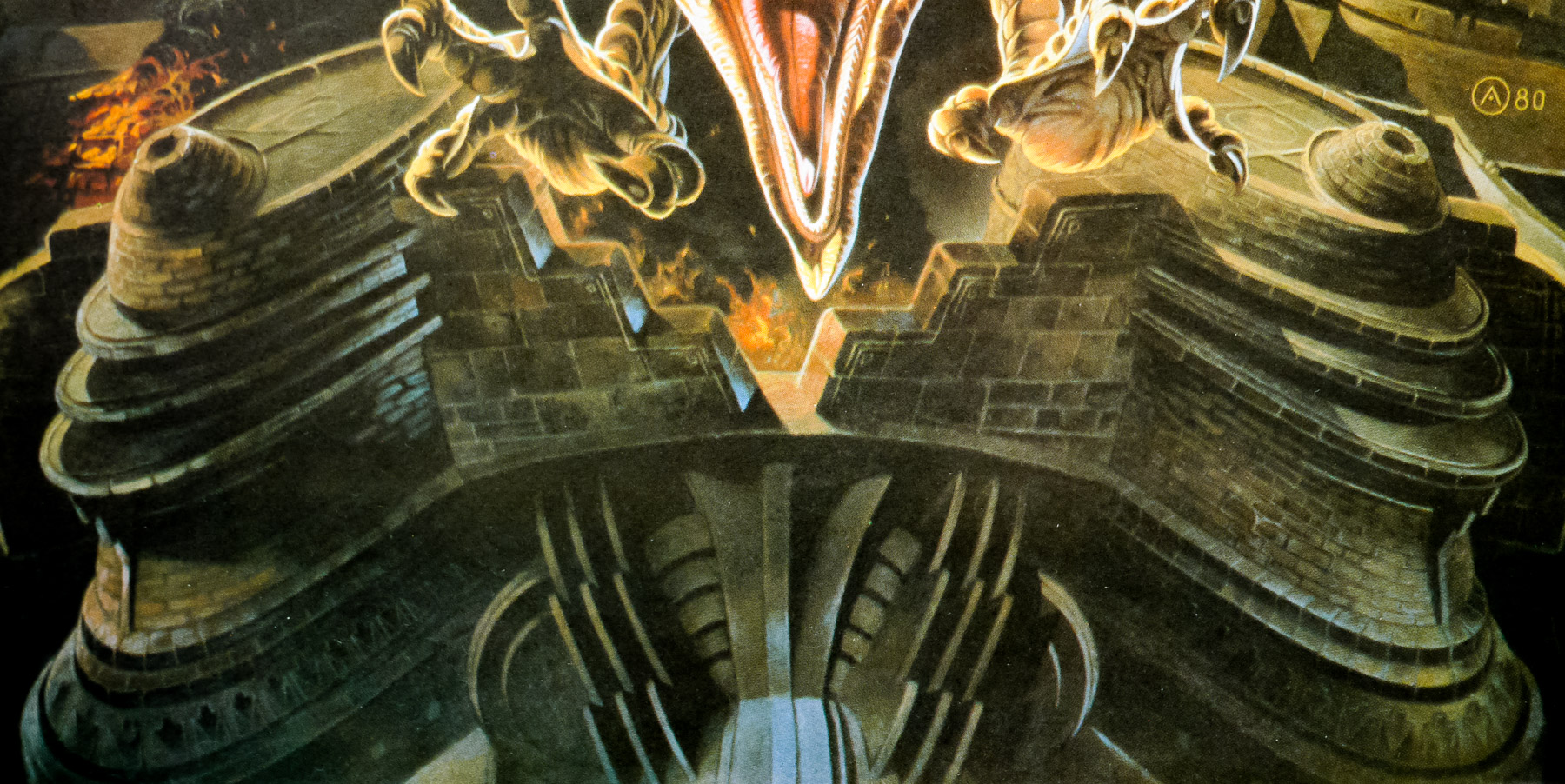
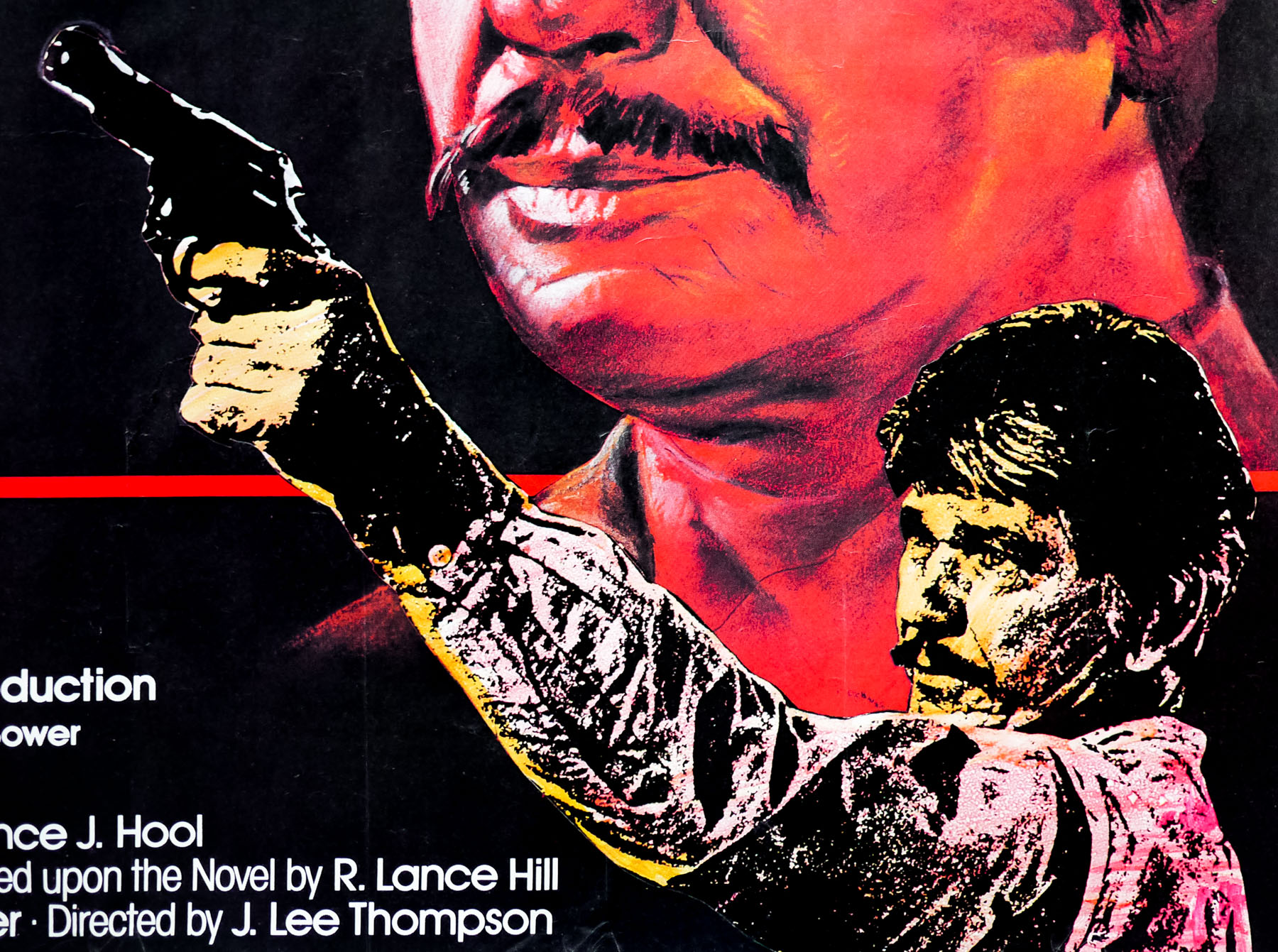
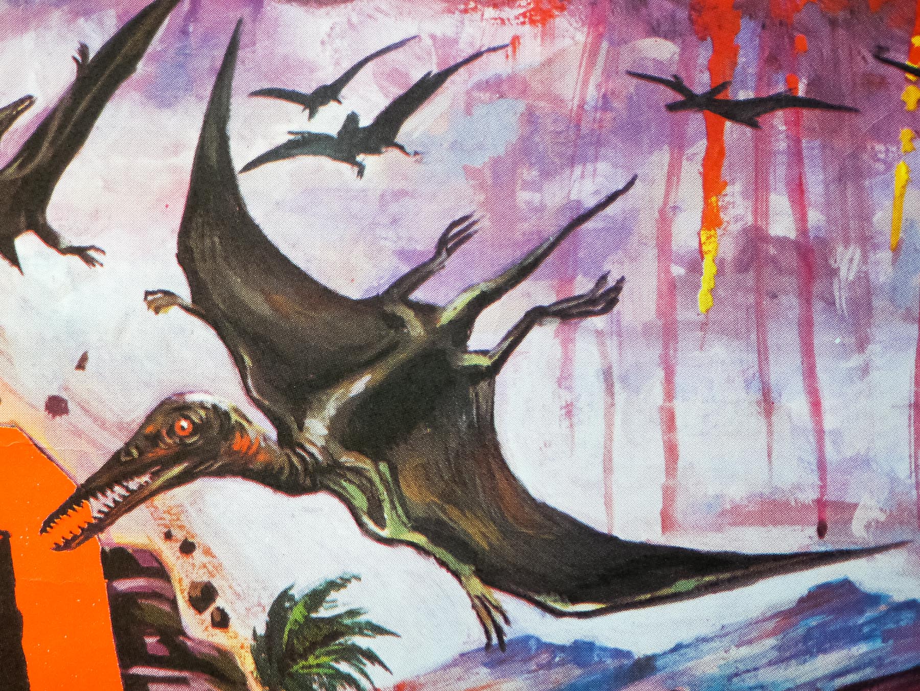
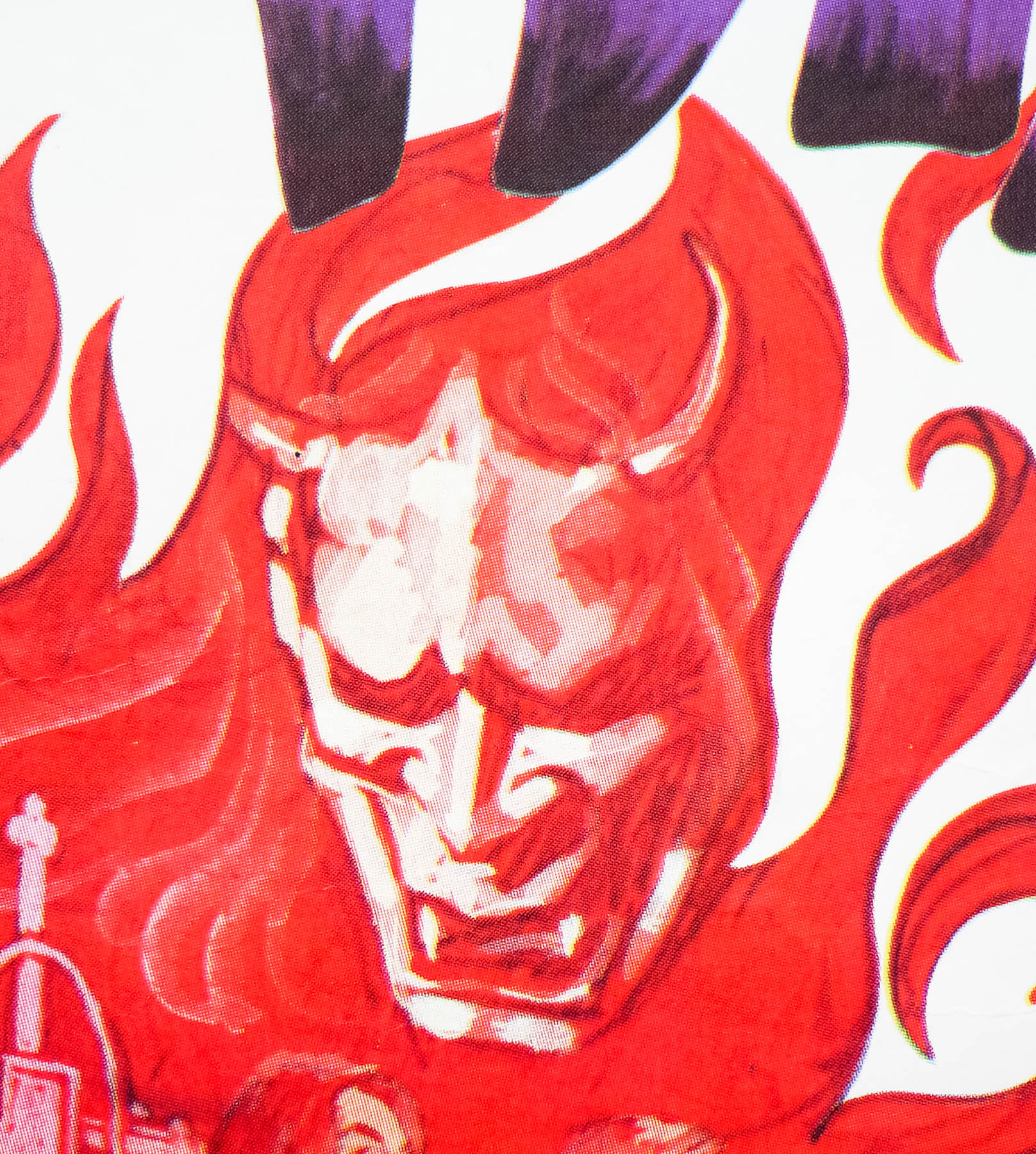
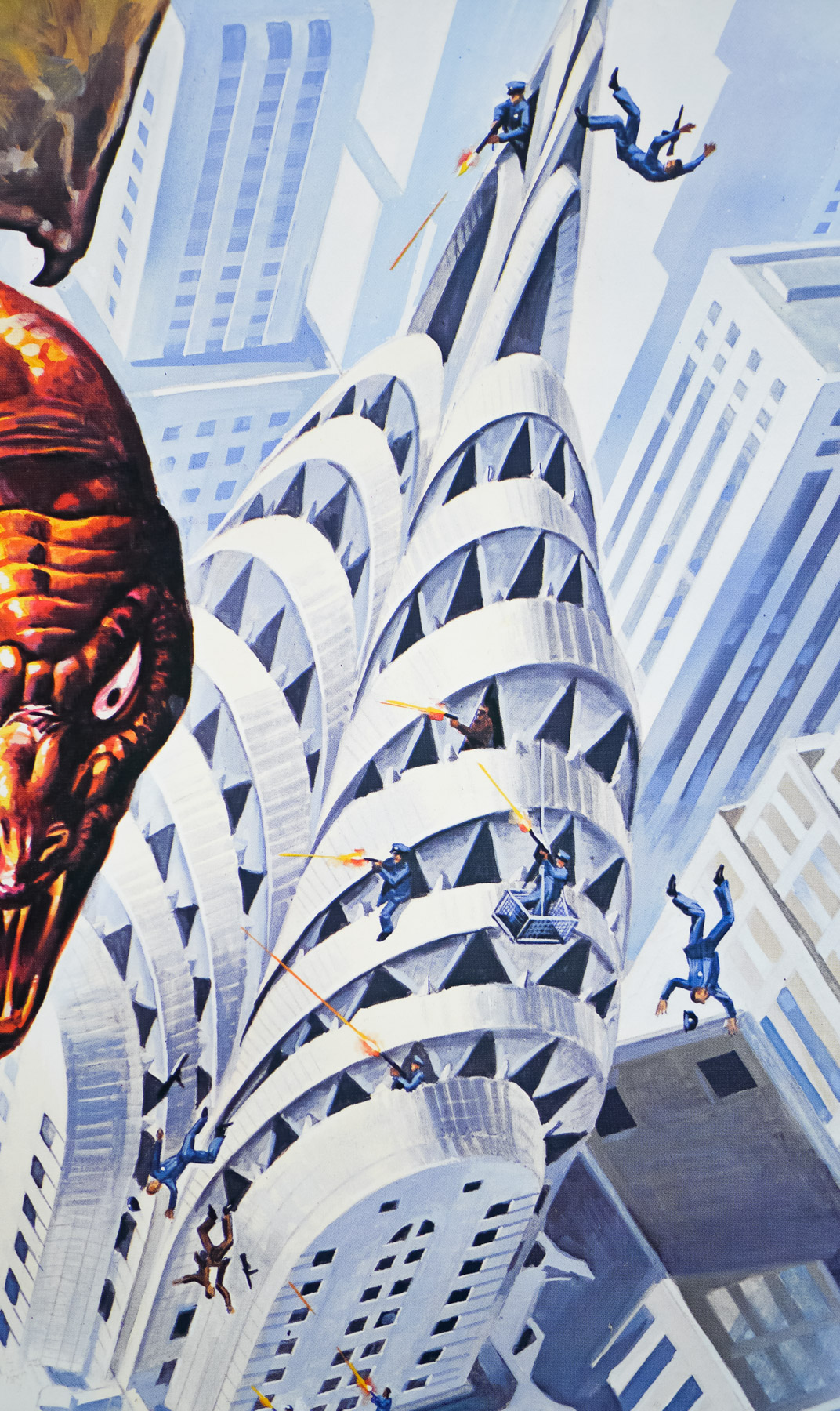
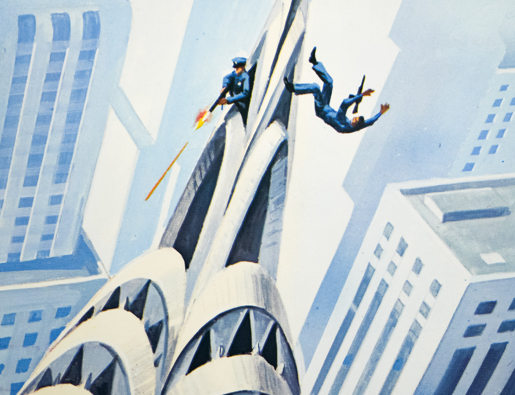
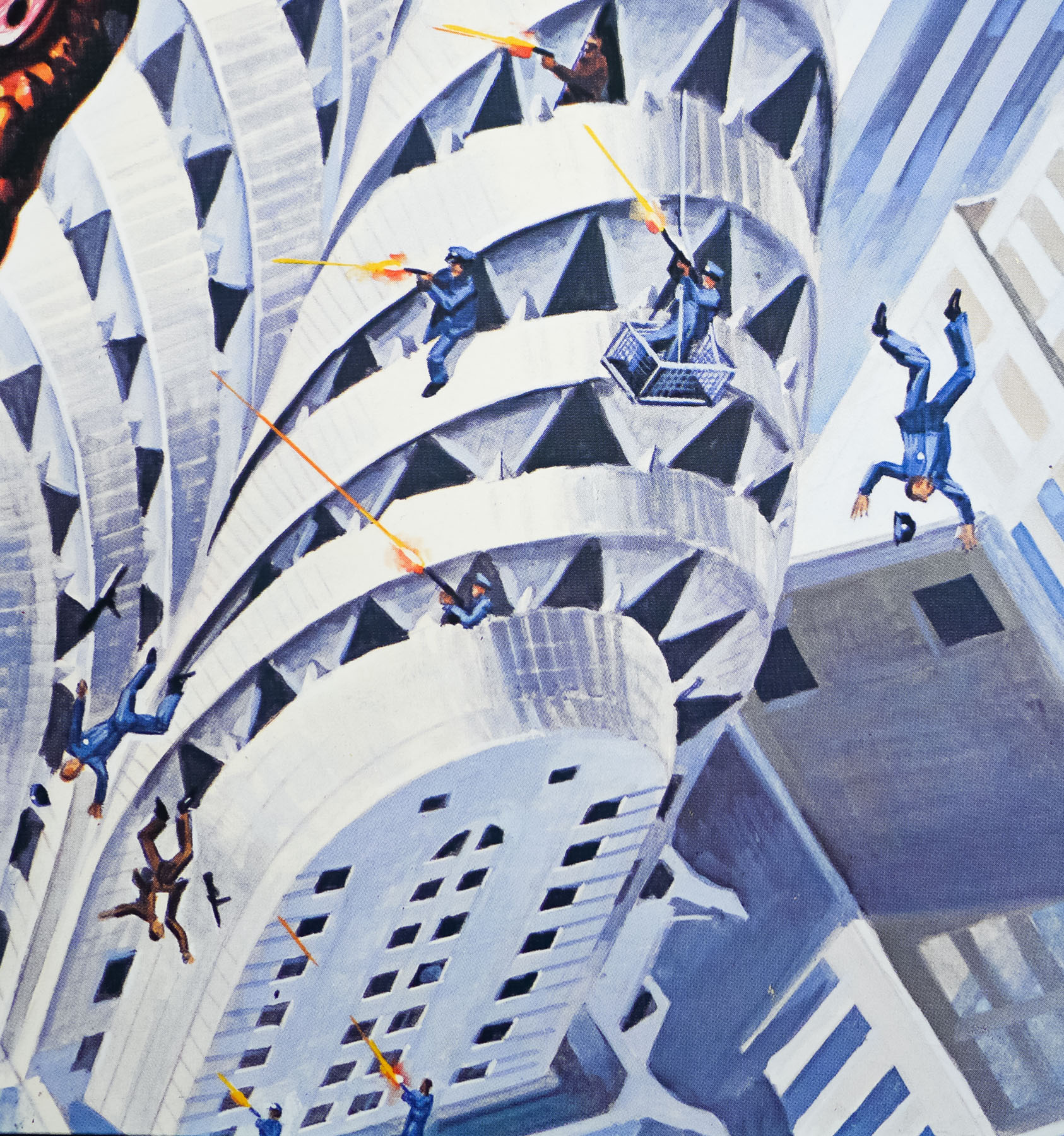
At the same time, a luckless hoodlum called Jimmy Quinn (played with gusto by Michael Moriarty) is on the run from murderous mobsters and discovers a giant egg hidden in the crown of the famous Chrysler Building, which apparently belongs to the deadly creature. It becomes apparent that the cult behind the sacrificial murders has managed to resurrect an Aztec god known as Quetzalcoatl, a flying lizard with huge talons and a taste for human flesh, and the detectives must battle to stop both the cult members and defeat the beast before New York City is lost.
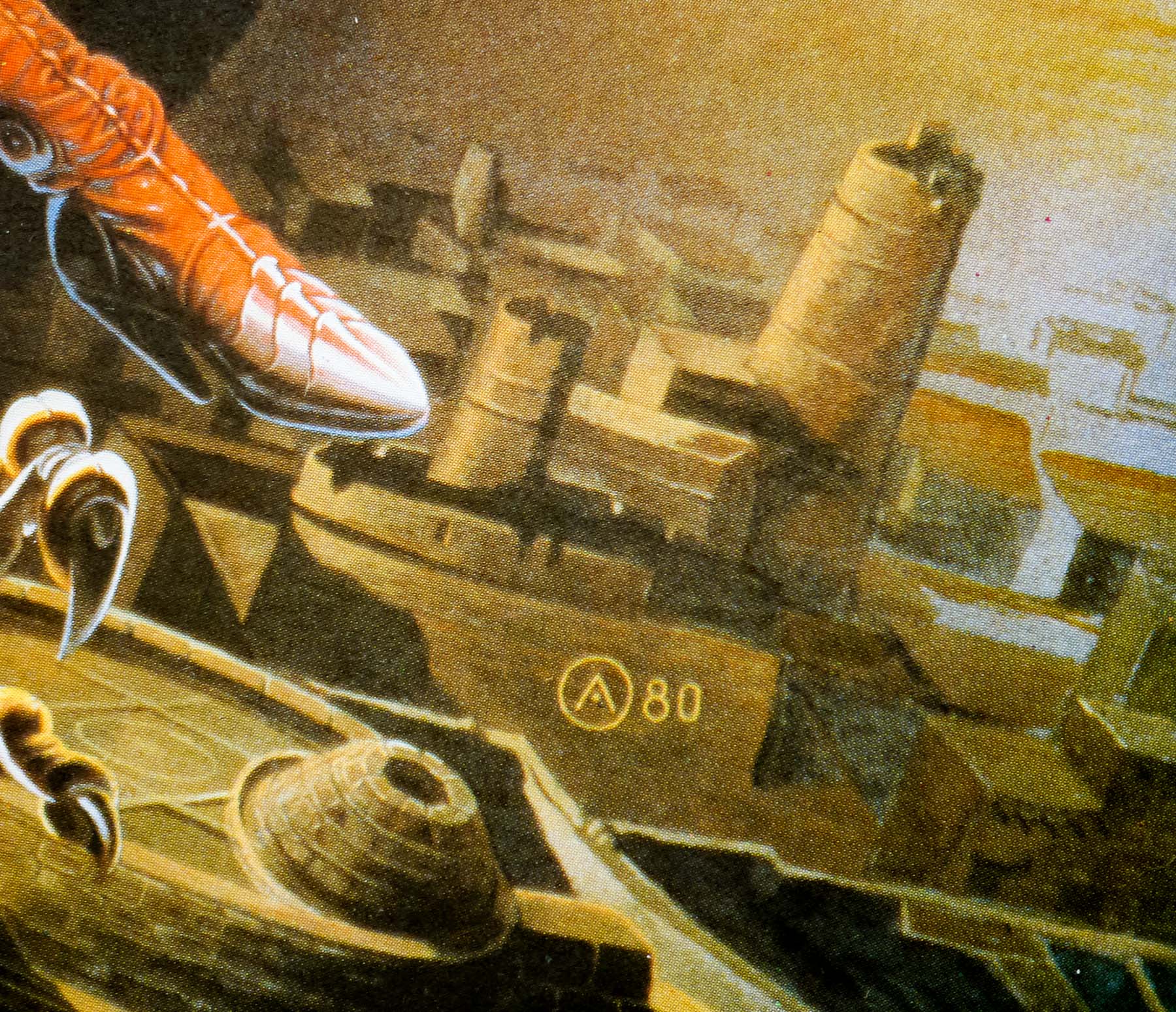
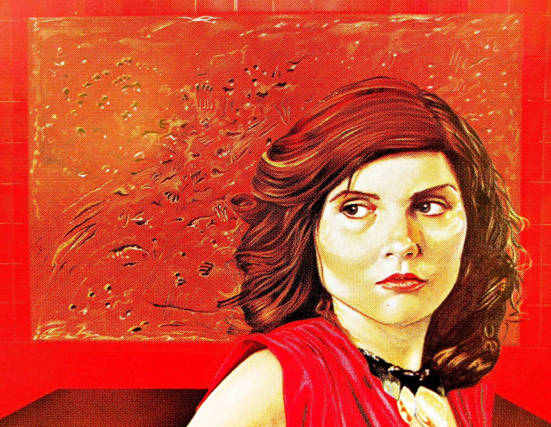
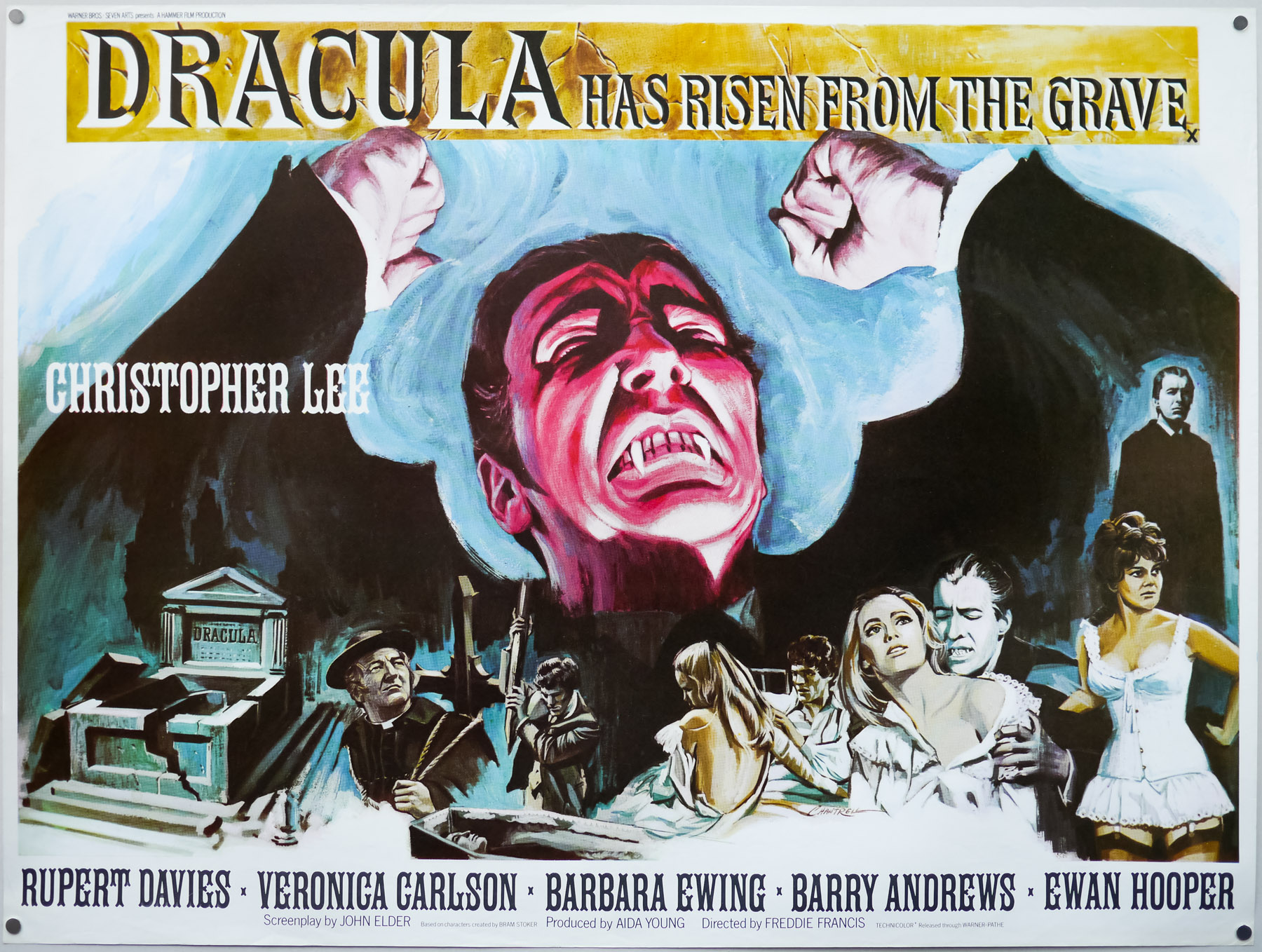
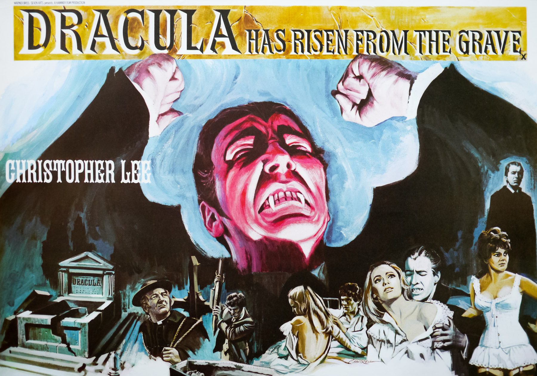
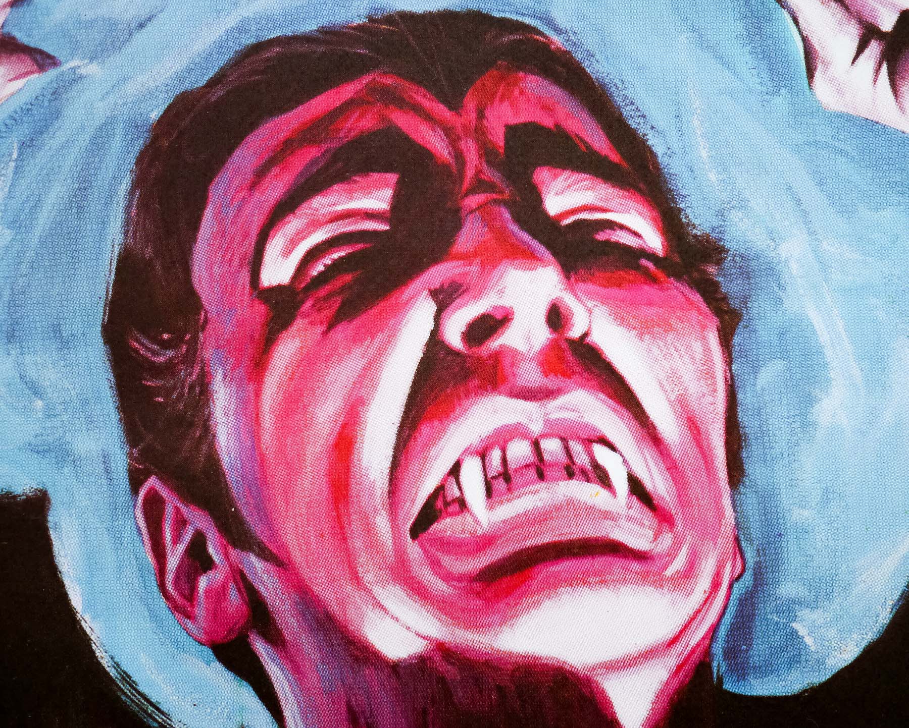
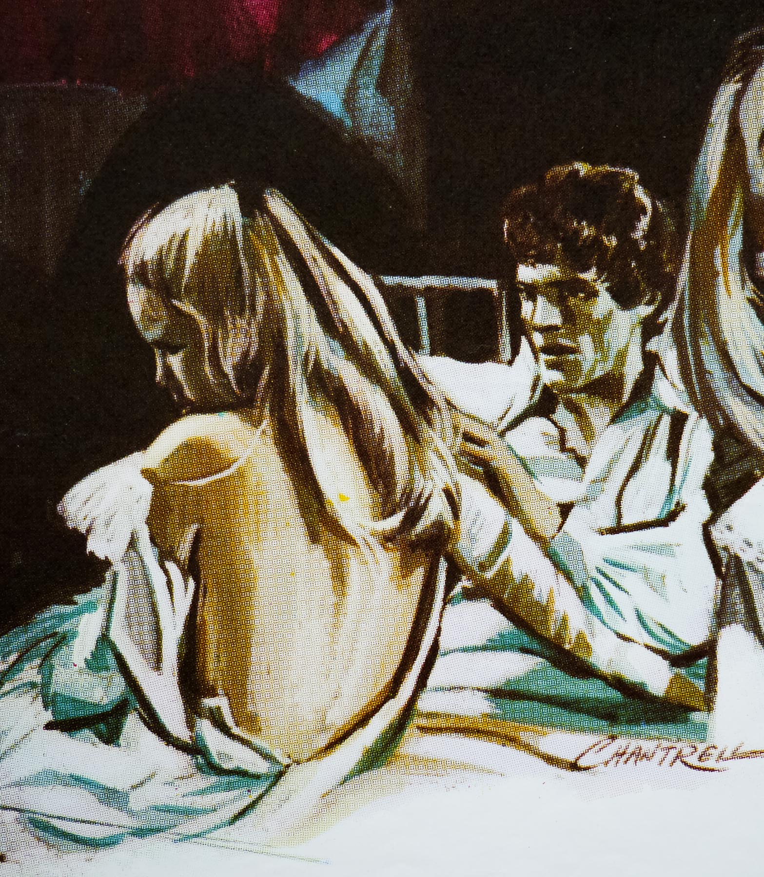
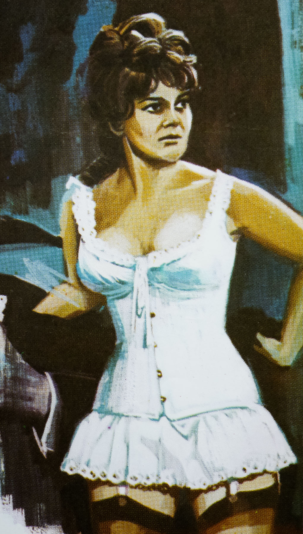
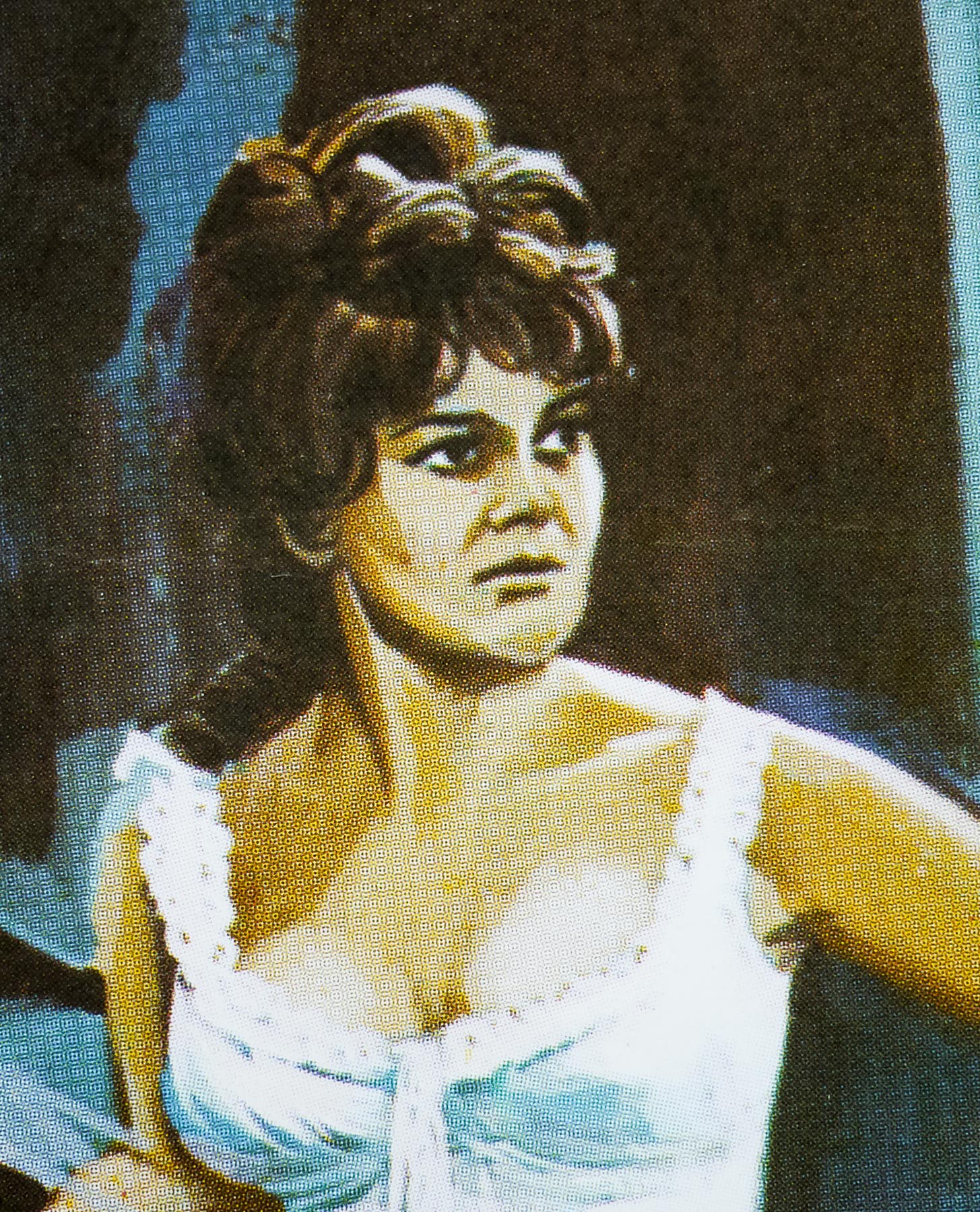
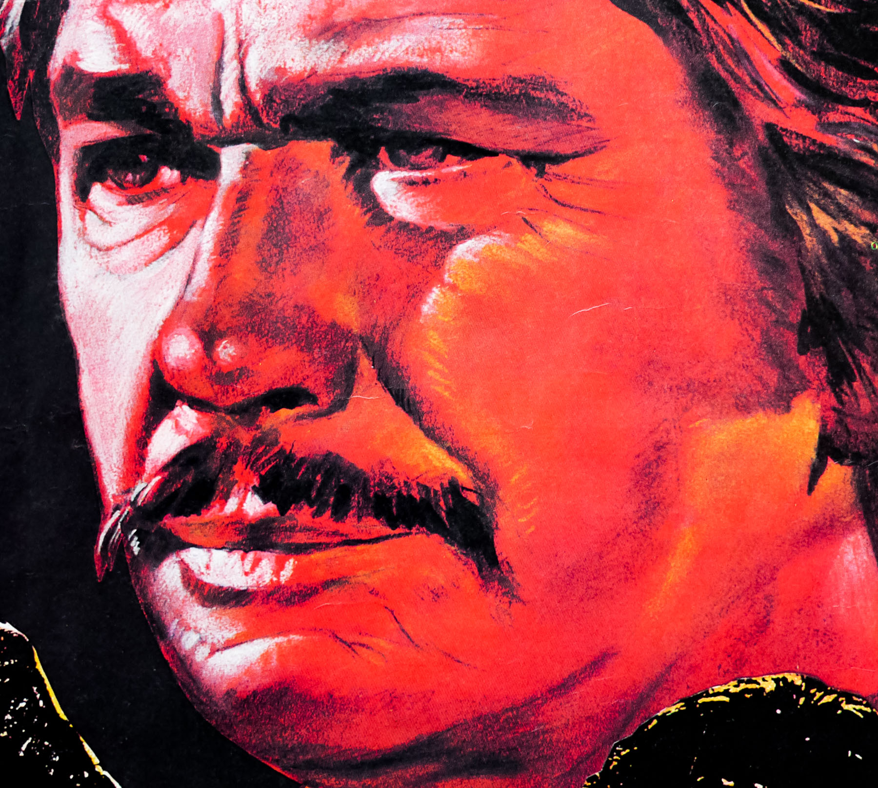
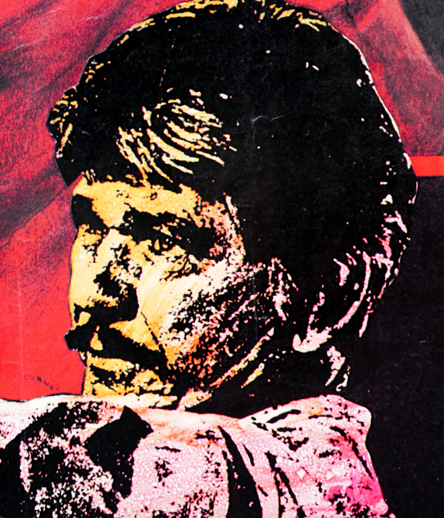
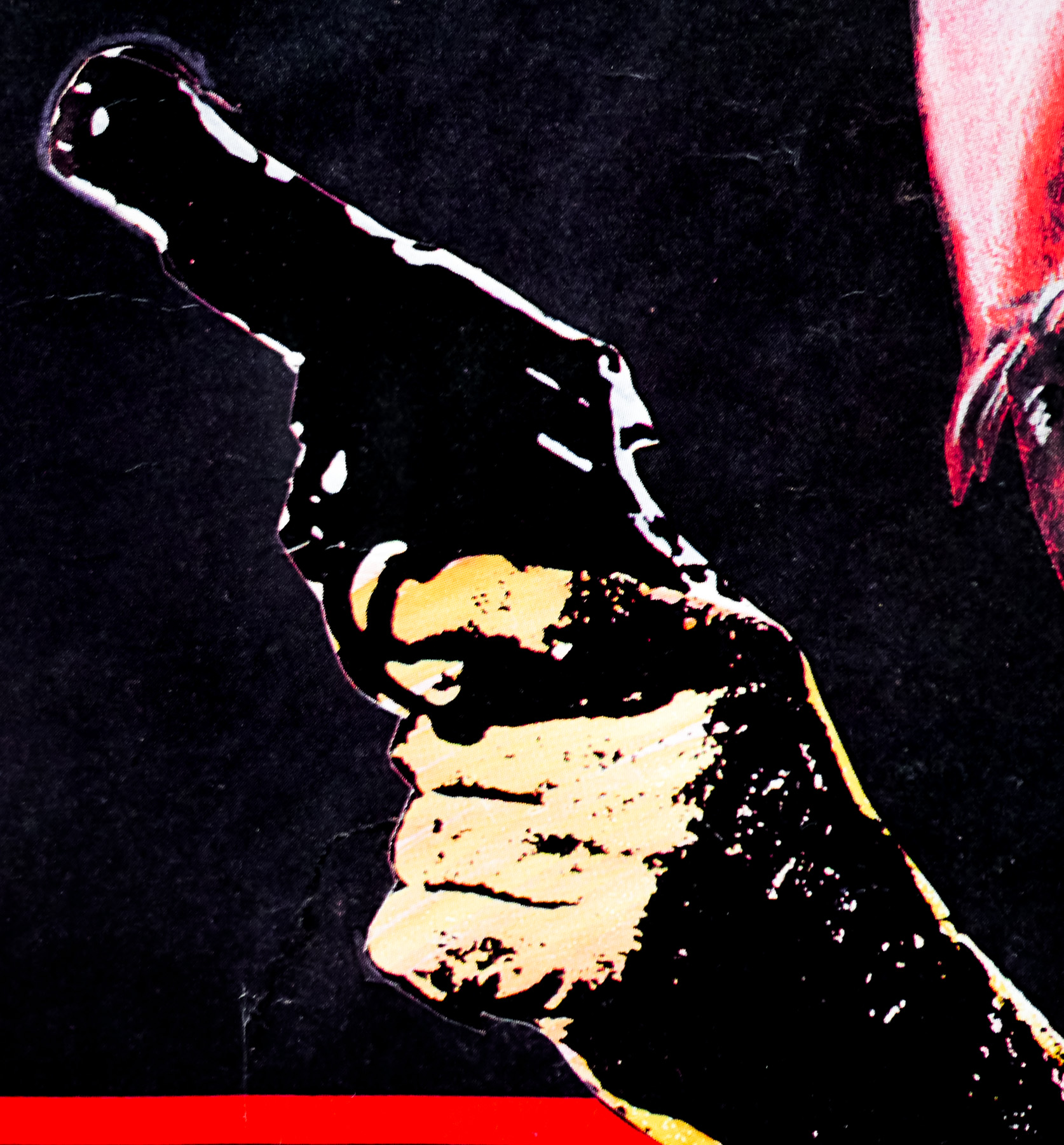
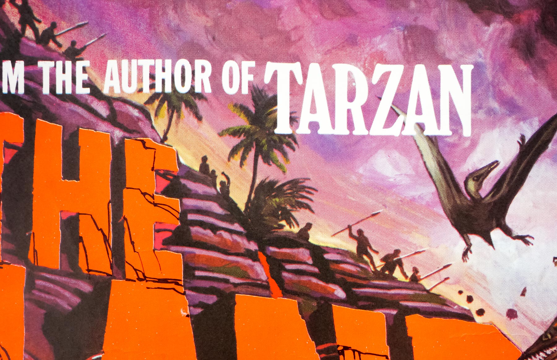
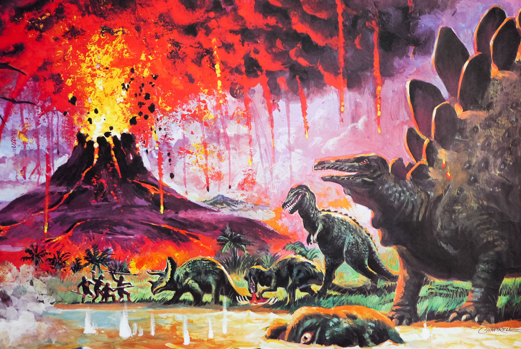
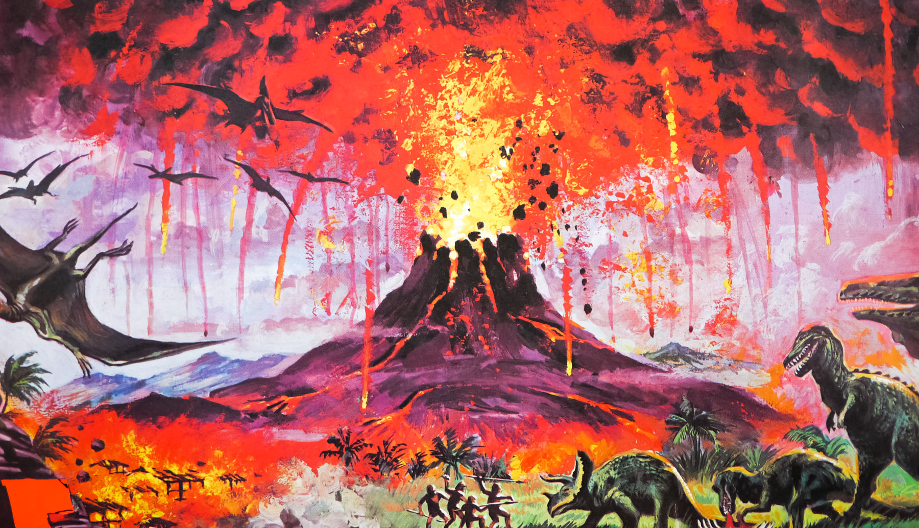
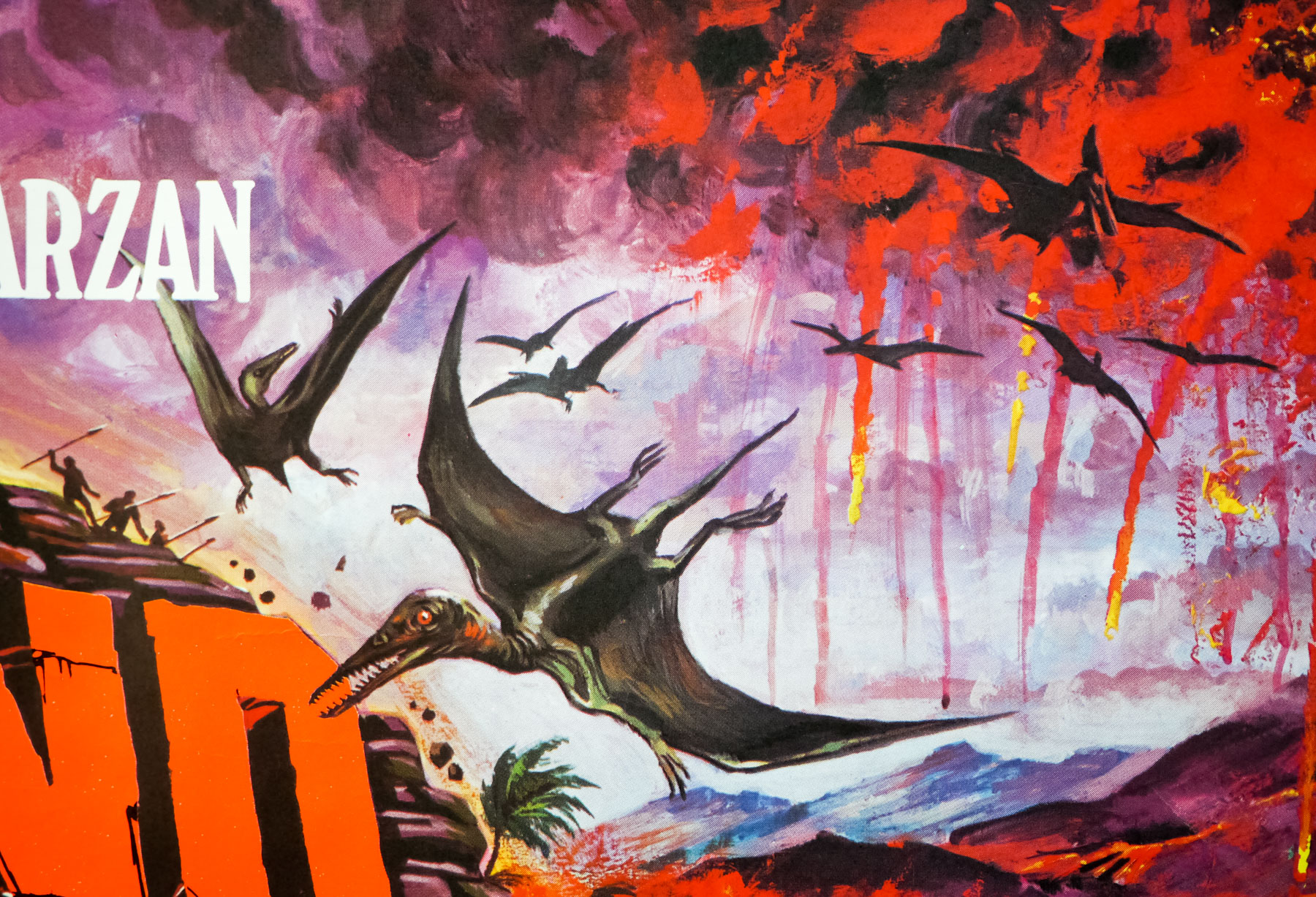
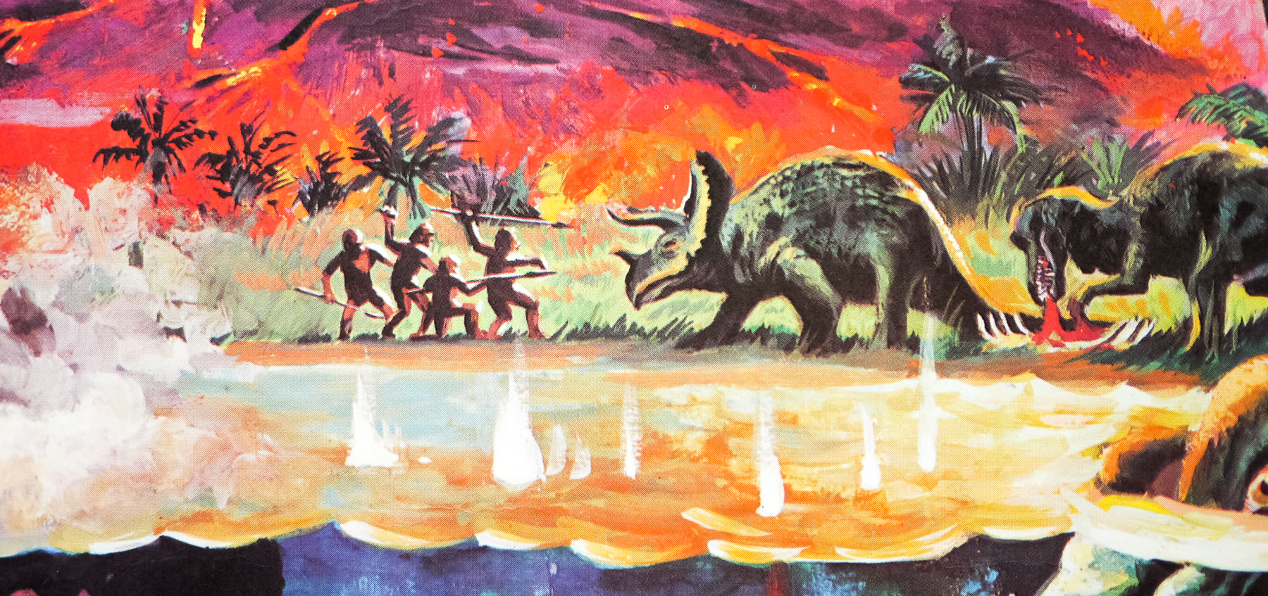
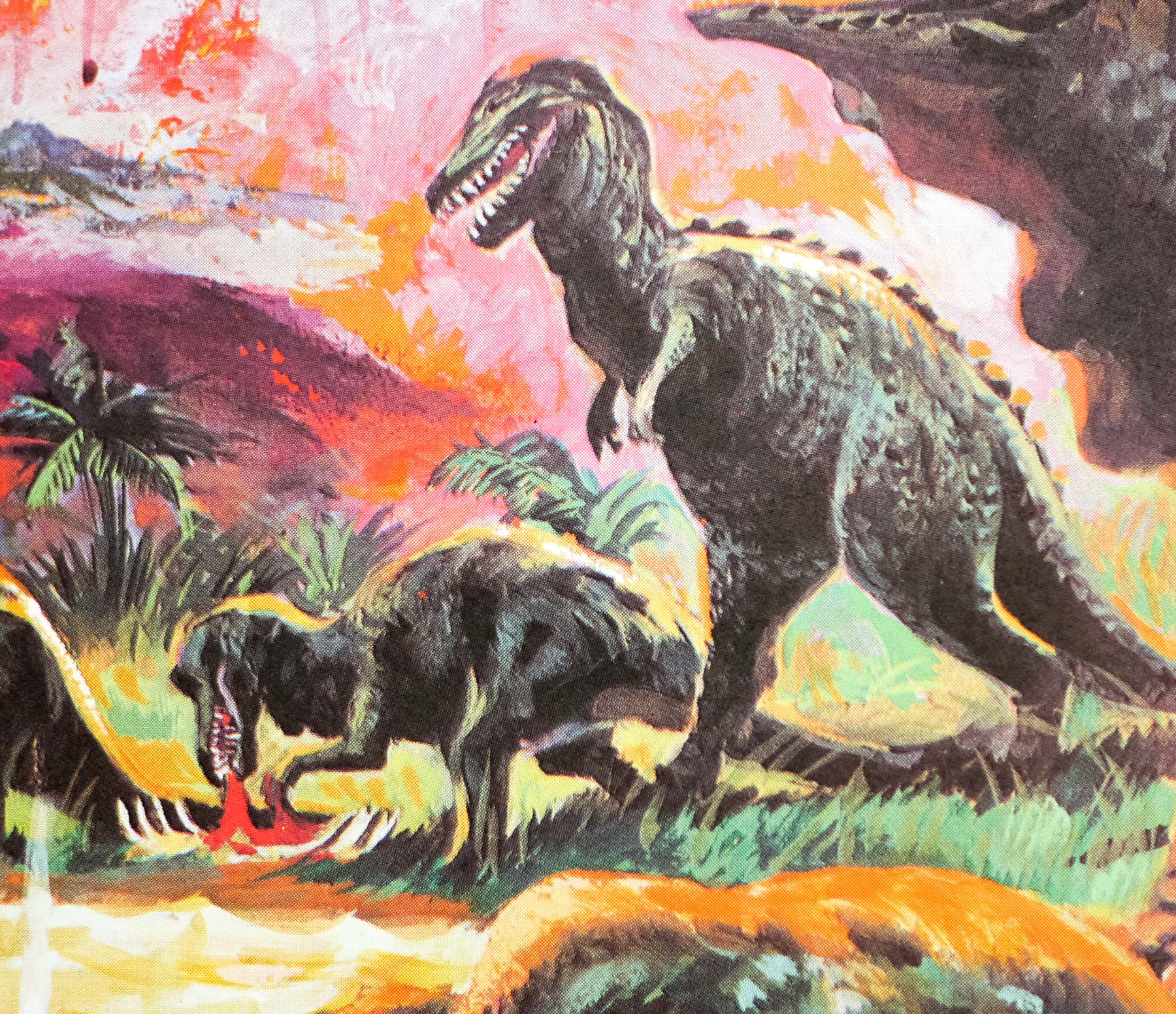
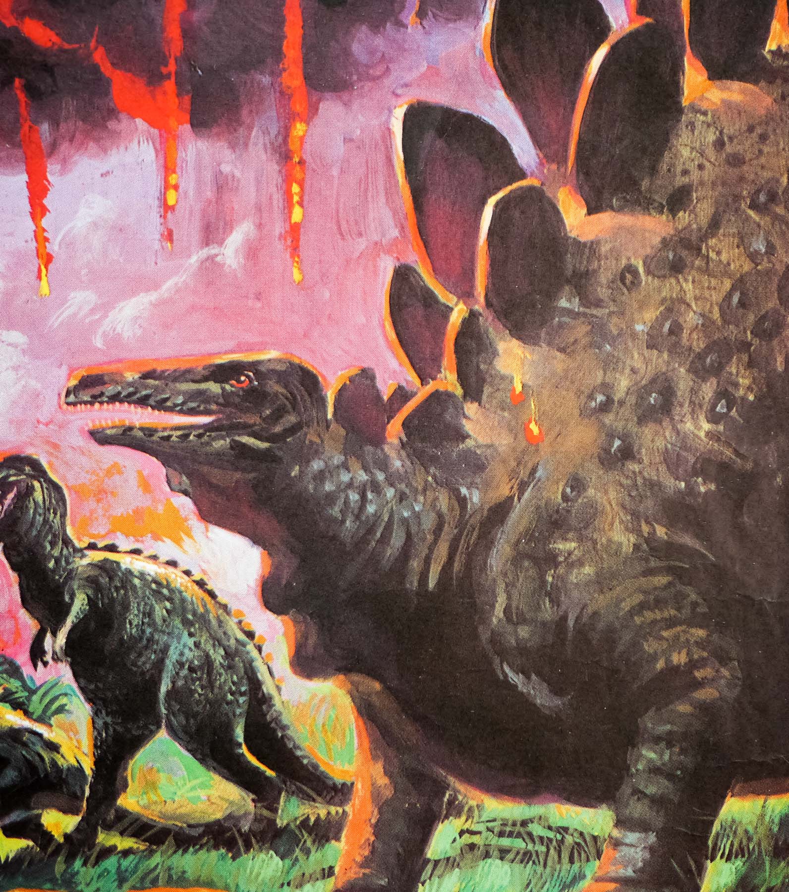
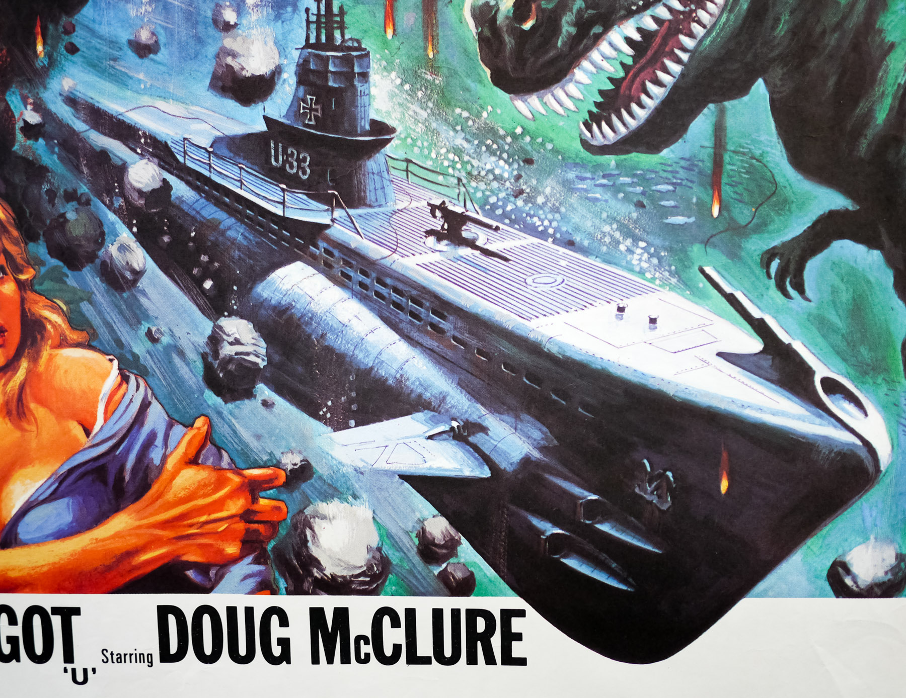
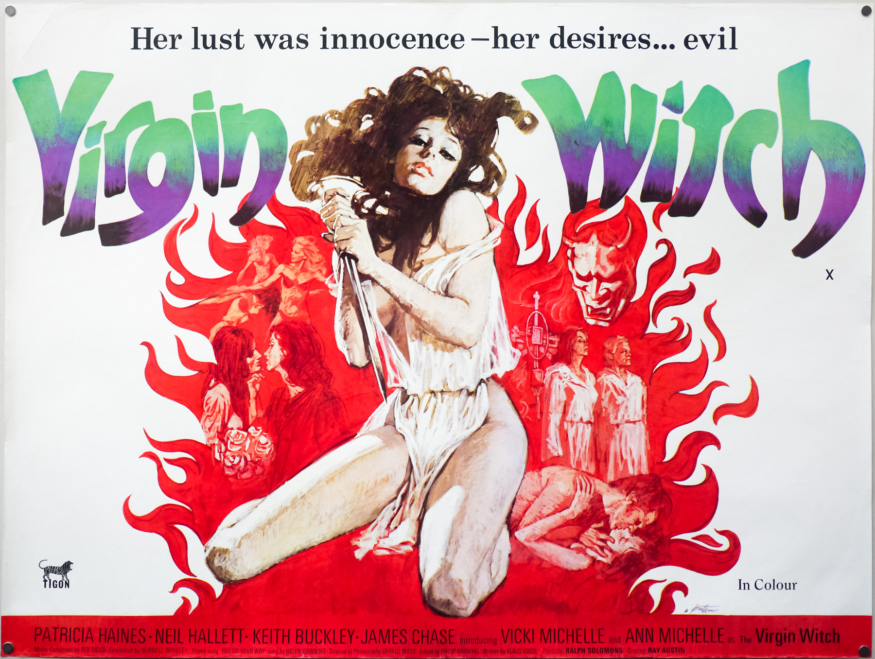
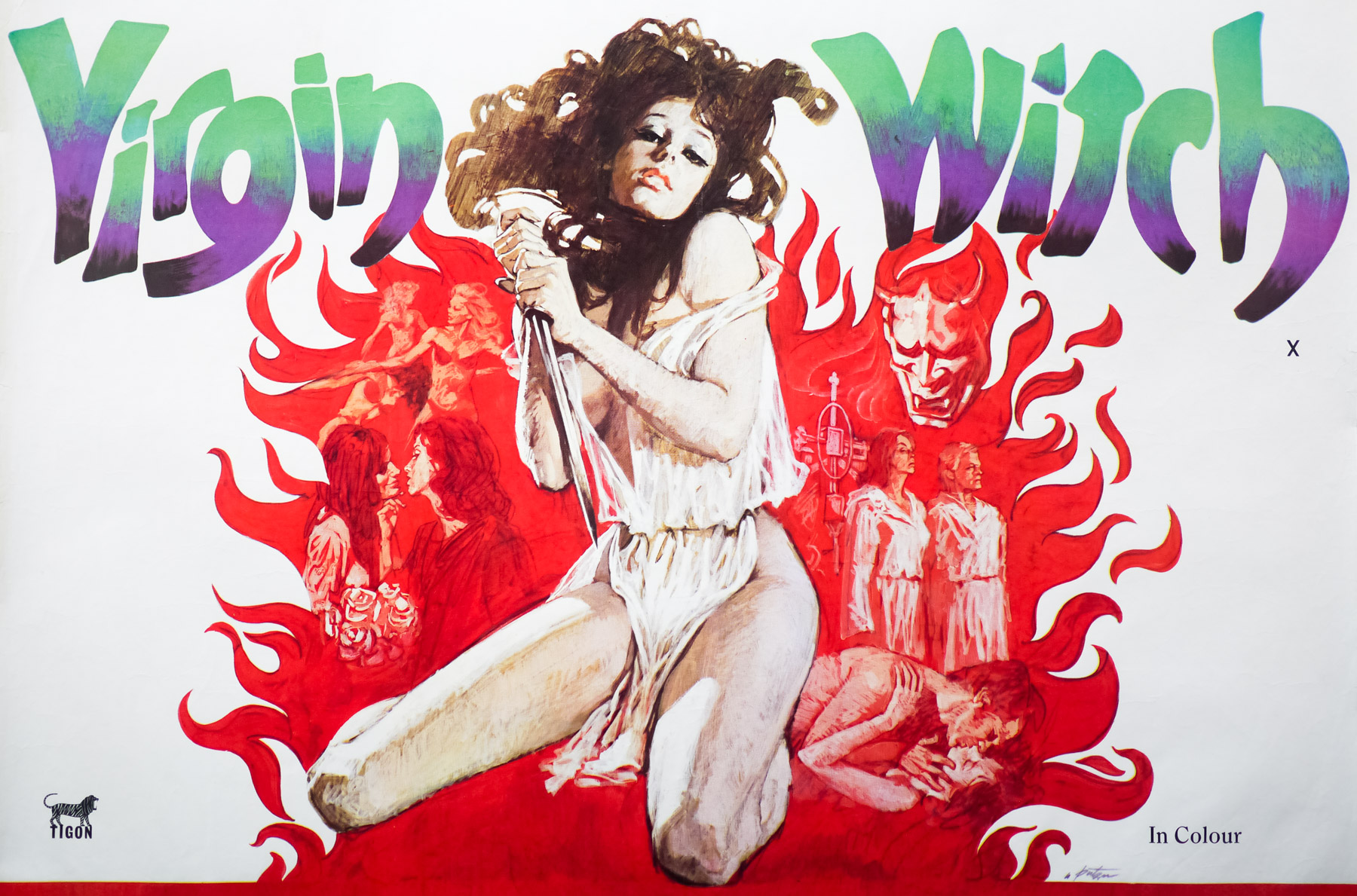
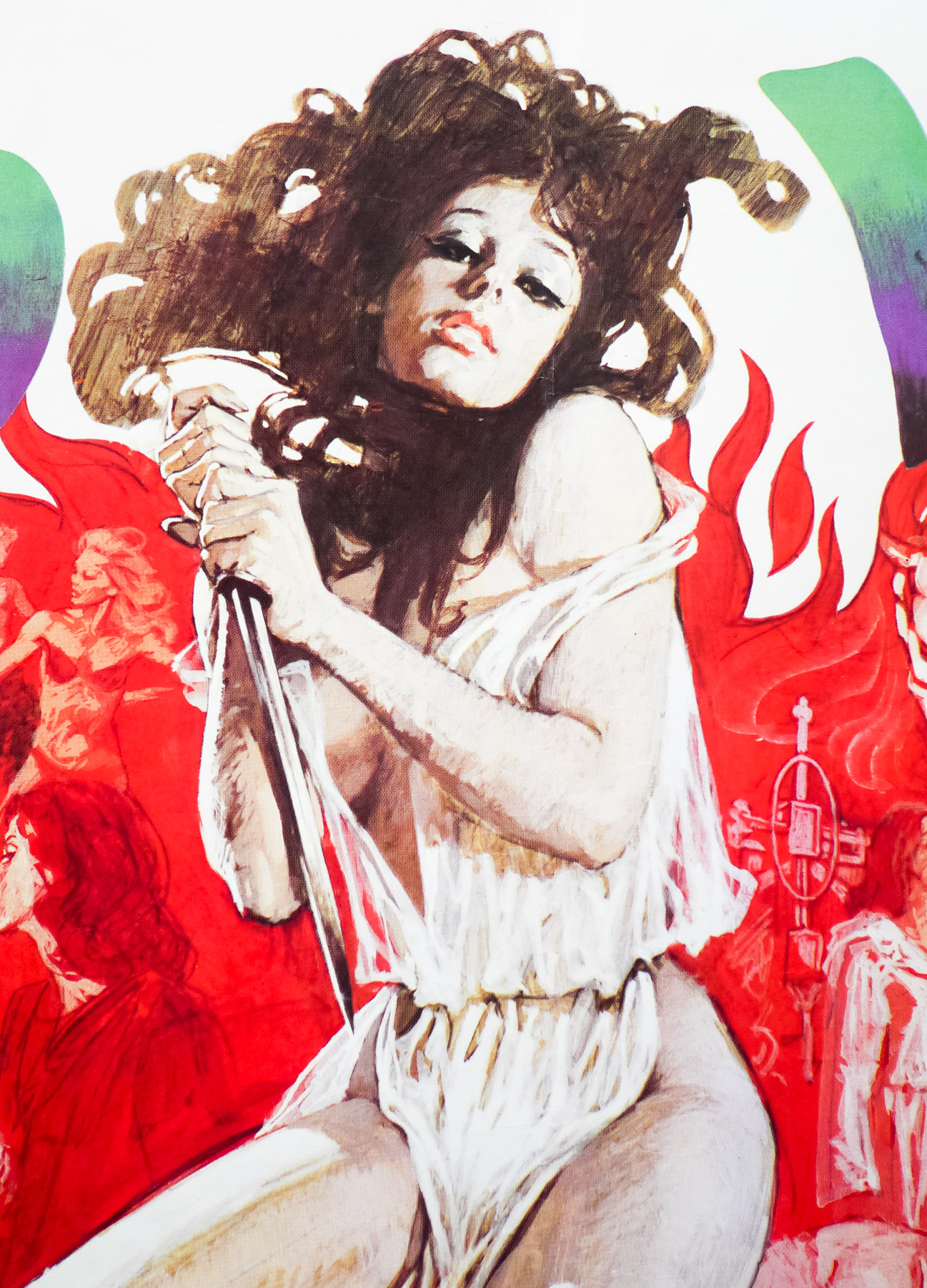
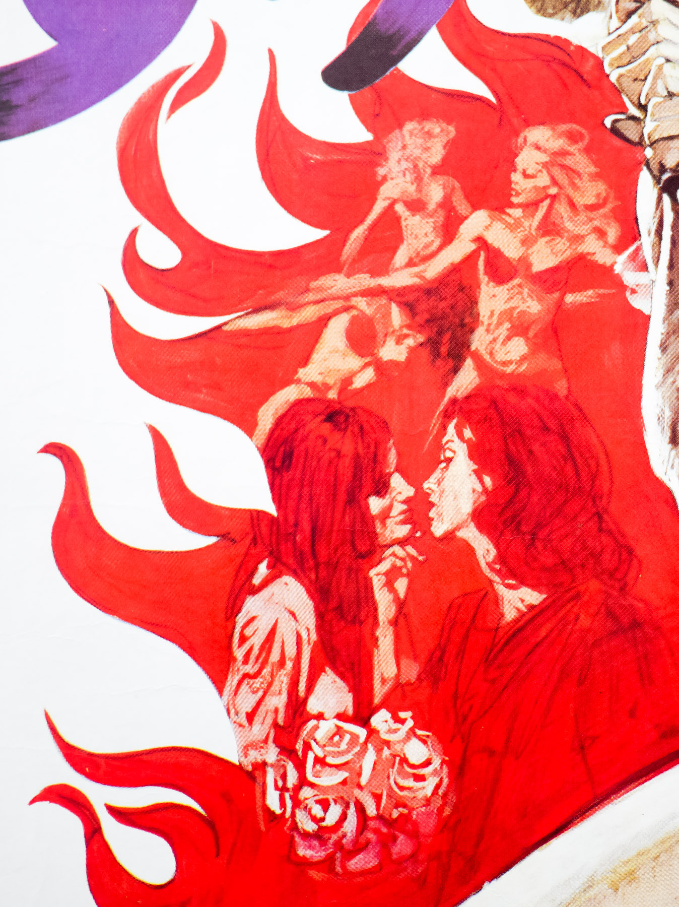
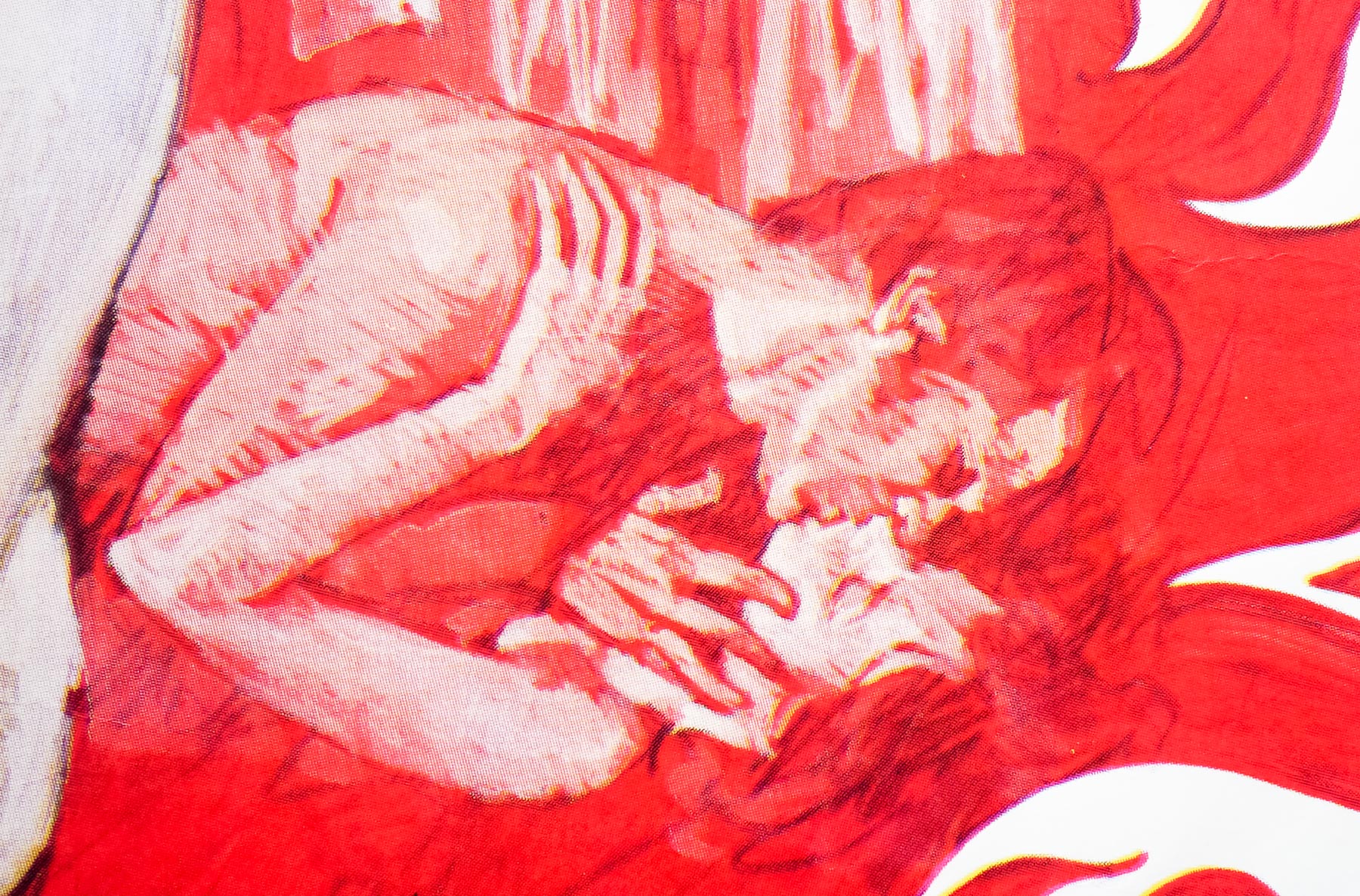
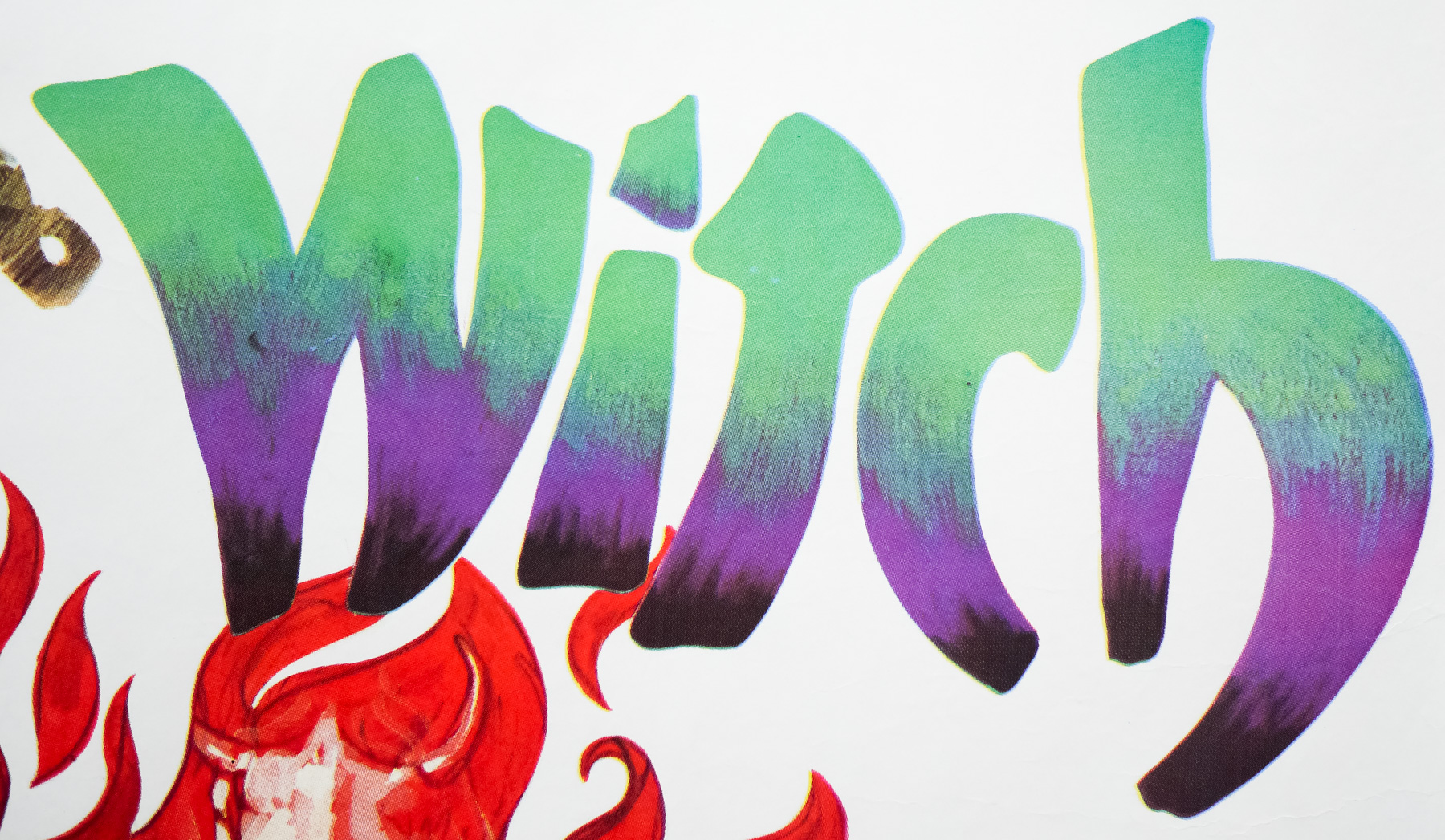
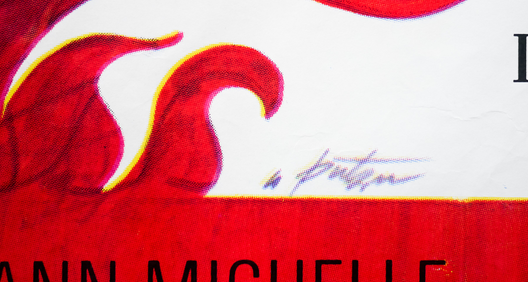
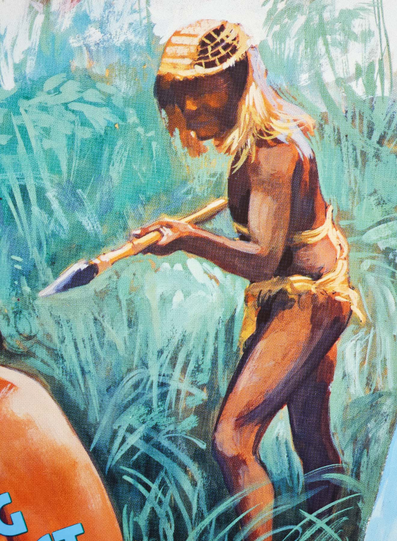
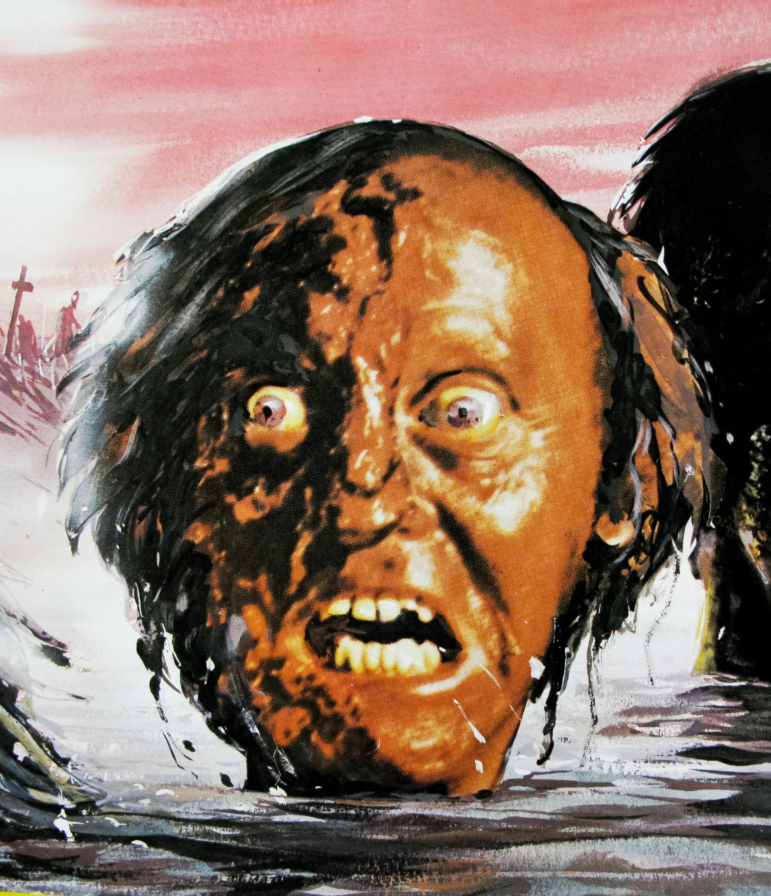
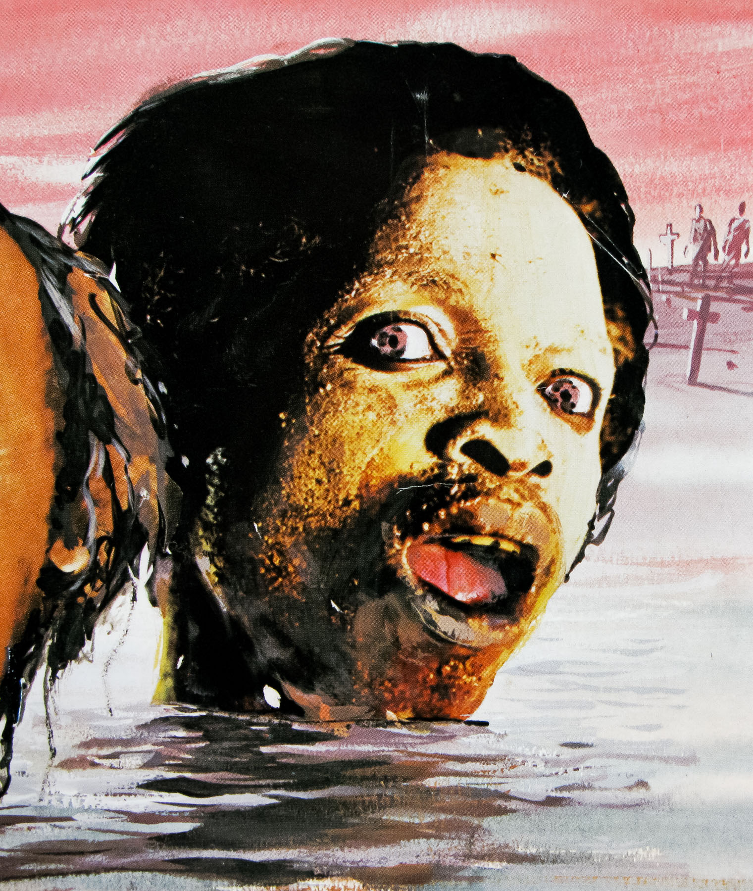
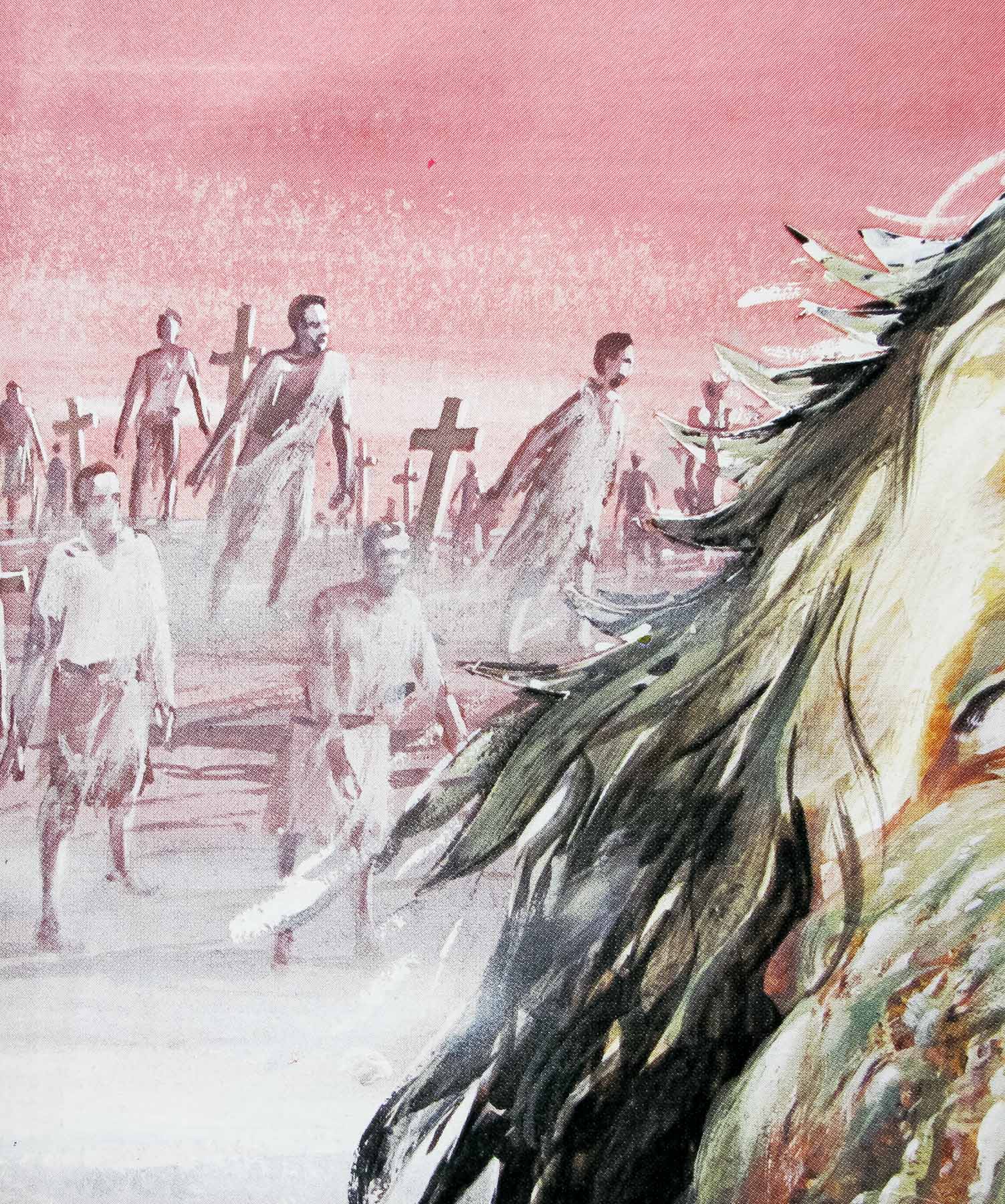
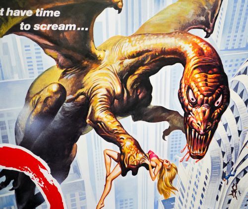
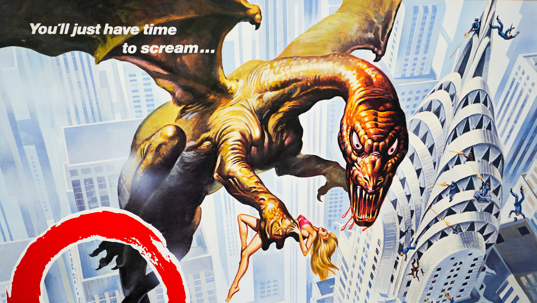
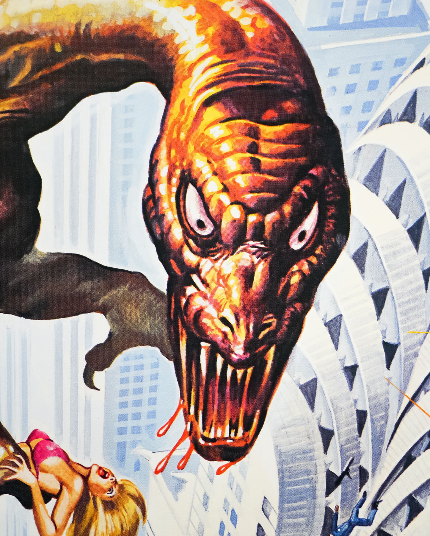
This quad was designed and illustrated by the late, great British artist Tom Chantrell whose dynamic and colourful work featured on hundreds of posters over a forty year period. It features the Chrysler Building, a famous New York landmark that also appears on the international one sheet, painted by Bob Gleason. Note that the lady in peril is wearing quite a bit less on this quad than she is on the one sheet – Chantrell always had an eye for adding extra bits of titillation to his artwork.
Tom Chantrell sadly passed away in 2001 but last year his widow Shirley launched his official website, which showcases his work and features a great biography written by Sim Branaghan, author of the must-own book British Film Posters. Chantrell illustrated many classic poster designs, including several Hammer posters such as the brilliant quad for ‘One Million Years B.C.’, and he was also responsible for the iconic Star Wars quad, the artwork of which ended up being used around the globe.
I have a number of other designs by Chantrell on this site and you can read an exclusive interview with Shirley by clicking here.