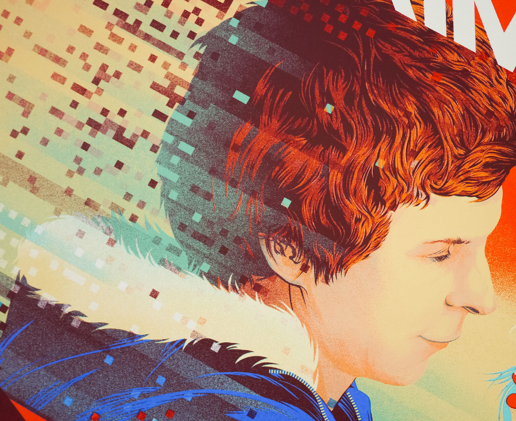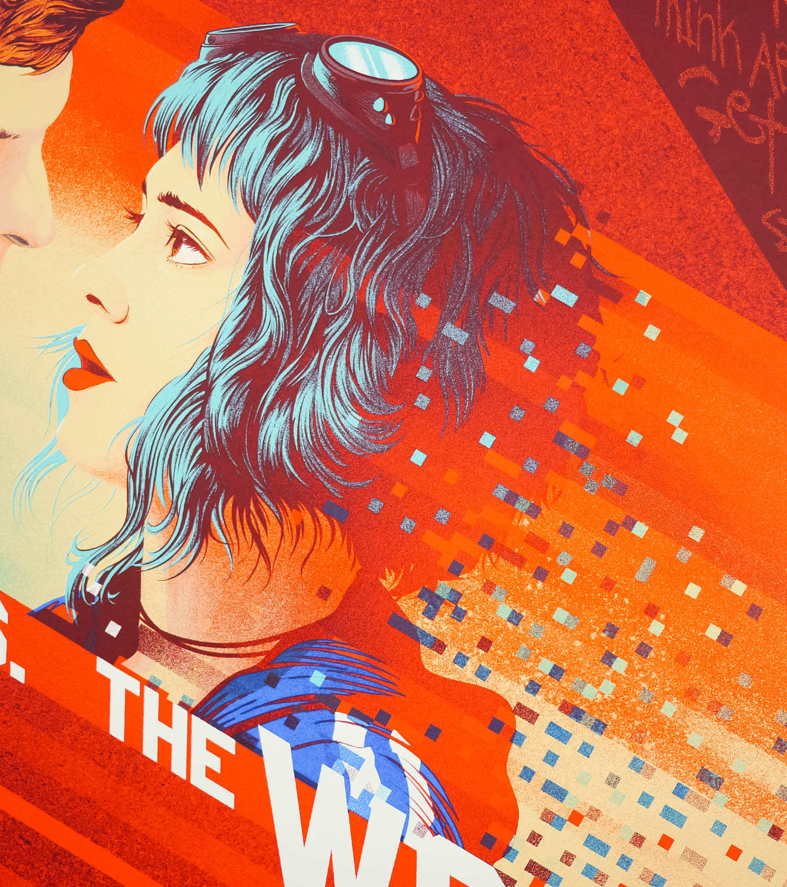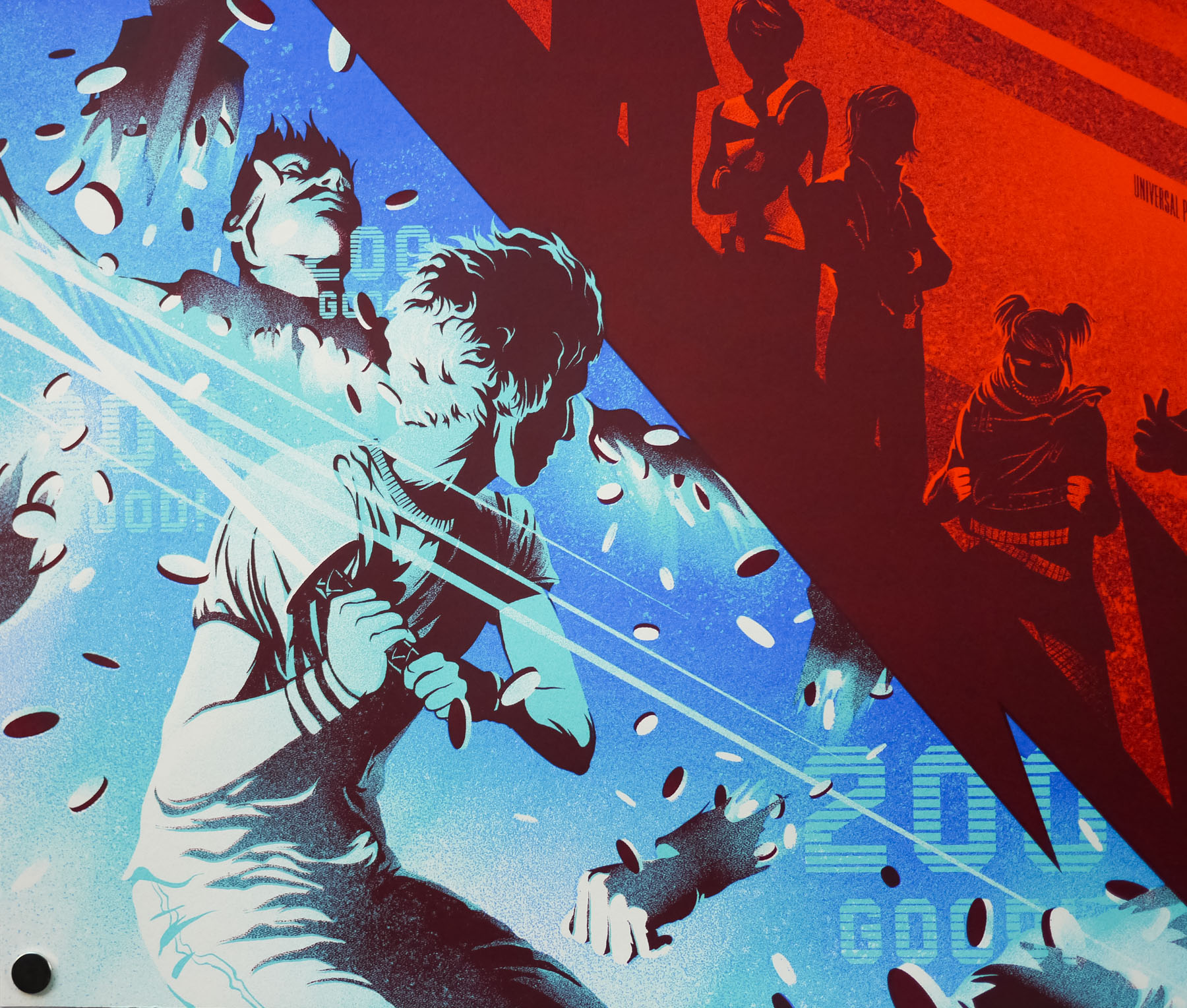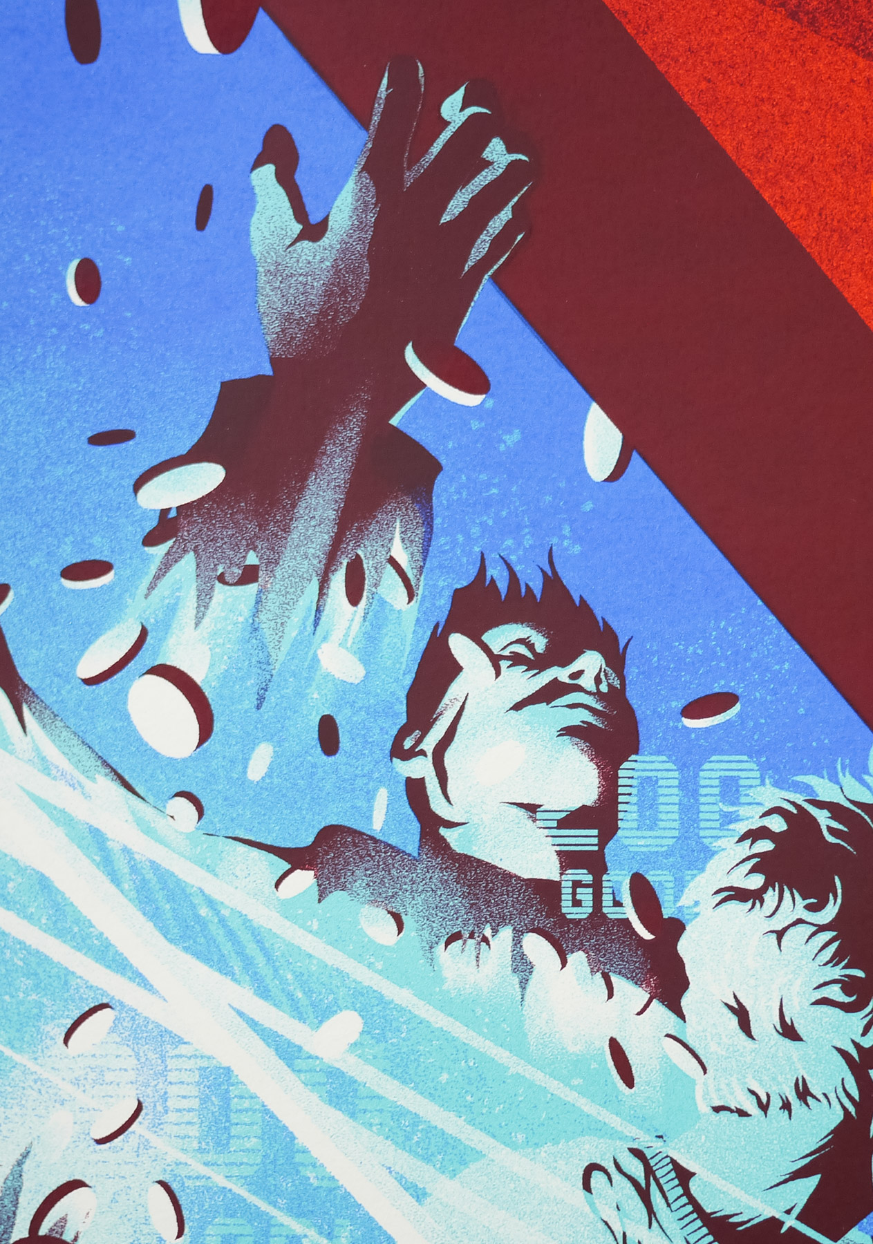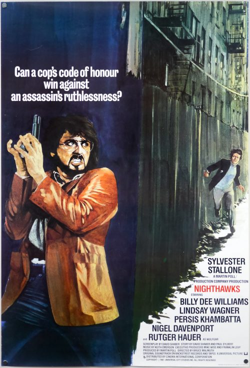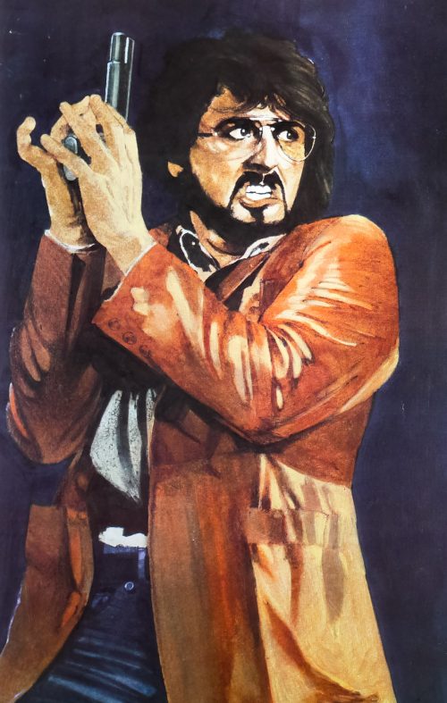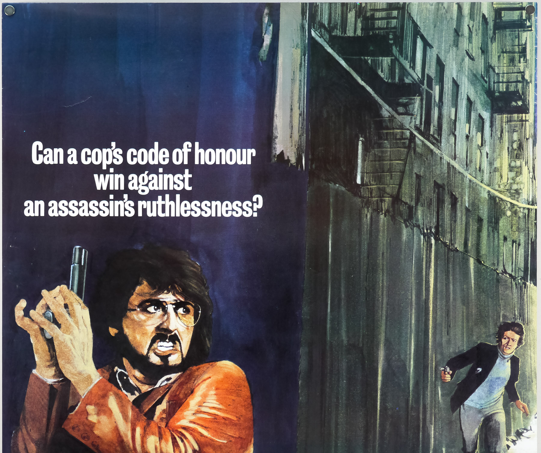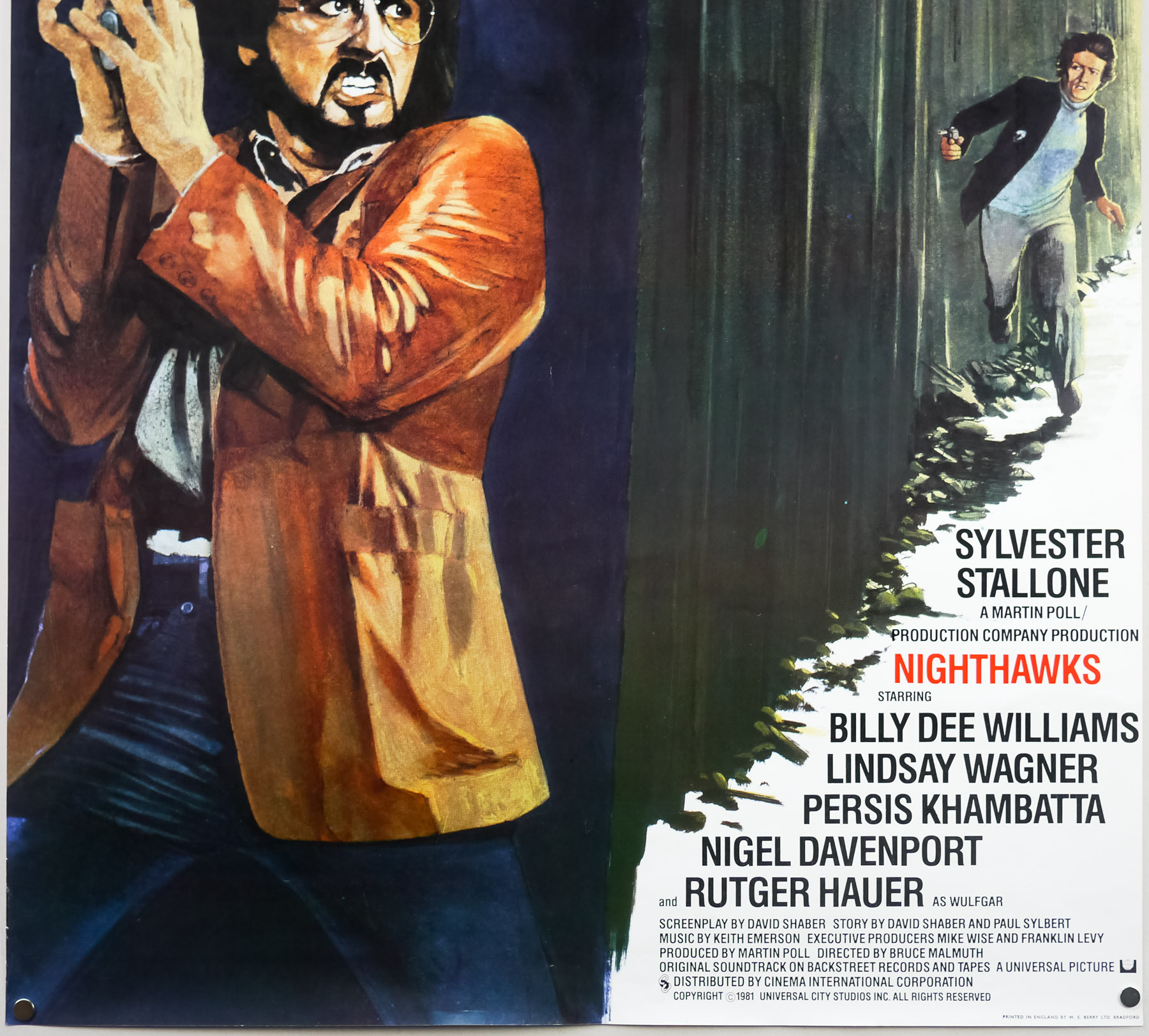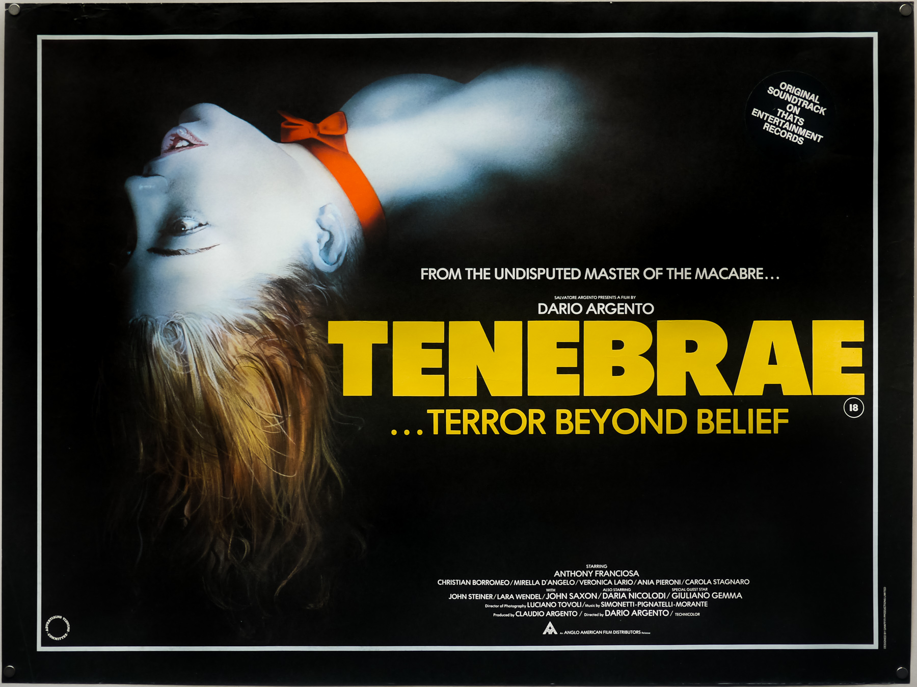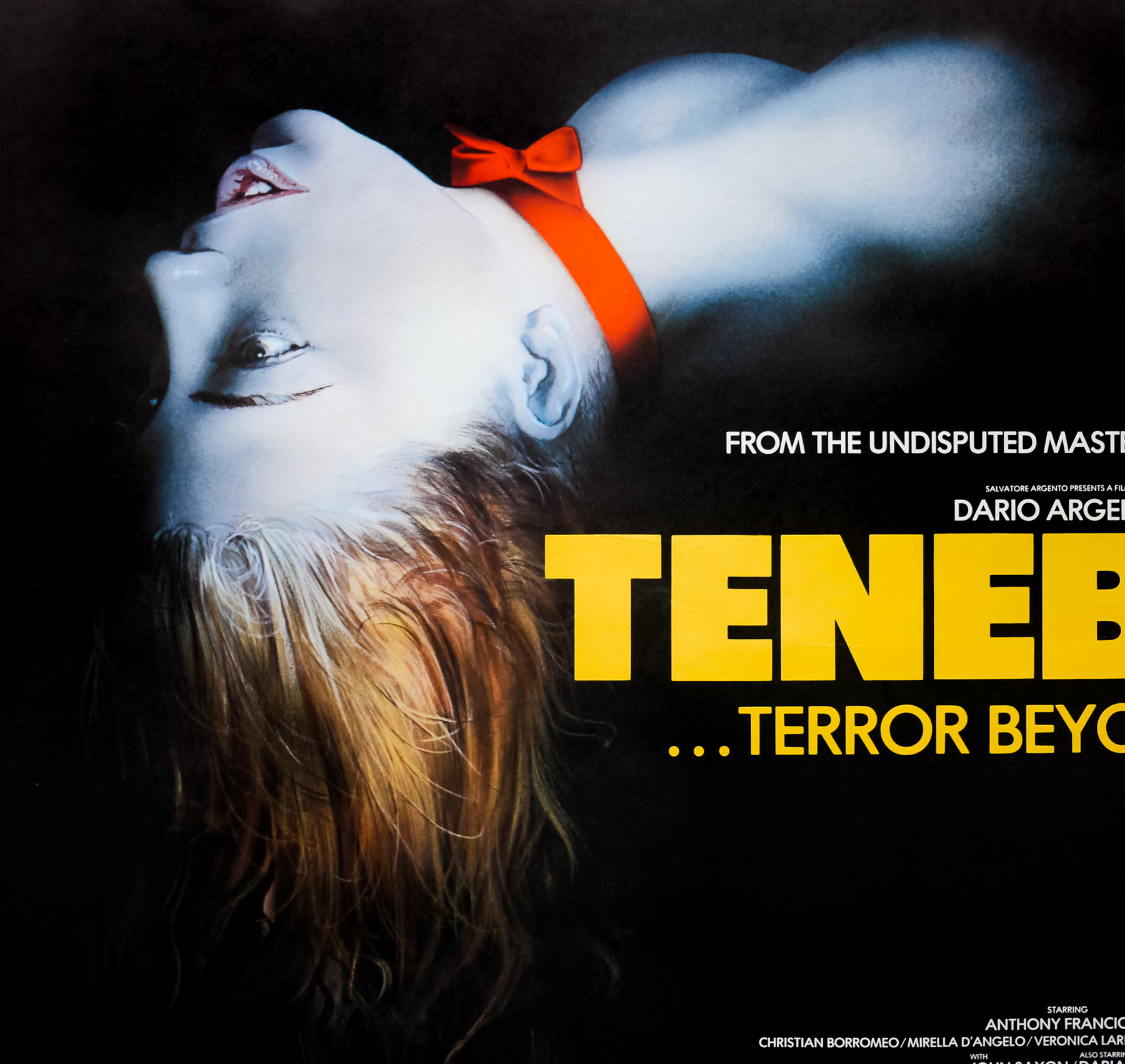

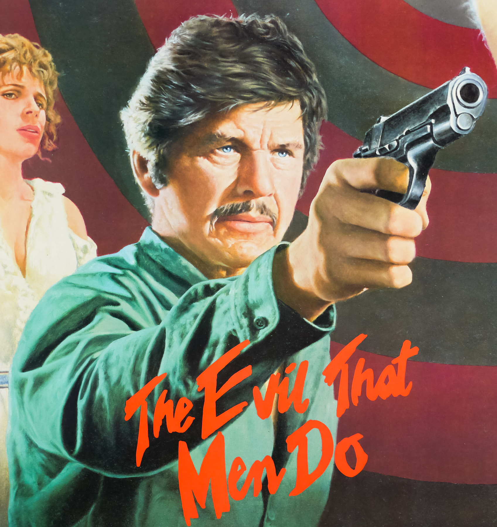
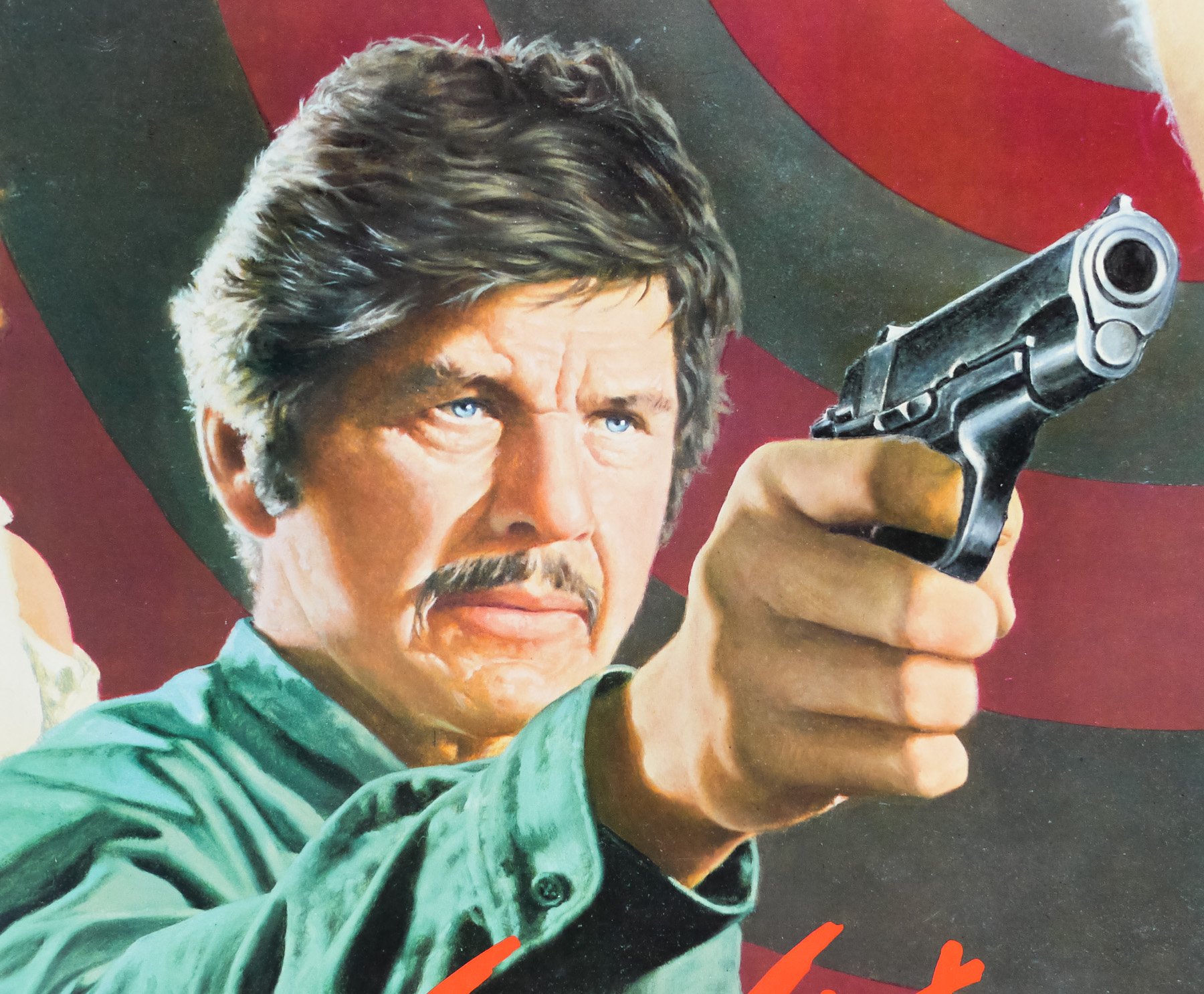
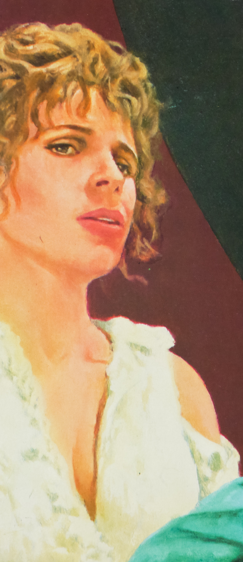
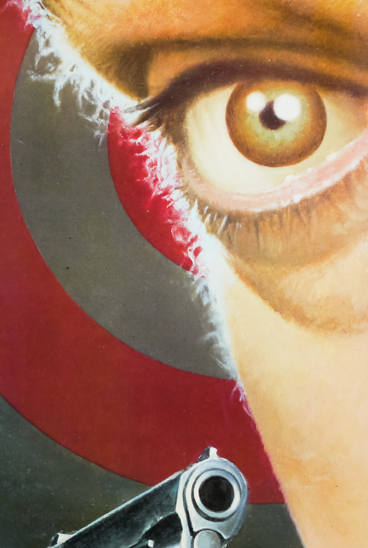
Poster detail
1-5

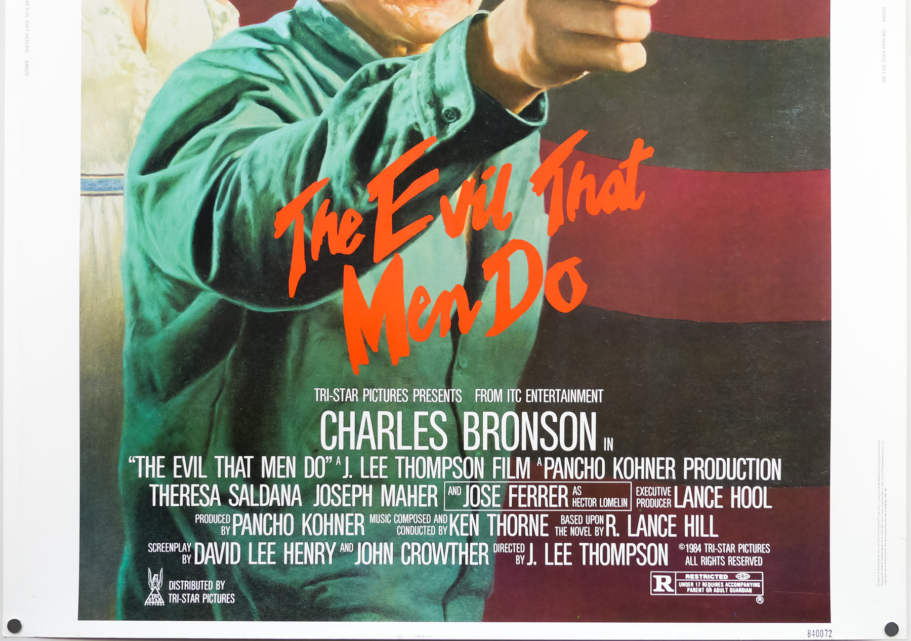
- Title
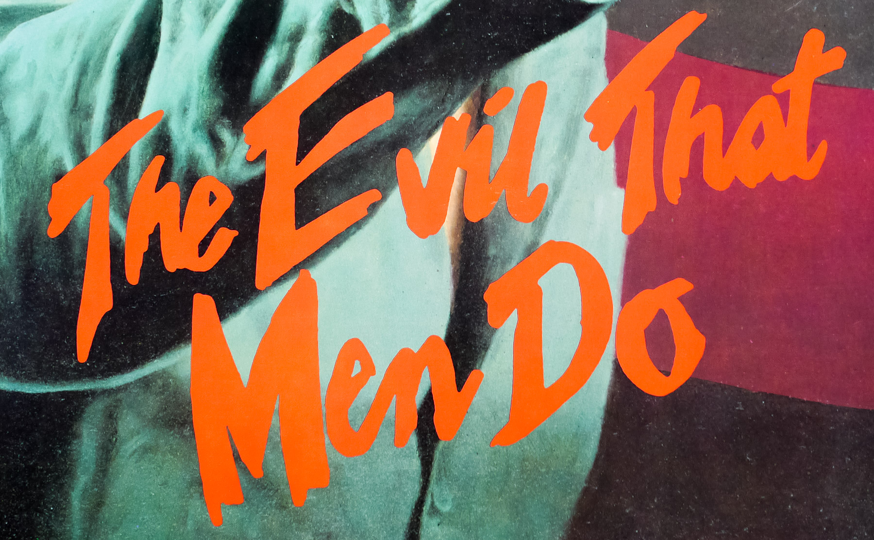
- The Evil That Men Do
- AKA
- Liquidator (West Germany) | L'enfer de la violence [The Hell of violence] (France)
- Year of Film
- 1984
- Director
- J. Lee Thompson
- Starring
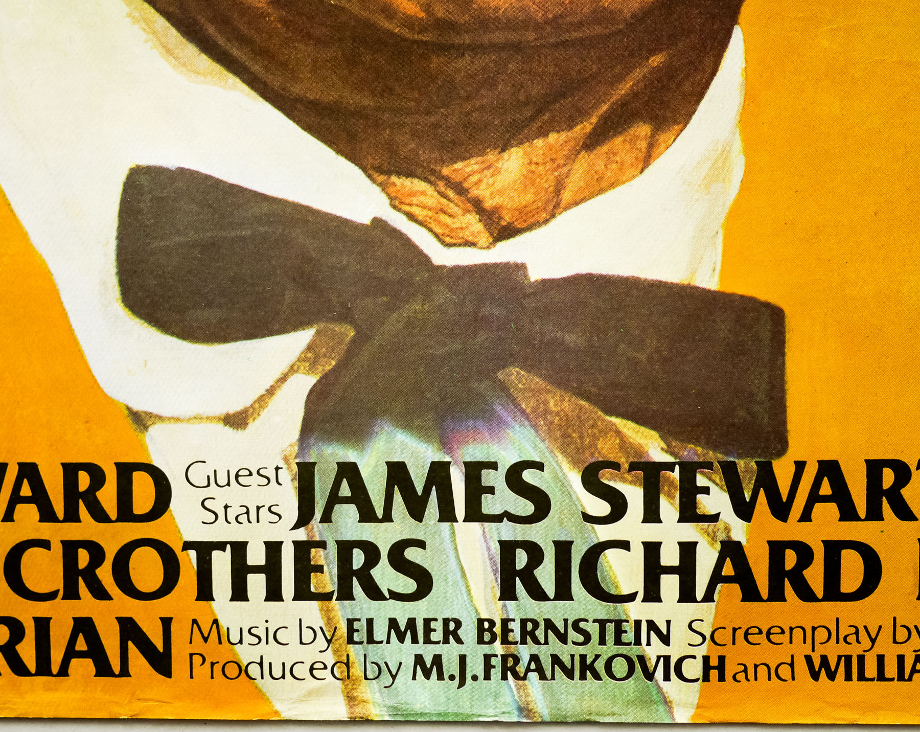
- Charles Bronson, Theresa Saldana, Joseph Maher, José Ferrer, René Enríquez, John Glover, Raymond St. Jacques, Antoinette Bower, Enrique Lucero
- Origin of Film
- Mexico | USA | UK
- Genre(s) of Film
- Charles Bronson, Theresa Saldana, Joseph Maher, José Ferrer, René Enríquez, John Glover, Raymond St. Jacques, Antoinette Bower, Enrique Lucero,
- Type of Poster
- 30x40
- Style of Poster
- --
- Origin of Poster
- USA
- Year of Poster
- 1984
- Designer
- Unknown
- Artist
- Unknown
- Size (inches)
- 30" x 40"
- SS or DS
- SS
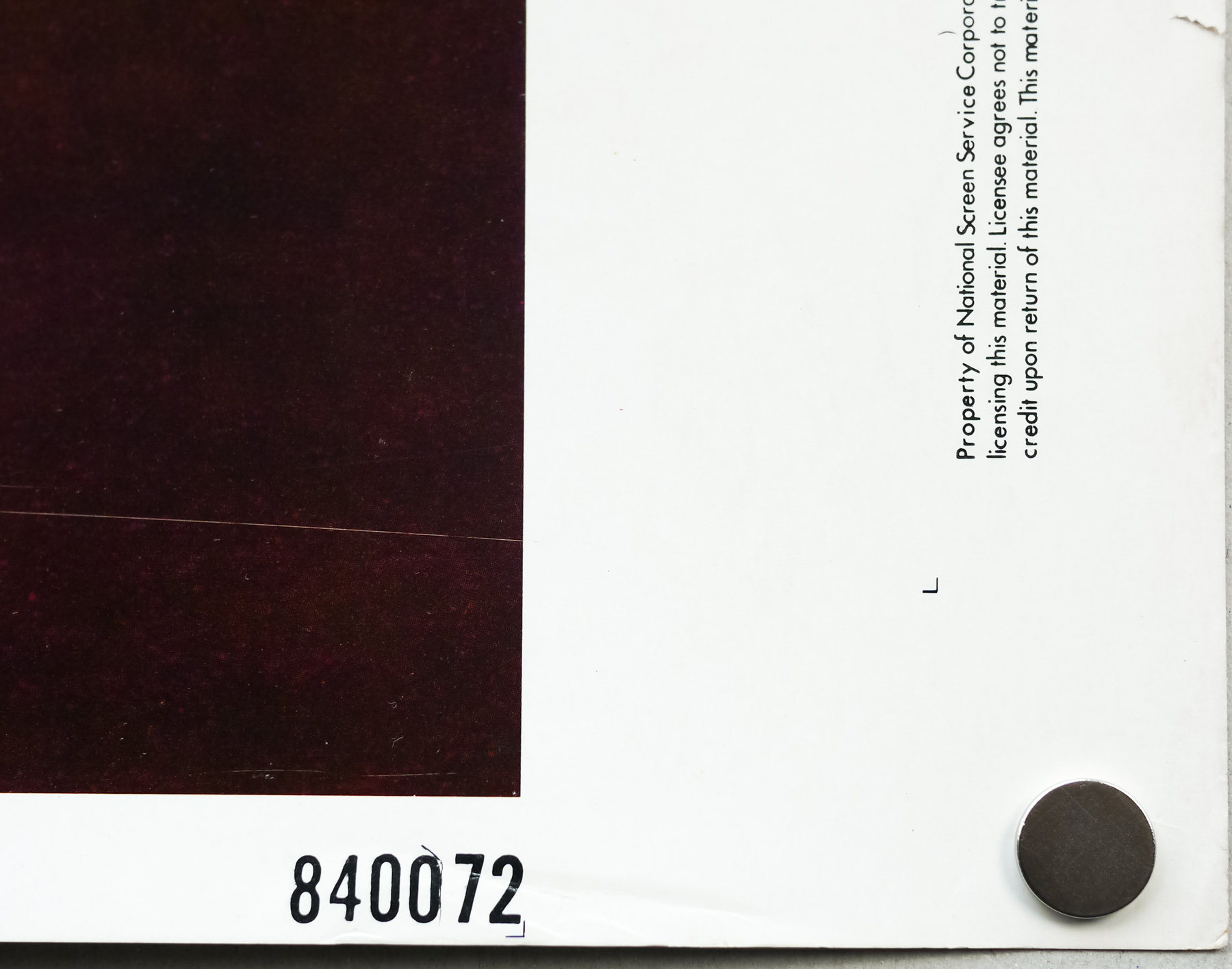
- NSS #
- 840072
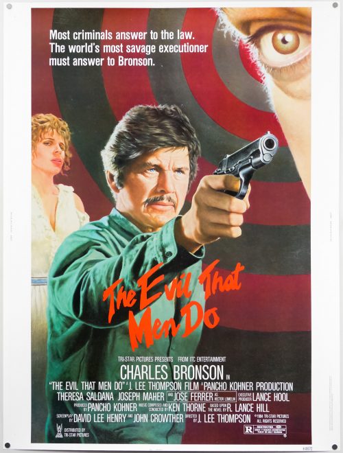
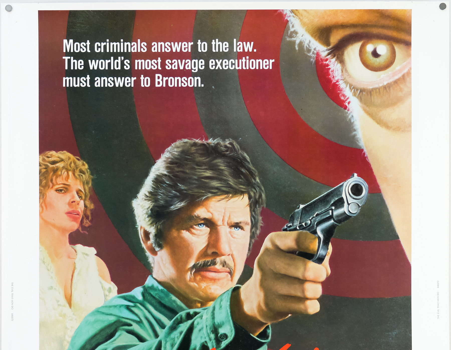
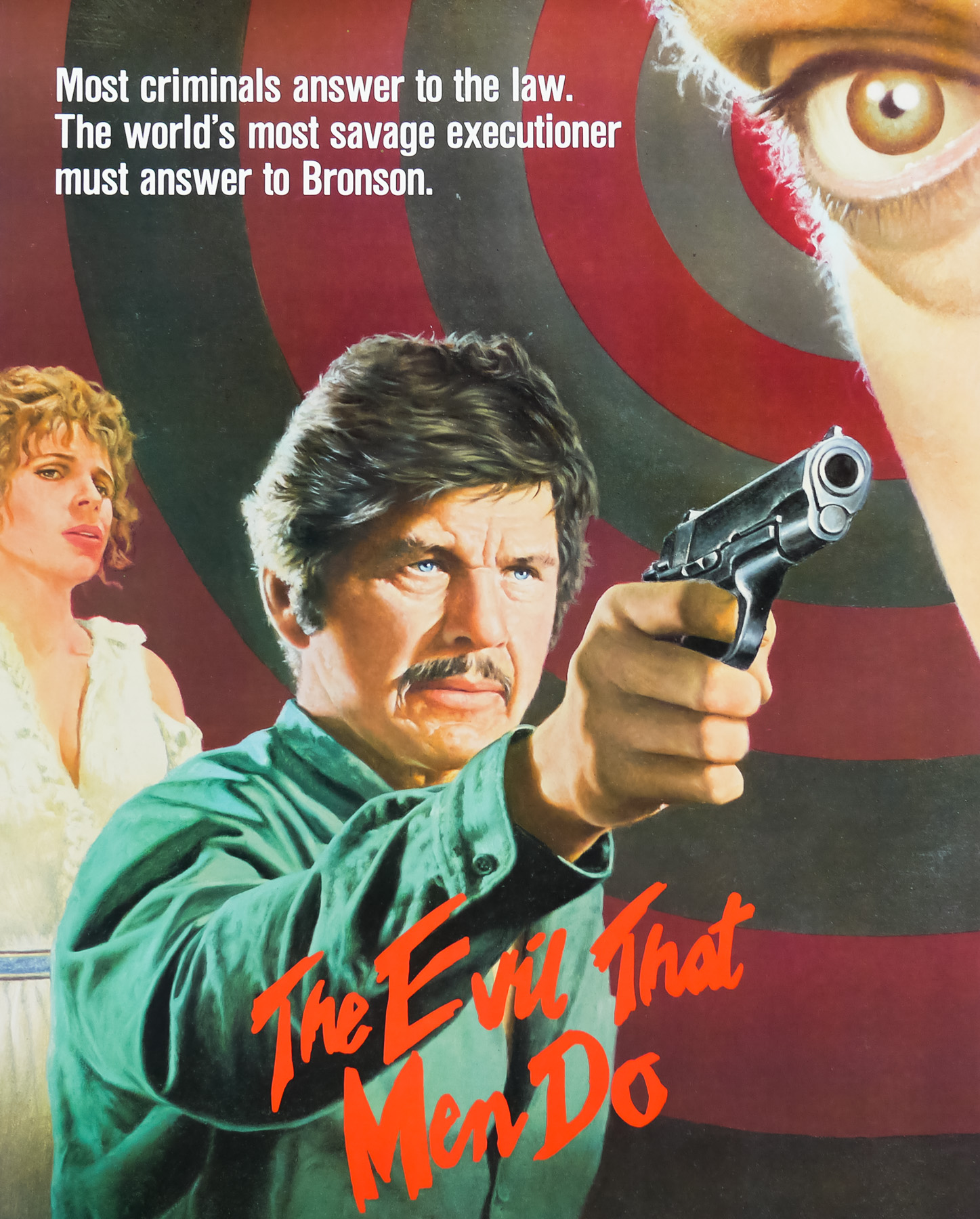
- Tagline
- Most criminals answer to the law. The world's most savage executioner must answer to Bronson.
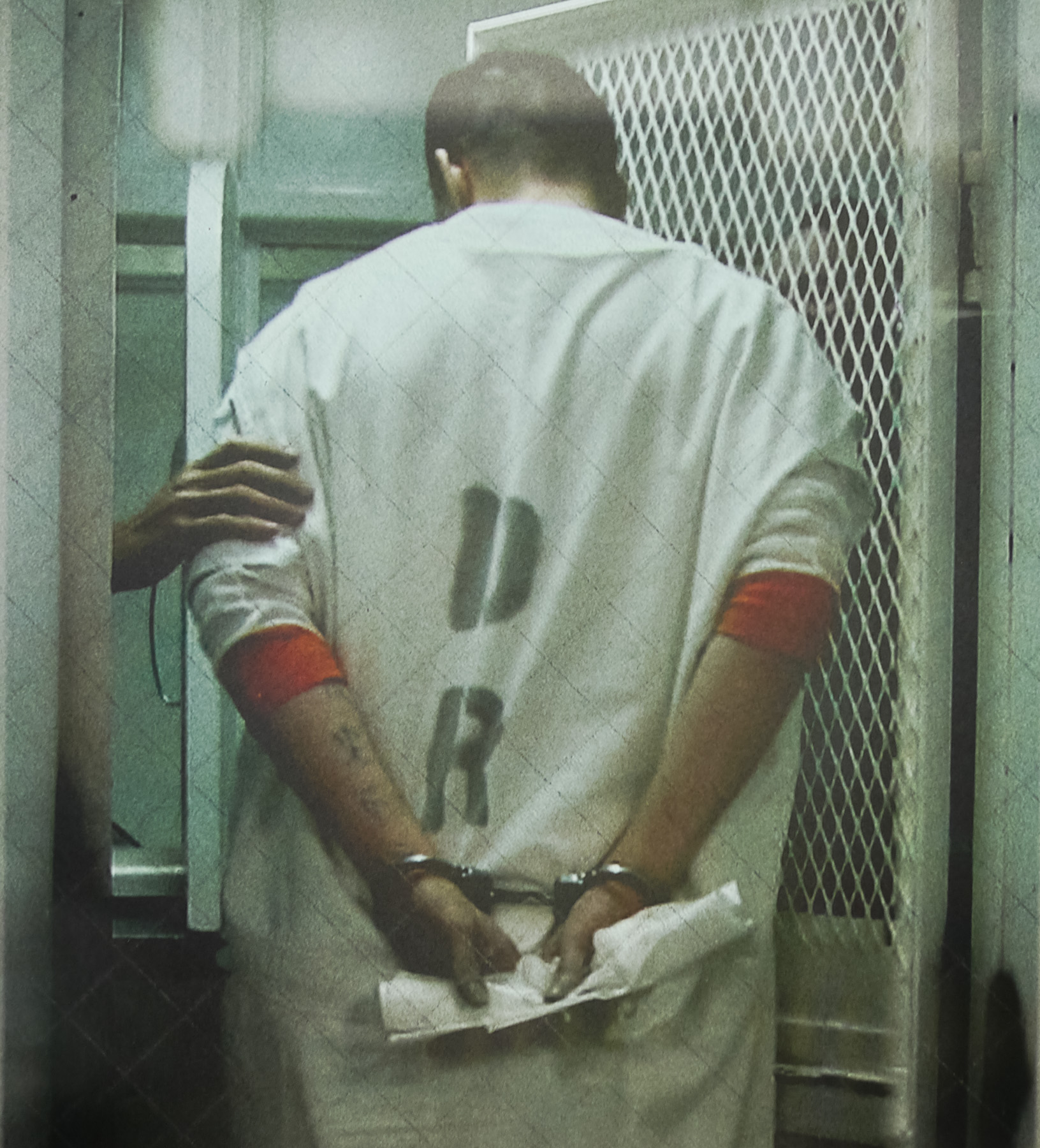
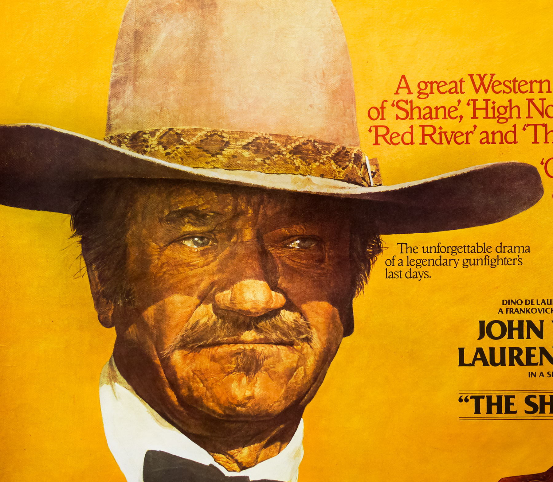
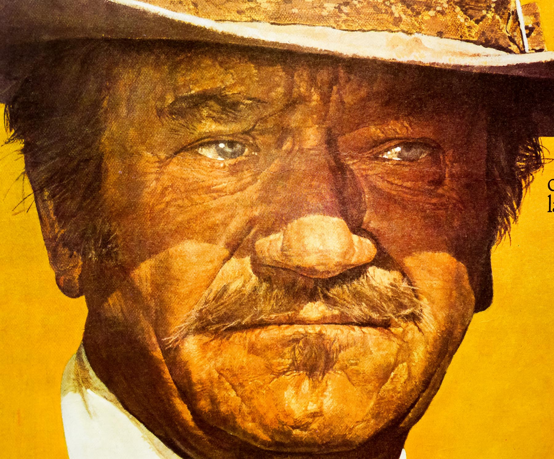
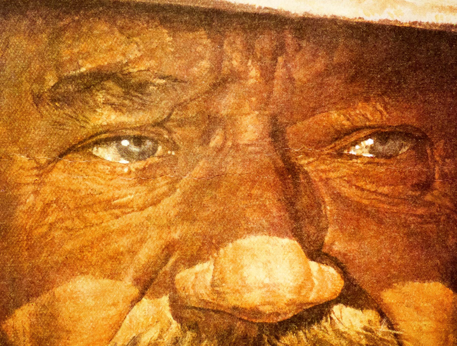
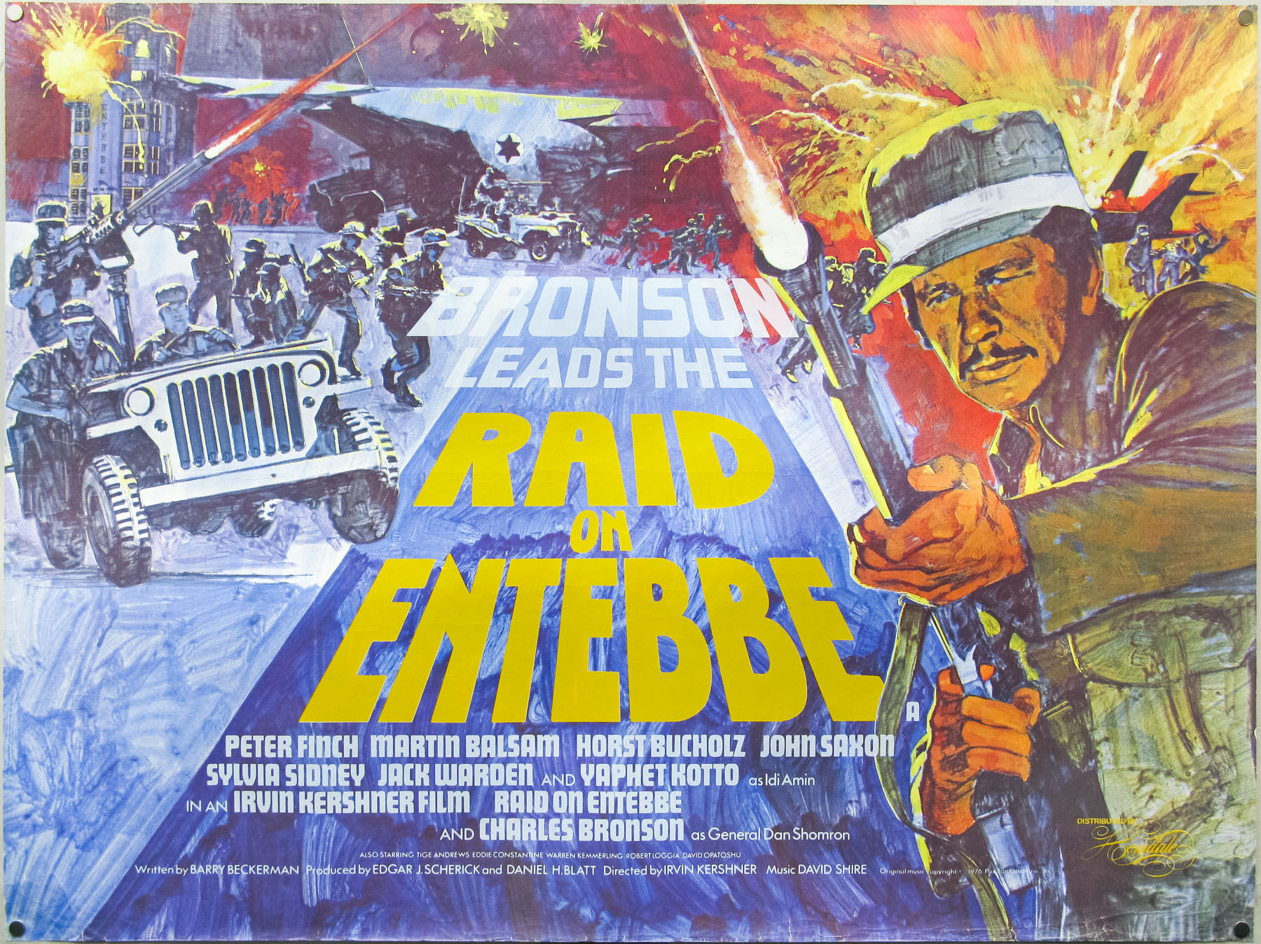
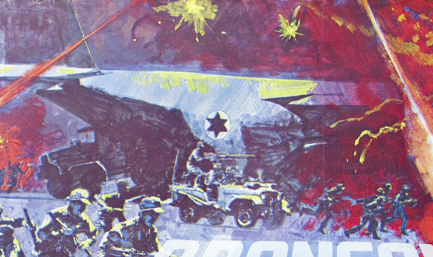
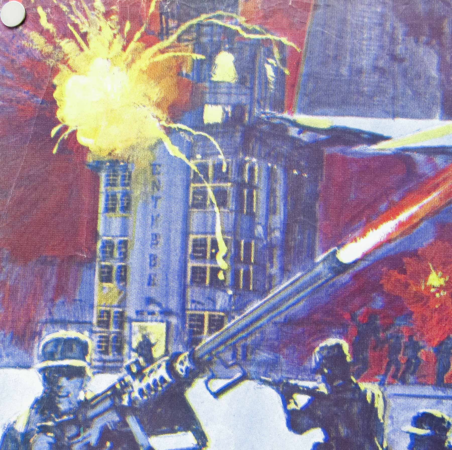
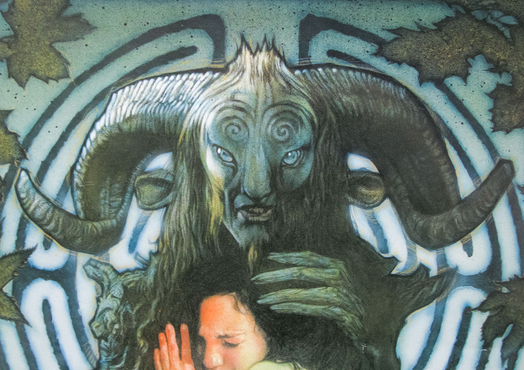
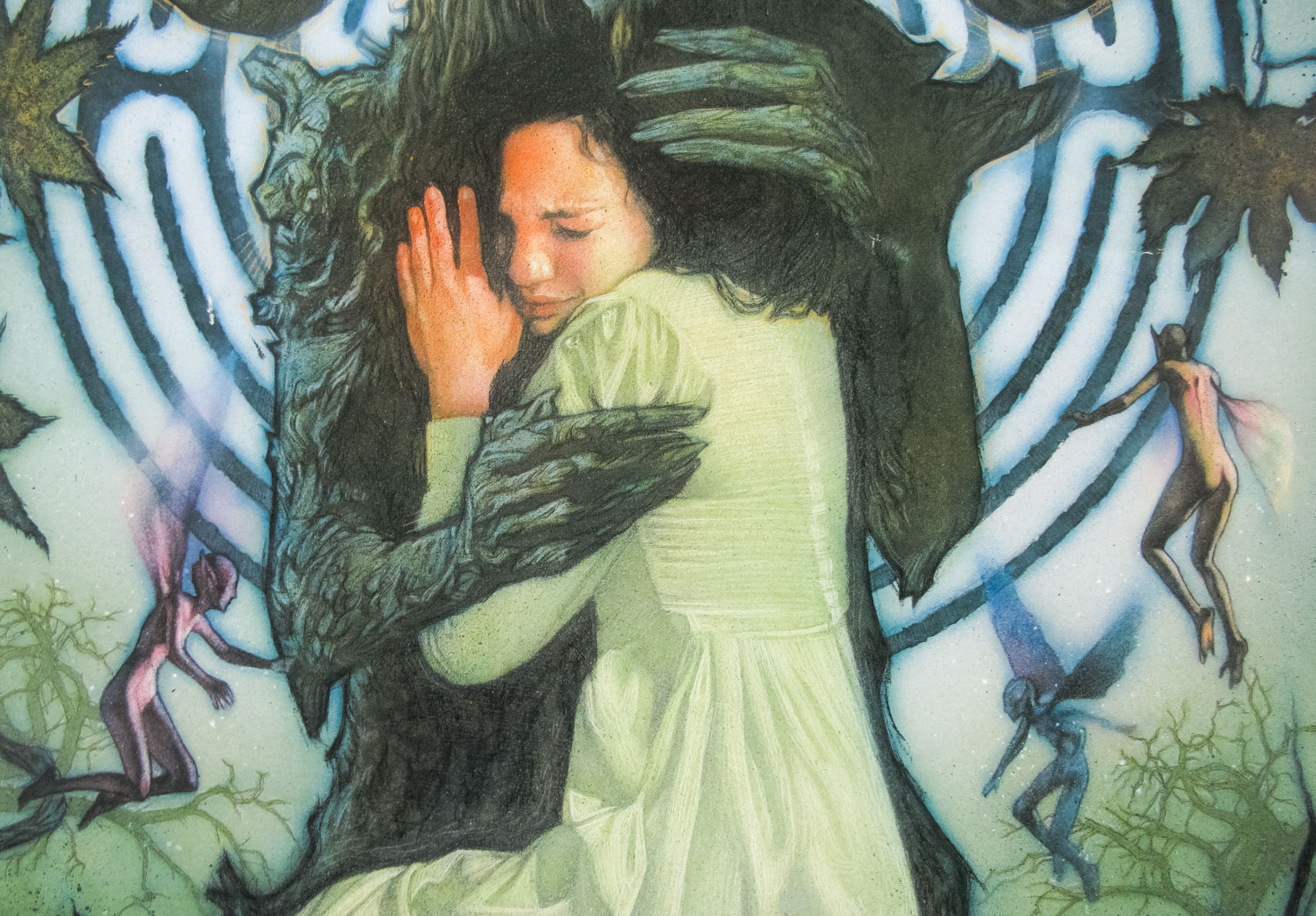
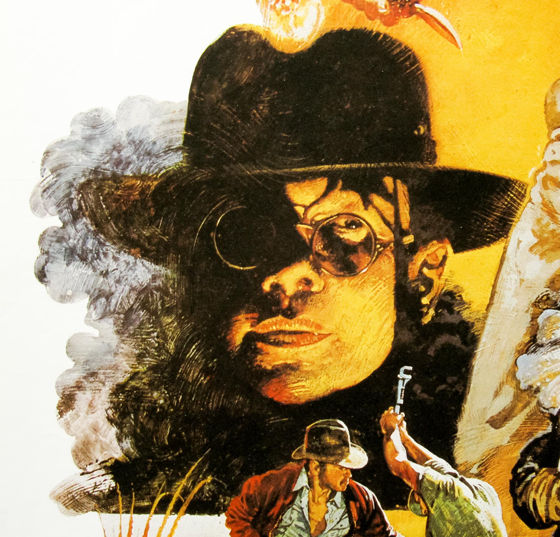
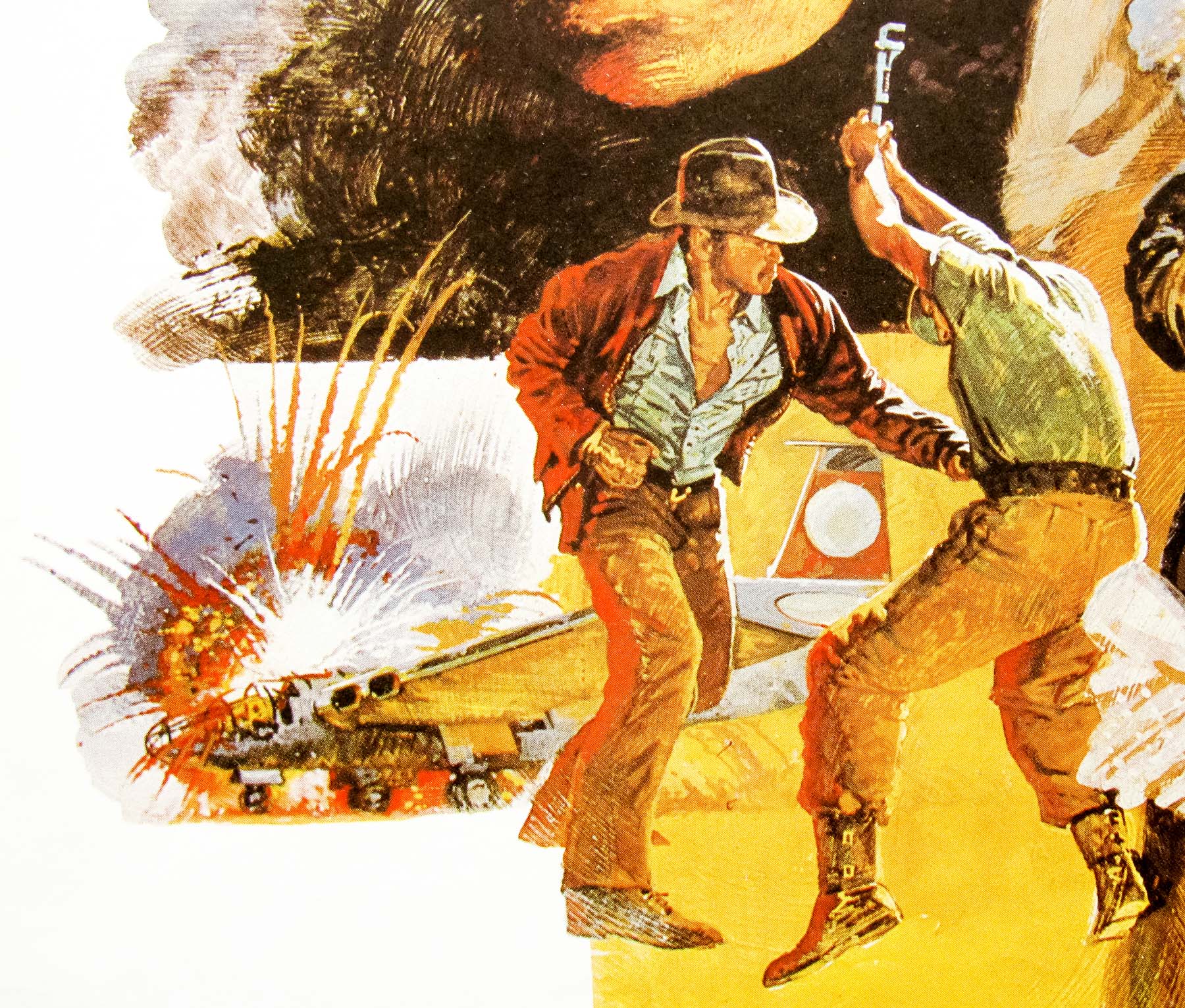
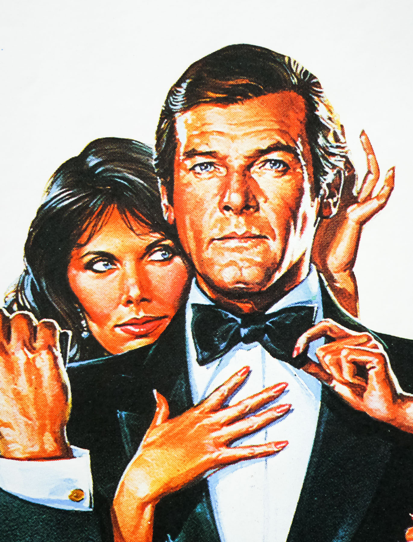
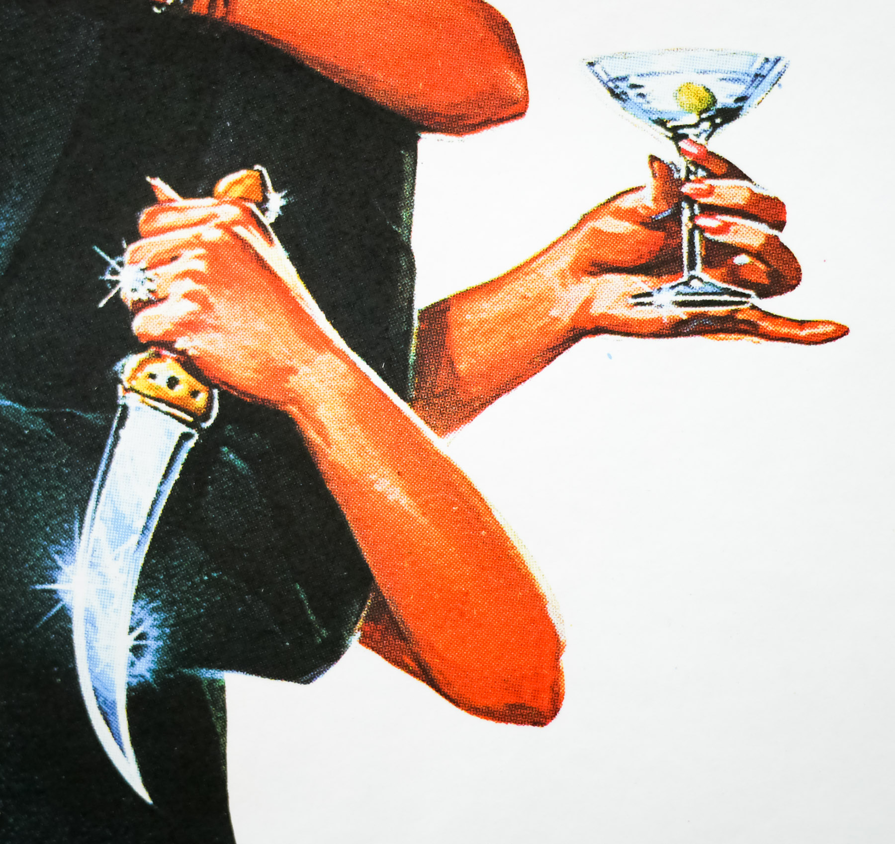
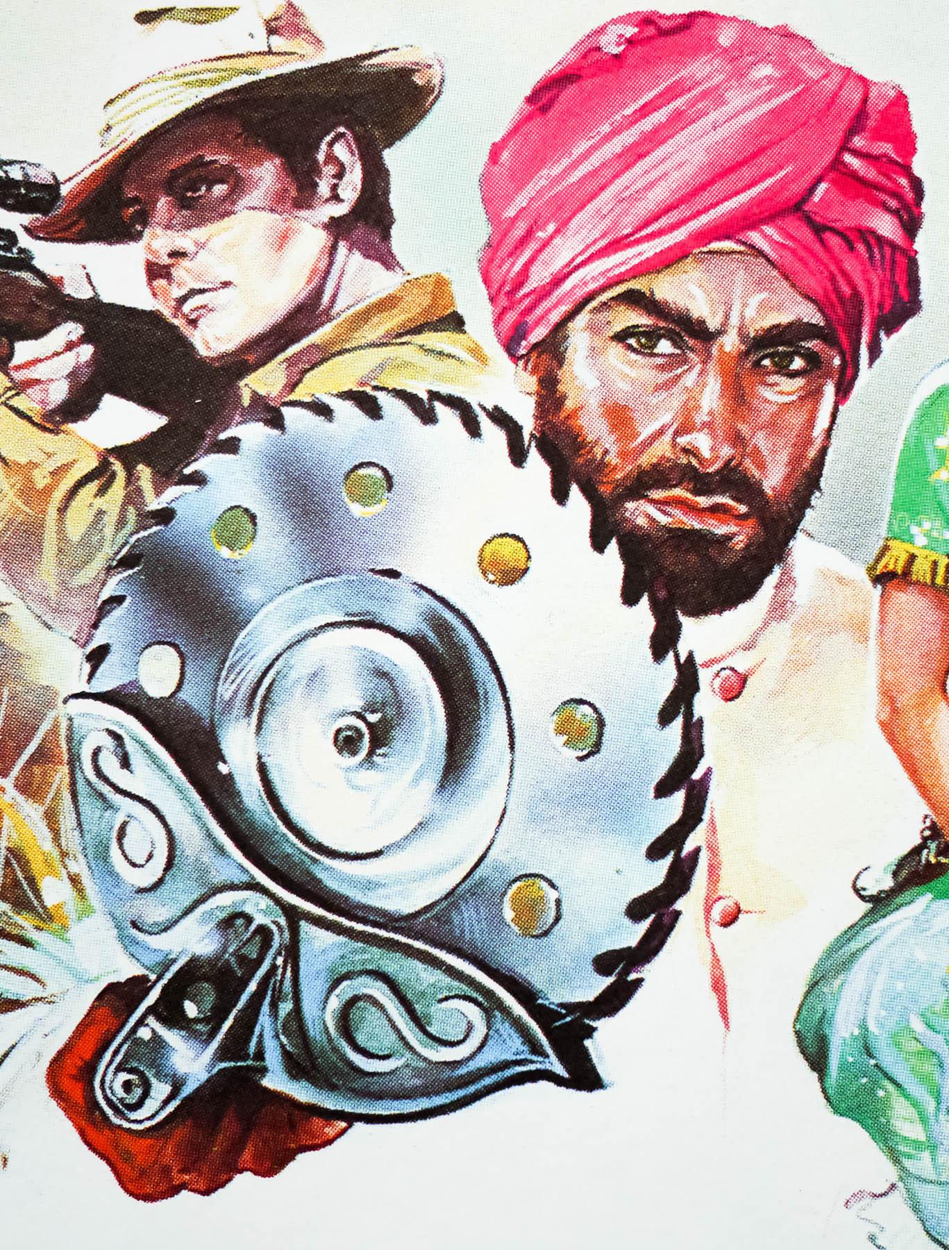
An excellent portrait of action legend Charles Bronson features on this 30×40 poster for the 1984 thriller The Evil That Men Do. One of several collaborations between the star and director J. Lee Thompson, the film sees Bronson star as a retired hitman known as Holland who is living a relaxed life on a West Indies Island when he is approached by former associates who persuade him to take on one last job. The target is the sadistic torturer, Dr. Clement Molloch, a Welshman who is often hired by political regimes to help them keep dissidents in check and has consequently left a trail of enemies in his wake.
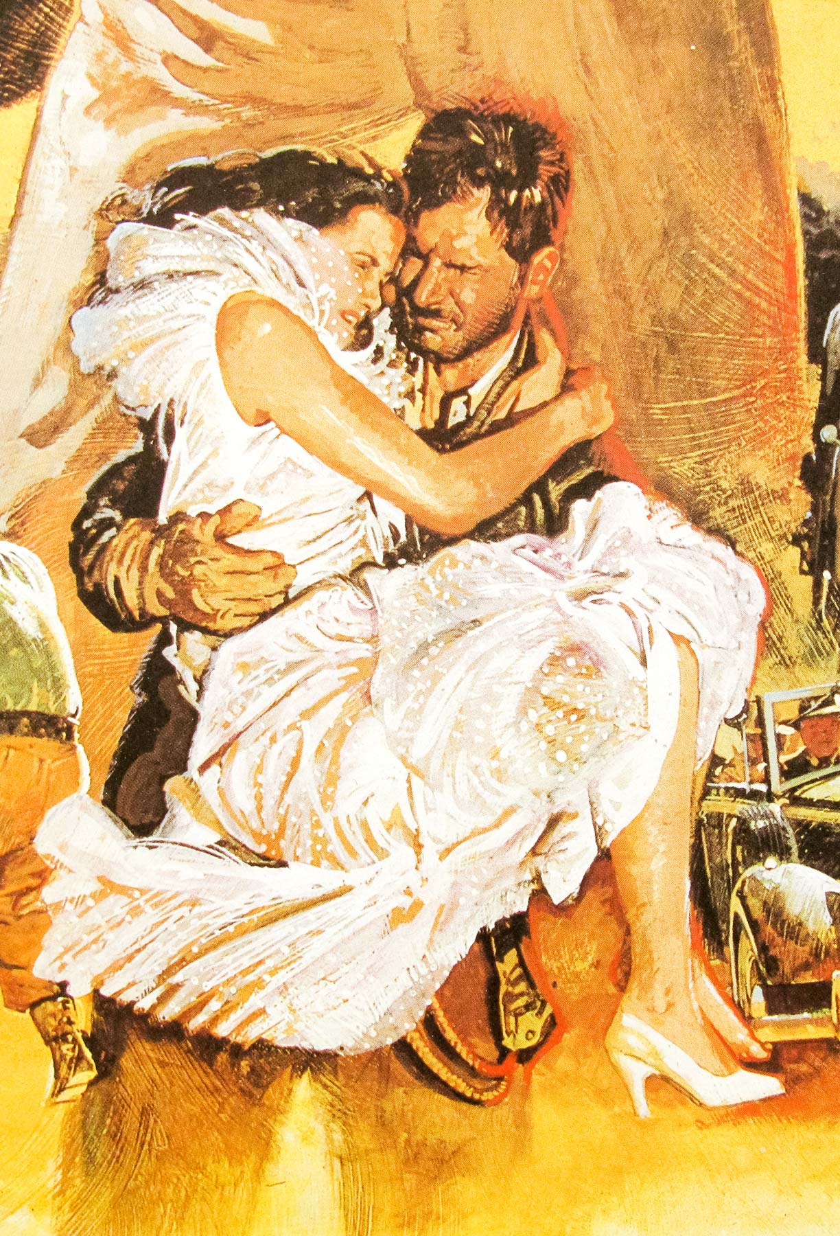
Holland discovers that Molloch has killed his old friend Jorge Hidalgo at the behest of the Surinamese regime and he agrees to set off to Guatemala, the last known location of his target, with Hidalgo’s wife and daughter agreeing to pose as his family to protect his cover. Holland uses his old skills to take out various criminal associates as he works his way up the chain to exact revenge against Molloch. The film was released to weak reviews and it’s definitely not Bronson’s finest hour, or the best collaboration with J Lee Thompson.
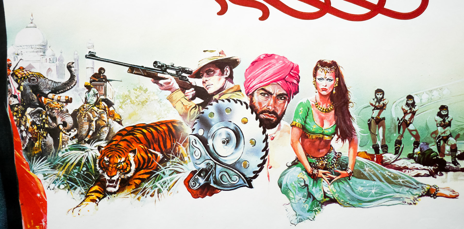
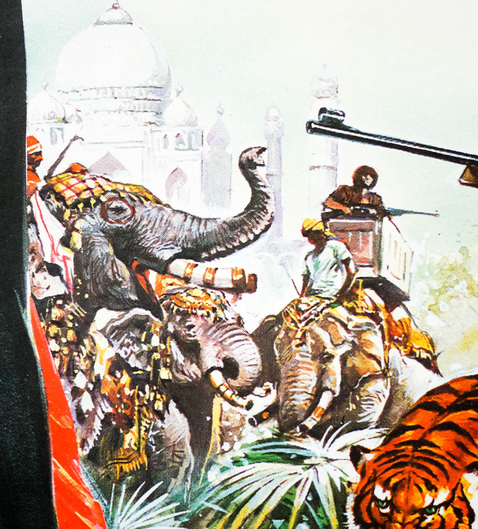
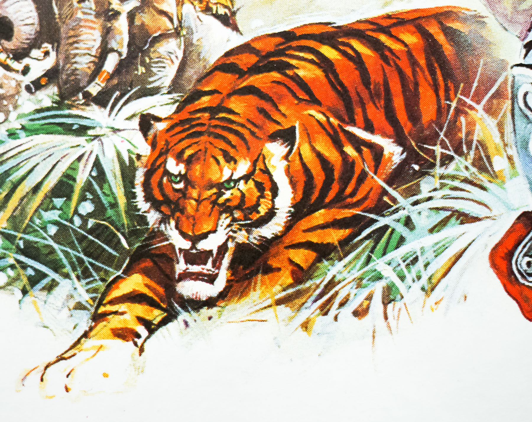
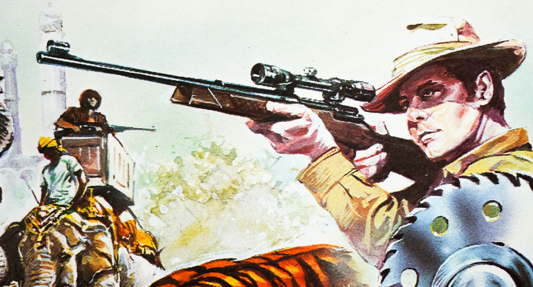
Frustratingly I’ve been unable to find out who was responsible for the artwork on this poster so if you have any ideas please get in touch. The same art also featured on the Japanese B2 poster which can be seen here.
The film’s trailer can be viewed here.