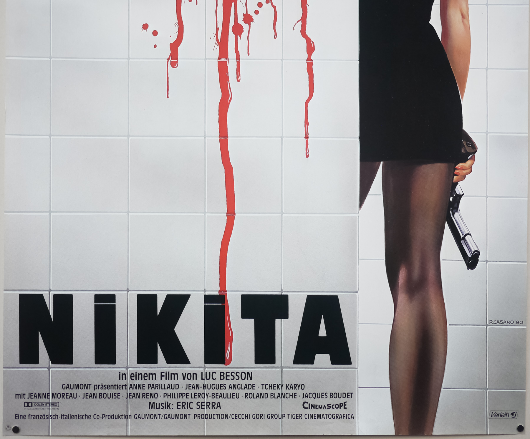
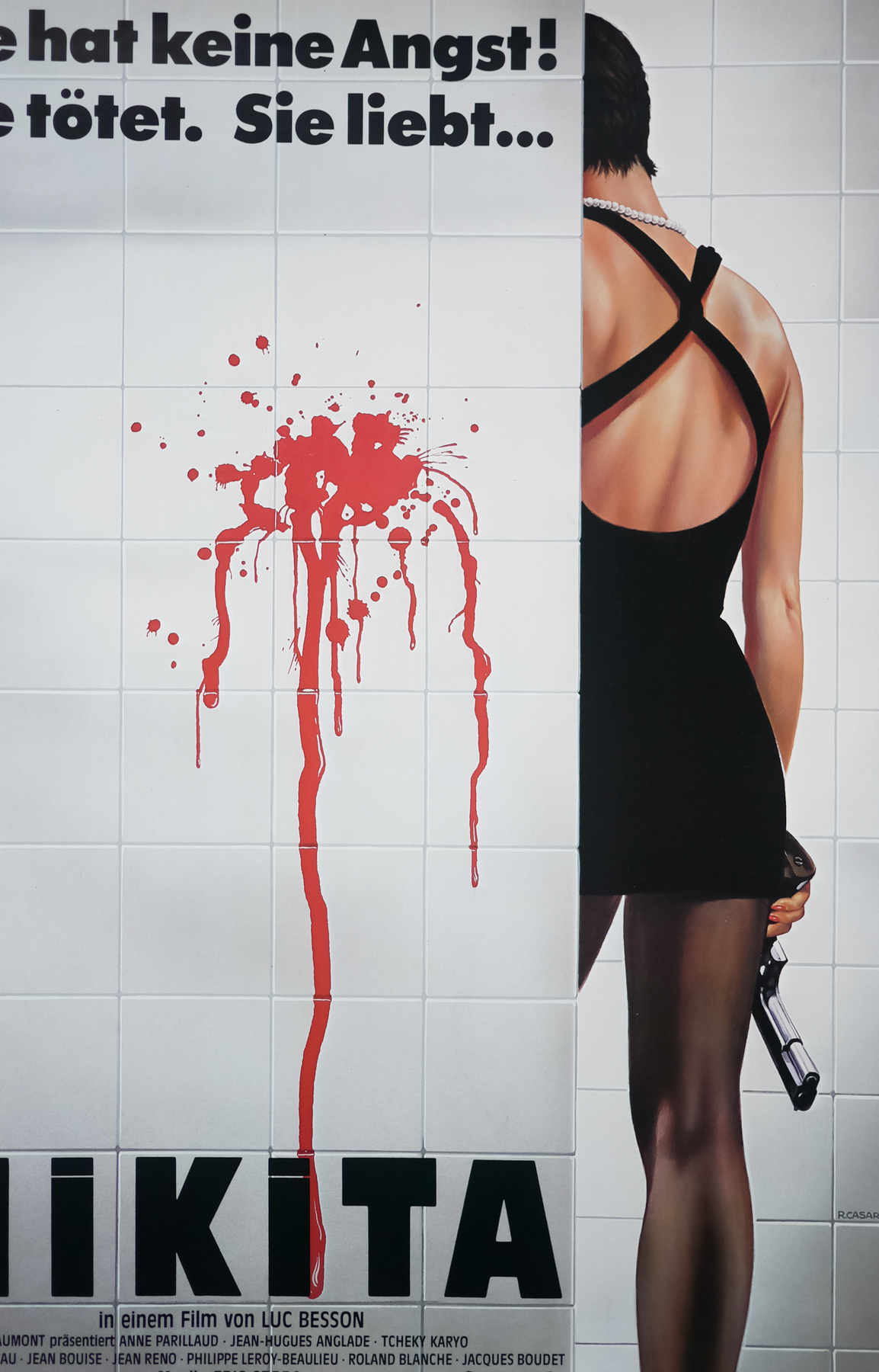
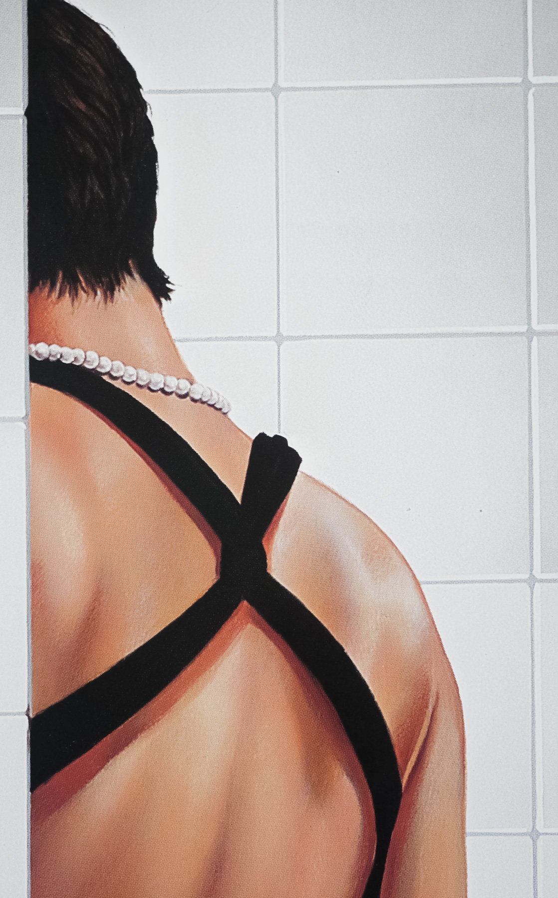
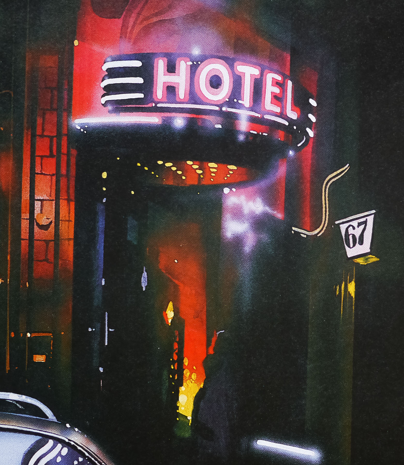
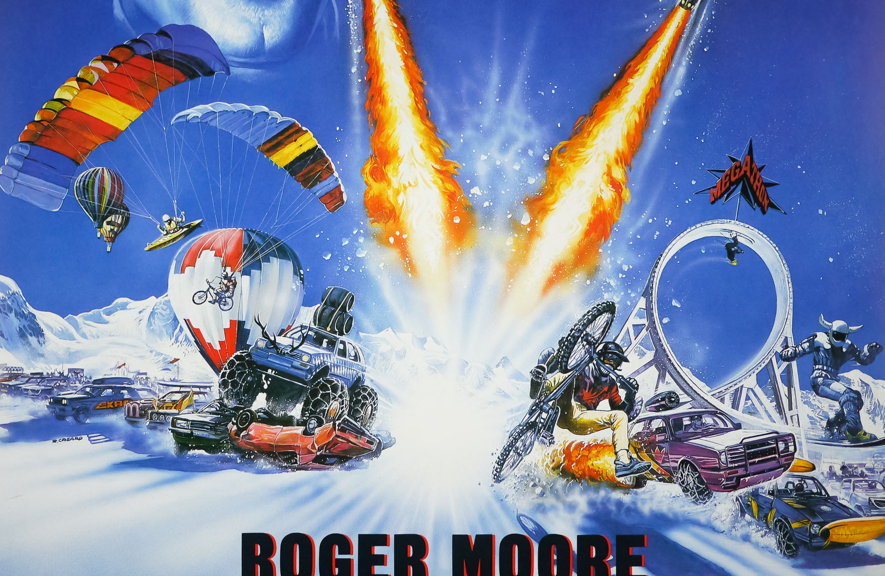
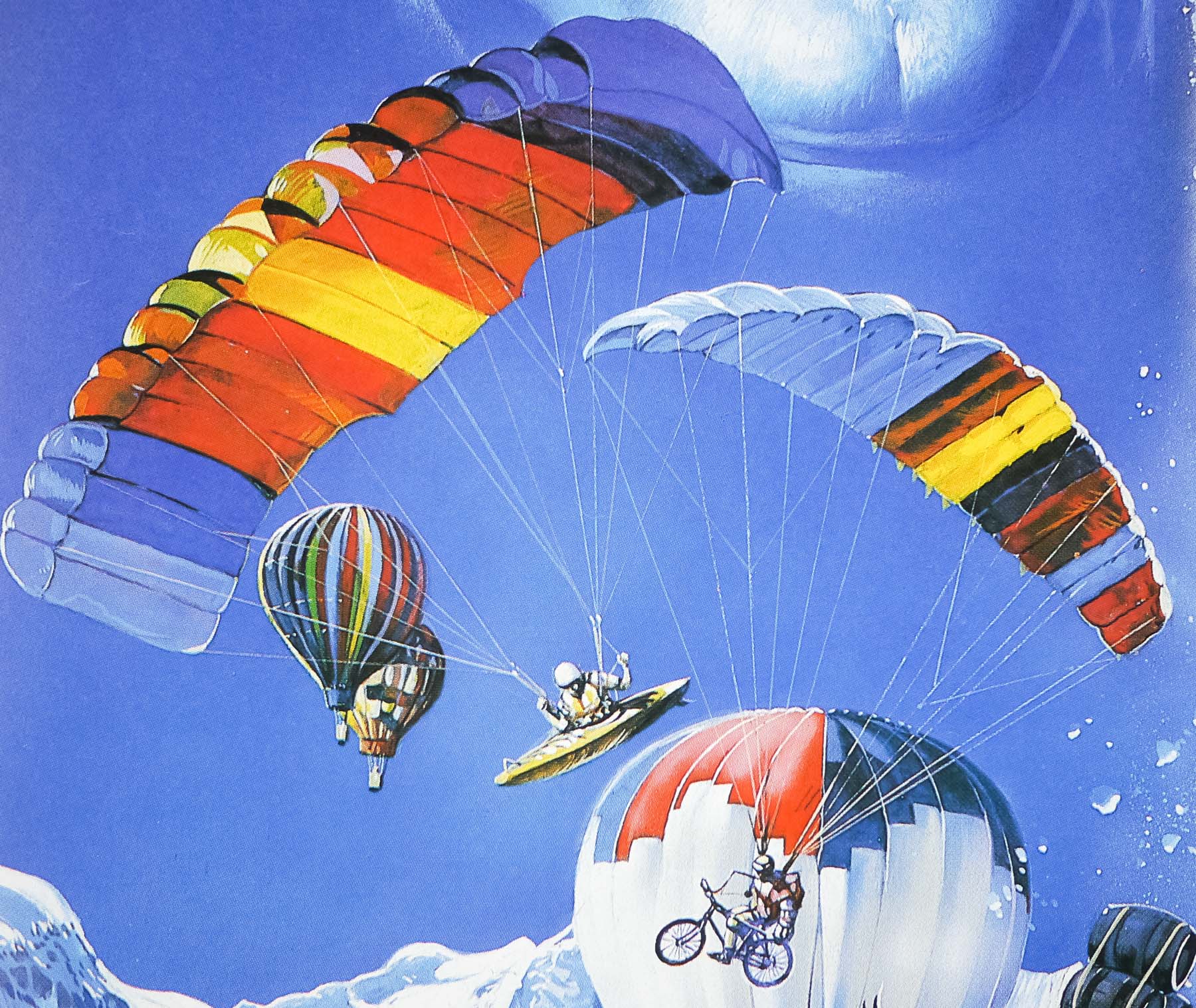
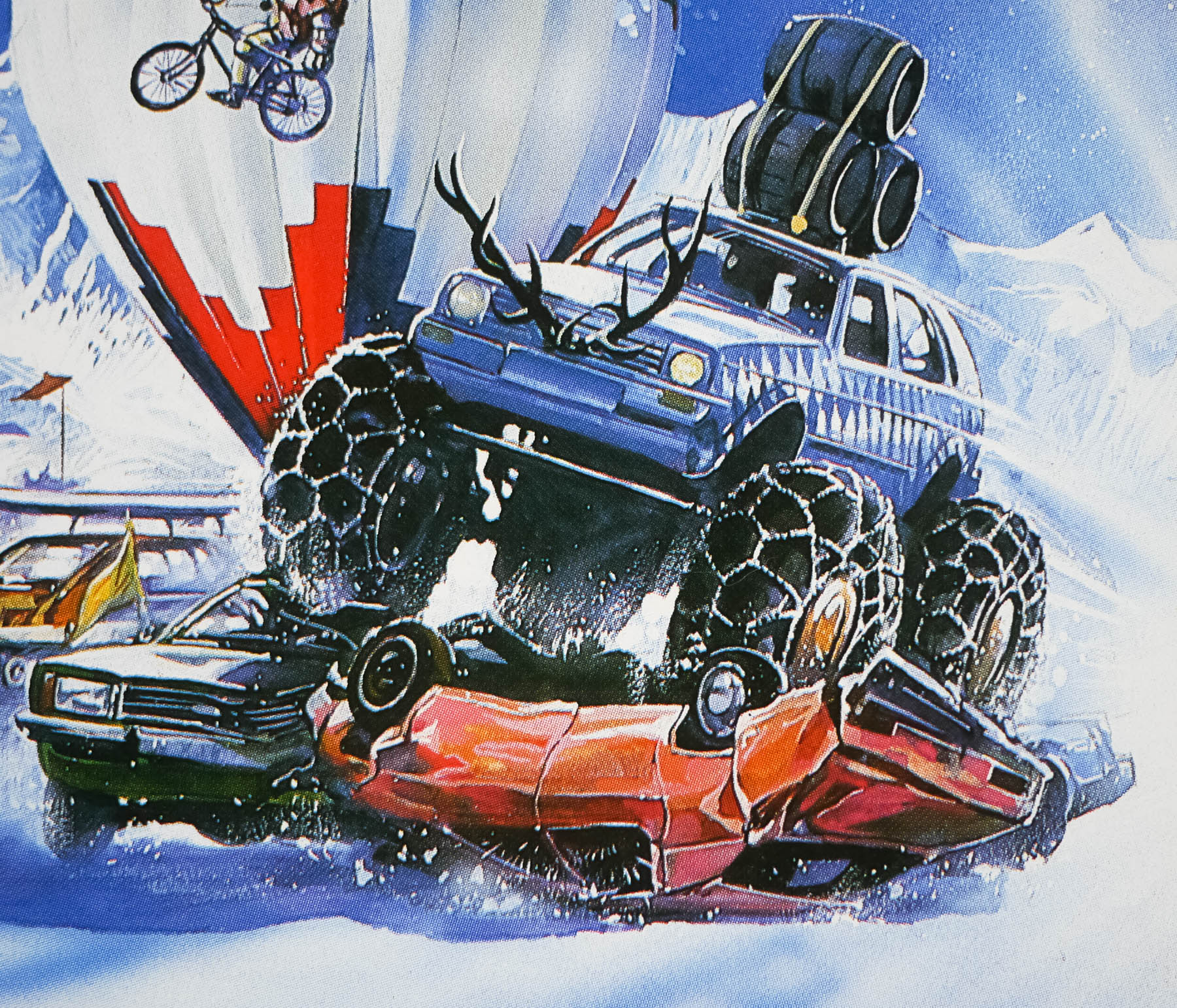
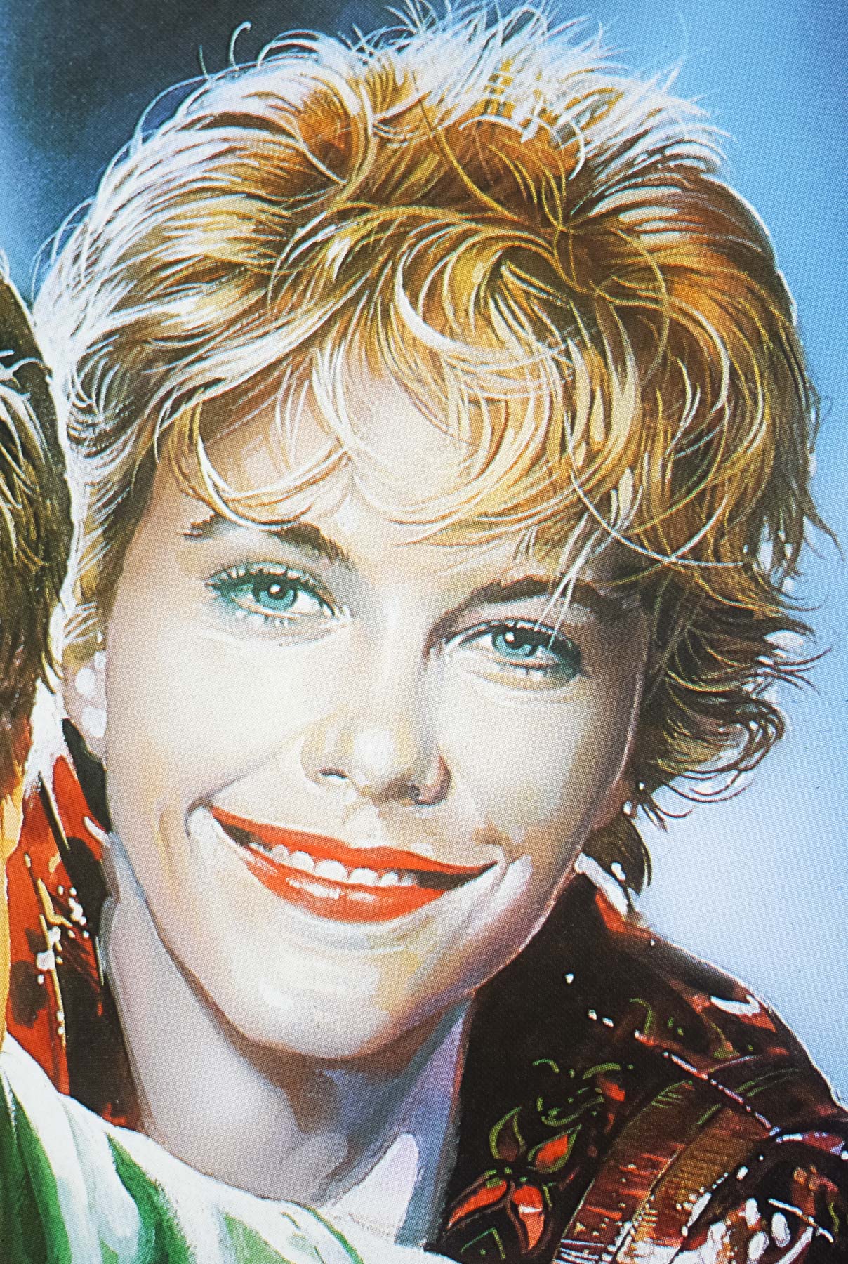
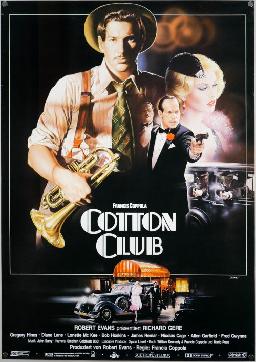
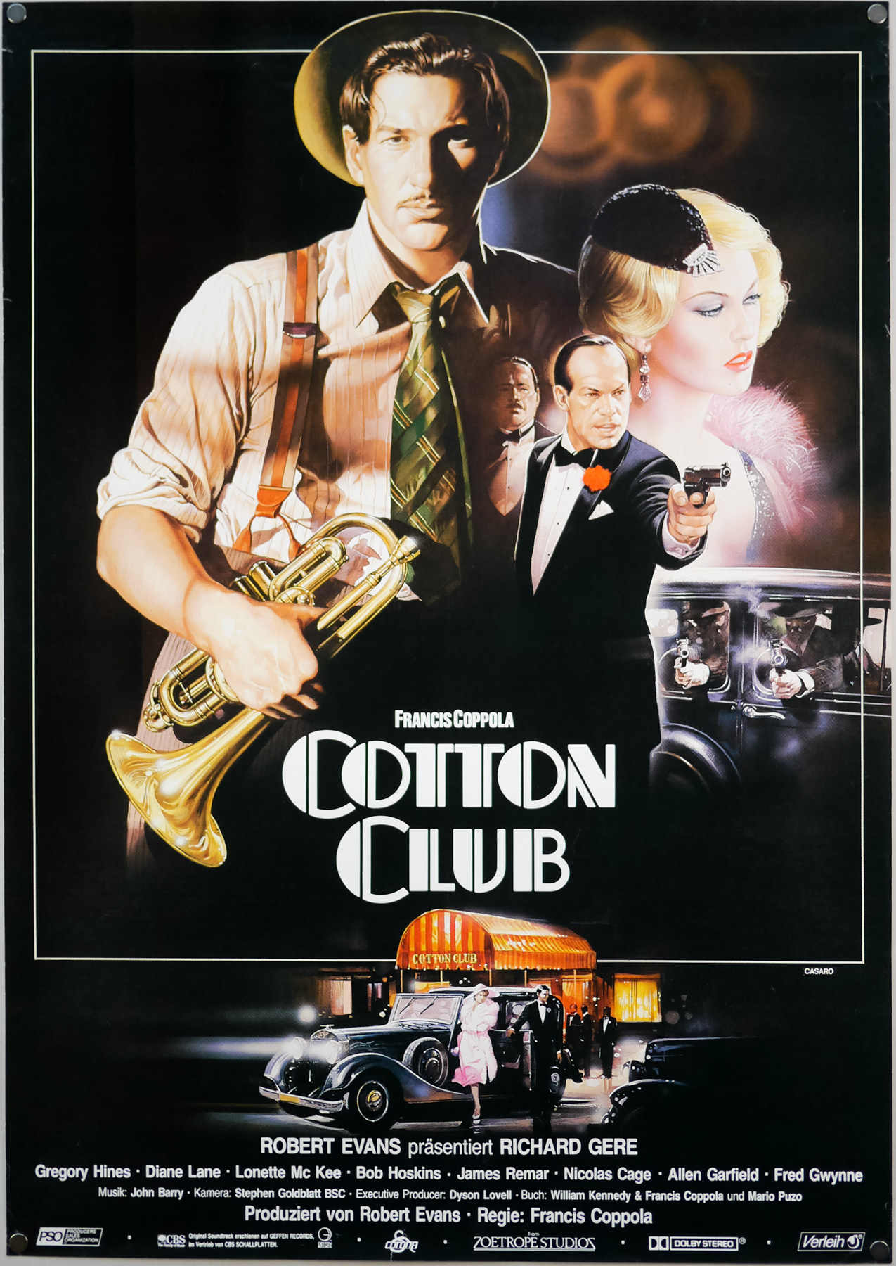
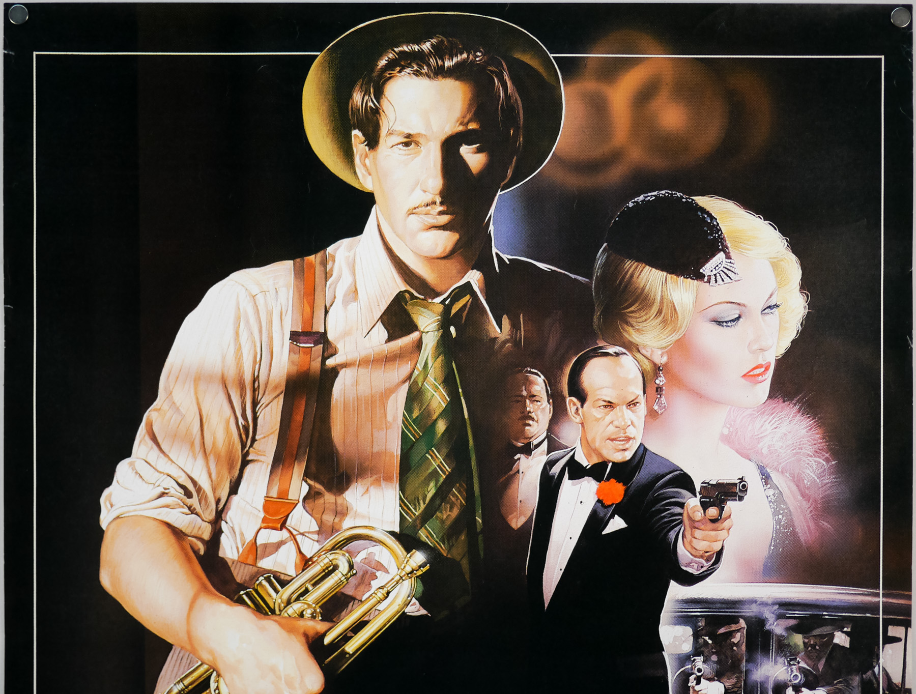
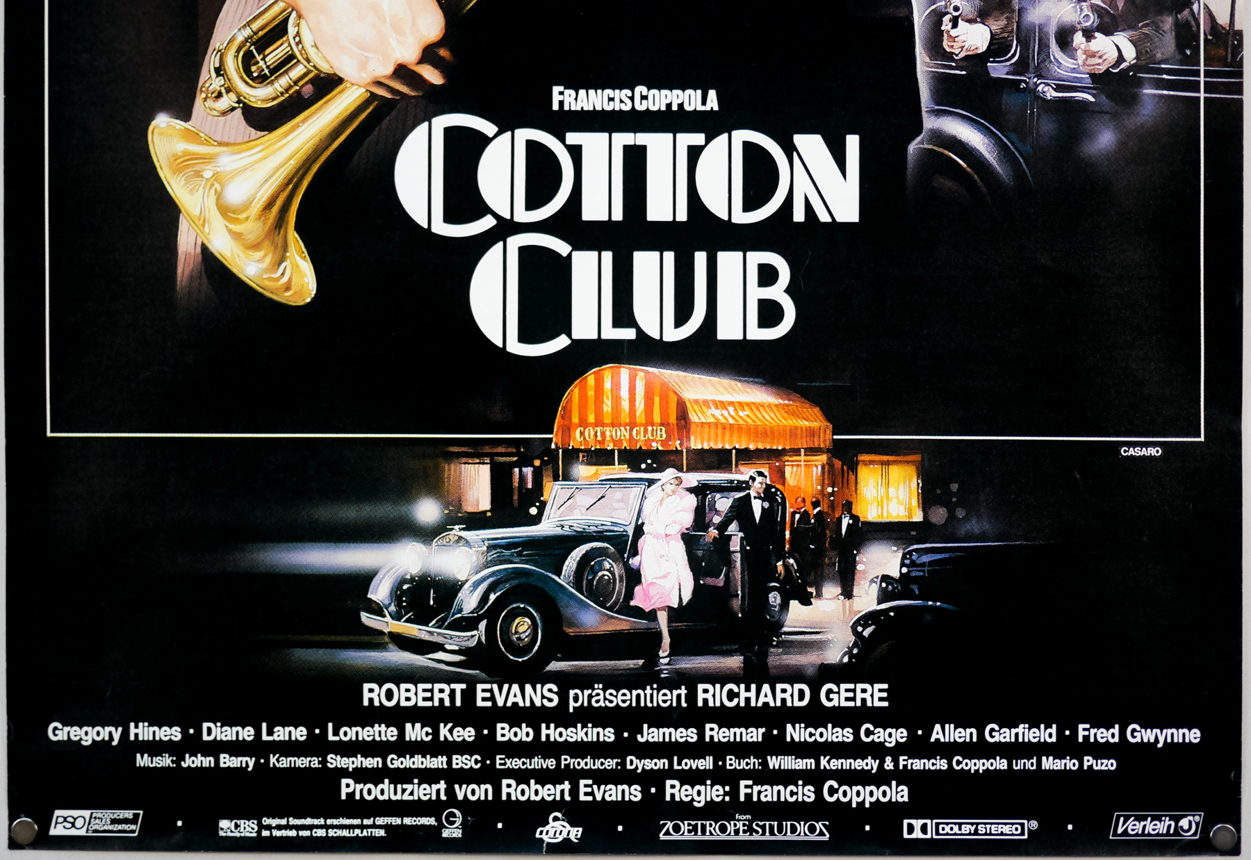
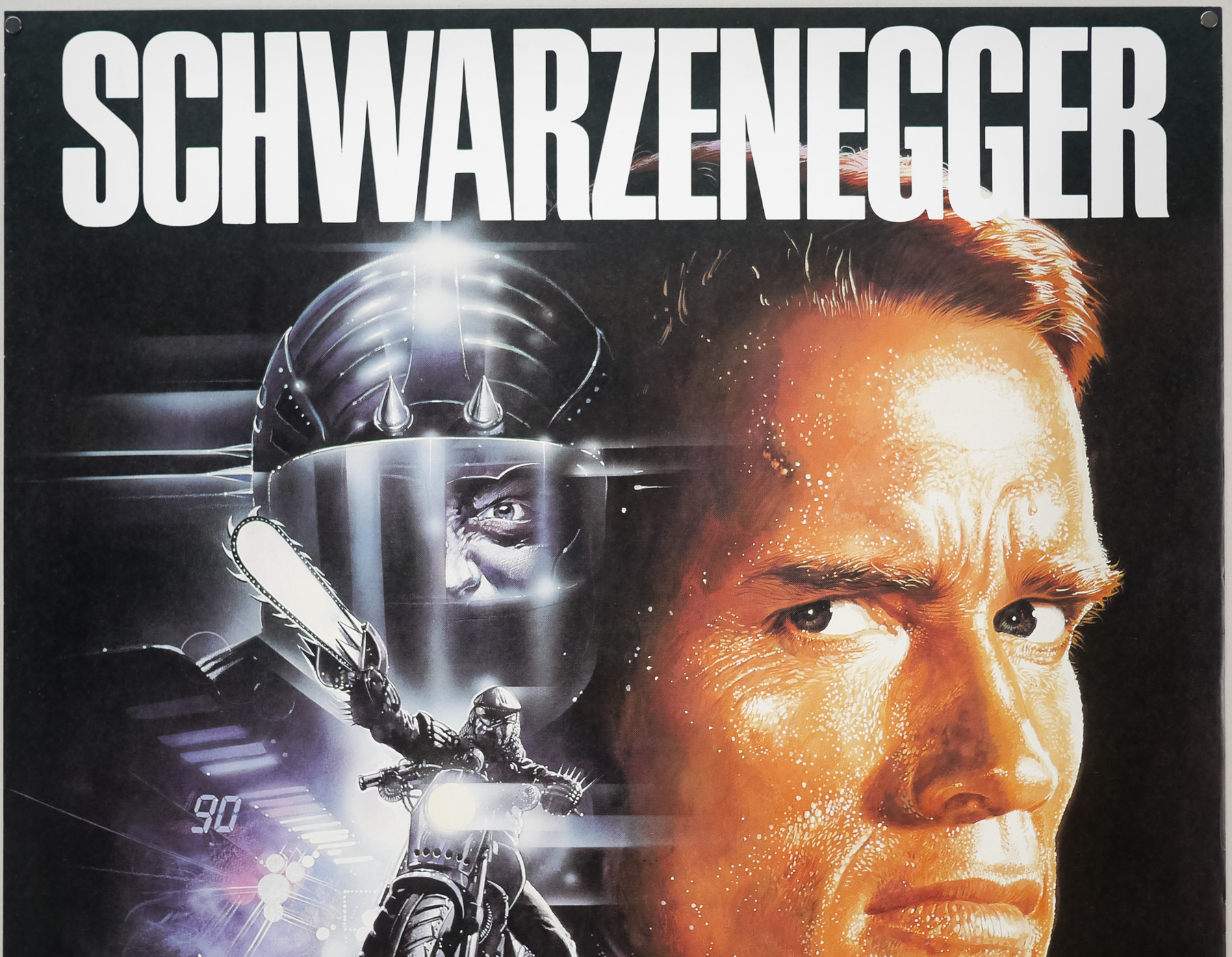
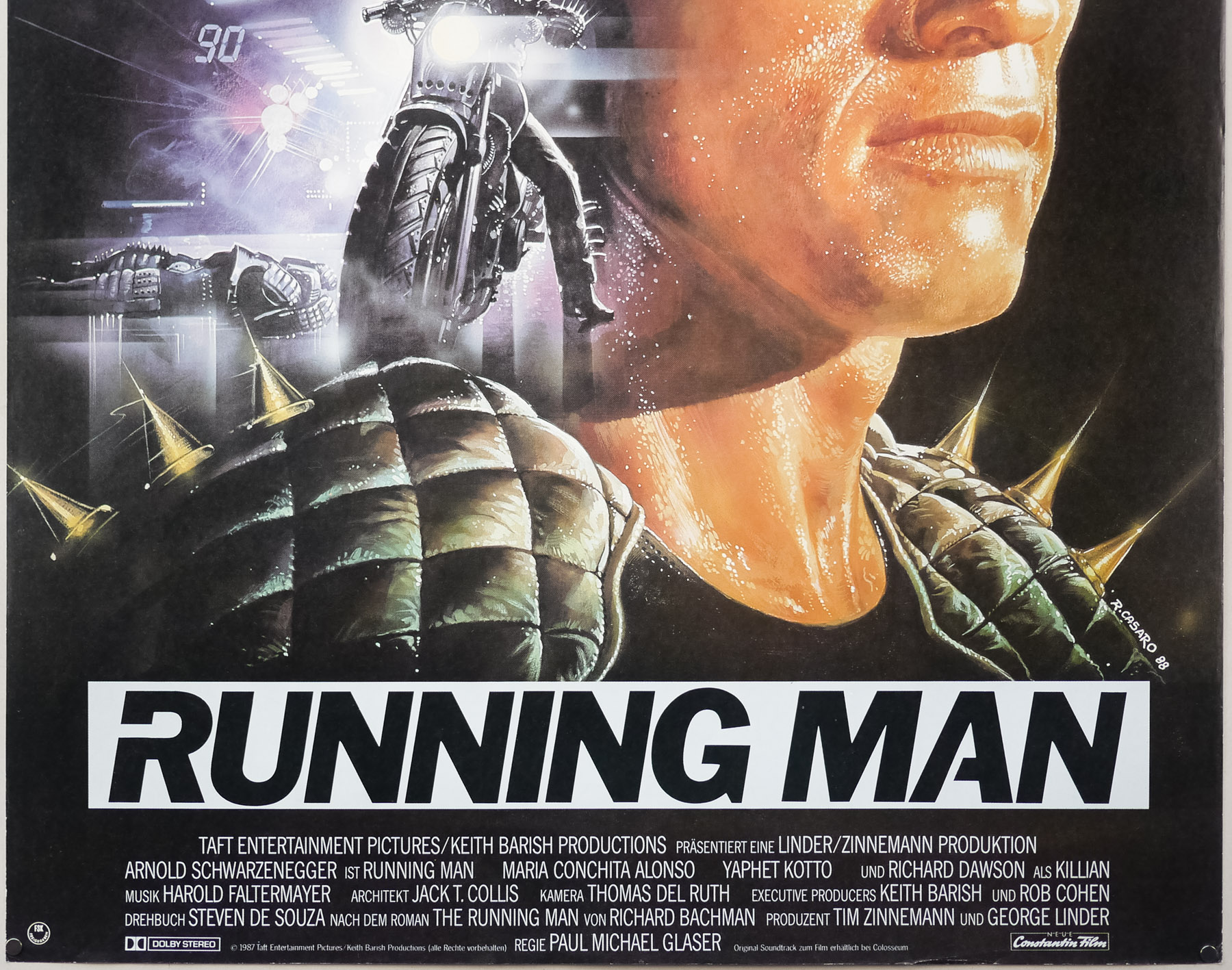
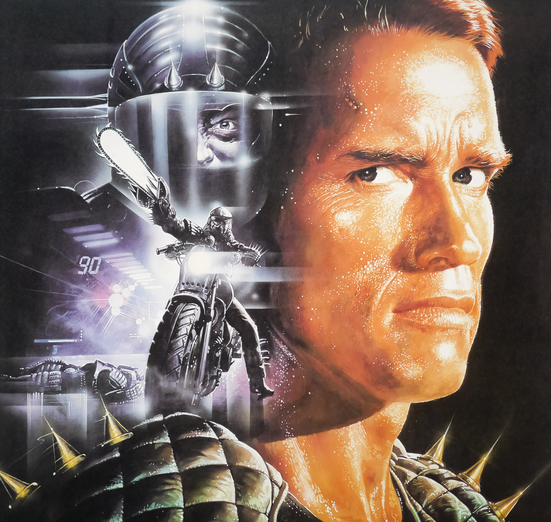
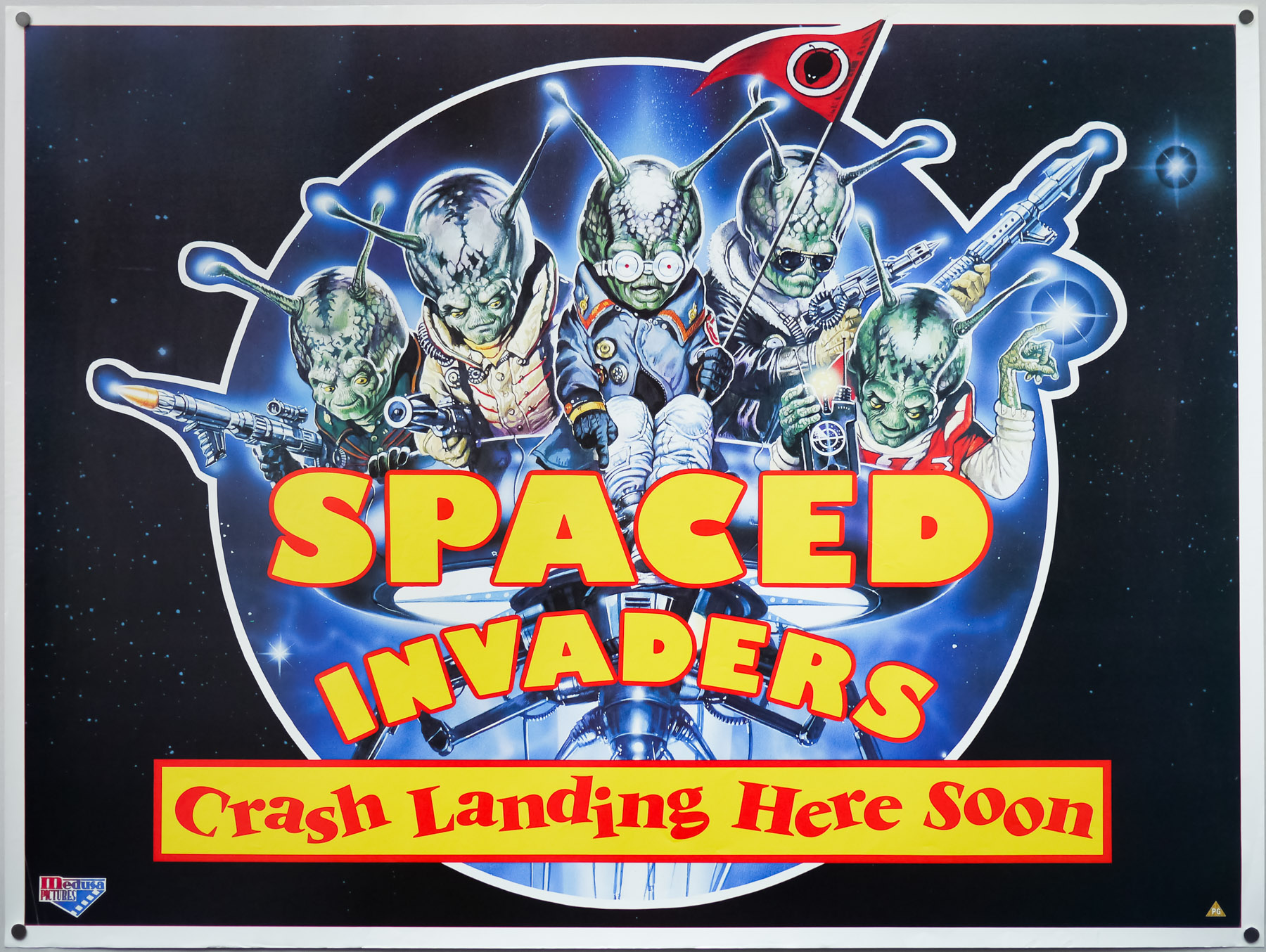
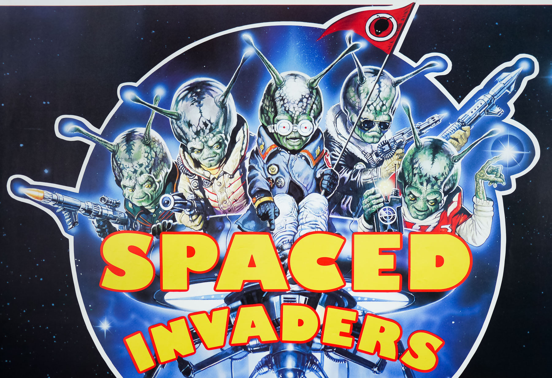
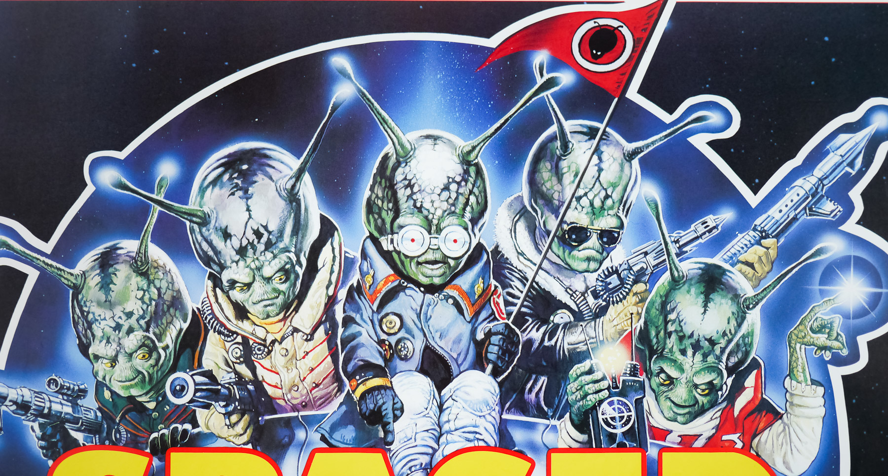
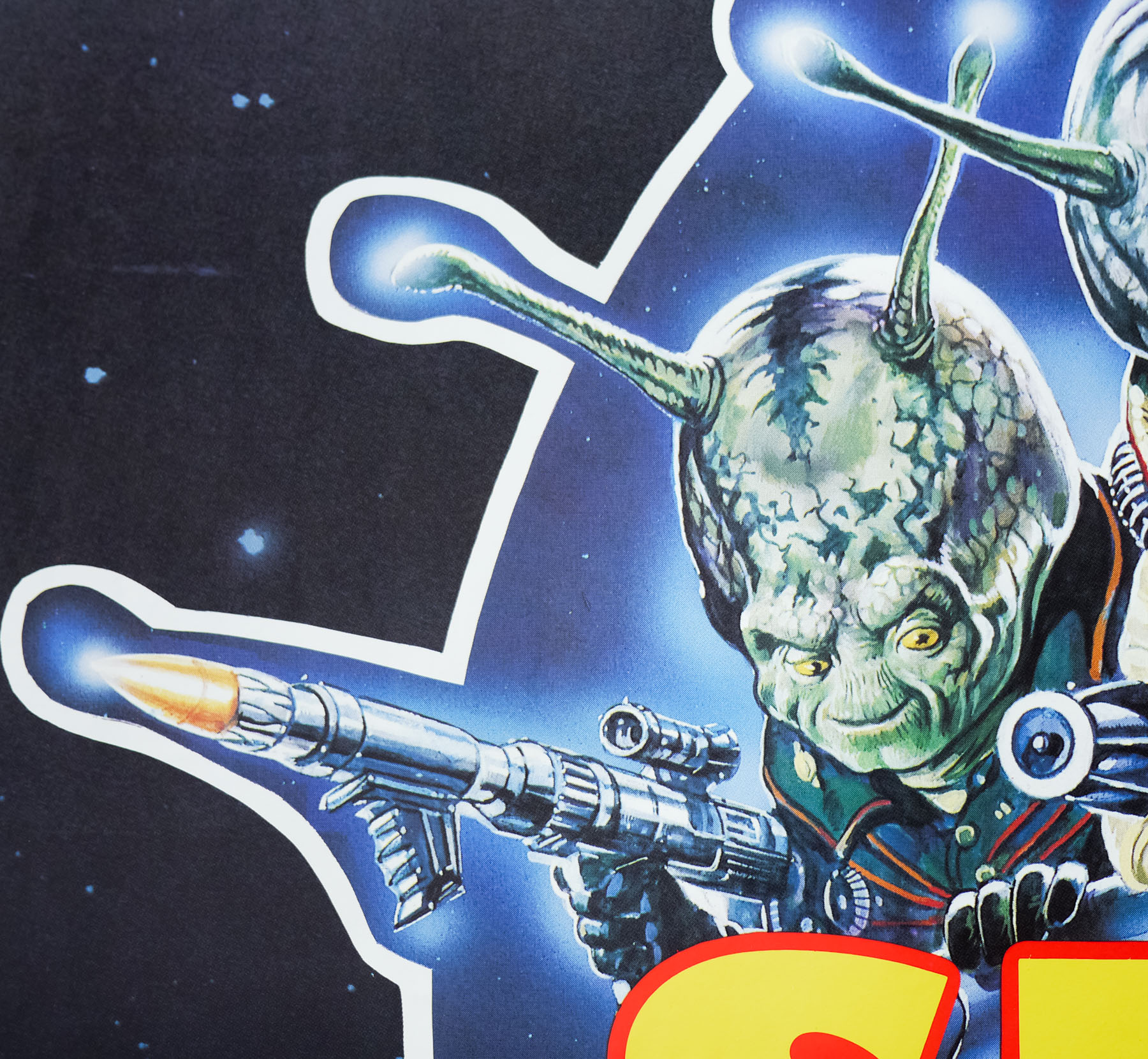
There are few film poster artists as prolific as Italian-born Renato Casaro whose work featured on thousands of posters advertising films around the globe for over 40 years. From his beginnings as a cinema-obsessed youth in Treviso, northern Italy, Renato forged a career that saw him join the famous Studio Favalli in Rome aged 19 before becoming a freelance artist and designer just over a year later. By the time of his retirement at the end of the millennium he had worked on memorable posters for some of the biggest films of the past 50 years whilst forming close friendships with the likes of Dino De Laurentiis, Sergio Leone and Bernardo Bertolucci. For many years Renato was the go-to artist for both Italian and German distributors wanting to release their films with a striking poster design.
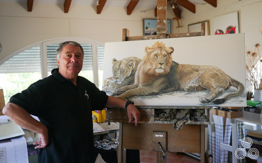
Renato Casaro stands next to his latest wildlife painting inside his home studio near Marbella, Spain. Photo taken in June 2013.
Unusually, especially in comparison to other film poster artists, Renato has retained and carefully archived almost all of the original sketches and artwork for his posters dating back to the 1960s, with only some of his very earliest work no longer surviving. In the summer of 2013 I was privileged to be able to meet Renato at his home near the Spanish town of Marbella and spend an afternoon discussing his life and career. I was also granted a brief but memorable look at the archive of his work and some photos are included below.
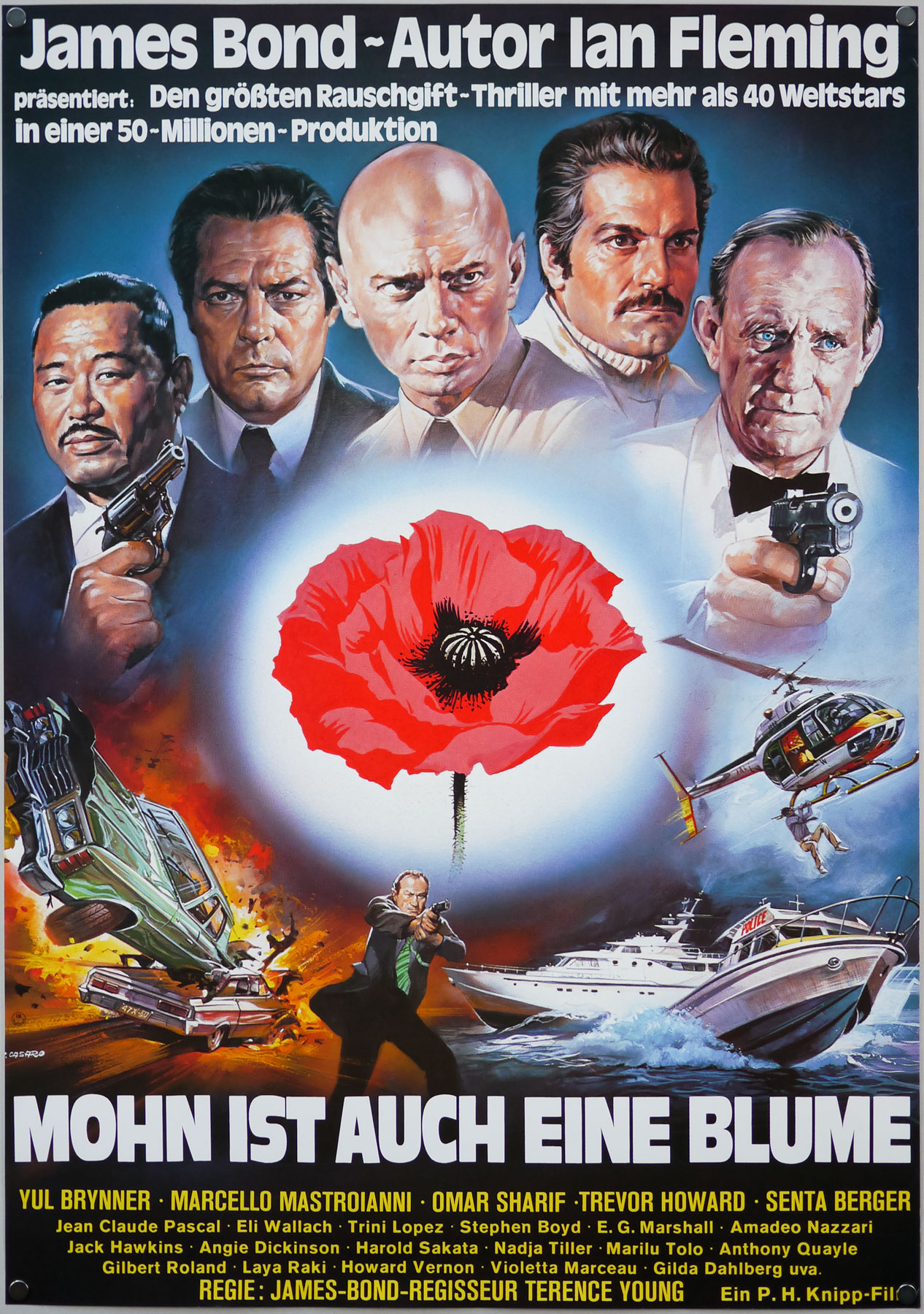
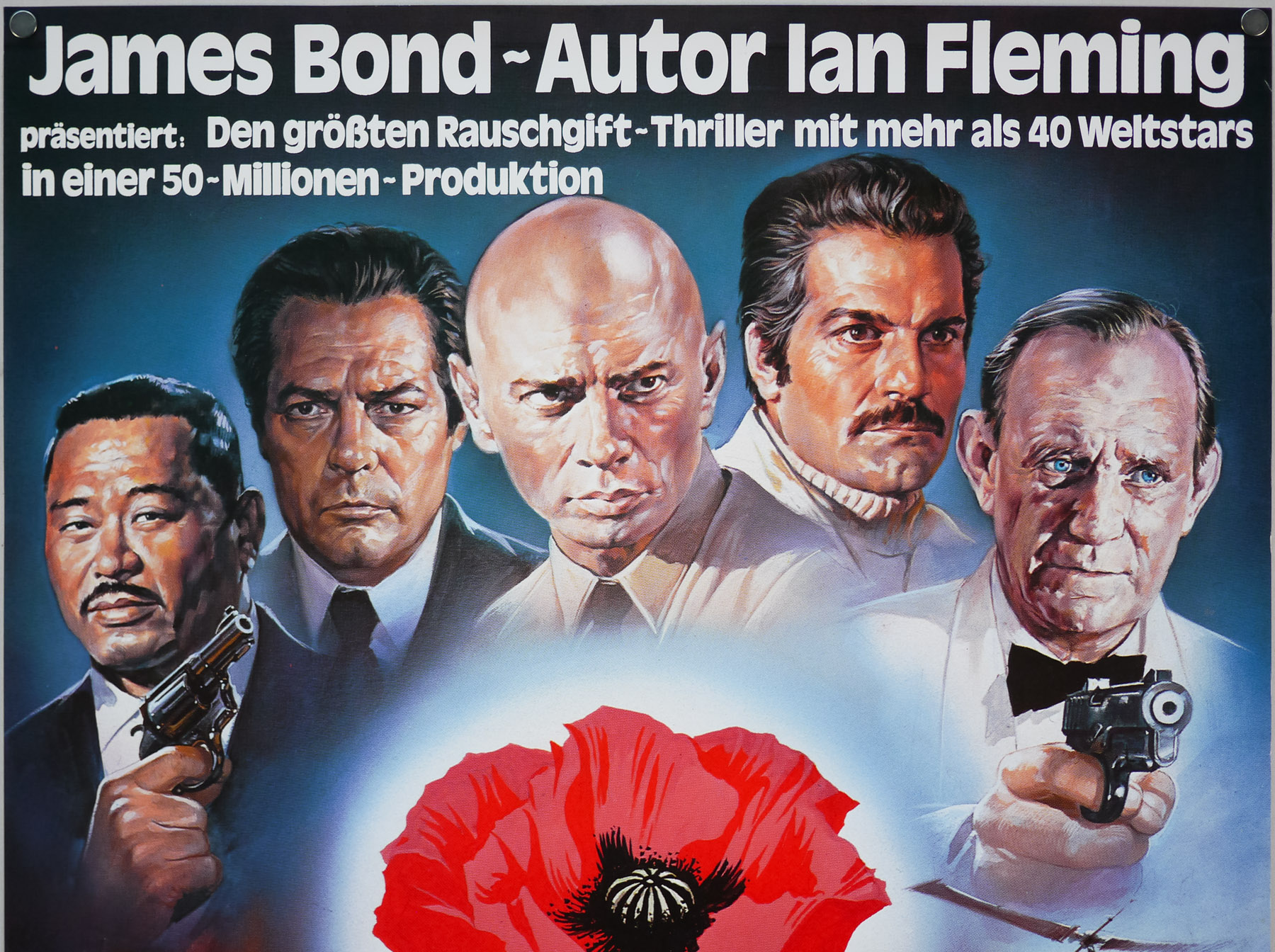
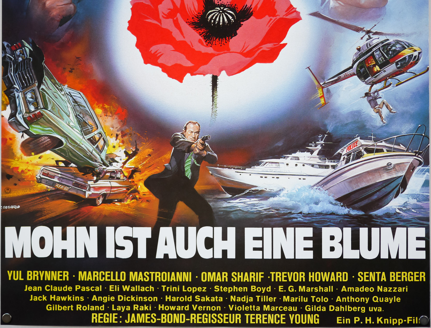
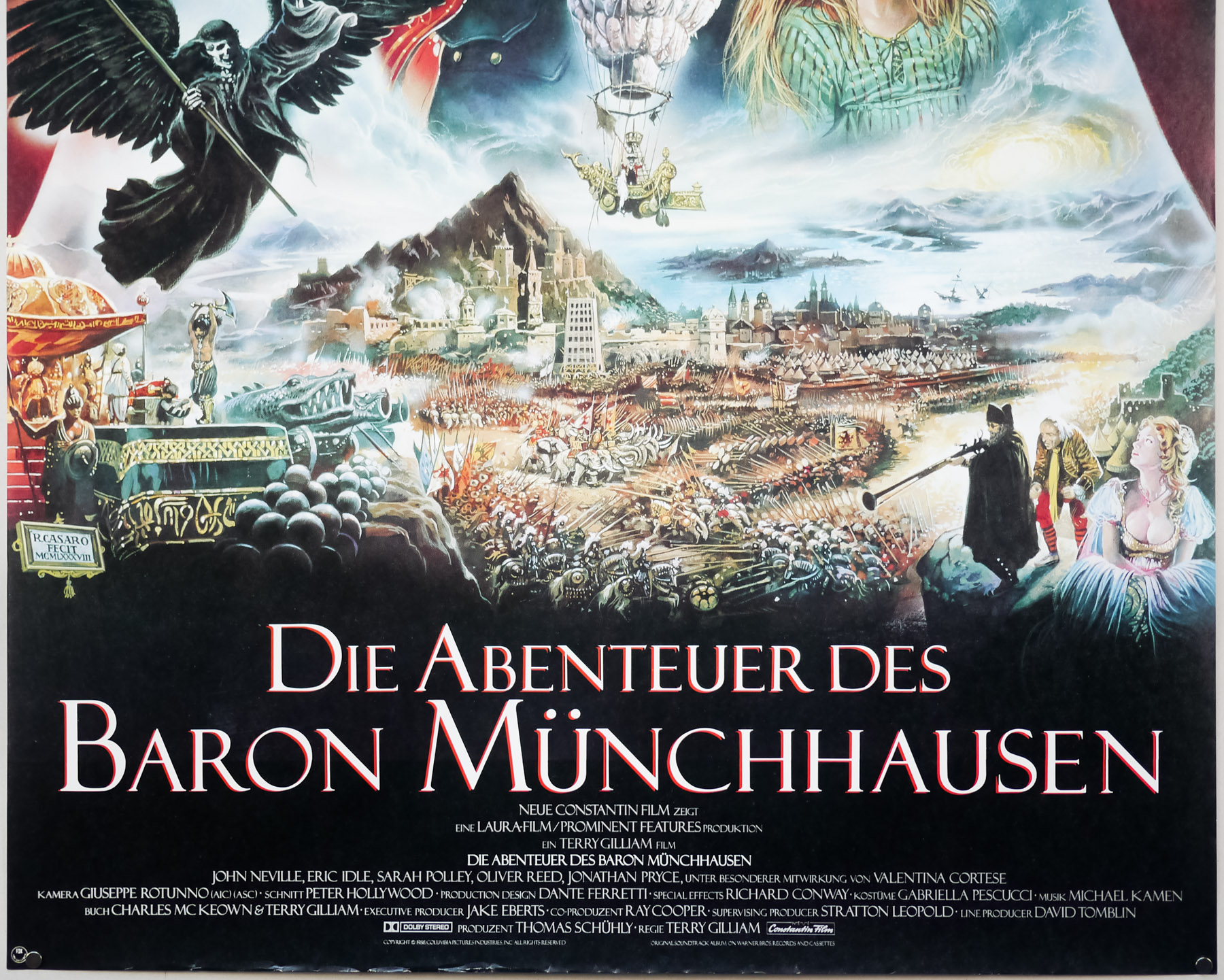
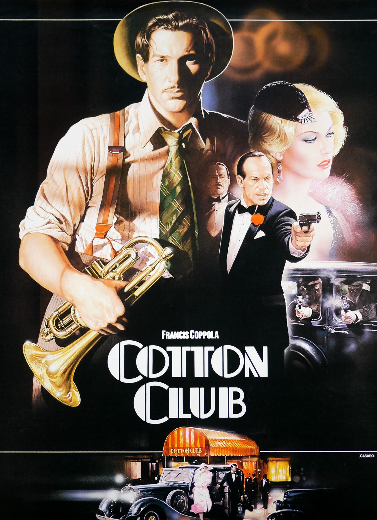
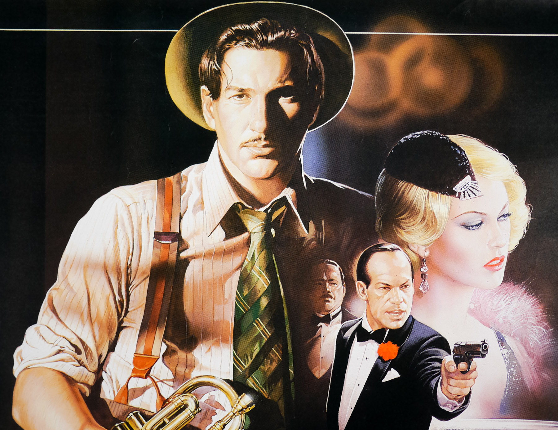
The following article contains many images of Renato’s work with a larger focus on the film posters he worked on during the 1970s and 1980s since this is the era of his work that is found in the Film on Paper collection and means the most to me personally. However, it’s important to stress that the images displayed here are just the tip of the iceberg and I encourage you to follow the links displayed at the end of the article to see many more of Renato’s great posters.
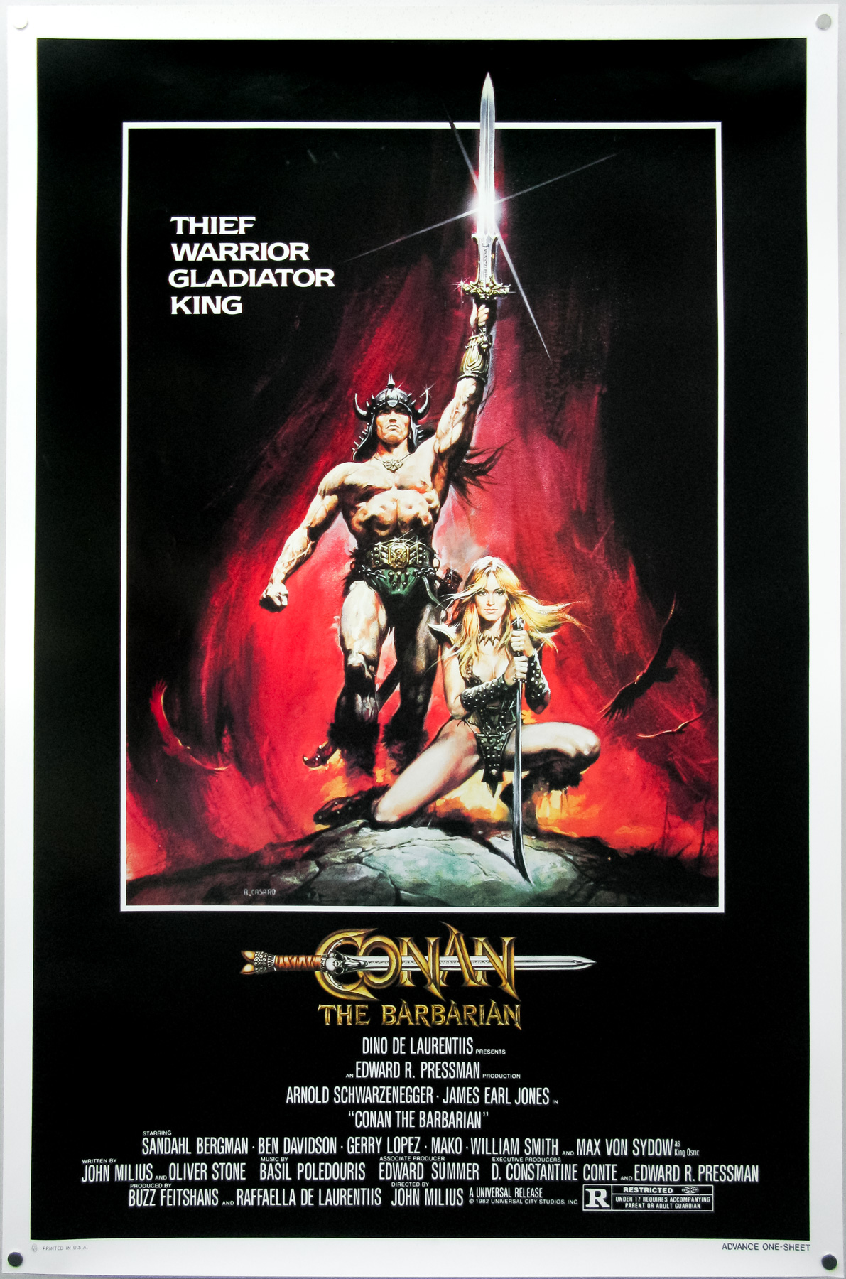
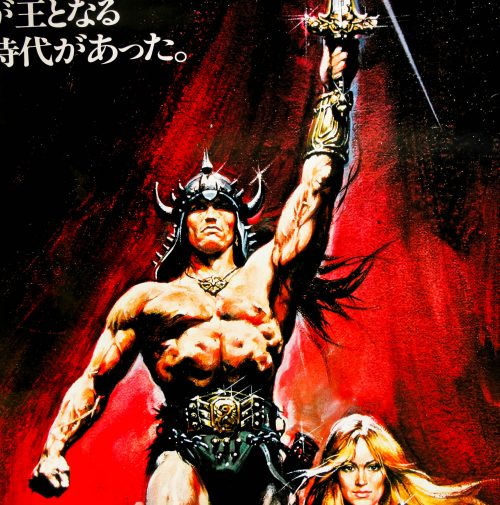
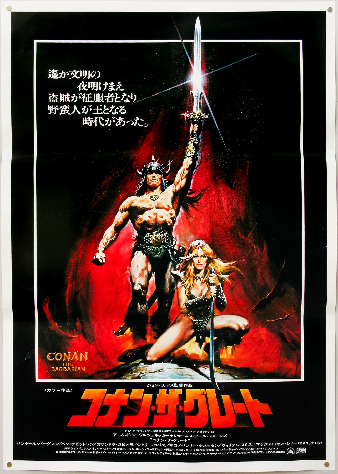
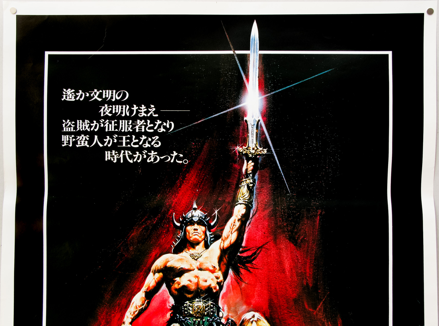
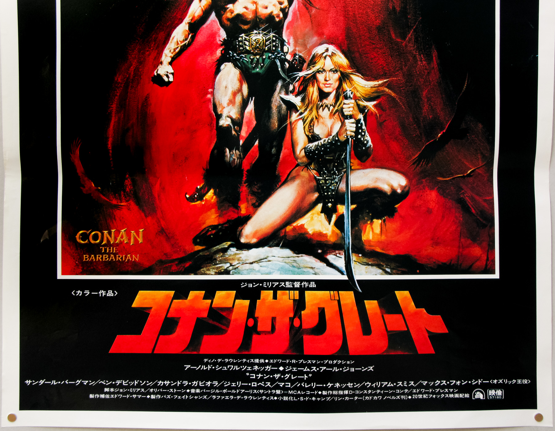
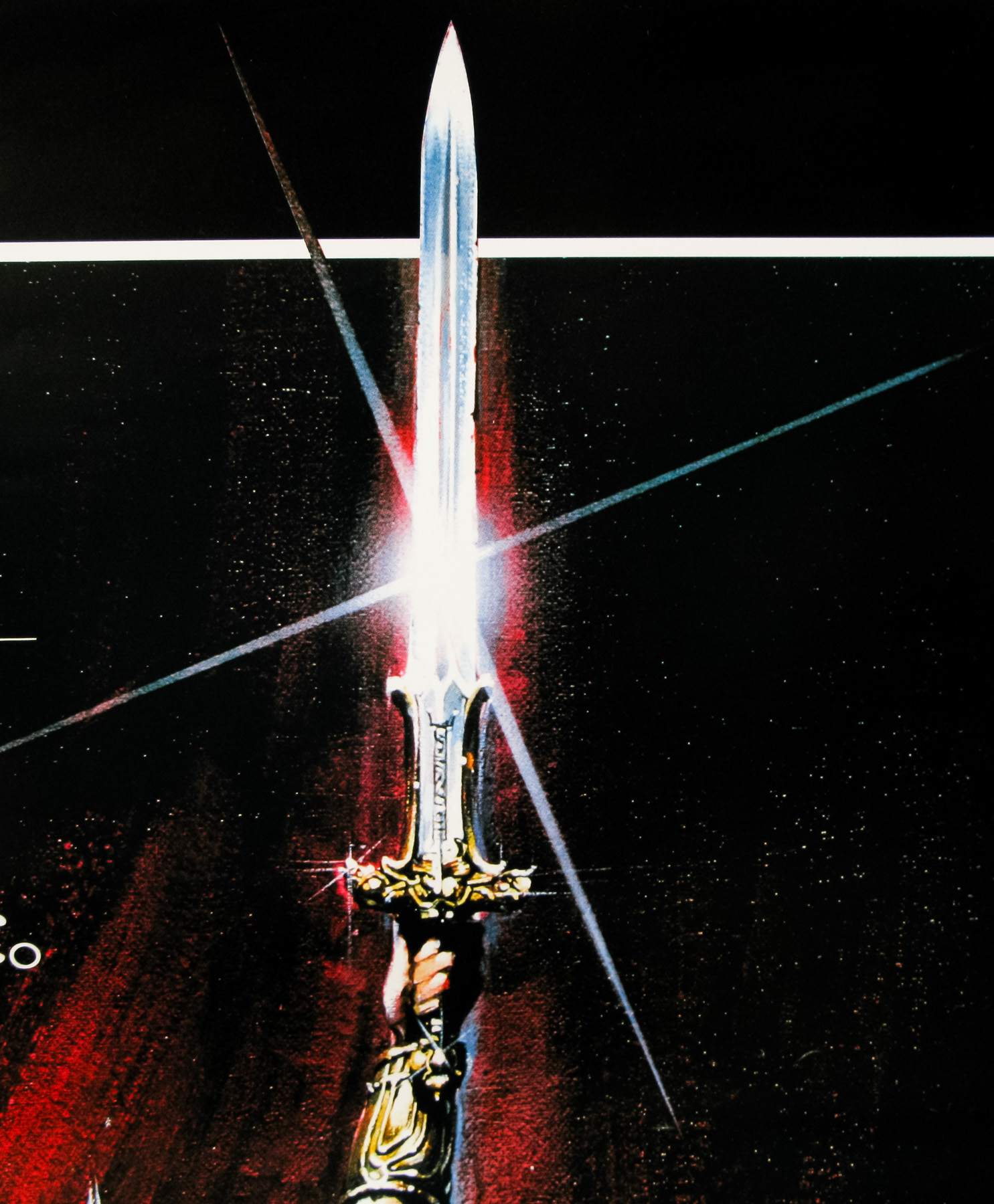
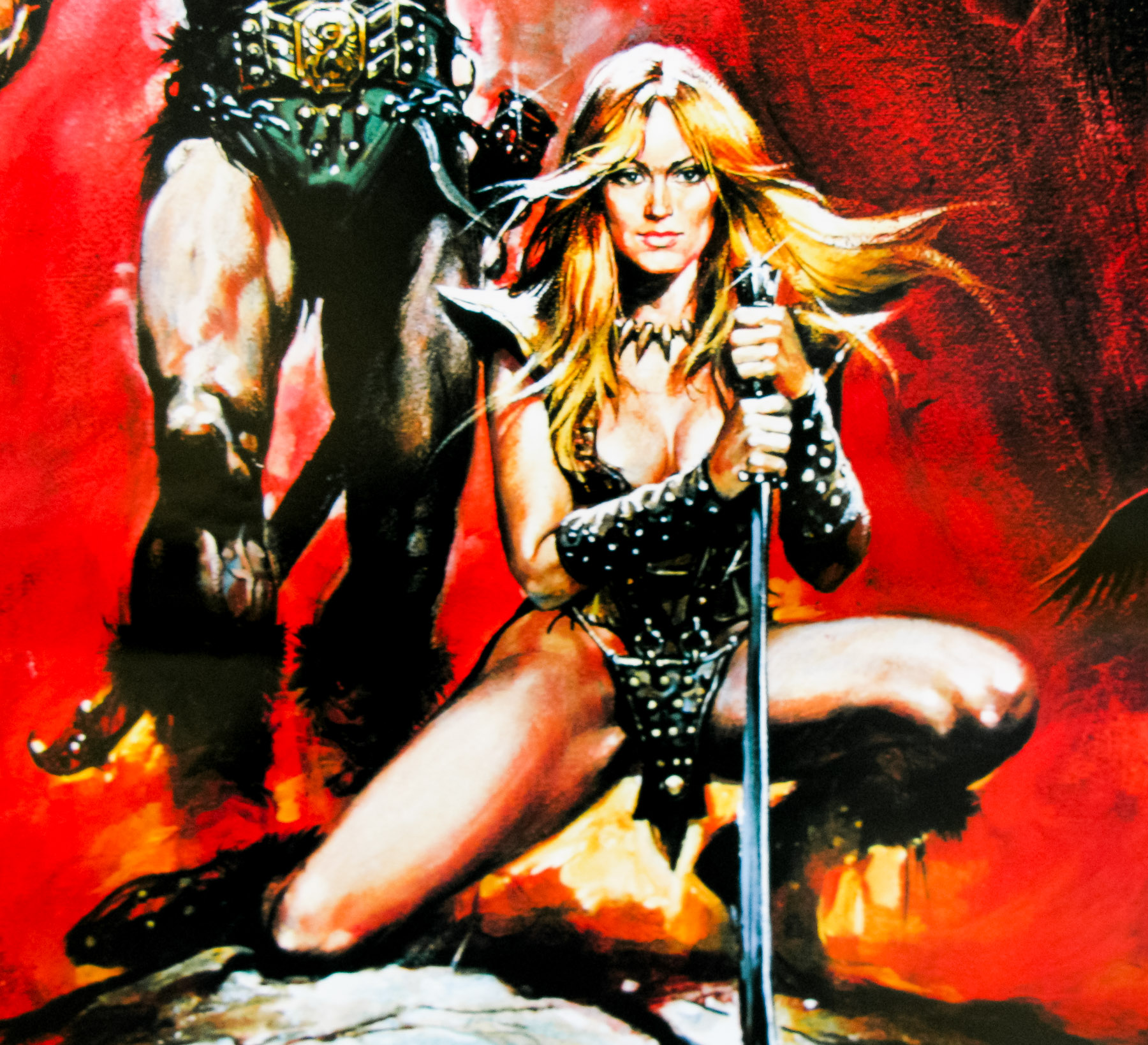
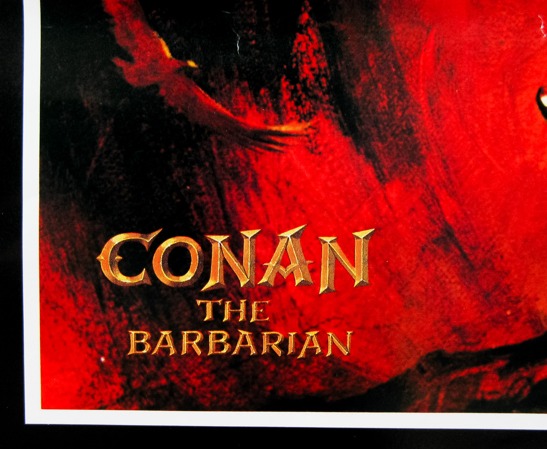
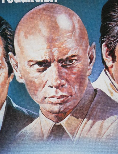
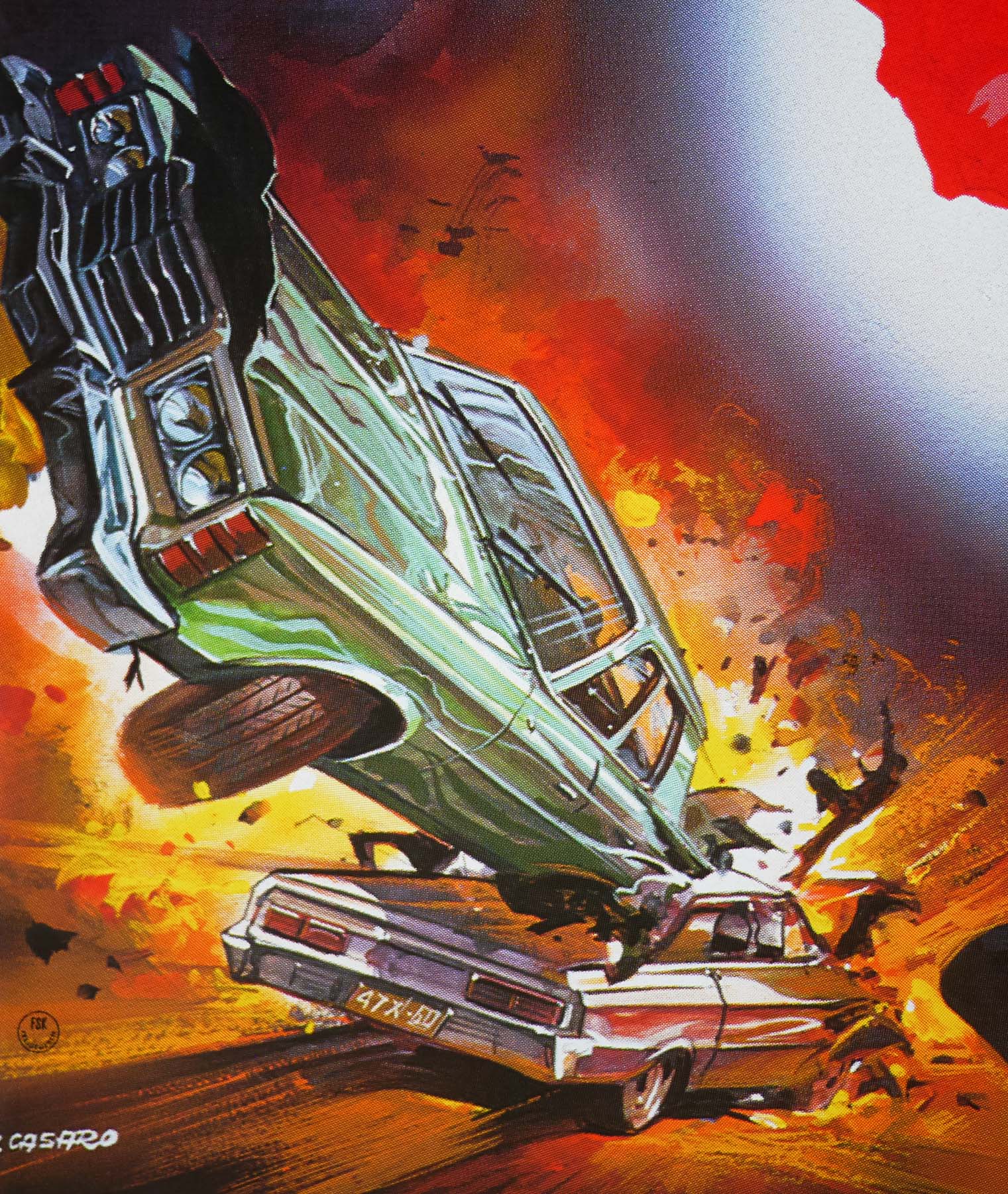
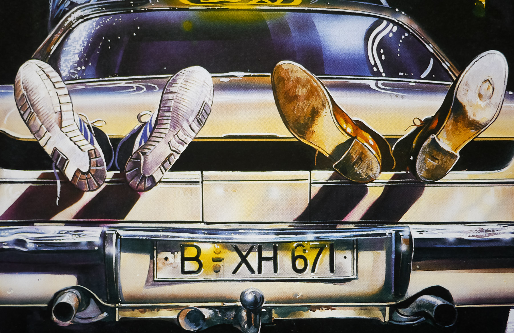
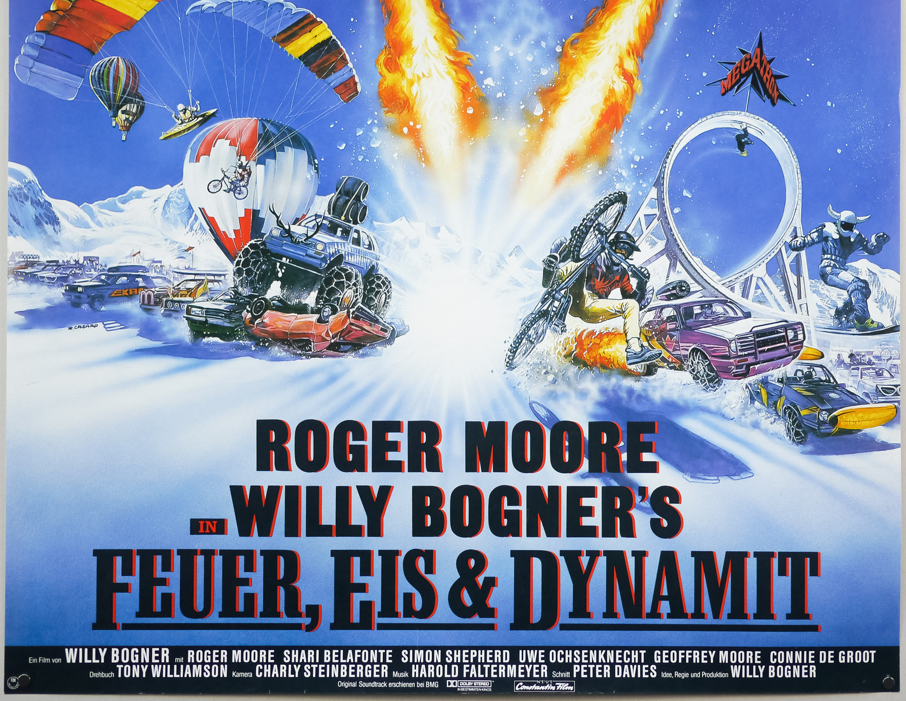
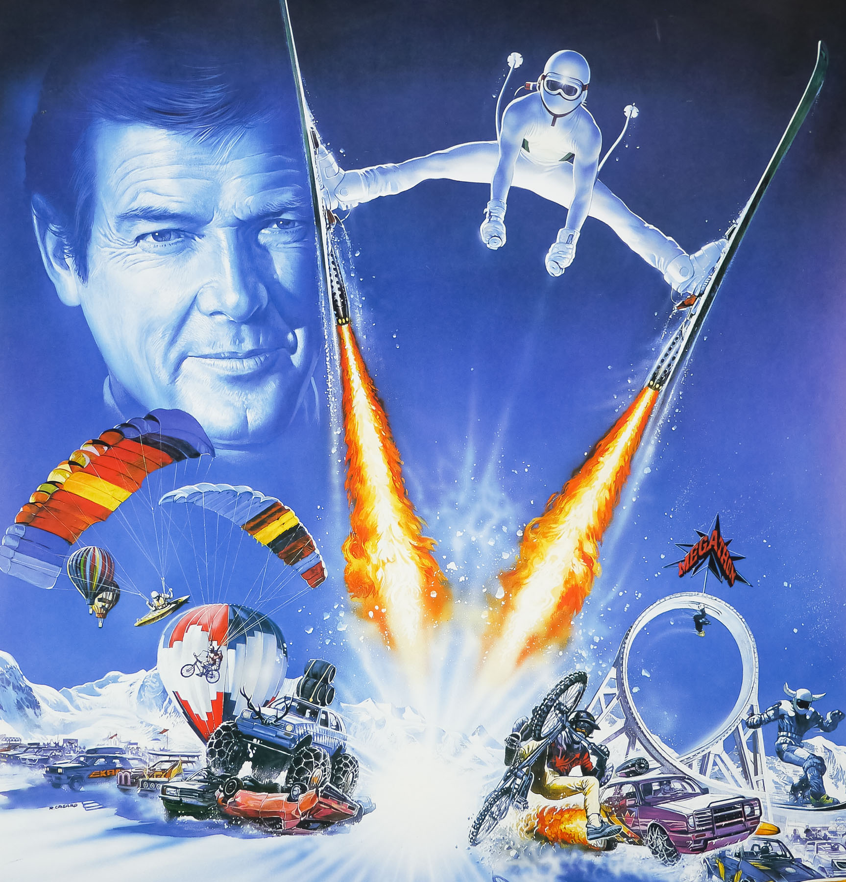
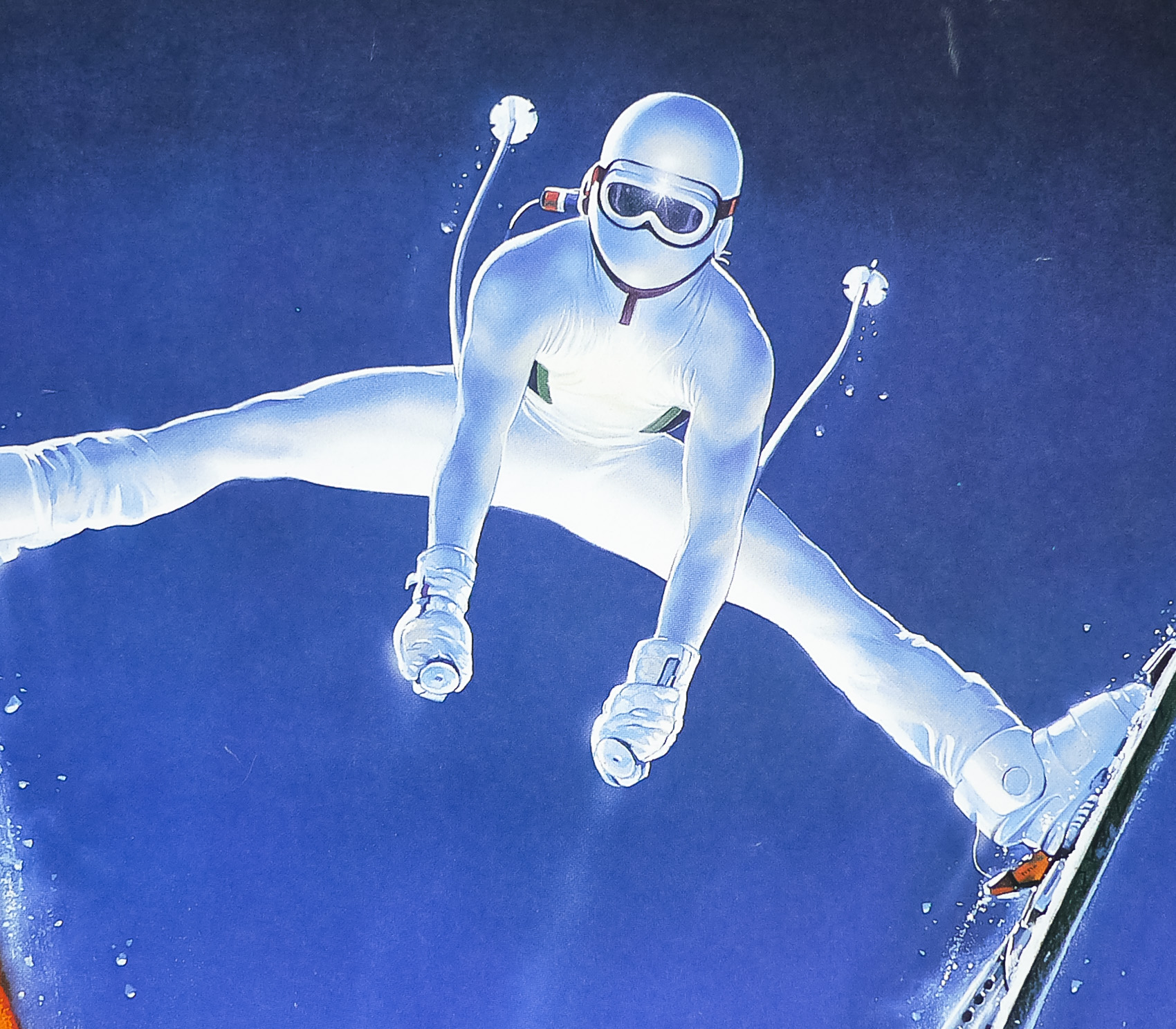
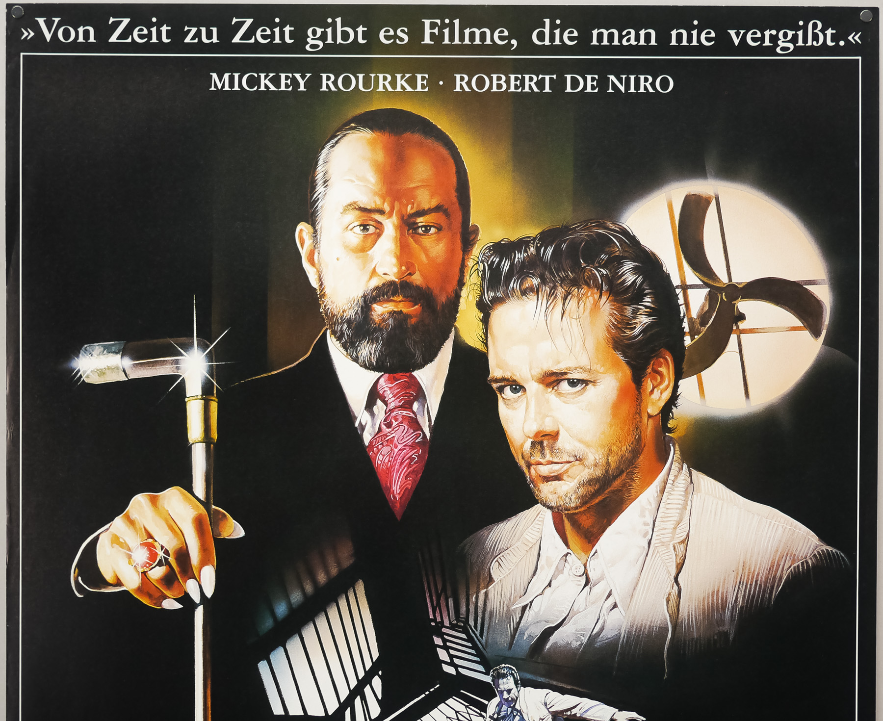
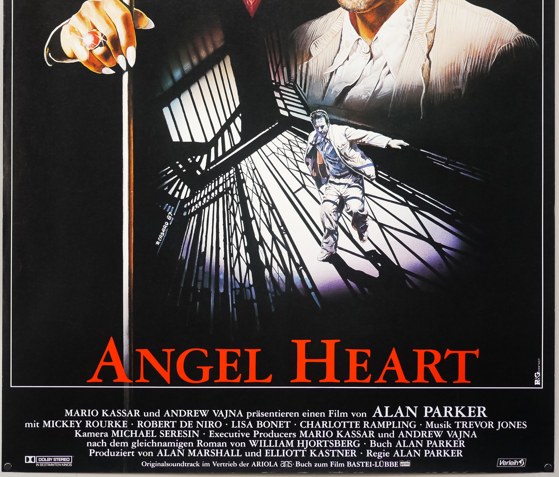
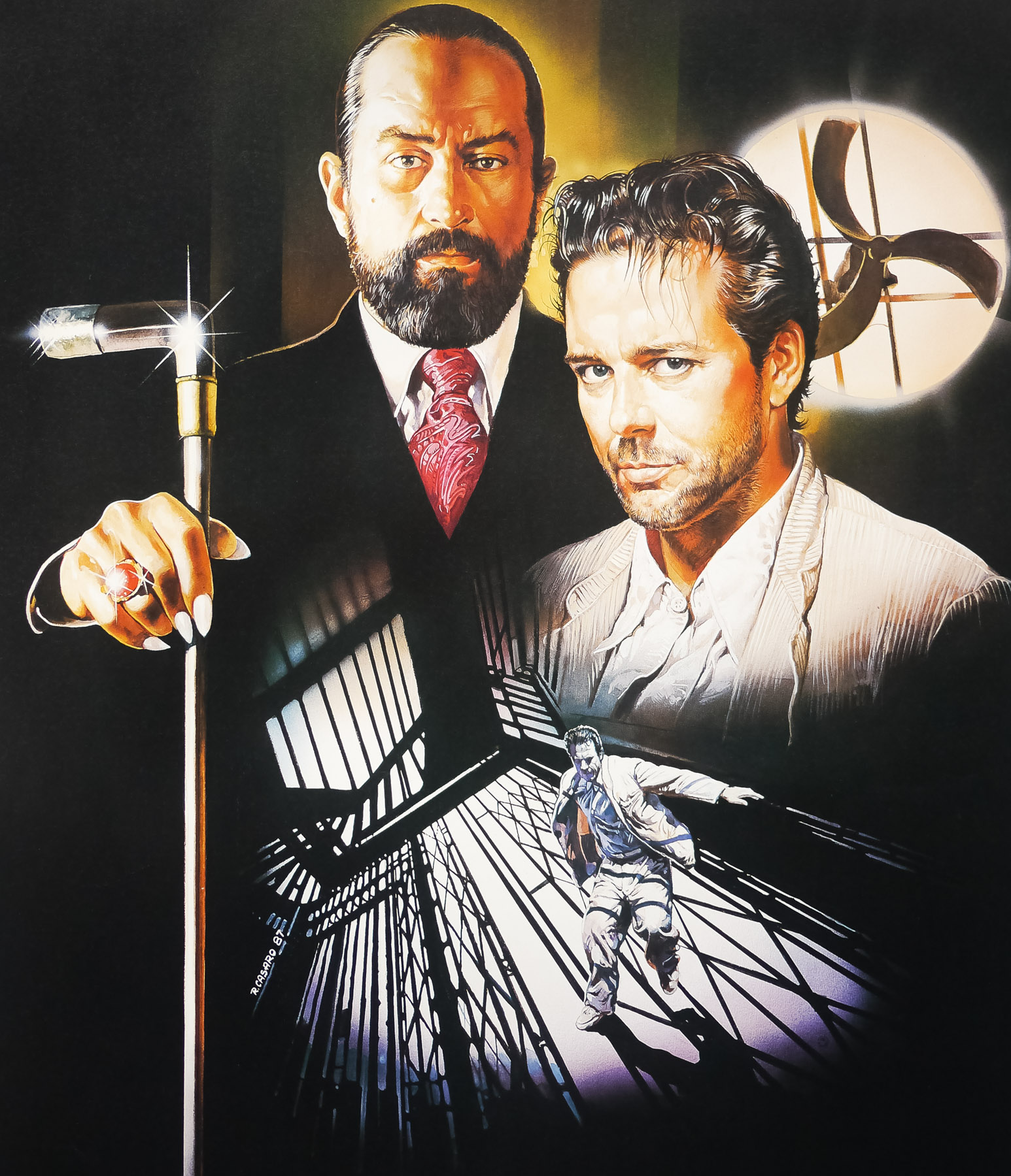
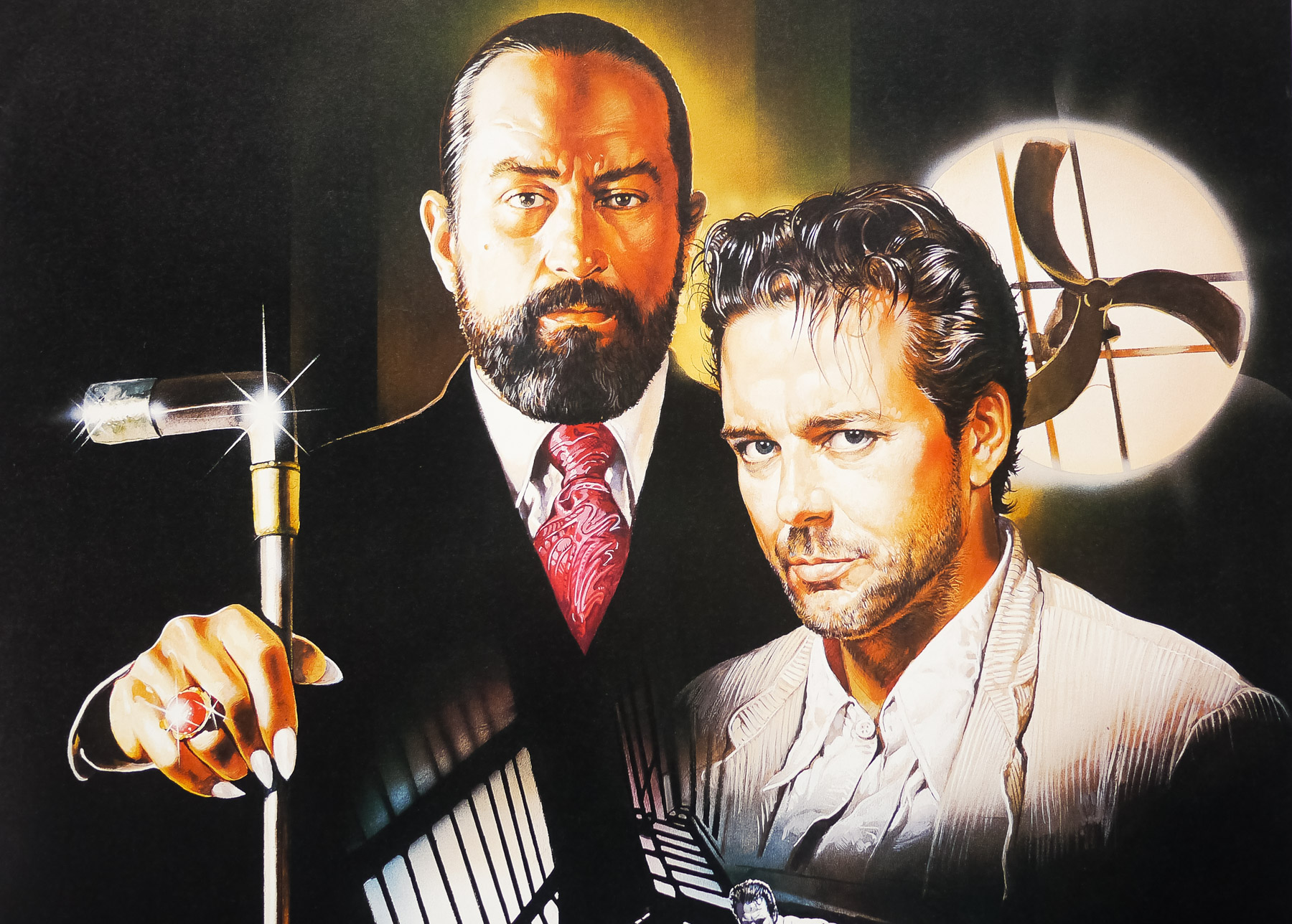
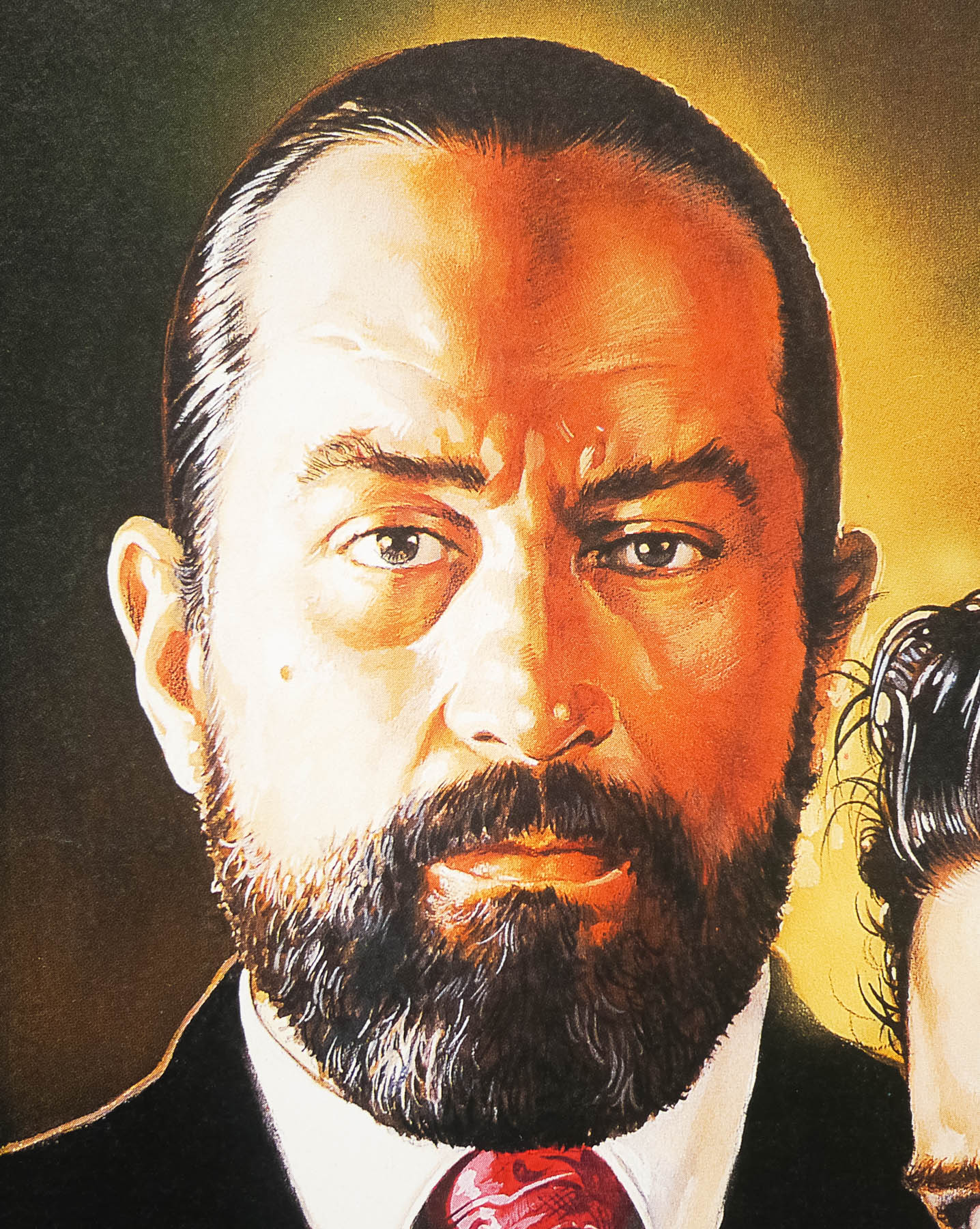
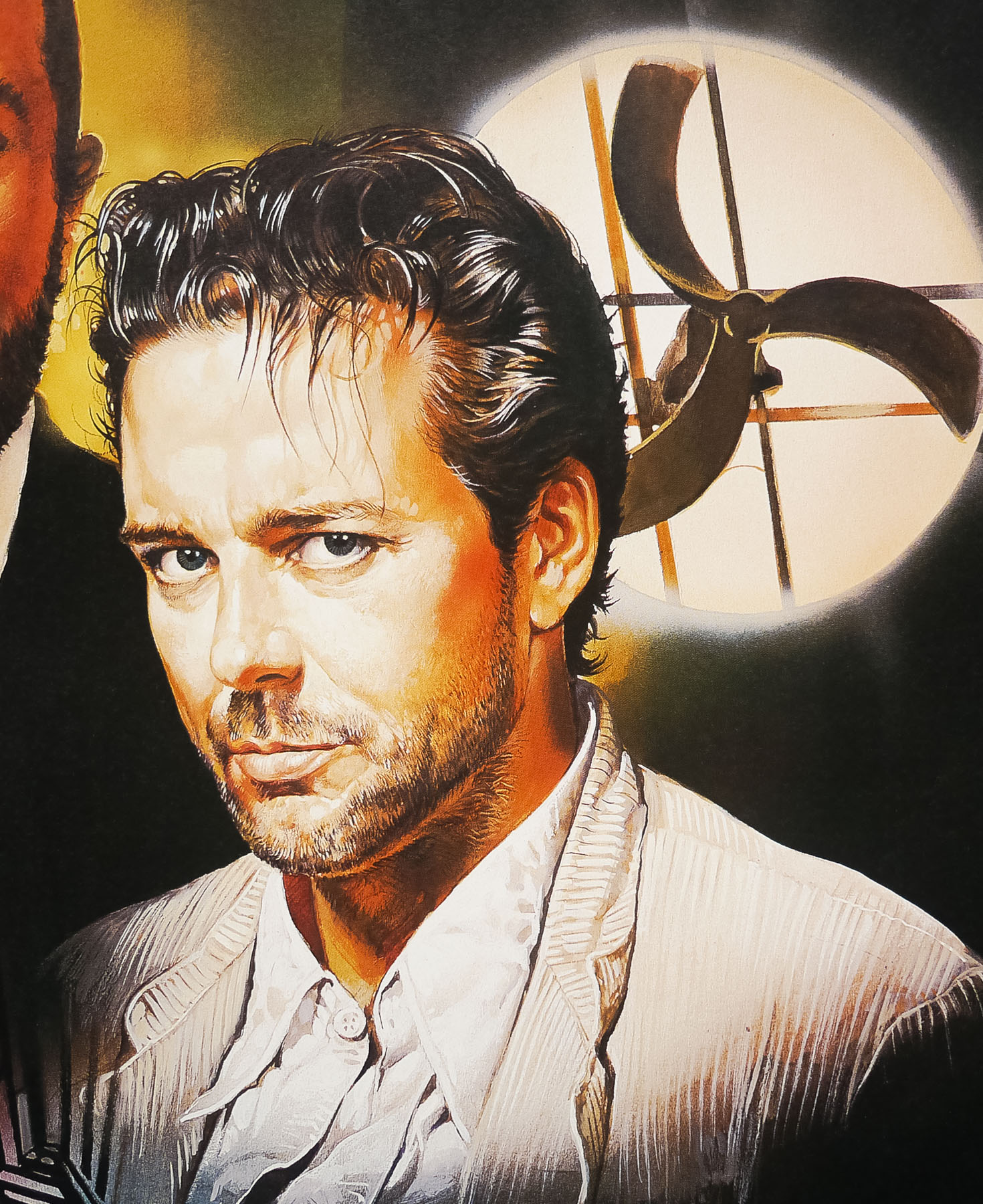
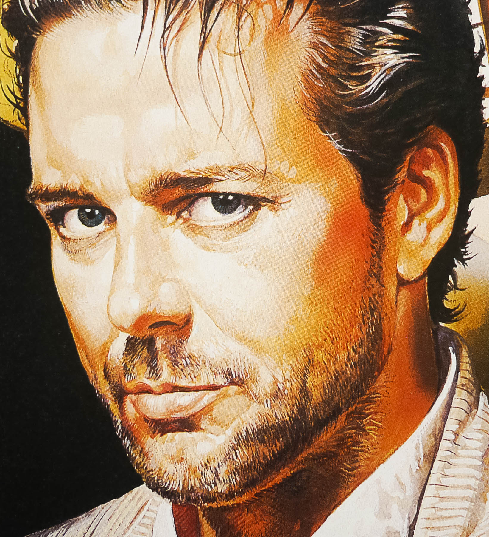
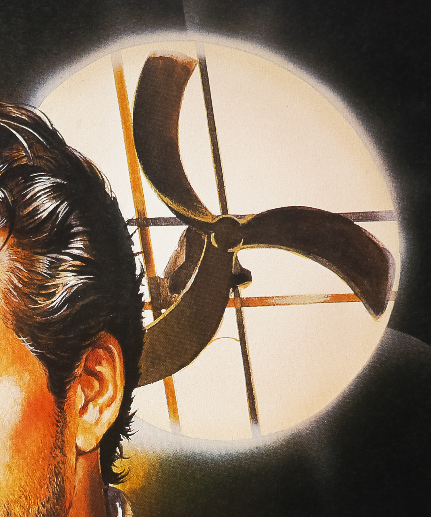
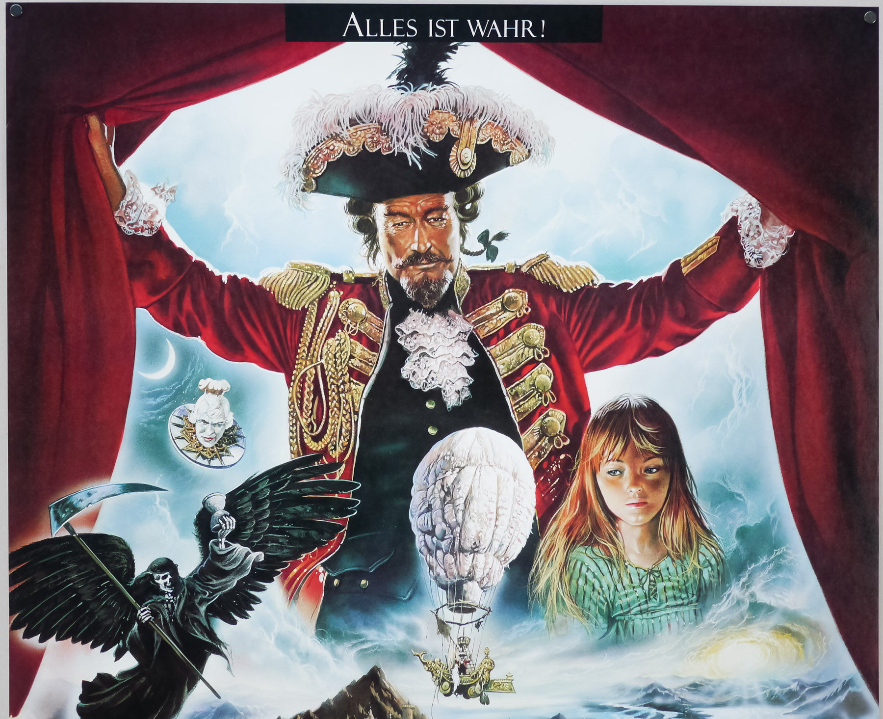
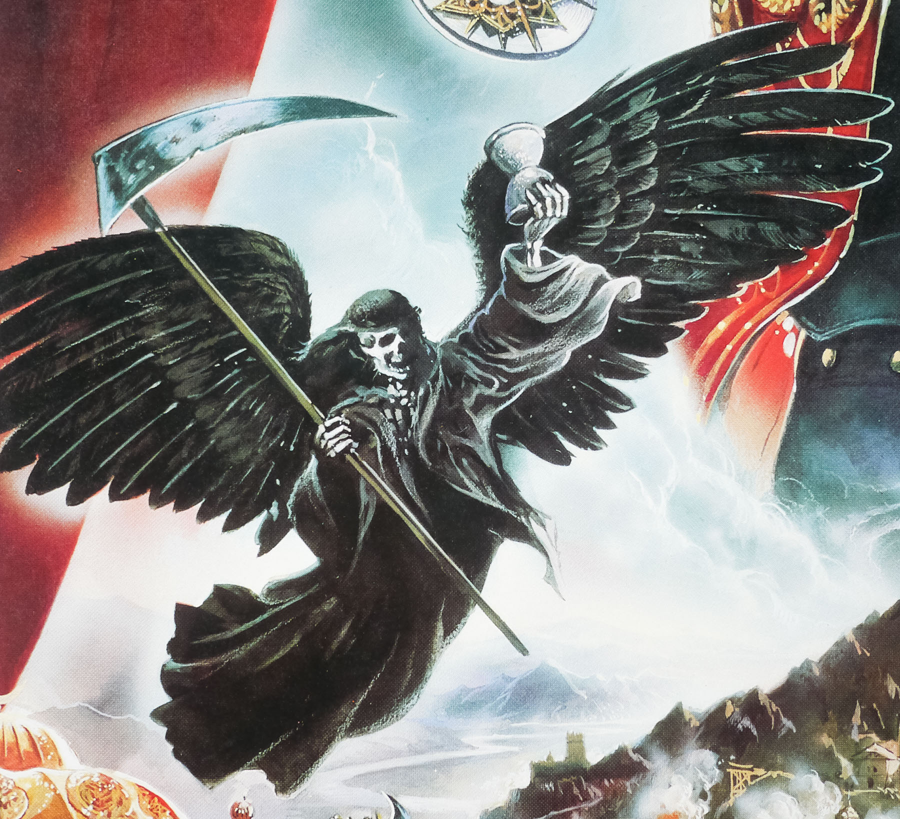
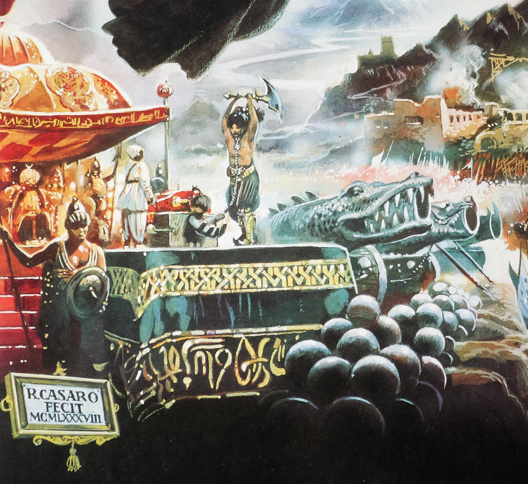
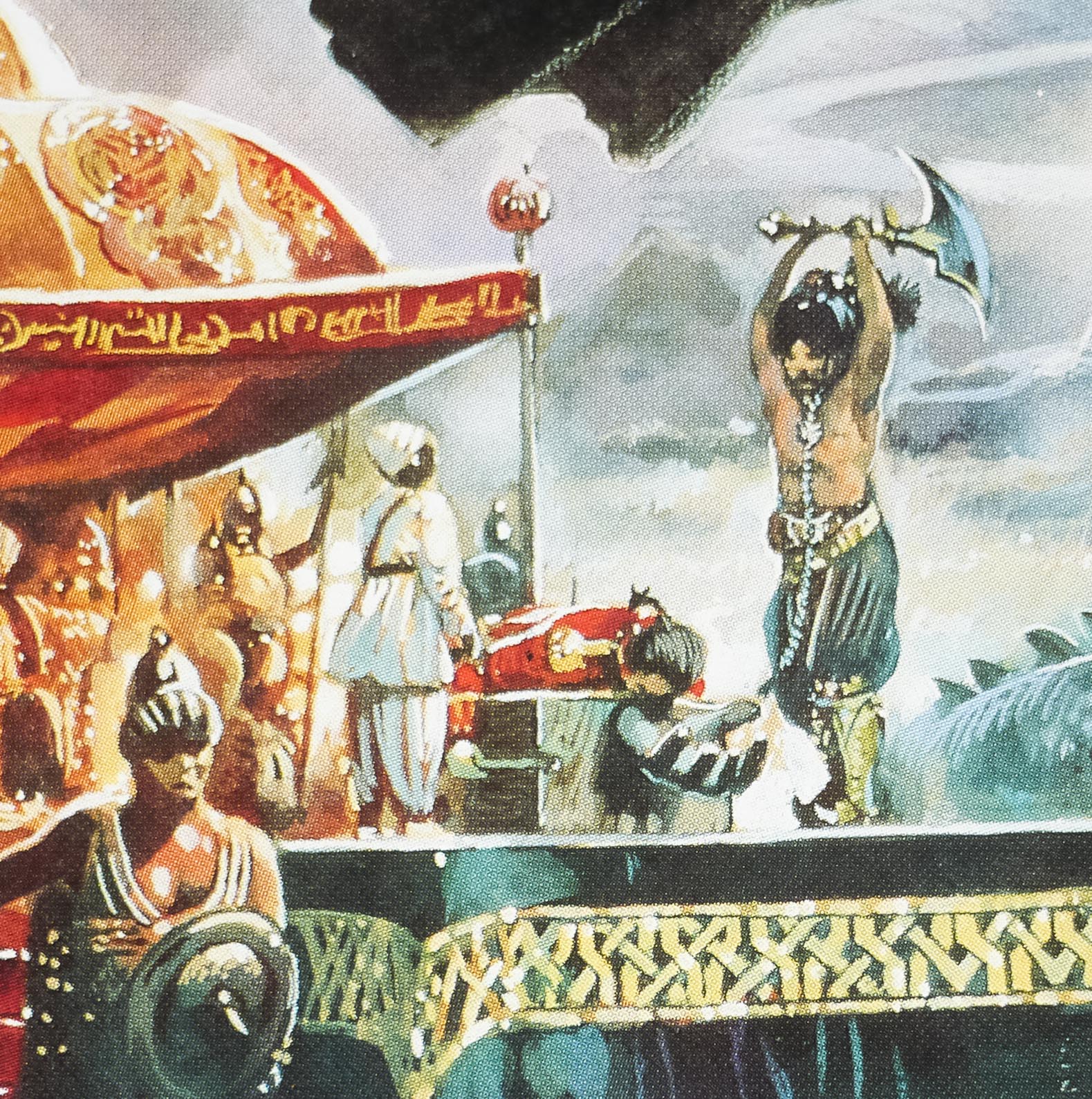
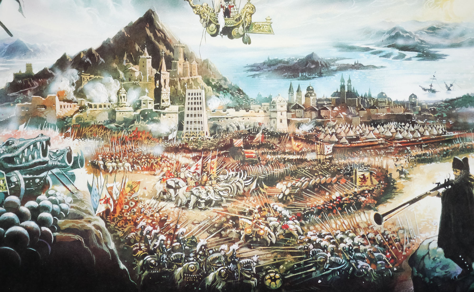
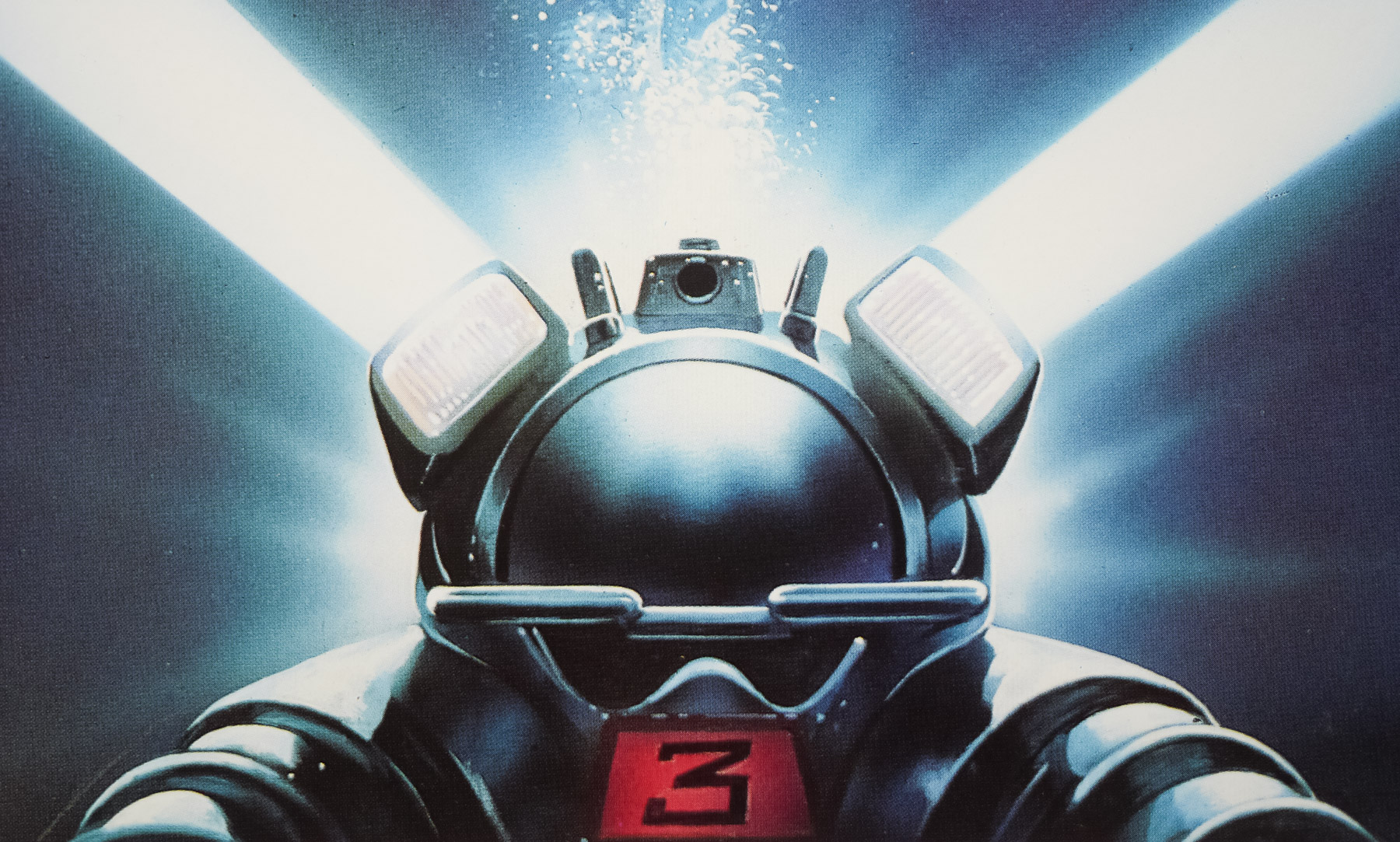
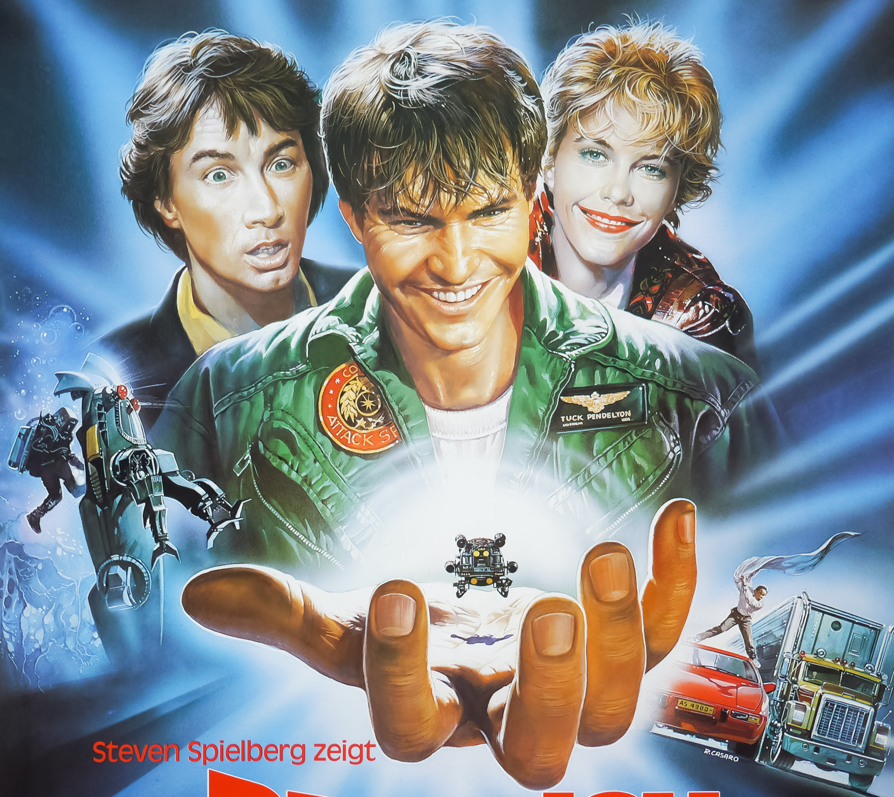
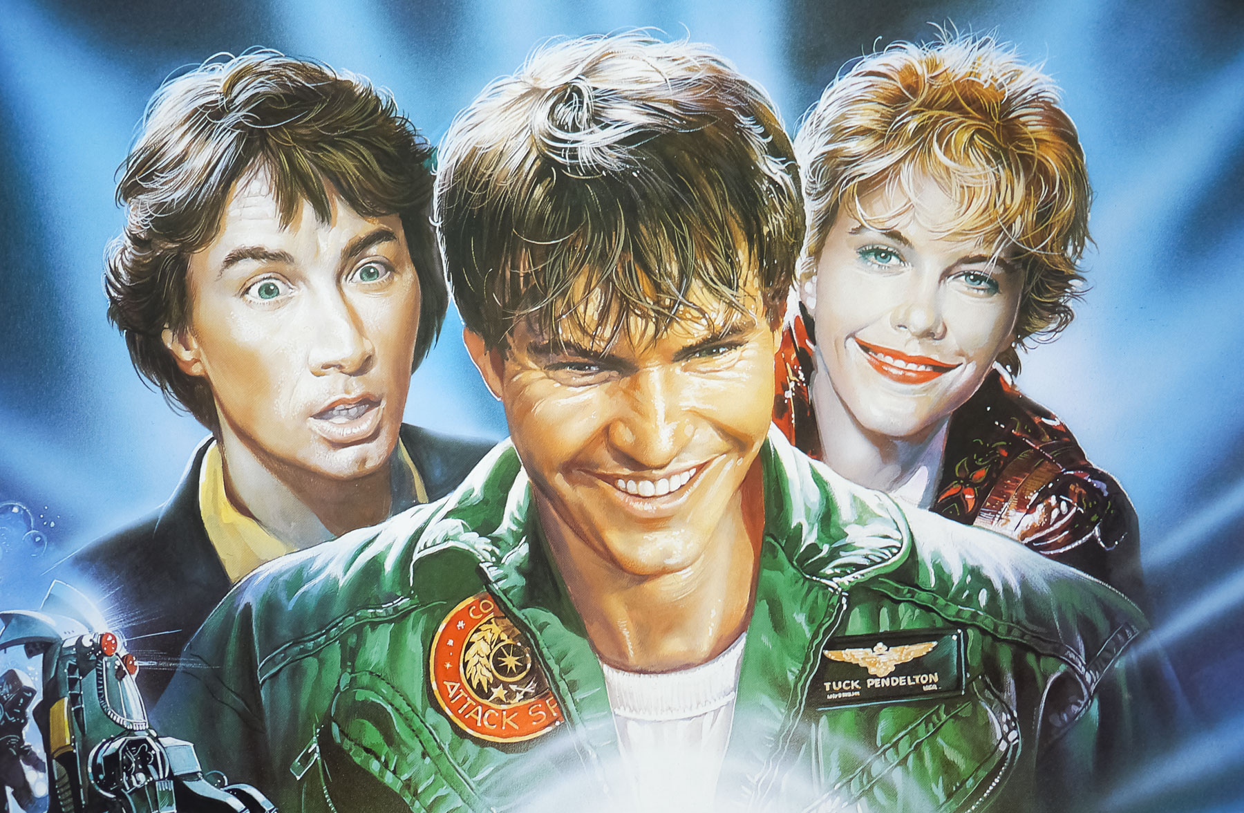
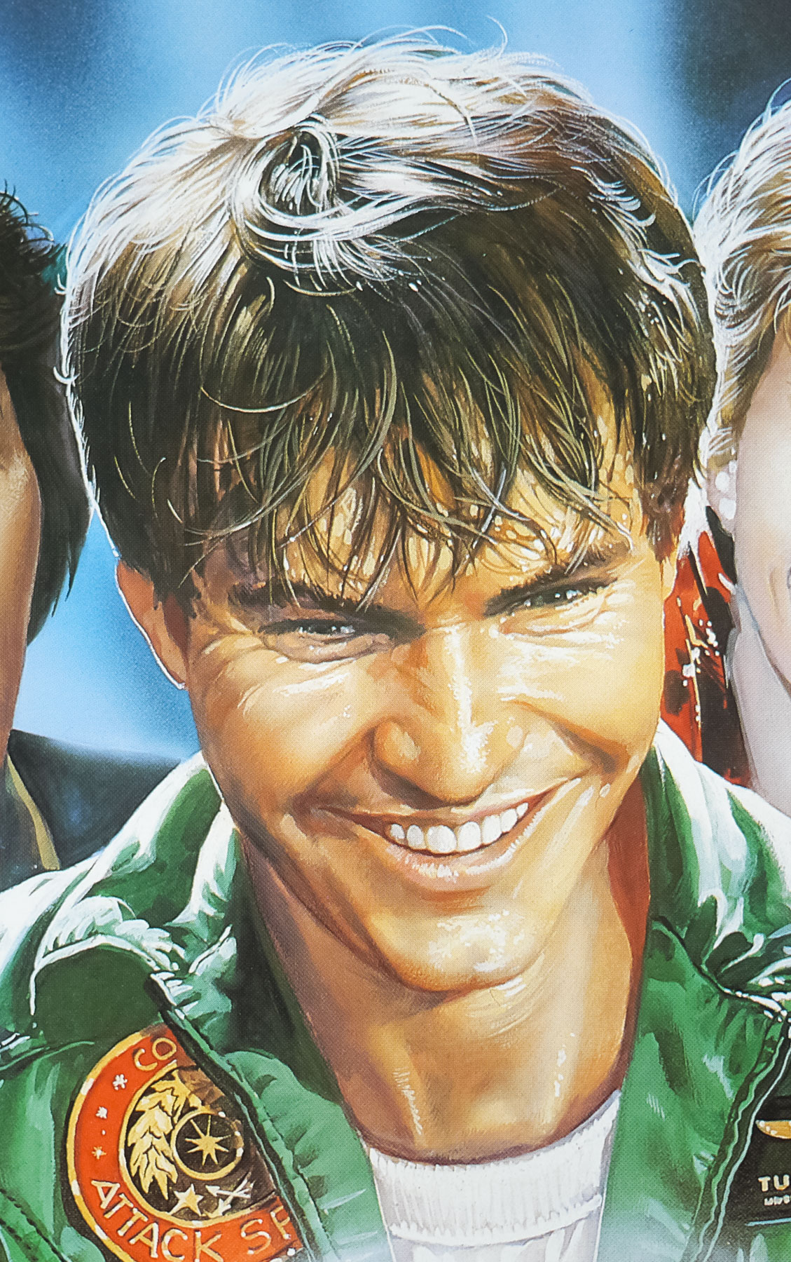
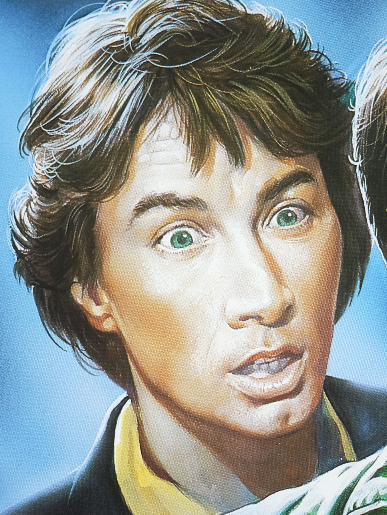
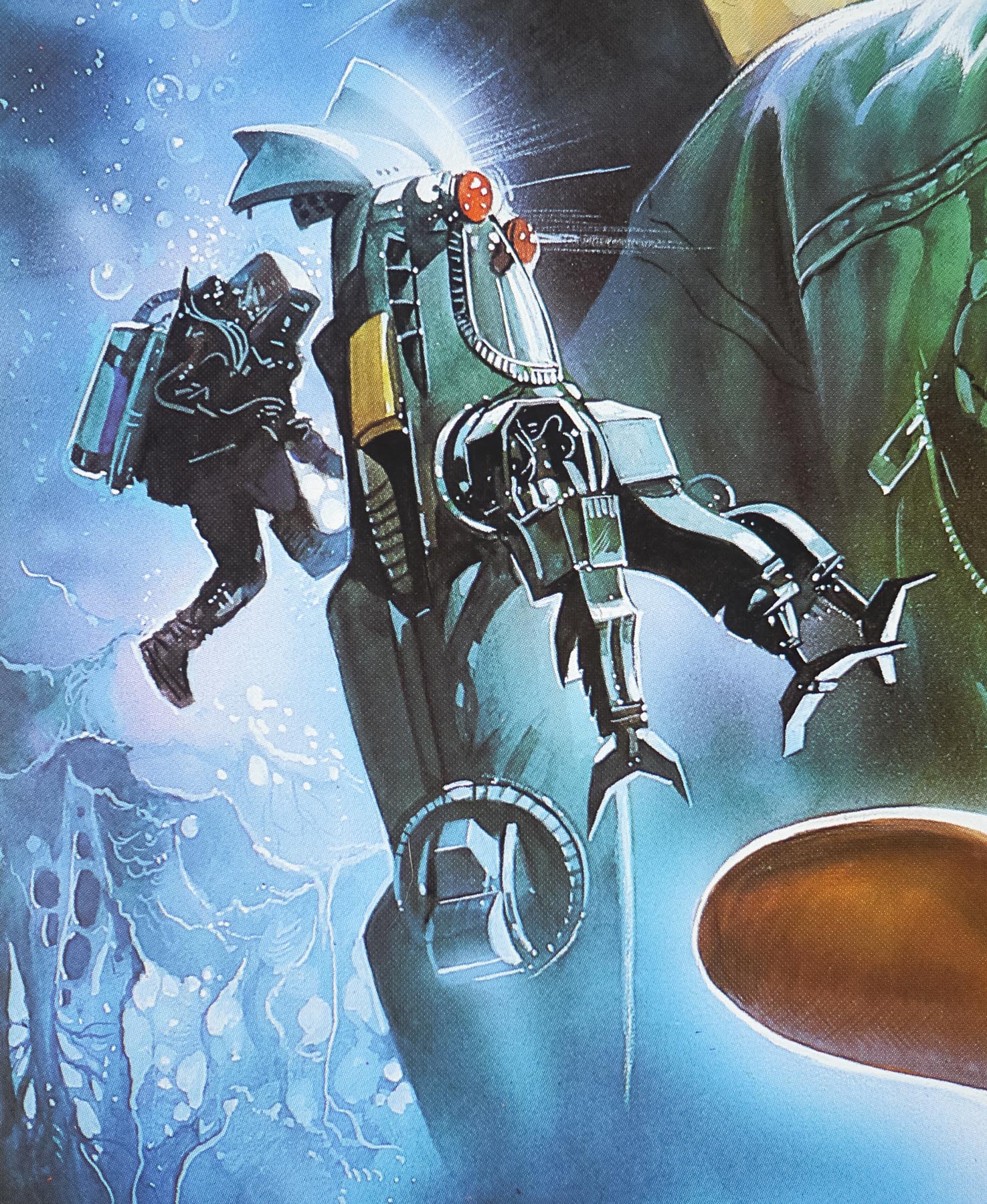
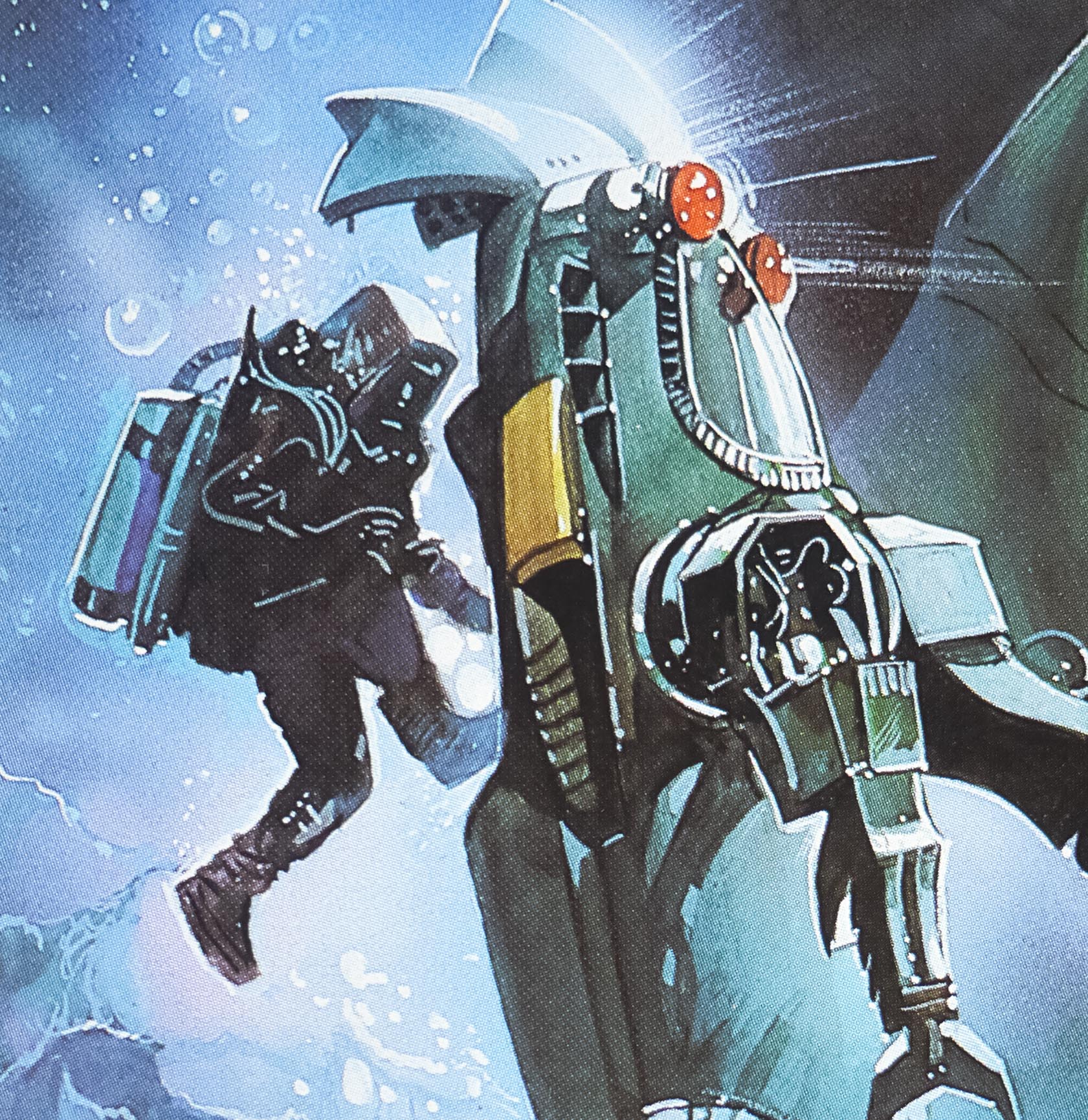
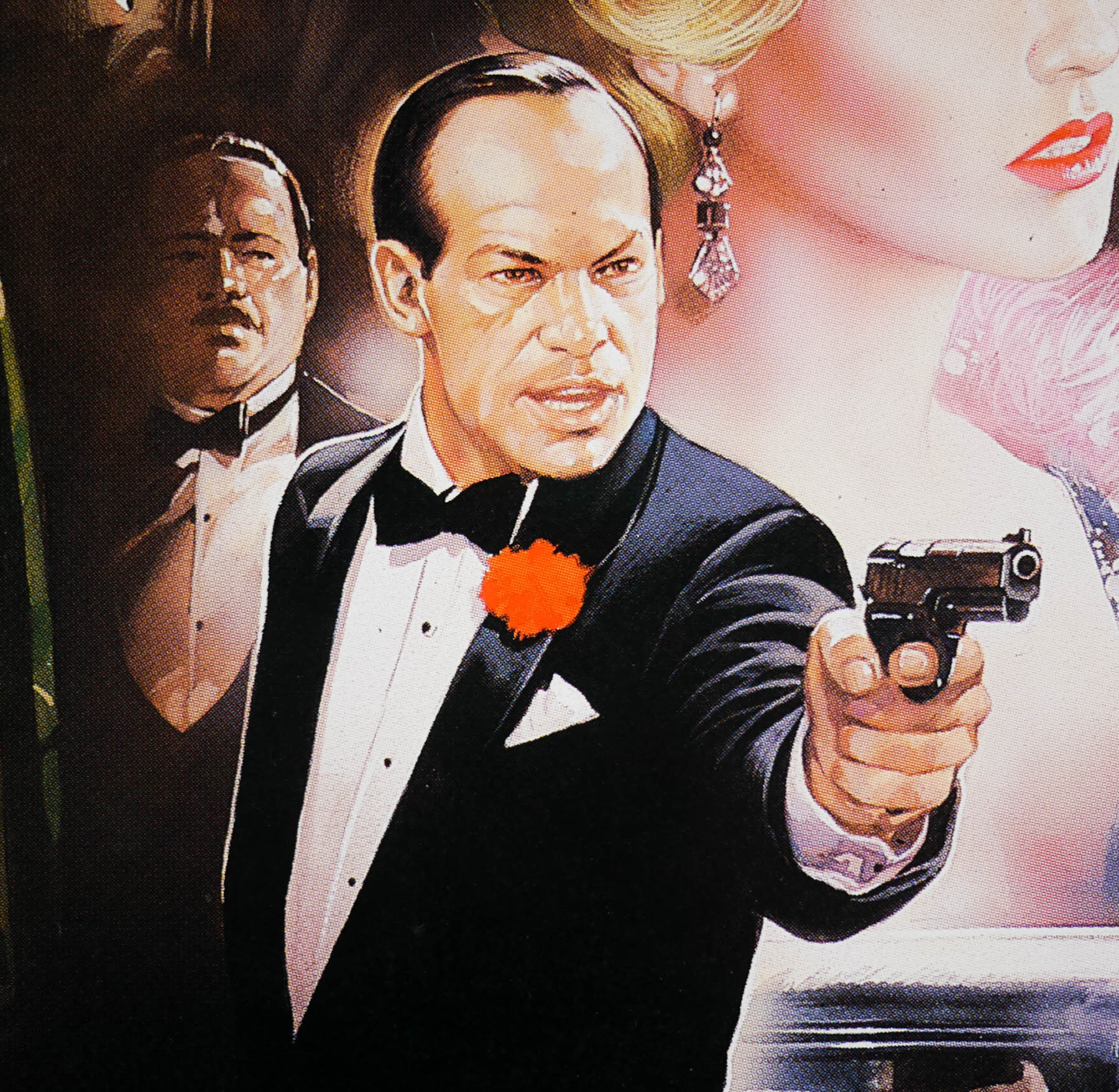
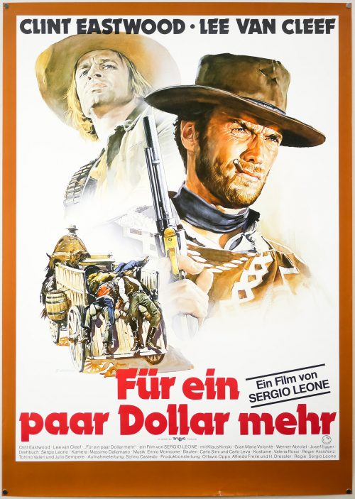
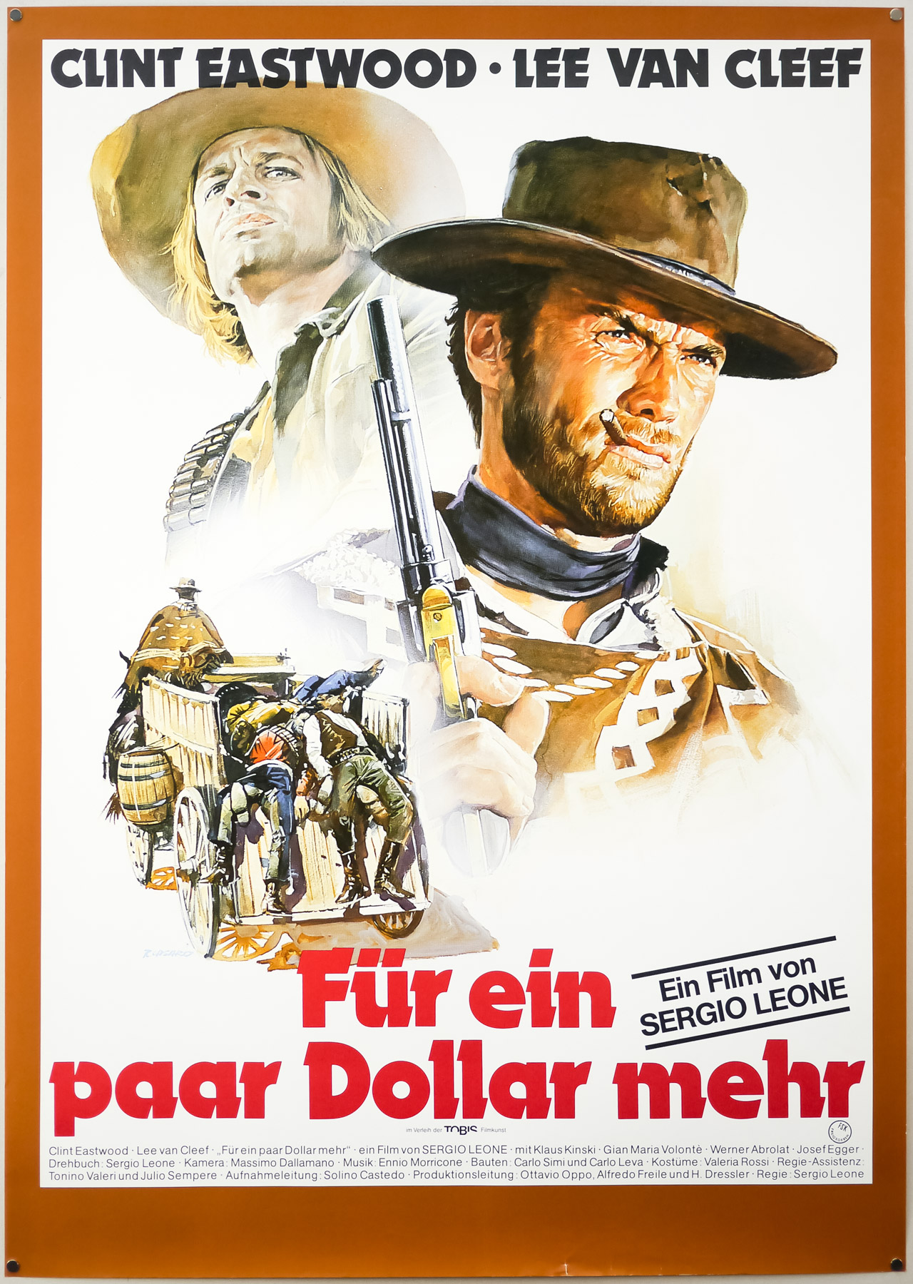
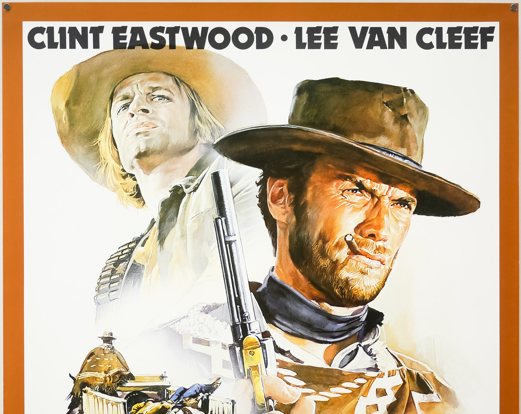
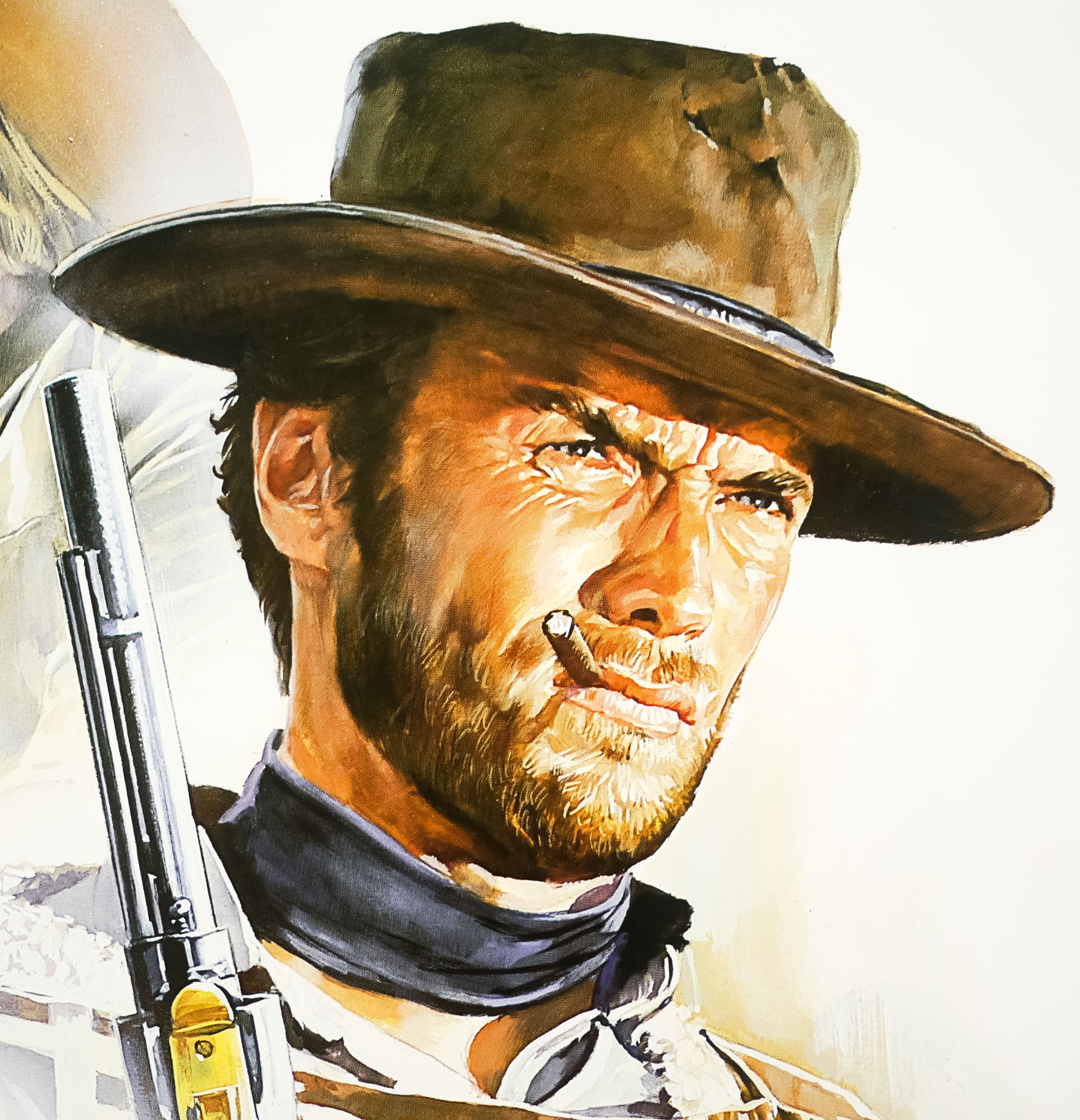
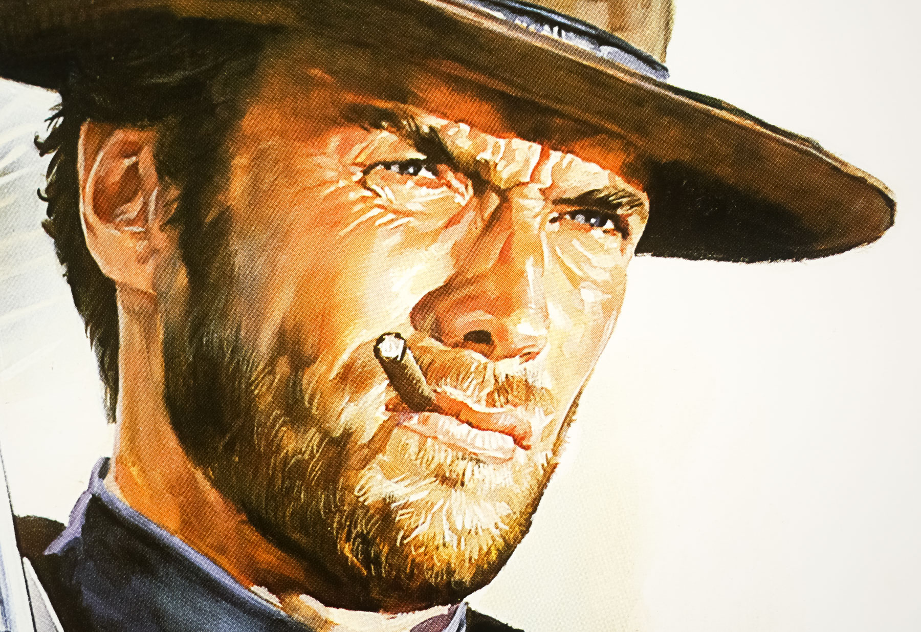
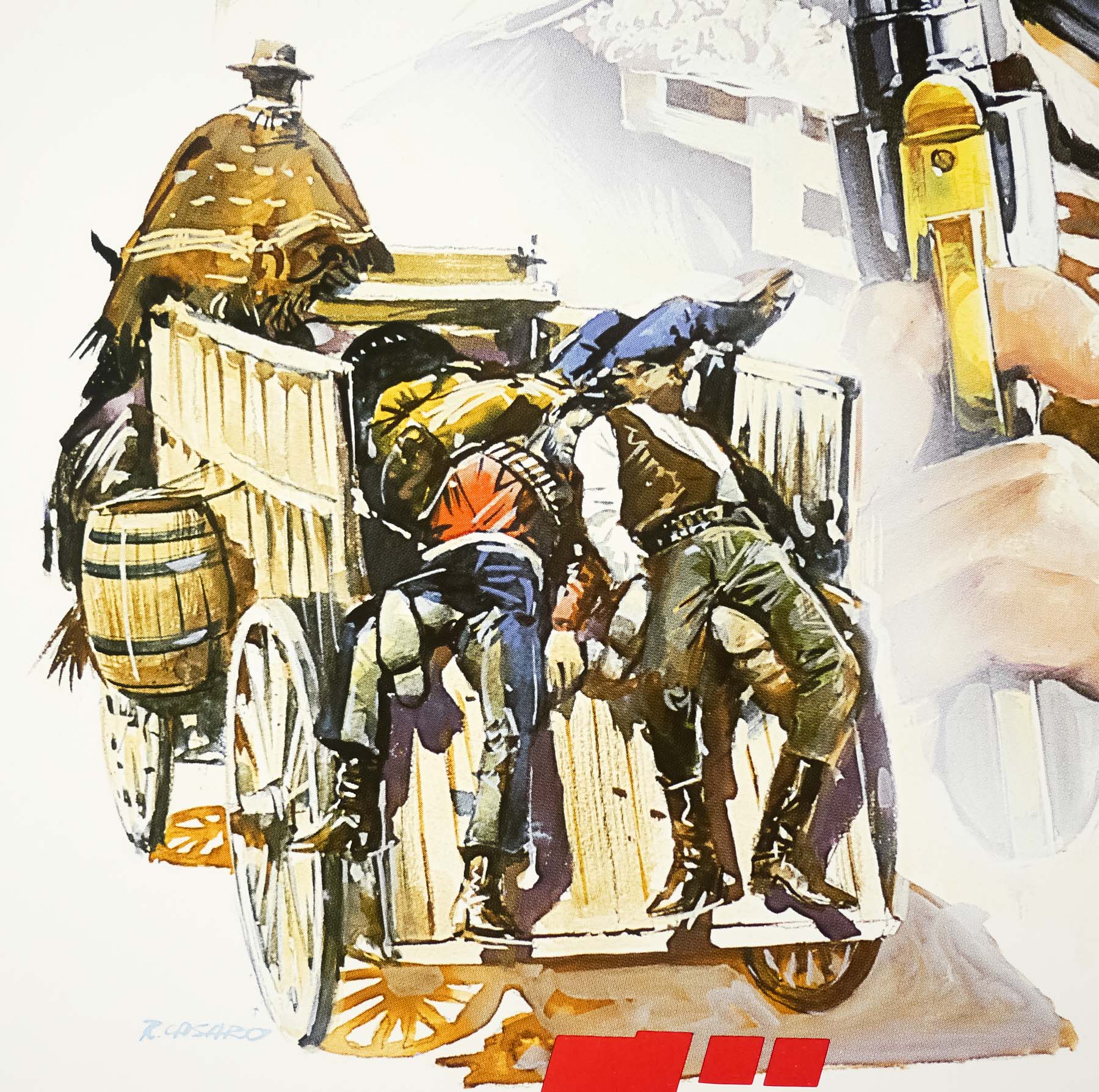
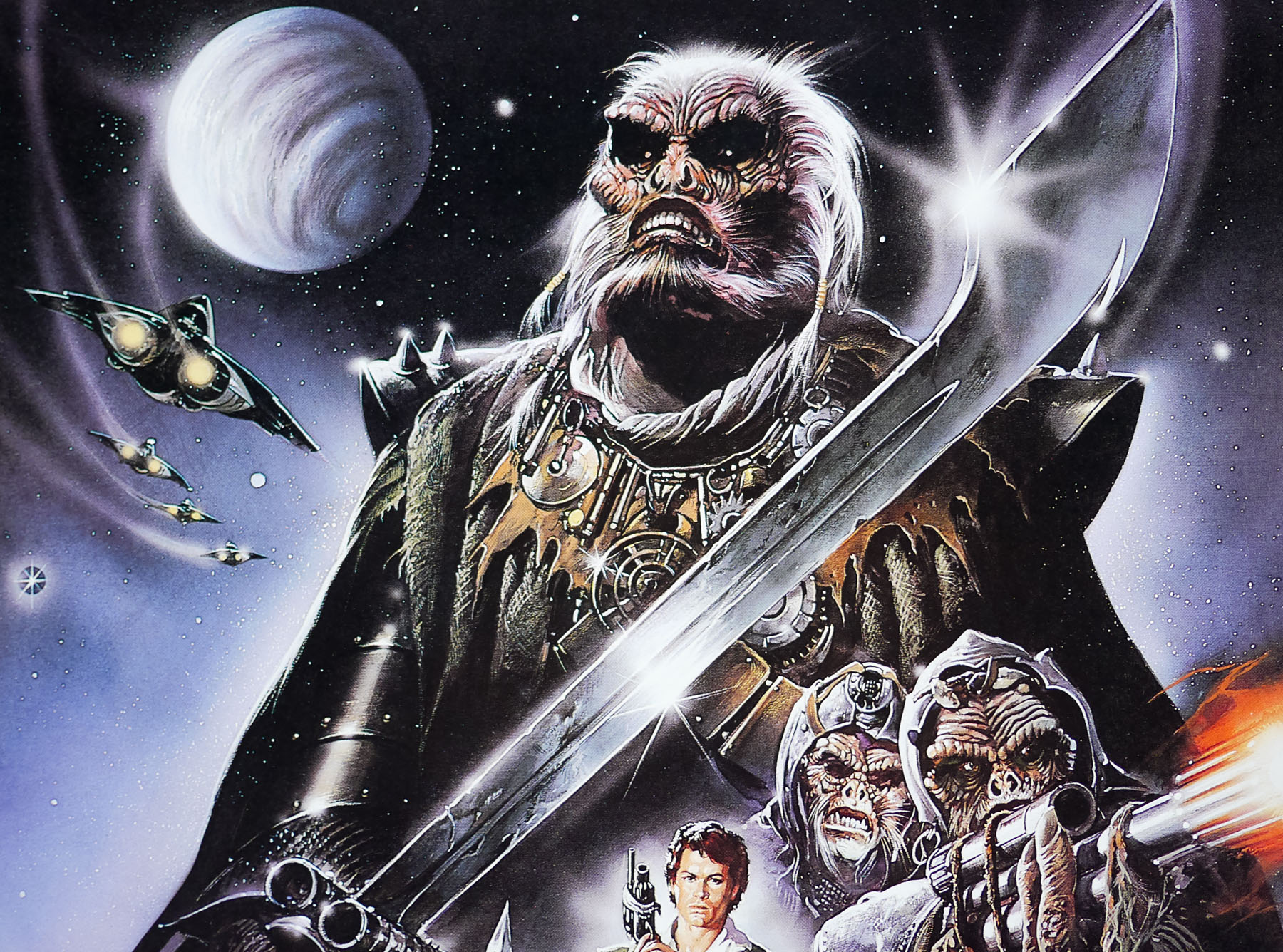
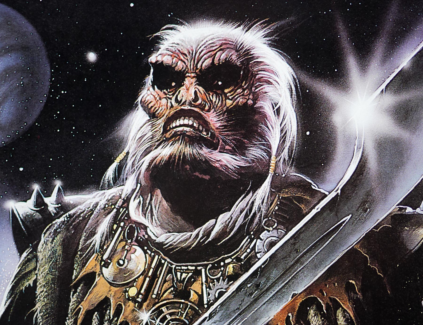
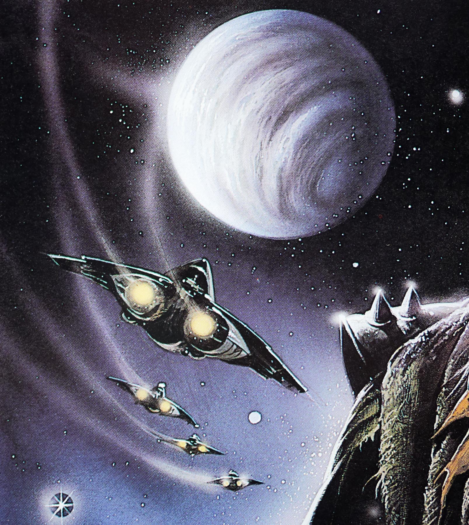
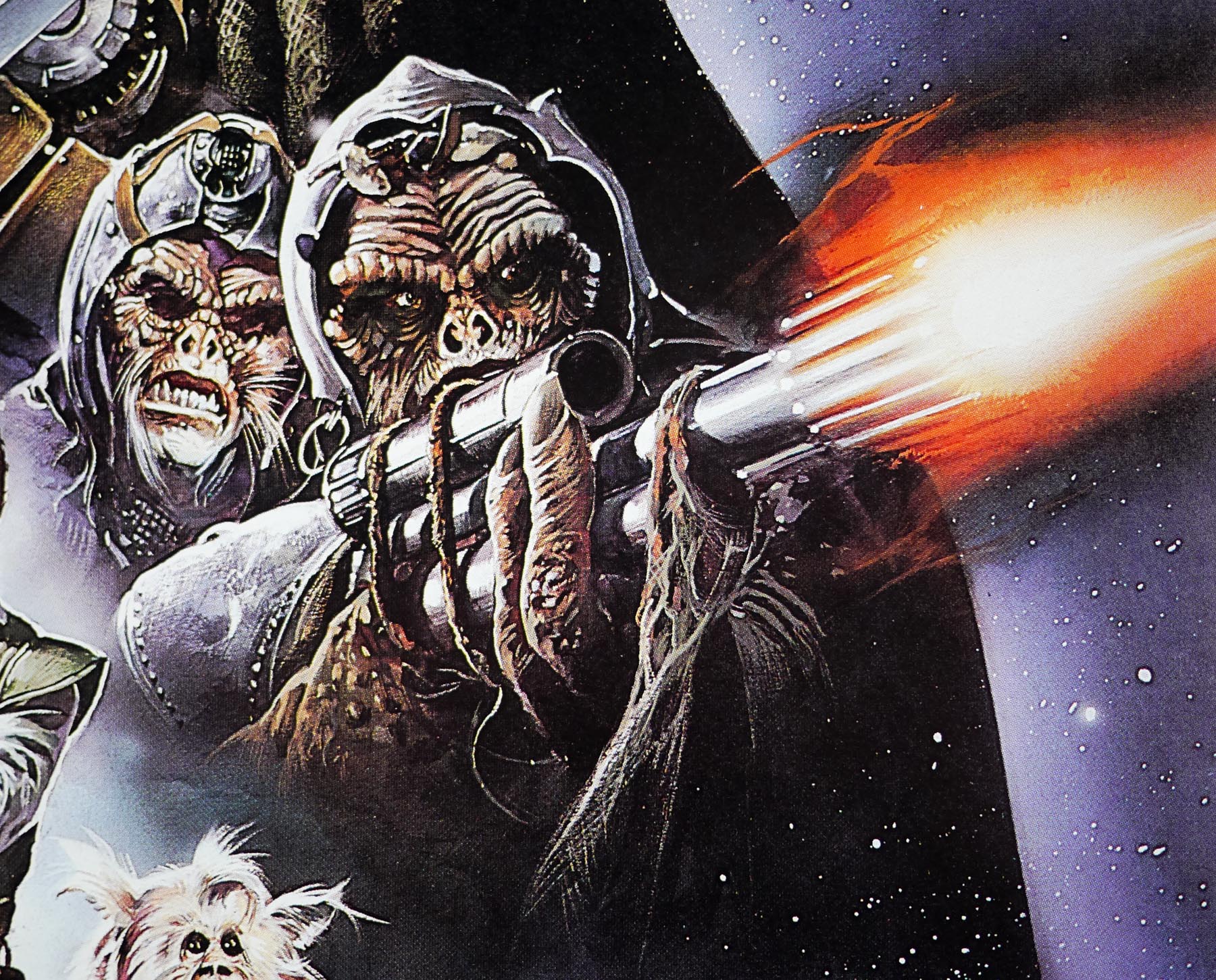
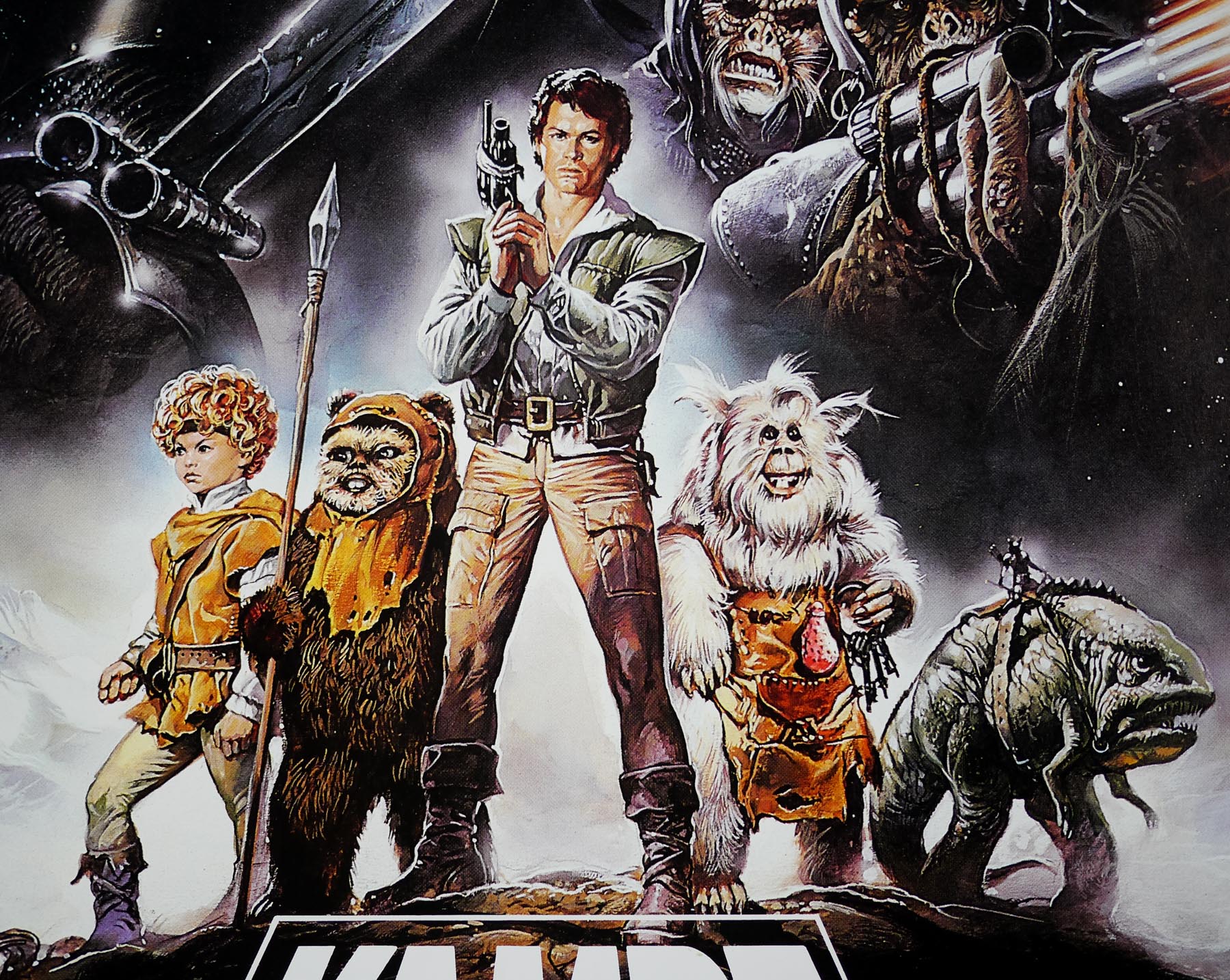
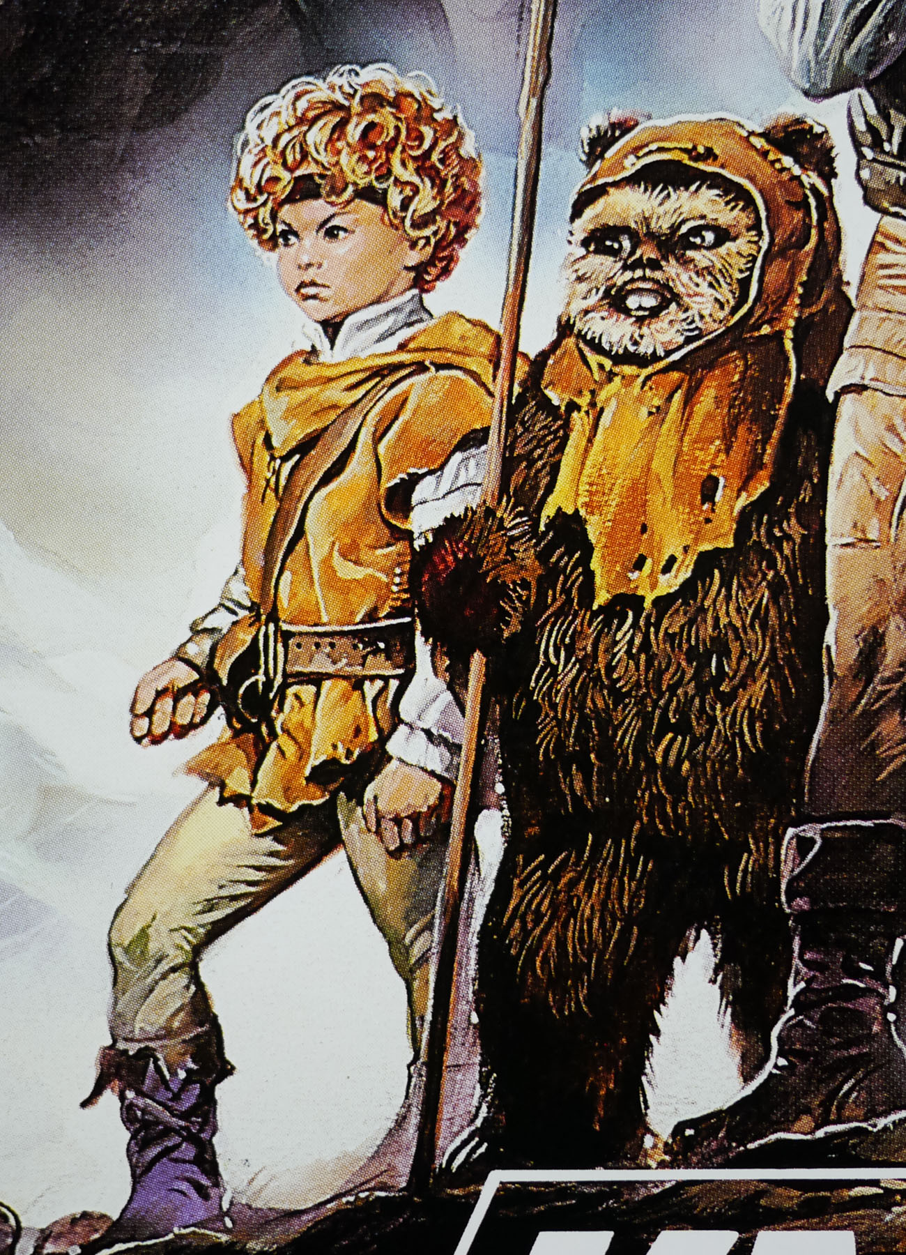
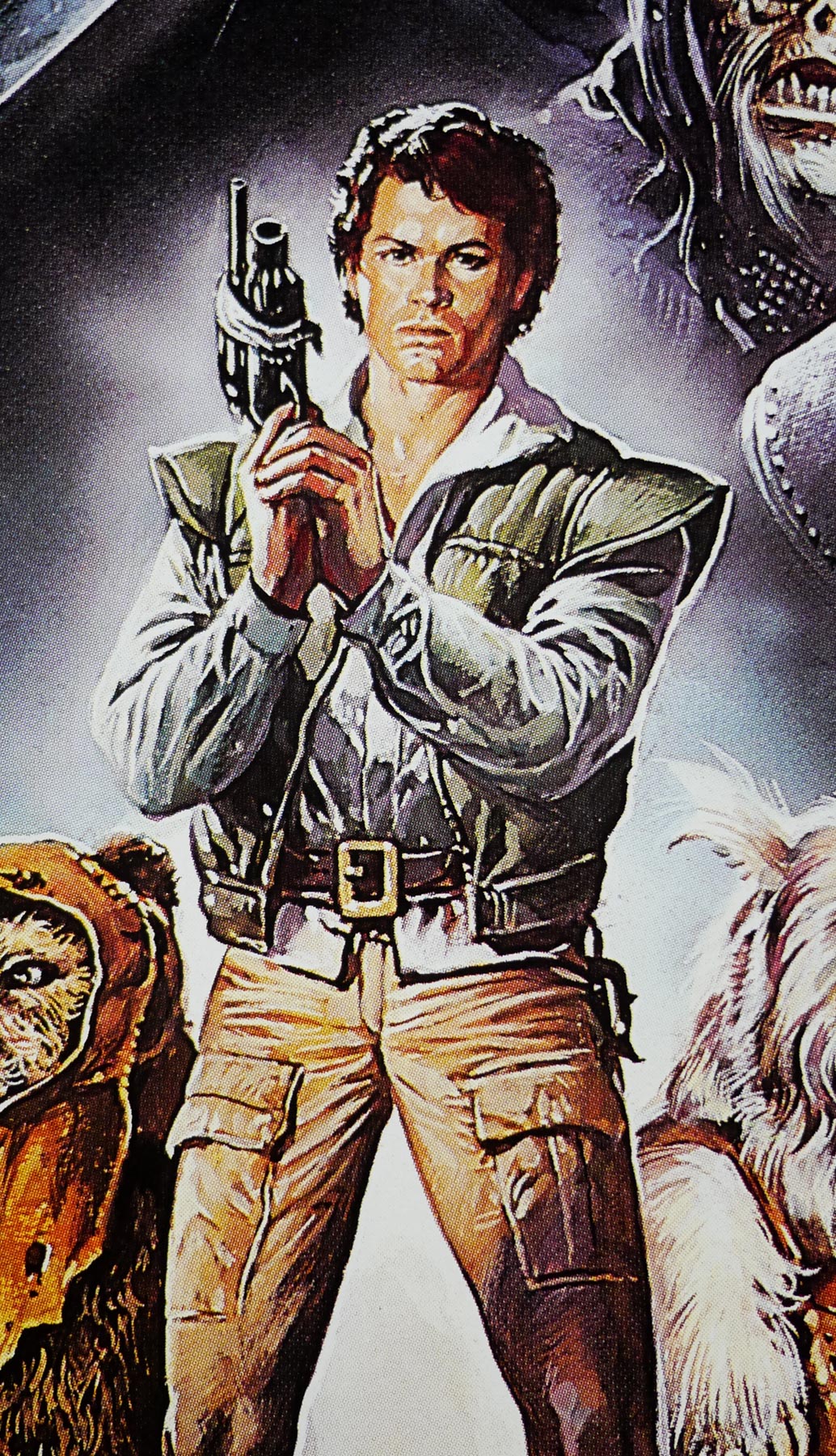
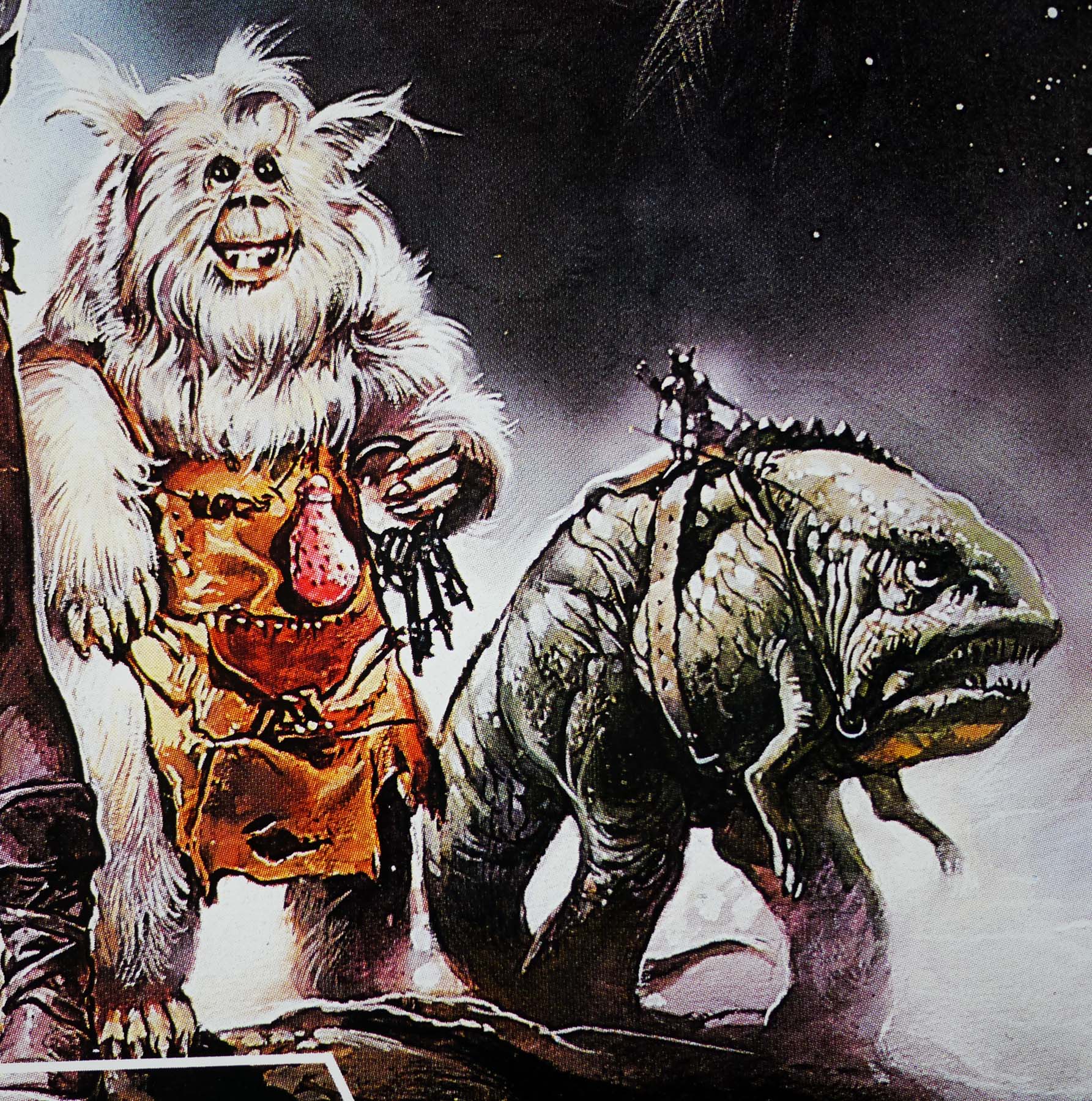
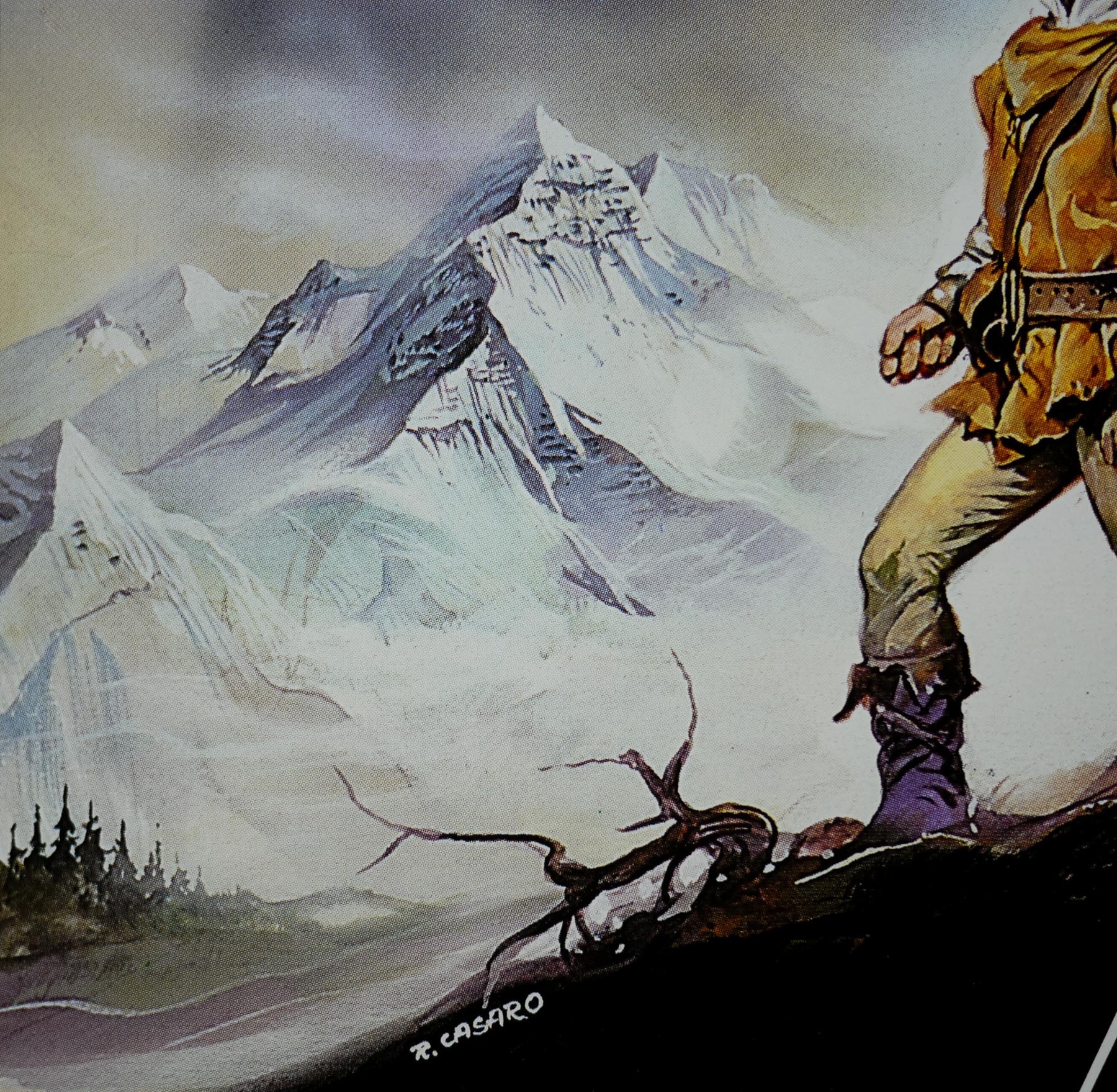
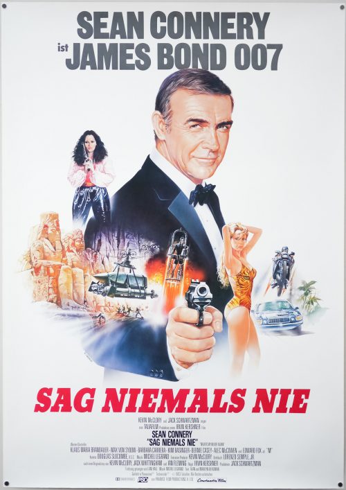
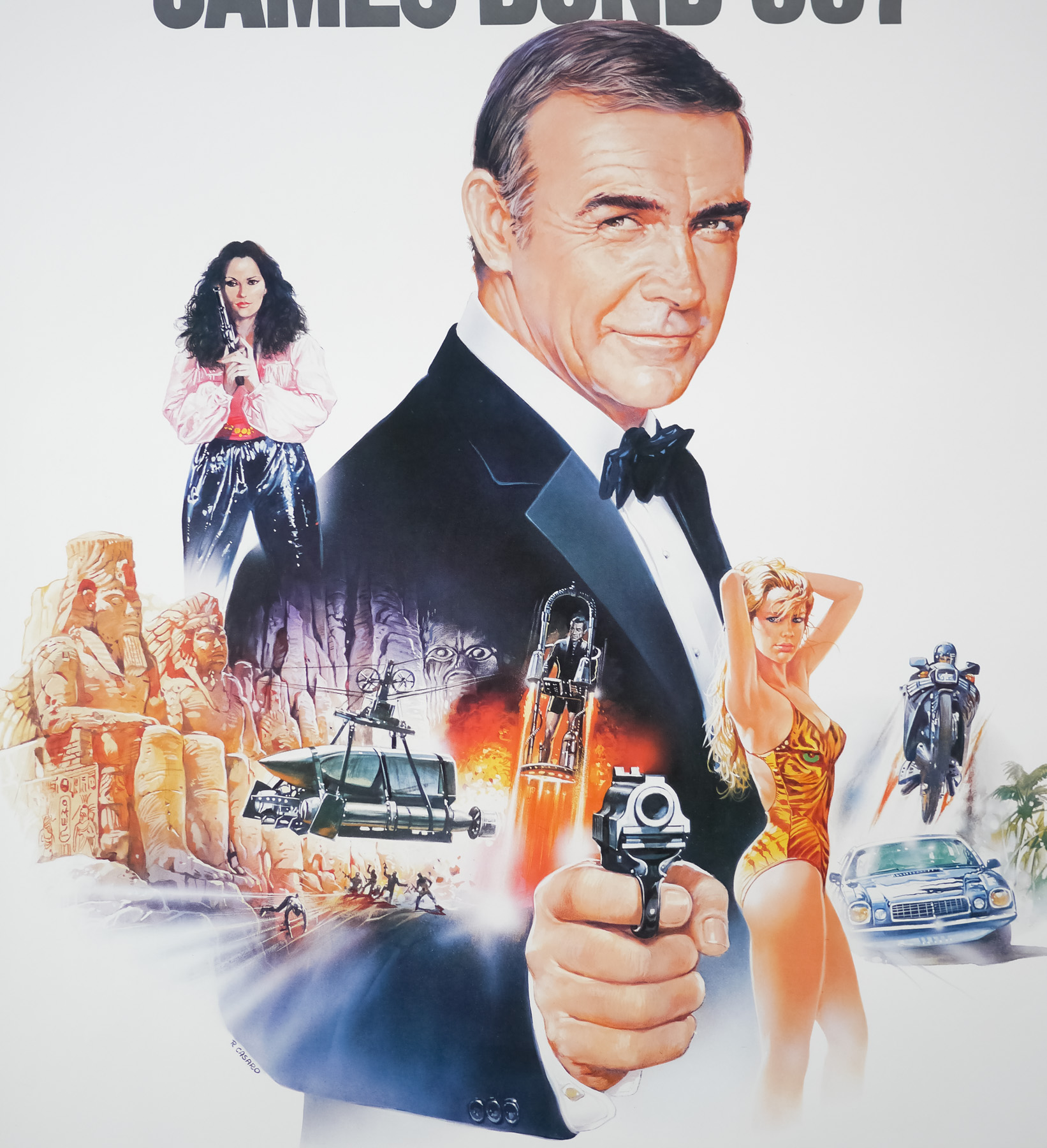
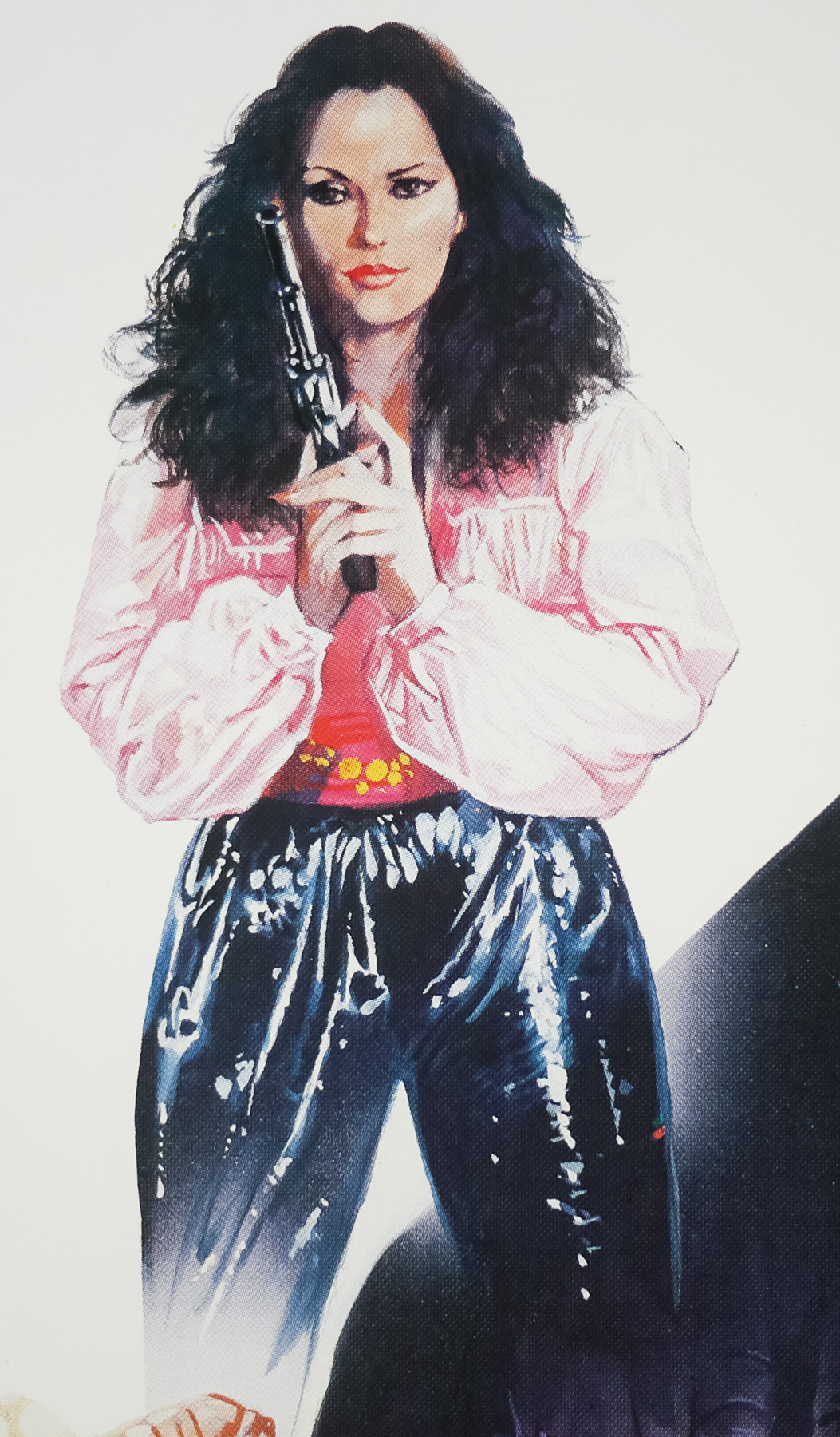
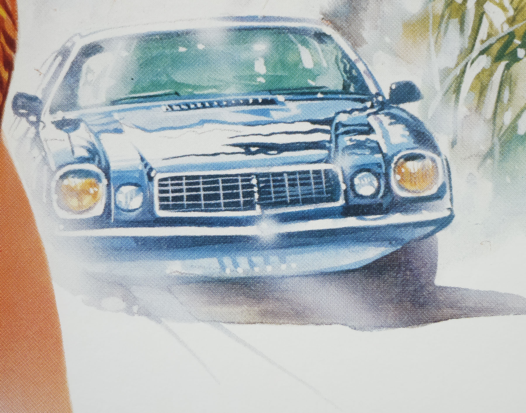
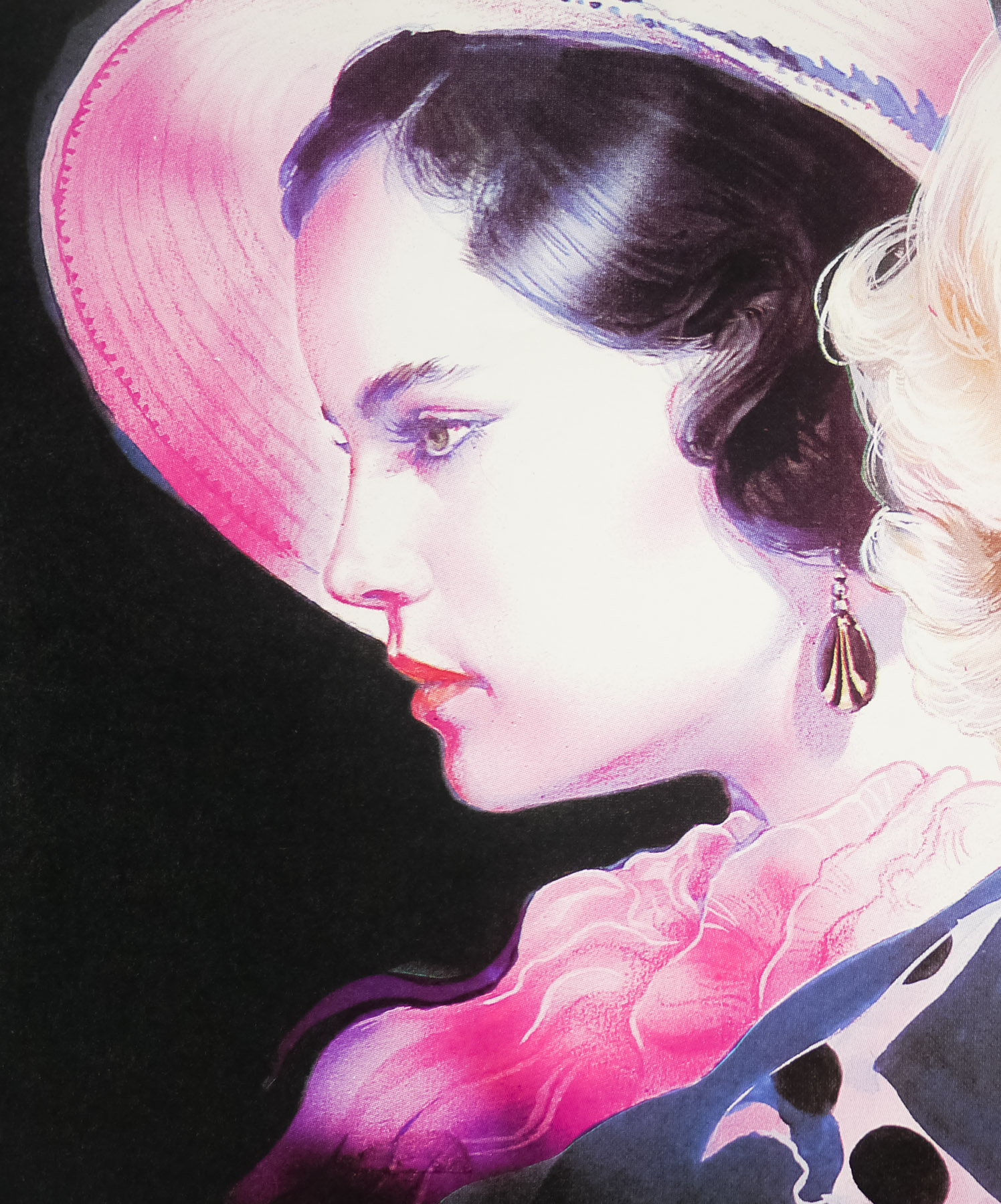
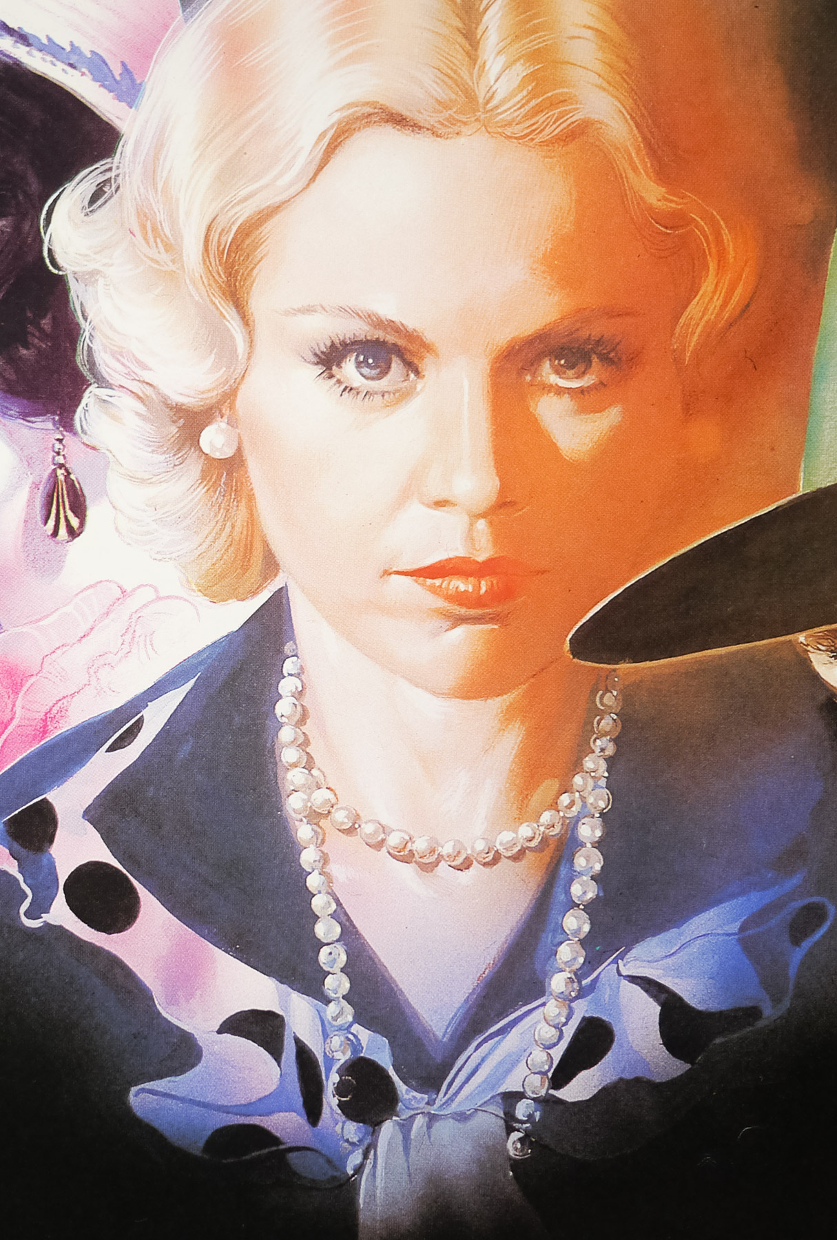
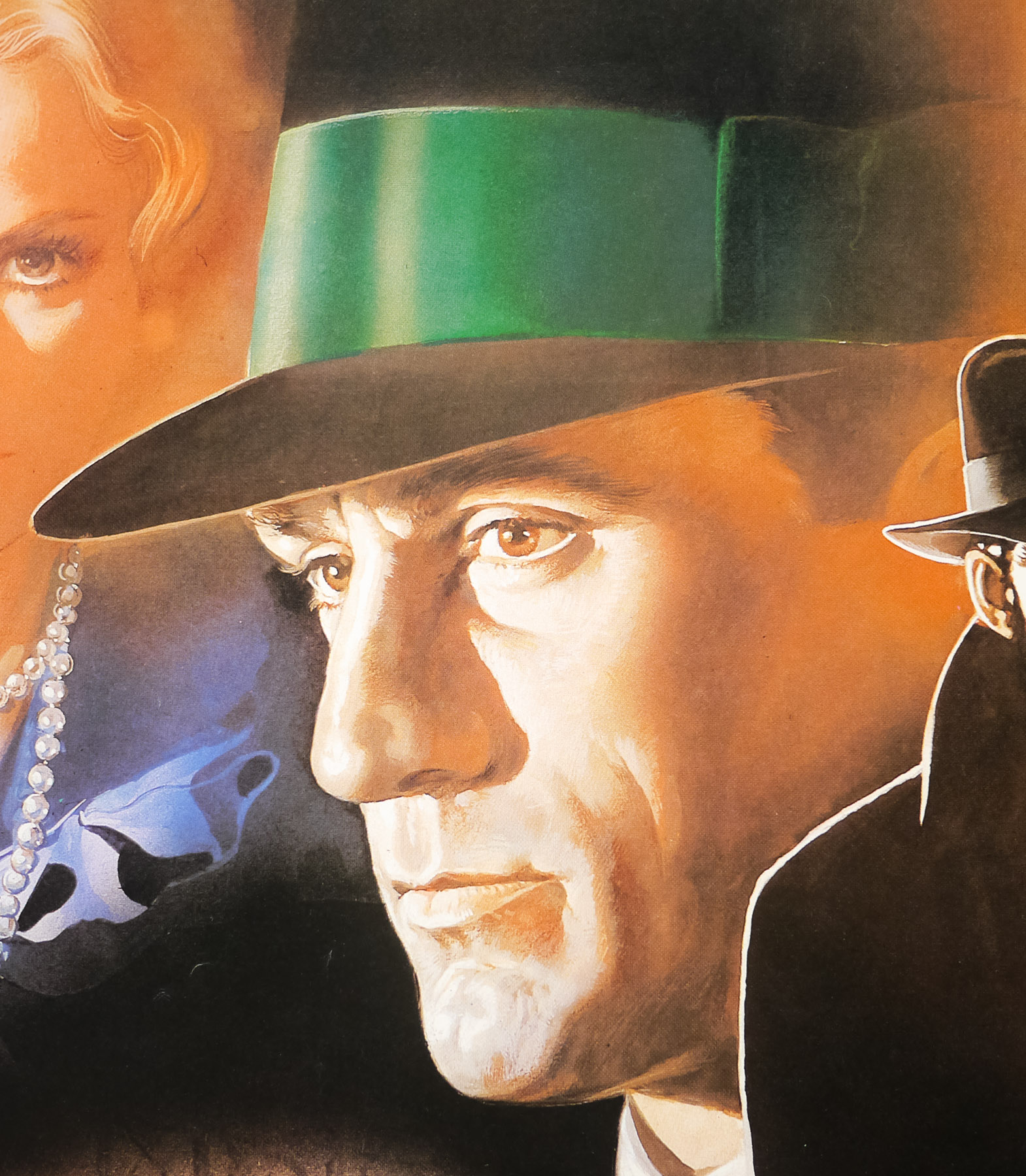
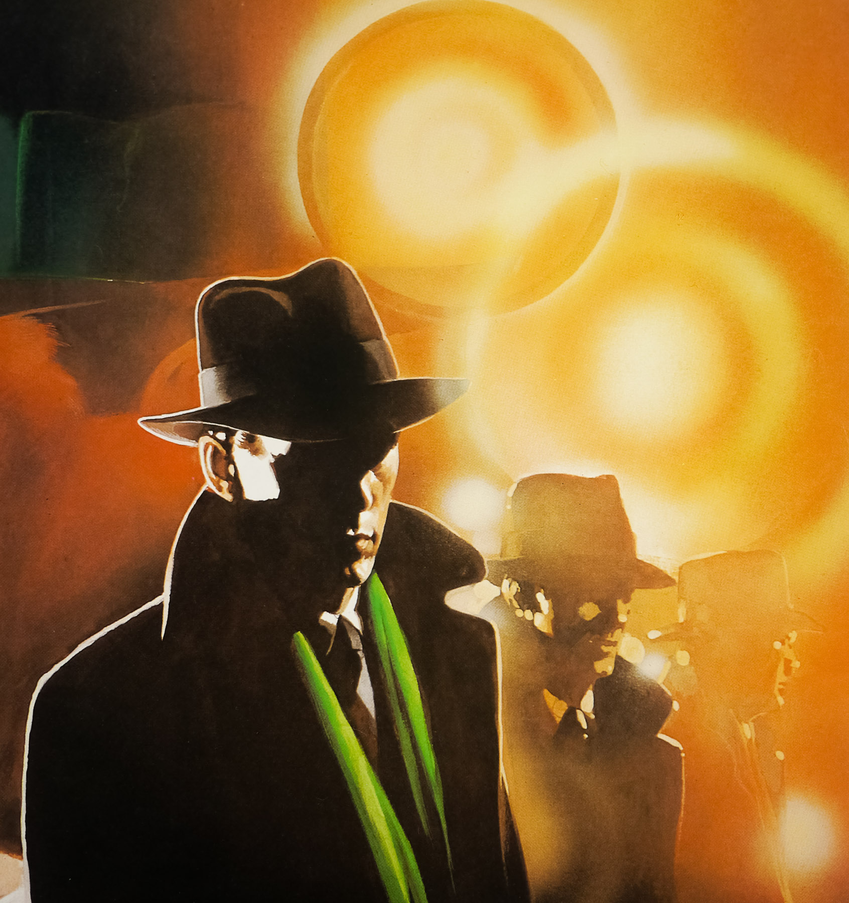
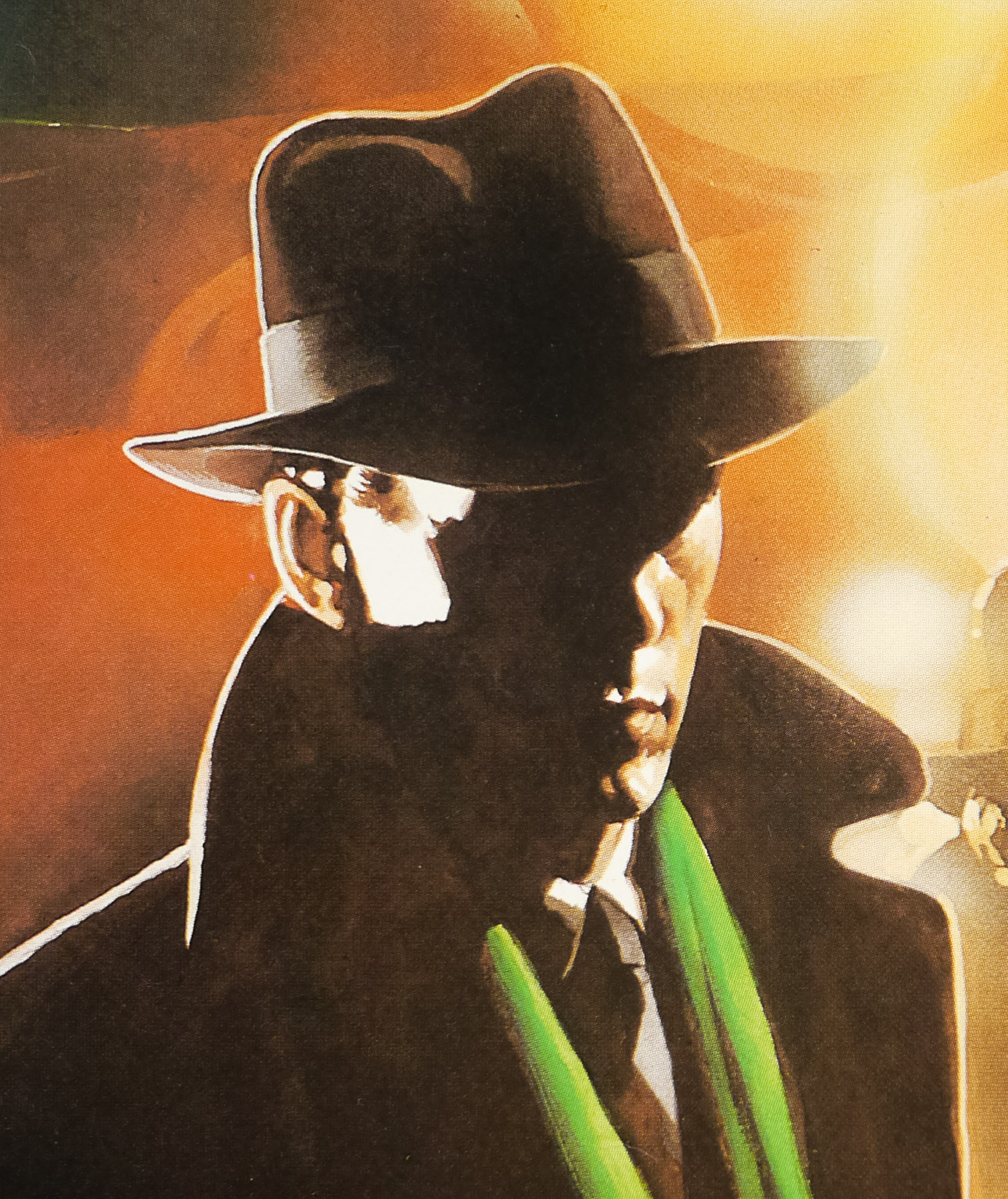
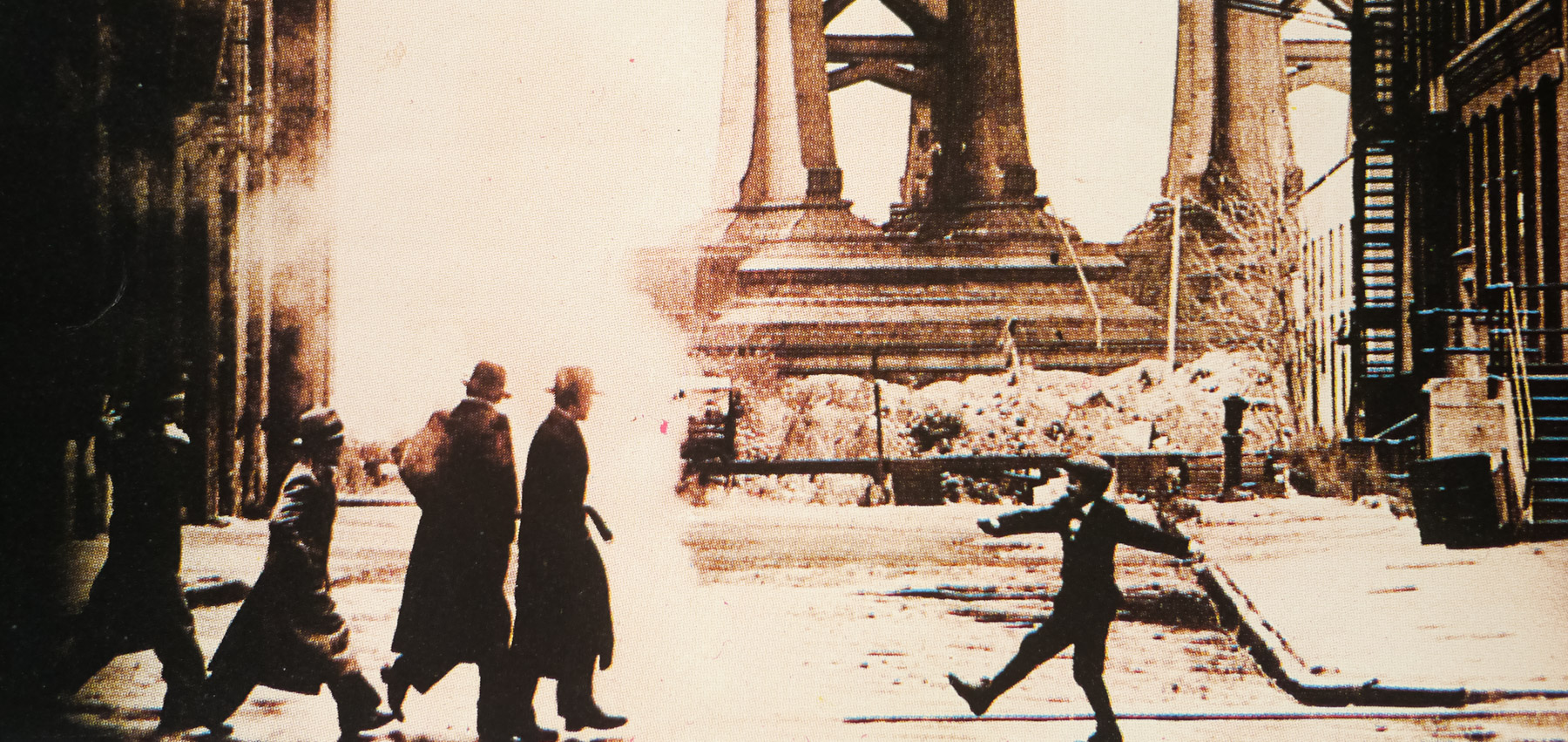
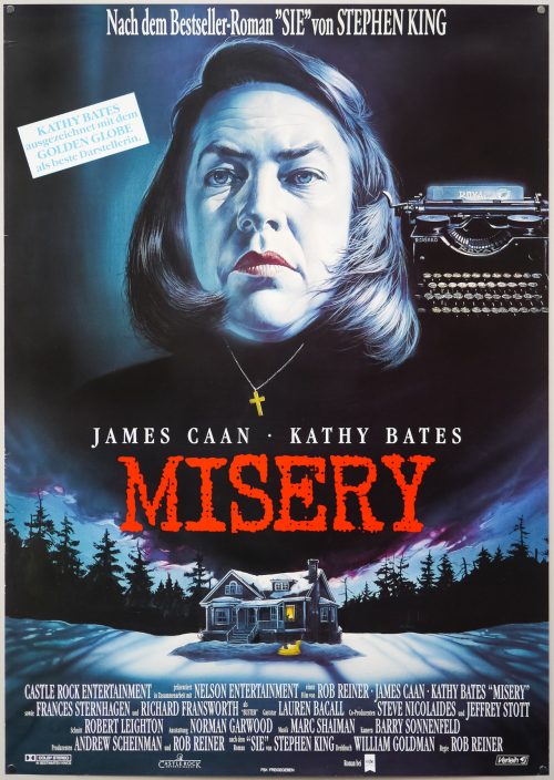
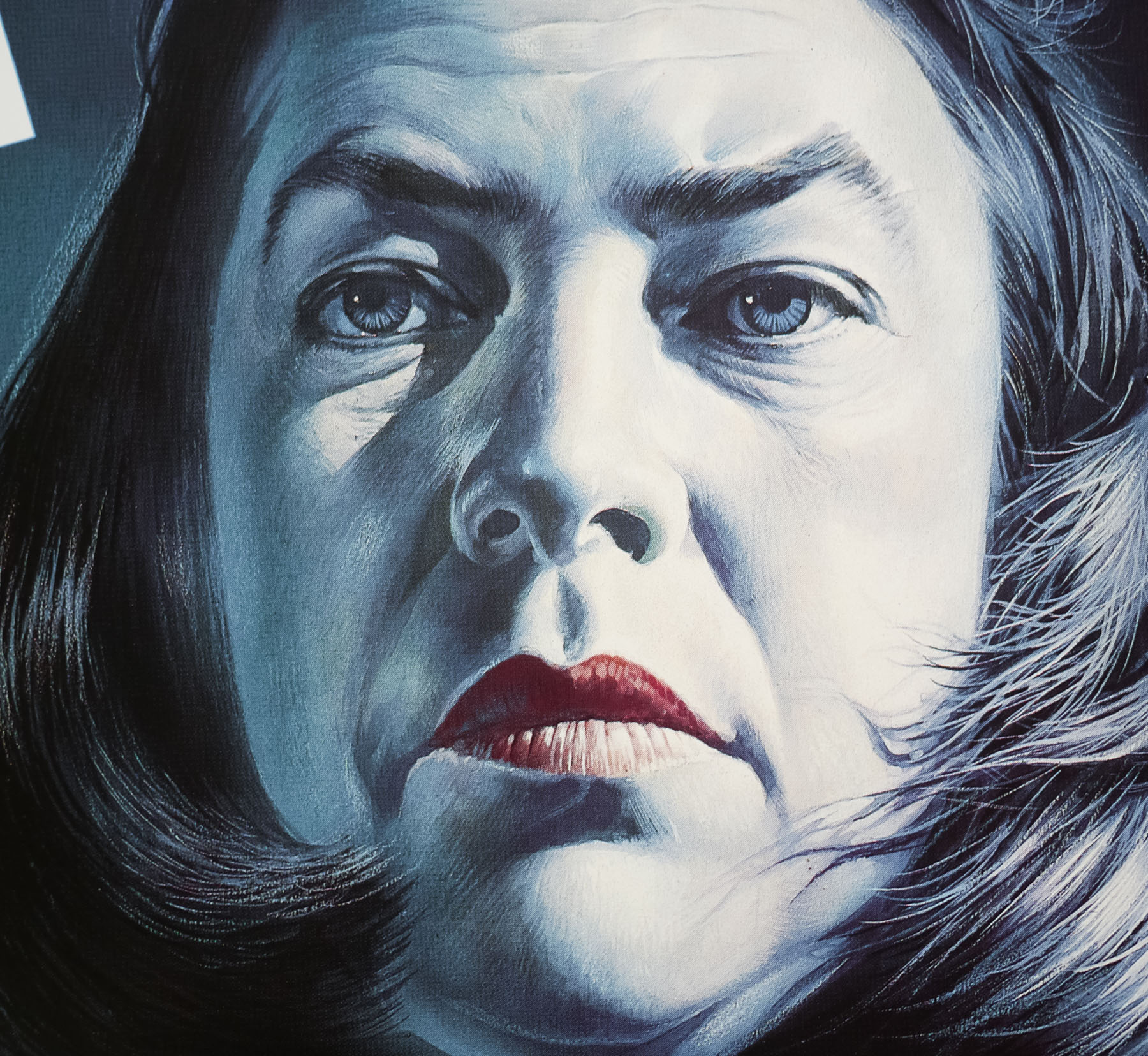
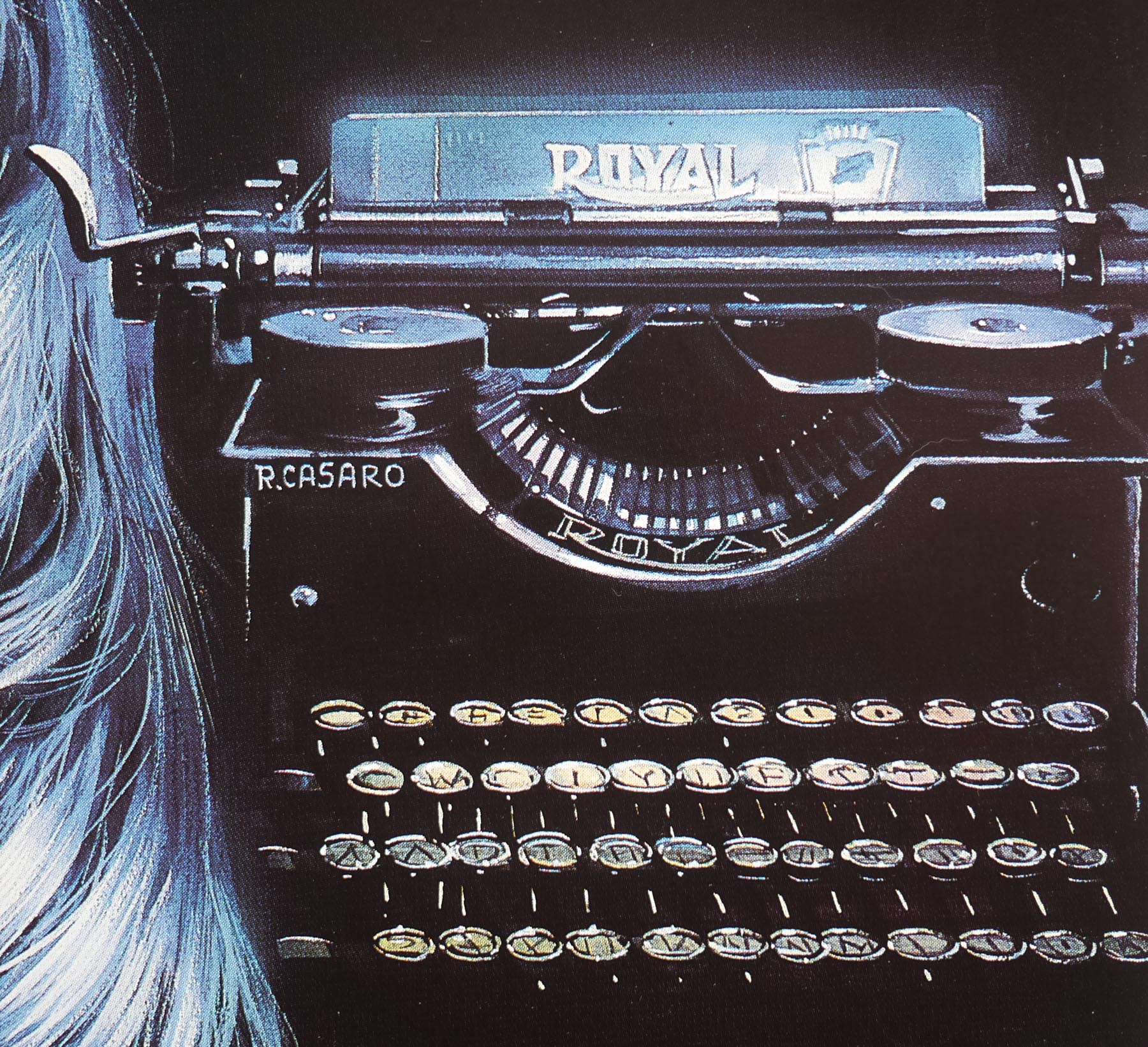
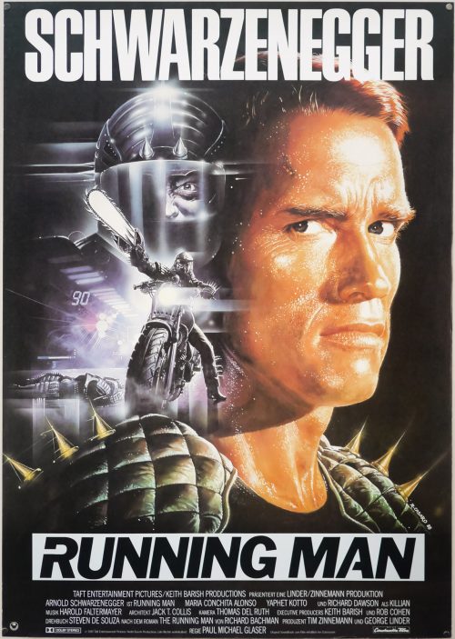
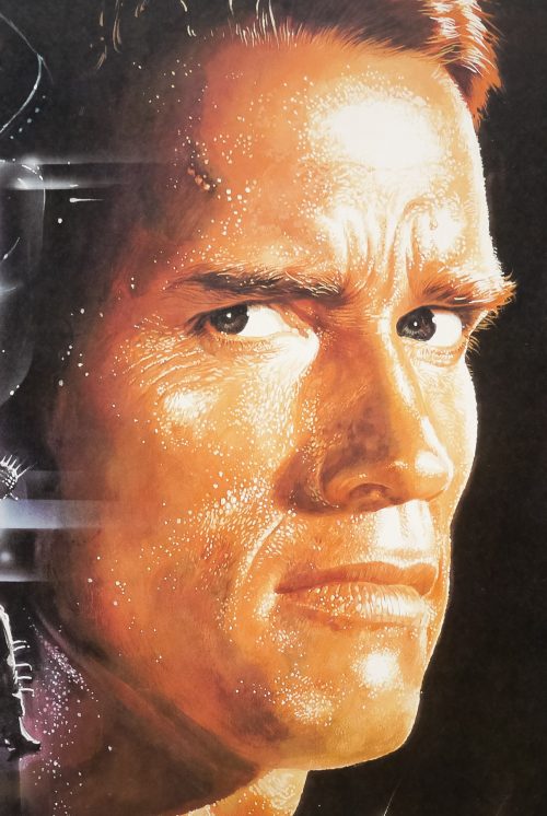
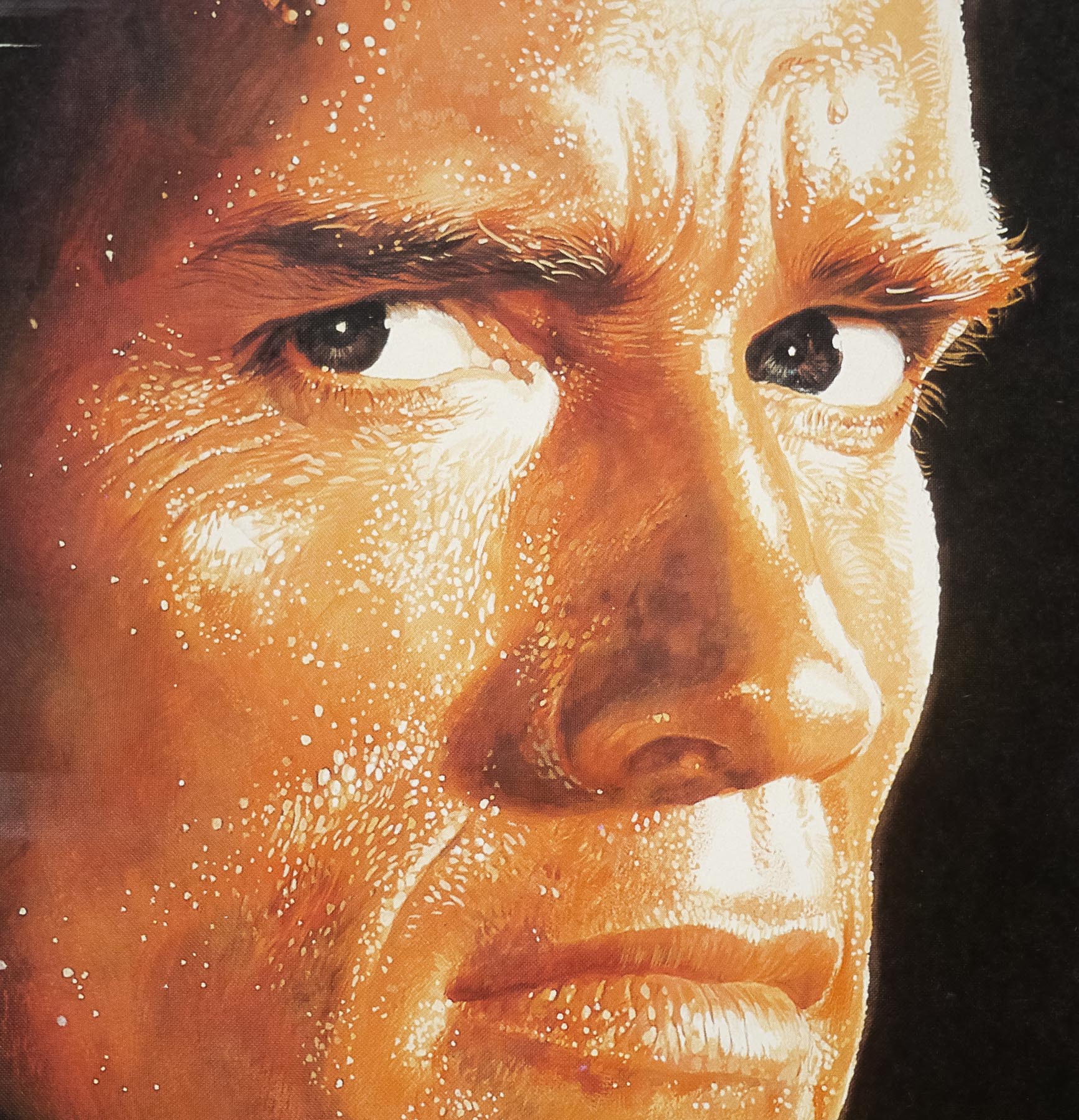
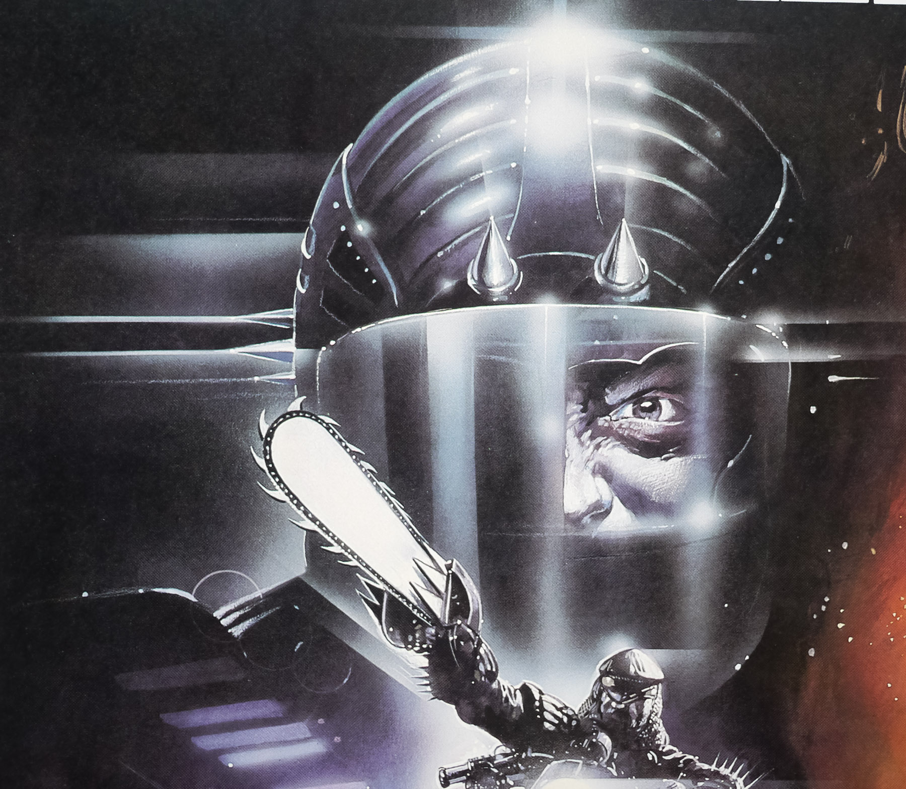
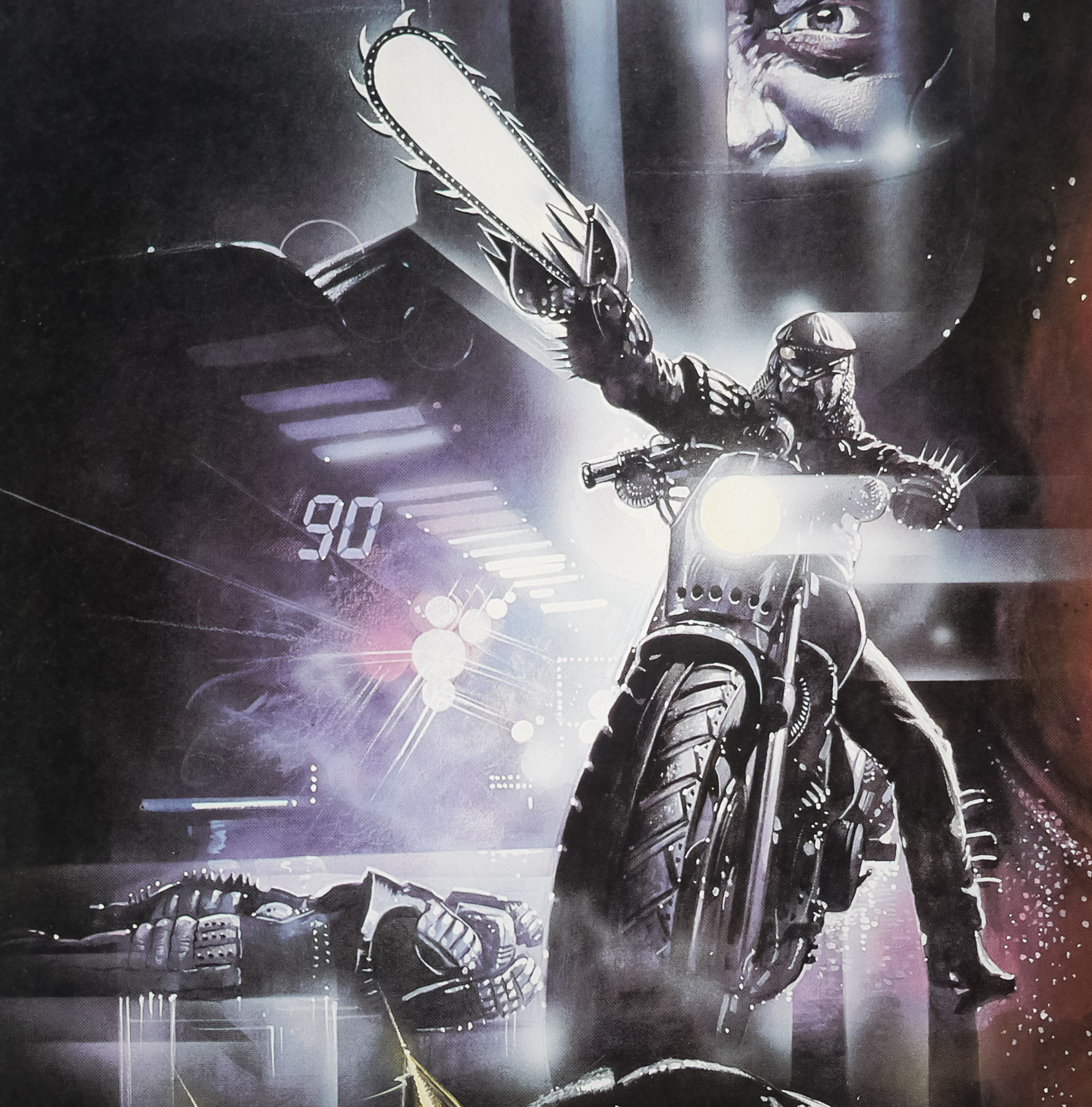
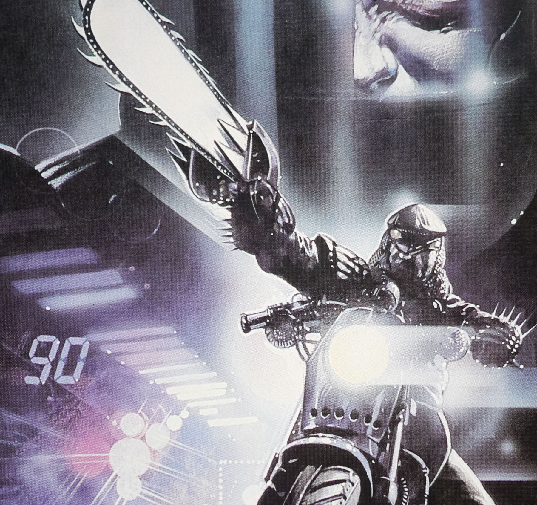
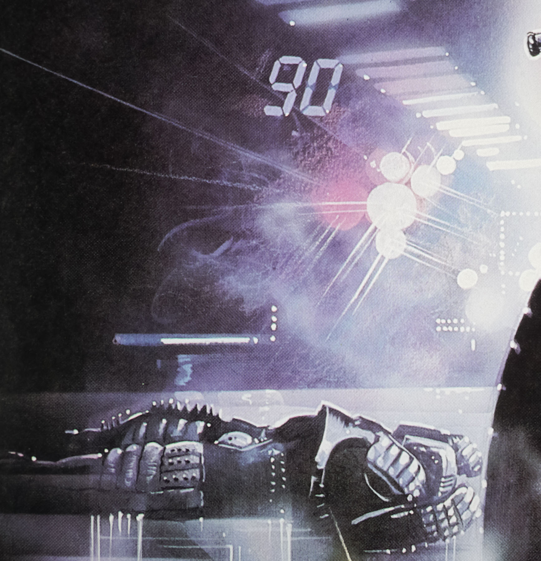
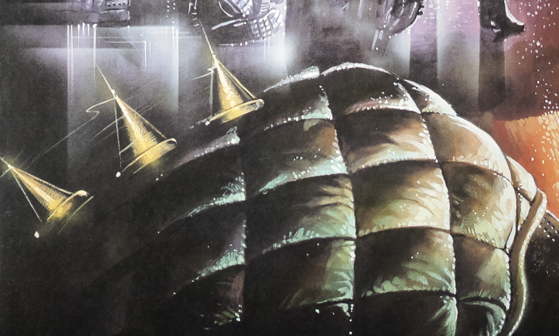
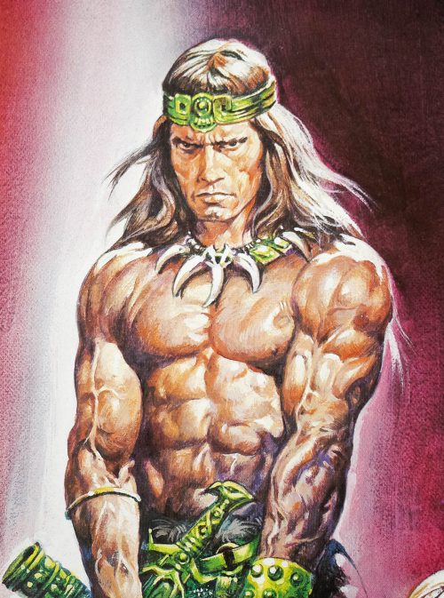
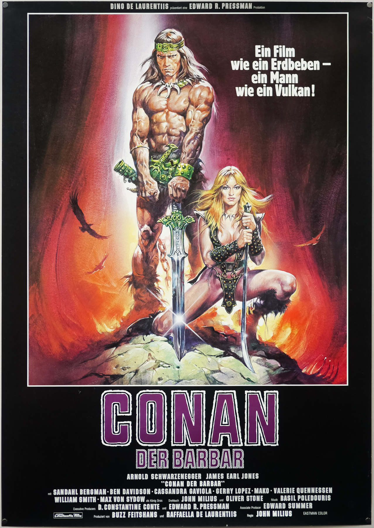
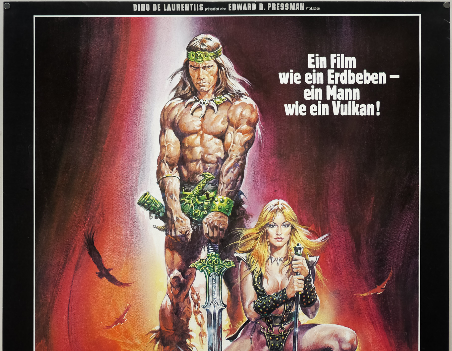
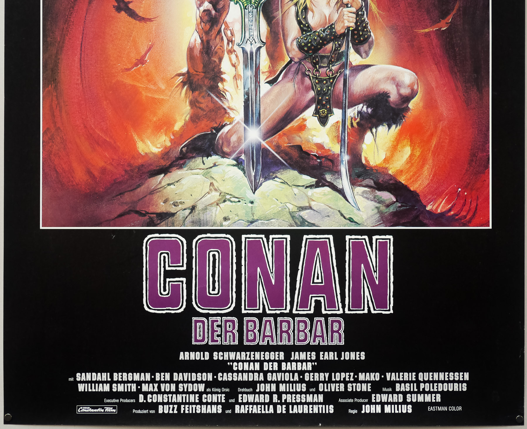
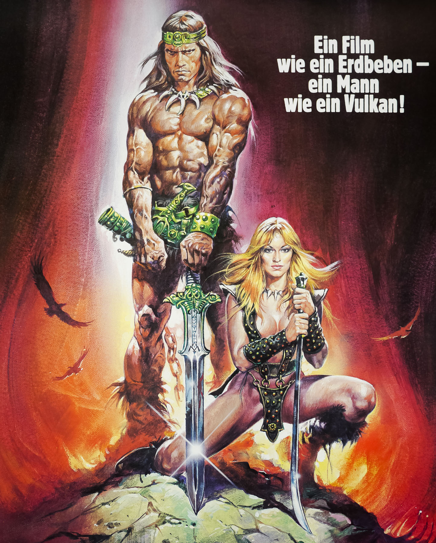
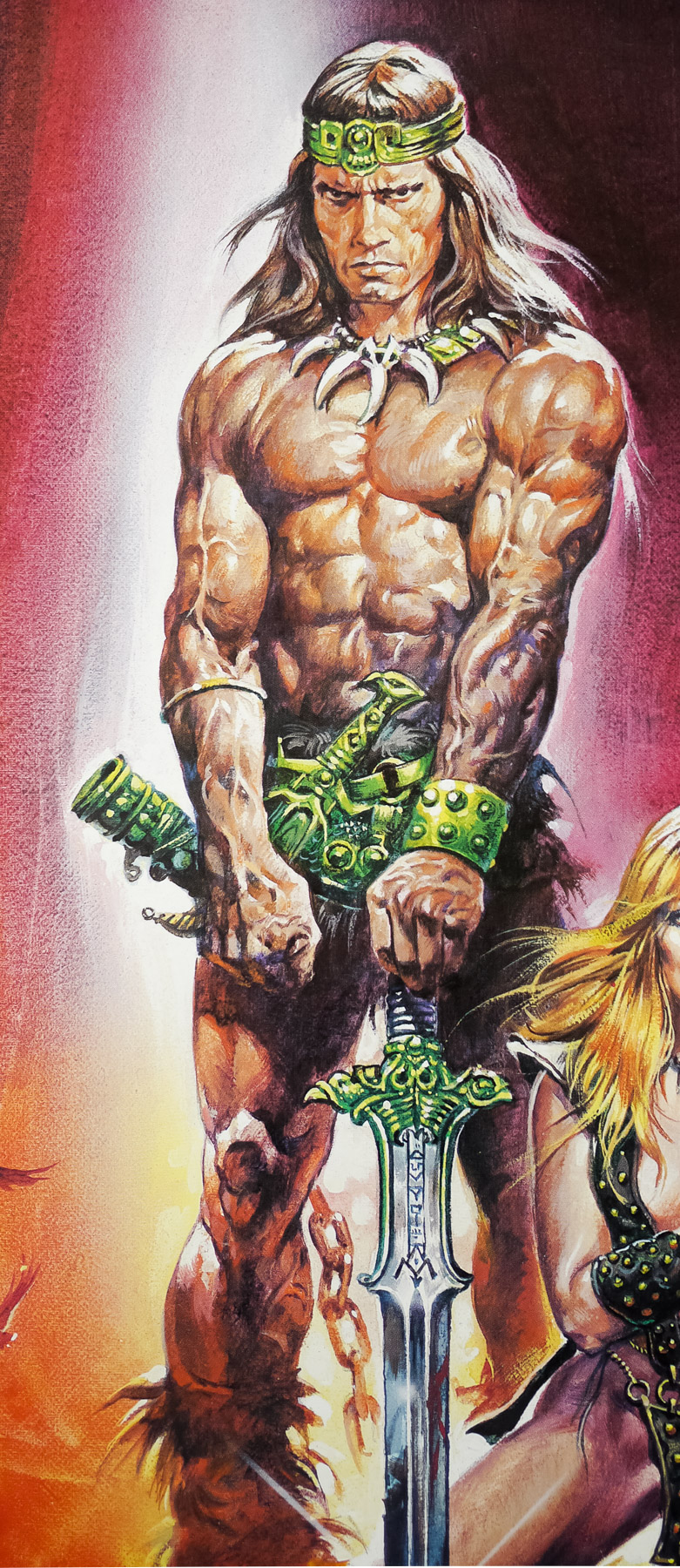
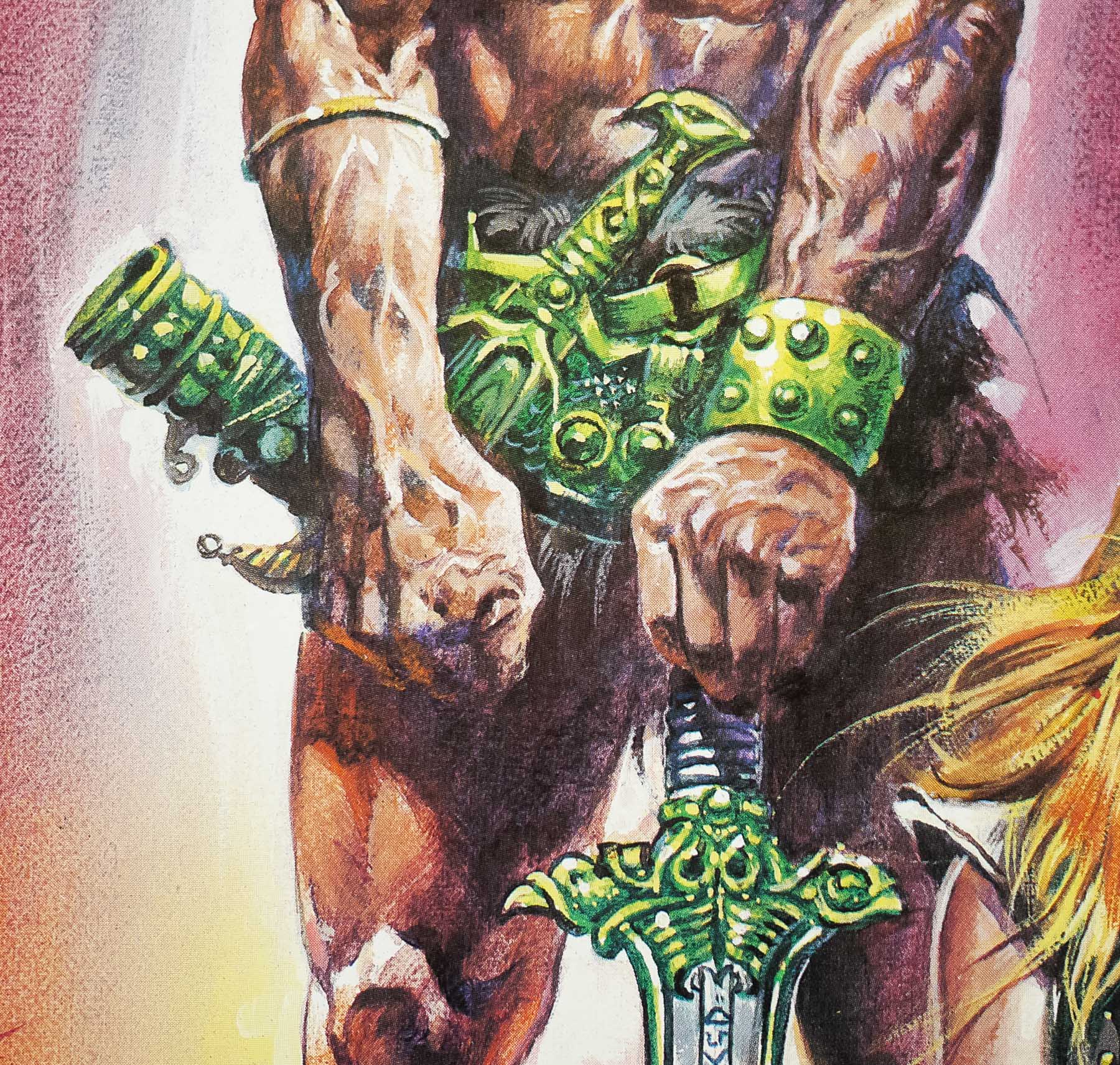
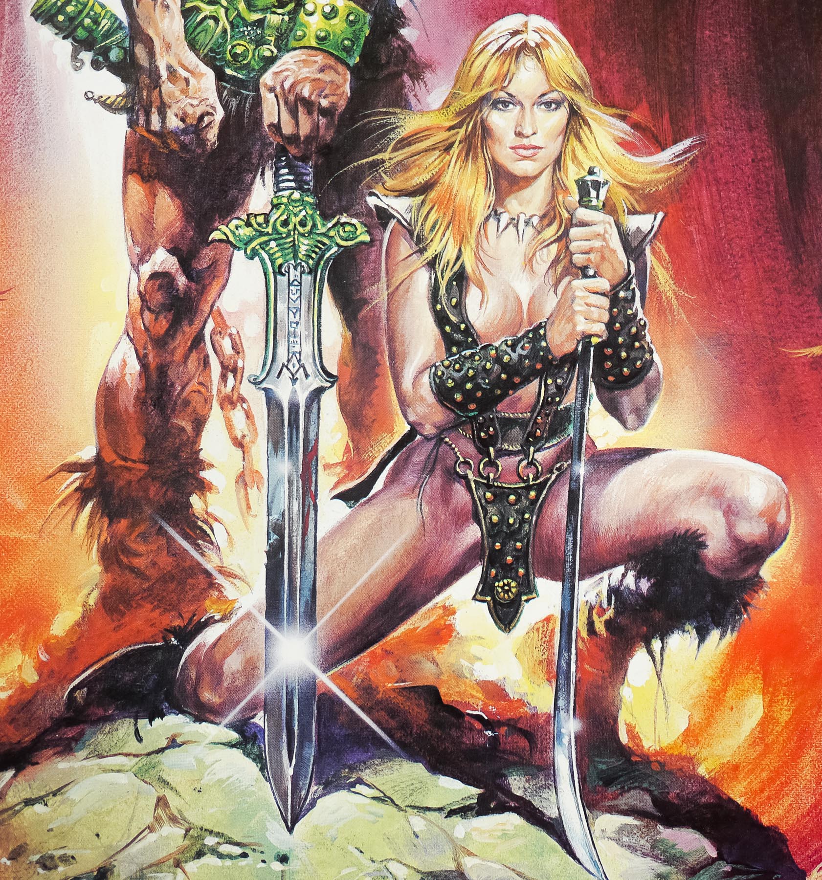
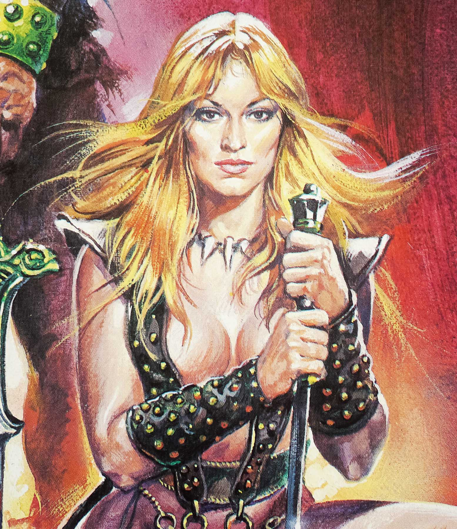
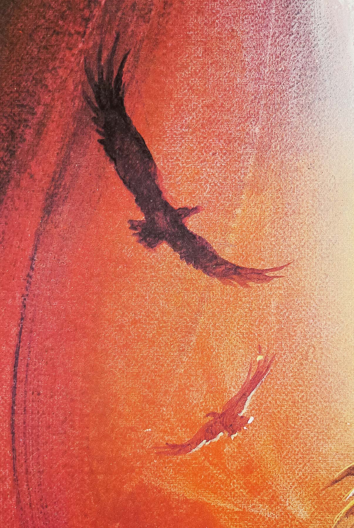
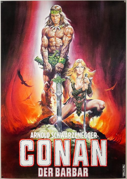
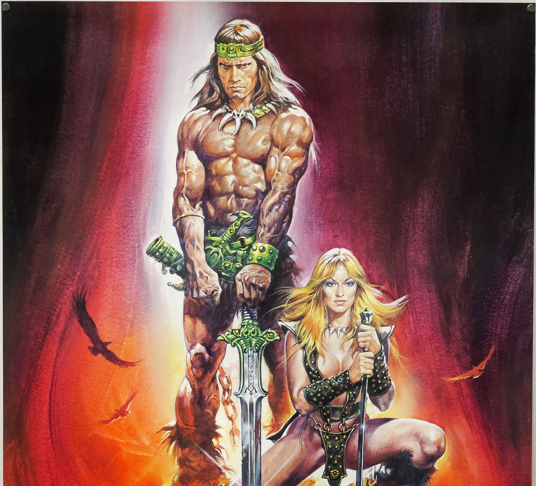
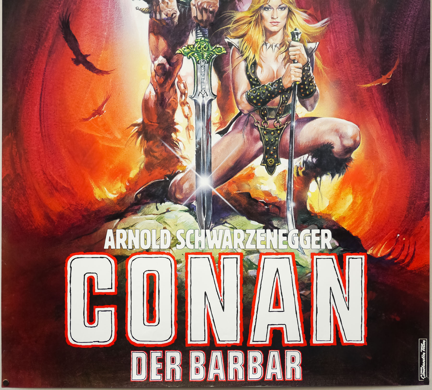
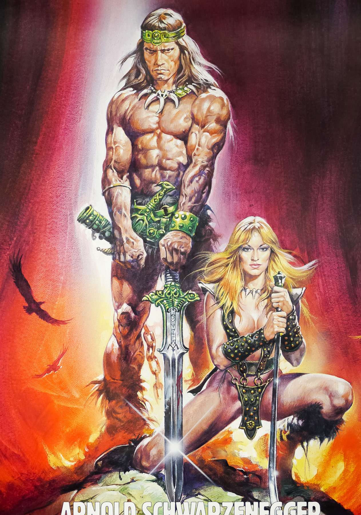
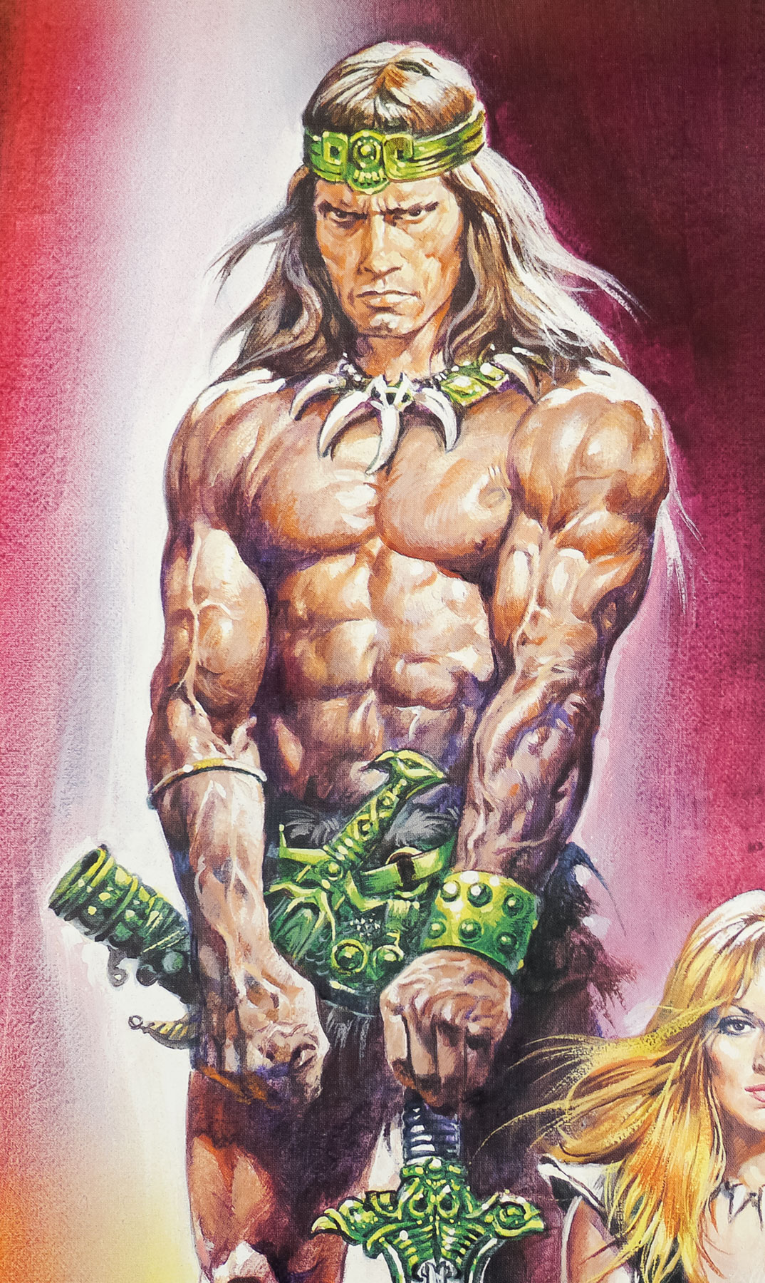
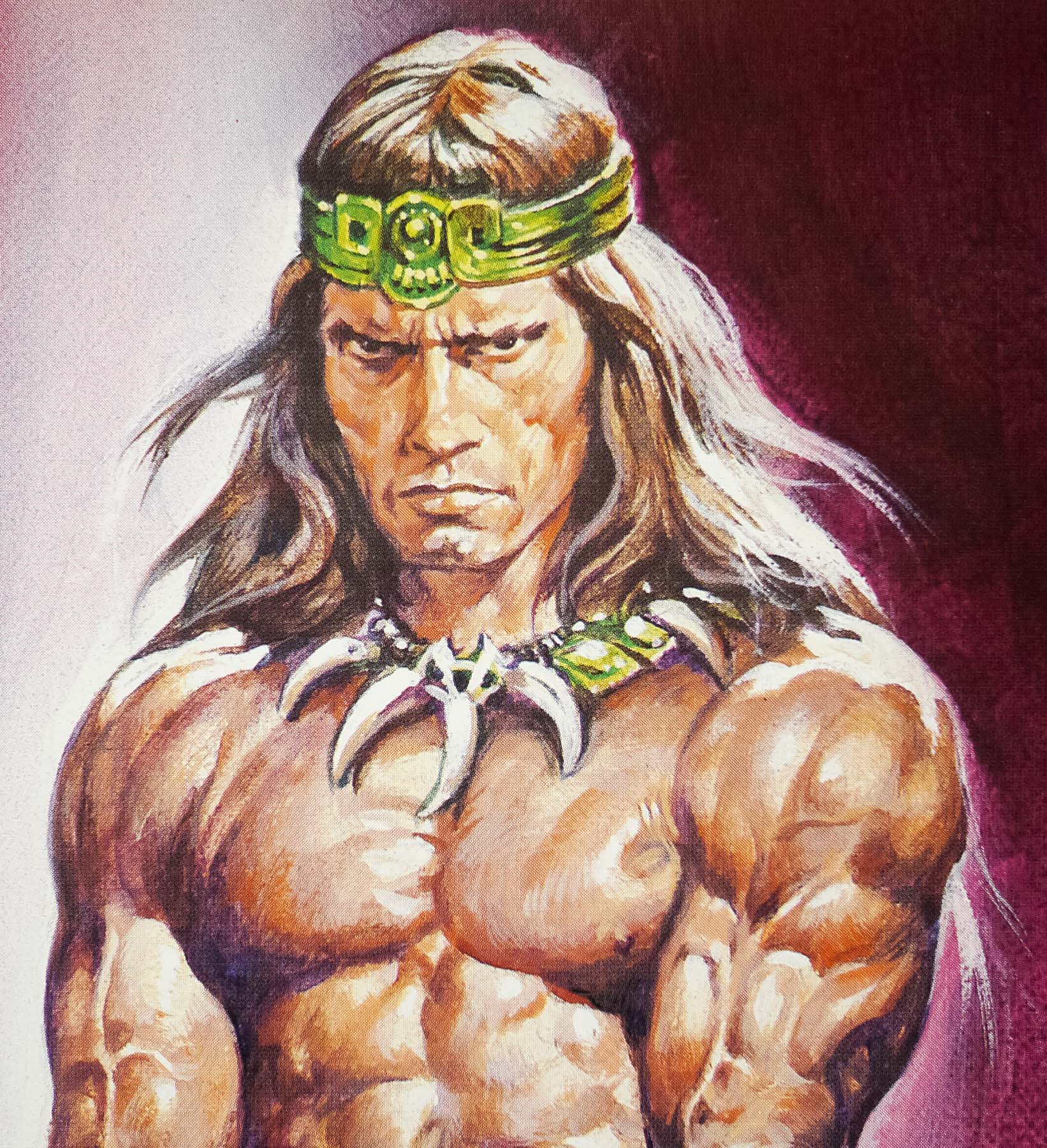
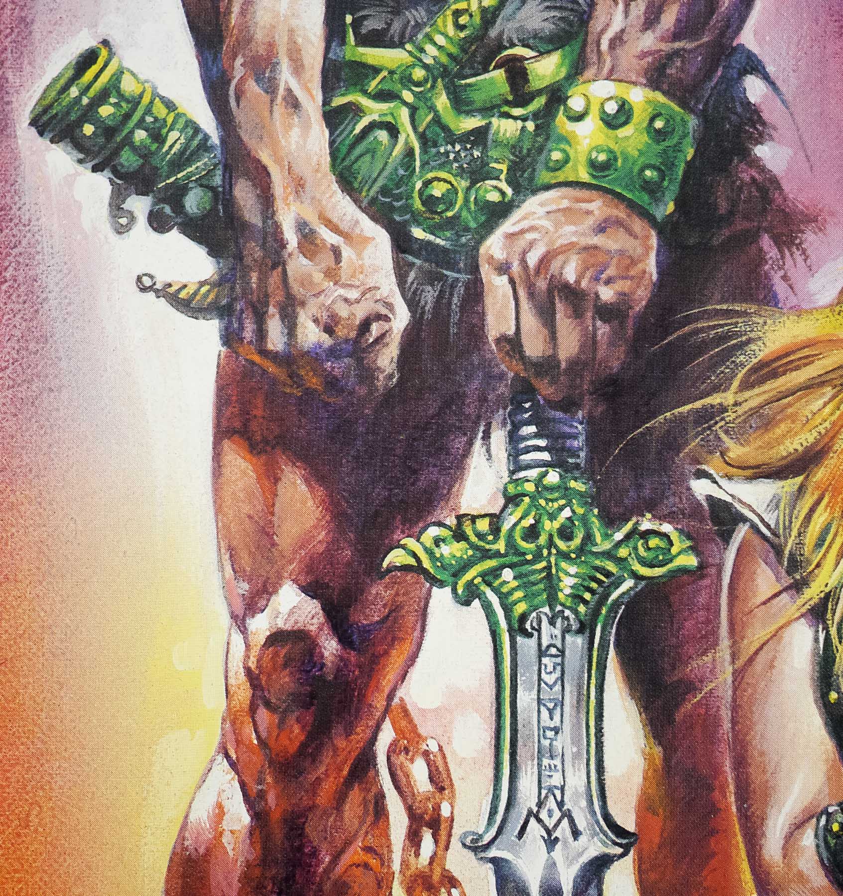
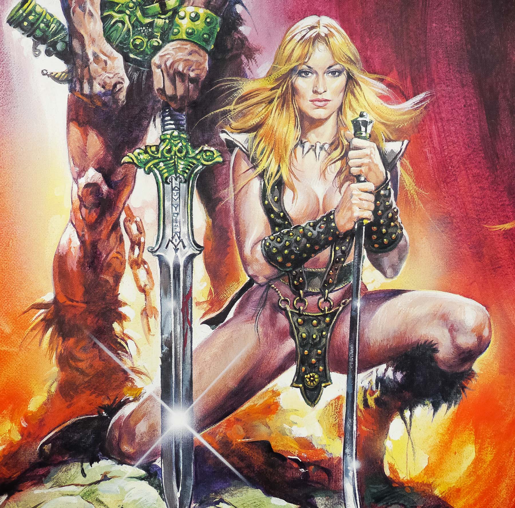
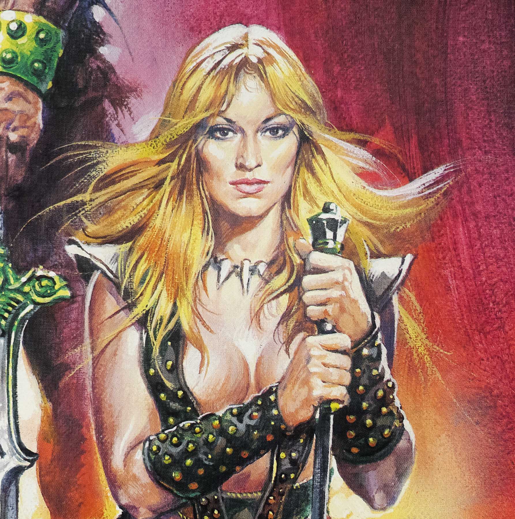
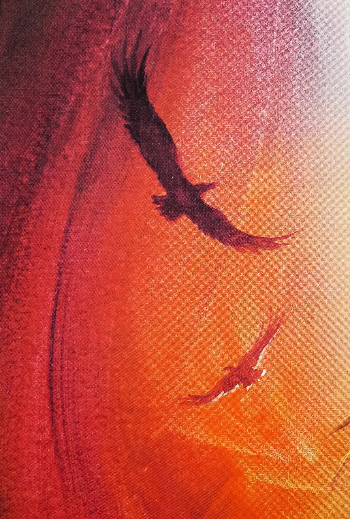
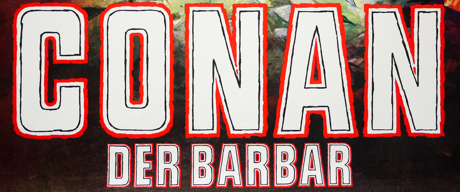
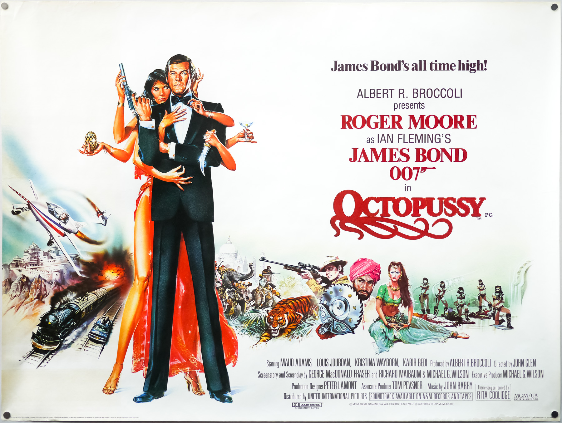
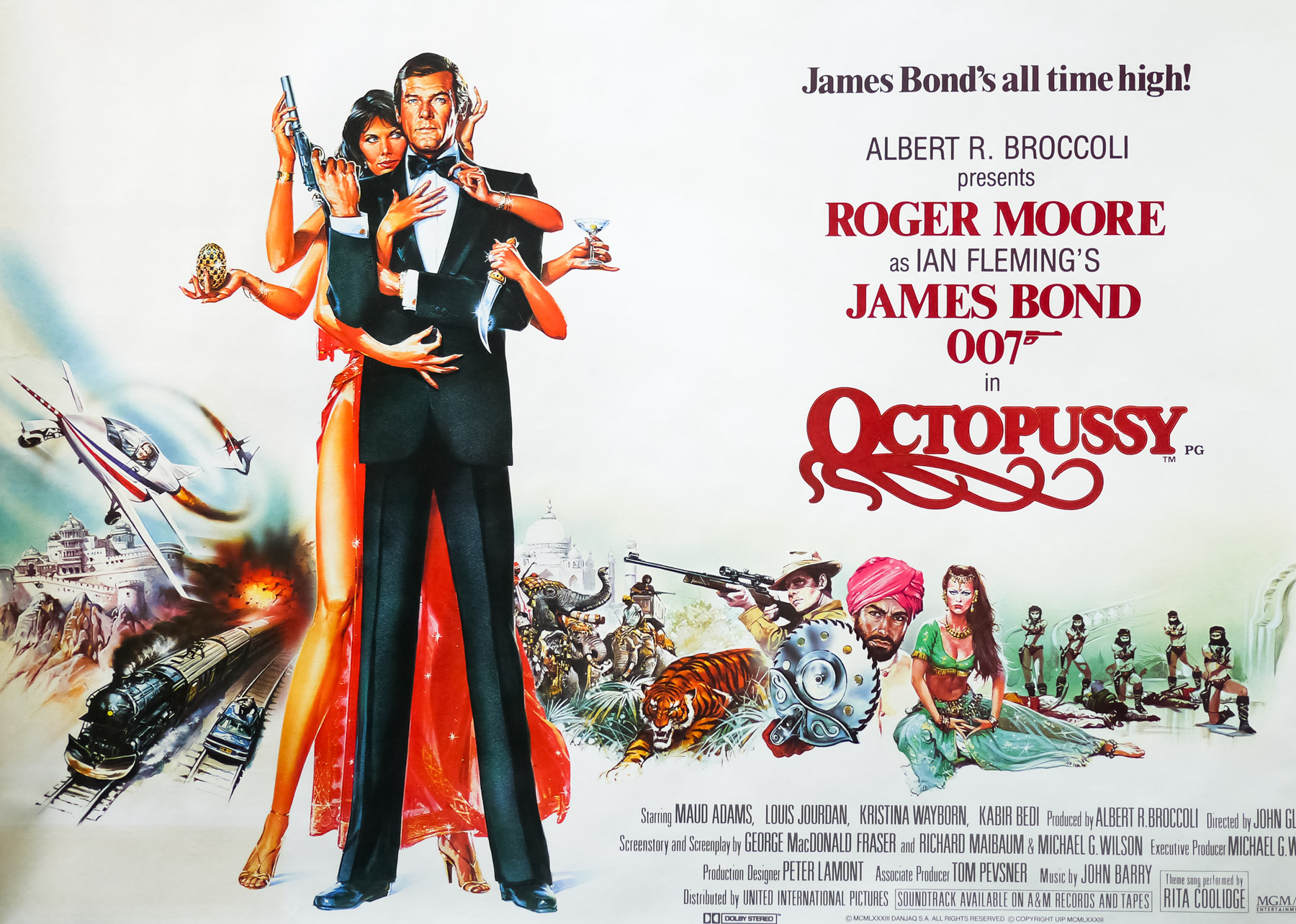
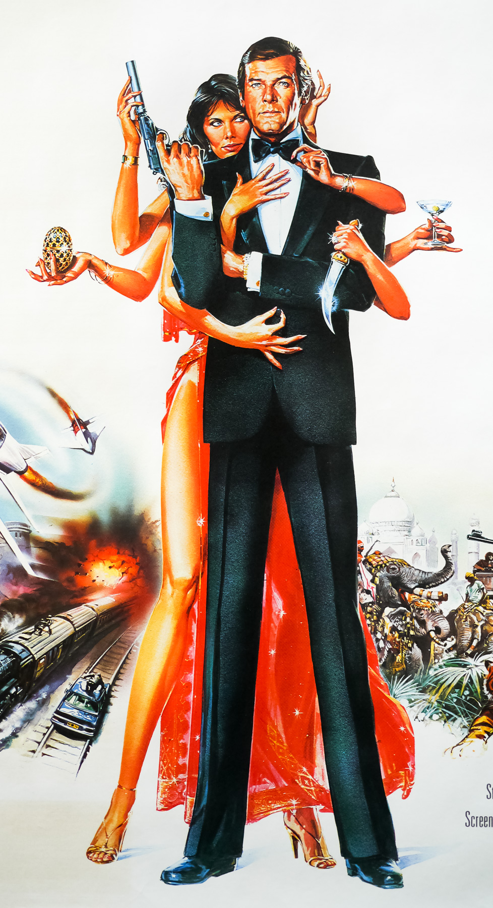
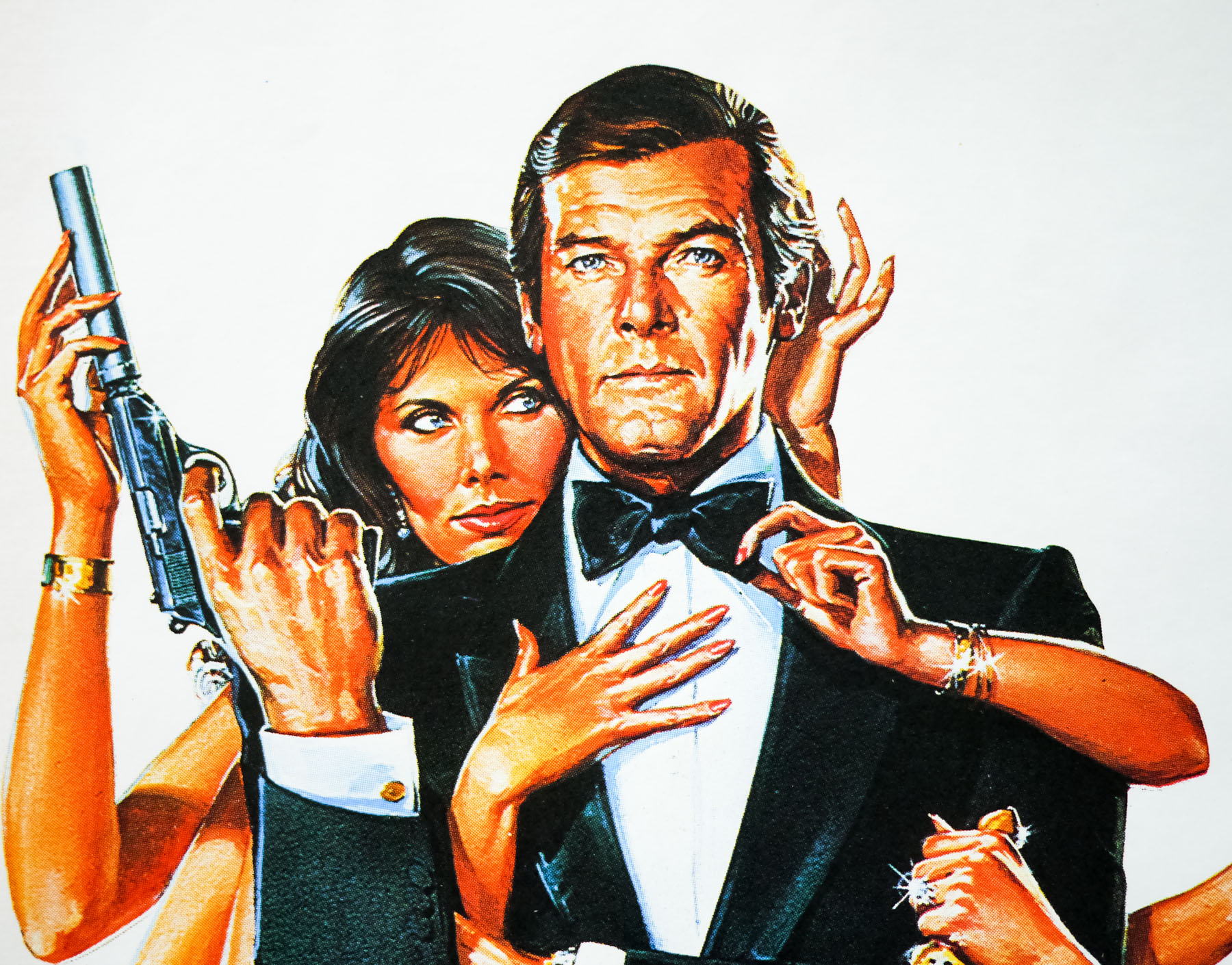
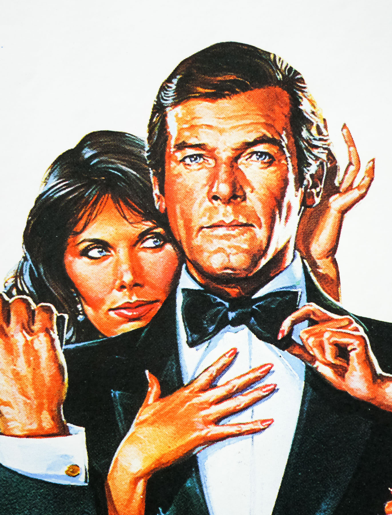
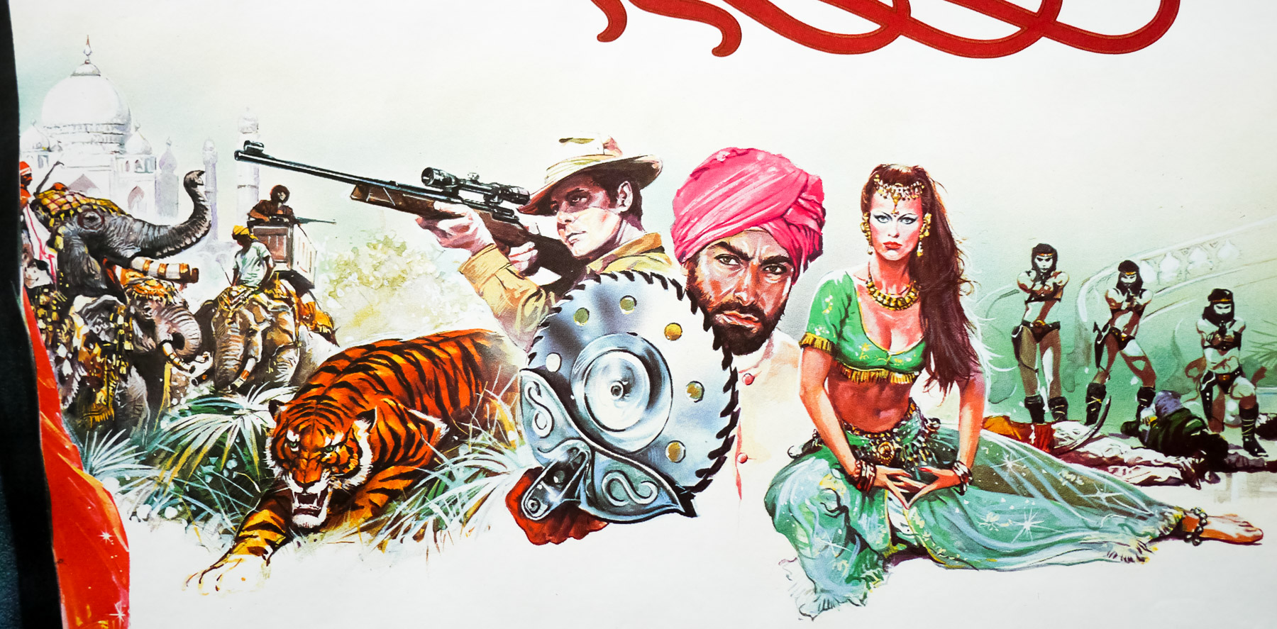
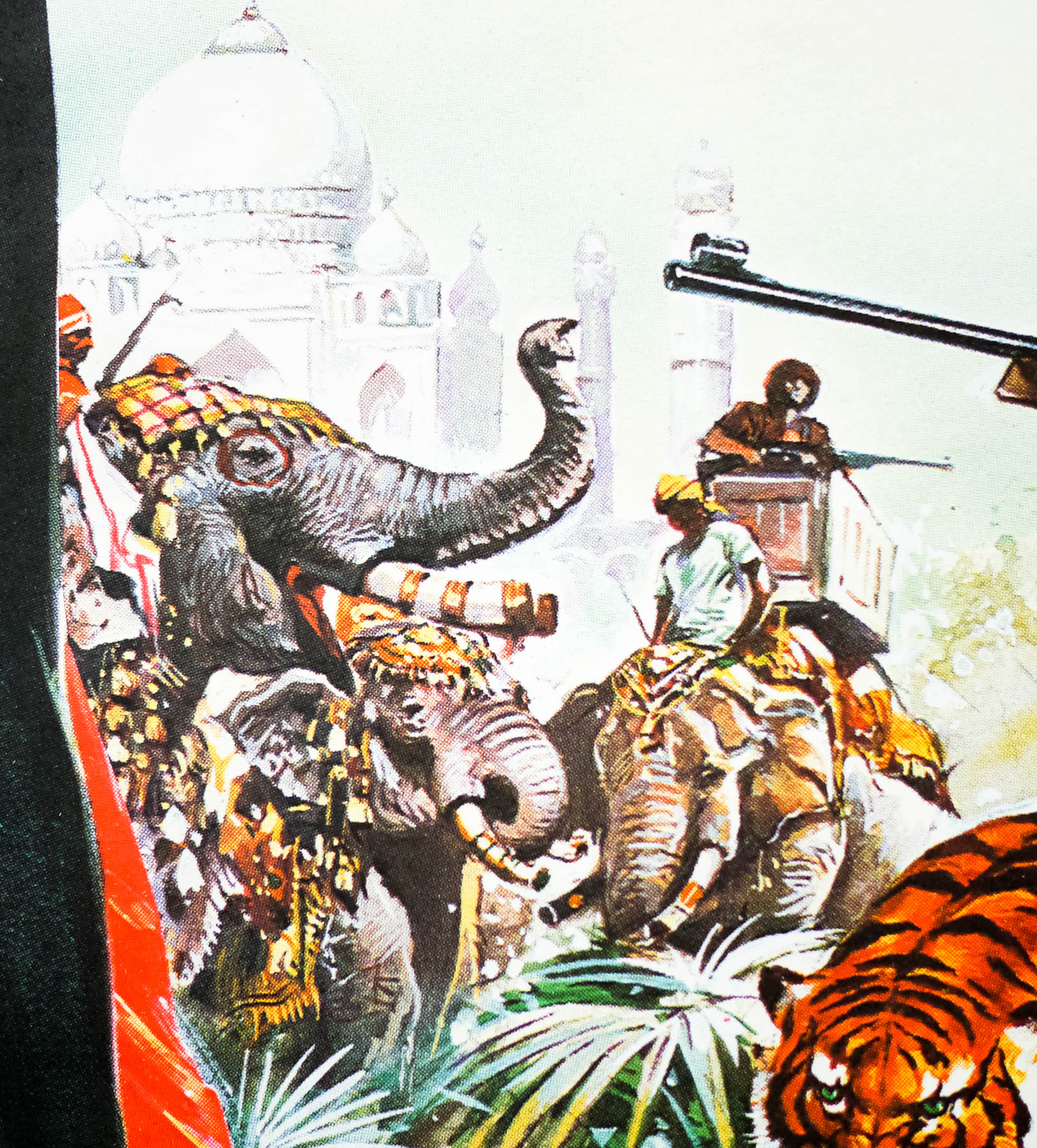
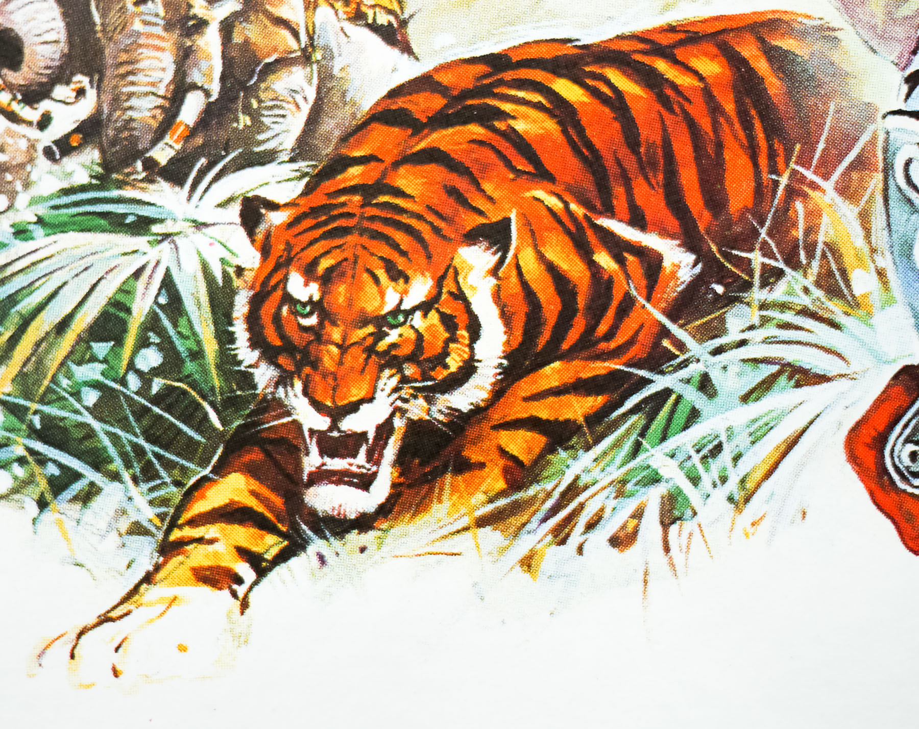
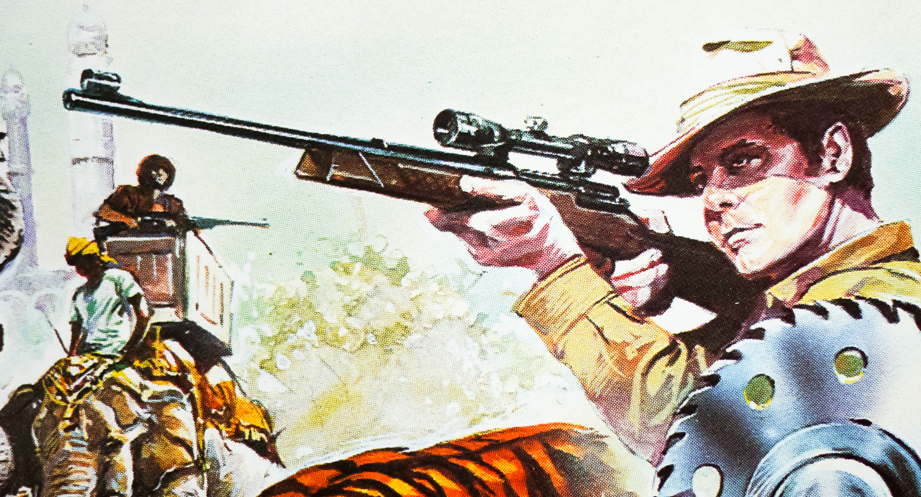
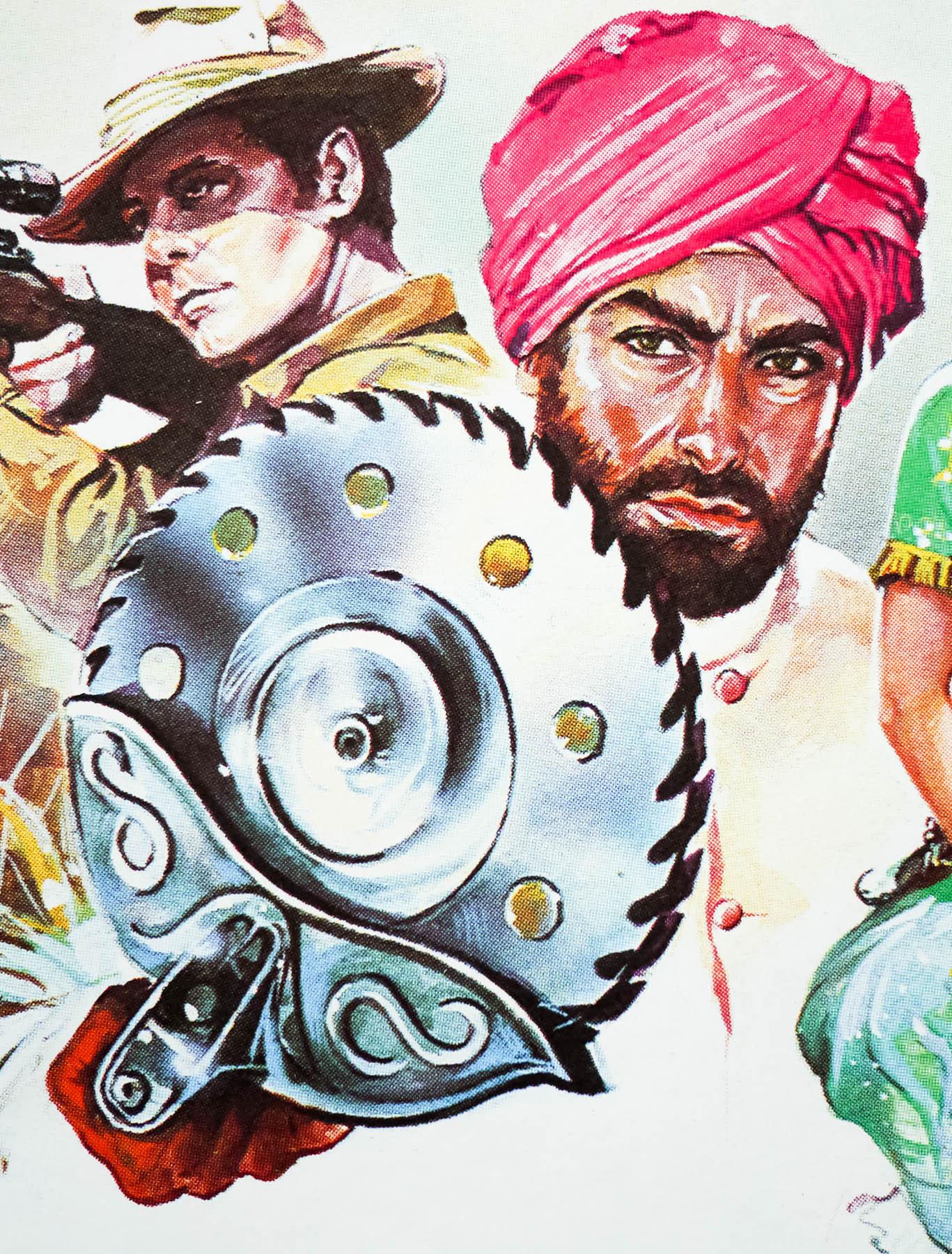
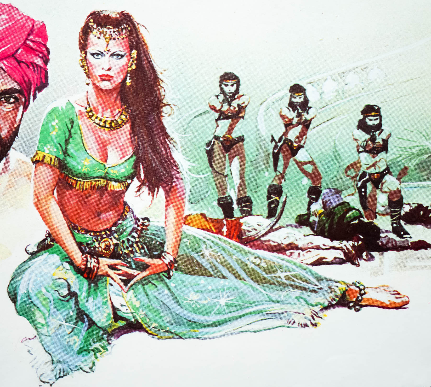
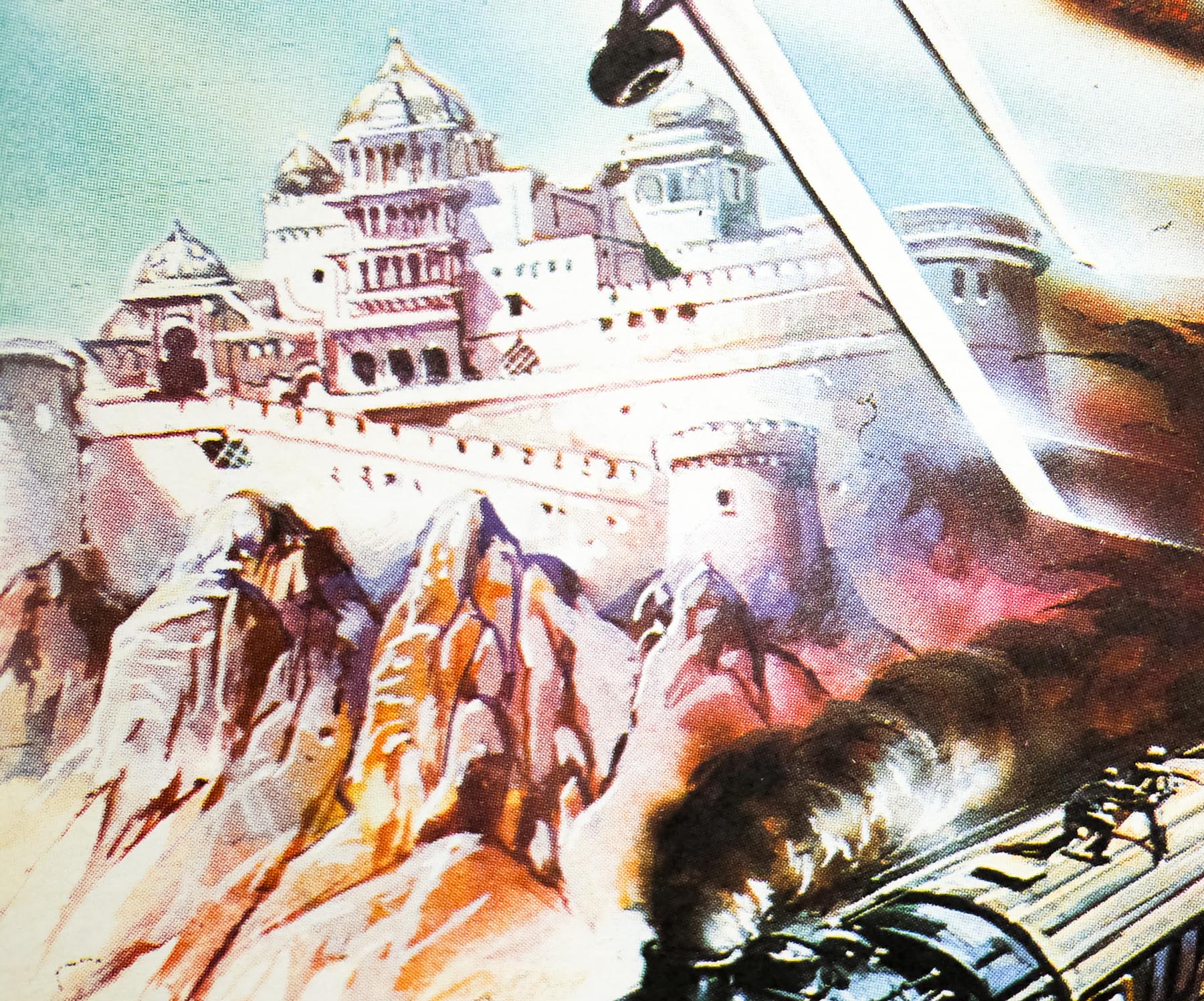
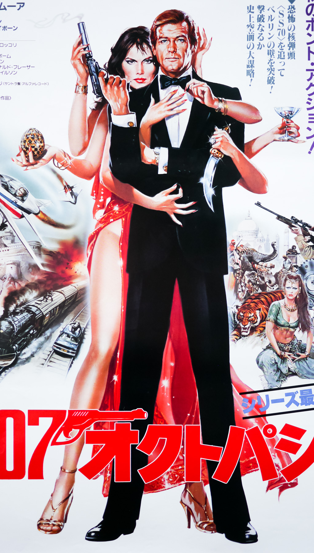
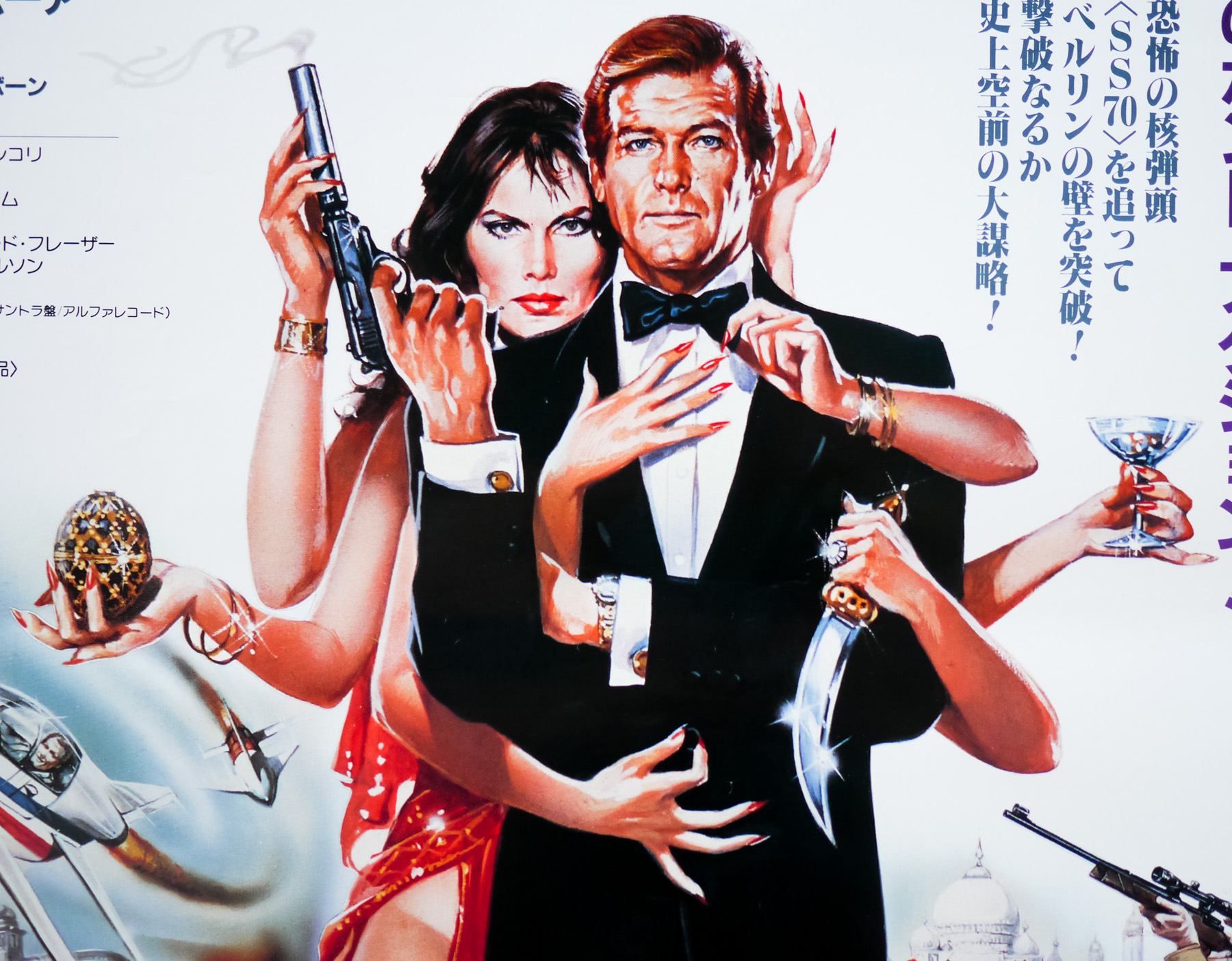
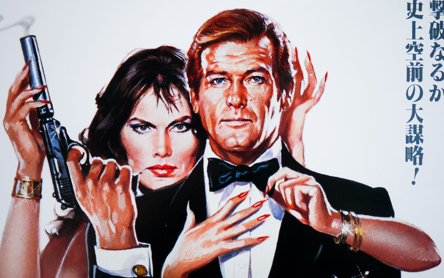
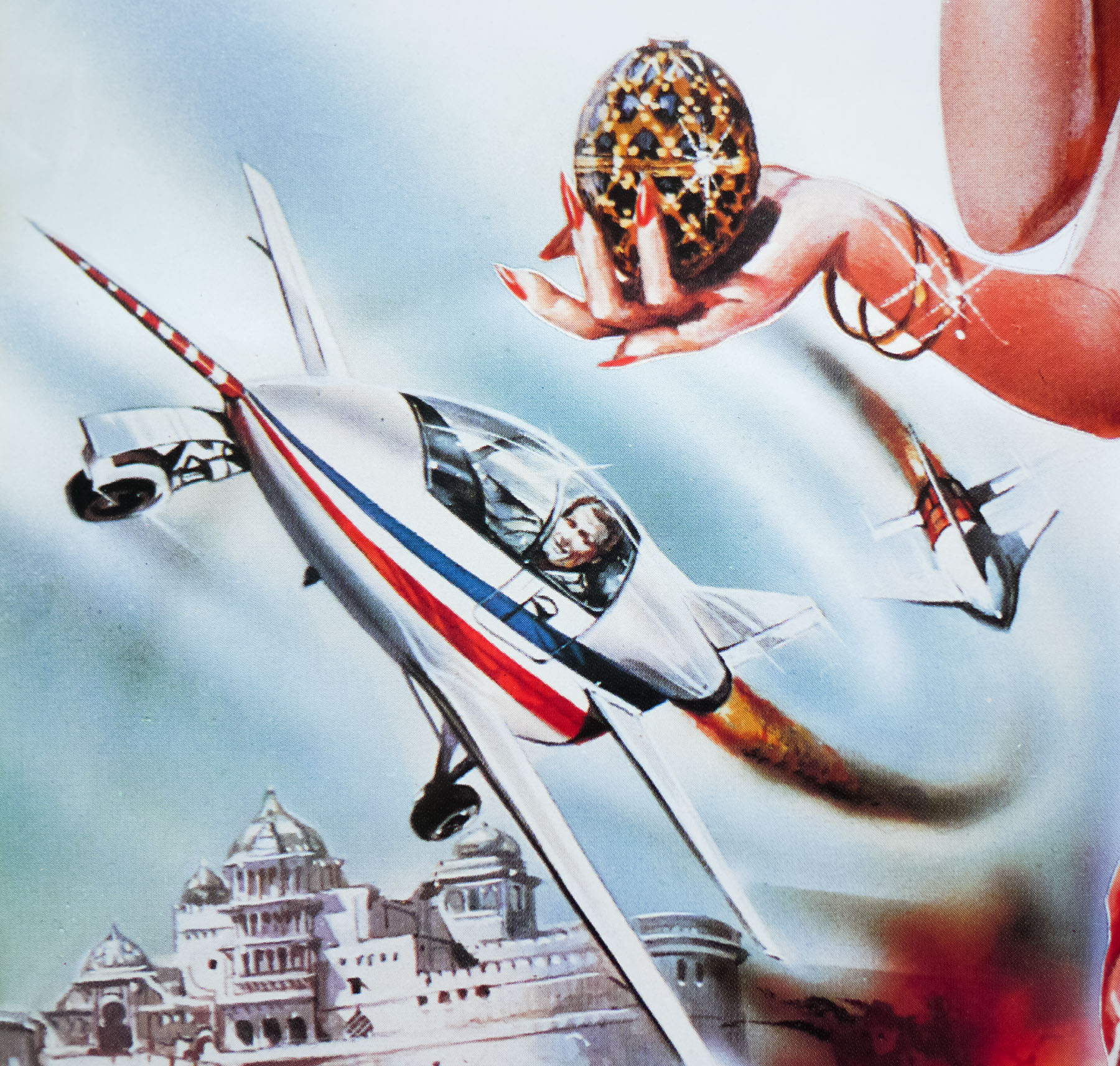
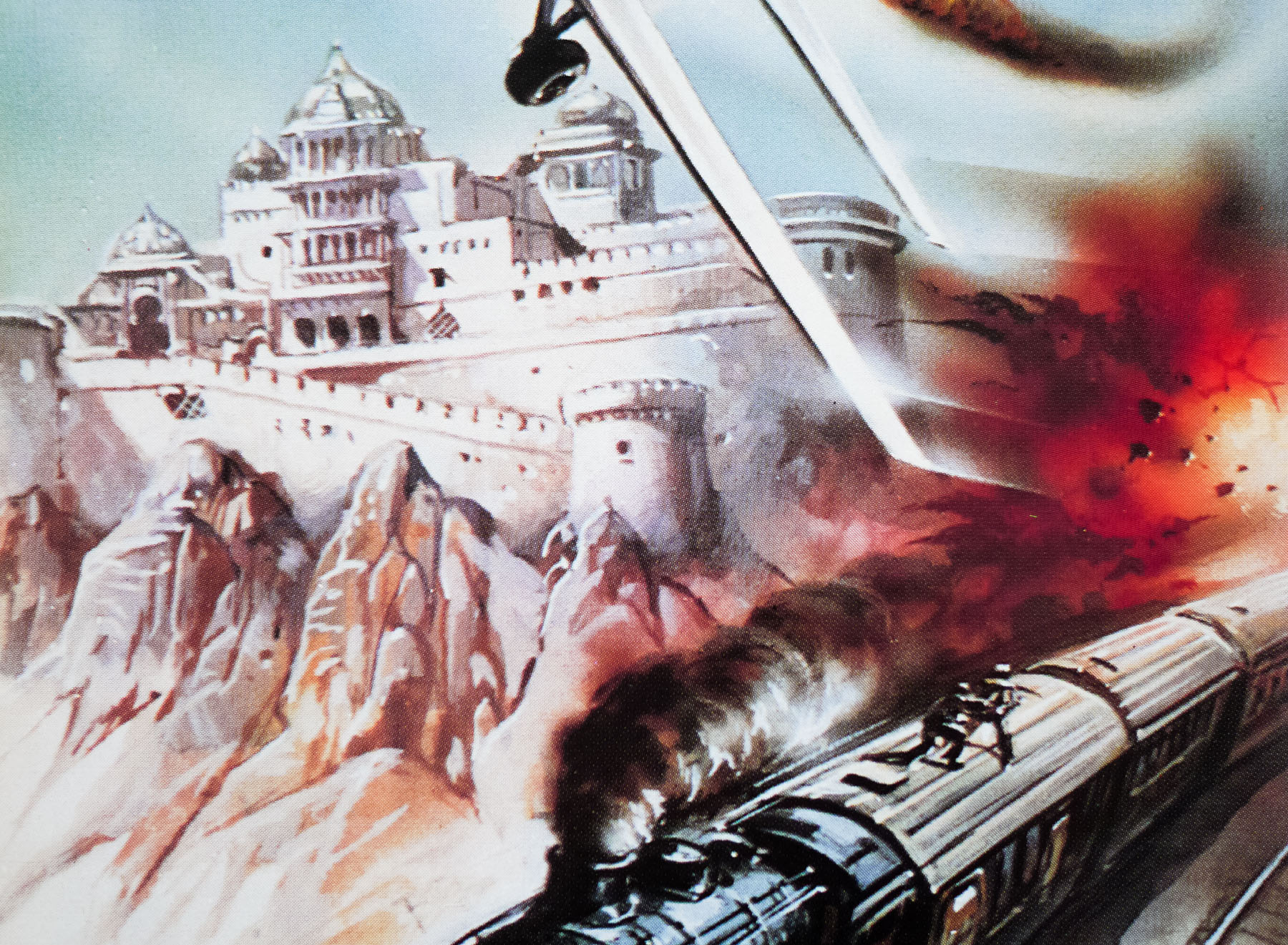
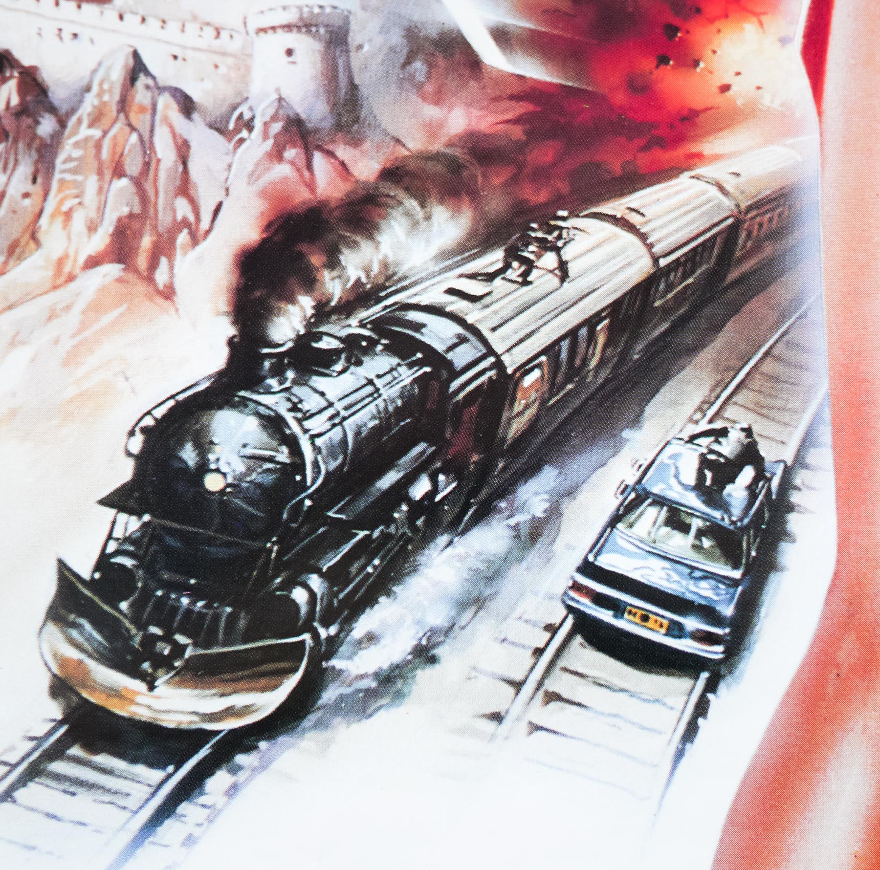
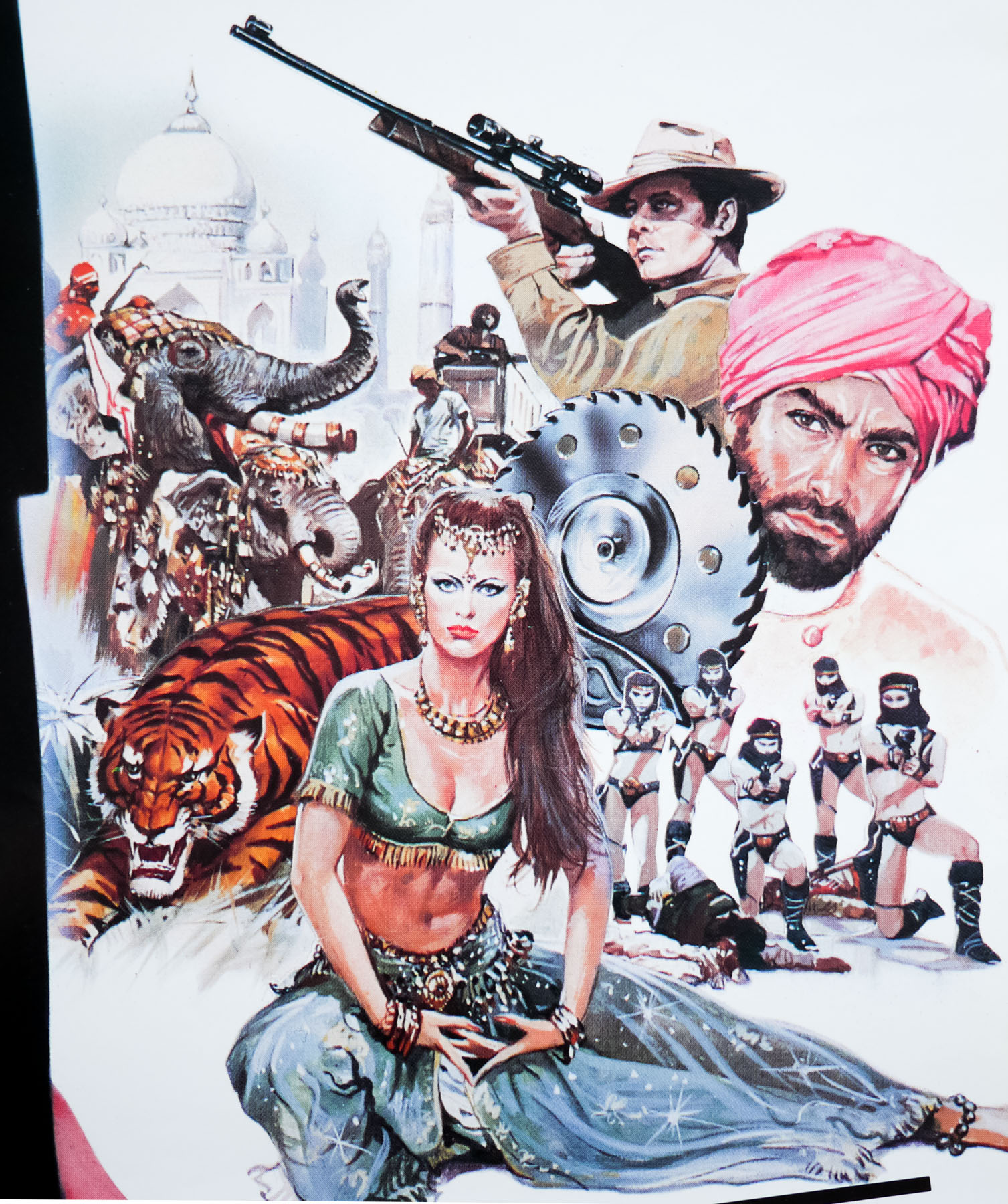
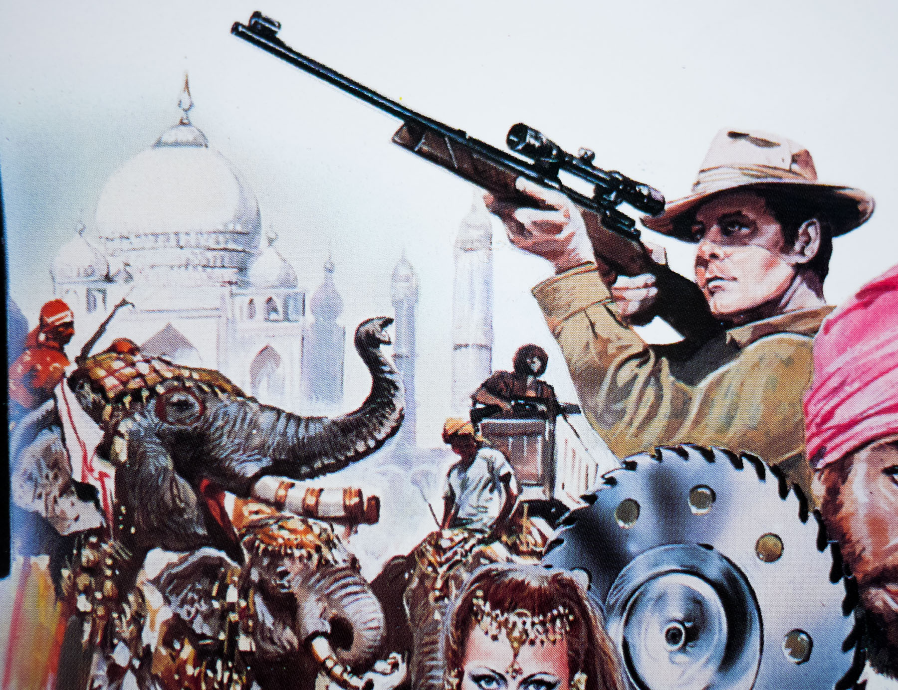
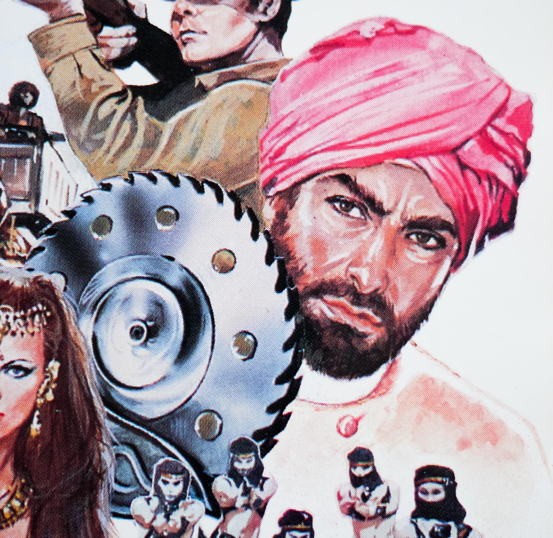
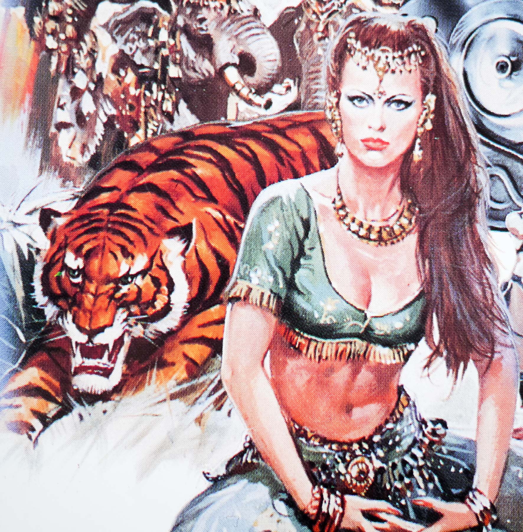
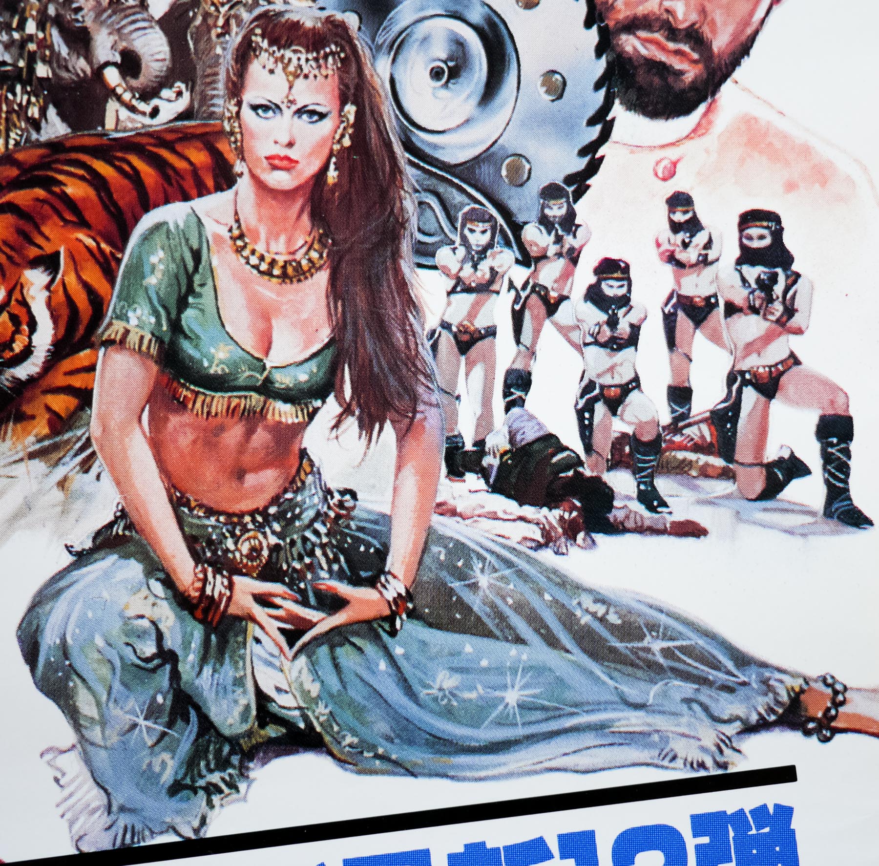
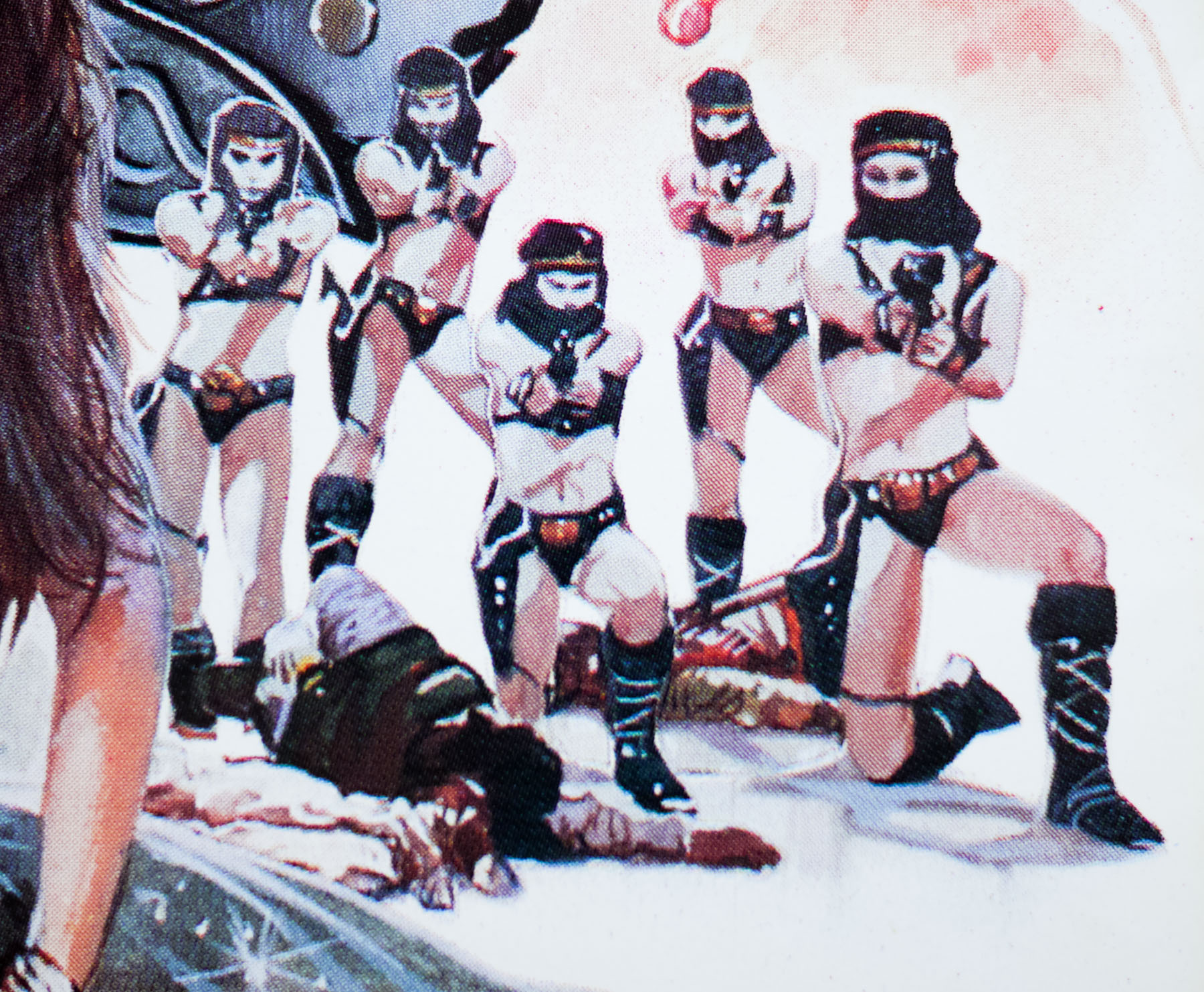
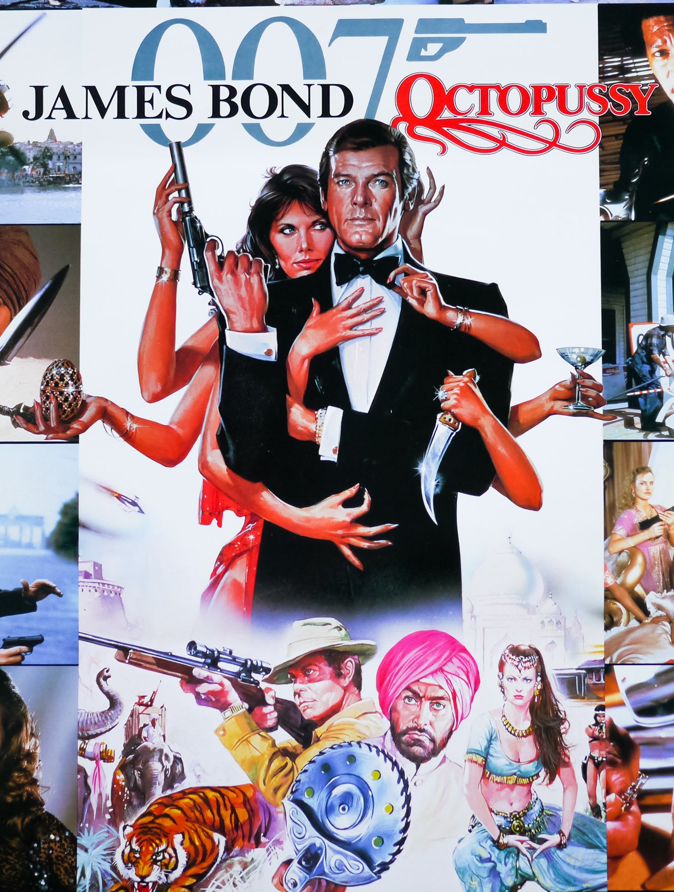
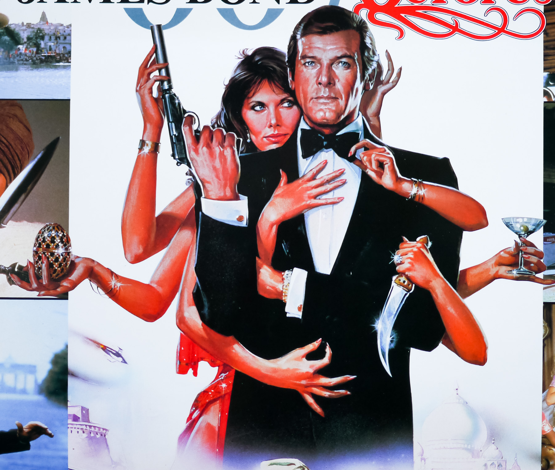
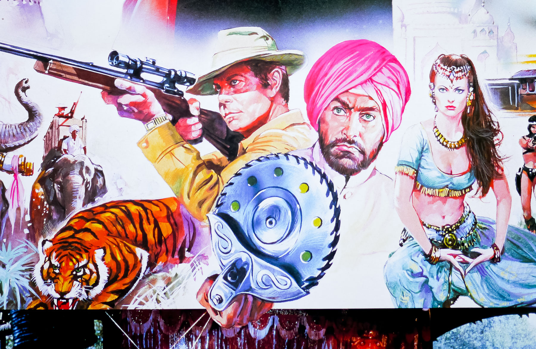
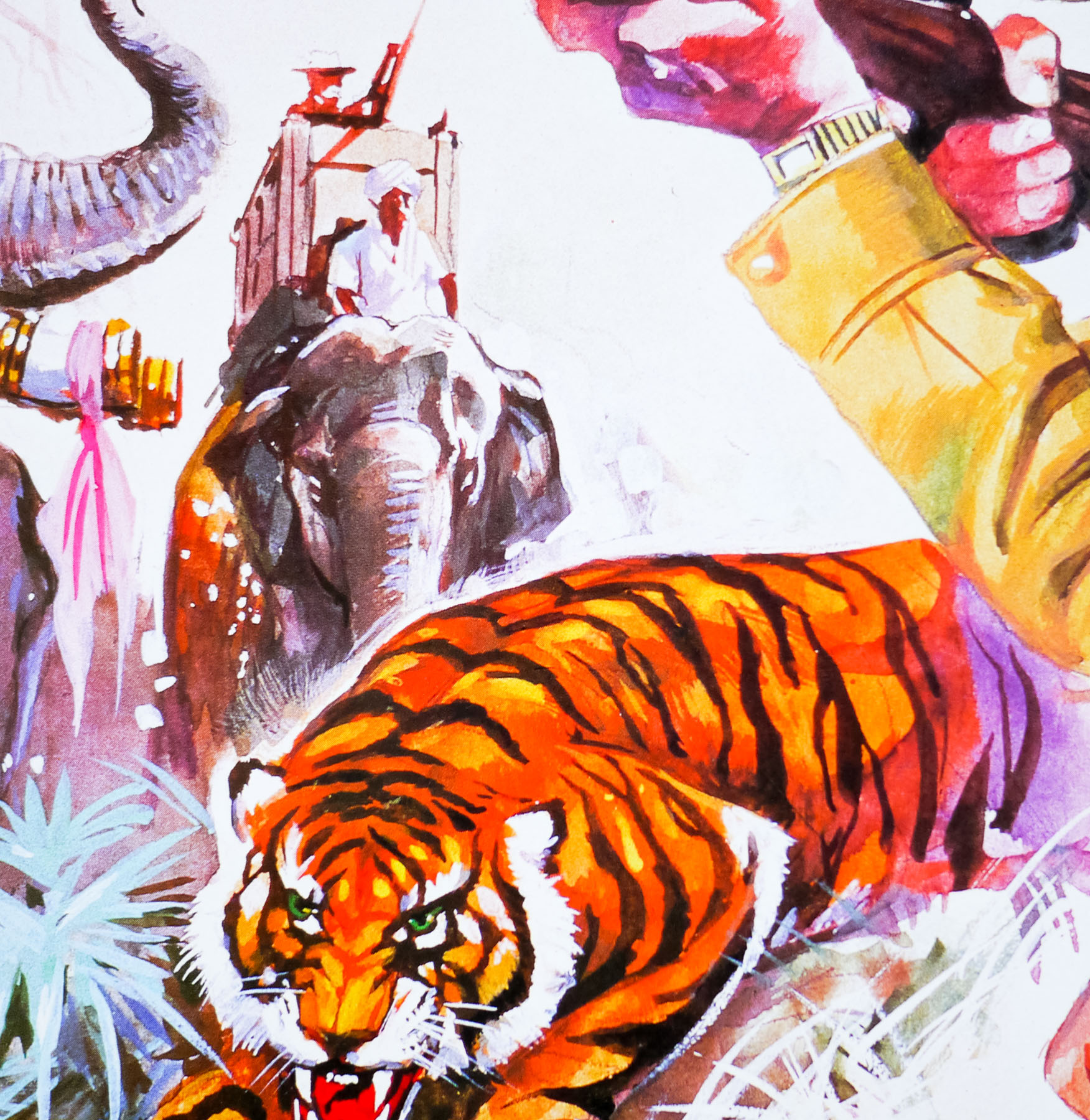
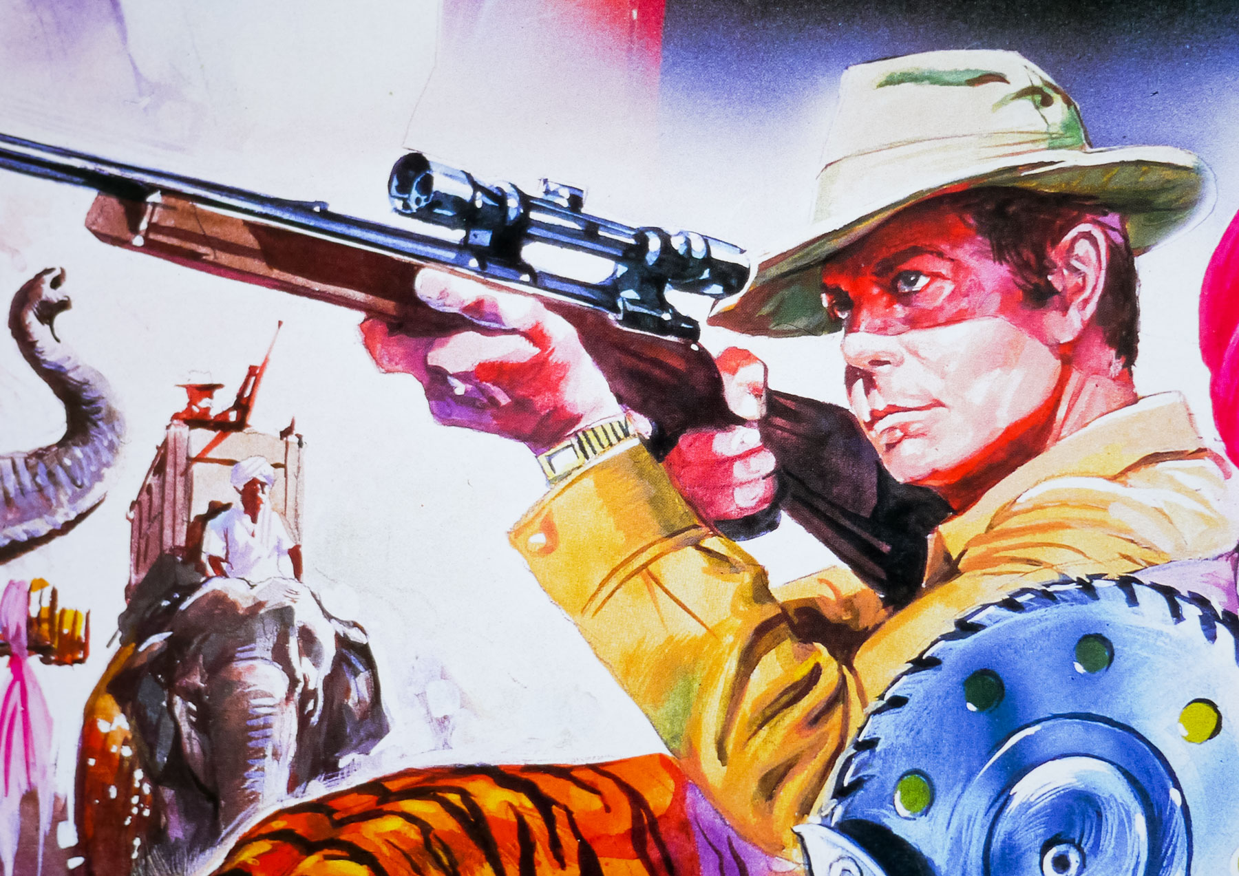
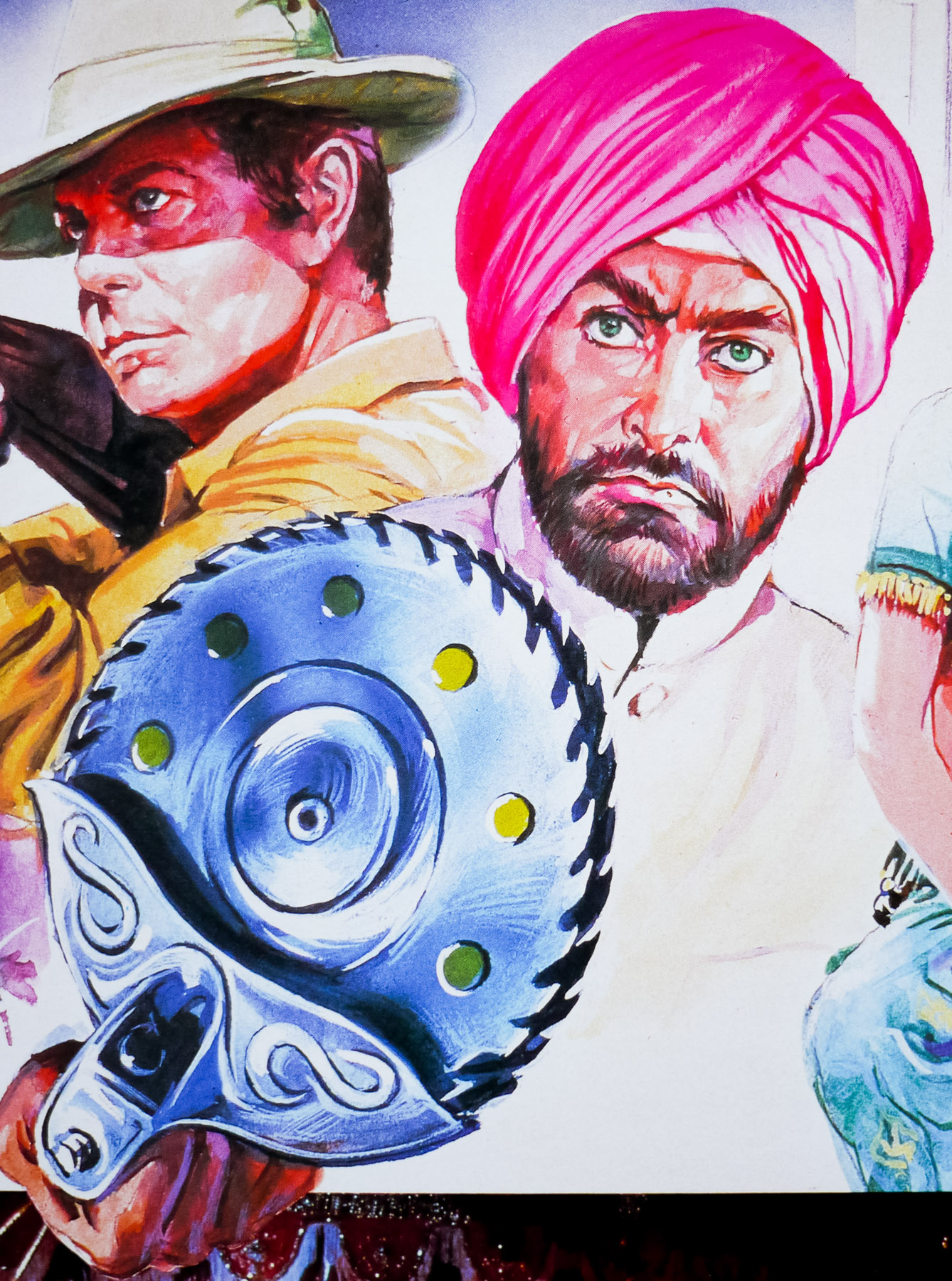
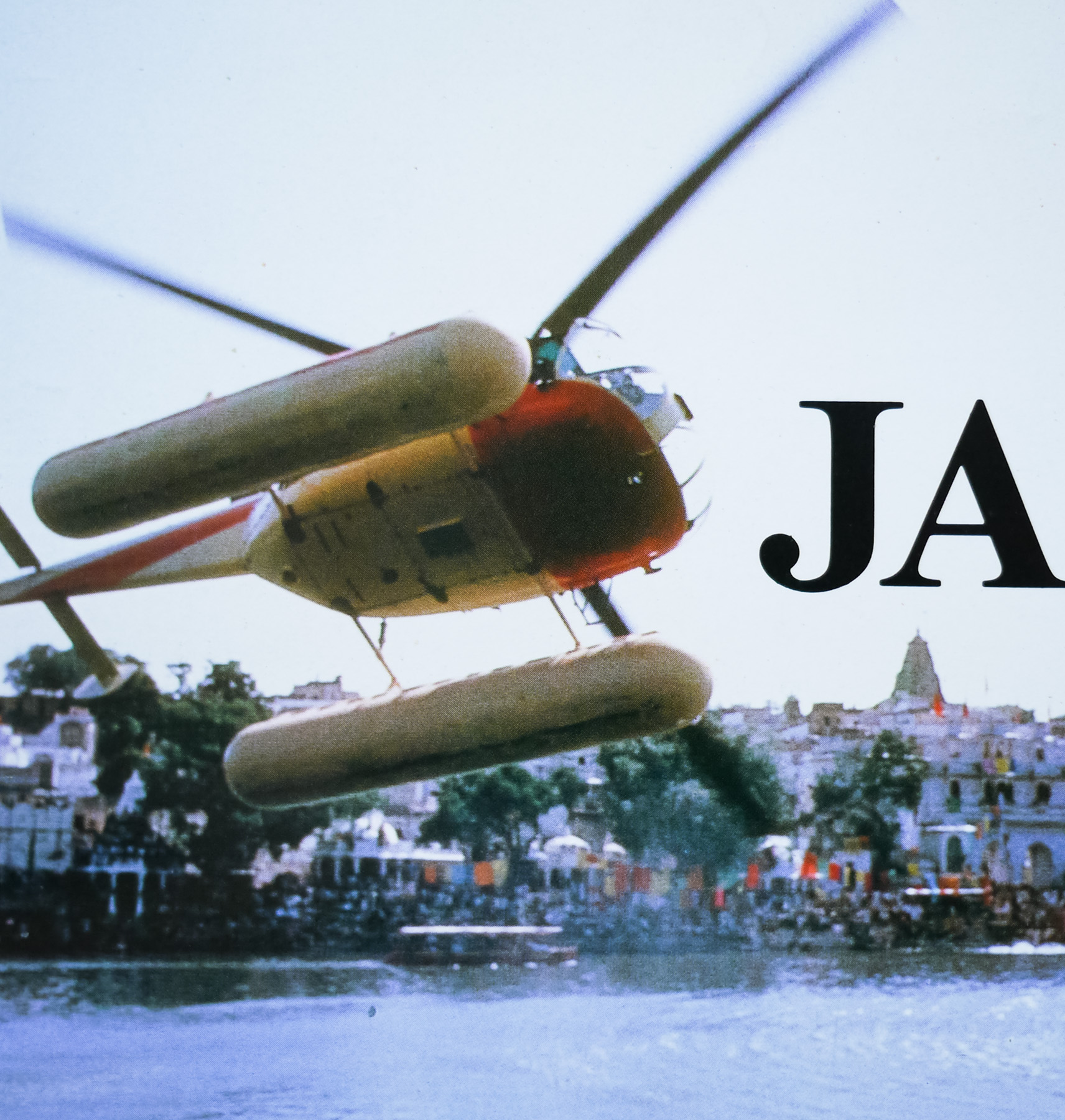
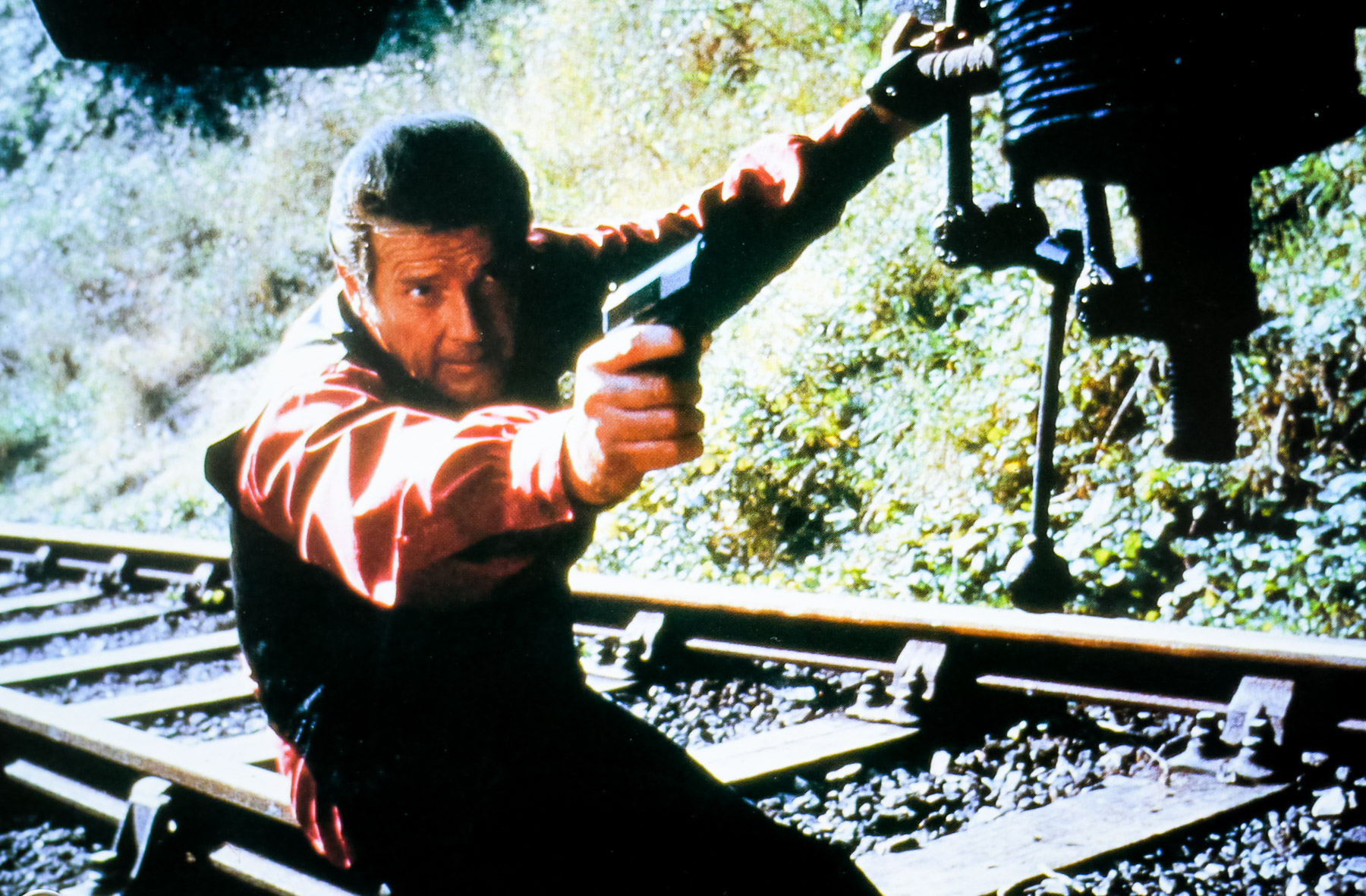
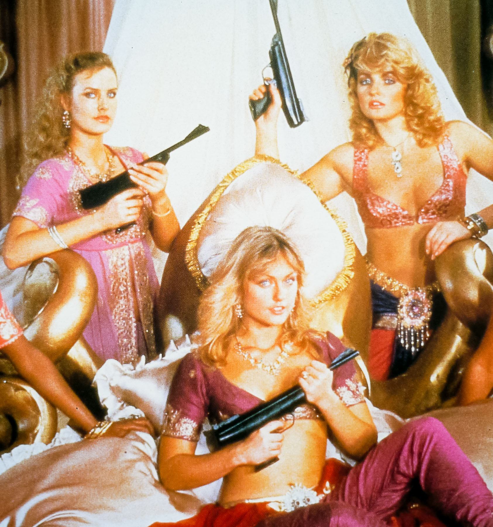
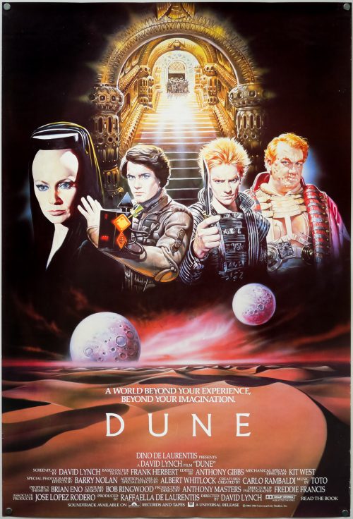
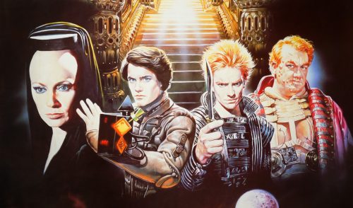
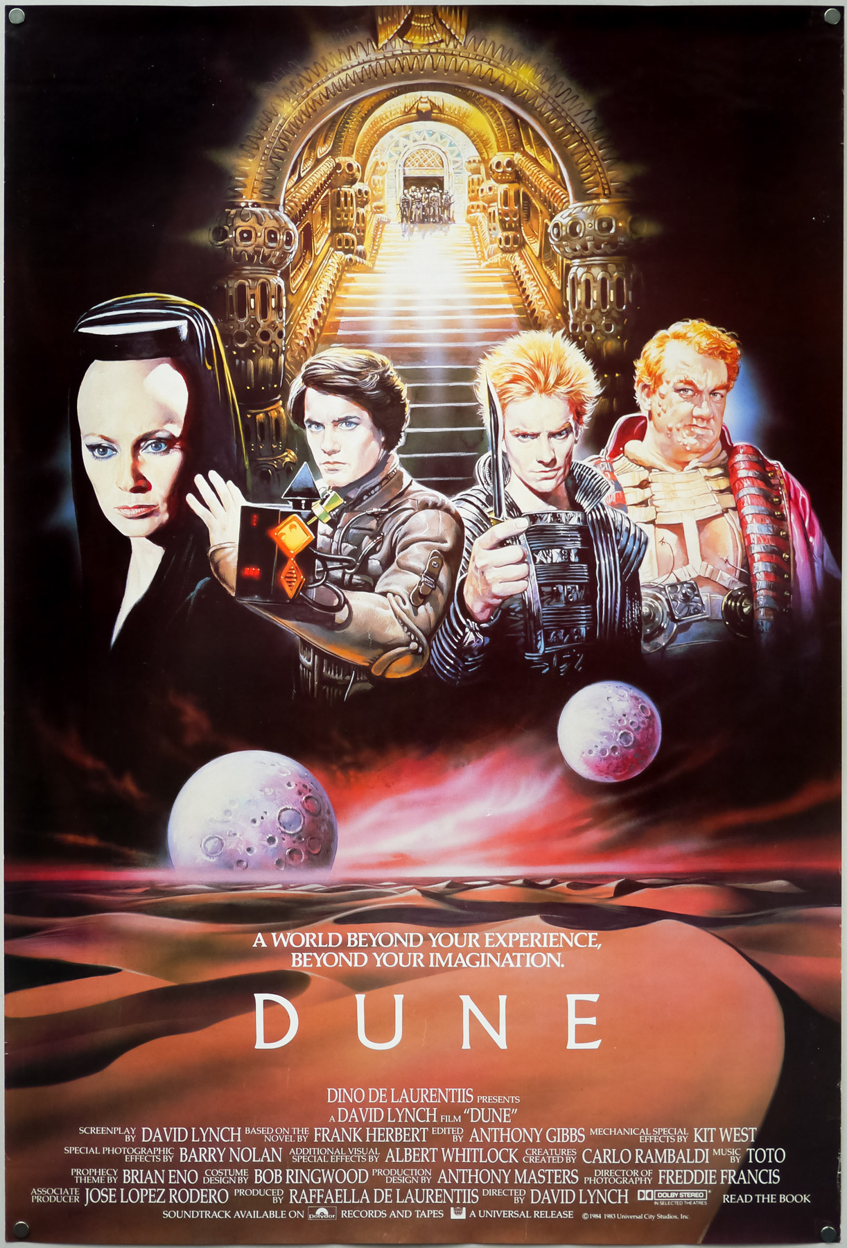
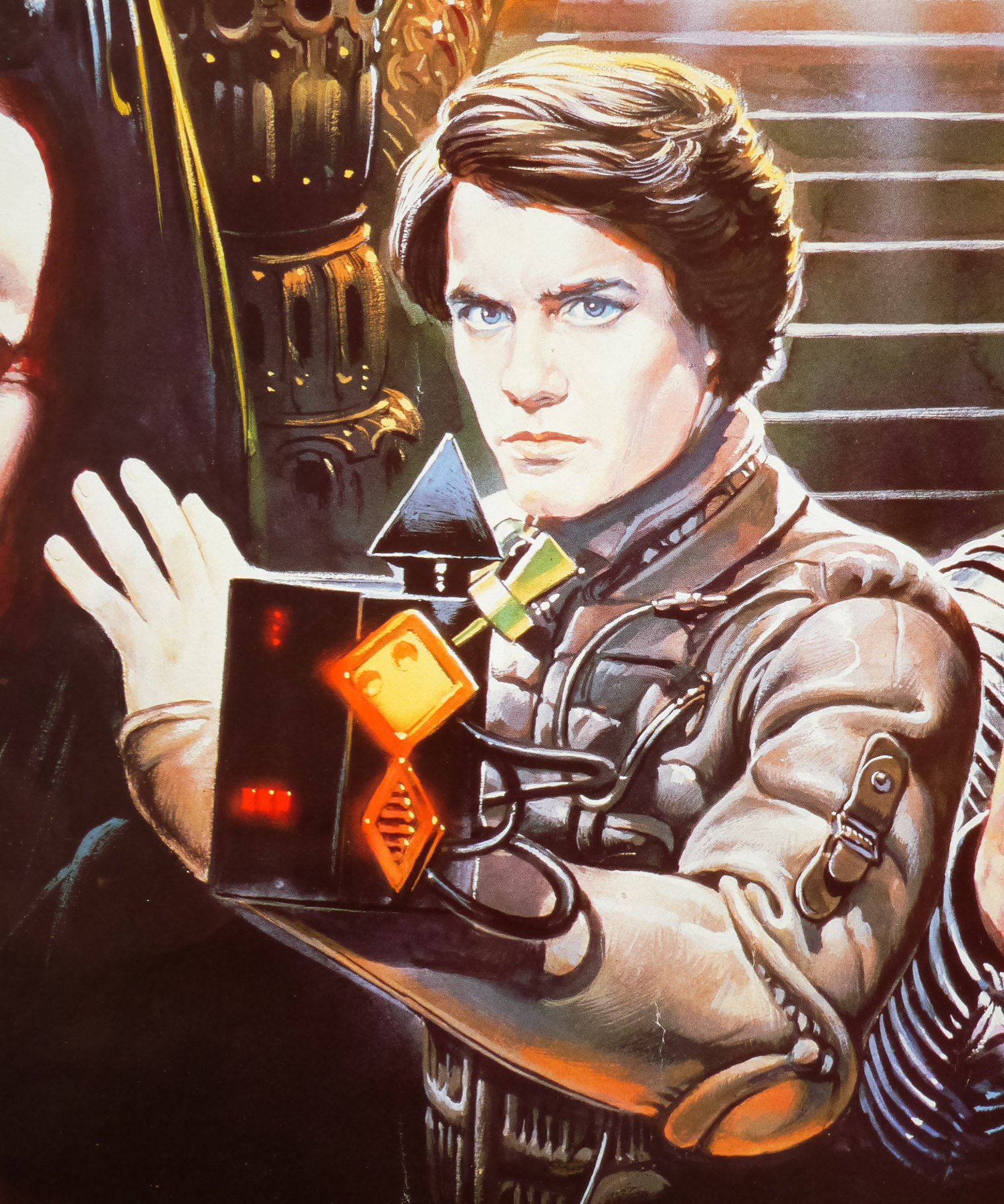
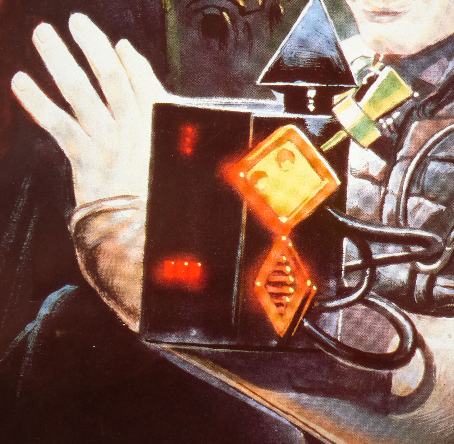
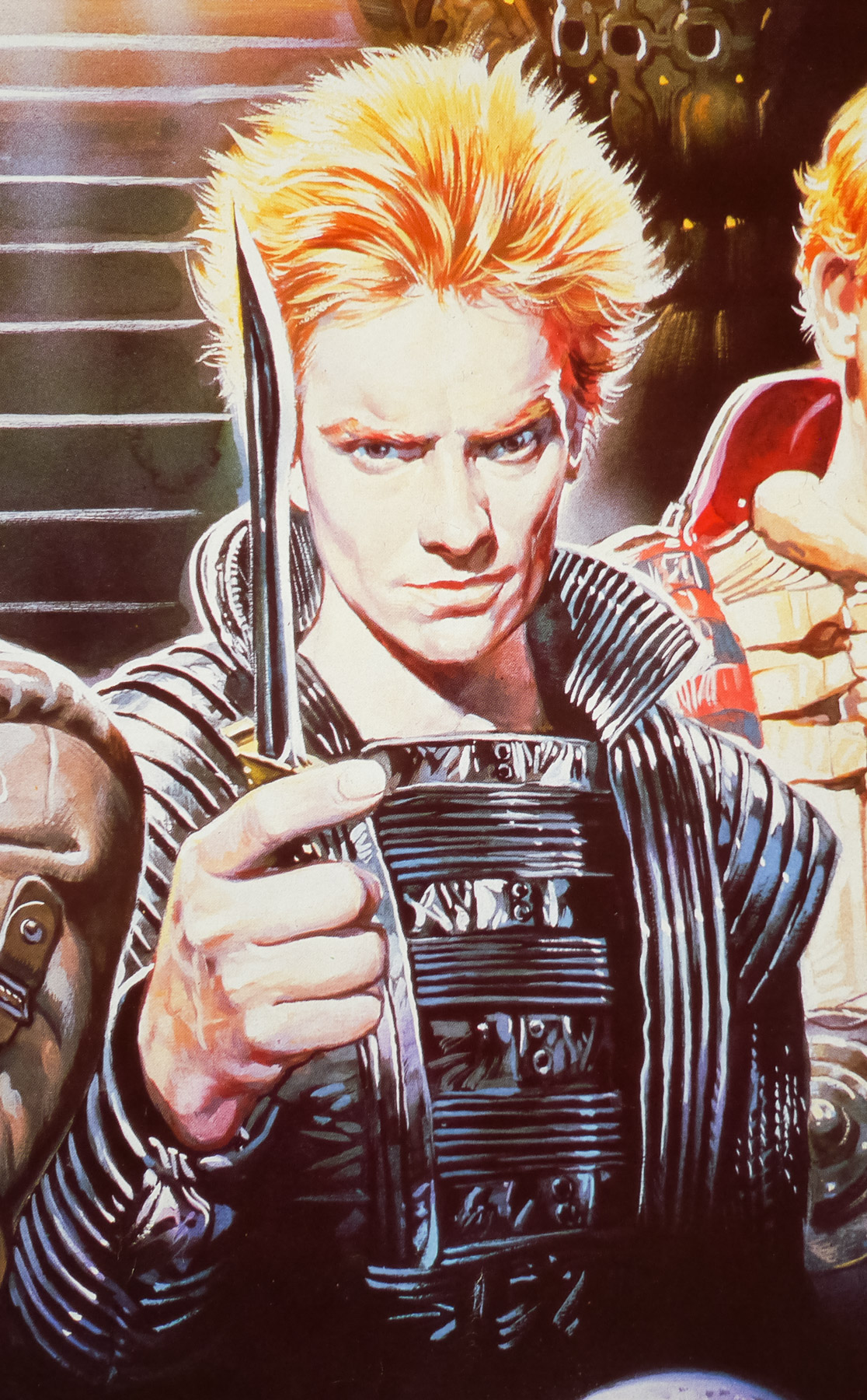
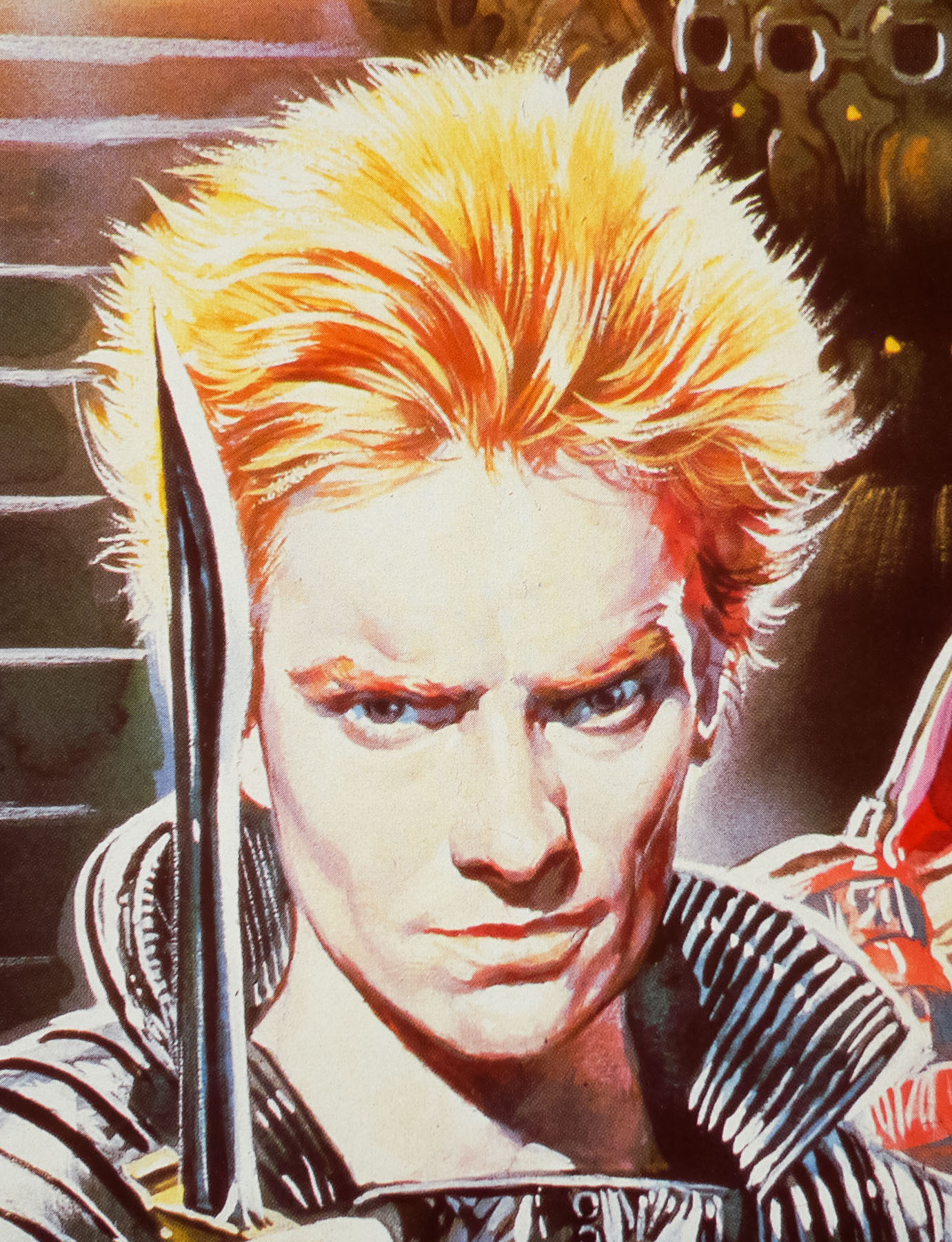
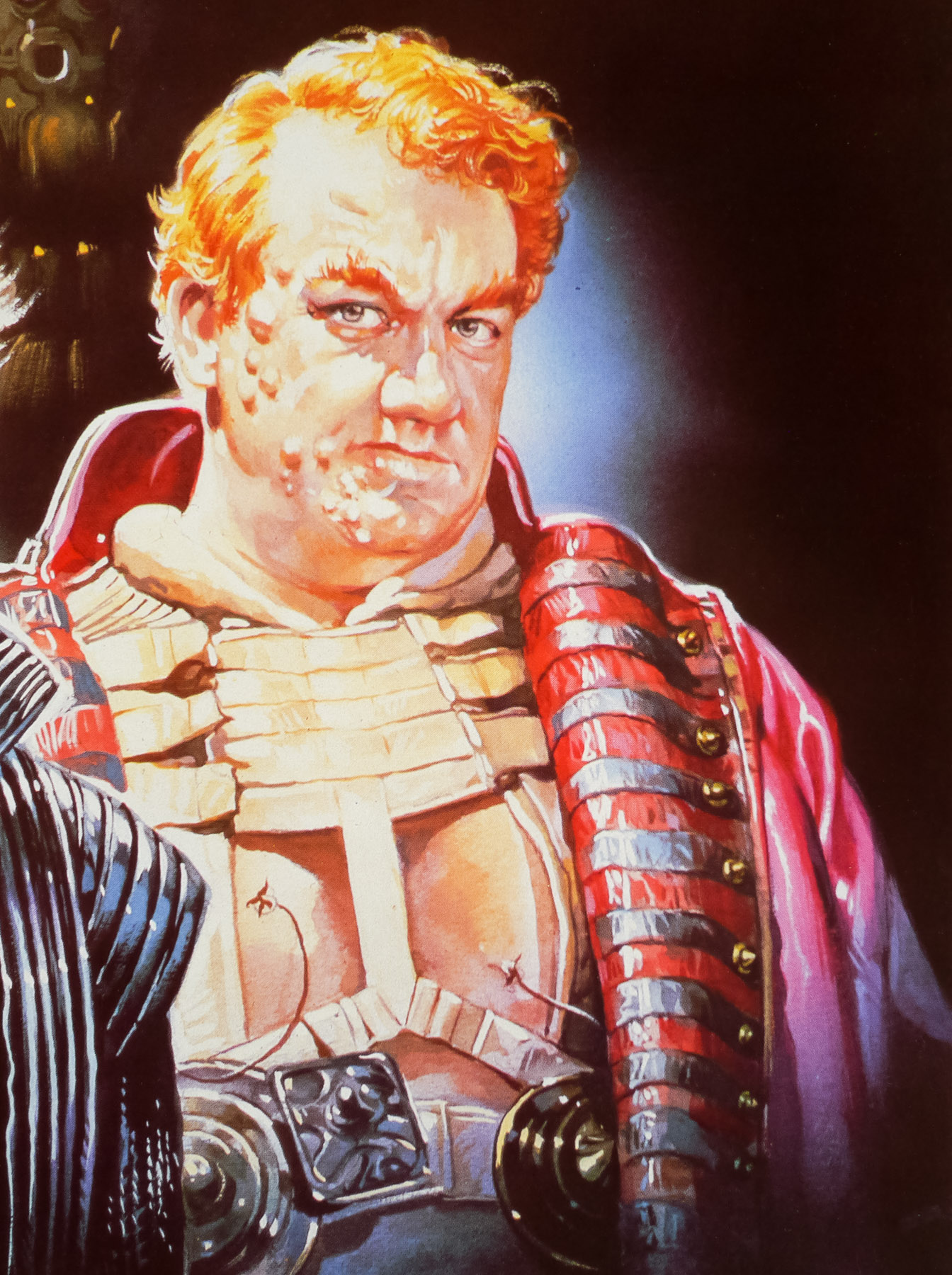
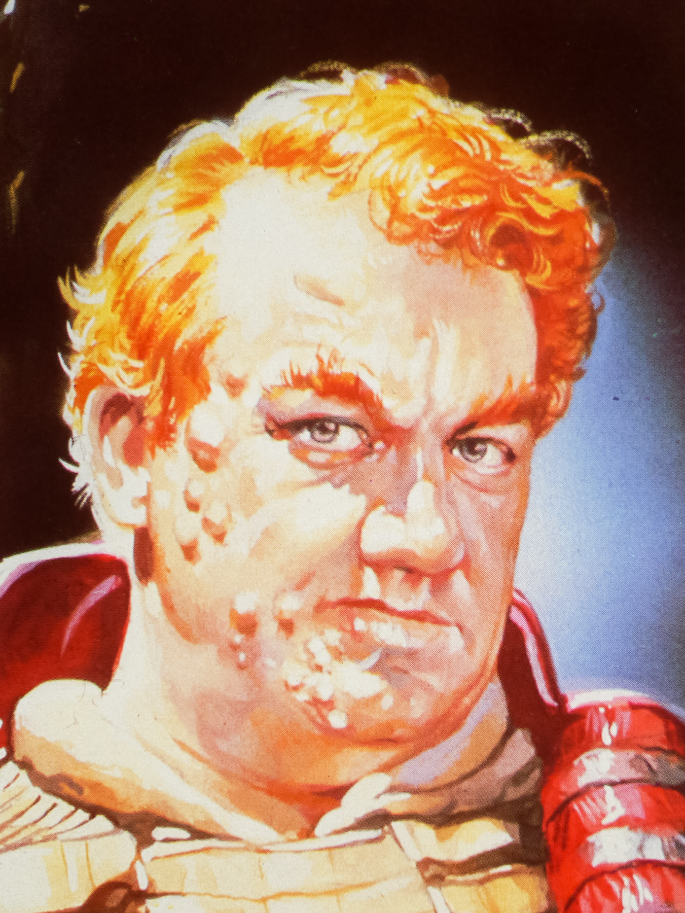
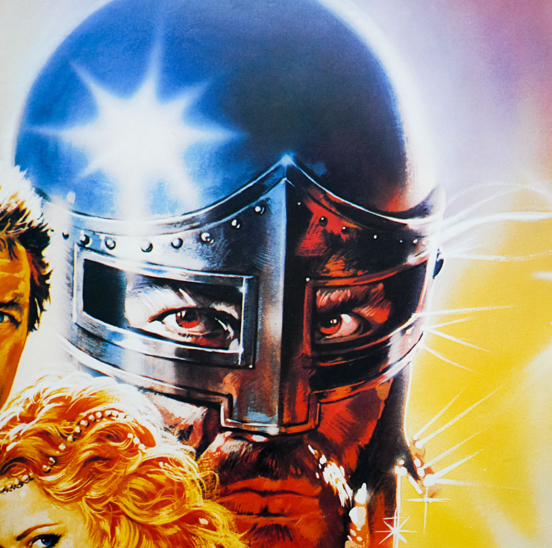
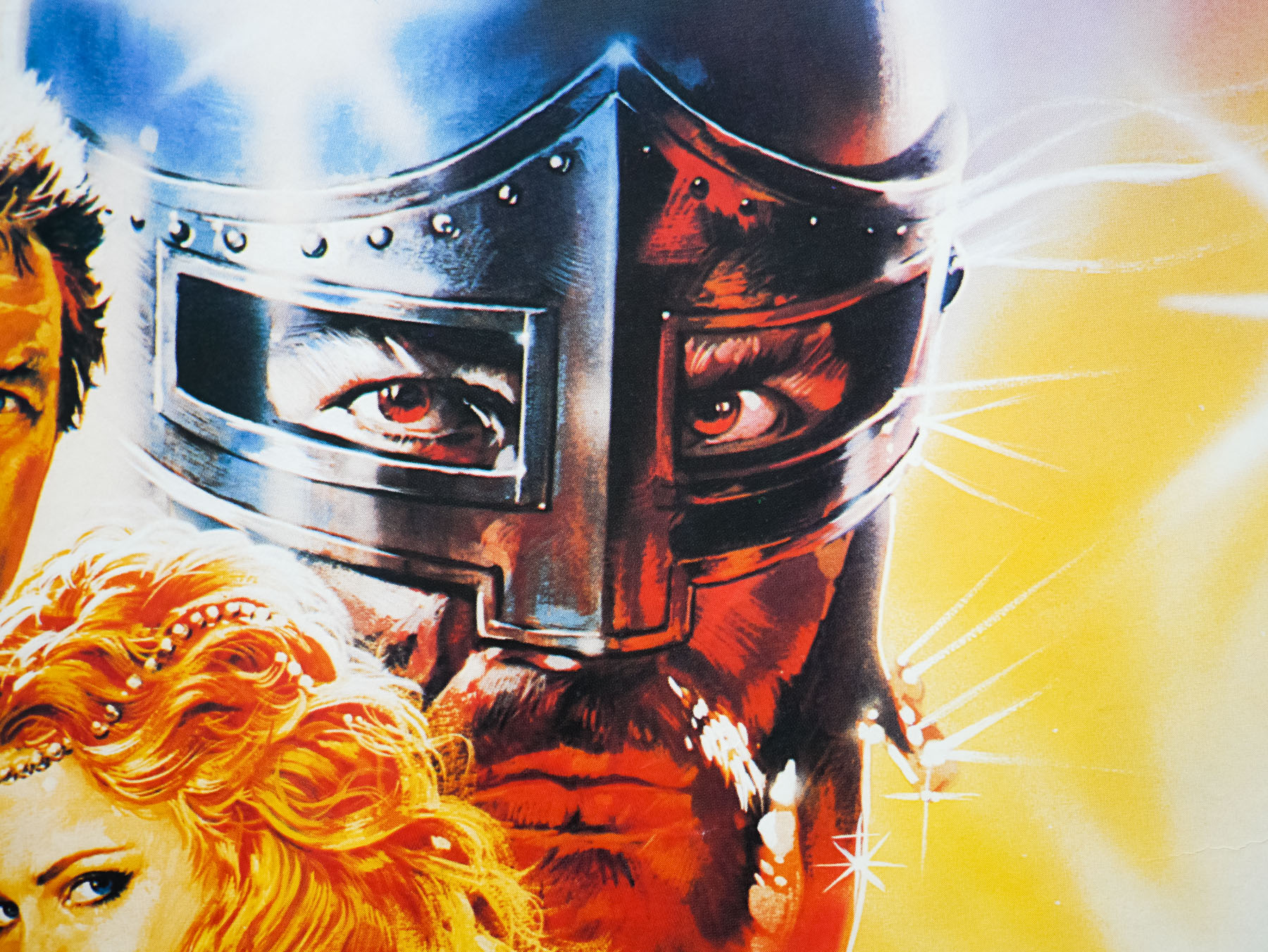
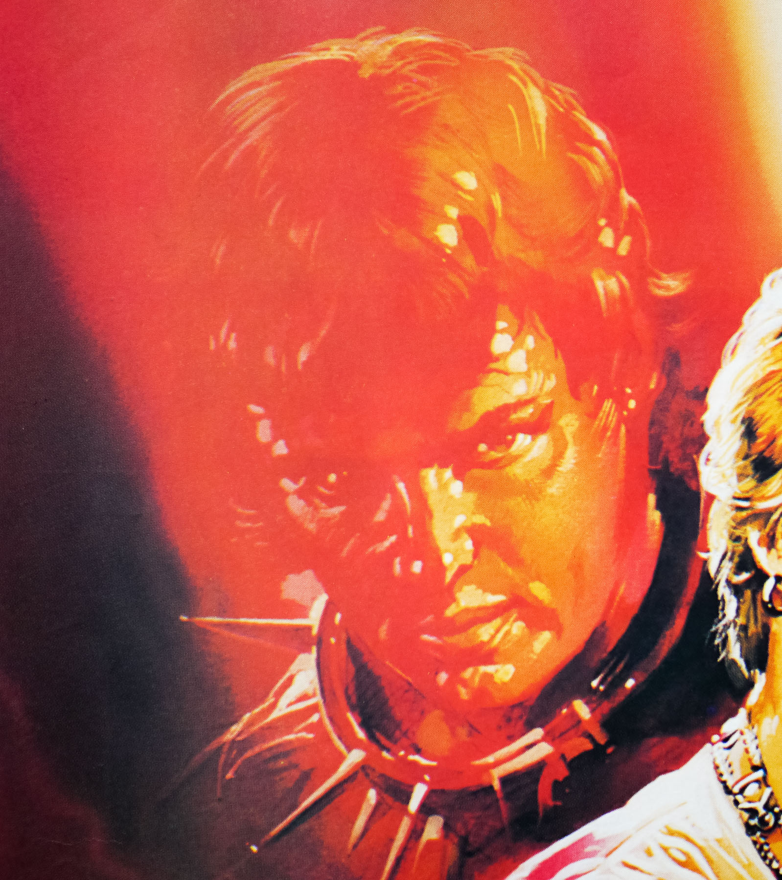
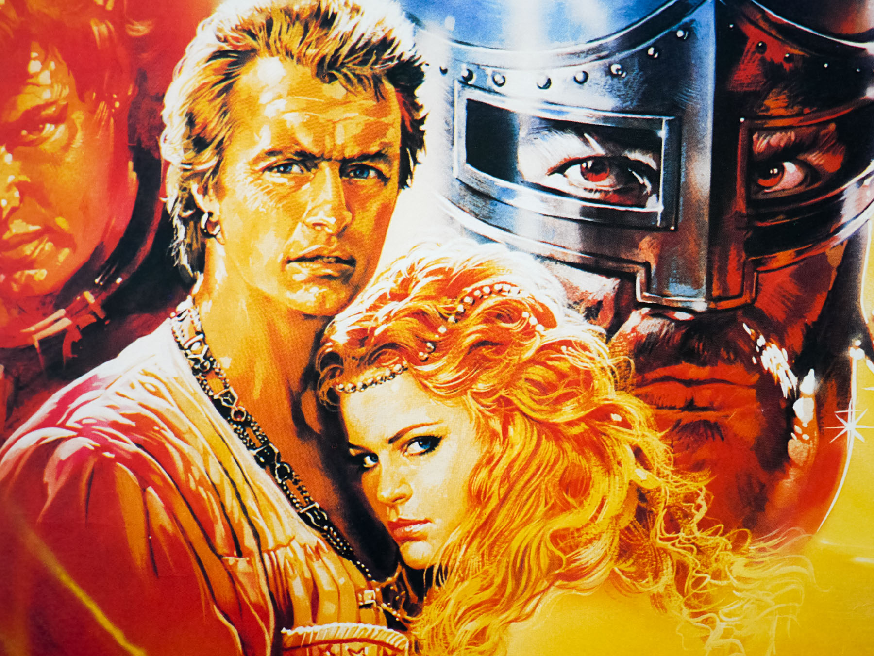
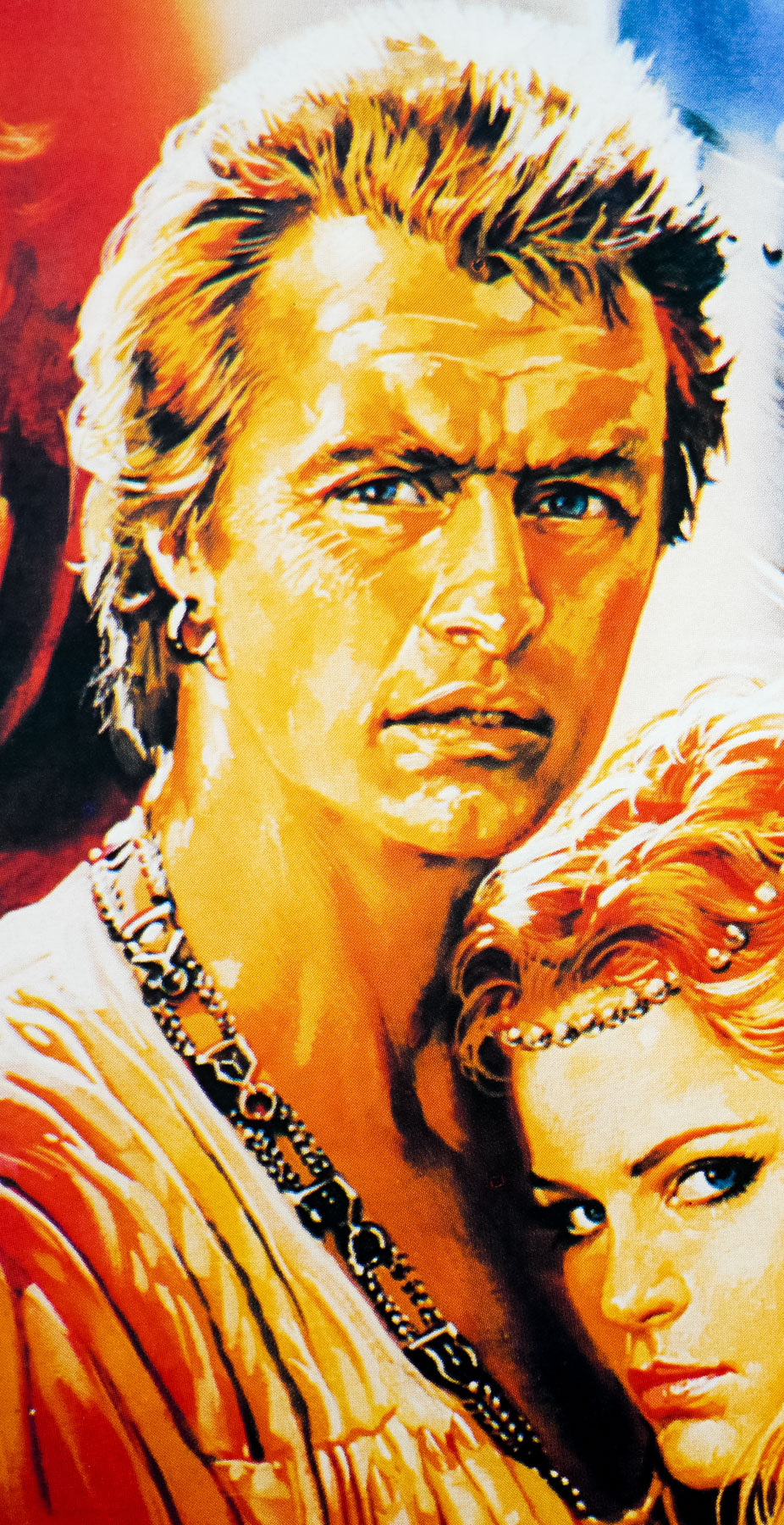
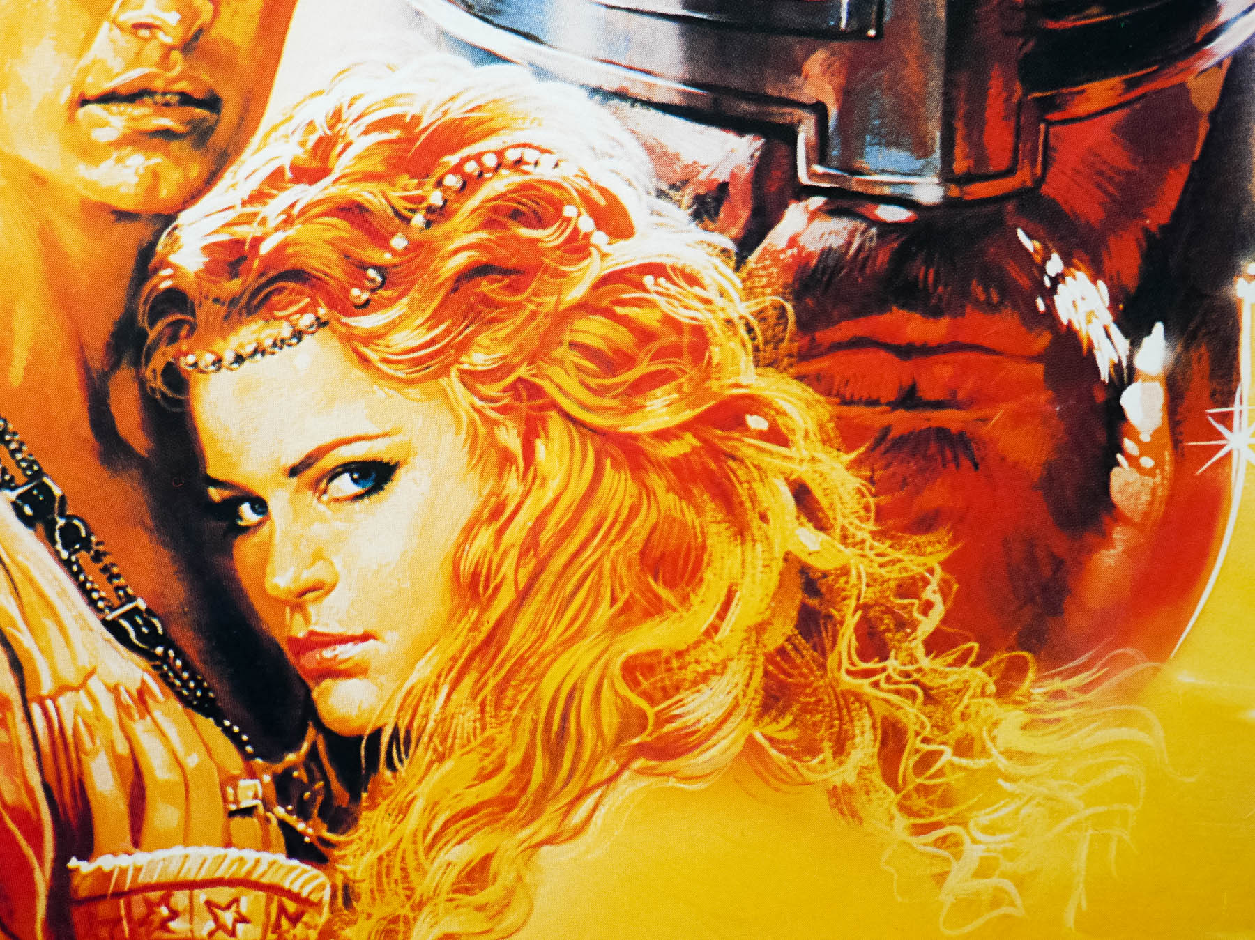
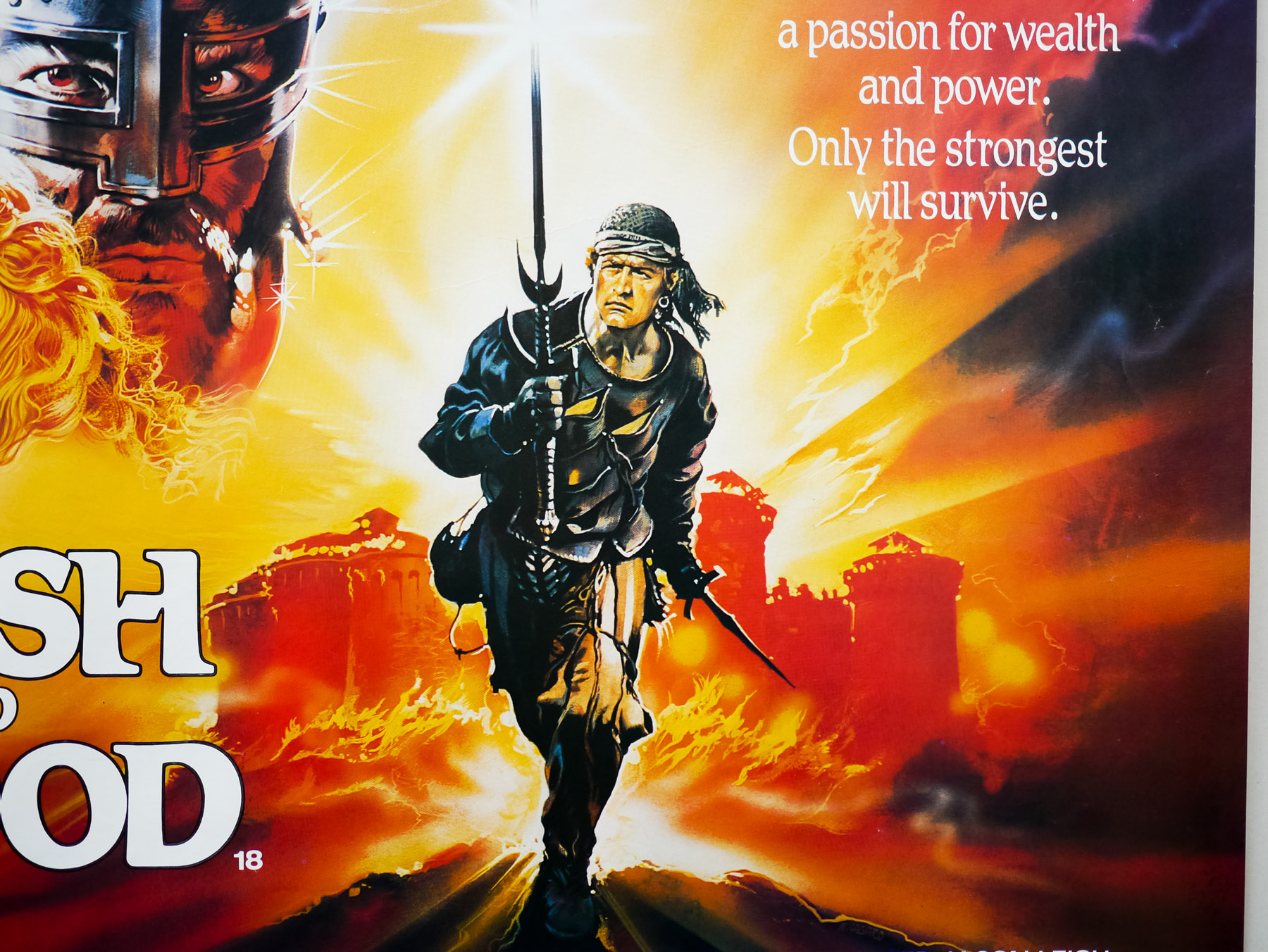
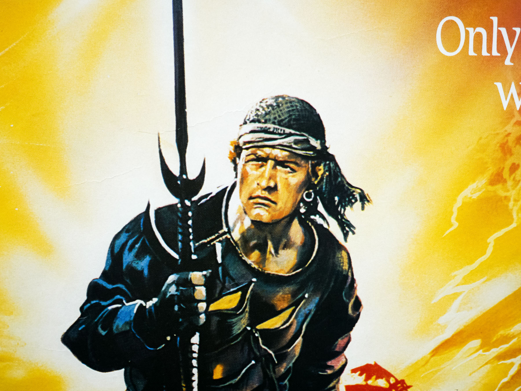
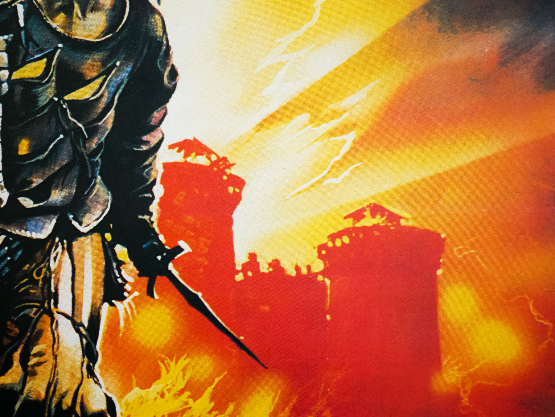
The American one sheet for Conan the Barbarian, painted by Renato Casaro in 1982 after the artist made a memorable visit to the film’s Almeria set. The artwork was used around the world to promote the film and is arguably Renato’s most famous work.
Renato, thanks for welcoming me here. I thought we could start with your early life and you were born in 1935?
Yes, that’s correct. I was born in Treviso, Northern Italy.
Can you tell me about your childhood?
I was lucky because I went to a school near Treviso that was really respected for the way it taught the pupils about art and design. I had a teacher that encouraged me and helped me to understand how to draw and paint. I remember that I had a notebook that I would carry with me everywhere and I would continue to draw sketches and caricatures of other students and teachers, even when I wasn’t in art class. My mother used to get annoyed because I’d be drawing in books that were meant for other subjects!
Did your mother and father have an artistic background?
No, there were no members of my immediate family who were artists and I don’t really know of any relatives who were particularly skilled either.
What about cinema? Was that a passion from a very early age?
Oh, absolutely! I was at the cinema to see a film almost every day. As well as enjoying the films themselves, I fell immediately in love with the posters that were displayed when a new film was showing. I used to go by the cinema every day to see if they were changing the posters and when they were I would ask if I could take them home. I was usually in luck and would run home with the poster and go into my bedroom to study it before attempting to paint a copy of it. I always did this because it helped me to understand how the artist had achieved the finished result.
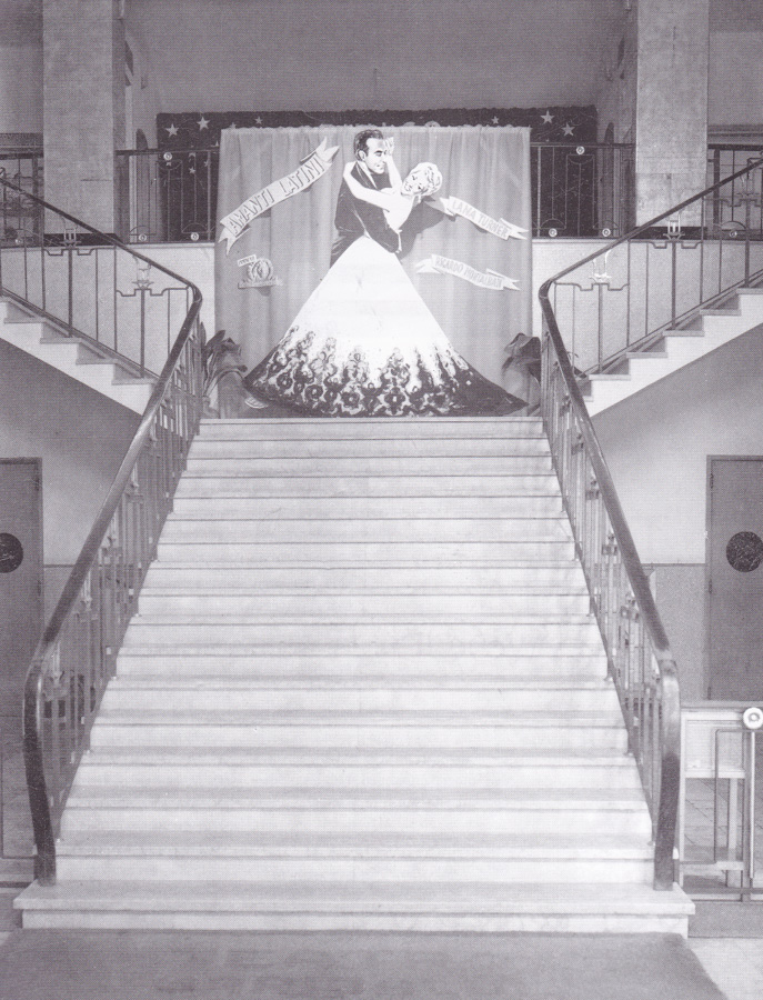
The central staircase of Treviso’s Cinema Garibaldi in the 1950s.
I repeated this over and over with many different posters and I guess that’s how I taught myself various techniques that would later serve me well for my career as an illustrator. There were no colleges or courses that specifically taught illustration around Treviso so it was the best way for me to learn. My art teachers were good but they weren’t really interested in teaching us commercial illustration skills like those I’d need if I were to become a professional.
Some of the posters were so incredibly well painted and, try as I might, I just couldn’t emulate the way that the artist had done it. It was like a mystery to me how they had achieved it and I was hungry to understand. I realised that if I was to learn more I would have to leave Treviso and go to Rome.
Did you know the names of the artists at that time?
Yes, most of the posters had signatures on them or credits in the bottom corner so I began to learn the styles of the different artists, like Angelo Cesselon and Averado Ciriello. For me, however, the best in the world at that time was the American artist Norman Rockwell – I just thought he was the master!
Every week I used to go to have a look at the new issue of The Saturday Evening Post that was imported from the States by a newsagent in Treviso. Rockwell’s artwork would be on the cover or inside the magazine illustrating different scenarios. Of course I tried and tried to capture his wonderful images, but it was not easy. Don’t get me wrong, I did really like many of the Italian artists but for me nobody could match Rockwell.
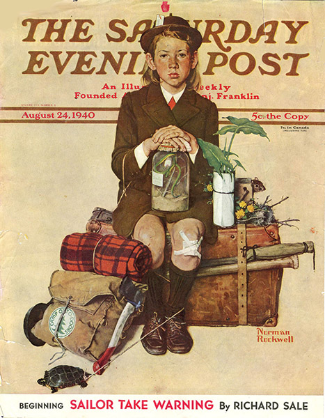
The cover of The Saturday Evening Post, August 24 1940, which was illustrated by Norman Rockwell.
What was life like for you during the Second World War?
It was not too bad because I was so young at the time and my family and I lived in a small village called Sant’Antonino that was in the countryside outside Treviso, so we didn’t have to worry too much about the bombing that was hitting the city. Because we were in the country we also had no worries about food since there was plenty of space to grow vegetables and we had livestock and chickens too. When the war finished it was really easy for me to return to studying, so I felt very lucky.
A few years before the war started I had gone with my parents to Libya to live in Benghazi because my father was a shipbuilder and he had been offered a job there working to build huge boats. We returned to Sant’Antonino when I was about six years old.
What did you do after you finished school?
Well, thanks to me having been constantly sketching and painting since a young age, both in school and at home, I had become pretty good at technical drawing – the kind of detailed images that were used by engineers as a basis to build machines and vehicles. My father had recognised that I had a talent for it and had helped me to nurture the skill with the thought that I would join him at the place where he worked and help to design ships.
It could have been a good career possibility for me as I might have ended up working for one of the car manufacturers like Ferrari or somewhere like that. The problem was that I was still too obsessed with film and the idea that I might have a career as a poster artist. My parents were very keen that I at least try working in what they considered to be a ‘normal’ career first so I got a job as a logo and type designer at a company called Longo & Zoppelli in Treviso. They handled the publicity for many companies all over the Veneto region, including for things like food and drink companies.
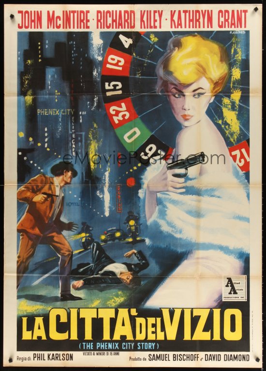
The Italian one panel (2-fogli) poster for La Citta Del Vizio (AKA The Phenix City Story, designed and painted by Renato Casaro, circa 1961.
I was based in the design studio and was working on things like labels for wine bottles and I remember doing a poster for an advertisement for a brand of panettone [an Italian cake sold at Christmas], which was one of the first of my designs to be printed. I recall it being a really great feeling to see my work on paper and hanging on the wall. All the while I was spending my spare time painting copies of film posters and continuing to hone my skills in that area. I was still living with my family at the time and they let me set up a small studio space in my bedroom. I had even bought different canvases and types of paints trying to improve my capabilities. It was an intense obsession of mine.
Whilst working at Longo & Zoppelli, I used to visit the big cinema in Treviso, which was called Cinema Garibaldi, and in there they had this huge wall onto which an artist would paint an advert for upcoming films that were due to be shown there. The cinema would change this painting every few weeks and so I asked them if I could work for them and was thrilled when they said yes. I remember working on these huge paintings for films like Latin Lovers with Lana Turner, Burt Lancaster in Apache and Marilyn Monroe in River Without Return.
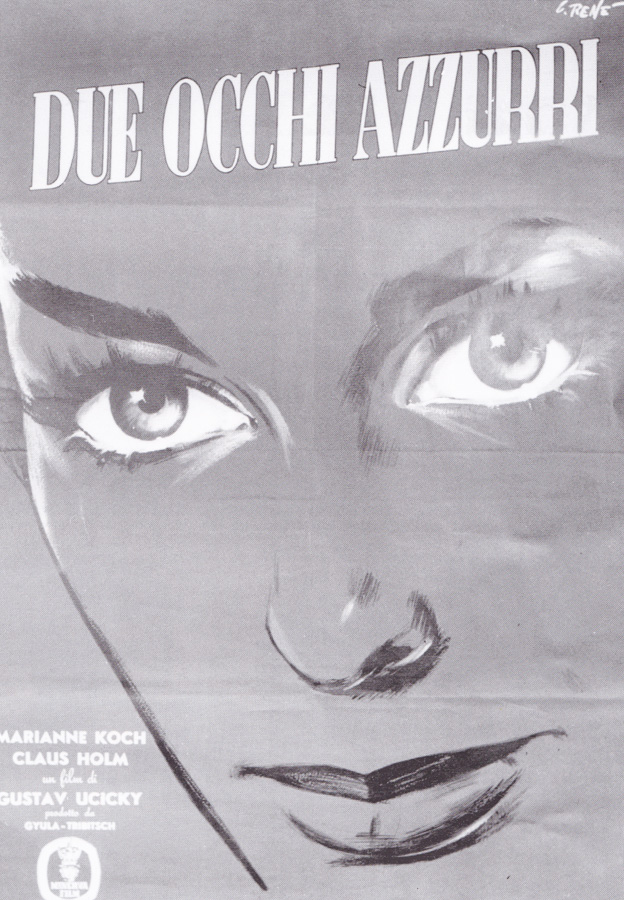
The Italian poster for Two Blue Eyes, painted by Renato Casaro circa 1956. This was the artist’s first ever printed poster.
When I turned 20 I decided it was time to travel to Rome and I told my parents that I had to go. Back then Rome felt a long way from Treviso; now it’s only a few hours by fast train, but 50 years ago it was a big deal to move there and was seen as a quite an adventure. My mother was of course very worried for me and was telling me how dangerous the big city could be, but I was determined to go and promised her that I would be fine. I knew that if I wanted any chance of becoming a film poster artist then that’s where I had to be.
I had taken photographs of all the paintings I’d done for the Cinema Garibaldi as well as plenty of illustrations and paintings I had done at home whilst I was perfecting my style and sent these to Studio Favalli, which was a really famous design and art studio working for the Rome film industry. They liked what they saw and invited me for an interview, which went well and I was invited to join the studio by the boss Augusto Favalli. I felt very lucky, as it was a small but strong team.
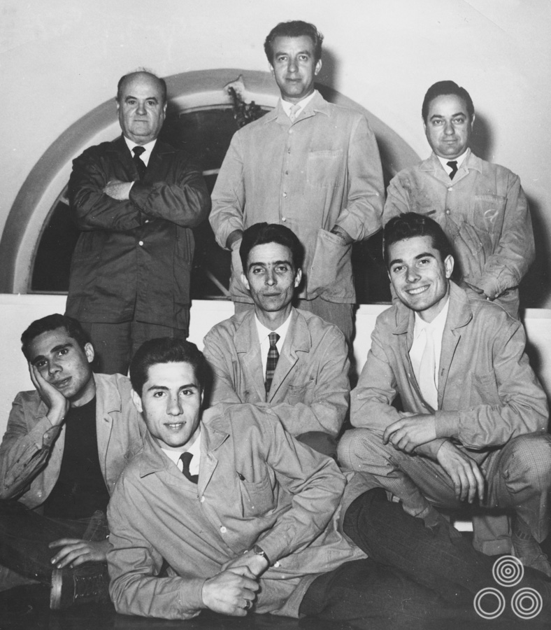
Studio Favalli, circa 1960, with Augusto Favalli in the centre at top, Renato Casaro bottom right, and Renato Fratini bottom left.
At that time the artist Renato Fratini was working there and I had around a year of working directly with him and learning tips and tricks before he left to go and work in London. It was a strong partnership and we were roughly the same age, he a little bit older, but we did some good work together during that time. I was very happy being in Rome and you can only imagine how much fun I was having as a young man, both at work and in my spare time! There was so much to see, experience and learn. I was truly full of life at that time. I also got to meet other artists that I’d admired before.
Ah, so you met some of the people responsible for the poster paintings you’d admired when you were growing up?
Yes, eventually I got to meet artists like Angelo Cesselon and others and I would tell them that I used to copy their art to understand how they achieved the finished result and to try and improve my own work.