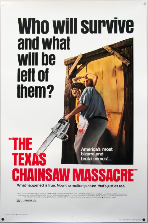
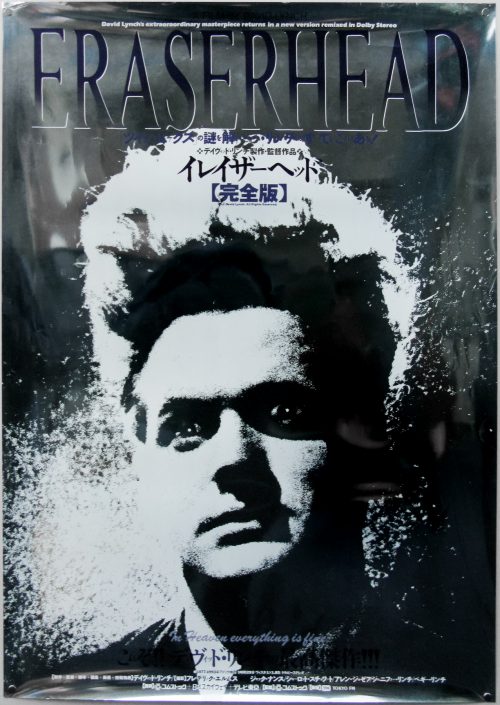
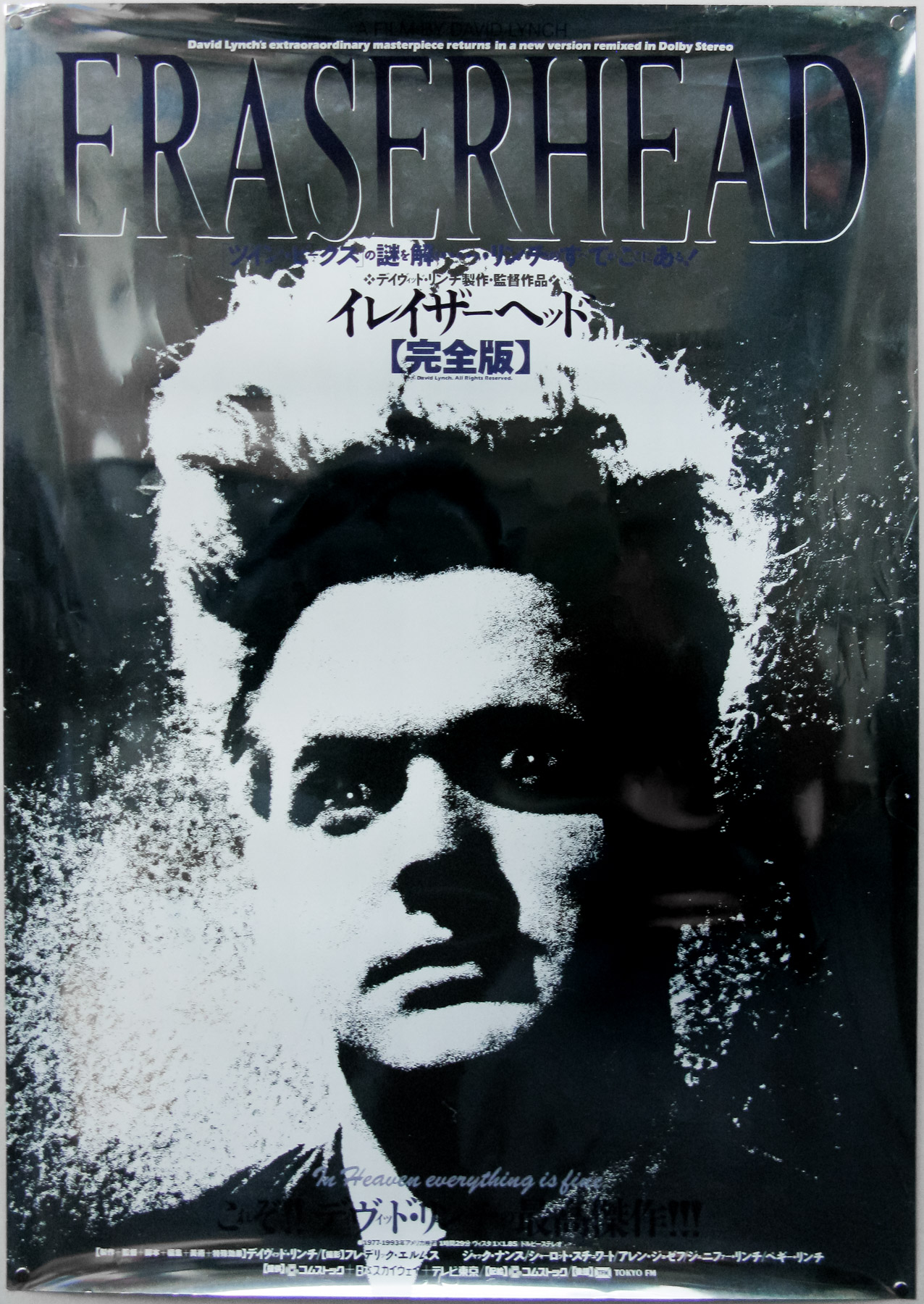
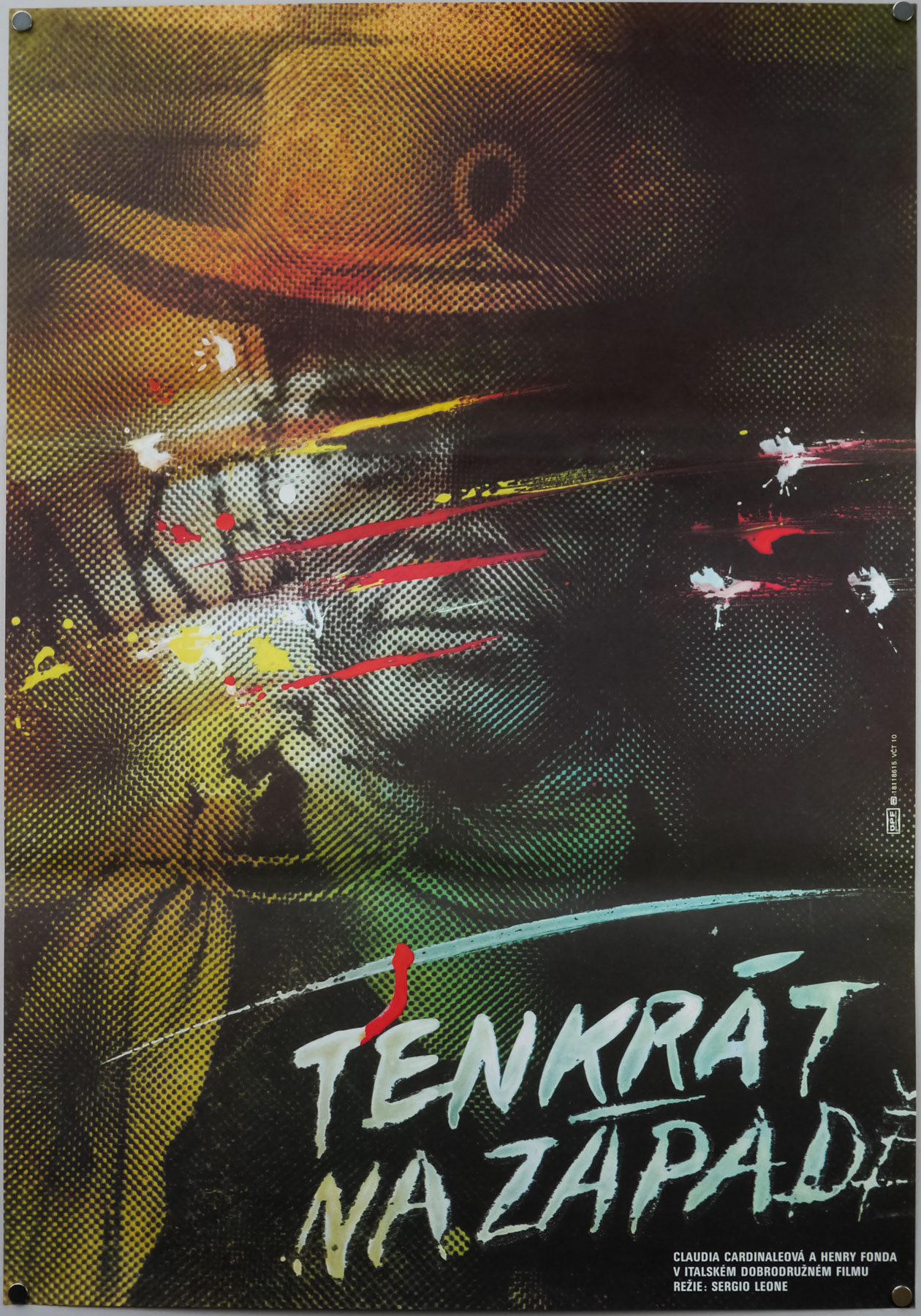
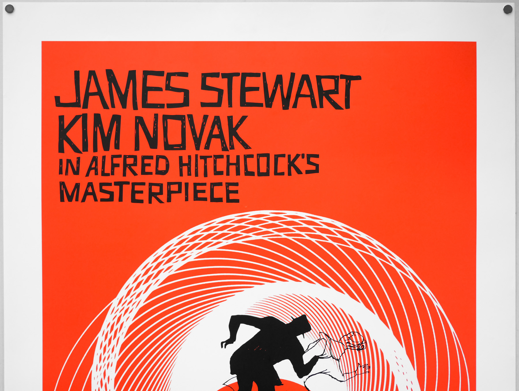
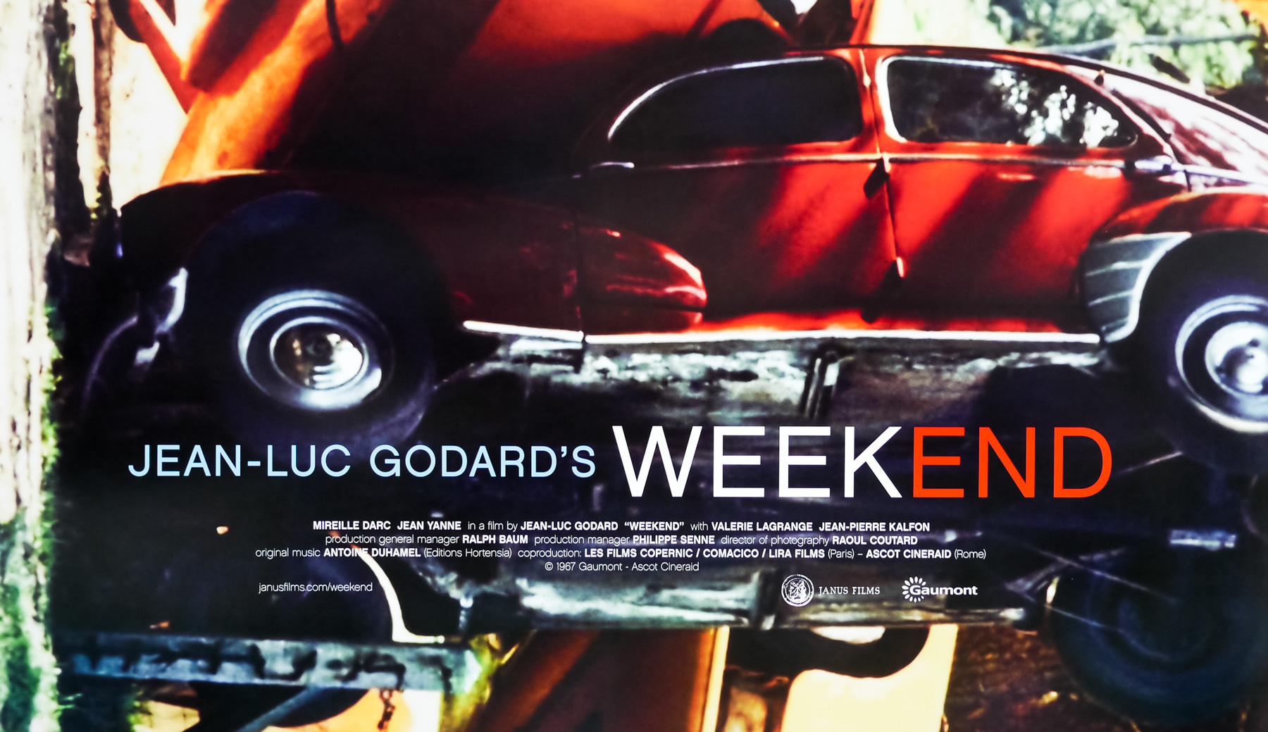
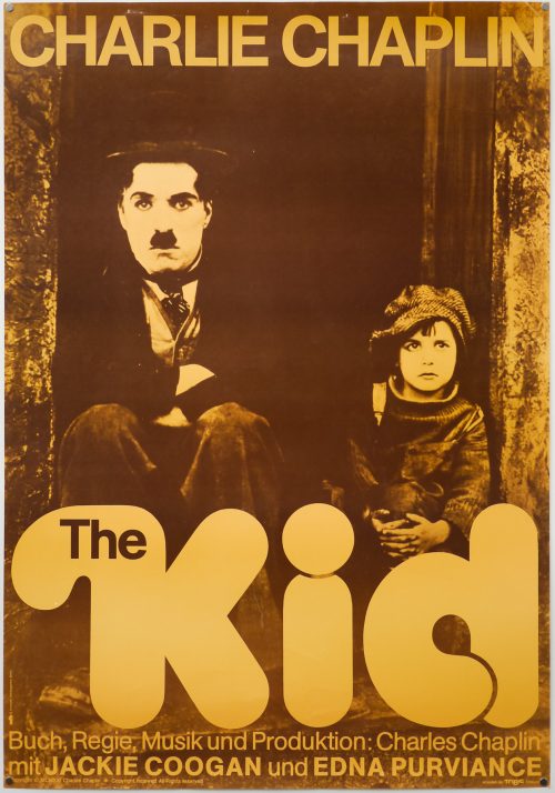
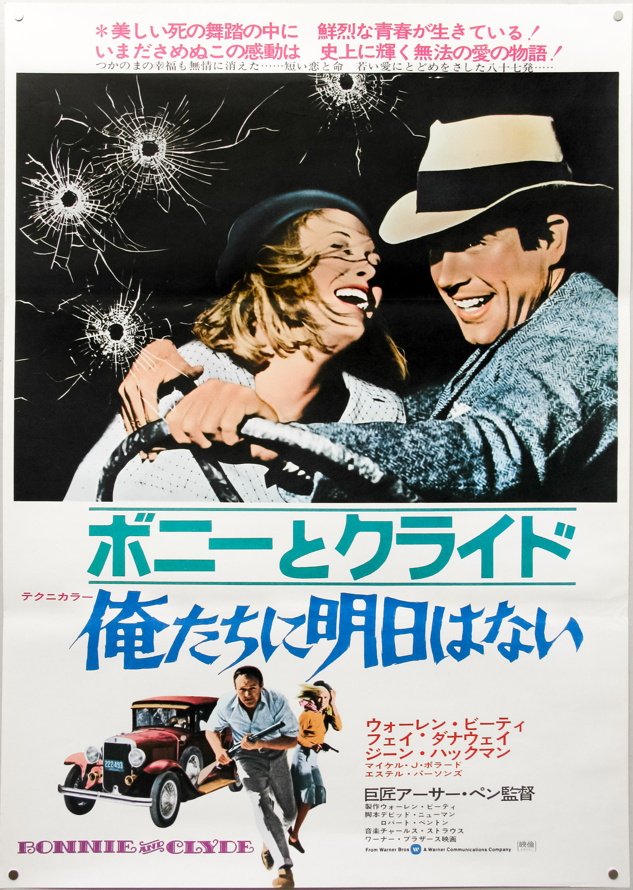
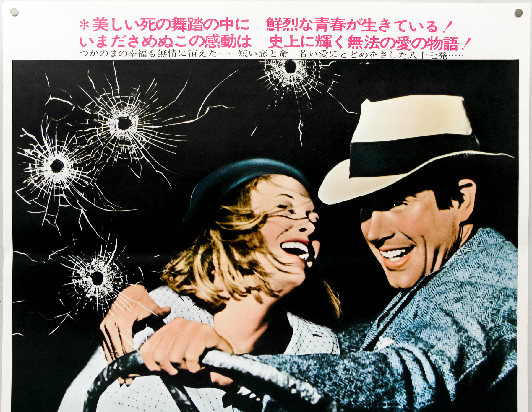
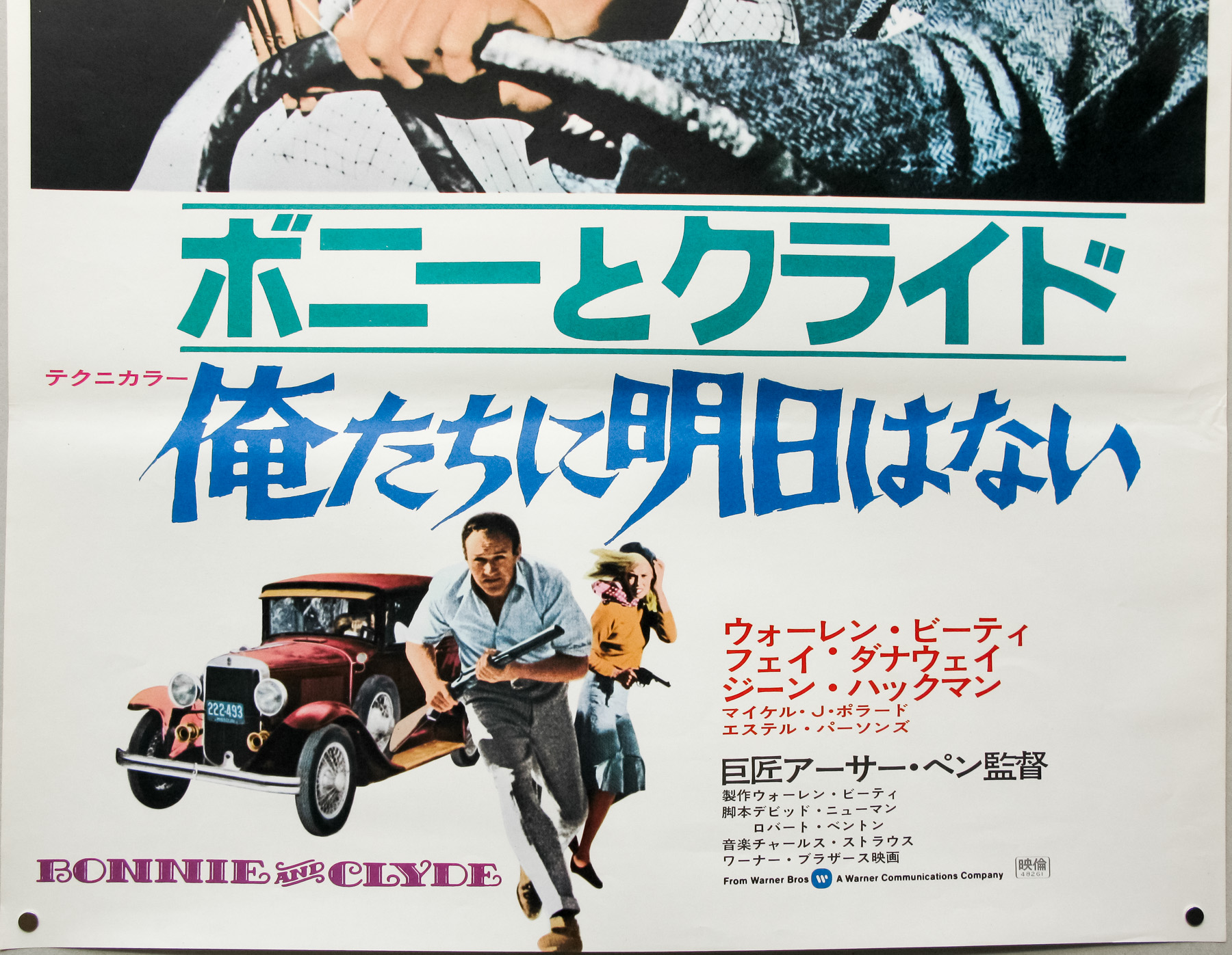
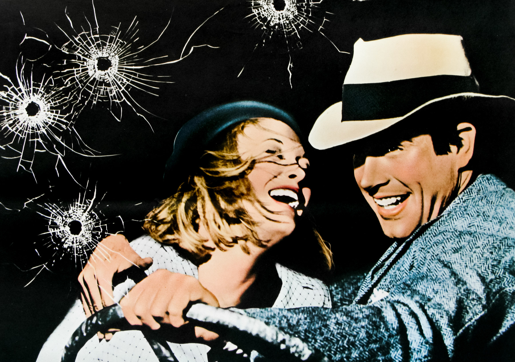
- Title
- House
- AKA
- (Hausu - alt. title)
- Year of Film
- 1977
- Director
- Nobuhiko Ôbayashi
- Starring
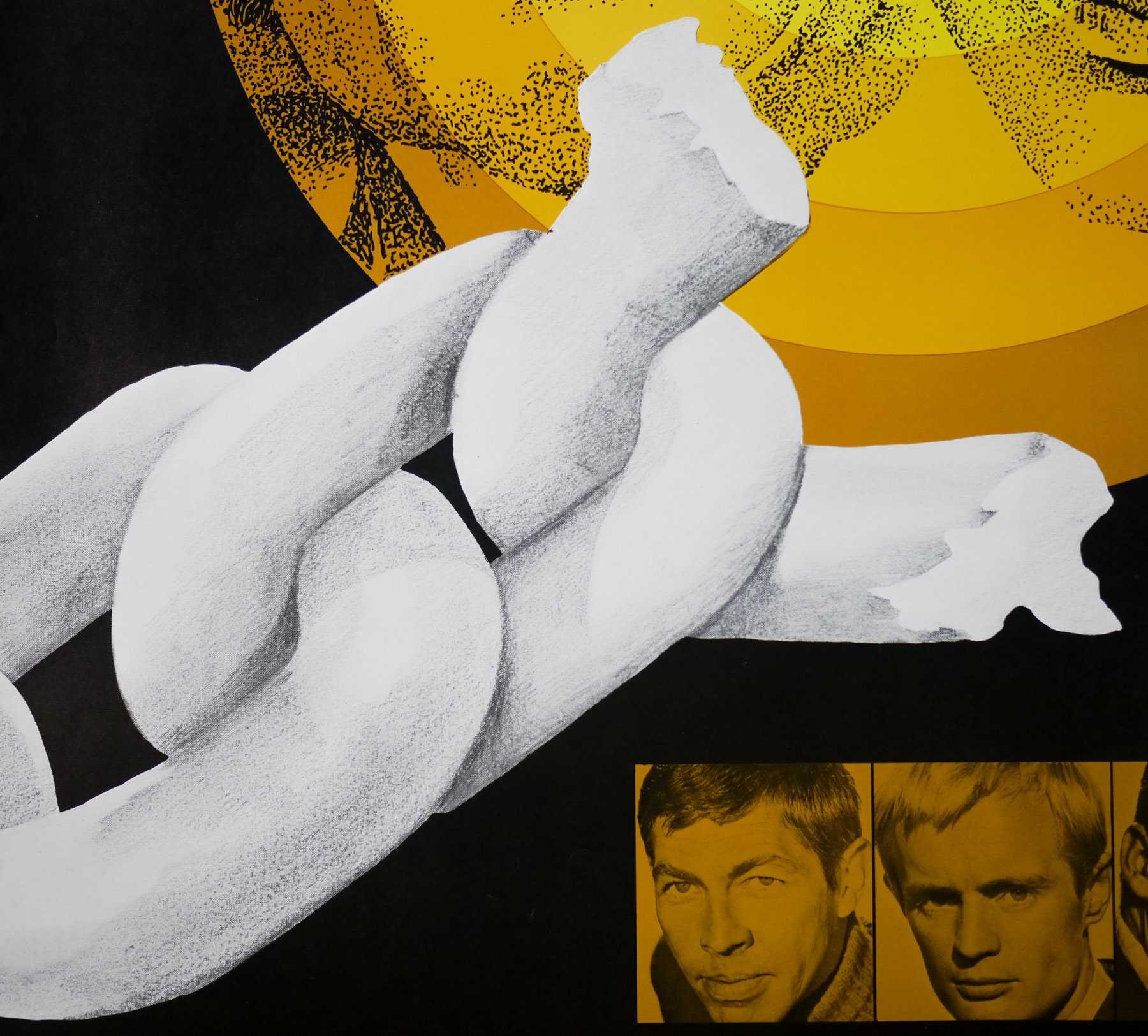
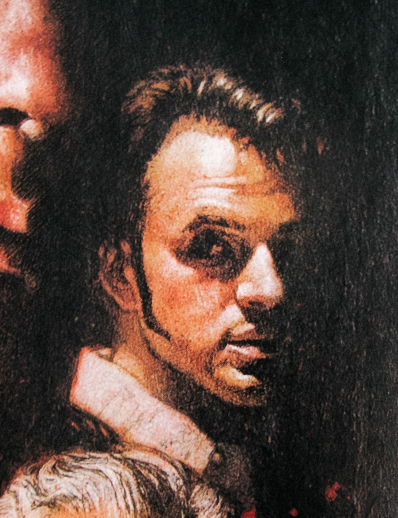
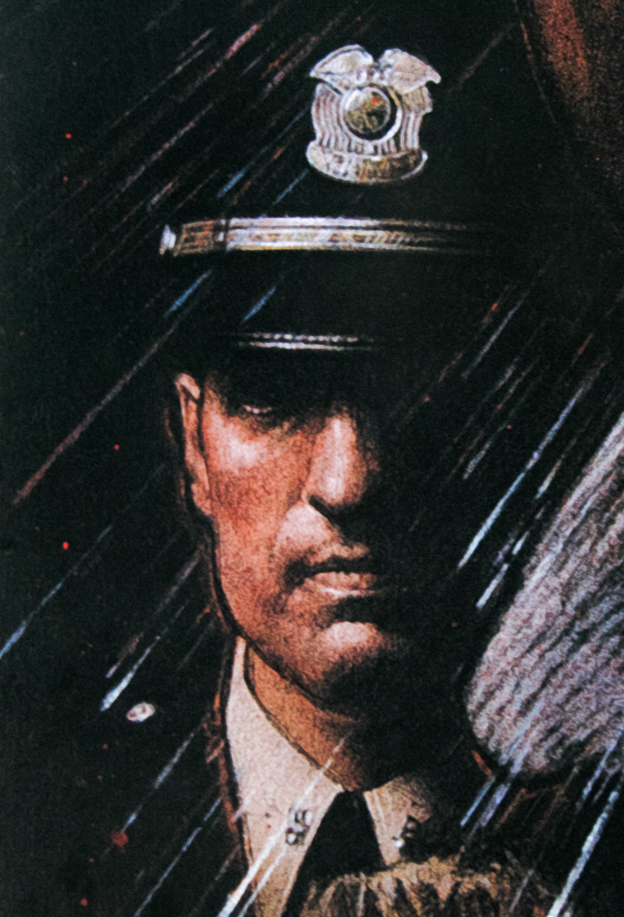
- Kimiko Ikegami, Miki Jinbo, Kumiko Ohba, Ai Matsubara, Mieko Satô, Eriko Tanaka, Masayo Miyako, Kiyohiko Ozaki, Saho Sasazawa, Asei Kobayashi, Mitsutoshi Ishigami
- Origin of Film
- Japan
- Genre(s) of Film
- Kimiko Ikegami, Miki Jinbo, Kumiko Ohba, Ai Matsubara, Mieko Satô, Eriko Tanaka, Masayo Miyako, Kiyohiko Ozaki, Saho Sasazawa, Asei Kobayashi, Mitsutoshi Ishigami,
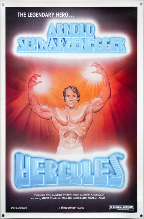
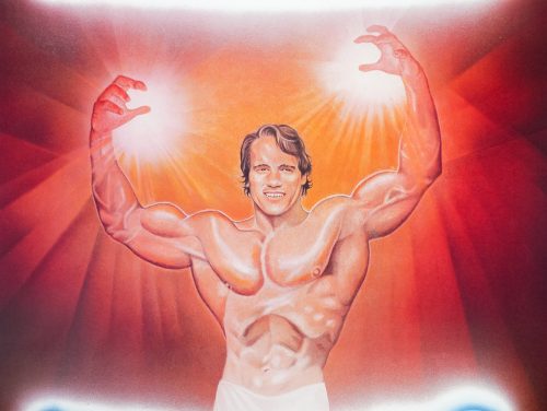
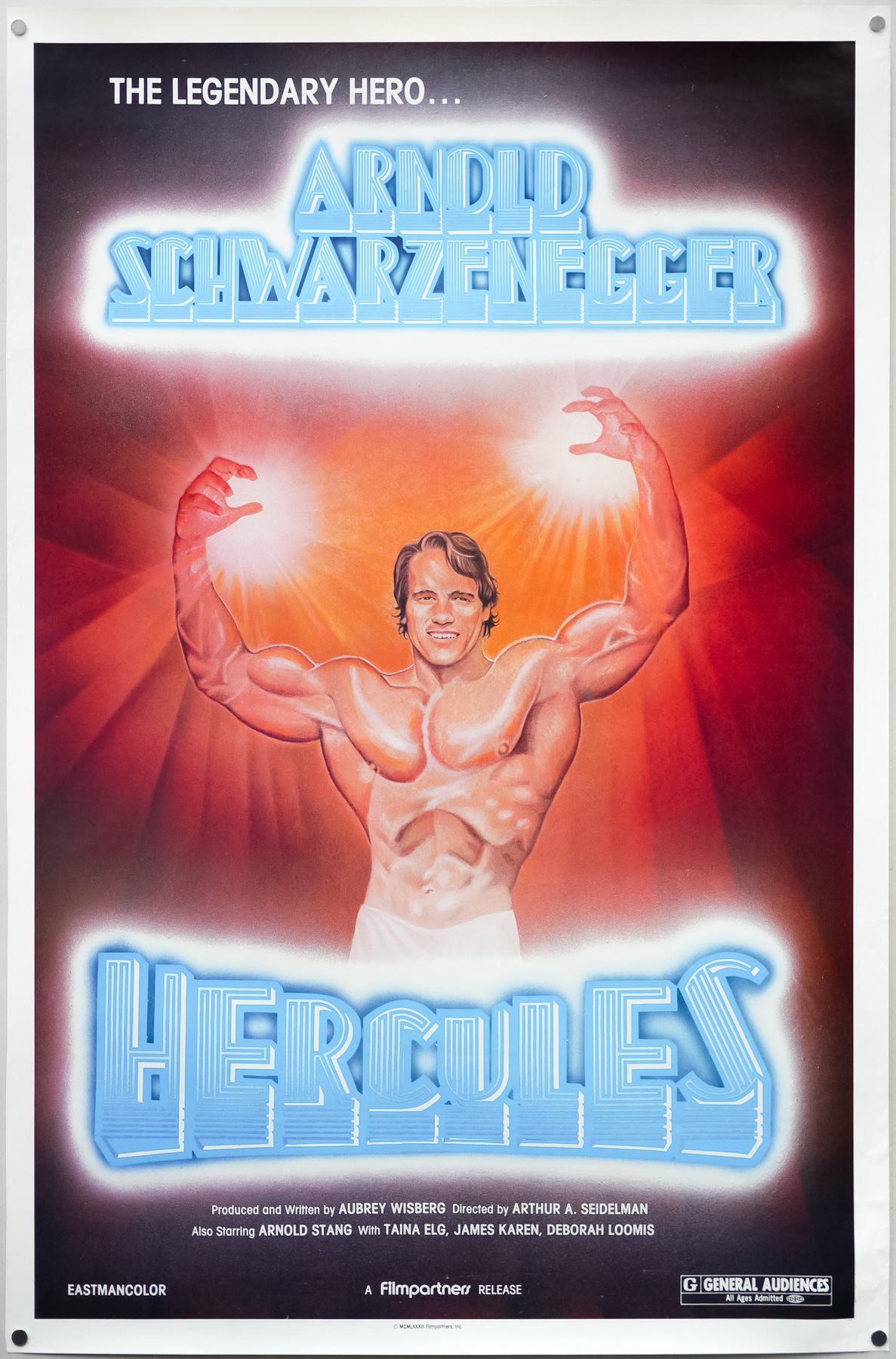
- Type of Poster
- One sheet
- Style of Poster
- Re-release
- Origin of Poster
- USA
- Year of Poster
- 2010
- Designer
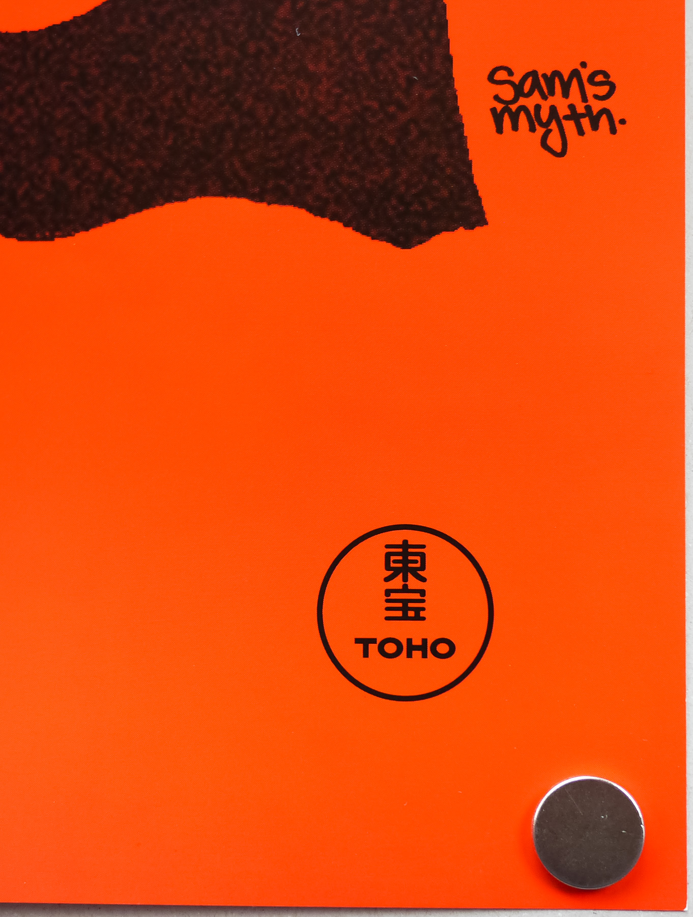
- Sam Smith AKA Sam's Myth
- Artist
- Sam Smith AKA Sam's Myth
- Size (inches)
- 27 1/16" x 39.5"
- SS or DS
- SS
- NSS #
- --
- Tagline
- --
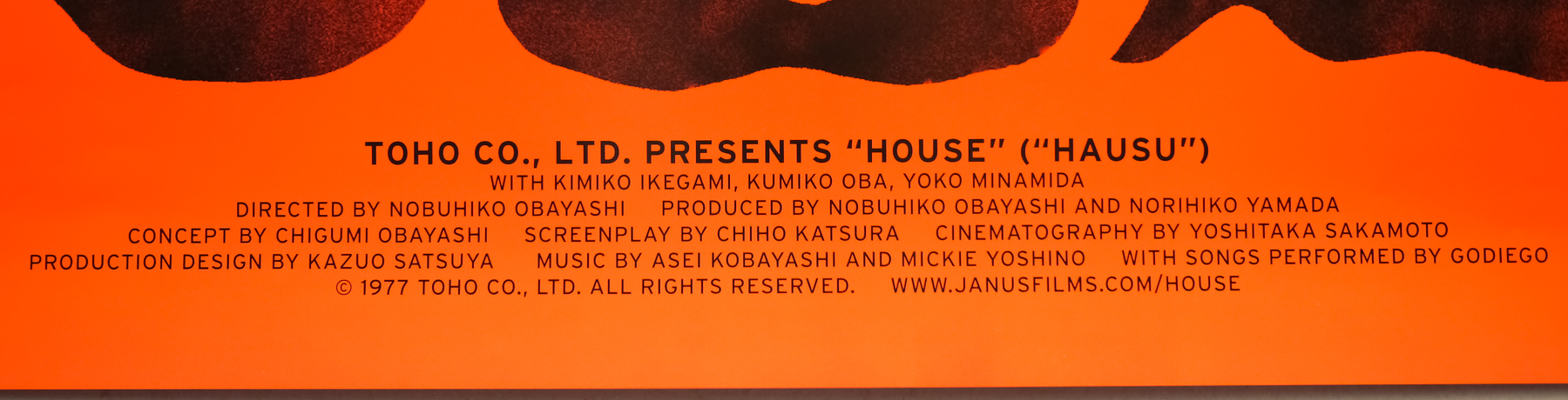
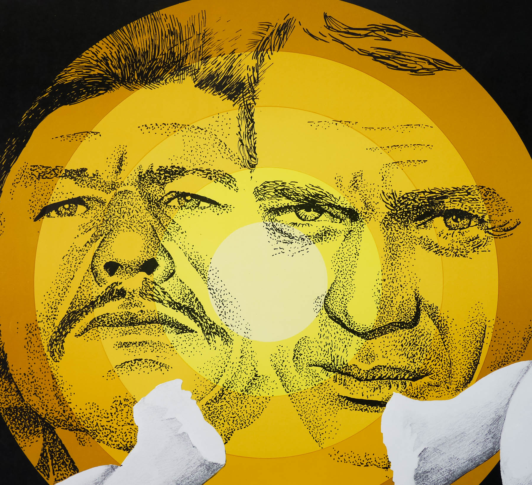
A cinematic experience quite unlike any other, Japanese director Nobuhiko Obayashi‘s 1977 masterpiece House is almost impossible to categorize or even describe and simply needs to be seen to be believed. The American distributor Janus Films, who supervised a restoration of the film in 2010, attempt to summarise the film better than I possibly could:
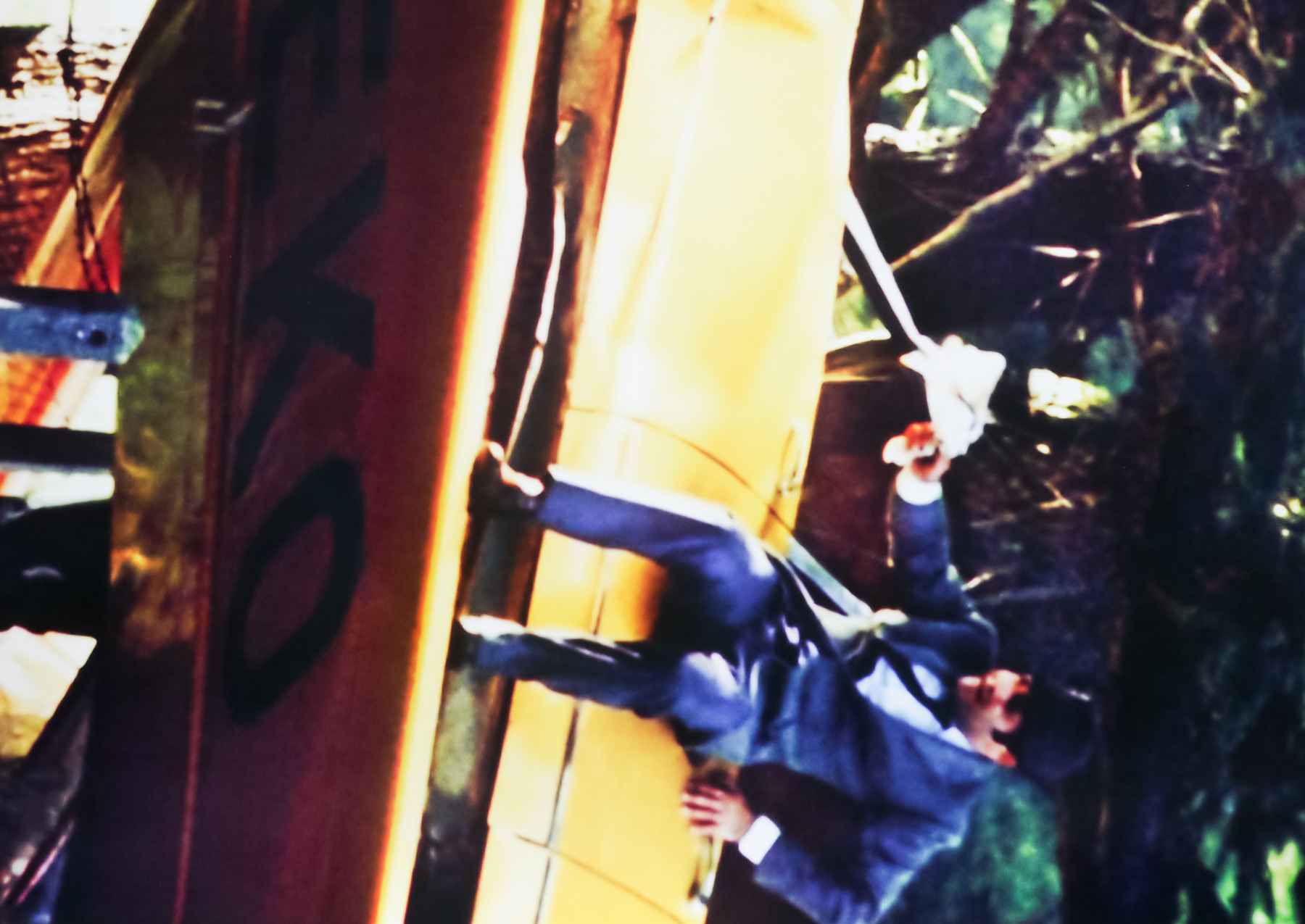
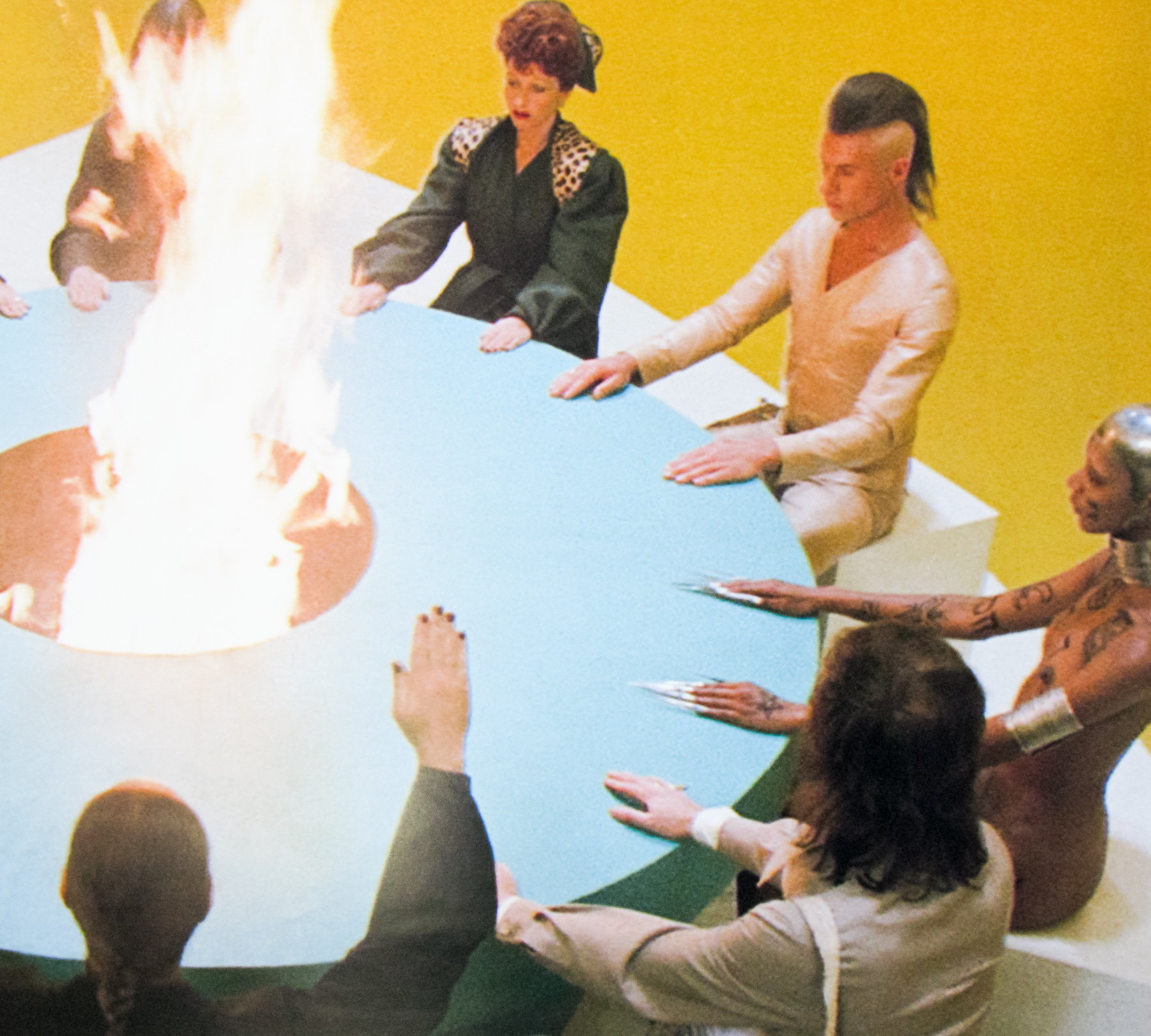
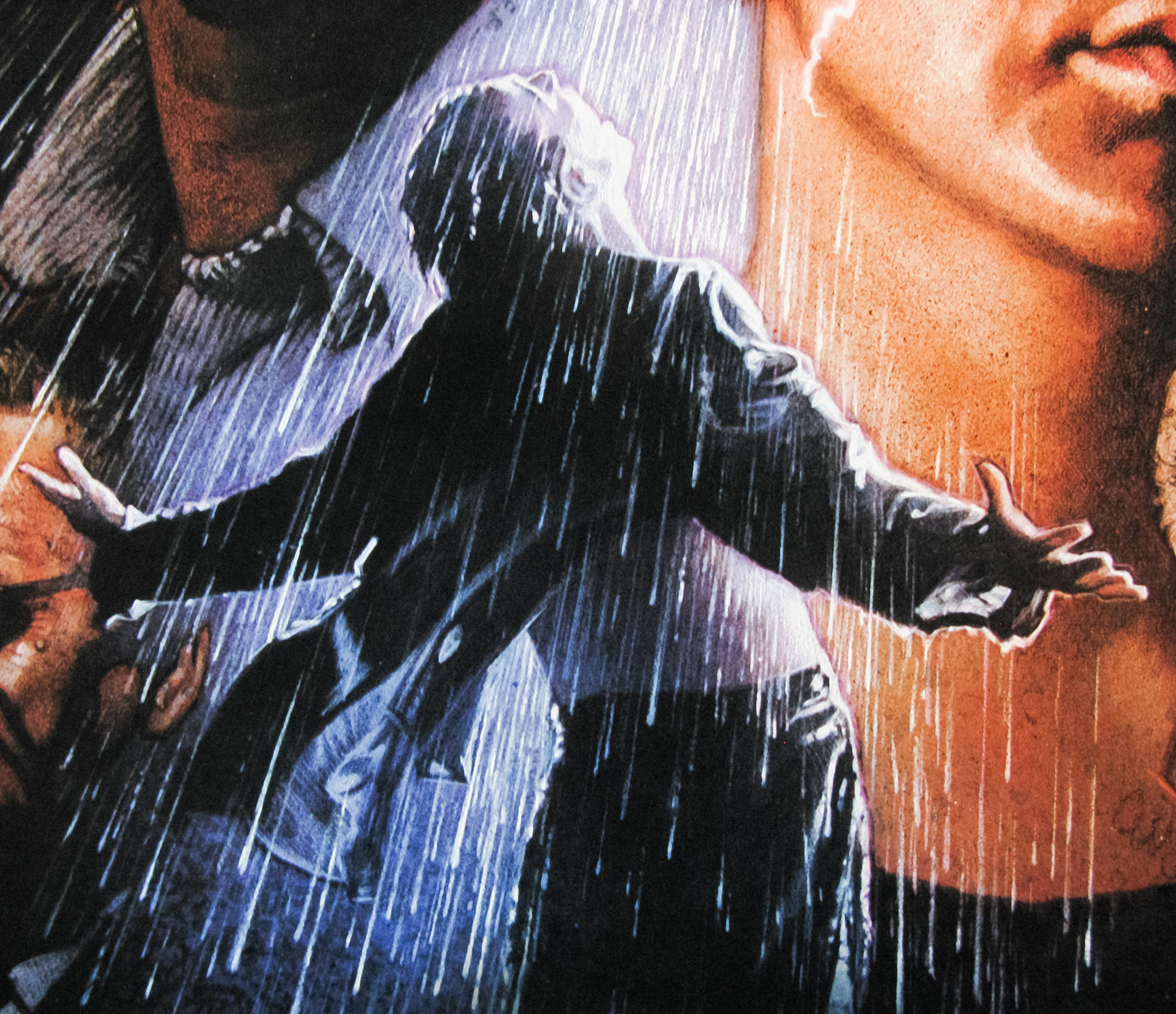
‘How to describe Nobuhiko Obayashi’s 1977 movie House? As a psychedelic ghost tale? A stream-of-consciousness bedtime story? An episode of Scooby Doo as directed by Dario Argento? Any of the above will do for this hallucinatory head trip about a schoolgirl who travels with six classmates to her ailing aunt’s creaky country home, only to come face to face with evil spirits, bloodthirsty pianos, and a demonic housecat. Too absurd to be genuinely terrifying, yet too nightmarish to be merely comic, House seems like it was beamed to Earth from another planet.’
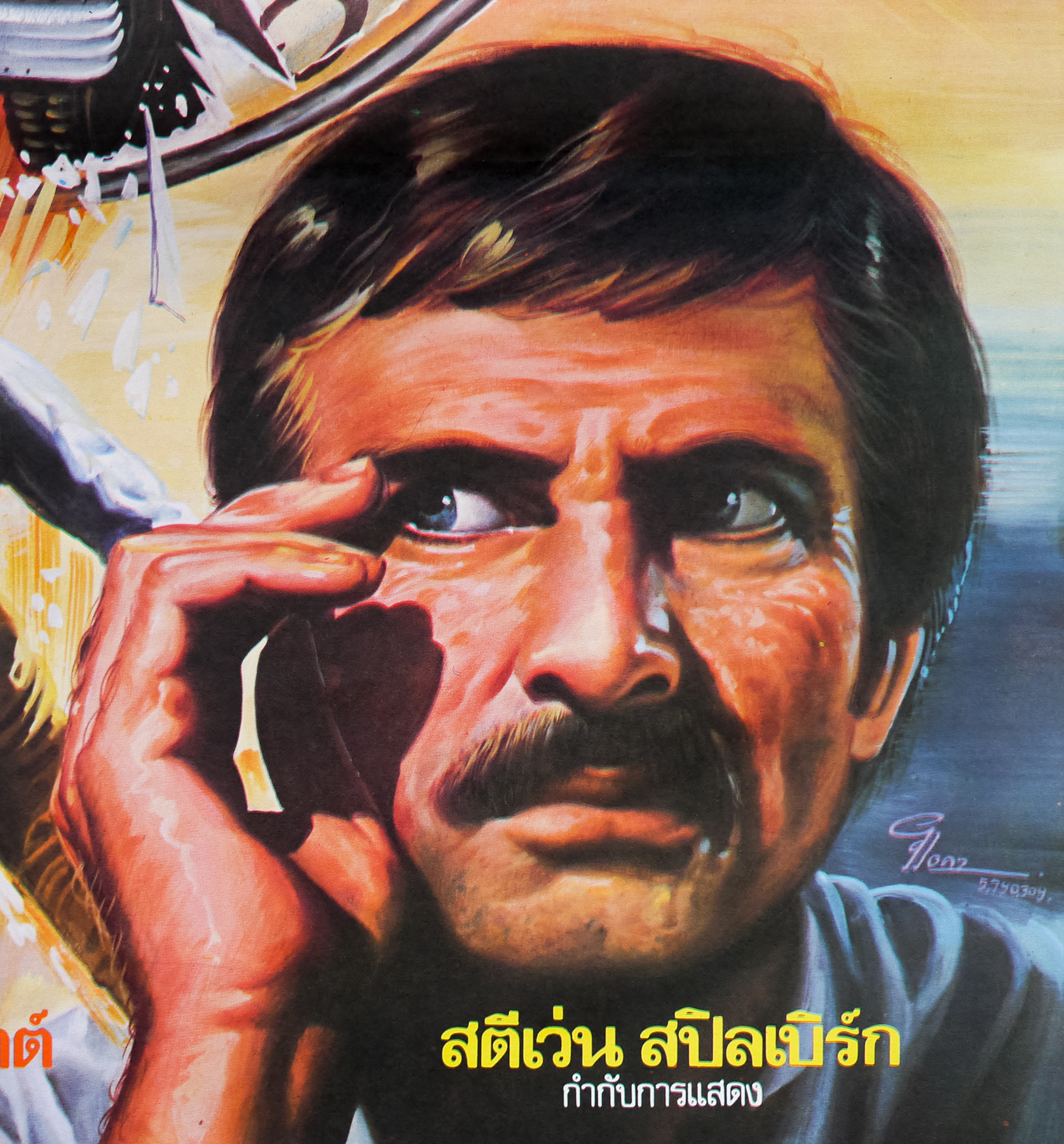
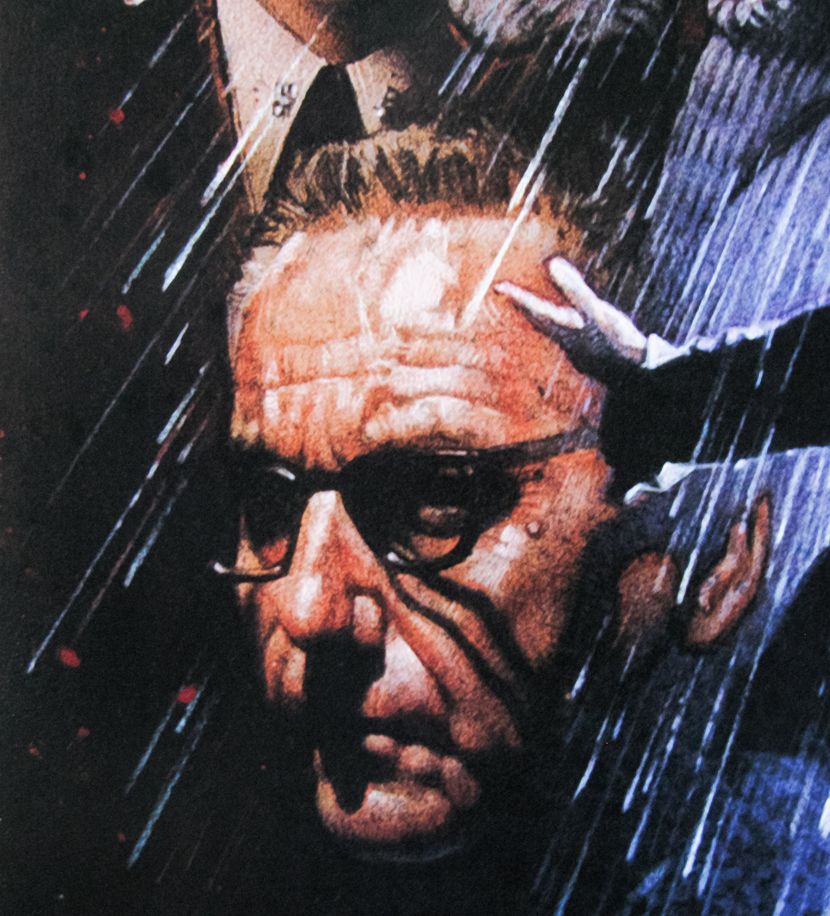
Relatively unknown outside of his native Japan, Obayashi had started his career in the field of experimental filmmaking and quickly forged a reputation as a master visual artist. His skills were soon utilised by advertising agencies and he quickly became a sought-after commercial director, working with Western actors including Sophia Loren and Charles Bronson who were earning lucrative paycheques to hawk various goods. The Japanese studio Toho approached Obayashi and asked him to develop a script for a horror film that would hopefully emulate the great success of Spielberg’s Jaws. The director spoke to his 11-year-old daughter Chigumi to get some inspiration, claiming later that adults “only think about things they understand…everything stays on that boring human level”.
The resultant script, written by Chiho Katsura, included several of Chigumi’s suggestions. Toho green-lit the script and then, after struggling to find a director willing to tackle it, gave the job to Obayashi himself despite him not being a member of the Toho staff. The resultant film is clearly the work of someone who is unafraid to experiment with the medium of film and the director spent two months on Toho’s biggest soundstage shooting the script without storyboards and utilising a whole host of special effects techniques, several of which Obayashi seemingly created especially for this film. House was a huge hit, much to the studio’s surprise, unquestionably helped by the fact that the popular band Godiego providing the best-selling soundtrack, thus cementing the film’s appeal to the youth market.
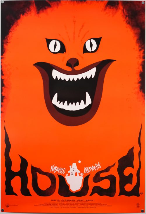
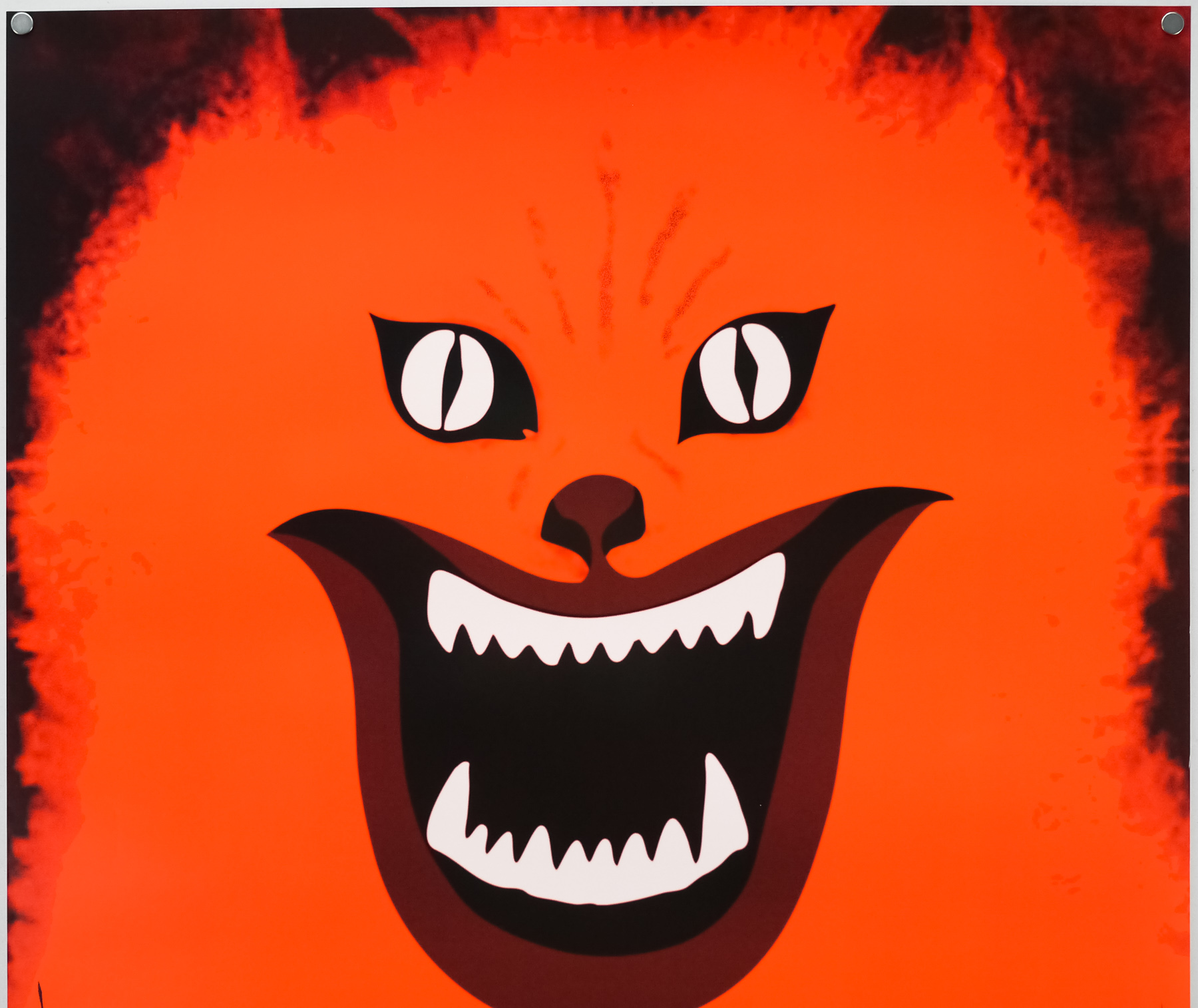
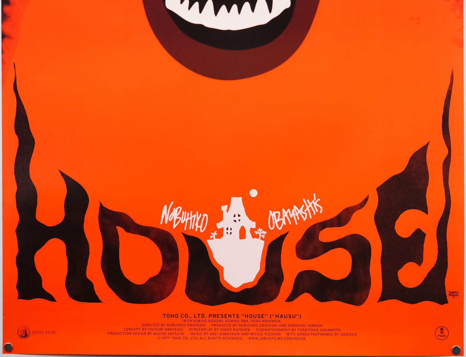
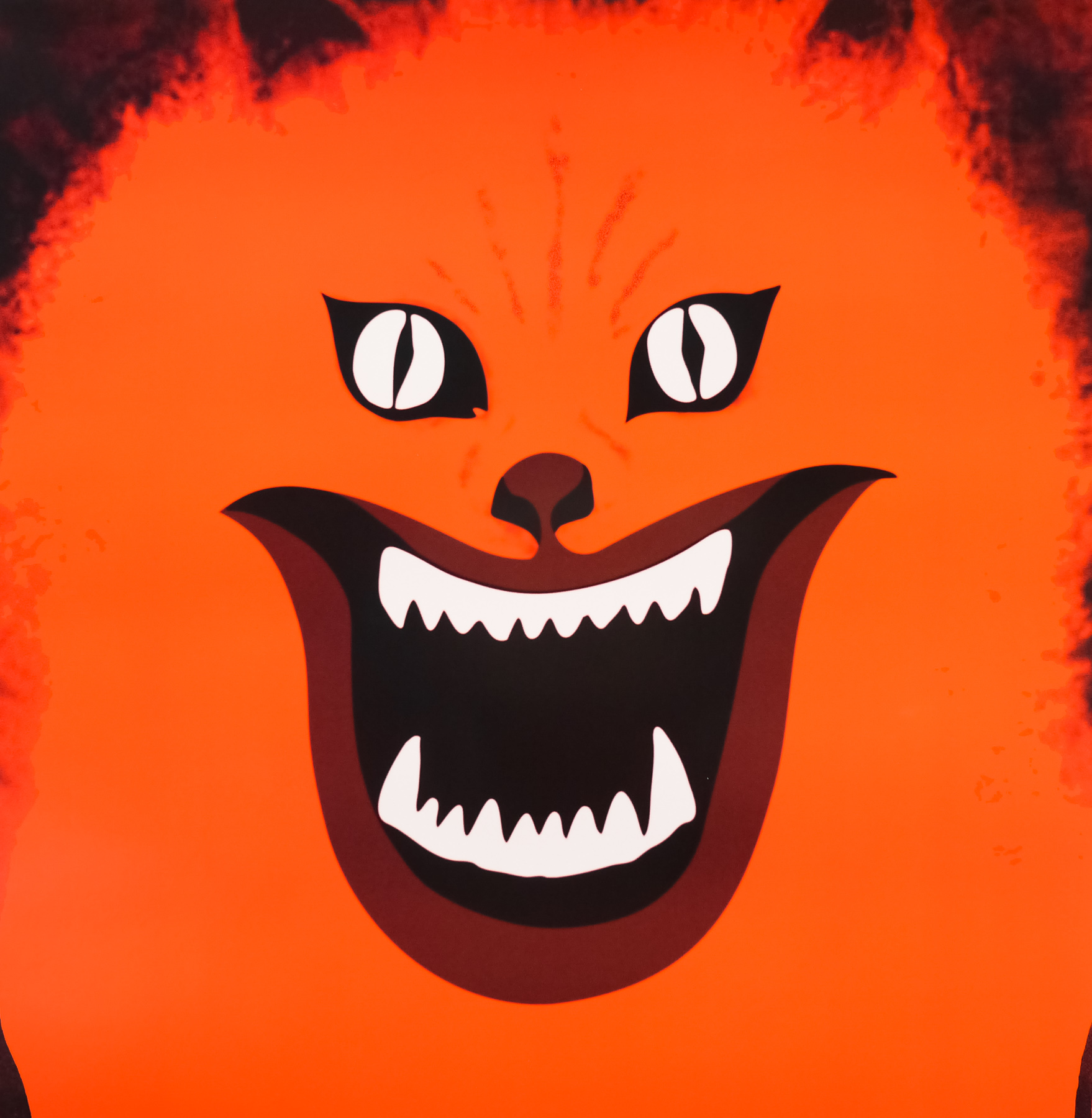
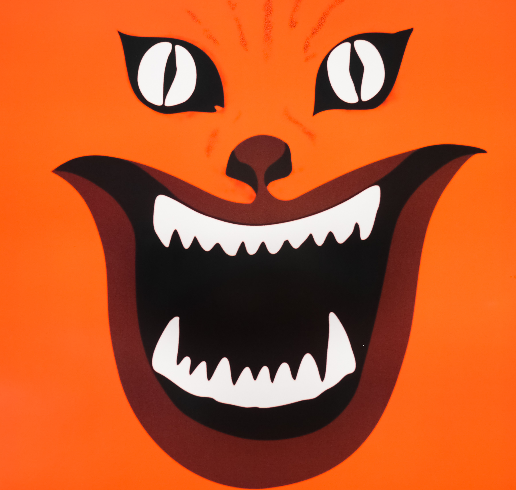
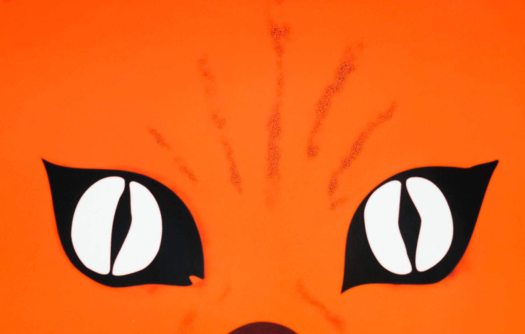
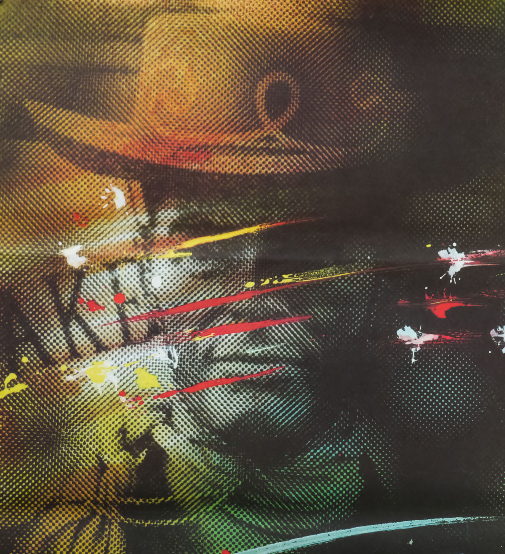
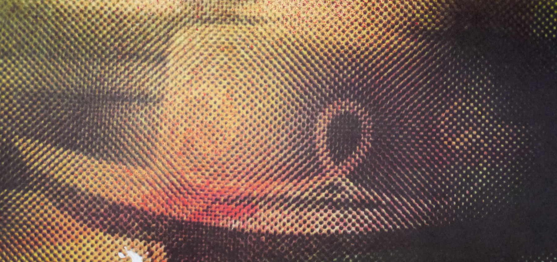
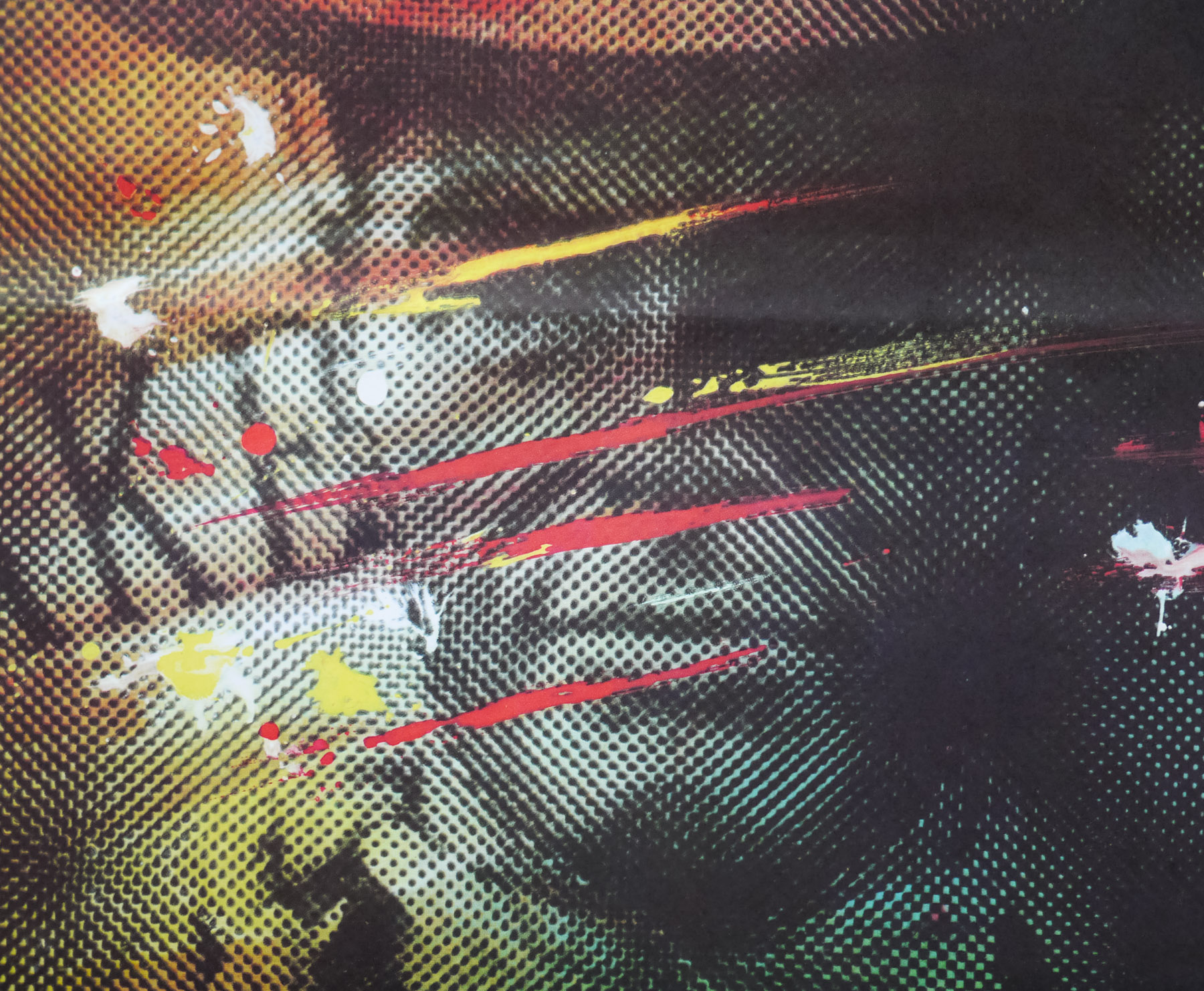
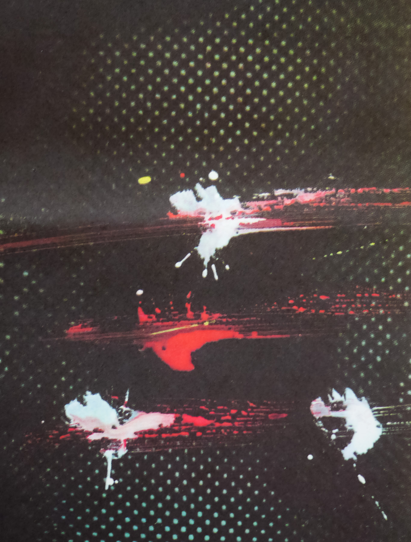
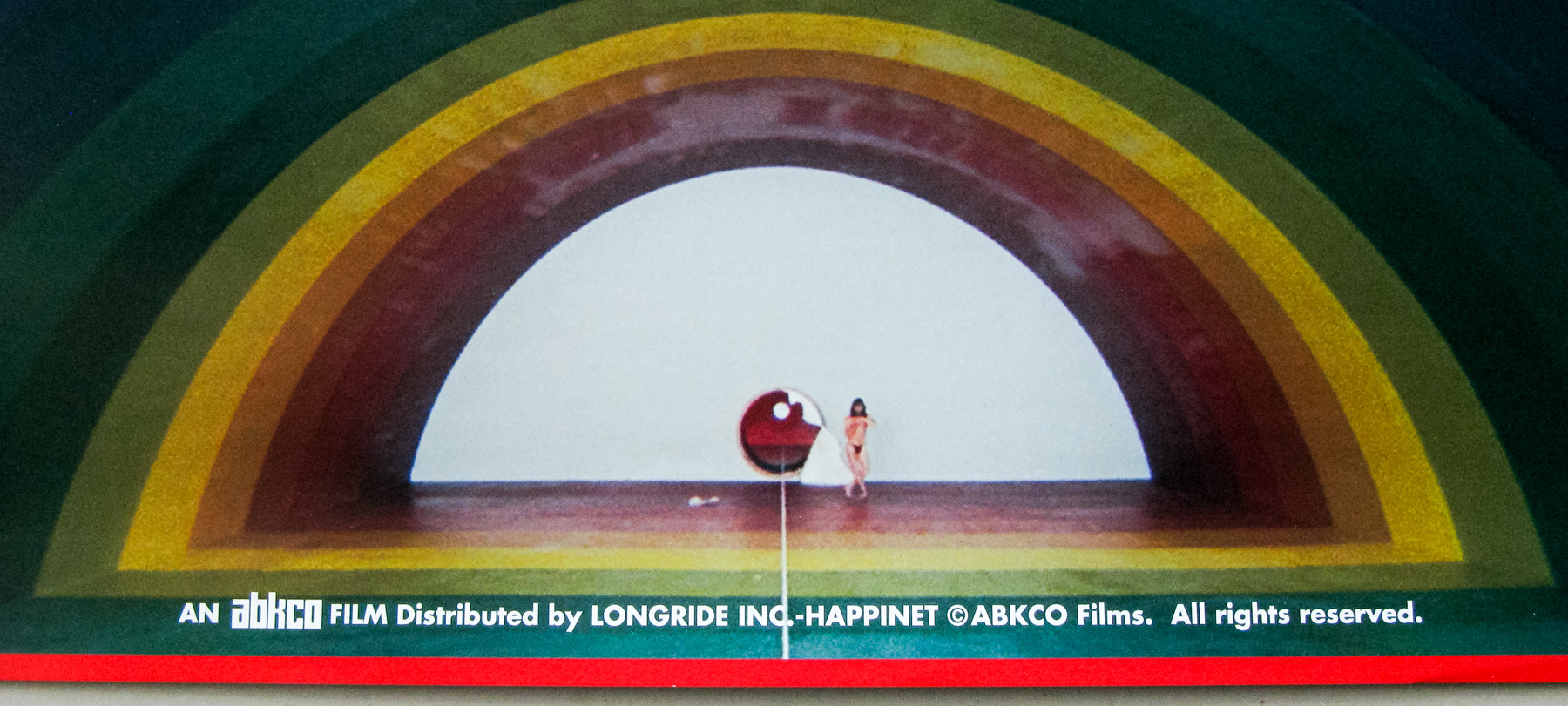
Despite Japanese success the film wasn’t released outside of the country, that is until Janus Films bought the distribution rights and aided with a digital restoration in preparation for a cinema re-release, and eventually a blu-ray release on their Criterion label in 2010. When the Nashville-based designer and artist Sam Smith (AKA Sam’s Myth) prepared a poster for a preview showing of the film at his local Belcourt Theatre he had no idea that Janus would eventually decide to not only use the image for their official one sheet but also as the cover of the eventual Criterion release. In June 2013 I interviewed Sam and the resultant article can be read here. We discussed the House poster and the following excerpt explains how he arrived at the final design:
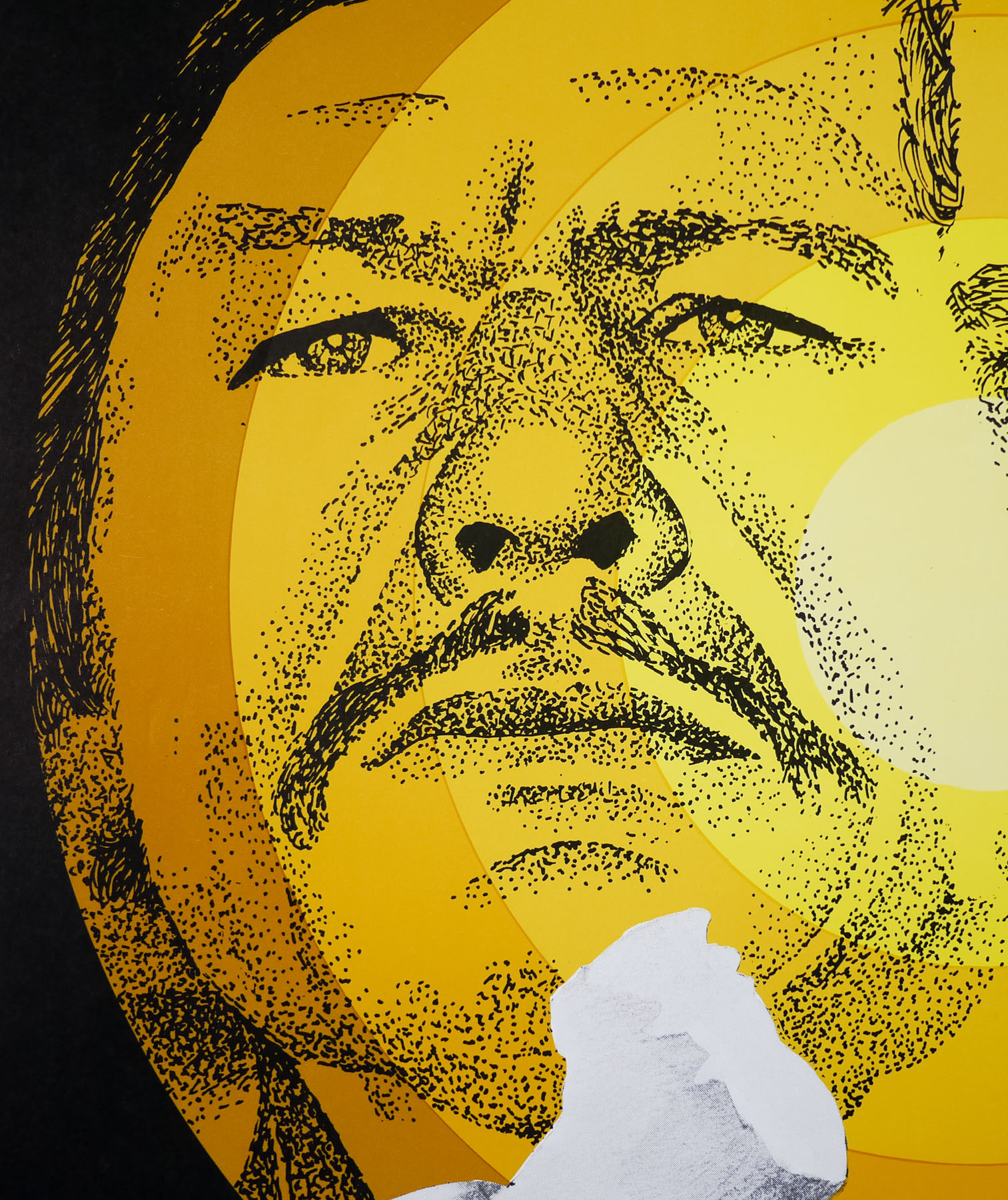
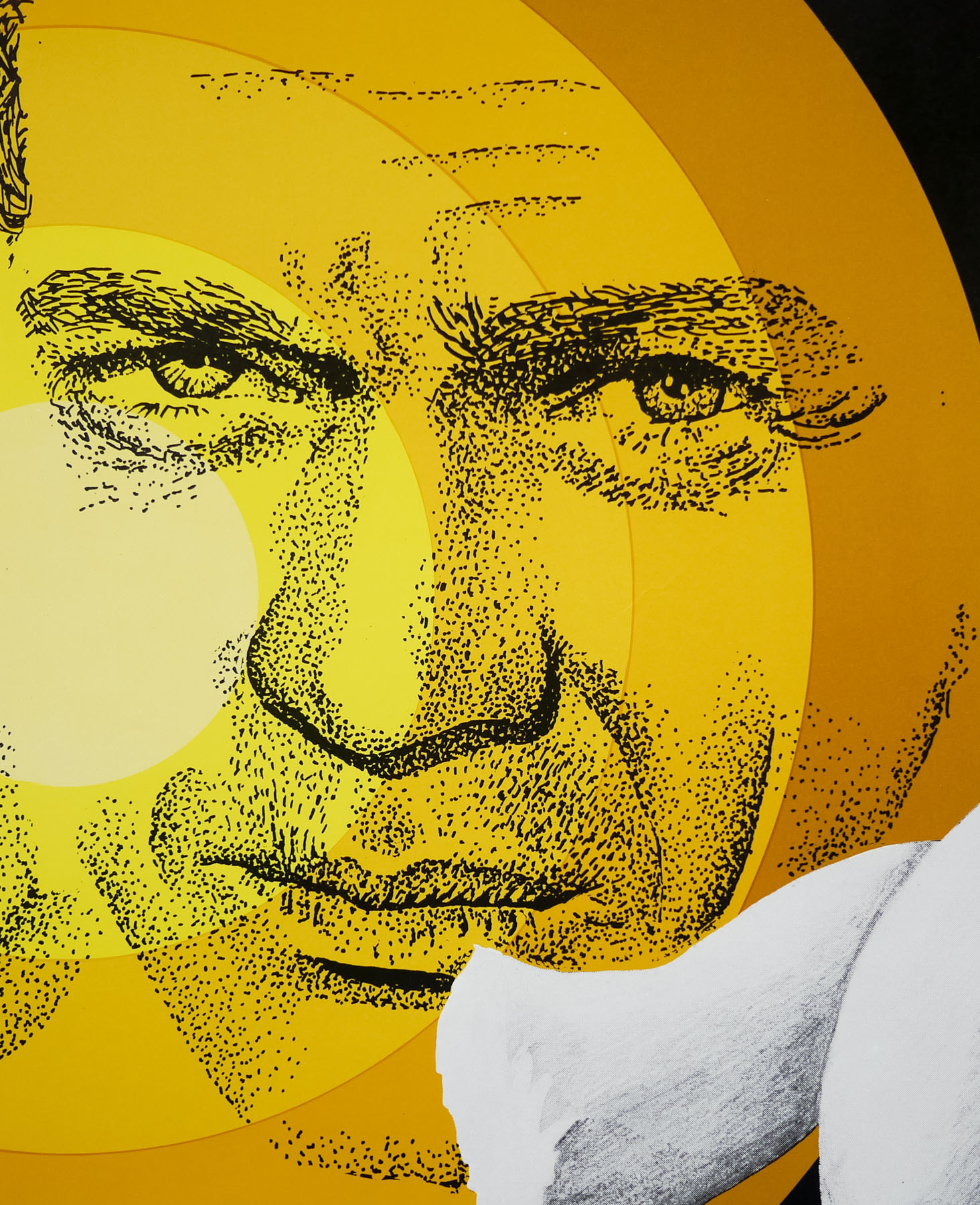
How quickly did you arrive at using the image of Blanche the cat as the poster image?
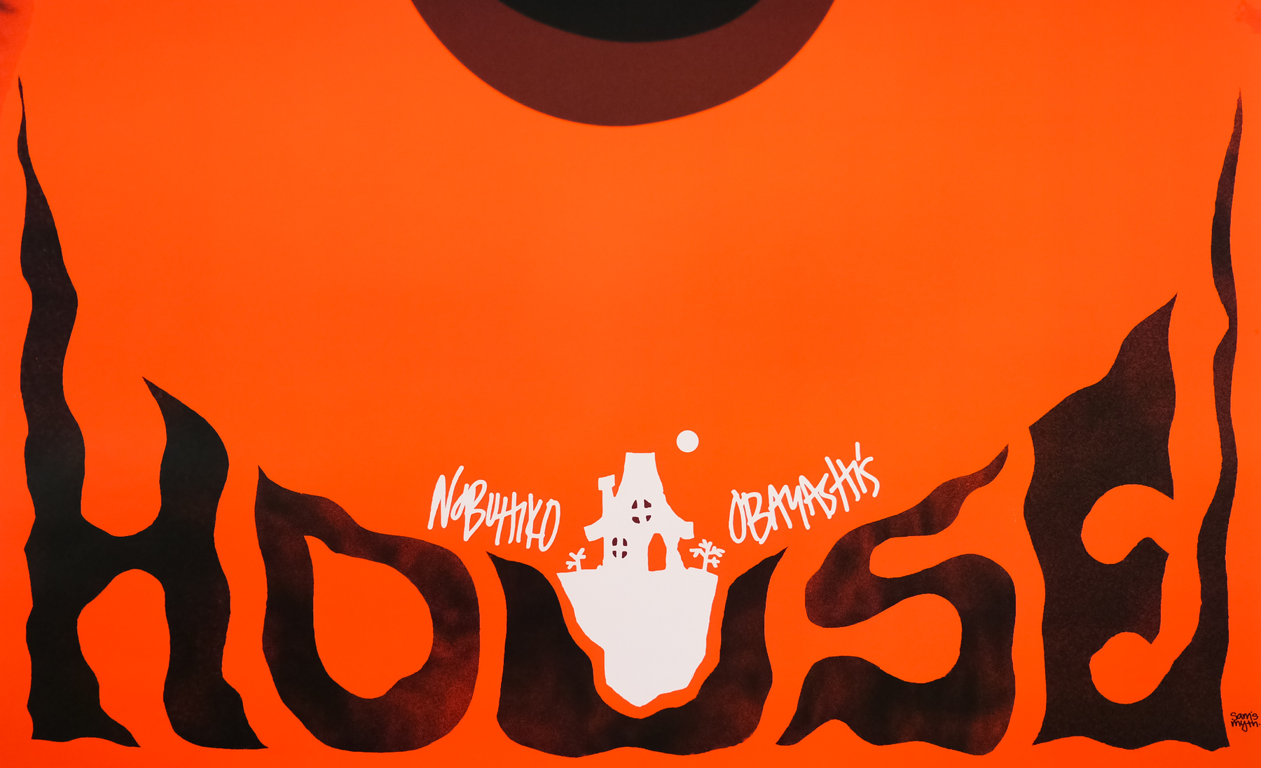
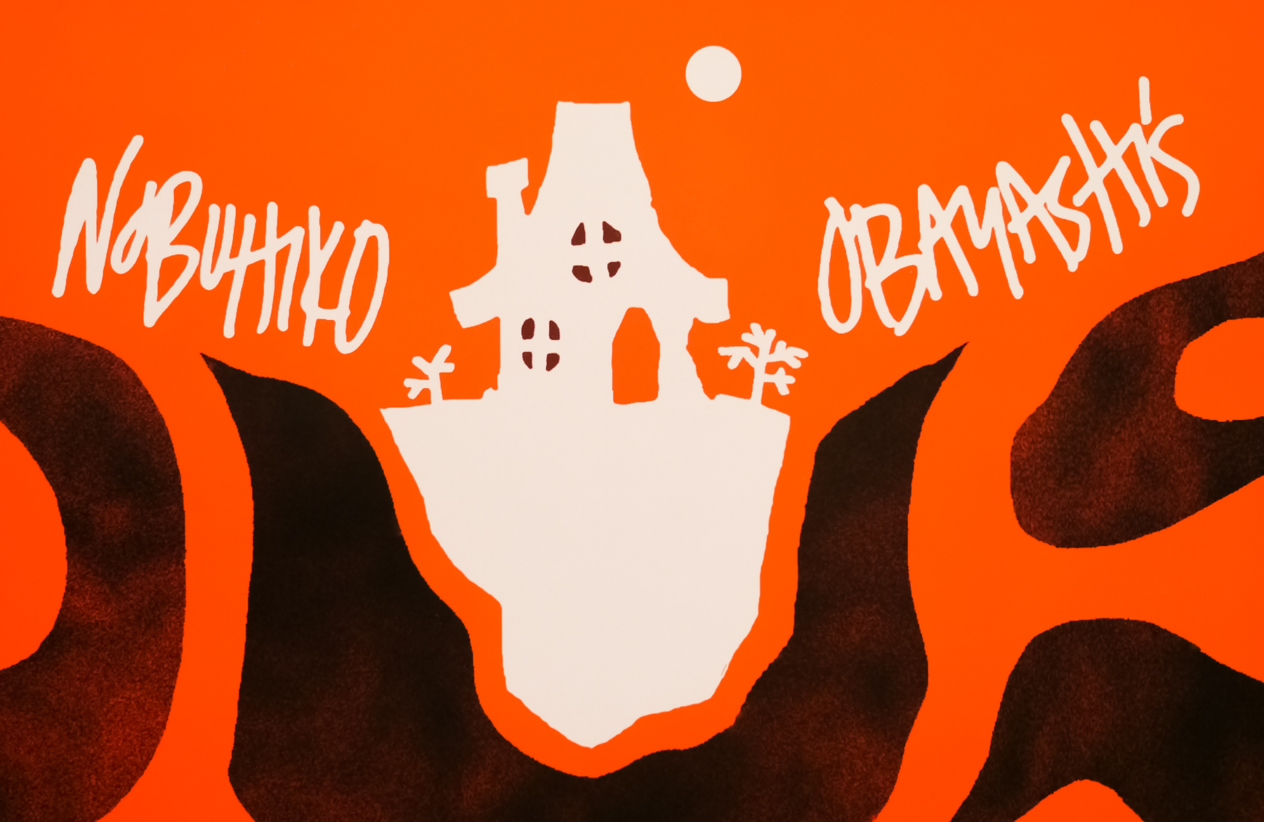
Almost instantly actually. In fact, my friend Zack Hall who is a manager at the Belcourt sent me some images and we were brainstorming at that image of Blanche just jumped out at me and seemed like something I could use. But I wanted to transform it from the screenshot into a graphic piece. The angle of that shot isn’t quite straight on, so I manipulated that, and I gave the cat’s face the entire frame of the poster, removed from the picture frame. I touched the image up and blew it out in black and white, and I just saw this field of red-orange over the whole thing, thinking it could really transform that image into something iconic. The lettering and everything else– the little house illustration– all came very quickly, in a single pass. It’s by far the fastest any poster design has ever come together for me. I didn’t really think much about it and don’t really remember it happening.
Were you surprised at how iconic the Blanche image has ended up being?
A little bit, but I must give credit to Obayashi who came up with this image in the first place. It’s not like I drew it or created it out of my own imagination. I feel that I just plucked it out of the film and tried to transform it graphically into something iconic that represented the insane, exciting, colorful energy of the film, while adding my own touches with the lettering and accoutrements. People loved it though. I suggested making t-shirts and stickers, and I still see people wearing them when I’m at a festival or traveling somewhere. It really taught me that in this day and age, the most important quality of a poster is for its design to feel iconic and eye-catching, above all else. The goal is to get people talking about the film and going to see the film and telling their friends about it, and it’s cool to hear people say “you know, the movie with the poster of the red cat face” and realize you had a role in the film finding its audience.
———————
Sam’s blog has a post about the creation of the House poster and is well worth a read.