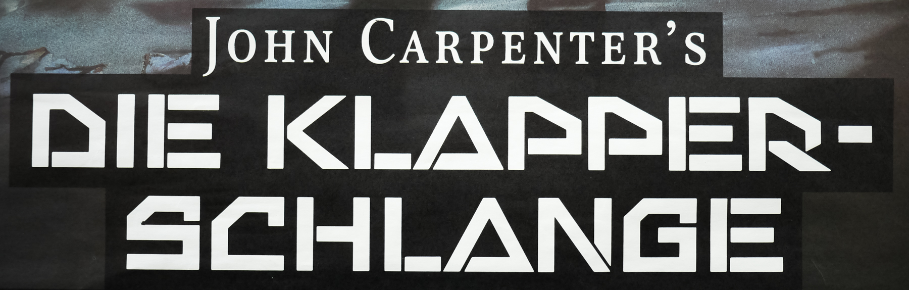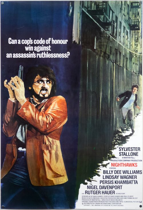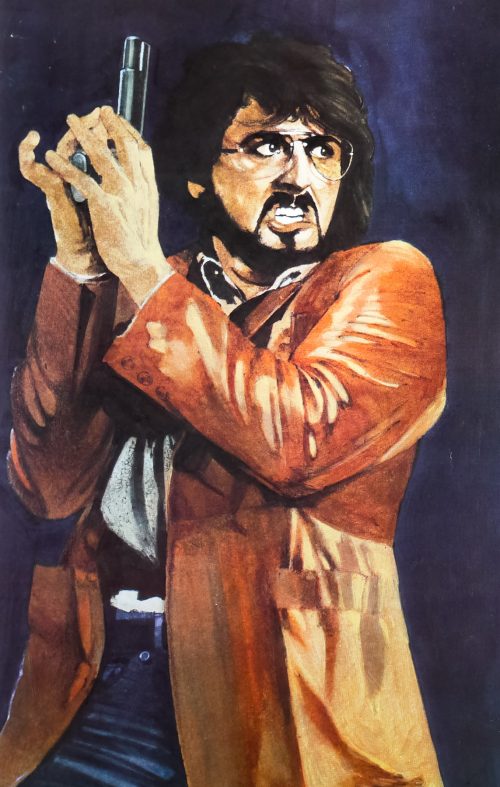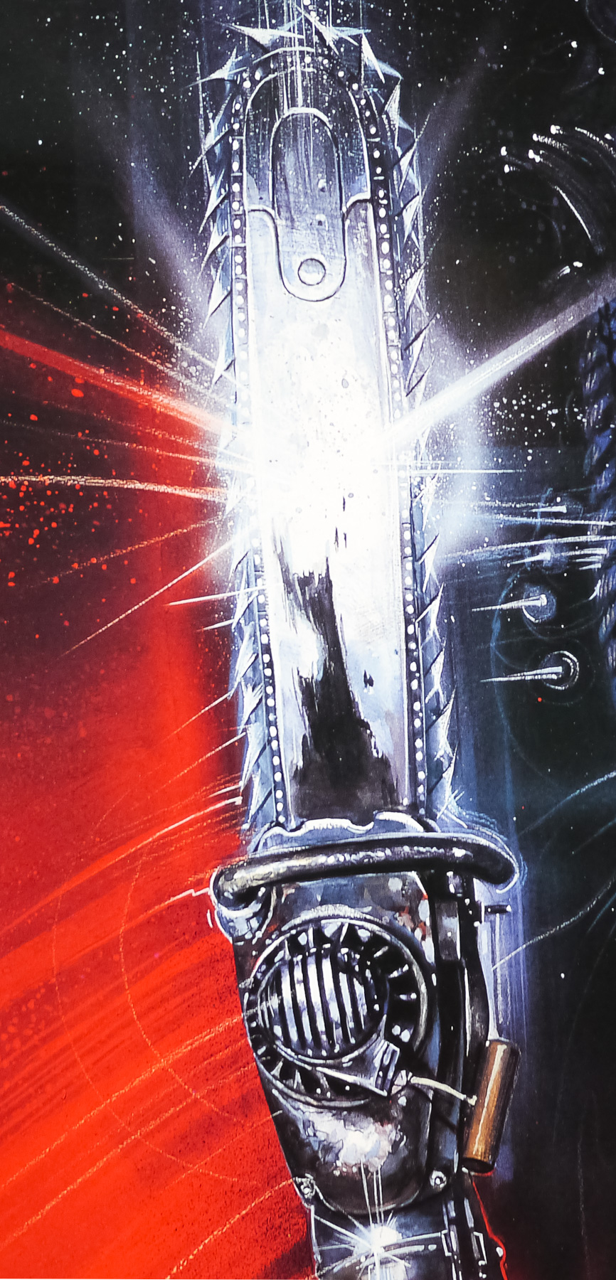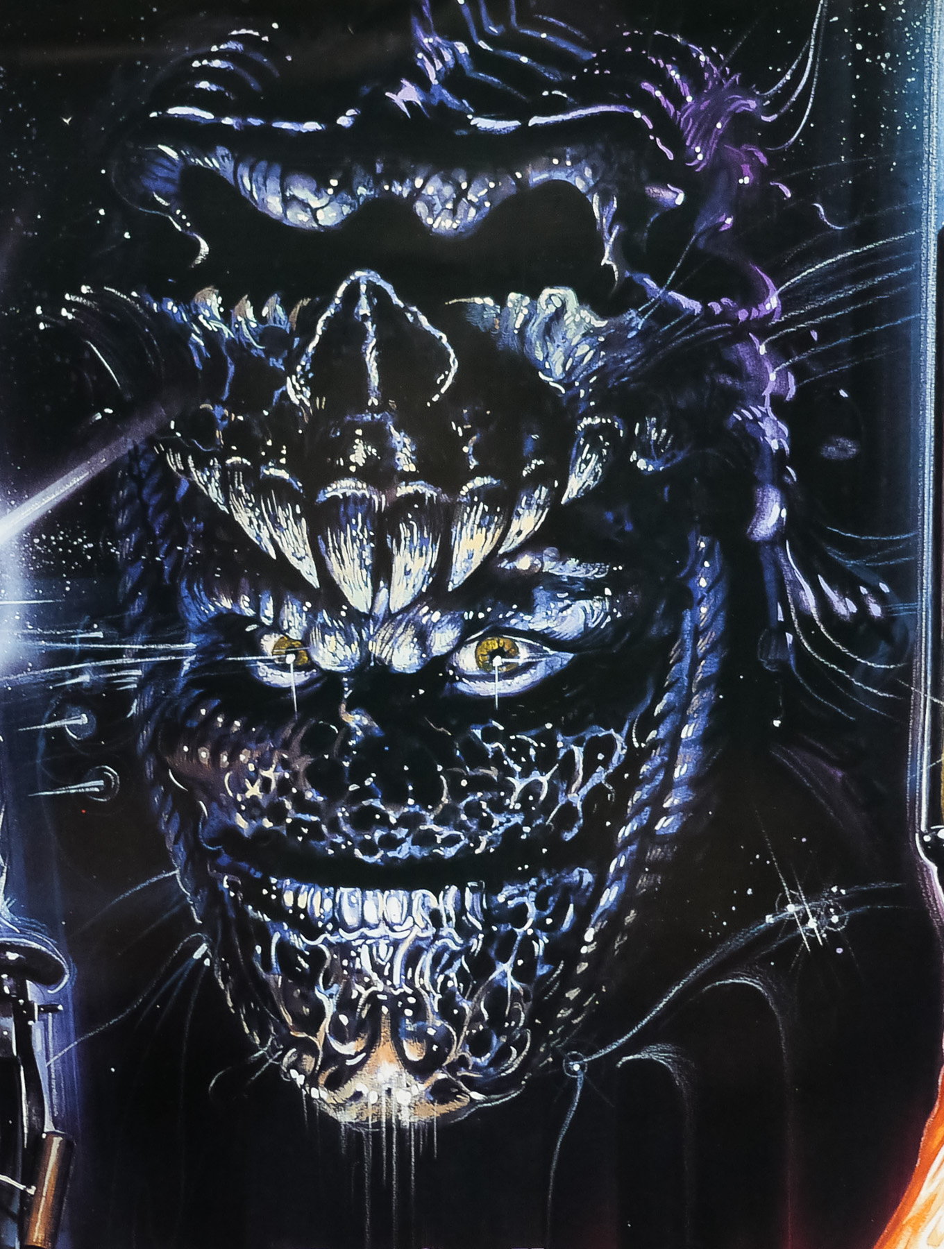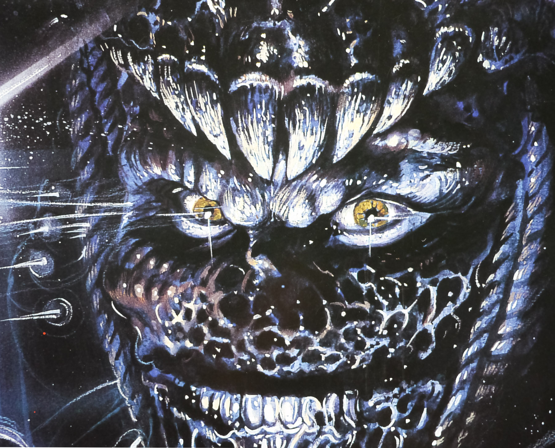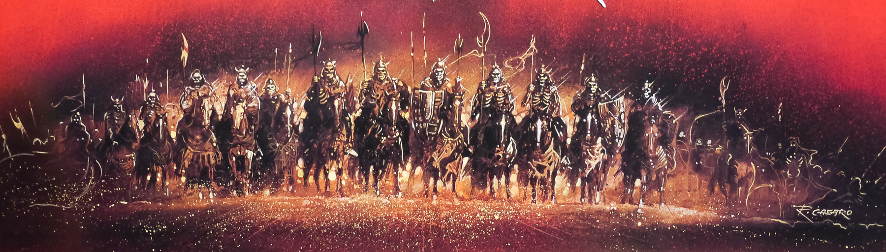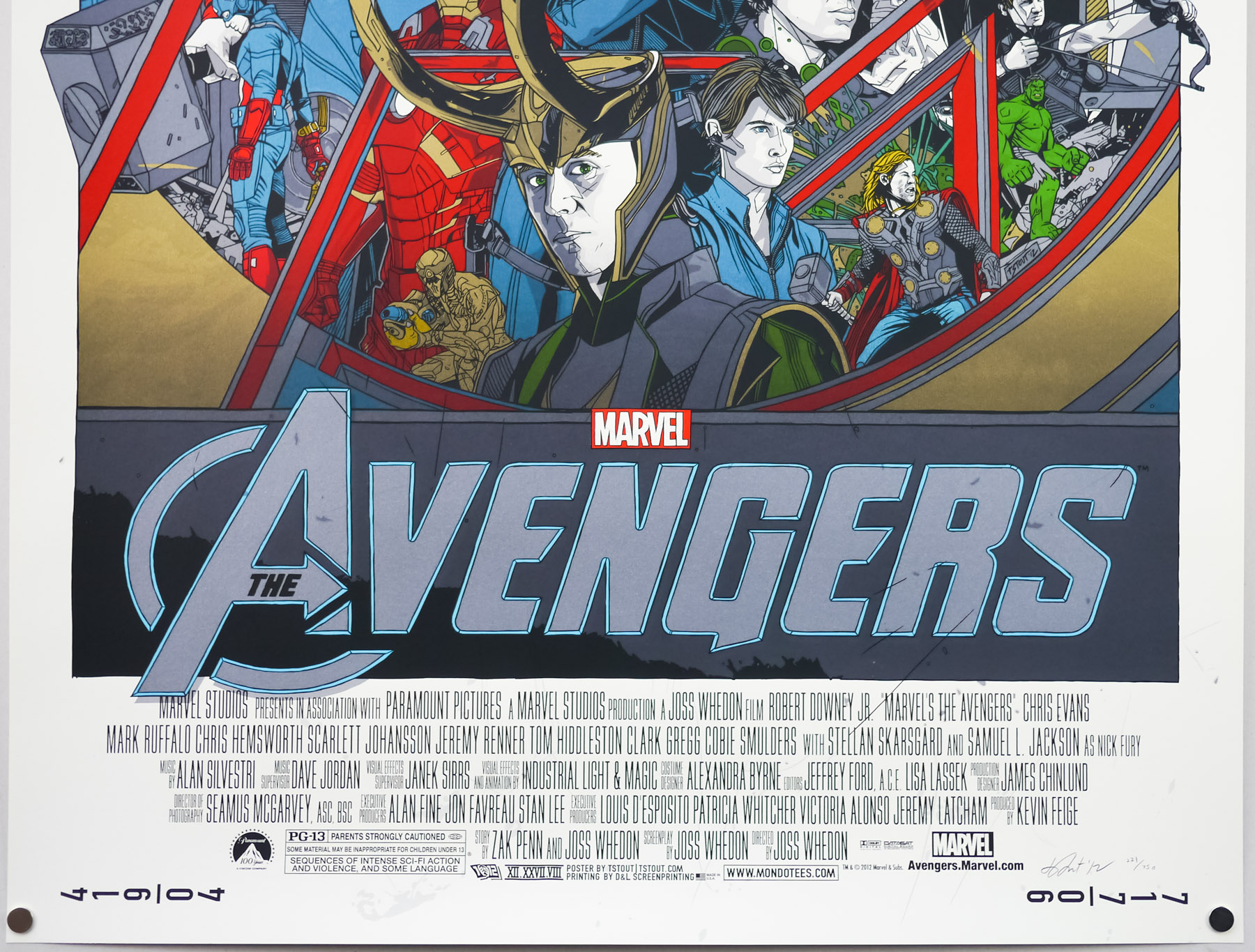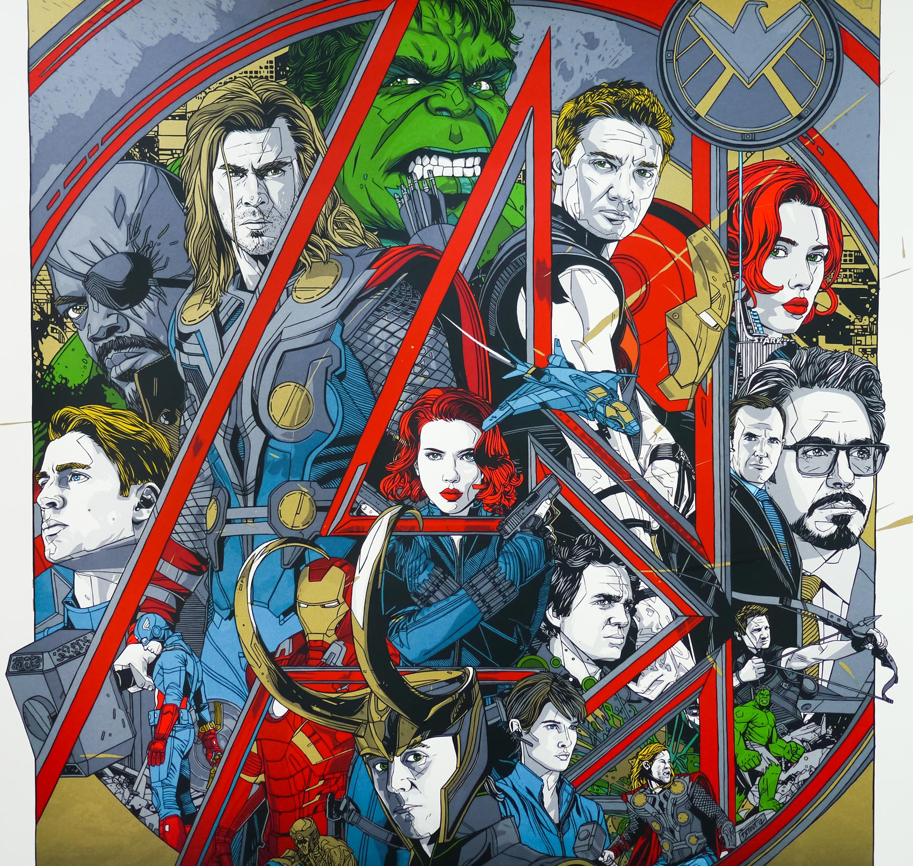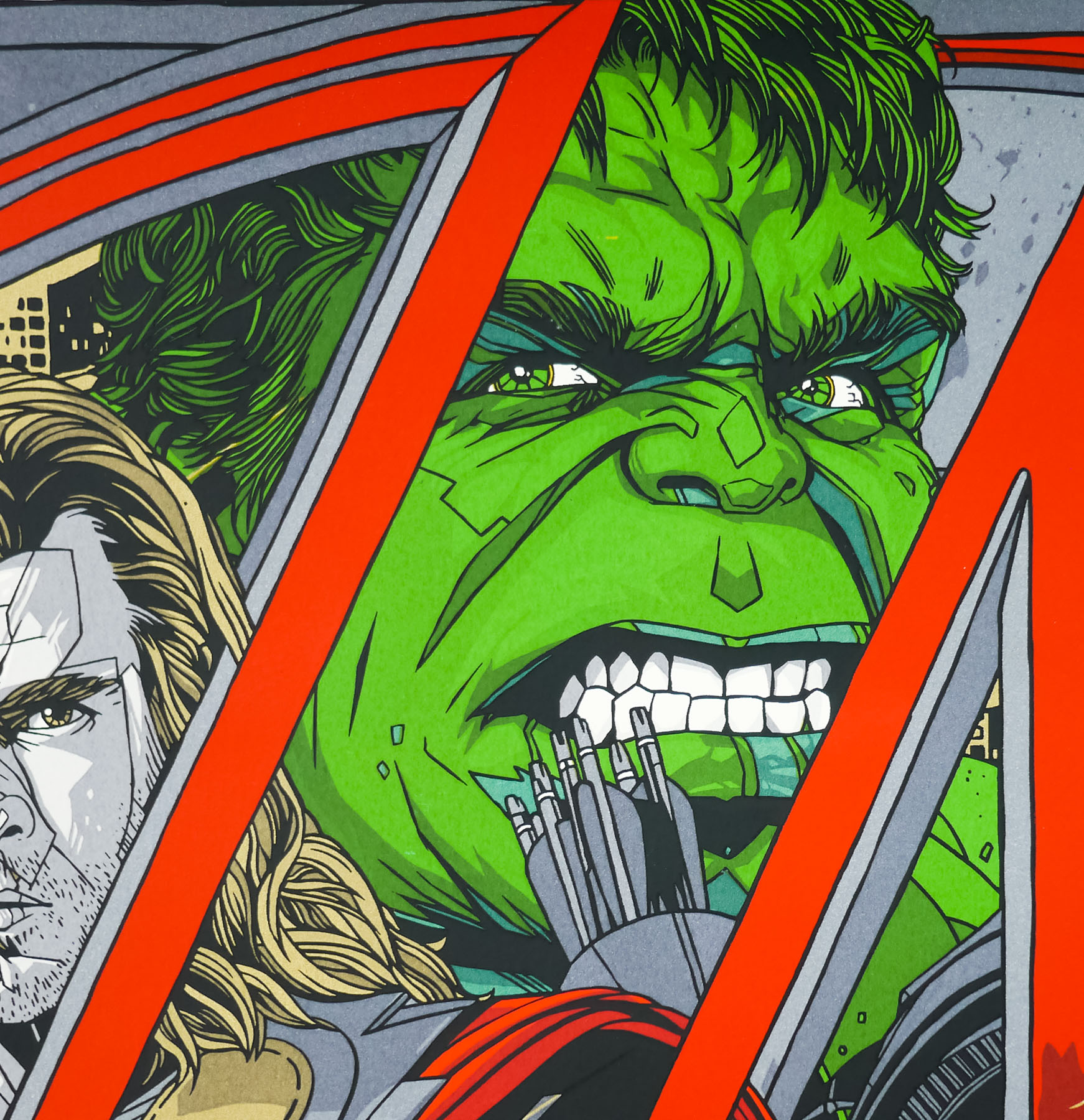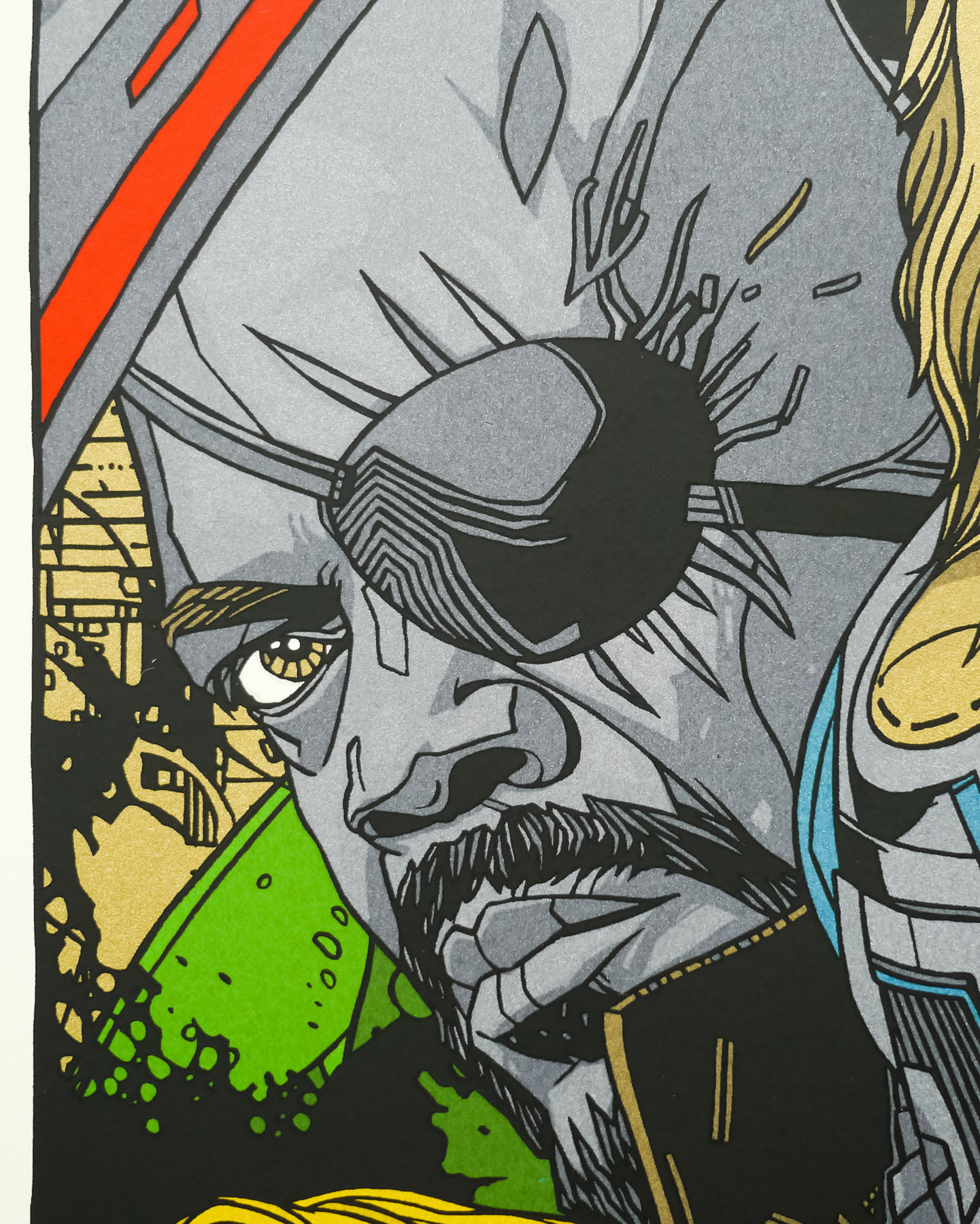
Poster detail
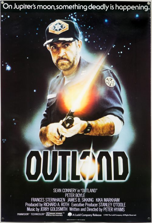
1-5

- AKA
- --
- Year of Film
- 1983
- Director
- Terry Marcel
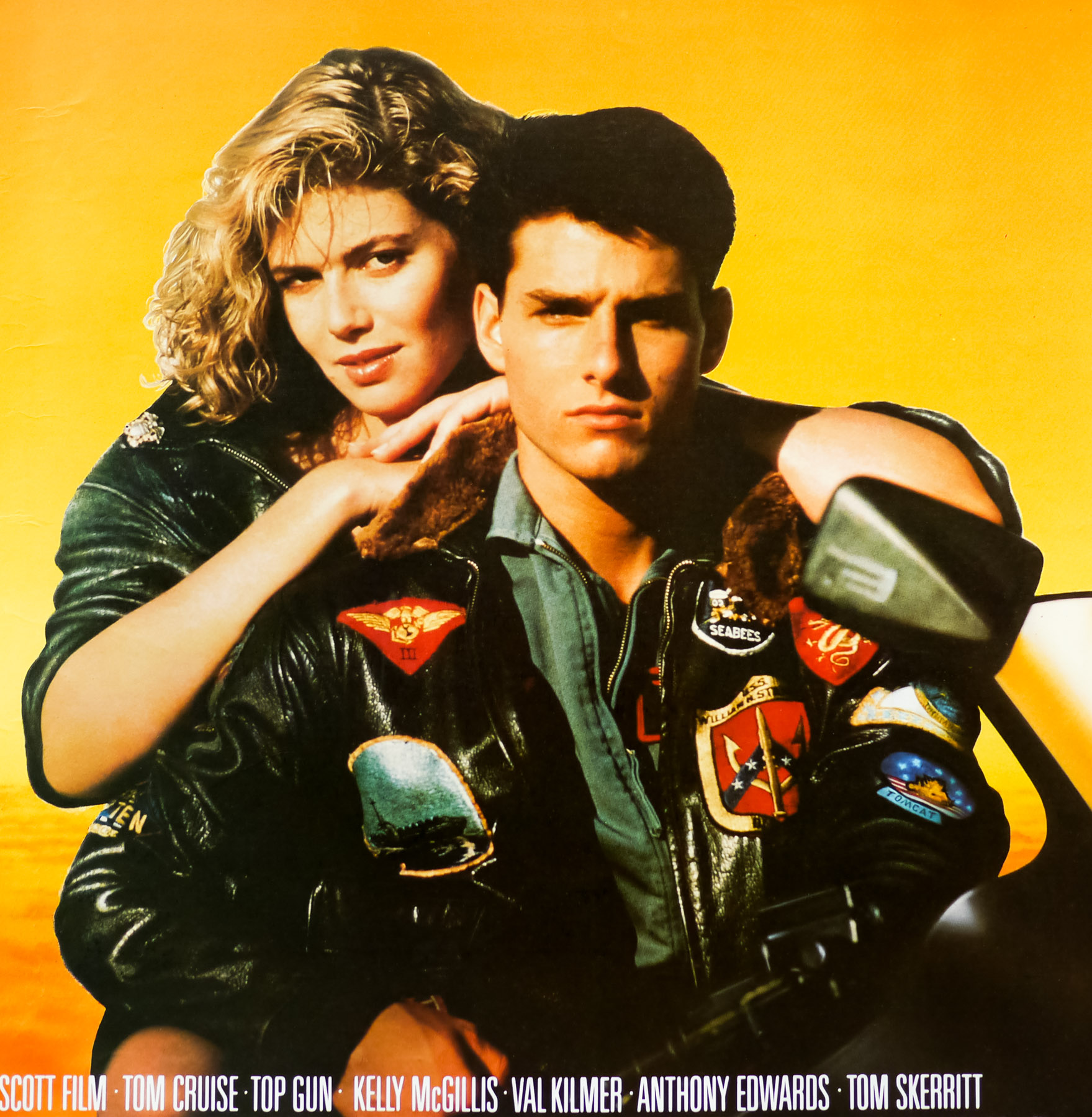
- Starring
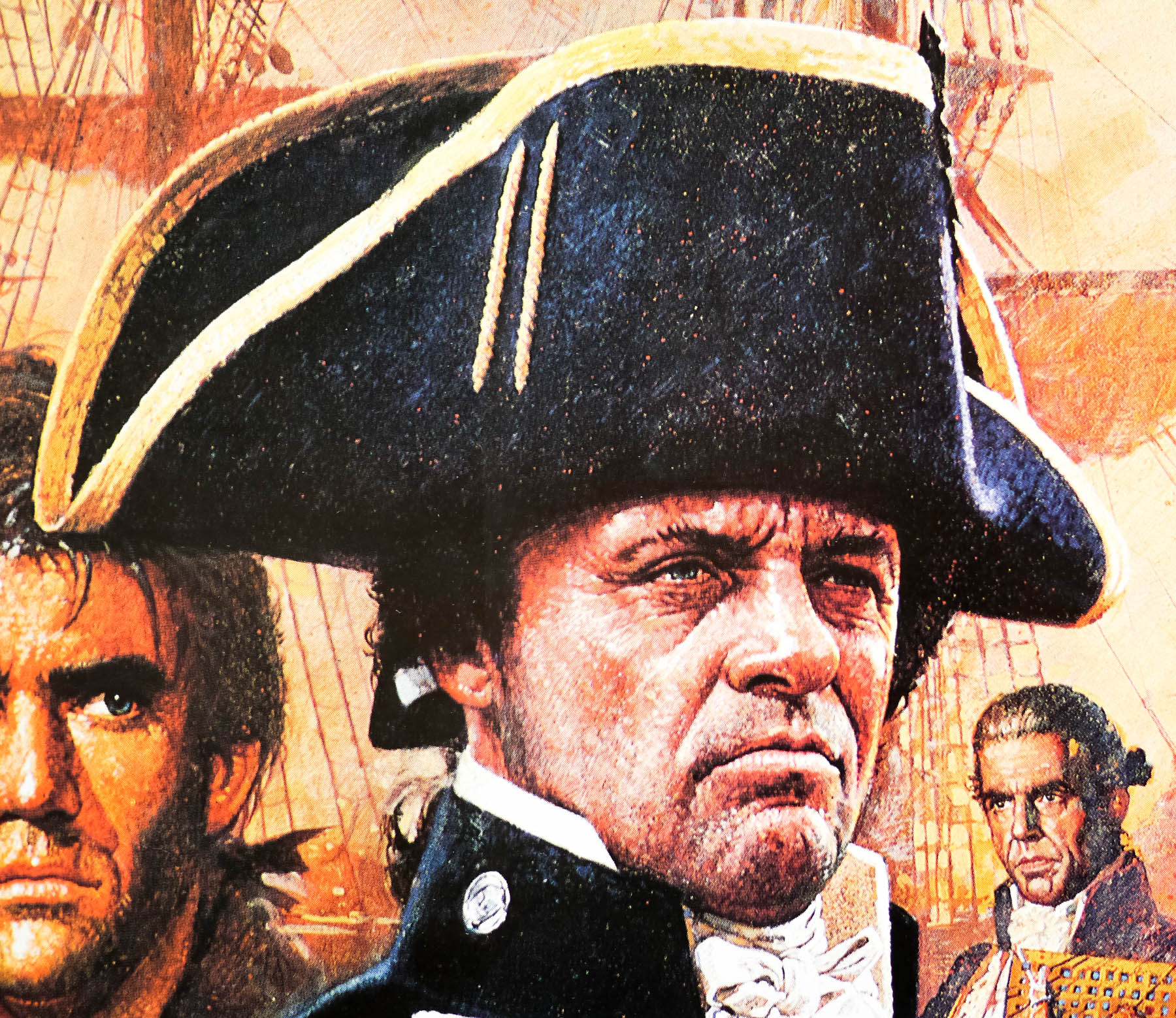
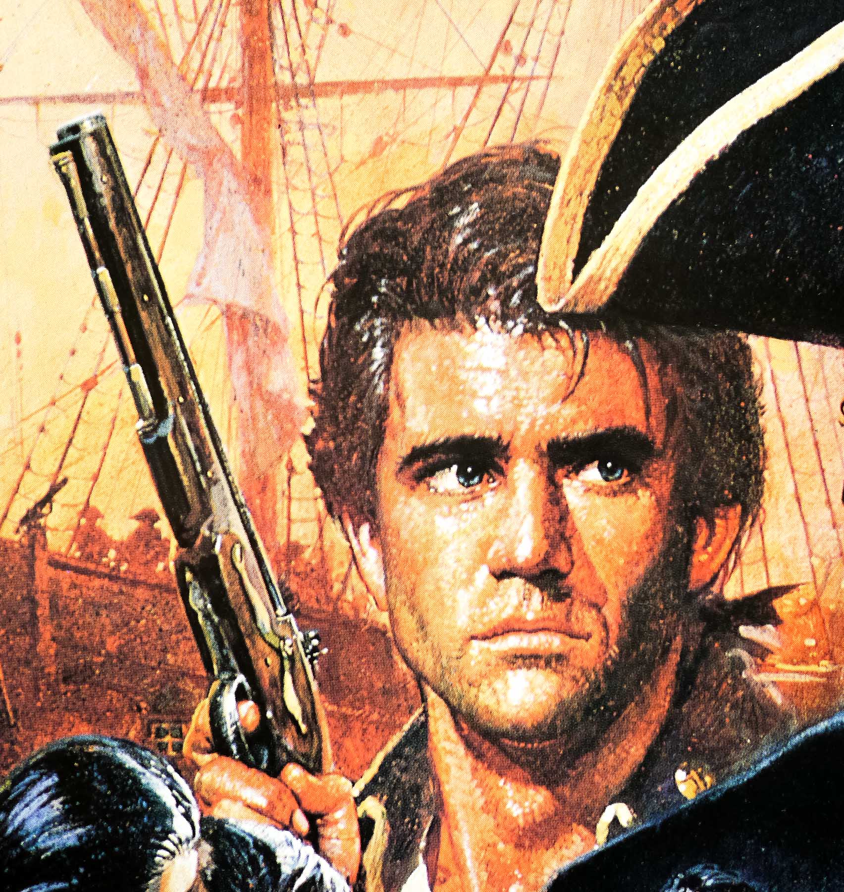
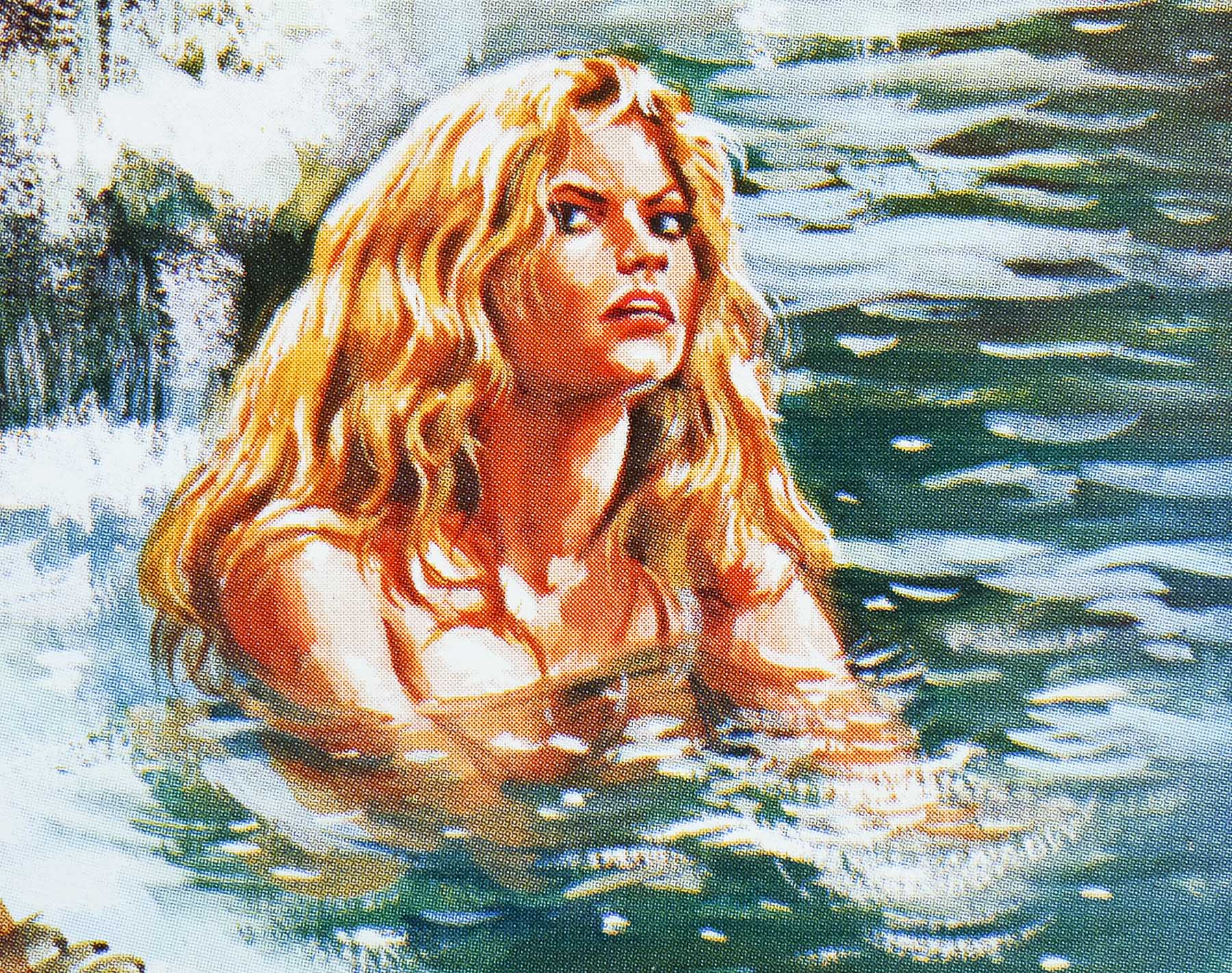
- Richard Hatch, Kay Lenz, John Saxon, Peter O'Farrell, Ray Charleson, Kenneth Hendel, Philip Van der Byl, Larry Taylor, Dawn Abraham, Ron Smerczak
- Origin of Film
- UK
- Genre(s) of Film
- Richard Hatch, Kay Lenz, John Saxon, Peter O'Farrell, Ray Charleson, Kenneth Hendel, Philip Van der Byl, Larry Taylor, Dawn Abraham, Ron Smerczak,
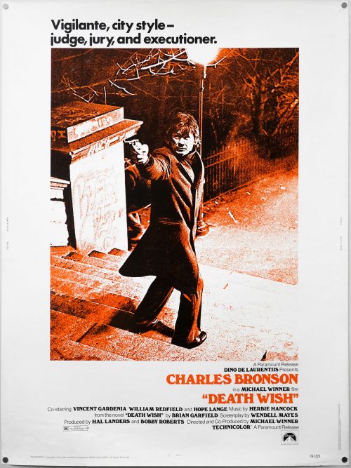
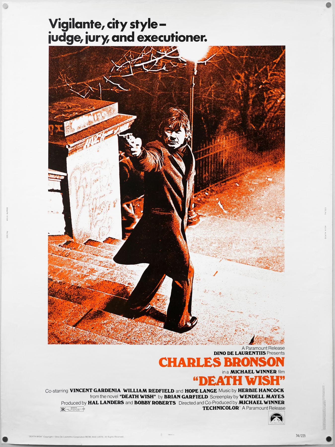
- Type of Poster
- One sheet
- Style of Poster
- --
- Origin of Poster
- UK
- Year of Poster
- 1983
- Designer
- Tom Chantrell
- Artist
- Tom Chantrell
- Size (inches)
- 27" x 40"
- SS or DS
- SS
- Tagline
- --
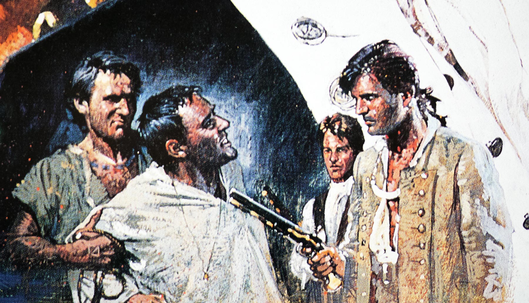
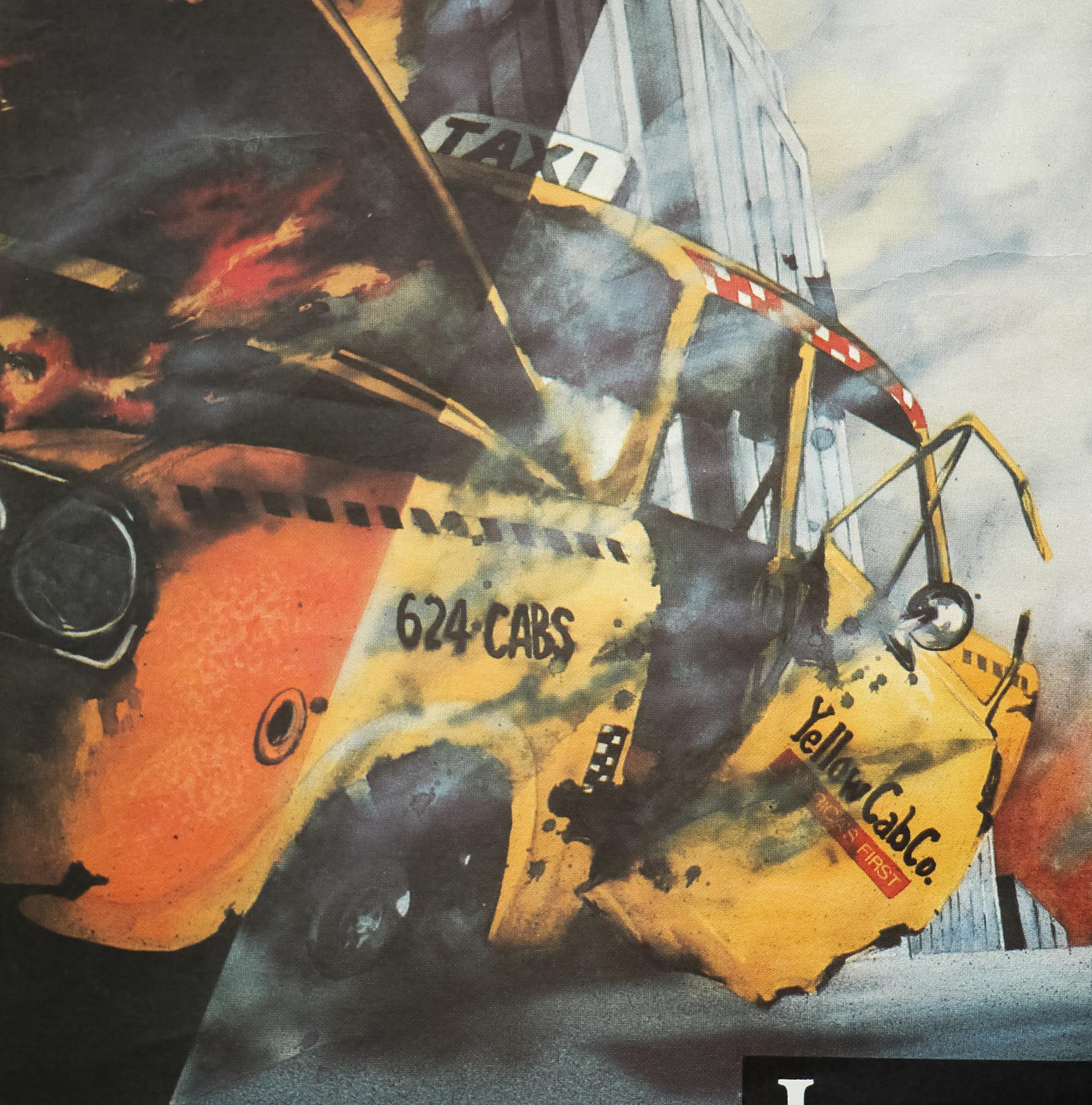
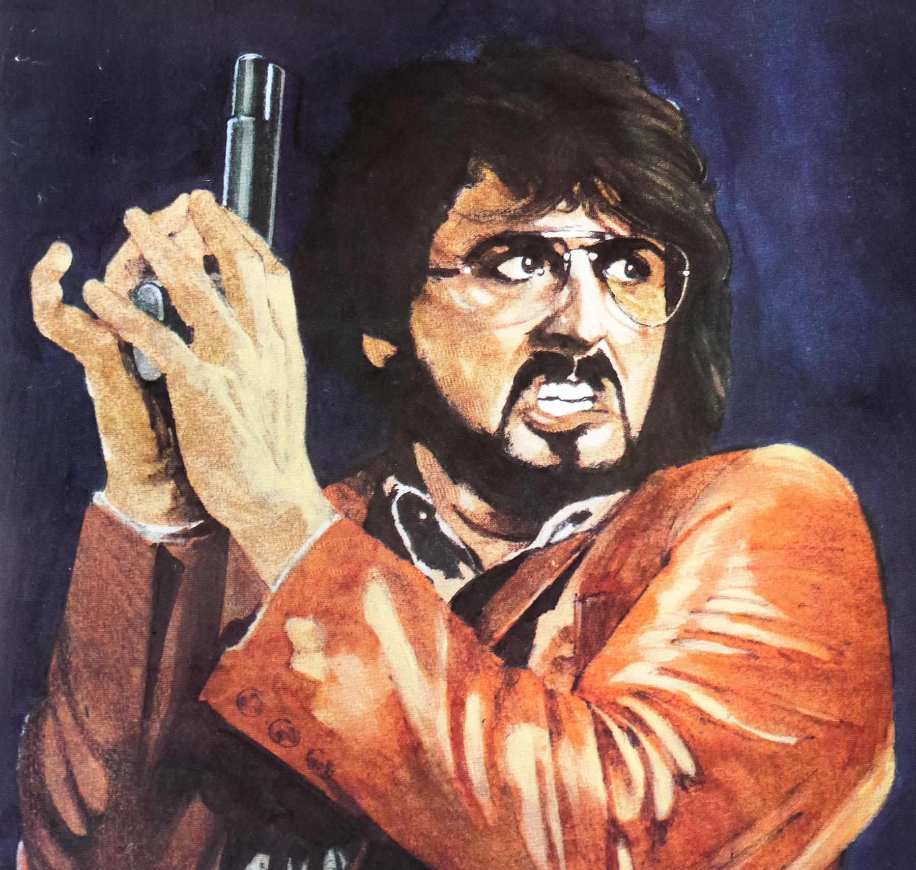
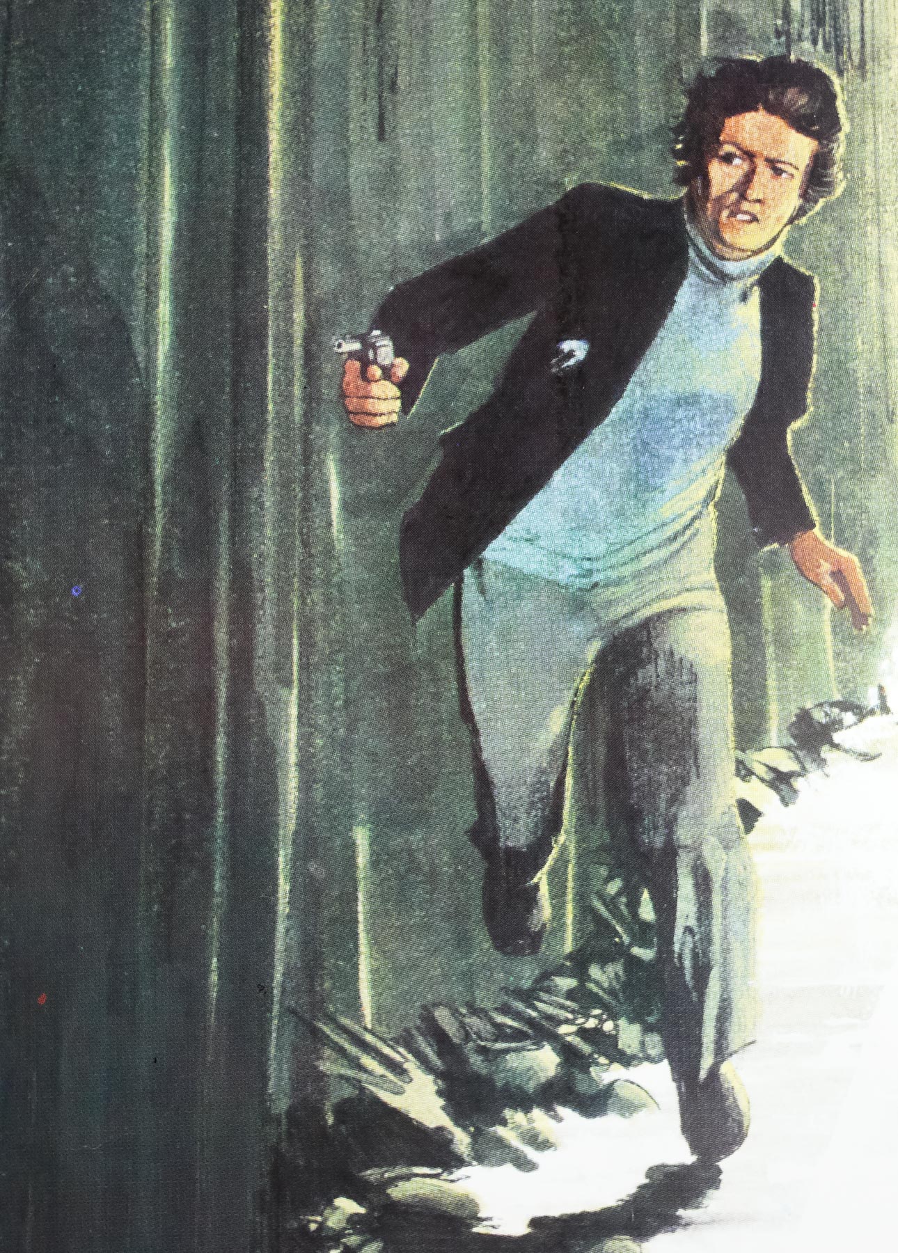
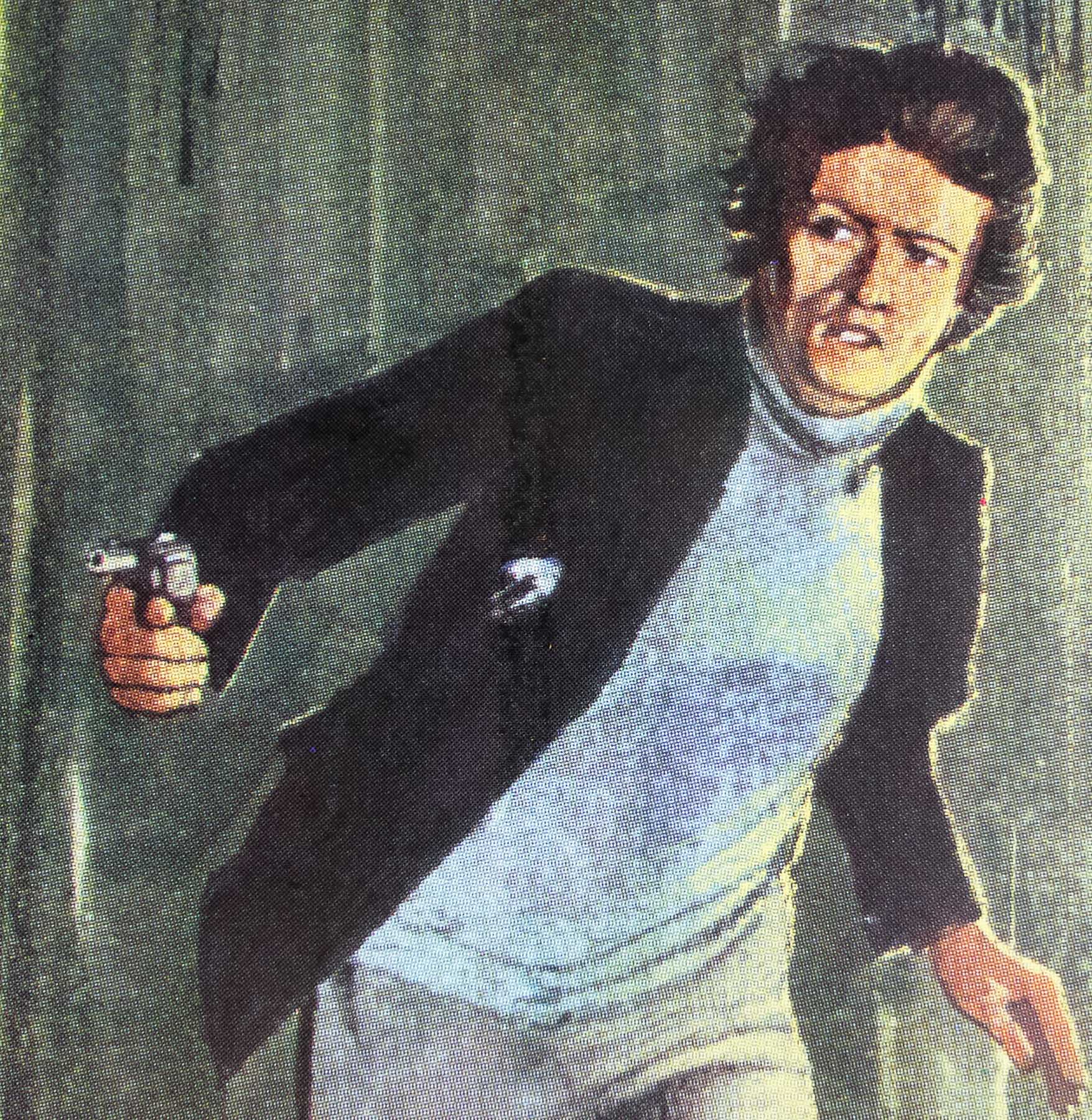
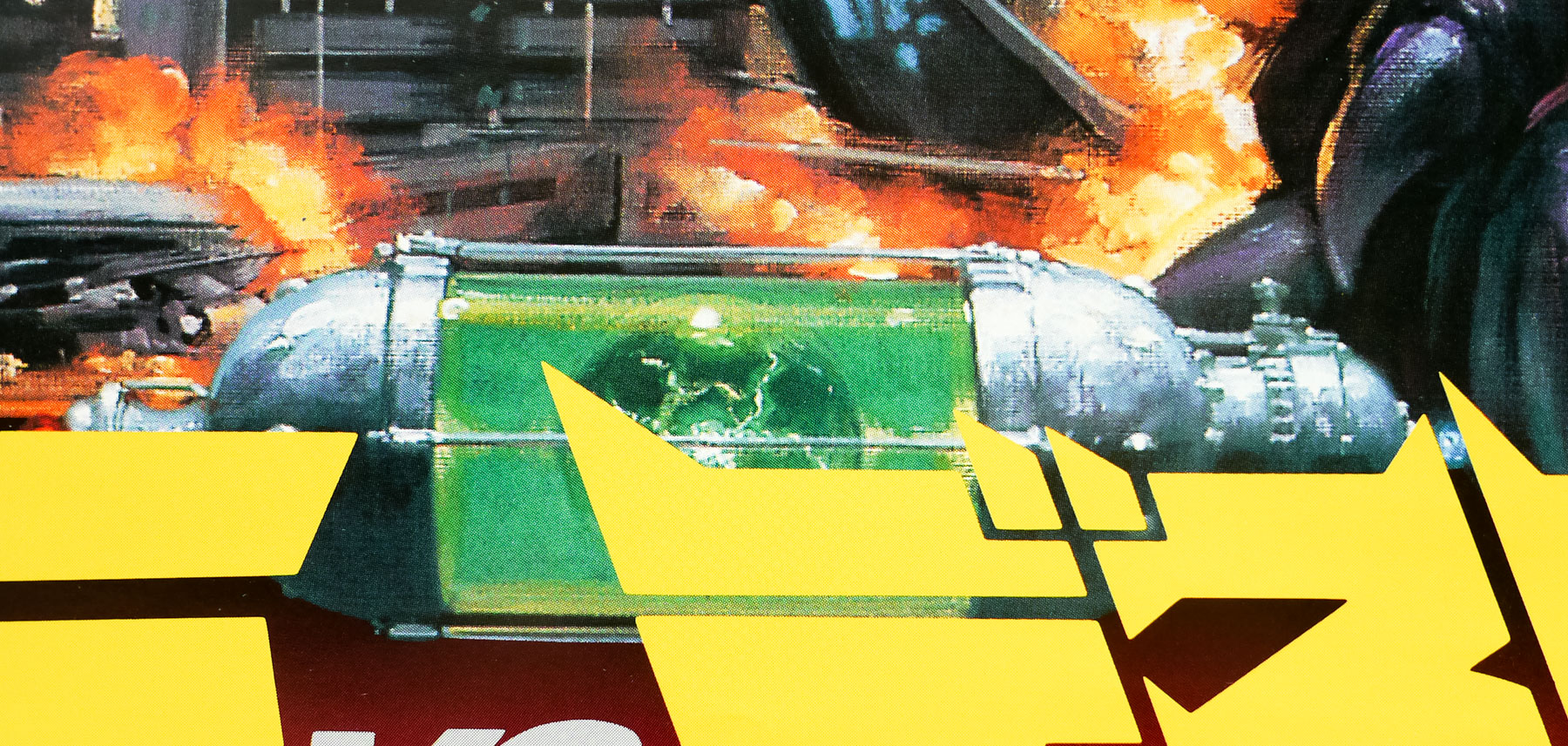
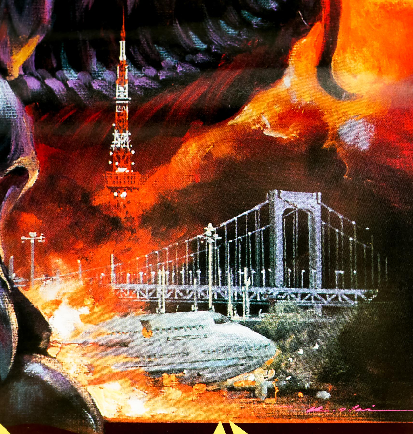
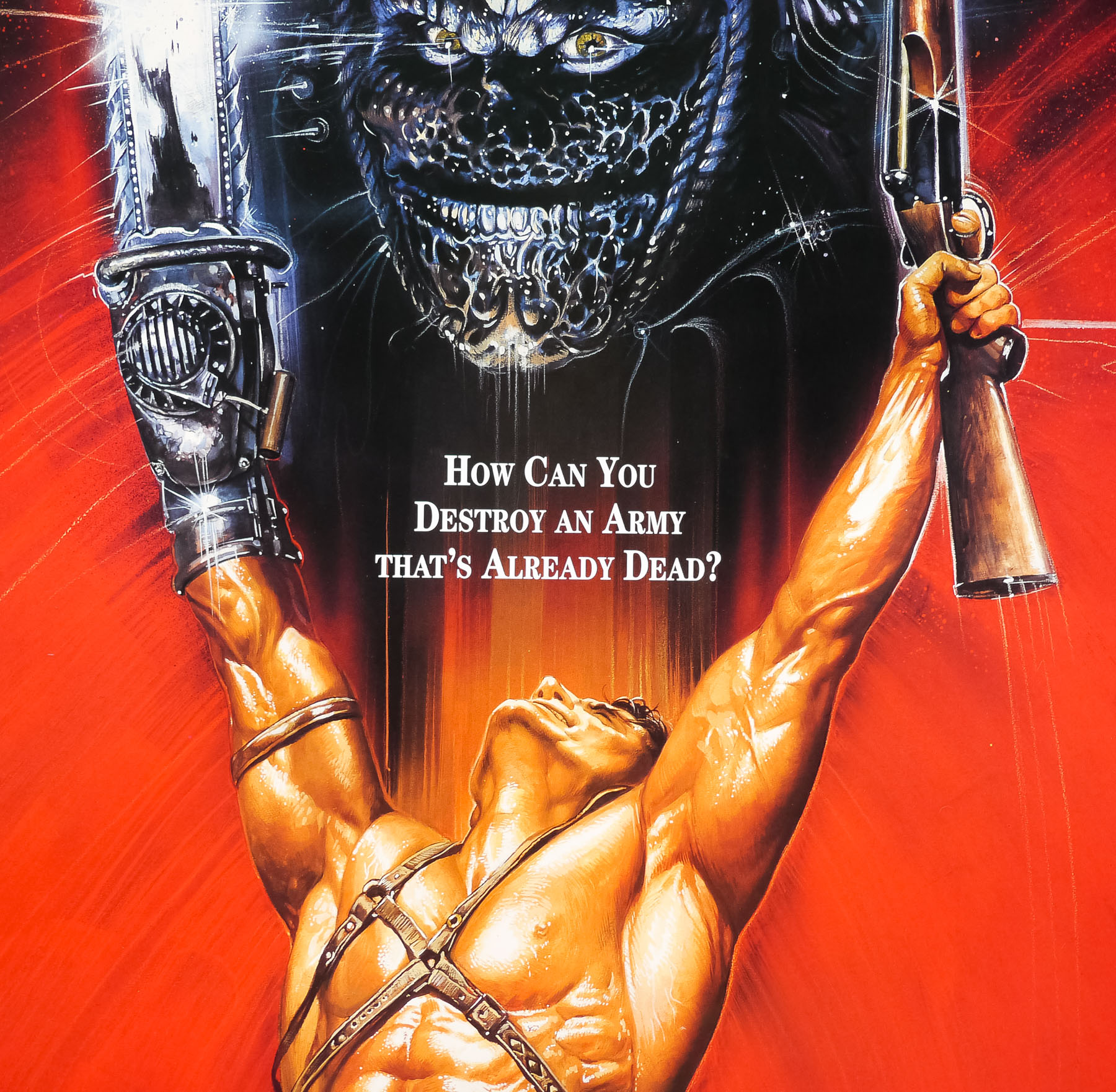
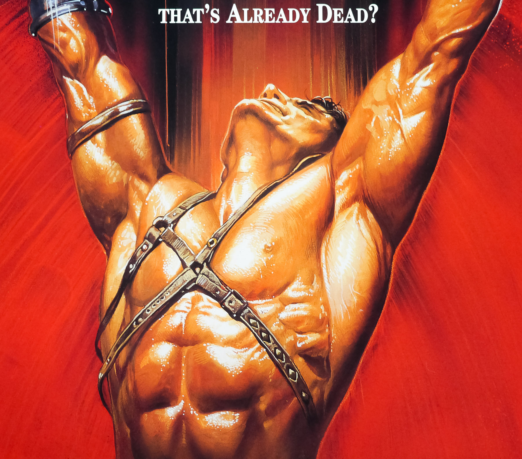
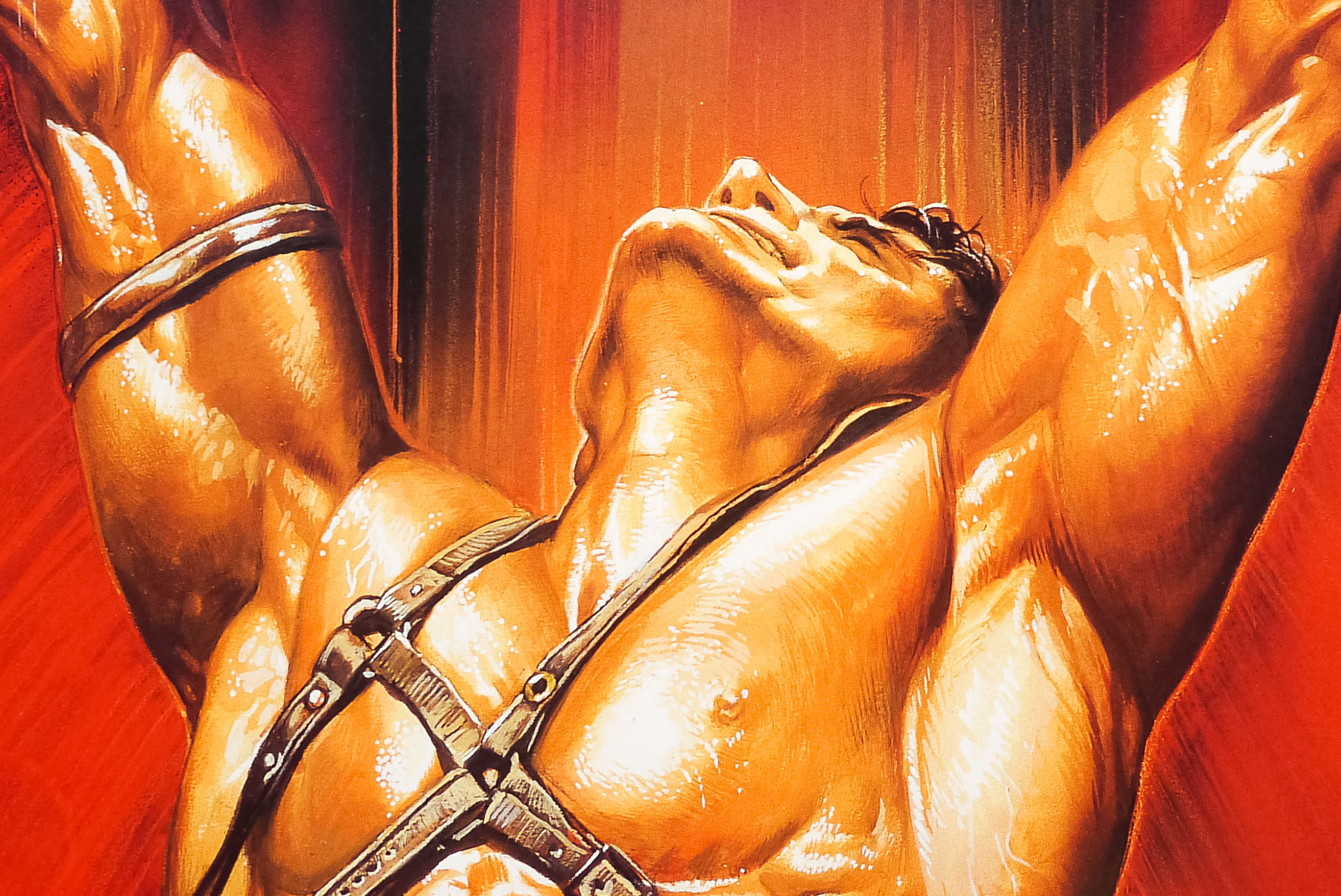
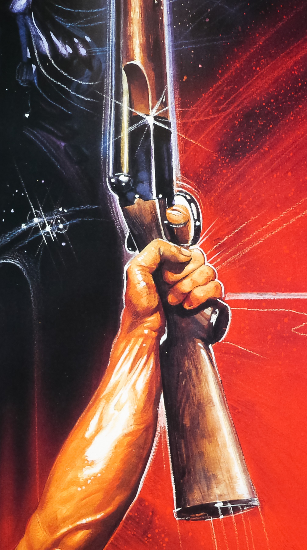
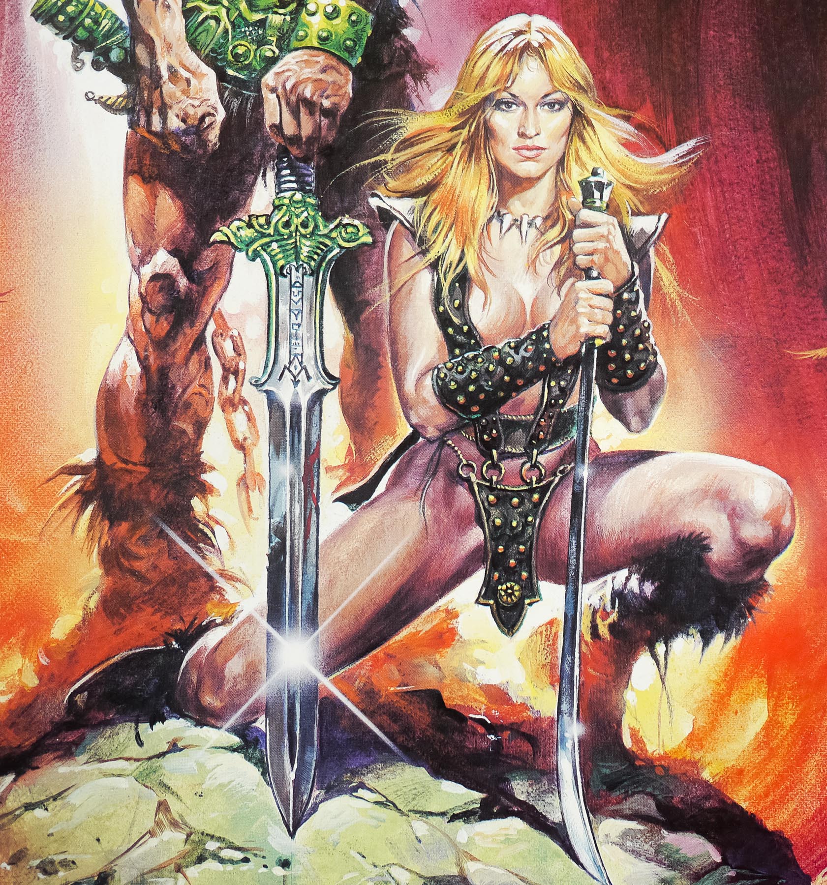
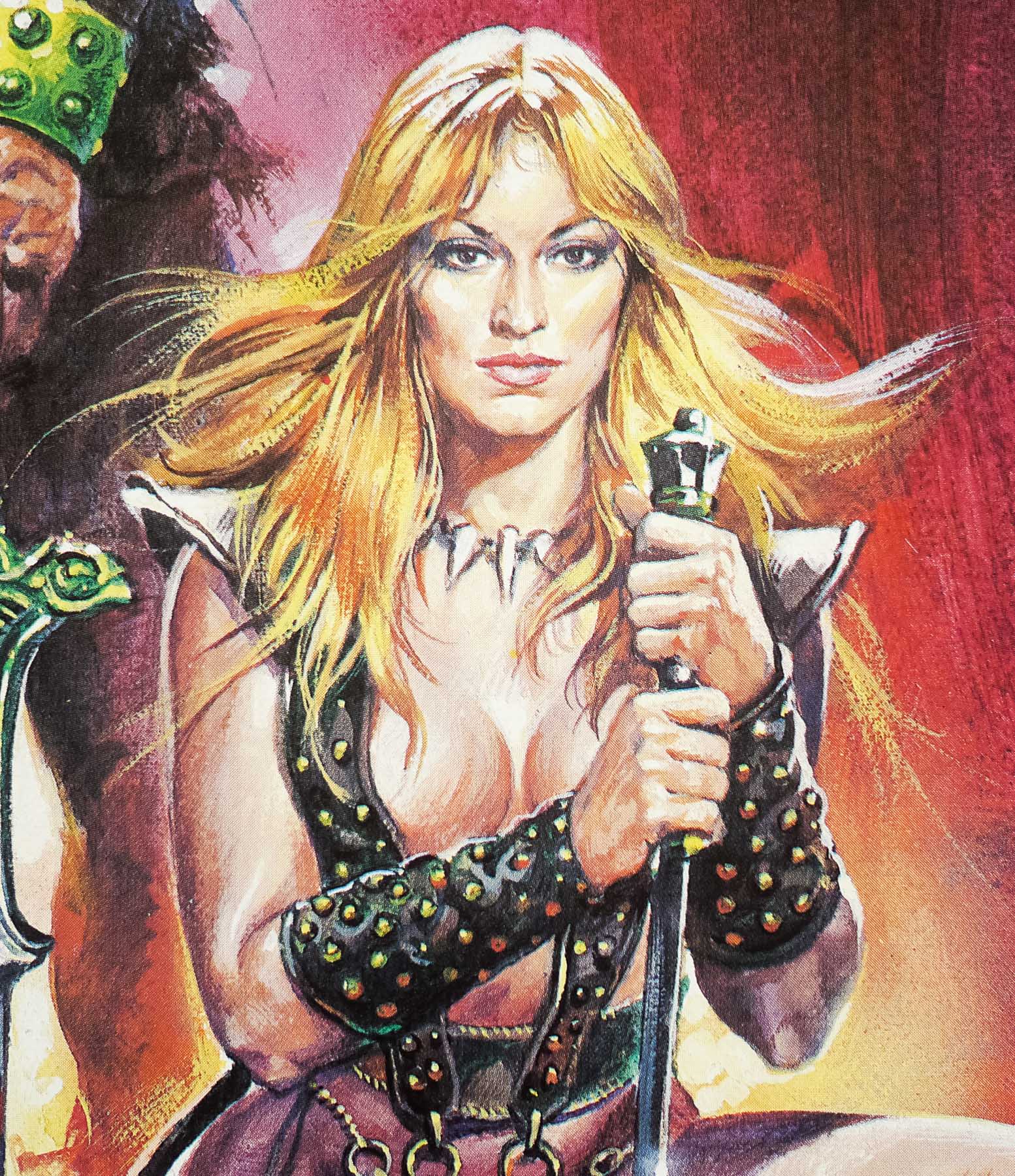
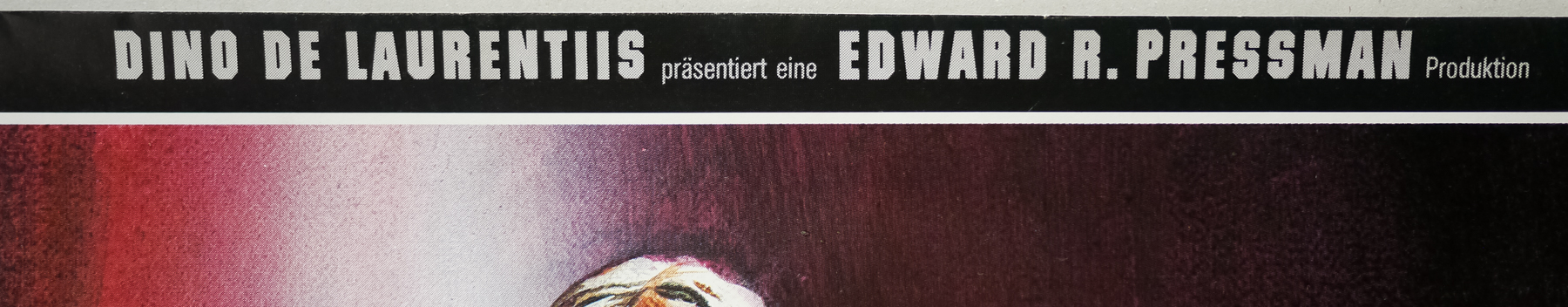
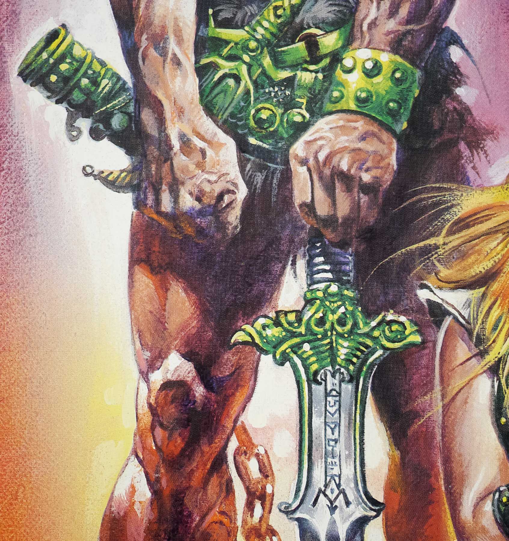
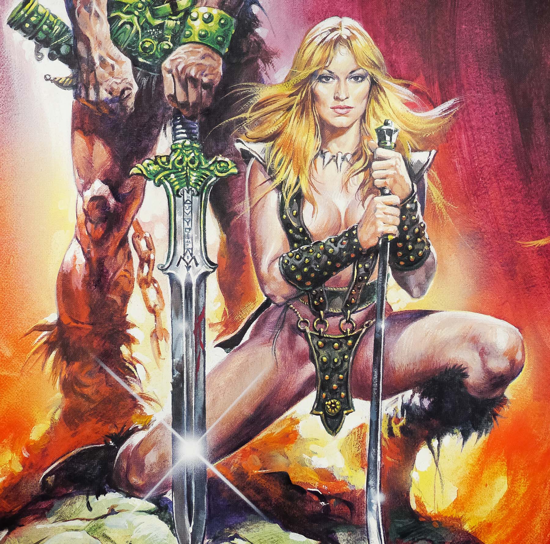
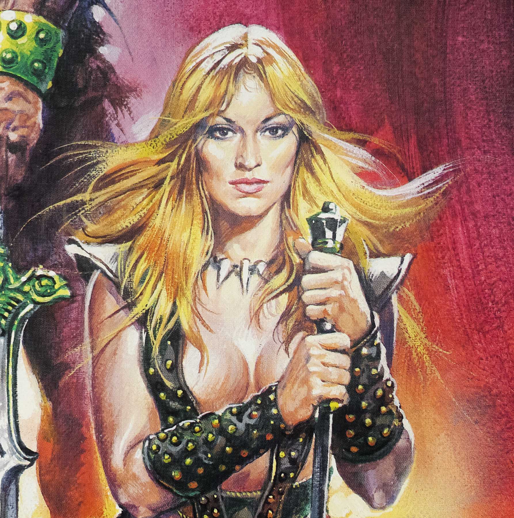
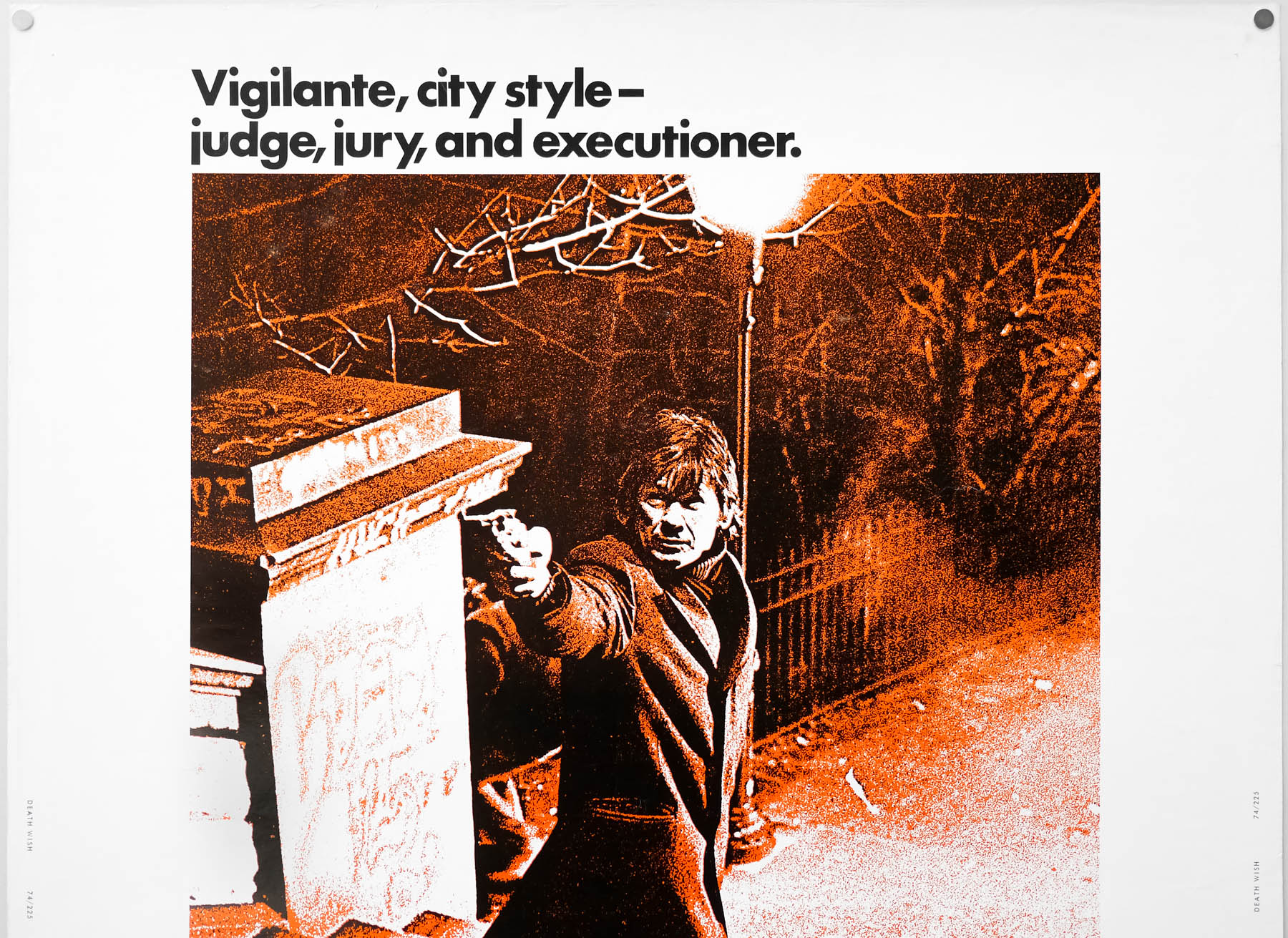
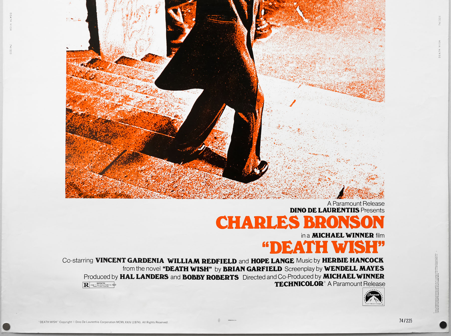
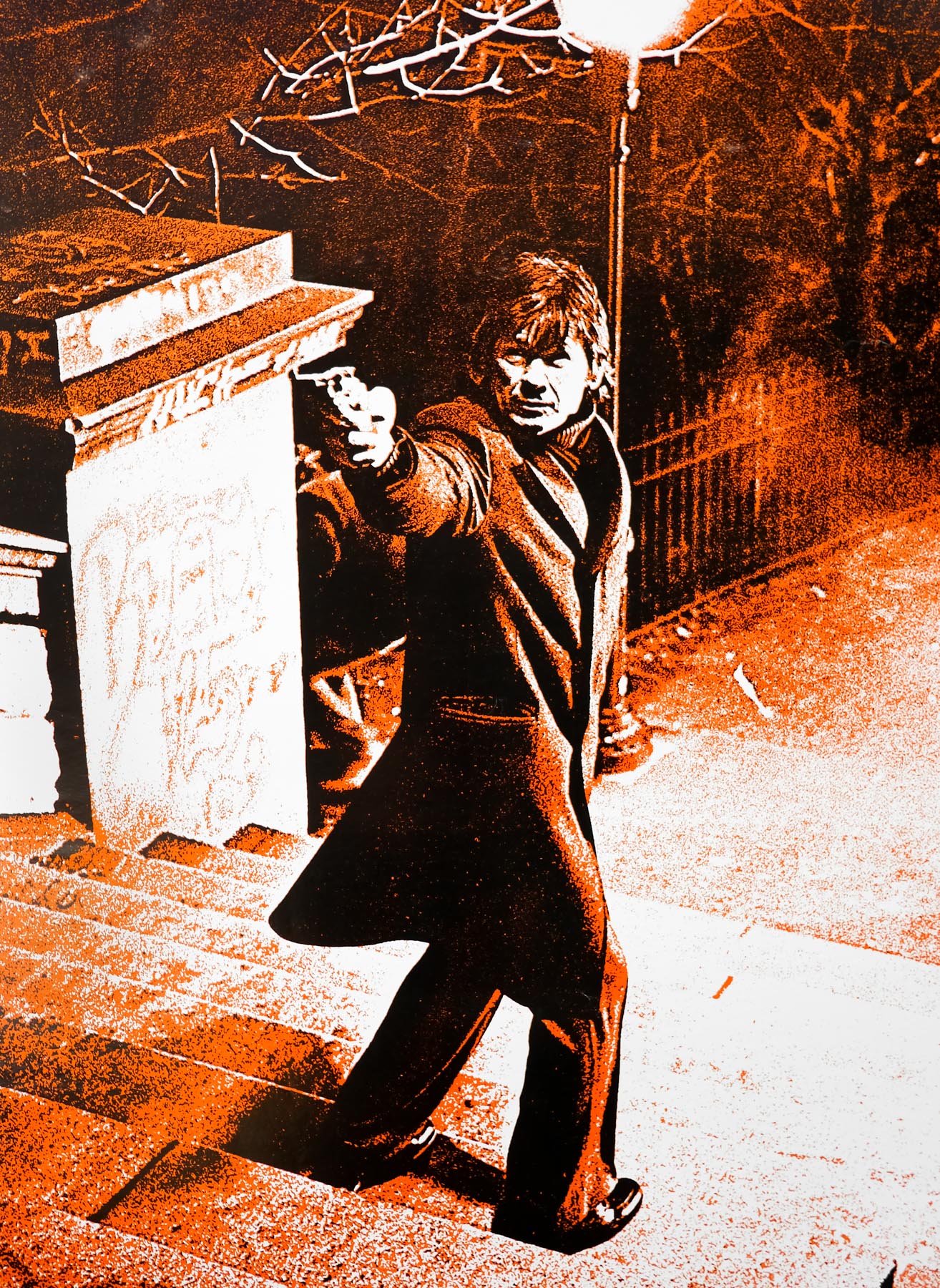
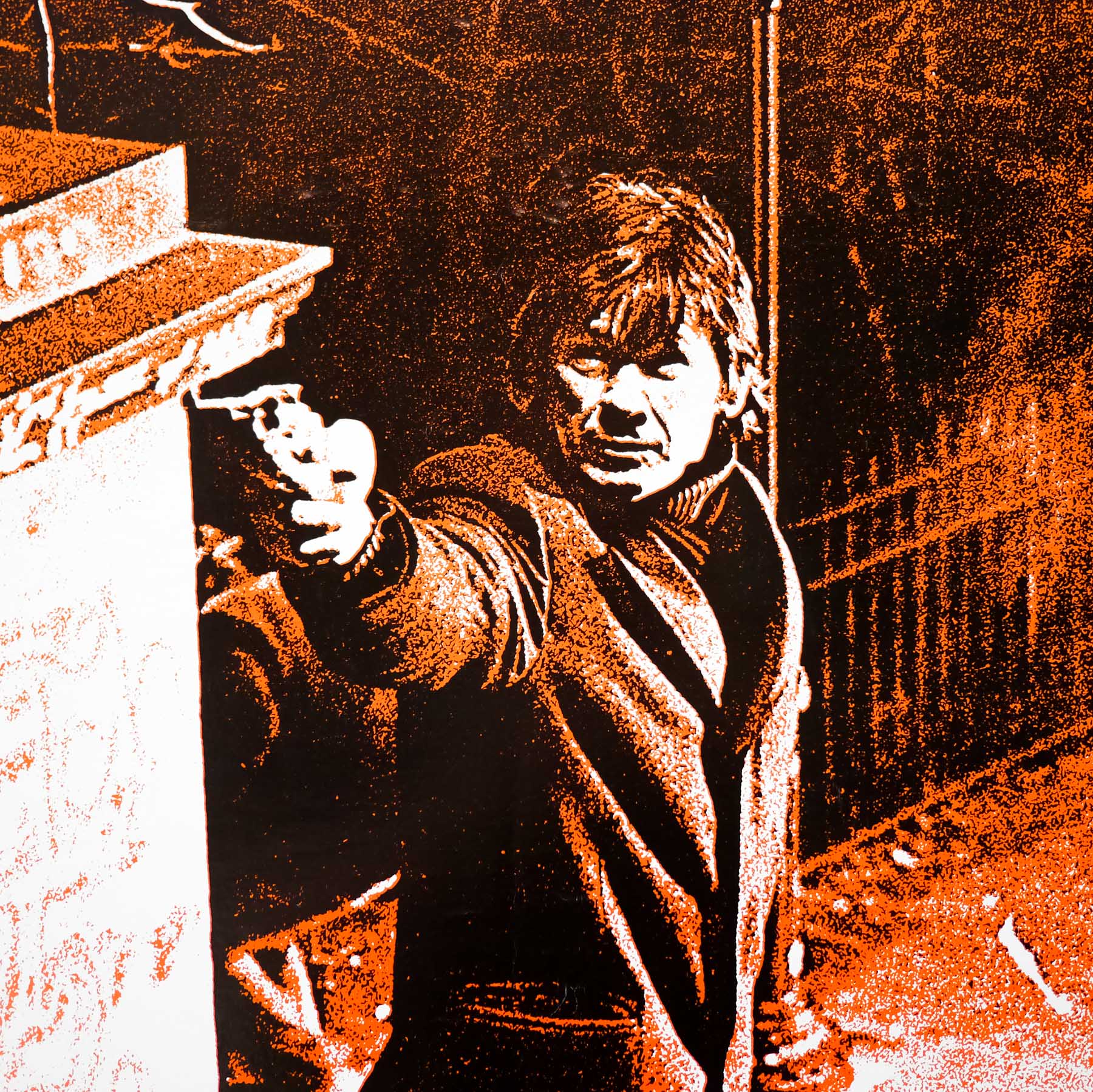
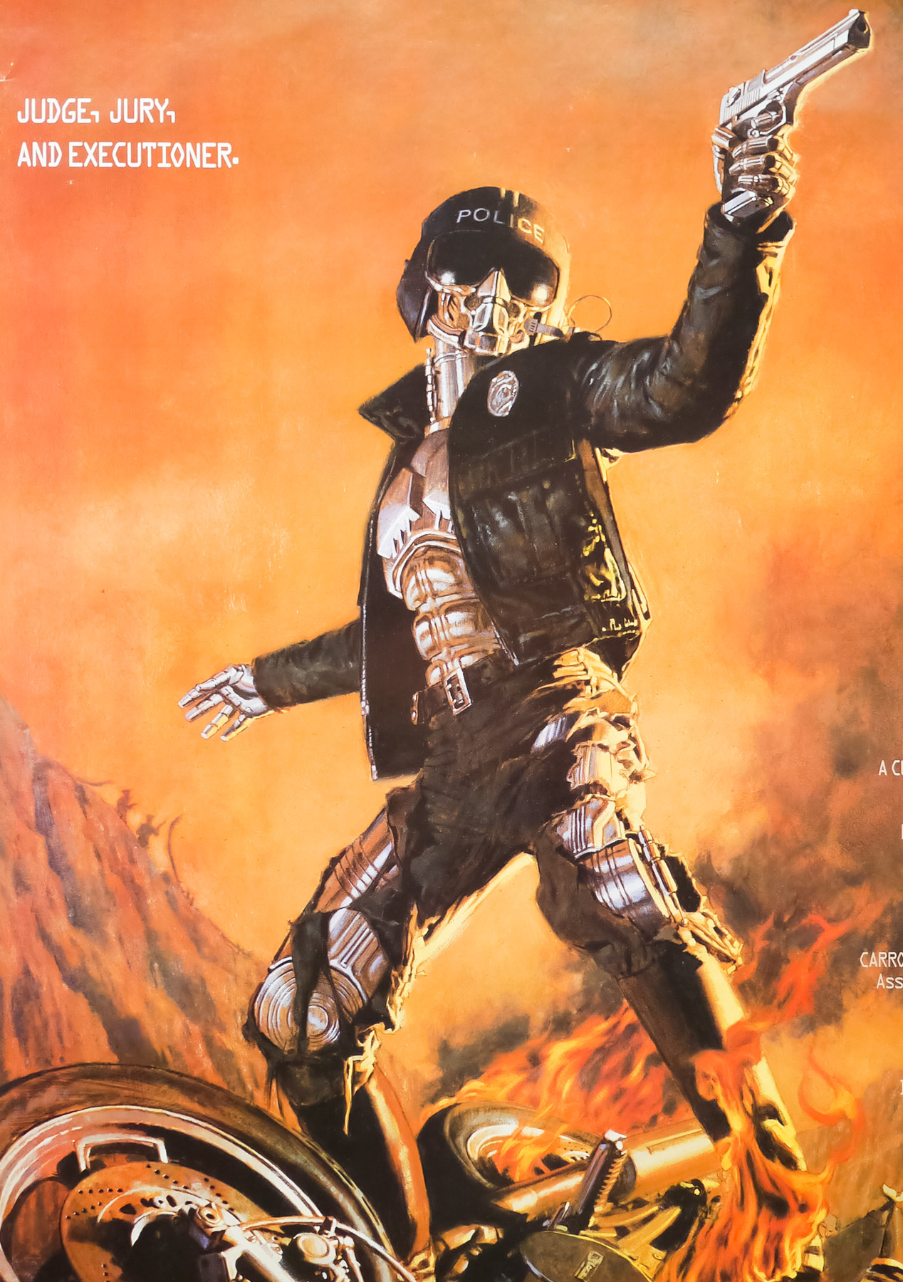
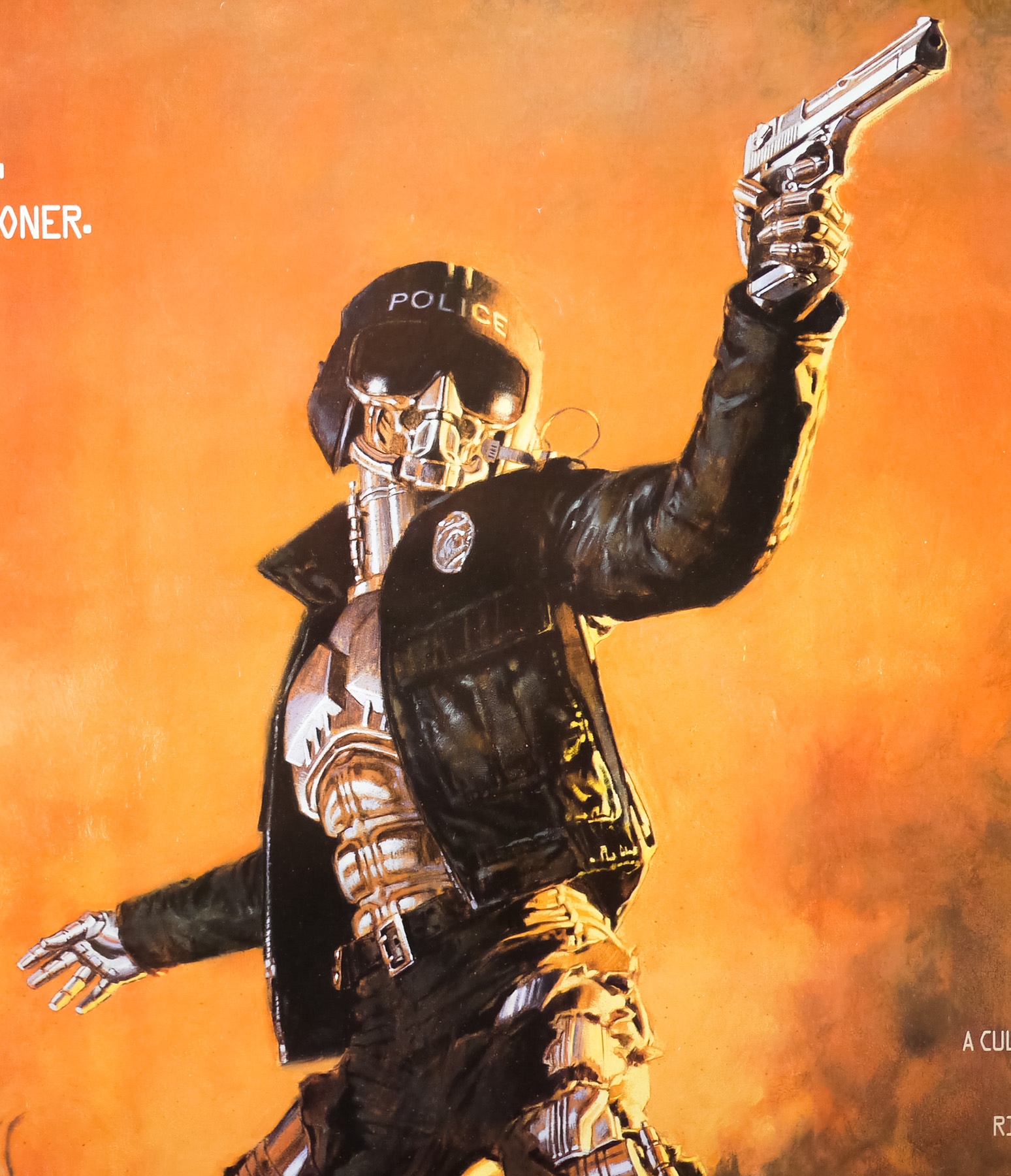
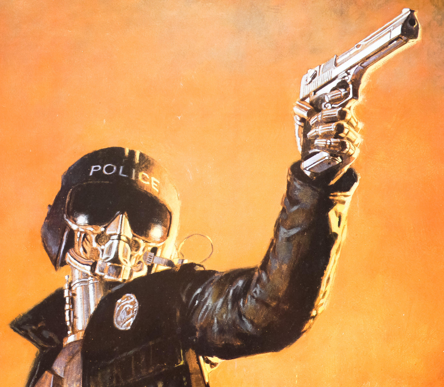
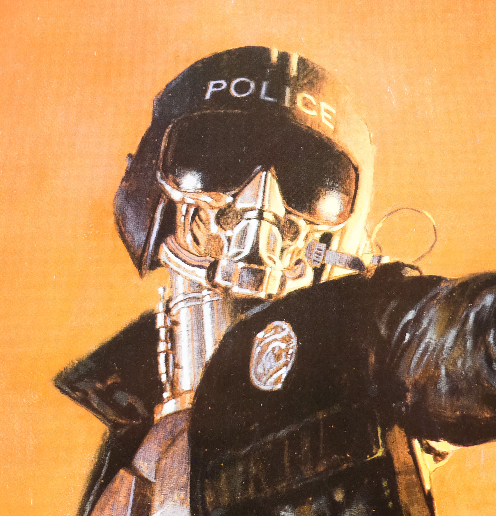
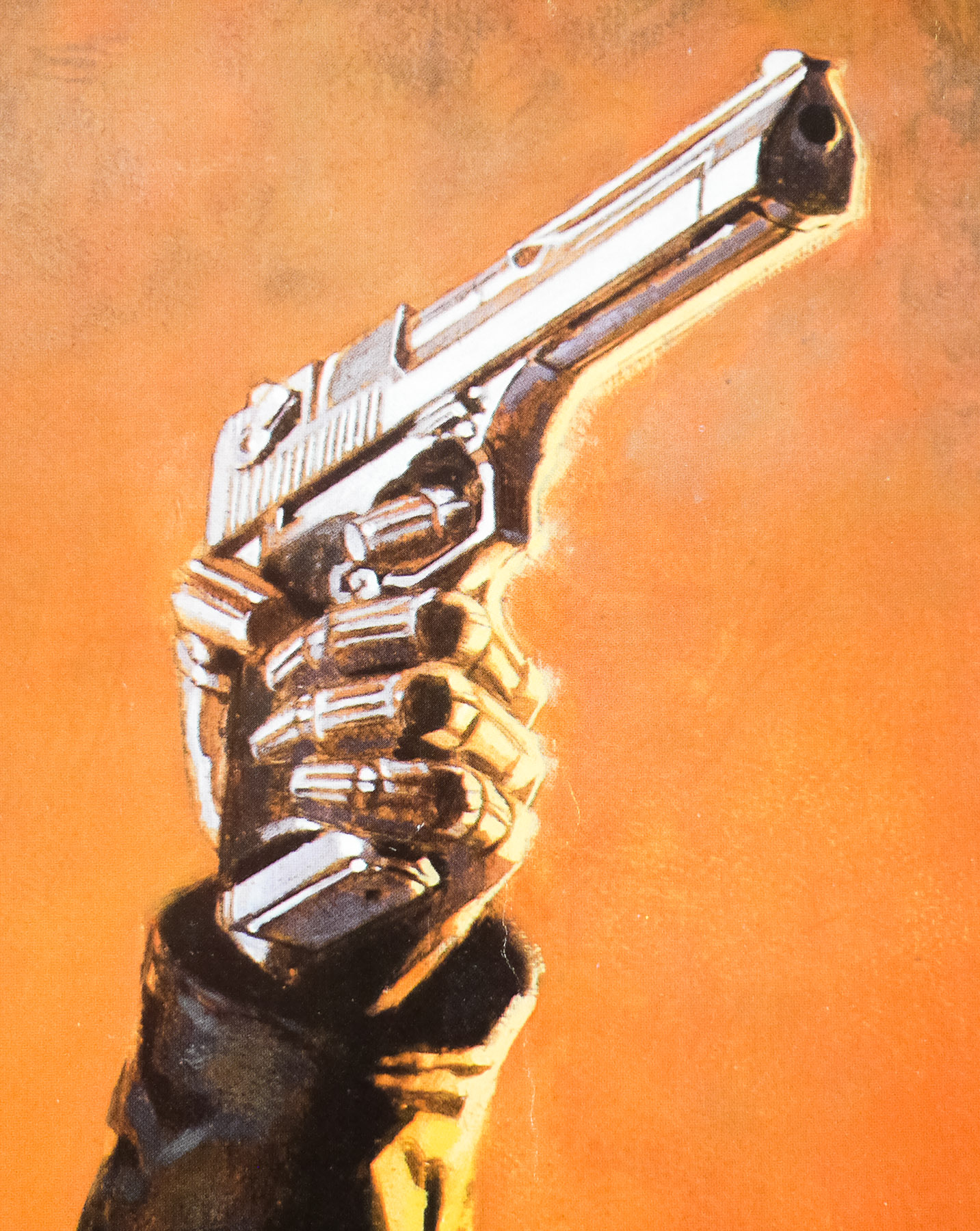
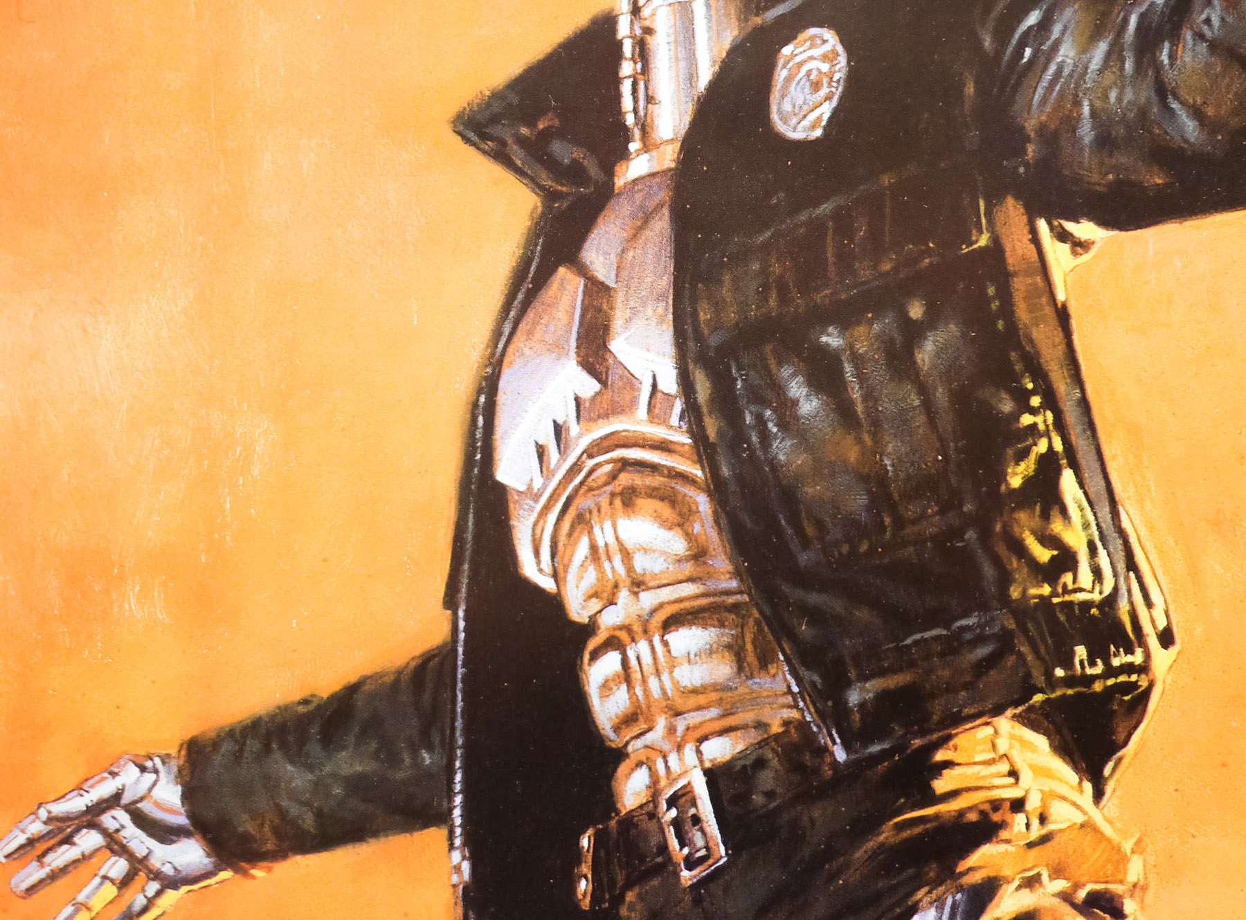
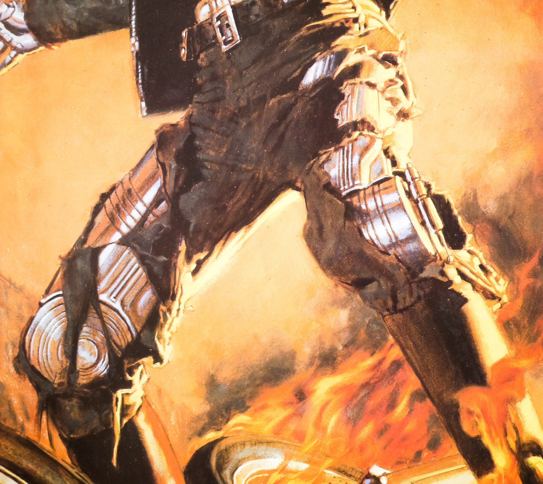
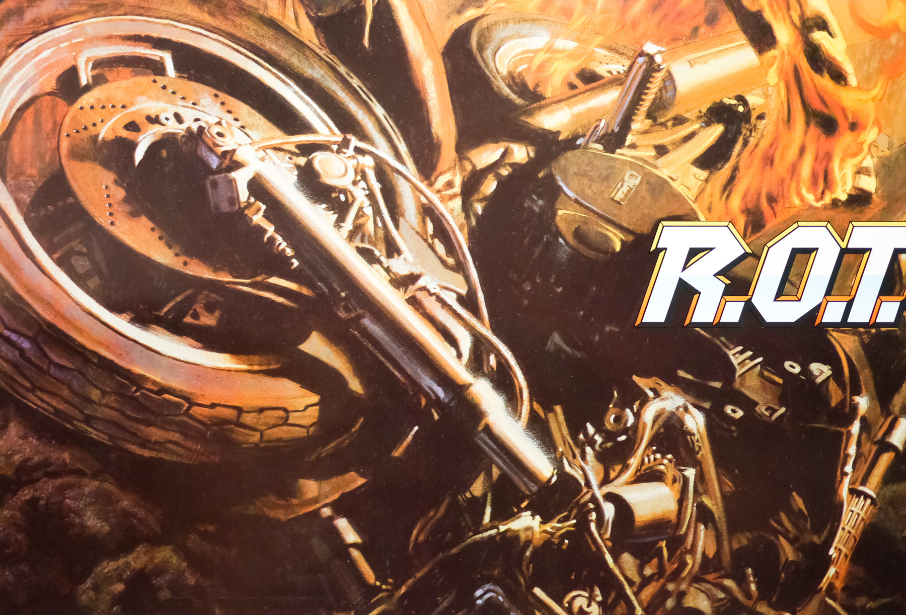
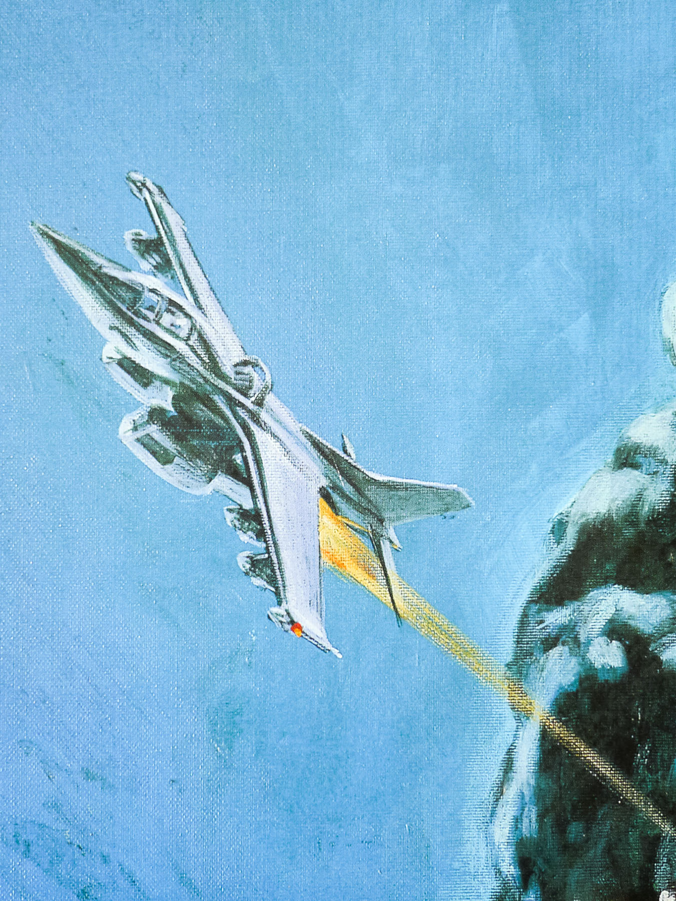
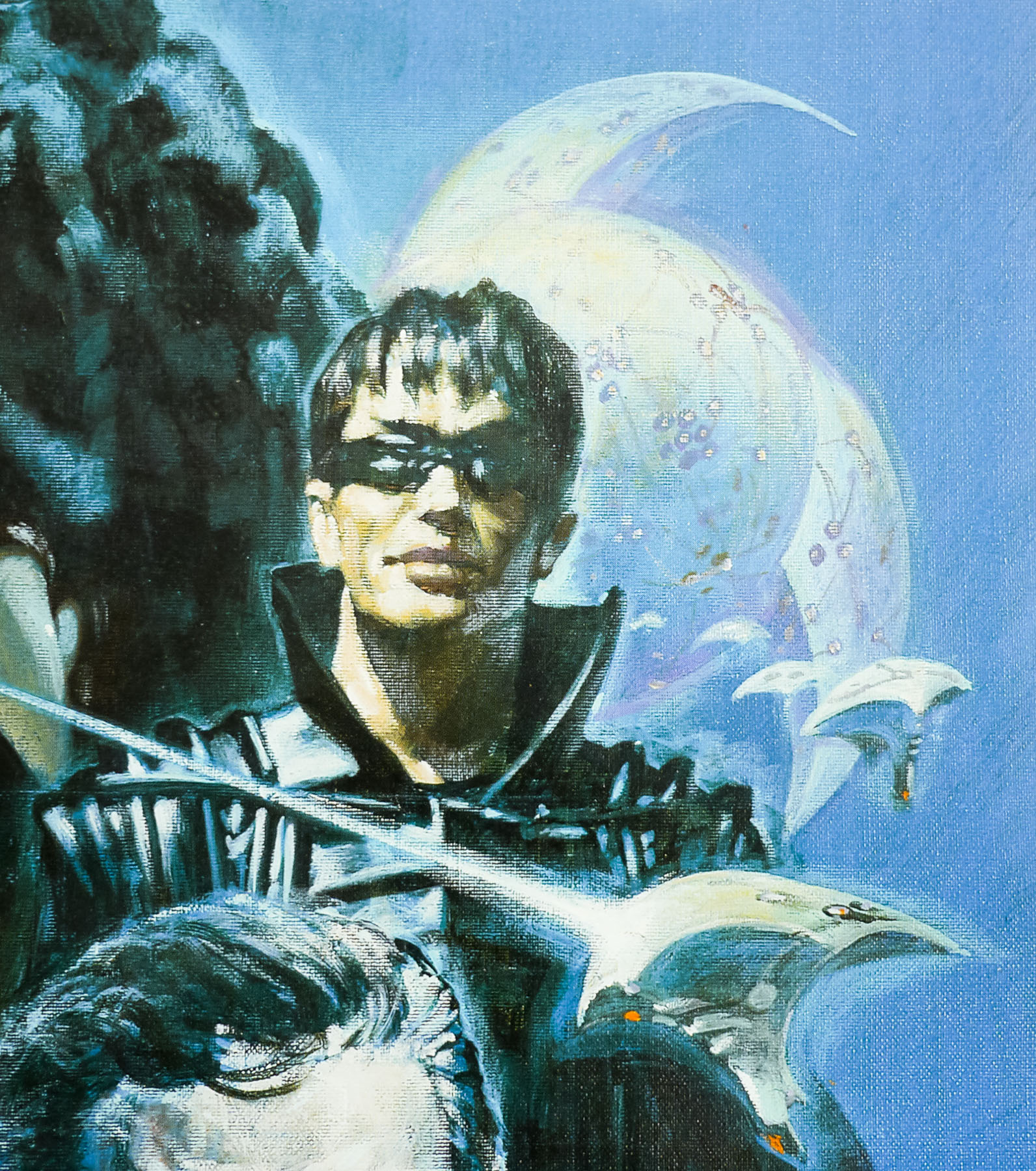
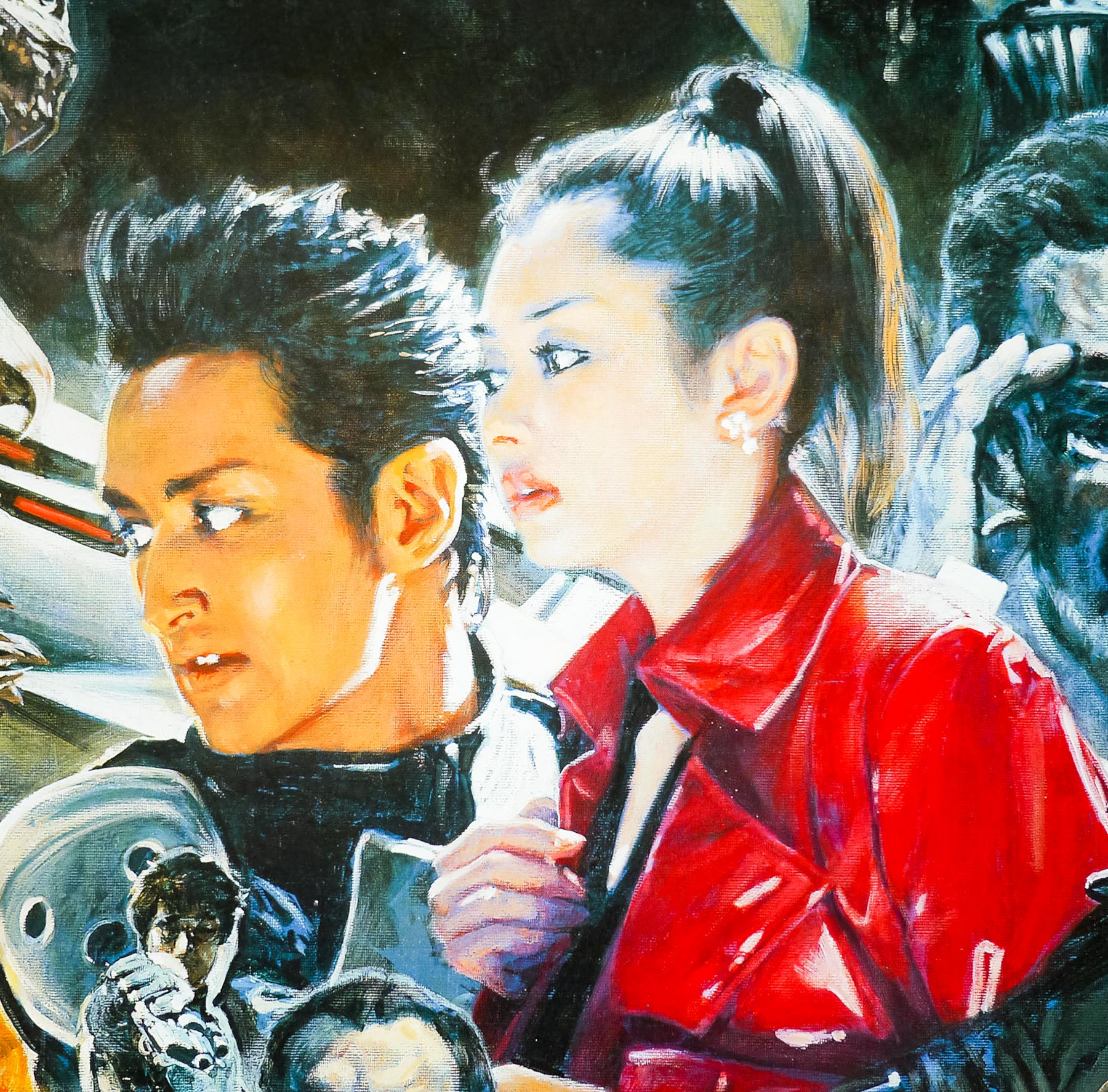
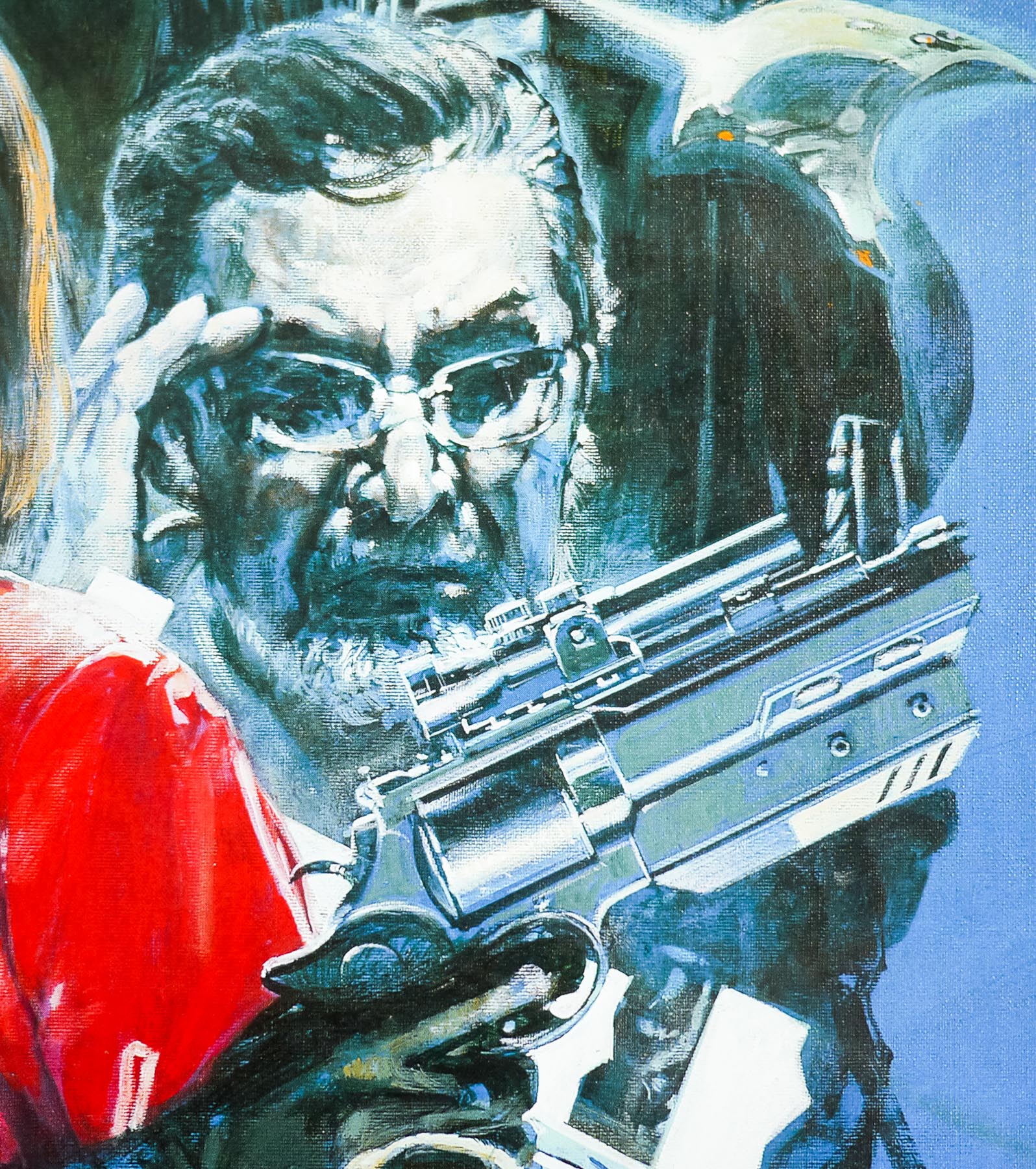
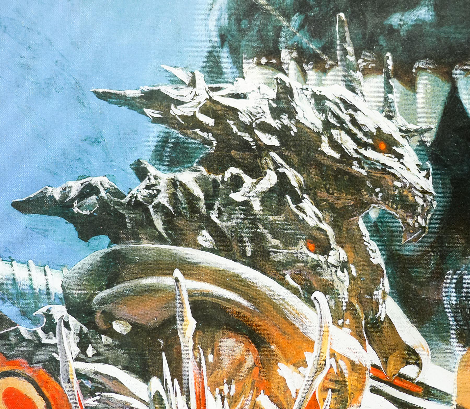
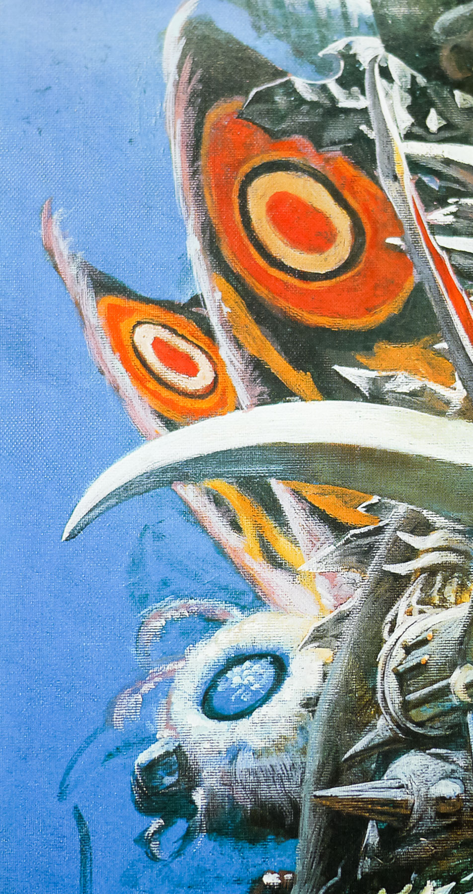
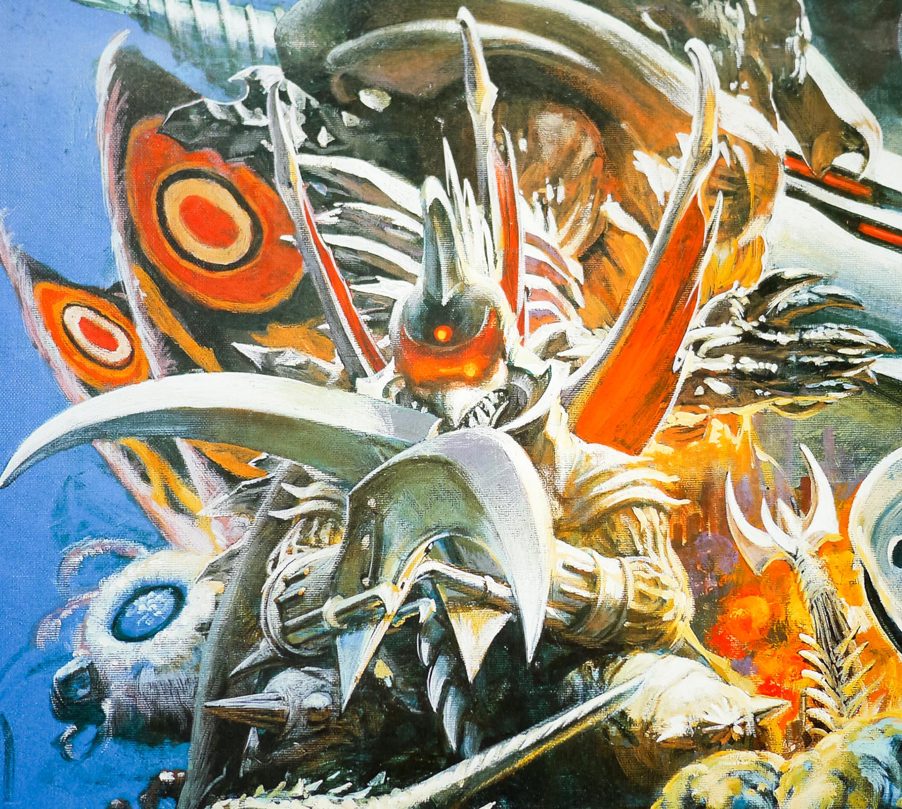
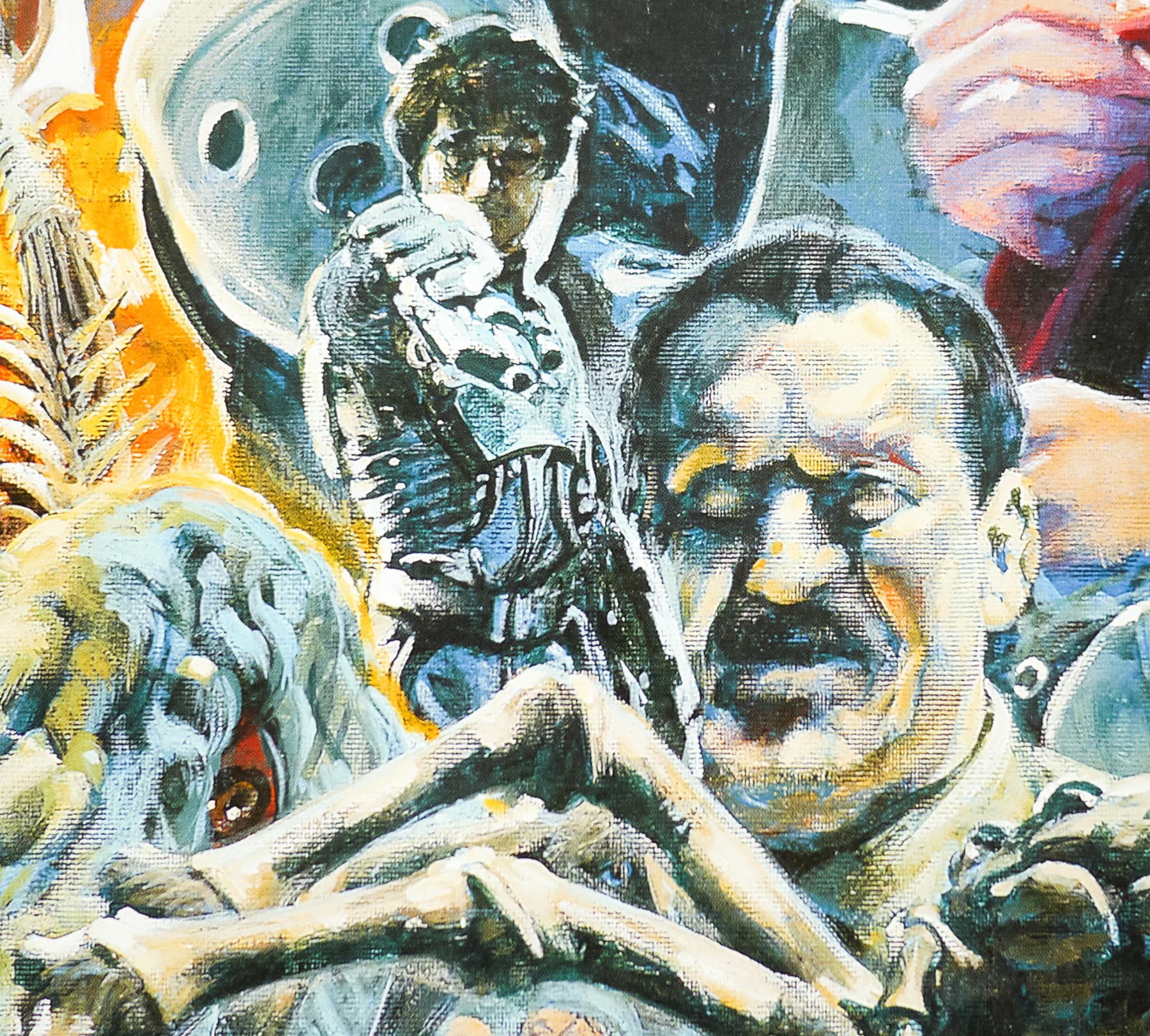
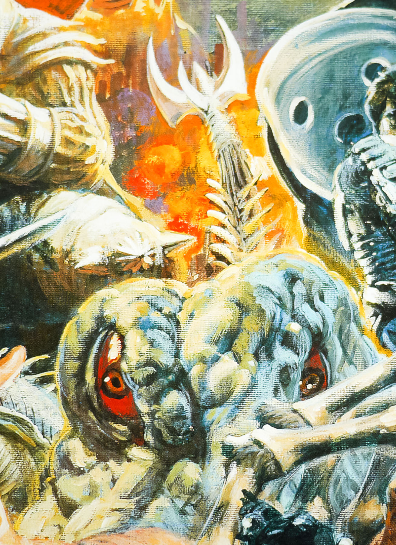
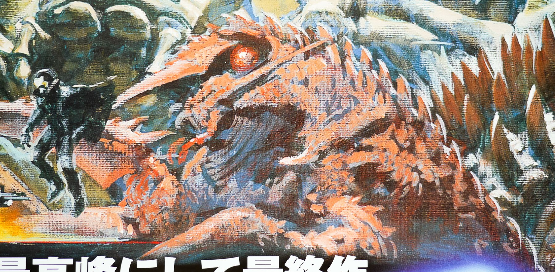
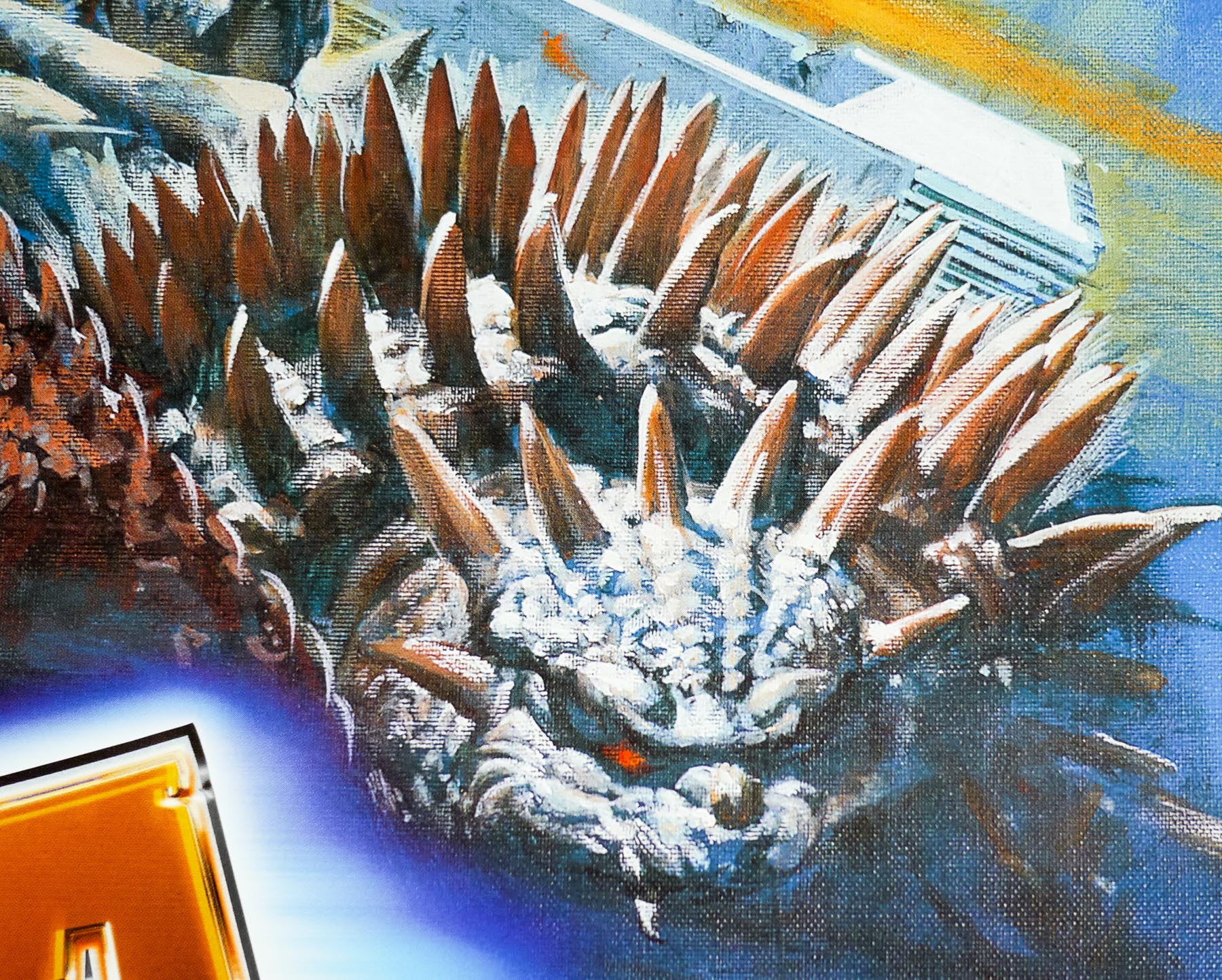
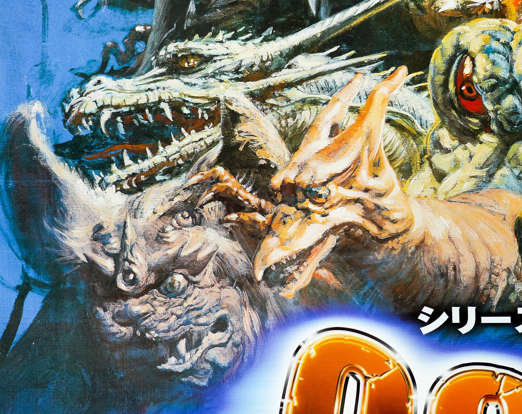
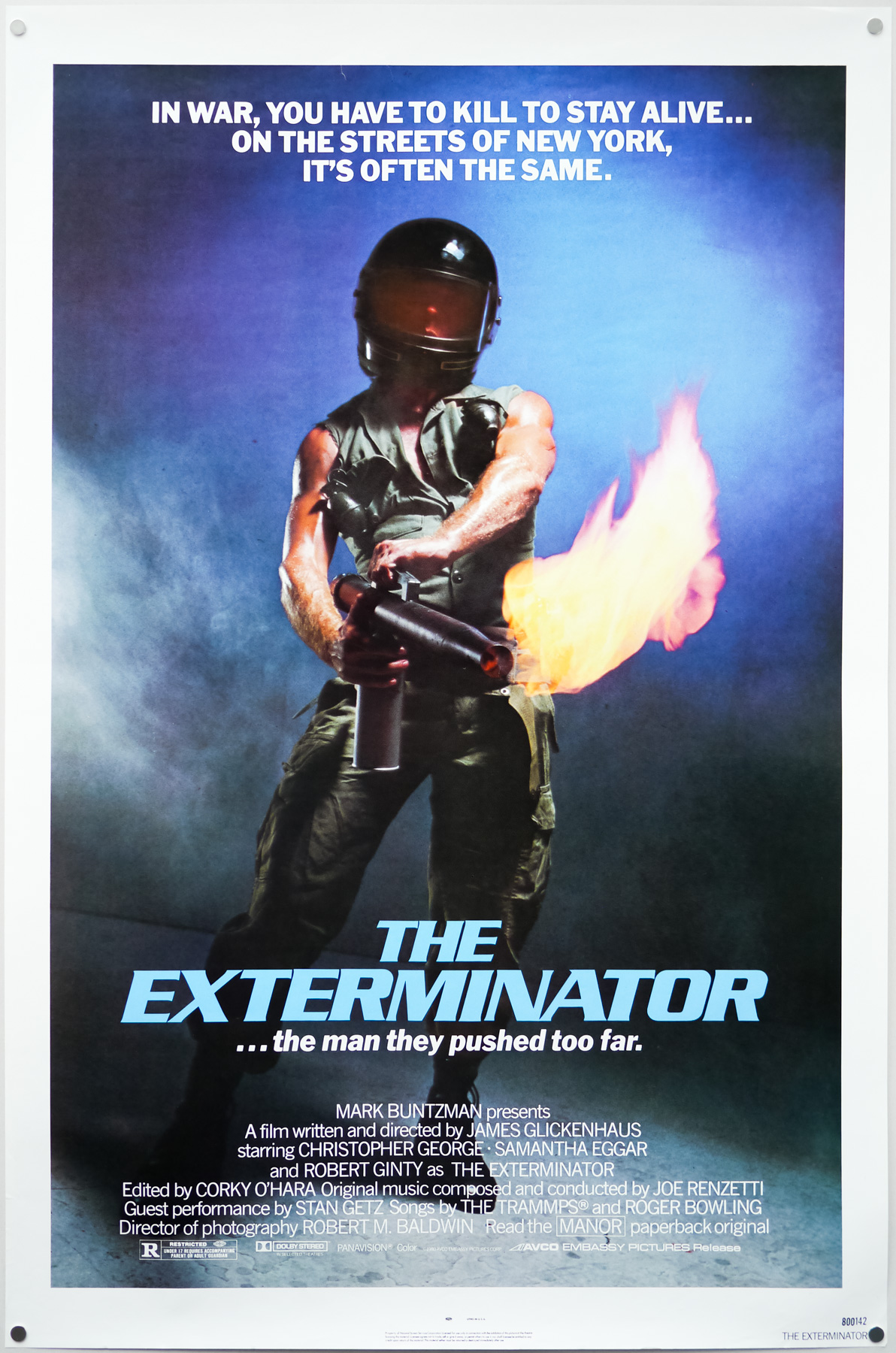
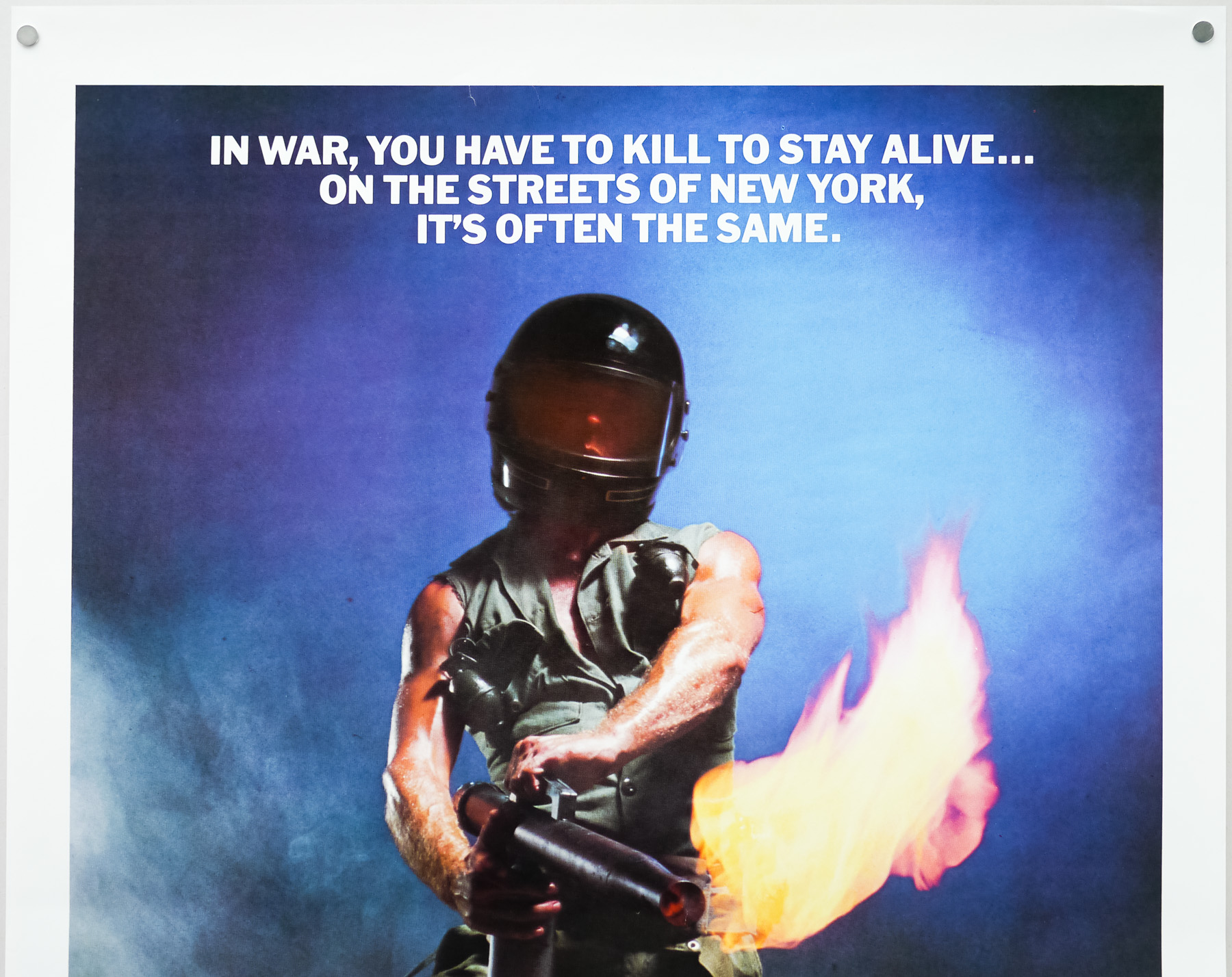
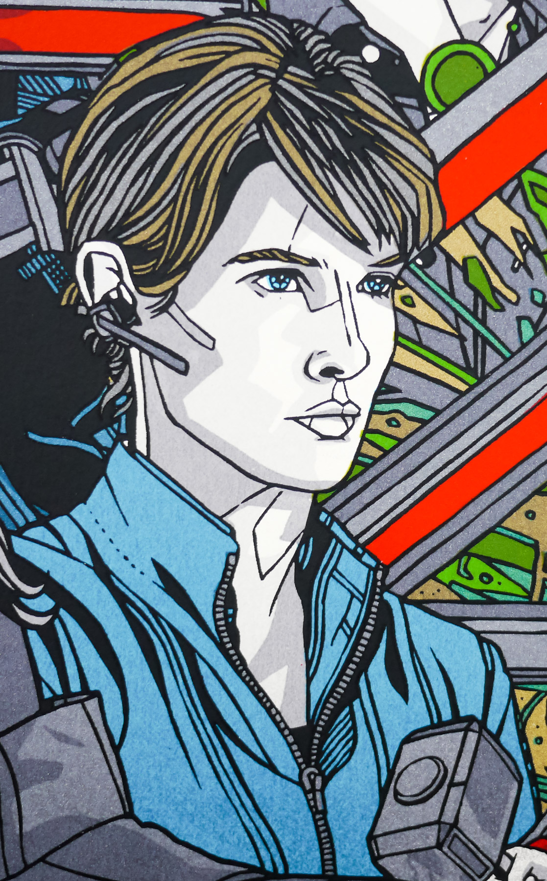
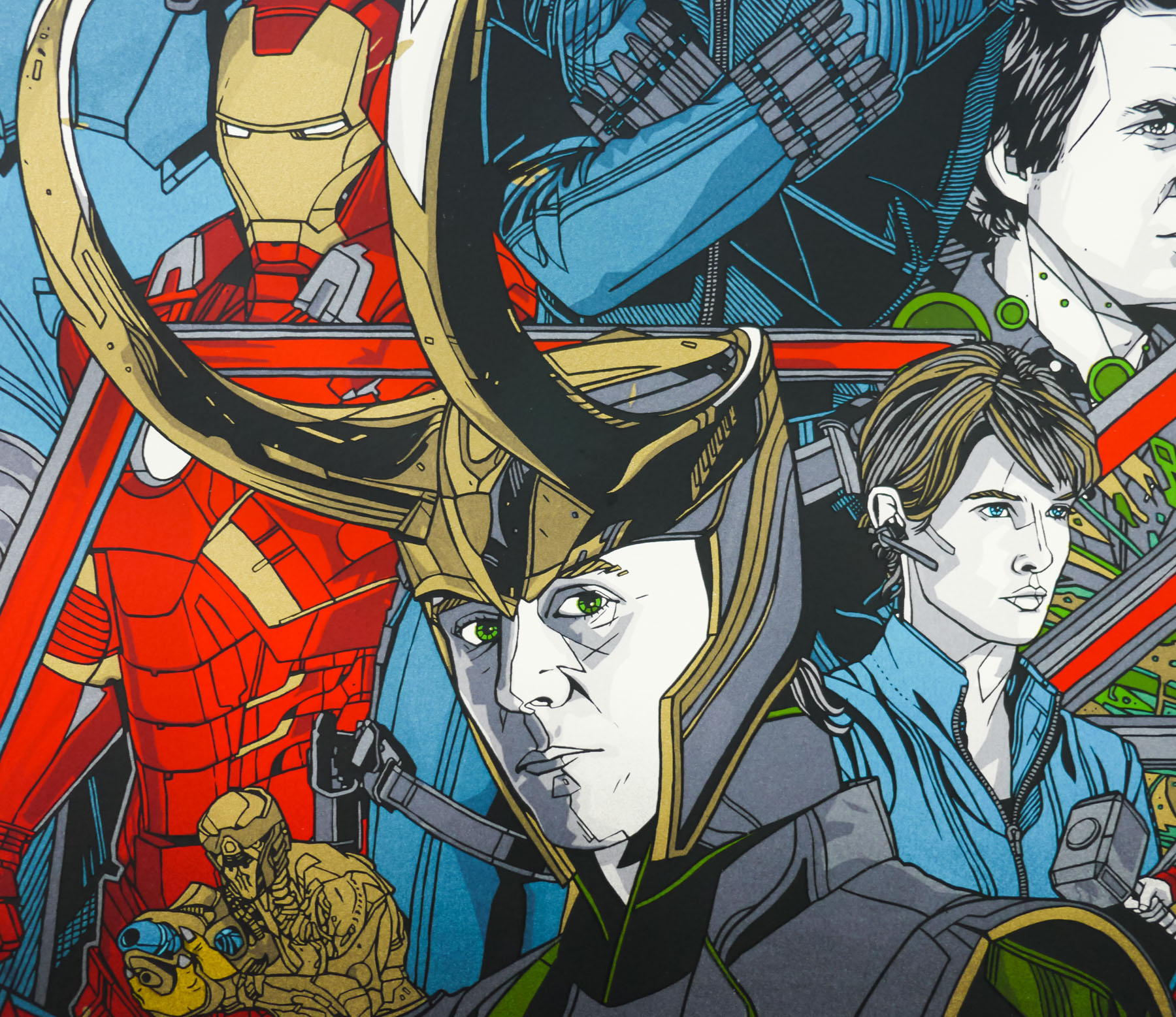
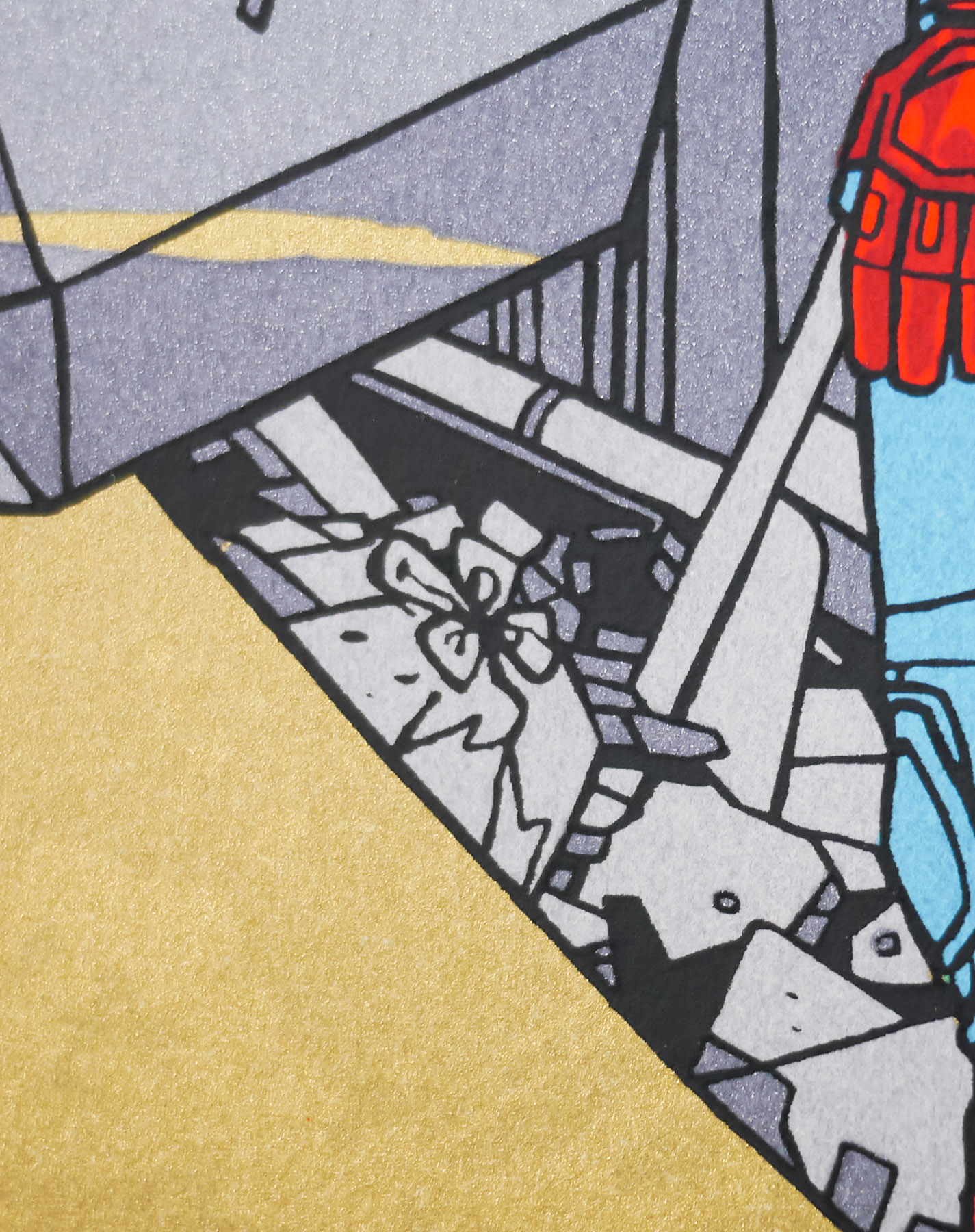
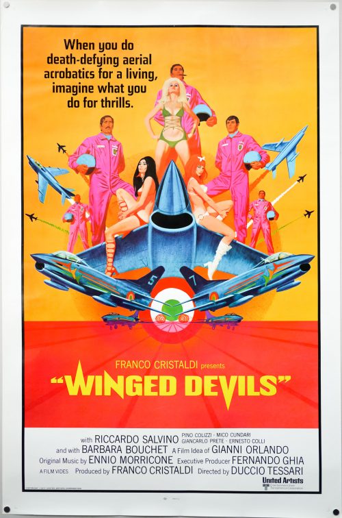
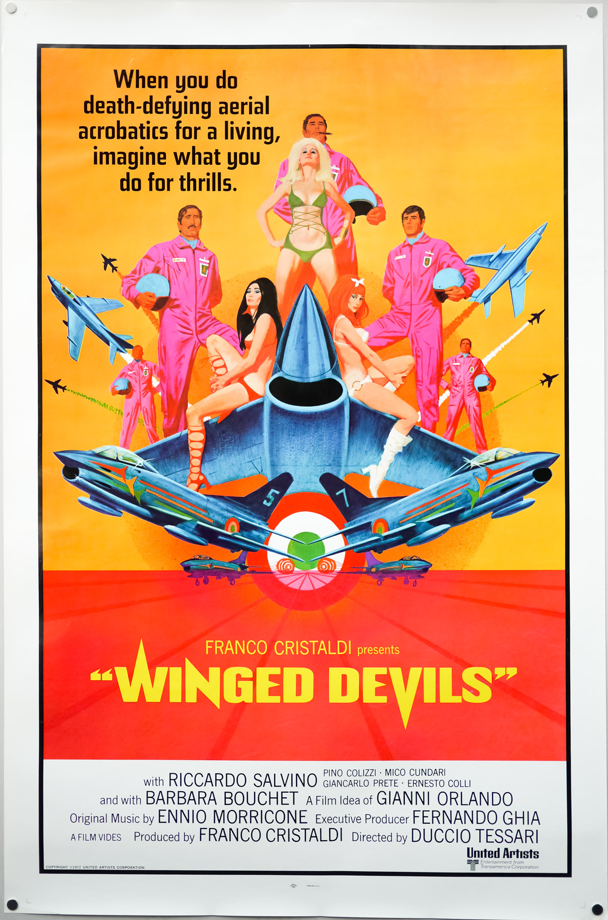
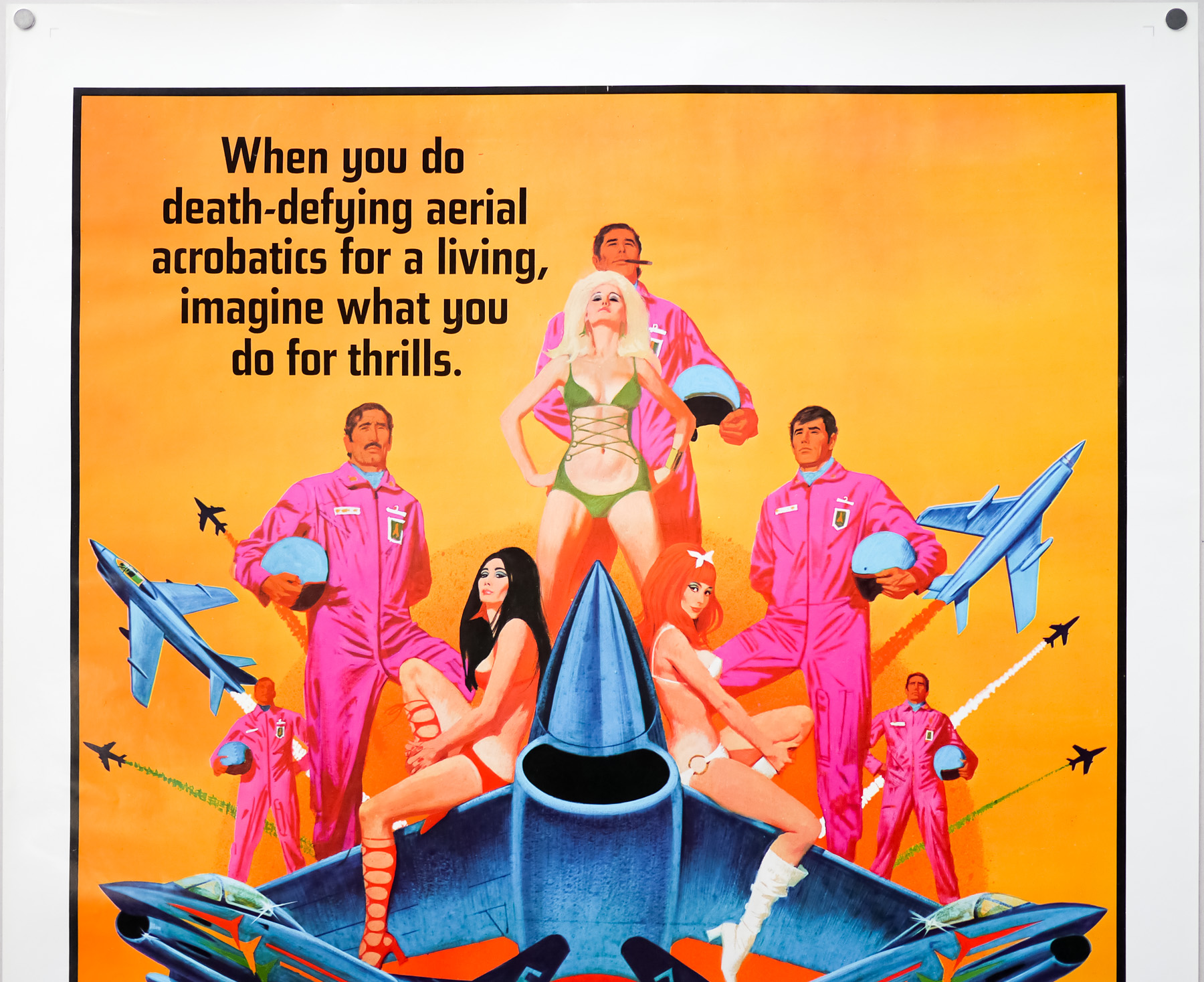
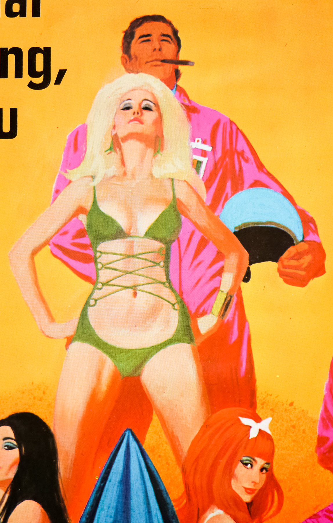
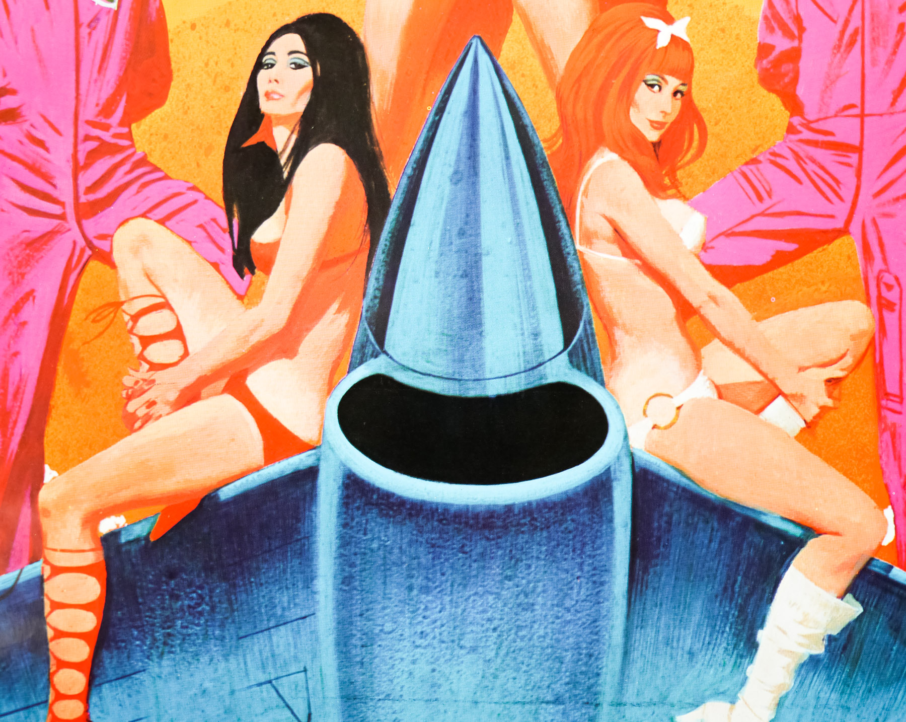
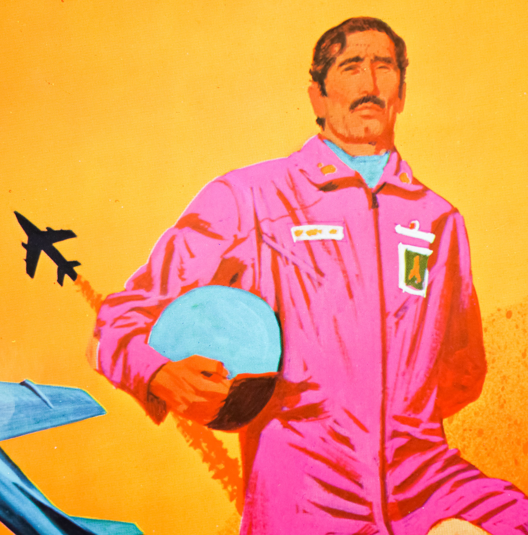
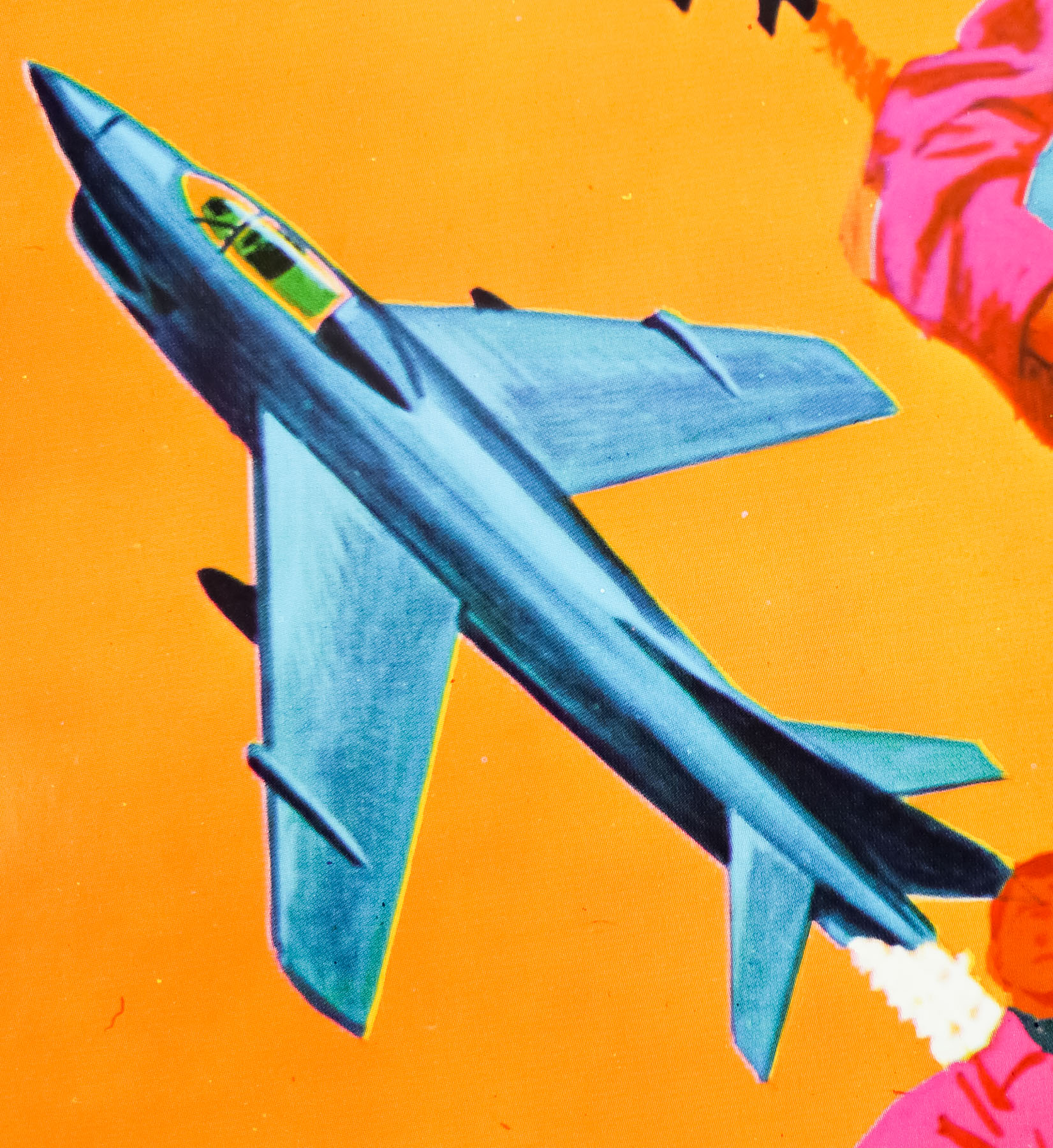
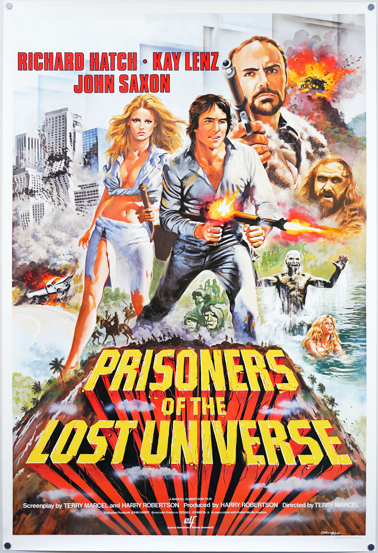
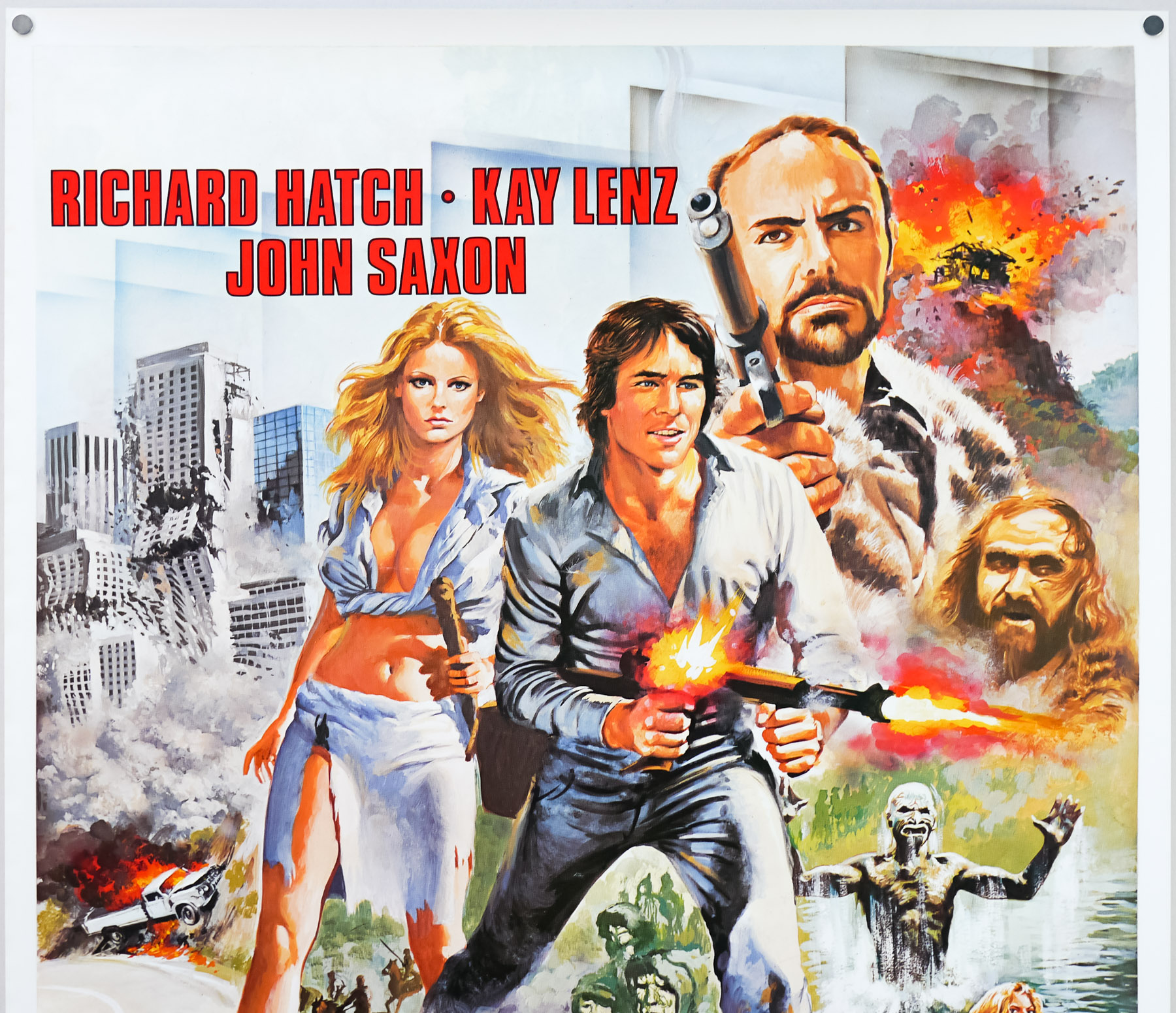
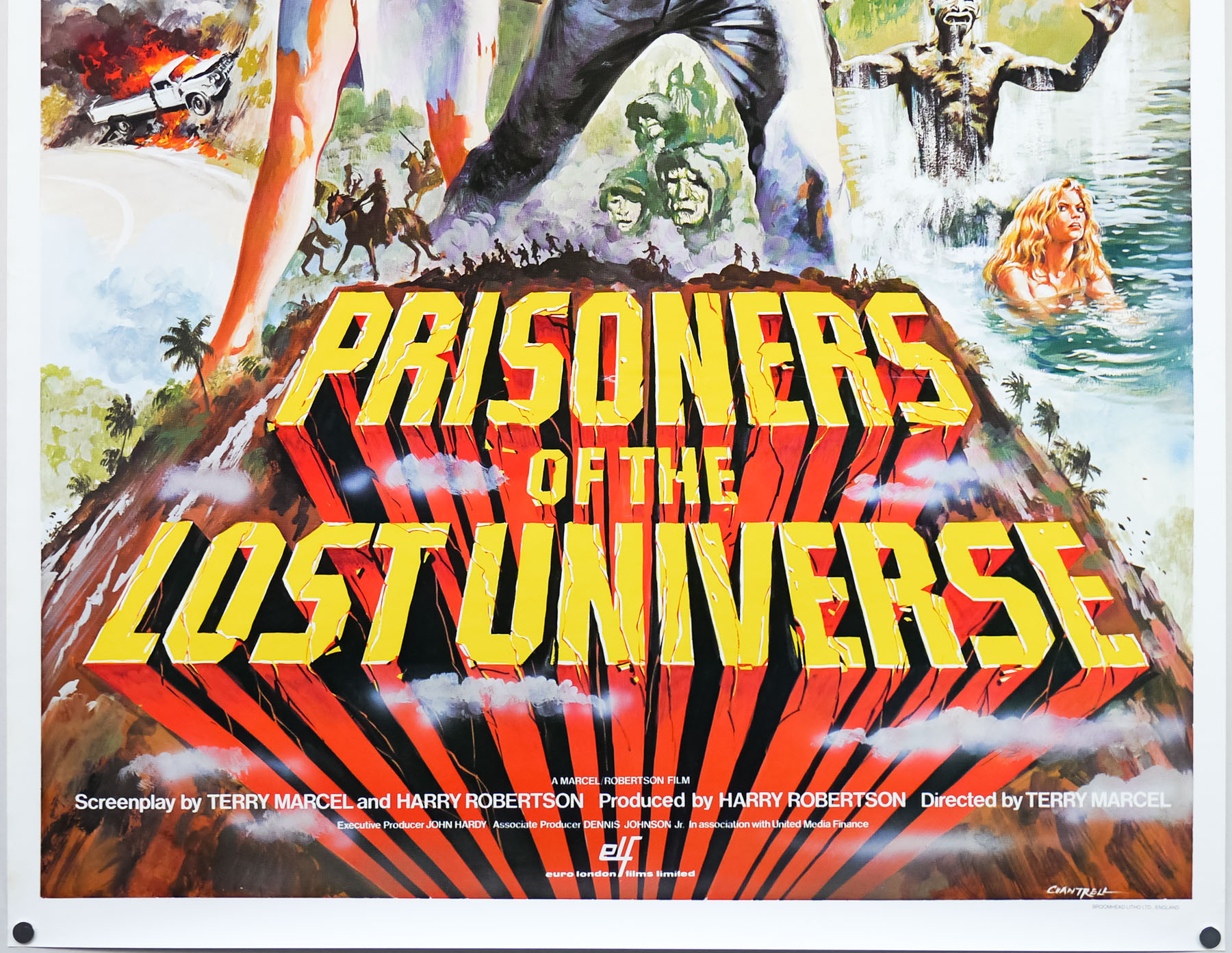
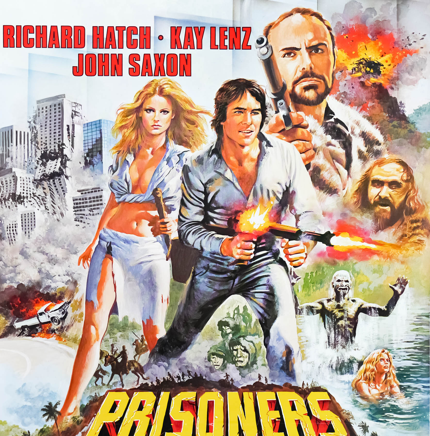
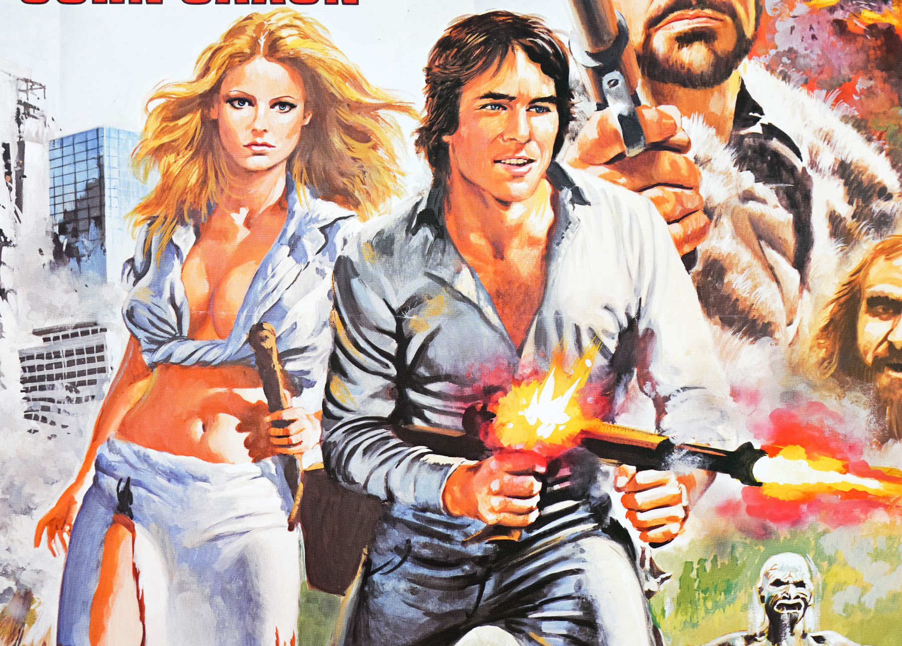
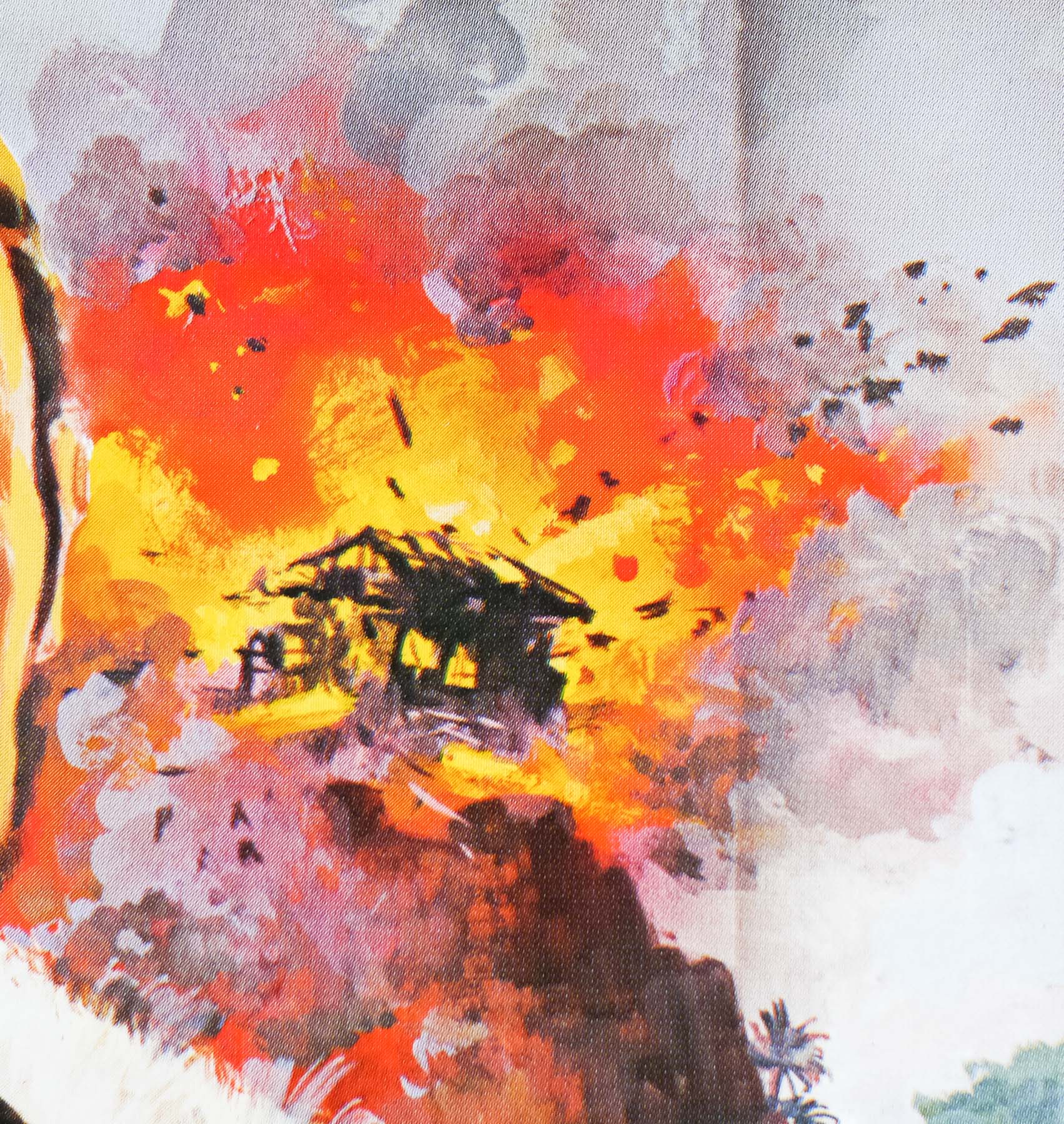
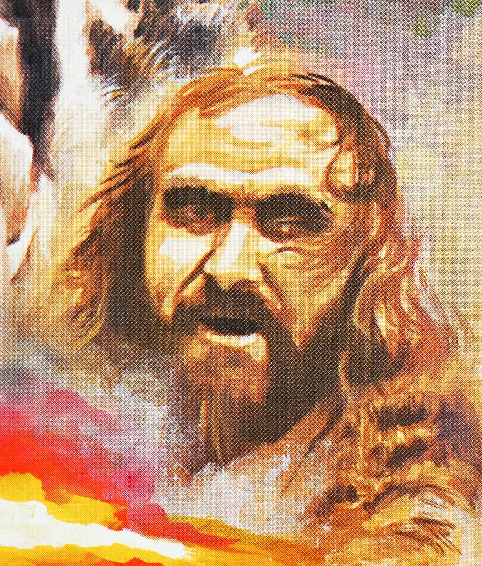
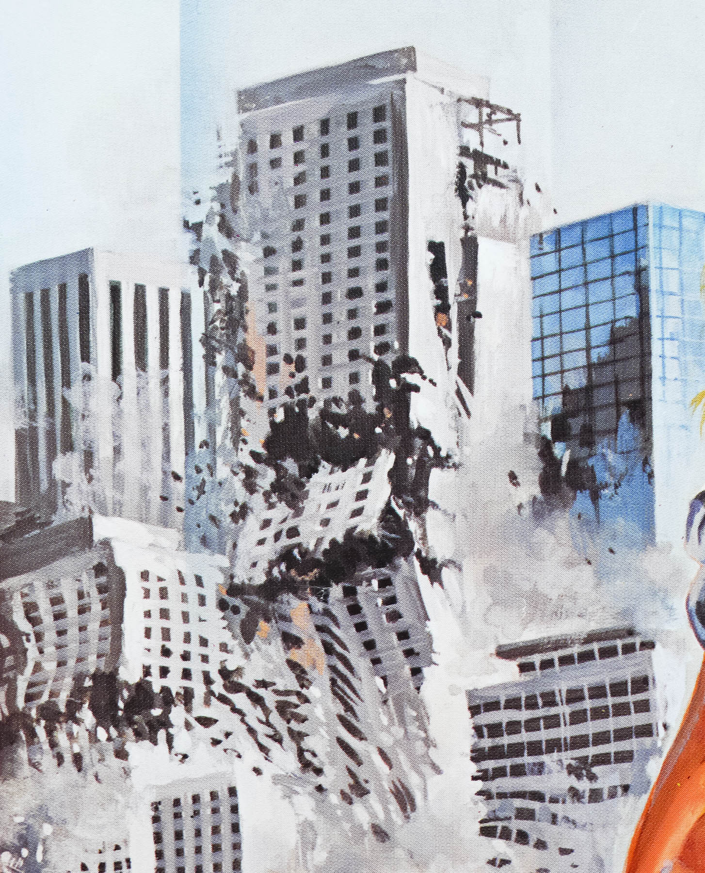
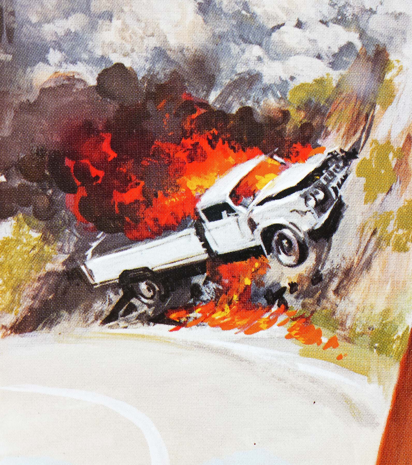
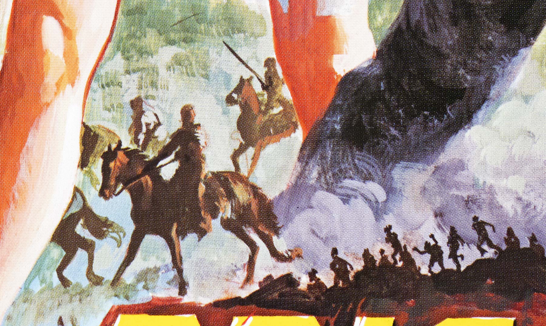
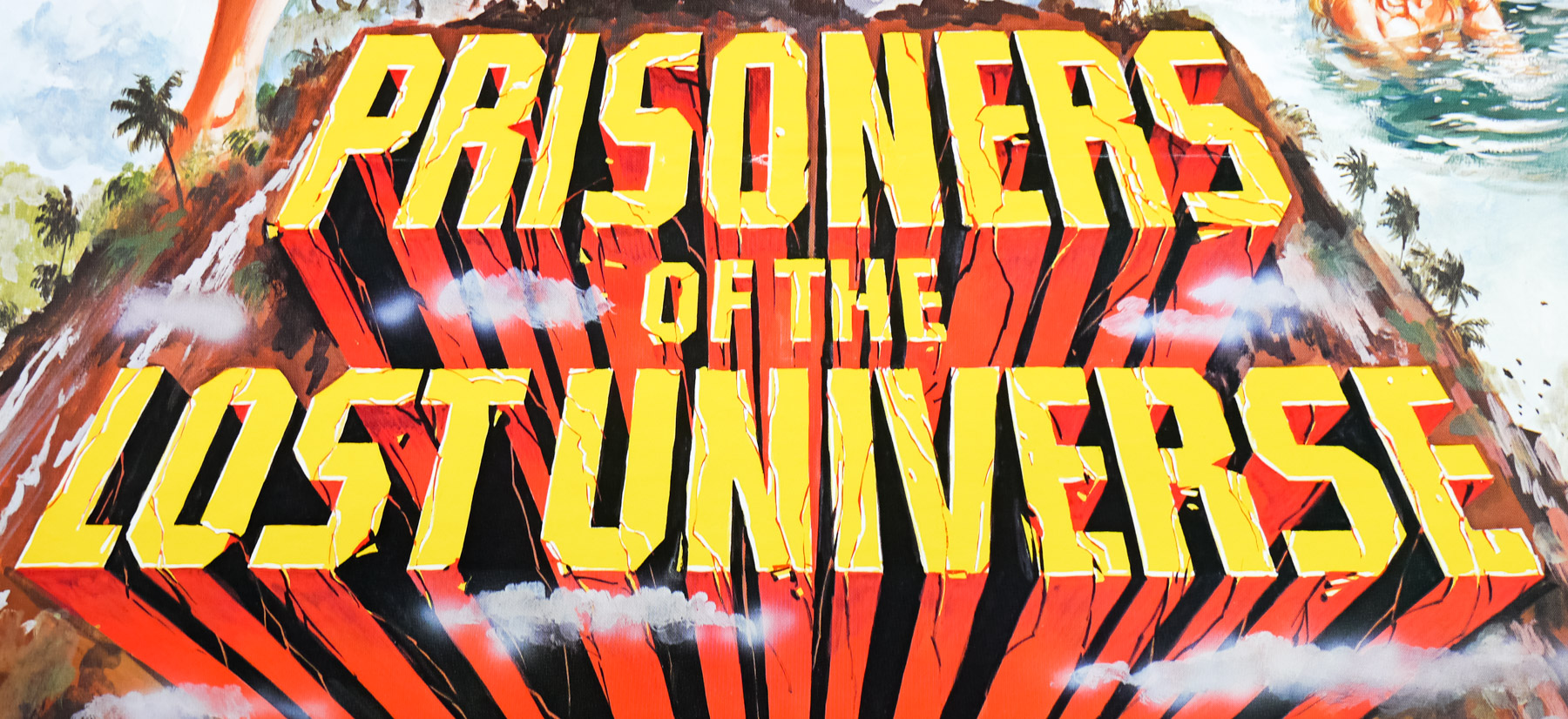
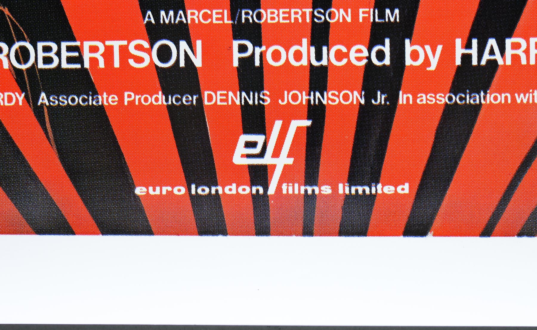
A classic case of the poster being significantly more exciting than the film it was attempting to sell to the cinema-going public, this is the UK one sheet for the release of the low-budget sci-fi adventure Prisoners of the Lost Universe. Produced by Marcel/Robertson Productions Ltd, the short-lived company who were also responsible for Hawk the Slayer (1980), filming took place in South Africa with a largely American cast and, despite seeing a cinema release in several countries, the film was given its debut on cable TV in the States.
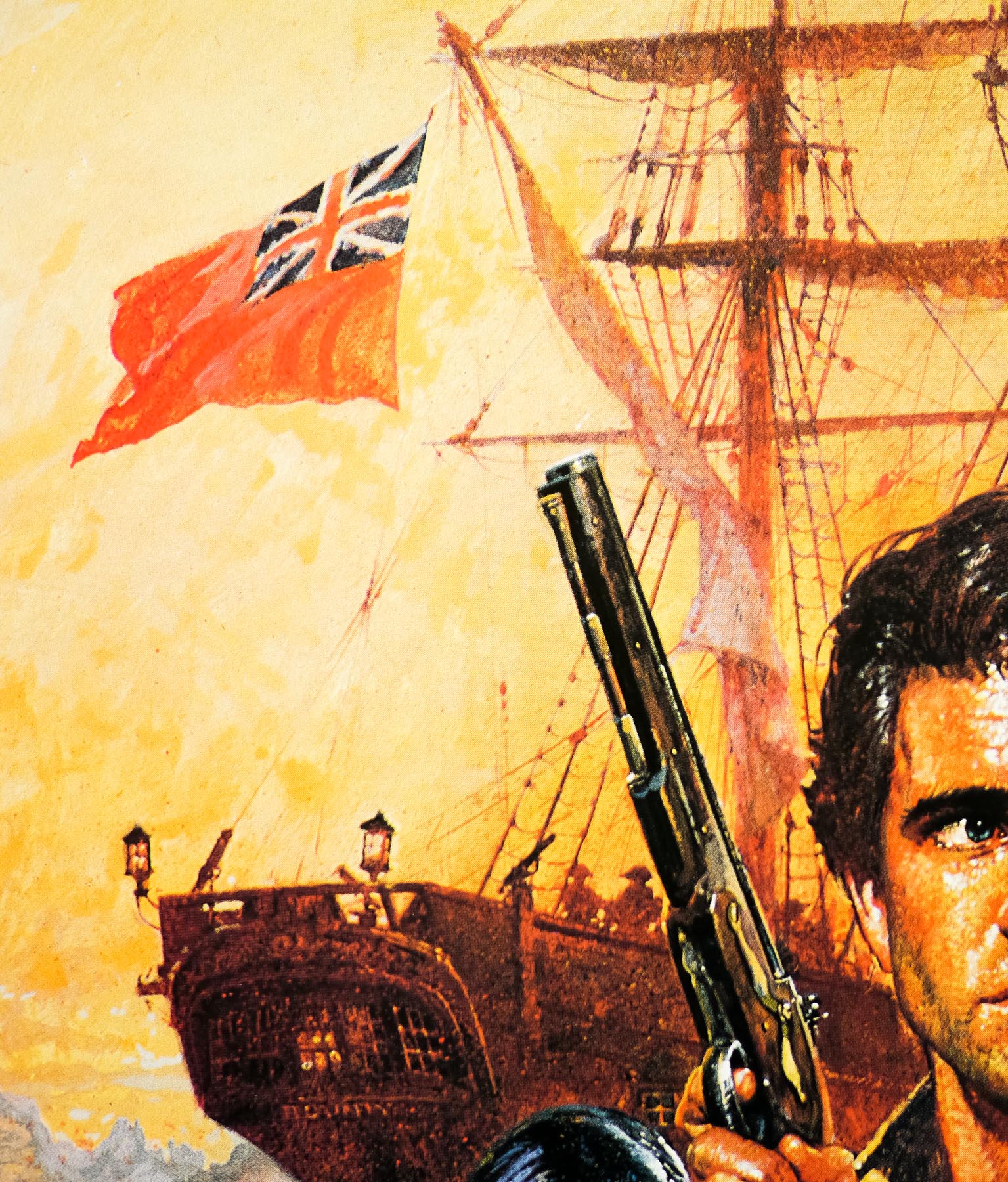
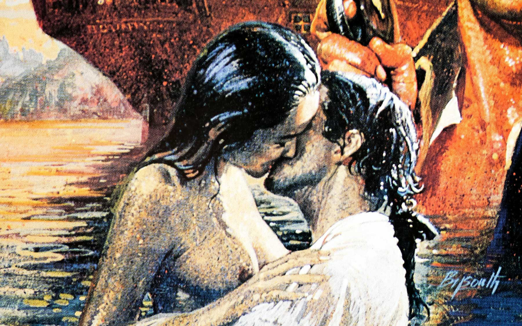
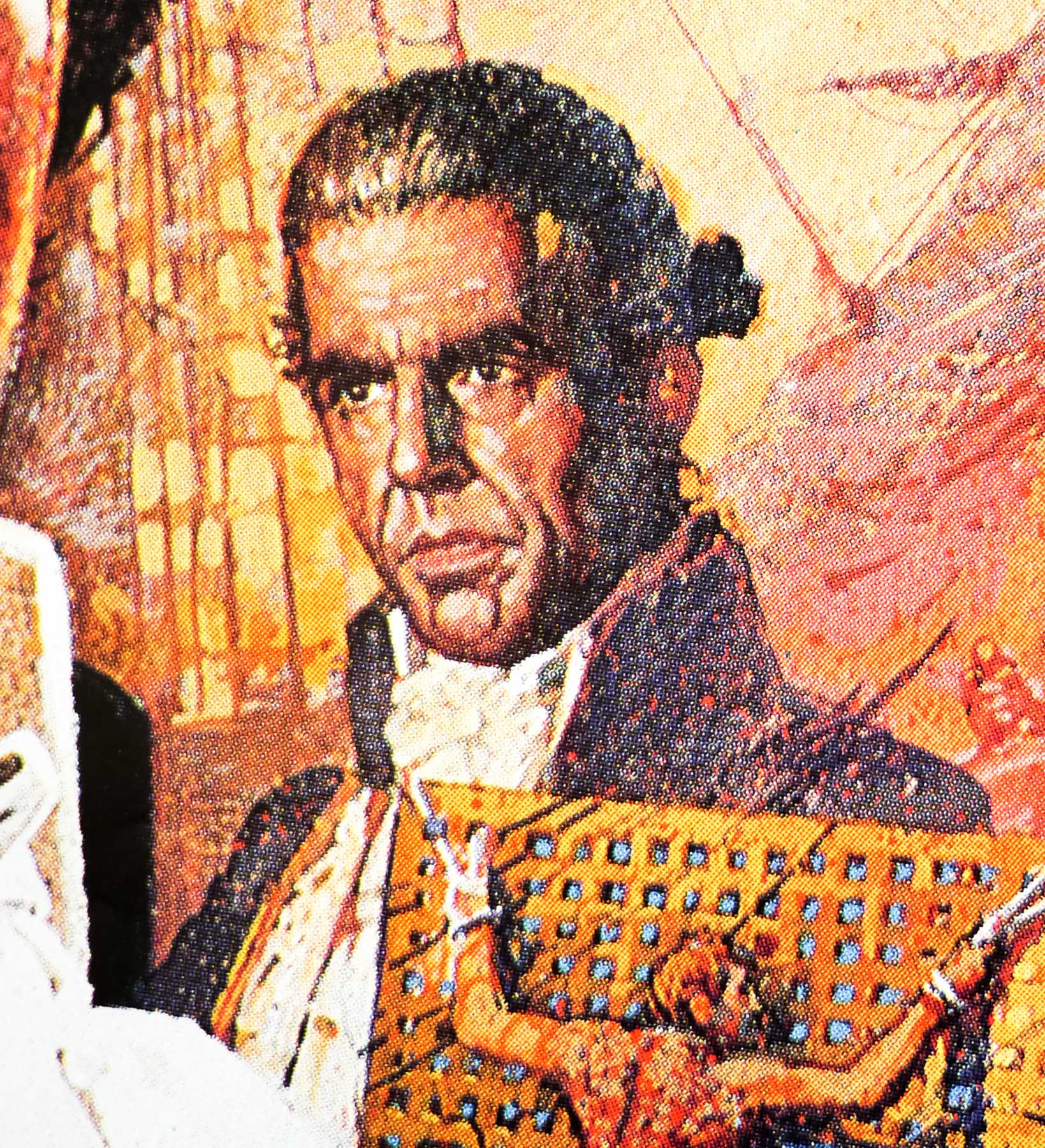
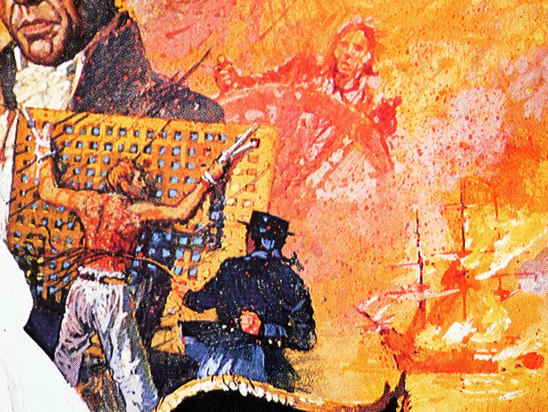
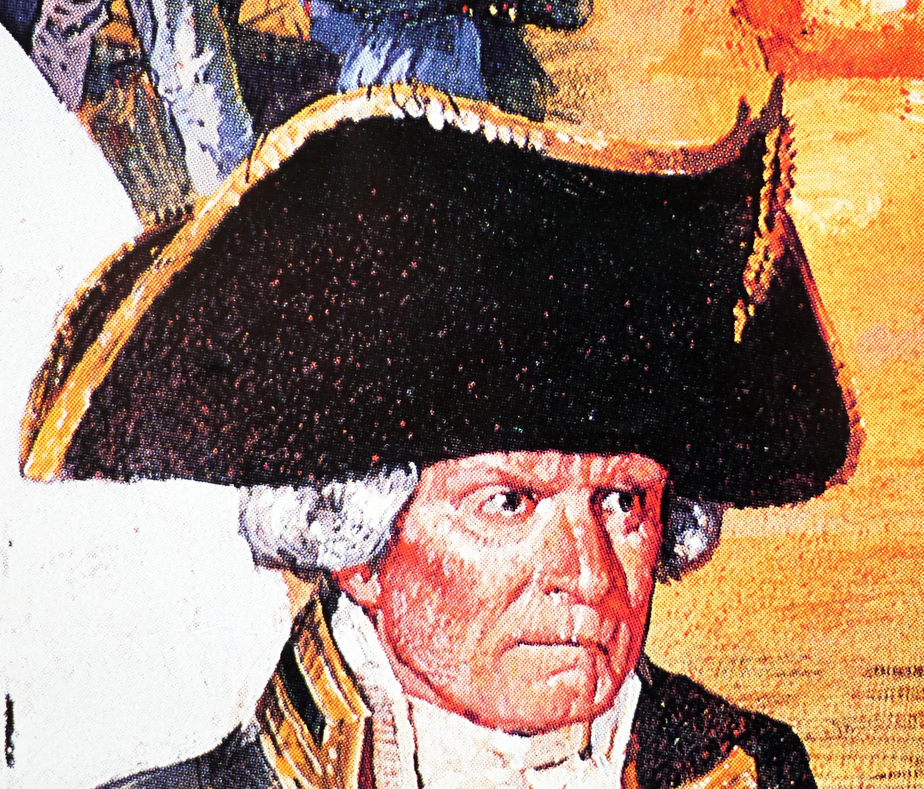
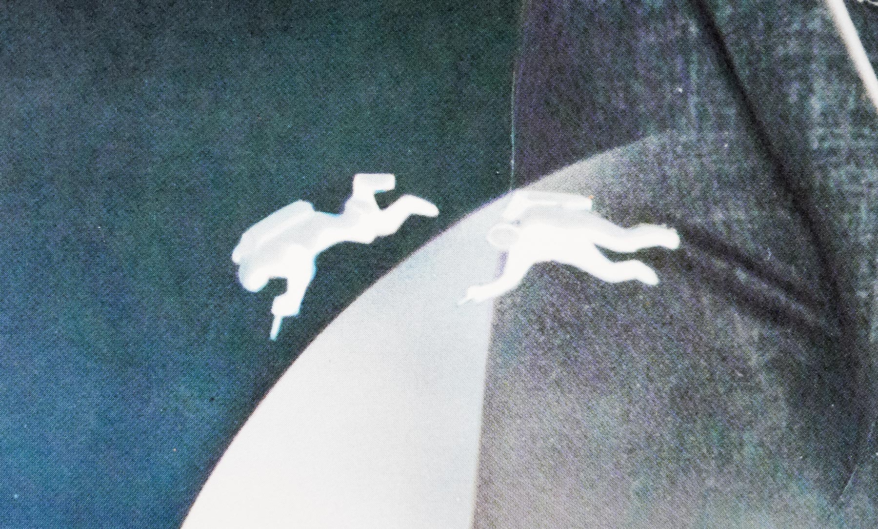
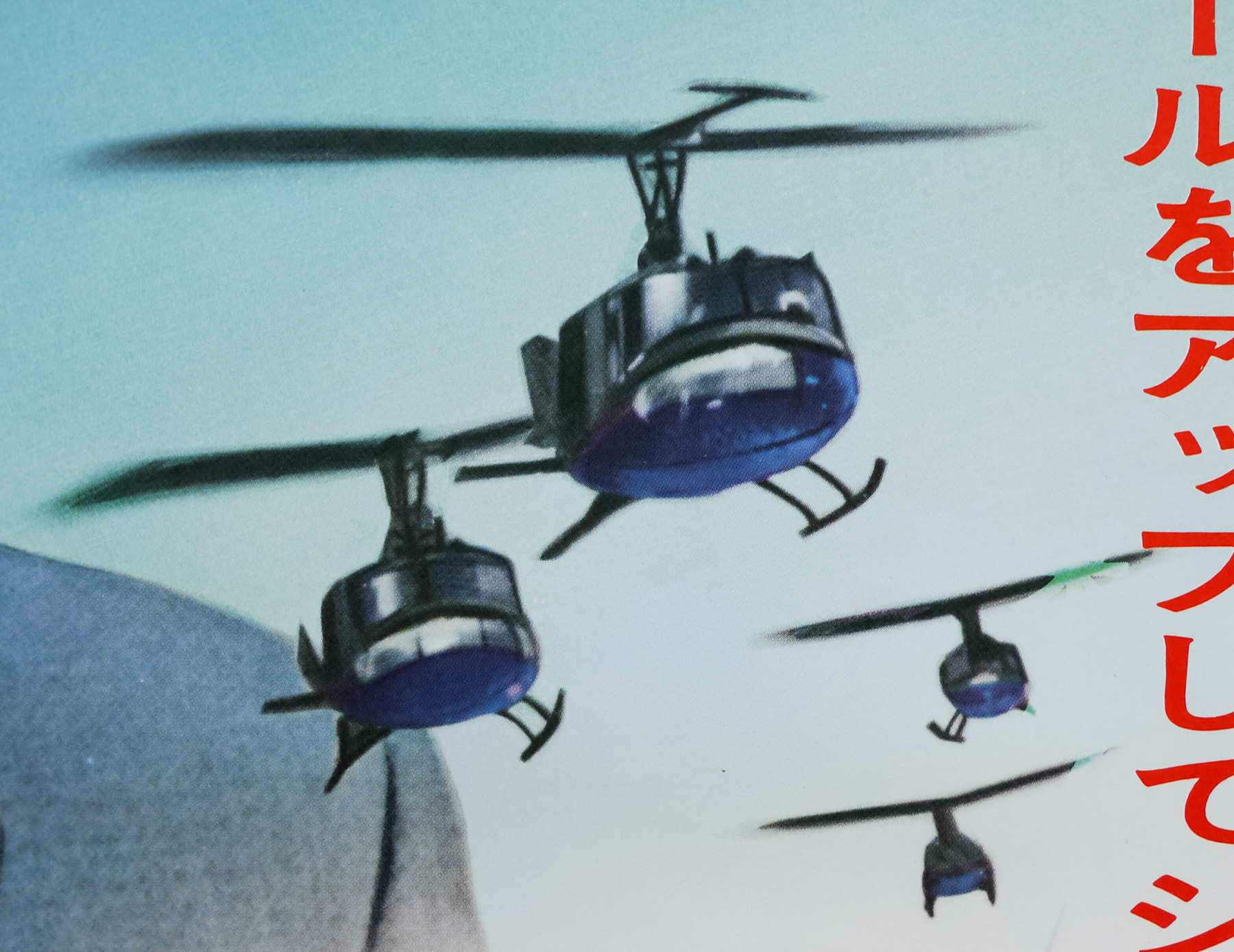
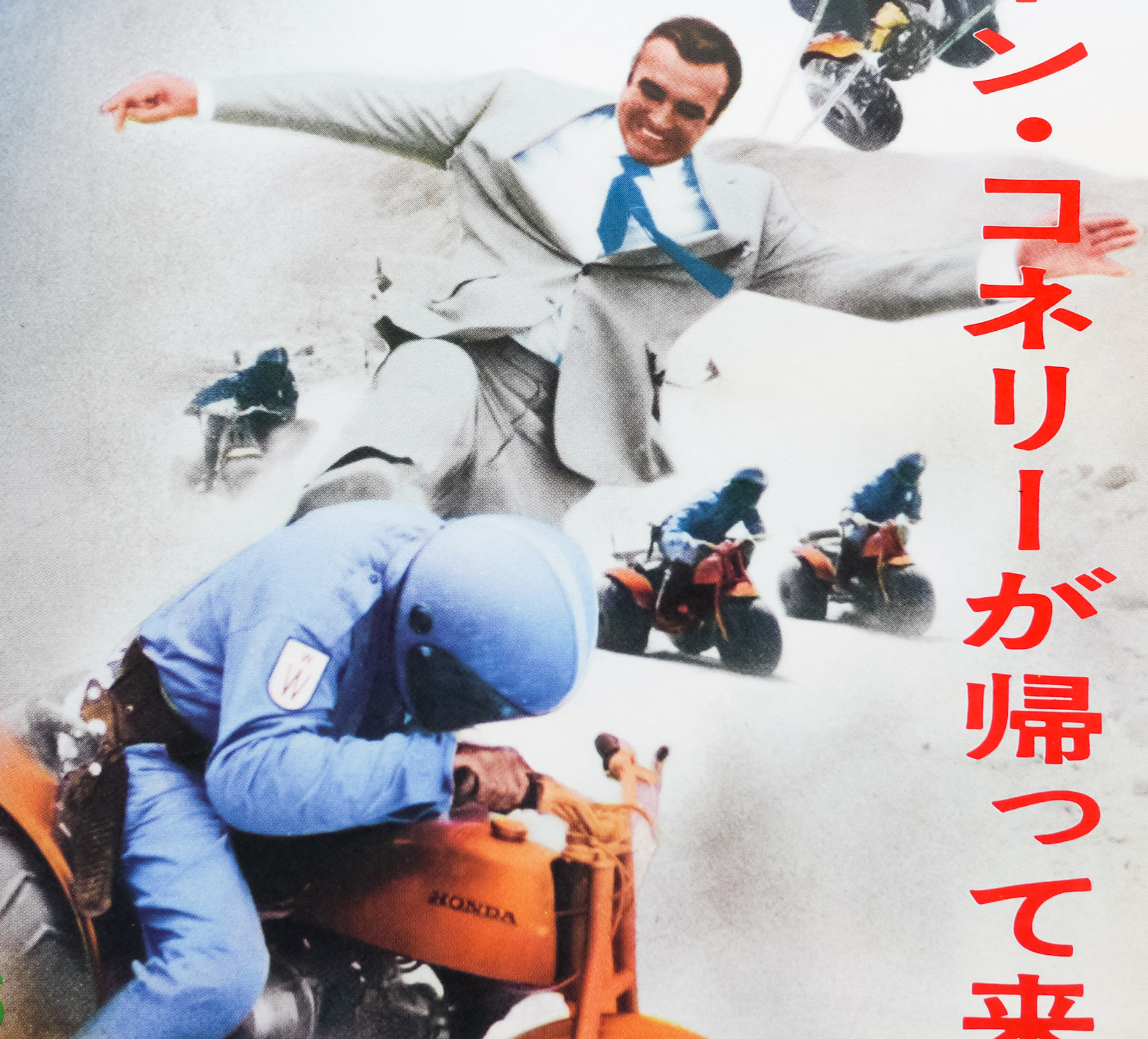
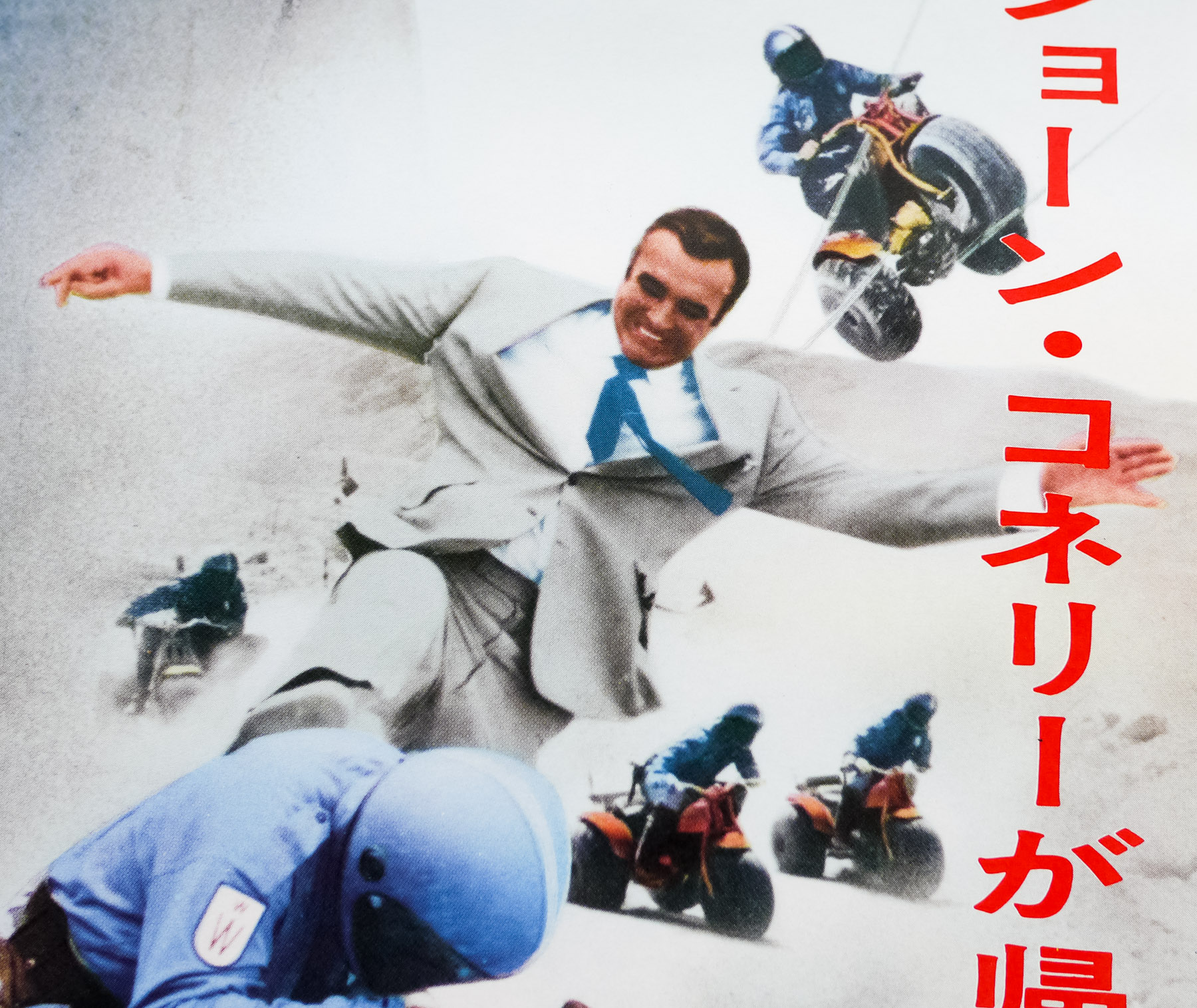
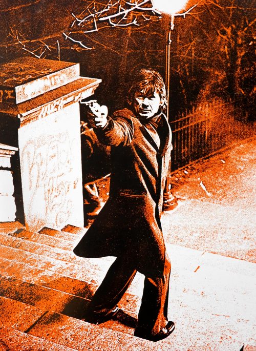
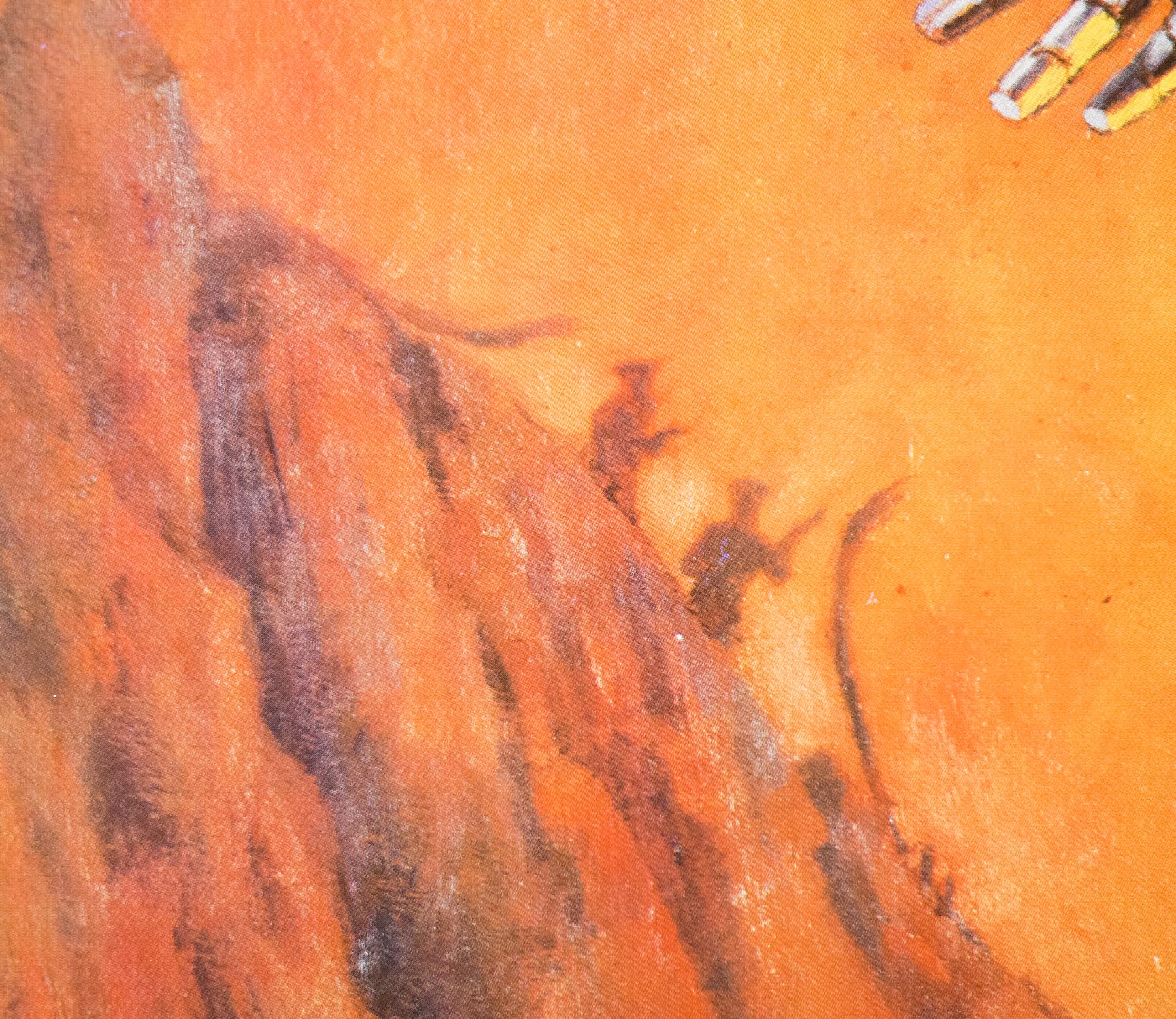
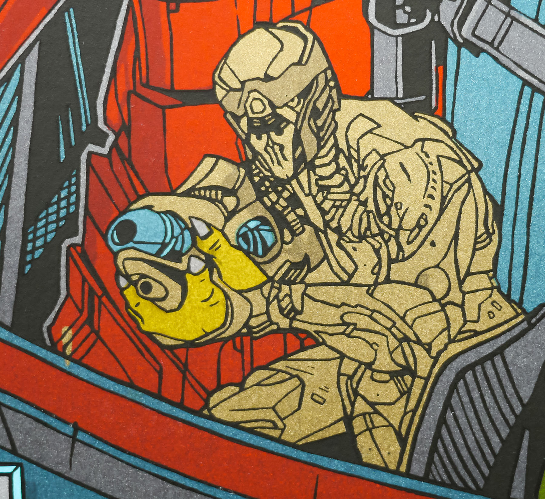
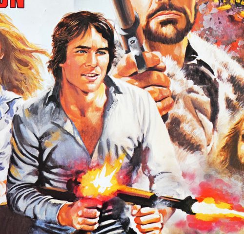
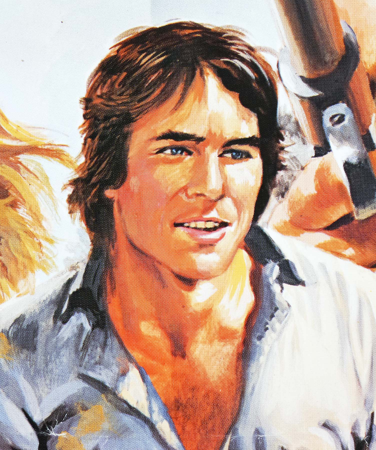
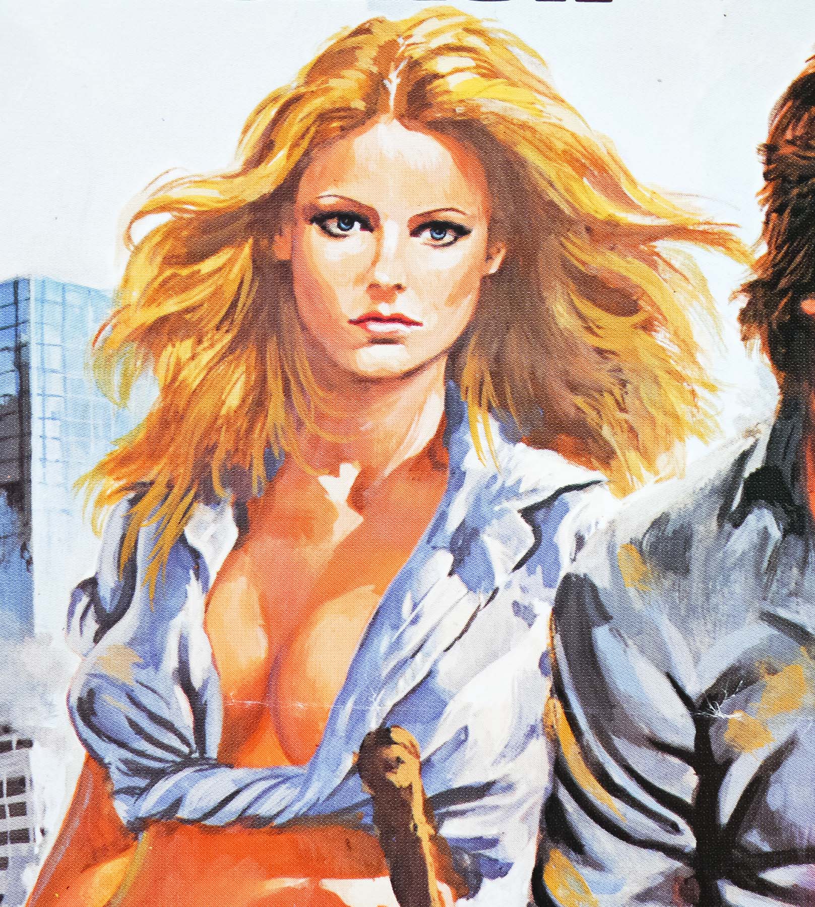
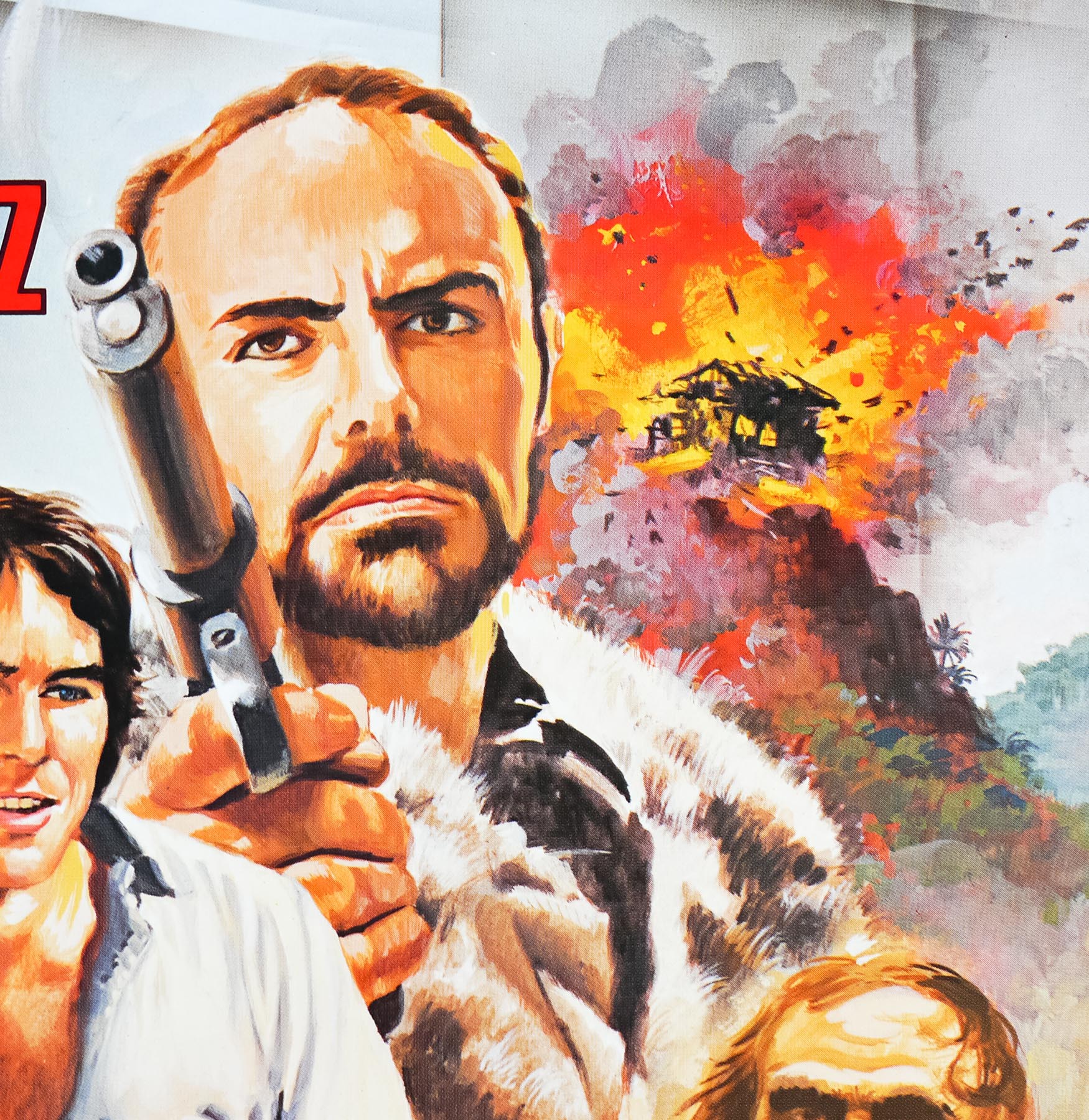
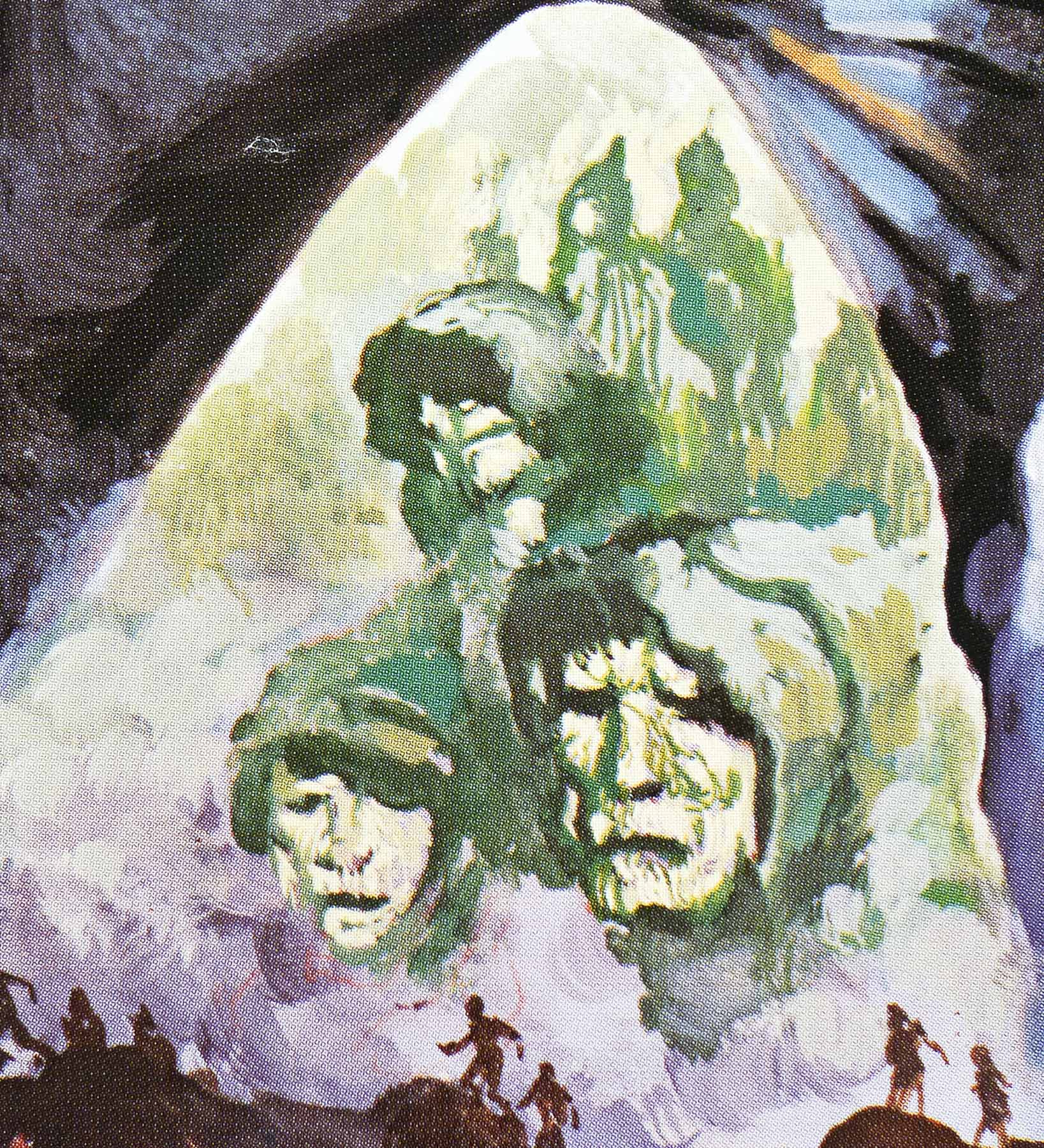
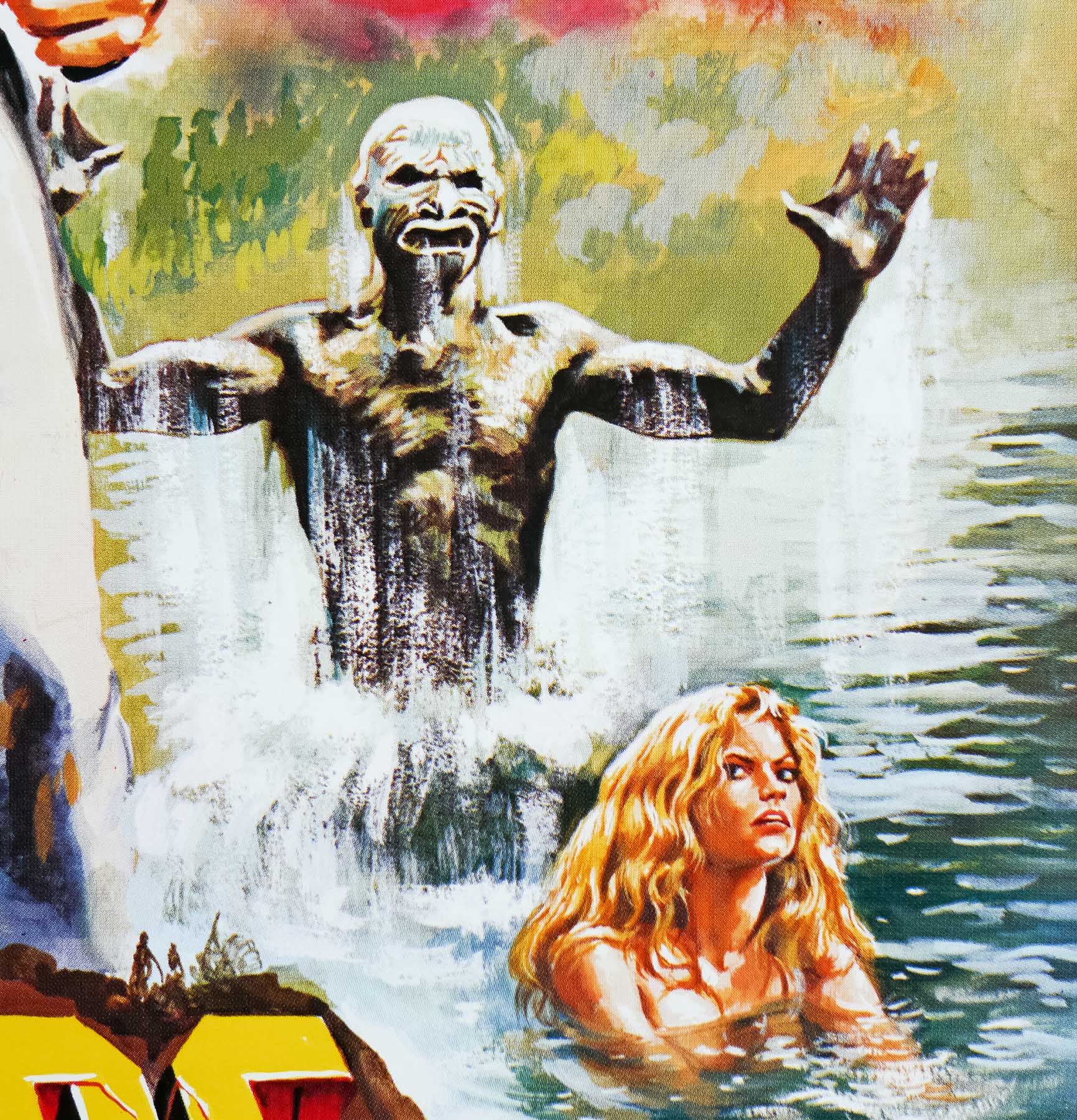
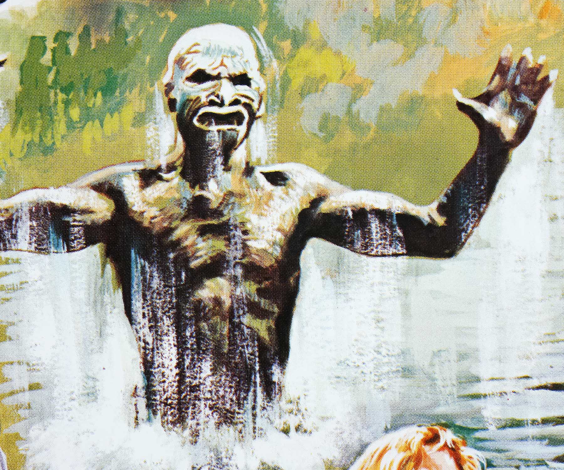
Scientist Dr. Hartmann (Kenneth Hendel) is testing out his revolutionary matter transporter when an earthquake strikes and accidentally beams him to an alternative universe, followed shortly after by Carrie (Kay Lenz), a TV reporter sent to meet him, and Dan, a handyman who also happens to be a kendo champion (Richard Hatch). The duo must cope with the hostile, prehistoric-seeming environment of the new universe, and as they search for the scientist they meet a host of strange characters, including a mute giant, a green-skinned warrior and a cheeky thief. Before long, Carrie has been kidnapped by a warlord named Kleel (played by genre stalwart John Saxon) who has strangely modern technology compared to the rest of the people he rules over, and Dan must battle to save her from his clutches.
Low-budget and with a clunker of a script, awful production design and unsurprisingly sloppy special effects, the film has very little going for it other than a series of unintentionally hilarious moments, which might explain why it has featured on several TV shows that make fun of bad films, including This Movie Sucks! and Mystery Science Theater 3000. The film is apparently in the public domain and has been released on DVD multiple times, usually as part of a compilation of other public domain clunkers, but it can also be watched on YouTube, if you want.
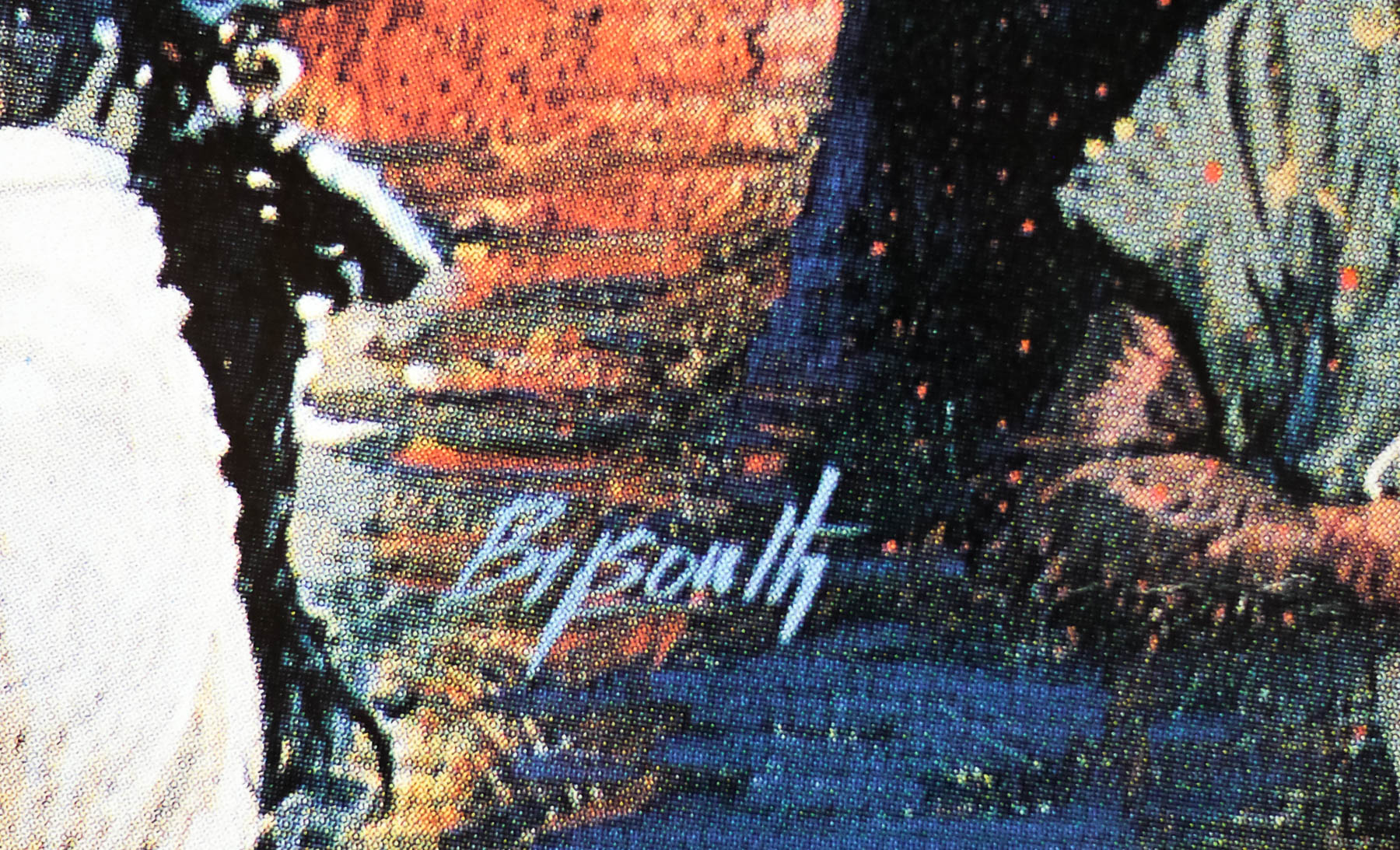
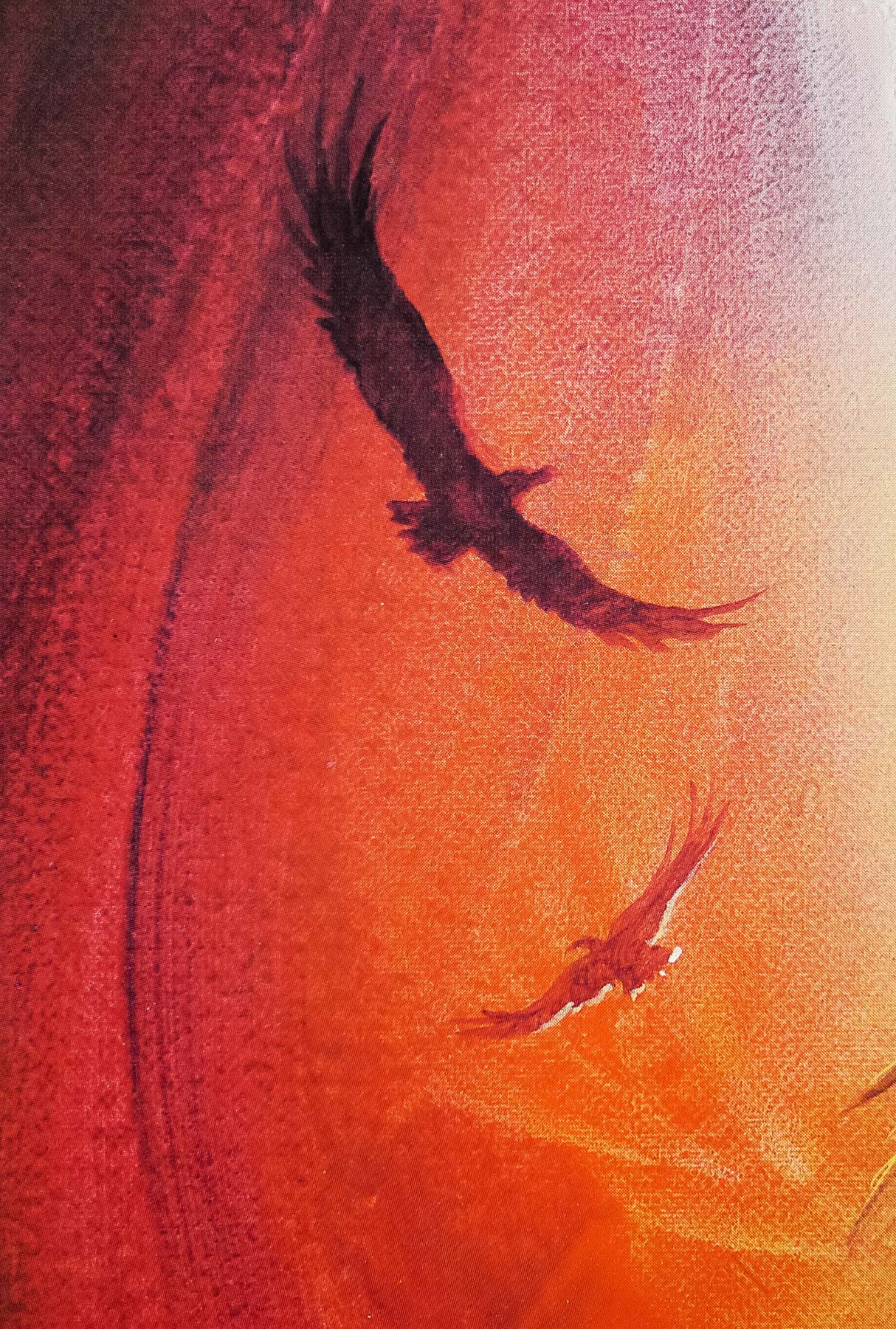
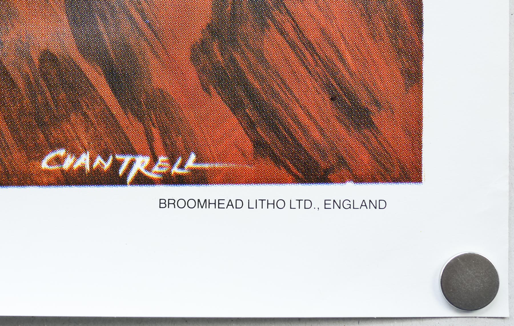
This one sheet was designed and illustrated by the late, great British artist Tom Chantrell whose dynamic and colourful work featured on hundreds of posters over a forty year period. His official website features a great biography written by Sim Branaghan, author of the must-own British Film Posters. Chantrell illustrated many classic poster designs, including several Hammer posters such as the brilliant quad for ‘One Million Years B.C.’, and was also responsible for the iconic Star Wars quad, the artwork of which ended up being used around the globe. I have a handful of other designs by him on this site.