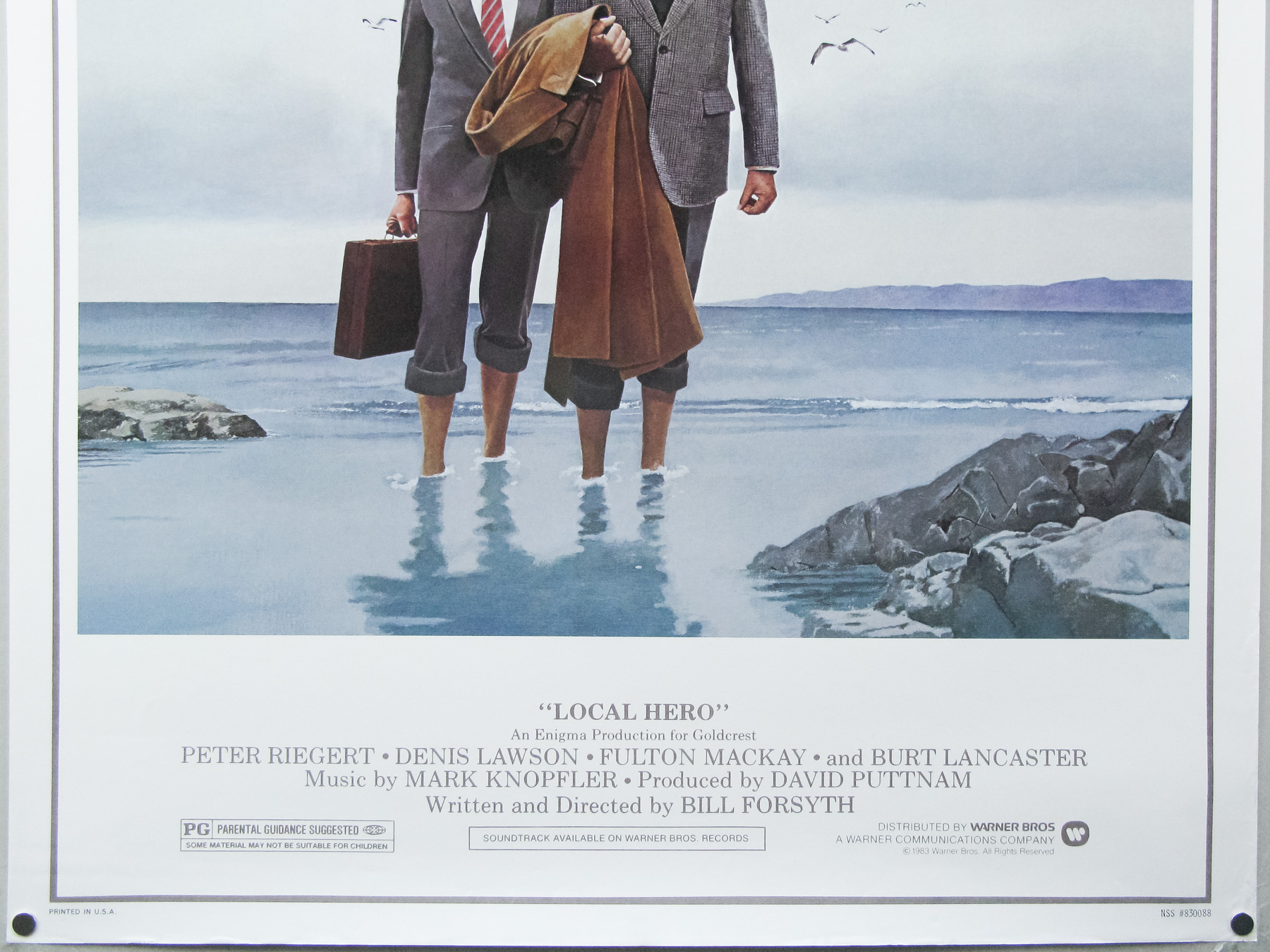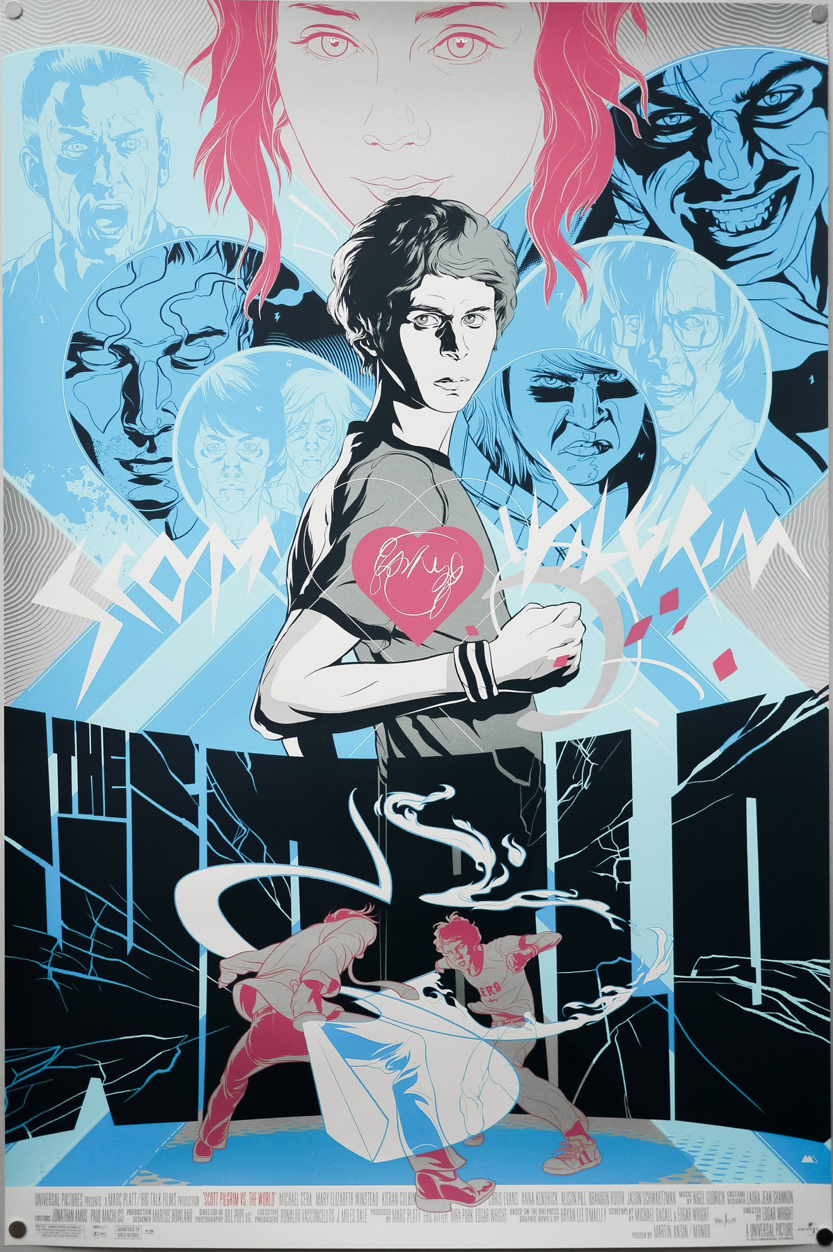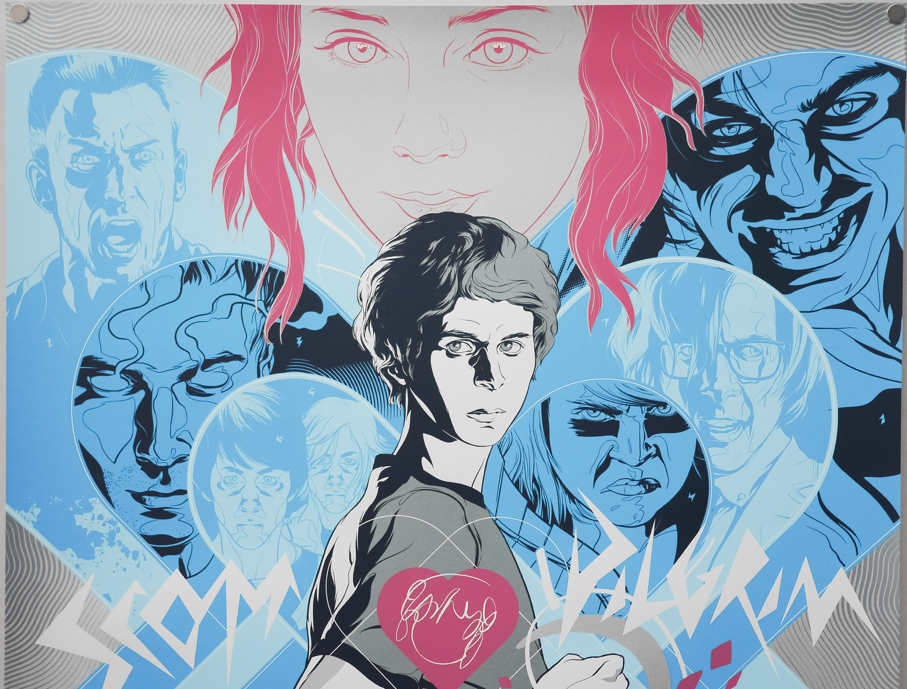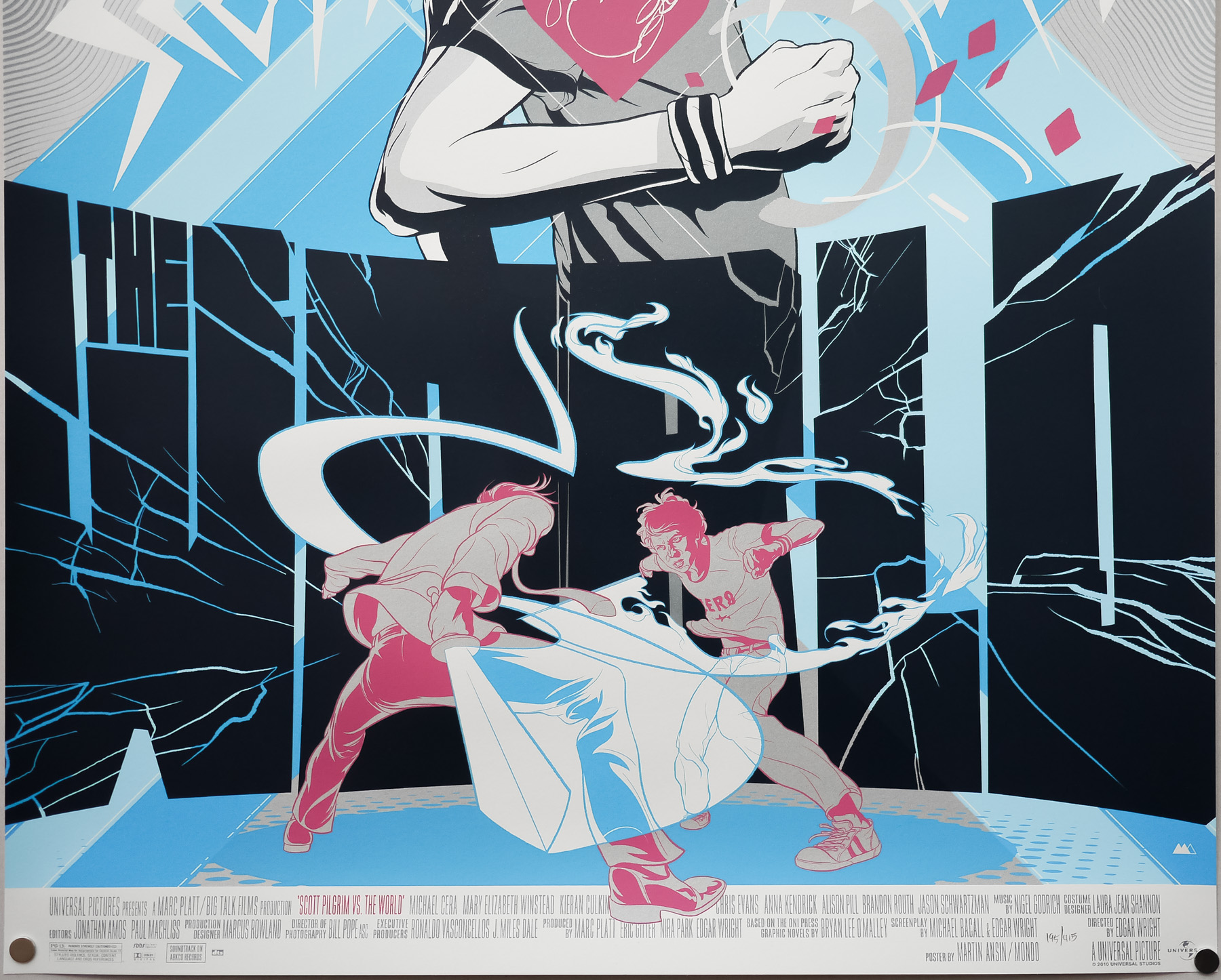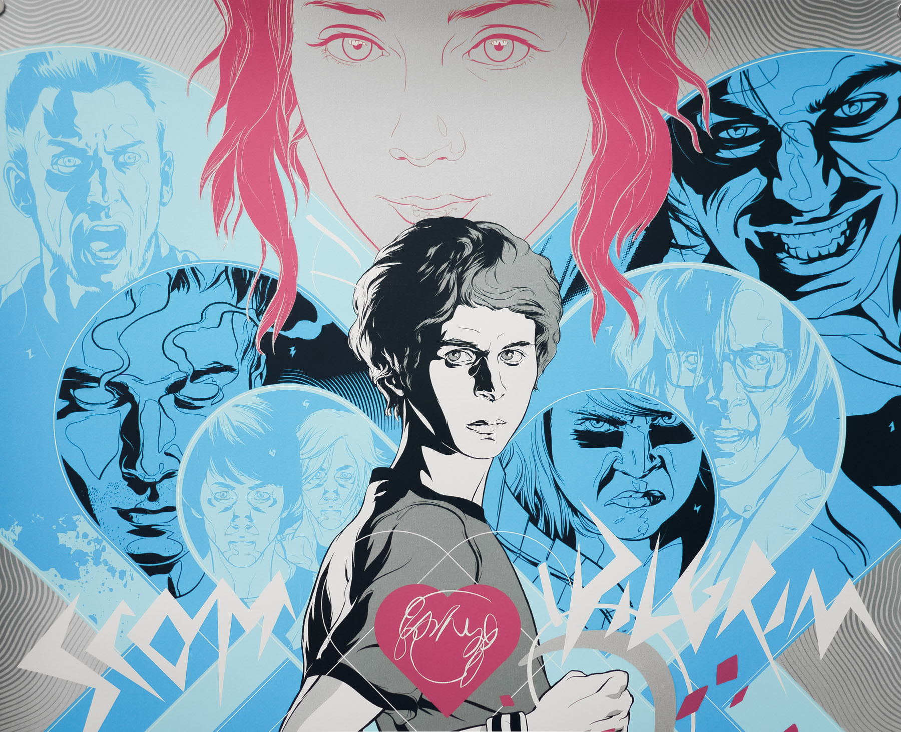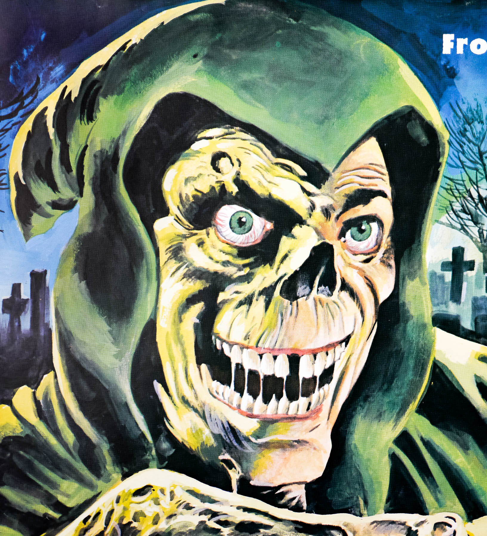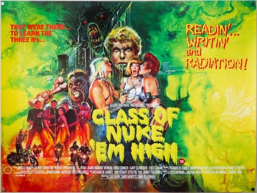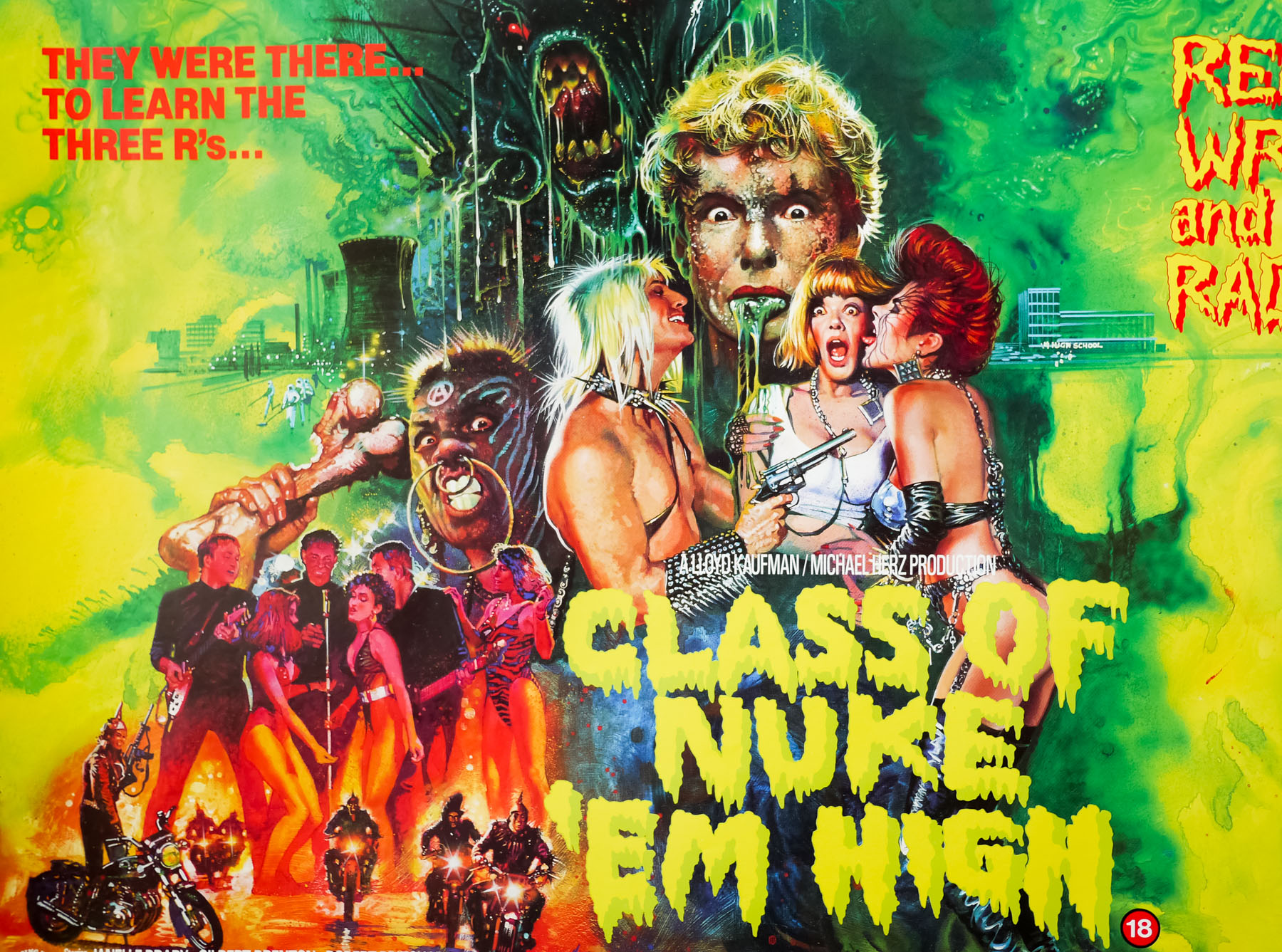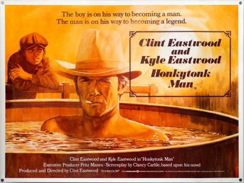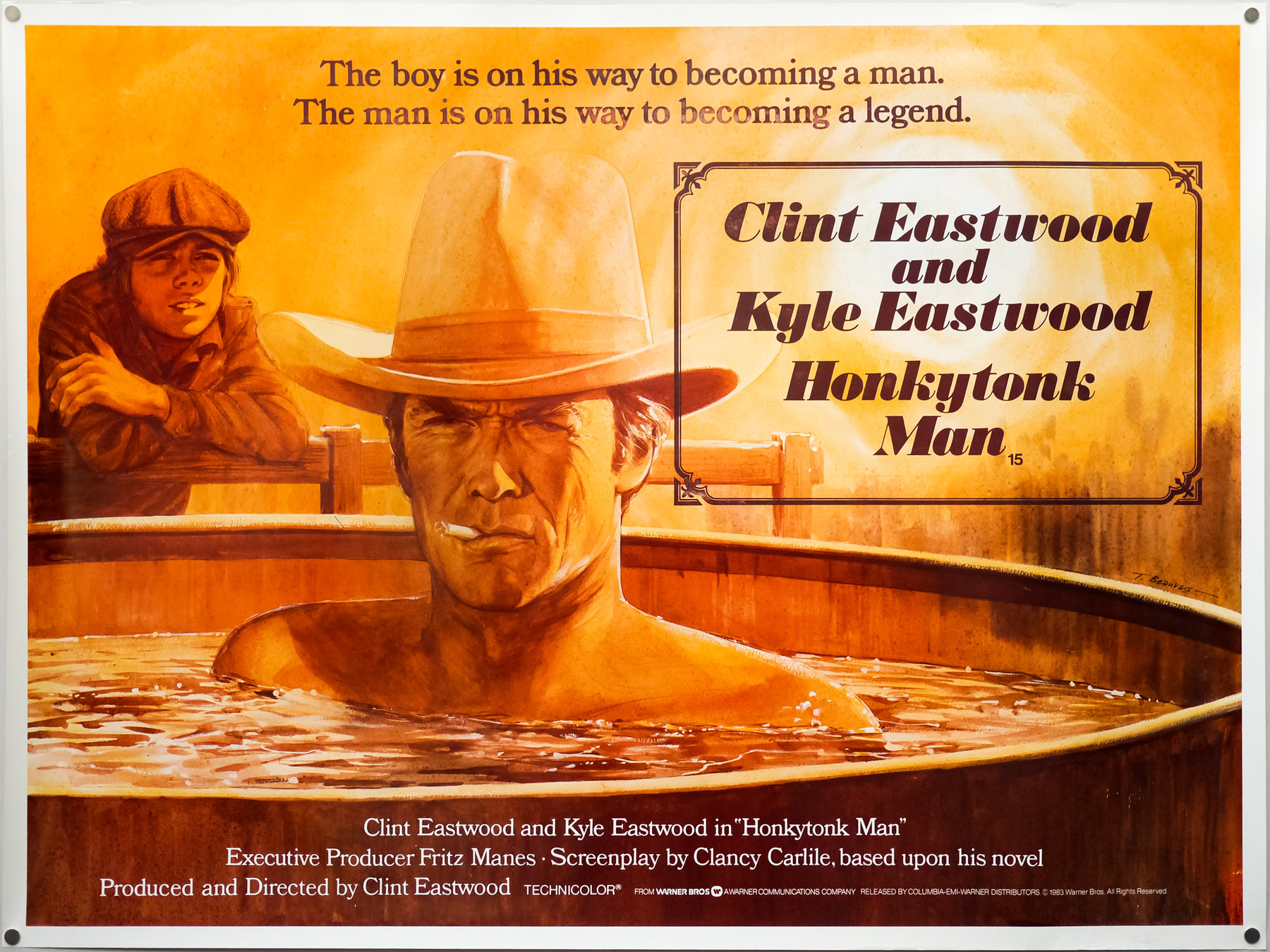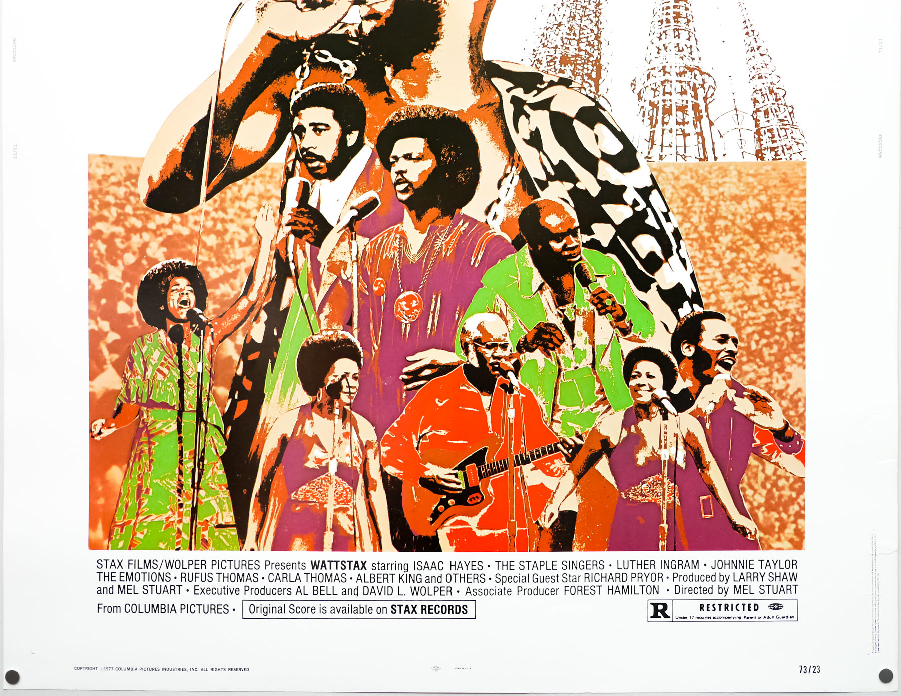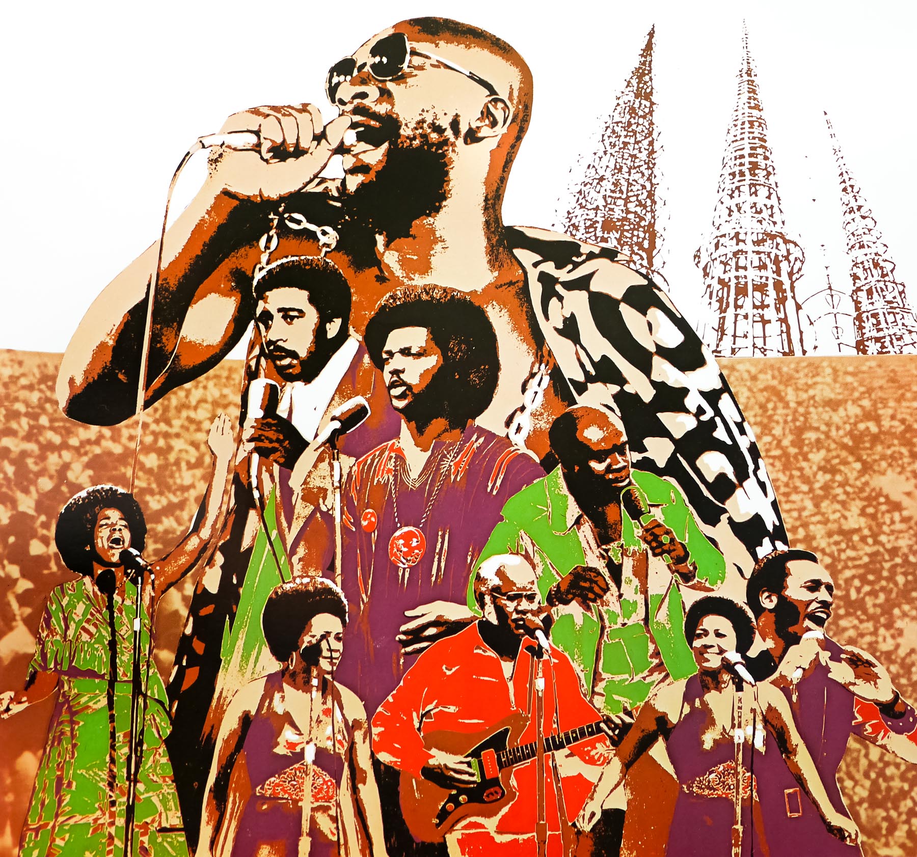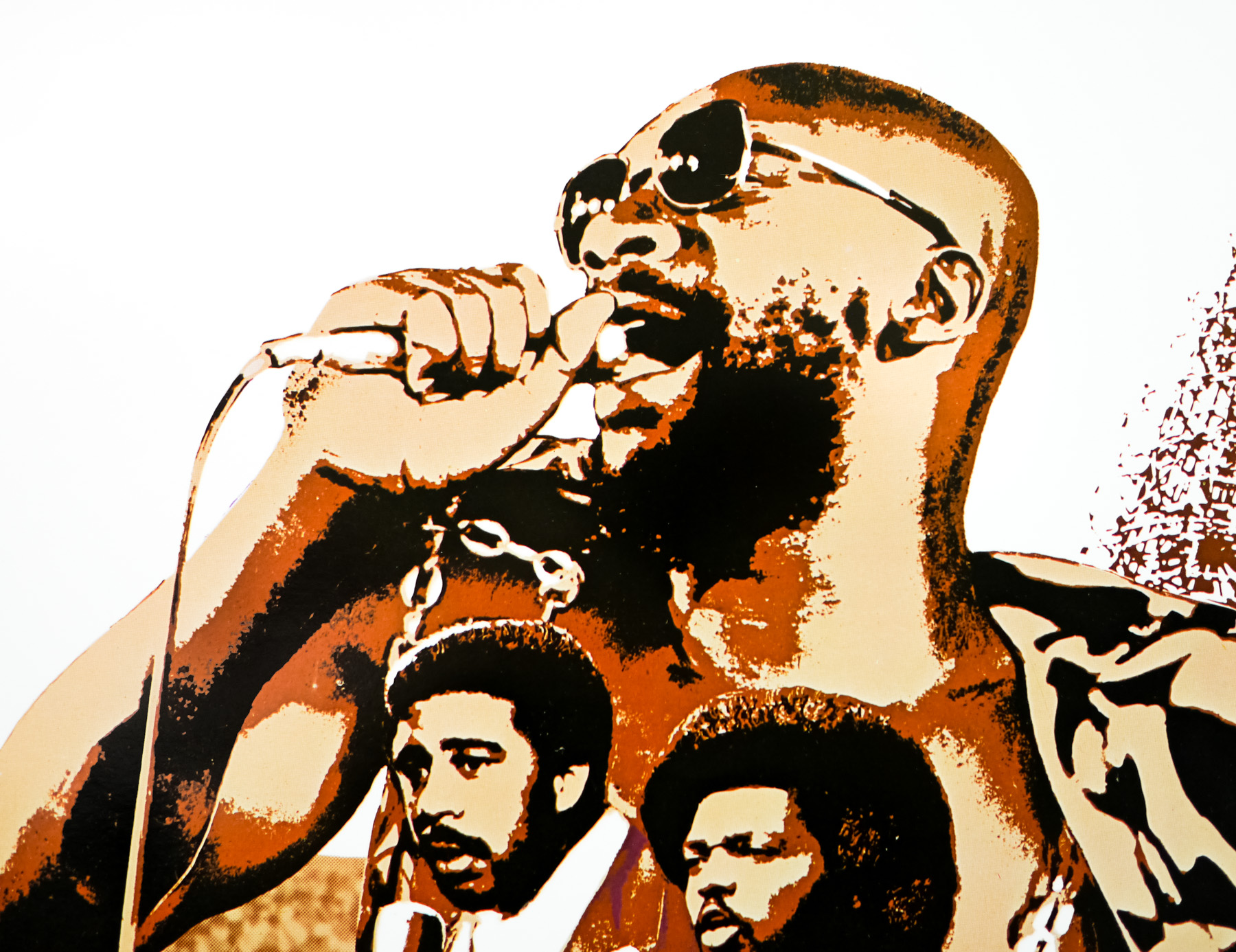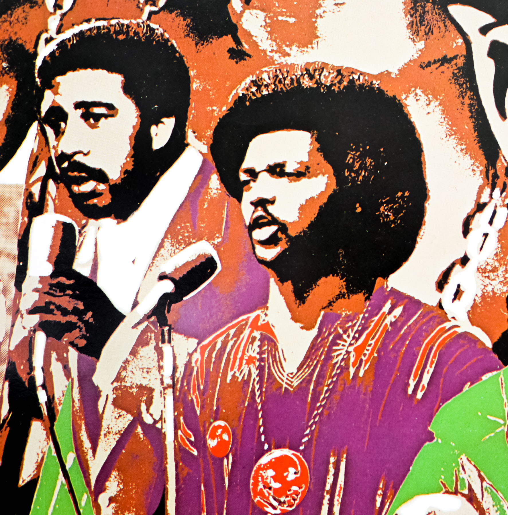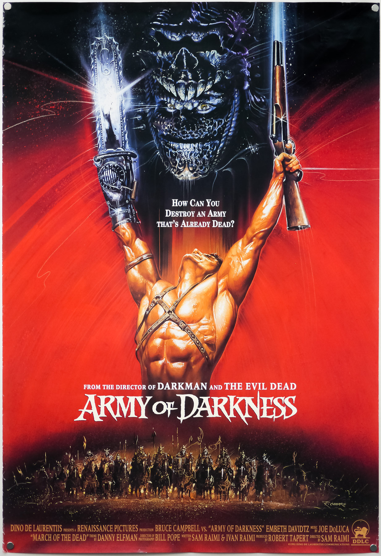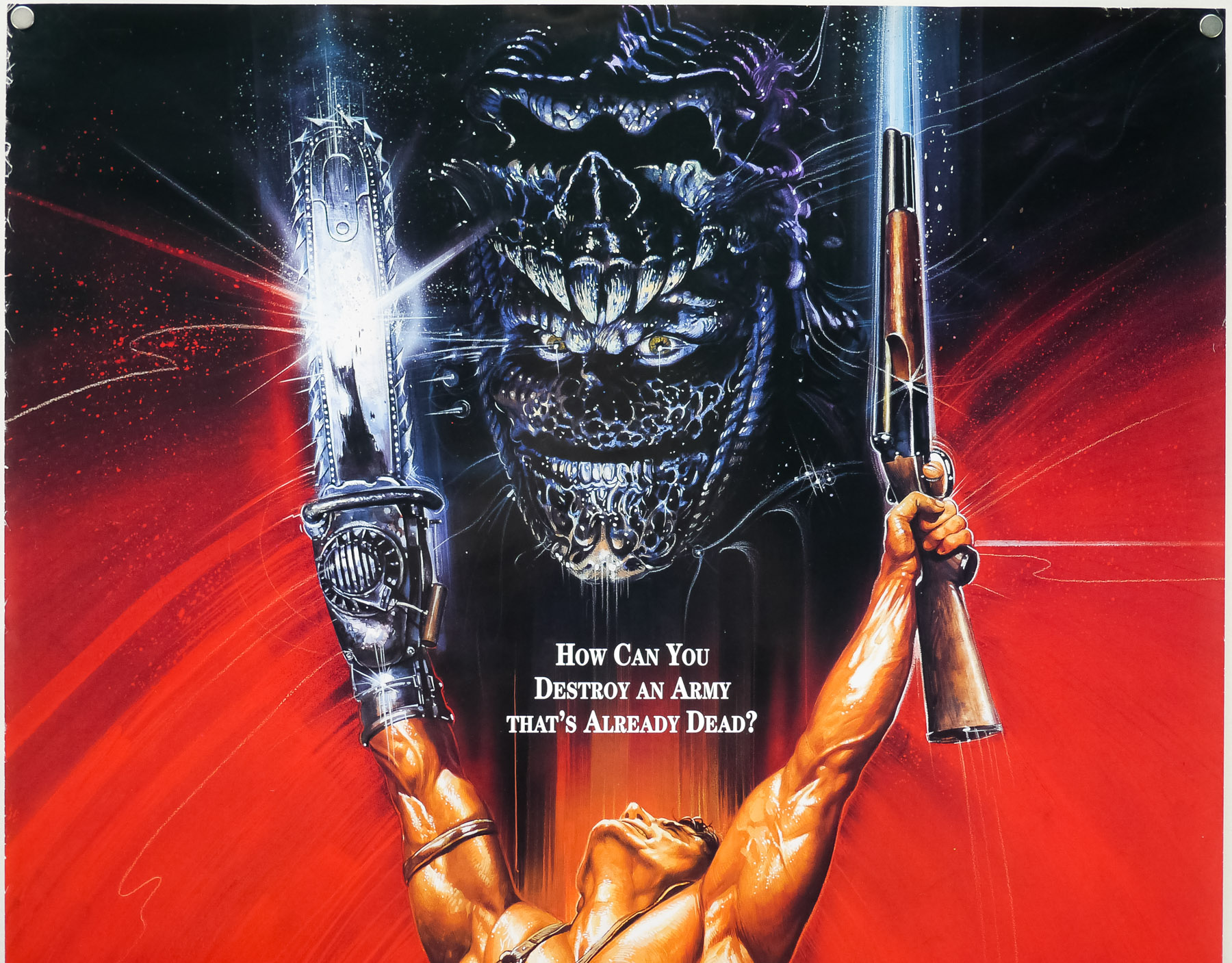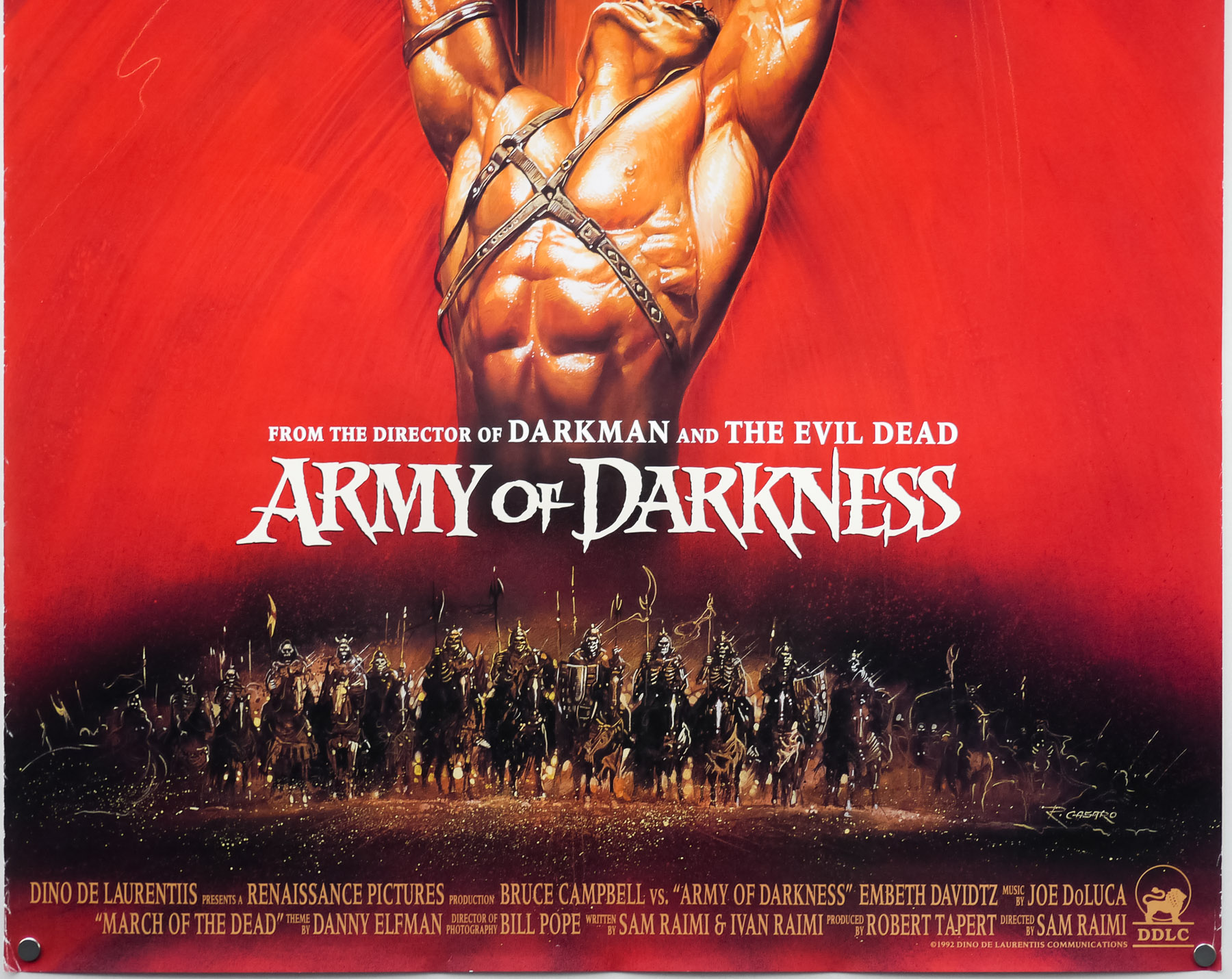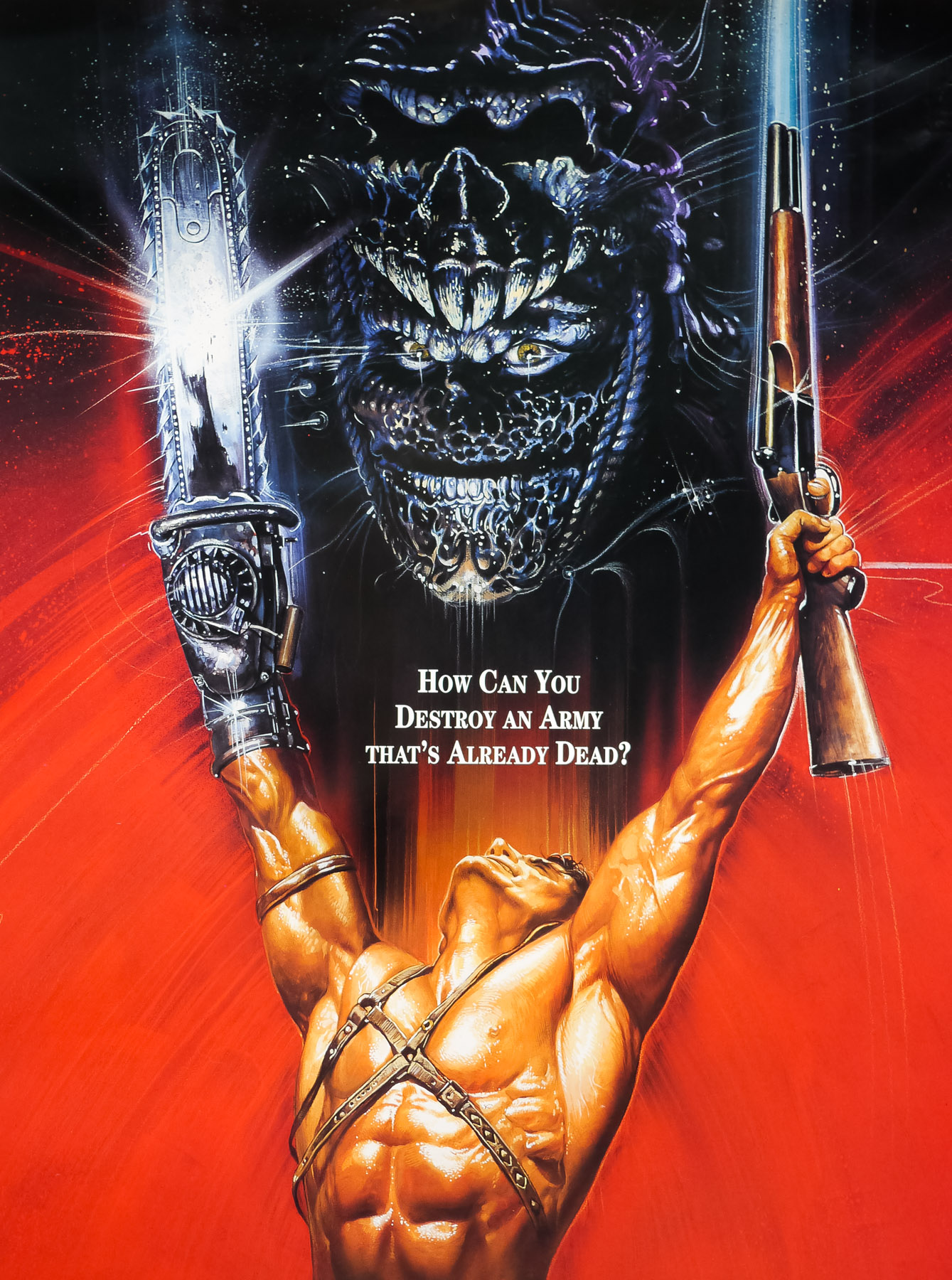
Poster detail
1-5
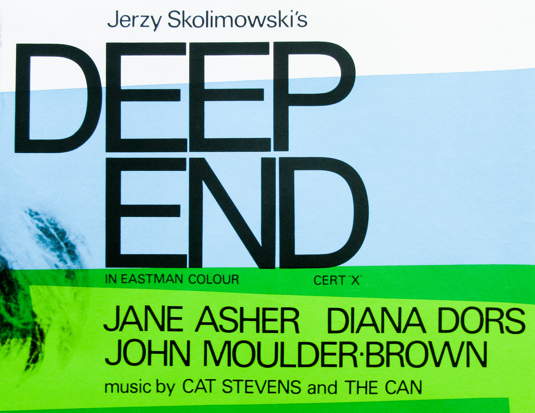
- Title
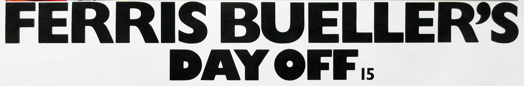
- Ferris Bueller's Day Off
- AKA
- Una pazza giornata di vacanza [A crazy day of vacation] (Italy) | Ferisu wa aru asa totsuzen ni (Japan)
- Year of Film
- 1986
- Director
- John Hughes
- Starring
- Matthew Broderick, Alan Ruck, Mia Sara, Jeffrey Jones, Jennifer Grey, Edie McClurg, Charlie Sheen
- Origin of Film
- USA
- Genre(s) of Film
- Matthew Broderick, Alan Ruck, Mia Sara, Jeffrey Jones, Jennifer Grey, Edie McClurg, Charlie Sheen,
- Type of Poster
- Quad
- Style of Poster
- --
- Origin of Poster
- UK
- Year of Poster
- 1986
- Designer
- Unknown
- Artist
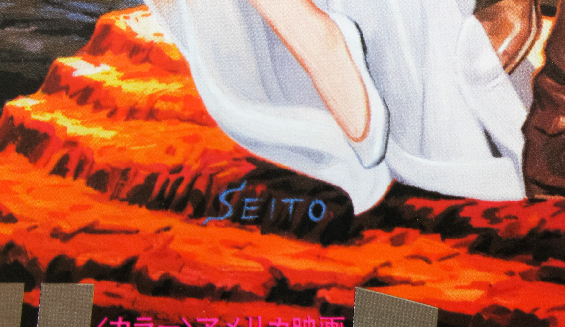
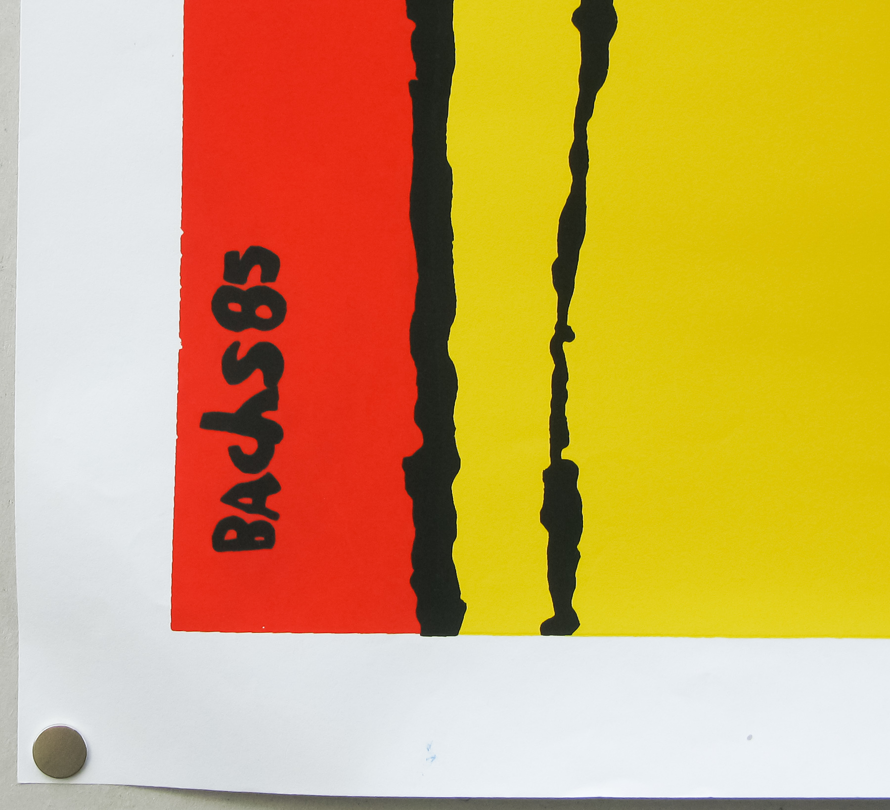
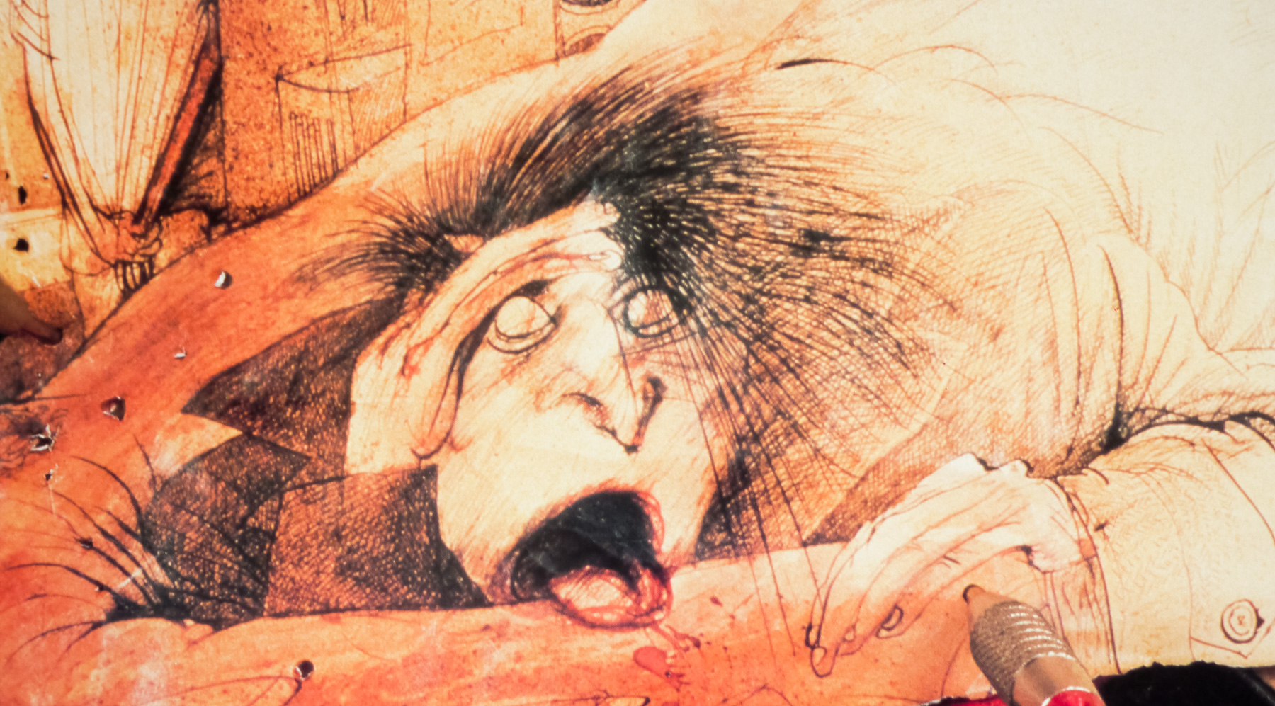
- Steve Kingston
- Size (inches)
- 30" x 39 14/16"
- SS or DS
- SS
- NSS #
- --
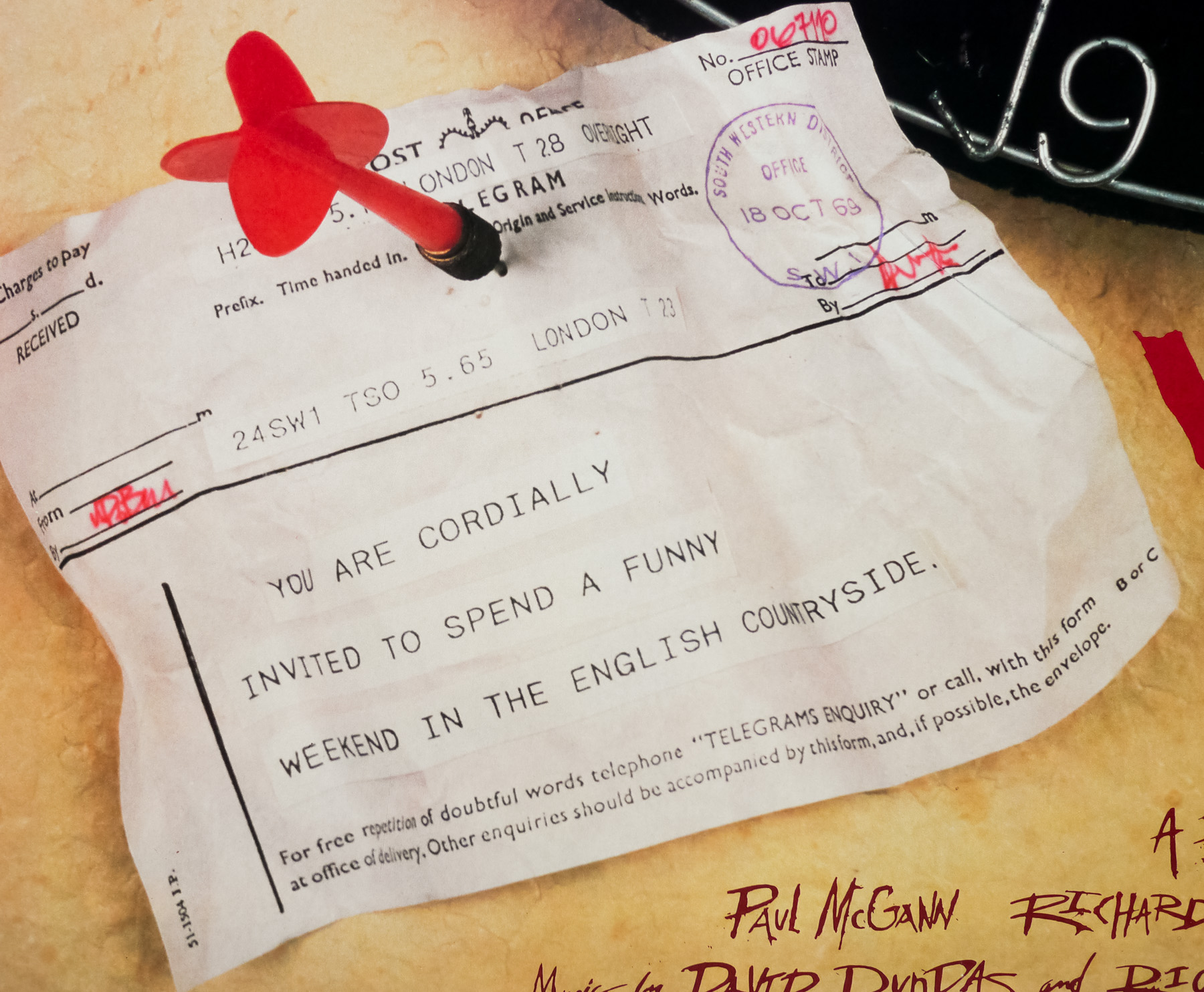
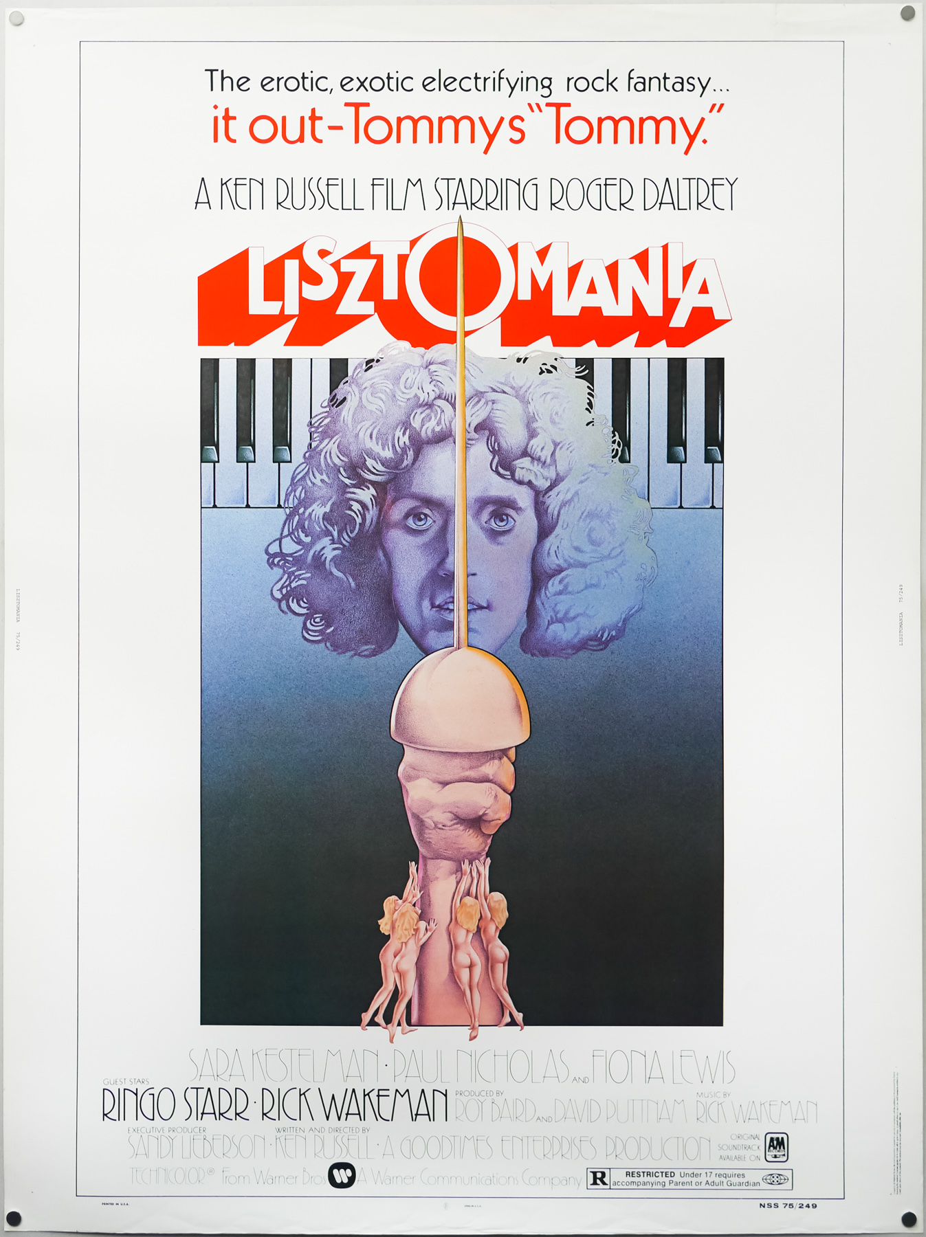
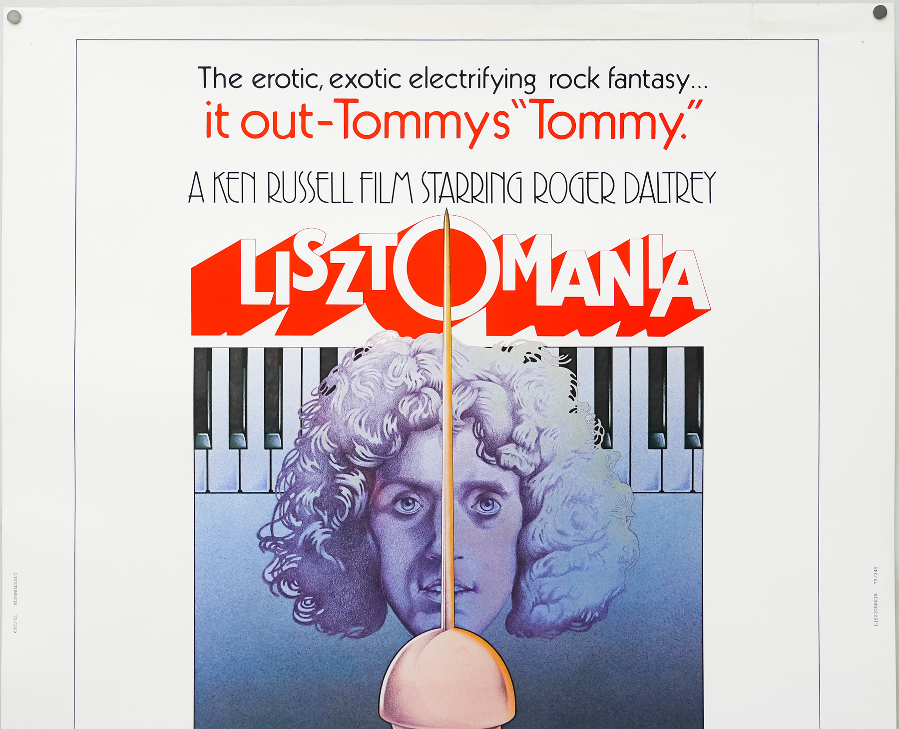
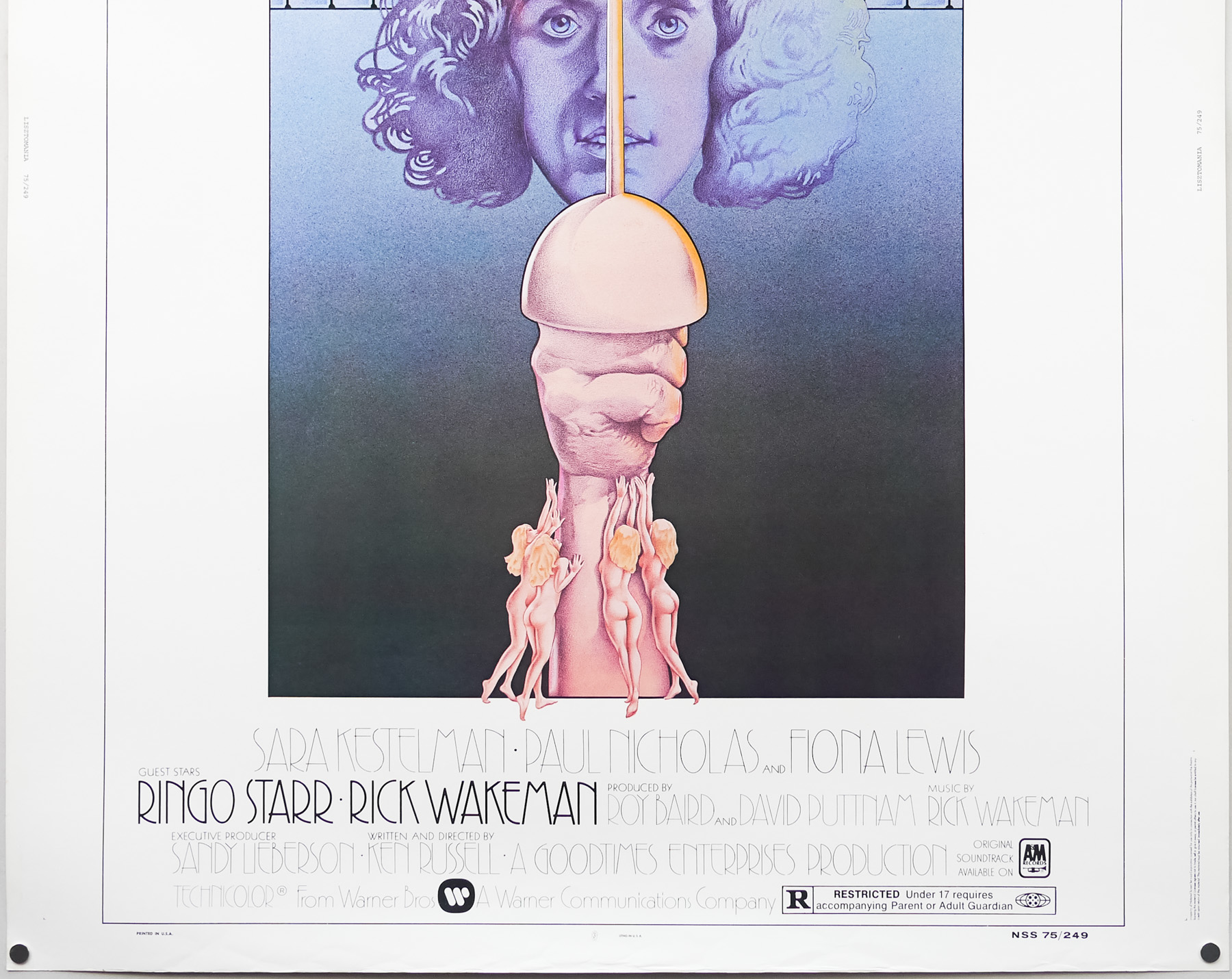
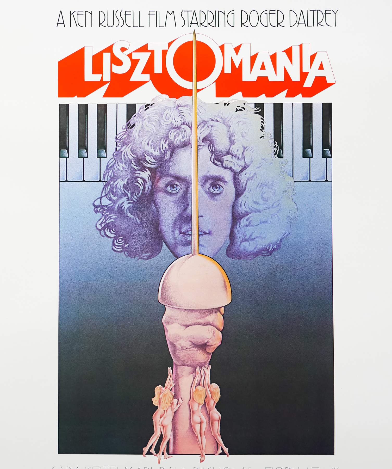
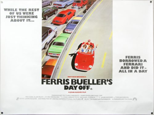
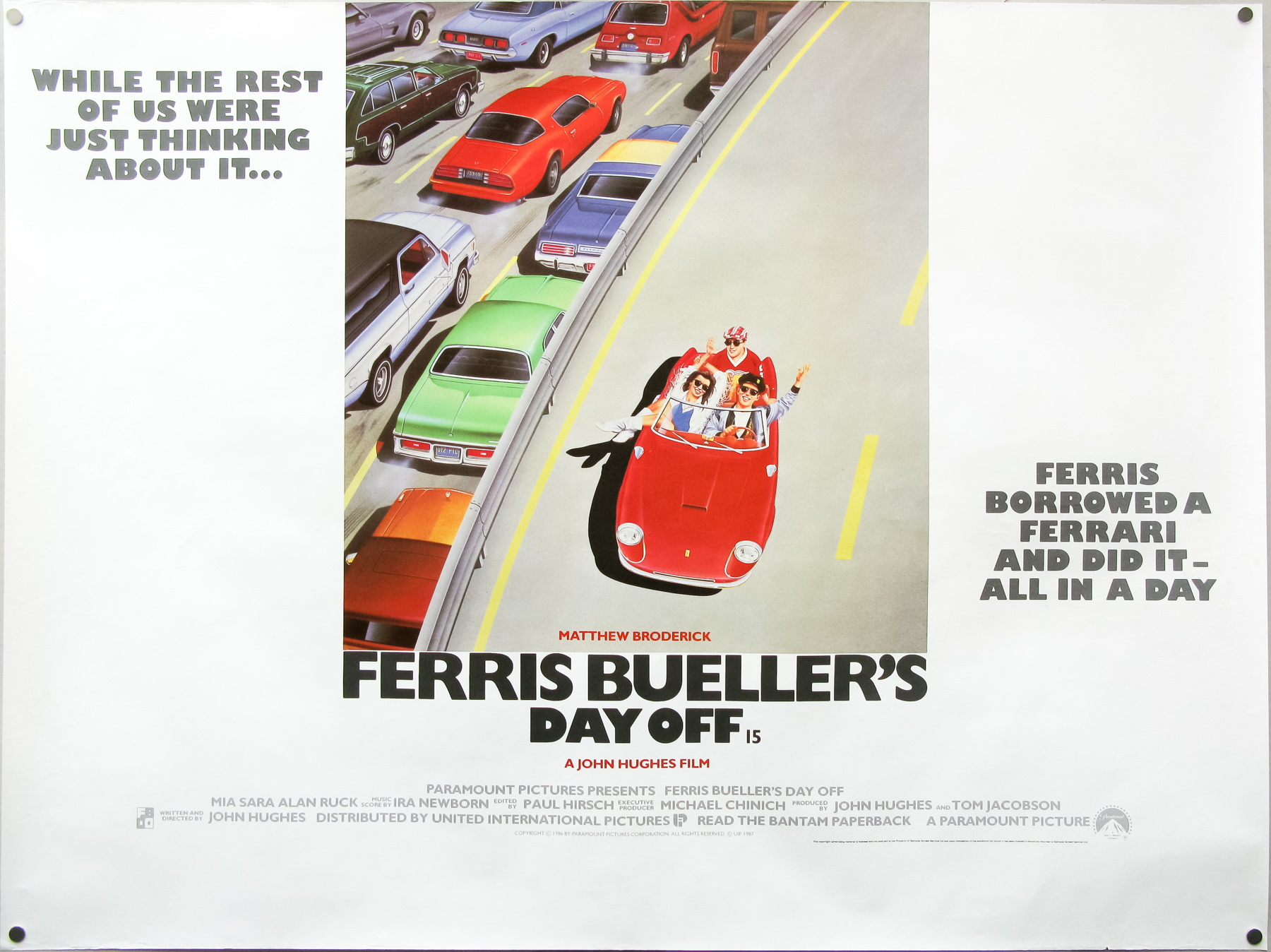
- Tagline
- While the rest of us were just thinking about it...Ferris borrowed a Ferrari and did it...all in a day.
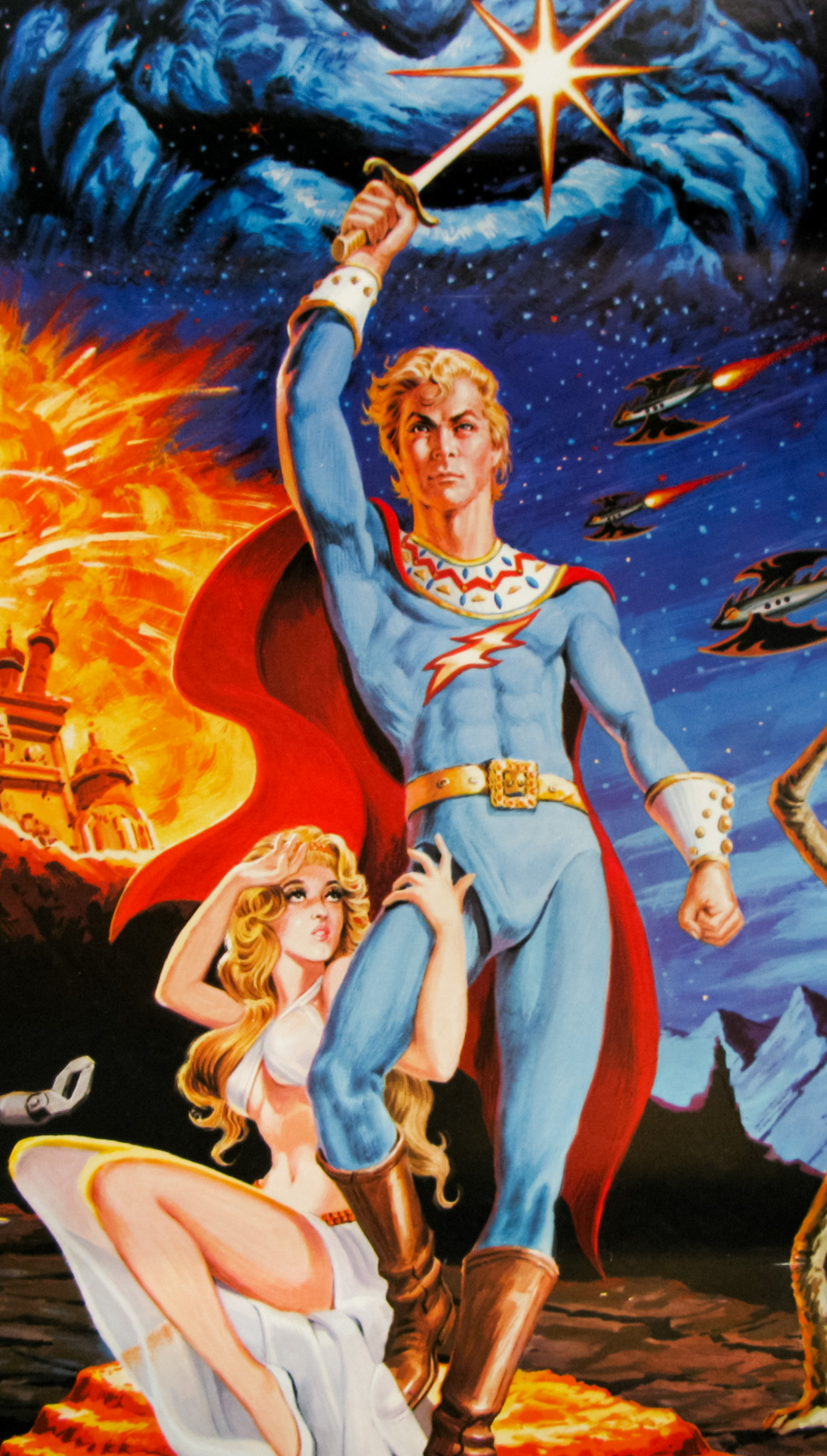
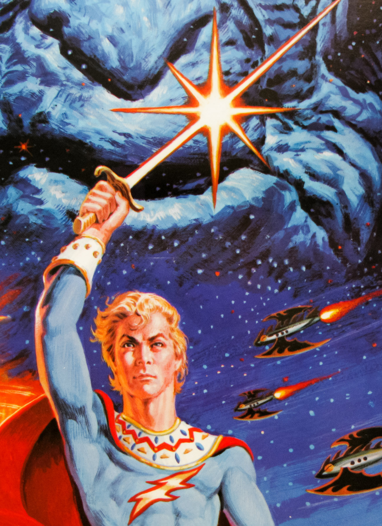
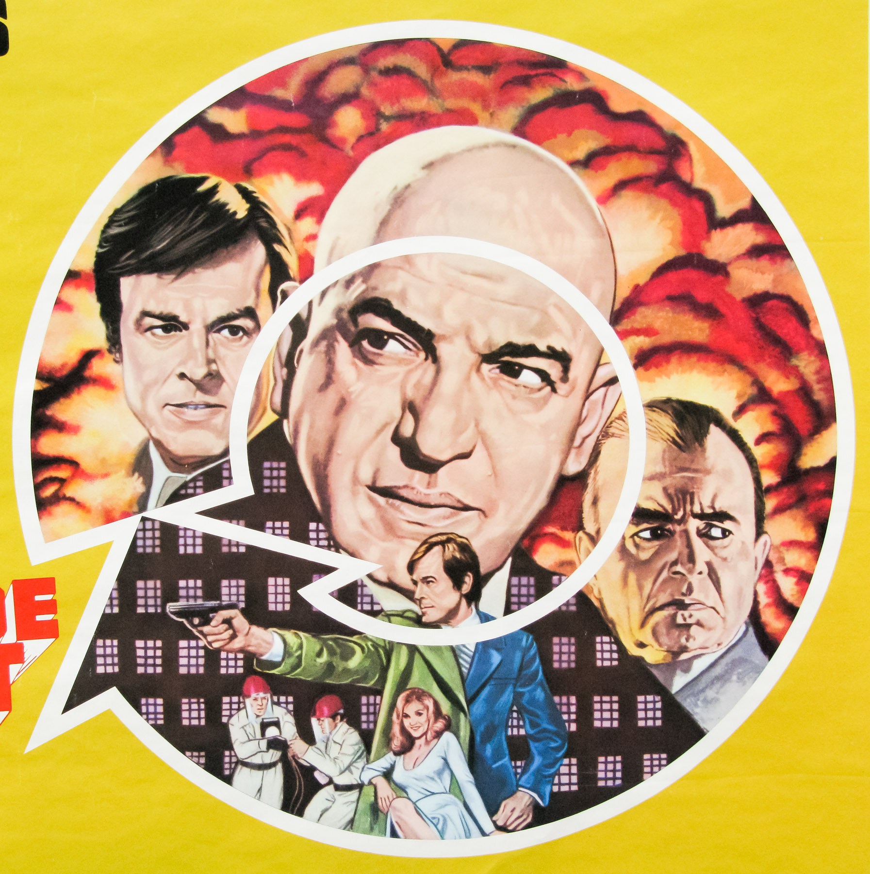
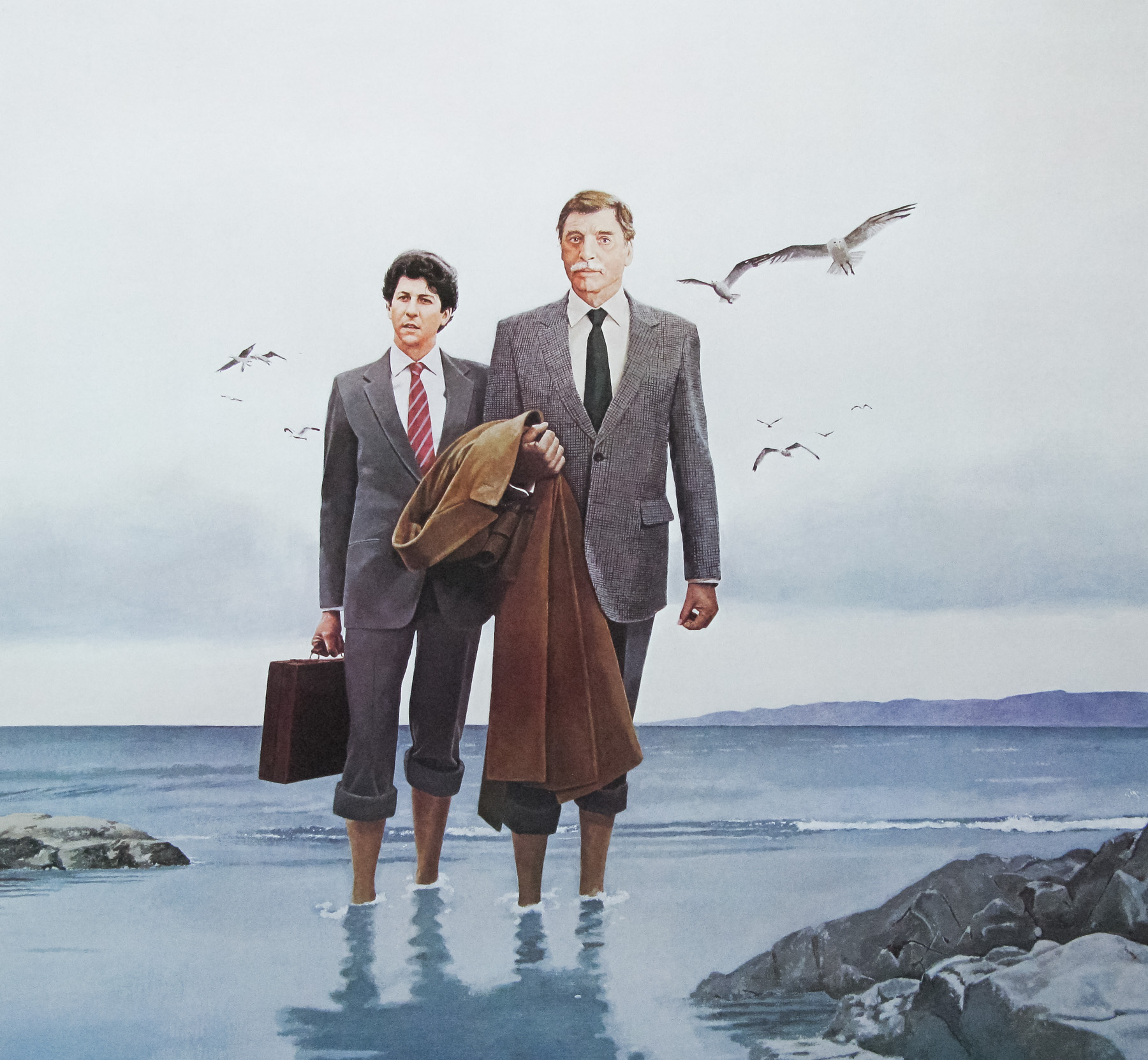
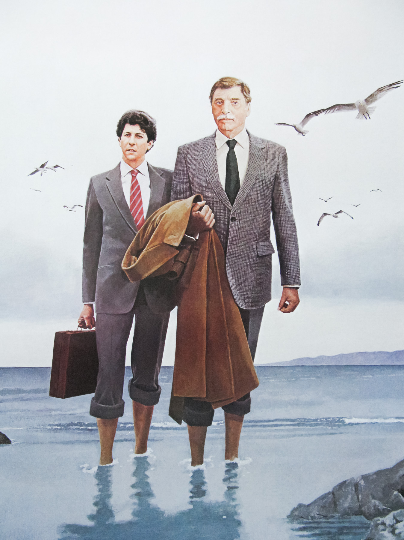
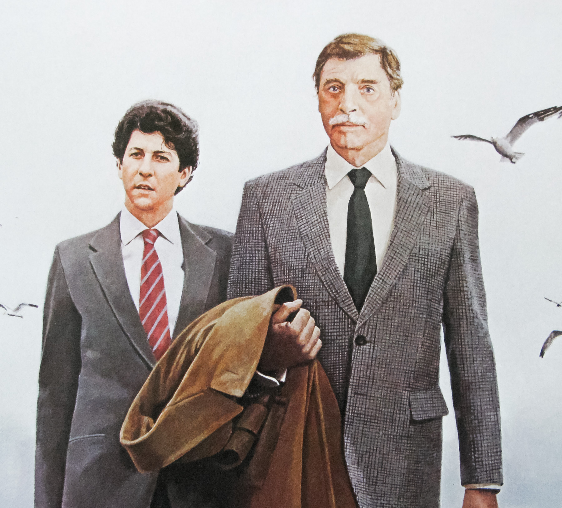
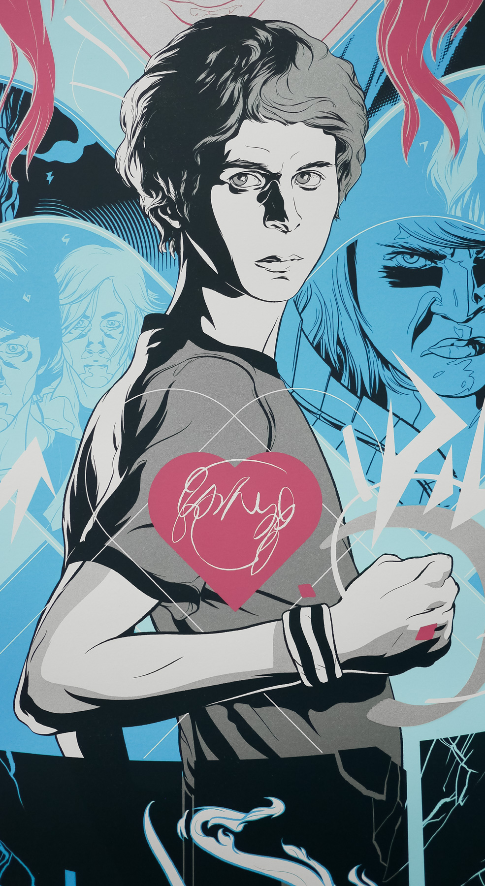
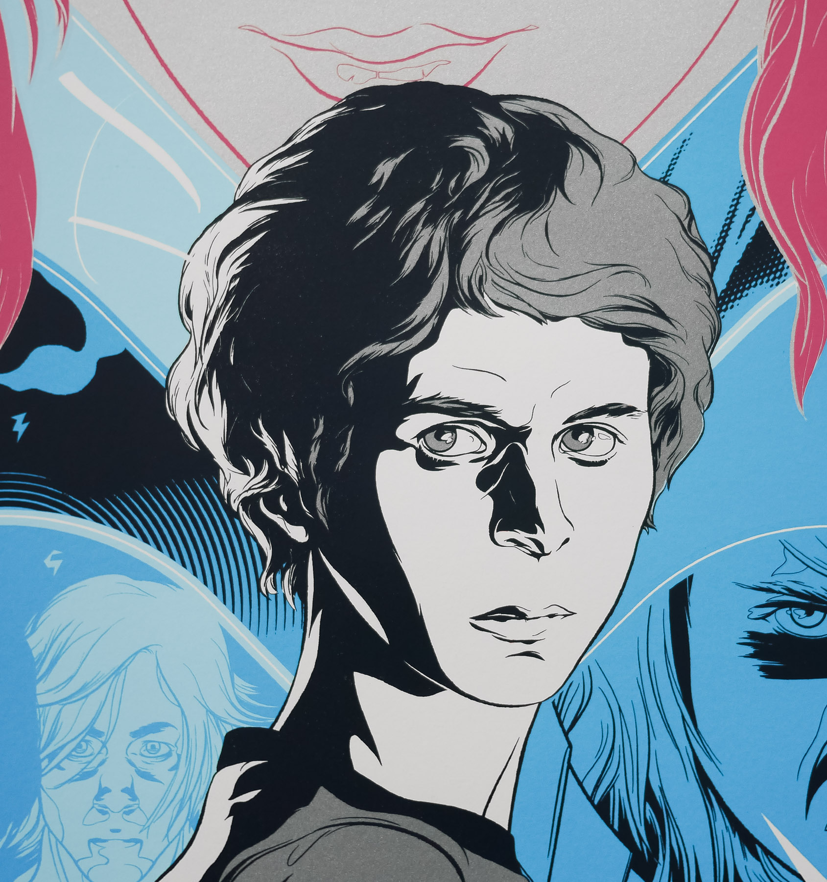
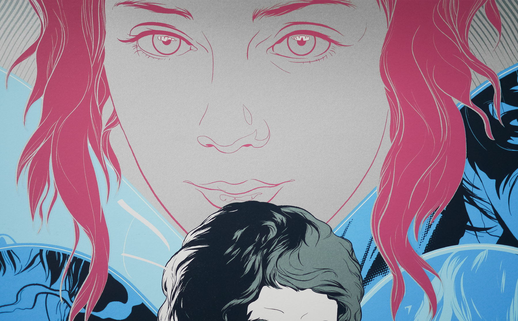
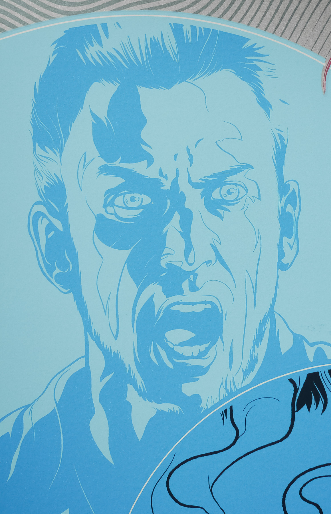
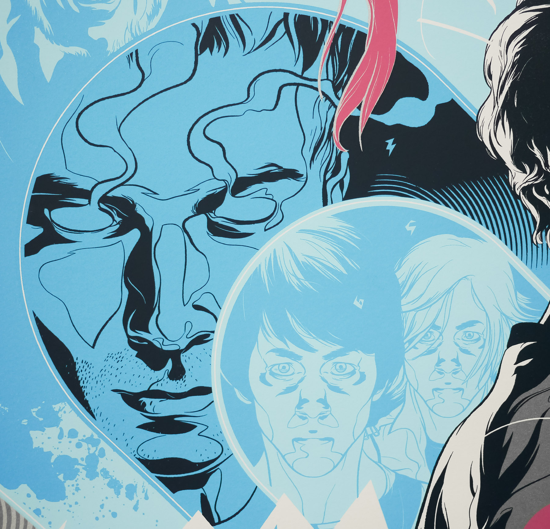
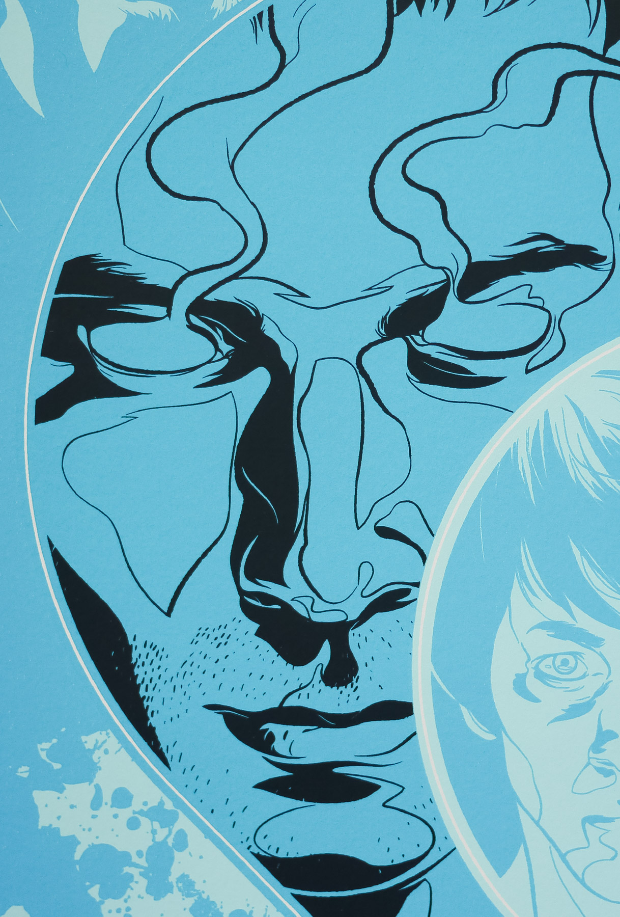
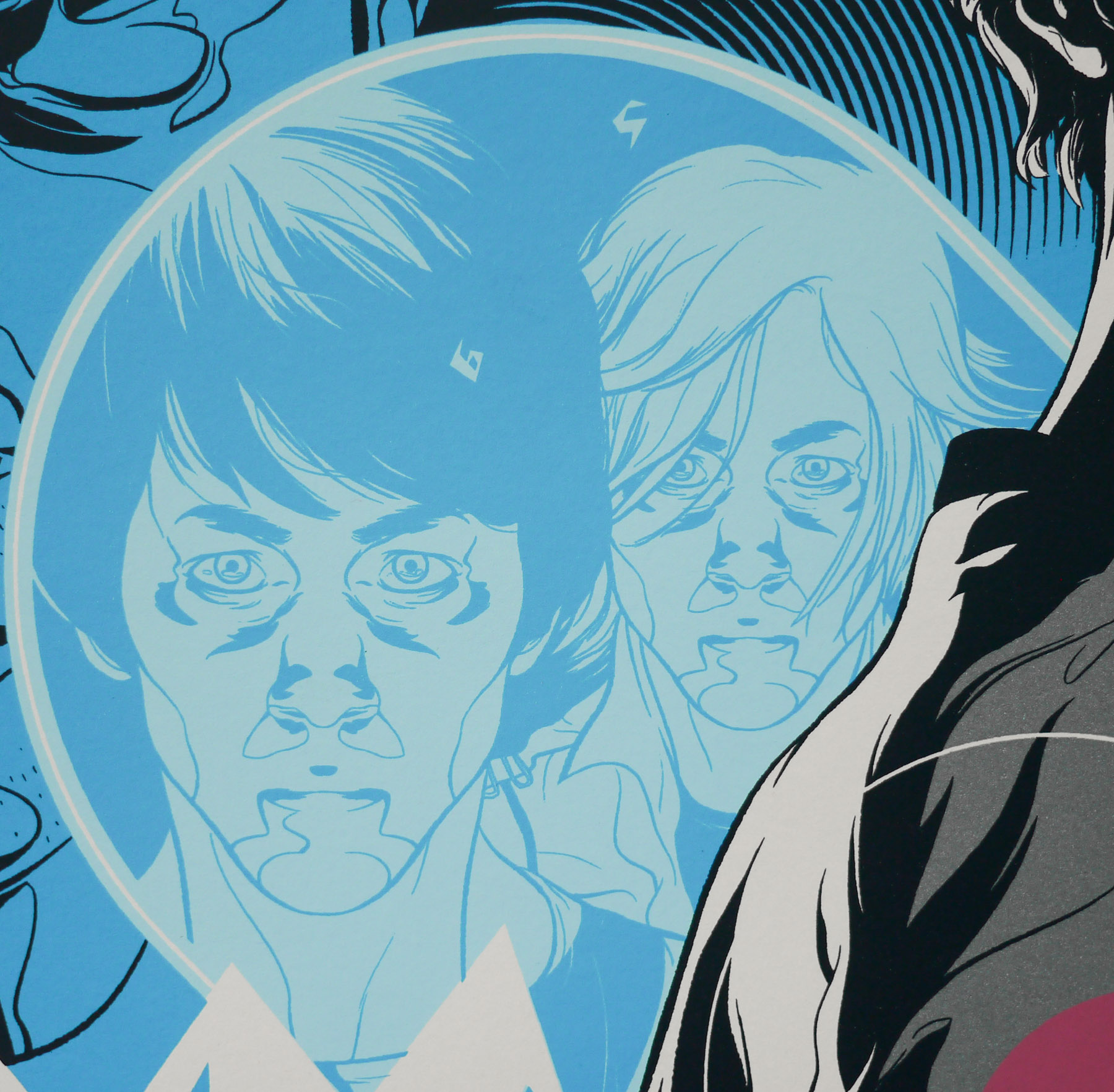
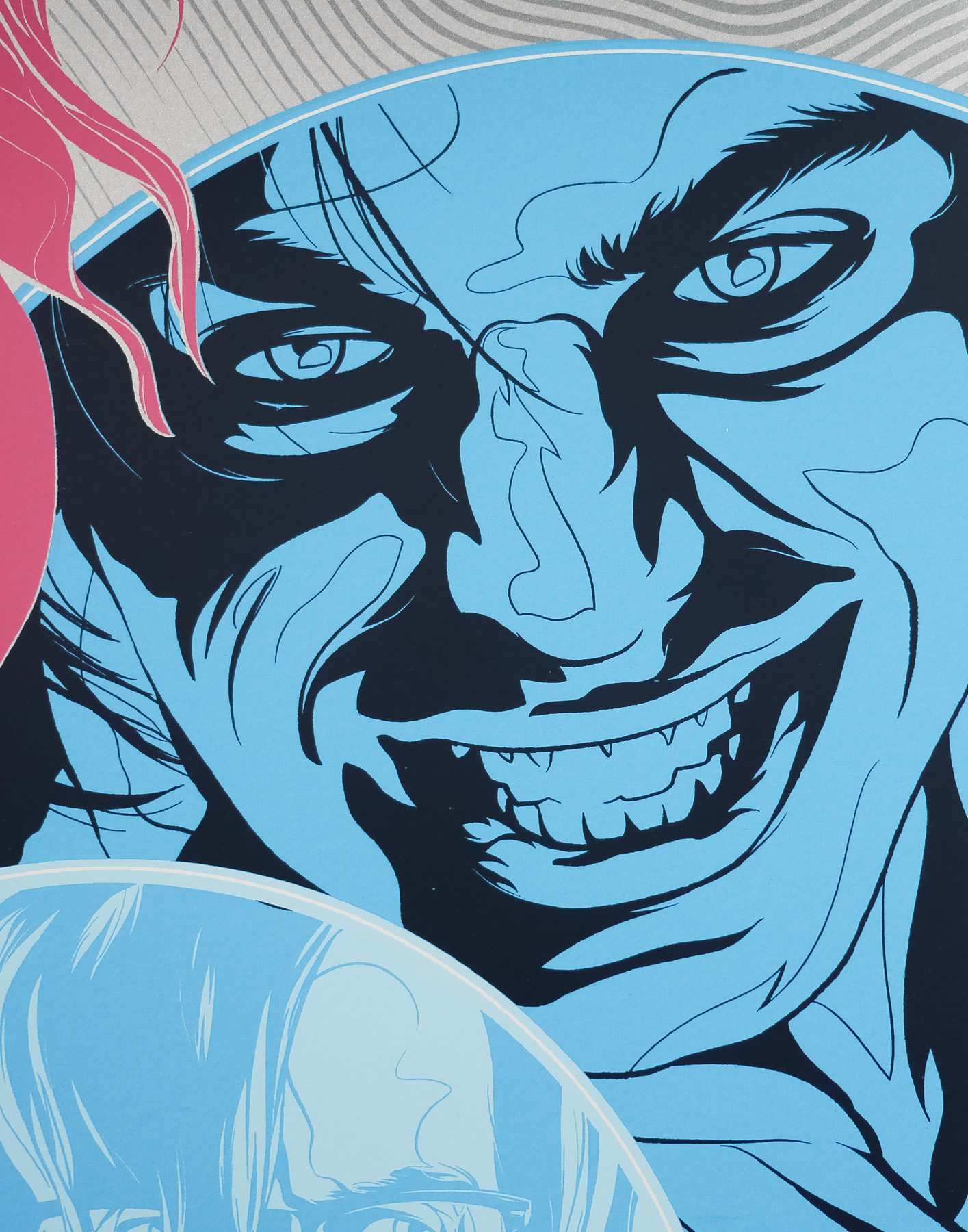
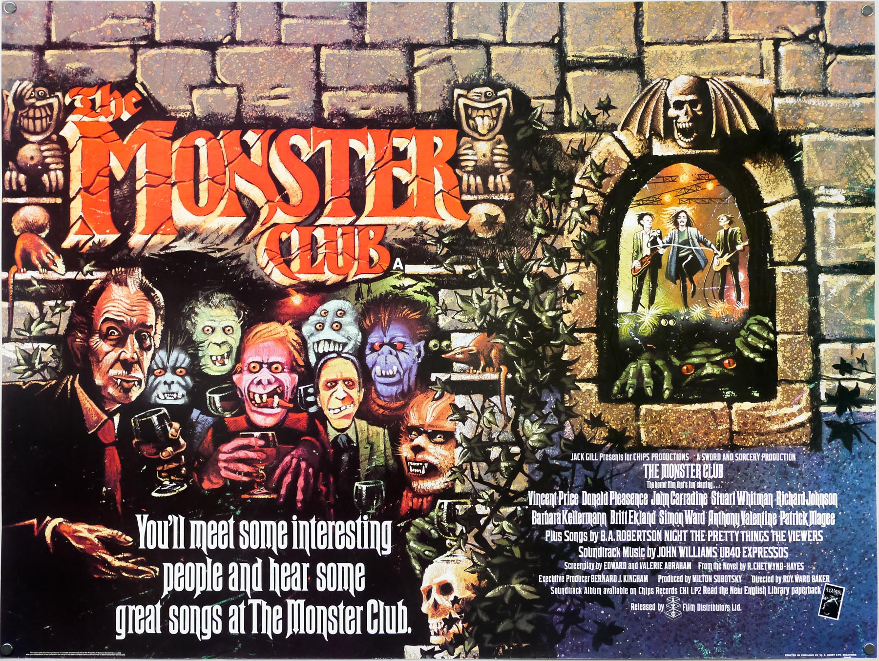
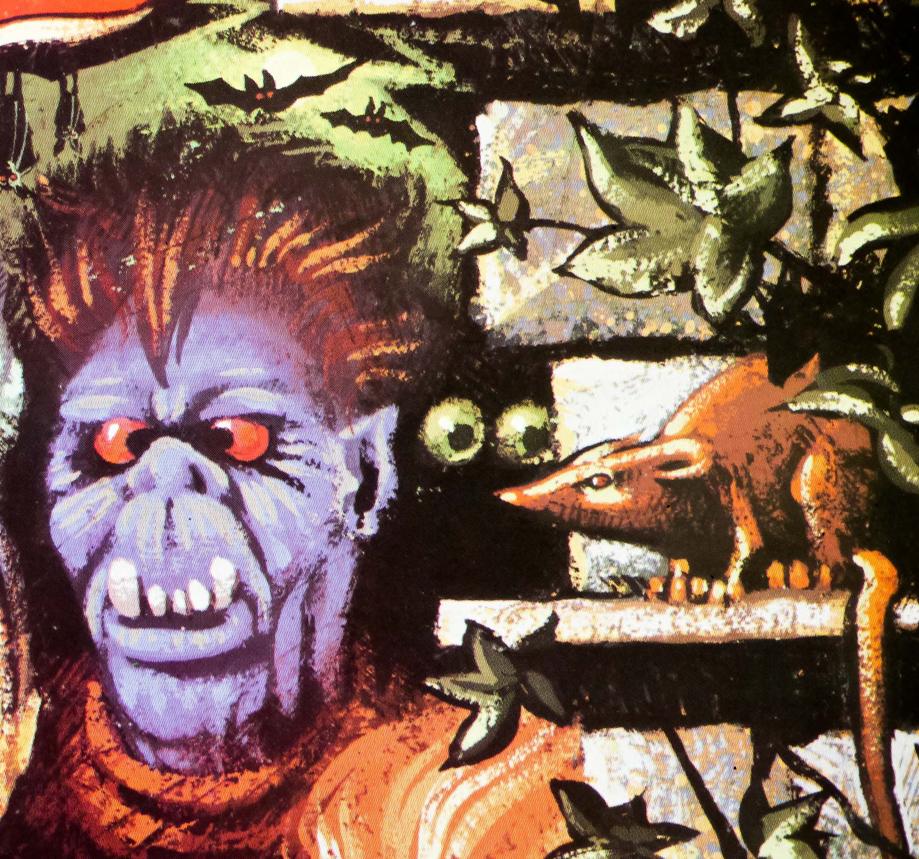
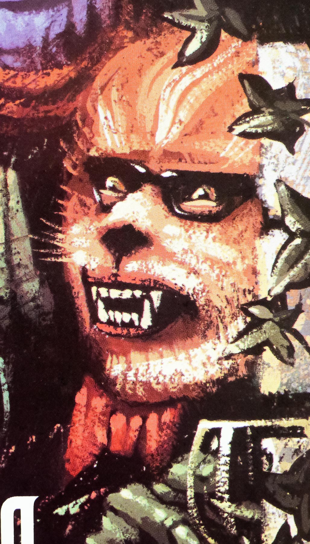
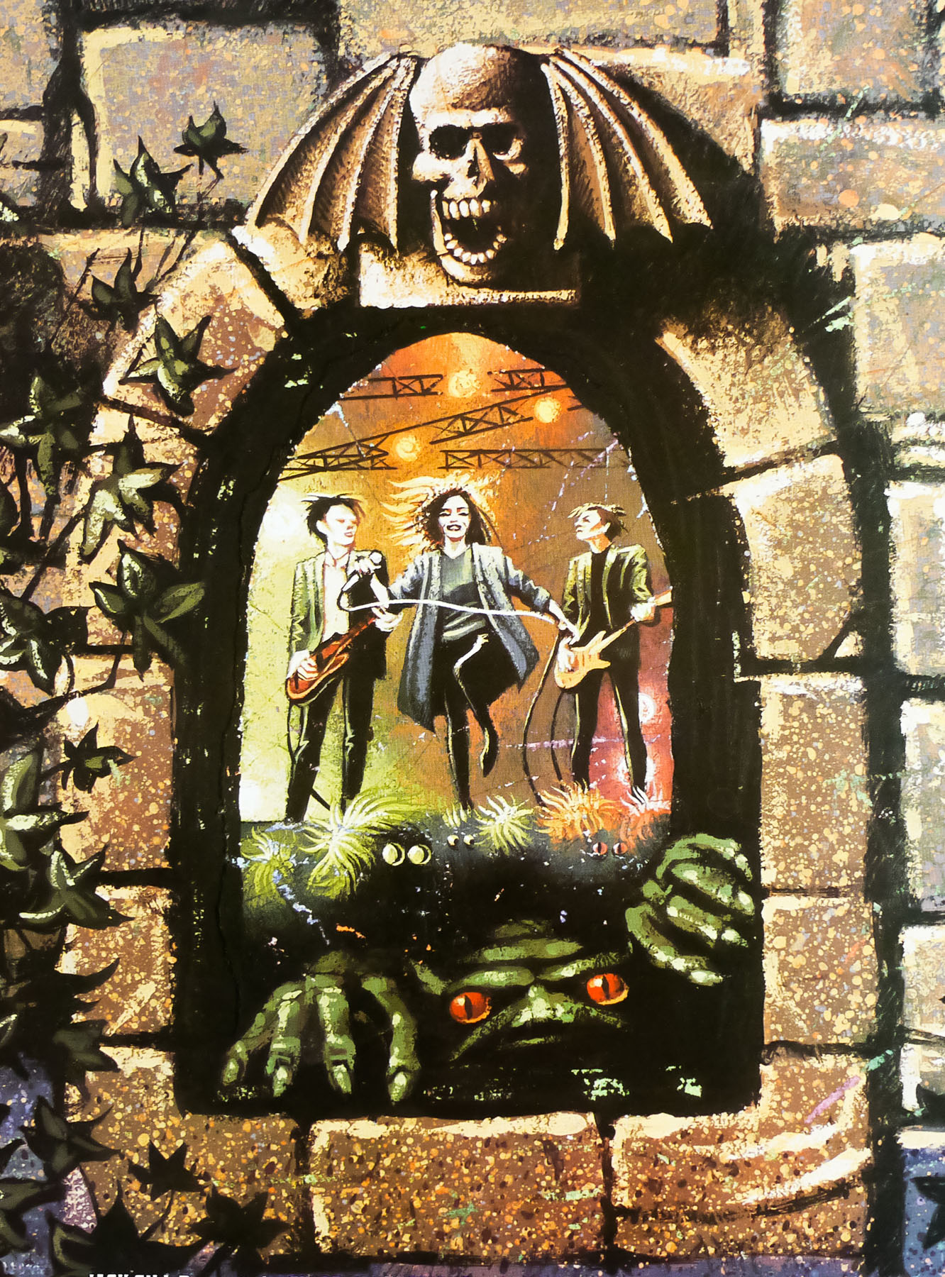
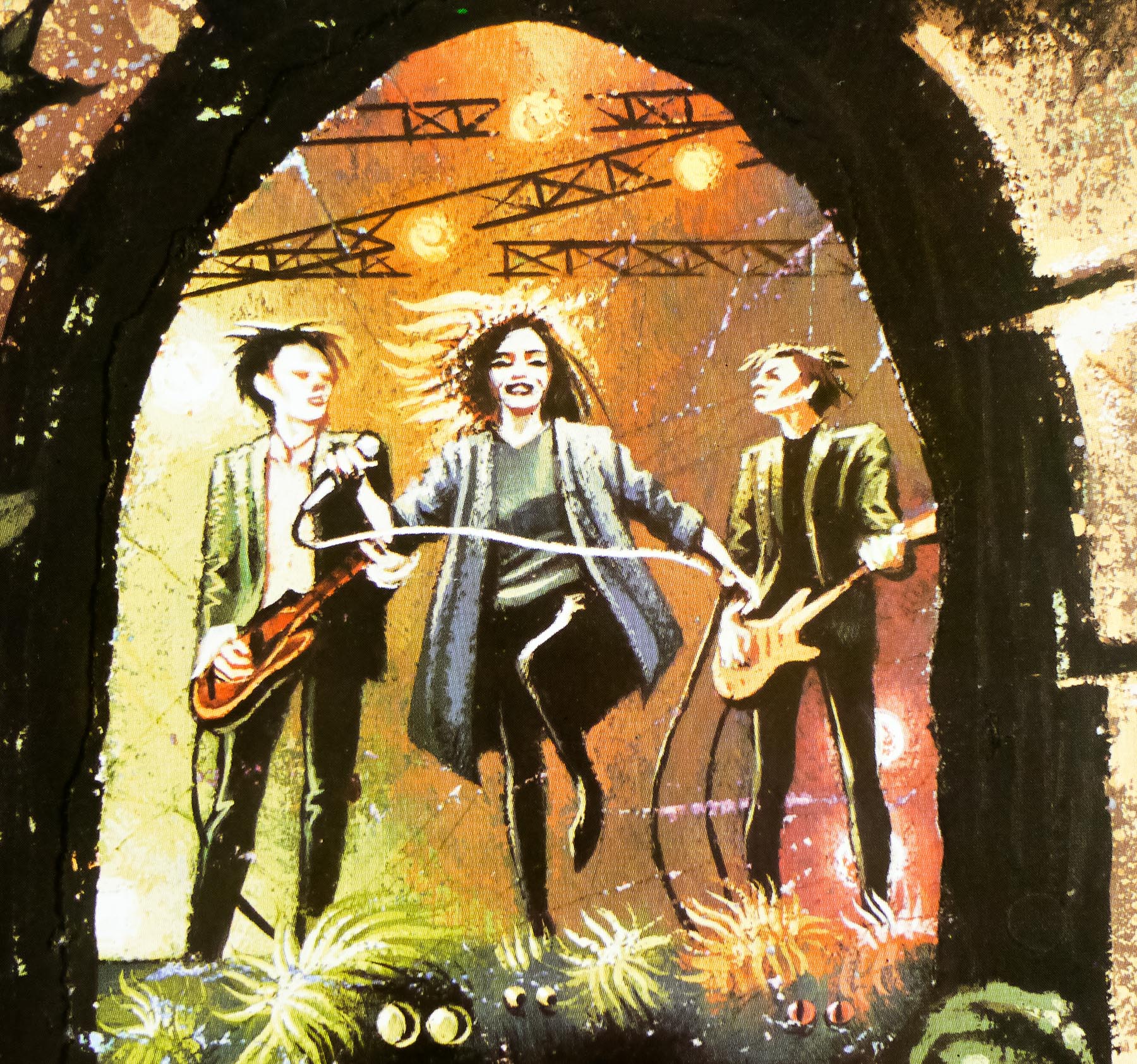
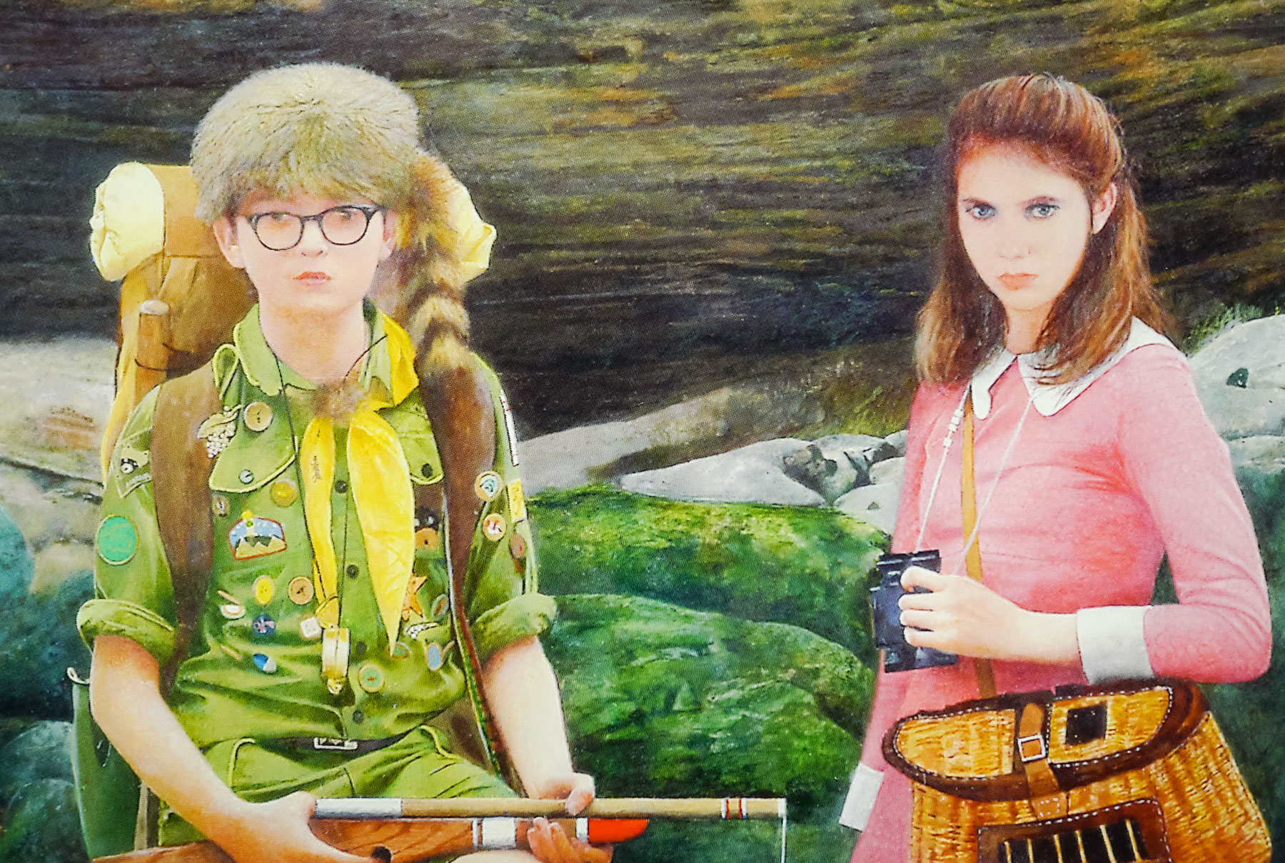
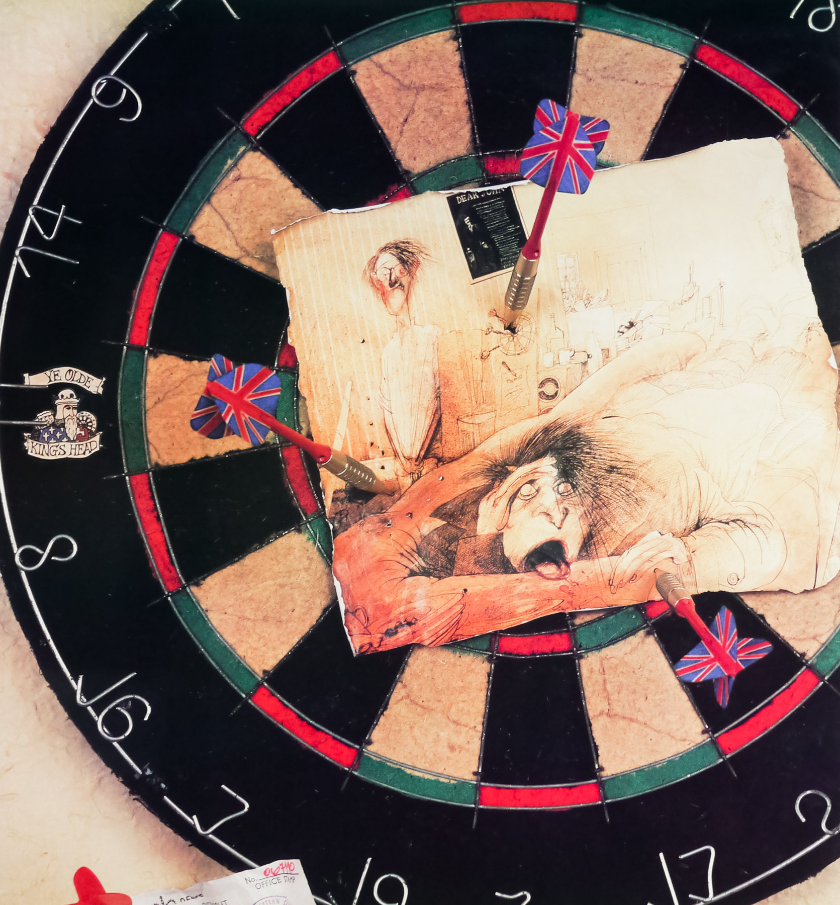
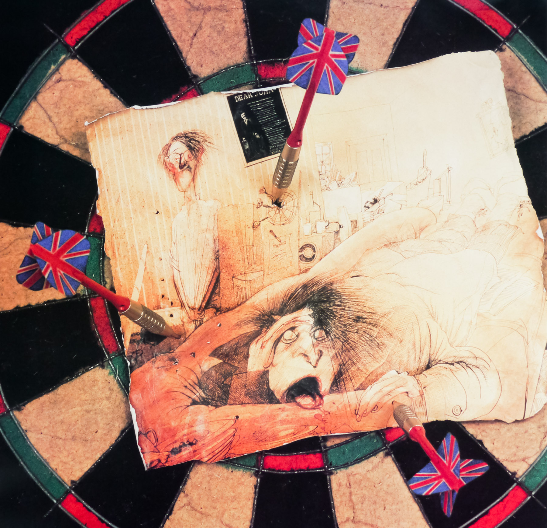
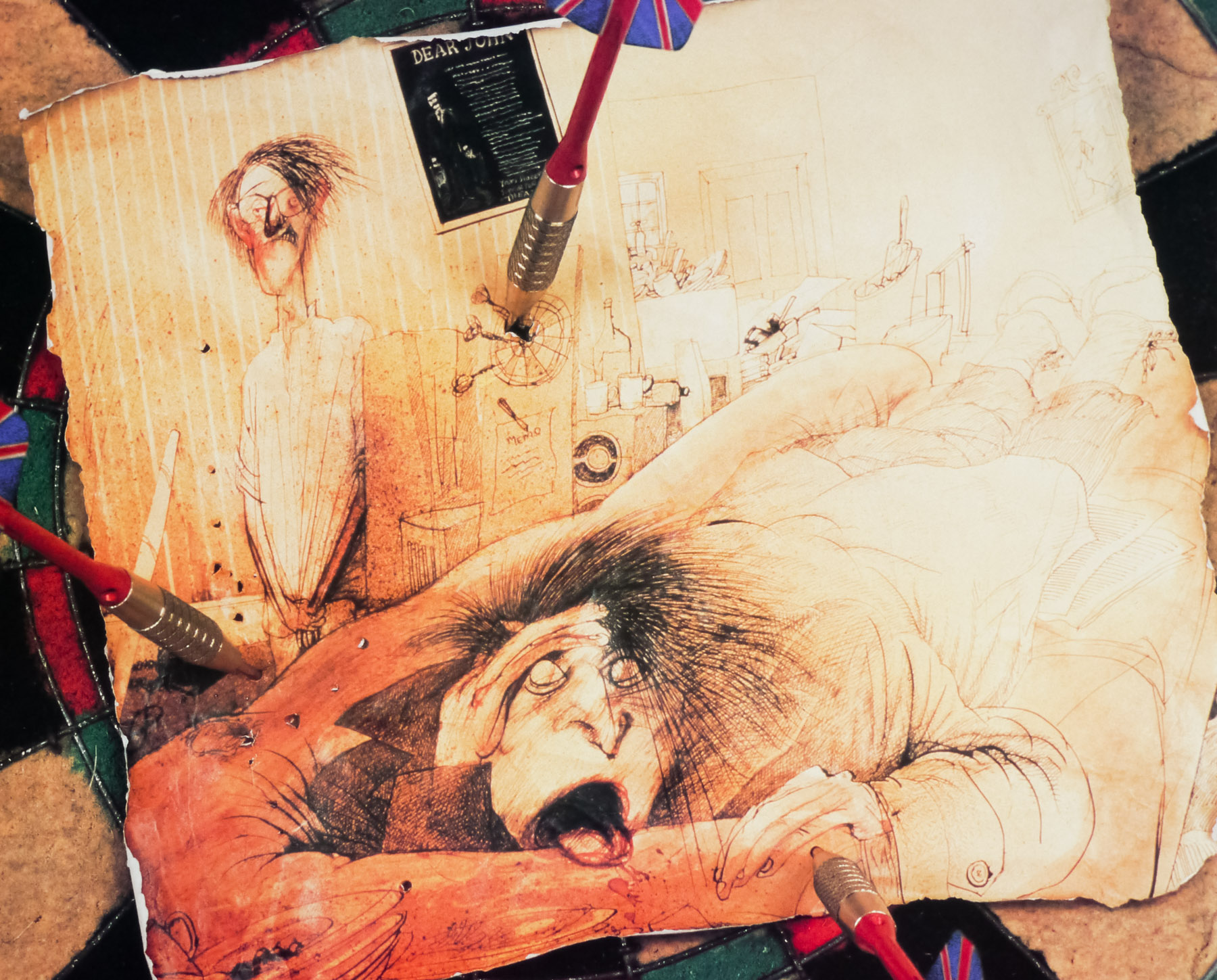
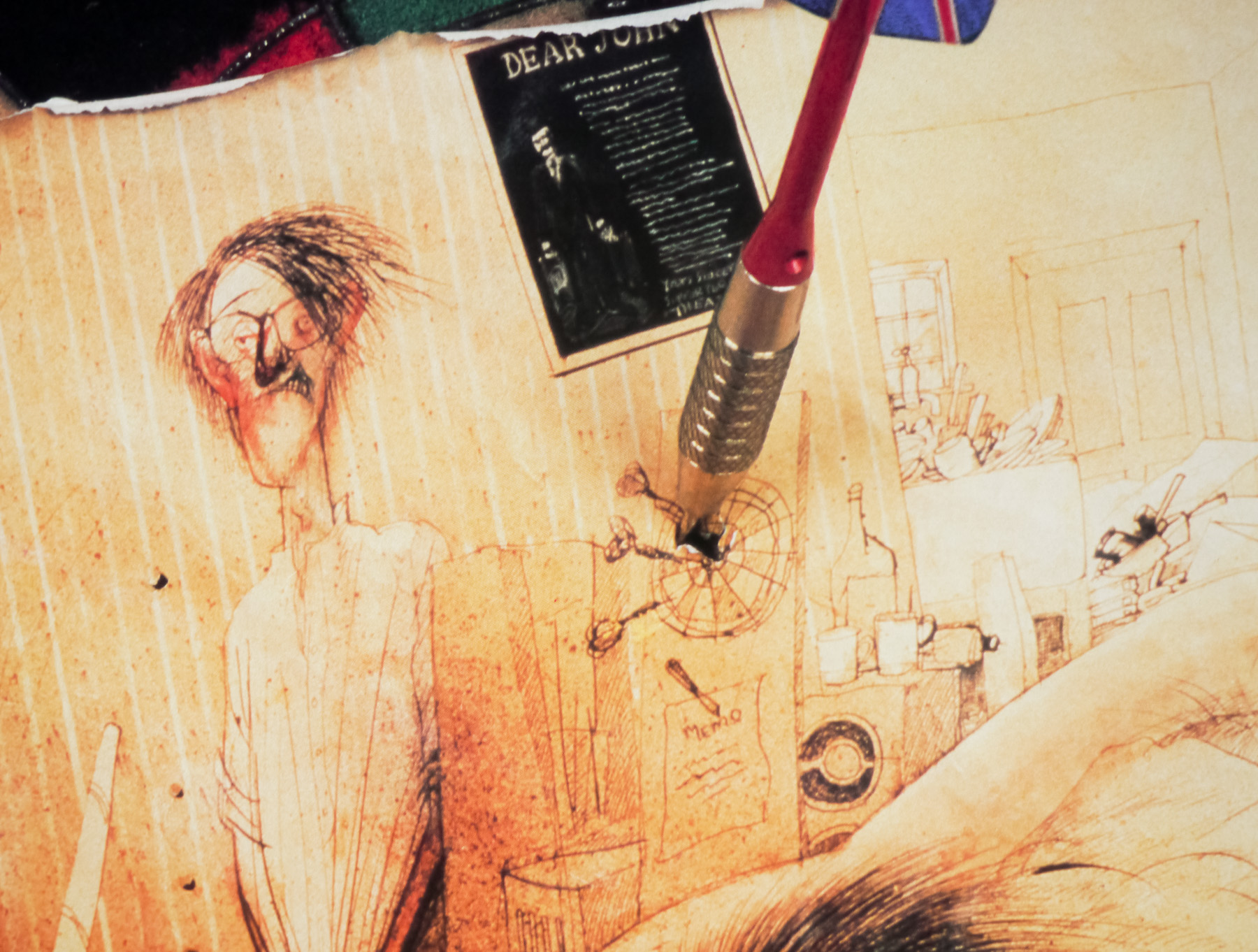
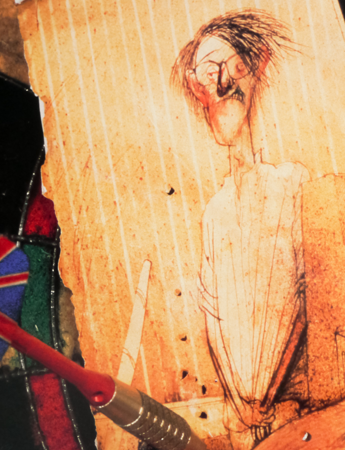
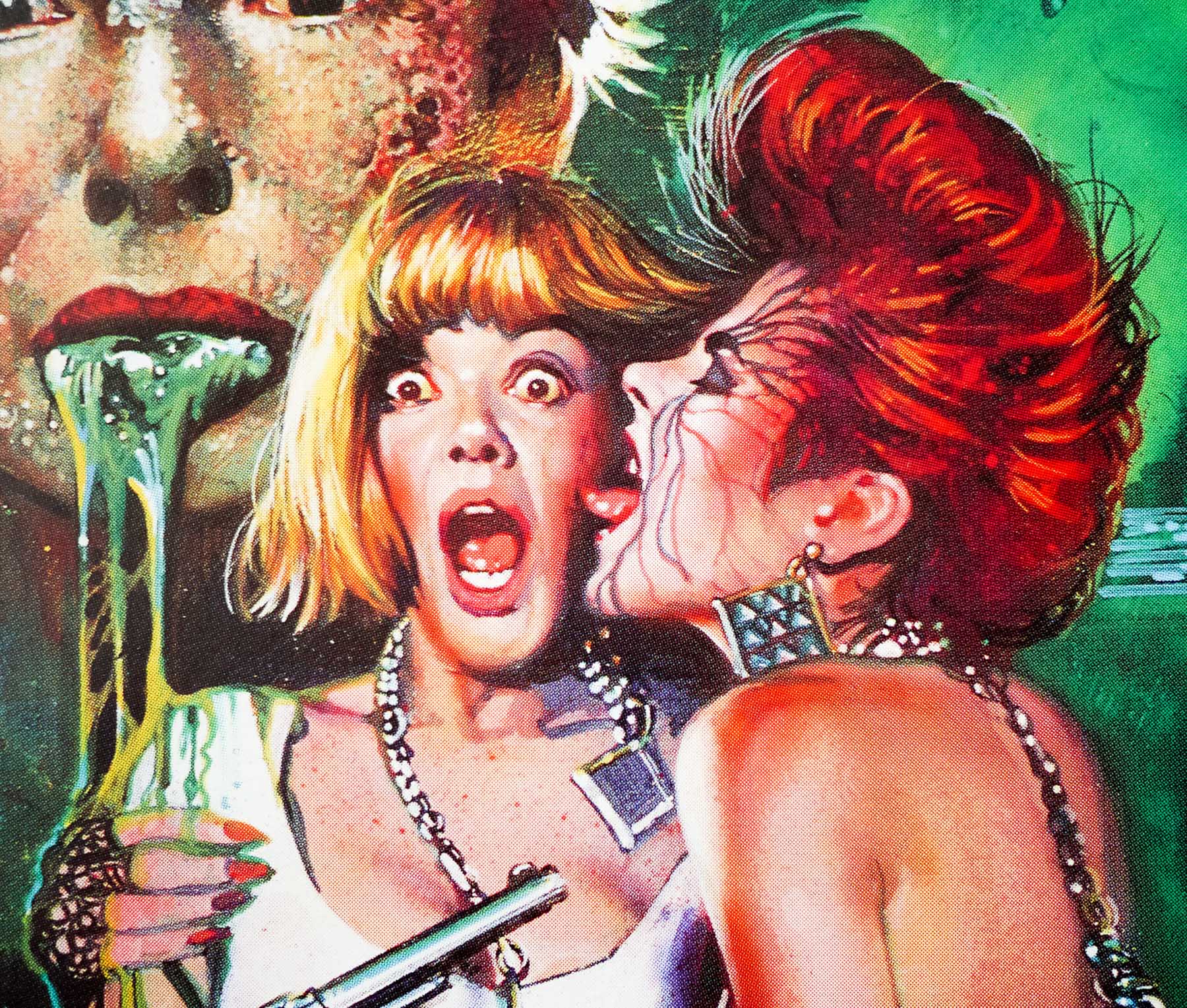
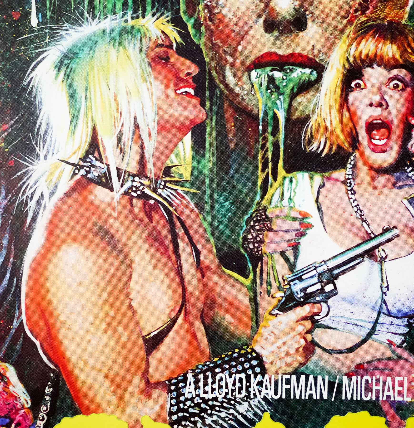
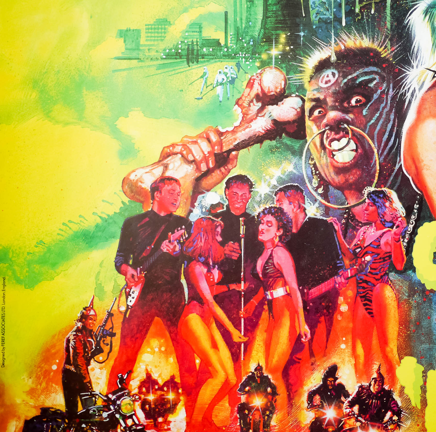
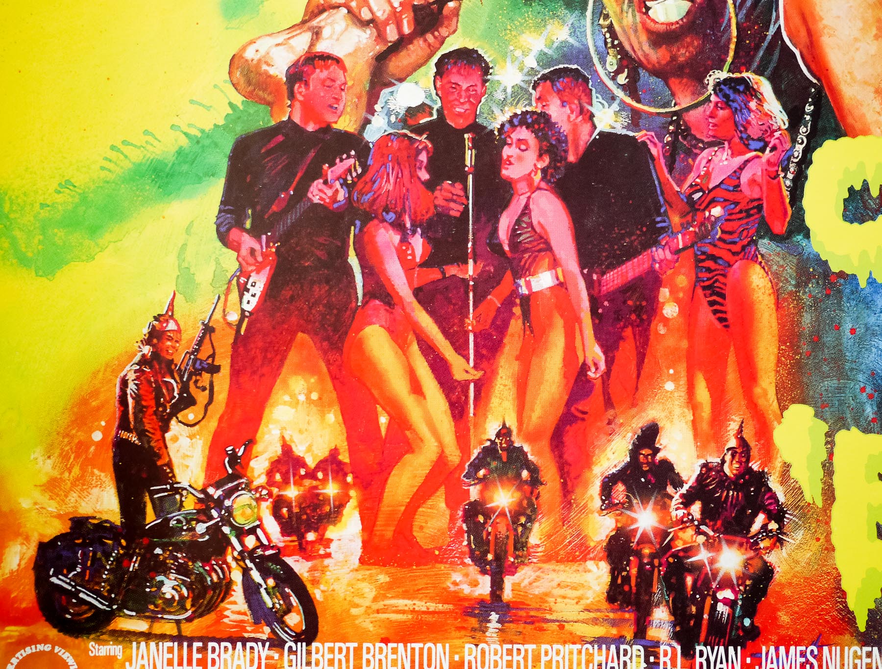
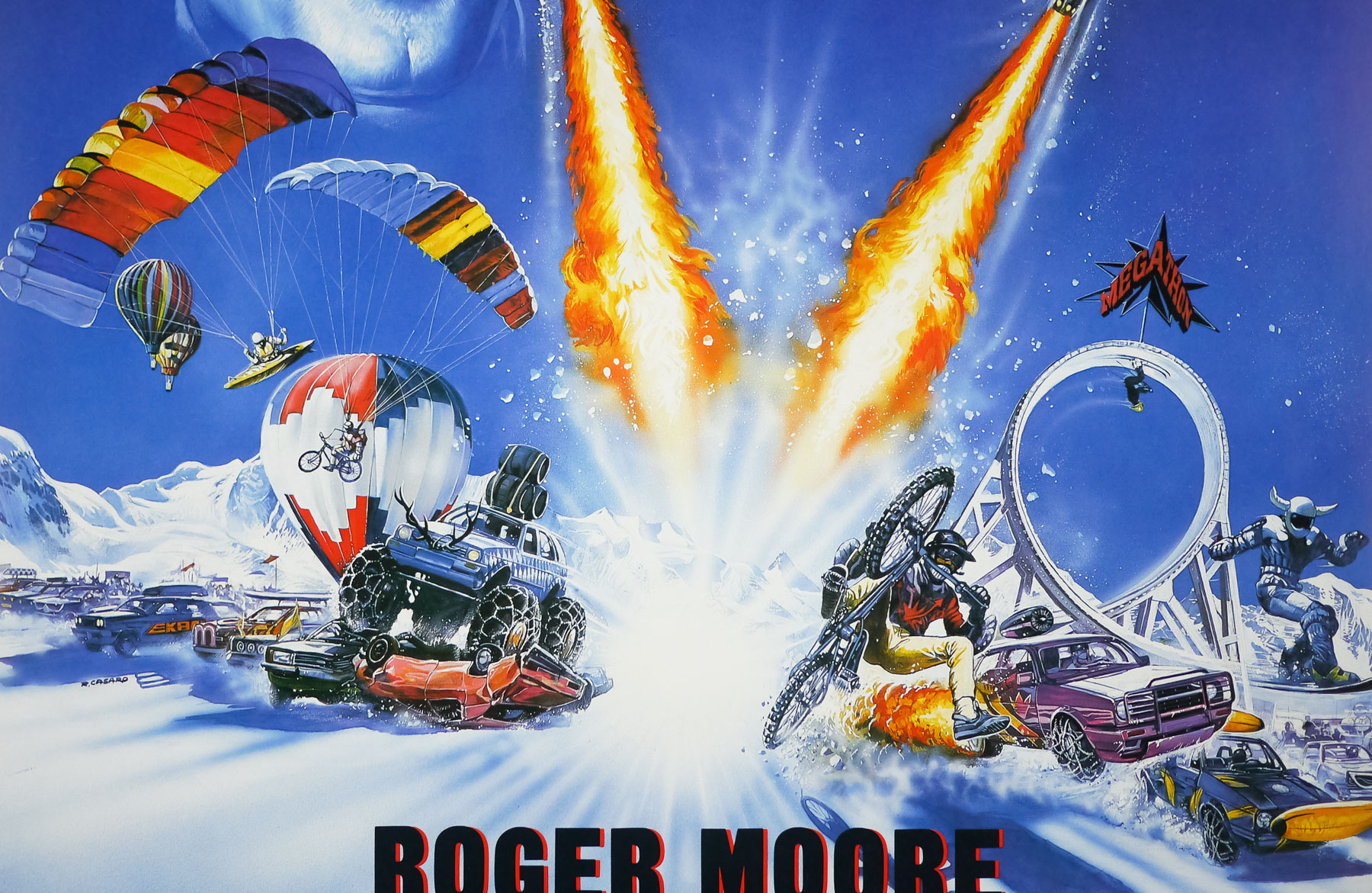
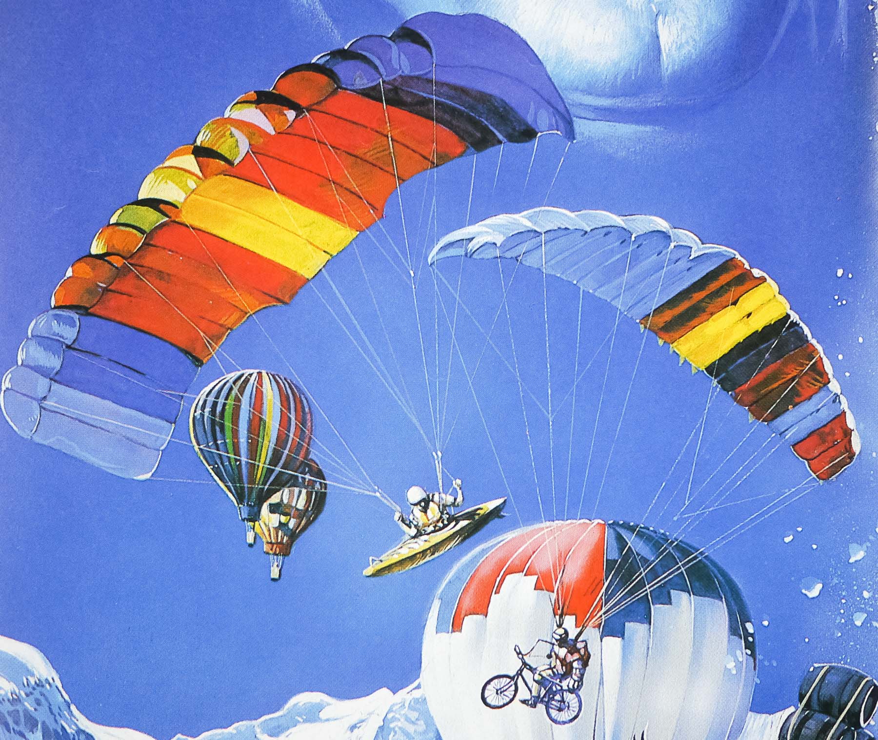
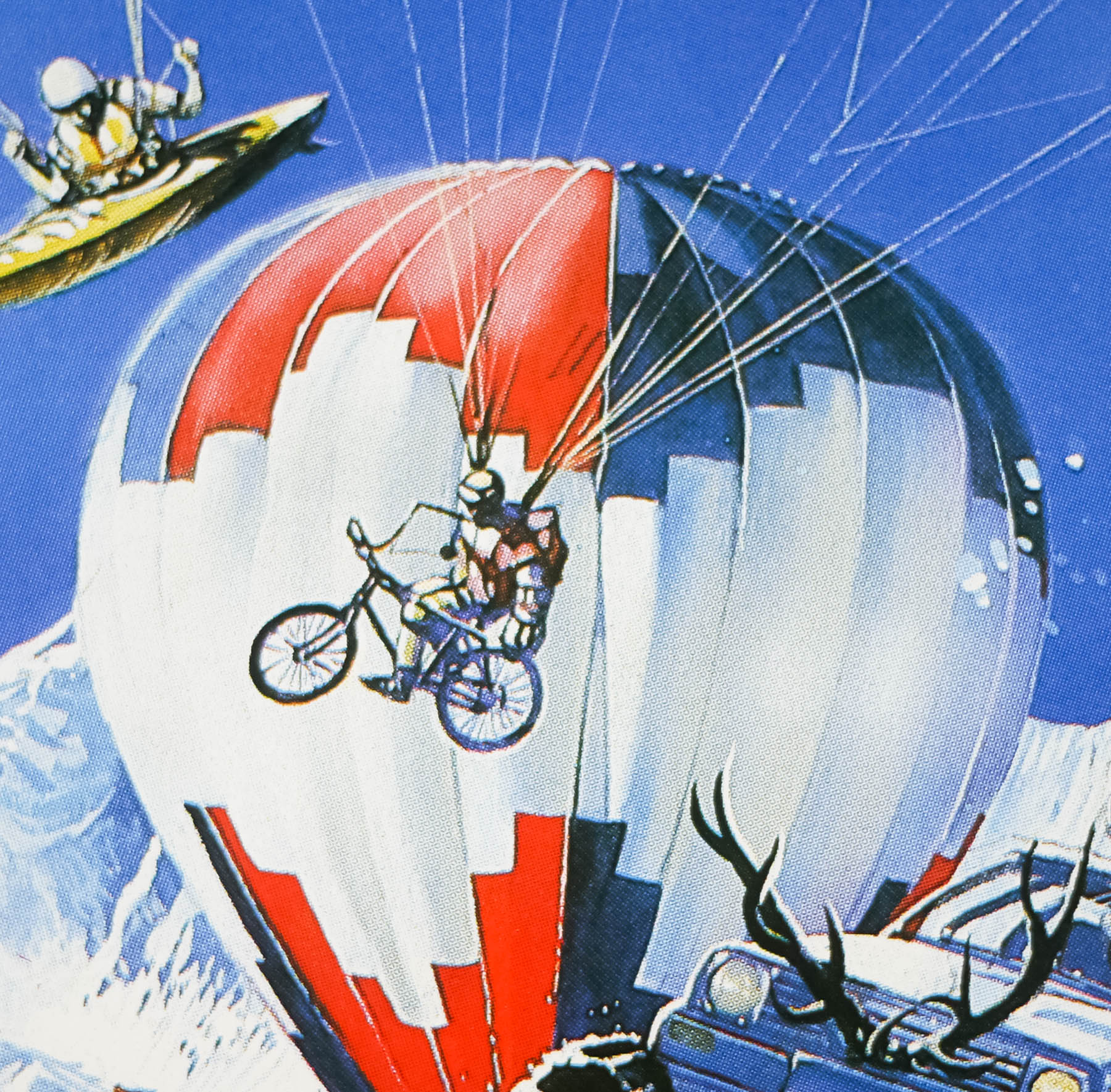
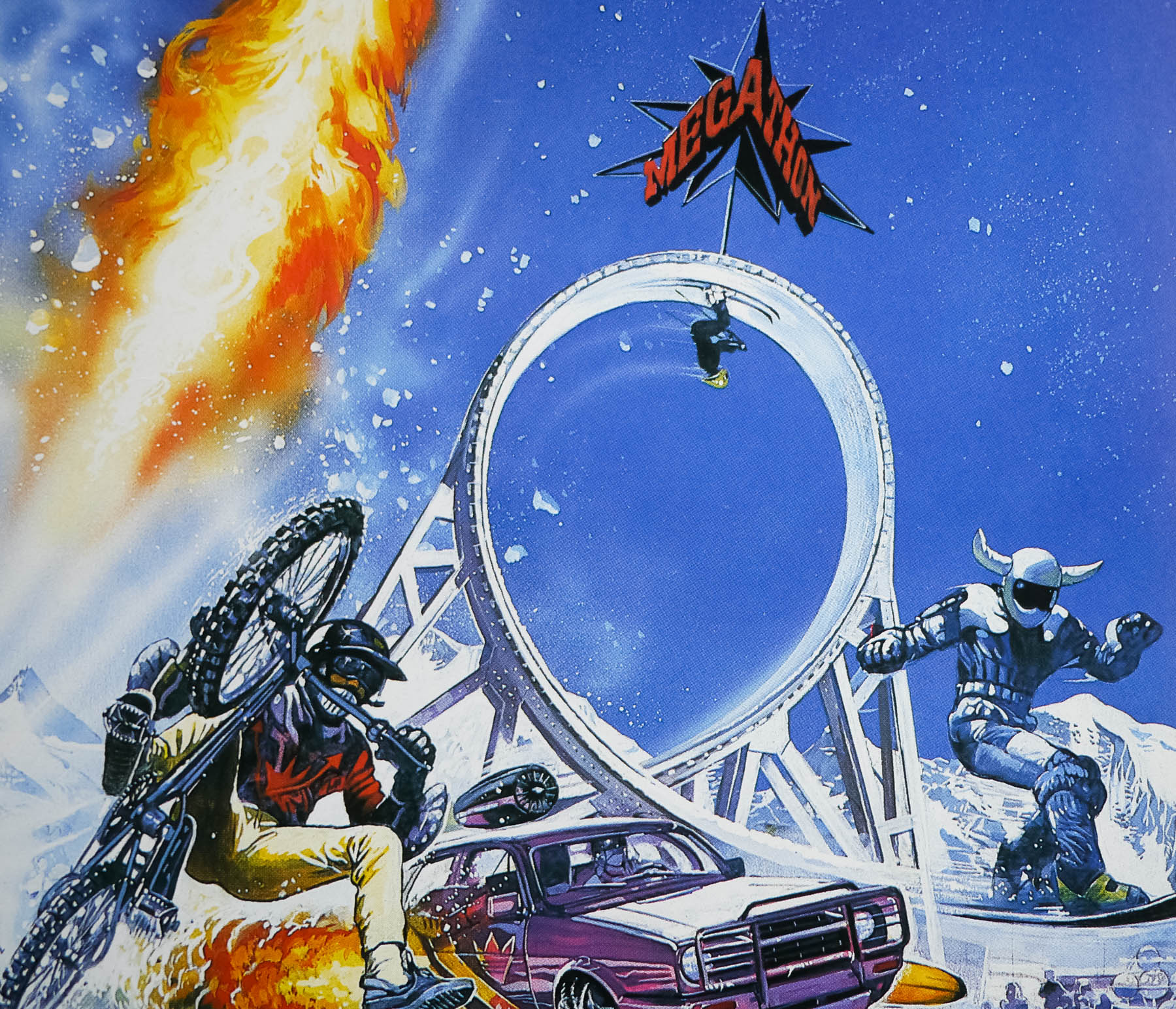
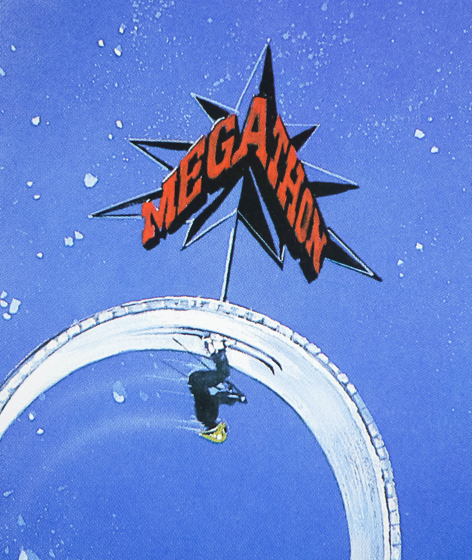
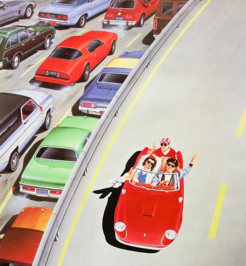
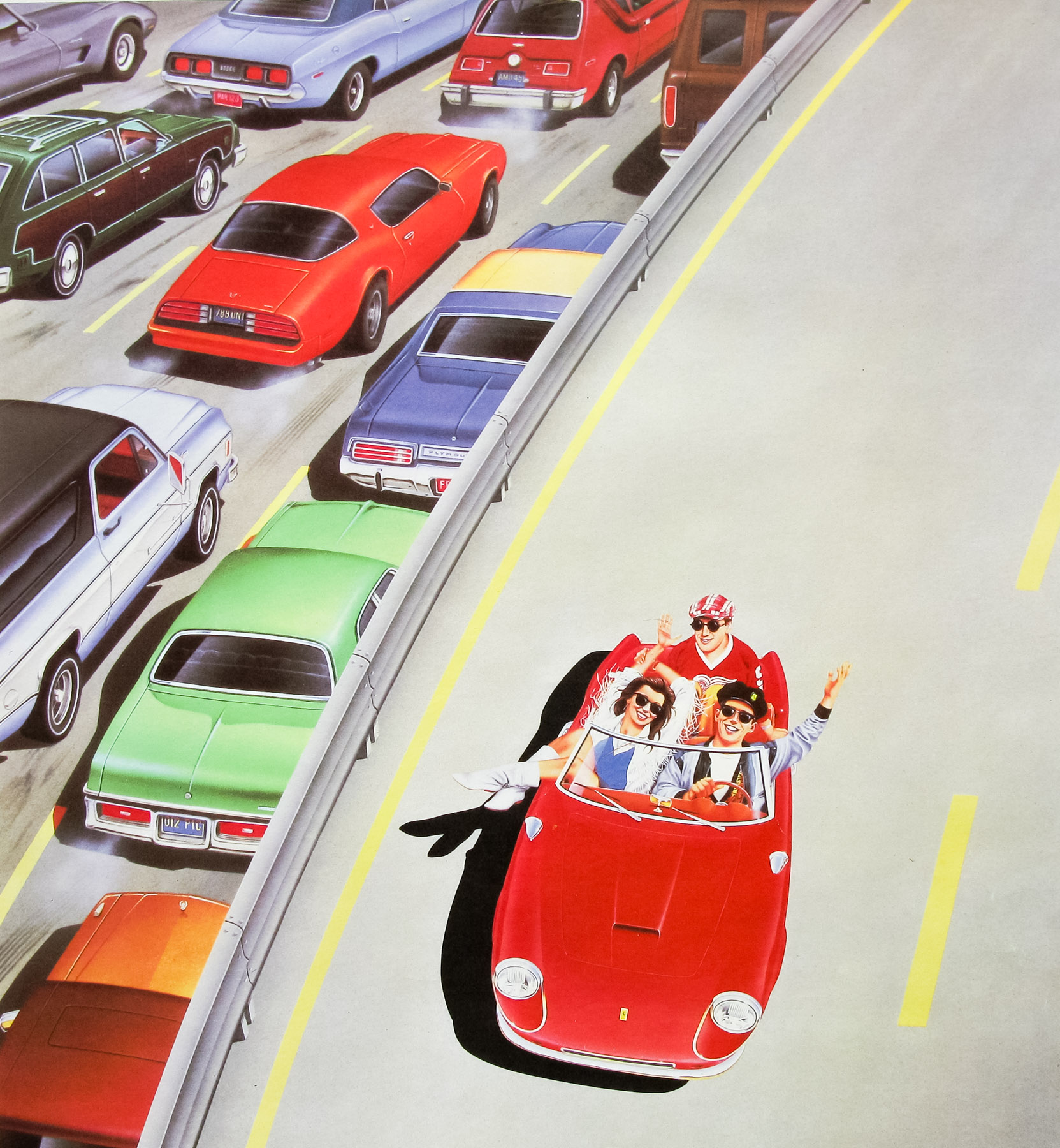
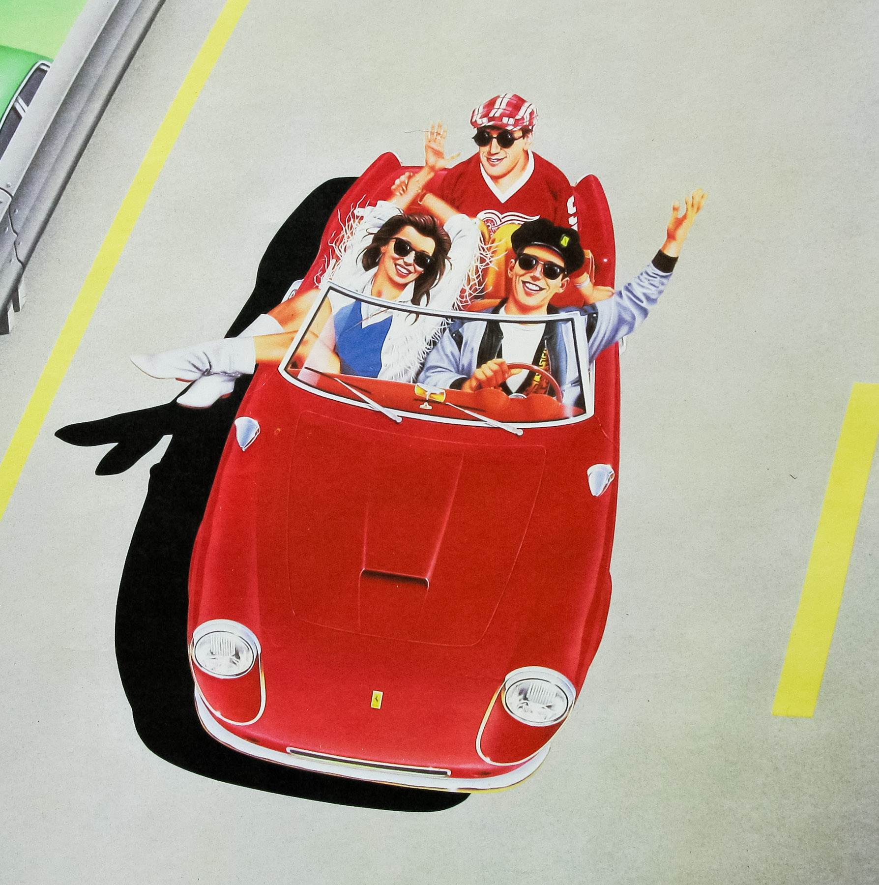
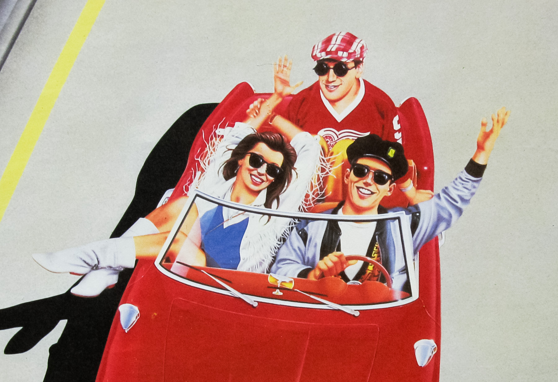
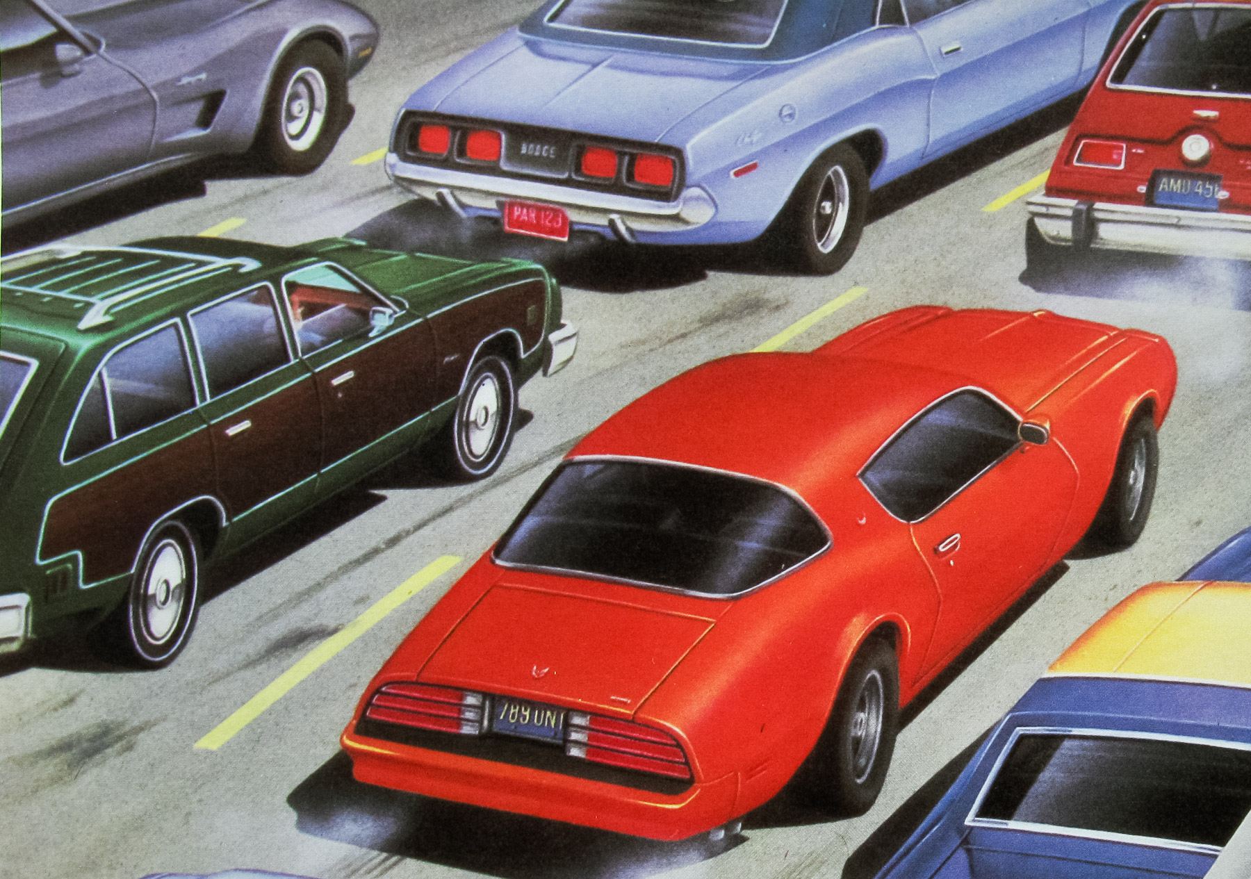
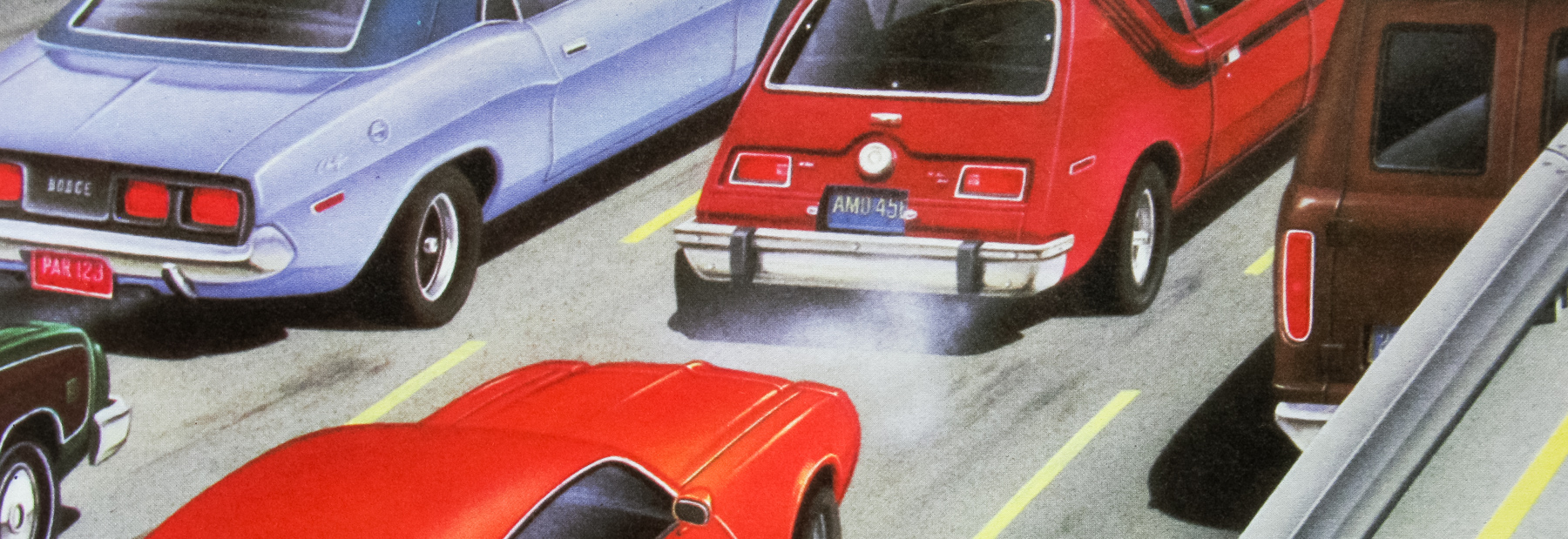
John Hughes‘ teen classic was given a pretty dire US poster (unless you’re a fan of Matthew Broderick‘s head) but the international design, as seen here, is much more interesting. As well as this quad, the artwork was used for an English one sheet, plus posters for several other countries, including France, Germany and Italy.
For many years the artist responsible was a mystery. Several misattributions have been spotted over the years, with various names suggested, so I was absolutely thrilled when an artist called Steve Kingston contacted me via this page’s comments section to inform me that he was responsible and that he had recently rediscovered the original artwork in his archive. I emailed Steve and he explained how he had come to be involved with creating the artwork:
‘My career started on the route that many commercial illustrators followed, ie books and magazines. For almost a decade I worked for a well known men’s magazine called Mayfair, where I illustrated the misadventures of a character called Carrie. I’ve worked closely with former Rolling Stone Bill Wyman on a number of projects, and the commissions for the Ferris artwork came via an agency that Wyman used regularly.’
Steve was born in 1951 in the Clapham area of London and is a self-taught artist with ‘not a qualification in sight’. Like many other commercial artists of his generation he decided to get straight out into the workplace, rather than attend college or a university course (or what would have likely been called a polytechnic). Steve explains that he was ‘lucky enough to form a career out of my passion for art and illustration’.
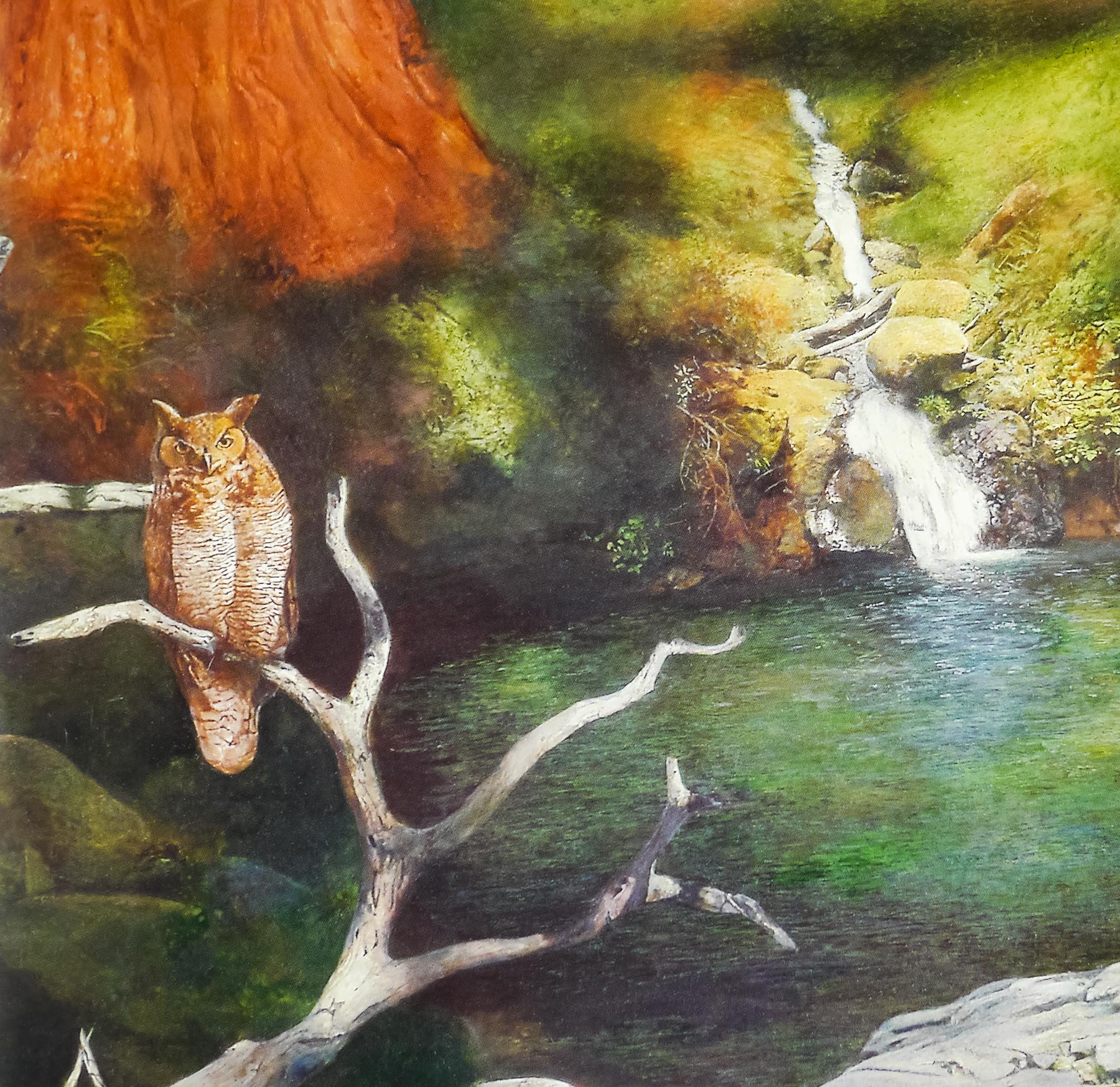
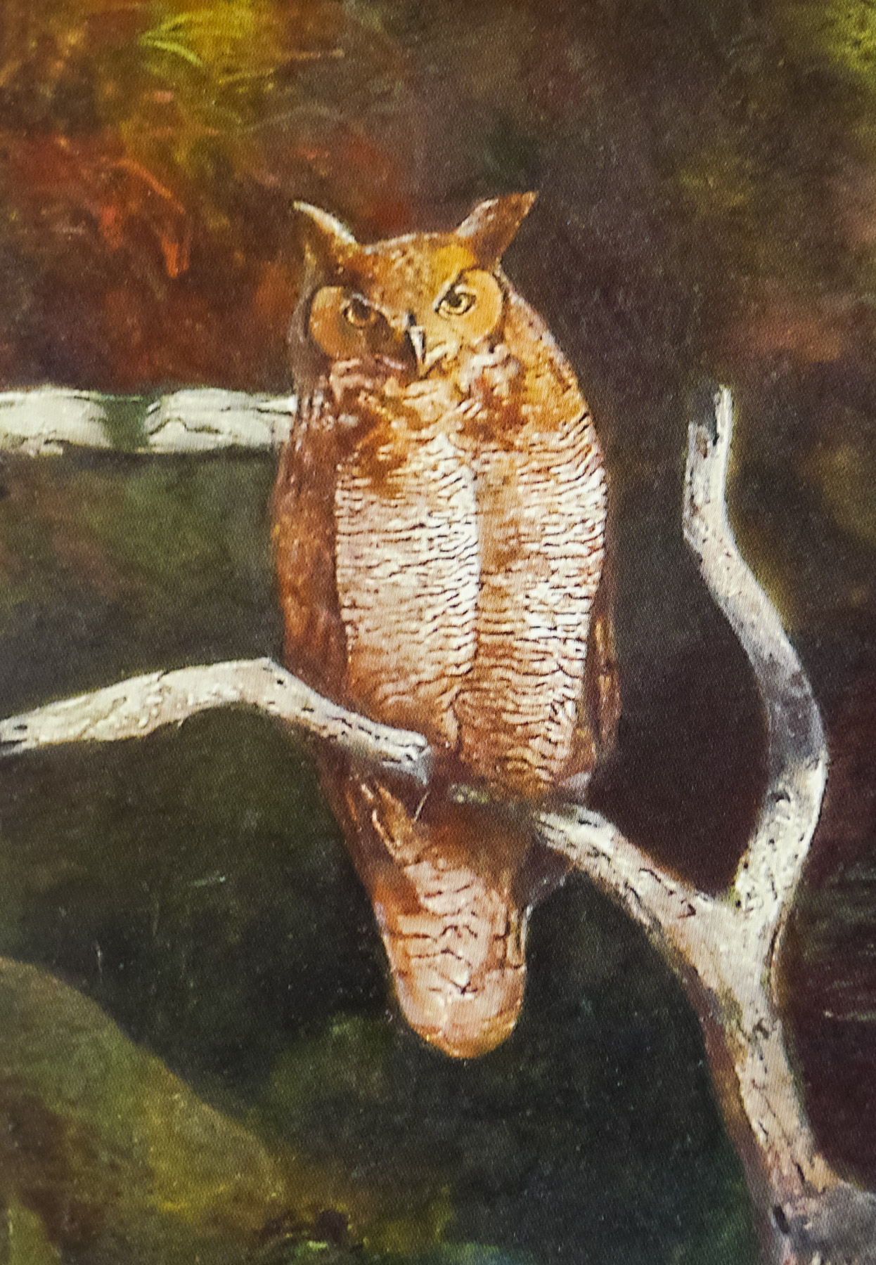
Steve was commissioned to produce all the artwork for the UK Tower Records poster campaign when the American chain launched a number of ill-fated shops over in the UK. In 1985 he was asked to work on the international artwork for the Ron Howard film ‘Gung Ho’. Around this time he turned his attention towards painting fine art, specifically around the subject of wildlife. The resultant paintings sold well at major London auction houses. Steve no longer works as an artist and explained that ‘in 2009 I was diagnosed as having Parkinson’s and this degenerative condition, of which there is no cure, has gradually taken away my ability to paint and effectively ended a career I loved so much.’
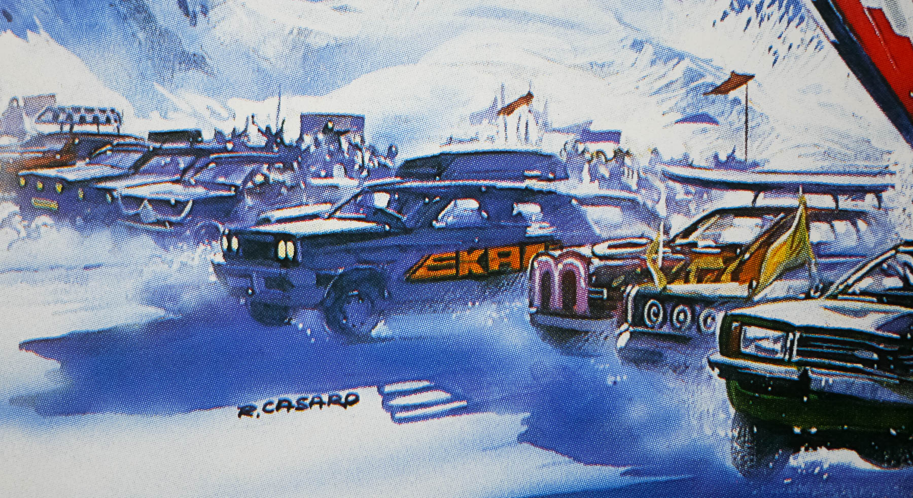
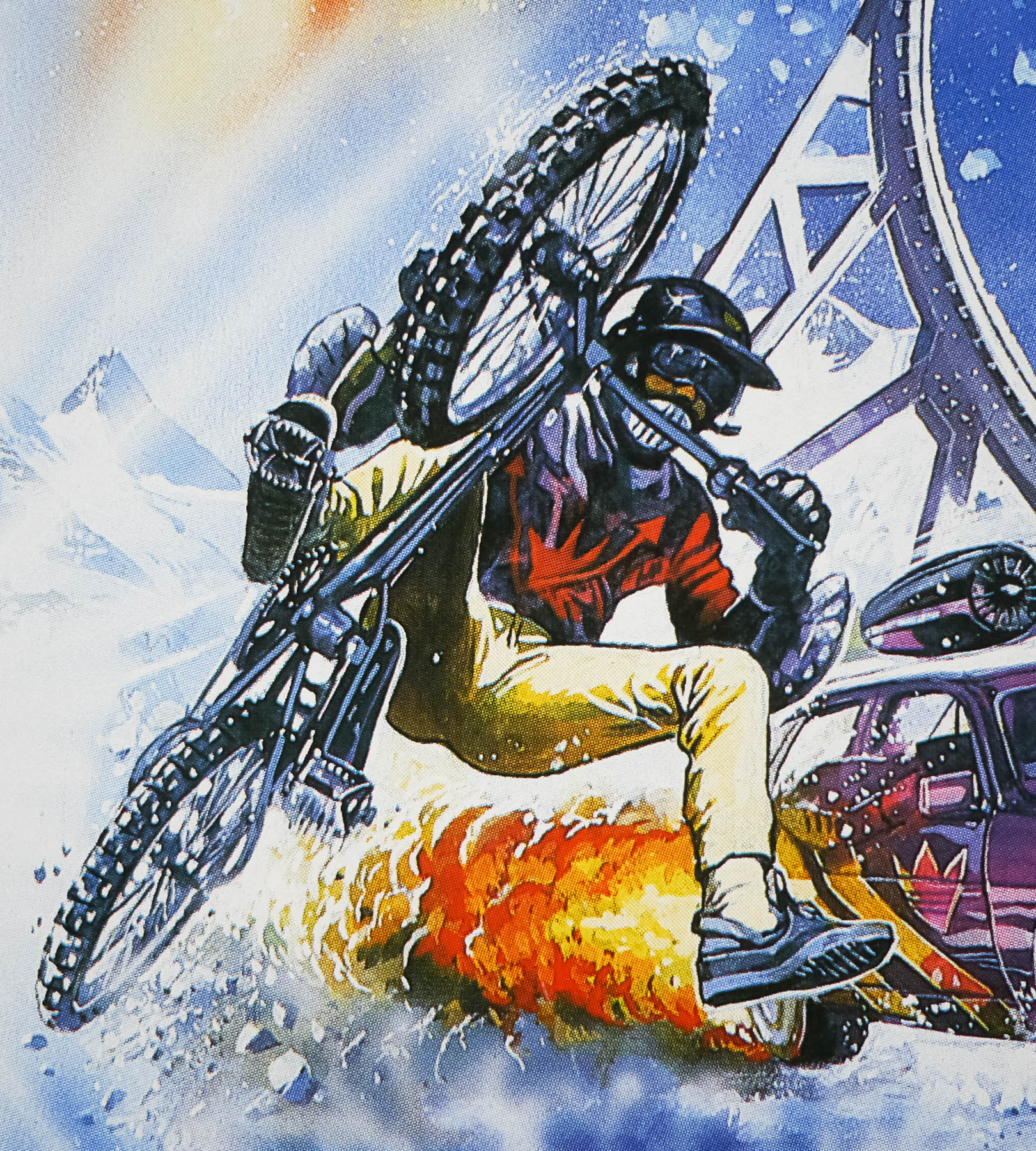
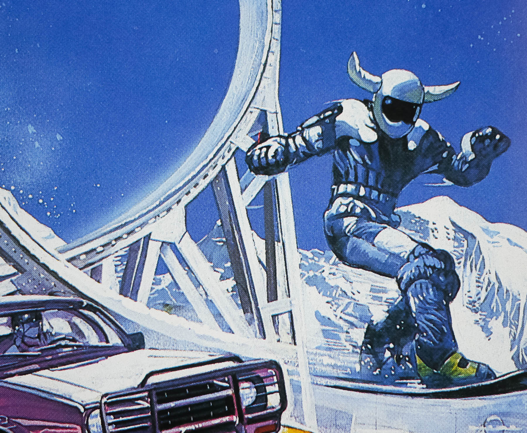
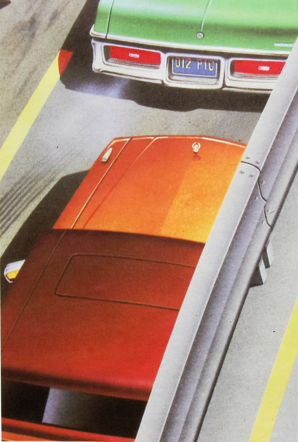
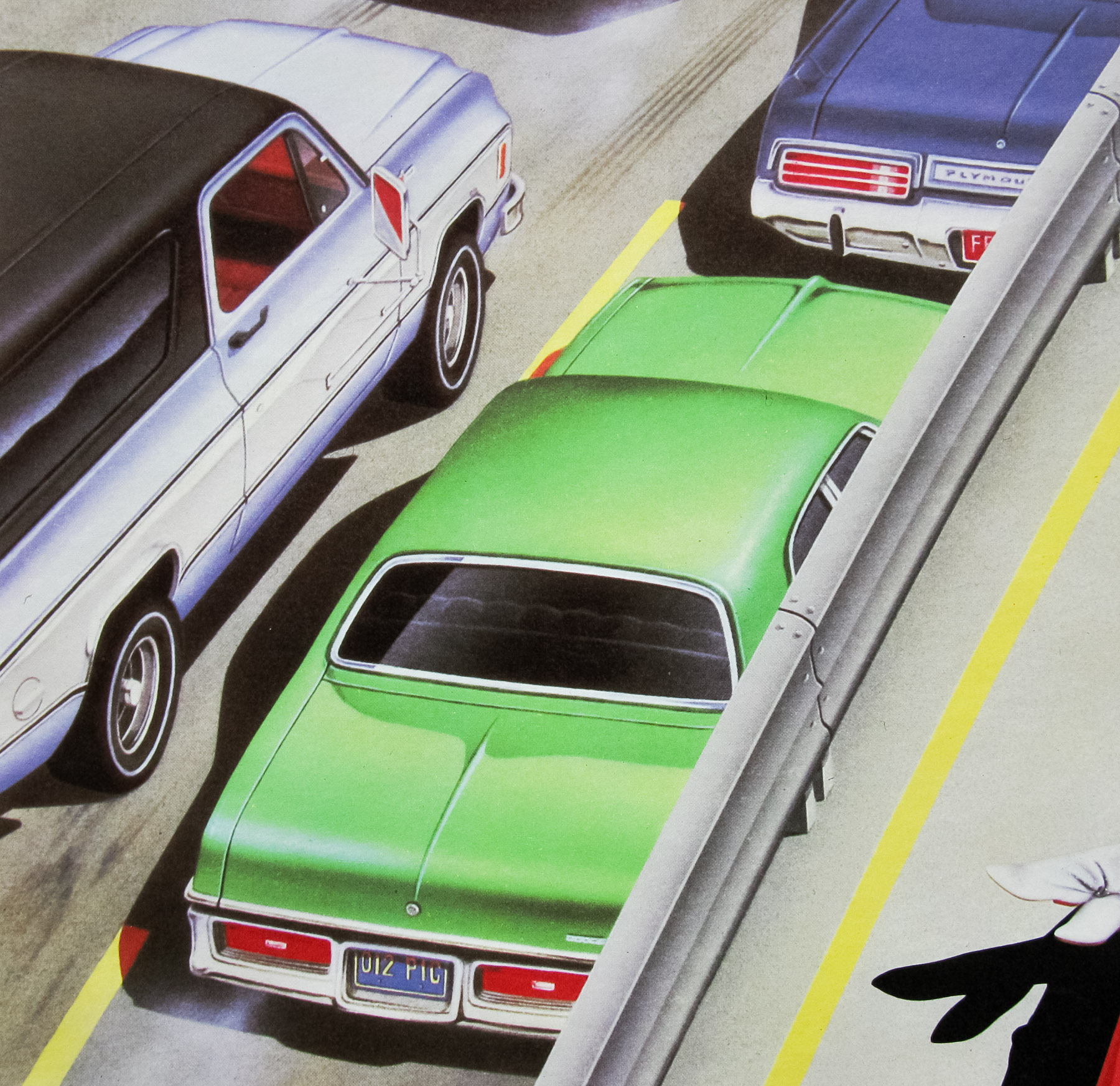
This poster is in demand from automotive memorabilia collectors due to the famous Ferrari and other real-life car models that are featured.
Here’s the original trailer.