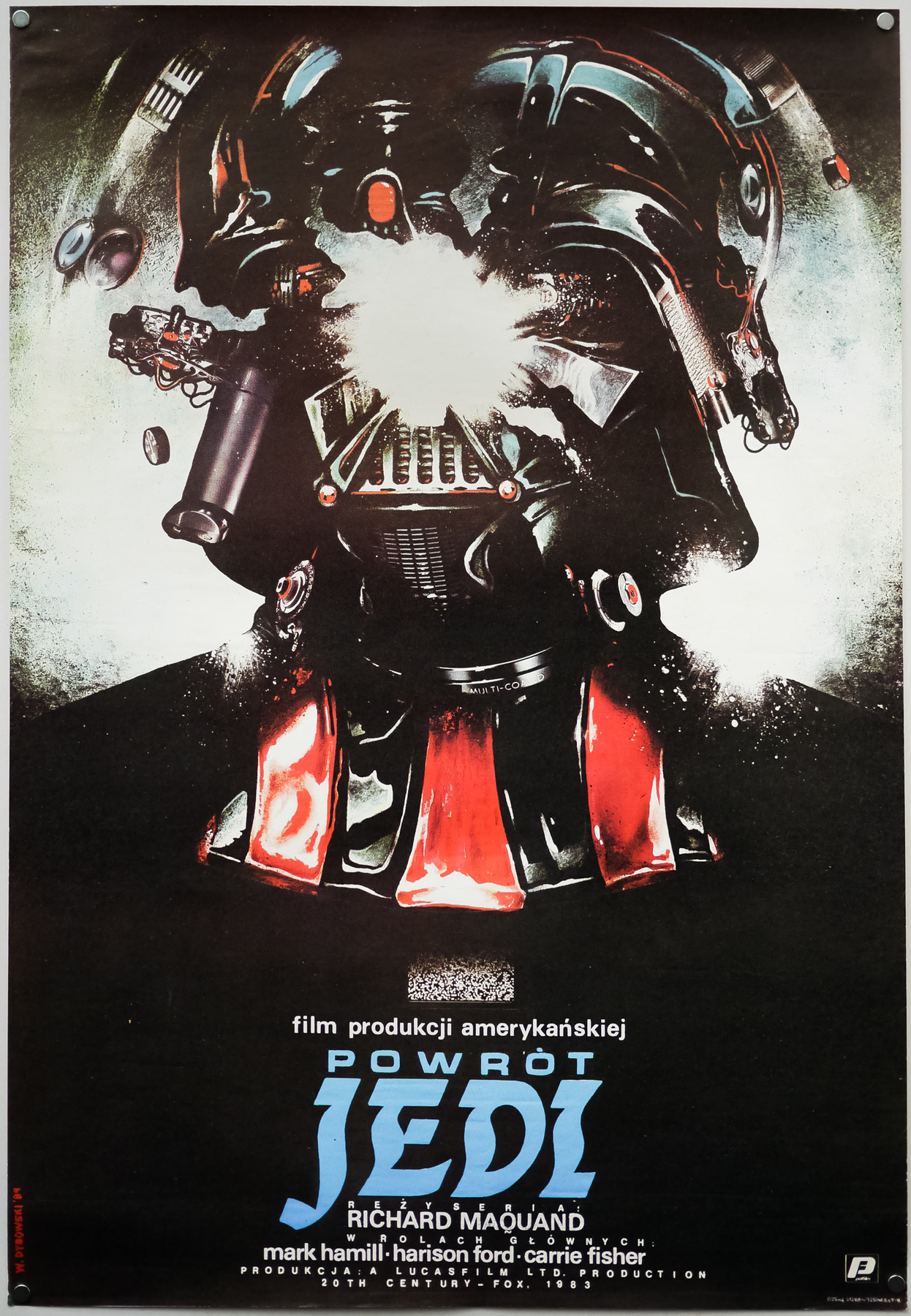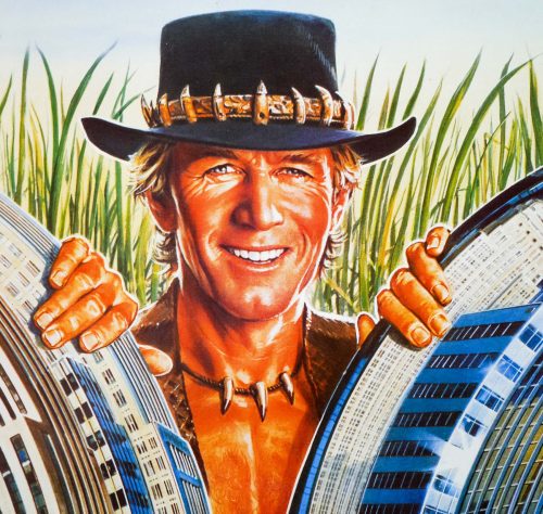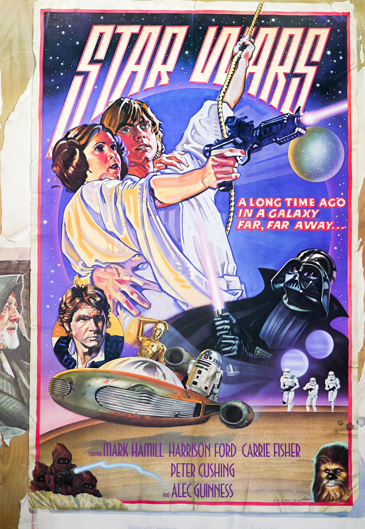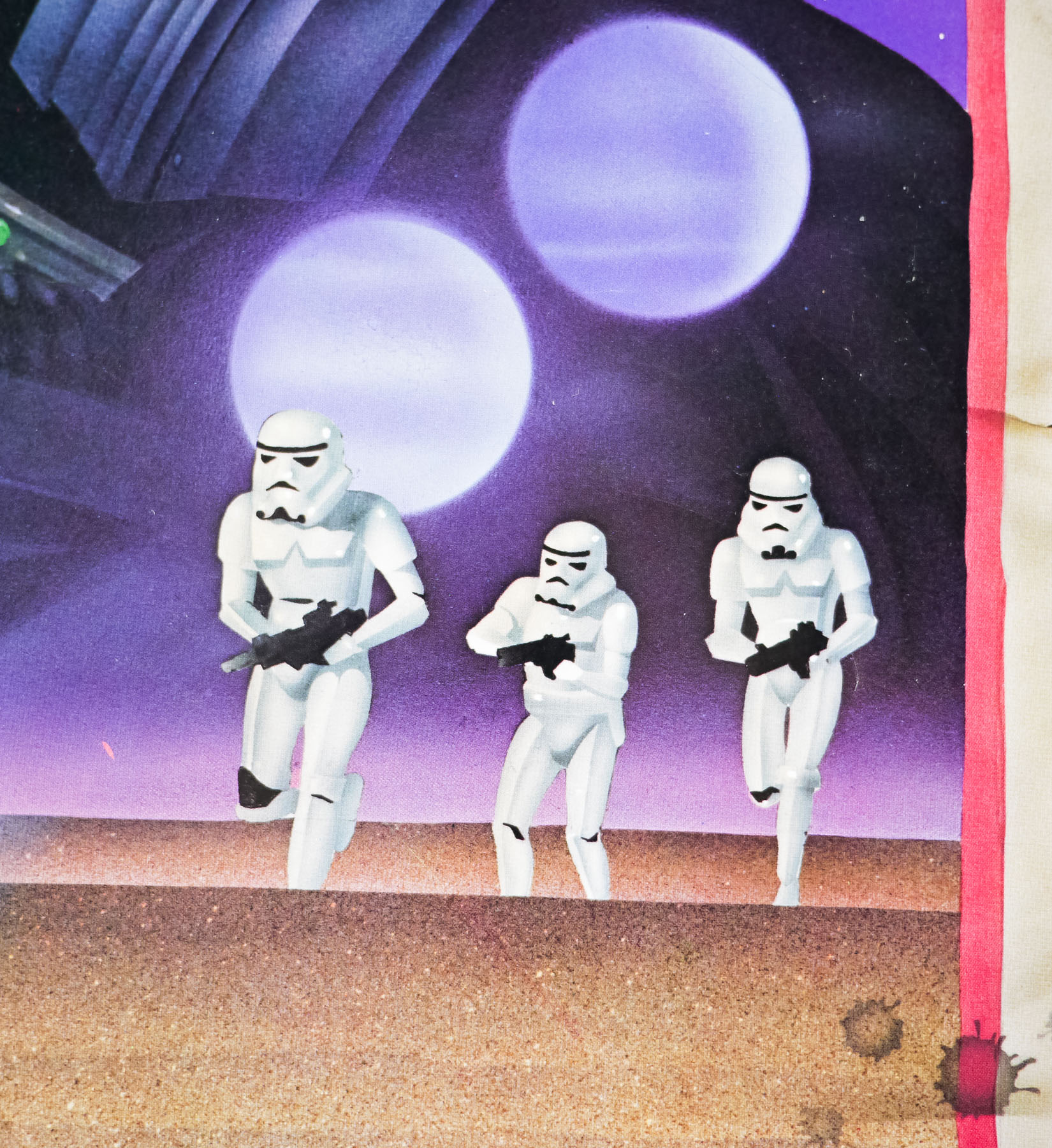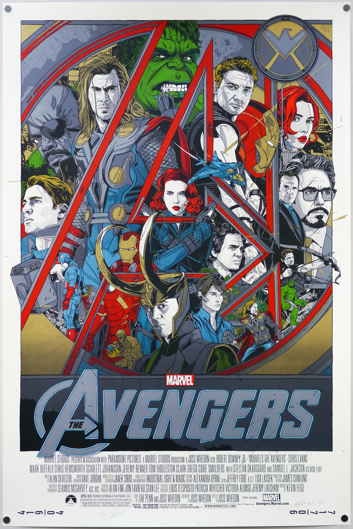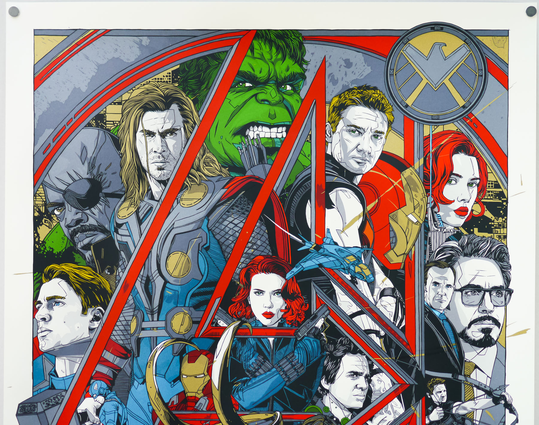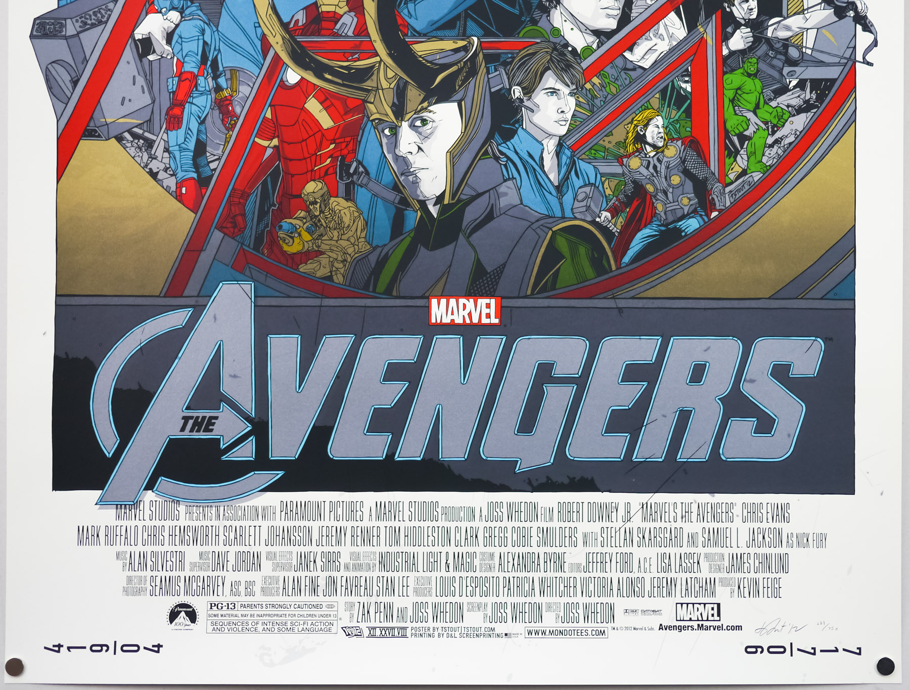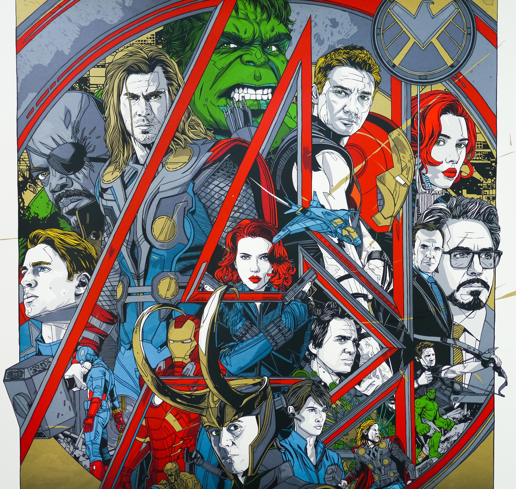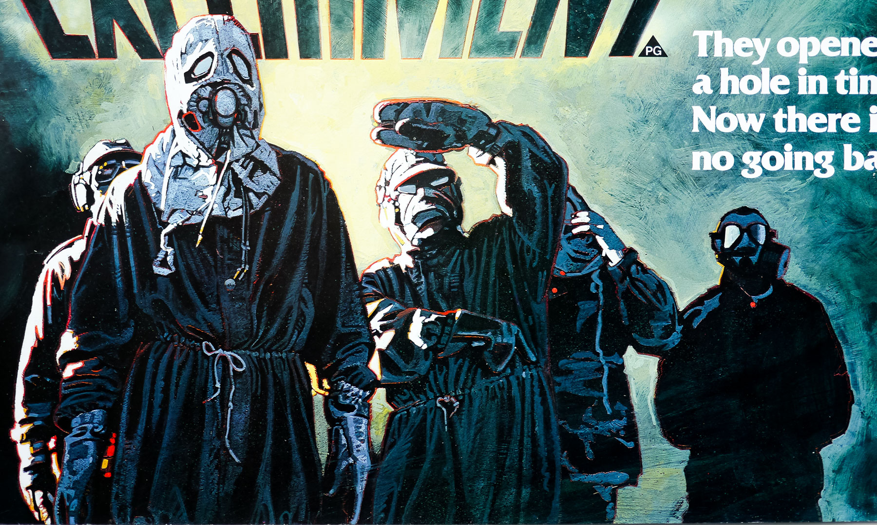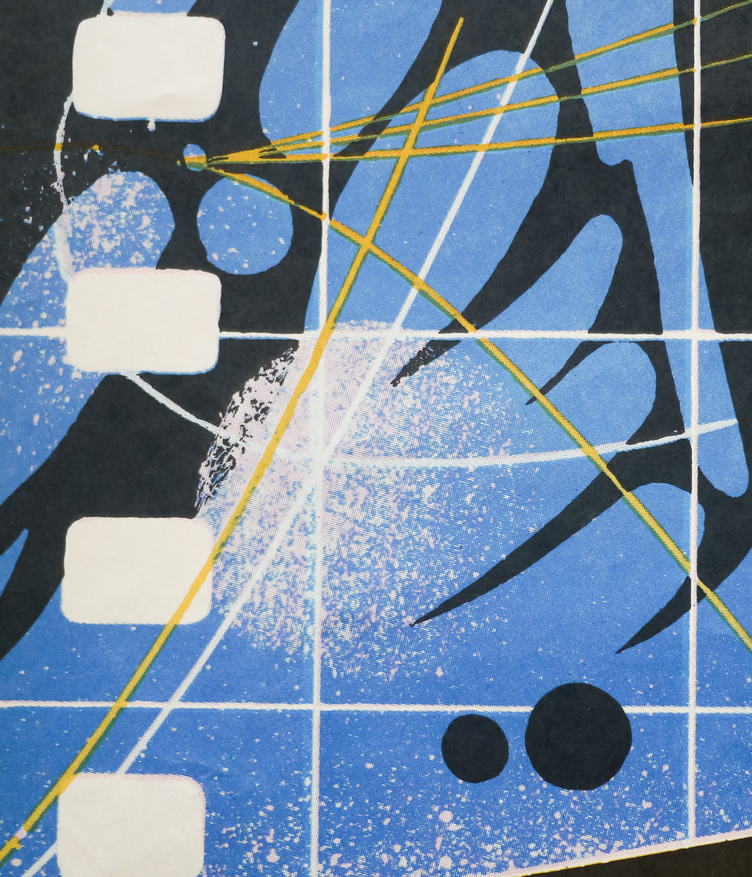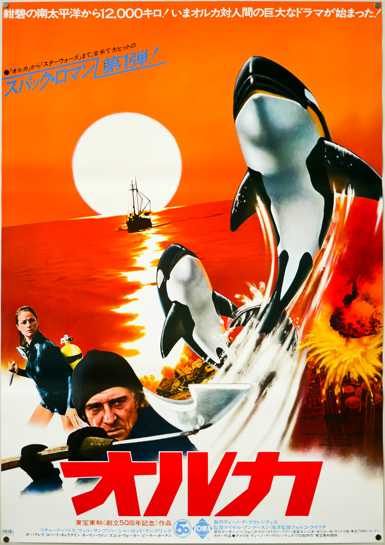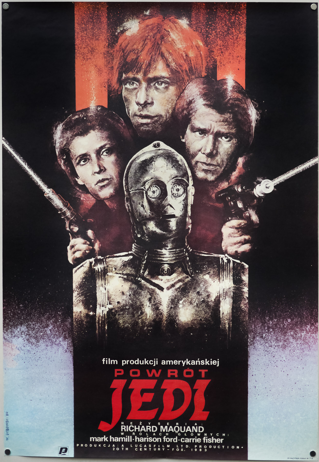
Poster detail
1-5
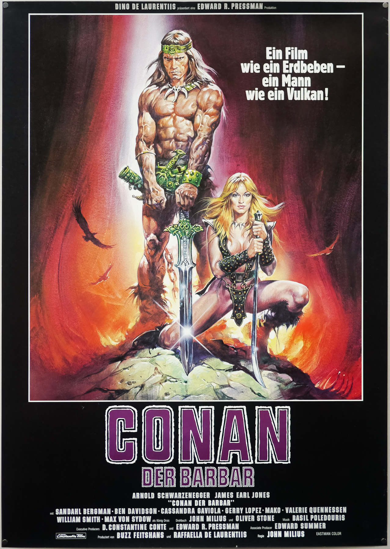
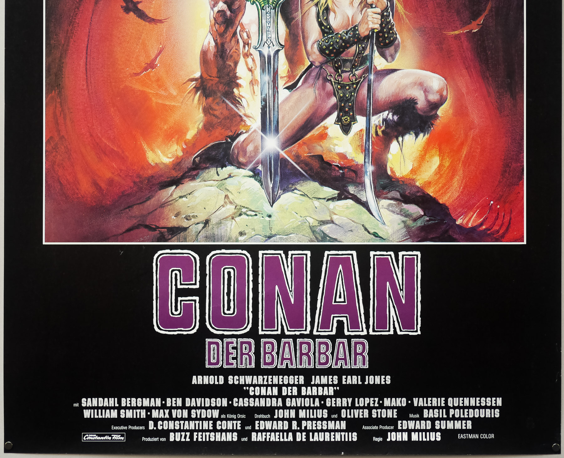

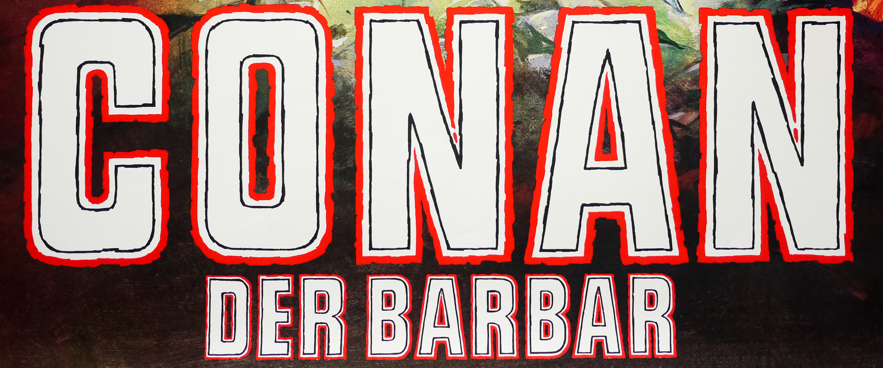
- Title
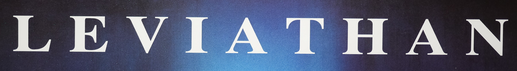
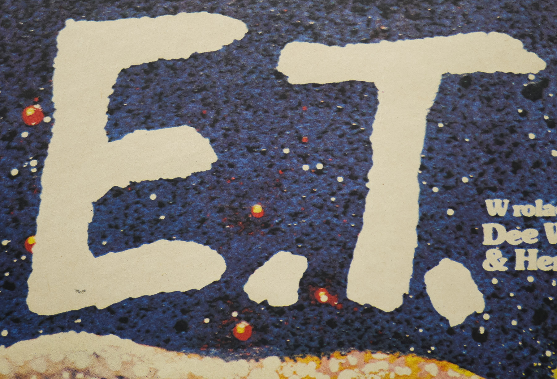
- Conan The Barbarian
- AKA
- --
- Year of Film
- 1982
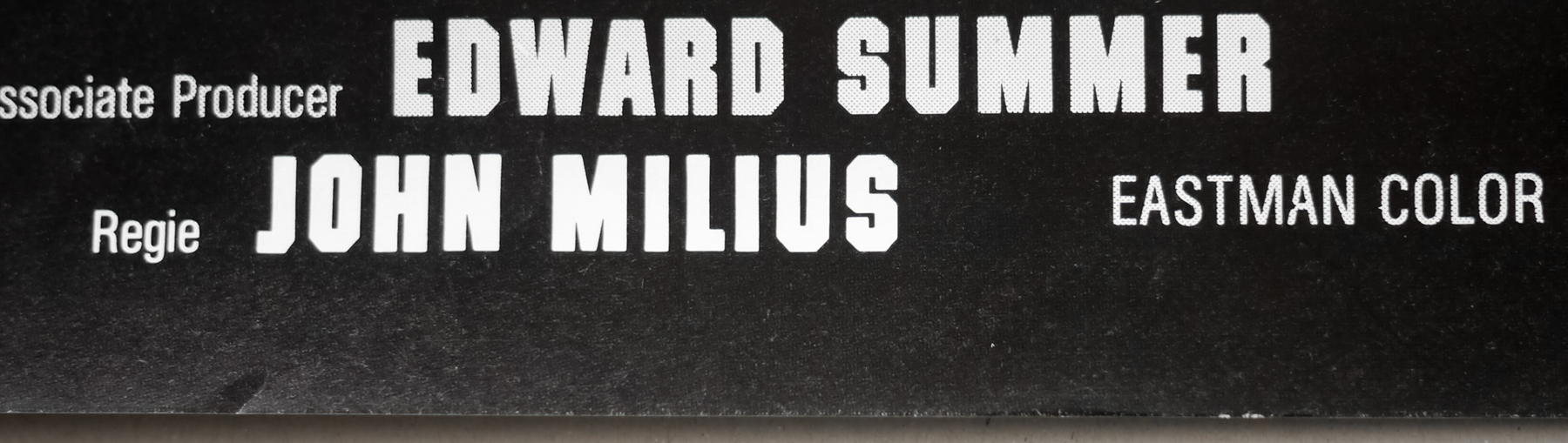
- Director
- John Milius
- Origin of Film
- USA
- Genre(s) of Film
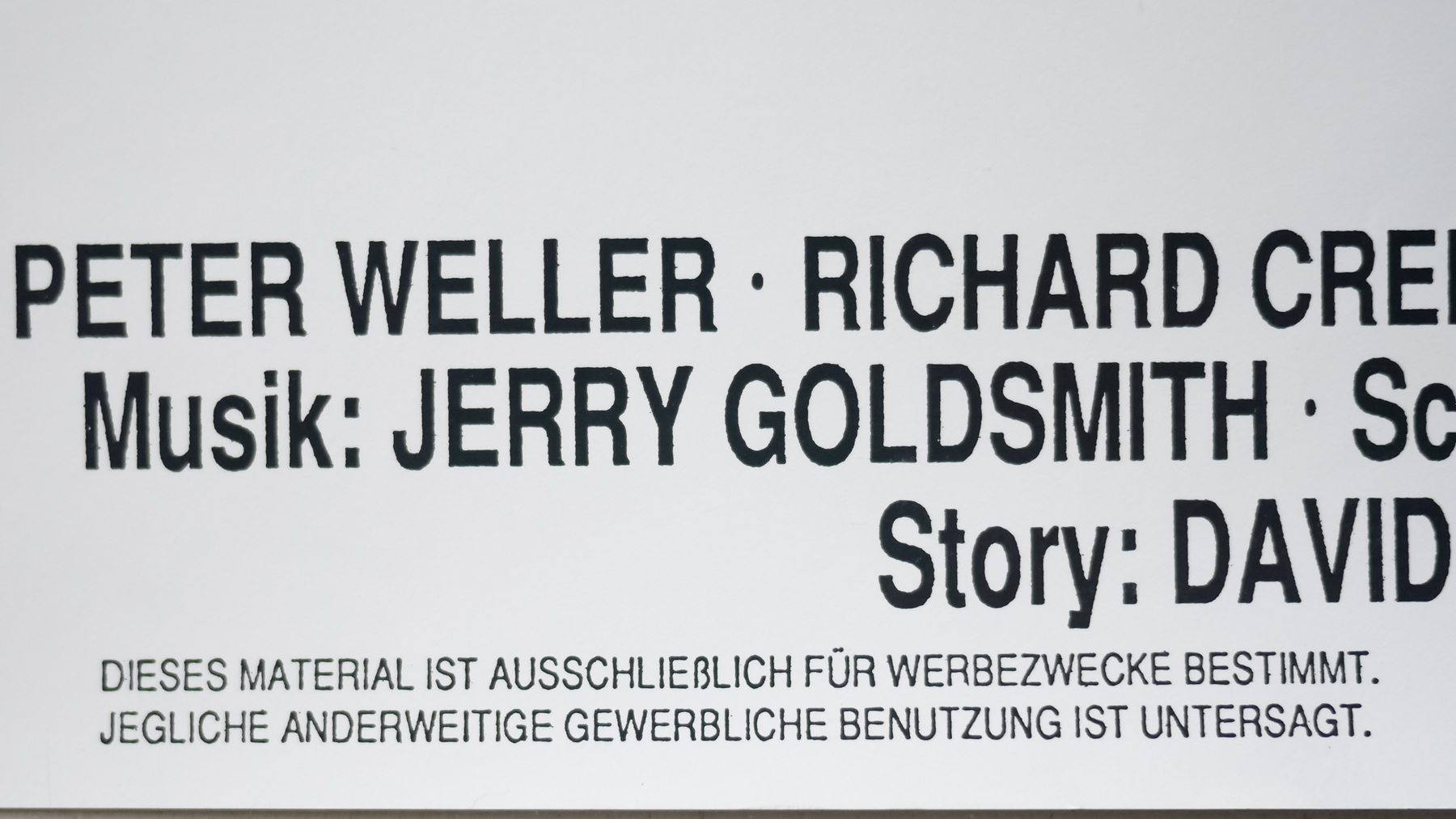
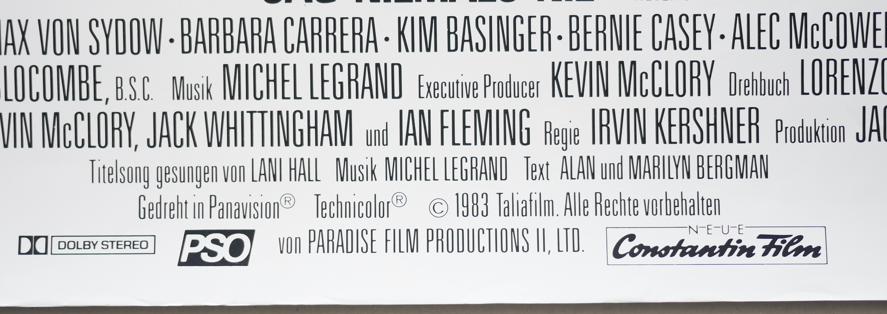
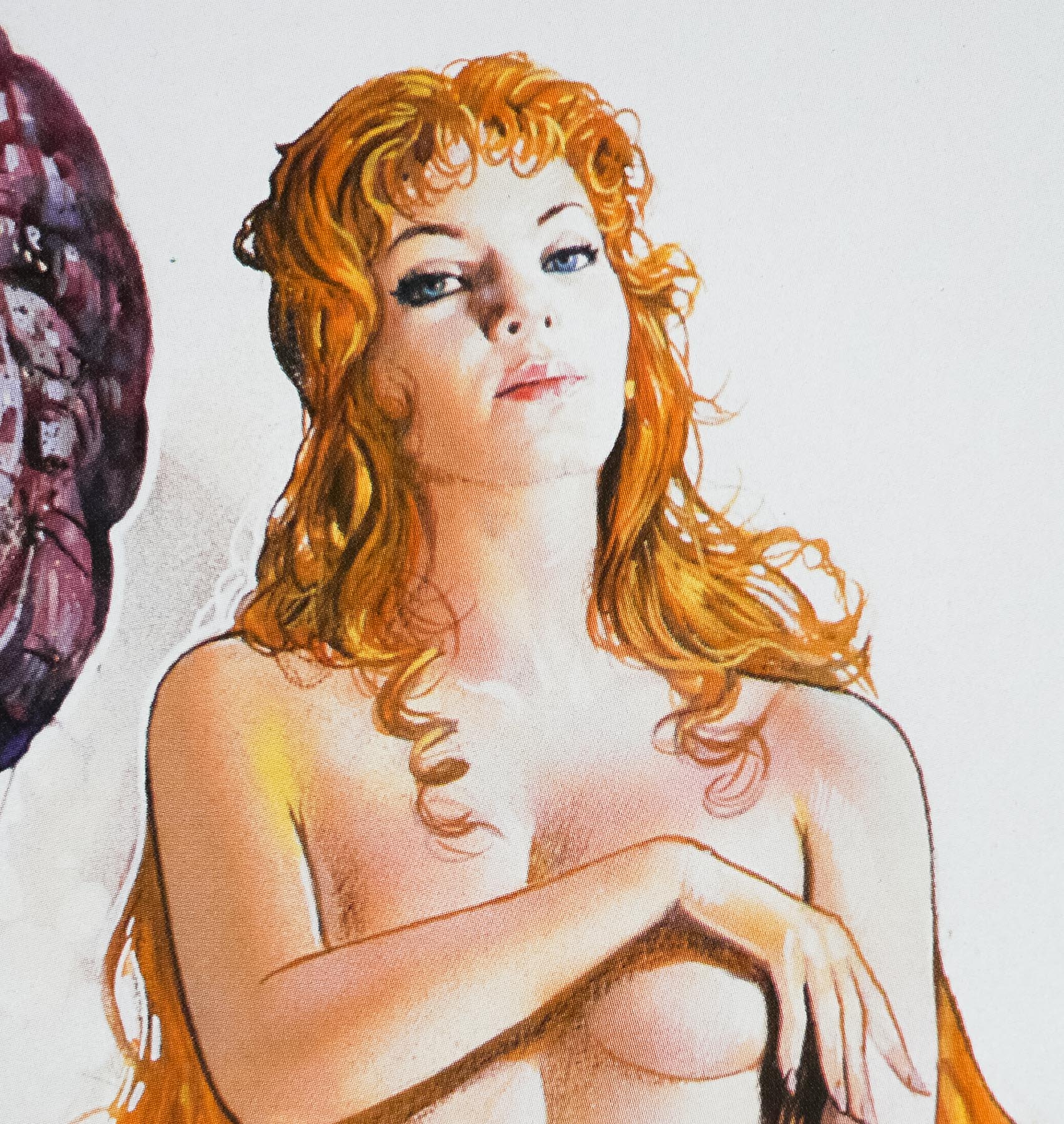
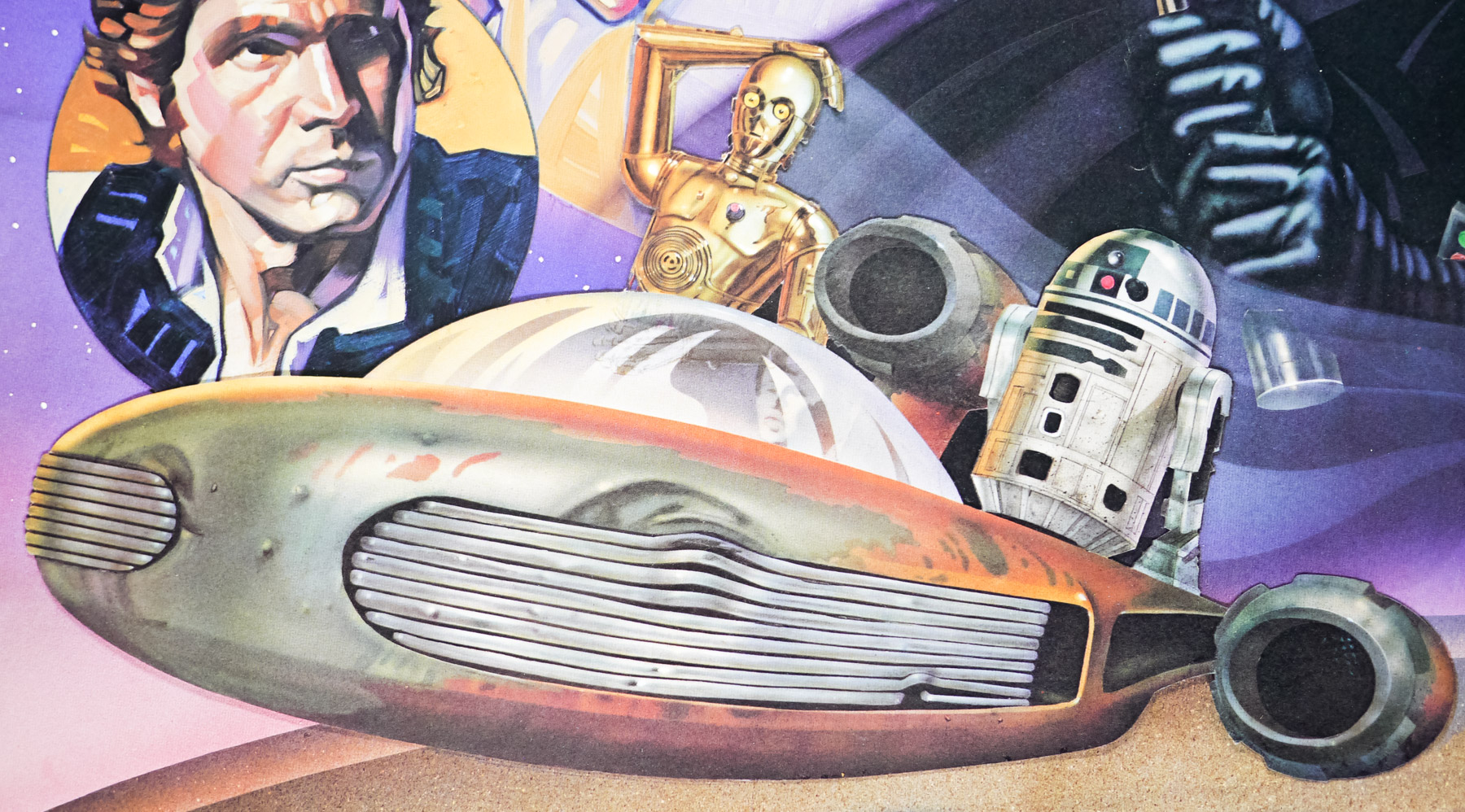
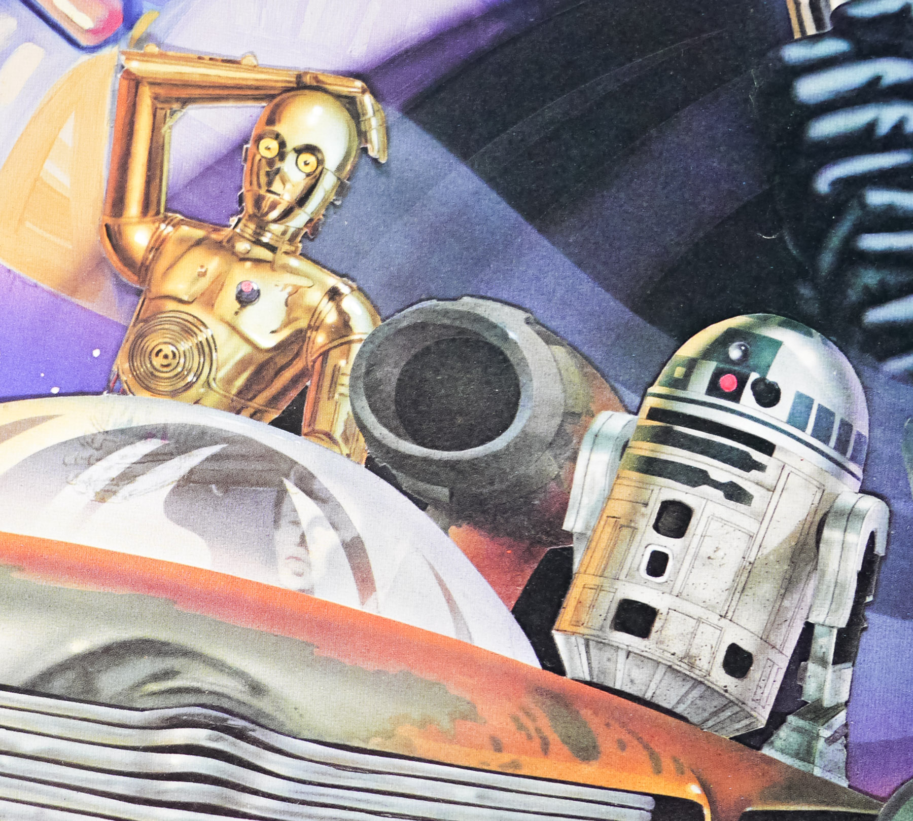
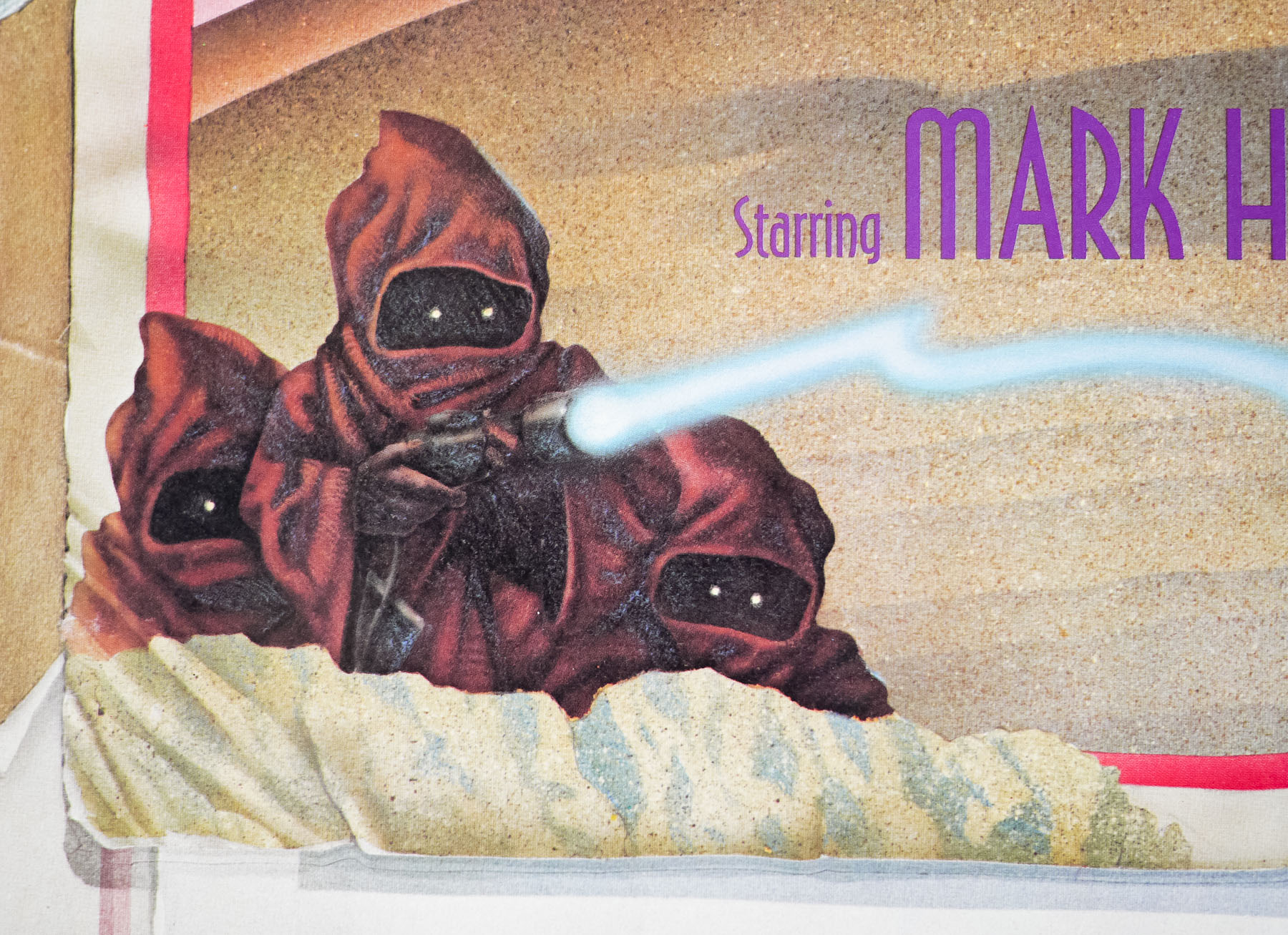
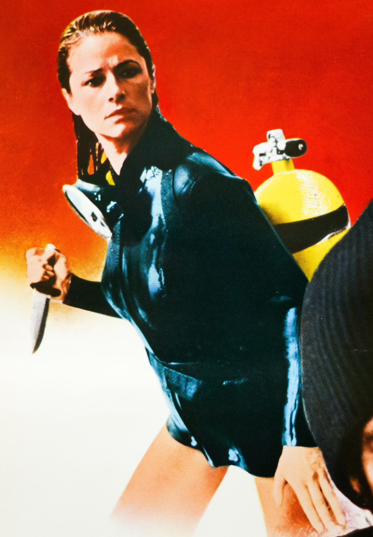
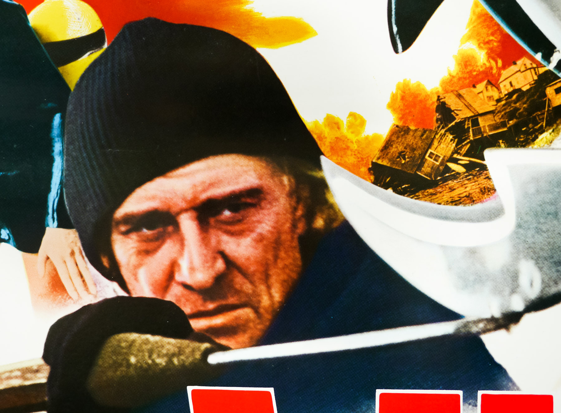
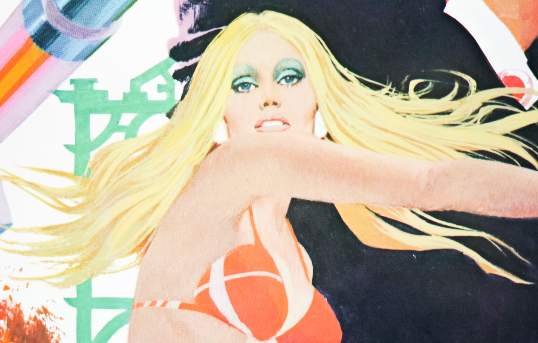
- Arnold Schwarzenegger, James Earl Jones, Sandahl Bergman, Mako, Gerry Lopez, Max von Sydow,
- Type of Poster
- A1
- Style of Poster
- Final
- Origin of Poster
- Germany
- Year of Poster
- 1982
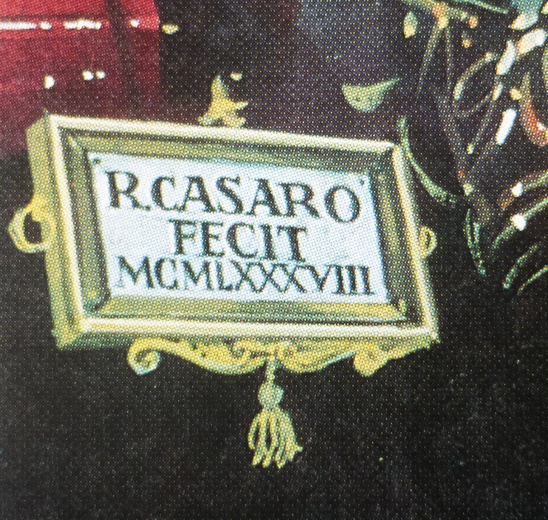
- Designer
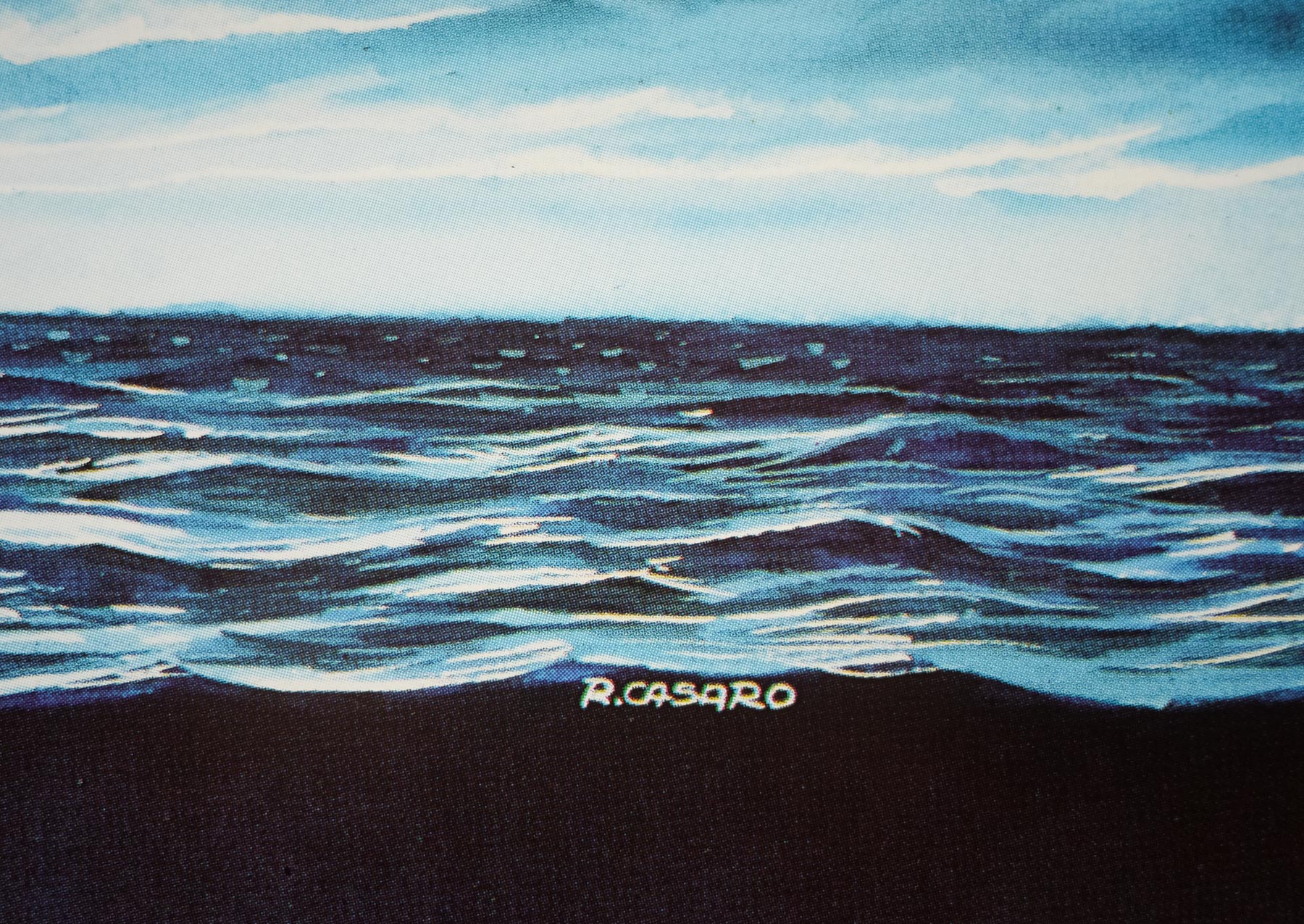
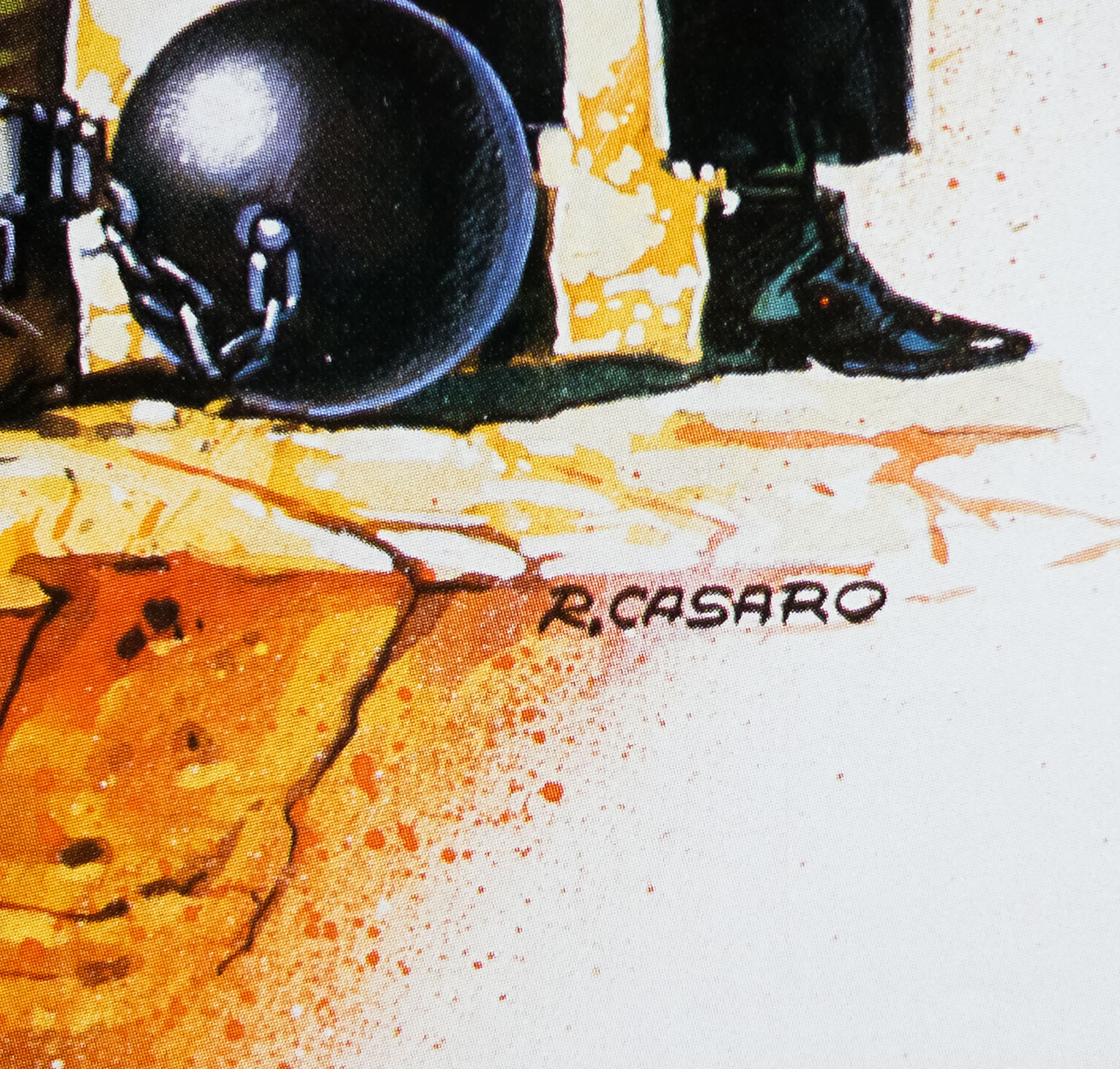
- Renato Casaro
- Artist
- Renato Casaro
- Size (inches)
- 23 6/16" x 33"
- SS or DS
- SS
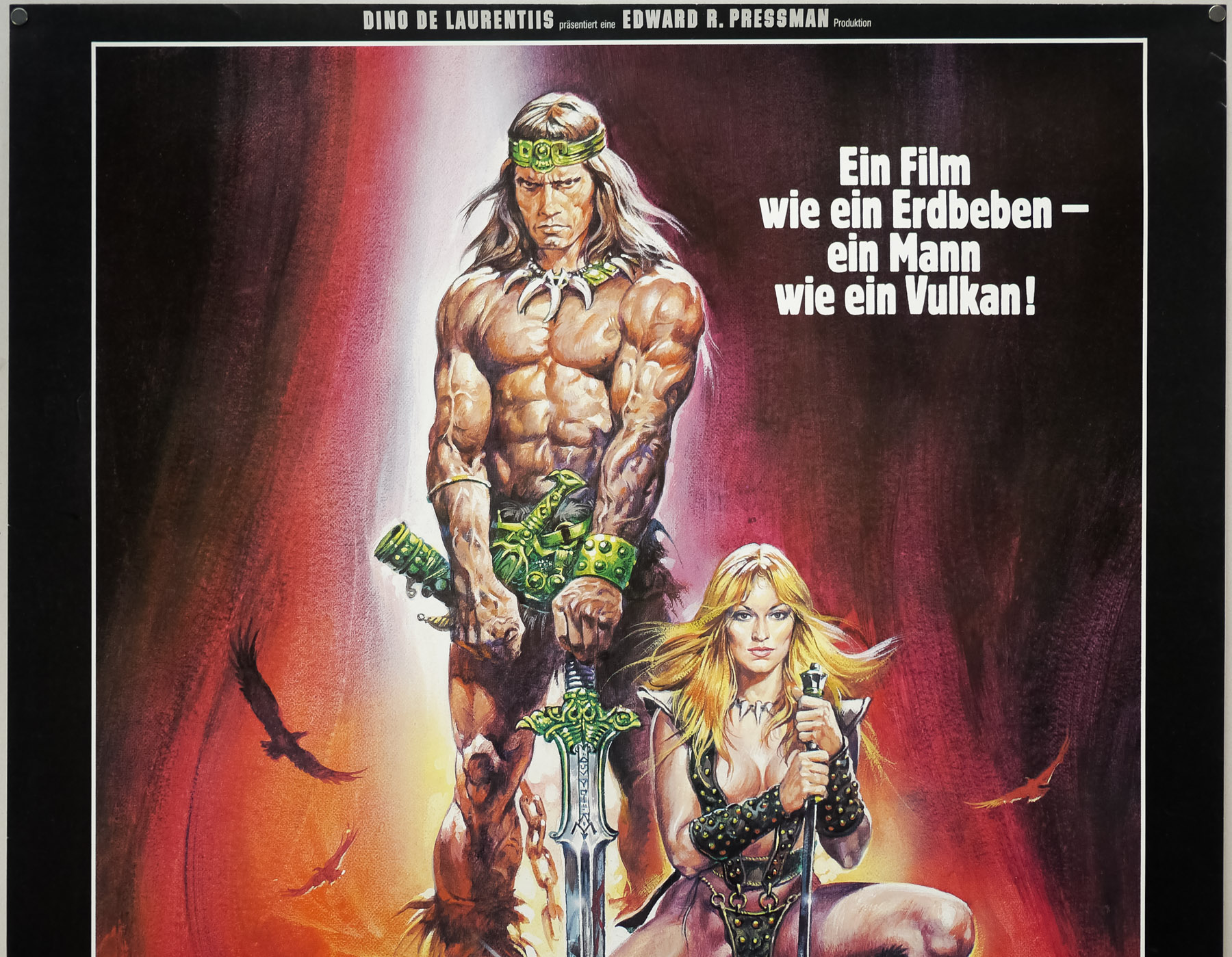
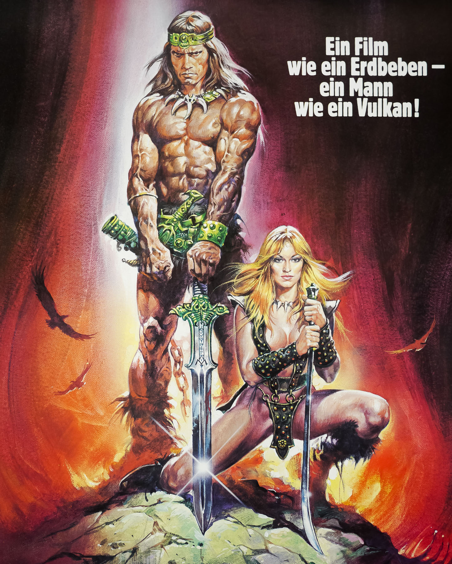
- Tagline
- Ein Film wie ein Erdbeben - ein Mann wie ein Vulkan!
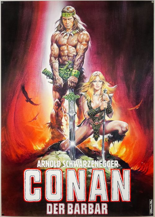
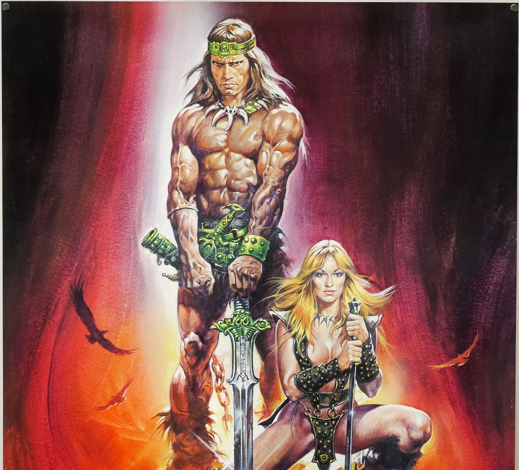
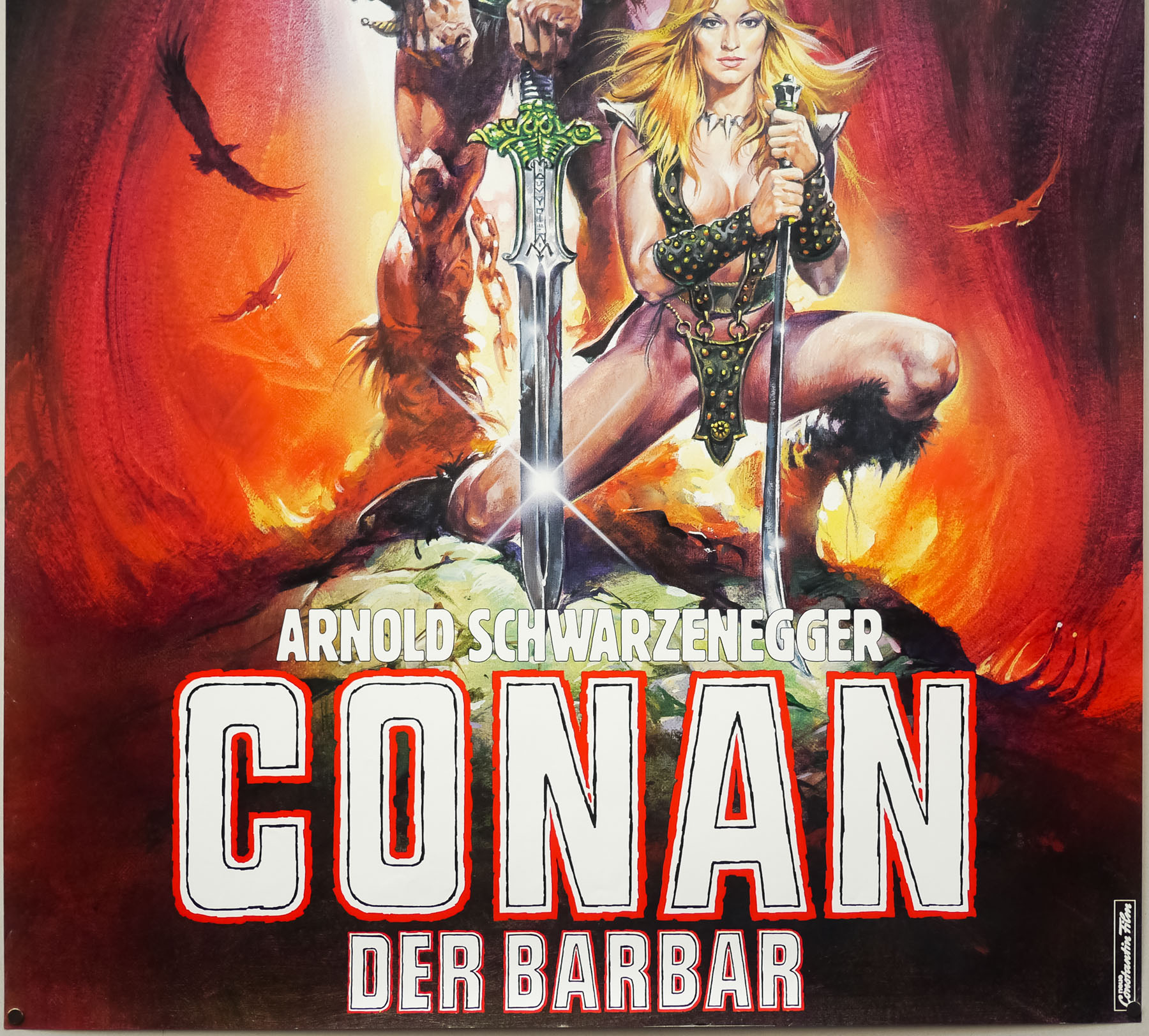
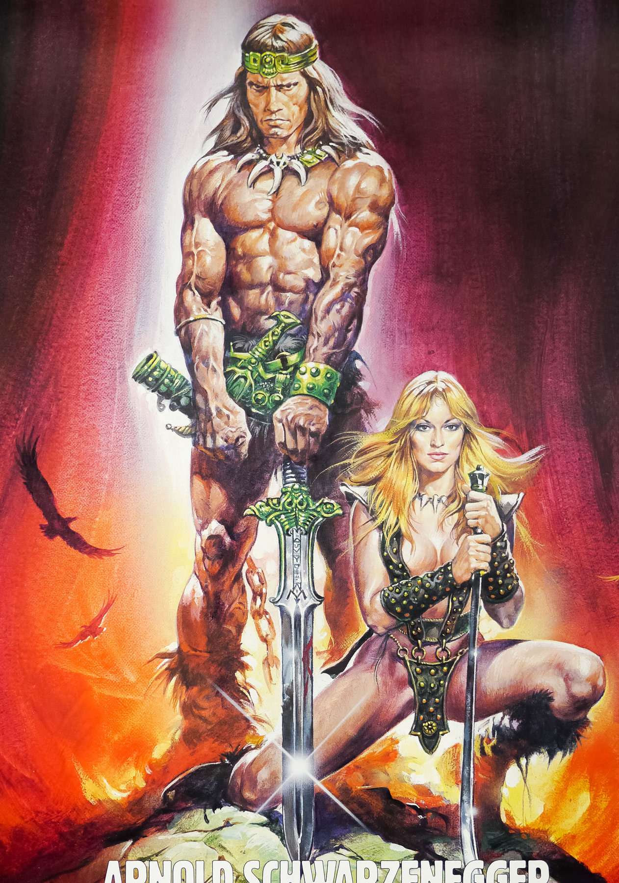
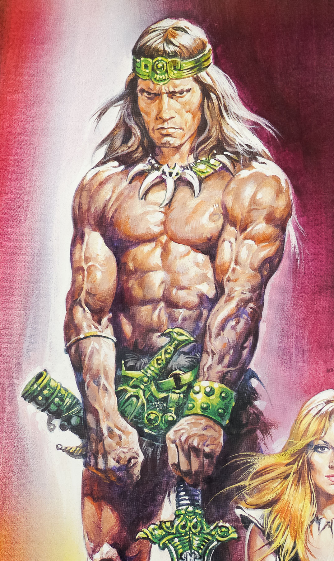
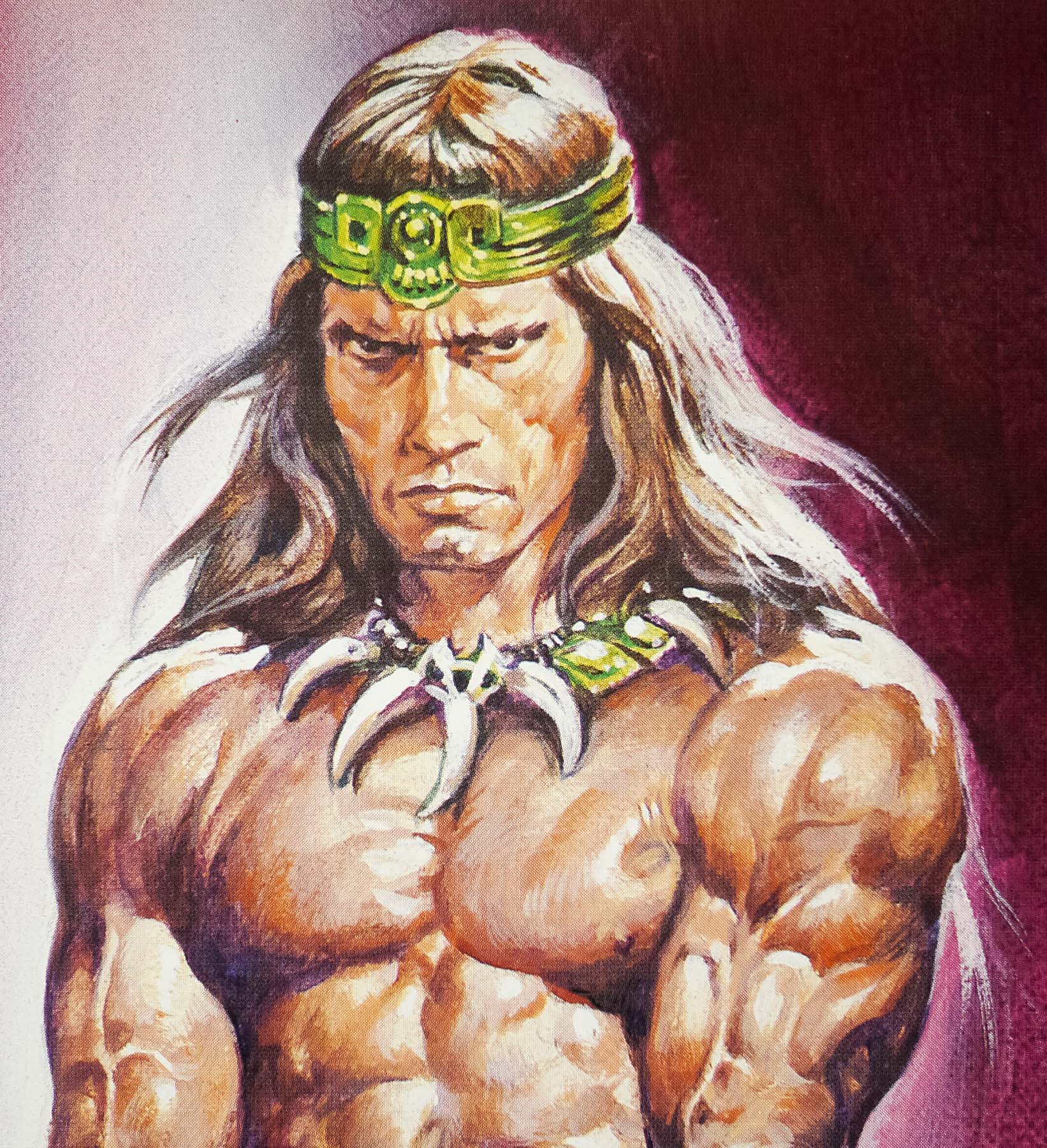
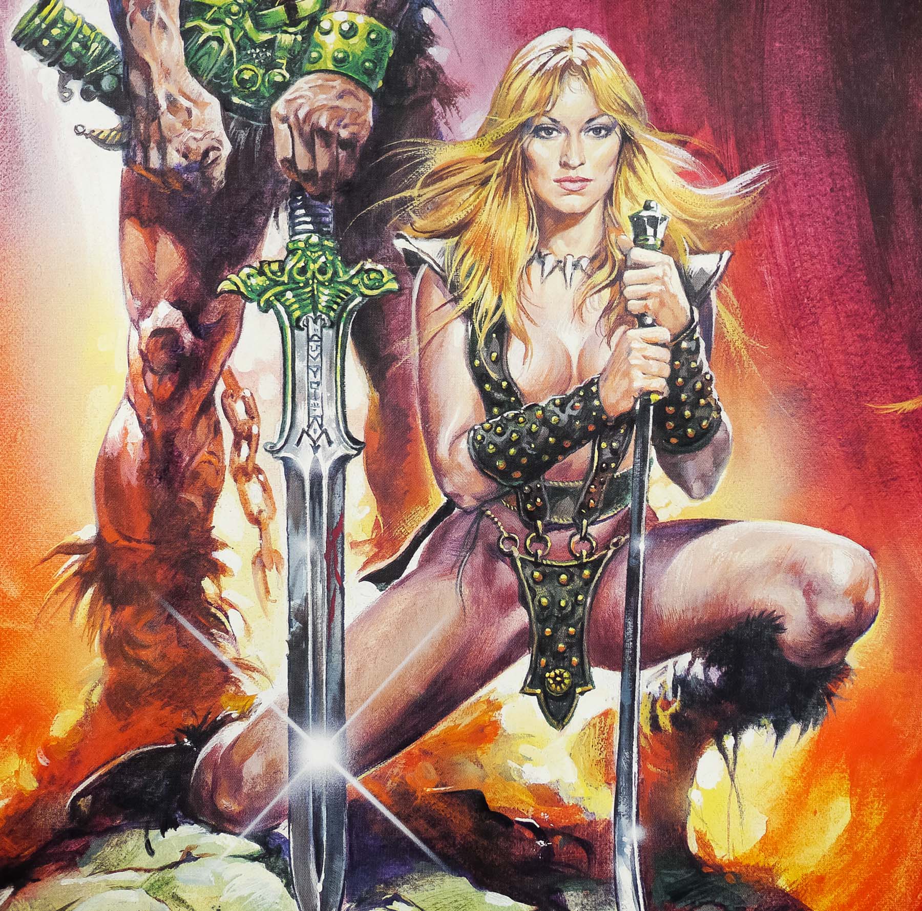
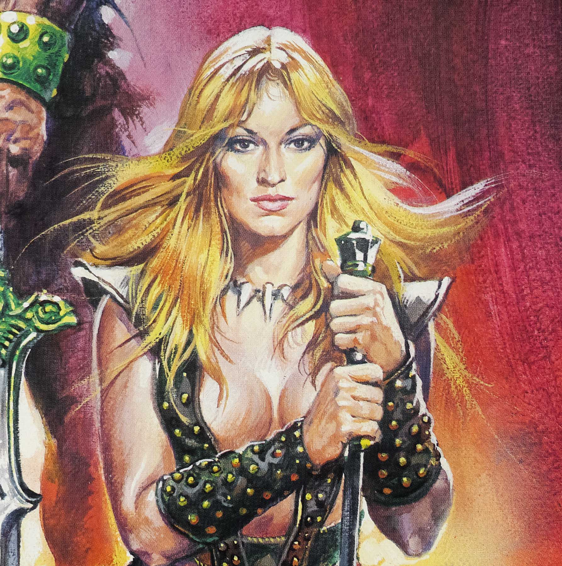
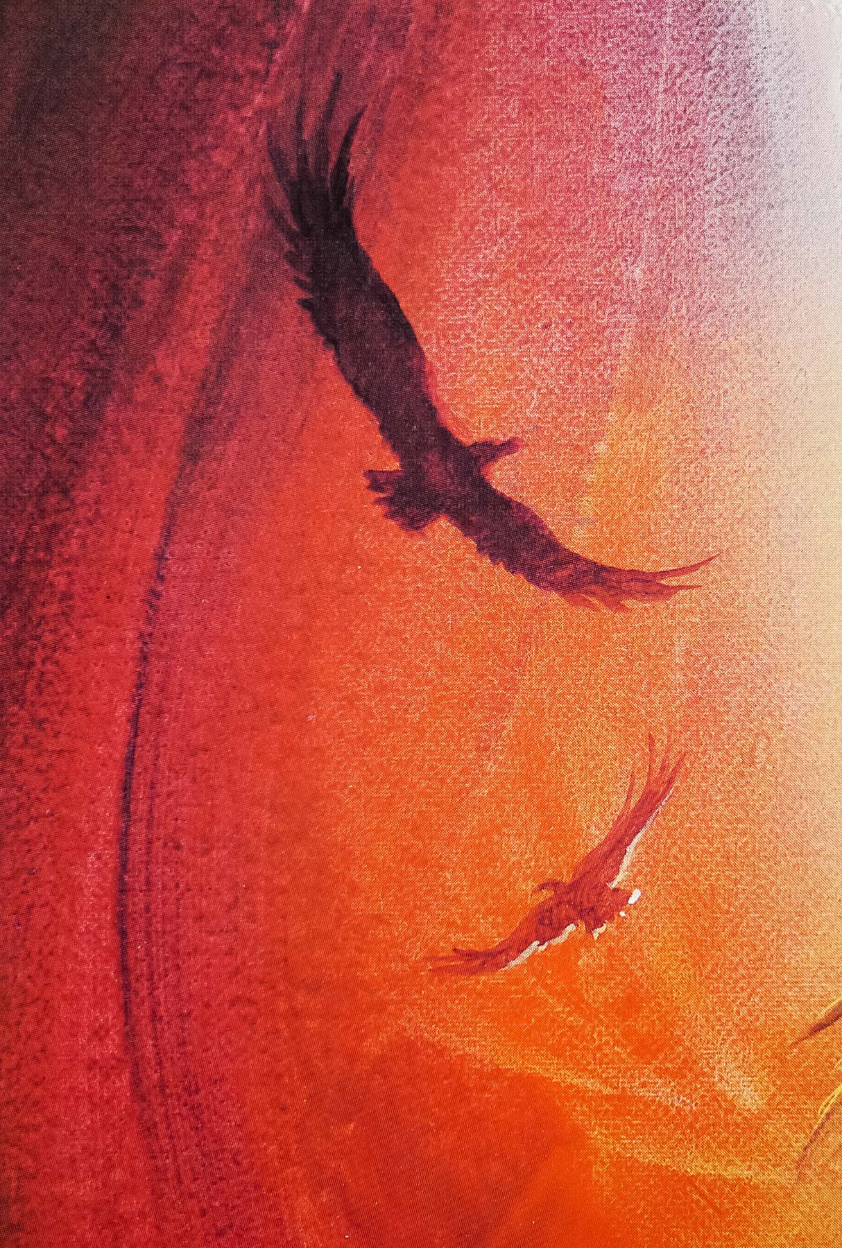
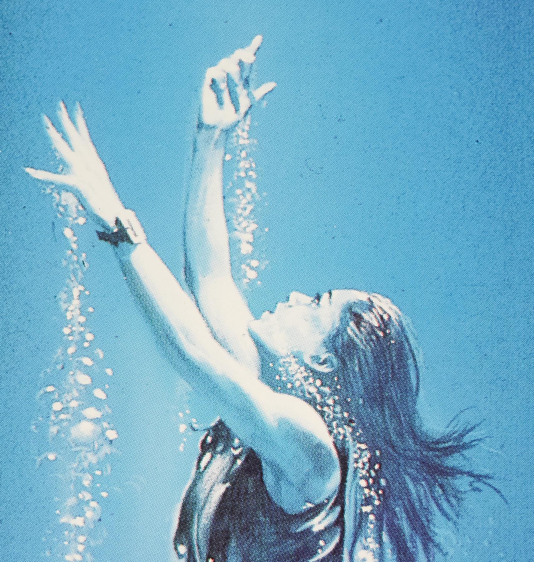
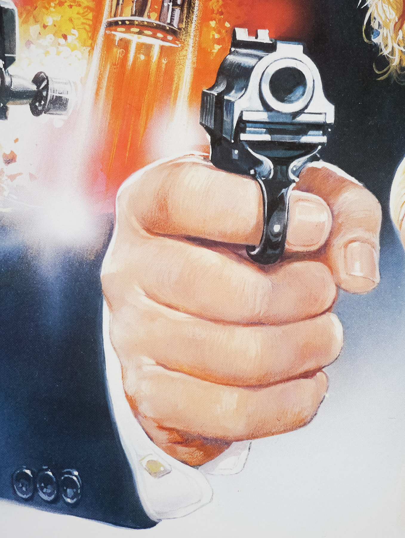
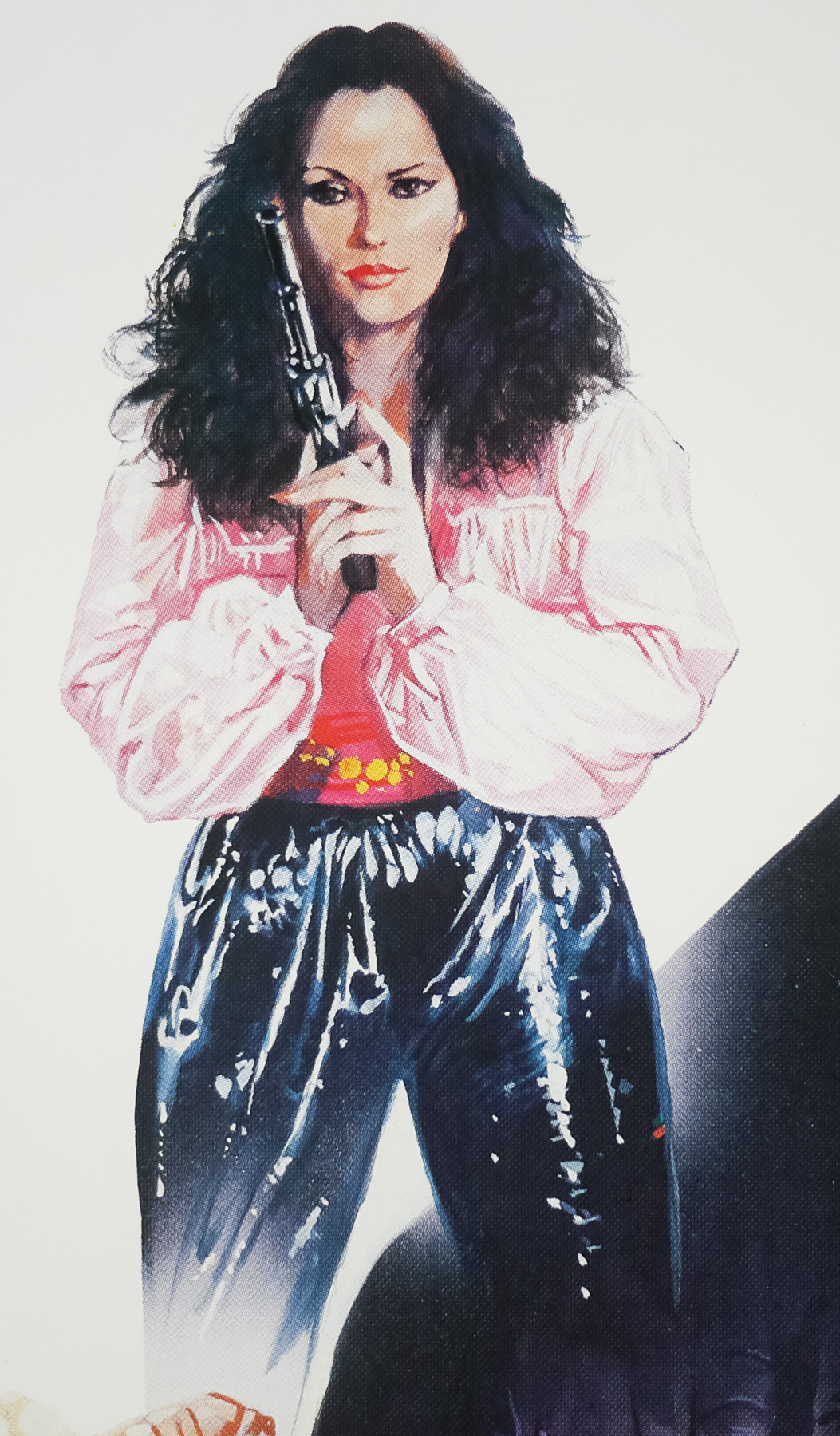
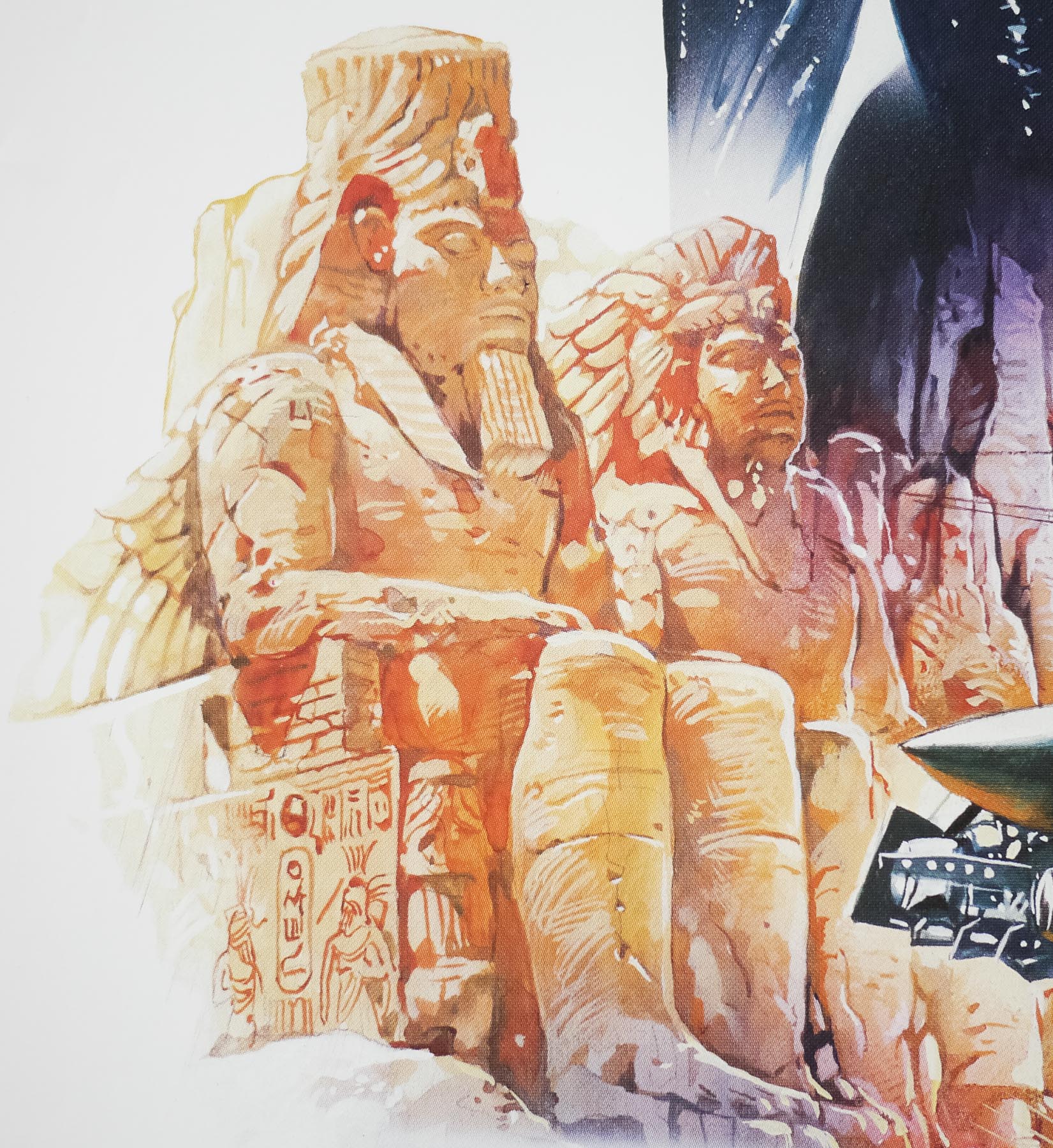
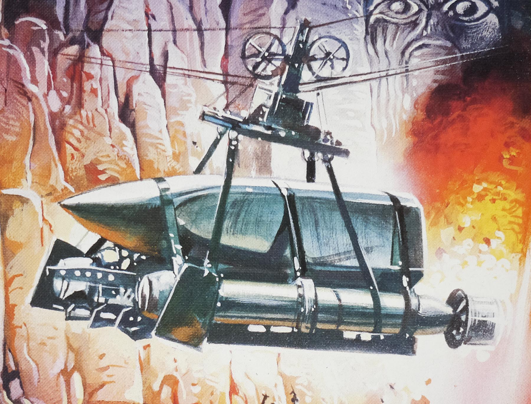
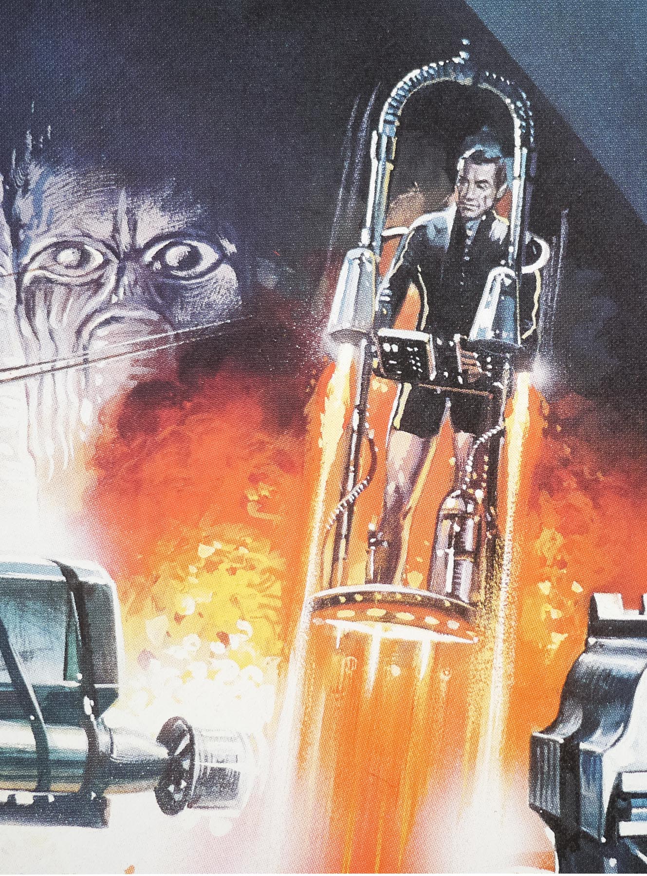
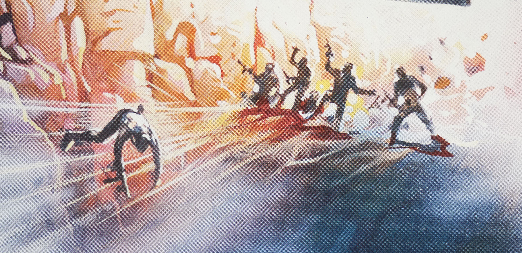
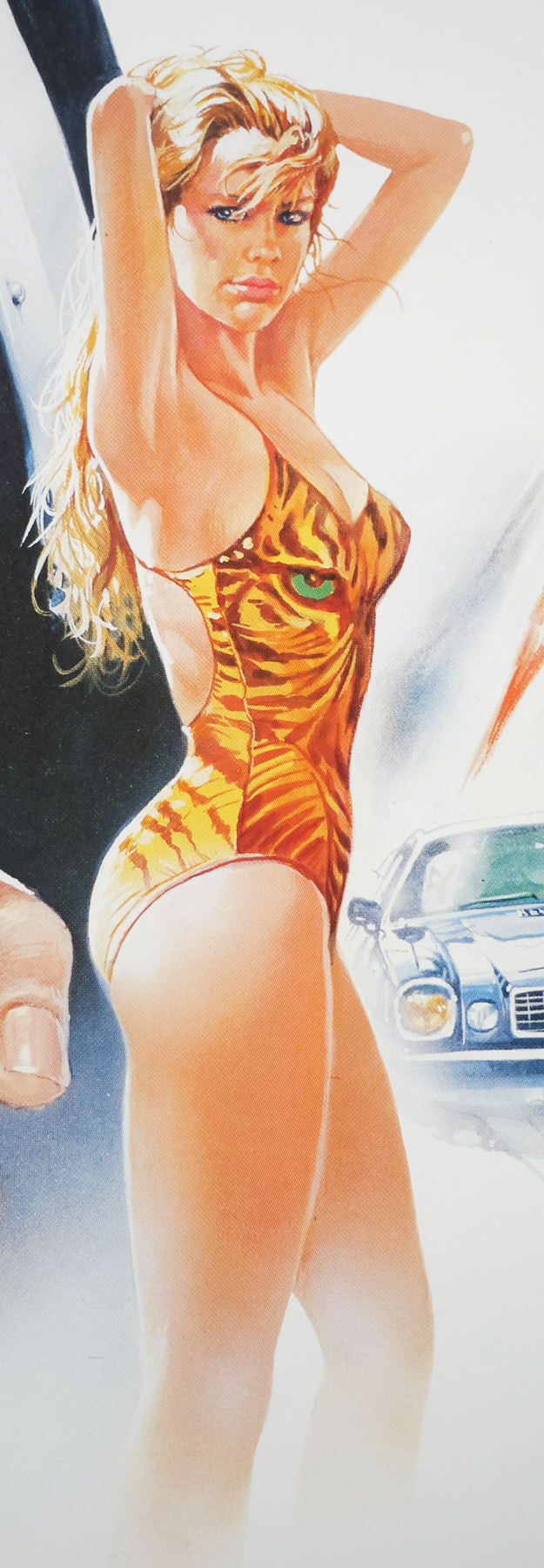
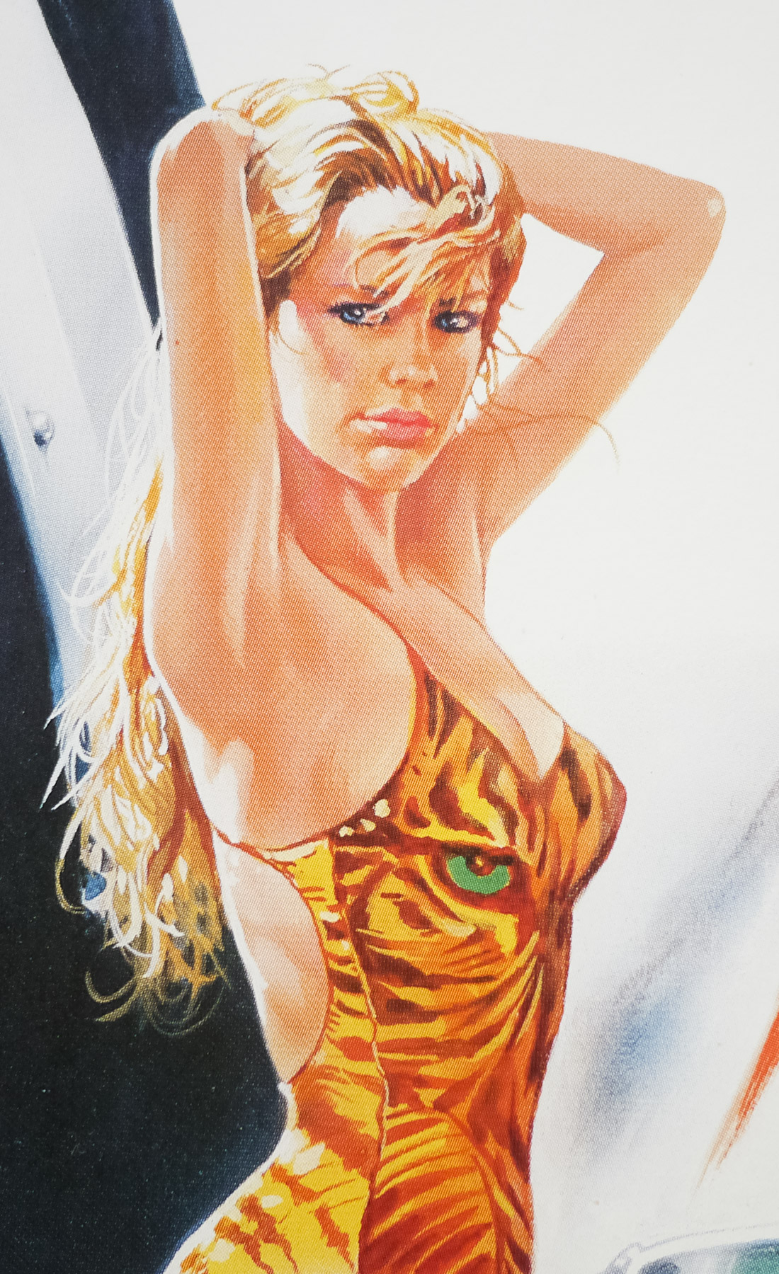
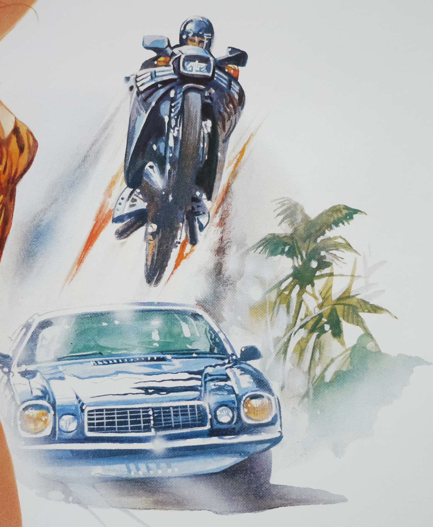
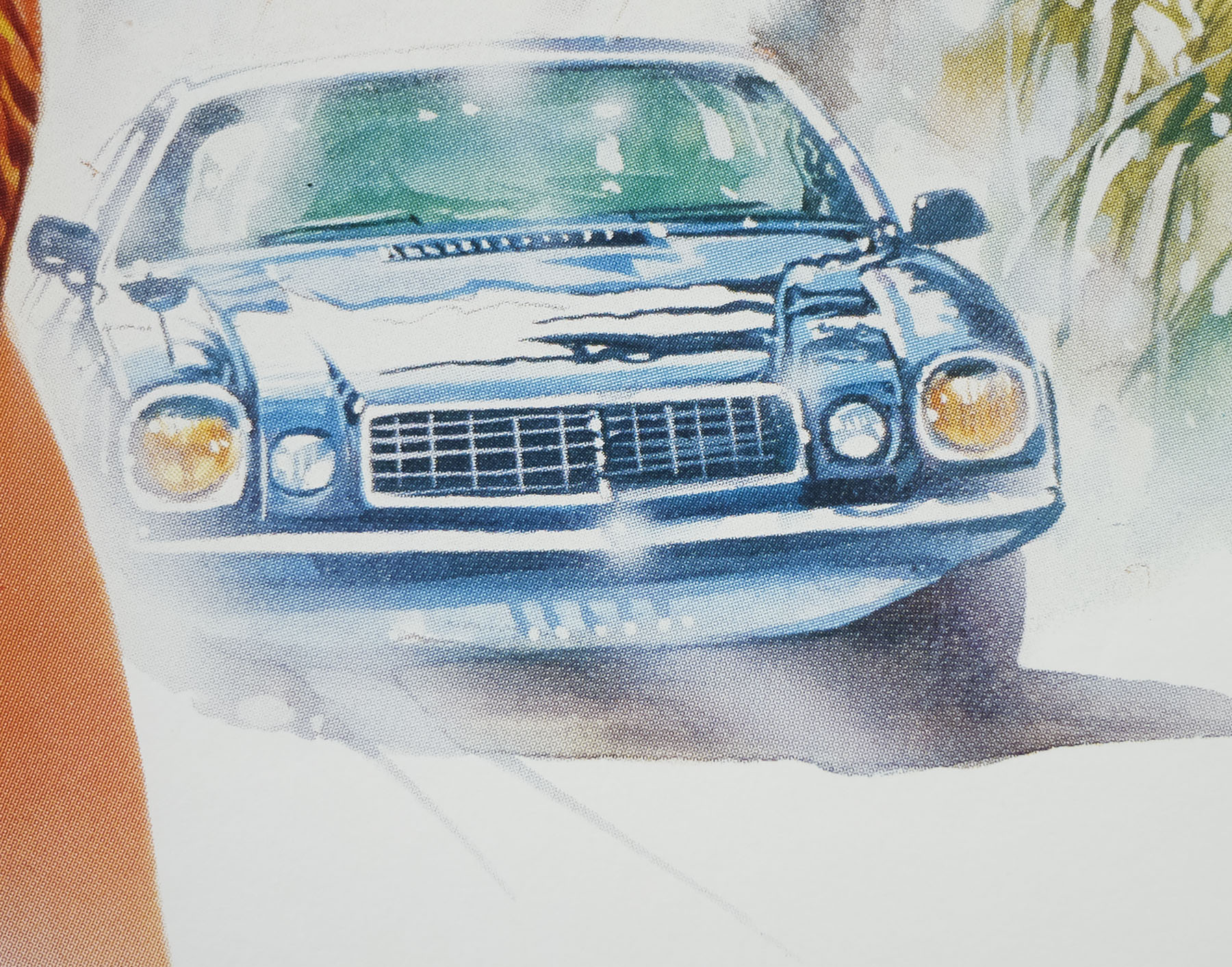
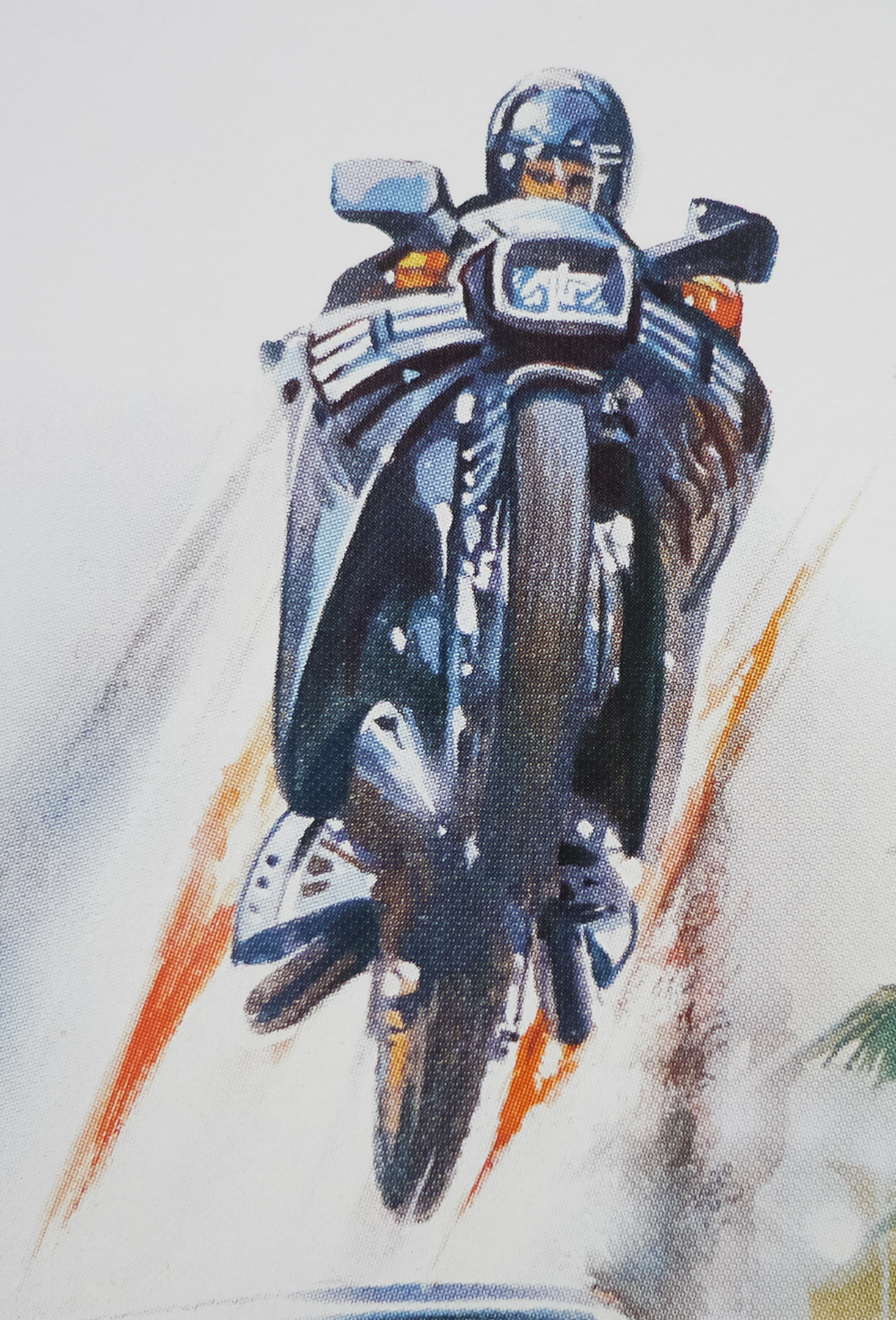
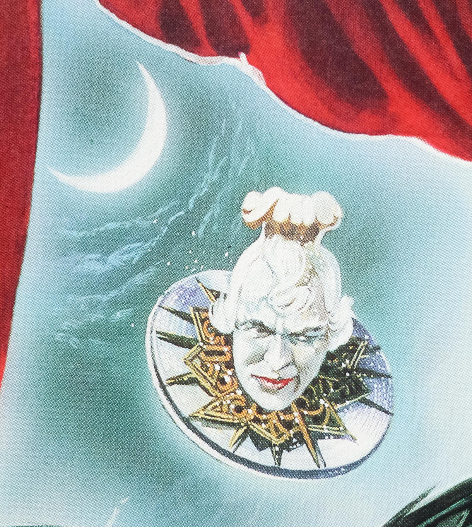
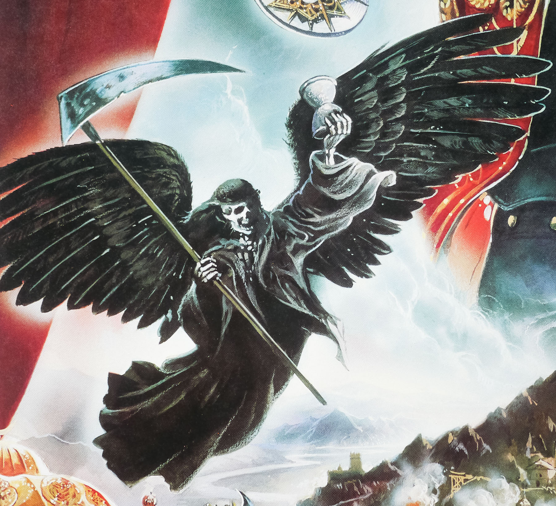
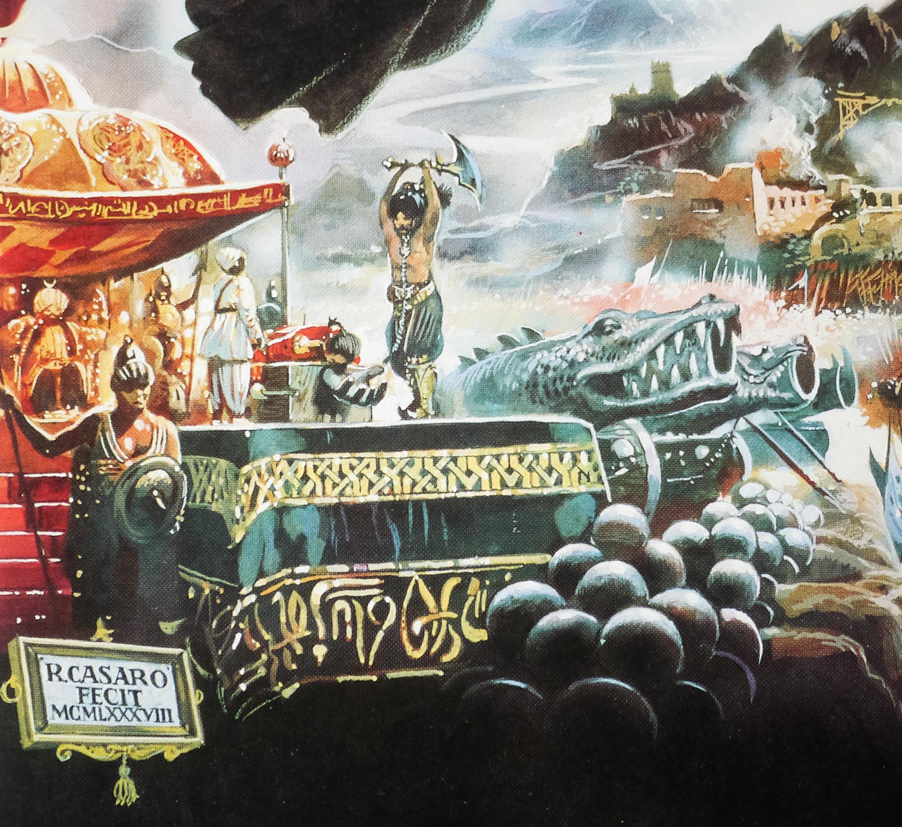
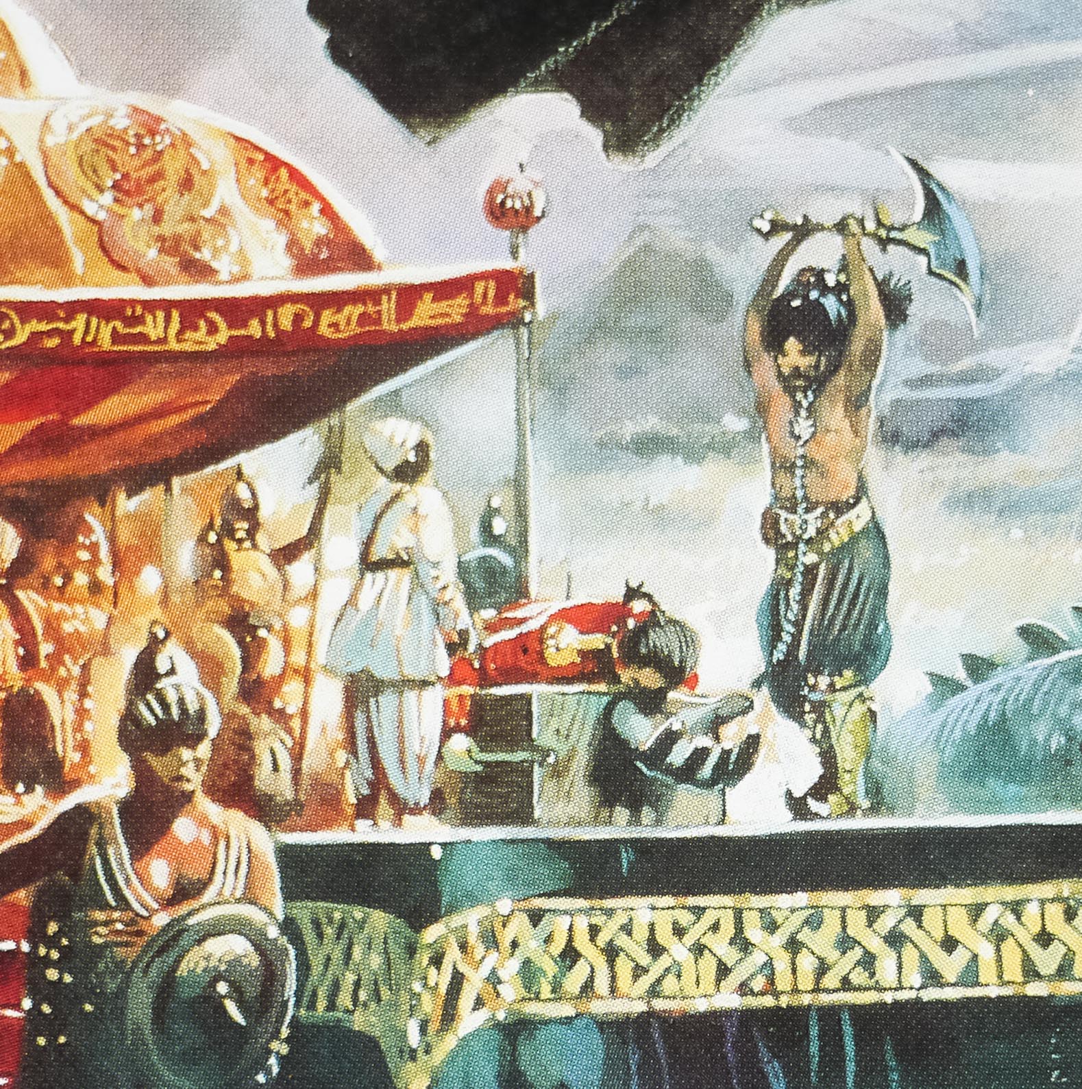
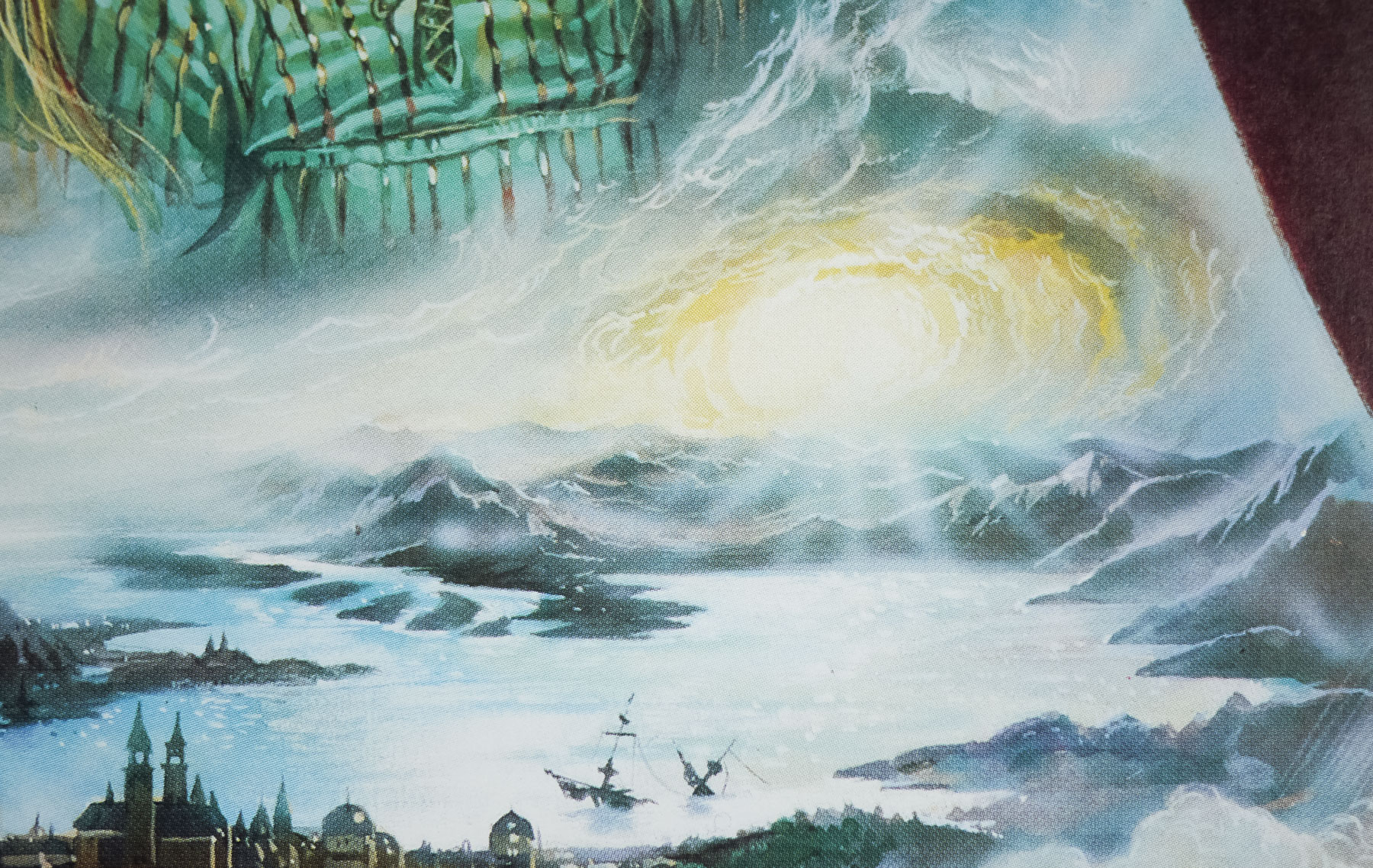
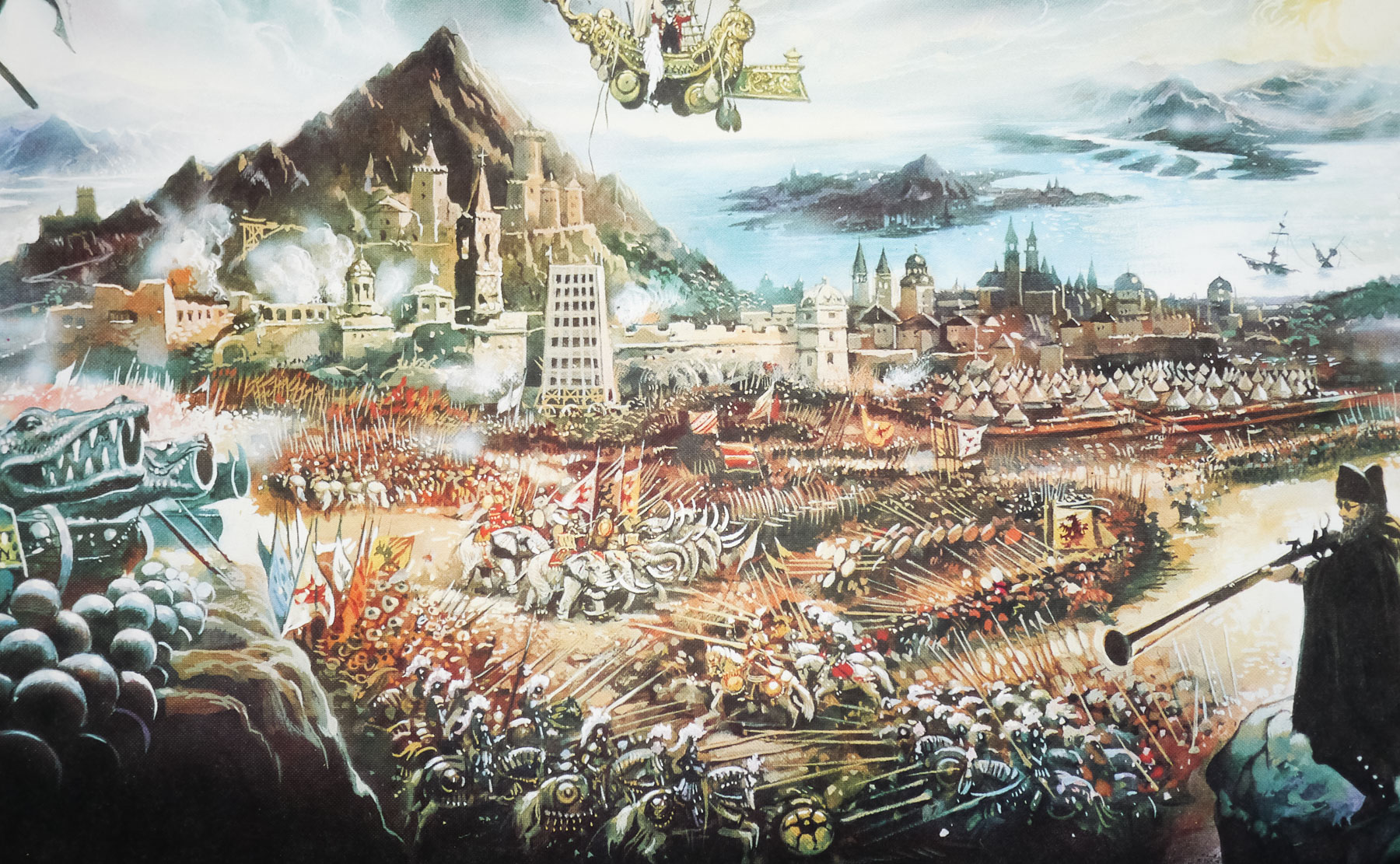
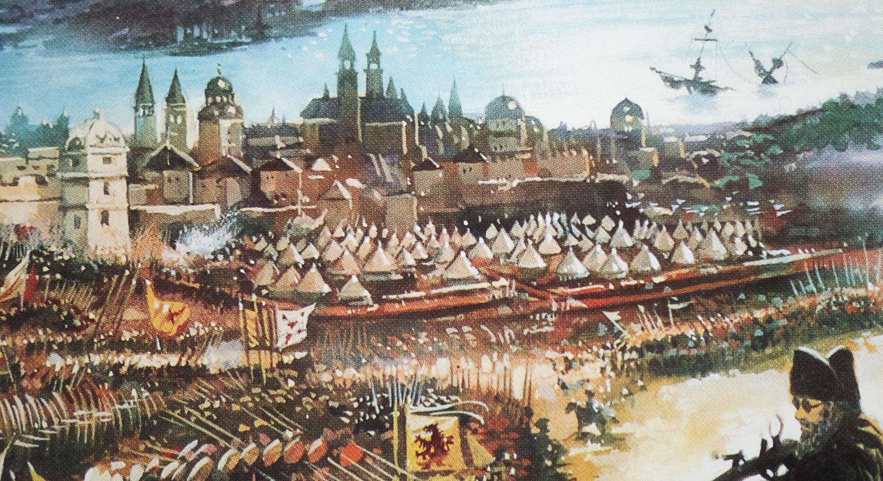
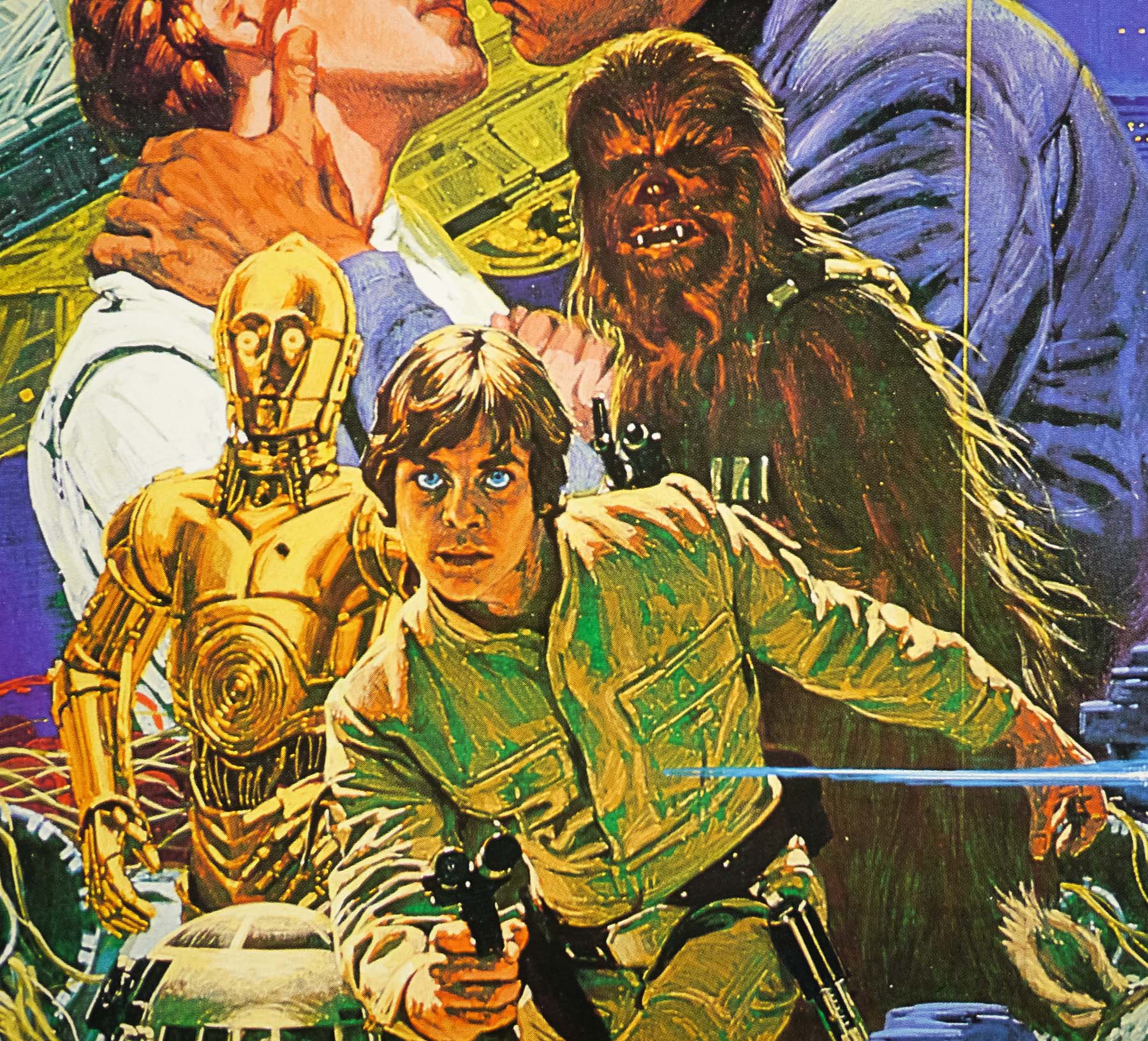
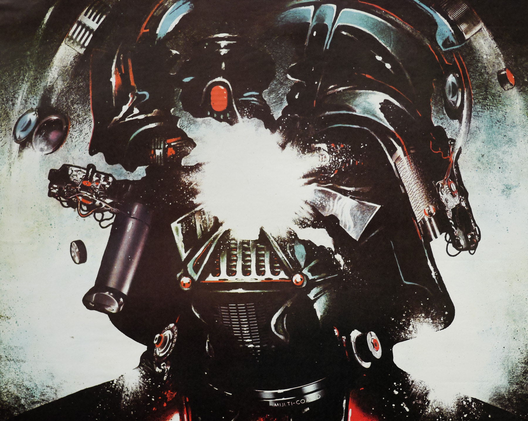
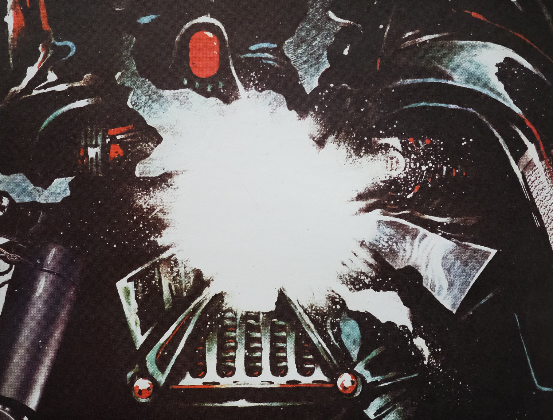
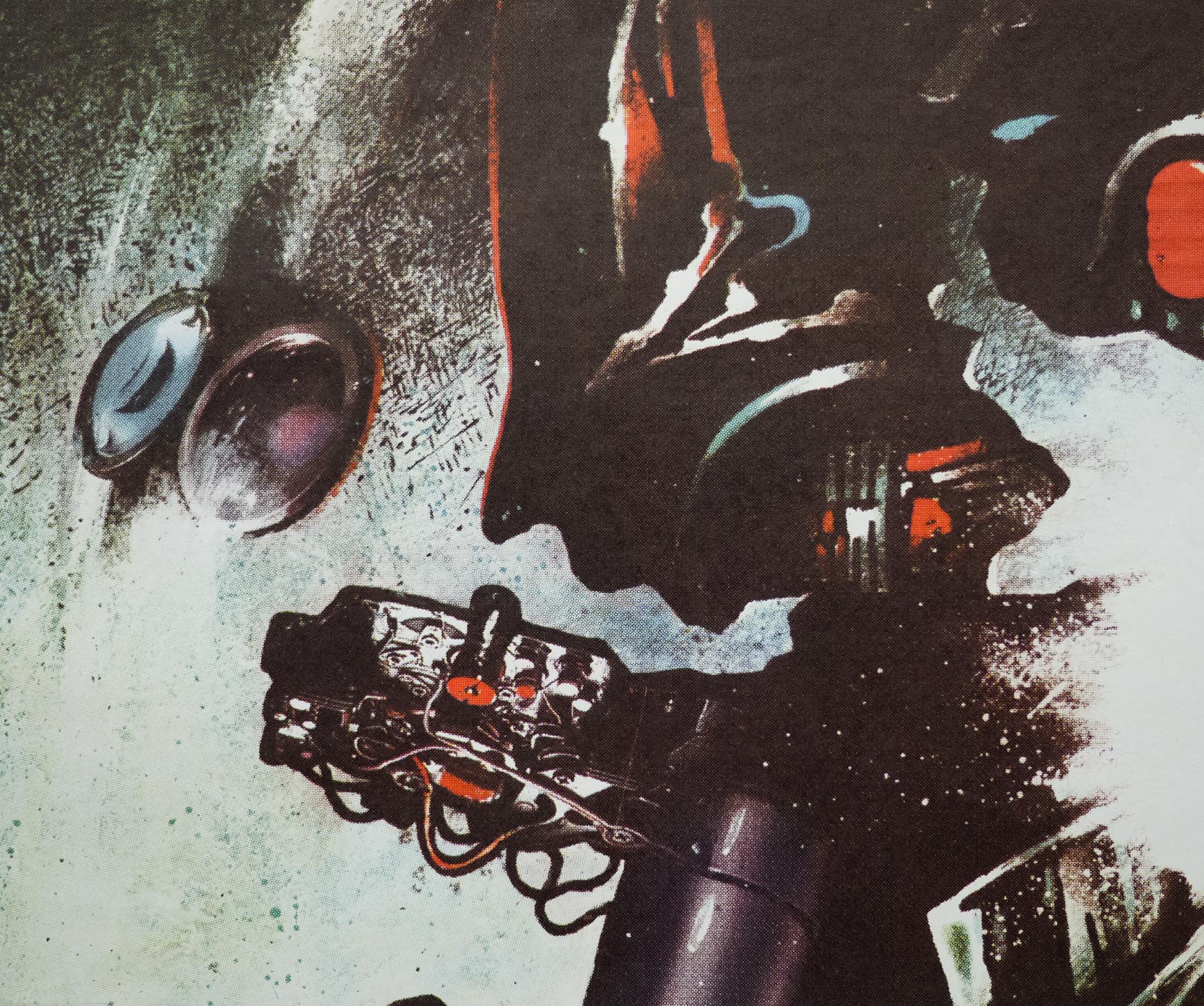
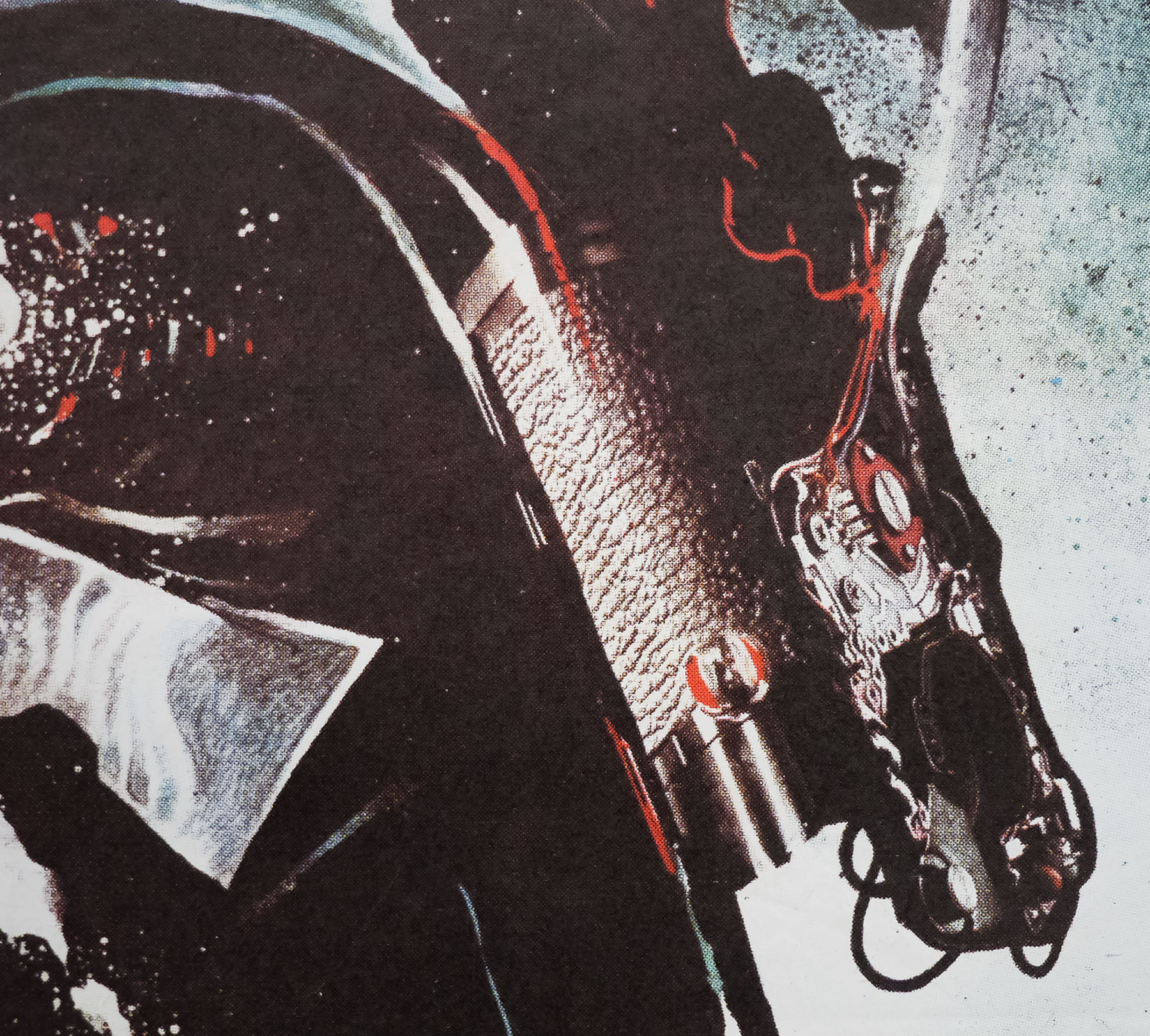
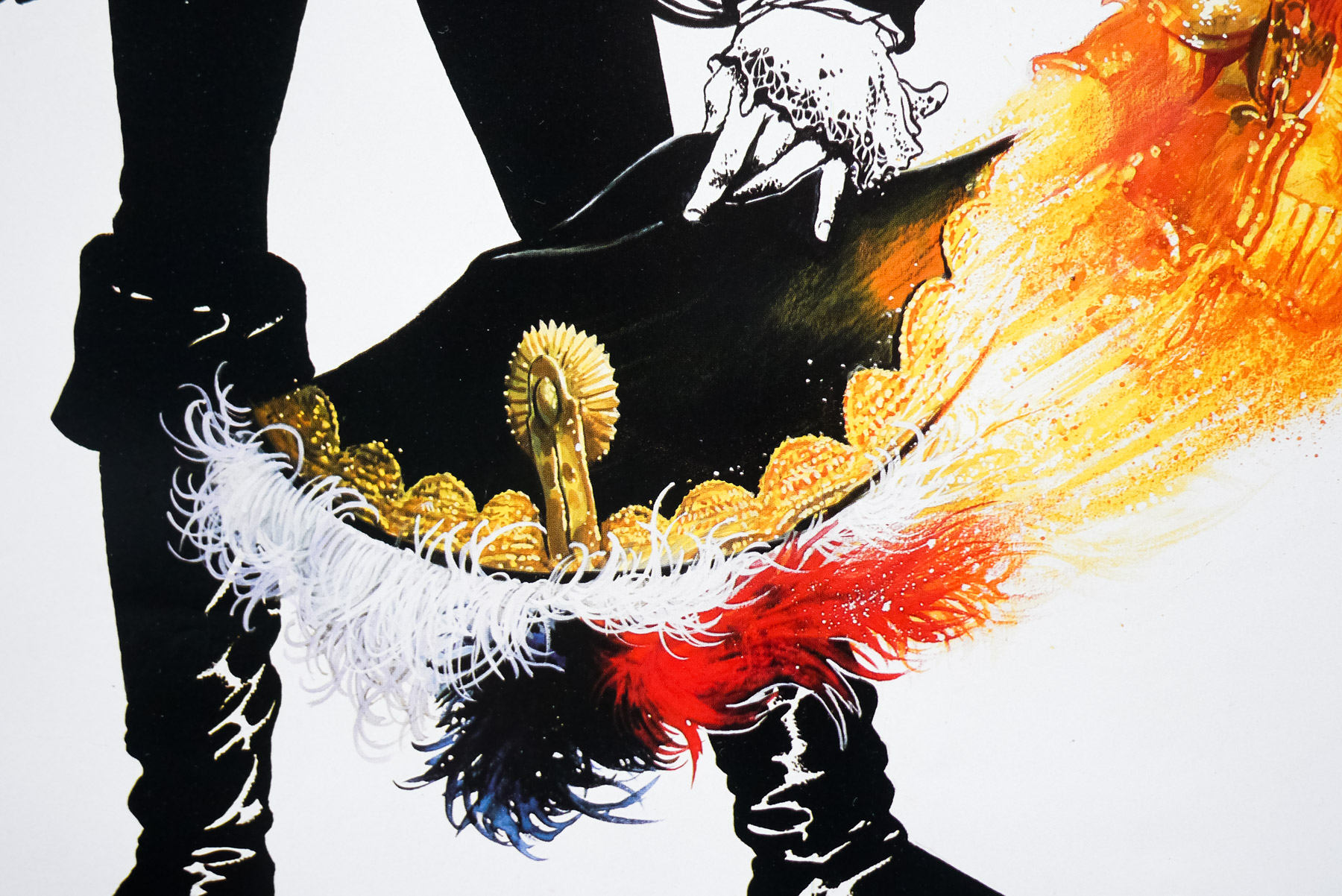
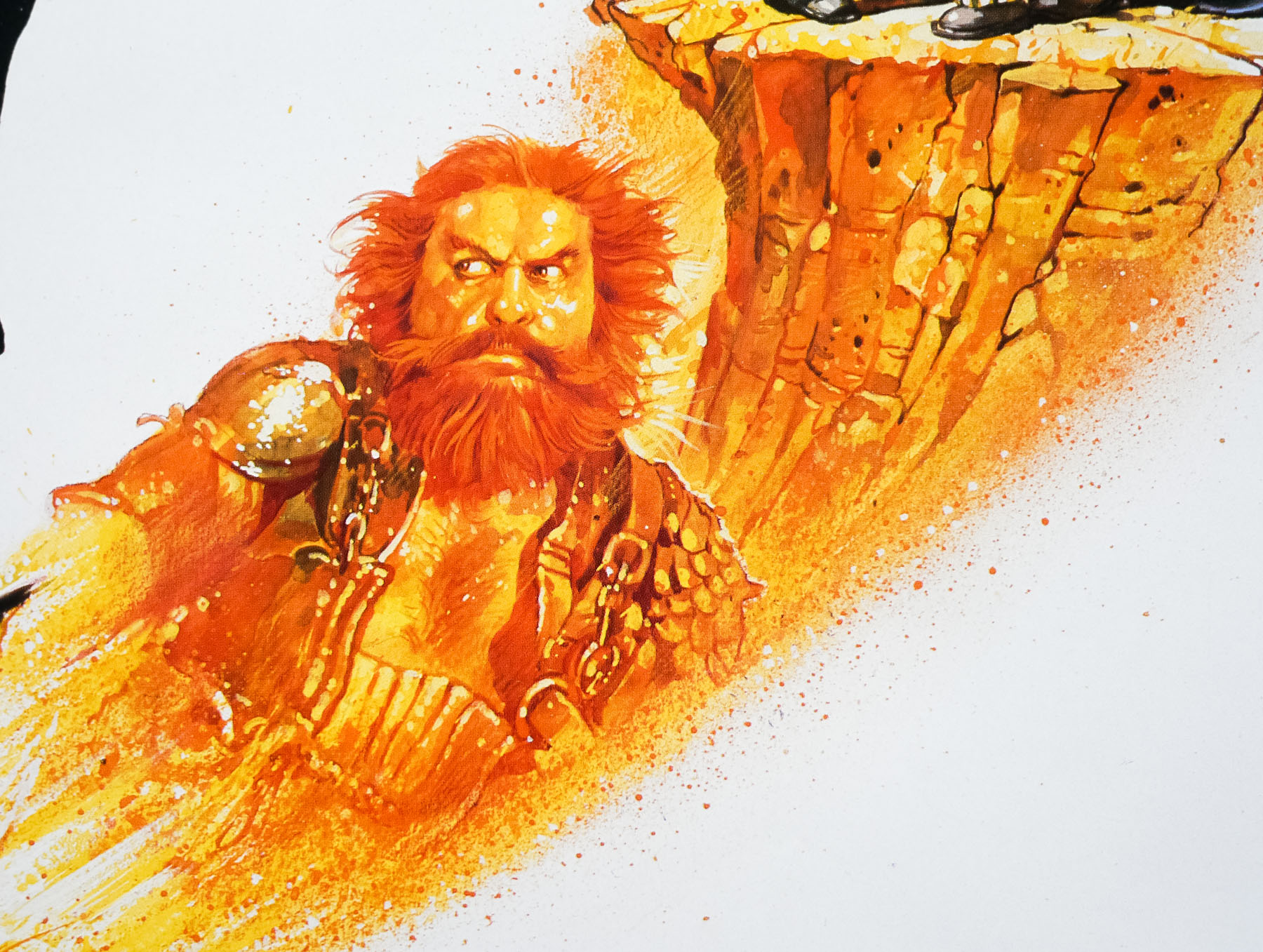
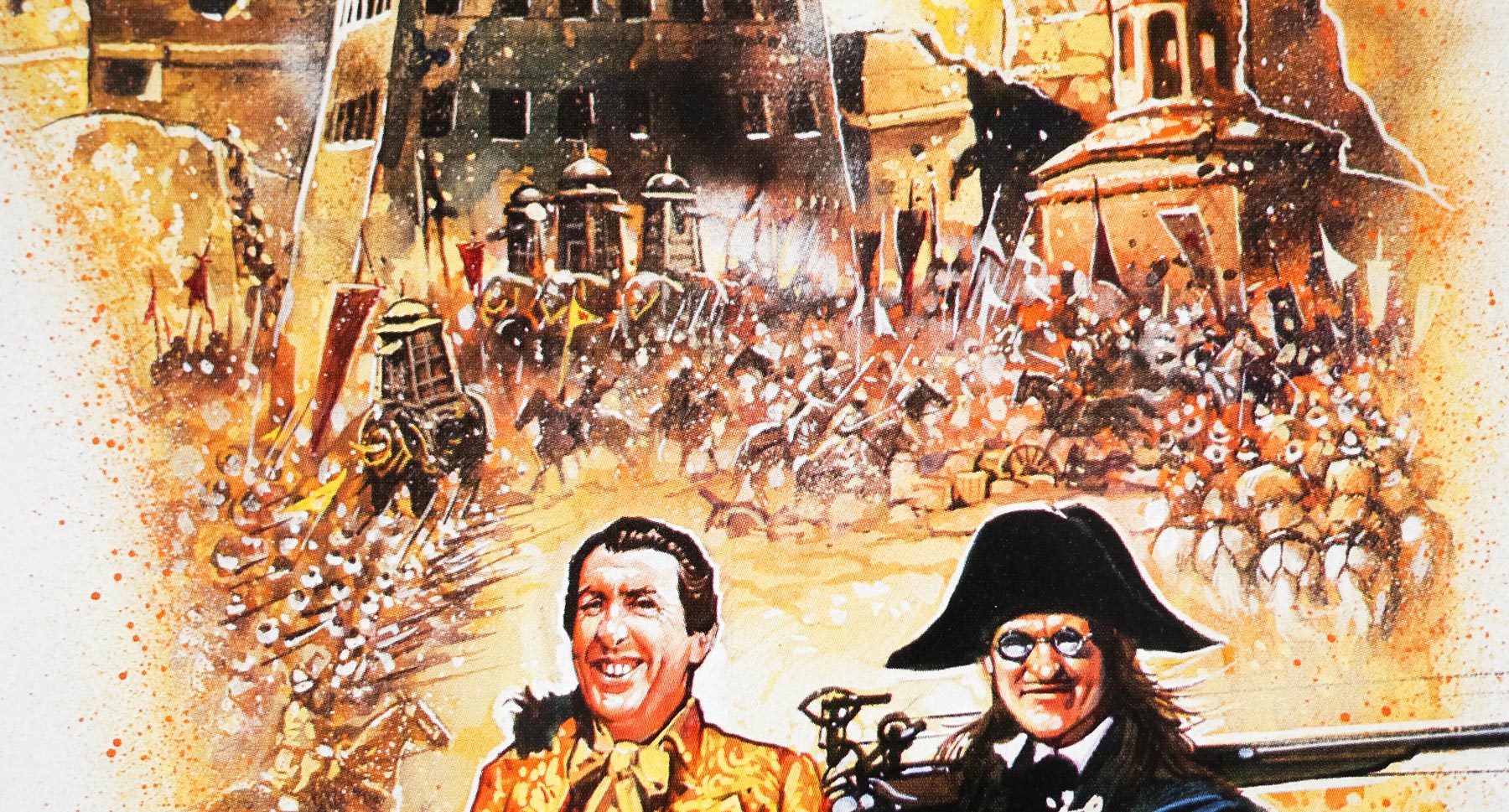
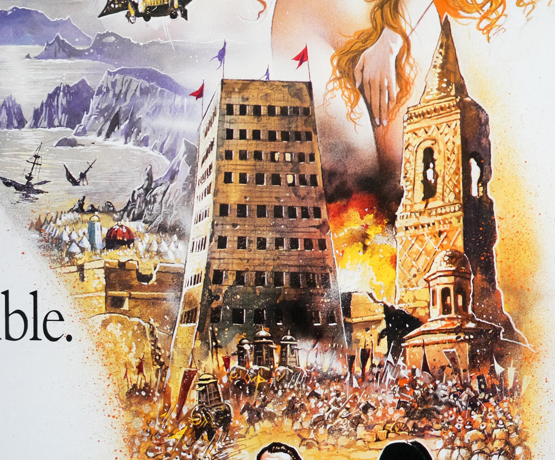
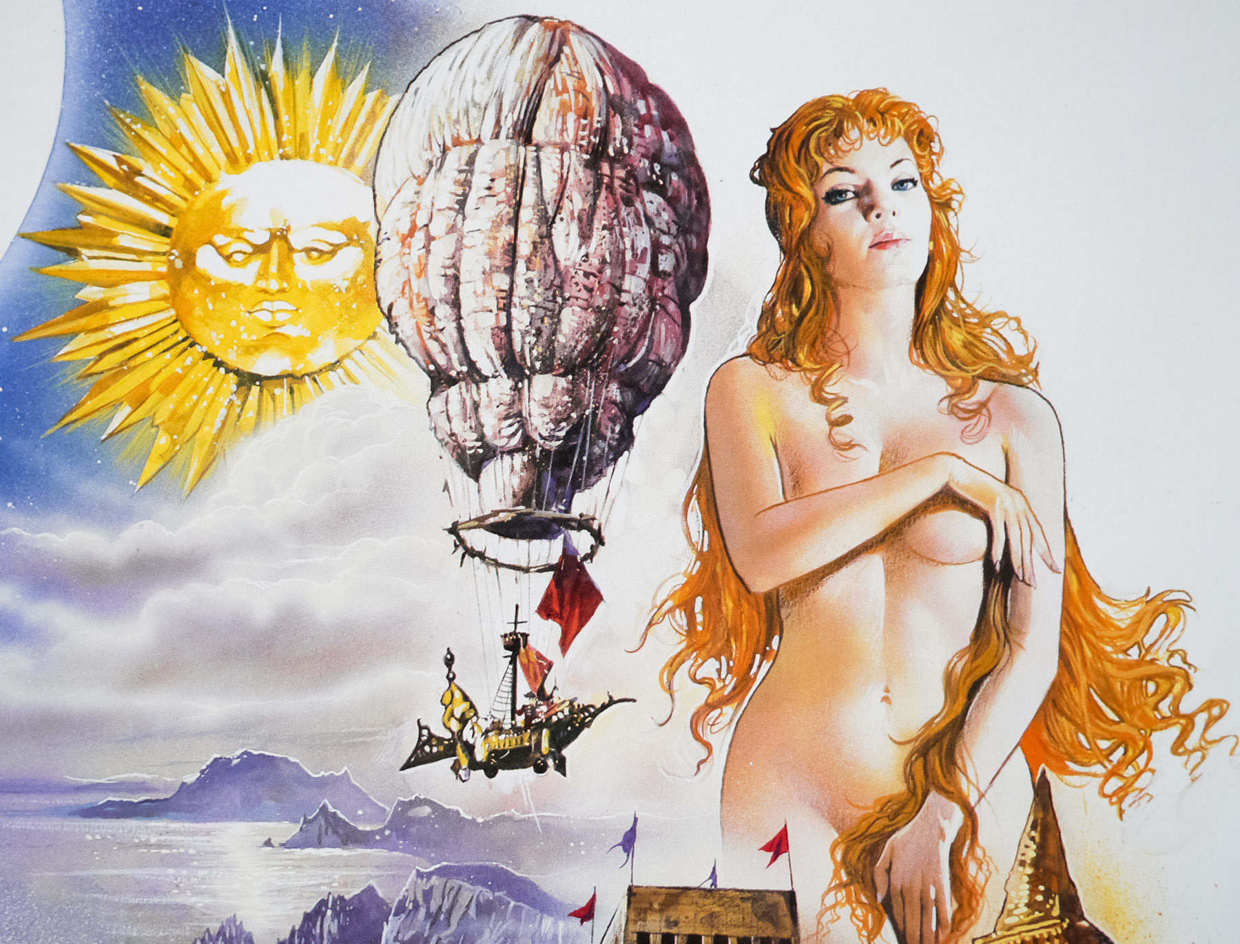
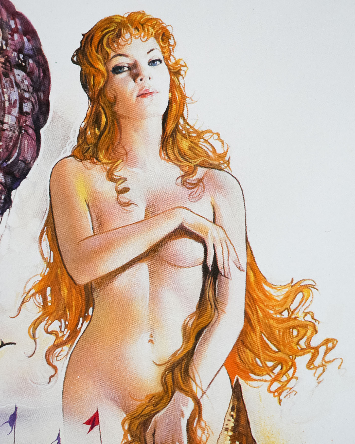
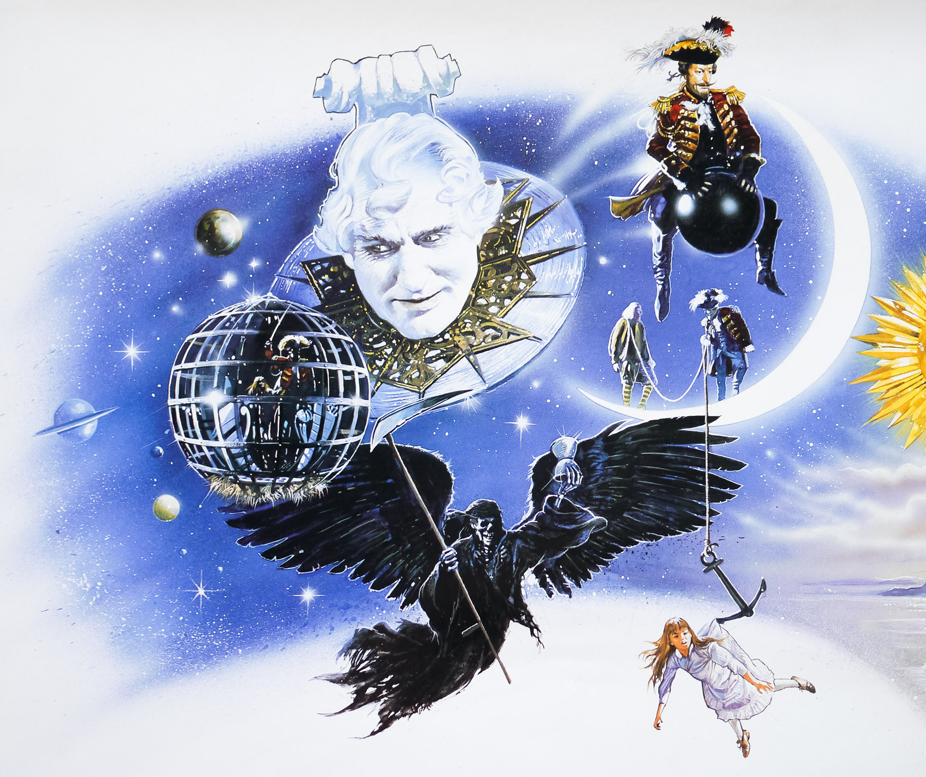
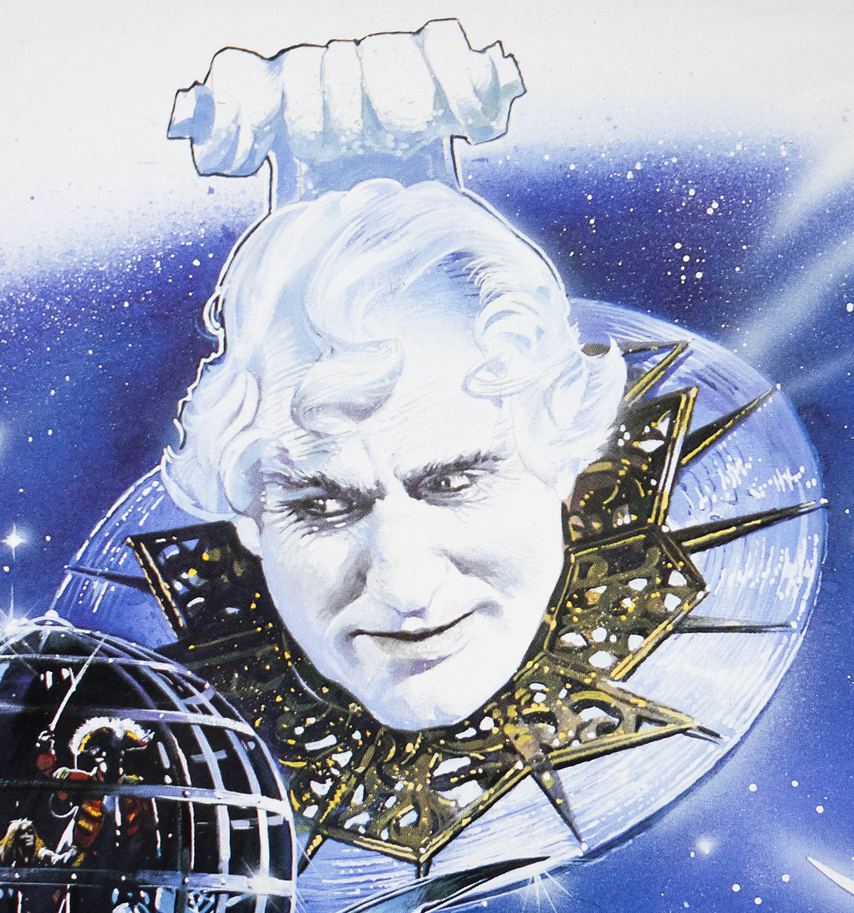
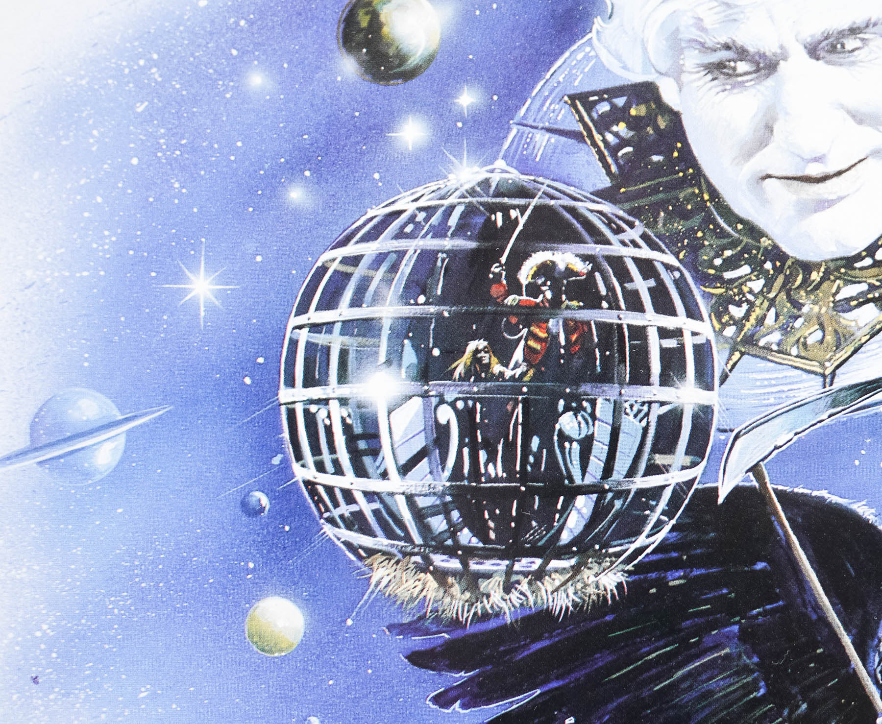
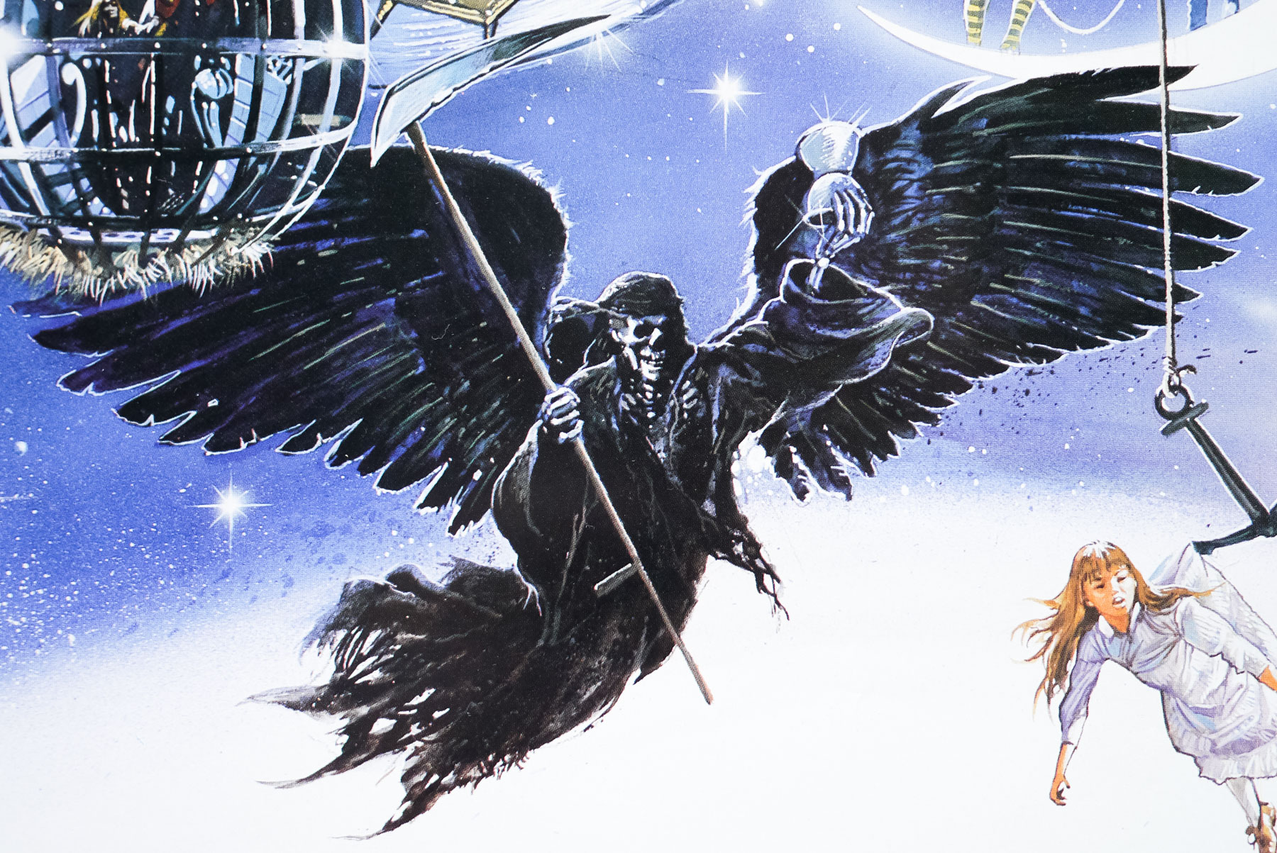
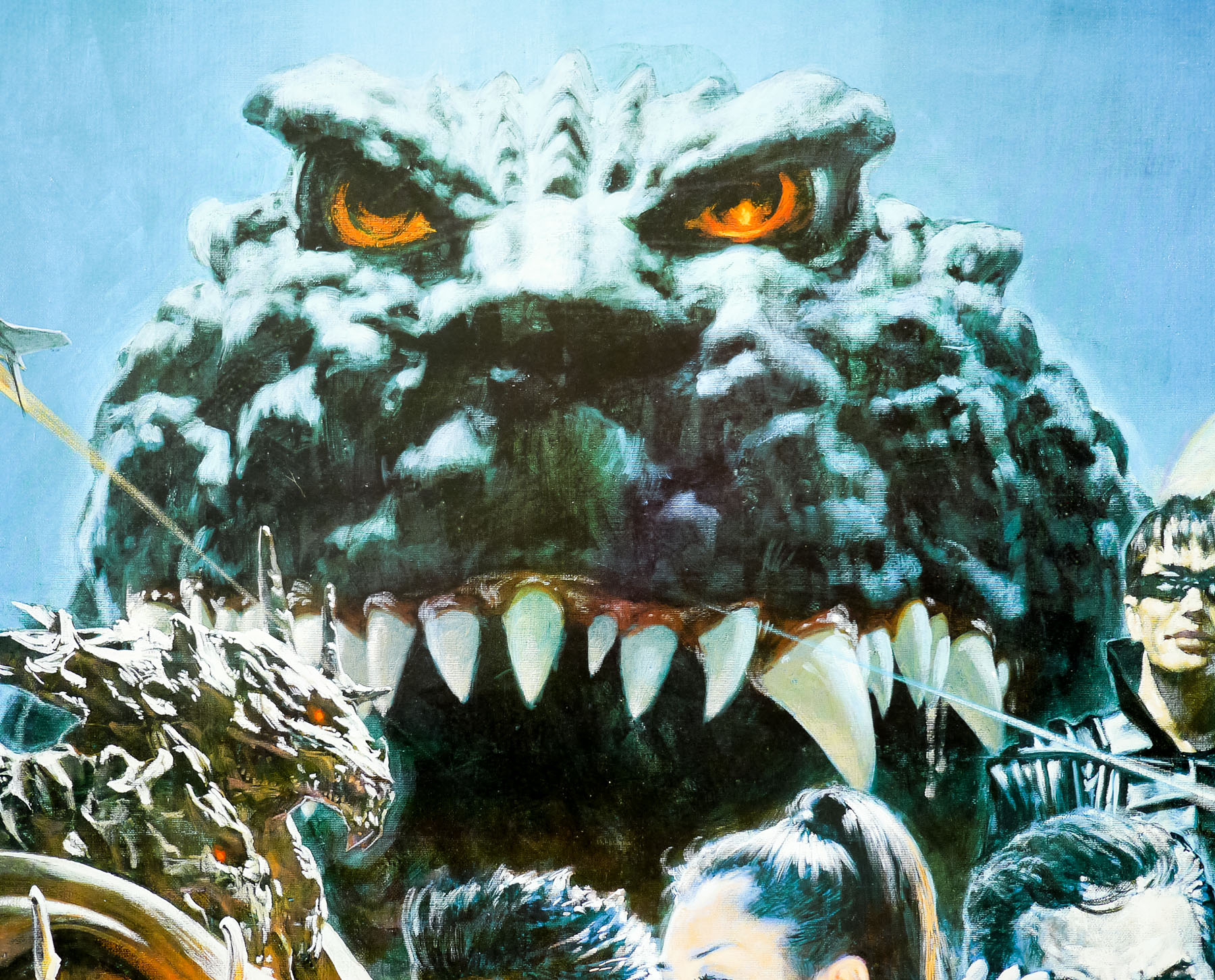
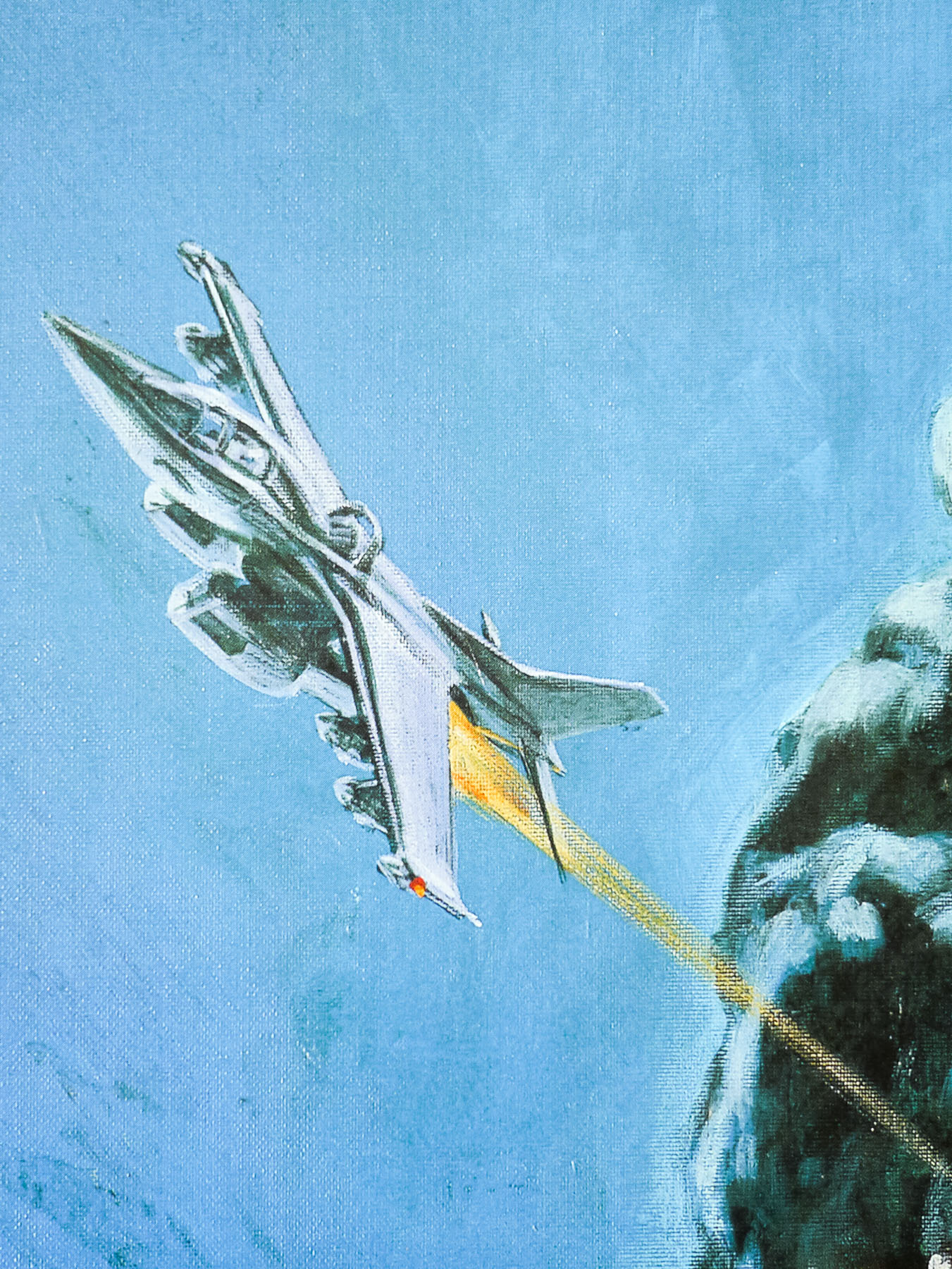
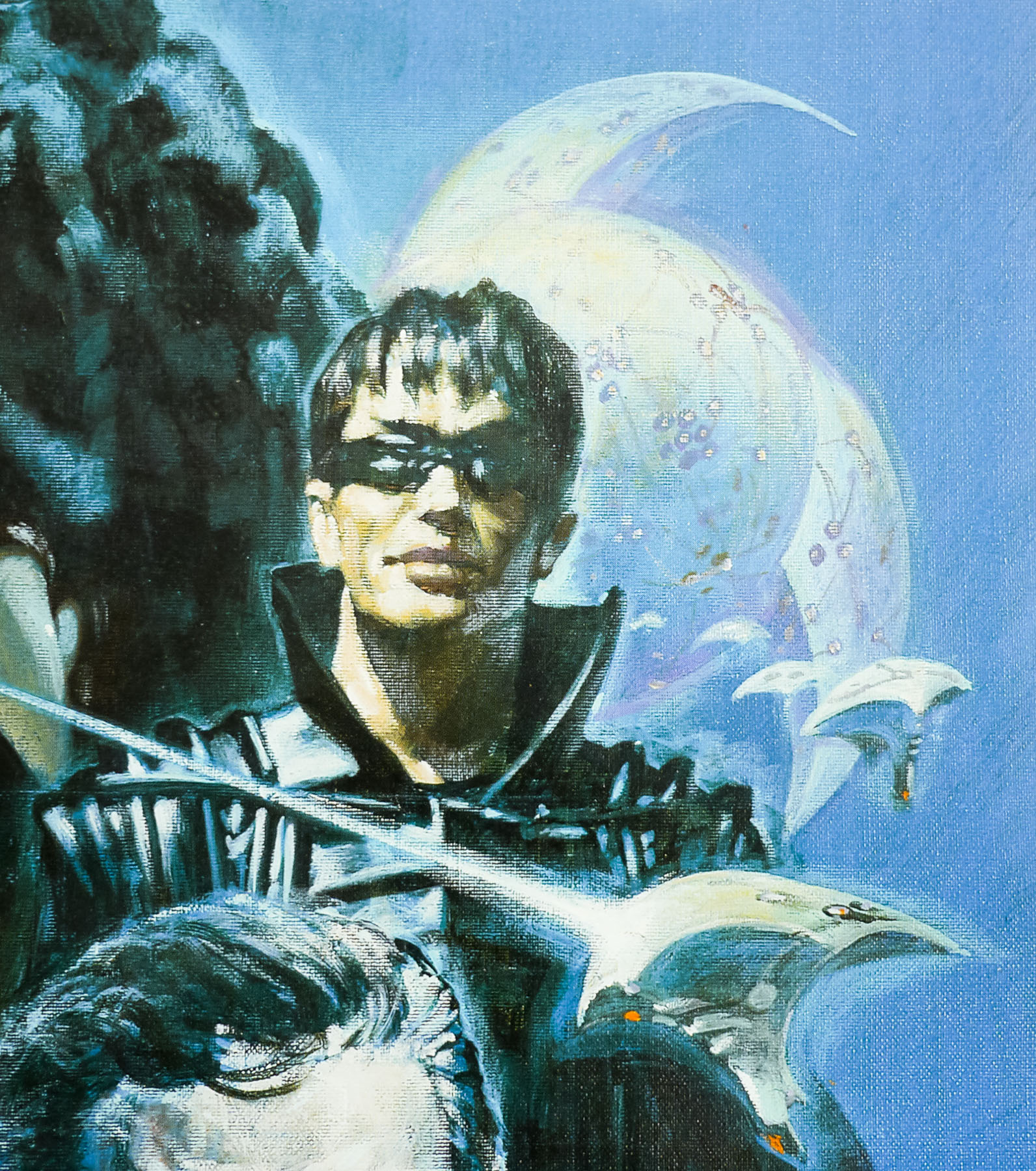
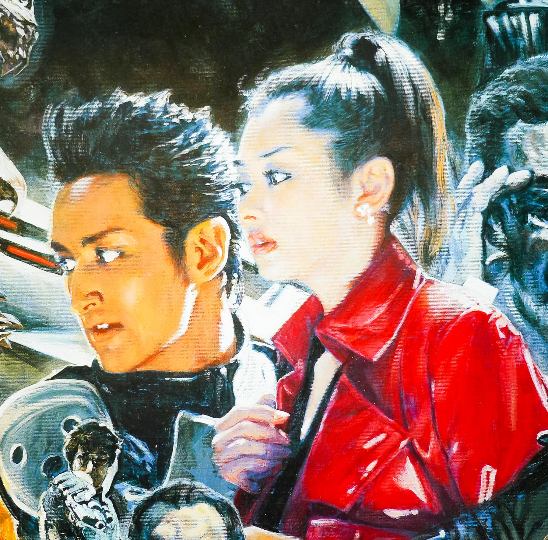
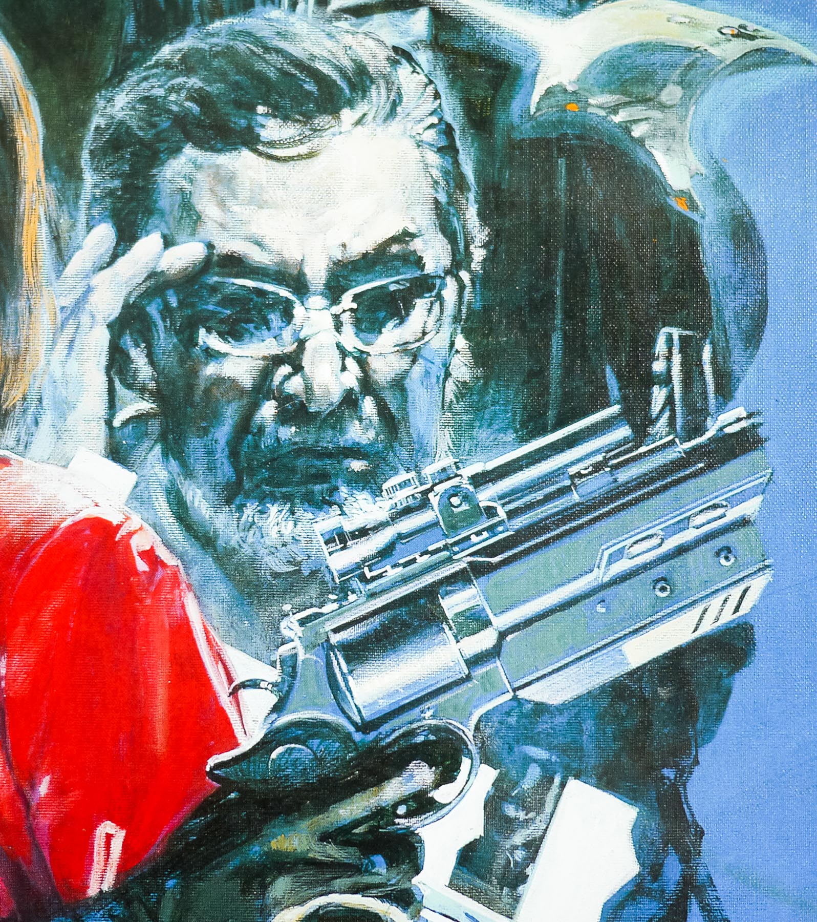
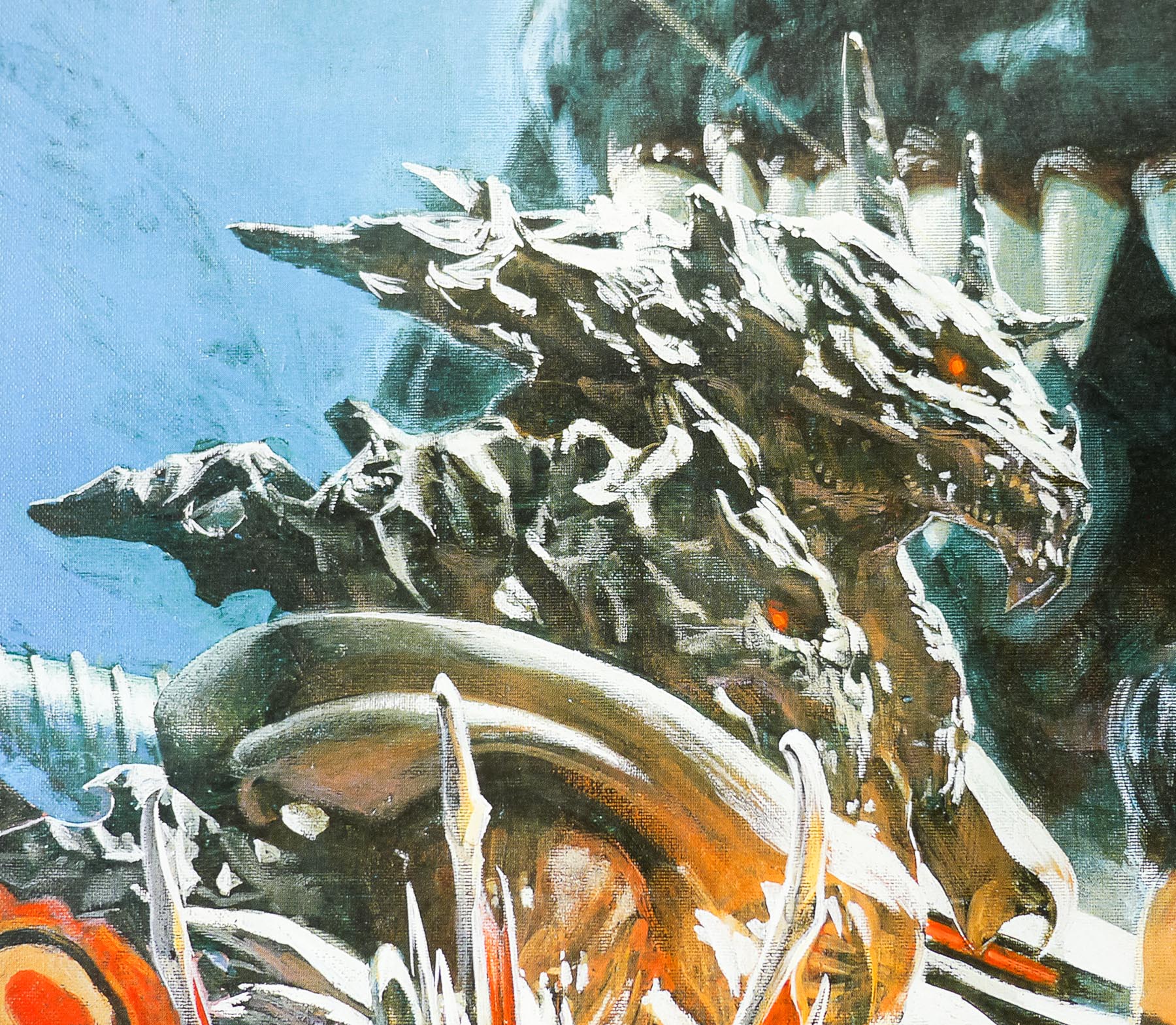
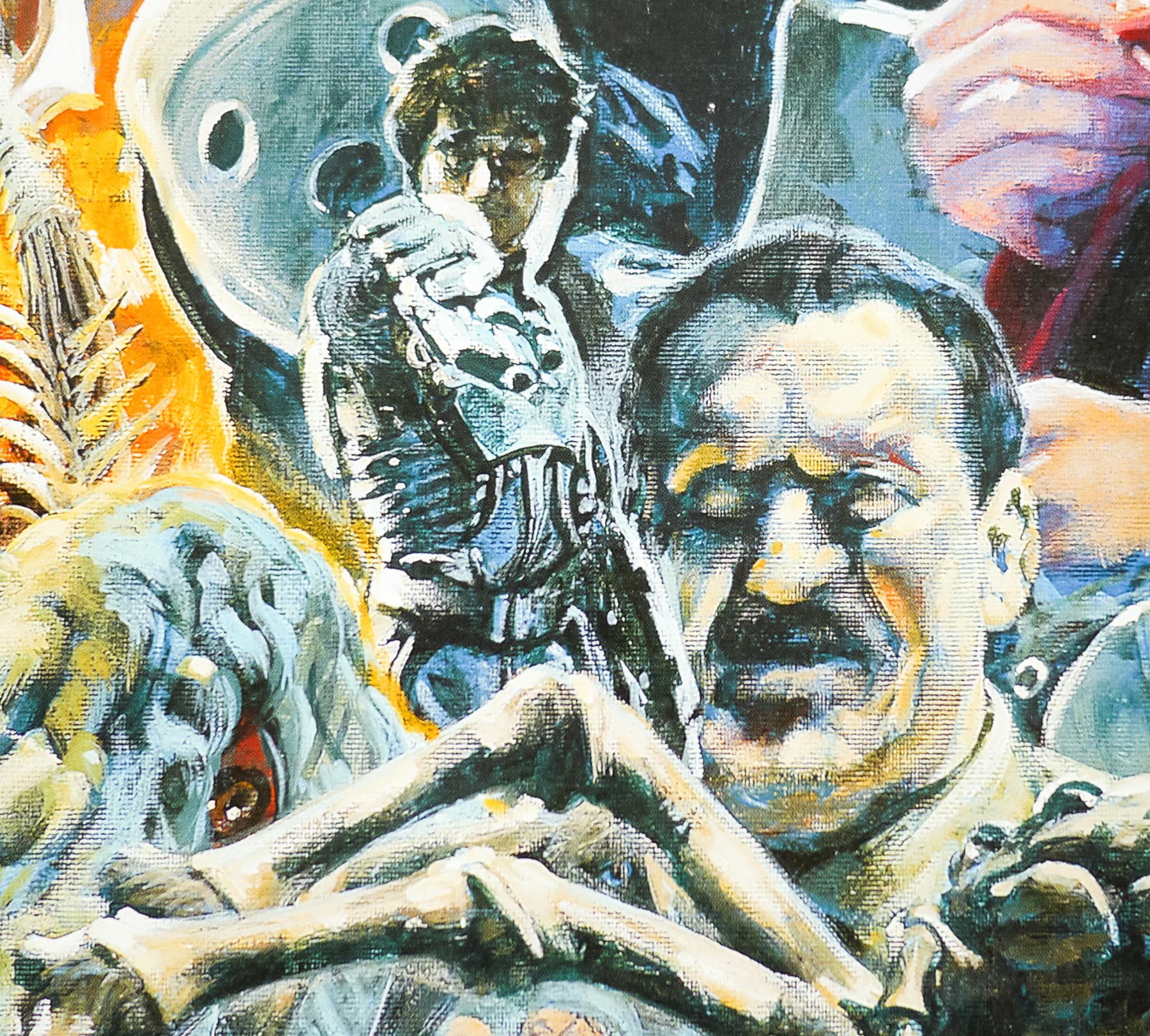
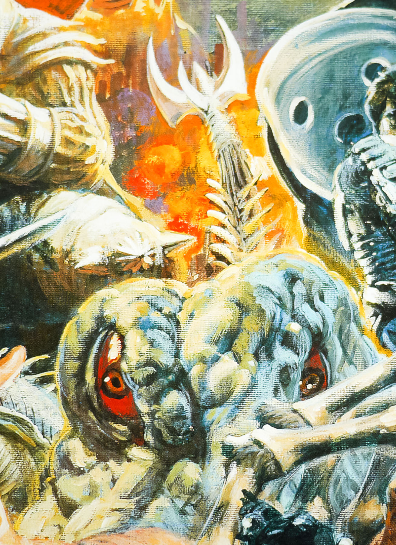
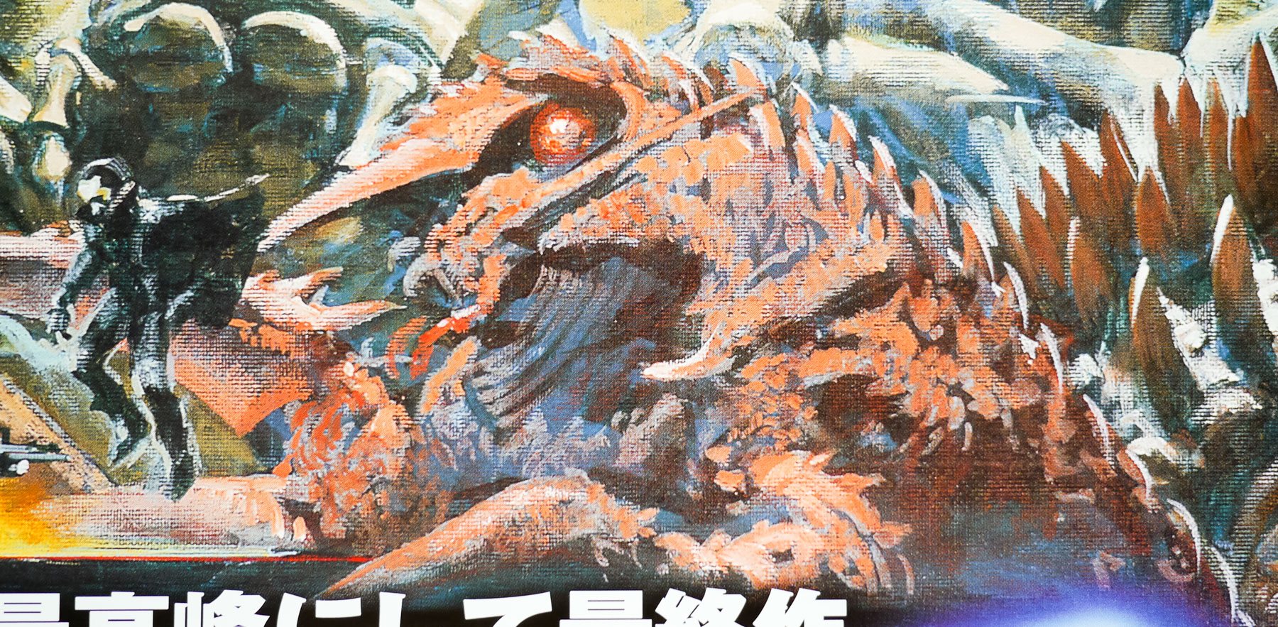
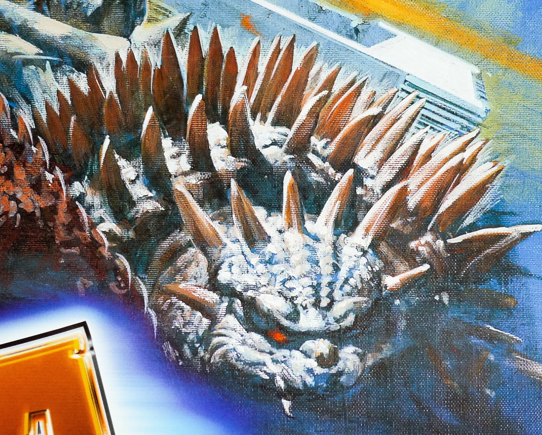
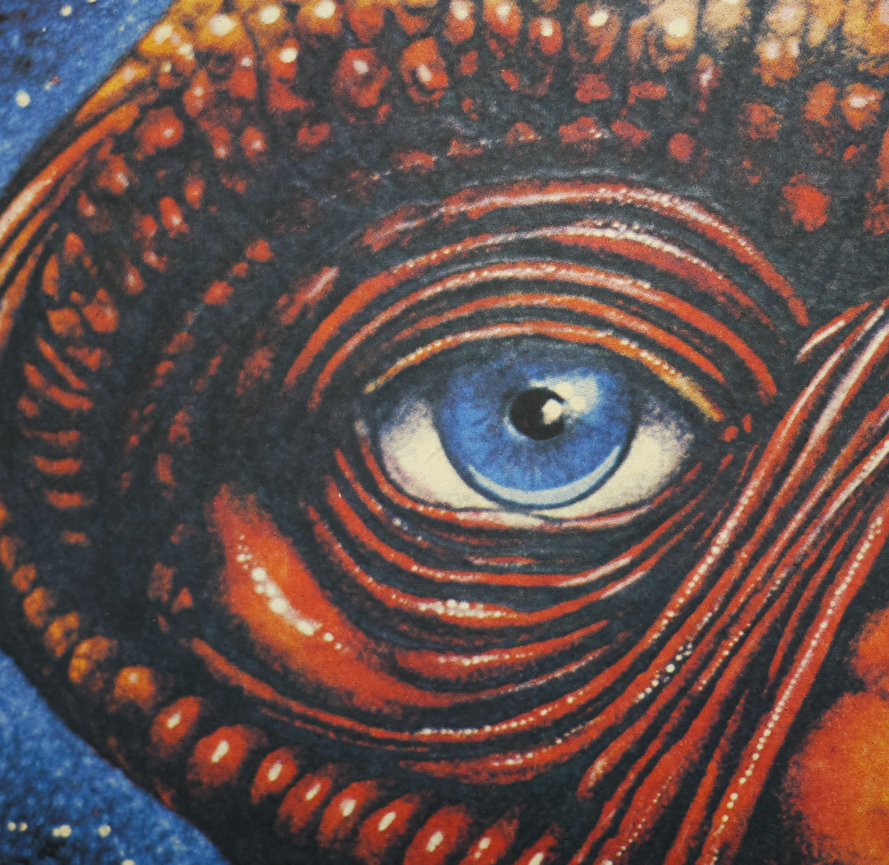
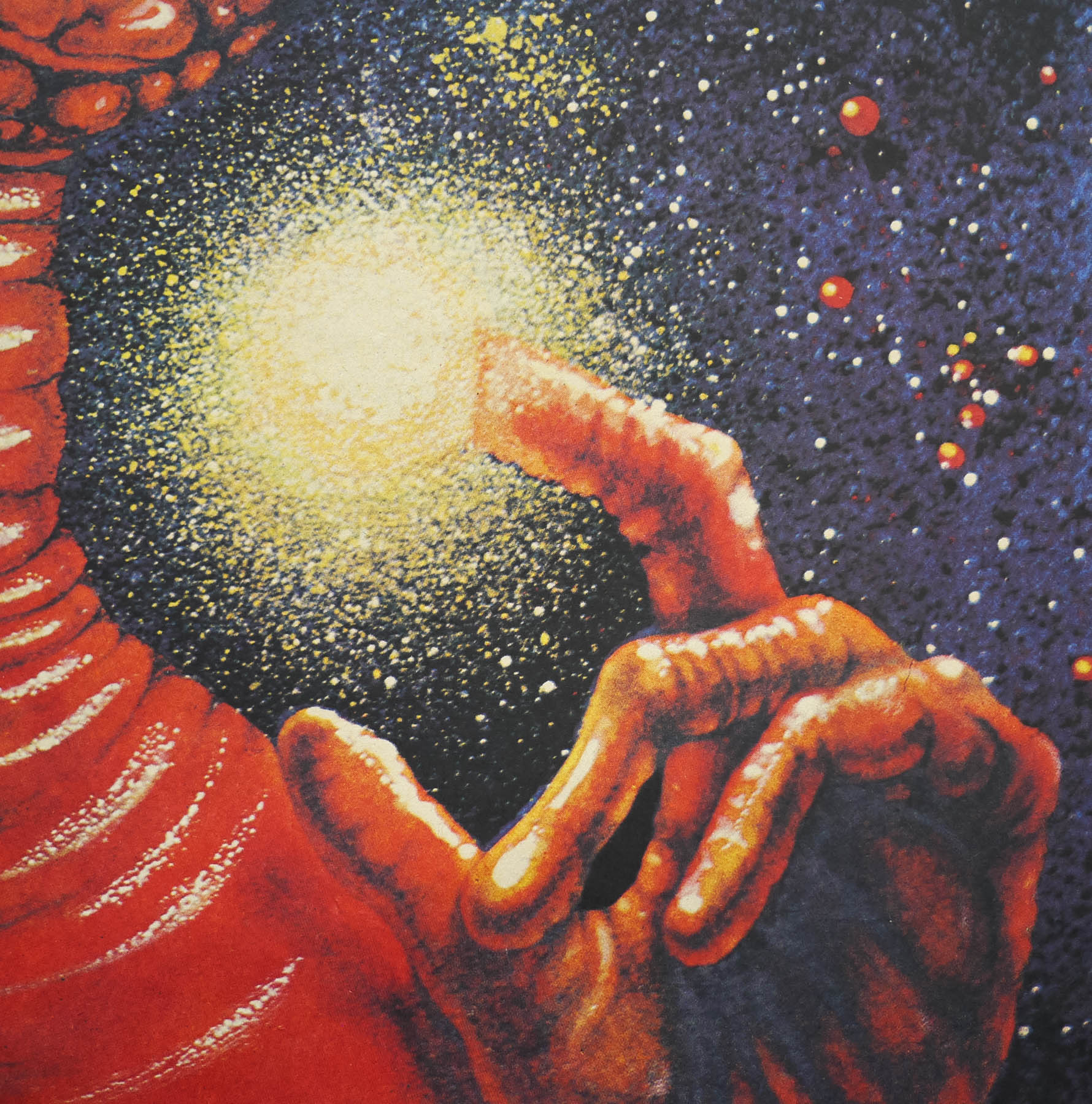
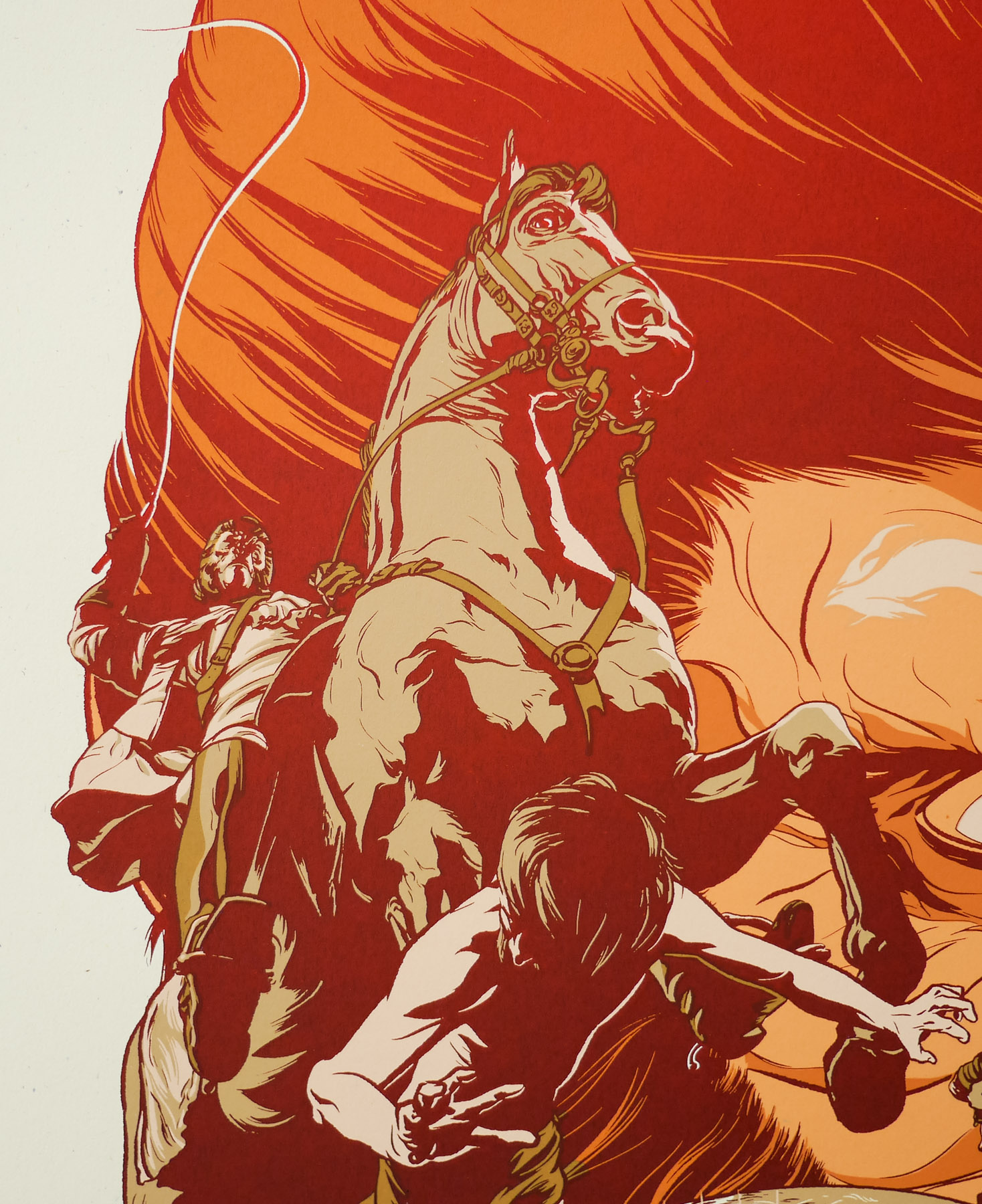
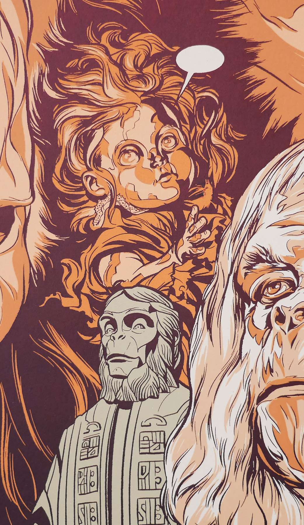
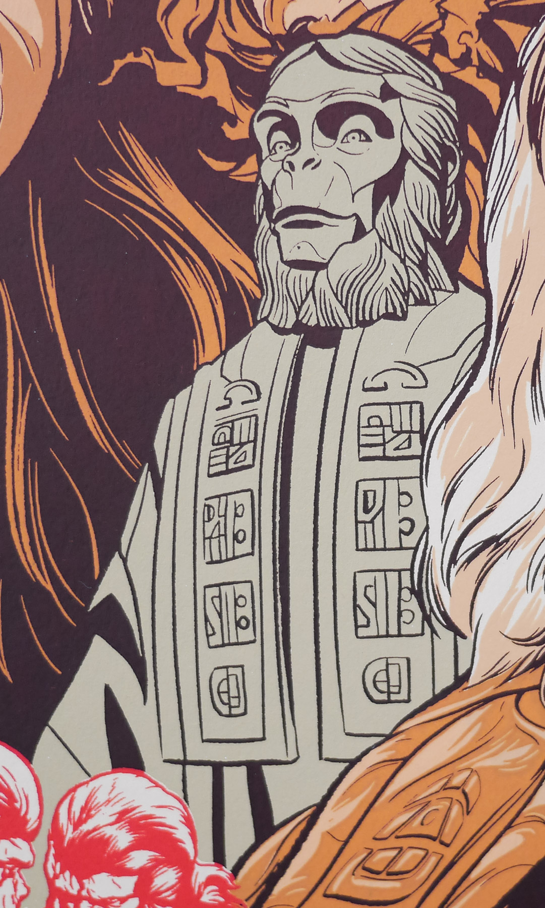
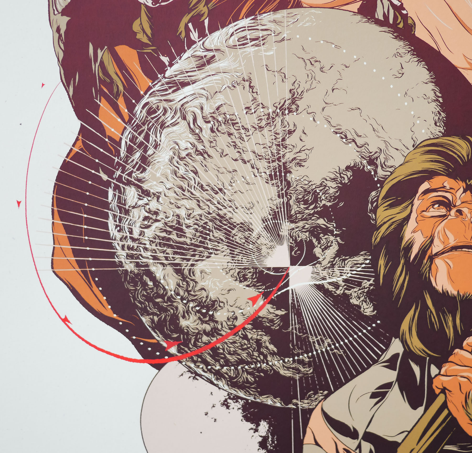
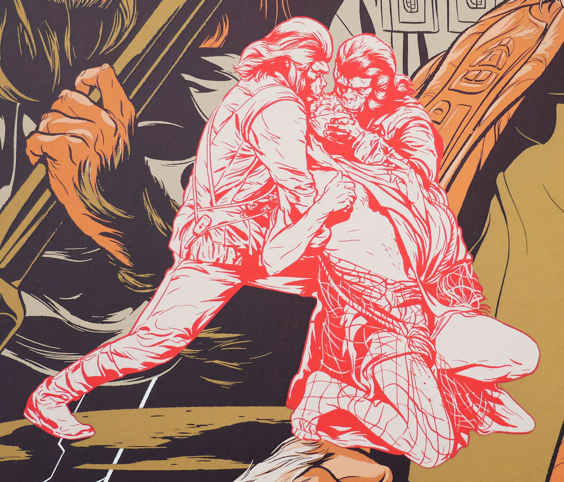
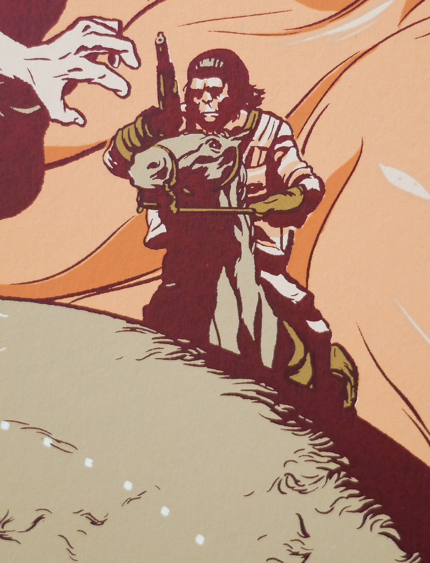
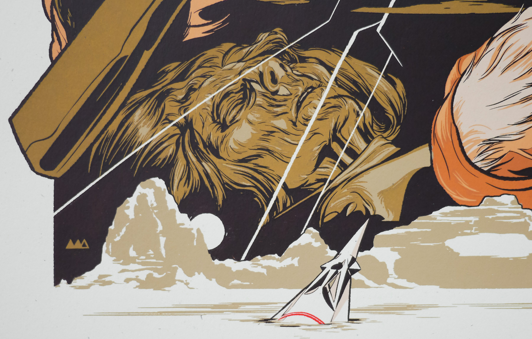
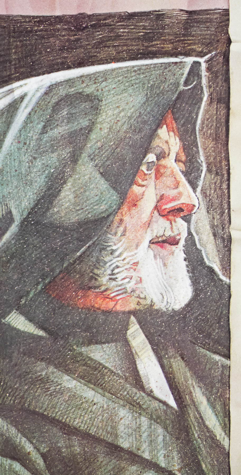
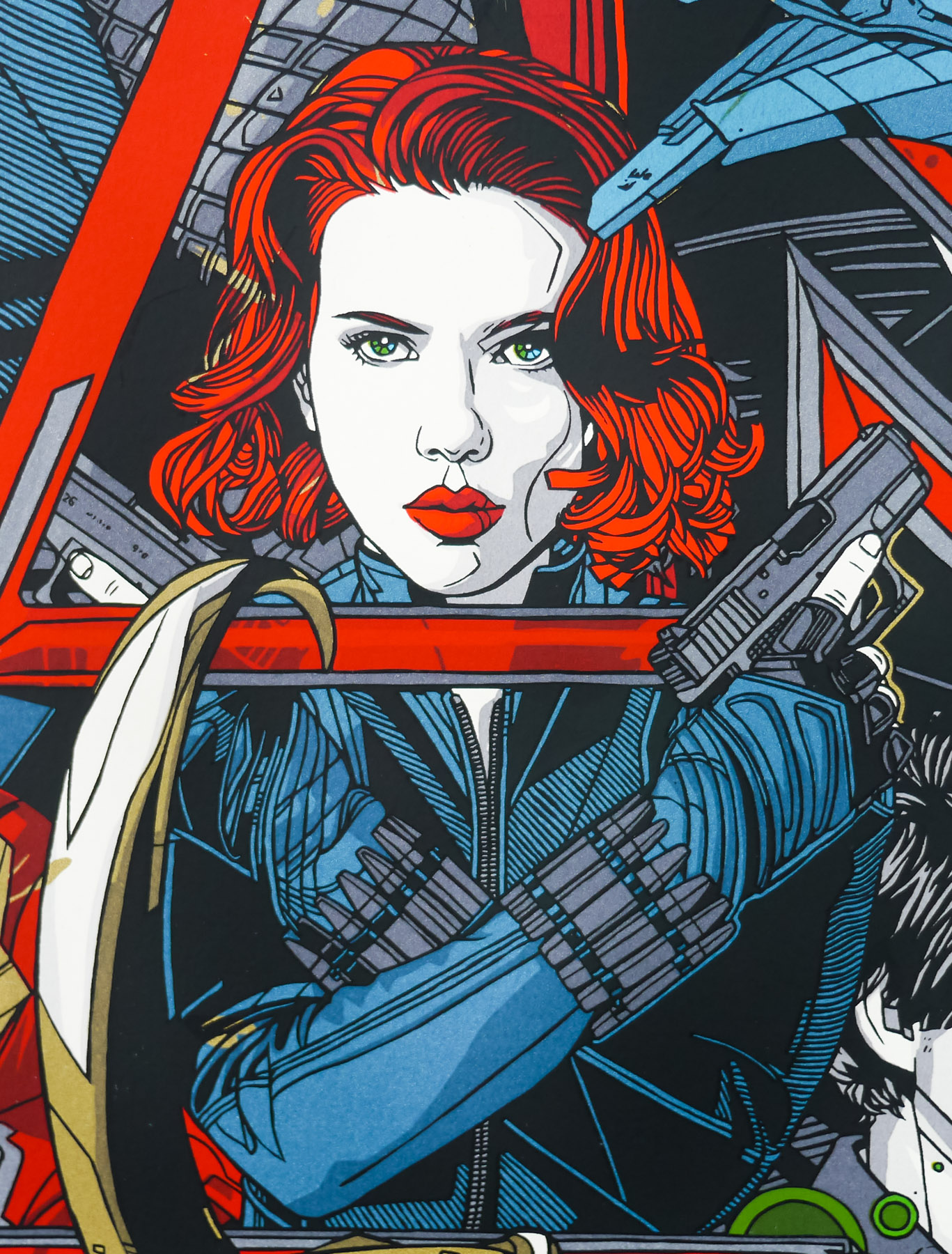
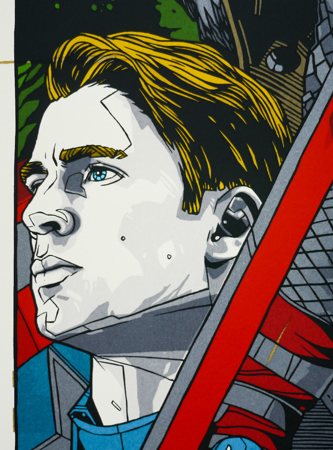
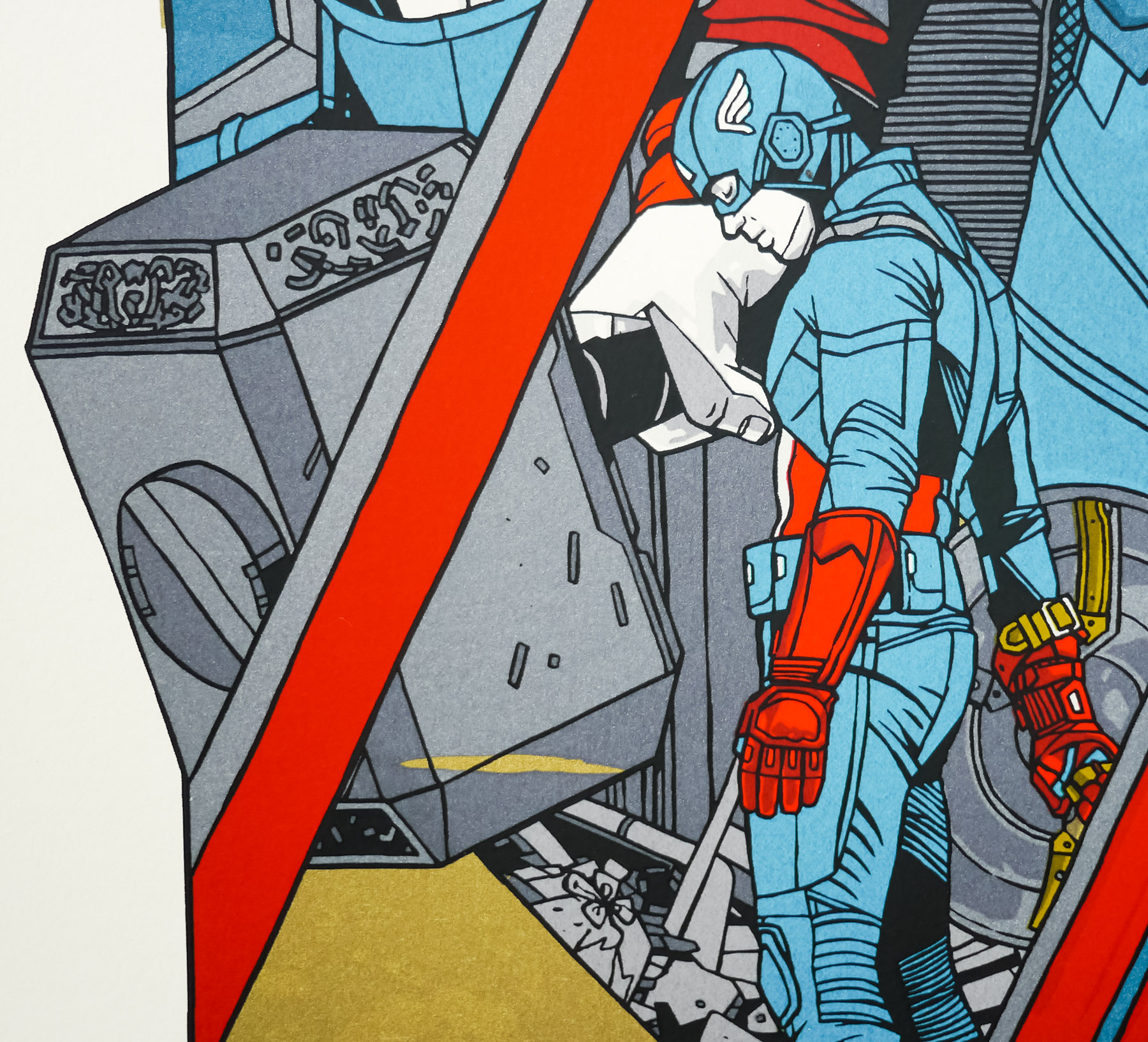
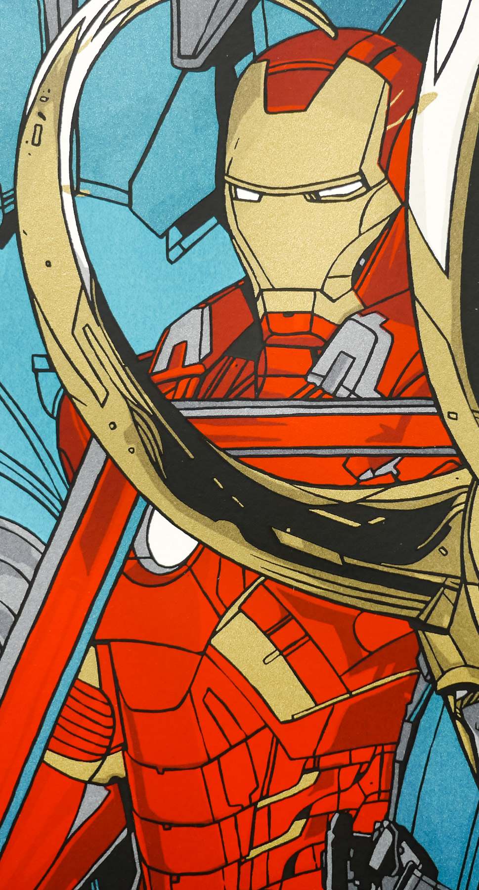
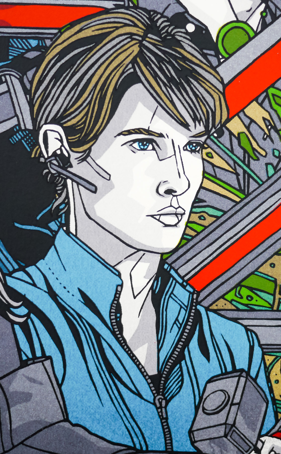
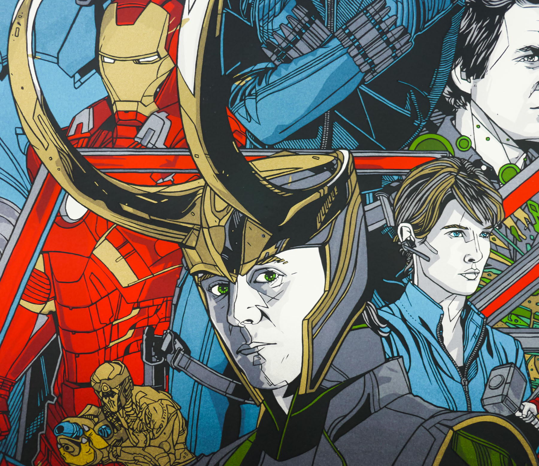
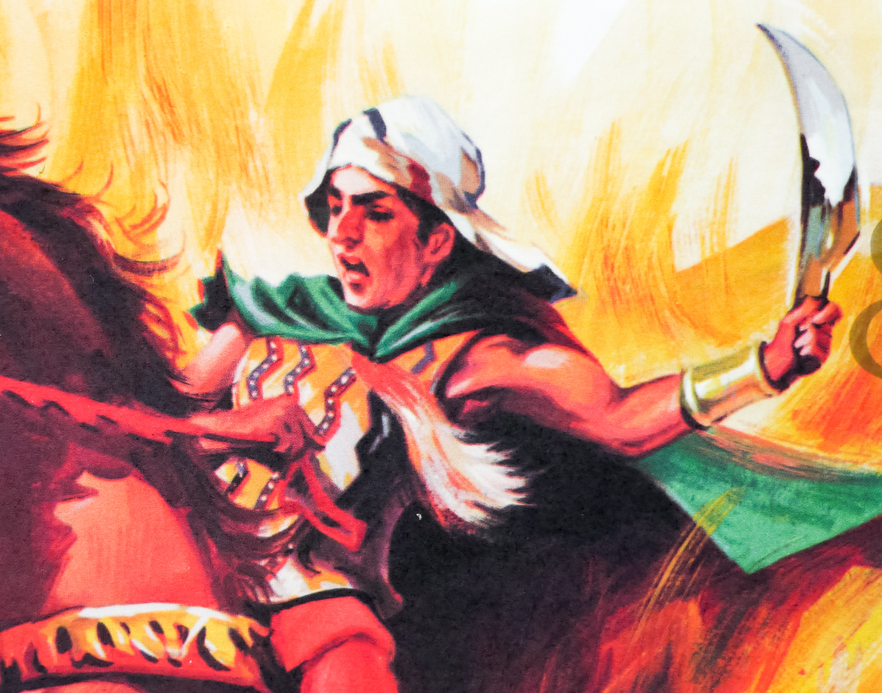
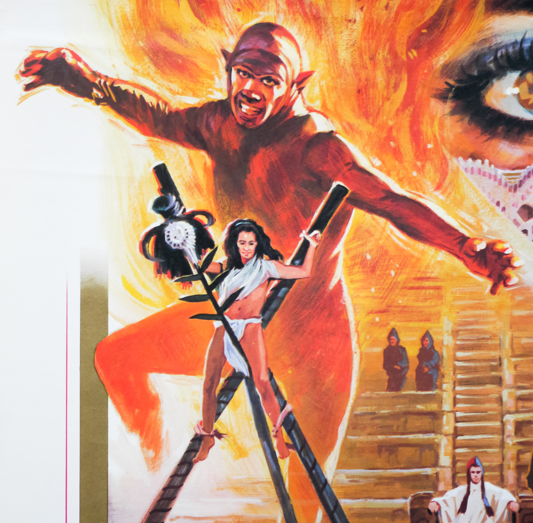
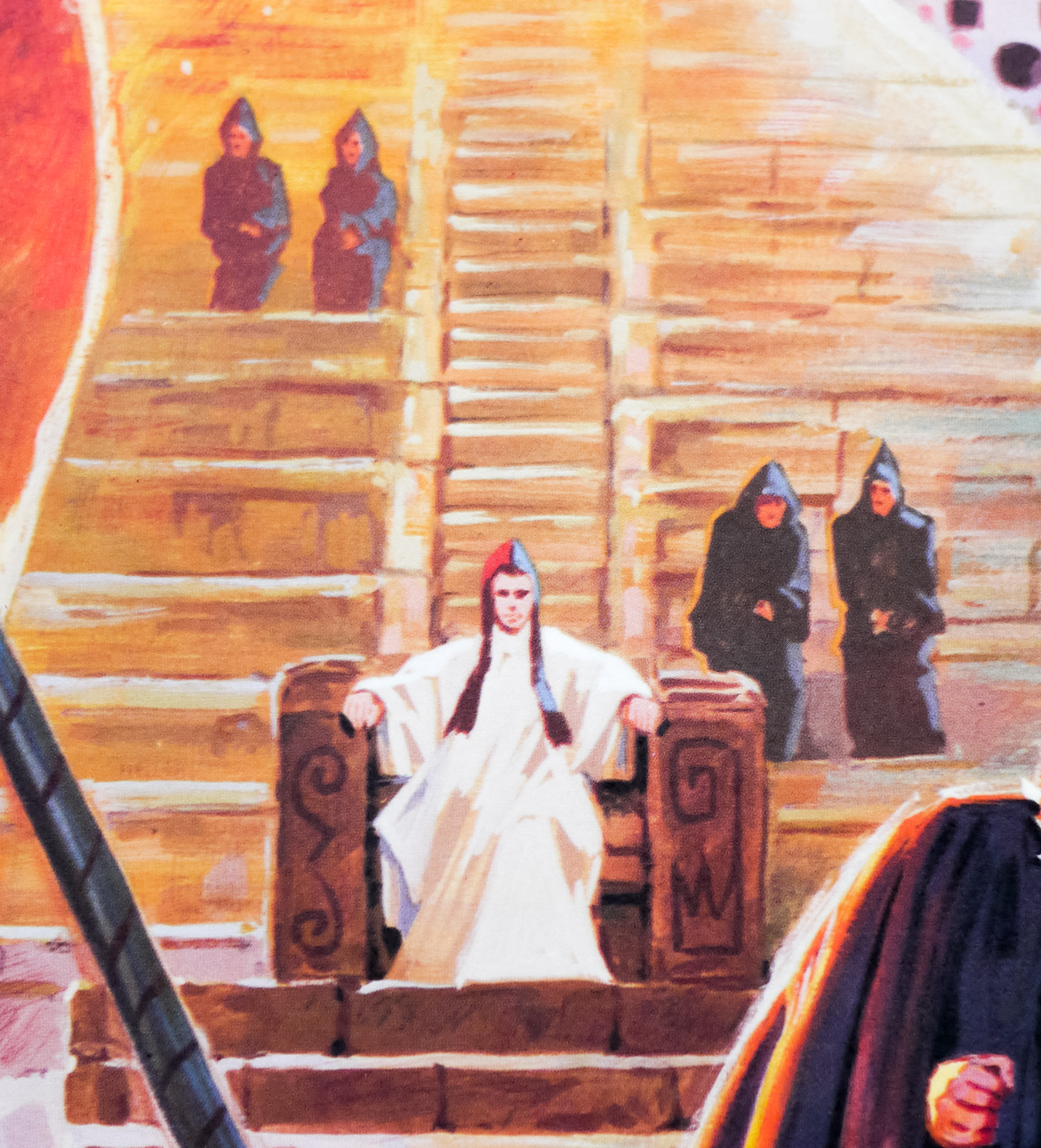
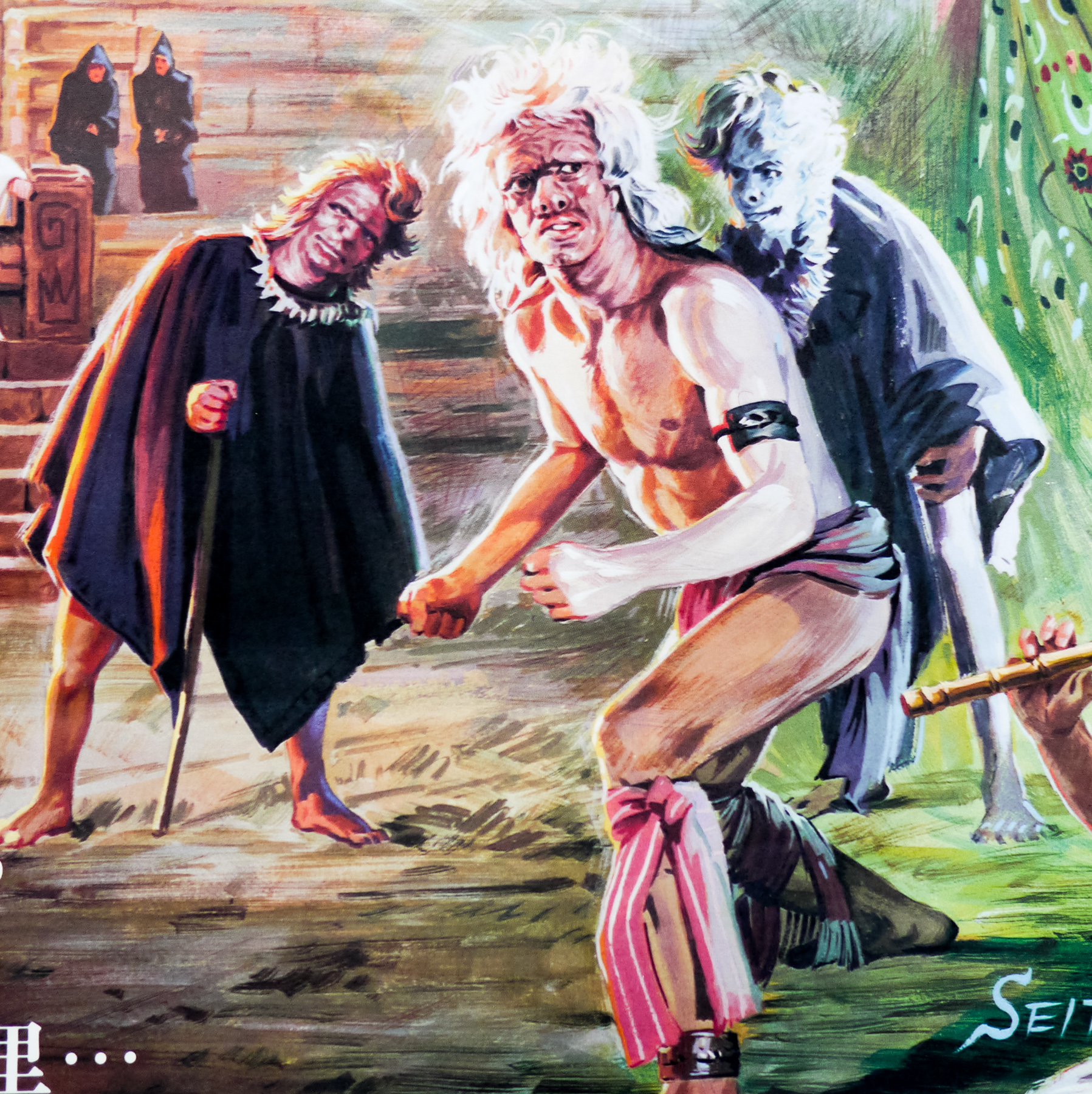
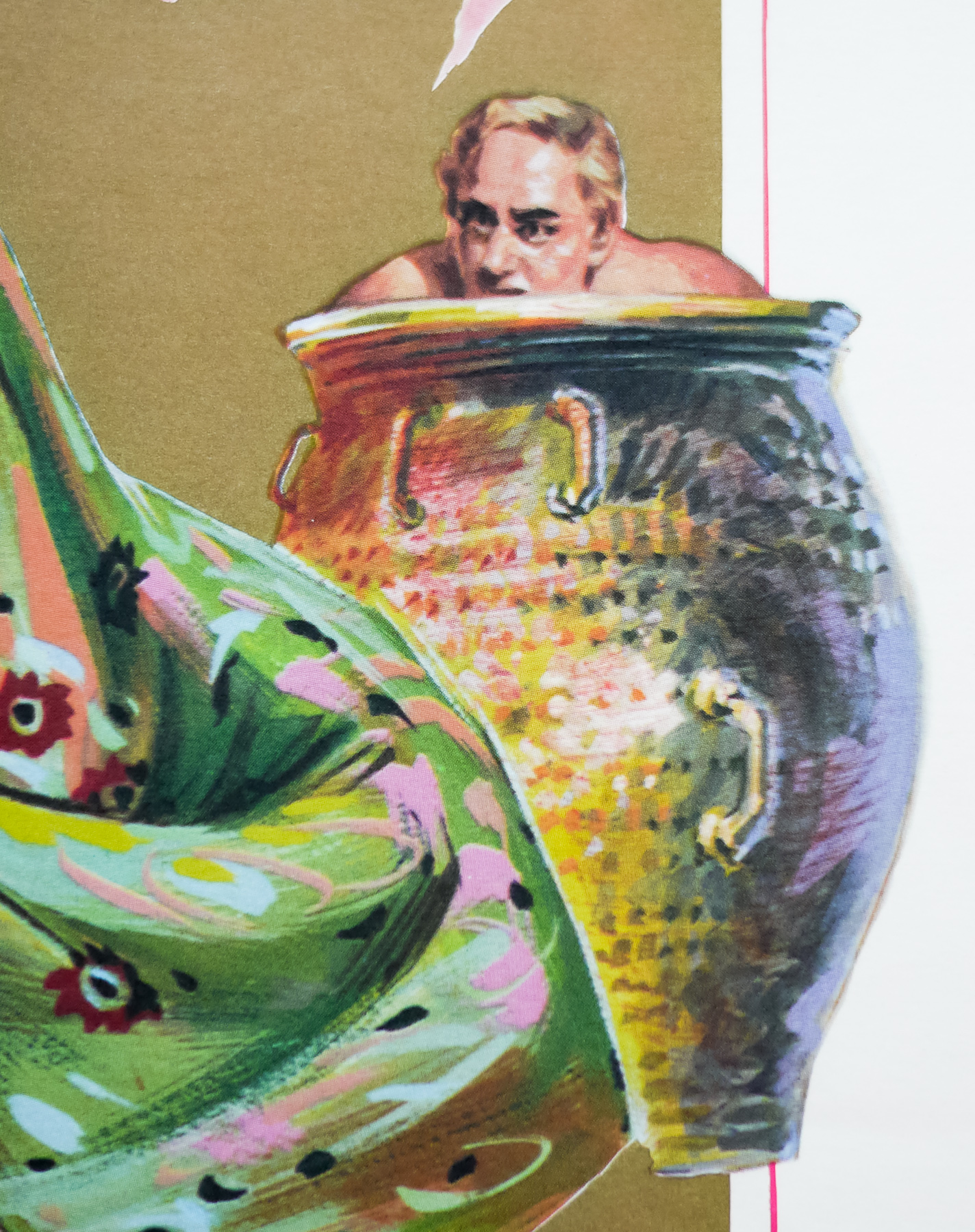
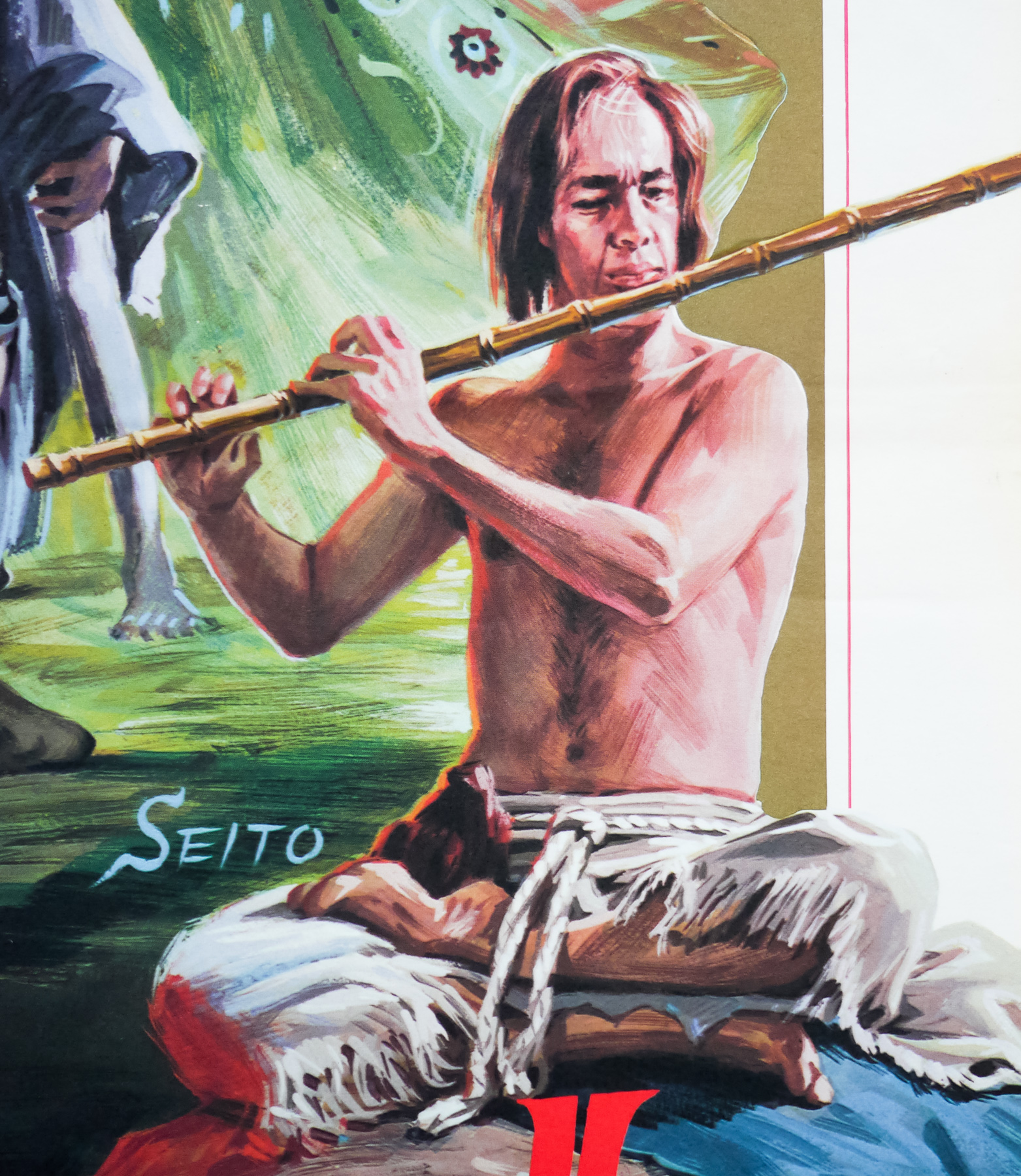
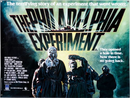
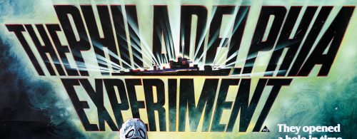
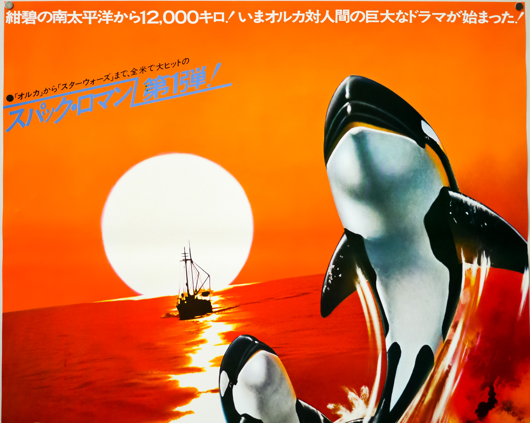
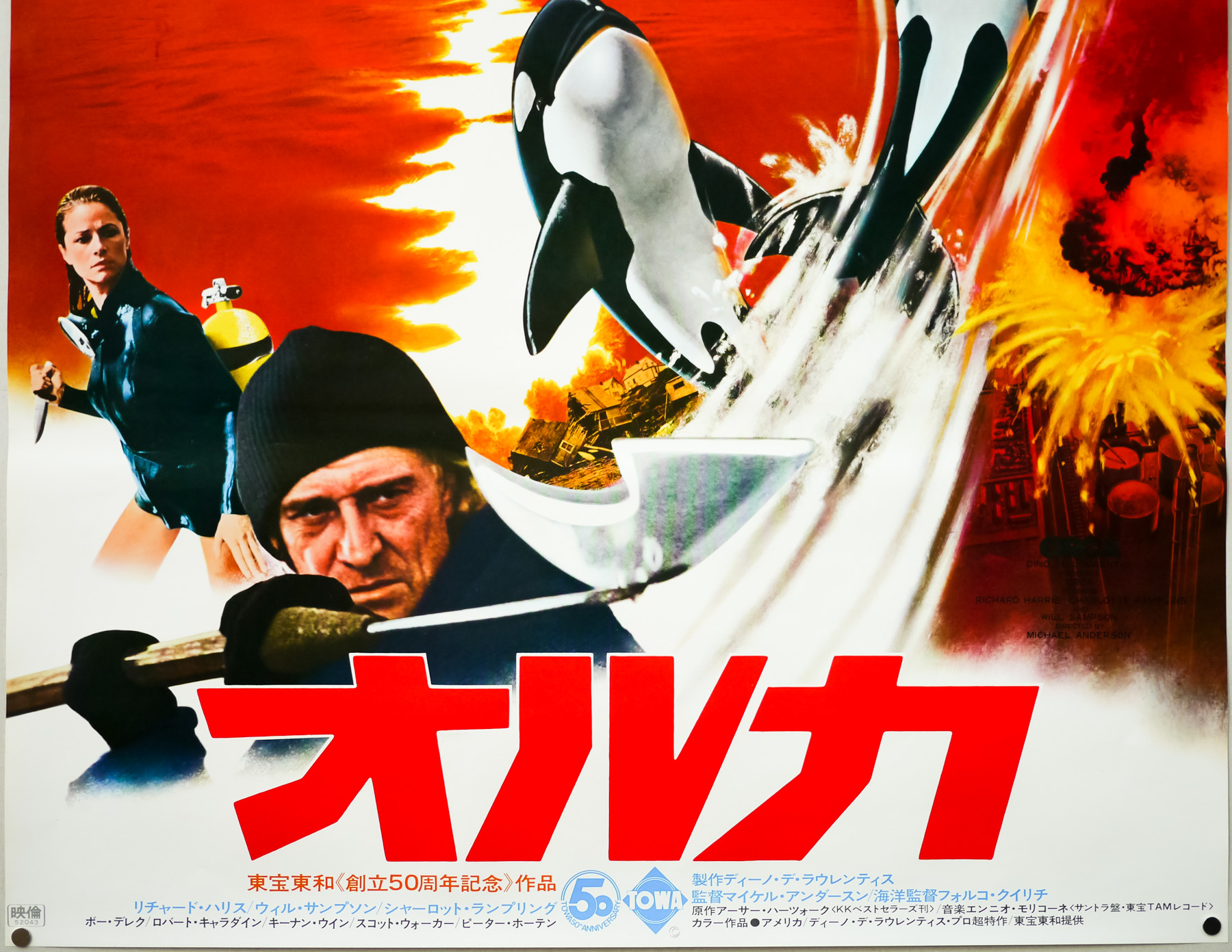
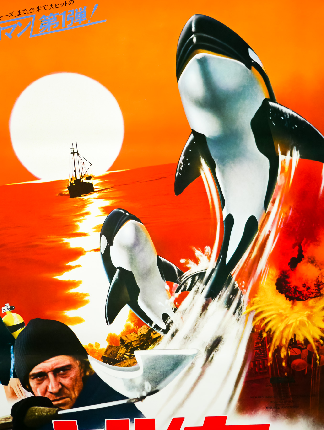
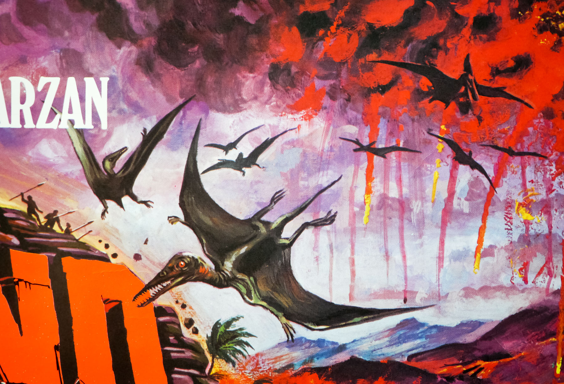
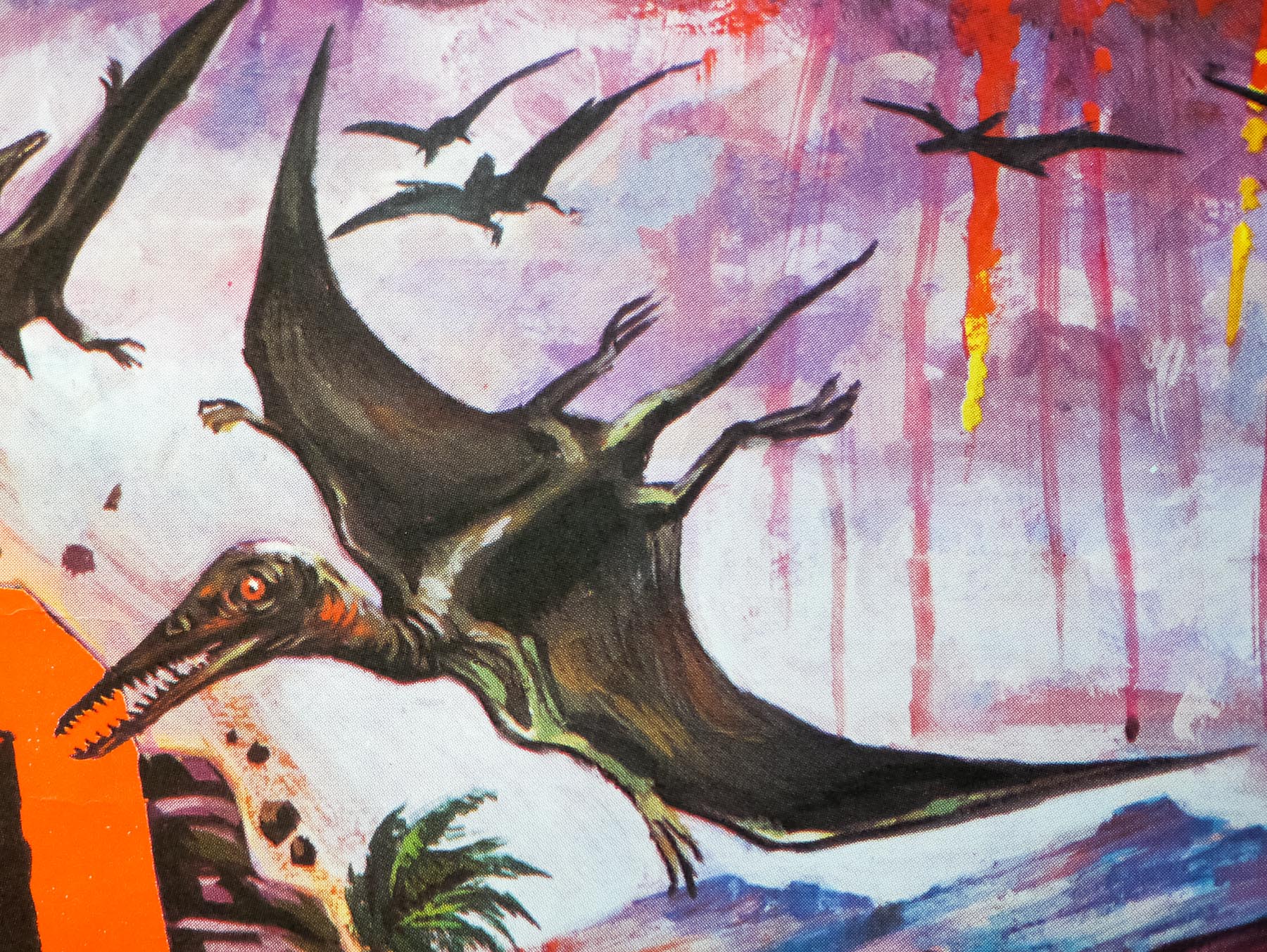
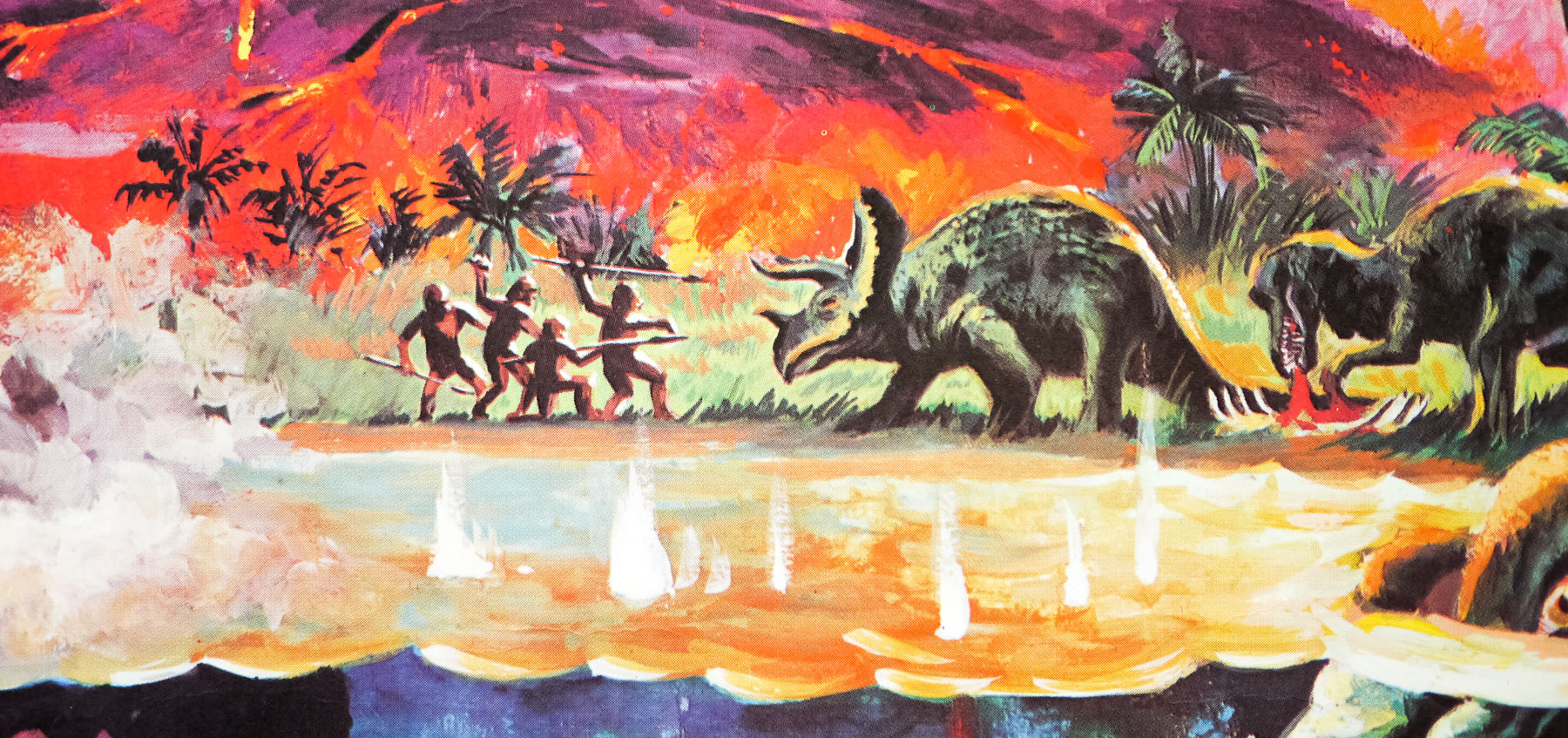
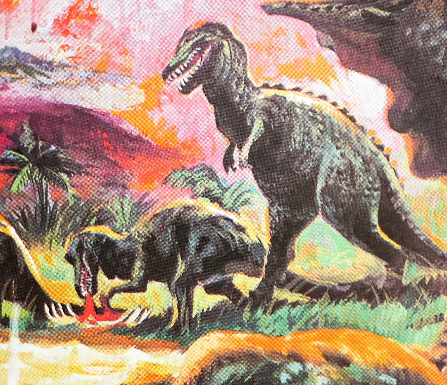
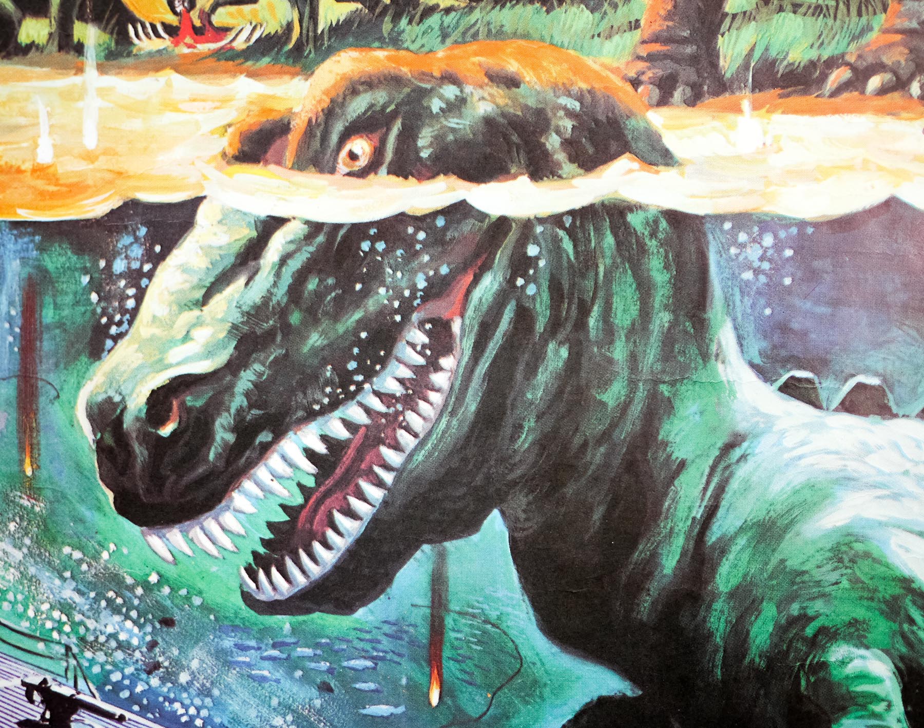
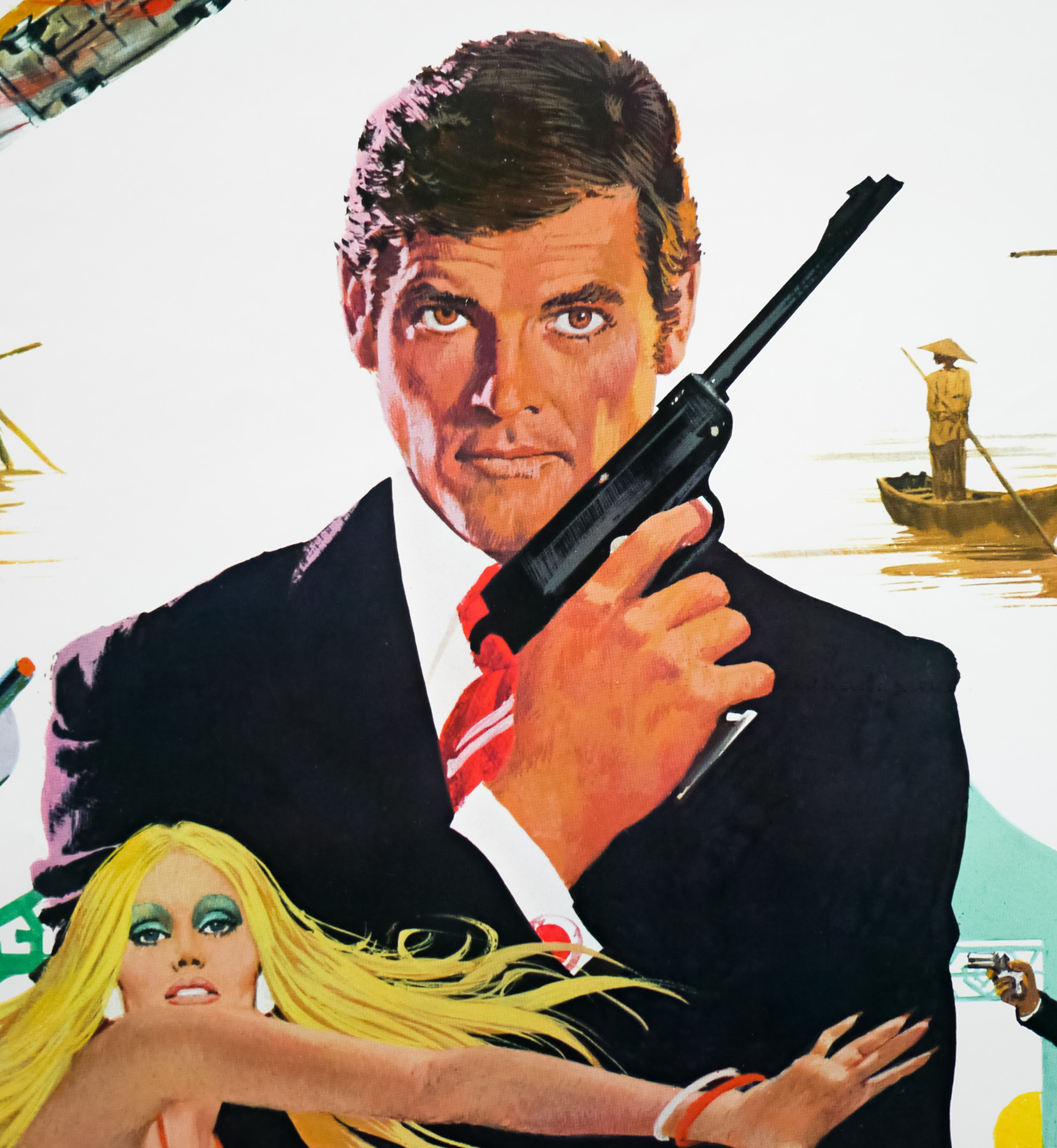
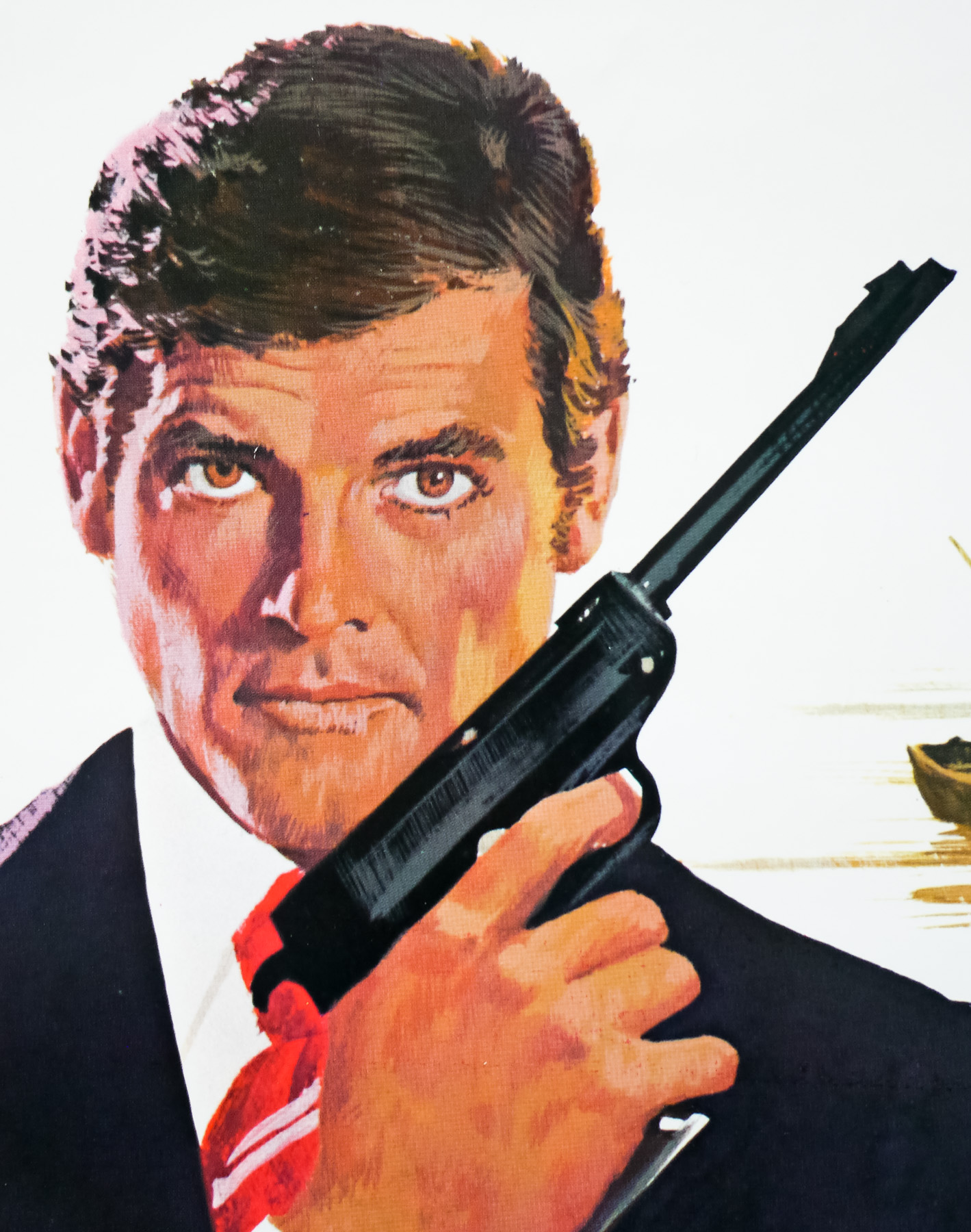
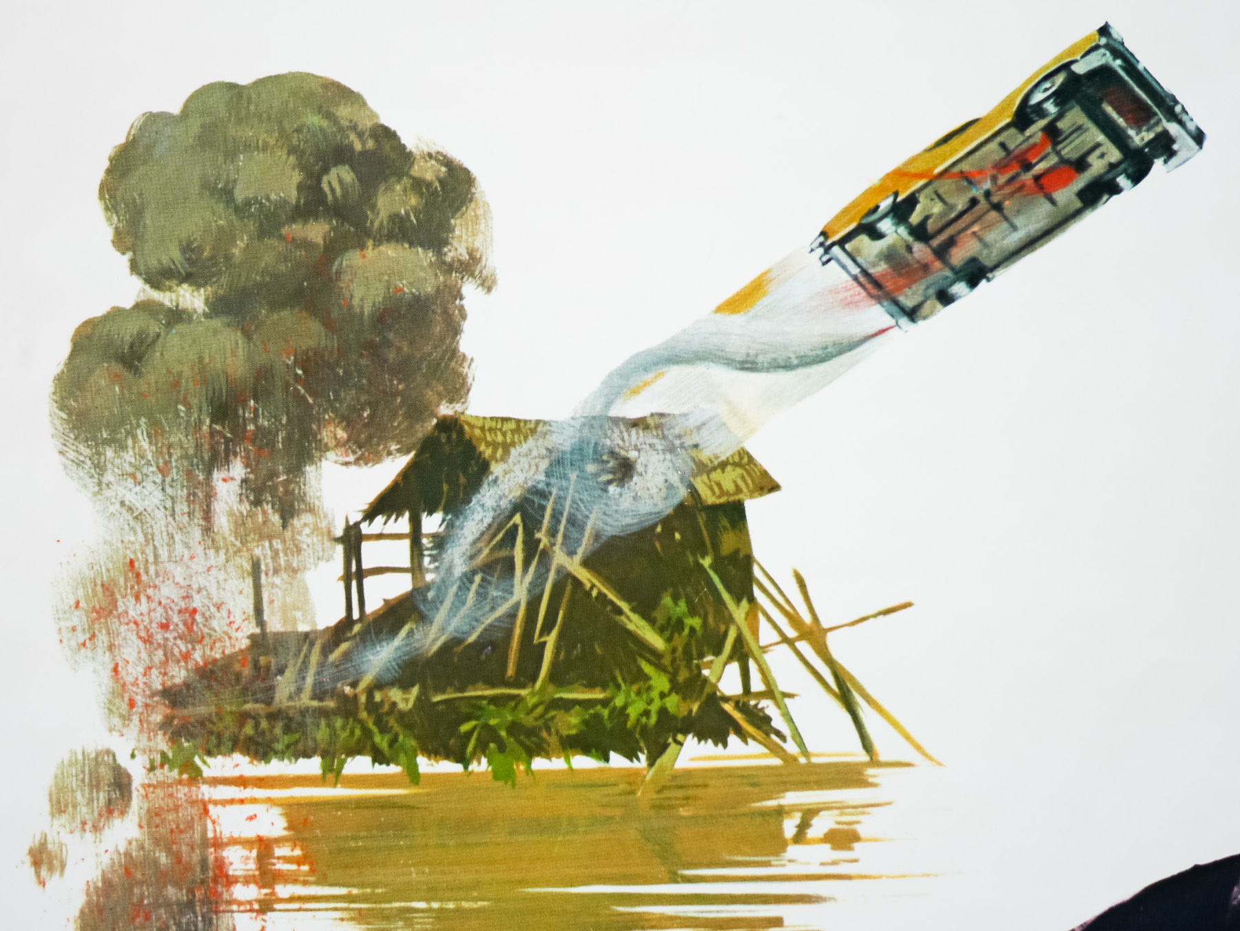
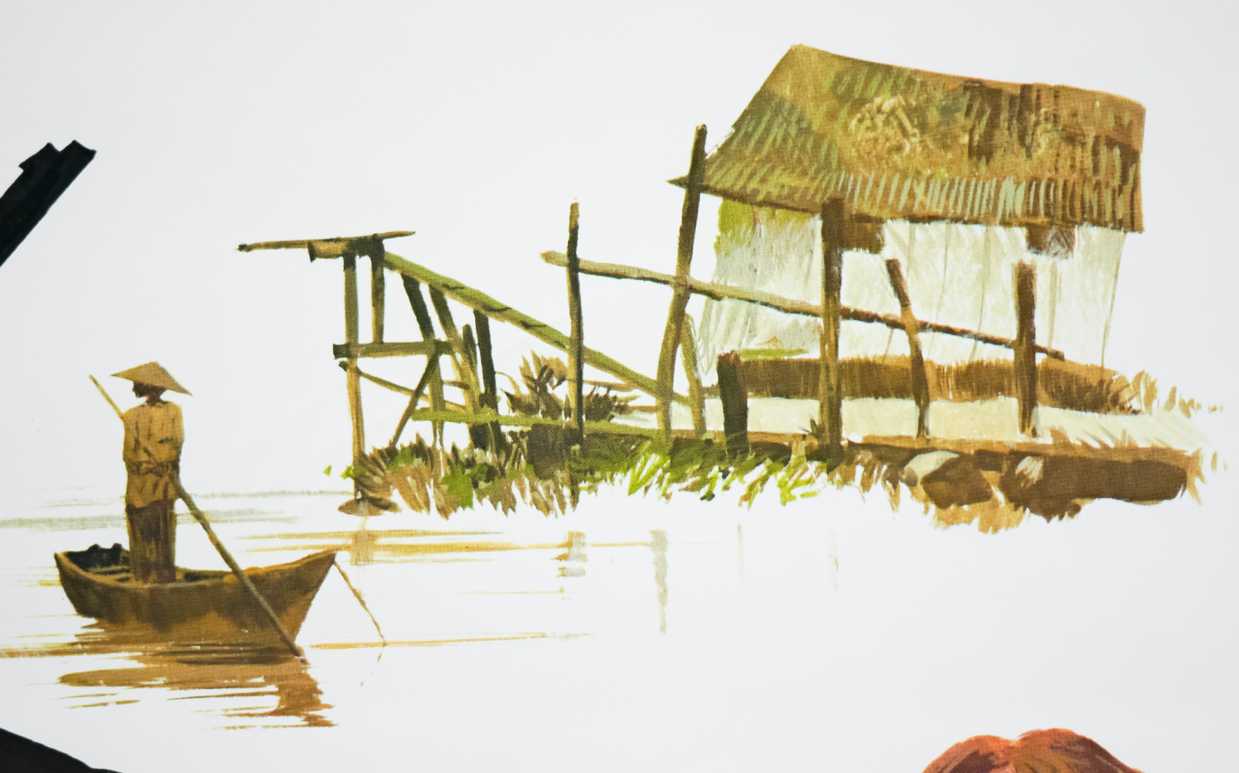
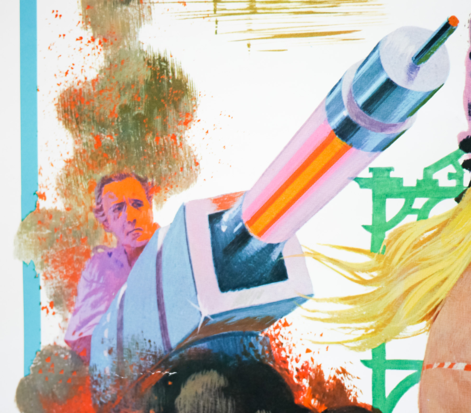
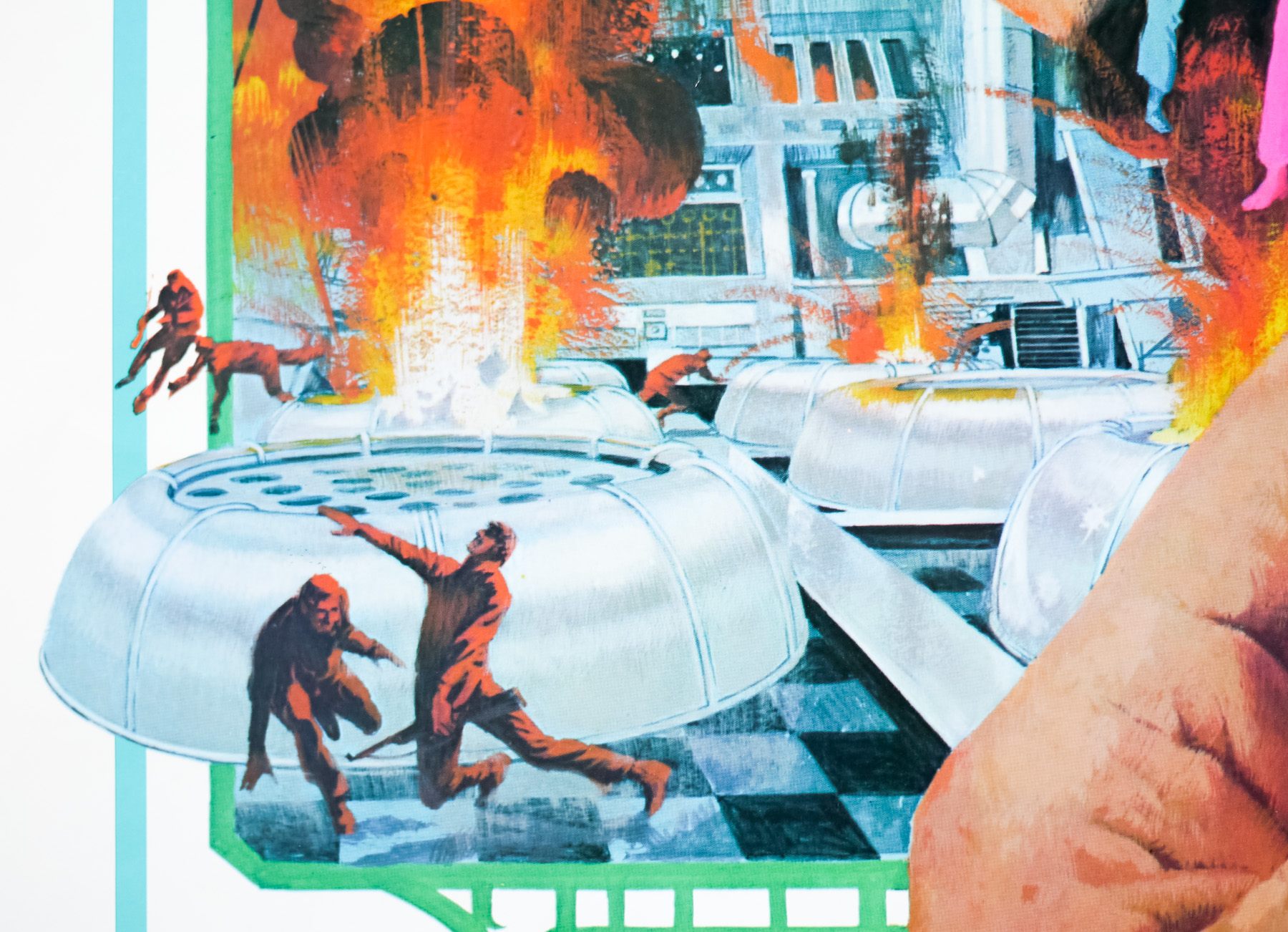
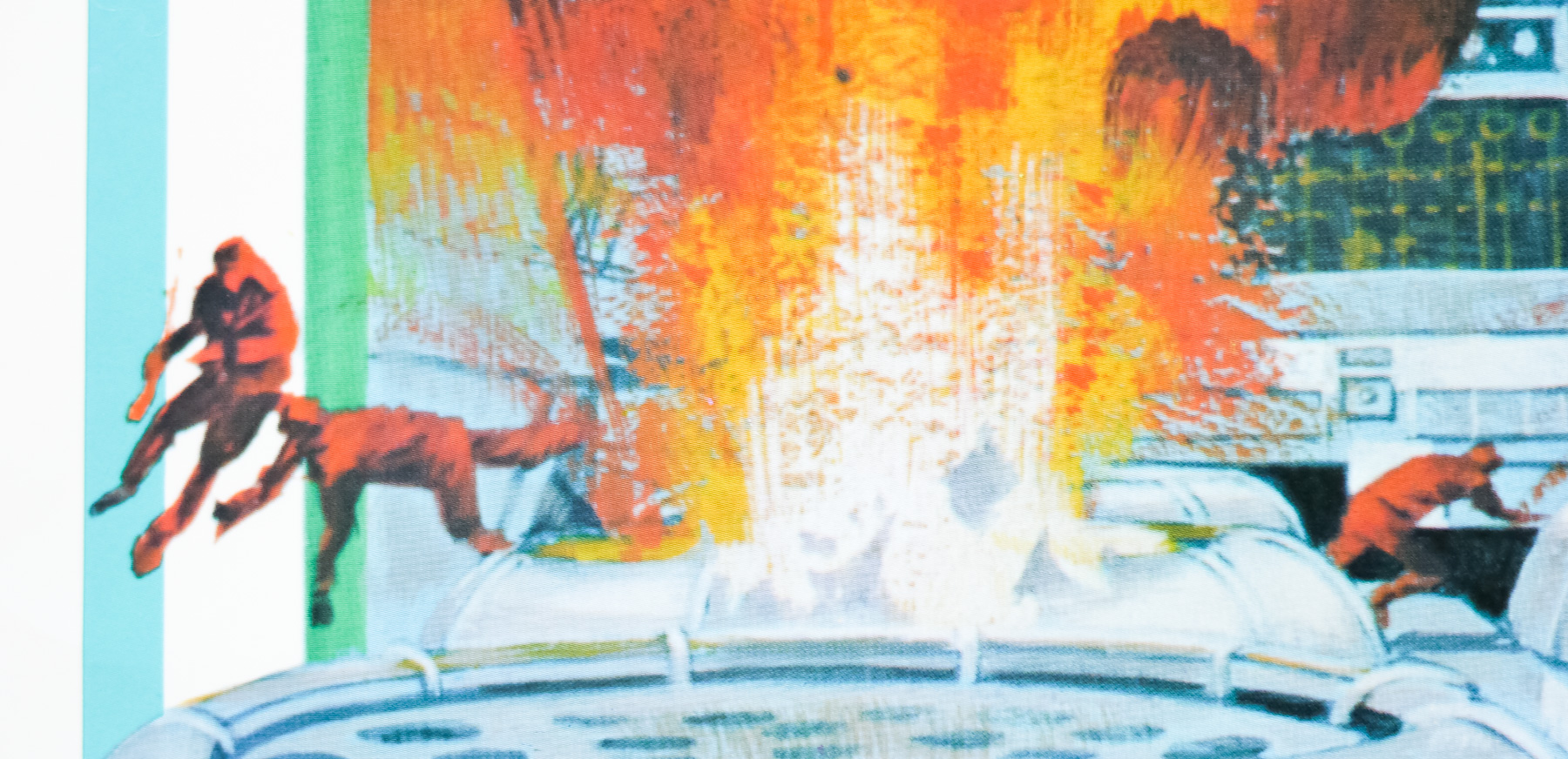
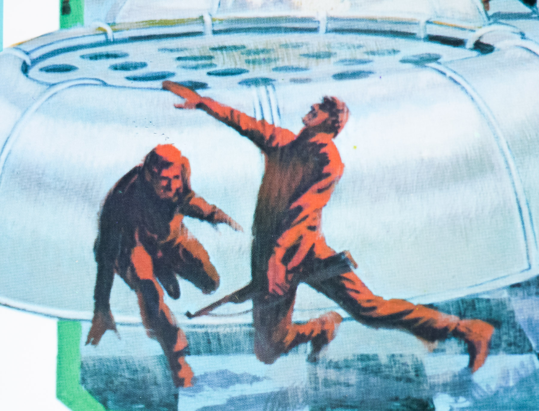
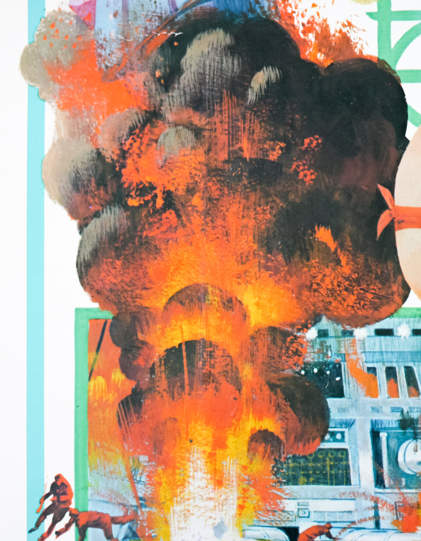
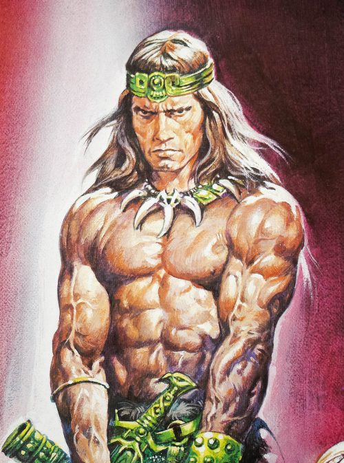
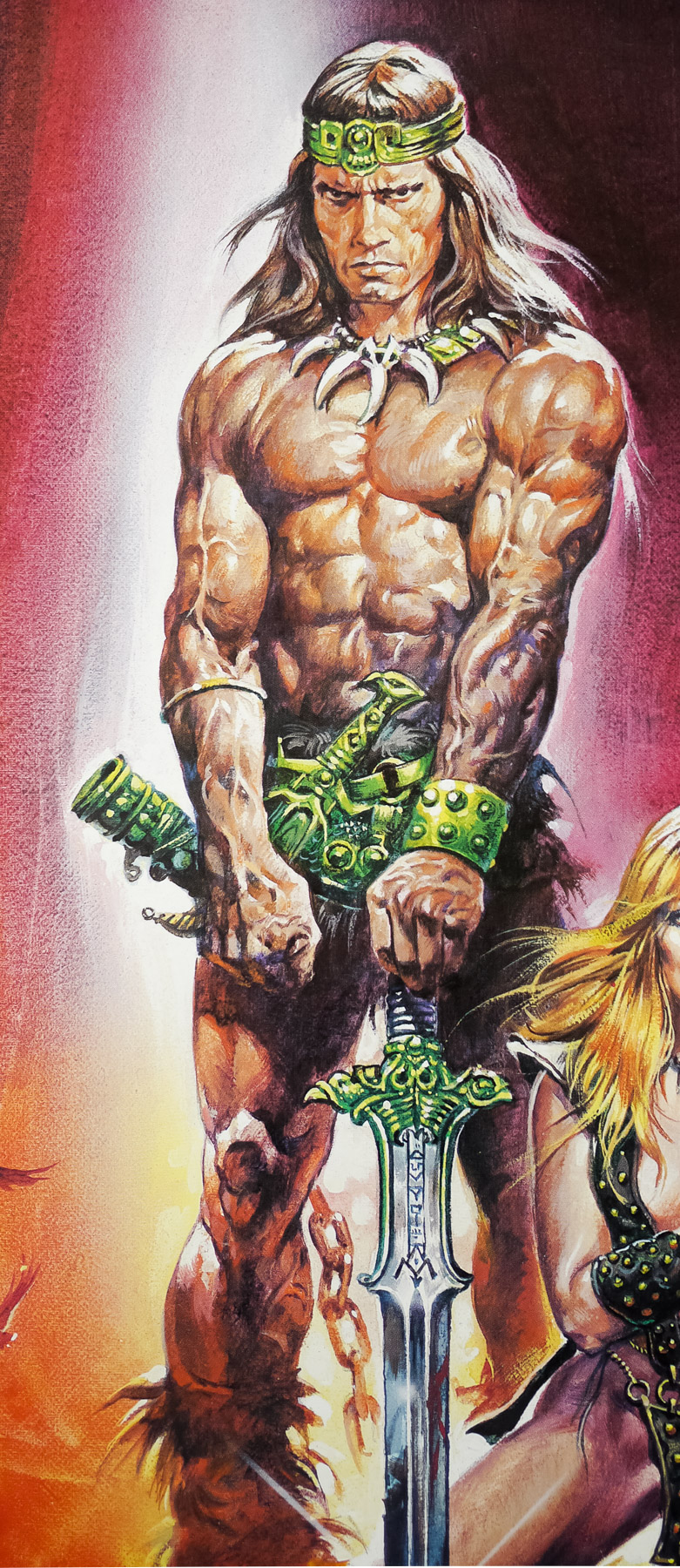
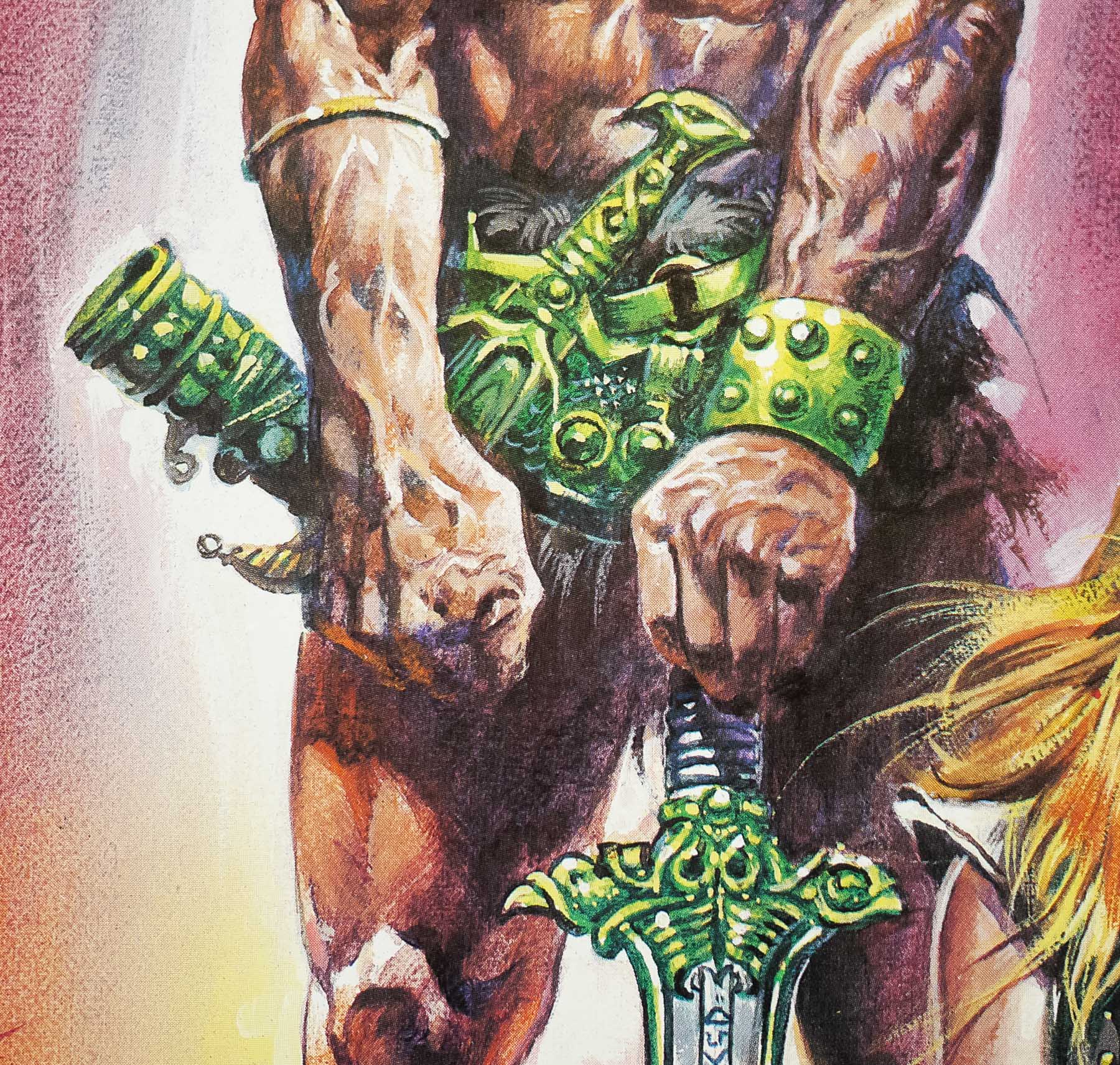
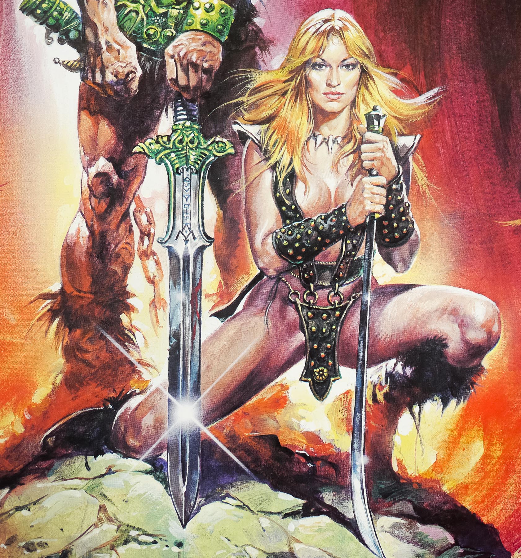
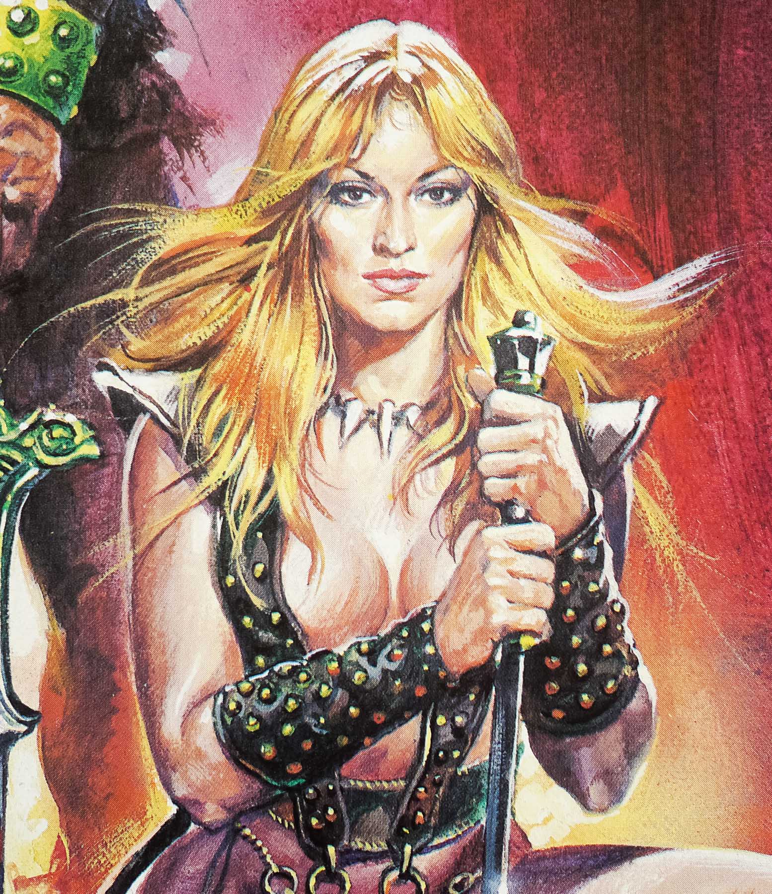
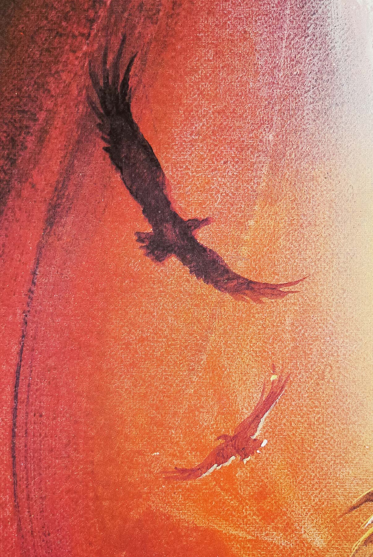
This is the final style German A1 poster (printed after the teaser) for the release of John Milius‘ swords and sorcery classic Conan the Barbarian. It was an important film in the career of actorArnold Schwarzenegger since it effectively launched his Hollywood career. The producers had seen Arnie in his documentary Pumping Iron and both felt he had the right quality for the role of the eponymous warrior. Based on the pulp novels of the 1930s by Robert E. Howard, the film sees the young barbarian Conan seek revenge for the death of his parents at the hands of Thulsa Doom (James Earl Jones), the leader of a snake cult.
This film was also an important assignment for the Italian artist Renato Casaro who painted the artwork that was used around the world, including on the US one sheet and also adapted that artwork for this German poster at the request of a local distributor. The pose of Arnie on this poster has more in common with the US teaser poster that was painted by Frank Frazetta, although the face of the barbarian on the latter is definitely more like the original artwork for the covers of the various novels. I interviewed the artist in 2013 and the poster was mentioned several times during our meeting:
—————-
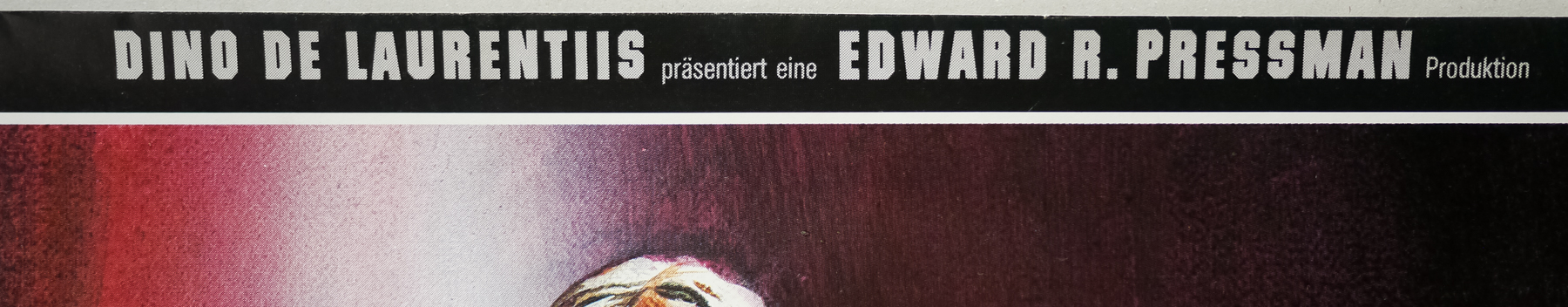
One of your big breaks was working for the Italian producer Dino De Laurentiis?
Yes, that was with a poster I did for the film he was producing called The Bible (1966). He liked what I did for him and that was the start of a good working relationship, and friendship, with him. I remember that The Bible artwork was also used in America for a huge billboard that was displayed on Sunset Boulevard in Los Angeles for several months. After that I worked on many films with De Laurentiis, including Waterloo, Flash Gordon, Dune and Conan the Barbarian, which was possibly the most important for me in many ways as it was used across the world and really helped to get my name out there as an artist.
You visited many different countries at this time?
Yes, one week I might be in the UK, the next in France or Germany or Spain, and then I might be over to the States for one week before returning home. I would visit the set of the film or perhaps the production office to meet the various people involved with it.
One of the most memorable trips I had was over here to Almeria, Spain to visit the set of Conan the Barbarian, which was a Dino De Laurentiis production. I remember the set was stupendous. It was like a piece of old America had been reconstructed in Spain. The village set was here and it was brilliantly done with lots of detail. I recall that the light and ambience over here really fascinated me and I promised myself then that I would return. Years later, I hadn’t forgotten about it and decided that it was time to return here and that’s when I built this house and decided to live most of the year in Spain.
——————
Did you meet Arnold Schwarzenegger when you worked on posters for his films?
Ah, yes, sure. We first met on the set of Conan in Almeria and it was strange because back then no one on the set knew who he was, just that he had this powerful body and a handsome face. Nobody working on the film had any idea how famous he would eventually become! He was a nice guy and I enjoyed working on the poster for the film. I took lots of photographs on the set whilst they were filming and John Milius, the director, was very helpful. I spent some time with him to understand the vision of the film.
——————
Is there one poster that you’re most proud of?
Not really, I’m pleased with how different many of my posters are, both in terms of the style with which I painted them and for the layouts and concepts I used. There are posters like the one I did for Conan that really bring back good memories when I look at them or that were a really important milestone in my career, but there are many other posters I’m also proud to have worked on.
——————
Also worth reading is the brief interview with Renato on the Conan Completist website, which specifically mentions the German poster:
——————
Usually, when a film goes to other countries, the poster changes. Were you involved too in some of the foreign posters?
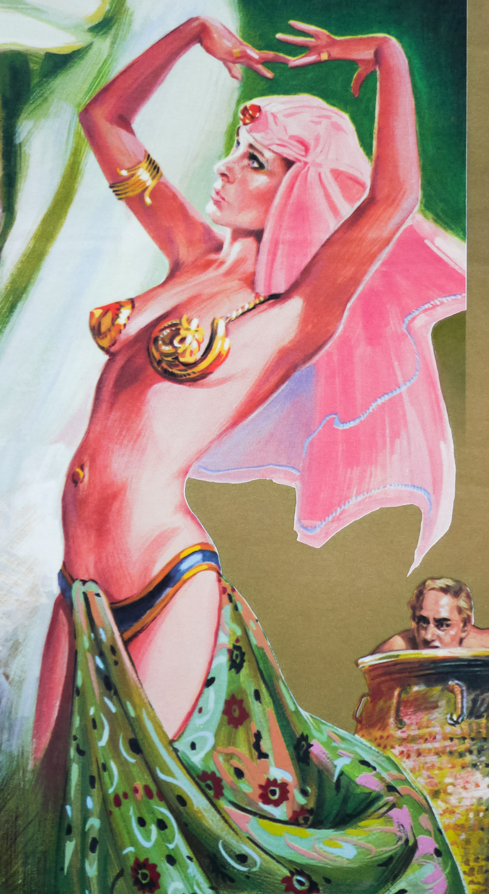
Yes. The German version, for example, was specifically done on request of the German distributor as to produce a huge display to be put in the cinema entrances. The painting, therefore, was done by me. Sometimes other elements were added into the key art, like in the Thai version, but I’m not concerned with that.
—————–
To see the other posters I’ve collected by Renato click here.