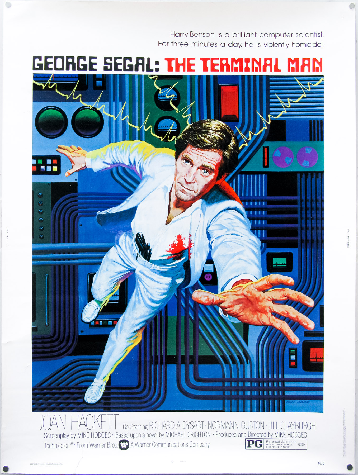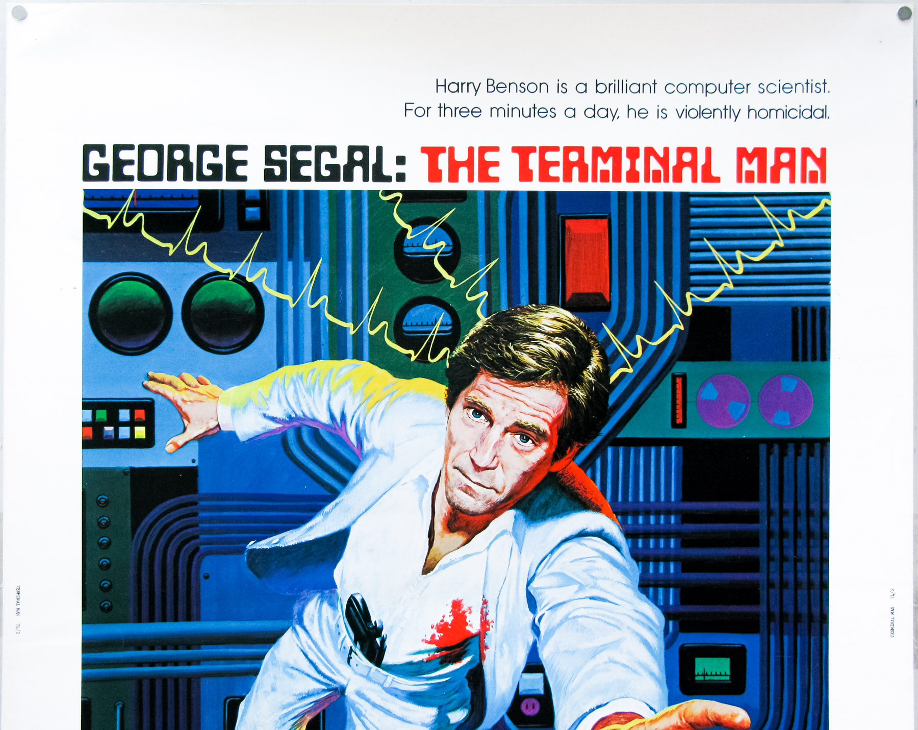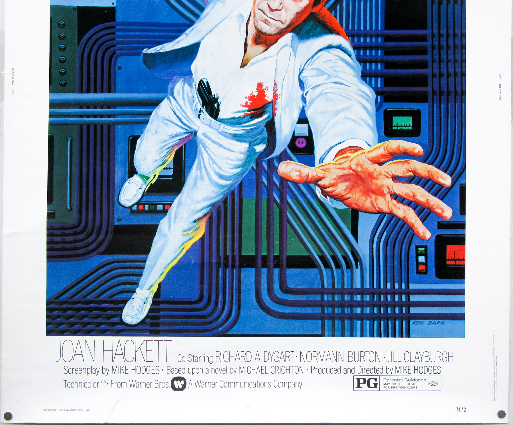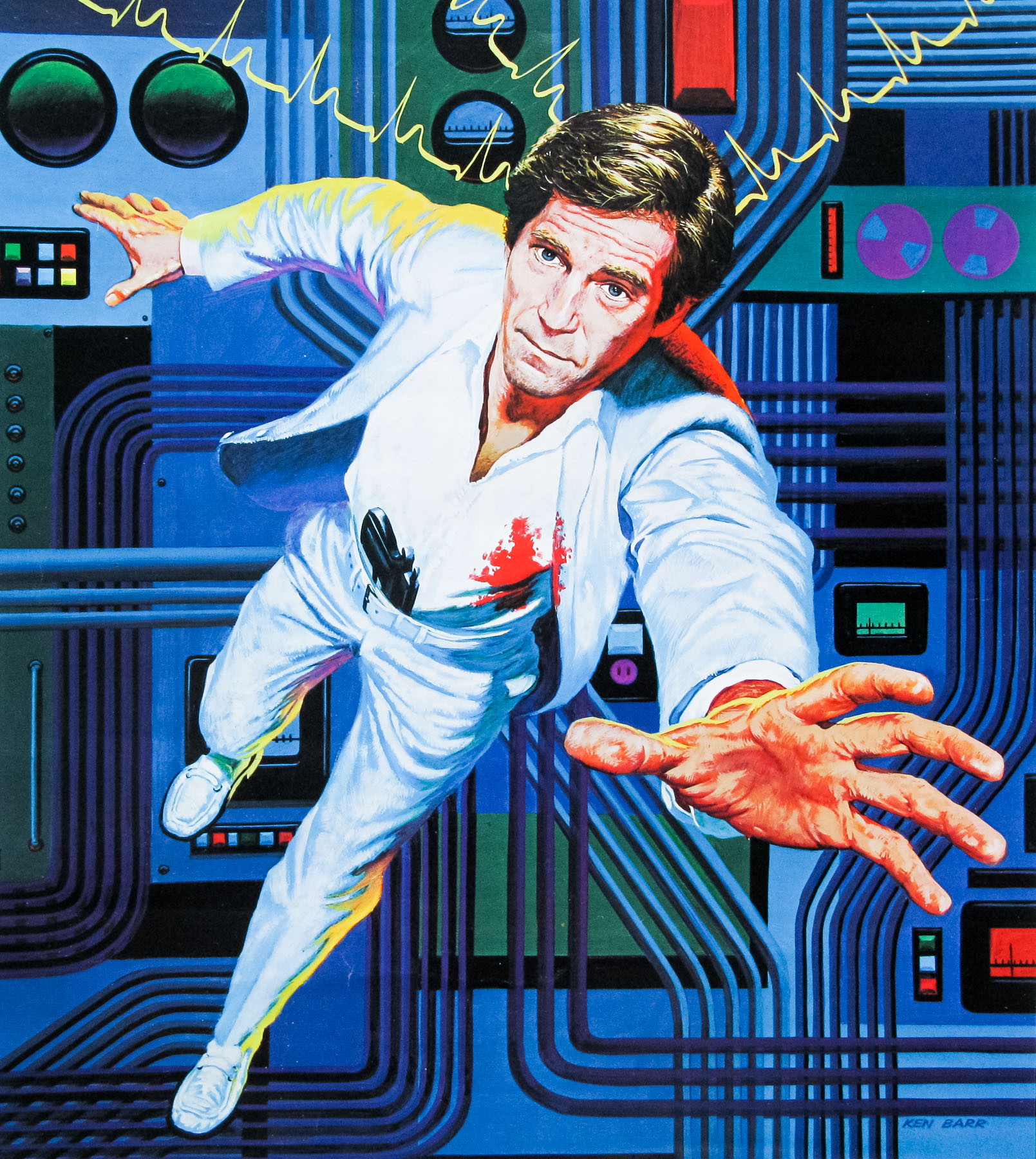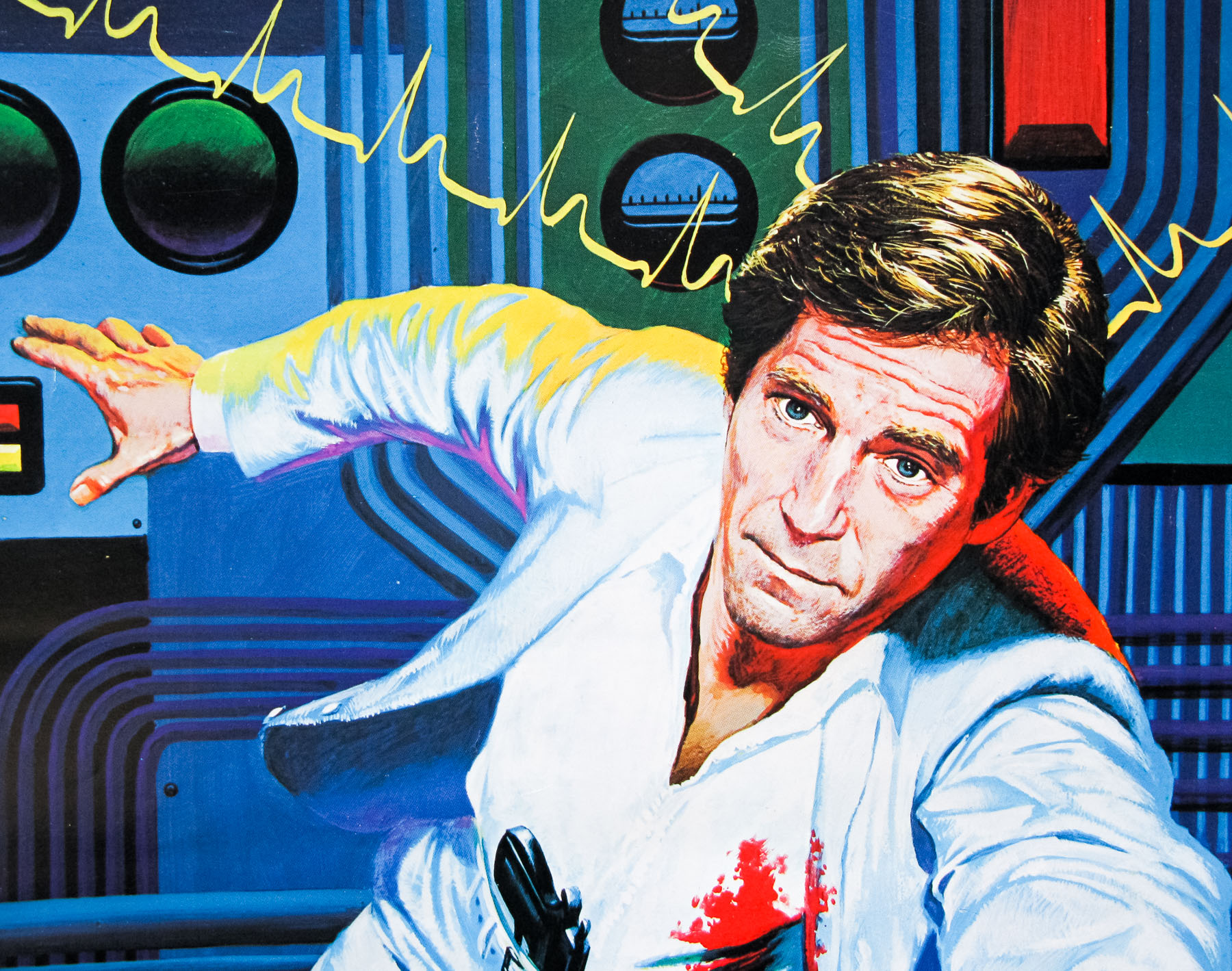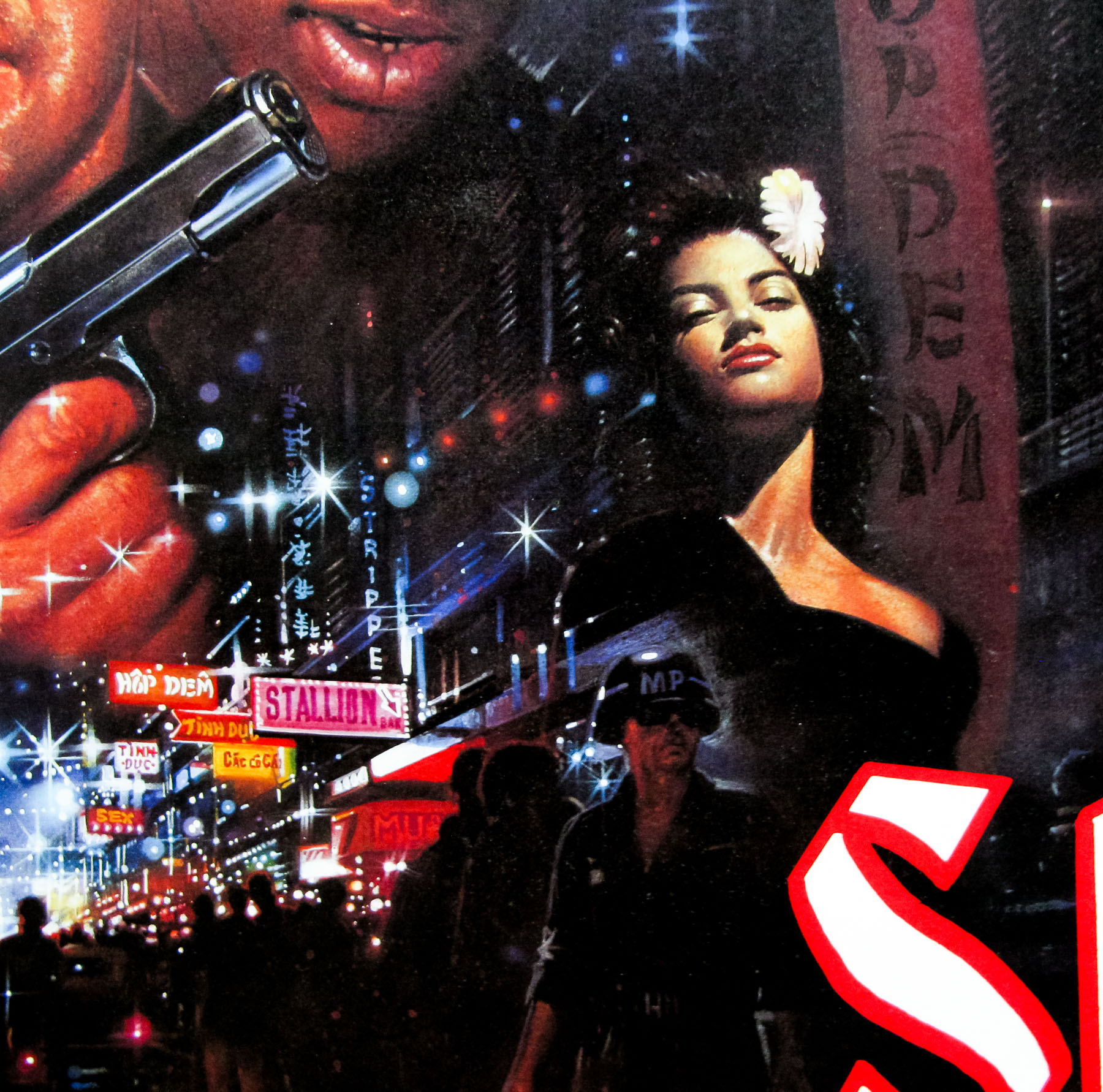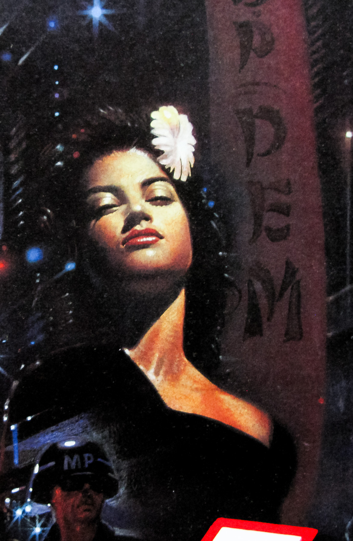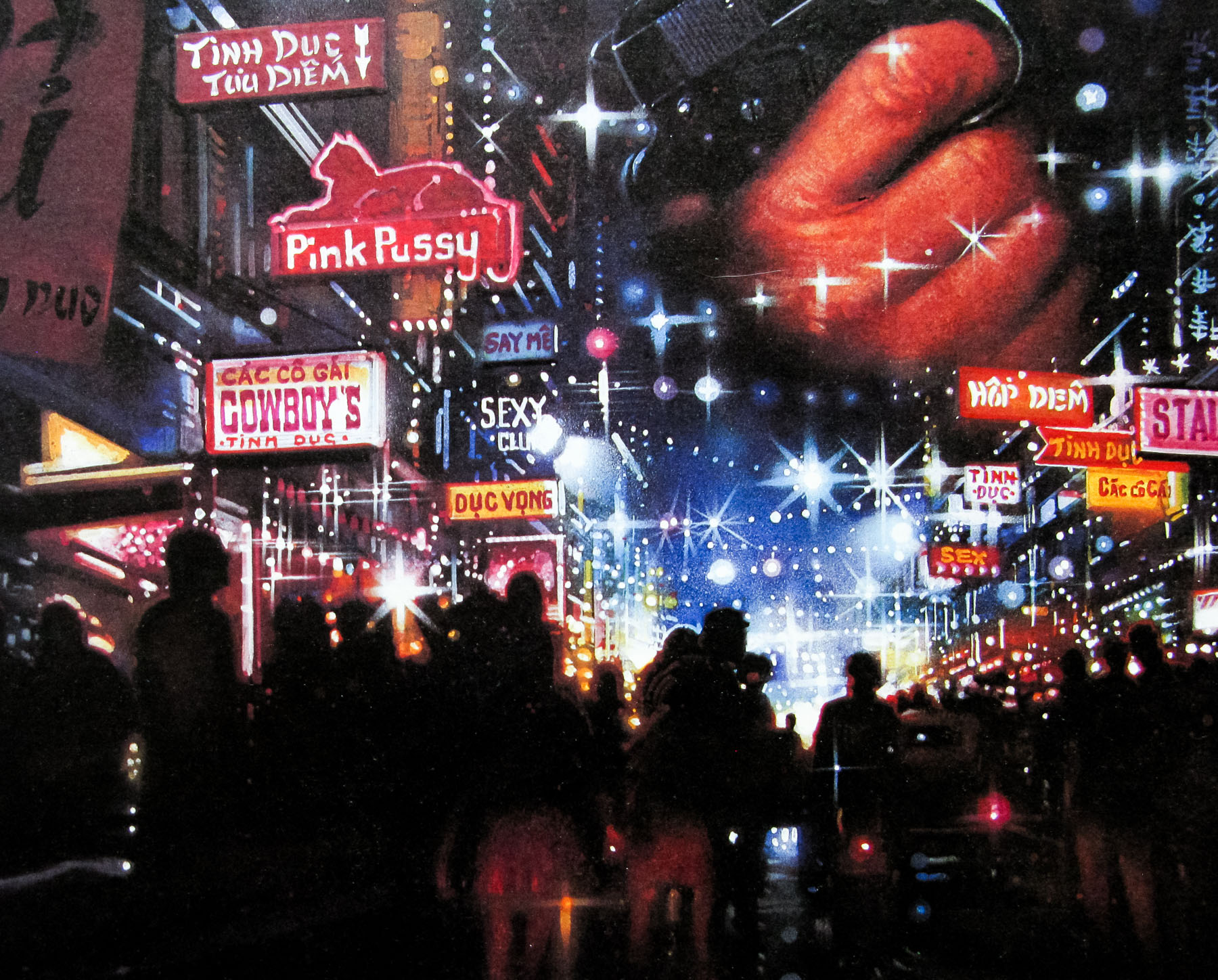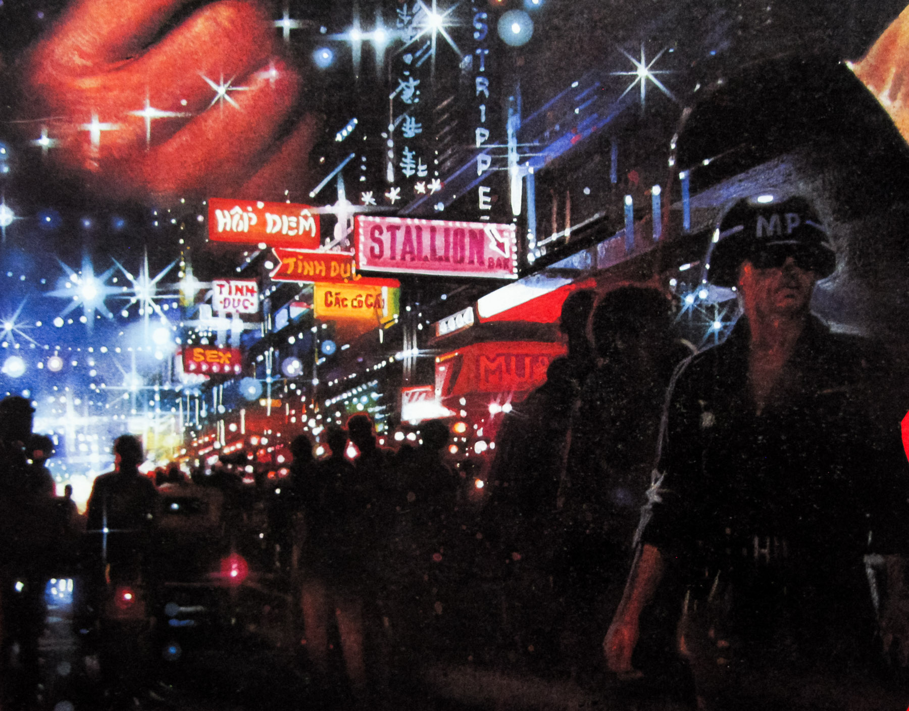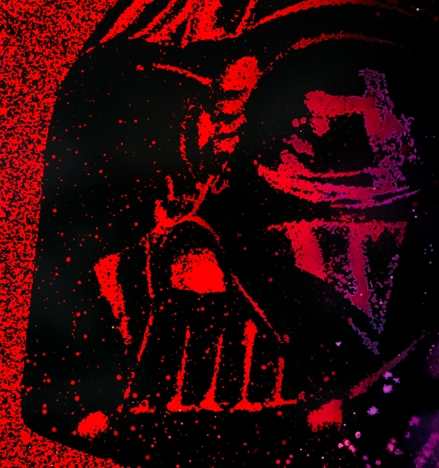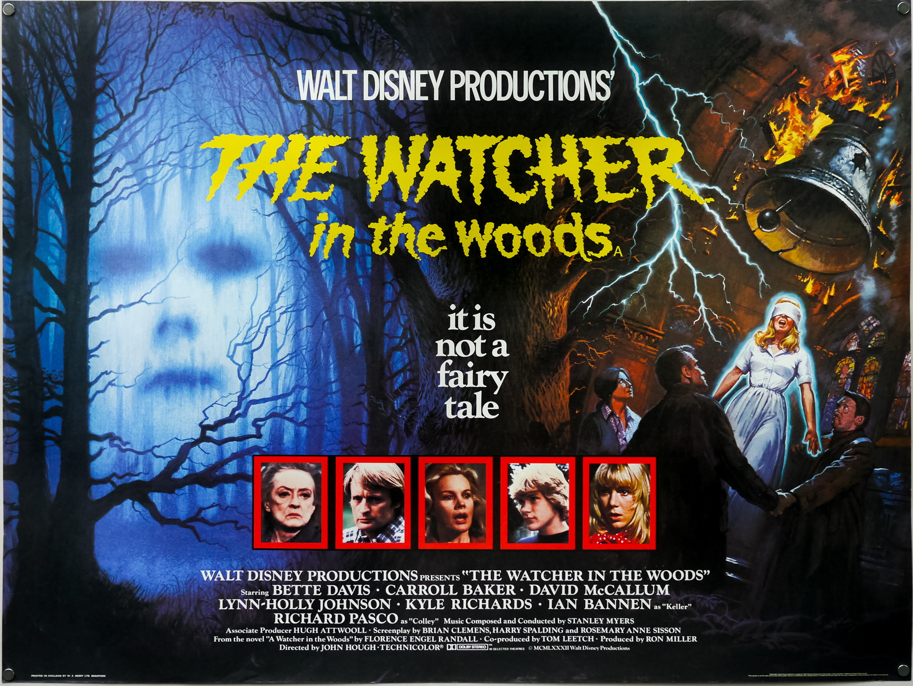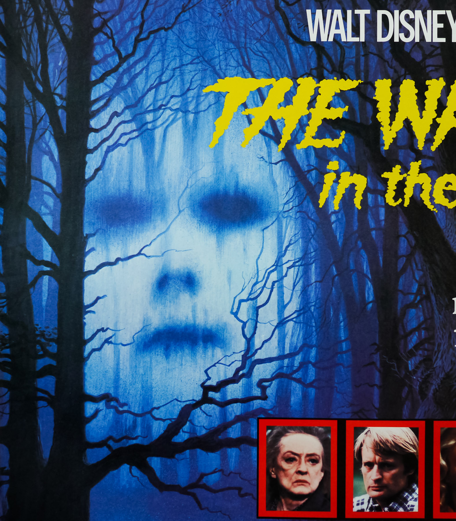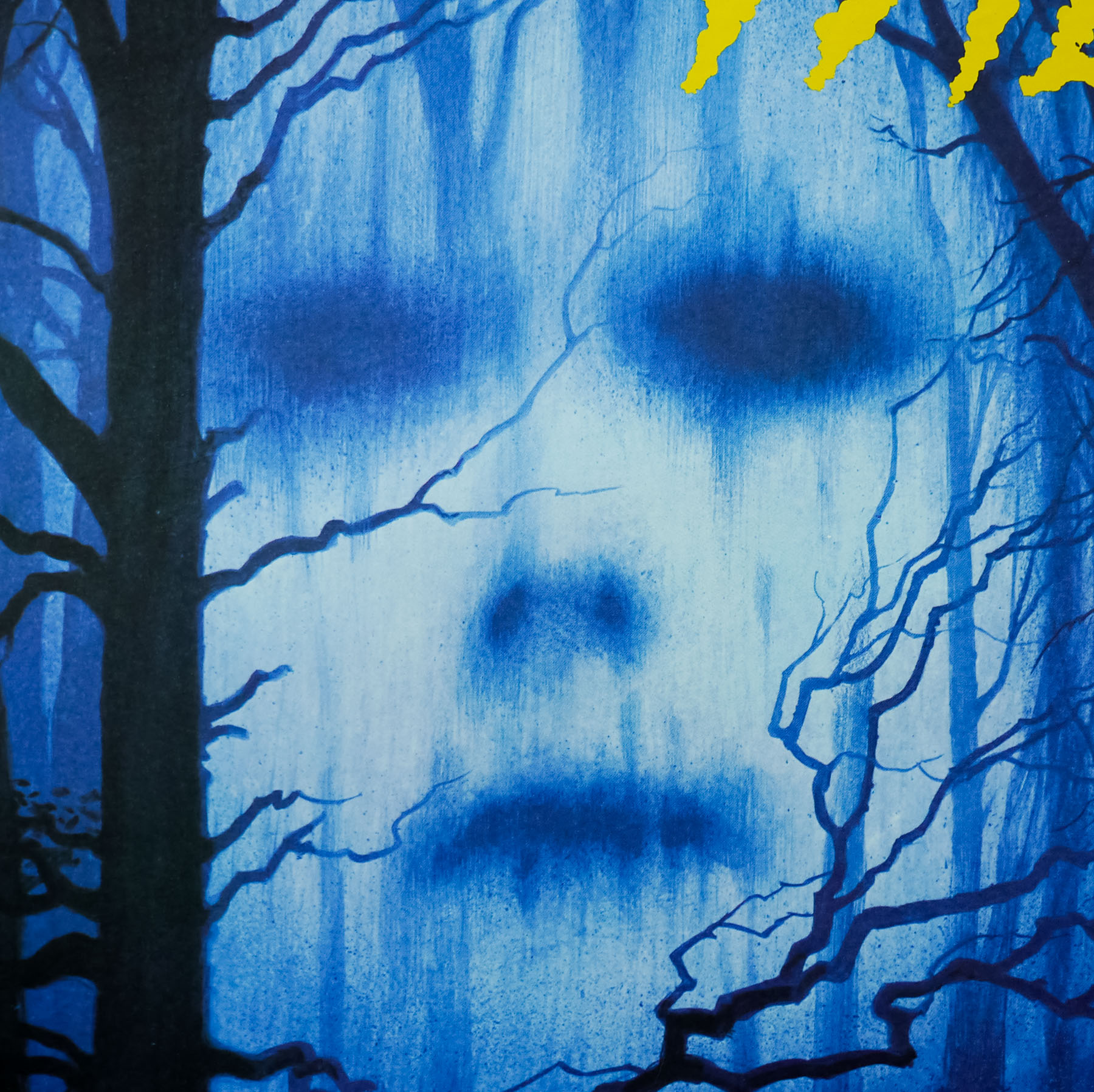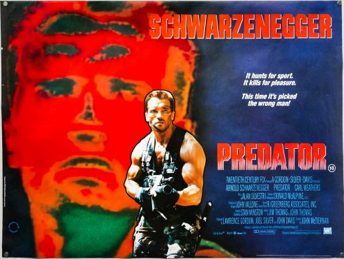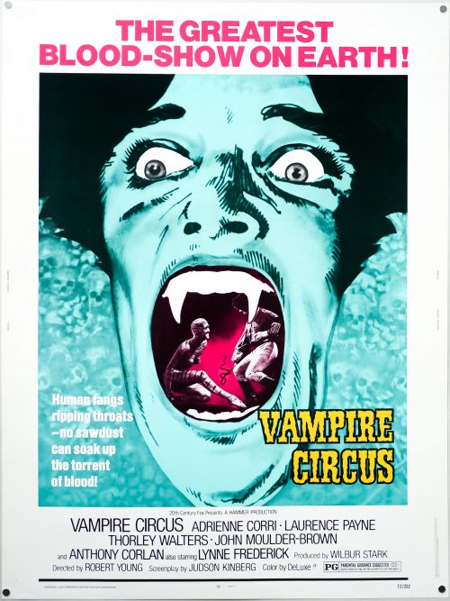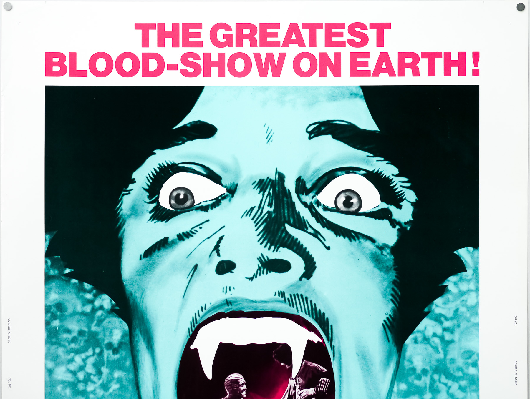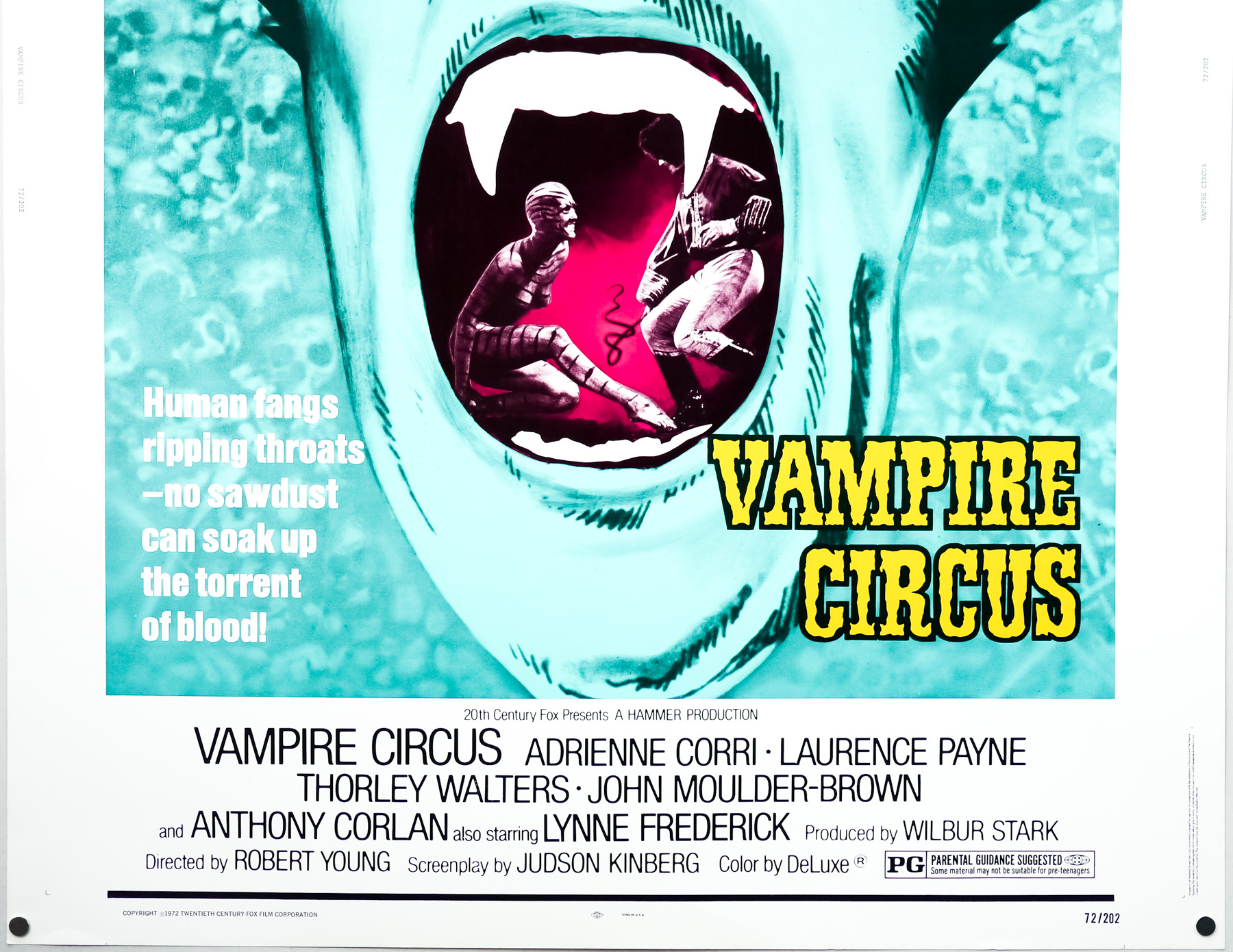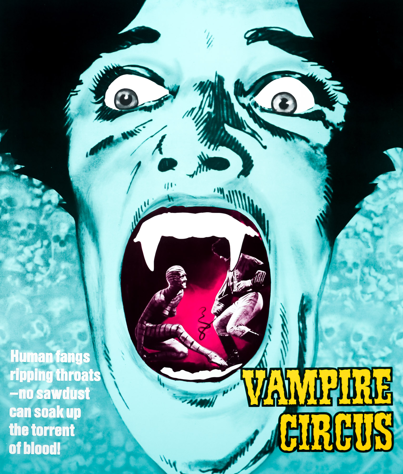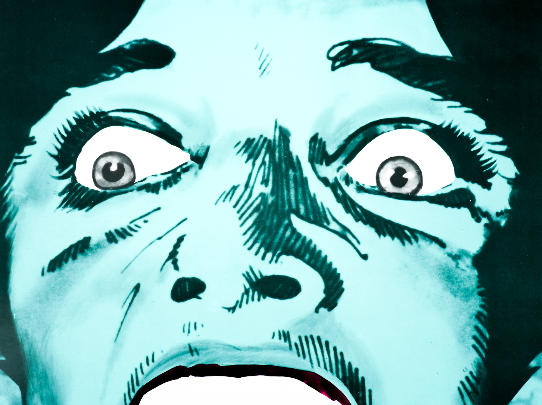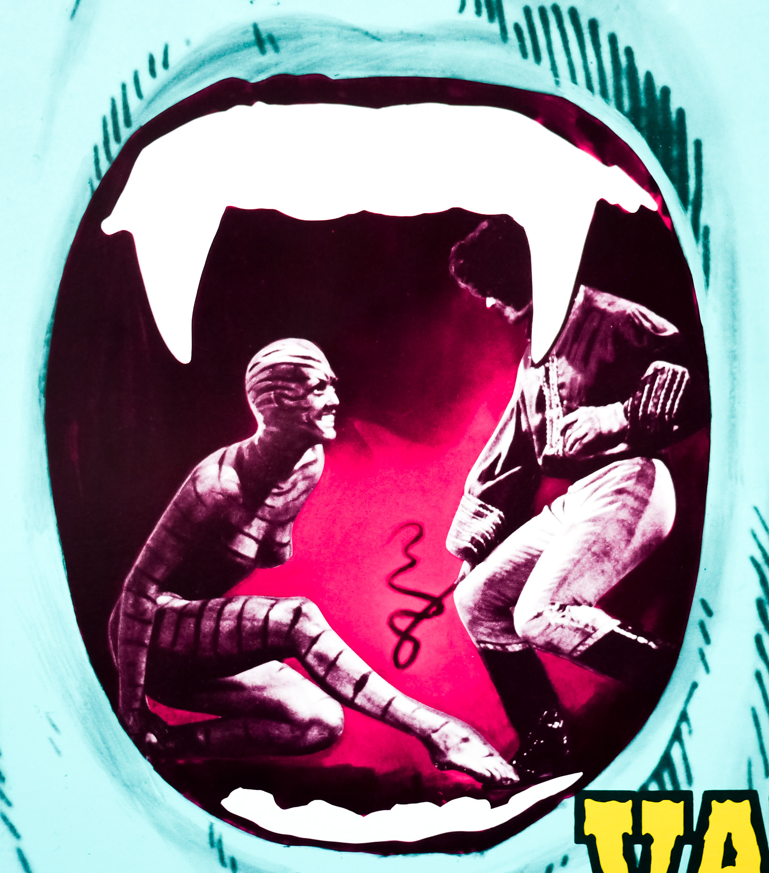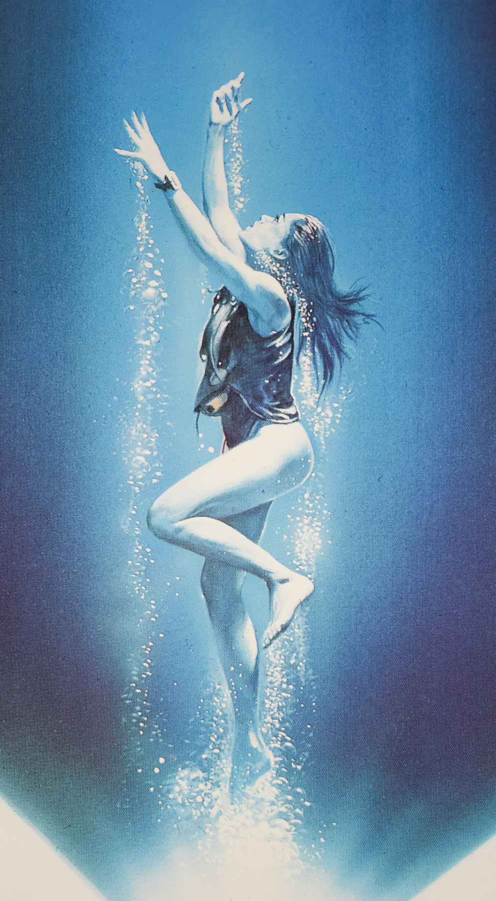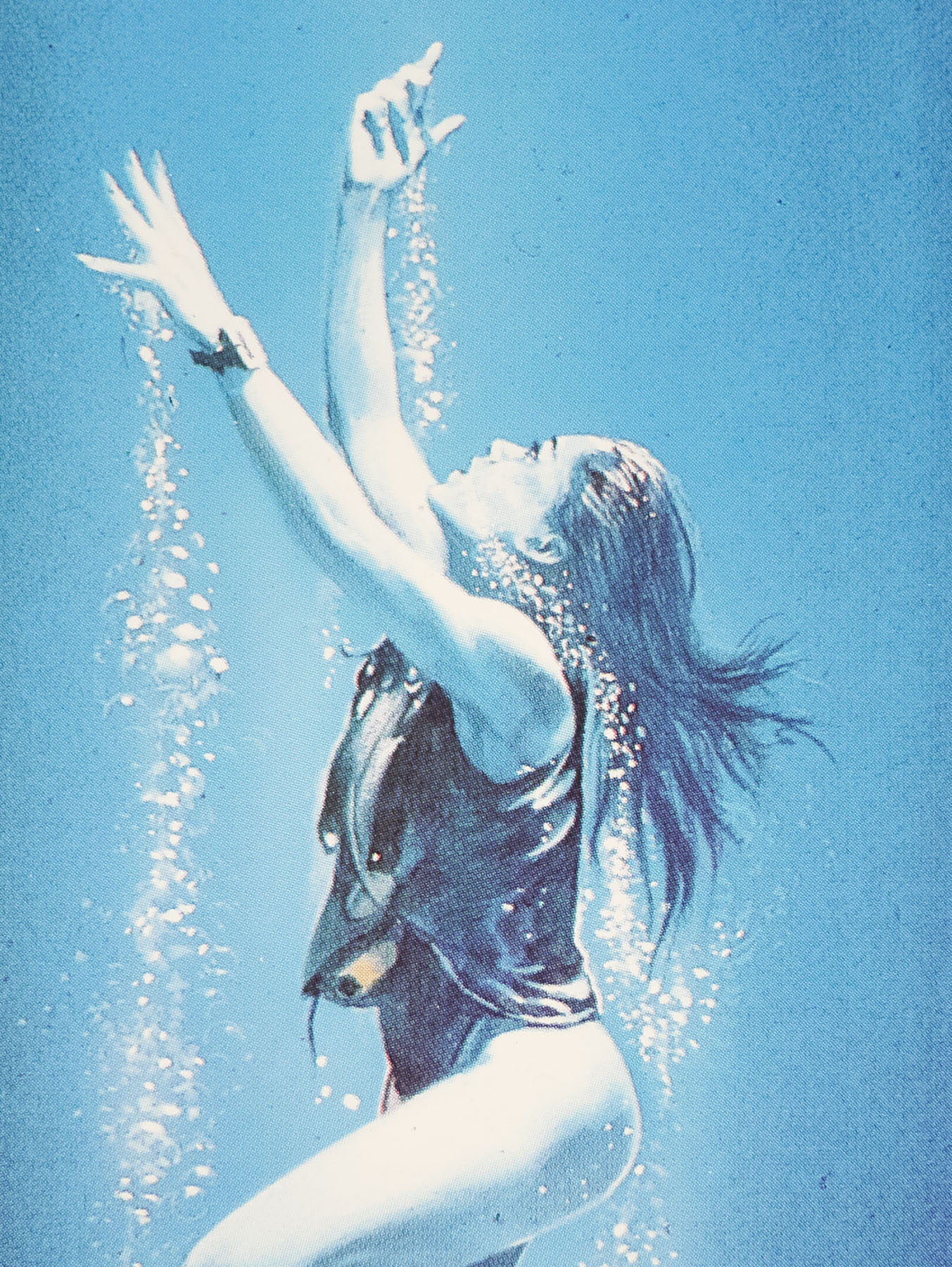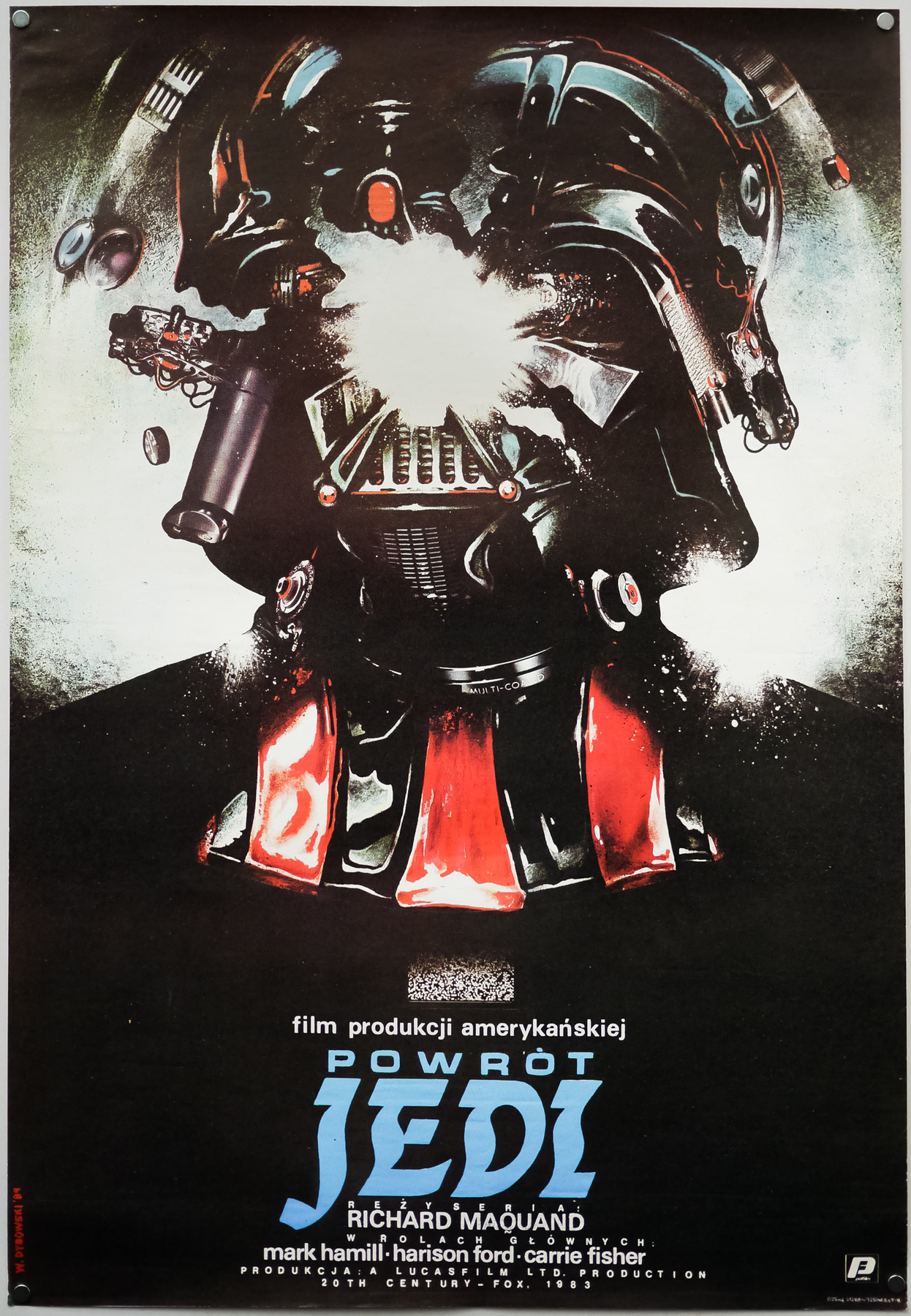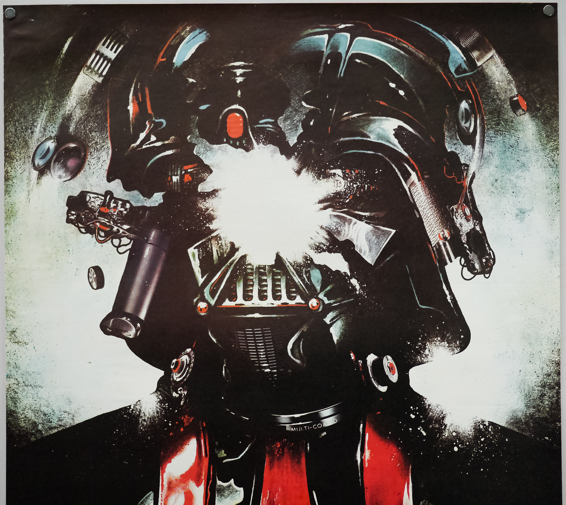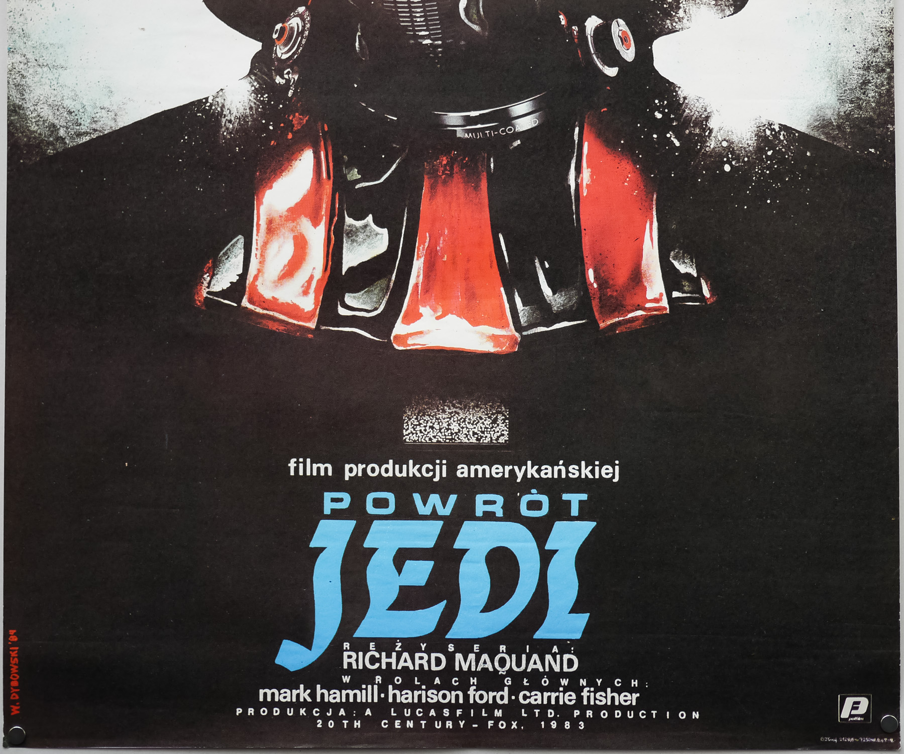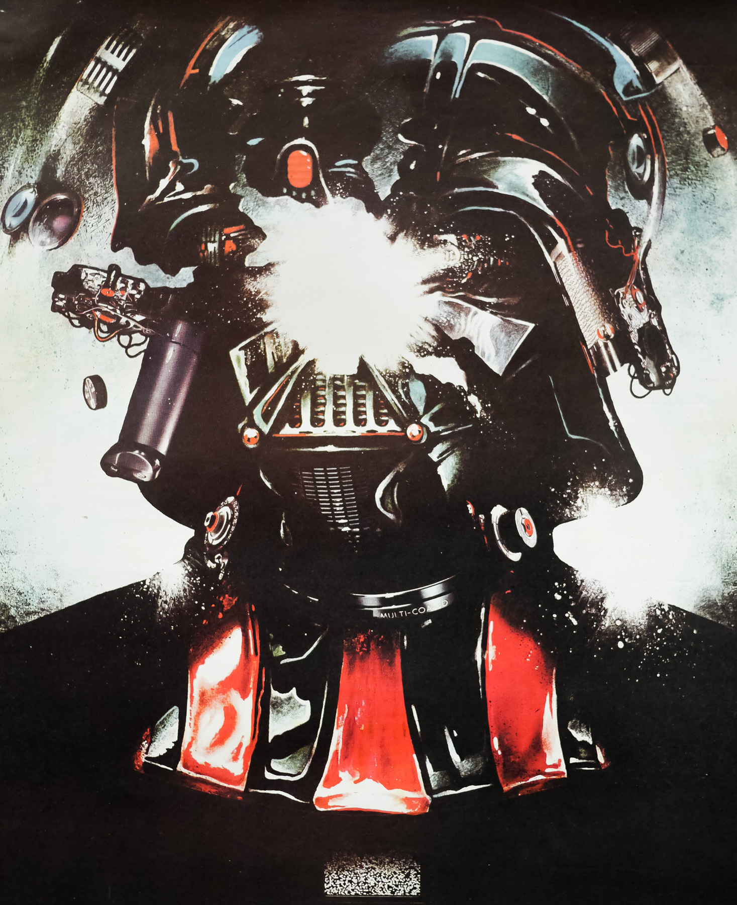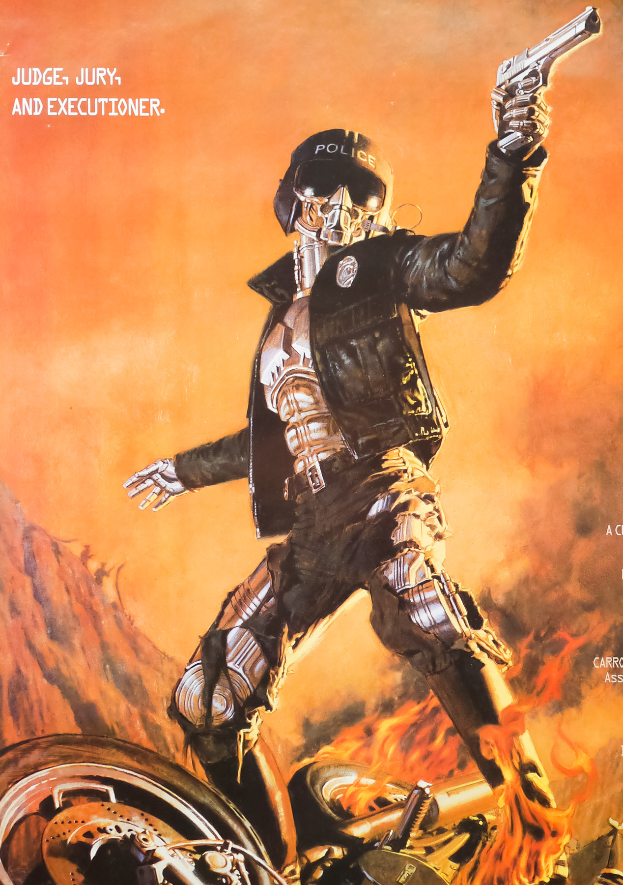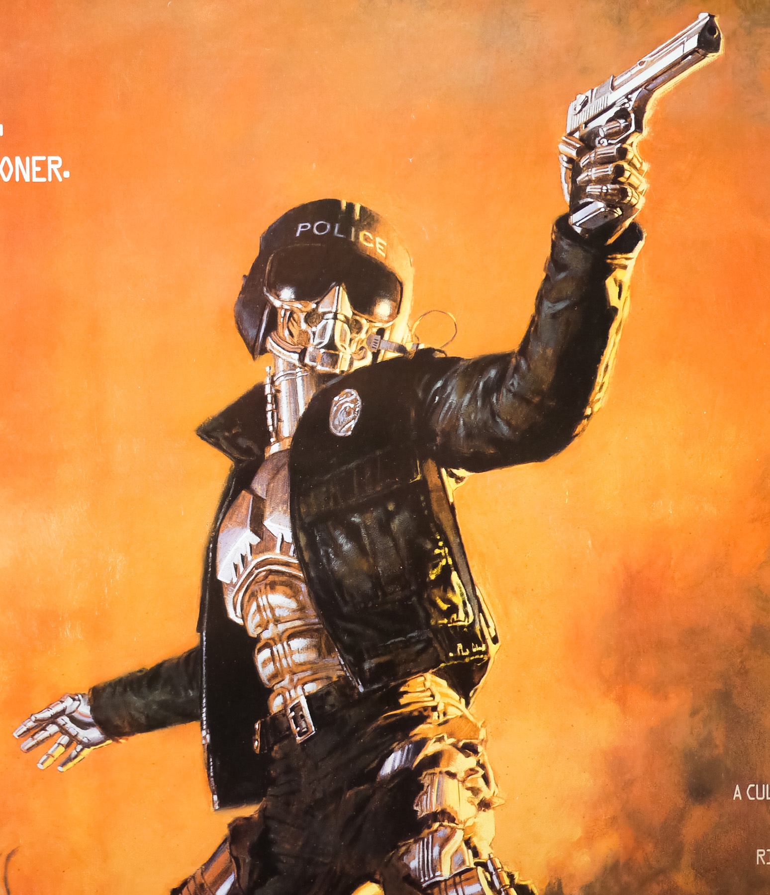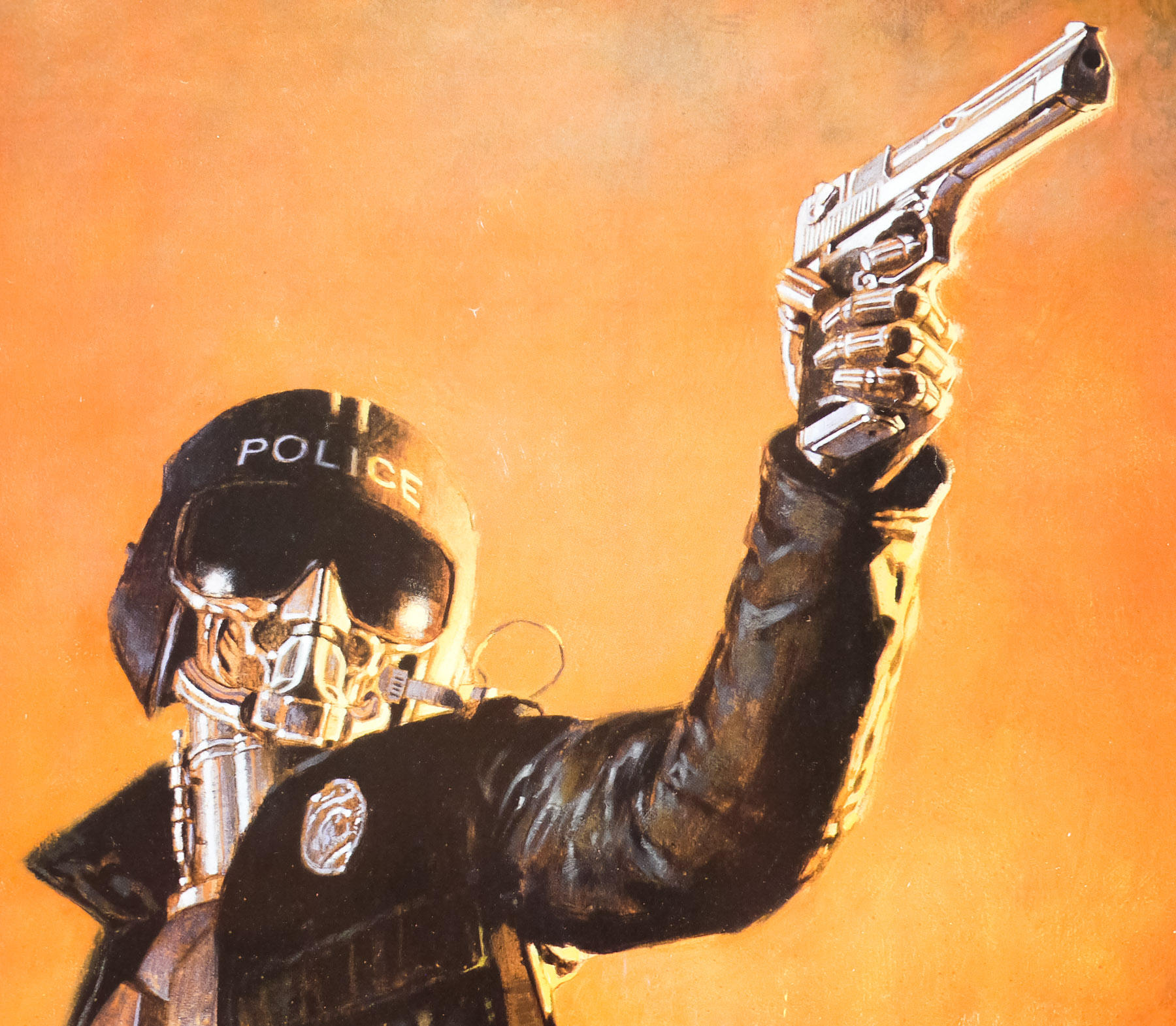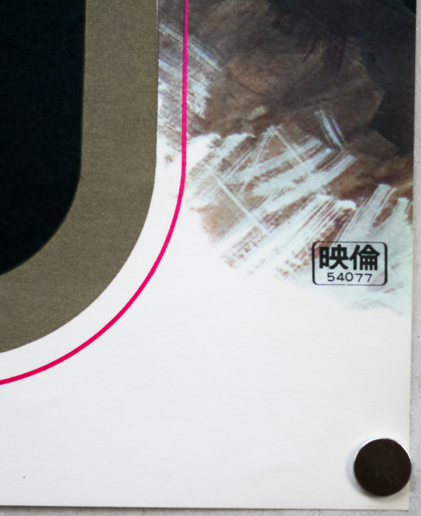

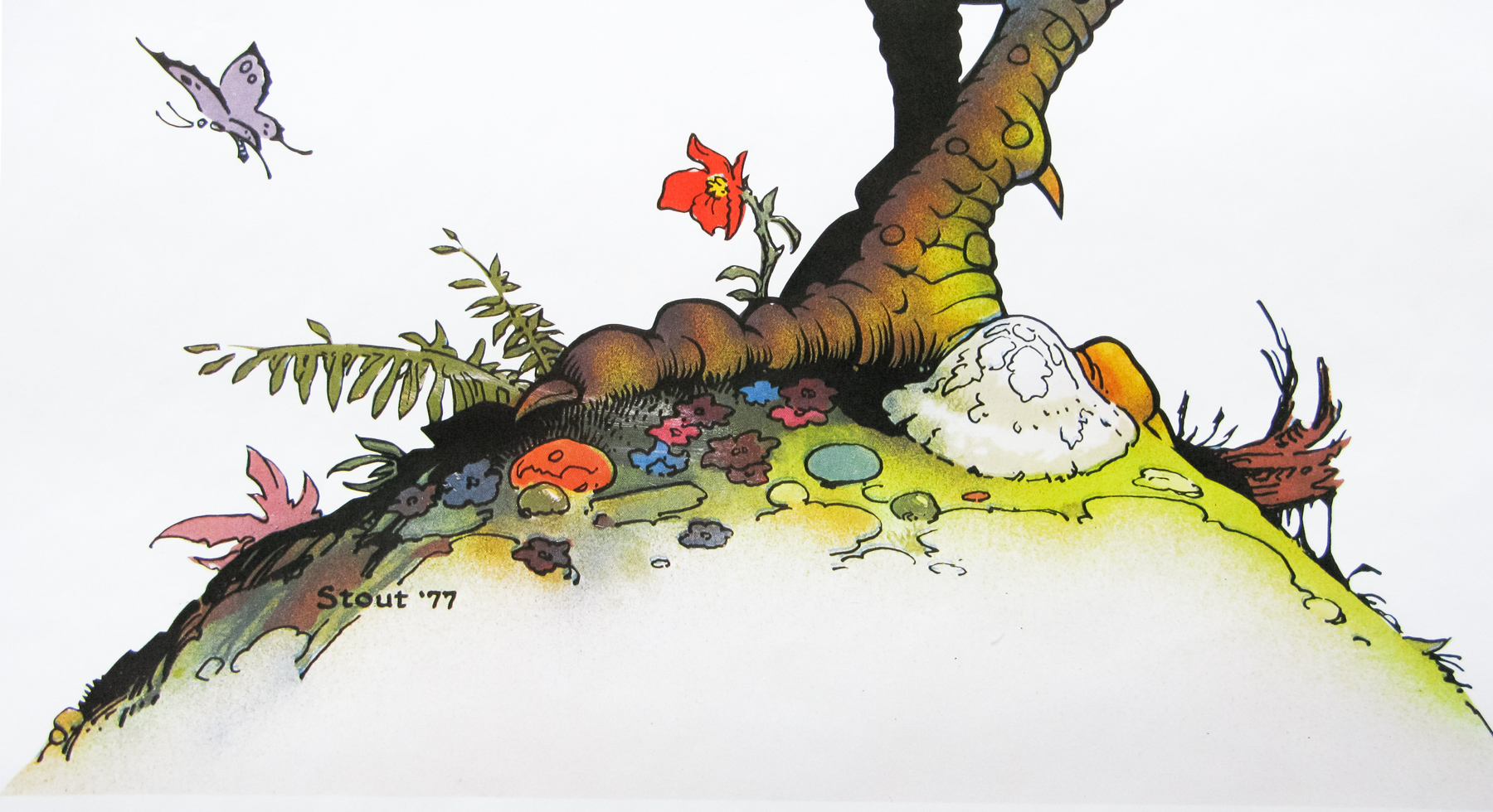
Poster detail
1-5

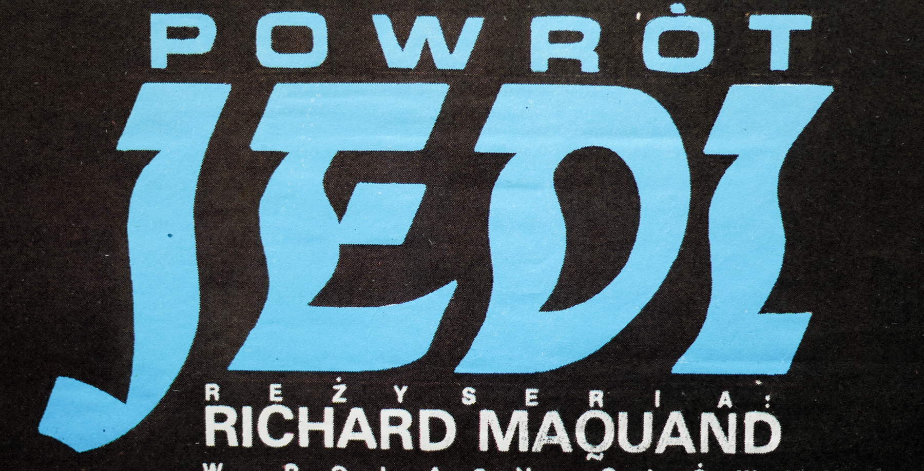
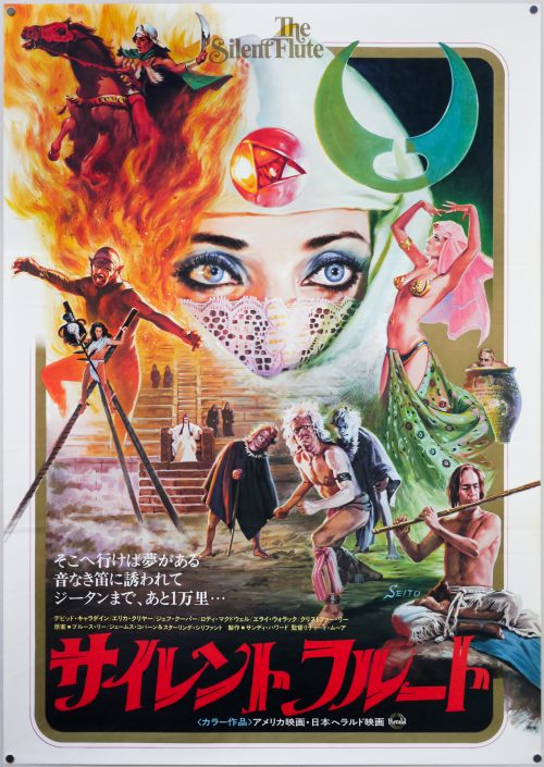
- Title
- Wizards
- AKA
- --
- Year of Film
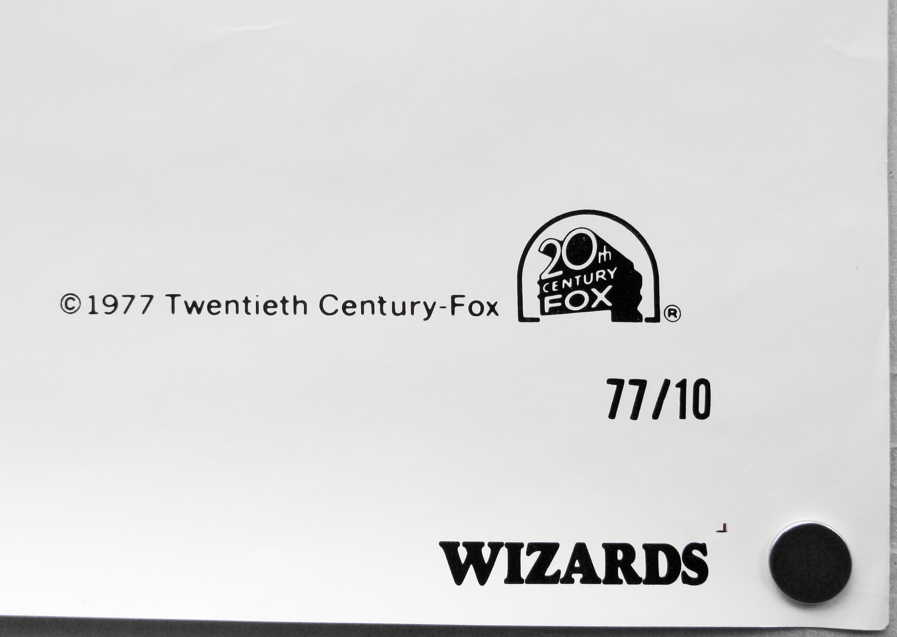
- 1977
- Director
- Ralph Bakshi
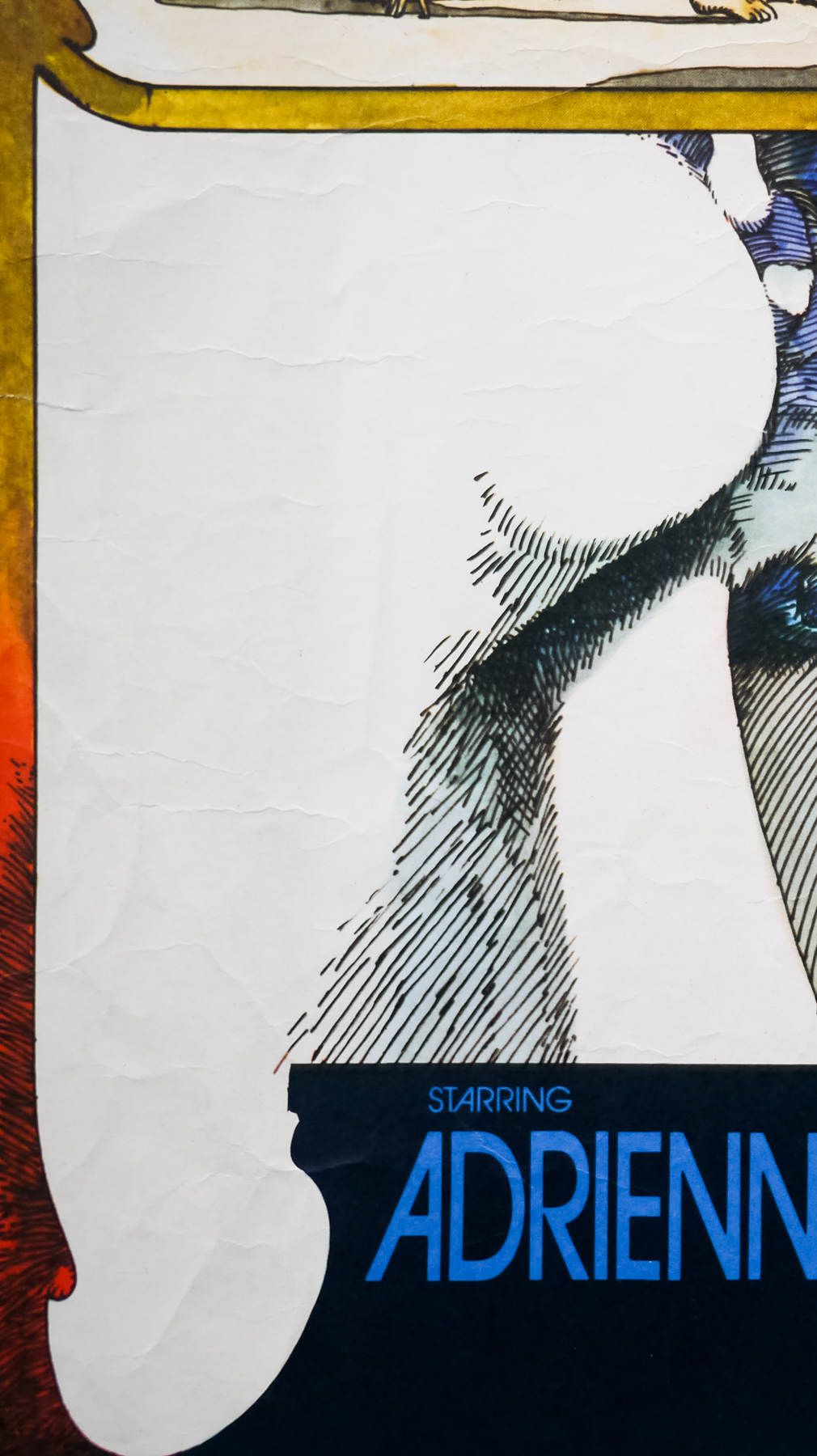
- Starring
- Bob Holt, Jesse Welles, Richard Romanus, David Proval, James Connell, Steve Gravers, Mark Hamill, Susan Tyrrell
- Origin of Film
- USA
- Genre(s) of Film
- Bob Holt, Jesse Welles, Richard Romanus, David Proval, James Connell, Steve Gravers, Mark Hamill, Susan Tyrrell,
- Type of Poster
- One sheet
- Style of Poster
- Style A
- Origin of Poster
- USA
- Year of Poster
- 1977
- Designer
- Unknown
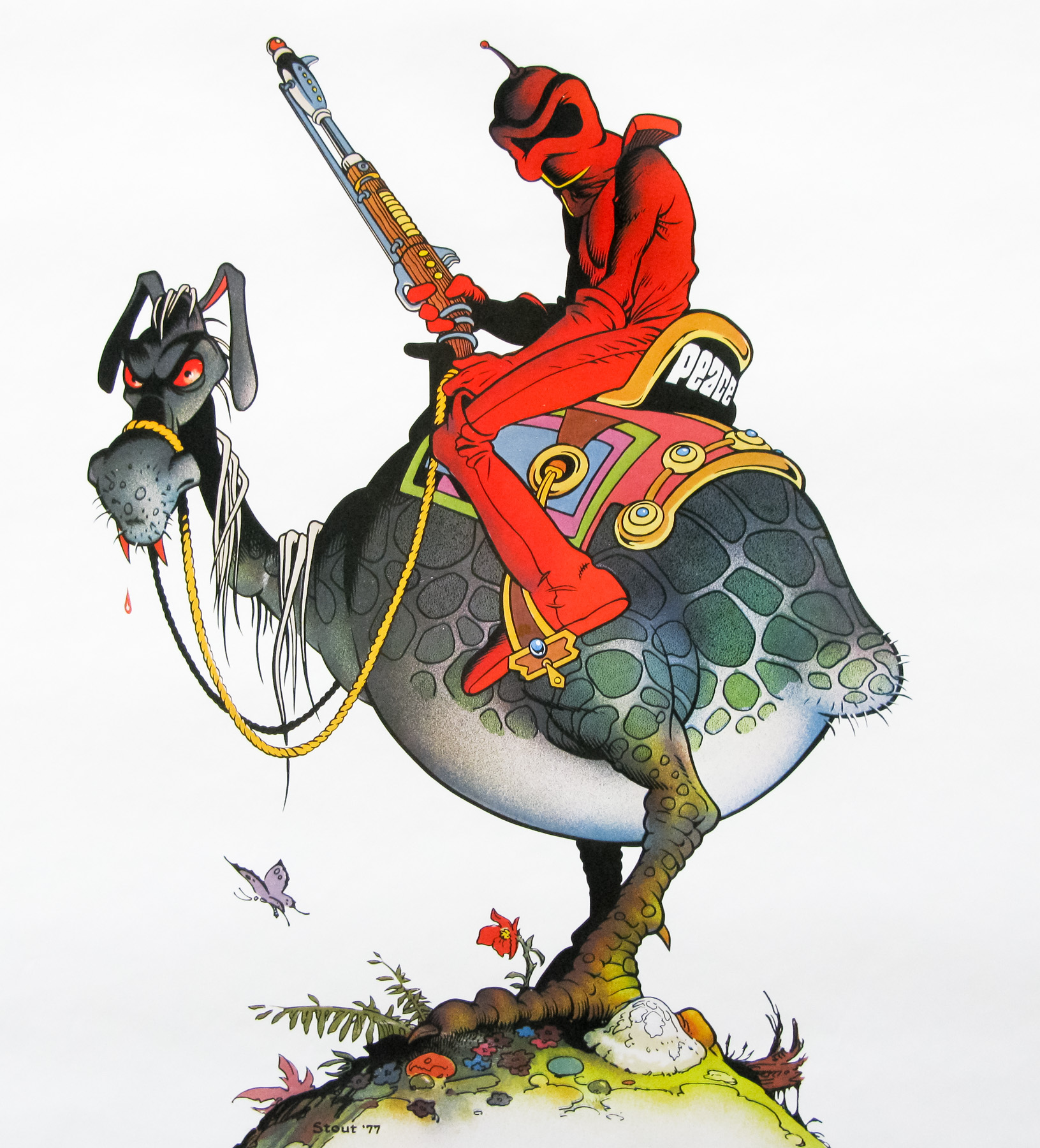
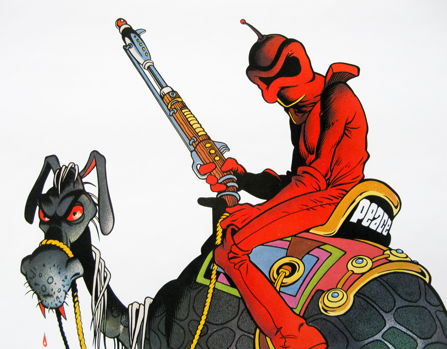
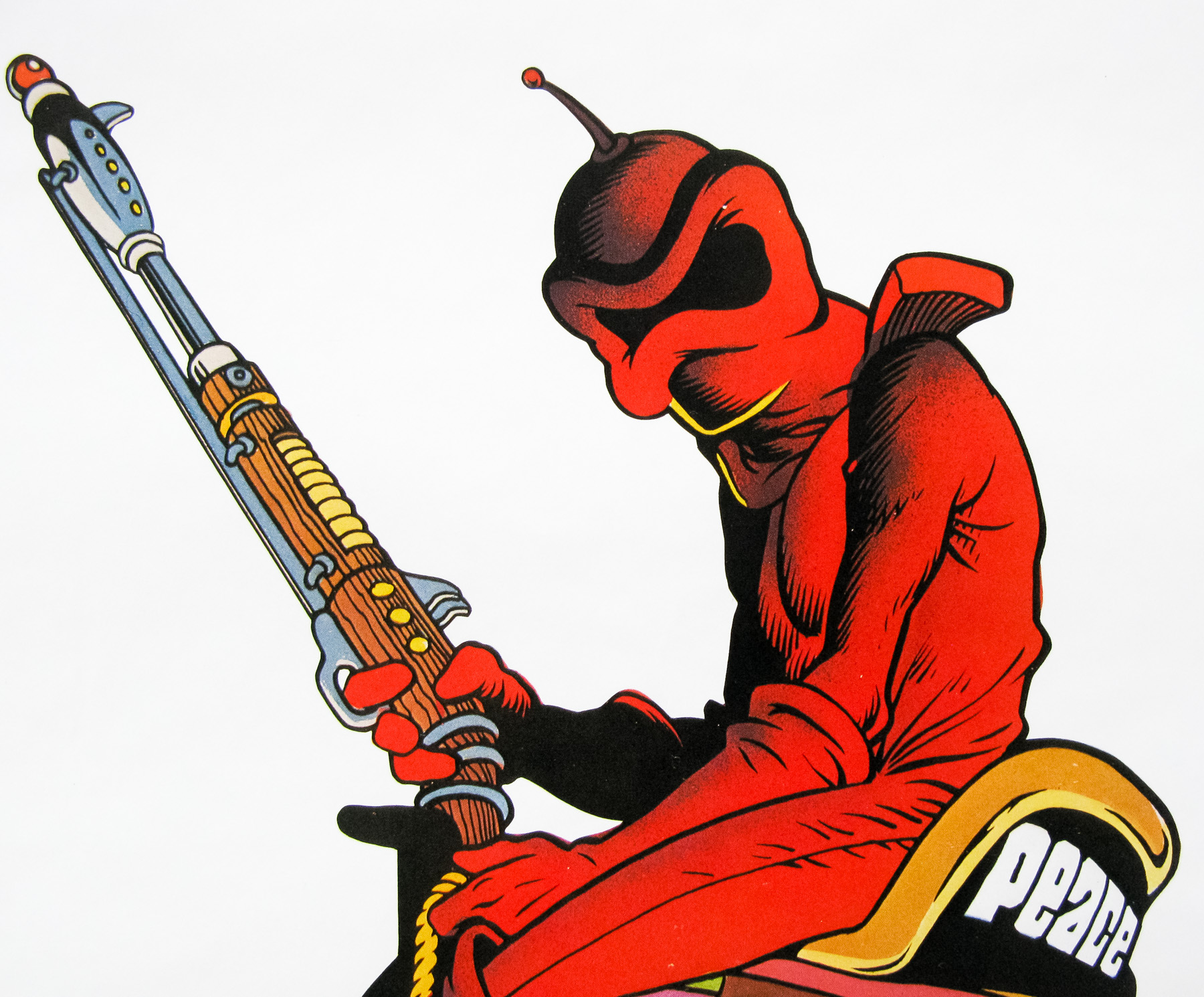
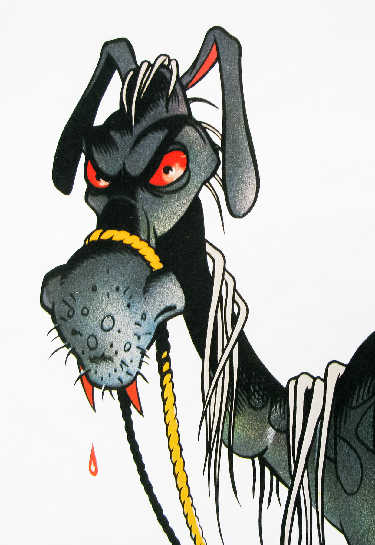
- Artist
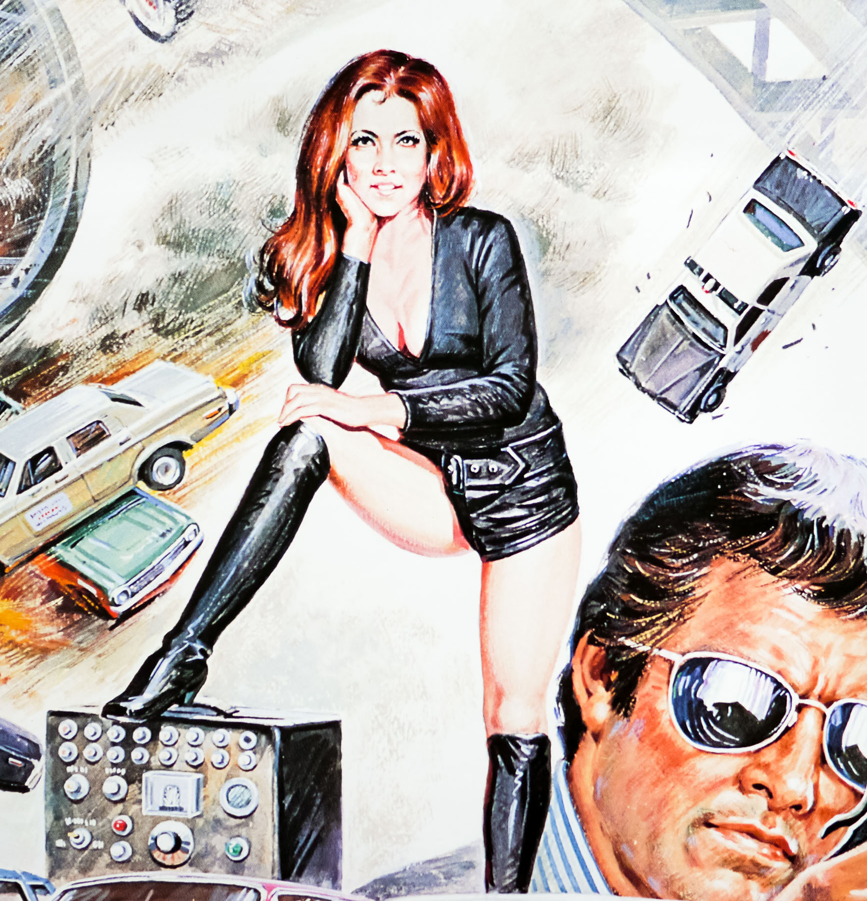
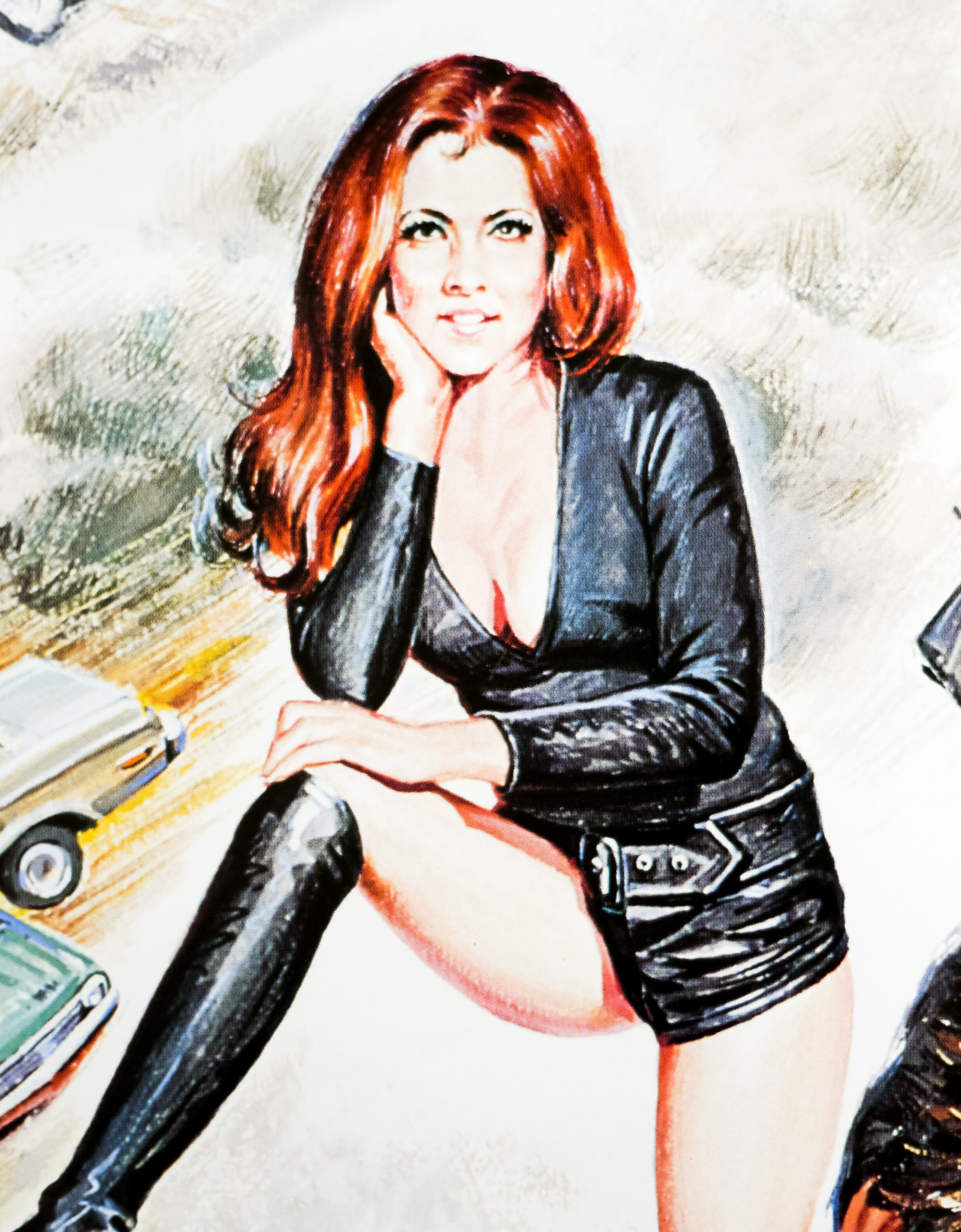
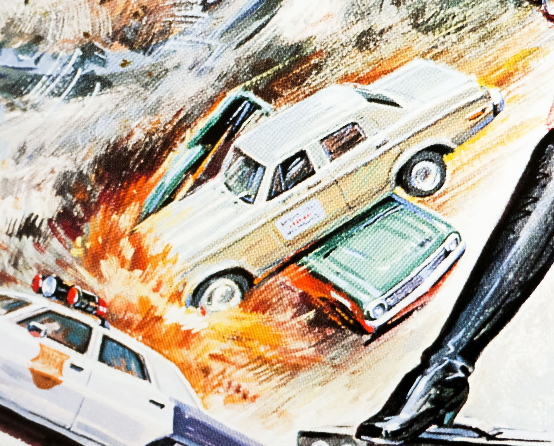
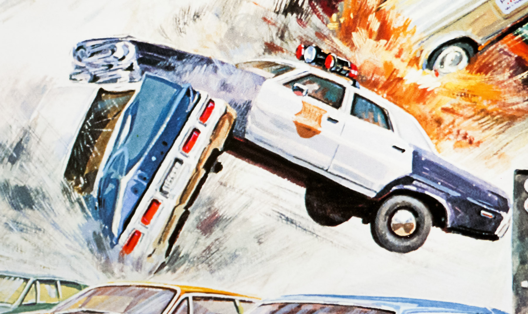
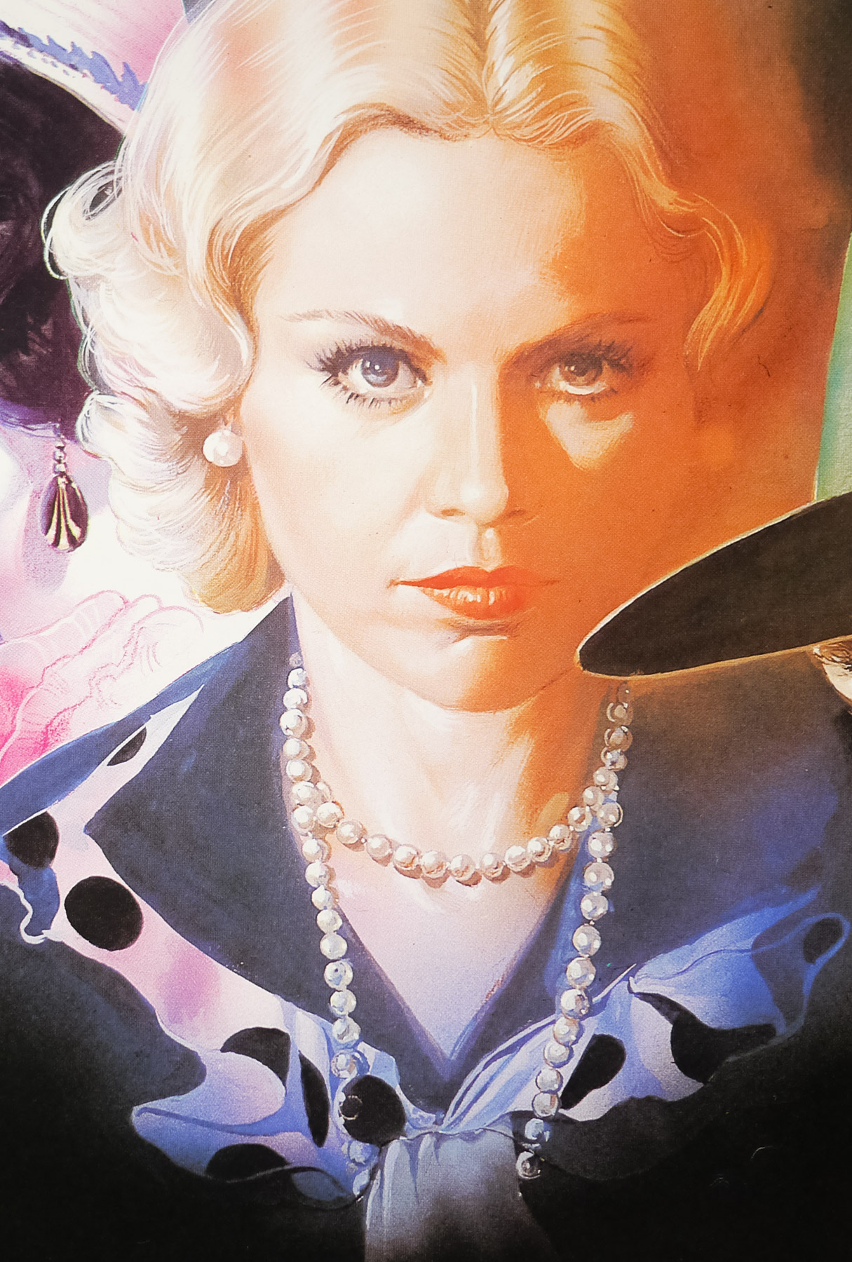
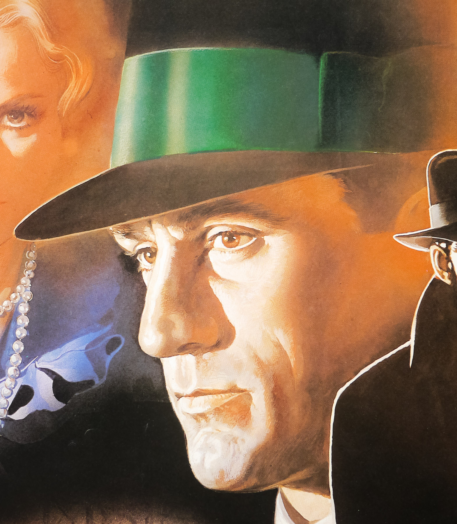
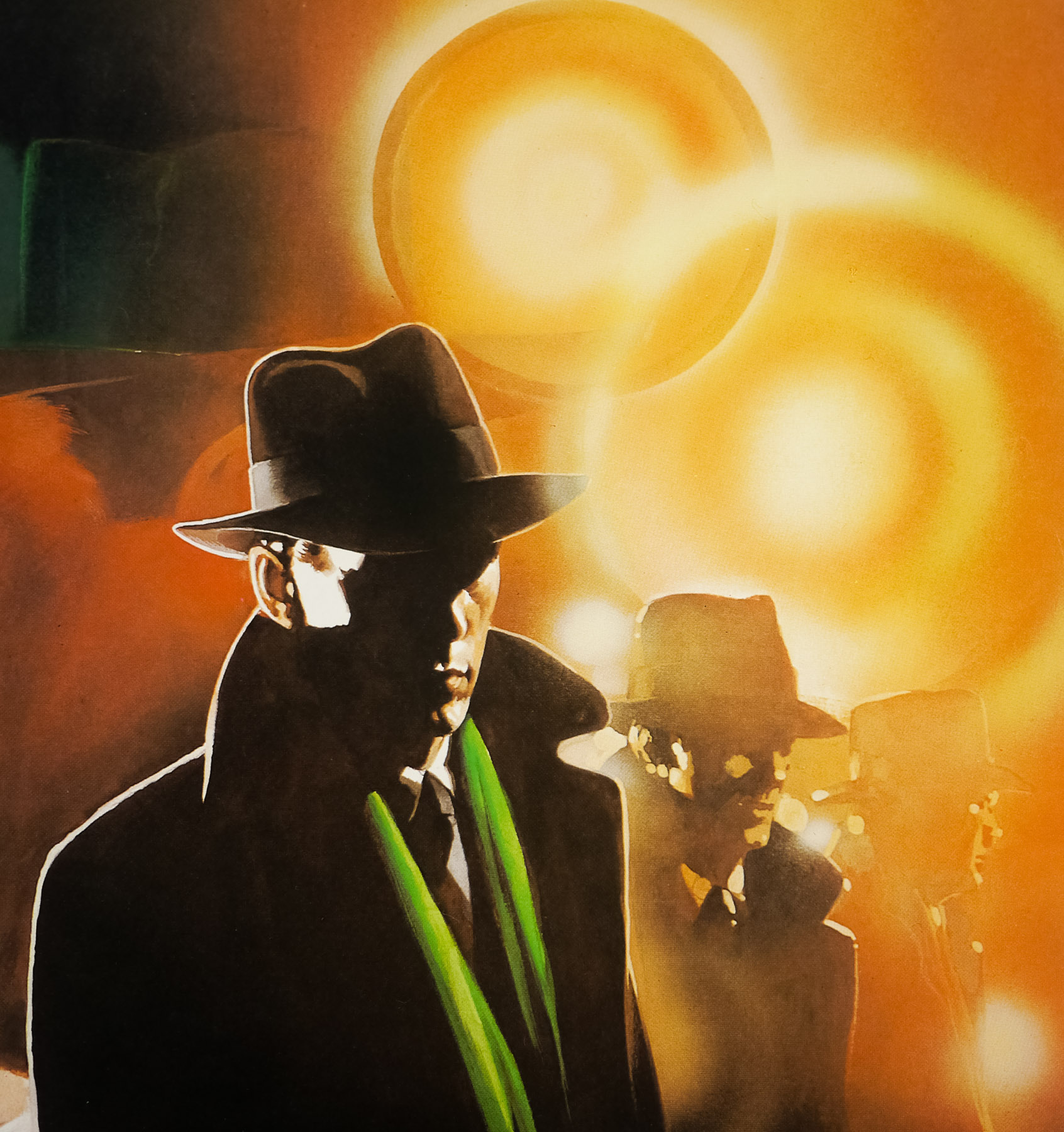
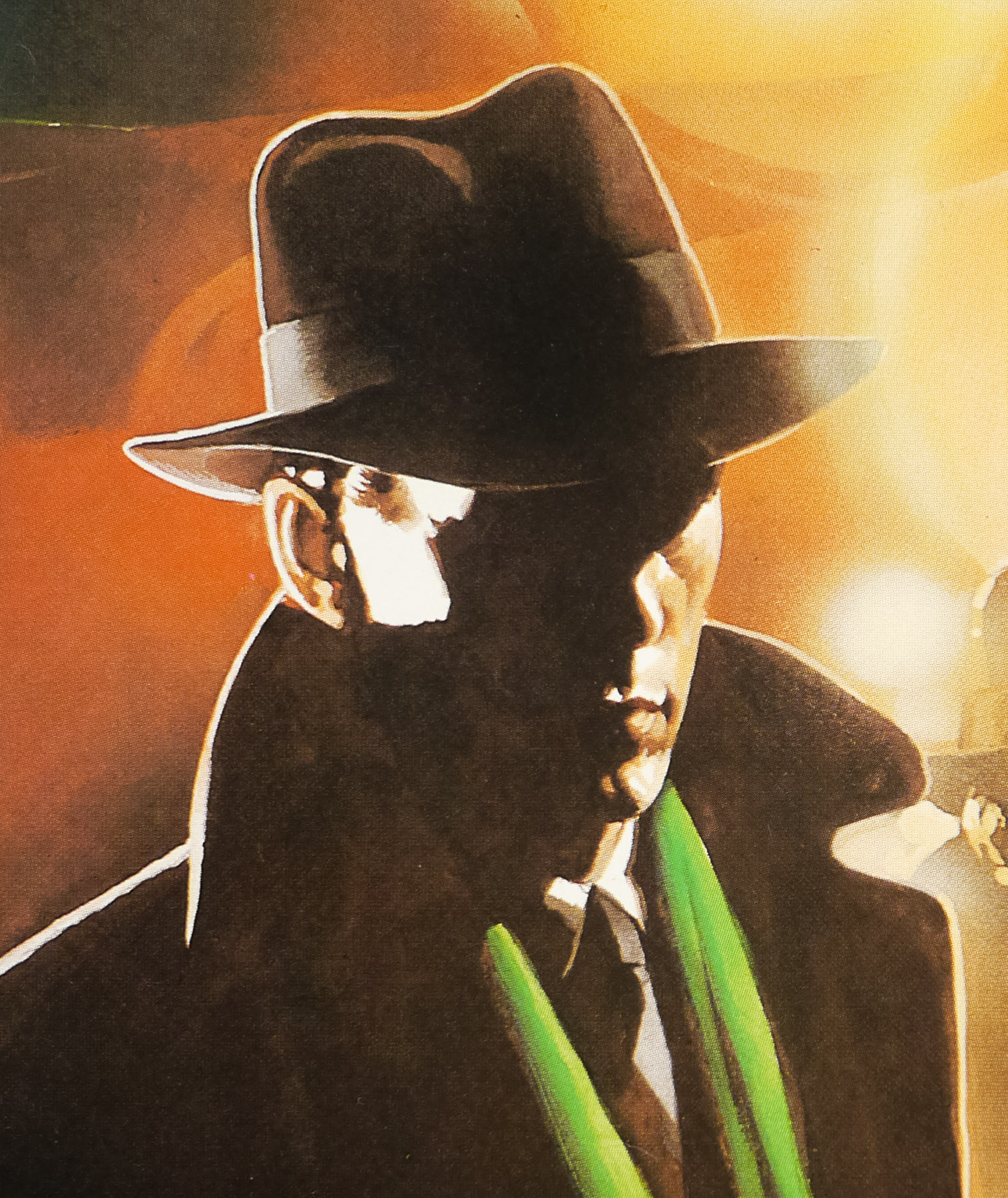
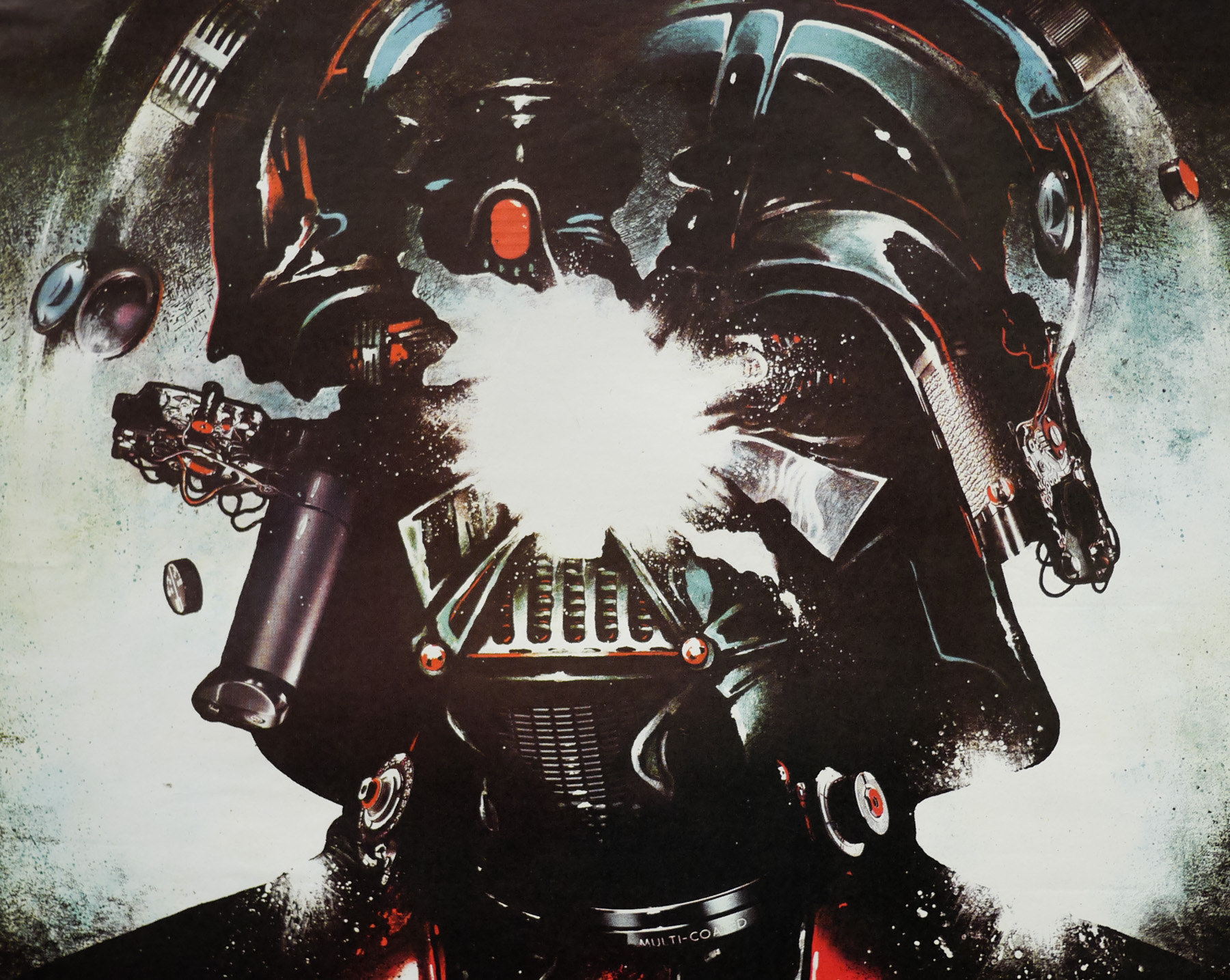
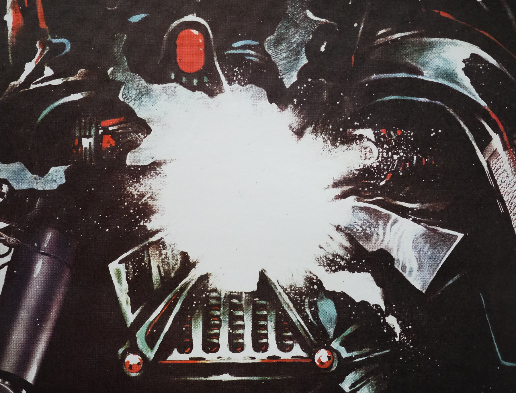
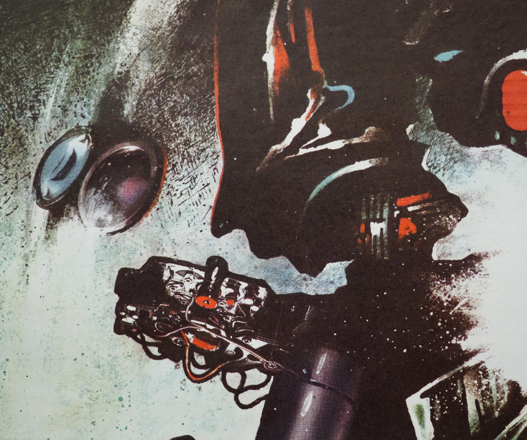
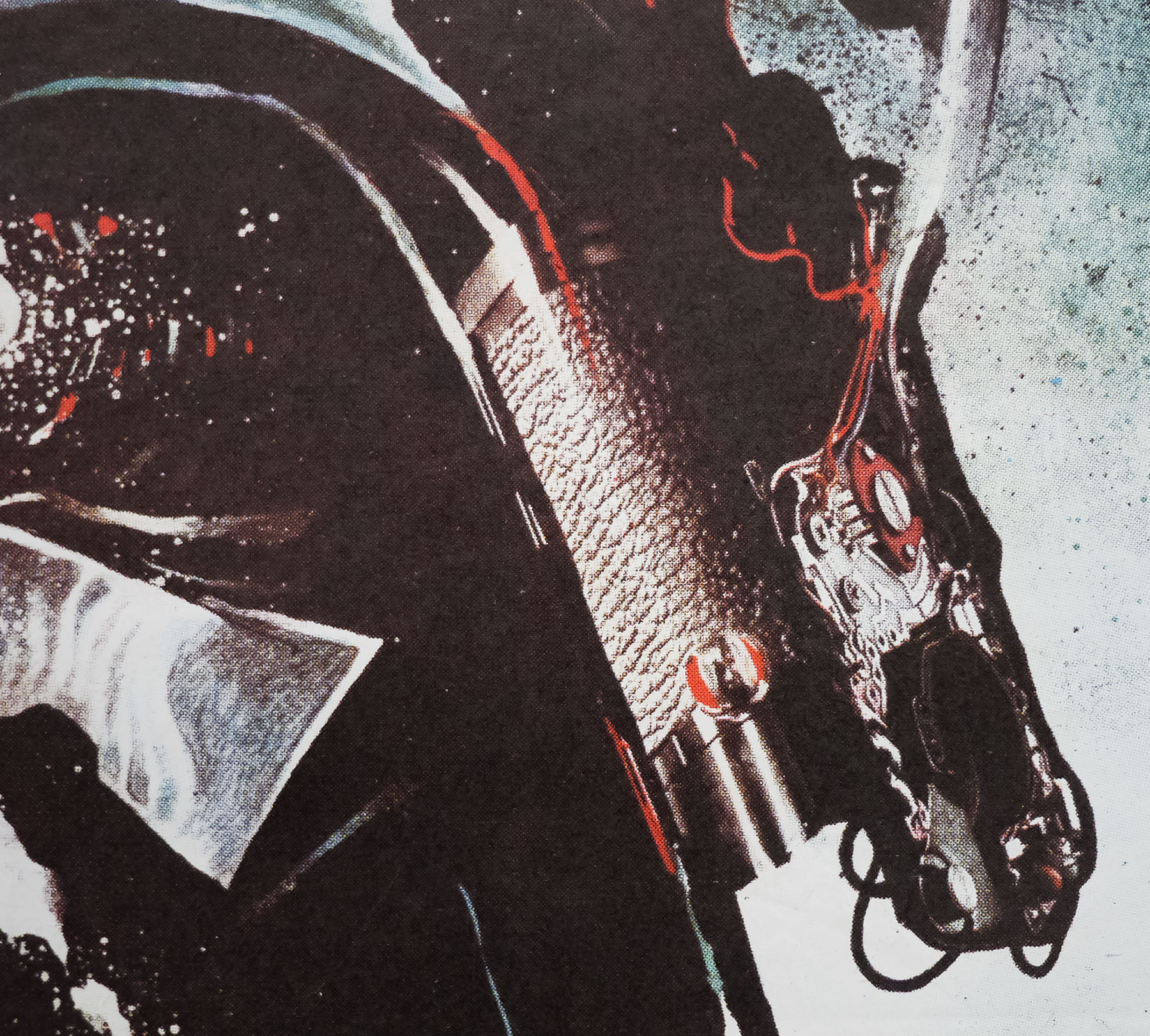
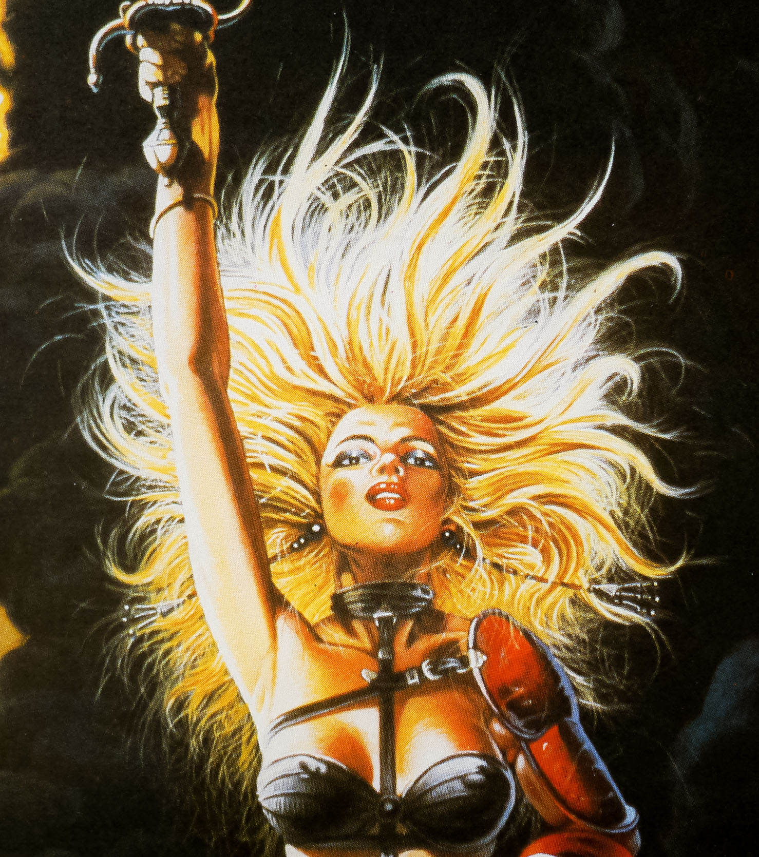
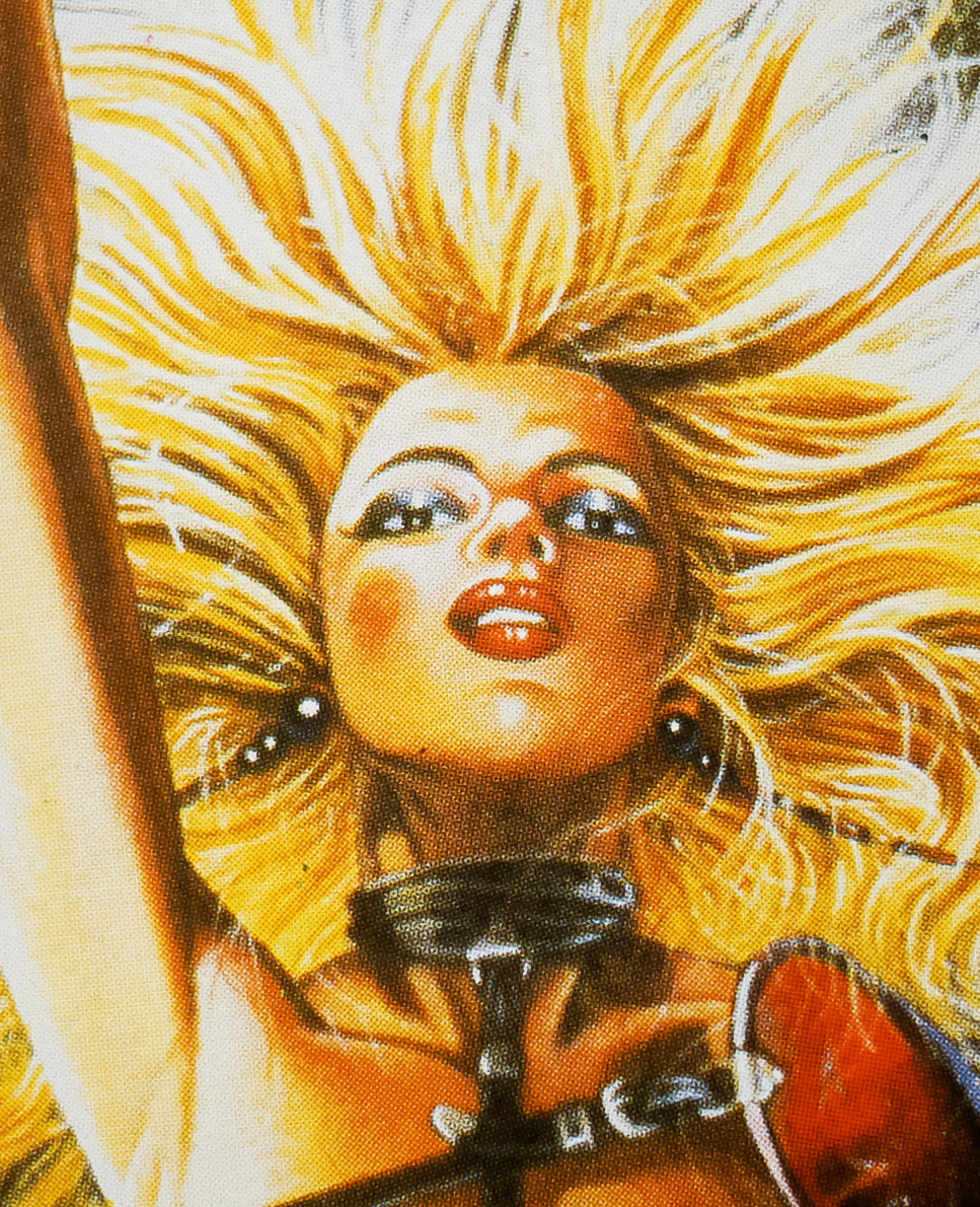
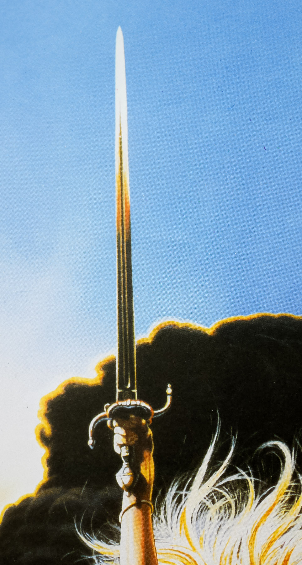
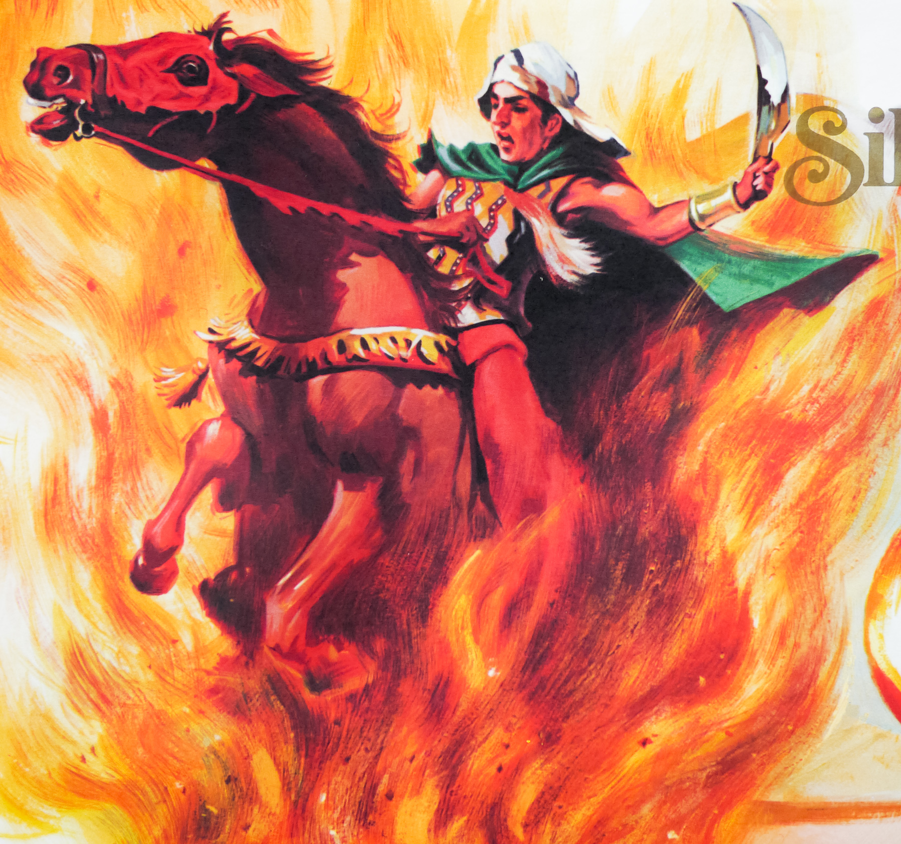
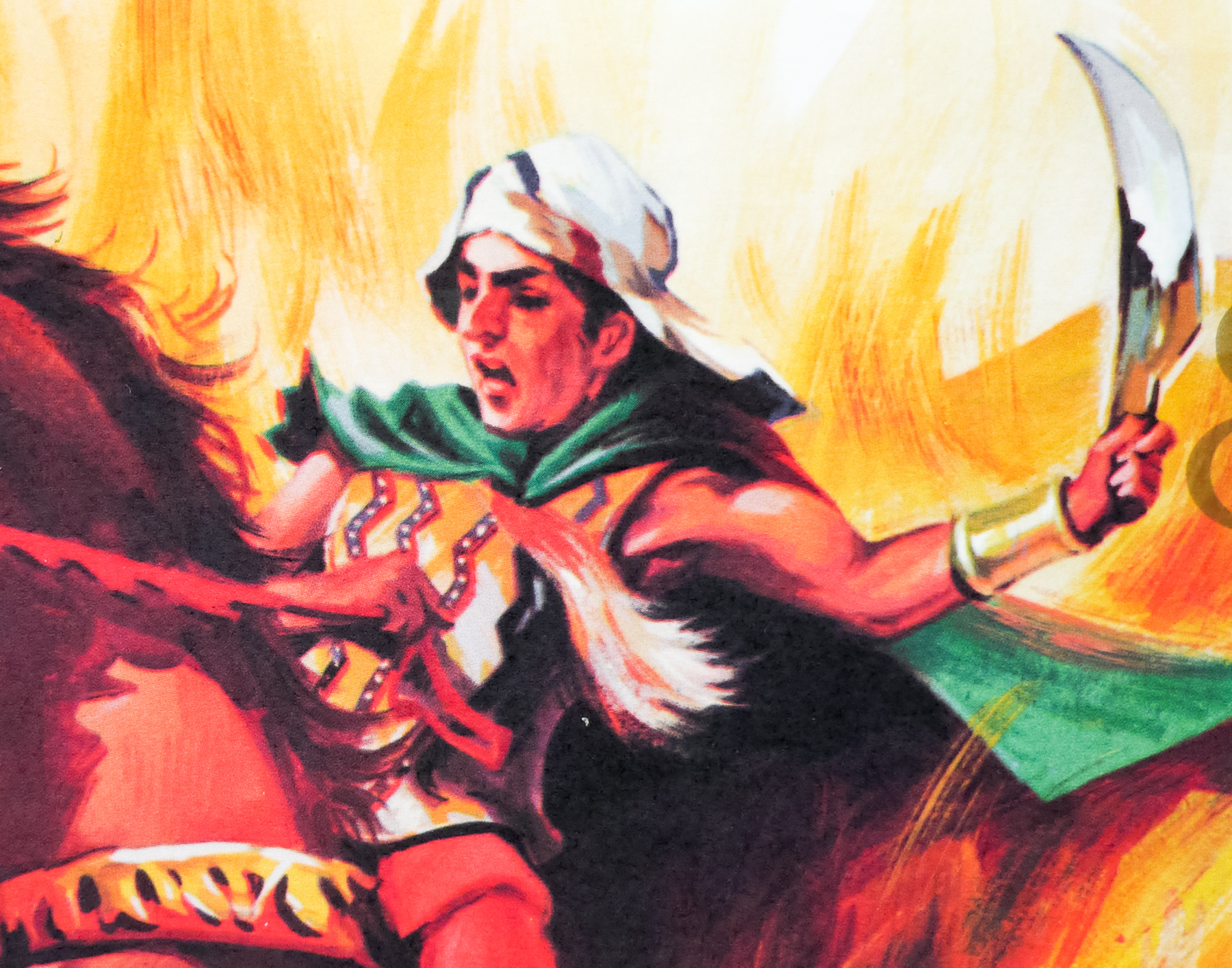
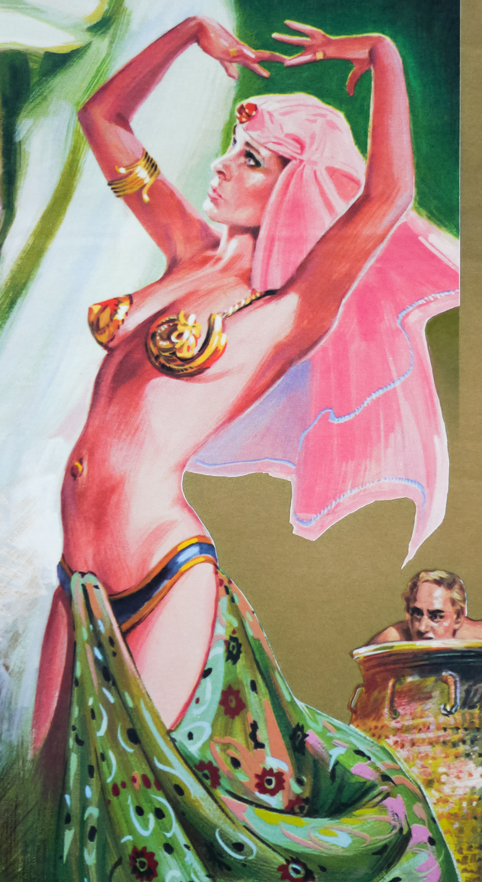
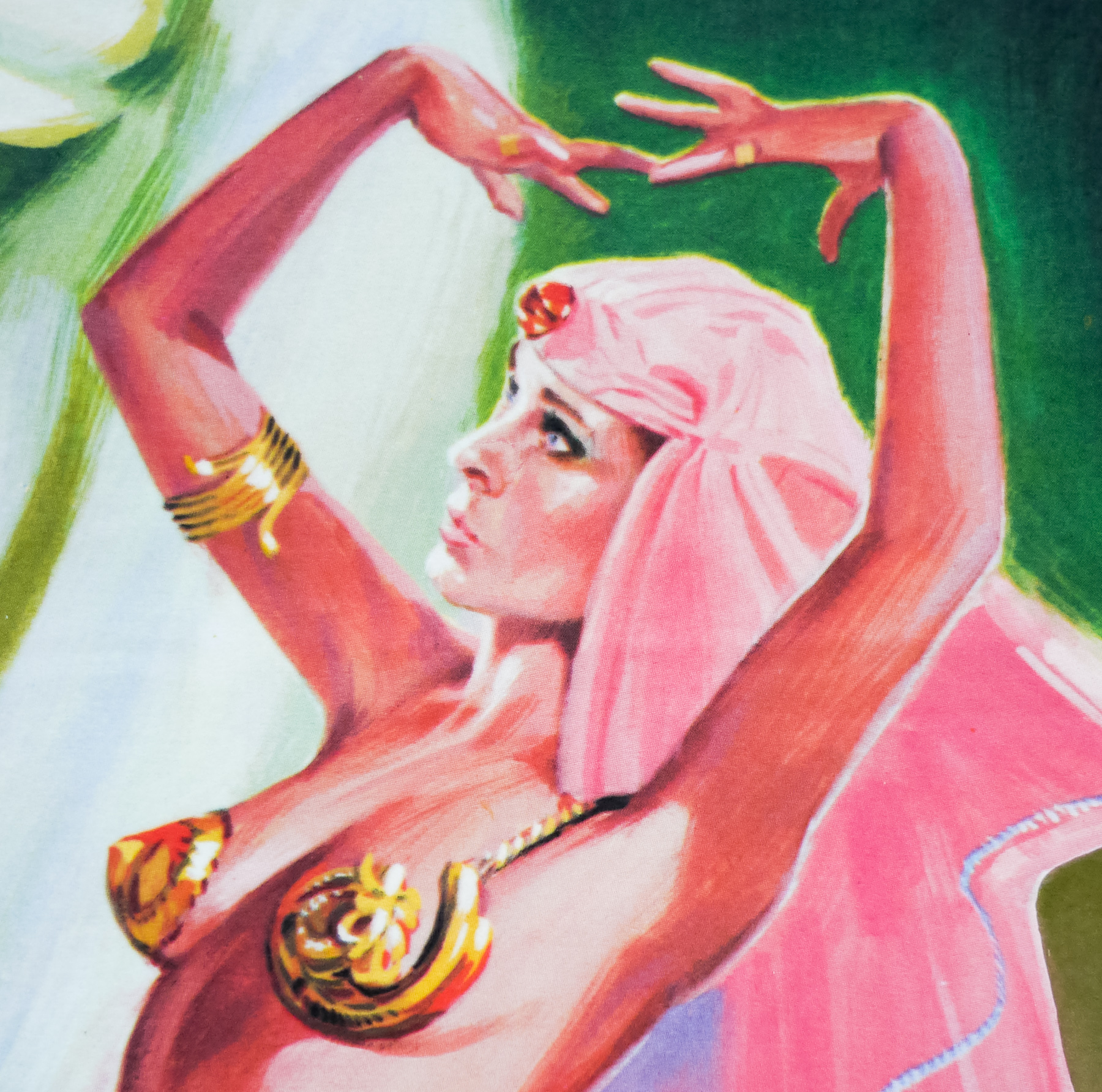
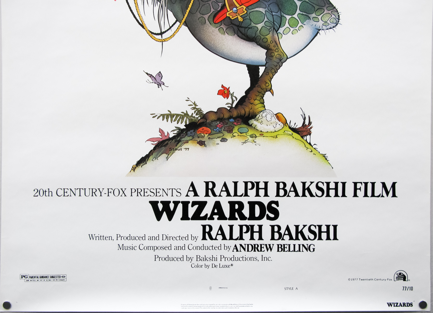
- William Stout
- Size (inches)
- 27 1/16" x 41"
- SS or DS
- SS
- NSS #
- 77/10
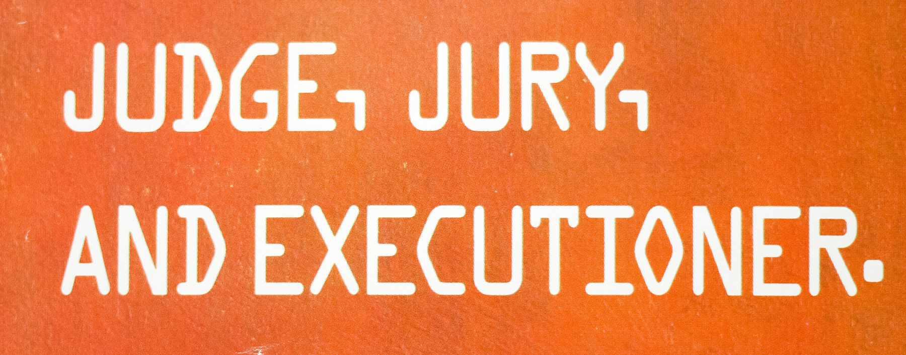
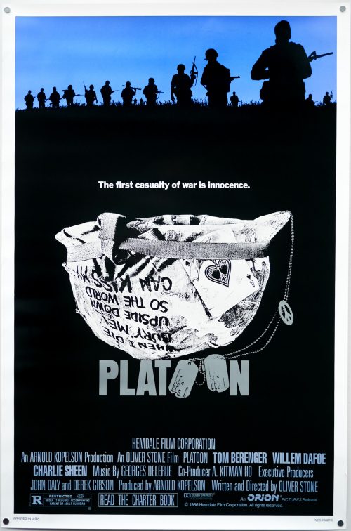
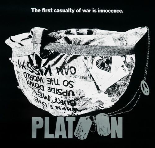
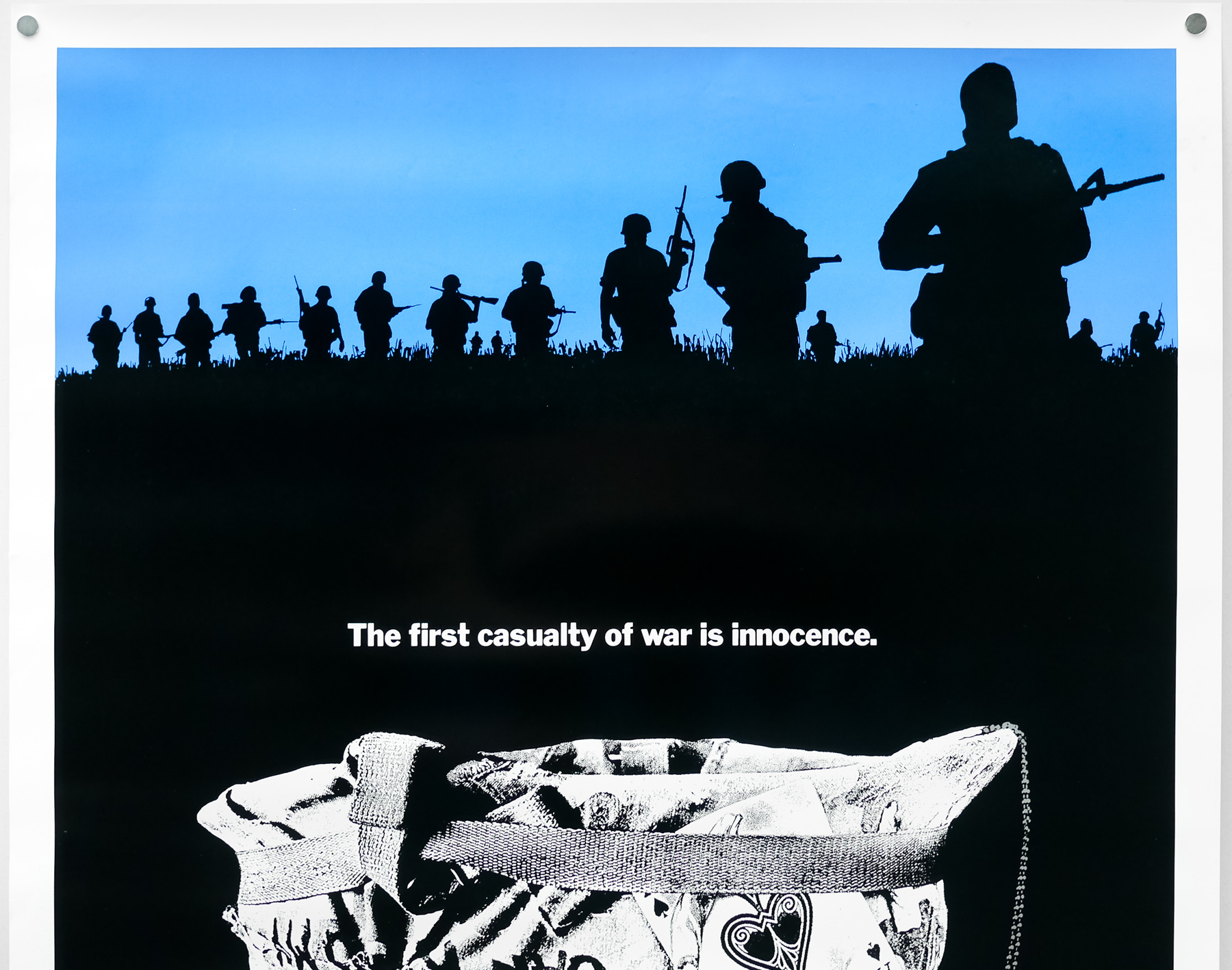
- Tagline
- An epic fantasy of peace and magic
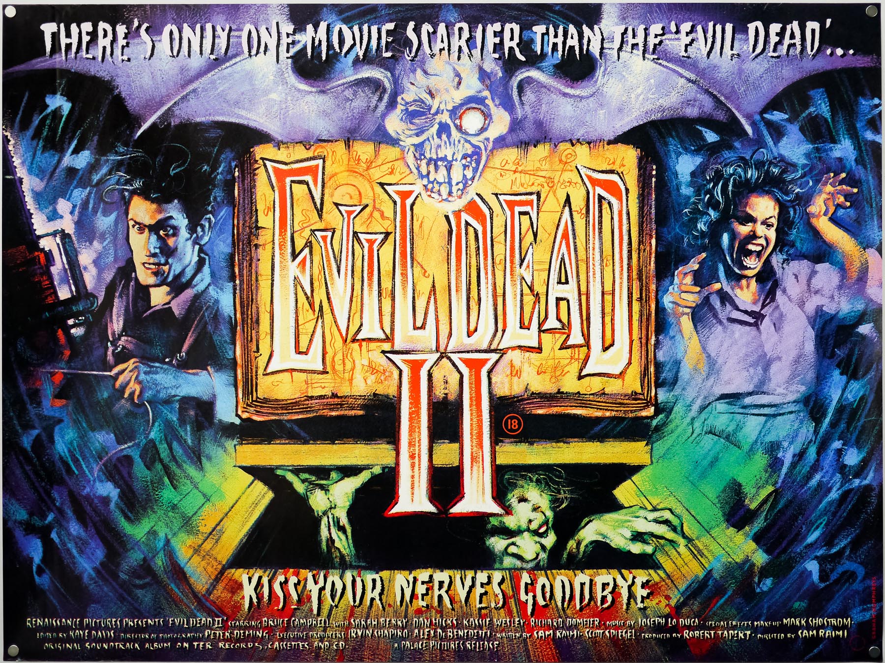
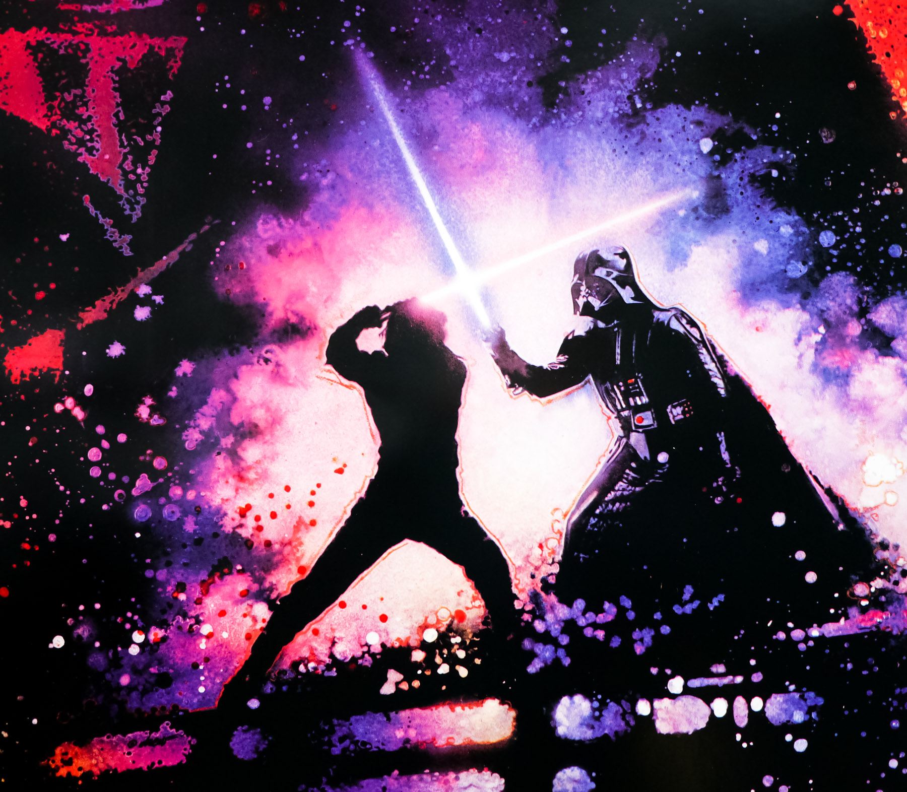
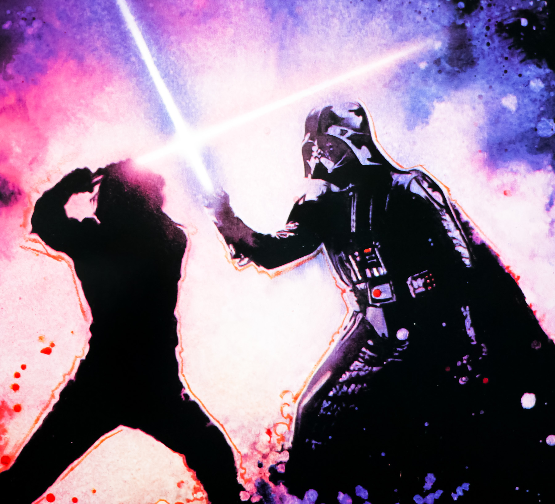
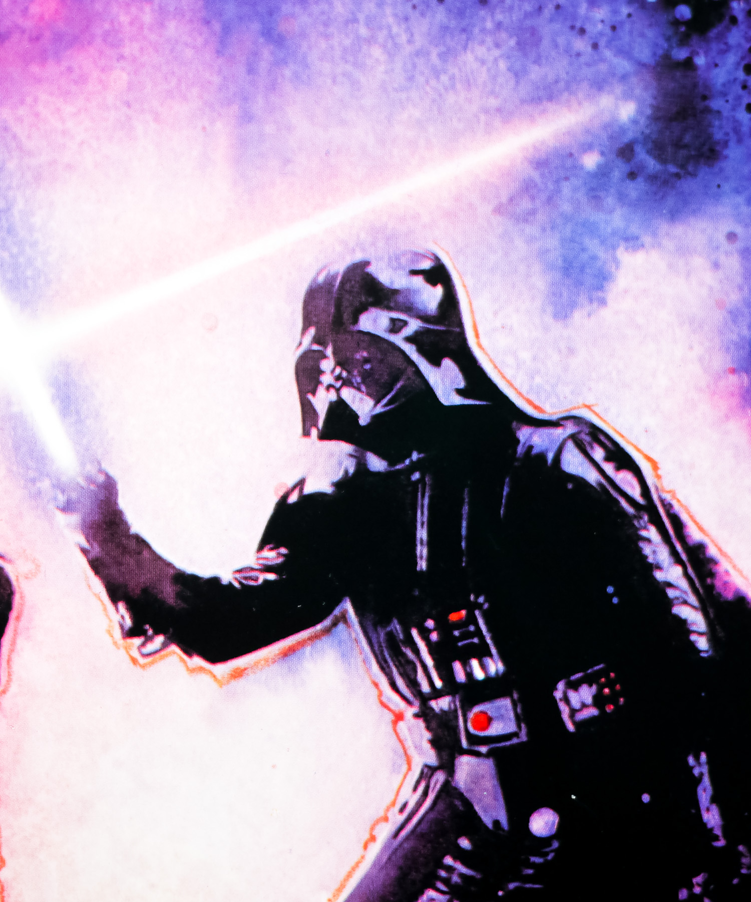
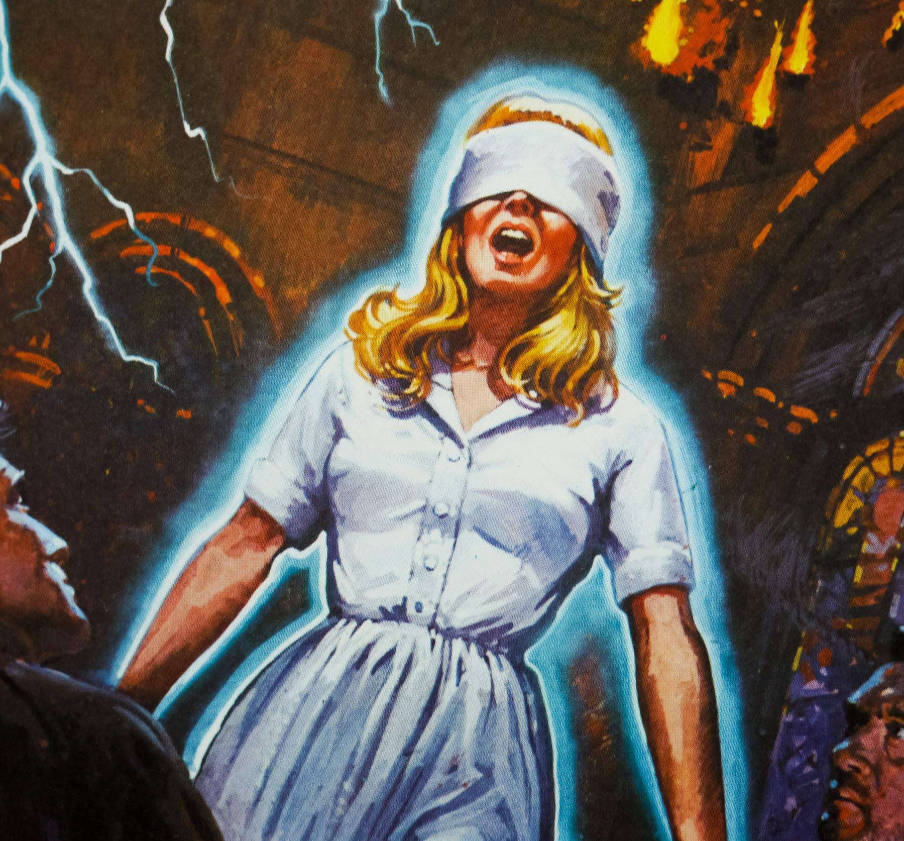
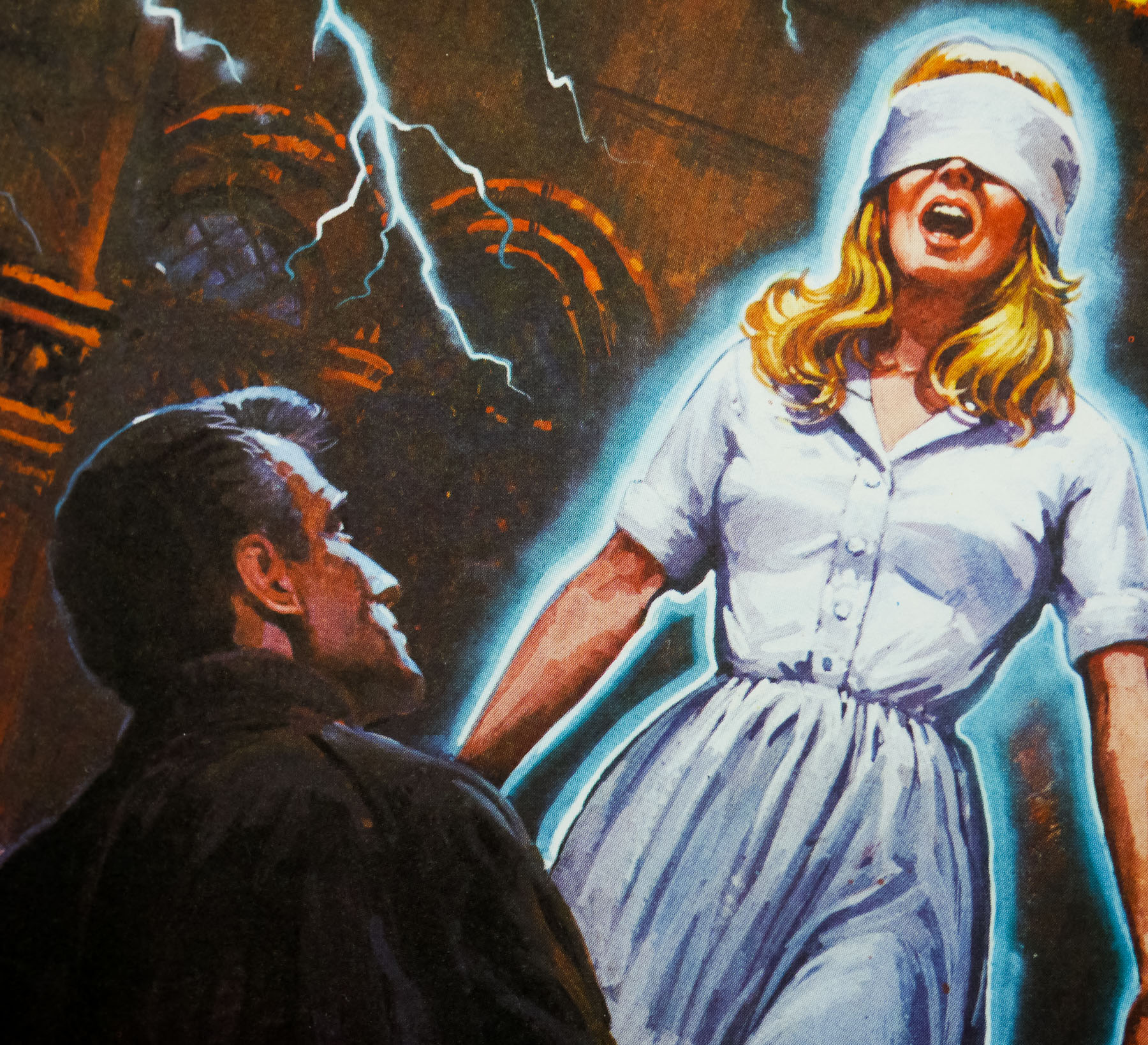
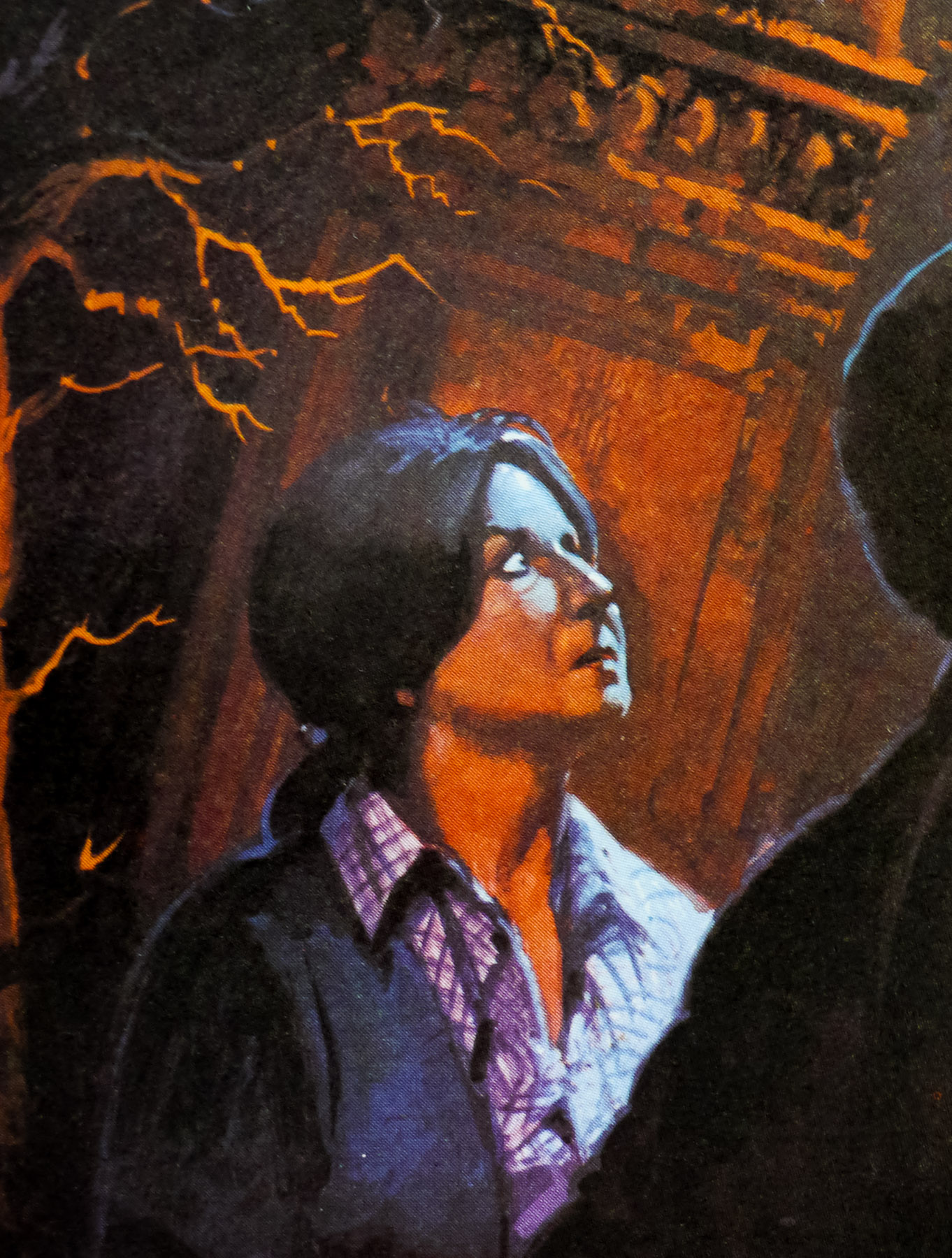
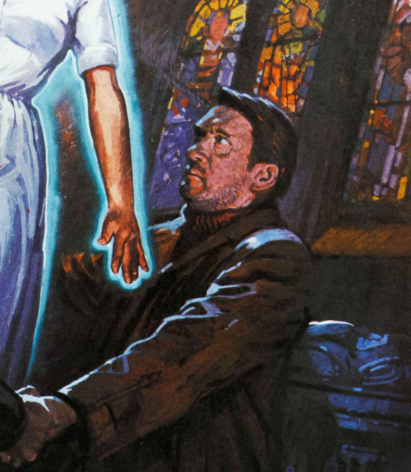
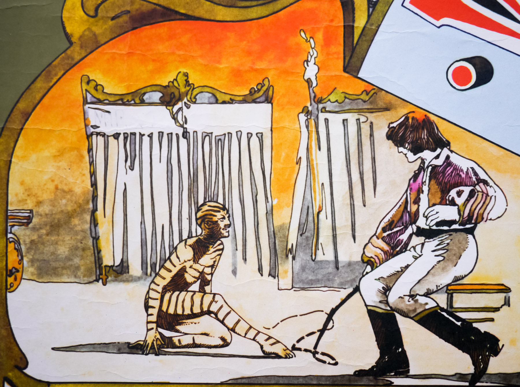
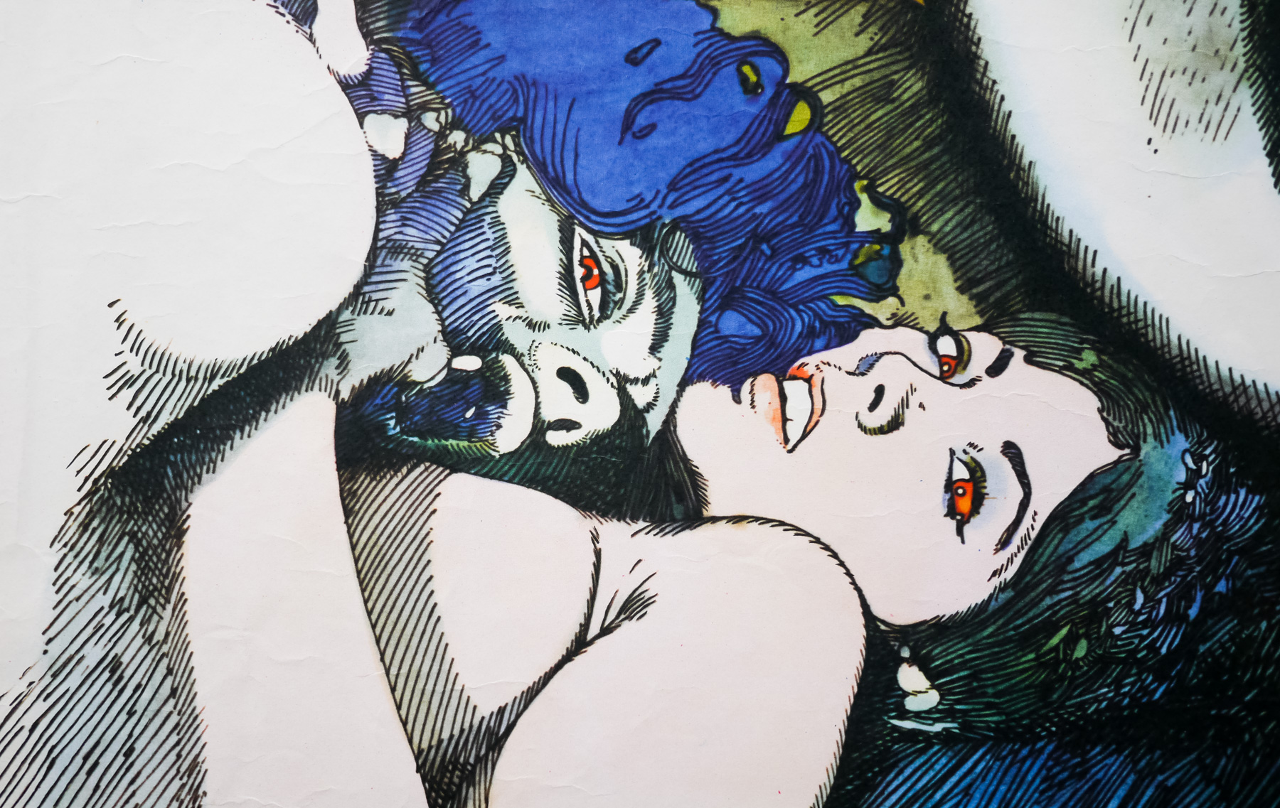
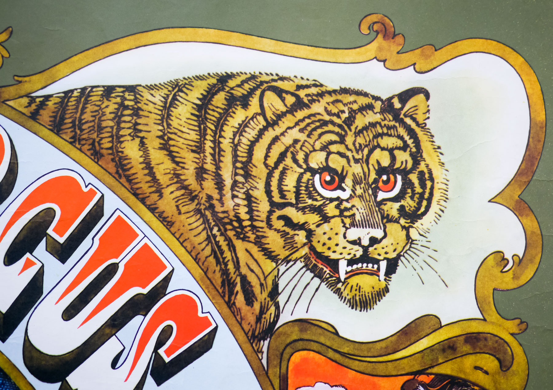
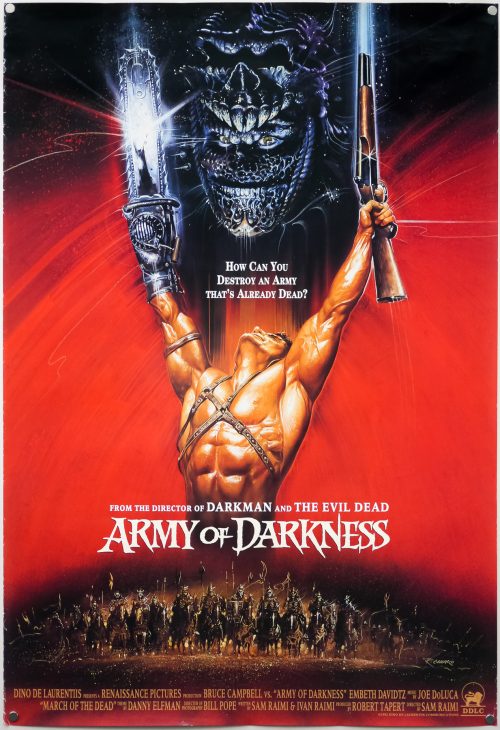
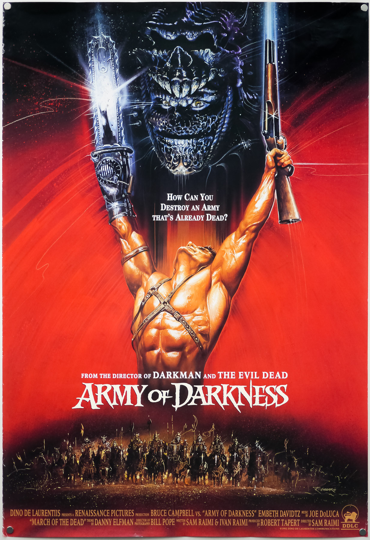
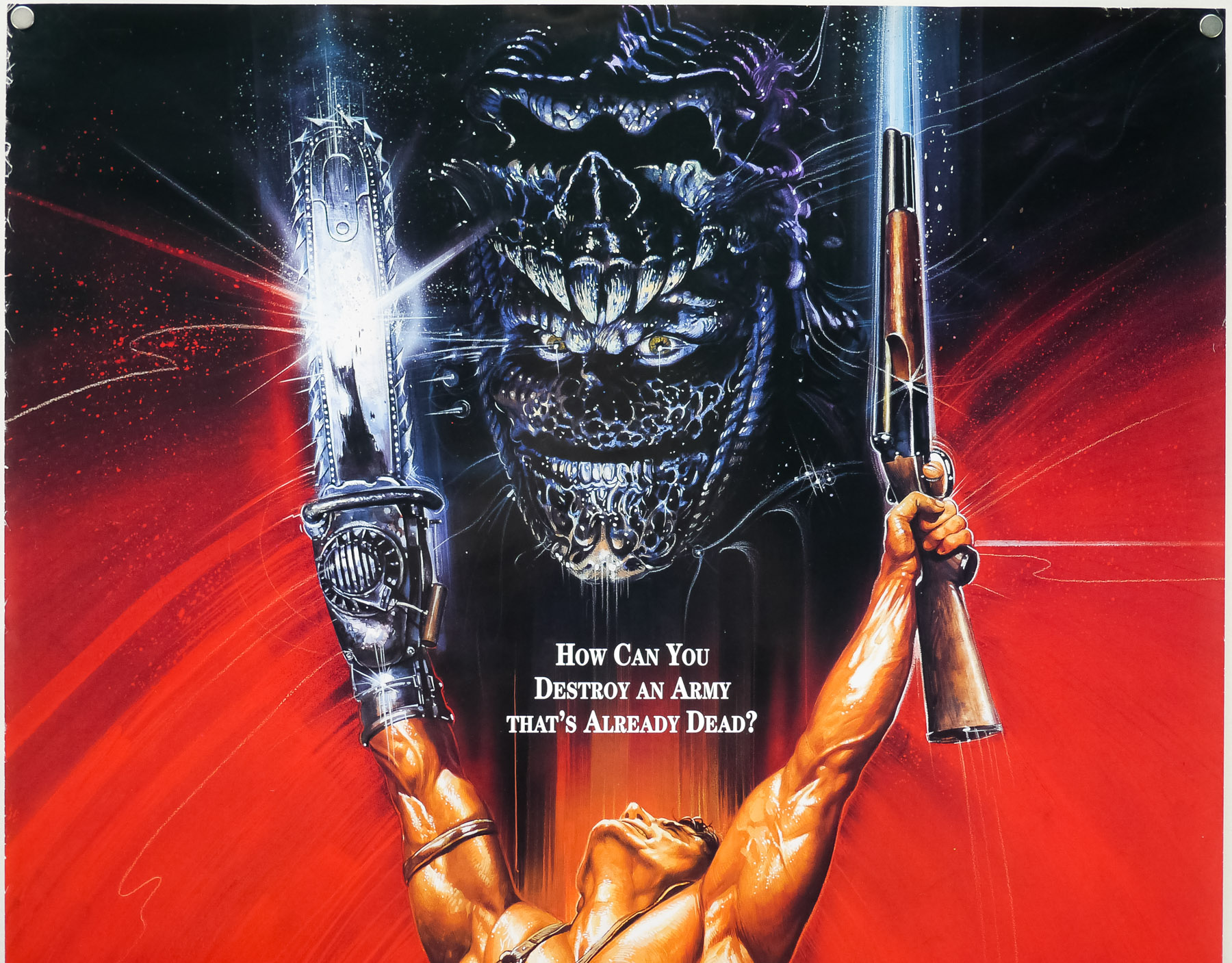
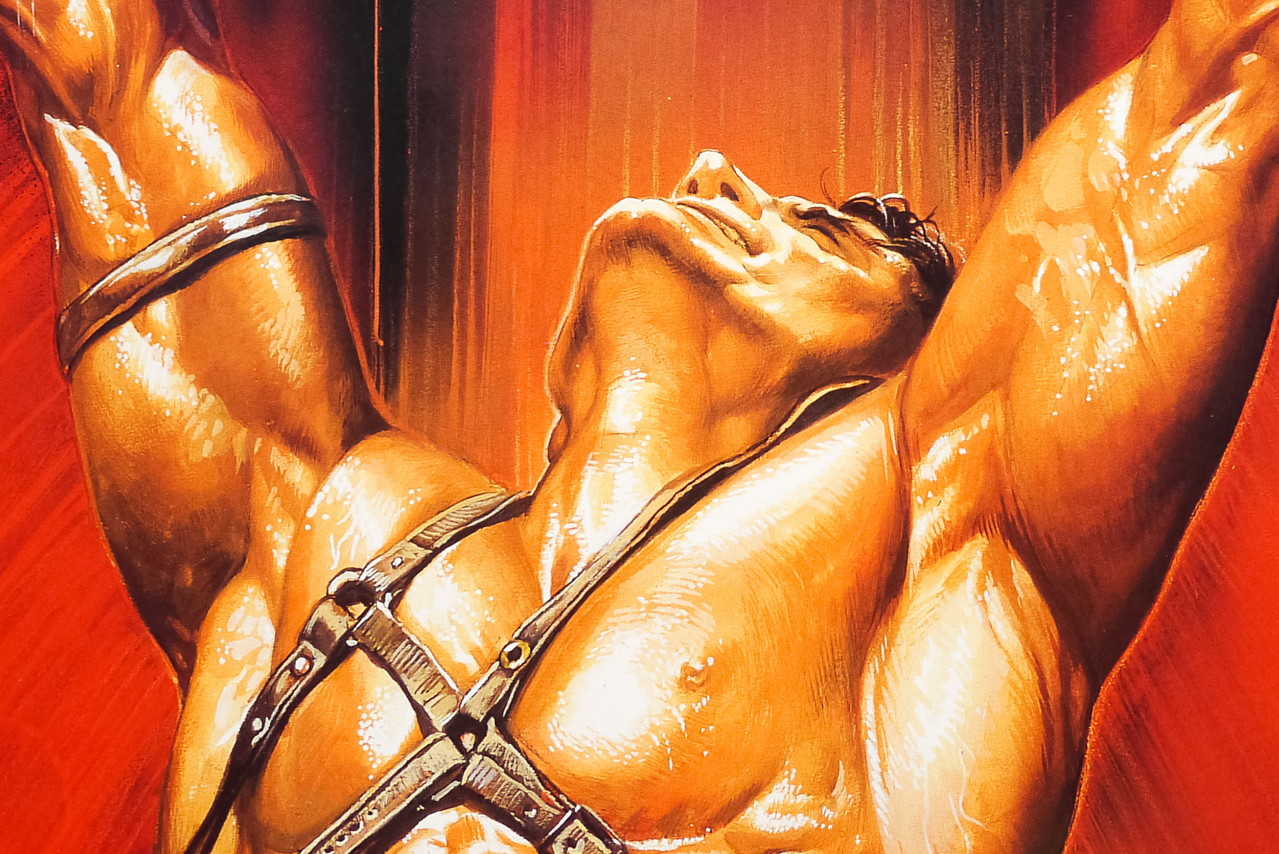
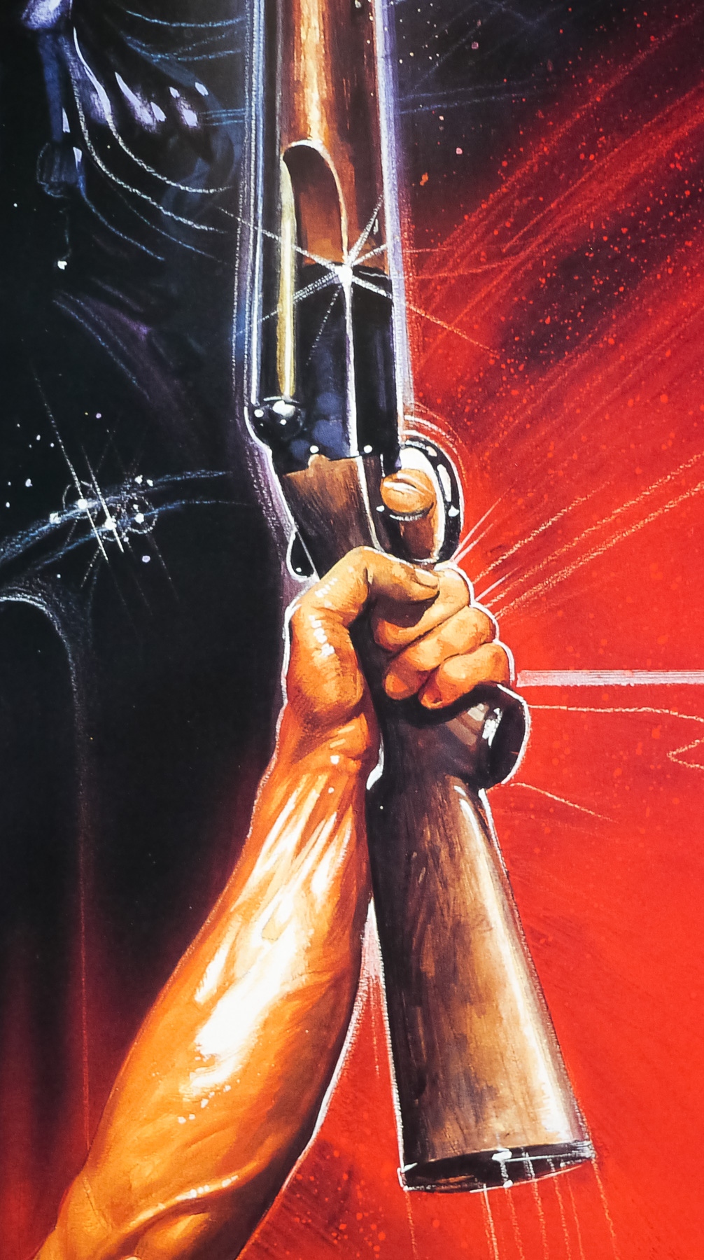
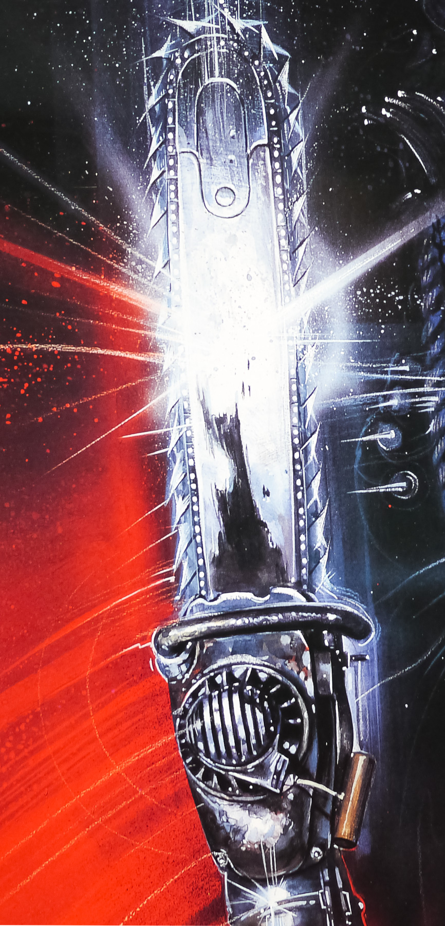
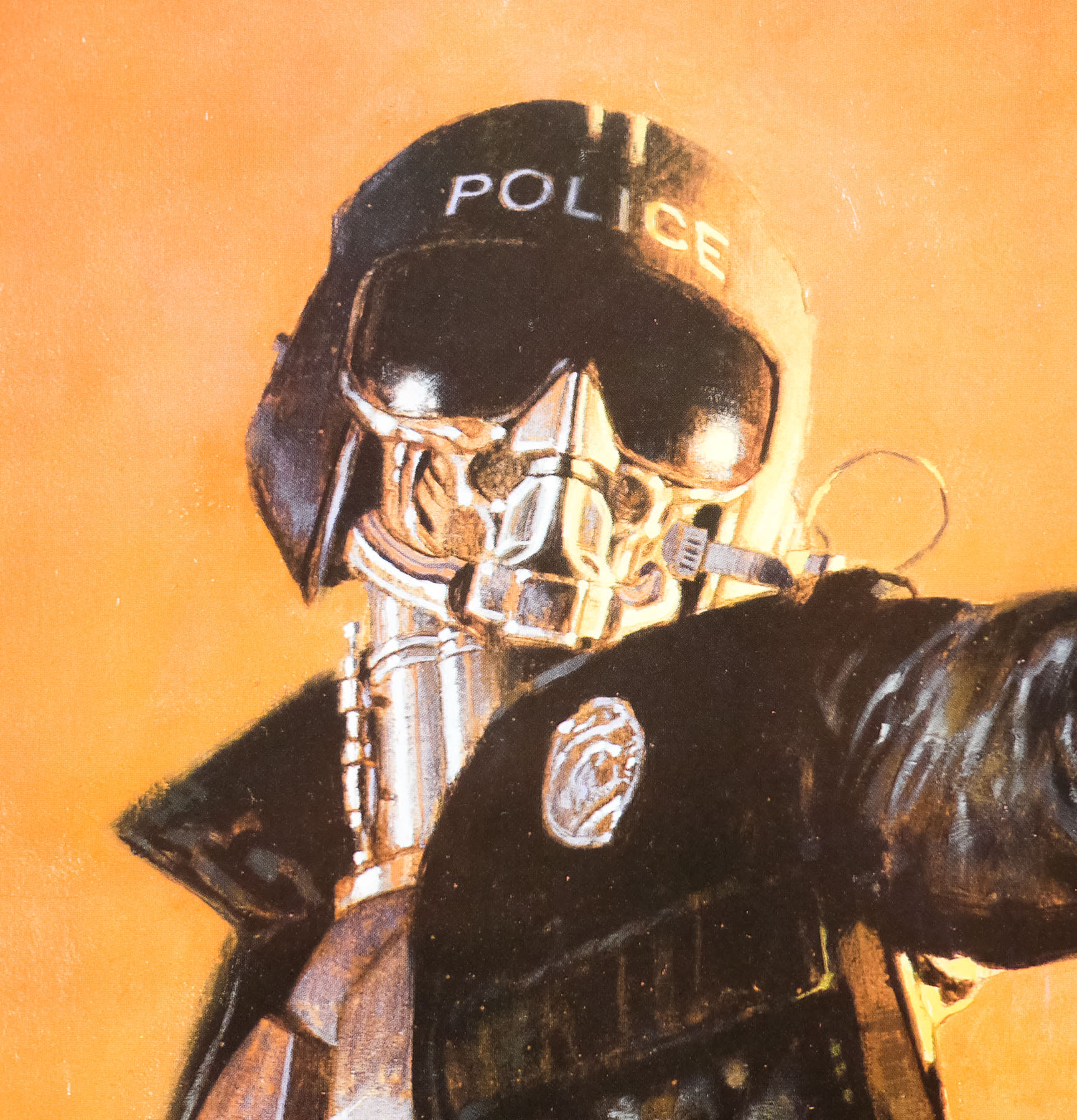
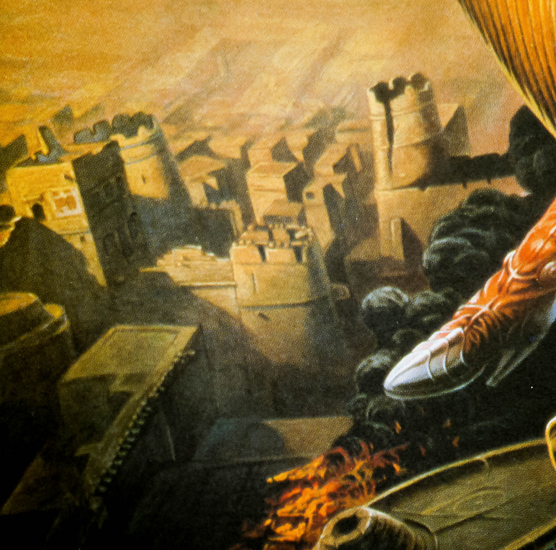
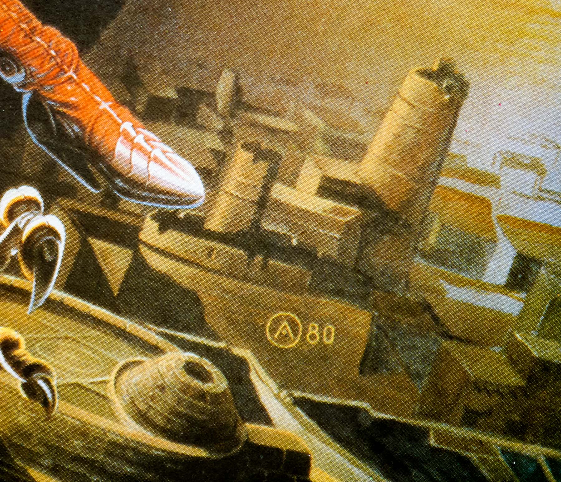
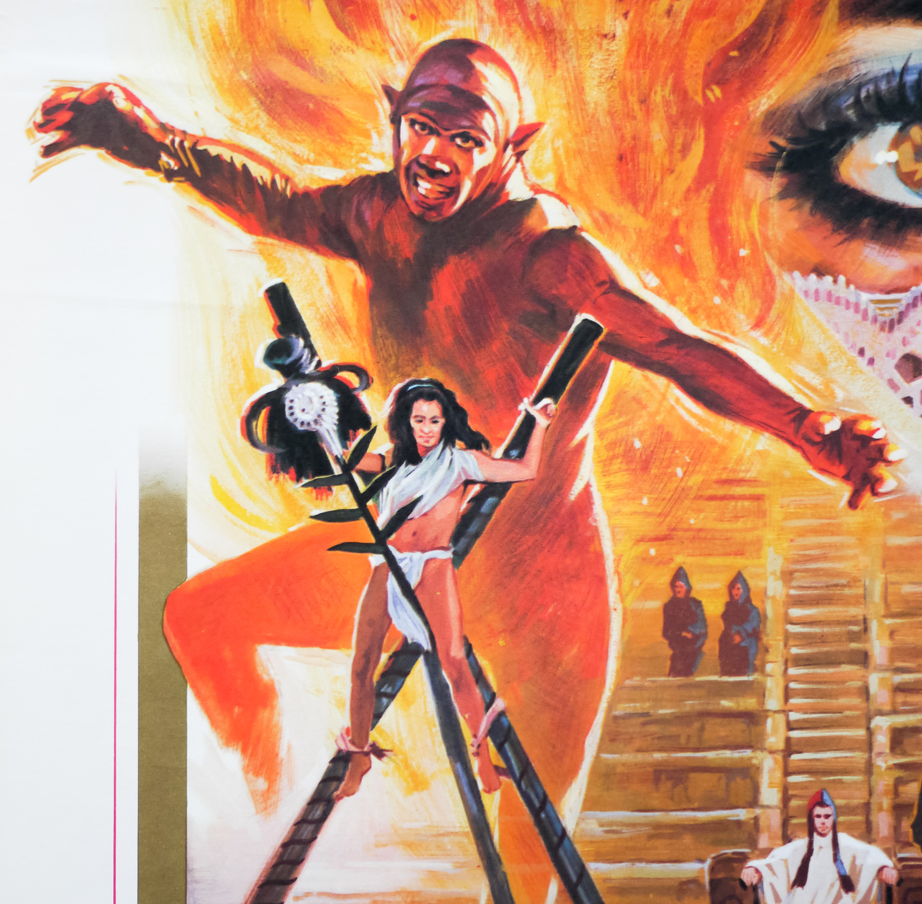
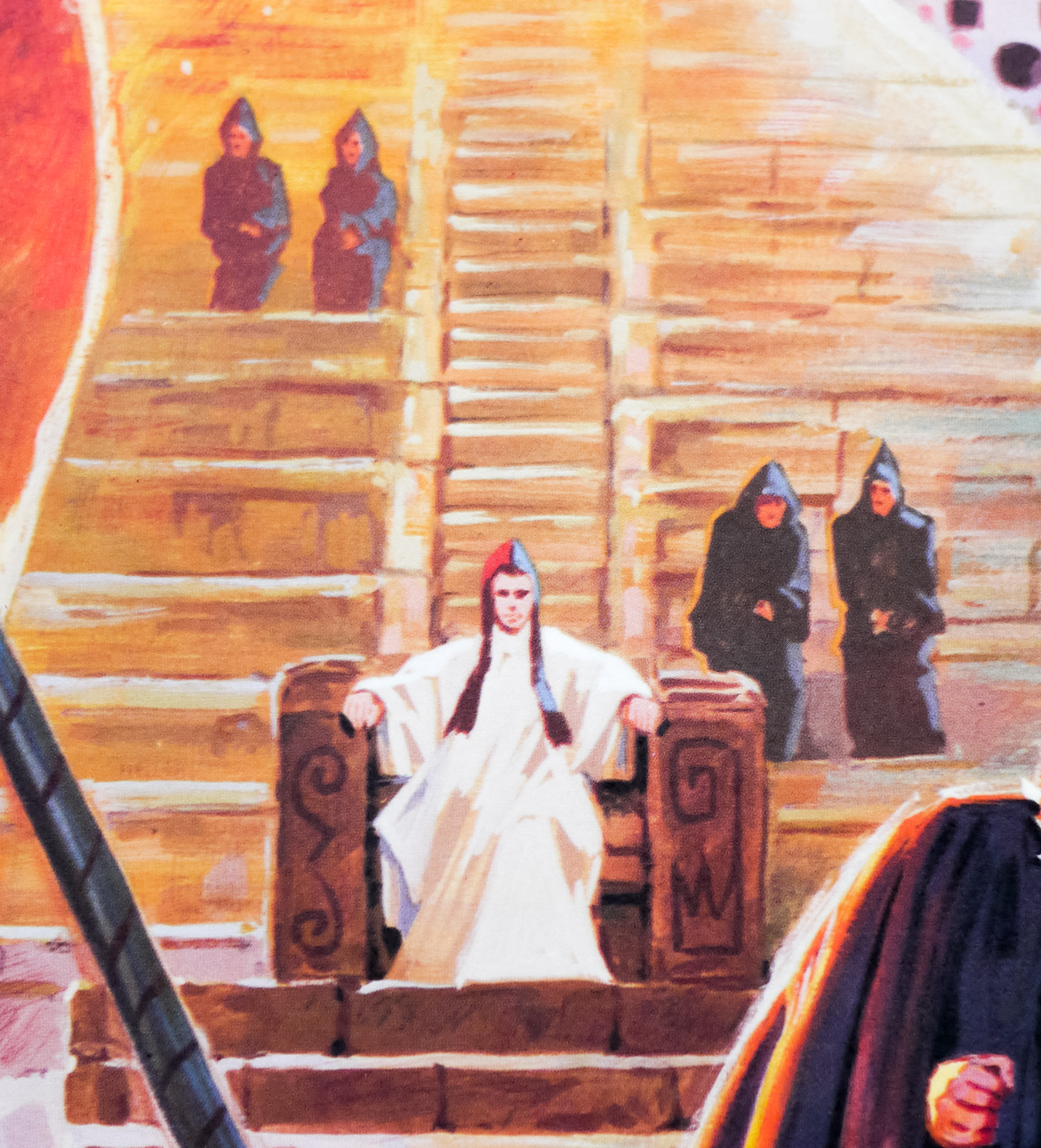
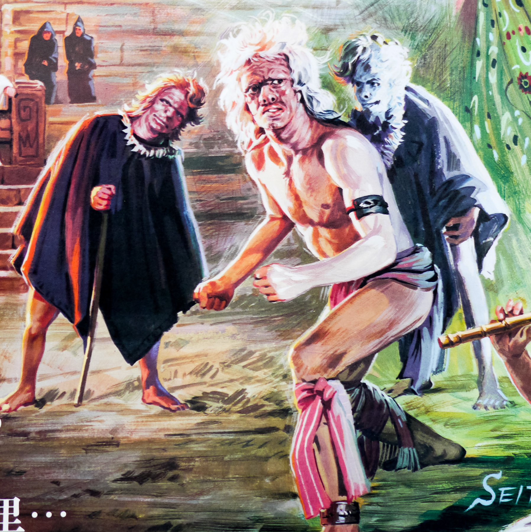
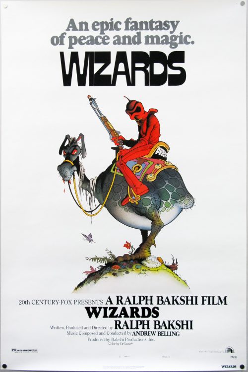
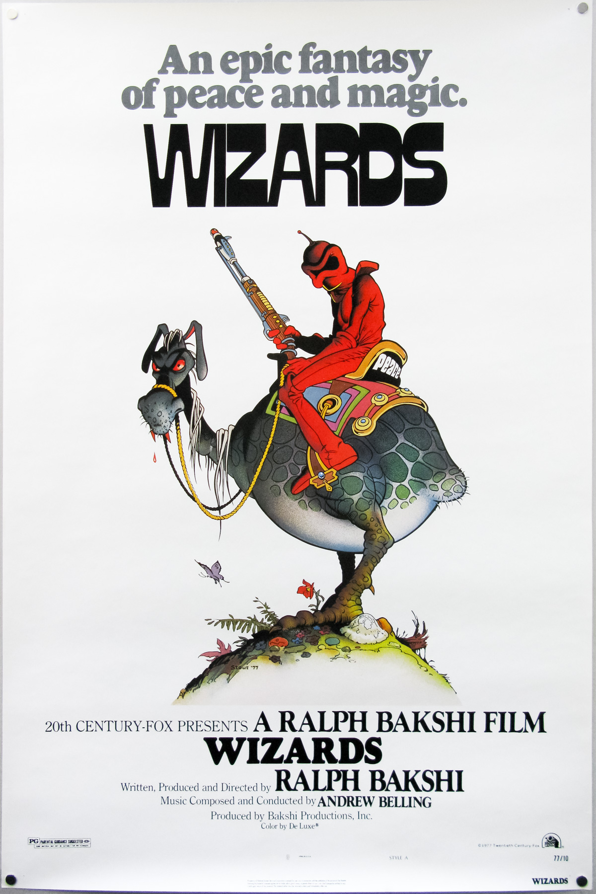
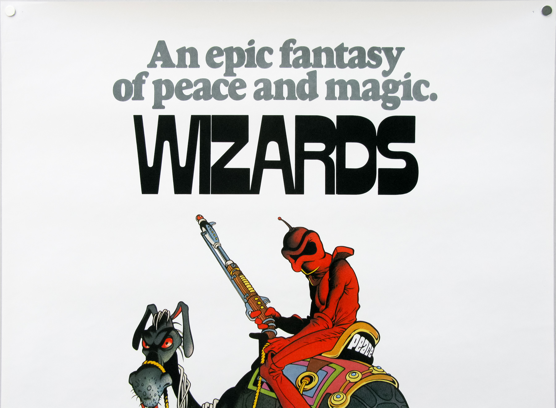
Great artwork by the legendary fantasy artist William Stout for Ralph Bakshi‘s post-apocalyptic fantasy sci-fi animation Wizards. The film was Bakshi’s first fantasy story and was something of a departure from the urban settings seen is his earlier works, including Fritz the Cat and Heavy Traffic. His intention was to create a family film that had the same kind of impact of his previous adult features. It’s essentially a good versus evil story set two million years after a nuclear war where fairies, elves and dwarves have returned to reclaim parts of the earth, whilst the rest of the human survivors are mutants roaming the wasteland.
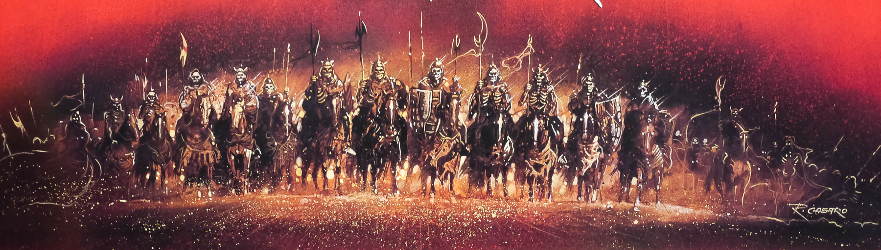
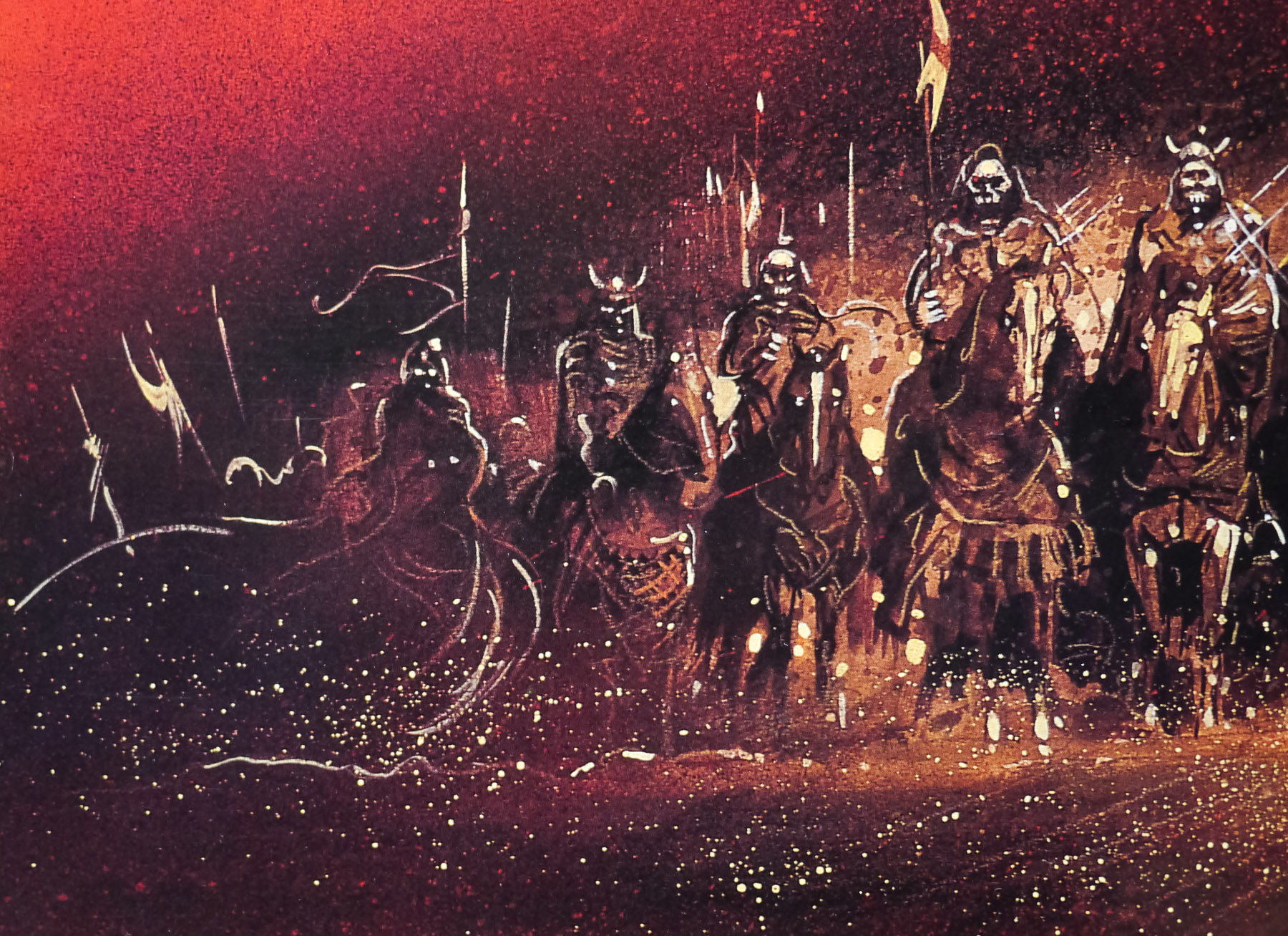
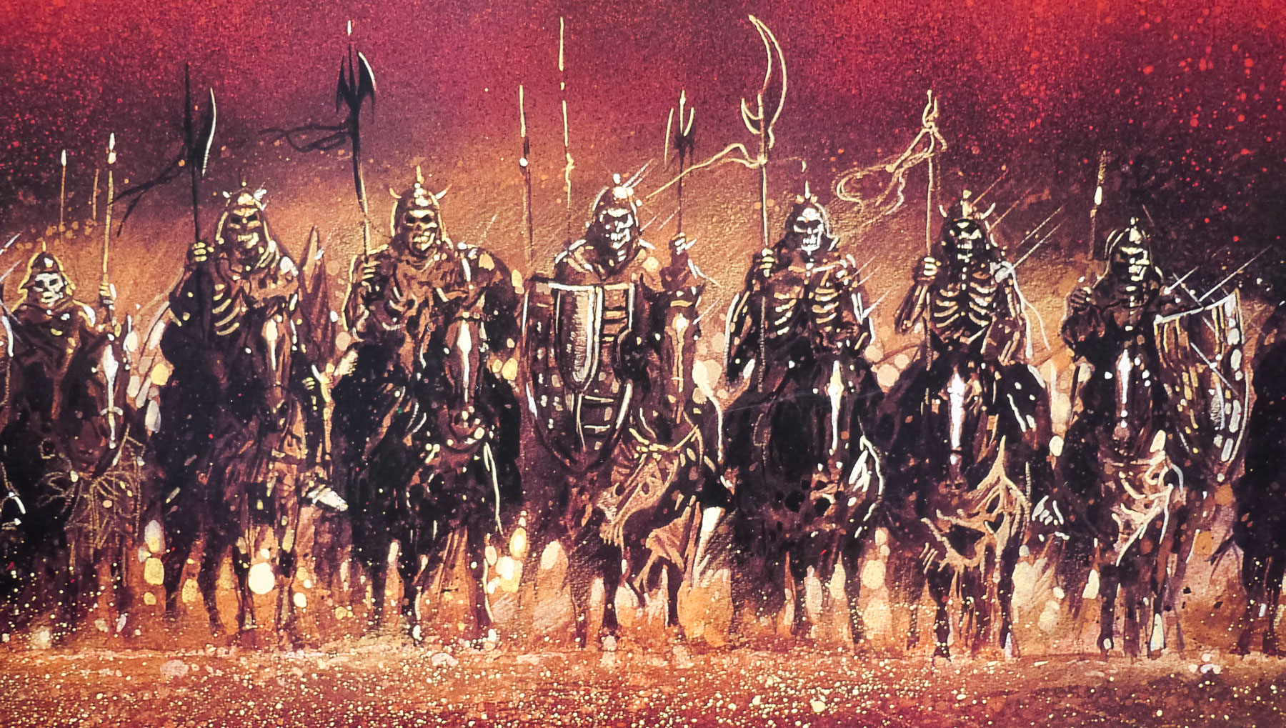
The film sees two wizards called Avatar and Blackwolf, one kind and gentle and the other a grumpy mutant, born to a fairy (stay with me) who end up battling each other to prevent Blackwolf from using his band of mutants to destroy all goodness left on the earth. The film is described on the DVD audio commentary as being ‘an allegorical comment on the moral neutrality of technology and the potentially destructive powers of propaganda’. Blackwolf uses old projections of (genuine) Nazi propaganda marches to inspire his evil troops and frighten his enemies.
The film is notable for its rough animation style and its use of rotoscoping, a technique of painting over live-action footage, to create several of the major sequences, which was employed after Fox (the studio financing the film) refused an increase to the budget. Bakshi would later use the same technique for his 1978 version of the The Lord of the Rings.
This was William Stout’s first film poster and he went on to illustrate over 120 more, a few of which can be seen on his official website. Stout is known for being an incredibly versatile artist and he has worked in multiple fields throughout his long career, including motion picture design, comic art, book illustration, CD covers and paleontological illustration. He worked as conceptual artist and production designer on an impressive range of films, including both of the original Conan adventures, First Blood and The Return of the Living Dead; Stout designed the brilliant Tar-Man. Check out his impressive bio for more details and there are plenty of galleries on the same site.
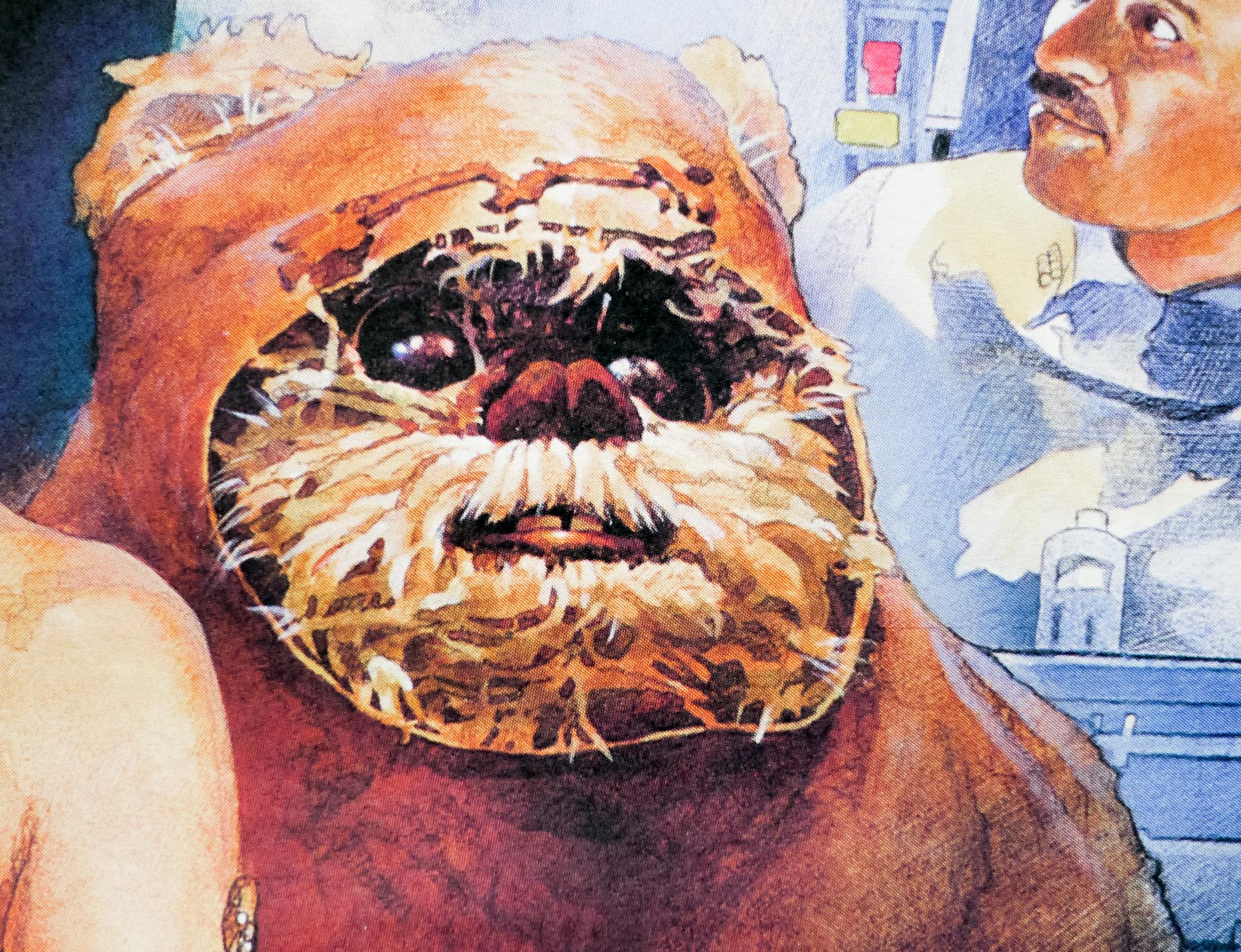
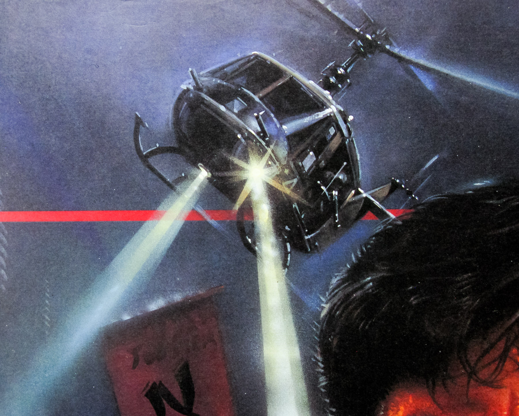
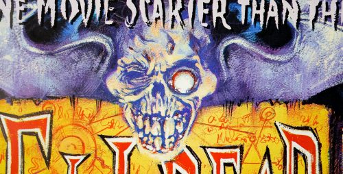
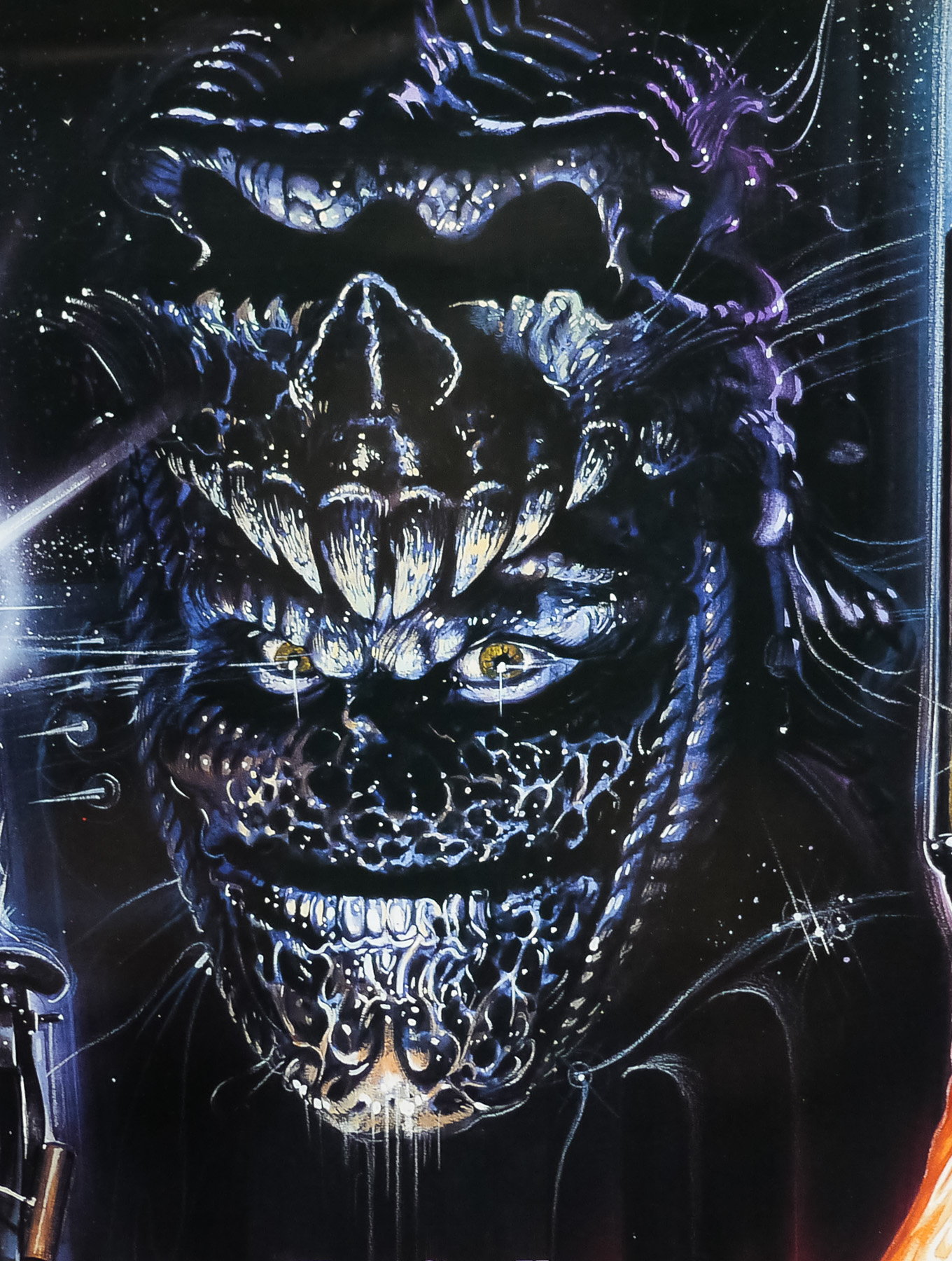
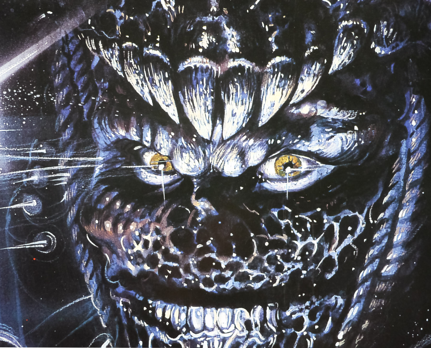
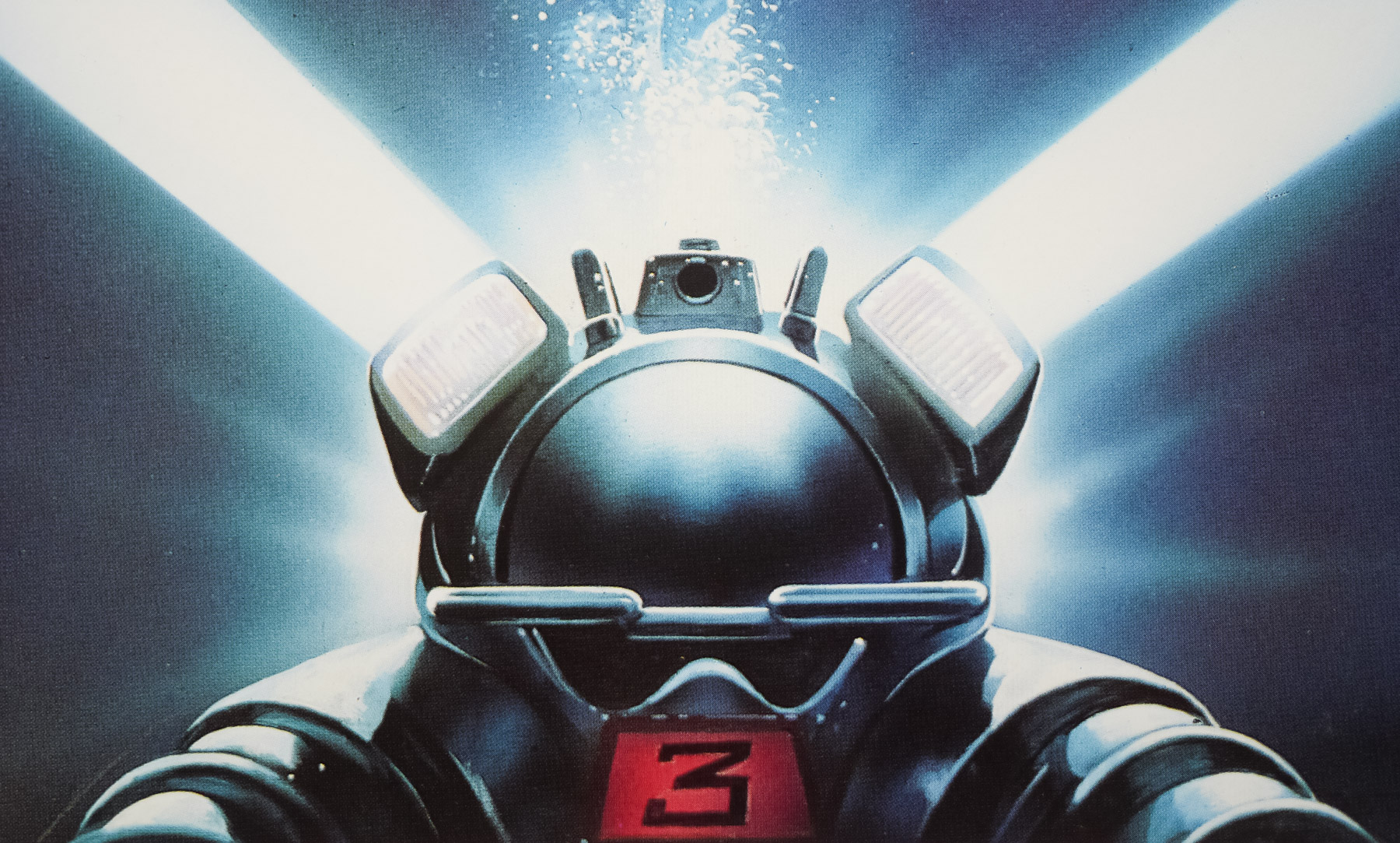
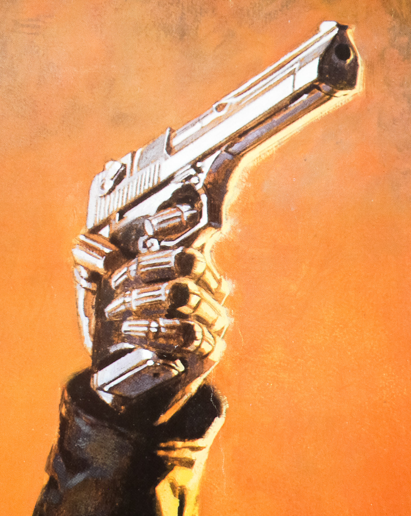
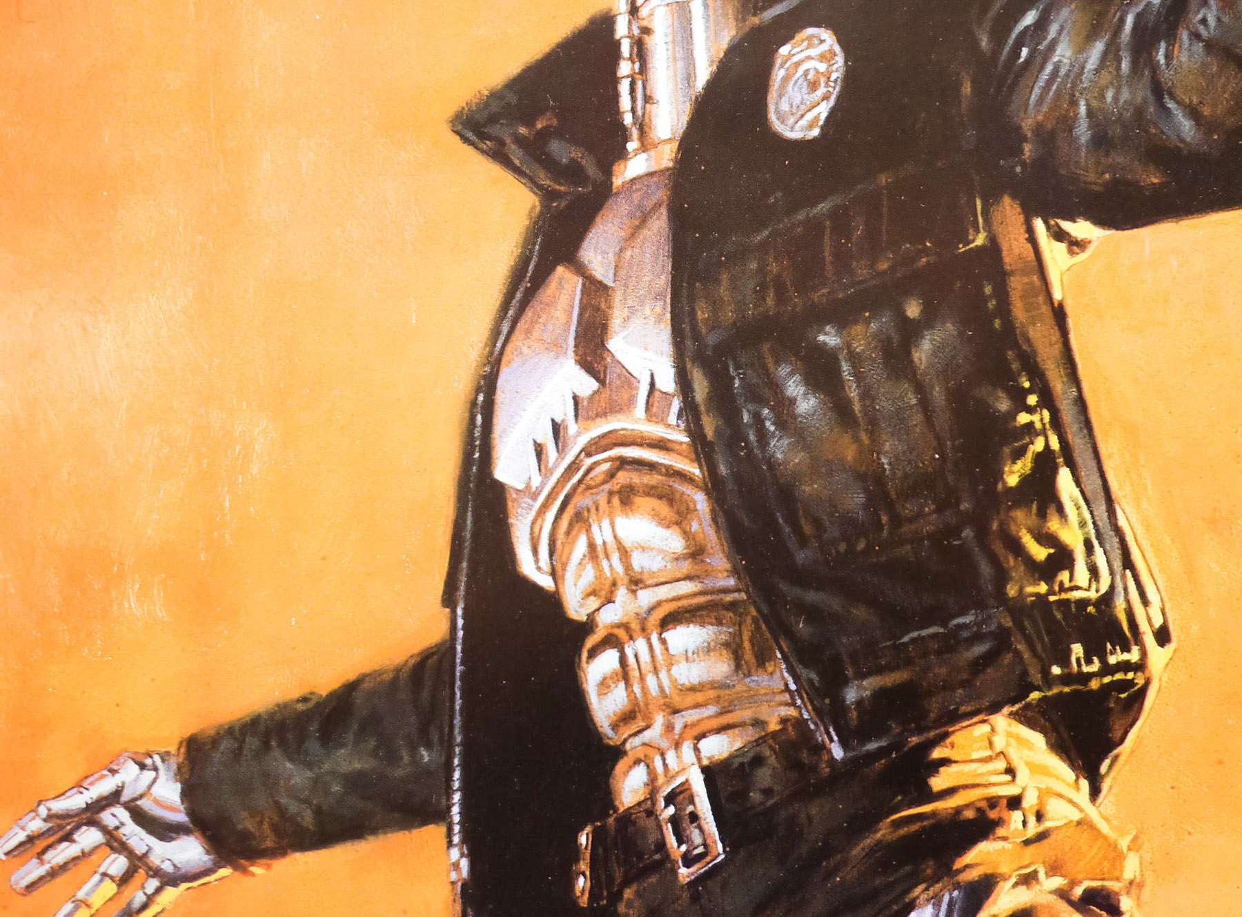
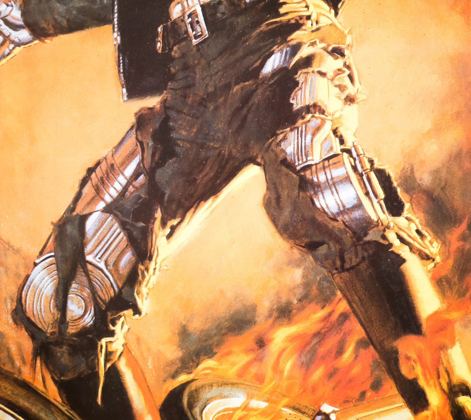
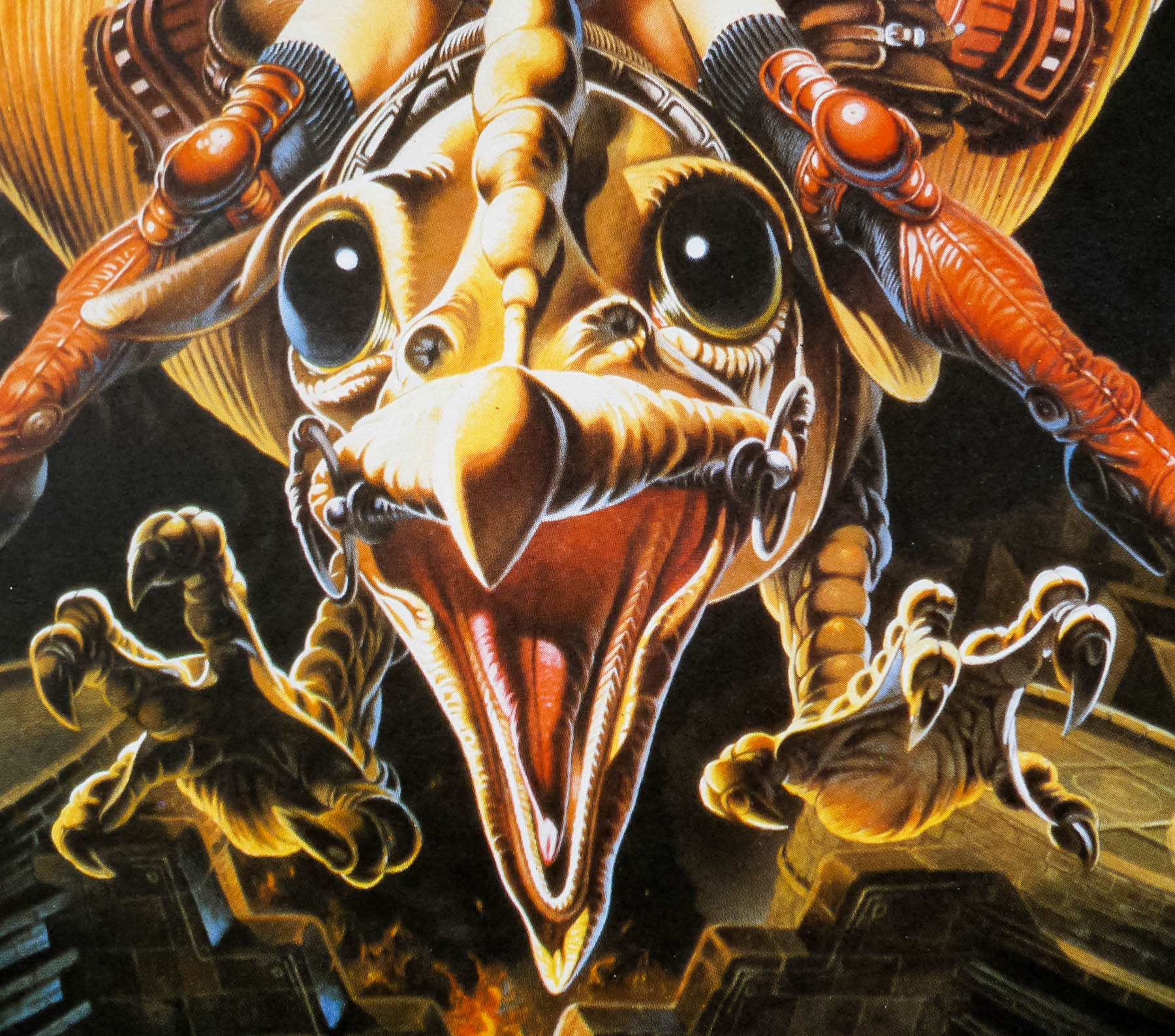
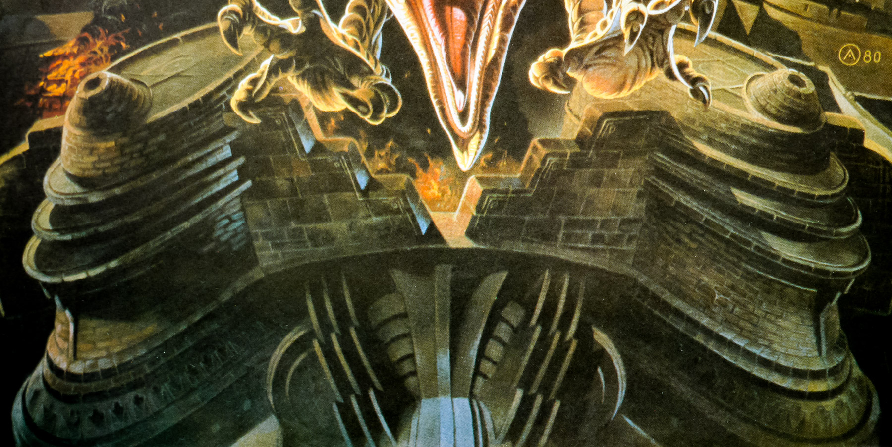
The creature depicted is Necron 99, a robot assassin who is eventually controlled by Avatar and renamed as Peace.
The official trailer is on YouTube.