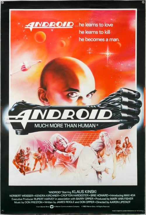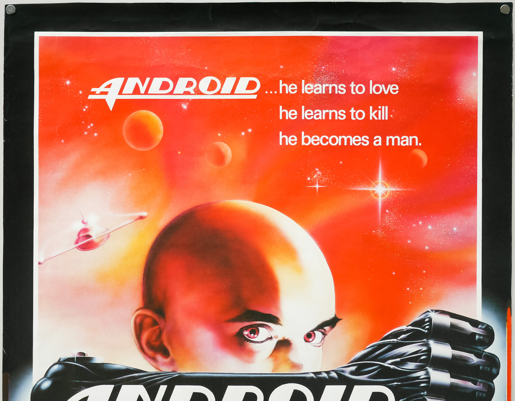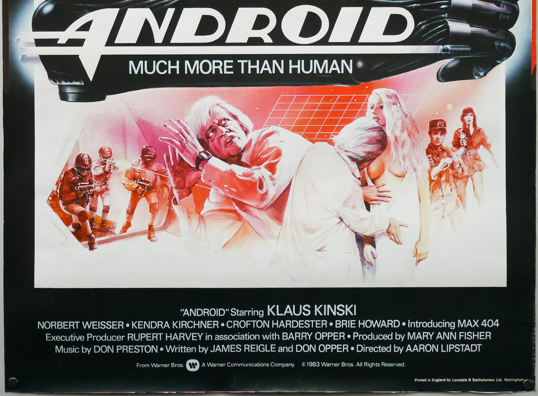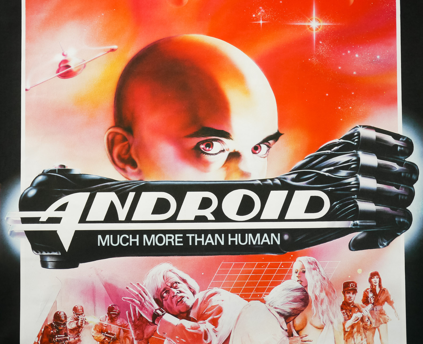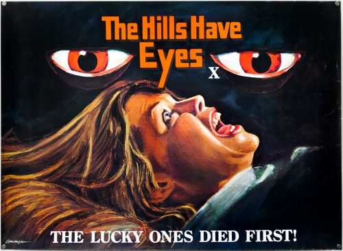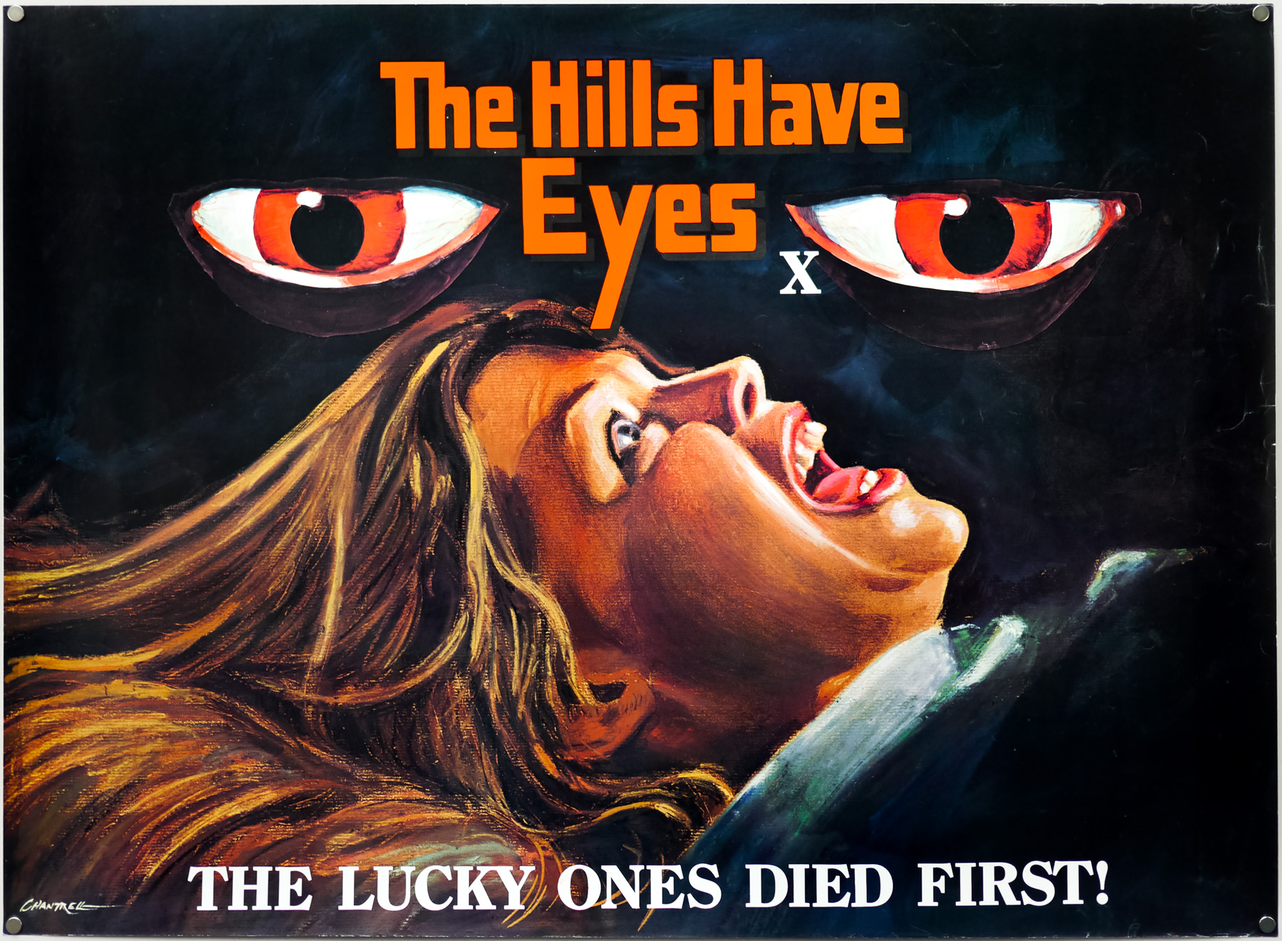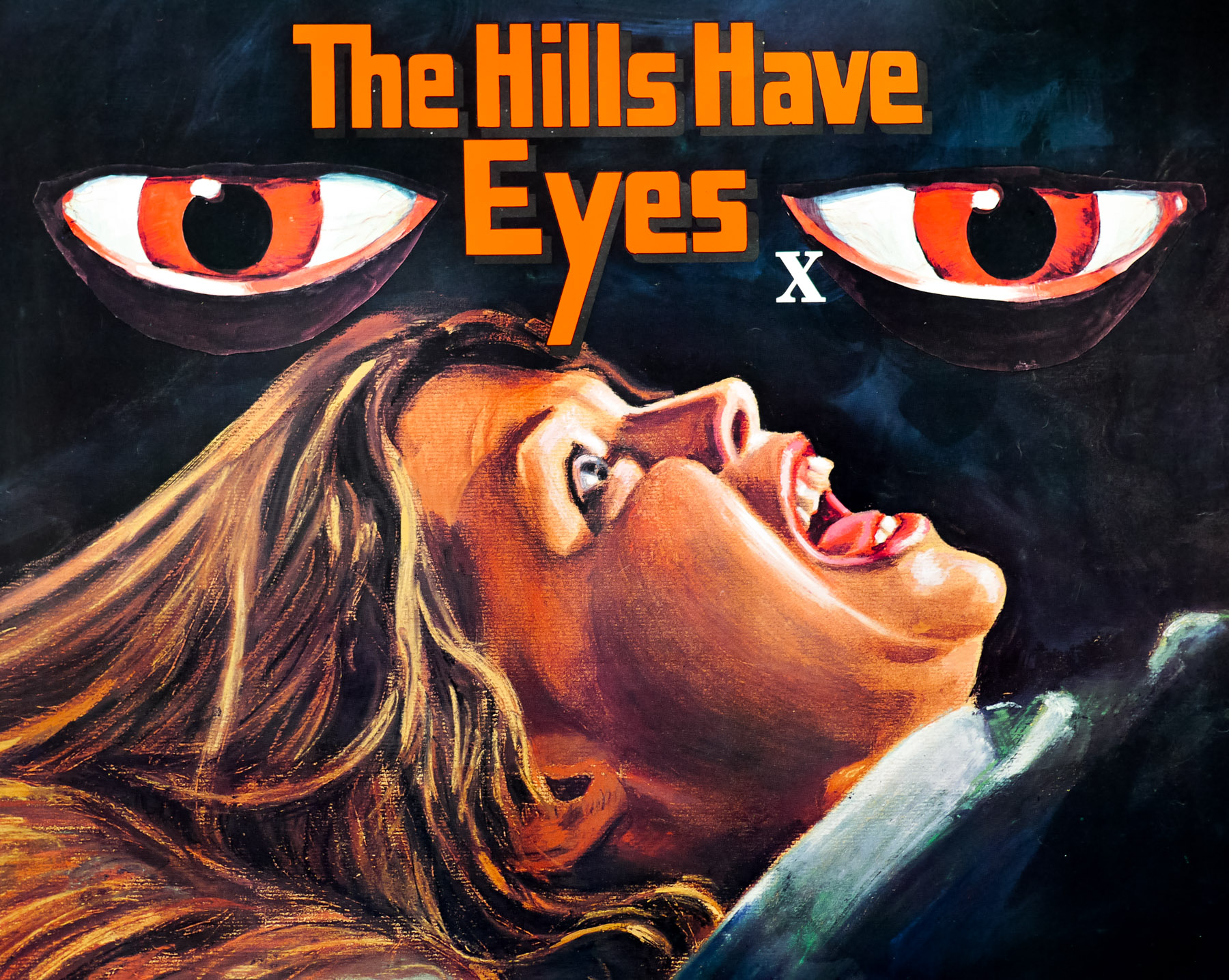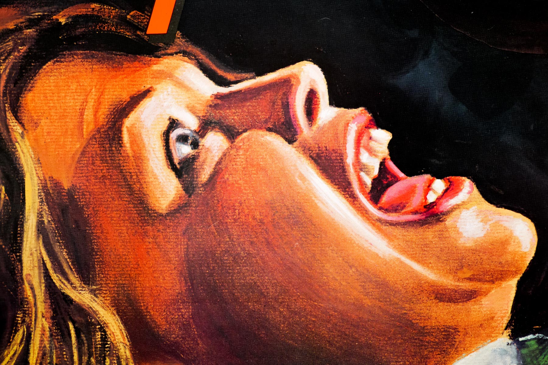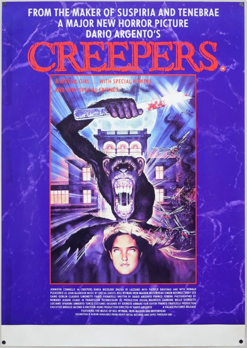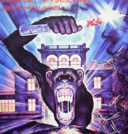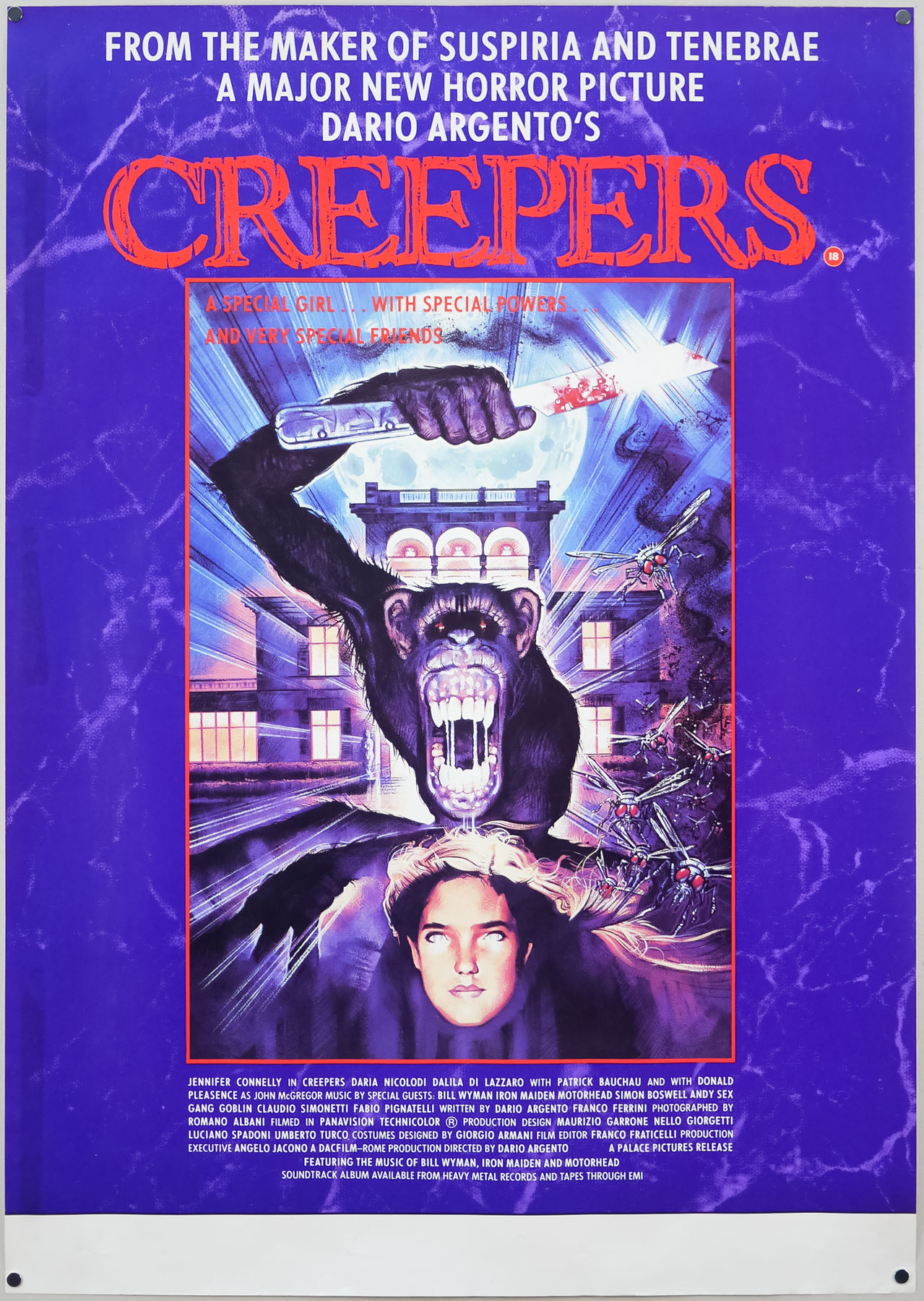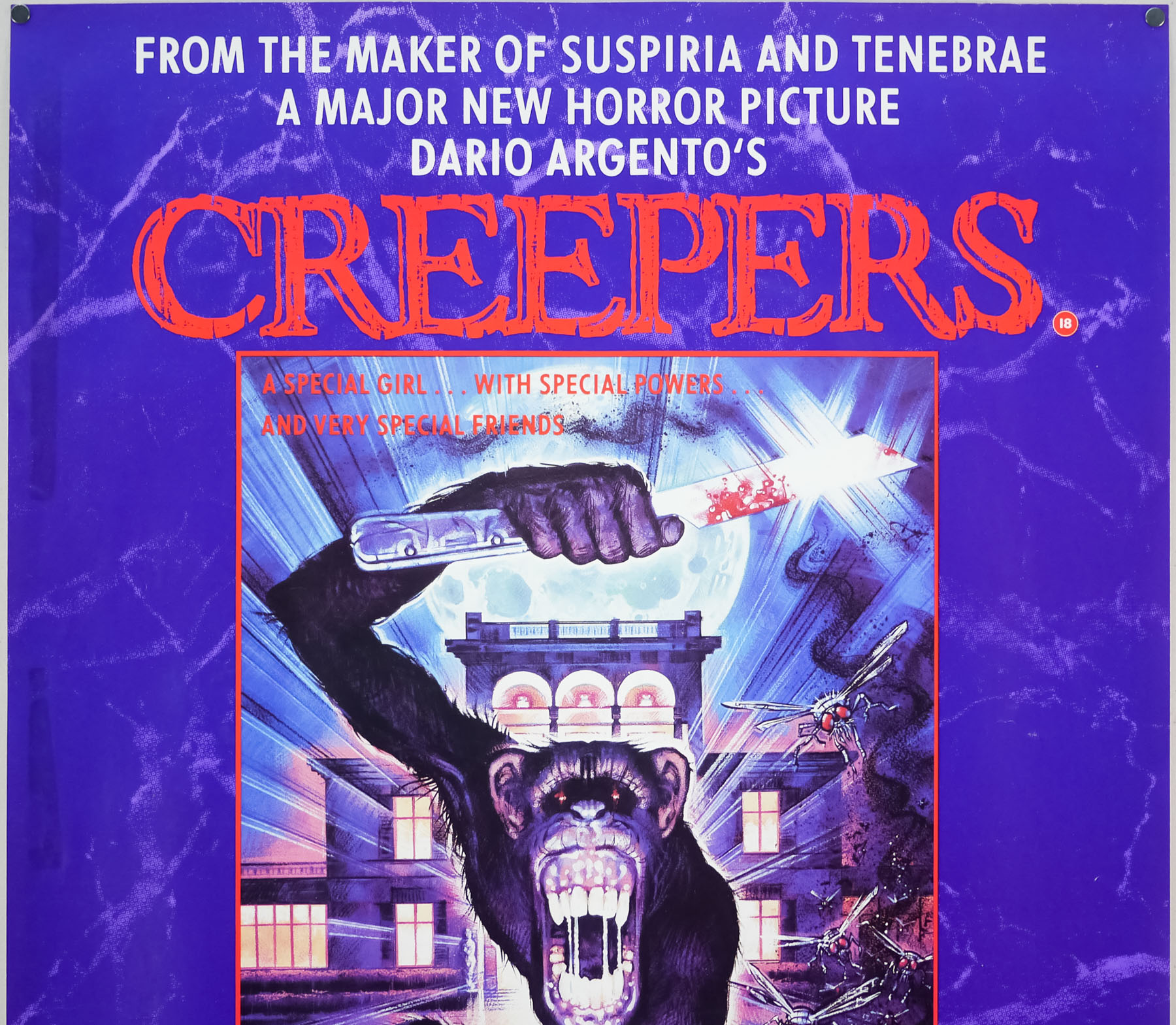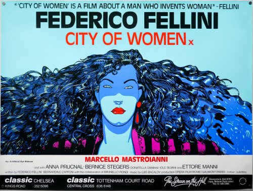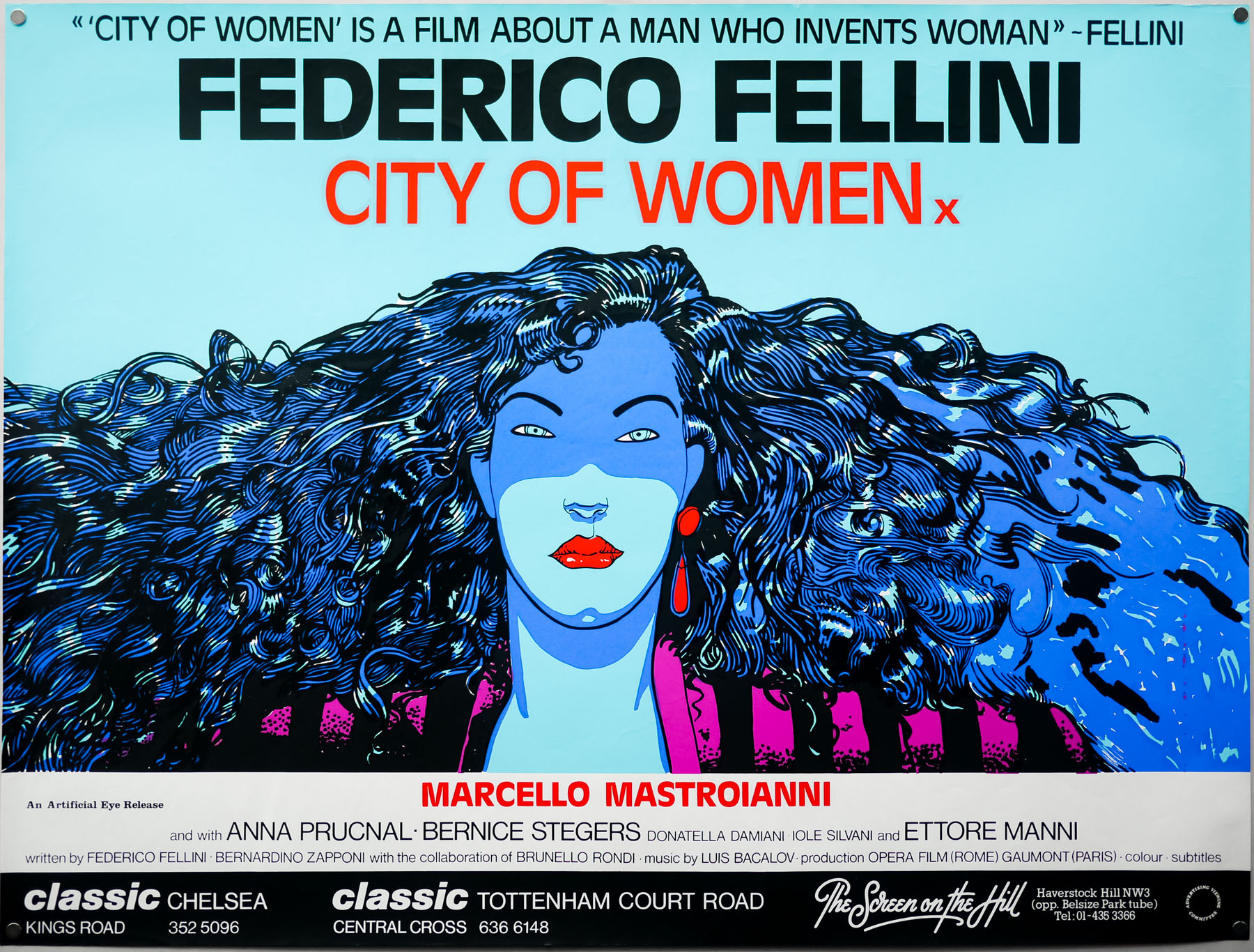

Poster detail
1-5

- Title
- Pan's Labyrinth
- AKA
- El laberinto del fauno (Spain - original title)
- Year of Film
- 2006
- Director
- Guillermo Del Toro
- Starring
- Ivana Baquero, Sergi López, Maribel Verdú, Doug Jones, Ariadna Gil, Álex Angulo, Manolo Solo, César Vea, Roger Casamajor, Ivan Massagué, Gonzalo Uriarte, Eusebio Lázaro
- Origin of Film
- Spain | USA | Mexico
- Genre(s) of Film
- Ivana Baquero, Sergi López, Maribel Verdú, Doug Jones, Ariadna Gil, Álex Angulo, Manolo Solo, César Vea, Roger Casamajor, Ivan Massagué, Gonzalo Uriarte, Eusebio Lázaro,
- Type of Poster
- One sheet
- Style of Poster
- Special
- Origin of Poster
- UK
- Year of Poster
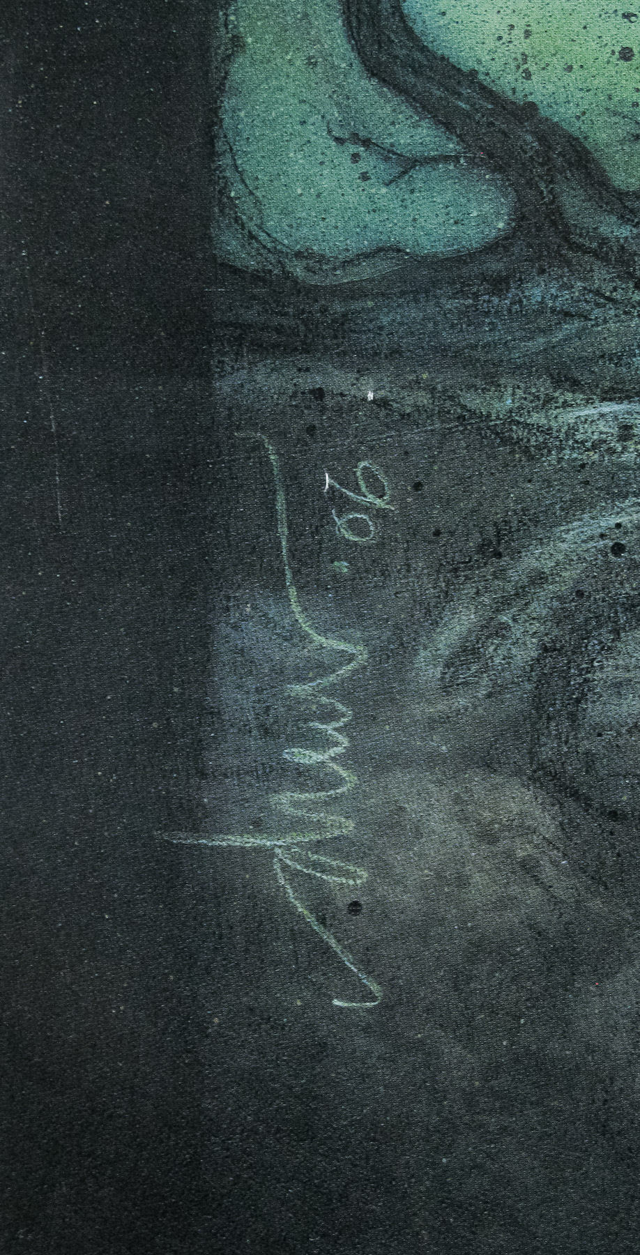
- 2006
- Designer
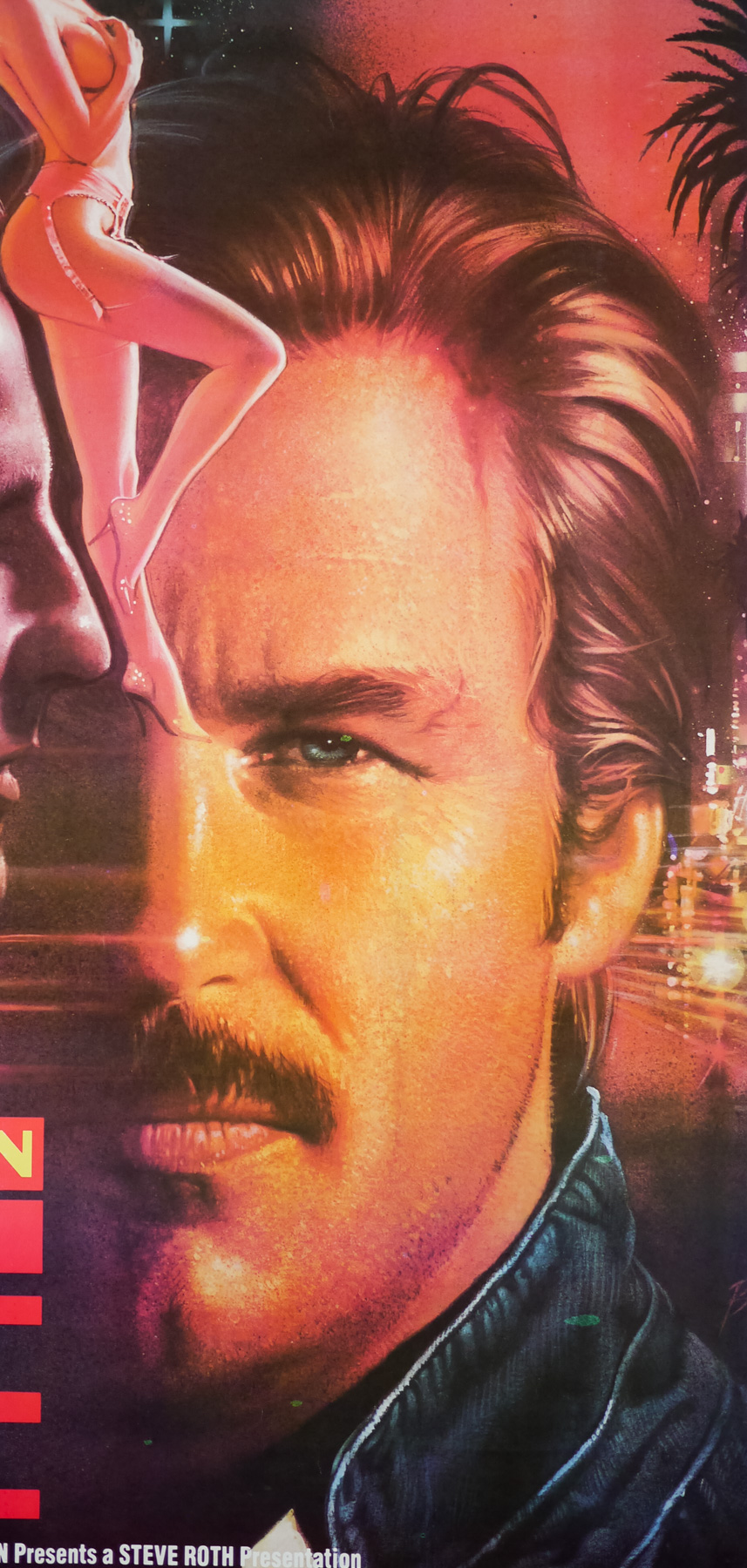
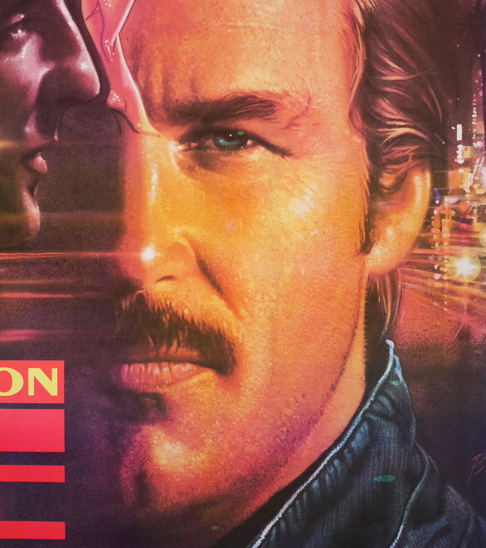
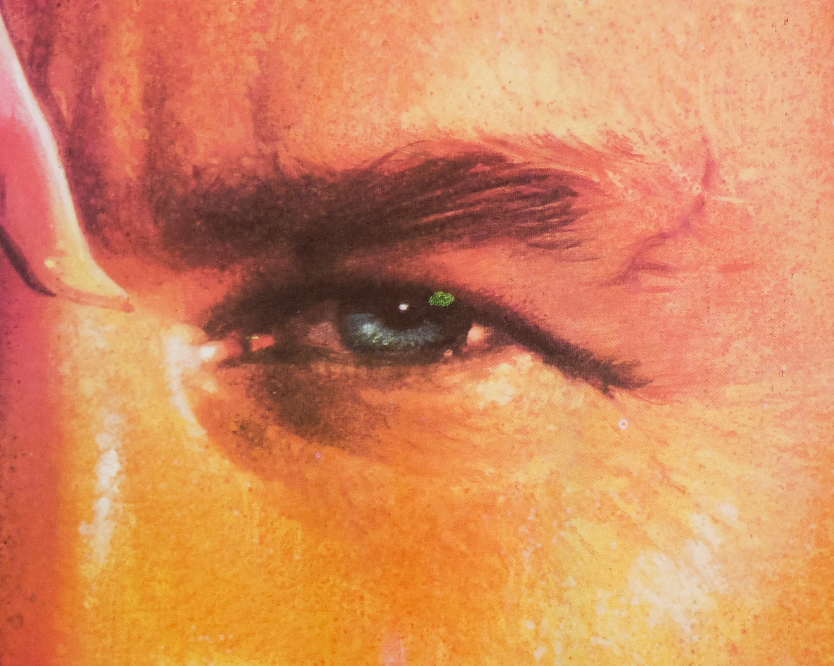
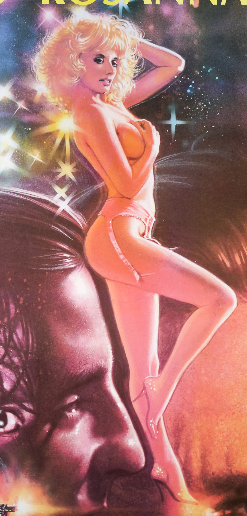
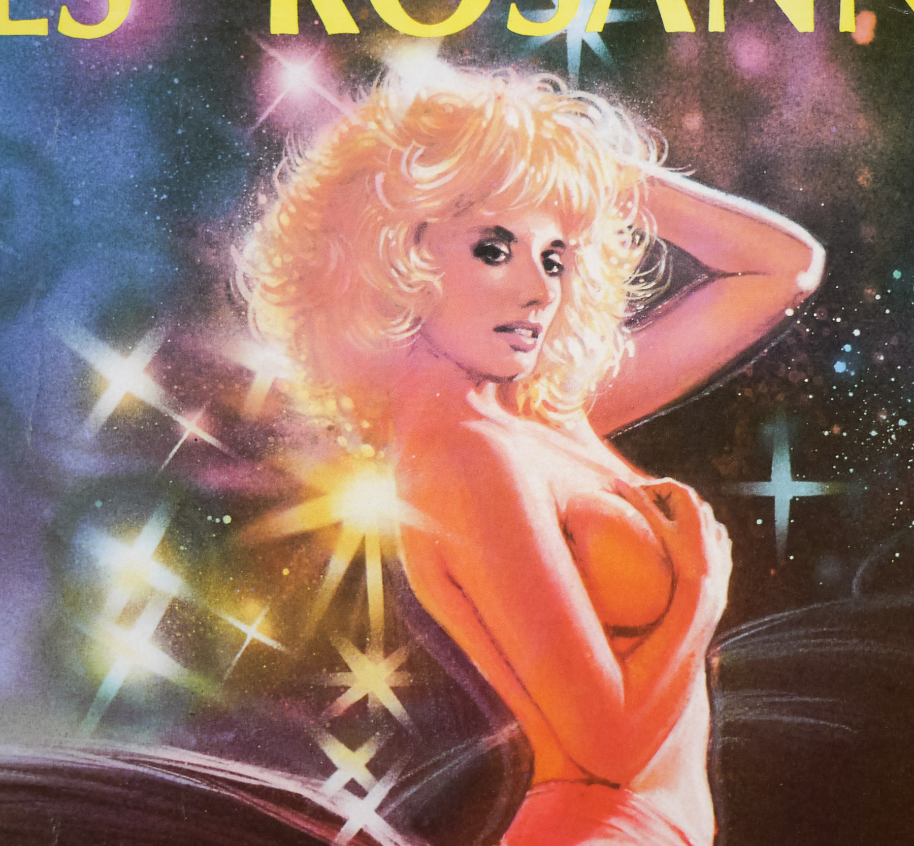
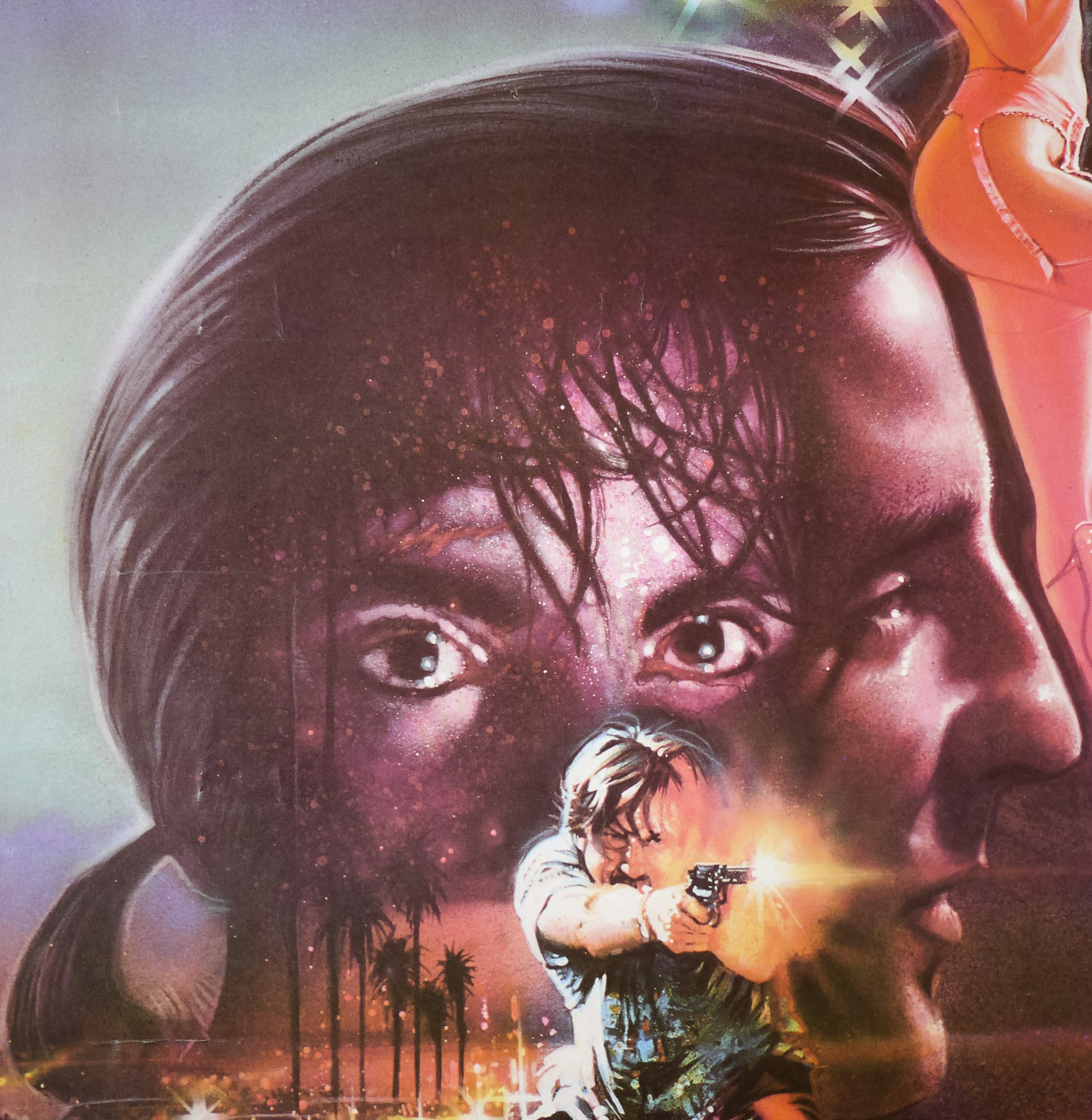
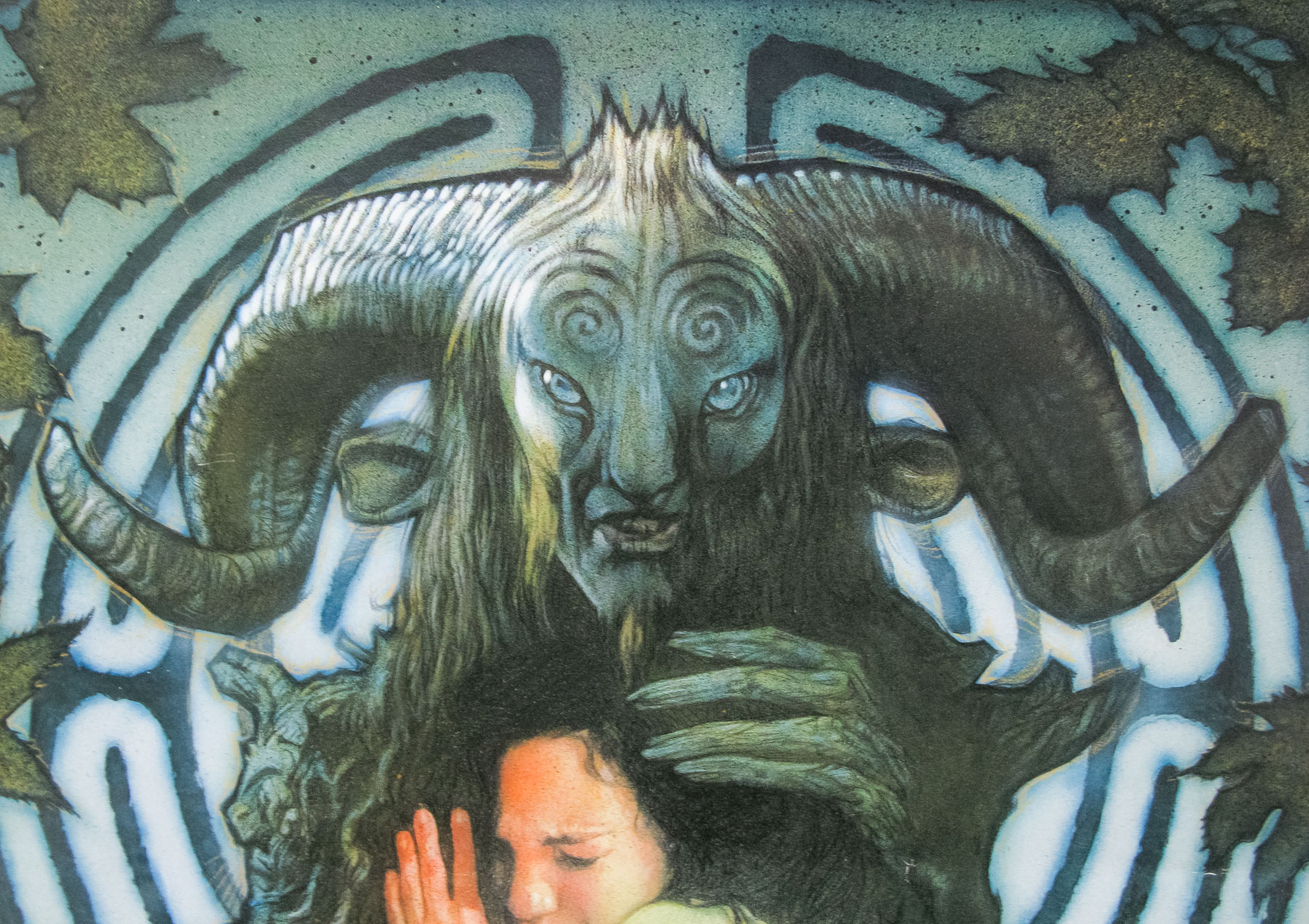
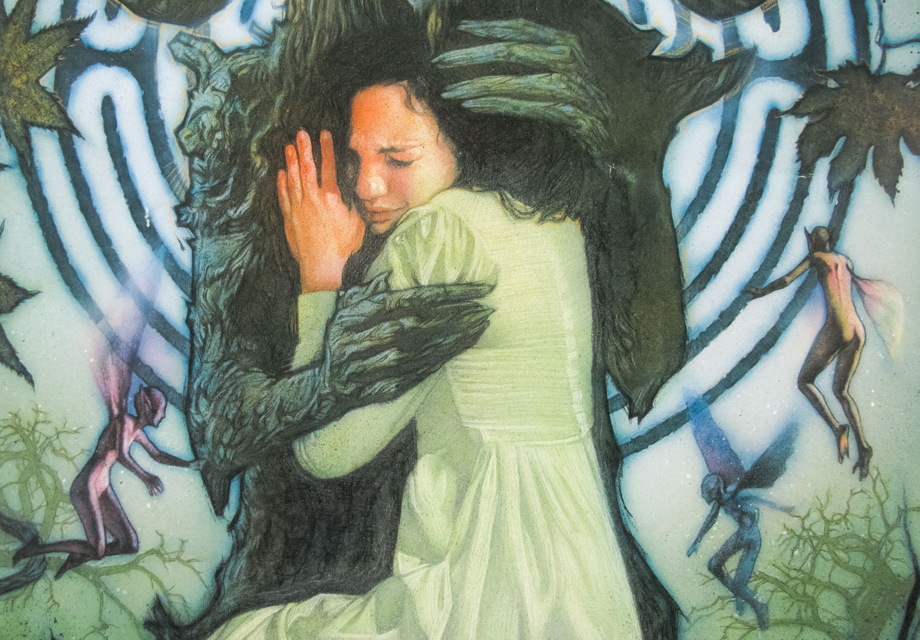
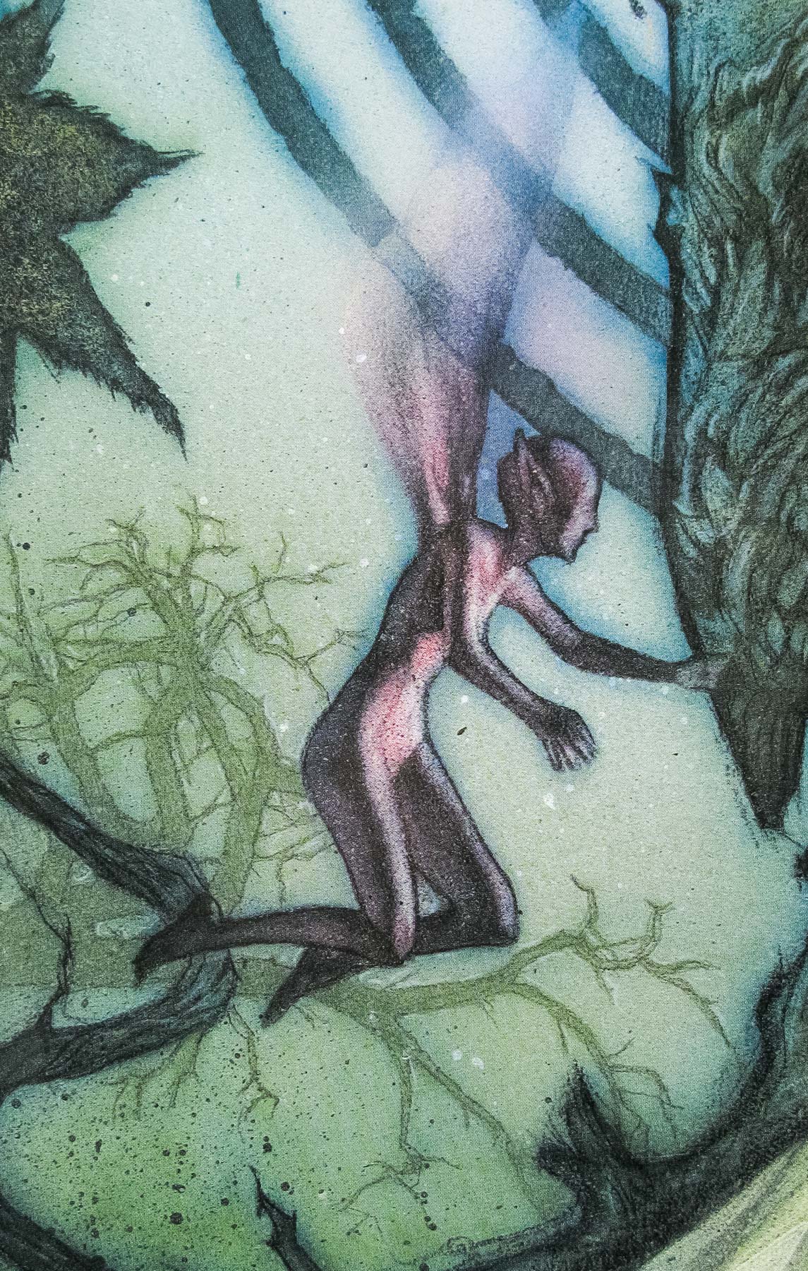
- Drew Struzan (original concept)
- Artist
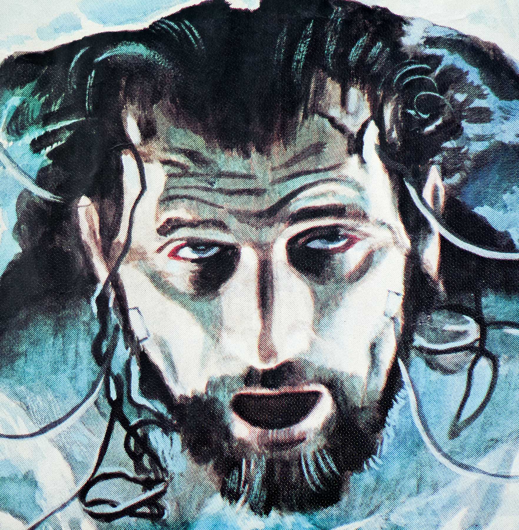
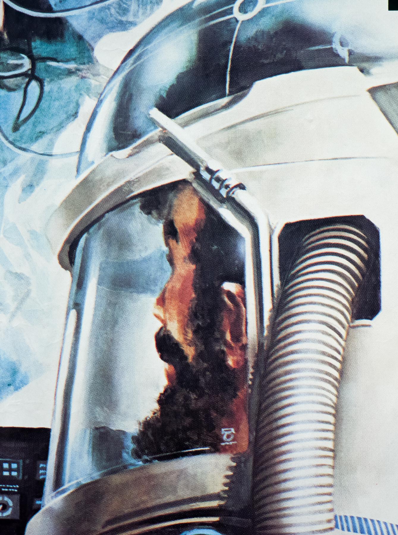
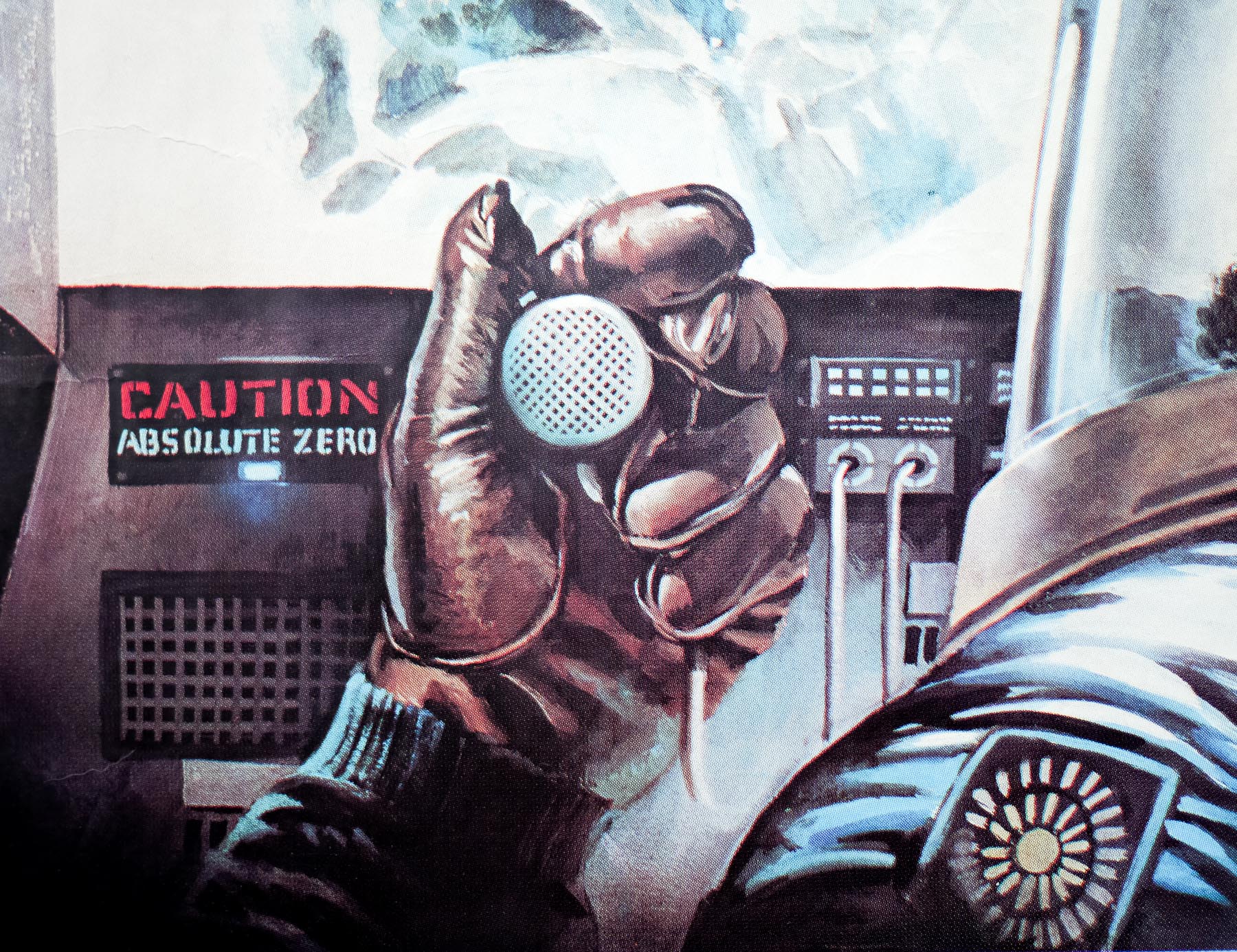
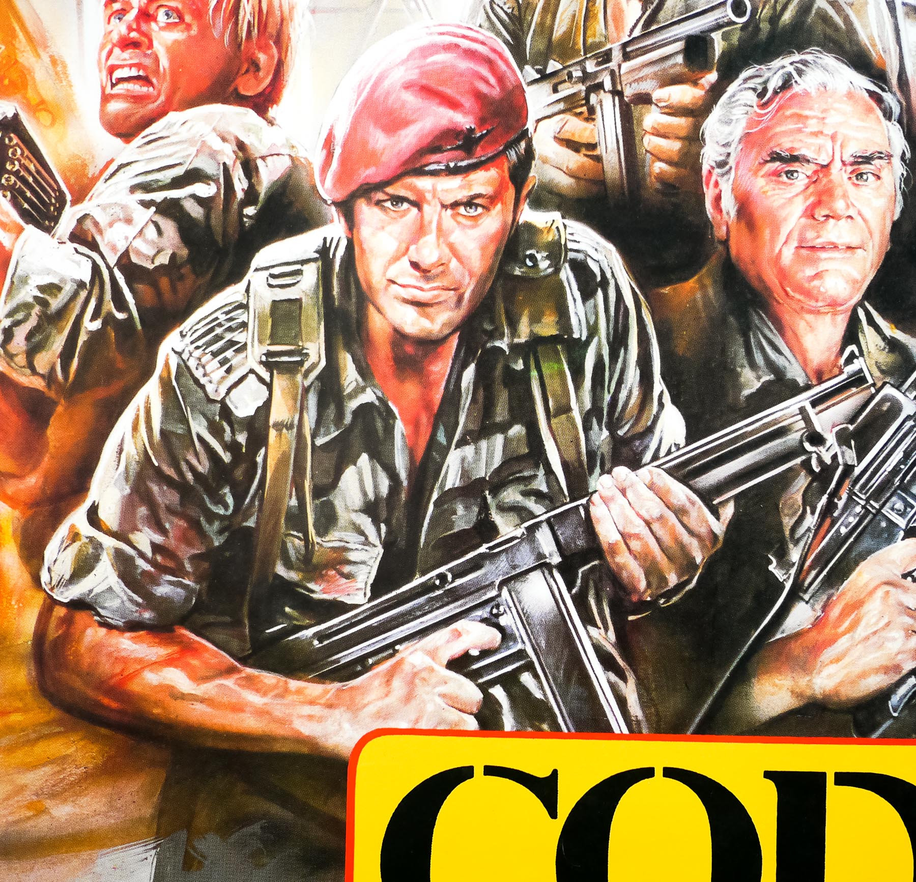
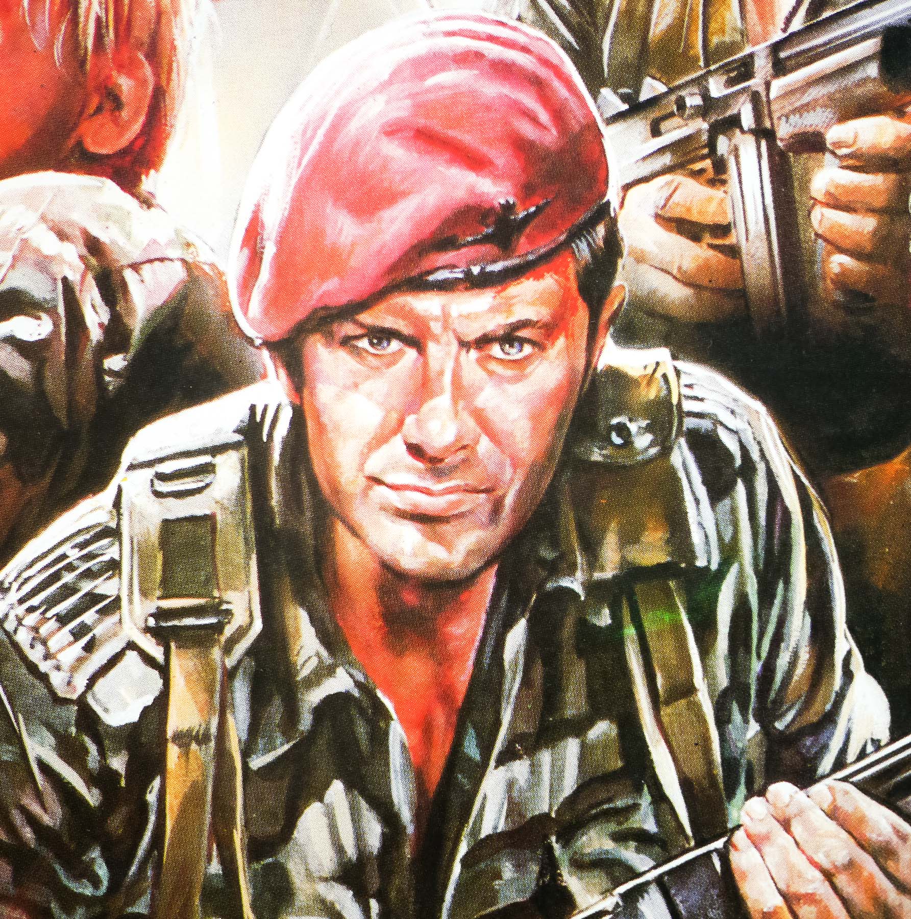
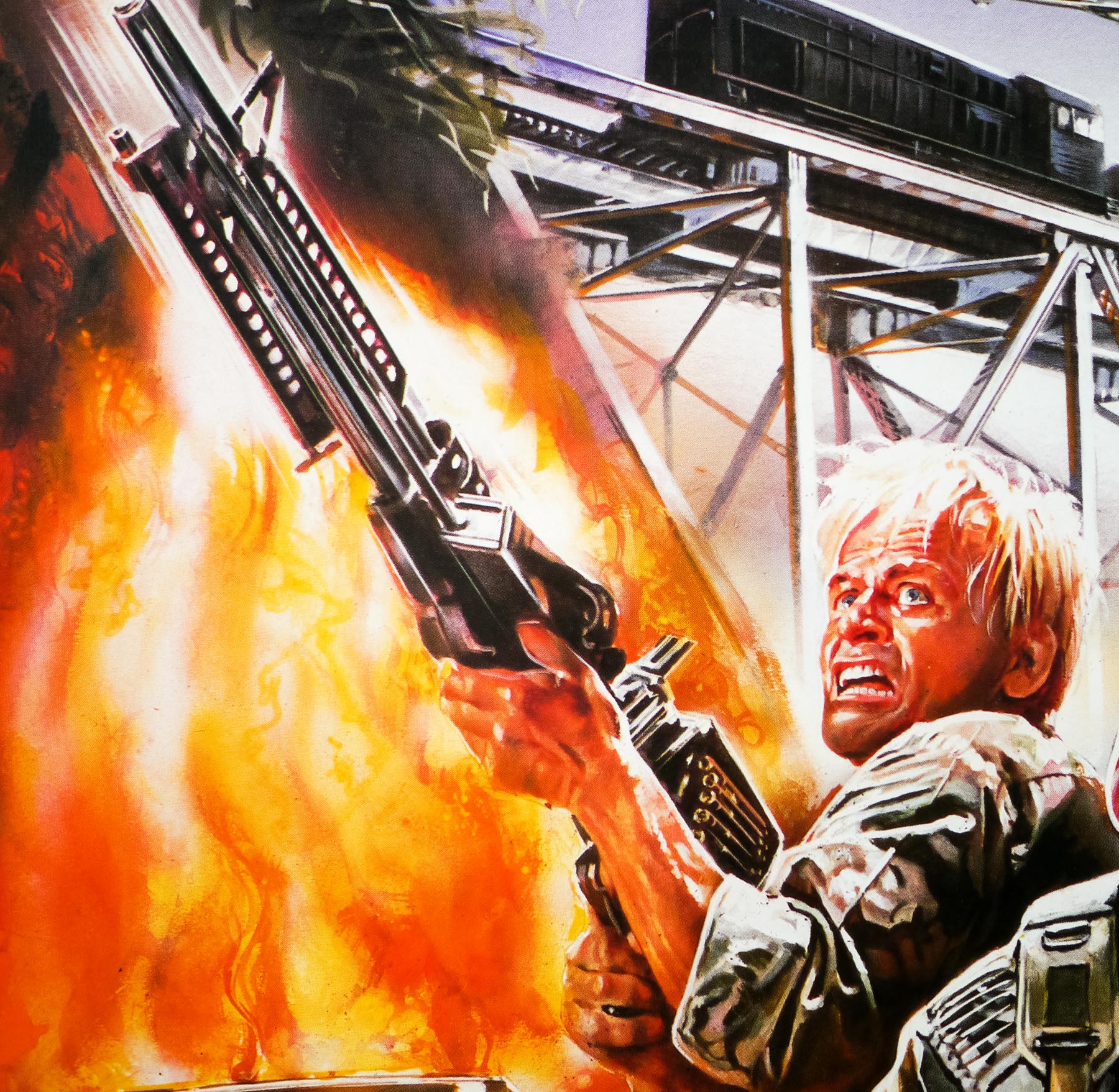
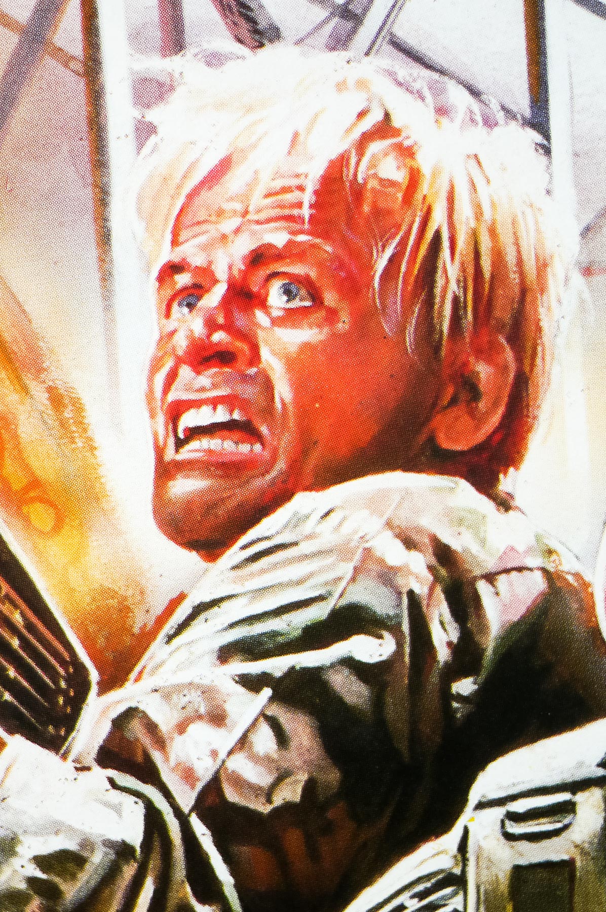
- Drew Struzan
- Size (inches)
- 27 1/16" x 40"
- SS or DS
- SS
- NSS #
- --
- Tagline
- --
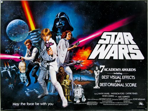
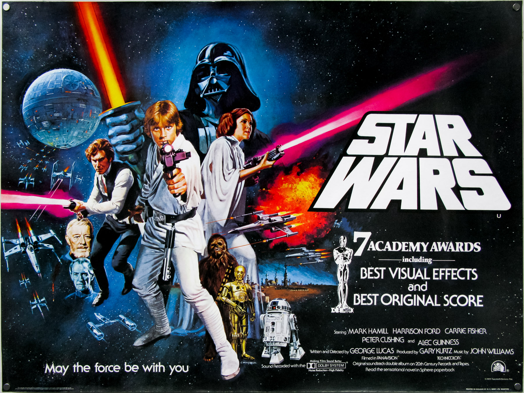
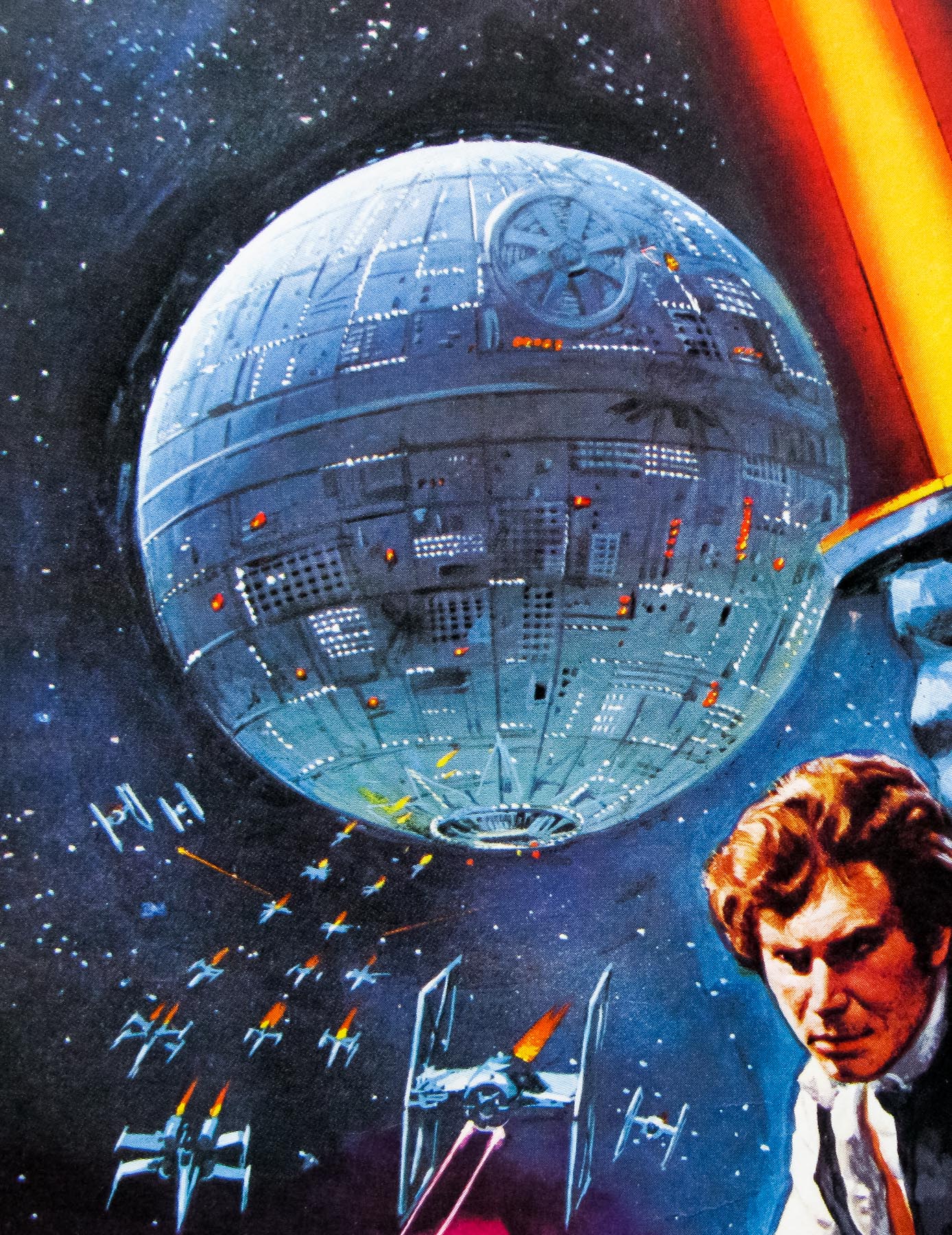
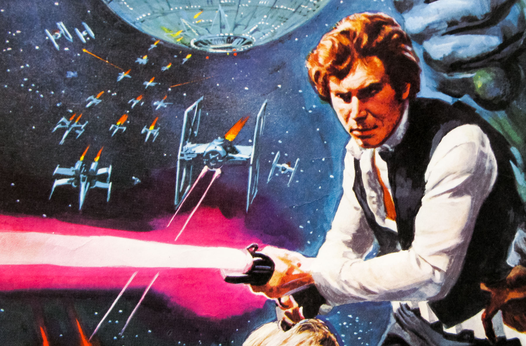
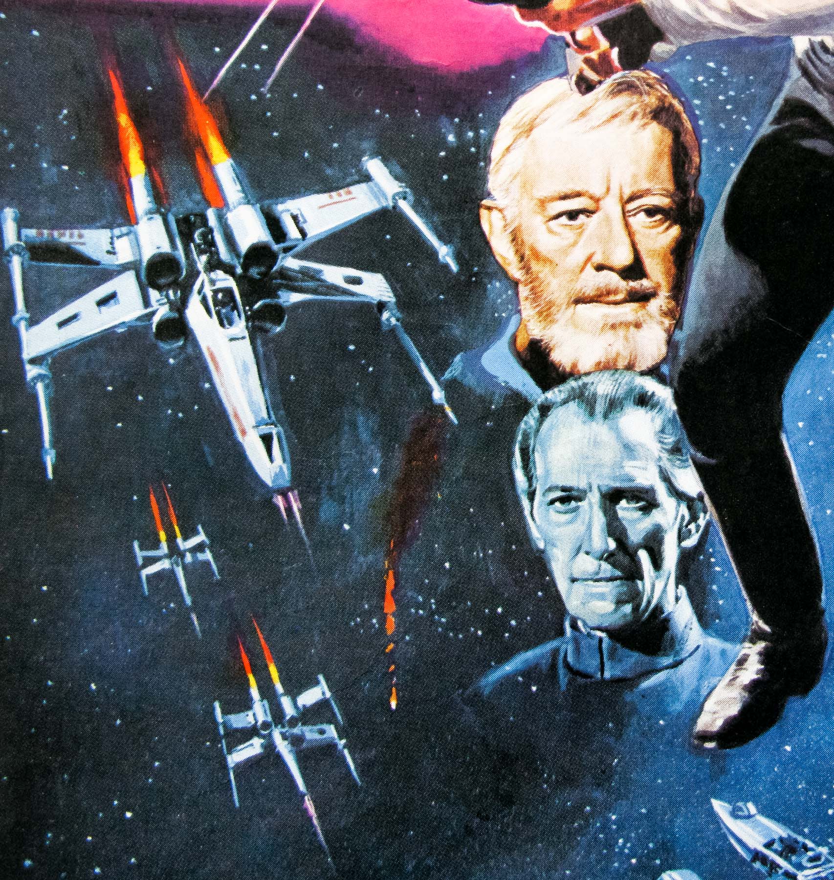
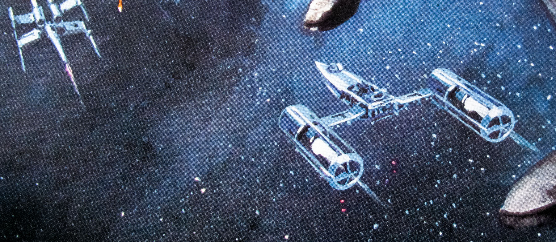
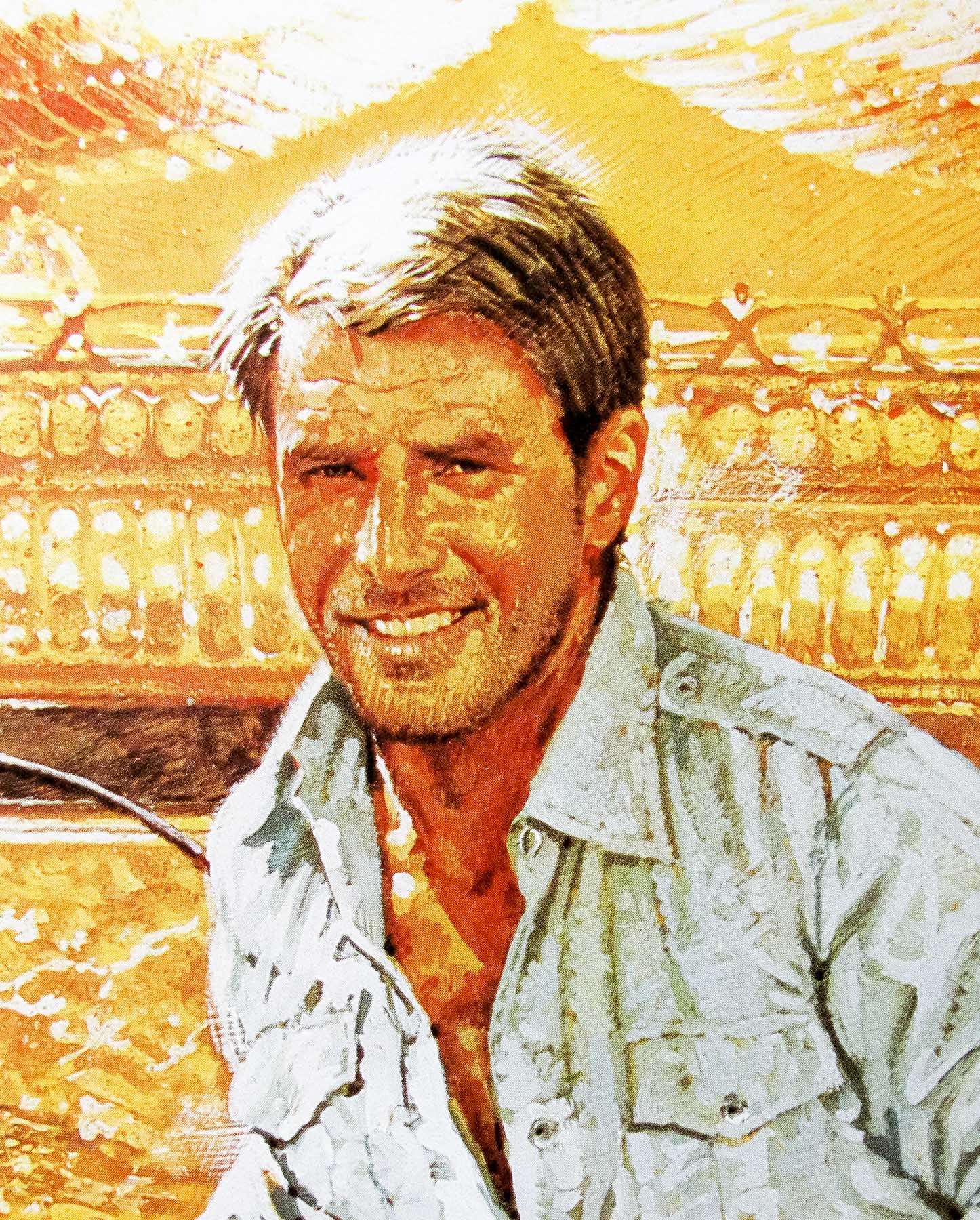
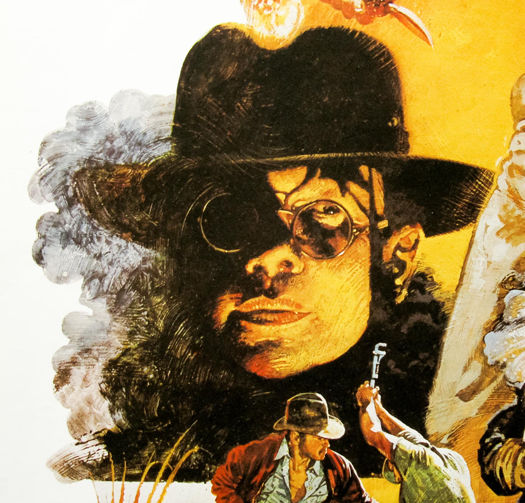
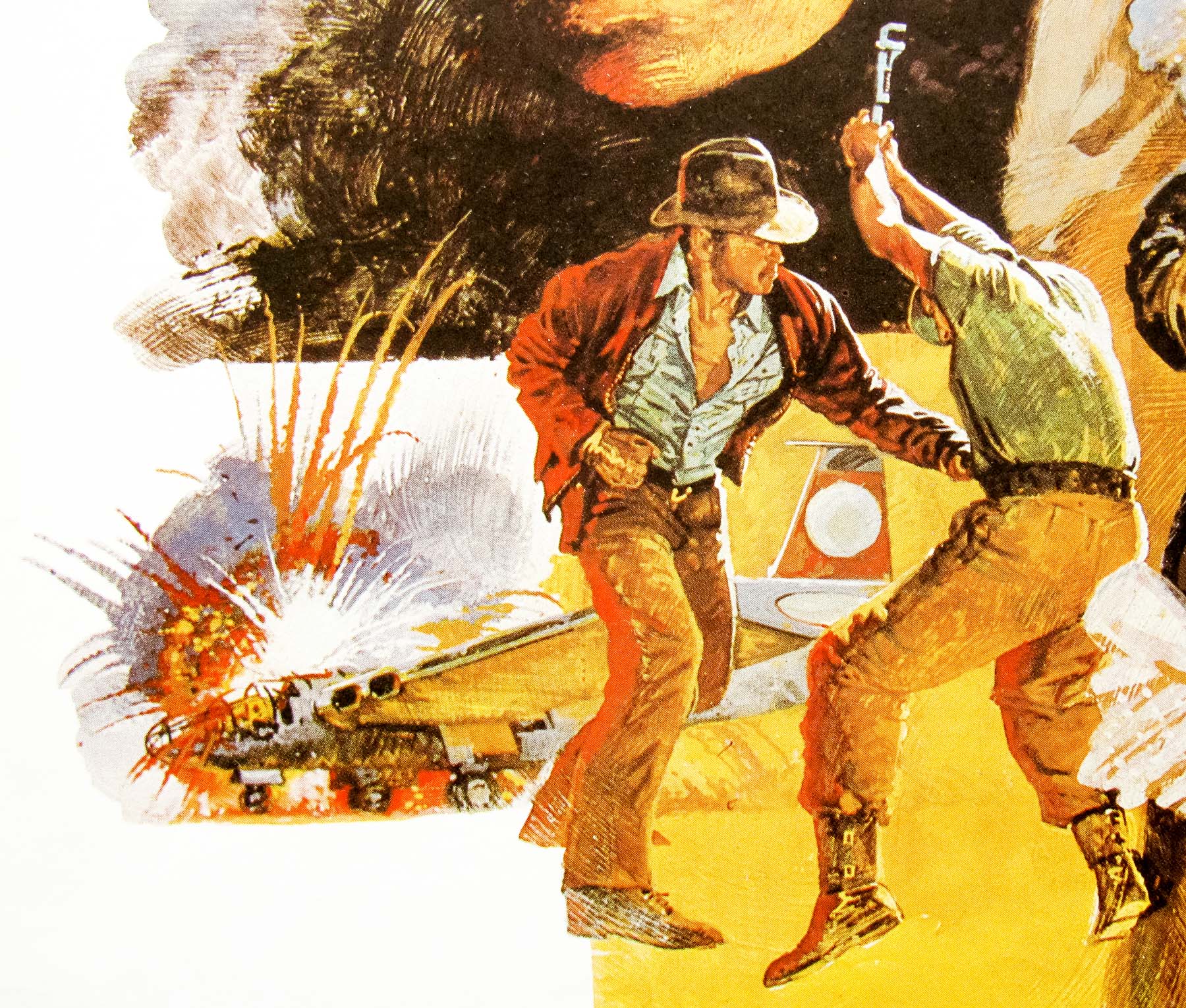
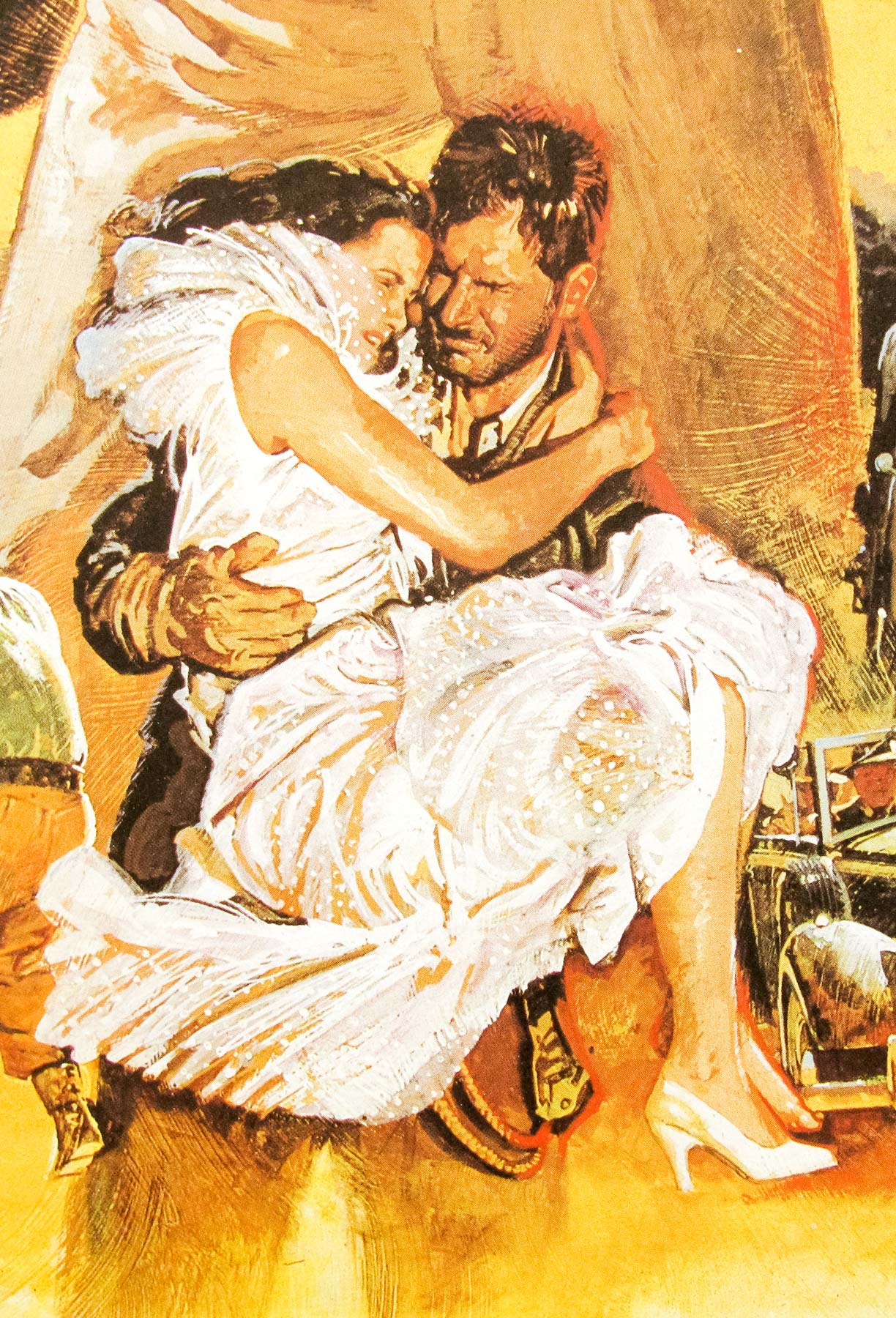
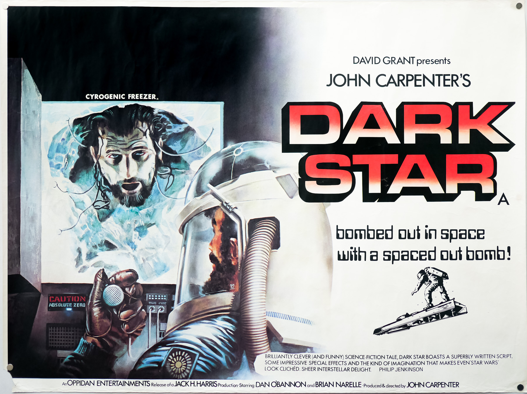
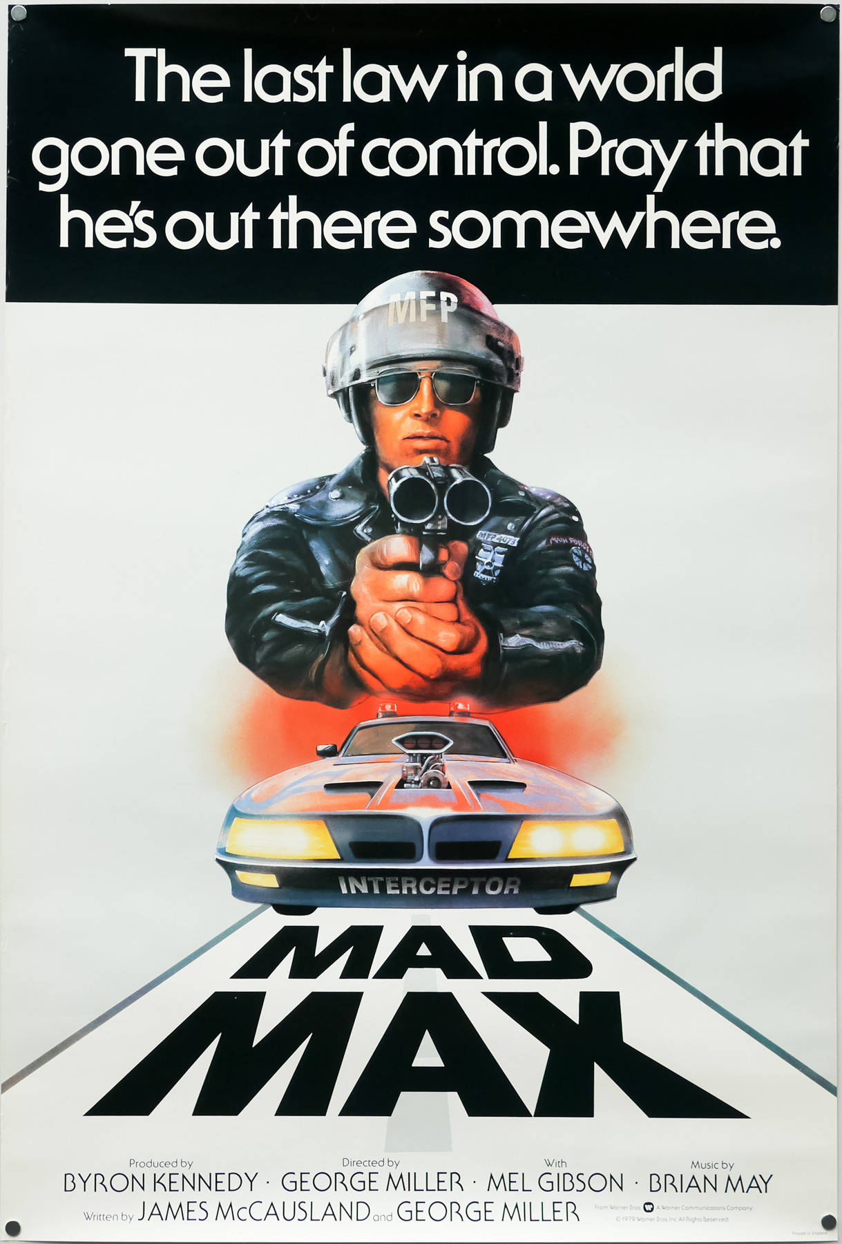
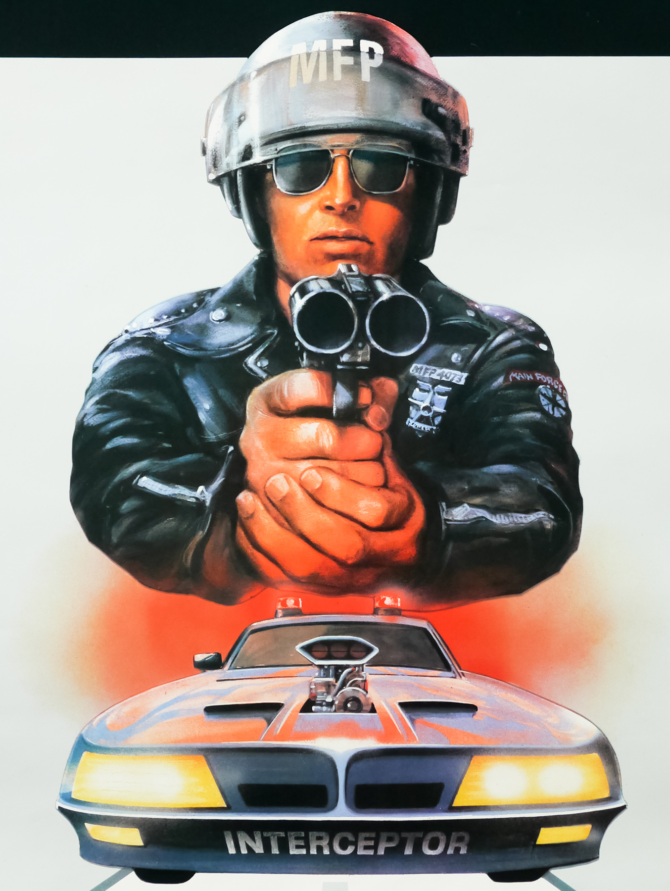
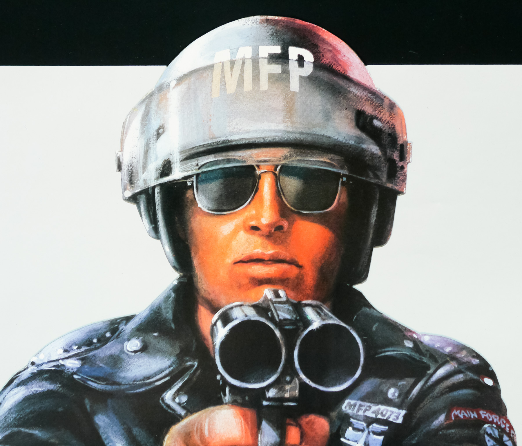
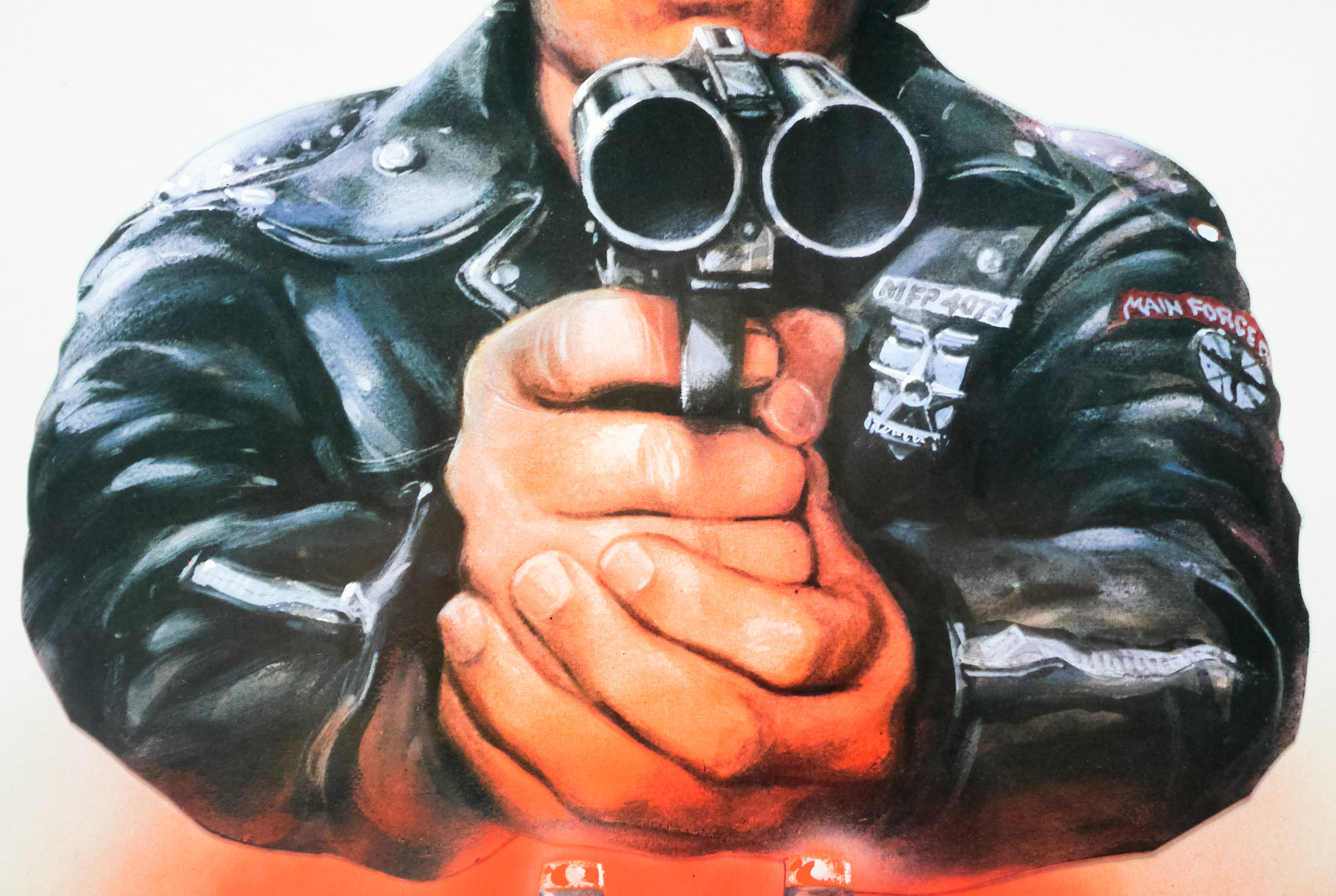
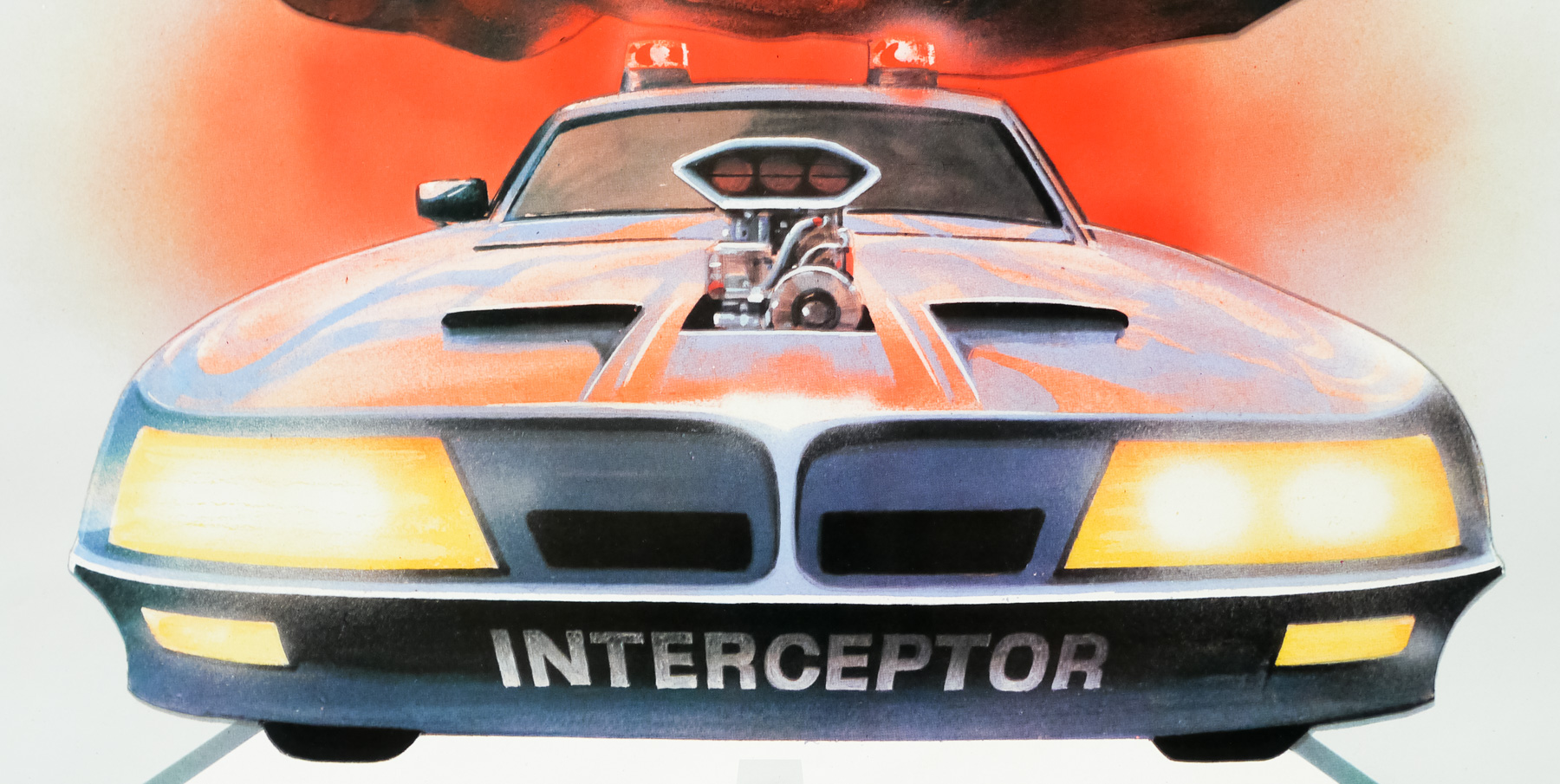
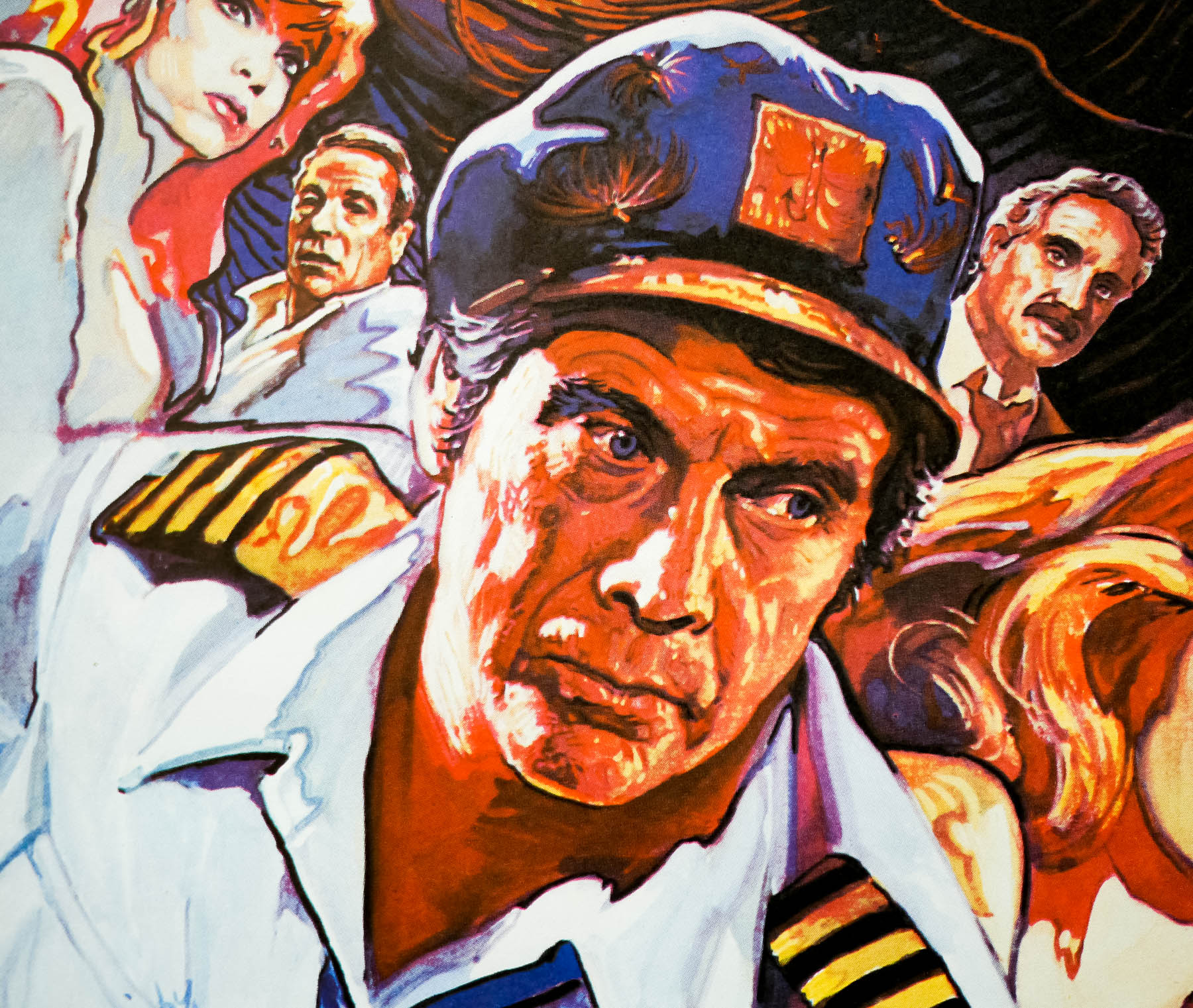
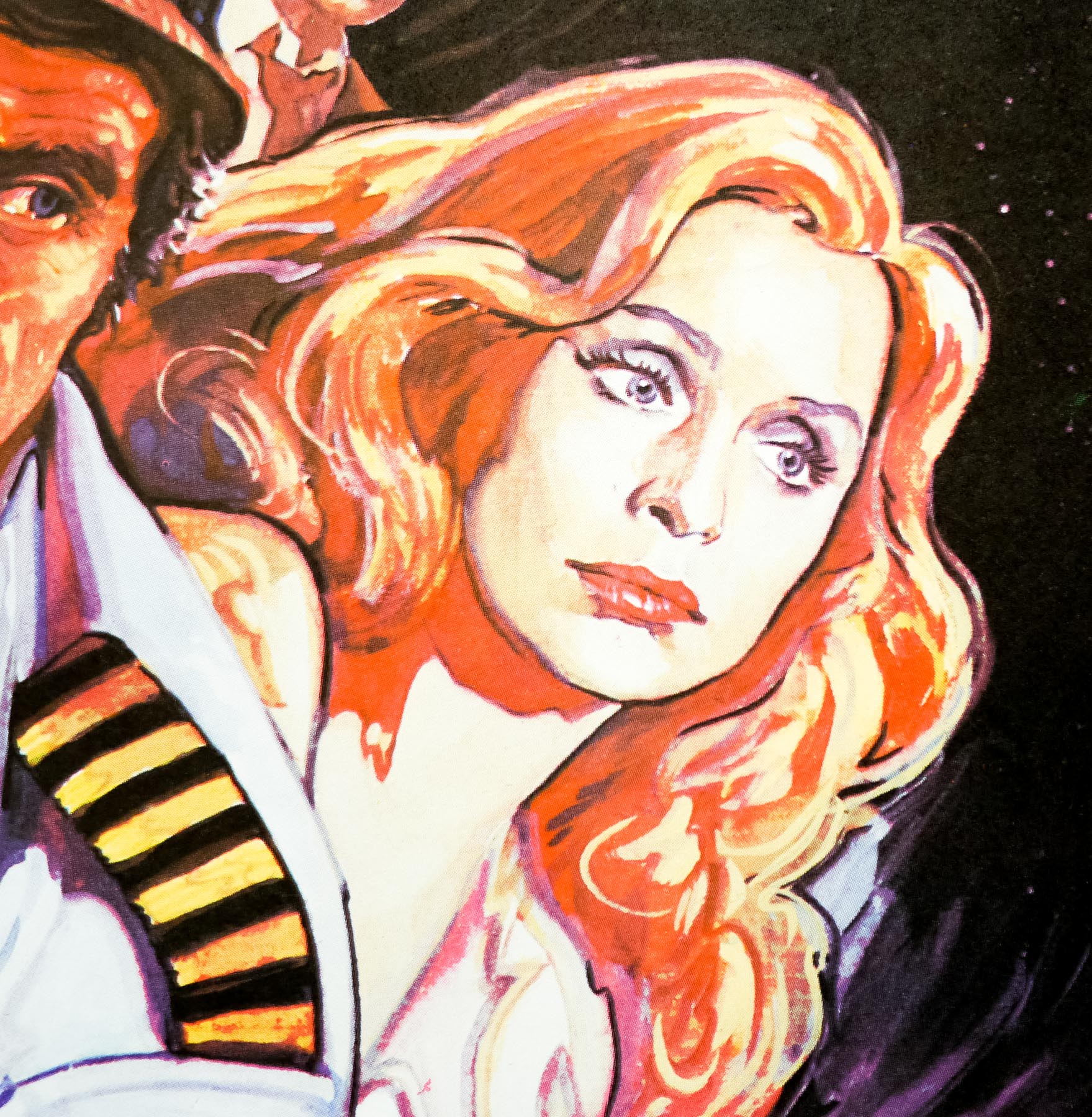
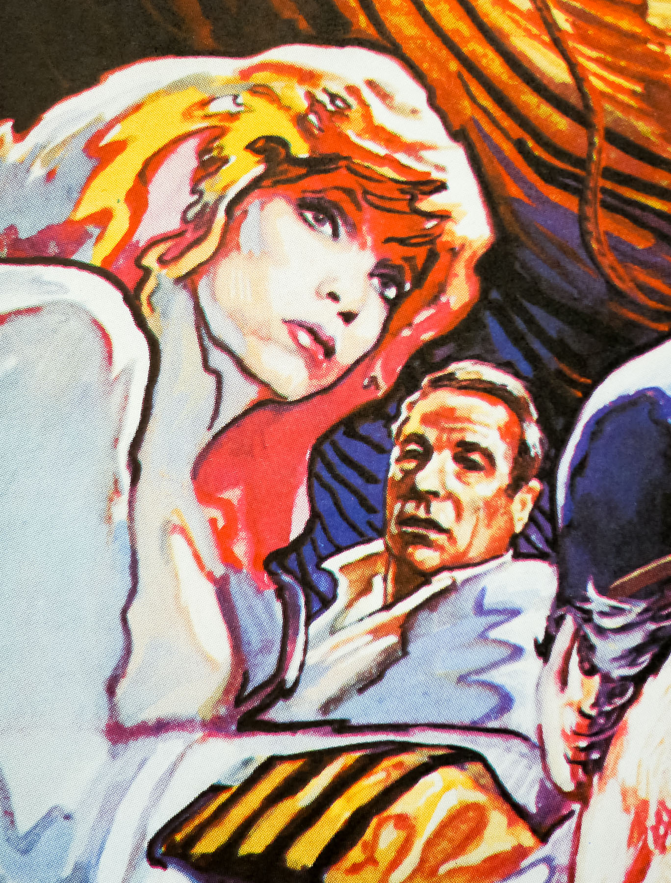
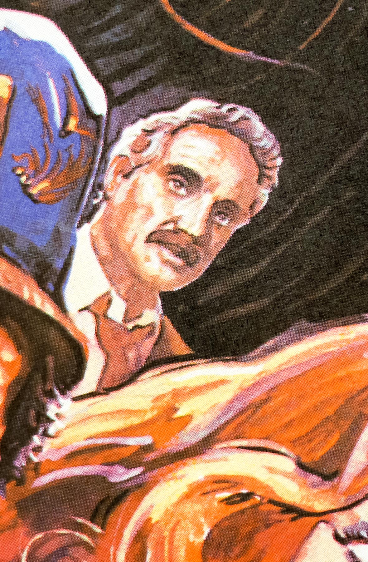
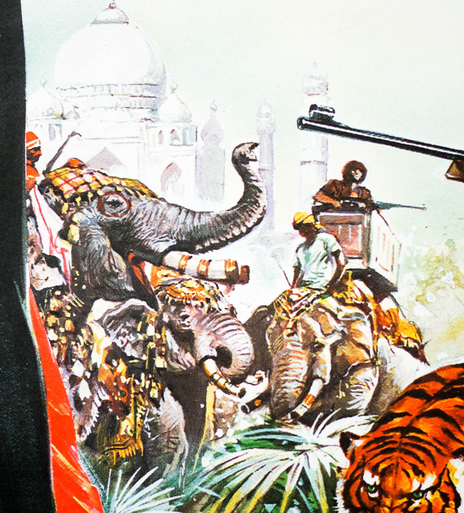
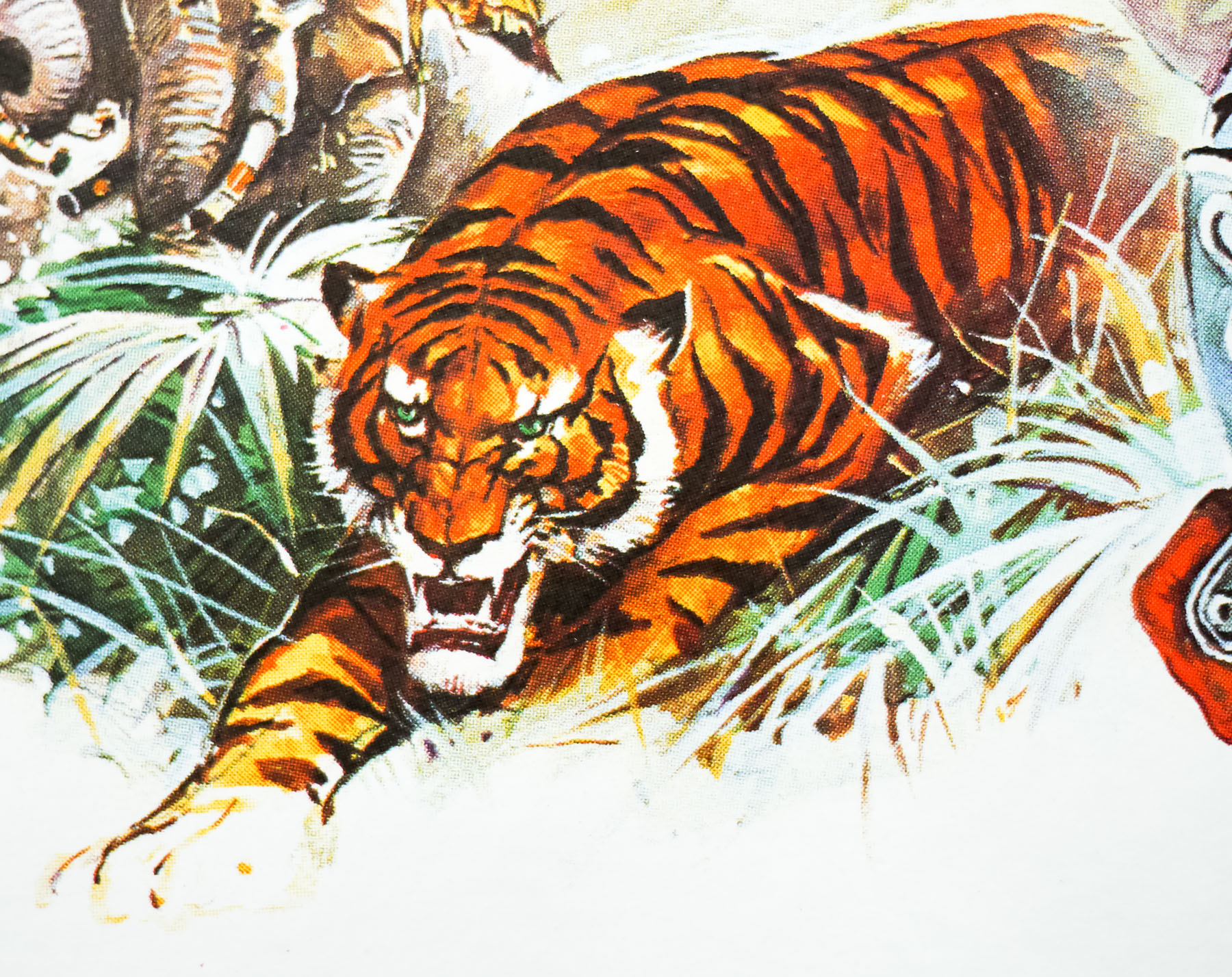
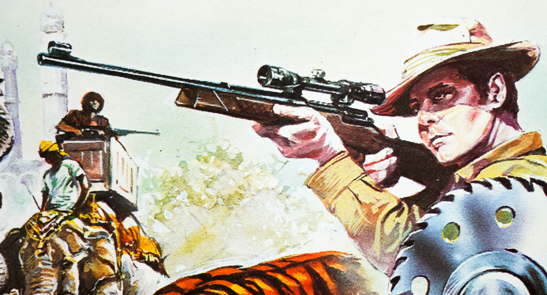
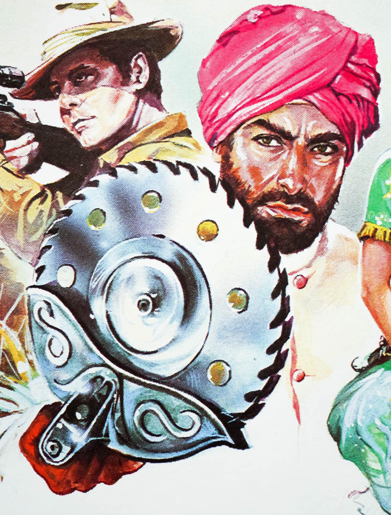
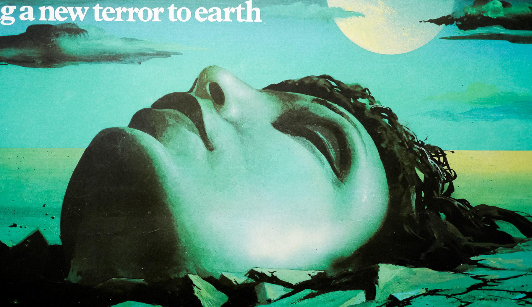
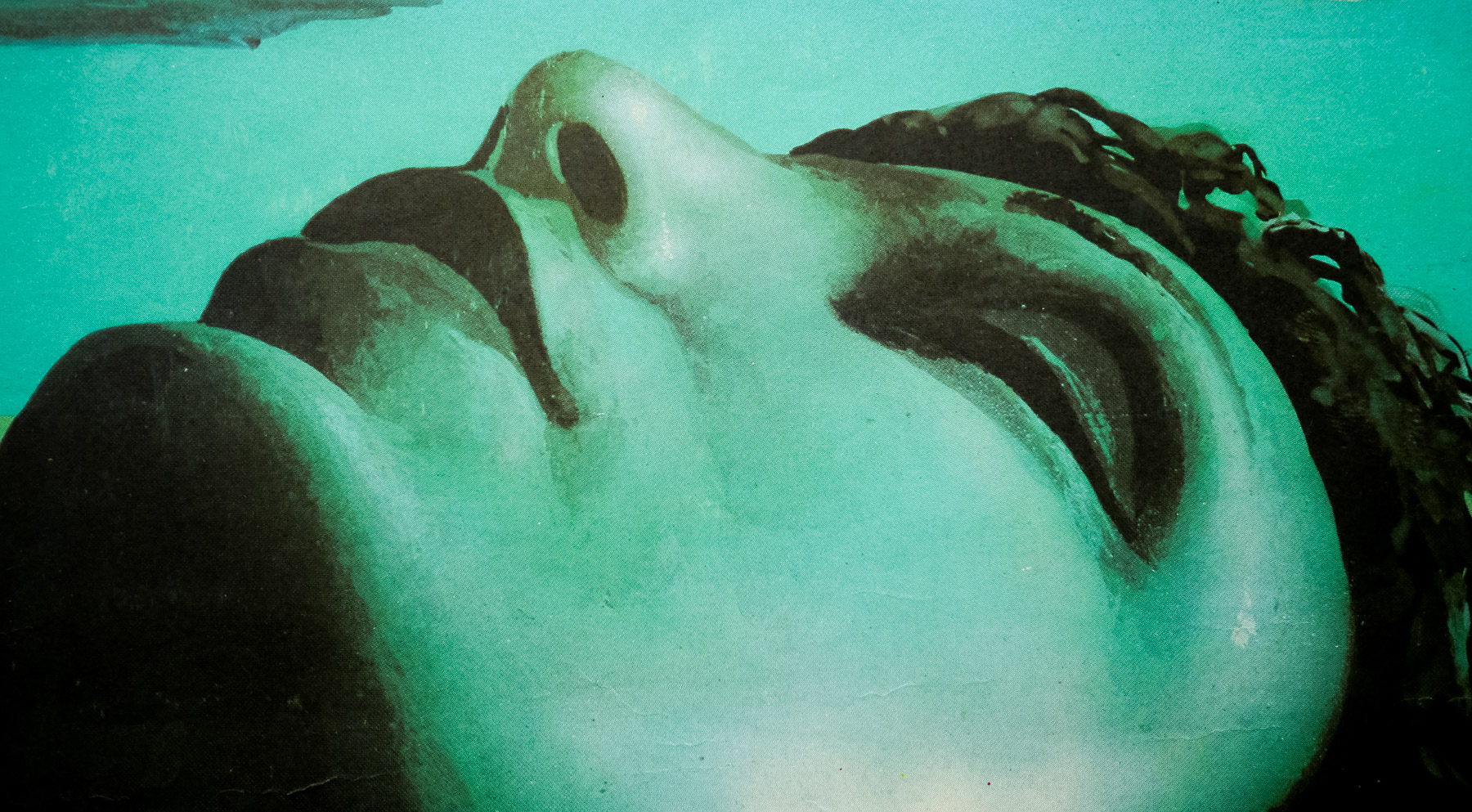
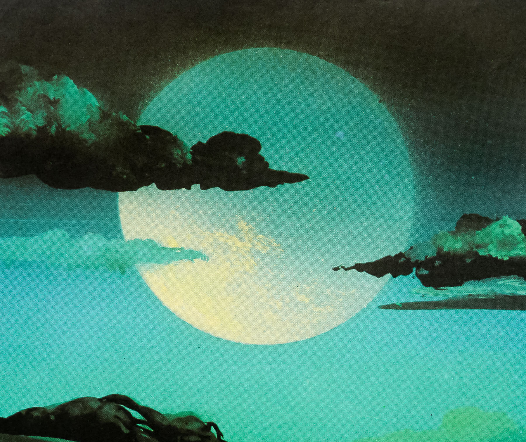
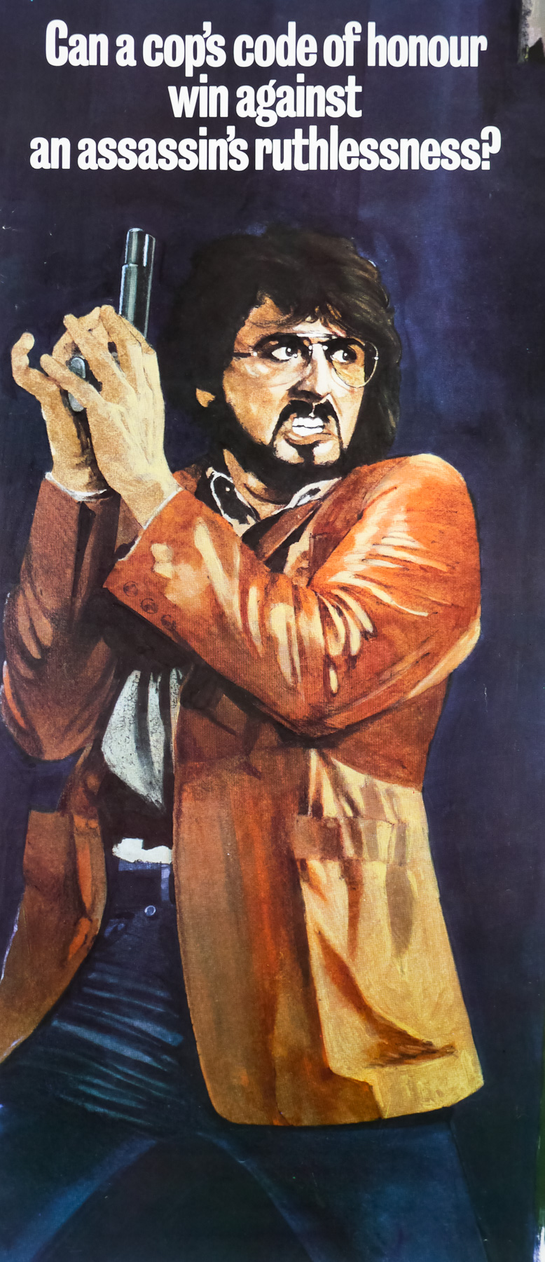
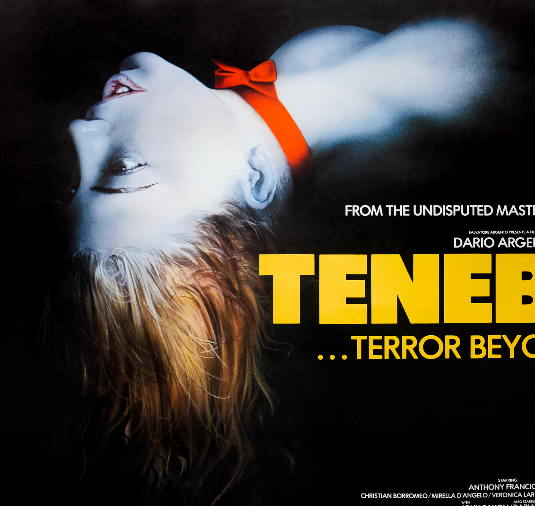
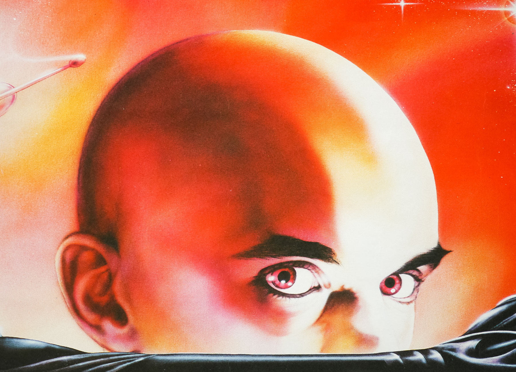
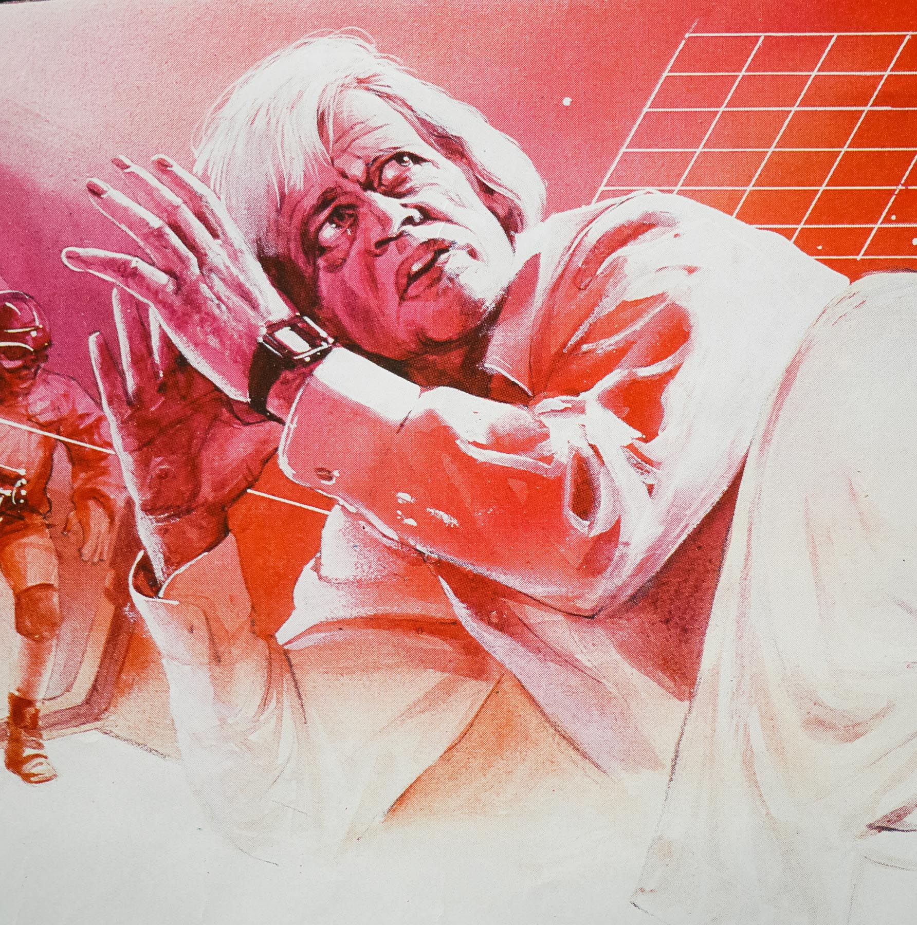
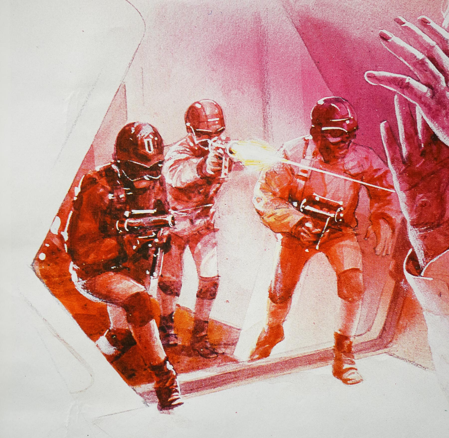
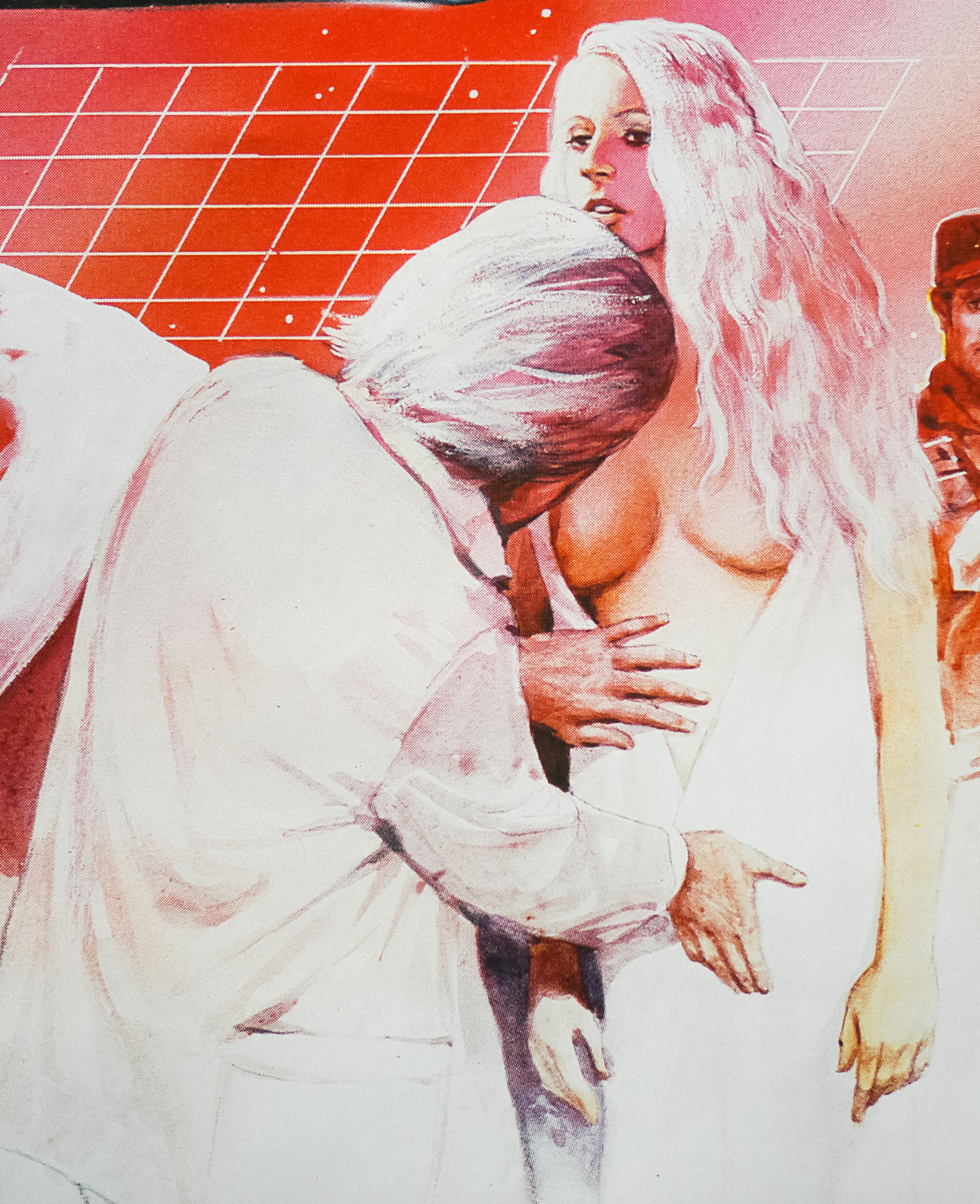
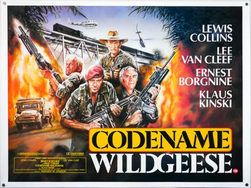
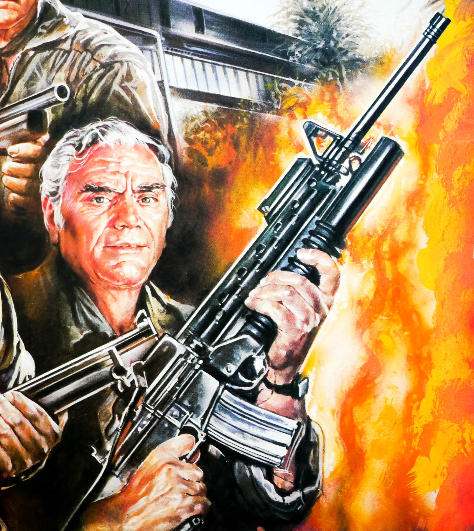
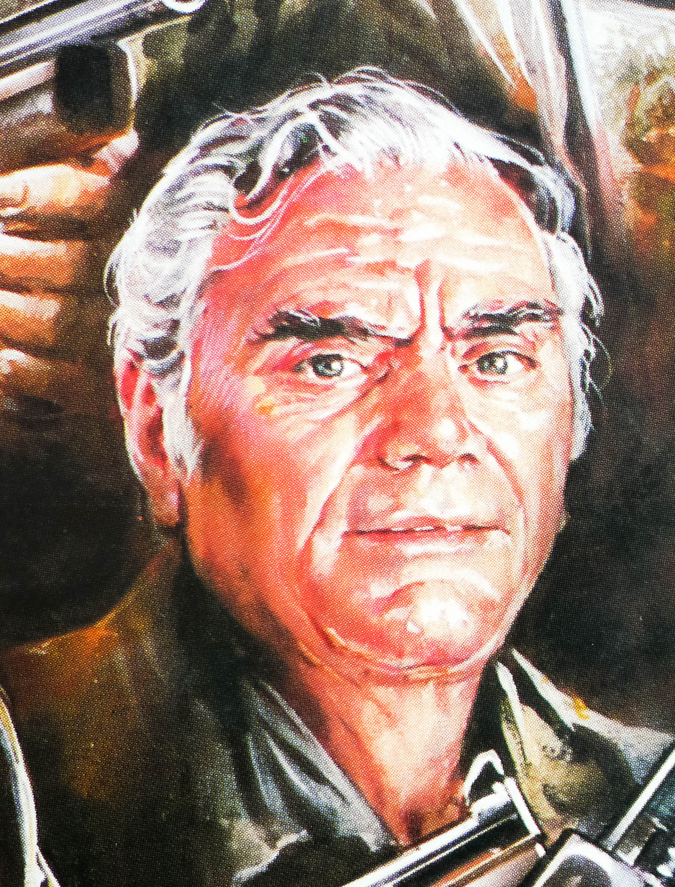
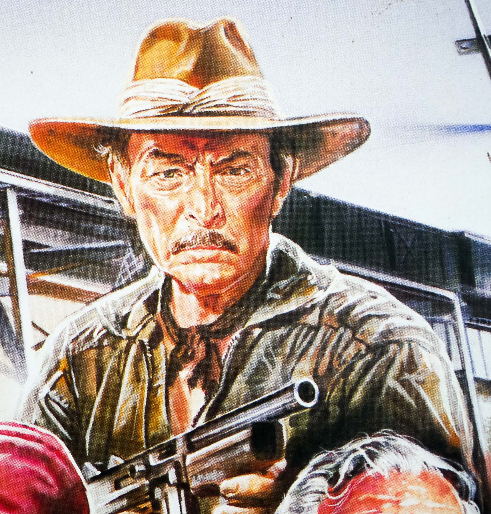
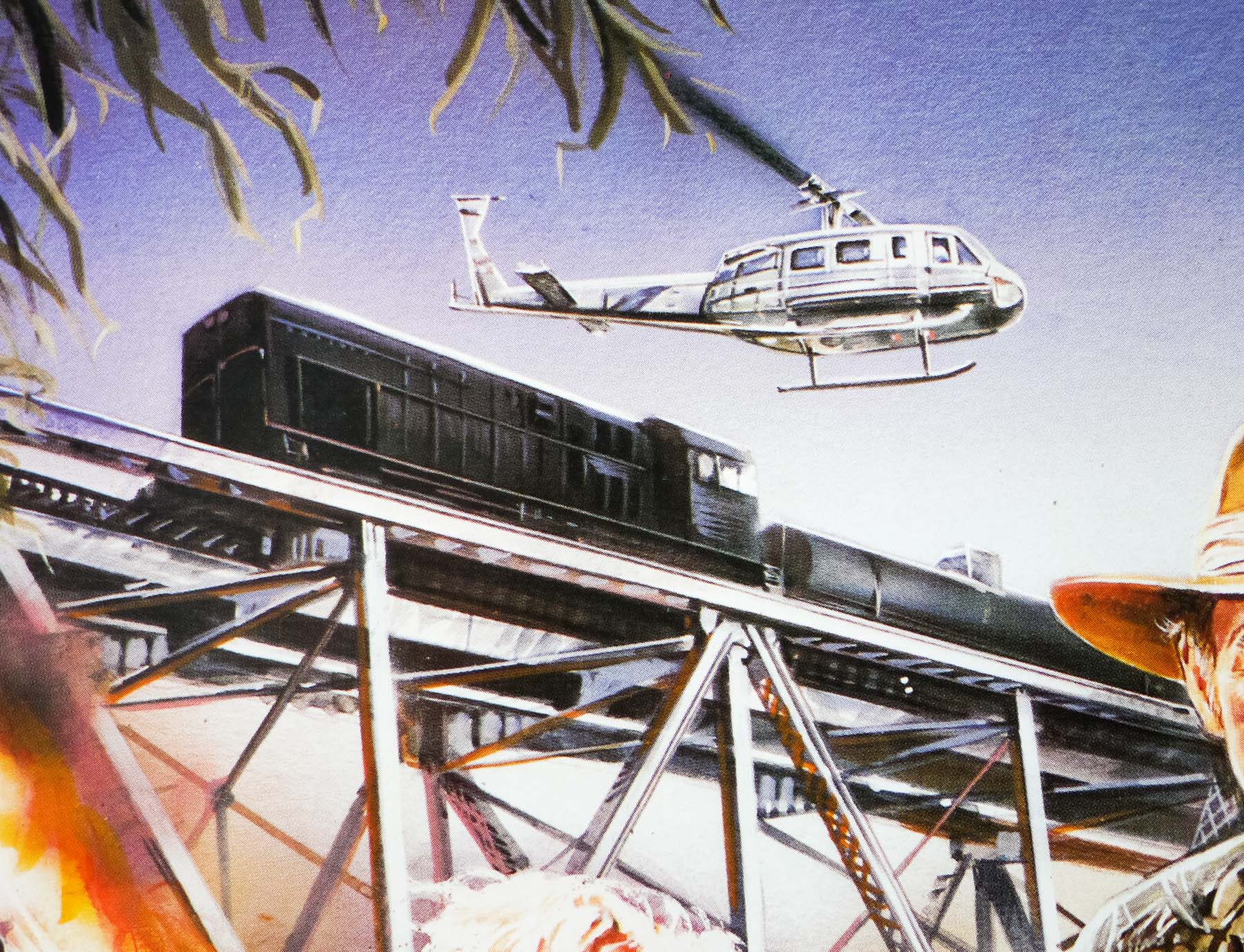
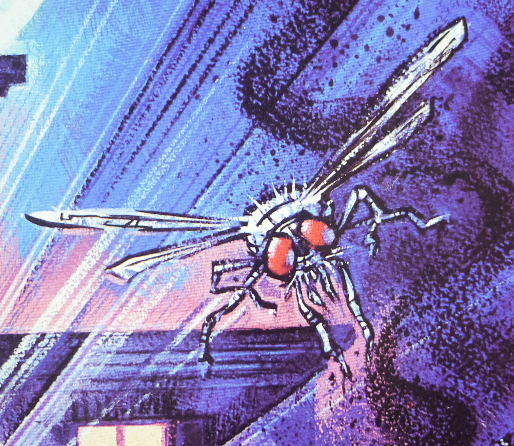
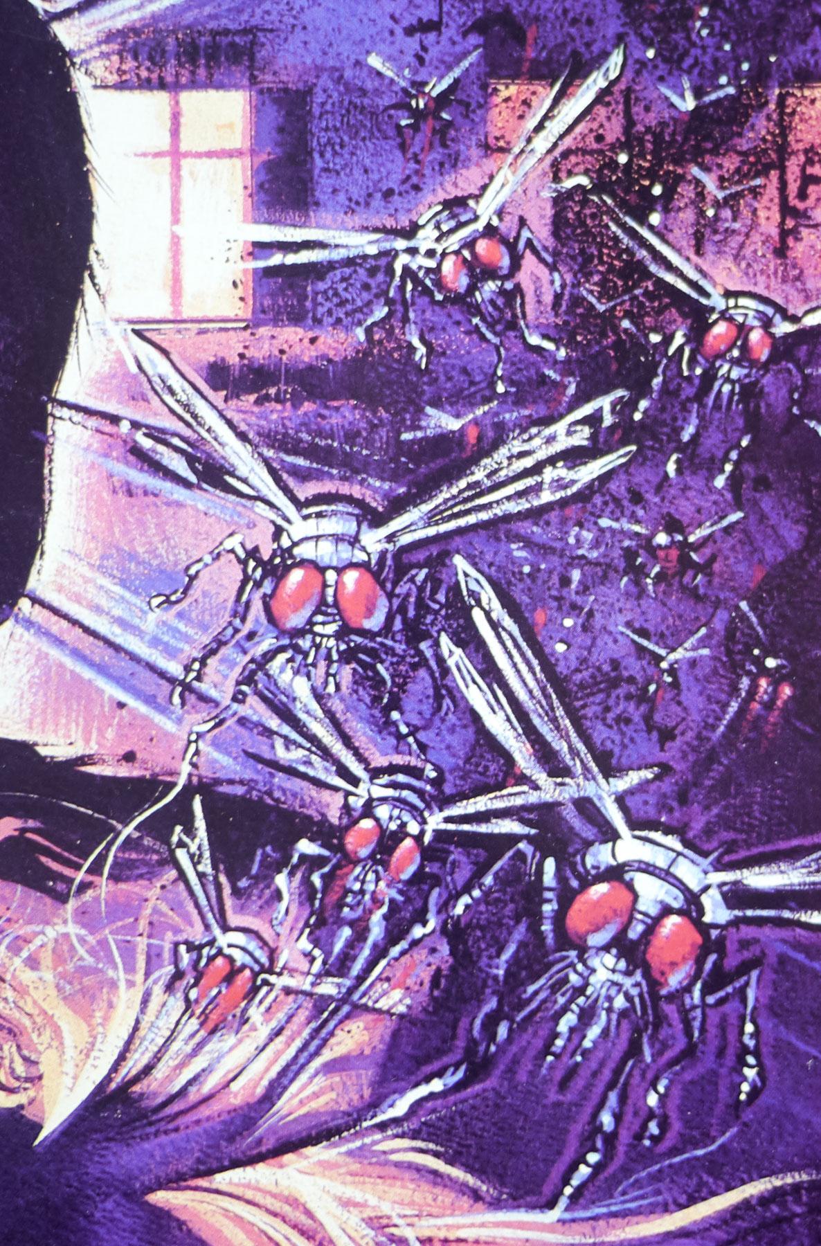
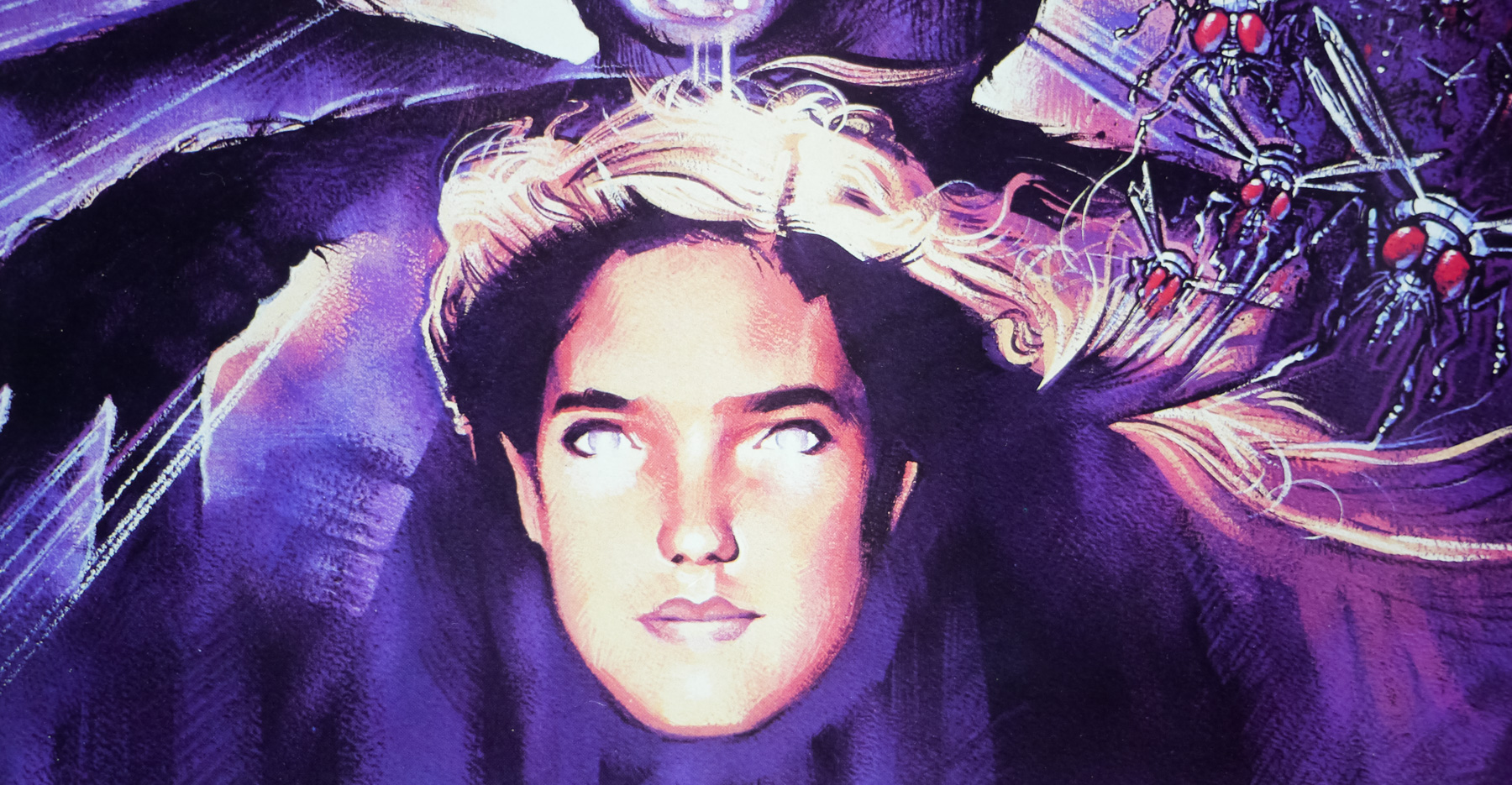
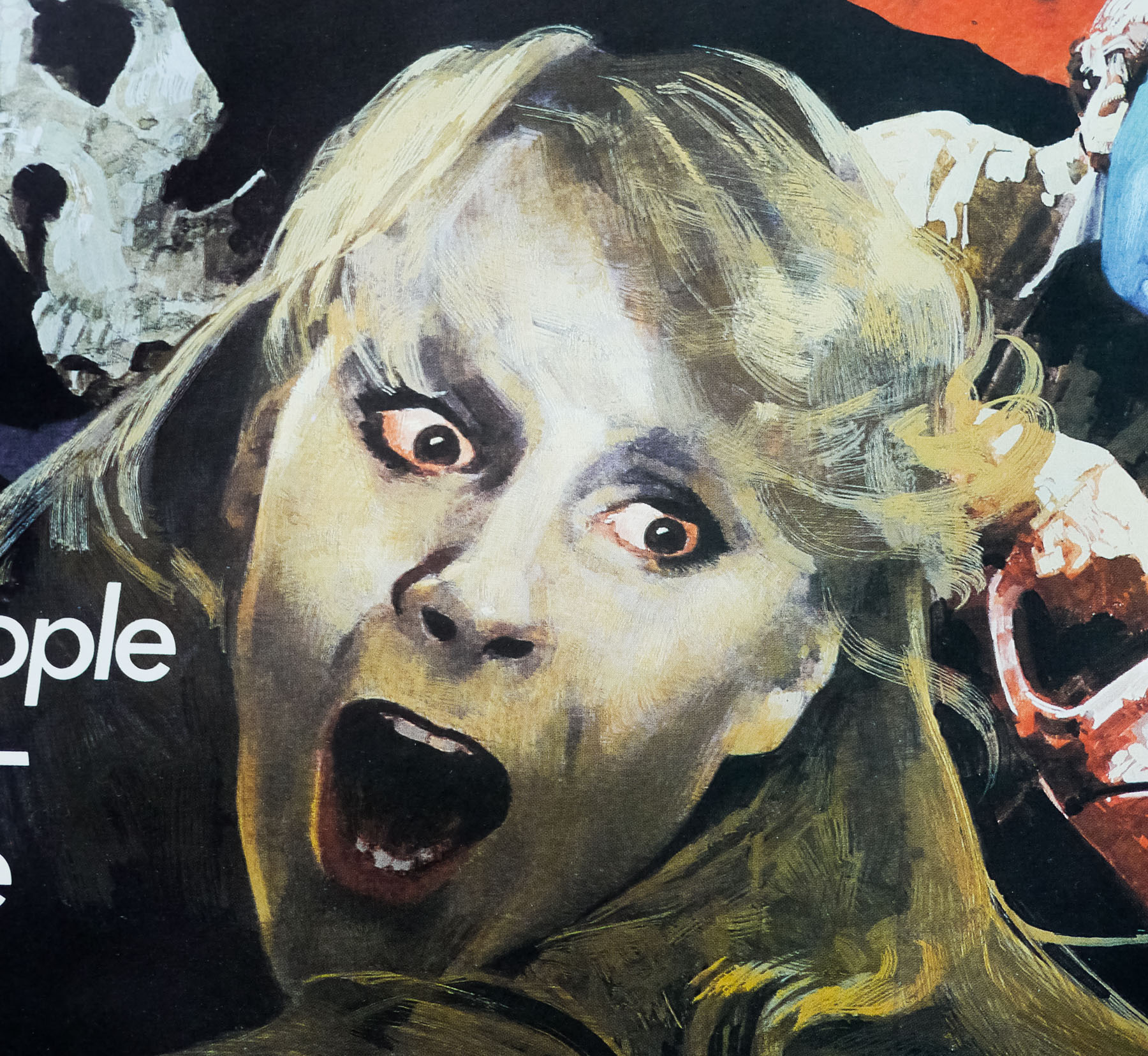
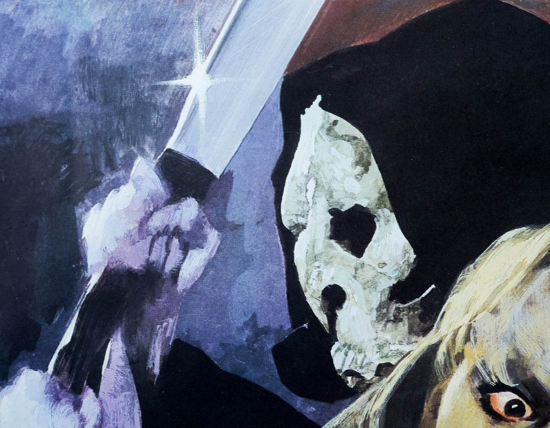
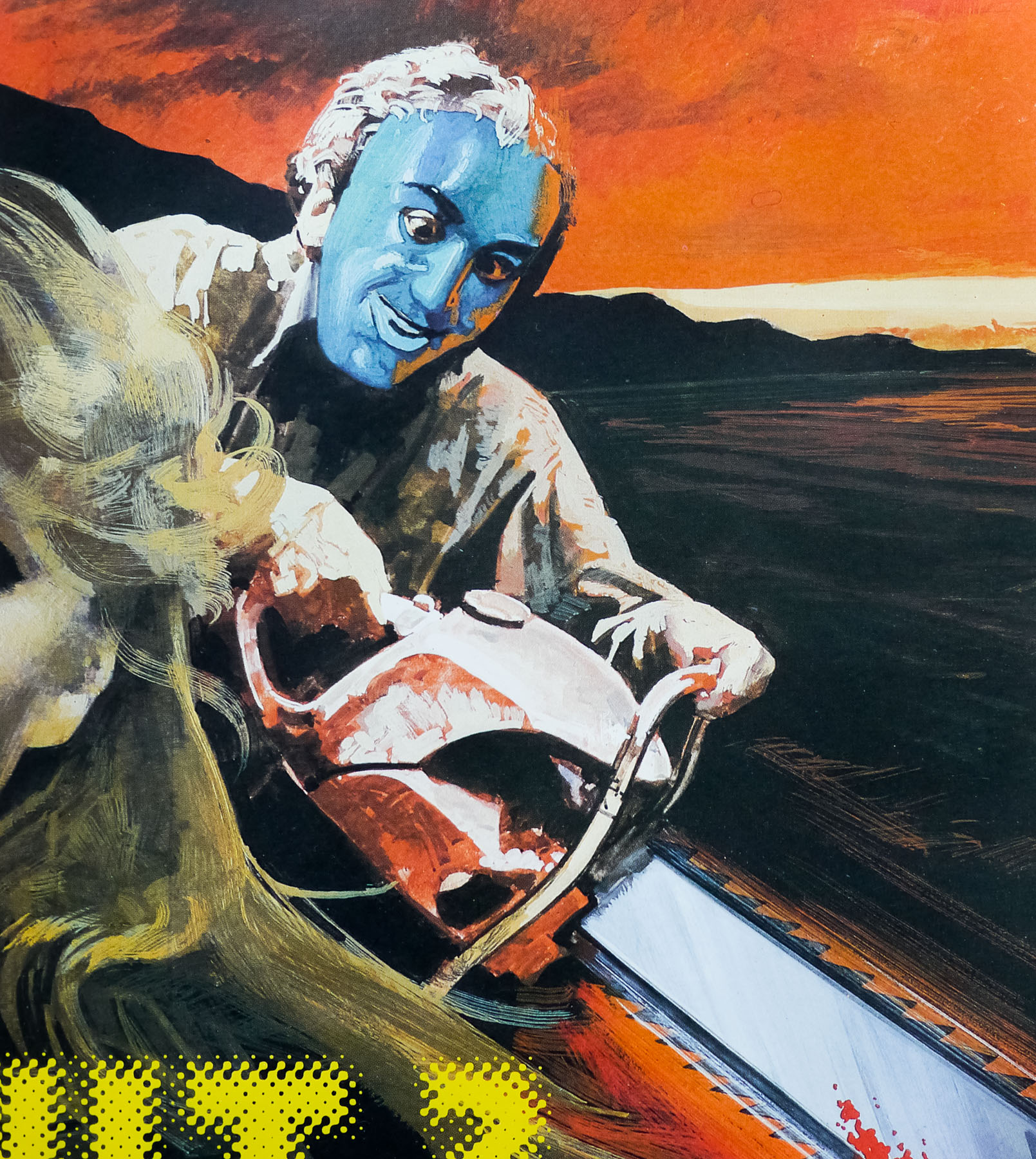
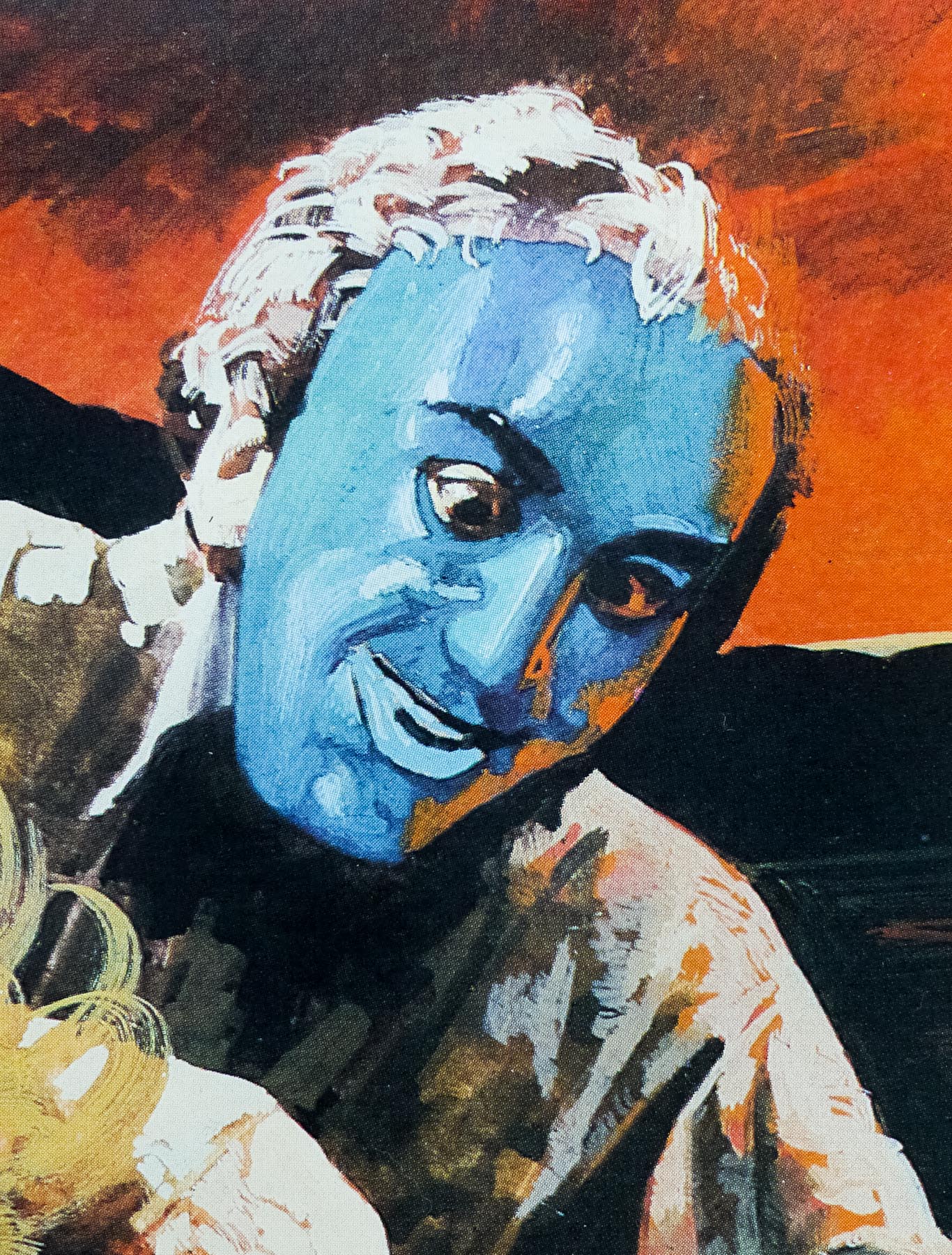
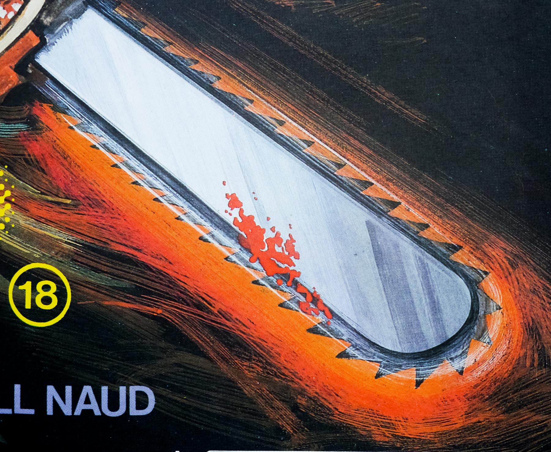
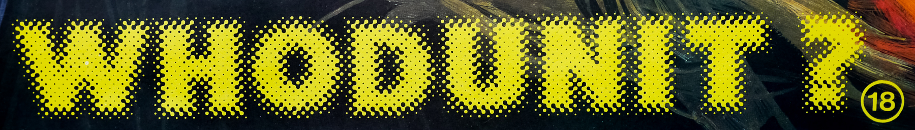
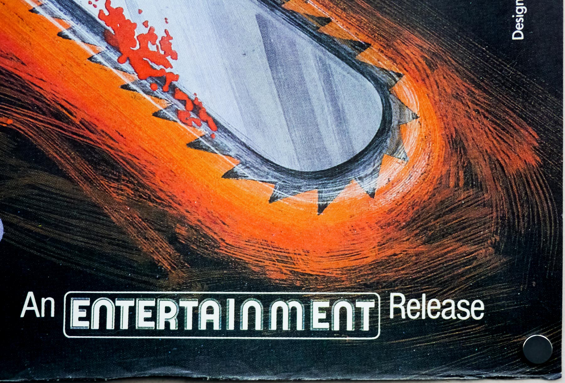
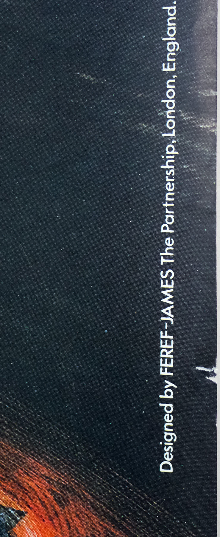
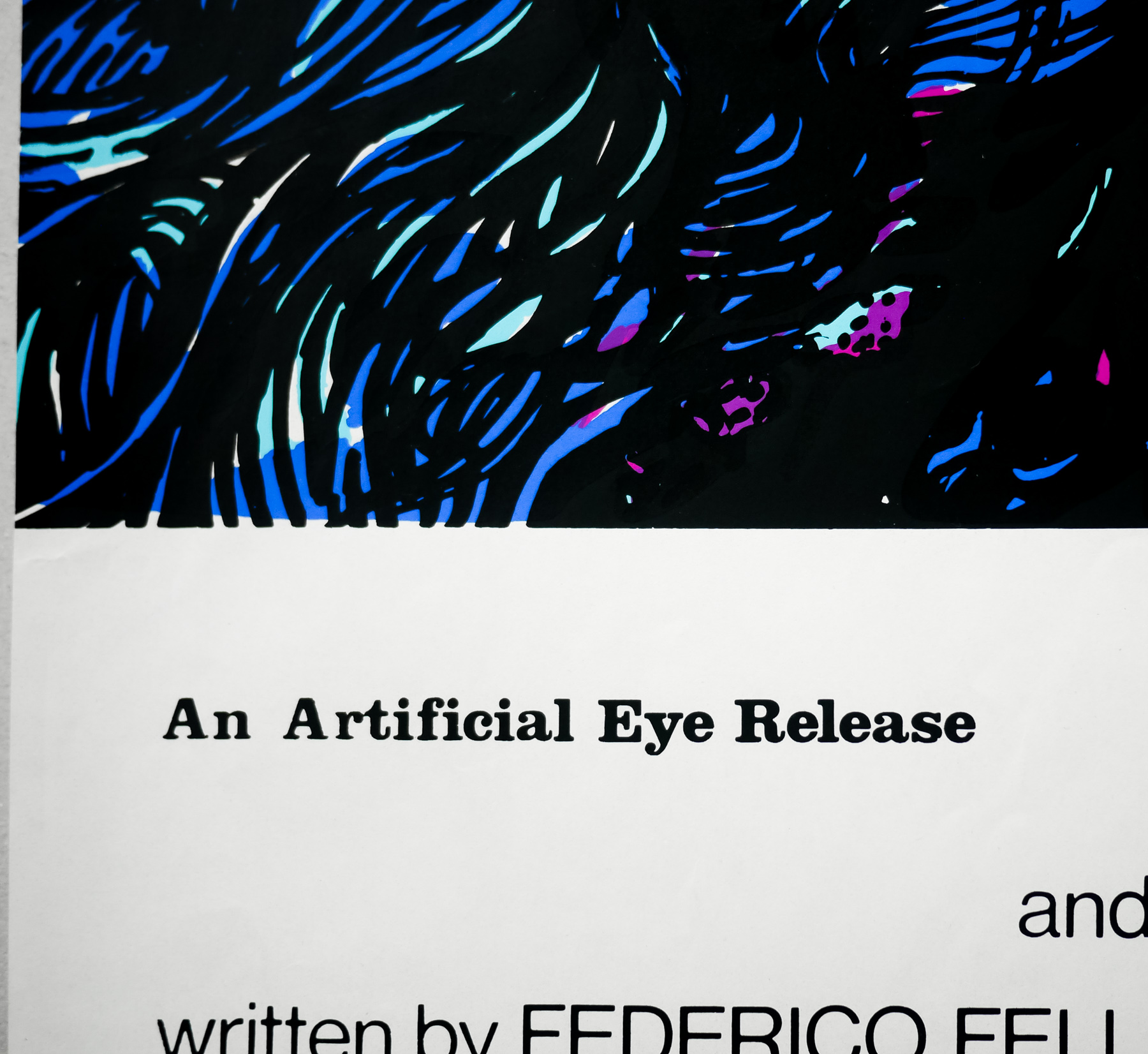
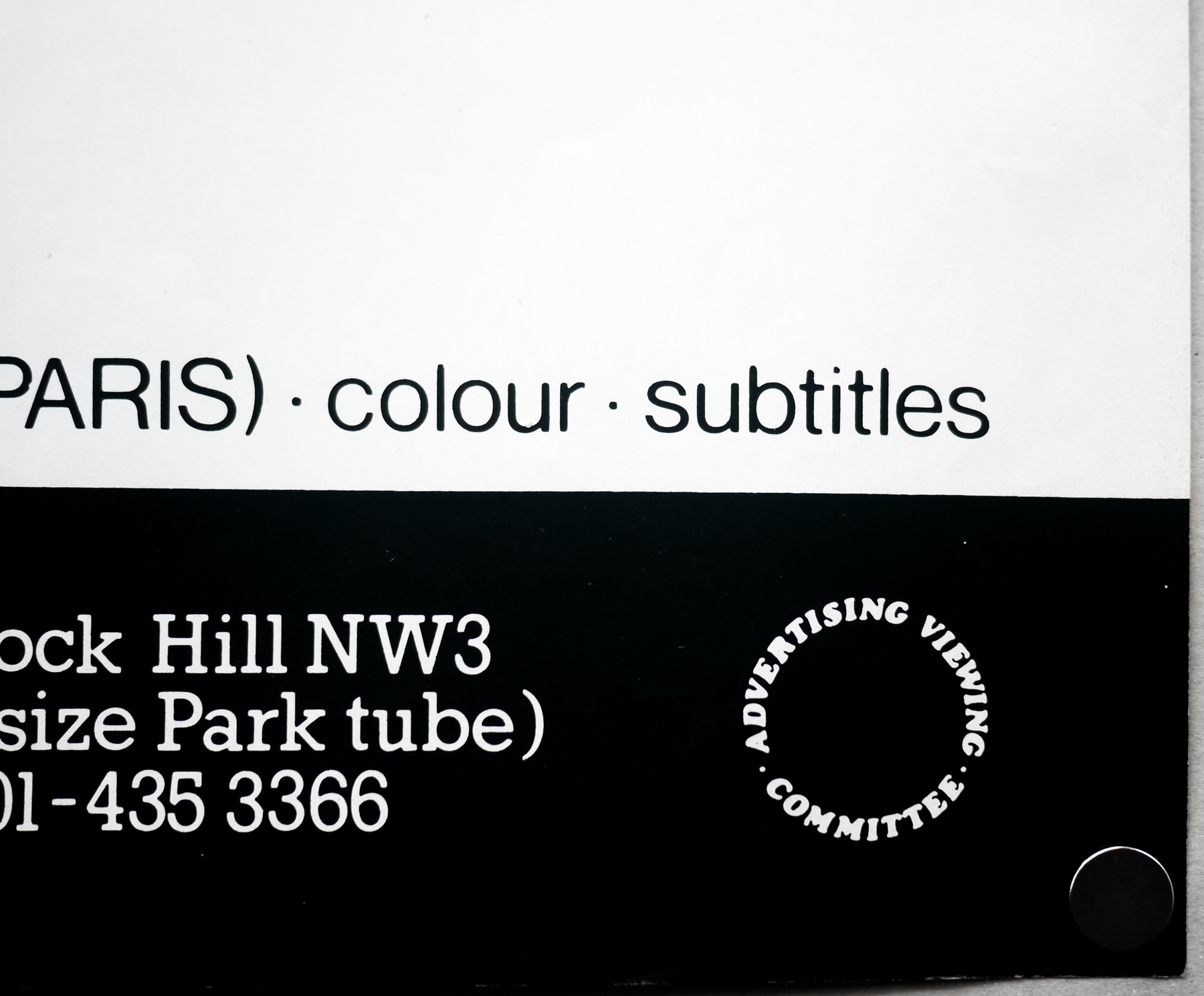
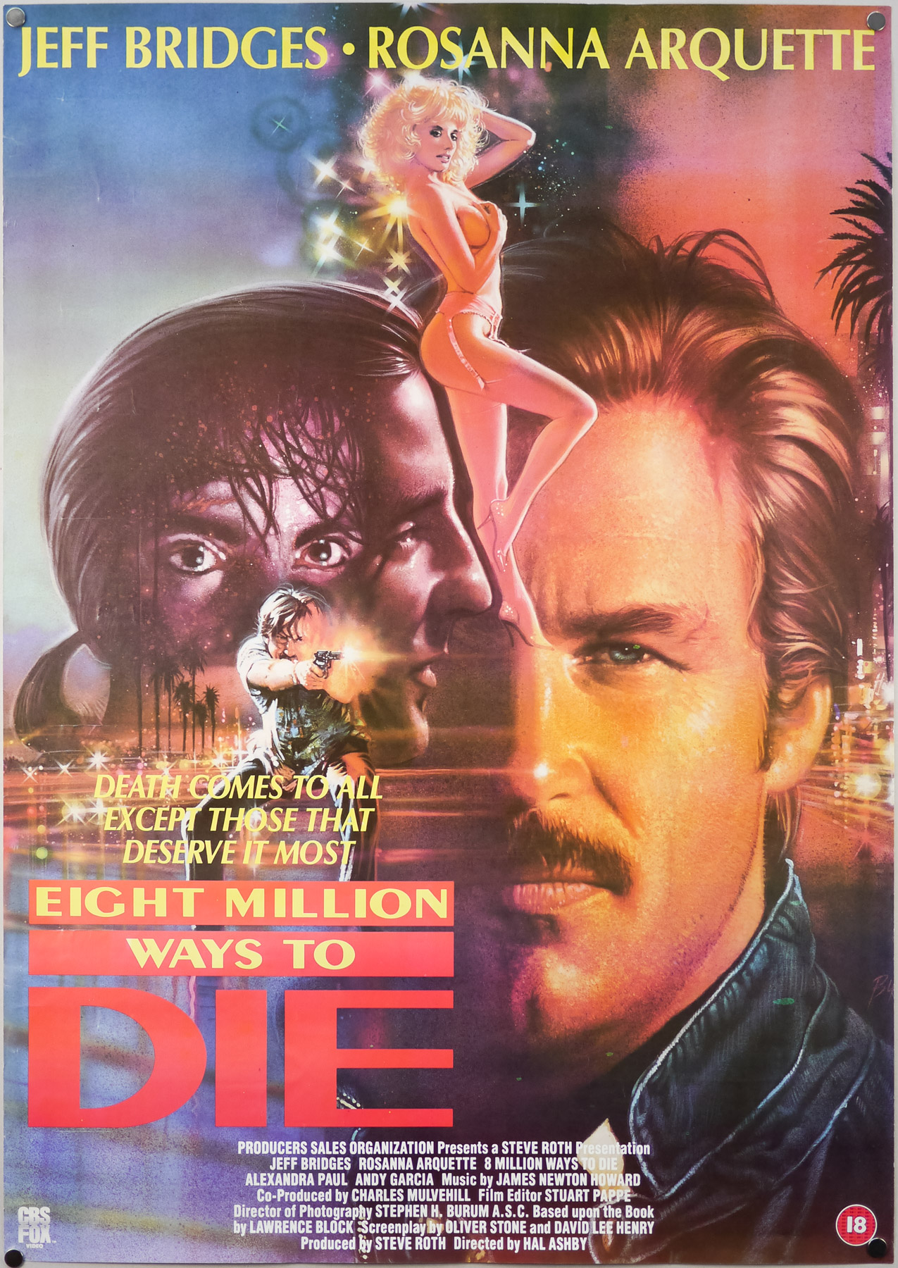
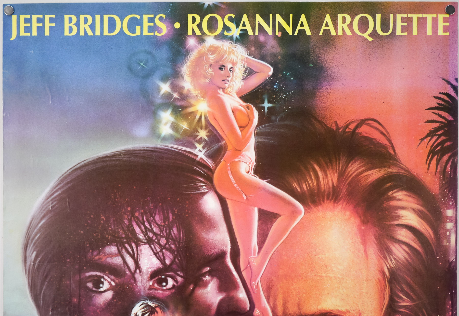
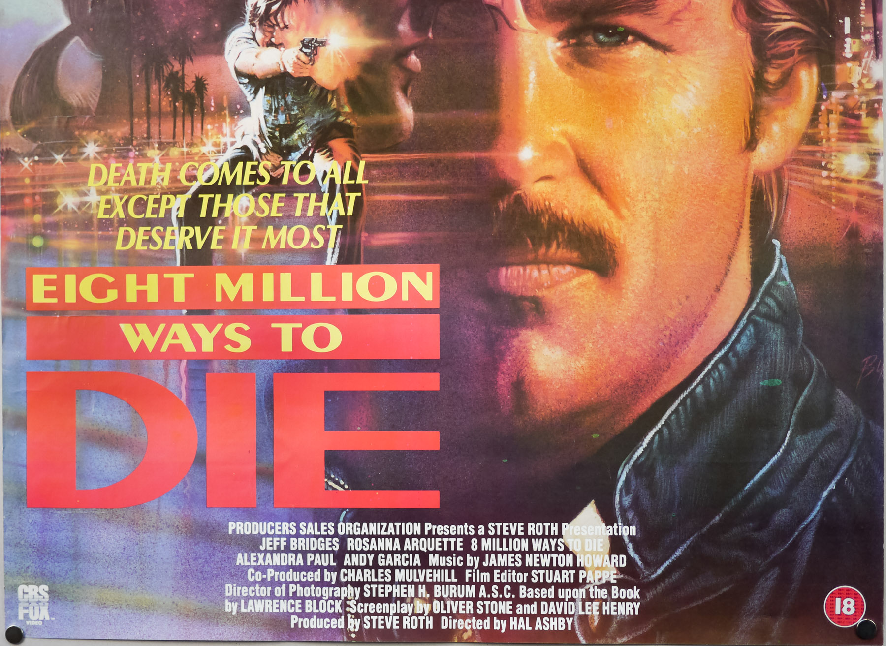
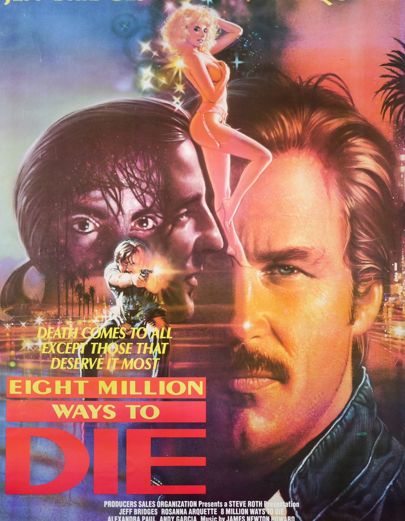
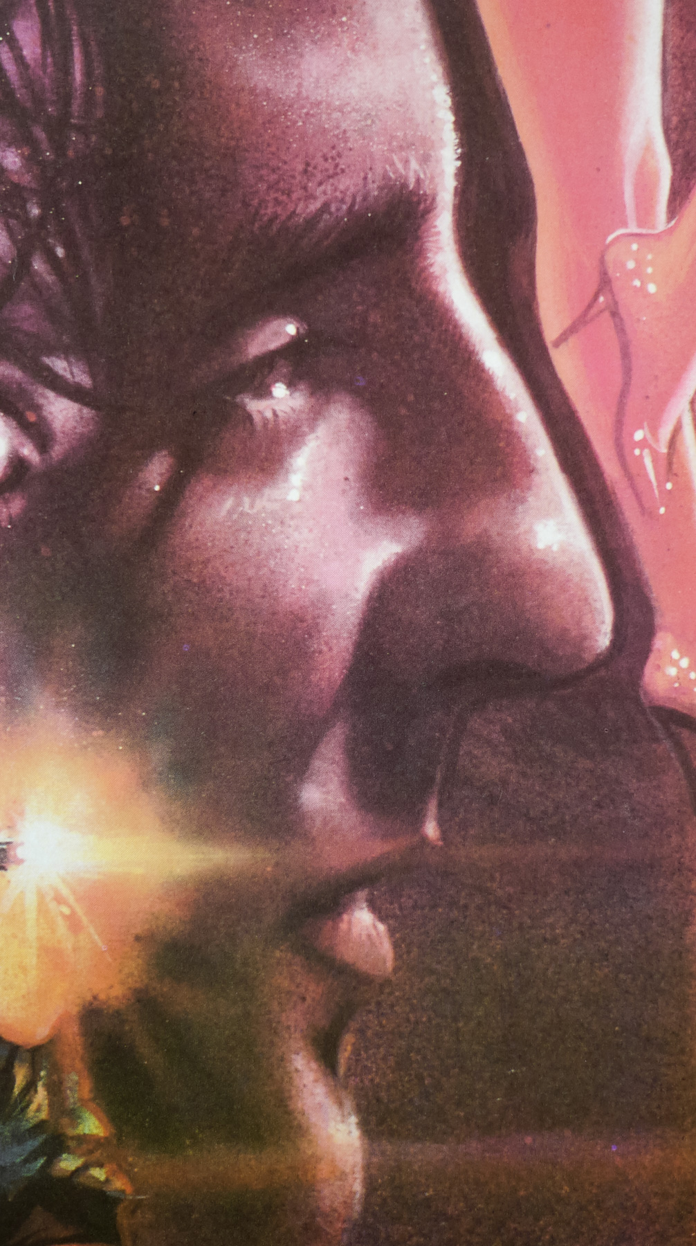
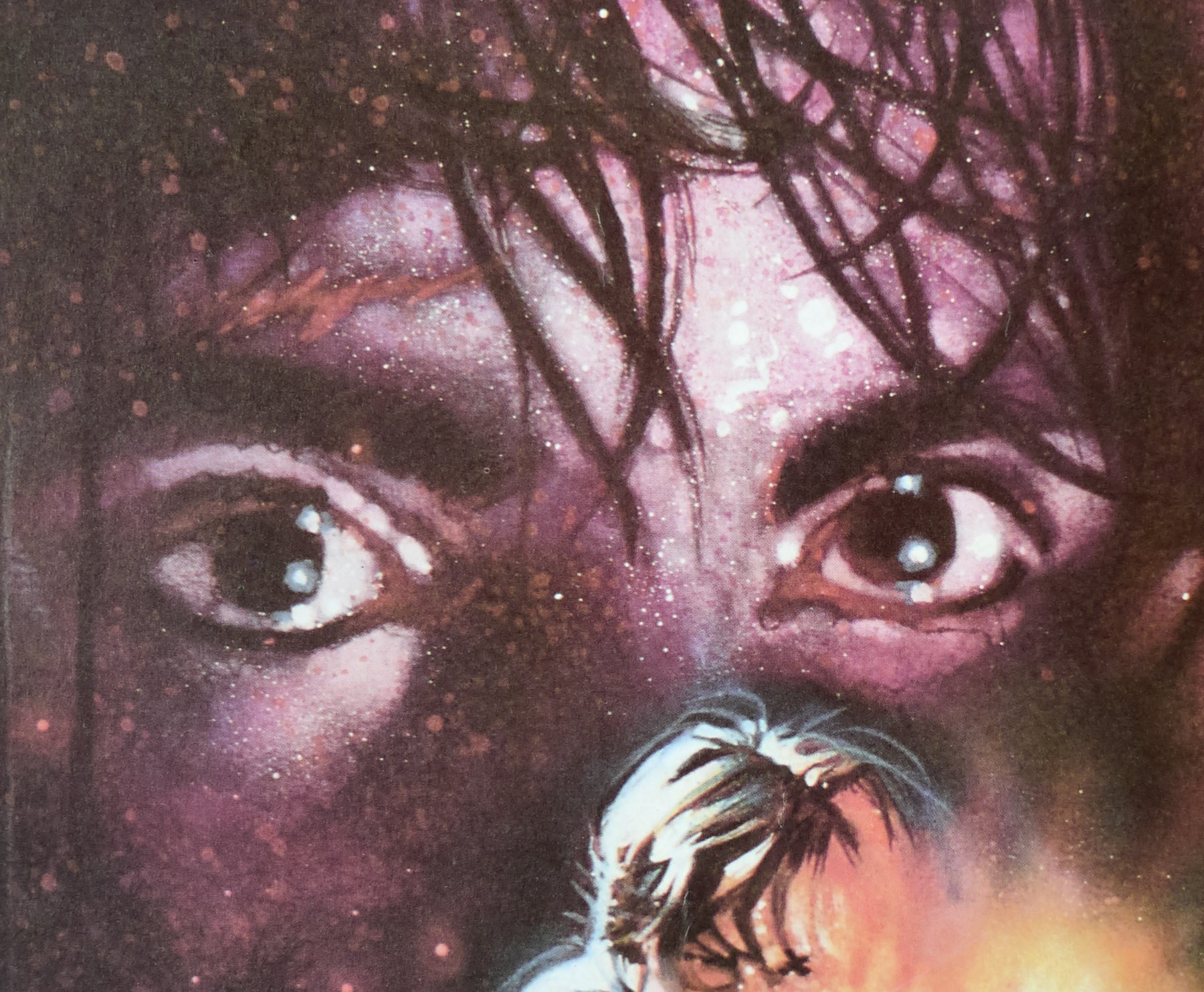
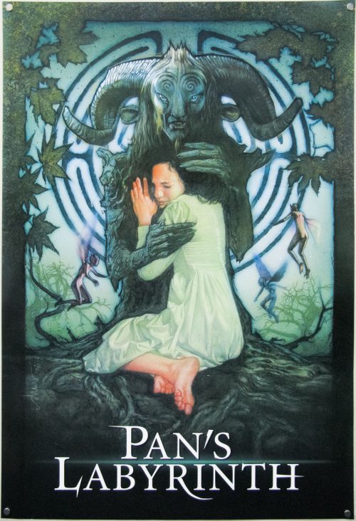
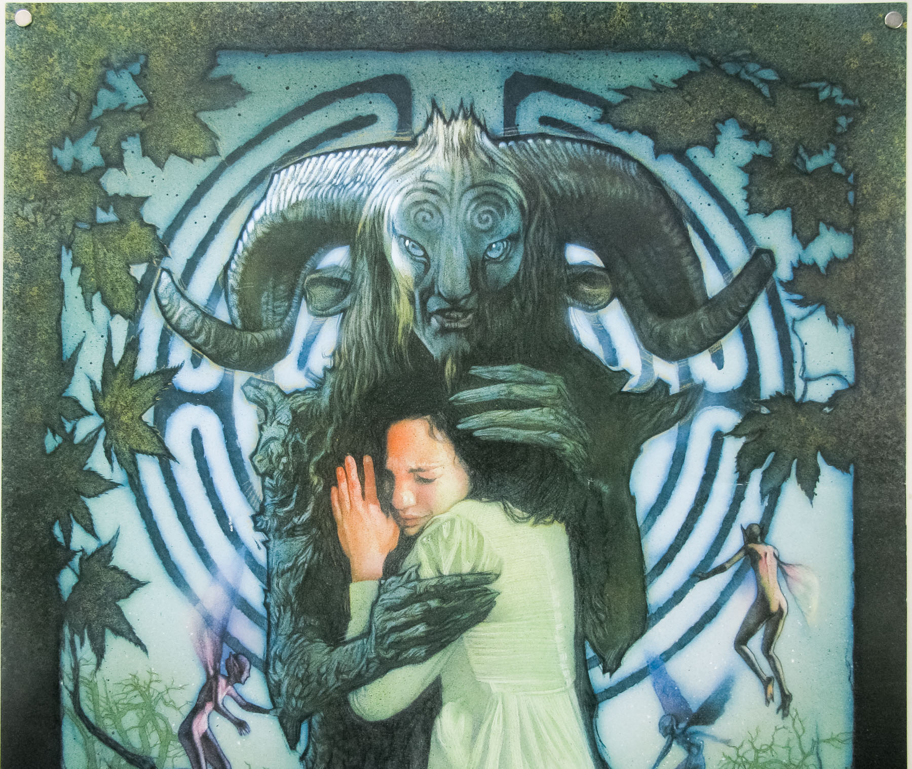
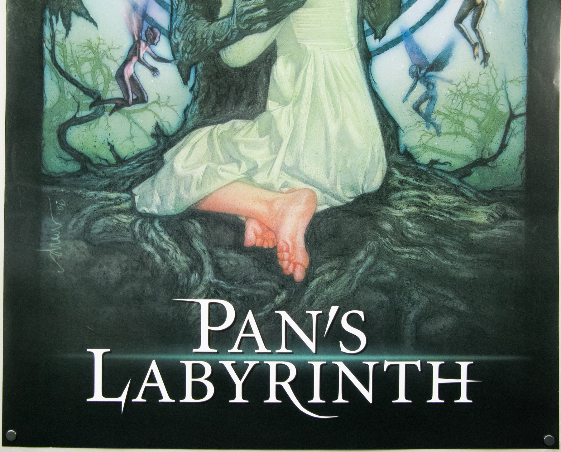
Guillermo Del Toro’s sublime, fantastic fairy tale Pan’s Labyrinth almost had an official cinema poster by the great Drew Struzan, that is until the studio suits had their way. The poster you see here is from a special screening in London and the design was never actually used as a cinema poster in any country. The final American Pan’s Labyrinth one sheet can be seen here.
The full story of how Struzan and Del Toro worked together on the poster can be found in the fantastic book ‘The Art of Drew Struzan’, which is an absolute must-buy for anyone who who has even a passing interest in Drew’s work (it’s currently only £16.49 on Amazon UK and $23.07 on Amazon.com). The stories associated with each of the artworks are a fascinating insight into what it’s like to work with directors and studios during the creation of a film poster.
These excerpts are taken from the Pan’s Labyrinth section of the book.
Drew on the completion of the artwork:
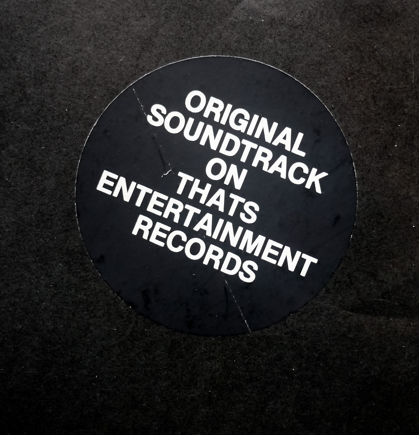
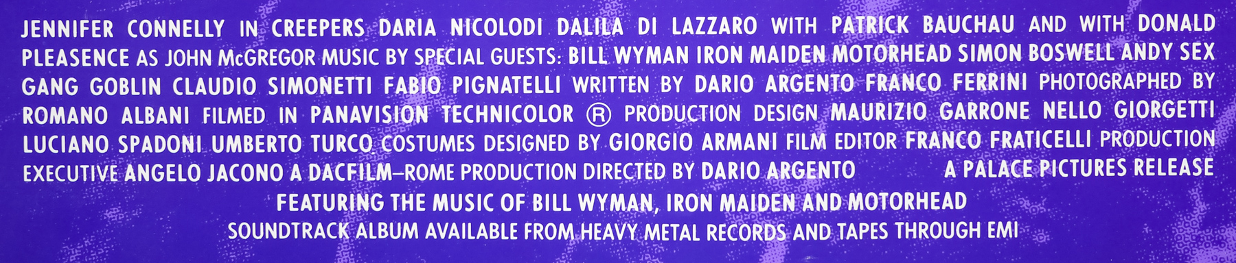
Then the shit hit the fan – the studio never used the painting. It did wind up on a special vinyl issue of the soundtrack album though.
Once the image had been released online there were many who couldn’t believe that Drew’s artwork wasn’t used for the final poster.
They were having a press conference in Europe, and a reporter actually stood up and asked one of the suits, “How come you didn’t use Struzan’s artwork for the poster?” … The suit’s reply was: “We didn’t use it because it looks too much like art.”
That statement from the studio representative says it all really. It seems like they genuinely believe that cinema-goers won’t respond to illustrated posters any more and that the photoshopped monstrosities so prevalent today are the only way to sell films successfully.
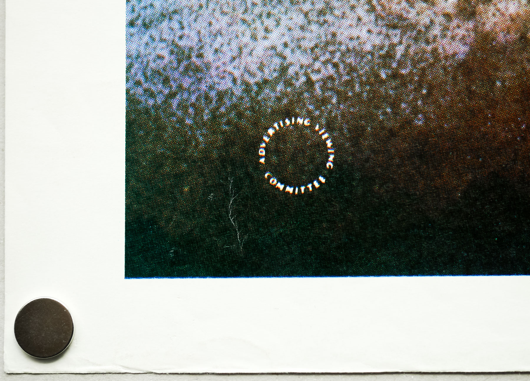
This particular example of the poster was obtained from a very established and trusted poster dealer that had bought them from a contact in London, who managed to secure a few after the event had finished. I’m assuming it was for the UK premiere or a large press screening, but I’d love to know for sure so please get in touch if you have any more details. I’m certain it’s not a bootleg poster as it measures the standard size for one sheets, is printed on decent paper and the details are sharp when viewed up close.